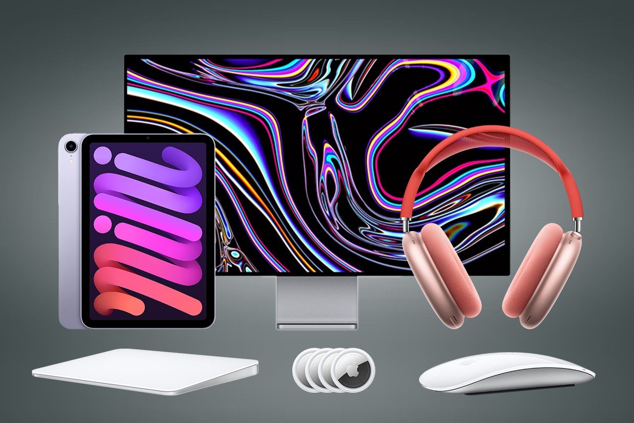
Here Are The Oldest Apple Products Still Available Today
![]()
If you asked anyone on the streets, they’d probably agree that Apple stands at the cutting edge of innovation. The company leads the smartphone market, wearable market, and tablet market, is one of the leaders in the desktop and laptop markets too, and is touted to be quite the disruptor in the AR/VR market too. Apple makes its own silicon, has a remarkable supply chain, runs its entire headquarters on renewable energy, and is set to go entirely carbon neutral by 2030. The company improves each product line at most every year, or at least every 2-3 years, but there are products in Apple’s production line that still haven’t seen updates in 3-4 or more years (some haven’t been updated in almost 9 years at this point). We’ve made a list of some of the ‘oldest’ products still available on Apple’s website dating back as early as 2015 and as recent as 2021. Now sure, all these devices are pretty great even by today’s standards… but there’s definitely room for improvement… and we’ve taken the liberty to leave out accessories like connectors and cables. Here are some of the ‘oldest’ Apple products you can still buy today.
Magic Mouse Gen 2 (2015)
![]()
It’s been nearly a decade since the infamous Magic Mouse Gen 2 got an update. Okay, maybe that isn’t entirely true because the wireless mouse did get a refresh in 2019 and 2021, but the only thing that materially changed was the introduction of new color variants. Even today, however, the mouse runs on the same internals, houses the same Lightning port, and still charges in a way that continues to baffle users around the globe. It’s speculated that Apple will be giving the mouse a refresh in 2024, although most rumors say that the company only plans on upgrading the charging port to USB-C. If you ask me, there’s a lot more they can do to improve the Magic Mouse’s design…
Magic Trackpad 3 (2015)
![]()
The Magic Trackpad 3 too shares this distinction with the Magic Mouse Gen 2. Debuted in 2015, the trackpad has only received color refreshes in upcoming years. However, the distinct difference between the trackpad and the mouse is that there really seems to be no room for improvement as far as this product is concerned. It looks sleek, performs well, and is wireless. It also charges via Lightning, which is something Apple should change moving forward, but at least you don’t need to turn the trackpad upside down while charging it…
Pro Display XDR (2019)
![]()
2019 really got overshadowed by the cheesegrater Mac Pro and its incredibly expensive wheels, but alongside them was also announced the Pro Display XDR. Designed to be the most high-end display available for Mac users, the display boasted a 32-inch 6K Retina screen with an ‘astonishing’ 1,000,000:1 contrast ratio and an eye-watering $4999 starting price – that’s about as much as one Vision Pro headset and one iPhone 15 Pro Max with some change to spare. Surely the Pro Display XDR isn’t for everyone (Apple has a slightly more affordable Studio Display for most users), which is probably why Apple never gave it an update post-2019. After all, do you really need to upgrade a 32-inch 6K Retina display?! Fun Fact: The cheesegrater Mac Pro actually got an update in June 2023 with the M2 Ultra chip, leaving the Pro Display XDR behind.
AirPods Max (2020)
![]()
It became almost certain when Apple acquired Beats by Dre that they had plans of their own to enter the wearable audio market in a big way. The Beats acquisition happened in 2014, and just 2 years later, Apple dropped the first wireless AirPods in 2016. However, it took the company 4 full years to release their first wireless over-ear headsets. The AirPods Max debuted in December of 2020, immediately becoming Apple’s flagship wearable audio device. It had everything – an aluminum design, a woven head strap, a fancy charging case, a rotating crown, and Spatial Audio (one of the first devices to support the feature). In all honesty, Apple doesn’t really NEED to refresh the AirPods Max because feature-for-feature, they’re just as good today as they were 4 years ago. However, there’s always room for improvement – for example, the AirPods Max doesn’t have an Ultra-Wideband chip that makes them easy to track using Apple’s Find My app, the charging case is one of the most absurd designs ever, and hey, we’re still stuck on Lightning when the AirPods Pro have upgraded to USB-C.
AirTag (2021)
![]()
Ah, the AirTags, every clutterbrain and stalker’s best friend. Announced in 2021, the AirTag leverages Apple’s Find My network and their Ultra-Wideband chip to really help you track and detect objects with precise accuracy. They run on CR2032 batteries which last around a year and are easy to replace – a big improvement over some tracking devices that have built-in batteries that can’t be removed. However, the AirTags haven’t seen any update since their announcement in 2021. Now here’s the question again – do they need updating? Well, on the feature front, no… they’re pretty good, have anti-stalking features, and are fairly helpful when it comes to tracking everything from bags, to pets, to even vehicles. However, the one major upgrade they need is on the design front. They’re circular and bulky, which makes them difficult to store in wallets, passport covers, and other slim belongings. Heck, I’d like a slim AirTag just so I could strap it to my Apple TV remote which keeps getting lost every third day.
iPad Mini 6th Gen (2021)
![]()
The AirTags weren’t the only product to get left behind in 2021 – Apple hasn’t refreshed the iPad Mini in 3 years either, still leaving it with the A15 Bionic chip while the other iPads get their M-series chips. Now it’s entirely possible that Apple’s held the iPad Mini back all these years deliberately – the people who buy the tiny iPad aren’t Apple’s core tablet users. They don’t need power features, they don’t edit movies on their tablet, and they clearly don’t need their tablet to work as a makeshift laptop with a dedicated keyboard folio case. However, the iPad Mini 6th Gen does support the 2nd Gen Apple Pencil and does have a USB-C port that also works for connecting external displays. The iPad Mini, as small as it is, was built to be a mighty little tablet. However, that A15 Bionic chip doesn’t really compare to the M3 chip that Apple’s due to give its latest iPads this year. Could we also see a better camera system on the iPad Mini if it gets refreshed soon? I surely hope so… but up until then, we’re stuck with the model from 2021.
Bonus – Apple Card (2019)
![]()
The Apple Card makes it to this list for purely technical reasons, but truth be told, there’s never any need to update a payments card the way you’d update smartphones and tablets every year. Apple announced the card in 2019 in partnership with Goldman Sachs, but as of 2023 November, Goldman Sachs will stop providing banking support for the card, leaving Apple to look for another partner. As far as the card’s design goes, there’s not much you can upgrade – the Apple Card comes machined from solid titanium, making it highly durable, but it’s still susceptible to scratches or discoloration. Maybe color variants??
The post Here Are The Oldest Apple Products Still Available Today first appeared on Yanko Design.