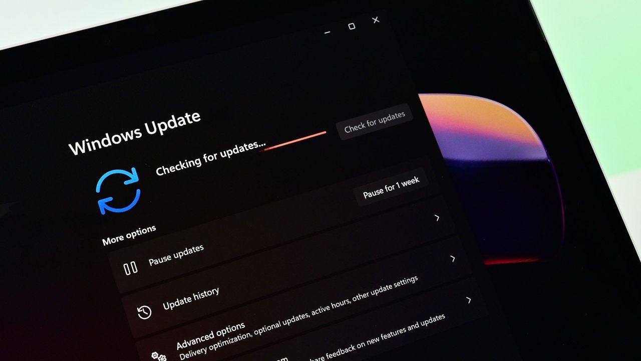
Yesterday, Microsoft rolled out the latest Windows 11 updates for all users across version 24H2, 25H2, and 26H1. For users running version 24H2 and 25H2, this latest patch includes a number of nice to see quality of life improvements in the way of performance and reliability upgrades in a number of key areas.According to the changelog, which includes improvements that began rolling out as part of last month's optional feature update, the KB5101684 update includes
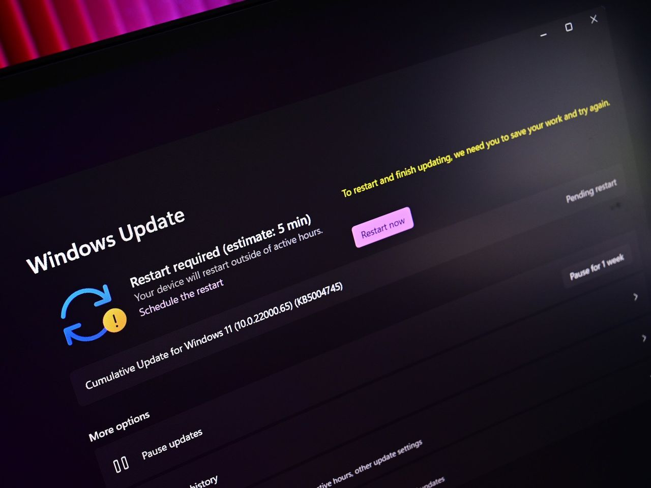
Yesterday, Microsoft rolled out the latest Windows 11 updates for all users across version 24H2, 25H2, and 26H1. For users running version 24H2 and 25H2, this latest patch includes a number of nice to see quality of life improvements in the way of performance and reliability upgrades in a number of key areas.
According to the changelog, which includes improvements that began rolling out as part of last month's optional feature update, the KB5101684 update includes reliability upgrades for explorer.exe, which will make opening things like Jump Lists and recent files faster. Additionally, Microsoft says this update will also make sharing files and switching between desktops with Task View faster too.
The reliability improvements don't end there, either. This update also includes reliability upgrades for the Windows lock screen and sign-in screen, which will be most noticeable on PCs with low amounts of RAM available. There are also startup reliability upgrades for the Start menu and Taskbar, which should make those interfaces appear quicker when powering up.
Furthermore, Microsoft says that this update also makes the post-update process less resource intensive, meaning your PC will feel faster to use immediately after an update is installed. Previously, Windows Updates required a clean-up phase after install which could be quite resource intensive on certain PCs.
The good news is all of these performance and reliability upgrades apply regardless of the amount of RAM your system has. You should notice a more responsive system if you have 8GB or 128GB of RAM.
Here's a rundown of the reliability-focused improvements in the latest update:
This update improves explorer.exe reliability, including when opening Jump Lists and recent files, when sharing files and folders, and when using Task View and multiple desktops.
This update improves the reliability of the Windows sign-in and lock screens, especially when system memory is low. It also improves the reliability of the Start menu and taskbar during startup.
This update improves reliability of loading the system tray area of the taskbar when using the taskbar on touch devices in a tablet posture.
The update improves the reliability of Start menu view preferences, ensuring your selected view is retained.
This update includes changes to update clean-up logic to improve system performance immediately following an update.
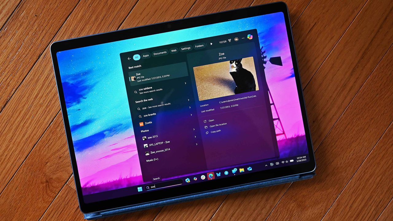
This update improves app search to better handle typos and partial app names when finding installed apps.
These reliability and performance upgrades are in addition to the many other quality of life improvements shipping as part of the KB5101684 update, including improvements to File Explorer, Windows Hello, Windows Search, system sounds, and more.
Microsoft recently announced a renewed commitment to making Windows 11 better on PCs with 8GB RAM, and it appears we're already seeing the fruits of that labor. While there's plenty of more optimizations to come, it's good to see Microsoft already moving to address this weak point on Windows.
Microsoft has been delivering genuinely nice improvements to Windows 11 over the last few months, all of which have been addressing issues with the OS around performance and reliability. This latest update continues that crusade, meaning your PC will feel better to use as of the latest updates.
Join us on Reddit at r/WindowsCentral to share your insights and discuss our latest news, reviews, and more.
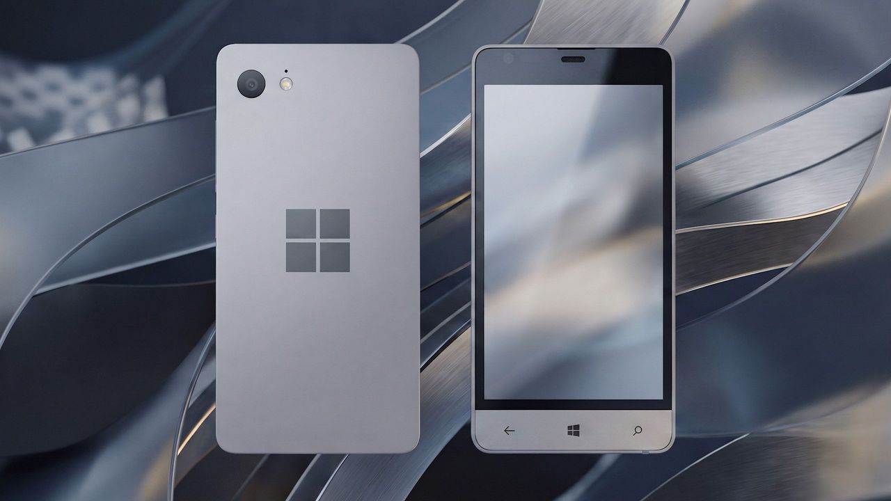
Before Microsoft acquired Nokia, the company was heavily rumoured to be working on its own in-house Windows Phone device that was expected to ship in 2014 under the Surface moniker alongside its Surface Pro device. Unfortunately for Windows Phone fans, such a device never saw the light of day, but newly published images of a mysterious prototype might have just given us our first and only look at what Microsoft was exploring internally.Possibly codenamed Raven, t
Before Microsoft acquired Nokia, the company was heavily rumoured to be working on its own in-house Windows Phone device that was expected to ship in 2014 under the Surface moniker alongside its Surface Pro device. Unfortunately for Windows Phone fans, such a device never saw the light of day, but newly published images of a mysterious prototype might have just given us our first and only look at what Microsoft was exploring internally.
Possibly codenamed Raven, there isn't much information available about this prototype, other than the fact that it’s from the 2013-2014 time frame and is running an early pre-release build of Windows Phone 8.1. It’s powered by an unknown Qualcomm chip, has a 720p screen, features a Microsoft logo on the back, and a silver metal frame that matches the colour of the Surface 2 that released that same year.
We can see in the photos that it has dedicated hardware keys for navigation, which are also coated in the same silver color as the chassis. The build of Windows Phone that it’s running appears to be from September 2013, and is from an internal development branch building towards what eventually became Windows Phone 8.1.
Real images of this mysterious Windows Phone prototype. (Image credit: Telegram/Discord)
While not viewable in the images, I understand the device features individual up and down volume buttons and a camera button on the right-hand side of the device, and a power button on the top of the device. It also features a micro-USB port and headphone jack on the bottom side, and a SIM card slot on the left side.
This is likely one of dozens of prototype designs that Microsoft’s hardware teams cooked up during this era, but it’s certainly a fascinating look at what could have been, and it does look so clean. Development on this device was likely paused once Microsoft moved to acquire Nokia in 2014.
Back in 2013, I remember hearing from sources that Microsoft was experimenting with the concept of a "Skype Phone," a Windows Phone device with mobile data that utilized Skype for calls and messaging instead of traditional carrier networks. Perhaps this device was going to be that? Who knows.
The Surface Phone we eventually got arrived as the Surface Duo, which started development in 2016 and launched to the public in 2020. In that time, Microsoft shipped Nokia designs in the form of the Lumia 640, 650, 950, and 550 running Windows Phone, before abandoning the platform in 2017.
Join us on Reddit at r/WindowsCentral to share your insights and discuss our latest news, reviews, and more.
Surface Phone Render
Render based on real images of the prototype (seen below.)
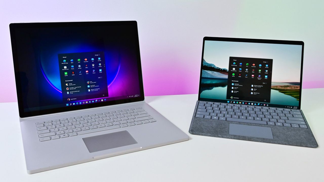
According to a new report from Taiwanese publication United Daily News (UDC,) Microsoft is raising the cost of Windows license fees for hardware makers by a much higher amount than normal. According to the report, certain OEMs are seeing licensing price hikes of between 7% and 10%.Usually, Microsoft raises Windows license fees for OEMs by a low digit percentage, making this 7% to 10% increase much more significant than normal. "A PC brand executive stated that Mi
According to a new report from Taiwanese publication United Daily News (UDC,) Microsoft is raising the cost of Windows license fees for hardware makers by a much higher amount than normal. According to the report, certain OEMs are seeing licensing price hikes of between 7% and 10%.
Usually, Microsoft raises Windows license fees for OEMs by a low digit percentage, making this 7% to 10% increase much more significant than normal. "A PC brand executive stated that Microsoft increases licensing fees for Windows OEMs (device manufacturers) every year. In the past, licensing fees mostly increased by single digits each year, but starting in July this year, the average increase has reached 7% to 10%, which is a significant increase compared to previous years," UDC says.
Of course, the cost of the Windows license fee is usually (at least partially) passed onto the consumer buying a computer, and UDC claims that their source says laptop pricing is already being impacted by these recent license fee increases. Microsoft charges different OEMs their own fees for Windows, so the exact increase in cost will differ for each hardware maker.
Regardless, with the ongoing memory component shortage, PCs have already seen astronomical price increases over the last year, with experts claiming that we haven't yet seen the worst of it. With Microsoft raising prices higher than usual on Windows licenses, it feels like the Redmond giant is adding extra fuel to the fire.
Windows Central reached out to Microsoft for comment regarding this story, but the company declined to provide one.
To be clear, the Windows license fee price hikes only apply to OEMs building hardware that ships with Windows. The cost of buying a license for Windows 11 as a consumer remains unchanged, being $99 for Windows 11 Home and $199 for Windows 11 Pro.
The ongoing component crisis has made computing unaffordable for many people. PCs that used to target the $600-$800 price bracket now cost close to $1,000. And flagship Windows laptops that used to cost $1,200-1,500 are now closer to $2,000. Even Apple has been hit by the shortage, being forced to raise prices by hundreds of dollars across its Mac lineup. Microsoft's own Surface line was hit especially hard, with the flagship Surface Pro and Surface Laptop being $400-$500 more expensive than the last-gen models.
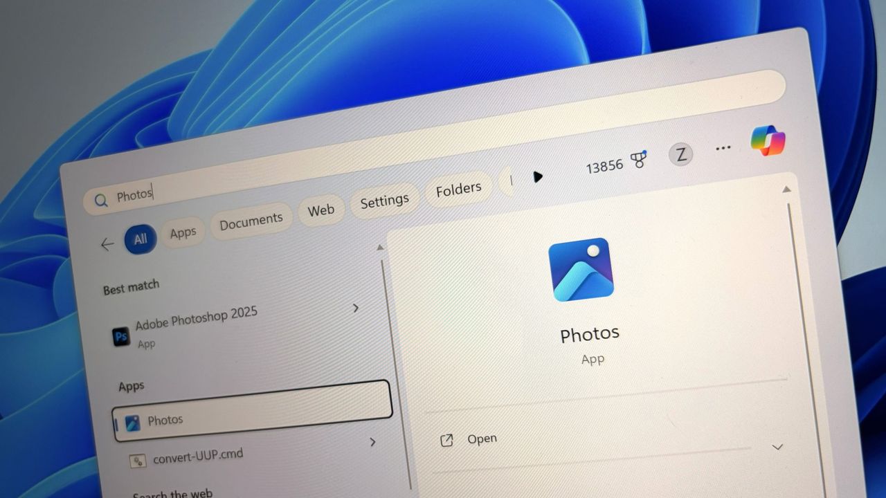
Last week, users began noticing a new app appearing in their Start menu on Windows 11, titled "OneDrive Photos" which was being forcibly installed by the OS. Naturally, this caused outrage among users who aren't interested in using OneDrive for photo storage, resulting in pushback online.Now, Microsoft's EVP of Apps and Agents, Jeff Teper, has taken to X to explain what happened. He confirms that the OneDrive Photos app is an incubation project, which wasn't supp
Last week, users began noticing a new app appearing in their Start menu on Windows 11, titled "OneDrive Photos" which was being forcibly installed by the OS. Naturally, this caused outrage among users who aren't interested in using OneDrive for photo storage, resulting in pushback online.
Now, Microsoft's EVP of Apps and Agents, Jeff Teper, has taken to X to explain what happened. He confirms that the OneDrive Photos app is an incubation project, which wasn't supposed to rollout as widely as it did. "We are incubating a new photos experience in OneDrive that went more broadly than it should have in Windows. We’re fixing that. Windows Photos will always give you the option of local and cloud photos and the choice to use OneDrive or not."
It's unclear why Microsoft thinks it needs to build a dedicated OneDrive Photos app, especially when Windows comes preinstalled with an already competent photo viewer that does a good job of handling photos stored in OneDrive. The new OneDrive Photos app is a web app, which is heavy on RAM usage and not very responsive.
Although Microsoft has confirmed that the rollout of OneDrive Photos was an error, the company does say that it's still looking forward to delivering this new experience soon. "We're very excited for you to try out OneDrive's photos features on desktop, web, and mobile and hear your feedback."
It's unclear if Microsoft intends to re-hide the OneDrive Photos app from appear on PCs where it shouldn't. On my PC, I can still see the new Photos (Preview) appearing in Windows Search, which opens the OneDrive Photos experience. This isn't the first time Microsoft has been caught automatically installing new apps on Windows 11. The OS has frequently been accused of automatically installing apps like Microsoft 365 Copilot, much to the dismay of users who don't want it.
The good news is it appears Microsoft is listening to the feedback, and publicly acknowledging that it made an error with the rollout of the OneDrive Photos app is confirmation that it saw the backlash and understands that a lot of users don't want this new experience. Hopefully that means the company won't forcibly install it next time.
Join us on Reddit at r/WindowsCentral to share your insights and discuss our latest news, reviews, and more.
In a new tweet, Partner Director of Design at Microsoft, March Rogers, has confirmed that there are no plans to introduce a customizable UI transparency slider on Windows 11, after users asked for a feature similar to the Liquid Glass slider that was recently added to the next version of iOS.For a long time, Windows has featured transparency and blur effects. However, Windows has never natively supported adjusting how strong those effects are. Users have the opti
In a new tweet, Partner Director of Design at Microsoft, March Rogers, has confirmed that there are no plans to introduce a customizable UI transparency slider on Windows 11, after users asked for a feature similar to the Liquid Glass slider that was recently added to the next version of iOS.
For a long time, Windows has featured transparency and blur effects. However, Windows has never natively supported adjusting how strong those effects are. Users have the option to turn transparency on and off, but there's no fine-tuning options for those effects to be found in the OS.
Third-party apps such as Windhawk do allow for customizing these effects, but this customization is not natively supported by the OS on its own. As such, it's natural to find that there are users out there who wish they could adjust these settings without being forced to download a third-party app first.
Rogers confirms that there are no plans to introduce a transparency slider on Windows 11 at current. "We think hard about who will benefit from the investment, usability and accessibility considerations. We also look at our community of developers (like the amazing Windhawk project) who may already be providing what users need. We won't be making immediate changes to the transparency options already in Windows, but we love getting your feedback."
It sounds like Microsoft has looked at this option, and has found that it's not a priority at the moment, which is understandable. Windows 11 has much bigger issues that needs fixing right now, and the company is focused entirely on delivering those improvements first.
The beauty of Windows is that it's an open-platform, meaning third-party developers can easily builds tools and apps that modify the Windows experience. Windhawk is a powerful suite of customization enhancements for Windows that lets users customize everything from the Start menu design to blur effects across the OS.
It's very refreshing to see Microsoft be so open about the design process for Windows 11 these days. I'm frequently checking the X accounts of many Microsoft employees these days, as they are always responding to Windows Insiders with explanations about new features and feedback from users.
While a transparency slider isn't on the cards for Windows 11 right now, Microsoft is working on a number of new customization options for the OS. There's a new customizable Start menu coming very soon, along with a redesigned context menu that will also be user customizable.
For the longest time, Windows has suffered from an inconsistent user interface design. It started with Windows 8, but got worse over the lifespan of Windows 10, with various levels of UI design, frameworks, context menus, iconography, and more getting thrown into the mix across the many different versions of Windows 10.In fact, Windows 10's inconsistent UI design became so bad that it began contributing to people's dislike of Windows, citing its perceived lack o
For the longest time, Windows has suffered from an inconsistent user interface design. It started with Windows 8, but got worse over the lifespan of Windows 10, with various levels of UI design, frameworks, context menus, iconography, and more getting thrown into the mix across the many different versions of Windows 10.
In fact, Windows 10's inconsistent UI design became so bad that it began contributing to people's dislike of Windows, citing its perceived lack of polish and craft as a reason to avoid it over competitors like Apple's macOS, a platform that takes pride in how it looks and feels to use.
So with Windows 11, Microsoft began addressing this problem. The debut of Windows 11 in 2021 was a huge step in the right direction, attempting to modernize a number of Windows UI surfaces with a consistent design language using the company's WinUI framework.
Slowly but surely, older and inconsistent UI surfaces were updated with modernized alternatives that match the design of Windows 11. Things like the volume and brightness control, file share dialog, context menus, and more were updated with a more consistent design that look great.
This was introduced in 2022, replacing the Windows 8 one. (Image credit: Microsoft)
More recently, Microsoft has improved dark mode across the Windows 11 interface, making it more consistent in apps like File Explorer where much of it was missing dark mode support and contributed to the "Windows never feels finished" allegations that have haunted the platform for years.
It's been a few months since Microsoft announced its plans to bring WinUI to more areas of the OS, and work has been slowly progressing. The company has already confirmed that it's rewriting the Start menu with WinUI, which should make it faster and more responsive. But there's more interfaces that the company is yet to announce that we know is also in the works.
Modernized File Properties
The modernized File Properties dialog coming soon. (Image credit: Windows Central)
First up, recent Windows 11 preview builds have confirmed that Microsoft is rebuilding the File Properties dialog in File Explorer with WinUI. This is one area of the File Explorer that hasn't been touched in well over a decade, meaning it still doesn't even support dark mode.
This legacy interface is being rewritten with WinUI, and the first sightings of this work were spotted in a recent preview build, albeit only when viewing the properties of a file in the Recycle Bin.
With that said, we know Microsoft is planning to bring this modernized experience to the entire File Properties experience, meaning right-clicking and selecting properties on a file in File Explorer will soon present you with a consistent design that matches the Windows 11 aesthetic.
Modernized Autoplay Menu
Not yet updated, this interface is from Windows 8 (Image credit: Windows Central)
This interface hasn't been touched since Windows 8, and is one of few areas of the OS that still utilize Microsoft's old Metro design language. The menu that appears when you plug in a USB drive or insert a disc is being modernized with WinUI, which will bring a consistent Windows 11 design to the aged interface.
Microsoft has confirmed this work is underway, but is yet to give us a look at the new interface, though we know it will support both light and dark mode unlike the current version. For now, we'll just have to imagine what such a modernized menu might possibly look like. Still, it's good to know the work is happening.
Modernized Print Management
A WinUI powered Print Management app replaces the old MMC-based one. (Image credit: Windows Central)
It's not the sexiest feature in the world, but it looks like Microsoft is building a modern version of the Print Management experience with WinUI, replacing a decades old interface with something that looks like it was designed for Windows 11. And yes, it supports dark mode now.
This is the first MMC-based interface we're seeing get the WinUI treatement, which bodes well for future modernizations of apps like Disk Management, Computer Management, and more. These 90s era interfaces have plagued the Windows experience for years, so it's very reassuring to see Microsoft is finally working on WinUI versions of these apps.
Modernized Run Dialog
The new Run dialog is better in basically every way. (Image credit: Windows Central)
Microsoft has already announced and shipped preview builds with this redesigned interface, but the company is rebuilding the classic Windows Run dialog with WinUI, now with support for both light and dark mode, and features from PowerToys.
The company says the new UI is both better looking, more functional, and faster than the legacy Run box it replaces. With that said, it appears the modern Run interface will be shipping as an option that users will have to manually enable first if they want to see it.
The new Run interface also includes the ability to type ~\ for quick access to your home directory, and it will also show app icons when applicable in your recent search list, which is a nice touch.
Rewritten Start Menu
It may not look different, but the Start menu is being rewritten with WinUI too. (Image credit: Windows Central)
As mentioned up top, Microsoft has already confirmed that it's rebuilding the Start menu with WinUI, but we're yet to hear more about what that's going to entail for the end user.
So far, we know the goal of the WinUI rewrite is to make the Start menu faster and take up less system resources. This should mean (very) slightly less memory usage for the Start menu, as many WinUI interfaces will share a System Compositor, which is how Microsoft intends to make WinUI faster.
It's unclear if Microsoft is planning to redesign the Start menu alongside the WinUI rewrite. Last I checked, this was not in the plan. While there may be some minor UI differences and adjustments between the current Start menu and WinUI Start menu, I understand that the company intends to keep the experiences mostly the same.
This makes sense given Microsoft just launched new customization options for the existing Start menu, which would be odd to change so soon.
Compact Context Menus
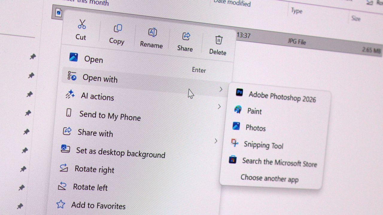
While technically not old, context menus are getting an overhaul. (Image credit: Zac Bowden / Windows Central)
While not technically a legacy interface, context menus on Windows 11 are a mess, and Microsoft is working to redesign them so that they are faster, more responsive, and most importantly, more customizable.
Coming this year, Windows 11's context menus will be updated with a new compact design that's smaller and lighter, meaning they won't lag or take as long to open, especially when there's lots of actions and items within the menu.
Microsoft is also planning to let users customize which items appear within the context menu, as well as configure the order in which those items appear. This means users will be able to hide certain actions and apps from the context menu if they don't use them.
With that work ongoing, it's likely that we're going to see even more older and outdated parts of the Windows experience updated with modern WinUI designs. While certain legacy interfaces will likely continue to exist for years to come, it looks like Microsoft is exploring where it can best implement new UIs as fast as possible without breaking compatibility.
Moving more parts of the Windows UI under a consistent UI framework should result in better performance and reduced memory usage, which should make the OS feel faster and less bloated, thanks to that new System Compositor that's in the works that is designed to manage all WinUI interfaces across the Windows Shell.
It's good to see Microsoft once again focused on polish and craft. It helps make Windows feel more unified and cared about, something that has not been so obvious in recent years and in my opinion has eroded confidence in the platform. Hopefully Microsoft will continue to focus on craft for years to come.
Join us on Reddit at r/WindowsCentral to share your insights and discuss our latest news, reviews, and more.
Halo: Campaign Evolved launched just days ago, and it appears Microsoft is moving quickly to make cuts at Halo Studios now that the game is out. A number of developers who were previously employed at Halo Studios have posted on LinkedIn today confirming that some roles have been laid off. (via Insider Gaming)Halo Studios producer Nick Treitman confirmed that he was impacted by the layoffs, stating that "after 6.5 years working on Halo and dodging just as many rou
Halo: Campaign Evolved launched just days ago, and it appears Microsoft is moving quickly to make cuts at Halo Studios now that the game is out. A number of developers who were previously employed at Halo Studios have posted on LinkedIn today confirming that some roles have been laid off. (via Insider Gaming)
Halo Studios producer Nick Treitman confirmed that he was impacted by the layoffs, stating that "after 6.5 years working on Halo and dodging just as many rounds of layoffs - it has finally caught up to me. I have nothing but love for Halo and the folks at the studio, this is just a tough reality in the gaming industry right now."
Paul Morris, listed as Scrum Master at Halo Studios, also confirmed that his role had been impacted by layoffs this week. "Today, I learned my time at Halo Studios will be coming to an end following the successful launch of our latest game, Halo: Campaign Evolved. I know this is one of the most challenging job markets our industry has seen, and I know the road ahead won’t be easy."
A number of other Halo Studio employees have updated their LinkedIn pages confirming that they are now available for work. The layoffs come as new reports claim Halo: Campaign Evolved's development was troubled throughout, taking up more resources than originally planned and causing other projects such as a Halo multiplayer game to be canceled.
Unfortunately for the studio, this led to development being more complex, with third-party studio Abstraction struggling to meet deadlines imposed by Halo Studios and being ultimately kicked off the project, forcing Halo Studios to scrap much of the work done by Abstraction and rebuild assets in the Blam engine instead.
If this story sounds familiar, that's because it closely mirrors the development of Halo: Infinite. That game also suffered from a troubled development cycle, with contractors struggling to meet deadlines and work in the Slipspace Engine (which was just the Blam engine with a new name.)
Now, with layoffs impacting Halo Studios, it's clear that Microsoft is moving forward with its confirmed 3,200 layoffs, 1,600 of which were already made back in July.
Join us on Reddit at r/WindowsCentral to share your insights and discuss our latest news, reviews, and more.
Master Chief wearing green tactical armor and a gold visor, holding a futuristic assault rifle inside a glowing blue geometric corridor structure.
Master Chief wearing green tactical armor and a gold visor, holding a futuristic assault rifle inside a glowing blue geometric corridor structure.
Earlier this year, Microsoft announced that it was moving to address Windows 11's biggest issues and criticisms from users in an effort to win back trust from customers and reposition Windows once more as a viable alternative to macOS and Linux, something people actually want to use over the competition. It was nice to see Microsoft outline its roadmap and plan for Windows 11, but I wasn't prepared for just how fast the company would start delivering on the promi
Earlier this year, Microsoft announced that it was moving to address Windows 11's biggest issues and criticisms from users in an effort to win back trust from customers and reposition Windows once more as a viable alternative to macOS and Linux, something people actually want to use over the competition.
It was nice to see Microsoft outline its roadmap and plan for Windows 11, but I wasn't prepared for just how fast the company would start delivering on the promises it was making. Since March, Microsoft has previewed and even shipped many improvements to Windows 11 that are the direct result of its Windows K2 initiative, all designed to fix Windows 11.
I've been testing these new Windows 11 builds over the last few months, and there are 5 big changes and improvements that stand out as super exciting. Some of these improvements are already shipping, whereas others are still in preview.
A new and improved Windows Update
Windows Update is now much smarter and doesn't get in the way anymore (Image credit: Zac Bowden / Windows Central)
Updates on Windows have always been frustrating, so much so Microsoft made it a point of focus for its Windows K2 effort. In the last few months, Microsoft has shipped multiple changes and improvements to Windows Update which are designed to make it more reliable, and more importantly, less annoying.
The first big change is ensuring driver, framework, and security updates are now all timed to install at the same time. Previously, any update could require the user to restart at any time. Now, Windows Update will only ask you to restart once a month, as the update system now installs those driver and framework updates alongside security patches.
That's in addition to being able to pause updates indefinitely now, so even when the one time a month that Windows asks you to restart finally rolls around, users have the option to say no and postpone the restart for as long as they need. Even when an update is pending restart, the option to shut down or restart without installing said update is now present.
Microsoft has even made it so users can skip installing updates when setting up a PC for the first time, meaning it now takes just a few minutes to get right into using your new PC instead of the 20+ minutes it used to take when installing the latest update was a requirement before reaching the desktop.
All of these Windows Update improvements are already shipping to all Windows 11 users, which is a crazy quick turn around.
Less ads and AI across the OS
Widgets no longer includes MSN ads and sponsored content. (Image credit: Zac Bowden / Windows Central)
Microsoft is also removing Bing and MSN ads from Windows Search, in preview now. The search pane itself is now a long list or recent search queries and items, with nonsense like the Bing wallpaper of the day and other sponsored content no longer appearing at all. Even search results that reach out to the web no longer include sponsored content.
The Start menu now also has more granular controls over the kind of content that appears in there. The "Recommended" feed has been renamed to the "Recents" feed and no longer shows recommended apps and websites that came across as more advertising. Users even have the option to remove the Recents feed entirely now, which is great.
Copilot used to plague every inbox app and UI surface you could think of on Windows 11, but today it only appears in a few very specific areas. It still exists as a standalone app on Windows 11, but the Copilot button no longer exists in apps like Photos and Notepad. Microsoft has even removed the "Ask Copilot" option in File Explorer.
Better performance and reliability
Windows 11 is now faster and more reliable, with a focus on reducing memory usage. (Image credit: Zac Bowden / Windows Central)
One big area of focus for Microsoft is the overall performance and reliability of Windows 11, which many agree has slipped over the last few years. The good news is Microsoft has already delivered several improvements on this front, with more to come in the following weeks.
The first big change is the new "Low Latency Profile" feature that shipped just a few weeks ago. It's an invisible change that makes opening apps, context menus, and flyouts from the Taskbar much more responsive by silently increasing CPU frequency when these common actions take place.
This is something other OS platforms do which allows them to remain feeling snappy, even under heavy load, and now Windows 11 has the same behavior. This has outright fixed the issue users sometimes have where things like the Start menu don't always appear immediately when clicked. That's a thing of the past now.
Microsoft is also improving the performance of WinUI interfaces across the system via a new System Compositor which reduces latency and memory overhead across the OS so that these modern interfaces are consistently responsive. There's even a new Run dialog built with WinUI that is faster than the old Win32 version.
Opening and navigating through file trees in File Explorer is faster too, and searching for files and apps on Windows 11 is now more consistent. Two character search is already shipping, which makes finding content a little bit easier.
Customizable Taskbar and Start menu
There are many new customization options coming to Start (Image credit: Zac Bowden / Windows Central)
One of the biggest issues people have with Windows 11 is how it took away customizable options for areas of the system like the Start menu or Taskbar. Microsoft has heard that feedback, and is already publicly testing a new Taskbar and Start menu that can be user customized.
The Taskbar can now be repositioned just like on Windows 10, allowing the user to move it to the left, right and top of the display if that's where they want it. There's also a new resize option letting users make it smaller like the Windows 10 one could.
The Start menu is also getting more customization options. Users can hide entire segments of Start, such as the Recents feed, Pinned apps, or All Apps area. They can toggle on or off the Phone Link companion, and disable Start entirely if they don't ever use it.
And there's more to come
Context menus are getting a redesign and better customizability. (Image credit: Zac Bowden / Windows Central)
Above are all the new improvements that I've tested and are either shipping or in public testing via the Windows Insider Program. These are the real changes and features that can be tried and tested as we speak, not just empty promises or ideas. It's all available to download and try out right now.
There's still more to come too, stuff that isn't yet in public preview testing. Microsoft has confirmed it's working to move more parts of the OS to WinUI for faster performance, such as the Start menu and areas of File Explorer. There's an effort to reduce the footprint of the OS in the works too, which should make the OS less resource intensive at idle.
For the features that are yet to ship outside of preview, I understand that Microsoft is aiming to get the bulk of these improvements out of the door before the end of 2026, with some expected in 2027.
SI'm so very impressed with how quickly Microsoft has turned Windows 11 around so far. I haven't felt this positive about the features and changes being actively made to Windows in a really long time, to the point where it feels weird to not have anything to really complain about. All of my biggest issues with Windows 11 have either already been addressed, or are in the process of being addressed.
It's a great time to be a Windows user again.
Join us on Reddit at r/WindowsCentral to share your insights and discuss our latest news, reviews, and more.
In this episode of the Windows Central Podcast, Daniel Rubino and Zac Bowden sit down with Marcus Ash, Corporate Vice President of Design and Research for Windows at Microsoft. The discussion centers on the user experience vision for Windows 11, balancing modernization with legacy app compatibility, and optimizing system efficiency across diverse hardware configurations.This episode of the Windows Central Podcast is sponsored by Surfshark VPN. Unlimited devices,
In this episode of the Windows Central Podcast, Daniel Rubino and Zac Bowden sit down with Marcus Ash, Corporate Vice President of Design and Research for Windows at Microsoft. The discussion centers on the user experience vision for Windows 11, balancing modernization with legacy app compatibility, and optimizing system efficiency across diverse hardware configurations.
This episode of the Windows Central Podcast is sponsored by Surfshark VPN. Unlimited devices, access your content from anywhere, and auto-block malware on Windows, Edge, and other platforms from $2.50/mo, with 4 months extra FREE. Sign up today!
Design Philosophy in Windows 11: Marcus Ash discusses how design decisions are shaped by user feedback, telemetry, and modern workflow requirements.
Optimizing Performance for Low-RAM Devices (8GB): A deep dive into full-stack optimizations—ranging from kernel memory scheduling to UI process management—to ensure smooth performance on 8GB RAM hardware.
Modernizing Legacy Tools vs. Backward Compatibility: Discussion on how Microsoft approaches updating older OS utilities (e.g., Control Panel, Registry Editor) while protecting enterprise compatibility and muscle memory.
Web Tech, WebView2, and Modern UI: Exploring the role of web-based interface components in Windows 11, including trade-offs between agility, feature delivery, and resource utilization.
Have a question you want us to answer on the podcast? Send it to us at [email protected]
Microsoft's CVP of Design and Research for Windows and Devices, Marcus Ash sat down with the Windows Central Podcast to discuss ongoing work around Windows 11's UI, and how the company is moving to finally eradicate the OS of legacy cruft while maintaining backward compatibility where possible.We started with Control Panel, which is everyone's go-to as a measurement for the progress the company has made to modernize Windows. Microsoft first began modernizing the
Microsoft's CVP of Design and Research for Windows and Devices, Marcus Ash sat down with the Windows Central Podcast to discuss ongoing work around Windows 11's UI, and how the company is moving to finally eradicate the OS of legacy cruft while maintaining backward compatibility where possible.
We started with Control Panel, which is everyone's go-to as a measurement for the progress the company has made to modernize Windows. Microsoft first began modernizing the Control Panel with Windows 8 over 13 years ago, and the work still isn't complete over a decade later.
Unsurprisingly, Ash says that the reason this has taken so long is that Microsoft prides itself on compatibility with legacy tooling and workflows, so it can't just rush in and modernize everything without first ensuring the modern replacements maintain functionality with what came before.
"That's why things like Control Panel get tricky, because if a customer has a driver or has something that depends on that legacy functionality, we just have to be careful about not breaking that compatibility promise," Ash said. "When we finally get things in Settings, we will then deprecate places say in Control Panel where we don't need that function anymore, we can carry it forward."
Control Panel still exists in Windows 11 today. (Image credit: Screenshot: Windows Central / Laptop: Edited with Gemini)
Ash highlights that modernizing legacy interfaces is as much about designing and building the new interface as it is about developing the tooling and UI frameworks to support the functionality required to build that modern interface, all while carrying forward the same capabilities, featureset, and performance.
"It also requires us to do work in WinUI 3 and some of these frameworks so that we can move things over at a rate that we think, one, customers can adopt and not break promises, but also just make sure we can test and we have the framework that supports all the things that our customers need. So we are pushing really hard to try to modernize, but we're also proud of the progress."
Ash says that legacy support in Windows is a strength of the platform, not a weakness. With that said, the company is exploring ways it can modernize legacy apps and interfaces while maintaining that legacy support. "There will be cases where, because of a customer that wants something that's important to them, we'll have some legacy UI, but even there we're trying to look and see: are there ways that through tooling and through better approaches we can just reduce that over time?"
In case you've ever wondered how Microsoft goes about choosing which legacy interfaces to modernize, Ash breaks down the process, confirming that "it's based on usage, telemetry, feedback. It's based on: where do we think the tooling is ready to move that surface forward? ... we just keep going through that and trying to make sure that over time, the amount of legacy UI that a customer would see in their day-to-day experience just gets smaller and smaller."
Microsoft is slowly but surely modernizing apps like File Explorer with WinUI. (Image credit: Phantomofearth on BlueSky)
"We look at user journeys. Like if you were to look at File Explorer and you were to think about all the functions that happen in File Explorer, we then look left-to-right and say, okay, for this particular dialogue, where did the user start and where does the user end? So it's not just pick one dialogue, it's pick the full user journey of the things that the customer is trying to do."
Ash even teases that the company is looking at how it can evolve its tooling that that one day it can tackle modernizing apps like the Registry Editor. "I would say the common things that we look at are the top things that users/customers want: File Explorer and some of the big apps. But even things like Regedit and some of the tooling, we're already starting to take a look at and figure out: how would we attack this problem so that we keep a compatibility promise AND we can modernize these frameworks."
It's clear that Microsoft is eager to move Windows forward with modern designs that are consistent with its current design language, but that the company must ensure that these modernizations don't interrupt workflows or break compatibility. That's ultimately why it's taken so long for Microsoft to modernize legacy UIs across Windows, because the UI frameworks and tooling required to do it need to be built-out to ensure legacy support first.
Our interview dives into more topics, including optimizing the OS for 8GB RAM devices and why Microsoft sometimes chooses WebView2 over WinUI in certain apps and interfaces. Be sure to watch the whole interview on our YouTube!
The Windows Central Podcast is sponsored by Surfshark VPN. Unlimited devices, access your content from anywhere, and auto-block malware on Windows, Edge, and other platforms from $2.50/mo, with 4 months extra FREE. Register today!
Join us on Reddit at r/WindowsCentral to share your insights and discuss our latest news, reviews, and more.
Microsoft's Corporate Vice President of Design and Research on Windows, Marcus Ash, has commented on the company's ongoing effort to modernize and reduce the memory footprint of Windows 11 for devices with low amounts of RAM. Last week, Windows chief Pavan Davuluri confirmed the motion to optimize performance on Windows 11 for devices with 8GB RAM, and Marcus Ash has now broken down just how the company is planning to go about doing that.Ash confirms that Microso
Microsoft's Corporate Vice President of Design and Research on Windows, Marcus Ash, has commented on the company's ongoing effort to modernize and reduce the memory footprint of Windows 11 for devices with low amounts of RAM.
Ash confirms that Microsoft is taking its work to optimize the OS seriously. It's looking at all aspects of Windows from top to bottom to ensure performance is optimized at every step.
"This is something we've learned especially over the last few months with the effort we've done on quality. We have to look at these as full-stack challenges, from the design of the pixels all the way down to the kernel scheduler and drivers," Ash told us in an interview on the Windows Central Podcast. "We know that given the expectations customers are going to have, we have a chance to do better. We have a chance to do things that get ahead of where we know customers are going to go in terms of their expectations on the apps they run, and the responsiveness of those apps."
Apps often eat up a lot of RAM these days, which is a problem for PCs with just 8GB. (Image credit: Windows Central)
The process is a group effort, one that incorporates all the teams building software and experiences inside and on top of Windows 11. "We get teams together across Microsoft, we get our own team together, we instrument the various customer jobs that people want to run, and then we're relentless at: how do we reduce the memory footprint?"
Ash continues: "How do we think about preload, and how long something should stay preloaded so that we can release things when you're not using the app as much, when we really need to reduce more system memory? We think about the design and just making sure that when people get under stressful memory conditions, how do we make it very easy for them to decide what they don't want to run anymore so that we can relieve some of that pressure?"
It's clear that Microsoft views the ongoing memory pricing crisis and competition from the MacBook Neo as driving forces for optimizing Windows 11 for devices with 8GB RAM. The company has confirmed that it's looking to begin shipping these memory and performance optimizations before the end of the year.
Our interview with Marcus Ash touches on more topics, including modernizing legacy UIs, how WebView2 fits in, and more on the Windows Central Podcast. So give the episode a watch on our YouTube today at 2PM ET if you want to hear more from Marcus Ash.
The Windows Central Podcast is sponsored by Surfshark VPN. Unlimited devices, access your content from anywhere, and auto-block malware on Windows, Edge, and other platforms from $2.50/mo, with 4 months extra FREE. Register today!
Join us on Reddit at r/WindowsCentral to share your insights and discuss our latest news, reviews, and more.
Surface Go 4 with Windows 11
(Left) Daniel Rubino, Editor-in-Chief, Windows Central; (Right) Marcus Ash, CVP Design and Research for Windows, on the Windows Central Podcast #400.
Windows chief Pavan Davuluri has posted an article on X today that outlines the journey Microsoft has taken so far to fix and improve Windows 11. Since March, the company has been laser focused on addressing Windows 11's biggest issues, delivering many new features and changes that are designed to improve the reputation and experiences around Windows.While that work is still ongoing, Davuluri has now outlined four new areas of focus that Microsoft will be working
Windows chief Pavan Davuluri has posted an article on X today that outlines the journey Microsoft has taken so far to fix and improve Windows 11. Since March, the company has been laser focused on addressing Windows 11's biggest issues, delivering many new features and changes that are designed to improve the reputation and experiences around Windows.
While that work is still ongoing, Davuluri has now outlined four new areas of focus that Microsoft will be working on for Windows 11 between now and the end of the year:
Onboarding and setup. Delivering a faster and more efficient out-of-box experience.
Memory optimization for 8GB and above. Reducing Windows memory footprint to deliver a fast and responsive Windows experience across the PCs customers use every day.
Family. Providing a faster set up and making it easier for families to access useful parental controls.
Voice. Making voice more natural and fluid to interact across the apps you use every day.
Microsoft has confirmed that it's planning to improve Windows 11 so that it runs better on PCs with just 8GB of RAM. MacBook Neo took the world by storm earlier this year, and while Windows OEMs have since stepped up to offer better value for money, Windows itself is still quite heavy on these limited memory devices.
The company is now working to reduce Windows 11's memory footprint, ensuring that the OS feels fast and responsive even on 8GB RAM. It's yet to dive into how it's planning to make these changes, but it's likely related to how the company is moving more areas of the Windows UI to WinUI, which is lighter than WebView.
"We're going to take everything we've learned since March and keep listening and closing the loop on your feedback. The signal from you is clear: keep going. We intend to," says Davuluri.
Additionally, Microsoft has confirmed that it's rethinking the Windows out of box experience, with a new faster and more efficient set up experience in the works that will make booting up a new PC for the first time seamless and straight forward.
The other two areas of focus are Family and Voice. The company says it's working to deliver new Family Safety features across the OS, including enhanced parental control setup and more.
Voice is the final area of focus. Microsoft is on record as stating the future of computing will be one that is multi-modal, with voice acting as a primary input method alongside the keyboard and mouse. The company intends to make voice input more natural and fluid across the OS and apps you use.
Microsoft is clearly very proud of the work it has done so far this year to fix Windows 11. Compared to late last year, Windows 11 is in a very different spot. The company has delivered genuinely meaningful improvements and changes that are already impacting the OS for the better, and it sounds like there's more to come soon.
Join us on Reddit at r/WindowsCentral to share your insights and discuss our latest news, reviews, and more.
Microsoft is working on a major overhaul to the context menu system on Windows 11 that is designed to fix performance and reliability issues by allowing users to customize what appears within the right-click menu across the system. The company is also working on a new compact menu design that will be faster to open and interact with.One of Windows 11's more frustrating problems currently is how cluttered the modern context menus have become. Since Windows 11's de
Microsoft is working on a major overhaul to the context menu system on Windows 11 that is designed to fix performance and reliability issues by allowing users to customize what appears within the right-click menu across the system. The company is also working on a new compact menu design that will be faster to open and interact with.
One of Windows 11's more frustrating problems currently is how cluttered the modern context menus have become. Since Windows 11's debut, context menus have become bloated and overburdened by apps and actions from both Microsoft and third-party developers, which can add themselves into the context menu without user input.
This has resulted in the context menu being very slow to initiate, often taking a second or two to appear when the user right-clicks in File Explorer on a system with many apps installed and actions available. According to sources familiar with Microsoft's plans, the company is working on a new compact context menu design to fix this, that prioritizes the most common actions above everything else.
This new compact menu will be much faster and more reliable, as it foregoes needing to load in all the third-party actions that slow it down currently. Additionally, at the Windows Insider Meetup in London, Microsoft showed me a new context menu customization feature coming soon that will let users configure what apps and actions appear in the right-click menu.
The option to customize the context menu will be added. (mockup) (Image credit: Windows Central)
Users will be able to show and hide actions and apps, as well as change the order in which these actions and apps show within the right-click menu. The menu will include a new "customize" option at the very bottom which can be accessed at any point to begin changing the menu options.
These changes are part of Microsoft's larger effort to fix Windows 11's biggest problems and issues under the Windows K2 initiative, which has been ongoing since last year. The company has confirmed plans to move more areas of the Windows system over to WinUI for consistency and performance reasons, with areas like File Explorer file properties and the Start menu getting the WinUI treatment soon.
Context menus are already powered by WinUI, and these new improvements that are currently in the works are designed to speed up the menus so that they are instantly responsive whenever you right-click within File Explorer, the desktop, or other native Windows UI interfaces.
It's unclear when these context menu updates are set to be announced, but the demo I saw a few weeks back was real working code and relatively polished, so I suspect we'll see an official announcement about these changes in the near future. I expect Microsoft is hoping to get these improvements out the door before the end of the year.
Join us on Reddit at r/WindowsCentral to share your insights and discuss our latest news, reviews, and more.
Windows 11 context menu
Cluttered context menus will soon be a thing of the past.
Ever since Microsoft threw in the towel with Surface Duo, I've been what I call "smartphone homeless." Well, technically that era of my life began with the death of Windows Phone in 2017, flip flopping between different iPhone's and Android's until I found my new forever home with the Surface Duo in 2020.That new forever home was very short lived. Between 2020 and 2023, I daily drove both the Surface Duo and Surface Duo 2 for the lifetime of those devices. I was
Ever since Microsoft threw in the towel with Surface Duo, I've been what I call "smartphone homeless." Well, technically that era of my life began with the death of Windows Phone in 2017, flip flopping between different iPhone's and Android's until I found my new forever home with the Surface Duo in 2020.
That new forever home was very short lived. Between 2020 and 2023, I daily drove both the Surface Duo and Surface Duo 2 for the lifetime of those devices. I was happy, content, and excited for where this form factor could lead should Microsoft continue developing it.
Of course, Microsoft didn't feel the same way, and the Surface Duo was put to rest not long after the Surface Duo 2 shipped. I loved the Surface Duo for a myriad of reasons, but the main one was its shape and size. I loved how squat and wide the device was, when being used in single-screen and dual-screen mode.
It was unique and different that it turned heads in public. To this day, I have never had more strangers come up to me in public to ask what phone model I was using. The Surface Duo was a conversation starter, but it wasn't just the novelty that I loved. It was genuinely useful, being easier to type on in single-screen mode compared to slab phone, and better for multitasking when in dual-screen.
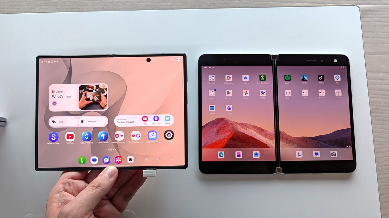
Both screens are similar, but the Galaxy Z Fold 8's is a tiny bit narrower and taller. (Image credit: Zac Bowden / Windows Central)
So, when Samsung unveiled the Galaxy Z Fold 8 last week, I was instantly intrigued based on its shape and size alone. It's the first westerly available short but wide smartphone since the Surface Duo, and although it's not dual-screen device with a 360-degree hinge, this is the closest thing to a Surface Duo 3 we're ever going to get.
Taking a look at their specs, it's immediately evident that both share similarities in their sizing. While the Galaxy Z Fold 8 is technically smaller, it's only smaller because the Surface Duo's bezels are so large. If you just compare screen sizes, they are very similar. The Surface Duo's display is 5.6-inches, and the Galaxy Z Fold 8 is 5.5 inches.
Both are similar in width when in folded position, which means typing on both feels identical when in use as a smartphone. It also means apps have more room to spread out, with text and images displaying more content across a single line. When opened up, the Surface Duo's dual-displays are overall bigger, but the Galaxy Z Fold 8's aspect ratio is preferred.
Spec
Microsoft Surface Duo
Samsung Galaxy Z Fold 8
Form Factor
Dual dual-screen displays joined by a 360° physical hinge
Flexible single inner screen with an external cover screen
Unfolded Dimensions
145.2 × 186.9 × 4.8 mm
123.9 × 161.4 × 4.5 mm
Folded Dimensions
145.2 × 93.3 × 9.9 mm
123.9 × 81.9 × 9.7 mm
Weight
250 g
201 g
Main / Inner Display
8.1" dual display (3:2 total ratio, 2700 × 1800) split by a physical hinge seam
Although I could see the similarities on paper, I had to get my hands on a Galaxy Z Fold 8 just to make sure. Luckily for me, I have a Samsung store nearby, so I popped in and checked it out. To say I didn't immediately fall in love would be lying. It felt like home. The short but wide aspect ratio, the almost creaseless folding screen on the inside, and thin bezels all around, it just all comes together so perfectly.
Side by side, it makes the Surface Duo look like a prototype with its thick bezels and gap between the screens. I've always said the Surface Duo is beautiful in its own special way, but I think the Galaxy Z Fold 8 finally dethrones it from a pure aesthetics perspective.
But I could immediately tell that the aspect ratio and size of the Galaxy Z Fold 8 was right. It feels just like a Surface Duo in both folded and unfolded postures, and typing on both doesn't give my thumbs the cramps after a few minutes. Apps feel like they have more room to breath across both, and the entire OS experience is just nicer when the screens are this wide.
The typing experience feels very roomy across both. (Image credit: Zac Bowden / Windows Central)
The one area that the Galaxy Z Fold 8 still fails to beat the Surface Duo on however is multitasking. Yes, the Galaxy Z Fold 8 can multitask and when set up by the user, it's very powerful. However, the Surface Duo was special because it made multitasking automatic.
You never think about multitasking on Surface Duo. It just happens. The device dynamically adjusts and places apps and popups on either screen where it makes the most sense. I never multitask on normal foldables, but I was running two apps side by side all the time on Surface Duo, because it was automatic.
The Galaxy Z Fold 8 still requires you to manually initiate multitasking, which means I rarely if ever do it. On the Surface Duo, if you tap a link in a group chat in one app, it'll open your browser on the other half so that you can still see the group chat in the app you were just using. Galaxy Z Fold 8 doesn't do that.
The Duo is only bigger because of its bezels. (Image credit: Zac Bowden / Windows Central)
It would be awesome if Samsung could add an option in OneUI that forces the OS to act more like Surface Duo, where multitasking is automated by the device. Unfortunately, that's not a thing at current, and so multitasking is still something I'm probably not going to do much of on the Galaxy Z Fold 8.
Outside of that minor disappointment, I think the Galaxy Z Fold 8 is a near perfect replacement for my Surface Duo needs. It has better cameras, and it's SO much lighter than the Duo. And although it doesn't support pen, I wasn't much a pen user on the Surface Duo either and so that's not a problem for me.
I will miss the novelty of a 360-degree hinge, and being able to close the Duo so that neither screen is visible was a really nice unique capability that the Galaxy Z Fold 8 obviously doesn't have. But we know at this point that Surface Duo 3 was going to pivot to a single-screen folding design like the one on the Galaxy Z Fold 8 anyway, which is why I think Microsoft was wrong to give up so soon.
With that said, I'm still very excited for the Fold 8, and I hope its the start of a long running trend of short but wide phones. Thank you Microsoft for showing the world that the short but wide aspect ratio works for smartphones. It may have taken a little longer for everyone else to catch on, but the good news is people are finally waking up.
Samsung
Galaxy Z Fold 8
The Samsung Galaxy Z Fold 8 is a spiritual successor to the Surface Duo, featuring a short but wide aspect ratio cover and foldable screen that makes typing and multitasking so much easier than your traditional smartphone slabs.
Join us on Reddit at r/WindowsCentral to share your insights and discuss our latest news, reviews, and more.
I've never really had much interest in "business" laptops, because most of the time they are boring as hell. Featuring plastic exteriors with subpar displays and creaky hinges, I've always said they actually bring down the overall reputation of the Windows laptop ecosystem. For years and years, business laptops were boring, but ASUS' new ExpertBook Ultra is the first business-class laptop I've used that has given me second thought. It's a beautiful machine, made
I've never really had much interest in "business" laptops, because most of the time they are boring as hell. Featuring plastic exteriors with subpar displays and creaky hinges, I've always said they actually bring down the overall reputation of the Windows laptop ecosystem.
For years and years, business laptops were boring, but ASUS' new ExpertBook Ultra is the first business-class laptop I've used that has given me second thought. It's a beautiful machine, made out of premium materials and with a thin and light design that you might find on a high-end consumer focused flagship laptop.
It's the first business laptop I've used that made me want to keep using it. I was excited to unbox and set up this machine, even though it's designed for office workers and business professionals. I can't say I've ever felt this way about Dell's or HP's business focused laptops.
I've been using the ASUS ExpertBook Ultra for the last month, and this is my full review.
Specs & Price
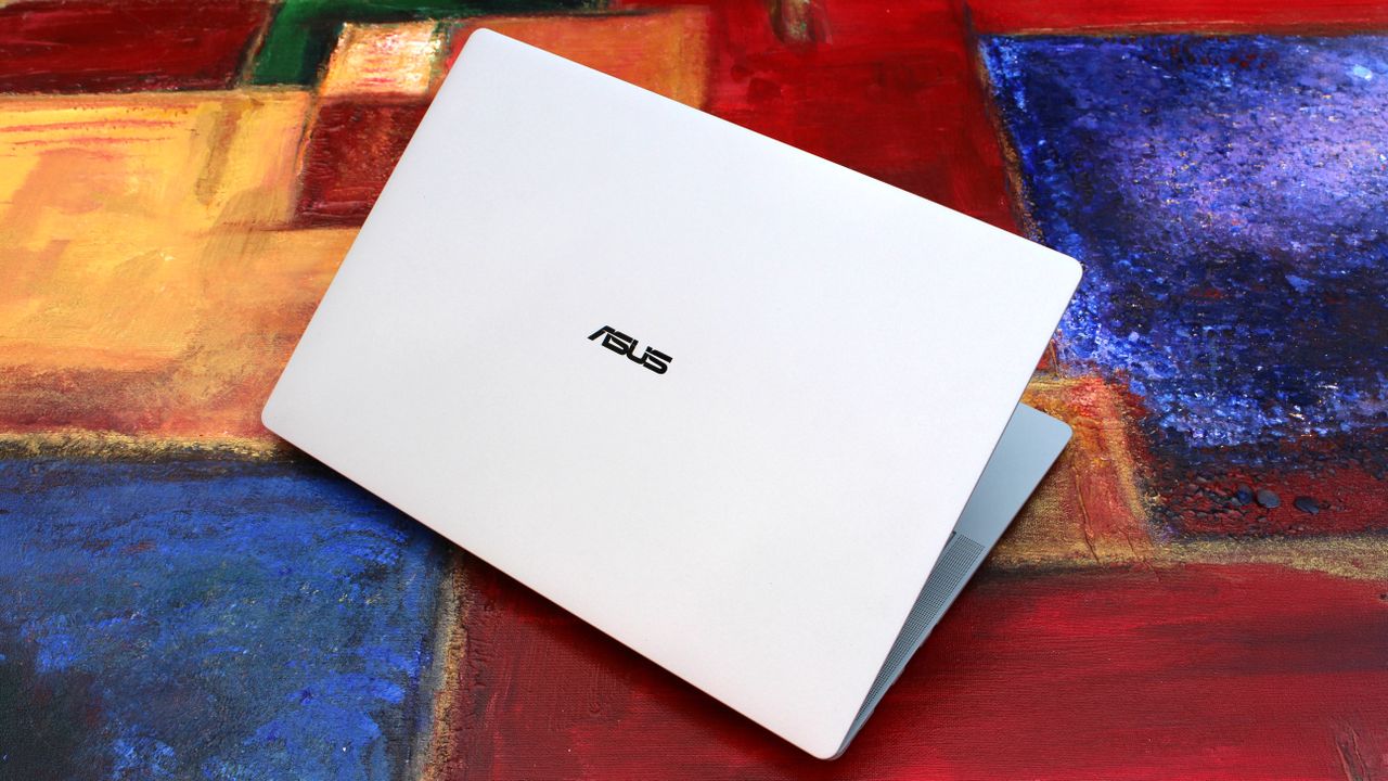
It looks great when closed (Image credit: Zac Bowden / Windows Central)
The ASUS ExpertBook Ultra is available now from ASUS for an eyewatering $3,599.99. This will net you the same spec reviewed here, with an Intel Core Ultra X7 358H, 32GB RAM, and an Intel B390 GPU. That also includes the Tandem OLED 3K display. Of course, that is ludicrously expensive, so my advice is to wait for sales or try your luck at a third-party retailers like Best Buy.
It's available in both black and light-gray colorways, and in this review we spent time with the light-gray model which I think looks best.
ASUS
ExpertBook Ultra (2026)
The HP OmniBook Ultra is a premium thin-and-light laptop engineered for elite performance, all day battery life, and immersive visual experiences.
Category
Specification
Dimensions & Weight
10.9 mm thin | 0.99 kg (2.18 lbs)
Chassis Build
Aviation-inspired Magnesium-Aluminum Alloy with Nano Ceramic Technology (9H Durability)
Processor
Up to Intel® Core™ Ultra X9 Series 3 (Intel vPro® support)
AI Performance (NPU)
50 TOPS NPU (Up to 180 total-platform TOPS)
Graphics
Up to Intel® Arc™ Pro Graphics
RAM
Up to 64 GB LPDDR5x
Display
14-inch 3K Tandem OLED Touchscreen
Display Features
Up to 1400 nits HDR peak brightness, 30–120 Hz variable refresh rate, 100% DCI-P3 / sRGB color gamut
Screen Glass & Coating
Corning® Gorilla® Glass Victus® with Gorilla® Matte Anti-Reflective Coating
Cooling System
ASUS ExpertCool Pro (Up to 50W TDP performance in Turbo mode; under 28 dB in Balanced mode)
Audio
6-speaker system (2 dual-magnetic woofers + 2 tweeters) with AI noise cancellation
Webcam & Biometrics
High-resolution camera with Windows Hello IR face recognition & Match-On-Chip fingerprint sensor in power button
Up to 26 hours battery life; Fast charging (50% in 30 minutes via USB PD 3.0)
I/O Ports
2 x Thunderbolt™ 4 Type-C (Power Delivery & DisplayPort) 1 x USB 3.2 Gen 2 Type-A 1 x HDMI 2.1 TMDS 1 x 3.5 mm Audio Combo Jack
Wireless Connectivity
WiFi 7 (802.11be) with Laser Direct Structuring (LDS) antenna
Security
ASUS ExpertGuardian (NIST SP 800-193 compliant), Discrete TPM 2.0, Microsoft Pluton, Secured-core PC
What I love
The display is best-in-class (Image credit: Zac Bowden / Windows Central)
Kicking things off, let's talk about design. In a word, I love the design of the ExpertBook. It's proof that business laptops need not be boring and corporate. The ExpertBook is anything but, featuring ultra-thin bezels and a unique finish on the chassis that ASUS calls Nano Ceramic Technology.
This Nano Ceramic feels amazing. It provides a distinct, silky matte texture to the whole device, which makes it easy to grip and does a fantastic job at hiding fingerprints and scratches. The device itself is also shockingly light and thin, coming in at just 0.99 kg and measuring a razor-thin 10.9 mm in profile. It's an almost impossibly light device, easily maneuverable with one hand and disappears when placed into any backpack, making it an excellent travel companion.
Simply put, the laptop strikes a great balance between executive minimalism and futuristic flair. That futuristic flair is best showcased when opening the laptop. Every time you open it, a lightbar that exists below the display will light up to let you know that the laptop is booting or waking up from sleep. ASUS calls this bar the "ExpertLumi" lighting system, and it provides an ambient glow whenever the device is booting or restarting.
The ExpertBook Logo hides lights underneath (Image credit: Zac Bowden / Windows Central)
You can turn off the ExpertLumi bar if you don't like it, but honestly, why would you. It's something unique about the device which I love, and it's not used often enough for it to be annoying. It's there when you boot up, or power off, and that's about it.
Above the ExpertLumi bar is the incredible 3K Tandem OLED 14-inch display. It's arguably the best thing about this laptop, offering great color contrast, colors that pop, and a high 120Hz refresh rate that makes scrolling and animations super smooth.
Attribute
Specification
Panel Type
3K Tandem OLED Touchscreen
Peak Brightness
1400 nits HDR
Refresh Rate
30 - 120 Hz Variable
Color Accuracy
100% DCI-P3 / 100% sRGB
Glass Protection
Corning Gorilla Glass Victus with Matte Finish
The display also features Corning Gorilla Glass Victus, complete with a matte finish that's designed to remove reflections and make the screen easy to see outdoors. It works wonders, with this laptop being one of the best when it comes to viewing it outdoors on a sunny day.
With that said, the matte finish does mean text and image clarity is slightly reduced. It's not the end of the world, and the display is still plenty sharp, but if you're used to high-resolution glossy displays like myself, the matte finish on this display will make text seem a little fuzzier around the edges.
The keyboard and trackpad are faultless (Image credit: Zac Bowden / Windows Central)
In regards to the keyboard and trackpad, I have no notes. Both are perfect and feel incredibly satisfying to use. The trackpad is a haptic one, which is tuned perfectly so that it feels natural to use. Its design is also quite unique, as the trackpad itself runs all the way to the very edge of the device.
That means the trackpad hangs over the edge of the device, which doubles as a convenient place to place your finger when prying the lid open. On that subject, the lid is openable with one-hand, for those who care about that sort of thing. The keyboard is excellent to type on, with a quiet yet tactile feel that makes typing easy.
Coming onto the ports selection, I'm happy. There's plenty of ports on this device, all of which are well spec'd. We have two Thunerbolt 4 Type-C ports, supporting up to 40Gbps of data, as well as one USB-A 3.2 Gen2 port 1x full-sized HDMI 2.1 port, and a 3.5mm audio jack. The only port I'd say it's missing that I wish it had is an ethernet jack, but I'm content without one.
The webcam, microphone, and speakers are also great, which you'd hope would be the case on a business-focused laptop. Image quality is crisp and clear in well lit environments, with the picture only getting a little noisy in low-light environments. Perfectly acceptable for video calls at work.
What's not good
I just looks so good (Image credit: Zac Bowden / Windows Central)
The ASUS ExpertBook Ultra is mostly great, which means I have very little to talk about that I'd class as "not good" about the ExpertBook. One issue that plagued my review unit it the laptop's hinge, which was very loose out of the box, so much so that the device wouldn't stay at a usable angle when typing.
This is a pretty big issue, but ASUS was quick to assure me that this was simply a pre-production issue and would not be the case on final units, which are now shipping. I can confirm that retail units that I have tested do not have this problem, though it's worth keeping an eye out just in case. If your laptop's hinge is super loose to the point where it won't stay upright when typing, make sure you get it exchanged.
The only other "issue" which isn't really an issue is the matte finish on the display. It really does come down to personal preference here, and I just prefer glossy screens over matte finishes. The matte finish on this display takes away from the color contrast you usually get on OLED displays, colors are a little more washed out and text and images are a little less sharp around the edges.
I wish ASUS offered the ExpertBook Ultra with multiple display configurations so I could choose one without the matte finish.
I think the real big problem with this laptop is its price. It's $3,599, which is an absurd price which, even when a laptop is this good, isn't worth it. The ongoing component shortage is the reason why pricing is this high, but as a result this is a super hard recommend to anyone that isn't buying these in bulk for a fleet of executives and managers.
Performance & Battery
Plenty of ports (Image credit: Zac Bowden / Windows Central)
Powering things under the hood, we have an Intel Core Ultra X7 358H paired with 32GB RAM and an Intel Arc B390 GPU. This is a very well equipped PC with plenty of power under the hood for day to day productivity tasks, multitasking, and even video and photo editing and rendering.
In fact the Intel B390 GPU in here is more than just your typical integrated graphics. It balances efficiency with power, resulting in an integrated graphics chip that is surprisingly capable at gaming when settings are lowered to 1080p medium. With that in mind, this is not a gaming laptop and should not be judged as one.
Although the device is super thin, the ExpertBook is still plenty capable. It keeps that Intel Core Ultra cool, allowing the CPU to boost up to 50W TDP in Turbo Mode without thermal throttling issues. In day-to-day productivity tasks involving handling dozens of browser tabs, streaming 4K video, compiling code, and running local AI tasks via its 50 TOPS NPU, the machine stays remarkably quiet (under 28 dB in Balanced mode) and snappy.
In regards to battery life, this laptop will last you all day on a single charge with no sweat for your usual day to day productivity task workflows. Obviously, that number will be less if you're doing high-intensity tasks, but for the most part you should be able to leave your charger at home for an office-based productivity workday.
Metric
Real-World Expectation
Battery Life (Light Usage)
Up to 18–20 hours
Battery Life (Heavy Workday)
12–14 hours comfortably
Fast Charging
0 to 50% in ~30 minutes via USB-C PD
Conclusion
It's the best business laptop yet. (Image credit: Zac Bowden / Windows Central)
You should buy this PC if...
✅ You want a lightweight flagship Windows laptop
✅ You need a PC with an anti-reflective screen and Tandem OLED
✅ You need lots of ports on your laptop
You should not buy this PC if...
❌ You prefer glossy displays
❌ You don't want to spend over $3,000 on a laptop
❌ You're a hardcore gamer who wants to game
Ultimately, the ASUS ExpertBook Ultra is an incredible laptop, but at $3,599, it's not something I can recommend most people go out and buy. It's just too expensive for what it is, even if it is an almost perfect thin and light laptop.
If we ignore that stupidly high price tag, I have very little to complain about here. The Nano Ceramic material that coats the chassis is unique and looks and feels amazing. Its lightweighted-ness is also otherworldly, and the Tandem OLED display is to die for, even with its matte finish which I'm not a huge fan of.
If you can find the ExpertBook Ultra on sale for less than $2,500, this gets a recommendation from me. Anything more than that, and I think you should probably look elsewhere as there are many other laptops that cost lest that do a great job at matching the ExpertBook Ultra in design and performance.
ASUS
ExpertBook Ultra (2026)
The HP OmniBook Ultra is a premium thin-and-light laptop engineered for elite performance, all day battery life, and immersive visual experiences.
Microsoft's once popular IRC client "Comic Chat" is being open sourced to celebrate its 30th anniversary. Those who frequented the world wide web in the 90's will likely remember Comic Chat for being a unique experiment into how IRC chatting could be, featuring graphical avatars that presented chats and chatrooms in comic strip form. Originally developed by Microsoft Researcher David Kurlander and released on August 13, 1996, Comic Chat began life as a research p
Microsoft's once popular IRC client "Comic Chat" is being open sourced to celebrate its 30th anniversary. Those who frequented the world wide web in the 90's will likely remember Comic Chat for being a unique experiment into how IRC chatting could be, featuring graphical avatars that presented chats and chatrooms in comic strip form.
Originally developed by Microsoft Researcher David Kurlander and released on August 13, 1996, Comic Chat began life as a research project before morphing into Microsoft Chat and becoming the default chat client for MSN.
"Today, we’re excited to announce the open-source release of Microsoft Comic Chat, the chat client that automatically turned conversations within Internet Relay Chat (IRC) into comic panels featuring illustrated characters, speech bubbles, and expressions, and helped introduce the world to a little font called Comic Sans," Microsoft's Scott Hanselman announced in a blog post today.
Comic Chat running on Windows 11. (Image credit: Microsoft)
"For many people, Comic Chat is a nostalgic artifact from the early days of the internet as we transitioned from technologies like telnet, Usenet, and IRC to the largely visual web that we enjoy today. For others, it’s a legendary piece of Microsoft history they have only heard about in stories, screenshots, and debates about typography. Now, developers, historians, retro computing enthusiasts, and anyone who appreciates a wonderfully unconventional idea can explore the source code for themselves."
Although from the 90s, Comic Chat is still functional as an IRC client today, though most people likely don't use it anymore. Still, with the app now being open source, perhaps developers and tinkerers will be more open to breathing life back into the 30 year old app.
The Comic Chat source code is now public on GitHub for anyone who wants to take a look and compile their own version.
Join us on Reddit at r/WindowsCentral to share your insights and discuss our latest news, reviews, and more.
Microsoft has confirmed that it has blocked the availability of the recent Windows 11 July Patch Tuesday update (KB5101650) on Dell PCs, after Dell reported a number of issues including unexpected shutdowns, overheating, poor performance, and more caused by the preview update that released before it.The KB5101650 began rolling out on July 14, and includes a number of quality of life improvements and fixes. For most users, this update is issue free, but Dell PCs w
Microsoft has confirmed that it has blocked the availability of the recent Windows 11 July Patch Tuesday update (KB5101650) on Dell PCs, after Dell reported a number of issues including unexpected shutdowns, overheating, poor performance, and more caused by the preview update that released before it.
The KB5101650 began rolling out on July 14, and includes a number of quality of life improvements and fixes. For most users, this update is issue free, but Dell PCs will find that the update is not available for them currently.
"A limited number of Dell devices might display a yellow exclamation point in Device Manager next to the Intel Innovation Platform Framework Processor Participant driver. These devices can potentially experience unexpected shutdowns, poor performance, increased heat, and battery drain."
This issue applies to both the KB5101650 update that rolled out on July 14, and the optional preview update KB5095093 that rolled out on June 23, on either Windows 11 version 24H2 or 25H2. Dell PCs running either of these updates and experiencing issues should roll back.
The bug in question appears to be caused by the new Windows USB-C Connection Manager interface, with the Intel Innovation Platform Framework Processor Participant driver no longer functioning as intended. "This issue was reported by Dell during testing and identified as an incompatibility between the Intel driver and the new Windows USB-C Connection Manager interface."
Microsoft says that it's working on a fix, and will release a resolution for the PCs that are impacted by this issue soon. The good news is that it appears Microsoft was aware of the problem right away, as the July 14 update was blocked on Dell PCs right out of the gate.
Unfortunately, there was no immediate block on the optional update that released on June 23, meaning some devices may have installed the update that is causing problems. The best course of action in that situation is to simply roll-back to the previous update.
This week, Microsoft unveiled a major overhaul coming soon to Windows 11's search experience that's designed to fix its biggest flaws and criticisms. For a long time, many have agreed that search on Windows is pretty much broken, but the new changes that are now in testing may finally be fixing that problem. I've been testing the new Windows Search out over the last two days, and I'm very impressed with the new experience. Right off the bat, the search pane is no
This week, Microsoft unveiled a major overhaul coming soon to Windows 11's search experience that's designed to fix its biggest flaws and criticisms. For a long time, many have agreed that search on Windows is pretty much broken, but the new changes that are now in testing may finally be fixing that problem.
I've been testing the new Windows Search out over the last two days, and I'm very impressed with the new experience. Right off the bat, the search pane is no longer a noisy mess of Bing ads and sponsored content. It's a clean list of recent searches, exactly what you'd expect from a search pane.
Search items that appear in this list are categorized so that you know whether an item is an app, document, setting, or web search. Hovering over items in this menu will display options depending on the type of item it is, such as apps which present the option to pin it to the Taskbar or run as an administrator.
Quick options appear when you hover over recent search items. (Image credit: Zac Bowden / Windows Central)
You can also right-click on any of the items in the search pane for more info, which displays additional options such as uninstall or app settings, open file location, as well as the ability to remove the item from the recents list.
Getting onto the actual searching experience, it's a major step up. The UI is nice and clean, and web results now pretty much never show up at the top unless you are actively searching for a website or query that makes sense for a search engine. In the old Window Search, searing for "windows central" would always bring the Bing result to the top, but now it prioritizes my local files and folders.
When a web result does appear at the top, you'll no longer see any ads or sponsored content in that result. The Bing results are now ad-free, showing only results that relate to your search query, which is amazing. You no longer have to worry about accidentally clicking on a link or app that has paid to be there.
Web results are now more deliberate and ad-free.Zac Bowden / Windows CentralPreviously, searching "windows central" would show a web result. Now, it shows my local files that relate to that term. Zac Bowden / Windows Central
I also find that search results are now more accurate based on how you use your system. For example, on a PC where I have both the Photos and Photoshop app installed, typing "photos" actually surfaces Photoshop, which is what I want. I believe this is happening because I've never opened the Photos app on my PC before, and so Windows assumes that I'd want to use the app I use more often or most recently.
To test this theory, I ran Photos a few times and then typed "photos" again, and sure enough the Photos app was now appearing above Photoshop. To triple confirm, I started opening Photoshop a few times, and Photoshop became the top result for "photos" after.
This is great for those who have a system set in place where all the apps they ever use are already in full circulation on their PC. Windows knows which apps you use most, and will now do its best to position them as a best match when it thinks you're searching for it, listing follow up results below it that you can manually select if that's what you need instead.
Windows will surface a best match based on how you use your PC. As I frequently use Photoshop, searching for "photos" places it at the top. (Image credit: Zac Bowden / Windows Central)
I also find that search is now a little smarter and more dynamic. If you don't know the name of an app, you can search for a category and Windows will do its best to surface an app that it thinks can do that job. For example, if I type "video editor" into the search box, Windows surfaces Clipchamp as a result, as that's the only video editor I have installed.
Windows Search now also does a much better job at surfacing settings that you might want to configure. If I type "temp" it'll show delete temporary files, or if i type "wifi" the wi-fi settings page is at the top. Even things like "insider" now correctly surface the Insider settings page. You can now pretty much search for any Windows Setting and have it accurately appear in the search pane, without needing to open Settings first.
Some settings even have configurable options within the search pane. For example, typing restart PC will show a setting to do so right from search, which then lets you select whether you want to restart or shut down. It's pretty neat, though most people will probably find it faster to just do that from Start.
Settings are now better represtedn in search (Image credit: Zac Bowden / Windows Central)
Overall, these new search improvements are a real strong step in the right direction. In my brief testing, I've not really been able to fault it, and understand why the best match results are what they are. Being able to turn off things like Microsoft Store and web results are also a great addition, letting you craft your experience into whatever you need it to be. If you only ever want local search results, you can make it so.
It's clear that even in its default state now, local results are the number one priority. Unless your search query is clearly one intended for a search engine, Windows will more than likely place a local result as a best match, which is going to address the biggest complaint most people have with Windows Search.
These improvements are rolling out now in preview for Windows Insiders, with general availability expected later this year.
Join us on Reddit at r/WindowsCentral to share your insights and discuss our latest news, reviews, and more.
The tech world is sweating, and it’s not just the summer heatwave. This week on the Windows Central Podcast, Daniel Rubino, Zac Bowden, and Jez Cordon sit down to unpack a massive wave of Microsoft layoffs. We break down Asha Sharma’s internal memo revealing a staggering 14 layers of middle management at Xbox, why the gaming division has struggled to capitalize on massive acquisitions like Fallout and Minecraft, and whether turning Xbox into an independent subsid
The tech world is sweating, and it’s not just the summer heatwave. This week on the Windows Central Podcast, Daniel Rubino, Zac Bowden, and Jez Cordon sit down to unpack a massive wave of Microsoft layoffs. We break down Asha Sharma’s internal memo revealing a staggering 14 layers of middle management at Xbox, why the gaming division has struggled to capitalize on massive acquisitions like Fallout and Minecraft, and whether turning Xbox into an independent subsidiary is the brand's last chance for survival.
Zac walks us through the shocking Discord leak of "Project Ion," an experimental, web-native Copilot Operating System built entirely inside Microsoft Edge. Finally, we break down the quiet arrival of Snapdragon X2-powered Surface devices, the new 24 GB RAM "sweet spot," and why sources tell us the Surface Go lineup is officially dead.
Microsoft and Xbox Layoffs: An in-depth look at the 4,800 job cuts, why the brunt is hitting Xbox, and a critique of management's failure to capitalize on massive IPs like Fallout and Minecraft.
Leaked "Project Aion" (Copilot OS): Zac reveals an internal 2024 incubation project that leaked on Discord—an experimental, platform-agnostic, web-native operating system built entirely inside Microsoft Edge where Copilot replaces the traditional Start menu.
The Tech Industry's AI Bubble: A philosophical debate on consumer pushback against AI, the staggering cloud costs of large language models, and the lack of quantifiable productivity gains for regular users.
Snapdragon X2 Surface Refresh: Details on the consumer launch of the Surface Laptop 8 and Surface Pro 12, the introduction of a 24 GB RAM middle-tier "sweet spot," and lower-cost 8 GB configurations engineered to beat the RAM crisis.
The Death of the Surface Go Lineup: Breaking down exclusive source info confirming that the 10-inch Surface Go and the Surface Laptop Go lines have been canceled, leaving a major gap for enterprise and ultra-portable tablet fans.
Have a question you want us to answer on the podcast? Send it to us at [email protected]
It looks like Microsoft is planning to make a small but interesting (ok, maybe not that interesting) change to Windows 11 in the coming weeks, one that has us scratching our heads a bit. The company has revealed (albeit accidentally) that it's making the search box that appears on the Taskbar and in the Start menu a little taller, by 4 whole pixels.4 pixels doesn't sound like much of a change, but it is a noticeable difference, if you can believe it. The change m
It looks like Microsoft is planning to make a small but interesting (ok, maybe not that interesting) change to Windows 11 in the coming weeks, one that has us scratching our heads a bit. The company has revealed (albeit accidentally) that it's making the search box that appears on the Taskbar and in the Start menu a little taller, by 4 whole pixels.
4 pixels doesn't sound like much of a change, but it is a noticeable difference, if you can believe it. The change makes the search box appear chunkier, taking up more visible space above and below it, and bringing it closer to the top edge of the Taskbar itself and slightly pushing content down in Start.
Here's a before and after of the Start menu and Taskbar, in gif format so that it loops making the difference very easy to identify:
Notice how things shift slightly when the thicker search box is enabled. (Image credit: Zac Bowden / Windows Central)
Microsoft hasn't explained why it's making this change, but if I had to guess, I'd say the change is being made to align it with the Ask Copilot search box appearance, which differs from the existing Windows Search search box.
Ask Copilot is an alternative search experience coming soon to the Taskbar on Windows 11 that incorporates Copilot chat directly into the user interface. It's currently aimed at commercial customers, and includes a thicker but narrower search box that appears on the Taskbar when enabled.
Ask Copilot is a separate UI to the standard Windows Search experience, and needs to be manually enabled before you can use it. That's why I think Microsoft is making the default search box 4 pixels taller, as the company likes the look of Ask Copilot and would like that appearance to apply to the default search box too.
Here's a closer look at the search box on the Taskbar comparing the new height to the old height. See, it is a noticeable difference! Investigative journalism at its finest on display here.
Top: The new taller search box. Bottom: The current search box. (Image credit: Zac Bowden / Windows Central)
Either way, you can likely expect to see the search box in the Start menu and on the Taskbar get slightly bigger in the coming months, as Microsoft begins rolling out the change to Insiders before making it generally available to all. The change was unveiled in a changelog for a recent Windows 11 preview build, but a Microsoft engineer has since confirmed to me that the change isn't yet being previewed.

 Connexion