
Vue normale

  • ✇Yanko Design
  • Tomas Kral Made a Ruler You Can’t Quite Read on Purpose
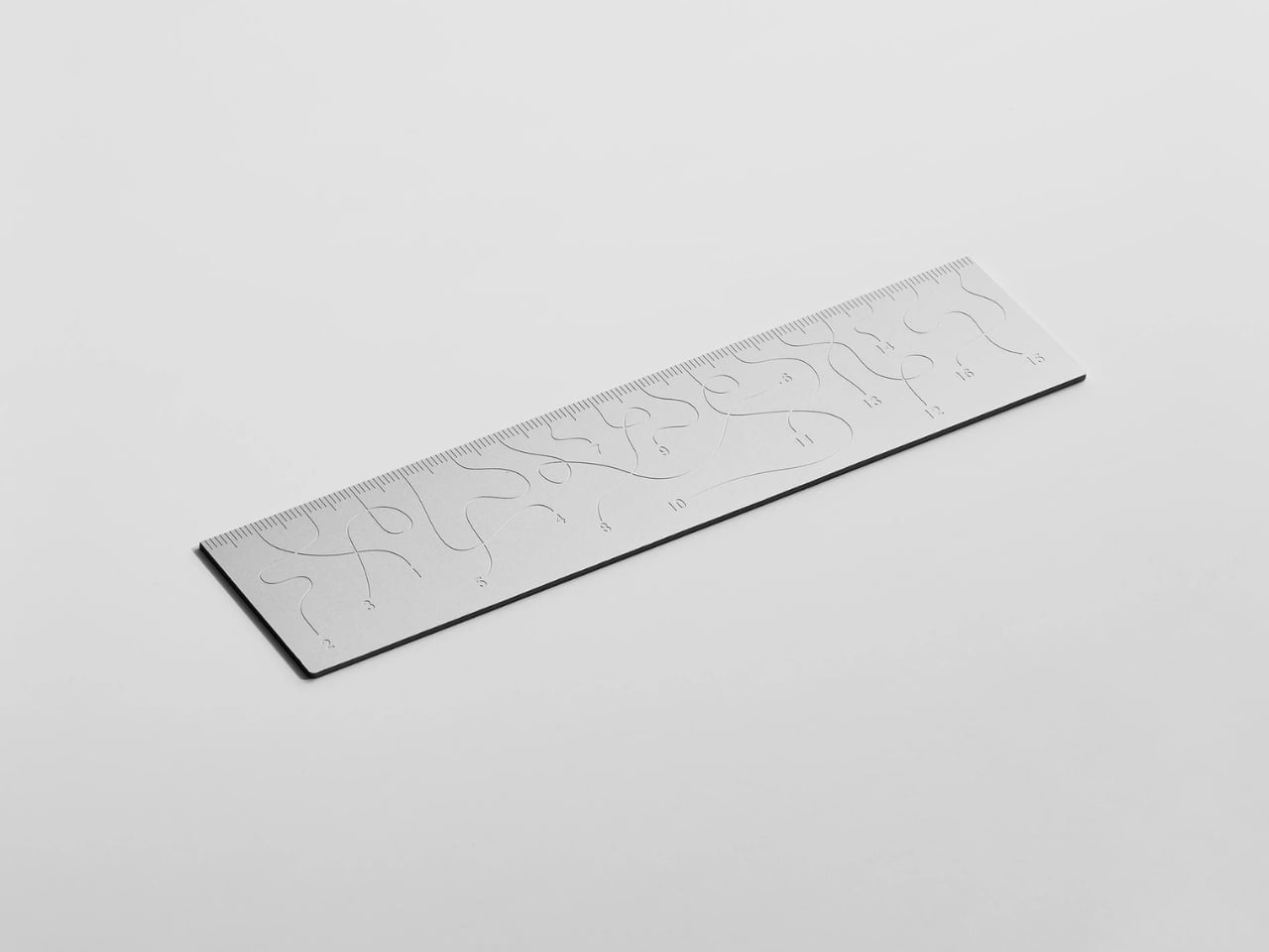
    Pick up the WAY ruler and the first thing you notice is that it feels exactly right. It’s small, made from anodized aluminum, and has the kind of weight and finish that signals intention without announcing itself. It’s the sort of object that sits comfortably in a shirt pocket or on the edge of a desk and looks like it belongs in both places. Then you look closer at the markings, and something shifts. The inscriptions on the WAY don’t run in a clean, predictable line the way ruler markings are
     

Tomas Kral Made a Ruler You Can’t Quite Read on Purpose

26 mars 2026 à 09:20

Pick up the WAY ruler and the first thing you notice is that it feels exactly right. It’s small, made from anodized aluminum, and has the kind of weight and finish that signals intention without announcing itself. It’s the sort of object that sits comfortably in a shirt pocket or on the edge of a desk and looks like it belongs in both places. Then you look closer at the markings, and something shifts.

The inscriptions on the WAY don’t run in a clean, predictable line the way ruler markings are supposed to. They wind. They curve and drift across the surface of the aluminum like a path traced through a landscape, referencing, quite literally, the idea of small winding roads and the wandering nature of travel and discovery. The numbers and measurements are there, engraved directly into the material with digital precision, but they’re arranged in a way that asks you to slow down and actually read them rather than glance and move on. It’s legible. Just not immediately.

Designer: Tomas Kral

The engraving itself is worth paying attention to. Kral chose to cut the inscriptions directly into the anodized aluminum rather than printing or applying them as a secondary layer. That decision gives the markings a permanence and a tactility that you don’t get with most production objects at this scale. You can feel the grooves if you run a finger across the surface. The graphic quality of the lettering is considered without being decorative for its own sake. It reads as design that knows exactly what it’s doing, which is what makes the playfulness land rather than feel arbitrary.

The object is small enough to be considered an accessory as much as a tool. Kral has always worked at a scale that pays attention to how things actually live in your hands and in your space, and the WAY is consistent with that. It doesn’t try to be a statement piece in the way that some design objects do, where the visual drama is the whole point. The WAY is quieter than that. The drama is embedded in the detail, in that moment when you realize the markings are doing something unexpected and you have to orient yourself before you can use it.

That slight disorientation is the concept, and it’s a sharp one. There’s a real tension running through modern product design right now, one where the drive to make something visually striking starts to work against the thing it was actually built to do. We’ve all used something that looked incredible but made us work harder than we needed to. Packaging that’s beautiful but impossible to open. Interfaces that prioritize visual elegance over intuitive use. Apps designed to delight that end up frustrating. The WAY ruler doesn’t rail against any of that. It just holds up a small, well-made mirror to it. It’s more of a wink than a manifesto.

The difference between a provocation and a critique matters here. Kral isn’t punishing you for picking up the WAY. The experience of using it is still pleasant. The aluminum feels considered, the engraving is precise, and the object as a whole is genuinely lovely. He’s not making something bad on purpose to prove a point. He’s making something that’s slightly impractical in a very deliberate, very elegant way, and letting you sit with that paradox.

And he followed through on it. The WAY isn’t a prototype or a one-off shown at a design fair and then retired to a shelf. Kral produced a batch and sells them directly through his studio’s website. That matters. It means the object gets to exist in the world the way all good design should, in someone’s hand, on someone’s desk, doing its quiet, considered, slightly inconvenient thing in real life.

At a time when so much product design either chases pure utility or drifts so far toward aesthetics that it forgets what it was originally supposed to do, the WAY ruler manages to be a little bit about both. It’s funny, it’s beautiful, and it makes you think. A ruler, of all things. Leave it to Tomas Kral.

The post Tomas Kral Made a Ruler You Can’t Quite Read on Purpose first appeared on Yanko Design.
  • ✇Yanko Design
  • Pencil Shavings Have Never Looked This Beautiful
    Most desk objects get ignored. They sit there doing their one job, collecting dust around the edges, and we never really think about them again. NEST, a conceptual pencil sharpener designed by a team of five students from TUST, UNNC, and CAU, is a direct challenge to that dynamic. It recently took home the winner prize at the 2025 European Product Design Award in the Conceptual Work & Office Product Design category, and the reason it won feels obvious the moment you understand what it actua
     

Pencil Shavings Have Never Looked This Beautiful

21 mars 2026 à 18:30

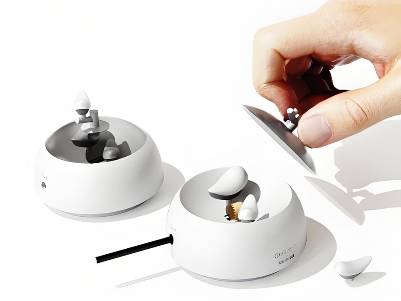
Most desk objects get ignored. They sit there doing their one job, collecting dust around the edges, and we never really think about them again. NEST, a conceptual pencil sharpener designed by a team of five students from TUST, UNNC, and CAU, is a direct challenge to that dynamic. It recently took home the winner prize at the 2025 European Product Design Award in the Conceptual Work & Office Product Design category, and the reason it won feels obvious the moment you understand what it actually does.

The concept is deceptively simple. A small bird figurine sits inside a rounded, bowl-shaped container. As you sharpen your pencil, the curling wood shavings collect beneath the bird, gradually building up like the gathered material of a real nest. By the time the container needs emptying, the little bird looks as if it has been nesting all along, settled into a soft, spiraling bed of wood ribbons. It is a beautifully accidental image that the design deliberately engineers into being, and once you picture it, it is very hard to unsee.

Designers: Zebin Qiao, Kaishuo Liu, Hongchen Guo, Zicheng Zhao, XiaoTongPan

The real strength of NEST is the intelligence of its metaphor. Lead designer Zebin Qiao and the team didn’t just borrow a visual from nature and paste it onto a product. They found a genuine structural parallel between the act of using the sharpener and the act of nest-building, then made sure the user experiences that parallel in real time. That is not an easy thing to pull off. Most product design that reaches for nature ends up with surface decoration or an illustrative graphic on a box. NEST earns its metaphor because the metaphor lives in the function, not on top of it.

The second layer of the design is the lid. It doubles as a perch, fitted with a minimal branch element. When you are not sharpening, the tiny bird figurine can be lifted out of the interior and placed on the branch, transforming the whole object into a quiet desktop ornament. This dual-state approach means the product shifts personality depending on how you use it. It is a working tool when you need it, and a miniature sculpture the rest of the time. I genuinely appreciate designs that respect both modes of being at a desk, the productive and the contemplative.

I will admit my first instinct when I encounter “award-winning conceptual product” is mild skepticism. Conceptual work can drift toward spectacle and lose interest in whether the thing would actually function. NEST sidesteps that problem by grounding every design choice in real, physical behavior. The shavings accumulate because that is what shavings do. The bird sits because the container holds it. Nothing is forced or artificially staged. The charm is a byproduct of the function, which is exactly the right way around. It gives the design an integrity that a lot of more expensive, more elaborate objects simply do not have.

The color variants are worth noting too. The design comes in white, a warm terracotta tone, and a soft powder blue, each with a matching bird. It is a small decision that makes the object feel personal rather than clinical, and it opens the door to something close to a collecting impulse. You are not just buying a sharpener. You are picking a companion for your desk, which is a particular kind of intimacy that few office products ever manage to create.

At its core, NEST is making an argument that utility does not have to be neutral. That the objects we interact with daily can carry meaning, invite attention, and reward a small amount of patience. A student design team from three Chinese universities made that argument with a pencil sharpener, and they made it convincingly enough to win a major European award. That is not nothing. If anything, it is the kind of design thinking we need more of, the sort that finds poetry in the ordinary without making you feel like you are trying too hard to appreciate it.

The post Pencil Shavings Have Never Looked This Beautiful first appeared on Yanko Design.

❌