Vue normale

Il y a de nouveaux articles disponibles, cliquez pour rafraîchir la page.
À partir d’avant-hierTechs Design

The Echo Chair Makes 3D Printing Feel Refined

Par : Tanvi Joshi
4 août 2026 à 22:30

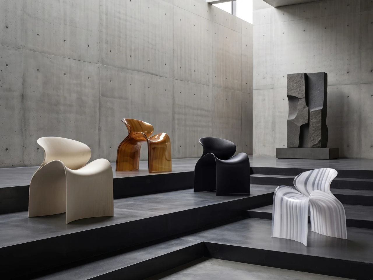
ZHA has collaborated with Spanish design brand Nagami to create the Echo Chair, a 3D-printed seat made from recycled plastic waste. Formerly known as Zaha Hadid Architects, the studio developed the chair through parametric design and large-scale additive manufacturing. Its form is fluid and sculptural, with an arched backrest that extends towards the floor and a seat that curves upwards at the sides.

The two parts look separate at first, but they are printed as one continuous piece. Both surfaces grow from the same structural edge and share the same underlying geometry. One becomes the seat, while the other rises to form the backrest and support.

Designer: ZHA and Nagami

This continuous construction gives the chair a clear sense of logic. The shape is doing several jobs at once: supporting the body, holding the structure together, and defining the overall visual character.

The Echo Chair was developed through an iterative research process at ZHA Lab and manufactured by Nagami, a brand known for its work in large-format 3D printing. The studios used recycled PETG sourced from industrial waste, including single-use medical plastics.

As the chair is printed layer by layer, the process leaves a ribbed texture across its surface. Those lines have been kept visible rather than hidden or polished away. That decision gives the chair much of its character. The texture follows the curves closely and makes the manufacturing process easy to read. It also gives the recycled plastic a more tactile, less generic appearance.

There is something useful in that honesty. The material is not being forced to look like timber, stone or metal. It keeps the visual qualities created by the printing process and uses them as part of the design. The surface does still reference natural materials in a subtle way. Its layered finish recalls mineral formations and carved stone, which helps the chair feel less industrial when placed in an interior.

ZHA and Nagami developed four colourways for the chair: white, black, a white-to-translucent gradient and a caramel tone made using a bio-based cork composite. The colour choices help shift the mood of the design. White makes the form feel lighter and more architectural, while black gives it a stronger, more graphic presence. The translucent version draws attention to the printing layers, and the caramel finish adds warmth to what could otherwise feel like a very technical object.

The caramel version is especially successful because it softens the synthetic quality of the plastic. It feels easier to imagine in a home, hotel lobby or lounge space, rather than only in a gallery or design exhibition. According to ZHA project design director Sebastian Andia, the goal was to turn an abundant and overlooked material into something people would genuinely want to live with. That idea matters because recycled material alone is rarely enough to make a product successful. People still need to like the object, find it comfortable and see a place for it in their environment.

The Echo Chair handles this well. Its sustainable story supports the design, rather than becoming the whole design. The seat’s raised sides create a more enclosed sitting position, while the curved backrest gives the chair a supportive and almost cocooned feel. The shape is expressive, but it still looks usable. Its scale and neutral colour options also make it easier to place than the form might suggest. It has enough presence to work as a statement piece, yet it does not depend on bright colour or decoration to stand out.

The 3D-printing process allows the chair to be produced without visible joints or separate components. This gives it a seamless appearance and keeps the connection between the digital model and final object very direct.

That connection is one of the strongest parts of the project. The manufacturing process does not sit behind the design. It shapes the design. The ribs, curves and continuous structure all come from the same production method. Each part of the chair feels related because it has been developed through the same system.

The Echo Chair continues ZHA and Nagami’s existing collaboration. Nagami launched its first collection of 3D-printed chairs in 2018, which included two designs by the architecture studio. Their latest project shows how much more refined large-scale 3D printing has become. The chair feels less like a technical experiment and more like a finished product with a clear place in contemporary interiors.

The Echo Chair is currently on display as part of London Creates at The Truman Brewery. What makes the chair interesting is the way it brings together material, form and manufacturing without overcomplicating the idea. Recycled plastic is treated as a starting point for the design, rather than something that needs to be disguised.

The post The Echo Chair Makes 3D Printing Feel Refined first appeared on Yanko Design.
This Glowing Jello Table Lamp Balances Softness and Structure

Par : Tanvi Joshi
2 août 2026 à 22:30

There is something inherently temporary about jello. It trembles, folds, and gives way under the slightest pressure. Balloon sculptures behave much the same way, holding their shape only until the air begins to escape. MAJU’s Jello Lamp takes these fleeting forms and gives them permanence.

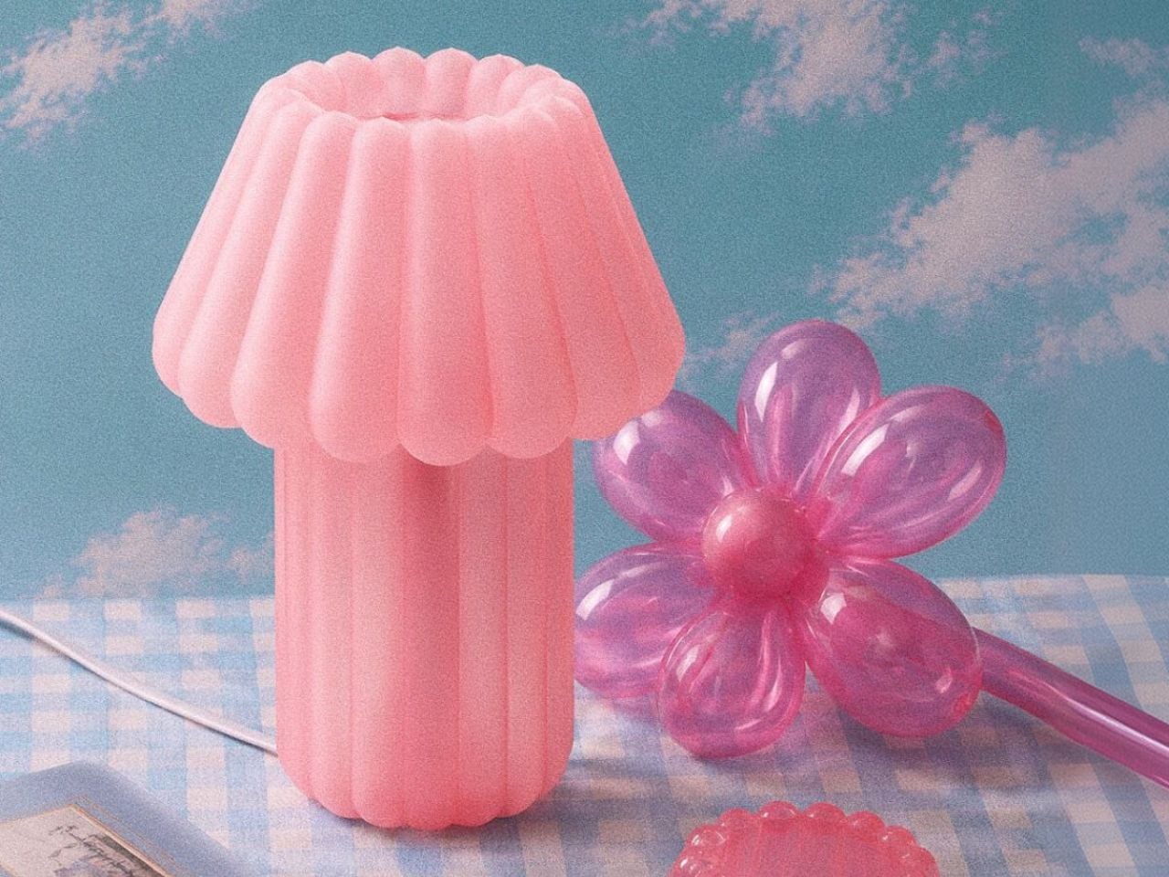
Designed by Hyu Lim, the sculptural table light translates the soft wobble of gelatin desserts and the inflated curves of balloon animals into a 3D-printed object. The result is playful without becoming novelty-driven, balancing generous proportions and rounded edges with the visual precision of digital fabrication. The lamp’s form is built around repetition. A fluted shade expands outward in soft, scalloped volumes, while the base continues the same inflated geometry below. Together, the two elements create a silhouette that appears almost compressible, despite being printed as a rigid, continuous body.

Designer: MAJU

That tension gives the lamp much of its character. Its shape suggests movement, softness and instability, while its construction fixes those qualities in place. MAJU uses one of the most controlled contemporary production methods to capture something loose and unpredictable. When illuminated, the object begins to soften again. Light passes through the translucent shade, diffusing into a warm 2700K glow that gathers along the ridged surface. The flutes become less defined, and the lamp takes on a fluid, almost edible quality.

It is here that the Jello Lamp moves beyond a visual reference. Rather than simply resembling a moulded dessert, it recreates its translucency and sense of suspended volume. The light source becomes part of the form, turning the lamp into an illuminated sculpture rather than a fixture with a decorative shade. Each piece is 3D printed to order in MAJU’s workshops in California and Singapore using plant-based, biodegradable PLA. The process allows the studio to produce the lamp’s curved geometry without conventional moulds, while also reducing excess inventory and material waste.

The visible texture of additive manufacturing is not concealed. Fine printed ridges run across the surface, catching light and revealing how the object was made. Instead of disrupting its softness, they add another layer of detail, sitting somewhere between the grooves of a dessert mould and the traces of a machine-built object.

The lamp is also designed as a modular system. Its shade and base can be replaced or upgraded independently, extending the life of the object rather than treating it as a sealed product. An integrated cord organiser is built into the base, keeping the cable from interrupting the lamp’s compact silhouette. Measuring 9.5 × 9.5 × 12.25 inches and weighing approximately half a pound, the Jello Lamp is light enough to move easily through domestic spaces. Its 2.9W bulb is intended to produce ambient illumination, positioning it as a quiet atmospheric object rather than a primary source of light.

Shown in Cottage Core Pink, the design leans into its confectionery associations. The colour, rounded profile and luminous surface recall something sweet and familiar, while the printed construction keeps the object rooted in contemporary production.

The Jello Lamp forms part of MAJU’s broader collection of plant-based home objects, shaped by the studio’s position between Singapore and California and by a combination of Eastern and Western design influences. Its most compelling quality, however, lies in a simpler contradiction. The lamp gives durability to forms that are usually defined by their impermanence. A balloon loses air. Jello collapses. Here, their softness is held in place, glowing quietly on a table.

The post This Glowing Jello Table Lamp Balances Softness and Structure first appeared on Yanko Design.

BIG Wraps Dymak’s Headquarters in Solar-Powered Timber

Par : Tanvi Joshi
2 août 2026 à 19:15

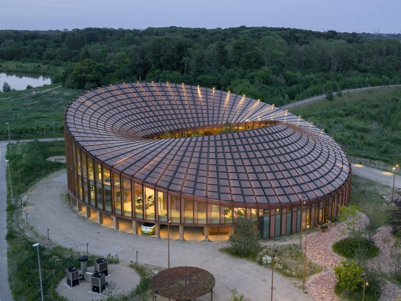
BIG’s new headquarters for Danish material supplier Dymak turns environmental performance into architecture. Rather than treating sustainability as a technical layer hidden within the building, the studio makes it central to the project’s form, materiality and identity.

Located beside Glisholm Lake in Odense, Denmark, the 2,800-square-metre headquarters is organised as a circular mass-timber structure around an open-air courtyard. Above it, an undulating roof rises and falls across the building, creating a form that recalls a Möbius strip. The result is sculptural and highly recognisable, but it is also shaped by practical concerns.

Designer: BIG

The roof rises towards the north to open views of the lake and surrounding forest, while sloping towards the south to provide shade and reduce solar heat gain. Its surface is covered with 880 custom-shaped photovoltaic panels, turning the roof into both an energy-producing system and the building’s main visual feature.

This combination of performance and spectacle is characteristic of BIG. The studio often transforms practical constraints into clear architectural gestures, and the Dymak headquarters follows the same approach. Solar orientation, shading and landscape views are not treated as separate problems. Instead, they are brought together within one continuous form.

The project also functions as a full-scale showcase for Dymak’s material portfolio. Mass timber forms the primary structure, while clay, cork, eelgrass and recycled paper fibres are used throughout the building. These materials are not displayed as isolated samples. They appear across the floors, ceilings, walls and structural elements, allowing visitors to experience them through texture, sound and scale.

BIG describes the building as a “living catalogue”, and the phrase captures its dual role. It is both a workplace and a demonstration of what Dymak’s materials can achieve. The architecture becomes part of the company’s identity, communicating ideas of craftsmanship, sustainability and material innovation.

This gives the headquarters a warmer atmosphere than the polished glass-and-steel language commonly associated with corporate buildings. Timber remains visible, brick-tiled flooring extends across interior and exterior spaces, and natural fibres soften the ceilings. The materials create a sense of tactility that reinforces the company’s focus while making the workplace feel less formal.

At the same time, the building clearly operates as a branding tool. Its solar roof, natural finishes and landscaped spaces present Dymak as environmentally responsible and forward-looking. Sustainability is not simply part of the building’s performance; it becomes part of the company’s public image.

At the centre of the circular plan is a landscaped courtyard conceived as a green amphitheatre. Planted terraces and stepped seating create space for informal meetings, gatherings and moments of rest. The courtyard is surrounded by glazing, allowing daylight and vegetation to remain visible from the surrounding interiors.

Unlike the dramatic roof, the courtyard does not rely on a strong visual metaphor. Its value is more direct. It creates a protected outdoor space, brings nature into the workplace and offers an alternative to desks and enclosed meeting rooms. Brick flooring continues across the threshold, reducing the distinction between inside and outside and making the garden feel like an extension of the office.

The ground floor contains a showroom, photo studio and fitness facilities, while the upper level includes open-plan workspaces, meeting rooms and lounge areas. A mezzanine connects the two floors, and the circular layout creates a continuous route around the courtyard.

The headquarters succeeds most when its sustainable ideas are experienced rather than simply announced. The warmth of timber, the shaded interiors, the continuity of the brick flooring and the presence of landscape all influence how the building feels in everyday use.

Still, the roof is likely to dominate how the project is remembered. Its Möbius-strip form is visually striking and easy to communicate, but it risks overshadowing the building’s quieter achievements. The use of low-carbon and bio-based materials, the creation of shared social spaces and the careful relationship with the surrounding landscape may ultimately be more significant than the headline image.

The project is not a universal model for office design. Its custom roof, circular plan and carefully selected materials make it highly specific to Dymak. Yet this specificity is also what makes it persuasive. By presenting timber, clay, eelgrass and recycled fibres within a polished corporate environment, the headquarters shows that low-carbon materials can support both technical performance and architectural ambition.

BIG’s Dymak headquarters does not attempt to disappear into the Danish landscape. It performs, advertises and turns sustainability into a statement. Its strength lies in showing that environmental responsibility can shape not only how a building performs, but also how it looks, feels and represents the organisation within it.

The post BIG Wraps Dymak’s Headquarters in Solar-Powered Timber first appeared on Yanko Design.

A Bell-Powered Playground for Collective Listening

Par : Tanvi Joshi
29 juillet 2026 à 22:30

French artist Céleste Boursier-Mougenot is widely known for uncovering the musical potential of objects and materials that were never intended to function as instruments. Rather than composing music in a conventional sense, he creates situations in which sound emerges through movement, interaction, chance, and the surrounding environment. His exhibition points de suspension, presented at Frac Normandie in Caen as part of the Normandie Impressionniste Festival, extends this approach across the cloister and galleries of a former seventeenth-century convent.

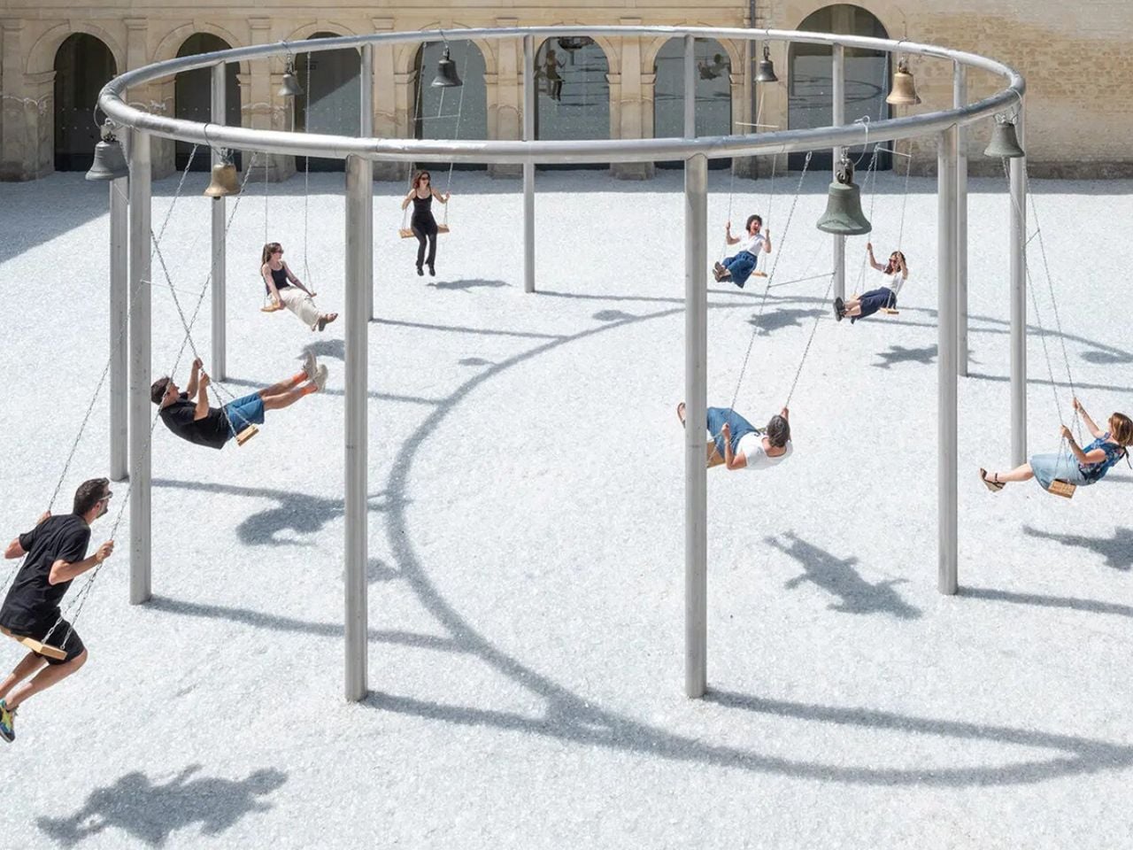
At the center of the courtyard is envolée, a playable musical installation made from swings and antique church bells. A circular steel structure, reminiscent of the bandstands that once animated public gardens, supports eight wooden swings. Above each one hangs a bronze bell of a different size, allowing every swing to produce its own distinct tone when set in motion.

Designer: Céleste Boursier-Mougenot

Visitors are invited to sit, push away from the ground, and activate the installation through the familiar movement of swinging. As the wooden seats rise and fall, the bells respond with changing rhythms and overlapping tones. No two performances can be repeated precisely. The resulting composition depends on how many people participate, how quickly they move, and whether their rhythms align or interrupt one another.

Boursier-Mougenot does not prescribe a melody for the group to perform. Instead, he designs the conditions from which a collective composition can emerge. The work only becomes fully active through the gestures of its participants, temporarily transforming strangers into performers. Individual actions accumulate into a shared sonic environment, allowing visitors to influence one another without needing to speak or coordinate deliberately.

The swing itself introduces another cultural and emotional layer to the installation. Appearing across civilizations as an object of ritual and recreation, it has been associated with ancient Egypt, seasonal festivities, springtime renewal, and the ornamental gardens of seventeenth-century France. It has also been understood as an object marking transitions between childhood and adulthood.

Within envolée, this nostalgic object is reframed as a device for reconsidering how bodies inhabit a public space. Swinging no longer belongs exclusively to childhood. It becomes a method of synchronizing movement, sound, attention, and proximity. The participant is simultaneously a listener, a performer, and an active component within the installation.

Extending beneath the structure is plage, a 900-square-meter field of crushed glass. Its shimmering surface resembles a crystalline body of water, reflecting the architecture, changing light, and movements of the visitors above it. The material produces an intentionally ambiguous landscape: dry yet apparently fluid, solid yet visually unstable. The courtyard of the former convent is consequently transformed into a glittering garden or an abstract lake, where the church bells form an evolving open-air score.

The experience continues inside the galleries with cameraobscura. Here, Boursier-Mougenot enlarges the optical principle of the camera obscura to the scale of an exhibition room. The exterior courtyard and its moving installation are projected upside down across the interior space, creating an immersive, inverted landscape. Suspended swings encourage visitors to pause beneath this reversed horizon, observing the world outside from an unfamiliar perspective.

The ringing bells remain audible indoors, connecting the projected image with the actions taking place outside. Sound shapes the perception of the moving image, while the projected movement gives visual form to the composition being created in the courtyard. Seeing and listening can no longer be understood as separate experiences. Instead, the two installations operate together, collapsing the boundaries between image, sound, architecture, and bodily movement.

Throughout his practice, Boursier-Mougenot draws resonance from ordinary materials and situations. At Frac Normandie, however, the instrument expands beyond the swings and bells to include the convent’s architecture, the reflective glass landscape, the changing light, and the people who temporarily occupy the site.

Points de suspension does more than ask visitors to interact with an artwork. It proposes another way of inhabiting public space—one that values curiosity, play, unplanned encounters, and collective attention. Through a simple act of swinging, visitors are encouraged to remain in the space a little longer, listen to those around them, and participate in a composition that belongs to no single person.

The post A Bell-Powered Playground for Collective Listening first appeared on Yanko Design.

This Sculptural Glass Object Makes Flowers Feel Like a Van Gogh Painting

Par : Tanvi Joshi
11 mai 2026 à 22:30

There is something instantly familiar about patterned glass. We have seen it in old windows, cabinet doors, bathroom partitions, and quiet corners of homes where privacy and light needed to exist together. It is a material that usually stays in the background, doing its job quietly. With Violet Frosted, designer Marius Boekhorst brings that overlooked material forward and turns it into something sculptural, expressive, and quietly poetic.

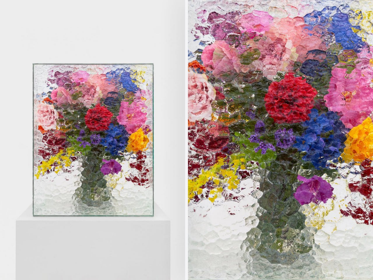
At its heart, Violet Frosted is a geometric glass object that plays with flowers, light, color, and texture. What makes it interesting is the way it changes how we see what is placed behind it. The frosted, patterned glass softens the flowers, turning bright petals and stems into blurred fields of color. A flower becomes a shadow, a brushstroke, a violet glow, or a faded green line depending on where you stand.

Designer: Marius Boekhorst

That is where the charm of the piece begins. Instead of presenting flowers directly, Violet Frosted filters them. It creates a gentle distance between the viewer and the arrangement. That distance makes you look closer. It asks you to slow down and notice how color shifts through glass, how a shape becomes unclear, and how something ordinary can feel painterly when it is partly hidden.

In many ways, Violet Frosted feels like a still life painting brought into the real world. Traditional still lifes capture flowers in one fixed composition, frozen in paint and time. This piece lets the still life move. The flowers change as they bloom and fade. The light changes throughout the day. The view changes as you move around it. From one angle, the arrangement may feel bold and graphic. From another, it becomes soft, quiet, and almost dreamlike.

The design feels especially beautiful because it does not try too hard. It avoids excess decoration. The form is clean and almost architectural, while the patterned glass gives it warmth and character. It feels contemporary without losing the memory of where the material comes from. That balance between old and new gives the piece its quiet confidence.

Violet Frosted also carries a museum-like feeling, though it never feels precious or untouchable. It brings the mood of a gallery into everyday space. A table, shelf, or windowsill suddenly feels more considered. A simple floral arrangement becomes an experience. You are looking at flowers through atmosphere, texture, and light.

Violet Frosted reminds us that design does not need to shout to stay with us. Sometimes, the most memorable objects are the ones that shift how we see familiar things. By turning patterned glass into a living frame, Marius Boekhorst creates a piece that sits between a vase, a sculpture, and a painting. It is functional, emotional, and deeply visual. It holds flowers, and it holds a moment.

The post This Sculptural Glass Object Makes Flowers Feel Like a Van Gogh Painting first appeared on Yanko Design.

A Double-Sided Clock That Turns Walls into Living Moments of Time

Par : Tanvi Joshi
8 avril 2026 à 00:30

Double-sided wall clocks are not new. They have existed for decades, quietly moving between public and private spaces. While many people associate them with railway stations and institutional corridors across Europe, they also made their way into homes in earlier times, often as decorative yet functional pieces in hallways or larger living spaces. Over time, however, they faded out of domestic interiors, replaced by flatter, more minimal wall clocks designed to sit quietly against a surface.

Turin-based brand Goofball is bringing this format back, but with a distinctly modern lens. Their Perch clock does not just revive an old idea; it reframes it for how we live today.

Designer: Goofball

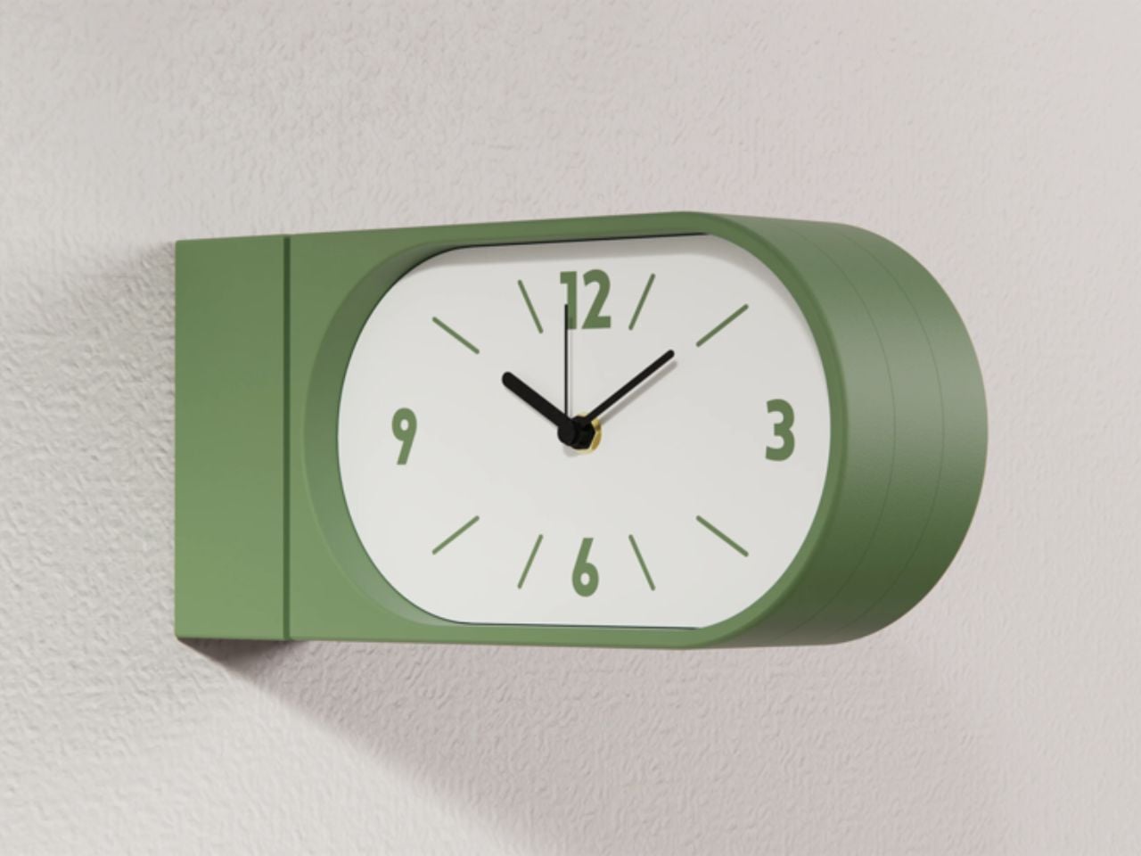
At first glance, the concept feels familiar. A clock that extends out from the wall, visible from both sides. But in a home setting, this simple shift changes everything. Instead of being something you look at from one fixed position, the clock becomes part of how you move through a space. Whether you are walking into a room, passing through a corridor, or glancing back as you leave, time is always within sight. It feels less like an object placed on a wall and more like something integrated into the rhythm of the room.

The functional decisions are just as thoughtful. The clock runs on two AA batteries, which means there is no need for wiring or complicated installation. It hangs on a bracket and can be easily lifted off when the batteries need to be changed. It is the kind of detail that you might not notice immediately, but it makes living with the product feel effortless.

Visually, the Perch clock embraces minimalism in a way that feels warm rather than clinical. It comes in three colors, allowing it to blend into different interiors while still holding its own presence. The design is clean and restrained, making it suitable for contemporary homes, yet it carries a quiet reference to its past. There is something unmistakably reminiscent of old railway clocks, those objects that once defined shared notions of time and movement.

That sense of nostalgia is part of its charm. It brings a subtle character into a space without feeling overly decorative. It introduces depth to a wall, quite literally, and creates a small moment of curiosity. Guests notice it. People interact with it differently. It becomes a conversation piece without trying too hard.

What makes this product particularly compelling is how it challenges a default assumption. We have grown used to thinking of wall clocks as flat, one-directional objects. This design questions the norm and reminds us that even the most familiar objects can be reimagined.

The response so far reflects this shift in perspective. The first batch sold out quickly, suggesting that people are ready for products that feel both nostalgic and new at the same time. Goofball is currently preparing the second batch, expected to be available in the coming weeks.

In the end, this clock is more than just a timekeeping device. It is a small but meaningful intervention in how we experience space. It takes something we already know, brings back its forgotten domestic presence, and gives it a contemporary voice. It does not just sit on a wall. It changes how the wall and the room around it are perceived.

The post A Double-Sided Clock That Turns Walls into Living Moments of Time first appeared on Yanko Design.

A Transforming Table-Chair That Turns Tradition into Space-Saving Intelligence

Par : Tanvi Joshi
6 avril 2026 à 22:30

At a time when living spaces are shrinking while expectations from them continue to expand, this design presents a thoughtful response that is both rooted in tradition and aligned with contemporary needs.

Emerging from the context of rising housing pressures in Taiwan, where compact homes are increasingly becoming the norm, the project addresses a fundamental question: how can furniture adapt to limited space without compromising comfort or experience? Rather than treating furniture as static, single-purpose objects, the designer reimagines them as dynamic systems capable of transformation.

Designer: Che-Chia Hsu

At the heart of this piece lies a deep engagement with traditional Chinese woodworking techniques, particularly the precision of tenon joints. These joints move beyond being structural solutions and become expressions of calculated craftsmanship, where geometry, material behavior, and human interaction converge. The result is a construction that feels both minimal and robust, relying on accuracy instead of excess.

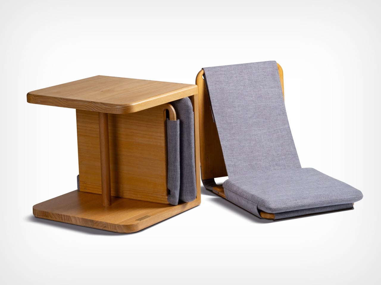
The furniture set is designed to integrate storage and seating within a compact footprint. A chair is concealed within the table and can be pulled out, unfolded, and expanded into a functional seat. The process is intuitive: the chair is extracted, the seat and backrest are opened, and the backrest angle is adjusted using velcro. The transformation is smooth and unobtrusive, allowing the object to shift roles effortlessly.

What distinguishes this design is its reliance on the user’s own body as part of the structural system. Instead of depending entirely on rigid supports, the chair uses the tension generated by the sitter to stabilize the backrest. This introduces a subtle interaction between user and object, where the act of sitting becomes integral to how the design performs. The experience feels efficient, responsive, and quietly intelligent.

Material choices reinforce this balance between function and experience. Lightweight pine wood panels provide durability while ensuring ease of movement. Paired with gray cotton linen fabric, the design introduces a tactile softness that enhances comfort. The fabric is breathable and visually understated, complementing the natural warmth of the wood. Together, these materials create a calm, cohesive aesthetic suited to contemporary interiors.

The development of the project reflects a layered and rigorous process. The designer began by studying traditional joinery techniques through literature, followed by hands-on training under a woodcraft master. This immersion enabled a deeper understanding of the craft beyond theory. Building on this foundation, the designer explored ways to translate these techniques into a modern, functional context through research and experimentation.

What emerges is a design that treats constraint as a starting point rather than a limitation. The piece brings together traditional knowledge and contemporary living patterns, shaping an object that adapts, responds, and participates in everyday use. It reflects a way of designing where space, material, and human interaction are considered together, resulting in furniture that feels considered, purposeful, and in tune with the realities of modern living.

The post A Transforming Table-Chair That Turns Tradition into Space-Saving Intelligence first appeared on Yanko Design.

❌
❌