Vue normale

Il y a de nouveaux articles disponibles, cliquez pour rafraîchir la page.
À partir d’avant-hierFlux principal

This $78K Tiny House Has Curved Walls & Luxury Most Homes Never Get

23 octobre 2025 à 23:30

Australia’s tiny house movement has found its perfect ambassador in the Harper, a stunning 20-square-meter dwelling that redefines what small-scale living can be. Created by Gold Coast-based Black Clay, this compact home proves that downsizing doesn’t mean downgrading when it comes to style and comfort.

The Harper stretches eight meters long and 2.5 meters wide, built on a robust triple-axle steel trailer designed for full transportability. What immediately strikes visitors is the exterior’s sophisticated blend of curved Decobatten aluminum and Colorbond steel cladding. This combination creates a timber-like aesthetic that demands attention while requiring minimal maintenance.

Designer: Black Clay

Interior Design Excellence

Step inside, and the Harper reveals its true character through carefully selected materials and thoughtful design choices. Architectural birch plywood lines the interior walls, creating warmth against the rich timber oak flooring. The kitchen serves as the home’s centerpiece, occupying 2.5 meters of prime real estate with Caesarstone benchtops and Laminex cabinetry in Porcelain Blush and Coolum Sand finishes that add subtle sophistication.

Living spaces flow naturally throughout the Harper’s interior, with the built-in lounge featuring hidden storage drawers beneath the seating. The bedroom continues the home’s commitment to both comfort and style, incorporating a queen-size bed base with additional storage underneath and subtly curved walls that create an enveloping sanctuary feel. Floor-to-ceiling windows throughout flood the interior with natural light and create seamless connections to the outdoors.

Sustainability and Investment

The bathroom showcases modern design sensibilities with full tiling and a striking concrete basin, while environmental consciousness runs throughout the Harper’s design. Earthwool insulation in walls and ceiling ensures energy efficiency, and full off-grid options cater to those seeking complete energy independence. This sustainability focus aligns with the growing desire for more intentional living that respects environmental boundaries.

Black Clay founders Justin and Rachel have positioned their company around creating “thoughtfully designed tiny homes built for people to enjoy in beautiful environments.” Priced from around US$77,500, the Harper represents a significant investment that delivers luxury finishes and thoughtful design typically associated with much larger homes. The Harper tiny house demonstrates that small-scale living can embody sophistication, comfort, and environmental responsibility, offering a compelling vision of downsized luxury for those ready to embrace intentional living.

The Future of Downsized Living

The Harper’s versatility extends beyond personal use, positioning it perfectly for the growing short-term rental market and luxury retreat sector. Property investors are increasingly recognizing the potential of high-end tiny homes as Airbnb offerings, where guests seek unique accommodations that provide both novelty and comfort.

The Harper’s sophisticated design and premium finishes make it an ideal candidate for such ventures, capable of commanding premium nightly rates while offering guests an immersive experience in minimalist luxury. Its transportable nature also allows owners to relocate their investment to capitalize on seasonal tourism patterns or changing market demands.

The post This $78K Tiny House Has Curved Walls & Luxury Most Homes Never Get first appeared on Yanko Design.

The Construction Zone Transforms A Horse Barn Into A Guest House In Phoenix, Arizona

Par : Tanvi Joshi
23 octobre 2025 à 21:30

In the arid heart of Phoenix, Arizona, a once hardworking horse barn has been quietly reborn, a poetic fusion of history and modern design. Reimagined by The Construction Zone, this 750-square-foot guest house is an ode to restraint, light, and material honesty. What was once utilitarian now breathes as a serene desert retreat, proof that thoughtful design can honor the past while creating something entirely new.

Approached through a winding path from the main residence, the guest house emerges as a sculptural volume nestled within the landscape. The journey itself is part of the experience, a slow reveal that ends in an outdoor gathering space defined by a bocce court, a jacuzzi, and native desert flora. The scene feels effortless, yet deeply intentional: a study in proportion, texture, and place.

Designer: The Construction Zone

The architectural language is quiet but confident. A flat roof stretches outward, forming generous overhangs that temper the desert sun while framing long horizontal lines against the open sky. Beneath it, warm Douglas fir eaves run continuously from exterior to interior, creating a seamless ribbon of wood that guides the eye and softens the transition between architecture and nature. It’s this gesture, simple, fluid, and tactile, that anchors the design.

Inside, restraint becomes luxury. The layout is compact, yet feels expansive thanks to full-height, north-facing glass that floods the space with soft desert light. The open plan connects a pared-down kitchen, living area, bedroom, and bath, each space flowing into the next with a quiet rhythm. The material palette is kept minimal: concrete, timber, steel, and glass. Every surface feels deliberate, every junction crisp.

The kitchen exemplifies functional minimalism, sleek cabinetry, essential appliances, and a slender bar table that serves as both dining spot and workspace. Just beyond, the lounge invites stillness: low seating, framed views, and the golden tones of late afternoon light bouncing off concrete and wood.

In the bedroom, a poured concrete wall doubles as the headboard, introducing a sculptural gravitas that contrasts beautifully with the surrounding warmth of timber. The tonal palette, gray, muted red, and honey wood, evokes the desert’s chromatic subtleties, balancing cool industrial precision with natural intimacy.

The bathroom continues this narrative of quiet refinement. Matte gray tiles, a matching concrete vanity, and precise wood detailing keep the mood grounded yet elevated, minimalist, not sterile.

Outside, the transformation feels almost cinematic. The barnyard’s past life lingers only in memory; its present is one of calm sophistication. The bocce court stretches into the horizon, the jacuzzi glimmers under a desert sky, and a curated garden of cacti and succulents completes the sense of place.

This is not just a renovation, it’s an act of design empathy. The Construction Zone has created a dialogue between heritage and modernity, between shelter and openness. By retaining the barn’s essence and reinterpreting its form through contemporary sensibilities, the architects have crafted a living sculpture, one that celebrates the desert not as backdrop, but as collaborator.

What began as a working horse barn now stands as a refined retreat, an architectural meditation on light, texture, and history. By preserving the structure’s spirit and introducing a language of calm modernity, The Construction Zone has definitely created a guest house, but also a living dialogue between past and present, between the rugged desert and the comforts of modern design.

The post The Construction Zone Transforms A Horse Barn Into A Guest House In Phoenix, Arizona first appeared on Yanko Design.

This Tiny House Looks Impossibly Small Outside But Hides A Full Sewing Studio Inside

10 octobre 2025 à 23:30

Baluchon has done it again. The French tiny house builder, widely regarded as the most innovative craftsman in the industry, has just revealed their latest masterpiece: Nouvelle Danse. This light-filled sanctuary represents everything that makes Baluchon the gold standard in compact living design. Custom-built for a passionate seamstress, Nouvelle Danse transforms the traditional tiny house concept into something extraordinary, seamlessly integrating a dedicated workspace into a surprisingly spacious two-bedroom layout that proves even the most specialized needs can be met within compact dimensions.

The exterior showcases Baluchon’s signature aesthetic mastery through high-contrast natural wood cladding that plays beautifully against matte black insertions flowing across the roof, door, and window frames. The entrance commands attention with modern glass doors framed in striking black paneling, ensuring the home turns heads whether nestled in a tiny house community or positioned in a remote natural setting. Natural light floods every corner of the interior, creating an atmosphere that feels anything but cramped while providing the perfect environment for creative work.

Designer: Baluchon

A Portfolio of Innovation

Nouvelle Danse joins an impressive roster of recent Baluchon creations that continue pushing boundaries in small space design. The Eden tiny house demonstrated how smart design maximizes functionality, serving as both a residence and a remote office, while the minimalist Avalon showcased the builder’s ability to create perfection through restraint, with sleek styling within an ultra-compact footprint. The recent Ivy model boasted 441 square feet of luxury, featuring innovative elements such as raised lounges and direct loft access from the bathroom. In contrast, Leila focused on homey comfort, with enlarged kitchen spaces and charming reading nooks.

The company’s attention to craftsmanship remains uncompromising across all builds, consistently using sustainable materials like red cedar construction, natural insulation including cotton, hemp, and linen, and predominantly natural wood finishes or eco-friendly dyes. These choices reflect a commitment to environmental responsibility without sacrificing aesthetic appeal. Industry observers consistently note that Baluchon homes never look plain or somber on the outside, while interiors maximize every square inch through clever storage solutions and multi-functional design elements.

Setting the Standard for Custom Design

What sets Baluchon apart in the crowded tiny house market is its refusal to create cookie-cutter designs. Every project begins with understanding the client’s specific needs, then crafting a completely personalized solution. The seamstress workspace in Nouvelle Danse exemplifies this approach perfectly, demonstrating how the builder’s reputation encompasses pure artistry and endless creativity. Each Baluchon creation tells a unique story tailored to its owner’s lifestyle, whether addressing accessibility concerns with single-floor layouts or incorporating specialized work areas for creative professionals.

As tiny house living continues gaining popularity worldwide, Baluchon remains at the forefront of innovation. Their latest creation proves that downsizing doesn’t mean compromising on style, functionality, or personal expression. Nouvelle Danse stands as a testament to the possibilities that emerge when masterful craftsmanship meets thoughtful design, creating spaces that truly enhance their owners’ lives rather than simply sheltering them. The French builder continues setting the standard for what tiny house living can become when imagination meets expertise.

The post This Tiny House Looks Impossibly Small Outside But Hides A Full Sewing Studio Inside first appeared on Yanko Design.

Solar Winds Wine Tasting Pavilion Imagines Architecture and Energy Flowing Together

Par : JC Torres
6 octobre 2025 à 10:07

Renewable energy systems in commercial architecture often remain hidden behind facades or tucked away on rooftops, treated as necessary but unsightly additions to building design. This approach misses opportunities to celebrate sustainable technology as part of the architectural experience, particularly in industries like wine making, where connection to natural cycles and environmental stewardship could enhance rather than compromise the visitor experience.

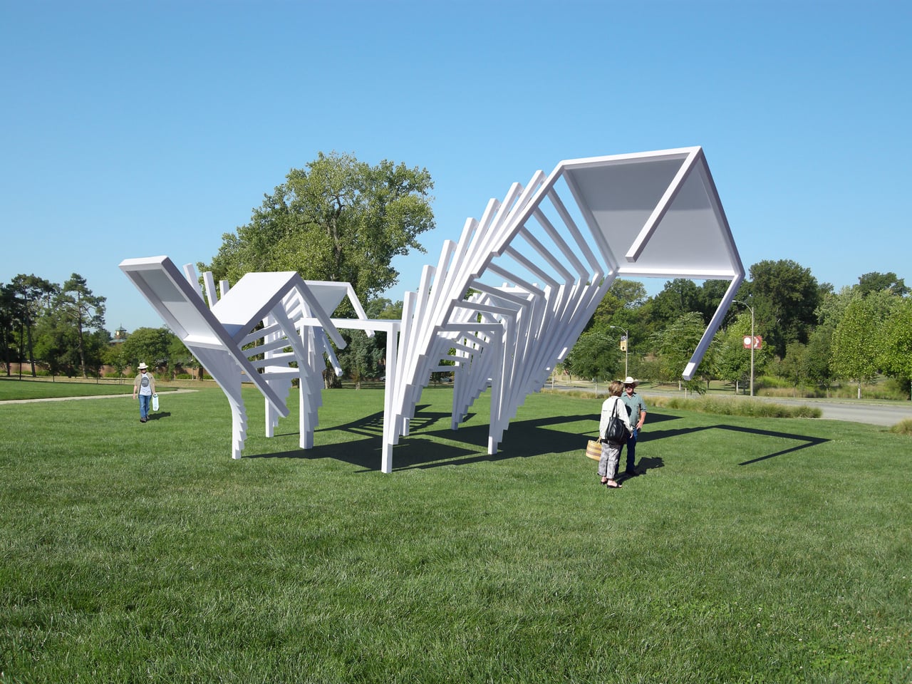
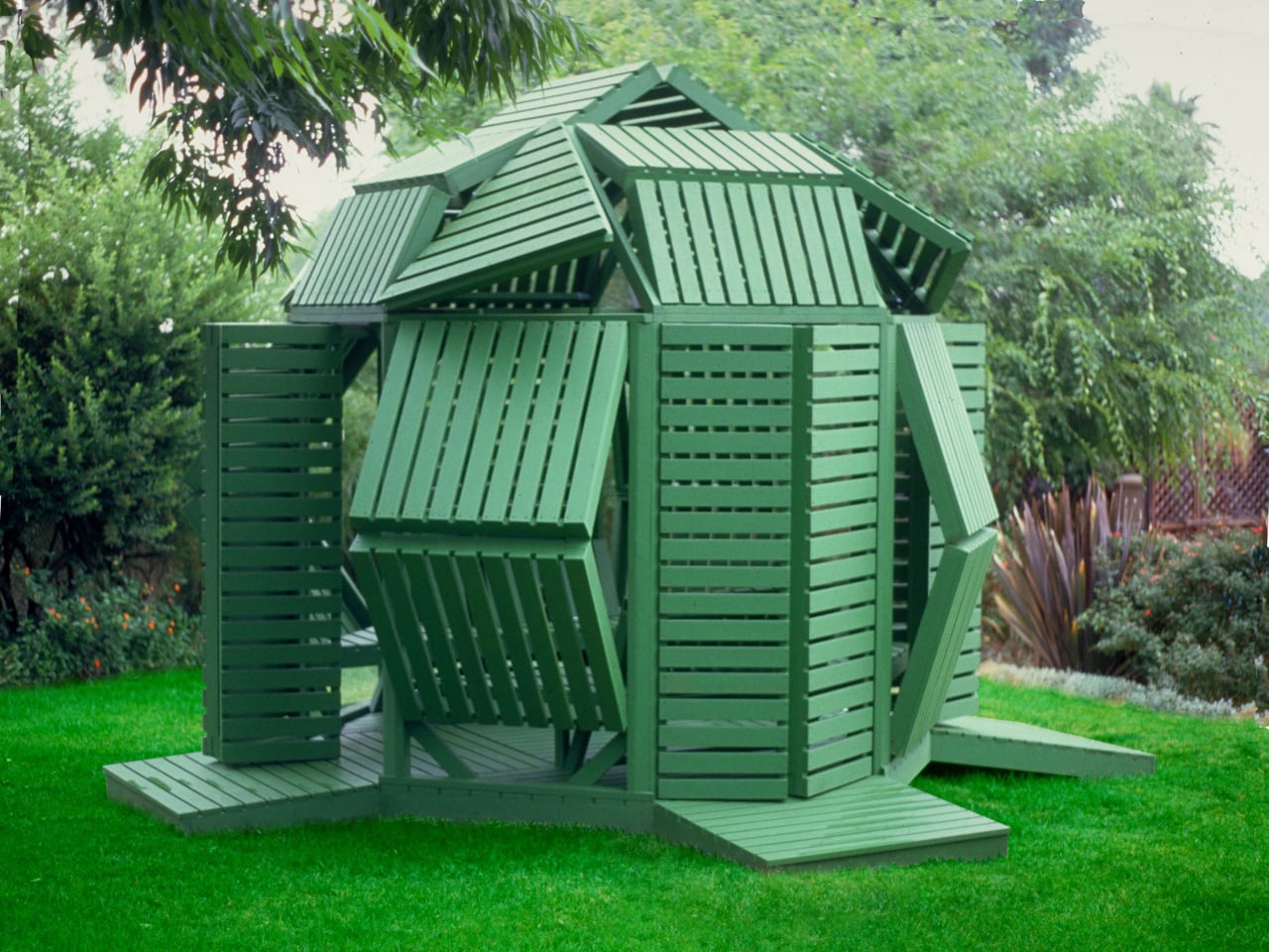
The Solar Winds Wine Tasting Pavilion by Michael Jantzen takes a radically different approach to this challenge. This unbuilt concept transforms renewable energy gathering into the starring feature of a winery pavilion, creating a structure where solar panels and wind turbines become sculptural elements that enhance both the building’s beauty and its environmental mission.

Designer: Michael Jantzen

The pavilion’s form immediately captures attention with its flowing series of curved steel panels that sweep across the structure like frozen waves. These panels, formed with two different radii, create a dynamic, undulating canopy that echoes the rolling hills of wine country. The effect feels both organic and futuristic, as if grapevines themselves had inspired a piece of architectural sculpture.

The steel arches and horizontal supports underneath provide the structural framework, clad with glass panels that can automatically open and close for natural ventilation control. This adaptive system allows the pavilion to respond to changing weather conditions while maintaining the flowing aesthetic. An open-air version could eliminate the glass entirely, creating a purely shaded gathering space.

The renewable energy integration becomes part of the visual spectacle rather than hiding in the background. Many of the curved panels incorporate flexible photovoltaic material positioned for optimal sun exposure, generating electricity for both the pavilion and the main winery. Panels without solar cells are painted to match, maintaining the cohesive flowing appearance while providing essential shade for the interior spaces.

Of course, the vertical-axis wind turbine adjacent to the pavilion adds another layer of energy generation and visual drama. The turbine’s sleek profile complements the pavilion’s sculptural form, while the circular bench built around its base creates a contemplative spot for visitors to observe both the technology and the surrounding landscape.

The interior experience feels equally thoughtful, with the curved panels casting intricate, ever-changing shadow patterns across the floor. Visitors can enjoy wine tastings and special events while surrounded by the gentle play of light and shadow, creating an atmosphere that connects them directly to the natural forces powering the building.

That said, the symbolic inspiration runs deeper than mere aesthetics. The trellis-like structure references the fundamental relationship between grapevines and their supporting framework, suggesting that buildings, too, can grow and adapt in harmony with their environment and energy sources.

You’ll notice how this concept challenges conventional approaches to both winery architecture and sustainable design. Rather than treating energy systems as afterthoughts, Jantzen makes them central to the architectural experience, creating spaces where visitors can appreciate both fine wine and the elegant technology that powers their experience.

The Solar Winds Wine Tasting Pavilion invites us to imagine buildings that celebrate their energy sources as proudly as they display their contents. This approach suggests possibilities for architecture that educates, inspires, and delights while advancing environmental goals through visible, beautiful sustainability.

The post Solar Winds Wine Tasting Pavilion Imagines Architecture and Energy Flowing Together first appeared on Yanko Design.

MVRDV’s Taiwan Tourist Facilities Are Designed To Disappear Into the Landscape

19 septembre 2025 à 23:30

Taiwan’s Jialeshui coastline is getting a major makeover, but you might not even notice the changes. That’s exactly what MVRDV had in mind when they designed “Nature Rocks!” – a tourism project that’s meant to look like it grew straight out of the dramatic rock formations that already define this spectacular stretch of coast.

Located in Pingtung County at Taiwan’s southern tip, Jialeshui has always been a magnet for visitors drawn to its wind-carved cliffs and ocean-sculpted stones. The problem is that the existing tourist facilities were falling apart, and the site needed better infrastructure to handle growing crowds without ruining what makes it special in the first place.

Designer: MVRDV

MVRDV’s solution is surprisingly simple: build new facilities that look like rocks. The Dutch architects, working with local firm HWC Architects, have designed a visitor center and three lookout points that mimic the site’s natural geology so closely they practically disappear into the landscape. It’s architectural camouflage at its finest.

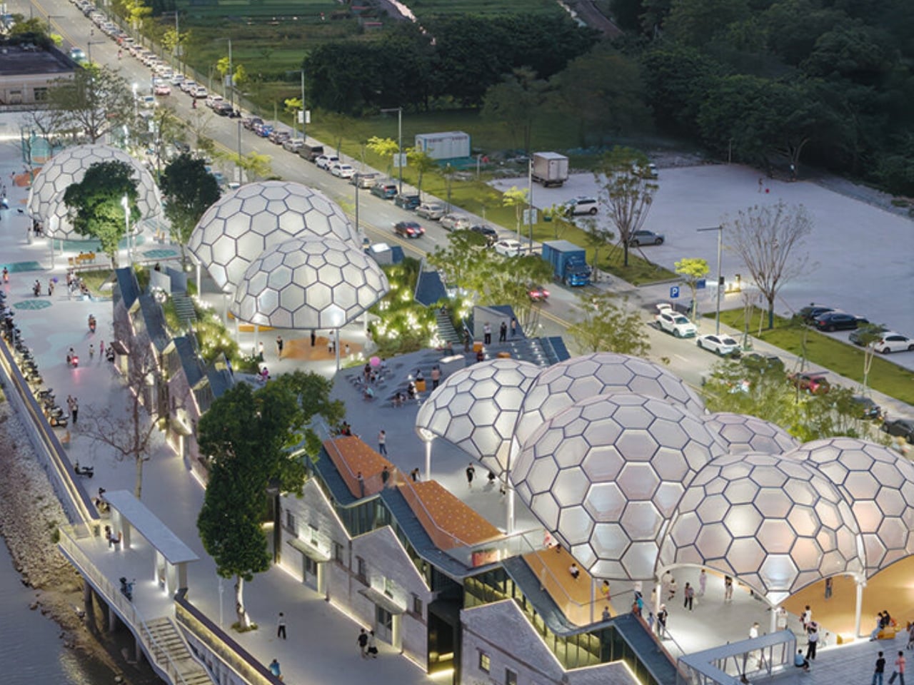
The 140,000-square-meter project doesn’t just add buildings – it creates an entire experience. New pathways wind through the terrain like natural trails, connecting viewpoints at the waterfall, scenic overlooks, and stone viewing areas. Each stop offers something different, but everything feels like it belongs there. The old, crumbling structures get replaced with sleek new facilities that actually enhance the natural setting instead of competing with it.

What’s refreshing about this approach is how it flips the usual tourism development playbook. Instead of slapping down generic visitor centers and concrete platforms, MVRDV let the landscape call the shots. The rock-shaped buildings don’t announce themselves – they blend in so well that the coastline remains the star of the show.

This matters more than it might seem at first glance. Taiwan wants to turn Jialeshui into one of its premier geological parks, which means more visitors are coming, whether the infrastructure is ready or not. The choice isn’t between development and preservation – it’s between smart development and the kind that destroys what people came to see.

MVRDV’s design team, led by founding partner Winy Maas, clearly gets this balance. They’ve managed to create something that works for tourists while actually strengthening the site’s natural character. The new facilities improve accessibility and provide better amenities, but they do it without that heavy-handed approach that turns beautiful places into theme parks.

The project also arrives at a crucial moment for sustainable tourism. As popular destinations worldwide struggle with overtourism and climate impacts, Nature Rocks shows how thoughtful design can handle more visitors while protecting fragile environments. The real test, of course, will come when the project opens and people start using these spaces. But if MVRDV pulls this off as planned, visitors to Jialeshui might find themselves wondering where the buildings end and the natural coastline begins. For a tourism project, that confusion would be the ultimate compliment.

The post MVRDV’s Taiwan Tourist Facilities Are Designed To Disappear Into the Landscape first appeared on Yanko Design.

One House, Two Faces: How This Mountain Cottage Nails Traditional & Modern

19 septembre 2025 à 21:30

The Kohútka Cottage, designed by SENAA architekti, sits perfectly in the Javorníky range as if it always belonged there. But this isn’t just another mountain retreat trying too hard to look rustic. Architects Jan Sedláček and Václav Navrátil faced an interesting challenge. The owner of a local mountain complex wanted something that felt authentically Wallachian but worked for modern living. Instead of choosing one or the other, they created a house with two faces that each tell a different story.

Walk up from the east and you’ll see exactly what you’d expect from this region. Small windows, deep roof overhangs, and that classic log cabin silhouette that’s been keeping mountain families warm for centuries. It’s the kind of building your grandmother would recognize, built using forms that actually make sense in this climate.

Designer: SENAA architekti

But circle around to the west side and everything opens up. Huge windows frame views across multiple valleys, turning the interior into a viewing gallery for some of the most beautiful scenery in the Czech Republic. It’s a smart move that lets the house honor its roots while making the most of its incredible location.

What’s really impressive is how they built this thing. The entire structure uses prefabricated timber panels that were made down in the valley, then trucked up and assembled in just one day. That’s not just efficient – it meant minimal disruption to the mountainside. The house meets strict low-energy standards, too, proving you don’t have to choose between being environmentally responsible and building something beautiful.

The interior layout makes clever use of the sloping site. There’s a wellness area tucked under the main level with a sauna and relaxation spaces that get natural light filtering down from above. All the boring mechanical stuff gets hidden away at this lower level, keeping the main living spaces focused on those mountain views.

SENAA architekti clearly know what they’re doing. The studio has worked everywhere from Brno to Los Angeles, and that experience shows in how they approached this project. They didn’t try to reinvent mountain architecture – they just did it really well.

You won’t find trendy dormers or unnecessary skylights here. Instead, the design relies on basics that have worked in these mountains for generations. The steep roof handles snow loads and weather. The window placement gives you light without losing heat. Simple decisions that add up to something that just works.

The Kohútka Cottage proves something important about mountain architecture. You can respect local building traditions while meeting today’s standards for comfort and sustainability. The result feels both timeless and completely contemporary – exactly what good architecture should do.

The post One House, Two Faces: How This Mountain Cottage Nails Traditional & Modern first appeared on Yanko Design.

SkiftOS - Recoder la roue c'est chouette aussi

Par : Korben
13 septembre 2025 à 19:13

Créer un système d’exploitation complet from scratch pour s’amuser, c’est le genre de projet un peu foufou qu’on ne voit plus tellement aujourd’hui. Pourtant SkiftOS existe !

SkiftOS c’est un OS écrit entièrement depuis zéro, et pas un n-ième fork de Linux ou d’une distribution BSD. Non, c’est un vrai OS avec son propre kernel, son interface graphique et même les bases d’un moteur de navigateur web.

J’ai découvert ce projet en me baladant sur les Top GitHub et ça m’a rappelé cette époque d’avant ma naissance où créer son OS était un genre de rite de passage pour tous les développeurs passionnés. Sauf qu’ici, on n’est plus dans les années 70 et le projet utilise du C++20 moderne avec une architecture microkernel très propre.

Et malgré son statut de projet “hobby”, il fonctionne réellement. Il tourne pour le moment sur du hardware x86_64 et l’équipe travaille sur le support RISC-V.

L’architecture modulaire du projet est d’ailleurs particulièrement bien pensée. Chaque module a son petit nom, c’est rigolo. Hjert gère le microkernel avec les fonctions essentielles telles que la gestion mémoire, l’ordonnancement et l’IPC (Inter-Process Communication). Karm fournit la bibliothèque C++ de base sans dépendre de la STL (Standard Template Library) . KarmUI propose un framework d’interface réactive. Hideo s’occupe du bureau et de l’environnement graphique. Et Vaev ambitionne de devenir un moteur de navigateur web complet.

Pour compiler tout ça, l’équipe a également développé CuteKit, leur propre système de build qui gère les dépendances et la cross-compilation. Bah oui, quand on réinvente un OS, autant réinventer aussi tous les outils pour le construire.

Cette approche “tout fait maison” rend en tout cas le projet fascinant d’un point de vue pédagogique. Car oui le code source est disponible sur GitHub donc si vous voulez comprendre comment fonctionne un OS moderne sans vous perdre dans les millions de lignes de code de Linux ou de Windows (pour les vieilles versions qui ont leakée), c’est une excellente opportunité pour apprendre. Pas besoin donc d’être Microsoft ou Apple pour développer un système d’exploitation fonctionnel.

Faut “juste” de la motivation, du temps, des compétences en C++ moderne, et surtout l’envie de construire quelque chose de différent.

Vous l’aurez compris, SkiftOS ne remplacera probablement jamais votre OS principal, c’est clair mais pour les développeurs curieux qui veulent comprendre les entrailles d’un système d’exploitation, ou pour ceux qui cherchent un projet open source technique sympa où contribuer, c’est une sacrée mine d’or.

Et qui sait, peut-être que dans quelques années on parlera de SkiftOS comme on parle aujourd’hui des débuts de Linux…

This Barcelona Café Borrowed Japan’s Best Idea About Music

15 septembre 2025 à 23:30

Walking into Jaç Hi-Fi Café in Barcelona’s Avinguda Diagonal feels like stumbling onto something special. This isn’t your typical coffee shop with music playing in the background. Here, the music is the point, and everything else revolves around creating the perfect listening experience.

The concept comes from Japan’s jazz kissa bars, where people go specifically to listen to music on high-end sound systems. Designer Isern Serra took that idea and gave it a Barcelona twist. The name “Jaç” works on multiple levels – it references jazz, nods to Japanese listening culture, and means “to recline, rest, and let go” in Catalan.

Designer: Isern Serra

What immediately catches your attention is how different this place looks. The bar itself is actually a giant speaker cabinet made from walnut wood. It’s functional furniture and high-end audio equipment rolled into one. You won’t find speakers awkwardly mounted on walls here. Instead, custom Bloom Island speakers are built right into the furniture, so the sound feels like it’s coming from the room itself.

The materials feel warm and deliberate. Rich walnut wood covers most surfaces, contrasted with smooth beige microcement walls. Everything has this golden, honey-colored glow that makes you want to settle in for hours. The curved seating area in back is particularly clever – walnut-clad walls flow up into an arched ceiling, creating this intimate listening nook where you can actually focus on the music.

Serra clearly studied how Japanese jazz kissa works. These bars emerged in 1960s Tokyo as places where music lovers could experience incredible sound quality in a respectful, quiet atmosphere. But instead of copying that aesthetic exactly, he made it feel distinctly Catalan. There’s still that social, café-going culture Barcelona is known for, just with better attention to what you’re actually hearing.

The lighting helps set the mood, too. Midcentury fixtures create different zones throughout the space, so you naturally move from the more social bar area to quieter listening spots. It all feels intentional without being pushy about it. What’s refreshing is how seriously they take the audio experience. In most cafés, music is just atmospheric – something to fill the silence. Here, they’ve designed every surface and angle with acoustics in mind. The result is a sound that feels clean and present without being overwhelming.

This kind of place feels particularly relevant right now. We’re constantly surrounded by noise and distractions, so having a space dedicated to actually listening to music feels almost radical. It’s not trying to be everything to everyone – just really good at this one specific thing.

Jaç manages to honor both traditions without feeling like cultural tourism. It’s genuinely Barcelona meeting Tokyo, creating something that couldn’t exist anywhere else. Whether this signals some broader trend toward more experiential dining and drinking spaces remains to be seen. For now, it’s just a really thoughtful place to drink coffee and remember why you fell in love with certain songs in the first place.

The post This Barcelona Café Borrowed Japan’s Best Idea About Music first appeared on Yanko Design.

This 16-Foot Tiny Home Packs A Full Kitchen, Office, & Bedroom For Under $40K

11 septembre 2025 à 23:30

In a world where housing costs continue to soar and living spaces shrink, Dragon Tiny Homes has introduced a game-changing solution that proves bigger isn’t always better. The Sora, their newest and most compact model, is making waves in the tiny home community by packing an impressive array of features into just 16 feet of living space.

At 135 square feet, the Sora challenges conventional thinking about what constitutes livable space. This ultra-compact tiny home on wheels demonstrates that thoughtful design can create a functional environment for full-time living, remote work, and even entertaining guests. The journey begins at the glass door entrance, which opens directly onto a surprisingly well-equipped kitchen. The kitchen maximizes every inch with essential appliances, including a full-size fridge/freezer, modern induction cooktop, and functional sink, with additional space allocated for supplementary appliances as needed. The integrated breakfast bar offers intimate dining for two while also serving as extra counter space during meal preparation.

Designer: Dragon Tiny Homes

Intelligent Layout Design

The Sora’s genius lies in its strategic zoning of living spaces. Adjacent to the kitchen, the living room creates an open, airy atmosphere through generous glazing that floods the space with natural light. The comfortable sofa bed serves dual purposes, providing everyday seating while accommodating two overnight guests when needed. Climate control is achieved through a mini-split air-conditioning system, complemented by a ceiling fan, ensuring year-round comfort regardless of the weather conditions.

Tucked cleverly under the staircase, a small desk creates a dedicated home office space, perfectly positioned for remote work without interfering with the main living areas. This thoughtful placement demonstrates how vertical space can be maximized in micro living environments.

Complete Living Essentials

Despite its compact footprint, the Sora doesn’t compromise on essential amenities. The bathroom, positioned opposite the living room, efficiently incorporates a full shower, sink, and flushing toilet within its compact design. This layout ensures privacy while maintaining the home’s open flow concept.

The bedroom occupies the loft space, accessed via the staircase that doubles as storage integration. While featuring the typical low ceiling found in loft bedrooms, the space comfortably accommodates a double bed alongside built-in storage solutions, proving that even sleeping quarters can be both cozy and functional.

Exceptional Value Proposition

Perhaps most compelling is Sora’s price point. Currently available at a special inventory price of $39,750, down from the regular $45,000, this tiny home offers an accessible entry point into homeownership. For comparison, this price represents less than a typical down payment on a traditional home in most markets.

The move-in-ready status eliminates the lengthy construction wait times often associated with custom tiny homes. This immediate availability makes the Sora particularly attractive to those looking to transition quickly into tiny living or investors interested in rental property opportunities.

The post This 16-Foot Tiny Home Packs A Full Kitchen, Office, & Bedroom For Under $40K first appeared on Yanko Design.

India’s First Mass Timber Home In Goa Raises The Bar For Sustainable Living

19 août 2025 à 21:30

Overlooking the lovely coastline of Vagator, Goa, sits something India has never seen before. Architecture Discipline’s Timber Residence breaks new ground as the country’s first mass timber home, proving that environmental responsibility and stunning design can work hand in hand. Architect Akshat Bhatt wanted to create more than just another luxury residence. The 8,650 square foot structure challenges everything we think we know about Indian construction.

The secret lies in eleven glulam portal frames, each one carefully crafted in New Delhi before making the journey to Goa. These aren’t your typical building materials. Glued laminated timber represents a completely different construction approach, where pieces get stronger when combined rather than weakened. The entire house operates like sophisticated building blocks that can actually be taken apart and moved elsewhere decades from now.

Designer: Architecture Discipline

From the outside, charred-wood cladding gives the home its stunning weathered appearance while protecting it from monsoon rains and coastal salt air. The linear design captures sweeping views of both the Arabian Sea and Chapora River, turning the house into a front-row seat for nature’s daily show. Inside, exposed timber beams steal the spotlight, their raw authenticity warming rooms finished with black granite floors and deliberately bare white walls.

The lower level houses something special: a glass-enclosed wood workshop bathed in natural light from clerestory windows above. This creative space opens onto a timber deck that feels more like an outdoor room than a traditional balcony. Instead of walls or railings, planters define the deck’s edges, keeping the connection to the surrounding landscape completely uninterrupted. The workshop becomes a bridge between indoor creativity and outdoor inspiration.

Building on a cliff in Goa means preparing for nature’s worst moods. Bhatt worked with engineers to ensure the structure could handle fifty years of typhoons and torrential rains without flinching. The glulam construction method does something remarkable: it removes carbon from the atmosphere during production. While concrete construction takes from the environment, this timber approach gives back, making each beam part of the solution rather than the problem.

International architecture publications have taken notice, recognizing this project as a catalyst for change across India’s building industry. The residence is proof that sustainable construction doesn’t mean compromising on quality or beauty. With India’s population demanding smarter housing solutions, this Goa home shows a path forward where environmental consciousness and architectural excellence aren’t just compatible but essential partners in creating the future of responsible design.

FAQs

1. What makes the Timber Residence unique in India?

This home is a real first for India, it’s the country’s debut mass timber house, built using glulam frames instead of the usual concrete or steel. What sets it apart is how it was designed: almost like a giant set of building blocks that can be taken apart and moved if needed. The focus on sustainability, adaptability, and a much lighter environmental footprint makes it a standout in Indian residential architecture.

2. Why use glulam (glued laminated timber) instead of concrete or steel?

Glulam is a bit of a game-changer. It’s incredibly strong, but much lighter than concrete or steel, and it can be prefabricated, which means less mess and faster building on site. The real bonus is that timber stores carbon, so using glulam helps the environment rather than hurting it. You get all the strength you need for a modern home, but with a much smaller carbon footprint.

3. How does the Timber Residence handle Goa’s harsh coastal weather?

Goa’s weather can be tough, think heavy rains, salty air, and the occasional typhoon. The Timber Residence was built with all that in mind. Its charred-wood exterior helps protect it from moisture and decay, and the engineered timber frames are made to last. Every detail, from the materials to the structure itself, was chosen to make sure the house stays comfortable and resilient, no matter what the weather throws at it.

The post India’s First Mass Timber Home In Goa Raises The Bar For Sustainable Living first appeared on Yanko Design.

Modular Sauna Brings Hammam and Sauna Rituals Home: Modern Design, No Extra Space Needed

12 août 2025 à 23:30

Entering a sauna after a long day feels like pure luxury. Now imagine having that experience alongside a traditional hammam and refreshing plunge bath, all within the same sleek system. That’s exactly what Italian wellness company Effe created with their new Petra SH, which made its debut at Milan Design Week 2025. Designer Marco Williams Fagioli became fascinated by the rituals surrounding thermal wellness while developing this system. He discovered that traditional hammams required bathers to bow when entering through deliberately low doorways as a sign of respect.

These cultural nuances shaped his approach, ensuring the Petra SH honors the authentic spirit of these ancient practices while fitting seamlessly into modern homes. The flexibility of this modular design is its USP. Whether you’re planning a compact home retreat or designing a hotel spa, the system adapts to your space. You can choose between clear glass panels for an open, airy feel or opt for opaque surfaces when privacy matters more. This versatility makes it work just as well in a city apartment as it does in a sprawling country estate.

Designer: Effe

The entire system uses eco-friendly, recyclable materials that align with today’s environmental consciousness. The sauna interior features Swiss pine cladding, chosen for its natural anti-bacterial properties and distinctive alpine fragrance. This hardy wood withstands temperature extremes and also creates that authentic forest-like atmosphere that makes sauna sessions so restorative. Having the plunge bath integrated directly into the system changes everything. Instead of needing a separate setup for cold therapy, you get the complete thermal contrast experience in one beautifully designed unit.

This proves useful in urban settings where space comes at a premium, yet people still crave comprehensive wellness experiences. Effe has spent nearly four decades perfecting wellness design, and that expertise shows in every detail of the Petra SH. The company understands that great wellness design goes beyond just functionality—it needs to create an experience that transports you from everyday stress into a state of genuine relaxation.

The timing is exceptional. Home wellness has exploded in popularity, with people investing in creating sanctuary spaces within their walls. The Petra SH addresses this desire while solving the common problem of needing multiple systems for different types of heat therapy. Instead of choosing between a sauna and a steam room, you get both, plus the cold plunge that completes the traditional Nordic wellness cycle.

I admire how this system brings together wellness traditions from different cultures—Finnish sauna culture, Turkish hammam rituals, and cold therapy practices—into one cohesive experience. It’s not just about having multiple options; it’s about creating a journey that honors the deep cultural significance of these practices while making them accessible for modern life.

FAQs

1. What is a modular spa system, and how does it work?

A modular spa system is all about flexibility and personalization. Instead of being locked into a single setup, you get a series of components—like a sauna, hammam, and cold plunge—that can be mixed and matched to fit your space and your needs. With something like Petra SH, you can create a wellness retreat that works just as well in a city apartment as it does in a larger home. The modules are designed to fit together seamlessly, so you can choose the features and finishes that suit your style, and even reconfigure or expand the setup later on if your needs change.

2. What are the health benefits of combining sauna, hammam, and cold plunge?

Bringing together sauna, hammam, and cold plunge therapies gives you the best of all worlds. The heat from the sauna and steam room helps relax your muscles, encourages deep sweating, and gets your blood flowing. When you follow that with a cold plunge, it wakes up your senses, reduces inflammation, and can even help your body recover after a workout. Switching between hot and cold is a time-tested way to boost circulation, ease stress, and support your immune system. Many people find this routine leaves them feeling both deeply relaxed and re-energized.

3. What makes Petra SH different from other home wellness systems?

Petra SH sets itself apart by blending authentic wellness traditions with modern design. It’s inspired by the rituals of Turkish hammams and Finnish saunas, so you get thoughtful details—like the low doorway and the use of Swiss pine—that honor those roots. But it’s also incredibly versatile: you can have a sauna, steam room, and cold plunge all in one system, tailored to fit your space. Sustainability is built in, with eco-friendly materials throughout. The result is a wellness experience that feels both timeless and perfectly suited to contemporary living.

The post Modular Sauna Brings Hammam and Sauna Rituals Home: Modern Design, No Extra Space Needed first appeared on Yanko Design.

Instead of walls, this interior designer divided a Warehouse Space using colours and shapes

Par : Sarang Sheth
12 août 2025 à 21:30

Walk into a warehouse in Bangalore’s Turahalli Forest and you might expect the usual: concrete, echoing emptiness, and the faint smell of dust. What you get instead is a journey – one that Megha Dugar Jain crafted for her client, THE ROOOM, completely redefining what a 2,500-square-foot godown can be. Sometimes, the most extraordinary transformations happen in the most ordinary places. The original space was as unremarkable as they come, but Megha’s vision turns it into a series of moments, each more surprising than the last, with every inch designed to invite curiosity and spark delight.

This is interior design as storytelling. Megha doesn’t just lay down materials or pick colors off a swatch book. She orchestrates visual microcosms, letting each zone unfold in its own unique way. The result is a kind of spatial patchwork where your eyes group elements together, building mini-worlds out of color, texture, and form. The lack of traditional walls isn’t a limitation; it’s an invitation to explore, to let boundaries blur and new relationships emerge between spaces.

Designer: Megha Dugar Jain

Mr. Folds is the silent protagonist here. Not a person, but an idea: the spirit of transformation itself. Megha talks about him like an old friend, a metaphor for the magic that happens when the ordinary is folded – sometimes literally, sometimes just in spirit – into something layered and unexpected. Think of Mr. Folds as the gentle mischief behind every crease in the design, the reason a simple panel suddenly suggests complexity, and why every corner seems to have a little more to say than you first notice. Scroll down and you may just spot Mr. Folds casually browsing around the space.

Walking into the main area, visitors immediately notice the dramatic shift from the soft peach monochrome of the entrance to a bold black-and-white interplay that defines different functional zones. The reception area features a striking curved counter with a crisp white top sitting atop a terracotta jaali base, its geometric patterns allowing light and air to flow through while creating intricate shadows across the floor. Above this, a flowing metal arch structure partially divides the space without closing it off completely. These arches serve multiple purposes: they guide movement, frame views into adjacent areas, and add a sculptural element that draws the eye upward. Megha has cleverly used these architectural features to suggest boundaries rather than enforce them. The arch motif repeats throughout the space, creating a visual rhythm that helps tie disparate elements together. Each arch feels like a portal, inviting visitors to step through and discover what lies beyond, while the curved forms soften what could otherwise be a boxy, rigid environment.

Perhaps the most playful elements in the space are what I call the “orange splooshes,” those organic, fluid shapes that break up the geometric precision of the checkered floor. These vibrant orange forms appear to spill out from the staircase, defying the grid and introducing an element of surprise and whimsy. The stairs themselves continue this orange theme, creating a bold visual statement that draws you upward. You’ll even see a strange ‘sploosh’ underneath the leg of a table. What makes these elements so effective is their unexpectedness; in a space defined by careful planning and intentional design moves, these fluid shapes feel almost rebellious, as if the orange paint had a mind of its own and decided to ignore the boundaries. Megha describes this as “an optical illusion of spillage, an artful disruption that intrigued and delighted.” And she’s right. These moments of controlled chaos provide relief from the more structured elements, reminding us that the best designs often include an element of playfulness. The orange forms also serve as wayfinding devices, subtly guiding visitors through the space without resorting to obvious signage.

The origami inspiration takes physical form in the sit-out area, where an extraordinary plywood panel transforms a simple wall into a sculptural masterpiece. This isn’t delicate paper folding; it’s origami principles applied to a rigid material, creating dramatic angles and planes that catch light and cast ever-changing shadows throughout the day. The technical achievement here shouldn’t be underestimated. Coaxing plywood, a material that naturally resists bending, into these complex folds requires both engineering knowledge and artistic vision. The result is a feature that feels simultaneously architectural and artistic. As natural light moves across its surface, the panel comes alive, revealing new dimensions and details. Visitors often find themselves touching these surfaces, trying to understand how something so solid can appear so dynamic. The panel serves as a focal point in the sit-out area, which itself opens to views of the surrounding Turahalli Forest, creating a dialogue between the geometric precision inside and the organic forms of nature outside.

Complementing these architectural elements are the custom-crafted berge decorative panels that adorn various walls throughout the space. These panels feature intricate, flowing patterns carved into the plywood, celebrating the natural grain and texture of the wood while adding another layer of visual complexity. Unlike the folded panels, which create dimension through physical manipulation of the material, these berge panels achieve depth through intricate surface patterning. The wavy, organic forms feel almost like topographic maps or flowing water, introducing a natural element that balances the more geometric aspects of the design. What makes these panels particularly impressive is how Megha transforms a humble material like plywood into something that looks precious and handcrafted.

What ultimately makes this transformation so successful is Megha Dugar Jain’s unique approach to spatial division. Instead of erecting walls to separate functions, she’s used color, material, and thematic elements to create distinct zones that still feel connected to the whole. The active, human-centric areas burst with vibrant hues and dynamic forms, while display zones adopt a more restrained palette that puts the focus on the products themselves. This strategy creates a space that feels both cohesive and varied, allowing for different experiences within a single open environment. The transitions between zones feel natural rather than abrupt, guided by subtle shifts in flooring, lighting, and material. And while each area has its own character, recurring elements like the curved forms, organic patterns, and thoughtful material selections create a visual language that unifies the entire project. The space works because it balances structure with spontaneity, allowing for moments of surprise within an overall framework that makes sense. It’s like a well-composed piece of music, with themes that repeat and evolve throughout, creating something that feels both familiar and fresh with each encounter.

The post Instead of walls, this interior designer divided a Warehouse Space using colours and shapes first appeared on Yanko Design.

The World’s Longest Suspension Bridge Rises in Italy, Connecting Sicily to the Mainland

12 août 2025 à 20:30

After decades of false starts, Italy’s wild dream of connecting Sicily to the mainland is finally happening. The government just gave WeBuild the green light to build what will become the world’s longest suspension bridge, stretching an incredible 3.6 kilometers across the Strait of Messina. Pietro Salini, WeBuild’s CEO, seems genuinely excited about this one, calling it a project his team will be proud of. At €13.5 billion, this isn’t just another bridge—it’s Italy betting big on infrastructure that could change everything for Sicily. The target completion date of 2032 feels both ambitious and realistic given the scale of what they’re attempting.

The engineering specs alone are jaw-dropping. Picture two towers shooting 399 meters into the sky—that’s roughly the same height as the Empire State Building, except these will be rising from the waters between Sicily and Calabria. The main span will hang 3.3 kilometers above the strait, dwarfing every other suspension bridge on Earth. What makes this particularly clever is how WeBuild designed it to handle earthquakes, which is crucial in this seismically active region. They point out that suspension bridges perform better during earthquakes than other bridge types, citing successful examples in California, Turkey, and Japan.

Designer: WeBuild

The bridge won’t just carry cars; it’s designed as a complete transportation solution. Six lanes of traffic flow in both directions, with room for up to 6,000 vehicles per hour. Two railway tracks will handle 200 trains daily, finally giving Sicily a direct rail connection to mainland Europe. Those currently enduring the ferry ride from Messina to Reggio Calabria will soon cruise across in minutes instead of waiting in long queues. The design includes service lanes for maintenance crews, showing they’ve thought through the long-term operational needs.

This project represents far more than bridge construction. Over 100,000 people will work on various aspects, from the bridge itself to new roads, train stations, and commercial developments. The investment extends to environmental restoration, tackling coastal erosion and rehabilitating old quarries. Italy secured complete public funding, already budgeted through 2025, which removes the financial uncertainty that killed previous attempts. About 40% goes to actual construction, while the rest builds the supporting infrastructure Sicily needs to maximize the bridge’s benefits.

The history here tells quite a story. Italy first approved this bridge back in 1971, then cancelled it multiple times as political winds shifted and costs spiraled. Each iteration brought refinements, and the current design benefits from five decades of technological advancement and lessons learned from other mega-projects. WeBuild brings serious credentials to the table, with experience on complex infrastructure projects worldwide. The company clearly understands the technical challenges of building in a marine environment while managing seismic risks.

When completed, this bridge transforms Sicily from an island requiring ferry access into an integral part of continental Europe. The economic implications extend far beyond tourism and convenience—Sicily gains direct access to European supply chains and markets. For Italy, this represents a showcase of engineering excellence that puts the country at the forefront of ambitious infrastructure development. The bridge shows us that some dreams, even those delayed for decades, eventually find their moment to become reality.

The post The World’s Longest Suspension Bridge Rises in Italy, Connecting Sicily to the Mainland first appeared on Yanko Design.

Kohler Saunas can transform your home into a personal, wellness spa

Par : Ida Torres
25 juillet 2025 à 08:45

The wellness revolution has officially arrived in your home, and Kohler is leading the charge with their innovative line of at-home saunas. As more people prioritize self-care and seek spa-like experiences without leaving their homes, Kohler’s newest wellness offering provides the perfect solution for creating a personal sanctuary that promotes both physical and mental well-being. Their entry into the home sauna market represents a significant shift in how we approach wellness design. The at-home sauna is a direct response to this demand, making spa-like experiences more accessible and seamlessly integrated into daily life for homeowners.

Kohler saunas seem to have thoughtful design and premium craftsmanship. Drawing inspiration from both 1970s iterations found in the brand’s archives and modern Kohler Waters Spas, these saunas feature high-quality Scandinavian spruce construction available in multiple finishes . The attention to detail extends to every aspect of the user experience, from the ergonomic Obeche wood headrest to state-of-the-art features that create a truly personalized wellness experience.

Designer: Kohler

The technology integrated into Kohler saunas is particularly impressive. Each unit includes ambient sunset lighting that creates a warm, inviting atmosphere, perfect for relaxation and stress relief. The intuitive touchscreen control system allows users to easily manage dual thermostats, ensuring optimal temperature control throughout their session. The innovative aerotherm ventilation system circulates air up to eight times per session, maintaining fresh air quality and enhancing the overall sauna experience.

Beyond the luxurious features, Kohler saunas offer substantial health benefits that make them a worthwhile investment in your well-being. Regular sauna use provides stress reduction, improved circulation, and detoxification, all within the privacy and hygiene of your own home . These benefits align perfectly with the growing cultural shift toward prioritizing health and self-care in our daily routines.

Kohler’s approach to wellness extends beyond individual products to create what Stevens describes as a “connected wellness ecosystem.” The brand envisions a future where your sauna can be integrated with other wellness products, such as ice baths and digital cold-mode showers, for seamless contrast therapy experiences . This comprehensive approach positions Kohler as a one-stop solution for homeowners looking to create a complete wellness routine at home. The versatility of Kohler saunas makes them suitable for various home configurations, with both indoor and outdoor models available. This flexibility allows homeowners to incorporate wellness into their existing spaces or design new areas specifically dedicated to health and relaxation.

For those considering this wellness investment, Kohler saunas represent more than just a luxury addition to the home. They offer a practical solution for busy individuals who want to prioritize their health but struggle to find time for regular spa visits. With the convenience of home access, users can easily incorporate sauna sessions into their daily routines, making self-care more accessible and sustainable than ever before.

The post Kohler Saunas can transform your home into a personal, wellness spa first appeared on Yanko Design.

Affordable, Modern Living In 135 Square Feet: Is This the Perfect Tiny Home For First-Time Buyers?

14 juillet 2025 à 23:30

Designed by Dragon Tiny Homes, the Genesis V2 strips away everything unnecessary to reveal what compact living truly means. This 16-foot masterpiece transforms 135 square feet into a super comfy tiny home that values function over flash. Starting at $39,500, the home casually reinvents what affordable housing can accomplish. The clean lines and purposeful layout represent a thoughtful design philosophy that worships substance over superficial details.

The loft-style bedroom maximizes vertical space while maintaining comfortable proportions for two occupants. Below, the main living area flows seamlessly between functions, with generous glazing that floods the space with natural light. The kitchen occupies just enough space to handle essential cooking tasks – it includes a two-burner induction cooktop, a sink, fridge/freezer, and some cabinetry.

Designer: Dragon Tiny Homes

The bathroom is fully functional, despite the home occupying a minimal square footage. A complete shower, sink, and flushing toilet arrangement proves that compact doesn’t mean compromise on basic needs. The space planning here reflects careful consideration of daily routines and movement patterns. Clean finishes and efficient fixtures create a bathroom that feels complete rather than condensed. This attention to essential amenities makes the Genesis V2 a genuine home territory rather than a basic shelter.

Climate control receives careful attention through a mini-split heater and air conditioning system and a ceiling fan combination. These mechanical systems ensure year-round comfort without overwhelming the compact space or energy systems. The dual approach to temperature management shows understanding of how small spaces can quickly become uncomfortable without proper ventilation. The systems integrate seamlessly into the overall design without creating visual clutter or operational complexity.

Who is the Genesis V2 best suited for?

The Genesis V2 is ideal for first-time tiny home buyers, minimalist couples, and anyone seeking an affordable entry into compact living. Its 16-foot design and efficient layout make it perfect for singles or pairs who value function, comfort, and simplicity over excess space.

With its ready-to-go availability and approachable price, the Genesis V2 is also a smart choice for those looking to downsize, embrace a minimalist lifestyle, or add a flexible guest house or vacation retreat to their property. It seems ideal for buyers who want to experience tiny living without navigating complex customization processes

Are there any drawbacks to the Genesis V2 tiny home?

The tiny home offers impressive affordability and a great design, but there are some drawbacks to consider:

  • Limited Space: With only 135 square feet, the Genesis V2 may feel cramped for more than two people or those with lots of belongings.
  • Minimal Storage: Storage options are basic, so buyers with significant storage needs may find it challenging to stay organized.
  • Small Kitchen: The kitchen is compact, with limited counter space and cabinetry, which may not suit those who love to cook or entertain.
  • Loft Access: The sleeping loft is accessed by a ladder, which may not be ideal for those with mobility concerns.

Our Take

The Genesis V2 manages to adopt a pretty mature approach to tiny home design, where genuine livability takes precedence over fleeting novelty. The updated version builds on lessons learned from the original Genesis while maintaining the core philosophy of functional minimalism that has made Dragon Tiny Homes a respected name in compact living.

Every design decision in the Genesis V2 reflects this maturation. The loft bedroom provides real comfort, the kitchen handles daily cooking needs, and the bathroom functions without compromise. It feels like a genuine home that happens to be compact rather than a novelty space that sacrifices comfort for size. This distinction matters enormously for anyone considering the transition to tiny living.

The post Affordable, Modern Living In 135 Square Feet: Is This the Perfect Tiny Home For First-Time Buyers? first appeared on Yanko Design.

This Tiny Cabin Is Designed For Sustainable & Serene Living Amid Romania’s Forested Hills

4 juillet 2025 à 23:30

Situated in the forested hills of Valea lui Enache, the CL02 Cabin by Vinklu beautifully shows us how minimalism can be both inspiring and deeply functional. The first impression is a sense of calm—a dark, understated silhouette softened by the filtered light of the surrounding trees. In this surreal cabin, less isn’t an aesthetic; it is intended to be a deliberate gesture toward finding contentment in simplicity. Every line and every finish supports the idea that a home should serve its inhabitants without demanding attention, quietly enabling the rituals of daily life.

The 55-square-meter structure stands where an earlier project failed, and it’s clear that Vinklu approached this second chance with a sense of reverence. The layout is straightforward: a ground floor with an open living area, a full kitchen, and a bathroom, and an upper level for rest. Each space is compact but never feels cramped, thanks to a vaulted ceiling and panoramic windows that extend the interior outward, inviting the forest in. The circular kitchen window frames a shifting tableau of leaves and light, turning even the most routine meal into an act of quiet observation.

Designer: Vinklu

The full-size kitchen is a luxury, especially in a home of this scale. It’s designed for those who find joy in cooking—ample countertop space, integrated appliances, and just enough storage to keep things tidy. The kitchen’s natural finishes echo the palette outside, blurring the boundary between interior and landscape.

The cabin is clad in dark, weather-resistant timber, allowing it to recede into the forest’s shadows. Inside, pale wood and minimal detailing create a sense of light and openness. There’s restraint in every decision, but also an invitation: to touch, to pause, to notice the subtle changes in the quality of light as the day moves on. The living area is open yet intimate, with just enough room for a small table and a pair of chairs. The focus isn’t on filling space but on creating an environment that feels both nurturing and uncluttered.


The CL02 Cabin’s relationship to its site is its most fabulous feature. The structure neither dominates nor disappears; it exists in dialogue with the landscape, responding to its contours and rhythms. Sustainability is embedded in the design—efficient insulation, passive solar orientation, and natural ventilation reduce the need for mechanical intervention. The house feels like a gentle addition to the hillside, its presence marked by sensitivity rather than intrusion.

Living in the CL02 Cabin is an exercise in mindful reduction. It’s not about doing without, but about having enough—and knowing that enough can be generous. There are compromises, of course: storage is limited, and the seasonal design may not suit every lifestyle. But for those drawn to clarity and contemplation, this is a space that offers both refuge and inspiration.

The post This Tiny Cabin Is Designed For Sustainable & Serene Living Amid Romania’s Forested Hills first appeared on Yanko Design.

Japandi-Inspired Home Showcases Floating Teahouse, Glass Bridge, & Sunlit Spaces In California

4 juillet 2025 à 17:20

The Waterbridge House shows us what it means to live both inside and out. Set amid the pines of Pebble Beach, this glass-clad sanctuary floats above the landscape, a calm, geometric silhouette that is as much an homage to nature as it is a feat of architecture. Designed by a local artist, the home’s spirit is rooted in the Japandi style, where Japanese calm and Scandinavian restraint meet the warmth of the California coast.

Staggered concrete steps emerge from the hillside, guiding you toward the house’s signature feature: a glass corridor that bridges a tranquil pool. This floating link is more than an entryway. It’s a threshold—a moment of pause between the everyday and the restorative energy within. The two wings that it connects speak to both privacy and togetherness.

Designer: Emily Yang Bauer

One wing features a spacious open-plan kitchen, living room, and dining area—perfect for gatherings and everyday living. The opposite wing is dedicated to privacy, offering a primary suite that opens onto a generous deck, a separate den or office, and two additional en-suite bedrooms. Below the common area, a separate guest suite with its own kitchenette and private entrance provides comfort and autonomy for visitors.

Waterbridge House’s minimalist form delivers a thoughtful complexity. The facade is a study in contrasts: bare white stucco, punctuated by vertical frameless windows, melts into entire glass walls that slide open to expansive decks. The effect is seamless. Indoors and outdoors blend, and natural light pours through the space, transforming at every hour. Here, the forest is never just a backdrop—it’s invited in, echoing along every surface and reflecting off the pool below.

Central to the home’s philosophy is its relationship with water and landscape. The glass corridor doesn’t only serve as a bridge – it is a calm vantage point, suspended between sky and pool, framing the shifting patterns of light and shade. It’s no wonder the house earned its name: Waterbridge. On quiet mornings, you might cross this bridge with coffee in hand, watching fog drift between trees and sunlight skip over ripples below.

The inspiration for Waterbridge House traces back centuries and continents. The staggered layout and bamboo-accented calm draw from the Cui Linglong, an 11th-century building in Suzhou, China. That legacy is felt most strongly in the home’s floating tea house—a conceptual pavilion accessed by its own set of concrete steps, perfect for contemplation or quiet gatherings. This gentle nod to history grounds the home’s modern lines, adding a layer of serenity and depth.

The house is blessed with light-filled spaces and a connection to nature, creating an atmosphere that is both calming and invigorating. The design offers privacy without isolation, and the floating glass bridge is a daily reminder of the home’s unique vision. The few cons—perhaps a less urban location or a minimalist palette that may not suit maximalist tastes—are far outweighed by the sense of peace and spaciousness.

The post Japandi-Inspired Home Showcases Floating Teahouse, Glass Bridge, & Sunlit Spaces In California first appeared on Yanko Design.

Spacious Single-Level Tiny House With A Porch Offers Elevated Modern Comfort & Minimalist Style

27 juin 2025 à 23:30

The Rowan Tiny Home is the latest offering from Tiny House Listings, and it takes a fresh attitude to small-space living. At first glance, it’s the clarity of its single-level layout and the inviting front porch that set the tone. The house stretches 34 feet in length and is slightly wider than most, measuring 10 feet across, which immediately gives the interior a more open and relaxed feel. Finished in engineered wood with a durable metal roof, the Rowan balances minimalist lines with a sense of solidity and comfort that’s rare among park model tiny homes.

The interior experience of the home is all about spaciousness and thoughtful functionality. The 340-square-foot interior unfolds in a way that feels purposeful and uncluttered, with each zone flowing effortlessly into the next. The living room greets you first—bright, comfortable, and anchored by a sofa and built-in cabinetry, it’s a space that easily accommodates lounging, conversation, or a quiet evening with a book. Natural light pours in from generous windows, reinforcing the home’s sense of calm and connection to its surroundings.

Designer: Tiny House Listings

The kitchen serves as the center of the home, and it is designed with everyday living in mind. There’s an induction cooktop, plenty of counter space, and room for additional appliances—unusual flexibility for a home of this size. Storage is handled with efficiency, with clever cabinetry and nooks that keep everything close at hand but out of sight. The dining area, just steps away, makes the most of the open plan, creating a seamless transition between meal prep, dining, and relaxation.

The bedroom is quite impressive, amped with a full double bed and built-in closet that offer comfort and practicality, while the single-level design means there’s no need for ladders or lofts. Ample headroom and easy circulation make this space feel like a true retreat, rather than a compromise. The bathroom, too, is generously sized for a tiny home, with a modern shower, vanity, and enough space to move around without feeling boxed in. Every detail has been chosen to support full-time living, from the fixtures to the layout.

One of Rowan’s strongest assets is its versatility. The covered front porch extends the living space outdoors, perfect for morning coffee or evening relaxation. The Rowan functions well as a primary residence or a weekend escape; its proportions and features adapt easily to different lifestyles. It’s a home that encourages you to slow down, focus on essentials, and enjoy the daily rituals of living.

The design language throughout is minimalist but never cold, with subtle Scandinavian influences that emphasize light, warmth, and natural materials. There’s a sense of permanence here—the Rowan isn’t just about squeezing life into a smaller footprint, but about expanding what’s possible in a compact home. It challenges assumptions about tiny living, offering an experience that feels grounded, comfortable, and genuinely livable.

The post Spacious Single-Level Tiny House With A Porch Offers Elevated Modern Comfort & Minimalist Style first appeared on Yanko Design.

LEGO Artist builds stunning 150,000-piece replica of reagan national airport

Par : Gaurav Sood
27 juin 2025 à 19:15

LEGO creations have long blurred the line between toy and art, with builders recreating everything from classic cars to full-scale architectural icons. For Richard Paules, it was a childhood passion that turned into an extraordinary pursuit of miniature realism. After winning attention for his detailed LEGO model of Dulles International Airport, Paules has now unveiled his most ambitious build yet: a stunning replica of Ronald Reagan Washington National Airport, constructed from approximately 150,000 LEGO bricks.

The massive model is set to go on display in the ticketing area of Terminal 2 next week, just before the TSA checkpoint. Weighing nearly 120 pounds, the replica showcases the airport’s unique architecture, from the domed ceilings and expansive skylights to the multi-level arrivals and departures layout. It even includes a realistic baggage claim area, gate seating, jet bridges, and signature airfield markings. Every detail, down to the exact floor patterning, has been meticulously replicated with plastic bricks.

Designer: Richard Paules

Paules spent nine months designing and assembling the model, calling it the most challenging project he had ever undertaken. Compared to his previous Dulles build, this one pushed his skills further due to Reagan National’s complex structural features and curved rooflines. As a solo builder, Paules had to manage both the creative vision and the physical logistics, including how to transport such a large and fragile piece safely to the airport. The project, now complete, reflects not only his technical skill but his deep fascination with aviation and public spaces.

The Metropolitan Washington Airports Authority worked closely with Paules throughout the process, helping coordinate installation and display logistics. Airport staff were reportedly stunned by the model’s accuracy, with one operations manager noting how the LEGO version captured the character of the terminal almost perfectly. The model is currently hidden behind a curtain on the ticketing level between doors three and four, and will be unveiled to the public next Monday.

This installation continues a growing trend of using public art and interactive displays in transit hubs to enhance the traveler experience. Instead of rushing past generic hallways, passengers at Reagan National will now encounter an unexpected moment of creativity—one that offers both nostalgia and inspiration. The display also serves as a conversation piece for both aviation buffs and casual travelers, giving them a chance to appreciate the complexity of the airport in miniature.

Following the success of his Dulles model, Paules has again demonstrated how LEGO can transform familiar infrastructure into works of art. His Reagan National build is not just a tribute to architecture or transportation, it’s a celebration of patience, precision, and play. For many who pass through Terminal 2, this impressive creation will likely become an unexpected highlight of their journey. For LEGO enthusiasts, well… it’ll be another build to take inspiration from and come up with something equally stunning.

The post LEGO Artist builds stunning 150,000-piece replica of reagan national airport first appeared on Yanko Design.

❌
❌