Your Knife Block Has No Business Looking This Good
![]()
Most kitchen accessories come with an unspoken agreement: you accept that they look utilitarian, and in return, they do their job quietly in the background. Knife holders, in particular, have always been the least glamorous residents of the countertop. The wooden block is fine. The magnetic wall strip is practical. But neither has ever made anyone stop and stare. Samyuktha S’s Eclipse Edge concept breaks that agreement entirely, and I’m genuinely glad it does.
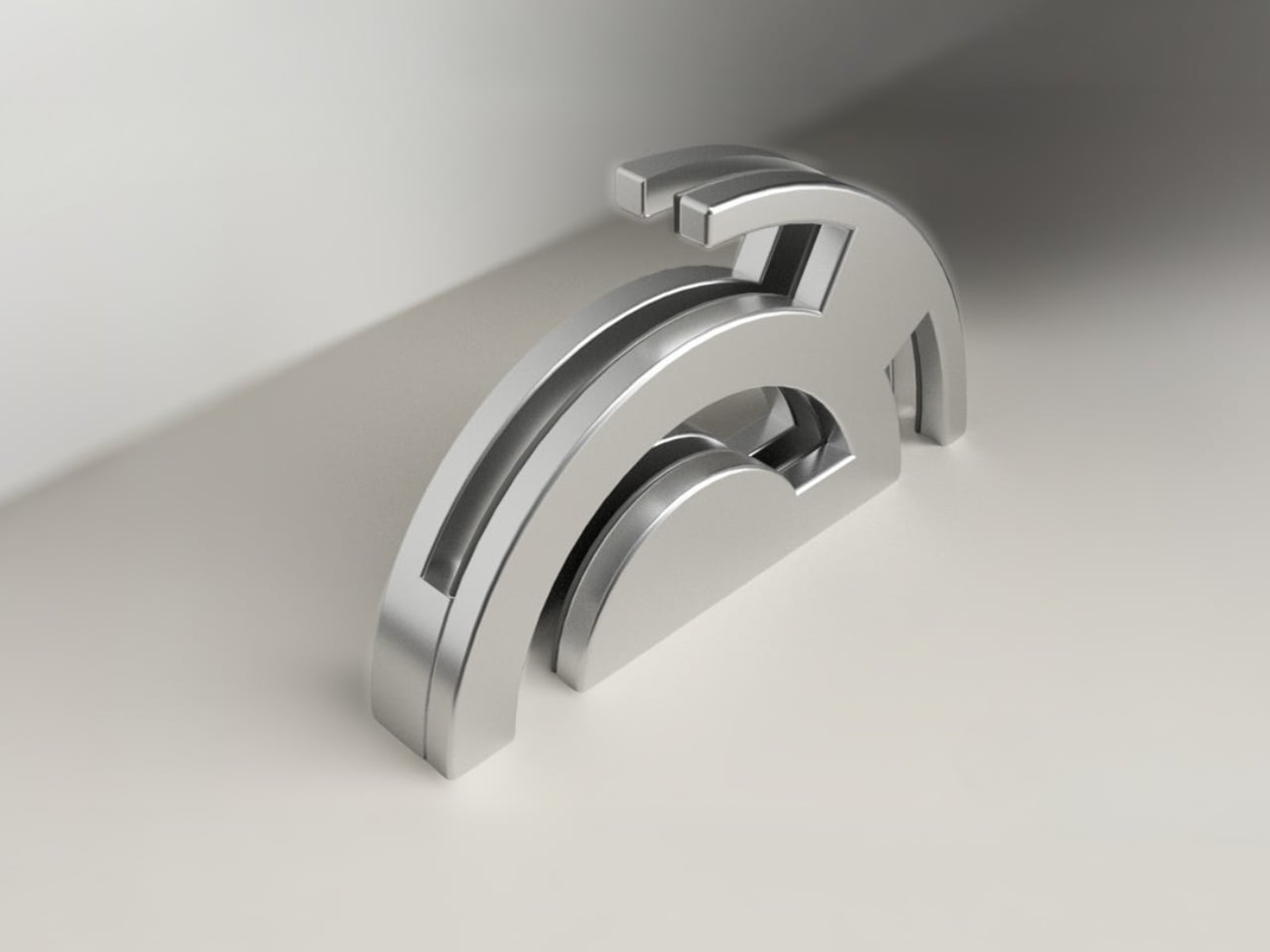
The Eclipse Edge is a magnetic knife holder inspired by the geometry of a lunar eclipse, specifically the moment when Earth aligns between the sun and moon, casting that iconic half-shadow silhouette into the sky. That form, an abstracted arc built from layered, concentric half-circles, becomes the entire design language here. Looking at it on a countertop, you wouldn’t immediately guess what it does. You’d probably assume it was a sculpture. That confusion is precisely the point.
Designer: Samyuktha S
![]()
Samyuktha’s design brief was direct: create a kitchen storage accessory that bridges functional utility and structural statement decor. The goal was to reimagine a standard tool organizer as a decorative landmark within the home, elevating it to a high-end sculptural piece. She achieved this without resorting to the usual tricks of adding color or unconventional materials. The Eclipse Edge is sand-casted aluminum with a hand-carved finish, and it leans entirely into that material’s dual nature: raw and refined at the same time.
The mechanics are equally considered. Hidden magnetic sheets inside the form hold knives parallel to the surface, which means blades are secured safely without any visible hardware or slots cutting into that clean silhouette. The oil and waterproof protective layering is built into the construction. Multiple knife sizes are accommodated without compromising the holder’s structural integrity or visual lines. It’s the kind of detail work that separates a pretty sketch from a design that actually holds up under scrutiny.
![]()
![]()
The ideation pages on Samyuktha’s Behance project tell you a lot. There are dozens of iterations, circular forms, crescent variations, abstracted lunar shapes explored and discarded before arriving at the stacked arch that became the final concept. Getting from a celestial reference to something that can hold a chef’s knife at the right angle and still look like contemporary sculpture takes a specific kind of problem-solving patience. The sketches make clear that nothing was accidental.
![]()
![]()
A physical prototype was also produced through aluminum sand casting using an MDF pattern, which means this design was tested in the real world, not just rendered beautifully and left to live on a screen. Seeing the actual object in photos alongside actual kitchen knives brings the concept into sharp focus. It looks grounded and serious in person, the kind of object that would hold its own on any well-styled countertop without asking for too much attention.
![]()
I do think about the practical day-to-day reality of owning something like this. Keeping polished aluminum pristine in a working kitchen takes effort, and the hand-carved finish, while gorgeous, would need care. But that’s not necessarily a flaw in the design. High-end kitchen objects have always required a little more commitment. A copper pot needs polishing. A cast iron pan needs seasoning. The Eclipse Edge feels like it belongs in that same category of objects you choose deliberately and tend to over time.
The broader conversation around kitchenware has been shifting for a while now. People increasingly want their kitchen tools to reflect how they live and what they care about, not just what they cook. The Eclipse Edge speaks to that shift with real confidence. It doesn’t apologize for being beautiful. It doesn’t hide its utility behind a costume. It just quietly insists that a knife holder can be, at the same time, an object worth looking at. Samyuktha S’s Eclipse Edge is a concept for now, but it’s the kind of concept that feels ready. The thinking is there. The craft is there. The prototype is there. Sometimes the only thing standing between a student project and a product is someone willing to bet on it.
![]()
The post Your Knife Block Has No Business Looking This Good first appeared on Yanko Design.