When Crisis Becomes Canvas: The Q Timex 1972 Time Machine Reissue Proves Accessible Design Never Goes Out of Style
![]()
When time travel costs less than your phone bill, something interesting happens to our perception of value and design. The Q Timex 1972 Time Machine Reissue carries the DNA of design born from chaos, back when the watchmaking industry faced what historians call the Quartz Crisis , a technological upheaval that threatened to destroy centuries of Swiss mechanical tradition. While European manufacturers scrambled to preserve their heritage, American brand Timex saw opportunity where others saw disaster.
Designer: Timex
This new reissue, priced at $249 for the silver variant and $279 for the gold , represents more than nostalgic throwback marketing. The watch embodies a moment when crisis forced innovation, when accessibility became a design philosophy rather than a compromise. In a world where good design often carries prohibitive price tags, the Time Machine Reissue stands as proof that democratic design principles still matter.
Design Democracy in a 39mm Package
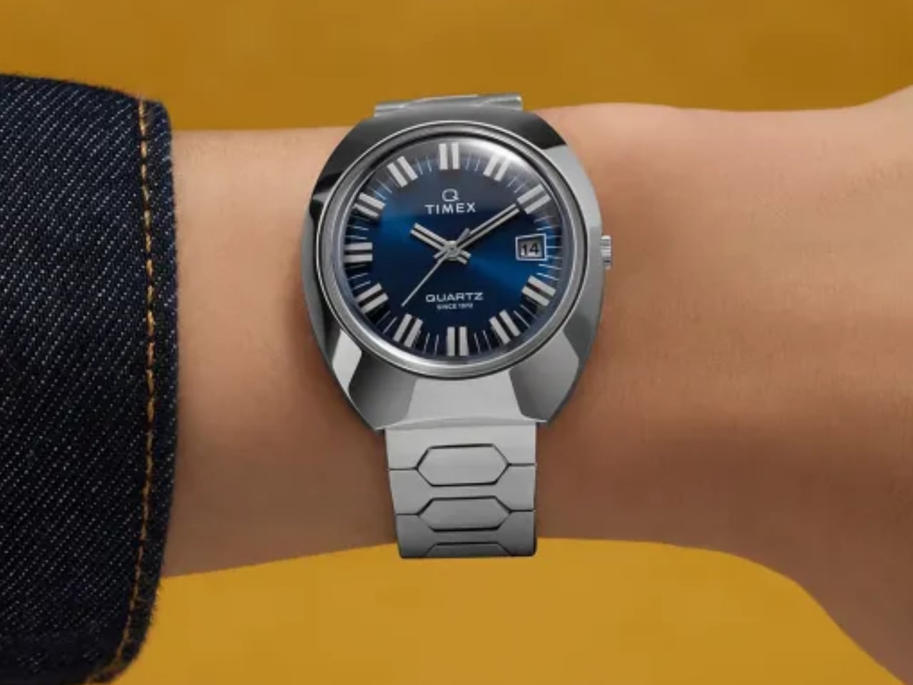
The original 1972 Q Timex emerged during American watchmaking’s most defining period. Swiss manufacturers, comfortable with their mechanical supremacy, initially dismissed quartz technology as a passing fad . Timex took the opposite approach, embracing the precision of quartz while wrapping it in bold, unapologetically American aesthetics. The hexagonal link bracelet wasn’t trying to mimic Swiss elegance. The tonneau case didn’t apologize for its unconventional proportions.
![]()
These design choices reflected a different philosophy entirely. Where Swiss watches emphasized exclusivity and tradition, the Q Timex prioritized accessibility and forward-thinking design. The floating hour markers, achieved through applied indices that cast subtle shadows around the dial , created visual depth without requiring expensive manufacturing techniques. Each element served both functional and aesthetic purposes.
The wood-grain dial pattern, available in deep red on the gold-toned case, represented pure design confidence. This wasn’t subtle or understated. The Time Machine demanded attention, celebrating its quartz precision rather than hiding it. For a brand targeting everyday Americans, this boldness made perfect sense.
The coin-operated battery hatch on the caseback tells its own story about user-centered design. In 1972, when the original cost $125 (equivalent to roughly $800 today) , Timex understood that luxury shouldn’t require specialized service. Users could replace their own batteries using a simple coin, eliminating the need for expensive watchmaker visits.
Disruption as Creative Catalyst
Understanding the Quartz Crisis context makes the Time Machine’s design choices even more meaningful. Between 1970 and 1985, Swiss watch industry employment plummeted from 89,450 to just 32,000 workers . Traditional watchmaking faced an existential threat as Japanese companies like Seiko introduced accurate, affordable quartz movements that outperformed mechanical alternatives.
![]()
Timex, already positioned as an accessible American brand, adapted faster than established players. The company recognized that quartz technology offered more than just accuracy. It enabled new design possibilities, freed from the size constraints of mechanical movements. The Time Machine’s distinctive case shape, measuring 39mm wide and 43mm long , maximized visual impact while maintaining comfortable wearability.
The acrylic crystal choice reflected both practical and aesthetic considerations. While mineral or sapphire crystals offered superior scratch resistance, acrylic provided the domed profile that defined 1970s watch design . This wasn’t cost-cutting but conscious design decision, preserving the authentic visual character that made the original distinctive.
Modern production techniques allow the reissue to improve on certain aspects while maintaining historical accuracy. The applied hour markers now sit higher above the dial surface, creating more dramatic shadows and enhanced legibility . The quartz movement delivers accuracy within milliseconds per day , far exceeding the precision possible with 1970s technology.
![]()
Each design element reflects the original’s democratic philosophy. The 20mm lug width accepts standard straps, ensuring easy customization. Water resistance to 50 meters provides practical everyday protection without unnecessary complexity. The stainless steel construction, now made from recycled materials , demonstrates how responsible manufacturing can coexist with accessible pricing.
The tonneau case shape deserves particular attention for its ergonomic intelligence. Unlike round cases that can feel disconnected from the wrist’s natural curves, the Time Machine’s elongated profile follows the arm’s contours. This creates a more integrated wearing experience, especially important for a watch designed for daily use rather than occasional display.
Sustainability Meets Storytelling
The recycled stainless steel used in both case and bracelet represents thoughtful evolution rather than marketing gimmick . Timex didn’t simply recreate the 1972 original but adapted its principles for contemporary concerns. The steel maintains identical durability and finish quality while reducing environmental impact, proving that sustainable practices can enhance rather than compromise design integrity.
![]()
This approach reflects broader shifts in how we understand luxury and value. The original Time Machine succeeded because it delivered premium design elements at accessible prices. The reissue maintains this philosophy while addressing modern sustainability expectations. The result feels both historically authentic and contemporarily relevant.
The gold-tone option, available for $279, demonstrates how surface treatments can dramatically alter a watch’s character without changing fundamental proportions. Against the wood-grain red dial, the warm metal creates a distinctly 1970s aesthetic that feels both retro and timeless. The silver version offers more versatility for contemporary styling while maintaining the same design DNA.
When History Becomes Tomorrow
The Time Machine’s revival coincides with broader renewed interest in 1970s design across multiple industries. Architecture, furniture, and automotive design all show influence from this period’s bold geometric forms and expressive color palettes. The watch industry’s embrace of vintage-inspired designs reflects this cultural shift, but few brands execute it with the Time Machine’s historical authenticity.
Perfect timing meets perfect proportions. The 39mm case size, considered large for 1972, now aligns perfectly with contemporary preferences . This sizing sweet spot works across different wrist sizes, offering substantial presence without overwhelming smaller arms. The proportional relationship between case, dial, and bracelet creates visual harmony that transcends temporal fashion trends. Unlike many modern watches that chase ever-larger dimensions, the Time Machine found its ideal size decades ago.
![]()
Modern watch enthusiasts appreciate the Time Machine’s honesty about its quartz movement. Electronic precision takes center stage rather than hiding behind mechanical mimicry. The clean dial layout, punctuated by the date window at 3 o’clock, prioritizes legibility over ornamentation. This functional approach feels refreshingly direct in an era of increasingly complex watch designs. No complications clutter the face, no subdials demand attention.
![]()
Those hexagonal bracelet links deserve recognition for their ergonomic sophistication. Each link articulates smoothly around the wrist’s curves while maintaining structural integrity. The polished surfaces catch and reflect light dynamically, creating visual interest without relying on precious metals or gem settings. Thoughtful engineering creates luxury-level aesthetics at accessible price points. The bracelet flows like liquid metal, conforming to your wrist’s natural movement patterns. Even after extended wear, comfort never becomes an issue.
Success comes from understanding that good design should be democratic rather than exclusive. The Q Timex 1972 Time Machine Reissue delivers hand-finished details, quality materials, and distinctive aesthetics typically reserved for watches costing significantly more. At $249, it challenges industry assumptions about pricing and quality relationships. Contemporary design culture increasingly values authenticity over artificial scarcity. The Time Machine demonstrates market appetite for products that prioritize genuine design merit over manufactured exclusivity.
Timex preserved the original’s essential character while adapting it for modern manufacturing and usage patterns. Superficial vintage styling gets replaced by respectful historical translation. The Q Timex 1972 Time Machine Reissue proves that crisis-born design can transcend its origins to become genuinely timeless. Democracy wins over exclusivity. Innovation trumps tradition. For $249, you get wearable proof that good design belongs to everyone.
The post When Crisis Becomes Canvas: The Q Timex 1972 Time Machine Reissue Proves Accessible Design Never Goes Out of Style first appeared on Yanko Design.

