Forget Your Old Loadout — 5 EDC Essentials Built for Summer 2026
![]()
Summer 2026 is a different kind of season for EDC. The carry conversation has matured past keychain gimmicks and bulk-heavy multitools into something sharper; gear that’s actually thought through, built from aerospace-grade materials, and designed with the same care as the objects that live on your desk. These five pieces represent the best of where that shift has landed: practical without being boring, minimal without being precious.
Whether you’re navigating festival crowds, weekend camping trips, or the daily urban grind, the right loadout isn’t about carrying more — it’s about carrying smarter. Each of the picks below earned its spot not through spec sheets alone, but through intentional design choices that make the experience of using them genuinely different. These are the five pieces worth making room for this summer.
1. Cubik Knife
![]()
![]()
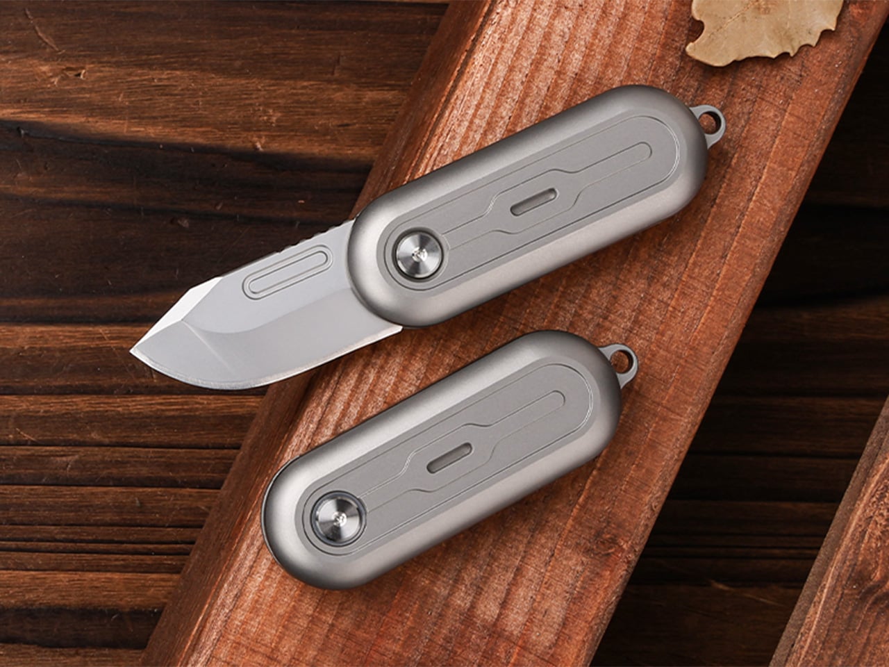
Gravity-powered deployment sounds more cinematic than practical — until you hold the Cubik. Designed by IF and machined from aerospace-grade titanium, this pocket knife opens with a button-flick and the natural pull of gravity: no springs, no mechanisms to fail, no audible snap. At 2.6 inches long, 0.98 inches wide, and just 0.2 inches thick, it slips into a pocket and disappears. The Cubik looks more like a designer flash drive than a knife, which is exactly the point — and what makes it so easy to live with every single day.
The blade runs a standard trapezoid utility format — the same geometry used to slice linoleum, roofing materials, acrylic, and thin sheet metals. When one edge dulls, flip it; when both are spent, swap it. That interchangeable format turns a consumable item into something genuinely sustainable over time. A deep-carry titanium clip keeps it flush to the pocket edge, and a tungsten carbide glass-breaker on the rear makes it a legitimate lifesaver when it counts. At $59 with five replacement blades included, it’s one of the most sensibly priced titanium tools in the category.
What we like
- Gravity-flick deployment is spring-free, meaning zero moving parts to fail over time
- Swappable trapezoid blades make the Cubik cost-effective and sustainable for long-term carry
What we dislike
- The utility blade format won’t appeal to collectors who prefer a dedicated knife steel
- Gravity deployment requires a deliberate wrist flick that takes a brief learning curve
2. 8-in-1 EDC Scissors
![]()
![]()
Most EDC scissors ask you to accept a compromise — either you get a folding design that sacrifices cutting power, or you get a rigid tool that’s too bulky to pocket. The 8-in-1 EDC Scissors from Eiger Design, available through the Yanko Design Shop, sidesteps both problems. Made in Japan and compact enough to sit in a palm at just 13 centimeters (5.1 inches) closed, it packs scissors, a knife, a lid opener, a can opener, a cap opener, a bottle opener, a shell splitter, and a degasser into a single carry-ready object.
The scissors themselves are the real story — full-strength blades that don’t rely on a collapsible pivot to achieve their compact profile, which means they cut with conviction through materials that foldable scissors would snag or mangle. The remaining seven functions are genuine, not ornamental. For summer specifically — camping weekends, beach cookouts, farmers market errands, festival packing — this is the kind of tool that earns its weight early and keeps earning it. At $53 through the YD Shop, it’s the most versatile item on this list per dollar spent.
What we like
- Eight independent tools in a 5.1-inch, palm-sized package that’s genuinely comfortable to carry daily
- Made-in-Japan manufacturing brings real precision to both the scissors and every secondary tool
What we dislike
- The scissors-first form factor means the secondary tools can feel secondary in actual day-to-day use
- Not the right call if you’re shopping for a dedicated cutting tool rather than a multitool
3. NoxTi
![]()
![]()
NoxTi is the kind of object that makes you reassess what belongs on your keychain. Designed by Xedge and built from Grade 5 titanium, it measures just 45mm and weighs 10.7 grams. The core of the piece is a tritium vial — a sealed, self-luminous insert that glows continuously for 25 years without batteries, charging, or any external power source. Quartz glass protects the vial from impact, and the titanium housing supports interchangeable vial options alongside a glass-breaker tip at the rear, making it far more than a novelty.
In practical terms, NoxTi solves a problem most EDC setups don’t realize they have: passive orientation in the dark. When your keychain is at the bottom of a bag, buried in a jacket pocket, or left on a nightstand, the glow orients you without reaching for your phone. That always-on, zero-input utility is a design philosophy most gear claims but rarely delivers.
What we like
- Tritium vial delivers 25 years of passive, battery-free illumination with no maintenance required
- Grade 5 titanium housing and quartz vial protection make it exceptionally durable for keychain life
What we dislike
- At 45mm, it’s compact but will add noticeable length to an already-loaded keychain setup
- Tritium vials are radioactive (safely contained, but a consideration for buyers who prefer chemical-free carry)
4. HYZER
![]()
![]()
Exceed Designs doesn’t do anything conventionally, and the HYZER is the clearest proof of that. At its core, it’s a hatchet — but calling it that undersells the engineering. The handle is fully skeletonized and CNC-machined from a solid block of 6AL-4V Grade 5 titanium, available in two lengths: a full-size 9.75 inches or a compact 8.15 inches. The head runs on an infinitely modular nested system that lets you swap cutting formats without replacing the handle — a level of adaptability that no conventional hatchet even attempts.
For summer carry — backcountry hiking, basecamp setups, or serious van-life configurations — the HYZER changes the math on what a hatchet needs to be. The D2 steel axe head delivers serious chopping performance, while the titanium handle keeps the tool lighter than any steel-handled competitor in its class. The stonewashed finish gives it a visual identity that’s unmistakably premium without being precious about it.
What we like
- The modular nested head system allows the HYZER to adapt to different cutting and splitting configurations
- Full skeletonized Grade 5 titanium achieves meaningful weight savings without compromising structural integrity
What we dislike
- The premium titanium and D2 material combination places this at a significantly higher price point than most seasonal carries
- Two-handed hatchet operation demands dedicated pack space that the other four items on this list don’t require
5. BlackoutBeam Tactical Flashlight
![]()
![]()
A 2,300-lumen output in a tactical flashlight isn’t rare in 2026 — but a 2,300-lumen flashlight that looks like it belongs at a design exhibition rather than a military surplus store is still genuinely hard to find. The BlackoutBeam, available through the Yanko Design Shop at $90, pairs that blinding output with an industrial aesthetic that wears well whether it’s clipped to a backpack or sitting on a shelf. The 300-meter throw distance cuts through darkness with clinical precision, and the IP68 waterproof rating ensures it performs regardless of what summer throws at it.
Five operational modes — including strobe and pinpoint — give the BlackoutBeam tactical flexibility that goes well beyond on-off cycling. The 0.2-second instant-on response is the detail that separates tools built for designers from tools built for actual use: in a power outage, a trail emergency, or any situation where you need light immediately, that activation speed matters in a way that a spec sheet can’t fully communicate. With longer days turning into late evenings outdoors and camping season running hot, the case for a serious flashlight in your summer kit has never been more straightforward.
What we like
- 2,300-lumen output with a 300-meter throw distance puts it firmly in professional-grade territory
- A 0.2-second instant-on response time makes it genuinely dependable when the situation demands it
What we dislike
- The tactical aesthetic reads as aggressive for carry setups that lean toward minimalist or everyday styling
The Best Loadout Is the One You Actually Think About
What these five pieces share isn’t material or price point…it’s intention. Every one of them was designed by someone who cared enough to solve the actual problem rather than approximate a solution. That’s the standard worth holding EDC to in 2026, and it’s becoming a higher bar to clear as the category matures and the market fills with near-misses. The best loadout is never the one with the most gear. It’s the one with the right gear.
Summer tends to be the season when carry gets edited down; lighter layers mean fewer pockets, and heat means less patience for bulk. These five designs all pass that test. They’re compact enough to disappear when you want them to and capable enough to matter when you don’t. Whether you pick up one or all five, the upgrade from whatever you’re carrying now is real.
The post Forget Your Old Loadout — 5 EDC Essentials Built for Summer 2026 first appeared on Yanko Design.