❌

Vue normale

  • ✇Yanko Design
  • The Lamp That Actually Looks Better With the Lights Off
    Most lighting has a dirty secret: it only works half the day. Flip the switch and a pendant or sconce can look spectacular, all warm glow and dramatic shadow. Flip it off, and you’re left staring at what is often just a glorified fixture, a thing bolted to a ceiling that has nothing to say for itself once the bulb goes dark. That gap between “on” and “off” is where a lot of home lighting quietly fails us, and it’s a problem most people never think to name because they’ve simply accepted it. Hol
     

The Lamp That Actually Looks Better With the Lights Off

12 septembre 2026 à 15:15

Most lighting has a dirty secret: it only works half the day. Flip the switch and a pendant or sconce can look spectacular, all warm glow and dramatic shadow. Flip it off, and you’re left staring at what is often just a glorified fixture, a thing bolted to a ceiling that has nothing to say for itself once the bulb goes dark. That gap between “on” and “off” is where a lot of home lighting quietly fails us, and it’s a problem most people never think to name because they’ve simply accepted it.

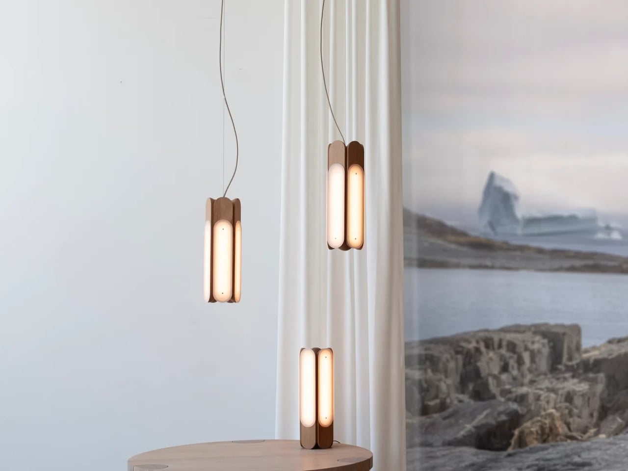
Hollis+Morris, the Toronto studio behind the new Beaufort collection, clearly has thought about it. Their solution isn’t a smarter bulb or a clever dimmer app. It’s a rethinking of what a light fixture is supposed to do when it’s doing nothing at all. Beaufort is built from sculpted solid wood paired with sandblasted acrylic, and the acrylic is cut and finished so it holds a kind of frozen depth, layered, translucent, a little mysterious, whether or not there’s current running through it. Turn it on and light diffuses through those layers in soft gradients. Turn it off and you still have an object worth walking past twice.

Designer: Hollis+Morris

The origin story is the kind of thing that sounds almost too tidy, except it happens to be true. Mischa Couvrette, the studio’s founder and lead designer, was flying home from Copenhagen’s 3daysofdesign when a conversation about ice, and about climate change, turned into sketches on a cocktail napkin somewhere over the Atlantic. By the time the plane landed, the collection basically existed in his head. The name comes from the Beaufort Sea, that remote stretch of Arctic water above Alaska and Canada’s Northwest Territories, which is a fitting reference for a studio that has built its identity on restraint rather than spectacle.

I appreciate that the collection doesn’t try to literally recreate an iceberg hanging from your ceiling. Instead it borrows the logic of ice: how light moves through something dense and layered, how clarity shifts depending on where you’re standing. The studio achieves that through repetition, mirroring, and rotation of a small set of core components, which is a fancy way of saying they’ve built one coherent visual language and then let it flex across a sconce, a mirrored horizontal pendant, a lantern-like vertical pendant, and a table lamp. Nothing in the lineup feels like an afterthought tacked onto a single hero piece just to pad out a catalog.

Jonathan Mandeville of Hollis+Morris put it plainly when he said the collection sits in a lineage of Scandinavian and Canadian design that values material honesty and quiet restraint, the idea that an object should earn its keep even when it isn’t doing anything. That’s a bit of a jab, gentle as it is, at a design moment that has leaned hard into maximalism and novelty for novelty’s sake. I don’t think Beaufort is arguing that bold, loud design is wrong. Plenty of homes need a little chaos. But there’s real value in a piece that doesn’t ask for your attention so much as reward it once you’ve already given it, and that’s a harder trick to pull off than another oversized statement chandelier.

It also matters, at least to me, that these pieces are made in Canada by a B Corp certified studio that treats that fact as a working value rather than a sticker on the box. Knowing who made a light and how isn’t a small thing anymore, especially with home goods, where supply chains can be murky at best.

Beaufort isn’t cheap. The R5 horizontal pendant runs $3,800 and the M2 horizontal starts around $1,900, so this is squarely in investment-piece territory, not an impulse buy from a big box store. But for anyone who has ever bought a light fixture, loved it while it was on, and felt a little let down by it during the day, Beaufort makes a fairly convincing case that the two states shouldn’t have to be so different.

The post The Lamp That Actually Looks Better With the Lights Off first appeared on Yanko Design.
  • ✇Yanko Design
  • A Ceramic Lamp That Refuses to Stay the Same
    Most lamps ask you to commit. You pick a shade, a finish, a mood, and that’s what you’re stuck with until the bulb burns out or you get sick of it and drag the whole thing to a donation bin. For anyone who likes to rearrange a room the way some people rearrange their playlists, that’s a real limitation, and it’s one nobody really talks about because we’ve just accepted lighting as a fixed decision rather than a flexible one. Seoul-based designer Byunggwon Na looked at that problem and did somet
     

A Ceramic Lamp That Refuses to Stay the Same

2 septembre 2026 à 15:20

Most lamps ask you to commit. You pick a shade, a finish, a mood, and that’s what you’re stuck with until the bulb burns out or you get sick of it and drag the whole thing to a donation bin. For anyone who likes to rearrange a room the way some people rearrange their playlists, that’s a real limitation, and it’s one nobody really talks about because we’ve just accepted lighting as a fixed decision rather than a flexible one.

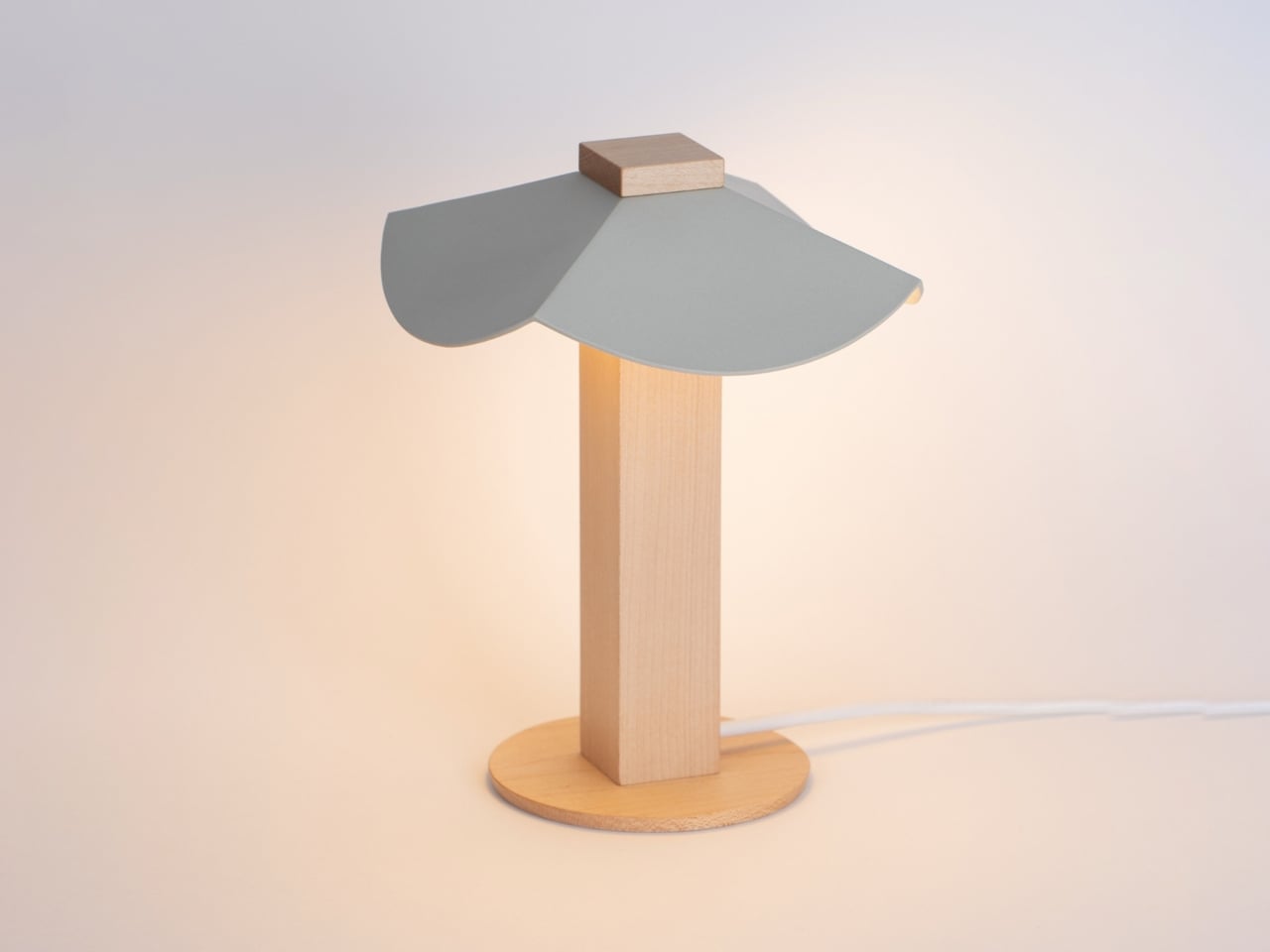
Seoul-based designer Byunggwon Na looked at that problem and did something refreshingly simple about it. His new piece, ALIT, is a lamp built from two honest materials, slip-cast ceramic and solid wood, and it’s designed so the ceramic shade can be lifted off and swapped for another one entirely. The wooden column stays put. The ceramic changes. One base, endless personalities.

Designer: Byunggwon Na

I’ll admit I’m a sucker for objects that do more with less, and ALIT is a good example of that instinct done right. It isn’t trying to be smart, connected, or app-controlled, which honestly feels like the correct move in a market saturated with lighting products chasing the “smart home” label. Instead, Na leaned into contrast: the coolness of ceramic against the warmth of wood, the matte against the grain, the handmade against the geometric. The square wooden column reads almost architectural, a quiet, upright form that could disappear into a Scandinavian-leaning living room or a mid-century one just as easily. The ceramic shade sitting on top is where the personality lives, and because it’s removable, that personality isn’t permanent.

This piece treats color and light together, not separately. A pale, unglazed ceramic shade lets light spill out soft and even, almost like paper. A darker or glazed version holds the light closer, letting it glow through in patches instead of flooding the room. So the same base lamp can go from a reading-corner glow to something moodier for a dinner table, just by switching the top. That’s not a gimmick. That’s actual utility dressed up as good design, and those two things don’t always travel together.

American interiors have leaned hard into modularity over the past few years, from sectional sofas you can rearrange endlessly to shelving systems that grow with you. Lighting has lagged behind that trend, still mostly sold as one fixed object per mood. ALIT fits into where the category is quietly heading: fewer disposable purchases, more pieces designed to be lived with and adjusted rather than replaced. For a design market that talks a lot about sustainability but rarely builds it into something this tactile, that matters.

There’s also something to be said for the fact that Na didn’t overcomplicate the engineering. No magnets, no proprietary mounts, no fragile clip system to break after six months. The shade simply rests on the column, held by gravity and good proportions. It’s the kind of restraint that separates designers who understand materials from those who just decorate around them.

I don’t think ALIT is going to reinvent the lighting industry, and I don’t think it’s trying to. What it does is solve a small, specific annoyance, the fact that changing a lamp’s mood usually means buying a whole new lamp, and it solves it with a design vocabulary that feels considered rather than trend-chasing. In a category full of objects competing for attention, ALIT seems more interested in earning a long-term place in a room. That’s a rarer ambition than it should be, whether this one ends up in a Seoul studio or an apartment in Brooklyn.

The post A Ceramic Lamp That Refuses to Stay the Same first appeared on Yanko Design.

❌