A Duck, Some Bent Tubes, and the Most Charming Lamp of 2026
![]()
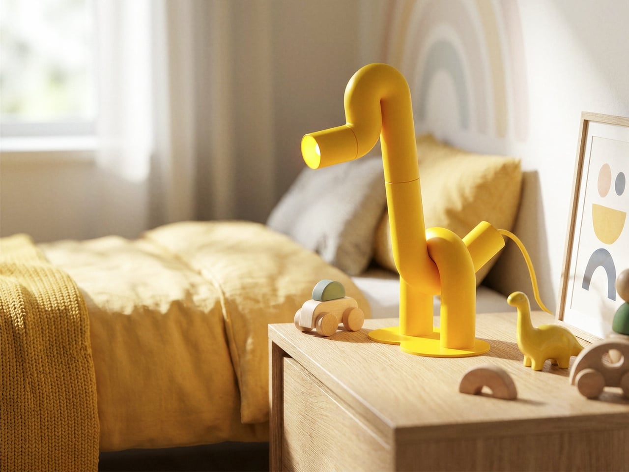
The first thing you notice is the yellow. Not a soft, hedging yellow, but a full-commitment, matte, warm yellow that coats every millimeter of the piece without apology. Then you notice the shape. A long, arching neck. Two sturdy legs. A horizontal head that doubles as the light source. Duke, the table lamp designed by Liam de la Bedoyere of Bored Eye Design, is a duck. More precisely, it’s a duck drawn by someone who decided that one continuous tube was all they needed.
That’s the central idea, and it’s worth sitting with. De la Bedoyere’s design vocabulary here is essentially a single rule: take a tube, bend it, and let the animal emerge from the bends. No additional elements, no decorative flourishes, no mixed materials. Just the tube, its curves, and the form they describe. The result is a piece that communicates immediately. You read it as an animal before you register that it’s a lamp, which is the correct order of things.
Designer: Liam de la Bedoyere
![]()
![]()
Up close, the construction rewards attention. The tubular sections connect in visible segments, and those joints give the piece a modular, almost architectural quality that tempers the playfulness with something more considered. The bends themselves are generous and smooth, with a radiused curve that keeps everything feeling soft rather than rigid. The head is a cylinder open at the end, functioning as the spotlight, and that detail is quietly clever. The light doesn’t interrupt the form. It completes it, pointing forward from the duck’s snout like the whole thing was always meant to do exactly this.
![]()
The base is a flat circular disc, minimal and low to the surface. Two legs rise from it and immediately branch into the body, giving the lamp a planted, grounded stance that stops it from reading as fragile. And then there’s the cord, a braided yellow cable that matches the body exactly, looping out near the base. Most designers treat the cord as a problem to solve or something to hide. Here it’s an afterthought that became a feature, trailing away from the lamp like a tail. It’s one of those small decisions that reveals how thoroughly this design was thought through.
![]()
![]()
The monochromatic yellow does something important for how the silhouette reads. By removing any tonal contrast within the piece itself, the animal form becomes purer and more immediate. Your eye traces the outline rather than getting pulled into detail, which is exactly what you want from a lamp that’s also functioning as sculpture. The color also travels. Looking at Duke placed against warm wood, concrete, white walls, and natural linen, it doesn’t clash with any of them. Yellow at this saturation and matte finish is warmer than it is aggressive, and it reads more like a material choice than a color choice.
![]()
![]()
The design is also genuinely versatile, which isn’t something you can say about most statement objects. Duke works in a child’s bedroom because it looks like a toy. It works on a bookshelf or a credenza in an adult living space because the construction is clean and the form is abstract enough to read as sculptural. Place it next to a magazine on a coffee table and it looks like something you’d find in a design gallery. That range of contexts isn’t accidental. It comes from the clarity of the underlying concept. When a design is resolved at the idea level, it adapts.
![]()
![]()
![]()
What makes Duke feel significant beyond its charm is that de la Bedoyere is clearly developing a language, not just making individual pieces. The Flamingo Lamp came first, and the same logic runs through both, which means the interest is in the system as much as the object. A lamp collection built entirely on the premise of one continuous tube tracing an animal is a genuinely interesting editorial position for a designer to take. It’s a constraint that produces rather than limits, and that’s the kind of thinking that tends to produce lasting work.
![]()
![]()
Duke doesn’t try to do many things. It tries to do one thing very well, and in design, that’s harder than it sounds.
![]()
The post A Duck, Some Bent Tubes, and the Most Charming Lamp of 2026 first appeared on Yanko Design.