❌

Vue normale

  • ✇Yanko Design
  • The $50 Titanium Cup That Refuses to Ruin Your Whiskey
    I’ve broken more shot glasses than I care to admit, and I’ve also poured a good shot of whisky into a glass that smelled faintly of dish soap because nobody thought to hand-dry it properly. That’s the quiet failure of most drinkware. It’s not that it looks bad. It’s that it gets in the way of the thing you’re actually drinking, whether through fragility, absorption, or just feeling like an afterthought grabbed from a gift-shop shelf. The Titanium Artisan Spirits Cup solves a problem I didn’t re
     

The $50 Titanium Cup That Refuses to Ruin Your Whiskey

13 septembre 2026 à 19:30

I’ve broken more shot glasses than I care to admit, and I’ve also poured a good shot of whisky into a glass that smelled faintly of dish soap because nobody thought to hand-dry it properly. That’s the quiet failure of most drinkware. It’s not that it looks bad. It’s that it gets in the way of the thing you’re actually drinking, whether through fragility, absorption, or just feeling like an afterthought grabbed from a gift-shop shelf.

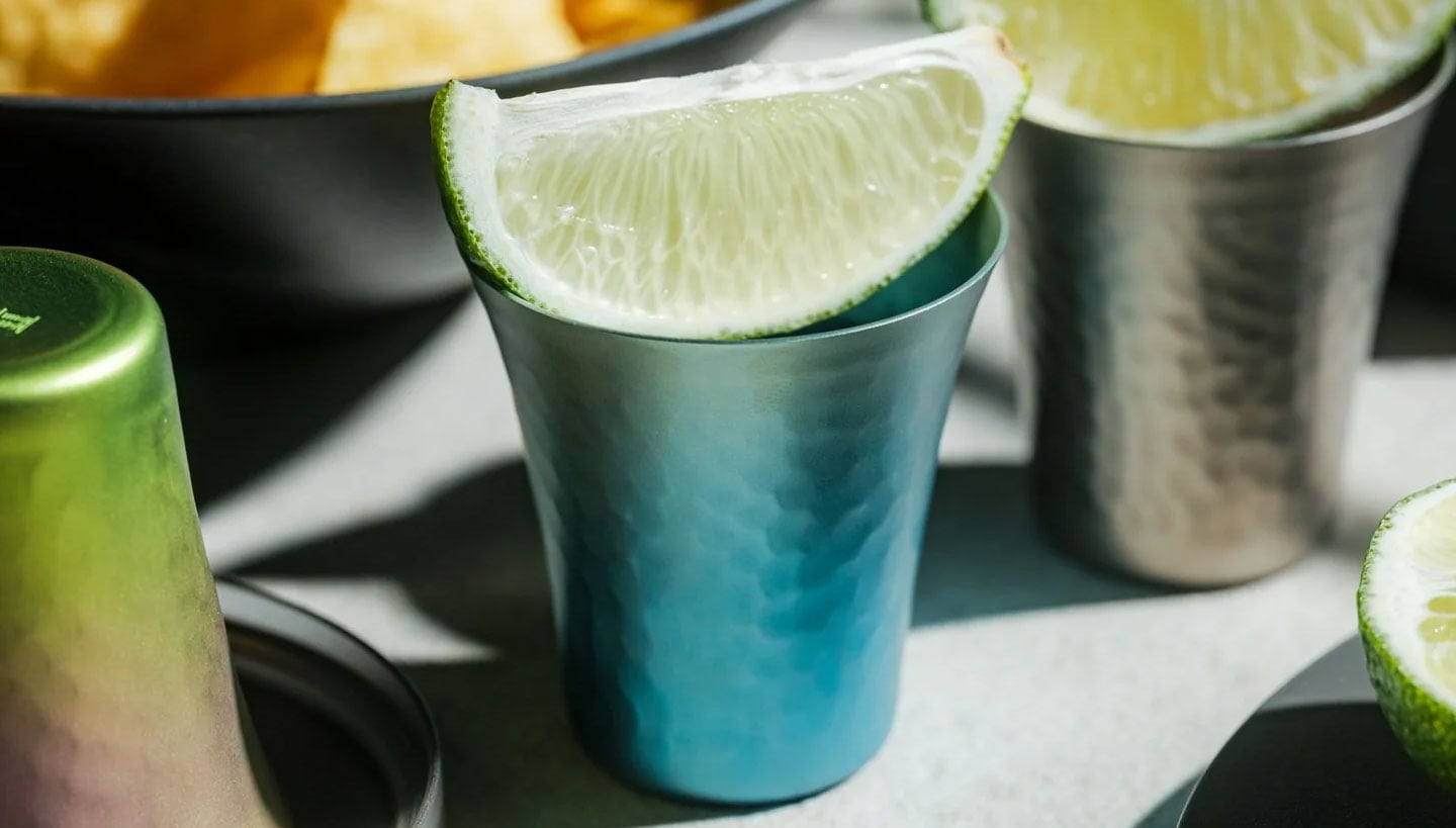
The Titanium Artisan Spirits Cup solves a problem I didn’t realize I’d been quietly annoyed by for years: the vessel changing the experience instead of getting out of its way. Made in Japan from solid titanium, this tiny cup, just 70ml, about the size of a proper sake or spirits pour, is built from a material that’s completely non-reactive. No metallic aftertaste, no lingering smell from last week’s whiskey, no worry about it cracking if you set it down a little too hard after a long day. It just holds the drink and lets the drink be the drink.

Click Here to Buy Now: Starting at $50

I’ll admit I was skeptical the first time I read “titanium cup” and pictured something that belonged on a camping trip, not a bar cart. But this isn’t the same brushed, utilitarian titanium you’d find in a hiking mug. The anodized finishes here, Horizon’s pink-to-green gradient, Aurora’s iridescent blue-green, Daylight’s pale blue shimmer, are created through an electrochemical process, not paint, which means the color actually lives inside the metal’s oxide layer. Practically speaking, that means no two colored cups come out quite the same. You’re not buying a product off an assembly line so much as picking one version of a process that never repeats itself exactly. For $50 to $60 depending on finish, that’s a small price for owning something genuinely singular.

It’s worth comparing this to how a brand like Yeti has trained American drinkers to think about premium drinkware over the last decade. Yeti built an empire on durability and temperature retention, on the promise that your drink stays cold or hot for hours in something that survives getting thrown in the truck bed. That’s a real, useful problem solved well. But Yeti’s whole design language is about insulation and toughness for casual, high-volume drinking. This titanium cup is solving something almost opposite: it’s not trying to keep your drink at a certain temperature or survive a drop from a tailgate. It’s built for the smaller, slower moment, the two-ounce pour you’re meant to sit with, not gulp. One is engineered for durability at scale. The other is engineered for intimacy in a single sip.

What actually sold me on this piece isn’t the finish or the aerospace-grade pedigree of the material, though both are legitimate. It’s the size. Seventy milliliters forces a kind of restraint. You can’t casually refill it five times without noticing you’re doing it. It nudges you toward treating a pour of whiskey or sake as an event rather than background noise while you scroll through your phone. That’s a small, almost accidental piece of good design, the kind that changes behavior without lecturing you about it.

I also don’t think the Titanium Artisans Spirit Cup is for everyone, and that’s fine. If you want something that holds sixteen ounces of iced tea and survives a dishwasher cycle, this isn’t your object. But if you’ve ever wanted a single, honest vessel for the good stuff, the bottle you save for a specific mood or a specific person, this earns its place on a shelf. With only a handful available at a time, it’s also not pretending to be mass-market, which somehow makes it feel more genuine rather than more precious. Good drinkware should disappear the moment the drink hits your lips. This one actually manages that, and it does it while looking like something you’d want to hold onto forever.

The post The $50 Titanium Cup That Refuses to Ruin Your Whiskey first appeared on Yanko Design.
  • ✇Yanko Design
  • The Bali Sculpture That Finally Makes Overshot Views Feel New
    Bali has a photo problem. Not a bad one, exactly, but a familiar one: the same rice terrace, the same infinity pool angle, the same swing shot dangling over the same jungle canopy, reposted by a few million travelers who all found the identical spot through the same map pin. When a landscape gets photographed enough times, it starts to flatten out in your memory before you’ve even seen it in person. You arrive, and it feels like déjà vu instead of discovery. That’s the quiet problem Vincent Ler
     

The Bali Sculpture That Finally Makes Overshot Views Feel New

13 septembre 2026 à 11:20

Bali has a photo problem. Not a bad one, exactly, but a familiar one: the same rice terrace, the same infinity pool angle, the same swing shot dangling over the same jungle canopy, reposted by a few million travelers who all found the identical spot through the same map pin. When a landscape gets photographed enough times, it starts to flatten out in your memory before you’ve even seen it in person. You arrive, and it feels like déjà vu instead of discovery.

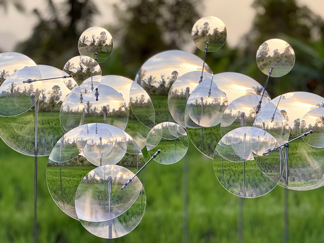
That’s the quiet problem Vincent Leroy’s new installation seems to answer, even if he’d probably never put it in those terms. Tucked into the hills of Munduk, “Eccentric Lenses” is a field of Fresnel lenses mounted on posts, catching the wind and spinning on axes that aren’t centered, so nothing ever settles into a repeatable frame. Point a camera at it in the morning and again at dusk and you won’t get the same picture twice, not because the location changed, but because the lenses never stop rearranging it for you.

Designer: Vincent Leroy

Fresnel lenses are the flat, ridged discs you’d recognize from old lighthouses or projector screens, built to bend light without the bulk of a curved glass lens. Leroy has been experimenting with them for years, but this piece feels like his most site-specific use of the idea. Instead of distorting a studio backdrop, he’s pointed the lenses at Bali’s actual terrain, its rice fields, its distant volcanic peaks, its low clouds, and let the wind do the editing. Every gust nudges a lens a few degrees, and the mountain behind it splits, doubles, or slides sideways for a second before reassembling.

What I appreciate here is the restraint. There’s no motor, no app, no LED strip pretending to be magic. It’s just optics and weather, working together in a way that feels almost stubbornly analog for 2026. We’ve spent the better part of a decade being told that wonder needs a screen attached to it, that a landscape only becomes interesting once it’s been filtered, looped, or turned into a Reel. Leroy’s installation goes the opposite direction. It takes the one thing every travel photo tries to eliminate, unpredictability, and makes it the entire point.

There’s a reason kinetic art tied to natural forces keeps resurfacing right now, from wind-driven sculptures to mirror installations chasing the sun across a field. People are a little exhausted by content that behaves exactly the way it’s supposed to. A piece that changes because the wind decided to pick up speed is refreshing precisely because nobody, including the artist, can fully predict what it’ll look like an hour from now. That unpredictability used to be considered a flaw in outdoor art. Here it’s the mechanism.

It also helps that Leroy didn’t ask Bali’s landscape to hold still for him. The lenses don’t compete with the rice terraces or try to outshine the mountains; they just keep reintroducing you to them. That’s a small but telling choice. So much of contemporary installation art wants to be the main event, the thing you drove out to see. This piece works because it insists the actual landscape was always worth a second look, it just needed a nudge to prove it.

I don’t think “Eccentric Lenses” is trying to solve tourism fatigue or fix anyone’s relationship with their camera roll. But it’s hard not to read it that way anyway, especially watching footage of a single mountain peak splintering into five overlapping versions of itself, then quietly reforming into one. For a moment, an overexposed view of Bali stops feeling used up. It just feels new again, which might be the most useful trick any piece of art can pull off right now.

The post The Bali Sculpture That Finally Makes Overshot Views Feel New first appeared on Yanko Design.

  • ✇Yanko Design
  • Finally, a Bench Design That Never Wastes a Seat
    Anyone who has ever sprinted through a train station with a rolling suitcase in one hand and a coffee sloppily balanced in the other knows the particular despair of scanning a row of seats and finding every single one occupied by someone’s backpack. Not a person. A bag. Sitting there like it paid for the ticket too. That small, maddening moment is basically the whole reason a London studio called Of My Imagination designed something called Flip, a modular public seating system where each indivi
     

Finally, a Bench Design That Never Wastes a Seat

12 septembre 2026 à 18:30

Anyone who has ever sprinted through a train station with a rolling suitcase in one hand and a coffee sloppily balanced in the other knows the particular despair of scanning a row of seats and finding every single one occupied by someone’s backpack. Not a person. A bag. Sitting there like it paid for the ticket too.

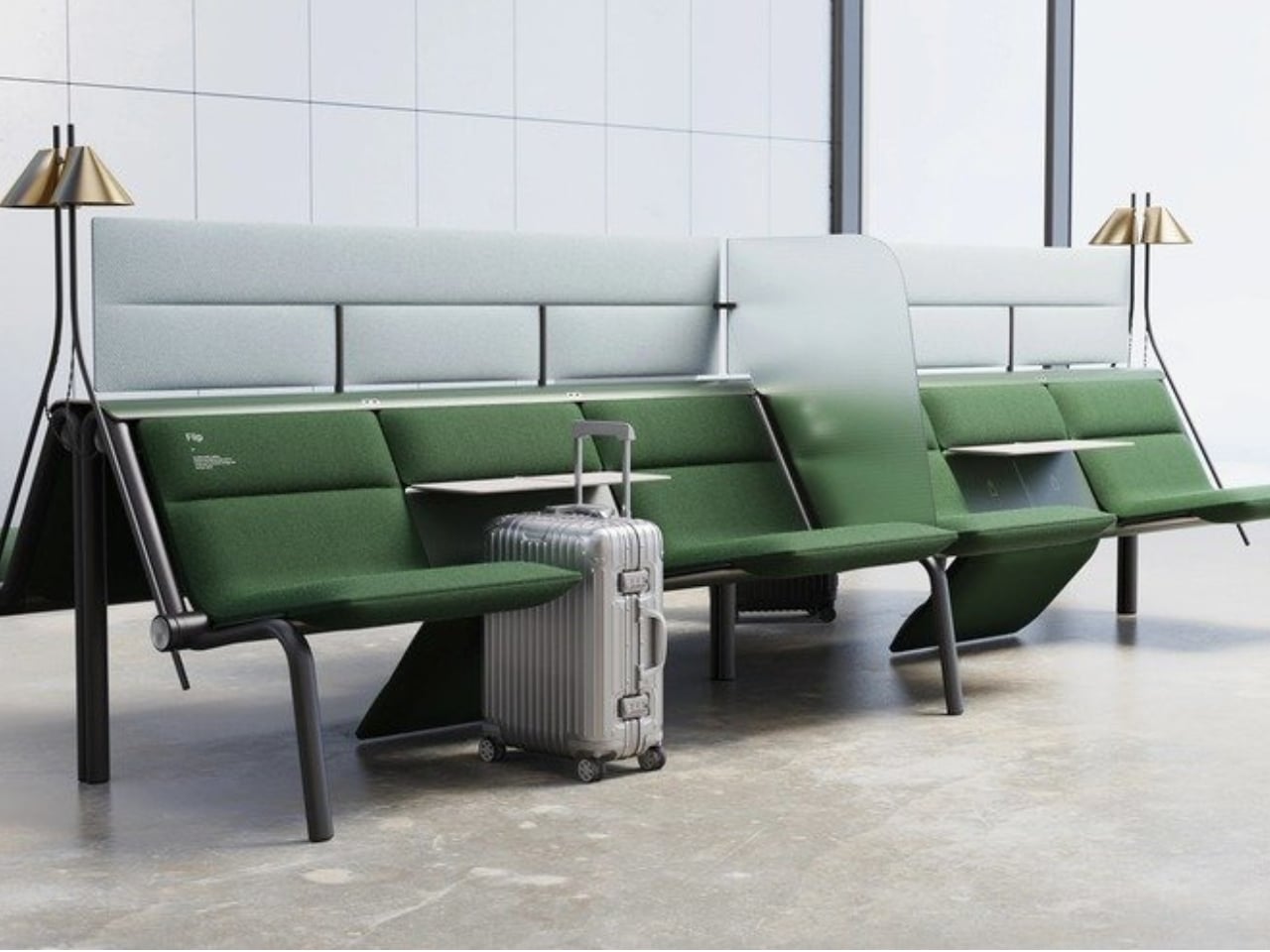
That small, maddening moment is basically the whole reason a London studio called Of My Imagination designed something called Flip, a modular public seating system where each individual seat can rotate out of the way on command. Instead of a bench being a fixed slab of “sit here or don’t,” Flip treats every seat as its own hinge point. Flip it down, it’s a chair. Flip it up and out, it becomes open space for luggage, a stroller, or just more room to breathe when a platform gets crowded. It sounds almost too simple to be clever, which is usually the sign of a genuinely good idea.

Designer: Of My Imagination

I’ve been thinking about public seating a lot lately, mostly because so much of it seems designed for an idealized version of how people move through the world rather than the messy, unpredictable reality of it. Airports, bus terminals, hospital waiting rooms. These spaces swing between dead quiet and total chaos within the same hour, and yet the furniture almost never adjusts with them. A bench built for a slow Tuesday afternoon becomes a liability during a holiday rush, when every inch of floor space suddenly matters and immovable seating just gets in the way.

Flip’s answer isn’t flashy. There’s no app, no motor, no sensor deciding when a seat should move. It’s a mechanical latch and a rotating joint, the kind of low-tech solution that feels almost old-fashioned in a moment when everything gets pitched as “smart.” I actually like that restraint. Public infrastructure breaks down constantly not because the technology is too simple, but because it’s too complicated, too fragile, too dependent on software updates and maintenance contracts nobody budgeted for. A seat that flips because a person physically flips it is a seat that still works during a power outage, a system failure, or just a Tuesday when the maintenance crew is short-staffed.

The pandemic-era spacing rules get a mention in OMI’s own description of the project, and it’s worth sitting with that for a second. Remember all those benches wrapped in caution tape or marked with awkward stickers telling you where not to sit? Most of that signage disappeared once the emergency did, but the underlying problem never really left. Public seating still needs to flex between “pack people in tightly” and “spread them out,” whether that’s for health reasons, accessibility needs, or just the reality of rush hour versus a quiet Sunday morning.

What strikes me most is how much this design respects the intelligence of the people using it. Flip doesn’t try to predict what a traveler needs. It just gives them the option and gets out of the way. That’s a surprisingly rare quality in public design, where the instinct is often to over-engineer a solution that anticipates every scenario instead of trusting a commuter to make a simple physical adjustment themselves.

Is it going to replace every bench in every transit hub across the country? Probably not right away, and cost, durability testing, and vandalism resistance are the unglamorous hurdles any concept like this has to clear before it shows up somewhere you’d actually sit down. But as a proof of concept, it’s a refreshing reminder that flexibility doesn’t require a screen or a subscription. Sometimes it just requires a hinge and a little humility about how unpredictable public spaces actually are.

The next time I’m standing in a crowded terminal, silently negotiating personal space with a stranger’s overstuffed duffel bag, I’ll probably think about Flip. Not because it solves everything, but because it solves the one thing that’s been sitting there, unaddressed, for as long as public benches have existed.

The post Finally, a Bench Design That Never Wastes a Seat first appeared on Yanko Design.

  • ✇Yanko Design
  • The Lamp That Actually Looks Better With the Lights Off
    Most lighting has a dirty secret: it only works half the day. Flip the switch and a pendant or sconce can look spectacular, all warm glow and dramatic shadow. Flip it off, and you’re left staring at what is often just a glorified fixture, a thing bolted to a ceiling that has nothing to say for itself once the bulb goes dark. That gap between “on” and “off” is where a lot of home lighting quietly fails us, and it’s a problem most people never think to name because they’ve simply accepted it. Hol
     

The Lamp That Actually Looks Better With the Lights Off

12 septembre 2026 à 15:15

Most lighting has a dirty secret: it only works half the day. Flip the switch and a pendant or sconce can look spectacular, all warm glow and dramatic shadow. Flip it off, and you’re left staring at what is often just a glorified fixture, a thing bolted to a ceiling that has nothing to say for itself once the bulb goes dark. That gap between “on” and “off” is where a lot of home lighting quietly fails us, and it’s a problem most people never think to name because they’ve simply accepted it.

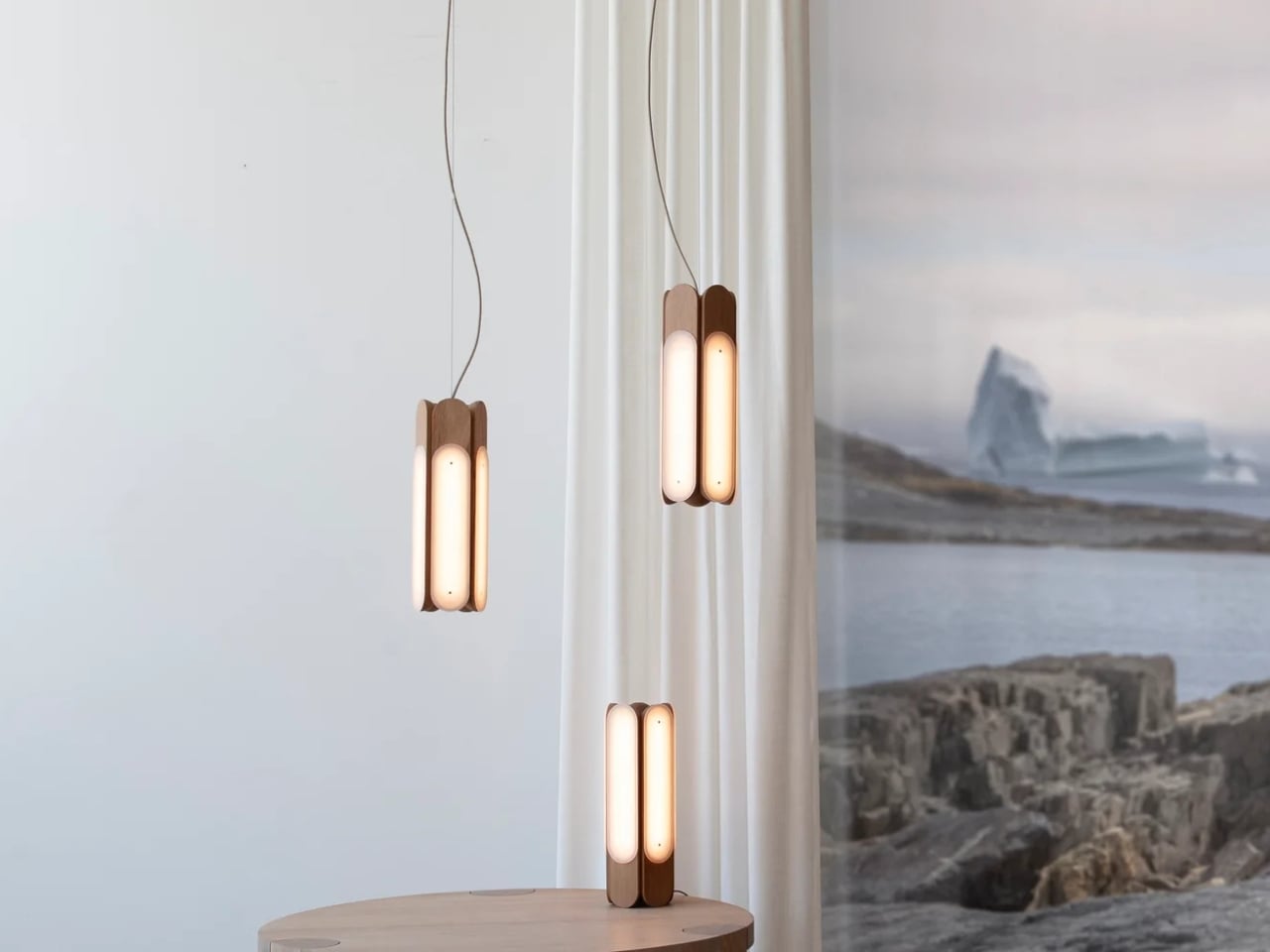
Hollis+Morris, the Toronto studio behind the new Beaufort collection, clearly has thought about it. Their solution isn’t a smarter bulb or a clever dimmer app. It’s a rethinking of what a light fixture is supposed to do when it’s doing nothing at all. Beaufort is built from sculpted solid wood paired with sandblasted acrylic, and the acrylic is cut and finished so it holds a kind of frozen depth, layered, translucent, a little mysterious, whether or not there’s current running through it. Turn it on and light diffuses through those layers in soft gradients. Turn it off and you still have an object worth walking past twice.

Designer: Hollis+Morris

The origin story is the kind of thing that sounds almost too tidy, except it happens to be true. Mischa Couvrette, the studio’s founder and lead designer, was flying home from Copenhagen’s 3daysofdesign when a conversation about ice, and about climate change, turned into sketches on a cocktail napkin somewhere over the Atlantic. By the time the plane landed, the collection basically existed in his head. The name comes from the Beaufort Sea, that remote stretch of Arctic water above Alaska and Canada’s Northwest Territories, which is a fitting reference for a studio that has built its identity on restraint rather than spectacle.

I appreciate that the collection doesn’t try to literally recreate an iceberg hanging from your ceiling. Instead it borrows the logic of ice: how light moves through something dense and layered, how clarity shifts depending on where you’re standing. The studio achieves that through repetition, mirroring, and rotation of a small set of core components, which is a fancy way of saying they’ve built one coherent visual language and then let it flex across a sconce, a mirrored horizontal pendant, a lantern-like vertical pendant, and a table lamp. Nothing in the lineup feels like an afterthought tacked onto a single hero piece just to pad out a catalog.

Jonathan Mandeville of Hollis+Morris put it plainly when he said the collection sits in a lineage of Scandinavian and Canadian design that values material honesty and quiet restraint, the idea that an object should earn its keep even when it isn’t doing anything. That’s a bit of a jab, gentle as it is, at a design moment that has leaned hard into maximalism and novelty for novelty’s sake. I don’t think Beaufort is arguing that bold, loud design is wrong. Plenty of homes need a little chaos. But there’s real value in a piece that doesn’t ask for your attention so much as reward it once you’ve already given it, and that’s a harder trick to pull off than another oversized statement chandelier.

It also matters, at least to me, that these pieces are made in Canada by a B Corp certified studio that treats that fact as a working value rather than a sticker on the box. Knowing who made a light and how isn’t a small thing anymore, especially with home goods, where supply chains can be murky at best.

Beaufort isn’t cheap. The R5 horizontal pendant runs $3,800 and the M2 horizontal starts around $1,900, so this is squarely in investment-piece territory, not an impulse buy from a big box store. But for anyone who has ever bought a light fixture, loved it while it was on, and felt a little let down by it during the day, Beaufort makes a fairly convincing case that the two states shouldn’t have to be so different.

The post The Lamp That Actually Looks Better With the Lights Off first appeared on Yanko Design.

❌