Windows 11’s Free Video Editor Has a Surprisingly Big Hardware Problem
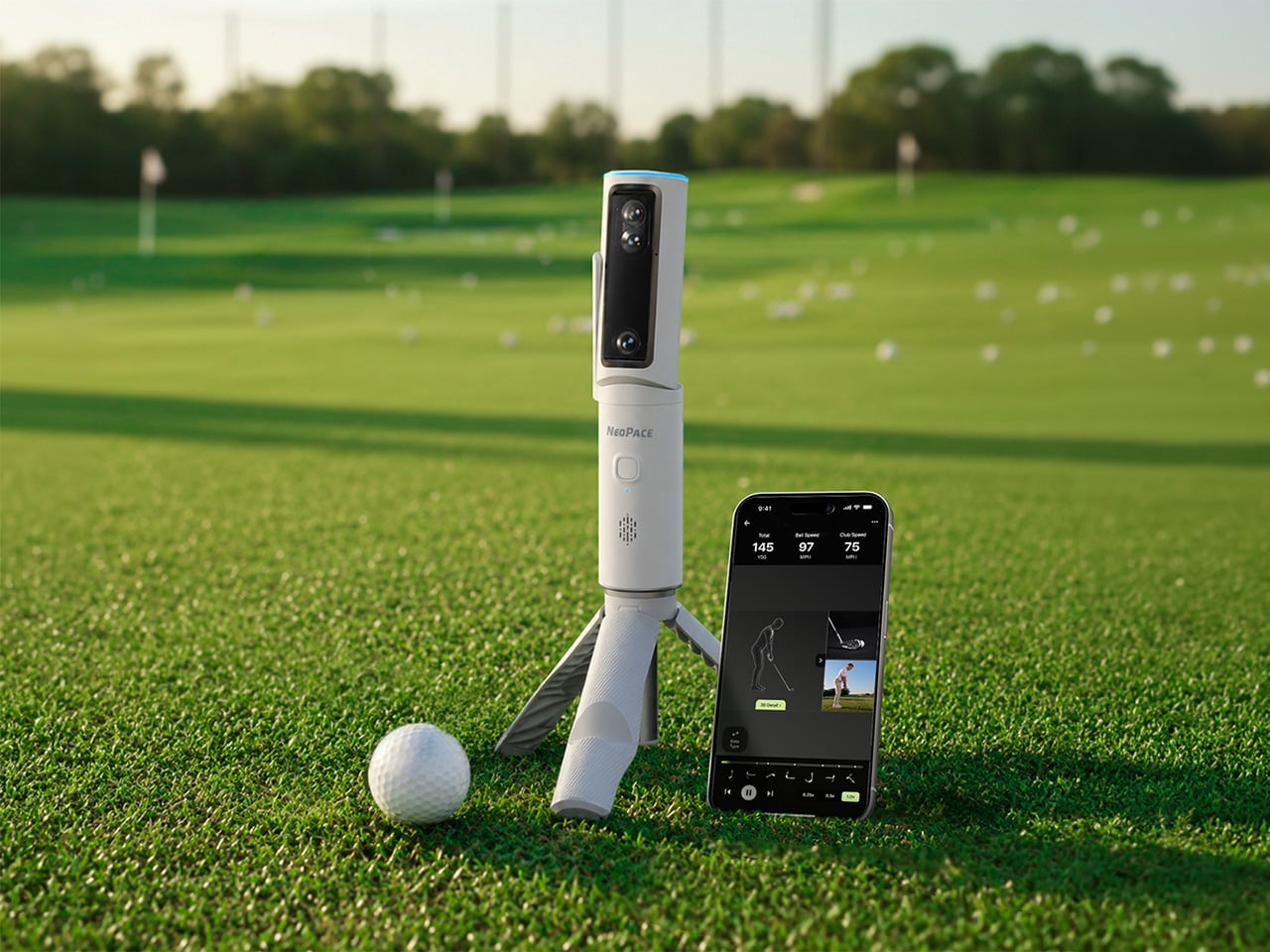
A decent golf lesson can cost anywhere from $80 to $200 an hour, but the bigger issue usually kicks in after the lesson ends. You leave with a fix, spend the next two weeks practicing on your own, and somehow manage to rehearse the exact mistake you were trying to get rid of. Golf has a funny way of doing that. More practice does not always mean better practice. Launch monitors helped by giving everyday golfers access to shot data that used to live in pro fittings, but numbers alone can still feel like homework. NeoPace’s G10 Pro tries to close that gap by pairing launch monitor stats with an AI coaching layer that explains what happened and what to work on next.
NeoPace, based in Irvine, California, built the G10 Pro around a triple-camera system and a 24 GHz Doppler radar. Two cameras capture the impact zone at up to 480 frames per second, while a third records the full swing at 120fps. The setup feeds into what NeoPace calls TrainerIQ
, an AI system that traces a bad shot through a Body to Club to Ball chain, connecting ball flight to club delivery and then back to the body movement that caused it. That matters because most golfers do not need more raw data, they need help turning data into action. The G10 Pro also rebuilds each swing in 3D, so you can replay it from multiple angles instead of squinting at a flat video and pretending you know what your hips are doing.
Designer: Neopace
Click Here to Buy Now: $899 $1499.99 (40% off). Hurry, only 875/1000 left! Raised over $286,000.
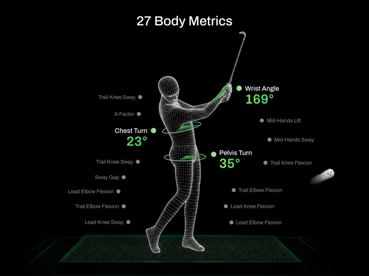
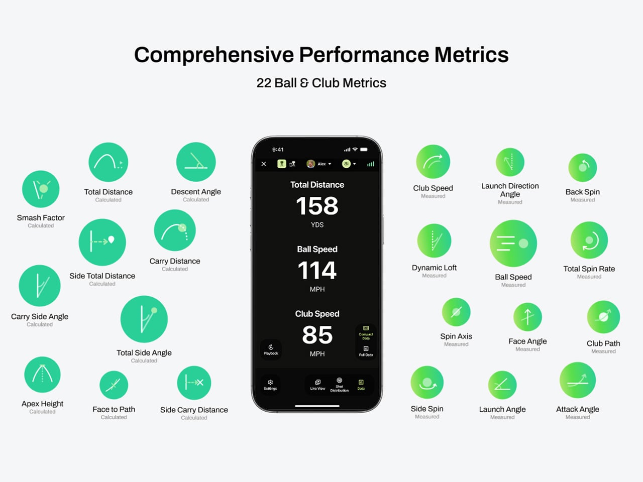
The G10 Pro tracks 22 ball and club metrics, plus 27 body-related metrics covering chest rotation, pelvis movement, wrist angles, elbow flexion, knee sway, and more. That is a pretty wild amount of information for a portable unit that costs $899, especially when most devices in this range focus mainly on ball flight and club numbers. NeoPace also made setup refreshingly simple, with auto alignment and support for both face-on and down-the-line placement. So whether you’re practicing at home, on the range, in the backyard, or sneaking in some swing diagnostics before a round, the G10 Pro feels built for golfers who want coaching-grade feedback without hauling around a tour van full of gear.
Every swing gets captured and rebuilt in full 3D, replayable from any angle, at any moment, from face-on, top-down, and down-the-line, all from a single device you placed once before you started. Most launch monitors give you flat video from a single fixed angle. The stereo camera pair locks the ball at 480 frames per second while the third follows the swing at 120fps, double the impact capture rate of most competing devices. Seeing your own swing from directly above mid-follow-through is the kind of analysis angle instructors have always wanted to show students but rarely had a clean portable way to deliver. NeoPace claims the 3D Replay
is a first in portable consumer launch monitors at any price, and from everything visible in the current market, that claim holds up.
TrainerIQ
analyzes your swing and body movement, identifies the likely cause of a miss, and suggests a targeted drill to help you improve. It does not just flag that the face was open at impact and leave you to figure out why. The analysis goes deeper: face 2 degrees open, heel contact, smash factor 1.35, and the root cause is that the body stopped rotating so the hands stepped in to carry the load. That kind of layered breakdown is exactly what a teaching pro walks you through after watching your swing, and the G10 Pro compresses it into automated real-time output after each shot. Golfers can also directly ask TrainerIQ
questions about their swing and receive personalized, actionable guidance on what to work on next, which makes the system feel less like a stat engine and more like an interactive training partner. TrainerIQ
then prescribes specific drills based on the diagnosis, closing the loop between data, understanding, and actual practice.
Twenty-seven body-related metrics track how your body moves through every swing, turning posture, timing, and rotation into data you can act on. The tracked parameters span the chest and pelvis in five axes each, lead and trail knee sway and flexion, mid-hands sway and lift, head movement, X-Factor and Sway Gap, lead and trail elbow flexion, wrist angle, shaft angle, and kinetic sequencing factors: Core Gain, Shoulder Gain, Wrist Gain, and Release Factor. Any coach reading that list will recognize it as the full biomechanical picture that motion capture setups in pro training facilities chase. Inside TrainerIQ
, it becomes the evidence base connecting a ball that lands 13 yards short and right to a chest that stopped rotating halfway through the downswing. That translation from raw biomechanics to actionable coaching is where the G10 Pro genuinely earns its price.
Getting the G10 Pro into a session takes three steps: set it down, auto align, and take your shot. That might sound like marketing language, but auto-alignment is a genuine quality-of-life upgrade over monitors that require precise manual positioning every single time. The pan-and-tilt gimbal covers a 120-degree pan range and a 40-degree tilt range, so near-correct placement is close enough. The unit itself measures 217.5 × 47.25 × 44.5 mm without the tripod, compact enough to slide into a range bag without reorganizing everything else in it. The 3,300mAh/7.2V battery runs for four hours with a 1.5-hour fast charge at 15W, which covers a full morning session with room to spare. For golfers who want to practice or play indoors, the G10 Pro is compatible with GSPro and Creative Golf, with additional major simulator platforms currently in development.
NeoPace also says there is no unlock fee or subscription required for simulator connectivity itself, though third-party simulator software fees may still apply. The companion app works with iOS (14.0 and above) and Android (10.0 and above) smartphones and tablets. NeoPace also says the core feature set does not require a subscription. D Swing Analysis and TrainerIQ
Analysis share an allowance of up to 5 AI-analyzed shots per month, while Premium AI increases the shared allowance to up to 1,000 shots per month and adds features such as Ask TrainerIQ
, Performance Insights, Personalized Drills, Practice Goals, and Cloud Storage.
At $899, the G10 Pro goes toe to toe with the Rapsodo MLM2PRO, its most direct camera-based competitor at the same price. The MLM2PRO does solid work on ball flight data and video, but offers no body tracking, no 3D reconstruction, no AI coaching chain, and face-on-only placement. Stepping further up the market, ball/club/body motion analysis at this depth typically lives in systems costing several times more, usually requiring separate wearables or dedicated motion capture rigs. Honestly, the fact that NeoPace has packed 3D reconstruction, 27 body metrics, and an AI coaching brain into a $899 portable device feels like it should be harder to pull off than it apparently is, and that is the most compelling thing about the G10 Pro.
Click Here to Buy Now: $899 $1499.99 (40% off). Hurry, only 875/1000 left! Raised over $286,000.
The post This $899 golf launch monitor tracks your swing in 3D and tells you how to fix it first appeared on Yanko Design.

The F9 Ultra feels like Poco growing into its strengths, with Bose-tuned sound still leading the experience.
The Poco F8 Ultra felt like a turning point for Poco. Up to that point, the brand had always been easy to understand. You bought a Poco for speed, sharp pricing, and a bit of swagger. The F8 series added something new to that formula with Bose-tuned speakers, and that changed the feel of the phone in a way a faster chip or brighter screen usually does not.
It was not just about volume or clarity. The whole device felt more built around entertainment. Games had more punch, films had more room to breathe, and even everyday audio felt less like an afterthought. The denim-inspired rear panel helped give the F8 Ultra a bit of tactile identity too, even if the finish was more denim-adjacent than truly fabric-like, but the thing that stayed with you was the sound.
Designer: POCO
The Poco F9 Ultra takes that idea and pushes it further. Rather than treating the Bose-tuned system as a one-off flourish, Poco seems to be building on it with more confidence this time, wrapping that sound-first approach in a package that feels bigger, more polished, and more ambitious. If the F8 Ultra introduced a new side of Poco, the F9 Ultra feels like the phone that tries to make it stick.
If the Poco F8 Ultra leaned young and fashionable, the Poco F9 Ultra leans sophisticated. It keeps the brand’s taste for visual confidence, but expresses it in a more restrained way, swapping tactile playfulness for cleaner lines, flatter surfaces, and a more polished sense of control.
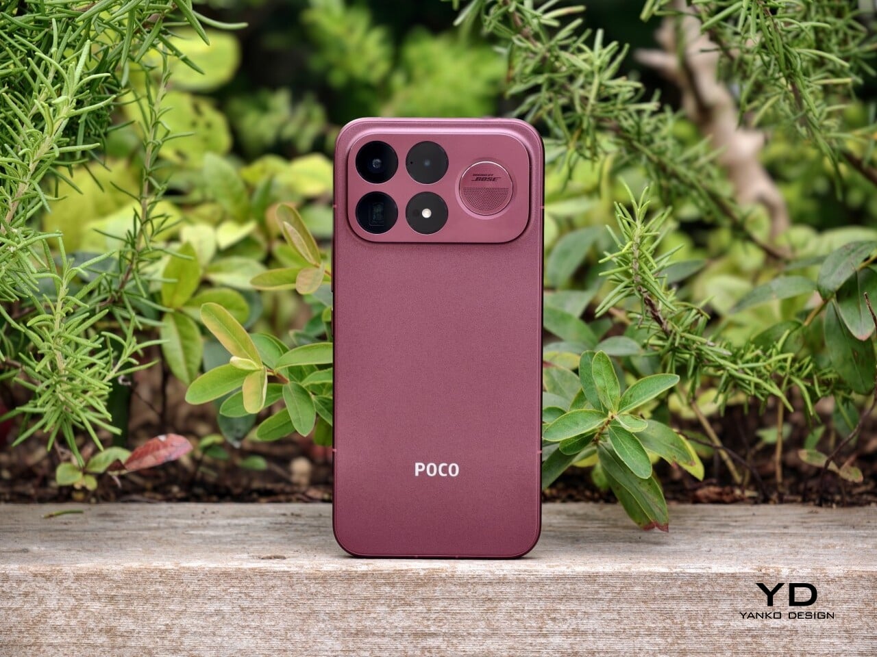
That shift is obvious the moment you look at the back. The denim-inspired treatment from the F8 Ultra is gone, replaced by a finish that feels more metallic and more architectural. The overall silhouette is simpler, but it does not come across as plain. Instead, it feels like Poco has traded novelty for composure, letting shape and proportion do more of the work.
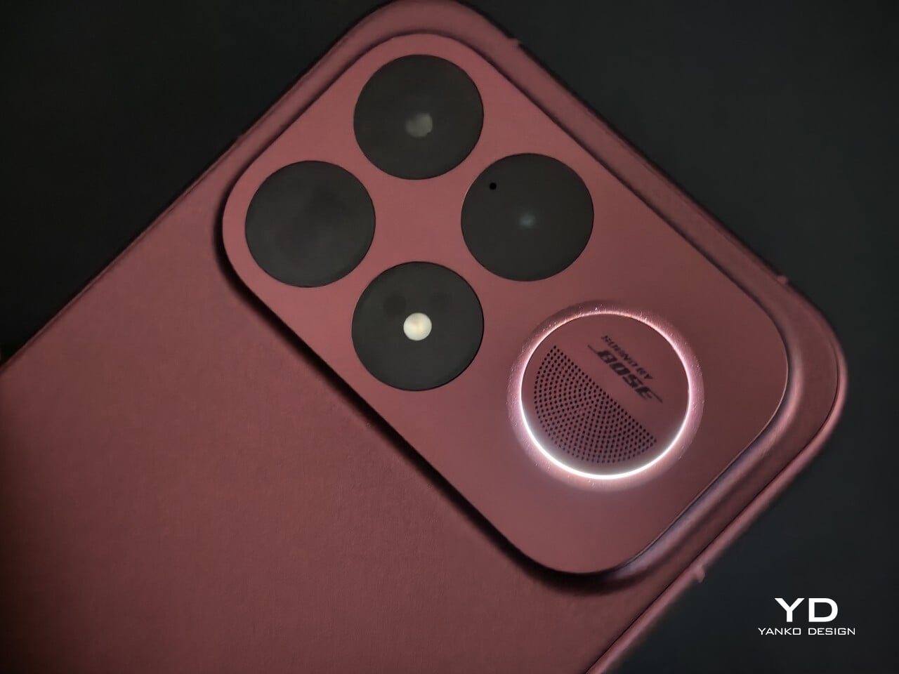
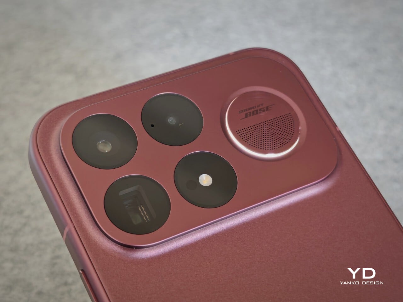
The camera island design remains largely the same as its predecessor, but it feels more resolved here. A large rectangular module sits across the top portion of the phone, housing three cameras and an LED flash in a neat 2 by 2 arrangement, with the speaker grille set off to the right. It is still a bold layout, but one that now feels less experimental and more like a defining part of the phone’s identity.
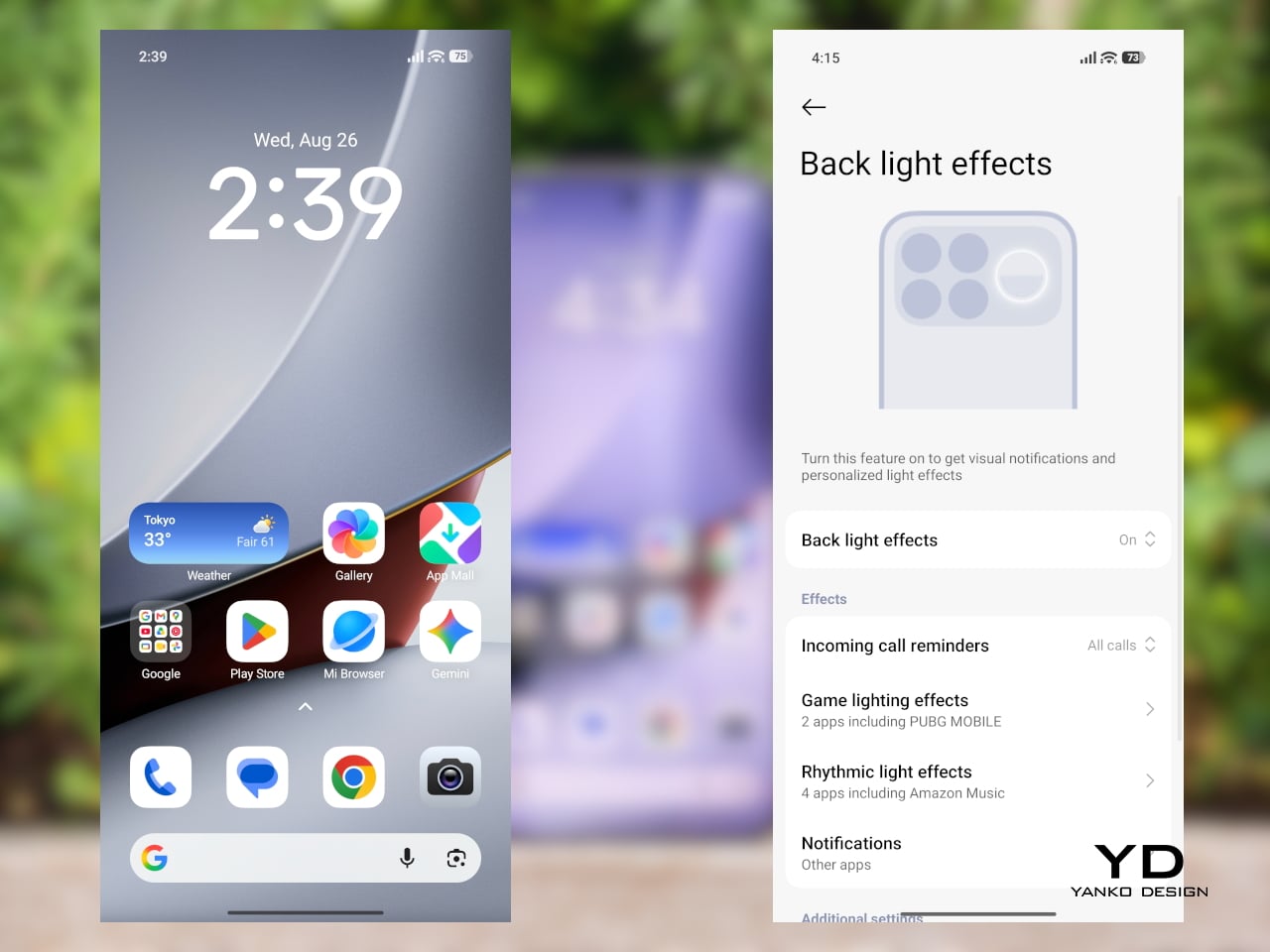
New to the F9 Ultra is a dynamic light ring built around the speaker grille. It supports personalized visual effects for incoming calls, games, and music. The effect itself appears to be fairly simple, closer to a clean white LED accent than anything overly flashy, but that may be exactly the point. It feels like Poco’s way of keeping a hint of gaming-phone energy alive without letting it overwhelm the more sophisticated direction of the design.
The two colors also tell slightly different stories. The Dark Cherry finish is the more expressive option, bringing warmth and a bit of drama without tipping into flashiness. The Black version feels more understated and technical, especially with the red side-button accent adding a small but effective point of contrast. Both work, but they speak to different moods. One is richer and more characterful, while the other is cooler and more controlled.
That more sophisticated look does come with a more substantial physical presence. At 235g, the Poco F9 Ultra is about 15g heavier than the F8 Ultra, and you feel that extra weight immediately. It sits firmly on the heavier side, especially in one-handed use, where its size and mass are hard to ignore.
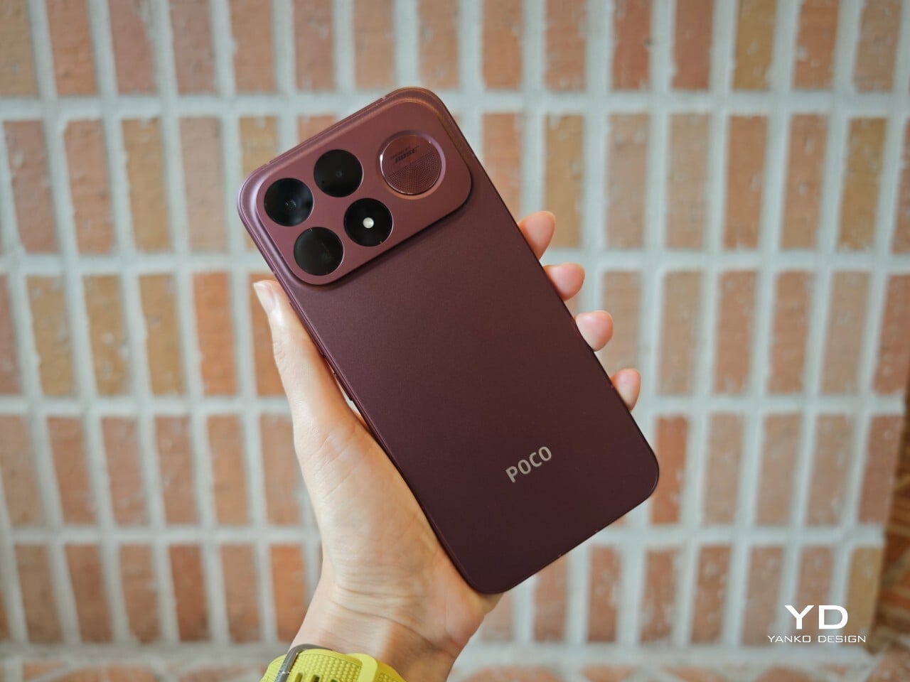
Its dimensions, 163.49 x 77.94 x 8.74mm, are broadly in line with its predecessor, so the overall footprint will feel familiar if you are coming from the older model. It is still a wide phone, though, and not the easiest to manage with one hand. The curved edges do help soften the grip and make it feel less severe than the numbers suggest, but this is still a device that feels more at home in two-handed use.
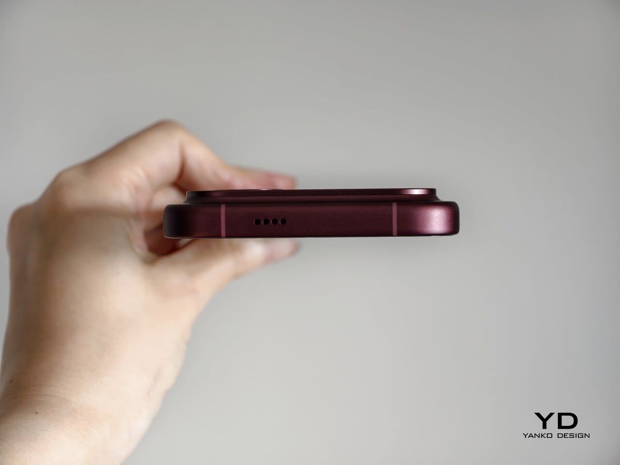
The matte finish does its part as well. It feels premium, pleasant to touch, and better at disguising smudges than a glossier surface would be. Add in the familiar button placement and unchanged in-display fingerprint scanner, and the F9 Ultra ends up feeling less like a phone you need to relearn and more like one you simply need to get used to carrying.
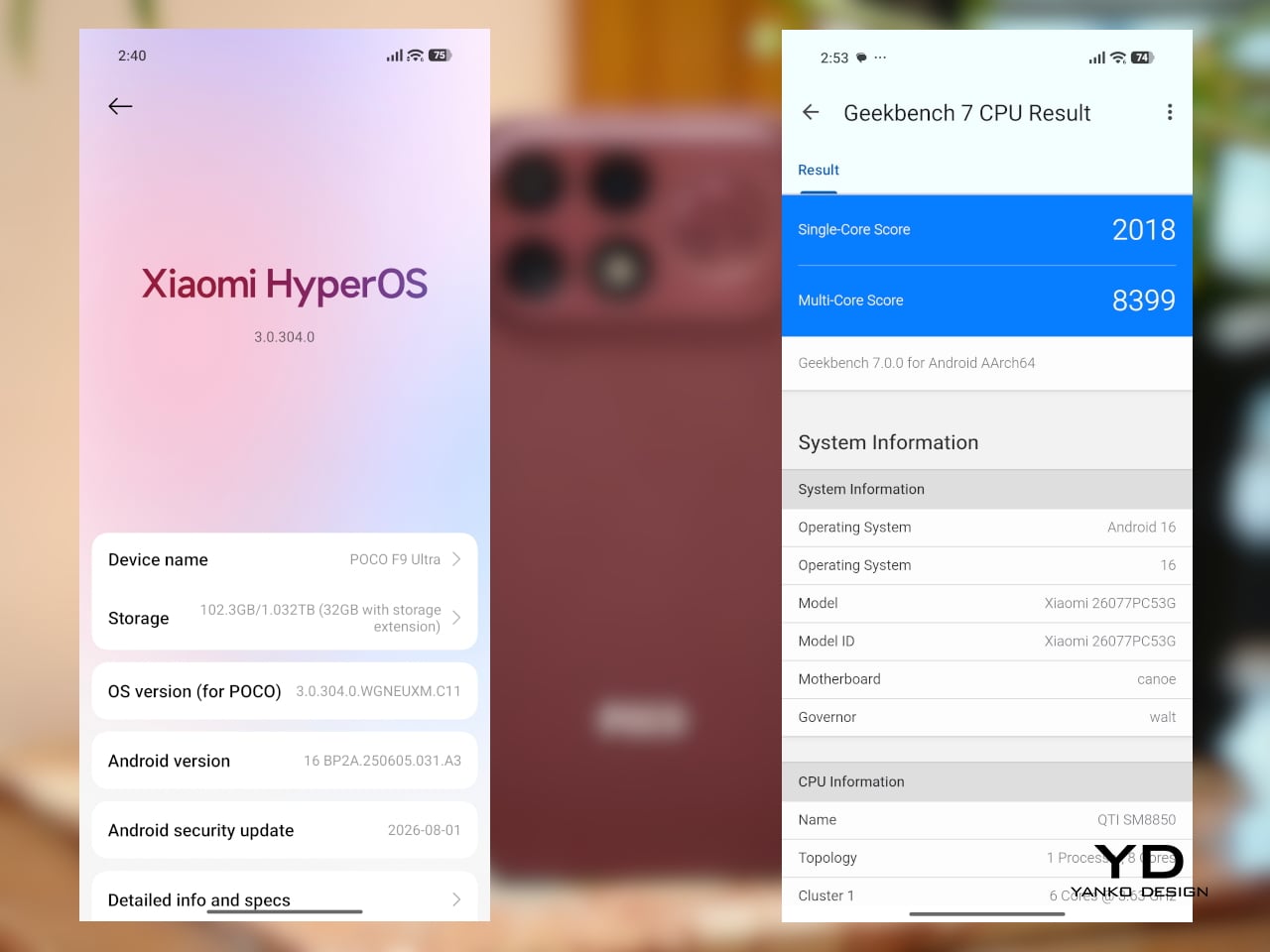
The F9 Ultra runs on Qualcomm’s Snapdragon 8 Elite Gen 5, the same flagship platform used in the F8 Ultra. Poco has also retained the VisionBoost D8, a dedicated chip aimed at improving gaming and video performance. In practice, that makes the F9 Ultra feel less like a leap in raw power and more like a refinement of an already capable performance formula.
The F9 Ultra pairs that gaming focus with a 6.9-inch 1.5K AMOLED display, and it is exactly the kind of panel you would want on a phone built around entertainment. It is large, sharp, and vibrant, with a refresh rate that gives the phone a clear performance edge in games that can actually take advantage of it. Outside of gaming, that same smoothness carries over into scrolling, animations, and general navigation, even if the practical difference becomes less dramatic in everyday use.
Brightness is another clear strength. Poco says this is the first global lineup to use the new M11 luminescent material, which helps the panel reach up to 4,500 nits in peak brightness and as high as 10,000 nits for HDR highlights. The numbers are extreme, but the more practical takeaway is that the screen stays very readable outdoors and gives bright scenes a stronger sense of punch and contrast without losing too much detail.
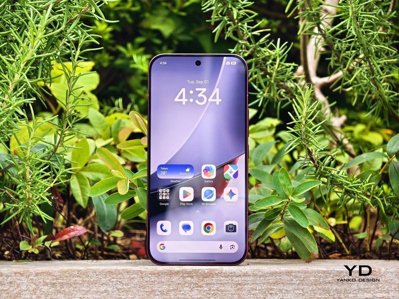
The F9 series is also Poco’s first to push to 185Hz, with support for 24 games running at a native 185fps. That sounds more dramatic than it always feels in practice, because the benefit depends heavily on the kind of game you are playing. In faster titles like Blood Strike, Crossfire: Legends, and Brawl Stars, the higher refresh rate does make a difference. Motion looks cleaner, visual updates come faster, and the game feels a little more immediate under your fingers. In slower games like Clash of Clans, Clash Royale, or Hearthstone, the gain is much smaller. You still get smoother animations and interface movement, but not the same kind of gameplay advantage.
In an hour-long session of Blood Strike at the highest graphic settings, the F9 Ultra was able to hold 185fps without any obvious frame drops. Just as importantly, it did not get uncomfortably hot, staying at around 40 degrees Celsius on the surface. There is clearly enough cooling here to keep performance from falling off over time, but the more important takeaway is that the phone stays consistent under load.

Main Camera, 1x

Portrait mode, Main Camera, 3.1x
The F9 Ultra is the second phone to come out of Poco’s partnership with Bose, which makes the collaboration feel less like a one-off experiment and more like part of the series identity. The Bose-tuned speaker system remains one of its most distinctive features, and also one of the easiest to appreciate in daily use. Poco says it has redesigned the acoustic port and upgraded the dual speakers for clearer sound and richer bass. It also keeps the sound profile presets and 10-band EQ introduced on the F8 Ultra, which means there is still plenty of room to tailor the sound to your liking.

Telephoto Camera, 5x
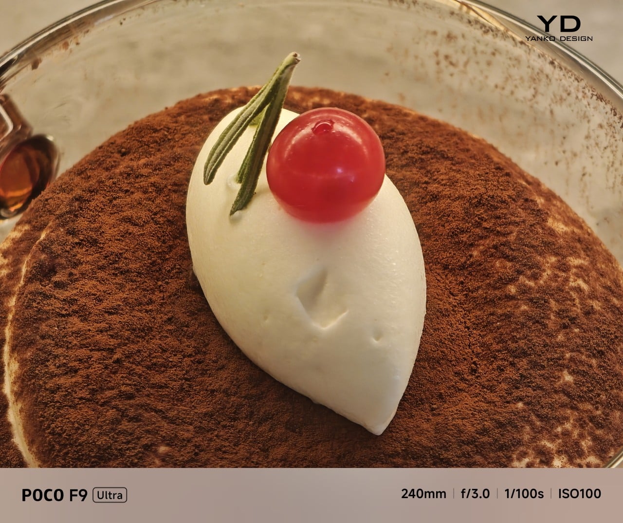
Telephoto Camera, 10x
In use, the speakers are easy to like. Just like the F8 Ultra, the F9 Ultra delivers some of the best smartphone audio you can get. The sound is fuller and more open than what most phones manage, with enough bass presence to give games, films, and music a bit more body. Dialogue comes through clearly, and the overall presentation feels less cramped than the average smartphone speaker setup.
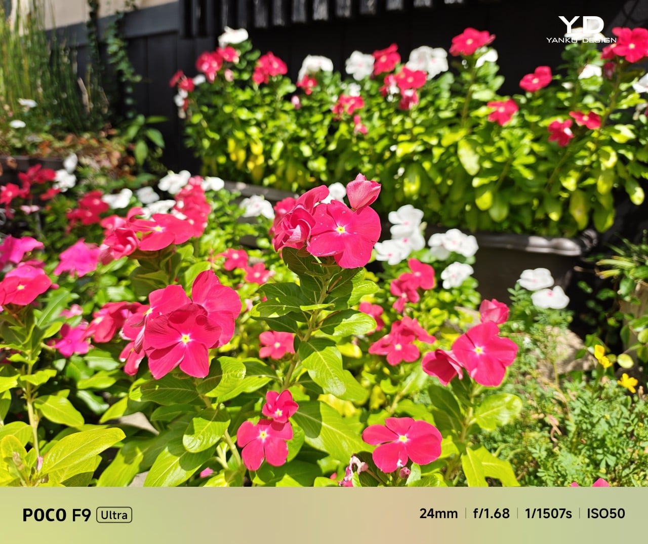
Main Camera, 1x

Telephoto Camera, 5x

Telephoto Camera, 10x
The F9 Ultra upgrades the main camera from 50MP on the F8 Ultra to 200MP here, though the sensor itself is smaller, dropping from 1/1.31-inch to 1/1.56-inch. That makes it less a straightforward upgrade and more a different kind of tradeoff. The rest of the setup remains familiar, with a 50MP 5x telephoto, a 50MP ultrawide, and a 32MP front camera.
Poco has also made a subtle but useful change to the focal lengths. The F9 Ultra uses a 24mm-equivalent main camera and a 17mm-equivalent ultrawide, compared with 23mm and 18mm on the F8 Ultra. The shift is small, and the ultrawide still does not feel especially expansive, but the added separation between the two lenses makes the jump from main to ultrawide feel a little more purposeful.

Ultrawide Camera, 0.7x
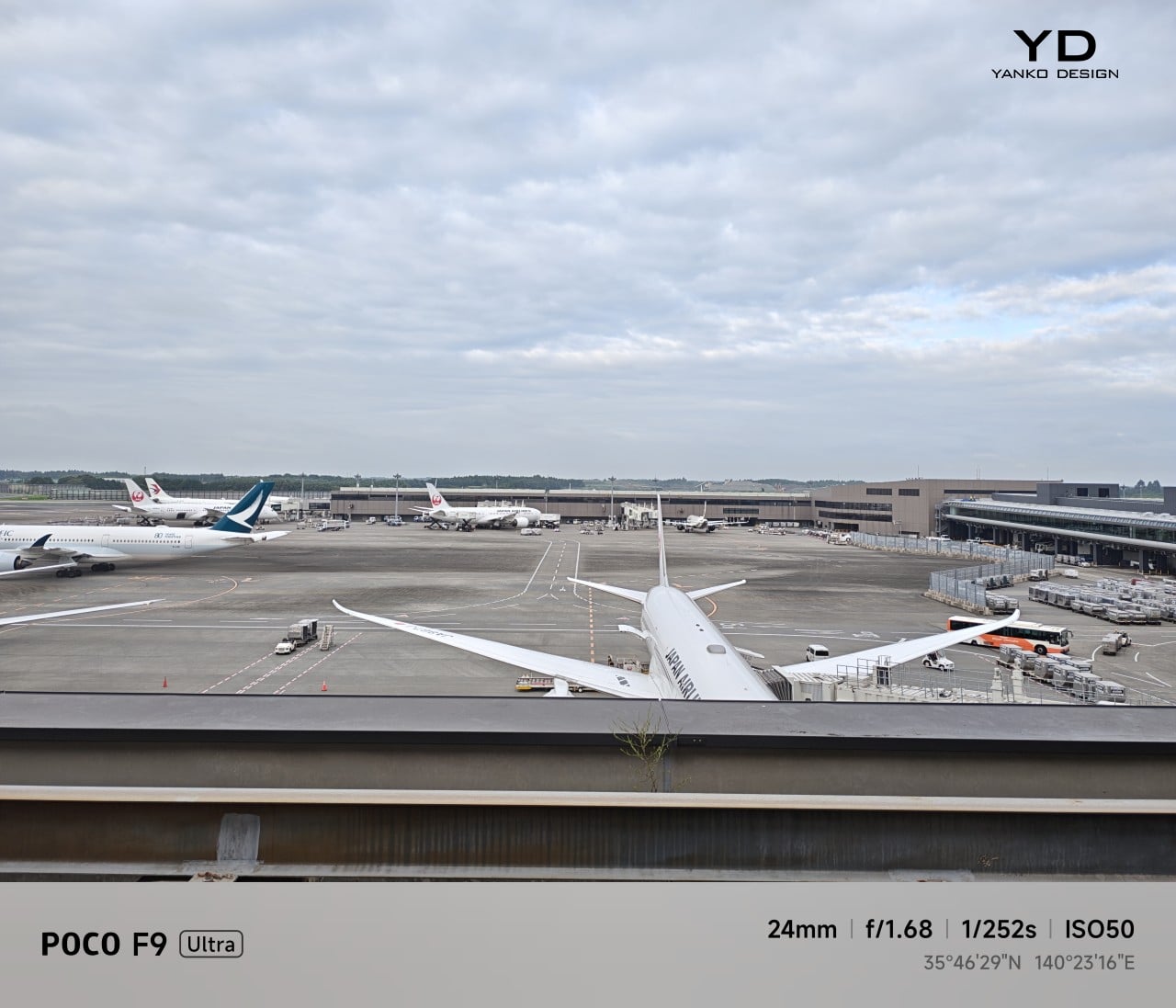
Main Camera, 1x

Telephoto Camera, 10x
In use, the main camera captures photos with good detail, solid dynamic range, and vibrant color. The 5x telephoto is also capable, though it tends to produce images that look a bit more saturated and contrast-heavy. Video is solid too, with crisp footage and enough consistency to make the camera system feel dependable for everyday shooting.

Night Shot, Ultrawide Camera, 0.7x

Night Shot, Main Camera, 1x

Night Shot, Telephoto Camera, 5x

Night Shot, Telephoto Camera, 10x
Battery life remains one of the F9 Ultra’s biggest strengths. The 8,050mAh battery is enormous even by flagship standards, and it gives the phone a clear advantage in the kind of heavy use it is designed for. In my use, it was easy to stretch the phone across two days on a charge, which suits the F9 Ultra’s media-heavy, gaming-friendly character especially well.
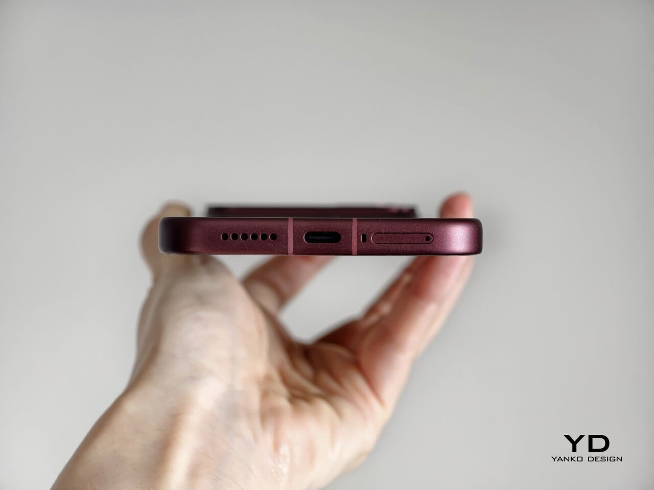
Charging is just as capable, with 100W wired and 50W wireless support, plus 27W wired reverse charging and 22.5W wireless reverse charging. It is a battery setup that feels as well-rounded as the rest of the phone.
The F9 Ultra is not a phone that talks much about sustainability in the material-driven sense, but it does make a decent case for longevity. Its IP68 rating and Corning Gorilla Glass 7i should help it stand up to everyday wear, which is still one of the most practical ways a phone can stay useful for longer.
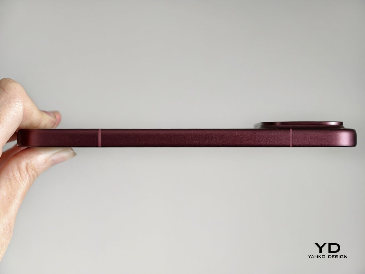
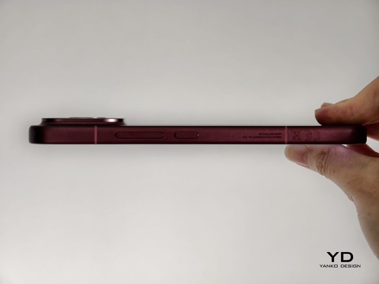
Poco also promises four major Android OS updates and six years of security patches, which gives the F9 Ultra a fairly credible long-term support story. That matters because software support plays a big role in whether a phone remains worth keeping. Poco may not be leading the conversation around recycled materials or repairability here, but the basics of durability and usable lifespan are in place.
The F9 Ultra starts at $799 for the 12GB/256GB version, which puts it $70 above the F8 Ultra. That is still an increase, but not an especially aggressive one in the current climate, where similar phones have seen price jumps closer to $100. Some of that restraint may come from Poco reusing the same Snapdragon 8 Elite Gen 5 platform, which likely helped balance out the rising cost of RAM and other components.
As an upgrade, though, the case is less convincing. If you already have the F8 Ultra, moving to the F9 Ultra does not make a lot of sense unless you specifically want the new design, the 185Hz display, or the 200MP main camera. As a fresh buy, however, it remains one of the best affordable flagship-level phones around. Poco may be edging upward in price, but it still knows how to deliver a lot of phone for the money.
The Poco F9 Ultra feels like Poco settling into a formula that actually works. The design is more mature, the gaming side is still strong, and the Bose-tuned speakers remain one of the best reasons to care about the series in the first place. Add the huge battery and the 185Hz display, and you end up with a phone that feels very sure of what it wants to be.
If you already have the F8 Ultra, I do not think this is the upgrade to chase. The older phone is still good enough that the differences here feel more iterative than urgent. But if you are buying fresh, the F9 Ultra is still one of the better affordable flagship-level phones around, especially if you care as much about sound and gaming as you do about the usual specs.
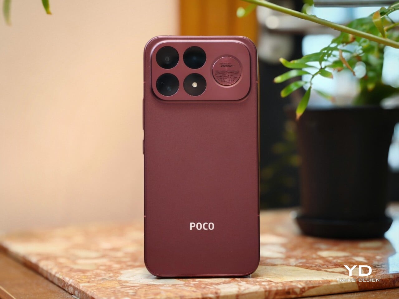
The post Poco F9 Ultra Review: Great Sound, Grown-Up Design first appeared on Yanko Design.

Most of us have two or more gadgets that need constant charging, plus several chargers and cables to keep them all juiced up. That’s probably fine if you have an entire outlet strip at home or in the office, but when you’re working with a small space, or you’re traveling and on the go, it can be a real challenge to charge multiple devices at once. You end up with a tangle of cords and charging heads, or sometimes you even have to take turns charging your gadgets.
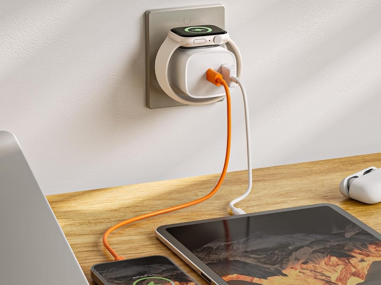
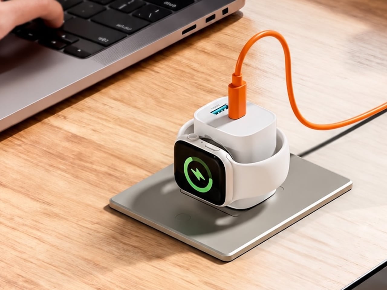
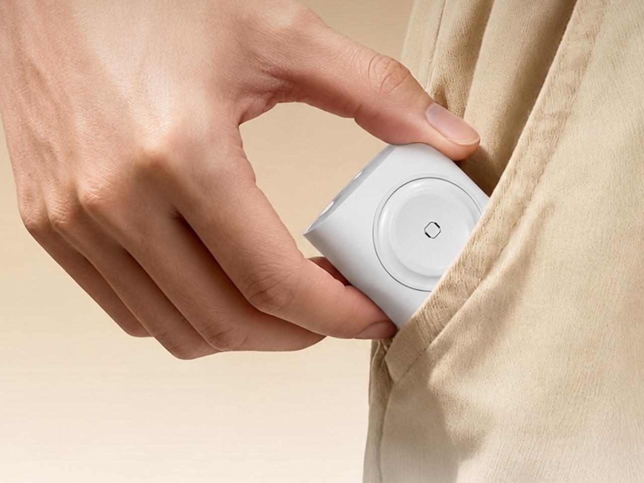
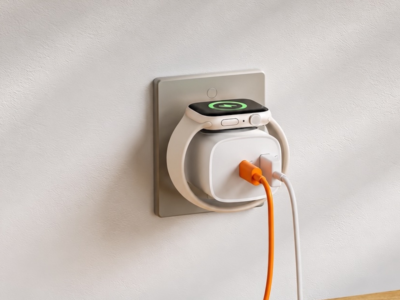
If you mostly own Apple devices or other USB-C-powered gear, the TESSAN 3-in-1 USB-C Charger may actually solve that problem for you. It’s a compact wall charger with a USB-C port, a USB-A port, and a built-in magnetic Apple Watch dock, so you only need one outlet to power up three devices at the same time.
Designer: TESSAN

This 3-in-1 charger is especially handy when you only have one outlet available but need to power up three different devices. A few years ago, this wouldn’t have been much of an issue, since most of us only had one phone to worry about. But now that owning multiple devices is the norm, charging has become an everyday hassle. What do you do when you’ve got a phone, a pair of AirPods, and a smartwatch that all need power at the same time?
TESSAN’s charger features fast charging through its 20W USB-C port, so you can get a device like the iPhone 15 up to 55 percent battery in just 30 minutes. At the same time, its 18W USB-A port can juice up an accessory simultaneously while your main device charges. It also offers broad compatibility, working with everything from the latest iPhone models to AirPods and other USB-powered devices. The real star of the show, though, is the built-in magnetic charger for your Apple Watch. There’s no separate puck or cable needed here. Instead, you get a self-aligning dock, so you won’t have to fuss with positioning your watch every time you need to charge it.

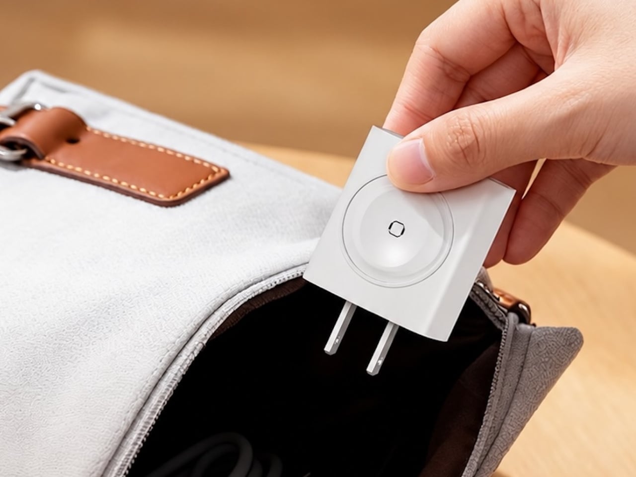
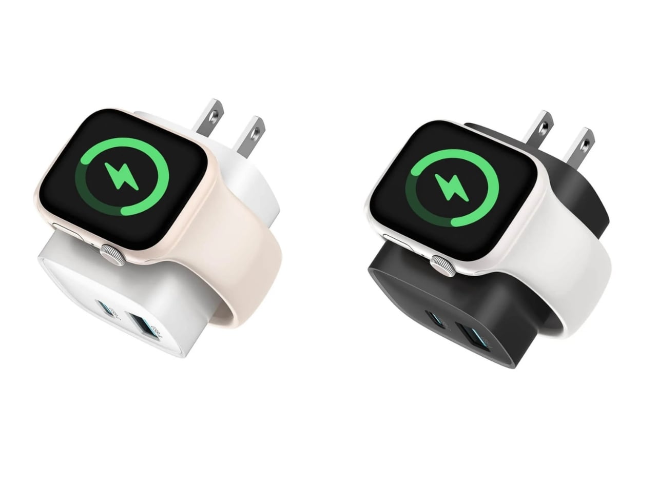
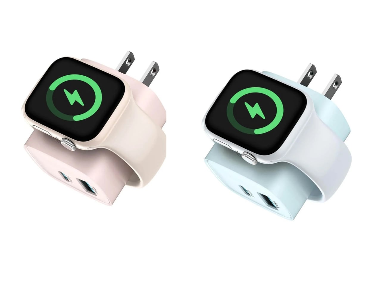
The charger comes in four finishes (white, black, pink, and blue) and is clearly designed to double as a small desk-aesthetic item, though it will likely still read as “just a charger” to most people, especially in the white colorway. Where it really shines is portability: it’s a travel-friendly device you can toss in a bag without a second thought, instead of hauling around three separate chargers that eat up space and weight in your carry-on.


How does it stack up against the competition? The most obvious comparison is Belkin, whose 3-in-1 MagSafe charging stands are the gold standard in this category. Belkin’s BoostCharge Pro and UltraCharge Pro docks charge an iPhone, Apple Watch, and AirPods wirelessly and look considerably more premium sitting on a nightstand, but they also run anywhere from $95 to $150 and require more desk real estate. TESSAN’s charger, at $20.99, skips the wireless charging bells and whistles in favor of a compact, plug-in design that’s built more for function and travel than for a styled bedside setup. If you want a showpiece charging stand for your living room, Belkin is still hard to beat. But if you want something inexpensive, pocketable, and fast enough to get you out the door in the morning, TESSAN makes a compelling case for itself as the budget-friendly, travel-first alternative.

At the end of the day, this isn’t a charger trying to be a lifestyle centerpiece. It’s a charger trying to solve a genuinely annoying, everyday problem: too many devices, not enough outlets, and not enough patience to wait in line for your turn at the power strip. For $20.99, the TESSAN 3-in-1 USB-C Charger delivers fast charging, broad compatibility, and a clever built-in Apple Watch dock in a package small enough to disappear into a laptop bag or a nightstand drawer. It won’t turn heads the way a sleek charging stand might, but it will quietly keep your phone, watch, and earbuds powered up without the usual cord chaos. For anyone juggling multiple Apple devices on a daily basis, or packing for a trip and dreading the tangle of cables, this little charger earns its spot on the “actually useful” list.

The post This $21 Charger Powers Your iPhone, Apple Watch, and AirPods at Once first appeared on Yanko Design.


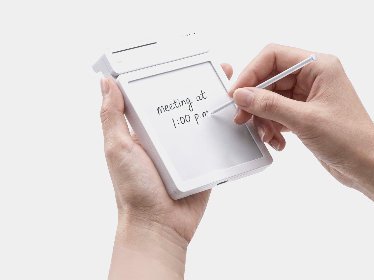
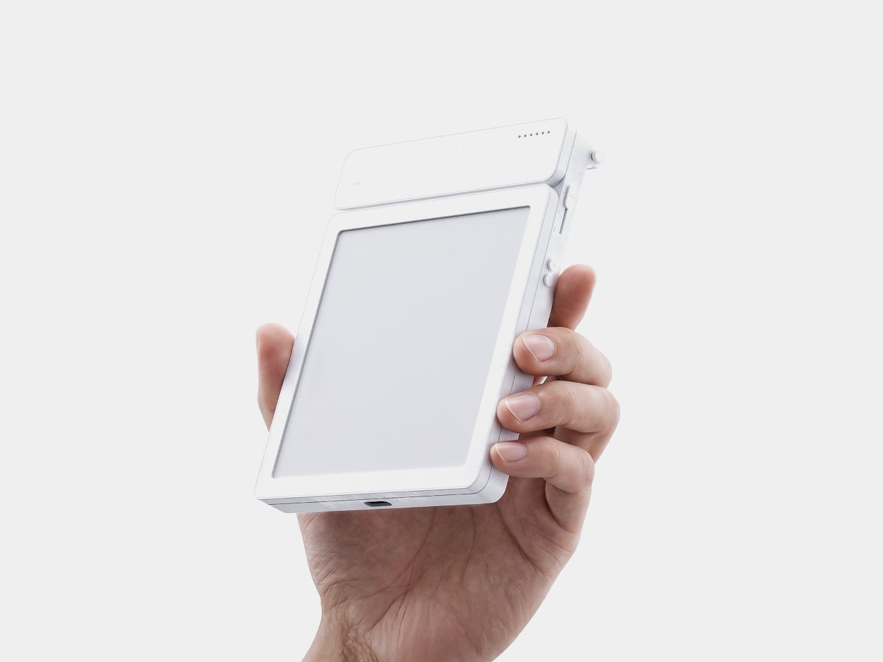
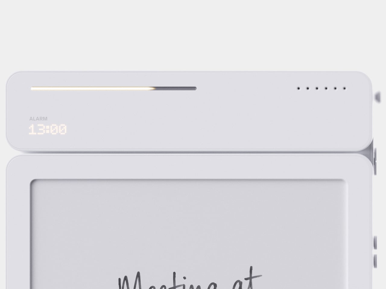
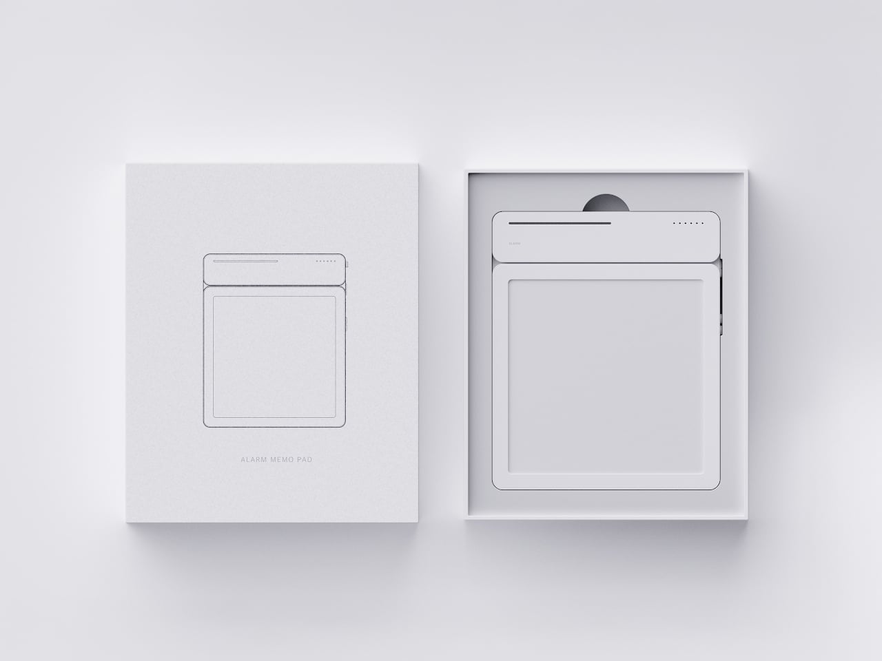
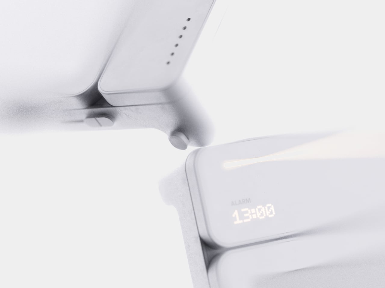
Setting a reminder on a phone means unlocking a screen, opening an app, and typing on a keyboard, three steps that break whatever train of thought led to needing the reminder in the first place. MATE skips all of that by reading your own handwriting instead. Write “meeting at 1:00 p.m.” on its E-ink panel with the built-in pen, and the device sets the alarm itself, no app, no unlocking, no menu to dig through.
That handwriting recognition is the entire premise, and it works because the device treats a note and a task as the same object rather than two separate steps. The moment it detects a time written into the text, it quietly converts that scribble into a scheduled alert running in the background. Nothing about the note’s appearance changes. It still just looks like something you jotted down on paper.
Designer: Geonwoo Kang


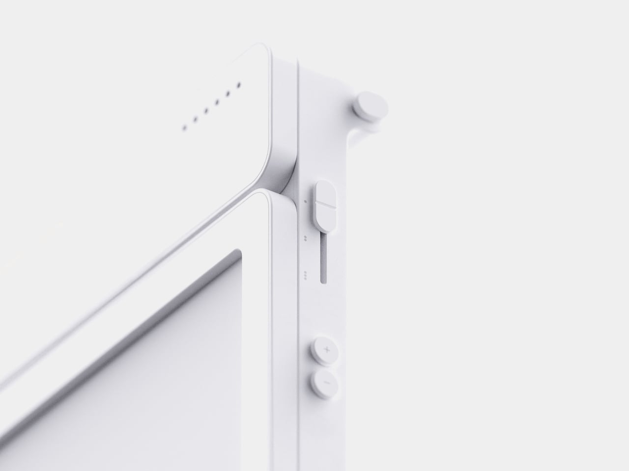
A thin LED bar along the top edge handles the countdown, giving a glance-able sense of how much time remains without requiring a full screen wake or a swipe through settings. When the set time actually arrives, the alarm sounds and stops the instant you tap the panel, keeping the entire alert cycle contained to the same physical surface where the note was written in the first place.


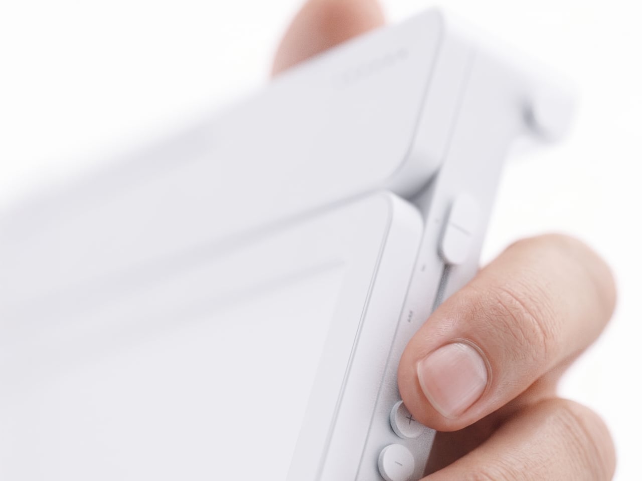
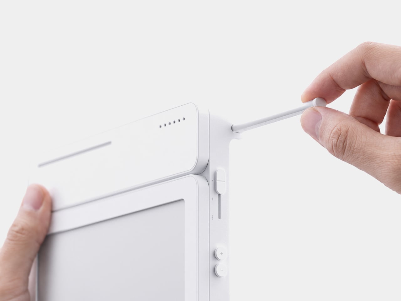
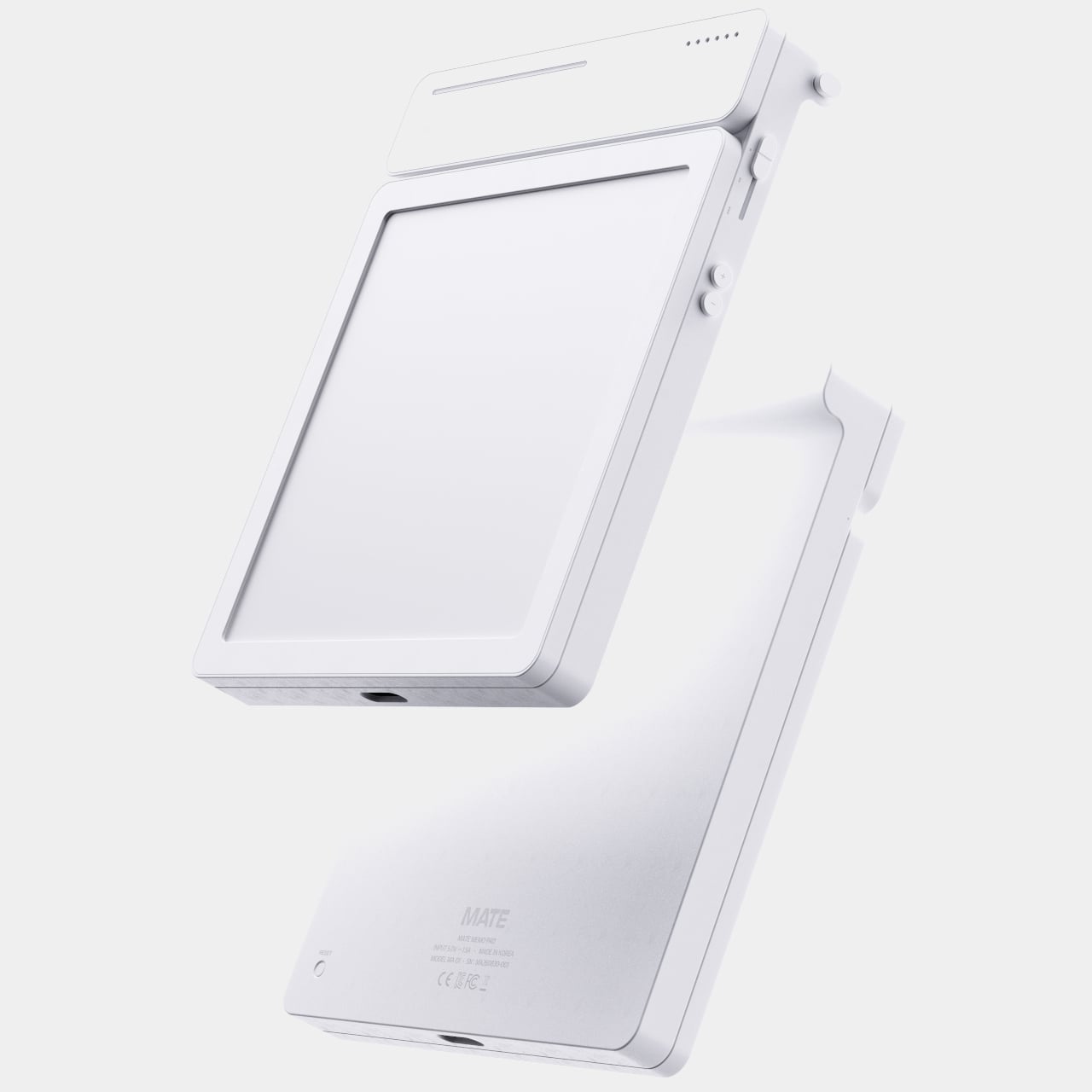
Because handwritten notes pile up fast, MATE handles multiple pages through a three-stage physical slider running down one side, letting you flip between up to three saved notes with a flick of a finger. That’s a deliberately low-tech solution to a problem most gadgets solve with a touchscreen menu, and it works specifically because a slider takes zero attention to operate correctly on the first try.


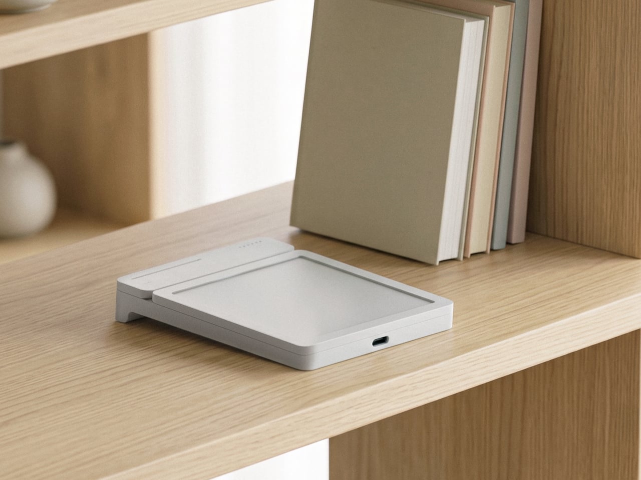
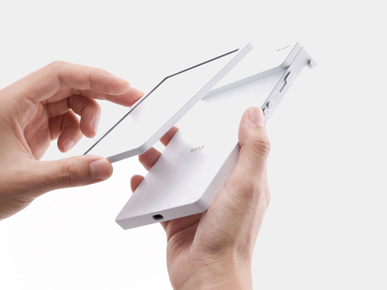
The memo pad itself doesn’t have to stay locked into the main body either. It detaches from its dock and relies on built-in magnets to stick onto a partition wall or a metal filing cabinet, turning a handheld notepad into a fixed reminder posted wherever it’s actually needed. A grocery list stuck to a fridge door works the same way a sticky note always has, just with an alarm quietly running underneath it.


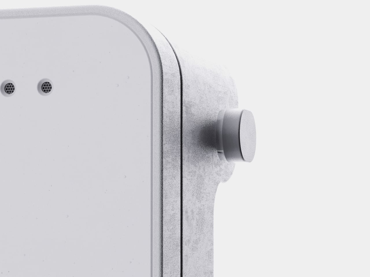
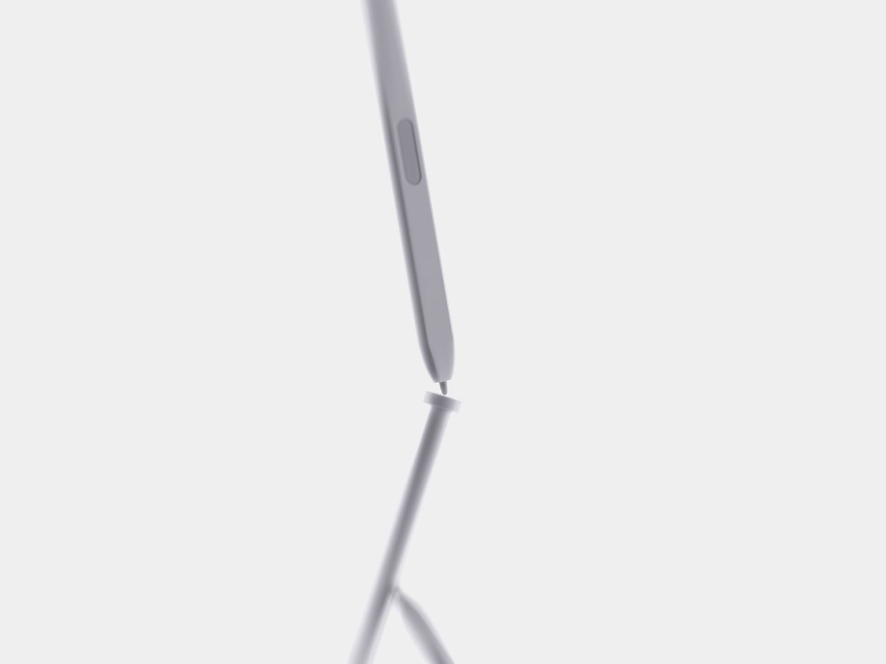
Even the pen gets a small, deliberate design decision most styluses skip. It nests into a groove at the top of the device rather than rattling around loose in a bag or a drawer, solving the single most common complaint about any stylus-based gadget: losing the one piece that makes the whole thing work. Reaching for a note and finding the pen missing defeats the entire point of a device built around spontaneous handwriting.


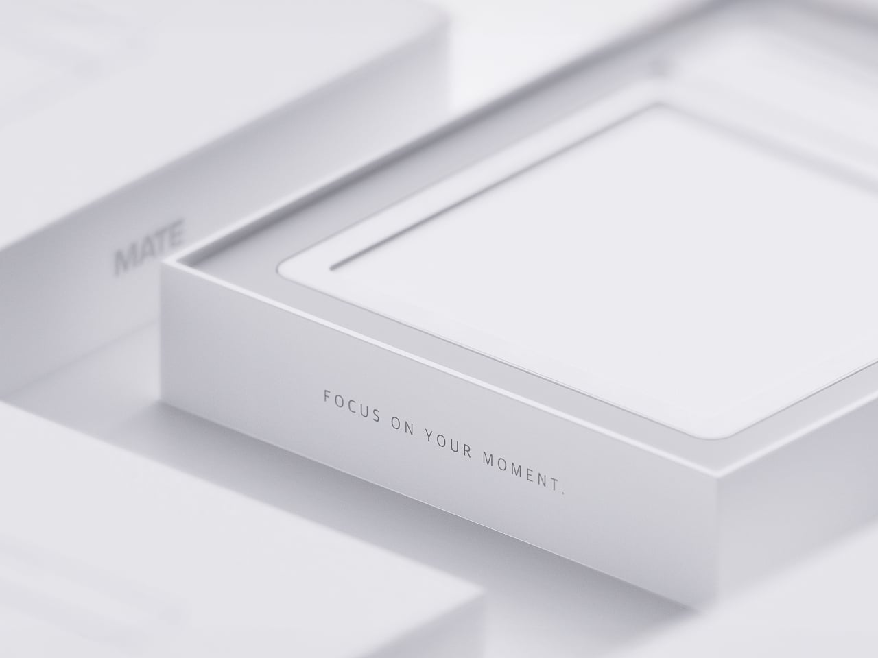
None of MATE’s individual pieces, the E-ink panel, the physical slider, the magnetic pad, would stand out much alone. Put together, they describe a specific kind of object: something meant to sit on a desk quietly doing one job well, catching a thought before it disappears and holding onto it until the moment it’s actually needed.


The post MATE Works Like a Sticky Note That Sets Its Own Alarm When You Write first appeared on Yanko Design.


Dragon Tiny Homes has long been a name worth watching in the compact living space, and its latest custom Vista only strengthens that case. Built on a double-axle trailer, the home stretches 24 ft (7.3 m), larger than most European models but modest by North American standards, where builds twice this length are common. Finished in timber with metal accents and generous glazing throughout, it reads more like a considered architectural statement than a road-ready dwelling.

Step inside and the ground floor’s 204 sq ft (19 sq m) opens up with surprising depth. The living room anchors the space with a sofa, and in place of a television, a space-saving projector paired with a pull-down screen keeps things clean and purposeful. Adjacent to it, a dedicated office nook with a desk and chair makes this model genuinely work-from-anywhere capable. A storage-integrated staircase nearby pulls double duty, folding in cupboard and shelf space where the footprint would otherwise offer none.
Designer: Dragon Tiny Homes


The kitchen is where the custom Vista earns its reputation. A sink, oven, and four-burner propane-powered cooktop handle the cooking side, while a small fridge tucked into the desk area keeps things spatially intelligent. What sets this build apart is the inclusion of both a washer/dryer and a dishwasher, amenities that rarely appear together in a home this size. Quartz counters and well-considered cabinetry bring the space together, making it feel complete rather than compromised.
The bathroom, reached from the kitchen, is snug in the way that tiny living demands: a vanity sink, a flushing toilet, and a walk-in shower. It’s tight and intentionally so. Dragon Tiny Homes made smart trade-offs here, and the square footage they saved has been redistributed into a build that genuinely earns its keep across the rest of the floor plan.


Upstairs, two separate lofts sit at opposite ends of the home. The main loft, accessed from the storage staircase, accommodates a double bed and features slatted timber room dividers that add texture while keeping a restless sleeper safely in place. The secondary loft is reached via a removable wooden ladder positioned in the kitchen. Sized similarly, it includes egress windows that make its use as a legal bedroom possible, though in this particular build it’s been set up for storage.
This model was created for a private client, and pricing remains undisclosed. Dragon Tiny Homes’ Vista range starts at $60,000, and given everything this custom build delivers, that baseline begins to feel like fair ground. A home office, a fully stocked kitchen, two lofts, egress windows, and a dishwasher: the custom Vista makes a quietly compelling case for compact living done right. At 24 feet, it proves that size rarely defines quality of life.


The post A 24-Foot Tiny Home With Two Lofts, a Dishwasher, and a Real Home Office first appeared on Yanko Design.


I’ve tried every trick to get my phone to leave me alone. Do Not Disturb. Grayscale mode. Leaving it in another room, which mostly just means I walk to the other room every twenty minutes to check on it. None of it works for long, because the problem was never the settings. The problem is that the phone is still there, still glowing, still capable of buzzing the second I let my guard down. Willpower is a terrible security system, and every app-based fix is still just asking me to trust myself, which is exactly the thing I can’t do at nine at night with a bag of chips in one hand.
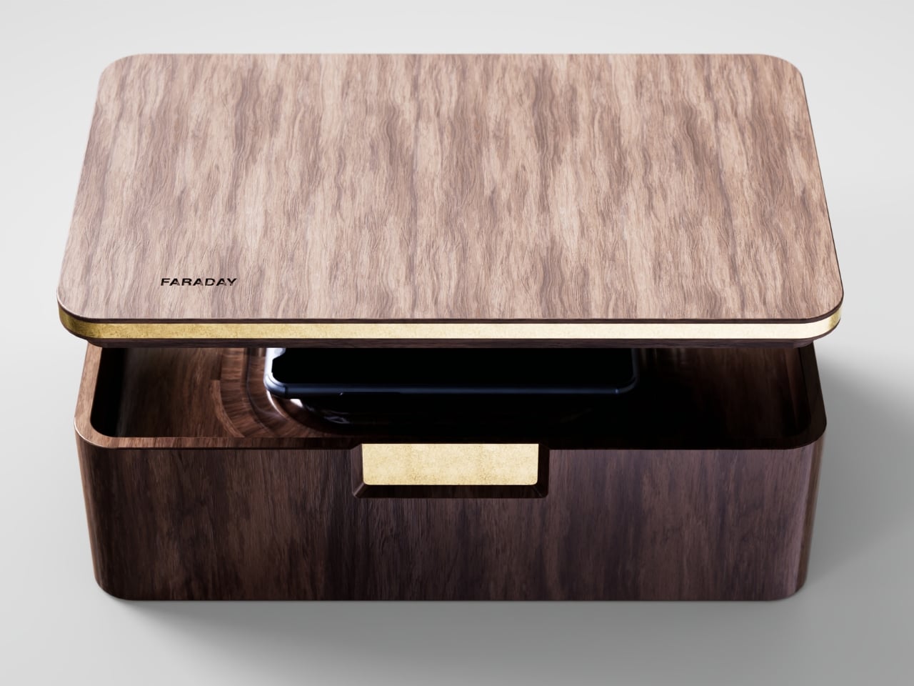
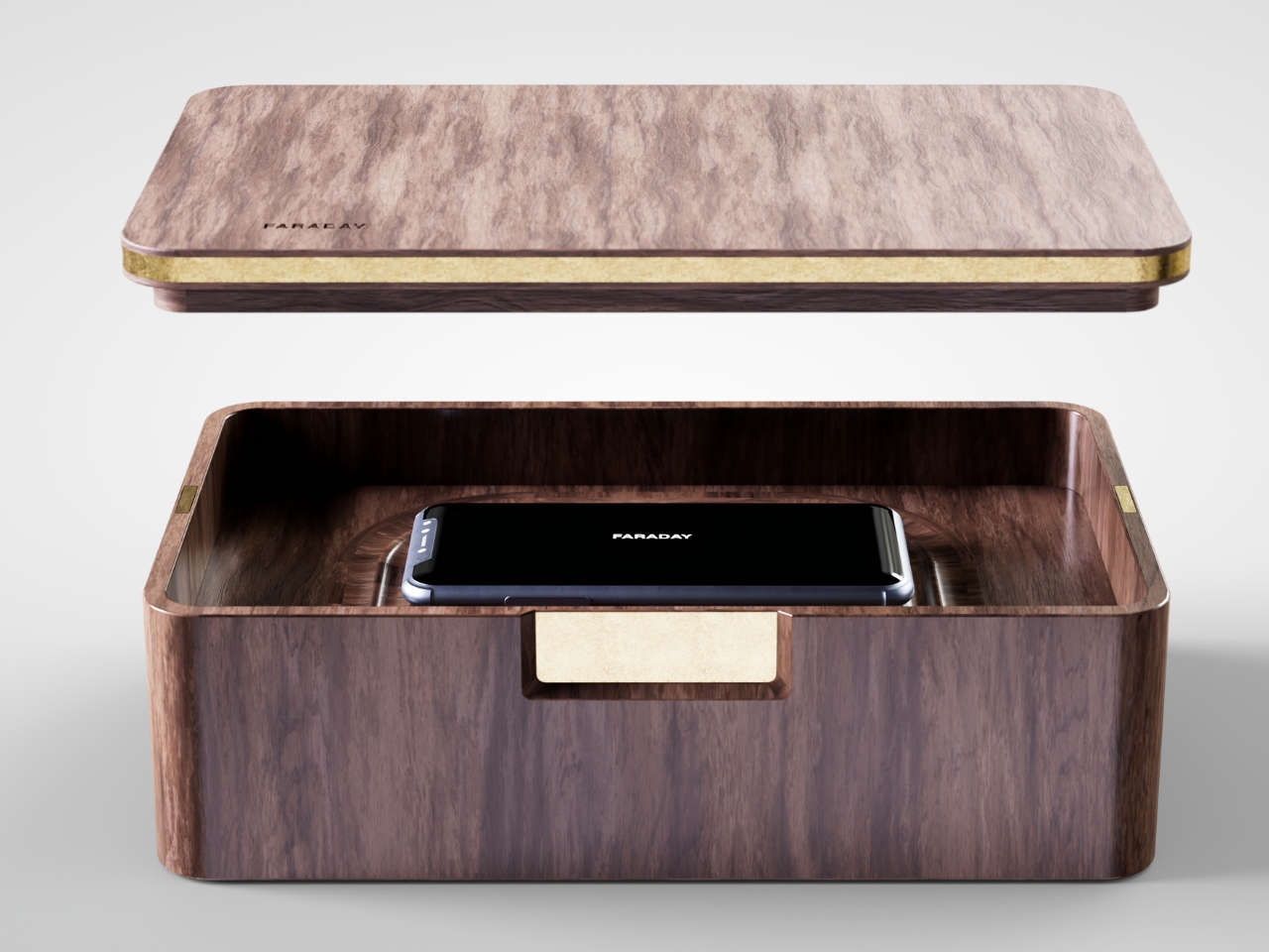
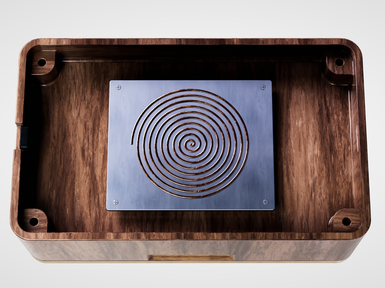
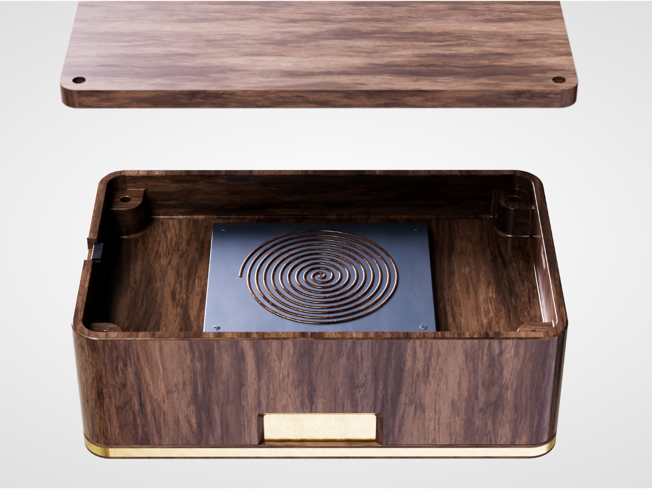
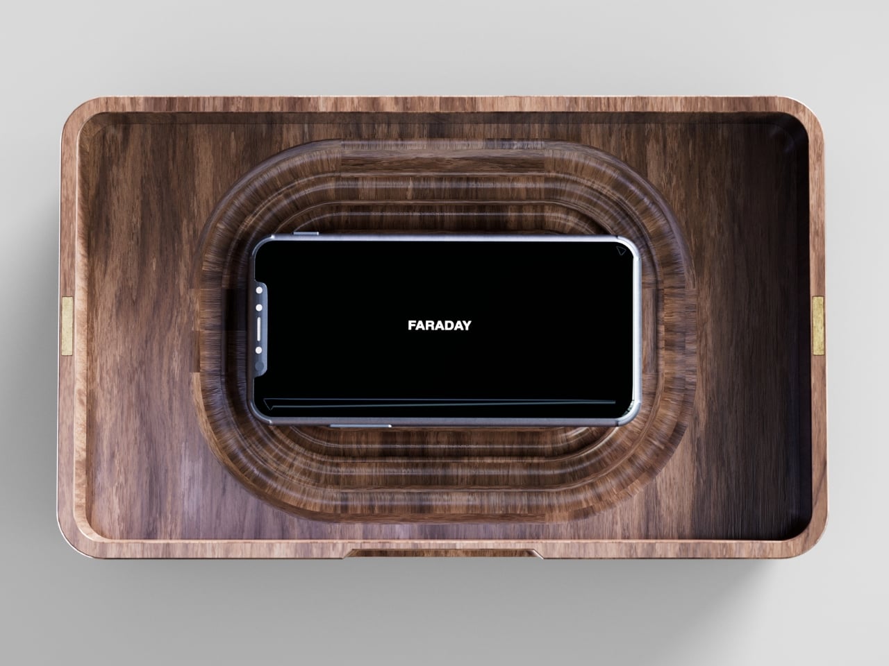
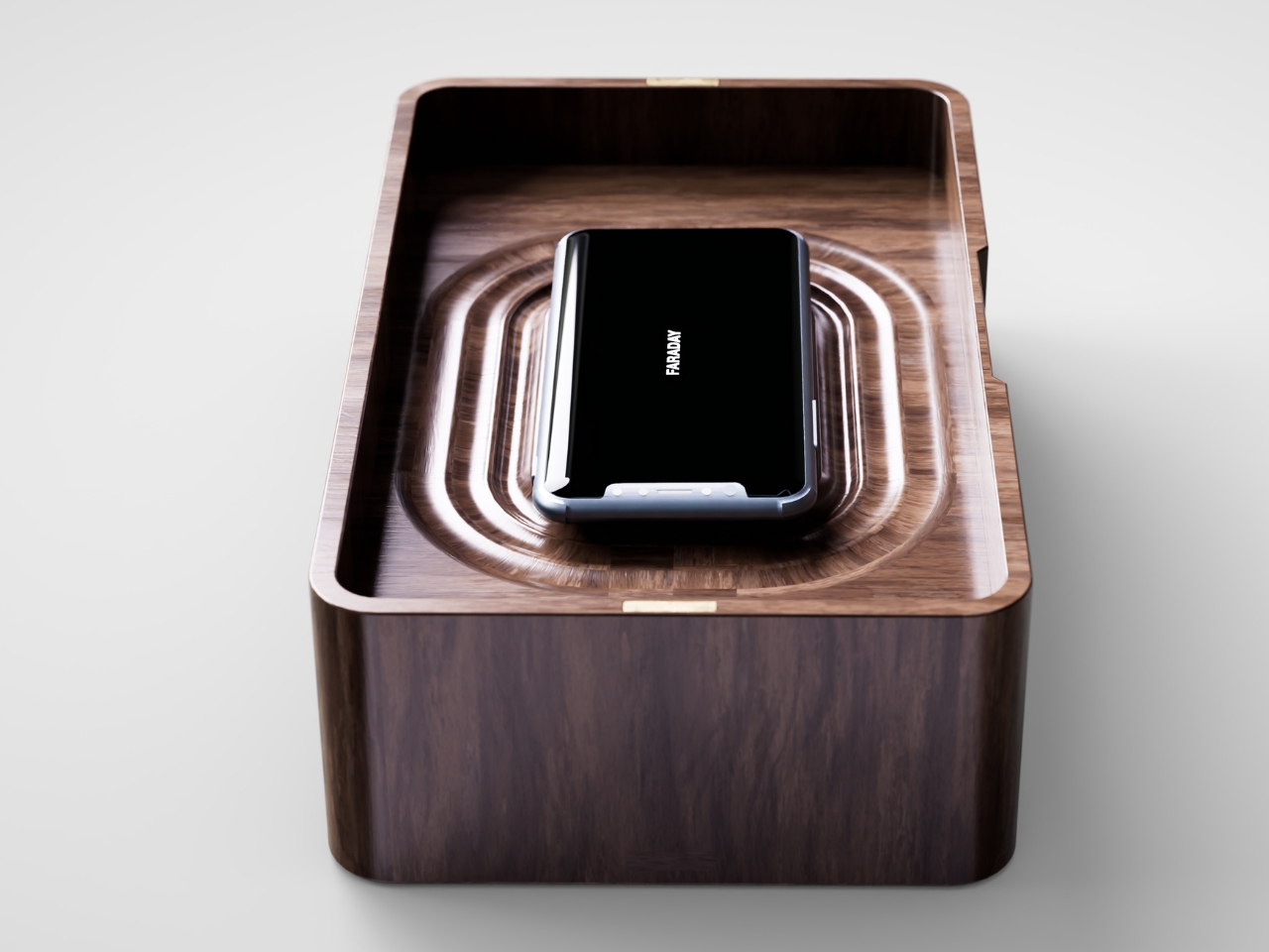
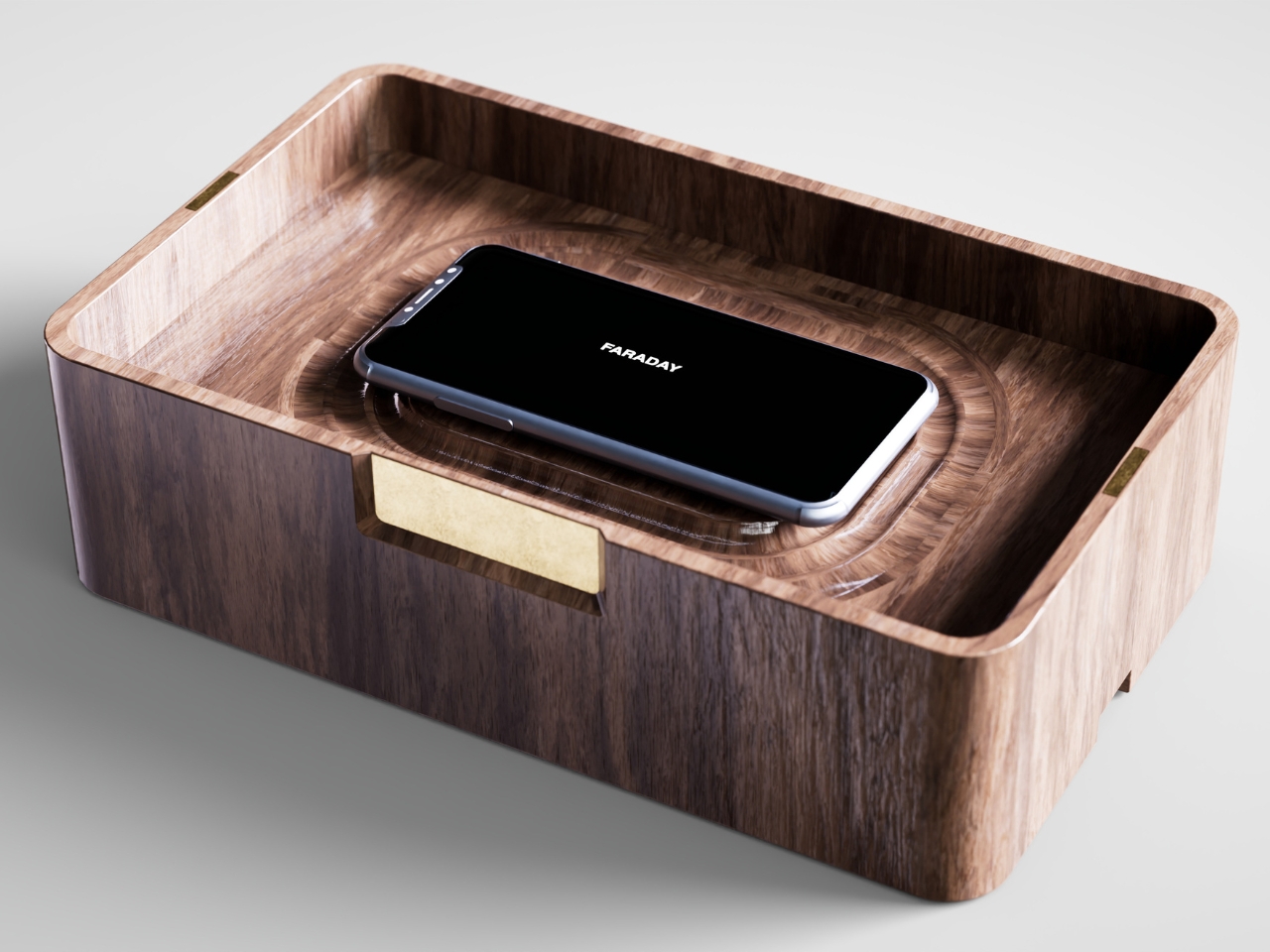
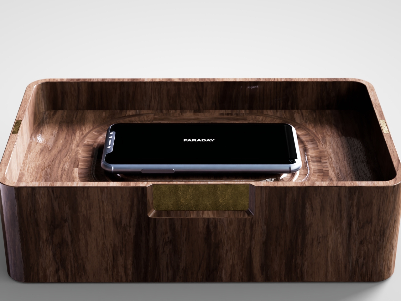
That’s the gap French industrial designer Pascal Grangier is quietly working in with FARADAY, a home object that doesn’t ask you to resist your phone. It makes resistance unnecessary. Named after the 19th-century scientist whose cage design blocks electromagnetic fields, the piece works on the same basic physics: once your phone is inside, it has no signal at all. No calls sneak through, no texts land, no app can light up your lock screen and drag your eyes back to it. You’re not disconnecting through discipline. You’re disconnecting through geometry.
Designer: Pascal Grangier

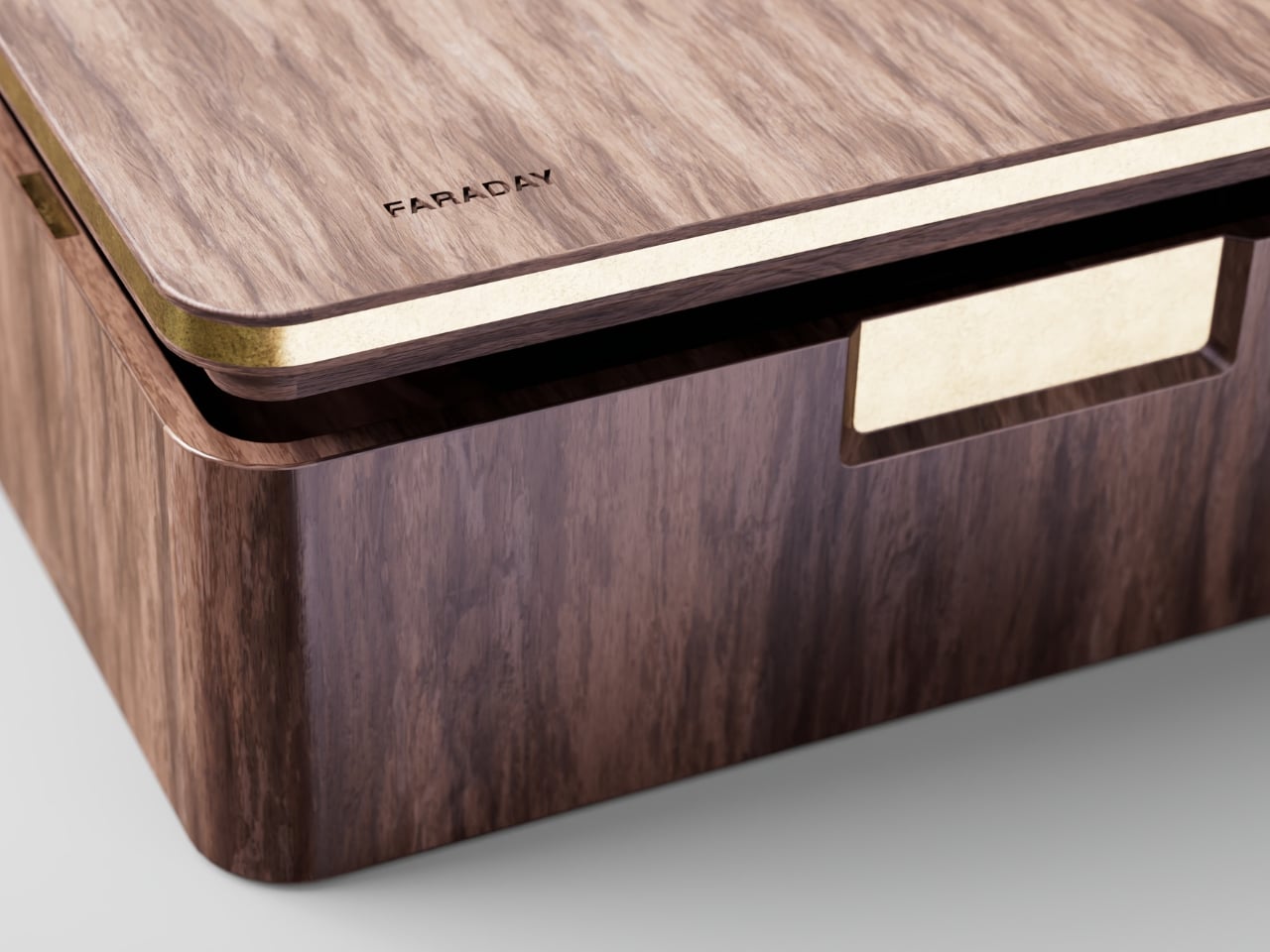
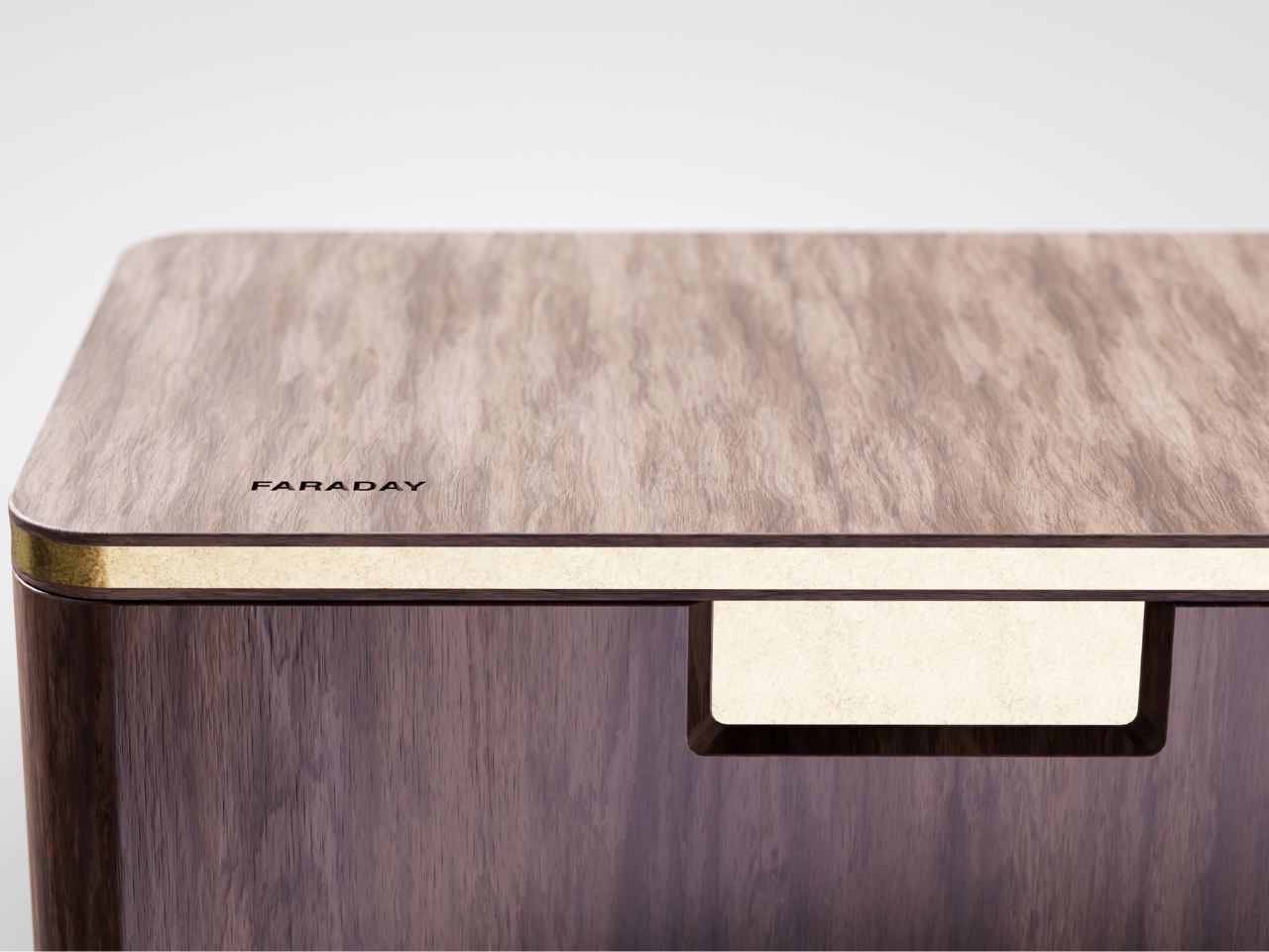
What makes this more than a novelty is the shape it comes in. Most signal-blocking products look like they were built for a hardware store, not a living room. Faraday pouches for concerts and courtrooms are floppy nylon sleeves you’d never leave out on a counter. Grangier’s version is carved from wood, with the kind of soft, rounded form you’d expect from a well-made bowl or a piece of studio furniture. It’s designed to sit on a nightstand or a kitchen counter without looking like a confession that you have a phone problem. That distinction matters more than it sounds like it should. An object you’re proud to display gets used. An object you’re embarrassed by gets shoved in a drawer and forgotten by the second week.


I think a lot about why boxes like this are showing up now, and it’s not really about phones getting worse. It’s about people finally admitting that the “just put it on silent” advice never addressed the actual craving, which is the urge to check, not the urge to hear. Silent mode still lets the dopamine loop run in the background of your brain, because you know the notifications are piling up somewhere, waiting. A Faraday enclosure removes the pile entirely. There’s nothing accumulating on the other side of that lid, so there’s nothing to be curious about later.



I don’t think objects like FARADAY are anti-technology, and I’d push back a little on anyone who frames it that way. It’s closer to how we treat food we know we’ll overeat if it’s sitting on the counter. Nobody calls it deprivation to put the cookies in a cabinet instead of banning sugar from the house. A wooden box that mutes a phone for the length of a dinner, or a weekend, or a first date, isn’t rejecting the smartphone era. It’s setting a boundary the same way a lock on a liquor cabinet does, respectfully and without lecturing anyone.


The dinner table is probably where this thing earns its keep fastest. Phone stacking, where everyone tosses their device into a pile and the first person to grab theirs pays the check, has become a real ritual at restaurants precisely because people know they need external enforcement. FARADAY takes that same instinct and gives it a permanent home, no penalty games required, no honor system to break.

Whether a hand-carved signal blocker becomes a fixture in American homes the way candles or diffusers did, I couldn’t tell you yet. But the appetite is obviously there. We keep buying productivity apps, screen time trackers, even flip phones marketed as luxury items, all chasing the same outcome Grangier reached with a block of wood and a basic law of physics. Sometimes the smartest tech solution is the one that refuses to be technology at all.

The post The Wooden Box That Refuses to Let Your Phone Win first appeared on Yanko Design.


"Never say never" is the common refrain, but BlizzCon revealed a bit more about the future of Blizzard's games on console than perhaps you might expect.
BlizzCon 2026 was pretty amazing. We got new trailers for Diablo V and the revival of StarCraft, as well as a revival for Warcraft 3, Heroes of the Storm, and WoW Classic in the form of World of Warcraft: Forever.
Blizzard also revealed Diablo 4 for Nintendo Switch 2 for the first time, and World of Warcraft also includes native Xbox controller support on PC as well — eliminating the need to use addons like Console Port.
World of Warcraft + Xbox controller works really well, really easy to get used to. - RB+LB for interface shortcuts like bags etc.- 32 keybinds on LT+RT, using ABXY and d-pad. - Radial menu on Menu button.- Targeting enemies and friendlies is intuitive, but unclear how viable… pic.twitter.com/B3yPGxryqDSeptember 18, 2026
When I asked Xbox customers on my Patreon and on X (Twitter) for questions to serve up at BlizzCon 2026, the top ask was always about potential Xbox ports.
DEAL: Get Surfshark VPN 86% OFF with Windows Central 🦈
So to honor your requests, I put the questions to the teams across Heroes of the Storm, Warcraft 3, and World of Warcraft about the potential for the games to hit Xbox or other traditional gaming consoles.
All of them offered variations on the same response ... Here's what they said.

Warcraft 3 had a big moment at BlizzCon when it revealed Forsaken Kingdom, the first expansion pack in over two decades. I asked Warcraft 3 Project Lead Brad Chan if we could eventually see the RTS emerge on Xbox and other consoles, given that games like Halo Wars and Age of Empires have been successfully adapted for controller.
"You know, we're going to talk about it," Chan said, "Maybe, maybe not, I don't know. Many things are possible, but right now we're focused [on PC]."
Echoing that sentiment was World of Warcraft Game Director Ion Hazzikostas, when I asked if we could eventually see World of Warcraft itself emerge on Xbox and other consoles. World of Warcraft: Forever is launching in November, and will be the first version of WoW with native Xbox controller support on PC. Is that a hint at a console version down the line?
RELATED: Speaking with WoW's Ion Hazzikostas on the future of Retail vs. Forever
"Our focus remains PC," Hazzikostas said, referring to World of Warcraft Forever's new Xbox gamepad controllers. "It's not just Xbox, it's just gamepad in general. Right? I think we've seen tons of people in the community use addons like Console Port over the years, and jump through a lot of hoops to get WoW playable on gamepad — we want to make that easier."
Hazzikostas said the Classic and Forever eras of WoW are potentially better suited to Xbox, given the slower, more methodical pace of combat before the Haste stat was added, for example. "Our focus remains [on PC], but many possibilities exist in the future, and we'll see where that leads us."
Well then, what about Heroes of the Storm? Heroes of the Storm also had a big BlizzCon moment when they revealed the game is well and truly back, starting with new hero Xal'atath. I have a bigger review with the team there coming shortly as well.
Speaking to Heroes lead developer James Yen, I asked if the game might find new audiences and growth were it ported to Xbox, consoles, or even mobile, given the popularity of things like Pokémon Unite. Yen quite rightly noted that their focus today is mostly about getting Heroes of the Storm back on its feet.
"We think about all avenues for where [Heroes of the Storm] could go, but that kind of distracts us right now ... from 'we just came back, let's make sure that the players that have been here for so long — let's take care of them, let's keep building content for them.'
We do have long-term goals, but you know those are more like stars, as you know. Our stars were like, 'Hey, let's come back. BlizzCon, that was just perfect timing,' but we are driving towards thinking about other things. But right now, the focus is, ' Let's give something to the players."
World of Warcraft: Forever is already poised to be a huge hit, taking the top spot on Twitch despite being weeks out from launch and rocking in closed beta. The fact that it has native Xbox controller support will open up the game to new audiences across PCs, potentially among users who prefer playing MMORPGs in that format. Naturally, bringing it to consoles across Xbox, PlayStation, and Nintendo Switch would also vastly open it up to new players, particularly among aging millennials who moved to console from PC through the past two generations. The fact that WoW: Forever is based on classic graphics also means it'll run on practically any modern device at 60 FPS, including the Nintendo Switch 2 and the Steam Deck.
It gets a bit trickier for Heroes of the Storm and Warcraft 3, potentially, though. Warcraft 3 is very much a PC game all up, and RTS has never really found a big audience on Xbox consoles. The Age of Empires 2 Xbox controls are very well realized, but there's probably not an audience big enough to justify the work.
Heroes of the Storm is a bit different in my view. I feel as though Heroes and other MOBAs would control great with a gamepad; Pokémon Unite and Smite proved that it's possible. Heroes of the Storm would be virtually without competition on Xbox and PlayStation, and including heroes and characters from franchises beyond Blizzard would also potentially help it find new audiences Fortnite-style. But it's like James Yen said ... it's still early days for the Heroes' revival.
What do you think? Would you like to see any of these games hit Xbox, PlayStation, or Nintendo Switch? Hit the comments, let us know.

Join us on Reddit at r/WindowsCentral to share your insights and discuss our latest news, reviews, and more.