Every idea deserves somewhere to go, and for a lot of 3D printing hobbyists, that place has been missing. ELEGOO wants to change that with ELEGOO DAY 2026, launching September 10, its annual celebration built around bringing creators together on Nexprint. This year folds in a creator fund, a design contest, new model generators, and a sale, all pointing toward one goal: getting more people to create, share, and be part of a growing community.
Most of that action happens on Nexprint, ELEGOO’s open-source 3D model platform, built on the belief that creation should be open to anyone with an idea. Think of it as the hub tying everything together: models get uploaded, tools get discovered, and creators get a real reason to keep contributing. That shift is slowly turning ELEGOO from a printer maker into a community built around making.
The centerpiece is the new $1,000,000 Creator Fund, ELEGOO’s way of recognizing and rewarding people for sharing 3D models on Nexprint, not just paying for output but investing in the community itself. Rewards start with your very first submission, no waiting for likes or rankings to climb first. Individual models can earn up to $100, and stacking incentives push that ceiling to $300 per model.
There’s more structure built in too. Extra rewards unlock at 3, 5, 10, 20, and 50 submissions, so consistency pays off as much as any single hit model. Monthly rankings hand exclusive prizes to the top five creators, including actual ELEGOO printers, while a new bonus-card mechanism can push individual payouts even higher. It feels less like a marketing gimmick and more like a system built to grow alongside its creators.
From September 10 to October 30, ELEGOO runs the MakeItReal contest on Nexprint, and the premise couldn’t be simpler: take a flat idea, in whatever form it takes, and give it dimension, no design background required. There’s no theme to chase, just that shift from flat to physical. Winning entries will be picked and announced on November 20, each earning up to $300 in ELEGOO coupons for the trouble.
The idea behind it is almost sentimental for a hardware company, echoing ELEGOO’s belief that 3D printing works best as a creative outlet, not a manufacturing shortcut. A photo on your phone or a doodle in a notebook can end up as something you actually hold, not just imagine. Creators don’t need advanced modeling skills to compete, either. Nexprint’s upcoming Text and Image to 3D Generator lets anyone shape a contest entry straight from a photo or a written description, no CAD needed.
That generator is one of three new tools ELEGOO just added to Nexprint, alongside a Vase Generator and a Nameplate Generator, each built to make creation easier for beginners and veterans alike. All three do the same basic job: they take a drawing, a photo, or a few typed words and turn it into a printable model within minutes. None of it replaces real design skill, but it removes the blank-page problem that stops many from starting.
Put it together, and the loop makes sense. Someone sketches an idea, runs it through a generator, shares the result on Nexprint, enters it into MakeItReal, and picks up Creator Fund rewards along the way. None of those steps demand deep technical skill. This is the connected ecosystem ELEGOO keeps referencing, not a slogan, but an actual sequence anyone can walk through starting today.
All this activity lines up with the ELEGOO DAY Sale, with discounts of up to 54% on selected products, running September 8 through 29 with regional pricing, ELEGOO’s way of putting that ecosystem into more hands. The Saturn 4 Ultra 16K brings high-resolution resin printing for detailed sculptures, jewelry prototypes, and miniatures. The Centauri Carbon 2 Combo handles multicolor prints for home décor and personalized gifts. The Mars 5 Ultra offers a smaller resin option with sharp detail for tight workspaces.
What stands out about ELEGOO DAY 2026 isn’t any single feature; it’s the shape of the whole thing. A hardware company built its business on printers, then quietly built systems for sharing, competing, and earning that turn a machine into a habit. For ELEGOO, that’s what building an ecosystem means: more chances for people to create, connect, and turn ideas into something real.
I’ve broken more shot glasses than I care to admit, and I’ve also poured a good shot of whisky into a glass that smelled faintly of dish soap because nobody thought to hand-dry it properly. That’s the quiet failure of most drinkware. It’s not that it looks bad. It’s that it gets in the way of the thing you’re actually drinking, whether through fragility, absorption, or just feeling like an afterthought grabbed from a gift-shop shelf.
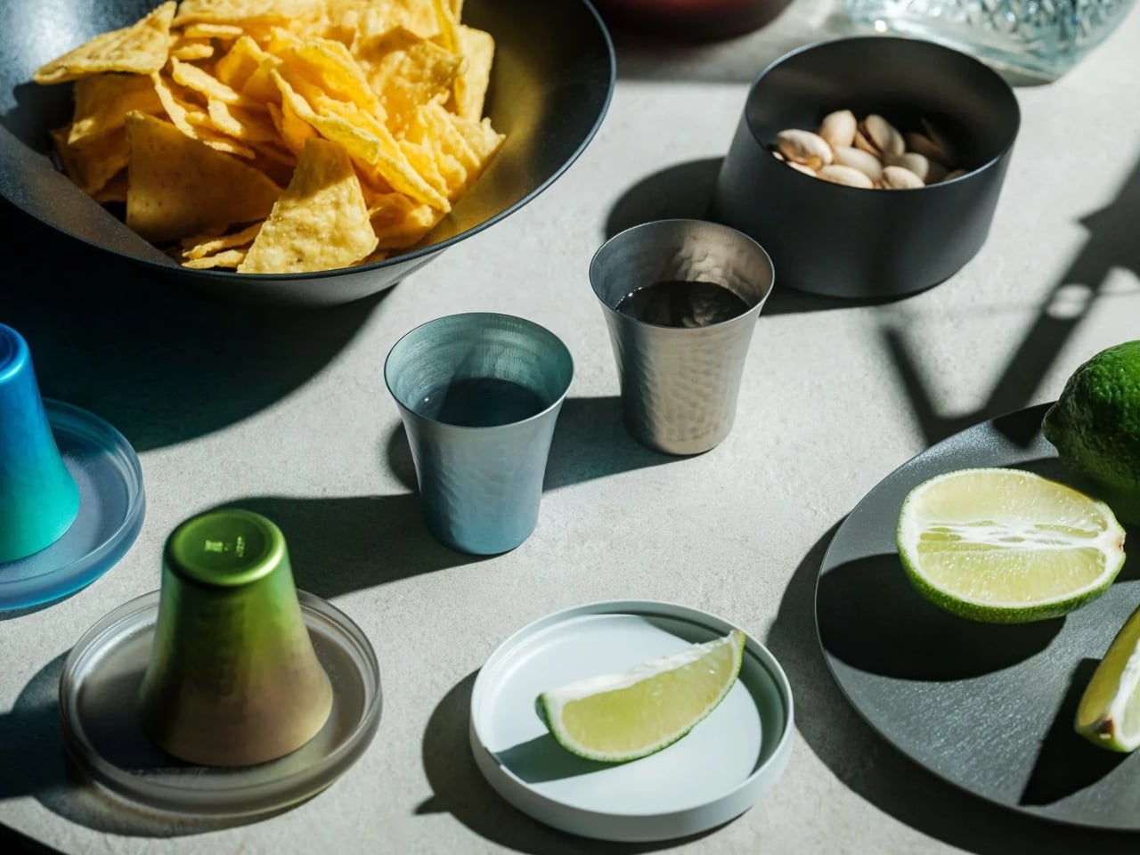
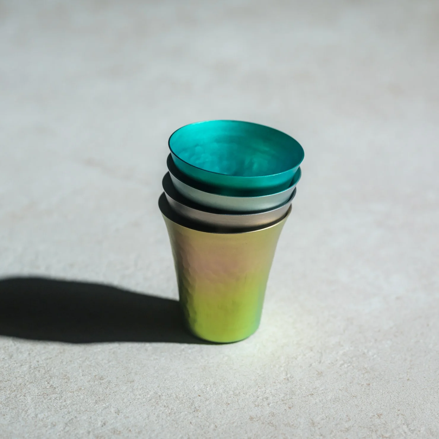
The Titanium Artisan Spirits Cup solves a problem I didn’t realize I’d been quietly annoyed by for years: the vessel changing the experience instead of getting out of its way. Made in Japan from solid titanium, this tiny cup, just 70ml, about the size of a proper sake or spirits pour, is built from a material that’s completely non-reactive. No metallic aftertaste, no lingering smell from last week’s whiskey, no worry about it cracking if you set it down a little too hard after a long day. It just holds the drink and lets the drink be the drink.
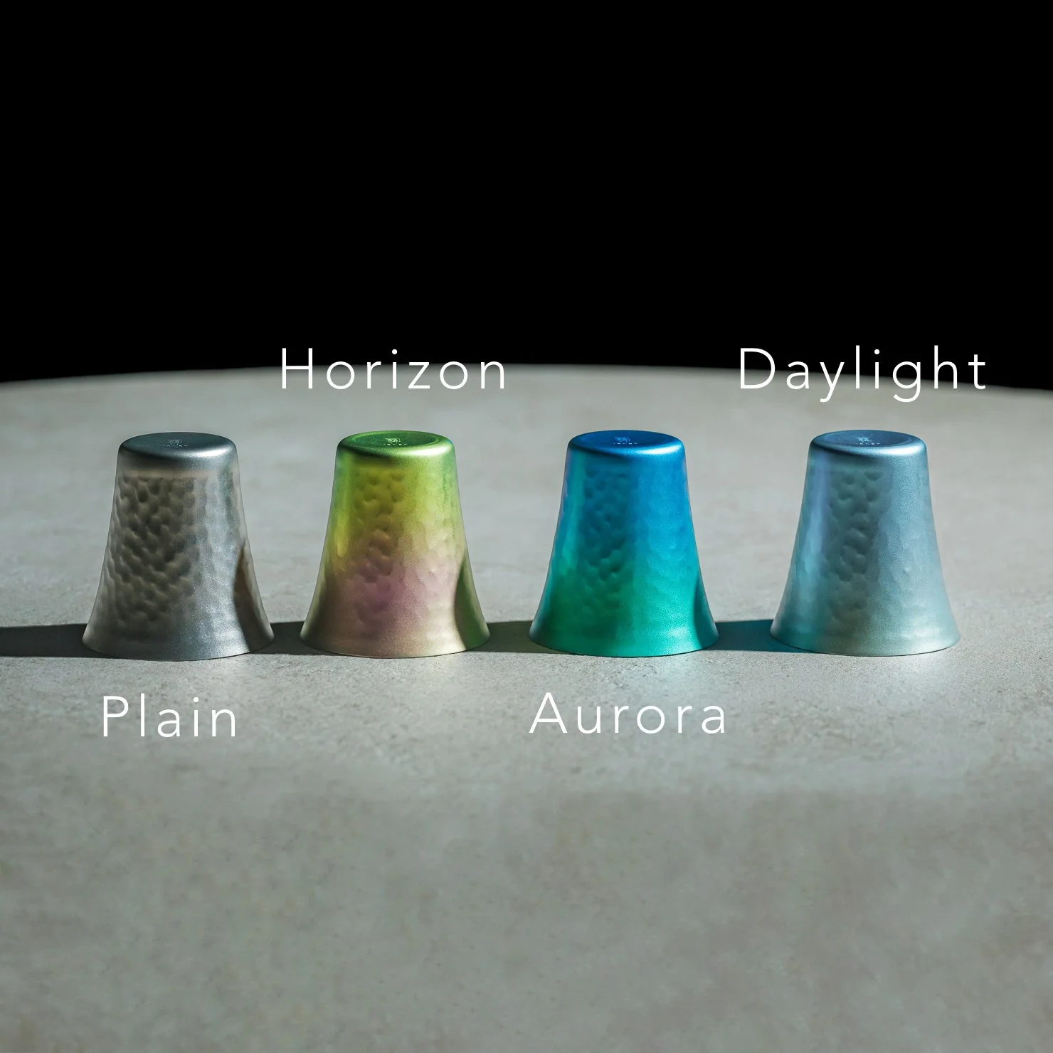
I’ll admit I was skeptical the first time I read “titanium cup” and pictured something that belonged on a camping trip, not a bar cart. But this isn’t the same brushed, utilitarian titanium you’d find in a hiking mug. The anodized finishes here, Horizon’s pink-to-green gradient, Aurora’s iridescent blue-green, Daylight’s pale blue shimmer, are created through an electrochemical process, not paint, which means the color actually lives inside the metal’s oxide layer. Practically speaking, that means no two colored cups come out quite the same. You’re not buying a product off an assembly line so much as picking one version of a process that never repeats itself exactly. For $50 to $60 depending on finish, that’s a small price for owning something genuinely singular.
It’s worth comparing this to how a brand like Yeti has trained American drinkers to think about premium drinkware over the last decade. Yeti built an empire on durability and temperature retention, on the promise that your drink stays cold or hot for hours in something that survives getting thrown in the truck bed. That’s a real, useful problem solved well. But Yeti’s whole design language is about insulation and toughness for casual, high-volume drinking. This titanium cup is solving something almost opposite: it’s not trying to keep your drink at a certain temperature or survive a drop from a tailgate. It’s built for the smaller, slower moment, the two-ounce pour you’re meant to sit with, not gulp. One is engineered for durability at scale. The other is engineered for intimacy in a single sip.
What actually sold me on this piece isn’t the finish or the aerospace-grade pedigree of the material, though both are legitimate. It’s the size. Seventy milliliters forces a kind of restraint. You can’t casually refill it five times without noticing you’re doing it. It nudges you toward treating a pour of whiskey or sake as an event rather than background noise while you scroll through your phone. That’s a small, almost accidental piece of good design, the kind that changes behavior without lecturing you about it.
I also don’t think the Titanium Artisans Spirit Cup is for everyone, and that’s fine. If you want something that holds sixteen ounces of iced tea and survives a dishwasher cycle, this isn’t your object. But if you’ve ever wanted a single, honest vessel for the good stuff, the bottle you save for a specific mood or a specific person, this earns its place on a shelf. With only a handful available at a time, it’s also not pretending to be mass-market, which somehow makes it feel more genuine rather than more precious. Good drinkware should disappear the moment the drink hits your lips. This one actually manages that, and it does it while looking like something you’d want to hold onto forever.
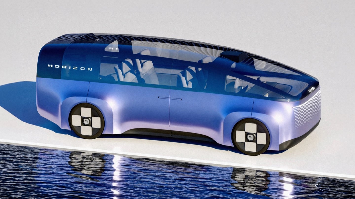
You know that little rounded square Xiaomi uses as its logo? The one a Japanese design legend spent actual months tuning with a math equation just to get the curve right? Lucas Angelo looked at that shape and thought, sure, why not build a car out of it. The result is the Xiaomi Horizon, and I mean that almost literally. The tailgate is one giant glowing squircle. The wheels are squircles. The whole rear end reads like someone blew up an app icon to the size of a minivan.
It sounds like a gimmick until you remember Xiaomi’s entire EV strategy is basically “make our products feel like they all came from the same brain,” and a car shaped logo is honestly not the dumbest way to pull that off. Whether it should be a Multi Purpose Vehicle or something else entirely is a separate question, and we will get to it. But credit where it is due, this thing has more brand DNA baked into its sheet metal than most concepts manage with an entire mood board of heritage references.
Designer: Lucas Angelo
That squircle obsession is not Angelo inventing a bit for fun. Back in 2021, Xiaomi hired Kenya Hara, the design legend behind MUJI’s whole visual identity, to redraw its logo. He landed on a superellipse formula, dialed to a value called n equals 3, which is the mathematically precise sweet spot between a perfect square and a perfect circle. People online mocked it as three hundred grand for rounded corners. Angelo apparently took it a lot more seriously than the internet did, because Horizon’s entire rear fascia is basically that formula rendered at automotive scale, ringed in individually lit LEDs so it glows like a screensaver whenever the car is parked.
The front end plays a similar game with something Xiaomi calls the Cascade Grille, a full width lattice of tiny illuminated squares that fade in a stepped pattern across the nose. It is not a functional intake so much as a light show, which tracks for a brand that made its name on phones and smart speakers before it ever touched a chassis. Xiaomi’s actual head of automotive design, Li Tianyuan, cut his teeth on the BMW iX and the i Vision Circular, a concept that turned BMW’s kidney grille into a digital display. Angelo landing in almost the same conceptual neighborhood, independently, says his instincts are pointed in a direction the real design team already validated once.
Here is where things get spicy. China’s premium electric MPV segment has a body count, and the most famous casualty is the Li Auto Mega, a smooth, curvy one box people mover that the internet immediately nicknamed the hearse. One owner slapped high speed train decals on his because the jokes wrote themselves, and Li Auto’s own design chief was still publicly defending the car more than two years later. A big blank slab of a rear end on an MPV is basically an invitation for the internet to decide what it looks like for you, and it is never flattering.
This is exactly the trap Horizon’s illuminated tailgate sidesteps. Instead of a flat dark void back there, you get a glowing signature the size of a barn door, something to actually look at instead of squint at. Whether Xiaomi ever builds anything like this is unlikely, especially now that the real Xiaomi has already picked its answer to the family hauler question with the SkyNomad, an EREV SUV with a fridge and a bed mode rather than a sliding door MPV. But Horizon is a fun reminder that sometimes the best way to honor a brand is to take its smallest, most mocked design decision and blow it up until everyone has to take it seriously.
Apple and the gaming crowd have always had one of those relationships where you nod at each other across a party and never actually walk over. Apple makes the chips, brags about them beating a PS5 in some benchmark slide, then goes right back to talking about spreadsheets and stargazing apps. Gamers, meanwhile, buy a Steam Deck or a Switch and never think about the iPhone in their pocket as a gaming device at all. Bloomberg’s Mark Gurman just reported that Apple wants to finally cross the room, having spent over a year quietly developing its own gaming controllers for the iPhone. The bigger twist is who gets to wear the name tag. Rather than an Apple logo, the hardware is reportedly launching under Beats, the audio label Apple has been slowly turning into its lifestyle catch-all since buying it in 2014.
Code unearthed in a leaked macOS 26.7 build gives the rumor real teeth, naming two unreleased devices, T6502 and T1057, each carrying its own dedicated controller profile instead of placeholder code. Both come with the standard gamepad vocabulary, sticks, triggers, a D-pad, face buttons, the stuff every controller on the planet already has. T6502 keeps things simple and wired. T1057 adds Bluetooth, motion sensors, and a noticeably different haptic engine, suggesting more than one idea is being tested at once. Nothing is priced, dated, or confirmed, but the code alone says this has moved well past a mood board.
Designer: Apple
Gurman’s sourcing on the branding is the part I keep chewing on. He says Beats executives are leading both the engineering and the product concept, not just slapping a logo on something Apple’s industrial design team already finished. His reasoning is that the culture and lifestyle around gaming controllers fits Beats better than it fits Apple, and that the sub-brand gives the company room to use cheaper materials and a louder design without dragging down the premium finish people expect from anything wearing the actual Apple logo. Read between the lines and that is Apple admitting its own aesthetic has a ceiling. Titanium and glass photograph beautifully, but nobody wants to grip a cold slab for a three-hour Genshin Impact session. Beats, with its glossy plastics and its very unserious relationship with color, is a far more honest home for an object designed to be squeezed, dropped, and thrown in a backpack pocket.
There is a decent trade-off lurking here too, and it is worth naming before anyone gets too excited. T6502, the wired one, is basic by design, which means it will likely be the cheaper, more disposable option with none of the motion sensing or richer haptics that make a controller feel alive. T1057 sounds like the one worth wanting, but Bluetooth controllers introduce pairing friction and battery anxiety that a simple USB-C plug-in never has to deal with. Apple will have to pick a lane, or price the two far enough apart that the choice makes sense, and so far there is no signal on either price or release window. History also isn’t fully on Apple’s side. The company has floated controller ideas for years without shipping one, and it once required developers to support the Siri Remote’s accelerometer as a de facto gaming input before quietly dropping that mandate. A leaked profile in a beta build is not a keynote slide.
Where this actually matters long term is the software Apple has already built around it. iOS 26 shipped a dedicated Games app that pulls your library, your Game Center friends, and Apple Arcade into one hub across iPhone, iPad, Mac, and Apple TV, and Arcade itself has quietly grown past 250 titles for $6.99 a month. A first-party controller, even a scrappy Beats-branded one, gives all of that infrastructure something physical to plug into, which is a very different goal from just selling more hardware. It also puts Apple in the odd position of competing with its own shelf space, since the Apple Store already sells the Backbone One and the SteelSeries Nimbus, and we covered how Backbone’s own Pro model already chases full-size ALPS sticks and forty-hour battery life at a premium price. Razer’s brand new Prio takes the opposite approach entirely, folding down to credit card size for people who would rather not carry a controller-shaped commitment at all. Apple showing up now, later than everyone, wearing someone else’s logo, says less about gaming and more about how Apple treats every category it enters late. Quietly, sideways, and only once it has found a version of itself that does not feel like Apple at all.
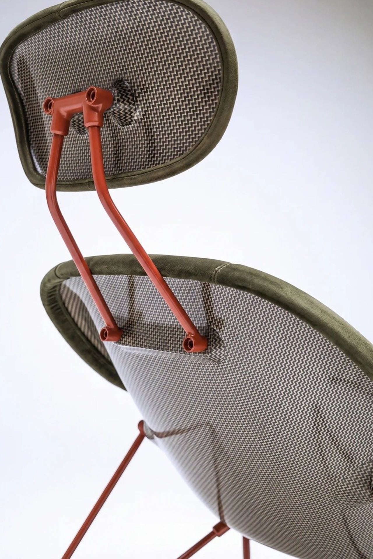
Most furniture doesn’t have a backstory worth telling. The Maniac Chair does. It looks, from across the room, like it wandered out of a 1950s Danish design studio — until you get close enough to realize it’s built from the same bloodline as a $2.35 million hypercar.
Oilstainlab is the California-based studio founded by Ukrainian-born twins Iliya and Nikita Bridan — high school dropouts trained in Italy and California, responsible in their previous lives for 6.5 million street cars. In 2018, they started Oilstainlab with a single promise: never to be sane. The result was the HF-11, a limited-production hypercar of which only 25 will ever exist. The Maniac Chair is the furniture-world extension of that same obsession, sold through House Dé Stains, Oilstainlab’s lifestyle brand.
Designer: Oilstainlab
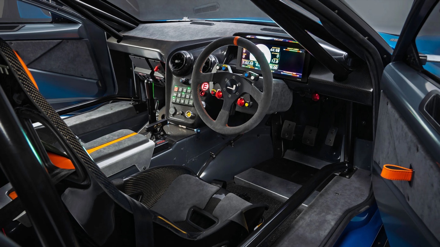
The chair’s shell is built on a CNC-machined aluminum frame wrapped in a hand-laid carbon fiber shell. That detail matters. Hand-laid carbon fiber isn’t a production shortcut — it’s the language of motorsport, of race seats and monocoques shaped around bodies doing 200 mph. Here, it’s shaped around a body doing nothing more than sitting. That deliberate mismatch is the whole point. The midcentury silhouette is familiar enough to read as furniture; the material is foreign enough to make you question what you’re actually looking at.
The name traces back directly to the HF-11, which Oilstainlab offered in an exclusive “Maniac” package for 11 of its 25 cars. The chair carries that identity forward — it’s not merchandise, it’s an extension of a design philosophy that treats excess and restraint as two sides of the same surface. The carbon fiber reads as raw and technical; the form reads as warm and considered. Neither cancels the other out.
What Oilstainlab has done here is something furniture designers rarely attempt, and automotive designers rarely bother with: they’ve made a chair that has genuine provenance. It isn’t inspired by cars in the way that means “we added some aggressive lines.” It shares DNA with an actual race seat.
The prep process before upholstery even echoes motorsport fabrication. For a studio built on the idea that sanity is optional, the Maniac Chair is a surprisingly coherent object. It knows exactly what it is — a piece of furniture for people who want to sit inside a design argument — and it doesn’t flinch.
There is a tool called an English wheel that has been shaping aluminum car panels since roughly the 1930s. It is a big metal hoop with a roller in the middle, and you push sheet metal through it by hand until it curves the way you want. It sounds like something you would find in a blacksmith’s shed, not in the workshop of a car aiming for 1,200 horsepower. Yet that is exactly the tool Coventry Metalcraft used to hand-form the body of the new Jensen Interceptor GTX, alongside laptops running computational fluid dynamics software. Old-world muscle meets new-world math, and somehow both sides showed up to the same car without arguing.
Jensen International Automotive unveiled the GTX in early September, and it is a strange beast by design. It is Jensen’s first ever clean-sheet car, built to preview a whole new Interceptor lineup, and it gets there using ten English wheels worked by more than 30 artisans, alongside digital design data from studio Avant Design and mixed-reality checks nobody in 1966 could have dreamed of. The result is a 960 bhp supercharged V8 grand tourer wearing hand-beaten aluminum panels shaped partly by algorithms. Britain’s oldest car-forming trick just got a very modern wingman.
Designer: Avant Design
Avant Design, based out of Royal Leamington Spa, is the studio responsible for translating the original 1966 Interceptor’s proportions into something that reads as contemporary rather than costume. The long bonnet survives, the tightly drawn greenhouse survives, and the wraparound rear glass that made the original such a distinctive shape is still there, even if a towering rear wing now partially blocks the view of it. What is new is the front end, with slim horizontal LED lighting and enormous carbon intakes replacing the old car’s chrome-heavy face. Interestingly, this is not Avant’s first crack at reimagining this exact silhouette. Back in 2023, the studio quietly published a concept called the E-Ceptor, an electric take on the Interceptor with reworked rear glazing and a fresh grille graphic. The GTX effectively took that speculative sketch and gave it a supercharged V8 instead of a battery pack.
The aluminum decision, both for the chassis and the body, was not driven by sentiment. David Duerden, Jensen International’s managing director, put it plainly when explaining why the GTX skipped carbon fiber entirely. He does not want the car riding like “a skateboard,” which is a fair concern given how punishing a stiff carbon tub can feel on a road built for a Sixties grand tourer, not a modern track special. Aluminum chassis structures are also considerably cheaper to produce in small batches, since they avoid the expensive tooling that carbon fiber demands before a single panel gets made. For a car expected to sell in the dozens rather than the thousands, that economic math matters more than bragging rights about carbon weave.
That economic logic is exactly why the English wheel earns its keep here. Hand-forming panels sidesteps the tooling costs that would sink a low-volume carbon fiber program before it ever reached a customer. Coventry Metalcraft’s artisans still shape every piece the old-fashioned way, but they are working from digital surfaces that Avant Design refined using CFD modeling, chasing the 350 kilograms of downforce the GTX needs to behave itself at speed. It is a genuinely odd combination of a seventy-year-old forming technique and simulation software that did not exist when the original Interceptor left the Kelvin Way factory. Jensen is betting its entire comeback on that combination holding together, and so far, from what we have seen, it seems to be working rather beautifully.
Bali has a photo problem. Not a bad one, exactly, but a familiar one: the same rice terrace, the same infinity pool angle, the same swing shot dangling over the same jungle canopy, reposted by a few million travelers who all found the identical spot through the same map pin. When a landscape gets photographed enough times, it starts to flatten out in your memory before you’ve even seen it in person. You arrive, and it feels like déjà vu instead of discovery.
That’s the quiet problem Vincent Leroy’s new installation seems to answer, even if he’d probably never put it in those terms. Tucked into the hills of Munduk, “Eccentric Lenses” is a field of Fresnel lenses mounted on posts, catching the wind and spinning on axes that aren’t centered, so nothing ever settles into a repeatable frame. Point a camera at it in the morning and again at dusk and you won’t get the same picture twice, not because the location changed, but because the lenses never stop rearranging it for you.
Fresnel lenses are the flat, ridged discs you’d recognize from old lighthouses or projector screens, built to bend light without the bulk of a curved glass lens. Leroy has been experimenting with them for years, but this piece feels like his most site-specific use of the idea. Instead of distorting a studio backdrop, he’s pointed the lenses at Bali’s actual terrain, its rice fields, its distant volcanic peaks, its low clouds, and let the wind do the editing. Every gust nudges a lens a few degrees, and the mountain behind it splits, doubles, or slides sideways for a second before reassembling.
What I appreciate here is the restraint. There’s no motor, no app, no LED strip pretending to be magic. It’s just optics and weather, working together in a way that feels almost stubbornly analog for 2026. We’ve spent the better part of a decade being told that wonder needs a screen attached to it, that a landscape only becomes interesting once it’s been filtered, looped, or turned into a Reel. Leroy’s installation goes the opposite direction. It takes the one thing every travel photo tries to eliminate, unpredictability, and makes it the entire point.
There’s a reason kinetic art tied to natural forces keeps resurfacing right now, from wind-driven sculptures to mirror installations chasing the sun across a field. People are a little exhausted by content that behaves exactly the way it’s supposed to. A piece that changes because the wind decided to pick up speed is refreshing precisely because nobody, including the artist, can fully predict what it’ll look like an hour from now. That unpredictability used to be considered a flaw in outdoor art. Here it’s the mechanism.
It also helps that Leroy didn’t ask Bali’s landscape to hold still for him. The lenses don’t compete with the rice terraces or try to outshine the mountains; they just keep reintroducing you to them. That’s a small but telling choice. So much of contemporary installation art wants to be the main event, the thing you drove out to see. This piece works because it insists the actual landscape was always worth a second look, it just needed a nudge to prove it.
I don’t think “Eccentric Lenses” is trying to solve tourism fatigue or fix anyone’s relationship with their camera roll. But it’s hard not to read it that way anyway, especially watching footage of a single mountain peak splintering into five overlapping versions of itself, then quietly reforming into one. For a moment, an overexposed view of Bali stops feeling used up. It just feels new again, which might be the most useful trick any piece of art can pull off right now.
The Glass House by Escape arrives at a moment when the tiny home conversation desperately needed a reset.It’s a park model that reads less like a compact shelter and more like someone took a considered, light-soaked apartment and simply decided it didn’t need to be attached to a city block.
The structure stretches 47 feet long and 12 feet wide — uncommonly generous proportions for this category — finished in cedar that ages the way good materials should. But the defining move here is the glazing. One full wall runs 30 feet of continuous windows, pulling in light, landscape, and the kind of visual depth that makes a space feel genuinely expansive rather than merely tolerable. It’s a single-floor layout, which matters more than it sounds. No loft ladder, no crouched ceilings. Just clean, lateral living that prioritizes how a space feels to move through over how many square feet it can claim on paper.
Designer: Escape
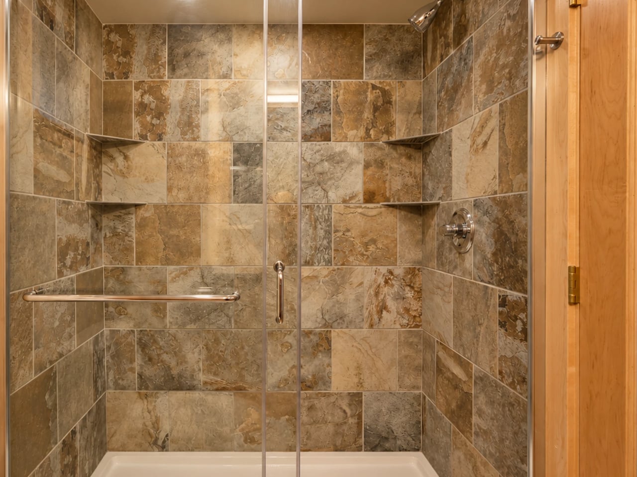
The interior holds up to its exterior promise. The kitchen is equipped with a full-size fridge/freezer, dishwasher, induction cooktop, and a combination microwave/convection oven — the kind of spec sheet that signals the designers were thinking about real use, not Pinterest renders. The bathroom features a large glass-enclosed tiled shower, a vanity sink, and a proper flushing toilet with generous storage built around it. The bedroom carries the same commitment to glazing — framing a view of the surrounding landscape rather than walling it out. An enclosed porch extends the footprint further, offering an indoor/outdoor zone that shifts with the weather and the mood.
Escape, which has been building award-winning tiny homes for over 30 years, currently has the Glass House on view at its Canoe Bay Village property in Wisconsin — which is worth noting, because it suggests the design isn’t purely aspirational. It exists in a real landscape, subject to real seasons, and it holds its own.
What makes the Glass House interesting as a design object isn’t just its size or its spec list. It’s the underlying argument it’s making: that living small doesn’t require a philosophy of sacrifice. The single-floor plan, the wall of glass, the proper kitchen — these aren’t luxury additions. They’re the baseline of what attentive design looks like when it’s applied to a form that usually settles for less. The Glass House doesn’t settle.
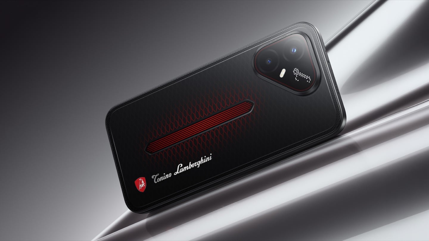
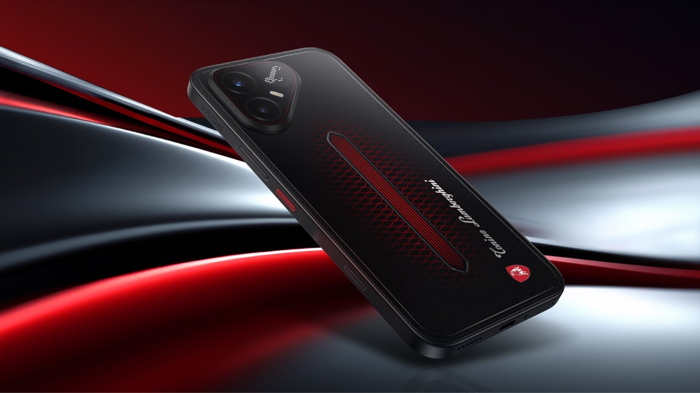
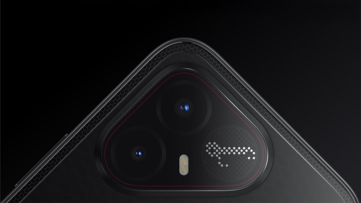
The most expensive Lamborghini phone ever made was a $6,000 slab of hand-stitched leather and gold plating called the 88 Tauri, and it ran Android KitKat on a Snapdragon 801. That was CES 2015, peak era for buying two-year-old silicon at four times the price because someone put a bull on it. Tonino Lamborghini made three of those phones between 2013 and 2017, then went away. The name has now resurfaced on the back of a TECNO POVA that costs about $490, and the badge is finally earning its position. It gets drawn in light instead of stamped in metal.
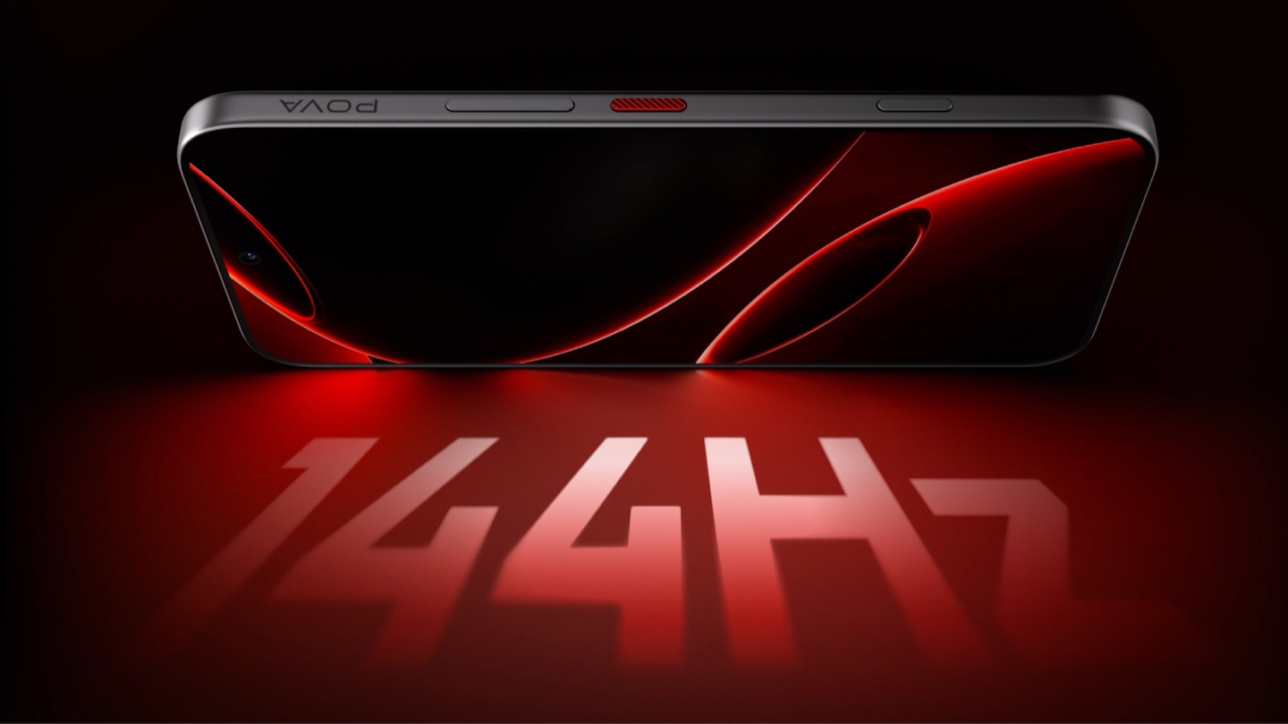
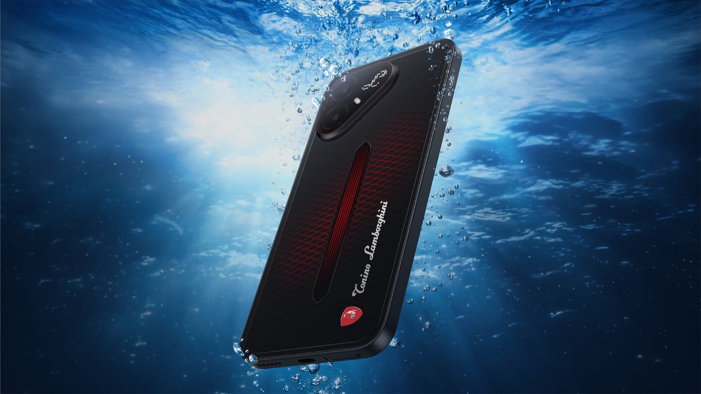
On the POVA 8 Pro 5G Tonino Lamborghini Limited Edition, the Italian brand’s “L” is rendered by 177 individually controlled mini-LEDs in TECNO’s Alive Matrix panel, and the red Pulse Line down the center of the back is a passive optical effect built from internal mirror structures sandwiched between two coating layers at different physical heights. Rotate it and the red rises out of the black, then drops back in. The phone is spec-identical to the standard POVA 8 Pro, so every difference you are paying for is a surface decision. Thai prices start at 15,999 baht for 8GB and 256GB, topping out at 19,999 baht for 12GB and 512GB. There is no US release and no US carrier certification.
Designer: TECNO Design Team, in collaboration with Tonino Lamborghini S.p.A.
Mechanical Grammar, Translated
The brief TECNO gave itself was to take a vocabulary that belongs to cars and make it belong to a slab of glass and aluminum, and the way in usually decides whether that kind of project reads as clever or as a paste job. The team started with the visual codes of mechanical design rather than the logo itself: body lines, cooling grilles, honeycomb patterns, exhaust-inspired detailing. That’s the right instinct. A shield pasted onto a black rectangle says nothing. A shield built from the same geometric logic as an engine bay at least has a reason to exist there. The result is the Signature Shield pattern ringing the Pulse Line, a hexagonal structure lifted from Tonino Lamborghini’s own emblem and mechanical detailing rather than invented fresh for the phone. It gives the back of the device an actual sense of depth and structure instead of a flat decal sitting on top of a chassis that was never designed with it in mind.
The Manufacturing Problem Nobody Sees
The interesting part isn’t the pattern, it’s how TECNO built it. Getting that Pulse Line to shift color under different lighting angles required internal mirror structures processed to redirect light the way a curved mirror does, stacked underneath a brightness-enhancing first layer that behaves closer to a lacquer finish than a printed graphic. Between the two layers sits a real, physical height difference, which is what gives the effect actual depth rather than the flat printed texture you get on most co-branded rear panels. TECNO describes this as one of the most complex rear-cover processes it has run on a POVA product, and the harder problem wasn’t making one unit look right, it was getting thousands of units to look right consistently. That’s a legitimate manufacturing achievement on a phone priced well under $500, and it’s the kind of detail that gets lost entirely once a press release compresses it down to “premium finish.”
A Skin That Goes All the Way Through
TECNO didn’t stop at the shell, which is the part most co-branded phones treat as optional. The software carries the same black-and-red system with reworked icon outlines, nudging soft rounded shapes toward hexagon and shield silhouettes so the interface reads as an extension of the hardware rather than a wallpaper slapped over stock Android. TECNO says the software work alone took close to four months, covering the boot animation, dynamic wallpapers, ringtones, and the Alive Matrix “L” effect. The accessories continue the bit: a braided black-and-red cable, a case built from TPU and polycarbonate carved with a Kevlar-inspired carbon fiber texture. None of it is essential to how the phone functions, but all of it is the difference between a badge and a bit that someone actually thought through.
What a Tonino Lamborghini Badge Used to Cost
Worth sitting with how far this pulls the brand from its own history. This partnership started back in March at MWC, where TECNO and Tonino Lamborghini unveiled the POVA Metal Tonino Lamborghini Limited Edition alongside a water-cooled mini gaming PC concept carrying the same red-and-gunmetal language into laptops, tablets, and earphones. That first phone felt closer to the old playbook than this one does. The 88 Tauri and its 2014 sibling, the Antares, were built around leather, gold plating, and price tags that assumed the badge alone justified the markup. The 2017 Alpha One dialed the ornamentation down but kept the price near $2,100. Automobili Lamborghini’s own collaborations, including the Oppo Find X Automobili Lamborghini Edition at €1,700 against a €1,000 base phone, followed the same math: better materials, a visible badge, a premium that tracked the logo rather than the manufacturing. This is the first Lamborghini phone where the badge shows up as a production process instead of a price justification, and it happens to be the cheapest one the family has ever put its name on. For the full spec rundown on the rear panel construction, we’ve covered the hardware side of this phone in detail already.
Price, Availability, and the Fine Print
Thailand has this now, sold through BaNANA, IT CITY, Jaymart, and other retailers since August 21, with early buyers getting a Tonino Lamborghini backpack and a Tecno Watch 3 Active thrown in. Pricing for India and other markets hasn’t landed yet as of this writing. If you’re reading from the US, this one isn’t coming your way in any official form. TECNO has no FCC certification and no carrier partnerships stateside, so anything that turns up on a resale site is a gray-market import with no warranty support behind it. Worth knowing before anyone gets attached to a color they’ll never see in a carrier store.
The Badge, Recalibrated
TECNO didn’t need Tonino Lamborghini’s name to sell a $490 phone with a good screen and a big battery, which makes the choice to spend four months on software and reinvent the rear-cover process for a mid-ranger feel almost backward by traditional luxury-licensing logic. Usually the name does the selling and the hardware coasts. Here the hardware earns the attention and the name rides along for once. Whether that model survives past a limited run is a separate question, since Tonino Lamborghini’s own history with phones has always run in short bursts before going quiet for years. For now, the badge looks better on a light source than it ever did on leather.
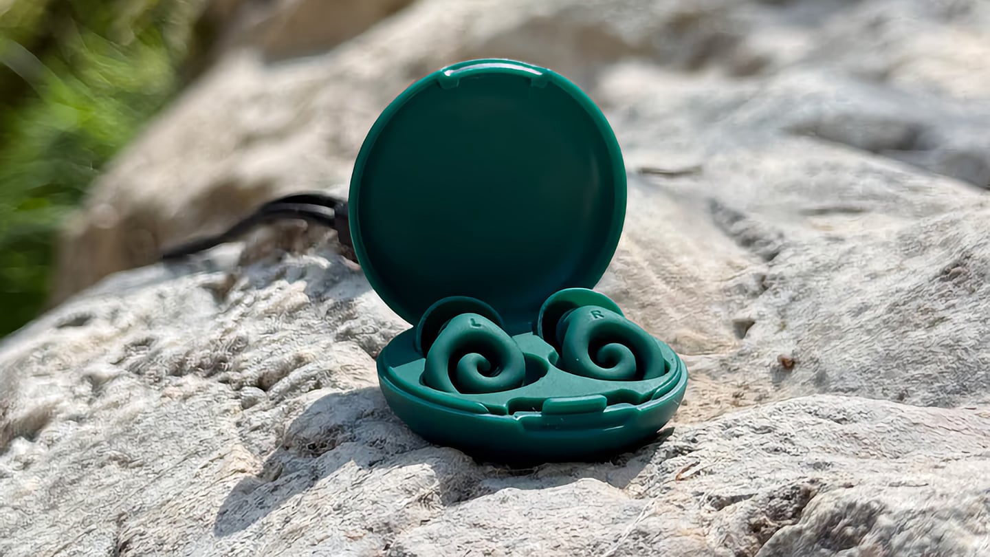
The humble foam earplug has been functionally unchanged since the 1970s: roll it down, jam it in, hope it expands to a seal, and find it somewhere in the sheets by 2 AM. It’s one of the few everyday objects that design culture has genuinely never come for, maybe because the attenuation numbers technically work, or maybe because nobody with enough resources was annoyed enough to fix it. The Ears 360 Silence, a CE-certified soft silicone earplug from Paris, is a structural redesign of that whole idea. Its retractable spiral wraps into the outer ear’s helix rather than anchoring in the canal, locking the plug flat and flush against the head with 24 dB SNR measured to EN 352-2:2020 and a peak of 29.9 dB at the frequency range where snoring and human voices live. The foam never had a chance.
Youcef Abdaoui runs a studio near Paris and started prototyping the Silence in 2024 with a bent wire and a bit of putty, just to test whether a helix-anchoring spiral could hold in an ear. It did, and the dozens of iterations that followed produced a product France voted Product of the Year 2026, consumer-elected rather than jury-awarded, which tells you something about how it performs in actual ears. Ears 360 has since shipped to more than 120,000 customers through their store, 500+ pharmacies and B2B partners before going international. The Silence is not a prototype; it is certified to EN 352-2:2020, mass-produced, and more than 14,000 units are already in stock. I got to see a pair in person, and the silicone finish reads as serious product, not a health-aisle impulse buy.
The ear is already a spiral. The outer rim of the pinna is anatomically called the helix, a curved ridge that traces a partial revolution around the auricle, and deeper inside, the cochlea completes that geometry: a full spiral chamber, coiled like a snail shell, that converts sound pressure into neural signal. Nature returns to the spiral for the same reason architects do: it distributes force without concentration points, the same logic behind a nautilus shell or the tight coil of a fern fiddlehead before it unfurls. The Ears 360 Silence works with that architecture: the spiral holds, not the tip. The spiral wraps laterally into the helix and locks through geometry, bearing almost no canal pressure, which is the whole reason the plug sits flush against the head rather than protrudes from it.
Loop-style reusable earplugs have made a design virtue of their visibility, with a circular protrusion sitting outside the ear canal as a deliberate aesthetic statement. That works at a concert, but it becomes a pressure point the moment you roll onto your side in bed, which is the situation most people are buying earplugs for in the first place. The Silence’s spiral body measures 18.44 mm by 15.49 mm, slim enough that there’s nothing significant pressing against a pillow. The profile looks almost deceitfully small for what it’s actually doing inside the helix. Side sleepers have been the quiet losers in every previous generation of earplug design, and this is the first form factor that treats their use case as the primary constraint rather than an afterthought.
One spiral body, two levels of silence, switchable in seconds from 24 dB to 29 dB. The standard configuration ships with four tip sizes across diameters of 9.9, 10.9, 11.9, and 12.9 mm, covering a genuinely wide range of ear canal openings, and delivers 24 dB SNR in filter mode, enough to take a busy street down to library territory without muffling conversation entirely. The Swim & Work Kit clips on triple-flange tips that push attenuation up to 29 dB, entering genuine worksite and industrial territory. User satisfaction data from Ears 360 puts concert approval at 91% and commute approval at 97%, and the founder confirmed to me directly that concert use is a genuine design intention, not a marketing add-on. The IPX7 waterproof rating keeps the spiral pool-ready alongside the kit’s triple-flange seal.
One Silence replaces hundreds of disposable foam earplugs, full stop. The body is made to last for years, the silicone tips are replaceable instead of throwing the product away, and the packaging is compact by design so every shipment travels as a slim letter, not a parcel. There’s no offset scheme or carbon language layered on top to make it sound more considered than it is. The Silence is reusable by nature: wash it, swap the tips, keep the body. Replacement tip sets extend the product’s life instead of replacing it, and the compact packaging uses a fraction of the material of a standard box.
Pricing starts at €18 (roughly $21) for a single unit with carry case and tip set, with the Silence and Swim & Work Kit bundle at €27, a Duo Pack at €39, a Duo plus Kit at €49, and the new ALL COLORS pack at €59, which includes one pair in each of the three current colorways. Black, Pink, and Green are all available now. Every unit carries the 2-year EU legal warranty of conformity, which is meaningful for a product whose longevity pitch depends on actually outlasting the disposable foam it replaces. Delivery is November 2026, and the Ears 360 Silence is also available at ears-360.com.
Here is a fun little contradiction to chew on before we get into the actual lamps. The whole point of Call It a Day, Tongqi Design’s new lighting collection, is that you barely have to try. You bop it, you tug it, you flop your hand near it, and it turns on. Zero precision required, zero thinking involved, which is exactly the pitch when you have just walked through the door after a day that emptied you out. But get this. The less effort the lamp asks of you, the more effort someone else clearly put into making that possible. That is the trade we are here to unpack.
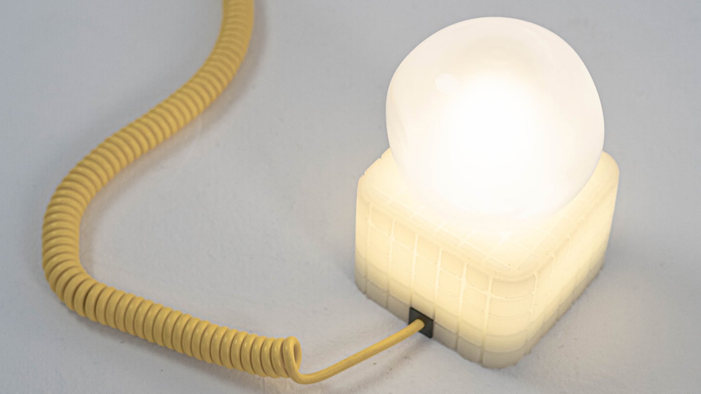
Shanghai-based designer Tongqi Lu built the collection, a table lamp, floor lamp, and pendant, around soft silicone shades with zero switches anywhere on them. Every gesture works because the material itself is doing the sensing, not a button hunting for your finger. It sounds simple sitting in your living room. It is not simple to make, and that gap between the two is basically our whole story today.
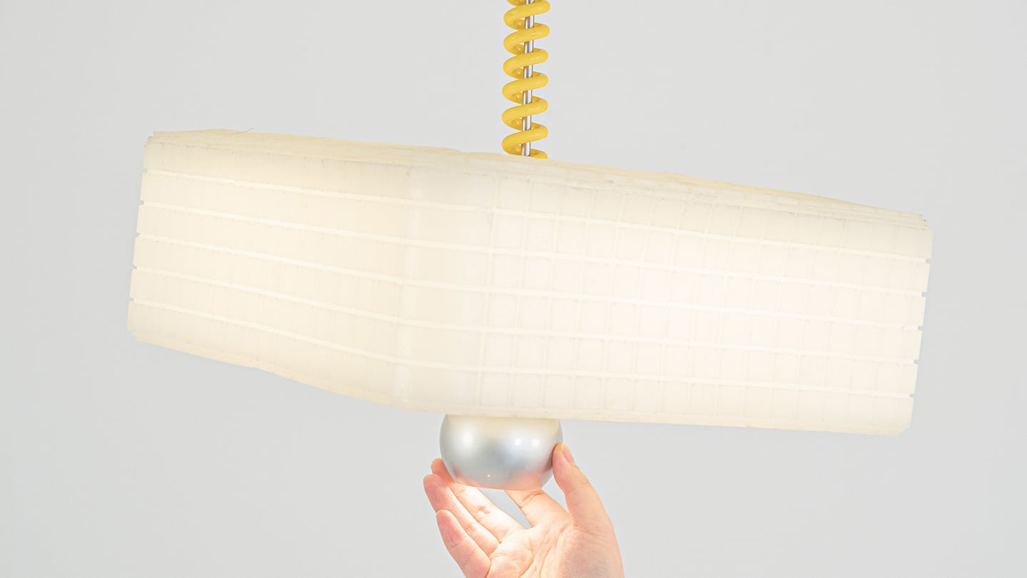
Call It a Day is a three piece lighting collection, a table lamp, a floor lamp, and a pendant, and every one of them is dressed in soft, translucent silicone instead of glass or fabric. That alone is a break from convention, since silicone shades are usually reserved for LED strip diffusers rather than the whole visible body of a lamp. But the real departure is that none of these lamps have a switch. You bop the table lamp, you tug the pendant by its cord, you press the floor lamp wherever feels natural, and the light responds. There is no correct spot to find in the dark. The entire shade is the input, which sounds like a small shift until you realize how much of lamp design has always been built around finding one tiny precise point.
Lu frames the whole thing around the moment you get home and your body checks out before your brain does. She has talked about dropping onto the sofa and reaching out to press, pull, or tap without really thinking about it, and the light turning on not because she followed a rule but because she did not. That is a genuinely sharp way to think about interaction design. Most lighting asks you to be at your most coordinated right when you are at your least. Call It a Day flips that expectation, and the coiled yellow cable running through the collection is a nice touch too, borrowing the old pull chain gesture without being precious about it.
The Process
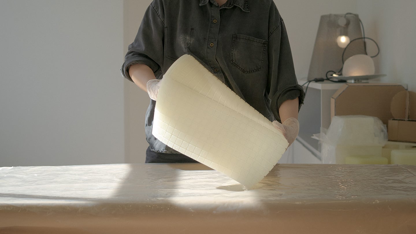
Here is where things get interesting, because the studio itself is not some slick production facility. It is an office in Shanghai with a plastic sheeted folding table, jerrycans of liquid silicone lined up against the wall, and a window looking out over the skyline. Before any of it was cast, the whole collection existed as full scale cardboard mockups, a pendant hung from a coiled cord and a table lamp balanced on a paper cone, sitting in the corner of the room like a rough draft nobody threw away. That is a genuinely useful thing to see, because it shows the gesture and the proportions were locked in long before the material was.
The shades themselves come out of large block molds with a fine grid texture cut into the cavity, which shows up on the finished silicone as a soft woven pattern once the lamp is lit. Getting silicone out of a mold cleanly is trickier than it sounds, since silicone tends to bond to itself, so getting a cast shade out of a cast mold without either tearing or fusing takes real care with release agents and material choice. Pouring it clean adds another layer of difficulty, since bubbles trapped in a translucent material show up as visible flaws once the light hits them. In the photos, you can see two people pouring together, one holding the bucket steady, the other running a palette knife across the lip so the silicone comes down in a thin ribbon instead of glugging out in one shot, which is a simple trick for keeping air out of the pour. It is not a factory process. It is a hand process, done carefully, on a folding table, gallon by gallon.
The Perspective
What I like most about Call It a Day is that the ease on the user’s end is clearly paid for somewhere upstream, and that upstream cost is visible if you know where to look. A switchless lamp sounds like a simple idea until you have to actually engineer a material that can be grabbed, twisted, and mistreated without breaking or losing its shape, and then cast that material cleanly at scale in a small studio. That gap between the lived experience and the labor behind it is exactly what a lot of good product design tries to hide, and here it is sitting right out in the open in the process photos.
It also helps that the whole thing traces back to something real. Lu’s early work, the lemon shaped Citron lamp, her furniture line built around trees and water lilies, all of it circles the same idea of pulling people back into their bodies after a long day in a city that does not really let them slow down. Call It a Day feels like the most literal version of that idea yet, a lamp built entirely around the ninety seconds when you have officially given up on being careful. Whether or not the gesture control holds up over years of actual use is a question only time and daily wear will answer, but as a piece of intent, this one lands.
Modern architecture is increasingly moving beyond simply occupying a site to becoming part of it. Instead of dominating the landscape, many contemporary homes integrate the contours, colors, and materials of their surroundings, creating a visual harmony that minimizes environmental impact. Through thoughtful siting, natural materials, and restrained forms, these residences blur the boundary between the built and natural worlds.
Whether nestled into rugged mountains, hidden among dense forests, or perched along windswept coastlines, these homes show how architecture can celebrate instead of competing with nature. By responding to local climate, terrain, and ecosystems, they create immersive living experiences while leaving a lighter footprint on the landscape.
1. Mountain Homes That Become Part of the Terrain
Mountain homes often embrace steep slopes, rocky outcrops, and dramatic elevations instead of reshaping them. Architects use locally sourced stone, weathered timber, exposed concrete, and green roofs to visually anchor buildings within the landscape. Many designs are partially embedded into hillsides, allowing the surrounding topography to become an integral part of the architecture.
Large panoramic windows frame distant peaks while low-profile forms reduce visual impact. These homes appear sculpted from mountains, offering protection from harsh climates while creating a seamless relationship between architecture and the natural terrain.
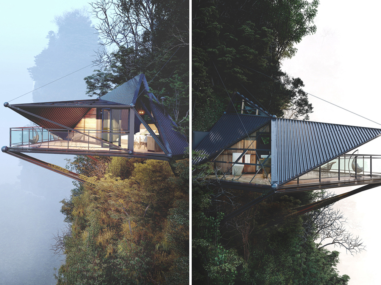
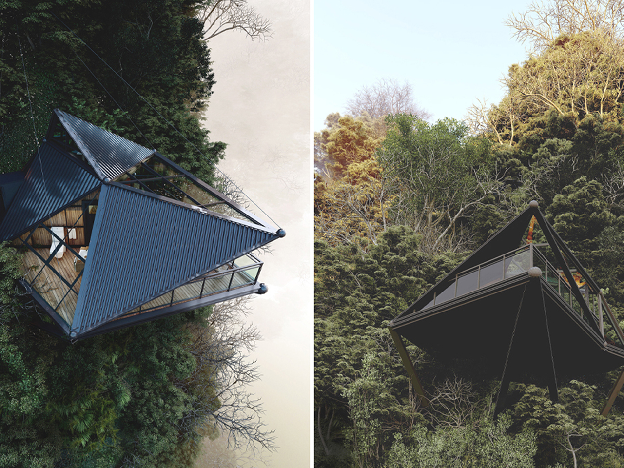
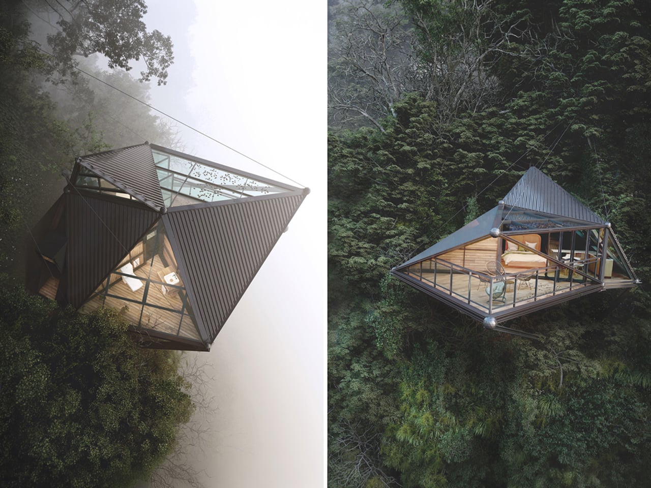
3D visualizer and architectural designer Thilina Liyanage conceptualizes mountain living through a contemporary cabin concept that engages directly with extreme terrain. Set high above a rugged slope, the design appears to float against the mountainside, framed by expansive glass façades and sleek metal cladding. Its sharp triangular form enhances the sense of lightness, while the fully glazed surfaces open uninterrupted views of the surrounding peaks, turning the landscape into a continuous visual experience from inside the home.
Structurally, the cabin is anchored into the rock using steel beams and tension cables, making the engineering part of the architecture itself. This allows the home to project outward dramatically, hovering above the cliff edge. Inside, warm timber finishes balance the exterior’s industrial expression, creating a softer, livable atmosphere. A cantilevered deck extends the space further into the void, combining wooden flooring with a protective canopy.
2. Beach Homes That Blend with Coastal Landscapes
Coastal homes are designed to respond to shifting dunes, ocean breezes, and expansive horizons. Elevated structures, light-colored materials, timber cladding, and generous glazing help buildings harmonize with sandy beaches while improving resilience against coastal conditions. Their open layouts maximize natural ventilation and uninterrupted views.
Instead of becoming dominant landmarks, these homes maintain a quiet presence within the shoreline. Reflective glass, soft material palettes, and carefully integrated landscaping allow them to merge with the surrounding environment while preserving the character and beauty of the coast.
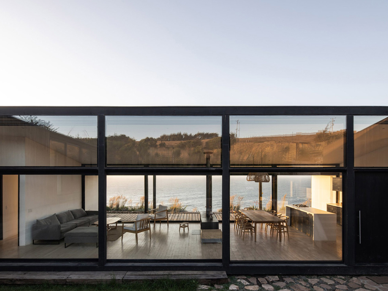
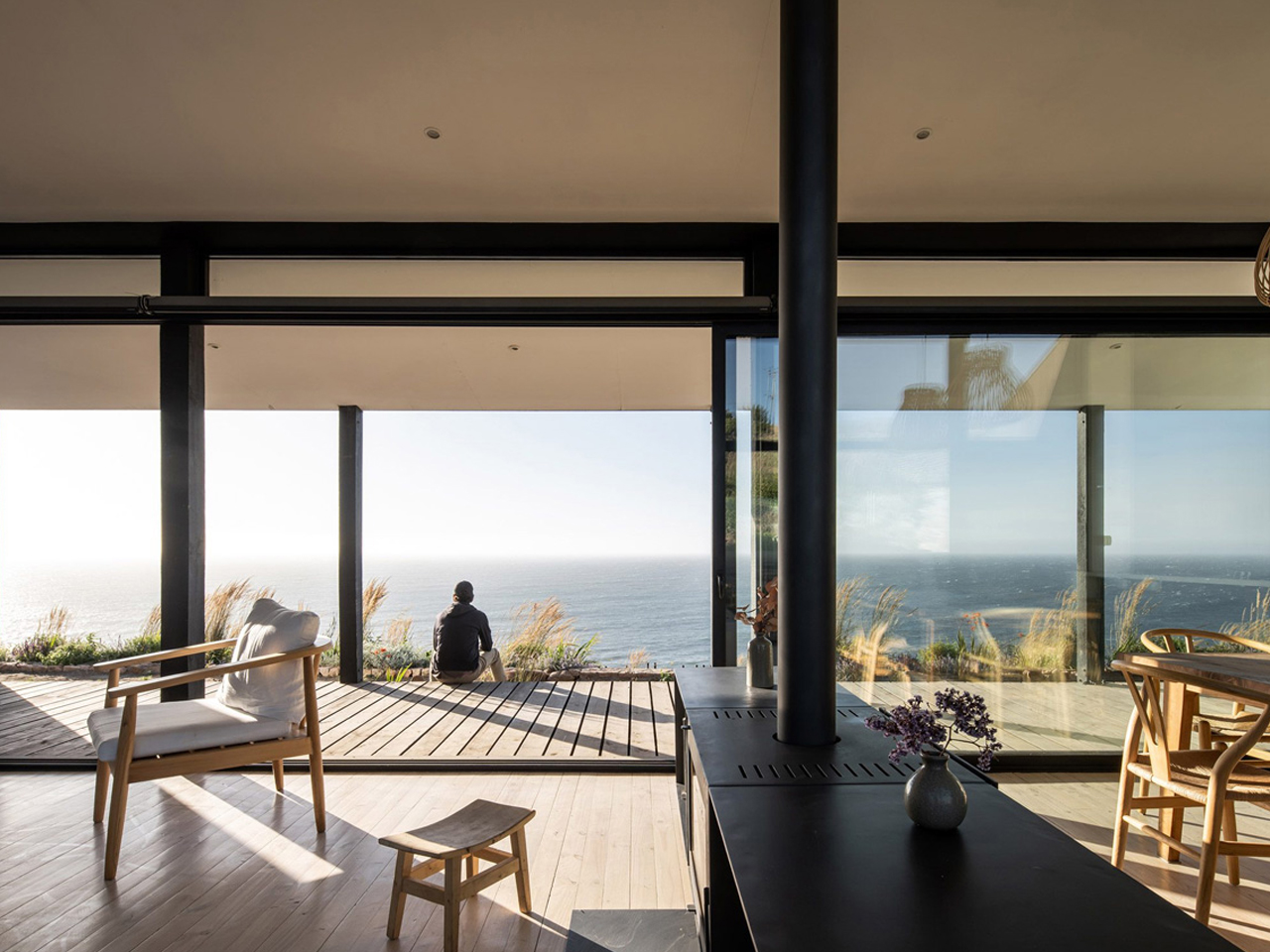
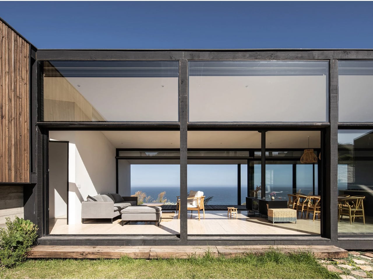
Based in Chile, ERRE Arquitectos designed Casa Ferran, a low-profile beach house in Matanzas. Set on a 240-square-meter site along the Pacific coast, the home follows a U-shaped plan that gently wraps the cliff edge, responding directly to the dramatic drop toward the ocean. The composition is carefully oriented to balance exposure and shelter, using its geometry to soften the impact of strong southwestern winds while preserving privacy along the side edges.
The central design strategy creates a protected courtyard that connects visually to the sea through a glazed common volume. This core space holds the kitchen, living, and dining areas, defined by full-height glass that draws in light and frames uninterrupted coastal views. Two wings extend outward: one containing bedrooms with planted atriums, and the other accommodating parking, guest rooms, and service zones. Built in black steel with pine cladding, and softened by white interiors and warm wood finishes, the home blends structure, landscape, and coastal living into one cohesive architectural gesture.
3. Forest Homes Hidden Among the Trees
Forest homes prioritize preservation by weaving architecture between existing trees rather than clearing the landscape. Dark timber, charred wood, Corten steel, and natural stone allow buildings to recede into woodland settings while respecting the surrounding ecosystem. Elevated walkways and compact footprints minimize disturbance to the forest floor.
Large windows invite natural light through the canopy, creating interiors that remain closely connected to seasonal changes. These homes dissolve into their wooded surroundings, allowing residents to experience nature without disrupting the delicate balance of the forest environment.
Circle Wood by Mobius Architekci redefines circular home design at a larger residential scale, set within a dense pine forest. Inspired by the form of a sliced tree trunk, the 400-square-meter house adopts a continuous circular geometry clad in okoume wood, carefully selected to help the structure merge with its natural surroundings. The smooth, knotless wooden exterior reinforces the idea of a seamless object embedded in the landscape rather than placed upon it.
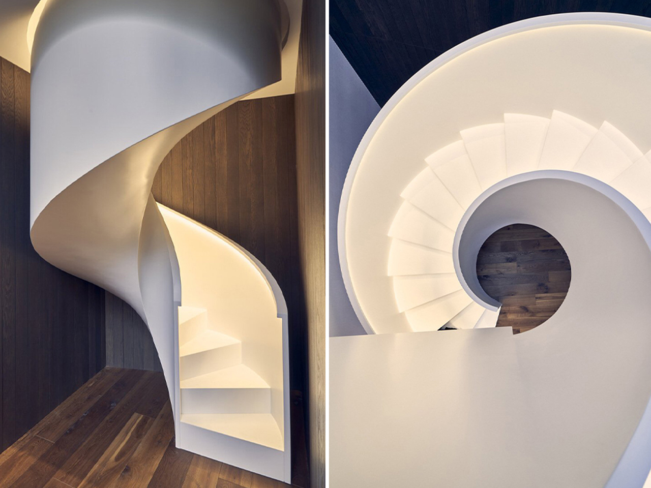
The design organizes living spaces through a fluid, looping layout where rooms feel carved into the volume like pockets within timber. An overhanging oval frame extends the architecture to include a garage and open spa, strengthening the sense of continuity between functions. Generous glazing dissolves boundaries between inside and forest, while a central atrium draws daylight deep into the home. Inside, gallery-like interiors and sculptural elements, including a sweeping white staircase, enhance the experience of movement, making the house feel like a continuous walk through nature and space.
4. Desert Homes Inspired by the Landscape
Desert architecture embraces simplicity, using forms and materials that echo the surrounding terrain. Rammed earth, textured concrete, adobe, and locally sourced stone create earthy palettes that blend naturally with sand dunes, rocky formations, and arid landscapes. Courtyards and shaded outdoor spaces further respond to the harsh climate.
Low horizontal profiles reduce visual prominence while passive cooling strategies improve comfort with minimal energy use. These homes demonstrate how architecture can adapt to extreme environments by working alongside nature instead of resisting it.
In the heart of Inner Mongolia’s Tengger Desert, designRESERVE introduces Desert Ark, a 3D-printed concrete shelter system that redefines how architecture merges with extreme desert landscapes. Designed for volunteers working on large-scale reforestation efforts, the 150-square-meter base camp responds directly to harsh conditions where temperatures swing from extreme heat to cold. Instead of resisting the desert, the architecture is shaped to coexist with it, forming a compact settlement that feels naturally embedded in the sandscape.
The modular design consists of nine units arranged in a circular layout around a shared communal core, balancing privacy with collective living. Built using robotic 3D-printing and sand-based concrete, the structures feature layered, wavy surfaces that echo wind-shaped dunes, allowing them to visually dissolve into the environment. Integrated insulation cavities regulate temperature, making the interiors more habitable in extremes. Beyond function, Desert Ark becomes part of the desert itself as an adaptive, low-impact form that blends shelter, landscape, and technology into a unified architectural response.
5. Lakeside Homes That Reflect Their Surroundings
Homes along lakes and rivers often use transparency and subtle material choices to reduce their visual presence. Glass façades reflect changing skies and water, while timber, stone, and planted roofs soften the transition between architecture and the surrounding landscape. Many designs gently follow the shoreline instead of altering it.
By emphasizing reflection, openness, and carefully framed views, these homes create a continuous dialogue between indoor and outdoor spaces. The result is architecture that appears to dissolve into the water’s edge while providing peaceful living environments immersed in nature.
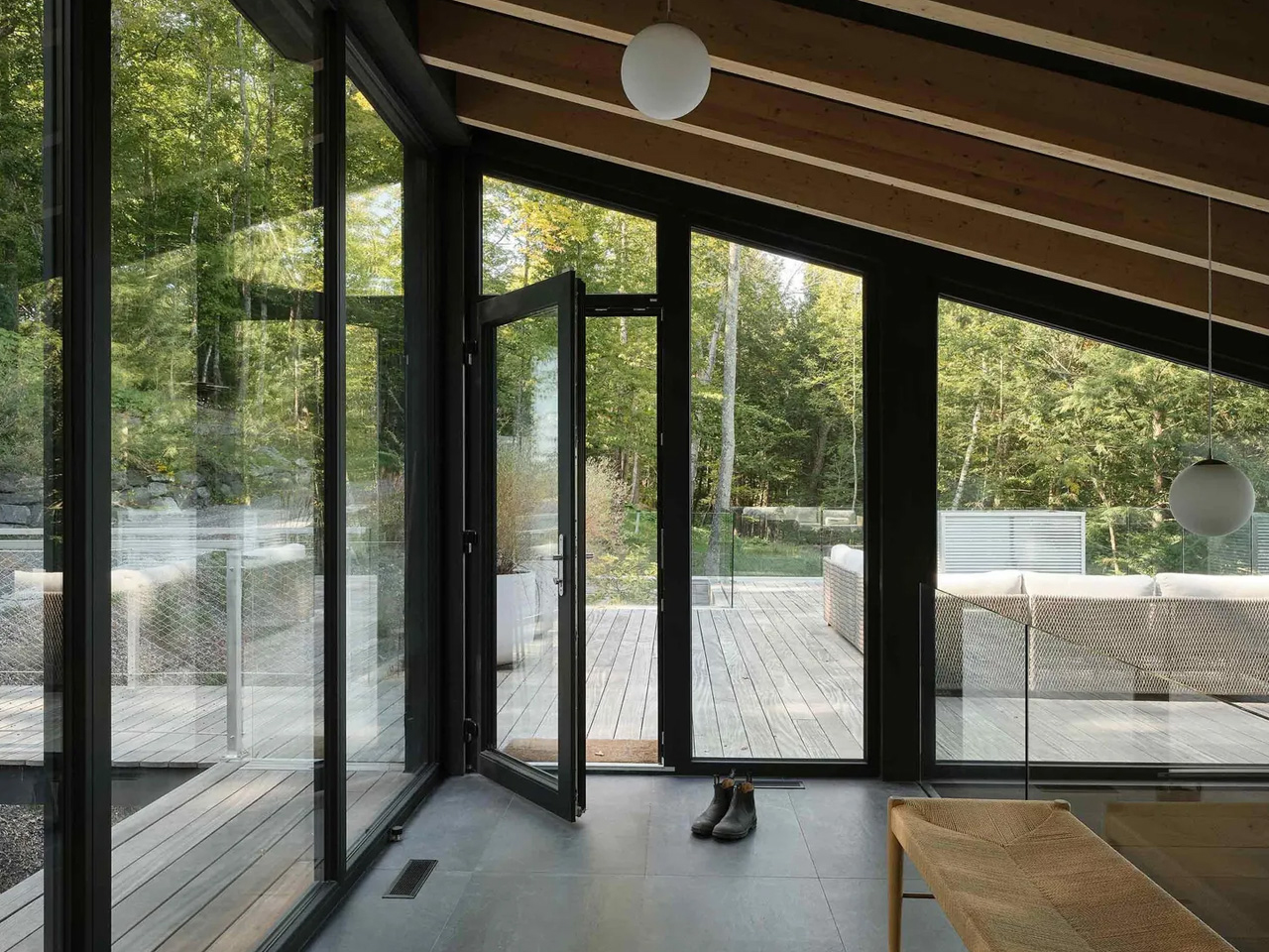
yh2 Architecture designs the Counter-Slope House as a quiet intervention within the steep terrain of Lake Memphremagog in Potton, Quebec. The 4,530-square-foot residence is embedded in a sharply sloping woodland site, where dense trees and shifting gradients shape every architectural decision. Instead of asserting presence toward the lake, the house withdraws into the land, reading more like a calibrated extension of the hillside.
The building is composed of two interlocking volumes that step gently with the slope, each capped by a subtly shifting dual-pitched roof that reduces visual mass and echoes the surrounding topography. Weathered cedar cladding allows the exterior to dissolve into the forest, while interiors in white oak introduce warmth and structure. Openings are carefully placed to capture fragmented lake views through trees rather than direct exposure, making light, movement, and seasonality central to the lived experience.
Ultimately, homes that disappear into their natural surroundings reflect a thoughtful approach to design, where architecture complements rather than competes with the landscape. By respecting local environments and embracing contextual materials, these residences create timeless spaces that foster a deeper connection between people and nature.
Anyone who has ever sprinted through a train station with a rolling suitcase in one hand and a coffee sloppily balanced in the other knows the particular despair of scanning a row of seats and finding every single one occupied by someone’s backpack. Not a person. A bag. Sitting there like it paid for the ticket too.
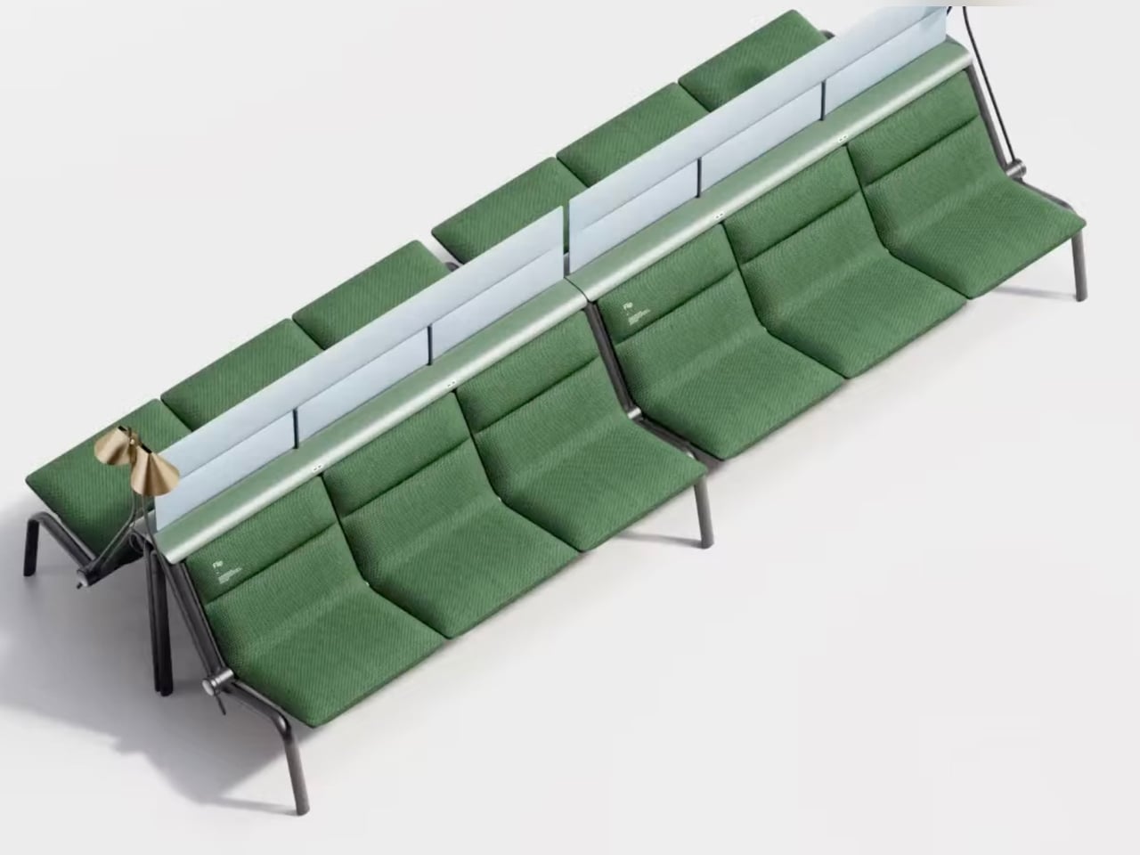
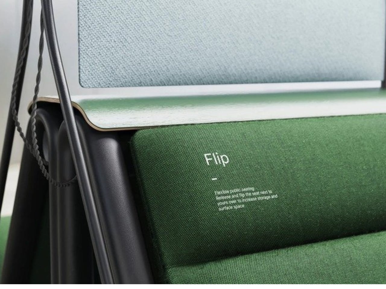
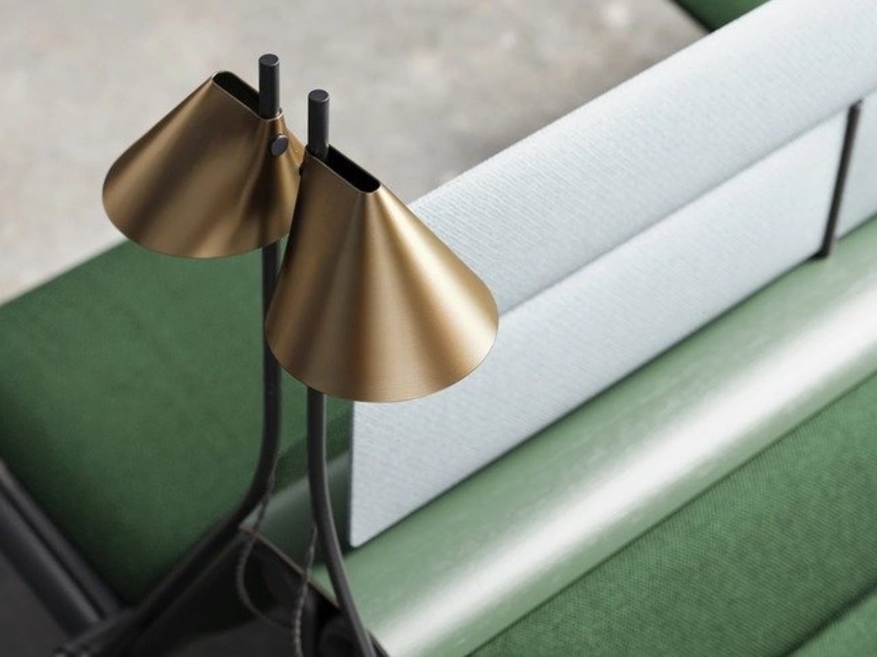
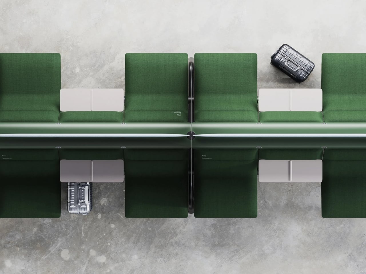
That small, maddening moment is basically the whole reason a London studio called Of My Imagination designed something called Flip, a modular public seating system where each individual seat can rotate out of the way on command. Instead of a bench being a fixed slab of “sit here or don’t,” Flip treats every seat as its own hinge point. Flip it down, it’s a chair. Flip it up and out, it becomes open space for luggage, a stroller, or just more room to breathe when a platform gets crowded. It sounds almost too simple to be clever, which is usually the sign of a genuinely good idea.
I’ve been thinking about public seating a lot lately, mostly because so much of it seems designed for an idealized version of how people move through the world rather than the messy, unpredictable reality of it. Airports, bus terminals, hospital waiting rooms. These spaces swing between dead quiet and total chaos within the same hour, and yet the furniture almost never adjusts with them. A bench built for a slow Tuesday afternoon becomes a liability during a holiday rush, when every inch of floor space suddenly matters and immovable seating just gets in the way.
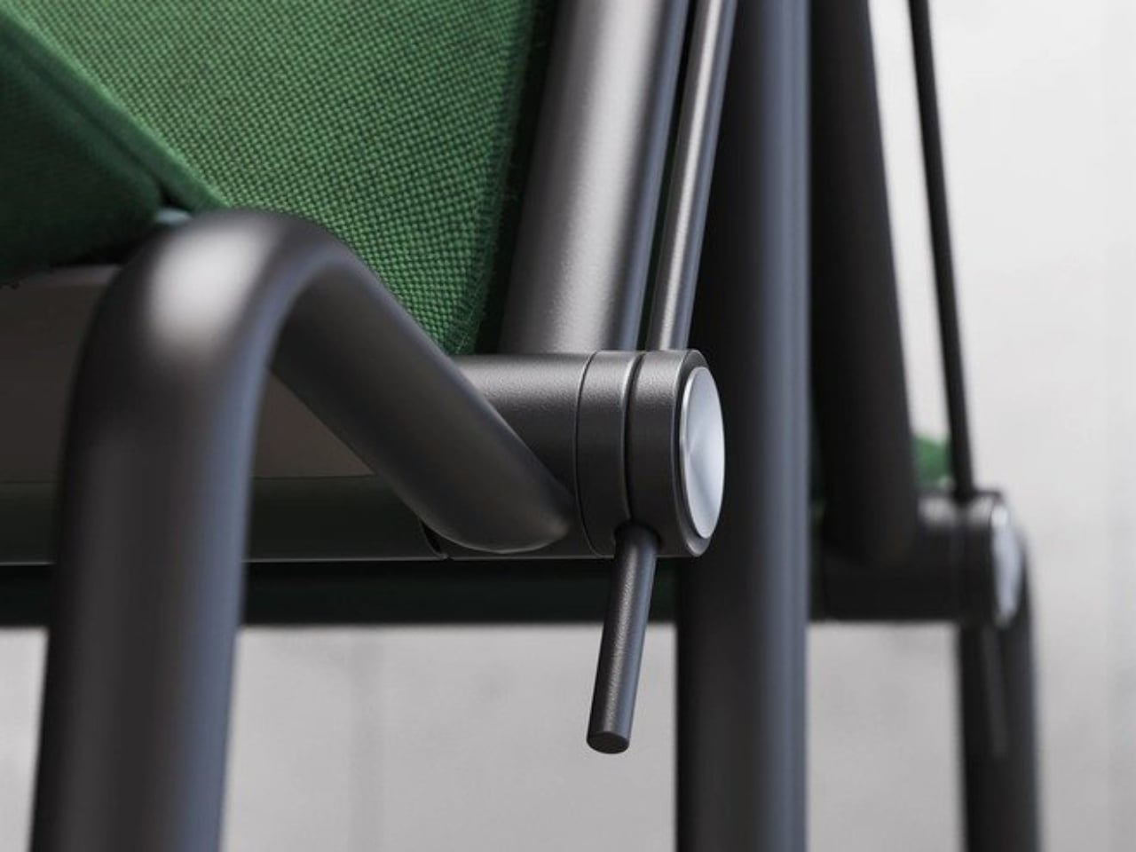
Flip’s answer isn’t flashy. There’s no app, no motor, no sensor deciding when a seat should move. It’s a mechanical latch and a rotating joint, the kind of low-tech solution that feels almost old-fashioned in a moment when everything gets pitched as “smart.” I actually like that restraint. Public infrastructure breaks down constantly not because the technology is too simple, but because it’s too complicated, too fragile, too dependent on software updates and maintenance contracts nobody budgeted for. A seat that flips because a person physically flips it is a seat that still works during a power outage, a system failure, or just a Tuesday when the maintenance crew is short-staffed.
The pandemic-era spacing rules get a mention in OMI’s own description of the project, and it’s worth sitting with that for a second. Remember all those benches wrapped in caution tape or marked with awkward stickers telling you where not to sit? Most of that signage disappeared once the emergency did, but the underlying problem never really left. Public seating still needs to flex between “pack people in tightly” and “spread them out,” whether that’s for health reasons, accessibility needs, or just the reality of rush hour versus a quiet Sunday morning.
What strikes me most is how much this design respects the intelligence of the people using it. Flip doesn’t try to predict what a traveler needs. It just gives them the option and gets out of the way. That’s a surprisingly rare quality in public design, where the instinct is often to over-engineer a solution that anticipates every scenario instead of trusting a commuter to make a simple physical adjustment themselves.
Is it going to replace every bench in every transit hub across the country? Probably not right away, and cost, durability testing, and vandalism resistance are the unglamorous hurdles any concept like this has to clear before it shows up somewhere you’d actually sit down. But as a proof of concept, it’s a refreshing reminder that flexibility doesn’t require a screen or a subscription. Sometimes it just requires a hinge and a little humility about how unpredictable public spaces actually are.
The next time I’m standing in a crowded terminal, silently negotiating personal space with a stranger’s overstuffed duffel bag, I’ll probably think about Flip. Not because it solves everything, but because it solves the one thing that’s been sitting there, unaddressed, for as long as public benches have existed.
Some houses are designed to be looked at. Split Mass Residence, completed in 2026 by K-Thengono Design Studio, is designed to be moved through — a 712-square-metre home in BSD, South Tangerang, Indonesia, where every architectural decision is in service of movement, togetherness, and the slow pull of the outdoors.
Founder Kelvin Thengono built the project around a single, quietly radical idea: “The main design goal was to allow a seamless sequence of spaces that keeps the family connected, while also staying closely aligned with the surrounding landscape.” The house sits on a corner — what architects call a hook site condition — and rather than treat that exposure as a problem, the studio used it as the engine for the entire massing strategy. Volumes are split, pulled apart, and repositioned so that no single path through the house feels accidental.
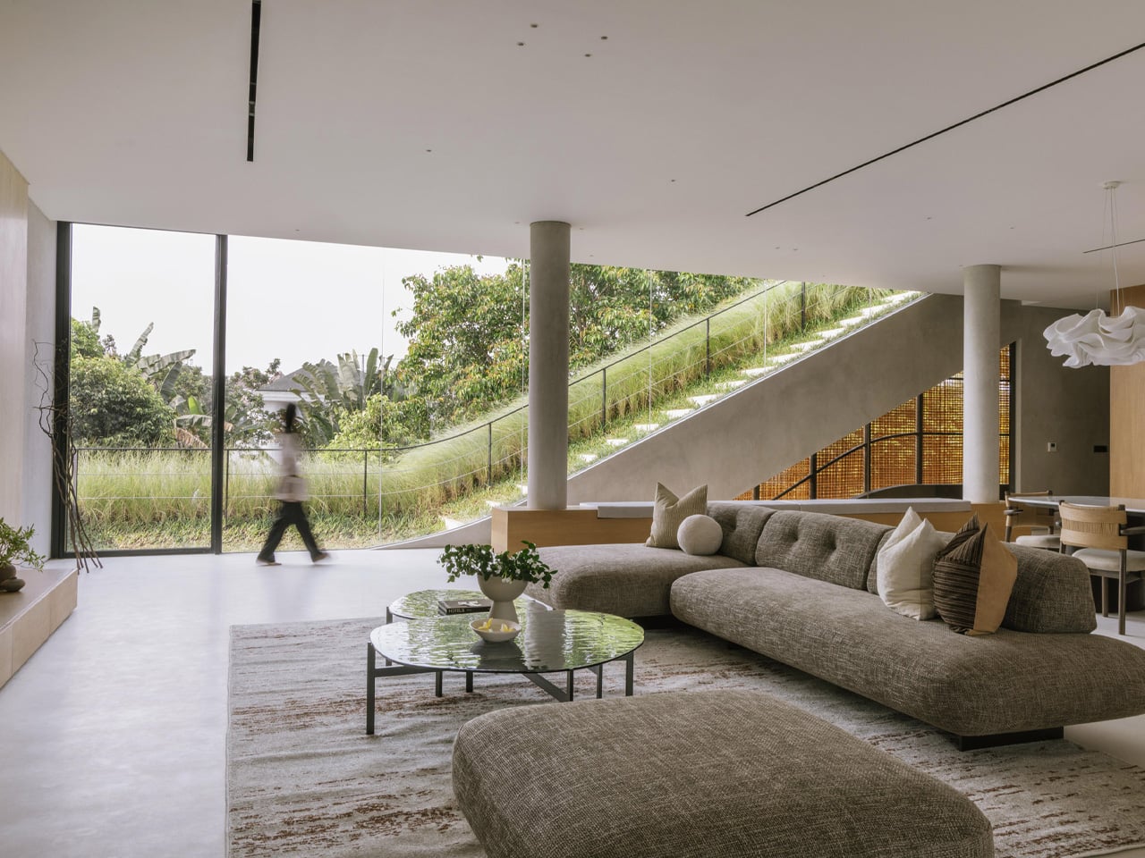
That split is where the project gets interesting. Tiered, sloping garden roofs connect indoor living spaces directly to the planted outdoor setting, blurring the line between ceiling and garden in a way that feels more organic than architectural. From the open-plan kitchen, living, and dining area on the first floor, a glass door opens straight onto a grassy rooftop slope. An outdoor staircase continues upward to a swimming pool and barbecue area — the roof isn’t just a lid; it’s the social core of the house.
On the exterior, two materials do the heavy lifting. Concrete anchors the structure, giving it weight and presence on the streetscape. PE rattan panels wrap across the facade in woven screens that soften everything — filtering light, adding texture, and offering just enough visual privacy without closing the house off from its surroundings. The contrast is deliberate: one material says permanence, the other says warmth. Together they give the house a character that’s grounded and tactile rather than slick.
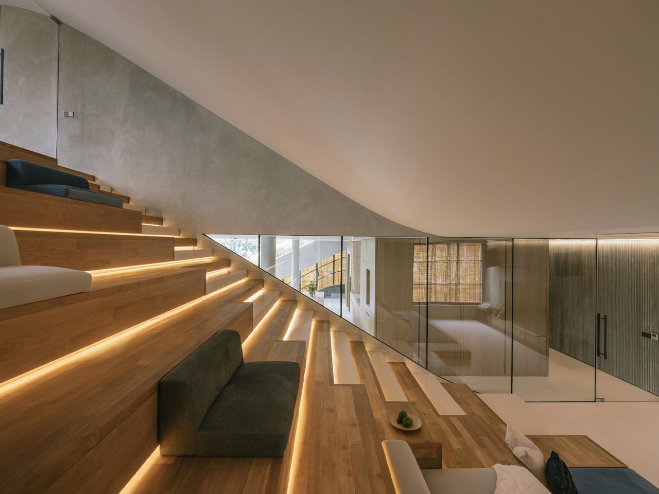
What Thengono has built here isn’t really a house in the traditional sense — it’s a system of encounters. Divided volumes, green roofs, and internal and external staircases create different scenarios for family interaction, so the architecture itself nudges people toward each other without ever forcing it. The rooftop garden crowning the whole composition reinforces that layered approach — landscape as architecture, architecture as landscape.
In a region where residential design often defaults to gated grandeur or tight minimalism, Split Mass Residence lands somewhere more considered. It’s a house that knows exactly where it wants you to be — and makes getting there feel like the whole point.
Most lighting has a dirty secret: it only works half the day. Flip the switch and a pendant or sconce can look spectacular, all warm glow and dramatic shadow. Flip it off, and you’re left staring at what is often just a glorified fixture, a thing bolted to a ceiling that has nothing to say for itself once the bulb goes dark. That gap between “on” and “off” is where a lot of home lighting quietly fails us, and it’s a problem most people never think to name because they’ve simply accepted it.
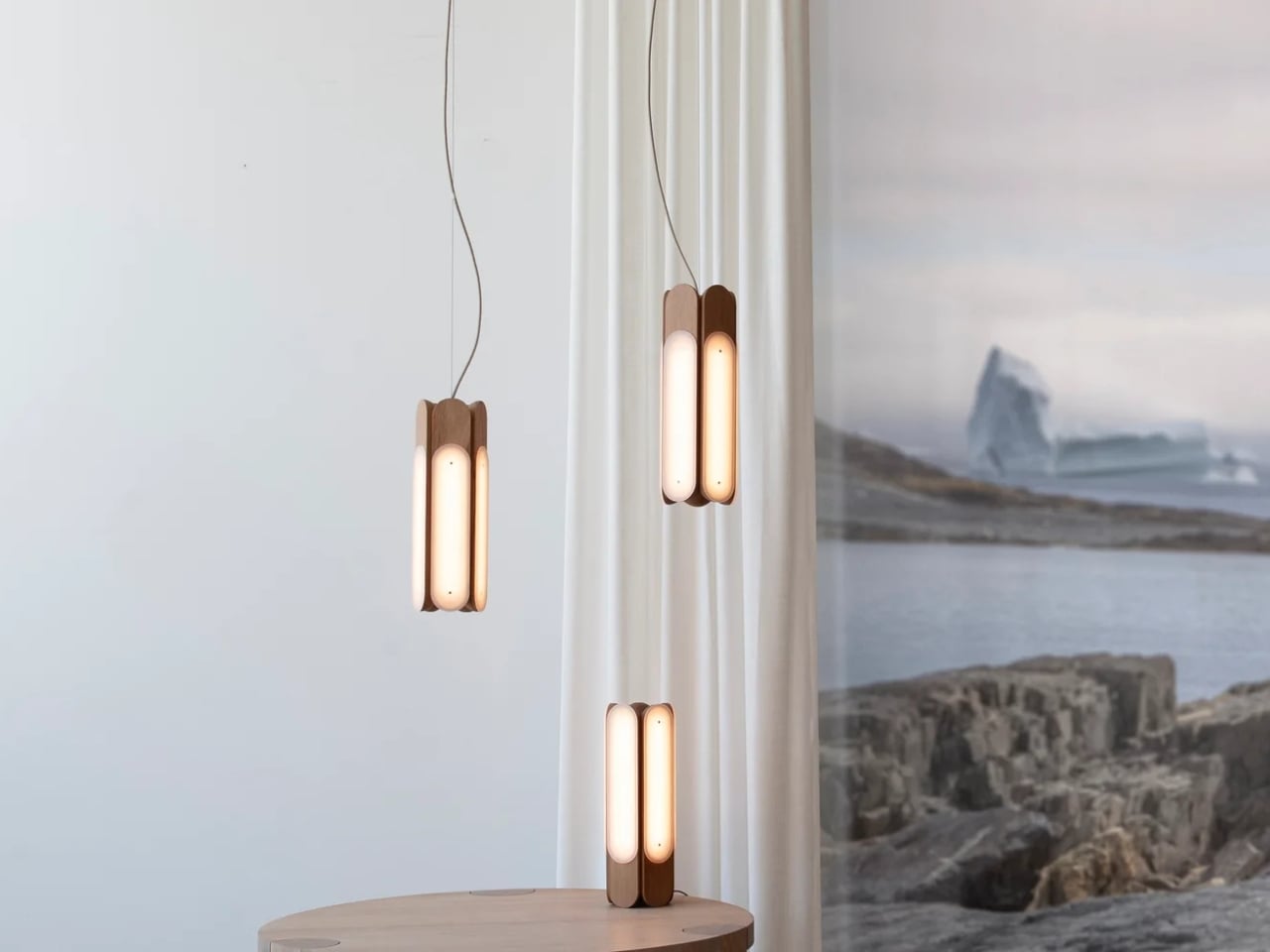
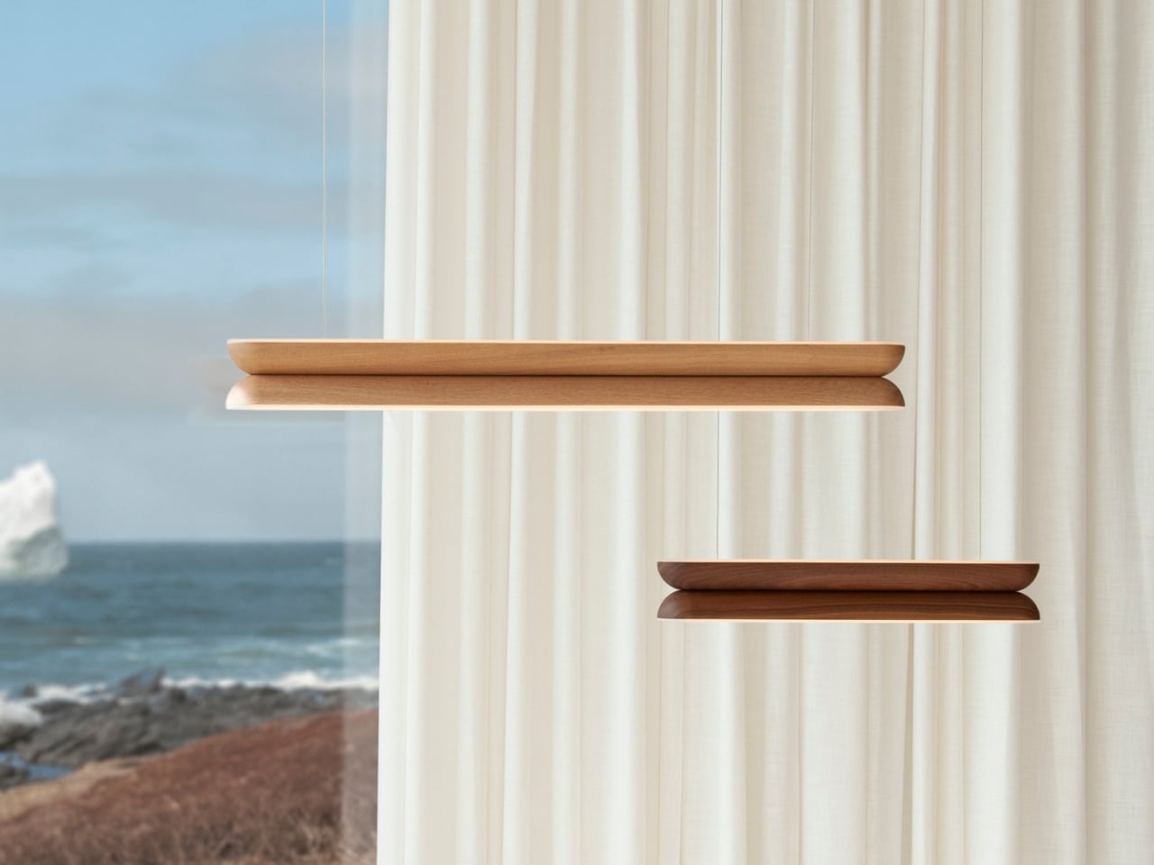
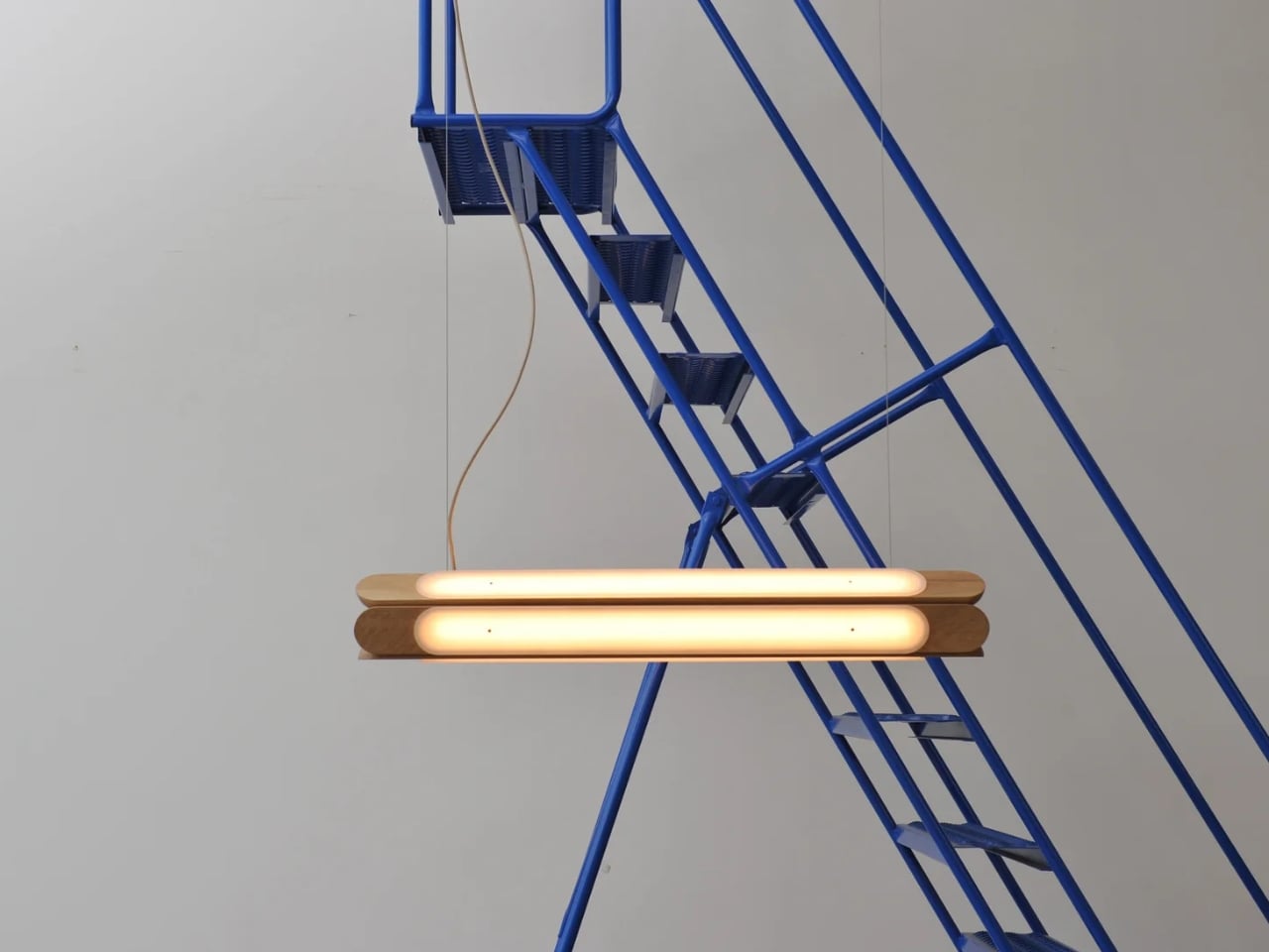
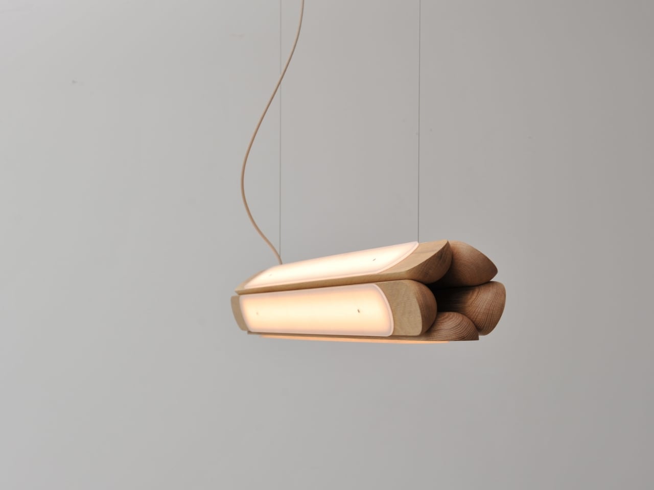
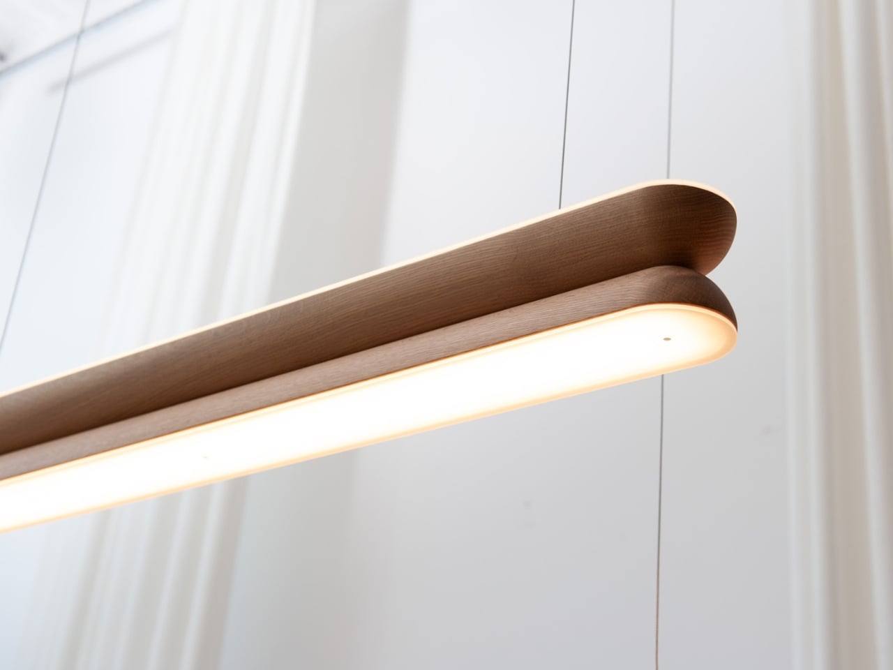
Hollis+Morris, the Toronto studio behind the new Beaufort collection, clearly has thought about it. Their solution isn’t a smarter bulb or a clever dimmer app. It’s a rethinking of what a light fixture is supposed to do when it’s doing nothing at all. Beaufort is built from sculpted solid wood paired with sandblasted acrylic, and the acrylic is cut and finished so it holds a kind of frozen depth, layered, translucent, a little mysterious, whether or not there’s current running through it. Turn it on and light diffuses through those layers in soft gradients. Turn it off and you still have an object worth walking past twice.
The origin story is the kind of thing that sounds almost too tidy, except it happens to be true. Mischa Couvrette, the studio’s founder and lead designer, was flying home from Copenhagen’s 3daysofdesign when a conversation about ice, and about climate change, turned into sketches on a cocktail napkin somewhere over the Atlantic. By the time the plane landed, the collection basically existed in his head. The name comes from the Beaufort Sea, that remote stretch of Arctic water above Alaska and Canada’s Northwest Territories, which is a fitting reference for a studio that has built its identity on restraint rather than spectacle.
I appreciate that the collection doesn’t try to literally recreate an iceberg hanging from your ceiling. Instead it borrows the logic of ice: how light moves through something dense and layered, how clarity shifts depending on where you’re standing. The studio achieves that through repetition, mirroring, and rotation of a small set of core components, which is a fancy way of saying they’ve built one coherent visual language and then let it flex across a sconce, a mirrored horizontal pendant, a lantern-like vertical pendant, and a table lamp. Nothing in the lineup feels like an afterthought tacked onto a single hero piece just to pad out a catalog.
Jonathan Mandeville of Hollis+Morris put it plainly when he said the collection sits in a lineage of Scandinavian and Canadian design that values material honesty and quiet restraint, the idea that an object should earn its keep even when it isn’t doing anything. That’s a bit of a jab, gentle as it is, at a design moment that has leaned hard into maximalism and novelty for novelty’s sake. I don’t think Beaufort is arguing that bold, loud design is wrong. Plenty of homes need a little chaos. But there’s real value in a piece that doesn’t ask for your attention so much as reward it once you’ve already given it, and that’s a harder trick to pull off than another oversized statement chandelier.
It also matters, at least to me, that these pieces are made in Canada by a B Corp certified studio that treats that fact as a working value rather than a sticker on the box. Knowing who made a light and how isn’t a small thing anymore, especially with home goods, where supply chains can be murky at best.
Beaufort isn’t cheap. The R5 horizontal pendant runs $3,800 and the M2 horizontal starts around $1,900, so this is squarely in investment-piece territory, not an impulse buy from a big box store. But for anyone who has ever bought a light fixture, loved it while it was on, and felt a little let down by it during the day, Beaufort makes a fairly convincing case that the two states shouldn’t have to be so different.
The Apple ecosystem runs deep, but the devices themselves only go so far. The iPhone, Apple Watch, and iPad are remarkable pieces of hardware on their own, and yet a small category of accessories has figured out exactly what each one is missing. Not cases that just protect or cables that just charge, but objects that change the way a device feels, sounds, looks, or works from the moment you pick it up.
These five accessories do exactly that. They come from different corners of the Apple world, covering the watch, the phone, the iPad, and the kind of audio experience Apple never built its own hardware around. Each one earns its place not because it carries a name worth recognizing, but because it solves a specific frustration that was always there waiting to be noticed. Here are the ones worth knowing about right now.
1. NightWatch
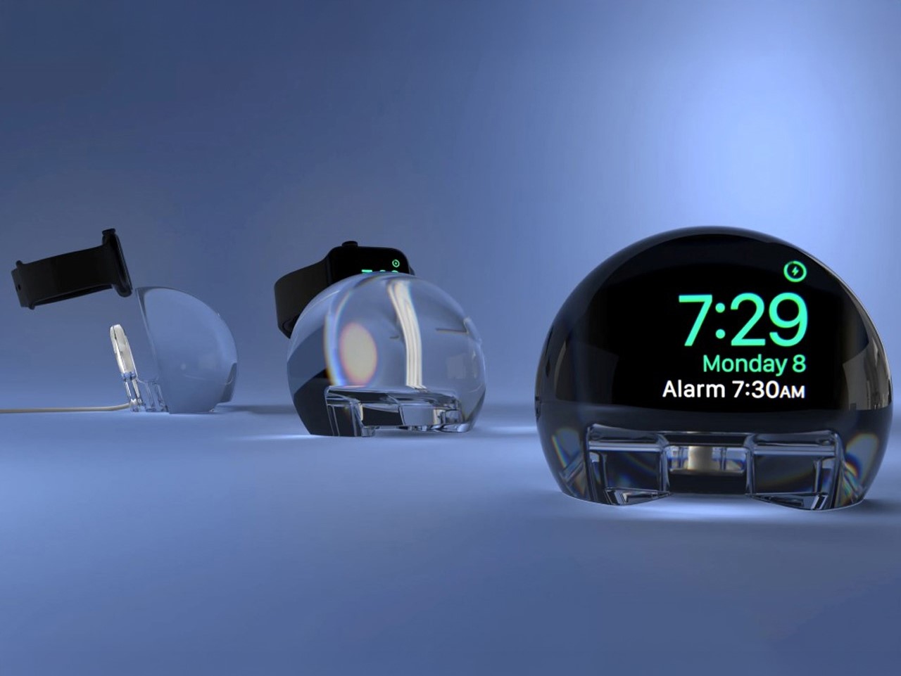
Most Apple Watch docks are functional and forgettable, a plastic puck with a magnetic charger and no ambition beyond getting your watch off your wrist for the night. The NightWatch is not that. It is a clear glass orb, roughly the size of a generous paperweight, that you set your Apple Watch inside at night. The result transforms the watch’s nightstand charging face into a magnified, glowing clock that is genuinely easier to read from across a dark room than the device alone would ever allow.
The dock works by treating the Apple Watch display as a light source and the glass sphere as a lens, drawing the time out of a small wrist-bound rectangle and spreading it into a real visual presence on the nightstand. It also includes a built-in audio amplifier that boosts the sound of your alarm, so quiet mornings stay that way until you actually need them not to be. At $69.99, it is priced more like a considered object than a cable management solution, which is exactly the spirit it deserves to be received in.
What we like
The magnification effect turns the Apple Watch display into a legitimate bedside clock without additional screens, apps, or setup
The built-in audio amplifier addresses the one genuine weakness of relying on Apple Watch nightstand mode as a morning alarm
What we dislike
The orb form factor is visually dominant enough that it will not suit minimalist nightstands where a small footprint matters
At $69.99, it costs more than several competing dock designs that handle charging equally well without the visual statement
2. Rock Paper Pencil 4.0
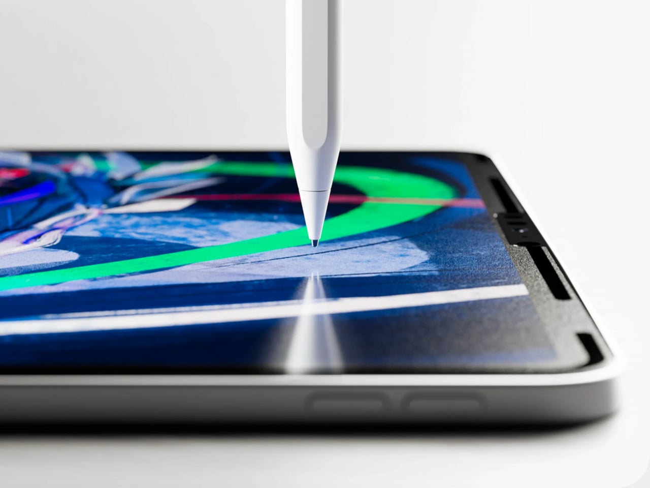
The Apple Pencil is a precision instrument that has never quite figured out how to feel like one. The glass surface beneath it is smooth and frictionless, and while that works fine for certain tasks, illustrators and note-takers spending hours drawing have always wanted something closer to real paper. Astropad’s Rock Paper Pencil addresses that gap directly: a removable, reusable nano-texture screen protector paired with custom Apple Pencil tips, and version 4.0 makes the system meaningfully better than it has ever been.
The upgrade introduces a new graphite POM tip alongside the existing steel ballpoint option, and the difference is immediately legible. The graphite tip mimics the toothy drag of a 2B pencil, a sensation that makes expressive sketching and shading feel deliberate and controlled rather than slippery and approximate. Each kit now ships with four tips in total, two graphite and two ballpoint, alongside a screen cleaning kit that should have been included from the beginning. The protector attaches via NanoCling static cling rather than adhesive, meaning it lifts off without residue and goes back on without a bubble.
What we like
The NanoCling system is genuinely removable and reusable, giving iPad owners a paper-feel surface on demand without permanently altering the display
Having both graphite and ballpoint tips in a single kit covers two distinct working styles without requiring a separate accessory purchase
What we dislike
The graphite tip wears down noticeably faster than the ballpoint option, which will matter to anyone putting in long, intensive drawing sessions regularly
The friction that makes sketching feel natural also makes smooth, fast swiping across the screen feel slightly resistant during ordinary everyday use
3. Battery-Free Amplifying iSpeakers
Every speaker you own asks something of you before it makes a sound. The Bluetooth speaker needs charging, and the charging case needs its own cable. The smart speaker needs a wall outlet, a WiFi password, and a company’s servers to stay online on a random Tuesday. The Battery-Free Amplifying iSpeakers, designed by Ooi Masato of Pit-A-Pat for Shimawa and made in Japan, need none of it. They need your iPhone and the physics of a sound wave moving through precision-machined metal, and that is the complete brief.
The design is straightforward: a Duralumin metal body with a slot for the phone and golden-ratio speaker apertures that channel and amplify sound through acoustic resonance, the same principle that powered phonographs before electricity reached most homes. There is no pairing, no app, no battery level to check. You set your phone in the slot, and your music gets louder and fuller, immediately.
Zero setup and zero charging requirements make it the simplest speaker in any room, with no ritual standing between you and better sound
The precision-machined Duralumin construction means there is nothing to break, replace, update, or charge, ever
What we dislike
At $179, it competes on price with capable Bluetooth speakers that offer far more volume, range, and flexibility for larger spaces or outdoor use
The phone slot is sized for specific handsets, so case thickness and phone dimensions will determine how well it actually cradles your device
4. Nomad Leather Folio
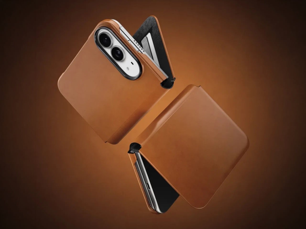
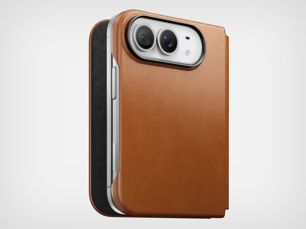
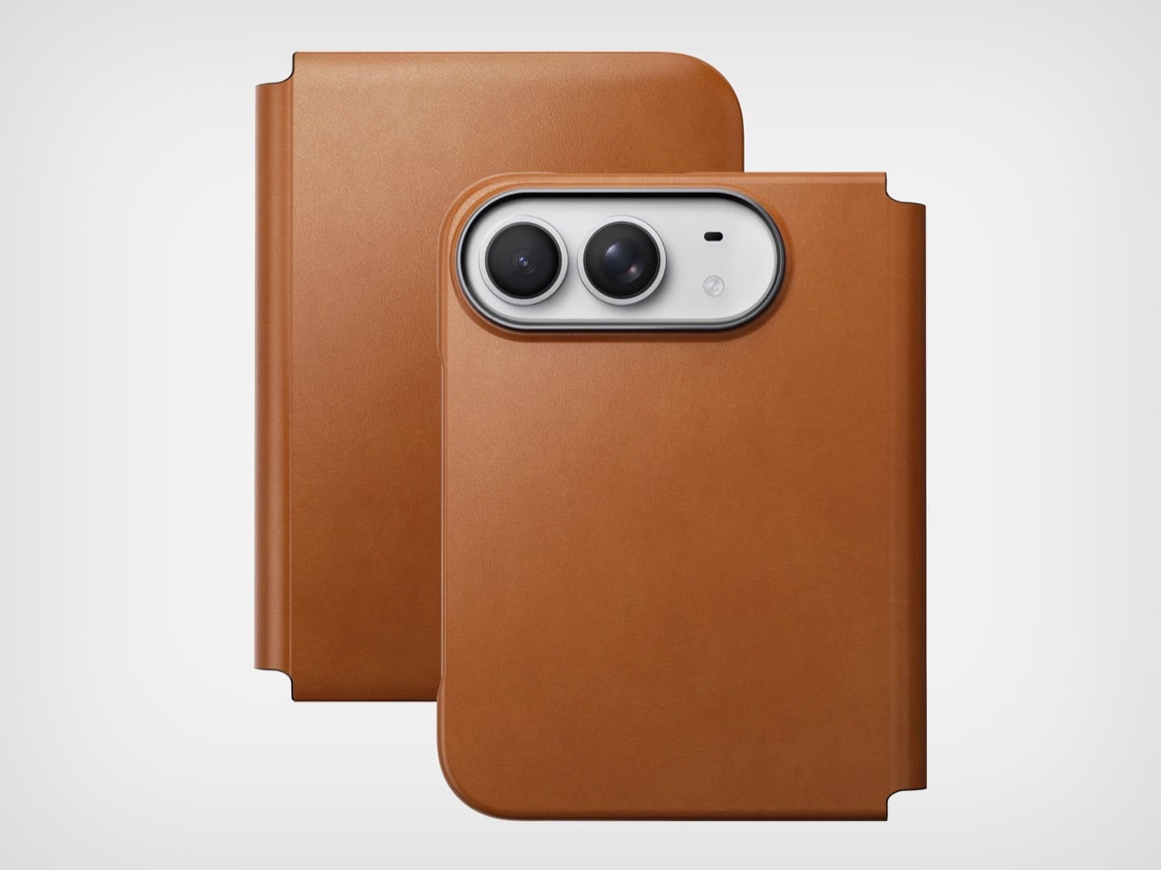
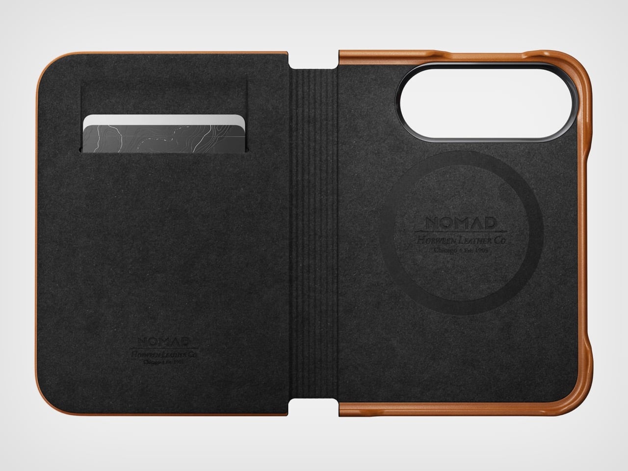
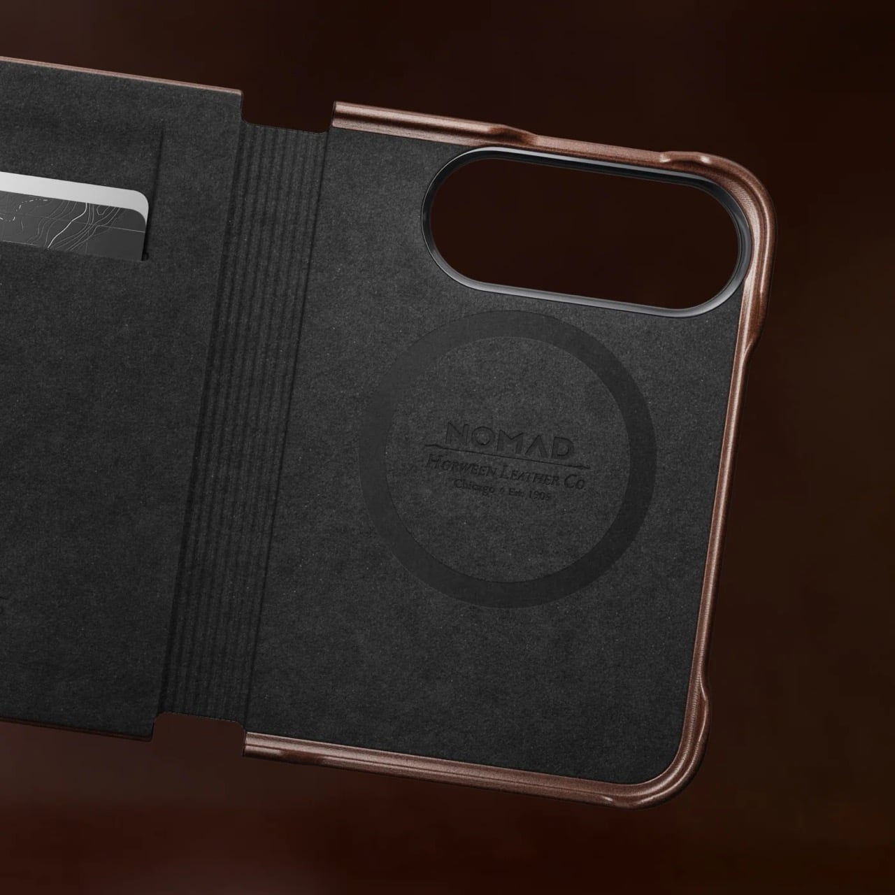
Phone cases tend to fall into two camps: those that protect the device and those that try to say something. Nomad’s Leather Folio attempts something harder: a single object that does both without looking like it is trying to do either. Crafted from Horween leather inside and out, with MagSafe compatibility and RFID blocking built in, it folds over the front of the iPhone Duo and turns what is already an expensive device into a combination that reads less like a phone and more like something a person who still carries a leather notebook would reach for without thinking twice.
Priced at $129, it is not a cheap case, but it is not pretending to be. The leather cover closes over the screen, which is either a feature or a nuisance depending entirely on how you use your phone, though for anyone who already drops it face-down out of habit, the protection is real and the payoff is legitimate. MagSafe integration means the phone charges normally through the case, and the RFID blocking handles the handful of situations where that actually matters. The overall effect is a device that feels deliberately considered in a way most cases never manage to pull off.
What we like
Horween leather develops a patina with use rather than aging badly, which gives the case a genuinely long useful life most materials cannot match
MagSafe compatibility and RFID blocking are both included without any visible hardware bulk or added thickness to the profile
What we dislike
The full front flap adds a step to every screen interaction that will feel like friction until the habit settles, and that adjustment can take longer than expected
At $129, it sits in an awkward price band between affordable everyday cases and truly premium leather goods, which makes the value case harder to land cleanly
5. RePod C1
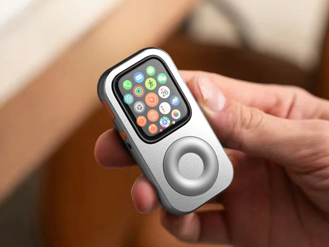
The click wheel was never just an interface. It was a tactile experience that gave early iPods a sense of ceremony that touchscreens have never quite replaced, a physical scroll mechanism that made navigating a playlist feel like it was worth doing slowly. Techpod’s RePod C1 is a $60 Apple Watch case that wraps the watch in an iPod-style shell and brings that wheel back, and what keeps it from being a novelty is one mechanical detail: the click wheel connects directly to the Apple Watch’s Digital Crown, so turning it actually does something real.
The case uses an open-back design that leaves all of the watch’s sensors fully accessible, meaning heart rate monitoring, ECG, and Apple Pay all continue to work normally. Antenna cutouts preserve Wi-Fi, Bluetooth, and cellular connectivity without compromise. The more interesting side effect is what it does to the device’s identity: sliding the watch into a pocket during a run or a commute and navigating with the Crown from inside the shell turns the Apple Watch into something that feels far more like a small, deliberate music player than a wrist-worn notification machine.
What we like
The mechanical connection between the click wheel and the Digital Crown makes the nostalgia functional rather than cosmetic, which is a meaningful distinction
The open-back design keeps every sensor and connectivity feature fully intact, so nothing about the watch’s capabilities changes when the case goes on
What we dislike
Adding any case to the Apple Watch introduces bulk to a device whose appeal partly depends on being thin and unobtrusive on the wrist
The iPod aesthetic lands clearly for one generation and reads as entirely opaque to anyone who came to Apple after the click wheel era ended
The Best Accessories Are the Ones Apple Didn’t Think to Make
Apple’s hardware is precise enough that the accessories worth paying attention to are the ones that noticed a gap the company chose not to fill. The NightWatch saw a dim nightstand clock. Astropad saw a frictionless drawing surface. Ooi Masato saw a speaker that required too much setup before it made a sound. Nomad saw a phone that could carry itself differently. Techpod saw a scroll mechanism nobody had brought back with anything real underneath it.
None of these are essential in the way a charging cable is essential. They are optional in the best sense, the kind of thing that makes a device feel more considered in the hands of whoever chose it. Whether your Apple device is a watch, a phone, or an iPad, something on this list has already figured out what was missing before you had the words for it.
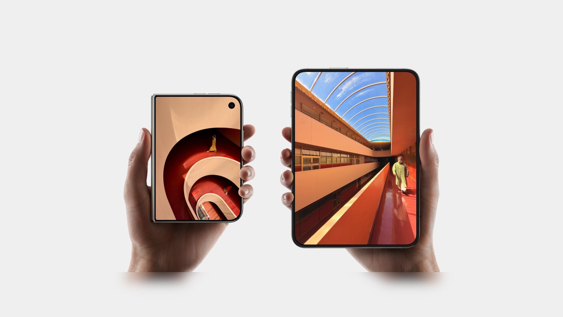
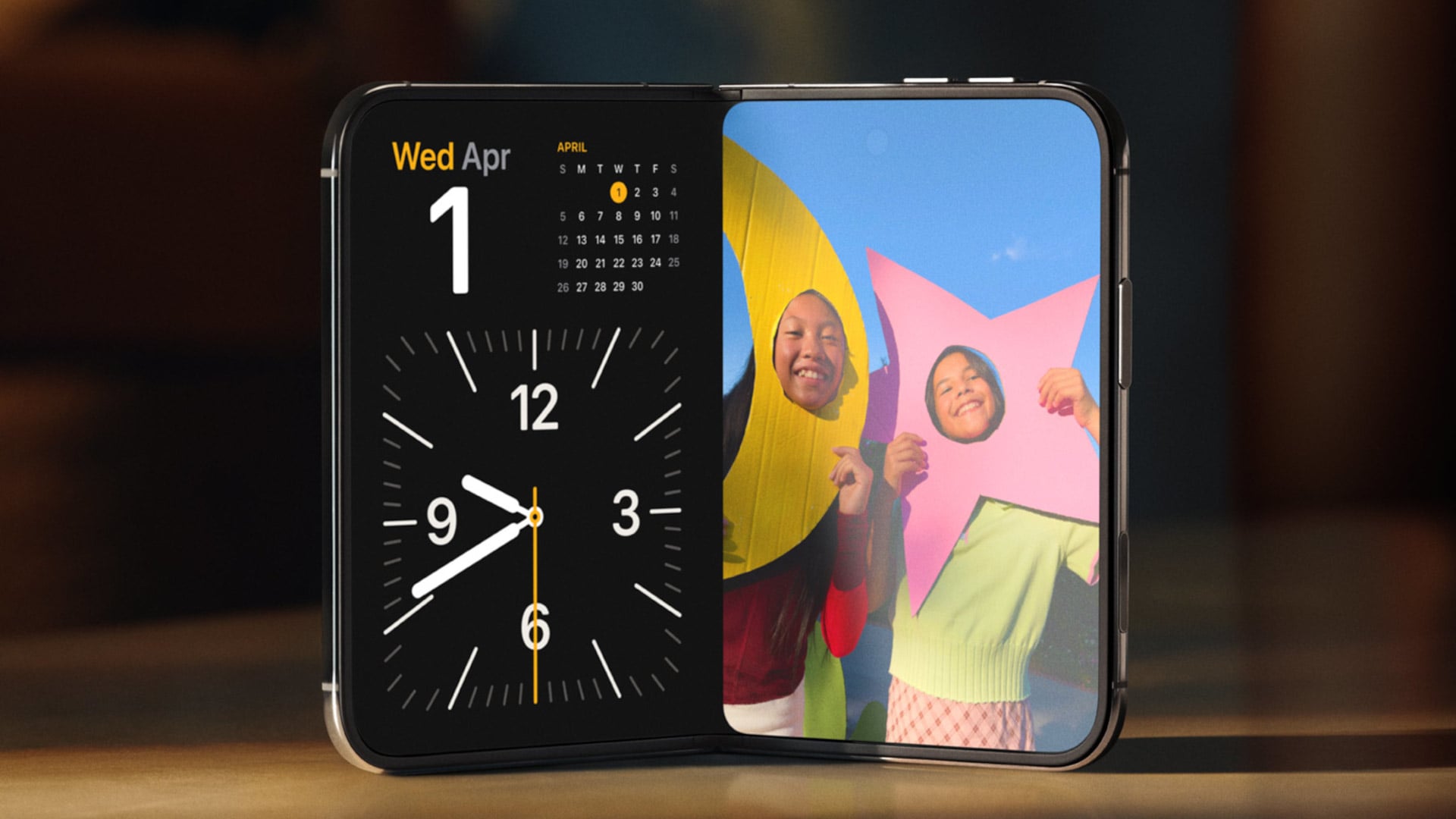
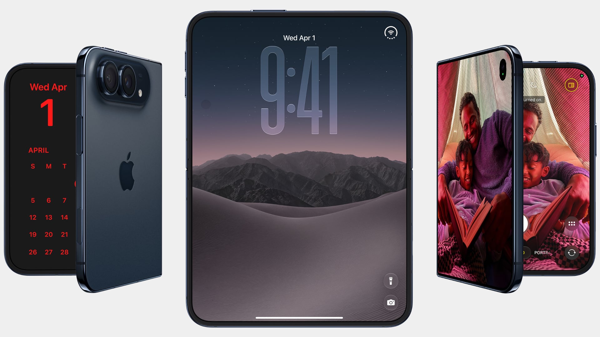
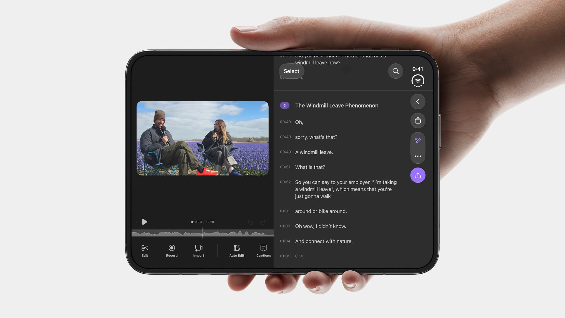
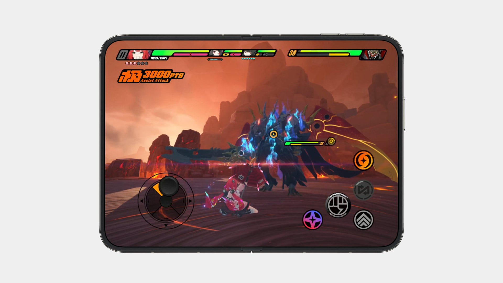
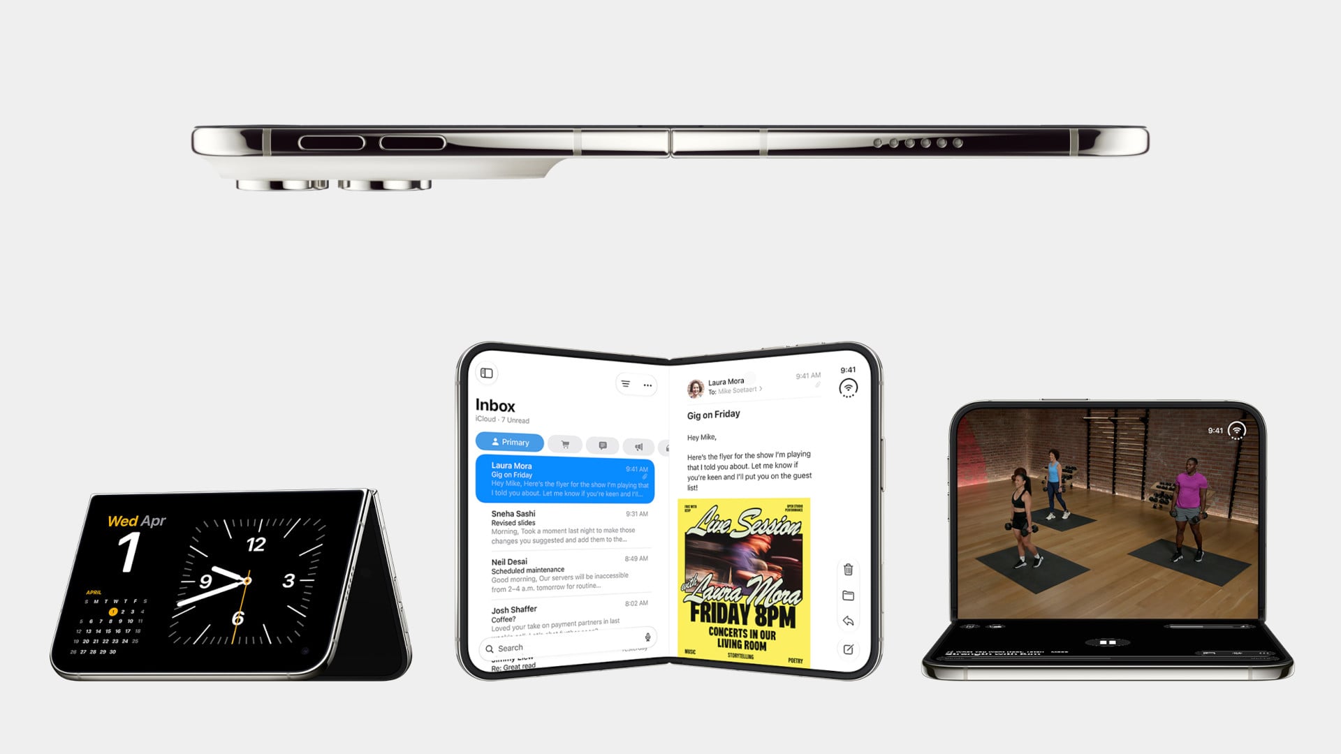
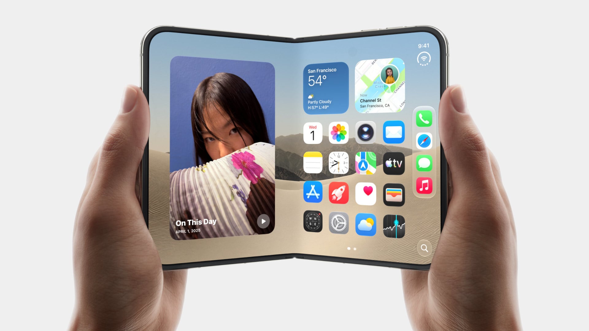
Samsung has had the folding phone conversation to itself for six years now, tweaking hinges, shrinking creases, and figuring out what a cover screen is even for. Apple waited, watched, and let its rival make every mistake first. That patience shows in the iPhone Duo, a first-generation foldable that skipped straight past problems Samsung’s Galaxy Z Fold8 still hasn’t fully solved.
None of that comes cheap, though. The Duo starts at $1,999 and costs more than the Fold8’s $1,899.99, weighs in at roughly nine ounces against the Fold8’s seven, and folds up thicker in your pocket, besides. Samsung still wins those arguments outright, and we’ll get back to that later. But set weight and price aside, because here are five places where Apple’s first foldable actually beat Samsung’s eighth attempt.
Designer: Apple
The Camera That Disappears
A foldable phone’s whole pitch is the screen, one continuous surface that opens up into something closer to a small tablet. Every notch or punch-hole cut into that surface breaks the illusion a little, reminding you that the software is still working around a sensor buried in the glass. Samsung’s Galaxy Z Fold8 has never quite escaped that compromise, even eight generations in.
The Galaxy Z Fold8 carries a 10-megapixel camera punched into both the inner and cover displays, a hole you notice every time the screen lights up. The Duo takes a different route entirely, tucking its inner selfie camera under the panel itself so nothing interrupts the display when you’re watching a movie or scrolling through photos with both halves open. The outer screen keeps a single, smaller cutout.
A Stylus Samsung Gave Up On
Samsung built its whole Note legacy around the S Pen, then carried that stylus into the first few generations of the Galaxy Z Fold before quietly dropping it this cycle. Neither the Galaxy Z Fold8 nor the Galaxy Z Fold8 Ultra bring it back, leaving a gap for anyone who used to sketch, sign, or jot notes onto that big inner display. It’s a strange retreat for a company built on that exact feature.
Samsung Galaxy Z Fold6
Apple Pencil support changes that, working on both the 5.4-inch cover screen and the 7.6-inch inner display, once it arrives. Dual-screen support lands through a software update later this year rather than at launch, so early buyers will have to wait a bit for the full experience. Still, it means signing a document or sketching an idea won’t require unfolding the phone first, something Samsung’s lineup can no longer offer.
Built to Survive the Mess
Dust is the part of durability testing everyone forgets about until it’s too late, and a folding hinge is the worst possible place for grit to sneak into. Water resistance ratings get all the marketing attention, but the dust half of an IP rating tells you whether sand at the beach or fine construction dust will actually make it past the seals and start scratching at the mechanism underneath.
The iPhone Duo carries an IP68 rating, meaning the seal is dust-tight; nothing gets through, full stop. The Galaxy Z Fold8 only manages IP48, which covers water fine but leaves that dust digit low enough that fine particles, sand, and powder aren’t actually kept out. For anyone who takes their foldable to a beach, a workshop, or just a dusty backpack, that gap matters more than it looks.
Room for Everything You Shoot
A foldable’s bigger inner screen practically begs you to shoot more video and drag around heavier files, whether that’s 4K footage, a stack of RAW photos, or a library of apps you’d never bother installing on a regular phone. Storage stops being an afterthought pretty quickly once you’re using the extra screen real estate the way it’s meant to be used, for actual creative work instead of just bigger icons.
Apple tops out the iPhone Duo at 2TB of storage, double what the Galaxy Z Fold8 offers at its 1TB ceiling. That’s the difference between planning around your camera roll on a long trip and simply forgetting storage exists as a problem. For anyone who treats their foldable as a mobile production tool rather than a bigger email client, that extra headroom ends up mattering more than the megapixel count.
Fighting the Fold’s Oldest Flaw
The crease down the middle of a folding screen has been the one problem no manufacturer has fully cracked, Samsung included, no matter how many generations they’ve shipped. Apple’s approach to the Duo’s hinge stacks a nano-texture matte layer over glide-adhesive glass and backs the whole assembly with a titanium plate, an engineering answer to a problem that’s mostly been treated as unavoidable elsewhere in the industry.
Early impressions from outlets with briefing access suggest the crease is still visible. Nobody’s claiming otherwise, but it doesn’t catch your finger or your attention the way it does on most rivals, the Galaxy Z Fold8 included. That’s worth flagging as an early read rather than a verified result, since neither phone has landed in reviewers’ hands yet. Outdoor glare handling gets similar praise, though the real test comes once these ship.
What Samsung Still Gets Right
None of this makes the Galaxy Z Fold8 a bad phone, and Samsung still wins the arguments that matter most to plenty of buyers. It’s $99.01 cheaper, noticeably lighter at roughly seven ounces against the Duo’s nine, and thinner whether it’s folded shut in your pocket or opened flat on a desk. Those are real, measurable advantages, not consolation prizes.
Apple iPhone Duo
Samsung Galaxy Z Fold8
What you’re really choosing between is a phone that’s been refined for eight generations and one making its very first attempt, price and weight included. A first try that already beats its rival on a camera, a stylus, a durability rating, storage, and a hinge design is a strong opening argument, whatever it costs to get there. Samsung’s turn to respond comes next year.
Smartphones turned music into just another notification competing for attention, a song interrupted by a text, an album broken up by a calendar alert. RHYTHM exists to undo that arrangement entirely, building a dedicated listening device from real audio components instead of borrowing a phone’s guts and bolting on a headphone jack. It’s a from-scratch digital audio player designed around one job: playing music properly, without a screen demanding anything else from you.
That commitment starts with what’s actually driving the sound. Rather than leaning on an all-in-one audio codec chip the way most budget players do, RHYTHM routes music through a genuine ESS SABRE DAC, the same category of chip found in dedicated hi-fi gear, paired with a discrete amplifier stage rather than a shortcut solution. An ESP32-S3 handles the file parsing and processing, but the actual sound reproduction runs through hardware built specifically for that job alone.
The headphone output makes the clearest case for why any of this matters. Instead of splitting one internal signal across a single jack, RHYTHM runs two completely independent, actively buffered 3.5mm outputs, each driven by its own dedicated amplifier chip. Two people can plug in two entirely different pairs of headphones, and each gets a full, uncompromised signal, no shared circuit quietly degrading whichever connection came second.
Keeping that signal clean required rethinking the power supply as much as the audio path. RHYTHM physically separates its digital logic and high-frequency switching lines from the analog circuitry that actually shapes the sound, regulating each side through its own dedicated, ultra-low-noise power regulator. It’s an unglamorous decision that never shows up in a spec sheet screenshot, but it’s exactly the kind of choice that determines whether quiet passages in a recording stay quiet.
Physical control gets the same attention. A precision mechanical rotary encoder handles navigation alongside a set of tactile buttons, giving the whole interface a hands-on quality that a touchscreen simply can’t replicate. Paired with a compact 2-inch color display, the device reads less like a shrunken phone and more like a purpose-built instrument, something meant to be operated by feel in a pocket or a bag without needing to look at it.
A microSD slot rounds out the practical side, storing lossless files locally rather than depending on a streaming connection or app ecosystem. That local-first approach extends the project’s entire philosophy: RHYTHM isn’t trying to replace a phone’s convenience. Instead, it’s opting out of that convenience on purpose, trading constant connectivity for a listening experience built around a single, uninterrupted task.
There’s something wonderfully strange about walking up to a framed picture on your wall and telling it what to paint next. Say “paint my dog as a Japanese ink painting,” and the frame generates and displays a new piece. No file transfers, no app navigation, no creative software required. Jitrainno’s Smart Canvas runs on this premise: a voice and text-prompted AI art frame built around an E-Ink Spectra 6 color display, the matte, paper-like panel technology that draws zero power in static mode and reads under ambient light the way a canvas does. It comes in three solid-wood sizes, 7.5, 13.3, and 31.5 inches (named the Echo-7, Echo-13, and Echo-31 respectively), all with built-in batteries and Wi-Fi.
Jitrainno is a Hong Kong-based multidisciplinary team with in-house expertise spanning hardware R&D, E-Ink engineering, AI integration, firmware, and cloud services. They developed a proprietary color rendering layer on top of the Spectra 6 panel, tuned specifically for skin tone accuracy, landscape depth, and smooth gradient transitions. That kind of layered engineering, building custom display algorithms rather than shipping a panel with factory defaults, is what separates a team that genuinely understands display science from one that simply sourced a good component. The project moved from inception and industrial design in June 2025 to a production validation run by May 2026, a fast but not reckless pace for hardware at this scale. Global fulfillment is estimated for November 2026.
E-Ink Spectra 6 is the most capable color e-paper panel currently available to consumer product makers, using six primary pigments: black, white, red, yellow, blue, and green. It achieves up to 200 pixels per inch and draws zero power in static display mode, meaning the canvas can stay on your wall for days between charges. The paper-like surface reflects ambient light rather than projecting it, eliminating the glowing-rectangle problem that has defined every LCD-based digital art frame since the Kodak EasyShare era. Jitrainno’s self-developed rendering and color optimization layer is designed to preserve the subtle details that make an image feel closer to paper art. Based on early reviews, it reads more like a framed print than a screen, which is the bar the whole product needs to clear.
Speaking a prompt aloud and watching a new image materialize on the wall is a genuinely new behavioral ritual, and I think it’s the feature that will hook most people. Users can create images from text or voice prompts, explore different visual styles, and generate variations of their ideas, with AI used as a creative tool within the artwork creation experience. The product page demos a prompt like “a cute green dinosaur in a sunny prehistoric scene, soft watercolor and colored-pencil storybook style,” which apparently renders accurately enough to land on a kid’s wall. The AI side routes through third-party commercial image generation services via official APIs, supporting text-to-image and image-based creative generation within the experience. They also confirm they do not use user content to train their own foundation models, a meaningful distinction in a market where that commitment is far from universal.
AI generation is only one of several ways to populate the canvas. The app supports content from AI-generated art, a free art gallery called Daily Drops, the phone camera, the user’s photo library, and personal collections. Daily Drops streams a rotating selection of curated artwork that users can filter by mood or scene type and push directly to the display. The phone camera connection opens the obvious use case of photographing a physical painting, a landscape, or a face and sending it to the frame instantly. That breadth of sourcing makes the Smart Canvas a capable display platform in its own right, with AI generation sitting as a feature rather than a crutch.
Gallery proportions, tactile materials, and Auto-Rotation are deliberate choices to help the Jitrainno Echo series belong in the room like framed art. From the product photography, the proportions are gallery-standard, the profile slim enough to recede into a wall, and the matte panel surface does the visual work of making it belong. A built-in sensor detects whether the frame is in portrait or landscape and automatically switches the artwork’s aspect ratio, with no manual setting required. Connectivity runs in two modes: full cloud-connected (remote upload, AI creation, gallery sync, multi-user sharing) or completely offline (no account, no internet, direct phone-to-frame transfer). The offline option is a genuine design stance in a category where “smart” has almost universally meant always routing through someone else’s server.
The Jitrainno Echo-7 at 7.5 inches (1024×600, 170x236mm) is the tabletop model. The Jitrainno Echo-13 at 13.3 inches (1200×1600, 316.3×416.3mm) works both on a desktop stand and wall-mounted, making it the most flexible of the three. The Jitrainno Echo-31 at 31.5 inches (2560×1440, 603x903mm) is wall-only, the model that reads as a proper statement artwork rather than a gadget trying to pass itself off as one. All three run on E-Ink Spectra 6 full-color panels in solid wood frames, with built-in batteries and USB-C charging. The Jitrainno Echo-13 retails at $469 and the Jitrainno Echo-31 at $1,499, both covered by a one-year manufacturer’s warranty, with global fulfillment estimated to begin November 2026.
The folio case for smartphones remains an entirely boomer product offering. Having a case with a flap that covers your screen and needs to be folded open like a book to answer calls or use your phone is an innately ‘old-soul’ experience. The flap protects your screen but it also obscures it. Fold the flap to the back and it reveals your screen but blocks your camera. It isn’t for millennials or Gen-Z phone owners, but for anyone who wears reading glasses, this folio style case is as addictive as their generation’s Candy Crush habit. With Apple launching the iPhone Duo just yesterday, Nomad developed a similar folio style case for the Apple foldable.
Nomad’s Folio case for the Duo is a strange little thing. While most folio cases turn candybar phones into bifolds, Nomad’s case sort of turns it into a trifold, if you will… or a bifold with a partition. The case is a single-piece leather and plastic design, created to wrap your phone not just from the back but also the front. The front flap magnetically snaps to your phone’s outer display, and lets you open your phone in two ways – firstly, by just disengaging the flap to see the outer screen, but also by disengaging the flap and outer screen together to see the inner screen… and like any good folio case, the flap’s inside packs a card-holder for your payment, ID, and access cards so you don’t need a MagSafe wallet ruining your iPhone Duo’s design.
Like all of Nomad’s leather cases, this one’s made from Horween leather, crafted from a single piece of hide that’s been tanned, bent, crimped, and buffed to absolute beauty. The leather gracefully wraps around the edges, keeping the buttons exposed and accessible, while also covering the hinge in a way that creates that bifold feeling. The leather then transitions upwards ever so slightly before cutting off to a plastic lip around the camera bump, cushioning your phone’s precious shooters from accidental drops and bumps.
On the inside, the leather’s reinforced by a microfiber layer that protects the iPhone’s glass panels from damage. Sure, Apple touts Ceramic Shield on both the front and back, but nothing breaks your heart faster than seeing a cut or a scratch running down the glass body from abrasive action caused by objects in your pocket or even your table. Meanwhile, a slot on the front stores two cards from the looks of it, so your iPhone Duo doubles as a card holder beyond what Apple Pay already lets you do.
Like all good leather cases, this one’s designed to age gracefully with time. Chances are, if you’re an iPhone Duo buyer, you will probably use this phone as your ride or die for another 2 years. In that time, Nomad says the case will patina gorgeously with time, aging uniquely based on how you use the phone. Luckily, the case isn’t too expensive. Priced at $129, you can grab the Nomad iPhone Duo Traditional Folio in one of three colors – Saddle, Rustic Brown, and Black, with global shipping starting November 14th.

 Connexion