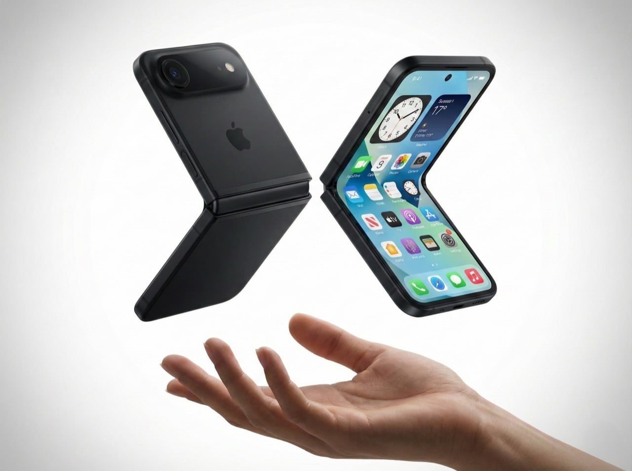
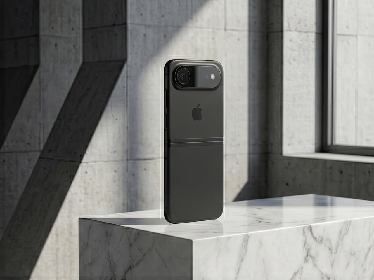
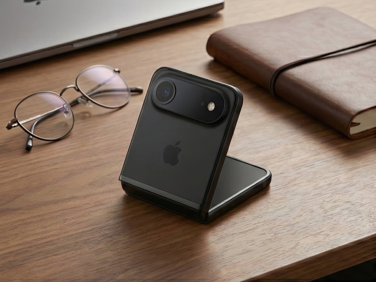
Remember when phones got smaller? The iPhone 13 Mini had a cult following, but Apple killed it because most people wanted bigger screens. Here’s the plot twist: a clamshell foldable iPhone could bring back that beloved compact size without sacrificing screen real estate. You get a full-size display when you need it, and a pocketable square when you don’t. It’s the best of both worlds, and Apple knows it.
Mark Gurman’s latest report suggests Apple is seriously exploring this form factor. It wouldn’t be their first foldable (a larger model is rumored for later this year), but it might be their smartest. A clamshell iPhone makes sense for reasons that go way beyond nostalgia. It’s cheaper to build than a book-style fold, it doesn’t compete with the iPad Mini, and it opens up a market where Samsung is basically the only serious player. There are six solid reasons why Apple should do this, and one big reason why it might not work. Let’s dig in.
The iPhone Mini lives on (just folded in half)
Apple discontinued the iPhone 13 Mini because the sales numbers didn’t justify keeping it around. Turns out most people prefer bigger screens, even if it means carrying a brick in their pocket. But the Mini’s fans were passionate, and they’ve been vocal about wanting a truly compact iPhone ever since. A clamshell solves this problem in the most elegant way possible.
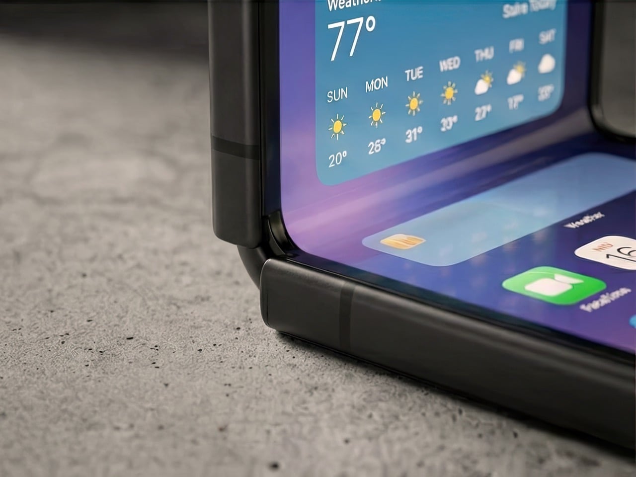
When folded, it’s roughly the size of the Mini, maybe even smaller depending on how thick the hinge is. When unfolded, you get a full 6.1-inch or 6.7-inch display, same as the regular iPhone or Pro Max. The people who loved the Mini weren’t asking for a smaller screen, they were asking for a phone that didn’t dominate their pocket or require two hands for basic tasks. A clamshell gives them that portability without forcing them to squint at a 5.4-inch display.
This isn’t just about bringing back a discontinued product. It’s about proving that compact phones can exist in 2026 without compromising on screen size. The form factor itself becomes the feature.
It doesn’t murder the iPad Mini
Here’s the uncomfortable truth about book-style foldables: they’re iPad killers. If Apple released an iPhone that unfolds into an 8-inch display, who’s buying an iPad Mini? The overlap would be brutal. You’d have a device that fits in your pocket, runs iOS, makes calls, and gives you a tablet-sized screen when you need it. The iPad Mini’s entire value proposition collapses.
A clamshell doesn’t have this problem. Even at its largest, a clamshell iPhone would max out at maybe 6.9 inches unfolded. That’s still firmly in phone territory, not tablet territory. The iPad Mini’s 8.3-inch display remains the smallest “real” iPad you can buy, and it stays relevant for people who want that in-between size for reading, note-taking, or media consumption.
Apple’s product lineup is carefully segmented, and a clamshell iPhone slots in without disrupting the hierarchy. It’s a phone that folds smaller, not a tablet that folds into a phone. That distinction matters when you’re trying to sell both devices to the same customer.
Samsung owns this space, but they’re beatable
The Galaxy Z Flip has been around since 2020, and Samsung’s refined it through multiple generations. They’re the dominant player in the clamshell category, but “dominant” doesn’t mean “unbeatable.” Motorola’s putting up a fight with the Razr, but Google hasn’t touched this form factor yet. No Pixel Flip. No Nothing Flip. No OnePlus Flip. It’s basically Samsung’s game, and that’s an opportunity for Apple.
Apple doesn’t need to be first. They need to be better. And in a market where there’s only one major competitor, “better” is achievable. Samsung’s Z Flip 6 is solid, but it’s not perfect. The cover screen still feels like an afterthought, the crease is visible, and the software experience is classic Samsung (which is to say, inconsistent). If Apple can deliver a smoother hinge, a more useful outer display, and that signature iOS polish, they could own this category within a generation.
The fact that Google isn’t competing here is huge. The Pixel is Apple’s biggest threat in terms of owning both hardware and software (plus Gemini is vastly more superior than any AI Apple’s managed to roll out), and if there’s no Pixel Flip to compete with an iPhone Flip, Apple has a clear shot at Android users who want this form factor but don’t want Samsung’s ecosystem.
Smaller hinge, lower risk
Building a book-style foldable is expensive and complicated. You’re engineering a hinge that supports a massive, fragile display. You’re solving durability issues that Samsung and others have been wrestling with for years. You’re creating an entirely new product category that might flop. The R&D costs are enormous, and if it doesn’t sell, you’ve burned a ton of money.
A clamshell is cheaper to prototype, cheaper to manufacture, and cheaper to fail with. The display is smaller, the hinge mechanism is simpler, and the overall engineering challenge is less daunting. If Apple wants to dip their toes into foldables without betting the farm, a clamshell is the way to do it.
This also means Apple can price it more competitively. A book-style iPhone Fold would probably start at $1,799 or higher. A clamshell could reasonably launch at $1,199, maybe $1,299. That’s still premium, but it’s within reach of people who’d normally buy a Pro model. The lower price point expands the potential customer base, and if it sells well, Apple can use that momentum to justify a larger foldable later.
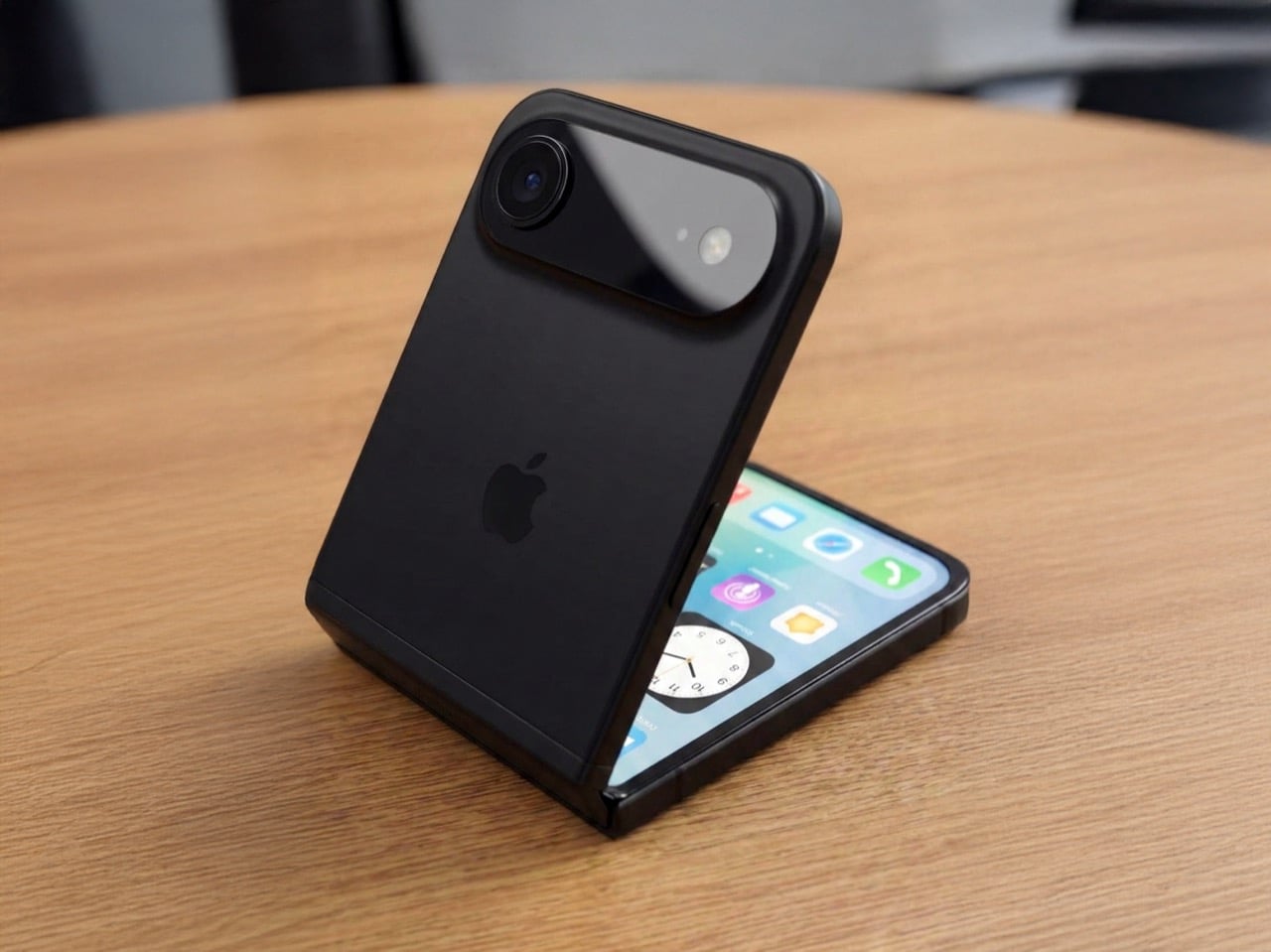
Hands-free everything
The half-folded “laptop mode” is one of the best features of clamshell foldables, and it’s criminally underrated. You can prop the phone up on a table, angle the screen however you want, and suddenly you’ve got a hands-free setup for FaceTime, vlogging, watching videos, or taking photos. No tripod required. No awkward propping it against a water bottle. It just works.
Apple’s been positioning the iPhone as a serious content creation tool for years. ProRes video, Cinematic Mode, all those camera upgrades, they’re aimed at people who make stuff. A clamshell iPhone would give those creators a built-in tripod mode that’s actually useful. Imagine shooting a cooking tutorial, a makeup video, or a product unboxing without needing extra gear. The phone holds itself at the perfect angle, and you’re free to use both hands.
This isn’t a niche use case. Every vertical video you’ve ever seen on TikTok or Instagram could’ve been easier to shoot with a clamshell. Apple knows this, and they know it’s a selling point that most mobile brands haven’t fully capitalized on yet.
Big screen, small pocket
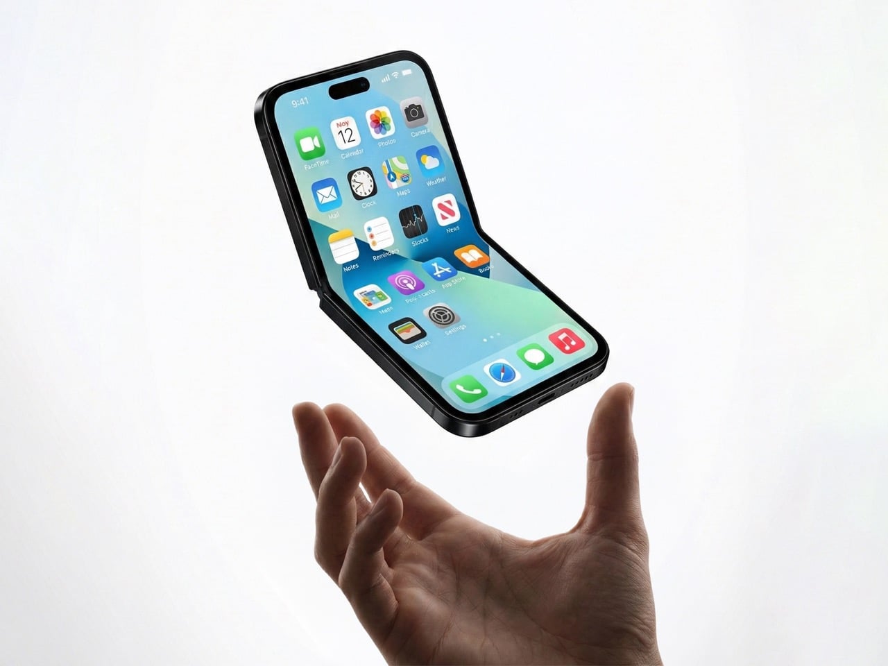
Here’s the paradox of modern smartphones: people want huge screens, but they hate carrying huge phones. The iPhone 15 Pro Max is a phenomenal device, but it’s a slab that dominates your pocket, your bag, and your hand. A clamshell solves this in the most obvious way possible: make the screen big, then fold it in half.
When unfolded, you get all the screen real estate of a Pro or Pro Max. When folded, it’s a compact square that sits comfortably in any pocket. You’re not sacrificing display size, you’re just rearranging it. This is especially appealing for people who want big screens but don’t want to upgrade their wardrobe to accommodate a 6.7-inch rectangle.
The folded form factor also changes how you carry the phone. It’s less likely to slide out of a pocket, it doesn’t create that awkward bulge in tight jeans, and it’s easier to grip when you’re pulling it out. These are small quality-of-life improvements, but they add up. A clamshell makes the big-screen experience more portable, and that’s a real advantage.
The one problem: MagSafe doesn’t love squares
Here’s where things get tricky. Apple’s entire MagSafe ecosystem is built around vertical rectangles. Wallets, battery packs, car mounts, wireless chargers, they all assume your iPhone is shaped like, well, an iPhone. A clamshell changes that. When folded, it’s a square. When unfolded, it’s a normal phone shape. But MagSafe accessories are designed to stick to the back of a phone that’s always the same shape.
How does a MagSafe wallet work on a folded clamshell? Does it attach to the outer cover, which is probably glass or plastic? Does Apple redesign the entire accessory lineup to accommodate a square form factor? Do they create clamshell-specific MagSafe products? None of these solutions are great.
This isn’t a dealbreaker, but it’s a complication. Apple’s accessory ecosystem is a huge part of their strategy, and a clamshell iPhone disrupts that in ways a book-style fold wouldn’t. You could argue that a book-style fold, when closed, is still roughly phone-shaped, so MagSafe accessories might work. A clamshell is just different enough to break compatibility.
Apple could solve this with clever engineering. Maybe the MagSafe ring is on the outer screen side, and accessories attach there. Maybe they introduce a new “MagSafe Flip” standard with different magnets. Or maybe they just accept that clamshell buyers won’t use traditional MagSafe accessories and move on. Either way, it’s a problem that doesn’t exist with their current lineup, and it’s worth considering.
So, is this happening?
Gurman’s report is credible, but it’s not a product announcement. Apple explores lots of things that never ship. They’ve been prototyping foldables for years, and we’ve seen patents dating back to 2016. The fact that they’re actively working on a clamshell now doesn’t mean it’ll hit shelves in 2027 or even 2028.
But the logic is there. A clamshell iPhone solves more problems than it creates. It brings back the Mini’s form factor without shrinking the screen. It enters a market where Apple could actually win. It’s cheaper and less risky than a book-style fold. And it gives Apple a foothold in foldables without cannibalizing their other products.
If Apple does this right, a clamshell iPhone could be the foldable that finally makes sense for people who aren’t early adopters. It’s practical, it’s pocketable, and it’s exactly the kind of product Apple excels at making. The only question is whether they’re willing to rethink MagSafe to make it work.
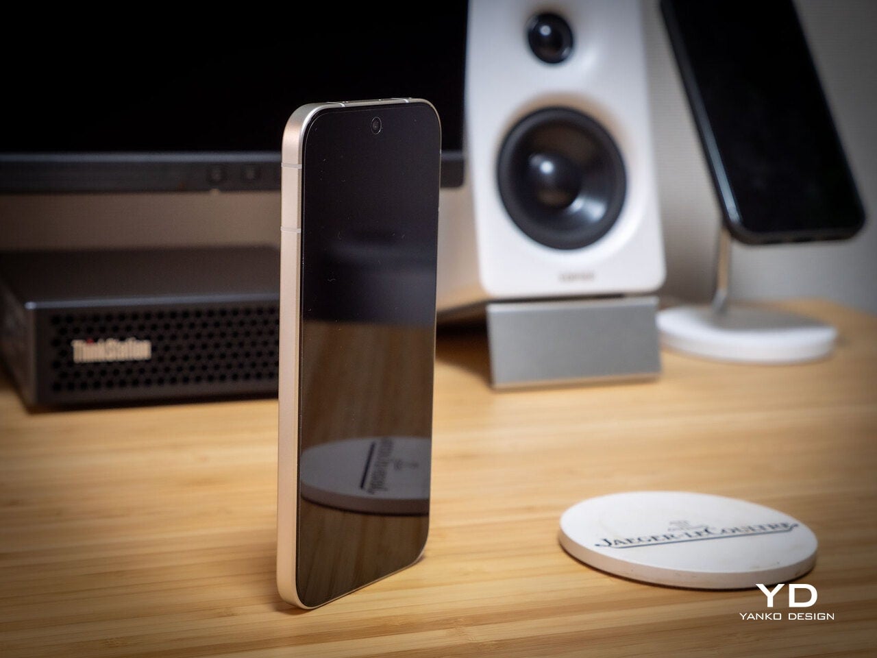
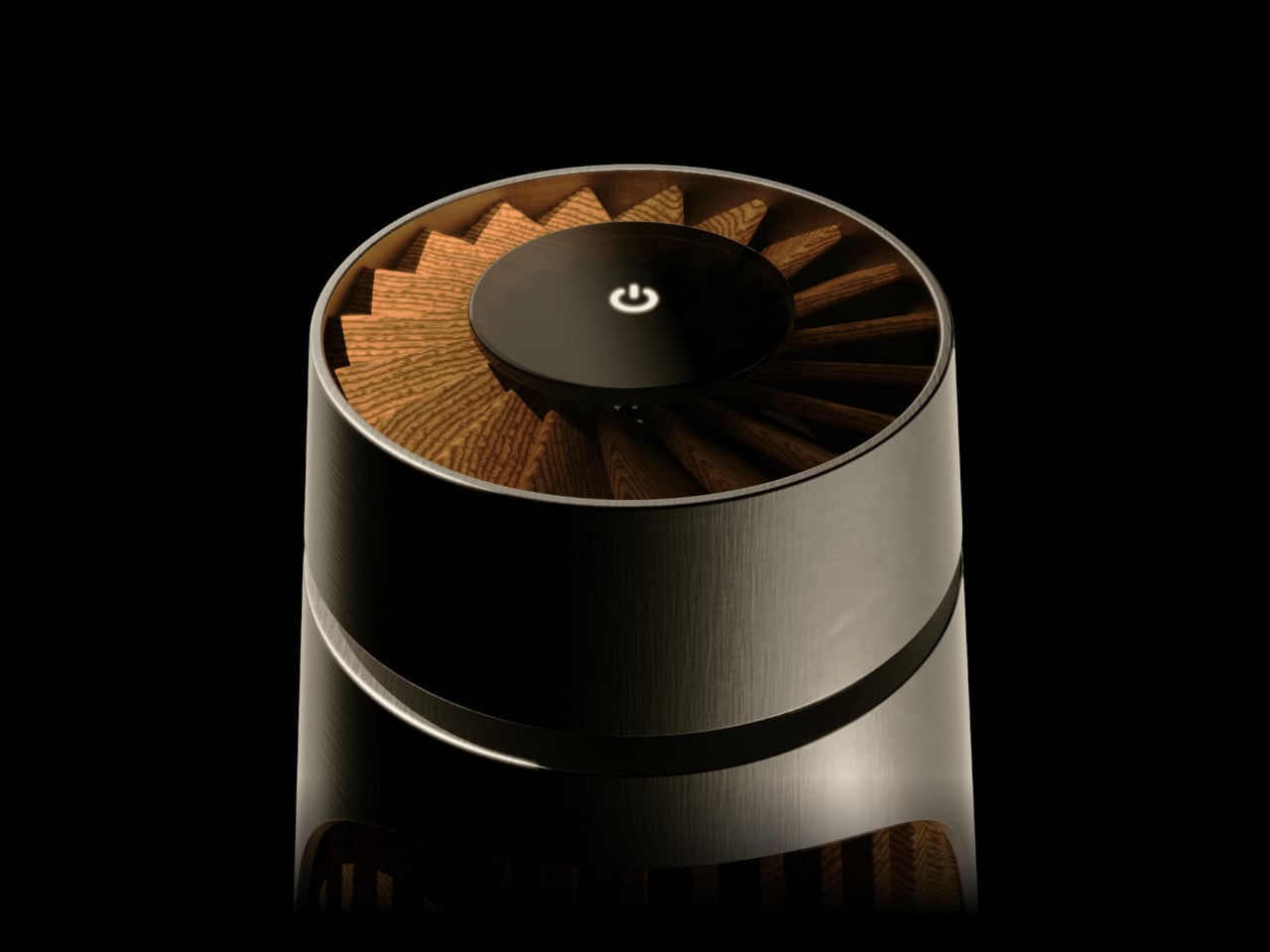
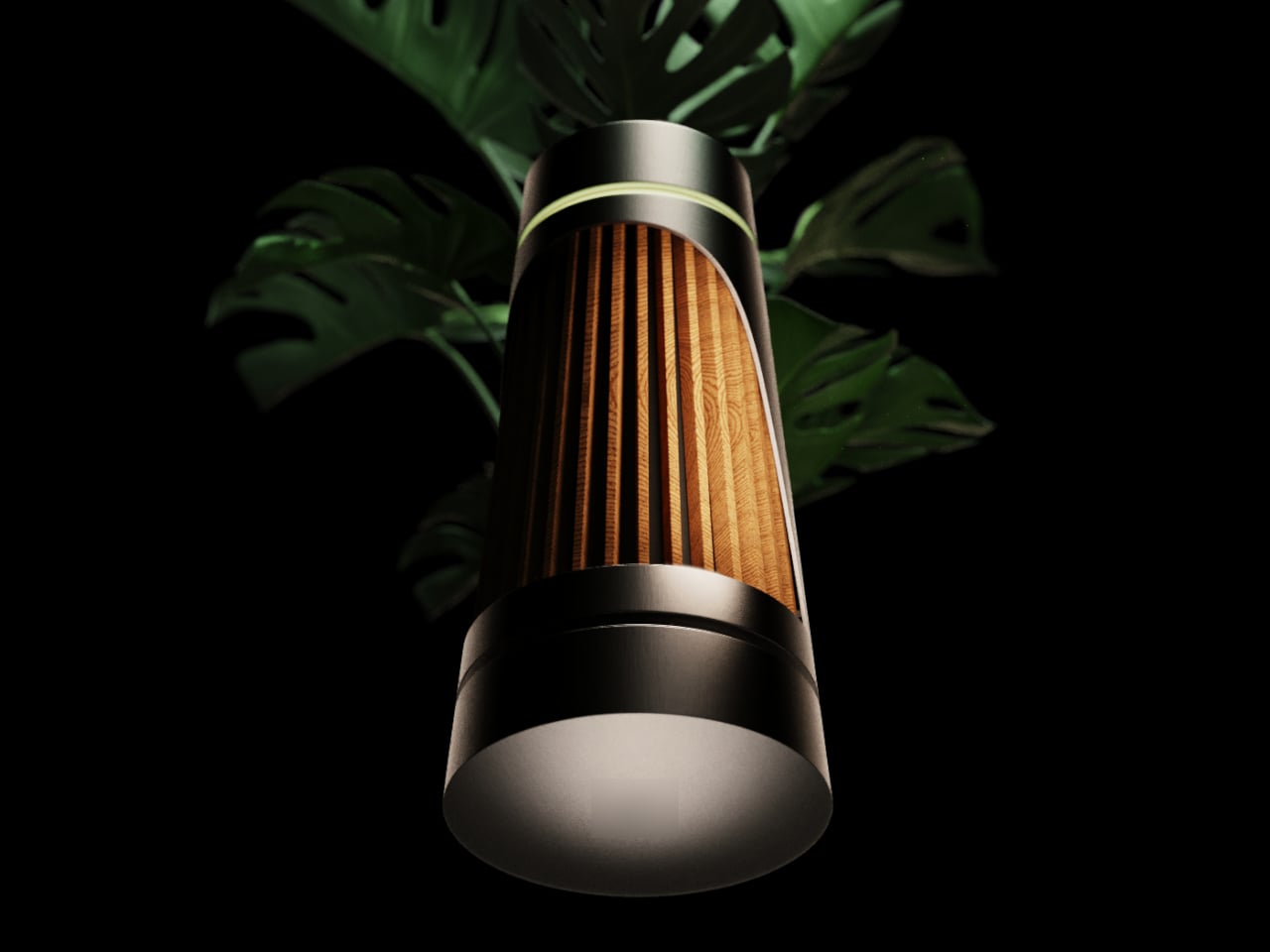
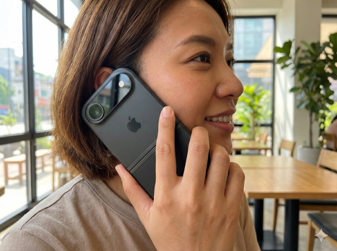
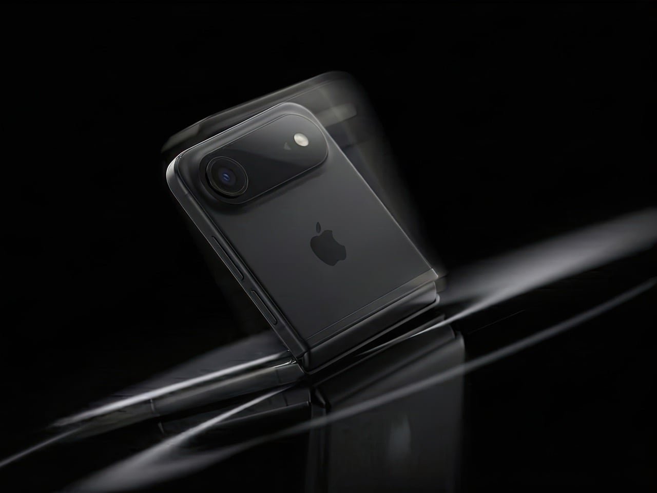
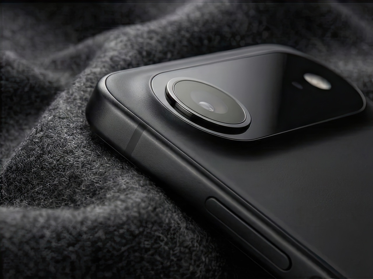
(Images via AI)
The post 6 Reasons Why Apple Needs to Build a Clamshell iPhone Flip (And 1 Reason It Shouldn’t) first appeared on Yanko Design.