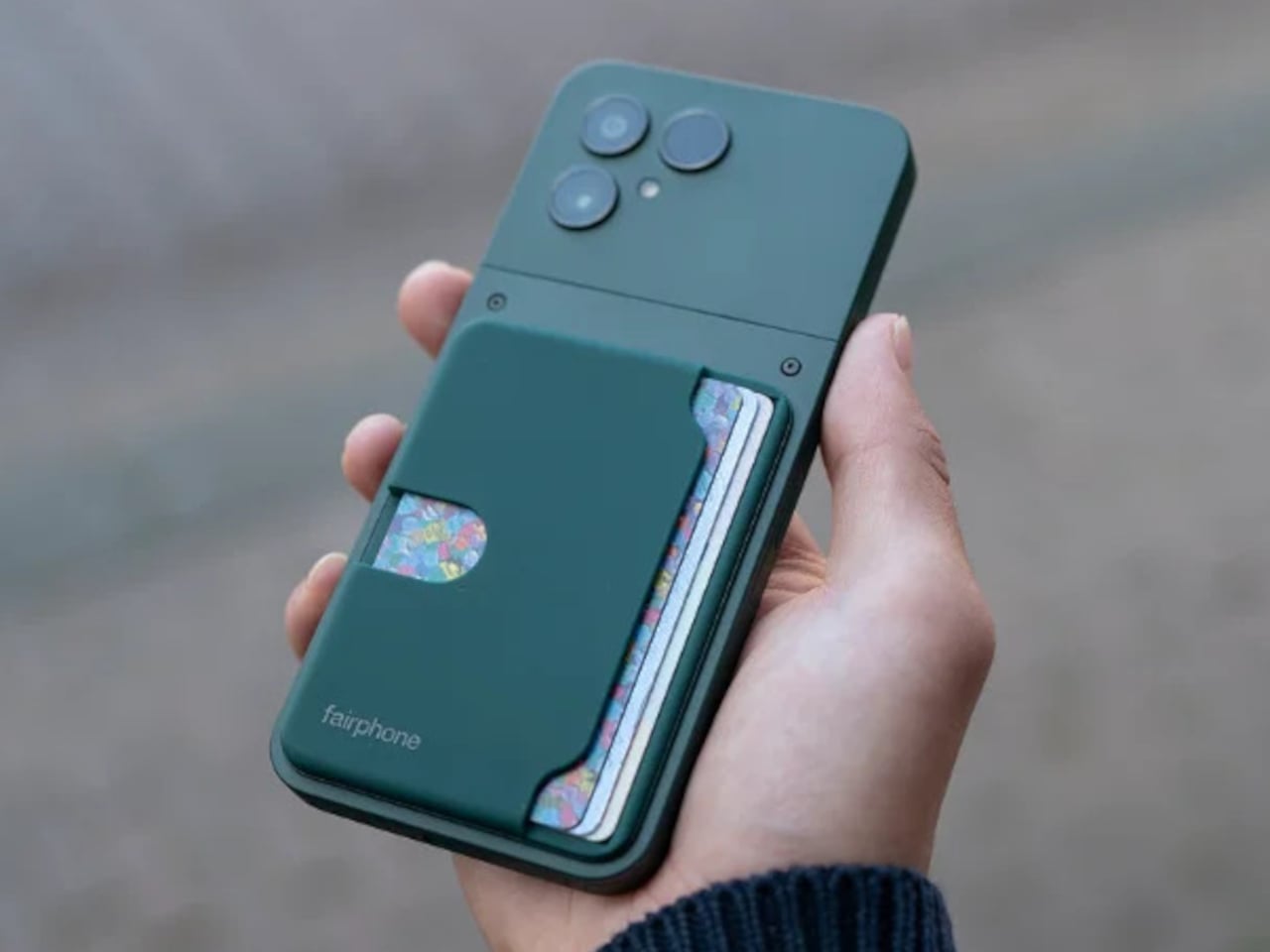
As someone who just bought an Apple Watch not too long ago, I can’t begin to tell you what a heaven-sent it is to be able to ‘summon’ your phone through the watch. I’m decently organized, but I do tend to leave my phone, wallet, keys around the house sometimes, and I just wish there was a way to track or summon your wallet the way you would your phone – WITHOUT fitting a godawful AirTag inside it. Sure, there are cards that help you track your wallet too – until you switch from iOS to Android, and then suddenly you need a new tracker. By that metric, Seinxon has accomplished something genuinely clever: creating the first wallet that plays nice with both Apple Find My and Google Find My Device simultaneously. For those of us living in mixed-device households (or who might switch platforms someday), this dual-ecosystem approach solves a real problem rather than creating another walled garden.
The wallet launched at $65 for early backers (34% off the planned $99 retail), which initially seemed steep until you dig into the technical details. Most tracking wallets are essentially leather pouches with a slot for an AirTag or a Chipolo card. The Seinxon integrates both tracking systems natively, eliminating bulk while tapping into Apple’s network of nearly a billion devices and Google’s massive Android ecosystem. Honestly, this is genuinely smart engineering that acknowledges how people actually use technology across multiple platforms and devices.
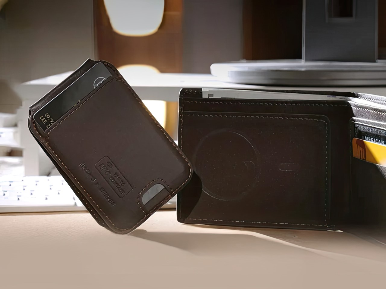
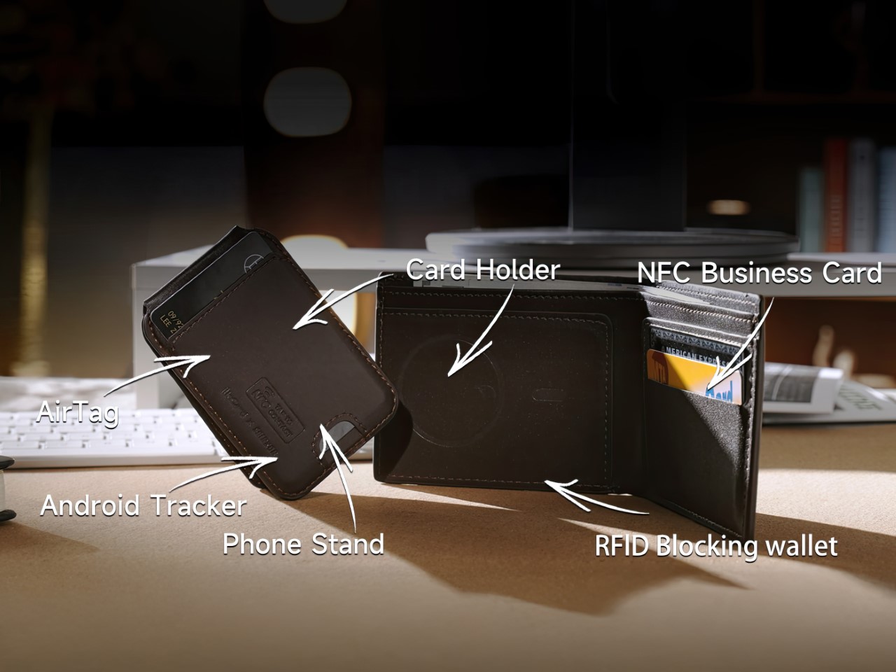
The tracking capability alone would make this interesting, but Seinxon packed in five additional features without creating a bulky monstrosity. The detachable magnetic cardholder serves double duty as a phone stand, addressing the awkward “prop your phone against a water glass during lunch” problem we’ve all experienced. The magnetic attachment feels substantial in a satisfying, Apple-accessory kind of way – strong enough to stay put but not so powerful that it requires a wrestling match to separate components.
The wallet’s somewhat modular design means you can detach the card holder and have it hooked to your phone, while the bifold remains in your pant pocket. It’s a nice way to separate elements based on where you need them. The card holder, however, has all the tracking tech, so it’s best placed back in the wallet when you’re not using its phone-stand feature.
The built-in NFC business card functionality transforms the wallet from passive storage into an active networking tool. Tap your wallet against someone’s phone, and your contact details transfer instantly. This feature has existed in various forms for years, but integration into something you already carry eliminates the need for yet another gadget. The implementation here matters – the NFC chip remains powered even when the wallet battery runs low, ensuring your digital business card works even if tracking temporarily doesn’t.
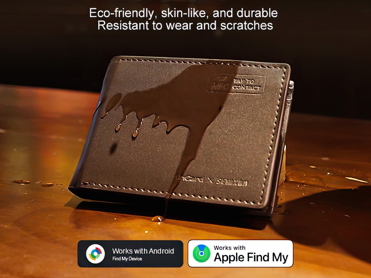
This might be the first wallet with an IP rating, but it doesn’t hurt that the Seinxon Trackable Wallet+ is IP68 certified. This specification means the wallet can survive submersion in 1.5 meters of water for 30 minutes – plenty of protection for rain, spills, or the occasional accidental washing machine trip. Achieving this level of water resistance with multiple electronic components requires careful gasket design and material selection. The company apparently tested prototypes through 200 submersion cycles to validate the waterproofing claims. It just means the wallet’s durable against water and splashes, I don’t recommend jumping into a pool with it.
Battery life typically becomes the Achilles heel of smart accessories, especially those running multiple radios. Seinxon addressed this potential weakness by incorporating wireless charging, eliminating fiddly ports that could compromise waterproofing. The Qi-compatible charging coil works with standard charging pads, though the company recommends their own charging mat for optimal alignment. According to their testing data, a full charge powers the wallet for approximately three weeks of normal use. The battery itself is a custom 400mAh lithium polymer cell rated for 500+ charge cycles before capacity degradation becomes even slightly noticeable.
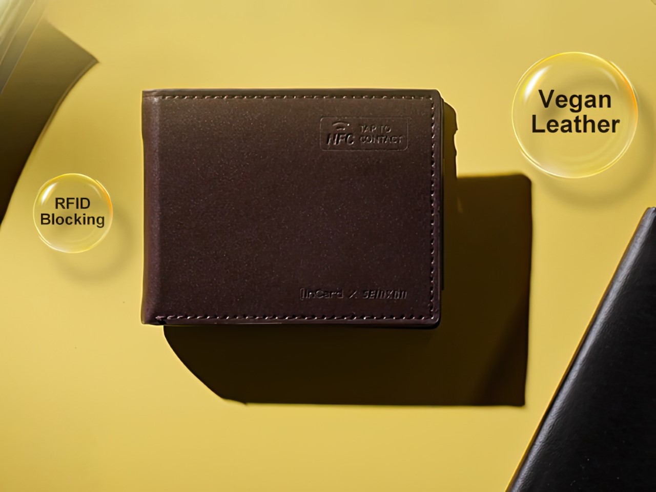
The physical design balances tech integration with wallet fundamentals. At just 14mm thin, it maintains a reasonably slim profile while accommodating up to eight cards plus cash. The exterior uses vegetable-tanned leather from an Italian tannery that meets environmental certification standards, while also boasting RFID-blocking features that prevent your cards from digital theft and unwarranted scanning. The stitching pattern cleverly conceals antenna placement while maintaining signal strength, showing attention to both aesthetics and functionality.
The interface handles both Apple and Google tracking setups through a unified process rather than forcing users through separate workflows. Location history, battery status, and NFC card customization all live within a clean interface that doesn’t require a computer science degree to navigate. The company promises three years of software updates, addressing the common concern that crowdfunded products become abandonware shortly after delivery.
The Seinxon Trackable Wallet+ represents what crowdfunding platforms do best: enabling innovative solutions that larger companies overlook because they’re too invested in their ecosystems. By bridging the Apple-Google divide while adding genuinely useful features, Seinxon has created something that solves actual problems rather than inventing new ones. The wallet starts at a rather impressive $65, which definitely undercuts most wallets, let alone paying for a wallet, a phone stand, an AirTag, and an Android tracker. The 6-in-1 Seinxon Trackable Wallet+ ships globally starting July 2025.
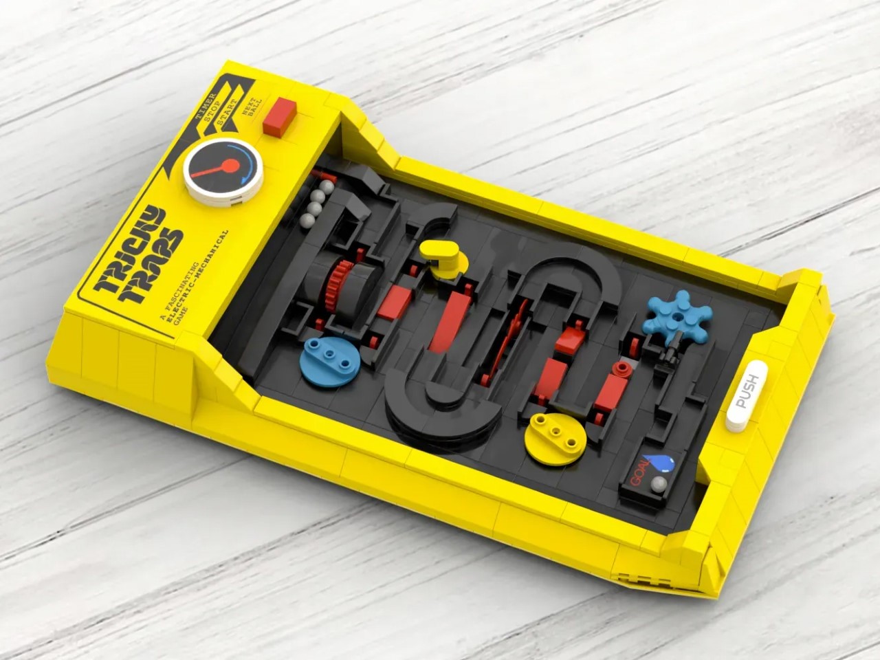
The clacking of marbles against plastic, the agonizing wait as your ball teeters on the edge of a trap, the trash talk between friends gathered around a tabletop game. Remember that? The “Tricky Traps” LEGO Ideas project bottled that exact feeling, transporting us back to the days when entertainment didn’t require a charging cable. Created by LEGO enthusiasts BRICKUP and JodyPad, this 600-piece recreation of the classic 80s Tomy game has already captured over 1,000 supporters on the LEGO Ideas platform. Nostalgia sells, but this project goes beyond mere sentimentality. The creators have meticulously designed each piece to function exactly like the original, resulting in a LEGO set you’ll actually play with long after building it.
I’ve always had a soft spot for LEGO sets that do something after you’ve snapped the last brick into place. The company has quietly built an impressive portfolio of interactive builds over the years. The playable chess sets let you stage epic battles between minifigures. The LEGO Mario sets transform your living room floor into a real-world platformer with electronic sensors and sound effects. Even the Ideas Maze set from 2016 brought genuine gameplay to the LEGO experience, with a tilting labyrinth that challenged your steady hand. “Tricky Traps” continues this tradition, blending the satisfaction of construction with the thrill of competition.
Designers: BRICKUP & JodyPad
The original Tricky Traps captured 80s kids’ hearts with its devilish obstacle course for marbles. Players navigated through moving platforms, sudden drops, and precarious pathways, all while racing against opponents and the clock. This LEGO recreation maintains that essence while adding the unmistakable texture of brick-built design. Each of the approximately 600 pieces serves a purpose, creating a 1:1 scale model that doubles as a fully functional game. The designers incorporated Technic elements to recreate the motorized aspects of the original, ensuring that this isn’t just a static display piece. The attention to mechanical detail shows a deep understanding of both LEGO engineering and what made the original game so addictive.
LEGO shines brightest when it pushes beyond static models. The grand piano that actually plays, the Nintendo Entertainment System with its scrolling TV screen, the functioning typewriter with its satisfying key action. “Tricky Traps” belongs in this category of builds that reward you twice: first during construction, then every time you play with it. For a generation raised on instant digital gratification, there’s something revolutionary about a toy that demands patience, skill, and physical presence. If this set makes it through the LEGO review process, expect to see adults hogging it at family gatherings, reliving their youth one marble at a time, while introducing a new generation to the analog joys of mechanical gaming.
The project still has 589 days to gather the 5,000 supporters needed to reach the next review milestone, but its early momentum suggests a hunger for tactile, interactive play experiences. With enough support, it could potentially become a retail box set that all of us can assemble and play with. If you want to see that happen, i.e., if you love tactile games over doomscrolling displays, go ahead and give the Tricky Traps your vote on the LEGO Ideas website here!
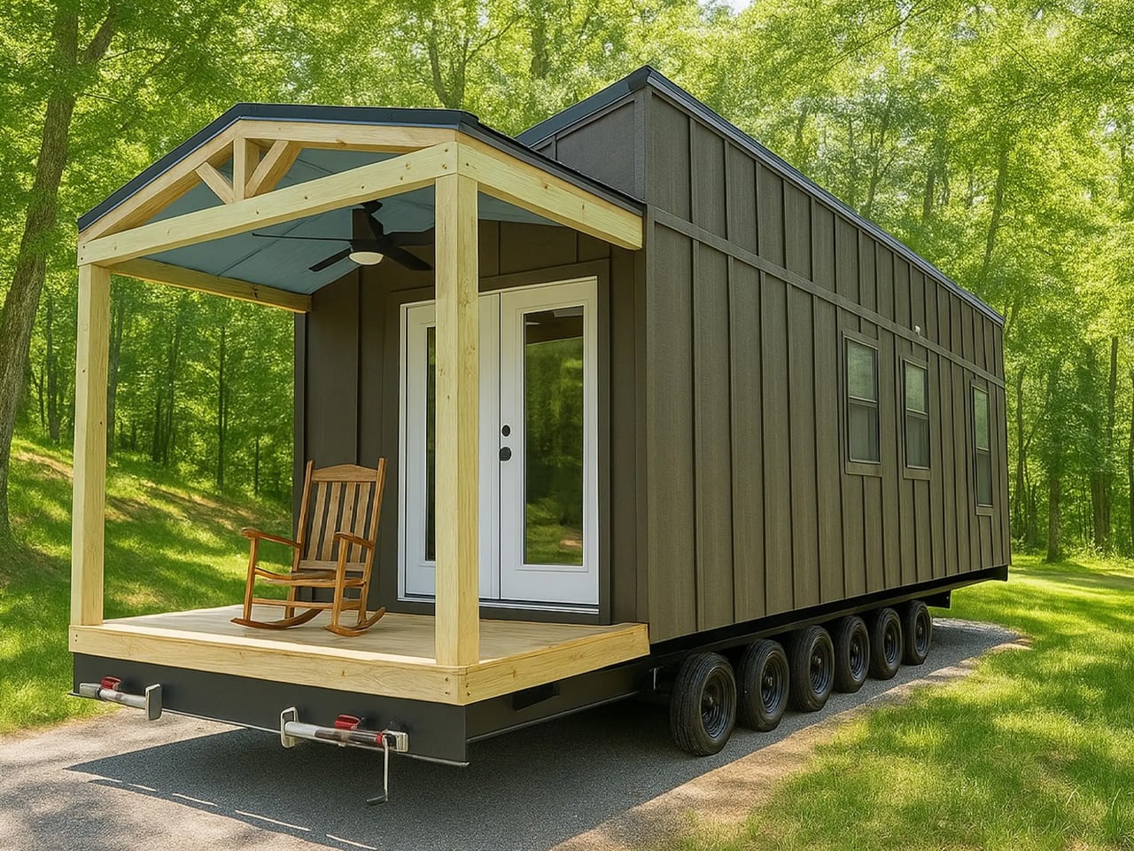
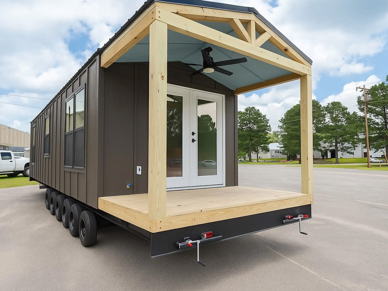
The Rowan Tiny Home is the latest offering from Tiny House Listings, and it takes a fresh attitude to small-space living. At first glance, it’s the clarity of its single-level layout and the inviting front porch that set the tone. The house stretches 34 feet in length and is slightly wider than most, measuring 10 feet across, which immediately gives the interior a more open and relaxed feel. Finished in engineered wood with a durable metal roof, the Rowan balances minimalist lines with a sense of solidity and comfort that’s rare among park model tiny homes.
The interior experience of the home is all about spaciousness and thoughtful functionality. The 340-square-foot interior unfolds in a way that feels purposeful and uncluttered, with each zone flowing effortlessly into the next. The living room greets you first—bright, comfortable, and anchored by a sofa and built-in cabinetry, it’s a space that easily accommodates lounging, conversation, or a quiet evening with a book. Natural light pours in from generous windows, reinforcing the home’s sense of calm and connection to its surroundings.
The kitchen serves as the center of the home, and it is designed with everyday living in mind. There’s an induction cooktop, plenty of counter space, and room for additional appliances—unusual flexibility for a home of this size. Storage is handled with efficiency, with clever cabinetry and nooks that keep everything close at hand but out of sight. The dining area, just steps away, makes the most of the open plan, creating a seamless transition between meal prep, dining, and relaxation.
The bedroom is quite impressive, amped with a full double bed and built-in closet that offer comfort and practicality, while the single-level design means there’s no need for ladders or lofts. Ample headroom and easy circulation make this space feel like a true retreat, rather than a compromise. The bathroom, too, is generously sized for a tiny home, with a modern shower, vanity, and enough space to move around without feeling boxed in. Every detail has been chosen to support full-time living, from the fixtures to the layout.
One of Rowan’s strongest assets is its versatility. The covered front porch extends the living space outdoors, perfect for morning coffee or evening relaxation. The Rowan functions well as a primary residence or a weekend escape; its proportions and features adapt easily to different lifestyles. It’s a home that encourages you to slow down, focus on essentials, and enjoy the daily rituals of living.
The design language throughout is minimalist but never cold, with subtle Scandinavian influences that emphasize light, warmth, and natural materials. There’s a sense of permanence here—the Rowan isn’t just about squeezing life into a smaller footprint, but about expanding what’s possible in a compact home. It challenges assumptions about tiny living, offering an experience that feels grounded, comfortable, and genuinely livable.
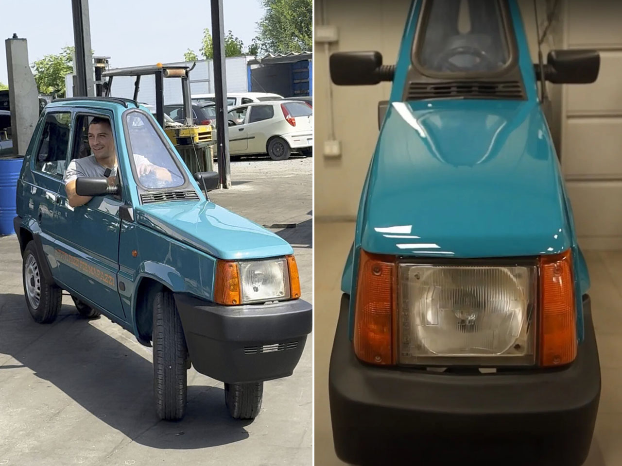
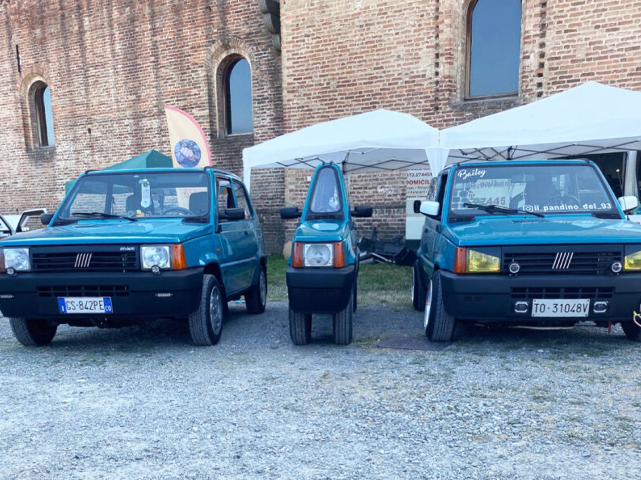
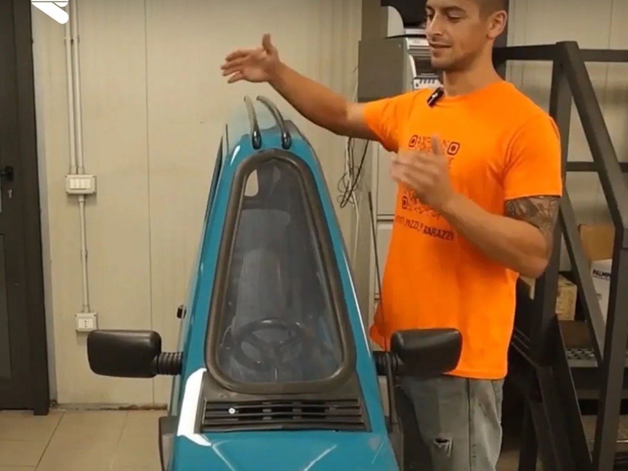
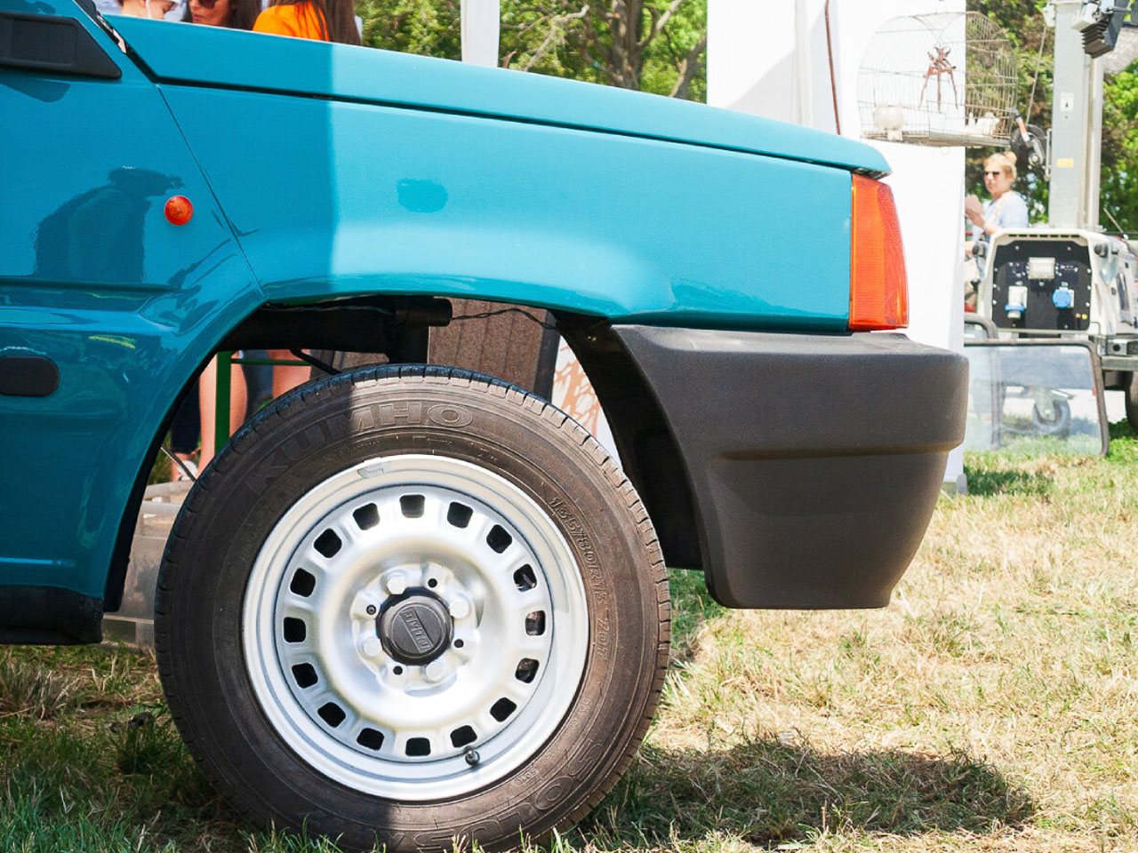
Classic cars often become platforms for bold customization, but few reimaginings are as visually striking (or ugly, I have to admit) as this one. Italian mechanic Andrea Marazzi has transformed a 1993 Fiat Panda into what is now being described as the world’s narrowest functioning car. At just 19.6 inches wide, the one-seater electric vehicle looks more like a cartoon sketch brought to life than a road-ready hatchback. Yet it can move, steer, stop, and drive like any other car. That said, I would never imagine myself driving this one-eyed Cyclops in this lifetime.
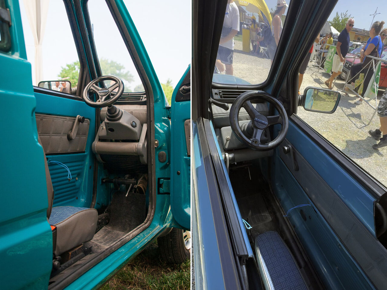
Marazzi, who works at his family’s scrapyard and mechanical workshop in Bagnolo Cremasco, spent over a year building the vehicle as a tribute to the original Fiat Panda. Nearly every original part of the 1993 car has been reused in the process—doors, lights, roof, and wheels—but the body has been split vertically and rebuilt to shrink the vehicle’s width down to a comically slim profile. What was once a compact city car is now a sculptural slice of steel with just enough room to accommodate a single person, seated at the exact center.
Powering this narrow Panda is a small electric motor borrowed from an e-scooter, paired with a 24V battery that gives the car a modest top speed of about 15 kilometers per hour and a driving range of approximately 25 kilometers. It’s not built for real-world commuting, nor is it legally road-registered. But it functions exactly as a basic car should: offering forward and reverse drive, braking, turning, and a working headlight and turn signals. While Marazzi originally created it as a showpiece, the vehicle is fully operational and was recently driven in public at an enthusiast gathering in Pandino, Italy.
The car made its debut at “Panda a Pandino,” a festival celebrating 45 years of the Fiat Panda. Surrounded by thousands of conventionally sized Pandas, Marazzi’s single-seater stood out immediately. Videos and images from the event quickly went viral online, leaving viewers fascinated by its proportions and mobility. Many were amused by how the Panda looks almost flattened, as if it had been squeezed into a 2D shape while retaining its ability to move. Others praised the engineering behind it, describing it as a brilliant blend of creativity, nostalgia, and humor.
Though it’s not street-legal, Marazzi is in the process of submitting the car for a Guinness World Record as the slimmest functioning vehicle ever made. At just a third of the width of the original Fiat Panda, it’s an extreme but fascinating reinterpretation of automotive form. More art installation than transport solution, the narrow Panda invites viewers to rethink proportions, functionality, and playfulness in mechanical design. It’s a rolling experiment—part engineering challenge, part tribute, and part public spectacle.
Few cinematic antiheros have captured our collective techno-anxiety quite like the T-800 Terminator. That chrome skull with piercing red eyes has haunted our dreams since 1984 when Arnold first uttered those now-legendary words: “I’ll be back.” Four decades later, the endoskeleton design remains a masterclass in mechanical menace, a perfect fusion of human anatomy and cold machine precision. The exposed pistons, hydraulic jaw detail, and that unwavering death stare somehow manage to be both familiar and utterly alien. James Cameron’s creation tapped into something primal about our relationship with technology – the fear that one day our creations might look back at us with those same emotionless eyes.
Now that iconic design has found a brilliantly practical new purpose on your desktop. Someone has finally answered the question nobody thought to ask: what if the relentless killing machine from the future could hold your Sennheisers? The result is this meticulously crafted 3D-printed Terminator Endoskeleton Headphone Stand, and I’m absolutely here for this unexpected fusion of 80s sci-fi nostalgia and modern desktop organization. Standing at approximately 8.5 inches tall, this menacing little skull transforms the mundane act of storing your headphones into something with far more cult weight than your minimalist wood or metal stand. Etsy seller by the name of ‘ProperCrafts’ offers it in two finishes, and judging by the photos, both capture the weathered metallic sheen that made the original so compelling.
The true showstopper here is undoubtedly the glowing red LED eyes, powered via USB. They cast an ominous glow across your desk that hits the perfect balance between practical lighting and nostalgic fan service. The lights activate when plugged in, bathing your workspace in that signature Skynet red that instantly communicates “cybernetic organism” rather than “plastic headphone stand.” This feature transforms what could have been a simple novelty into something genuinely atmospheric. The wiring is cleverly concealed within the stand itself, maintaining the clean aesthetic while providing that essential touch of authenticity.
The side of the cranium features detailed mechanical elements that would make Industrial Light & Magic’s original model makers nod in approval. Even the base has been thoughtfully designed with enough stability to prevent toppling when supporting even the heaviest audiophile-grade headphones.
For the 3D printing enthusiasts looking to take this piece to the next level, an acetone bath can smooth out the visible layer lines for an even more screen-accurate finish. Fair warning, though: this finishing technique requires significant experience with 3D printing materials and can easily ruin the entire piece if performed incorrectly. The standard finish looks fantastic out of the box, so novices should resist the urge to experiment unless they’re comfortable potentially sacrificing their new cybernetic desktop companion to the gods of DIY finishing. A little masking, a little spray paint, and you can actually turn this plastic piece into a shimmering chrome skull that should have the average mother fervently whispering “Santa Maria” every time she enters your room.
While modern CGI has given us more elaborate killer robots, nothing has quite replaced the primal fear of that chrome skull with glowing red eyes. Priced between $121-151 depending on finish options, it’s on the expensive side for sure, but feels reasonable once you consider that it also serves as a detailed movie prop with a fair bit of functionality (just like this Sauron headphone stand). For anyone who grew up watching the Terminator films or simply appreciates retrofuturistic design, this headphone stand delivers both nostalgia and utility in equal measure. Your headphones finally have a resting place worthy of Judgment Day.
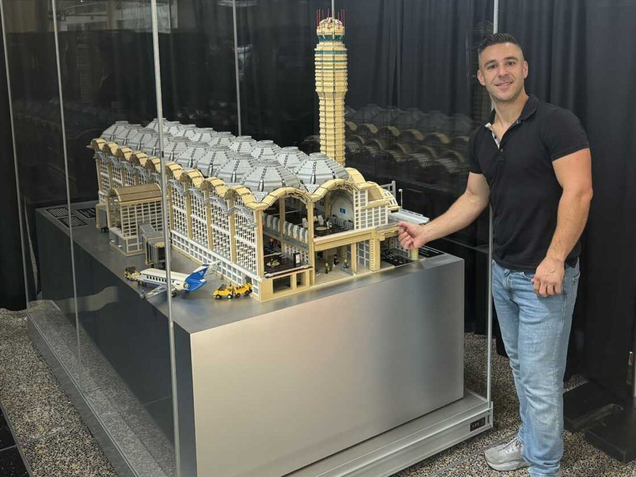
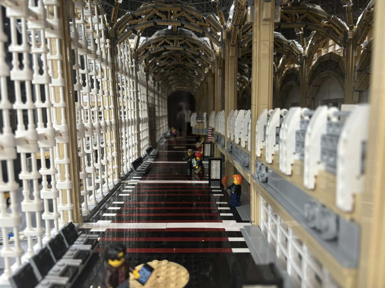
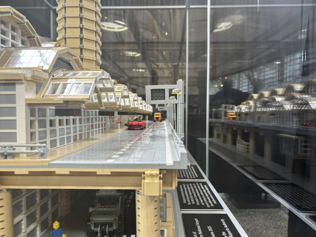
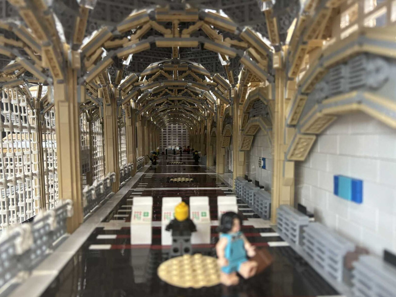
LEGO creations have long blurred the line between toy and art, with builders recreating everything from classic cars to full-scale architectural icons. For Richard Paules, it was a childhood passion that turned into an extraordinary pursuit of miniature realism. After winning attention for his detailed LEGO model of Dulles International Airport, Paules has now unveiled his most ambitious build yet: a stunning replica of Ronald Reagan Washington National Airport, constructed from approximately 150,000 LEGO bricks.
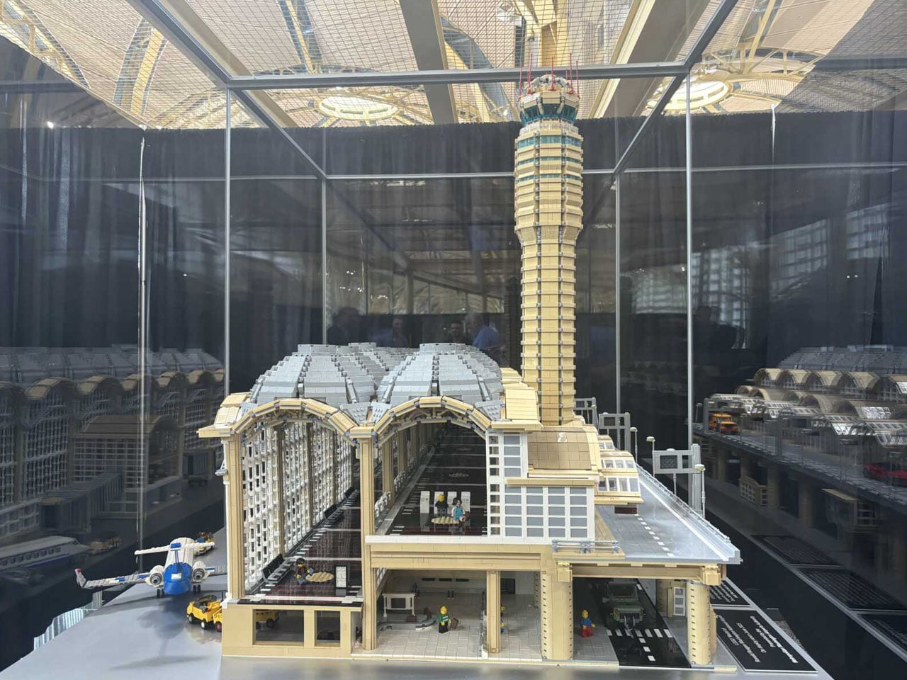
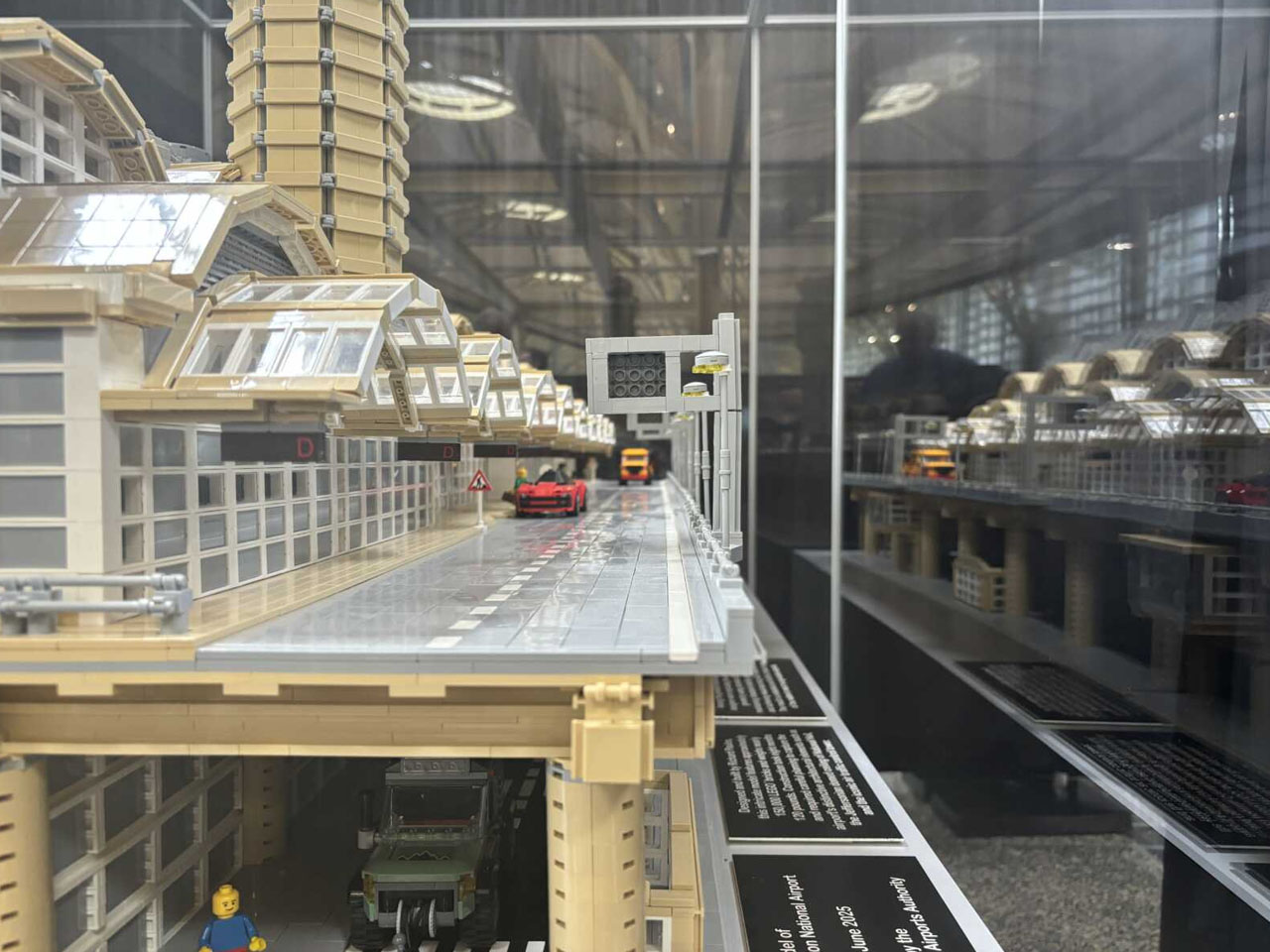
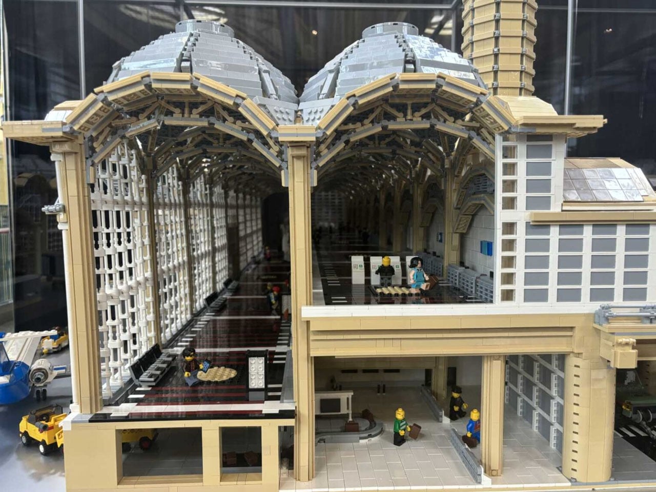
The massive model is set to go on display in the ticketing area of Terminal 2 next week, just before the TSA checkpoint. Weighing nearly 120 pounds, the replica showcases the airport’s unique architecture, from the domed ceilings and expansive skylights to the multi-level arrivals and departures layout. It even includes a realistic baggage claim area, gate seating, jet bridges, and signature airfield markings. Every detail, down to the exact floor patterning, has been meticulously replicated with plastic bricks.
Paules spent nine months designing and assembling the model, calling it the most challenging project he had ever undertaken. Compared to his previous Dulles build, this one pushed his skills further due to Reagan National’s complex structural features and curved rooflines. As a solo builder, Paules had to manage both the creative vision and the physical logistics, including how to transport such a large and fragile piece safely to the airport. The project, now complete, reflects not only his technical skill but his deep fascination with aviation and public spaces.
The Metropolitan Washington Airports Authority worked closely with Paules throughout the process, helping coordinate installation and display logistics. Airport staff were reportedly stunned by the model’s accuracy, with one operations manager noting how the LEGO version captured the character of the terminal almost perfectly. The model is currently hidden behind a curtain on the ticketing level between doors three and four, and will be unveiled to the public next Monday.
This installation continues a growing trend of using public art and interactive displays in transit hubs to enhance the traveler experience. Instead of rushing past generic hallways, passengers at Reagan National will now encounter an unexpected moment of creativity—one that offers both nostalgia and inspiration. The display also serves as a conversation piece for both aviation buffs and casual travelers, giving them a chance to appreciate the complexity of the airport in miniature.
Following the success of his Dulles model, Paules has again demonstrated how LEGO can transform familiar infrastructure into works of art. His Reagan National build is not just a tribute to architecture or transportation, it’s a celebration of patience, precision, and play. For many who pass through Terminal 2, this impressive creation will likely become an unexpected highlight of their journey. For LEGO enthusiasts, well… it’ll be another build to take inspiration from and come up with something equally stunning.
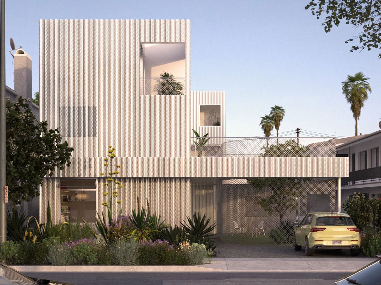
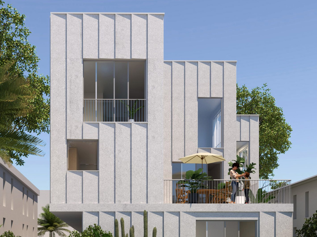
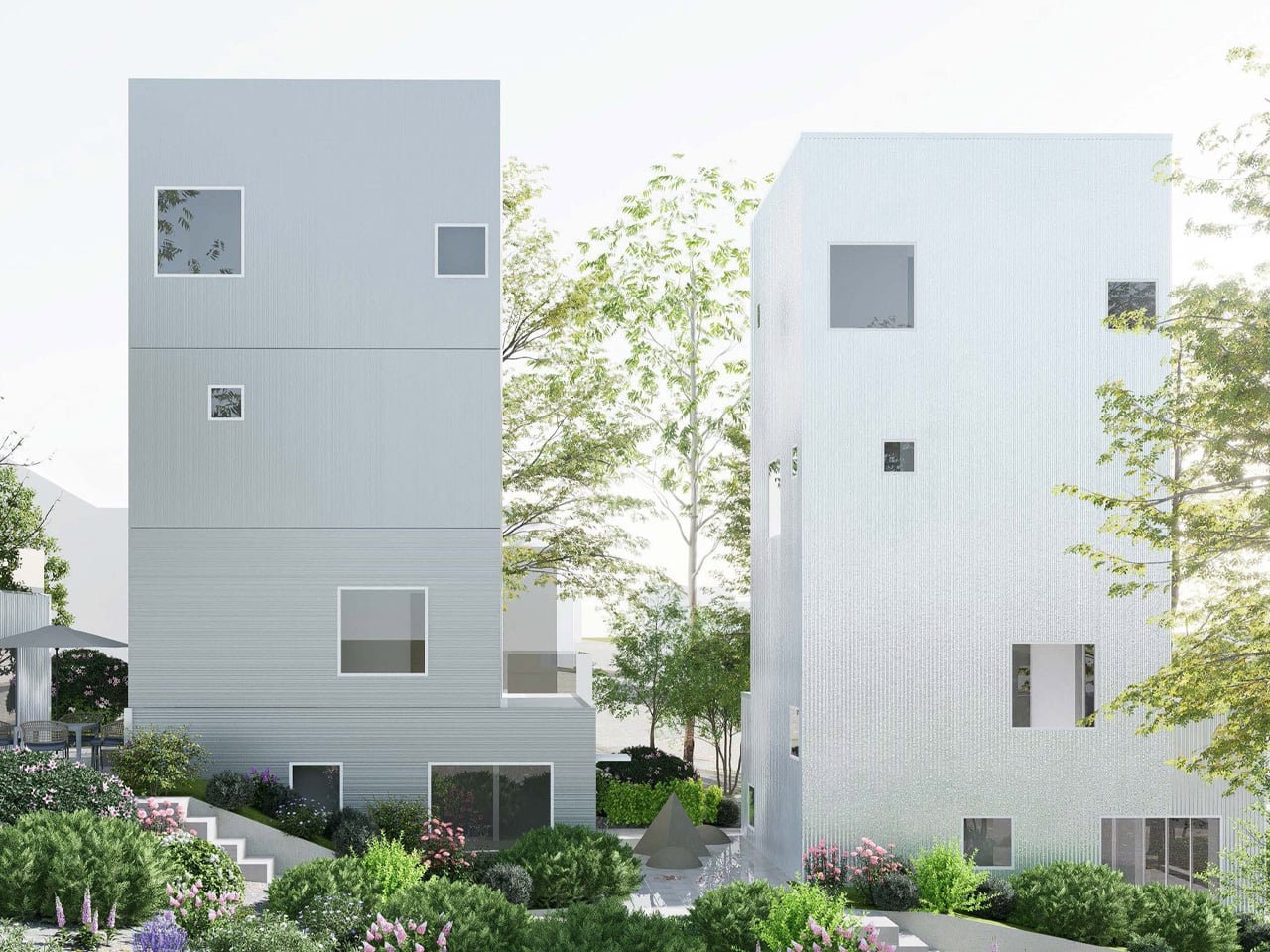
Los Angeles has long been at the epicenter of America’s housing crisis, with high costs and limited inventory making homeownership unaffordable for many. The multiple fires this year have also made the situation worse. This year, a new wave of optimism and hope arrived with the “Small Lots, Big Impacts” initiative, a collaboration between the City of Los Angeles, UCLA’s CityLab, and advocacy group LA4LA.
Their design competition invited architects to reimagine starter homes for city-owned small lots, challenging the notion that space is the primary barrier to affordable, family-friendly housing. The result is a collection of inventive, buildable homes that could reshape the city’s housing landscape. The competition was divided into two categories, “Gentle Density” and “Shared Future,” each encouraging creative approaches to maximize livability on minimal footprints.
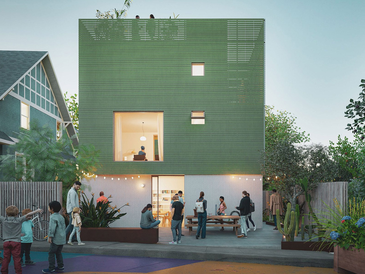
One of the entries is Shared Steps, designed by California architecture studios WORD and SSK. Responding to the challenges of infill development, the team devised a composition of stepped buildings that reads as a single, cohesive residential facade from the street. Behind this unified exterior, however, are three separate, three-storey buildings, each accompanied by its accessory dwelling unit (ADU).
Also in the Gentle Density category, Brooklyn-based studio Light and Air presented 4X4X4, a scheme that brings four three-level houses to a single lot, each with the capacity for ground-floor ADUs. The design uses precast concrete panels punctuated with generous cutouts, allowing for floor-to-ceiling glass and expansive terraces. These features cultivate an indoor-outdoor lifestyle that resonates with Los Angeles’ climate and culture, while the stacked format delivers the density required to make a real impact on housing availability.
Nationally recognized firms also made their mark on the competition. Olson Kundig’s entry envisions a “vertical neighbourhood,” using a scalable mass-timber structure clad with solar panels. This design weaves together three primary buildings with shared amenity spaces, and its modular units can be removed or reconfigured to carve out outdoor spaces as needed. The flexibility of this plan is particularly valuable in a city as dynamic and diverse as Los Angeles, offering the possibility for custom-tailored community spaces and a sustainable, adaptable housing model.
What ties these projects together is their blend of density, flexibility, and a deep sensitivity to context. Rather than imposing generic solutions, the designs respond to the unique qualities of Los Angeles’ neighborhoods and the economic realities of its residents. These refreshing and impressive concepts leverage small lots and innovative design strategies, and could help unlock thousands of new homes, making the dream of affordable homeownership and vibrant, walkable communities more attainable for all Angelenos.
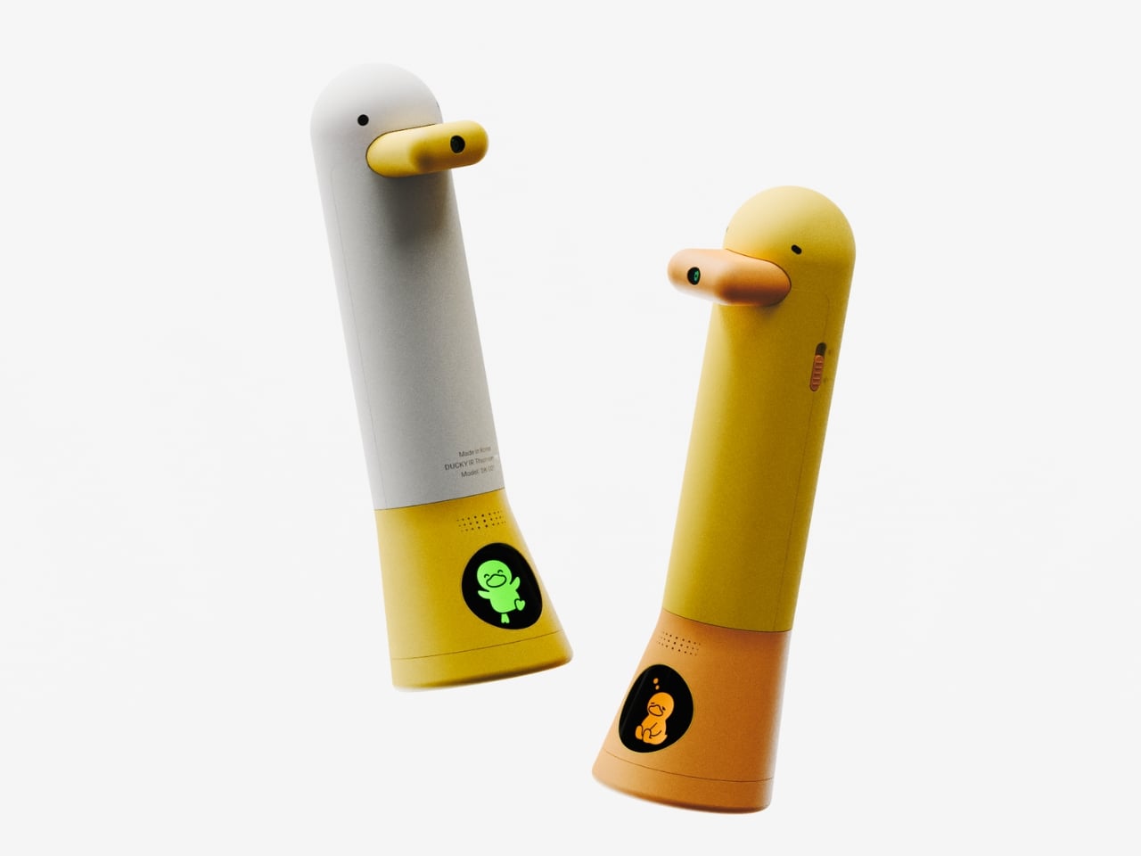
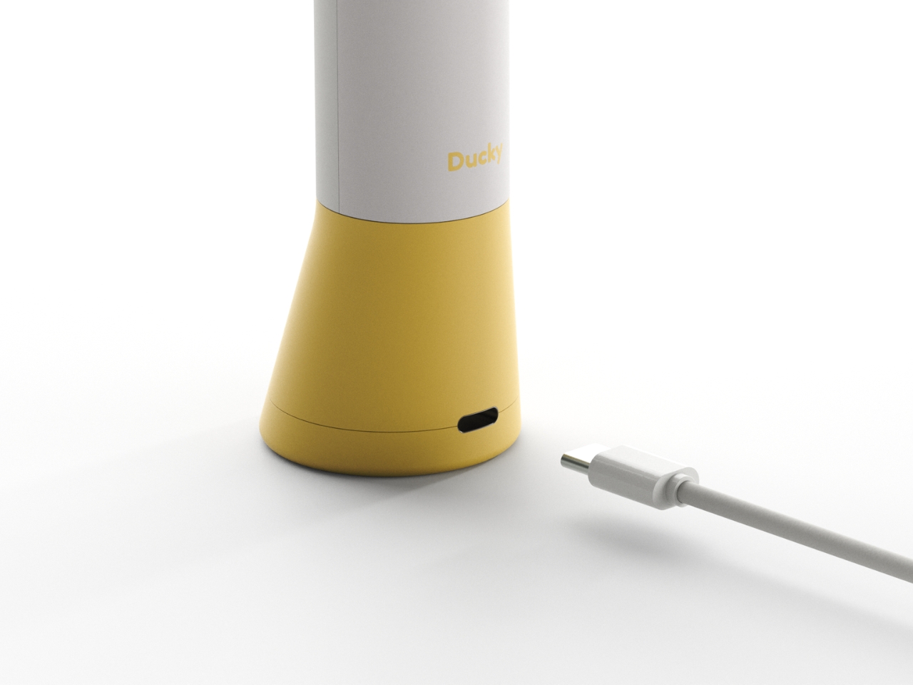
Now that you’re an adult, taking your temperature is no big deal—maybe even pretty routine. But if you think back to when you were a kid, it was sometimes more of a struggle with your parents, especially if you were really feeling under the weather. There aren’t any needles involved, but it can still be a scary experience for young children, particularly when they don’t understand what’s happening. But what if checking their temperature could be a bit more fun and playful?
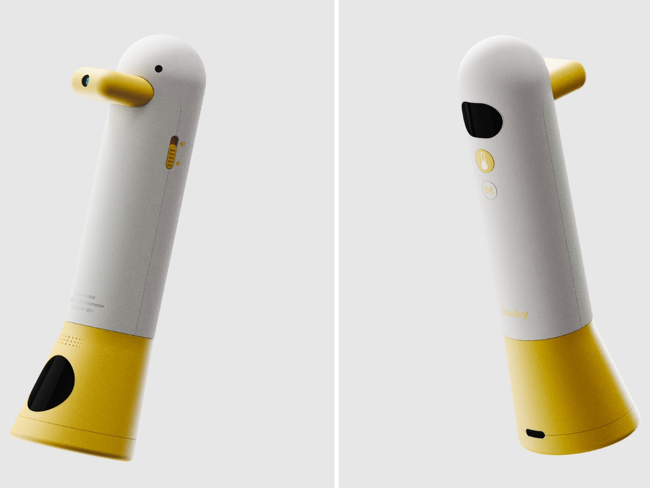
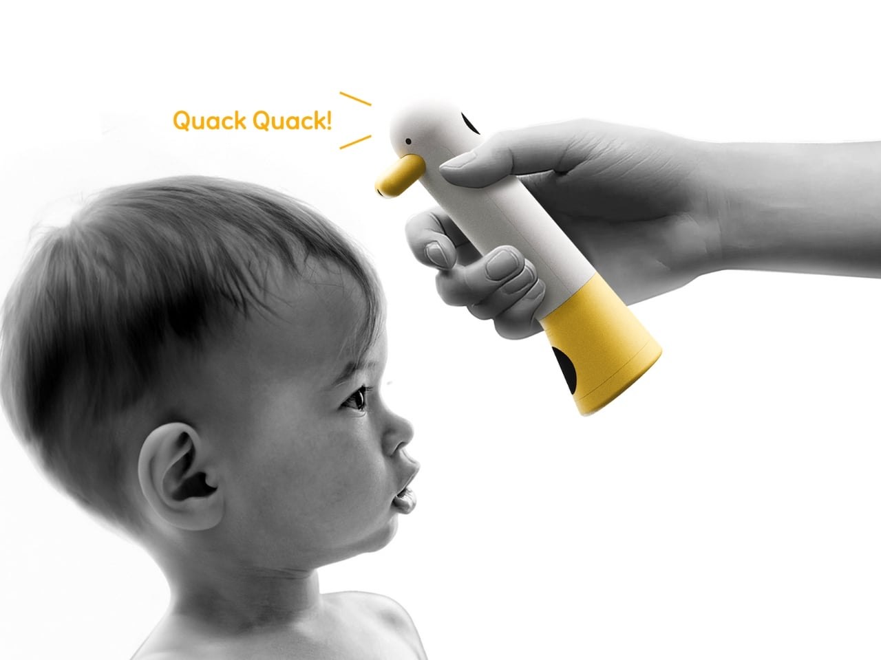
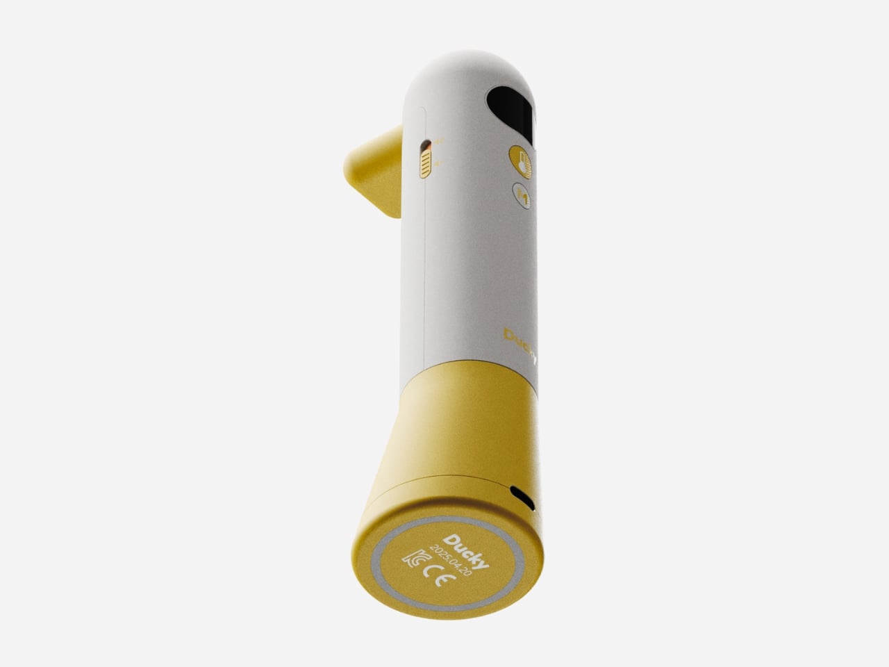
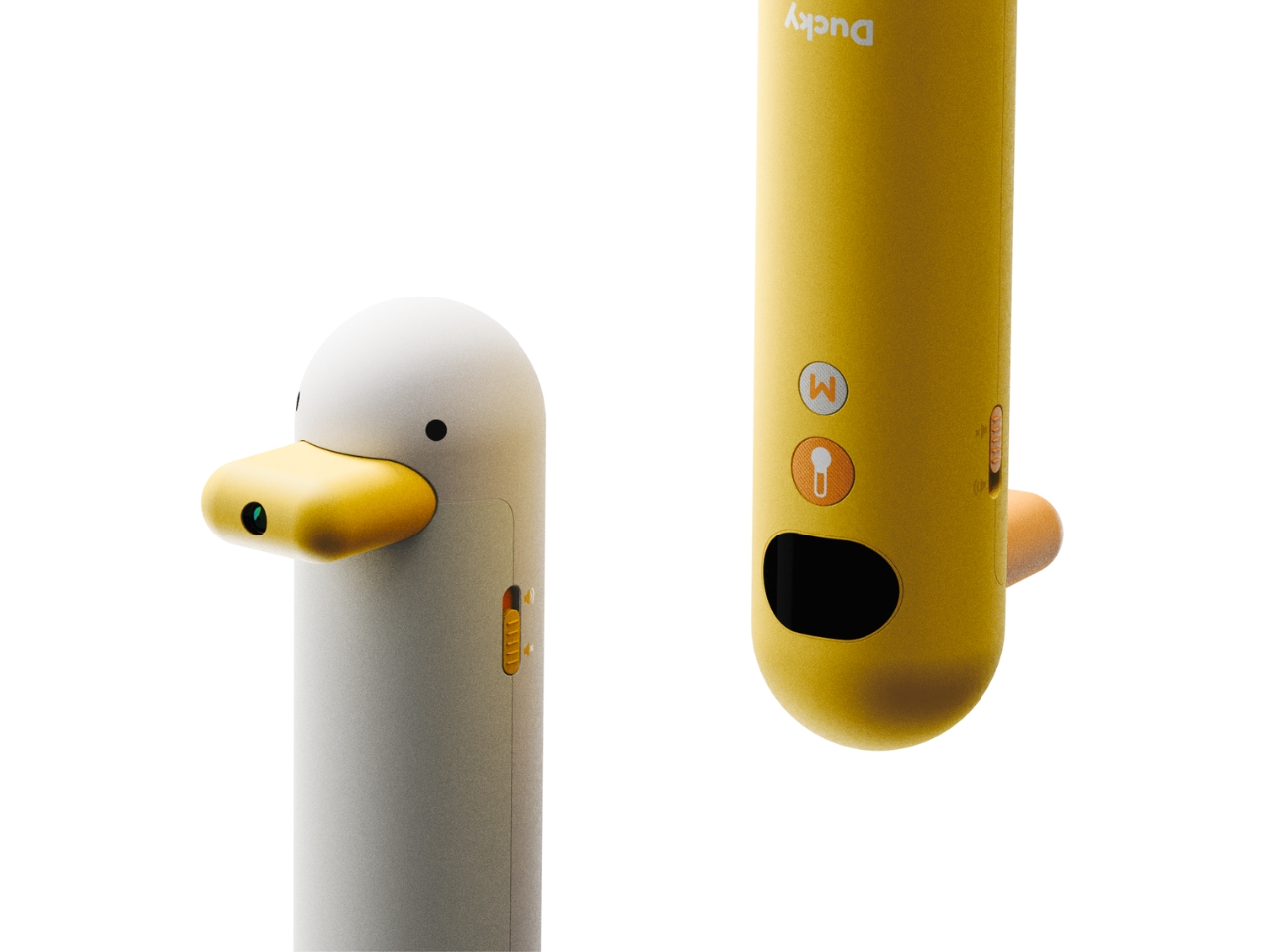
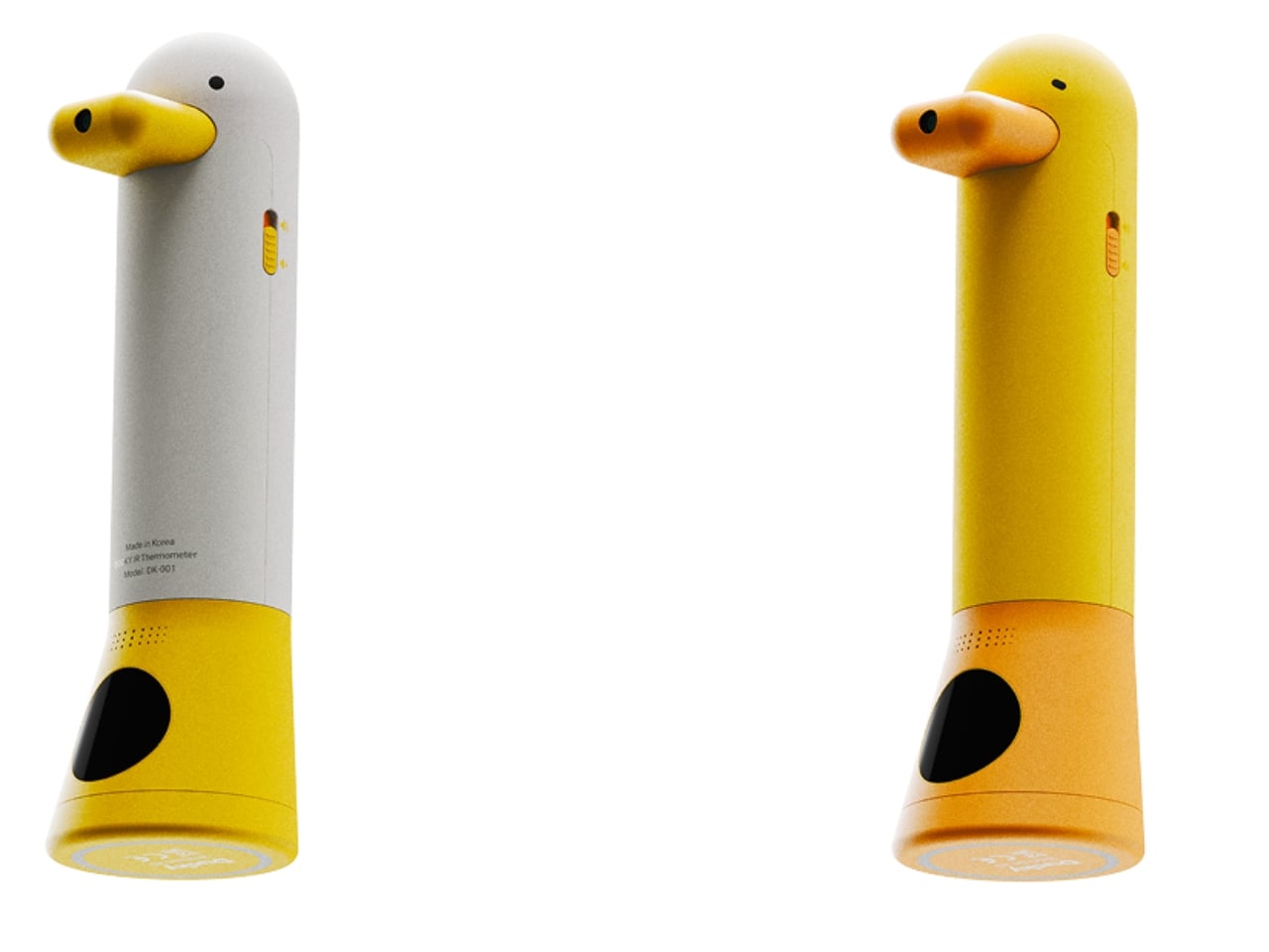
That’s the idea behind the Ducky Thermometer for Kids—a concept thermometer designed to bring comfort, safety, and a touch of fun to a child’s health routine. As its name suggests, it’s shaped like an adorable, friendly rubber ducky that helps put kids at ease by making them feel like they’re just playing. It can transform a potentially stressful moment into an engaging and playful interaction.
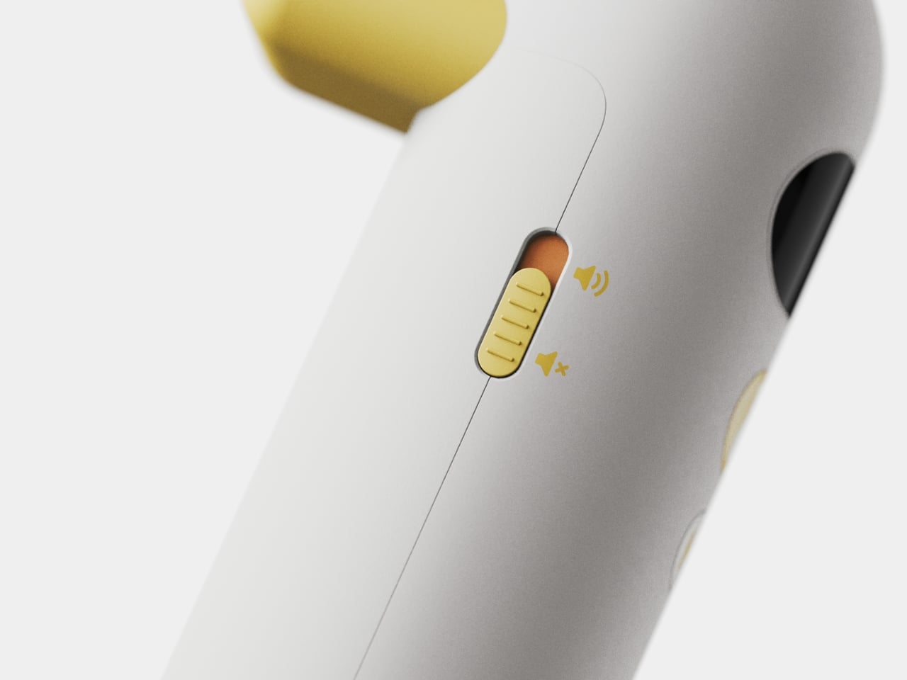
The ducky shape isn’t just adorable and inviting for kids—it’s thoughtfully designed to fit comfortably in small hands, allowing children to hold it themselves. This sense of involvement can help reduce anxiety, as kids feel more in control when they’re able to participate in the process, such as helping a parent position the thermometer on their forehead. To make the experience even more engaging, there’s a sound mode that can be adjusted with a slider, adding a playful touch to every temperature check.
What makes this thermometer even more unique is the display at the bottom of the duck, which shows the child their temperature—not with numbers, which might be confusing or intimidating—but with expressive ducky faces. There are three kinds of duckies to represent different temperature ranges: Active Ducky, with a smiling and happy look, represents a normal temperature; Resting Ducky, sitting down with a worried expression, appears if there’s a mild fever; and Sick Ducky, who looks unwell, shows up when the child has a high fever.
Although the product renders don’t show it, including a display for parents to view the exact temperature would be a valuable addition, as this information is essential for assessing and managing a child’s illness. Even so, small innovations like the Ducky Thermometer remind us that parenting doesn’t have to be all stress and worry. By blending playful design with practical functionality, Ducky turns everyday health checks into moments of comfort and connection—helping both parents and children feel a little more at ease, no matter what the day brings.
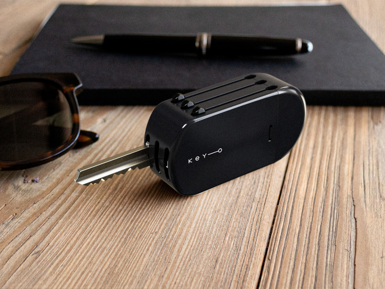
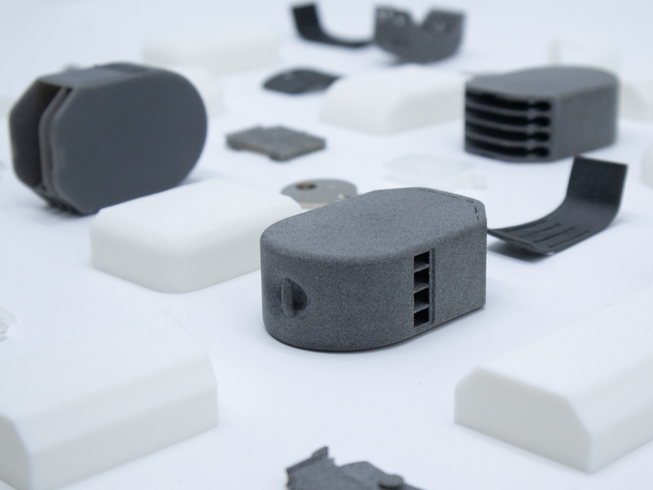
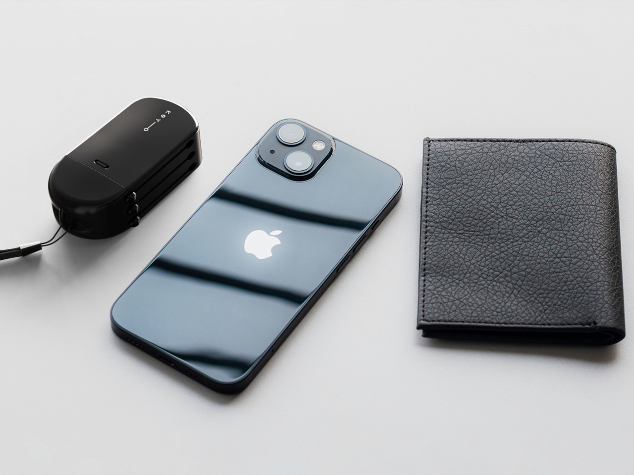
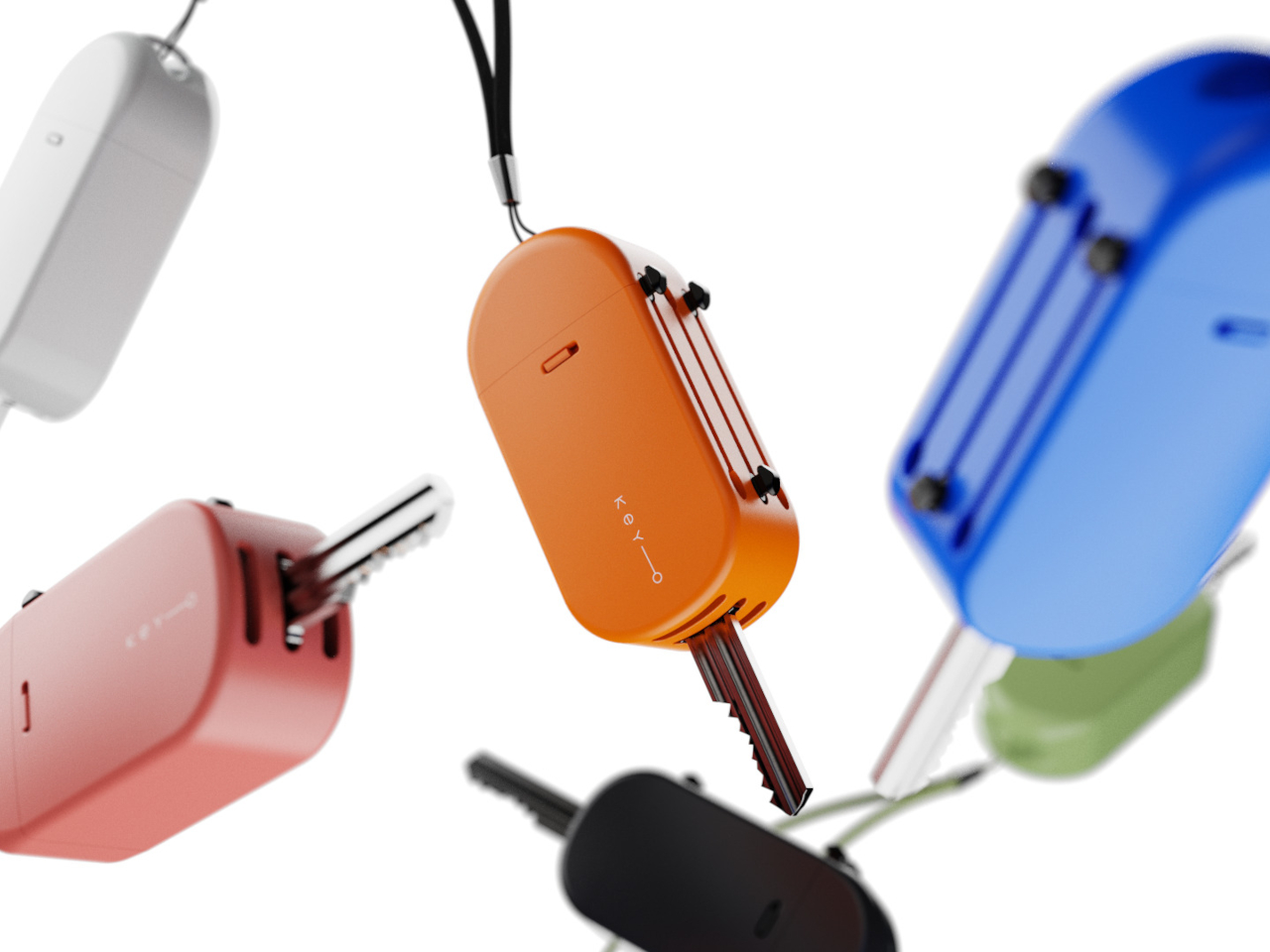
There is something oddly frustrating about fishing around for the right key while juggling a phone, bag, or coffee cup. Traditional key holders sometimes make things tidier, but they still leave you with a tangle of metal, mystery jingles, and the occasional scratch on your favorite gadget. The simple act of grabbing a key shouldn’t feel like a daily puzzle, yet for many of us, it somehow does.
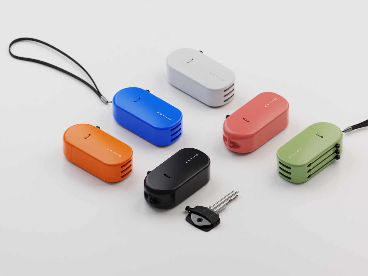
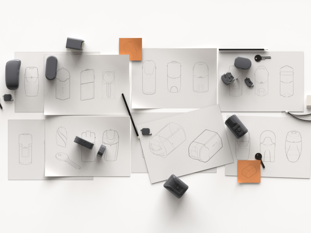
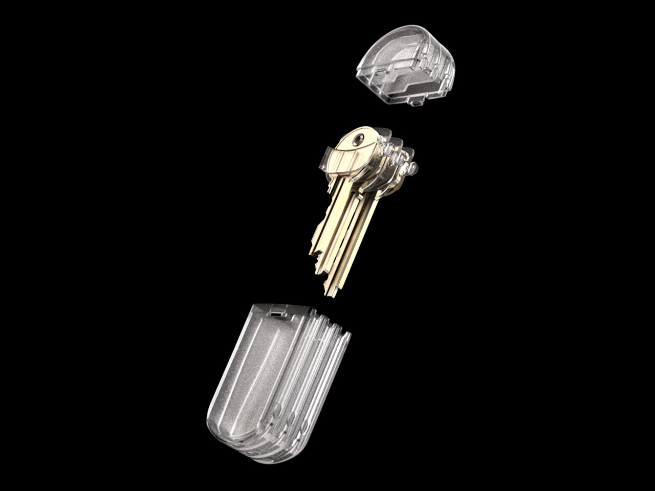
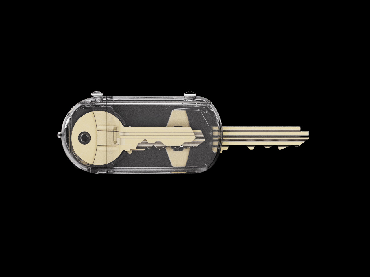
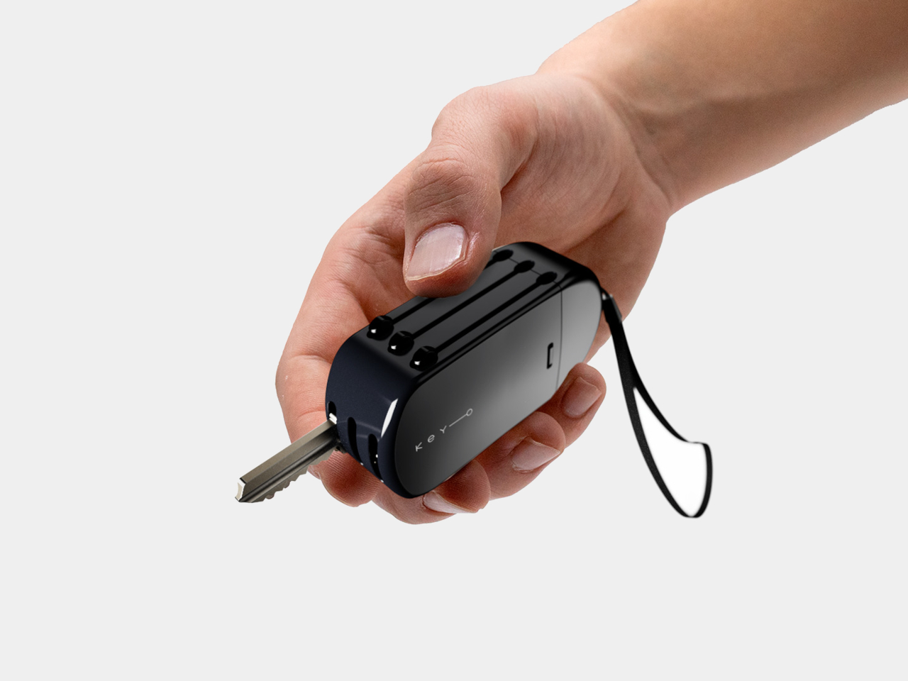
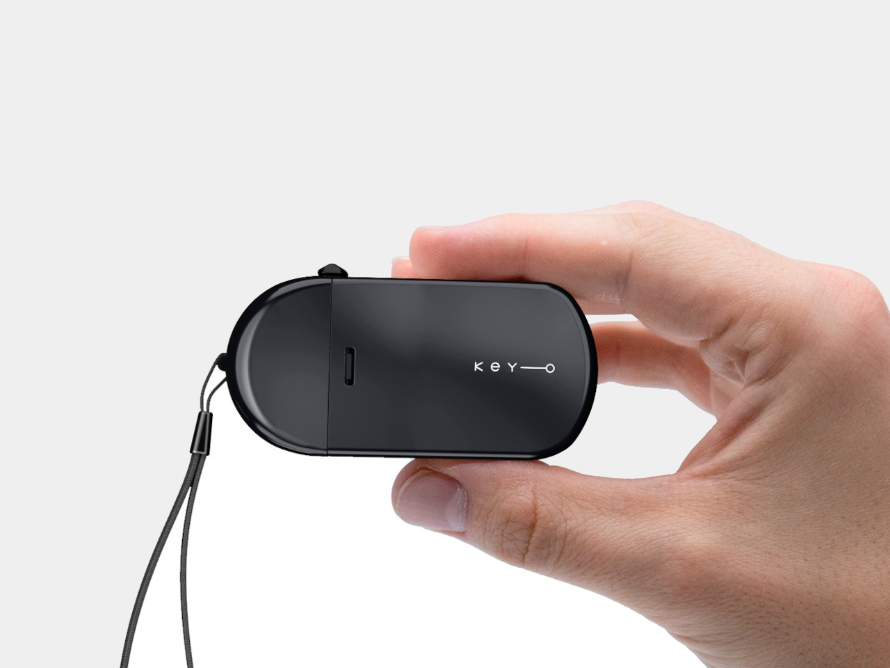
Key holders have existed for ages, but their designs rarely change. After all, keys are just keys, right? That’s why when an entrepreneur set out to rethink this small but stubborn daily problem, they partnered with a design team to create a truly clever alternative. The result is Keyo—a sleek, minimal organizer that borrows inspiration from those classic multi-cartridge pens you might remember from school.
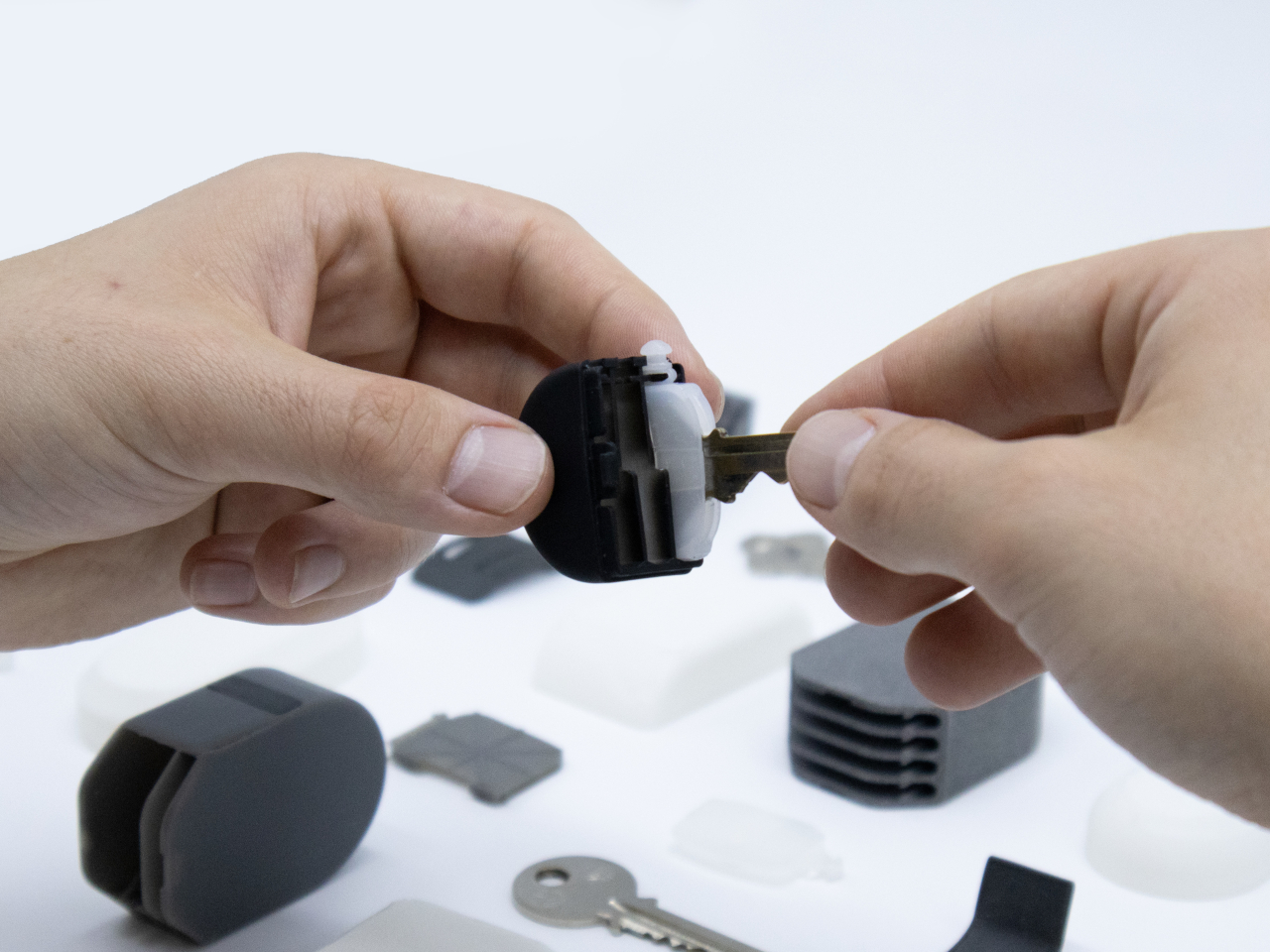
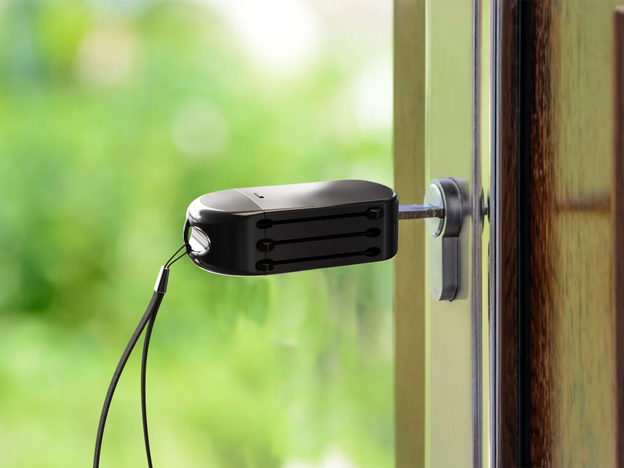
Keyo is compact, with a shape that feels natural in your hand or pocket. It’s designed to simplify one of those little interactions you repeat countless times a week. The hard plastic shell protects your keys from scratches and damage, while also keeping them from scratching anything else in your pocket or bag. It’s the kind of thoughtful upgrade that makes you wonder how you ever managed the old way.
The real fun comes with the sliding mechanism. With a satisfying click, you can deploy each of the three stored keys individually, so you always get the one you want, right when you need it. No more fumbling or flipping through a ring of lookalikes. This smooth action feels almost like using a fancy pen: one push, one key, and you’re set.
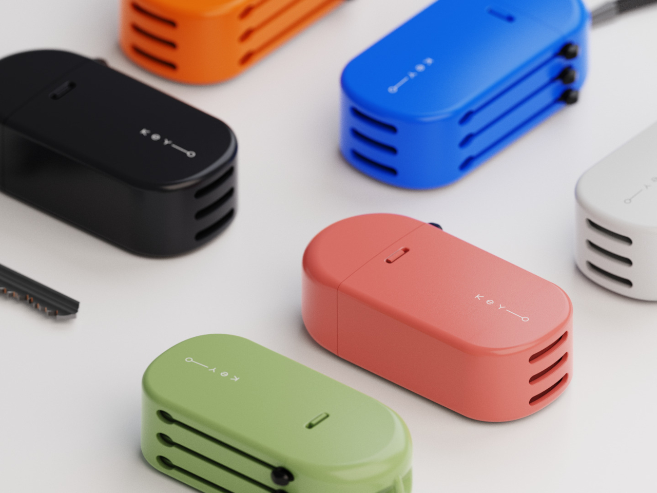
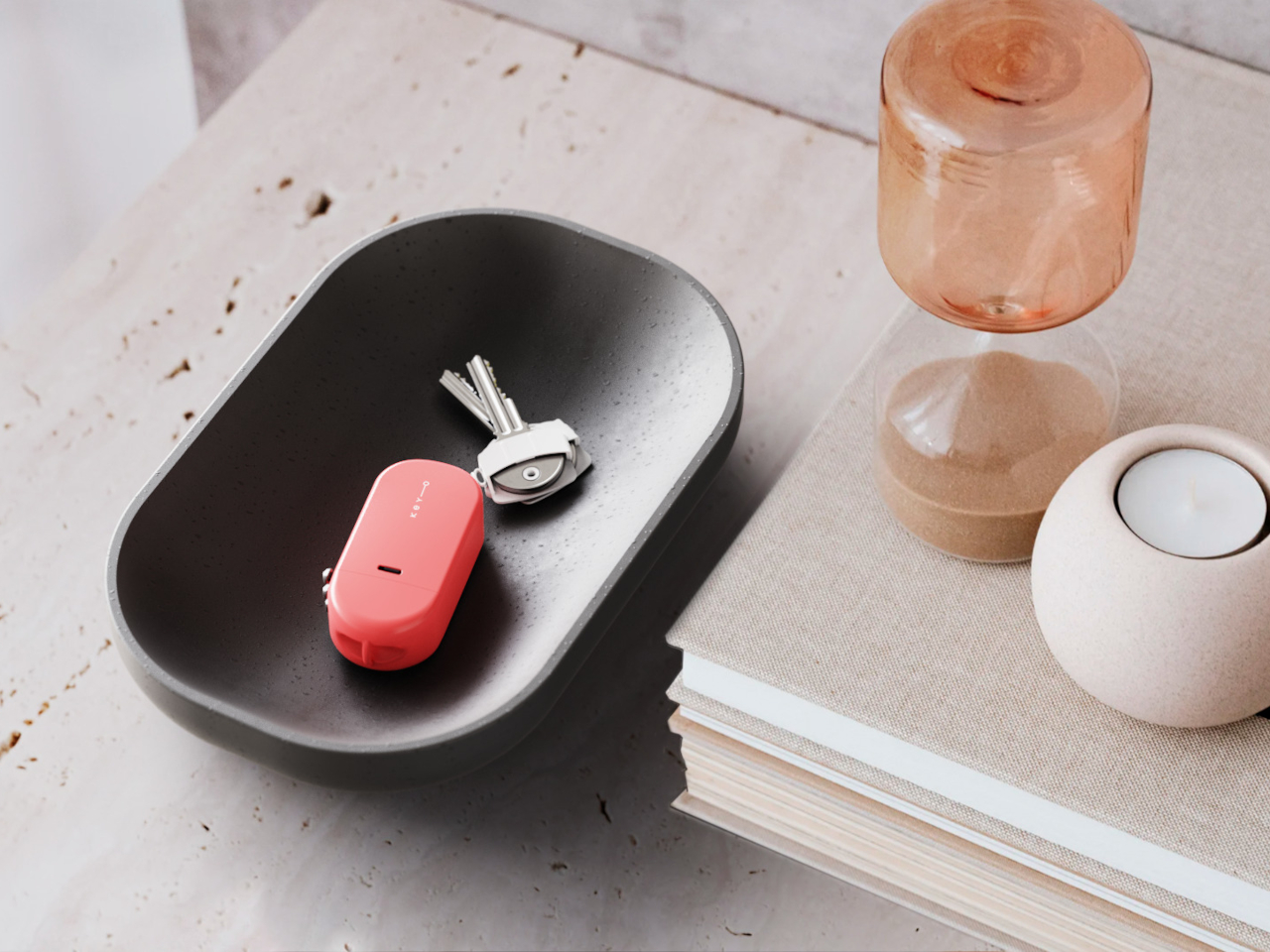
Keyo’s design also means less noise and less clutter. By housing everything inside a lightweight and durable shell, it cuts down on the jangling sound that follows most keychains. The body is available in several colors, making it easy to match your mood or style. Whether you prefer understated black or something a bit more playful, there’s a version for everyone.
Inside, the mechanism is designed to fit a wide variety of key shapes and sizes. The length of Keyo is carefully tuned to accommodate the most common key heads on the market, so you don’t need to order custom keys or make modifications. Just load them in and you’re ready to go, no fuss or extra trips to the hardware store required.
It’s the sort of concept that makes everyday life just a little smoother. With Keyo, searching for the right key becomes a thing of the past, replaced by a quick, intuitive motion that feels both familiar and refreshingly new. For anyone tired of the daily key shuffle, it’s a smart solution waiting to be brought into reality.
Remember the entire Oscars debacle when La La Land was accidentally announced as the Best Picture winner when the award actually belonged to Moonlight? Remember when the design of the announcement card leaked online and the entire internet agreed that the layout was RIDDLED with readability errors? Or maybe you remember the time a Citibank employee accidentally transferred $900 million to the creditors of Revlon instead of paying the actual $7.8 million? The review of the banking dashboard’s graphic design exposed how bad design is often MUCH costlier than good design, given the severe impact it can have on societies.
Cut to the year 2025, and to the world’s third-richest man’s wedding invite: Bezos is marrying his long-time girlfriend Lauren Sanchez in Venice, and a leak of the wedding invite just shows how little the world’s elite think about design in general. The card, which looks like it was pulled from an MS Word template in the 90s, has the least creative design I’ve seen as a 34-year-old man who’s attended enough weddings in his life to know what a good invite looks like. At YD, we usually credit the designers, but this might be the first time I’m choosing not to. Not because I don’t know who designed the card, but because this is one of those rare occasions where we talk about the ‘lack of design’ rather than the presence of it.
Image Credits: Jeff Bezos
It’s estimated that Bezos and Sanchez are spending around $56 million on their wedding (although rumors in December indicated ‘falsely’ at a $600 million spend). It’s safe to say that even with a conservative budget of 1/10th that amount, Bezos could put together a much better invite. So what’s wrong with the invite’s design? Let’s get a little technical.
We start with the most obvious lack of any actual information. Sure, Bezos has a lot of name recognition, but does it hurt to put your name on your own wedding invite? Maybe a date too? These seem much more crucial to the invite than perhaps a dress code, or even a location (considering Bezos apparently rented ‘most of Venice’ for the nuptials). The lack of any identifying information really steals the credibility of the invite. More so, the word ‘WEDDING’ seems to be missing from the entire text, too. Strange…
As for the graphical layout itself, it lacks any sort of character or panache. Text in the center, with haphazard stickers on the outside that look like they came in a free PNG pack. Gondolas, feathers, birds, butterflies, all hideously generic pieces of clip art that only an 8-year-old would use. Centrally aligned text in that italic font is difficult to read too, and with just the words UNESCO and CORILA in bold, it really undercuts what the invite is all about – a wedding. And sure, one could argue that a wedding invite hardly has the same impact as accidentally announcing the wrong winner at the Oscars, or sinking hundreds of millions of dollars because of human error… but it’s the attitude towards good design that’s the problem. Fix that and you fix culture.
But hey, the invite literally has the entire design community talking… and that’s what’s so horrendously powerful about bad design – or polarizing design too. It spreads like wildfire, doing a far better job than good design at acquiring more eyeballs. I assume that’s probably why Bezos’ Blue Origin rocket looks the way it does too…
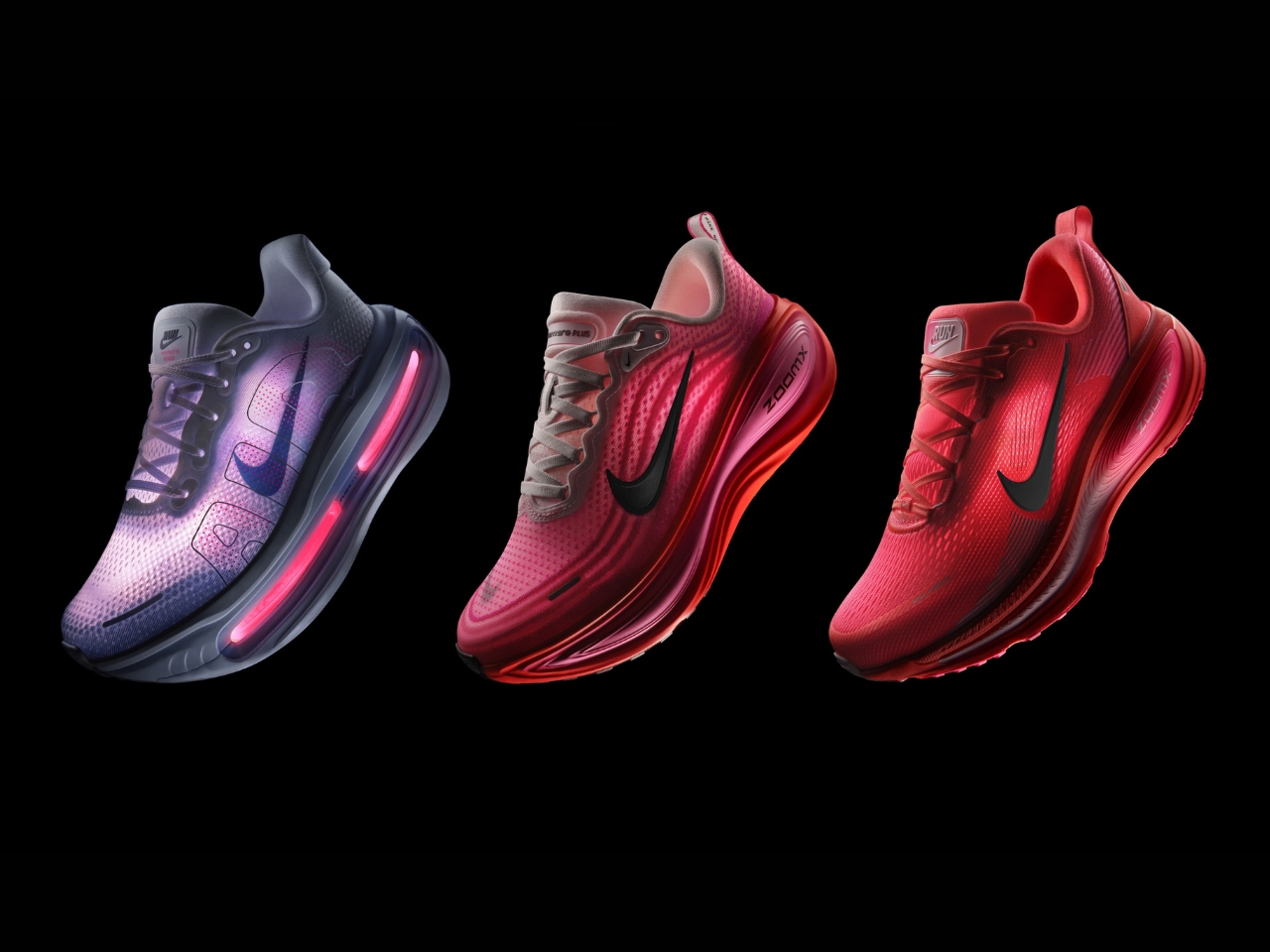
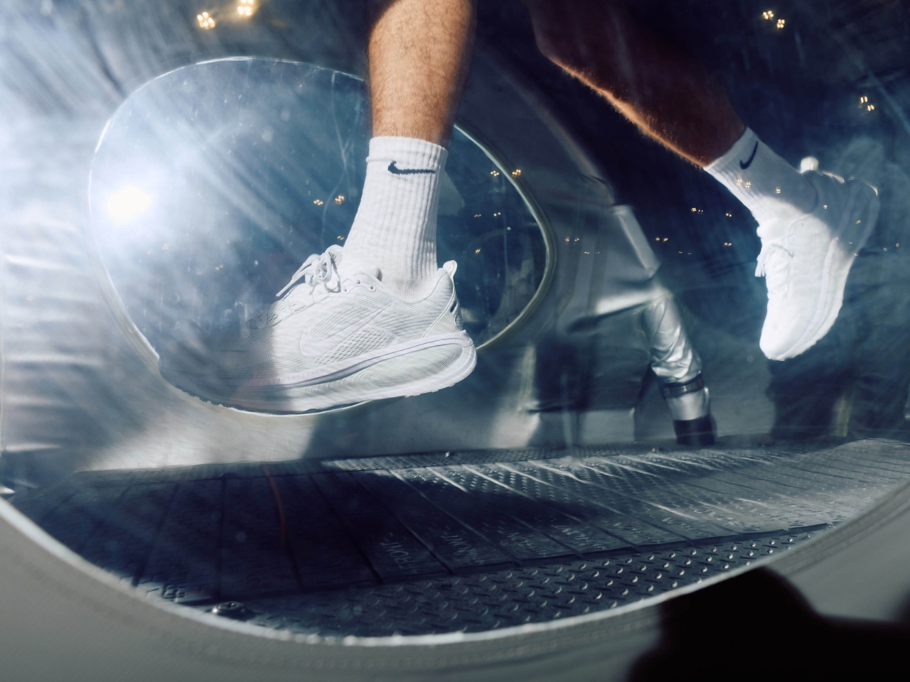
One of my goals for the rest of the year is to actually start the thing that I promised myself I would start at the beginning of 2025: running, or at least brisk walking. One of the problems that I faced before, when I was still doing that, was that I did not invest in good running shoes. The ones I used were either not that comfortable or would show wear and tear just a few weeks in. Nike has been recommended to me many times, and seeing that they will soon be releasing next-level sneakers may encourage me to finally invest in a pair.
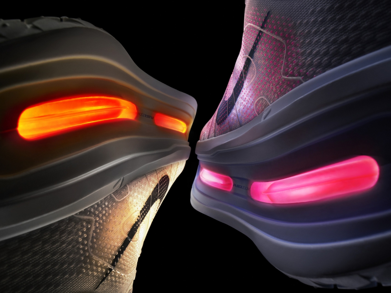
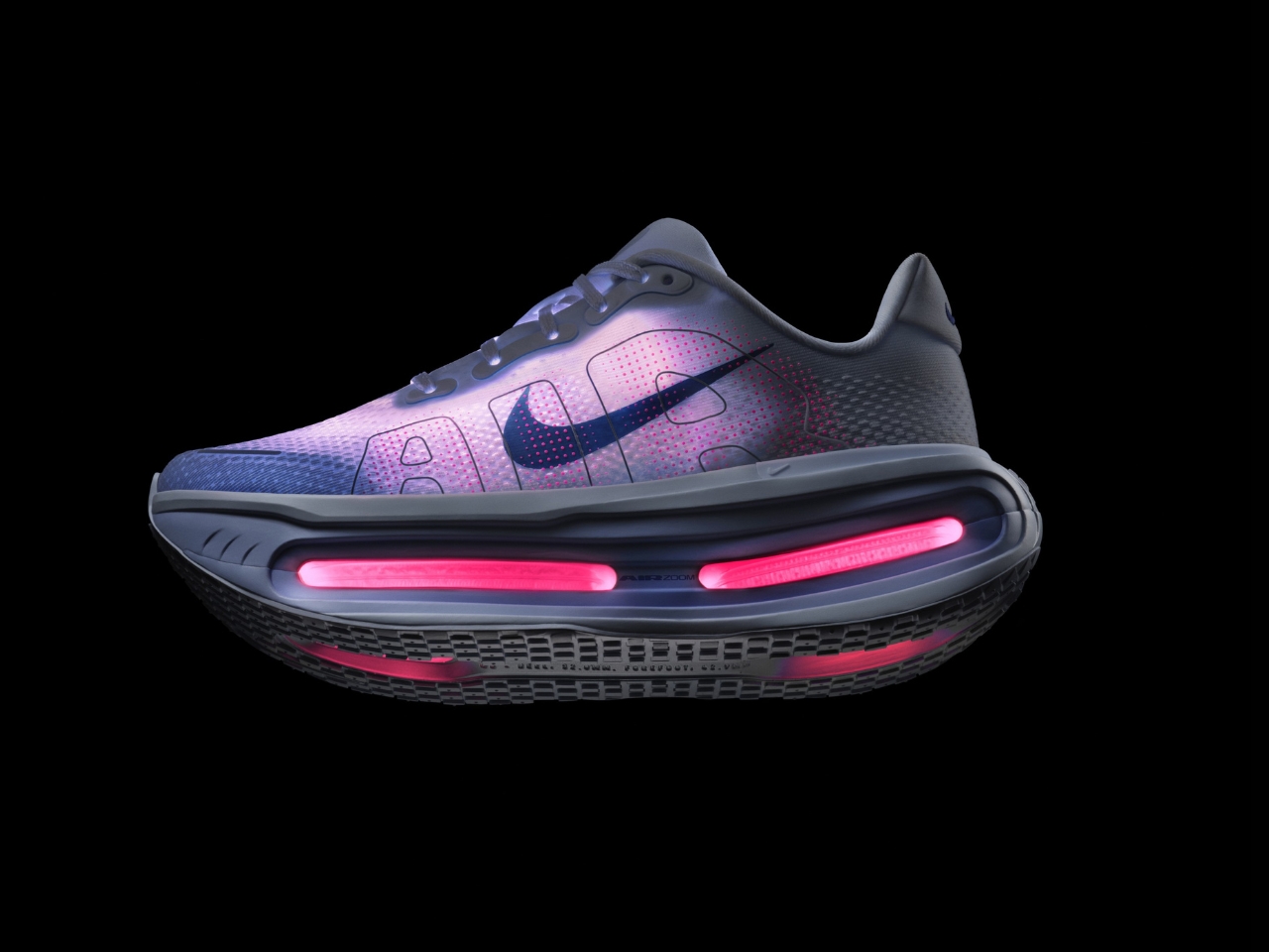
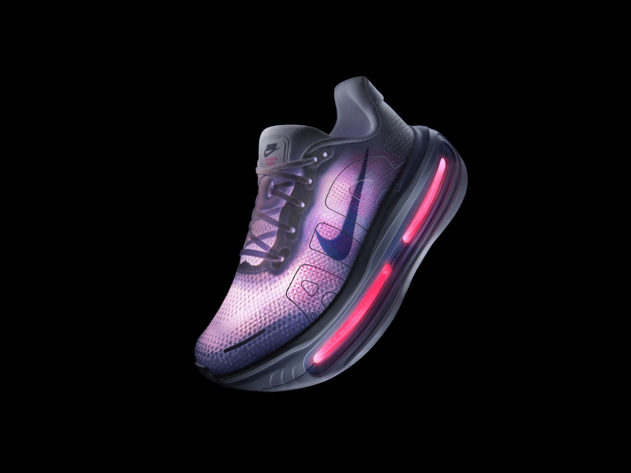
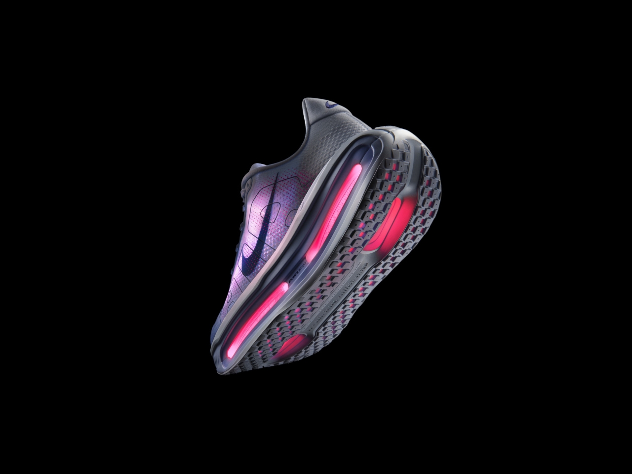
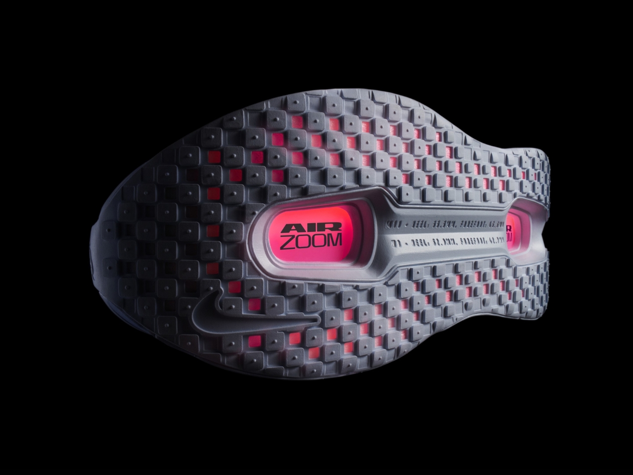
Nike has announced the next level of comfort and performance in running shoes with their Vomero Premium and Vomero Plus. These two new silhouettes build on the beloved Vomero line, a favorite among runners and casual wearers who crave plush cushioning and all-day support. Both are engineered to make running and walking easier on the body, highlighting their advanced midsole technology.
The Vomero Premium features the brand’s prized ZoomX foam, which is the same responsive, lightweight material used in their elite racing shoes. This provides a soft and bouncy feel when you’re running or walking, absorbing impact and returning energy. Each step feels lighter and won’t leave you with that heavy, tired feeling as your run goes on. It’s designed to meet the needs of elite marathon runners and is considered the ultimate recovery trainer. It has a plush 55-millimeter heel stack height and gives you maximum cushioning for those recovery miles as well as your easy runs.
The Vomero Plus, meanwhile, has the full ZoomX midsole, so you get an even softer, lighter, and more responsive ride. The silhouette comes with a 45-millimeter heel stack height and an evolved version of the most responsive foam, giving you around 85% energy return. It’s recommended for longer runs and for those who want to increase their mileage and get a comfortable recovery shoe. The Vomero Plus features a thoughtfully engineered midsole with increased rocker geometry and a wide platform, delivering an ultra-cushioned sensation while maintaining responsiveness and stability. Its upper is crafted from soft, stretchy engineered mesh, offering enhanced comfort around the collar and tongue. The high-abrasion rubber outsole ensures reliable traction for high-mileage runs.
Nike hasn’t skimped on the upper materials either. Both models sport engineered mesh uppers that hug your feet without feeling restrictive. The Premium version ups the ante with luxurious fabrics and thoughtful overlays that add structure while keeping things breathable. These shoes are designed to mold to your foot’s movements, reducing the chance of hot spots or discomfort on longer outings. While these shoes are engineered for running, their comfort and style make them perfect for everyday wear. The plush underfoot feel is gentle on joints, and the durable rubber outsole provides great traction whether you’re jogging on the pavement or strolling through the park. The Vomero Plus is set to release this August, while the Vomero Premium will be available by October.
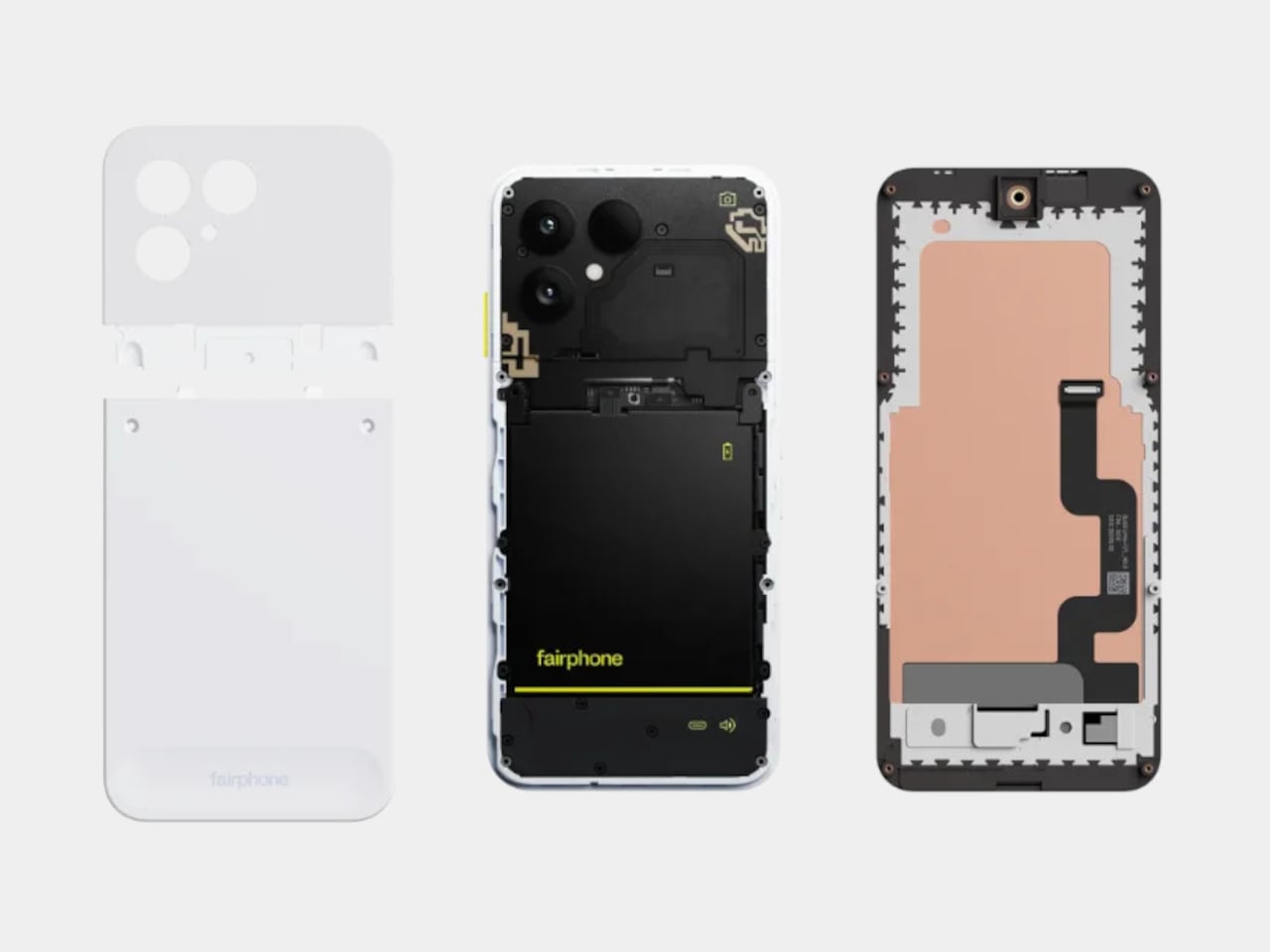
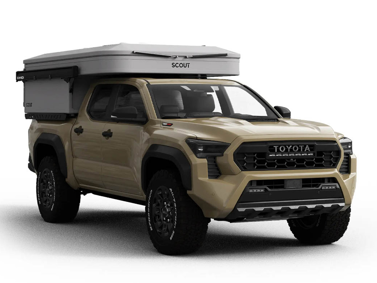
The Fairphone 6 arrives with a quiet confidence, carrying on the company’s mission to make smartphones that respect both the planet and the people who use them. At first glance, it might look like any other modern device, but every detail tells a different story. This phone is built for those who want more than just the latest specs. It is for anyone who values mindful design and practical longevity, right down to the smallest screw.
One of the most impressive aspects of the Fairphone 6 is the careful choice of materials. Recycled plastics form the backbone of the frame and back cover, while ethically sourced metals like Fairtrade gold and conflict-free tin and tungsten make up the internal circuitry. Even the battery is produced with responsibly sourced cobalt and lithium. By focusing on these thoughtful materials, Fairphone manages to shrink the environmental footprint of each phone, setting an industry example that others will hopefully follow.
Repairability has always been Fairphone’s hallmark, and the sixth generation stays true to those roots while adding a new layer of durability. The back plate and battery are both removable, not with a quick snap but with a few turns of a screwdriver. It is a subtle shift that gives the phone a more solid feel without locking out the user. If the battery ever fades or a component needs swapping, it is just a matter of unscrewing, replacing, and reassembling; no special tools or trips to a service center required.
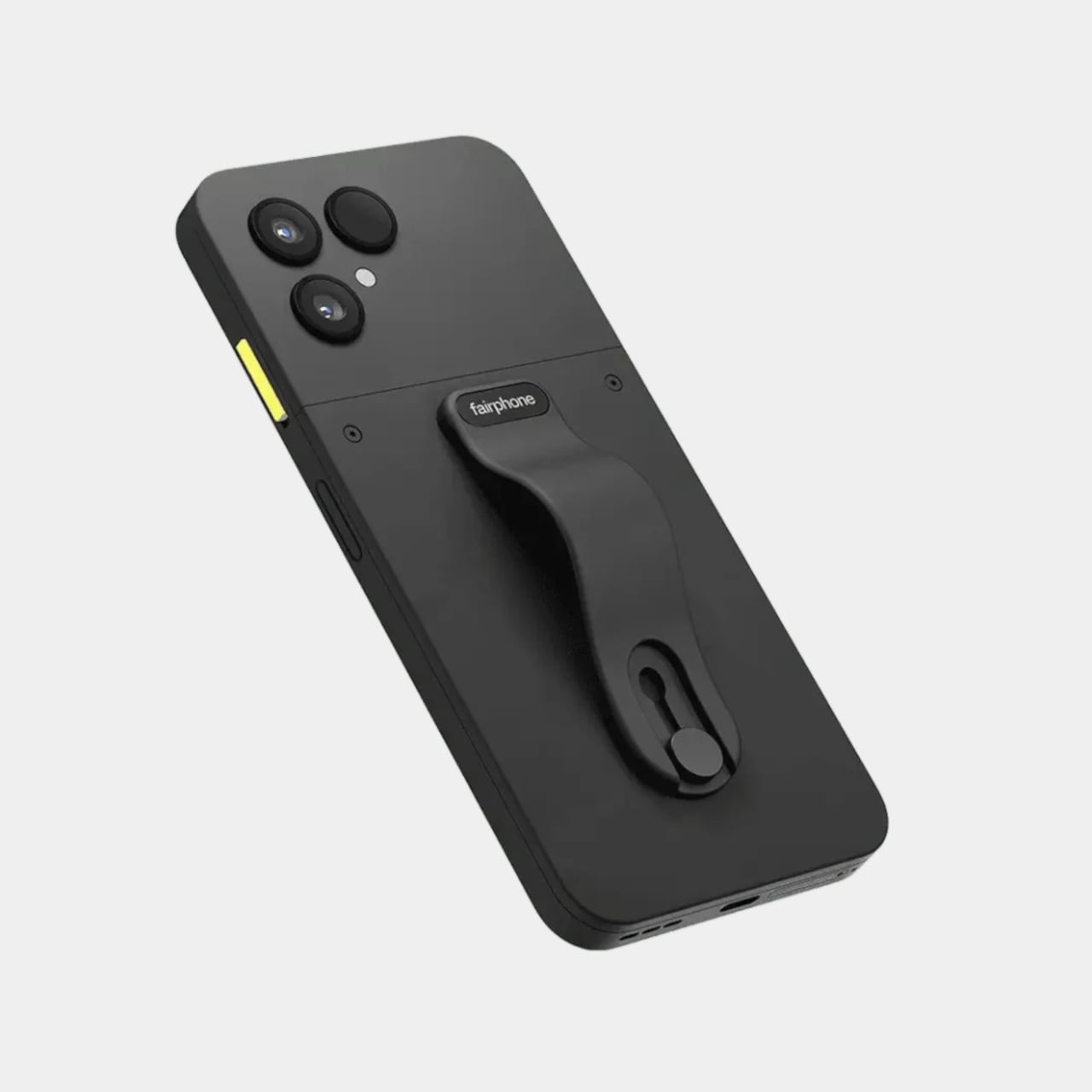
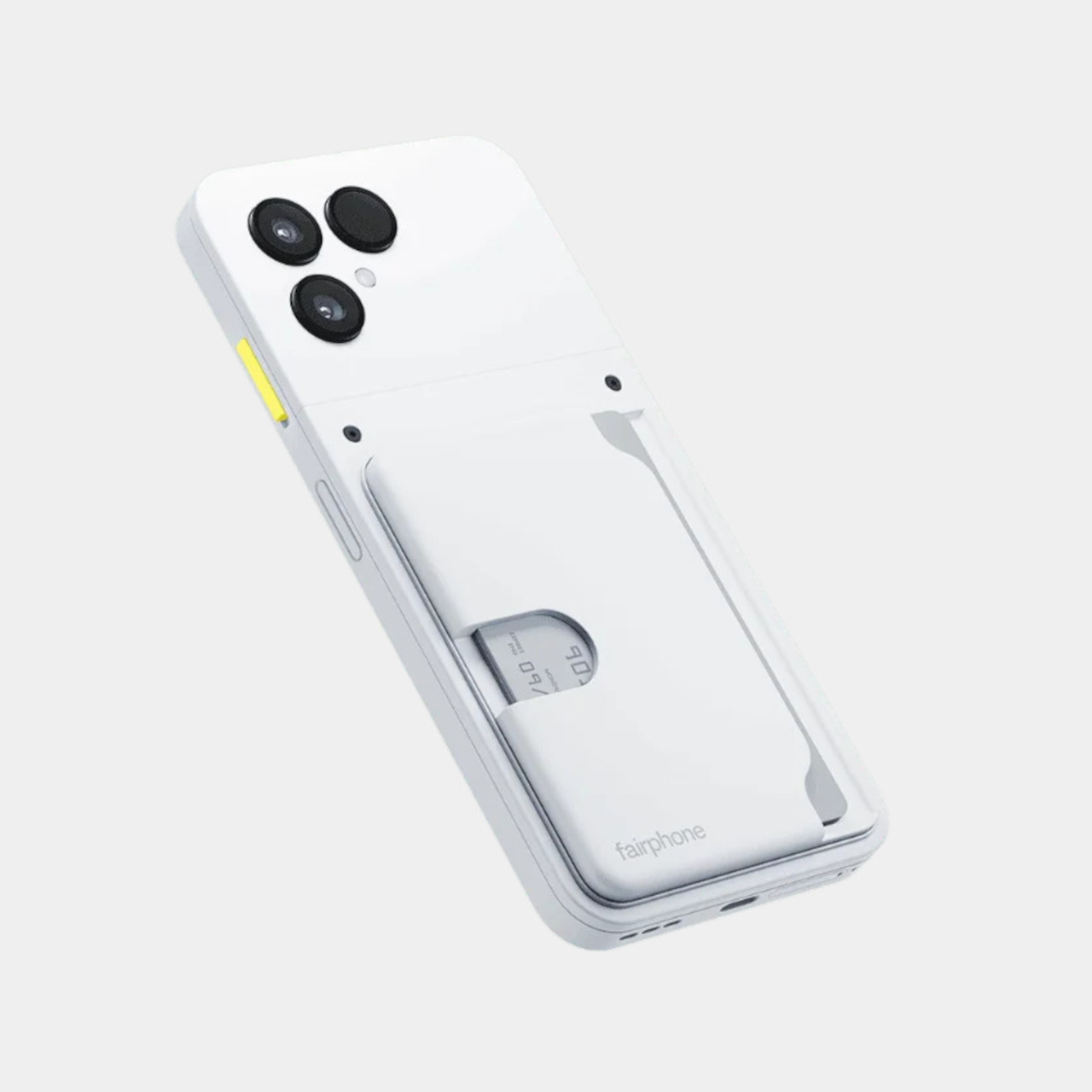
Customization is where the Fairphone 6 truly stands apart. The accessory ecosystem is designed with the same sustainable mindset as the phone itself. Instead of relying on sticky adhesives or magnets, everything from cardholders to finger loops and lanyards attaches with sturdy screws. Whether you use them on the bare phone or with the matching protective case, these add-ons are made from recycled materials and built to last through daily use. The result is a phone that feels uniquely yours, down to the smallest accessory.
This screw-based system is more than a clever engineering trick. It ensures that every attachment remains secure and functional over time, avoiding the wear and tear that comes with less robust solutions. It is a design philosophy that values longevity and flexibility, making it easy to update or personalize your phone as your needs change. Each accessory fits neatly into the overall vision of sustainability, blending practical function with an honest, transparent approach to design.
With the Fairphone 6, repairability and sustainability are not just marketing buzzwords: they are woven into every fiber and feature. It is a phone for those who want their technology to reflect their values, proving that innovation does not have to come at the expense of responsibility or individuality.
Camping in 2025 is less about compromise and more about finding the perfect blend of comfort, mobility, and design. The best new campers of the year reflect a sharp focus on utility and clever use of space, often surprising with their ability to deliver a home-like experience in a compact footprint. Each model here answers a different kind of wanderlust, whether you’re drawn to rugged off-grid adventures, family road trips, or spontaneous solo escapes.
What unites them isn’t just innovation—it’s the way thoughtful design transforms the journey itself. From modular interiors and lightweight builds to integrated power solutions and unique silhouettes, these ten campers showcase what’s possible when form meets function. If you’re ready to embrace the freedom of the open road this summer, then these impressive designs offer a fresh perspective on what it means to travel well, wherever you park for the night.
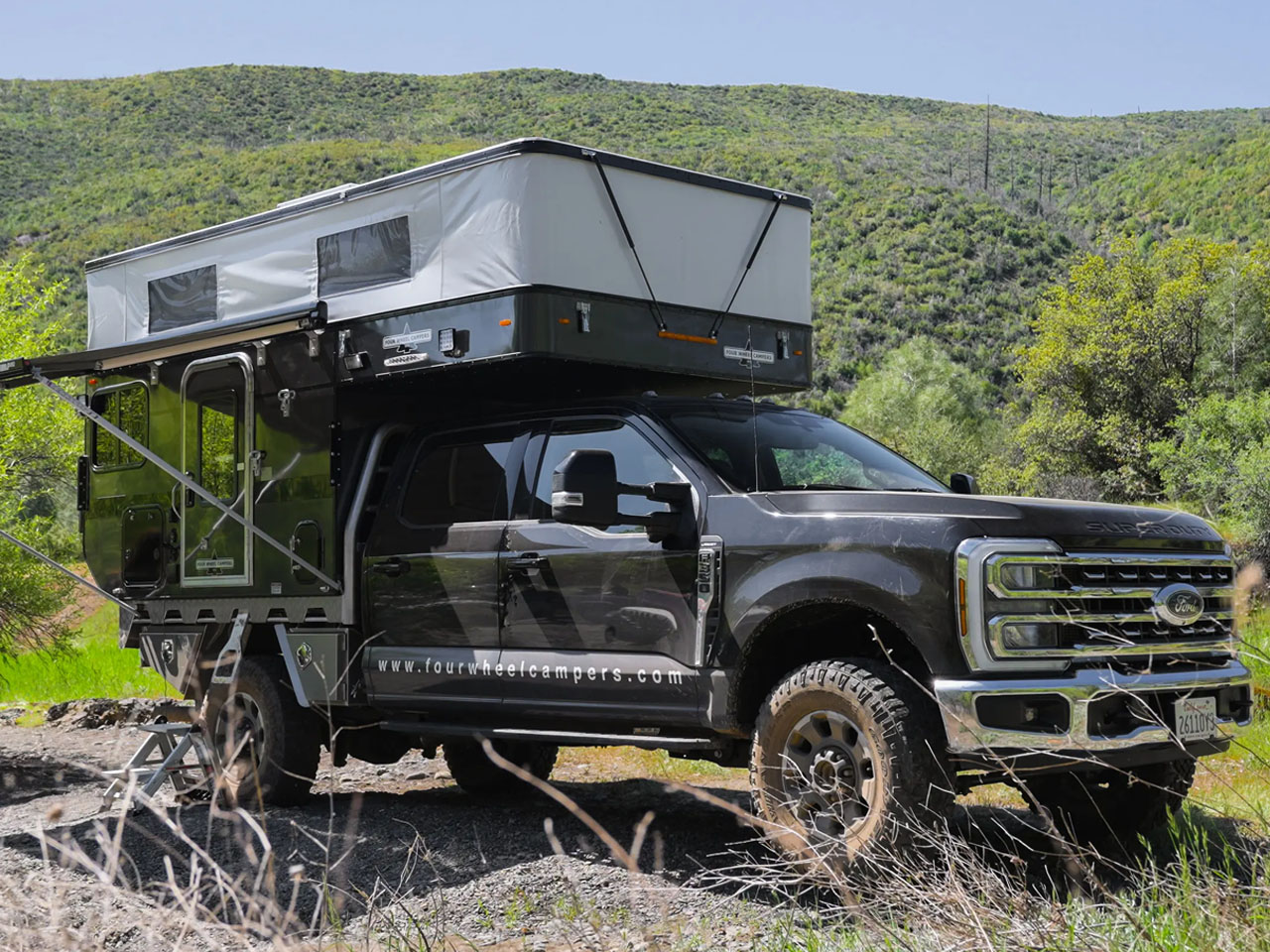
1. Hawk+
The Hawk+ by Four Wheel Campers introduces a new dimension to off-grid travel, blending utility with a comfort-focused layout that genuinely respects the realities of life on the road. Its slide-in design sits harmoniously atop a pickup bed, offering an adaptable space that feels open yet well-contained. Accoutered for nomadic life or overland explorations that demand durability as much as comfort, the Hawk+ stands ready for extended off-grid journeys.
The larger onboard space is remarkably well utilized, supporting all the essentials—eating, sleeping, living, and, impressively, ample storage. Every detail reflects a commitment to making life on the road both practical and enjoyable. The galley sits at the heart of the layout, offering a kitchen counter on one side and a cassette toilet cleverly tucked into storage on the other. Storage extends throughout, wrapping around the interior and making organization effortless.
What we like
Spacious layout in a slide-in form, maximizing livability without bulk.
Off-grid readiness ensures longer stays in remote spots.
What we dislike
Size may limit compatibility with some smaller pickups.
The minimalist approach could feel sparse to those seeking luxury finishes.
2. VW Ibex Concept
The VW Ibex concept by Sunlight is poised for the wild, striking a balance between contemporary aesthetics and rugged, go-anywhere capability. At its heart, the Ibex is about pushing boundaries—both literally and figuratively. The high-clearance stance and all-terrain tires signal its off-road ambitions, while the unique silhouette hints at a camper that’s as comfortable on the trail as it is at a festival. The design prioritizes flexibility, with a modular interior that adapts to changing needs.
Inside, the Ibex surprises with a thoughtful use of space. The seating transforms with ease, storage is intuitive, and the ambient lighting gives evenings a cozy, inviting atmosphere. There’s a sense of creative freedom here—a vehicle that doesn’t dictate how you should live, but rather invites you to explore possibilities. The Ibex provides a refreshing take for design lovers on what a modern camper can be, merging utility and personality.
What we like
Modular, reconfigurable interior adapts for work, sleep, and play.
Sturdy off-road build extends camping to remote locations.
What we dislike
As a concept, some features may not reach production.
Larger size may be unwieldy in urban or tight spaces.
3. Traveler Summit
The Traveler Summit from Happier Camper is an ode to nostalgia, bringing retro lines and cheerful colors into a thoroughly modern camping experience. Its lightweight build makes towing uncomplicated, opening up possibilities for smaller vehicles and spontaneous getaways. The modular Adaptiv system allows travelers to reconfigure the interior in minutes, shifting from lounge to sleeping area or workspace as needed. It’s a design that encourages you to embrace the journey as much as the destination.
What’s most interesting in the camper is the sense of playful practicality. Every component feels thoughtfully selected, from the robust storage cubes to the panoramic windows that frame the landscape. There’s no excess here—just smart solutions for making the most of a compact footprint. For those who appreciate flexibility without sacrificing comfort, the Traveler Summit is a reminder that good design can make even small spaces feel expansive.
What we like
Lightweight construction enables easy towing and fuel efficiency.
The Adaptiv interior system offers total layout flexibility.
What we dislike
Limited space may feel tight for more than two people.
Minimal insulation could impact comfort in extreme climates.
4. Lutz Minicamper
The Lutz Minicamper is all about delivering a tiny home experience in a trailer footprint, catering to campers who crave comfort but refuse to tow a full-size van. Its streamlined shape and clever window placement bring in natural light, making the interior feel airy and open. The kitchen is neatly tucked away yet fully functional, while the convertible seating area ensures that space never feels wasted. There’s a strong emphasis on creating a homelike atmosphere in a portable shell.
The interiors of the Lutz Minicamper are warm and welcoming, and the insulation helps maintain comfort across different weather conditions. It’s the kind of trailer that invites you to linger, to cook a real meal, or to unwind with a good book after a day outdoors. If you’re seeking the balance of mobility and genuine comfort, the Lutz Minicamper is a natural fit.
What we like
Home-like interior with solid insulation for year-round comfort.
Compact, aerodynamic profile makes for easy towing.
What we dislike
Limited standing room may not suit taller individuals.
Smaller water and power reserves require frequent stops.
5. T1 Micro Camper
Grounded’s T1 micro camper reimagines minimalist travel, distilling the essentials into an ultra-compact, electric trike platform. The T1 is about freedom—slipping through city streets or along park trails without the burden of a full-size vehicle. Its micro-cabin houses a convertible bed, a compact kitchenette, and just enough storage for short escapes. Smart features abound, from solar panels to app-based controls, bringing a layer of modern convenience to its pared-down form.
The T1 is fundamentally about movement and efficiency. There’s a liberating sense of not having to plan around parking or campsite restrictions; you can simply ride, stop, and rest. The design is playful yet purposeful, encouraging users to travel light and enjoy the journey. It’s best suited for solo explorers or those who appreciate the challenge of packing smart and living simply.
What we like
Ultra-compact design enables access to narrow trails and urban spots.
Electric powertrain cuts emissions and running costs.
What we dislike
Limited range restricts longer trips.
Minimal amenities may deter those seeking home comforts.
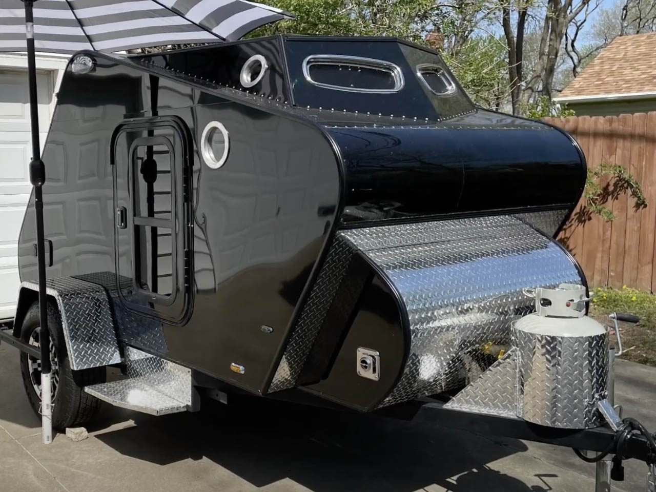
6. Argonaut Teardrop Camper
Argonaut’s teardrop camper brings an exciting and unique personality to compact camping, where every inch is utilized with precision. Its forward-tilting, slanted design isn’t just a visual statement—it creates extra headroom inside, making the cabin feel less confined. Storage is integrated seamlessly into the walls and under the bed, demonstrating a clear understanding of how to maximize utility in a small package. The combination of wood and metal gives the camper a rugged, timeless presence.
Despite its petite form, the Argonaut feels surprisingly accommodating. The raised roofline means you can sit up comfortably, while the durable exterior hints at years of reliable use. The layout manages to balance privacy, storage, and sleeping space without compromise. This camper is amazing at turning smallness into an advantage, making it ideal for travelers who value simplicity and durability.
What we like
Innovative height and shape deliver more headroom and a unique look.
Durable build with metal reinforcements for longevity.
What we dislike
No official off-road credentials might limit extreme adventuring.
Compact size isn’t ideal for extended trips or families.
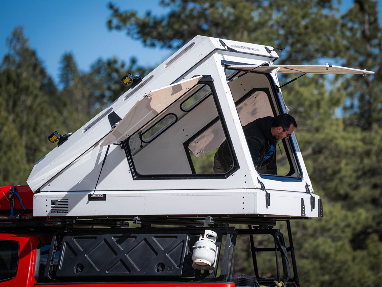
7. Yoho Pop Up
The Yoho Pop Up takes the classic truck camper and gives it a forward-thinking twist, introducing an auto-expanding pop-top that dramatically increases headroom at camp. The lightweight shell keeps things manageable for mid-sized trucks, while the interior offers all the basics: bed, cookspace, and organized storage. The pop-top is the star, transforming the interior from a compact shell into a space where you can stand, cook, and move with ease.
This camper is truly quite adaptable. Travel with the top down for efficiency, then expand at camp for comfort. The materials are chosen for durability, with a focus on resisting the wear and tear of regular use. The Yoho Pop Up is a clever solution that maximizes every square foot, specially designed for travelers who want a go-anywhere base without the hassle of towing.
What we like
Auto-expanding pop-top delivers standing room in a compact footprint.
Lightweight build suits a wide range of trucks.
What we dislike
The interior may feel sparse for longer stays.
Not suited for larger groups or families.
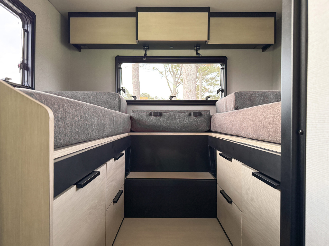
8. Open Trail 25 AO
The Open Trail 25 AO is built for families, with an interior that prioritizes shared experiences and comfort. The layout is a thoughtful blend of private and communal zones, featuring a spacious main bed, convertible dinette, and bunks for kids. The kitchen is fully equipped, and storage is abundant throughout, making it easy to keep things organized on extended journeys. Its robust chassis and insulation mean you’re prepared for a variety of climates.
The appeal lies in the details that make everyday life easier: a bathroom with a real shower, dedicated storage for gear, and windows that bring in light without compromising privacy. The Open Trail 25 AO isn’t just about moving from place to place—it’s about making the journey feel like home, wherever you park. It is an ideal fit for couples and families seeking an excellent blend of adventure and domestic comfort.
What we like
Family-friendly layout with multiple sleeping zones.
Full bathroom and kitchen enhance livability.
What we dislike
Larger size limits access to rugged or remote sites.
The heavier build requires a strong tow vehicle.
9. Mammoth Overland SKL
The Mammoth Overland SKL is a rooftop camper designed for those who demand ruggedness and self-sufficiency. Its hard shell is built to withstand harsh elements, and the integrated power station keeps devices charged off-grid. The SKL opens up to reveal a surprisingly comfortable sleeping area, elevated above the ground for safety and better views. Storage solutions are smartly tucked away, and the setup time is minimal, making spontaneous stops possible.
The materials are selected for longevity, and the design is intentionally pared back to reduce failure points. It is great for solo travelers or couples who want to venture far from established sites. The SKL offers a sturdy, dependable base that doesn’t weigh you down. It’s an ideal companion for those who see the outdoors as a place to be both comfortable and self-reliant.
What we like
Rugged, insulated shell with integrated off-grid power.
Rooftop design provides safety and unique vantage points.
What we dislike
Limited interior space compared to larger campers.
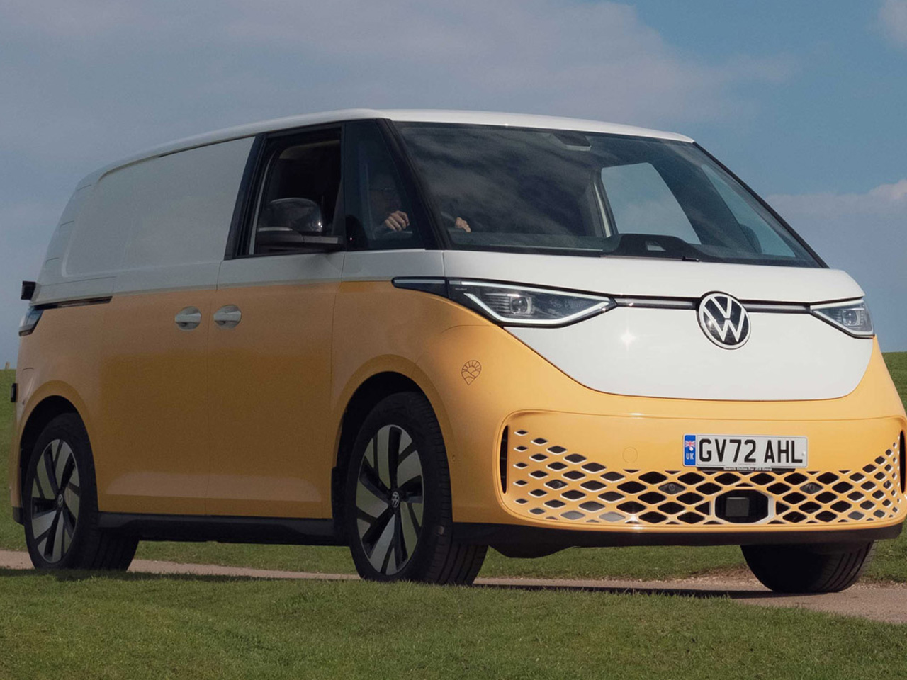
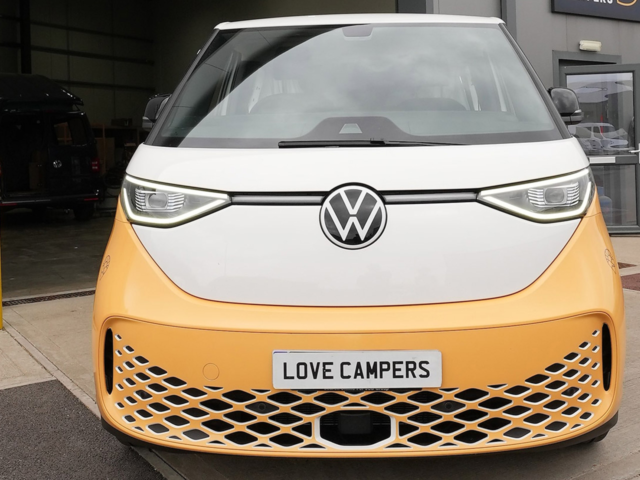
10. Love Campers VW ID. Buzz Camper Van
A collaboration between Love Campers and Wild Drives has resulted in the VW ID. Buzz camper van—a vibrant, attention-grabbing design that’s available to rent in the UK. Dressed in a playful lime yellow and white dual-tone scheme, the van’s exterior hints at the cheerful atmosphere inside. The matching interior feels genuinely uplifting, giving the impression of stepping into a moving work of art that’s as much about aesthetics as it is about function.
Space is smartly optimized throughout the cabin. The sofa easily slides out, quickly converting into a comfortable double bed, while the kitchen area—set directly opposite—features a sink with a foldaway faucet and an induction hob for easy meal prep. Every detail is considered, from the sustainable materials to the 77kWh battery and rooftop solar panel that keep devices powered up for off-grid journeys.
What we like
Sustainable design is ideal for couples or solo travelers.
Generous battery and solar array capably handle onboard power needs.
What we dislike
Only includes a portable toilet, which may not suit everyone.
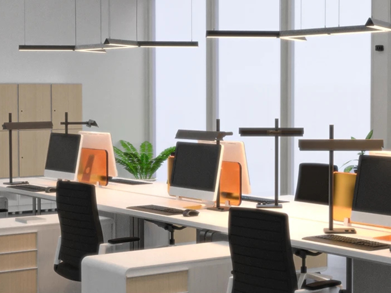
I don’t really pay that much attention to the lighting at home, in the office, or whichever coffee shop I end up working in. As long as the light is good enough for me to work or read properly, then I’m satisfied. That’s probably because I’m not involved in designing the space, so I can’t really do anything about it. But if you love looking for lighting solutions that can adapt to your needs, then this concept may capture your attention.
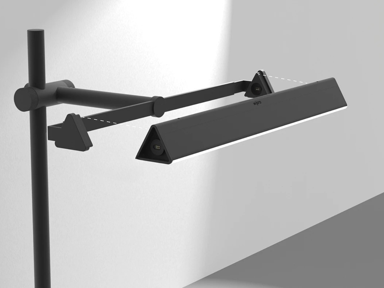
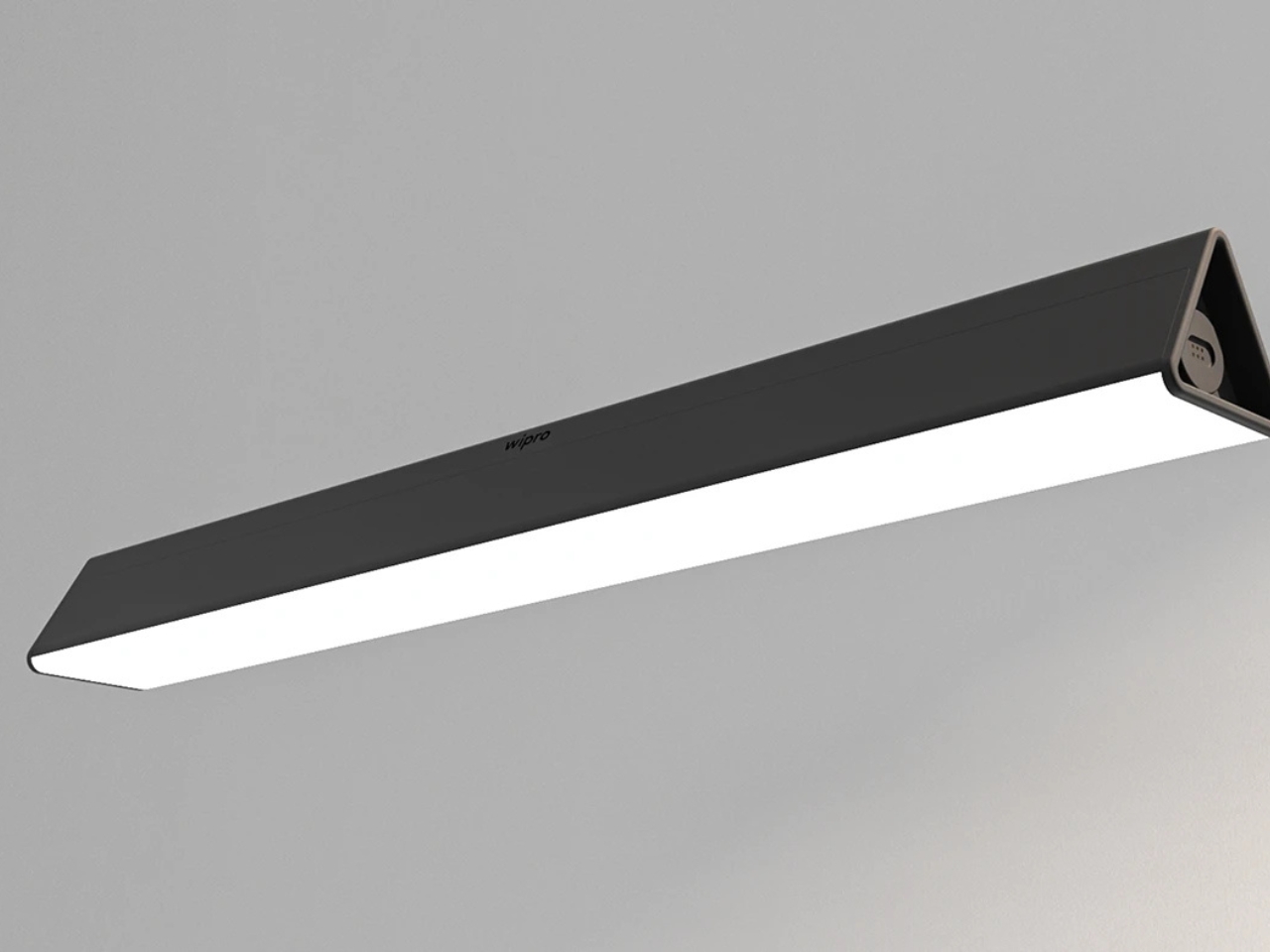
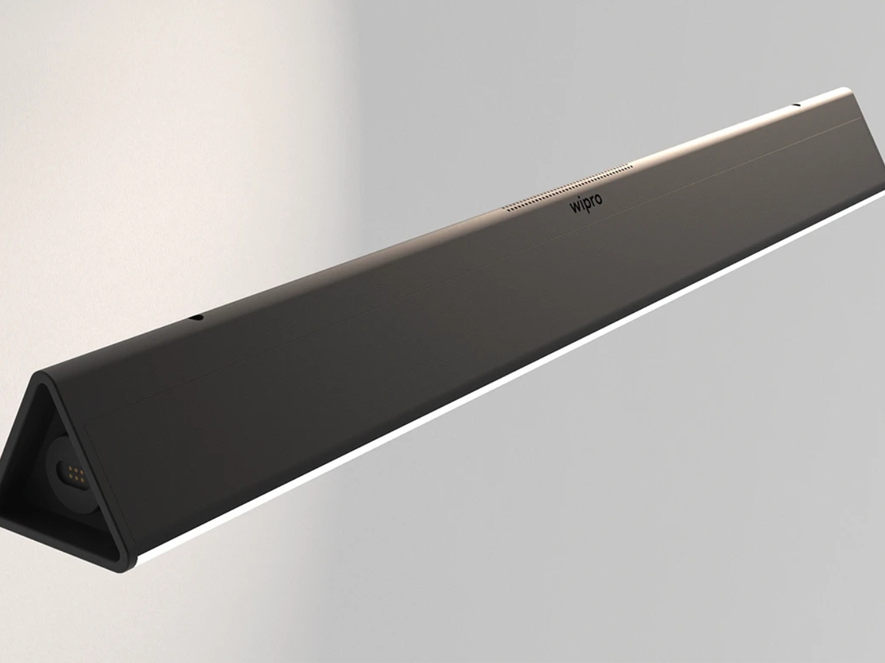
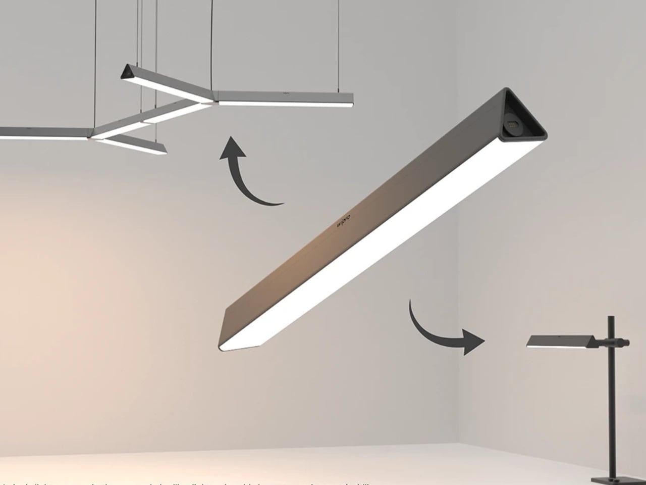
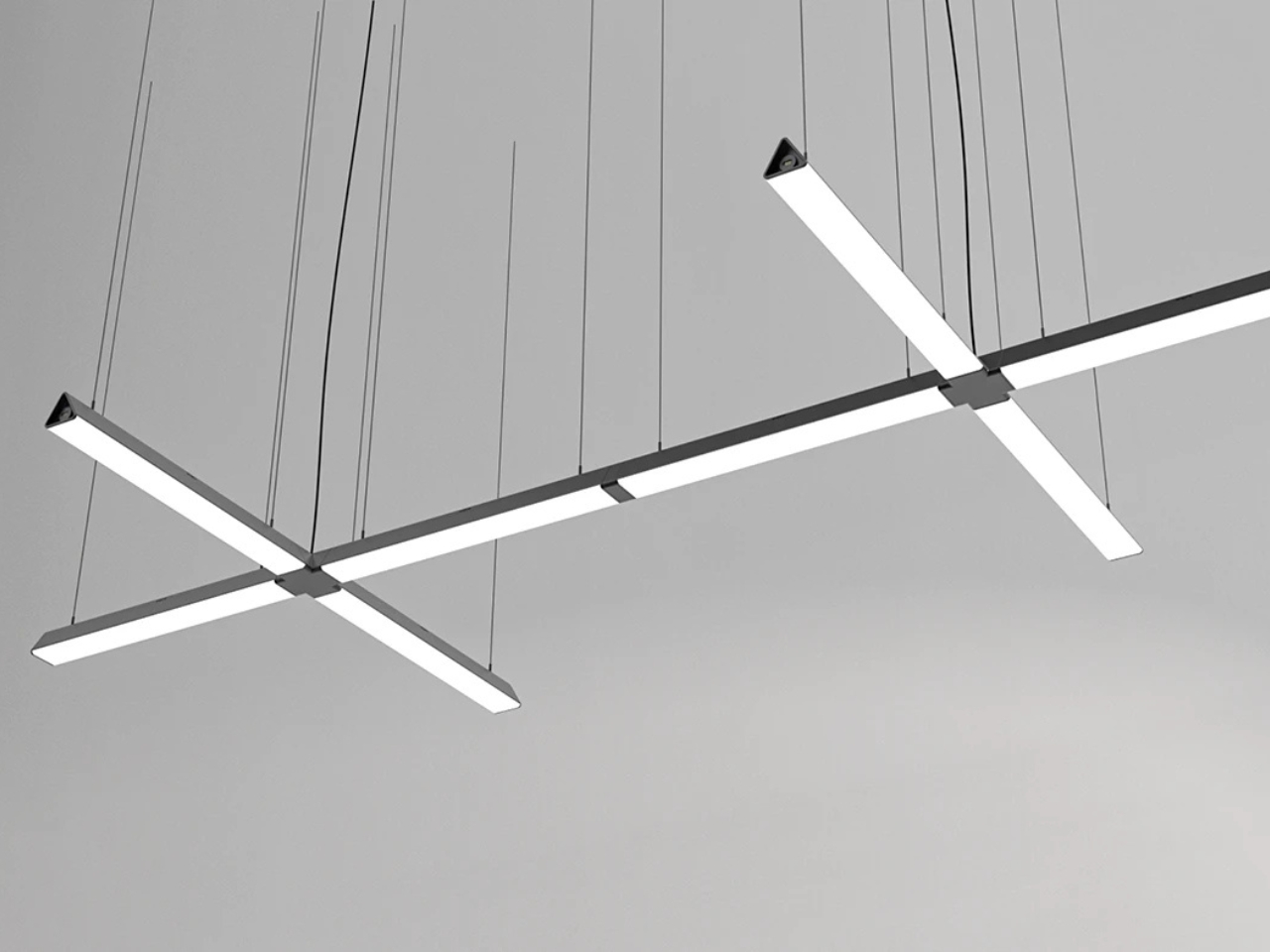
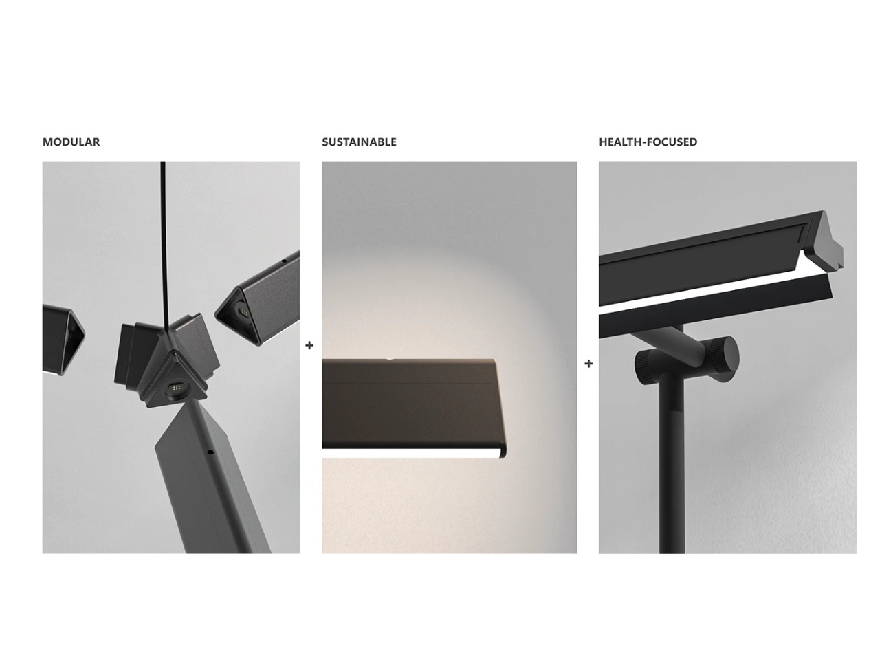
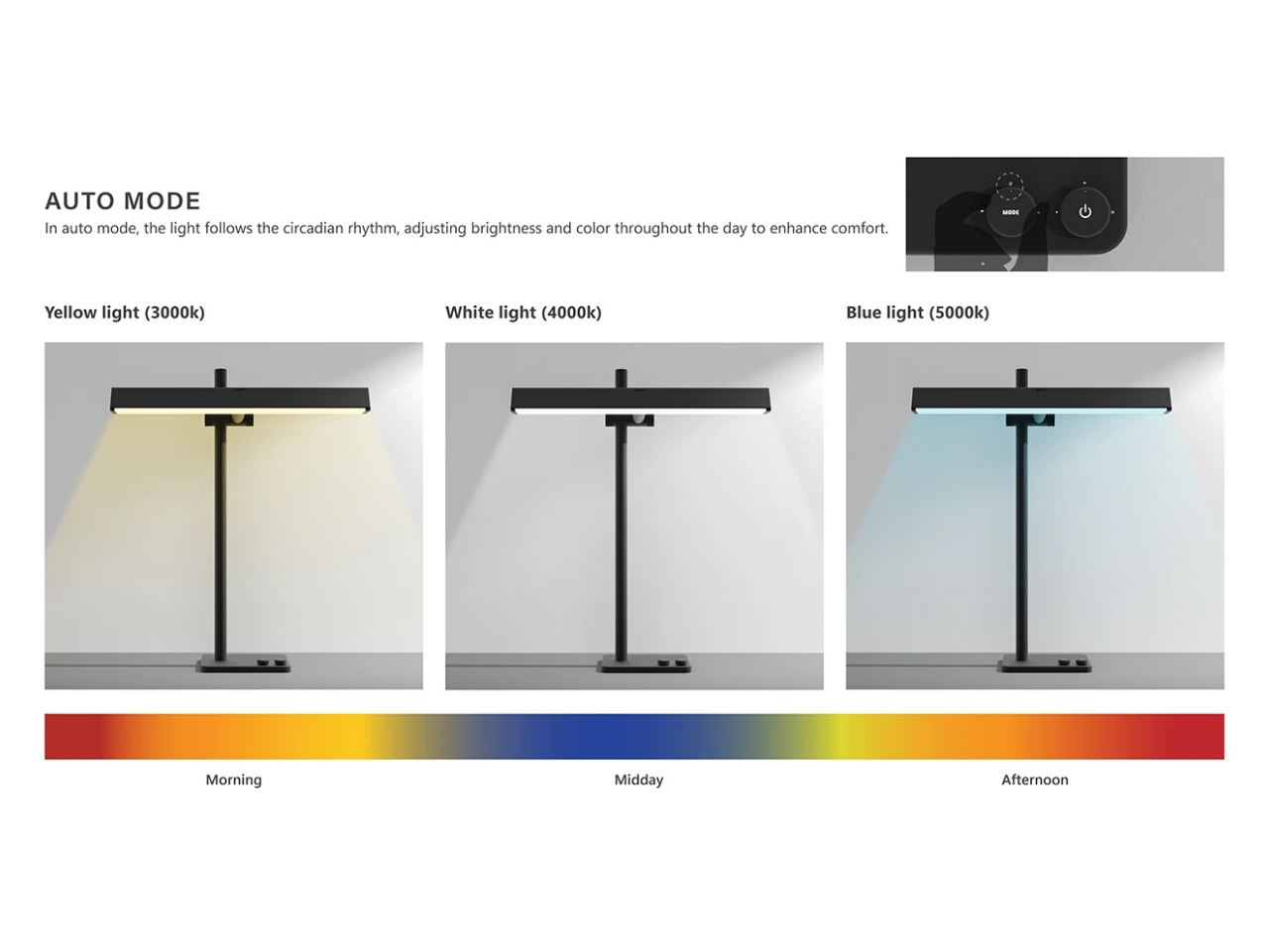
The Wipro EcoLumi Flex is a concept for a modular, sustainable lighting system that functions as both a table lamp and a suspended ceiling light, featuring easy adjustability, customizable layouts, and a slidable shade for glare control. It enhances well-being with auto mode circadian lighting, allowing users to personalize brightness and color temperature throughout the day for optimal comfort and productivity.
Its clever design features a smart, easy-to-use adjustability mechanism. With just a gentle twist, you can fine-tune both the height and the angle of the lamp. Whether you’re working at your desk or want to reimagine your ceiling lighting, this lamp’s flexibility means your light is always right where you need it. One of the standout features is the slidable shade; with a smooth motion, you can open or close the shade to control the direction of the light, reducing glare and enhancing comfort for those focused, productive moments. The modular design is also pretty interesting and useful—each unit can serve as a sleek table lamp or be effortlessly installed as a suspended ceiling light. Thanks to easy-install connectors and angular joints, you can link multiple lights together, crafting custom layouts that make your office truly unique and adaptable to your needs.
EcoLumi Flex is also about wellness. The Auto Mode feature automatically adjusts the color and intensity of the light throughout the day, following your natural circadian rhythm. Enjoy gentle yellow light (3000K) to ease you into the morning, crisp white light (4000K) for midday focus, and energizing blue-white light (5000K) to help you power through the afternoon. With intuitive controls right at your fingertips, you’re always in charge of your environment. This concept is also crafted with sustainability at its core. The modular system allows for easy upgrades and part replacements, reducing waste and ensuring your lighting solution stands the test of time. It’s a thoughtful choice for eco-conscious professionals and collectors who believe great design should also be good for the planet.
Sleek, minimal lines and a matte black finish give EcoLumi Flex a contemporary aesthetic that works beautifully in any setting. In open-plan offices, the coordinated look of multiple table lamps and custom-length ceiling lights creates a harmonious, designer feel and can make your workspace as inspiring as it is functional. Whether you’re passionate about sustainable design, crave flexibility, or are building a collection of future-ready office essentials, this lighting innovation concept can be both useful and inspiring.
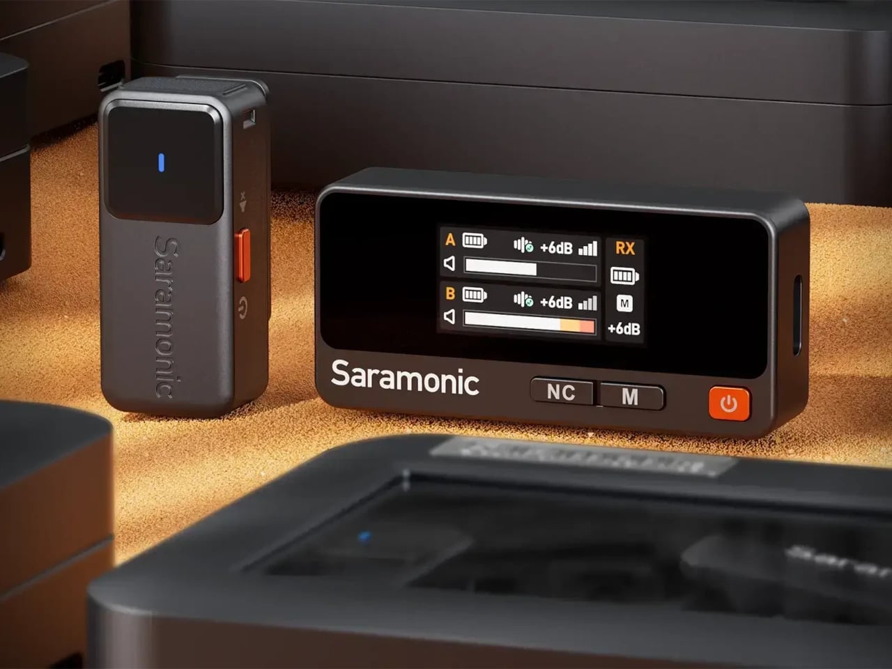
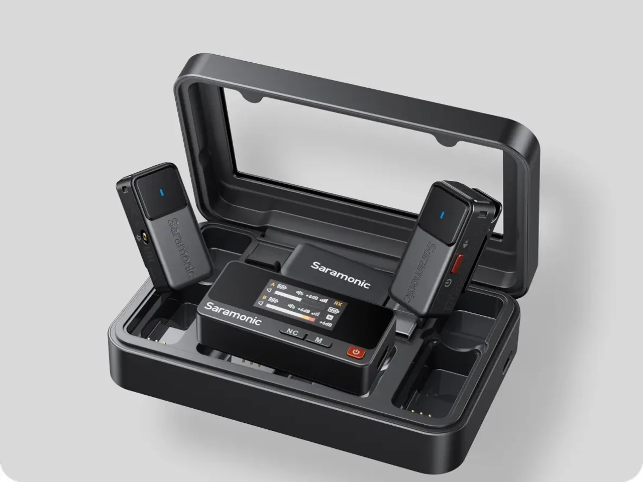
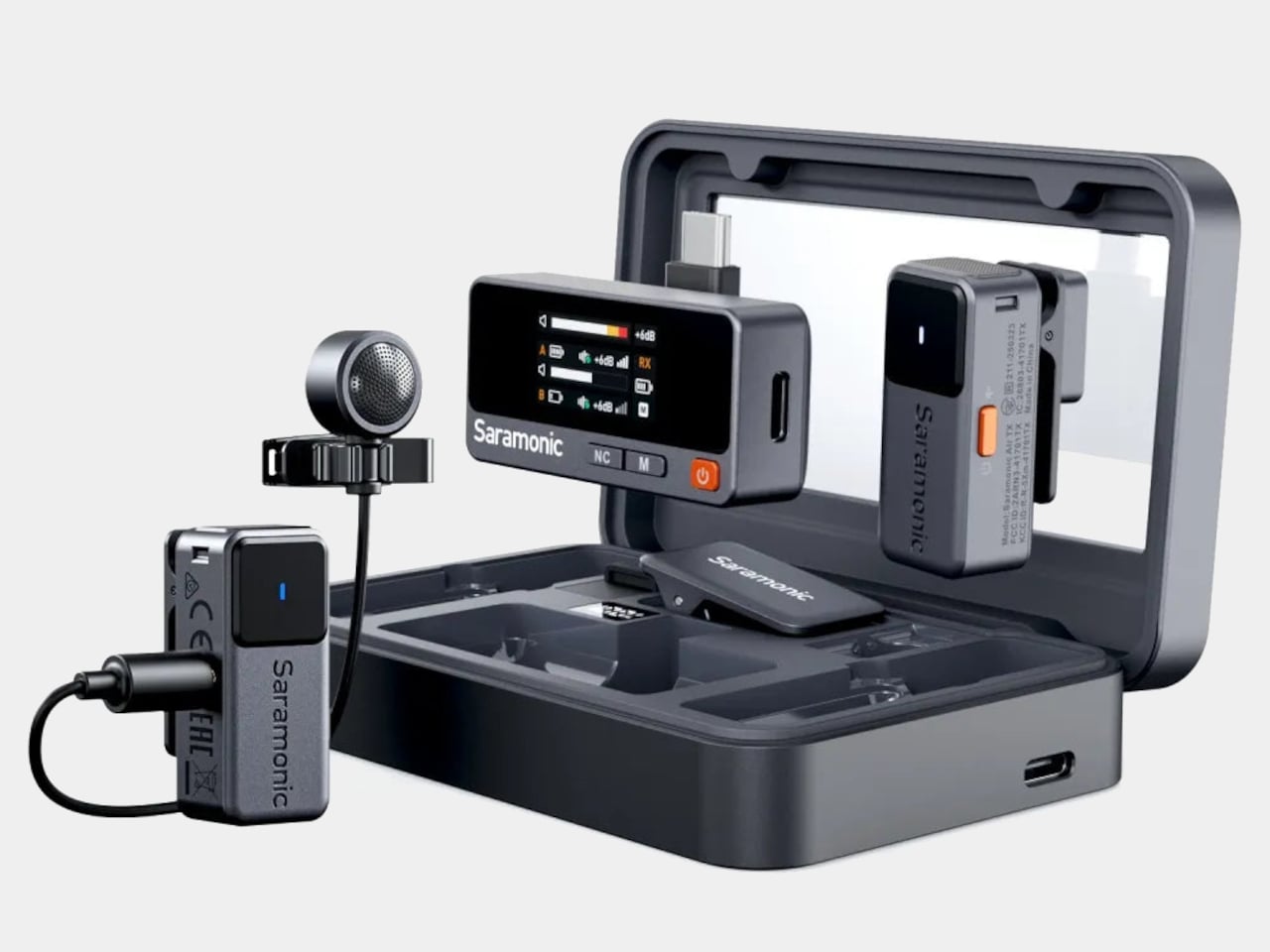
Audio equipment typically prioritizes function over form, leaving content creators with gear that performs well but looks utterly forgettable. The new Saramonic Air wireless microphone system breaks this convention entirely, wrapping professional-grade recording capabilities inside a design that genuinely deserves attention. This dual-channel system transforms the mundane necessity of wireless audio into something that actually enhances your creative setup.
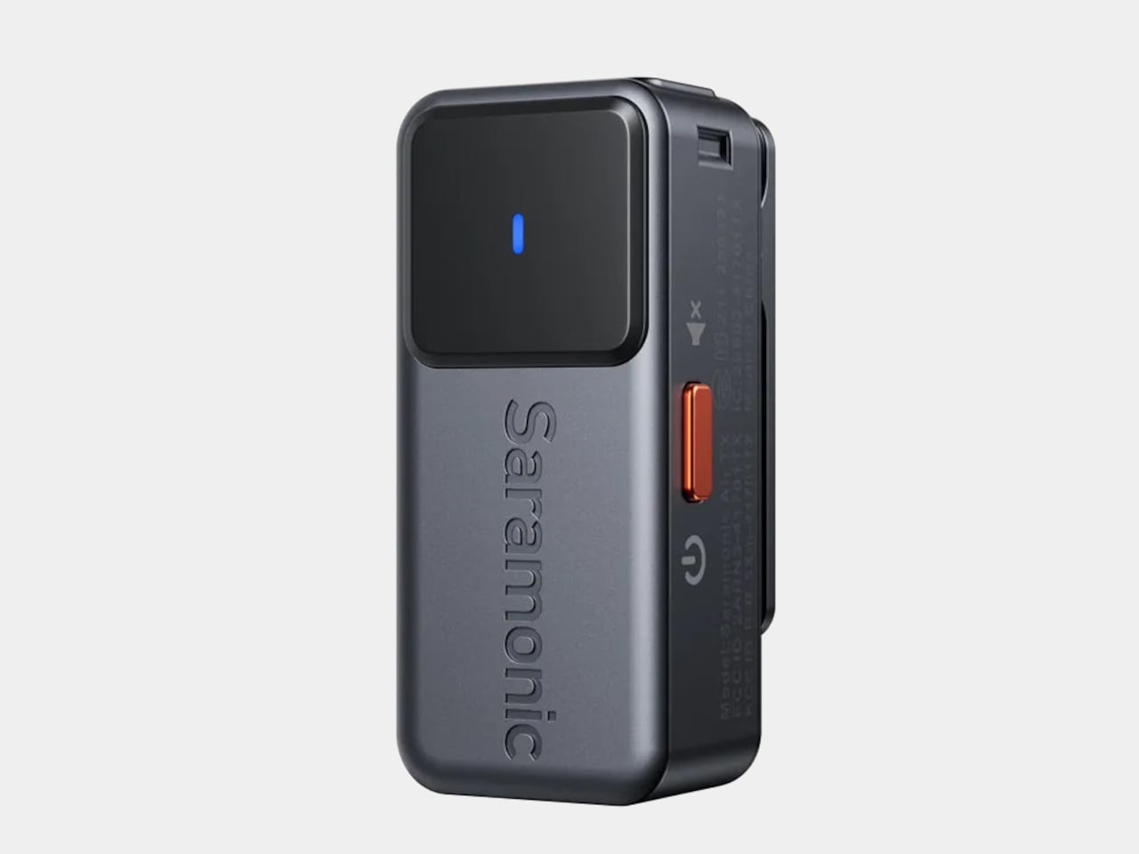
The design language speaks volumes about Saramonic’s intentions here. Rather than following the typical black-box approach, the Air system embraces retro-futuristic aesthetics with refined metal shells and carefully considered proportions. The galactic gray finish catches light beautifully, while subtle internal illumination adds a sophisticated touch that suggests premium engineering. Every curve and angle feels intentional, creating visual harmony that complements modern cameras and mobile devices.
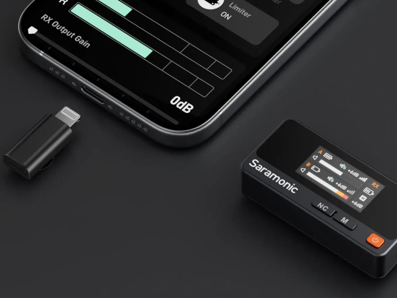
Weighing just 11 grams each, the transmitters practically disappear when clipped onto clothing, yet their compact form houses impressive technical capabilities. The 9.7mm lavalier microphone features a 6mm diaphragm that captures significantly more detail than standard alternatives. This larger surface area translates into richer audio reproduction, from deep bass tones to crisp high frequencies that bring interviews and dialogue to life.
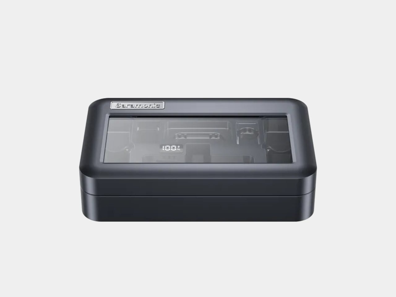
The charging case deserves particular recognition as a design masterpiece. Its transparent lid reveals the transmitters inside like precious instruments, while LED battery indicators provide essential information without cluttering the aesthetic. The pocket-friendly dimensions ensure portability never becomes a compromise, and the automatic charging function eliminates workflow interruptions. This attention to both form and function exemplifies thoughtful industrial design.
Technical sophistication hides beneath the beautiful exterior. Two-level intelligent noise cancellation suppresses ambient sound without introducing unwanted artifacts, while customizable EQ modes enhance vocal clarity naturally. The built-in limiter protects against audio spikes, and a safety track provides additional security for critical recordings. These features work transparently, allowing creators to focus on content rather than technical adjustments.
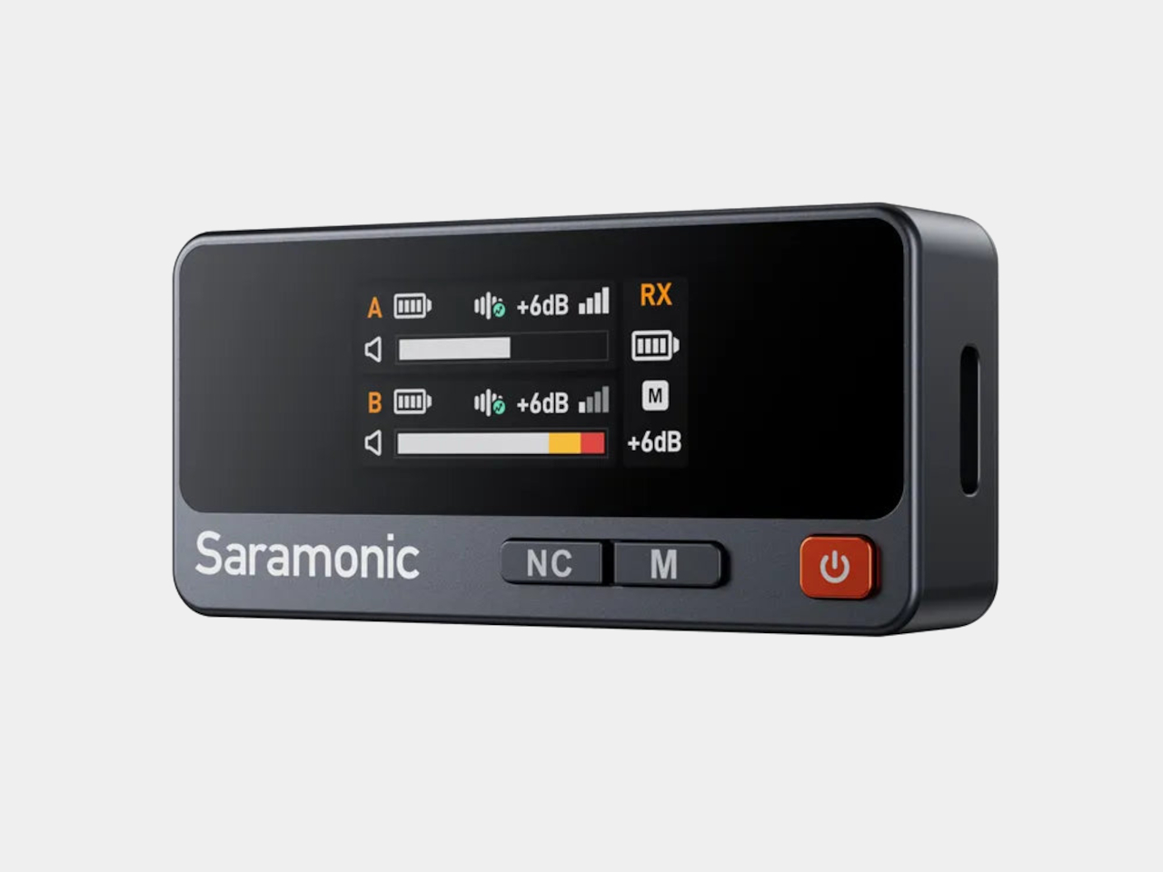
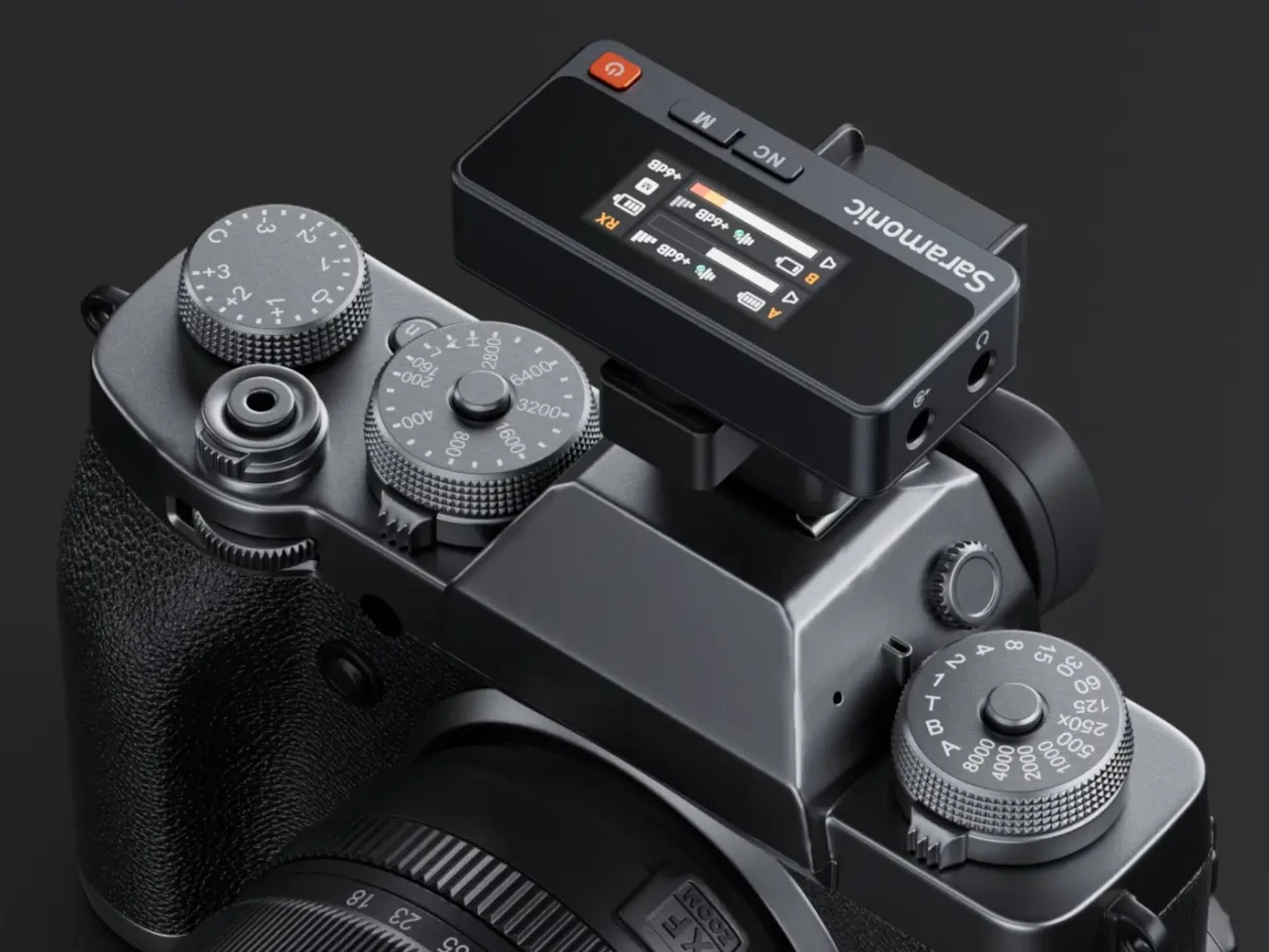
Connectivity options reflect modern production needs perfectly. USB-C, Lightning, and traditional 3.5mm outputs ensure compatibility across virtually any device combination. The system can simultaneously feed two devices, supporting workflows where creators need to record for both professional cameras and social media platforms. The receiver’s full-color display provides real-time monitoring without requiring separate apps or complicated setup procedures.
The front-facing pickup design minimizes plosives while maintaining a clean on-camera appearance. This consideration for visual aesthetics extends the design philosophy beyond mere technical specifications. Content creators can confidently feature the microphone system in their shots, knowing it enhances rather than detracts from production value.
Professional creators will appreciate how the Air system elevates their entire kit’s visual appeal. The retro-futuristic design suggests serious attention to craft, while the compact form factor respects the mobile nature of modern content creation. At $139 to $169 depending on configuration, this system delivers both striking aesthetics and genuine performance improvements that justify the investment for creators who value both sound quality and visual design.
Most good projects die by a rough cut. You print a crisp lattice, reach for the hobby knife, and five seconds later, there is a gouge exactly on the outer surface – a part that’s easily visible. That small heartbreak is what HOZO Design set out to delete with NeoBlade, a cordless cutter that trades brute force for forty-thousand-times-per-second ultrasonic finesse. The idea is simple: let vibration slice through projects with the perfection of a knife through room-temperature butter.
NeoBlade looks and feels like a chunky marker that fits perfectly into your grip. Battery clicks into the tail, blade peeks from the nose, and the whole tool tips the scale at 6.4 ounces, so even a long session of trimming support material will not sprain a wrist. Press the trigger gently, and Precision mode fires in quick bursts, perfect for knocking a single nub off a resin mini. Pull past the detent, and Continuous mode hums until you let go, turning foam board or acrylic sheet into respectful, silent ribbons. A perfect gizmo for finishing touches on all your projects.
Forty kilohertz of motion means the edge never drags long enough to melt plastic or splinter wood. Instead, it slips forward under light pressure, one microscopic slice after another, leaving a glassy face that looks almost molded. A smart driver reads resistance on the fly and feeds anywhere from nine to forty watts to the actuator, so switching from soft PLA to stubborn ABS feels seamless. There is no temperature dial to chase, no speed knob, no guesswork.
Keeping the tip cool is the job of a tiny turbofan buried in the barrel. Air enters through side vents, slides across the metal core, and exits behind your hand, dropping blade temperature far below the scorch line of common filaments. The handle stays comfortable, the cut stays clean, and warping never starts. Two bright LEDs flank the blade to fill shadows that magnify mistakes, a small but welcome nod to late-night builds.
HOZO ships six blade profiles in snap-forward cartridges. A 30-degree spear handles everyday trimming, a longer spear dives deeper stock, a curved slice glides through vinyl and leather, a twin-edge scores parallel grooves, and two chisel tips tackle carving and cleanup. Used blades press into a one-way slot on the cartridge, so they retire safely instead of migrating to a drawer where future you will forget they exist. The tool cap hides a stubby driver and a magnet that holds the fresh blade steady while you line up the tang, a little UX grace that feels earned on a cluttered bench.
Changing the Battery
The NeoBlade Creator Combo includes the TurboDock, an extra Battery Pack, and a set of trial blades
Cordless convenience lives or dies by downtime, so NeoBlade ships with an optional TurboDock that charges the handle and a spare cell in about thirty minutes. Slide one battery out, slide the other in, twist, and you are back to slicing before the printer’s next layer cures. Makers on a tighter budget can rely on the USB-C port in the grip, though that route parks the cutter for an hour or more. Early Kickstarter pledges locked in the full kit for $99 USD, a tidy slice off the planned $149 retail tag. The Creator Combo (priced at a discounted $149) packs the NeoBlade, a TurboDock, an extra battery, and a spare blade trial kit with 6 blades.
But don’t confuse this with one of those cheap cutters on Amazon or that soldering iron that you also use to burn off imperfections in 3D prints. Because the edge oscillates instead of tearing, you avoid the fuzzy bead that hot-wire cutters leave in foam and the ragged fringe delivered by abrasive wheels. Clean edges mean less post-processing, which in turn means more time for tuning the slicer profile or experimenting with paint. Model makers, cosplay armor builders, prop shops, even electronics hobbyists who need to notch an enclosure without filling the room with ABS dust will notice the difference on day one.
NeoBlade lands at a sweet spot between pocketable craft knives and industrial ultrasonic stations that never leave a lab. It gives hobbyists, cosplay armor fabricators, prop builders, and small-batch product designers a push-button guarantee of clean edges and repeatable results. By making ultrasonic cutting as casual as clicking a pen, HOZO turns the most stressful step of fabrication into the easiest. Projects move forward, sanding blocks stay clean, and the next big idea arrives sooner because the last one didn’t stall at the trimming stage.
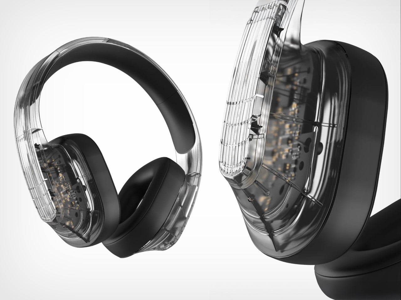
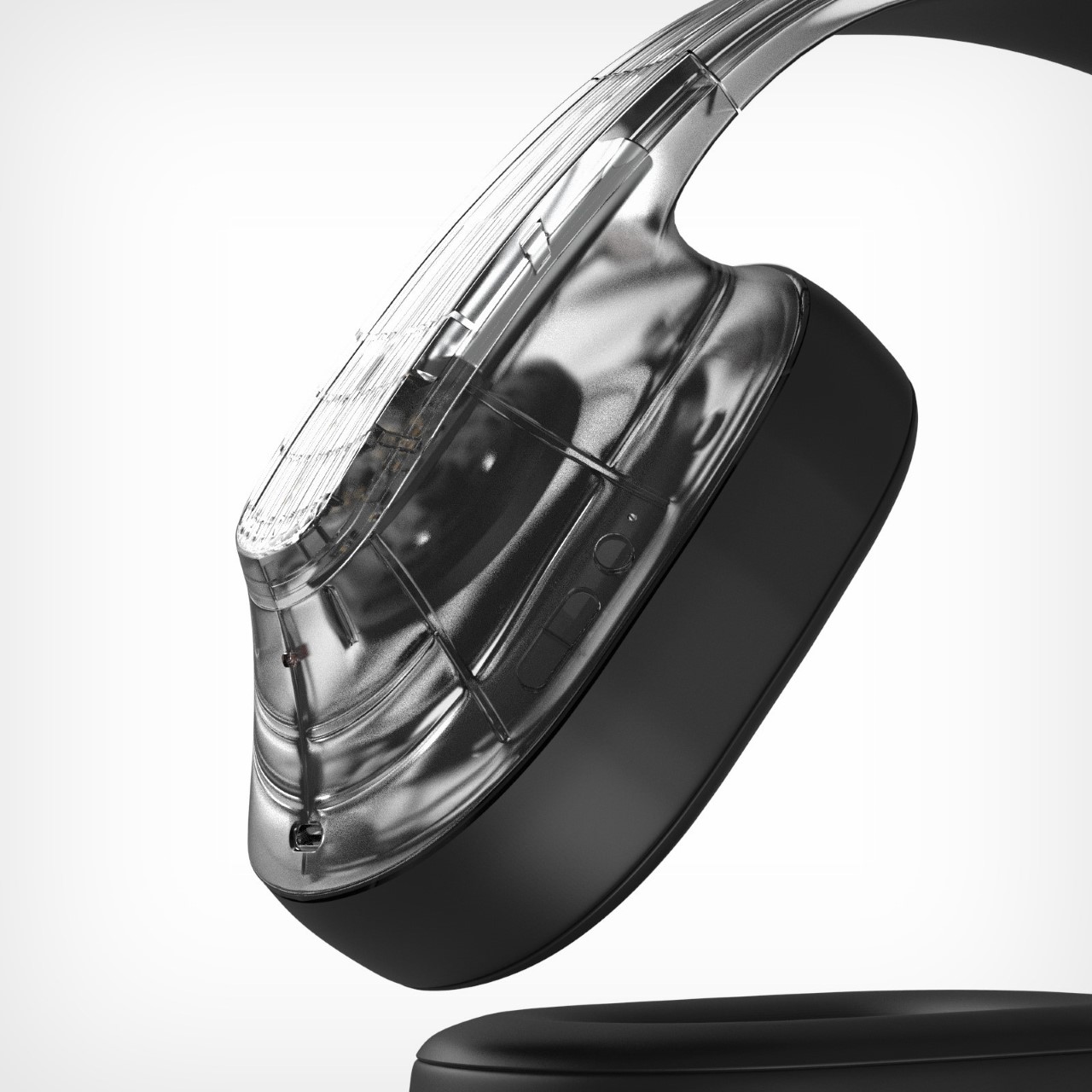
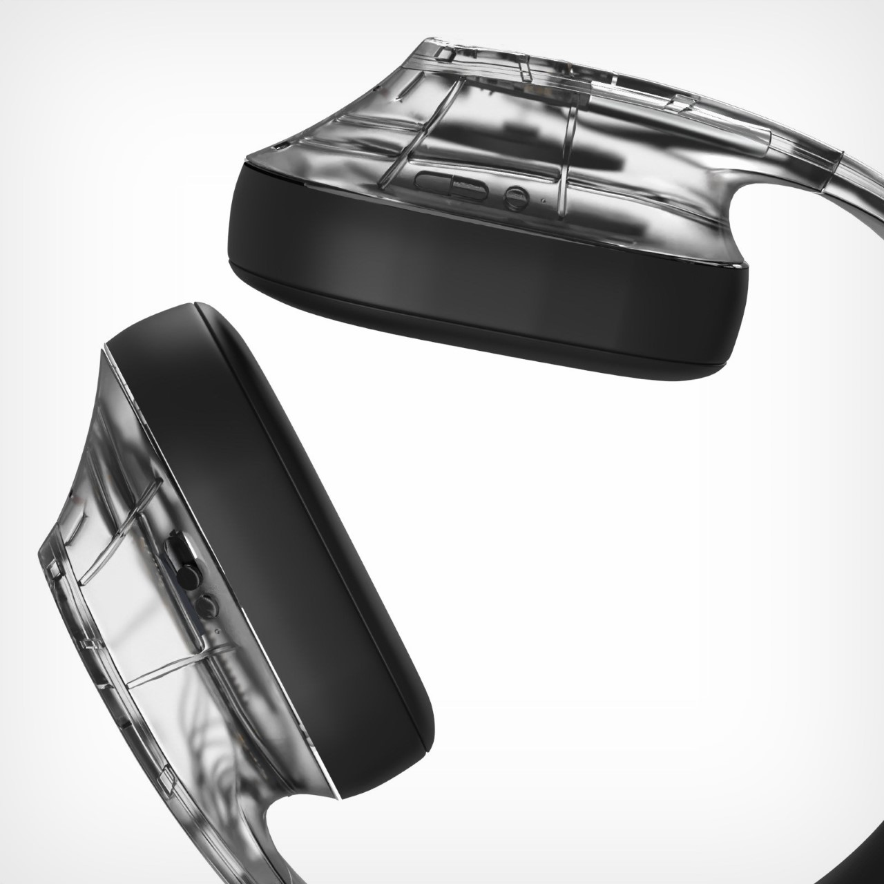
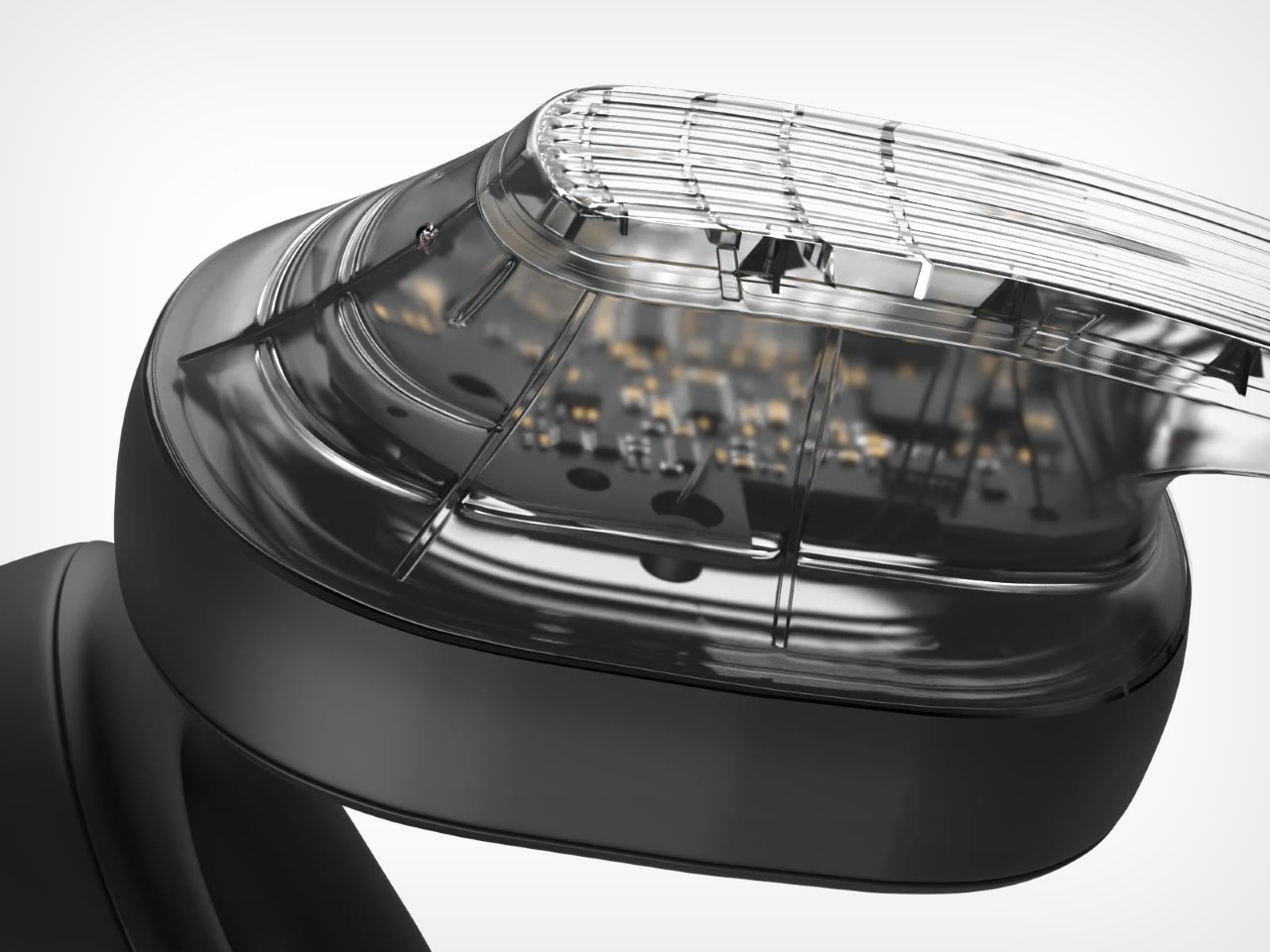
For a company that single-handedly revived transparent tech, the Headphones (1) have absolutely no transparency in their design. If you saw this video dated a month or so ago, it was Nothing literally confirming that they were due to debut their first over-ears. The internet’s been asking for Nothing to build AirPods Max ‘killers’ for a while, and it seems like Carl Pei finally had his cards in place to make this play…
However, images from a private preview earlier last week showed what the headphones looked like – and the internet has thoughts. A lot of people on Reddit can’t help notice the odd shape, commenting on how it looks different from what they expected… and that’s a good thing. Subverting expectations is great if you can create a design that’s somehow received more positively than the consumer’s expectations. The problem is that Nothing’s ardent fan base now always has the highest expectations. And as a fan, I did too.
Call me pedantic, but Nothing’s entire design DNA was transparency. Whether it was the earbuds or the phones, there was always an element of ‘see-through’ in their tech. Not so much in the phones, given how densely components are packed inside, but the Ear (1), Ear (a), and Ear (open) all had a transparent outer housing that let you peer into the electronics below. While the ‘alleged’ Headphones (1) do have a transparent shell, the design is FAR from actually transparent. In fact, it’s entirely opaque, except for one can-hugging outer shell that doesn’t really let you ‘peer into the headphones.’
That’s when I stumbled upon the ‘Spectrum’ headphones by Monica Bhyrappa. These phones were especially designed for wearers with autism, allowing them to experience less sensory load as compared to other humans. Autistic people experience the world very differently, and an overload of sensory input can easily overwhelm them. The Spectrum are a specially-tuned pair of noise-canceling headphones designed to phase out too many noises, allowing wearers to focus on audio that actually matters.
The design brief is spectacular, and I’m all for accessible tech, but I couldn’t help but also notice one of Monica’s concept renders, which featured a set of transparent cans… and the second I saw them, I knew exactly what I wanted the Nothing Headphones (1) to look like.
Nothing’s ethos is broadly to make tech fun again – not through awkward shapes, but through an eye-catching design that boasts transparency. You have a broader appreciation for tech if you know what’s inside it, or at least that’s what I personally believe. Beats by Dre had this entire scandal following a teardown that revealed metal cubes inside the headphones, added with zero purpose other than to make them feel ‘heavier’ and therefore ‘premium’. Nothing’s transparent tech was supposed to be an open challenge to that.
Are the upcoming Headphones (1) ‘fun’? I’m sure there’s a set of people who love the design, and a set of people who think it’s funky, but not specifically for them. That isn’t the point I’m trying to make. What I personally wish is that the headphones adopted the ‘transparency’ design direction more aggressively. Headphones aren’t like phones. They’re thicker, have more air gaps to allow for vibrating components and air-based resonance. This inherently allows for headphones to have a lot of empty space on the inside – empty space that is PERFECT for beautifully showcasing through transparency.
No, I don’t want glyphs on my headphones. But I do wish they looked a little different. I wish they championed transparency more than they currently are… because let’s not deny that Monica Bhyrappa’s Spectrum headphones do look absolutely gorgeous!
There was a time when listening to an album meant more than tapping a screen. You’d open a case, slide in a disc, and sit with the music from start to finish. The ClearFrame CD Player revives that experience not with nostalgia, but with intent. It doesn’t just play your albums. It exhibits them.
Set behind a crystal-clear shell, the disc spins like a sculpture in motion. Your album art, once forgotten in a drawer or buried on Spotify, now floats on your wall or desk like a curated gallery piece.
In an era of algorithmic playlists and invisible files, ClearFrame is a reminder that presence still matters.
The Player That Reframed My Daily Routine
At first, I thought it was just a beautiful object—something I’d admire occasionally, maybe play once a week. But within days, ClearFrame had reshaped my habits. It became my morning ritual companion, my afternoon focus anchor, and surprisingly, my way of rediscovering albums I forgot I loved.
Plays full albums while I cook or read
Loops a single track to help me write
Turns guests into curious onlookers who ask, “Wait… is that a CD player?”
There’s a strange power in seeing your music—watching the disc spin, the LED glow, the cover art behind the clear face. Suddenly, sound becomes sculpture.
Designed to Display, Built to Play
Transparent Polycarbonate Shell The album becomes the focal point—protected but never hidden.
Visible Circuit Board Honest engineering that feels like part of the design, not a secret.
Floating Disc Mechanism Smooth motion + warm LED lighting gives each playback a ritualistic calm.
Wall-mountable or Desktop-friendly Display like a photo frame or place beside your speaker setup.
Bluetooth 5.1 + Headphone Jack Stream wirelessly or go classic with a plug-in.
USB-C charging + 7–8 hour Battery. Portable enough to carry room to room.
Multiple playback modes Loop a track, let the album ride, or pause for silence.
ClearFrame isn’t trying to be “smart.” It’s trying to be present, and in doing so, becomes more essential.
Why Physical Still Wins
The more digital our lives become, the more we crave something real, something to touch, see, and return to. ClearFrame doesn’t replace streaming. It offers an alternative state of mind.
You choose an album. You see it. You hear it all the way through. No shuffling. No ads. No interruptions.
It’s a gentle confrontation with the way we consume music today, and a subtle push to slow down, look up, and listen better.
Design That Reflects Discipline
ClearFrame’s visual simplicity hides a surprising depth of thought.
It was developed by a Tokyo-based team known for merging tech with clarity, removing friction, not adding features. Every detail—the sharp edges, the floating CD, the matte circuit board—was chosen to showcase music as something worth displaying.
It doesn’t shout. It just sits there, spinning, glowing, doing one thing well. That’s the power of restraint.
Who It’s For
Design Enthusiasts
A daily-use object that elevates your space and sparks conversation.
Music Lovers Rediscovering the Physical
ClearFrame transforms forgotten CDs into something worth revisiting.
Minimalists & Analog Fans
No apps. No updates. No distractions. Just the disc, the art, and you.
A Living Album Cover for Everyday Life
What would your favorite album look like framed in motion? Imagine a desk that becomes a music gallery. A bedroom wall that reflects your taste—literally. ClearFrame doesn’t just play music. It turns your albums into an ongoing exhibition.
It’s not about going back in time. It’s about bringing what mattered back into view.
Not just a CD player, but a daily reminder that music deserves your full attention. ClearFrame is available now for $199.
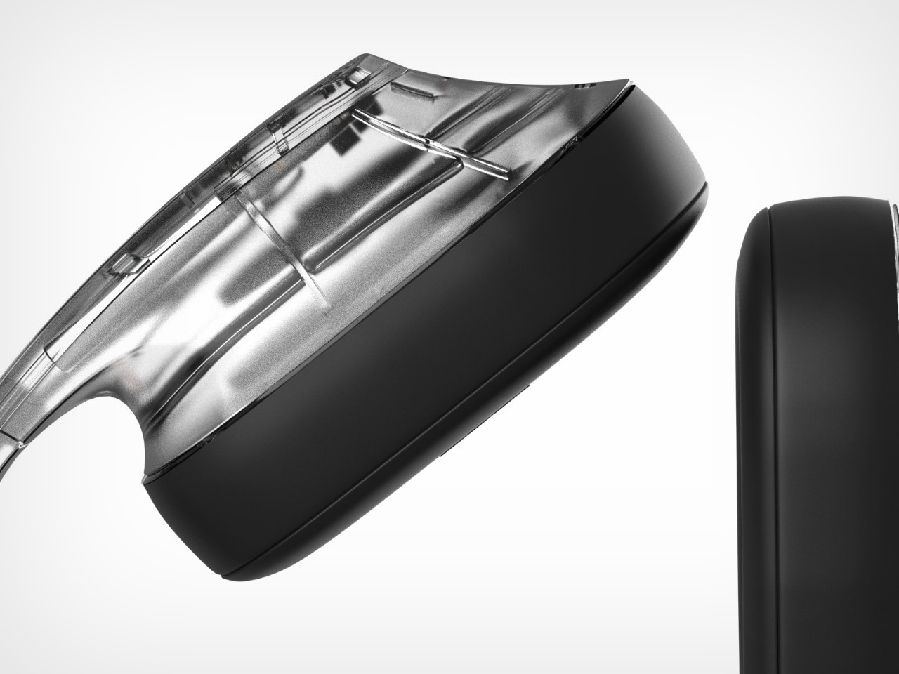
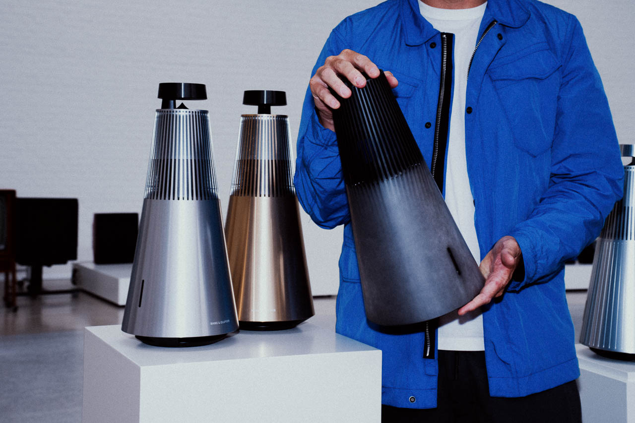
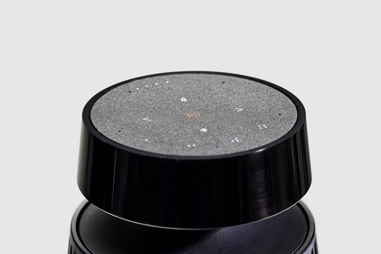
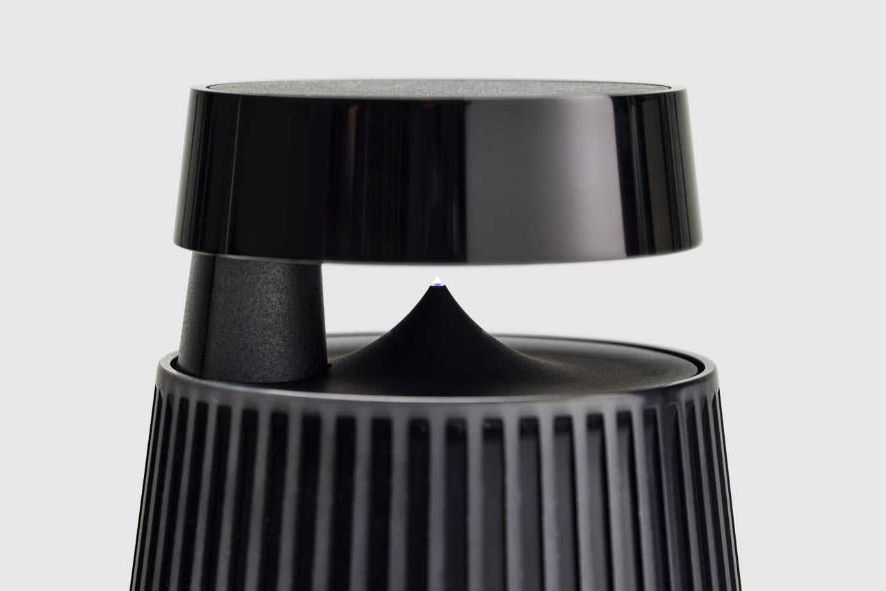
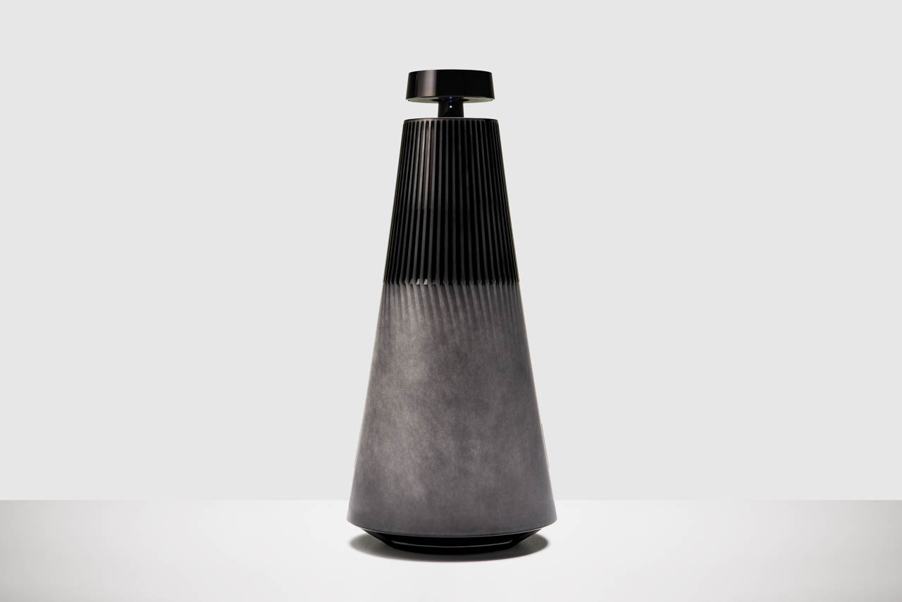
A failed experiment just became the defining feature of a $5,300 luxury speaker. Bang & Olufsen’s aluminum experts in Struer, Denmark were attempting deep black anodization when something unexpected happened. The test piece emerged with textured swirls and darker pigment streaks – what they called the “burnout” effect. This accident sparked intense experimentation to reproduce the unpredictable finish under controlled conditions.
Designer: Bang & Olufsen
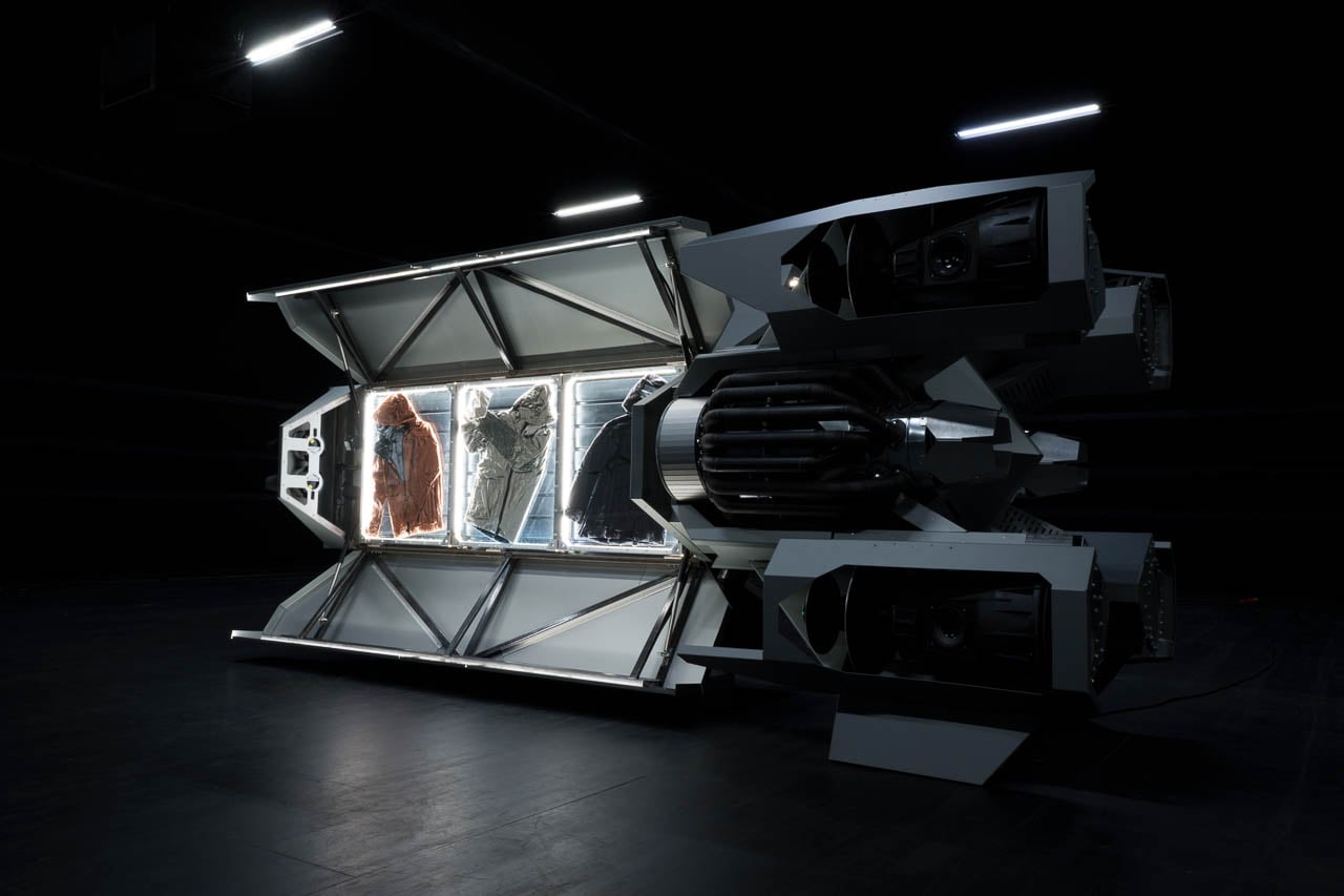
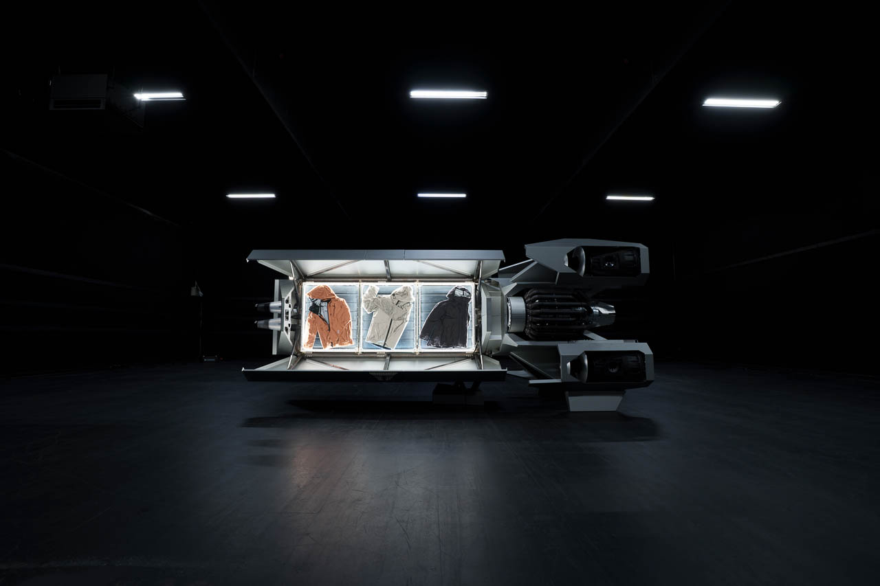
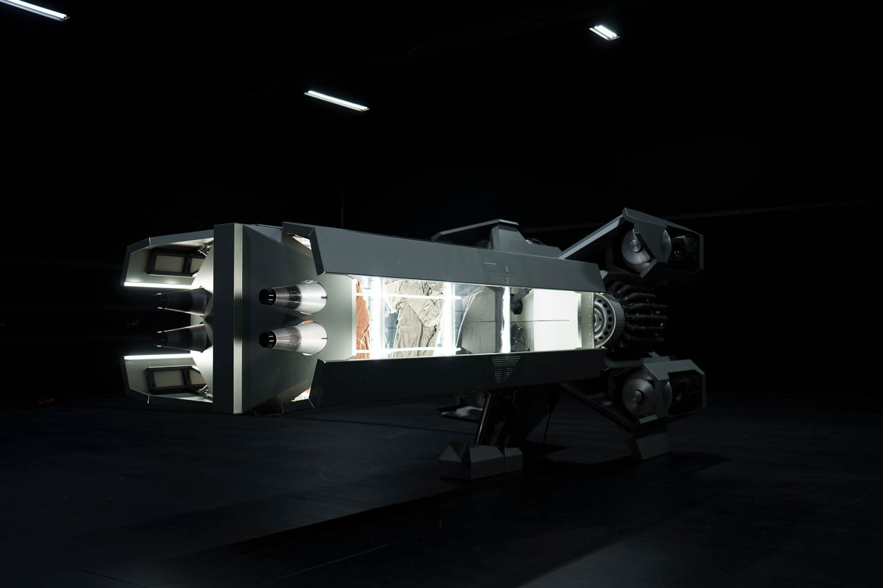
The Revolutionary Spaceshop: Retail Reimagined for Any Planet
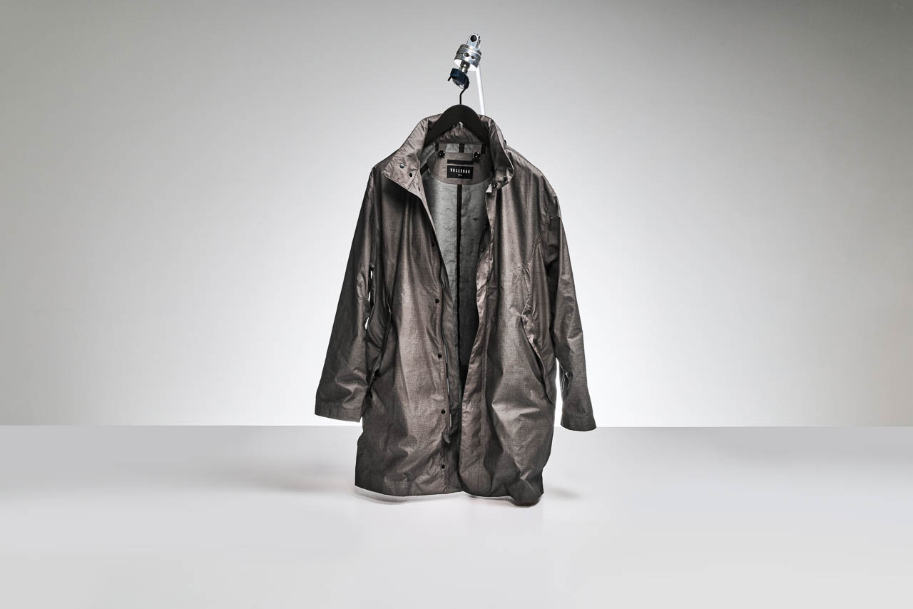
Weighing 1000kg and designed by Danish Space Architects SAGA, the Vollebak Spaceshop represents mobile retail architecture for extreme environments. “When we thought about our first shop we didn’t simply think about one city, or even one planet,” explains Nick Tidball, Vollebak co-founder. “We thought about a future in which stores would come to you, bringing the things you needed when you needed them, regardless of where you were hanging out on the beach in LA, or mining asteroids in space.”
Precision-engineered aluminum forms the structure’s foundation. Its exterior panels feature the same burnished, anodized aesthetic as the Beosound 2 Vollebak Edition. Inside? Bang & Olufsen’s iconic Beolab 5 and Beosound 2 speakers deliver an immersive, space-inspired soundscape.
Danish Space Architects SAGA specializes in architecture for extreme conditions. This makes them ideal partners for a retail concept that could theoretically function anywhere from Earth to space stations. Following its June 25 unveiling at Bjarke Ingels Group’s Copenhagen headquarters, the Spaceshop will tour key cities globally.
The Accidental Discovery That Defines the Beosound 2 Vollebak Edition
Rocket-burn effects on aluminum. That’s what Bang & Olufsen set out to replicate through advanced anodization. Kresten Bjørn Krab-Bjerre, Creative Director for Atelier at Bang & Olufsen, breaks down the process: “Aluminum, in its raw form, has an open structure. Left untouched, it naturally oxidizes to protect itself. But in a controlled environment, you can open the pores, introduce color, and seal it with a layer of aluminum oxide.”
Then came the breakthrough. A test piece meant for deep black emerged with textured swirls of grey and streaks of darker pigment. Teams worked intensively to reproduce this unpredictable finish under controlled conditions. The result? No two speakers appear identical. Each Beosound 2 Vollebak Edition becomes a one-of-a-kind sculptural object shaped by unexpected outcomes in the design process.
Pricing reflects this uniqueness: $5,300 for a made-to-order piece. Available from vollebak.com starting June 25, with Bang & Olufsen availability following later.
Vollebak’s Revolutionary Material Science Legacy
Twin brothers Nick and Steve Tidball founded Vollebak in 2016 with an ambitious mission. They use advanced material technology to tackle fundamental challenges of the next century: space exploration, climate change, human health, and sustainability. Their track record speaks volumes – two-time winners at TIME Best Inventions.
What have they created? Clothing ranges built for Mars and Titan. Gear designed for apocalypse scenarios. The world’s first solar-charged jacket. The first jacket made from graphene. The first computer programmable clothing, bringing humanity one step closer to an invisibility cloak.
This expertise in extreme material applications perfectly complements Bang & Olufsen’s century of acoustic development and aluminum mastery. As Krab-Bjerre puts it: “We’re excited to partner with Vollebak on this ambitious project, showcasing the innovation and experimentation that are at the heart of both brands. Together, we’ve transformed aluminum into a work of art – one that doesn’t just represent space and sound but also imagines the future we’re building towards.”
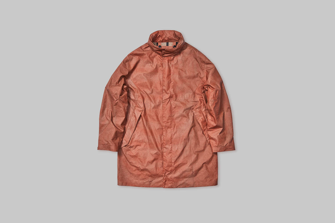
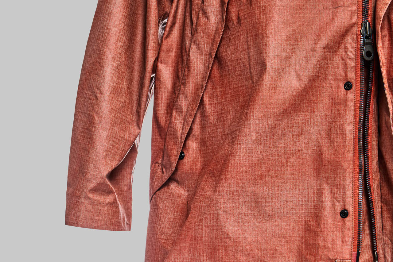
The Vollebak Anodized Jacket: Wearable Material Innovation
The collaboration extends beyond audio equipment. Enter the Vollebak Anodized Jacket, made from polyamide ripstop fused with a near-invisible layer of metal using galvanic treatment. This experimental process mirrors the speaker’s material experimentation in wearable form.
Why does this matter? It demonstrates how anodization techniques can transfer across product categories, from audio equipment to high-performance clothing. The jacket bridges the gap between traditional clothing and advanced protective gear through galvanic treatment that fuses metal layers with textile.
Bang & Olufsen’s Century of Innovation
Peter Bang and Svend Olufsen founded their company in 1925 in Struer, Denmark. Nearly a century later, their devotion and vision remain the foundation for everything Bang & Olufsen creates. The company has consistently pushed boundaries of audio technology while maintaining its position at the forefront of acoustic innovation.
Today’s numbers tell the story: approximately 900 employees operating in more than 70 markets worldwide. Products sold through Bang & Olufsen stores, bang-olufsen.com, and select retailers globally. Shares listed on NASDAQ Copenhagen A/S. Every product still characterized by the unique combination of beautiful sound, timeless design, and unrivaled craftsmanship.
A Long-Term Partnership for Future Innovation
This collaboration marks just the beginning. Both brands share commitments to pushing boundaries and reimagining what’s possible in their respective fields. The partnership demonstrates how audio engineering and advanced material science can converge to create products that transcend traditional category boundaries.
The June 25 unveiling at Bjarke Ingels Group’s Copenhagen headquarters represents more than a product launch. It’s a statement about the future of design innovation. As the Spaceshop begins its global tour, it will carry this message of material experimentation and boundary-pushing design to key cities worldwide, inspiring new conversations about the intersection of space, sound, and advanced materials.