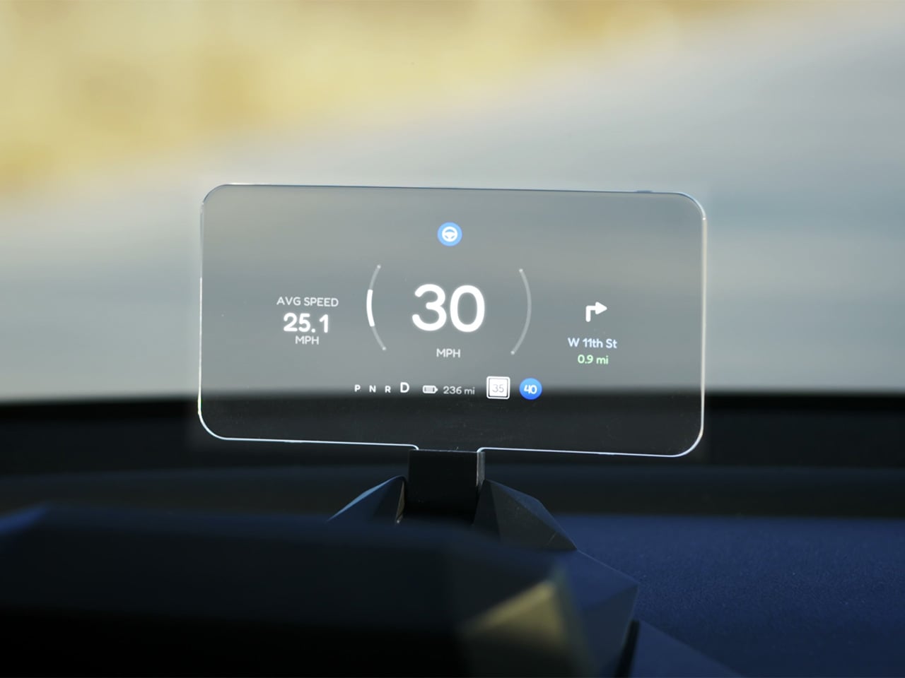
Tesla Left a Glaring Gap in Every Model 3 and Model Y. This $379 HUD Fixes It.
Fighter pilots have had heads-up displays since the 1950s, because asking a human to look down at instruments while traveling at 600 miles per hour and making life-or-death decisions is an engineering failure, not a pilot failure. The technology migrated to production cars in 1988 when GM offered the first automotive HUD in the Oldsmobile Cutlass Supreme, and every generation of premium vehicle design since has treated it as table stakes. Tesla rewrote so many conventions of the automobile that it’s easy to forget it left one important capability behind. For all the innovation packed into the Model 3 and Model Y, their dashboards direct critical driving data to a screen mounted nowhere near where human eyes naturally rest during forward motion. TrantorVision built NeuroHUD to close that gap, and the Kickstarter campaign funded in 30 minutes.
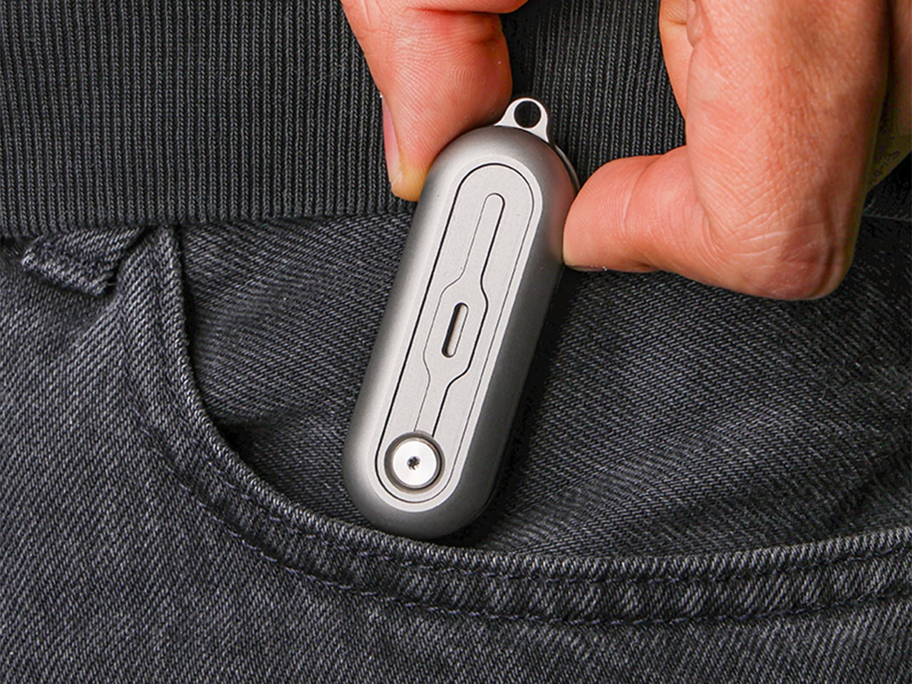
Built alongside a community of over 4,000 Tesla owners from mid-2025 through early 2026, NeuroHUD projects Tesla driving data directly into the driver’s forward sightline rather than leaving it on a screen at center console height. Installation takes about one minute, requires no tools and no disassembly, and leaves the factory wiring completely untouched, keeping the manufacturer’s warranty intact. The compute module clips behind Tesla’s center screen and draws power through a single USB-C cable, with no hardwired connections and no vehicle modifications of any kind. From there, a dual-channel data system reads Tesla’s screen directly through AI cameras and simultaneously pulls deeper vehicle telemetry through the Tesla API, creating a richer information layer than either method could supply alone. The result covers speed, navigation, gear state, battery range, blind-spot alerts, and takeover warnings, all projected directly in the driver’s line of sight.
Designer: TrantorVision
Click Here to Buy Now: $379 $629 (40% off). Hurry, only a few left! Raised over $474,000.
A pair of 150-degree AI fisheye cameras face Tesla’s display and read high-frequency data like speed at 50 Hz, fast enough to keep the HUD readout synchronized with the car’s actual state without perceptible lag at any velocity. Lower-frequency information, covering gear position, battery range, and navigation turns, arrives through the Tesla API on a separate channel, and the system routes each data type through the appropriate pipeline based on how quickly it needs to update. End-to-end latency on the AI vision side sits as low as 20 milliseconds, tighter than many production-fitted HUDs achieve through direct hardware integration. The onboard processor is a 6-core Arm DynamIQ chip paired with an Arm Mali G610 MP4 GPU and 4GB of LPDDR4 RAM, running Ubuntu Core Linux with Wi-Fi 6 and Bluetooth 5.4 connectivity. That compute specification would look comfortable in a mid-range Android tablet, which gives a sense of how much processing headroom TrantorVision has reserved for future OTA feature additions.

At 1,500 nits of peak brightness, NeuroHUD’s 4-inch TFT LCD panel is engineered specifically around the failure mode that sinks most aftermarket HUDs in real-world use: direct sunlight washout. The panel runs at 480×800 resolution with a 140-degree viewing angle, keeping displayed information legible across a wide range of driver head positions without requiring precise alignment to a narrow sweet spot. The modular Light Engine gives drivers a genuine choice of projection method rather than committing them to a single approach. Combiner Mode positions a semi-transparent screen in the driver’s sightline for the sharpest image quality, with projected information appearing to float in the forward visual field at a focal distance that keeps eyes aimed naturally at the road. Windshield Projection Mode throws the image directly onto the glass for a more immersive overlay, and both modes switch without tools or any hardware intervention.

HomeControl is a GPS-triggered garage automation system that learns the driver’s RF remote signal, geolocates the home driveway, and fires the garage door automatically as the car turns in, with a physical button for manual override available at any time. Screen Mirroring turns the HUD into a secondary phone display, meaning Google Maps or Waze can be projected directly onto the combiner or windshield without any dependency on Tesla’s native navigation system. UI customization runs three levels deep: a mobile app for toggling individual elements, a full UI editor for precise sizing and positioning of each data element, and an open API interface for users who want to build a custom renderer entirely from scratch. A community layer lets drivers share layouts or download configurations built by other NeuroHUD owners worldwide, making the display experience as much a living software product as a hardware one. The combination of GPS automation, open API access, and a community-driven layout library gives NeuroHUD a software depth that compounds as its user base grows.

TrantorVision began the project in January 2025 with the goal of building a heads-up display designed around Tesla’s unique display architecture from the ground up. By May 2025 an engineering prototype was assembled and the AI vision system validated through real-world road testing; by July the product was publicly announced with a community already exceeding 4,000 Tesla owners across multiple platforms. Production design locked in December 2025, with the first batch of production samples arriving in January 2026. The device supports Model 3 from 2017 to 2023, Model Y from 2020 to 2025, Model 3 Highland from 2023 onward, Model Y Juniper from 2025 onward, and the Cybertruck from 2023 onward, covering both left-hand-drive and right-hand-drive configurations with Model 3/Y Standard trim included. An OTA Compatibility Upgrade Service is built in, meaning the hardware is designed to receive future software capabilities without requiring a new unit.

The standard NeuroHUD carries an early bird price of $379 against a retail MSRP of $629, covering Tesla data integration, mobile app control, UI community access, the custom UI editor, screen mirroring, and CarPlay and Android Auto support. The NeuroHUD Pro steps to $429 at early bird pricing, down from $729 retail, adding HomeControl, Windshield Projection Mode, deeper Tesla API integration, and enhanced hardware built to grow its feature set through over-the-air updates. Both tiers ship with a windshield film, USB-C power cable, Thunderbolt cable, 12V car adapter, cable clips, and a quick start guide, backed by a one-year warranty. Shipping is free to the continental United States and Canada, with a flat $10 covering the EU, UK, Australia, Hong Kong, and all other worldwide regions, with customs fees covered for most major markets. Global delivery is scheduled to begin between September and October 2026.
Click Here to Buy Now: $379 $629 (40% off). Hurry, only a few left! Raised over $474,000.
The post Tesla Left a Glaring Gap in Every Model 3 and Model Y. This $379 HUD Fixes It. first appeared on Yanko Design.


 Bang & Olufsen has been designing objects that make a room better simply by existing in it since 1925.