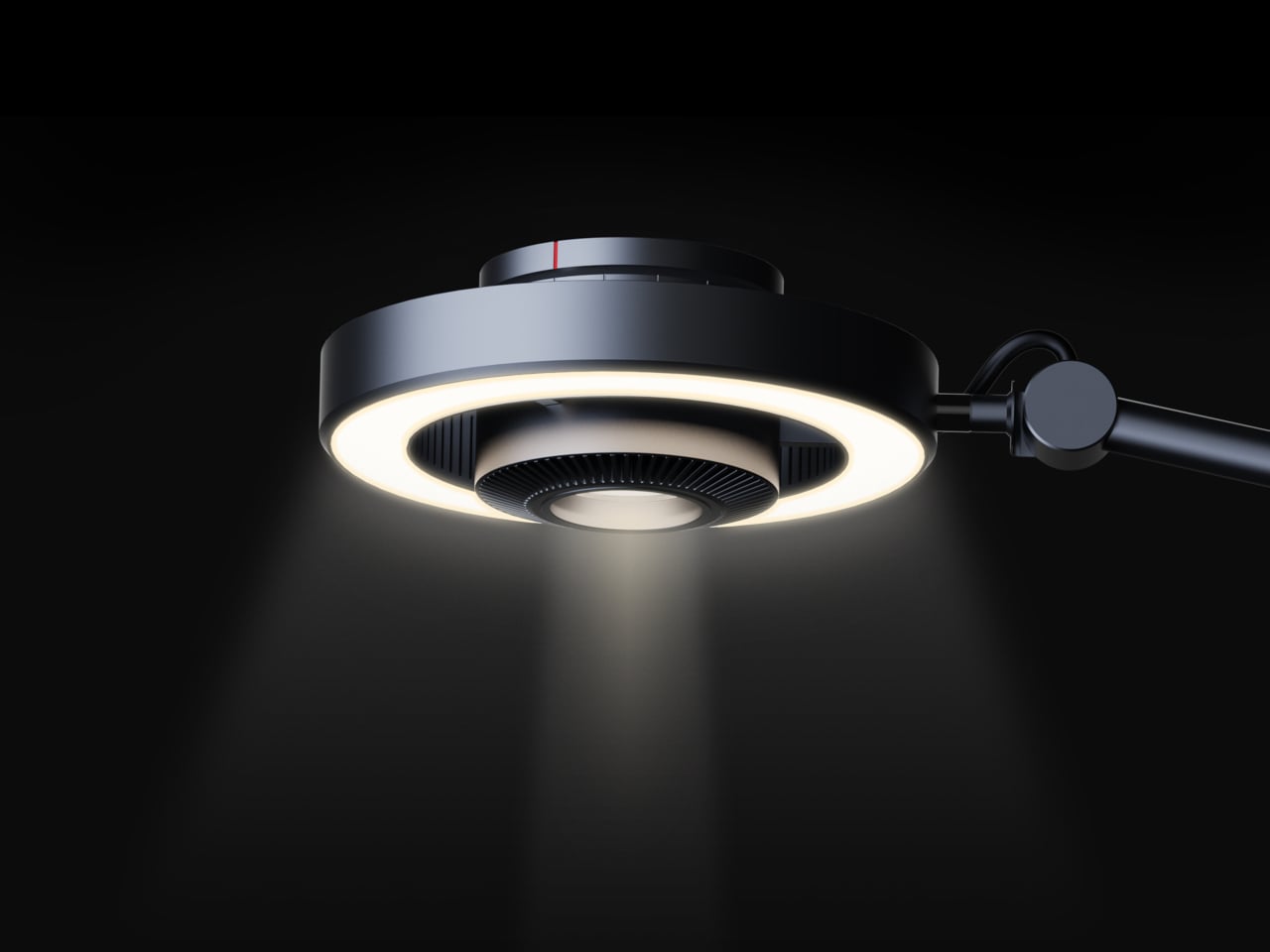
Desk lighting has long been a compromise between task and atmosphere. Professional lamps tend to lean one way or the other: too directional and harsh for extended use, or too diffuse to support fine detail work. A lamp that’s good for examining physical samples often isn’t comfortable over long stretches, and one that’s gentle on the eyes doesn’t always deliver when you need a hard, directed beam.
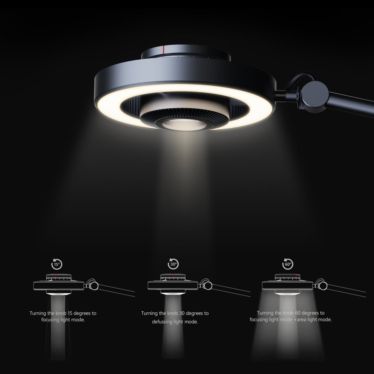
The Focus Light is a desktop lamp concept built around a different premise. Rather than committing to one kind of output, it combines two independent light sources into a single lamp head, giving the user the ability to shift between a precise, concentrated beam and a broad ambient glow, or run both at once. All of it’s controlled by a single rotary knob, and there aren’t any menus, apps, or extra switches involved.
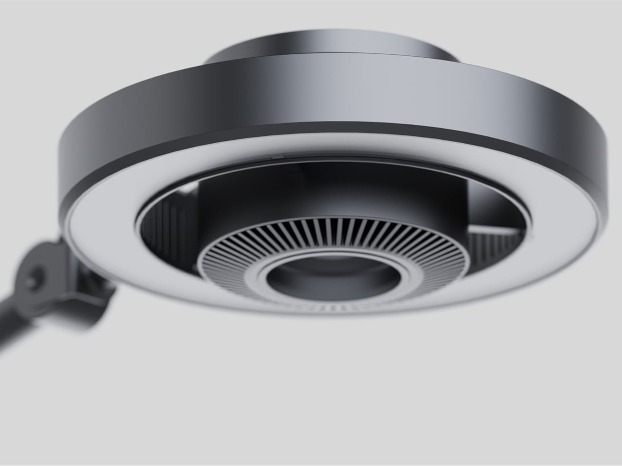
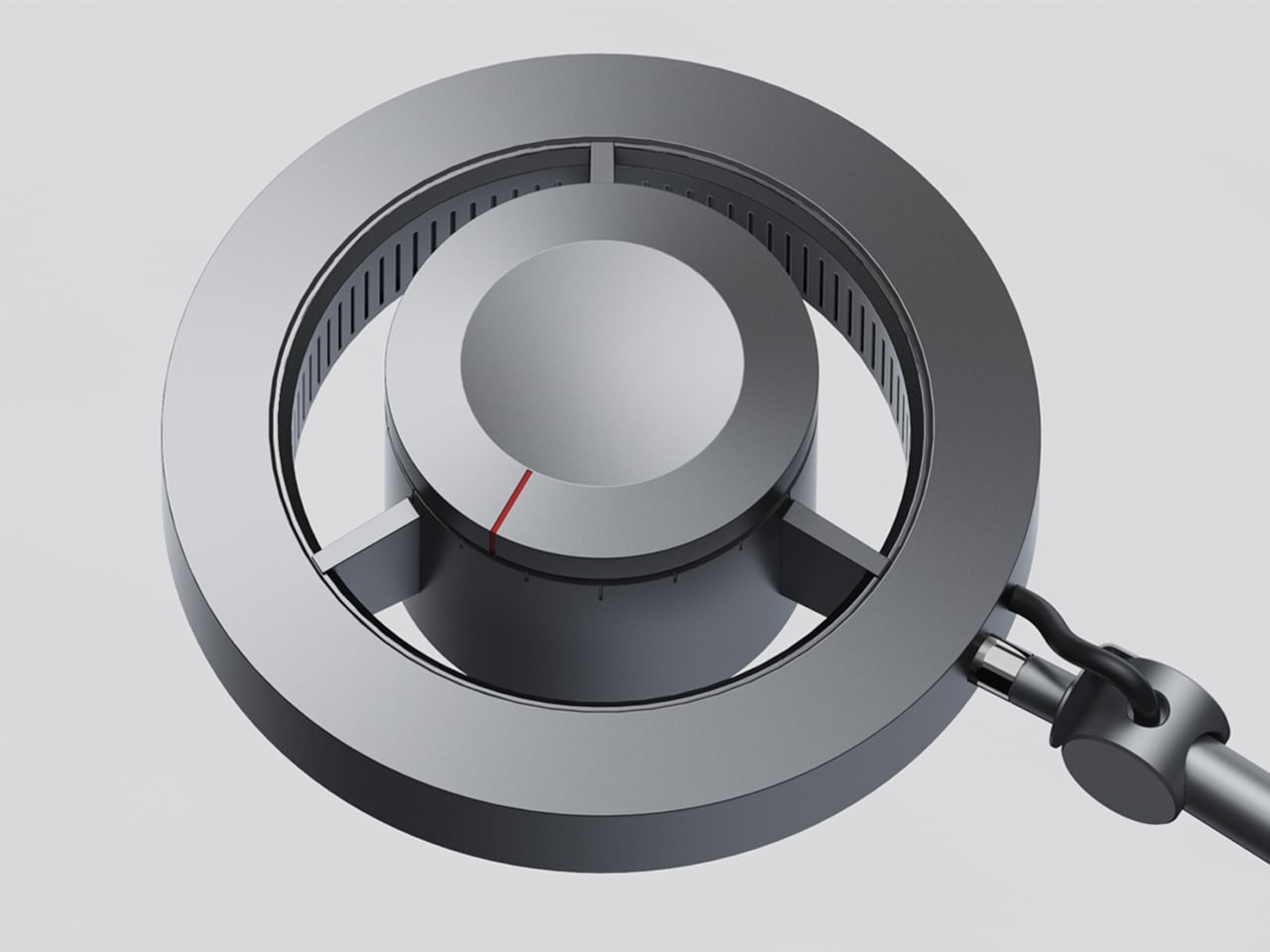
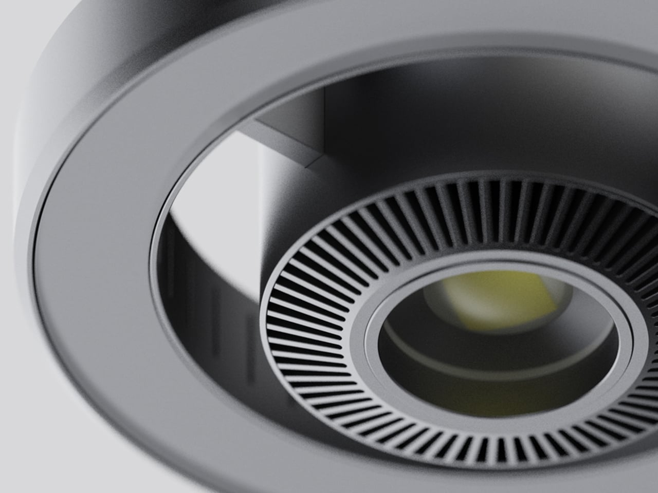
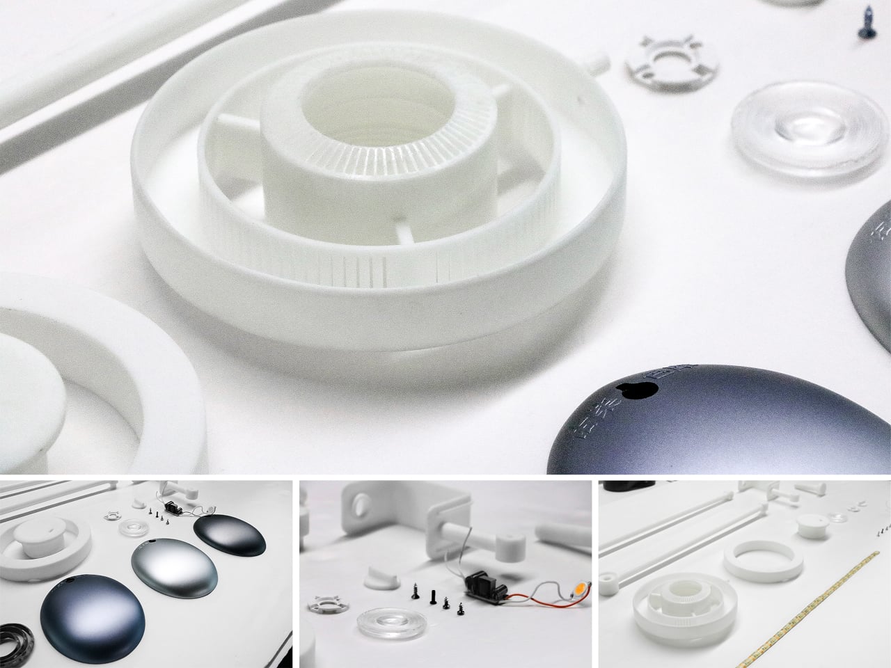
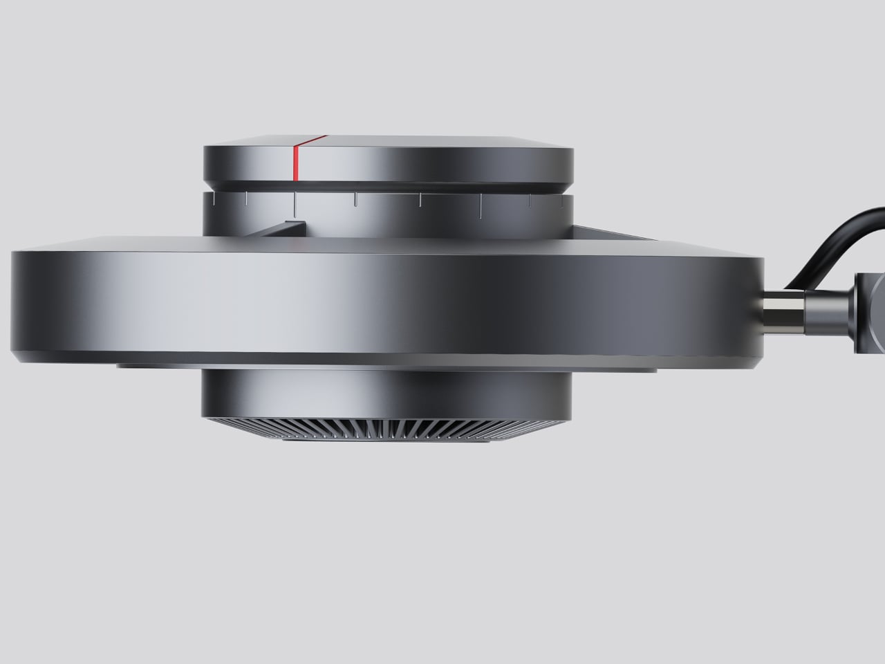
The lamp head is organized concentrically: an outer ring delivers ambient light while a central optical lens handles the focused beam. That layout has both functional and visual logic to it. Both sources sit in deliberate, concentric relation to each other, and the overall form looks as precise as it performs. The whole thing is finished in space gray metal, which lends it a professional, precision-tool character.
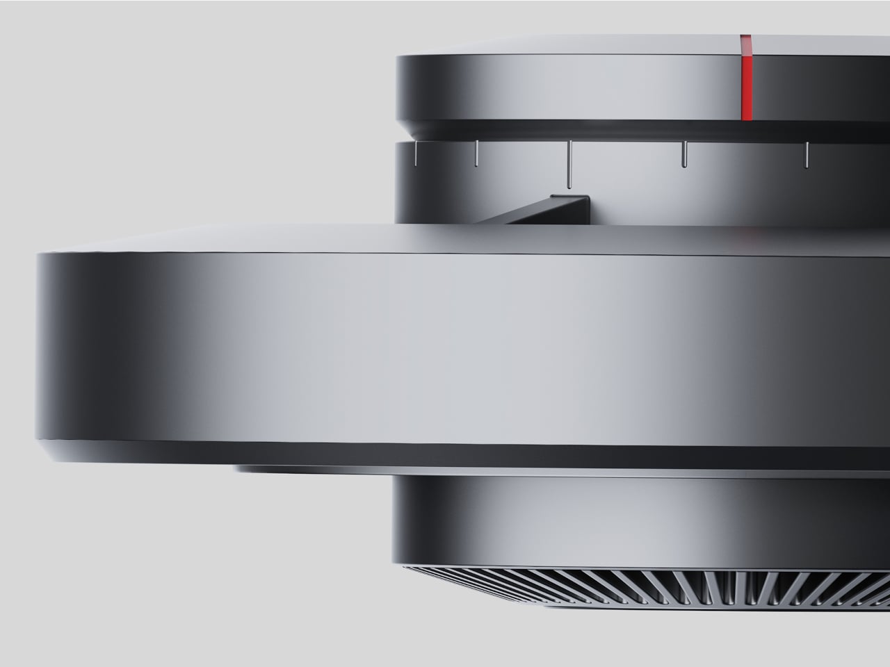
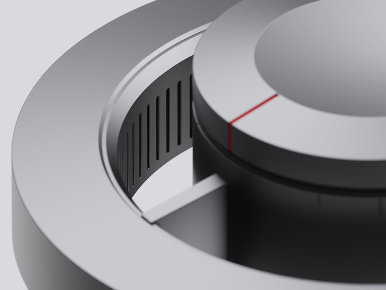
Control comes from a rotary knob on top, marked with a red indicator line. Rotating it 15 degrees activates focusing mode, sending a tight, concentrated beam straight down. At 30 degrees, the lamp shifts into diffusing mode, spreading the output into something closer to fill light. Push it to 60 degrees, and both sources run simultaneously, combining the central spot with the ambient ring for a layered workspace light.
For detailed hands-on tasks, being able to shift between modes without touching an app or dimmer panel makes a real difference. An illustrator tracing fine lines benefits from the precision of the focused beam, but that same beam creates harsh contrast against a dark surrounding surface. Bringing in the ambient ring softens that contrast, and having both running at once makes moving between close-up precision work and wider desk visibility much more seamless.
The same flexibility serves anyone who switches between different types of work at the same desk. Reading calls for something even and non-glare; marking up documents or working with small physical components benefits from a harder, more directed light. The Focus Light doesn’t ask the user to swap lamps or reposition the arm for each shift. The knob handles it, and the change is immediate.
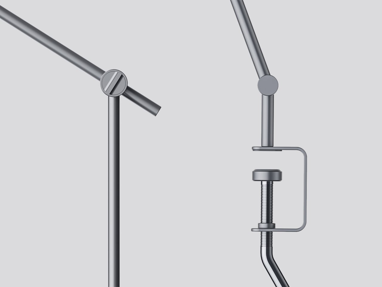
The physical form reflects the precision the lamp is meant to support. The lamp head is a clean disc with radiating heat fins arranged around the inner lens assembly, and the arm connects at a ball joint that allows repositioning without loosening a series of screws. A threaded desk clamp handles the mounting, so it doesn’t demand a grommet hole or take up surface area with a weighted base.
What stands out about the concept isn’t just the dual-source setup, but that a single physical control manages both. There’s no menu to scroll, no app to open. The red indicator on the knob tells you exactly where you are, and the three positions are distinct enough that you’d find your way back to any of them by feel after just a few days.
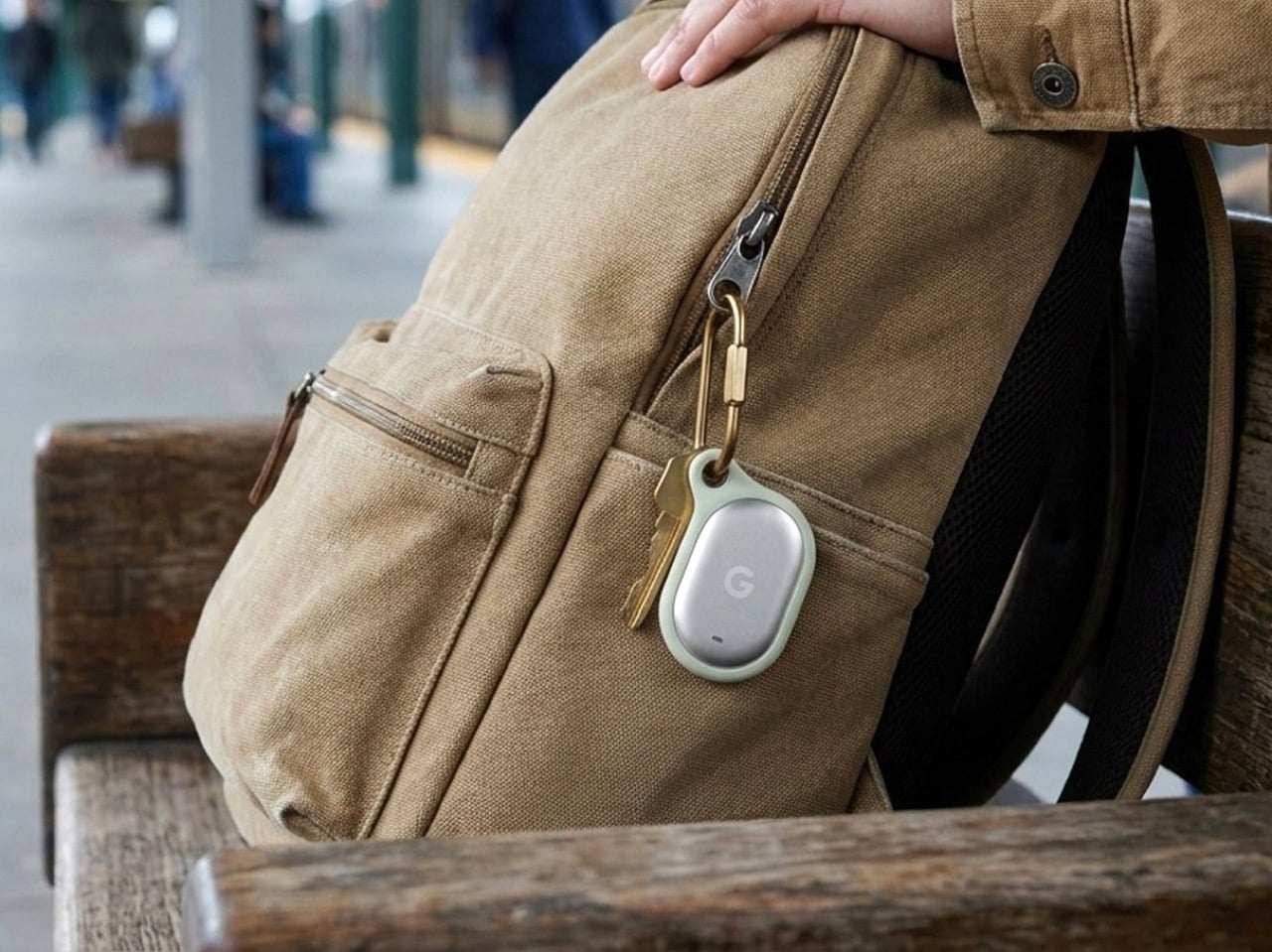
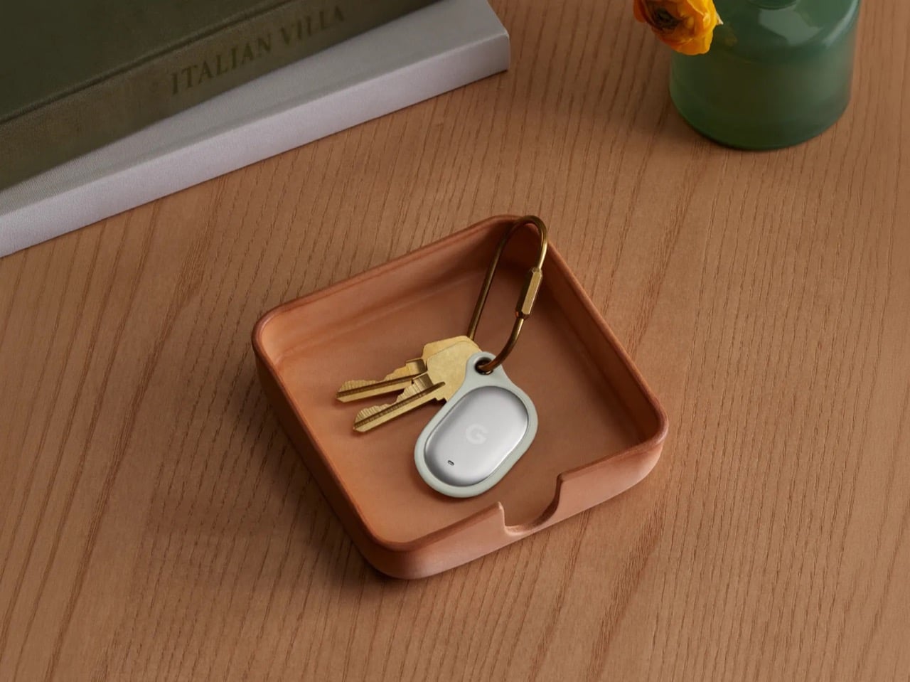
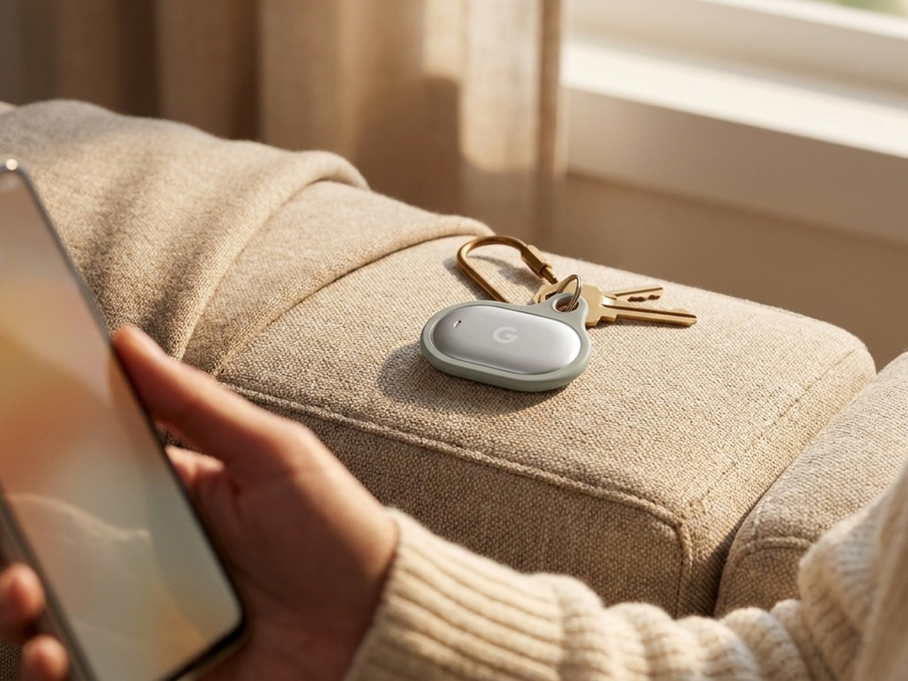
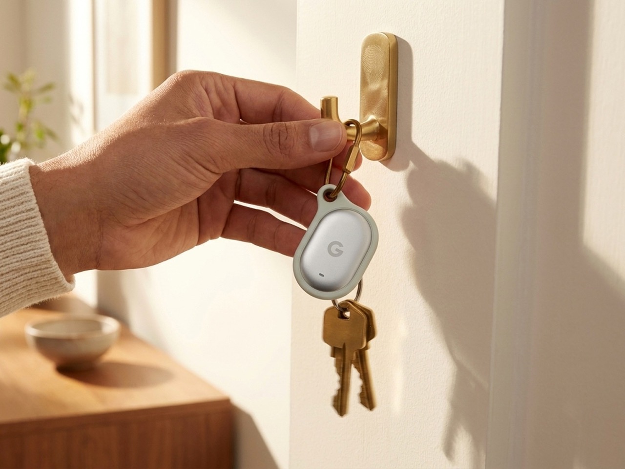
The Pixel Tag comes in exactly one color, a grey green called Fog, wrapped around stainless steel with a G logo stamped right on the front. It’s the same script Apple wrote with the AirTag and Samsung copied with the SmartTag2. A tracker spends its entire life clipped to your keys or your dog’s collar or tucked into a backpack pocket, which makes it one of the most personal objects you own. Google, of all companies, knows how to make hardware feel less like hardware. It just didn’t bother here.
Somebody at DJI figured out that a $60 microphone could come with snap-on decals, because apparently even a tiny accessory deserves a little personality. Motorola figured out something similar with the Moto Tag, which actually ships in sage green and a soft blue instead of the usual black or white default. So it’s not like nobody in tech has thought about this. It’s just that almost nobody applies it to trackers, and now Google has joined the long list of companies that had the chance and passed.
The excuse I keep hearing, and I use that word deliberately, is durability. Metal survives drops, fabric doesn’t, case closed. Except my phone survives daily abuse inside a woven case, and so does yours, and so does every rugged Kevlar sleeve sold by the millions for devices far more fragile than a coin sized tracker. Nobody worries their phone case is going to disintegrate because it has some texture on it. A tracker being too delicate for color or grip is not a real constraint. It’s a decision that got dressed up as one.
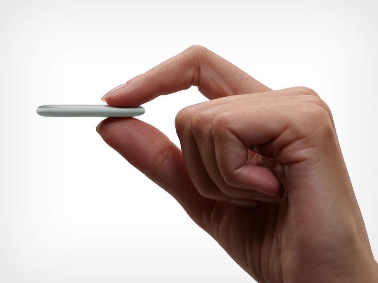
Underneath that decision is genuinely solid engineering, for what it’s worth. The Pixel Tag measures 1.8 by 1.1 inches and just 5.4mm thick, which makes it noticeably slimmer than the AirTag’s 8mm body. It runs on a replaceable CR2032 battery rated for about a year, carries an IP67 rating for dust and water, and pairs instantly over Fast Pair with any Android 9 device or newer. The headline feature is Ultra Wideband combined with Bluetooth Channel Sounding, which gives you a literal on-screen arrow and distance reading instead of a vague “getting warmer” signal, though that trick needs Android 16 and Bluetooth 6.0 to actually work. It taps into Find Hub, Google’s network of over a billion Android phones, so a lost item can get spotted even when it is nowhere near your own devices. You can share access with up to ten people, ring it from a Pixel Watch, or ask Gemini through your Pixel Buds to ring it for you. All of that ships November 11 for $29, or $99 for a four pack.
Google already knows how to wrap good engineering in an object people actually want to look at, because it solved the exact same brief years ago with its speakers. The Nest Mini gets a soft, woven top because Google understood people don’t want to display a hunk of bare plastic on their kitchen counter. The Nest Audio does the same thing, fabric front, rounded edges, an object designed to belong in a room rather than announce itself as a gadget in one. That instinct exists inside the same company that just shipped a keychain accessory in one shade of grey with a logo dead center, like it needed to remind you it’s tech.
A tracker’s entire job is to sit quietly on the stuff you actually care about. It should feel like something you chose, not something you tolerated because the tech underneath happened to be good. Find Hub integration, UWB precision finding, a battery that lasts a year, all of that is genuinely solid work. But solid engineering wrapped in a logo stamped on steel isn’t a finished product. It’s half of one, and Google, weirdly, is the company with the least excuse for stopping there.
Summer does a reliable job of exposing what is wrong with your carry. Thinner clothes mean shallower pockets, and whatever has been accumulating since January starts demanding justification it cannot provide. The wallet that has been stretching since February, the key ring that jingles through every meeting corridor, the flashlight that has been dead for three weeks – they all resurface together as you pack a bag and head back. The loadout that survived winter is not the one that deserves September.
The five upgrades here share a single argument: fewer objects doing more work, or one object doing something with enough precision that the supporting cast stops being necessary. None of them ask you to carry more. Each one consolidates something you were already carrying into a form that earns its pocket space so completely you stop thinking about it. That is the standard. That is what back-to-work EDC should actually look like.
1. Olight Baton 4 Premium Edition
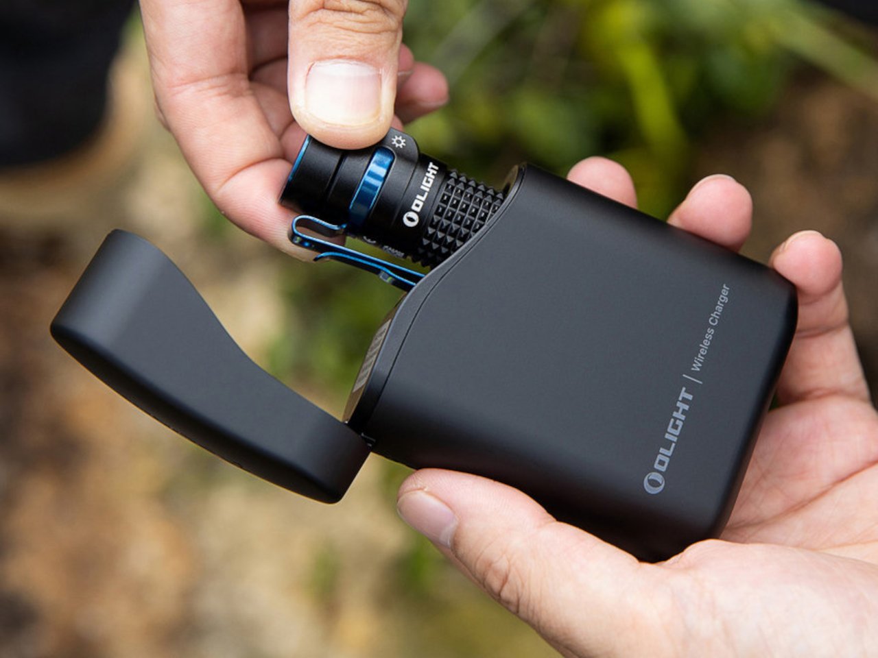
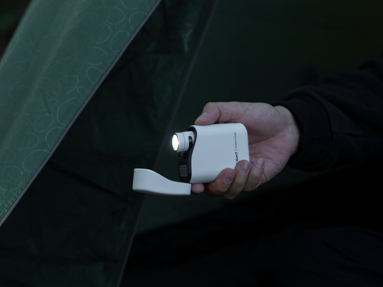
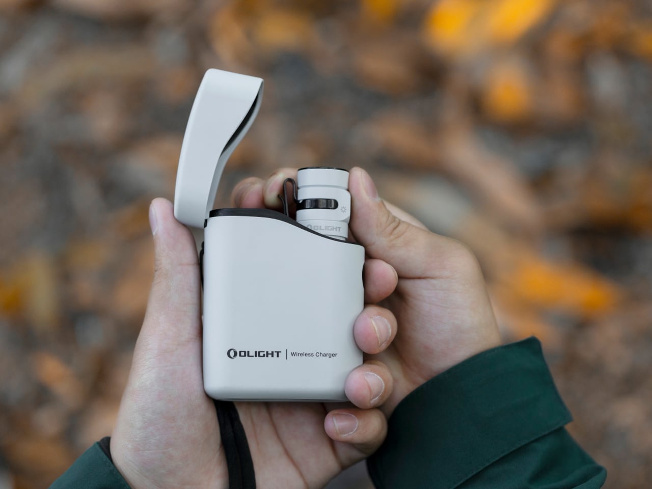
Most people heading back to work carry a flashlight and a power bank as two separate objects, in two separate compartments, with two separate charging cables neither of them can ever locate. The Baton 4 Premium settles that argument by making the charging case the second object, not the flashlight and the power bank as distinct things. The flip-top case carries 5,000mAh, recharges the Baton 4 up to five times, and allows you to activate the light without removing it from the case at all. Open the lid, press the side button, and the light fires. That single interaction collapses the gap between a flashlight that lives in a bag and one that is actually ready when something happens.
The 1,300-lumen output and IP68 waterproof rating handle the practical end of what a flashlight needs to do. The magnetic tail cap converts it into a freestanding lantern by sticking to any steel surface, removing the need for a separate camp light in most outdoor situations and proving genuinely useful in an office during a power outage. For a loadout returning to structure after a summer of loose carry habits, the Baton 4 Premium makes the case that two carry problems can be resolved by a single considered object. That is the only standard that matters right now.
What we like
The charging case serves as a functional 5,000mAh power bank and activates the flashlight without removing it – two carry problems resolved by one object instead of two
The magnetic tail cap frees both hands during stationary tasks without requiring any additional accessories, stands, or setup
What we dislike
Maximum brightness draws battery down faster than lower output modes, which means more frequent recharging on heavy-use days and more reliance on the case as a compensating mechanism
The case adds volume to the carry; users wanting the flashlight alone will need to leave the power bank function behind, which partially defeats the premise of carrying less
2. Fantom X Wallet
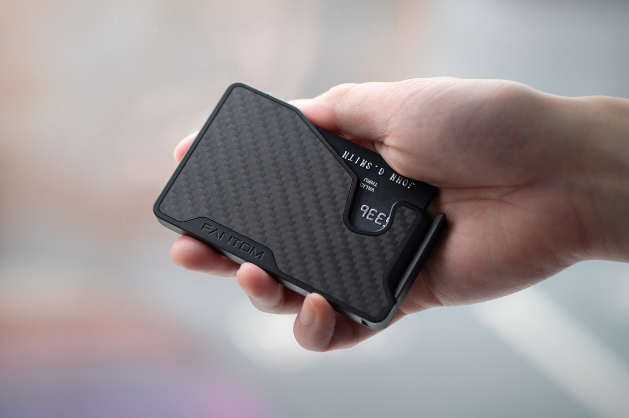
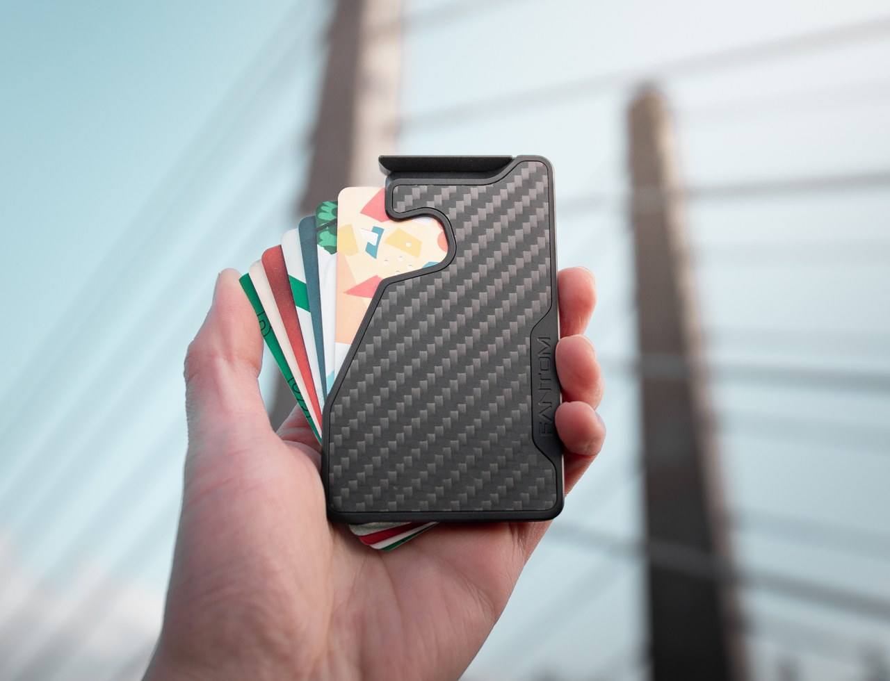
The wallet category has been failing quietly for decades. Leather stitching stretches, bifolds accumulate receipts nobody asked for, and elastic bands lose tension in months rather than years. The Fantom X approaches the problem as an engineering challenge rather than a craft one, building the chassis from machined aluminum, retaining cards mechanically, and adding a spring-loaded ejection system that fans your cards in sequence at the press of a button. Nothing in its construction is soft, which means nothing in this wallet degrades.
The design logic is borrowed from product categories where material failure is not tolerated. A bead-blasted aluminum body carries the same engineering rationale as the titanium tools that dominate the better end of the EDC market: fewer materials, one mechanism, no organic components that can rot or stretch under daily use. Cards are organized by ejection sequence rather than pocket habit, which introduces a useful kind of intentionality about what actually deserves a slot. Heading back to work with a wallet this considered makes the chaos of a stretched billfold feel like a problem you solved rather than one you are still living with.
What we like
Machined aluminum construction eliminates the stretching, cracking, and wear patterns that define the lifespan of leather and fabric wallets across every price bracket
The spring-loaded ejection fans cards in sequence, removing the fumbling that every other slim wallet format still requires at the checkout counter
What we dislike
The mechanical ejection system has a learning curve for anyone switching from a traditional bifold, and the first week of carry involves genuine reorientation
Cash carry is minimal depending on configuration, which limits practicality for anyone who still moves through the day with notes in their pocket
3. Orbitkey Key Organiser
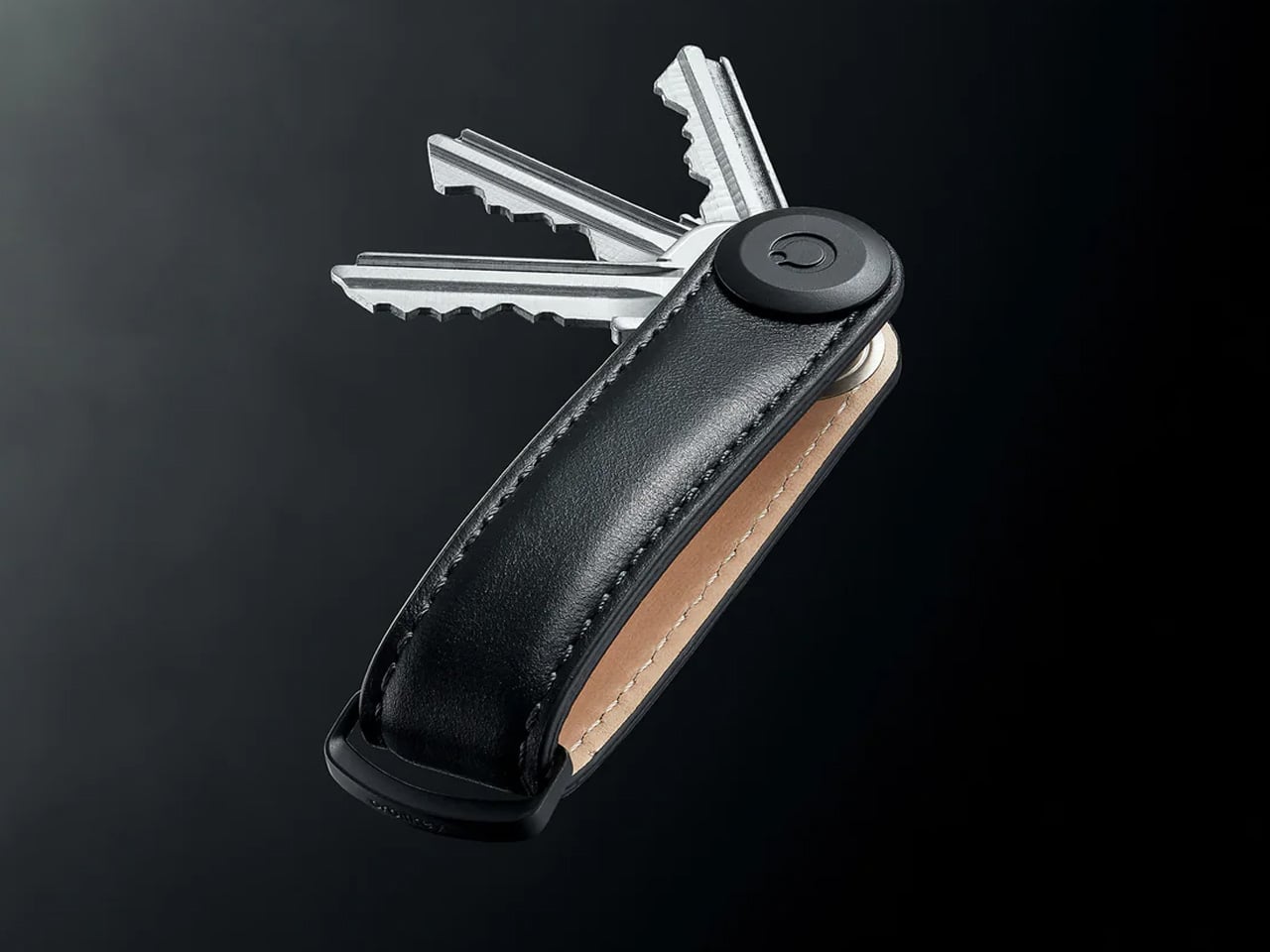
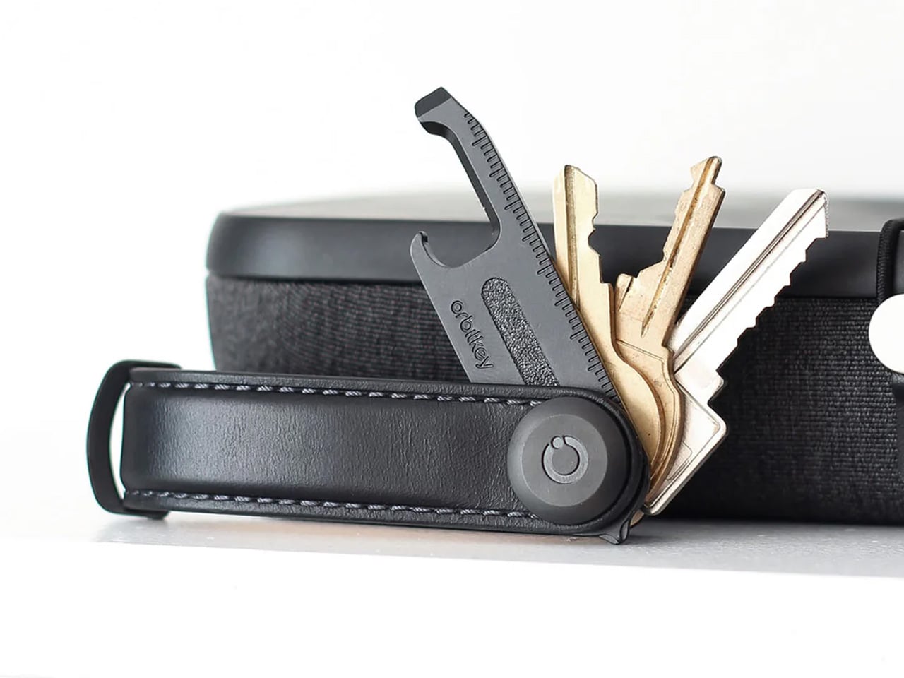
A standard key ring solves the organizational problem with the bluntness of something designed before pockets had size constraints. Keys stack against each other, jingle against everything nearby, and press ridges into the thigh pocket of work trousers for eight hours straight. The Orbitkey stacks two to seven keys flat inside a full-grain leather spine secured with stainless steel hardware, held under tension, producing no movement and no sound when the system is closed. In a pocket, it disappears entirely.
The leather exterior develops its own grain and wear pattern over years of daily use, an explicit design position about longevity that most keychain products never bother taking. The two-screw expansion system accommodates keys confidently up to its rated capacity, and a small ring attachment handles anything that does not stack flat inside the body. Five colorways run from black dress leather to warmer cognac tones, covering the full range of what a work bag demands. Heading to the office with the Orbitkey in your pocket for the first time, the first thing you notice is the absence of sound from your keys. Then you stop noticing it, and that is the point.
What we like
The tension stacking system eliminates key jingle, which sounds like a minor quality-of-life gain until you experience the cumulative quiet of a full working day without it
Full-grain leather construction ages into character rather than showing damage, signaling a product built to outlast the annual trend cycle by a significant margin
What we dislike
Initial key installation involves a screwdriver and careful threading – not difficult, but the setup time is a real first-use commitment that catches some buyers off guard
Oversized or irregularly headed keys may not stack cleanly within the system’s geometry, which is worth confirming before purchase rather than after
4. KeyUnity KK08 Titanium Carabiner Knife
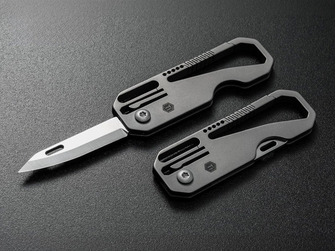
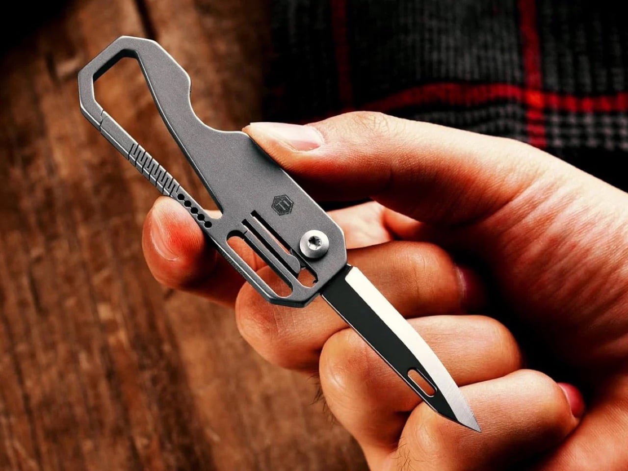
The carabiner is one of the most underutilized platforms in everyday carry. Most examples handle clipping and nothing else, occupying keychain real estate without justifying it with more than a single function. The KeyUnity KK08 corrects that by integrating a deployable blade directly into the gate of a TC4 Grade 5 titanium carabiner. One object handles clipping, carrying, and cutting without requiring any tool swap. The blade locking mechanism operates independently from the carabiner gate, keeping both functions discrete and deliberate rather than tangled.
TC4 titanium earns its place here for the same reason it appears throughout the better end of the EDC market. Corrosion-resistant, strong relative to its weight, and completely indifferent to the wear conditions that define outdoor carry. On a carabiner that lives clipped to the outside of a bag or attached to belt hardware, that resistance matters considerably more than it does for something sitting at the bottom of a pocket. The KK08 simplifies the question of what to clip things with by answering a second question at the same time – the most honest argument any carry tool can make.
What we like
Two functions in one form factor means the carabiner earns twice the keychain space it would otherwise occupy, which is the cleanest possible argument for carrying it daily
TC4 Grade 5 titanium construction handles outdoor exposure and weather without the corrosion concerns that affect steel alternatives over extended carry
What we dislike
The integrated blade deployment requires some familiarity with the gate mechanism before it feels genuinely intuitive in the moment you actually need it
Carabiner knives occupy a legal gray area in certain jurisdictions, so confirming local blade regulations before daily carry is worth the time it takes
5. Titaner Swing Ratchet System
A standard ratchet needs 15 to 30 degrees of swing arc to advance a single tooth. That is a workable trade-off in open space and a complete failure in the places where screws actually live: behind cables, inside recessed housings, angled into corners that no straight tool can reach. The Titaner Swing Ratchet compresses that arc to 4 degrees, which means it can cycle in gaps where conventional ratchets physically cannot complete a single turn. CNC-engraved directional markers on both sides of the core remove any guesswork from direction selection.
At 29.8 grams, it sits 40 percent lighter than a traditional ratchet while delivering full torque through a modular system that accepts different bit configurations. Back-to-work projects – tightening workstation hardware, adjusting studio furniture, building out a new desk setup – involve screws in confined locations far more often than they involve screws in clear, open space. A ratchet that reaches those positions at under 30 grams earns its pocket space across a full working season rather than waiting in a tool bag for a task large enough to justify the trip back to get it.
What we like
A 4-degree swing arc allows operation in spaces so confined that standard ratchets cannot cycle at all, solving the one problem no other tool in this roundup attempts to address
At 29.8 grams, it is genuinely light enough for daily carry rather than tool-bag-only use, which changes how often it actually gets reached for
What we dislike
The ultra-compact ratchet head can feel less assured under heavy torque loads compared to a full-sized alternative with more leverage to draw from
It earns its pocket space most clearly when fastener access is a regular part of your week; for purely occasional use, the weight-to-frequency ratio may not always close the argument
Editor’s Choice: ClearSlide Box Opener
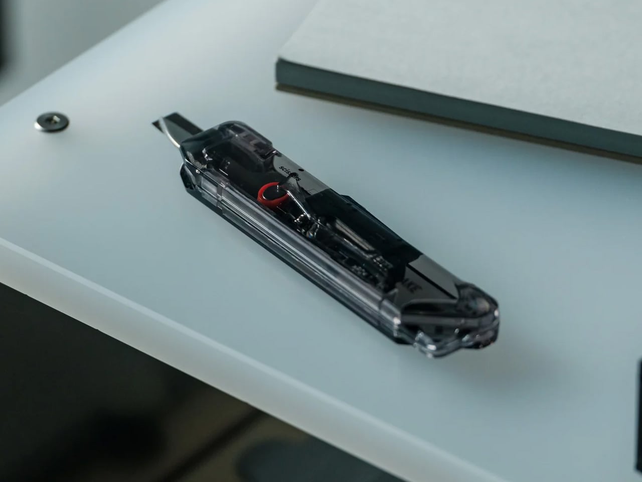
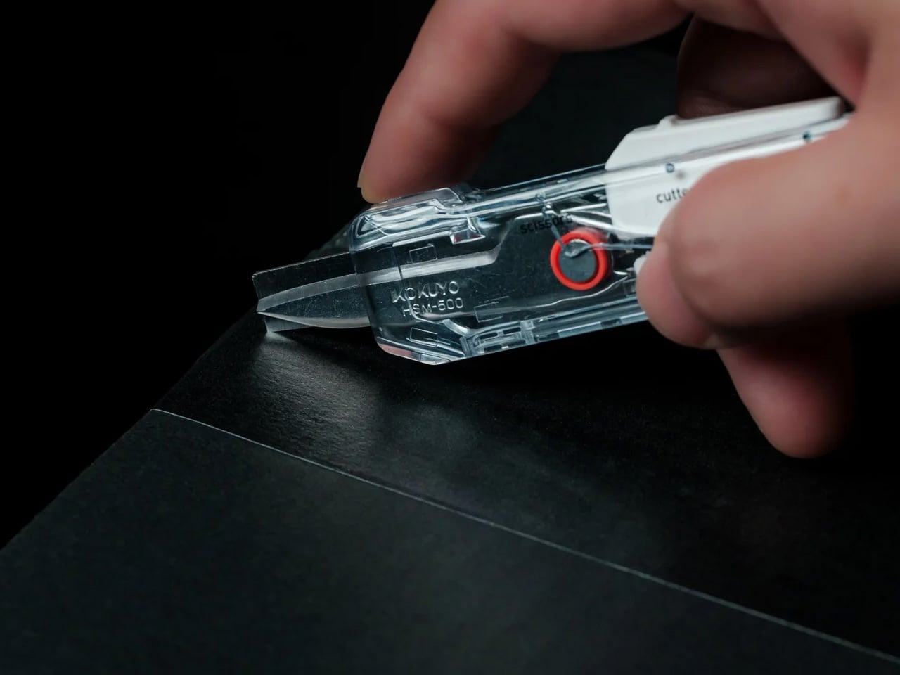
Every back-to-work loadout eventually faces the same moment: a delivery arrives, you reach for a box cutter, realize you also need scissors to deal with the tag inside, and end up setting the box down to find a second tool. The ClearSlide was designed specifically to end that exchange. A smooth sliding thumb mechanism switches between lock, cutter, and scissors in a single hand motion, then cuts with the same thumb – without ever putting the box down. It is a two-tool problem resolved by one object small enough to live on a desk or disappear into a pocket.
The 0.12-inch blade extension is deliberate rather than conservative. It slices through packaging tape cleanly while keeping enough distance from the contents that you are not second-guessing every cut. But the detail that earns it Editor’s Choice is the transparent body. The red slider and internal mechanism are fully visible through the shell as you cycle through positions, each one locking with a crisp click before releasing with a clean spring action. Instead of hiding the engineering, the ClearSlide makes watching it work part of using it – a small thing that changes the object from a utility purchase into something you actually want to keep on your desk. At $30, it is also the most straightforward decision on this entire list.
The single-hand sliding mechanism switches between box cutter and scissors without setting the package down – the exact problem it promises to solve, solved completely
The transparent body exposes every shift of the internal mechanism, turning a functional action into something worth noticing
What we dislike
The 0.12-inch blade is optimized for tape and packaging, not heavier cutting tasks that need more blade depth
Only a few units currently available, so if the ClearSlide catches your attention, the window to order without waiting is short
The Best Carry Is the One You Stop Thinking About
The best September loadout is not a longer list. It is five objects that between them cover a light, a wallet, keys, a clip, and a ratchet – each doing its job well enough that nothing else feels necessary – plus one desk tool that quietly removes a daily frustration you have been tolerating since the last time boxes started arriving. Nothing is left over. Nothing is missing. The edit is worth making now.
What changes when you get this right is not just the weight, though the weight does drop. What changes is the feeling of moving through the day without friction from the objects that are supposed to be helping you. The Baton 4 charges and illuminates from a single case. The Fantom X does not stretch. The Orbitkey does not jingle. The KK08 clips and cuts. The Titaner reaches where nothing else can. The ClearSlide handles the desk. That is the carry.
Camera batteries are one of those accessories that photographers never think about until something goes wrong. They’re small enough to vanish into the bottom of a bag or a jacket pocket, common enough to own several of and regularly mix up, and important enough that losing one mid-trip can force an early stop to a shoot. The solution most people reach for is buying more of them, which only increases the number of things to keep track of.
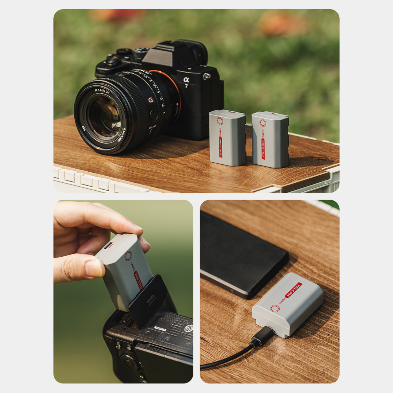
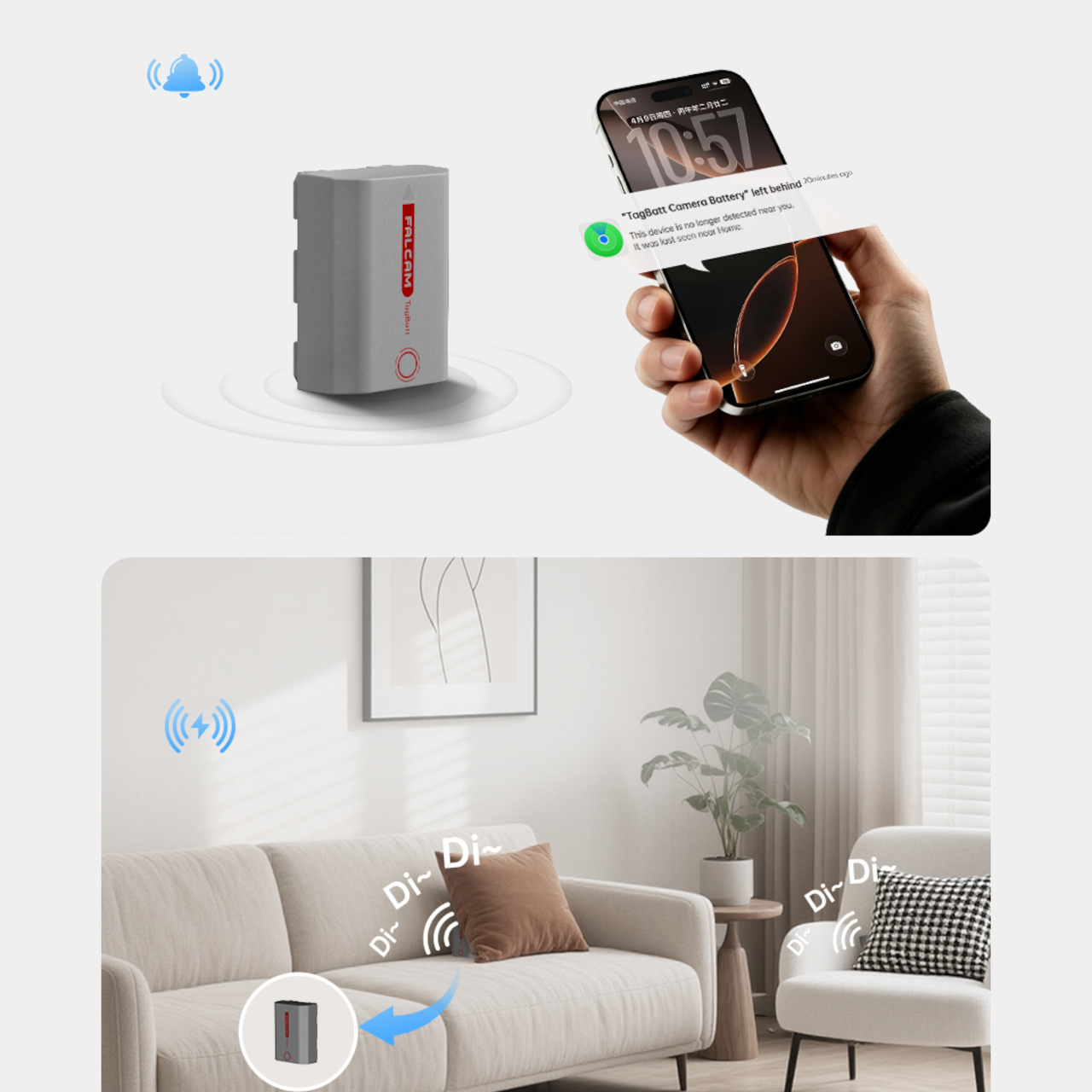
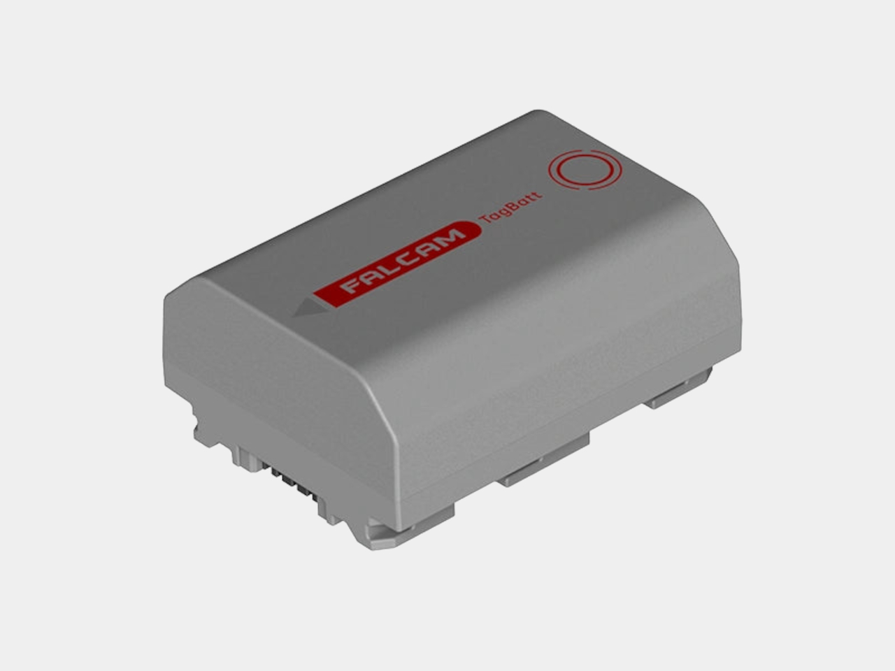
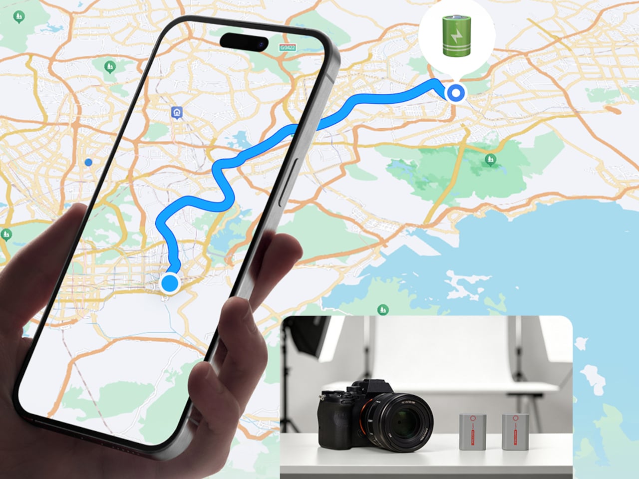
The FALCAM TagBatt addresses the problem from inside the battery itself. Compatible with Sony’s NP-FZ100 form factor, it integrates Apple’s Find My tracking technology directly into the cell, so the battery carries its own location data wherever it goes. If it ends up left behind at a studio, a venue, or the seat pocket of a flight, the Find My app will flag it and show its last known position.
Because the tracker lives inside the battery rather than clipped to a camera strap or screwed into a cage mount, it’s considerably harder to spot. An opportunistic thief who grabs a camera bag and removes any obvious Bluetooth puck from the outside can’t strip out what’s already built into the power source. It’s the kind of discreet integration that external trackers can’t quite replicate, no matter how small they get.
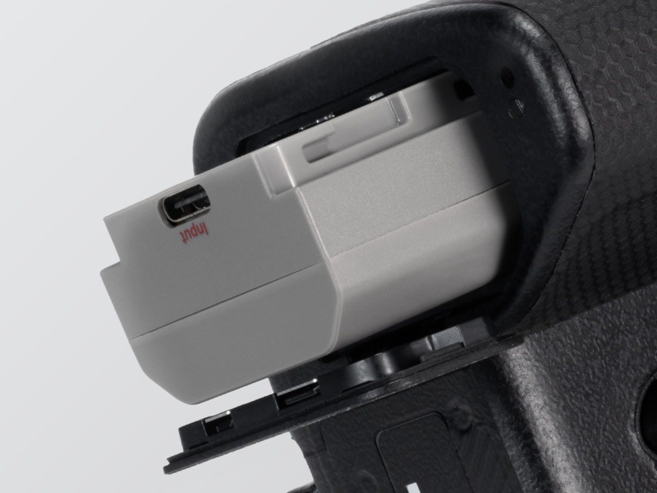
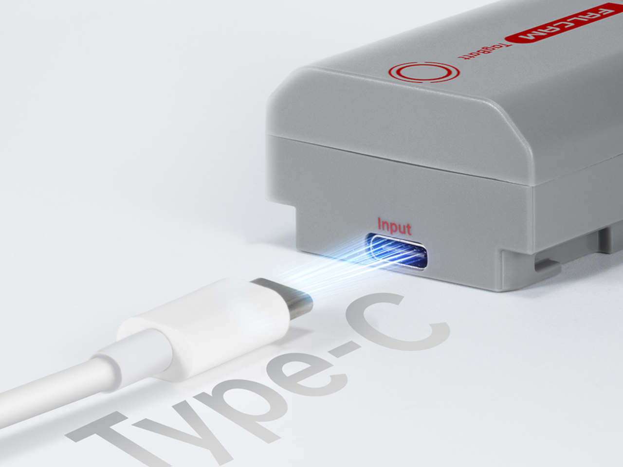
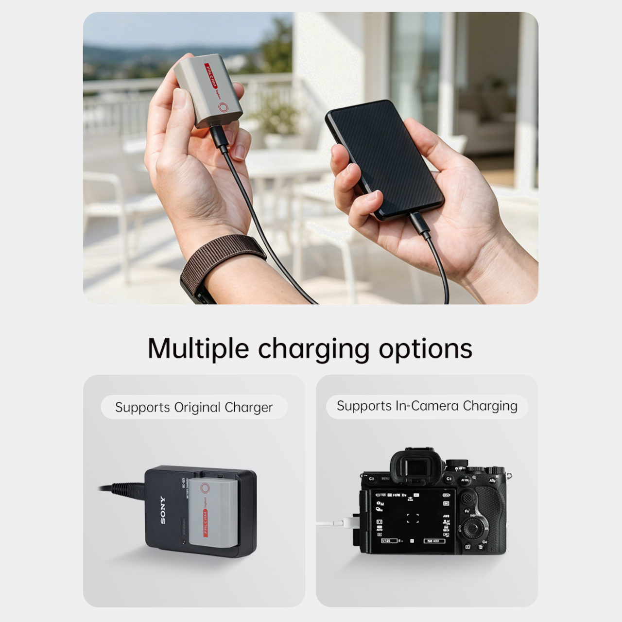
The tracking isn’t the only thing the TagBatt changes about how a camera battery behaves. A built-in USB-C port lets it charge directly from any standard USB-C source, including a power bank or a travel adapter, without needing the dedicated Sony battery charger that typically takes up its own space in a kit bag. Pop it out of the camera, plug it in overnight, and it’s ready in the morning without routing around a charger at all.
Capacity comes in at 2,600mAh against the OEM Sony NP-FZ100’s 2,280mAh, which translates to a modest but real advantage per charge. An advanced decoding chip handles the communication with the camera’s internal systems so the body treats it as it would any genuine battery, with accurate charge-level reporting and none of the “non-genuine battery” warning messages that typically accompany third-party cells.
Compatibility covers a wide sweep of Sony’s current lineup, including the Alpha 7 series through the Alpha 7 V, the Alpha 9 series, the Alpha 6700, the FX3 and FX30, and the ZV-E1, among others. A Canon LP-E6 version is also available now, with Nikon EN-EL15 and Fujifilm NP-W235 versions confirmed to be in development.
At $69.99, the TagBatt costs more than a standard third-party replacement but considerably less than the Sony original, and it comes with two capabilities that the original simply doesn’t offer. For photographers who travel frequently, work in locations where gear occasionally goes astray, or are just tired of carrying a charger they’d rather leave at home, the trade-off makes a fairly straightforward case.
Tabletop roleplaying games have an accessory problem. The dice alone can take over a corner of any gaming table, each one representing a different die type that the rules will inevitably call for at the least convenient moment. Tracking down the right d10 mid-session, or explaining to a new player why there are two different ten-sided dice in the bag, is just one of those small but reliable annoyances that experienced players have long since stopped questioning.
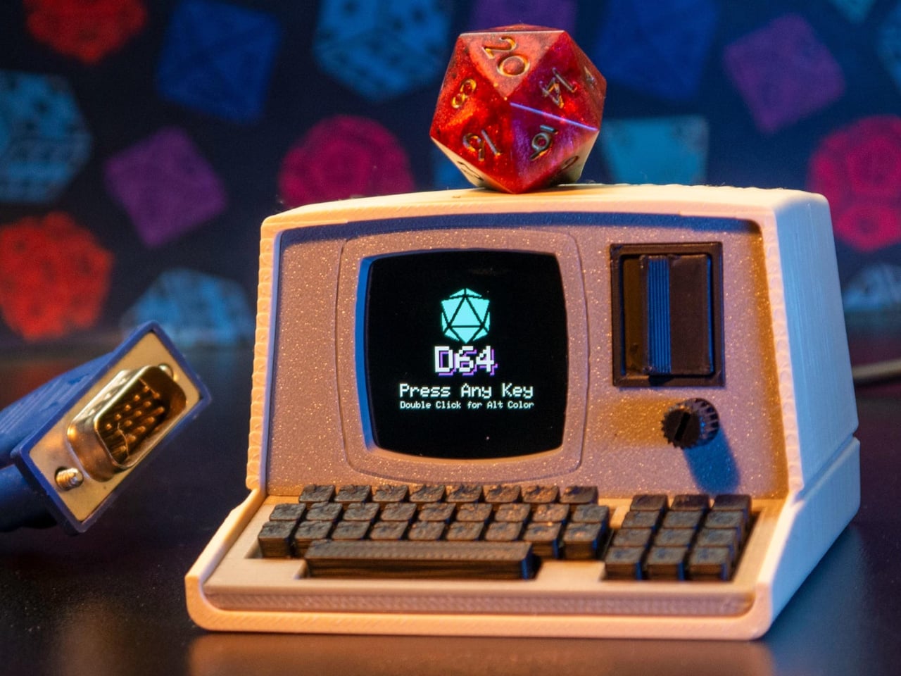
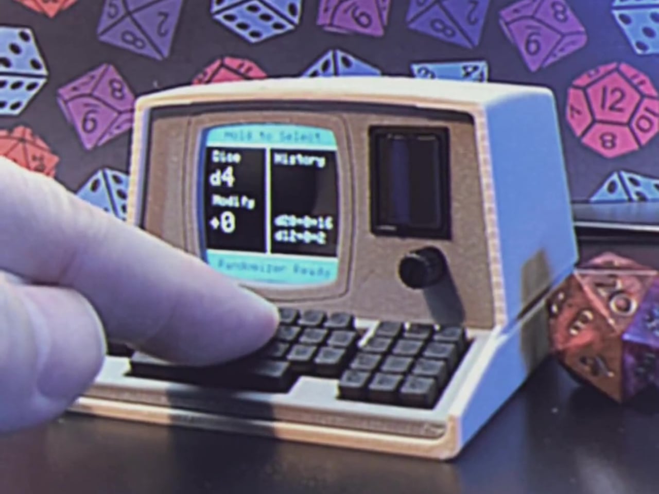
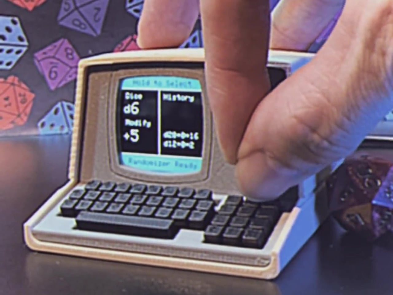
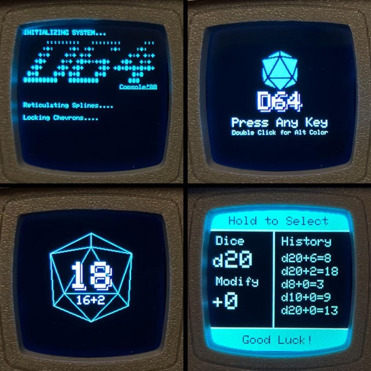
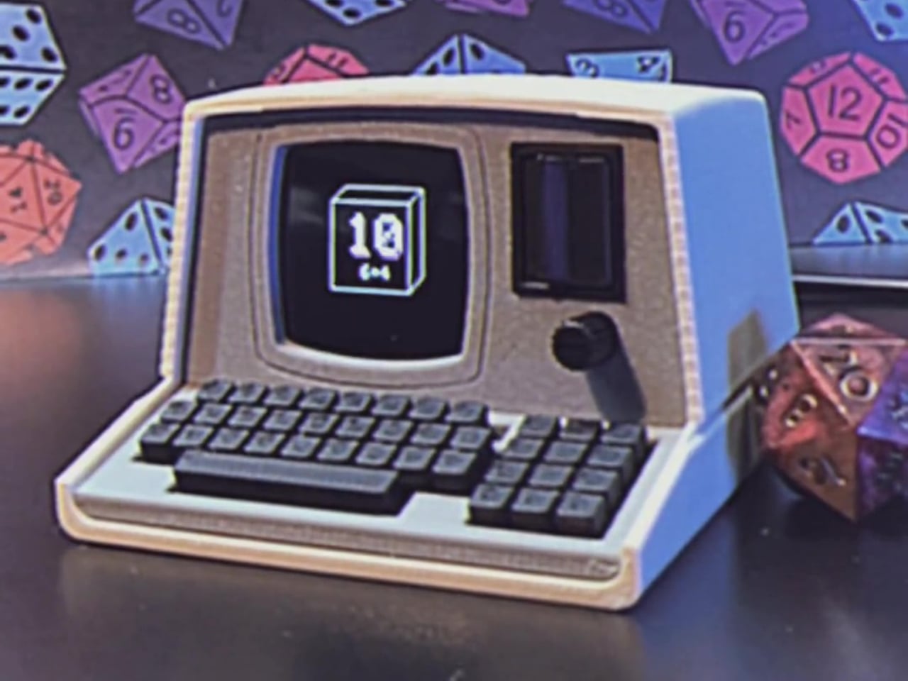
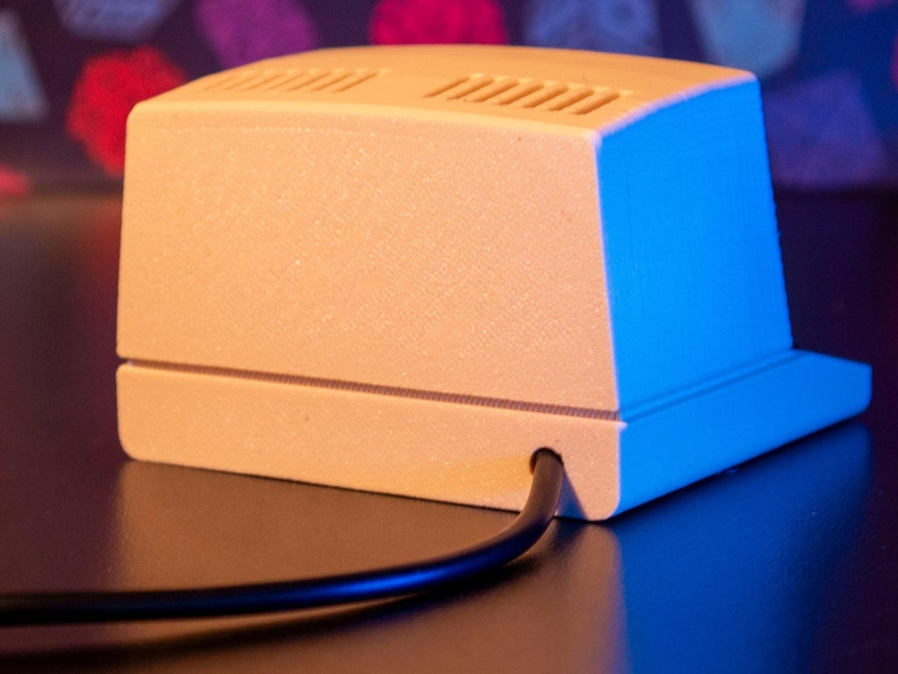
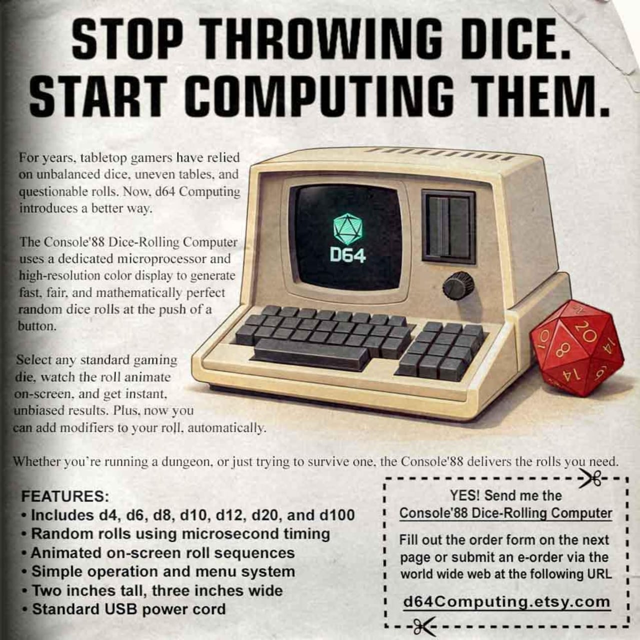
The Console’88 from d64Computing is a compact digital dice roller that handles the entire set from d4 through d100 in a single device, the size of a pocket calculator. What makes it genuinely interesting, though, isn’t just the function; it’s that the designer chose to dress it up as a miniature 1980s computer, complete with a CGA color display, vector graphics, boot-screen text, and the kind of visual language that looks like it was pulled straight out of a 1984 computer catalog.
Selecting a die type is done through a rotary dial and a button underneath the faux keyboard, which fits the era aesthetically and keeps the interaction simple. Spin it to the die you want, and get your result. The randomness runs at microsecond precision, so the results are genuinely unpredictable rather than cycling through a predictable sequence. For anyone who’s ever side-eyed an app-based roller and wondered about its actual randomness, that’s a meaningful detail.
The sounds are what push it over from clever gadget into something with real personality. The Console’88 plays 1980s video game audio when you roll, and it apparently has dedicated sound effects for critical successes and critical failures, which is the kind of contextually appropriate design decision that’s easy to appreciate at an actual gaming table. A crit that’s announced by a triumphant eight-bit jingle lands differently than a number quietly appearing on a phone screen.
There’s an argument to be made for physical dice that has nothing to do with practicality. Rolling actual dice is tactile, dramatic, and central to the experience for a lot of players. But for anyone who travels frequently to gaming sessions, runs games for beginners without their own dice, or simply wants something that takes up less space on an already crowded table, a single device covering every die type is a reasonable swap to make.
The design commitment here is what separates the Console’88 from a generic electronic dice app. This thing looks like it belongs on a desk next to a Commodore 64, and reviews consistently call out the visual quality of the vector graphics and the charm of the retro computer case. It’s a product that clearly started from an aesthetic vision rather than pure function, and the function turned out to be genuinely good on top of it.
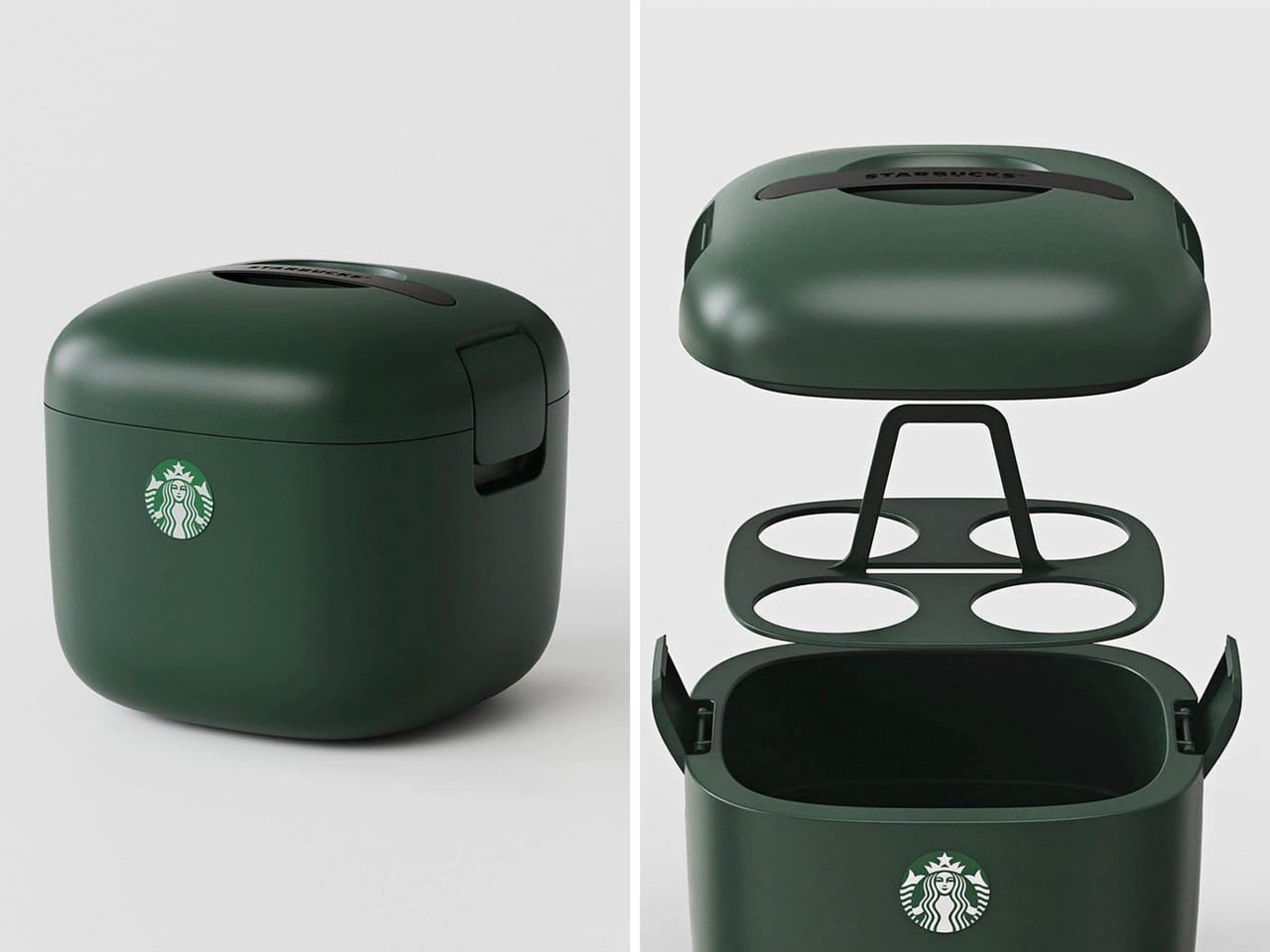
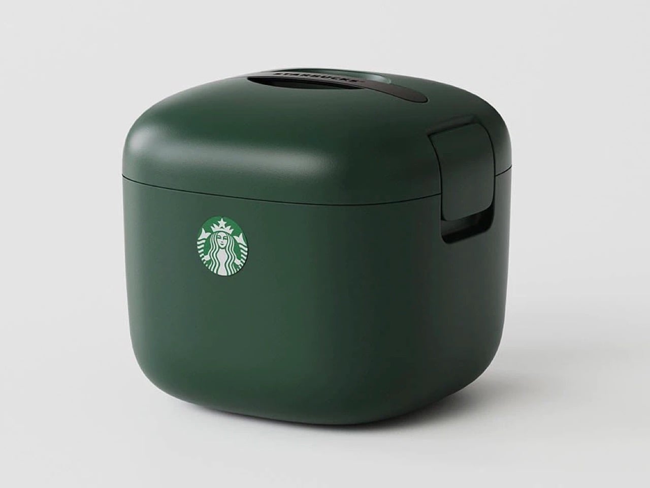
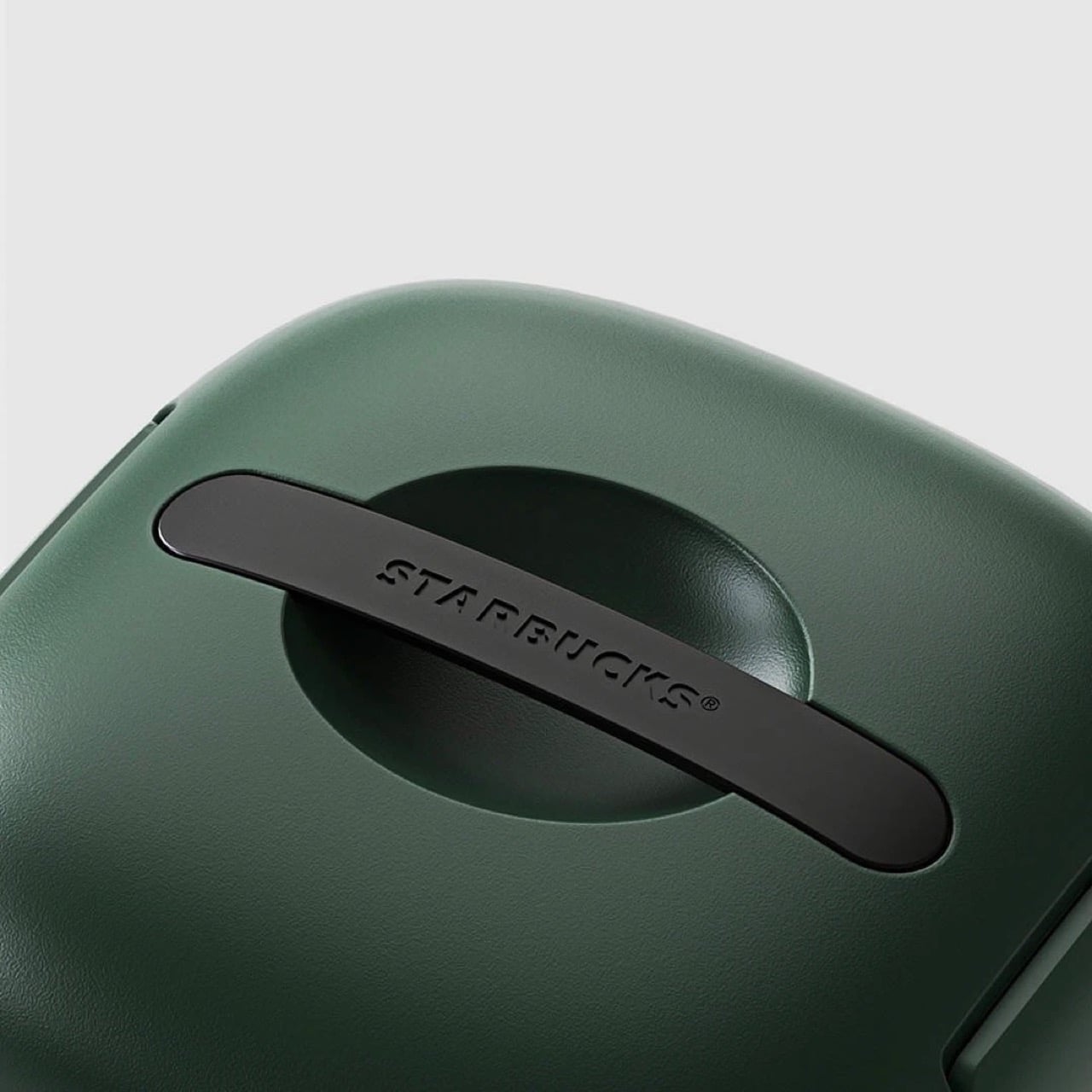
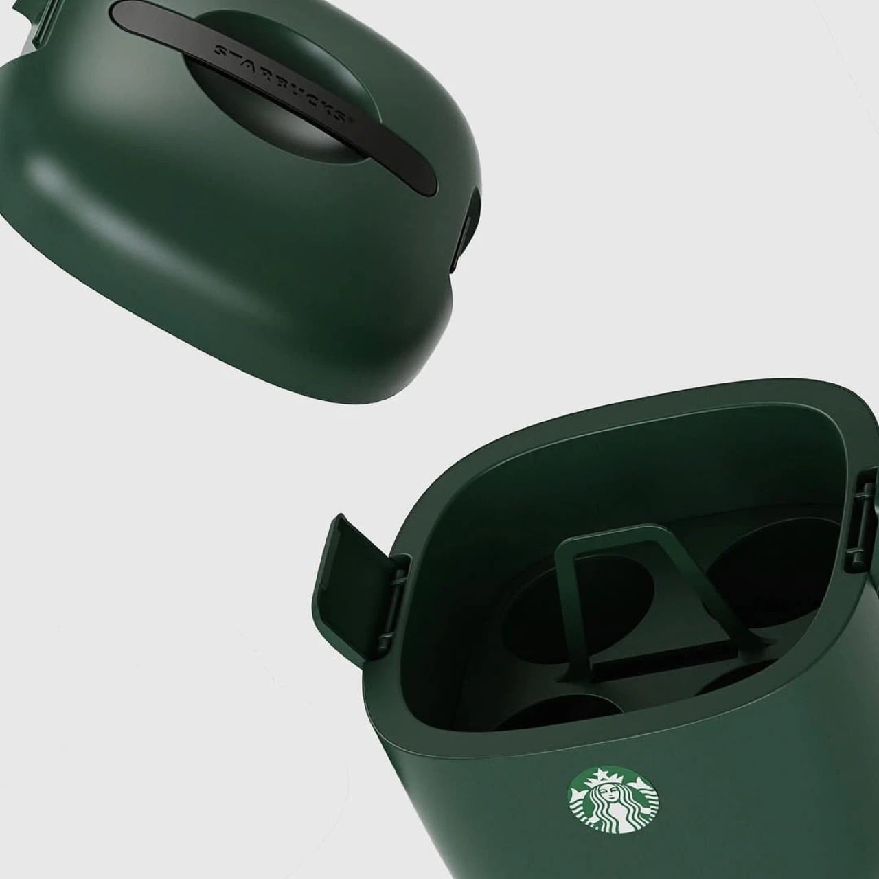
You know what’s ‘vertical integration’? Starbucks building its own cooler box for its own beverages. Meet the Yeti-alternative that’s designed not for your Budweisers, but for your venti iced lattes. It’s called the Starbucks Ice Box, and while it looks perfect from top to bottom, it has one problem: it’s only available in South Korea.
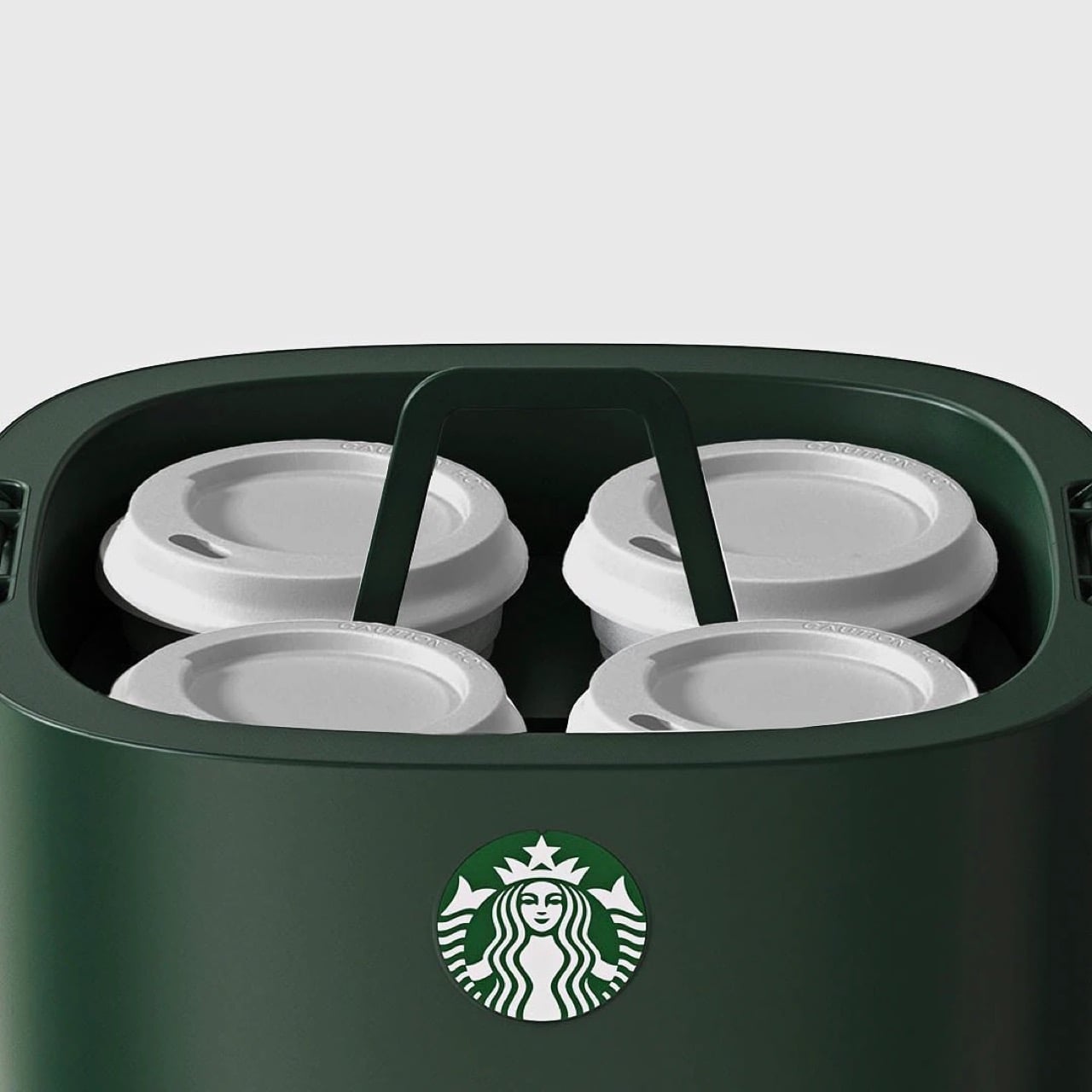
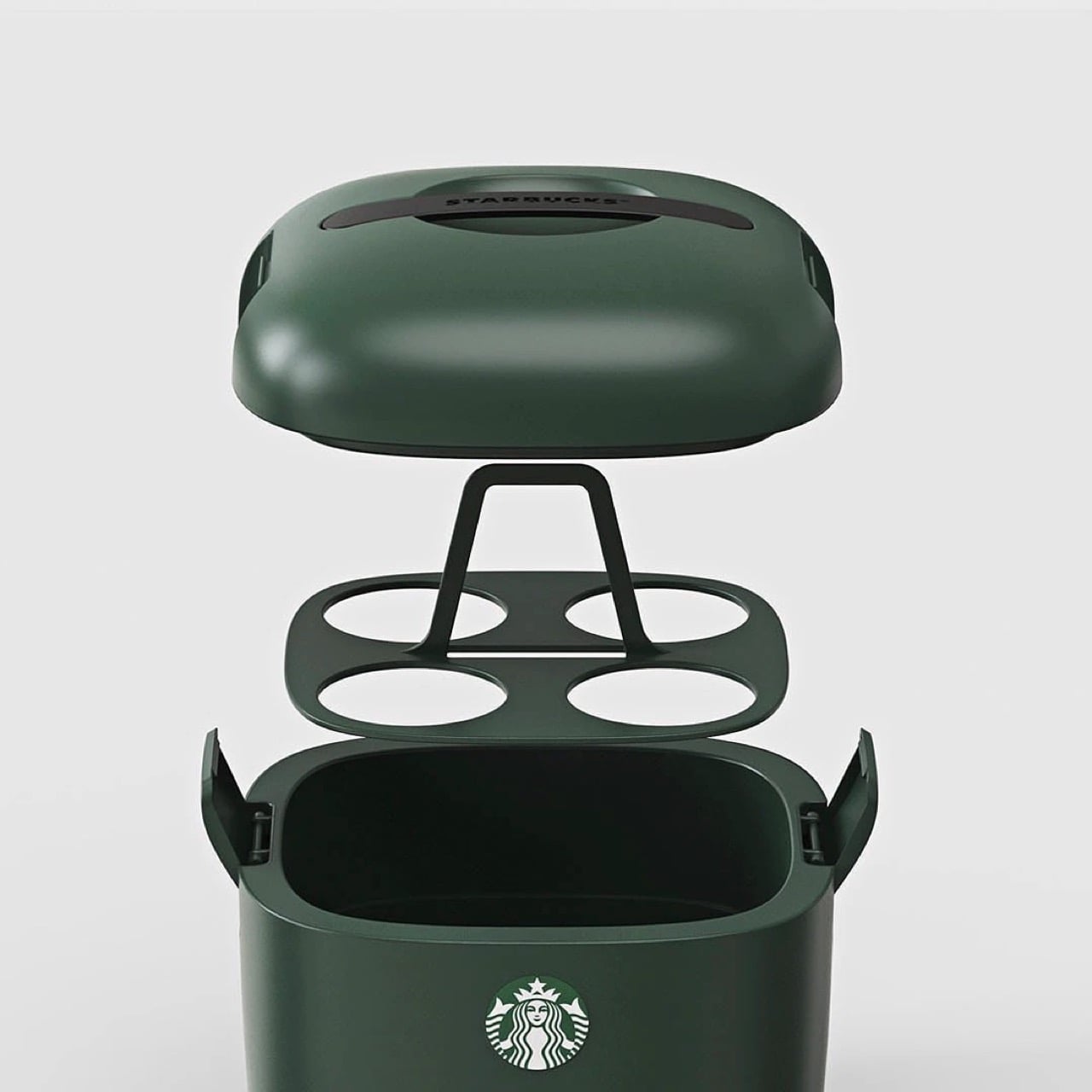
The design is deceptively simple but gets every detail right. Four individual cup slots keep drinks stable and separated, eliminating the float-and-tip chaos that happens when you throw tall cups into a standard cooler. A dedicated ice compartment sits at the bottom, isolated from the drinks themselves so you’re not fishing cups out of melted ice water an hour later. The domed lid has ventilation slots that allow air circulation without sacrificing insulation, and those side latches look substantial enough to actually keep everything secure when you hit a pothole. It’s wrapped in Starbucks’ forest green colorway, compact enough to fit behind a car seat or in a trunk corner, and clearly designed by people who have done the group coffee run enough times to know exactly where the pain points are. The proportions feel right in a way that general-purpose coolers never quite nail when you’re dealing with tall, narrow vessels.
Design: Starbucks Korea
This isn’t Starbucks’ first merch attempt. They’ve consistently pushed out loads of accessories over the years, mostly in eastern markets (like these TWS earbuds in collaboration with Samsung, and these $28 retro cameras that they debuted in China) although this one feels way more purposeful than any of their other launches. It’s something people will buy and use for years, rather than becoming just another collectible, and you know that if someone’s buying a Starbucks cooler, they’re a customer for life. Vertical integration for the win!
The design is as simple as it gets. The insulated walls keep the insides whatever temperature you want. Although built for iced drinks, you can put your hot beverages in too and have them piping even after hours. For iced drinks, you can also add ice packs into the cooler to chill them down further – just be careful they don’t drip or the cups could get soggy. A lift-out tray holds four venti drinks, because if you’re the kind to drink regulars, you probably wouldn’t be keeping them for hours. The clamp-lid ensures everything is locked in tight, and a Starbucks-branded handle sits flush against the top, giving the entire thing a gorgeously monolithic design.
The only place you can grab this right now is on obscure sites online. A Japanese website has it listed for ¥26,530 or $169 USD, not including shipping. If anyone in Starbucks’ global team is reading this, consider it your sign to manufacture this for the American and European audiences too, trust me, your annual turnover will thank you!
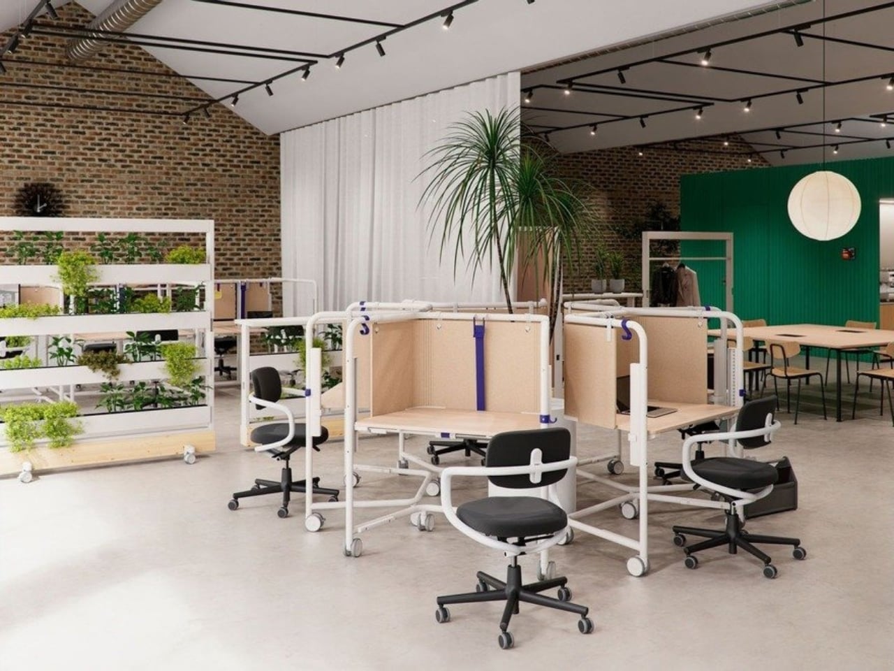
We’ve been designing office desks essentially the same way for decades. Four legs, a flat surface, maybe a drawer if you’re lucky, and an ergonomic chair that costs more than your first car. So when Vitra and German industrial designer Konstantin Grcic quietly dropped the Scout Work Mobile just last month, I paid close attention.
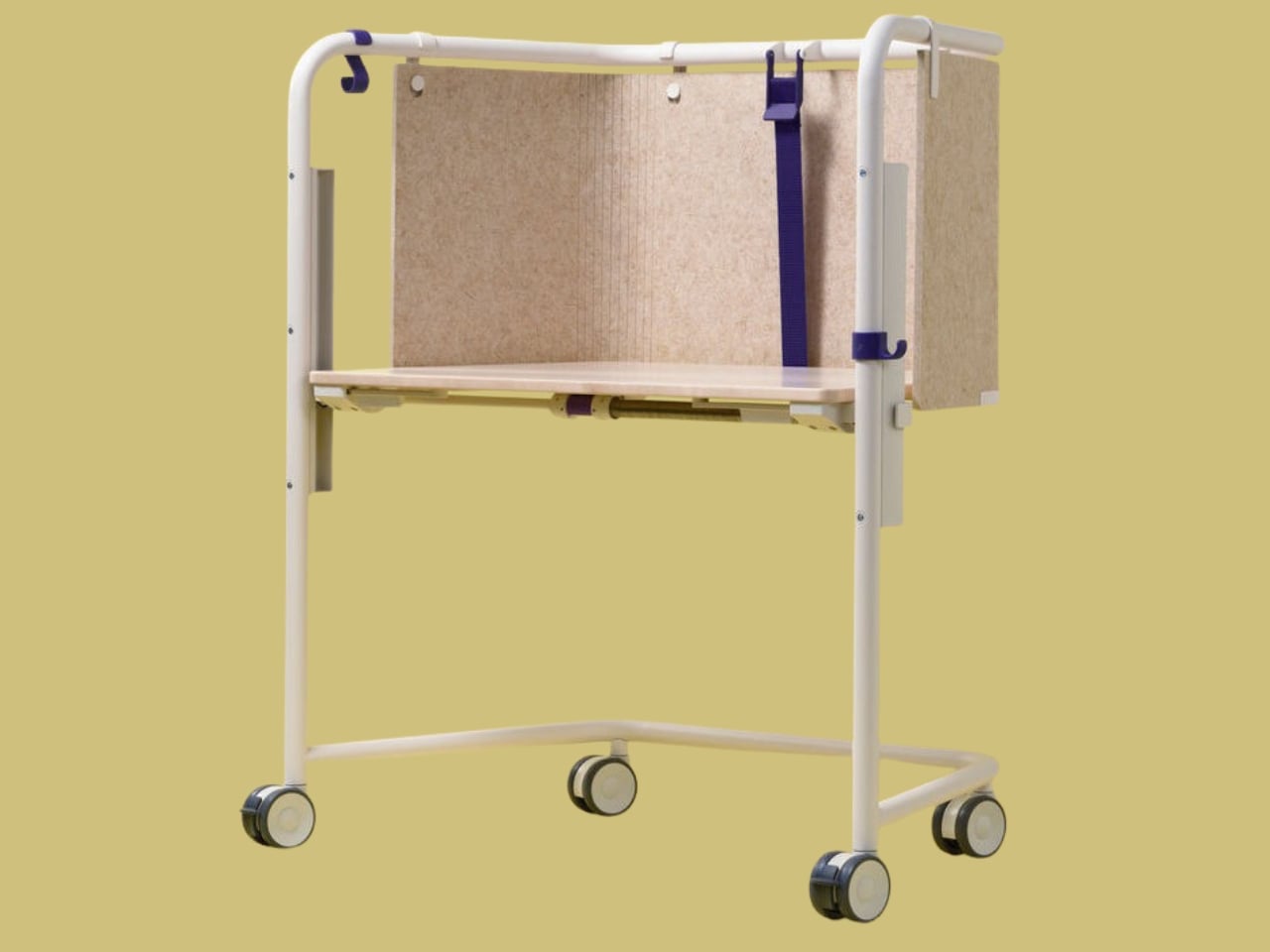
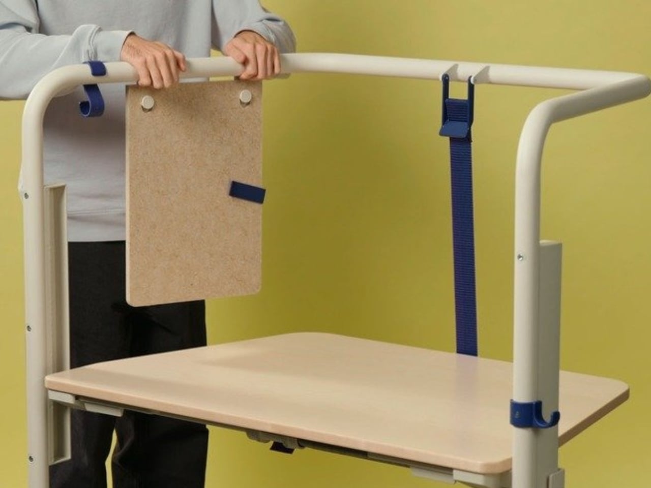
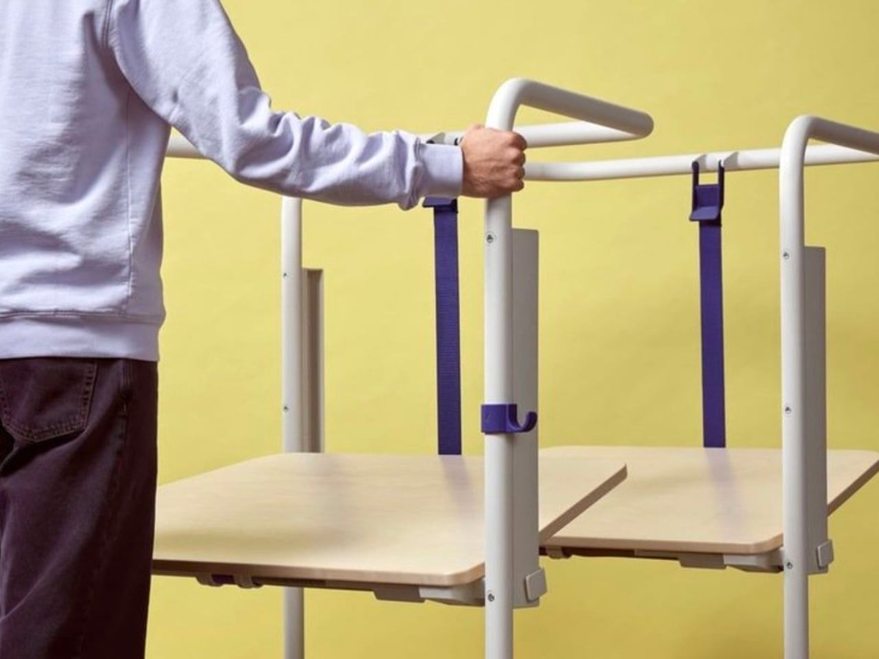
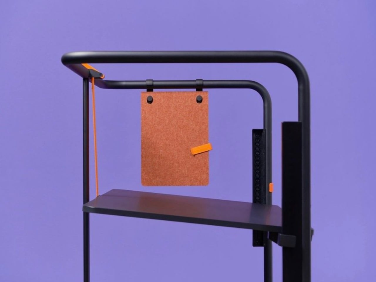
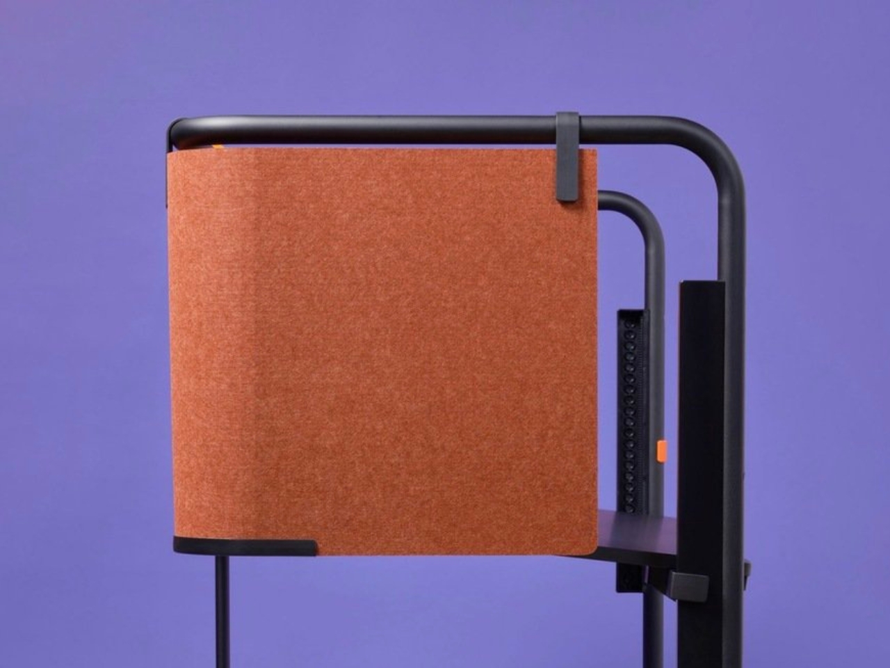
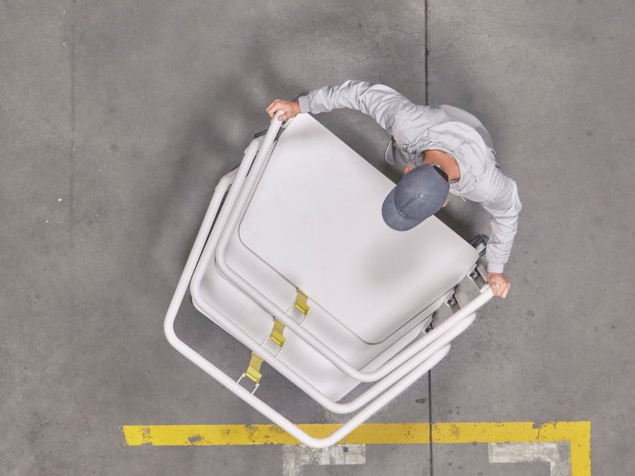
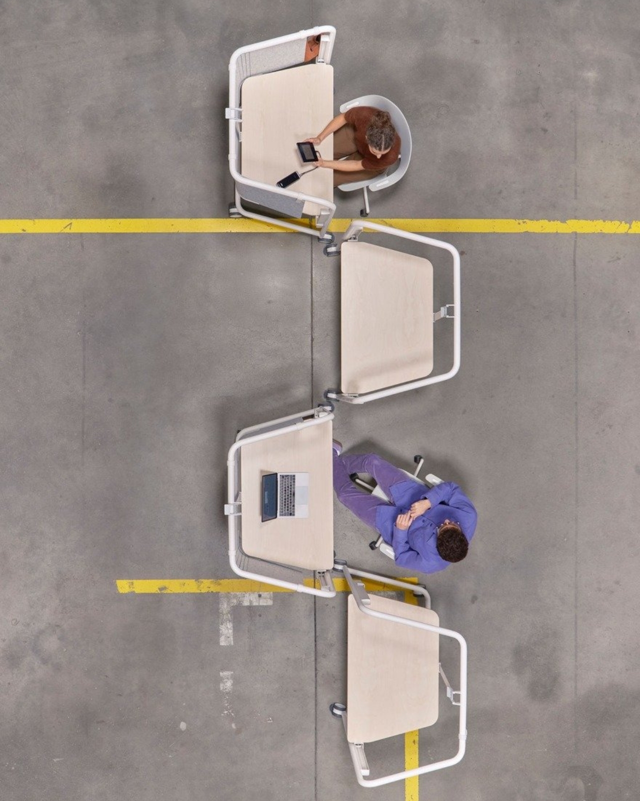
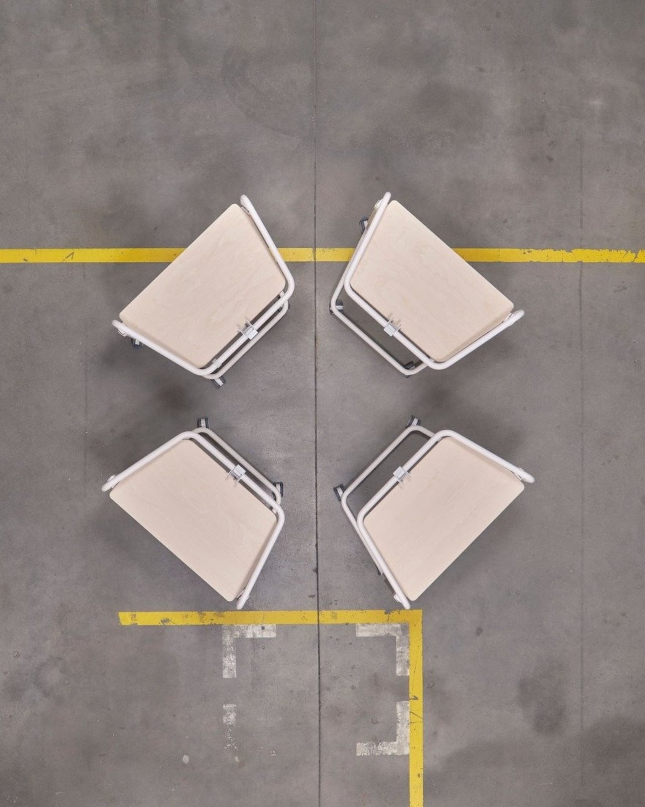
The Scout Work Mobile is part of a larger family of workstation and meeting tables simply called Scout, launched on March 19 of this year. The collection comprises five pieces ranging from stationary desks to mobile variants, and it’s Grcic’s response to how offices actually function today versus how they were designed to function twenty years ago. The Scout Work Mobile is the one that caught my eye: a compact, trapezoidal desk on wheels with a tubular steel frame that rises up and encircles the work surface.
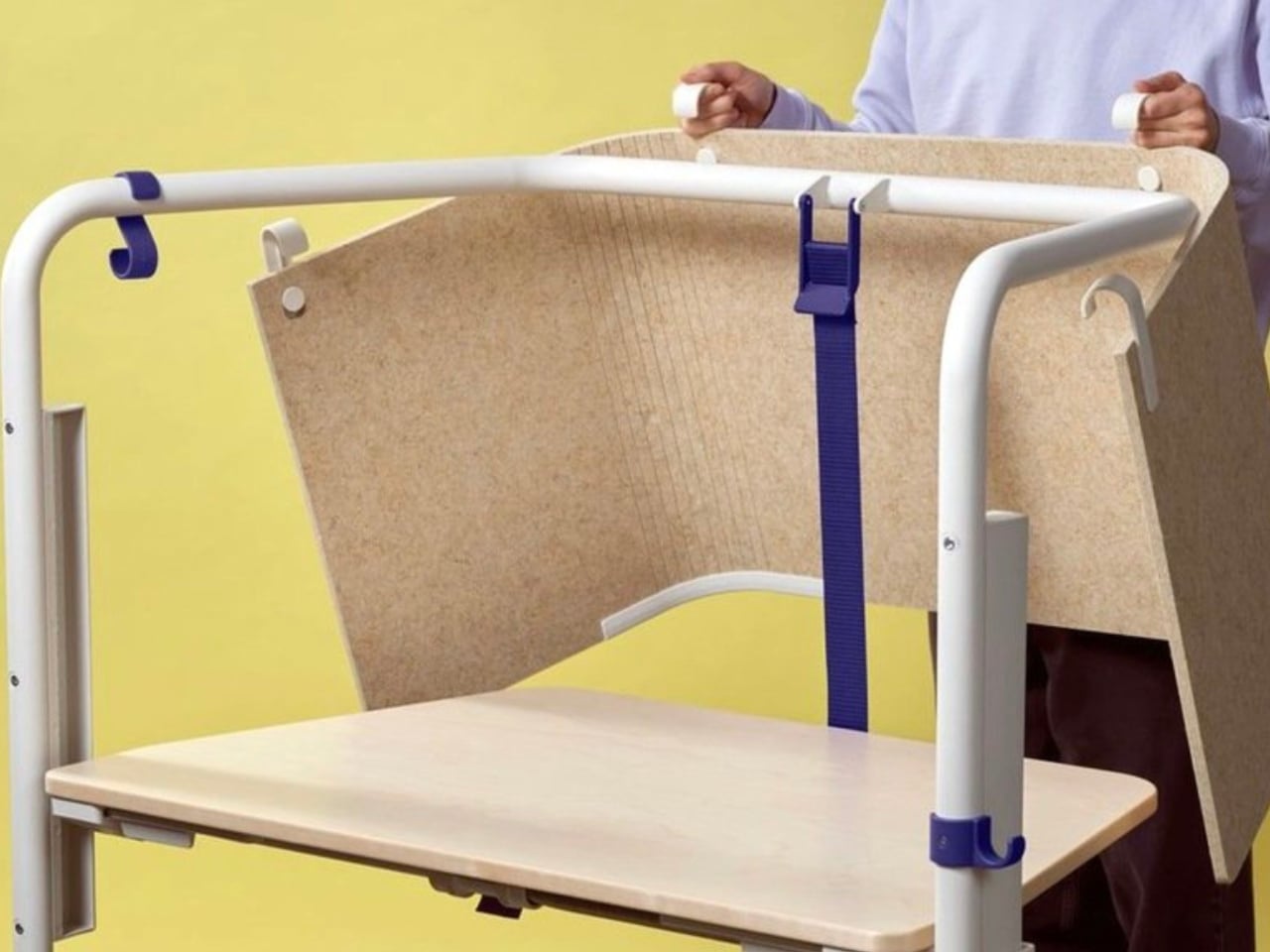
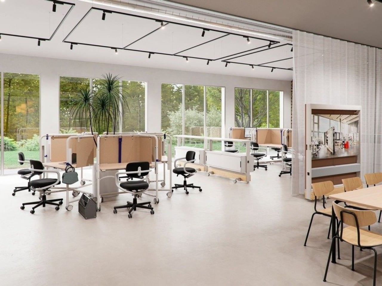
That frame is the whole story, really. It’s not decorative. It’s not there to look good in a mood board (though it absolutely does). The frame acts as a grab handle when you’re rolling the thing across a room, a mounting point for privacy screens, and a place to hang accessories. Without any attachments, it still creates what Vitra describes as a “room-within-a-room” effect, a bit of visual and psychological separation from whatever chaos is happening around you. For those of us who’ve had to MacGyver focus time in open-plan offices using noise-cancelling headphones and pure denial, that feels like a genuine design insight rather than a marketing afterthought.
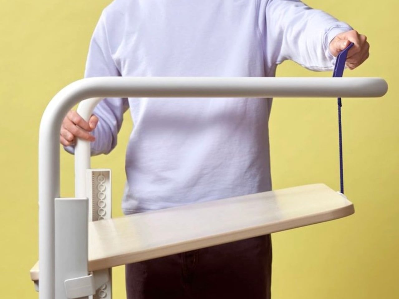
Grcic is known for what Vitra calls a “severely simple” aesthetic. He doesn’t add things for the sake of adding them, and the Scout Work Mobile reflects that clearly: the height adjustment and tilting function work entirely without electricity. No motors, no app, no firmware updates required. It adjusts by hand. That might sound unremarkable, but compared to the increasingly tech-dependent office furniture being released right now, it reads almost like a radical statement.
The mobile aspect of Scout is where the design really earns its name. Return-to-office mandates are reshaping how companies think about their physical spaces, and the rigid assigned-desk model is quietly becoming a liability. Hot-desking, collaborative hubs, project clusters, training rooms that double as focus spaces. Modern offices are being asked to do a lot more with the same square footage. Scout was built for exactly that kind of environment. You grab it, roll it where you need it, work, and move on. No teardown required. No reconfiguration meeting on the calendar.
Grcic put it plainly in an interview with Vitra Magazine: “The aim is not to replace what already exists. Rather, the system is an extension or complementary offering that responds to different levels and styles of work.” That kind of restraint is rare in product design, where the temptation is always to pitch your thing as the only thing. Scout doesn’t ask to own your whole office. It just wants to be useful wherever you put it.
Aesthetically, it sits in that satisfying middle ground between industrial and refined. The tubular steel frame reads as utilitarian at first glance, but the trapezoidal silhouette and deliberate proportions make it feel considered rather than clinical. It’s the kind of furniture that would look at home in a forward-thinking tech company, a design school studio, or a well-curated co-working space. It isn’t trying to disappear into the background, and it certainly doesn’t need to.
What makes Scout genuinely interesting is that it treats mobility as a first principle rather than a feature tacked on after the fact. Desks on wheels have existed forever, but most of them feel like an afterthought, as if someone just bolted casters onto a standard table and called it agile. Grcic designed the Scout Work Mobile from the ground up with movement in mind, and the difference is visible in every element. Office furniture rarely makes me stop and think twice. The Scout Work Mobile managed to.
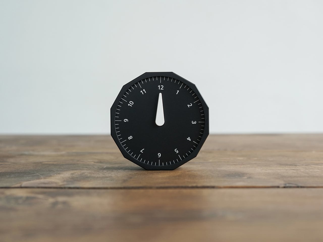
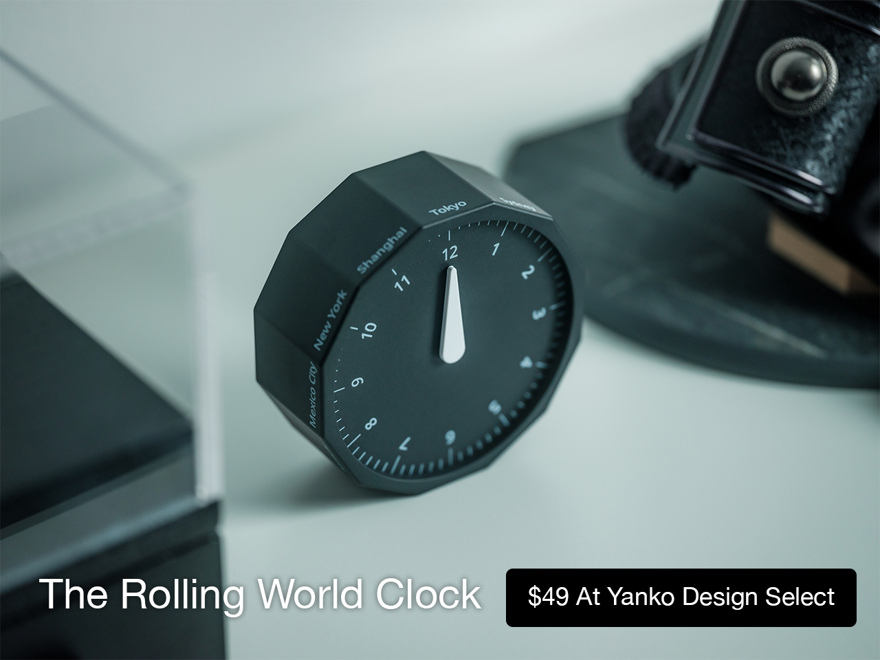
This 12-sided clock turns global timekeeping into a calmer desk ritual
Keeping up with different time zones sounds simple until it becomes part of your everyday routine. You check your phone before a call, open another tab to confirm the hour, do a quick mental calculation, and still second-guess whether it’s too early in Tokyo or too late in New York. Not to forget the perils of push-notifications – a quick check of time leads you down a drain of doom-scrolling that you take an hour to return from! To add a layer of analog convenience in this increasingly digital setup, I present the Rolling World Clock.
Why Traditional World Clocks Never Quite Feel Right
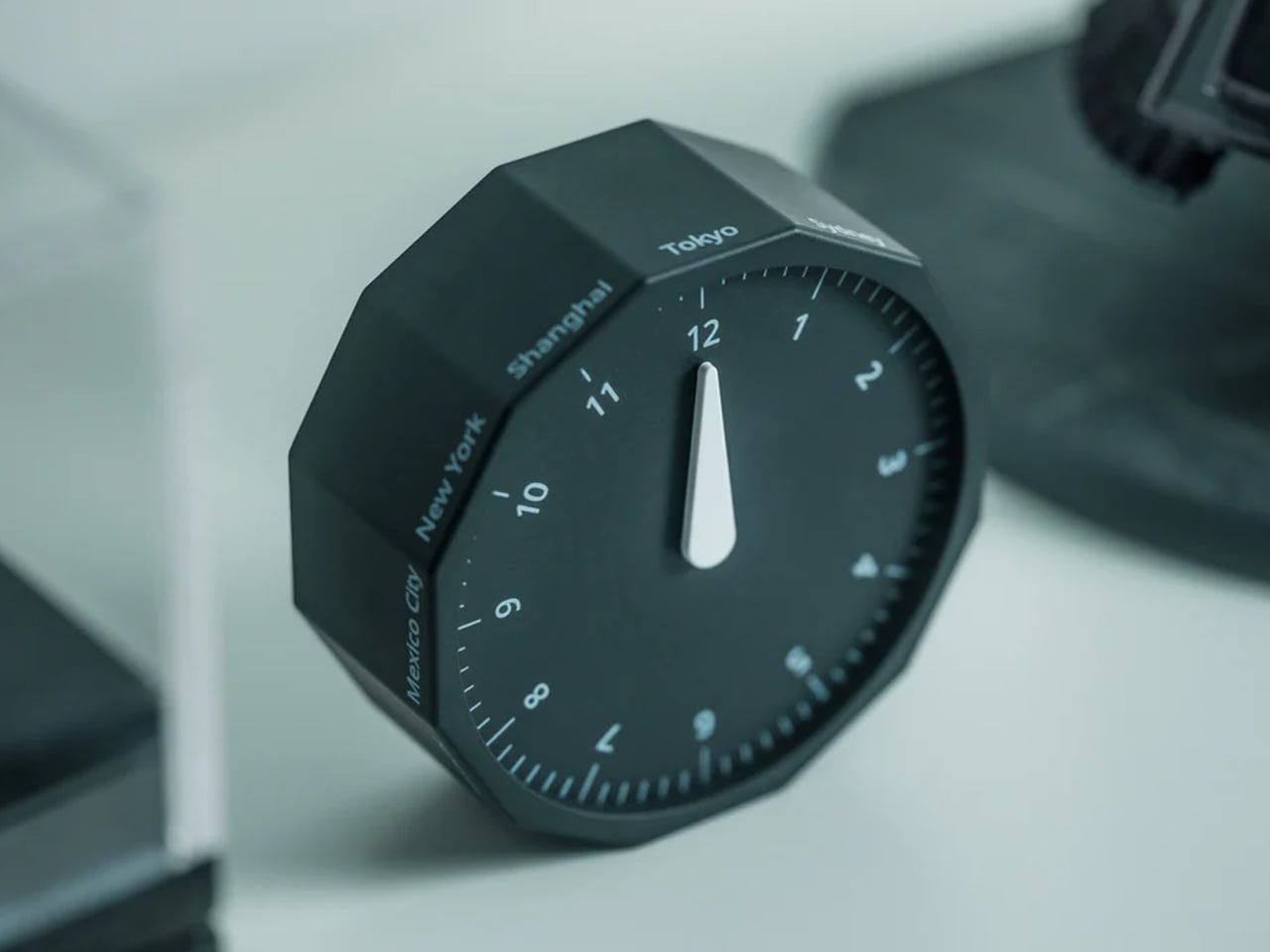
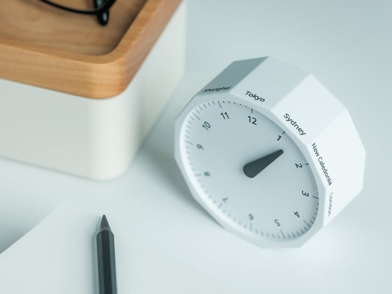
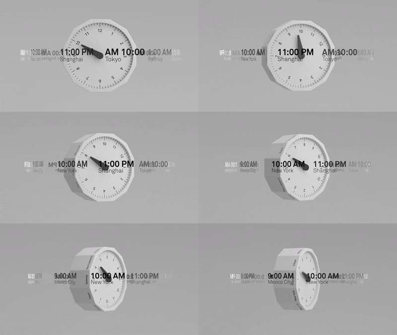
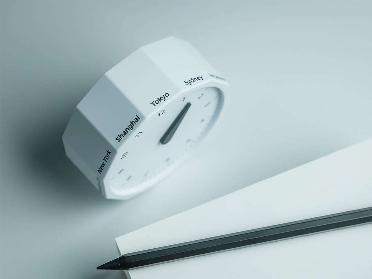
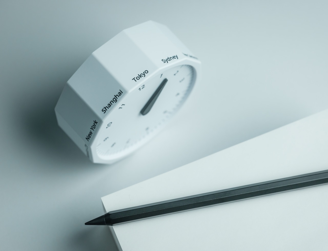
The Rolling World Clock takes a familiar category and gives it a much smarter form. Instead of relying on screens, menus, or a row of tiny city labels, this analog desk object turns world time into a simple physical interaction. Built with 12 sides, each representing a major timezone city, it lets you roll from one location to another and instantly read the local time with a single hand. It’s a cleaner, more tactile answer to a problem that has long been solved in ways that feel unnecessarily digital.
That analog quality is a big part of the appeal. There’s a growing interest in devices that help people step back from constant digital interaction, and this clock fits neatly into that trend without feeling nostalgic for nostalgia’s sake. It still solves a modern problem, especially for people working with global teams or keeping in touch with friends and family abroad, but it does so in a way that feels grounded and human. You’re not swiping, tapping, or toggling between screens. You’re just rolling the object in your hand and reading the time.
Built for modern routines, expressed through simple interactions.
The city lineup also makes it genuinely useful. The 12 sides cover major global time zones, including London, Paris, Cape Town, Moscow, Los Angeles, Karachi, Mexico City, New York, Shanghai, Tokyo, Sydney, and New Caledonia. That gives it enough range to be practical for a wide variety of work and lifestyle needs, whether you’re coordinating meetings, planning travel, or just trying not to message someone at the wrong hour.
Built for a More Intentional Desk
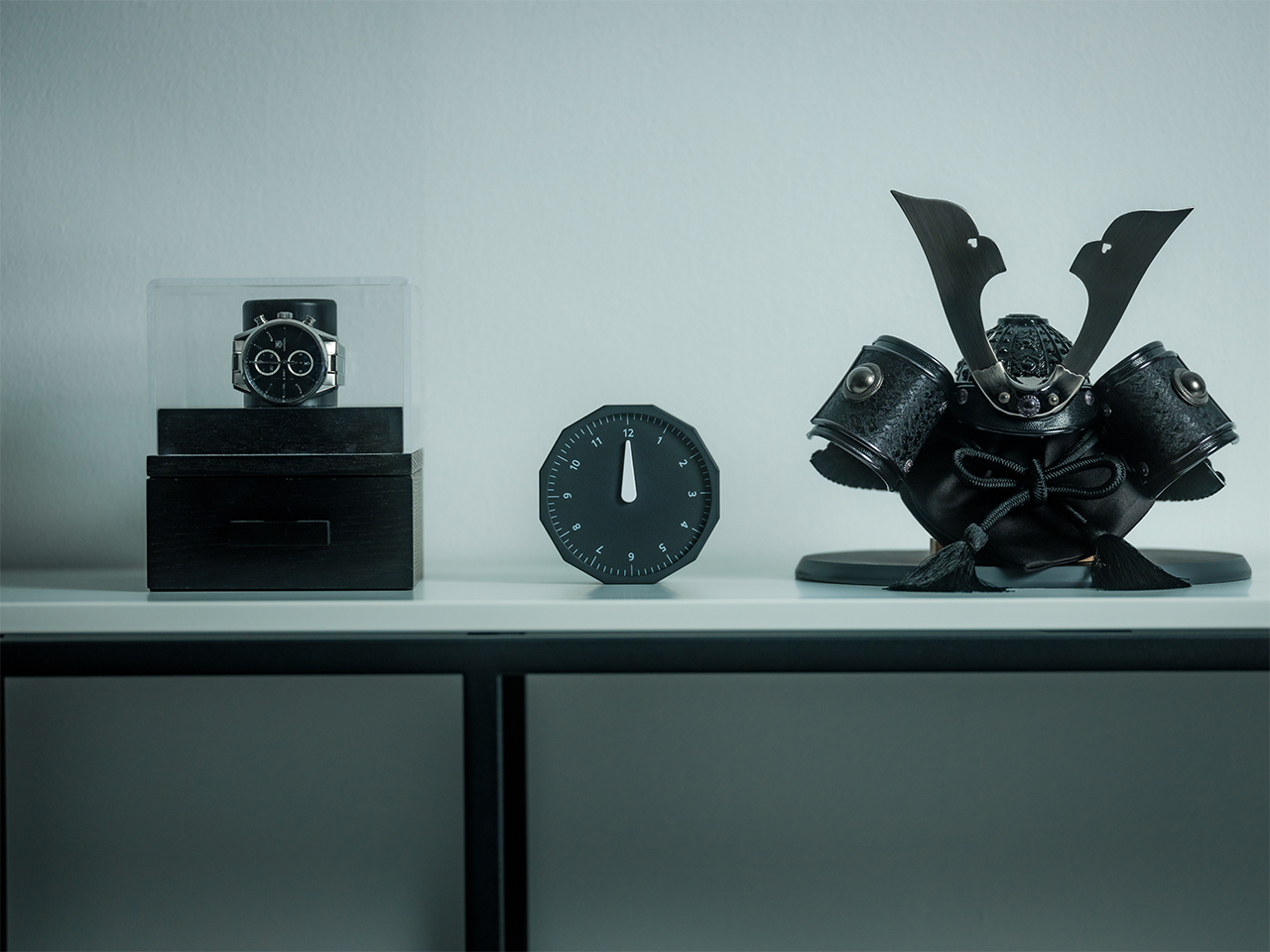
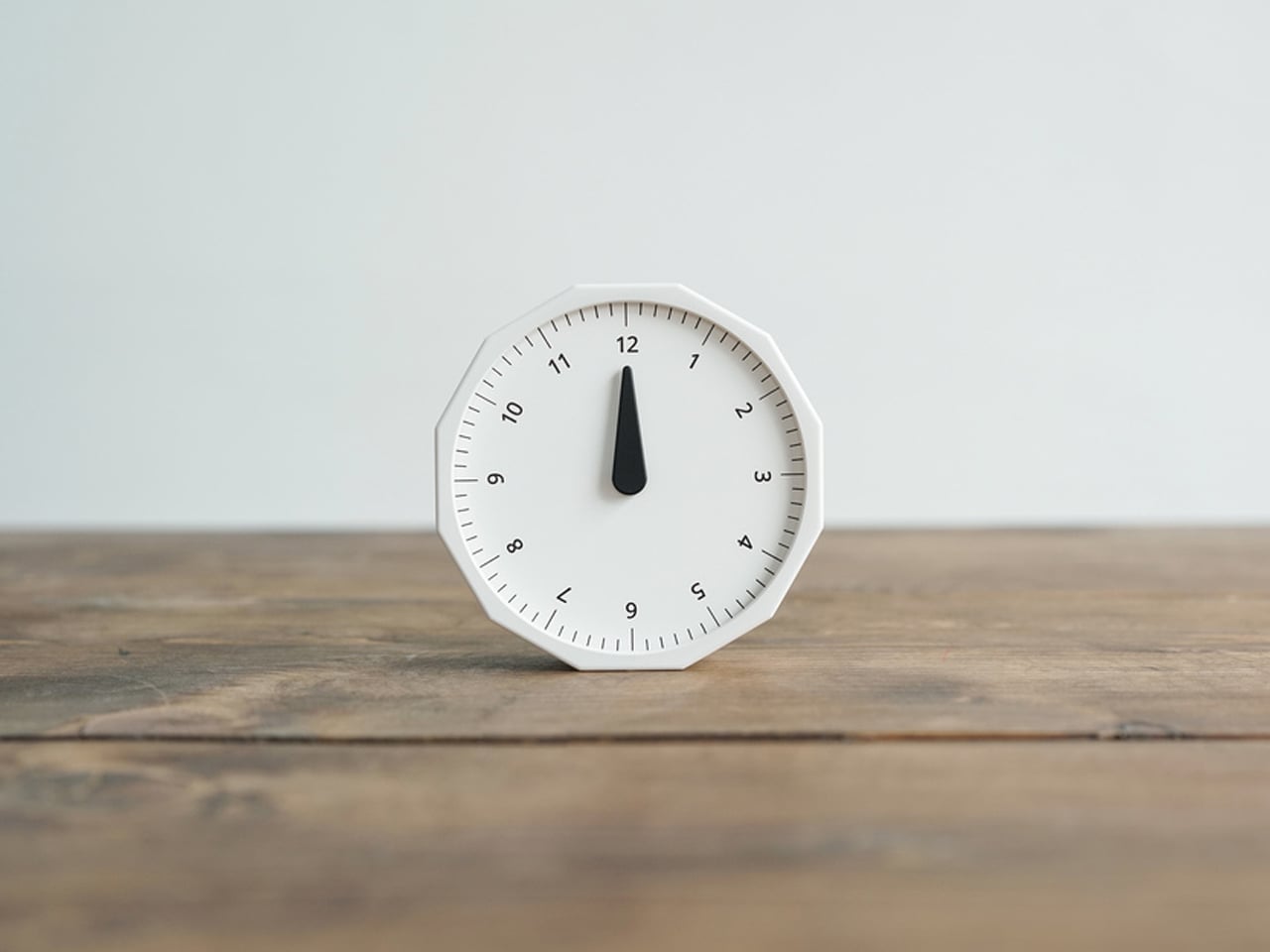
For the desk setup fanatics, there’s also a strong aesthetic argument here. The Rolling World Clock is available in black and white, two finishes that make it easy to integrate into a modern desk setup without fighting for attention. It has the kind of understated presence that works especially well for young professionals who want their workspace to feel differentiated without becoming visually noisy. It’s functional, yes, but it also reads as a design object, the sort of piece that quietly signals taste.
Clean lines, one hand, no distractions.
That balance of utility and personality is what makes this more than a novelty. If you work across cities, collaborate with clients in different regions, or simply like the idea of keeping global time visible without adding another glowing screen to your day, this clock makes a strong case for itself. It taps into a broader shift toward analog tools that feel slower, more deliberate, and more human, while still solving a very modern problem.
Feels as good in the hand as it looks on the desk.
Why It’s Worth Picking Up Now
At $49, the Rolling World Clock lands in a sweet spot for a desk upgrade that feels distinctive without being overcommitted. It also has the kind of giftable appeal that comes from being both useful and conversation-worthy. And with only a few left, it carries just enough urgency to make hesitation a risky move.
If your desk could use an object that feels smarter, calmer, and more intentional than another digital widget, the Rolling World Clock is worth grabbing now. It’s currently available in the Yanko Design Shop in black and white, and with limited stock remaining, this is one of those rare functional design pieces you probably shouldn’t wait on.
Most desk setups are inherited. The nomad’s is earned. Everything that makes it into the bag has already passed a strict and largely unconscious test — weight, versatility, the ability to make a stranger’s table feel like a place worth working from. Over months and years of moving between cities, time zones, and co-working spaces, the digital nomad ends up with a carefully curated set of tools that are small by necessity but thoughtful by design.
The interesting thing about these objects is what happens when the travel slows down. When a lease gets signed, a proper desk arrives, and the bag starts being unpacked with more intention. The tools that survived the road do not lose their relevance on a permanent surface. Many of them were built with the kind of considered design that rewards exactly this kind of scrutiny. They look better than most things bought specifically for a home office, hold up longer, and carry the kind of personal history that makes a workspace feel genuinely inhabited. This is for that moment. Eight objects that lived in the bag for a reason, and deserve a permanent home for the same one.
1. OrigamiSwift Folding Mouse
The OrigamiSwift is what happens when industrial design takes portability seriously. Weighing just 40 grams and folding flat to a profile thin enough to slip between notebook pages, it removes the usual tension between compact and comfortable. On a desk, it unfolds in under half a second, snapping into a full-sized ergonomic shape that sits naturally in the hand. For anyone who has suffered through the cramped mechanics of a standard travel mouse, this feels like a genuine upgrade.
The Bluetooth connectivity is quick, and the origami-inspired fold keeps the mechanism tactile enough that using it becomes a small ritual rather than a chore. At the desk, it earns a permanent spot not because it compensates for a lack of options, but because the transformation itself is satisfying. It is the kind of tool that makes you reconsider how you work, and then makes the work feel slightly more considered. Portable by design, permanent by choice.
Folds to near-invisible thinness at just 4.5mm, making it one of the most carry-friendly mice ever built without compromising on ergonomic full-size comfort
Activates in under half a second with a single flip, making the transition from travel bag to working mouse feel immediate and effortless
What we dislike
At 40 grams, the lightweight build may feel insubstantial for users accustomed to the heft and resistance of a traditional full-sized mouse
Bluetooth-only connectivity means no wired fallback for tasks where even minor wireless latency becomes a frustration
2. Fidget Cube
The Fidget Cube arrived at a time when open-plan offices made visible restlessness a liability and invisible anxiety a norm. Antsy Labs built something straightforward in response: a small cube with six distinct tactile surfaces, each mapped to a different kind of fidget. Click. Glide. Flip. Breathe. Roll. Spin. The vocabulary is simple, the execution is precise, and the result is a desk object that earns its keep without demanding attention from anyone but you.
For digital nomads who have spent years suppressing the impulse to tap or spin something through a long layover or tense client call, the Fidget Cube offers quiet permission. On a permanent desk, it sits within reach without asking for attention. The black and graphite colorways blend cleanly into most setups, looking less like a toy and more like a considered detail. It is not a gimmick. It is self-awareness shaped into an object.
What we like
Six distinct tactile surfaces cover a wide range of fidgeting behaviors in a single pocket-sized cube, making it genuinely versatile across different stress responses and focus modes
Discreet colorways like Midnight Black and Graphite blend seamlessly into professional setups without drawing unwanted attention in shared or client-facing workspaces
What we dislike
The clicking surfaces can produce audible sounds that may distract colleagues in quiet, open-plan, or library-style work environments
The cube format offers no digital or productivity-tracking integration for users who want data on their focus habits or stress patterns
3. Nothing Power (1) Battery Bank
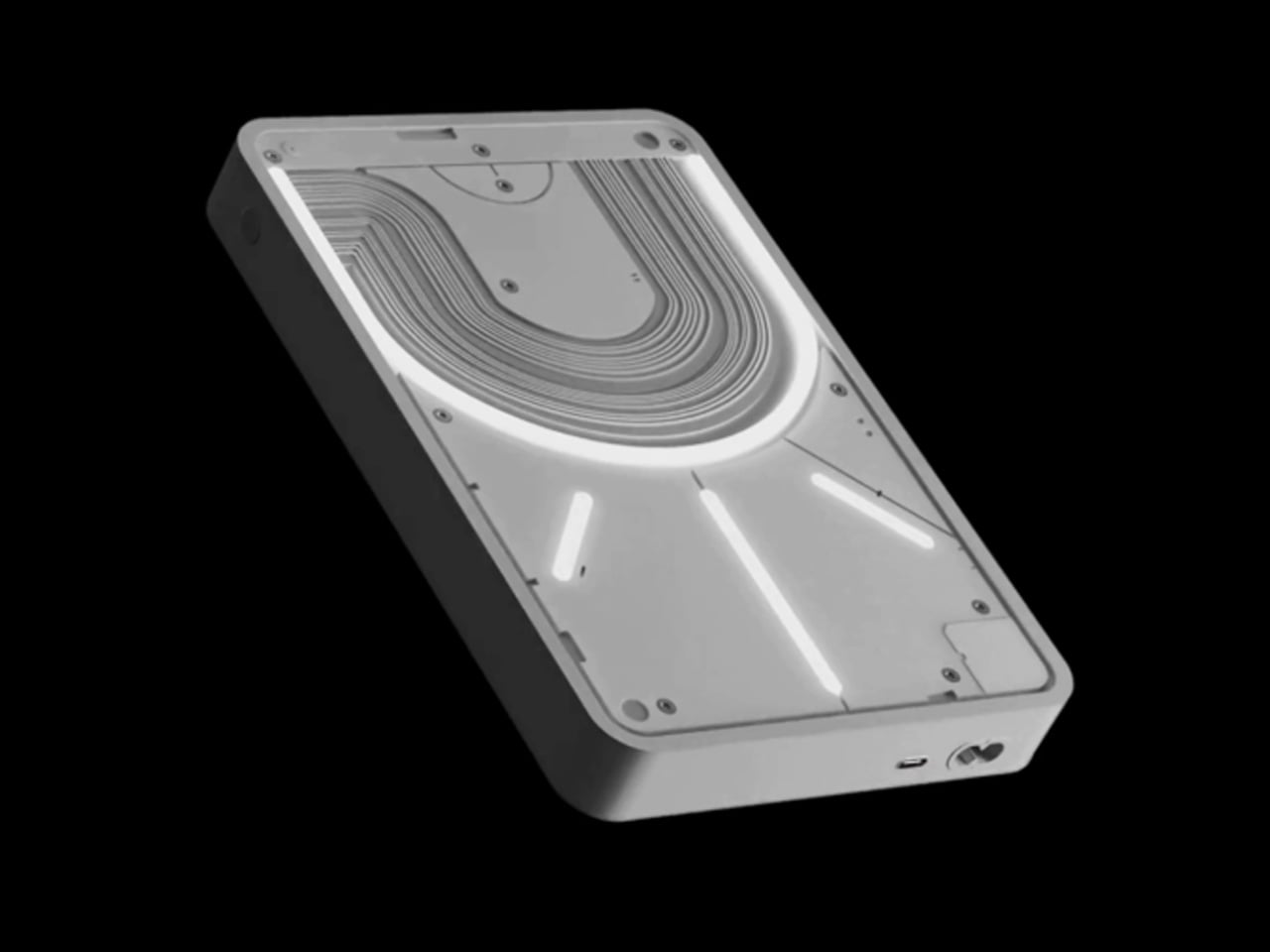
Nothing built its reputation on the Glyph interface, a grid of LED lights that turned the back of a phone into a notification display and a design statement. The Power (1) carries that language into a battery bank, using transparent layers, bold light paths, and illuminated interactions to make a utilitarian object feel worth looking at. The design philosophy is direct: good design is not just about appearance, it is about how an object makes you feel when you reach for it.
For a nomad who has charged devices from airport benches and café stools, a power bank is rarely a display piece. The Nothing Power (1) challenges that. Sitting on a desk, the Glyph illumination gives charging status a visual presence that feels more like an ambient display than a simple indicator light. It treats the desk as a stage and every object on it as a conscious choice. Few battery banks have ever earned that kind of consideration.
What we like
The Glyph interface turns a charging indicator into a visual experience, making it arguably the only power bank designed to look genuinely intentional, sitting on a desk permanently
Transparent design layers reflect Nothing’s ethos of honest, open construction, giving the object a premium quality that stands apart from every other battery bank on the market
What we dislike
The Nothing Power (1) is currently a concept design and is not yet available as a finished commercial product
Exact battery capacity, output wattage, and pricing remain unconfirmed, making direct comparison with available alternatives difficult at this stage
4. HubKey Gen2
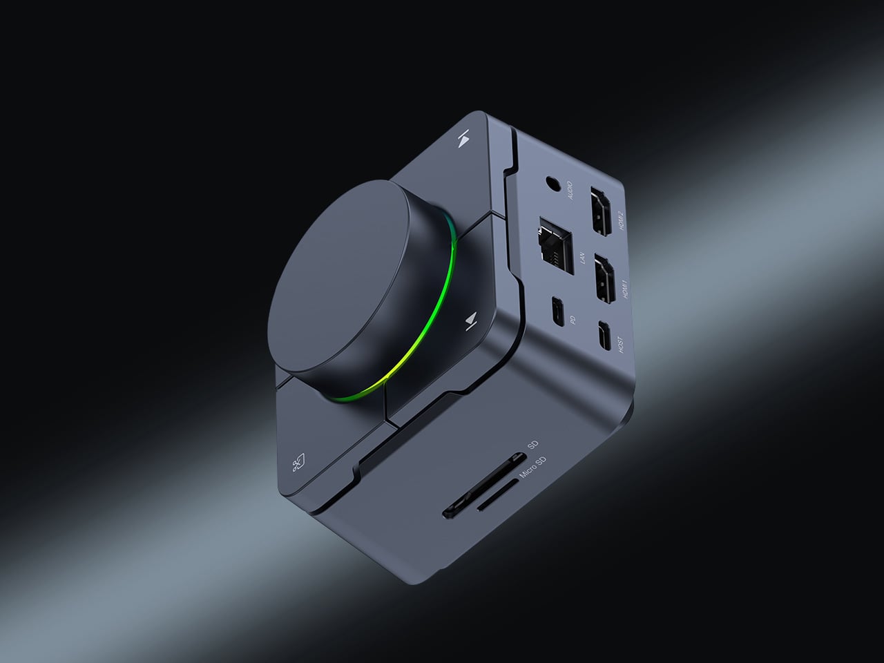
Desk clutter tends to accumulate in layers: a dock for the monitor, an adapter for the second screen, a hub for storage. Somewhere between them sits a tangle of cables that each solves a single problem in isolation. The HubKey Gen2 treats that as a design problem worth solving from the inside out. It is an 11-in-1 USB-C hub with a hardware control surface on top, offering programmable shortcut keys, a central dial, 100W power delivery, and 2.5Gbps Ethernet in a compact cube footprint.
The display support is what separates it from a standard hub. Two HDMI ports, each running a 4K display at 60Hz, mean a laptop becomes a proper dual-monitor workstation without extra adapters. For a nomad settling in, that shift from single-screen café work to a dual-screen editing setup is significant. The shortcut keys and central dial bring a physical control layer to software-heavy workflows, keeping hands on the desk rather than hunting through menus on a trackpad.
What we like
Dual 4K HDMI outputs at 60Hz eliminate the need for a separate display dock when transitioning from a travel setup to a full home workstation
The programmable shortcut keys and central knob return a satisfying physical dimension to digital workflows, reducing time spent navigating software menus
What we dislike
The compact cube form factor may feel crowded once all 11 ports are simultaneously in active use, which limits clean cable management around the unit
Fully customizing the shortcut keys requires additional software configuration, adding a setup investment before the productivity benefit becomes fully apparent
5. Rolling World Clock
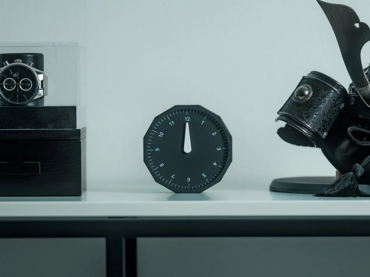
Keeping track of time zones is one of the quieter friction points of nomadic life. The Rolling World Clock solves it most physically: you roll it. A 12-sided form with each face representing a major timezone city, a single hand reads the local time wherever it lands. London. Tokyo. New York. The gesture is intuitive, and the result is a genuinely useful desk object without trying to be more.
Available in black and white, this is the kind of object that earns its place through curiosity rather than scale. Guests pick it up. Colleagues ask about it. It turns a functional necessity into a small conversation. For the nomad who has lived across time zones and built relationships across continents, there is something quietly satisfying about having those cities represented not on a screen, but held in your hand.
The tactile rolling interaction makes checking international time a deliberate, physical gesture rather than a reflexive phone unlock
Covers 12 major timezone cities in a clean, minimalist form that works equally well as a functional desk piece or a shelf object
What we dislike
Limited to 12 preset cities, which may not include every timezone relevant to users with contacts in less commonly represented regions
The single analog hand offers general time orientation rather than precise minute-level accuracy, which may not suit users with tight cross-timezone scheduling needs
6. Orbitkey Desk Mat Slim
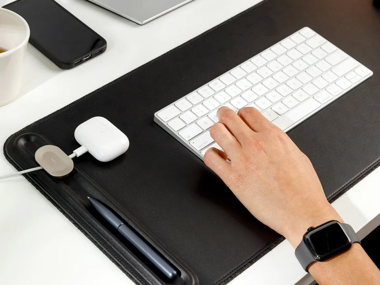
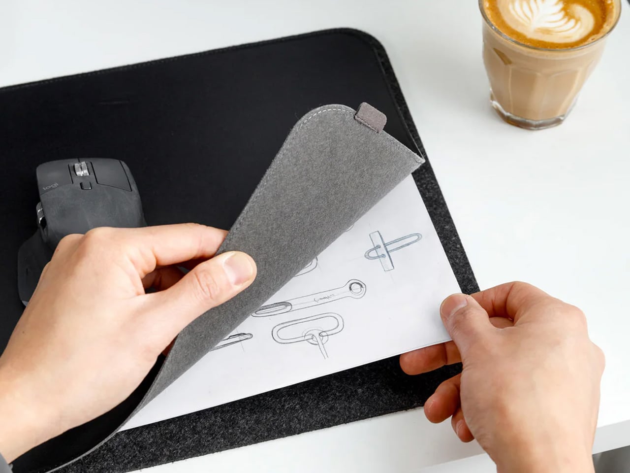
A desk mat either disappears into the background or it becomes the visual anchor of the entire setup. The Orbitkey Desk Mat Slim is built for the second outcome, designed with the restraint of the first. Made from premium vegan leather on top and 100% recycled PET felt underneath, it layers material integrity with practical function. The anti-slip backing holds the mat planted, while the magnetic cable holder keeps wires from drifting toward the edges, where they become a distraction.
Notes, receipts, and napkin sketches are the inevitable artifacts of nomadic work, and they tend to pile up without a clear home. The document hideaway is the detail that tips this mat from surface to organizer. The slim front pocket keeps loose papers horizontal, accessible, and out of sight. For someone accustomed to a shared café counter or a hotel tray table, this level of surface order feels less like a feature and more like a quiet exhale.
What we like
The document hideaway pocket reduces visible desk clutter without adding bulk, making it one of the more intelligent storage details found on any desk mat
Vegan leather and recycled PET felt construction deliver both a refined visual quality and a material responsibility that most desk accessories still lack
What we dislike
The slim format may feel too narrow for users with wide multi-monitor setups who need significant horizontal coverage across their full desk surface
The magnetic cable holder works best with a small number of cables and may become less effective in more heavily wired configurations
7. Flow Timer
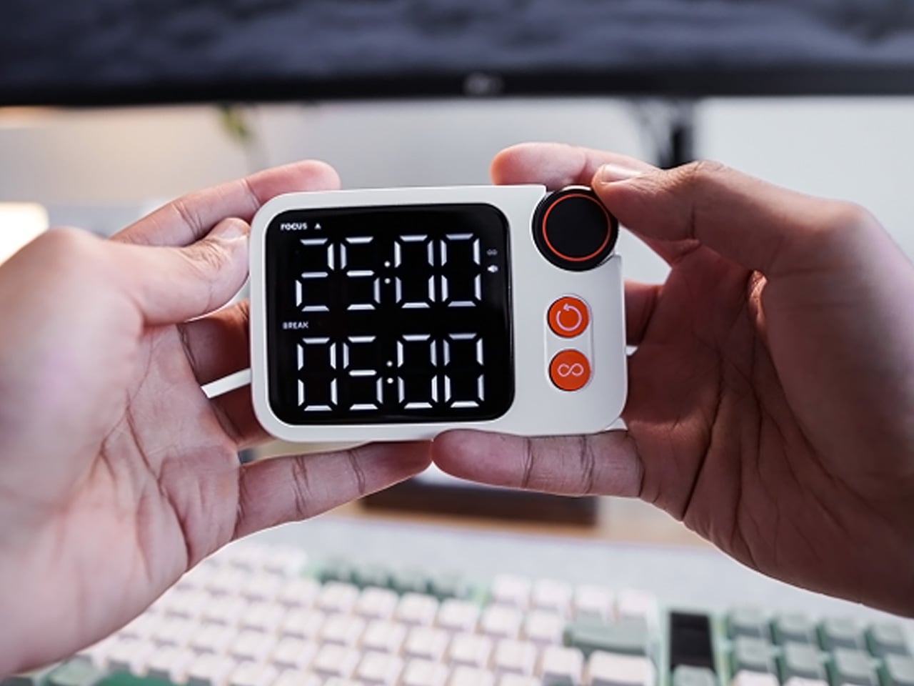
The Pomodoro method has been around since the late 1980s, and most people who use it rely on a phone timer or a browser tab. Neither is ideal. The Flow Timer replaces that with something solid. Cast in metal, with dual customizable presets for focus and break intervals, it lives on the desk as a functional timer and an object of intention. The visual arc tells you where you are in the session without a notification or a screen unlock.
For nomads who have long been their own productivity managers, a physical timer brings a different quality of commitment than a screen-based one. The act of setting it is deliberate. The focus-to-break transition is automatic. Sitting in a permanent spot, it becomes a small anchor for the rhythm of the day. Available in three colorways, the Flow Timer is one of those rare accessories that improves both how you work and how the desk looks while you do it.
What we like
Automatic switching between focus and break intervals removes the friction of resetting a timer mid-session, keeping the workflow continuous and uninterrupted
Solid metal construction and three considered colorways make it an aesthetic desk object as much as a productivity tool
What we dislike
The absence of a digital display means reading the visual arc requires a brief adjustment period before the feedback becomes truly instinctive
As a dedicated single-function device, it competes for surface space against multi-purpose tools in more minimal or compact desk setups
8. Memento Business Card Log
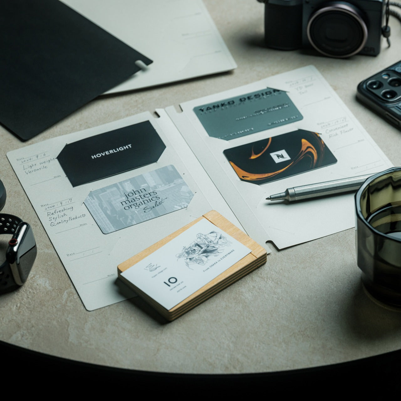
There is a specific quality to the business cards that collect at the bottom of a travel bag. Each one marks a moment, a conversation, a person worth remembering. The Memento Business Card Log was made for exactly this. Designed by Re+g, a Japanese brand with roots in thoughtful stationery craft, it holds up to 120 cards with a dedicated handwriting space beside each one for a characteristic, a date, or a detail that brings the memory back clearly.
The two-point slit system keeps cards secure without sleeves or adhesive, and the special binding allows pages to be easily reordered as professional relationships evolve. For a nomad building a network across cities and industries, this is the kind of object that earns its desk placement not through technology but through intention. It is a record of everywhere you have been and everyone who mattered enough to keep. That is rare, and the design knows it.
The two-point slit system and reorderable binding make the organization genuinely flexible, allowing the log to grow and shift alongside a professional network over time
Handwritten note spaces beside each card transform a simple storage product into a meaningful personal archive of the conversations that shaped a career on the road
What we dislike
A maximum of 120 cards may feel limiting for high-volume networkers who accumulate contacts rapidly across multiple cities, conferences, and industries
The analog format, while entirely intentional, offers no digital sync or search capability for users who need to cross-reference contacts across devices
These Gadgets Were Never Just for the Bag
There is a moment in every nomad’s life when the bag starts feeling less like freedom and more like a deadline. When the tools that carried you through airports and co-working spaces deserve something more settled. These eight objects were always portable by design, but built with the kind of intention that reads just as well on a permanent desk. Good design does not ask where it is. It just works.
The idea here is not to stop moving. It is to stop treating permanence as a downgrade. A folding mouse, a tactile timer, a rolling clock, a mat that holds your cables and your notes — taken together, they form a desk that feels chosen rather than assembled. The nomad who gives these a home is not giving anything up. They are just finally working somewhere worthy of the tools they already carry.
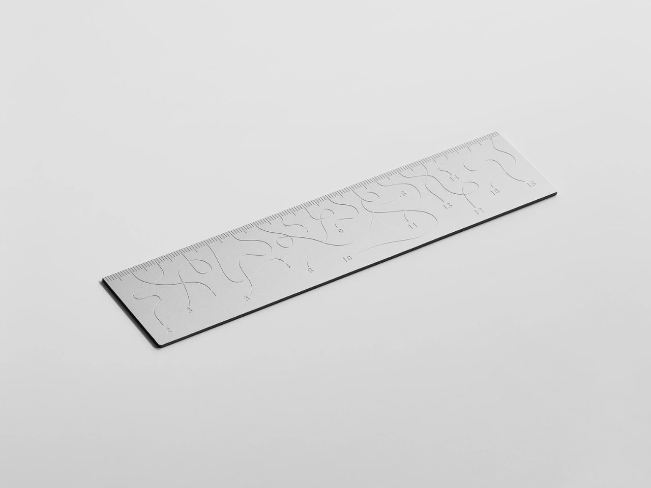
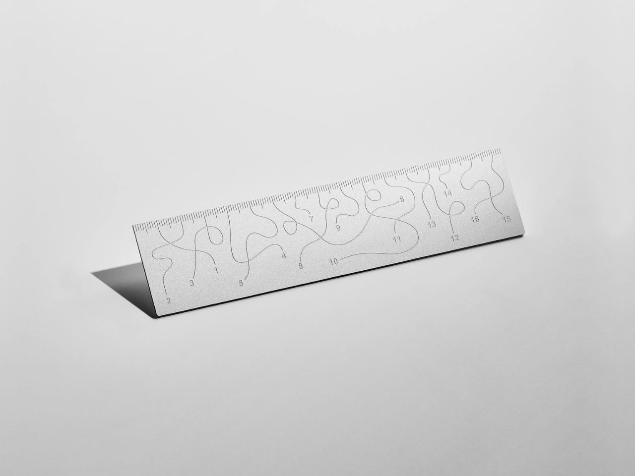
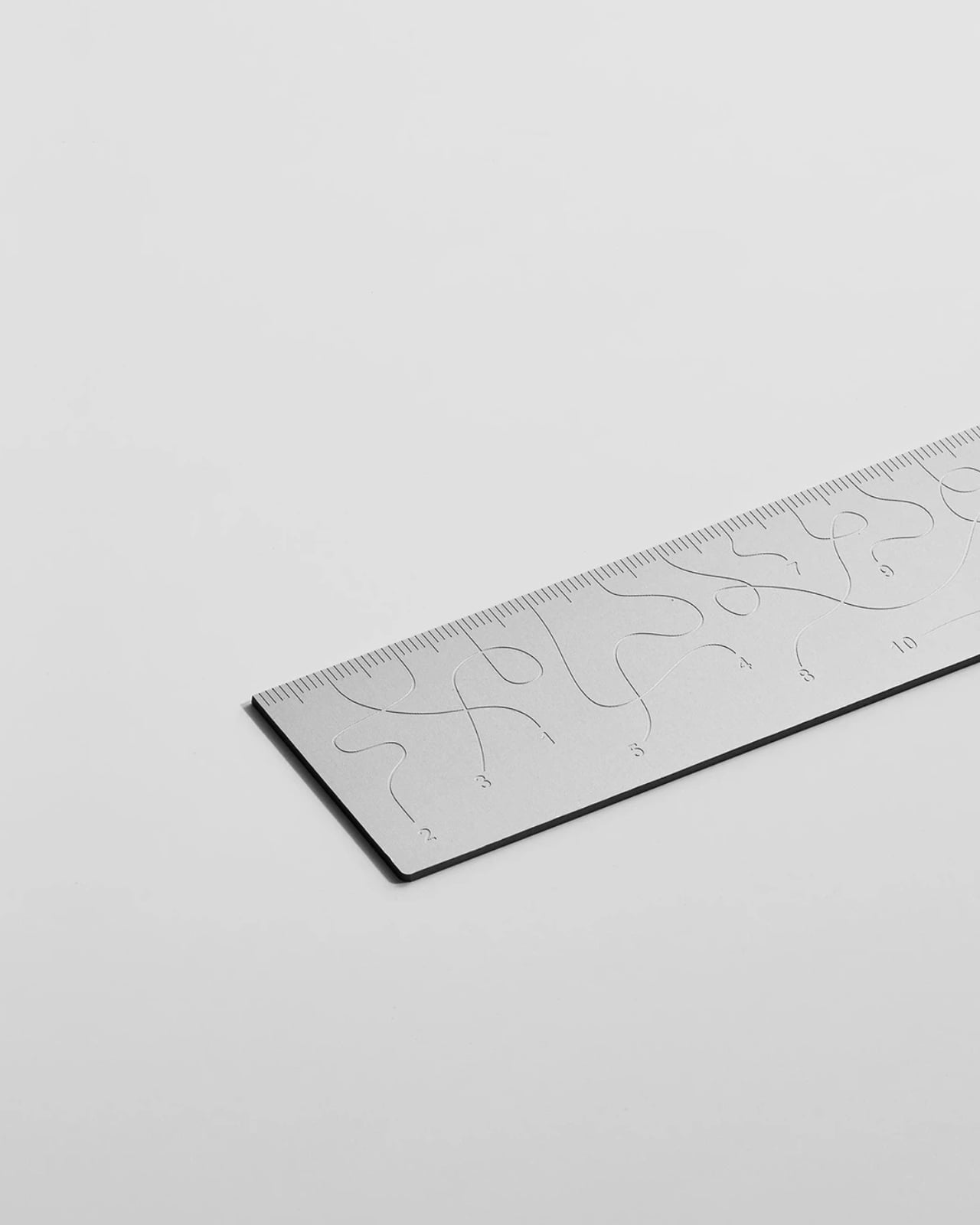
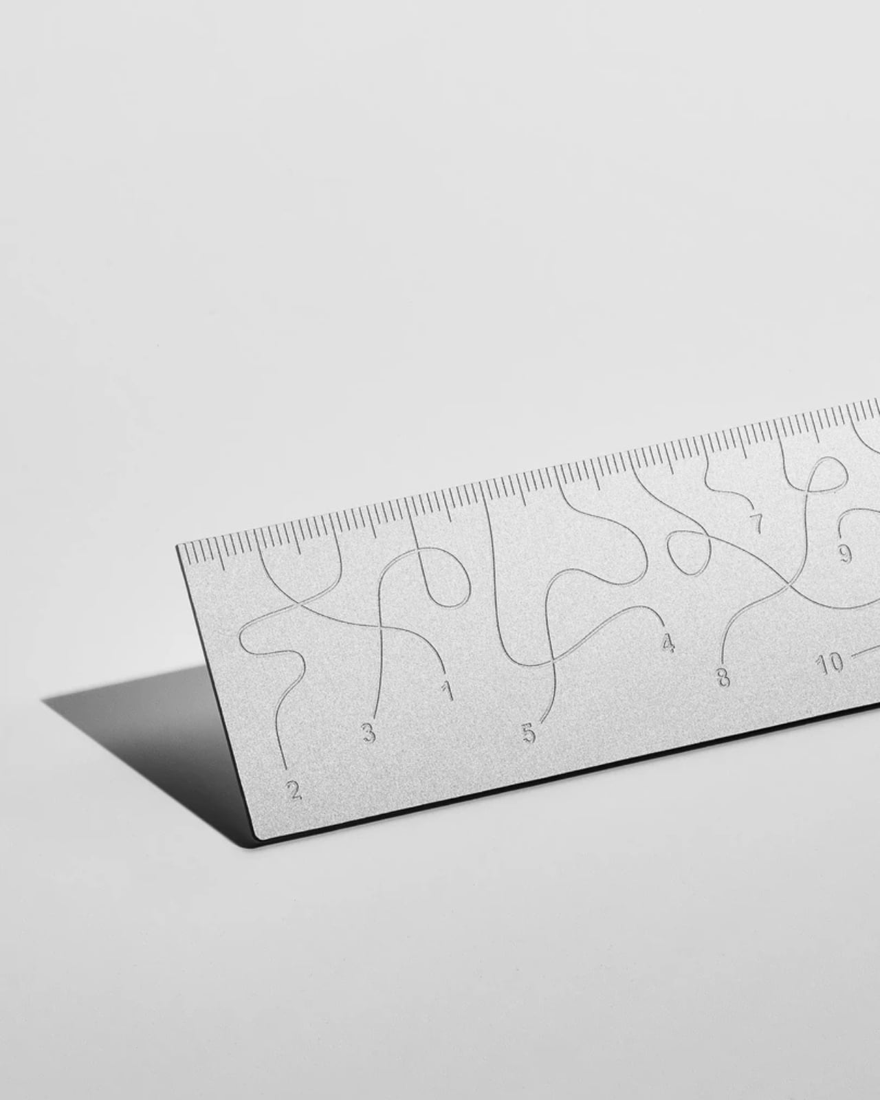
Pick up the WAY ruler and the first thing you notice is that it feels exactly right. It’s small, made from anodized aluminum, and has the kind of weight and finish that signals intention without announcing itself. It’s the sort of object that sits comfortably in a shirt pocket or on the edge of a desk and looks like it belongs in both places. Then you look closer at the markings, and something shifts.
The inscriptions on the WAY don’t run in a clean, predictable line the way ruler markings are supposed to. They wind. They curve and drift across the surface of the aluminum like a path traced through a landscape, referencing, quite literally, the idea of small winding roads and the wandering nature of travel and discovery. The numbers and measurements are there, engraved directly into the material with digital precision, but they’re arranged in a way that asks you to slow down and actually read them rather than glance and move on. It’s legible. Just not immediately.
The engraving itself is worth paying attention to. Kral chose to cut the inscriptions directly into the anodized aluminum rather than printing or applying them as a secondary layer. That decision gives the markings a permanence and a tactility that you don’t get with most production objects at this scale. You can feel the grooves if you run a finger across the surface. The graphic quality of the lettering is considered without being decorative for its own sake. It reads as design that knows exactly what it’s doing, which is what makes the playfulness land rather than feel arbitrary.
The object is small enough to be considered an accessory as much as a tool. Kral has always worked at a scale that pays attention to how things actually live in your hands and in your space, and the WAY is consistent with that. It doesn’t try to be a statement piece in the way that some design objects do, where the visual drama is the whole point. The WAY is quieter than that. The drama is embedded in the detail, in that moment when you realize the markings are doing something unexpected and you have to orient yourself before you can use it.
That slight disorientation is the concept, and it’s a sharp one. There’s a real tension running through modern product design right now, one where the drive to make something visually striking starts to work against the thing it was actually built to do. We’ve all used something that looked incredible but made us work harder than we needed to. Packaging that’s beautiful but impossible to open. Interfaces that prioritize visual elegance over intuitive use. Apps designed to delight that end up frustrating. The WAY ruler doesn’t rail against any of that. It just holds up a small, well-made mirror to it. It’s more of a wink than a manifesto.
The difference between a provocation and a critique matters here. Kral isn’t punishing you for picking up the WAY. The experience of using it is still pleasant. The aluminum feels considered, the engraving is precise, and the object as a whole is genuinely lovely. He’s not making something bad on purpose to prove a point. He’s making something that’s slightly impractical in a very deliberate, very elegant way, and letting you sit with that paradox.
And he followed through on it. The WAY isn’t a prototype or a one-off shown at a design fair and then retired to a shelf. Kral produced a batch and sells them directly through his studio’s website. That matters. It means the object gets to exist in the world the way all good design should, in someone’s hand, on someone’s desk, doing its quiet, considered, slightly inconvenient thing in real life.
At a time when so much product design either chases pure utility or drifts so far toward aesthetics that it forgets what it was originally supposed to do, the WAY ruler manages to be a little bit about both. It’s funny, it’s beautiful, and it makes you think. A ruler, of all things. Leave it to Tomas Kral.
The line between work and home has blurred into an architectural dialogue. Today’s hybrid living isn’t about working from the kitchen counter but about rethinking how domestic spaces support productivity and calm. Designers now aim to create environments that balance efficiency with ease, where furniture performs multiple roles without sacrificing elegance or comfort.
For high-net-worth homeowners, this shift is about investing in experiences that enhance their lifestyle and property value. Portable chairs and adaptive workstations have evolved into design essentials, dynamic and ergonomic, fluid enough to move with the rhythms of daily life, redefining how we live and work within our spaces.
1. Ergonomic Intelligence and Wellness Value
The strength of any portable workspace lies in its ergonomic foundation. Temporary, low-quality setups often lead to long-term strain and reduced focus. True wellness ROI comes from minimizing physical fatigue through design that supports the body’s rhythm, integrating temperature-responsive materials, balanced support, and kinetic flexibility rather than relying on surface aesthetics alone.
When selecting furniture, prioritize chairs with dynamic lumbar support and workstations with seamless height adjustment. The ideal setup becomes a biophilic cocoon, comforting, adaptive, and attuned to your natural movement, ensuring that even during long digital sessions, productivity and physical harmony remain perfectly aligned.
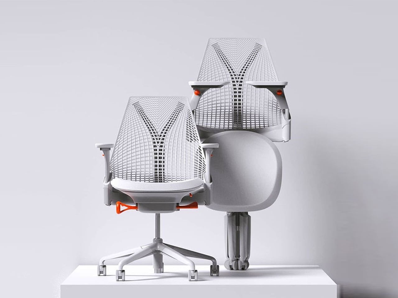
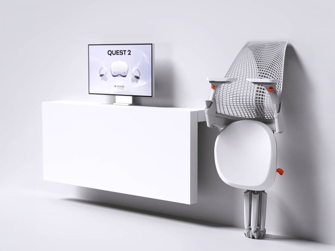
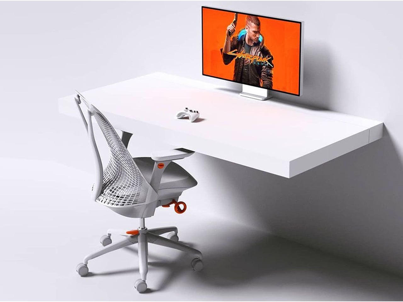
The Sayl concept chair by Charley reflects the changing ways we live, work, and play. As homes have evolved into hybrid offices, gyms, social spaces, and relaxation zones, our furniture needs have changed too. Charley even considers the hours we spend gaming or binge-watching, recognizing that chairs today must support multiple activities while remaining comfortable and functional. Designed by Herman Miller, the Sayl chair combines high-end design with practical usability, allowing users to maximize their space without sacrificing luxury or ergonomics.
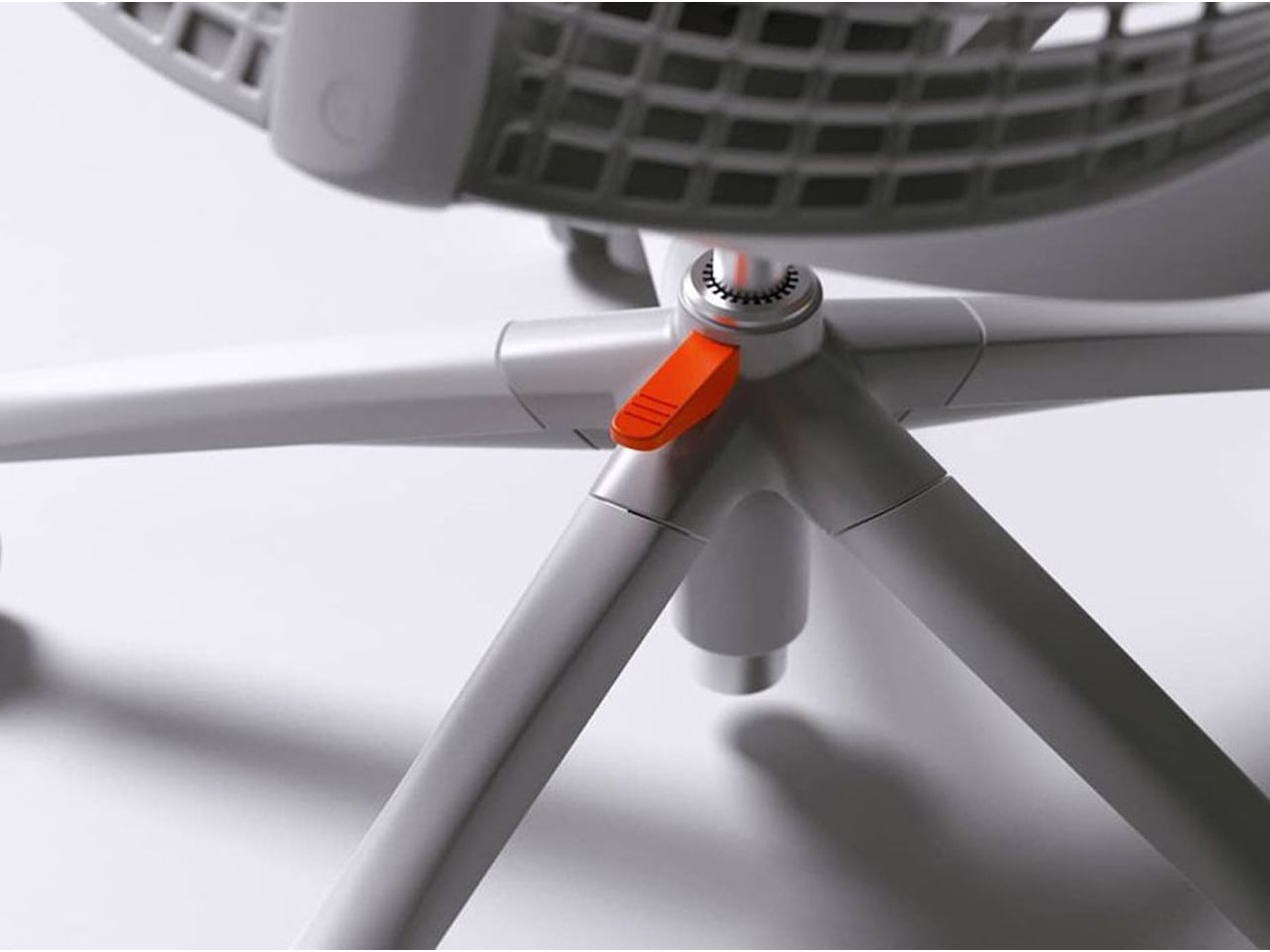
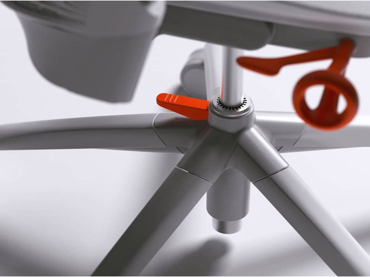
The chair’s muted grey tones ensure it blends effortlessly into any interior, while bright orange accents draw attention to pivotal touchpoints, making it intuitive to use. A foot pedal mechanism allows the chair to collapse easily, providing a convenient, space-saving solution for modern homes. In the post-pandemic era, furniture design has shifted towards modular, flexible, multifunctional, and compact solutions. The Sayl chair embodies all these qualities, offering a versatile, stylish, and practical seating option for today’s hybrid lifestyle.
2. Aesthetic Integrity and Material Authenticity
Every portable unit should carry a strong aesthetic value that complements its architectural surroundings. Materials must feel genuine and timeless, like solid wood, brushed metal, and high-performance textiles that reveal craftsmanship rather than conceal it. This honesty of composition creates visual depth and emotional connection, reinforcing the idea that beauty lies in authenticity, not imitation.
The design should remain sculptural yet understated, integrating seamlessly into curated interiors. Its finish must align with the home’s palette, allowing it to coexist gracefully within the space. When not in use, it should rest as a quiet architectural accent rather than a workplace intrusion.
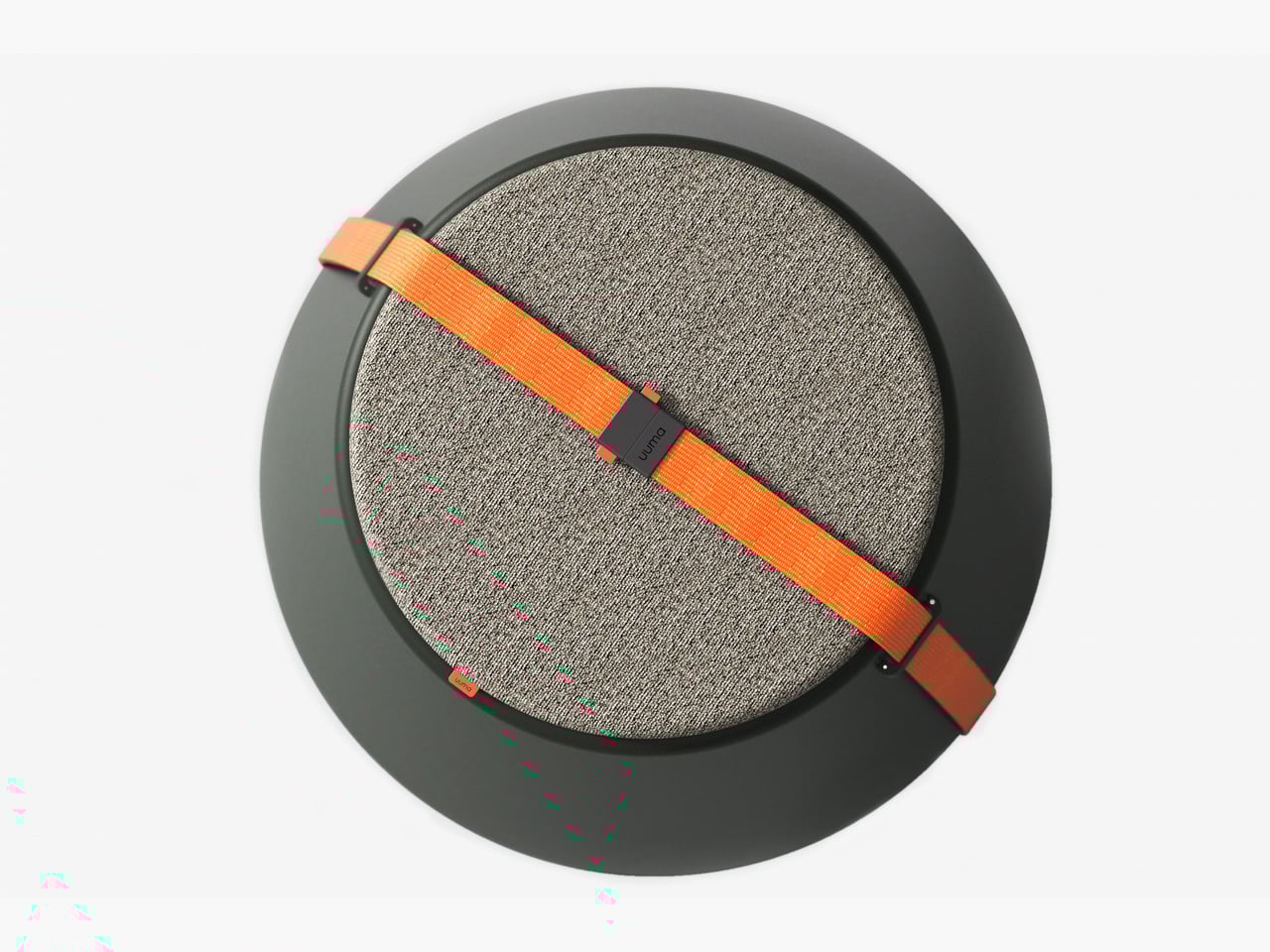
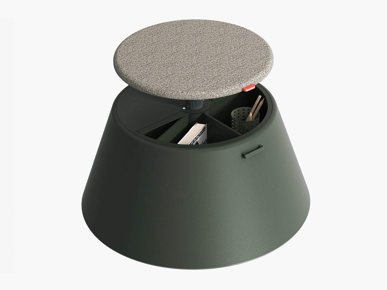
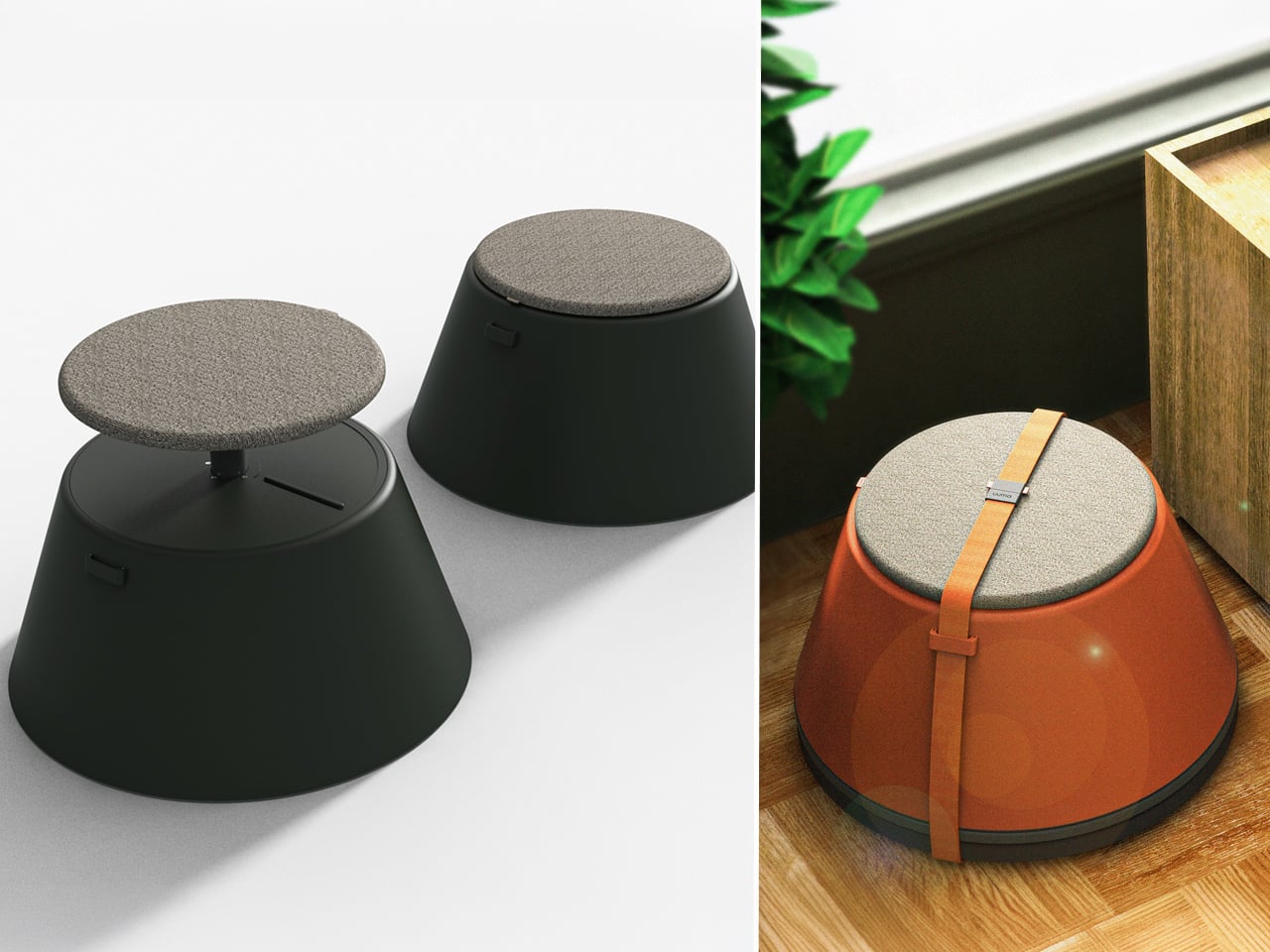
Working from home has spared many from long commutes and office distractions, yet it has also made work feel more solitary. Sitting by the same wall each day, even in a well-designed home office, can feel disconnected from the world beyond virtual meetings. While folding furniture remains popular for its space-saving benefits, stackable, all-weather alternatives are emerging as a smarter choice. Industrial designer Gökçe Nafak introduces the uuma, a portable table-and-chair combo designed as a single stackable unit that transitions effortlessly between indoor and outdoor settings.
Perfect for those who enjoy working in the garden, on the balcony, or in flexible spaces, the uuma blends convenience with creativity. Made from fibreglass, it is lightweight, durable, and sustainable. Its modular design features a height-adjustable metal frame and detachable parts that assemble easily. The chair transforms into a table within moments, offering comfort, portability, and style in three vibrant, modern colors.
3. Spatial Flow and Footprint Efficiency
The effectiveness of any modern workstation depends on how well it manages spatial flow. In compact urban homes, every inch counts, making footprint reduction a key design priority. A thoughtfully designed system should retract or fold away seamlessly, minimizing its physical presence while supporting the need for adaptable, multi-functional living spaces that evolve throughout the day.
Mobility and refinement define its usability. Tables and desks should transition effortlessly from work to leisure, enabling a quick shift from boardroom mode to family dining. Silent, non-marking wheels and intuitive movement reflect superior engineering and respect for interior balance.
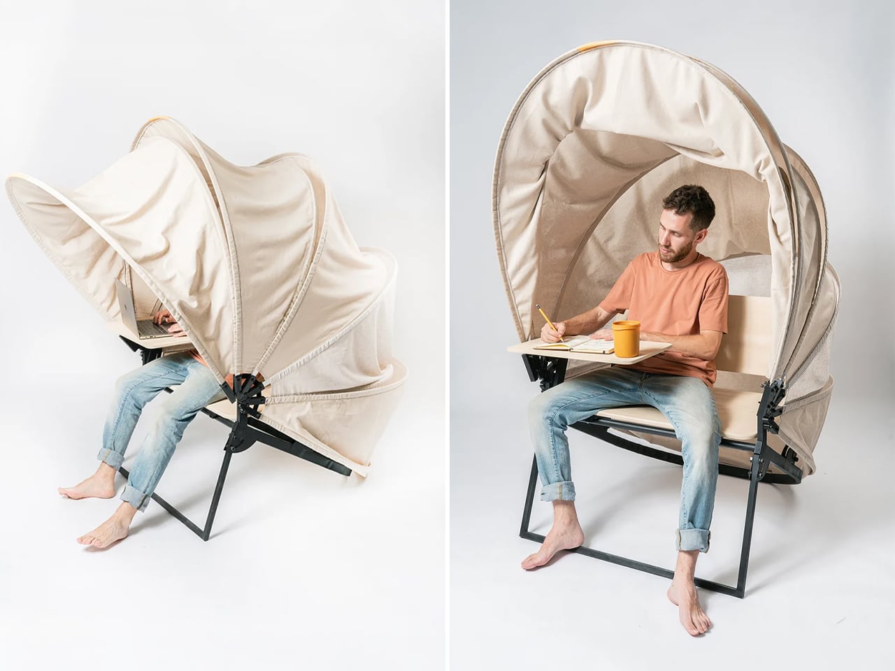
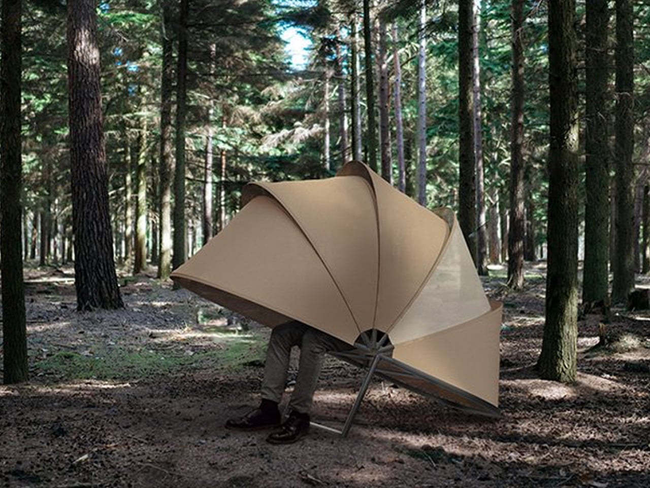
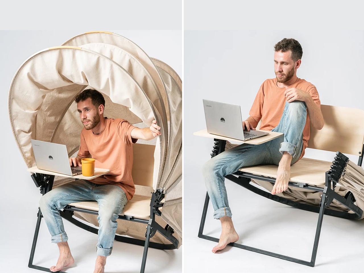
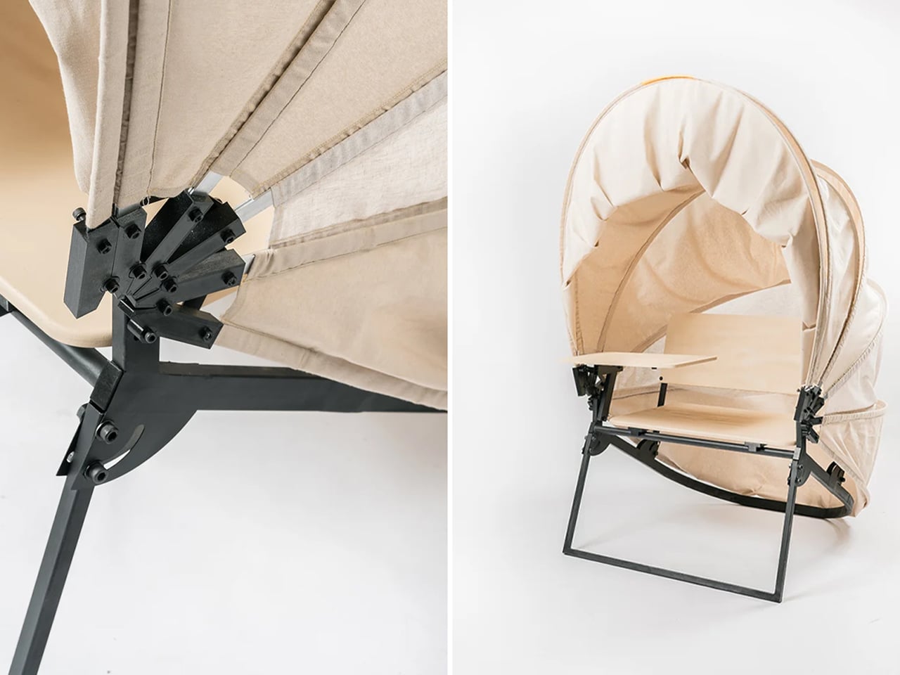
In a shared workspace like WeWork, or a peaceful spot under a tree, flexibility defines modern work culture. Industrial designer Matan Rechter responded to this shift with Shelly, a personal outdoor workspace that combines privacy, shade, and portability for those who prefer working outside. Inspired by the remote work movement, Shelly was designed to bring focus and comfort to outdoor environments like public parks.
Its name comes from its shell-like canopy that folds in and out with ease. Built from lightweight aluminium profiles and durable Cordura fabric, Shelly shields users and electronics from harsh UV rays. The canopy’s retractable design, reminiscent of an armadillo’s shell, provides instant shade and convenience. Compact and portable, Shelly transforms outdoor work into a comfortable, productive, and stylish experience anywhere, anytime.
4. Technological Integration and Power Autonomy
A modern hybrid workstation should function as a self-sufficient ecosystem, anticipating digital needs without visual clutter. True design intelligence lies in seamless connectivity, like built-in charging, concealed wiring, and intuitive access that keeps the workspace both elegant and efficient. Power autonomy ensures independence from fixed outlets, supporting the growing demand for mobility and flexibility in home environments.
Features such as integrated induction charging pads, hidden cable channels, and optional battery packs transform furniture into an adaptive tool. These enhancements merge aesthetics with performance, allowing users to remain connected, productive, and untethered within any architectural setting.
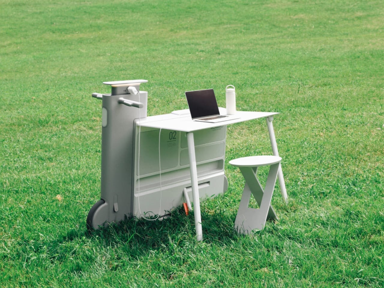
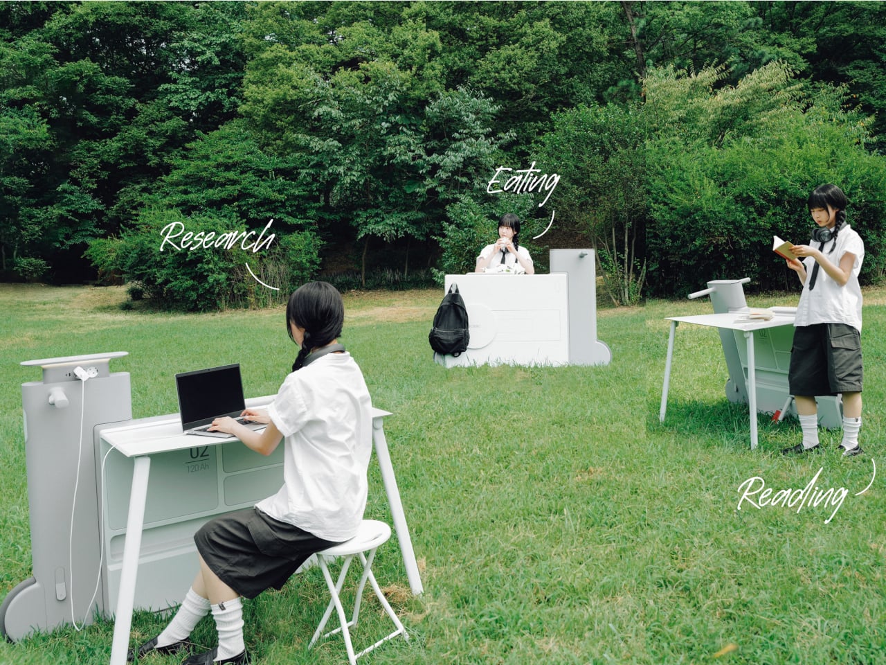
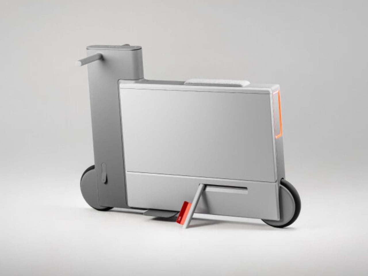
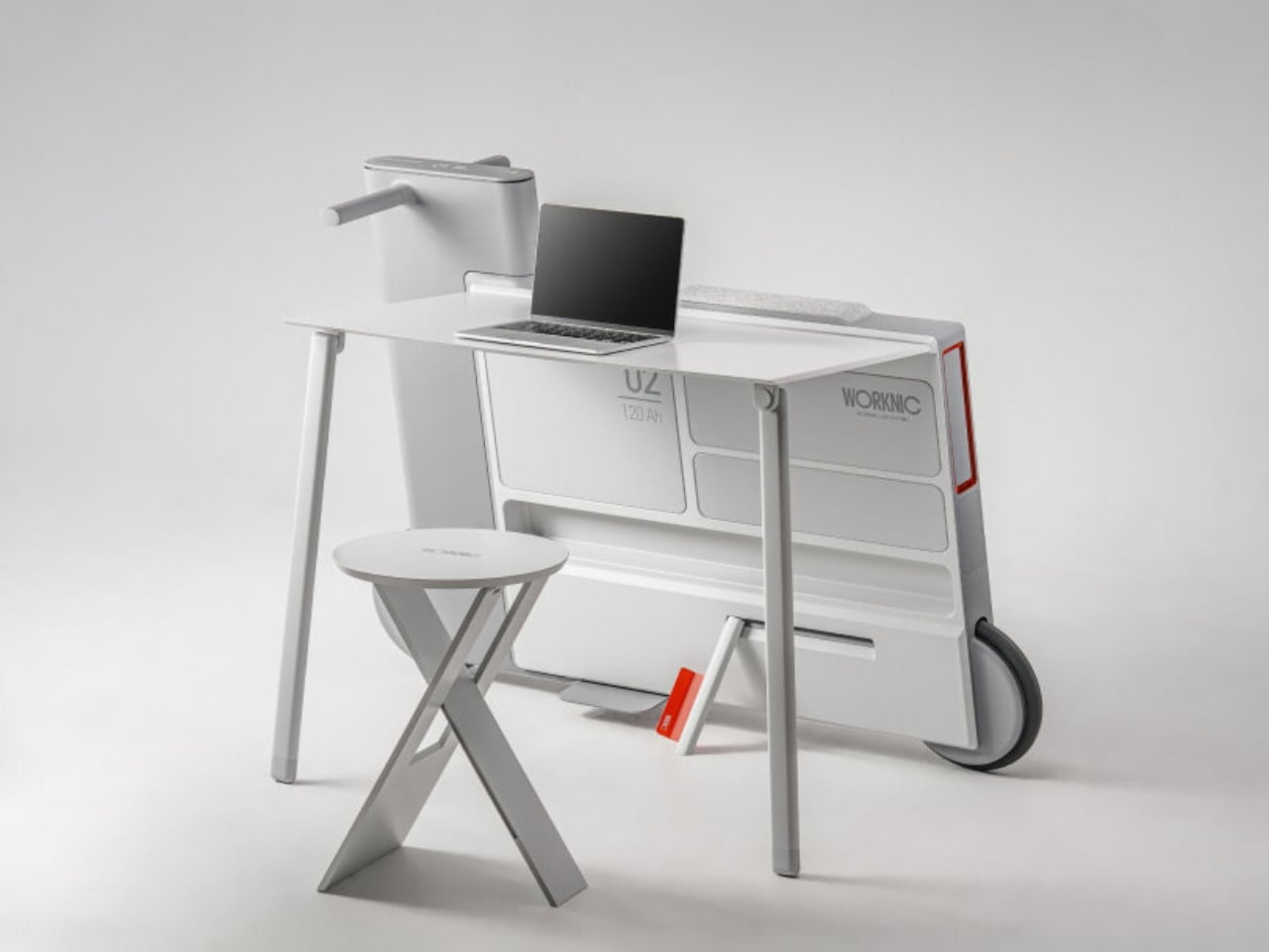
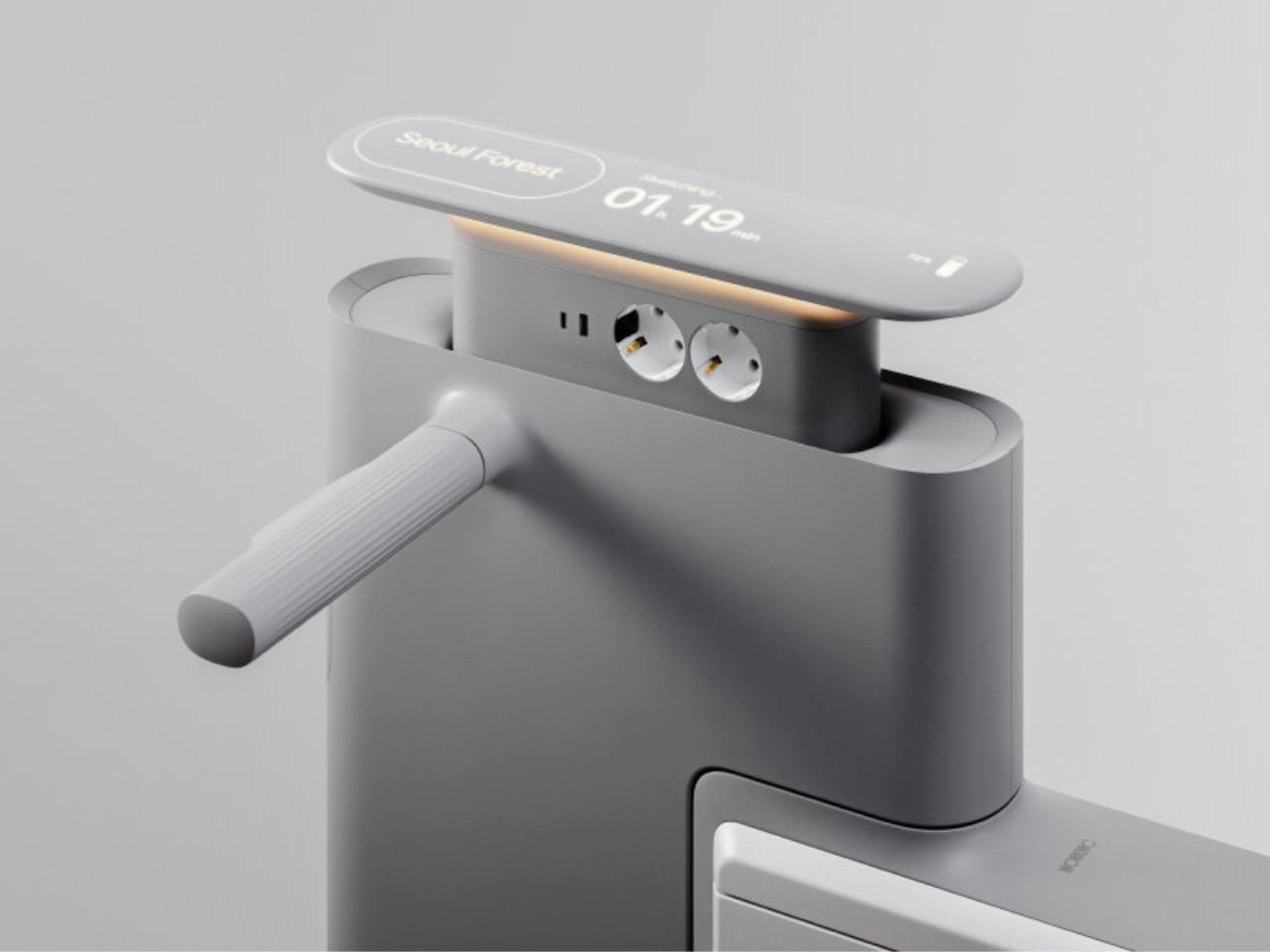
Another standout example is Worknic, a portable desk developed through the Samsung Design Membership program, sponsored by Samsung Electronics. Designed for flexibility, Worknic allows users to set up a functional workspace anywhere, whether in a home, park, or even on the beach, giving them the freedom to change their environment whenever needed.
The desk is built on wheels, making it easy to move and position in the ideal spot. Once in place, it unfolds to reveal a worktable, stands, and a built-in power source, while a pull-out stool completes the setup. Although details about battery life, weight, and additional features are limited, the concept prioritizes mobility, convenience, and adaptability. Worknic offers a creative solution for those who want a portable, fully equipped office that keeps productivity and inspiration in balance.
5. Design Resilience and Longevity Investment
For discerning homeowners, longevity defines true value. A well-crafted workstation should possess design resilience, built to endure daily use while retaining its original elegance and performance. This durability ensures a higher return on investment, setting it apart from fast furniture options that quickly lose both form and function.
Choosing established design houses and proven construction techniques guarantees structural integrity and timeless appeal. A five-to-ten-year warranty offers assurance that the piece is not just a purchase but a long-term architectural companion, blending endurance with refined craftsmanship for years of dependable, sophisticated use.
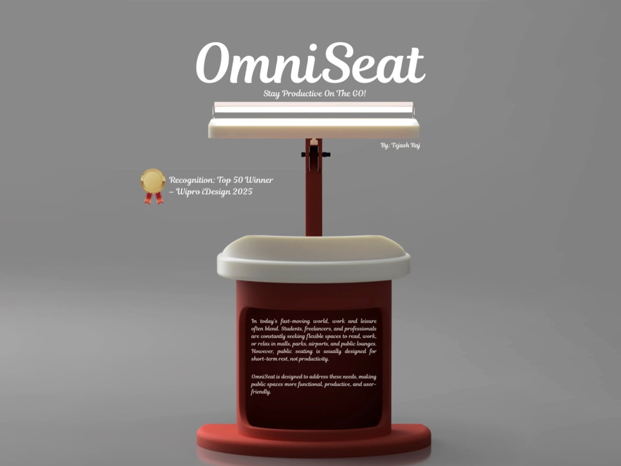
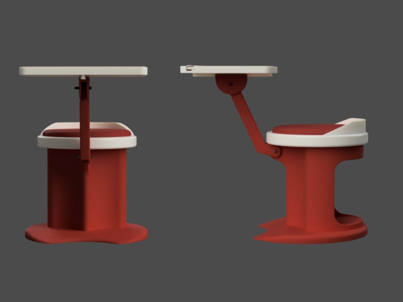
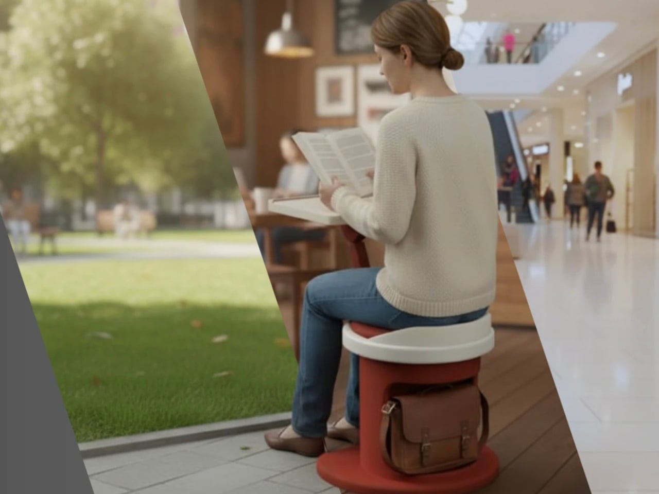
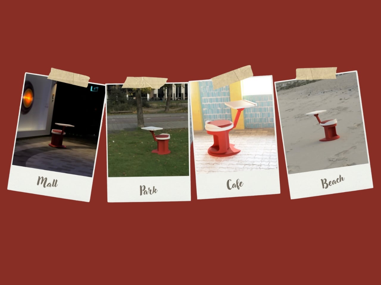
For those constantly on the move, finding a comfortable place to rest or work can be challenging. Cities often lack public resting areas beyond cafés and restaurants, making it tempting to carry a portable chair, though the idea quickly loses appeal due to its bulk and inconvenience. Recognising this need, designer Tejash Raj created the OmniSeat, a compact and ergonomic seating concept designed for people who stay productive while travelling, commuting, or working outdoors.
The OmniSeat features a lightweight frame, built-in storage, and device holders, all folding neatly into a slim form that fits in a backpack or attaches to a bike rack. A detachable tray accommodates laptops or tablets, with cable clips to keep cords tidy. Combining portability, comfort, and function, the OmniSeat offers a glimpse into the future of mobile workspaces.
The high-design portable workstation redefines the boundaries of work and home, merging productivity with tranquillity. It transforms interiors into fluid, balanced spaces where focus meets ease. Its true value lies in the freedom to work anywhere, capturing sunlight, inspiration, and connection without sacrificing comfort or creativity.
There’s a version of a desk setup that communicates everything about how little thought went into it. A black mesh organizer from the bottom shelf of a supply closet. A mouse pad that came free with something else. A cable clip in beige. The desk functions, technically, and does so with a level of visual enthusiasm that matches a waiting room.
The accessories below were designed by people who thought about this harder. Some carry authentic 1970s Italian design heritage. Some are running AI in the background to actively shape your environment. One contains material roughly 20 million years older than the Earth it now rests on. What they share is a quality of intentionality. Each was built as an object worth keeping on a desk, not just stashing in a drawer, because it earns its surface area through how it works, how it looks, or both at once. For men who have graduated from the corporate supply closet aesthetic, these eight represent a meaningfully different set of options.
1. Lenovo AI Workmate Concept
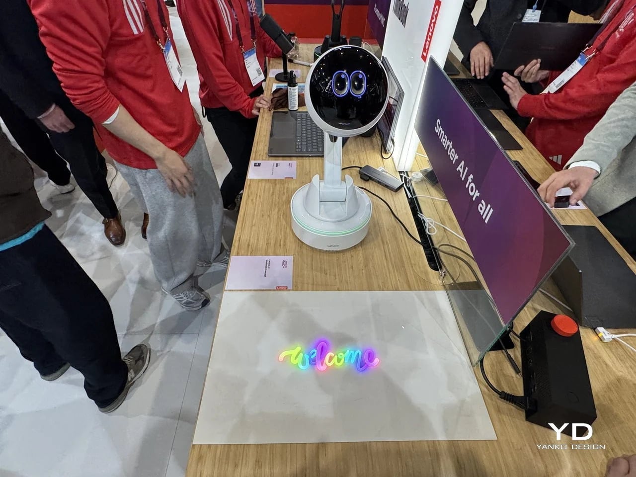
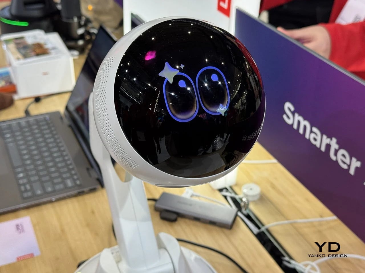
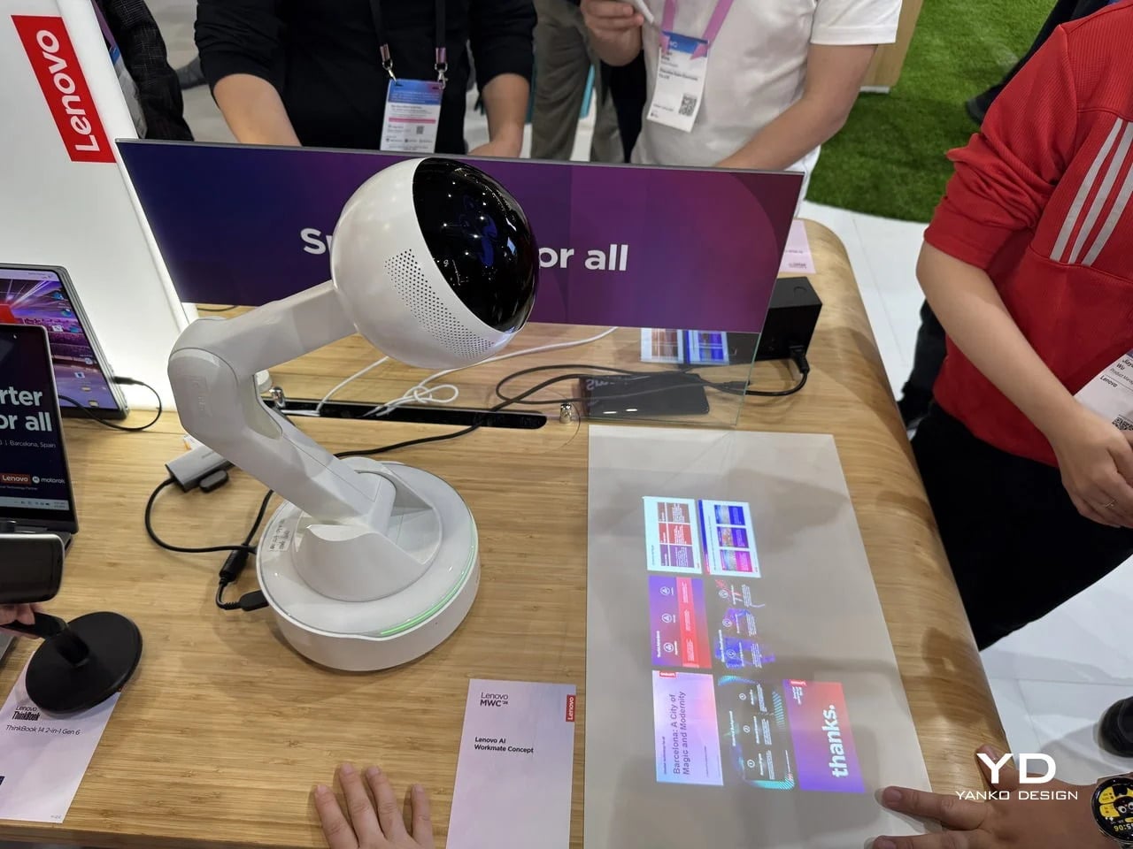
Working alone all day carries a specific kind of friction that most desk setups quietly ignore. Questions accumulate, decisions pile up, and the AI tools meant to support you sit behind a keyboard input that gives nothing back spatially or visually. Lenovo’s AI Workmate Concept, unveiled at MWC 2026, takes that problem seriously enough to build a physical object around it. The result is a desk companion in the most literal sense: a spherical head on an articulated arm mounted on a circular base, with animated eyes on its front display that shift and orient as it processes and responds. The form is compact, the presence is deliberate, and the intent is clear from the first time it moves.
The arm is the most consequential design decision here. Because it moves, the Workmate can orient itself toward whatever holds attention in front of it, a document laid flat on the desk, a person leaning back in their chair, or something happening at the periphery. That range of motion is what separates it from a smart speaker that has been given a screen and called a companion. Spatial awareness is embedded in its posture, not just its software. For men who spend long hours alone at a desk and find text-based AI interaction increasingly impersonal and context-free, the Workmate proposes something more honest about what presence and assistance can look like from an object sharing your workspace.
What We Like
Articulated arm gives the device genuine spatial awareness, orienting toward objects and people rather than remaining static
Animated eyes on the front display make AI interaction feel more present and less transactional than any screen-based interface
What We Dislike
Currently a concept unveiled at MWC 2026, with availability, pricing, and final specs still unconfirmed
The novelty of animated eyes may carry more emotional weight than the practical functionality justifies over time
2. Levitating Pen 2.0: Cosmic Meteorite Edition
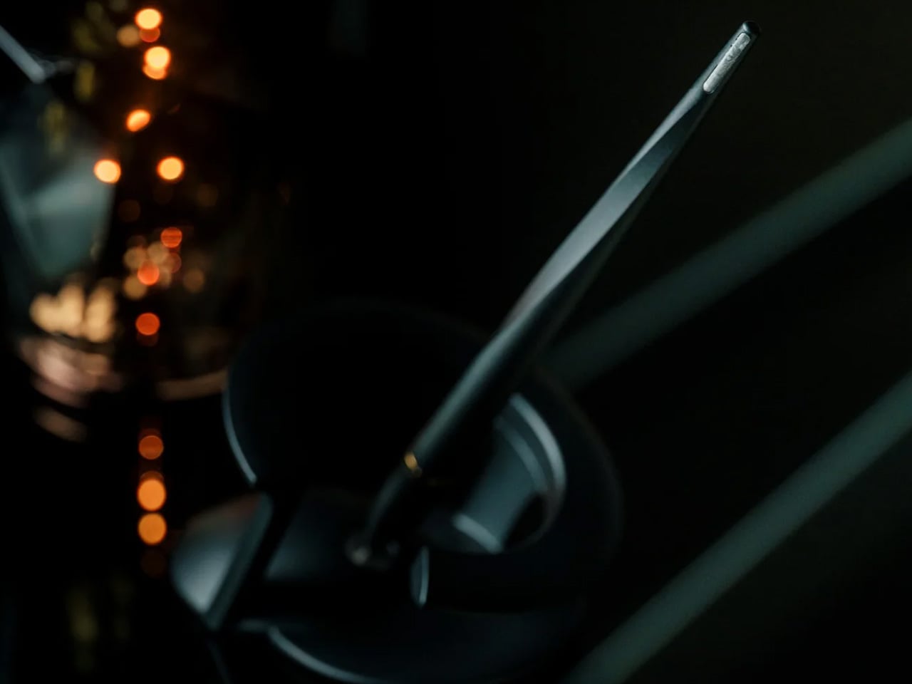
Most pens sit on a desk and do nothing interesting when they’re not being used. The Levitating Pen 2.0 Cosmic Meteorite Edition refuses that arrangement entirely. It floats at a 23.5-degree angle above its magnetic base, creating a suspension that stops people mid-sentence when they notice it. The design draws from spacecraft aesthetics, specifically the visual language of the USS Enterprise, and the tip incorporates a genuine fragment of Muonionalusta meteorite, a material approximately 20 million years older than the Earth it now rests on. It functions as a working ballpoint pen, which means it is simultaneously a collector’s object, a desk focal point, and a writing tool occupying the same physical form.
What keeps this from reading as pure novelty is how it behaves in your hands. The Levitating Pen is fidget-worthy in the best sense, the kind of object you reach for during a long call or a pause between tasks without consciously planning to. For men who collect objects with a verifiable reason behind them, the meteorite tip offers something most limited editions simply don’t: provenance with a story that doesn’t require a certificate to feel real. You’re holding material from beyond the solar system. That fact changes the weight of the object in your hand when you stop to think about it, and that shift is exactly what separates a desk accessory from a desk object worth keeping.
Genuine Muonionalusta meteorite tip connects the pen to a tangible, verifiable piece of cosmic history
Magnetic levitation display creates a desk focal point that requires no ongoing maintenance once positioned
What We Dislike
The floating display requires a flat, stable surface, limiting where it can sit effectively
Limited edition production means restocking after sellout is not guaranteed for future buyers
3. BOB Desk Organizer
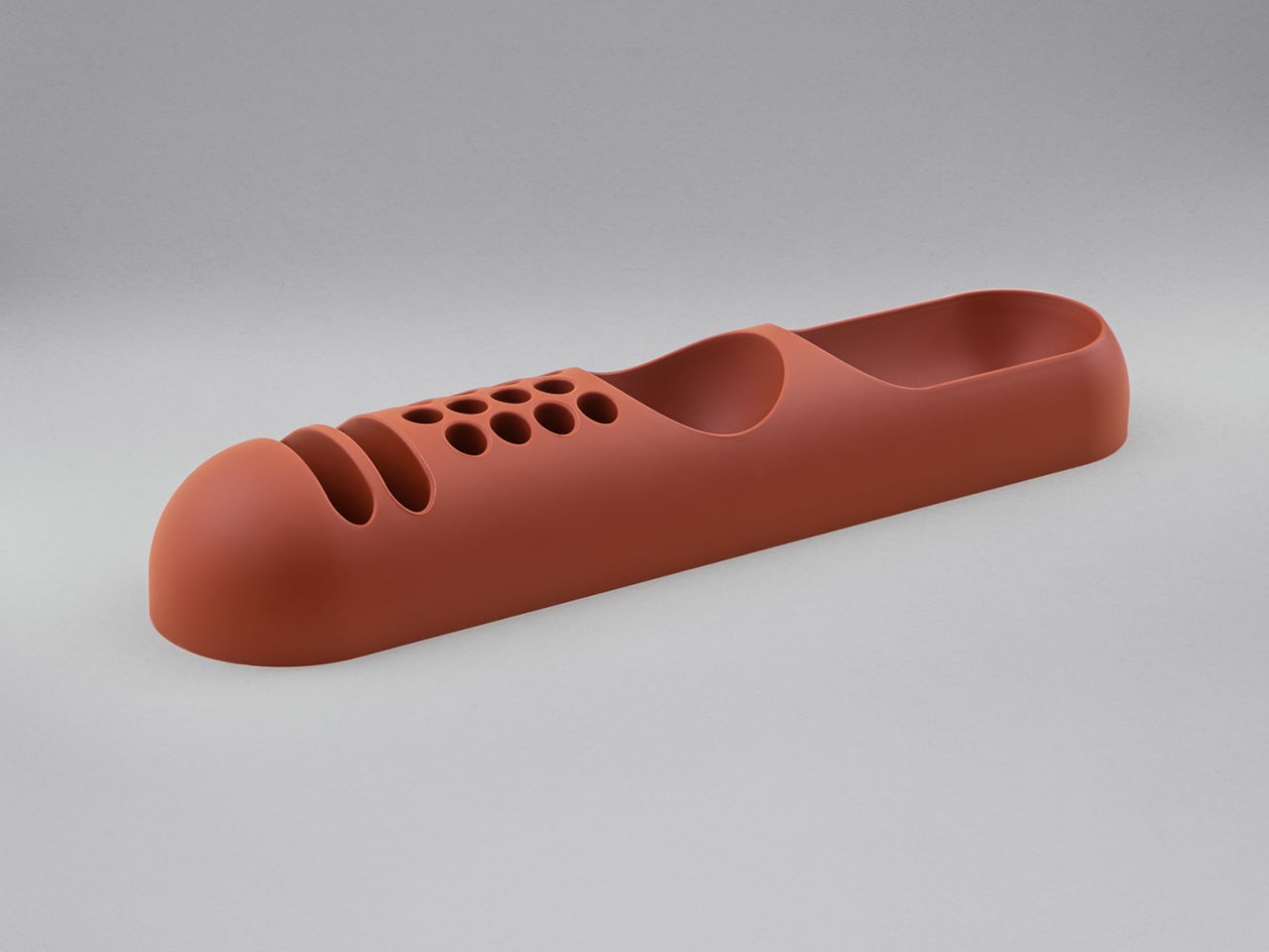
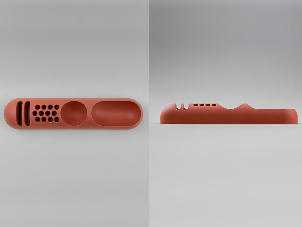
Joe Colombo designed BOB in 1970, at a time when desk organizers were either plastic trays with zero intentionality or overengineered systems that looked more complicated than the mess they were supposed to fix. He chose neither direction. BOB is a compact polyurethane gel form, elongated and low-profile, almost pill-shaped when viewed from above, with one end rising into a soft dome and the other tapering nearly flat. B-Line, an Italian label dedicated to reissuing objects from discontinued original molds, brought it back in 2023 across five colorways: terracotta, slate blue, mustard yellow, warm white, and a frosted translucent version called ice. The selection alone suggests a designer thinking about rooms rather than offices.
The top surface divides into three functional zones without any visible partition between them. The dome end opens into a large oval scoop for bulkier items. The center holds a three-by-four grid of individual circular holes, each sized precisely for a single pen or brush. The tapered tail offers two horizontal slot grooves for flat objects like rulers or small notebooks. None of this reads as a feature list in person. It reads as a single continuous gesture that happens to keep things organized along the way. For men who want a desk object with actual design history behind it rather than a branding story retrofitted over generic injection molding, BOB is nearly impossible to improve on.
What We Like
Rooted in authentic 1970s Italian design history, reissued from Joe Colombo’s original mold by B-Line
Three distinct functional zones are built into one continuous organic form with no visible hardware or dividers
What We Dislike:
Polyurethane gel construction may show surface wear or discoloration with extended daily use
The low-profile form works best for lighter objects and may not support heavier desk tools effectively
4. DEEP
DEEP operates on a premise most desk lamps don’t bother with: the working environment around you should configure itself to match what you are about to do, rather than waiting for you to adjust it manually. Switch it on with a spinning-top-inspired power button, tell it whether you’re studying, coding, reading, or doing creative work, and it adjusts both light quality and ambient sound before you’ve had to think about either. A camera positioned at eye level monitors your focus state in real time, functioning like a built-in productivity coach without requiring a separate app or a separate device taking up additional surface area.
What separates DEEP from a connected lamp with a smart home feature set is what it does across repeated sessions. The system saves your manual adjustments over time, builds a personal profile from the conditions that consistently work best for you, and begins applying them automatically without being prompted. Side buttons allow precise overrides for days when the default doesn’t fit. For men whose desks have become cluttered with single-function devices that each do one thing adequately, DEEP represents a genuine consolidation. It folds a lamp, an ambient sound environment, and a passive focus monitor into a single object that becomes more attuned to how you work the longer it stays on your desk.
What We Like
AI builds a personal focus profile across sessions and applies your optimal working conditions automatically over time
Combines lighting, ambient sound, and real-time focus monitoring without requiring any additional hardware
What We Dislike
Camera-based focus tracking may feel uncomfortable for users sensitive to passive environmental monitoring
Ambient sound adjustment effectiveness varies significantly based on an individual’s working environment and noise tolerance
5. Rolling World Clock
Every desk clock tells you one thing. This one tells you twelve. The Rolling World Clock is a 12-sided object with a single hand and an operation that couldn’t be more direct: set it on any face, and the hand reads the correct local time for the city printed on that side. The twelve cities span the major global time zones, including London, Paris, Cape Town, Moscow, Los Angeles, Karachi, Mexico City, New York, Shanghai, Tokyo, Sydney, and New Caledonia. For men who manage work across multiple time zones or simply have family spread across continents, the mental arithmetic of figuring out what time it is somewhere else is one of the more persistent small irritations in a working day, and this object removes it without adding a screen.
The design decision that makes this worth keeping on a desk rather than just owning is the total absence of anything unnecessary. No digital display. No charging cable. No app. Just a tactile, rollable object you turn to the city you need and set down. Available in black and white, it occupies desk or shelf space without reading as a gadget or demanding attention it hasn’t earned. There’s a quiet pleasure to the interaction that most clocks don’t provide: the act of picking it up, choosing a place in the world, and reading the time. There is a physical engagement with global time that a phone screen never manages to replicate.
Covers twelve major time zones in a single tactile object with no digital display, no app, and no charging required
Minimal form reads equally well on a desk or shelf without visually registering as a tech accessory
What We Dislike
A single clock hand requires slightly more reading attention than a digital display for precise timekeeping
The 12-city selection covers major zones well, but may not include every specific time zone a user needs regularly
6. Fidget Cube
The case for keeping a dedicated fidget object on a desk is more rational than it sounds from the outside. Restless hands during long calls, slow-loading processes, or decisions you’re turning over without fully committing to are a real and recurring part of working at a desk, and the Fidget Cube was built precisely for that condition. Six sides offer six different tactile surfaces: a cluster of clickable buttons, a gliding joystick, a row of flip switches, a smooth surface designed for the thumb’s natural breathing motion, a rolling ball set into one face, and a spinning disc. The variety means your hands will find a preferred surface quickly and return to it across the session without thinking about it.
What keeps this from reading as a toy is the restraint built into how it was designed. It doesn’t look out of place on a desk or conference table, particularly in the Midnight black colorway, which sits visually neutral among the standard dark objects that populate most professional environments. For men who have noticed that physical repetitive movement genuinely sharpens how they think through a problem, this is one of the more honest tools available at any price point. It takes a real behavioral truth seriously and gives your hands a quiet, clean way to act on it without disrupting anyone around you or drawing attention to what you’re doing.
What We Like
Six distinct tactile surfaces address a wide range of fidgeting habits within one compact, pocketable object
Discreet colorways, particularly Midnight black, keep it visually neutral in professional desk environments
What We Dislike
Some click mechanisms can produce an audible sound in quiet rooms or during video calls
Serves no secondary organizational function on a desk, occupying surface space with a purely tactile purpose
7. MOFT Z Sit-Stand Desk
Sit-stand desks have spent years being expensive, physically large, or permanently locked to a specific room. The MOFT Z takes a completely different approach, collapsing to something closer to a slim notebook in thickness while delivering a full ergonomic range through an origami-inspired Z-structure. It provides one standing mode and three seated position angles, which is enough postural variety to meaningfully shift how you feel across a long working session. For men who divide their time between home, a co-working space, a client’s office, or anywhere other than a fixed desk, the ability to carry a sit-stand setup in a bag removes an ergonomic compromise that most standing desk products are structurally incapable of solving.
The weight is what makes it a genuine solution rather than a clever concept. Ergonomic equipment that stays home because it’s too heavy or awkward to transport defeats the purpose of improving how you work across different locations. The MOFT Z doesn’t have that problem. Unfold it in seconds, set your laptop on the surface, and you’ve built the same ergonomic posture you’d have at a standing desk that costs several times more and cannot leave the floor it occupies. For anyone who has watched their posture decline steadily across a long afternoon of flat laptop work, this is a practical correction that goes where you go and requires no tools, no assembly, and no installation to use.
What We Like
Origami Z-structure provides one standing mode and three seated positions with no setup tools required
Ultra-lightweight, paper-thin folded profile makes it genuinely portable across different working locations
What We Dislike
Surface area restricts how much additional equipment can sit alongside a laptop in standing mode
Stability may be reduced under heavier setups or on surfaces that aren’t completely flat and firm
8. LEGO-Style Silicone Cable Organizer
Cable management has a way of being solved temporarily and then quietly abandoned. The solution works for a week, then a new cable enters the setup, or the organizer shifts position, or it turns out the adhesive left a mark on the desk. This silicone cable organizer approaches the problem differently. Shaped after a lozenge pack, it uses peg-topped cylindrical columns to wrap and hold individual cables in separate, stable positions. Multiple units can be stacked or arranged in rows, and three sizes cover the range from a single charging cable to a full multi-device setup: a 2×2 mini, a 3×3 medium, and a 2×5 large, with the option to place two cables on top of each other within the same row.
The design was born from a specific personal frustration: cables tangling with other items inside a bag, the kind of small recurring annoyance that accumulates into a genuine grievance over time. That origin shows in how focused the solution is. There’s no overengineering, no branded clip mechanism, no custom routing system that only works with certain cable gauges. The micro suction tape base grips the desk surface firmly without permanent adhesion, meaning it moves when the setup changes and holds when it doesn’t. For men who have gone through two or three cable management products and quietly abandoned all of them, the directness here is precisely the argument for this being the last one you need.
What We Like
Three modular sizes cover setups from a single cable to a full multi-device workspace without custom parts
Micro suction tape base holds securely without permanent adhesion, leaving the desk surface undamaged
What We Dislike
Silicone material collects lint and dust more readily than hard plastic alternatives
The LEGO-inspired visual style reads as playful and may not suit every desk aesthetic preference
The Best Desk Is One You Actually Thought About
A desk says something whether you intend it to or not. It communicates how seriously you take the hours you spend there, what kind of work you believe deserves a proper environment, and whether the objects around you were chosen or simply accumulated. The eight accessories above represent a different kind of accumulation, one where every item on the surface has a reason to be there, a story worth telling, or a function that genuinely improves how the day moves.
None of them require a complete overhaul. One rolling clock, one floating pen, one lamp that learns how you work — any single object from this list shifts the energy of a desk in a direction worth going. The corporate supply closet aesthetic isn’t inevitable. It just tends to win by default when no one pays attention. These eight are the case for paying attention.

 Connexion