Vue lecture

Il y a de nouveaux articles disponibles, cliquez pour rafraîchir la page.

This Georgian Residential Complex Rejects Straight Lines on its Floor Plan, Mimicking The Ocean

Straight lines are easy. Any architect can slap a rectangular tower on a plot and call it a day, and most beachfront developers do exactly that because straight lines are cheap, fast to build, and easy to sell off a brochure. Georgia’s Adjara coast just got a project that looked at that playbook and said absolutely not. Montemar Residential, a three tower complex rising in the seaside town of Gonio, ditches the grid entirely in favor of forms that ripple, curve, and cantilever like something dragged up from the Black Sea itself. It is the kind of building that makes you stop scrolling, then immediately want to know who signed off on it and how.

Designed by Irakli Emiridze and Irina Chkonia of Alpha Architecture, the complex sits on a 10,000 square meter plot within a UNESCO listed stretch of coastline, right where Adjara’s oddly tropical microclimate runs into the Black Sea. Each of the three 16 story towers tops out around 48 to 52 meters and wears a dramatic aluminum crown that flares out over the roofline like a mushroom cap, or if you squint, a seashell caught mid opening. Parking for 300 vehicles sits tucked below grade, keeping the ground plane free for landscaping and plazas. It is a lot of building, and it wants you to know it.

Designers: Irakli Emiridze and Irina Chkonia

The seashell inspiration shows up in how the facade behaves. The balcony edges do not stack in the usual identical, floor by floor grid you see on every coastal high rise from Miami to Marbella. Instead they undulate, staggering in and out like sediment ridges carved by tidal movement, which gives each tower a texture closer to a geological formation than a construction product. Aluminum embossed sheet cladding wraps the crowning terraces, catching light in a way that concrete or glass simply cannot, and it is the detail that separates Montemar from the generic curved tower trend that has been creeping through Gulf and Black Sea resort markets alike.

The space between the three towers is treated as public terrain rather than leftover setback, with green plantings, plazas, and communal zones designed to pull residents out of their units and into shared space. Panoramic apartments come with private terraces and jacuzzis angled toward the water, the kind of amenity that used to be penthouse exclusive and is now standard issue on any coastal development trying to compete for buyers. Whether that democratization of the infinity view holds up once the cranes clear out is the real test, since renderings are notoriously generous with light, weather, and empty beaches.

Gonio is a strange place for this kind of architectural swing. It is a historic town, not a resort capital, and Montemar is betting that sculptural ambition can coexist with a UNESCO designation next door rather than clash with it. If the finished towers deliver even half of what the renders promise, this stretch of the Adjara coast is about to become a lot more interesting to watch than its neighbors on the Black Sea.

The post This Georgian Residential Complex Rejects Straight Lines on its Floor Plan, Mimicking The Ocean first appeared on Yanko Design.

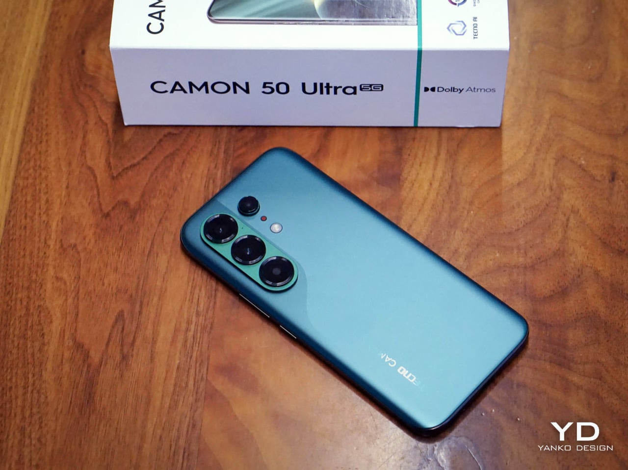
Tecno Camon 50 Ultra 5G Review: A $420 AI Phone With Built-in Gemini, ChatGPT, DeepSeek, and Grok

PROS:


  • EllaClaw is one of the most impressive phone AI experiences available right now

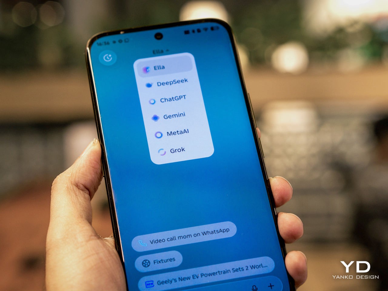
  • Multi-model AI support, including Gemini, ChatGPT, Grok, DeepSeek, Meta AI, and Ella

  • Strong 2-day battery life from the 6500mAh cell

  • Competitive value in the mid-range segment

CONS:


  • Single speaker setup sounds tinny and lacks bass

  • Curved waterfall display is prone to accidental palm touches

  • No wireless charging or Qi2 (MagSafe)

RATINGS:

AESTHETICS
ERGONOMICS
PERFORMANCE
SUSTAINABILITY / REPAIRABILITY
VALUE FOR MONEY

EDITOR'S QUOTE:

The Camon 50 Ultra 5G feels like Tecno looked at the current AI phone race, skipped the walled garden nonsense, and built the first assistant experience that actually shows you why you’d want to use it in the first place.

Apple has Apple Intelligence. Google Pixel has Gemini. Samsung has Galaxy AI. Tecno has everything else. Packed into its EllaClaw agent is the ability to use Gemini, ChatGPT, Grok, and DeepSeek, because a walled garden never benefited anyone. Tecno’s Camon 50 Ultra 5G is a great phone, but what makes it worth doing a double take for is EllaClaw, an agentic AI built into the phone that offers a phone AI experience I have yet to see on any smartphone so far. EllaClaw is currently an invite-only closed Beta feature limited to just this phone, but seeing it in action gave me everything I needed to understand where other phones are going wrong with their on-board AI, and where they can learn from Tecno.

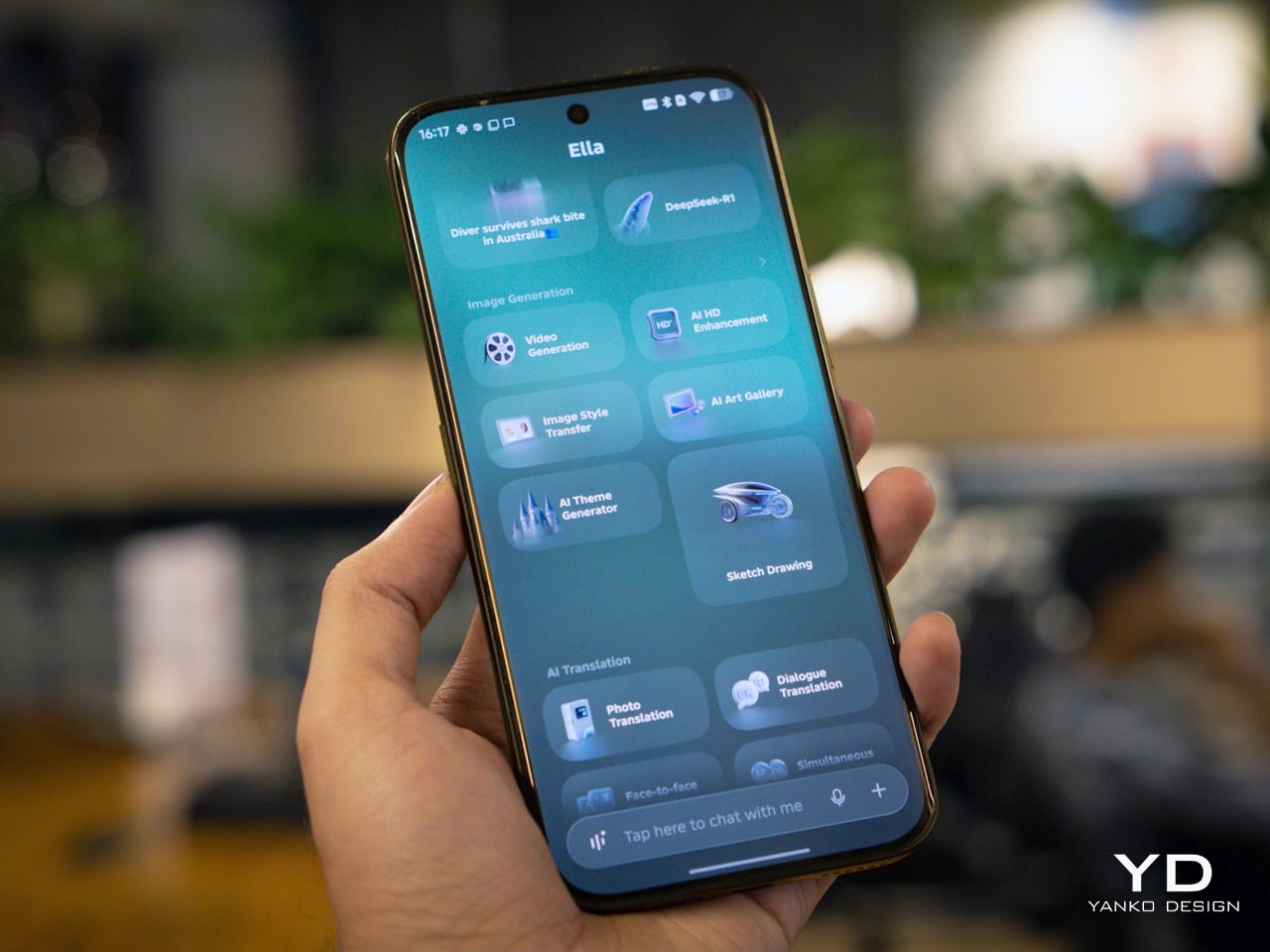
The wild part is how approachable it all feels. EllaClaw does not sit around waiting for you to guess the perfect command like some moody genie. It actively shows you what it can do, which makes the whole experience feel far less intimidating than Gemini or Apple Intelligence currently do. Within minutes, I was jumping between message summaries, creative tools, settings help, and different AI models without feeling like I needed a tutorial or a prayer.

Aesthetics

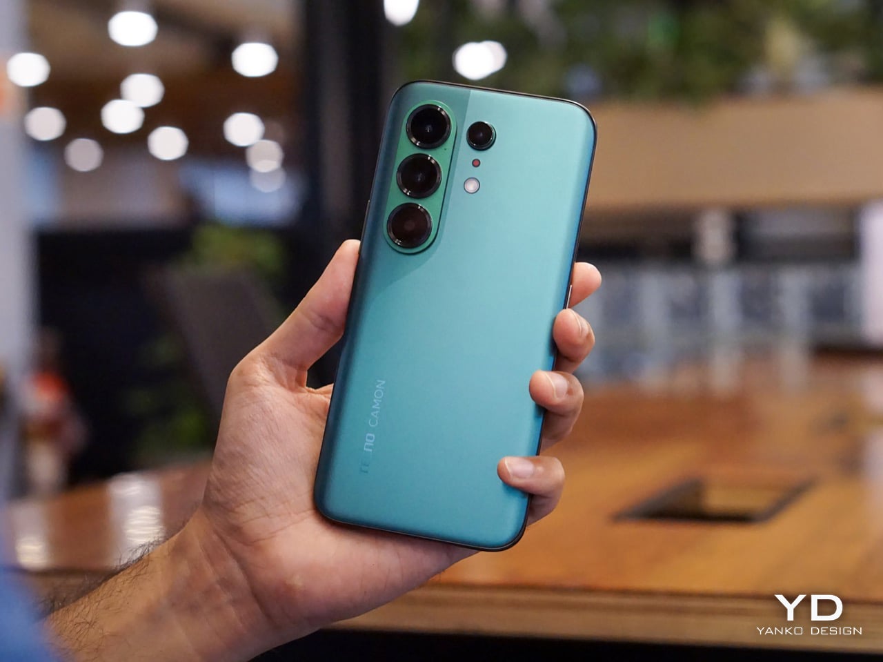
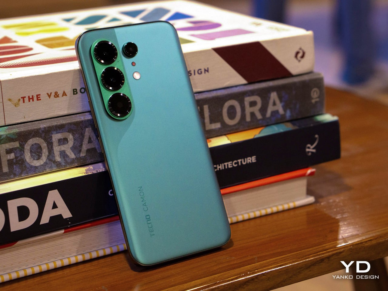
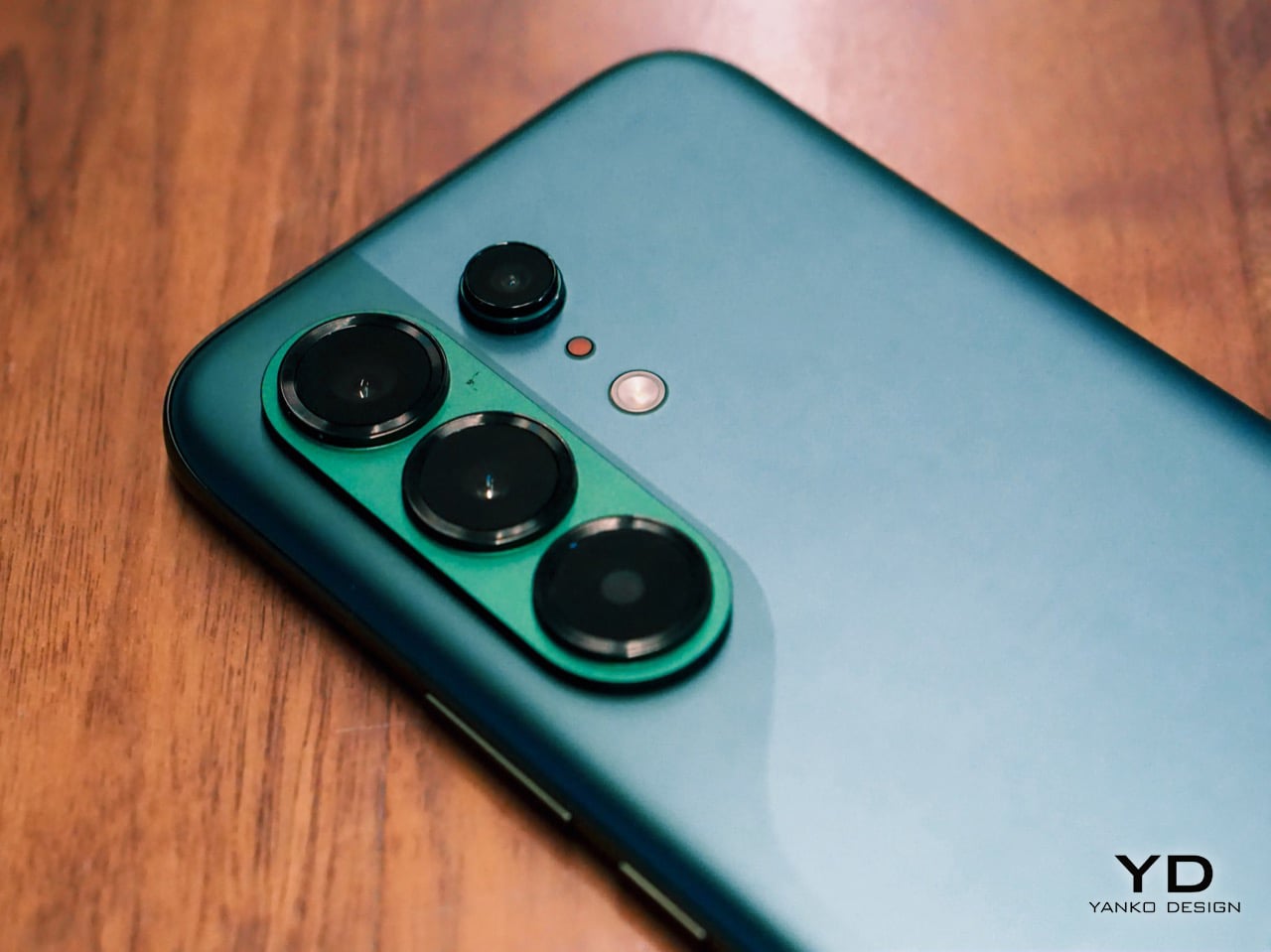
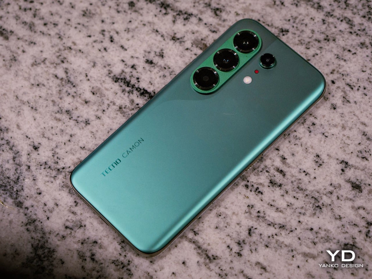
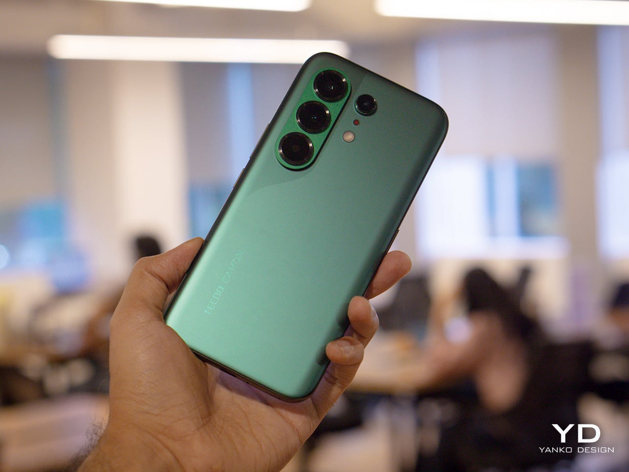
The moment I unboxed the Camon 50 Ultra 5G, I was hit with a serious case of déjà vu. The green variant has a gorgeous satin finish that gives it a silky, metallic glow under the light, and it immediately sent me down a memory lane trip to my old OnePlus 8 Pro which I faithfully used from 2020 to 2024. The color, the texture, even the way the camera module is arranged, it all felt so familiar and, frankly, so premium. Tecno absolutely nailed the flagship-esque feel here. The back is smooth to the touch, resists fingerprints reasonably well, and has a subtle elegance that a lot of phones in this bracket just do not bother with.

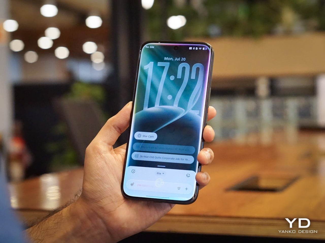
The front is where the design language gets a little more complicated, at least for me. Tecno went with a waterfall display, which means the screen curves dramatically around the sides. It looks stunning when the phone is off or when you are watching a video, creating an immersive, almost bezel-free experience. But I have always had a love-hate relationship with these displays. They are beautiful, no doubt, but they can be a magnet for accidental palm touches. While the software does its best to ignore them, I still found myself occasionally tapping something I did not mean to. It is a classic case of striking aesthetics meeting the messy reality of how we hold our phones. I do have to say that Tecno’s Liquid Glass homage does look much better on a waterfall display than on a bezel-ridden iPhone.

Ergonomics

That waterfall display has a big effect on how the phone feels in your hand. The curved edges melt away into the frame, making the Camon 50 Ultra 5G incredibly comfortable to hold. There are no sharp, flat corners digging into your palm, which is great for long sessions of scrolling or gaming. The trade-off, of course, is that the phone can feel a little slippery if you are not paying attention. It has that smooth, polished-stone feel that is lovely to touch but always feels one careless gesture away from a gravity experiment. It is a phone that practically begs to be put in a case, even if it feels like a shame to cover up the design.

The button layout is personally feels a little little bit tricky. On the left, you have a dedicated AI key that summons EllaClaw, a shortcut I ended up using constantly. You can remap it, but having a one-press gateway to the AI is a smart touch. The right side, however, is where my muscle memory started to complain. There is a power button and a fairly short, single-piece volume rocker. Because the rocker is slightly compact, I often found myself fumbling, unsure if my thumb was on volume up, down, or about to lock the screen. It is a small pain, but a tiny indent in the middle of the volume button would have made all the difference. The buttons themselves are slightly sharp and textured, a necessary choice for a phone with curved edges, but it does not quite solve the problem of telling them apart by feel alone.

Performance

EllaClaw is where the Camon 50 Ultra 5G earns its stripes. The dashboard (which you access by swiping towards the left – where you’d see Google Discover on most Android phones) keeps surfacing prompts, shortcuts, and suggestions, making the AI feel alive and accessible rather than buried under three layers of settings. Most phone AI treats users like they should already know what they want. EllaClaw meets you halfway, and that changes everything about how you interact with the phone.

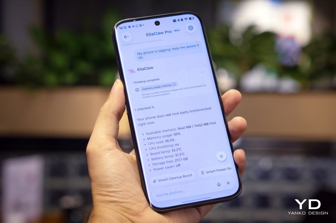
The deeper layer, EllaClaw Pro, is genuinely impressive. It reaches into the phone’s apps and system functions in a way that feels ahead of where the conversation currently is. I asked it to summarize my text messages without opening the messages app, and it did exactly that, handling the whole thing on its own. That kind of agentic behavior is the next logical step for phone assistants, and right now, Tecno seems to be ahead of the pack. Nothing reassured me that the AI wasn’t reading my messages to enhance its database though, so the privacy conscious might have a thing or two to worry about.

Tecno’s decision to build EllaClaw as a multi-model hub is one of the smartest software calls I have seen this year. My unit offered access to DeepSeek, Gemini, ChatGPT, Grok, and Meta AI alongside Ella’s own model, all in one dashboard. Claude is conspicuously missing, but everything else is here and free to use (at least during the Beta period). Daily limits are applied on AI use which reset every 24 hours, and you can buy extra credits in case you overshoot. In all my hours of testing, I never needed to purchase extra credits, which means image generation, video generation, and sketch-to-photo tools were all available at no additional cost.

EllaClaw is still being refined, though. The dashboard lagged occasionally, and the AI sometimes took longer to load than felt comfortable. Restarting the app always sorted it out, but it is a reminder that this experience has not fully grown into its ambition yet. Users in certain regions may also need a VPN to get the full experience running, which is worth knowing upfront.

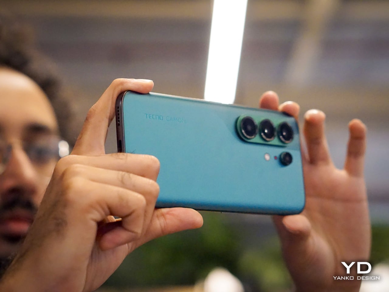
The camera system is built around a 50MP Sony LYT-700C main sensor with OIS, paired with a 50MP telephoto lens offering 3x optical zoom (70mm equivalent) and an 8MP ultrawide. That telephoto is a proper standout for a phone at this price point, and the software leans into it with confidence. You get 60x hybrid zoom, which is mostly digital exaggeration past the 3x mark, but the results between 3x and 10x are still usable in decent light. The main camera performs well across a range of scenarios, especially in good light, and night mode is aggressive without getting too soupy. The front camera is a 50MP sensor with autofocus, which makes a noticeable difference in selfie sharpness compared to the fixed-focus cameras on cheaper phones.

Tecno stuffs the camera app with modes including dual-cam, underwater mode, document scanning, super night mode, and super macro. FlashSnap is the standout, though. It watches your scene and captures the most dramatic moment automatically, so if someone is mid-jump or mid-throw, the phone clicks at exactly the right time without you having to think about it. It made me look like a considerably better photographer than I actually am. Video recording tops out at 4K at 30fps, which is fine but not particularly exciting.

Battery life is one of the phone’s most quietly satisfying qualities. The 6500mAh cell pushed comfortably through two full days of use without needing a charge, which is more than my current flagship iPhone manages. At some point I just stopped thinking about charging altogether, which is the best thing a battery can do. The phone supports 45W wired charging, which is fast enough to feel civilized without being record-breaking.

The display is a 6.78-inch AMOLED panel with a 1.5K resolution (1208 x 2644 pixels, 429 ppi) and a 144Hz refresh rate with LTPO support for adaptive refresh. It is vibrant, sharp, and performs well in low light. The 144Hz refresh makes scrolling and gaming feel smooth, and the high PWM dimming (2160Hz) helps reduce flicker for those sensitive to it. The curved waterfall edges are a design choice I have already aired my reservations about, and this section will not relitigate that argument. It looks great. It catches accidental touches. Moving on.

Speakers are a weak spot, and a noticeable one. There is a single grille at the bottom right, so stereo is off the table, and the audio leans tinny with very little bass to speak of. For a phone this polished everywhere else, it feels like a department that got the budget cut.

Gaming held up well for everything I tried. Tecno’s dedicated gaming software manages frame rates and battery draw sensibly, and the Dimensity 7400 handled casual to moderate sessions without complaint. The 144Hz display helps make fast-paced games feel responsive, and the phone stayed well within comfortable temperature ranges throughout. Nothing I played caused any real issues, thermal throttling never became a concern, and the large battery meant I could game for extended sessions without nervously watching the percentage drop.

Sustainability

Tecno is promising 3 years of Android OS upgrades and 5 years of security patches for the Camon 50 Ultra 5G, which puts it roughly in line with brands like Motorola and slightly ahead of OnePlus, though still behind Nothing’s 6-year security support.That is a meaningful commitment for a phone at this price, especially if you are someone who plans to use the device well beyond the usual two-year upgrade cycle.

Tecno also claims the battery is built for durability, marketing it as a “5-Year Durability Battery” with TÜV certification and a 72-month lag-free guarantee. Whether that holds true in practice is something only time will tell, but the fact that the company is willing to stake that claim suggests they are at least thinking about longevity beyond the usual marketing fluff. The 6500mAh capacity itself helps, because the less frequently you need to charge, the slower the battery degrades. If you are getting two full days of use out of a charge right now, that headroom means the phone should still feel usable years down the line when the cell inevitably loses some of its capacity.

Value

The Tecno Camon 50 Ultra 5G is priced at $420 for the 8GB + 256GB variant (that’s based on its ₹40,000 Indian price, since the phone hasn’t officially launched in the US). For a phone with a 50MP telephoto, a 144Hz AMOLED display, and a 6500mAh battery, that positioning feels competitive in the under-40K segment, especially when you factor in the AI ambitions.

What feels less competitive is the setup experience. When I powered on the phone and began the initial configuration, India was not listed in the countries menu. Hilariously enough, Palestine was available as an option. The world’s most populated country, nowhere on the list. I eventually had to select a different region just to proceed, which immediately felt awkward for a phone launching in India. Later, I also needed a VPN to access EllaClaw, which could have been a software issue tied to my initial region selection, or it could point to broader availability constraints. Obviously this won’t be the case for everyone since mine was a review unit with the EllaClaw beta program probably tied to a certain region. Either way, it is a frustrating first impression for a feature that is supposed to be the phone’s main selling point.

As for EllaClaw Pro and its credits system, Tecno does offer a credit-based structure for premium AI features like image generation and video creation. In my testing, I never hit a paywall or needed to purchase add-on credits, which suggests the included allocation is generous enough for typical use, at least initially. How sustainable that remains over time, or whether Tecno tightens the limits later, is harder to predict. For now, though, the experience feels surprisingly open, which is a rare thing in the AI phone space.

Verdict

The Tecno Camon 50 Ultra 5G delivers a lot of value for $420. The camera is genuinely impressive, with super night mode shots and 60x zoom that feel bonkers for this price range, and the battery life makes it easy to forget about charging anxiety for days at a time. But I am not recommending this phone for its camera, or its battery, or even its design, as much as I enjoyed all of those things. I am recommending it for EllaClaw, because it is the closest I have come to using a phone AI that feels like it was built for actual humans.

EllaClaw is everything Gemini and Apple Intelligence hope to achieve, and a bit more. I did not think I would see a phone that lets me choose the LLM for its AI assistant, swapping between models depending on what I need. I definitely did not expect an AI assistant dashboard to genuinely give me so much insight and value into how I can use the AI, rather than just sitting through a keynote, nodding along to feature lists, and then forgetting half of them the moment I leave the room. Tecno has cracked something here that bigger brands are still struggling with, which is making AI feel approachable, integrated, and genuinely useful instead of intimidating or buried.

The phone has a few tiny flaws that feel manageable if you’re more driven by the AI chops. The speakers are tinny, the curved display catches palm touches, EllaClaw occasionally lags, and the setup process was a bit of a hassle given I needed a VPN to get EllaClaw to work (but that’s just my China-bound review unit). But if you are looking for a phone that shows you what AI on mobile should feel like when it grows up, the Camon 50 Ultra 5G is worth your attention. It is not perfect, but it is ambitious in all the right ways. Google, Apple, and Samsung could surely take notes.

The post Tecno Camon 50 Ultra 5G Review: A $420 AI Phone With Built-in Gemini, ChatGPT, DeepSeek, and Grok first appeared on Yanko Design.

Honor Robot Phone Hands-on: Bold Phone With A Moving Camera Few Can Buy

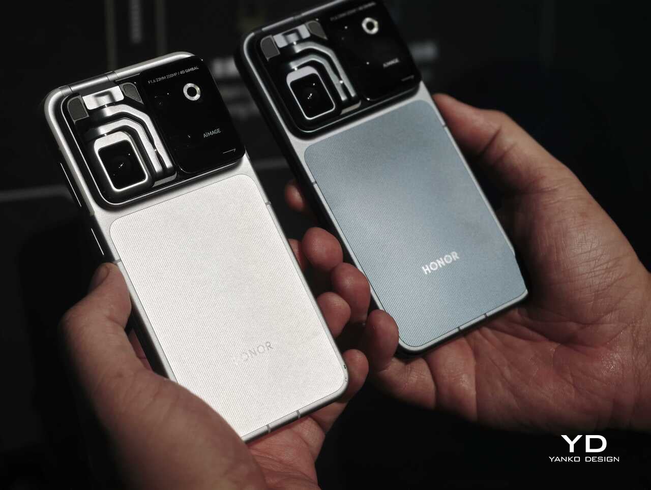
After many teasers and demos, the Honor Robot Phone has finally and officially launched in China. It is also staying exclusive to the Chinese market for now, with Honor not planning an international release at this stage. That alone will make it a frustratingly out-of-reach device for many, because this is one of the rare smartphones that feels genuinely different at first glance.

Part of the reason the launch has drawn so much interest is that Honor first revealed the Robot Phone at MWC earlier this year, where it quickly became one of the event’s biggest conversation pieces. Even in a show packed with concept hardware and camera claims, this was the device that made people stop, stare, and ask how it actually worked. Now that it has moved from trade show reveal to commercial launch, the Robot Phone still feels just as unusual.

Designer: HONOR

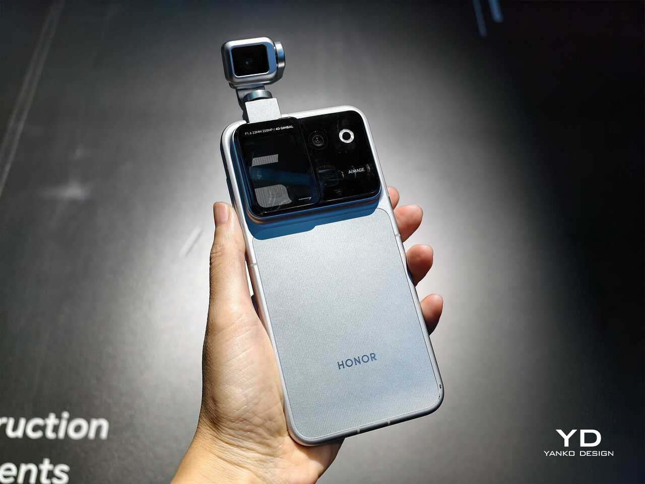
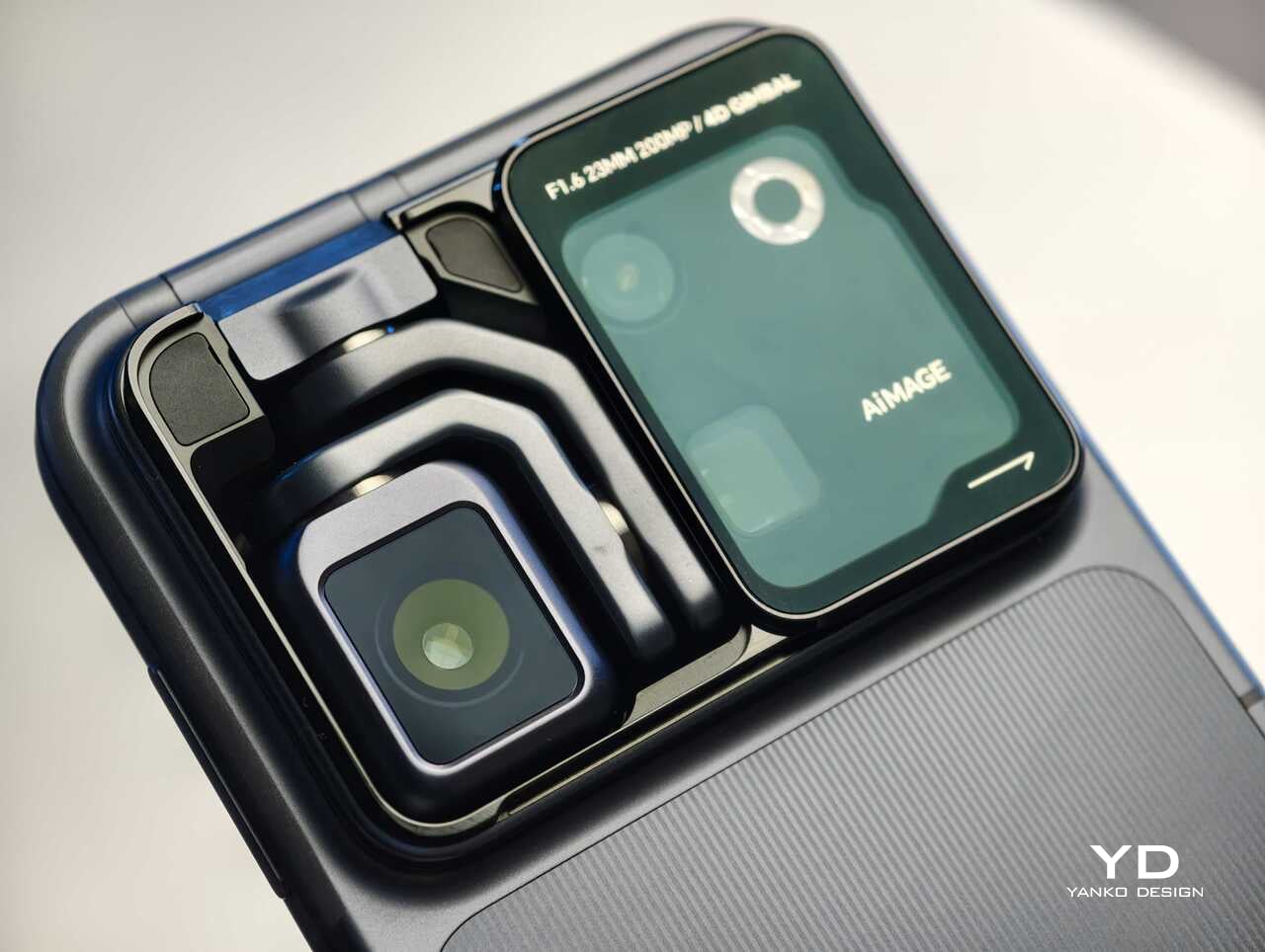
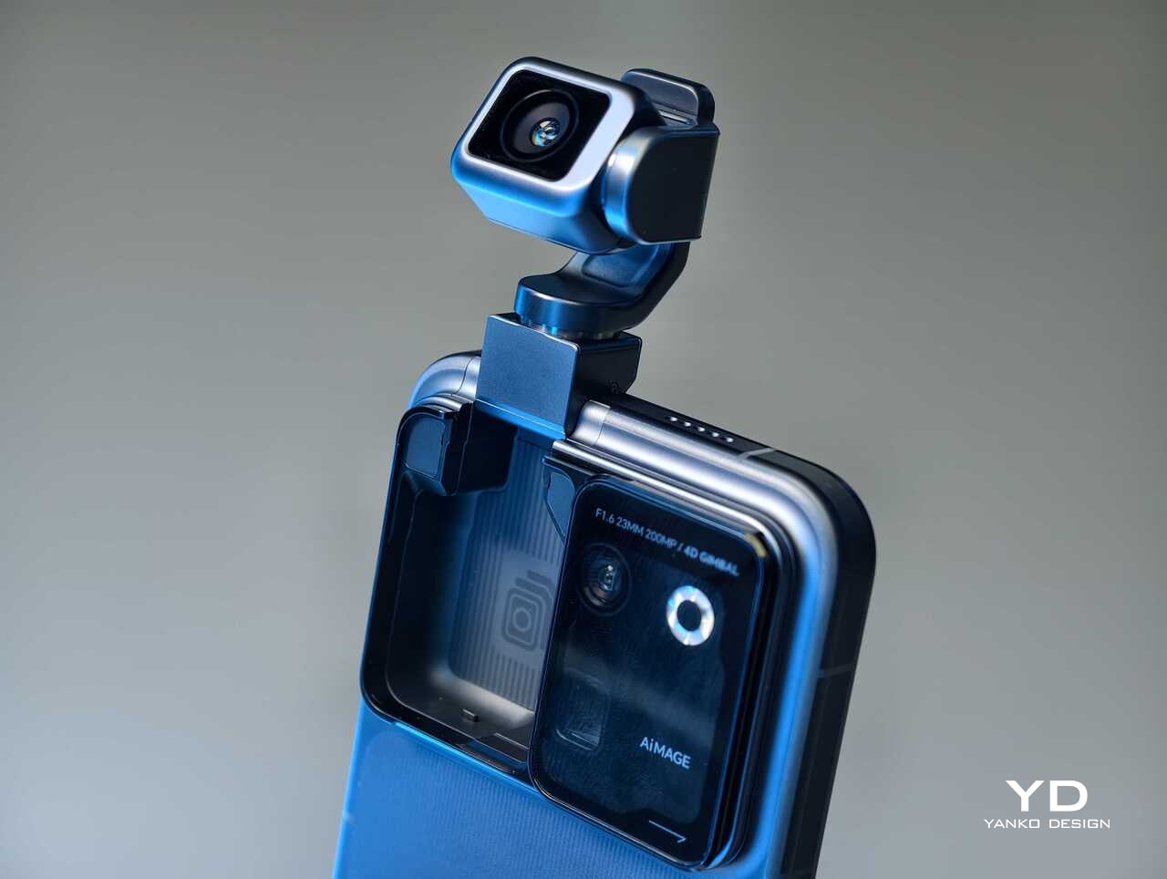
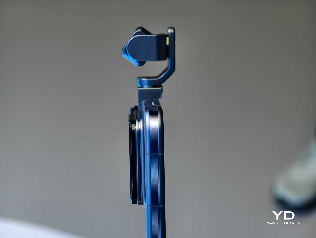
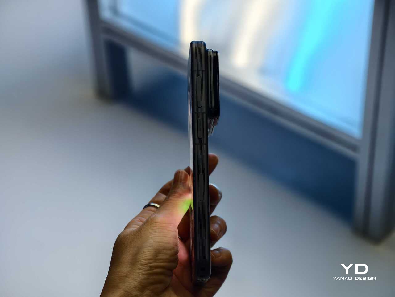
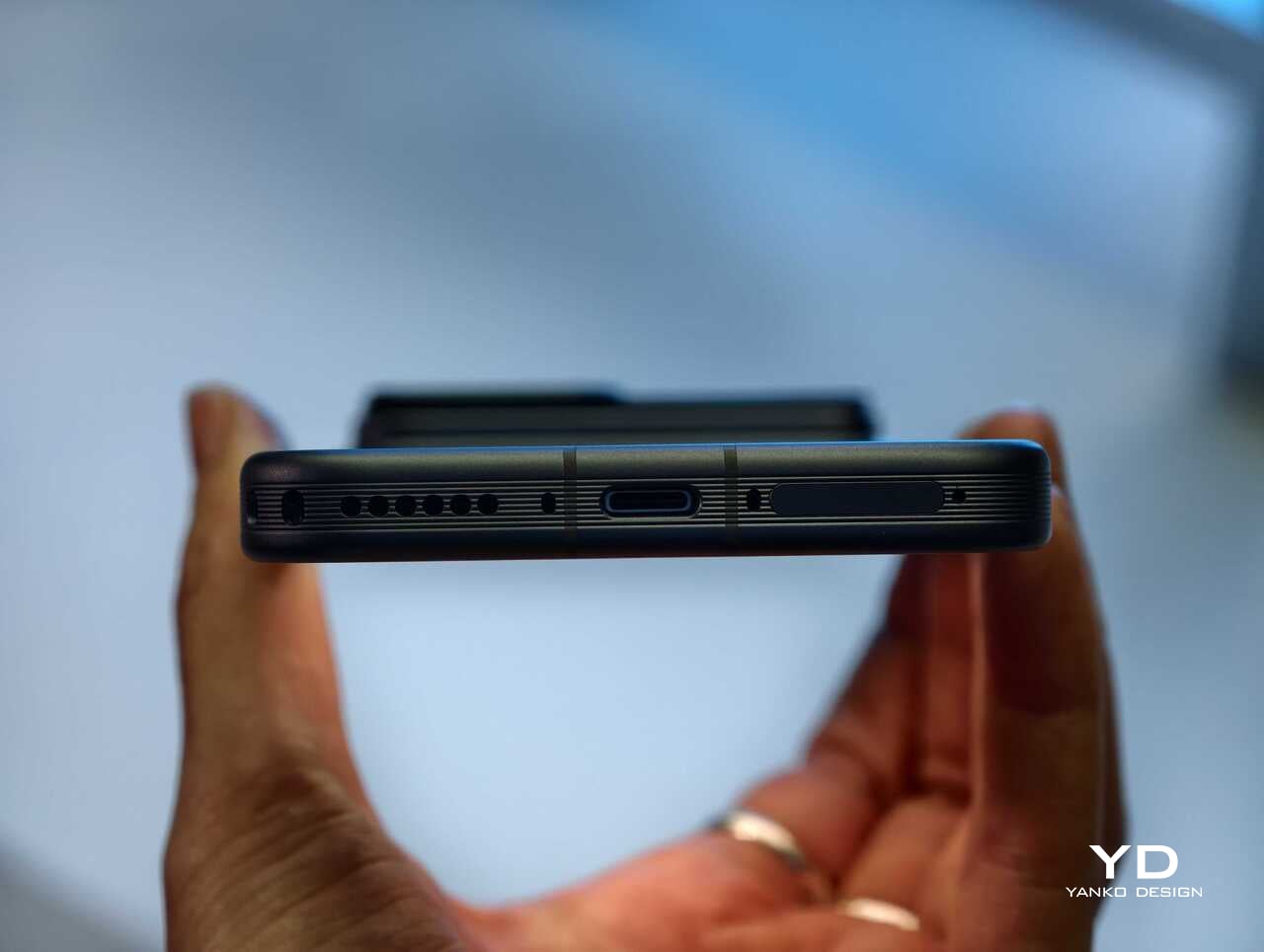
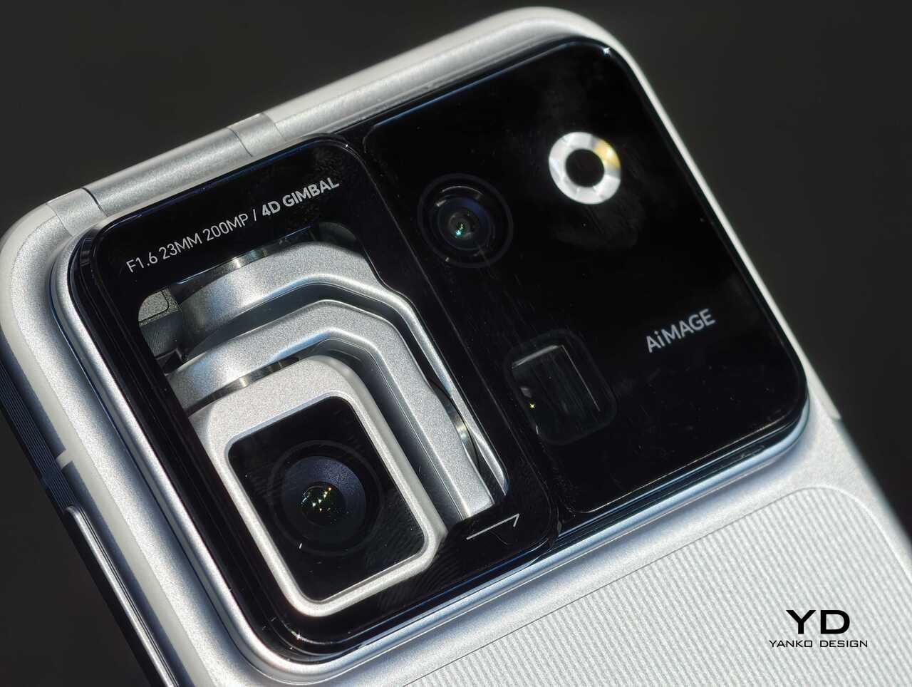
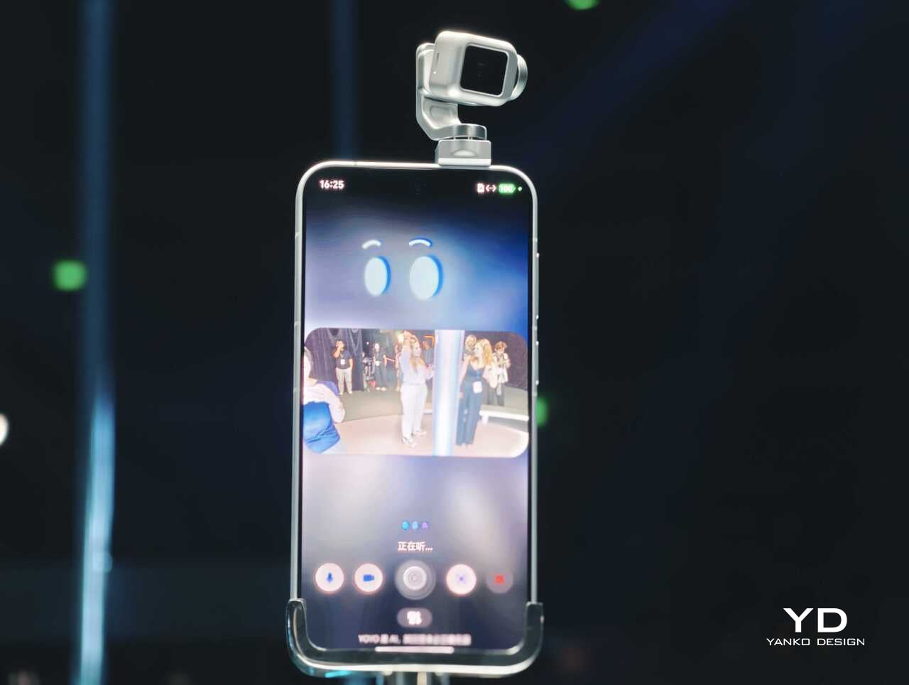
Rather than chasing attention with another familiar camera bump or an incremental spec upgrade, Honor has built a robotic gimbal directly into the phone itself. The result is a camera system that can physically move, track, tilt, and stabilize in ways a conventional flagship simply cannot. After spending time with the device, it is clear the Robot Phone is not just trying to be another premium handset with a long feature list. It is trying to pitch a new idea for what a creator-focused smartphone can be.

The big story is movement, not just megapixels

The core pitch behind the Honor Robot Phone is easy to understand once you see it in person. Honor has integrated what it calls a 4DoF Titanium Agile Gimbal into the phone, effectively turning the camera into an active moving system rather than a static sensor setup. The company says the module is 65 percent smaller than traditional gimbal solutions while also offering a 200 percent increase in structural strength, allowing it to fit inside a premium smartphone body without turning the device into a bulky experiment.

That change in hardware philosophy is what makes the Robot Phone immediately stand out. In practice, the moving camera module is meant to deliver smoother stabilization and more dynamic motion than a normal smartphone can manage on its own. Honor is also building in multiple movement modes, including Tilt Lock, First Person View, FPV Vertical, and AI SpinShot, all of which are designed to make mobile footage look more deliberate and more cinematic.

Honor is aiming this squarely at creators

The second half of the launch story is imaging. Honor says the Robot Phone is the first major product from its Cinematic Imaging Partnership with ARRI, bringing selected elements of ARRI Image Science and professional cinema workflow ideas into a smartphone. That includes ARRI LogC3 recording in ARRI CINEMA mode on the main gimbal camera, alongside ARRI Wide Gamut 3 and ARRI Looks.

On paper, the camera hardware is also extremely ambitious. The rear setup pairs a 200MP Agile Gimbal Main Camera with a 1/1.28-inch sensor and F1.6 aperture with a 200MP periscope telephoto camera using a 1/1.4-inch sensor and 2.7x optical zoom. A 50MP ultra-wide camera completes the setup. Honor is also claiming AI noise reduction improvements, up to 14 stops of dynamic range, and a video pipeline designed to preserve more usable information for post-production.

That is a lot of technical language, but the broader message is straightforward. Honor does not want the Robot Phone to be seen as a novelty. It wants this to be taken seriously as a compact filmmaking and creator tool.

Hands-on: The Honor Robot Phone feels different right away

The most striking thing about the Robot Phone in person is that its main feature is visible. So many smartphone launches revolve around internal improvements that are difficult to appreciate without extensive testing. Here, the big idea is immediately obvious. The camera module moves. It tracks. It gives the phone a sense of physical intention that most handsets simply do not have.

That makes the Robot Phone more memorable than most new flagships before you even get into image quality. Instead of relying entirely on software stabilization and fixed hardware, Honor is trying to introduce actual camera movement into the smartphone experience. In a short hands-on session, that makes the device feel less like a standard phone with a flashy camera and more like a compact production tool that happens to fit in your pocket.

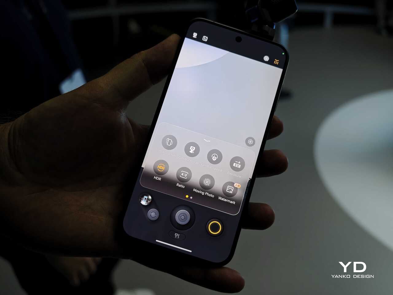
The tracking and movement features are also easier to appreciate in person than they are on a spec sheet. AI Live-Tracking, gesture controls, and voice-directed movement all sound abstract on paper. Once you see the phone physically following a subject or repositioning itself, the concept becomes much easier to understand. Whether that turns into something essential in everyday use is a bigger question, but as a first impression, the idea lands more convincingly than I expected.

Using the on-screen virtual joystick, I was able to adjust the gimbal with surprising precision. The interface crams in a lot of features, so it does take some time to learn. Even so, the gimbal feels very responsive, which helps the controls feel more intuitive once you settle in.

There is still a full flagship wrapped around the concept

Outside the headline camera hardware, Honor is still treating the Robot Phone like a proper premium device. It is powered by the Snapdragon 8 Elite Gen 5, backed by a custom cooling system that is meant to keep performance stable during longer recording sessions. There is also a 7060mAh silicon-carbon battery, with support for 120W wired charging and 50W wireless charging.

The rest of the hardware sounds suitably high-end too. Honor is using an all-metal unibody design paired with a 6.31-inch LTPO OLED display, an adaptive 1 to 120Hz refresh rate, and a claimed peak brightness of 6800 nits. On paper at least, this is not a concept phone built around one attention-grabbing trick. Honor is trying to package an experimental camera idea inside a full flagship experience.

China-only for now, and that is a shame

For now, the Honor Robot Phone is launching only in China, where it might be staying indefinitely. Honor is not planning to release the device outside China at this stage, which means this unusually creator-focused phone is set to remain a domestic-market curiosity rather than a broader global play.

That is disappointing, because the Robot Phone feels like exactly the kind of launch the smartphone market needs more of. It may not be for everyone, and there are obvious questions about durability, long-term usefulness, and whether creators will trust a built-in robotic camera system over dedicated gear. Even so, it is difficult to dismiss because the concept is so easy to understand once you see it in action.

Early thoughts

After a brief hands-on, my early take is that the Honor Robot Phone feels niche but genuinely fresh. The robotic gimbal is not just a visual gimmick for launch-day headlines. It changes the way the device presents itself, and potentially the way some people shoot with it. Whether that translates into a truly great camera phone will need more time to answer, but as a statement of intent, Honor has made one of the boldest smartphone moves of the year.

The bigger frustration is that, for now, it is a bold move that most of the world will only be able to watch from a distance. First teased at MWC earlier this year and now officially on sale in China for 9,999 yuan (roughly $1,483) for the 12GB+512GB variant and 12,999 yuan (around $1,928) for the 16GB+1TB variant, the Robot Phone is not about to become the next mainstream global flagship. Still, even as a limited-market release, it stands out as one of the most unusual and ambitious smartphones to arrive this year.

The post Honor Robot Phone Hands-on: Bold Phone With A Moving Camera Few Can Buy first appeared on Yanko Design.

Motorola’s Patent Isn’t a Phone You Wear, It’s a Watch You Unfold

The idea of merging a smartwatch and a smartphone into a single device has been floating around the industry for years, mostly because the obvious inconvenience is right there: two screens on two separate devices, one tiny and worn on the wrist, the other large and kept in a pocket, each doing essentially half the job the other can’t. The logical question is whether one of those devices could do both jobs depending on the situation.

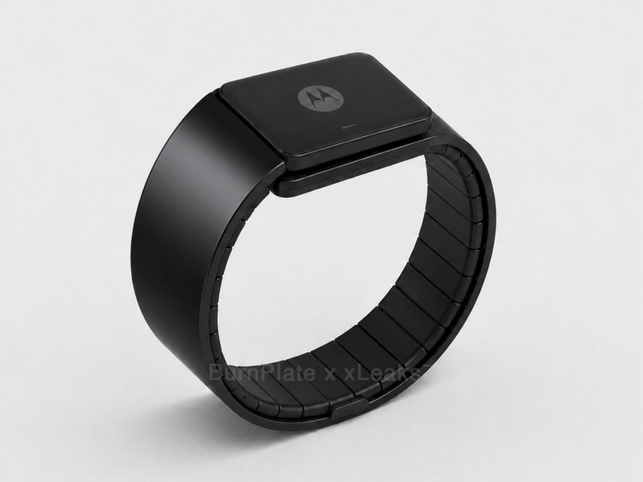
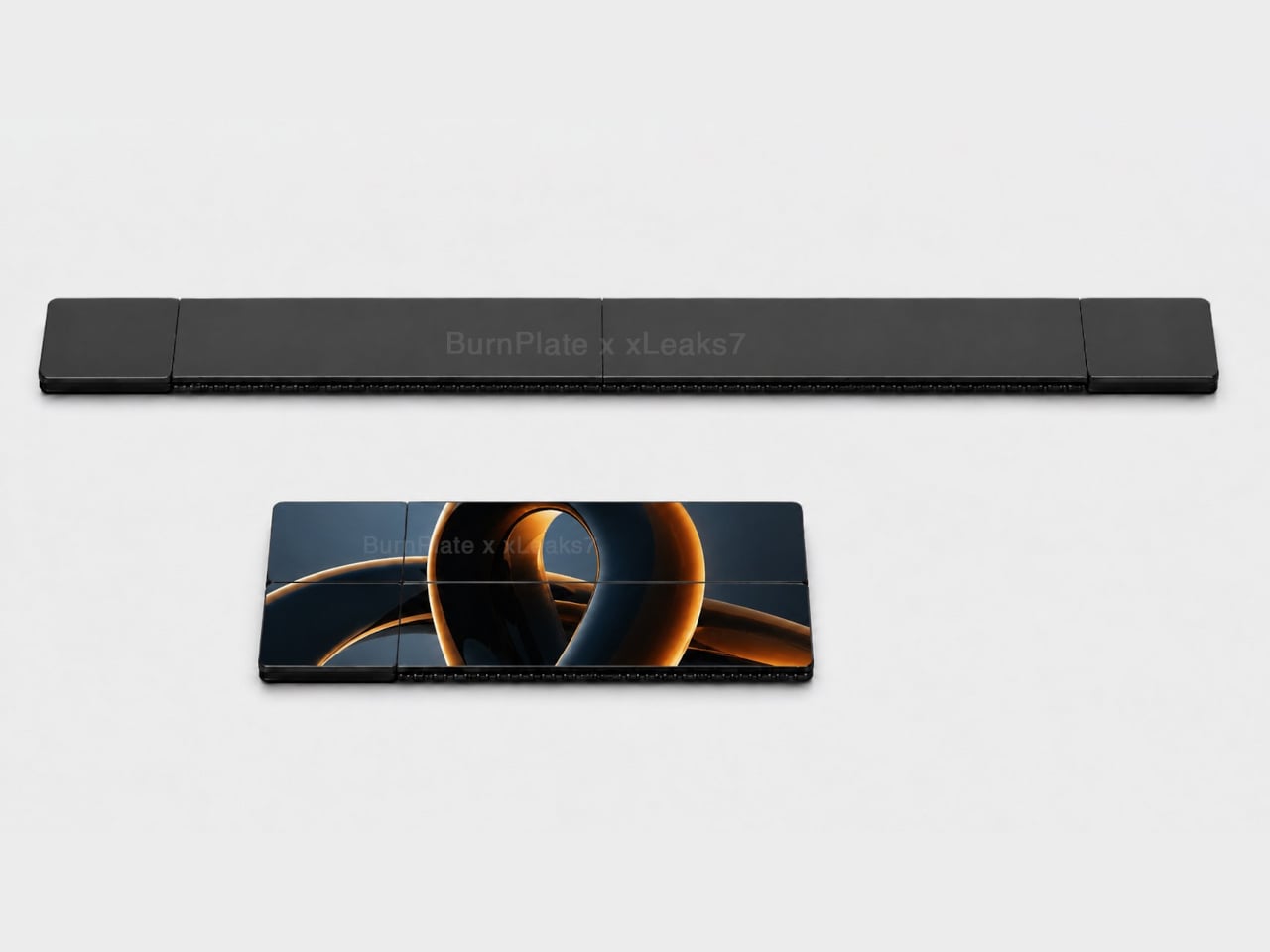
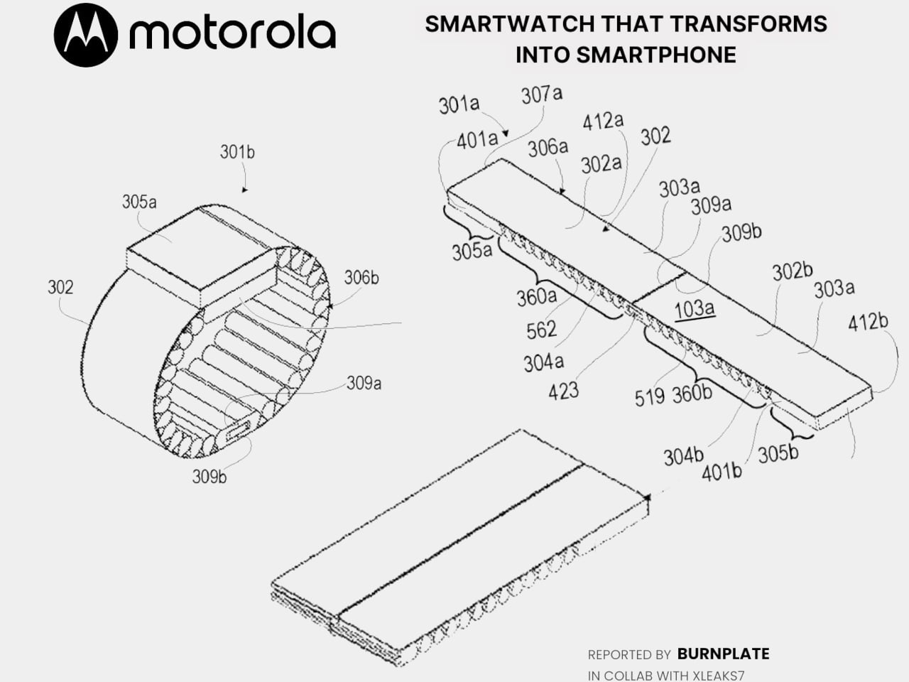
Motorola’s latest patent, officially registered as US12,693,705 under the title “Pivoting wearable reconfigurable screen,” proposes exactly that. The device starts on the wrist as a conventional smartwatch, its flexible display curved around the band. When more screen real estate is needed, the strap pivots and unfolds, flattening into a short, wide display format that functions as a handheld device. A third configuration folds the bottom quarter into an “L” shape, turning the unit into a self-standing desk display.

Designer: Motorola (via Burnplate, David Kowalski/xeaks7)

The mechanism that makes it possible is the strap itself. Rather than housing a traditional watch face with a fixed display, almost the entire outer surface of the band carries a flexible screen. Worn, it reads like a standard wearable. Removed and unfolded, that same surface becomes the display area of a compact, landscape-oriented device. The pivot point is what separates this from simply being a wrist-wrap phone like earlier concepts.

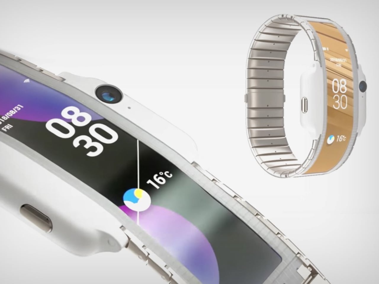
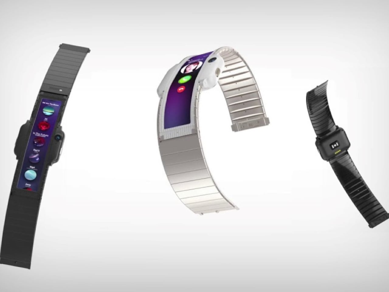
That distinction matters because Nubia tried the wrist-phone idea back in 2018 with the Alpha, and the result was a fascinating but limited object. The Alpha wrapped a 4.01-inch OLED display around the upper wrist, delivering more screen real estate than any smartwatch before it, but the display stayed wrapped. It curved beautifully, could make calls, take photos, and run apps, but it never transformed into anything. The watch was the watch, full stop.

Nubia Alpha

Motorola’s patent reverses the logic. Rather than making a phone you can wear, it proposes a watch you can unfold. The distinction isn’t purely semantic. A device that starts as a watch and transforms into a handheld is solving a different problem than one that starts as a phone and straps to your wrist. The first carries a reasonable identity in both states; the second always feels like a compromise in one of them.

Nubia Alpha

The Nubia Alpha’s sticking point wasn’t the display, which was genuinely impressive and ahead of its time. It was the software, the battery, and the form factor’s limits in practice. Nubia never took the concept further after the original and a 2020 follow-up. The flexible display remained horizontal and wrist-bound, never taking the step toward becoming a genuinely detachable, self-sufficient screen.

Whether Motorola’s patented concept eventually ships as a real device is a separate question entirely. Patents are filed routinely without becoming products, and this one would require flexible display technology durable enough to handle daily wrist bending and regular unfolding, a battery that fits within strap dimensions, and software that transitions cleanly between modes. None of those are trivial problems.

Still, the direction of thinking has clearly shifted since 2018. Nubia asked what happens when a smartphone lives on your wrist. Motorola is asking what happens when a watch becomes a screen the moment you need one.

The post Motorola’s Patent Isn’t a Phone You Wear, It’s a Watch You Unfold first appeared on Yanko Design.

The $599 AI Guitar That Finally Makes Playing Easy

At some point in their life, almost everyone has picked up a guitar, struggled with a C chord for ten minutes, and quietly put it back down. The fingertip pain. The out-of-tune strings. The YouTube tutorial that somehow assumes you already know what a fret is. Learning guitar has always had a steep and slightly humiliating entry curve, and most of us just gave up. The TemPolor Melo-D thinks that’s a problem worth solving, and the design it came up with is genuinely hard to ignore.

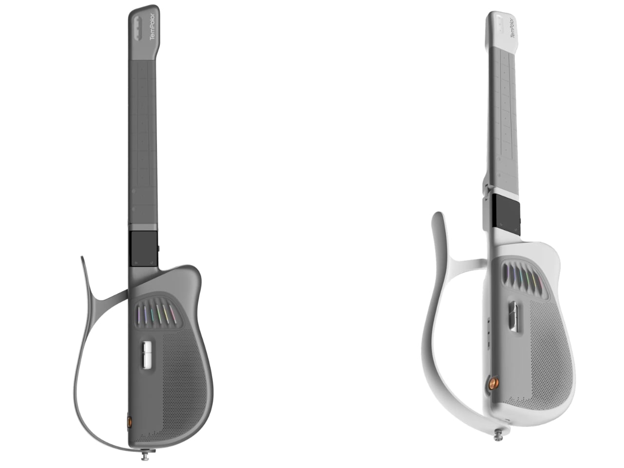
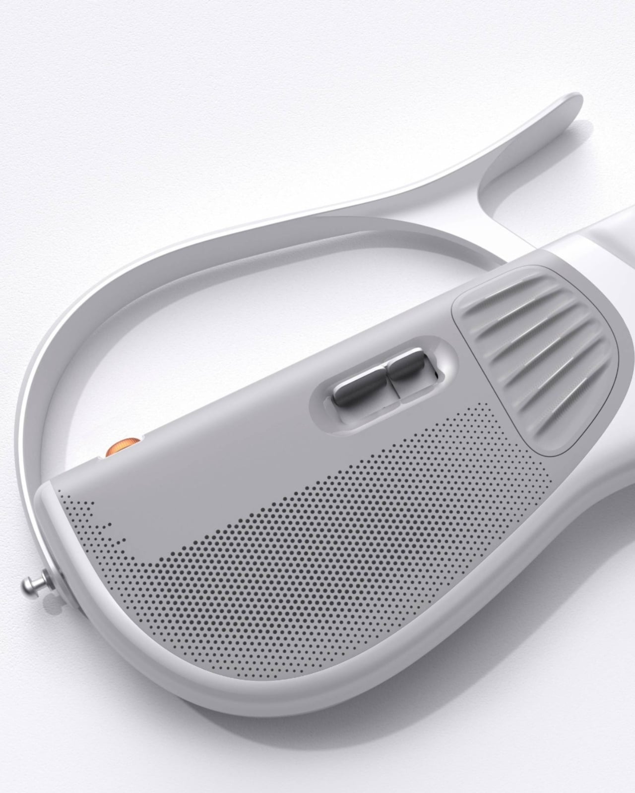
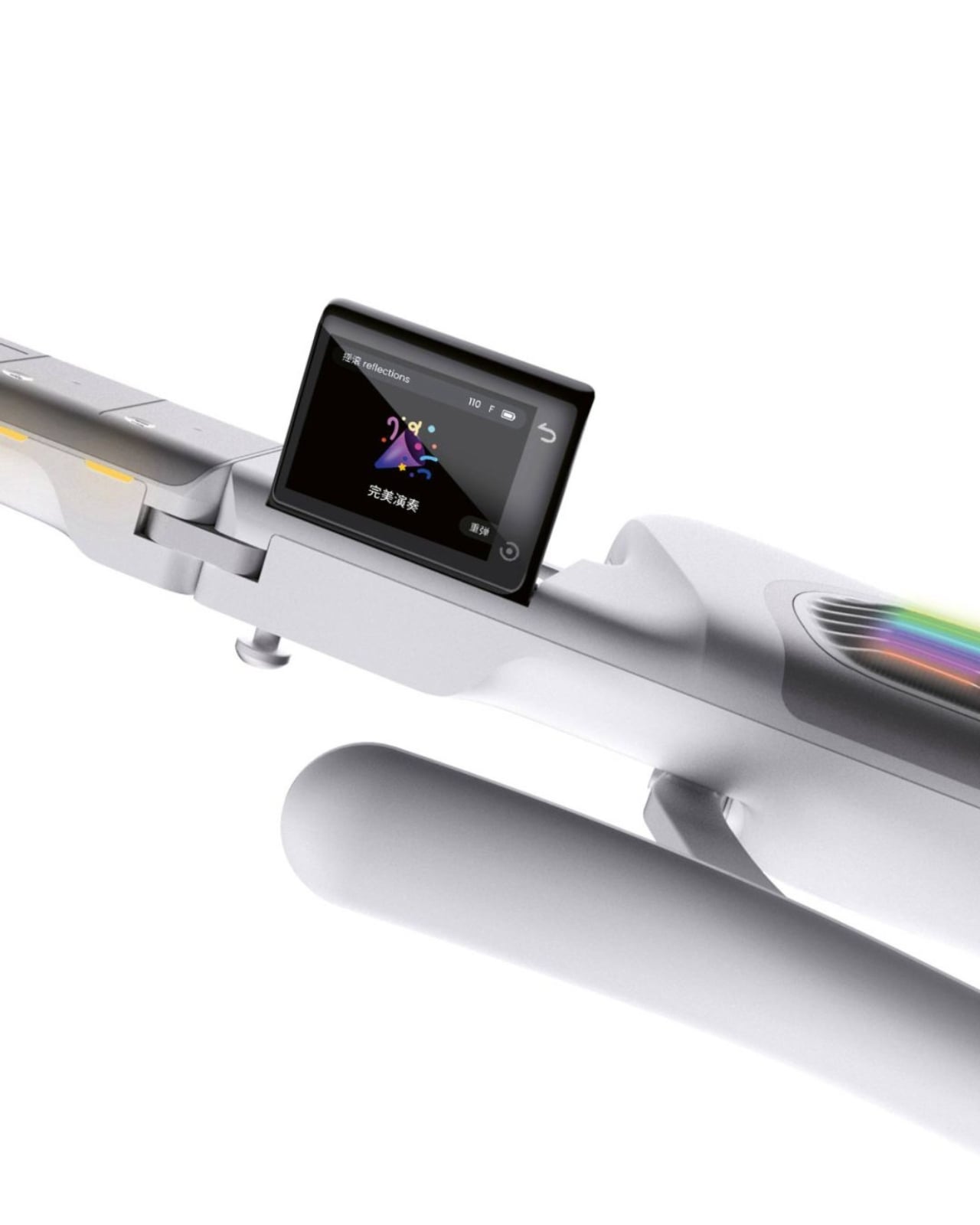
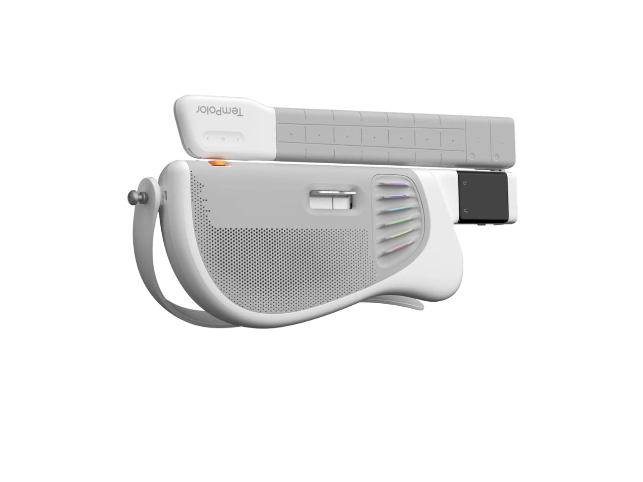
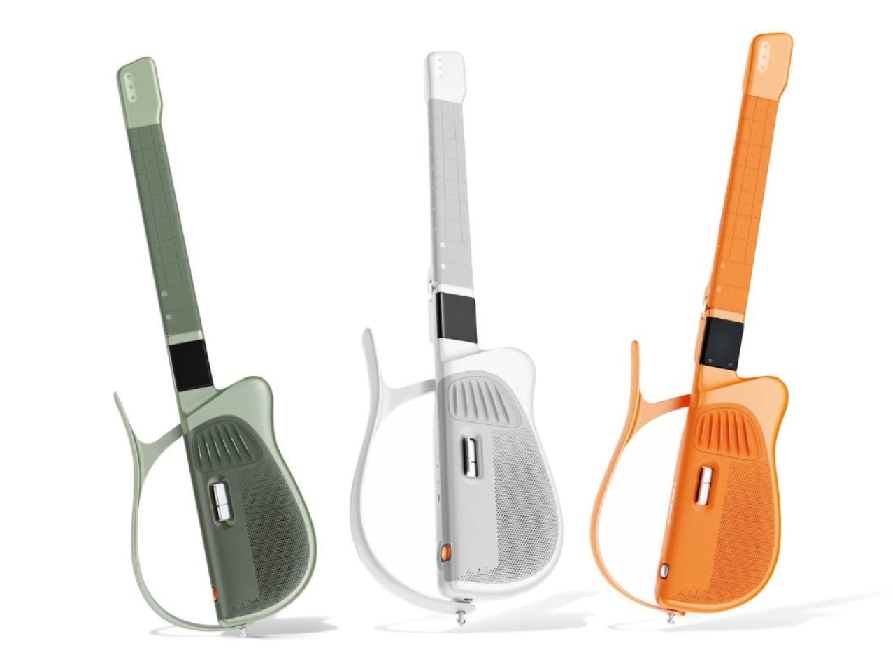
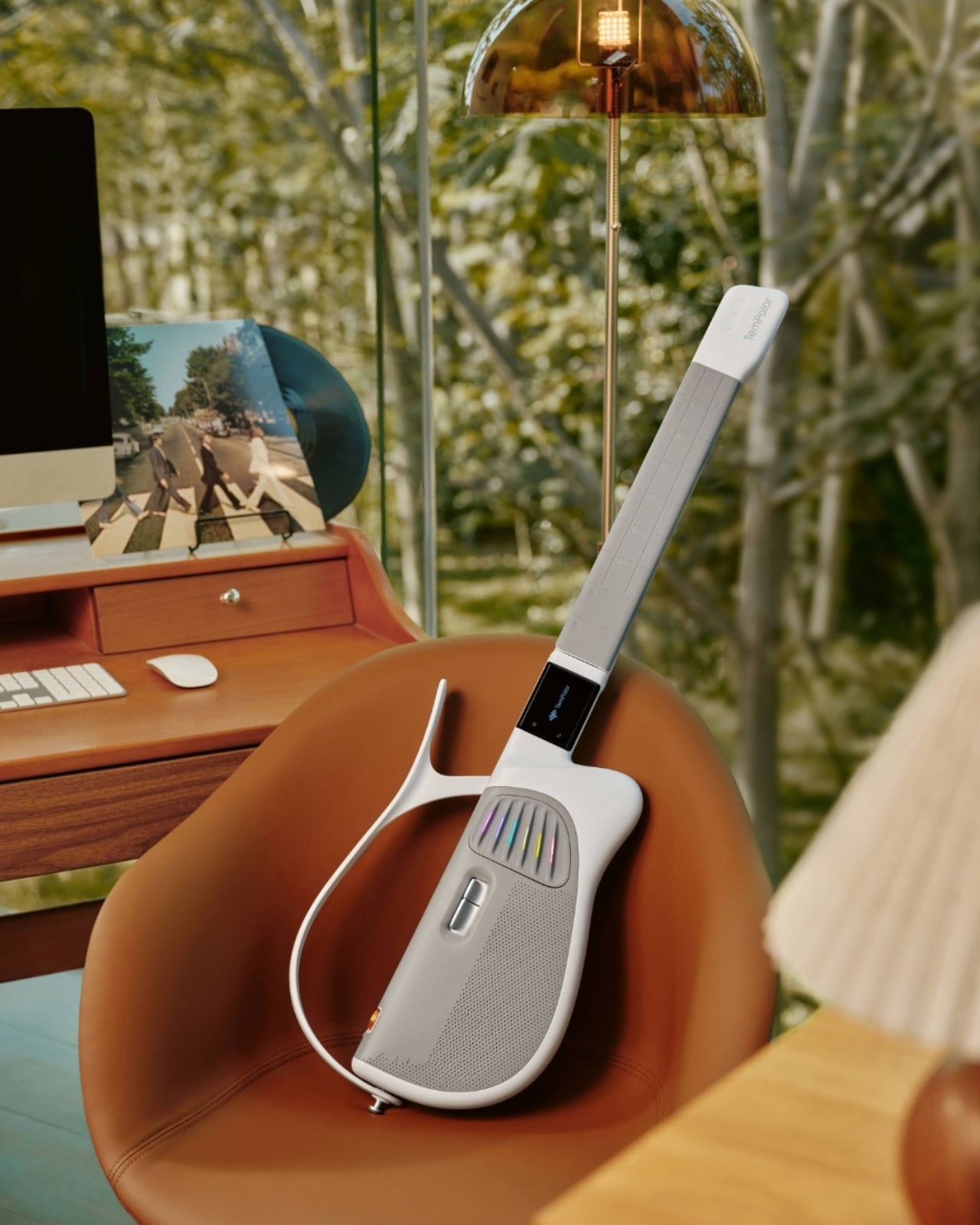
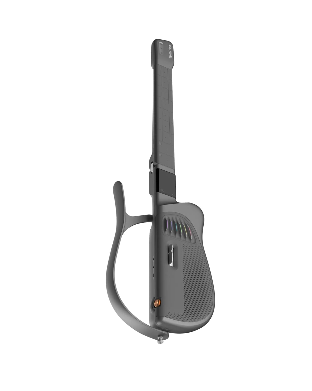
Designed by inDare Design Strategy Limited, the Melo-D is billed as the world’s first generative AI guitar, and even that description barely scratches the surface of what it actually is. On the outside, it looks like a guitar that a product designer and a tech enthusiast co-parented together. The body is sleek, the finish is pearl white, and it has a foldable build that makes it compact enough to take almost anywhere. But the real story is what happens when you turn it on.

Designer: inDare Design Strategy Limited

The neck is embedded with LED lights that illuminate exactly which notes to press, removing the guesswork for beginners entirely. A built-in 2.4″ LCD flip screen on the body handles chord guidance and ambient visuals without you ever needing to prop up a phone nearby. These feel like small details, but they represent a real design philosophy: the instrument itself should carry the full experience. You shouldn’t need a separate ecosystem of apps and accessories just to get started.

What makes the Melo-D genuinely interesting is the AI engine running underneath all of it. The guitar operates in three modes: solo, sing-along, and AI creation. In AI creation mode, you can hum a melody and the guitar transcribes it into a guitar solo. You can type a text prompt and it generates a song. Upload an audio file and it converts the music into playable tabs or chord charts. It even generates personalized backing tracks using emotional tags, so the sound starts to feel like yours rather than something borrowed from a practice app.

The “AI everything” wave has made it easy to be skeptical every time a product slaps the word generative onto its marketing. But the Melo-D doesn’t read as a gimmick dressed up in smart-instrument clothing. The six-string silicone system allows for real, note-by-note playing, which means it isn’t just a toy approximating the feel of music. It’s an actual instrument with training wheels you can choose to remove. The goal isn’t to replace the skill of playing guitar. It’s to lower the barrier enough that more people actually get through the door.

inDare’s design work here deserves its own mention. The studio, known for thoughtful human-centered industrial design, brought a lot of restraint to a product that could have easily become overcrowded with features. The foldable form factor, the integrated flip screen, and the silicone strings all feel like deliberate decisions, not afterthoughts. The Melo-D has also earned recognition at the iF Design Awards, which makes sense, because from a design standpoint it reads as a product with a clear and confident point of view rather than a collection of specs looking for a shell to live in.

At $599, it’s available for pre-order now with an expected ship date in September 2026. For a piece of hardware this layered, that number asks you to take it seriously, which feels appropriate for what it’s trying to do.

Learning guitar used to mean a real commitment: years of practice, a teacher, calluses, patience, and a certain willingness to sound terrible for a while. The Melo-D isn’t trying to skip all of that, but it is offering a more honest entry point for people who actually want to try. Whether you’re a complete beginner or someone who has quietly given up on the guitar more than once, it meets you where you are. And sometimes, that’s exactly the invitation you need to actually show up.

The post The $599 AI Guitar That Finally Makes Playing Easy first appeared on Yanko Design.

BEYOND Expo 2026: Asia’s Biggest Tech Event Just Told the World That AI Software Was Only the Warm-Up

Every major tech conference eventually finds its thesis statement. CES landed on “everything is connected.” SXSW staked out culture-meets-technology. BEYOND Expo‘s thesis for 2026 is more specific, and honestly more timely: AI has spent years proving itself in software, and the interesting question now is what happens when it leaves the screen. The official theme, “AI: Digital to Physical,” takes over from last year’s theme of Transforming Uncertainty into a Trigger for Innovation. Timed perfectly around the global speculation that AI’s a bubble, it’s a genuine reflection of where the most consequential AI work is actually happening right now, in robotics labs, automotive platforms, wearables, and manufacturing floors across the Greater Bay Area.

BEYOND has been building toward this moment since Dr. Lu Gang launched it during a global lockdown in 2021, a decision he’s called delusional in hindsight during an interview with Yanko Design, but with the kind of grin that says he’d do it again. The original problem he was solving was simpler than people realize: Asia’s most interesting founders kept showing up at CES and Web Summit as attendees rather than headliners. A hardware startup out of Shenzhen with genuinely world-class AI chops would get a 3×3 booth on a back wall while the stage went to the usual suspects. BEYOND was built to fix that imbalance, and five years in, it’s working.

Click Here to know more about the BEYOND Expo 2026

The 2026 edition is aiming for 30,000 attendees, a significant jump from 2024’s 20,000, and the programming reflects a maturing event that knows its own strengths. The summit lineup spans Humanoid Robotics and Embodied AI, Enterprise Agentic Workflows, Autonomous Driving, AI-Integrated Wearables, and a PayFi and Decentralized AI track that will either feel prescient or premature depending on your priors. What ties all of it together is the through-line of AI becoming something you interact with physically, not just through a chat interface. That’s a meaningful editorial choice, and one that puts BEYOND in a different conversation than conferences still treating large language models as the whole story.

The most interesting addition this year is the GBA Innovation Tour, which gives international attendees direct access to Greater Bay Area manufacturing infrastructure. This matters more than it might sound. Lu Gang has argued for years that what makes Asia’s tech ecosystem genuinely different isn’t just the innovation pipeline, it’s the compression of the distance between idea and physical product. Watching an AI concept move from prototype to production in a Shenzhen facility in weeks rather than months is something you can describe in a keynote, but apparently you need to see it to really understand the scale and speed involved. The tour is BEYOND’s way of making that argument visceral rather than theoretical.

Last year’s theme, “Unveiling Possibilities,” was about reframing uncertainty as creative fuel, which was the right message for a chaotic moment. “AI: Digital to Physical” is more declarative, more confident. It names a specific transition that the industry is mid-stride through, and plants BEYOND squarely in the middle of it. Registration and exhibition details are live at beyondexpo.com.

Click Here to know more about the BEYOND Expo 2026

The post BEYOND Expo 2026: Asia’s Biggest Tech Event Just Told the World That AI Software Was Only the Warm-Up first appeared on Yanko Design.

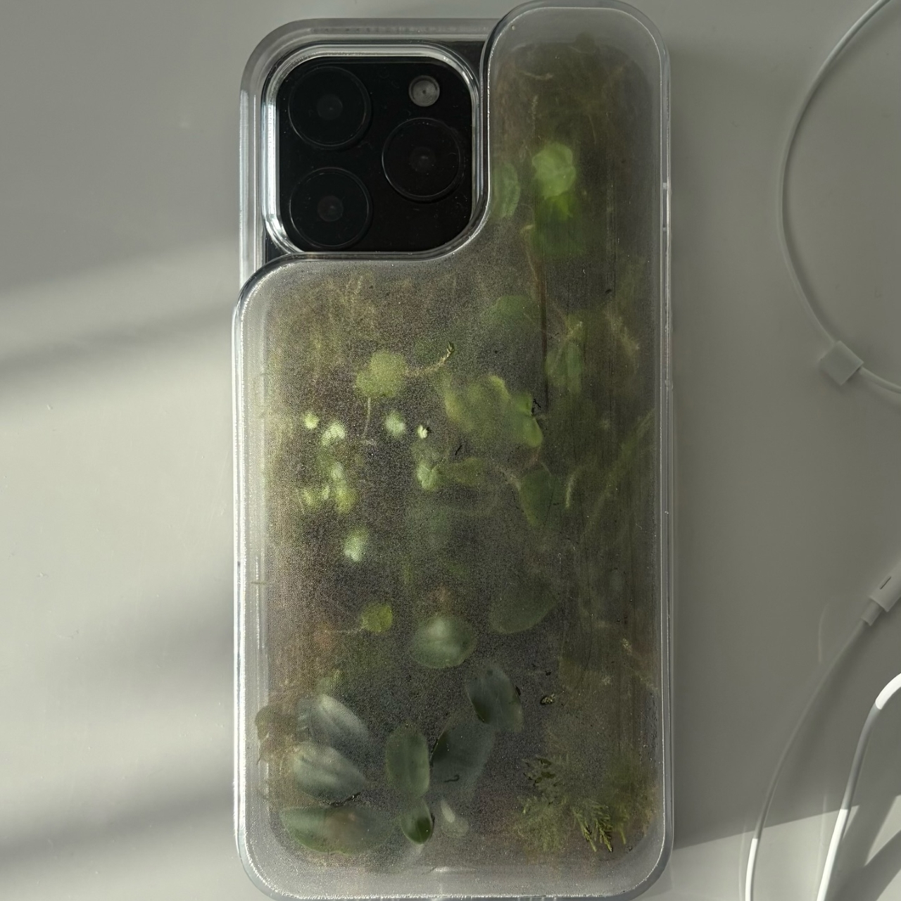
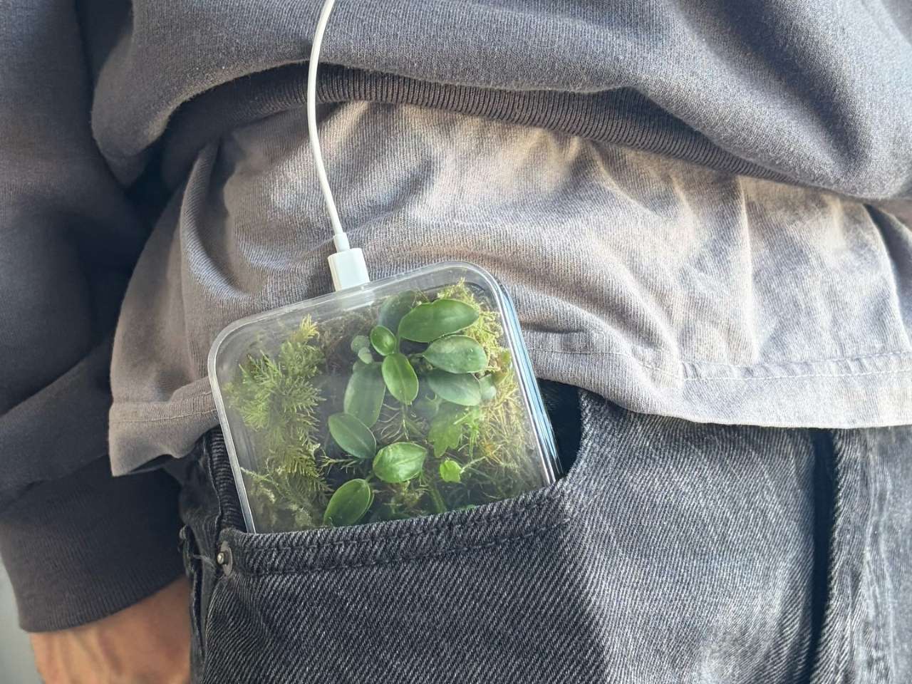
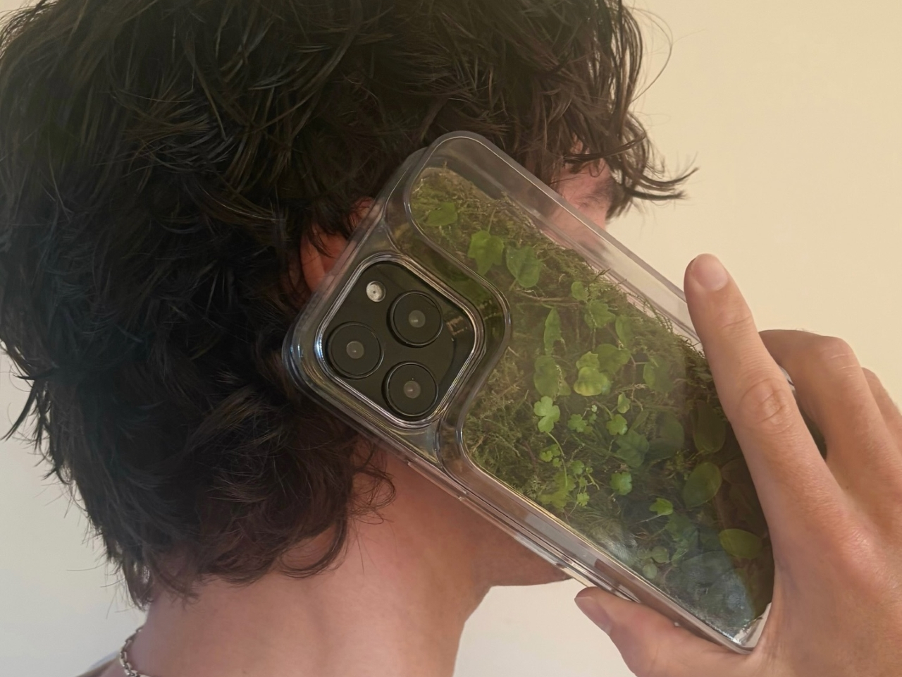
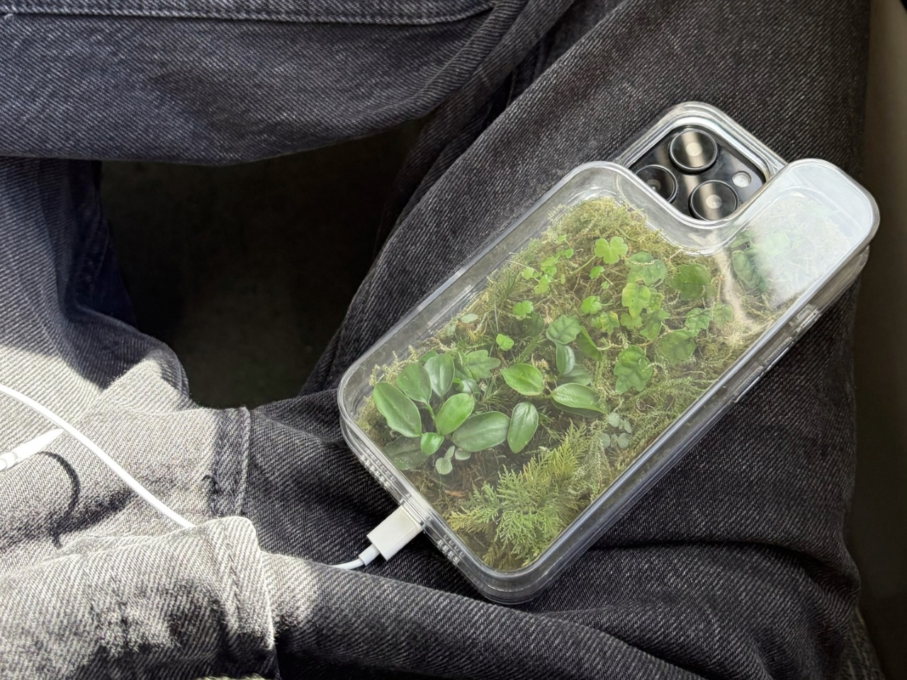
Phone Cases Are Boring, This One Puts a Living Terrarium Inside

Phone cases have largely settled into two camps: the ones that protect your phone without anyone noticing they exist, and the ones that make a statement with printed graphics, colors, or textures. Neither approach has found a way to make the back of a phone genuinely interesting rather than just decorated. Designer Daniel Idle found a third option that neither camp seems to have considered.

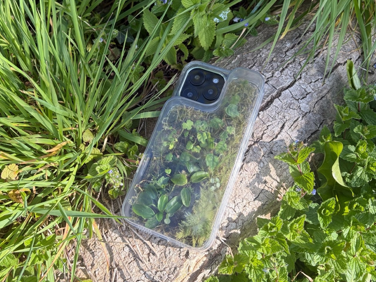
The Terrarium Phone Case is a clear resin case for the iPhone 16 Pro Max with an actual planted environment sealed inside the back cavity. Moss, small-leafed plants, and a stabilized soil substrate are embedded within the transparent shell, creating a thin cross-section of living terrain that you carry around with you wherever the phone goes. It’s a working phone case, a functional terrarium, and an oddly calming thing to have in your pocket all at once.

Designer: Daniel Idle

The construction involved 3D modeling and fabrication in clear resin, producing a case with enough depth in the back wall to house soil, roots, and plant matter. The plants are packed using a stabilized substrate that keeps the arrangement intact when the phone is picked up, rotated, tilted, or slipped into a bag. The camera cutout is fully preserved; the charging port at the bottom remains accessible; the phone continues to work exactly as it always did.

What keeps everything alive inside the sealed cavity is a closed-loop moisture system. The plants and soil generate humidity, which evaporates toward the inner surface of the resin, condenses back into droplets, and cycles down again. Light passing through the clear shell feeds the plants from outside, while the substrate provides gradual nutrient release. The whole thing is, in a fairly literal sense, a miniature ecosystem that sustains itself without any intervention from the person carrying it.

The condensation that forms on the inside of the shell during high-humidity moments is part of the visual appeal rather than a flaw to be engineered away. Seeing that vapor cycle through the case is a reminder that something in there is alive, actively breathing and responding to its environment, in the same pocket or bag as a device specifically engineered to minimize all biological interference.

There’s a running thread through design culture about bringing nature back into objects and spaces that have drifted too far from it. Biophilic design has become a recognizable term for everything from moss walls in offices to plant-filled shelving in apartments. Most of those applications treat plants as decoration layered on top of an existing design. Idle’s approach is different because the plant system isn’t decoration; it’s structural, sealed directly into the object’s body as a core component rather than an afterthought.

Of course, there will be some reservations about putting moisture and soil so close to your phone, which might be resistant to water and dust, but only from brief encounters. Good thing, then, that it’s still a concept project right now. But as a thought experiment about what a phone case could reasonably contain, it lands somewhere between genuinely novel and gently absurd, which is probably the most honest place for a good idea to start.

The post Phone Cases Are Boring, This One Puts a Living Terrarium Inside first appeared on Yanko Design.

Art Deco Furniture Is Back – and Salone 2026 Made It Official

Image credit: Armani Casa

After years dominated by pale oak, soft minimalism, and rounded silhouettes, Salone del Mobile 2026 signaled a clear shift toward richer and more expressive interiors. Held at Milan’s Rho Fiera fairgrounds from April 21 to April 26, 2026, the exhibition integrated Art Deco-inspired details such as chevrons, polished brass, chrome finishes, fan-shaped arches, and jewel-toned velvet upholstery, bringing glamour and structure back into contemporary furniture design.

Across Milan Design Week 2026, designers moved toward layered materials, geometric forms, and statement-making interiors. Instead of feeling nostalgic, the aesthetic appeared refined and updated for modern living. The resurgence also aligns with broader trend forecasts. Pinterest Predicts 2026 identified neo deco as one of the year’s defining interior styles, which is a cleaner, moodier reinterpretation of 1920s luxury.

Throughout Salone del Mobile 2026, recurring Deco-inspired forms and materials across installations and showroom launches pointed to a wider and more intentional design shift, reinforcing the growing influence of Art Deco furniture 2026 trends.

This shift is best understood by tracing how Neo Deco diverges from its historical origin.

What Is the Difference Between Original Art Deco and Neo Deco?

While both styles celebrate glamor and craftsmanship, Neo Deco reinterprets classic Art Deco for a more modern and livable aesthetic.

Characteristics of Original Art Deco

  • Strong geometric symmetry
  • Chevron patterns and fan-shaped arches
  • Heavy ornamentation and layered detailing
  • Glossy lacquer, marble, and polished brass
  • Bold jewel tones and dramatic interiors
  • Structured and formal furniture silhouettes

Characteristics of Neo Deco

  • Softer and more sculptural forms
  • Cleaner layouts with less visual excess
  • Refined brass and chrome accents
  • Selective use of velvet, marble, and glossy finishes
  • Open and contemporary interiors
  • Balanced mix of luxury and minimalism

Seen throughout Salone del Mobile 2026, neo deco keeps the elegance of classic Art Deco furniture but simplifies it for contemporary living. Additionally, Neo Deco keeps the glamour of classic Art Deco furniture while adapting it to modern interiors that prioritize comfort, simplicity, and sculptural design. This theoretical shift becomes most visible when translated into contemporary objects and reissued icons. Take a look at our pick of the top 7 Neo Deco pieces from Salone del Mobile Milan Design Week 2026.

1. Borgonuovo’s games table by Armani Casa

Image credit: Armani Casa
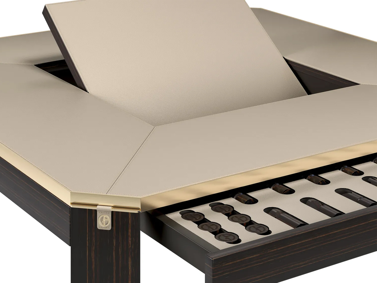
Image credit: Armani Casa

The Borgonuovo’s games table blends understated luxury with meticulous craftsmanship through a refined neo-deco design language. Crafted from ebony wood and topped with taupe leather, the piece conceals a rotating chess-and-checkers surface in ebony and maple wood. Satin-finished brass accents, sculptural triangular legs, discreet pull-out cup holders, and hidden storage drawers introduce geometric elegance and multifunctional sophistication without overwhelming the design.
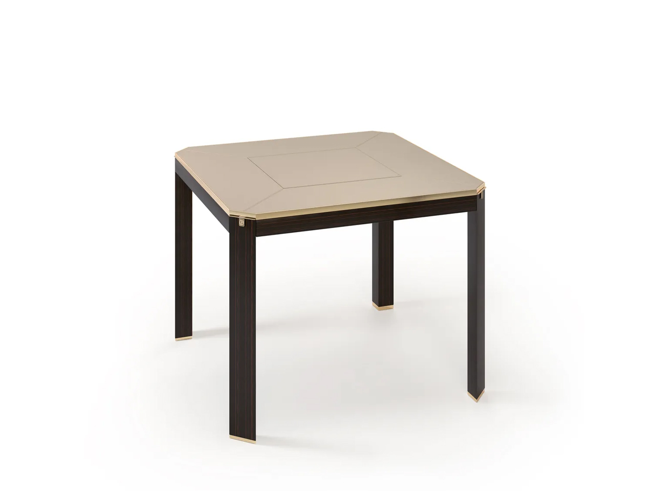
Image credit: Armani Casa

Named after the Milan street once home to Giorgio Armani, the table reflects the restrained yet luxurious aesthetic of Armani Casa. Its clean forms and rich material palette also reference the timeless influence of Jean-Michel Frank, whose minimalist approach to luxury continues to shape the brand’s furniture and interior collections.

2. Delfi Madia Cabinet by Promemoria
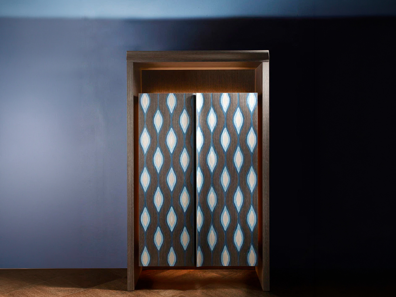
Image Credit: Promemoria

Image Credit: Promemoria

The Delfi Madia Cabinet by Promemoria expresses a refined neo deco aesthetic through its architectural proportions, geometric detailing and restrained use of ornamentation. Unlike traditional Art Deco, which often emphasized dramatic symmetry and lavish decoration, this contemporary interpretation feels quieter and more sculptural. Defined by a solid wood frame and a recessed central groove that creates a strong vertical axis, the cabinet balances precision with softness, while subtle perimeter lighting enhances its sculptural presence with a warm ambient glow.

Image Credit: Promemoria
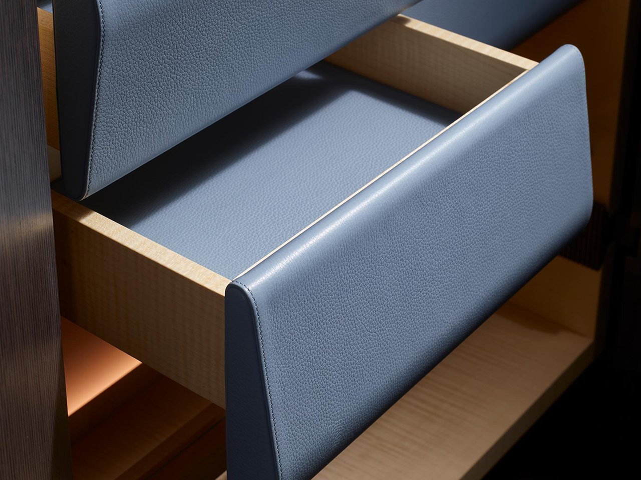
Image Credit: Promemoria

The cabinet doors become the focal point of the design, featuring layered wood veneers and repetitive patterns in varying tones that create a delicate three-dimensional effect. This interplay of geometry, texture, and craftsmanship recalls classic Deco influences but reworks them in a cleaner and more contemporary way. Functional yet expressive, the piece can shift from kitchen storage to an intimate bar setting.

3. ‘Pigreco’ Chair by Tobia Scarpa, Reissued by Tacchini

Image credit: Tacchini

Image credit: Tacchini

Image credit: Tacchini

The ‘Pigreco’ chair by Tobia Scarpa for Tacchini reinterprets neo deco through a refined balance of gloss, geometry, and sculptural elegance. Echoing the glamour of classic Art Deco furniture, the design pairs soft upholstery with lacquered structural elements that wrap around the chair like a polished architectural frame.

Image credit: Tacchini
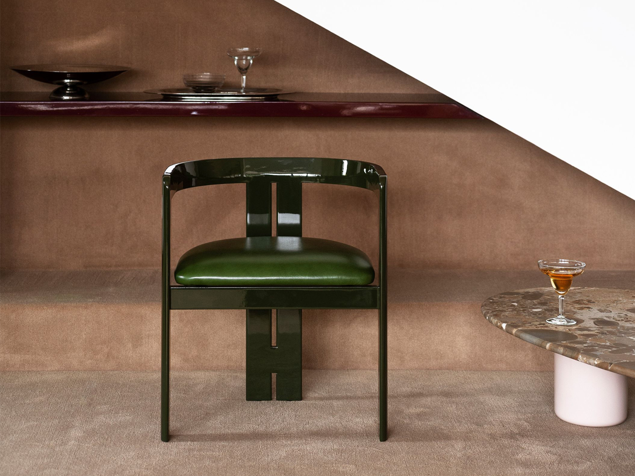
Image credit: Tacchini

The reflective surfaces introduce depth and luminosity, transforming lacquer from a simple finish into a defining visual feature. Instead of embracing the excess of traditional Deco interiors, Pigreco adopts a more restrained and contemporary approach. Its silhouette moves fluidly between curves and sharp lines, while the careful balance of solids and voids gives the chair a sense of rhythm and precision.

4. The Elie Saab x Impatia Pool Table
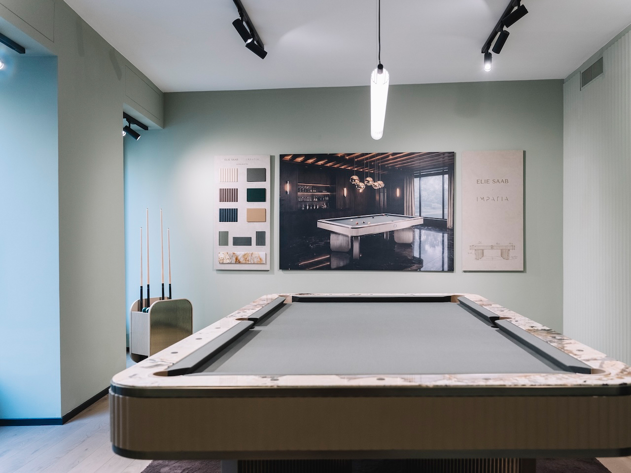
Image Credit: Elie Saab
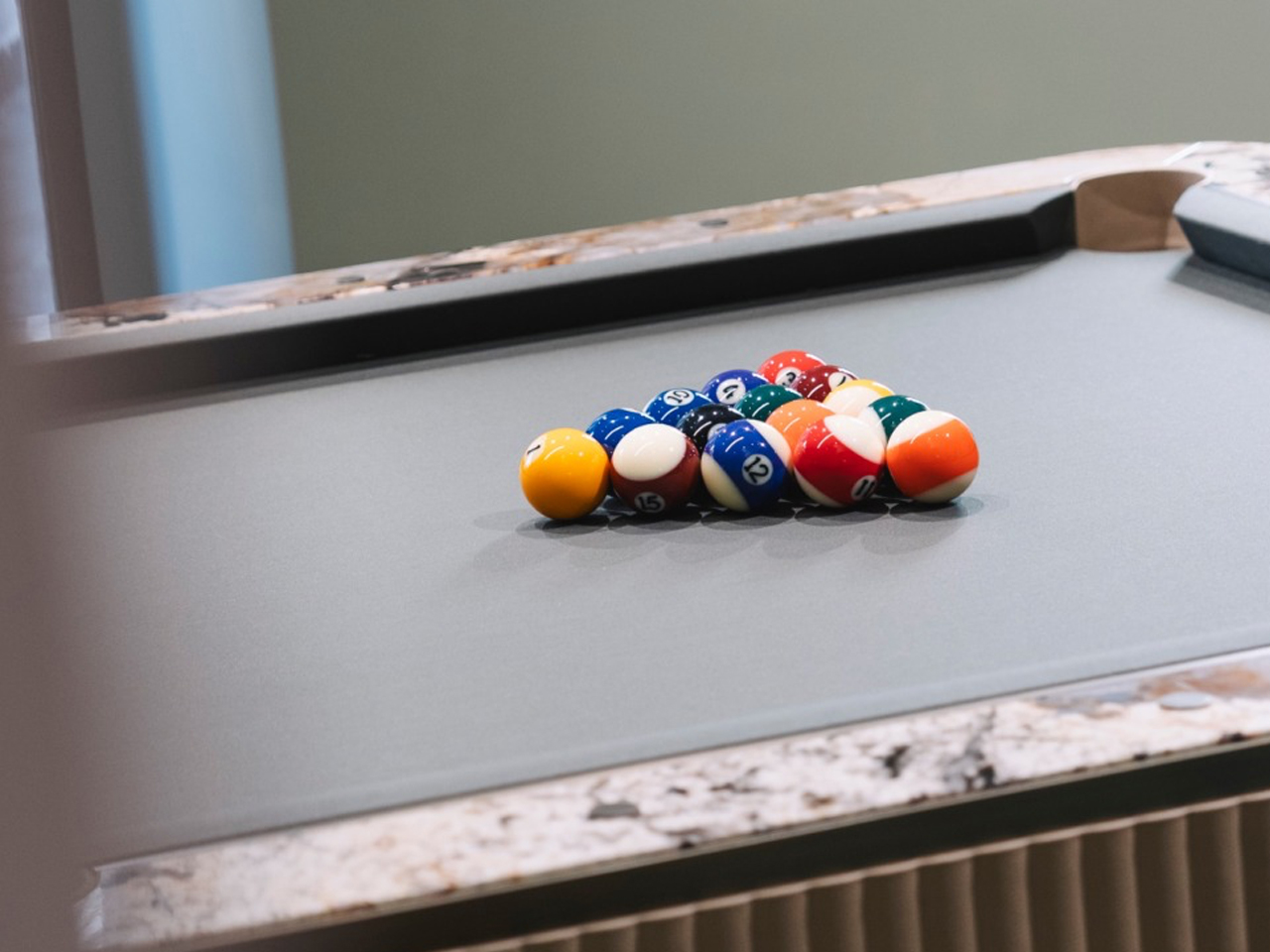
Image Credit: Elie Saab
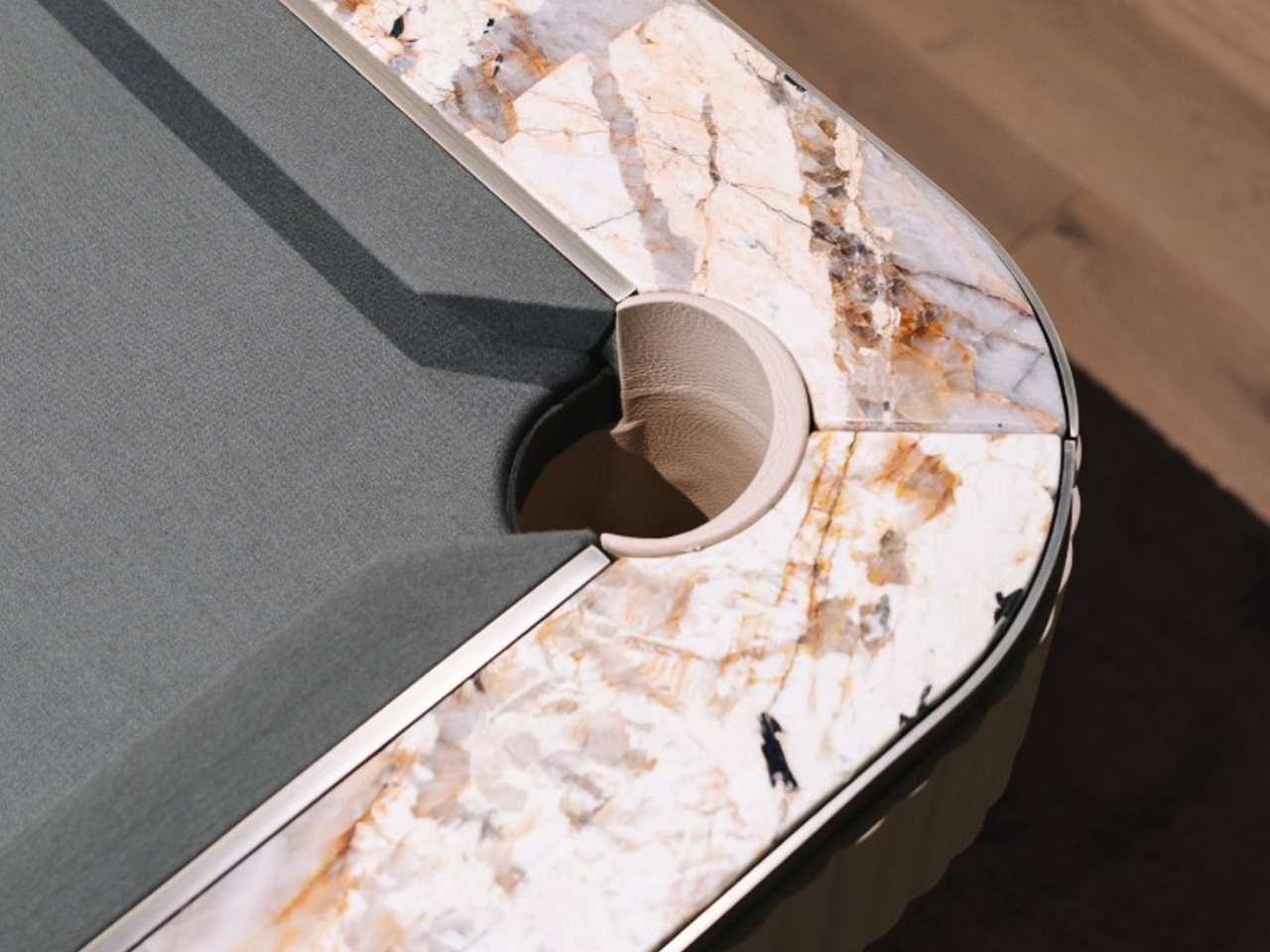
Image Credit: Elie Saab

The billiards table by Elie Saab in collaboration with Impatia transforms a traditional game table into a striking expression of neo-deco design. This functional furniture piece interprets the Neo Deco style through sculptural geometry, luxurious materials, and refined detailing. Transparent glass elements lighten the structure visually, while a concealed slate core preserves performance.
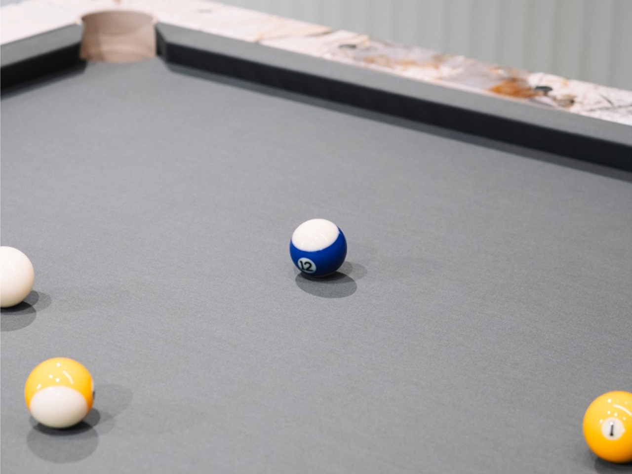
Image Credit: Elie Saab
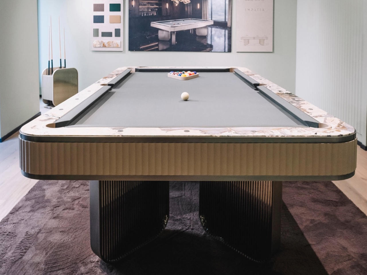
Image Credit: Elie Saab

Its Deco influence appears through layered material contrasts and architectural rhythm. A dark bronze metal frame provides structure, while ribbed glass panels reference geometric repetition. Beige leather edging softens the composition, while Patagonia marble rail tops introduce crystalline textures.

5. Louis Vuitton Omega Table (Reissue)
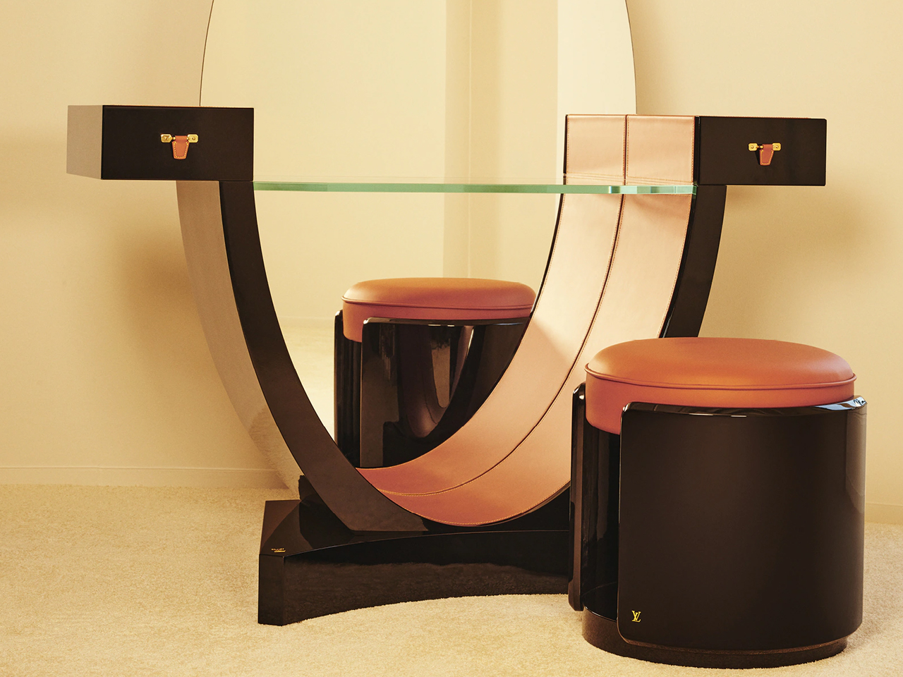
Image Credit: Louis Vuitton
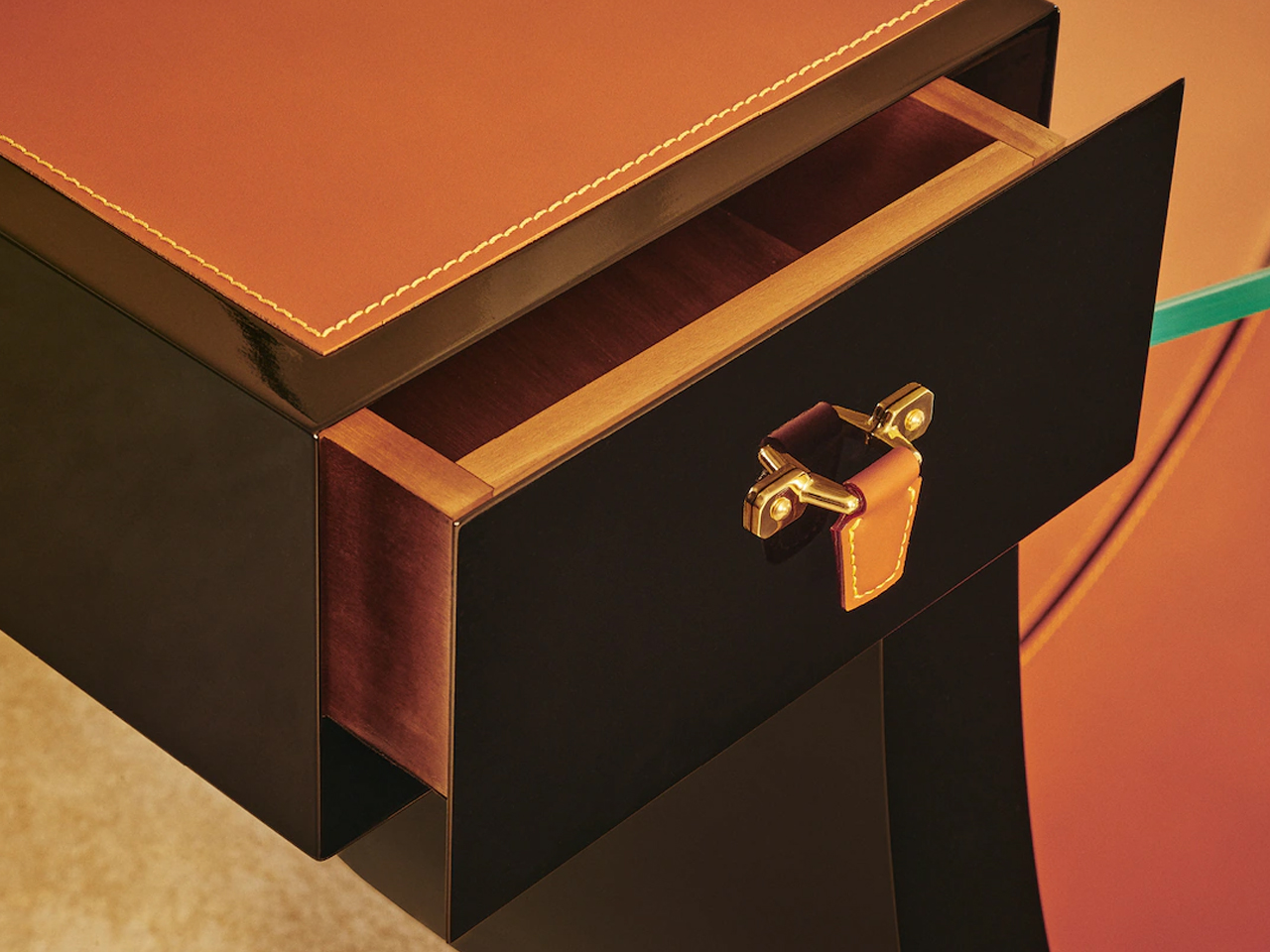
Image Credit: Louis Vuitton

Louis Vuitton returned to Milan Design Week 2026 with a refined presentation of Objets Nomades, staged as a dialogue between archival design and contemporary craftsmanship. The showcase revisited early Art Deco furniture principles, not as nostalgia, but as a structural language rooted in proportion, geometry, and material clarity.
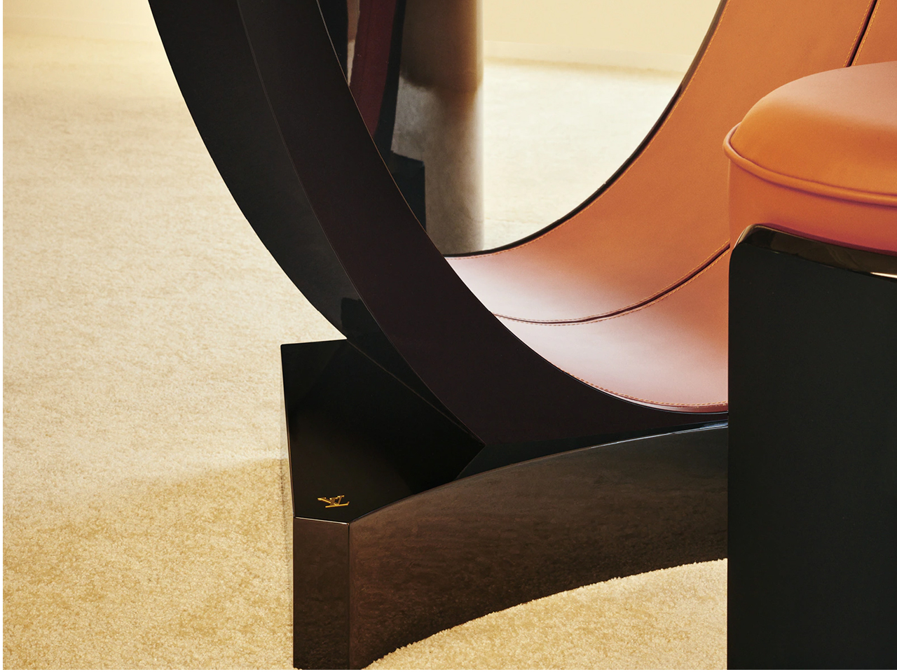
Image Credit: Louis Vuitton

A key highlight was the reissued Omega Table, originally designed by Pierre Legrain in 1921. Its distinctive curved profile remained intact, maintaining the tension between fluid line and architectural discipline that defined the original composition. Recrafted in lacquered wood and Nomade leather, the surface finish deepens its visual continuity, allowing the form to read as a piece of furniture alongside a sculptural object. The result preserves its historical identity while aligning it with a more contemporary sensibility of refined restraint and material precision.

6. Diamond Chocolate sideboard by Boca Do Lobo
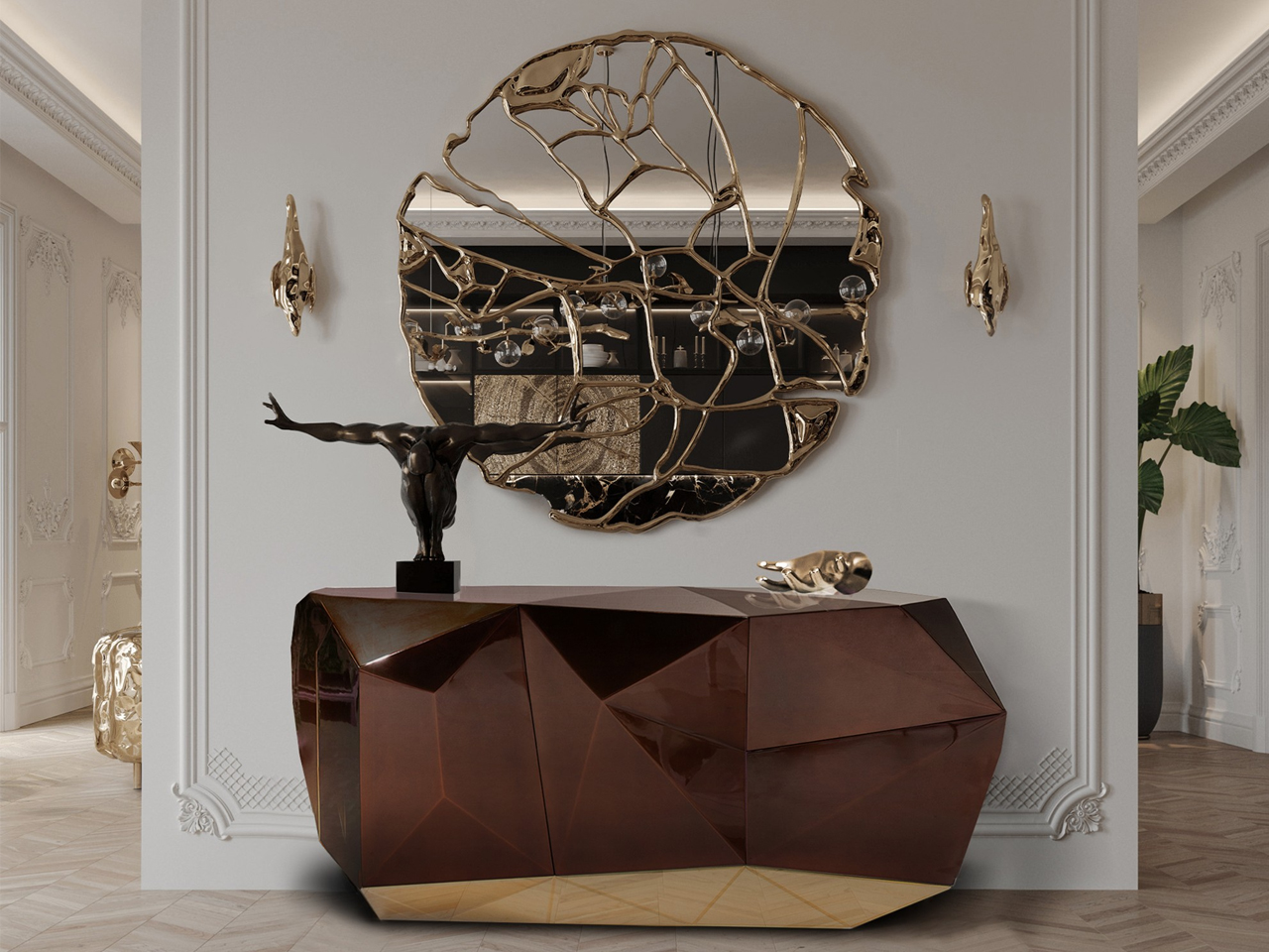
Image Credit: Boca do Lobo
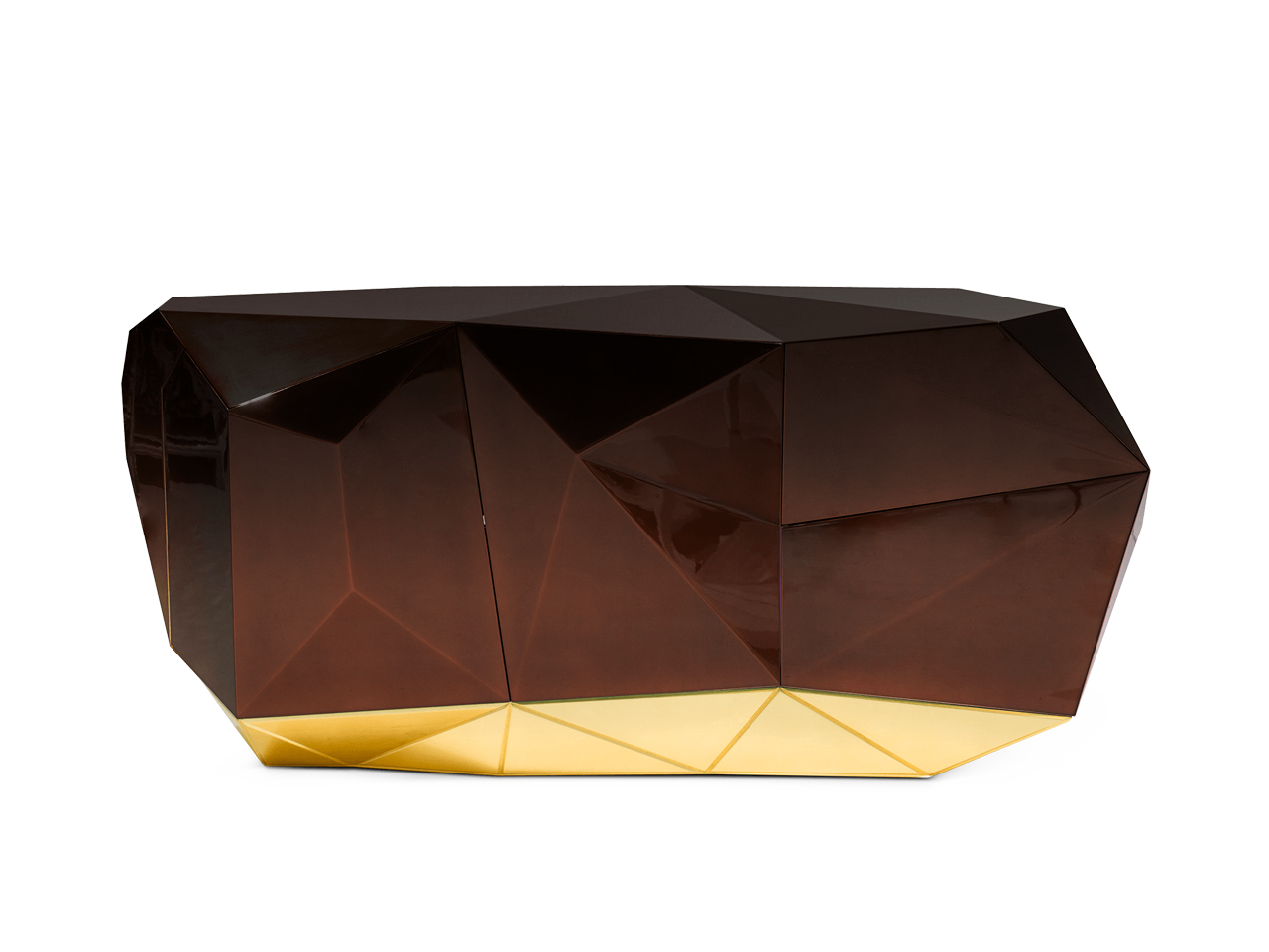
Image Credit: Boca do Lobo

The Diamond sideboard distils neo deco into a precise study of form, where geometry replaces ornament as the primary visual language. The design steps beyond decorative layering and is built around faceted surfaces that break light and shadow into controlled shifts across the object’s volume.
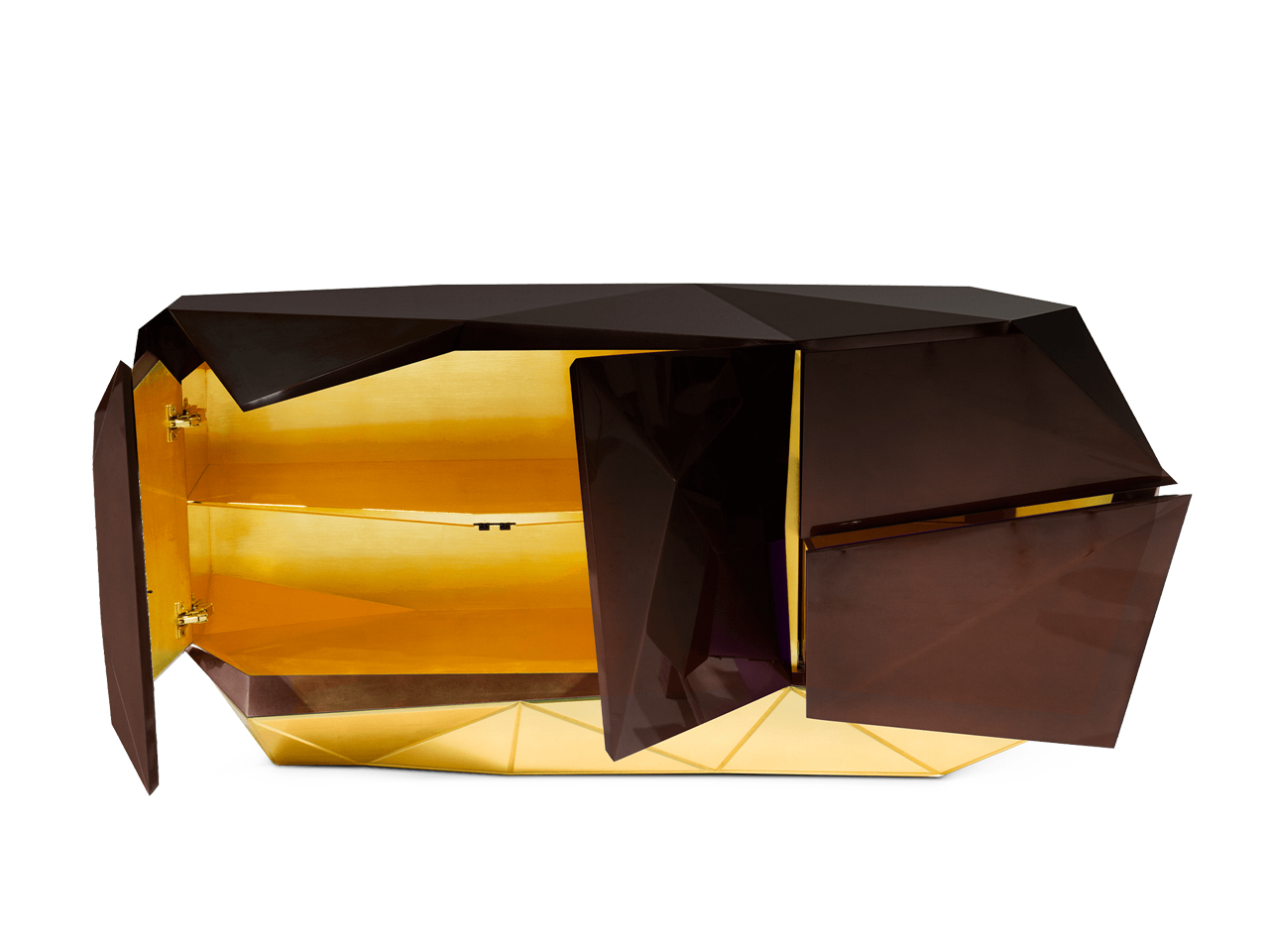
Image Credit: Boca do Lobo

Image Credit: Boca do Lobo

Its high-gloss exterior intensifies this effect, creating a reflective depth that changes with viewing angle and ambient light. The deep chocolate palette anchors the piece, introducing warmth and visual weight against its angular composition. Beneath its sculptural exterior, the craftsmanship remains tightly controlled, positioning the sideboard not as a decorative object, but as a structured, collectible form defined by clarity, precision, and material intensity.

7. Beacon Bar Cabinet by Ralph Lauren

Image Credit: Ralph Lauren Home

Image Credit: Ralph Lauren Home

The Beacon bar cabinet by Ralph Lauren Home operates at the intersection of architectural discipline and decorative refinement, expressed through a grounded yet sculptural oak structure within a Neo Deco sensibility. Its form is defined by strong vertical and horizontal logic, where proportion becomes the primary expressive tool rather than surface detailing.

Image Credit: Ralph Lauren Home

Behind its restrained exterior lies a carefully orchestrated system of concealed storage and engineered joinery, allowing functionality to disappear seamlessly into form. Subtle Deco influence appears through controlled symmetry and measured rhythm in its construction. The warmth of oak introduces a tactile counterbalance to its structural clarity, resulting in a piece that feels substantial and understated, anchored in material honesty and architectural calm.

Beyond individual objects, Neo Deco is also defined through its material language

Decoding Neo Deco Interiors Through Materiality

A return defined by materiality

Fluted wood, lacquer, burl veneer, brushed brass, and velvet have returned together within the neo deco revival. Their resurgence is driven by materiality itself and how surfaces hold light, absorb shadow, and create depth through texture rather than decoration.

Fluted wood creates rhythm through light

Fluted wood introduces quiet repetition and structure. Its grooves shift with light and shadow, giving surfaces a subtle architectural rhythm without visual heaviness.

Lacquer sharpens reflection and clarity

Lacquer brings a smooth, reflective finish that heightens colour and edge definition. It adds precision and a controlled luminosity to otherwise solid forms.

Burl veneer adds natural irregularity

Burl veneer introduces organic movement through its unpredictable grain. It softens geometry with a layered, expressive surface that feels distinctly unique.

Brushed brass introduces warmth and restraint

Brushed brass offers a muted metallic glow that grounds compositions. Its softened sheen balances richer materials without overpowering them.

Velvet brings depth and tactility

Velvet enriches interiors with softness, density, and colour saturation. It absorbs light, adding warmth and a more intimate spatial quality.

Why did they return together

In neo deco, these materials work through contrast via matte and gloss, soft and structured, natural and refined characteristics.

What Pinterest Predicts 2026 Actually Signals About Neo Deco

Pinterest search patterns show Neo Deco as a move toward complete spatial moods and not just isolated décor trends. Users are gravitating toward sculptural silhouettes, arched forms, and layered material compositions, suggesting interiors are now being imagined as unified architectural statements. This directly aligns with Milan Design Week 2026, where geometry, brass, lacquer, and Deco references appeared as part of the structure and not just surface styling.

To understand why this shift is happening now, it must be placed within the wider fatigue of minimalism-led interiors

Why Neo Deco Emerges After a Decade of Minimalism?

The rise of Neo Deco follows clear fatigue with Scandi-led minimalism. After years of soft oak, muted tones, and rounded neutrality, interiors have reached a point of visual saturation. Since 2024, designers have been signaling a shift toward more defined, expressive environments, marking a recalibration toward structure, contrast, and material presence.

Taken together, these signals point to a deeper change in how interiors are being conceived. What many interpretations miss is that Neo Deco is not a surface trend but is structural. The emphasis has moved from finishes and colour palettes to silhouette, proportion, and joinery. Furniture now operates as spatial architecture, shaping rhythm and atmosphere within a room. The logic is simple but decisive: the shift is no longer about what you apply to a space, but how the space is formed.

As a result, Neo Deco is not a revival of ornament but is a return to structure, where form itself becomes the new language of luxury.

The post Art Deco Furniture Is Back – and Salone 2026 Made It Official first appeared on Yanko Design.

The Roomba Guy Just Built a Robot Pet You Might Actually Love

If you’ve ever watched your Roomba bump helplessly into a chair leg for the third time and thought, “I deserve better from my robots,” you’re not alone. And apparently, neither did Colin Angle. The co-founder of iRobot, the man who essentially put a hockey puck-shaped vacuum in millions of homes, left the company in 2024 with a new question rattling around in his head: what if a robot could actually feel like it cares about you? The answer is the Familiar, the first prototype from his new startup, Familiar Machines & Magic. And it is not your average robot.
Picture a creature somewhere between a soft-eared dog and a round, slightly abstract bear. It has four legs, huge paws, and doe eyes that make it immediately charming in a way that no Roomba ever attempted to be. It’s furry, expressive, and was designed with the help of former Disney Imagineers, which explains why it looks like it belongs in an animated feature rather than a tech showcase. The Familiar has 23 degrees of freedom, meaning it can wiggle its ears, tilt its head, and wag a small nub of a tail with the kind of fluidity that feels less mechanical and more… alive. Its coat is touch-sensitive, built specifically to encourage physical interaction between you and it.

Designer: Familiar Machines & Magic

It also doesn’t talk. That detail feels deliberate and, to me, very smart. Voice assistants have trained us to think of robots as tools we command. The Familiar is going for something completely different. It’s designed to read your tone of voice, your body language, your overall energy, and respond accordingly. Angle calls it “Consumer Physical AI,” and while the label sounds like something off a product white paper, the idea behind it is genuinely compelling.

The name itself is worth noting. A “familiar” in folklore refers to the supernatural animal companion of a witch or magical figure, a creature bonded to a person not through ownership but through genuine connection. Angle’s team chose that name deliberately, and I think it sets the tone for what they’re trying to build. The goal isn’t to sell you a novelty gadget. It’s to create a new kind of relationship between humans and machines, one built on trust, attentiveness, and something approaching care.
Now, I’ll be upfront: I have feelings about this. Part of me finds it genuinely beautiful as a design concept. The Familiar was clearly approached the way good industrial design should be, with deep thought about how an object makes you feel, not just what it does. The choice to make it animal-like rather than humanoid is interesting, too. There’s far less of the uncanny valley unease that tends to follow humanoid robots around, and more of the universal warmth that most people already extend toward animals.

But another part of me wonders about the emotional stakes here. We’re already watching people form attachments to AI chatbots. A touch-sensitive, furry, expressive robot that mirrors your emotional state is a much more potent version of that. Angle has said he wants it to feel like the machine actually cares about him. That’s a lovely vision. It’s also a design brief that puts enormous responsibility on the creators to get it right, because the flip side of emotional bonding is emotional dependence.

Still, I’d be lying if I said the Familiar didn’t make me curious in the best possible way. The prototype images are almost disarmingly sweet. It looks like something you’d want sitting on the couch next to you while you read, or settled quietly in the corner while you work. If any robot was ever designed to move through your life rather than just function within it, this might be it.

The Familiar is still in the prototype stage, with no confirmed price or release date. But as debut concepts go, it’s a strong one. Whether or not it ever makes it into our homes, it raises questions about what we actually want from the machines we live with. And those questions feel well overdue.

The post The Roomba Guy Just Built a Robot Pet You Might Actually Love first appeared on Yanko Design.

AI-powered earbuds with built-in camera expand your capabilities in the real world

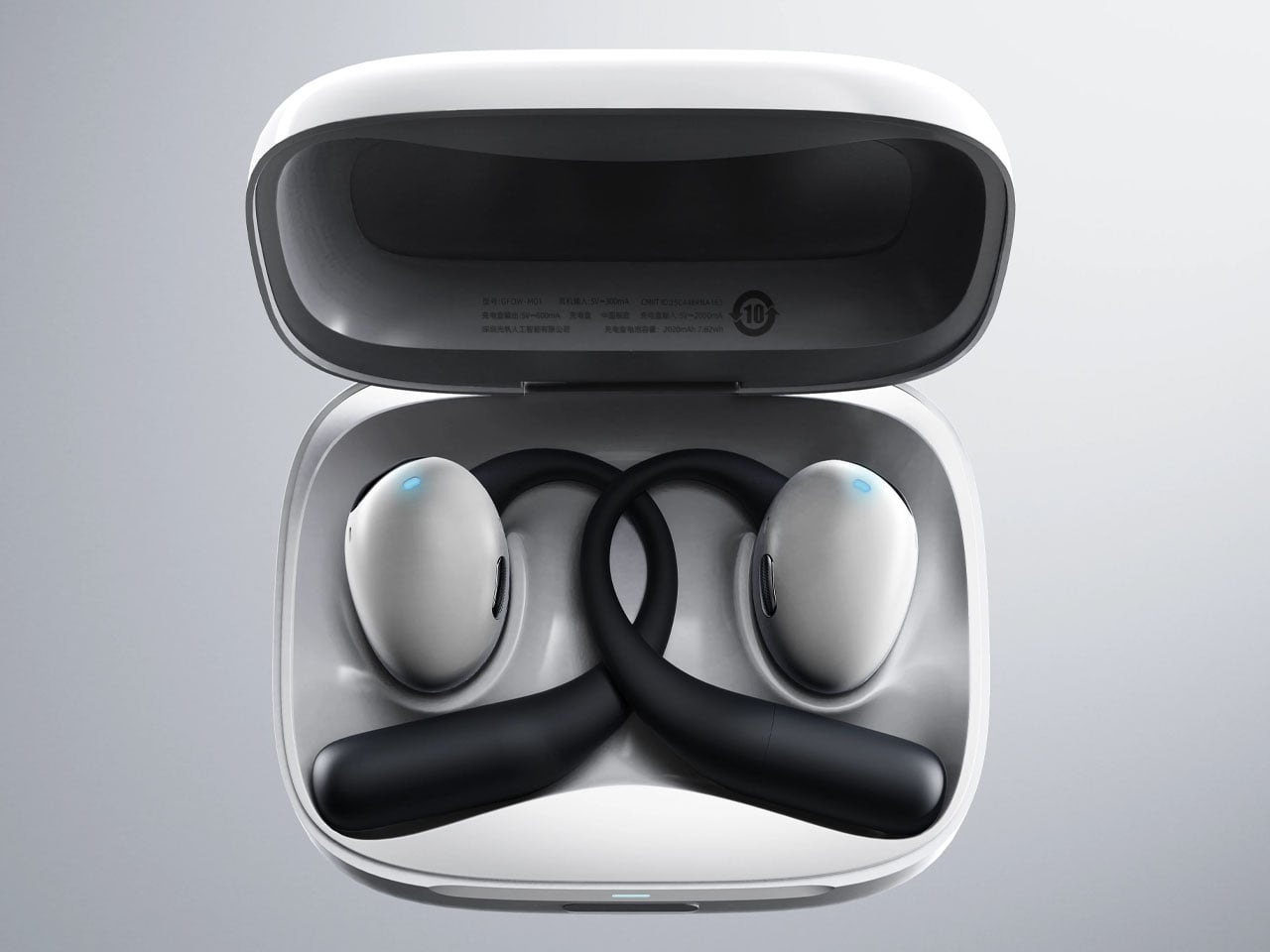
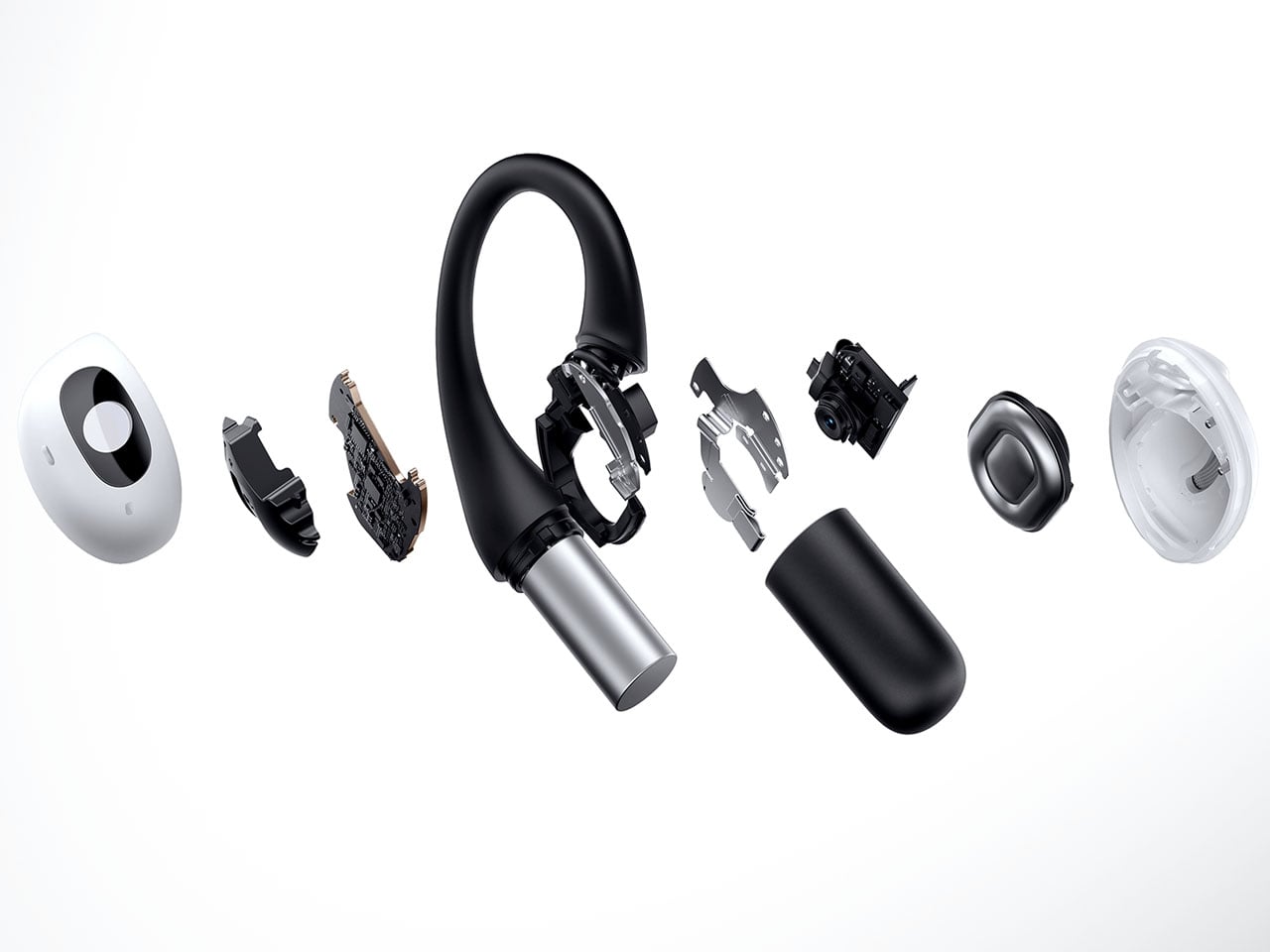
Headphones and earbuds have, over the last couple of years, become staples of this fast-paced world for good reason. The little audio gear essentials can do a multitude of tasks with just the push of a tactile button or pinch gesture. They can trigger smart assistant support for a smarter you, and if this concept were to be imagined, they can give you a pair of smart eyes, too.

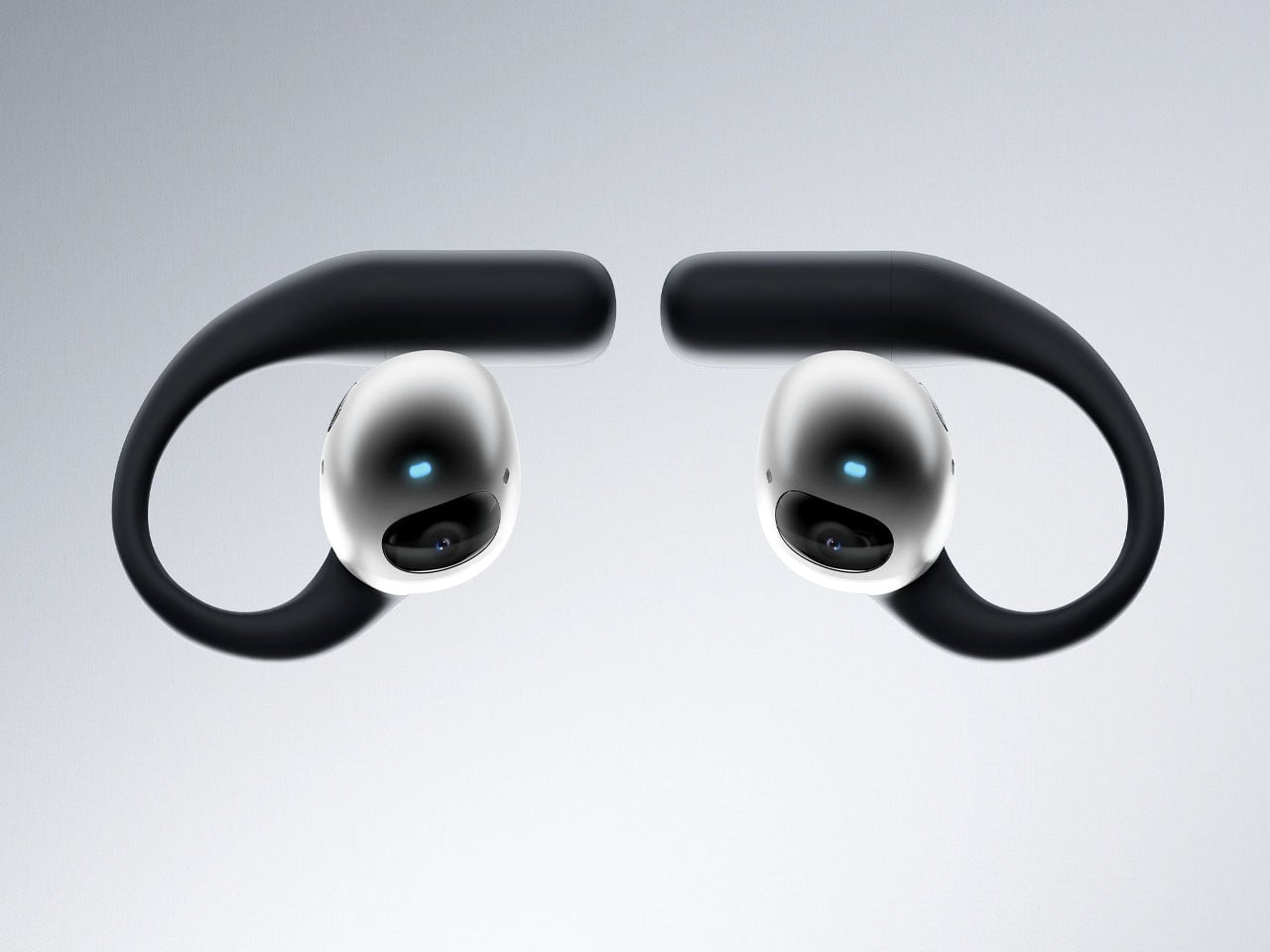
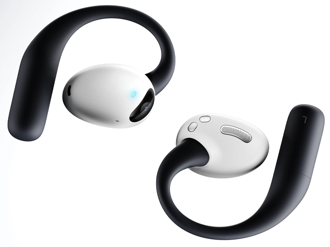
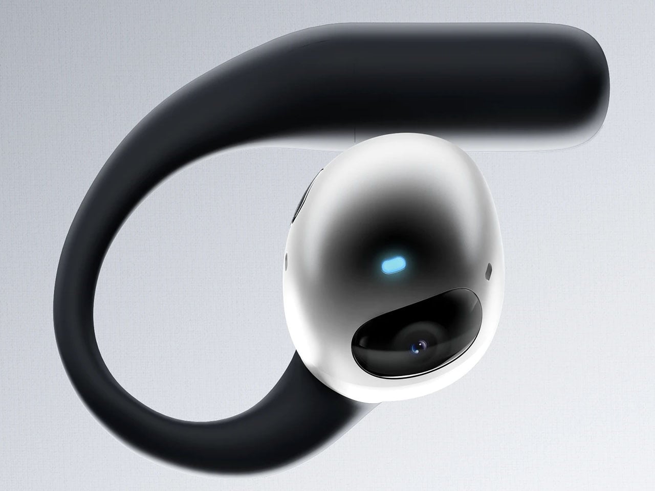
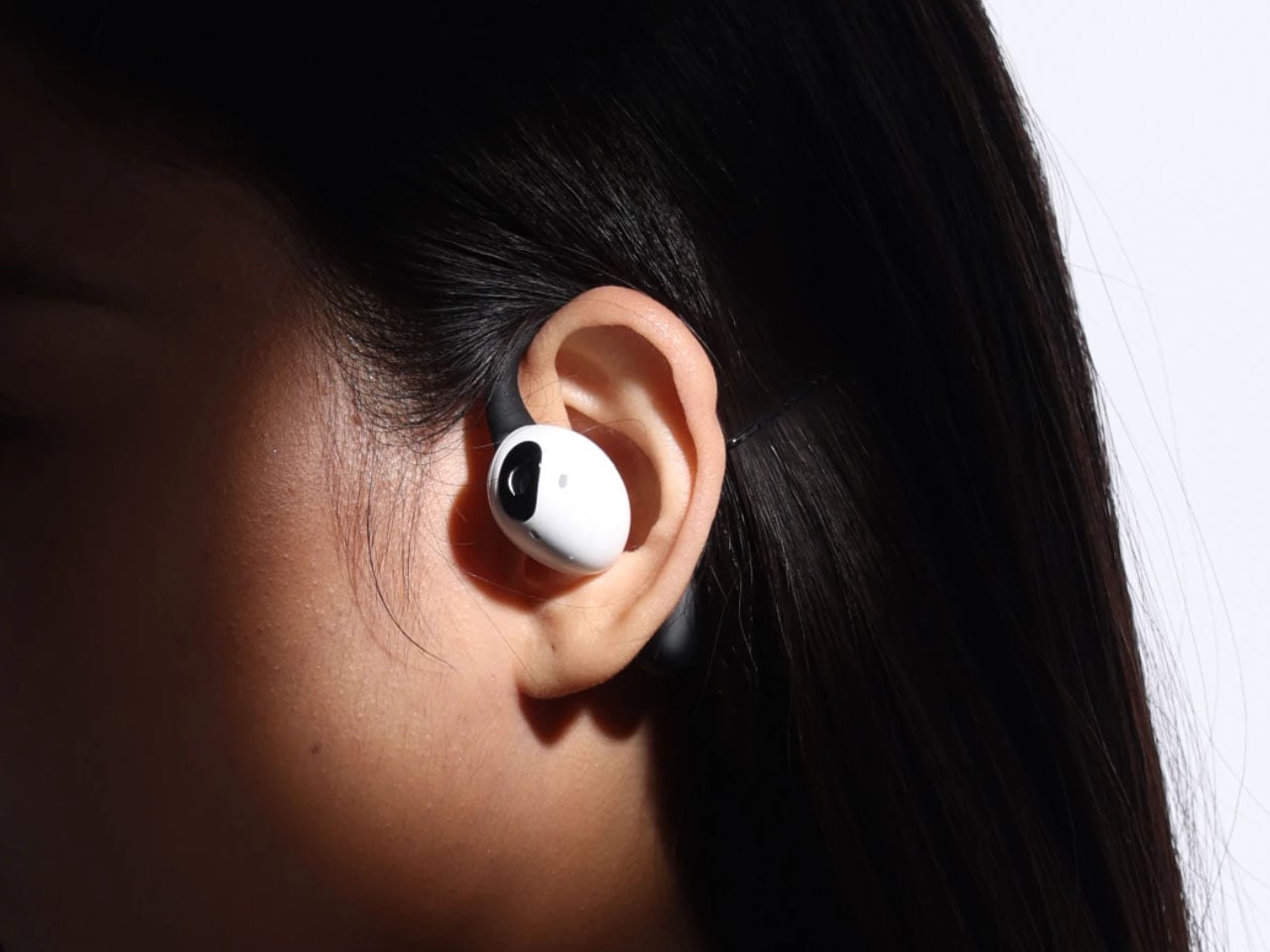
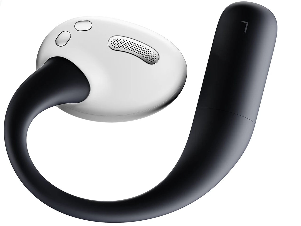
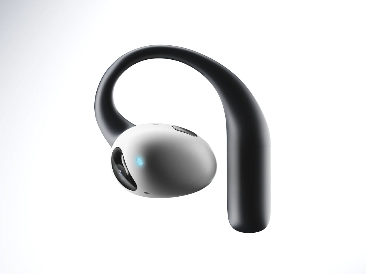
The idea of a pair of earbuds with integrated cameras is not new, as Emil Lukas imagined, and now another concept reinforces the merit in having a pair of lenses on earbuds. Dubbed Lightwear, the earbuds look something straight out of a sci-fi flick, but underneath, they are a pair of smart assistant earphones that enhance your environmental perception in real time.

Designer: Suosi Design

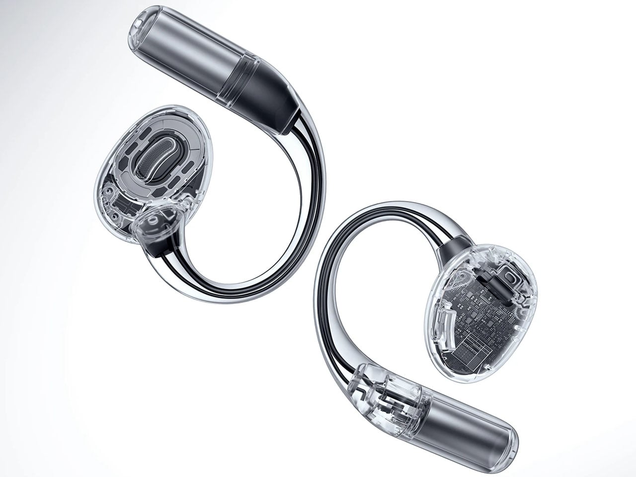
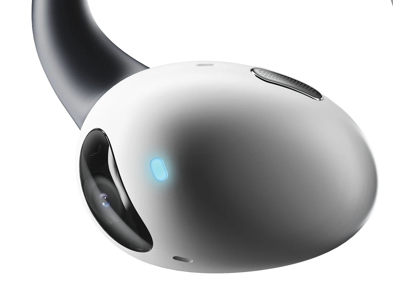
Touted as the world’s first AI-powered earphones, Lightwear comes with a set of HD camera lenses to expand the sense perception as a vision module to interpret the surroundings and deliver the desired result. One can detail them via voice command about any information required in real time, and the buds respond with a detailed set of instructions or navigation guidance. Having gesture control support, the buds can control the connected home devices remotely using just gesture commands. All the data fed into the smart data system is end-to-end encrypted and stored locally. For enhanced privacy and protection, the sensitive data is automatically cleared on a scheduled cycle.

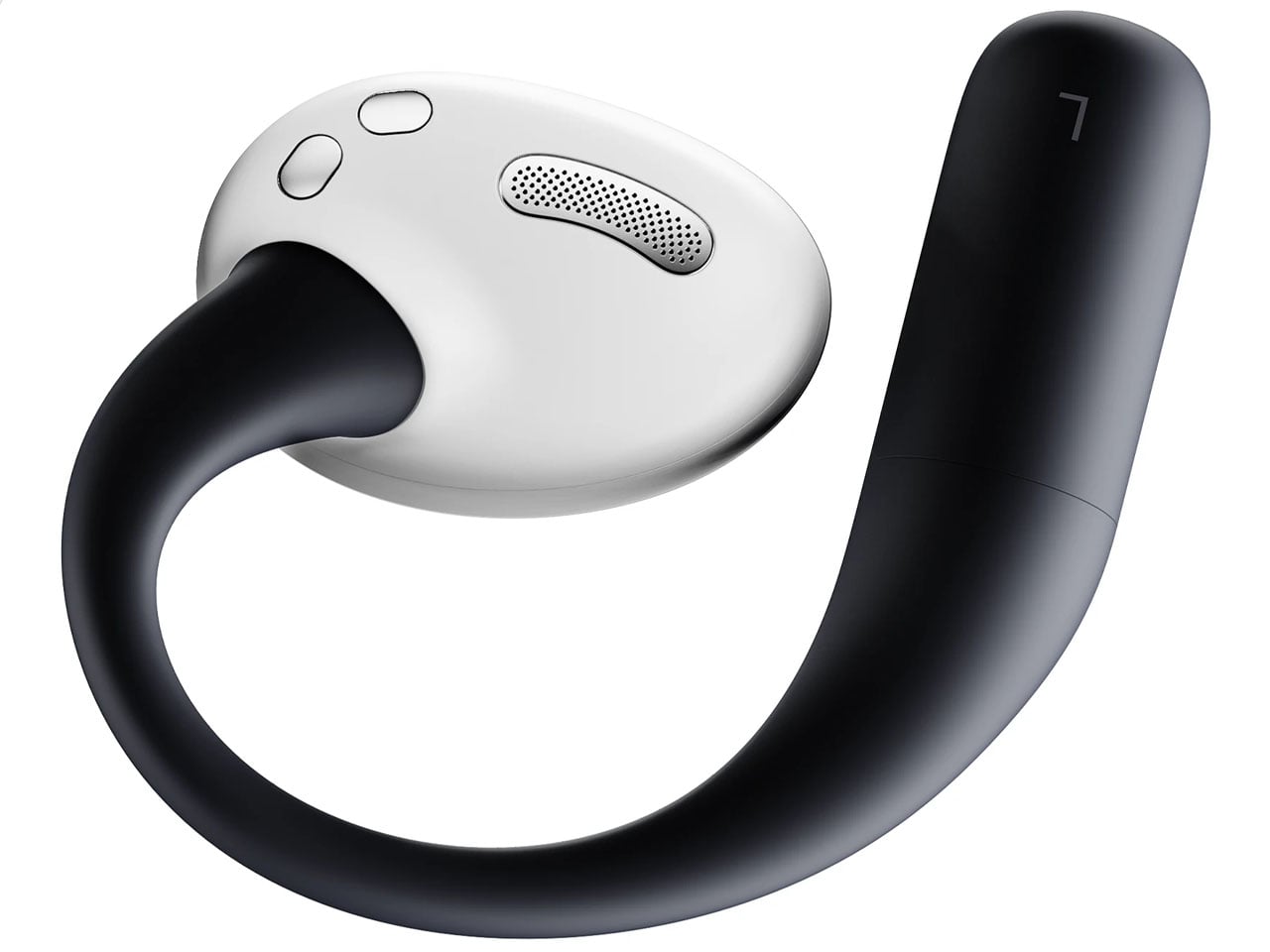
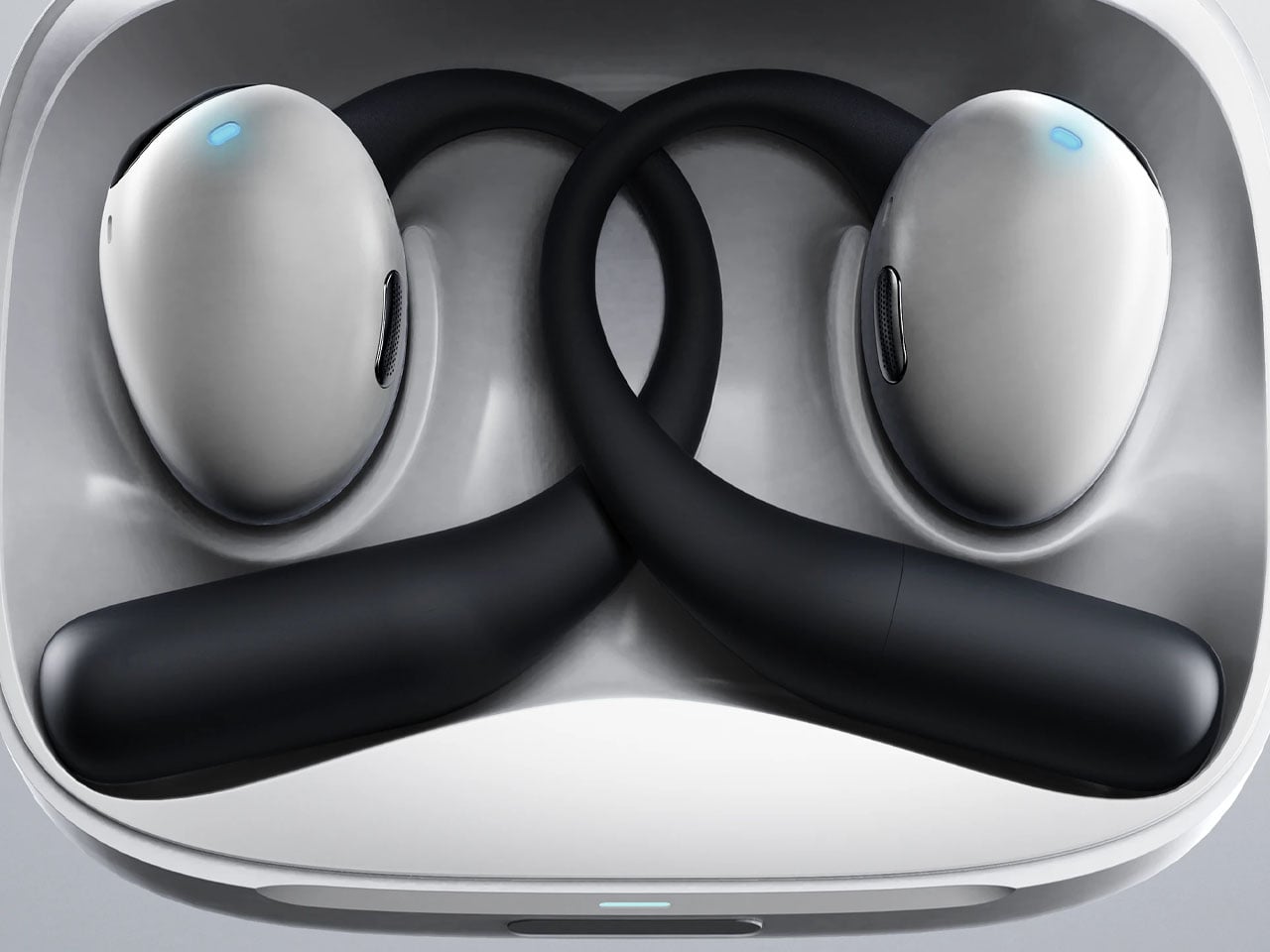
Compared to Emil’s version, these earbuds have a very downplayed camera presence, which I prefer. They look and feel just like any normal earbud, but have a function that makes them stand out from most pairs of earbuds that have the predictable features. Unlike other AI-powered earbuds, these stand true to their name as they come with the added visual apparatus to put forth better results. The use of AI functions is not limited to the earbuds, since the charging case does the same. This removes the use-case scenario to just when the earbuds are being worn. Loaded with highly sensitive microphones, the AI features can be triggered anytime the user wants. Privacy is also taken care of, as the user can opt to activate the fingerprint unlock module to prevent any unauthorized use.

These have an over-the-ear design, reminiscent of the way IEMs sit flush on the ears. The battery resides in those lobes, and although the designers don’t specifically talk about the usage time, these should last longer than TWS earbuds. Nor is there a specific word about the sound quality, ANC levels, or the app features. But then it’s just a concept centred on the form factor and usability.

The post AI-powered earbuds with built-in camera expand your capabilities in the real world first appeared on Yanko Design.

Forget Smarter AI, This Robot Thinks Presence Is the Point

We keep building AI to do more. More answers, more speed, more certainty. Designer Mehrnaz Amouei looked at that trajectory and asked a fundamentally different question: what if we built AI to be more present instead? The result is POCO, a soft robotic companion that might be one of the most quietly radical design concepts to emerge in recent years. It doesn’t talk over you, doesn’t flood you with information, and it doesn’t pretend to know things it doesn’t know. POCO sits with you. Literally.

At its core, POCO is a soft, tactile object that pairs with a smartphone, which serves as its computational brain and face. A soft textile body wraps around the device, transforming rigid, glass-and-metal technology into something that moves, breathes, and gestures in response to your presence. Together, they create something that sits somewhere between object, creature, and companion, and that deliberate ambiguity is very much intentional. You’re not quite sure what to call it, and that’s entirely the point.

Designer: Mehrnaz Amouei

Amouei developed POCO through research at the University of Illinois at Chicago, grounding the project in studies on loneliness and trust. Her findings indicated that people don’t actually want AI that projects certainty or control. They want availability and responsiveness. They want something that shows up without taking over. From those findings came the concept of “constructive interdependence,” a design philosophy where POCO’s limitations aren’t bugs to be patched but features embedded directly into the interaction model itself. The robot communicates what it can and cannot do through its behavior and physical states, which is a level of honesty you don’t often get from technology that typically overpromises and underdelivers.

I think that matters more than it might initially seem. The dominant conversation around AI right now is almost entirely about expansion: more capability, more integration, more autonomy. POCO pushes back on that without being preachy about it. It reframes the question of what good AI design actually looks like, and the answer it offers isn’t “smarter,” it’s “more trustworthy.” That is a genuinely different value system, and it feels overdue.

The sustainability dimension is also worth paying attention to. Rather than introducing new hardware and generating more electronic waste, POCO repurposes a device most people already own. That decision isn’t just a nice bonus; it’s built into the concept from the start, aligning with the UN’s Sustainable Development Goals around mental well-being and responsible consumption. In product design terms, that means the project was developed with a broader cultural and environmental context in mind, not just a user persona sitting in a lab.

Physically, POCO responds to touch, movement, and environmental cues. It adapts to a user’s preferences while maintaining a consistent identity, which is a surprisingly nuanced balance to strike in any product, let alone one sitting at the intersection of soft robotics and emotional design. Because interaction happens through touch rather than voice commands or screen taps, there’s an intentional slowing down embedded in the experience. You can’t rush a tactile exchange the same way you can type faster or speak louder. That shift from speed to presence feels like a meaningful counter-proposal to how most tech is currently designed. We’ve grown so accustomed to interfaces that demand our attention that a device asking only for our company reads almost as radical.

POCO has already earned an Honorable Mention from the International Design Awards and drawn coverage from major design publications. Whether it ever moves into consumer production remains an open question. But as a design statement, it’s doing exactly what the best concept work should: prompting us to reconsider what we actually want from the technology we live with, and whether expanding capability was ever really the right goal. Maybe the most interesting AI isn’t the one that knows the most. Maybe it’s the one that knows when to just stay close.

The post Forget Smarter AI, This Robot Thinks Presence Is the Point first appeared on Yanko Design.

vivo X300 FE Review: The Compact Flagship That Earns Its Keep

PROS:


  • Compact, comfortable, and premium design

  • Powerful 50MP main and telephoto cameras

  • Large battery with fast wired and wireless charging

  • Long-term software support

CONS:


  • Mediocre 8MP ultra-wide camera

  • Uncommon horizontal camera design

  • A bit pricier than most "small flagships"

RATINGS:

AESTHETICS
ERGONOMICS
PERFORMANCE
SUSTAINABILITY / REPAIRABILITY
VALUE FOR MONEY

EDITOR'S QUOTE:

The vivo X300 FE proves that a compact phone doesn't have to feel like a lesser one.

Premium smartphones have been trending bigger, heavier, and more visually imposing for years. It’s reached the point where “flagship” is almost synonymous with large, and carrying one all day feels less like convenience and more like a commitment. The compact phone hasn’t disappeared, but finding one that doesn’t sacrifice performance, battery life, or camera quality in exchange for a smaller footprint has been genuinely difficult.

That’s the gap the vivo X300 FE is aiming to fill. It pairs a 6.31-inch flat display with a Snapdragon 8 Gen 5 chipset, a 6,500 mAh battery, and a ZEISS co-engineered camera system, all within a compact design that stays remarkably light for its class. On paper, it reads like a phone that shouldn’t be this compact. But does it actually work in practice? We give it a spin to find out.

Designer: vivo

Aesthetics

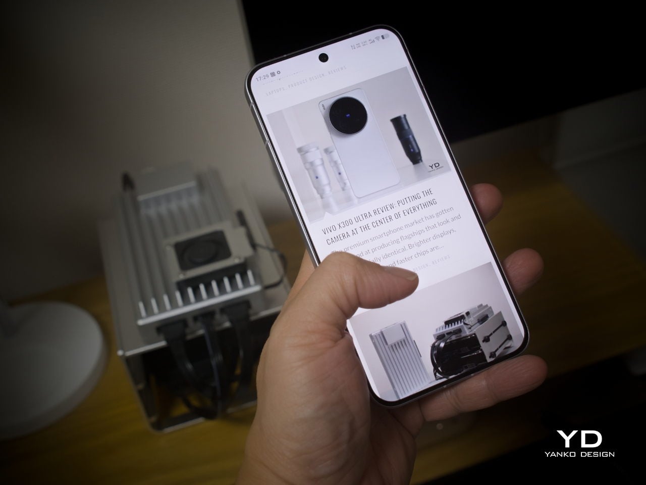
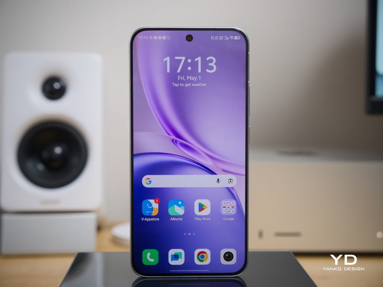
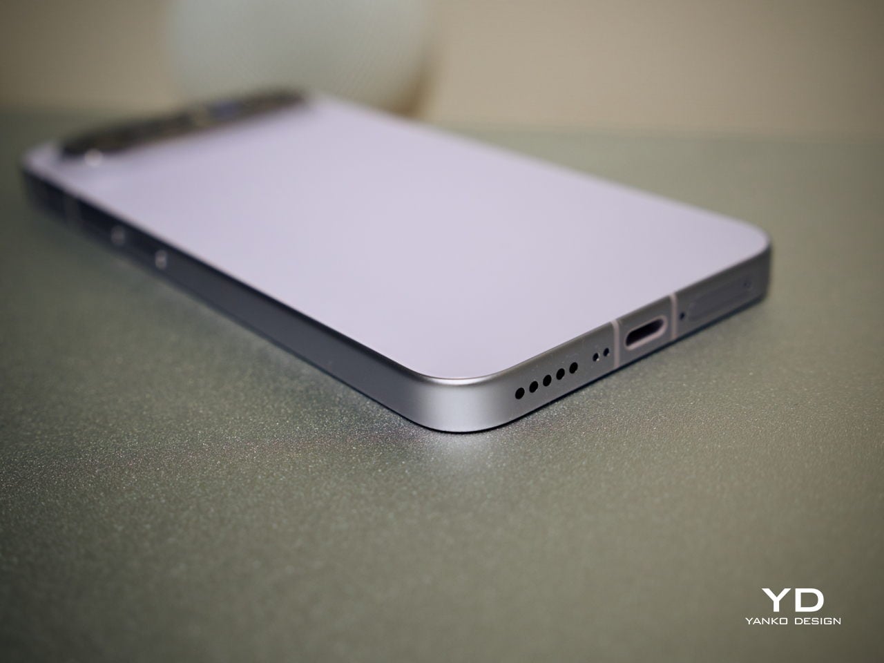
The X300 FE follows a flat-design language that’s become increasingly standard among more expensive flagships. There aren’t any curved glass edges or aggressively contoured surfaces, just a clean, rectangular form with ultra-narrow bezels, an aerospace-grade aluminum frame, and a front face that looks symmetrical and composed. The centered punch-hole is small and unobtrusive, and those slim borders give the display a neat, purposeful presence that doesn’t need theatrics to feel premium.

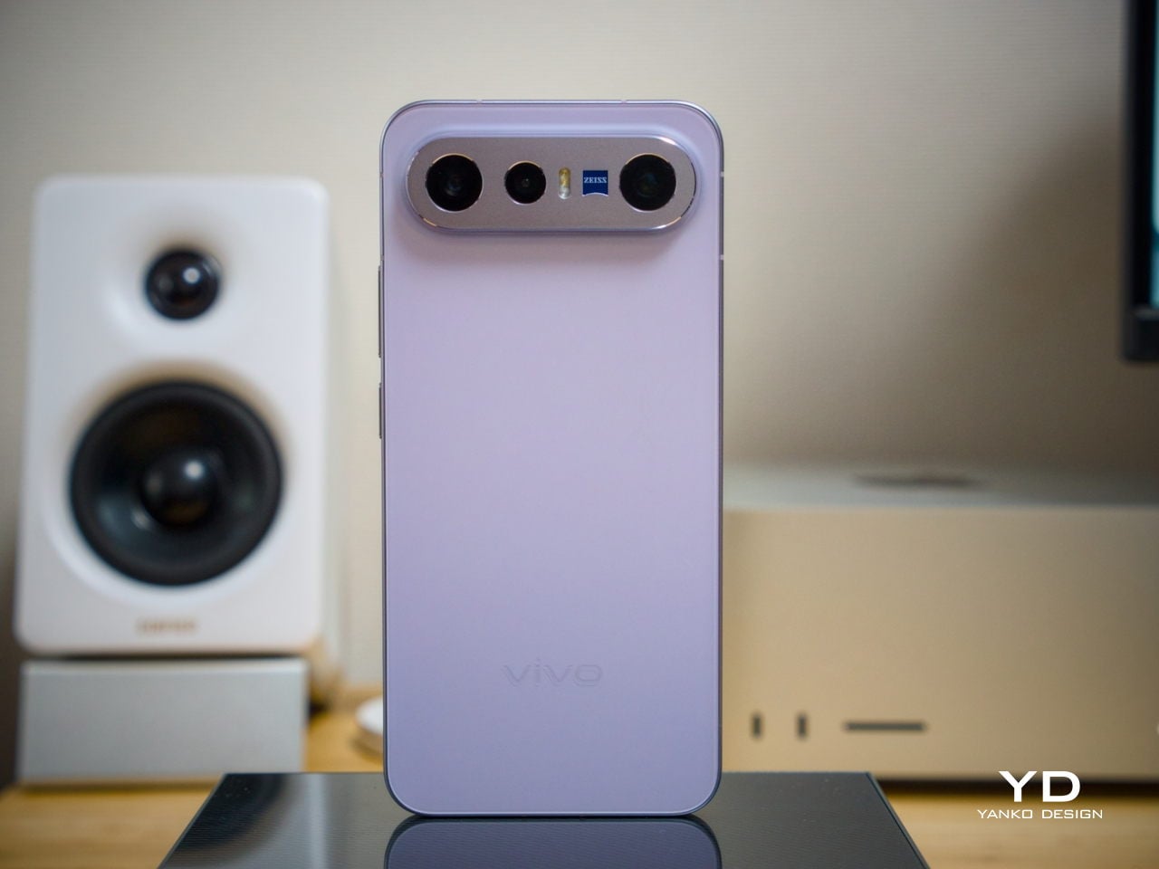
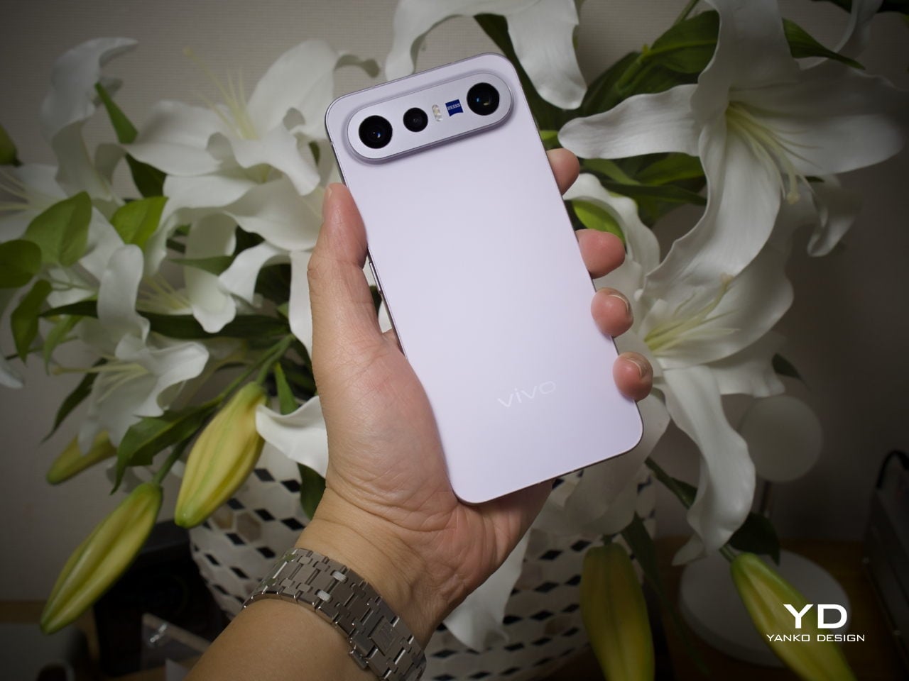
Our review unit came in white, which turns out to be a great choice for a phone this carefully considered. The matte rear panel uses vivo’s Metallic Sand AG glass treatment, giving it a soft, slightly chalky texture that resists fingerprints well and picks up ambient light in a way that shifts subtly between warm and cool tones. It doesn’t try to be eye-catching; it just looks well-made.

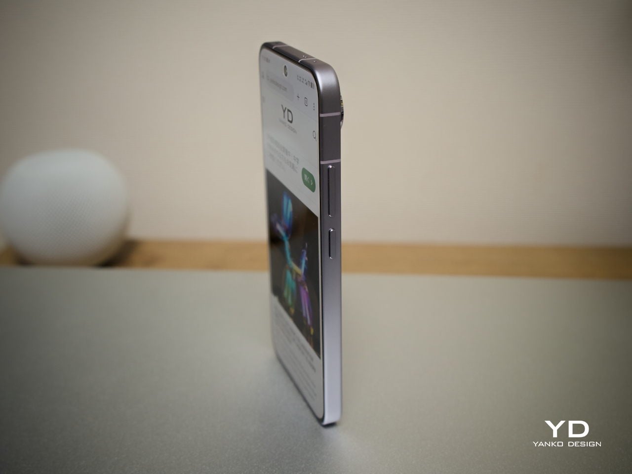
The flat aluminum frame wraps cleanly around the body, with edges that make it comfortable to grip without feeling sharp or slippery. The white model measures 8.10mm thick and weighs 192g, a hair more than the other colorways, but those differences don’t register in hand. What does register is the overall sense of a phone that’s been assembled with genuine attention to detail.

The camera module deserves its own mention. Rather than going for the oversized circular island that’s become visual shorthand for “serious camera phone,” vivo opted for a horizontal bar that spans the upper portion of the back. Three lenses are arranged neatly across it, with a ZEISS badge centered between them. It’s recognizable and distinctive without domineering the rest of the design. Admittedly, it’s going to be a divisive design, but it at least lets the vivo X300 FE easily stand out from the competition.

Ergonomics

At 150.83mm tall and 71.76mm wide, the X300 FE sits firmly in one-handed territory. It isn’t trying to be a miniature phone. It’s simply sized more sensibly than most flagships on the market. You can reach across the screen without adjusting your grip, slip it into a front pocket without thinking, and hold it for extended periods without the wrist fatigue bigger phones tend to bring.

The 192g weight for the white model falls in a range that feels present without being burdensome. There’s enough substance here to reinforce the premium feel of the materials, but not so much that you’re constantly aware of it. The 8.10mm profile isn’t exactly wafer-thin, though that’s a reasonable trade-off for a 6,500 mAh cell packed inside a frame this compact.

The flat-sided frame also contributes more to the ergonomic experience than it might seem. It gives your palm a stable, consistent surface to press against during typing and scrolling, which feels more controlled than on rounded-edge designs. The compact footprint, flat back, and balanced weight distribution all work together to make this a phone that feels designed around how it’s actually used.

Performance

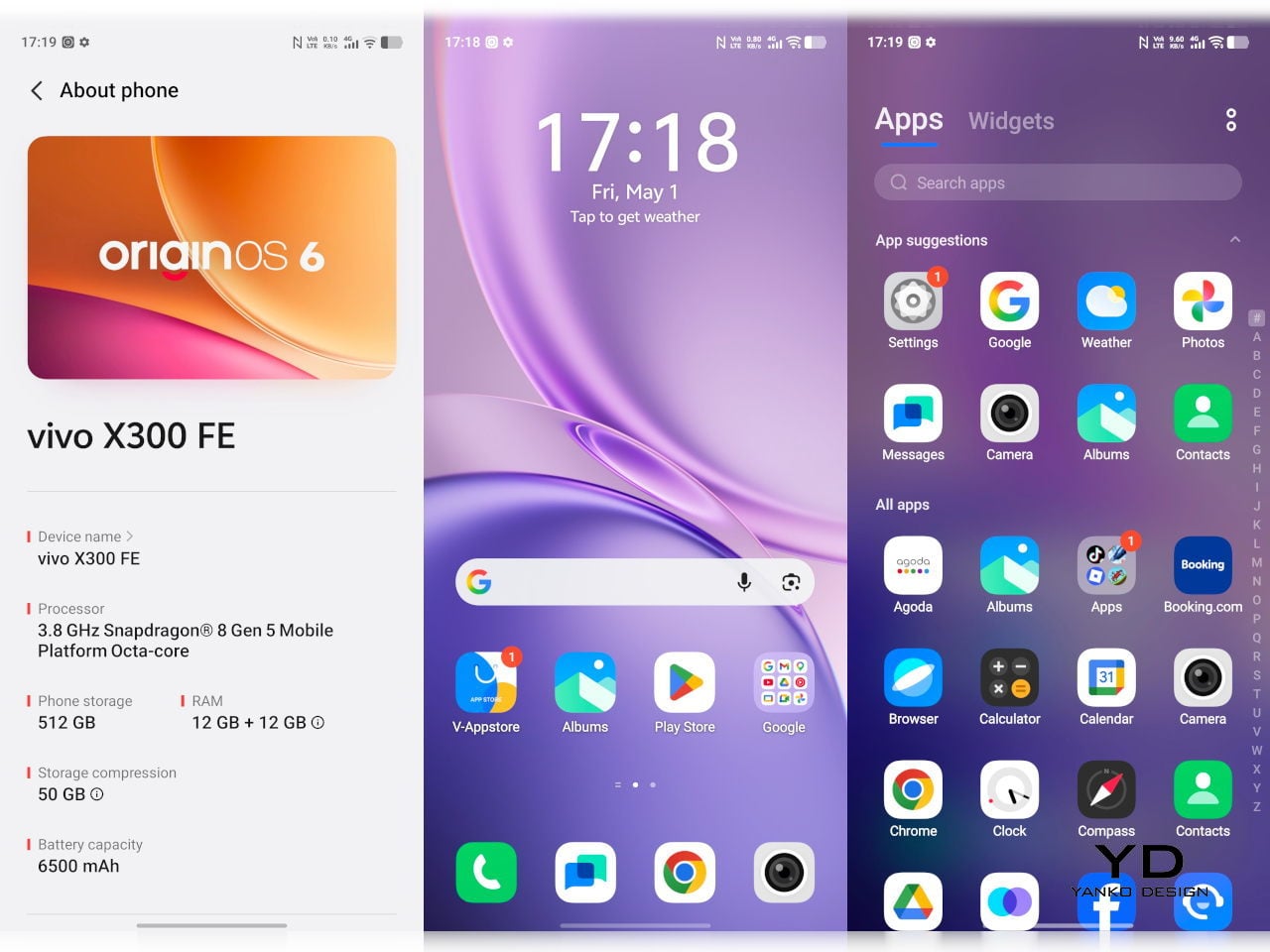
The Snapdragon 8 Gen 5 inside doesn’t need much introduction. It’s a flagship-class mobile processor, and the X300 FE puts it to good use. The 12GB RAM, expandable with another 12GB taken from the generous 512GB storage, clearly marks it as a class above your typical mid-tier compact phone. It runs Origin OS 6, based on the current Android 16 release, embracing a more minimalist and flat aesthetic that perfectly matches the phone’s design.

Day-to-day tasks feel completely effortless, from switching between apps and browser tabs to occasional gaming sessions, and nothing about the experience suggests the compact body is in any way holding the hardware back. Thermals are pretty impressive, given the vivo X300 FE’s size, but its compact form factor might work against it when it comes to how you hold it during those long periods.

Thankfully, the display backs that up well. It’s a 6.31-inch LTPO AMOLED panel with an adaptive refresh rate of 1 to 120 Hz, a 1.5K resolution at 460 PPI, and a local peak brightness of 5,000 nits. The 2,160 Hz PWM dimming also makes prolonged reading and scrolling noticeably more comfortable on the eyes, a detail that matters far more than most spec sheets would have you believe.

Then there’s the battery, arguably the X300 FE’s most impressive engineering accomplishment. A 6,500 mAh cell in a phone this slim and light isn’t something you see every day, and in practice, that capacity means genuine all-day endurance with room to spare. The 90W wired and 40W wireless charging mean you’re rarely stuck waiting long when it runs low, at least with the appropriate chargers.

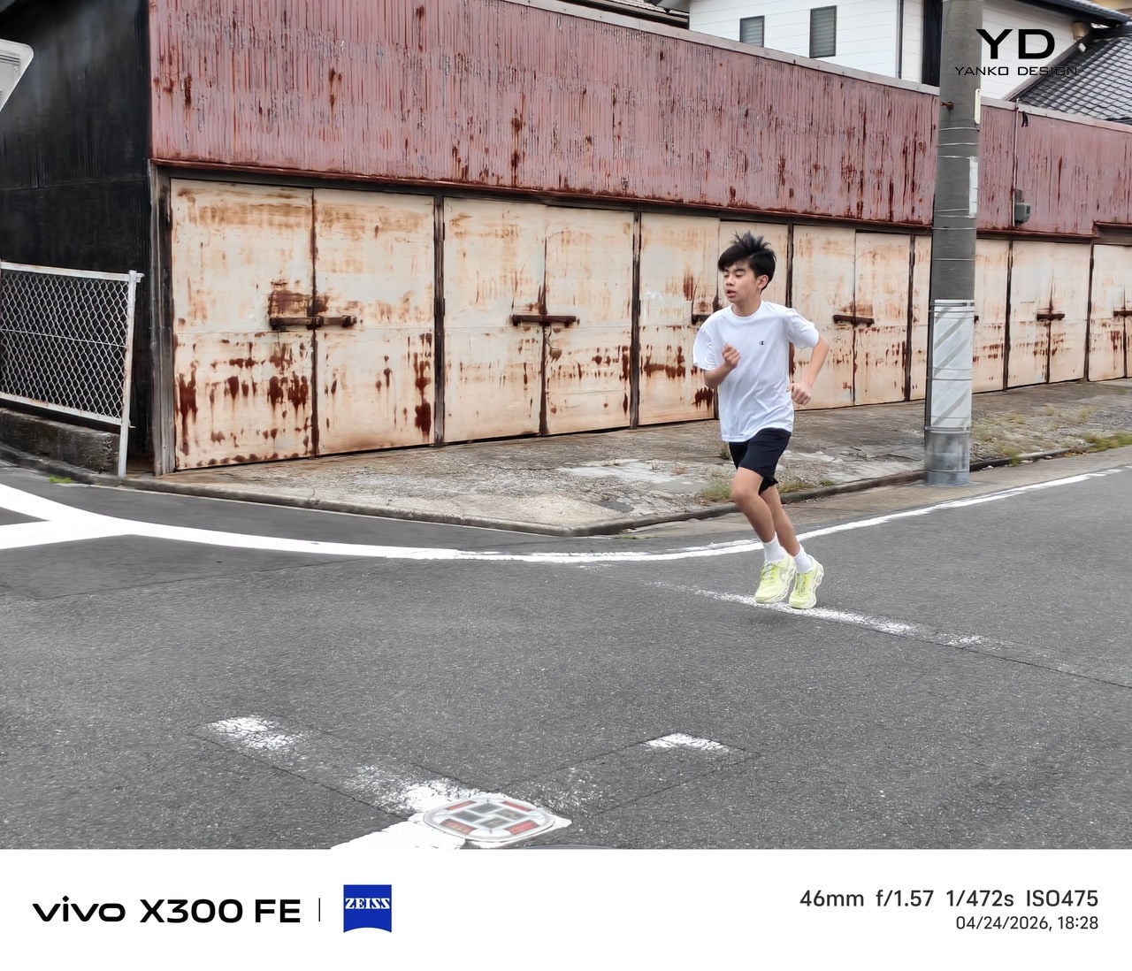
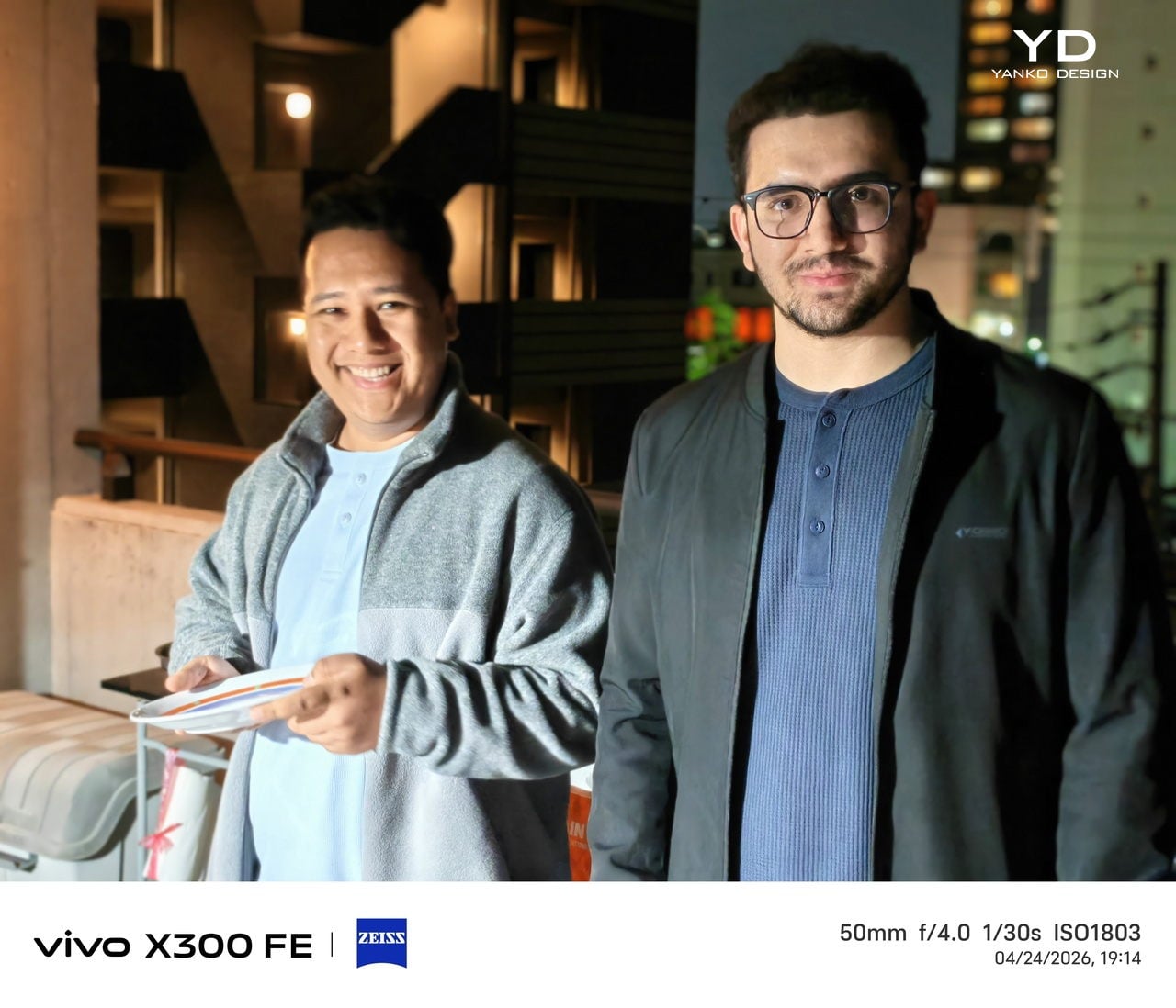
The camera system is led by a 50 MP ZEISS main camera and a 50 MP ZEISS super-telephoto camera, with an 8 MP ultra-wide rounding out the rear. The main and telephoto cameras handle portraits, street photography, and concert scenes with real confidence. An optional telephoto extender accessory also exists for those who want extended reach, though it’s firmly in niche territory.

The results are impressive, especially when starting to zoom in on subjects. Even without the telephoto extender, you can enjoy clear and detailed shots, even at night. The 8MP ultra-wide, though usable, is a bit of a letdown, but vivo had to cut some corners to bring down the price and differentiate this model from its more powerful and more expensive siblings. You do have a ton of settings to tweak to get your perfect shot, but even the defaults are good enough to make fleeting moments more memorable.

Sustainability

The X300 FE carries IP68 and IP69 dust and water resistance ratings, alongside an SGS five-star drop resistance certification, giving it a reassuring level of durability for daily use. It also carries an SGS five-star drop resistance certification, which gives it more formal durability credentials than most phones in its class. Together, those ratings make a convincing case for a phone built to survive daily life without requiring any particularly careful handling.

Software longevity is where the X300 FE makes its strongest long-term case. On that front, vivo is committing to five years of OS upgrades, seven years of security maintenance, and a five-year smooth experience promise. That support window is competitive with the best in the Android space, and it signals that this phone is meant to be genuinely used for years, not replaced the moment something newer comes along.

Value

At around €1,000, The X300 FE isn’t a budget phone, and it doesn’t try to be. It competes in the premium compact flagship space, where the particular combination it offers is harder to find than you’d expect. A current-generation chipset, a genuinely large battery, fast wired and wireless charging, ZEISS-branded imaging, and a durable premium build in a package that remains notably light for a flagship is a rare and coherent offering.

The person this phone is designed for isn’t shopping for the biggest or most spec’d-out device available. It’s someone who wants a phone that keeps pace with their life without dominating it, one that fits in a jacket pocket, lasts a full day, and still takes genuinely good photos. Frequent travelers, urban commuters, and anyone who’s tired of unwieldy flagships will feel right at home here.

Verdict

The vivo X300 FE is the kind of compact flagship that doesn’t feel like a compromise once you’re actually using it. The design is restrained and coherent, the battery is frankly impressive for the size, the chipset handles everything you throw at it, and the camera does its best work in exactly the situations most people find themselves in, out in the world rather than on a lab bench.

What the X300 FE offers is a phone that’s easy to carry, genuinely long-lasting, and capable enough for the photography and day-to-day demands you’ll actually encounter. It’s well built, well supported, and clearly designed with a specific kind of person in mind. That clarity of purpose is refreshing, and for the right buyer, it’s exactly what makes this phone worth serious consideration.

The post vivo X300 FE Review: The Compact Flagship That Earns Its Keep first appeared on Yanko Design.

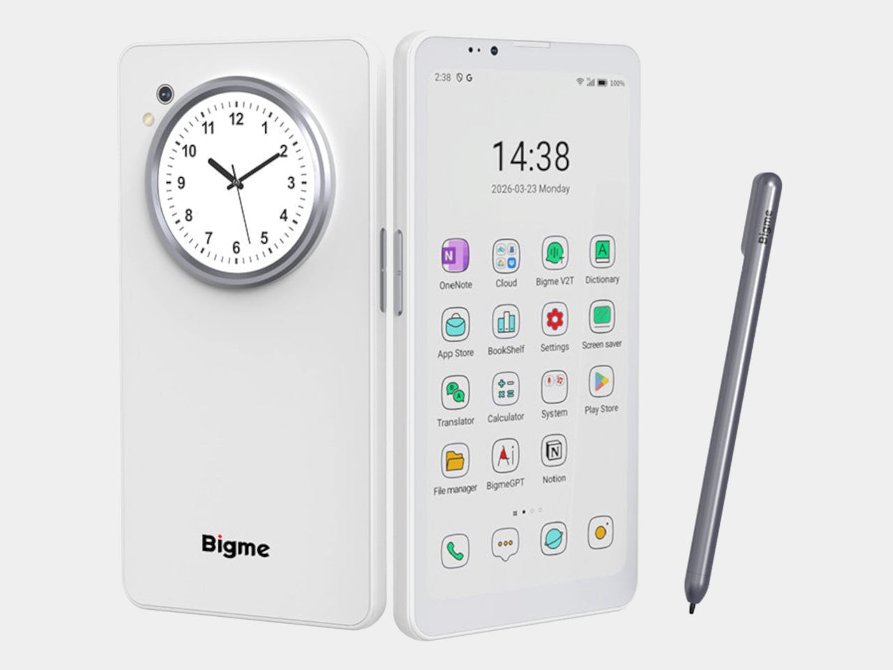
Bigme HiBreak Dual Has E Ink Up Front and a Round LCD in Back

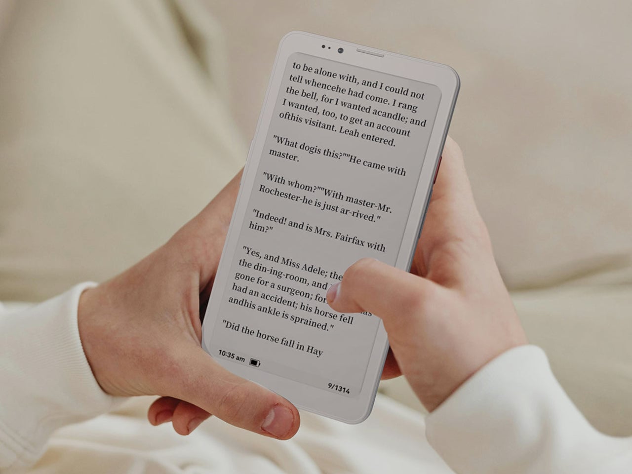
Staring at a phone screen for hours isn’t kind to your eyes, and more people are finally taking that seriously. The backlit displays on most modern smartphones are tuned for vivid color and fast scrolling, but sustained use can lead to real fatigue. That growing awareness has pushed E Ink displays into smartphone territory, where their paper-like readability makes a lot of practical sense.

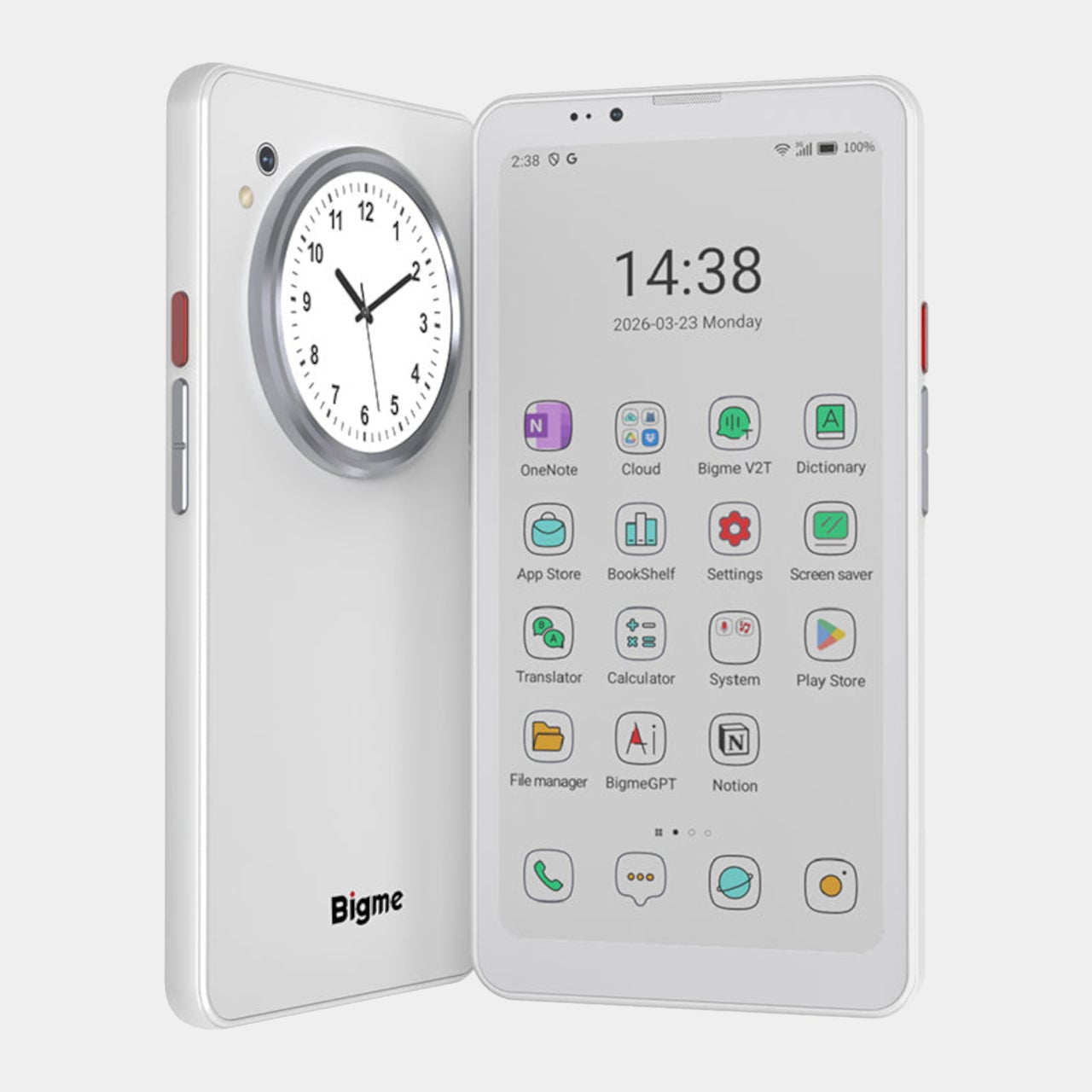
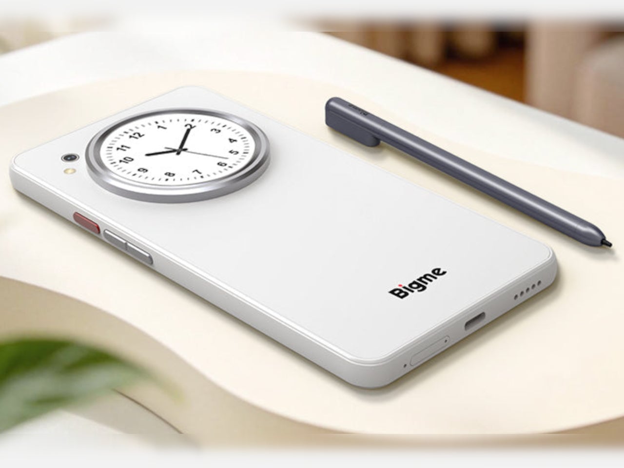
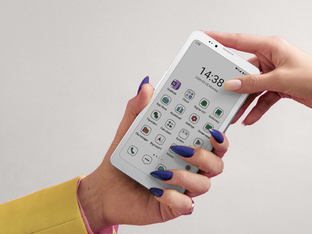
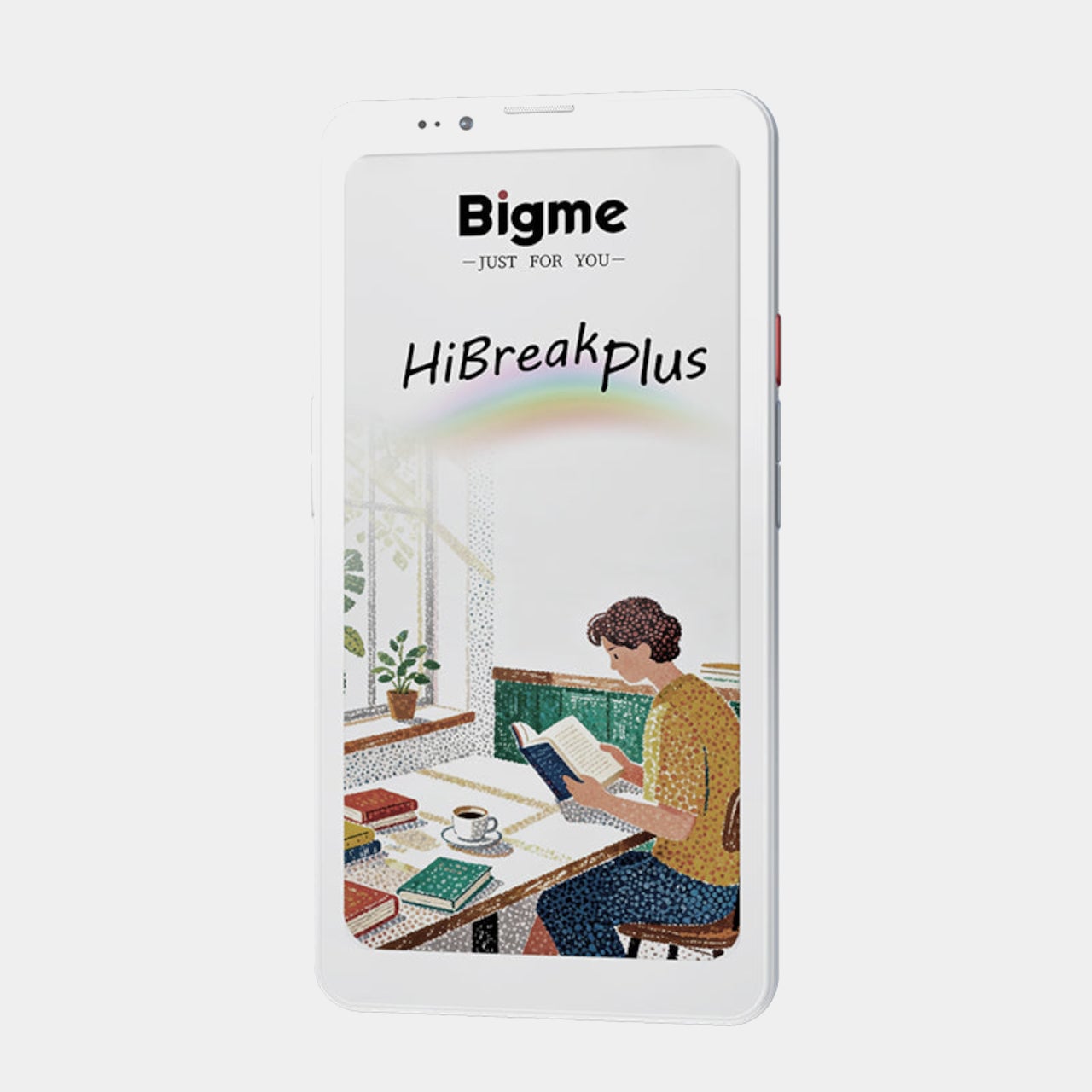
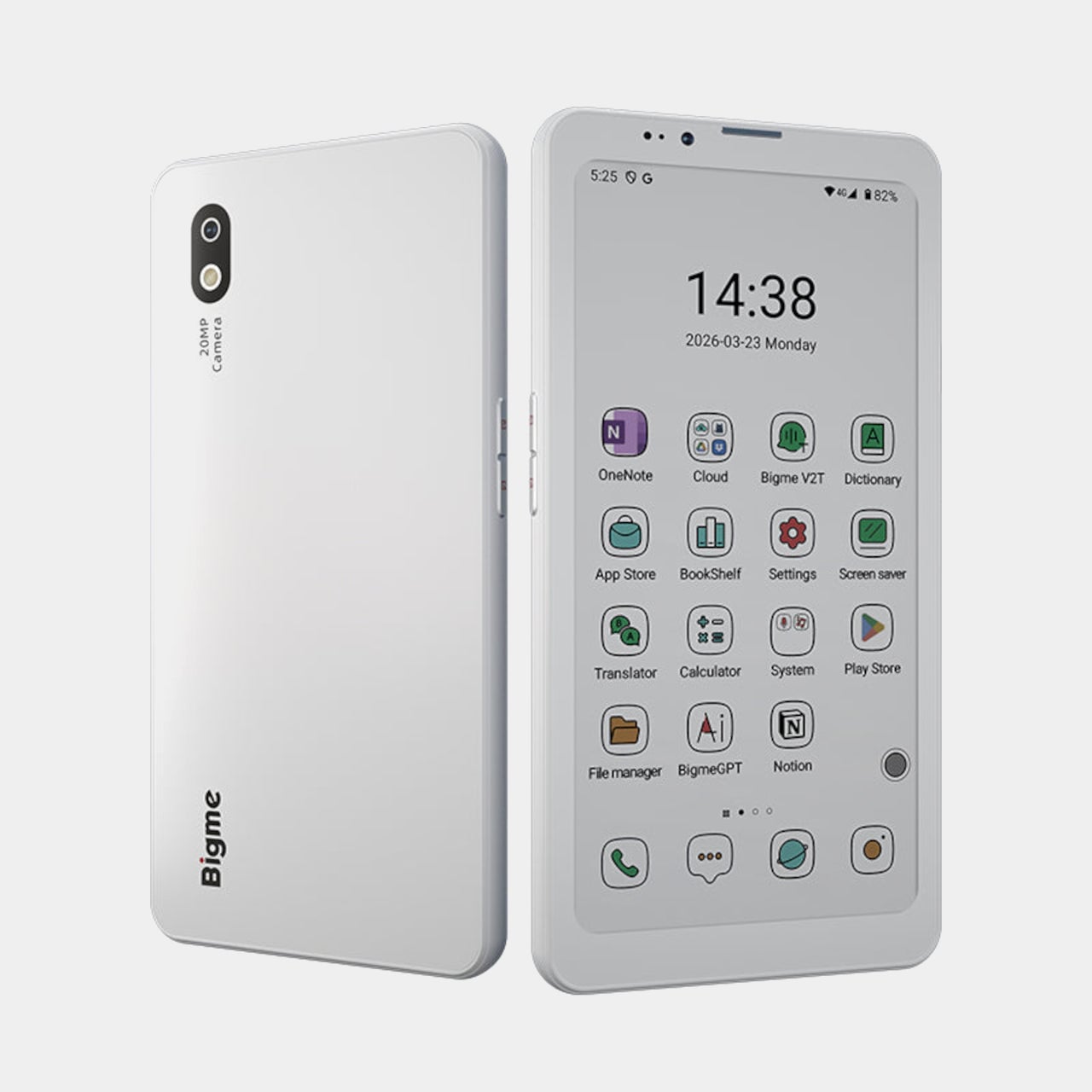
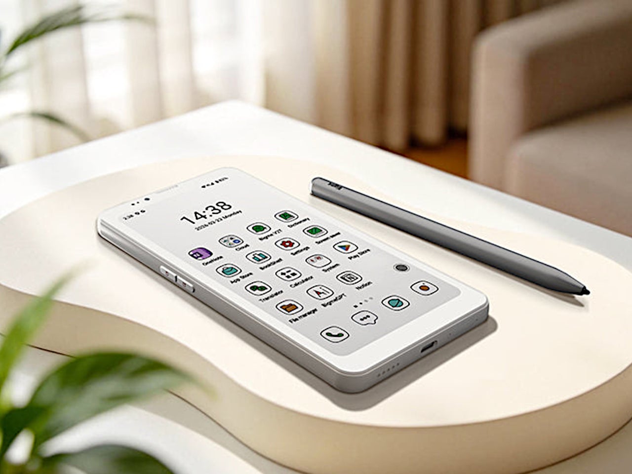
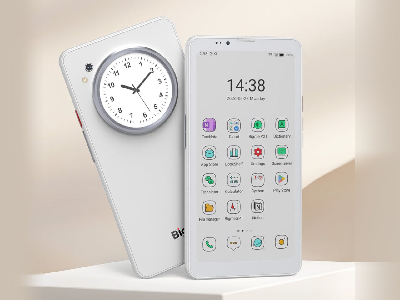
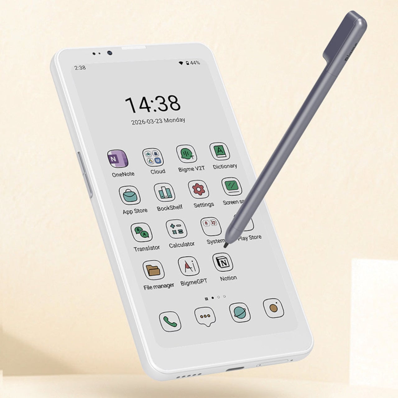
Bigme has been building its HiBreak series into a line of Android smartphones centered on E Ink displays, and the HiBreak Dual is its newest entry. Rather than simply updating the screen, Bigme gave this model two displays: a full-sized E Ink panel on the front and a compact circular LCD on the back, letting the phone handle information at two different levels of urgency.

Designer: Bigme

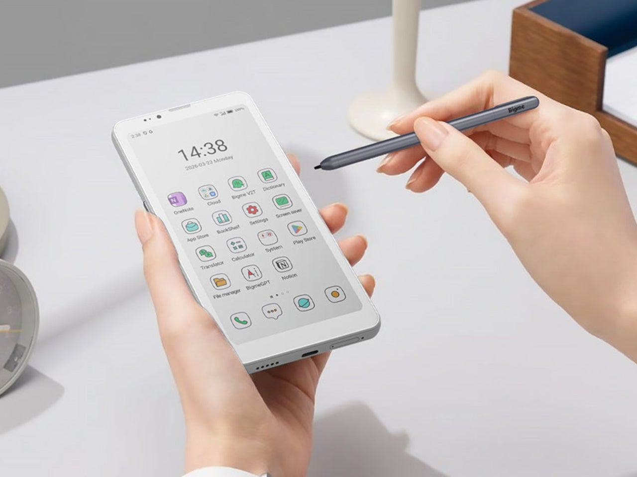
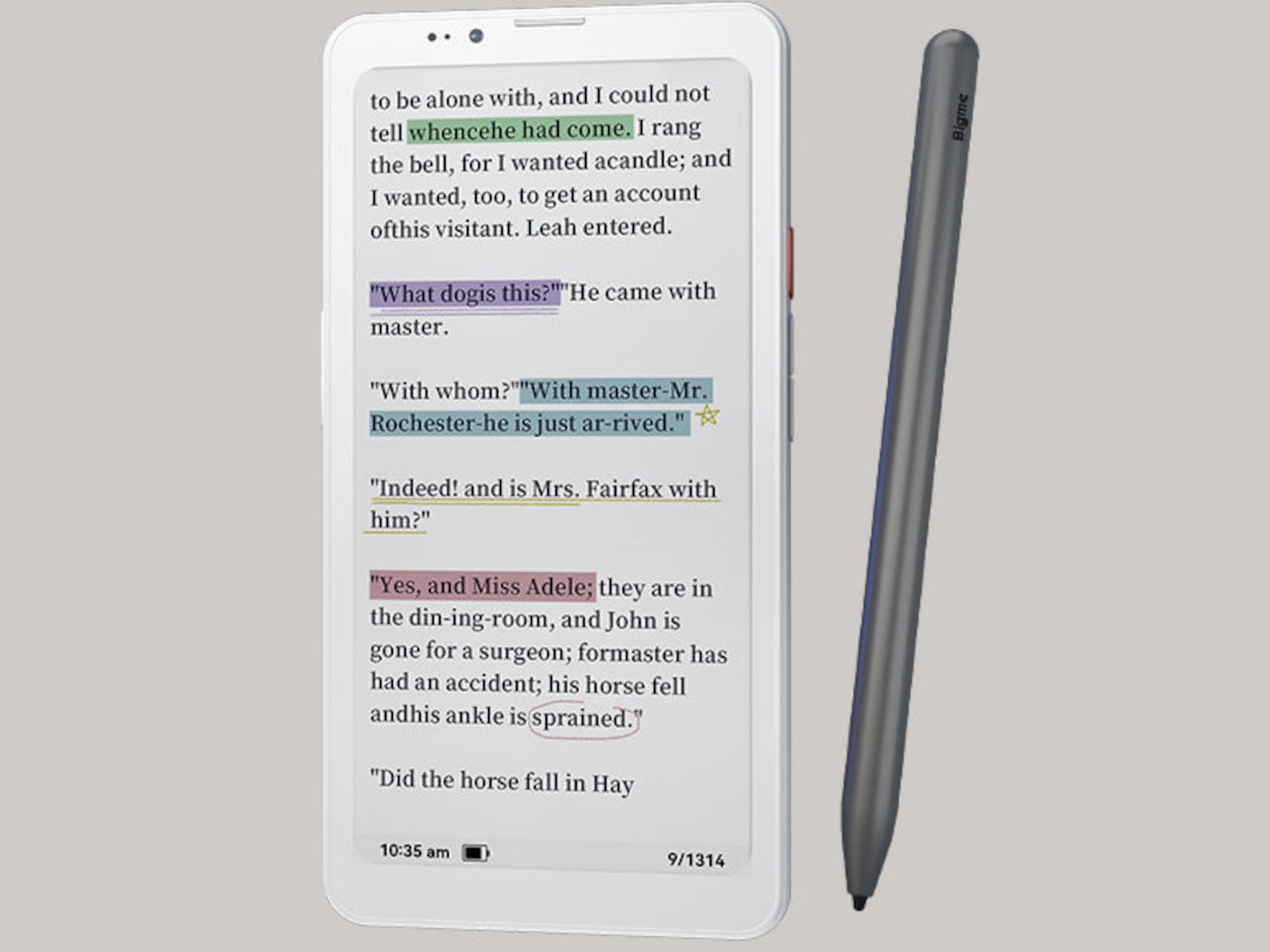
The main display is a 6.13-inch E Ink screen at 824 by 1,648 pixels, delivering 300 pixels per inch in greyscale mode. The color model supports up to 4,096 colors, and a frontlight with 36 brightness levels covers both dim interiors and bright outdoor settings. Because E Ink reflects ambient light rather than emitting it, reading outdoors is comfortable in a way that backlit displays simply aren’t.

What sets the HiBreak Dual apart from the rest of the lineup is its stylus support, a first for the HiBreak series. A 4,096-level pressure-sensitive pen lets you write, sketch, and annotate directly on the E Ink surface, turning the phone into something closer to a digital notebook. The paper-like texture of the display makes the experience feel more tactile and far less clinical than a standard touchscreen.

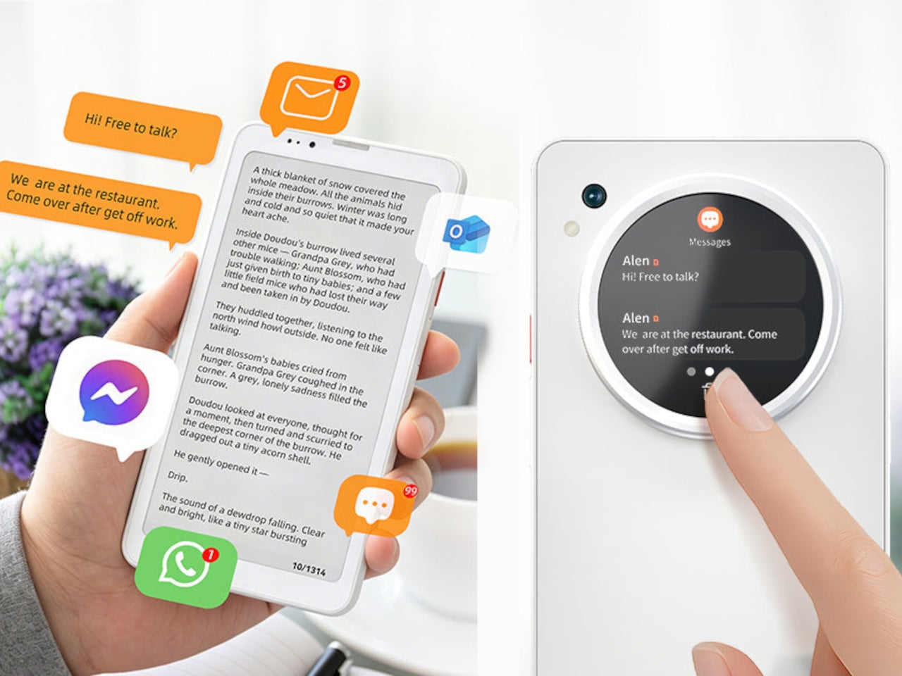
The circular LCD on the back measures 1.85 inches and pulls off a surprisingly wide range of tasks. It shows the time, notifications, music controls, and weather at a glance, and also doubles as a viewfinder for the 20MP main camera. Bigme even added an AI pet feature that generates an animated version of your actual pet from a photo, keeping it alive on that small round screen.

Despite the unconventional display setup, the HiBreak Dual doesn’t skimp on the fundamentals. Although dated, Android 14 with full GMS certification keeps the entire Google Play library accessible, and NFC support means Google Wallet and contactless payments work just as they would on any standard Android device. The 5MP front camera handles video calls and everyday selfies without issue, while a fingerprint sensor takes care of security.

Under the hood, the phone runs on a MediaTek Dimensity 1080 processor paired with either 8GB or 12GB of RAM and up to 256GB of internal storage, further expandable by an additional 2TB via microSD. A 4,500mAh battery gets through a full day without much drama, while 5G on dual SIM cards, Bluetooth 5.2, and dual-band WiFi take care of the rest.

Pricing starts at $519 for the 8GB/128GB model, with early bird options in the $359 to $409 range and a 12GB/256GB version also available. It’s a phone designed for people who spend a significant part of their day reading, writing, and staying on top of things through a mobile device, and who’d genuinely rather do it on a screen that asks a little less of their eyes.

The post Bigme HiBreak Dual Has E Ink Up Front and a Round LCD in Back first appeared on Yanko Design.

The F1 Engineer Who Turned Time Into a Kinetic Sculpture

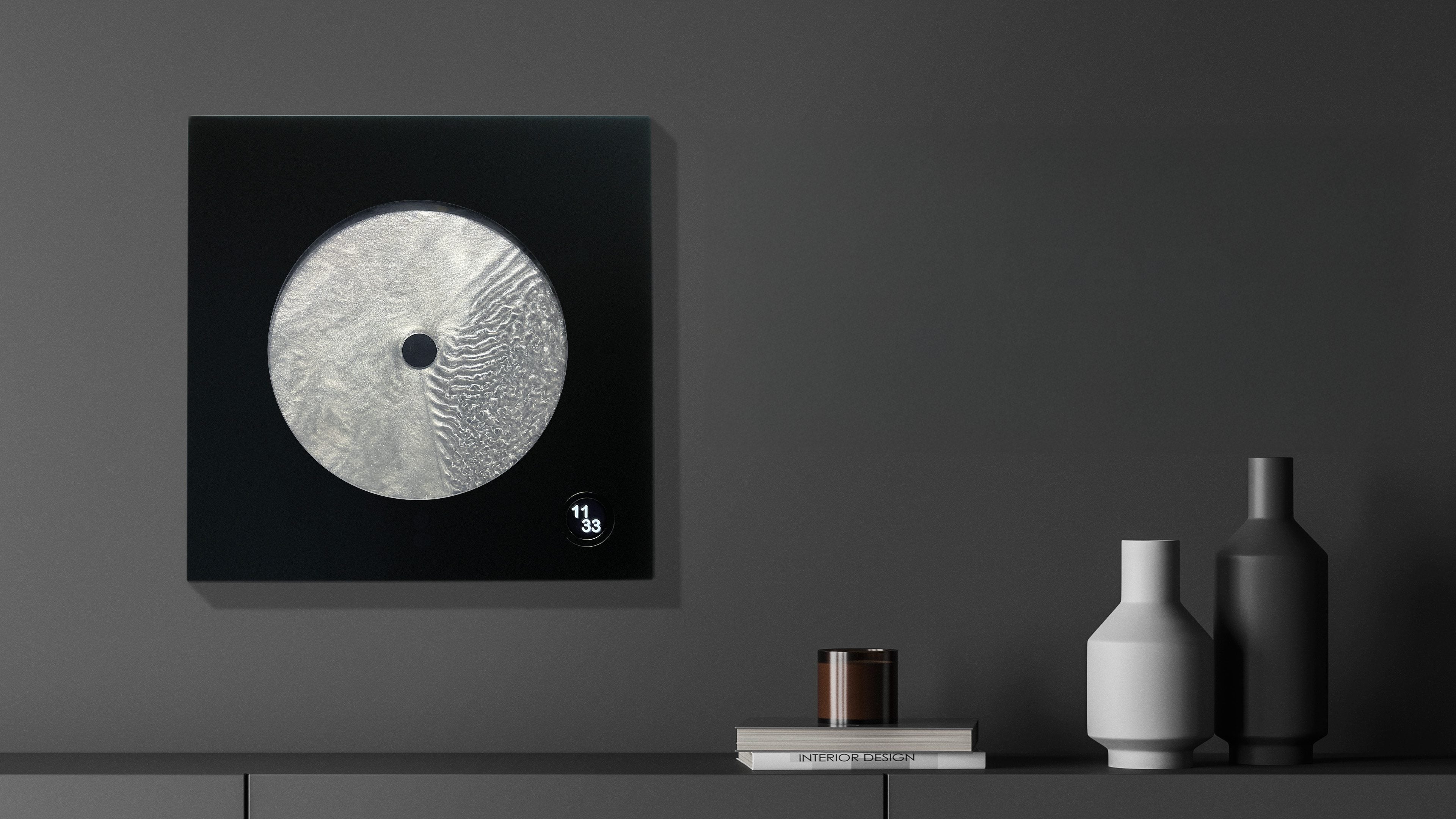
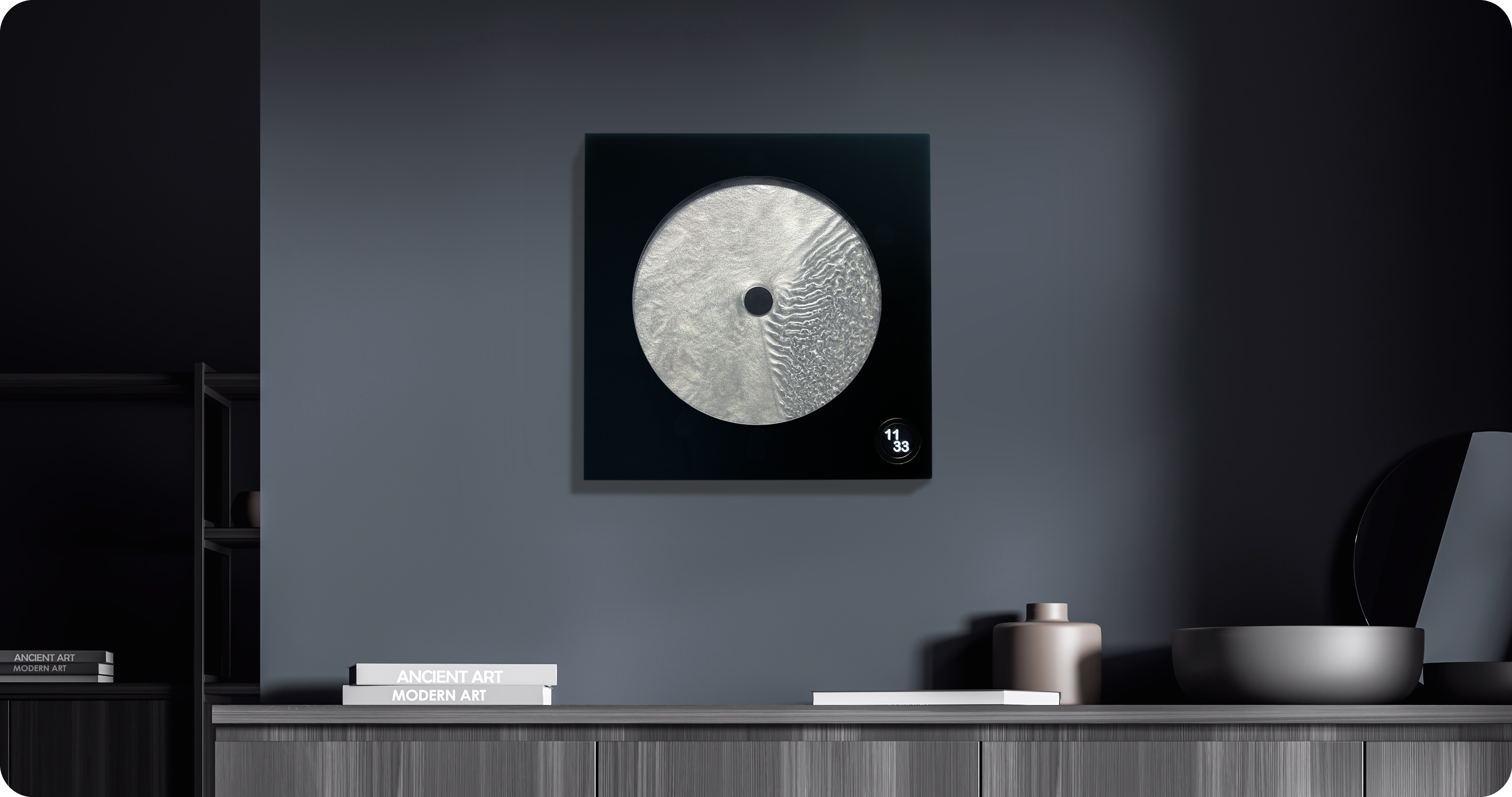
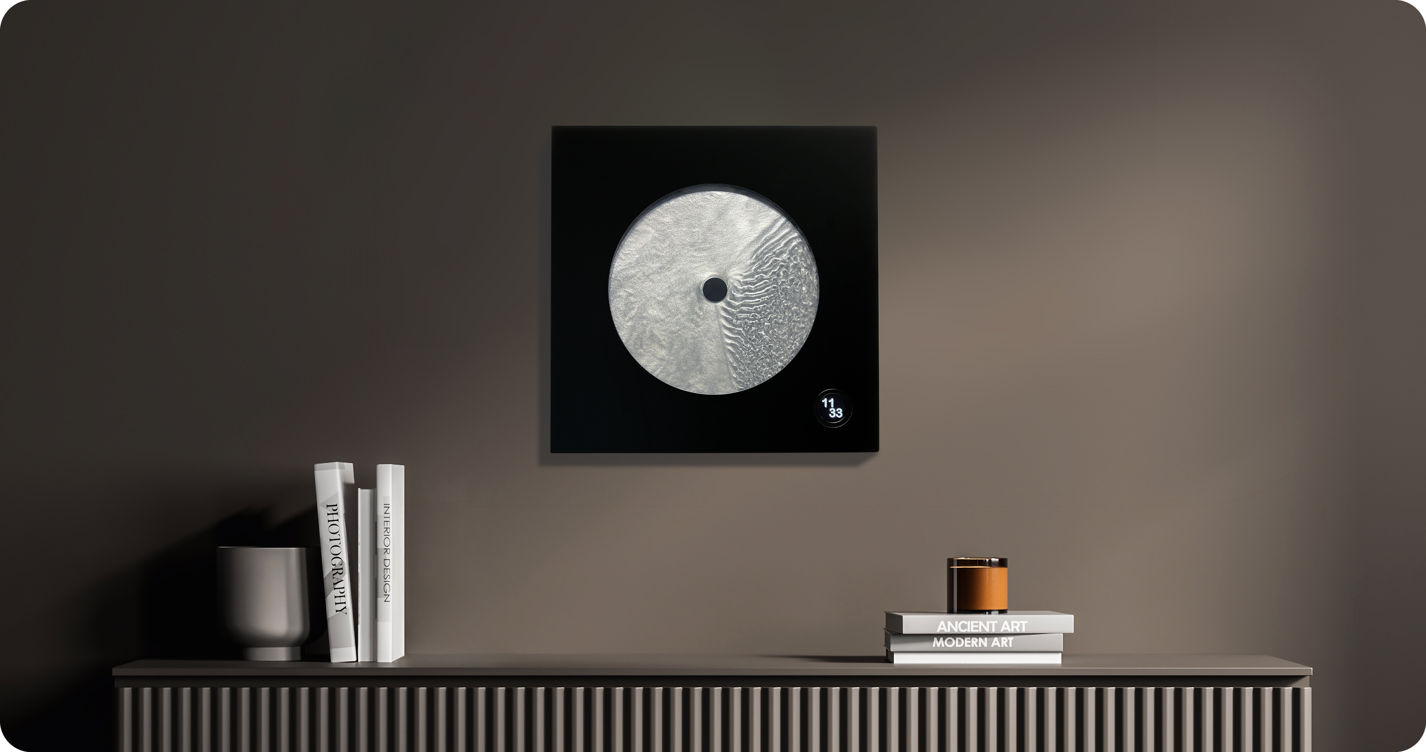
Most clocks are honest about what they are. They count. They tick. They remind you, with mild urgency, that you are late or almost late or about to be. Robert Spillner’s Luna is not a clock that measures time. It stages it. That’s a subtle but loaded distinction, and it’s exactly why this object is worth paying attention to.

Luna is a fluid wall object that translates the principle of the single-hand watch into a kinetic sculpture, making the moment between past and future perceptible. Behind the hand, a trace of turbulent patterns marks the touched past. Ahead of it stretches calm liquid: the untouched future. The present is the thin, moving line between them. It sounds poetic because it is, but it’s also technically precise, which is kind of the whole point.

Designer: Robert Spillner

Spillner trained as an engineer and initially developed components for Formula 1 cars, used by numerous teams, in a culture where speed, optimization, and victory are everything. With Luna, that paradigm is reversed. Instead of lap times, the focus is on mindful observation; instead of chasing the fastest, it is about pausing, about stillness. The pivot reads like a philosophical reversal, not just a career change, and that tension is embedded in the object itself.

At the heart of Luna is a specially developed fluid Spillner calls Zero Flow Technology. Its core consists of distilled water, additives, micro-particles, and a minimal quantity of genuine lunar dust. The exact composition remains deliberately undisclosed, part of the mystery that invites the observer to immerse themselves in the visual experience rather than merely explain it technically. I think that’s the right call. Part of what makes Luna compelling is that it resists easy explanation. You’re not supposed to look at it and think “clever fluid dynamics.” You’re supposed to feel like time has texture.

The lunar dust takes the cosmic concept to its logical conclusion. These are particles billions of years old that once fell from space to Earth, and they are now carriers of time. Each piece comes with a certificate of authenticity documenting the origin of this cosmic additive. That detail is not just a marketing flourish. It changes the nature of the object.

Aesthetically, Luna presents itself as a square wall or stand object, approximately 400 by 400 millimeters, with a black front and a cast acrylic glass pane at its centre that becomes the stage for the fluid time, framed by a solid, matte-black wooden frame. A small LCD touchscreen, 35 millimeters in diameter, merges the cosmic and digital realms. Time and display brightness can be adjusted easily. The screen is discreet enough that it doesn’t compete with the fluid for visual dominance. It supports the piece without stealing from it, and that balance isn’t easy to pull off.

Luna is handcrafted in Germany as a limited edition. The fluid mixture, developed over years in collaboration with a laboratory, requires weeks of fine-tuning for each unique piece. Every Luna carries an engraved serial number and year of manufacture, signed by the artist, and comes with a certificate for the meteorite dust. Only 99 pieces per year are planned, all made on demand. Luna defines itself clearly as an art object with a time function, not as an industrial small series. That self-awareness matters.

The question people tend to ask about objects like this is whether they’re worth it. I’d reframe the question. Luna isn’t competing with your iPhone or your smartwatch. It’s not trying to optimize anything in your day. It’s making an argument about how we relate to time, which is a thing most of us don’t think about until we’re running out of it. The fact that it’s beautiful while doing this isn’t a bonus. It’s the method. Design, when it’s working at its best, changes how you see the thing it’s describing. Luna does that with time. And for an object that started life inside Formula 1 engineering labs, that’s a remarkable distance to travel.

The post The F1 Engineer Who Turned Time Into a Kinetic Sculpture first appeared on Yanko Design.

This $215 Phone Has a 7,000mAh Battery and Lasts 20 Hours on Video

Budget smartphones have always played the same game of compromises. You get 5G connectivity but lose camera quality, or you get a fast screen but sacrifice battery life. As affordable phones adopt faster network speeds, keeping up with 5G’s energy demands has become one of the biggest challenges for manufacturers trying to keep costs down without leaving users hunting for an outlet before noon.

Realme’s answer to that is the C100 5G, a phone that doesn’t shy away from its budget origins but tries to get the fundamentals right. Built around the energy demands of a full-time 5G device, it leads with a 7,000mAh battery, backed by 45W SuperVOOC fast charging, a capable processor, and a 6.8-inch display that refreshes faster than most phones twice its price.

Designer: realme

Imagine the kind of day that drains most smartphones by mid-afternoon. You’re streaming music during your commute, navigating with GPS through unfamiliar streets, and then spending the evening on video calls or catching up on a show. Realme claims the C100 5G can handle nearly 20 hours of continuous video playback and over 18 hours of GPS navigation before needing a recharge.

When you do eventually need to plug in, the 45W fast charging takes care of the battery fairly quickly. There’s also 6.5W reverse wired charging built in, meaning the phone can act as a power bank for other devices when you’re away from an outlet. It also supports bypass charging, which helps reduce battery strain during extended gaming or heavy usage sessions.

Under the hood is MediaTek’s Dimensity 6300, a 6nm chip that handles 5G connectivity and everyday multitasking without much fuss. The display runs at up to 144Hz, which is genuinely rare at this price point, making scrolling and casual gaming feel noticeably smoother. It peaks at 900 nits of brightness and covers 83% of the NTSC color gamut, holding up decently outdoors.

The rear camera centers on a 50MP main sensor with an f/1.8 aperture and autofocus, capable of solid daylight photography, while the 5MP front camera handles selfies and video calls without complaint. The phone comes in two colors, Blooming Purple with a floral-patterned back and Sprouting Green, both with a matte frame and a squared-off silhouette measuring about 8.88mm thick.

Durability is also factored in, with an IP64 rating for dust and water splash resistance and a claim of 360-degree drop protection with military-grade certification. Running Realme UI 7.0 based on Android 16, the phone also supports external memory cards for additional storage. In Thailand, pricing starts at THB 6,999 (around $215) for 4GB/128GB and THB 7,499 (around $230) for 6GB/128GB.

For a budget phone, the C100 5G makes an interesting case by not competing on camera specs or premium materials, but on the one thing most users are tired of compromising on. Not everyone needs the sharpest sensor or the fastest chipset, but nearly everyone has panicked at a single-digit battery percentage at some point, and Realme clearly knows exactly who it’s building this for.

The post This $215 Phone Has a 7,000mAh Battery and Lasts 20 Hours on Video first appeared on Yanko Design.

A Tiny Pinwheel Is Doing What AI Giants Won’t

Every time you type a prompt into ChatGPT, something happens somewhere far away. Servers spin up. Electricity moves. Carbon gets generated. The whole transaction is so clean and invisible on your end that it might as well not be happening. That’s by design, and it’s worth thinking about. Although with the way we use technology these days, we seldom think about the consequences on our environment.

London-based creative studio Oio wants to change that, starting with a small 3D-printed box and a bright yellow pinwheel. Their project, the Hot Air Factory, is a domestic AI device that processes your questions and requests locally, without connecting to the cloud, and every time it thinks, it physically exhales. Hot air pushes out of the top of the device and spins that cheerful little pinwheel. The harder it thinks, the faster it spins. You’re watching computation happen in real time, which turns out to be a surprisingly powerful thing.

Designer: Oio

The concept is simple: make the invisible visible. We know AI uses energy. We’ve read the headlines. But knowing abstractly that data centers are energy-hungry is different from watching a pinwheel turn every time you ask your AI assistant to summarize something. One is a statistic. The other is a moment of honest accountability.

What makes the Hot Air Factory smart, beyond its obvious design appeal, is how it translates cost into human-readable terms. It doesn’t give you kilowatt-hours because most people have no idea what that means. Instead, it tells you something like “that prompt cost the equivalent of brewing a cup of tea” or “watching Netflix for five minutes.” Suddenly the math becomes personal. Suddenly you start wondering whether you really needed a 500-word AI response to a question you could have Googled.

Oio co-founder Matteo Loglio describes it as “a small, domestic AI that reveals the hidden energy cost behind every prompt.” The factory also lets you dial up or down the level of intelligence it uses. Want a quick answer? Use a lighter model, spend less energy. Need something more complex? Crank it up, and watch that pinwheel work for it. You can even schedule your heavier prompts for the night shift, when energy is cleaner and the grid is quieter. These are design decisions that carry real ethical weight, and they’re baked in with zero condescension.

The playfulness and the seriousness aren’t in conflict here. They’re exactly the point. The Hot Air Factory is built in a Frutiger Aero visual language, all soft curves and clean optimism, the kind of aesthetic that makes you want to put it on a shelf next to your plants. But underneath that approachable exterior is a genuinely complicated machine running open-source large language models on a local GPU. It looks like something a friendly robot would carry. It functions like a small act of protest.

AI companies have very little incentive to make their energy costs legible to users. Invisibility is convenient. It keeps things frictionless. It keeps you prompting without thinking about the bill. A report from the US Department of Energy projected that by 2028, data centers could account for 12% of total electricity consumed in the US. That’s not a small number, and it keeps growing every time we treat AI like it runs on good intentions and cloud magic.

The Hot Air Factory isn’t saying AI is bad. It isn’t demanding you stop using it. What it’s doing is quieter and more persuasive than that. It’s asking you to look. To see. To feel, just a little, what your digital habits cost in the physical world. That’s the argument made not through a lecture or a campaign, but through a yellow pinwheel spinning in your living room.

Design can do that. Sometimes a small, well-made object says more than a policy paper ever could. The Hot Air Factory is currently looking for collaborators to help bring it to a wider audience, still working its way from experiment to something anyone can own. If the goal is conscious computing, the first step might just be this: a tiny box, a spinning fan, and the quiet discomfort of watching a machine breathe.

The post A Tiny Pinwheel Is Doing What AI Giants Won’t first appeared on Yanko Design.

This $299 Android Phone Says Glowing Screens Are Already Obsolete

For most people, the smartphone screen is where focus goes to die. Even when you pick one up with a purpose, the bright OLED glare, the notifications, and the endless scroll have a way of pulling you elsewhere. Screen fatigue is real, blue light is a genuine concern, and the push for digital wellness has grown loud enough that even tech companies have started quietly acknowledging it.

The Bigme HiBreak Plus takes a different approach to the smartphone entirely. Built around a 6.13-inch E Ink Kaleido 3 color display, it runs on Android 14 with full Google Play support and connects via dual 4G SIM, making it a genuinely functional phone. But unlike everything else in your pocket, it defaults to a mode that’s easier on the eyes and harder to mindlessly abuse.

Designer: Bigme

E Ink displays on smartphones have always had one obvious weakness: the refresh rate. Previous devices refreshed so slowly that casual scrolling felt like a real chore. The HiBreak Plus addresses that with a remarkably high 52 FPS refresh rate for an E Ink display, making it responsive enough for reading, annotating, and light browsing without the ghost-image flicker that dogged earlier E Ink phones.

The display’s advantages don’t stop at being easy to look at. E Ink panels are naturally readable under direct sunlight without any brightness cranked up, which means you can check maps, take notes outdoors, or read in the afternoon light without squinting. There’s no backlight shining toward your face either, just a soft, paper-like surface that reflects the ambient light around it.

A front light with 36 brightness levels handles the dimmer end of things. It reads the surrounding environment and automatically calibrates brightness and color temperature, going from a cool, crisp tone for morning work to a warm amber glow at night. There’s no digging through menus or manually adjusting sliders; the phone handles it quietly in the background, adapting to wherever you happen to be.

Handwriting support, via an optional stylus, adds another layer to what the phone can do. Writing directly on the E Ink surface feels closer to putting pen to paper than tapping on glass. It makes the HiBreak Plus a natural fit for jotting down thoughts during a commute, capturing ideas in a meeting, or working through a long reading session with annotations in the margins.

The rest of the specs are functional rather than flashy: an octa-core processor, 4GB of RAM, 64GB of storage, GPS, a fingerprint sensor in the power button, and a 4500 mAh battery that should comfortably outlast most conventional smartphones thanks to the energy-efficient E Ink display. The whole package weighs just 193g, light enough to slip into a shirt pocket without a second thought.

Of course, there are some downsides as well, ones that go beyond the screen refresh rate and color vibrancy. Although not exactly outdated, 4G LTE caps data speed significantly, and the rather modest RAM and storage capacity don’t do it any favors either. That said, at a $299 price point ($249 on pre-order), you are getting a pocket-sized color e-reader that can also make calls and connect to the Internet, without the usual distracting trappings of a smartphone.

The post This $299 Android Phone Says Glowing Screens Are Already Obsolete first appeared on Yanko Design.

Samsung’s Galaxy A Phones Now Get IP68 and 6-Year Updates From $449

Mid-range smartphones have been getting very good, very quickly. Most now check the boxes for performance, camera quality, and even design, but the compromises tend to show up later. Software support runs out too soon, water resistance gets downgraded to save costs, or the storage fills up faster than expected. It’s a category where the spec sheet looks promising right up until the parts that actually matter start falling short.

Samsung’s Galaxy A57 5G and Galaxy A37 5G tackle those exact issues. Rather than simply refreshing the hardware, these two phones address the pain points that tend to sour long-term ownership, from shorter software cycles to inadequate protection from the elements. Samsung describes both as the most capable Galaxy A devices yet, and for once, that kind of claim holds up when you look at what’s actually new.

Designer: Samsung

The Galaxy A57 5G leads with a noticeably slimmer build, now at just 6.9mm and 179 grams. A 13% larger vapor chamber helps keep the new Exynos 1680 processor running cool through long gaming sessions or extended recordings. The display also gets slimmer bezels and a bright Super AMOLED+ panel with Vision Booster, so the screen stays readable whether you’re inside at your desk or standing in direct sunlight.

Storage is where the A57 5G makes history for the Galaxy A line. It’s the first A-series phone to offer a 512 GB option, a welcome change for anyone managing a large photo library or shooting high-resolution video regularly. The triple-camera setup, led by a 50 MP main sensor with a 12 MP ultrawide and a 5 MP macro, handles everything from wide-angle landscapes to fine close-up detail.

The Galaxy A37 5G takes a different route to earn its upgrade. Its primary camera now uses a larger 50 MP sensor with support for 10-bit HDR video recording, improving low-light performance and color depth over its predecessor. More significantly, the durability rating jumped from IP67 to IP68, and it now ships with Gorilla Glass Victus+ on both the front and back, which is a notable step up at this price.

Both phones run One UI 8.5 with a broader set of Awesome Intelligence (get it? “AI”?) features. The camera uses AI-based subject and scene recognition to balance skin tones and create cleaner background separation automatically. Circle to Search has also been updated with multi-object recognition, so you can search an outfit, its accessories, and the surrounding backdrop all at once, rather than hunting for each element separately or toggling between searches.

What gives both phones long-term value is Samsung’s commitment to six generations of Android OS updates and six years of security support. Add to that 5,000 mAh batteries and IP68-rated protection across both models, and these are phones clearly meant to outlast the typical mid-range upgrade cycle. The Galaxy A57 5G starts at $549.99 and the Galaxy A37 5G at $449.99 in the US, with availability beginning April 9, 2026.

The post Samsung’s Galaxy A Phones Now Get IP68 and 6-Year Updates From $449 first appeared on Yanko Design.

Galaxy Z Fold 8 Renders: Same Look, Bigger Battery, and S Pen Is Back

Foldable phones have reached a point where the form factor itself is no longer the talking point it once was. The big, dramatic “look how it folds” moment has settled into a quieter rhythm of iterative refinement, with each generation tweaking dimensions and chasing thinner profiles. Most buyers know what a modern book-style foldable looks like, and the language of change has shifted from shape to substance.

That’s the situation shaping the Samsung Galaxy Z Fold 8 conversation right now. Leaked CAD-based renders show a design that’s nearly indistinguishable from the Z Fold 7 pictured above: same flat sides, same sharp corners, same camera layout. The cover screen sits at 6.5 inches and the inner display at 8 inches, both unchanged. If you handed someone these renders without context, they’d probably just guess it was another angle of last year’s model.

Designer: Steve Hemmerstoffer/OnLeaks (Renders) via AndroidHeadlines

There’s one notable external difference, though, and it actually goes in the wrong direction. The leaked dimensions put the Z Fold 8 at 4.5mm thick when open and 9mm folded, compared to the Fold 7’s 4.2mm and 8.9mm. That’s a slight regression for a phone that went to considerable lengths to slim down the year prior. It’s not dramatic, but for a device that made a point of its thinness, it’s worth flagging. That said, the 4.5mm figure includes the protruding bezels around the display; it’s actually just 3.9mm thin.

The likely reason for that extra thickness is one of the better leaks so far: the possible return of S Pen support. Samsung dropped the stylus from the Fold 7, and that’s been a consistent complaint from the people who actually used it for note-taking or sketching on that wide inner canvas. If the S Pen does come back, a fraction of a millimeter is a fair trade for most of those users.

The battery theory, however, is probably more probable. A jump from 4,400 mAh to a rumored 5,000 mAh would mark the first capacity upgrade since the Galaxy Z Fold 3, and pairing that with 45W wired charging, up from 25W, addresses one of the more persistent frustrations with this lineup. Spending less time near an outlet matters more on a device you’re likely using across more tasks throughout the day.

The camera is also in line for a significant upgrade, according to the same leak. The main sensor is rumored to still be 200MP, and the ultrawide jumps from 12MP to 50MP. That ultrawide improvement in particular has been a long time coming. The gap between the Fold’s main and ultrawide cameras has been noticeable enough that it’s affected how people use the phone outdoors.

All of this is still leak territory, of course, pulled from CAD renders and a specs tipster ahead of what’s expected to be a July 2026 Unpacked announcement. Samsung hasn’t confirmed any of it, and final specs frequently shift between early renders and launch day. The Z Fold 8 is shaping up to be a phone that looks familiar and updates what actually needs updating, but none of that is official yet.

Galaxy Z Fold7

The post Galaxy Z Fold 8 Renders: Same Look, Bigger Battery, and S Pen Is Back first appeared on Yanko Design.

❌