❌

Vue lecture

This Oregon Library Brings the Feeling of Walking Through a Forest Indoors
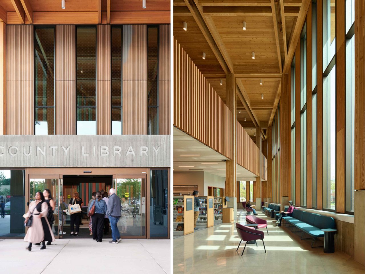
What if walking into a library felt a little like stepping into a forest? In Gresham, Oregon, that idea has taken shape through towering wooden columns, sunlit interiors, and spaces that gradually shift from lively gathering spots to quiet reading corners. Completed in 2026, East County Library brings the natural character of the Pacific Northwest into a public building, creating an environment where architecture, learning, and community life come together.

The 95,000-square-foot library draws inspiration from the experience of walking among tall trees. The connection begins outside, where slender wooden columns extend beyond the building’s exterior walls and support an expansive roof. Narrow vertical windows echo their rhythm, giving the facade a sense of depth and repetition. A sheltered entrance extends the public space toward the street, inviting visitors to experience the architecture before stepping inside.

Designer: Holst Architecture and Adjaye Associates
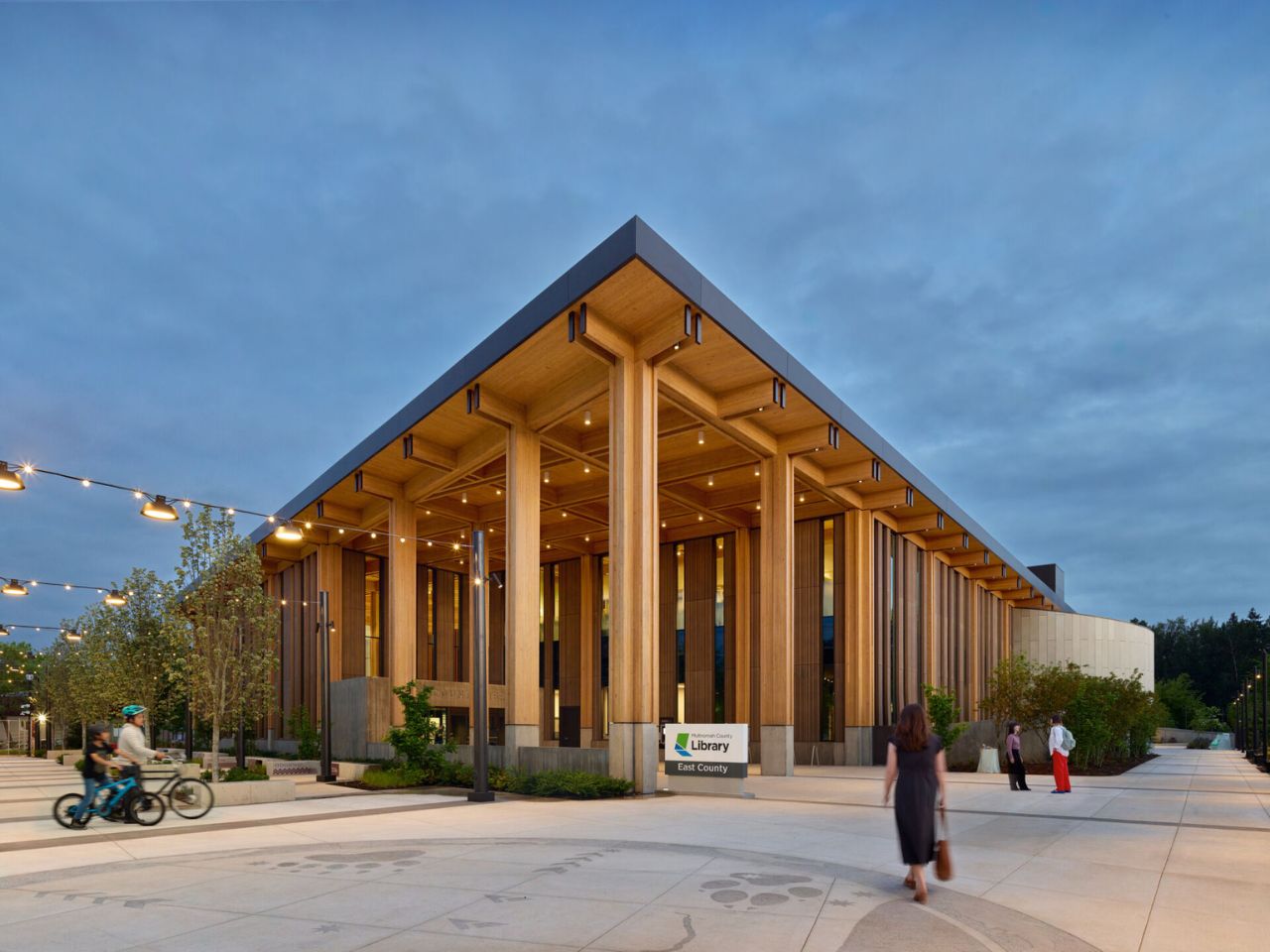
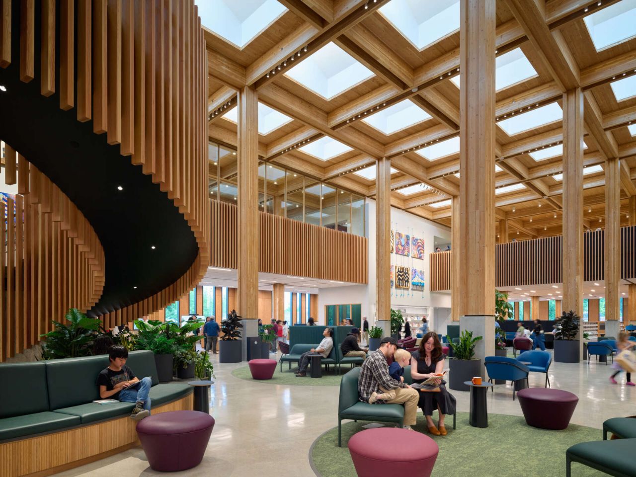
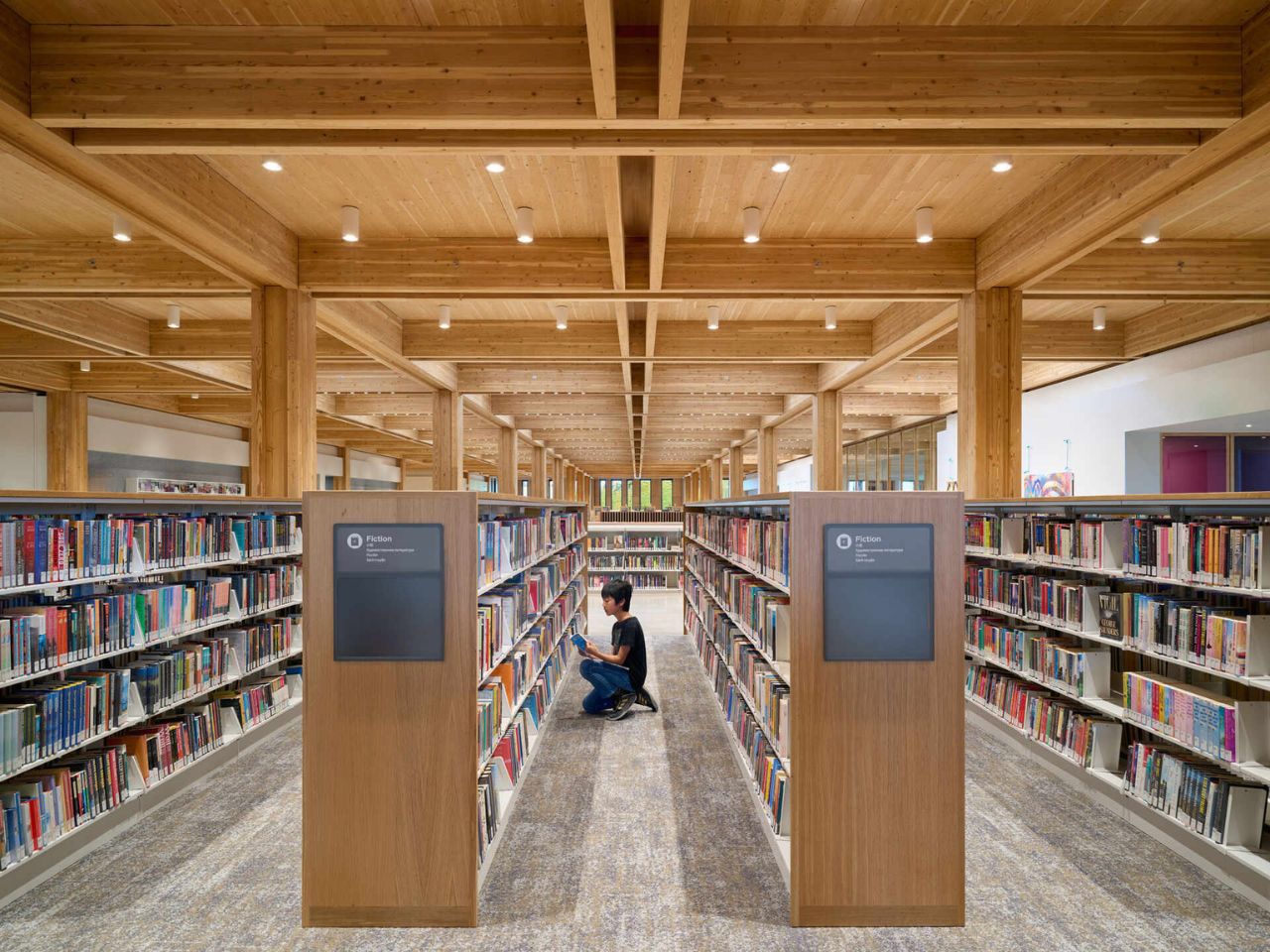
The forest influence becomes even more apparent indoors. Tall timber columns rise through expansive, double-height spaces, while exposed wooden beams form a geometric canopy overhead. Skylights introduce natural daylight, creating a changing interplay of light and shadow throughout the day. The building incorporates approximately 1,200 engineered wood beams and columns alongside nearly 300 cross-laminated timber panels. Much of this structure remains exposed, allowing the materials and construction to shape the atmosphere of the space. The result is an interior that feels warm, open, and closely connected to the landscape that inspired it.

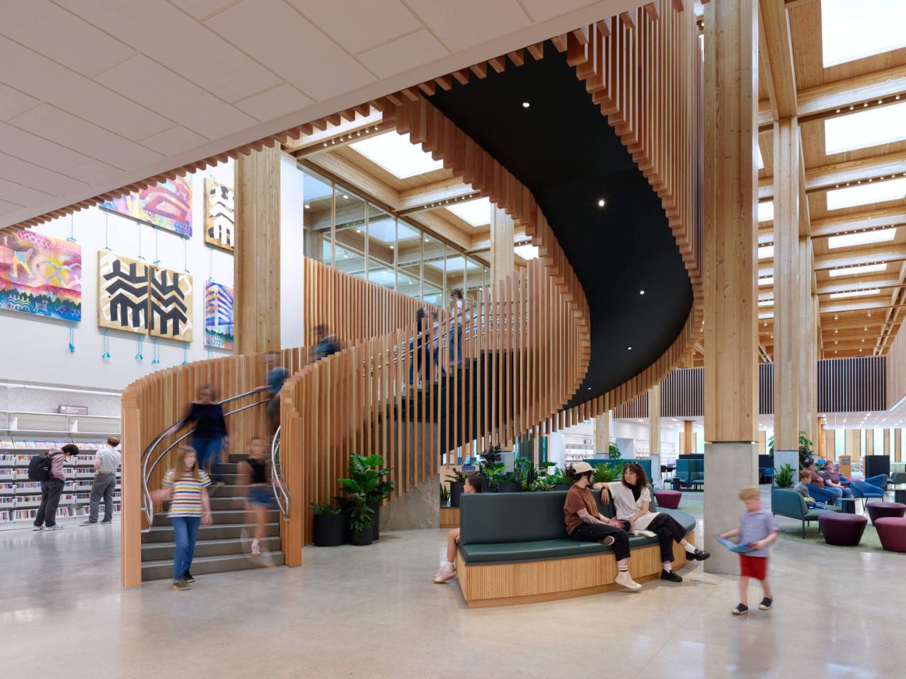
At the center of the library, a sweeping curved staircase introduces movement into the otherwise orderly arrangement of columns and beams. Closely spaced wooden slats wrap around its form, creating a sculptural feature visible from multiple viewpoints. From the upper level, the staircase reveals a landscaped seating area below, with greenery and curved benches tucked into its footprint. Its flowing shape provides a welcome contrast to the straight lines of the surrounding timber structure.
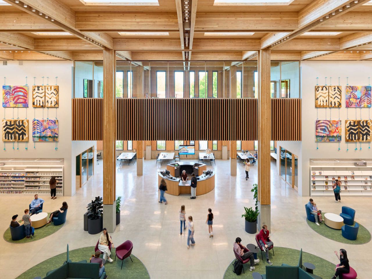
Around this central feature, the library opens into what feels like a communal living room. Sofas, lounge chairs, and smaller seating arrangements create informal places to meet, read, or simply spend time. The generous ceiling height keeps the space feeling open, while the furniture introduces a more intimate, comfortable scale. It is an inviting setting that encourages visitors to stay beyond the time needed to find a book.

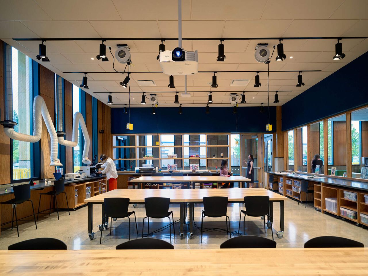
As visitors move farther into the building, the atmosphere begins to change. The western section accommodates the most energetic activities, with children’s play areas, a dedicated teen room, creative learning spaces, and an auditorium. Moving toward the center, visitors encounter book collections, community rooms, sensory rooms, and an audiovisual studio. The eastern end offers a quieter setting for reading, studying, and individual work. This gradual transition allows different activities to coexist comfortably, giving each part of the library its own character while maintaining a consistent architectural language.
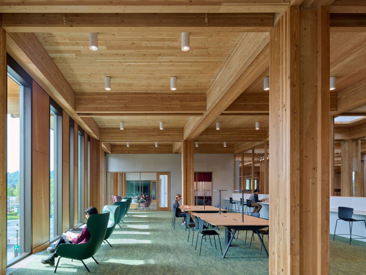
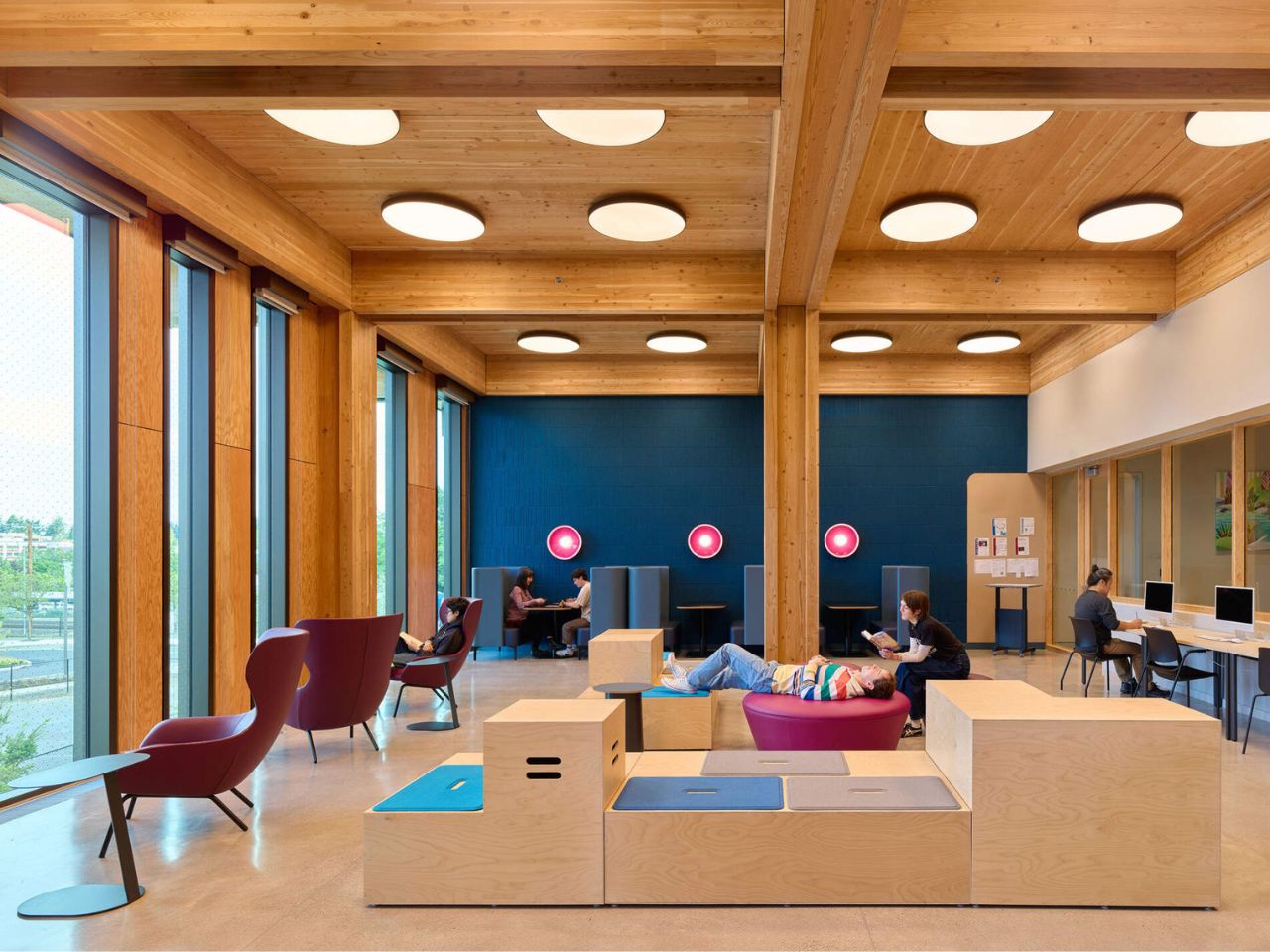
In the quieter sections, tall windows illuminate reading chairs, shared tables, and individual workspaces. Timber columns and exposed beams remain a familiar presence, but the furniture arrangement becomes more focused on concentration and personal space. The design recognizes that people use libraries differently throughout the day. Someone might arrive for a community event, settle into a comfortable chair with a novel, or spend several hours working independently.

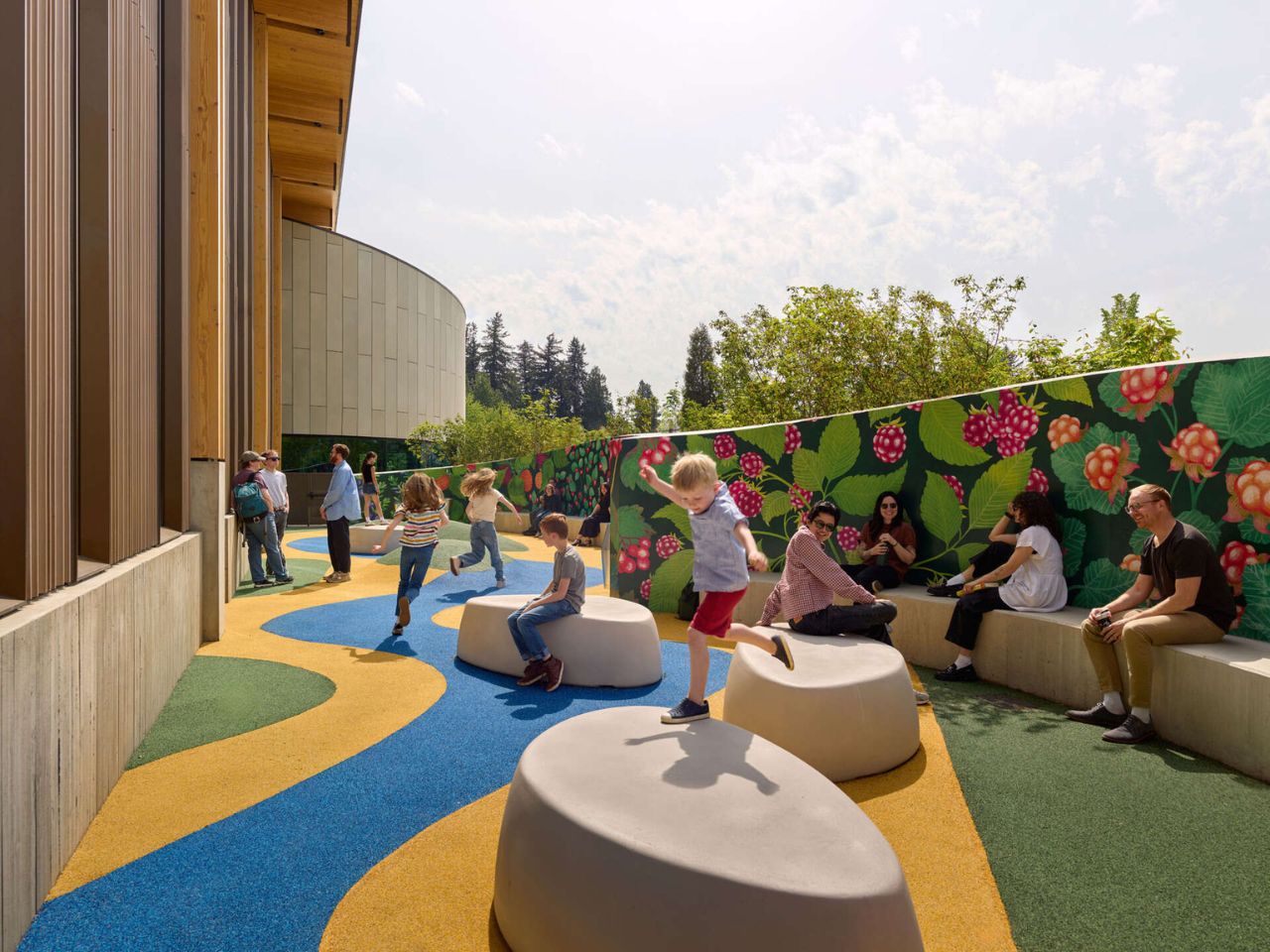
These varied experiences were shaped by the people who would eventually use the library. Conversations with local residents influenced several important decisions, including children’s spaces connected to outdoor play, an auditorium for performances and lectures, and a teen room designed around studying, technology, and social interaction. The community even participated in choosing the interior color palette, with more than 550 people voting for a scheme called Cool Coastal.
The library’s creative facilities further expand its role in everyday community life. A Creative Learning Room offers access to equipment such as 3D printers and laser engravers, supporting practical experimentation and creative projects. An audiovisual studio provides tools for producing music, podcasts, and videos, while the auditorium accommodates larger gatherings, presentations, and performances. Together, these spaces make the building a destination for learning through making, sharing, and participating.

That sense of accessibility extends beyond the building itself. East County Library occupies a former underused park-and-ride site near a light rail station and several bus routes. A landscaped pedestrian pathway connects the public plaza to nearby transit, making the library part of the neighborhood’s daily movement. Outdoor gathering spaces and a rooftop terrace offer additional opportunities to meet, relax, or spend time outside.

The post This Oregon Library Brings the Feeling of Walking Through a Forest Indoors first appeared on Yanko Design.
  •  

This Spanish Home Uses Curved Roofs and Cork Walls to Stay Naturally Cool

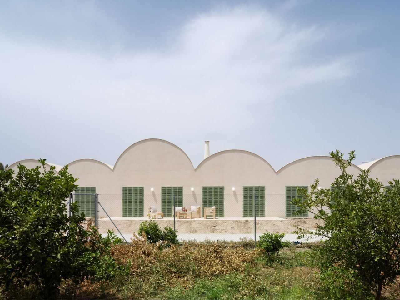
Some houses make their presence known through bold shapes, while others seem to grow naturally from the landscape.  Casa Vereda, designed by L’Aura Ortín Architecture For Happiness, finds a balance between the two. Set in the Spanish countryside, the residence draws inspiration from regional construction traditions, agricultural heritage, and Mediterranean living. Its curved roofs, earthy materials, and distinctive green shutters give the home a contemporary identity that feels rooted in its surroundings.

The architecture is defined by a succession of curved rooflines that ripple across the long, low structure. Constructed using traditional Catalan vaulting techniques and handcrafted bricks, these sculptural forms reference a building method deeply embedded in Spanish architectural history. The exterior is finished in pale sprayed cork, creating a continuous texture across the walls and roof while helping regulate temperature and moisture.

Designer: L’Aura Ortín Architecture For Happiness

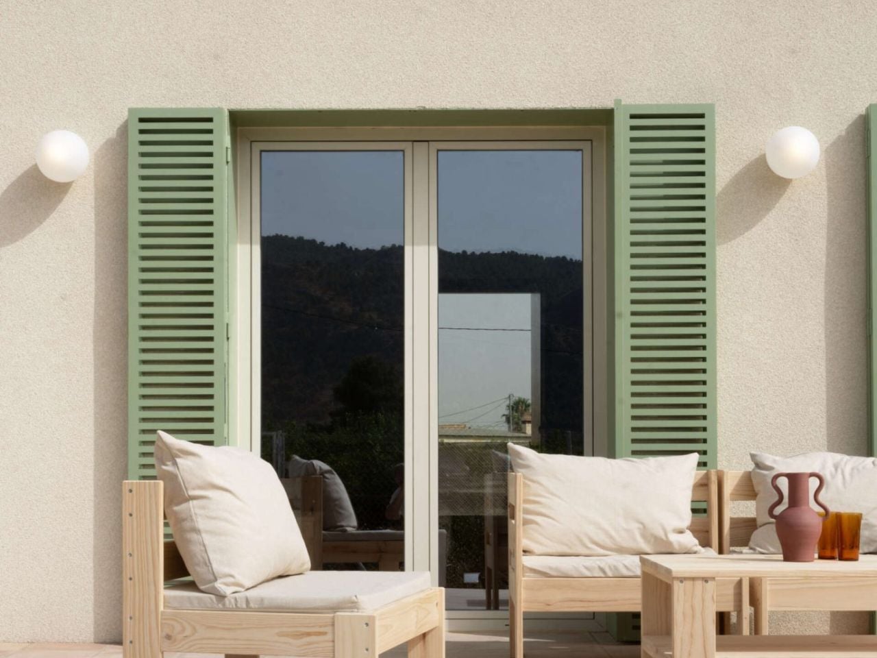
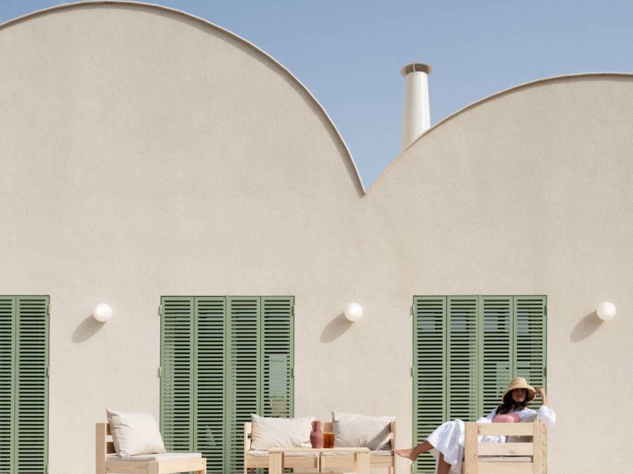
A row of tall, leaf green shutters adds a vibrant contrast to the neutral facade. Inspired by traditional Mallorcan designs, the shutters were custom-designed by the architects and made from powder-coated aluminum to provide shade, privacy, and security. Surrounded by vegetation, the house takes on an almost agricultural appearance, recalling the farm buildings and cultivated terraces that characterize the region.

Alongside the residence, a spacious patio paved with handcrafted terracotta tiles creates an inviting outdoor gathering space. The earthy flooring references the area’s agricultural heritage, while large glass doors connect the terrace directly to the interiors. Adjustable shutters help control sunlight throughout the day, making the transition between indoors and outdoors comfortable even during warmer months.

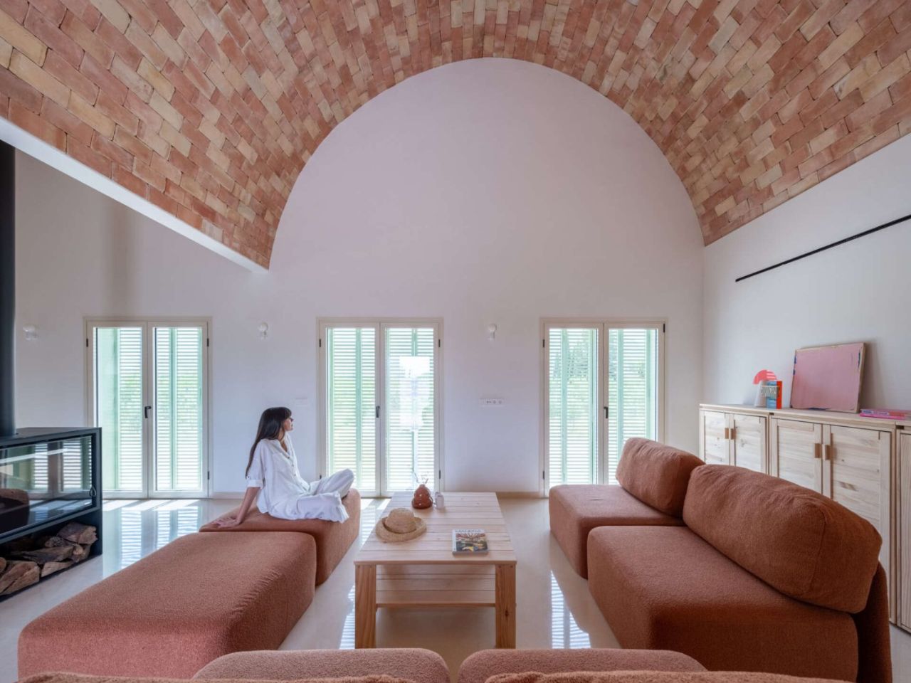
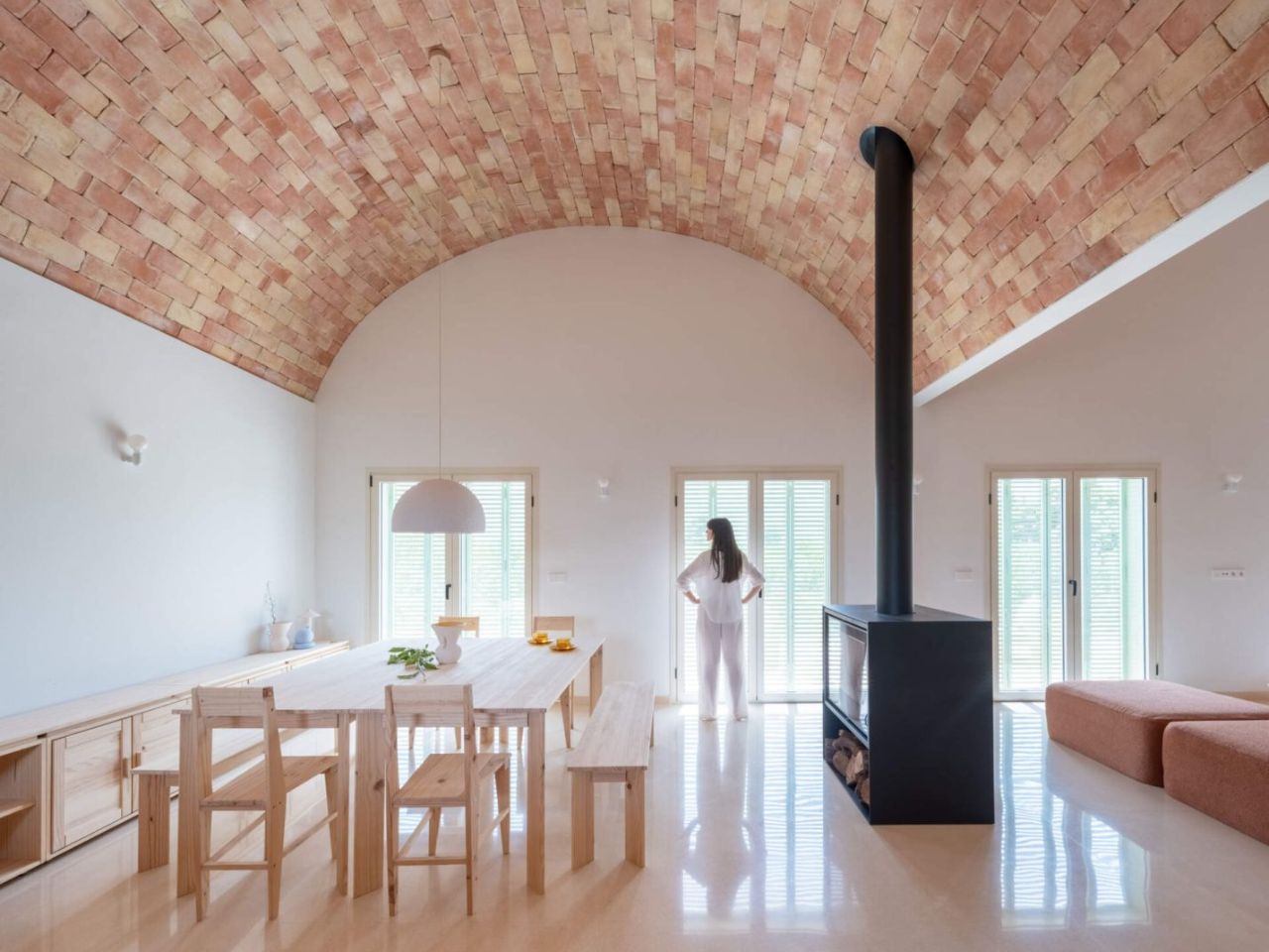
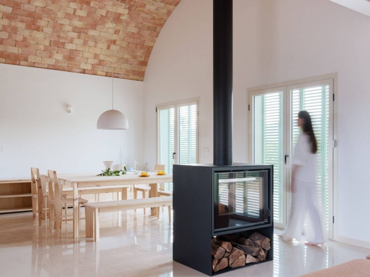
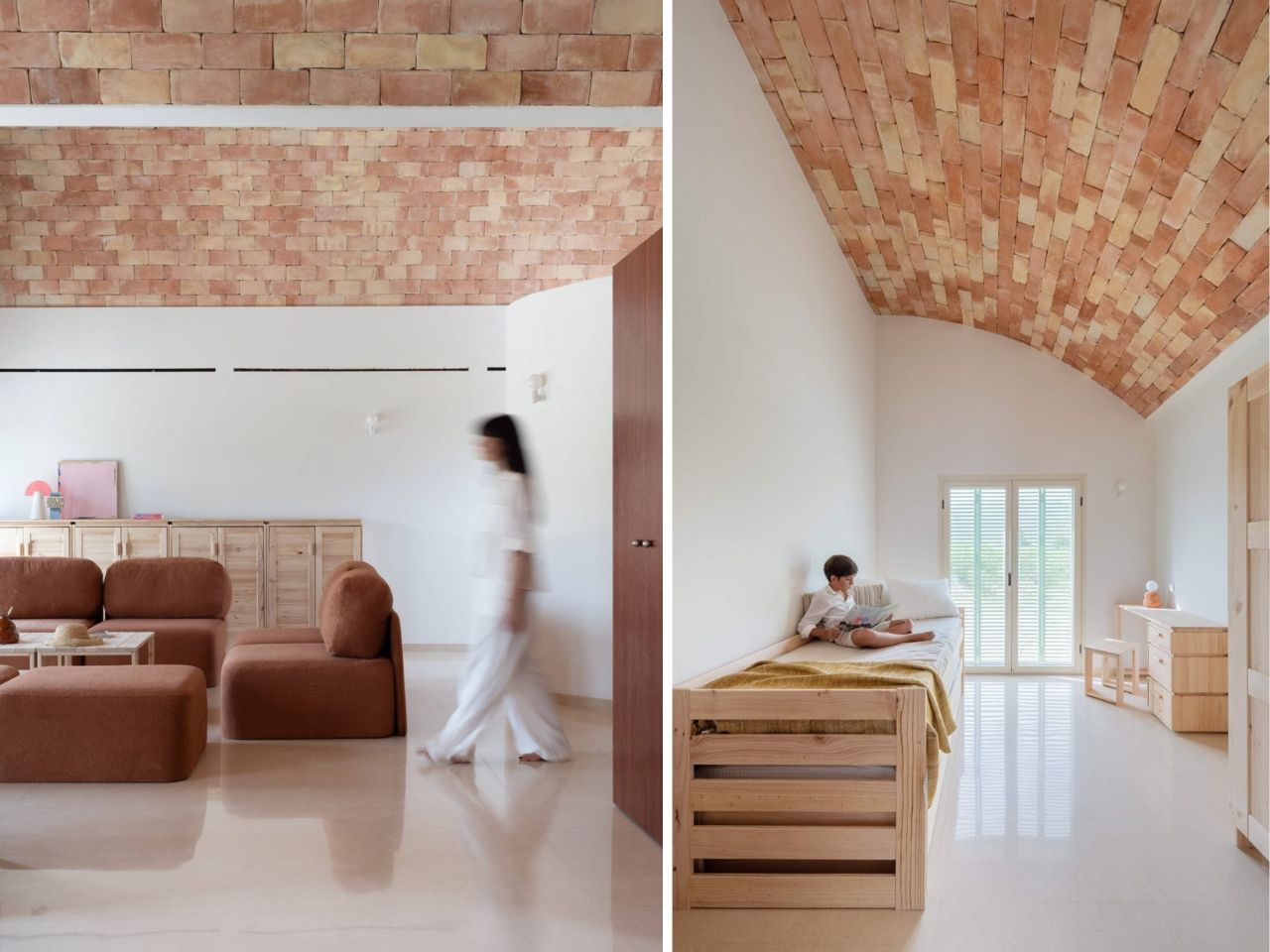
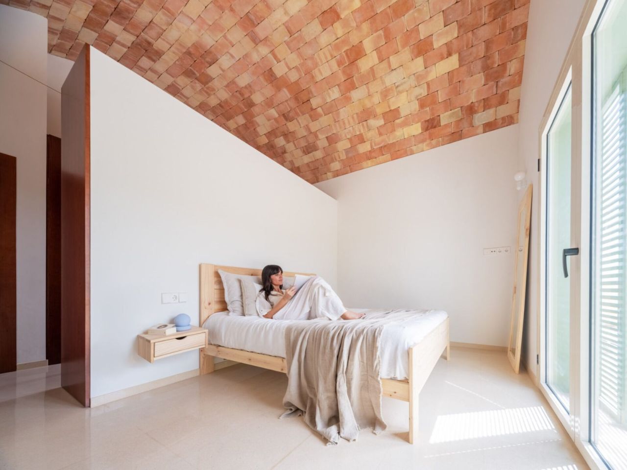
Inside, the living room unfolds beneath a dramatic Catalan vaulted ceiling made from handcrafted bricks in varying shades of terracotta, pink, and sandy beige. The exposed brick brings warmth and texture to the spacious interior, contrasting with smooth white walls and polished terrazzo flooring. Beyond its appearance, the terrazzo contributes to passive temperature regulation by absorbing warmth from the winter sun and staying cool during summer when the shutters are closed.

Modular sofas and ottomans upholstered in rust colored fabric form a comfortable seating arrangement around a simple pine coffee table. A freestanding black fireplace separates the lounge from the dining area without interrupting the open layout. Tall glass doors flood the space with daylight, while cherry-toned timber doors and pale wooden cabinets complete the warm material palette.

The adjoining dining area features a long, pale timber table paired with matching chairs and benches. A simple white dome pendant hangs overhead, while a low wooden sideboard provides storage along the wall. The exposed brick ceiling stretches across the space, adding character to an otherwise minimal setting.

Beside the dining room, the kitchen introduces richer tones through pine cabinetry lacquered in a cherry finish. The reddish wood contrasts with light colored countertops, while a long island provides additional workspace and casual seating with timber stools. Integrated appliances and streamlined cabinetry maintain a clean appearance, allowing the natural materials and vaulted ceiling to remain the focal points.

The bedrooms continue the home’s restrained aesthetic, with exposed brick vaults, white walls, pale terrazzo floors, and natural timber furniture. Unlike the communal areas, these rooms have lower ceilings that create a more intimate atmosphere while making them easier to heat and cool. In the main bedroom, a simple wooden bed is accompanied by a floating bedside table, neutral bedding, and a full-length mirror. The second bedroom features a single timber bed, a compact desk, and a matching wardrobe, with a mustard colored throw adding a subtle pop of color. Glass doors fitted with slatted shutters provide natural light and ventilation while allowing occupants to adjust privacy and shade.

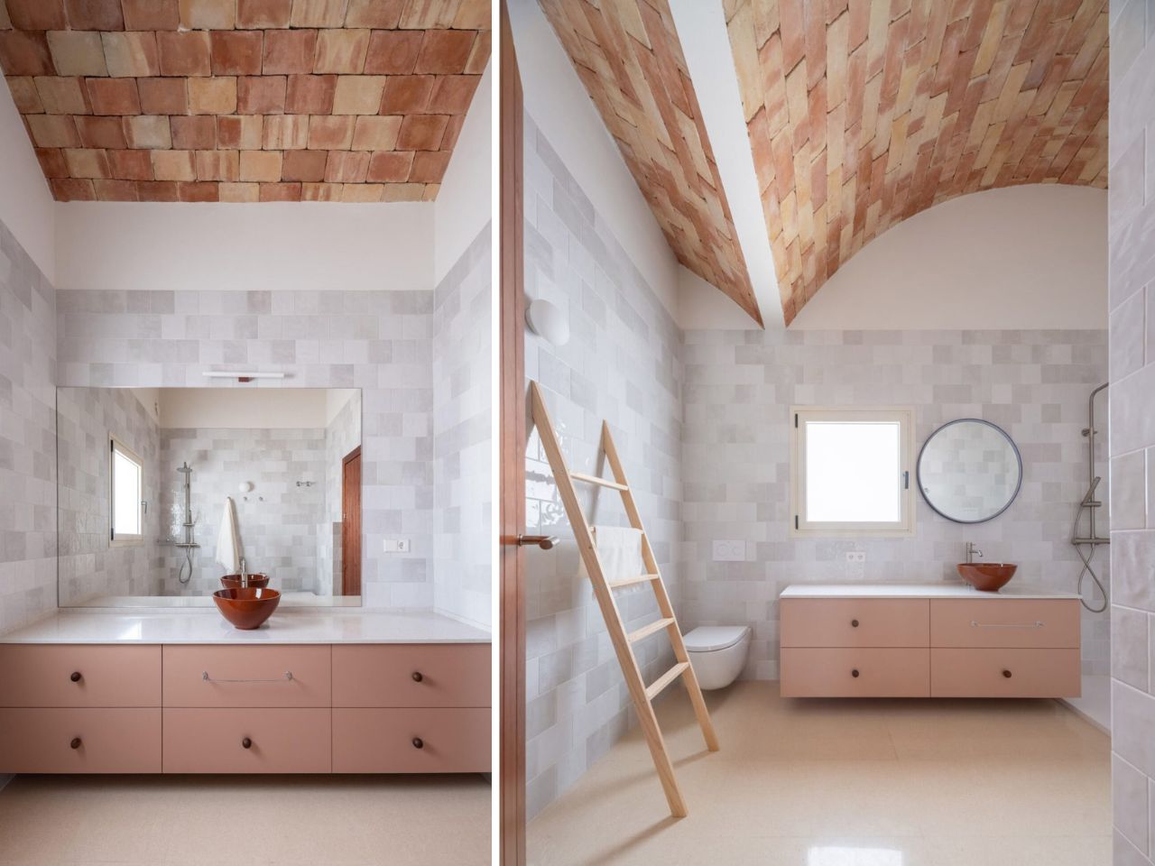
The bathrooms introduce a softer palette through pale gray rectangular wall tiles, warm pink cabinetry, and terracotta colored vessel sinks. One features a floating vanity with a white countertop and round mirror, while the other includes a wider vanity and a large rectangular mirror reflecting the walk-in shower opposite. Contemporary fixtures and minimal glass detailing keep the spaces open and bright, with exposed brick ceilings maintaining continuity throughout the interiors.

Architectural drawings reveal a long, single-story layout organized around everyday functionality. A two-car garage occupies one end, the open living, dining, and kitchen spaces form the center, and the bedrooms and bathrooms sit toward the opposite end. The communal spaces open directly onto the generous terrace, strengthening the home’s relationship with its garden and surroundings.

Casa Vereda finds its charm in the thoughtful reinterpretation of familiar architectural elements. The curved brick vaults, Mallorcan-inspired shutters, terracotta surfaces, and cork exterior serve practical purposes while giving the residence a distinctive identity. Through a careful balance of traditional craftsmanship, passive climate strategies, and contemporary interiors, L’Aura Ortín Architecture For Happiness has created a home that feels entirely at ease with its rural Mediterranean setting.

The post This Spanish Home Uses Curved Roofs and Cork Walls to Stay Naturally Cool first appeared on Yanko Design.
  •  

This Minimalist Bamboo Coffee Table Hides Everyday Clutter in Plain Sight

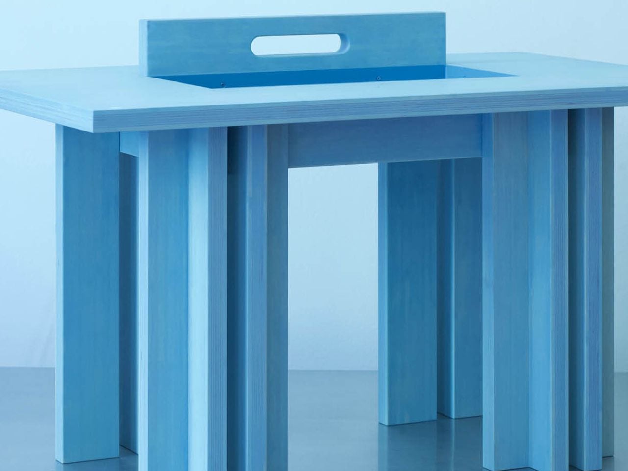
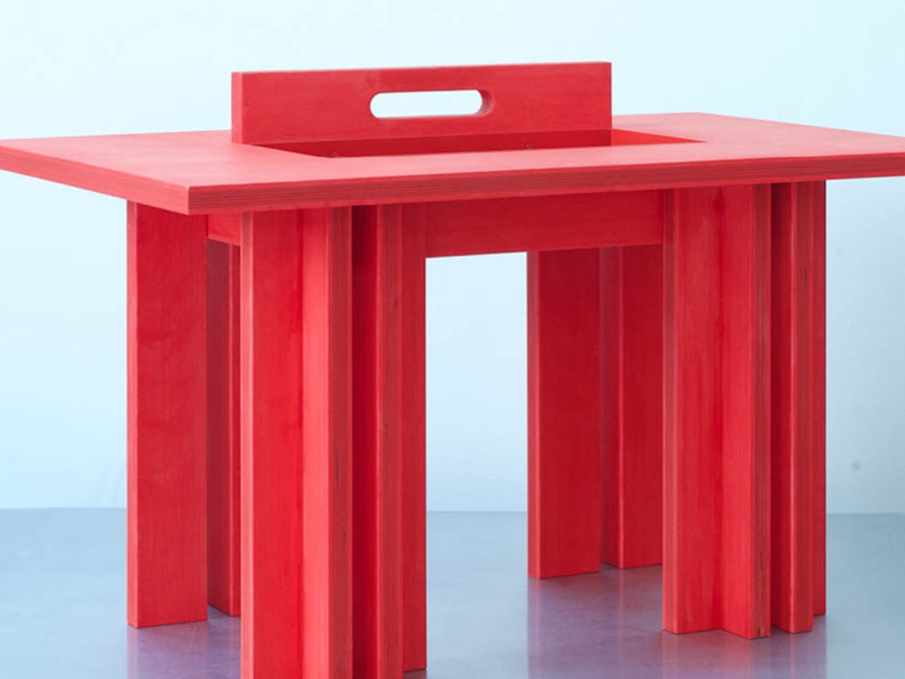
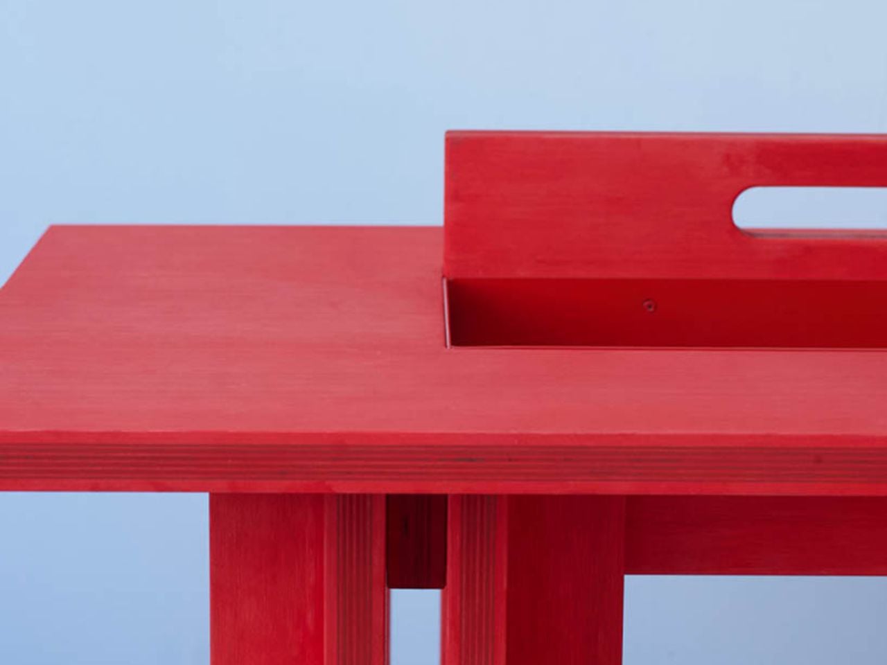
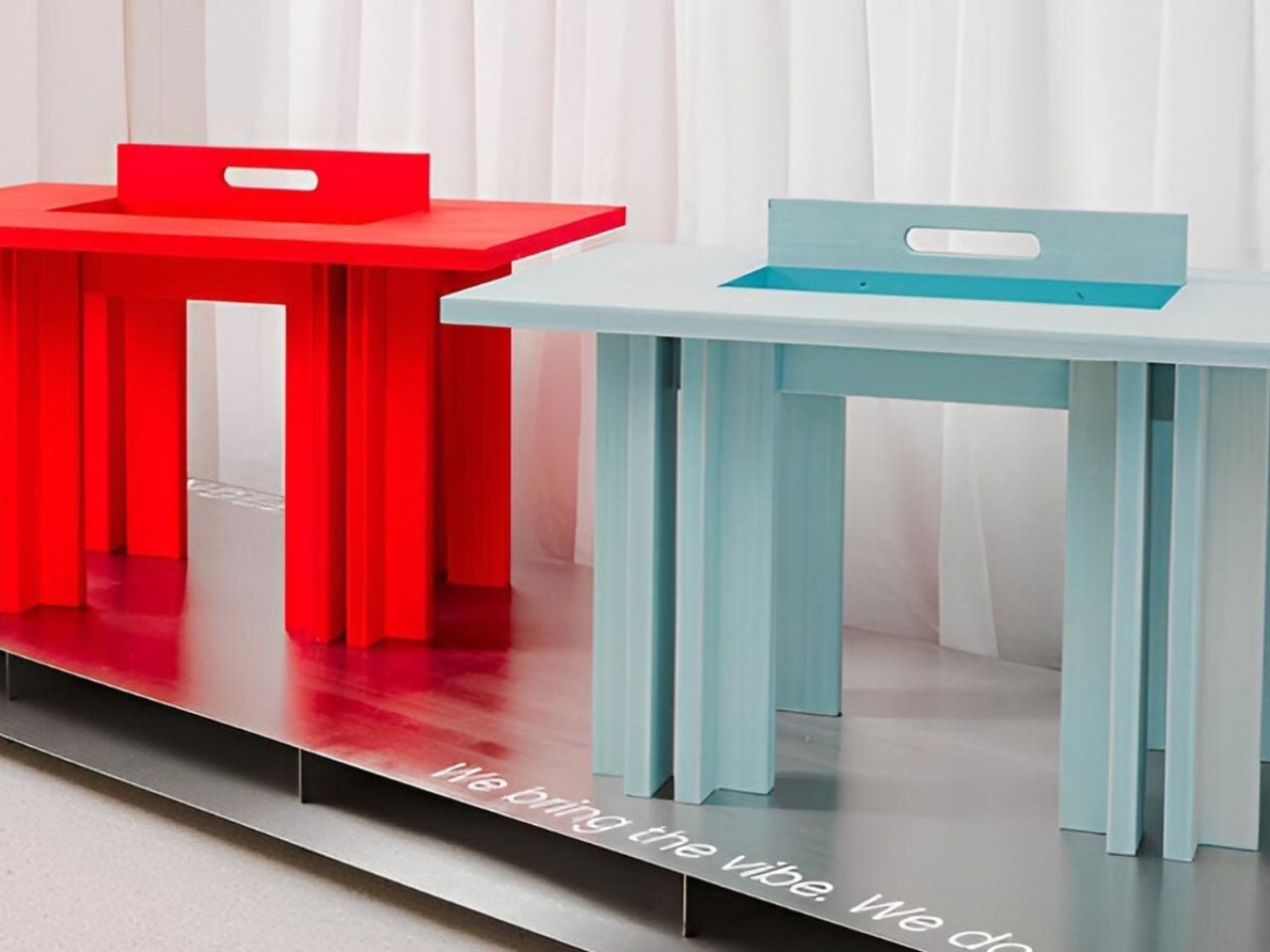
A coffee table usually has a fairly straightforward job: hold a cup of coffee, a few books, and whatever else happens to accumulate in the living room. But what if it could accommodate everyday clutter without putting any of it on display? Designed by Marek Kounovský of MK Designers in collaboration with Prague-based furniture company Frayer, the Handle Table takes this familiar piece of furniture and gives it a more considered purpose. Made primarily from bamboo, the table incorporates concealed storage, an integrated handle, and a restrained silhouette that allows its material and construction to take center stage.

The design takes inspiration from the Japanese principle of hodo-hodo, which loosely translates to the idea of “just enough.” Rooted in moderation and balance, the philosophy encourages appreciating things that serve their purpose without excess. Kounovský translates this thinking into furniture by reducing the table to its essential elements. Rather than introducing elaborate mechanisms or decorative features, he focuses on proportion, geometry, and the relationship between form and function. Every visible detail has a reason to exist, and the absence of unnecessary embellishment gives the table its distinct character.

Designer: MK Designers

One of its most interesting features is the concealed storage compartment, which is incorporated directly into the table’s geometry. Coffee tables often become gathering places for remote controls, magazines, chargers, and other small objects that are useful to have nearby but can quickly make a room feel cluttered. Handle Table addresses this familiar situation by providing a dedicated space for everyday belongings while preserving its clean exterior. The compartment remains visually discreet, allowing the table to maintain its sculptural appearance even as it performs an additional function.

The integrated handle is another subtle yet important element of the design. Rather than appearing as a separate attachment, it is incorporated into the tabletop itself, creating a functional feature that feels consistent with the overall composition. This detail makes the table easier to move and reposition, an especially relevant consideration for contemporary interiors where furniture frequently accommodates different activities throughout the day. The table can shift between spaces and arrangements without demanding a permanent position, extending its usefulness beyond that of a conventional stationary coffee table.

Material selection plays an equally significant role in the project. Bamboo forms the main structure, bringing its recognizable grain and natural texture into the otherwise reduced design. The surface is treated with an oil-based wood stain, developed through experimentation with application techniques suited specifically to bamboo. Instead of concealing the material beneath an opaque coating, the finish emphasizes its inherent structure and tactile qualities. The resulting surface gives the table a sense of depth while retaining the character of the bamboo itself.

This attention to finishing is particularly important in a design with so few visual elements. Without decorative distractions, the material becomes one of the primary ways the object communicates its identity. The stained bamboo, precise construction, and carefully controlled proportions work together to create visual interest through restraint. Even the concealed compartment contributes to this approach, demonstrating how practical considerations can become part of the furniture’s fundamental structure rather than additions made after the form has been established.

First presented at the 14th Czech Design Week international design festival in Prague, Handle Table reflects the collaboration between Kounovský’s design practice and Frayer’s approach to bamboo furniture. The project brings together an interest in thoughtful material treatment and an understanding of how furniture participates in everyday routines. Its simplicity is the result of deliberate decisions about what to include, what to conceal, and what can be left out altogether.

There is something appealing about furniture that makes room for the realities of daily life without constantly drawing attention to its cleverness. Handle Table does not attempt to reinvent the coffee table through an abundance of features. Instead, it refines the familiar object through a few carefully integrated gestures. The storage keeps essentials close, the handle makes movement easier, and the bamboo brings warmth and texture to its compact form. In a category where additional features are often presented as improvements, Kounovský offers a different proposition: perhaps a well-designed object needs only enough to do its job beautifully.

The post This Minimalist Bamboo Coffee Table Hides Everyday Clutter in Plain Sight first appeared on Yanko Design.
  •  

A Suspended Walkway Leads to This Tiny Cabin Overlooking the Salish Sea

A cabin this small could easily become an exercise in clever storage. On Blakely Island, Wittman Estes has taken a more interesting approach.  The Seattle-based architecture studio designed a 400-square-foot guest retreat that feels less concerned with proving how much can fit inside and more interested in how little architecture is actually needed to make a place feel complete.

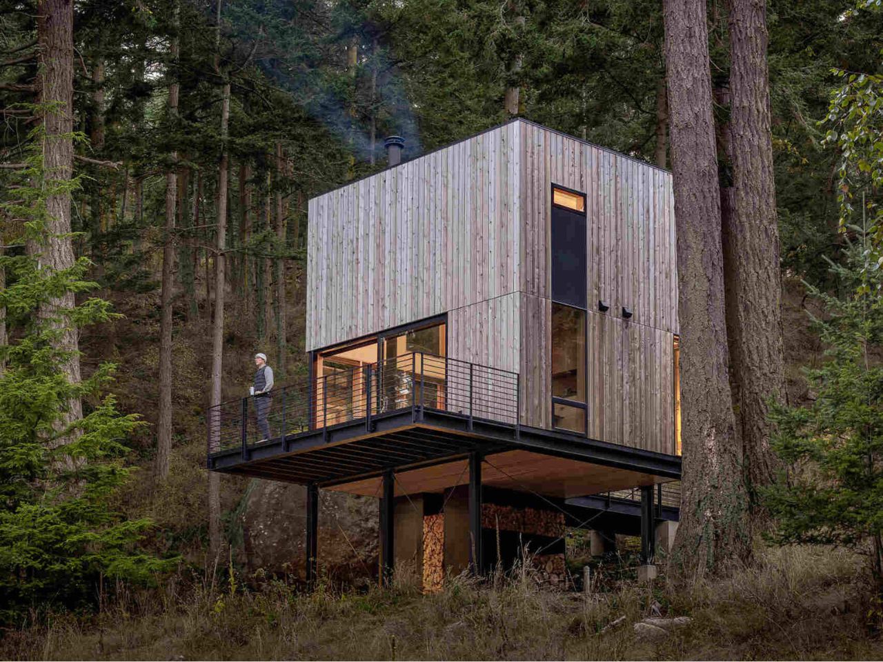
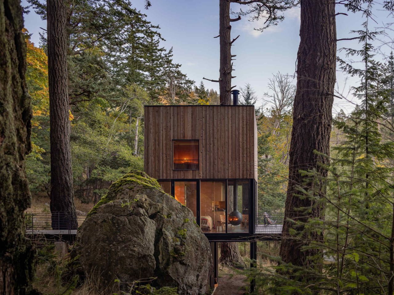
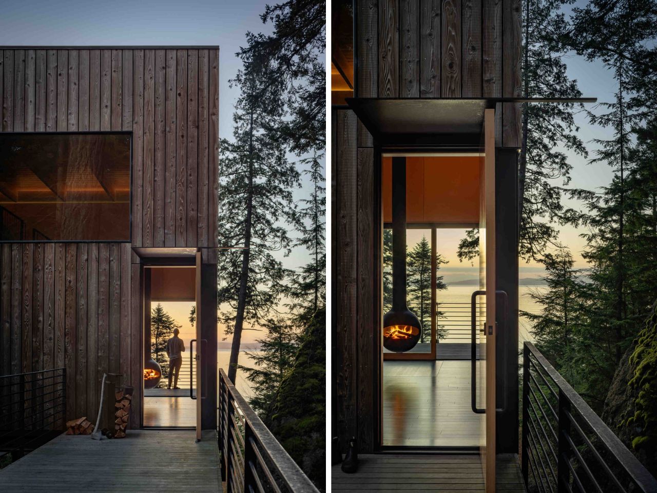
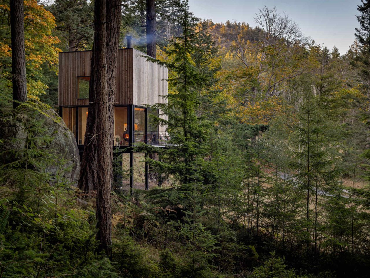
Set within Washington’s San Juan Island Archipelago, the cabin occupies a dramatic piece of terrain between a mature Douglas fir and a large glacial erratic boulder. Beyond the trees lies the Salish Sea. Rather than settling heavily into the rocky shoreline, the structure is lifted above it on slender supports, giving the impression that it has been carefully inserted into the forest rather than constructed over it.

Designer: Wittman Estes

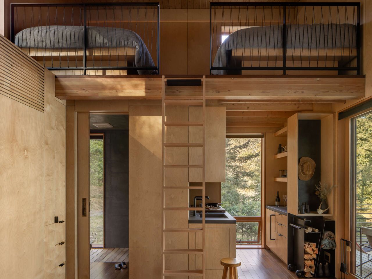
The main studio measures just 16 by 20 feet, drawing from the tradition of simple shelters in the woods, from Thoreau’s Walden Cabin to Le Corbusier’s Cabanon. Yet the interior does not feel particularly austere. A kitchen, bathroom, Murphy bed, living area, and loft with two bunks all occupy the compact volume, each given a precise place within the plan.

The difficulty of the site helped shape the architecture. Blakely Island’s steep, rocky shoreline made conventional construction complicated, particularly if heavy machinery had to pass through the surrounding forest. Many components were therefore fabricated at the contractor’s yard in Everett before being transported to the island by barge. Modular steel frames were then lifted onto a minimal point foundation. Western red cedar siding, milled from trees on the island, was left unfinished so it could gradually weather into the landscape.

That sensitivity continues through the experience of arrival. A narrow suspended metal walkway threads through the trees toward the entrance, allowing views of Thatcher Bay to open gradually between the branches. Powder-coated steel railings line the path and deck, while a simple steel awning shelters the fir entry door.

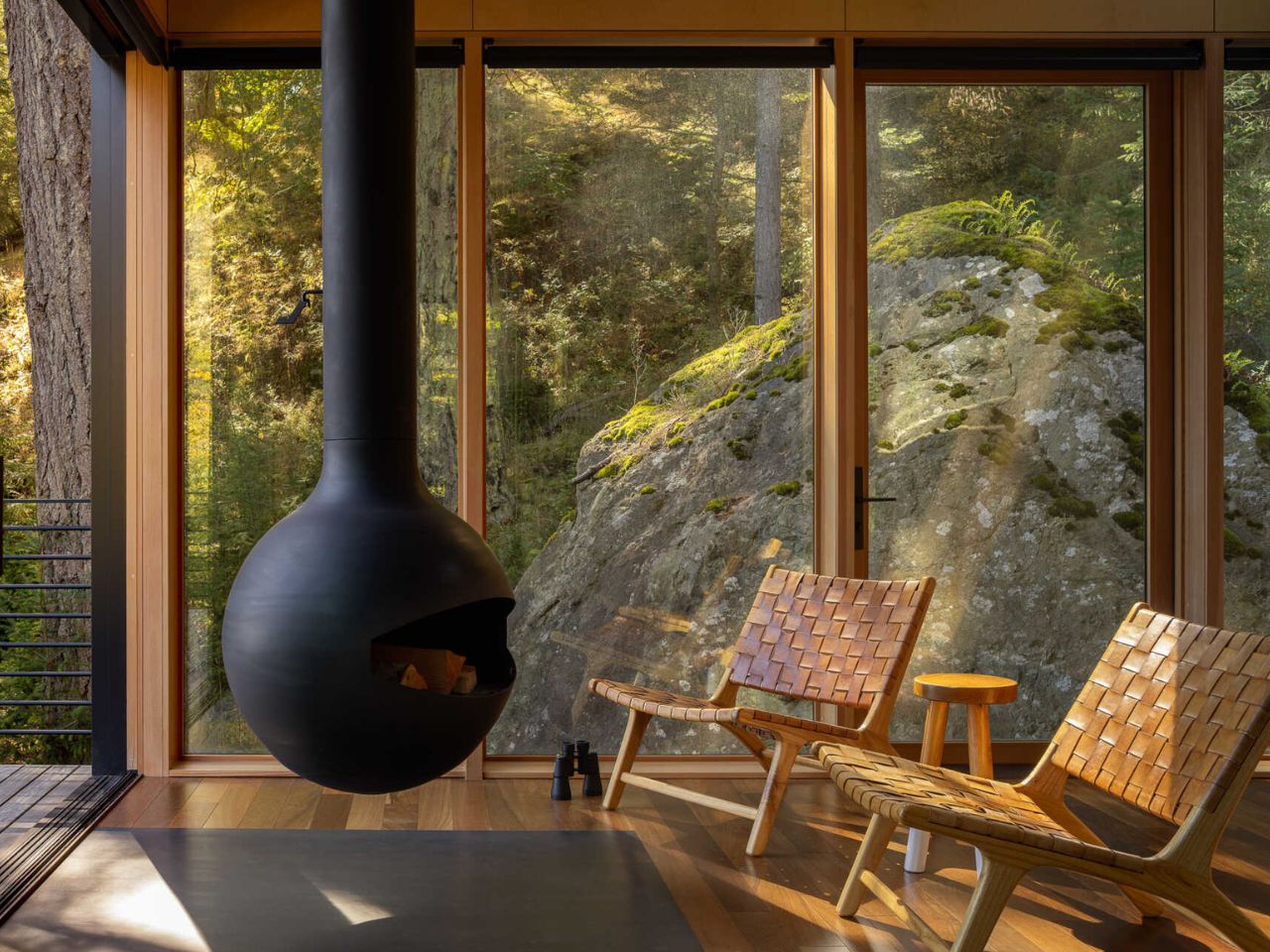
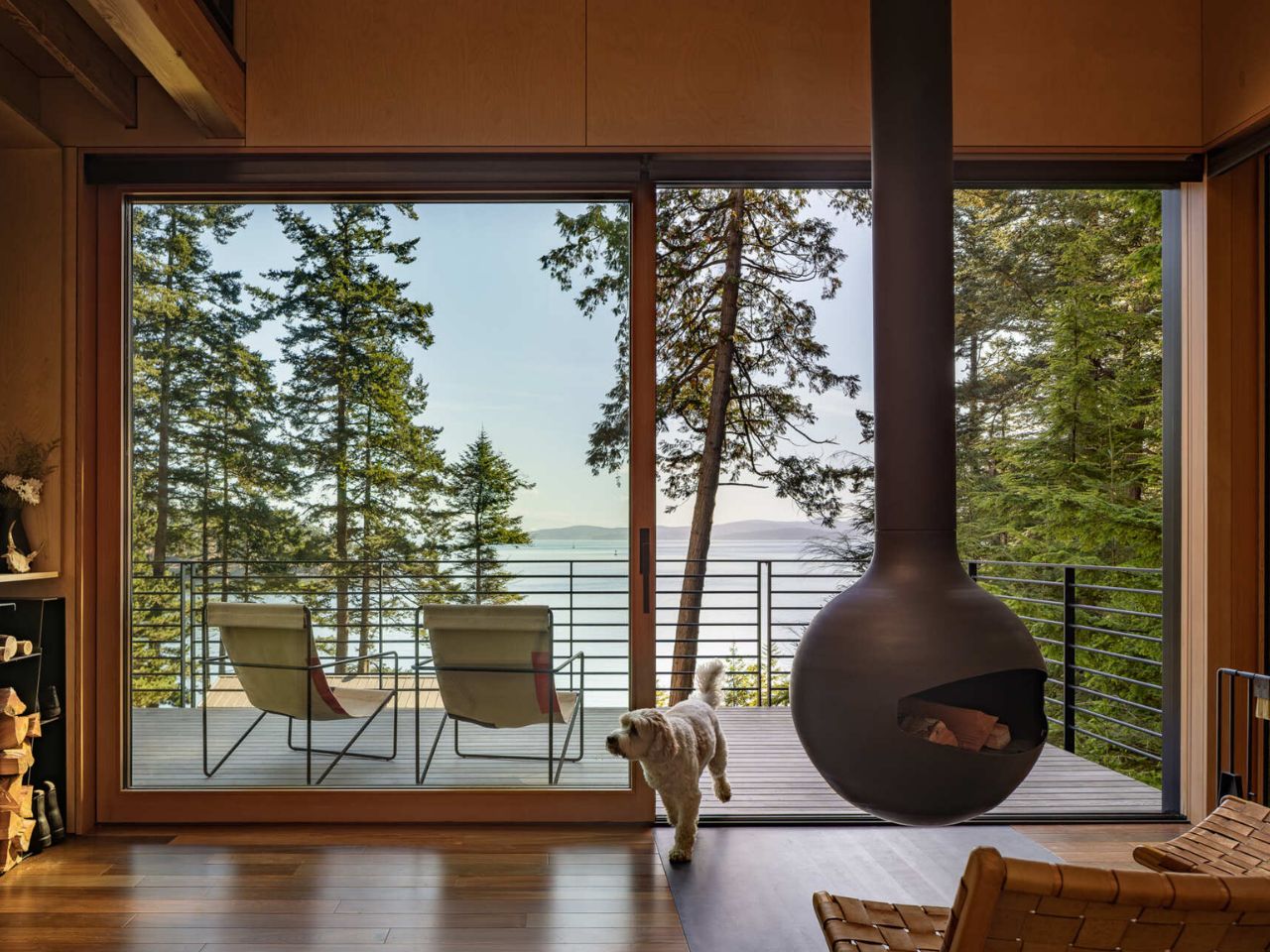
Inside, the material palette becomes warmer. Birch plywood wraps the walls, fir beams remain exposed overhead, and solid ipe runs underfoot. The restrained finishes allow the view to dominate. Large sliding glass doors face the water, visually extending the living space far beyond its modest footprint.

Near the center of the cabin, a suspended black fireplace rotates through 360 degrees, allowing the fire to face either the interior or the cantilevered deck outside. In warmer weather, the open glass doors effectively turn the deck into another living room. During colder months, the same glazing keeps the forest and water present while the cabin becomes a sheltered place from which to watch the weather change.

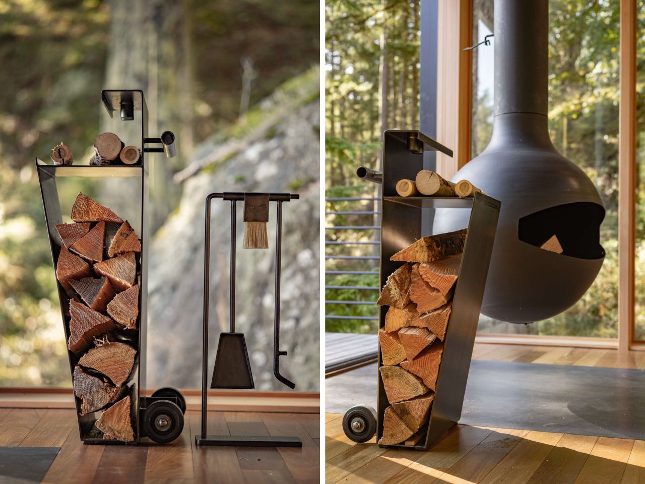
Even the fireplace tools have been treated as part of the architecture. Wittman Estes designed a movable steel fire cart that slips neatly into an angled niche nearby. It is a small detail, but an important one in a room where visual clutter could quickly overwhelm the space.

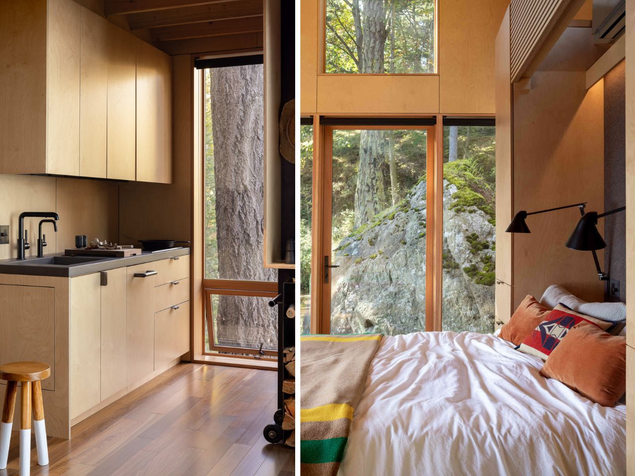
The kitchen follows the same logic. Positioned beneath the sleeping loft, it occupies one of the lowest parts of the cabin, reserving the taller volume for the main living area. A cast-in-place concrete sink and countertop are paired with dark fixtures and discreet integrated appliances. Against the birch plywood and fir, the concrete provides enough contrast to define the kitchen without separating it visually from the rest of the interior.

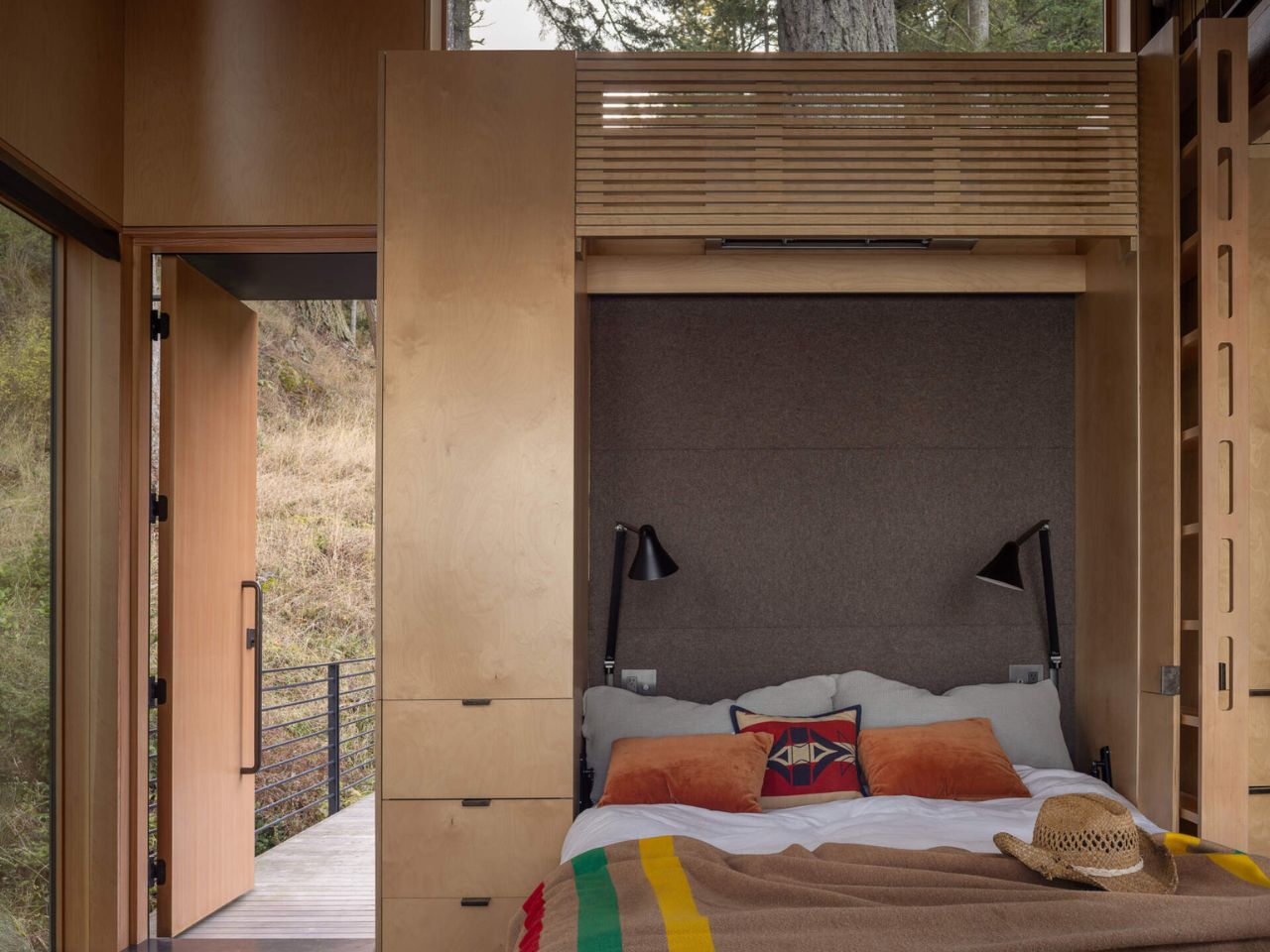
The living room becomes the primary bedroom when a Murphy bed folds down from the wall. During the day, it nearly disappears, preserving the openness of the studio. At night, the bed faces east toward the morning light, while a felt headboard introduces softness to the otherwise restrained palette of wood, steel, and concrete.

At the northwest corner, the bathroom is given its own relationship with the landscape. A glass corner window looks directly into the surrounding forest, preventing the compact room from feeling enclosed. Above the kitchen, a sleeping loft adds two bunks without expanding the cabin’s footprint, accessed by a custom maple ladder.

This use of vertical space reflects the logic of the entire project. Nothing feels squeezed into an arbitrary corner. Each function occupies the part of the volume where it makes the most sense, while the architecture continues to work around the existing terrain rather than attempting to reorganize it.

What makes the Blakely Island Cabin compelling is not simply how much has been fitted into 400 square feet. Its greater achievement is making those 400 square feet feel secondary to the experience of being there. The folding bed, compact kitchen, and sleeping loft provide efficiency, but the architecture rarely asks you to admire that efficiency.

Instead, it directs attention outward: toward the Douglas fir beside the house, the rock beneath it, the changing weather, and the long stretch of Salish Sea beyond the glass. For a building inspired by the idea of living simply in the woods, that may be its most convincing gesture. The cabin does not try to provide more space than it has. It simply makes the space beyond its walls feel like part of the room.


The post A Suspended Walkway Leads to This Tiny Cabin Overlooking the Salish Sea first appeared on Yanko Design.
  •  
❌