❌

Vue lecture

MAKERphone 2.0 Assembles Like LEGO, Calls Like a Real 4G Phone

Most phones arrive finished, sealed behind glass before you open the box. MAKERphone 2.0 flips that script. It ships as loose parts that only become a phone once you build it yourself: no soldering iron, no electronics background, just a screwdriver and about two hours. Once assembled, it’s a working 4G device that makes real calls and sends texts over a live network.

The build is what really sells the design. Every piece, from the board to the display to the numpad and to the joystick, clicks or screws into place. The entire endeavor is guided by an illustrated manual that reads like a LEGO instruction booklet, with video walkthroughs for anyone who gets stuck. By the time you finish, you’ve seen the processor, the modem, and the battery close, not used them.

Designer: CircuitMess

Click Here to Buy Now: $129 $160 (24% off). Hurry, only a few left! Raised over $300,000.

Pop in a nano-SIM and the phone comes alive on 4G networks, handling calls and texts like any device off a shelf. There’s a music player, a photo and video gallery, a calendar, notes, and a handful of retro games loaded onto that small color screen. What’s missing says as much: no app store, no social feed, nothing designed to keep anyone scrolling past bedtime.

That absence is the whole appeal for anyone shopping for a kid’s first phone. It calls and texts the people a child needs to reach, without opening the door to an internet’s worth of distraction. When a kid wants a new app or game, the answer isn’t downloading one; it’s building it. Screen time stops being something to limit and starts being something to spend making.

That building happens inside VibeBoy, the phone’s companion coding studio that runs on a computer. Describe an idea in plain English, like a taco dodging falling pickles, and the AI writes code sent to the phone with one click. The goal isn’t to let AI do all the thinking but to let VibeBoy teach users to read that code, question it, and eventually rewrite it.

That teaching happens across four stages built into the same app. Beginners describe what they want and watch it appear on-screen, before moving on to reading and tweaking the Python code the AI generates. Eventually, they write their own Python and C++ from a blank file. Nobody stays at one skill level long; the ladder is designed so most people climb it faster than expected.

Six snap-on modules turn the phone into something closer to a small hardware platform than a single-purpose device. A camera module captures pixelated stills and video, a bigger speaker adds volume, and a flashlight adds utility. An environment sensor reads temperature and humidity, an infrared module controls other devices, and a bare perforated board lets anyone solder a custom circuit and plug it in.

A companion smartwatch called MAKERband follows the same idea, arriving as a kit to assemble rather than a sealed gadget. Once built, it pairs with the phone over Bluetooth and also works with iOS and Android, running 15 watchfaces and five mini-games out of the box. It connects to VibeBoy, so a custom watchface, say, a pixel cat that naps after 9 PM, is a prompt away.

The company behind it, CircuitMess, has spent years building kits like this from a small studio in Croatia. It has shipped hundreds of thousands of units to customers across more than 100 countries, developed dozens of products, and earned coverage from outlets like Wired and The Verge. Just as important, the MAKERphone 2.0 isn’t a rendering or an early prototype: the hardware is finished and ready for production.

What sticks with you isn’t any single spec but the sequence. A pile of components turns into a working phone, and that phone turns into whatever its owner decides to code next. Somewhere between the last screw and the first successful call, the device stops feeling like something you bought and starts feeling like something you actually built, one working call at a time.

Click Here to Buy Now: $129 $160 (24% off). Hurry, only a few left! Raised over $300,000.

The post MAKERphone 2.0 Assembles Like LEGO, Calls Like a Real 4G Phone first appeared on Yanko Design.

  •  

Razer’s New Gaming Keypad Puts 31 Customizable Controls Right Under Your Hand

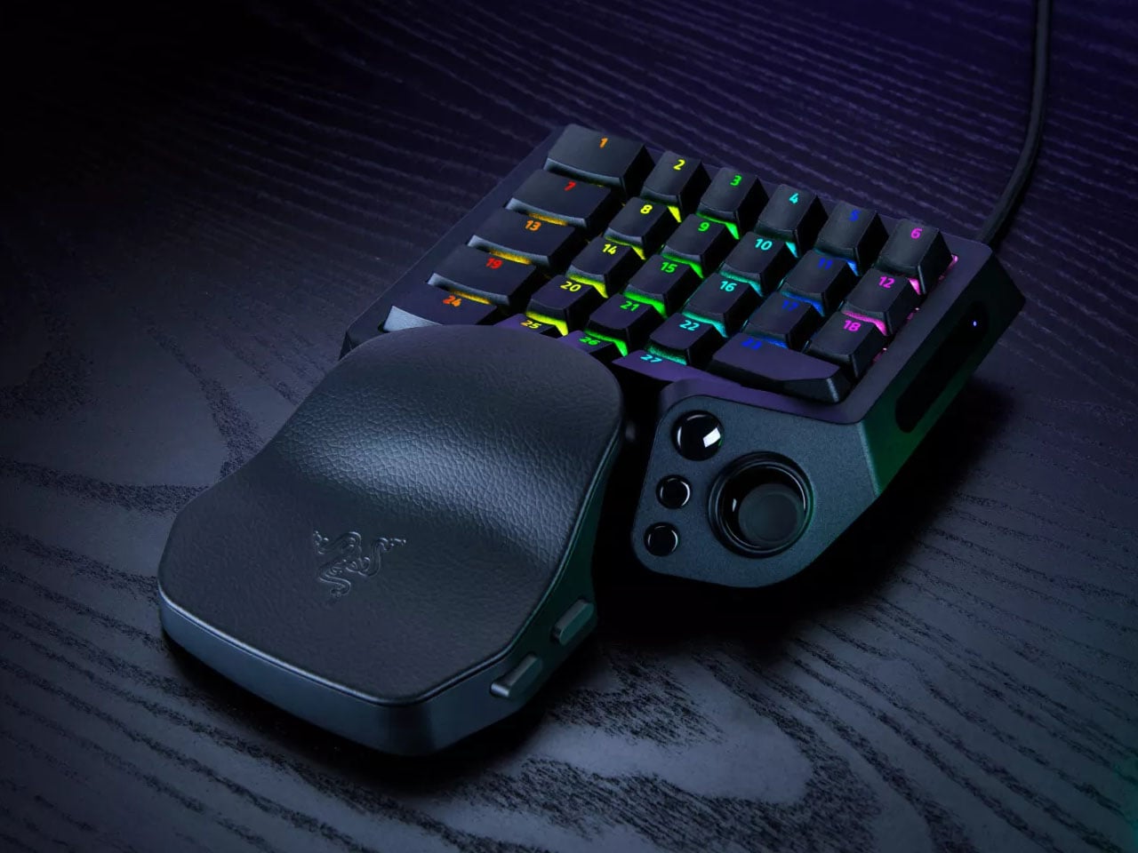
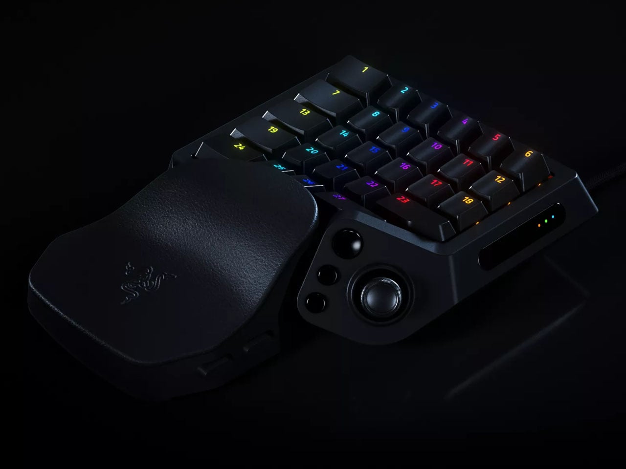
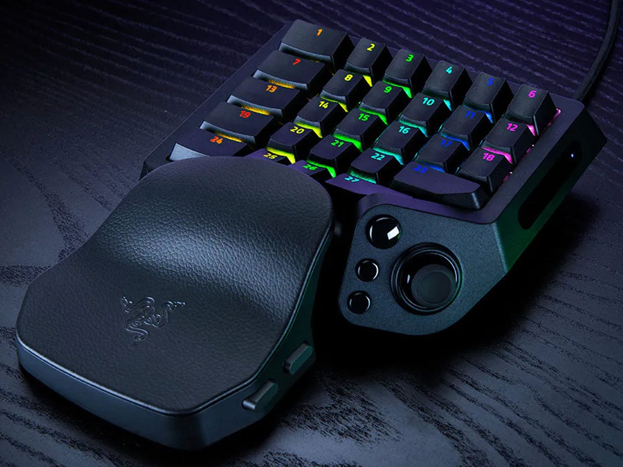
A keyboard can give you plenty of keys, but when you’re gaming, you rarely use all of them. What matters is having the right controls exactly where your hand needs them. That is the idea behind Razer’s new Tartarus V2 Pro, a one-handed gaming keypad that packs 31 programmable controls into a much smaller footprint while adding a proper analog thumbstick, something most keypads don’t have.

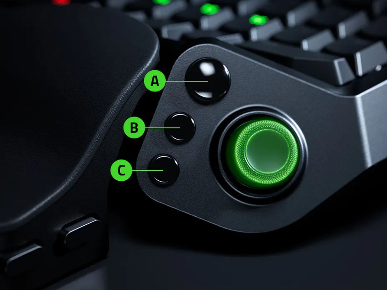
The thumbstick is one of the more interesting bits of the accessory. It uses TMR technology with anti-drift positioning and sits alongside three dedicated thumb buttons, giving the left hand a combination of keyboard and controller-style controls. The stick can handle movement, but it can also be assigned to other commands, making it useful for games that rely heavily on shortcuts, radial menus, or multiple simultaneous inputs.

Designer: Razer

Razer has also moved beyond the usual mechanical-switch approach, as Tartarus V2 Pro uses second-generation Analog Optical Switches that can recognize how far a key is pressed. Their actuation point can be adjusted anywhere between 0.1 and 4.0 mm, allowing the keys to be tuned for either quick, light presses or a more deliberate response. Rapid Trigger goes further by detecting upward movement as small as 0.1 mm, which can make repeated inputs feel considerably more immediate. Razer rates the switches for up to 100 million keystrokes.

There is plenty of control over how those inputs behave as well. Razer’s Advanced Input Control features include Snap Tap, Snap Flex, Dual-Keypress Priority, and Dynamic Keystroke. These allow players to change the way directional inputs work, prioritize simultaneous key presses, or assign different actions depending on how far a key is pressed. The wrist rest can slide outward and rotate from side to side, so the position of the hand can be adjusted instead of forcing it into one fixed angle. The keypad uses textured doubleshot PBT keycaps and a 5052 aluminum alloy top plate, with Chroma RGB lighting adding the familiar Razer touch.

True 8000 Hz HyperPolling is built in, while Razer Synapse handles deeper customization. Players can create up to 24 keymaps across three onboard profiles, with actuation and Rapid Trigger settings adjustable to suit different games. An onboard LED array also provides visual feedback without needing the software open.

At 211 × 159 × 49 mm and 486 grams, Tartarus V2 Pro takes up far less desk space than a conventional keyboard. Priced at $199.99, the gaming accessory changes how the player’s hand interacts with a game. Instead of reaching across a keyboard for commands, movement, and shortcuts, the controls are gathered into one compact surface designed specifically around that hand.

The post Razer’s New Gaming Keypad Puts 31 Customizable Controls Right Under Your Hand first appeared on Yanko Design.

  •  

The Japanese Grooming Kit That Actually Makes Sense

Most guys have a drawer like this: a razor with a blade that’s gone slightly dull but not dull enough to justify tossing, tweezers that pinch skin as often as hair, and a nail clipper that crushes more than it cuts. None of it is broken exactly. It just quietly underperforms every single day, and most of us have stopped noticing because we’ve never used anything better.

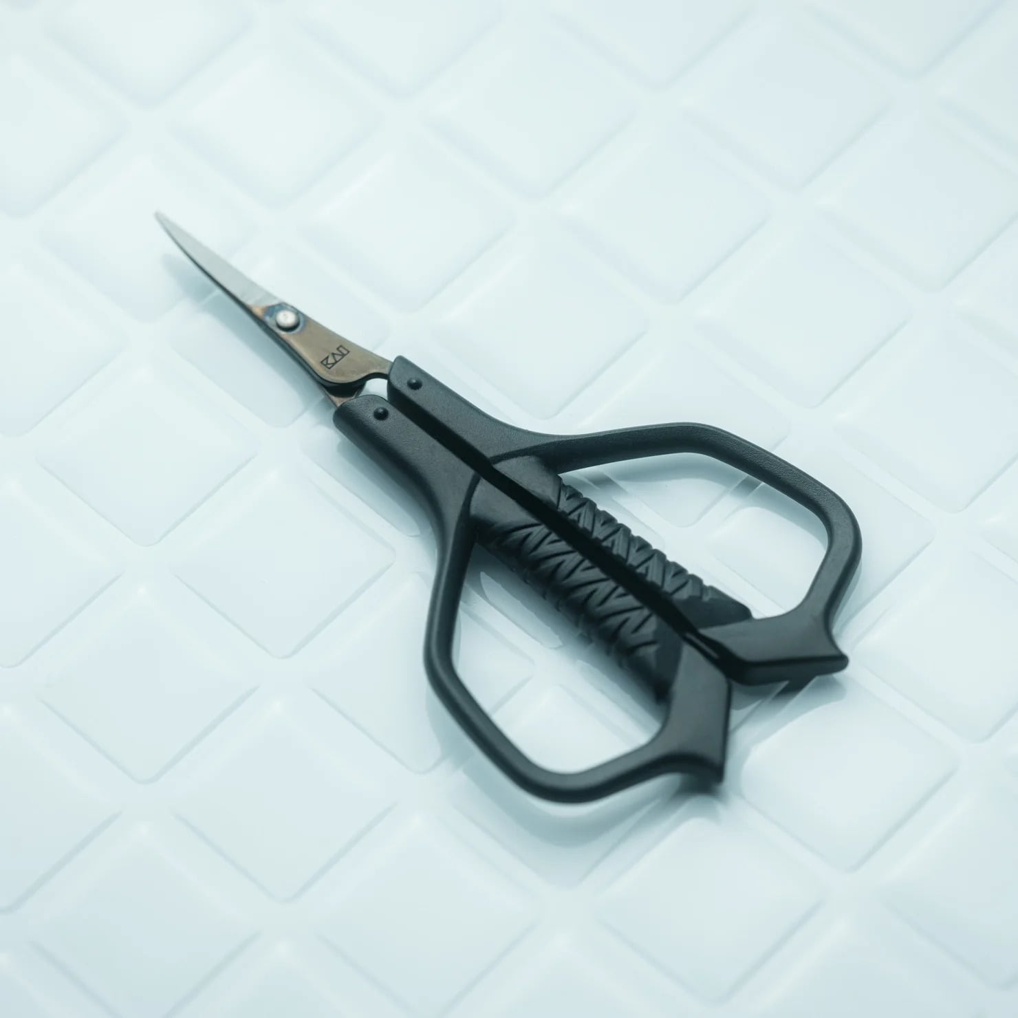
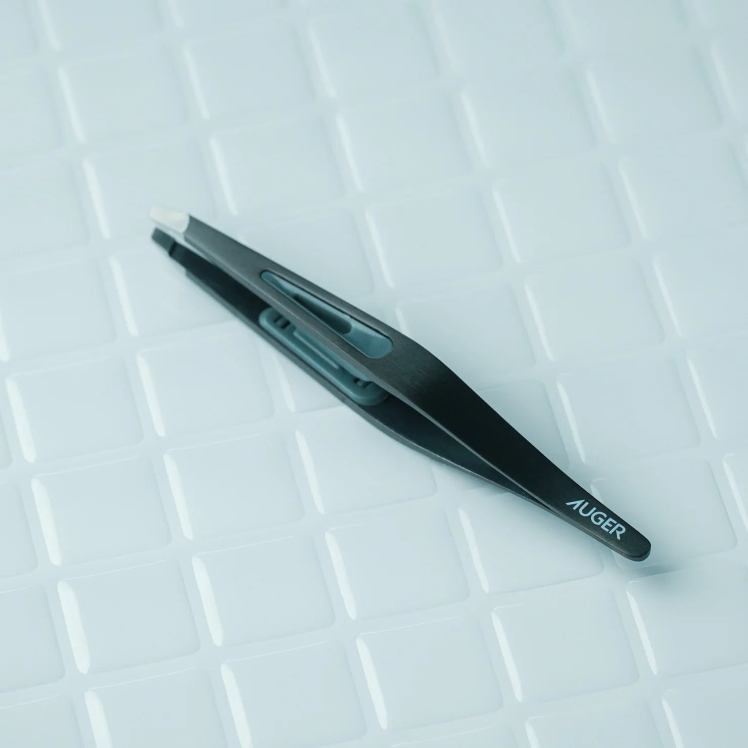
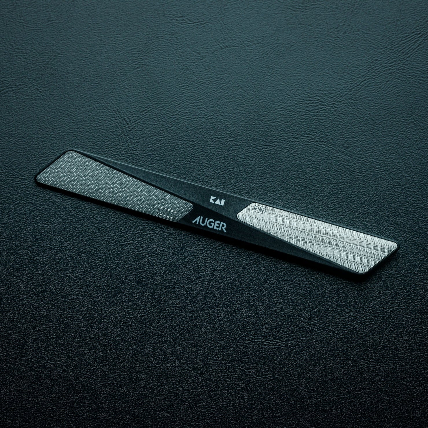
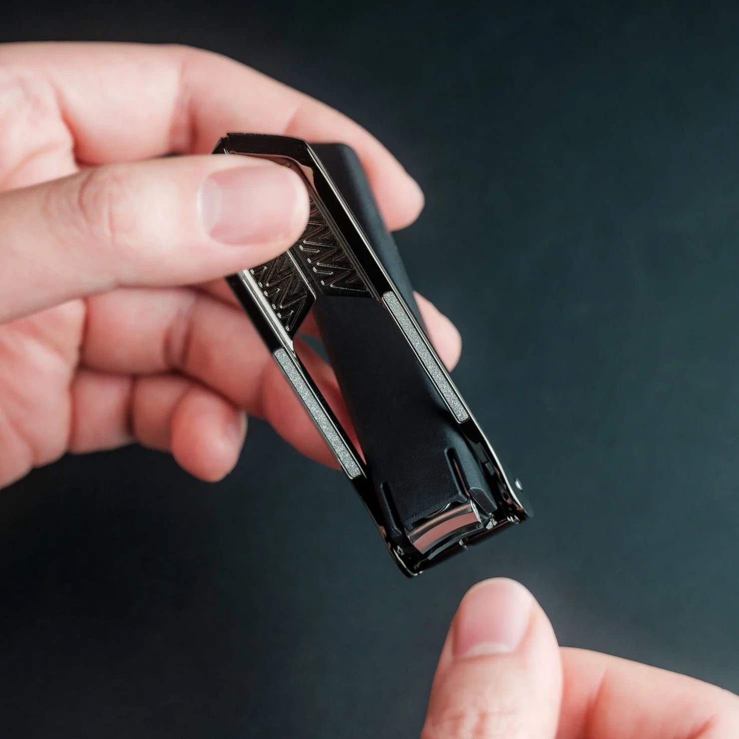
That’s the actual gap the Auger PrecisionMaster Grooming Set is built to close. It’s a five-piece kit from Kai Corporation, the Japanese company that’s been making blades since 1908, and it bundles a razor, tweezers, curved scissors, a nail file, and a nail clipper into one matte black collection that costs $150. The pitch isn’t flashy. It’s the opposite. The whole set is designed around the idea that grooming tools should just work, consistently, without you having to think about them.

Click Here to Buy Now: $150.00

The razor is the standout piece, and it’s worth explaining why. It has a 30-degree adjustable pivoting head and a five-blade system, which sounds like spec-sheet noise until you realize what it actually solves: the awkward angles under the jaw or around the nose that force most razors into a compromise. The tweezers use a patented stopper mechanism so the tips close with the same pressure every time instead of slipping at the worst moment. Even the nail clipper has a rotating lever built to cut thicker nails without the hand strain that comes from cheap versions. None of this is revolutionary engineering. It’s just engineering that was actually done, instead of skipped because grooming tools are treated as an afterthought category.

That’s really the argument for buying Kai over the brands most Americans grab without thinking. Gillette and Harry’s have made razors a subscription commodity, cheap, replaceable, and optimized for margin rather than feel. A Gillette Fusion refill pack runs you close to $20 for four cartridges you’ll toss in a month, and a Harry’s starter set lands around $25 with plastic that feels exactly like what it costs. Kai isn’t playing that game. It’s a company that’s spent over a century making blades for barbers and kitchens, and the Auger set is what happens when that expertise gets pointed at your bathroom counter instead of a professional’s toolkit. You’re not paying for a brand name stamped on plastic. You’re paying for a company that actually knows what a blade is supposed to do.

Is $150 a lot for tweezers and a nail file? Sure, if you’re comparing it to what’s sitting in a drugstore bin. But that comparison misses the point a little. This set isn’t for someone who wants the cheapest option that technically works. It’s for someone who’s tired of tools that almost work, who wants their morning routine to feel less like maintenance and more like something they actually control. The all-black finish and the total absence of loud branding fit that mindset too. Nothing about this set is trying to impress anyone else. It’s built for the person using it, not the person watching.

I’ll admit I’m a sucker for products that solve a problem nobody bothers to name out loud, and the Auger PrecisionMaster Grooming Set is exactly that kind of product. Bad grooming tools are one of those small frustrations we’ve all just agreed to tolerate, the same way we tolerated bad headphones before good ones existed. The Auger set won’t change your life. But it might change your morning, and for $150, that’s a fair trade for never reaching for a dull blade again.

The post The Japanese Grooming Kit That Actually Makes Sense first appeared on Yanko Design.

  •  

Two Lofts, a Rooftop Terrace, and Room for Five: This 26-Foot Tiny Home Does It All

The name earns its place on a wishlist before you even see the floor plan. Backcountry Tiny Homes’ Winter Wonderland is a 26-foot tiny house on wheels that manages to feel bigger than its footprint has any right to suggest — not through clever visual tricks, but through honest, considered design that treats every square foot as a decision worth making.

Mounted on a triple-axle trailer and clad in a mix of board-and-batten and lap siding, the exterior strikes a balance between rugged and refined. It reads equally well parked against a tree line or tucked into a snowy clearing. The rooftop terrace is the Winter Wonderland’s most immediately conversation-worthy detail — a genuine outdoor living space elevated above the trailer bed, giving occupants the kind of perch that almost no tiny home at this scale even attempts. It’s not decorative. It’s livable.

Designer: Backcountry Tiny Homes

Inside the 26 x 8.5-foot shell, Backcountry Tiny Homes packs in two sleeping lofts, a sofa bed in the living area, a full kitchen, and a bathroom — with a total sleeping capacity of five. That number is the headline within a headline. One loft carries a king-size bed flanked by built-in cubbies for storage, and a small door at the far end opens directly onto the rooftop deck. It’s a detail that feels less like a practical solution and more like an architectural gesture, the kind of thing that makes you stop scrolling.

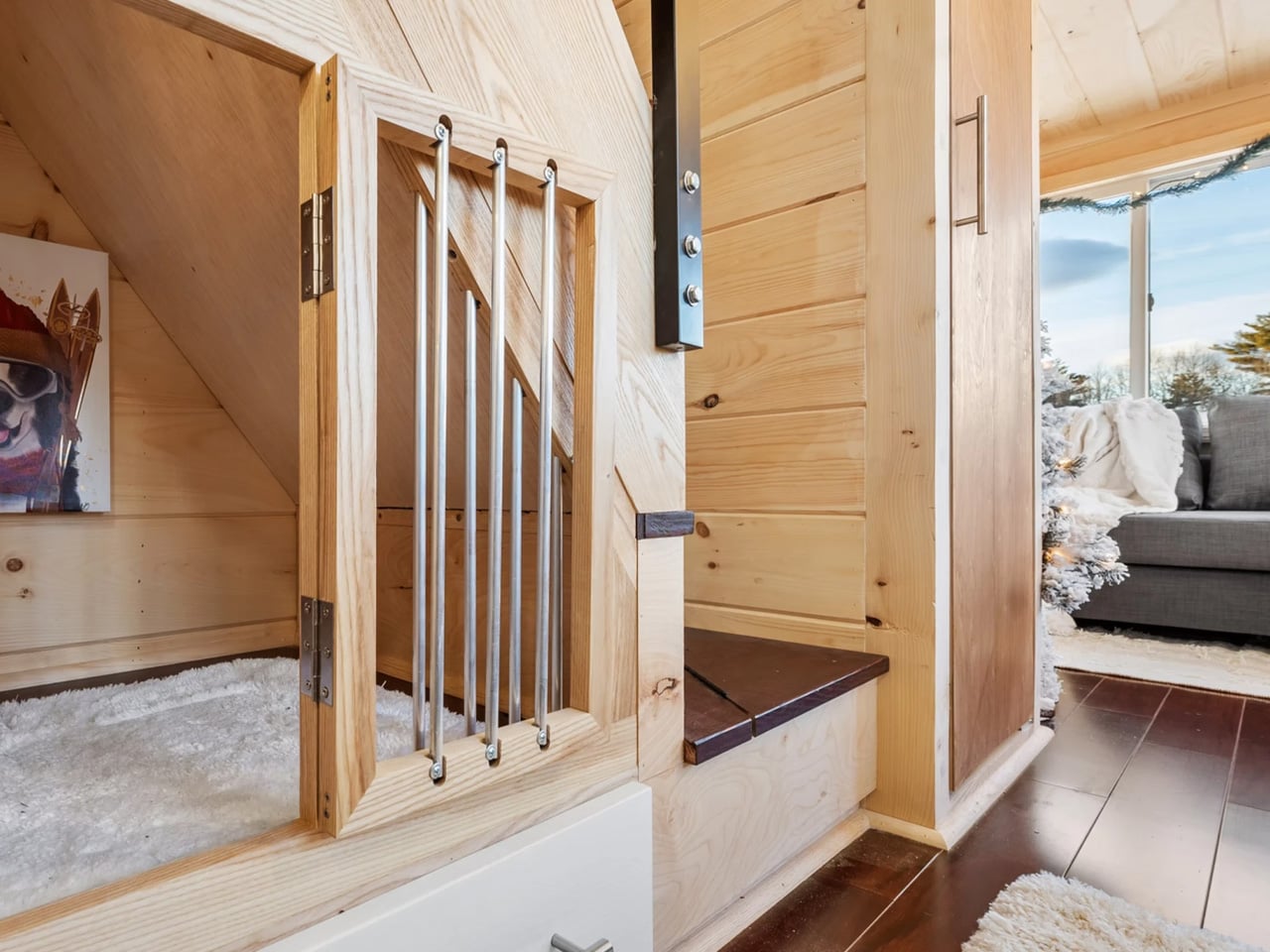
The fold-down breakfast bar keeps the kitchen footprint lean without cutting into function, and the interior finish leans toward natural materials — warm, textured surfaces that photograph well and age even better. There’s also a dedicated kennel area for pets, which signals clearly that Backcountry understands the lifestyle its buyers are actually living. Storage is woven throughout the build, which is the real benchmark for whether a tiny home designer truly thought the layout through or just made it look good in renderings.

Pricing starts at $116,455 for the shell, $63,670 unfurnished, and $127,230 for the fully turnkey model. For a build that legitimately sleeps five, includes a rooftop terrace, arrives NOAH certified, and comes move-in ready, the turnkey figure is easier to sit with than it might initially appear. NOAH certification also matters practically for anyone navigating zoning restrictions on their land of choice.

The Winter Wonderland isn’t chasing minimalism as an aesthetic. It’s chasing generosity within a tight frame — more square footage above your head than below your feet, more sleeping spots than you’d expect, and one door that opens onto a deck most full-size homes don’t bother with. That’s the pitch, and it lands.

The post Two Lofts, a Rooftop Terrace, and Room for Five: This 26-Foot Tiny Home Does It All first appeared on Yanko Design.

  •  

This Lounge Chair Is Built From Cork — and It’s Sturdier Than It Looks

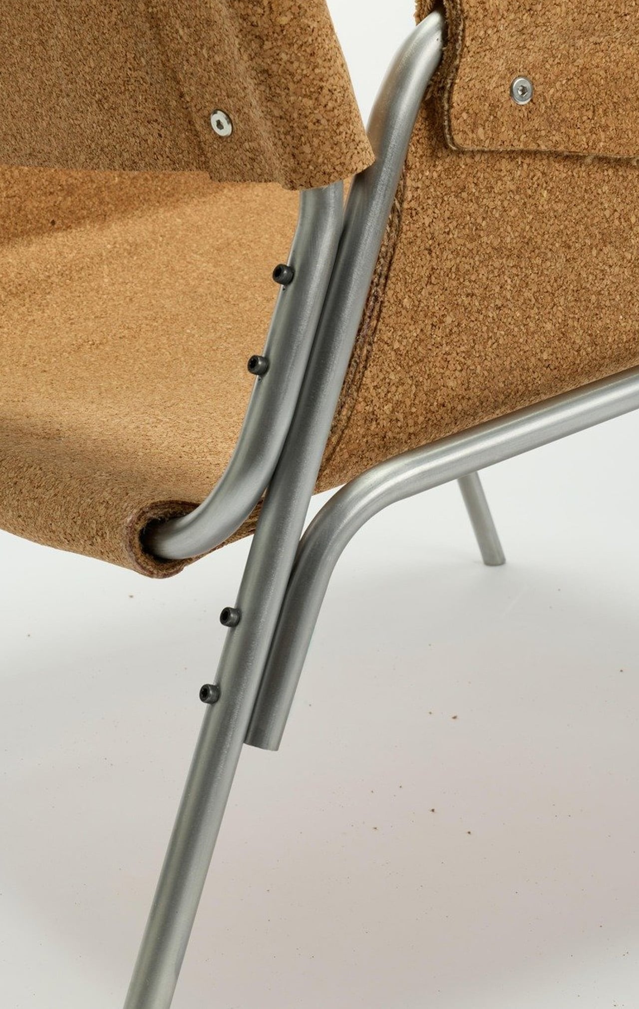
Cork is everywhere in design, and yet it’s almost always decorative. A tile floor. A pin board. A wine stopper. Copenhagen-based furniture designer Chiara Verde looked at that assumption and quietly dismantled it. Her Strata lounge chair doesn’t use cork as a finish — it uses cork as the architecture.

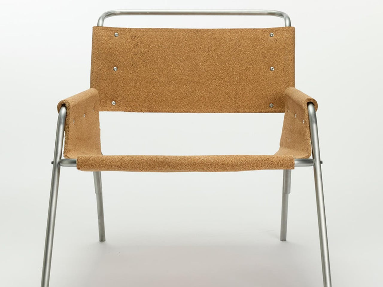
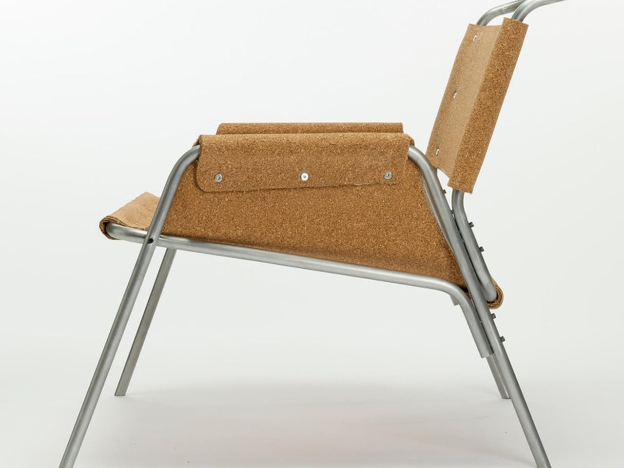
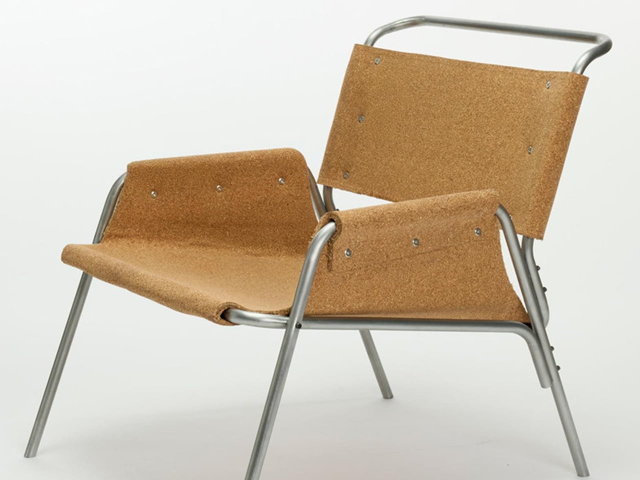
The chair is built around a layered composite system: thin cork sheets alternated with natural fibre textiles, laminated together to form load-bearing shells. The textile reinforcement isn’t there for aesthetics — it gives the cork directional stiffness and structural performance it simply doesn’t have on its own. A minimal metal frame handles only the points under concentrated load, leaving the cork shells to carry the rest. It reads, visually, like a chair slung from material intelligence rather than convention.

Designer: Chiara Verde

Verde’s background leans heavily into process. Her practice is built on material experimentation, prototyping, and structural research — work that treats the studio bench as an extension of the design itself. Strata wasn’t conceived and then executed. It emerged through months of testing, adjustment, failure, and recalibration. A cork stool came first — a full-scale testbed that validated the structural logic before Verde committed it to a larger form. The lounge chair is the result of everything that came before it.

What makes Strata worth paying attention to isn’t just the material provocation — it’s how restrained the final form is. The chair doesn’t announce itself. It holds the visual language of the natural world: organic in silhouette, warm in texture, quietly confident in its proportions. Cork has an inherent thermal quality to it, a softness underfoot and underhand that synthetic materials spend millions trying to replicate. Here, it’s simply doing its job.

The lineage of the slung chair runs deep — leather over steel tubing defined a generation of modernist seating in the early and mid-20th century. Verde is working in that same formal territory, proposing laminated cork as the next honest alternative to leather: a material that gives, breathes, and ages with use rather than against it.

Strata sits in a growing conversation around material-led design — not sustainability as branding, but sustainability as methodology. Verde isn’t marketing cork. She’s interrogating it, and the chair is the proof of concept. For a material that has spent decades on the periphery of furniture design, Strata might be the argument it needed all along.

The post This Lounge Chair Is Built From Cork — and It’s Sturdier Than It Looks first appeared on Yanko Design.

  •  

iPod Classic emulator for the Samsung Galaxy Z Fold8 finally gets the size and aspect ratio right

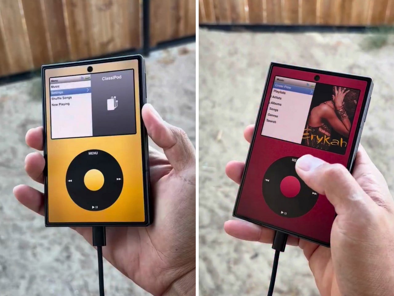
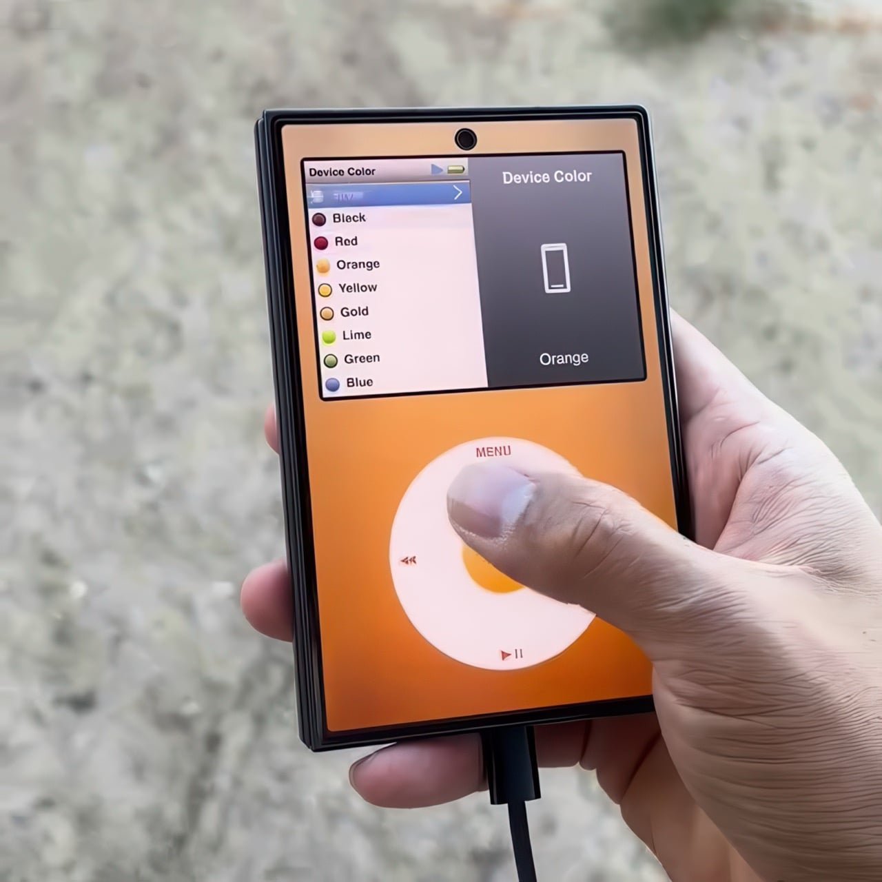
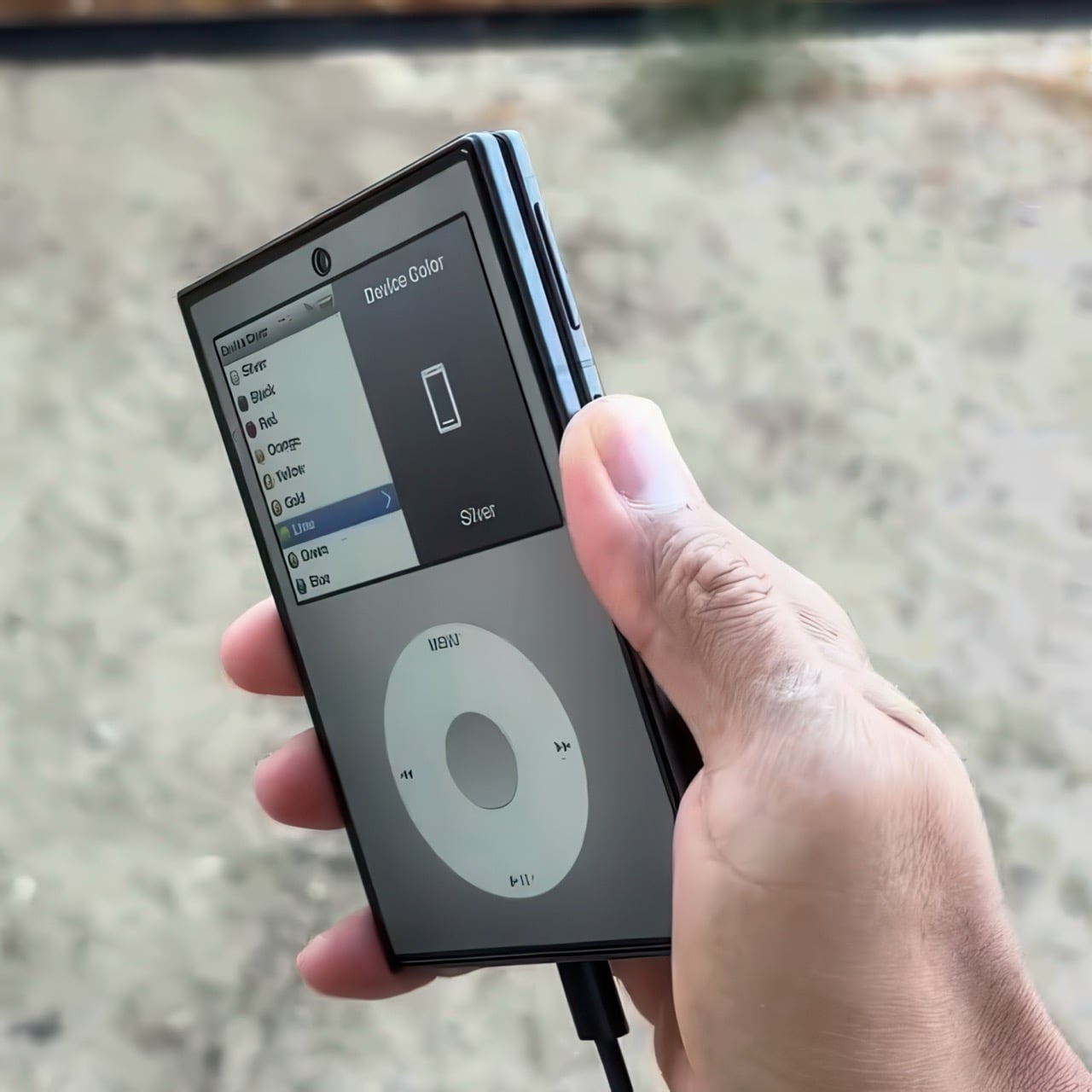
Apple has the opportunity to do something really cool here! An emulator going by the name of Classipod has been doing the rounds on the Google Play Store, letting you run an iPod Classic style interface on any Android phone of your choosing. The only problem is that Apple never really made a 9:20 iPod Classic. Every iPod Classic had a short, stout design and as it stands, there are only two Android phones that currently fit this bill, and both fold.

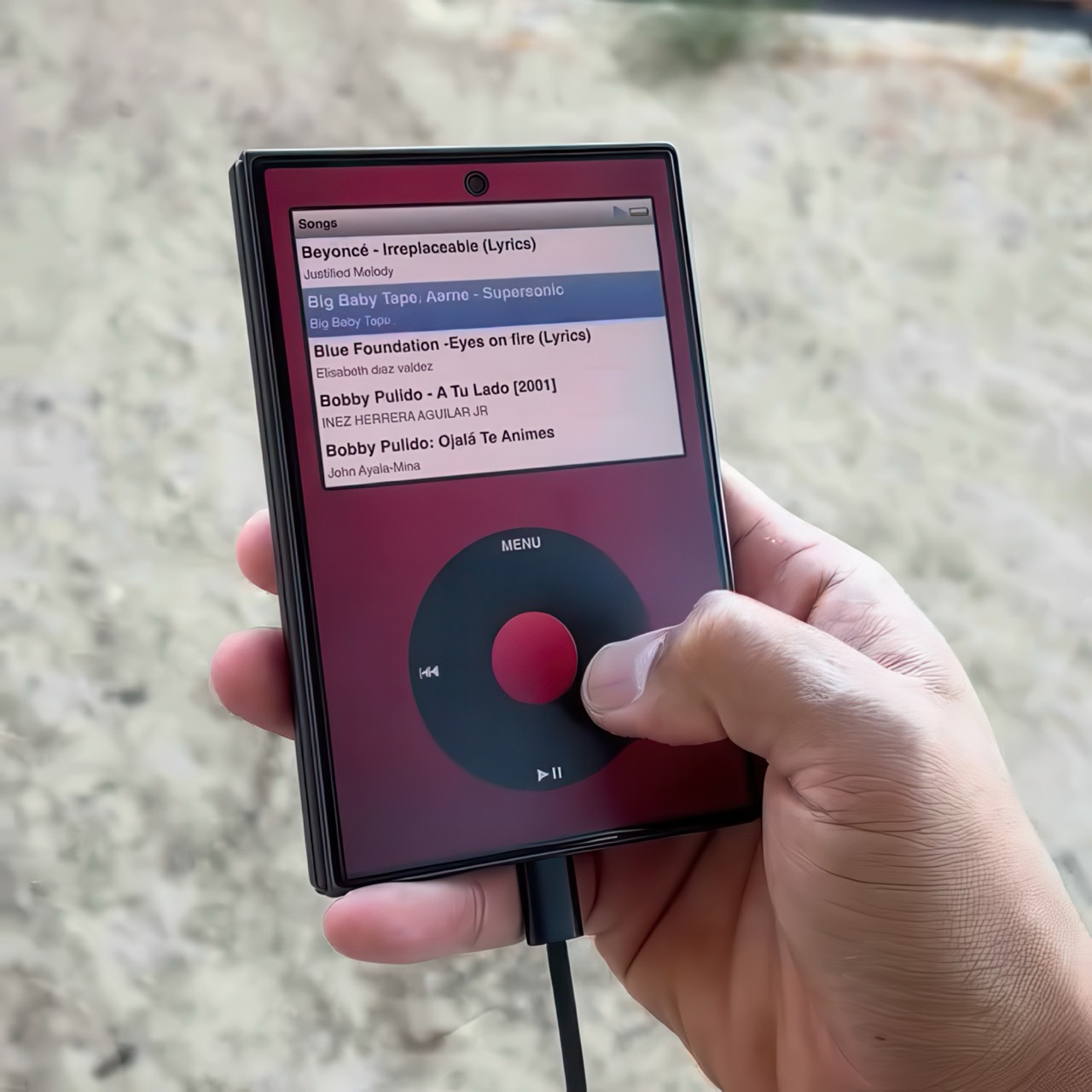
A video on Instagram showed the Classipod interface on a Galaxy Z Fold8 and I can’t help but feel like this almost exactly looks like the classic iPod. The proportions are damn near perfect, the interface still makes me nostalgic, and those color options absolutely slap! The only real problem is that, like all good things, Classipod came to Android before it did to the iPhone Duo… but if someone from Apple’s software team is reading this (hey Craig!), just go ahead and give us an Apple Music skin that brings back the iPod Classic! Pretty please??

Designer: Adeeteya

Here’s what I find so funny about running Classipod on a Z Fold8 – sure, it almost matches the iPod Classic’s form factor, but even when folded shut, it’s still thinner than the iPod! I’m talking hinge, two sets of screens, two batteries, an entire processor, cameras galore, all that packed into something that measures 9.7mm thick while the iPod Classic, which is just a tiny screen, battery, SoC, and a massive flash drive, measures 10.5mm in thickness. Then again, the iPod Classic packs an aux input too, which you’ll never see on a foldable phone.

But hold the Z Fold8 in your hand and the Classipod definitely scratches the itch of owning vintage Apple gear. The weight and heft, the analog interface, and that gorgeous jogwheel that is sure to get your muscle memory kicking in instantly. You sideload music so it plays locally (no streaming), and you can do everything, from searching for artists to making playlists. And yes, if you’re asking, the jogwheel has haptic feedback so it actually does feel like the iPod of yesteryears.

There are a few iPod emulators on the App Store, but none as good as the Classipod. I guess someone could vibecode one overnight and run it on an iPhone Duo soon, but until then, turns out the most faithful recreation of an iPod Classic exists… just on an Android device!

The post iPod Classic emulator for the Samsung Galaxy Z Fold8 finally gets the size and aspect ratio right first appeared on Yanko Design.

  •  

Gorgeous LEGO Book Nook Has a Steam Train Blasting Straight Through Its Snowy Pages

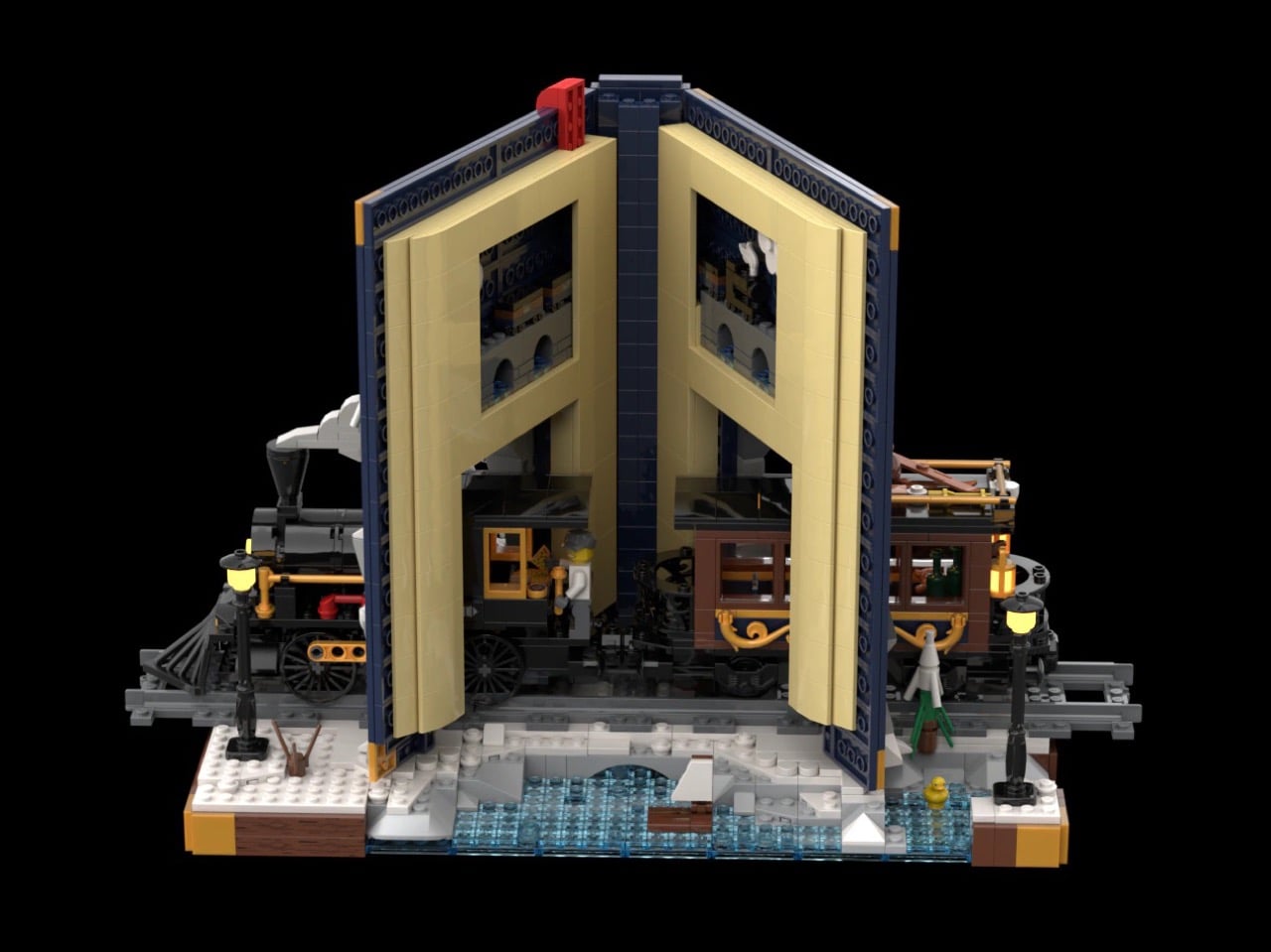
Every kid who grew up with Chris Van Allsburg’s The Polar Express remembers that moment where the story stops behaving like a story. A train just shows up, chugging straight out of the snow and into a kid’s actual bedroom, and suddenly bedtime reading feels a little bit dangerous in the best way. That’s the exact energy LEGO builder CrazyInventor is chasing with Winter Express, and yes, I see what you did there with that title, very smart way to dodge a certain mouse-shaped legal team while still getting the reference across loud and clear. Except here the train doesn’t stop at bursting out of the pages. It runs straight through the whole book, cover to cover, like the story just wasn’t big enough to hold it.

The result looks like someone left a hardback open on a shelf and a Victorian steam engine decided to use it as a shortcut. Gold trim, a red ribbon bookmark, snow dusted across the back cover like a sky full of stars, this thing reads more like a diorama that happens to be shaped like a book than a book that happens to have a train in it. And once you spot the tiny second train hiding inside the pages, you’ll understand why this project cracked 1,000 supporters in about three days flat.

Designer: CrazyInventor

The book itself steals the show before the train even enters the conversation. It’s a navy blue hardback with rounded gold corner guards and matching gold bands running down a curved spine, the kind of cover treatment you’d expect on a leather-bound classic rather than a pile of ABS plastic. A gold plaque on the front reads “Winter Express” in a wood-grain frame, and a red ribbon bookmark hangs off the top edge like someone set the book down mid-chapter and wandered off to make tea. Flip to the back cover and it’s scattered with pale blue round studs, doing double duty as either falling snow or a starry winter sky, depending on how you’re feeling that day.

A black and gold Victorian locomotive takes over from there, complete with a glowing headlamp, a cowcatcher up front, and Technic side rod detailing, coming straight out of a snow-capped rock tunnel carved into the front cover. A matching passenger coach trails out the other side through the spine, decked out in scrollwork trim with its own lit lanterns and a roof stacked with skis and sleds. Snowy pine trees, cobblestone tiles, and two working lampposts fill out the base, along with a frozen little pond built from trans-blue tiles.

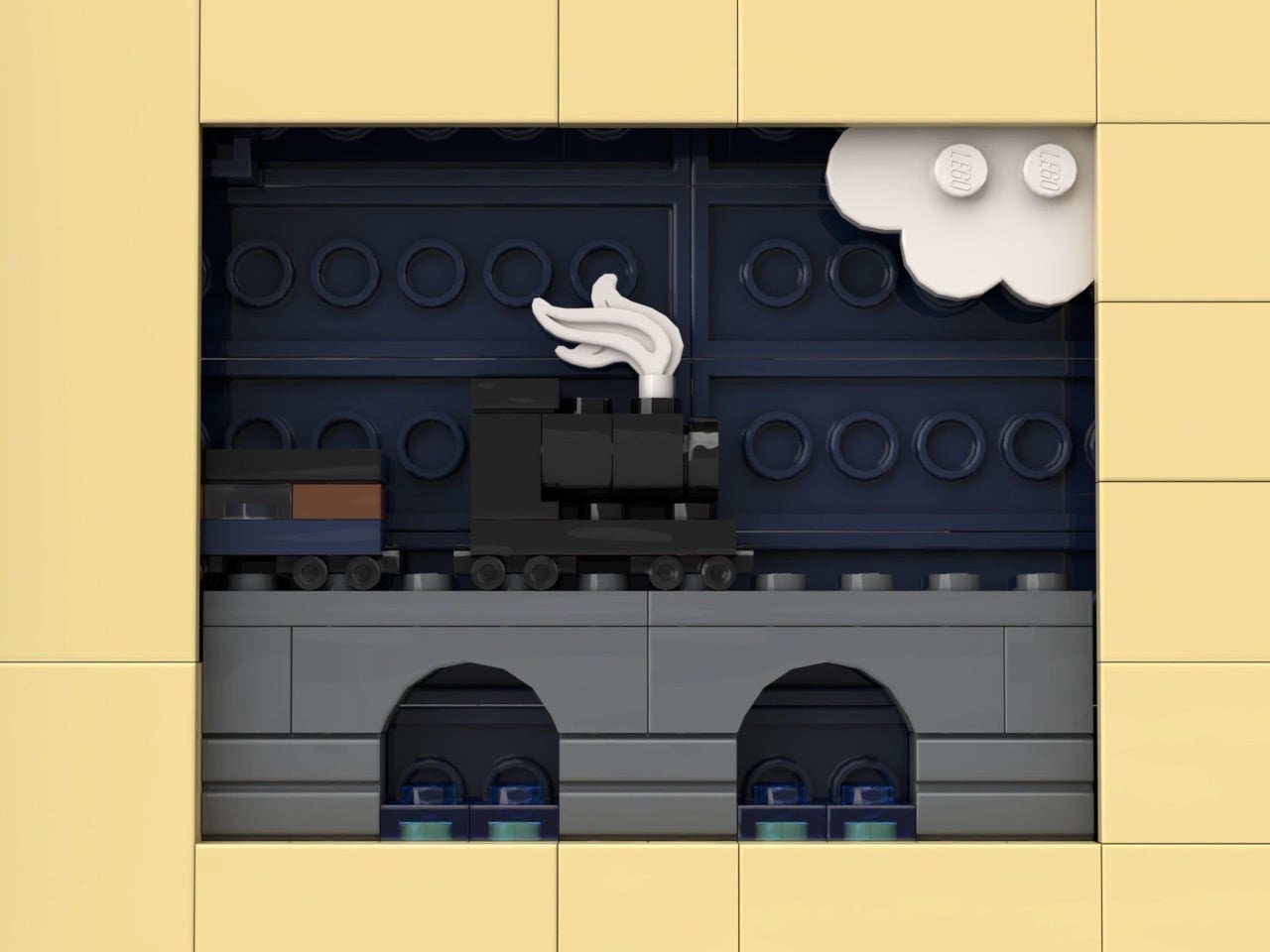
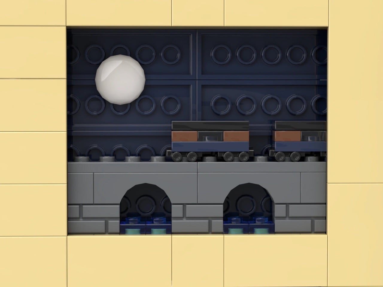
My favorite detail is buried in the pages themselves. Look closely at the tan interior spread and there are cutout windows revealing a second, micro-scale train crossing a tiny stone viaduct, a whole miniature railway hiding inside the book that the big train is currently smashing its way through. It’s a small touch, but it’s the kind of layered thinking that separates a fun MOC from a genuinely great one.

Winter Express landed on LEGO Ideas on September 15 and has already pulled in 1,291 supporters, cruising well past the first 1,000-vote milestone toward the 5,000 mark it needs next. If cozy winter dioramas with a little bit of chaos baked in are your thing, go to the LEGO Ideas page and add your support and watch this one keep climbing.

The post Gorgeous LEGO Book Nook Has a Steam Train Blasting Straight Through Its Snowy Pages first appeared on Yanko Design.

  •  

TECNO CAMON Slim 5G Review: Thinner than a Pencil, Tough as a Tank

PROS:


  • Unbelievably slim and lightweight design

  • Striking and stylish art-inspired finish

  • Large 6,000mAh battery despite slim profile

  • Exceptional durability with quad-IP rating, supporting underwater photography

CONS:


  • Modest hardware specs

  • No dedicated telephoto camera

RATINGS:

AESTHETICS
ERGONOMICS
PERFORMANCE
SUSTAINABILITY / REPAIRABILITY
VALUE FOR MONEY

EDITOR'S QUOTE:

Slim, art-inspired, and tougher than it looks, the TECNO CAMON Slim 5G packs a 6,000mAh battery into a body thin enough to turn heads.
award-icon

Slim phones have always come with a catch. Shave down the body and something else usually gets sacrificed: usually the battery, sometimes the durability, occasionally both. The TECNO CAMON Slim 5G doesn’t play by that old rulebook. At just 6.39mm thick, it still packs a 6,000mAh battery, 5G connectivity, and a durability rating most phones twice its thickness wouldn’t dare claim.

This review spent real time with the phone away from spec sheets, mostly to see if the design holds up once the initial wow wears off. That meant handling the Neo Mondrian finish TECNO sent for testing, carrying it through a normal week, testing the camera in situations that actually matter, and checking whether the durability claims survive contact with water and everyday clumsiness. The design conversation comes first.

Designer: TECNO

Aesthetics
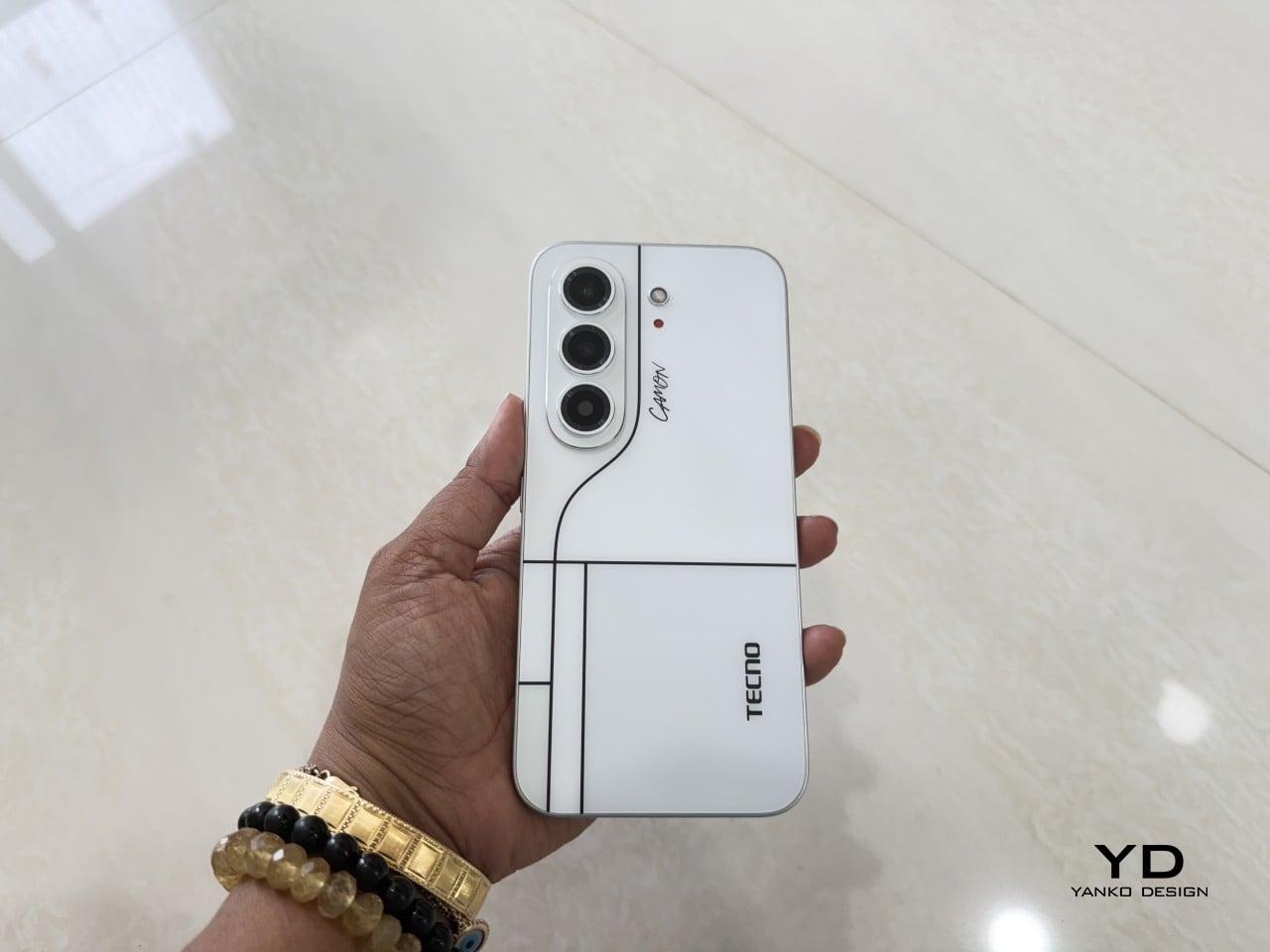
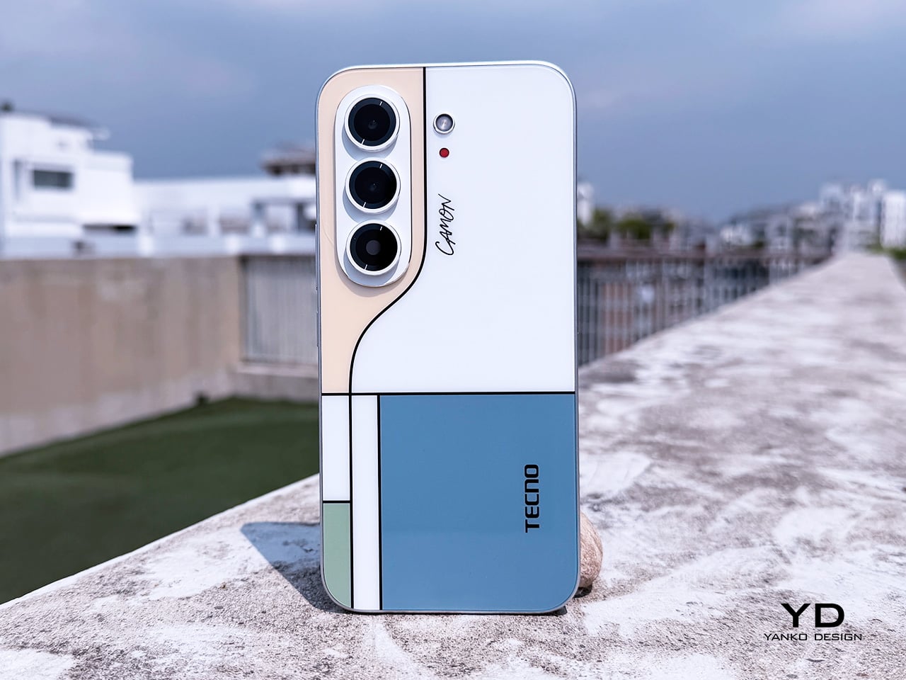
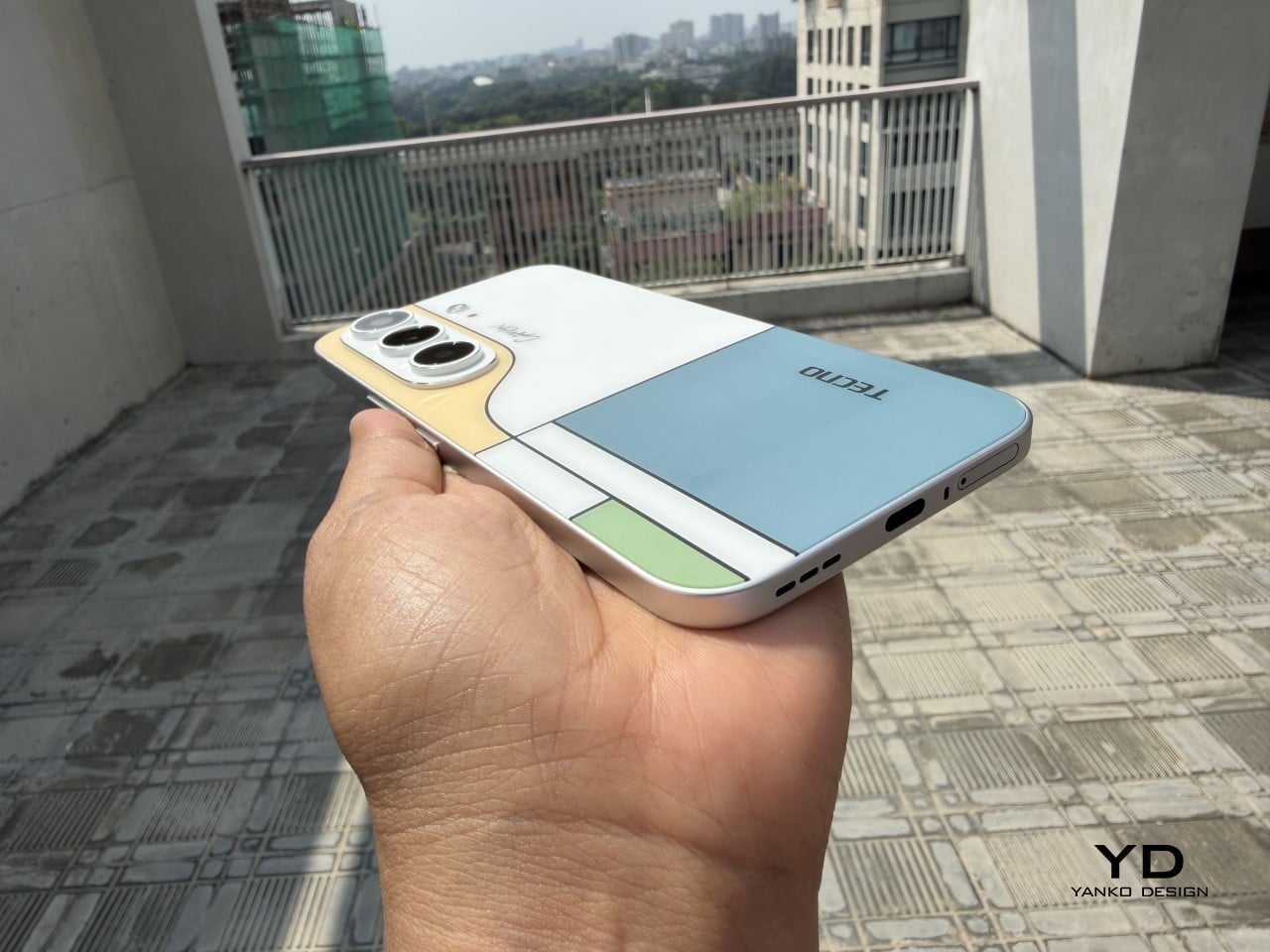
Pull the CAMON Slim 5G out in public and watch what happens. People notice a phone this thin the way they’d notice a watch too elegant for its price tag, usually with a double take and a request to hold it. TECNO carried over the swan-neck curve from the CAMON 50 series, and on a body this slender, that curve reads like a signature rather than a spec sheet footnote.
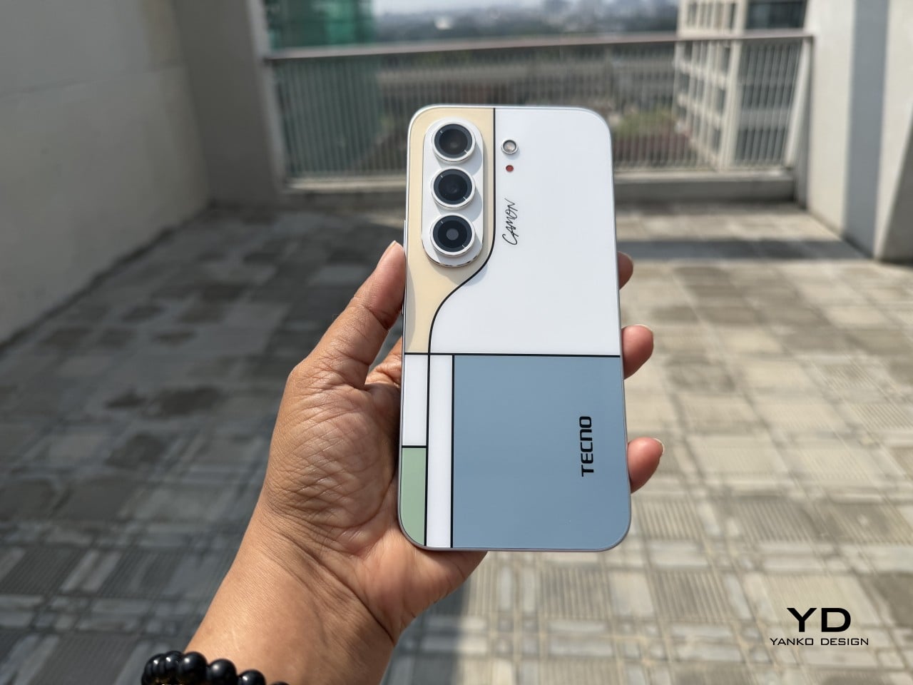
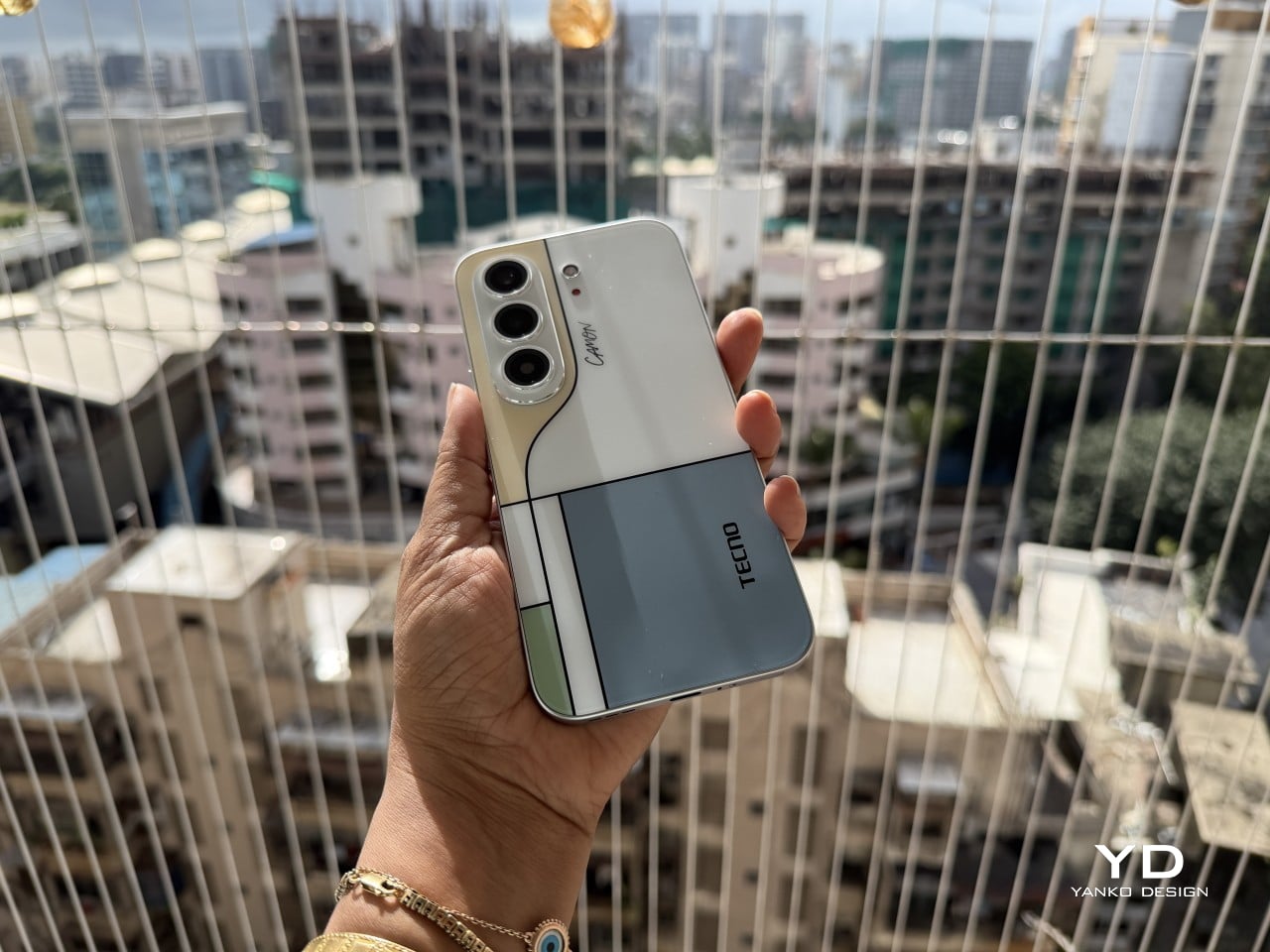
TECNO sent the Neo Mondrian colorway for this review, and it’s the strongest argument for treating a phone back as an actual canvas. Expose the panel to sunlight and yellow, green, and cyan blocks slowly bloom out of white, forming the grid Piet Mondrian made famous a century ago. It’s a photochromic trick, but watching it happen feels less like a gimmick and more like a magic show.

Neo Mondrian isn’t the only finish doing something interesting. Van Gogh Blue uses similar light-reactive techniques to make its swirling nebula pattern look like it’s actually rotating as shadows shift across it, closer to a painting than a phone back. Matisse Black leans into fluorescent green or pink color blocks that echo the artist’s cut-out work, while Burgundy Red blends fiberglass and matte texture into a warm, understated finish. Rebel Pink keeps things simpler, pairing a black body with sharp pink accents for something a little more playful.
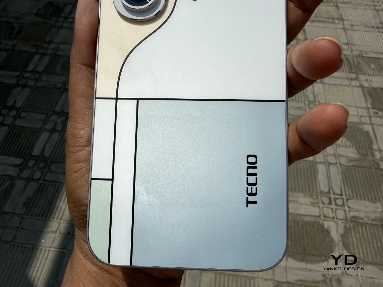
Phone backs used to be an afterthought, something to protect rather than admire, which is why so many people slapped an opaque case on day one without a second thought. That’s changing. As manufacturers invest more in finishes, textures, and light-reactive coatings, more owners are leaving their phones bare, treating the back panel the same way they’d treat a piece of art they paid good money to display.

Ergonomics

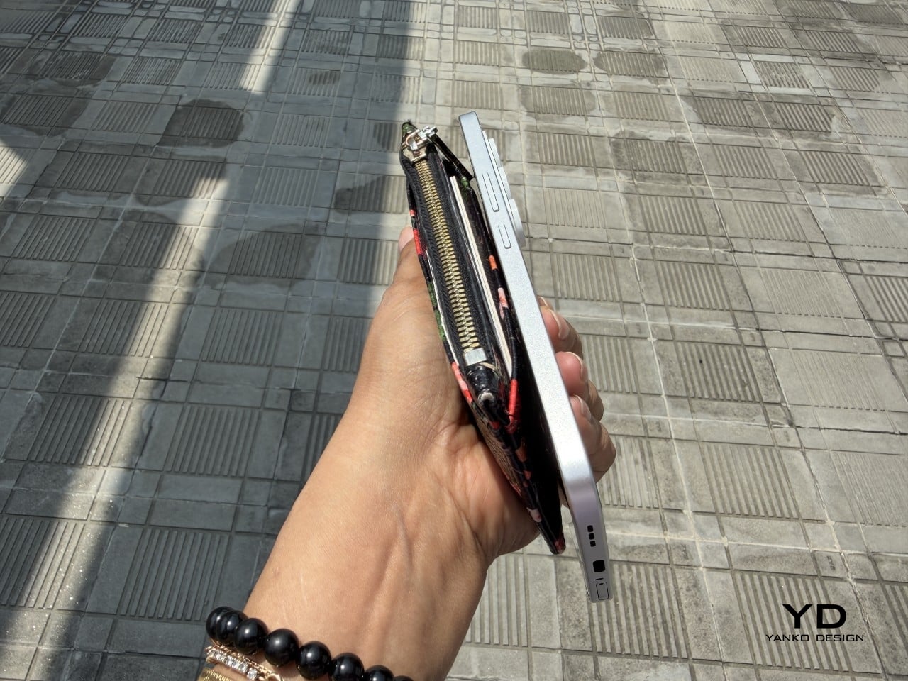
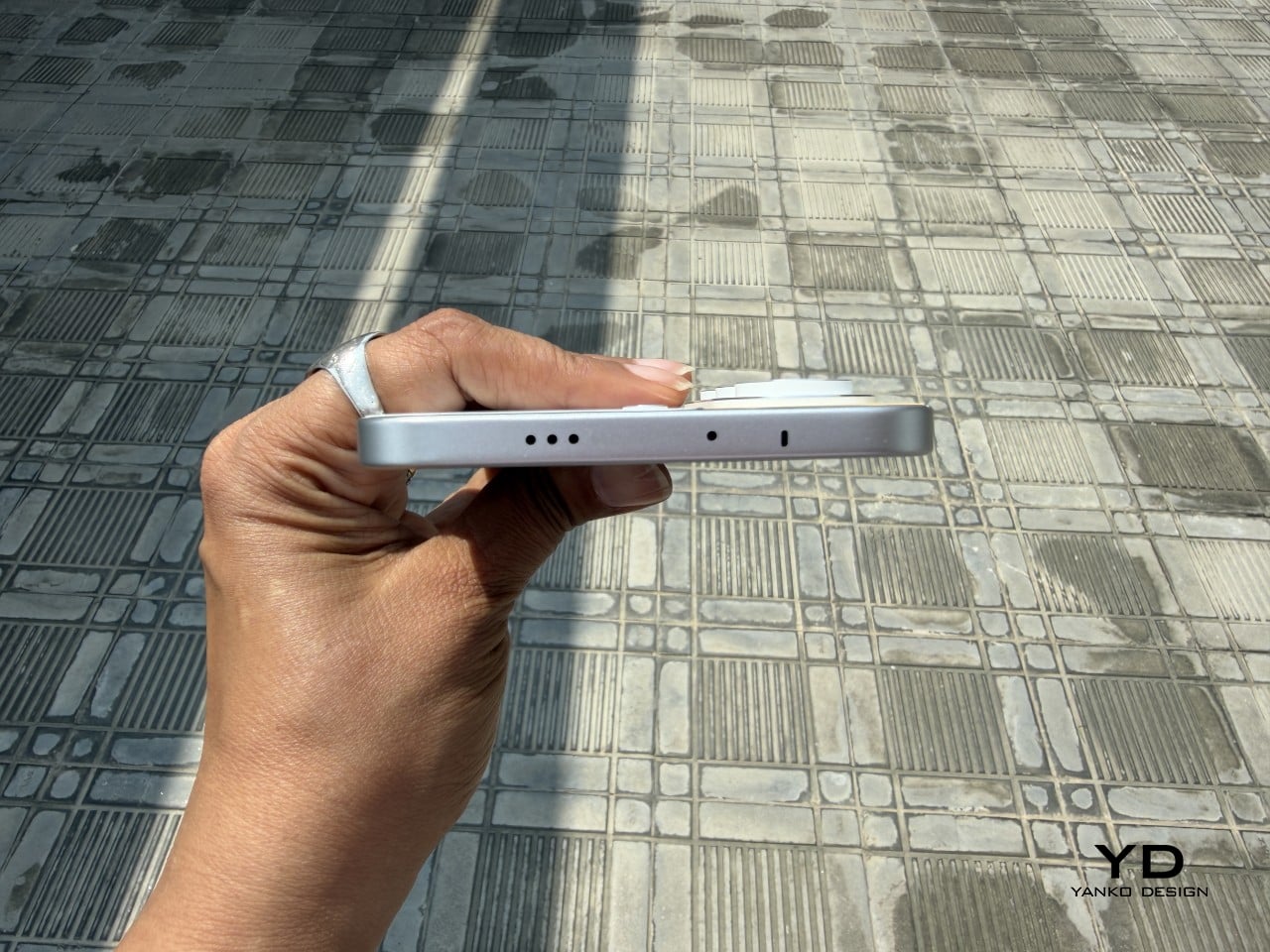
Carrying the CAMON Slim 5G is where the thin body actually pays off day to day. It slides into a front pocket without that telltale bulge, sits flat against a jacket without pulling on the fabric, and feels lighter in hand than the display size suggests. After a few days, reaching for a thicker phone almost feels like picking up a brick by comparison.
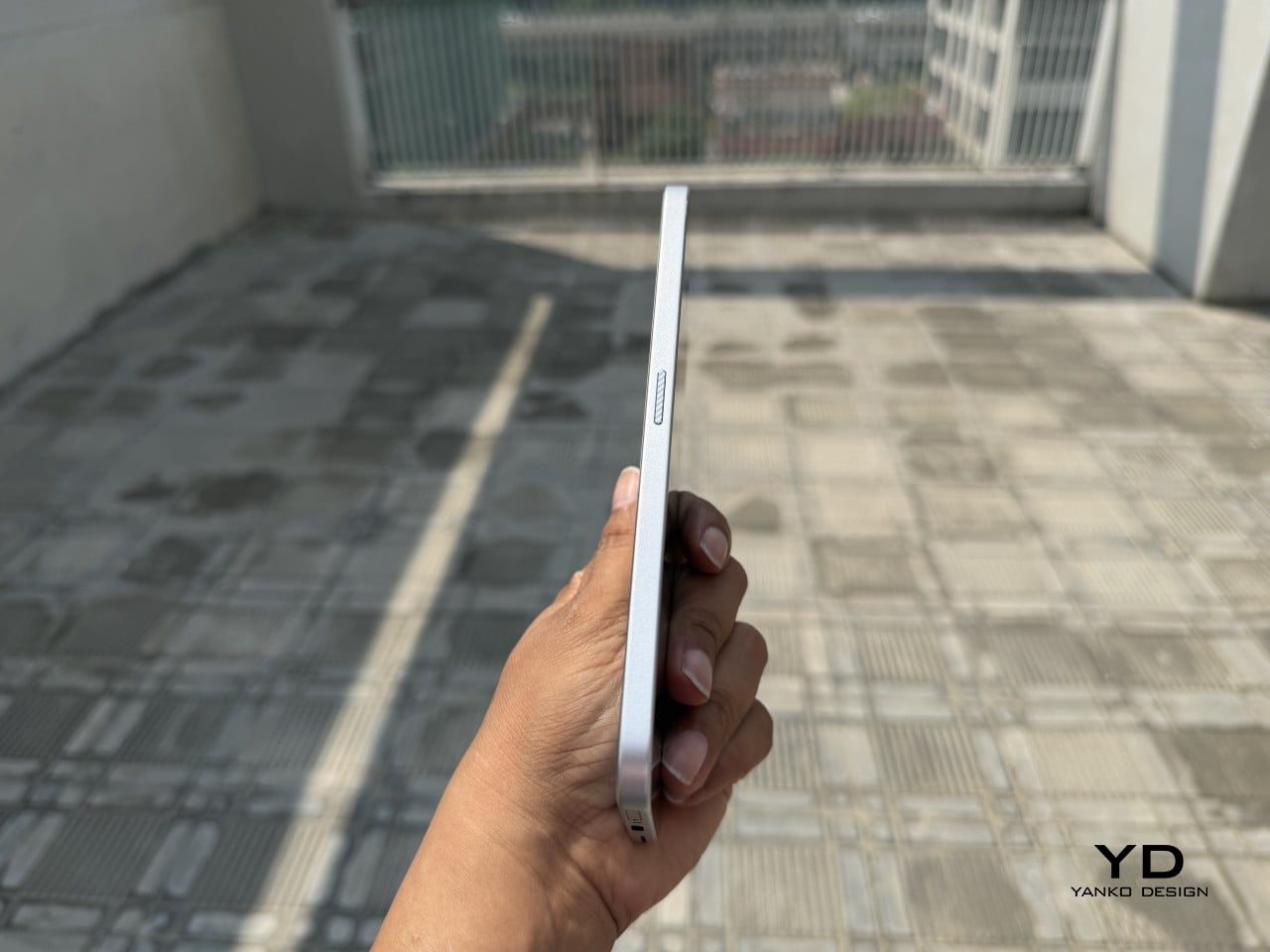
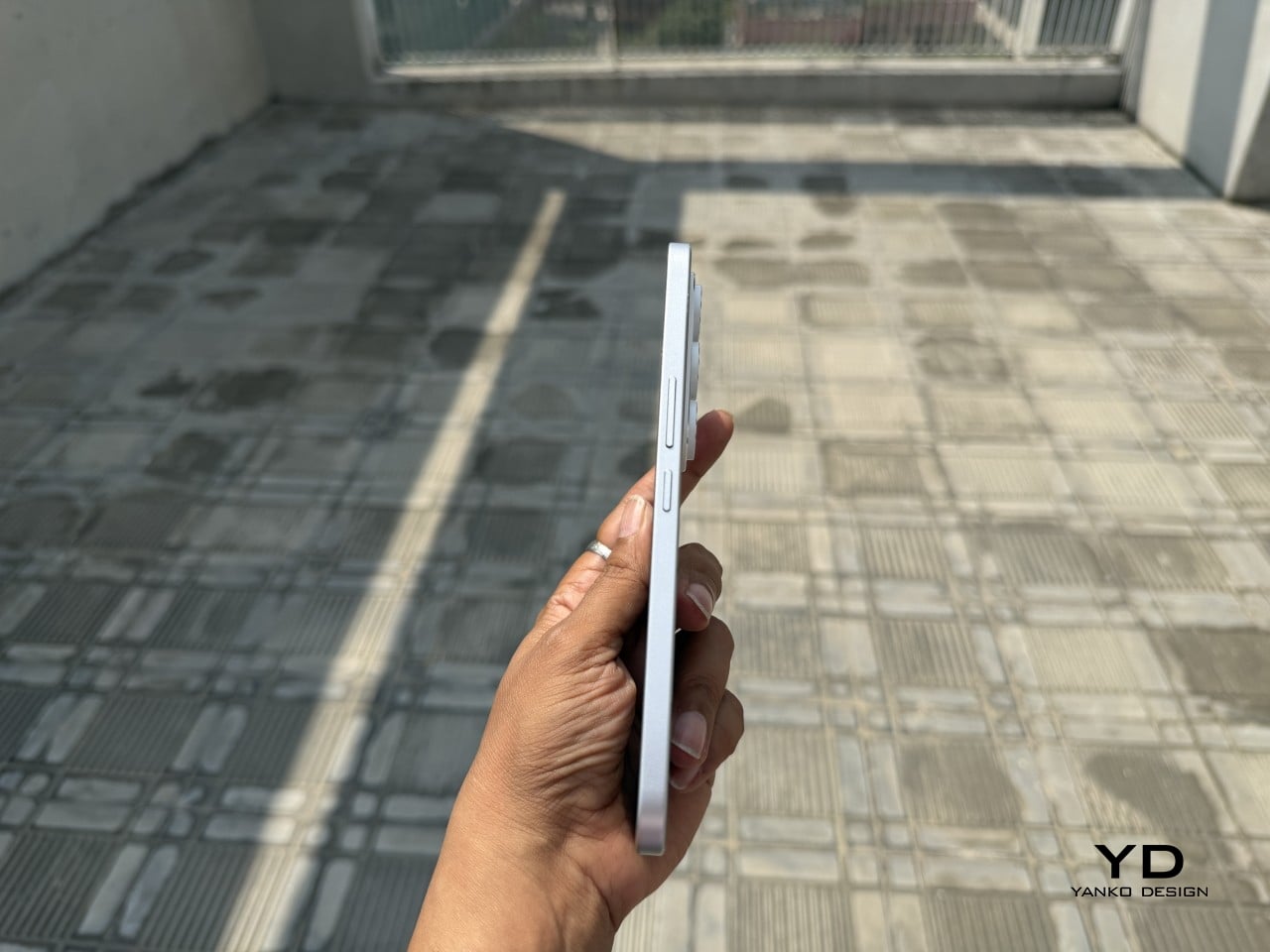
Those flat edges aren’t just a style choice borrowed from boxier design trends. They give fingers something to actually grip onto, instead of sliding off a rounded rim the way slippery slab phones tend to do. The matte texture on the Neo Mondrian panel adds even more confidence, and TECNO’s wet and oily finger recognition keeps the touchscreen responsive when hands aren’t exactly dry or clean.
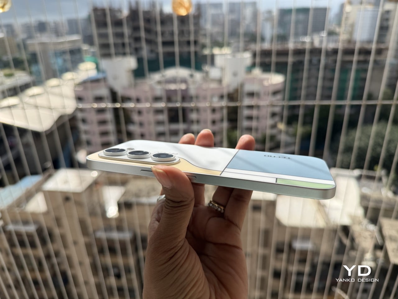
Performance

The 6.78-inch AMOLED display runs at 1.5K resolution and 144Hz, and both numbers translate into a screen that looks sharp and feels fast under a thumb. Photos pop with the kind of contrast only AMOLED delivers, video looks great for a lunch break binge, and scrolling through a feed never feels like it’s fighting the hardware. TÜV Rheinland’s low blue light certification is a nice bonus for long reading sessions.
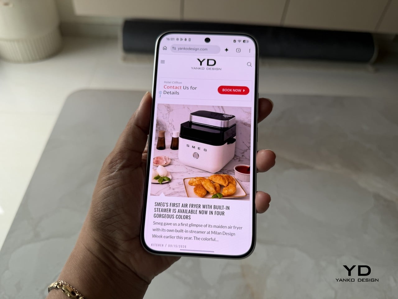
Under the hood sits a MediaTek Dimensity 7300e, a processor built for balance rather than benchmark bragging rights. It handles social apps, photo editing, and everyday multitasking without hiccups, though demanding 3D games will ask more of it than it’s built to give. The 8GB of RAM stretches to 24GB with virtual memory extension, which covers most multitasking habits without needing to close every open app.


The 50MP Sony LYTIA 700C handles most of the photography workload, and it earns that responsibility. A 1/1.56-inch sensor paired with an f/1.8 lens pulls in plenty of light for evening shots, while the closed-loop ball motor keeps focus locked even when subjects won’t sit still. The 8MP ultra-wide feels more like a footnote, and there’s no telephoto here, but the main camera rarely leaves you wanting one.
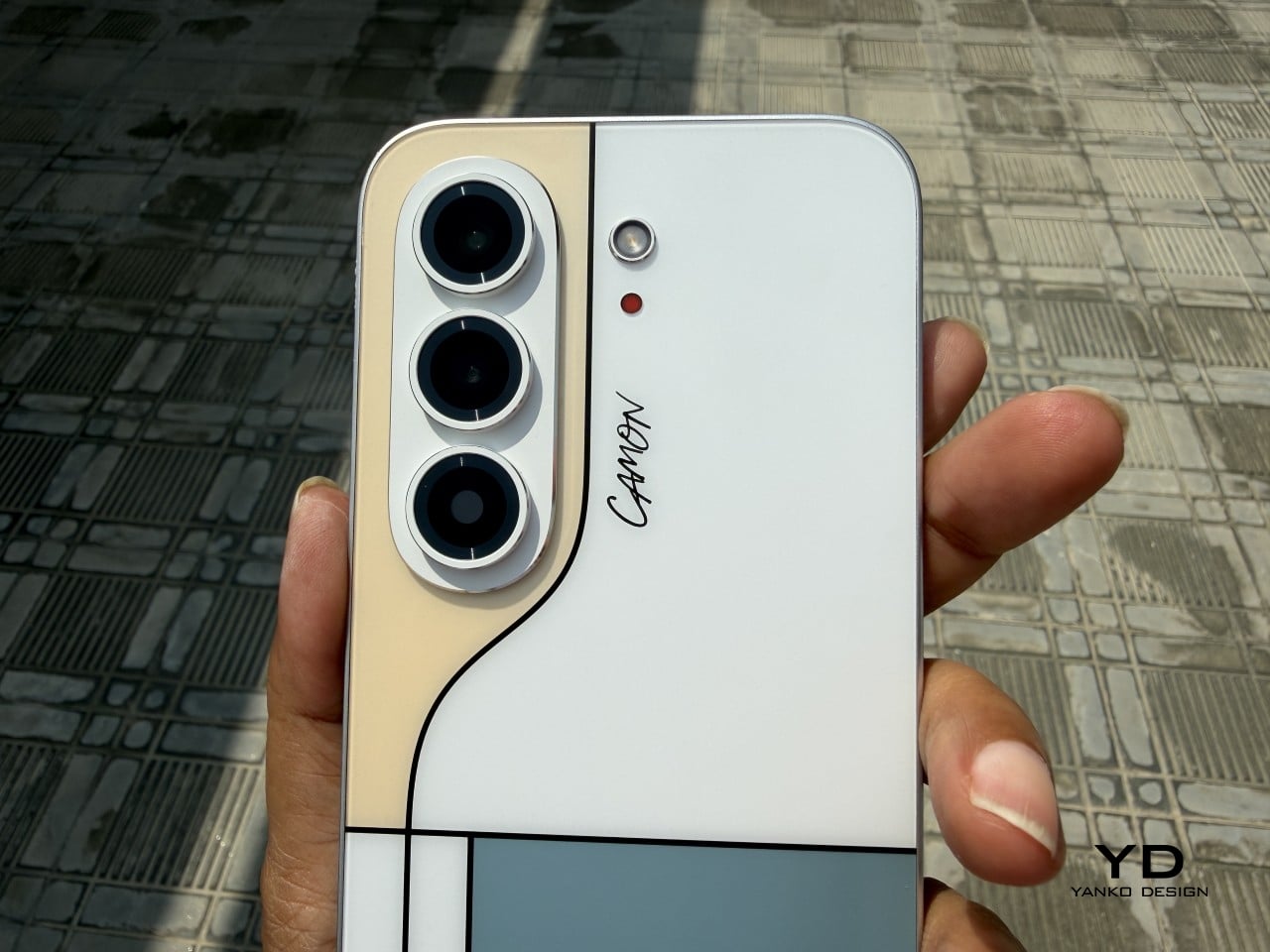
The real showstopper is the 6,000mAh battery, a number that seems almost impossible once you remember this phone measures 6.39mm thick. It comfortably carries a full day of camera use, video, and scrolling without the battery anxiety that usually comes with slim designs. That same waterproofing also unlocks a dedicated underwater photography mode, one that kicks in automatically the moment the phone senses it’s gone for a swim.


Sustainability

TECNO rates the CAMON Slim 5G at IP69K, IP69, IP68, and IP66, a combination that’s rare even among phones that don’t have to worry about staying thin. That covers everything from high-pressure water jets to dust particles to full submersion, which is a lot of technical armor for a phone this delicate-looking. Finding this rating on a 6.39mm body is the kind of detail that quietly impresses.
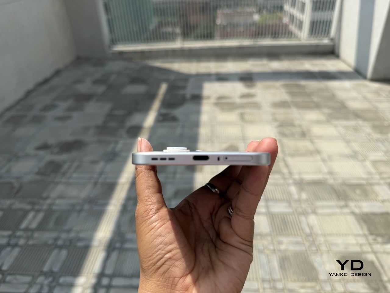
There’s also a MIL-STD-810 rating covering shock and drop resistance, which pairs nicely with features like Rain Touch and Waterproof Case Touch that keep the screen usable in a downpour or behind a case. This doesn’t read like a feature bolted on at the last minute. It feels like TECNO wanted this phone to survive actual daily chaos, not just look good sitting still on a shelf.
Longevity extends past the hardware, too. TECNO promises three major OS upgrades and five years of security patches, plus a 60-month smoothness certification from TÜV SÜD. That’s a meaningful commitment in a market where phones often get abandoned after two update cycles. A well-built object is worth keeping around, and TECNO seems to be betting that owners will want to hold onto this one for a while.

Value

TECNO hasn’t confirmed global pricing yet, but early indications point to somewhere around $400. At that number, buyers get a phone with genuine art-inspired finishes, a 6.78-inch 144Hz AMOLED screen, a Sony-backed 50MP camera with real stabilization, a 6,000mAh battery, and a durability rating that most phones twice the price don’t bother chasing. That’s a fairly generous list for a phone that costs less than most flagships.
Most phones in this price range make you pick a lane. Go thin, and the battery usually suffers, or the body skips water resistance entirely, or the software support runs out after a couple of years. TECNO’s five-year update promise and its layered durability ratings quietly add up to lower long-term cost, since a phone built and supported to last half a decade doesn’t need replacing as often.

This phone makes the most sense for people who are tired of carrying an identical black slab and want something that says a little more about them. It’s not the right pick for hardcore mobile gamers chasing max frame rates, or photographers who need optical zoom on tap. For nearly everyone else, it covers daily needs while looking like it belongs on a gallery shelf.

Verdict
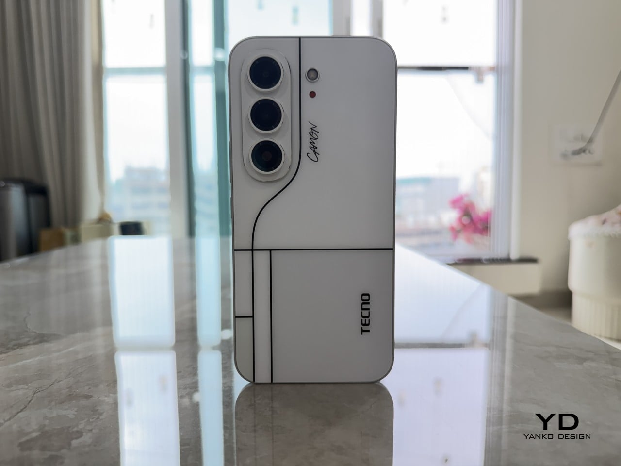
After a few days of actual use, the 6,000mAh battery and the quad-IP rating stop feeling like marketing footnotes and start feeling like the whole point. TECNO built a phone that looks like it belongs in a design museum and still survives a rainy commute or a splash at the sink. The Neo Mondrian panel alone gives it a personality that’s genuinely hard to find anywhere near this price.

Plenty of phones ask you to choose between something beautiful and something dependable, and most buyers have quietly accepted that trade-off as the cost of owning a nice-looking device. The CAMON Slim 5G makes a strong case that the choice was never as necessary as the industry made it seem. It’s a phone that looks good on a café table and still works fine after falling off of one.
The post TECNO CAMON Slim 5G Review: Thinner than a Pencil, Tough as a Tank first appeared on Yanko Design.

  •  

Bose Ultra Open 2nd Gen and Sport Open spice-up the clip-on earbuds options

After almost two years of a lull, Bose has finally released a new version of the Ultra Open Earbuds, along with a new pair of fitness-focused open earbuds. While I’m still a sucker for ANC earbuds that isolate me from the ambient world for deep focus moments, Bose’s new Open earbuds are tempting enough to consider for my walks and outdoor activities.
The hardware for the second-generation Open Ultra has been updated for better audio, while the all-new Sports Open Earbuds explore new territory for hardcore active individuals who trust the brand with their audio requirements. Both these open-ear audio accessories take on the competition with a strong set of specifications, features, and pricing to keep everyone interested.

Designer: Bose

The timing of this release is perfect, as the open-ear earbuds are trending amongst individuals who need to be aware of the environment and, more importantly, suffer from occlusion triggered by ANC earbuds. Sure, those buds have transparency mode for situations where you need to hear what’s happening around, but the open-ear options are ideal for runners, cyclists, or public transport users. The two of them will support Bluetooth 5.4 multipoint connectivity for two devices and Google Fast Pair. Both these open-ear buds will be available for pre-order from 19 September, and available from October 1 in Black and White Smoke along with other respective limited edition colors.

Ultra Open Earbuds 2nd Gen

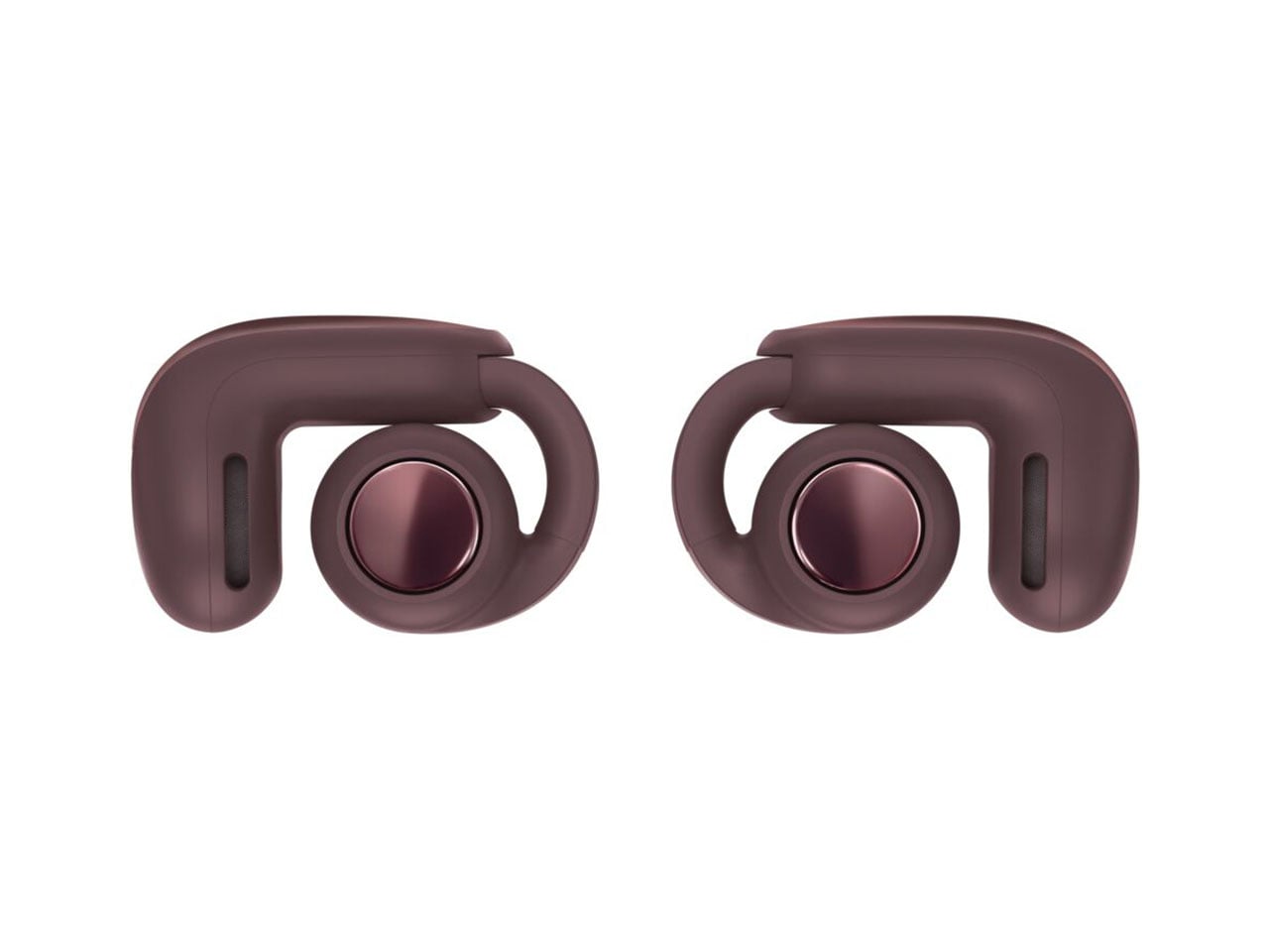
The flagship Ultra Open Earbuds arrive in the second generation to create “more listening moments across active pursuits and everyday life.” The buds are reengineered with better drivers to deliver deeper bass and a higher volume compared to the outgoing version. This has been the major complaint of existing users, and Bose has listened to the feedback and delivered the fix. The look and feel of the buds have been upgraded as they get a refined metallic cap with a beveled finish, while the case also benefits from a renewed design that makes them stand upright. As a welcome addition, the case is now wireless charging compatible. On the buds, you’ll now get 9 hours of battery life, with an additional 19.5 hours on the case. The buds support quick charge to deliver two hours of playback with just 10 minutes of quick charge.

High-quality audio is the main USP, as the open-ear buds get the aptX Adaptive codec and Snapdragon Sound support. For a better calling experience, the buds benefit from the Speech Clarity tech to adjust the listening volume automatically based on the environmental noise. Of course, this is AI-driven to smoothly transition the volume step. For those who love to watch movies and shows in surround sound, there is the Cinema mode that employs Bose’ TrueSpatial tech to envelope you in a 3D sound capsule. Ultra Open Earbuds (2nd Gen) will arrive in limited-edition Olive Green, Cherry Chocolate, and Sky Pink colors for $299.

Sport Open Earbuds

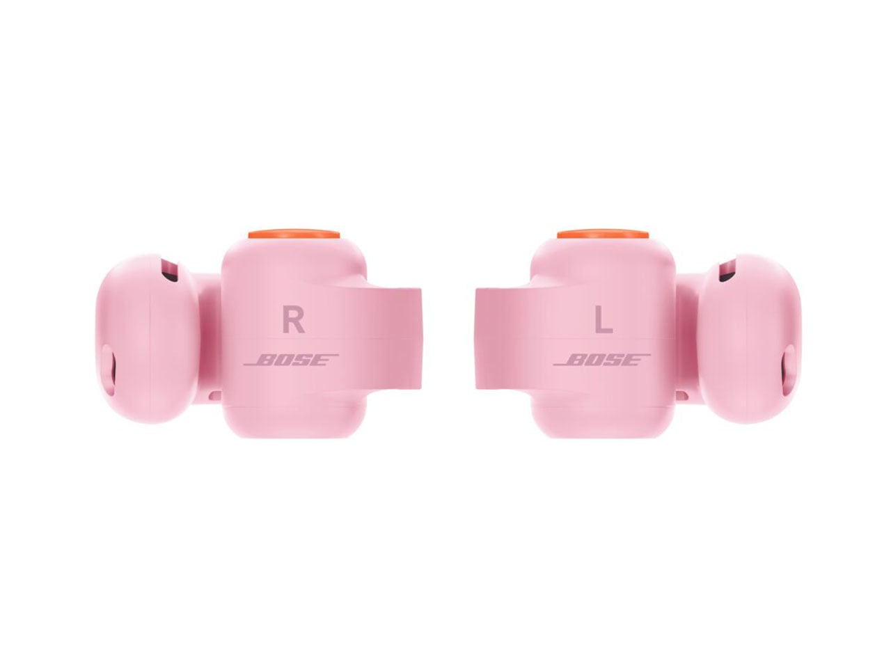
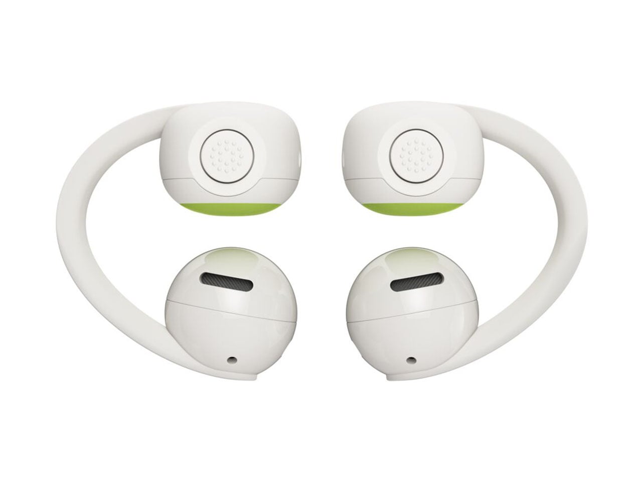
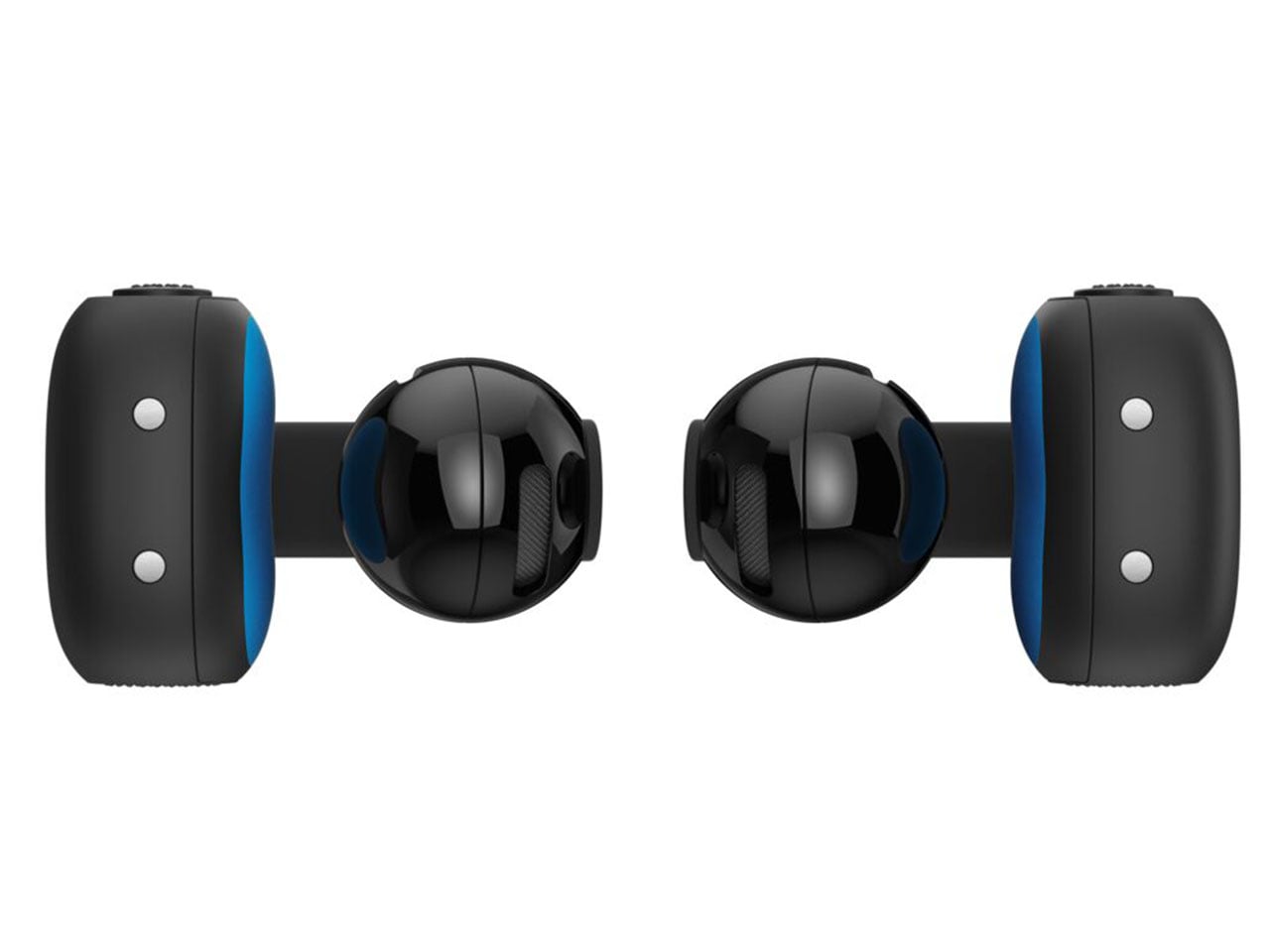
The new kid on the block is the Bose Sport Open Earbuds, which are designed for a secure fit and rated IP54 for dust and splash resistance. Compared to the big brother, these clip-on earbuds sport a more roundish hinge to stay in place even with the most rigorous activities like playing sports, running, or working out in the gym. According to Bose, the Sport Open Earbuds stay in place even with headshakes, cartwheels, and other activities.” For these open-ear wireless earbuds, Bose has opted for the tactile physical buttons since fiddling for touch controls is not practical.

For a sportier design, the earbuds get a translucent case lid that is textured for better grip. Each of the buds weighs 10 grams for all-day wearing comfort and touts 7 hours of listening time, with 29 hours total with the case. The Sport Open Earbuds will be available for $199 in limited-edition Eucalyptus Green, along with the aforementioned color options.

The post Bose Ultra Open 2nd Gen and Sport Open spice-up the clip-on earbuds options first appeared on Yanko Design.

  •  

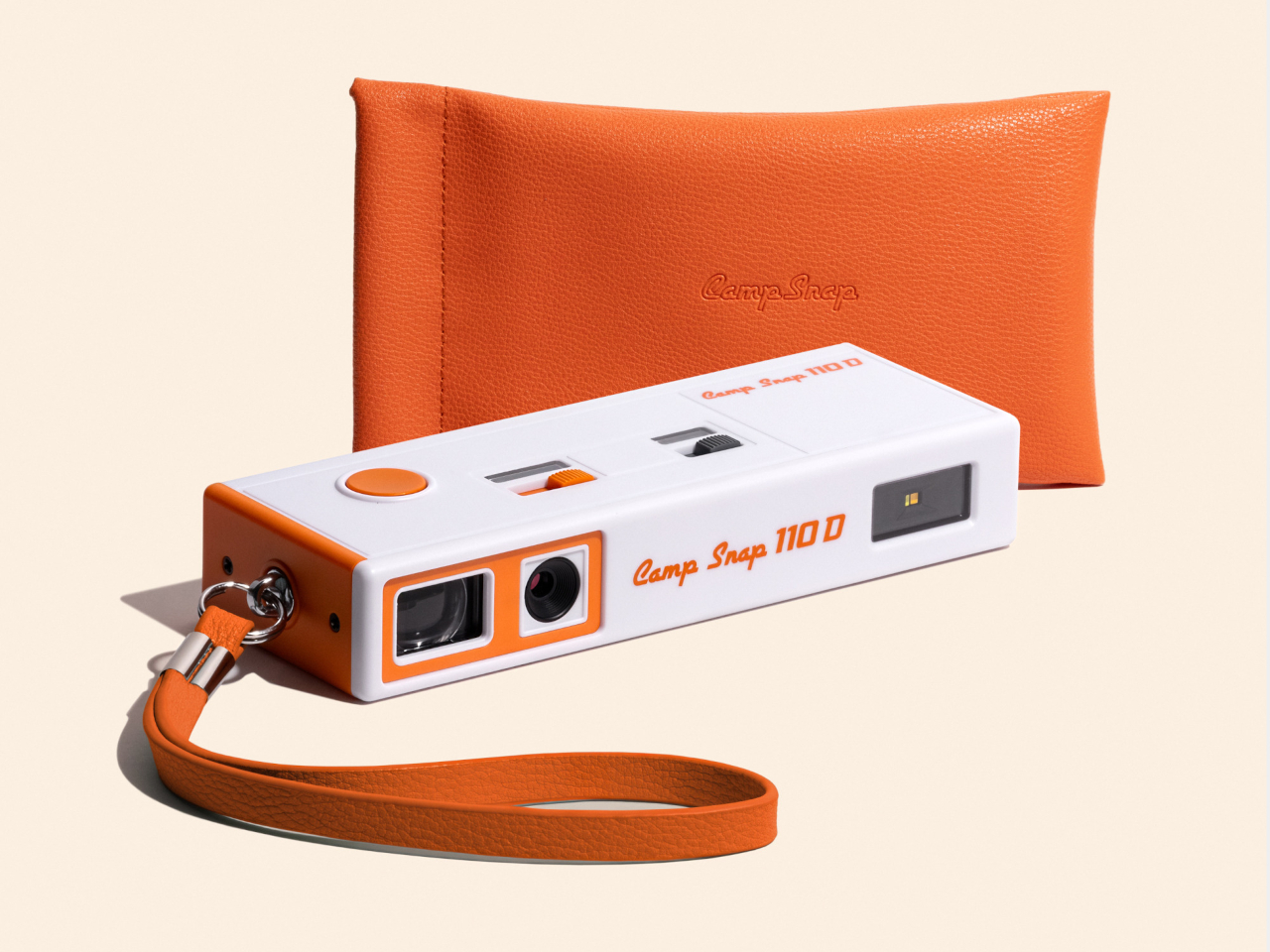
Camp Snap’s 110D Looks Like 1973 and Still Skips the Screen on Purpose

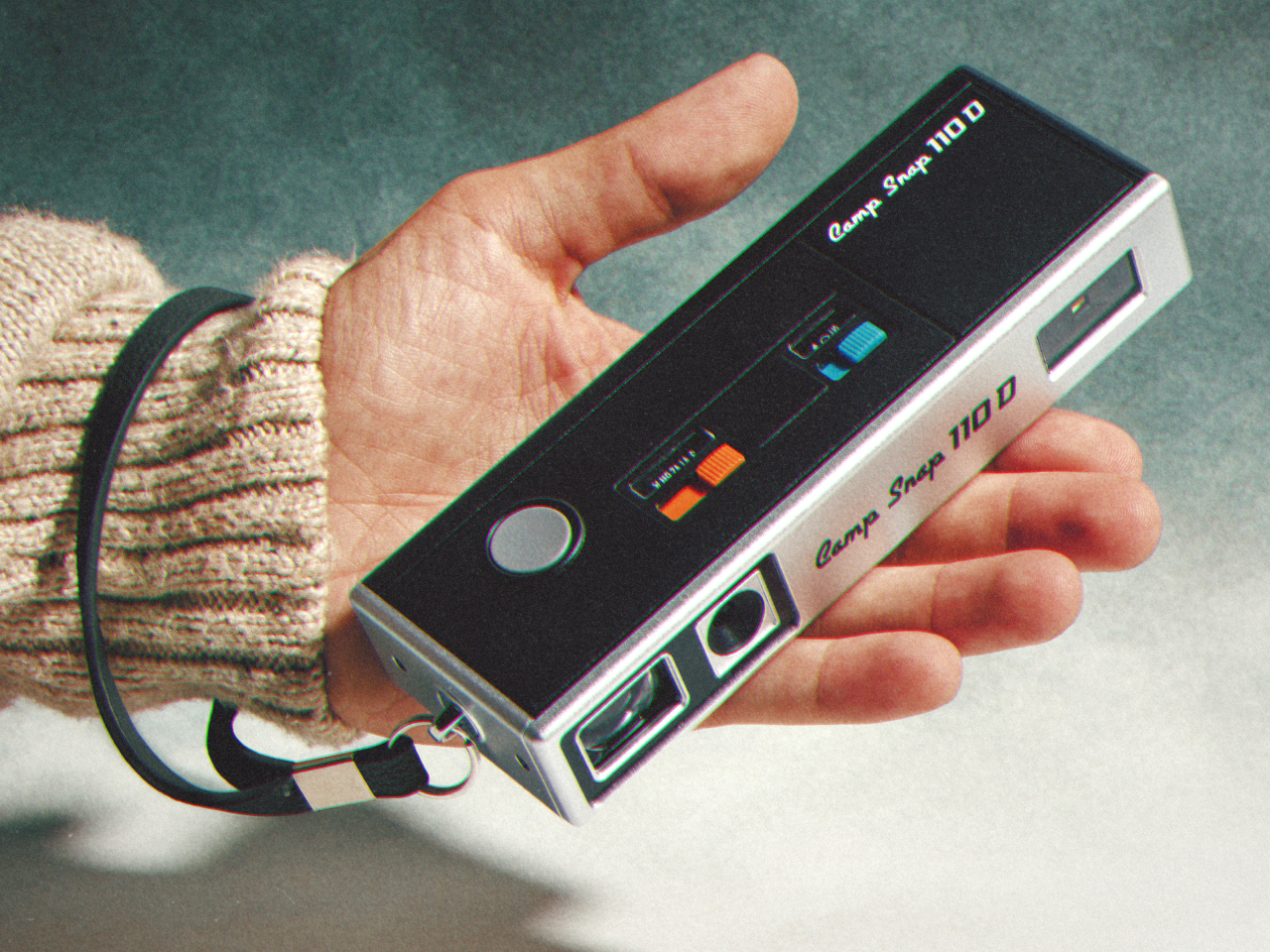
Camera design spent the last two decades chasing thinner phones and bigger screens, so a company deciding to revive a boxy, finger-length shape from the 1970s sounds like a step backward. The Camp Snap 110D proves otherwise. It borrows its elongated, pocketable body from the old 110 film format, then strips out the one feature every digital camera has trained us to expect: a screen for checking the shot you just took.

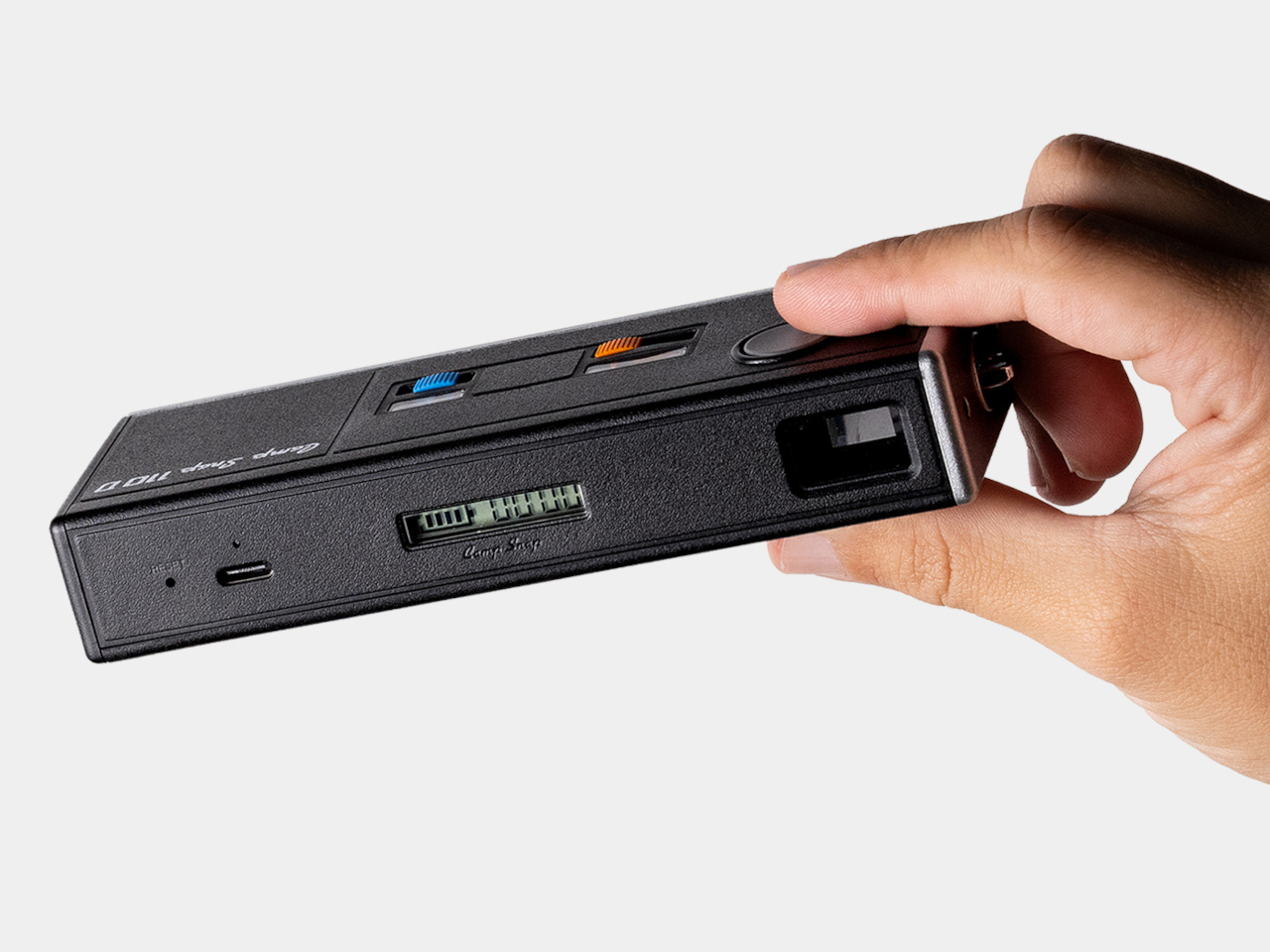
That missing screen isn’t a cost-cutting shortcut. It’s the entire point. Smartphone photography turns every outing into a loop of shooting, reviewing, deleting, and reshooting until a moment gets buried under a dozen nearly identical takes. The 110D breaks that loop by design, letting a photo exist the instant it’s taken and staying invisible until you plug the camera in later and actually look at what you captured.

Designer: Camp Snap

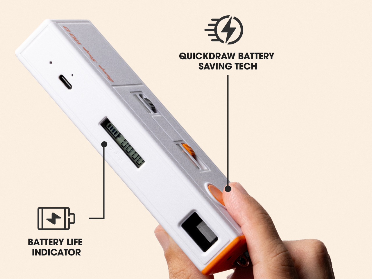
Living without a review screen also solves a problem the original 110 format never had to think about: battery life. Screens are usually the single biggest power drain in a compact camera, so removing one frees up room for improvements elsewhere. The 110D pairs that saved power with QuickDraw sleep and wake functionality, letting the camera snap awake fast enough to catch a moment instead of fumbling through a slow startup.

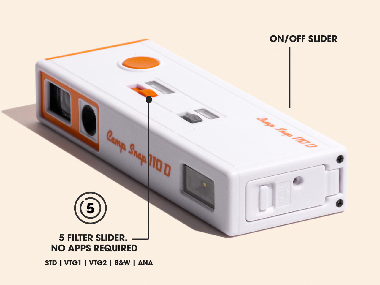
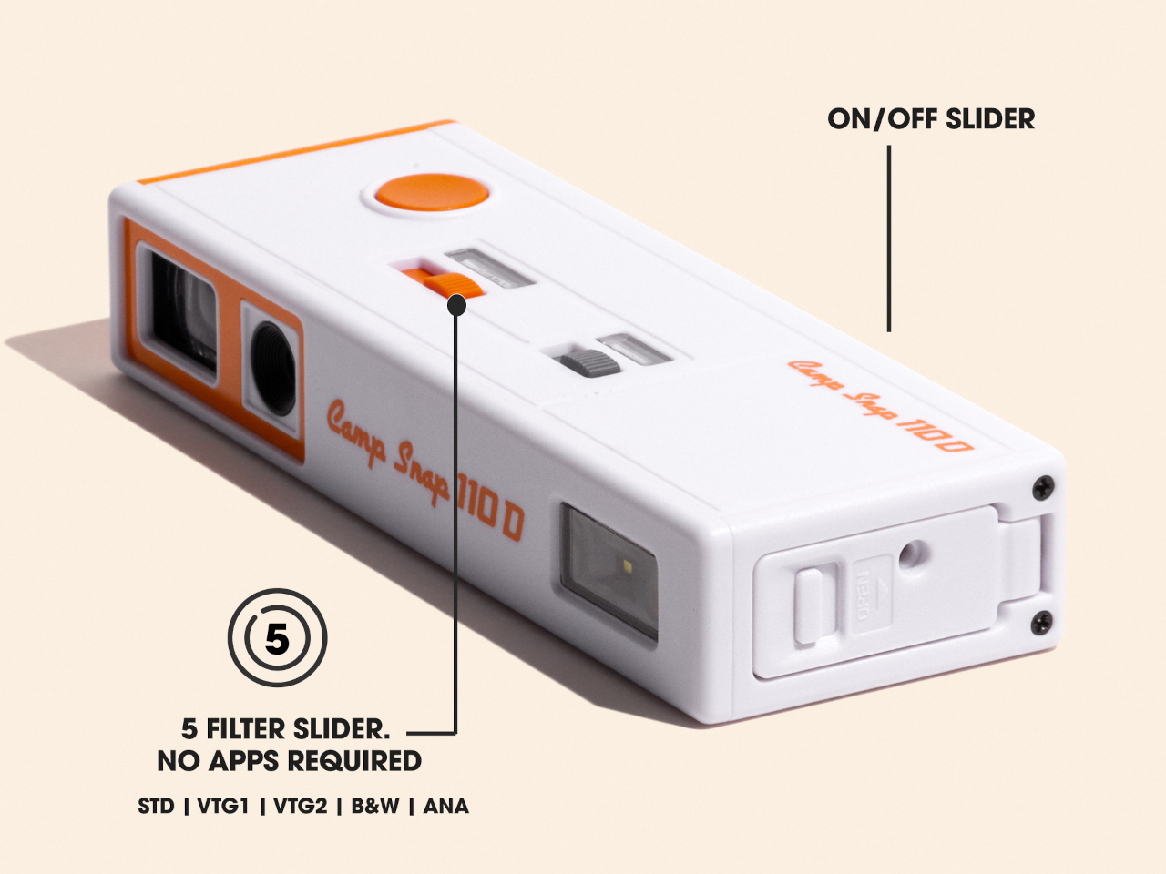
Inside that slim shell sits an 8-megapixel sensor, modest by phone camera standards on purpose, since chasing sharper resolution would work against the whole idea of embracing a lower-fidelity, more film-like result. Five built-in filters let a shooter pick a mood before pressing the shutter rather than fixing it afterward in an app, pushing the entire editing decision to before the photo exists instead of after.

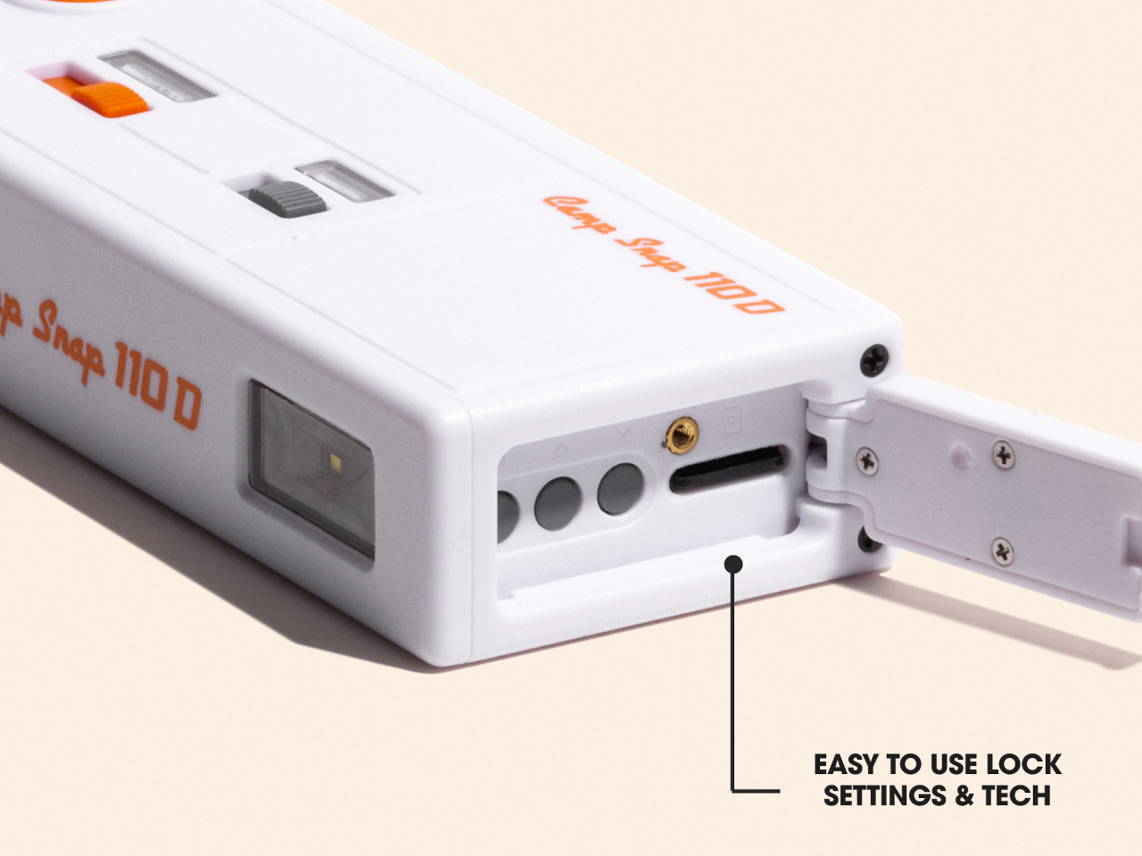
Storage runs on a microSD card, and images transfer out through a USB-C port, a small detail that keeps the retro shape from turning into an actual hassle to use. Charging works the same way, so nobody’s hunting for a proprietary cable or a dead battery with no replacement in sight. The vintage silhouette stays purely visual, while the internals stay entirely current.

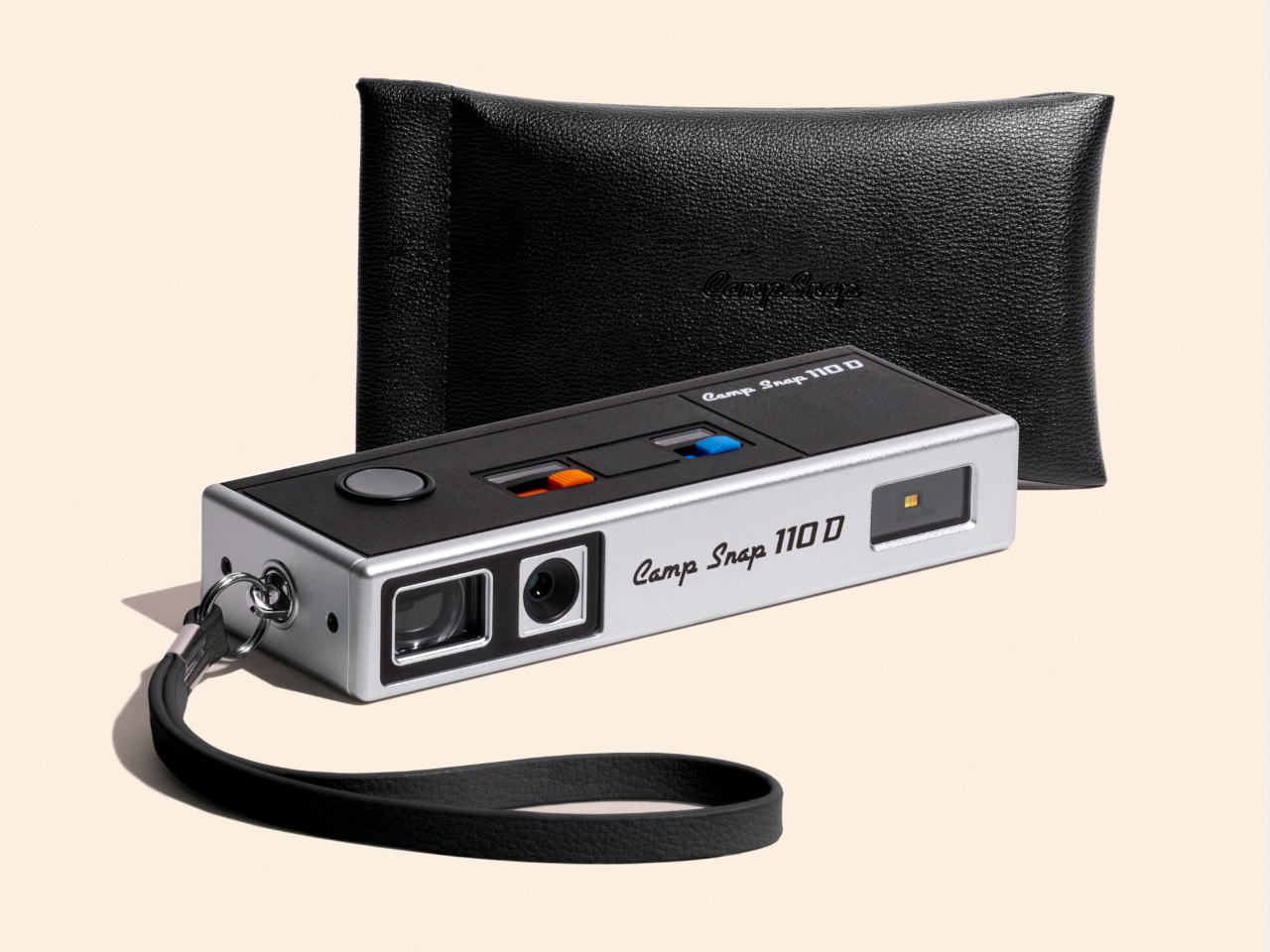
Two colorways round out the release: a black variant and a cream-and-orange combination that leans harder into the ’70s reference than the shape alone already does. Both ship with a wrist lanyard and a small carrying pouch, treating the camera less like a serious tool tucked into a bag and more like something meant to hang off a wrist at a party or a weekend trip without a second thought.

At $74.99, the 110D undercuts most instant cameras and plenty of higher-end toy cameras while offering something neither fully provides: a shape borrowed from actual photographic history rather than a generic plastic body built to look vaguely retro. That’s a specific kind of nostalgia, aimed at people who remember what a 110 camera looked like even if they never touched the film it used.

The post Camp Snap’s 110D Looks Like 1973 and Still Skips the Screen on Purpose first appeared on Yanko Design.

  •  

ELEGOO DAY 2026 Invites the World to Create, Share, and Grow With Nexprint

Every idea deserves somewhere to go, and for a lot of 3D printing hobbyists, that place has been missing. ELEGOO wants to change that with ELEGOO DAY 2026, launching September 10, its annual celebration built around bringing creators together on Nexprint. This year folds in a creator fund, a design contest, new model generators, and a sale, all pointing toward one goal: getting more people to create, share, and be part of a growing community.

Most of that action happens on Nexprint, ELEGOO’s open-source 3D model platform, built on the belief that creation should be open to anyone with an idea. Think of it as the hub tying everything together: models get uploaded, tools get discovered, and creators get a real reason to keep contributing. That shift is slowly turning ELEGOO from a printer maker into a community built around making.

Designer: ELEGOO

Click Here to Submit Now | Click Here To Buy Now.

The centerpiece is the new $1,000,000 Creator Fund, ELEGOO’s way of recognizing and rewarding people for sharing 3D models on Nexprint, not just paying for output but investing in the community itself. Rewards start with your very first submission, no waiting for likes or rankings to climb first. Individual models can earn up to $100, and stacking incentives push that ceiling to $300 per model.

There’s more structure built in too. Extra rewards unlock at 3, 5, 10, 20, and 50 submissions, so consistency pays off as much as any single hit model. Monthly rankings hand exclusive prizes to the top five creators, including actual ELEGOO printers, while a new bonus-card mechanism can push individual payouts even higher. It feels less like a marketing gimmick and more like a system built to grow alongside its creators.

From September 10 to October 30, ELEGOO runs the MakeItReal contest on Nexprint, and the premise couldn’t be simpler: take a flat idea, in whatever form it takes, and give it dimension, no design background required. There’s no theme to chase, just that shift from flat to physical. Winning entries will be picked and announced on November 20, each earning up to $300 in ELEGOO coupons for the trouble.

The idea behind it is almost sentimental for a hardware company, echoing ELEGOO’s belief that 3D printing works best as a creative outlet, not a manufacturing shortcut. A photo on your phone or a doodle in a notebook can end up as something you actually hold, not just imagine. Creators don’t need advanced modeling skills to compete, either. Nexprint’s upcoming Text and Image to 3D Generator lets anyone shape a contest entry straight from a photo or a written description, no CAD needed.

That generator is one of three new tools ELEGOO just added to Nexprint, alongside a Vase Generator and a Nameplate Generator, each built to make creation easier for beginners and veterans alike. All three do the same basic job: they take a drawing, a photo, or a few typed words and turn it into a printable model within minutes. None of it replaces real design skill, but it removes the blank-page problem that stops many from starting.

Put it together, and the loop makes sense. Someone sketches an idea, runs it through a generator, shares the result on Nexprint, enters it into MakeItReal, and picks up Creator Fund rewards along the way. None of those steps demand deep technical skill. This is the connected ecosystem ELEGOO keeps referencing, not a slogan, but an actual sequence anyone can walk through starting today.

All this activity lines up with the ELEGOO DAY Sale, with discounts of up to 54% on selected products, running September 8 through 29 with regional pricing, ELEGOO’s way of putting that ecosystem into more hands. The Saturn 4 Ultra 16K brings high-resolution resin printing for detailed sculptures, jewelry prototypes, and miniatures. The Centauri Carbon 2 Combo handles multicolor prints for home décor and personalized gifts. The Mars 5 Ultra offers a smaller resin option with sharp detail for tight workspaces.

What stands out about ELEGOO DAY 2026 isn’t any single feature; it’s the shape of the whole thing. A hardware company built its business on printers, then quietly built systems for sharing, competing, and earning that turn a machine into a habit. For ELEGOO, that’s what building an ecosystem means: more chances for people to create, connect, and turn ideas into something real.

Click Here to Submit Now | Click Here To Buy Now.

The post ELEGOO DAY 2026 Invites the World to Create, Share, and Grow With Nexprint first appeared on Yanko Design.

  •  

The $50 Titanium Cup That Refuses to Ruin Your Whiskey

I’ve broken more shot glasses than I care to admit, and I’ve also poured a good shot of whisky into a glass that smelled faintly of dish soap because nobody thought to hand-dry it properly. That’s the quiet failure of most drinkware. It’s not that it looks bad. It’s that it gets in the way of the thing you’re actually drinking, whether through fragility, absorption, or just feeling like an afterthought grabbed from a gift-shop shelf.

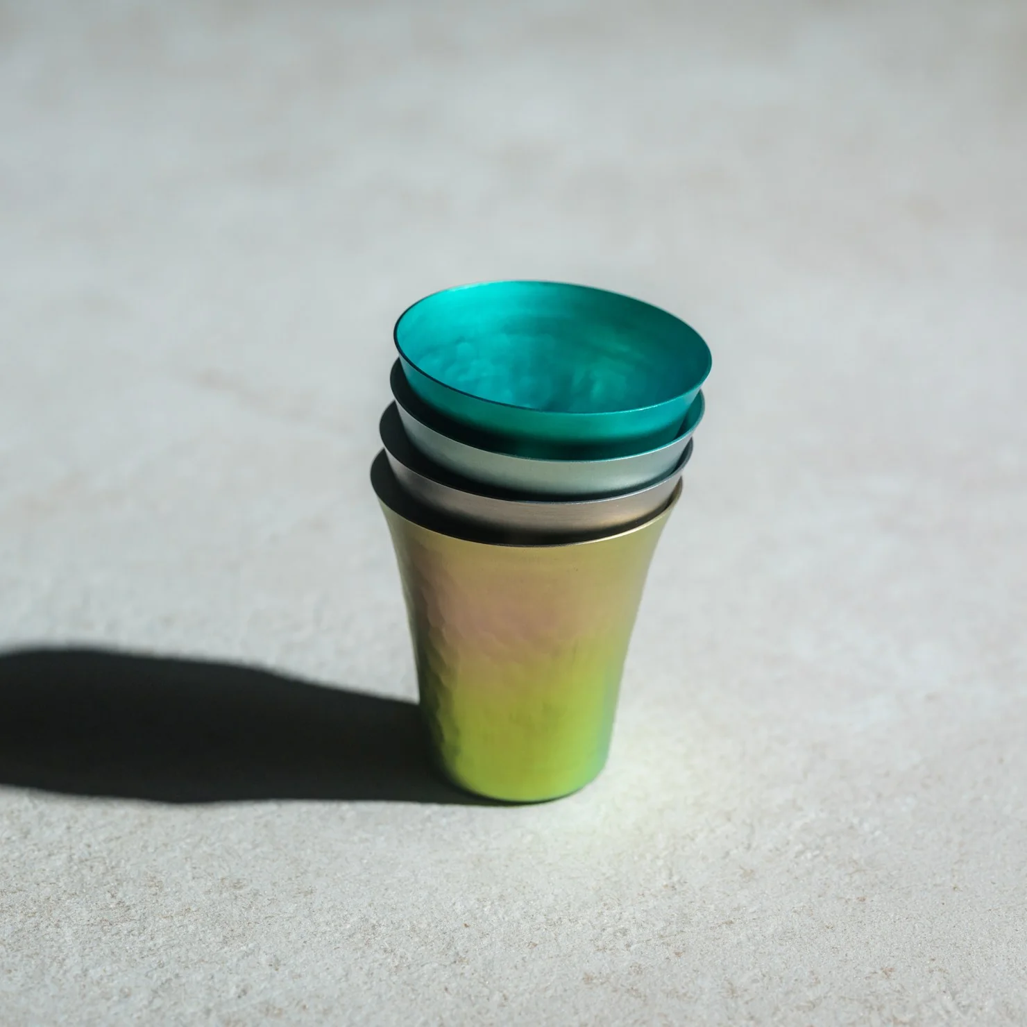
The Titanium Artisan Spirits Cup solves a problem I didn’t realize I’d been quietly annoyed by for years: the vessel changing the experience instead of getting out of its way. Made in Japan from solid titanium, this tiny cup, just 70ml, about the size of a proper sake or spirits pour, is built from a material that’s completely non-reactive. No metallic aftertaste, no lingering smell from last week’s whiskey, no worry about it cracking if you set it down a little too hard after a long day. It just holds the drink and lets the drink be the drink.

Click Here to Buy Now: Starting at $50

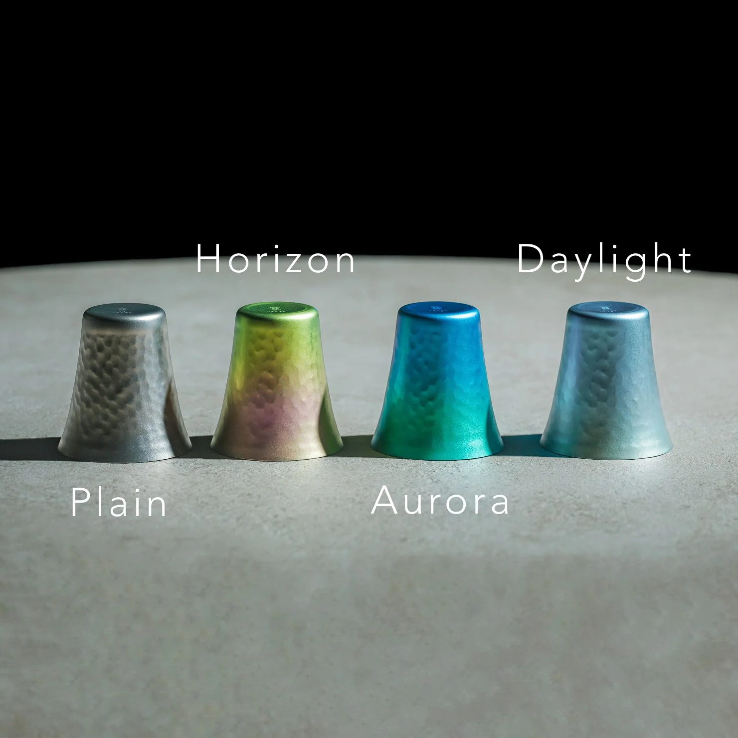
I’ll admit I was skeptical the first time I read “titanium cup” and pictured something that belonged on a camping trip, not a bar cart. But this isn’t the same brushed, utilitarian titanium you’d find in a hiking mug. The anodized finishes here, Horizon’s pink-to-green gradient, Aurora’s iridescent blue-green, Daylight’s pale blue shimmer, are created through an electrochemical process, not paint, which means the color actually lives inside the metal’s oxide layer. Practically speaking, that means no two colored cups come out quite the same. You’re not buying a product off an assembly line so much as picking one version of a process that never repeats itself exactly. For $50 to $60 depending on finish, that’s a small price for owning something genuinely singular.

It’s worth comparing this to how a brand like Yeti has trained American drinkers to think about premium drinkware over the last decade. Yeti built an empire on durability and temperature retention, on the promise that your drink stays cold or hot for hours in something that survives getting thrown in the truck bed. That’s a real, useful problem solved well. But Yeti’s whole design language is about insulation and toughness for casual, high-volume drinking. This titanium cup is solving something almost opposite: it’s not trying to keep your drink at a certain temperature or survive a drop from a tailgate. It’s built for the smaller, slower moment, the two-ounce pour you’re meant to sit with, not gulp. One is engineered for durability at scale. The other is engineered for intimacy in a single sip.

What actually sold me on this piece isn’t the finish or the aerospace-grade pedigree of the material, though both are legitimate. It’s the size. Seventy milliliters forces a kind of restraint. You can’t casually refill it five times without noticing you’re doing it. It nudges you toward treating a pour of whiskey or sake as an event rather than background noise while you scroll through your phone. That’s a small, almost accidental piece of good design, the kind that changes behavior without lecturing you about it.

I also don’t think the Titanium Artisans Spirit Cup is for everyone, and that’s fine. If you want something that holds sixteen ounces of iced tea and survives a dishwasher cycle, this isn’t your object. But if you’ve ever wanted a single, honest vessel for the good stuff, the bottle you save for a specific mood or a specific person, this earns its place on a shelf. With only a handful available at a time, it’s also not pretending to be mass-market, which somehow makes it feel more genuine rather than more precious. Good drinkware should disappear the moment the drink hits your lips. This one actually manages that, and it does it while looking like something you’d want to hold onto forever.

The post The $50 Titanium Cup That Refuses to Ruin Your Whiskey first appeared on Yanko Design.

  •  

A Designer turned Xiaomi’s Logo into a Multi-Utility Vehicle Concept

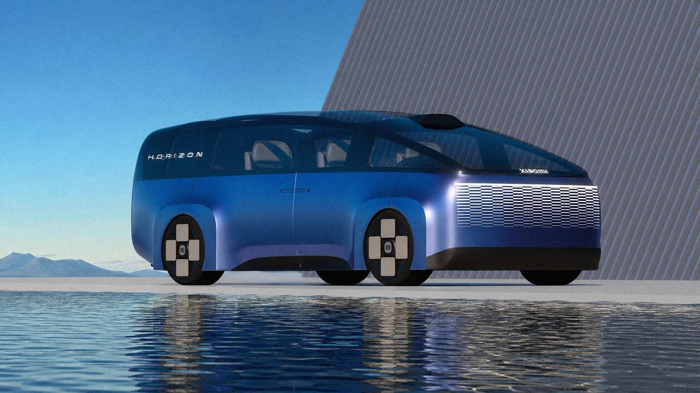
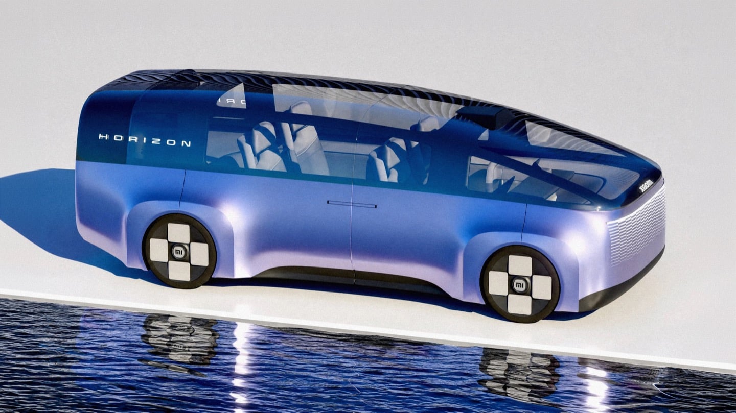
Side profile of the Xiaomi Horizon concept MPV in blue-to-lavender paint, parked on a white platform above still water.

You know that little rounded square Xiaomi uses as its logo? The one a Japanese design legend spent actual months tuning with a math equation just to get the curve right? Lucas Angelo looked at that shape and thought, sure, why not build a car out of it. The result is the Xiaomi Horizon, and I mean that almost literally. The tailgate is one giant glowing squircle. The wheels are squircles. The whole rear end reads like someone blew up an app icon to the size of a minivan.

It sounds like a gimmick until you remember Xiaomi’s entire EV strategy is basically “make our products feel like they all came from the same brain,” and a car shaped logo is honestly not the dumbest way to pull that off. Whether it should be a Multi Purpose Vehicle or something else entirely is a separate question, and we will get to it. But credit where it is due, this thing has more brand DNA baked into its sheet metal than most concepts manage with an entire mood board of heritage references.

Designer: Lucas Angelo

Front three-quarter view of the Horizon against a tall black louvered wall, with mountains visible in the background.

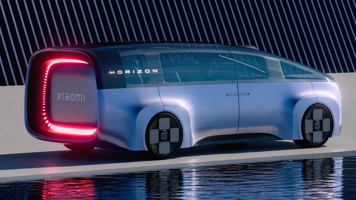
Rear three-quarter view of the Horizon at dusk, showing its illuminated red squircle taillight and the Xiaomi wordmark.

That squircle obsession is not Angelo inventing a bit for fun. Back in 2021, Xiaomi hired Kenya Hara, the design legend behind MUJI’s whole visual identity, to redraw its logo. He landed on a superellipse formula, dialed to a value called n equals 3, which is the mathematically precise sweet spot between a perfect square and a perfect circle. People online mocked it as three hundred grand for rounded corners. Angelo apparently took it a lot more seriously than the internet did, because Horizon’s entire rear fascia is basically that formula rendered at automotive scale, ringed in individually lit LEDs so it glows like a screensaver whenever the car is parked.

Front three-quarter view of the Horizon showing its illuminated Cascade Grille and squircle wheel hubs.

Straight-on rear view of the Horizon on a salt-flat-like surface, with its glowing red squircle taillight centered.

The front end plays a similar game with something Xiaomi calls the Cascade Grille, a full width lattice of tiny illuminated squares that fade in a stepped pattern across the nose. It is not a functional intake so much as a light show, which tracks for a brand that made its name on phones and smart speakers before it ever touched a chassis. Xiaomi’s actual head of automotive design, Li Tianyuan, cut his teeth on the BMW iX and the i Vision Circular, a concept that turned BMW’s kidney grille into a digital display. Angelo landing in almost the same conceptual neighborhood, independently, says his instincts are pointed in a direction the real design team already validated once.

Side view of the Horizon parked in front of a spiked black wall, taillight lit, with snowy peaks behind it.

Here is where things get spicy. China’s premium electric MPV segment has a body count, and the most famous casualty is the Li Auto Mega, a smooth, curvy one box people mover that the internet immediately nicknamed the hearse. One owner slapped high speed train decals on his because the jokes wrote themselves, and Li Auto’s own design chief was still publicly defending the car more than two years later. A big blank slab of a rear end on an MPV is basically an invitation for the internet to decide what it looks like for you, and it is never flattering.

The Horizon driving down a city street past a billboard

This is exactly the trap Horizon’s illuminated tailgate sidesteps. Instead of a flat dark void back there, you get a glowing signature the size of a barn door, something to actually look at instead of squint at. Whether Xiaomi ever builds anything like this is unlikely, especially now that the real Xiaomi has already picked its answer to the family hauler question with the SkyNomad, an EREV SUV with a fridge and a bed mode rather than a sliding door MPV. But Horizon is a fun reminder that sometimes the best way to honor a brand is to take its smallest, most mocked design decision and blow it up until everyone has to take it seriously.

The post A Designer turned Xiaomi’s Logo into a Multi-Utility Vehicle Concept first appeared on Yanko Design.

  •  

Apple is Working on Two iPhone Game Controllers Under its Beats Brand

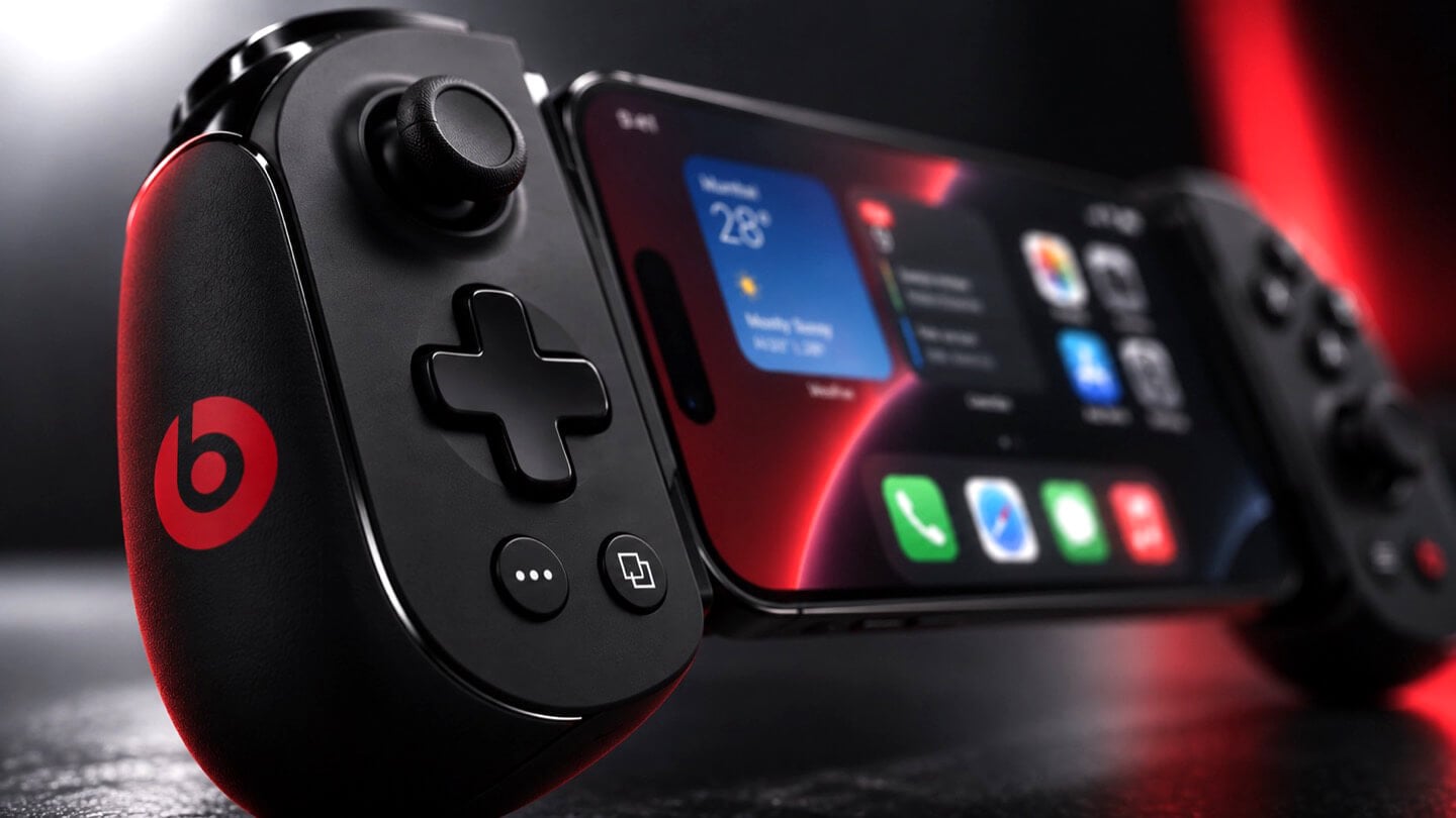
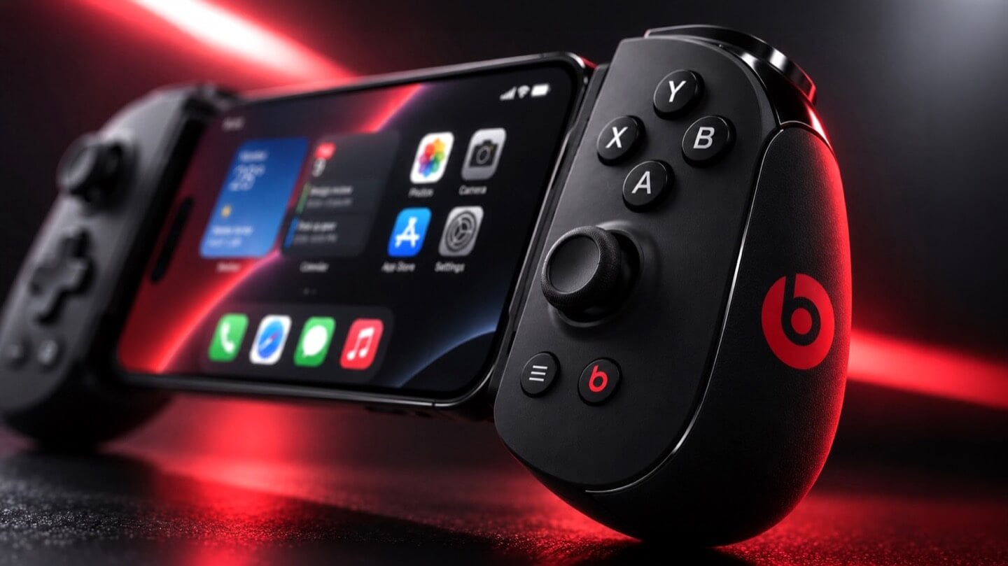
Concept Beats branded iPhone game controller, close-up on the right grip showing X, Y, A, B face buttons, thumbstick, and red Beats logo, with the clamped iPhone home screen visible at left, lit in red.

Concept Image

Apple and the gaming crowd have always had one of those relationships where you nod at each other across a party and never actually walk over. Apple makes the chips, brags about them beating a PS5 in some benchmark slide, then goes right back to talking about spreadsheets and stargazing apps. Gamers, meanwhile, buy a Steam Deck or a Switch and never think about the iPhone in their pocket as a gaming device at all. Bloomberg’s Mark Gurman just reported that Apple wants to finally cross the room, having spent over a year quietly developing its own gaming controllers for the iPhone. The bigger twist is who gets to wear the name tag. Rather than an Apple logo, the hardware is reportedly launching under Beats, the audio label Apple has been slowly turning into its lifestyle catch-all since buying it in 2014.

Code unearthed in a leaked macOS 26.7 build gives the rumor real teeth, naming two unreleased devices, T6502 and T1057, each carrying its own dedicated controller profile instead of placeholder code. Both come with the standard gamepad vocabulary, sticks, triggers, a D-pad, face buttons, the stuff every controller on the planet already has. T6502 keeps things simple and wired. T1057 adds Bluetooth, motion sensors, and a noticeably different haptic engine, suggesting more than one idea is being tested at once. Nothing is priced, dated, or confirmed, but the code alone says this has moved well past a mood board.

Designer: Apple

Concept Beats branded iPhone game controller shown fully assembled with an iPhone clamped in the center, both grips visible with D-pad, thumbsticks, and red Beats logos, set against a dark background with a large red Beats logo behind it.

Gurman’s sourcing on the branding is the part I keep chewing on. He says Beats executives are leading both the engineering and the product concept, not just slapping a logo on something Apple’s industrial design team already finished. His reasoning is that the culture and lifestyle around gaming controllers fits Beats better than it fits Apple, and that the sub-brand gives the company room to use cheaper materials and a louder design without dragging down the premium finish people expect from anything wearing the actual Apple logo. Read between the lines and that is Apple admitting its own aesthetic has a ceiling. Titanium and glass photograph beautifully, but nobody wants to grip a cold slab for a three-hour Genshin Impact session. Beats, with its glossy plastics and its very unserious relationship with color, is a far more honest home for an object designed to be squeezed, dropped, and thrown in a backpack pocket.

Concept Beats branded iPhone game controller in two separated halves with the iPhone floating above, left grip showing D-pad and right grip showing face buttons, both with red Beats logos, resting on a dark reflective surface.

There is a decent trade-off lurking here too, and it is worth naming before anyone gets too excited. T6502, the wired one, is basic by design, which means it will likely be the cheaper, more disposable option with none of the motion sensing or richer haptics that make a controller feel alive. T1057 sounds like the one worth wanting, but Bluetooth controllers introduce pairing friction and battery anxiety that a simple USB-C plug-in never has to deal with. Apple will have to pick a lane, or price the two far enough apart that the choice makes sense, and so far there is no signal on either price or release window. History also isn’t fully on Apple’s side. The company has floated controller ideas for years without shipping one, and it once required developers to support the Siri Remote’s accelerometer as a de facto gaming input before quietly dropping that mandate. A leaked profile in a beta build is not a keynote slide.

Close-up of the left grip of a concept Beats branded iPhone game controller, showing the D-pad, thumbstick, and red Beats logo, with the clamped iPhone visible in soft focus behind it.

Where this actually matters long term is the software Apple has already built around it. iOS 26 shipped a dedicated Games app that pulls your library, your Game Center friends, and Apple Arcade into one hub across iPhone, iPad, Mac, and Apple TV, and Arcade itself has quietly grown past 250 titles for $6.99 a month. A first-party controller, even a scrappy Beats-branded one, gives all of that infrastructure something physical to plug into, which is a very different goal from just selling more hardware. It also puts Apple in the odd position of competing with its own shelf space, since the Apple Store already sells the Backbone One and the SteelSeries Nimbus, and we covered how Backbone’s own Pro model already chases full-size ALPS sticks and forty-hour battery life at a premium price. Razer’s brand new Prio takes the opposite approach entirely, folding down to credit card size for people who would rather not carry a controller-shaped commitment at all. Apple showing up now, later than everyone, wearing someone else’s logo, says less about gaming and more about how Apple treats every category it enters late. Quietly, sideways, and only once it has found a version of itself that does not feel like Apple at all.

The post Apple is Working on Two iPhone Game Controllers Under its Beats Brand first appeared on Yanko Design.

  •  

This Chair Proves a $2.3M Hypercar & Your Living Room Have More in Common Than You Think

Most furniture doesn’t have a backstory worth telling. The Maniac Chair does. It looks, from across the room, like it wandered out of a 1950s Danish design studio — until you get close enough to realize it’s built from the same bloodline as a $2.35 million hypercar.

Oilstainlab is the California-based studio founded by Ukrainian-born twins Iliya and Nikita Bridan — high school dropouts trained in Italy and California, responsible in their previous lives for 6.5 million street cars. In 2018, they started Oilstainlab with a single promise: never to be sane. The result was the HF-11, a limited-production hypercar of which only 25 will ever exist. The Maniac Chair is the furniture-world extension of that same obsession, sold through House Dé Stains, Oilstainlab’s lifestyle brand.

Designer: Oilstainlab

The chair’s shell is built on a CNC-machined aluminum frame wrapped in a hand-laid carbon fiber shell. That detail matters. Hand-laid carbon fiber isn’t a production shortcut — it’s the language of motorsport, of race seats and monocoques shaped around bodies doing 200 mph. Here, it’s shaped around a body doing nothing more than sitting. That deliberate mismatch is the whole point. The midcentury silhouette is familiar enough to read as furniture; the material is foreign enough to make you question what you’re actually looking at.

The name traces back directly to the HF-11, which Oilstainlab offered in an exclusive “Maniac” package for 11 of its 25 cars. The chair carries that identity forward — it’s not merchandise, it’s an extension of a design philosophy that treats excess and restraint as two sides of the same surface. The carbon fiber reads as raw and technical; the form reads as warm and considered. Neither cancels the other out.

What Oilstainlab has done here is something furniture designers rarely attempt, and automotive designers rarely bother with: they’ve made a chair that has genuine provenance. It isn’t inspired by cars in the way that means “we added some aggressive lines.” It shares DNA with an actual race seat.

The prep process before upholstery even echoes motorsport fabrication. For a studio built on the idea that sanity is optional, the Maniac Chair is a surprisingly coherent object. It knows exactly what it is — a piece of furniture for people who want to sit inside a design argument — and it doesn’t flinch.

The post This Chair Proves a $2.3M Hypercar & Your Living Room Have More in Common Than You Think first appeared on Yanko Design.

  •  

This Supercharged Grand Tourer Was Built Using a 90-Year-Old Metal-Shaping Tool

The GTX in Riviera blue, all splitter, vents, and a rear wing that towers over the roofline.

There is a tool called an English wheel that has been shaping aluminum car panels since roughly the 1930s. It is a big metal hoop with a roller in the middle, and you push sheet metal through it by hand until it curves the way you want. It sounds like something you would find in a blacksmith’s shed, not in the workshop of a car aiming for 1,200 horsepower. Yet that is exactly the tool Coventry Metalcraft used to hand-form the body of the new Jensen Interceptor GTX, alongside laptops running computational fluid dynamics software. Old-world muscle meets new-world math, and somehow both sides showed up to the same car without arguing.

Jensen International Automotive unveiled the GTX in early September, and it is a strange beast by design. It is Jensen’s first ever clean-sheet car, built to preview a whole new Interceptor lineup, and it gets there using ten English wheels worked by more than 30 artisans, alongside digital design data from studio Avant Design and mixed-reality checks nobody in 1966 could have dreamed of. The result is a 960 bhp supercharged V8 grand tourer wearing hand-beaten aluminum panels shaped partly by algorithms. Britain’s oldest car-forming trick just got a very modern wingman.

Designer: Avant Design

Under the hood: a 6.8-liter supercharged V8 from Late Model Engines, wrapped in carbon and gold foil.

Long bonnet, fastback roofline, and a wing that ruins the original Interceptor's silhouette on purpose.

Avant Design, based out of Royal Leamington Spa, is the studio responsible for translating the original 1966 Interceptor’s proportions into something that reads as contemporary rather than costume. The long bonnet survives, the tightly drawn greenhouse survives, and the wraparound rear glass that made the original such a distinctive shape is still there, even if a towering rear wing now partially blocks the view of it. What is new is the front end, with slim horizontal LED lighting and enormous carbon intakes replacing the old car’s chrome-heavy face. Interestingly, this is not Avant’s first crack at reimagining this exact silhouette. Back in 2023, the studio quietly published a concept called the E-Ceptor, an electric take on the Interceptor with reworked rear glazing and a fresh grille graphic. The GTX effectively took that speculative sketch and gave it a supercharged V8 instead of a battery pack.

Diffuser, quad exhausts, and a wing built for lap times.

A full-width taillight and a wing pulled straight from GT3 territory.

The aluminum decision, both for the chassis and the body, was not driven by sentiment. David Duerden, Jensen International’s managing director, put it plainly when explaining why the GTX skipped carbon fiber entirely. He does not want the car riding like “a skateboard,” which is a fair concern given how punishing a stiff carbon tub can feel on a road built for a Sixties grand tourer, not a modern track special. Aluminum chassis structures are also considerably cheaper to produce in small batches, since they avoid the expensive tooling that carbon fiber demands before a single panel gets made. For a car expected to sell in the dozens rather than the thousands, that economic math matters more than bragging rights about carbon weave.

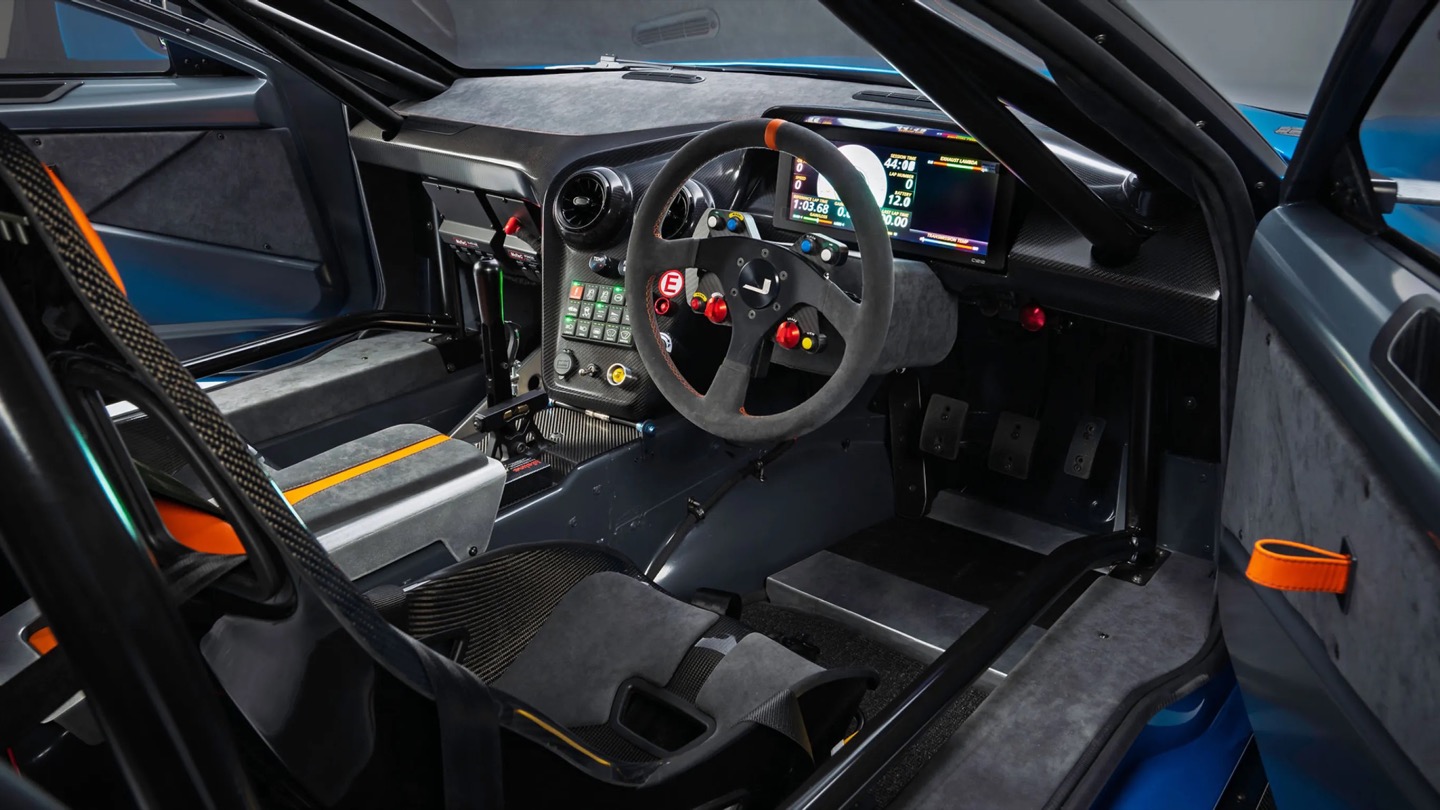
No screen, just a MoTeC dash, roll cage, and switchgear built for business.

That economic logic is exactly why the English wheel earns its keep here. Hand-forming panels sidesteps the tooling costs that would sink a low-volume carbon fiber program before it ever reached a customer. Coventry Metalcraft’s artisans still shape every piece the old-fashioned way, but they are working from digital surfaces that Avant Design refined using CFD modeling, chasing the 350 kilograms of downforce the GTX needs to behave itself at speed. It is a genuinely odd combination of a seventy-year-old forming technique and simulation software that did not exist when the original Interceptor left the Kelvin Way factory. Jensen is betting its entire comeback on that combination holding together, and so far, from what we have seen, it seems to be working rather beautifully.

The post This Supercharged Grand Tourer Was Built Using a 90-Year-Old Metal-Shaping Tool first appeared on Yanko Design.

  •  

The Bali Sculpture That Finally Makes Overshot Views Feel New

Bali has a photo problem. Not a bad one, exactly, but a familiar one: the same rice terrace, the same infinity pool angle, the same swing shot dangling over the same jungle canopy, reposted by a few million travelers who all found the identical spot through the same map pin. When a landscape gets photographed enough times, it starts to flatten out in your memory before you’ve even seen it in person. You arrive, and it feels like déjà vu instead of discovery.

That’s the quiet problem Vincent Leroy’s new installation seems to answer, even if he’d probably never put it in those terms. Tucked into the hills of Munduk, “Eccentric Lenses” is a field of Fresnel lenses mounted on posts, catching the wind and spinning on axes that aren’t centered, so nothing ever settles into a repeatable frame. Point a camera at it in the morning and again at dusk and you won’t get the same picture twice, not because the location changed, but because the lenses never stop rearranging it for you.

Designer: Vincent Leroy

Fresnel lenses are the flat, ridged discs you’d recognize from old lighthouses or projector screens, built to bend light without the bulk of a curved glass lens. Leroy has been experimenting with them for years, but this piece feels like his most site-specific use of the idea. Instead of distorting a studio backdrop, he’s pointed the lenses at Bali’s actual terrain, its rice fields, its distant volcanic peaks, its low clouds, and let the wind do the editing. Every gust nudges a lens a few degrees, and the mountain behind it splits, doubles, or slides sideways for a second before reassembling.

What I appreciate here is the restraint. There’s no motor, no app, no LED strip pretending to be magic. It’s just optics and weather, working together in a way that feels almost stubbornly analog for 2026. We’ve spent the better part of a decade being told that wonder needs a screen attached to it, that a landscape only becomes interesting once it’s been filtered, looped, or turned into a Reel. Leroy’s installation goes the opposite direction. It takes the one thing every travel photo tries to eliminate, unpredictability, and makes it the entire point.

There’s a reason kinetic art tied to natural forces keeps resurfacing right now, from wind-driven sculptures to mirror installations chasing the sun across a field. People are a little exhausted by content that behaves exactly the way it’s supposed to. A piece that changes because the wind decided to pick up speed is refreshing precisely because nobody, including the artist, can fully predict what it’ll look like an hour from now. That unpredictability used to be considered a flaw in outdoor art. Here it’s the mechanism.

It also helps that Leroy didn’t ask Bali’s landscape to hold still for him. The lenses don’t compete with the rice terraces or try to outshine the mountains; they just keep reintroducing you to them. That’s a small but telling choice. So much of contemporary installation art wants to be the main event, the thing you drove out to see. This piece works because it insists the actual landscape was always worth a second look, it just needed a nudge to prove it.

I don’t think “Eccentric Lenses” is trying to solve tourism fatigue or fix anyone’s relationship with their camera roll. But it’s hard not to read it that way anyway, especially watching footage of a single mountain peak splintering into five overlapping versions of itself, then quietly reforming into one. For a moment, an overexposed view of Bali stops feeling used up. It just feels new again, which might be the most useful trick any piece of art can pull off right now.

The post The Bali Sculpture That Finally Makes Overshot Views Feel New first appeared on Yanko Design.

  •  

This 47-Foot Glass House by Escape Reframes Everything You Thought About Tiny Living

The Glass House by Escape arrives at a moment when the tiny home conversation desperately needed a reset.It’s a park model that reads less like a compact shelter and more like someone took a considered, light-soaked apartment and simply decided it didn’t need to be attached to a city block.

The structure stretches 47 feet long and 12 feet wide — uncommonly generous proportions for this category — finished in cedar that ages the way good materials should. But the defining move here is the glazing. One full wall runs 30 feet of continuous windows, pulling in light, landscape, and the kind of visual depth that makes a space feel genuinely expansive rather than merely tolerable. It’s a single-floor layout, which matters more than it sounds. No loft ladder, no crouched ceilings. Just clean, lateral living that prioritizes how a space feels to move through over how many square feet it can claim on paper.

Designer: Escape

The interior holds up to its exterior promise. The kitchen is equipped with a full-size fridge/freezer, dishwasher, induction cooktop, and a combination microwave/convection oven — the kind of spec sheet that signals the designers were thinking about real use, not Pinterest renders. The bathroom features a large glass-enclosed tiled shower, a vanity sink, and a proper flushing toilet with generous storage built around it. The bedroom carries the same commitment to glazing — framing a view of the surrounding landscape rather than walling it out. An enclosed porch extends the footprint further, offering an indoor/outdoor zone that shifts with the weather and the mood.

Escape, which has been building award-winning tiny homes for over 30 years, currently has the Glass House on view at its Canoe Bay Village property in Wisconsin — which is worth noting, because it suggests the design isn’t purely aspirational. It exists in a real landscape, subject to real seasons, and it holds its own.

What makes the Glass House interesting as a design object isn’t just its size or its spec list. It’s the underlying argument it’s making: that living small doesn’t require a philosophy of sacrifice. The single-floor plan, the wall of glass, the proper kitchen — these aren’t luxury additions. They’re the baseline of what attentive design looks like when it’s applied to a form that usually settles for less. The Glass House doesn’t settle.

The post This 47-Foot Glass House by Escape Reframes Everything You Thought About Tiny Living first appeared on Yanko Design.

  •  

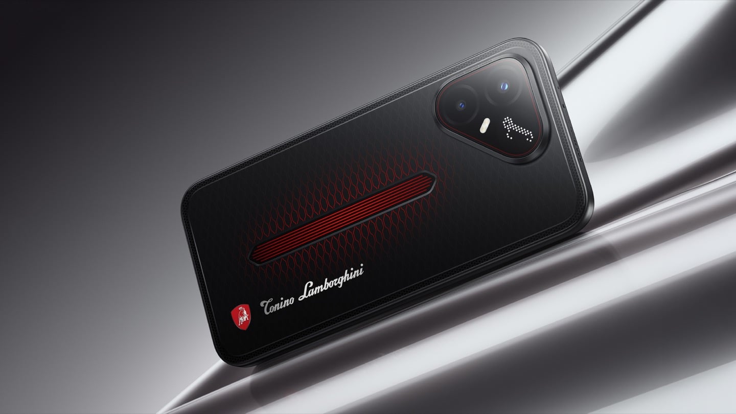
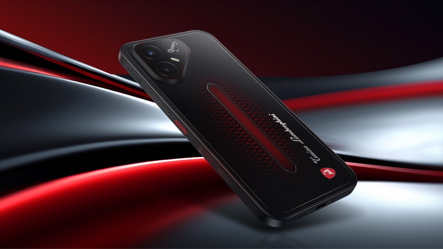
TECNO’s Lamborghini Phone Draws Its Logo in Light Using 177 Mini LEDs

TECNO POVA 8 Pro 5G Tonino Lamborghini Limited Edition

The most expensive Lamborghini phone ever made was a $6,000 slab of hand-stitched leather and gold plating called the 88 Tauri, and it ran Android KitKat on a Snapdragon 801. That was CES 2015, peak era for buying two-year-old silicon at four times the price because someone put a bull on it. Tonino Lamborghini made three of those phones between 2013 and 2017, then went away. The name has now resurfaced on the back of a TECNO POVA that costs about $490, and the badge is finally earning its position. It gets drawn in light instead of stamped in metal.

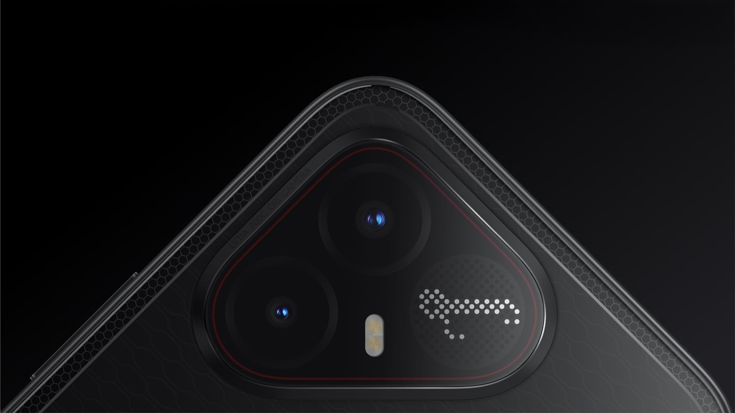
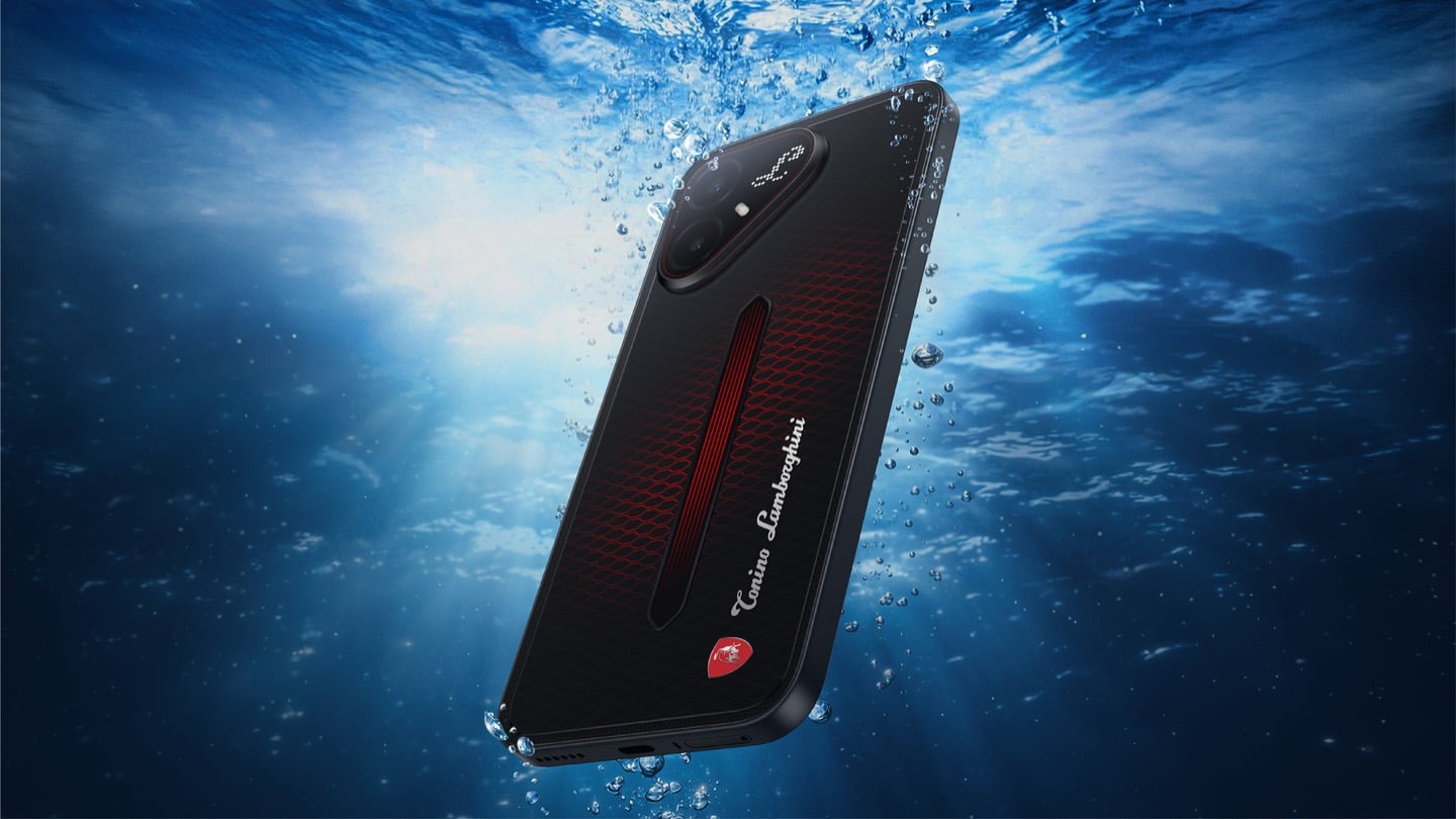
On the POVA 8 Pro 5G Tonino Lamborghini Limited Edition, the Italian brand’s “L” is rendered by 177 individually controlled mini-LEDs in TECNO’s Alive Matrix panel, and the red Pulse Line down the center of the back is a passive optical effect built from internal mirror structures sandwiched between two coating layers at different physical heights. Rotate it and the red rises out of the black, then drops back in. The phone is spec-identical to the standard POVA 8 Pro, so every difference you are paying for is a surface decision. Thai prices start at 15,999 baht for 8GB and 256GB, topping out at 19,999 baht for 12GB and 512GB. There is no US release and no US carrier certification.

Designer: TECNO Design Team, in collaboration with Tonino Lamborghini S.p.A.

Mechanical Grammar, Translated

The brief TECNO gave itself was to take a vocabulary that belongs to cars and make it belong to a slab of glass and aluminum, and the way in usually decides whether that kind of project reads as clever or as a paste job. The team started with the visual codes of mechanical design rather than the logo itself: body lines, cooling grilles, honeycomb patterns, exhaust-inspired detailing. That’s the right instinct. A shield pasted onto a black rectangle says nothing. A shield built from the same geometric logic as an engine bay at least has a reason to exist there. The result is the Signature Shield pattern ringing the Pulse Line, a hexagonal structure lifted from Tonino Lamborghini’s own emblem and mechanical detailing rather than invented fresh for the phone. It gives the back of the device an actual sense of depth and structure instead of a flat decal sitting on top of a chassis that was never designed with it in mind.

The Manufacturing Problem Nobody Sees

The interesting part isn’t the pattern, it’s how TECNO built it. Getting that Pulse Line to shift color under different lighting angles required internal mirror structures processed to redirect light the way a curved mirror does, stacked underneath a brightness-enhancing first layer that behaves closer to a lacquer finish than a printed graphic. Between the two layers sits a real, physical height difference, which is what gives the effect actual depth rather than the flat printed texture you get on most co-branded rear panels. TECNO describes this as one of the most complex rear-cover processes it has run on a POVA product, and the harder problem wasn’t making one unit look right, it was getting thousands of units to look right consistently. That’s a legitimate manufacturing achievement on a phone priced well under $500, and it’s the kind of detail that gets lost entirely once a press release compresses it down to “premium finish.”

POVA 8 Pro 5G Tonino Lamborghini Limited Edition with a 144Hz Display

A Skin That Goes All the Way Through

TECNO didn’t stop at the shell, which is the part most co-branded phones treat as optional. The software carries the same black-and-red system with reworked icon outlines, nudging soft rounded shapes toward hexagon and shield silhouettes so the interface reads as an extension of the hardware rather than a wallpaper slapped over stock Android. TECNO says the software work alone took close to four months, covering the boot animation, dynamic wallpapers, ringtones, and the Alive Matrix “L” effect. The accessories continue the bit: a braided black-and-red cable, a case built from TPU and polycarbonate carved with a Kevlar-inspired carbon fiber texture. None of it is essential to how the phone functions, but all of it is the difference between a badge and a bit that someone actually thought through.

What a Tonino Lamborghini Badge Used to Cost

Worth sitting with how far this pulls the brand from its own history. This partnership started back in March at MWC, where TECNO and Tonino Lamborghini unveiled the POVA Metal Tonino Lamborghini Limited Edition alongside a water-cooled mini gaming PC concept carrying the same red-and-gunmetal language into laptops, tablets, and earphones. That first phone felt closer to the old playbook than this one does. The 88 Tauri and its 2014 sibling, the Antares, were built around leather, gold plating, and price tags that assumed the badge alone justified the markup. The 2017 Alpha One dialed the ornamentation down but kept the price near $2,100. Automobili Lamborghini’s own collaborations, including the Oppo Find X Automobili Lamborghini Edition at €1,700 against a €1,000 base phone, followed the same math: better materials, a visible badge, a premium that tracked the logo rather than the manufacturing. This is the first Lamborghini phone where the badge shows up as a production process instead of a price justification, and it happens to be the cheapest one the family has ever put its name on. For the full spec rundown on the rear panel construction, we’ve covered the hardware side of this phone in detail already.

Close-up of the TECNO POVA 8 Pro 5G Tonino Lamborghini Limited Edition phone's camera bump

Price, Availability, and the Fine Print

Thailand has this now, sold through BaNANA, IT CITY, Jaymart, and other retailers since August 21, with early buyers getting a Tonino Lamborghini backpack and a Tecno Watch 3 Active thrown in. Pricing for India and other markets hasn’t landed yet as of this writing. If you’re reading from the US, this one isn’t coming your way in any official form. TECNO has no FCC certification and no carrier partnerships stateside, so anything that turns up on a resale site is a gray-market import with no warranty support behind it. Worth knowing before anyone gets attached to a color they’ll never see in a carrier store.

The Badge, Recalibrated

TECNO didn’t need Tonino Lamborghini’s name to sell a $490 phone with a good screen and a big battery, which makes the choice to spend four months on software and reinvent the rear-cover process for a mid-ranger feel almost backward by traditional luxury-licensing logic. Usually the name does the selling and the hardware coasts. Here the hardware earns the attention and the name rides along for once. Whether that model survives past a limited run is a separate question, since Tonino Lamborghini’s own history with phones has always run in short bursts before going quiet for years. For now, the badge looks better on a light source than it ever did on leather.

The post TECNO’s Lamborghini Phone Draws Its Logo in Light Using 177 Mini LEDs first appeared on Yanko Design.

  •  

Foam Earplugs Haven’t Changed Since the 1970s — This Spiral Design Just Made Them Obsolete

The humble foam earplug has been functionally unchanged since the 1970s: roll it down, jam it in, hope it expands to a seal, and find it somewhere in the sheets by 2 AM. It’s one of the few everyday objects that design culture has genuinely never come for, maybe because the attenuation numbers technically work, or maybe because nobody with enough resources was annoyed enough to fix it. The Ears 360 Silence, a CE-certified soft silicone earplug from Paris, is a structural redesign of that whole idea. Its retractable spiral wraps into the outer ear’s helix rather than anchoring in the canal, locking the plug flat and flush against the head with 24 dB SNR measured to EN 352-2:2020 and a peak of 29.9 dB at the frequency range where snoring and human voices live. The foam never had a chance.

Youcef Abdaoui runs a studio near Paris and started prototyping the Silence in 2024 with a bent wire and a bit of putty, just to test whether a helix-anchoring spiral could hold in an ear. It did, and the dozens of iterations that followed produced a product France voted Product of the Year 2026, consumer-elected rather than jury-awarded, which tells you something about how it performs in actual ears. Ears 360 has since shipped to more than 120,000 customers through their store, 500+ pharmacies and B2B partners before going international. The Silence is not a prototype; it is certified to EN 352-2:2020, mass-produced, and more than 14,000 units are already in stock. I got to see a pair in person, and the silicone finish reads as serious product, not a health-aisle impulse buy.

Designer: Youcef Abdaoui

Click Here to Buy Now: $21 $35 (40% off). Hurry, only 57/300 left!

The ear is already a spiral. The outer rim of the pinna is anatomically called the helix, a curved ridge that traces a partial revolution around the auricle, and deeper inside, the cochlea completes that geometry: a full spiral chamber, coiled like a snail shell, that converts sound pressure into neural signal. Nature returns to the spiral for the same reason architects do: it distributes force without concentration points, the same logic behind a nautilus shell or the tight coil of a fern fiddlehead before it unfurls. The Ears 360 Silence works with that architecture: the spiral holds, not the tip. The spiral wraps laterally into the helix and locks through geometry, bearing almost no canal pressure, which is the whole reason the plug sits flush against the head rather than protrudes from it.

Loop-style reusable earplugs have made a design virtue of their visibility, with a circular protrusion sitting outside the ear canal as a deliberate aesthetic statement. That works at a concert, but it becomes a pressure point the moment you roll onto your side in bed, which is the situation most people are buying earplugs for in the first place. The Silence’s spiral body measures 18.44 mm by 15.49 mm, slim enough that there’s nothing significant pressing against a pillow. The profile looks almost deceitfully small for what it’s actually doing inside the helix. Side sleepers have been the quiet losers in every previous generation of earplug design, and this is the first form factor that treats their use case as the primary constraint rather than an afterthought.

One spiral body, two levels of silence, switchable in seconds from 24 dB to 29 dB. The standard configuration ships with four tip sizes across diameters of 9.9, 10.9, 11.9, and 12.9 mm, covering a genuinely wide range of ear canal openings, and delivers 24 dB SNR in filter mode, enough to take a busy street down to library territory without muffling conversation entirely. The Swim & Work Kit clips on triple-flange tips that push attenuation up to 29 dB, entering genuine worksite and industrial territory. User satisfaction data from Ears 360 puts concert approval at 91% and commute approval at 97%, and the founder confirmed to me directly that concert use is a genuine design intention, not a marketing add-on. The IPX7 waterproof rating keeps the spiral pool-ready alongside the kit’s triple-flange seal.

One Silence replaces hundreds of disposable foam earplugs, full stop. The body is made to last for years, the silicone tips are replaceable instead of throwing the product away, and the packaging is compact by design so every shipment travels as a slim letter, not a parcel. There’s no offset scheme or carbon language layered on top to make it sound more considered than it is. The Silence is reusable by nature: wash it, swap the tips, keep the body. Replacement tip sets extend the product’s life instead of replacing it, and the compact packaging uses a fraction of the material of a standard box.

Pricing starts at €18 (roughly $21) for a single unit with carry case and tip set, with the Silence and Swim & Work Kit bundle at €27, a Duo Pack at €39, a Duo plus Kit at €49, and the new ALL COLORS pack at €59, which includes one pair in each of the three current colorways. Black, Pink, and Green are all available now. Every unit carries the 2-year EU legal warranty of conformity, which is meaningful for a product whose longevity pitch depends on actually outlasting the disposable foam it replaces. Delivery is November 2026, and the Ears 360 Silence is also available at ears-360.com.

Click Here to Buy Now: $21 $35 (40% off). Hurry, only 57/300 left!

The post Foam Earplugs Haven’t Changed Since the 1970s — This Spiral Design Just Made Them Obsolete first appeared on Yanko Design.

  •  
❌