PROS:
- Minimalist design streamlined for focused work on the go
- Paper-like experience when drawing or writing
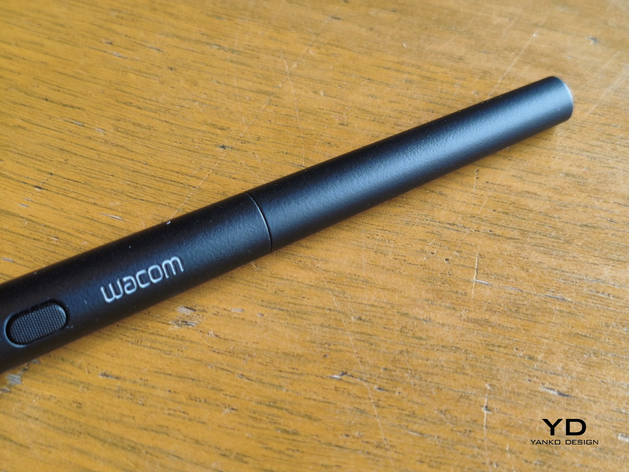
- Comes with Wacom Pro Pen 3 in the box
- Large, bright, color-accurate OLED screen with anti-reflective surface
CONS:
- Quite a significant investment
- Uncertain software update roadmap
- Instant Pen Display Mode is currently offered as a beta feature
RATINGS:
SUSTAINABILITY / REPAIRABILITY
EDITOR'S QUOTE:
The Wacom MovinkPad Pro 14 isn't another Android tablet. It's a sketchbook that happens to run one.
For decades, Wacom has held an almost unchallenged grip on the drawing tablet and pen display market. Its products are so trusted that studios and design firms often keep them running for years, sometimes long after they’ve been discontinued. Lately, though, its rivals have been gaining a lot of attention, pushing increasingly attractive prices and expanding into new product categories.
That doesn’t mean Wacom has been idling. The company is finally wading into standalone Android tablet territory with the MovinkPad 11 and the more premium MovinkPad Pro 14, a proper portable drawing machine aimed squarely at working creatives. We’ve been spending time with the larger of the two, along with the new Wacom Art Pen 2, and the question is whether it’s worth every dollar of its price tag.
Designer: Wacom
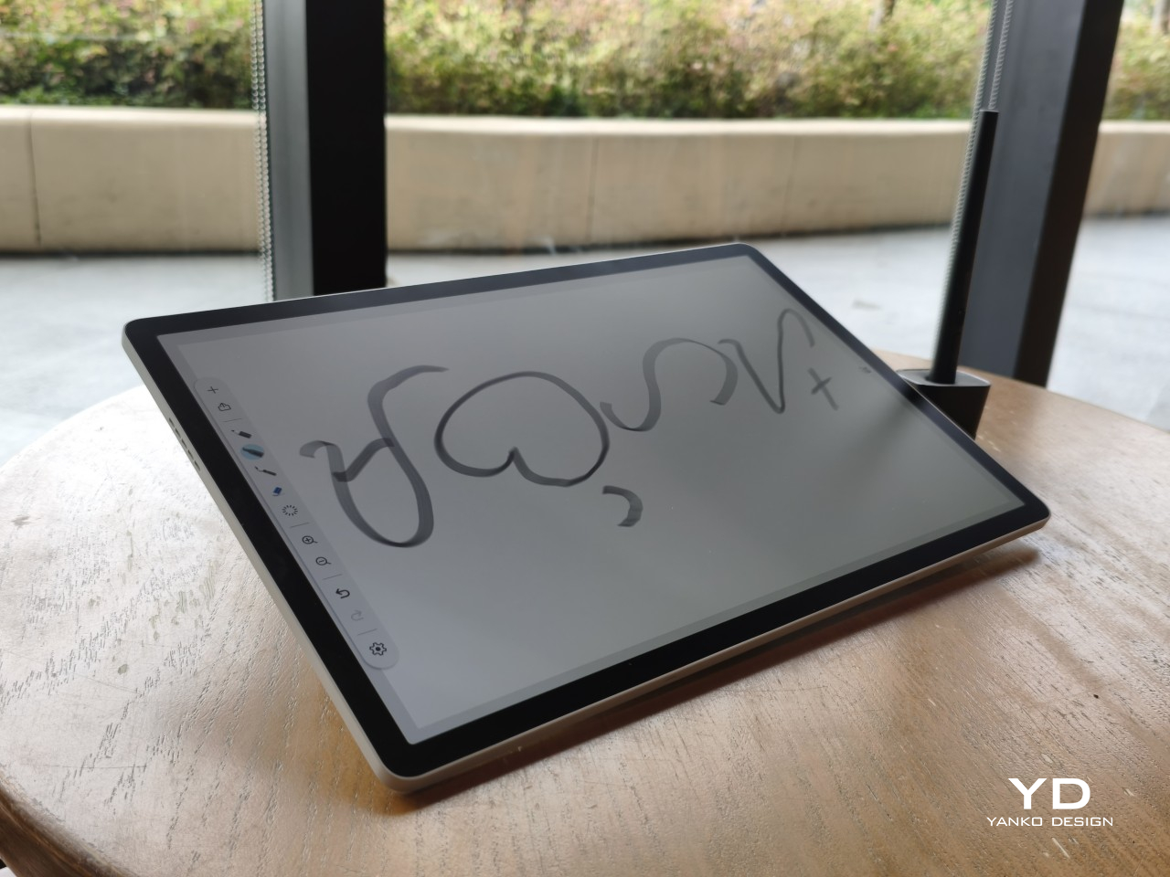
Aesthetics
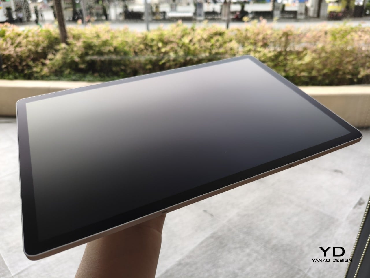
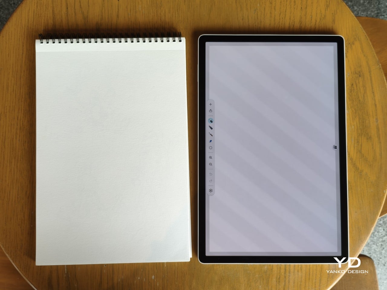
Right out of the box, the MovinkPad Pro 14 doesn’t dazzle the way other tablets in its price range tend to. There are no flashy colors, no ultra-thin borders, no polished surfaces. The bezels are noticeably wide, the default wallpaper is a solid, flat light gray, and the whole thing carries a stubbornly plain look that feels almost out of step with the competition.
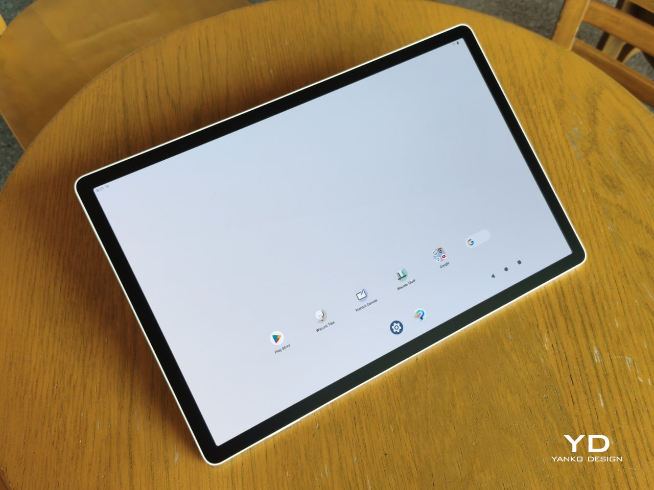
It’s all very much by design. Wacom’s intent is to mimic the look and feel of a physical sketchbook, the kind artists, designers, and architects carry everywhere. The device comes in one color, light gray, which echoes the tone of most sketchbook paper. Its rectangular form, wide borders included, also closely mirrors the footprint of an A4 pad, binding and all.
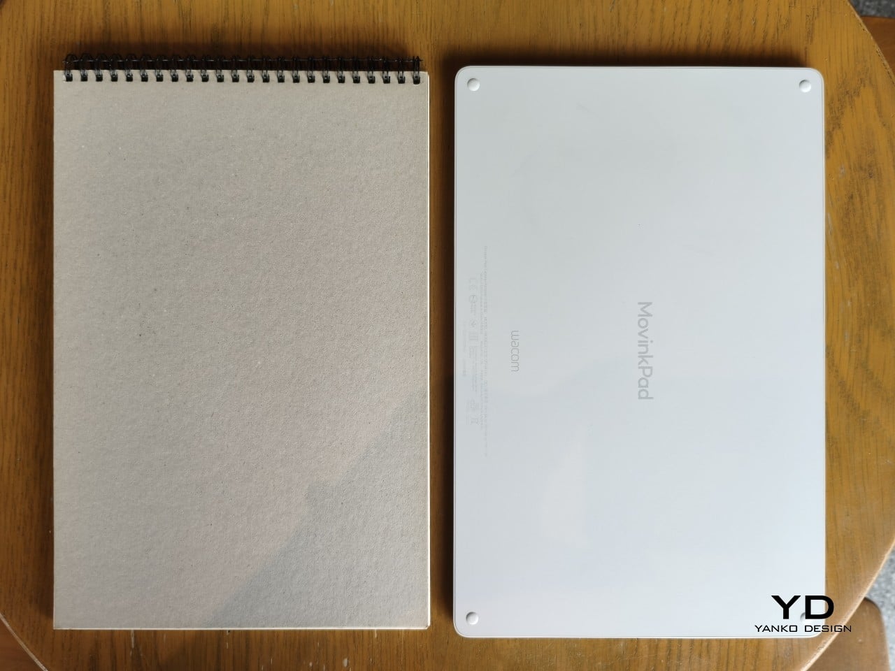
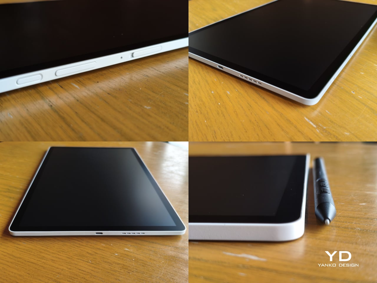
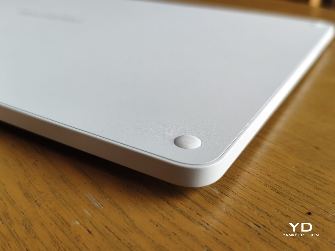
The sides of the device carry that same restraint. One long edge holds the power button, volume rocker, and microSD slot, while the opposite edge features connectors for the optional cover accessory. The short edges house the speakers, and the bottom is reserved for branding, regulatory inscriptions, and four rubber feet. There’s nothing extraneous, nothing decorative, and nothing that distracts from the task you’re there to do.
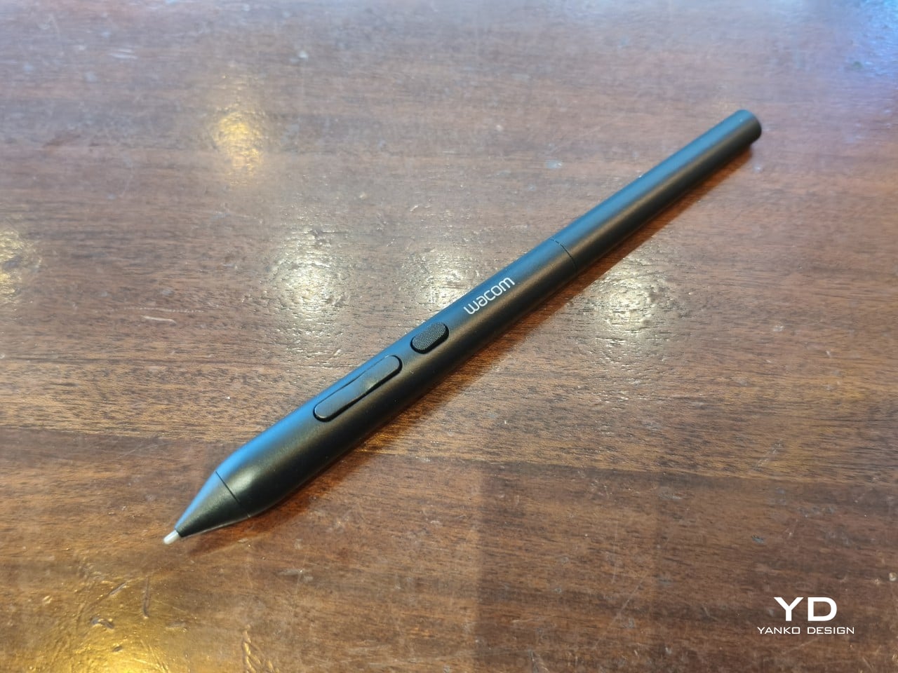
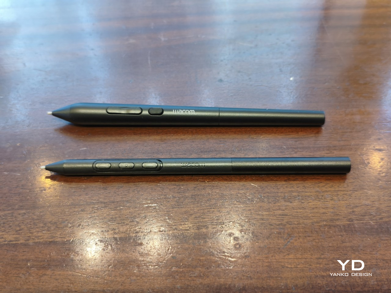
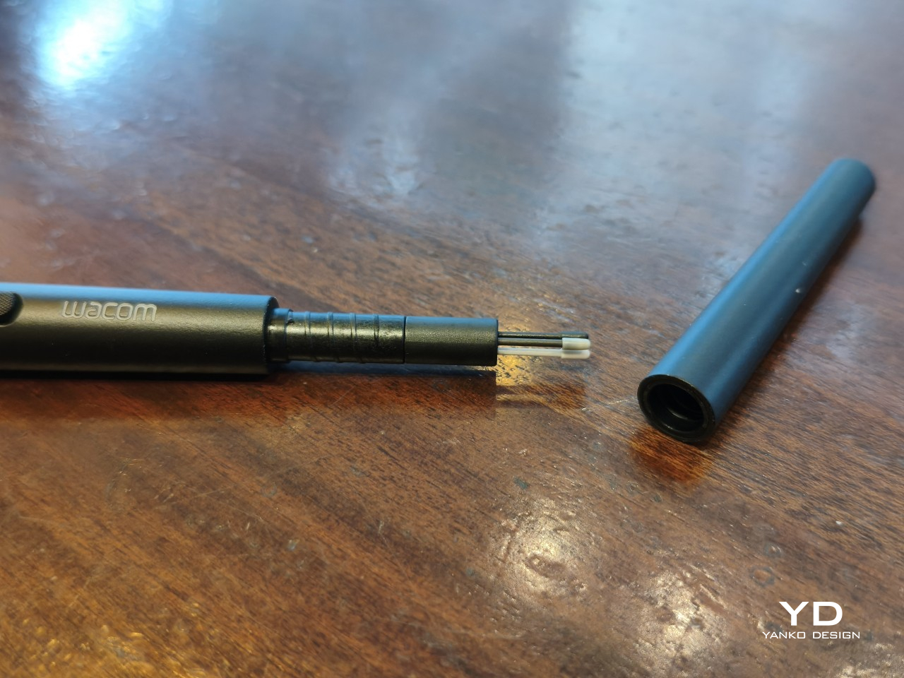
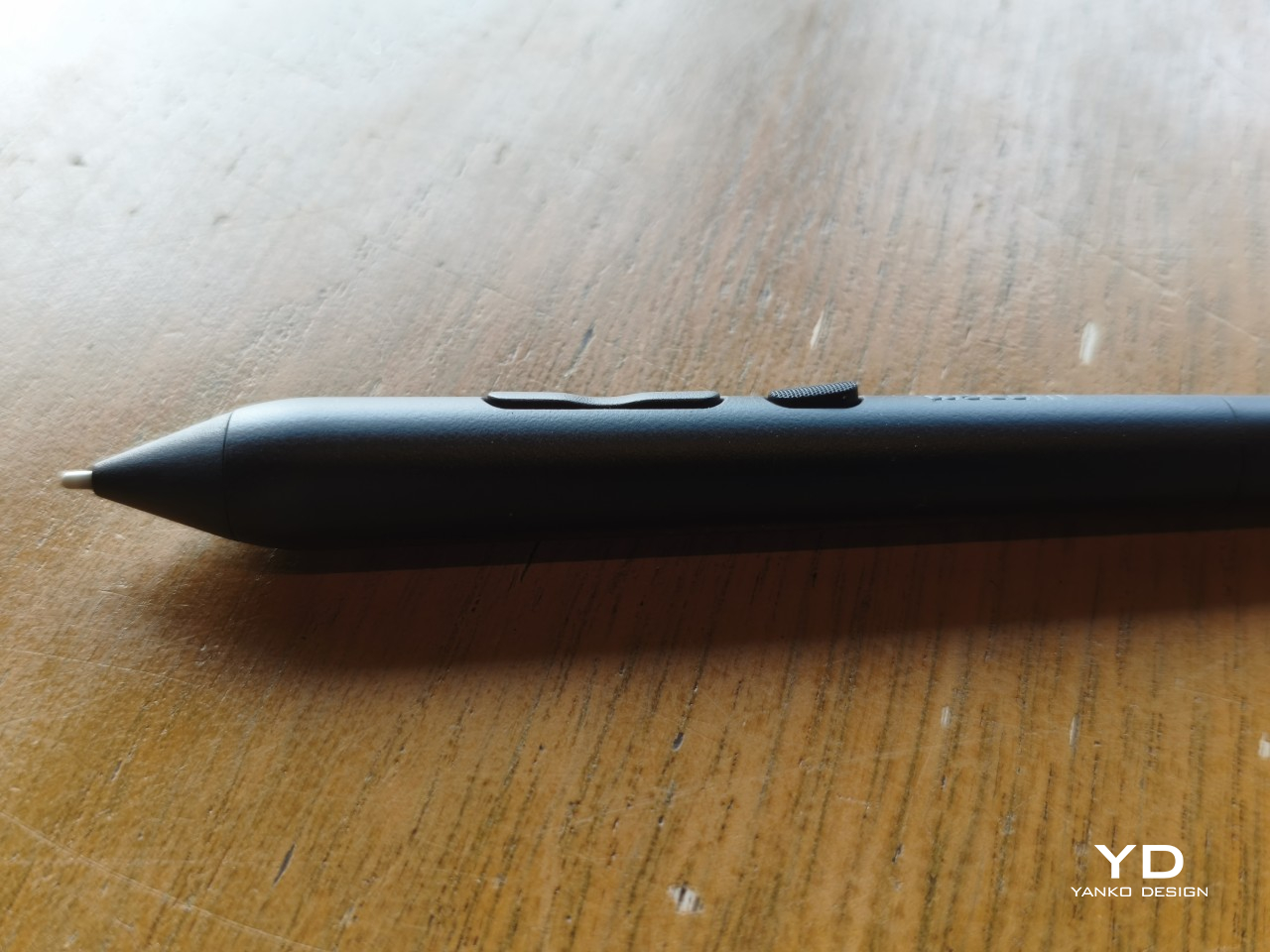
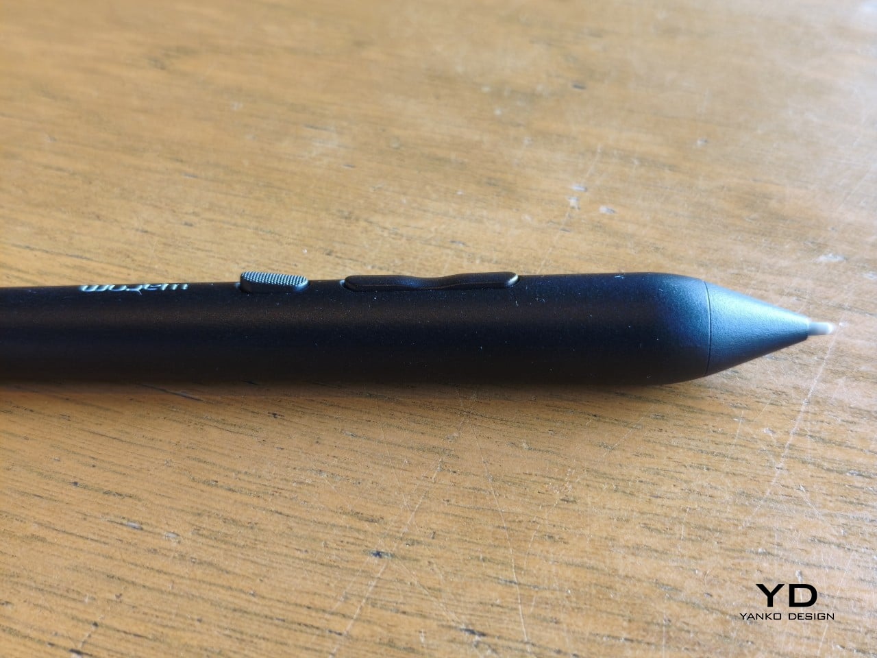
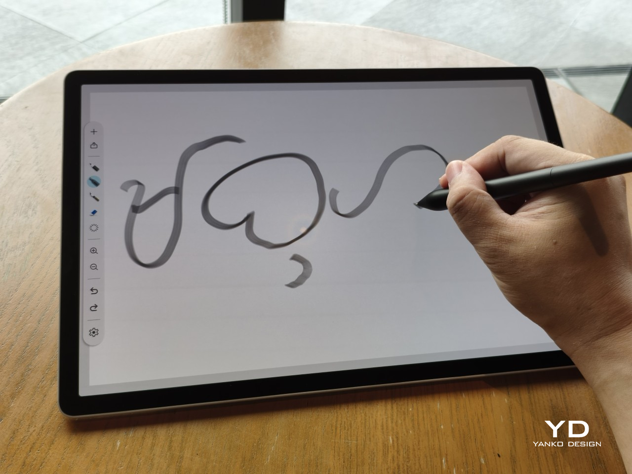
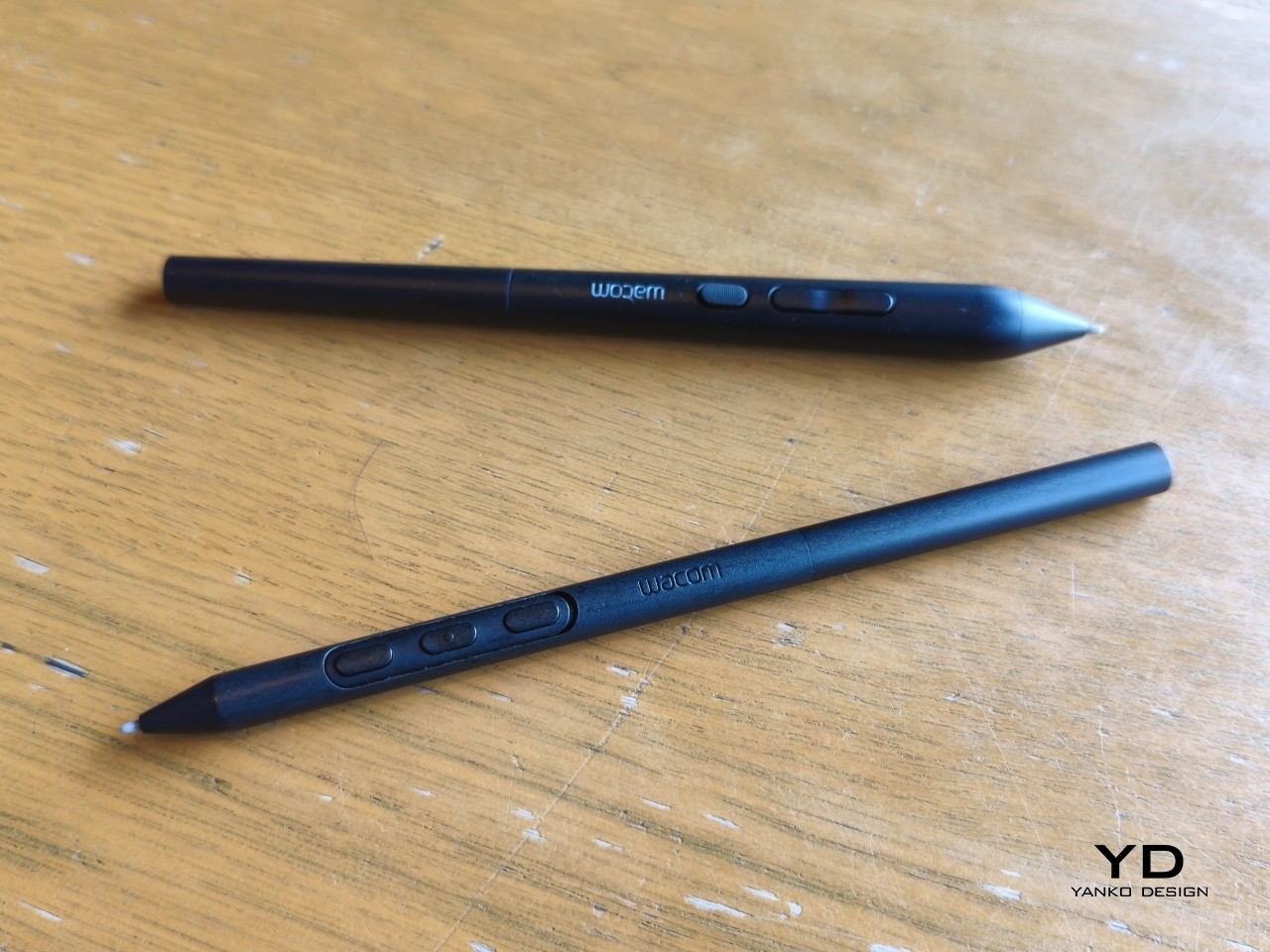
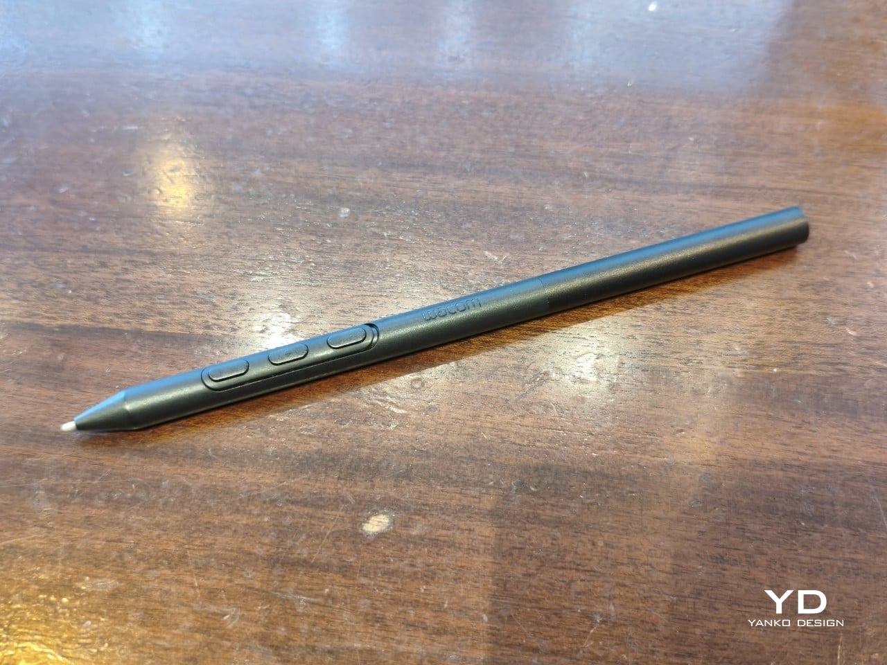
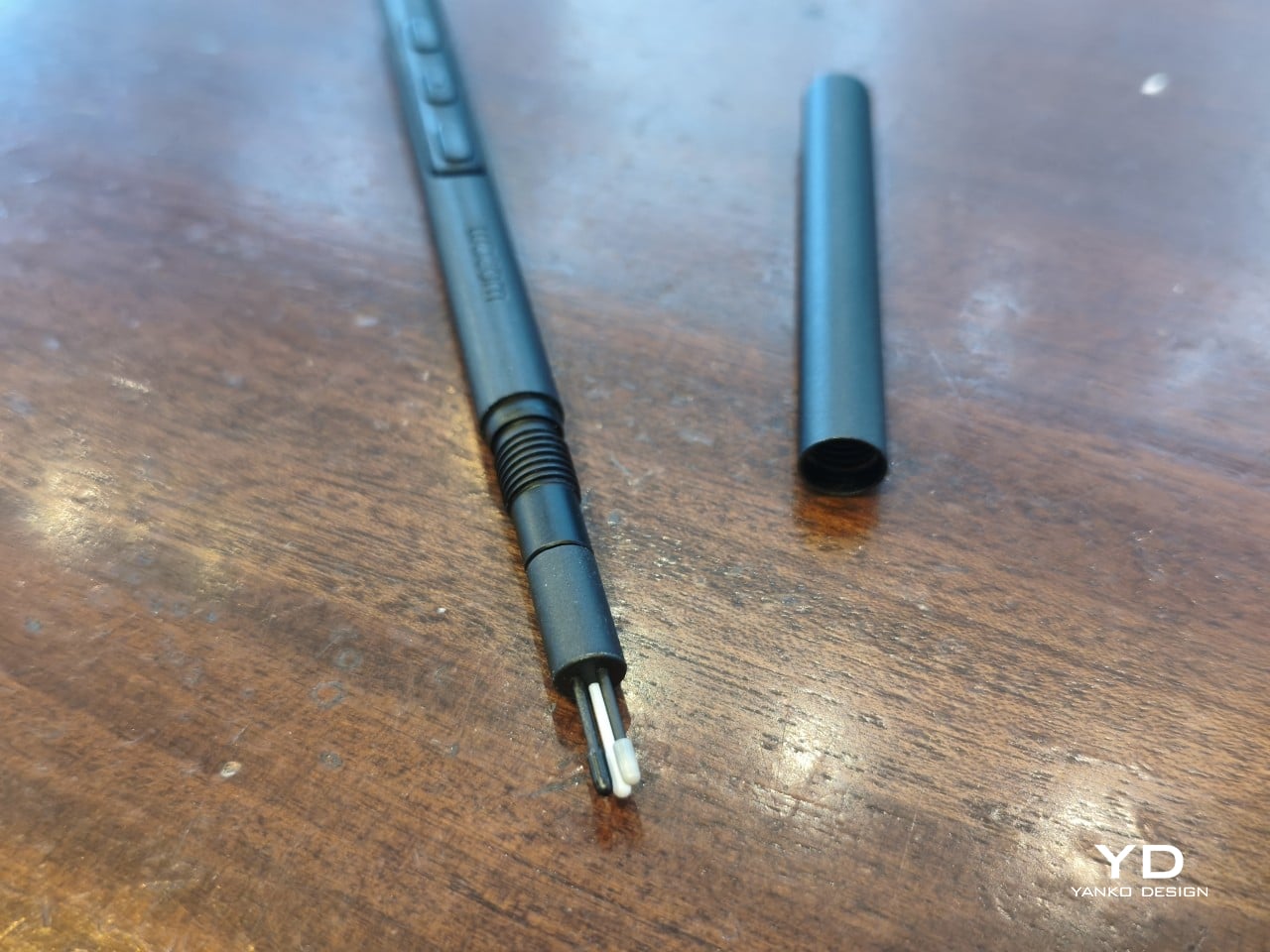
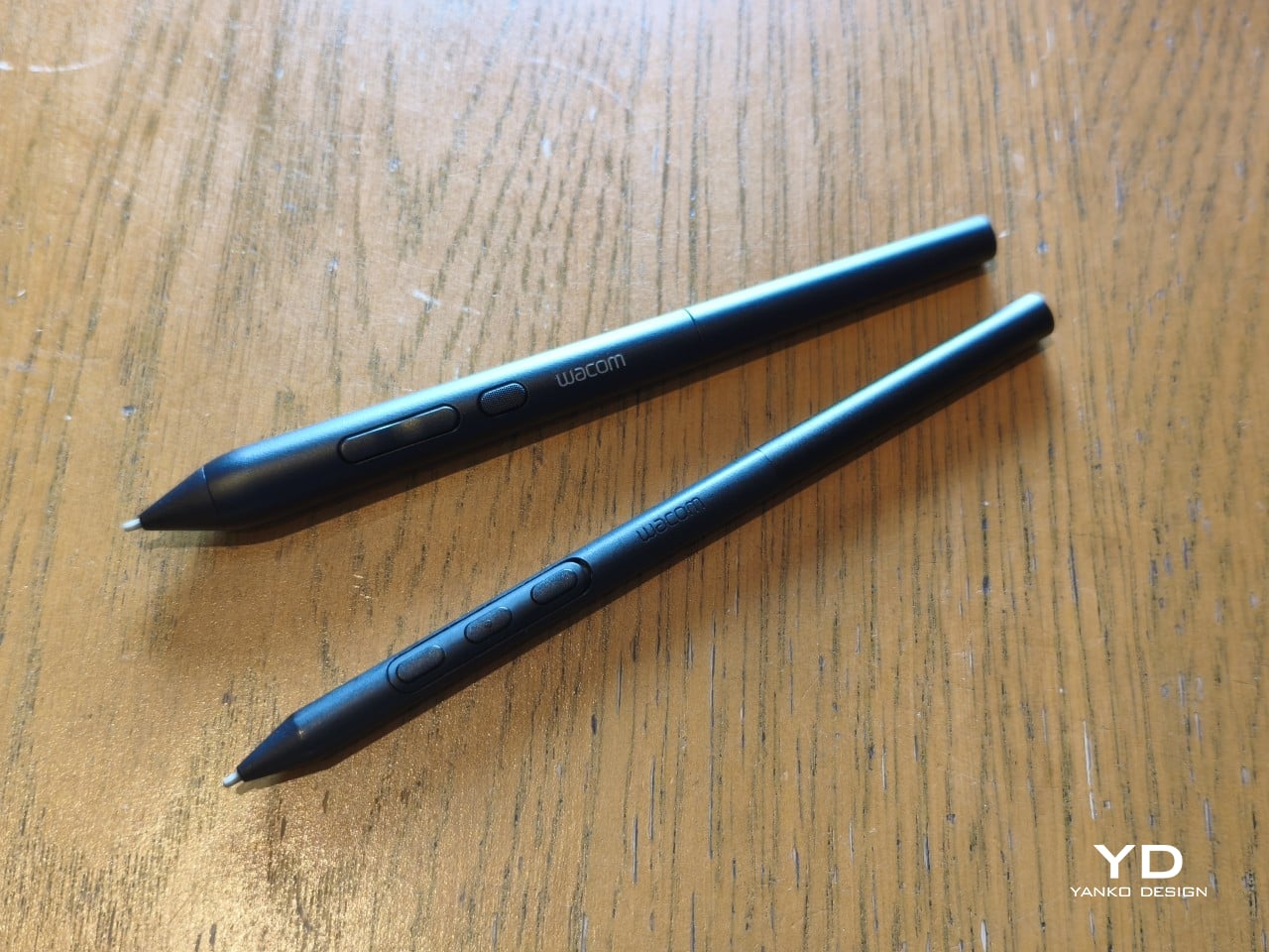
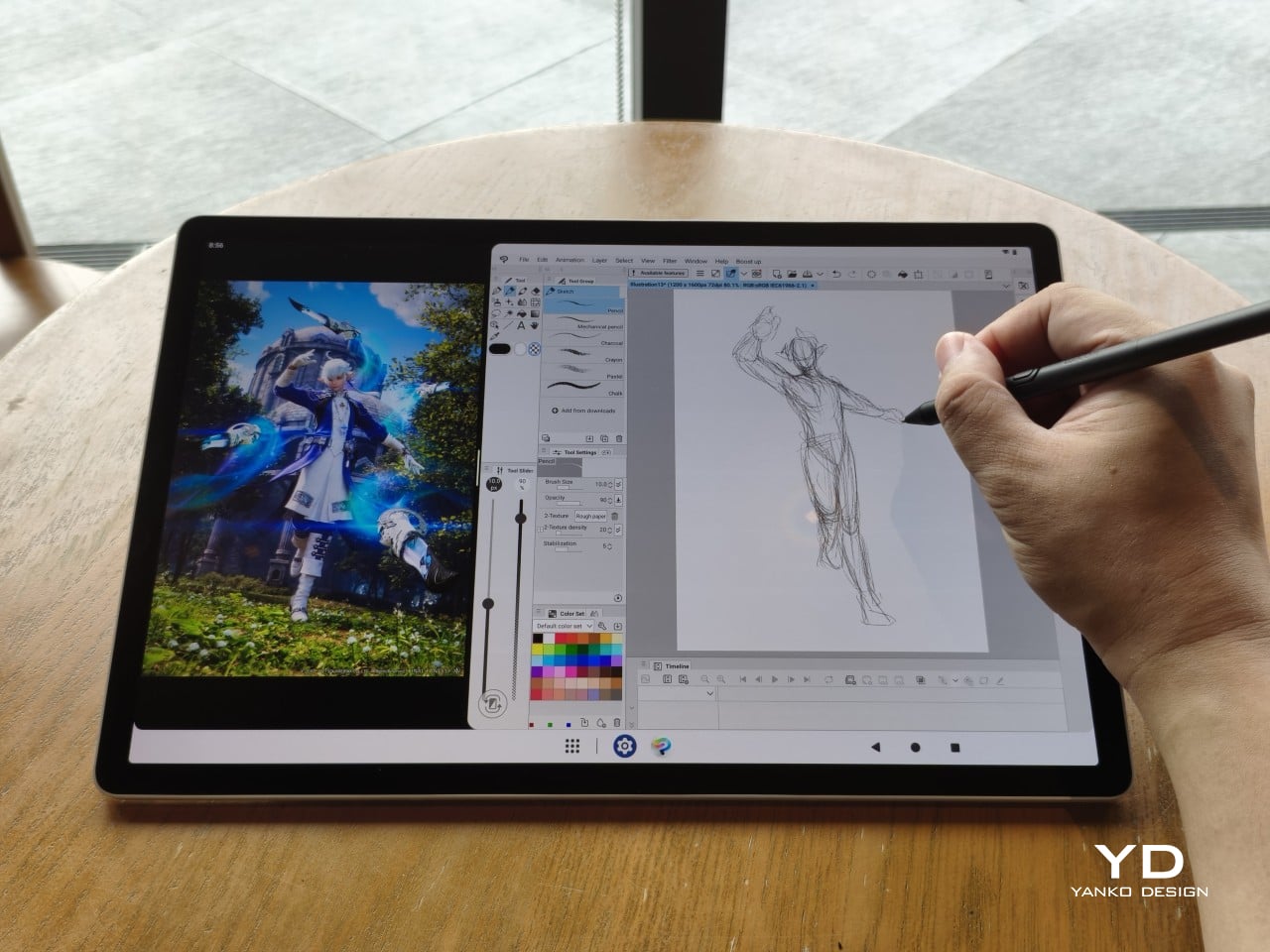
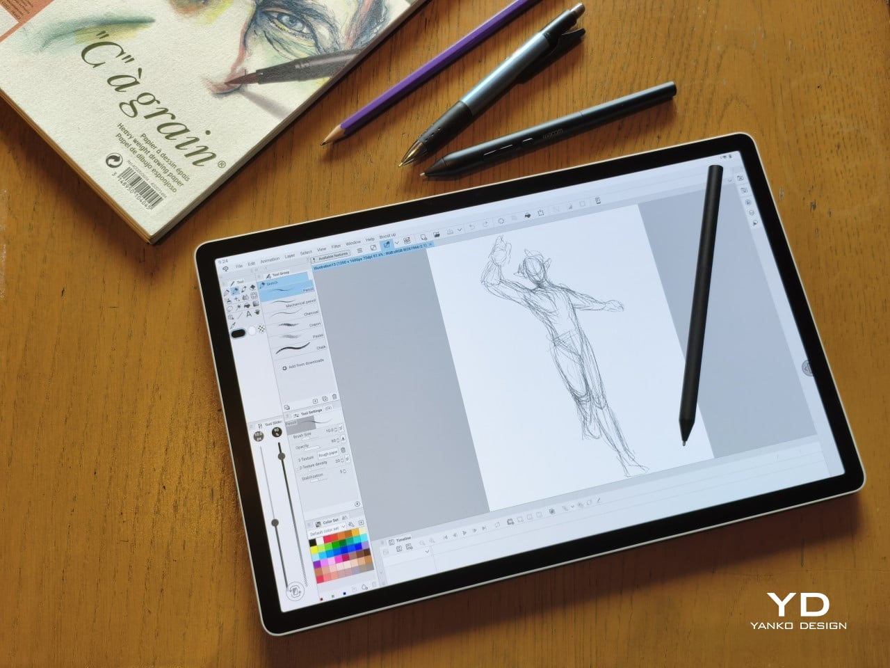
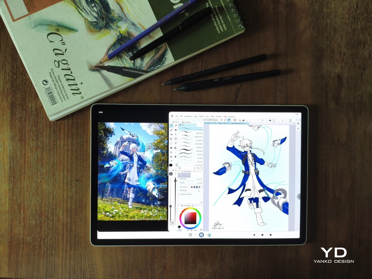
The included Pro Pen 3 follows the same philosophy. It’s all black, slim, and cylindrical, with a body so uniform it almost looks like a high-end mechanical pencil. The three side buttons are barely raised, sitting nearly flush against the barrel for a cleaner look. Unscrewing the rear half reveals three replacement nibs tucked inside: a Carbon Shaft nib, a Felt nib, and a POM nib.
Wacom’s vision for the MovinkPad Pro 14 is to replicate the feeling of picking up a sketchbook, flipping to a fresh page, and getting straight to work. That intent comes through clearly because the tablet removes just about every visual, physical, and digital distraction it can. It doesn’t try to be the slickest-looking device in the room. It tries to be the one you reach for first.
Ergonomics
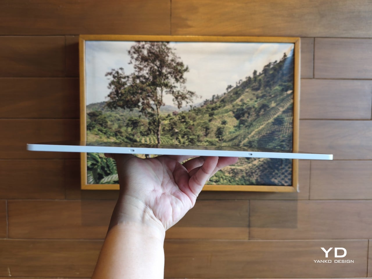
At 14 inches, the MovinkPad Pro 14 isn’t something you’d hold up one-handed for long, but at just 699 grams and 5.9mm thin, it slips easily into any bag. Resting it on your arm or lap doesn’t feel like a chore either. For creatives who move between locations throughout the day, that combination of size and lightness goes a long way toward making it a genuinely portable tool.
The four rubber feet on the underside keep the tablet from sliding around on a desk and slightly raise the back off the surface, which helps with airflow. There’s no built-in kickstand or angled stand, so if you prefer working at a tilt, you’ll need to source one separately, either from Wacom’s own accessory line or from a third-party option. It’s a small gap in an otherwise thoughtful package.
Those wide bezels, which might seem like a design quirk at first, actually earn their place here. They give you a comfortable inactive area to rest your palm or fingers when gripping the tablet from the sides, so your touch input doesn’t accidentally interfere with whatever you’re drawing. It’s the kind of practical thinking that tends to reveal itself only once you’re deep into a long session.
That said, the MovinkPad Pro 14’s footprint means it isn’t something you’d pull from a bag and start sketching on at a moment’s notice. For that kind of spontaneous work, the smaller MovinkPad 11 is probably the better fit. The Pro 14 is better suited to longer, more involved sessions away from the desk, as long as you’ve found a comfortable spot to settle in.
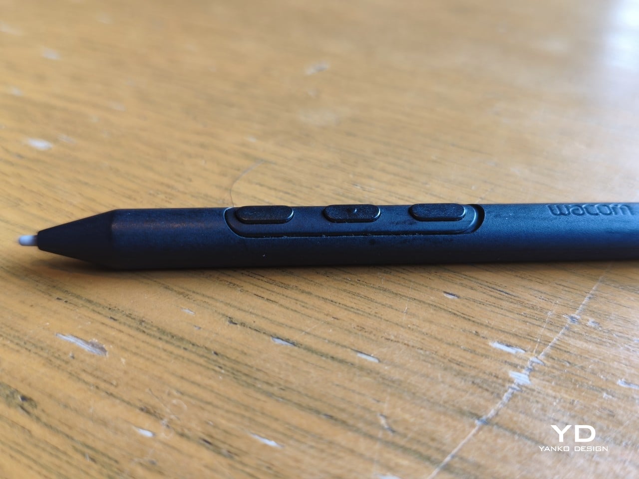
The Pro Pen 3 is well-balanced and comfortable enough in the hand, though your experience will vary depending on what you’re used to. Its slim, pencil-like build can lead to some cramping over long sessions for those accustomed to thicker tools. Official grips are available but aren’t cheap. The nearly-flushed buttons are also too easy to press accidentally. The Art Pen 2, which we’re also reviewing, offers a wider barrel as an alternative but is sold separately.
Performance
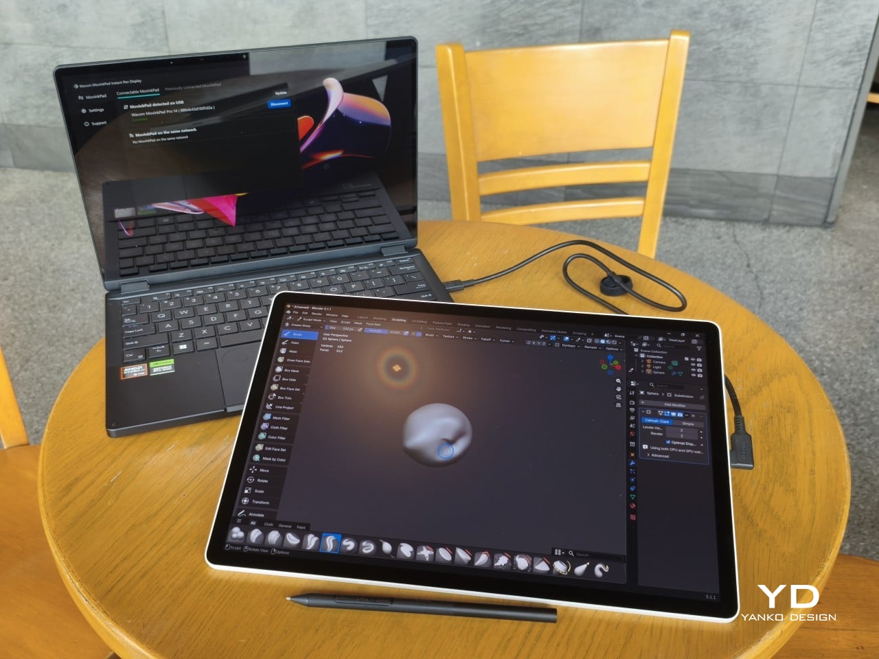
Under the hood, the MovinkPad Pro 14 runs on a Qualcomm Snapdragon 8s Gen 3 with 12GB of RAM and 256GB of storage, expandable via microSD up to 2TB. The processor isn’t the newest available, but it handles everything thrown at it with ease. Multitasking is smooth, app switching is fluid, and there’s no sense that the hardware is struggling to keep pace with anything.
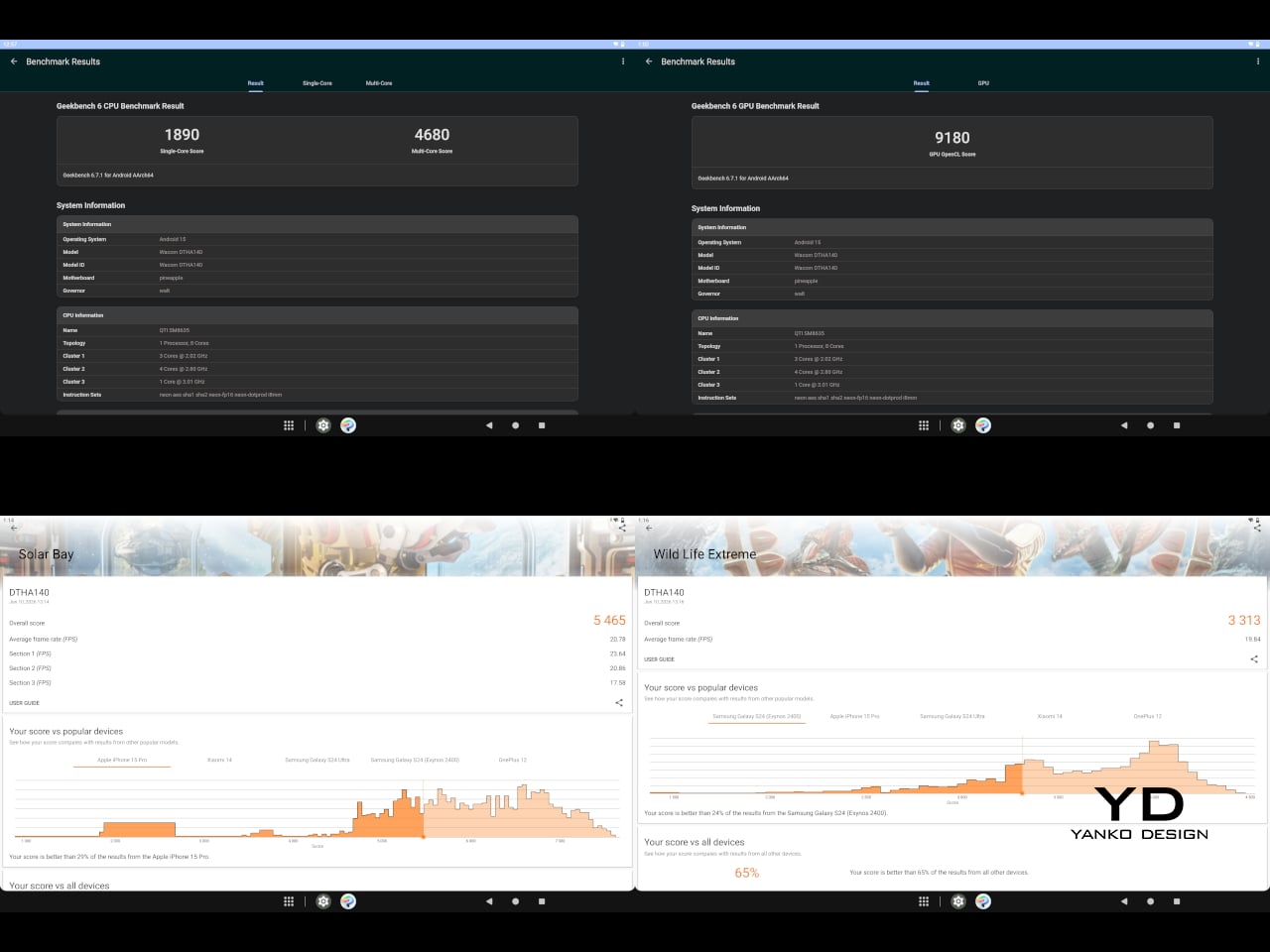
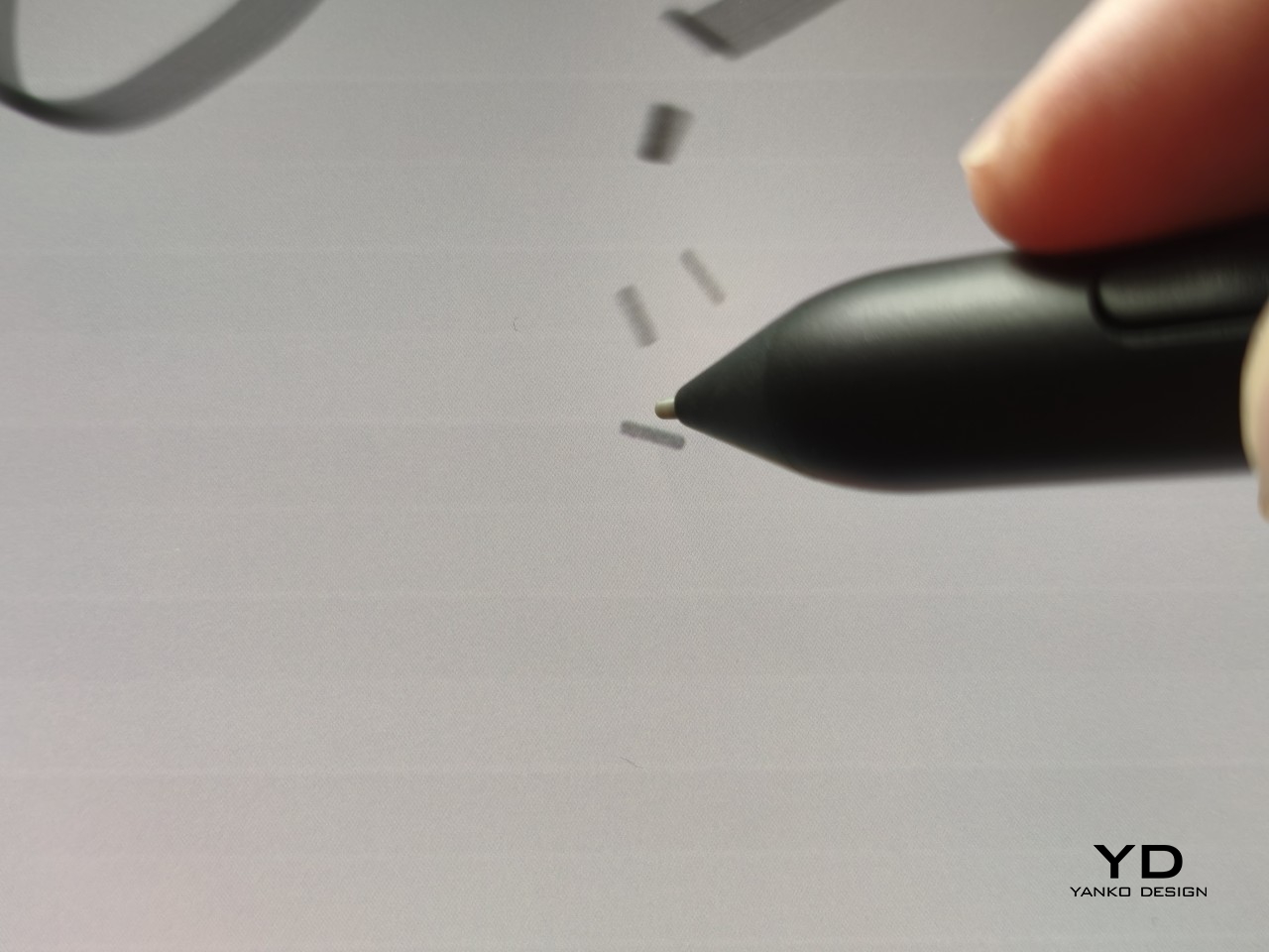
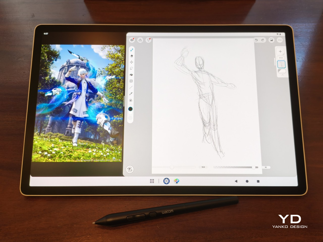
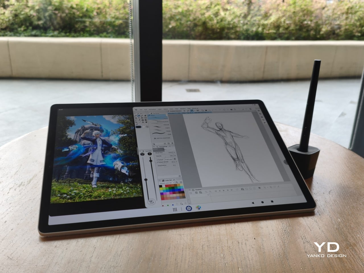
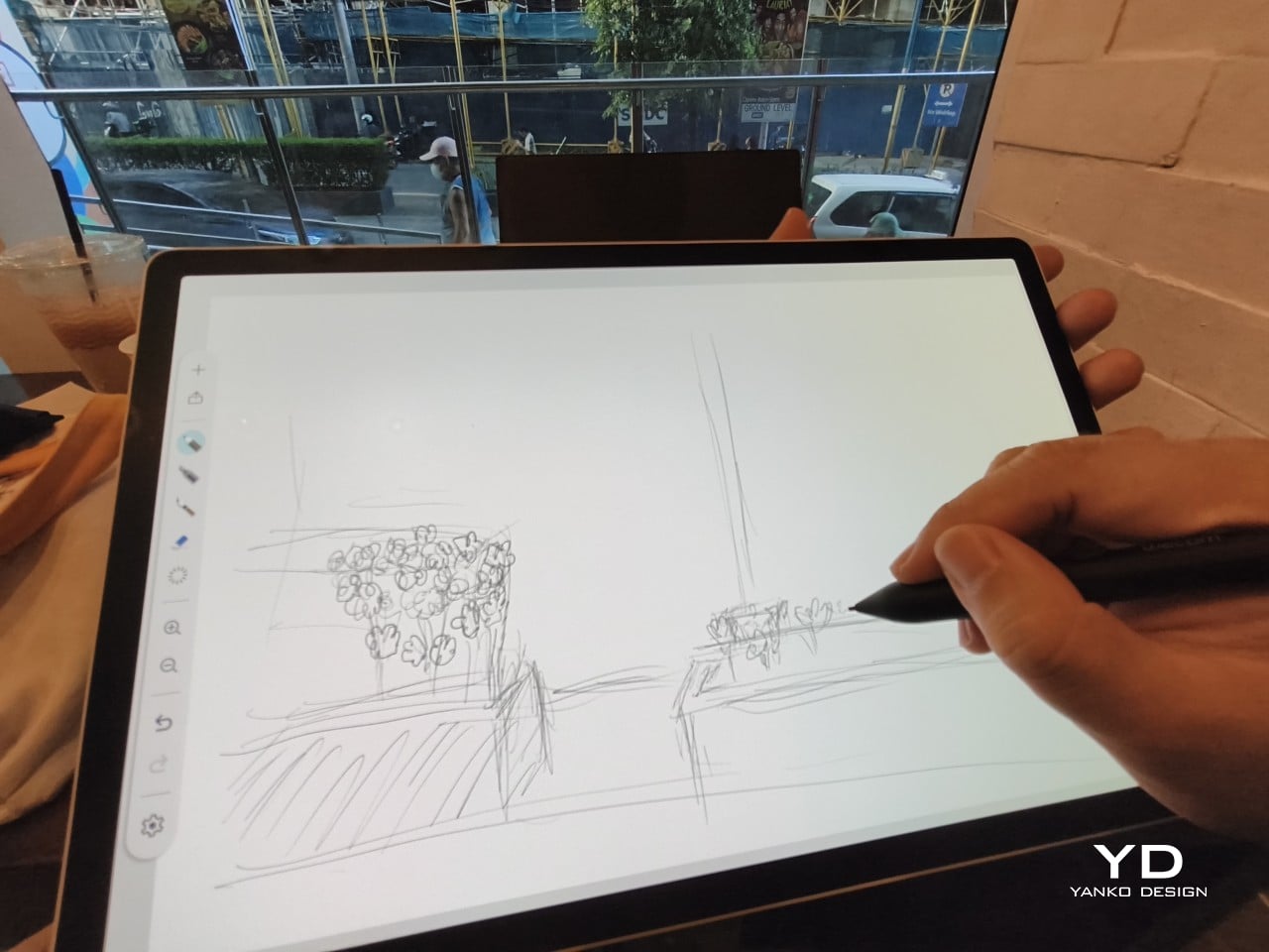
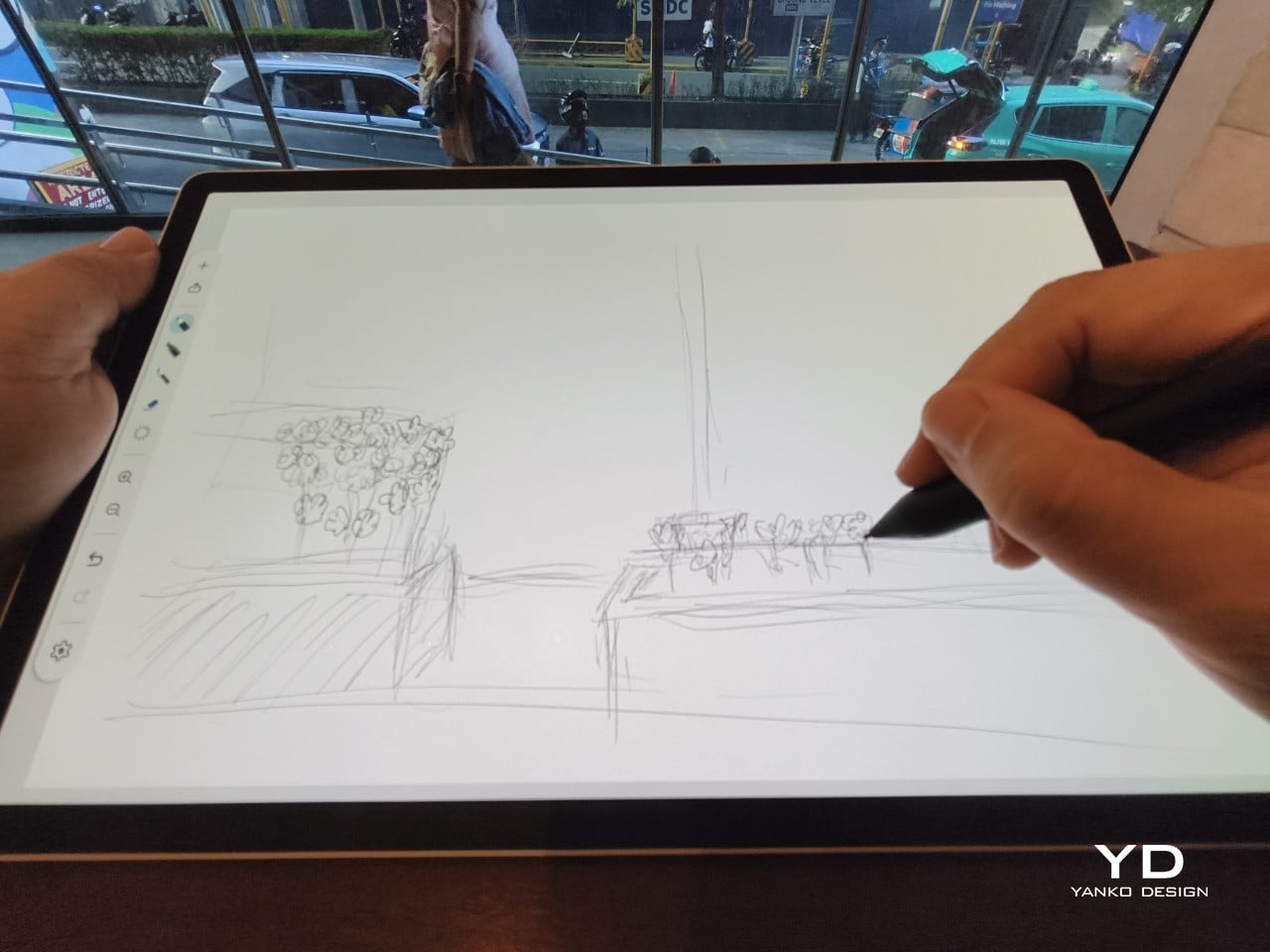
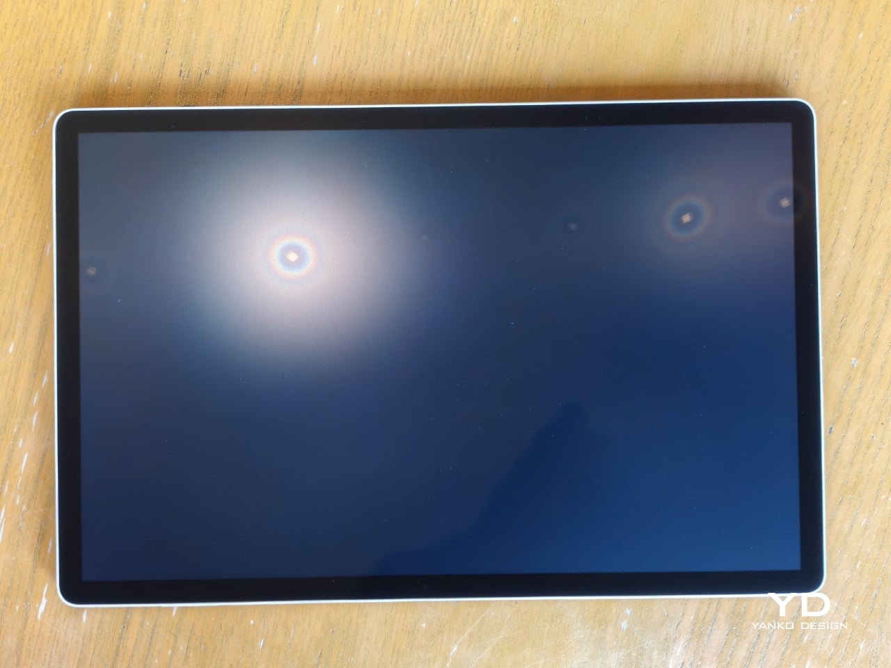
The 14-inch OLED display runs at a 2880×1800 resolution with a 120Hz refresh rate, treated with anti-fingerprint, anti-reflective, and anti-glare textured glass. The wide rectangular aspect ratio works in favor of drawing apps that line their UI panels along the sides, something squarish iPad screens can’t accommodate as cleanly. The textured coating adds a satisfying scratchiness to each stroke, and pen accuracy is, naturally, exactly what you’d expect from Wacom.
There are no cameras on the MovinkPad Pro 14, front or back. That’s a deliberate choice. There’s no temptation to flip over to social media, no accidental video calls, nothing that pulls focus away from what you’re there to do. Passively watching a tutorial in a corner of the screen is about as off-task as it gets, which, honestly, isn’t a bad thing for anyone prone to distraction. Split-screen functionality makes it easy to have a reference off to the side while you work.

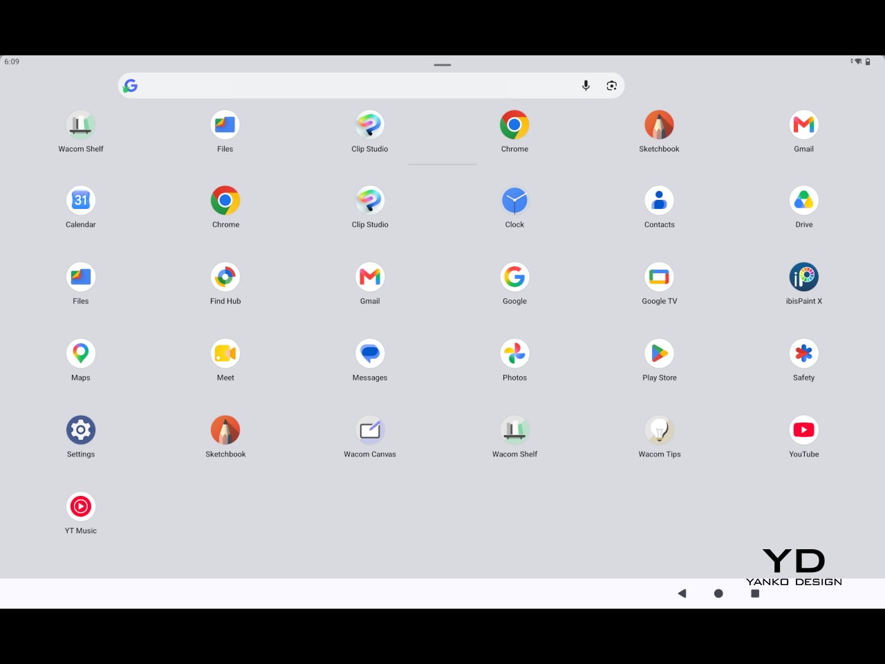
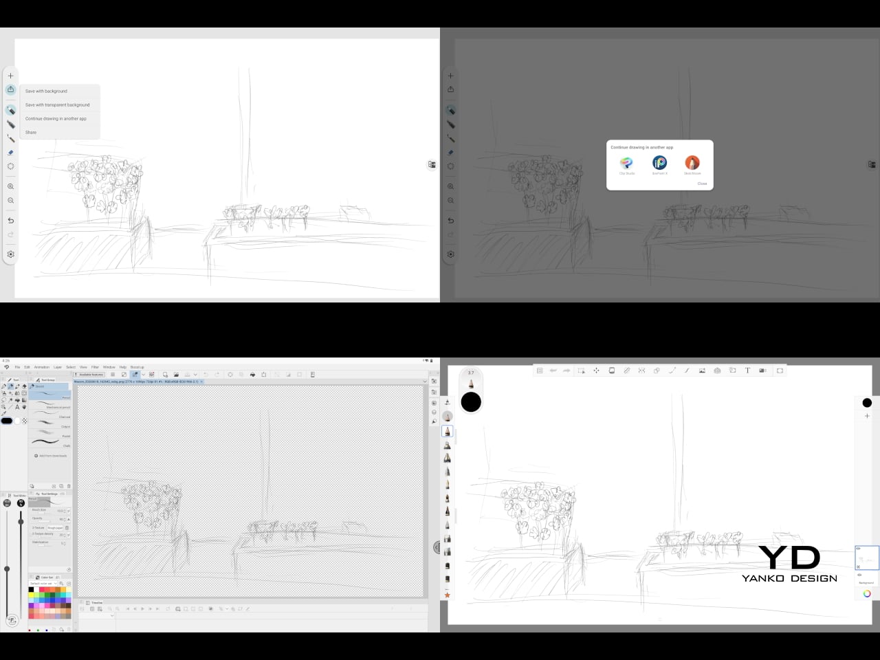
The software side is equally stripped down. Android 15 comes installed with zero bloatware and just three Wacom-made apps: Shelf for your gallery, Tips for settings, and Canvas, a quick sketching surface that wakes directly from sleep with a tap of the pen. It’s intentionally bare-bones for capturing fleeting ideas, though a few more brush options would genuinely be welcome. From Canvas, you can instantly send your sketch to an Android app, though it seems to be limited to Clip Studio Paint, iBisPaint, and Autodesk Sketchbook. Hoping it will offer some flexibility in the future.
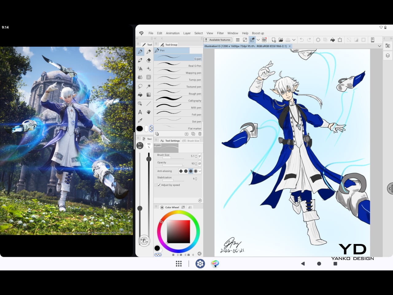
Speaking of apps, desktop-grade drawing applications like Clip Studio Paint and Krita run without issue. The broader Android ecosystem opens up a decent range of options, though it’s worth remembering that anything exclusive to Windows or Mac won’t be available here. Customizing the pen buttons is also off the table, a limitation of the Android platform rather than any fault of the hardware itself.
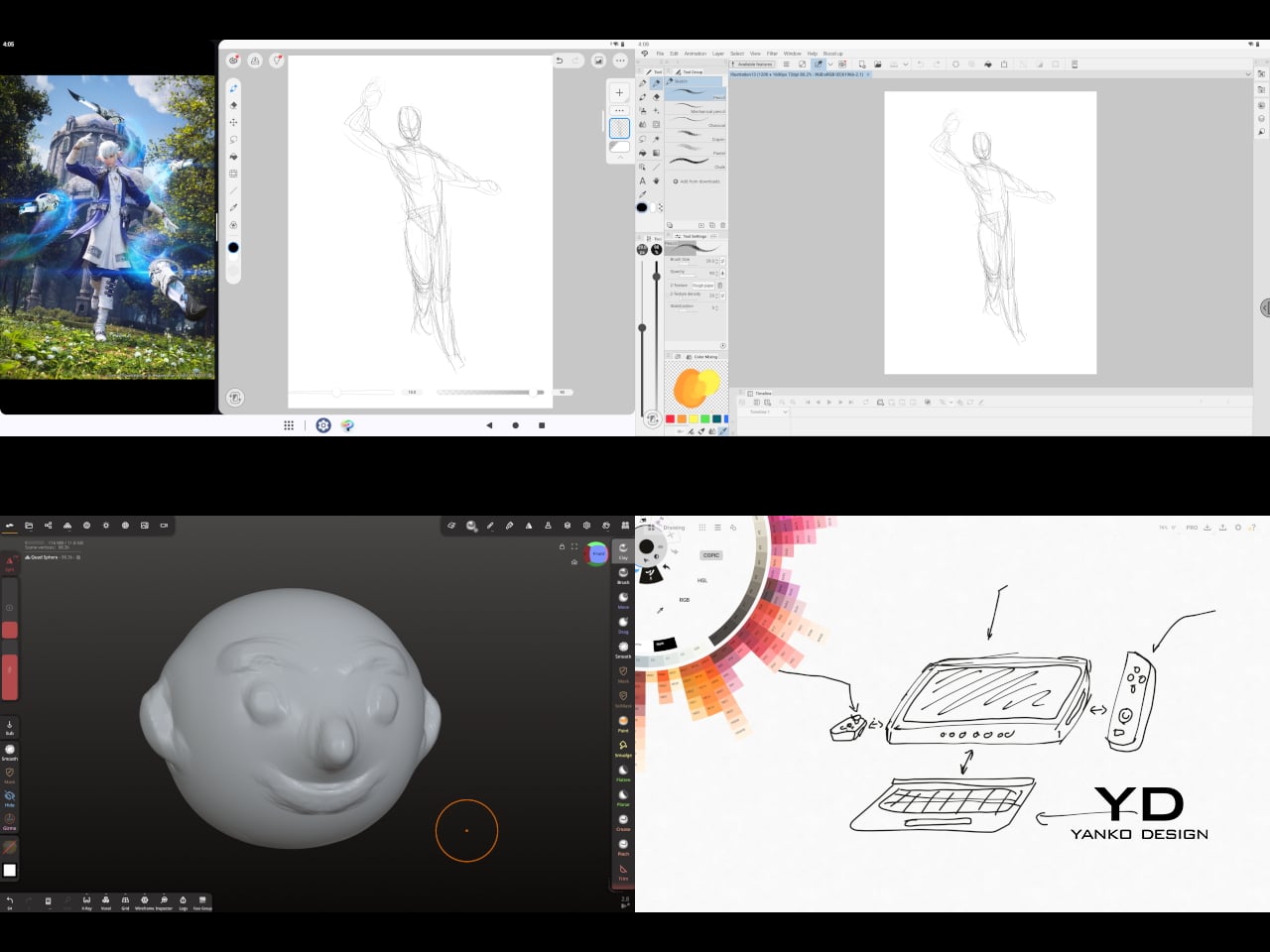
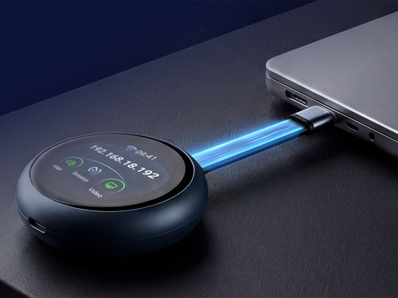
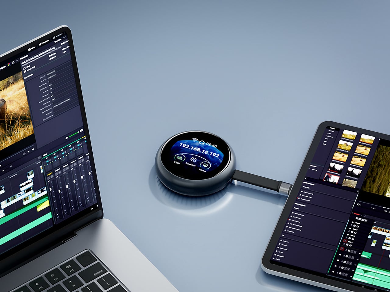
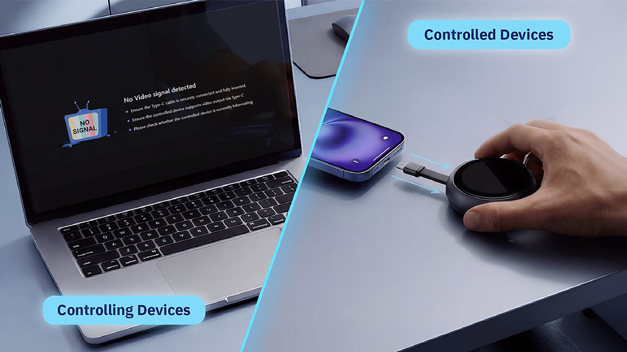
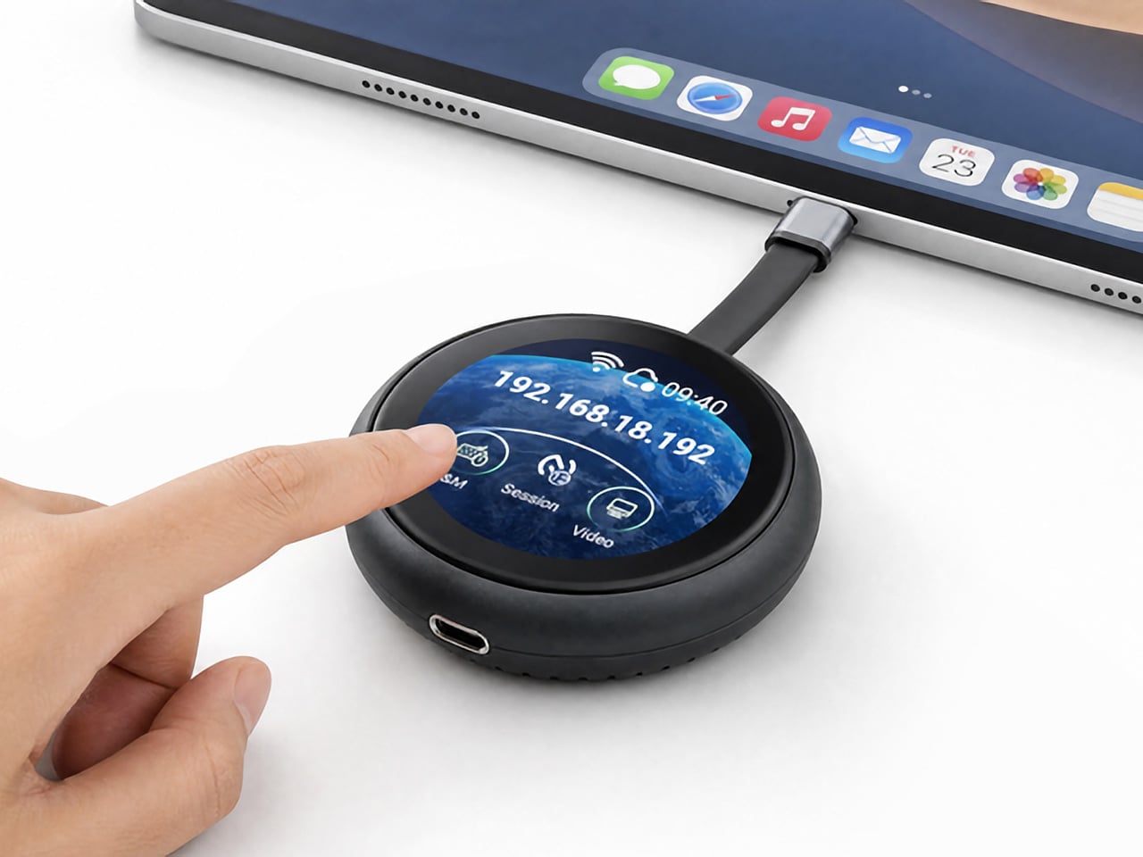
The Instant Pen Display Mode is arguably the most intriguing feature here. It converts the tablet into a secondary display for a Windows or Mac computer, via USB or Wi-Fi, turning it into a portable, makeshift Cintiq. It’s part of Wacom Lab, an experimental creator community that lets users explore and provide feedback on new creative possibilities through beta features. As of this writing, the setup process involves quite a number of steps, and pen button support is currently limited to toggling a small side panel for common modifier keys. It definitely shows promise, so hopefully development will be quick.
Battery life is genuinely impressive. The 10,000mAh cell can sustain nearly five days on standby and supports 65W fast charging, though you’ll need to bring your own charger since none is included in the box. The USB-C port is only 2.0, so it doesn’t charge as quickly as the spec might suggest, but an hour or more of active drawing barely makes a dent in the battery.
Sustainability
Wacom doesn’t use recycled or notably sustainable materials in the MovinkPad Pro 14 itself, but the company does meet several other environmental benchmarks worth noting. Its packaging is compact, minimal, entirely plastic-free, and fully recyclable, while the device is built with the kind of durability Wacom products are known for, the sort that keeps them in active use long after most gadgets would have been binned.
That longevity argument holds well for Wacom’s drawing tablets and pen displays, which tend to outlast their useful lives many times over. A standalone Android tablet is a different matter, though. Apps like Clip Studio Paint have already dropped Android 12 support, making regular OS updates critical. Wacom has committed to keeping the MovinkPad Pro 14 current, but no clear update schedule or roadmap has been shared publicly yet.
Value
At $899.95, the MovinkPad Pro 14 isn’t an impulse buy, but it’s a reasonably grounded one. An equivalent iPad would require buying the Apple Pencil separately, while a comparable Samsung Galaxy Tab tends to run noticeably higher. For a tablet built specifically around the drawing experience, with Wacom’s pen technology at its core, the price lands in a range that’s genuinely difficult to argue against.
The large screen and capable hardware make it a compelling option for creatives who frequently work away from their desks. It doesn’t sacrifice quality for the sake of portability. With the right app installed, it functions as a capable mobile workstation wherever you happen to be. And when a PC or Mac app becomes unavoidable, Instant Pen Display Mode is there to bridge the gap.
There are caveats, of course. The beta status of Instant Pen Display Mode means it’s not quite ready to be a daily driver feature. You’ll also need to feel at home with Android’s drawing ecosystem for this workflow to really make sense. And the uncertainty around long-term Android updates is a concern that Wacom will need to address more concretely before most buyers can put it fully to rest.
Verdict
The MovinkPad Pro 14 isn’t Wacom’s first stab at a standalone portable device. Veterans will remember the Windows-based Cintiq Companions and the MobileStudio Pros. But this is by far the most portable and clearly focused version of that idea. It doesn’t try to cram Windows into a pen display. It’s a purpose-built mobile experience that happens to carry a Cintiq-like trick discreetly tucked away.
At the same time, it doesn’t operate like an Android tablet with a Wacom digitizer tacked on, which is essentially what Samsung’s Wacom-enabled slates are. Wacom has built something around a specific, coherent idea: a true digital sketchbook. Some software edges still need ironing out, but for artists and designers craving genuine creative freedom outside the studio, the MovinkPad Pro 14 offers something few tablets in its class can match.
The post Wacom MovinkPad Pro 14 Review: The $900 Sketchbook Designers Needed first appeared on Yanko Design.