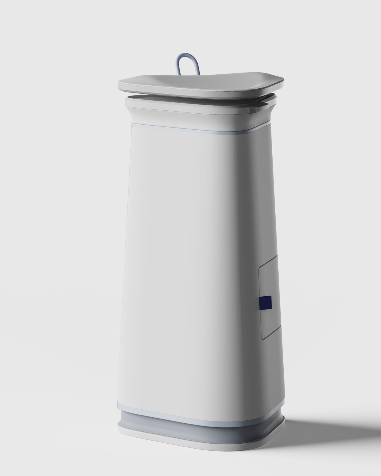
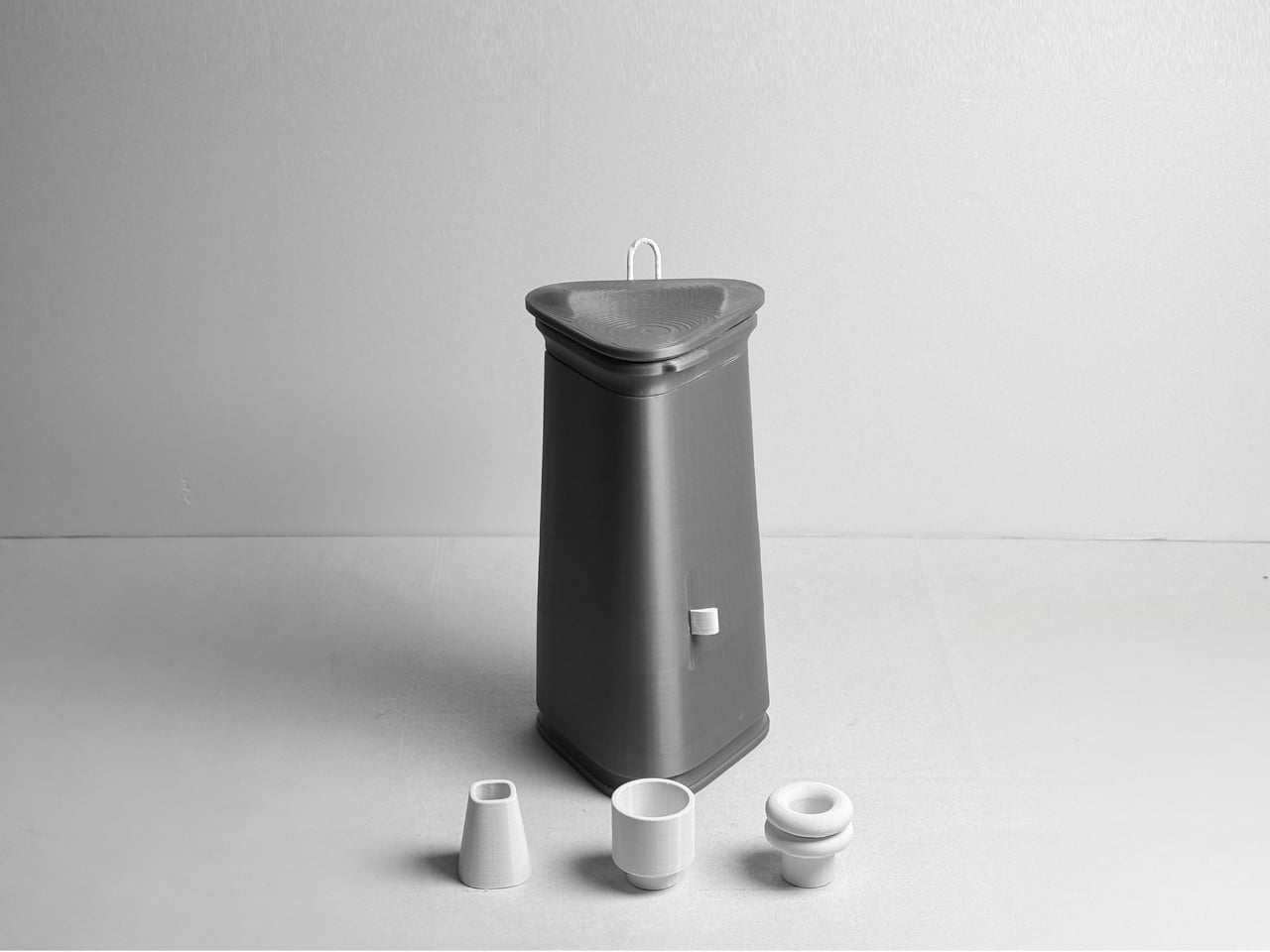
Reverse driving accounts for just 1% of all driving time, yet it’s responsible for roughly 25% of all accidents. A dirty backup camera in winter, mud season, or on dusty country roads is not a hypothetical inconvenience but a genuine safety liability, one that most drivers have resigned themselves to either living with or solving by stepping out of the car every time. Mike Klein, a Vermont-based tinkerer with a characteristically no-nonsense approach to annoying problems, got fed up enough to build a solution in his garage. What started as a Ziploc-bag-and-zip-tie prototype strapped to his license plate has turned into the Lens Lizard, a compact, self-contained, remote-controlled backup camera washer that just hit Kickstarter and has absolutely run away with its funding goal.
The concept is beautifully blunt. Lens Lizard mounts behind your license plate, sandwiched discreetly between the plate and the bumper using your car’s existing screw holes. No drilling, no wiring, no running tubing through door gaps or under trim panels. The whole install takes under five minutes with a standard screwdriver, and once it’s on, it’s invisible. The unit itself houses a fluid reservoir, a battery pack, and a high-pressure nozzle that you aim at your camera once during setup and then never have to touch again. When your backup camera gets caked in snow/ice or road salt on a grey January morning, or buried under a slush splatter from the truck overtaking you on a Vermont highway, you press a wireless remote button from inside the car and a jet of washer fluid blasts the lens clean. Sort of like a lizard or a chameleon striking its prey with a sharp, swift flick of its tongue. Except this time, it’s a concentrated jet of soapy water. Maybe a Pokémon reference would work better but I don’t want Nintendo’s lawyers sending me a cease and desist.
The engineering philosophy here is aggressively practical. Klein explicitly designed the Lens Lizard for Vermont winters, which means sub-zero temperatures, aggressive road salting, heavy snow, and the kind of freeze-thaw cycling that destroys lesser materials. The housing is sealed and built from automotive-grade materials, and the battery and fluid reservoir are sized to last four-plus months between refills and recharges, meaning you top everything up roughly once per season.
Maintenance is a non-event: open the latch, refill with washer fluid, charge via USB-C, close it back up. Klein’s origin story is worth noting too, because it gives the product a satisfying internal logic. He tried hydrophobic lens covers (they peeled), ceramic coatings (they did essentially nothing), and eventually decided to just build a scaled-down windshield washer system for his license plate. The first prototype was, by his own admission, ridiculous. But it worked, and that was enough to tell him the idea had legs.
Lens Lizard works with any vehicle where the backup camera sits above the license plate, which covers 99% of cars on the road, pickup trucks very much included. The product ships with assorted license plate screws to handle different fastener sizes, and the adjustable nozzle lets you dial in the spray angle for your specific camera position during initial setup. After that, the unit lives its entire life tucked behind the plate, completely out of sight. The wireless remote is puck-shaped and lives wherever you keep it in the cabin, a glove box, a cupholder, the center console.
The Lens Lizard starts at just $99 for the entire kit as an early bird discount off its $149 price tag. A dual bundle costs $189 if you’ve got two cars, and all bundles include the Lens Lizard unit, a wireless remote, a battery pack, and an assortment of screws to help you install the gizmo on your car. Given its specific design (and that every nation has a different license plate), the Lens Lizard only ships to the US and Canada for now, although I’m sure a more universal version is in the works. Production is slated to begin in April 2026, with shipping to backers planned for May. For drivers in cold-weather states, high-dust regions, or anywhere that sees serious road grime, it’s a hard value proposition to argue with. Certain premium vehicles have had integrated camera washers for years, quietly tucked into the bumper plumbing. Klein has simply figured out how to give everyone else the same result for under a hundred bucks, no dealer visit required.
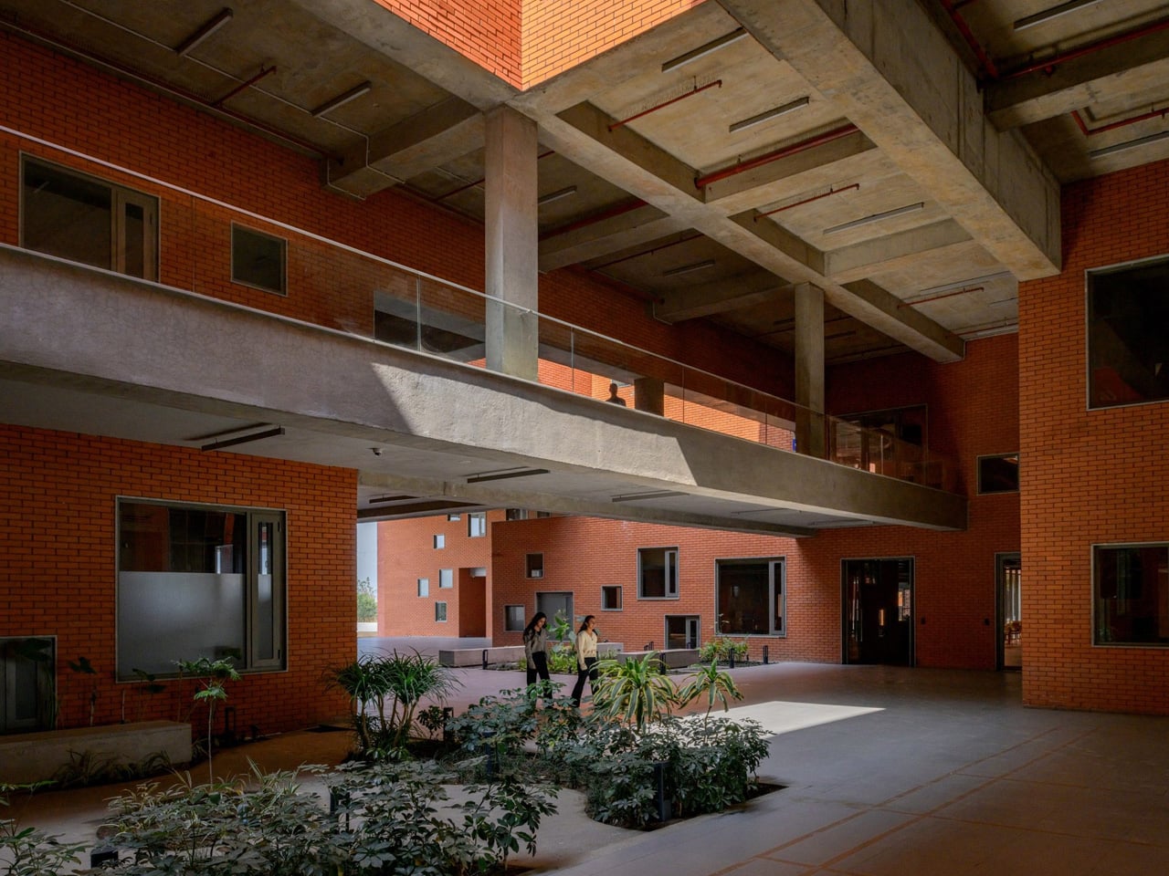
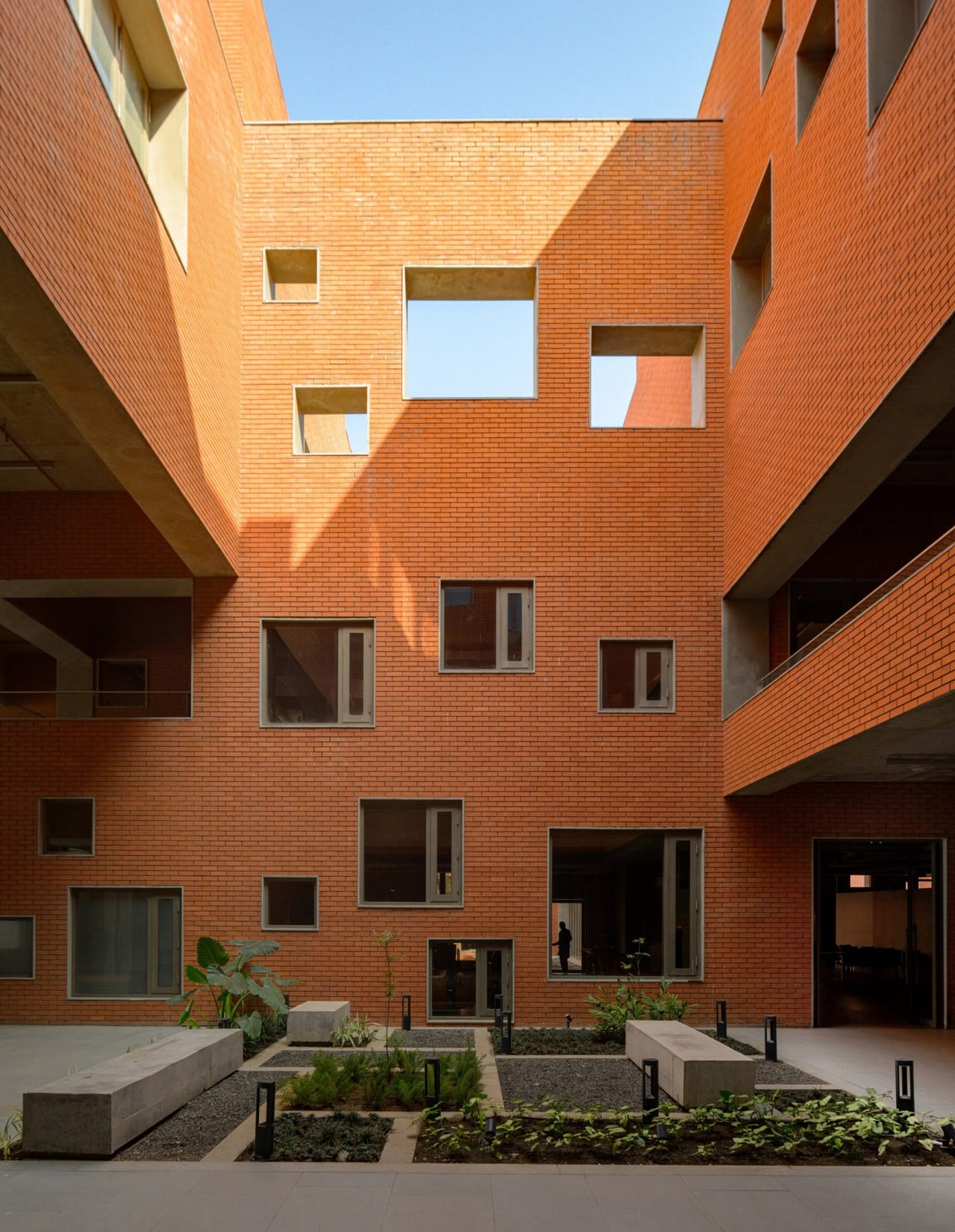
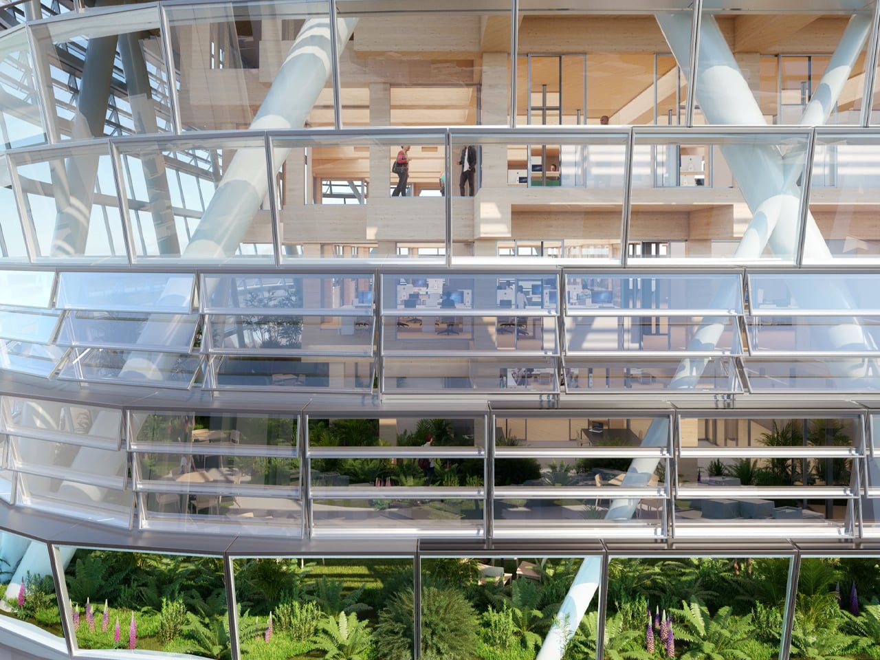
Most university buildings treat their rooftops as mechanical afterthoughts, a surface for HVAC units and waterproofing membranes that no one is meant to see. Sanjay Puri Architects inverted that logic entirely at Prestige University in Indore, turning a 97,000-sq-ft roofscape into a stepped public landscape that seats 9,000 people. The five-story building beneath it almost reads as infrastructure for what happens above.
The roof is composed of 463 individual stepped platforms that rise diagonally from the building’s northern point, with landscaped courtyards breaking up the geometry at intervals to allow natural light into the floors below. The formal reference is India’s historic stepwells, subterranean water storage structures built between the 7th and 19th centuries across western India. Stepwells like Rajasthan’s Chand Baori were never purely utilitarian; they doubled as gathering spaces for social and religious life. Sanjay Puri’s interpretation lifts that same dual-purpose logic above ground, and the campus has already used the roofscape for lectures, games, and a flag hoisting on India’s Independence Day.
Indore’s climate demanded more from the design than a compelling silhouette. Temperatures sit between 86°F and 104°F for most of the year, and the stepped form itself reduces the vertical circulation load needed to cool the building. A continuous diagonal indoor street running the length of the ground floor drives natural ventilation through internal spaces, while perforated glass fiber reinforced concrete screens wrap the eastern, western, and southern elevations to limit heat gain. A shallow pool at the base of the main building adds passive cooling. None of these strategies are novel in isolation, but layering all of them into a single structure shows a climate response that goes beyond token gestures.
The 32-acre campus is built for 3,000 students. Ground-floor programming includes a 700-seat cafeteria, the shaded courtyards, and an indoor auditorium. A first-floor library features a bridge that spans the corridor below. Forty-five classrooms occupy the second and third floors, with faculty offices and administration on the fourth.
Material choices stay regional and direct. Clay brick cladding covers the concrete and fly ash brick structure on the exterior. Inside, exposed concrete pairs with Indian sandstone flooring, creating interiors that feel grounded without relying on applied finishes to manufacture warmth.
Sanjay Puri Architects, now 34 years into practice, has a deep portfolio of climate-responsive work across India. Prestige University pushes that lineage further by making the passive strategy legible; the stepped roofscape is not hidden engineering but the building’s most public face. Whether that openness survives the wear of 3,000 students and Indore’s punishing summers will determine if the idea scales beyond spectacle.
Most lamps do one thing. They turn on. They stay on. And at some point, you turn them off and wonder why your eyes feel like sandpaper or why you cannot fall asleep even though you have been sitting in a dimly lit room for the last hour. Lighting is one of those things we think we understand because we interact with it every day, but most of us have been getting it quietly wrong.
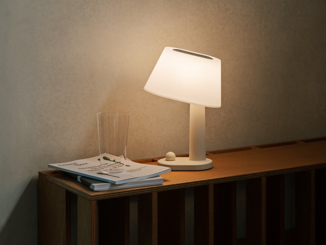
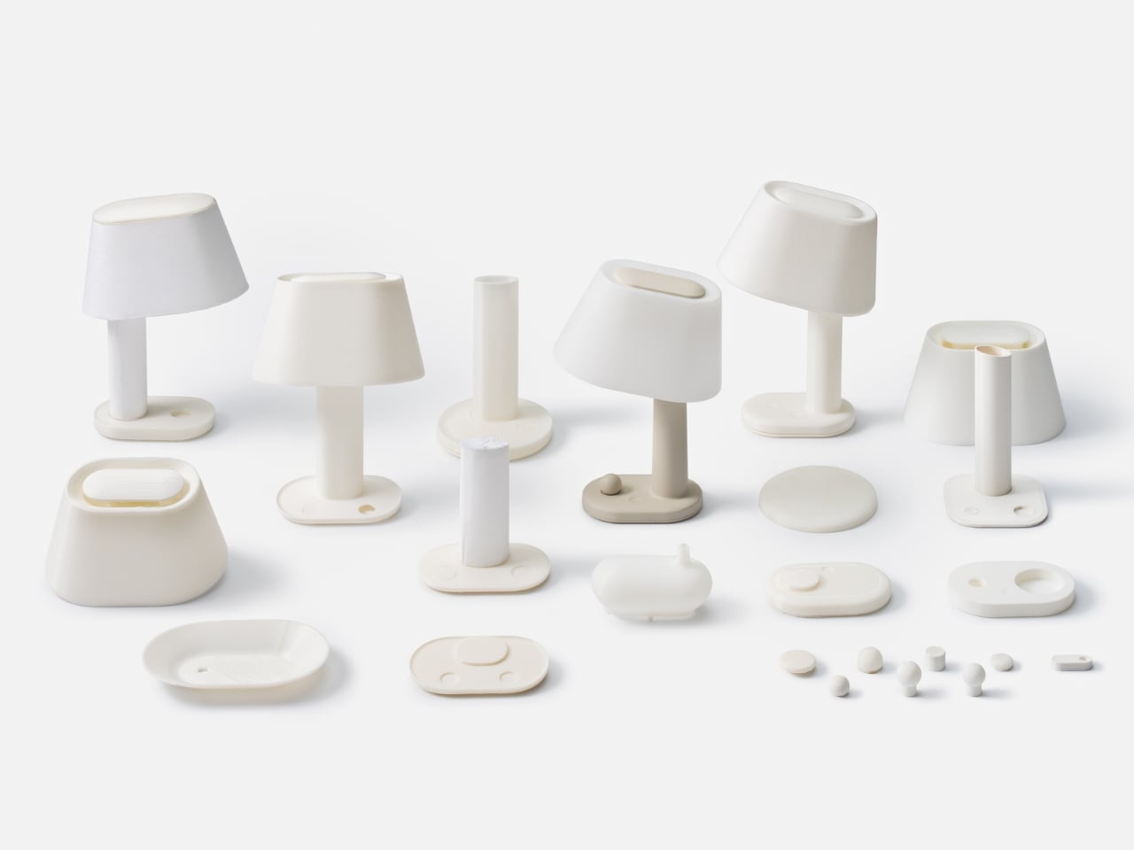
The Beanue Mini, designed by Seoul-based studio BKID co for manufacturer Baelux, is the portable follow-up to the original BAENUE The New Lamp, which collected a Red Dot Design Award in 2023 alongside recognition from Design Plus and the DFA Awards. That first lamp established Dim2Amber® as a genuinely interesting piece of patented lighting technology. The Mini takes that same idea and makes it portable, cable-free, and compact enough to fit in your hand.
Here is what Dim2Amber® actually does, because it matters more than you might think. As you dim the lamp, it does not just reduce brightness. It simultaneously shifts the color temperature from a crisp, clear white toward a warm amber tone. During the day, the light is sharp and cool, the kind that supports focus and keeps you alert. As evening arrives and you begin dimming down, it moves into amber territory, which is the spectrum that does not interfere with melatonin production. Your body reads it as sunset rather than artificial light, and it responds accordingly. You do not have to think about any of this. The lamp does the thinking.
What I find genuinely compelling about this is that it solves a problem most of us did not even have a proper name for. We know that blue light at night disrupts sleep. We know screens are bad close to bedtime. But the lamps sitting on our nightstands, the ones we read by for an hour before bed, are just as much of an issue. Beanue Mini addresses this not through a complicated app or a schedule you have to program, but through the physical act of dimming itself. The adjustment is built into the mechanism. That is an elegant solution.
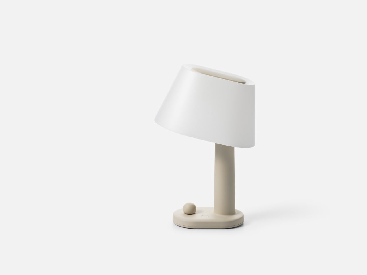
The design is worth talking about separately from the technology, because it holds its own. BKID went deliberately restrained here. There are no loud angles, no attempt to look futuristic, no material choices that announce themselves as a statement. The silhouette is soft and traditional in shape, almost like a table lamp your grandmother might have owned, except built with the kind of material precision that optimizes how light scatters and reflects through the diffuser shade. That slightly tilted shade is not an aesthetic accident either. It is functional, engineered to distribute light in a way that works whether you are using it as a reading lamp or as ambient mood lighting across a room.
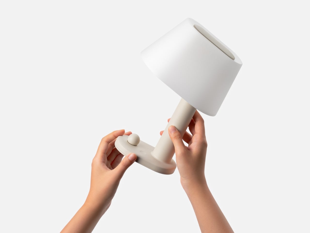
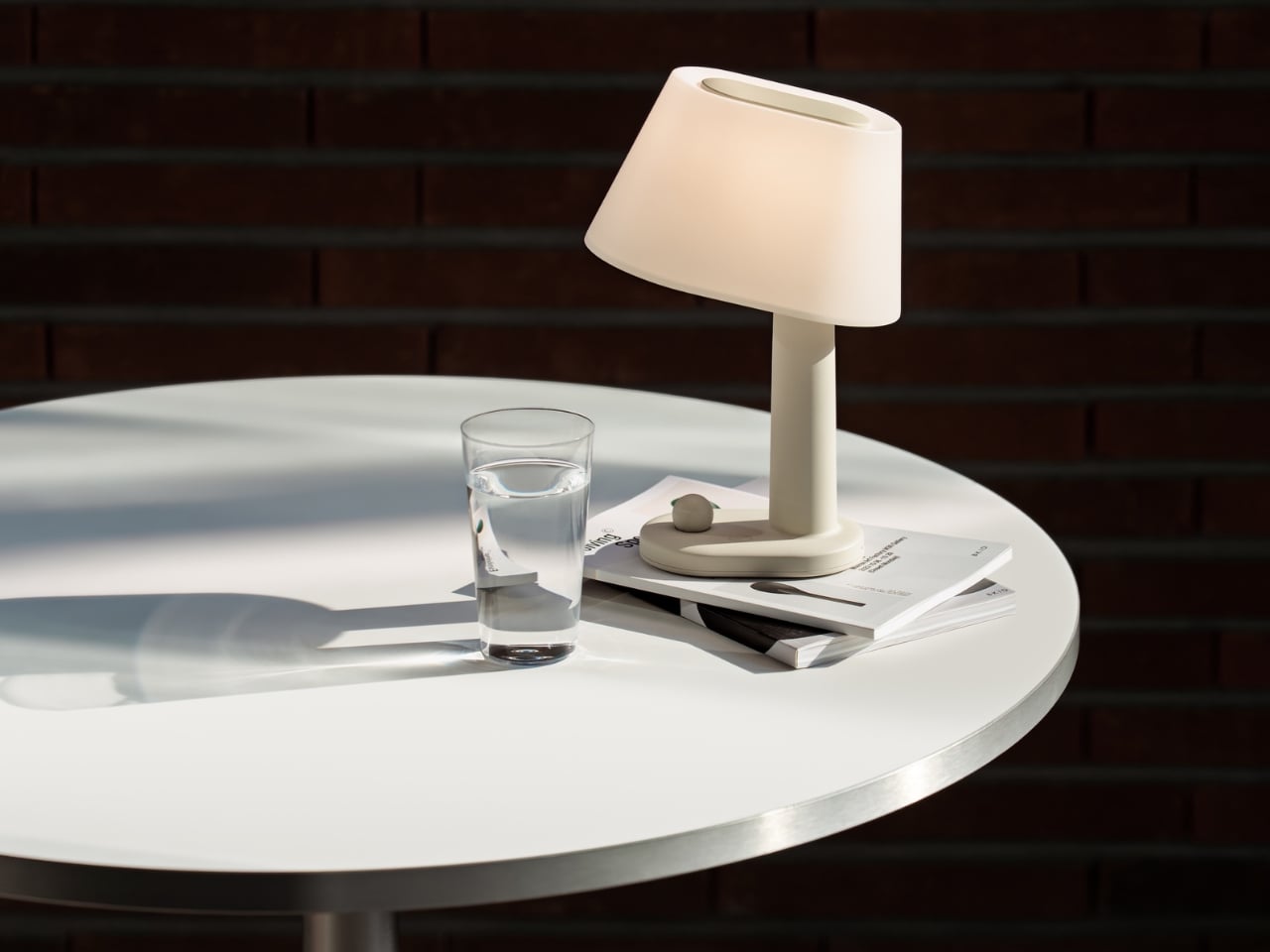
The wireless charging aspect feels almost obvious in retrospect, but it genuinely matters here. The whole point of the Beanue Mini is that it belongs wherever you are. Bedroom, study, hotel room, café table, terrace at dusk. A cord defeats that entirely. Being able to pick it up, carry it, and set it down without negotiating cables is what makes the portability real rather than theoretical.
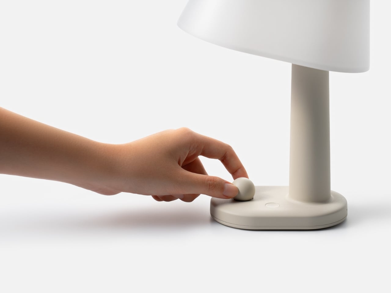
Looking at the development models photographed alongside the final product, you can see how many iterations BKID worked through to arrive at that little sphere button sitting at the base. It is such a small detail, almost insignificant at first glance, but it anchors the whole interaction. You do not tap the lamp or speak to it. You press a small ball, and that tactile contact feels satisfying in a way that touchscreens rarely do anymore.
Lighting design has been having a slow, quiet renaissance over the past few years. People are paying more attention to how their environments affect their biology, and objects like the Beanue Mini are the natural result of that growing awareness. It is not trying to be a centerpiece or a status object. It is trying to fit into your life and make the light around you better, automatically, without asking anything from you. That might be the most ambitious thing a lamp has ever tried to do.
Design Mindset is Yanko Design’s weekly podcast, powered by KeyShot, the 3D rendering and visualization software that helps designers test how products feel, not just how they look. Hosted by Radhika Seth, the show goes deep into the philosophy and process behind world-class products, sitting down with the designers and founders who actually built them. Episode 19, premiering this week, is one of the most thought-provoking conversations the series has produced yet.
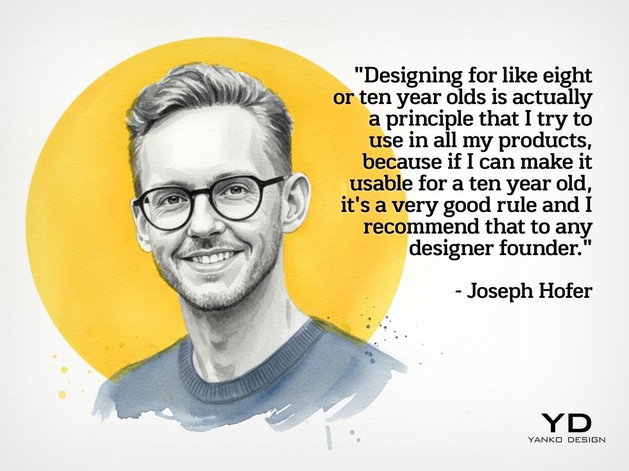
Joseph Hofer is the founder of Hofer Studio, where he consults with hardware entrepreneurs on building profitable, world-class product portfolios. Before that, he spent over a decade at BlackBerry as senior industrial designer, establishing the look and feel of the iconic Bold family and shaping devices like the Q10, Z10, and the BlackBerry Passport. His work spans over sixty design and utility patents, touching products that have sold over twenty-one million units and generated upward of $3.1 billion in revenue. More recently, he’s been the design force behind the Clicks Communicator, a physical-keyboard phone that launched at CES and challenges the smartphone status quo from the ground up.
Joseph opens the conversation with something that sounds almost poetic but lands with the weight of a core design principle, saying that “most of the objects we use every day quietly train us. They teach us how to hold them, how long to focus, how patient we need to be. When design ignores human limits, it drains us. When design respects them, it almost feels like care.” He critiques what he calls “sticky” experiences, the kind that benefit companies at users’ expense, arguing that the real question designers should be asking is whether a product helps people become a better version of themselves, or whether the company simply wins after ten years of draining them.
His case against the modern smartphone is pointed. Everything phones have become reactionary devices, he says, describing the experience of opening one to send an email and somehow finding yourself fifteen minutes deep in a reel, asking yourself how you got there. Big tech, in his view, has deliberately shaped products to increase screen time and sell more through ads. His philosophy runs in the opposite direction: good design should prompt intention before action, not exploit the absence of it.
Integration as Core Design Principle
One of the more revealing details Joseph shares early on is that at BlackBerry, the design team’s official title wasn’t “Industrial Design.” It was Design Integration. That framing stayed with him. “Integration is probably the word, the action that I look to do well in every project I work on,” he says, adding that a product can be really strong in one area but fall flat in others if you’re only focused on a single dimension. Great design, strong UX, and poor profit economics don’t add up to a sustainable company. Economics, manufacturing, cost, and complexity all have to be part of the thinking from the start.
His advice to technical founders reflects the same logic. Many of them start with a breakthrough innovation and then go looking for a market to push it into, which he sees as working in the wrong direction. The better path is to step back, clearly analyze the problem bubbling up from the market, shape an experience that solves it, and then let the technology marry with that. Letting one run too far ahead of the other is how good innovations end up as products nobody uses.
The Clicks Communicator: Intentional Mobile Interaction
The Clicks Communicator is the most direct physical expression of Hofer’s philosophy. It was the first phone he designed in ten years after BlackBerry, and the central idea is a complete inversion of how smartphones currently work. Rather than an app grid that presents notifications and pulls users in reactively, the Communicator prompts users to decide what they want to do first, then acts on it. Physical keys map to intentional shortcuts: pressing K calls a specific contact, pressing I opens Instagram only when the user has consciously chosen to. “It flips it from being reactionary to intentional,” Joseph says simply.
He’s also clear that the product’s appeal isn’t nostalgia. A lot of the customers aren’t even BlackBerry users, he notes; they’re younger people who simply want a different relationship with their mobile device. The Communicator sits within what he sees as a broader 2025 trend of “intentional tech,” products designed to decouple from the everything-phone model and serve one specific purpose well. Adding a 3.5mm headphone jack and a removable SD card wasn’t feature-stacking for its own sake either; those choices are signals to a specific audience that the team is listening and cares about them.
Recognizing Quiet Ideas and Process Discipline
When Radhika points out that the BlackBerry keyboard now feels like it was always inevitable, Hofer pushes back immediately. “Sometimes these quiet ideas that feel obvious or become obvious actually took a lot of effort and iteration to get there,” he says, describing the motto his team lived by: think, build, test. The keyboard’s evolution wasn’t a single stroke of insight; it was a response to real constraints. As iPhones pushed screens larger, BlackBerry faced intense pressure to shrink keypads, which meant switching from oval keys to square ones, losing the tactile separation users relied on. The innovation was subtle: raising a curved edge on each square key to preserve the feeling of the oval, essentially hiding a reference to the old shape inside the new form. Speed tests, accuracy tests, user sentiment on different options, all of that grinding iteration is what produced something that feels natural.
He applies the same thinking to simplicity broadly. Designing for a ten-year-old, he argues, is one of the most useful principles any designer or founder can adopt. If you can’t explain the product to a ten-year-old, it’s too complicated. He tested this literally the night before the recording, sitting down with his eight-year-old daughter to ask about her CD player. Her answer was that it had way too many buttons. Her ideal? Three: power, volume up, volume down. Six identical-feeling buttons with in-mold graphics that disappear in the dark told a clear story about what the designers had gotten wrong.
Restraint as Confidence and Commercial Strategy
The tension between restraint and visibility is something Hofer takes seriously. He doesn’t frame minimalism as a virtue in itself. “Clarity is actually an even stronger word,” he says, arguing that a vanilla product solving a vanilla problem will simply go unnoticed. The goal isn’t to be quiet; it’s to solve a real, specific problem so well that the product becomes the only answer for a particular group of people. A phrase he came up with captures where he’s trying to take the companies he works with: from viral products to vital ones, products that customers genuinely need in their lives because of the difference they’ve made.
That philosophy maps directly onto commercial outcomes. A product that meets the emotional and functional needs of a user, reduces cognitive load, lasts longer, and has lower return rates naturally builds a brand that draws people in without needing to be aggressively sold. “When products are just better,” he notes, “they need to be marketed and sold maybe less. That’s an effect on your bottom line.” His work at Hofer Studio is less about crafting beautiful objects and more about asking founders what commercial success actually means to them and building backwards from that.
When the rapid-fire round asks him to describe restraint in design in a single word, his answer arrives without hesitation: confidence. “What does obviousness create? It creates confidence. I know how to enter this experience. I know how to start this product. I feel more confident with it in my life.” It’s a fitting close to a conversation that consistently returned to the same idea: that the design decisions nobody notices are usually the ones that took the most care to make.
Design Mindset drops every week on Yanko Design. Catch Episode 19 in full wherever you listen to podcasts. For a free trial of KeyShot, visit keyshot.com/mindset.
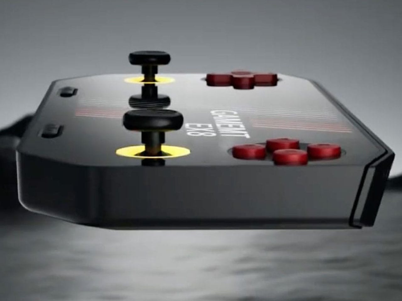
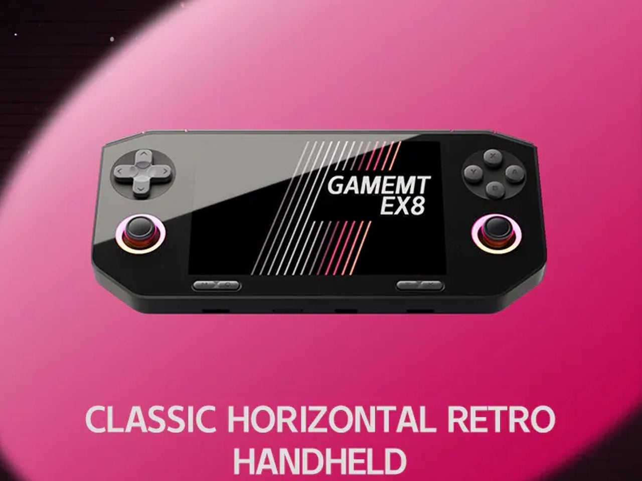
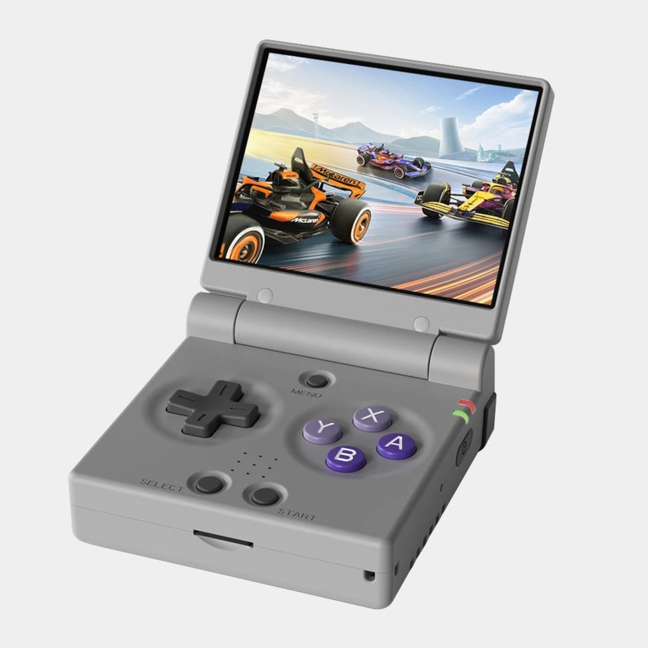
The gaming handheld continues to expand with new devices aimed at retro enthusiasts and mobile gamers. One of the latest additions is the GameMT EX8, a portable gaming console designed to deliver a capable Android-based gaming experience while maintaining a relatively affordable price point. With a high-resolution display, a familiar handheld layout, and hardware suited for emulation and mobile gaming, the EX8 represents GameMT’s attempt to compete with other budget-friendly handhelds in the growing retro gaming segment.
The handheld features a 4.88-inch display with a resolution of 1080 × 1620 pixels and a 3:2 aspect ratio. This format is particularly appealing for retro gaming because it better accommodates older console titles that do not match modern widescreen displays. The panel is also noticeably sharper than the screen used in some competing handhelds, such as the Ayaneo Pocket Micro, which uses a smaller 3.5-inch display with a lower resolution. The larger and sharper screen is expected to improve the visual experience when playing classic games from platforms like the PlayStation and PSP. With its combination of a high-resolution 3:2 display, capable mobile processor, and expandable storage, the GameMT EX8 aims to deliver a balanced handheld gaming experience.
Designer: GameMT
Powering the device is MediaTek’s Helio G99 processor, a chipset commonly found in mid-range smartphones. The chip is paired with 6GB of RAM and 128GB of internal storage, providing enough performance for Android gaming and a wide range of emulated titles. The Helio G99 has already proven capable of handling many retro systems and even some more demanding platforms through emulation, making it a practical choice for a handheld of this category. For users with larger game libraries, the EX8 also includes a microSD card slot that allows the storage to be expanded beyond the built-in capacity.
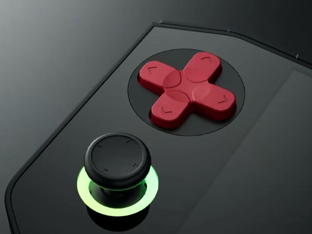
In terms of design, the EX8 adopts a horizontal handheld layout with symmetrical analog sticks positioned on both sides of the display. Each thumbstick is surrounded by an RGB ring light, giving the device a more modern aesthetic. A traditional D-pad and ABXY button arrangement sits alongside the sticks, while shoulder buttons are integrated along the top edge. The device also appears relatively thick compared to some competitors, likely to accommodate its internal hardware and cooling system. Thermal management is supported by an internal cooling fan, which helps maintain stable performance during extended gaming sessions. Audio is delivered through bottom-firing speakers, and the handheld is powered by a 5,000 mAh battery that charges through a USB-C port. These features are designed to ensure the device can sustain longer play sessions without overheating or running out of power too quickly.
The GameMT EX8 will be available in two color options. A black version pairs dark hardware with red D-pad and face buttons, while a white variant features purple buttons and matching accents. This contrast gives the handheld a distinctive visual identity within the crowded retro gaming market.
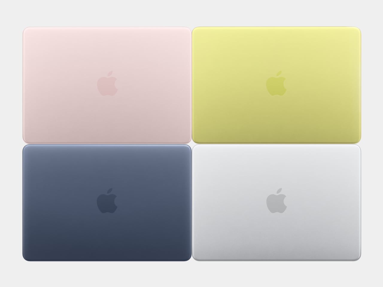
For about 18 years, every aluminum MacBook has looked more or less the same. Silver. Angular. Quietly serious. There’s nothing wrong with that. Apple’s unibody aluminum design, introduced in October 2008 and carved from a single block of metal, was genuinely elegant and set the template for an entire industry. But it also retired something along the way: the idea that a Mac laptop could feel chosen rather than just defaulted to.
The MacBook Neo, announced March 4 and starting at just $599, is the first real crack in that template. It comes in four colors (blush, indigo, silver, and a yellow-green called citrus) with enclosure corners that are noticeably softer than any aluminum Mac in recent memory. Whether that adds up to a proper design statement or just smart positioning is worth thinking through.
Designer: Apple
What happened to Apple’s color confidence
iBook G3 Clamshell (courtesy of Wikipedia)
Apple’s fondness for color didn’t always live inside an iPhone. The iBook G3, launched in 1999, came in tangerine and blueberry, and later in indigo and key lime. It was rounded, slightly toy-like, and completely unapologetic about being a consumer product. When the aluminum unibody arrived in 2008, Apple traded that warmth for precision machining and sharp rectilinear edges. Right call for the MacBook Pro. Default for everything else, apparently, for nearly two decades.
The result was a color drought in aluminum Mac laptops that has lasted until now. Silver, space gray, midnight, starlight: all variations on the same mood of professional restraint. The Neo’s citrus and blush aren’t just options on a spec page. They’re a quiet admission that not every laptop buyer wants a device that looks like it belongs in a boardroom. For Apple, that’s actually not a small thing to say at the product level.
Two different stories about corners
M1 MacBook Pro (2021)
There’s a distinction worth making here, because “rounded corners” gets used loosely when describing the Neo. MacBook displays have had rounded screen corners since 2021, which is a display-level detail and nothing new. What’s different on the Neo is the chassis itself. The physical aluminum enclosure is softer at the edges and corners than any aluminum Mac before it, and Apple’s own press materials describe “soft, rounded corners” specifically in terms of how the device feels to hold and carry.
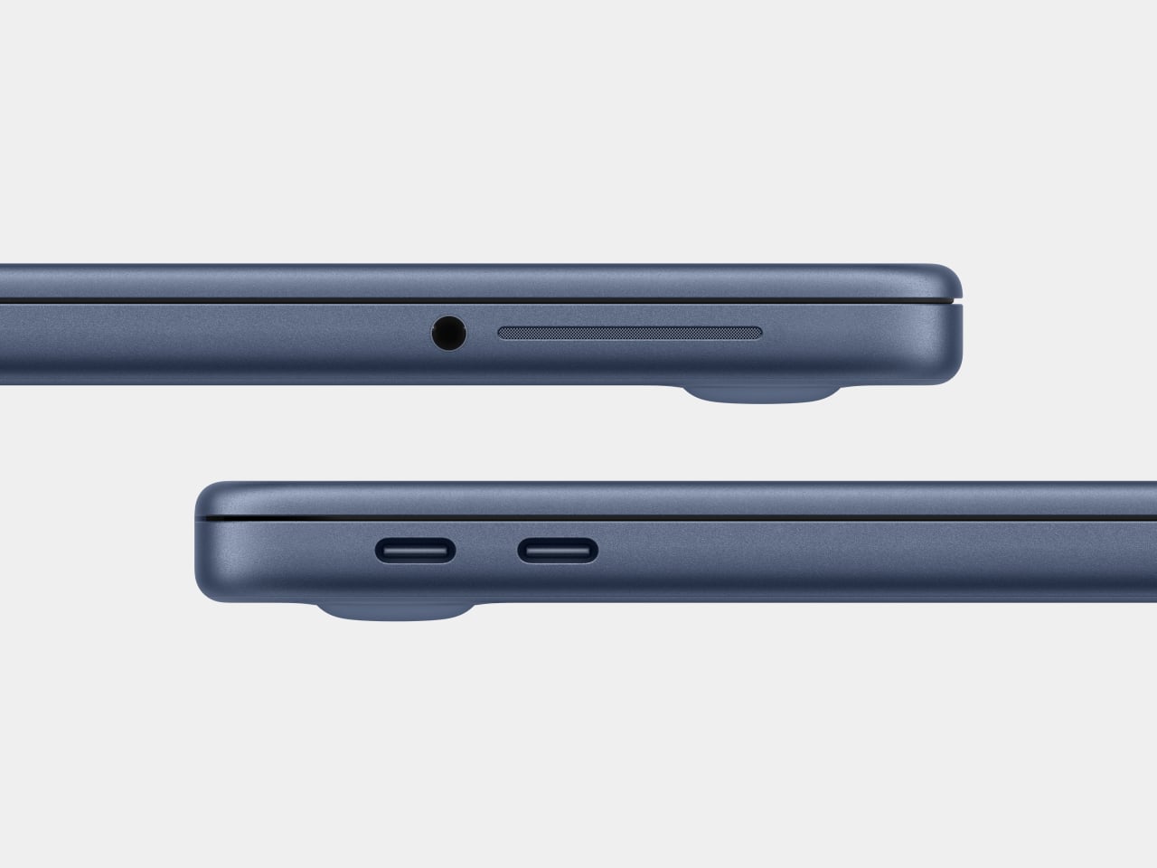
That’s a real shift in the design language. The 2008 unibody was celebrated for machined sharpness, corners you could feel were engineered. The Neo softens that deliberately. It’s not a revival of the iBook, and it’s not trying to be, but the instinct is similar: a consumer Mac that feels a little more like it belongs to you. The notch is also gone, making this the first notchless MacBook since 2020, which quietly tidies up the one thing that made recent Airs feel slightly unfinished.
The repairability angle is actually a design story too
One thing that got a little buried under the color conversation: the Neo is the most repairable Mac laptop in years, and that’s partly a design decision worth noting. Teardowns showed how the whole machine was disassembled in just a few minutes using standard Torx screws throughout. No tape, no adhesive, anywhere inside. That’s a first for a modern Mac. The USB-C ports, speakers, and headphone jack are all modular. The keyboard can be replaced on its own, without swapping the entire top case, which on the MacBook Air currently costs over $370 in parts.
The internal simplicity isn’t accidental. The A18 Pro chip runs so efficiently that the Neo needs no fan at all, which removes a whole layer of thermal engineering that usually clutters a laptop’s interior. The result is a cleaner, more logical internal layout. Whether Apple arrived here from genuine design philosophy or from regulatory pressure (the EU’s right-to-repair push has been building for years) is an open question, but the outcome is real either way.
What it doesn’t fix, and what might come next
It’s not all sunshine and rainbows, of course. The base model has 8GB of non-upgradable RAM, one USB-C port runs at USB 2.0 speeds, and there’s no backlit keyboard. These are calculated trade-offs for the price point, not mistakes, but they matter depending on what you actually need the machine for. And repairability, for all the justified enthusiasm, is still partial: the RAM and storage are fixed at purchase, just like every other current Mac.
Still, the Neo feels like Apple designing for a specific person it had previously ignored: someone who was never going to spend $1,000 on a MacBook Air and wasn’t particularly well served by anything else Apple made. The color, the softer form, the price, the clean internals, all of it points at the same person. What’s genuinely interesting is whether any of this travels upmarket. If a future MacBook Air gets a color story this confident, the Neo might end up looking less like an entry-level product and more like Apple quietly figuring out what comes next.
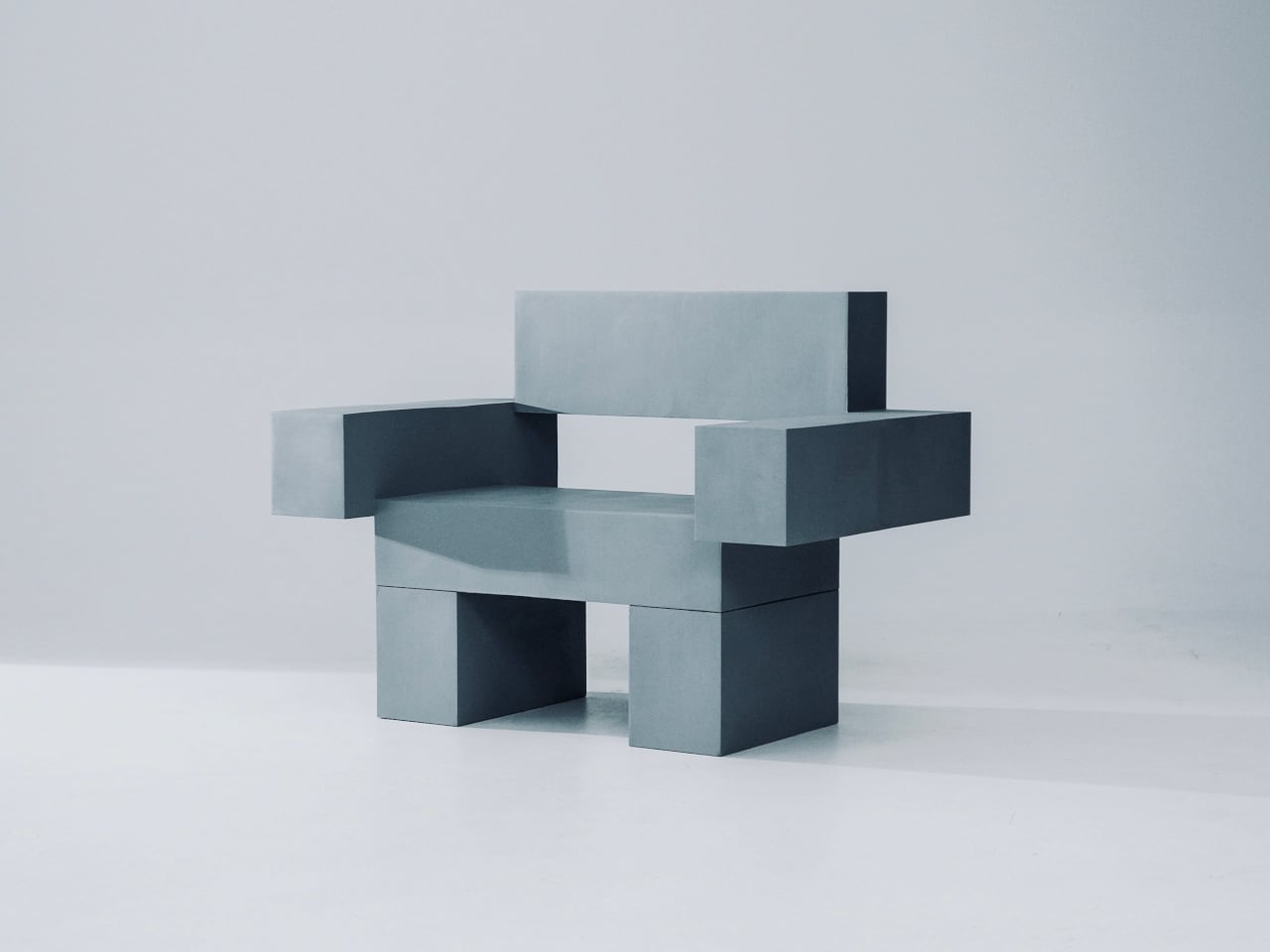
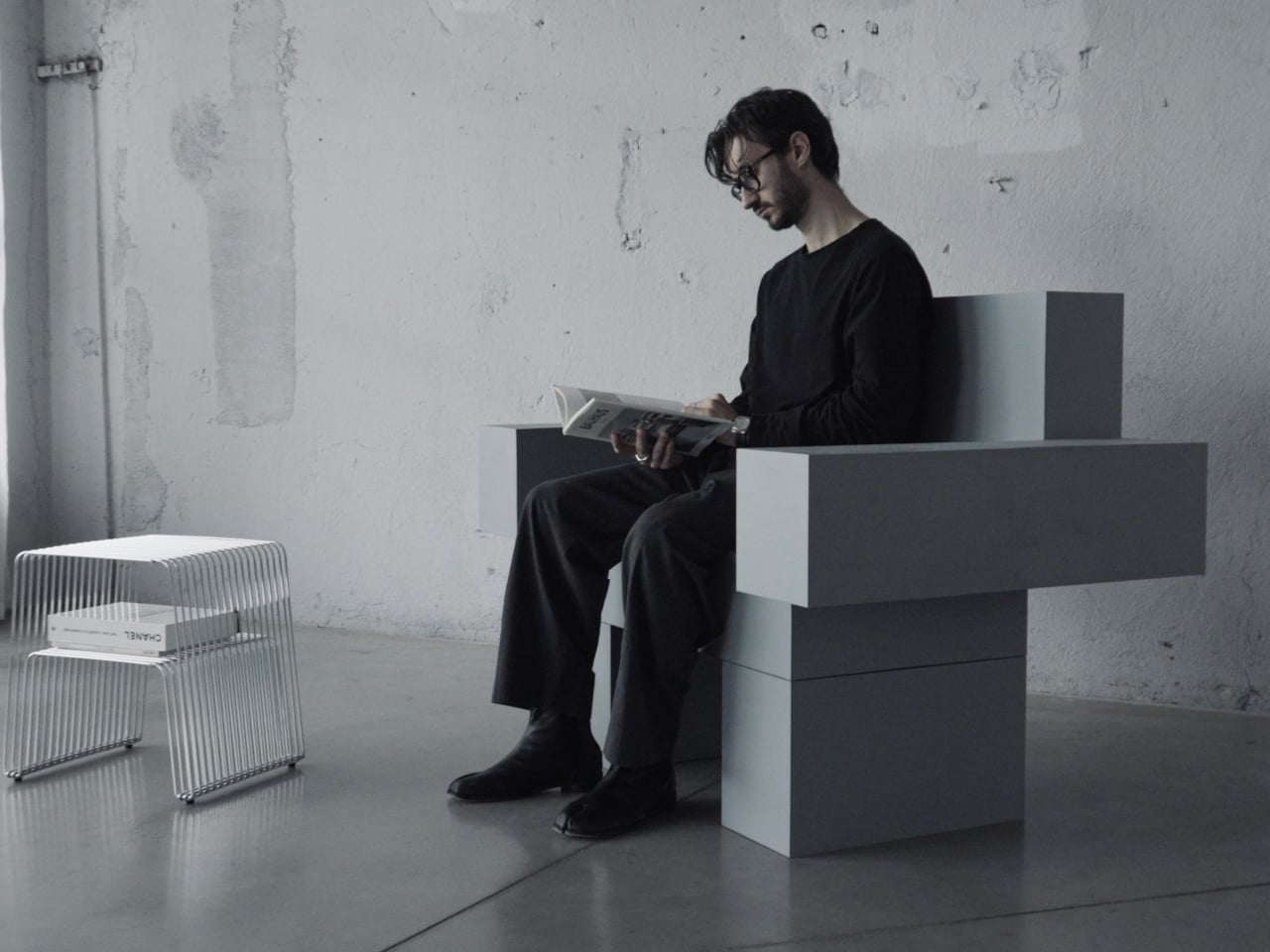
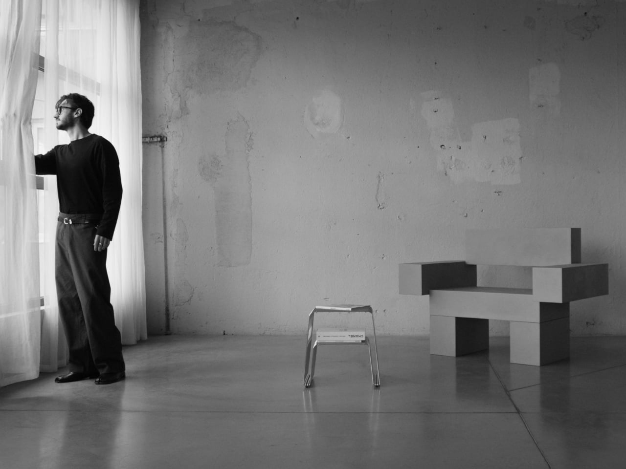
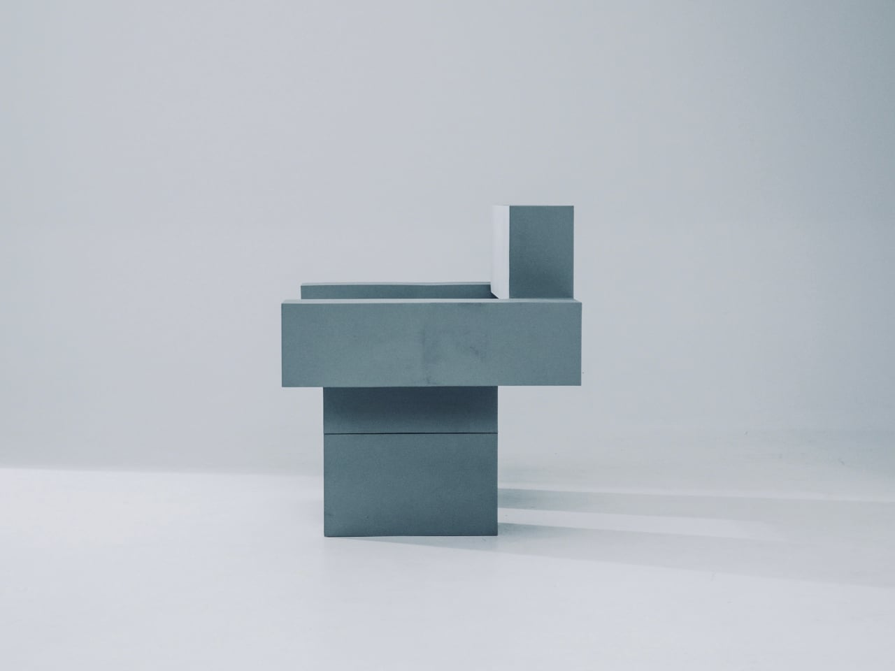
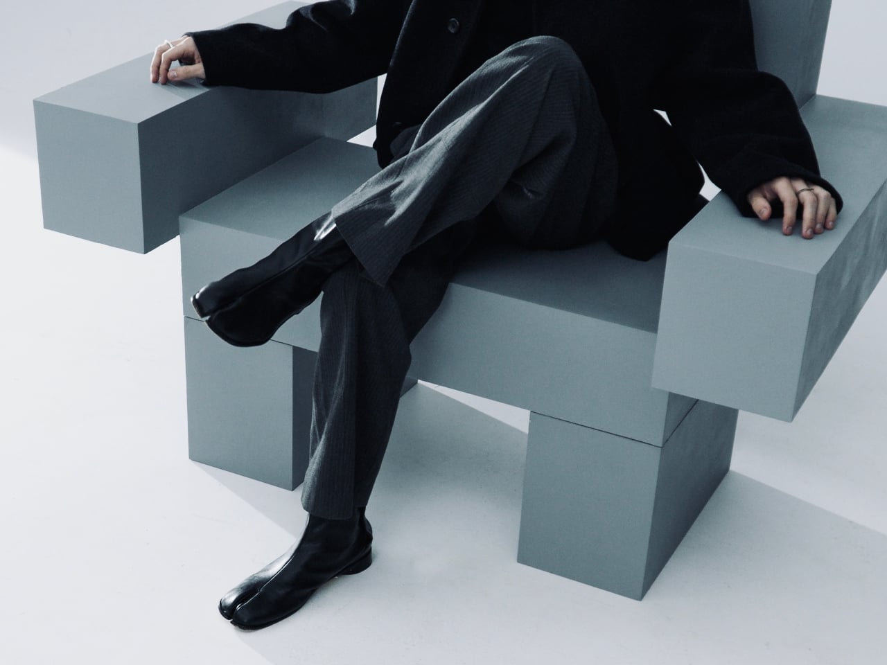
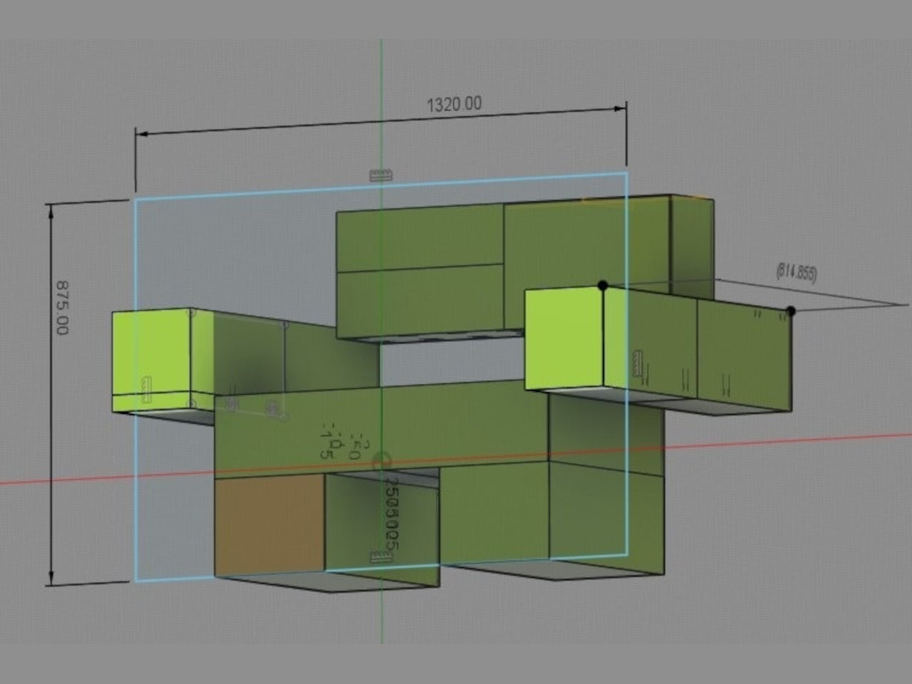
Most furniture sits in a room without saying much. It fills a corner, does its job, and disappears into the background. Nako Baev’s THE OBJECT 01 is not that kind of furniture. The Amsterdam-based designer set out to build a chair that carries the weight of a spatial statement, something that holds its ground without decoration or apology, and in that specific ambition, the object largely delivers.
THE OBJECT 01 is a 3D-printed lounge chair built from recycled PETG, a plastic more commonly found in water bottles than in furniture workshops. At 20kg, it is lighter than its blocky, slab-heavy proportions suggest, though not exactly something you would reposition on a whim. Its dimensions push it closer in scale to a small architectural fragment than to a typical chair, which is likely the whole point.
The construction follows a modular panel system, where each 3D-printed block fits into a sequence designed to cut material waste and keep the overall mass structurally lean. Finished in a cold grey Baev calls “Kyoto Fog,” the chair reads somewhere between concrete and matte stone. In a sparse studio or raw loft, it anchors the space with quiet authority. In a more conventional living room, it would likely dominate in ways not every household would welcome.
What makes THE OBJECT 01 genuinely worth attention is how honestly it exposes its own making. The layer-by-layer texture from the printing process is not hidden or smoothed away; it stays visible across the surface, turning the manufacturing method into part of the visual language. That kind of material honesty is far more common in ceramics or cast concrete than in plastic furniture, and it gives the piece a tactile quality that polished renders simply do not convey.
Baev describes the design as sitting between furniture and sculpture, drawing on minimalist brutalism and a quieter Japanese restraint in equal measure. The emotional reference points are more unusual: the designer cites the atmosphere of Silent Hill and Half-Life, those game environments built from silence and abandoned space, as part of what shaped the object’s mood.
The workflow involved AI assistance across early form studies, structural testing, and design refinement, reducing development time considerably. That footnote is becoming standard across the industry, and it doesn’t add or subtract much here. This process might even become the key to sustainable furniture design, as it can help optimize 3D printing, increase efficiency, and reduce waste in the long run.
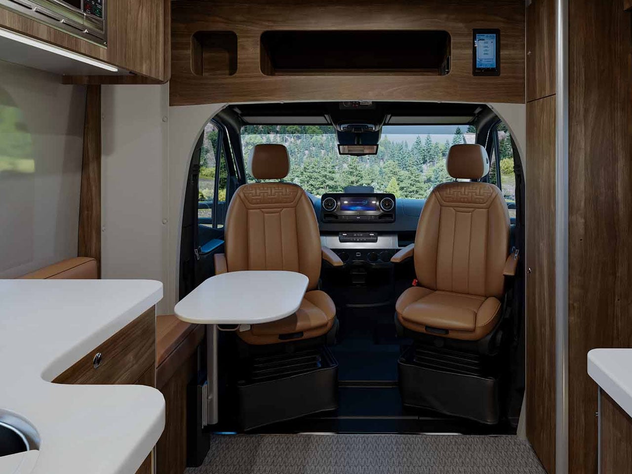
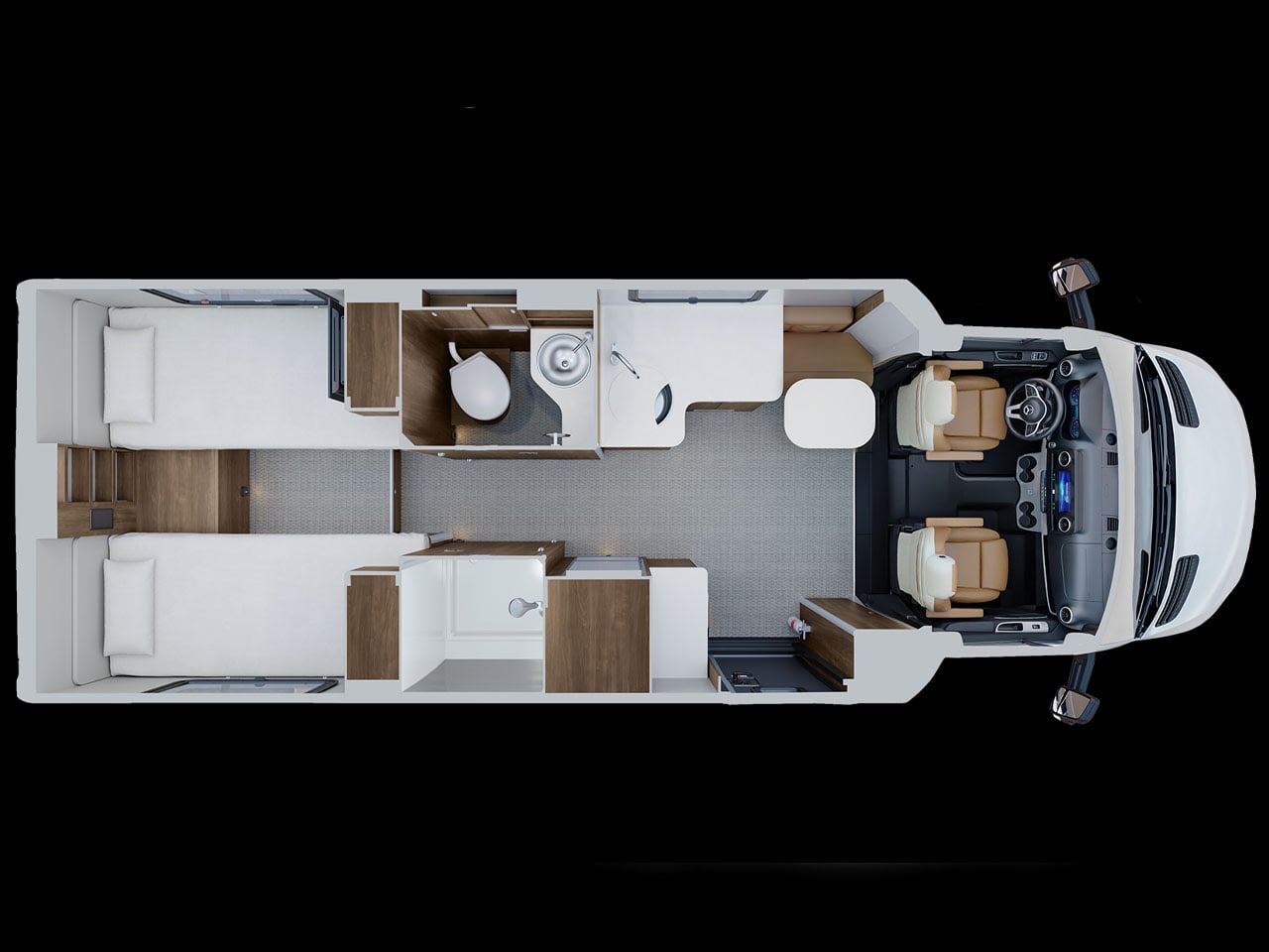
Airstream is synonymous with quality. And when that quality meets Mercedes-Benz performance and substance, you get an interesting, adventure-ready motorhome called the Atlas 25RT. From how Airstream puts it – and the photos suggest – this is a luxury-packed touring coach with sophisticated interiors that you would want for a comfortable adventure, whether it’s for a night out or an extended weekend under the stars.
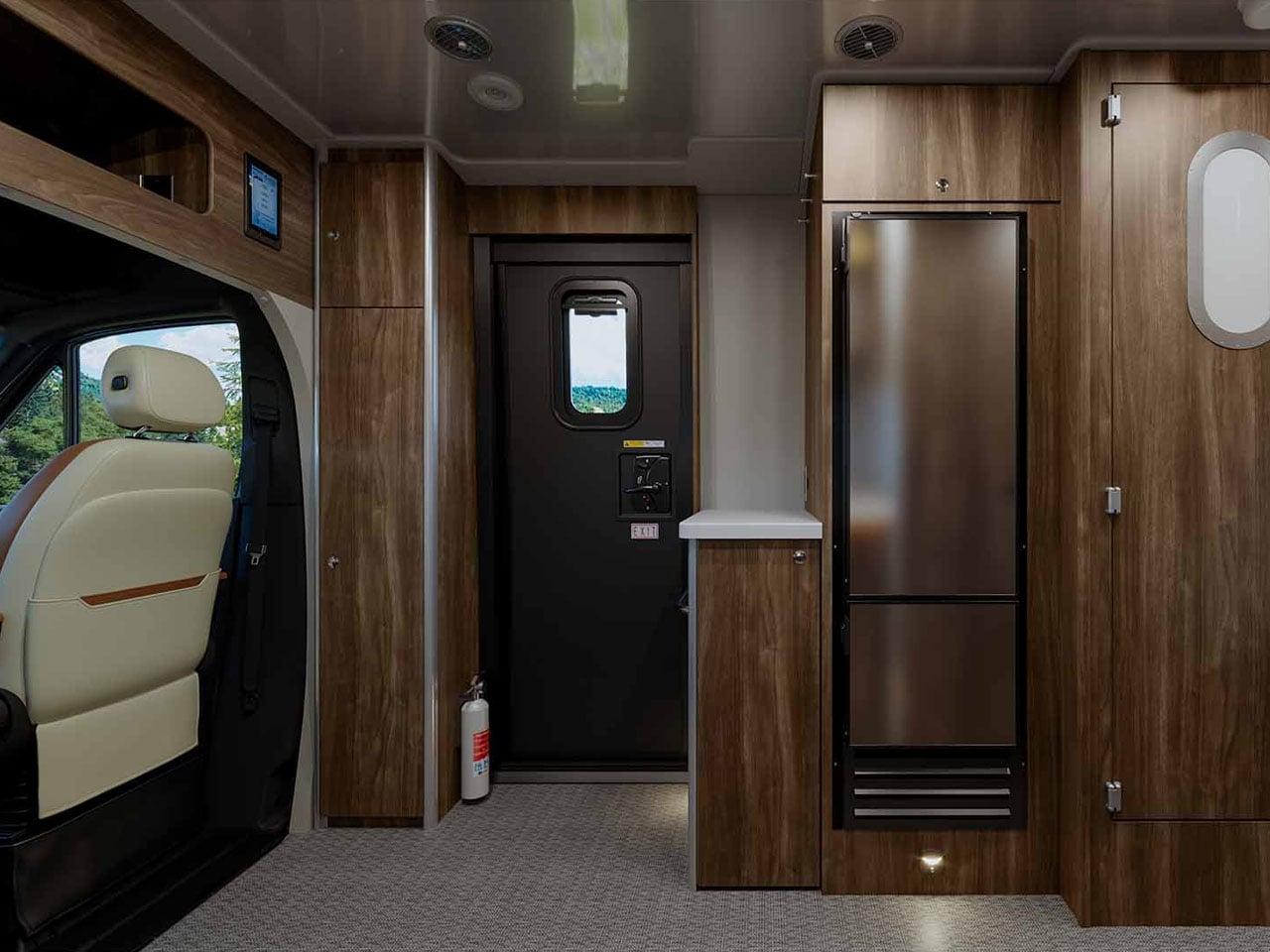
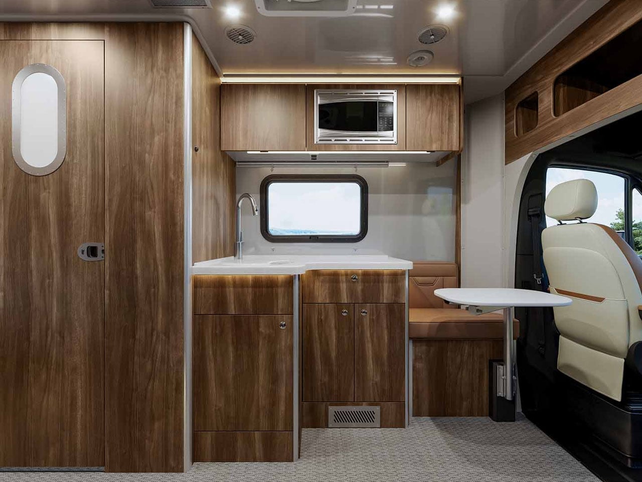
Within the spacious confines of the Airstream Atlas 25RT, you have a convenient layout that supports living, cooking, cleaning, and resting with equal ease. While the space outside, whether under the awning (add-on) or the cavity in the body comprising a pass-through garage, you have ample opportunity to carry gear and live a life outside of the coach.
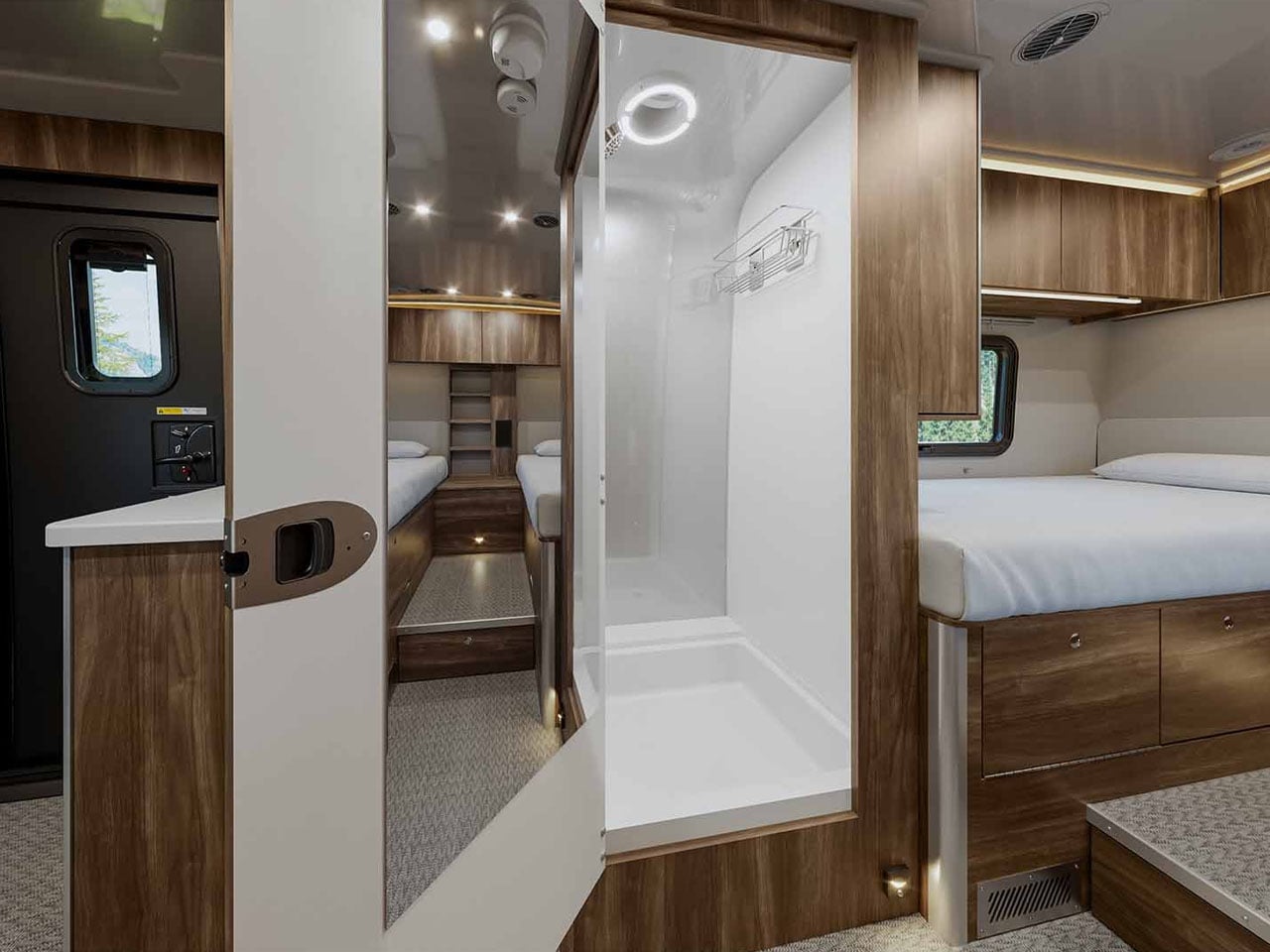
Atlas 25RT has a sleek, not the most symbolic of an Airstream, but pretty refined in Merc style, while the interior is refined and configured with “best in-class craftsmanship,” the company’s website notes. The interior is nicely configured with a functional living space, a spacious sleeping area furnished with a twin bed, and a separate toilet and wet bath, all designed to elevate living within the Class B+ motorhome.
The Atlas 25RT measures 25 feet in length and has two driver and passenger seats. The facility is designed to sleep two people only and Airstream has chosen to provide the motorhome in a solitary floor plan only. And this is a straightforward but efficient floor plan. You enter first into the galley that is provided with storage cabinetry and upscale to modern luxury requirements. Amber Ridge Décor adds warmth, and the use of palette and premium materials elevates the interior.
The craftsmanship here is notable, especially the way the seating and kitchen spaces are designed. For instance, the induction cooktop can be stored in a drawer when not in use to clear up the surface for maybe working or chit-chatting with a partner over a glass of wine. Interesting sight here is a Garmin multiplex system, which is a central system to control lighting, climate, and other functions of the travel coach. For the audiophiles, Airstream is providing a JBL stereo combined with four speakers and a subwoofer onboard.
Another interesting part of the Atlas 25RT is the split dry bath. Located between the galley and the bedroom is the space divided into two sections, comprising a shower space and a separate toilet and sink. A standing refrigerator resides next to the shower room. At the rear end of the coach is the twin bed layout with thoughtful storage planned in between the beds and beneath them.
If you want to spend a few days in the wilderness with the Airstream Atlas 25RT, you can beef it up with optional 400W rooftop solar panels. The motorhome is pre-wired to take it from there. For the more outdoorsy, Airstream provides a pass-through garage that can be handy for stowing your adventure gear or sporting equipment without much hassle. Atlas 25RT is available at a starting price of $290,000.
Most of us have a box. Or a bag, or a corner of the closet where clothes go to wait for a fate we haven’t quite settled on yet. Not trash, not donation, just quietly pushed aside. The jeans that stopped fitting but once made you feel unstoppable. The sweater that pilled after three washes but somehow survived four more years. Parting with clothes is harder than it sounds, and the fashion industry has largely treated that emotional gap as a non-problem.
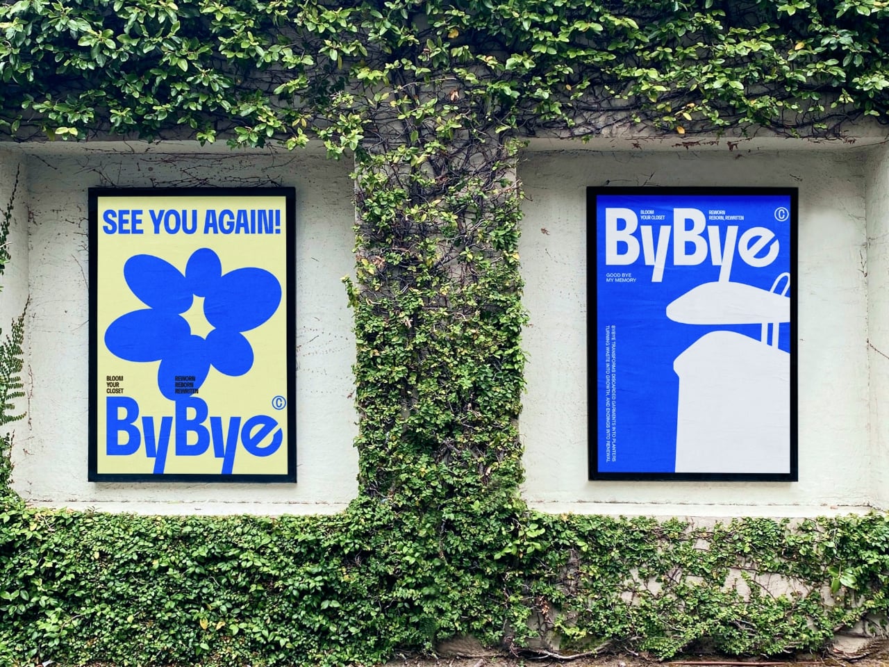
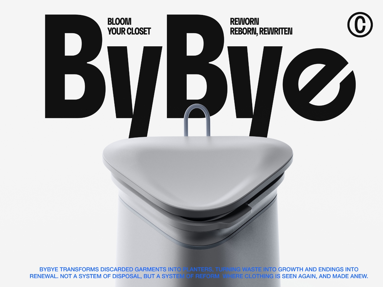
ByBye, a concept designed by Gyeong Wook Kim, Sooa Kim, Gayeon Kim, and Mingyeong Shin, disagrees with that approach in the most literal way possible. It’s a countertop-sized machine that takes your worn and discarded garments and transforms them, through a process of grinding, compression, and heat, into flower pots. Real, usable, actually beautiful flower pots.
Designers: Gyeong Wook Kim, Sooa Kim, Gayeon Kim, Mingyeong Shin
I want to sit with that idea for a second, because it’s a genuinely clever reframe of the problem. The designers describe ByBye not as a disposal system but as a “system of reform.” That language matters. When we throw clothes away, the garments disappear. When we donate, we hand off the moral weight to someone else. But ByBye asks you to stay present for the transformation and gives you something physical to show for it.
The mechanics are straightforward but impressively considered. You feed garments into the top opening, which uses a sliding rail mechanism to regulate input and automatically closes once the designated weight is reached. Inside, a shredder breaks the fabric down into fine particles. Those particles are then fed into a flower pot mold, compressed by a pressing plate, and hardened through high-temperature treatment. The finished pots rise up from the molding mechanism. The whole process takes about ten minutes per piece, and a companion app tracks fabric weight, the number of pots produced, and total production time.
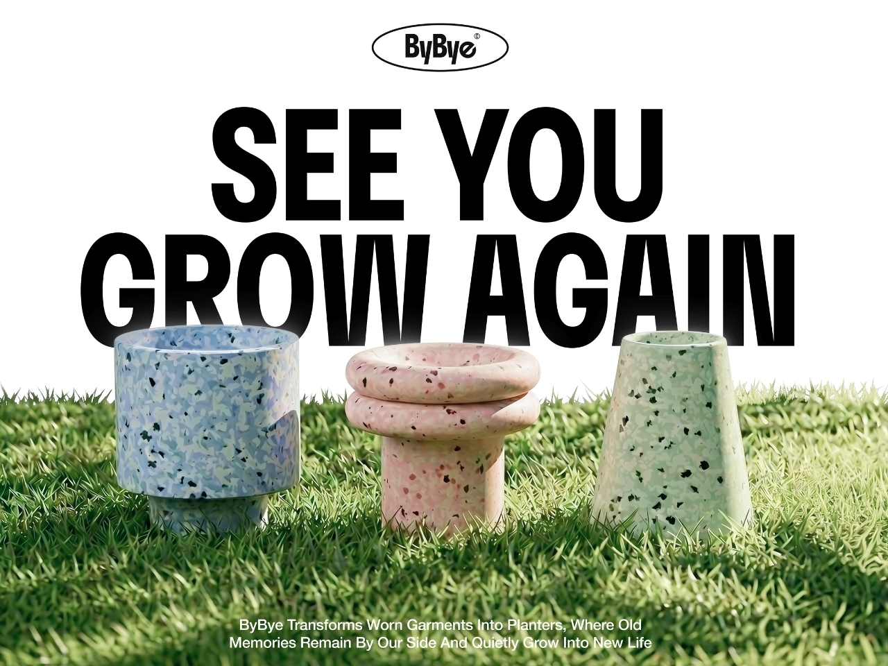
What comes out of the machine is genuinely surprising. The pots carry a terrazzo-like texture from the mixed fibers, soft and speckled in muted blues, pinks, and greens depending on the fabric input. They look like something you’d find at a design fair, not something born from a pile of worn-out t-shirts. That aesthetic outcome feels important to the whole concept. If the result were dull or utilitarian, the emotional payoff wouldn’t land. Instead, you end up with an object that holds some trace of the original garment, and then holds a plant on top of that.
The project raises questions I keep turning over. Can the machine handle all fabric types, including synthetic blends that behave very differently under heat and compression? What’s the upper limit on pot durability when working with processed textiles? These feel like the natural next steps for a concept this promising, and I genuinely hope the team is pushing toward them.
What ByBye gets absolutely right is the emotional architecture of the experience. The name alone, a gentle play on “bye bye” and “by” as in made by, signals that this isn’t designed to make you feel guilty about your wardrobe. The copy throughout the project, “Hello? Nice to Wear You,” “Let Your Clothes Begin Again,” reads more like an invitation than an environmental lecture. That tone is rare in sustainable design, which has a tendency to lead with shame rather than possibility.
The designers put it plainly in their project statement: “Not a system of disposal, but a system of reform where clothing is seen again, and made anew.” That’s a design philosophy worth paying attention to. Fashion produces staggering amounts of textile waste every year, and while no home appliance is going to fix that alone, concepts like ByBye shift the conversation in a useful direction. They make the ending feel less like a loss and more like a beginning. Parting with clothes is still going to feel like something. But now it might feel like planting something too.
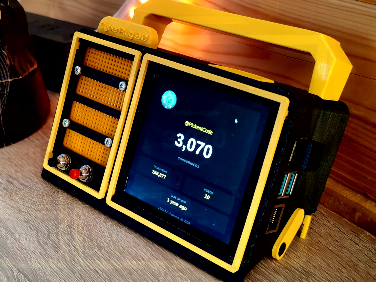
Most portable computers are sealed boxes, which is exactly what makes them frustrating for anyone who wants to experiment with electronics. You can run code on a laptop, but try wiring a temperature sensor or an infrared transmitter directly to it, and you’ll realize that consumer hardware was never designed for that kind of access. A maker who goes by PickentCode got tired of that gap and built something to close it.
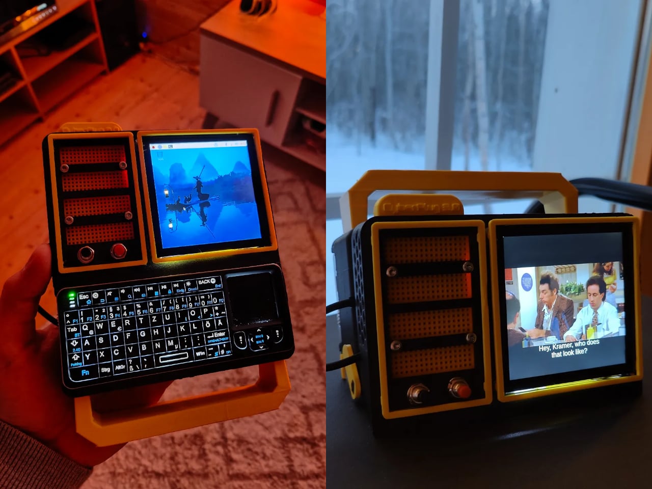
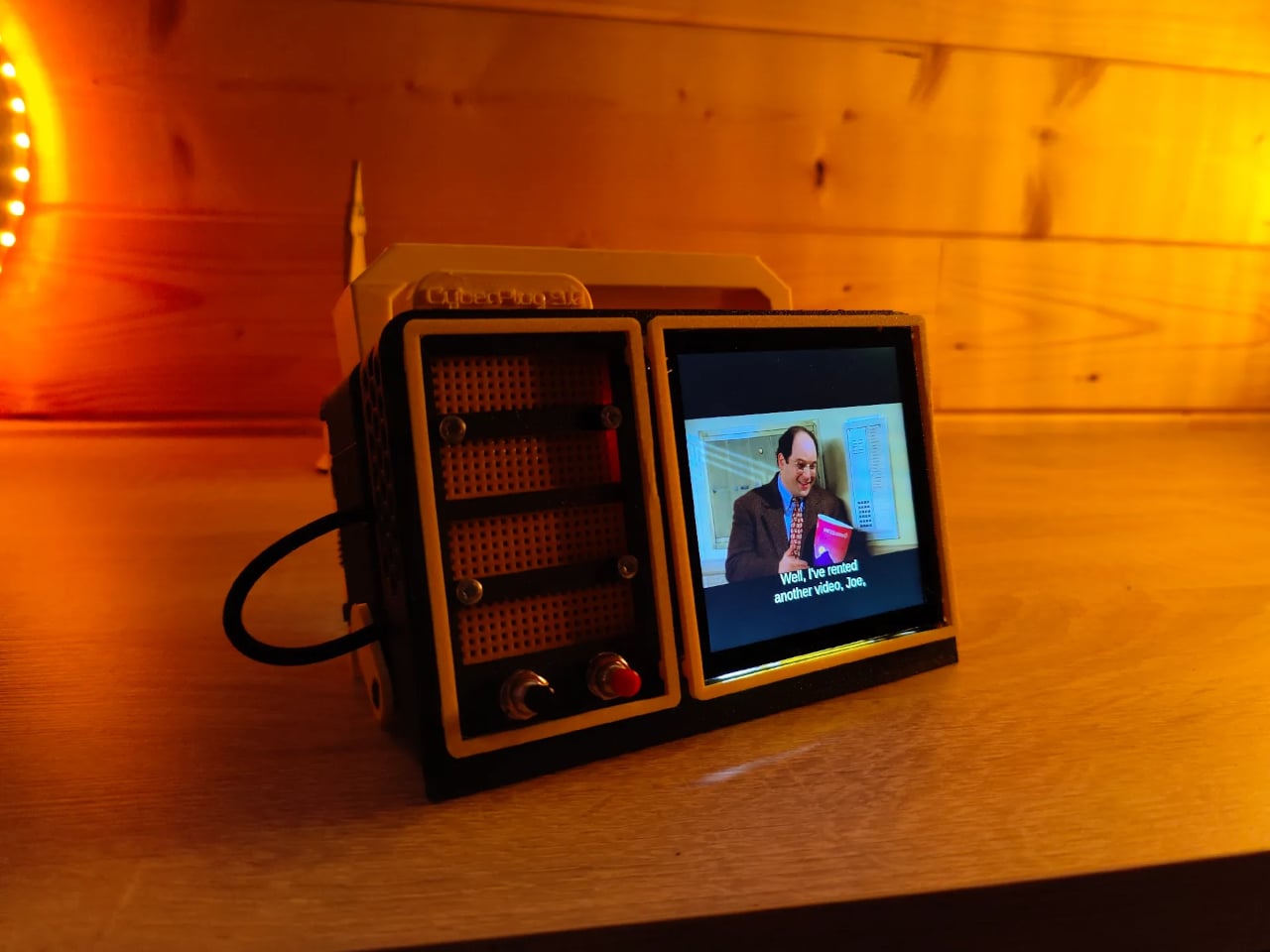
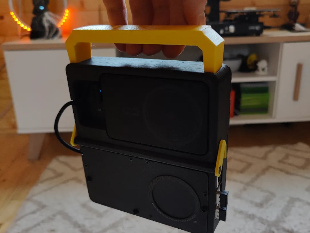
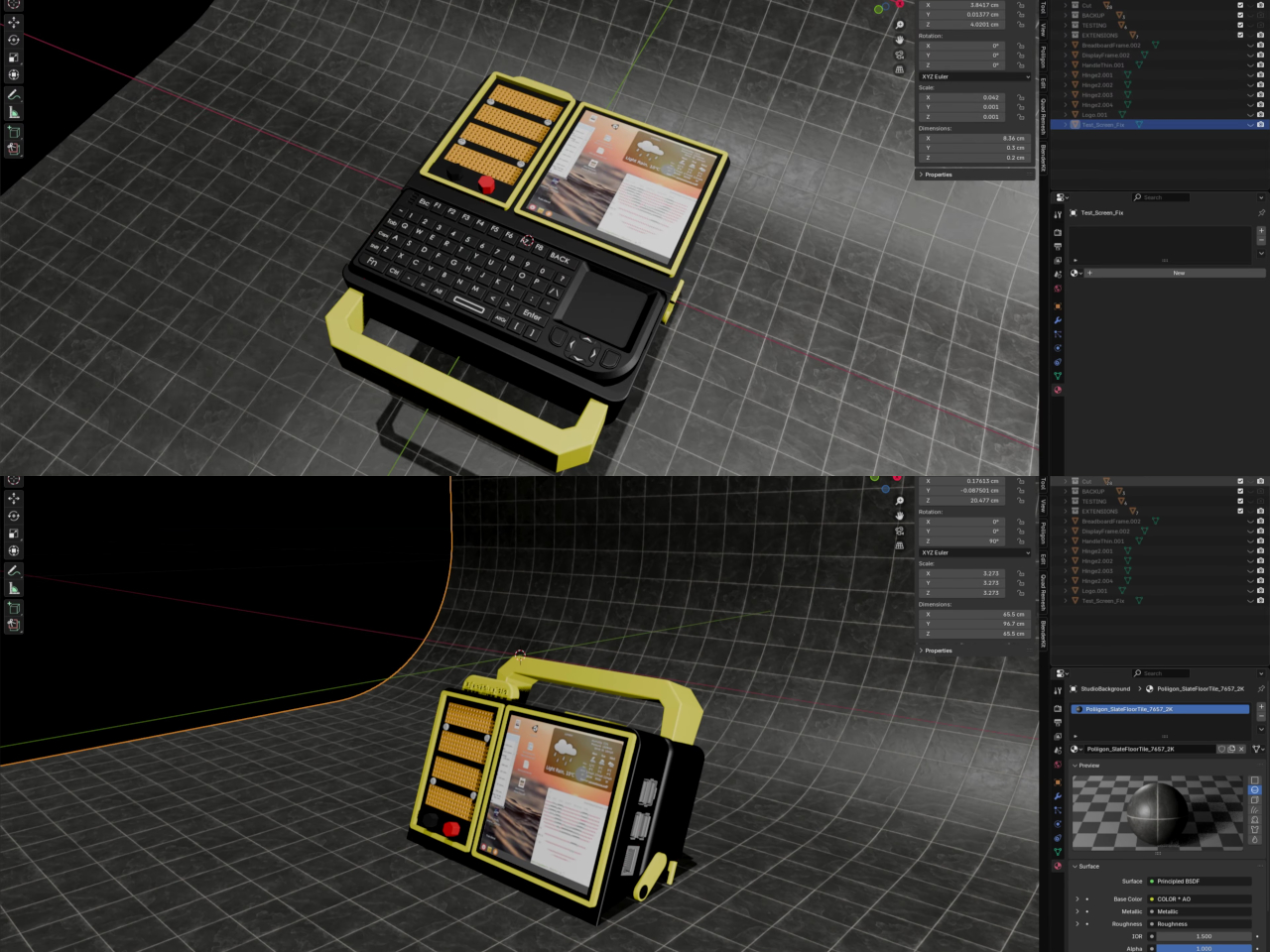
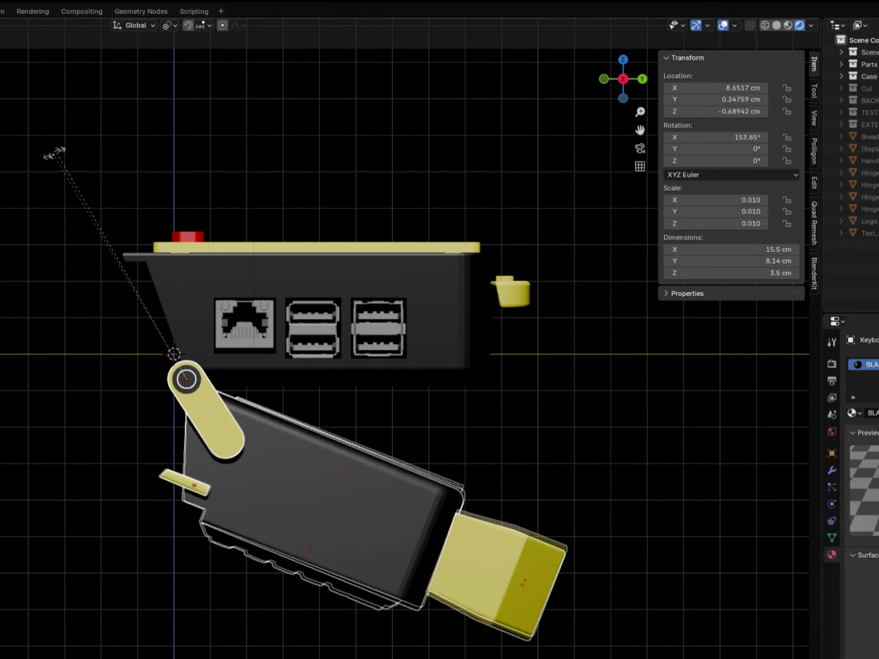
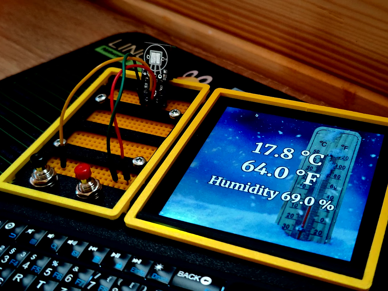
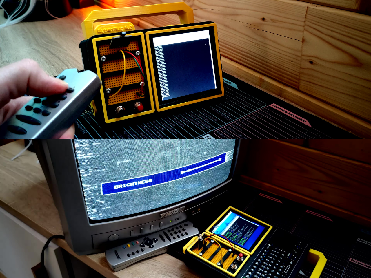
The CyberPlug 3.0 is the third iteration of a personal cyberdeck project, the earlier two having usability problems that sent PickentCode back to Blender to redesign. The final build packs a Raspberry Pi 4 Model B, a 4-inch IPS touchscreen, a Rii K06 mini keyboard with a built-in touchpad, and a 5,000 mAh USB-C power bank into a 3D-printed hinged body that folds flat for handheld use or props open at a desk-friendly angle.
Designer: PickentCode
What separates this from a standard Raspberry Pi build is the pair of breadboards soldered directly to the GPIO pins, seated inside the case, and accessible through a removable back panel. Connecting a sensor no longer means hunting for a separate breadboard and a tangle of jumper wires. PickentCode plugged in a temperature and humidity sensor and had it reading live data within minutes, then built an infrared setup that records remote control signals and replays them as single-button macros.
The two form factors each have a distinct locking mechanism rather than just flopping into position. In handheld mode, twin magnets pull the two halves together. In desktop mode, a metal ring on the back grabs the MagSafe-style power bank magnetically, holding the whole thing at a stable upright angle. Both the keyboard and the power bank slide out independently, and the deck keeps working on a desk without either of them.
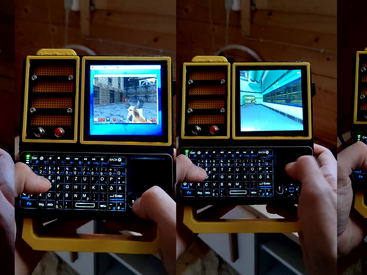
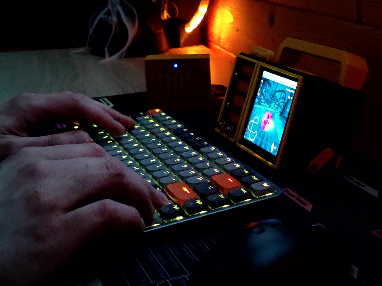
Extensions are where the project gets more interesting. PickentCode added a PWM-controlled external fan that reads CPU temperature and adjusts speed automatically, and a small speaker module that opened the door to YouTube and older games. Doom, Half-Life, and GTA: Vice City all ran on it, better with an external setup in desktop mode, though workable in handheld after some button remapping.
PickentCode frames this plainly as a testbed for learning electronics, not a replacement for a phone or a real computer. The 3D files are free on Printables, so the main cost is filament, time, and the components. For anyone who has ever stared at a sealed laptop wishing they could just plug something into it, that framing is probably the most relatable thing about it.
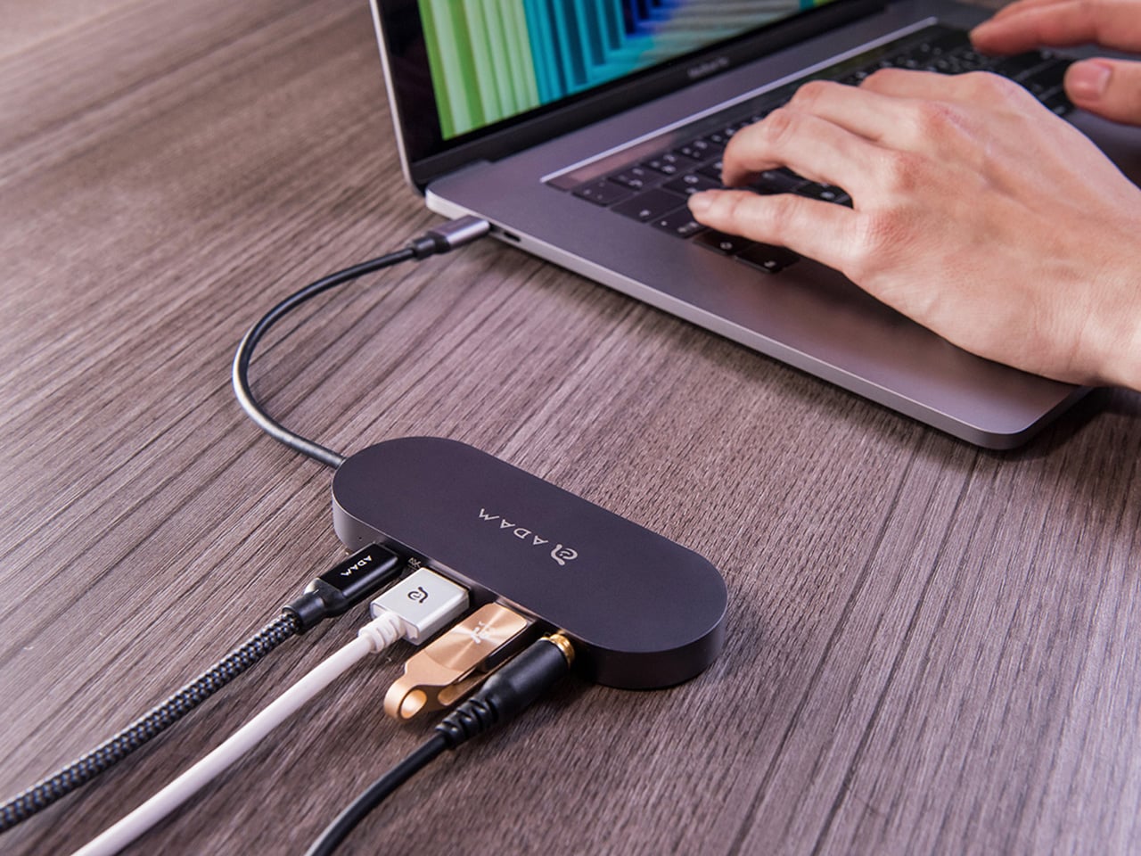
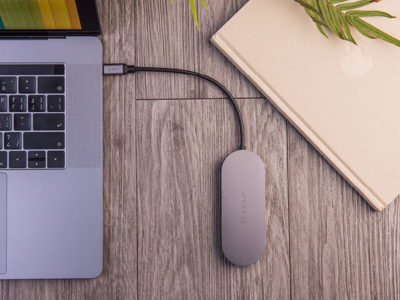
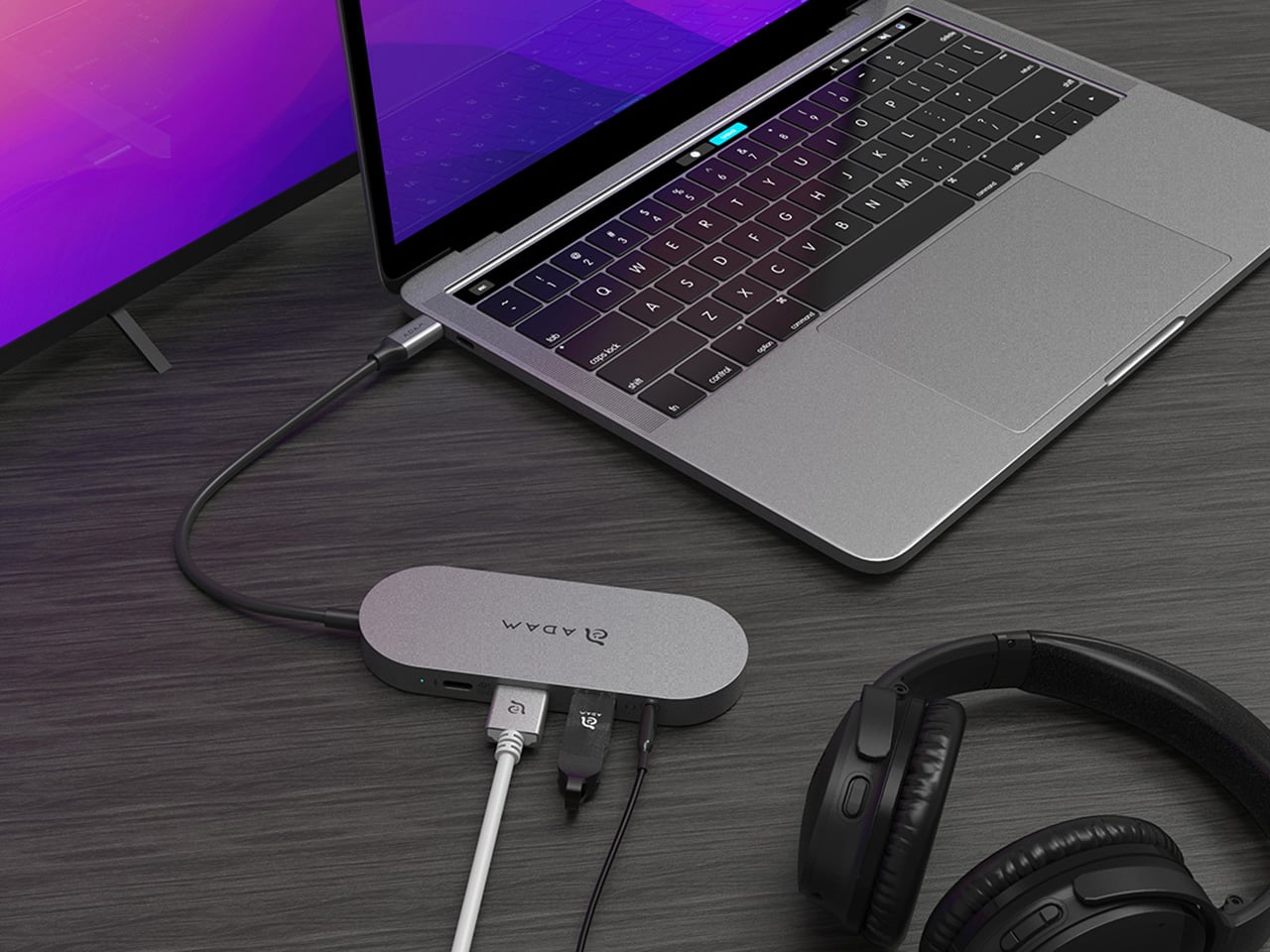
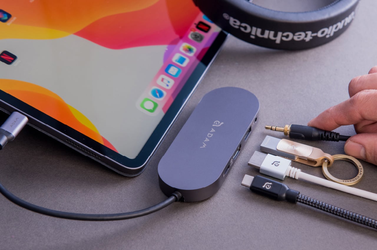
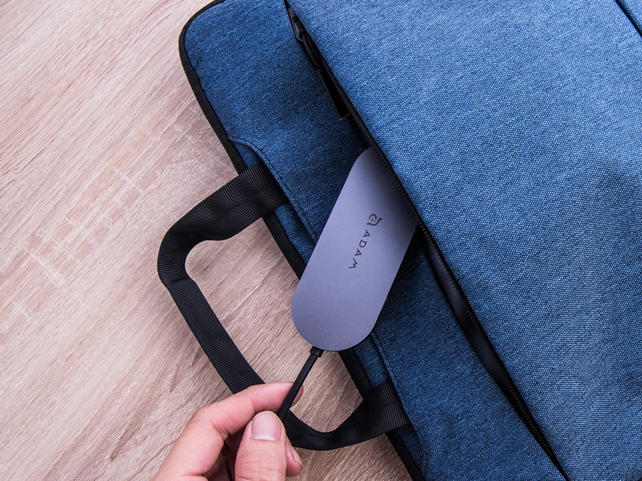
Modern laptops aren’t short on power, but they’re increasingly short on ports. One USB-C port ends up doing everything: charging, video out, storage, and peripherals, while a small pile of adapters accumulates next to the keyboard. The setup works, but it doesn’t look like the clean, minimal desk you were going for, and it means carrying more pieces than you’d like when you’re working somewhere that isn’t home.
ADAM elements’ Hub S is a USB-C hub with built-in SSD storage, designed around the idea that a hub and an external drive don’t need to be two separate objects. Instead of plugging in one thing for ports and another for files, you plug in one slim aluminum accessory that handles both. It isn’t trying to replace a full docking station, but it’s the right-sized tool for someone who needs the essentials covered without the clutter.
The built-in SSD is available in 240 GB, 480 GB, and 960 GB capacities, so there’s a size for whether you’re keeping a working project library or just enough space for recent shoots and backups. Having storage physically attached to your hub means it’s always there when you need to dump footage, move large project files, or keep a client’s assets close during a session, without remembering to pack a separate drive.
Transfer speeds are rated at up to 520 MB/s read and 456 MB/s write, which makes moving large files feel routine rather than something you schedule around. That kind of speed isn’t just a spec, though. It’s the difference between waiting through a transfer and forgetting it’s happening. For photographers and video editors working on the road, that matters more than it sounds on a product page.
For Mac users, the ADAM elements Hub S is also Apple Time Machine compatible. That means it can act as a rolling backup target every time you plug in, turning a habit that’s easy to forget into something that happens automatically. Backup isn’t exciting, but having it built into the same accessory you’re already using for everything else makes it feel less like a separate job.
The USB-C port on the hub supports PD 3.0 pass-through charging up to 60W, so your laptop doesn’t lose its charge while the hub is handling storage, display, and peripherals. That’s a meaningful consideration when you’re transferring large files and streaming to an external display at the same time, both of which can pull enough power to make a laptop feel like it’s running a sprint.
The HDMI port outputs up to 4K at 30Hz and supports HDCP 2.2, which is the protocol required for streaming 4K HDR content from services like Netflix. A lot of hubs advertise “4K output” but fail on DRM handshakes, so the HDCP 2.2 compliance isn’t a minor footnote. Whether you’re mirroring for a presentation or extending to a monitor for a proper editing session, the connection holds up where it matters.
Rounding out the port selection is a USB-A 3.1 port rated at up to 5 Gbps for peripherals or flash drives, and a 3.5mm headphone jack that supports 48kHz/16-bit audio. Neither is glamorous, but together they cover the inputs that would otherwise require yet another adapter. The aluminum alloy body is designed to sit flush on a desk surface, and the whole thing weighs about 2.5oz, roughly the weight of a single C battery.
The ADAM elements Hub S works best as the kind of accessory you stop thinking about. You plug it in, your files are there, your display is connected, your laptop is charging, and your headphones are plugged in. That’s it. For people who’d rather carry one considered piece of hardware than a small collection of adapters and drives, consolidating all of that into a single slim object that fits in a jacket pocket feels like the more sensible way to work.
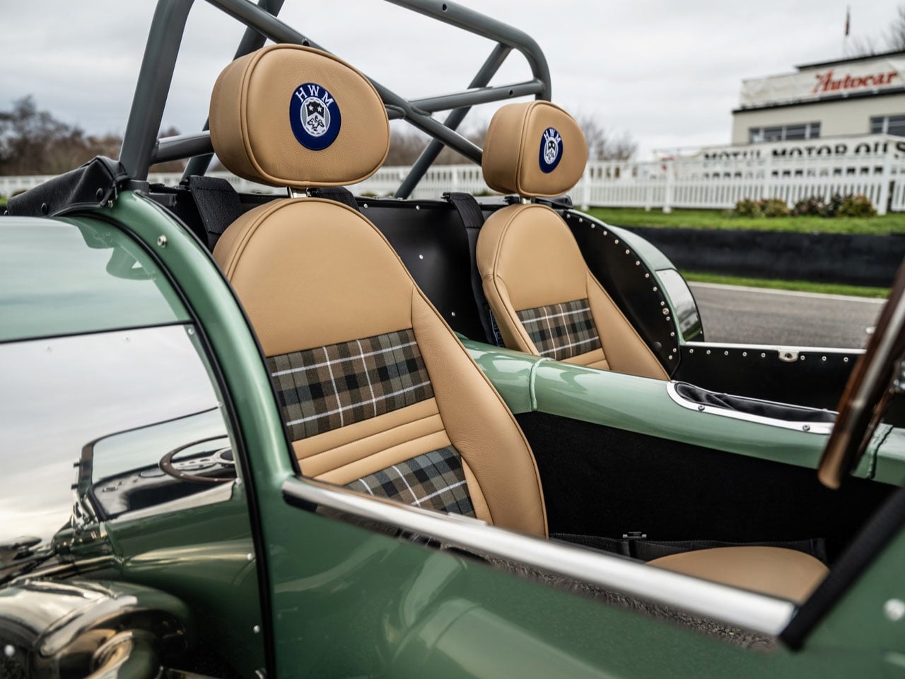
Few sports cars have preserved the spirit of lightweight performance quite like the Caterham Seven. With its minimalist design and uncompromising focus on driving purity, the model has remained one of the most authentic expressions of classic British motoring. Now, the British manufacturer has introduced a special variant that celebrates a lesser-known but historically important racing story. Developed in collaboration with Hersham and Walton Motors (HWM), the Caterham Seven HWM Edition pays tribute to the small British team that once challenged Europe’s best on the Grand Prix stage.
HWM was founded in 1938 and built a reputation in the early post-war years as a determined independent racing constructor. Its most famous machine was the 1951 HWM-Alta single-seater, which achieved several international race victories and podium finishes during an era dominated by far larger teams. The car also played a role in motorsport history by giving legendary driver Sir Stirling Moss an early Formula 1 appearance. By creating the Seven HWM Edition, Caterham and HWM are celebrating that underdog spirit and the shared heritage of two British brands deeply rooted in racing culture.
The limited-run model is inspired by the original HWM-Alta racer. Only 19 examples will be produced for the UK market, mirroring the exclusivity of historic racing specials and emphasizing the handcrafted nature of Caterham’s vehicles. Each car is finished in a distinctive HWM Green paint, a color digitally matched to the original 1951 race car. Exterior detailing reinforces the historical connection, with Alta-inspired side panel louvres, a bespoke nosecone grille, and suspension components such as the wishbones, anti-roll bar, and headlight brackets finished in Retro Grey. A centrally mounted chrome fuel filler cap and a special HWM Caterham nosecone badge further distinguish the model.
Inside the cockpit, the retro theme continues with a focus on craftsmanship and period-correct design cues. The dashboard features a hand-turned aluminum SuperSprint panel fitted with classic SMITHS chrome dials and a solid metal master cut-off switch. Drivers interact with the car through a polished wooden Moto-Lita quick-release steering wheel, while chrome-finished controls for the gear lever and handbrake add to the vintage racing aesthetic. The body-colored transmission tunnel enhances the bespoke feel, and buyers can choose between leather-trimmed seats or lightweight composite racing seats embroidered with the HWM logo. A numbered plaque on the passenger side of the dashboard marks each vehicle as “1 of 19,” underscoring its rarity.
Despite its historic inspiration, the Seven HWM Edition remains a thoroughly modern performance machine. The car is based on the Caterham Seven 420 platform and is powered by a naturally aspirated 2.0-liter Duratec four-cylinder engine producing around 210 horsepower. Paired with a five-speed manual gearbox and driving the rear wheels, the lightweight sports car delivers an impressive power-to-weight ratio of roughly 375 horsepower per ton. As a result, it can accelerate from 0 to 60 miles per hour in just 3.8 seconds and reach a top speed of approximately 136 miles per hour.
Prices for the Caterham Seven HWM Edition start at £57,990 (approximately $78,000), positioning it as an exclusive offering for enthusiasts who value both heritage and pure driving engagement.
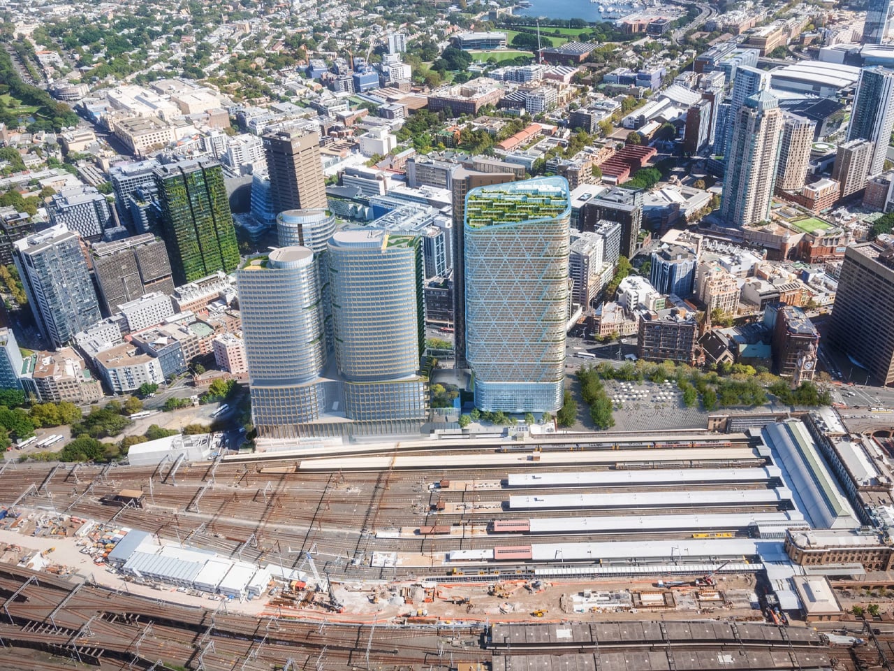
Sydney is on the verge of claiming a significant architectural milestone. Atlassian Central, a 39-floor hybrid timber tower currently nearing completion, is set to become the world’s tallest building of its kind, surpassing the existing record holder by a considerable margin.
Designed by BVN and SHoP Architects as part of a larger development in Sydney, Australia, the tower will top out at 183 m (600 ft). That makes it more than twice the height of Milwaukee’s Ascent, which currently holds the title of world’s tallest hybrid timber skyscraper at 86.6 m (284 ft). According to the Council on Tall Buildings and Urban Habitat (CTBUH), the premier authority on building heights, Atlassian Central will claim the record upon completion, ahead of any proposals not yet approved.
The structure relies on a hybrid system of concrete, steel, and engineered wood, a combination that sets it apart from purely timber towers like Norway’s Mjøstårnet. The use of concrete and steel allows the building to reach heights that timber alone could not sustain, while glued-laminated timber columns and cross-laminated timber slabs, sourced from Europe, are incorporated throughout. In total, roughly 10,000 cubic meters (353,000 cubic ft) of engineered wood will be used in the build.
Sustainability is woven into the design beyond the choice of materials. The facade integrates solar panels alongside an automation system developed by specialist EBSA, which is expected to significantly reduce the building’s mechanical cooling requirements. SHoP Architects describe the commercial floors as being organized into seven stacked four-story “habitat” modules, each framed by the hybrid timber structure and designed to maximize natural ventilation, provide access to landscaped terraces, and support workplace well-being through a connection to natural environments.
The tower’s program is varied. The lower floors will house a hostel, and the project will incorporate an existing building on the site, which is being restored and folded into the lobby. The majority of the remaining floors are dedicated to office space, interspersed with multiple open garden areas that reinforce the building’s emphasis on greenery and natural light.
An exact completion date has not been confirmed, but Atlassian Central is expected to be finished in late 2026 or sometime in 2027. When it opens, it will represent not just a new height record for hybrid timber construction, but a meaningful step forward in demonstrating what sustainable high-rise architecture can look like at scale.
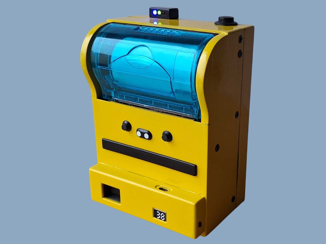
Remember when instant cameras were magic? You pressed a button, a mechanical whir filled the air, and moments later you were shaking a photo like it owed you money. Polaroid made photography feel like alchemy, turning light into physical memory right in your hands.
The Poor Man’s Polaroid by Boxart brings that instant gratification back using a thermal printer (the same kind that spits out your CVS receipts) and costs less than a cent per print compared to roughly a euro for each Polaroid picture. The name is a bit tongue-in-cheek since the parts actually cost more than the cheapest Polaroid cameras, but the creator clarifies it’s a “fun DIY project, possibly made by poor hands”.
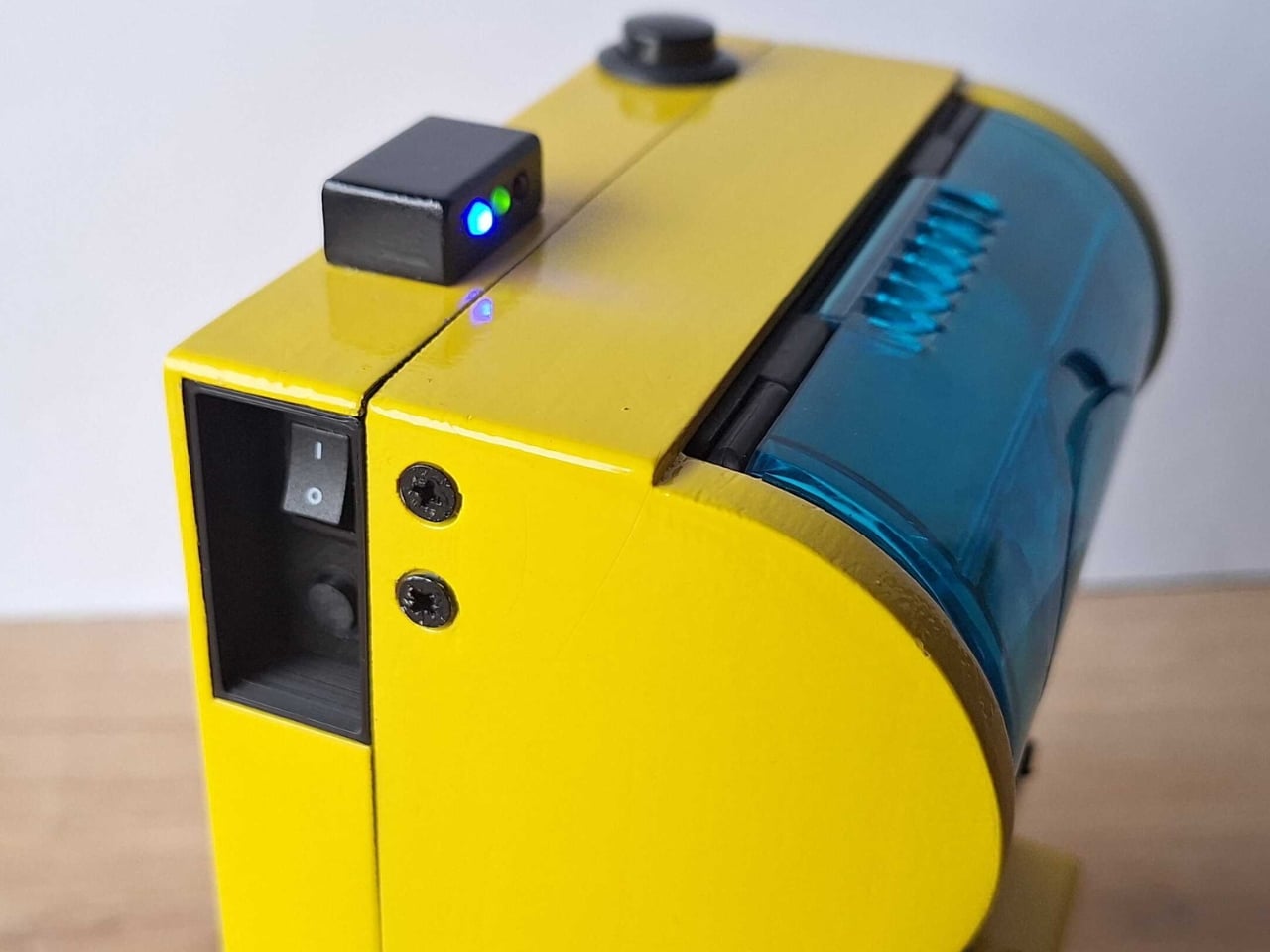
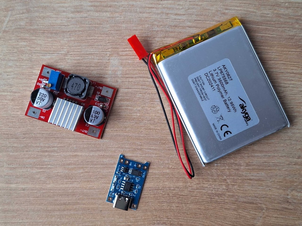
The whole setup is beautifully straightforward. A Raspberry Pi Zero and camera drive a receipt printer, all housed in a 3D-printed case with the guts of a power bank providing juice. Press the button, wait a beat, and out slides your photo on thermal paper. No film cartridges to buy, no wondering if you loaded it correctly, no accidentally exposing your entire pack to light.
Does the image quality match a real Polaroid? Not even close. The photos aren’t the same quality as self-developing film, but they have some charm to them. You get a not-very-good grayscale image on curly paper. But that’s kind of the point. The beauty of instant photography was never really about pristine resolution. It was about immediacy, about physicality, about having something tangible to pin on your wall or slip into someone’s hand.
This project lives in that sweet spot between nostalgia and practicality. Thermal paper might fade over time and the images might look like they came from a 1990s fax machine, but you can shoot hundreds of photos without bankrupting yourself. The economics are almost absurd when you compare it to authentic instant film, which has climbed to luxury pricing in recent years.
I love that this exists because it reminds us that the tools we carry don’t always need to be the most advanced or expensive. Sometimes the joy is in the making itself, in cobbling together a Raspberry Pi, a webcam, and a thermal printer to recreate something that used to cost hundreds of dollars and came from a factory. It’s technology as craft project, gadgetry as personal expression.
The curling thermal paper and grainy output might not win photography awards, but they capture something else: the spirit of experimentation that made instant cameras revolutionary in the first place. Edwin Land didn’t perfect the Polaroid overnight. He iterated, tinkered, and eventually changed how we thought about photography. Boxart’s version might use Python code instead of complex chemistry, but the impulse is the same.
What makes this project particularly appealing is its accessibility. The parts are 3D printed and the code is in Python, meaning anyone with basic maker skills can attempt it. You’re not locked into a proprietary ecosystem or dependent on a company that might discontinue your film stock. You own the entire chain of production, from capture to print.
Sure, you could buy cheap instant print cameras from import sites for less money. But where’s the story in that? Where’s the satisfaction of building something yourself, of understanding exactly how it works, of being able to modify and improve it over time? This isn’t just a camera. It’s a statement about what technology can be when we strip away the branding and the markup and the planned obsolescence.
The Poor Man’s Polaroid won’t replace your smartphone camera or even a proper instant camera if image quality is your priority. But it offers something more valuable: proof that with a little ingenuity and some off-the-shelf components, you can recreate the magic of instant photography on your own terms. And sometimes that curly thermal paper printout means more precisely because you built the machine that made it.
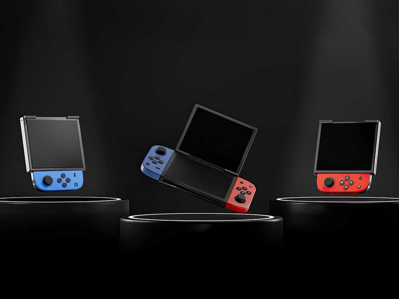
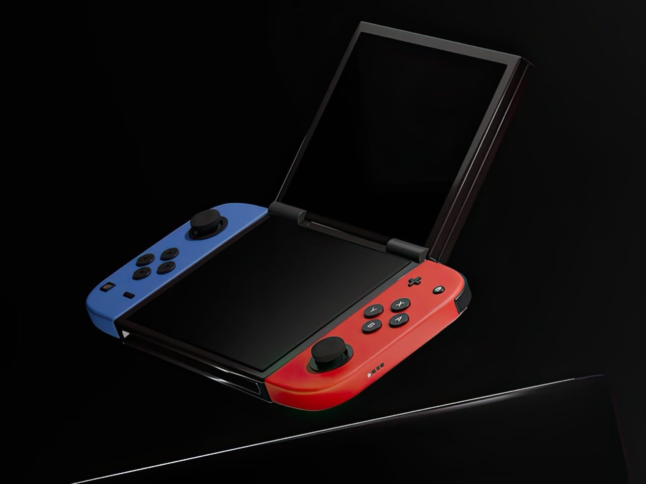
Nintendo had a choice when designing the Switch 2. They could iterate on the formula that made the original a cultural phenomenon, refining the single-screen hybrid into a faster, sharper, better version of itself. Or they could reach back into their own history, pull out the design philosophy that once made the DS family the best-selling handheld hardware line of all time, and merge two eras of thinking into something genuinely new. They picked the first path. Designer Juan Manuel Guerrero just sketched out the second.
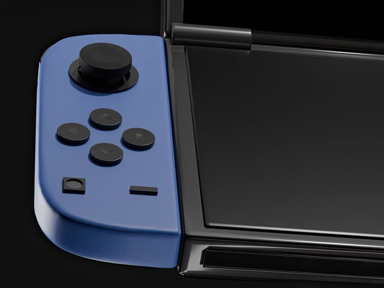
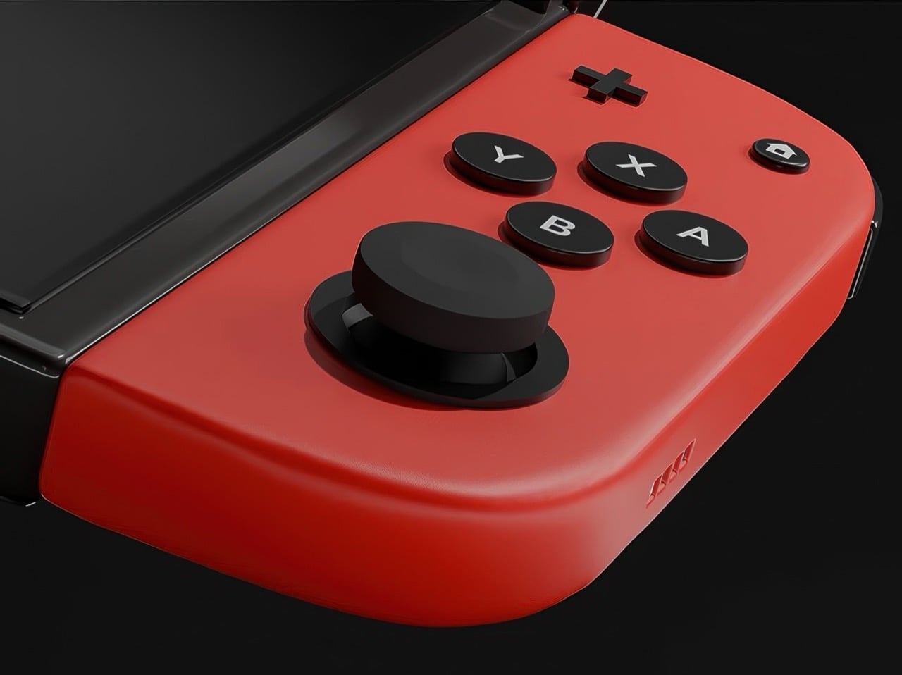
The concept arrives as a series of beautifully lit 3D renders: a folding Nintendo Switch with dual screens, a hinge running through the center of the body, and Joy-Cons in the familiar blue-red split attached to either end. The renders carry the finish of product photography, which makes it genuinely easy to forget this never shipped. Closed, it looks like a sleek, pocket-ready device with a tighter footprint than the original Switch. Open, it recalls something older and warmer, the quiet satisfaction of flipping a DS open on a long car ride, except now the screens are large, the controllers are proper, and the whole thing feels built for today. The proportions are deliberate, the design choices are considered, and the whole thing wears its Nintendo identity without apology.
Designer: Juan Manuel Guerrero
The Nintendo DS sat at 154.02 million lifetime units for years, the gold standard for Nintendo hardware, until the Switch finally crept past it in early 2026 with 155.37 million. Two hardware generations, both cultural touchstones, separated by fewer than two million units across a combined history of roughly three decades. The closeness of that race matters. The DS built those numbers on a genuine design idea, a spatial logic where two screens gave developers room for two distinct kinds of information at once, and players responded to that for fifteen years. Guerrero’s concept asks whether the Switch era ever had to leave that behind.
Phantom Hourglass let you draw on the bottom screen to annotate your own maps and solve puzzles, an idea original enough to win awards at the time. Pokemon Diamond and Pearl split the party menu from the battlefield, giving battles a spatial clarity the GBA never had room for. GTA: Chinatown Wars ran the full city map on the lower display and handed the top panel entirely to the action. These were designs built entirely around the format, dependent on the split in a way that made them fall apart on a single screen. That vocabulary has been sitting idle for the better part of a decade.
Samsung’s Galaxy Z Fold 6 runs a 7.6-inch interior display and represents the sixth generation of the company working foldable hardware into something genuinely reliable. Motorola, OnePlus, Google, and Huawei all have competitive entries in the space. Display durability and hinge reliability have been largely solved through successive product generations and real commercial pressure. A dual-screen Switch in 2025 wouldn’t be asking anyone to invent something new; the foldable category has already done the hard engineering work. Guerrero’s concept asks someone to point that already-mature technology at a gaming audience.
The DS touchscreen read as a toy gimmick in 2004. The Wii’s motion controls got laughed at before that console sold 101 million units. The Switch itself looked like a confused category play until it climbed past 155 million units and became Nintendo’s best-selling platform ever. That history of moves that look sideways before they land is the context Guerrero’s concept actually lives in. The foldable technology exists, the Joy-Con design language holds across both halves of the fold, and the IP is coherent. Someone drew it. Now it’s genuinely difficult to look at the Switch 2 without wondering what the other path could have looked like.
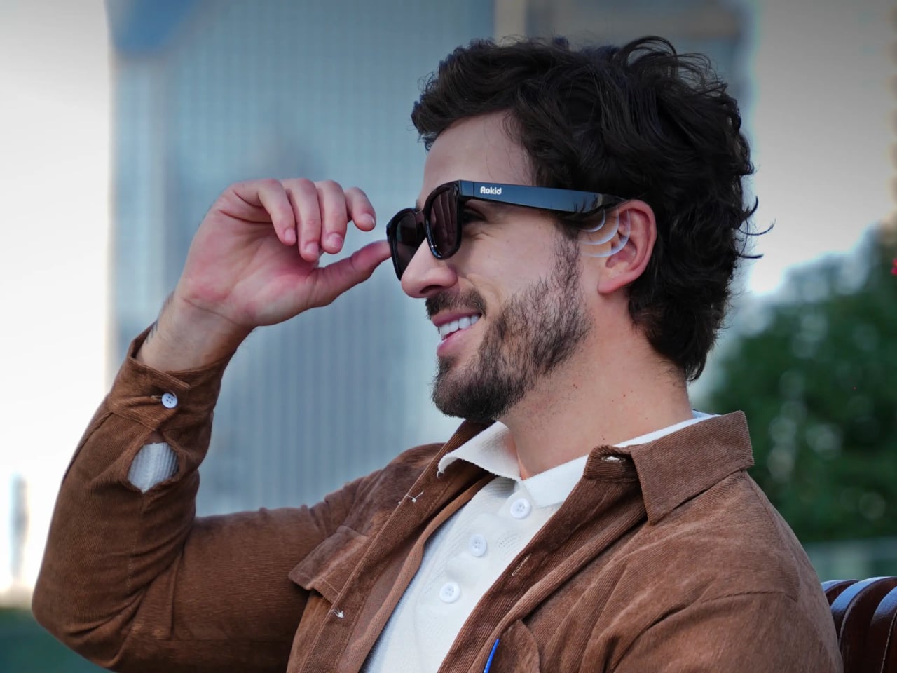
Most wearable tech that puts an AI assistant in your ear assumes you want only theirs. The earpiece, the speaker, the entire software stack, all funneled through one model chosen for you before you even open the box. Rokid’s latest update to the AI Glasses Style takes a different position entirely, turning the glasses into what is effectively an open platform where you pick the brain behind the voice.
The update makes the Style the first smart glasses to natively support Google’s Gemini, sitting alongside OpenAI’s ChatGPT, DeepSeek, and Alibaba’s Qwen in a unified interface. Users toggle between them freely, which means reaching for Gemini for a quick Google Maps query and switching to ChatGPT for something else entirely is up to you.
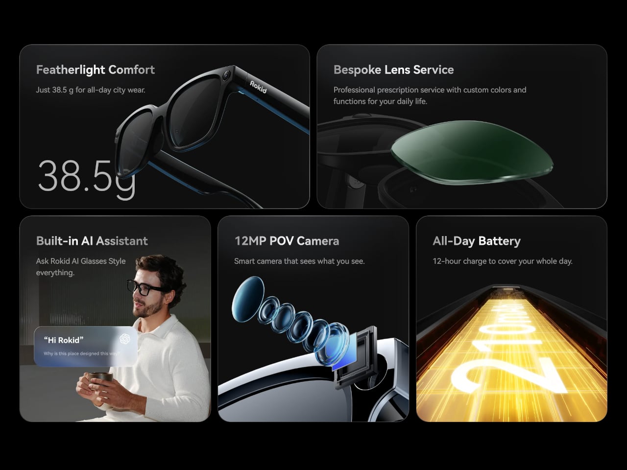
The glasses themselves debuted at CES 2026 in January, and the hardware makes a reasonable case for the category. At 38.5 grams, with a TR90 frame and titanium alloy hinges, they sit closer to a regular pair of prescription glasses than anything resembling a prototype. The frame takes prescription lenses directly, with a fitting service starting at $79, including photochromic options in over 200 colors that darken within 25 seconds.
Powering the AI and imaging workload is a dual-chip setup: an NXP RT600 handles always-on, low-power tasks, while a Qualcomm AR1 manages heavier processing. The same Qualcomm chip is in Meta’s Ray-Ban glasses, though the battery life here runs to 12 hours, noticeably longer than Meta’s. A 12MP Sony-sensor camera sits at the bridge, capturing 4K stills and 3K 30fps video with up to 10 minutes of continuous recording. A privacy indicator light signals to people nearby when the camera is active.
Audio comes through directional AAC speakers built into the temples, focused toward the ears with minimal bleed. The AI interaction itself works through a two-finger tap to summon any of the four models, head gestures for call management, and voice prompts in 12 supported languages. Real-time translation, navigation, photo recognition, and AI-generated meeting summaries are all part of the feature set, fed through whichever model the user has selected.
For anyone already oriented around a specific AI assistant, the practical appeal is straightforward. Someone in Google’s ecosystem gets Gemini in their glasses without compromise; someone who prefers ChatGPT for writing picks that instead. At $299 to start, with a lens fitting service folding in prescription and photochromic options, the Style has cleared 15,000 units sold ahead of its formal global rollout, which is a reasonable early signal for a category still working out what it wants to be.
At some point in the last couple of years, something quietly shifted in the gaming world. Not in the blockbuster, billion-dollar-franchise sense, but in the more personal, “why am I actually having more fun with this tiny device than my main console” sense. Search interest in retro gaming handhelds jumped 400% year-over-year, hitting 90,500 monthly searches in January 2026 alone. That’s not a blip. That’s people rediscovering something they forgot they wanted, and then telling everyone they know about it.
What’s driving it isn’t hard to understand. Modern gaming has gotten heavy, with big installs, long tutorials, and games that feel like part-time jobs. A retro handheld sidesteps all of that. You pick it up, you’re playing something in thirty seconds, and it fits in your jacket pocket. The designs themselves have become worth caring about, too, from machined aluminum bodies to translucent clamshells to square screens that look like props from a ’90s anime. These aren’t budget toys. Some of them are genuinely beautiful objects that happen to play games. Here are seven that are worth your attention.
Anbernic RG Cube: The one with the square screen that somehow works
The first thing you notice about the RG Cube is the screen shape, a perfect square, and your brain immediately goes: that can’t be right. Gaming moved to widescreen fifteen years ago. A 1:1 display in 2024 looks like a design mistake, or at best a gimmick. It is neither. The 3.95-inch IPS panel at 720×720 turns out to be native to more retro games than you’d expect, with Game Boy, arcade titles, and Nintendo DS with dual-screen stacking all living here without compromise.
The broader package is hard to argue with. An octa-core Unisoc T820 processor and 8GB of RAM run Android 13, with emulator support up through PS2 and GameCube, though more demanding titles on those systems will push its limits. The asymmetric thumbstick layout borrows from the Steam Deck playbook, and the Saturn-inspired D-pad is precise without drama. At around $170, it comes in Beige White, Radiant Purple, Black, Grey, and the radiant purple has no right looking as good as it does.
What we liked
Square 1:1 screen is genuinely ideal for Game Boy, arcade, and DS emulation
RGB lighting and color options make it a genuinely attractive object
What we disliked
Widescreen games require letterboxing or aspect-ratio compromise
Demanding PS2 and GameCube titles push the processor to its limits
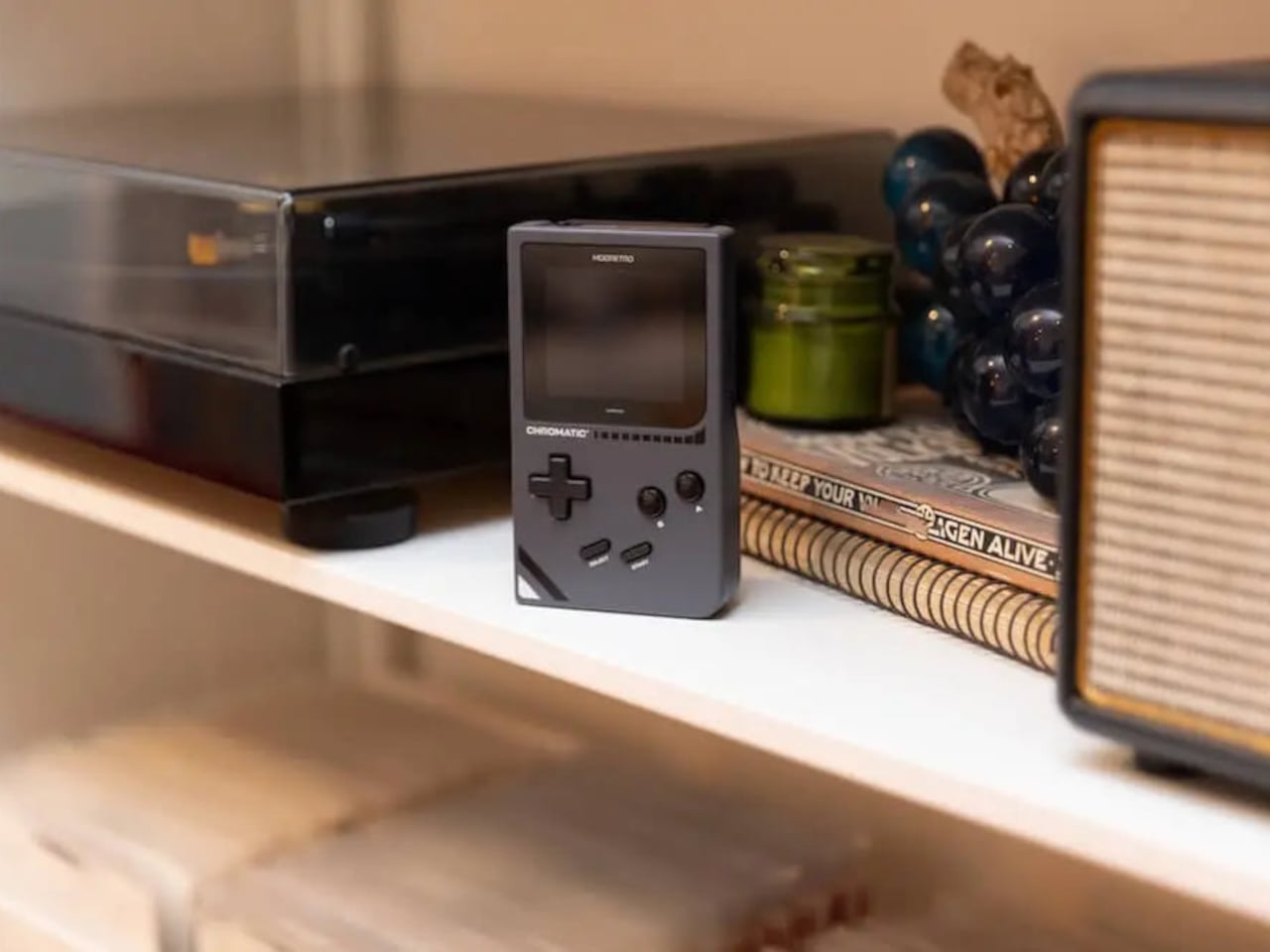
ModRetro Chromatic: The Game Boy Color that Nintendo never made
There’s a version of this product that could have been embarrassing: a magnesium alloy Game Boy Color clone bundled with a new Tetris cartridge, sold at $199. On paper, it sounds like a premium nostalgia trap. In practice, it’s one of the most carefully considered handheld devices released in years. It’s FPGA-based, meaning it reconstructs the Game Boy hardware at the circuit level rather than emulating it in software, which produces zero input latency and a millisecond-accurate match to original hardware behavior.
The physical design earns its price in ways spec sheets can’t capture. The curved battery compartment gives your hands something to grip. A physical volume wheel, a detail so obvious it’s shocking how rarely it appears on modern devices, lets you kill the sound without touching a menu. Colors run from Inferno and Bubblegum to a very wearable Wave blue, with English or Japanese button labeling as an option. It plays physical Game Boy and Game Boy Color cartridges only, which is either a dealbreaker or a feature, depending on how you think about focus.
What we liked
FPGA hardware delivers true zero input lag, not a software approximation
Magnesium alloy shell feels premium and genuinely durable
Comes bundled with a new Tetris cartridge
What we disliked
Plays only Game Boy and Game Boy Color cartridges, no ROMs or other systems
AA battery requirement adds ongoing cost; rechargeable Power Core is sold separately
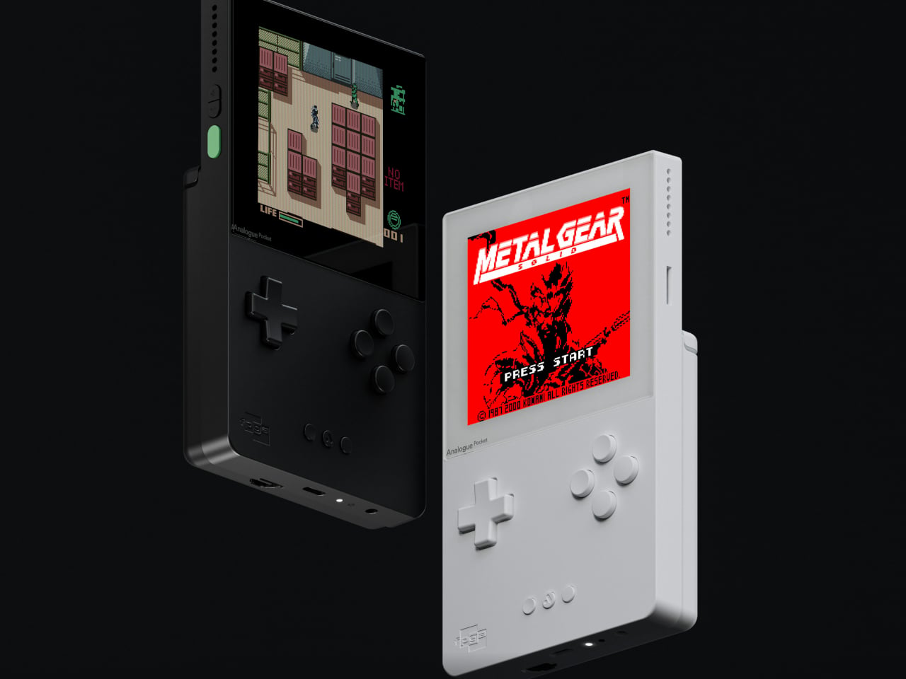
Analogue Pocket: The one photographers keep picking up
The Analogue Pocket is the device that made the retro handheld conversation respectable. It uses an FPGA rather than software emulation and plays Game Boy, Game Boy Color, and GBA cartridges out of the box. Via cartridge adapters, it adds Game Gear, Neo Geo Pocket Color, Atari Lynx, TurboGrafx-16, PC Engine, and SuperGrafx. Via its microSD slot and the OpenFPGA community platform, it loads cores for nearly every retro system that ever existed. The 3.5-inch LCD at 1600×1440 and 615 ppi is, simply, one of the sharpest displays ever put in a handheld.
At $239, it sits at the premium end of this list, and it’s also frequently out of stock. Firmware updates require a microSD card reader, which feels like friction that shouldn’t exist on a $239 device. TV output needs the separately sold $99 Dock. These aren’t dealbreakers so much as signals that Analogue built this for the dedicated enthusiast first. If you want one device to handle everything in your retro library for the next decade, this is probably it.
What we liked
OpenFPGA community support covers an enormous range of retro systems
Plays GBA in addition to GB and GBC, plus many more with adapters
MicroSD slot enables ROM loading
Premium aluminum build with a distinctly modern design language
What we disliked
Frequently out of stock; restocks sell out within minutes
Firmware updates require an external microSD card reader
TV output requires a separately purchased $99 Dock
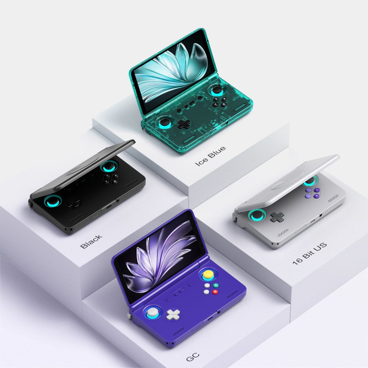
Retroid Pocket Flip 2: The clamshell that brought the GBA SP back with PS2 power
The GBA SP was the handheld that arguably peaked the clamshell form factor: it folded, it protected its own screen, and it had a backlit display before that was standard. The Retroid Pocket Flip 2 arrives in 2025 with that same closing-hinge energy, but with a 5.5-inch 1080p AMOLED screen, a Snapdragon 865 processor, and enough emulation horsepower to run PlayStation 2, GameCube, and Wii. When closed, it has roughly the same desk footprint as a modern smartphone. Closing the lid puts it to sleep; opening it wakes it up.
Color options include a translucent Ice Blue, GameCube Purple, a two-tone 16-bit US, and Black. Retroid clearly understands its audience. The AMOLED panel brings deep blacks and accurate color to games designed for CRTs, and the results are often striking for titles you’ve played a hundred times. At $229 for the Snapdragon variant, there is no meaningful clamshell competitor at this performance level. One persistent note from extended use: the form factor rewards shorter sessions more than marathon ones, which is maybe appropriate for a device meant to live in a bag pocket.
What we liked
5.5-inch AMOLED at 1080p is impressive for the price
Handles PS2, GameCube, Wii, and Dreamcast emulation
Translucent Ice Blue colorway is a design highlight
What we disliked
Thicker than it looks in product photos
Extended sessions can feel less comfortable than flat handhelds
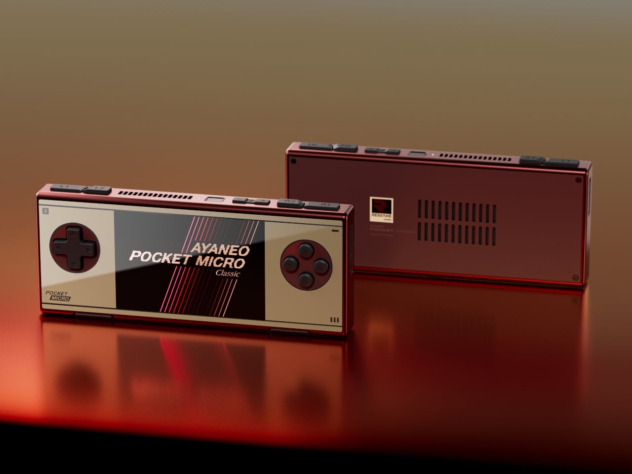
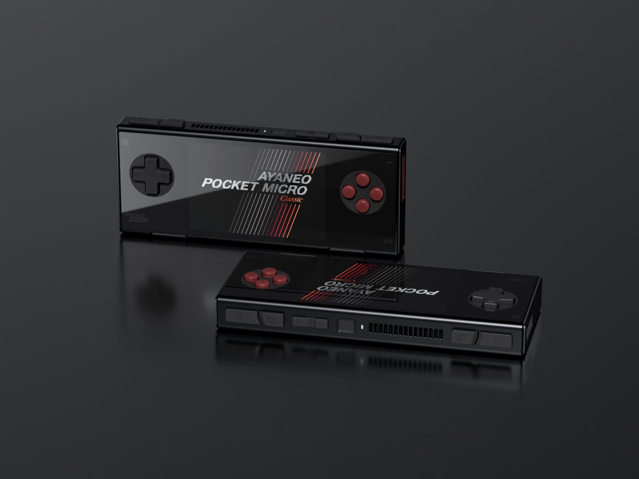
AYANEO Pocket Micro Classic: The one that fits in an actual pocket
The Game Boy Micro launched in 2005 as Nintendo’s most polarizing hardware decision. It was tiny, it was beautiful, it only played GBA games, and it was discontinued within a year. Design historians were kinder to it than the market was. The AYANEO Pocket Micro Classic is clearly in conversation with that history. It removes the analog joysticks, uses a CNC-machined aluminum alloy frame with a seamless all-glass front, and produces something that slides into a front jeans pocket without catching on anything.
The 3.5-inch borderless IPS display at 960×640 in a 3:2 ratio is built for GBA emulation, with 4x pixel-perfect upscaling. Available in Obsidian Black, Charm Red, Vintage Grey, and Gold, each colorway has a different character. The Gold skips “gaming device” and lands somewhere closer to “considered object.” The MediaTek Helio G99 handles everything up through PS1 confidently. If your retro library is 8-bit and 16-bit with a strong GBA presence, the Pocket Micro Classic is probably the most beautiful way to play it.
What we liked
CNC aluminum and all-glass build is genuinely premium for the category
No joysticks make it notably slimmer and more pocketable
Android 13 with Play Store access expands utility beyond emulation
What we disliked
No joysticks limit N64, Dreamcast, and PSP playability
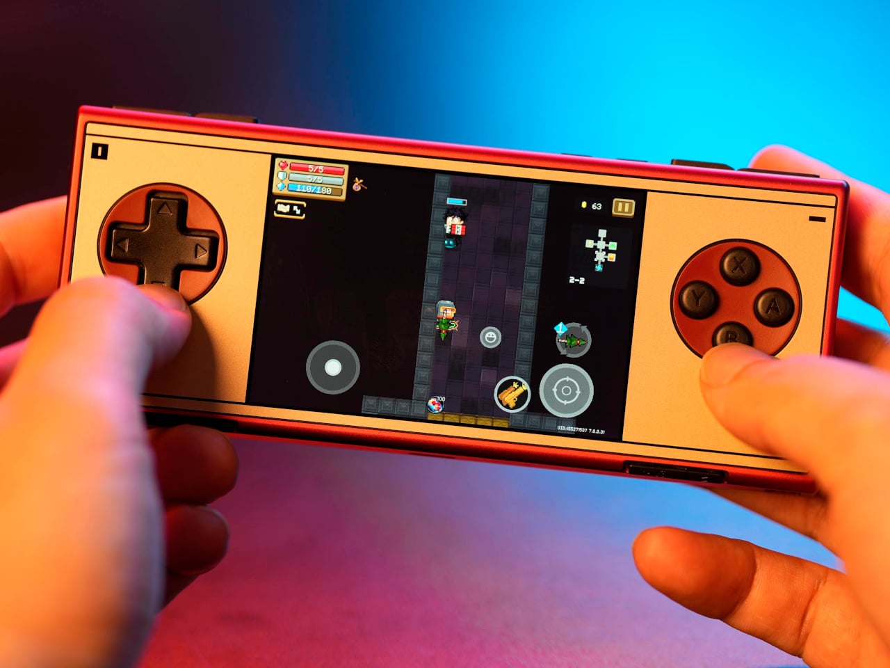
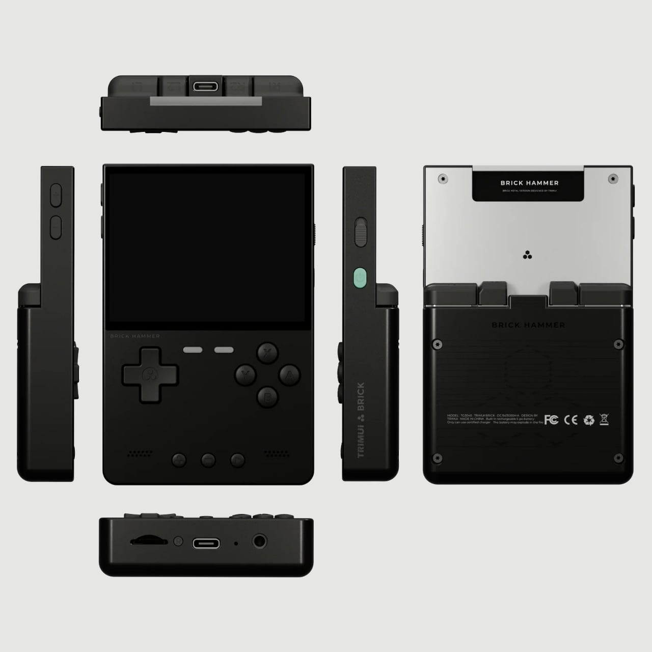
The original TrimUI Brick arrived in 2024 with an unusually sharp 3.2-inch IPS screen at 1024×768, giving it a pixel density of 405 PPI, a number that belongs on a premium smartphone, not a $55 device. The Brick Hammer edition, launched in 2025, replaces the plastic shell with a full CNC-machined aluminum alloy in Gunmetal Gray, Rose Gold, and Fluorescent Green. The metal shell doubles as a heatsink, dropping operating temperatures noticeably. Three interchangeable shoulder button sets ship in the box.
The software runs CrossMix OS on a Linux base: clean, fast, minimal overhead. Load your ROMs, pick a game, and play. Battery life lands around four to six hours. The processor handles Game Boy through PS1 without complaint; N64 gets through most titles; Dreamcast is inconsistent. The CNC backplate can be engraved, which no other device at this price point offers. The Rose Gold aluminum version sitting next to a MacBook on a desk looks less out of place than it has any right to, and that’s a strange and interesting thing to say about a $99 handheld.
What we liked
CNC aluminum Hammer shell runs noticeably cooler than the original plastic
Swappable shoulder buttons and engravable backplate are genuinely rare customization options
Rose Gold and Gunmetal colorways punch well above the budget tier
What we disliked
No analog joysticks, which limits 3D game compatibility
Dreamcast and demanding N64 titles run inconsistently
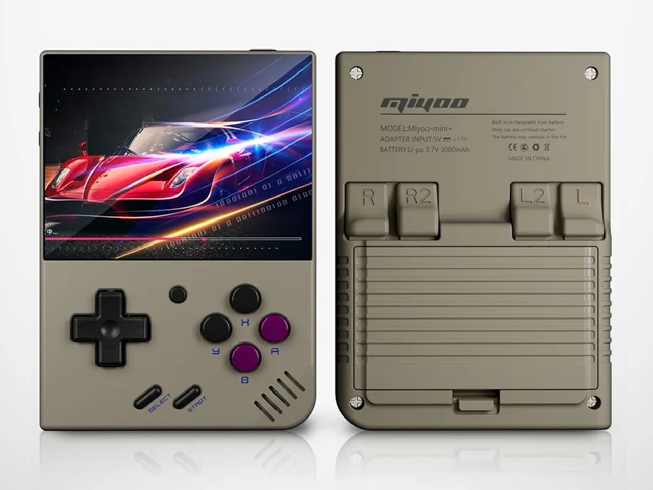
Miyoo Mini Plus (and Mini Flip): The one that started the whole obsession
If there’s a single device responsible for bringing this category to mainstream attention, the Miyoo Mini Plus is probably it. It weighs 200 grams, fits in a jeans pocket, has a 3.5-inch IPS screen at 640×480, and runs OnionOS, a community-built firmware that turns a modest Cortex-A7 processor into a near-perfect front end for everything from the NES to the original PlayStation. The interface is clean, the emulator library covers over a hundred platforms, and save states work the way save states should.
The Miyoo Mini Flip takes the same hardware and wraps it in a GBA SP-style clamshell, adding screen protection and an extra wave of nostalgia. Early production runs had hinge concerns, though those appear to have been addressed in more recent batches. At $69-99, this is the gateway to the category that doesn’t feel like a compromise. The honest question isn’t whether this device is worth the money, since it clearly is. It’s whether starting here will satisfy the itch, or simply make you want to own the other six devices on this list as well.
What we liked
Genuinely pocketable at 200g, fits in a jeans pocket without bulk
Covers NES through PS1 with confident performance
Mini Flip clamshell adds nostalgic GBA SP energy and screen protection
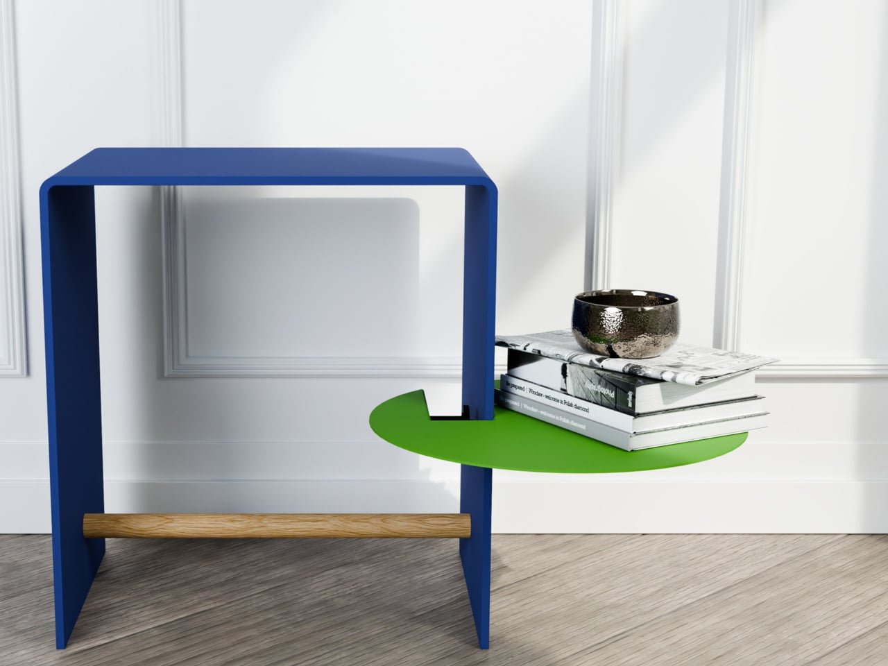
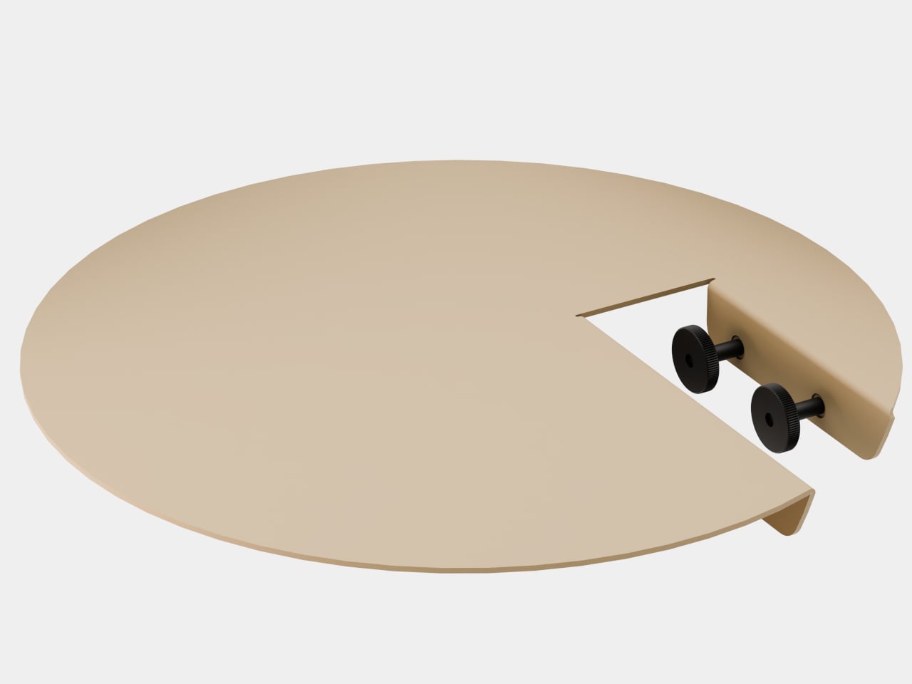
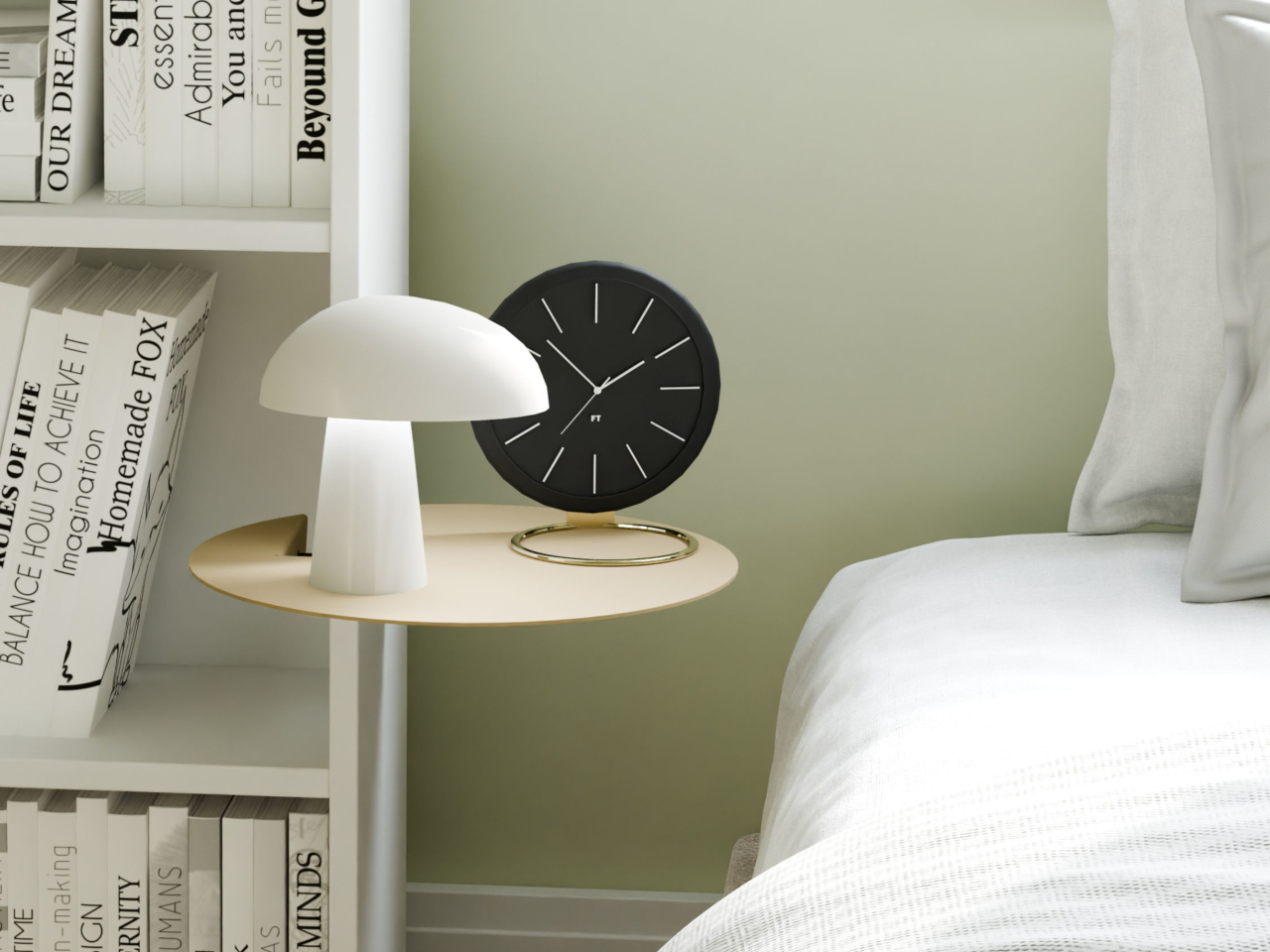
Most shelving solutions ask you to commit before you can even start. Drill a hole here, anchor a bracket there, then live with the consequences if you change your mind six months later. The TAB, designed by Berlin-based architect Michael Hilgers for housewares brand Purstahl, takes a different approach entirely. It clamps onto any vertical panel up to 38mm thick, no drilling, no damage, and releases just as easily when you want to move it.
The form itself is the most unexpected part. Where most clip-on accessories default to a rectangle, the TAB is a circle, a 30cm disc of 2mm aluminum with a fine-textured powder coating. That’s a small but meaningful choice; a circular shelf sitting against the side of a bookcase or cabinet reads more like a deliberate design detail than a functional add-on. It comes in two versions, TAB_left and TAB_right, which simply determine which direction the shelf extends from the clamp.
The thinness of the aluminum is doing more work than it looks like. At 2mm, the shelf sits flush and close to the panel face rather than jutting out awkwardly, which matters in tighter rooms. The powder coating adds color without bulk, and Purstahl offers enough options to match or contrast with the furniture underneath. That flexibility is part of the appeal: the TAB can read as an accent piece or disappear into the background, depending on the color you pick.
What makes it genuinely interesting is how widely the word “panel” applies. Hilgers frames his approach as “pragmatic design,” meaning objects that work with what already exists rather than replacing it. The TAB clamps onto a bookshelf side, the edge of a wardrobe, a balcony railing, a freestanding room divider, anywhere a flat vertical surface falls within that 38mm thickness range. That’s a broader set of possibilities than a 30cm disc might initially suggest.
The one thing Purstahl doesn’t mention is a maximum load rating, which is a fair thing to wonder about at €79 per unit. A small plant, a few magazines, or an espresso cup are probably fine. A heavy ceramic pot or a stack of hardcovers is a less certain proposition, and it would help to know the limits before buying. The screw clamp mechanism does allow for repositioning, so there’s room to adjust if the shelf shifts under load.
Hilgers has built a consistent body of work around the idea that existing furniture doesn’t need replacing, only rethinking. The TAB fits neatly into that logic. It’s a small, unhurried intervention in a room you already have, and the more interesting question is less about whether it works and more about how many panels around your home you’d actually want to put it on once you start looking at them differently.
Daily utility meets design in EDC multitools. And here at Yanko Design, we have this knack for recognizing the best tools for you, which would provide advanced features and excellent value when you need them. In the market flooded with multitools that are designed to fold and twist, Prometheus Design Werx has surprised the demanding with the stunning idea of the SPD Ti-Spork Chop – a multitool in its own unibody design.
While multitools that fold and feature pull-out accessories from the body are a common sight, it is unusual for a multitool to arrive in a one-piece design with construction that’s durable enough to withstand whatever you can throw at it. Looking at the Ti-Spork Chop, you can instantly count it out as a viable pocket tool, but spare a thought and read further before you arrive at a conclusion.
The look of the Ti-Spork Chop is self-explanatory of what the design entails. But the first thing that can disturb many is how to fit that EDC into the pocket. To ensure that it is possible and effortless, the one-piece multitool features a pocket clip to hold it in place inside the pocket. And when you’re unsure of having it in the pocket, the tool’s lanyard hole makes carrying it worry-free. The look may not obviously suggest, but this tool has six built-in functions.
It obviously starts with the combination of a spoon and fork in the front, which clearly wins it the word ‘Spork’ (combination of spoon and fork) in its name. Besides, making it a valuable EDC for casual campers and serious adventurers are features like the bottle opener, box/can opener, and a prybar. Of course, the pocket clip on one side and the lanyard in the middle are other notable options that make the tool even more handy.
Describing various scenarios in which the multitool can be used, the company notes, “Whether you’re shoveling canned peaches, stirring your precious hot cup of instant coffee with powdered creamer in some remote, dangerous corner of the world, or opening a bottle of Jarritos, our Ti-Spork Chop has got you covered.” It’s “A titanium spork to rule them all…” the company website reads.
All these tools are packed on a Ti-Spork Chop that’s milled from a single piece of 6AL-4V grade-5 titanium. The construction makes it highly durable and exceptionally resistant to corrosion. The design, as opposed to that of other folding multitools, ensures that it is easy to clean. Weighing roughly 30g and measuring about 4.72 inches long, the lightweight but incredibly robust Prometheus Design Werx multitool is available on the company website for only $79.