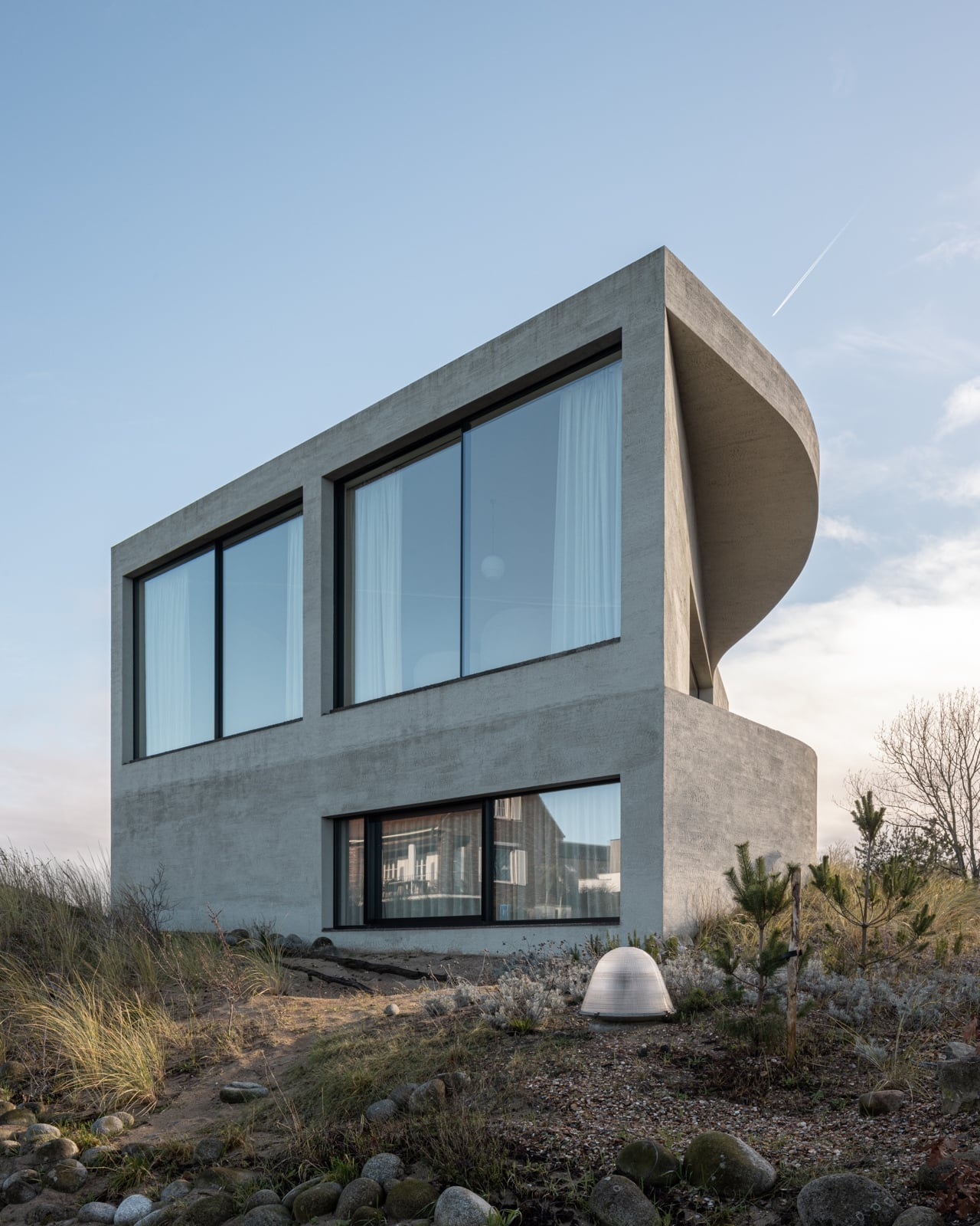
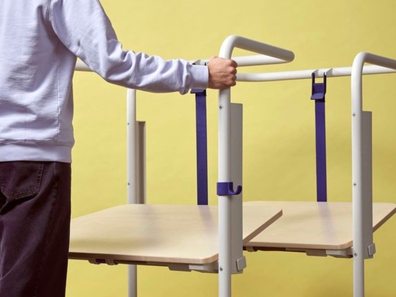
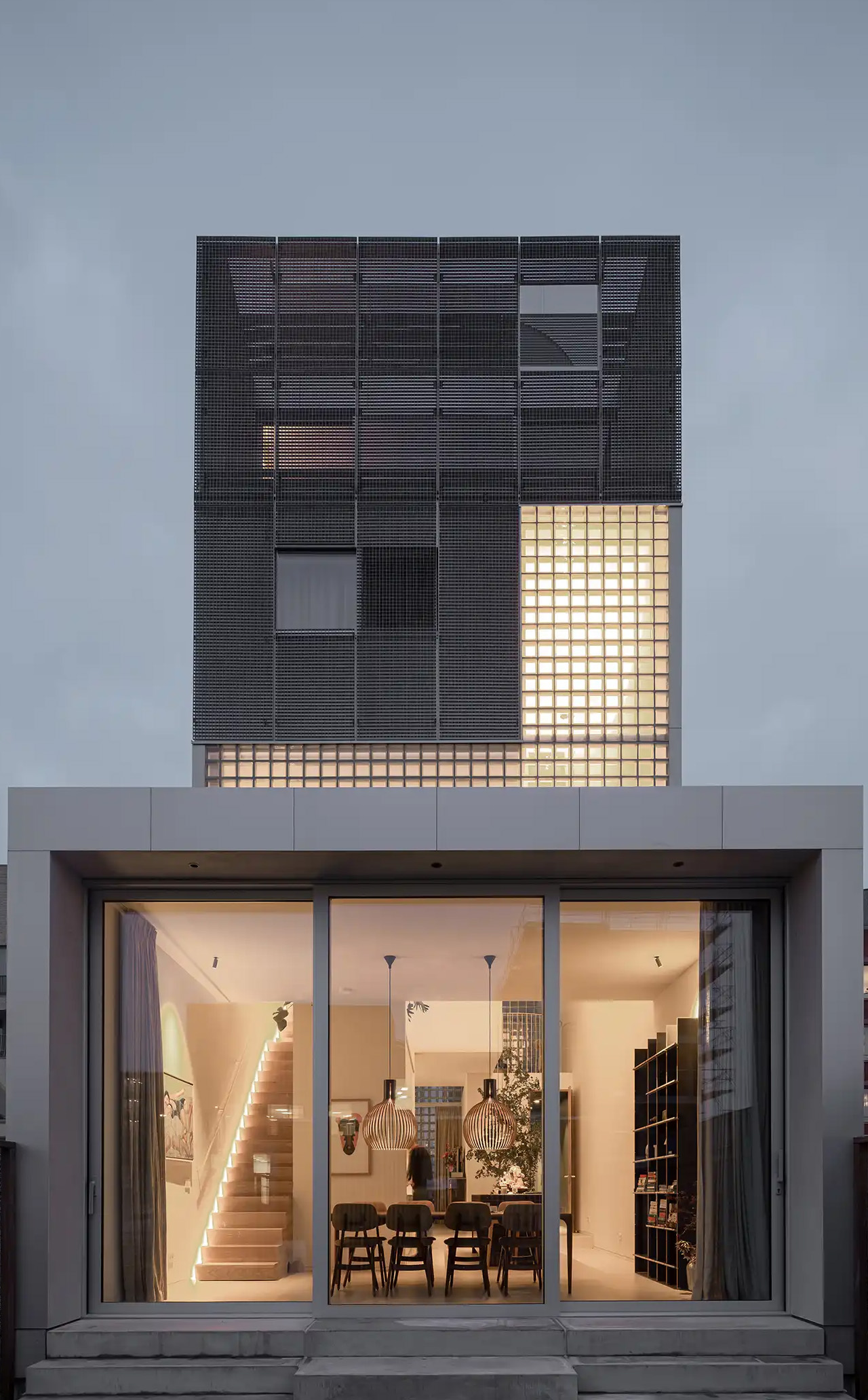
If you’ve ever stood on a beach and watched the tide pull back, you know that moment right before the water retreats completely, when it leaves those delicate horizontal lines etched across wet sand. That’s what the facade of Villa Nouvelle Vague looks like. Not metaphorically. Literally. Belgian architect Magalie Munters designed the concrete surface of this seaside villa in Oostduinkerke with a horizontal grain that mirrors the striations the North Sea leaves behind at low tide. The reference isn’t decorative, it’s structural. And that distinction matters.
The villa sits on a corner plot at the edge of a protected dune reserve in Oostduinkerke, a small coastal town already known for a few wonderfully eccentric things: a ship-shaped restaurant and fishermen who harvest shrimp on horseback. Into this landscape, Munters has introduced something that manages to be arresting without being loud. The form is sculptural and unmistakably modern, but it doesn’t shout. It settles.
The name “Nouvelle Vague” borrows from the French New Wave film movement, and the reference is apt in ways that go beyond the obvious nod to style. The French New Wave was defined by breaking conventional rules while remaining deeply committed to craft. Munters is working in a similar register. For years, her Ghent-based boutique studio has been developing residential architecture with organic geometries, pushing against the idea that construction methods should set the ceiling on what architecture can achieve. “Through that ongoing research, I developed a way of building in which construction and technology no longer act as a limitation to the architecture,” she explains. Villa Nouvelle Vague is where that research cashes out.
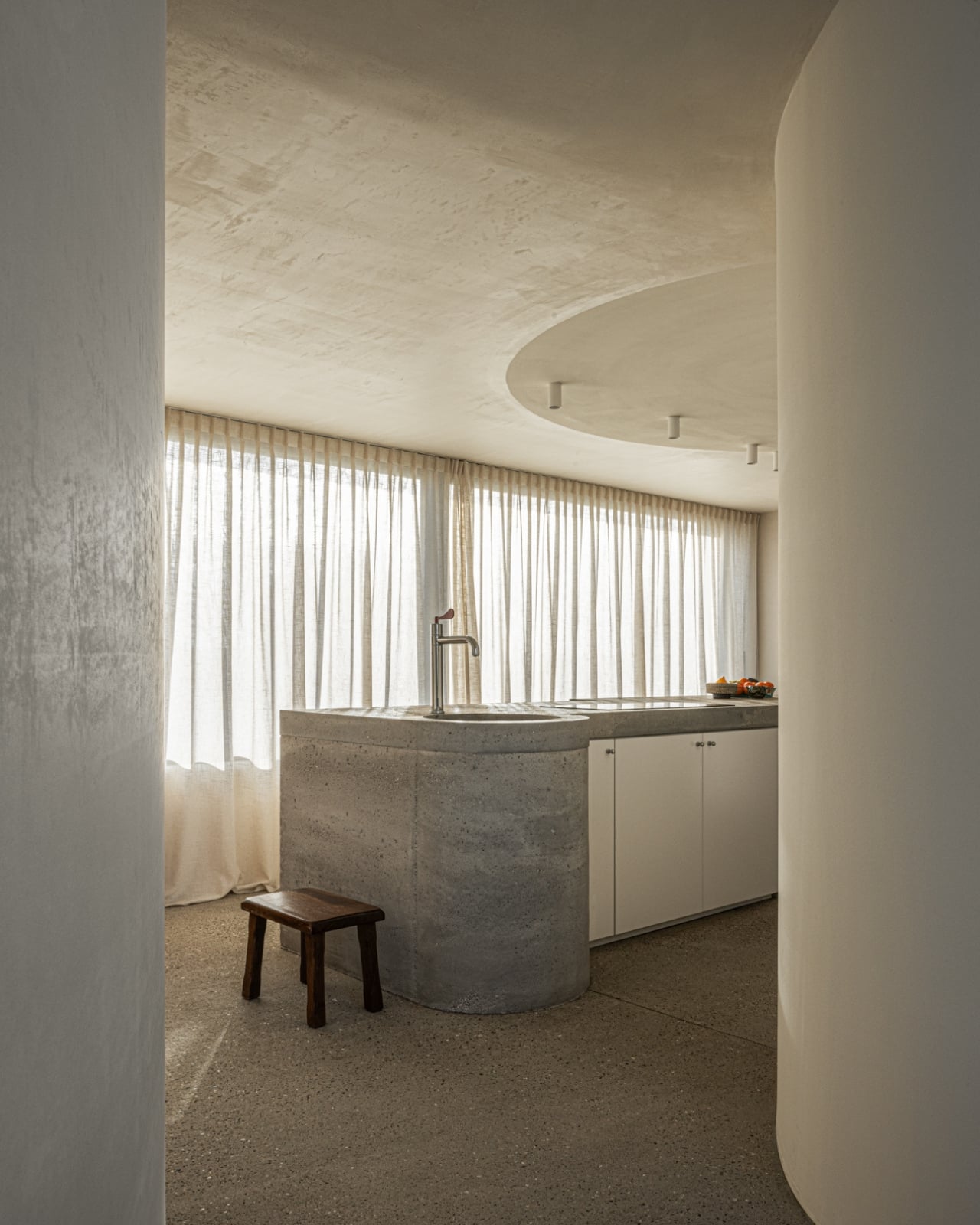
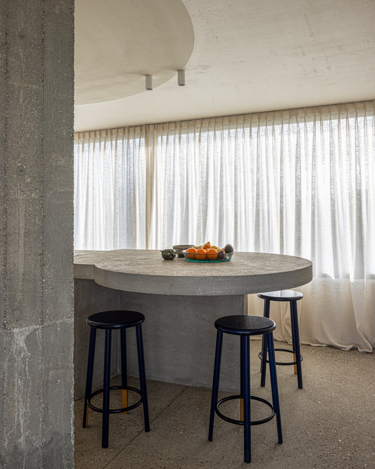
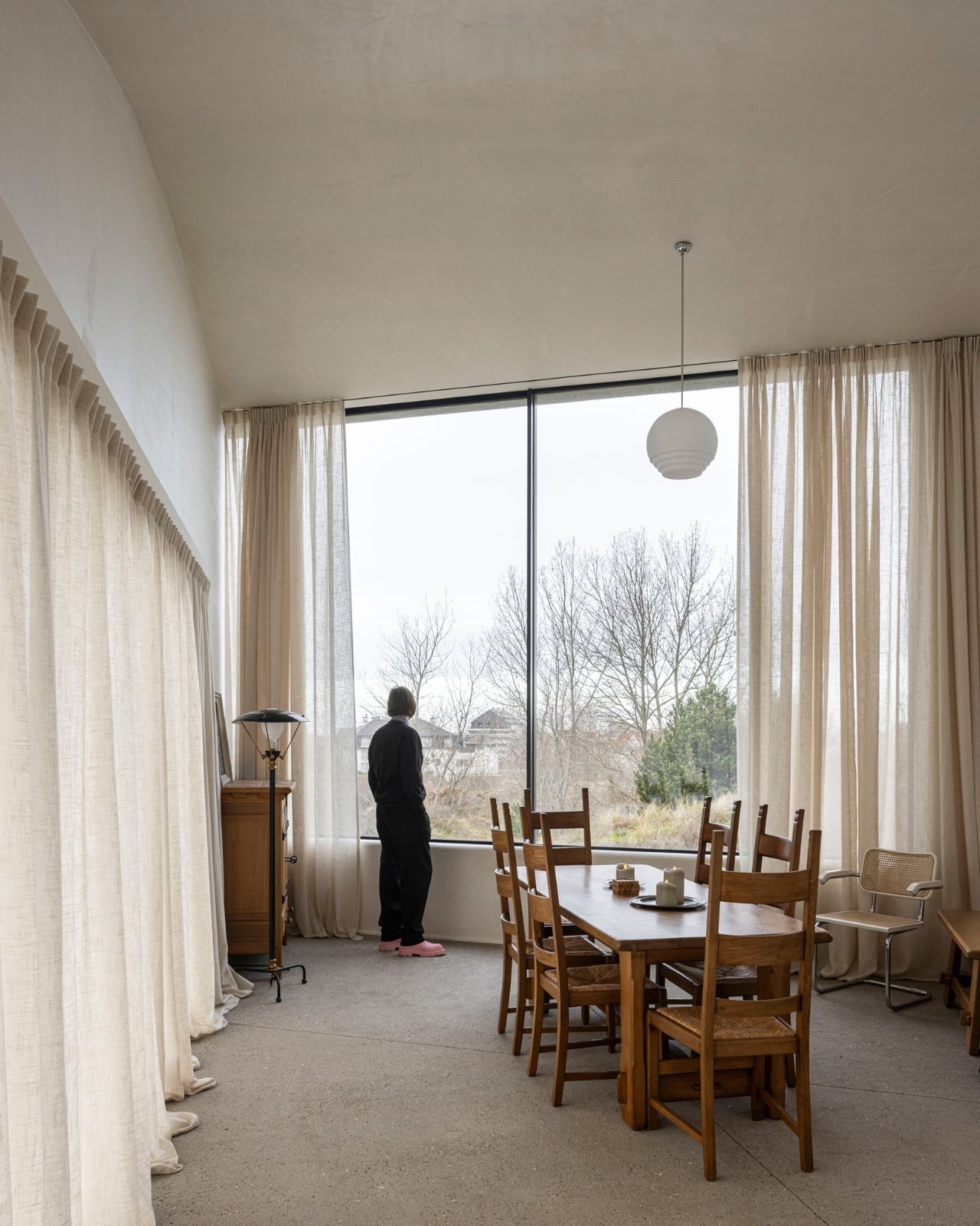
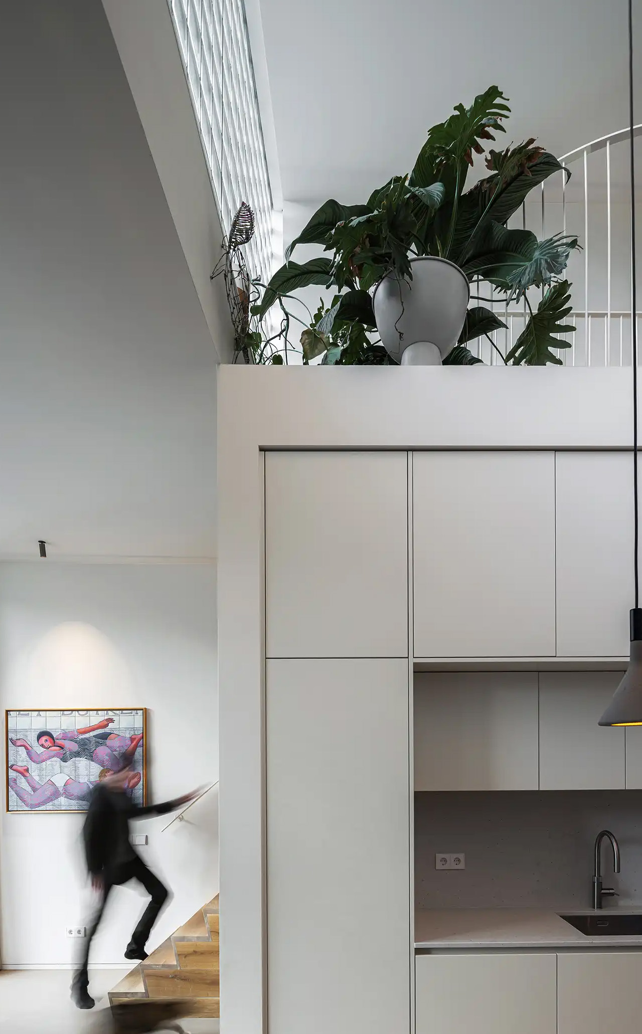
The concrete form is completely curved across the entire volume, not just as a surface treatment but as a governing logic, carried through every detail: the absent roof edges, the curved garage opening, even the way the house integrates into the ground. The bedrooms are half-buried in the dunes, which is both a functional and a conceptual move. The house doesn’t sit on the landscape. It’s anchored into it. Above those buried rooms, the living spaces rise toward the horizon, pulling in light and opening out to views of the dunes in a way that feels earned rather than forced.
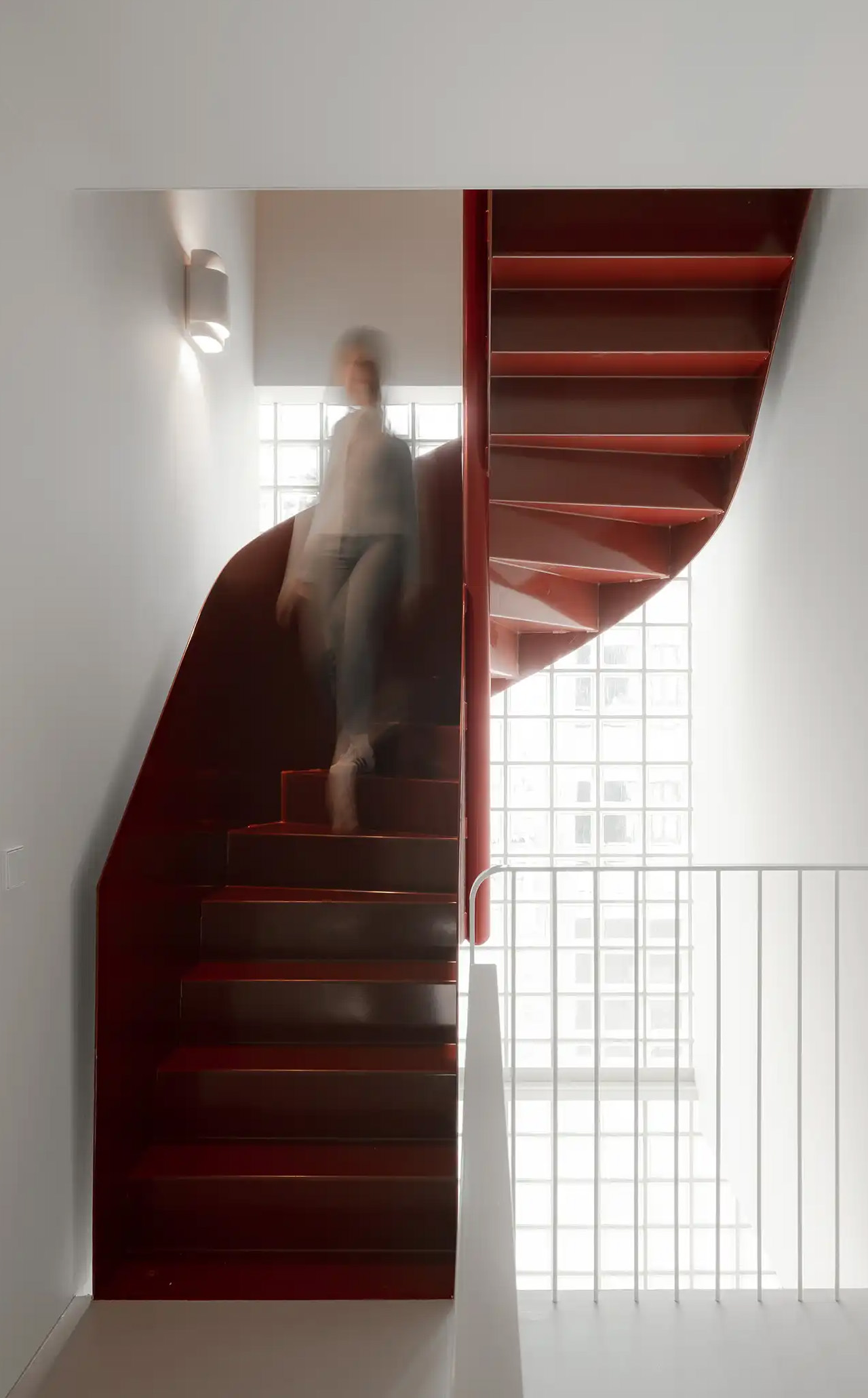
The way you move through the house is where Munters’ admiration for Le Corbusier becomes most legible. She’s spoken about his influence, specifically in “the rooftop solarium, in the way spaces expand and contract, and in the vertical shafts that structure movement through the house.” You enter through a vertical shaft that climbs toward the roof before expanding into the main living space. The compression-then-release is theatrical in the best sense. The house is working on your nervous system before you’ve even sat down.
I keep coming back to that word: deliberate. Munters uses it herself: “What might appear as a free form is in fact the result of a very deliberate construction logic.” That’s the tension the villa lives in, and frankly, it’s what makes it interesting. Nothing here is freehand improvisation. The curves look fluid because the logic behind them is airtight. The concrete looks like it grew from the dunes because the architect studied the dunes before she touched a drawing. That’s different from a building that mimics nature for aesthetic points. It’s rarer, and harder.
Belgian architecture doesn’t always get the international visibility it deserves, and Magalie Munters is one of those names worth paying attention to even if residential architecture isn’t usually your thing. Villa Nouvelle Vague is the kind of project that earns its name. It has the confidence of something that knows exactly what it is, and the intelligence not to over-explain itself. Just like the best films of the movement it references.
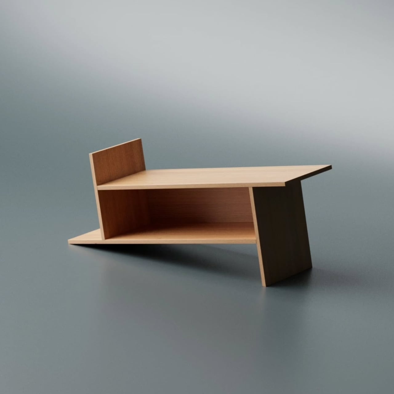
Most furniture design starts with a question about function and ends there. Deniz Aktay, the designer behind the studio @dezinobjects, apparently decided to start with geometry instead, and the result is one of the most quietly clever storage pieces I’ve come across in a while: the Barrow Bookrack.
The concept is almost laughably simple to explain, which is exactly why it works. Take a rectangle. Extend each of its lines on one side only. That’s it. That’s the whole idea. And yet, what comes out the other end of that single decision is a bookrack that feels caught mid-motion, leaning into itself, its proportions oddly satisfying in a way that’s difficult to immediately place. On paper, it barely sounds like a design at all. In person, it’s all you notice.
Looking at it from a distance, the Barrow tilts at an angle that initially reads as precarious. It looks like it could tip at any moment, like a shelf that forgot to stand up straight. But it doesn’t. The asymmetry is intentional and controlled, and that’s exactly the kind of design choice that separates a well-considered piece from something that only looks interesting in renders. The structure holds, both physically and visually. The angular feet, the jutting top ledge, the open body sitting between them: everything is doing something.
The name is worth pausing on. A barrow, the traditional kind, is a simple carrying frame stripped back to its essential parts. Nothing extra, nothing decorative, just the minimum structure required to move something from one place to another. Aktay’s Barrow carries that same philosophy. Every extended edge and protruding surface earns its place. The result is a range of storage spots, each with its own character. Books stand upright in the central cavity. Larger volumes or stacked titles settle onto the flat extended surfaces. A magazine slipped sideways into one of the outer ledges feels like it was always meant to sit there.
This is the kind of piece that rewards being actually used. A lot of beautiful storage objects suffer from what I’d call the trophy problem: they look better empty than full. Barrow is the opposite. Load it with design books, art monographs, a worn paperback or two, and it genuinely improves. The varying heights, the mix of orientations, the textures of spines pressed against pale wood, it all adds up into something that feels lived in rather than staged. The structure becomes a frame for your reading life rather than something competing with it.
Aktay has explored this kind of thinking before. His earlier Bookgroove piece was a sculptural bookrack-table hybrid that played with the idea of furniture as form. Barrow feels like a sharper, more edited version of that same instinct: fewer moves, more precision. There’s less drama in the silhouette, but the restraint makes it more liveable. A piece like this can sit in a living room, a studio, or a bedroom and feel contextually right without demanding too much visual real estate from the room around it. It has presence without insistence, which is a harder balance to strike than it sounds.
The part that keeps pulling me back to this design is how naturally it moves from a flat idea to a physical one. The Barrow is essentially a graphic concept made tangible, a line drawing that decided to become furniture. The form evolved directly from extending lines on a flat surface before anything was actually built, and seeing that logic translated so cleanly into wood makes the whole thing click. The render and the physical piece are telling the same story, which is rarer in furniture design than it ought to be.
Furniture, at its best, makes you reconsider something you assumed was already settled. You’ve seen hundreds of bookshelves. You’ve probably owned a few. The Barrow doesn’t try to be revolutionary. It just extends a line a little further than expected, and somehow that’s enough to change the whole conversation.
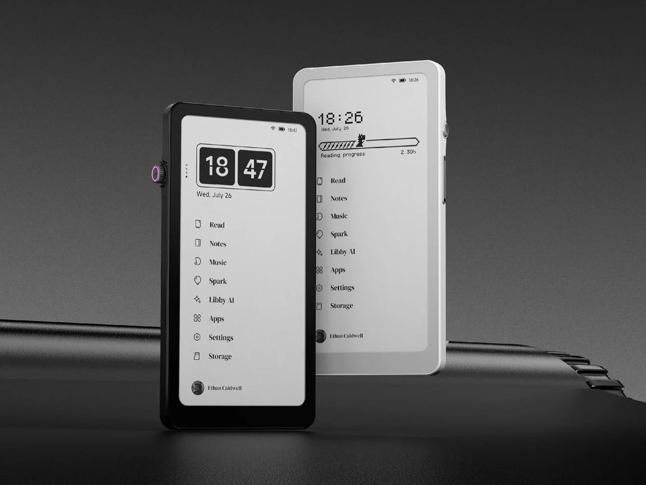
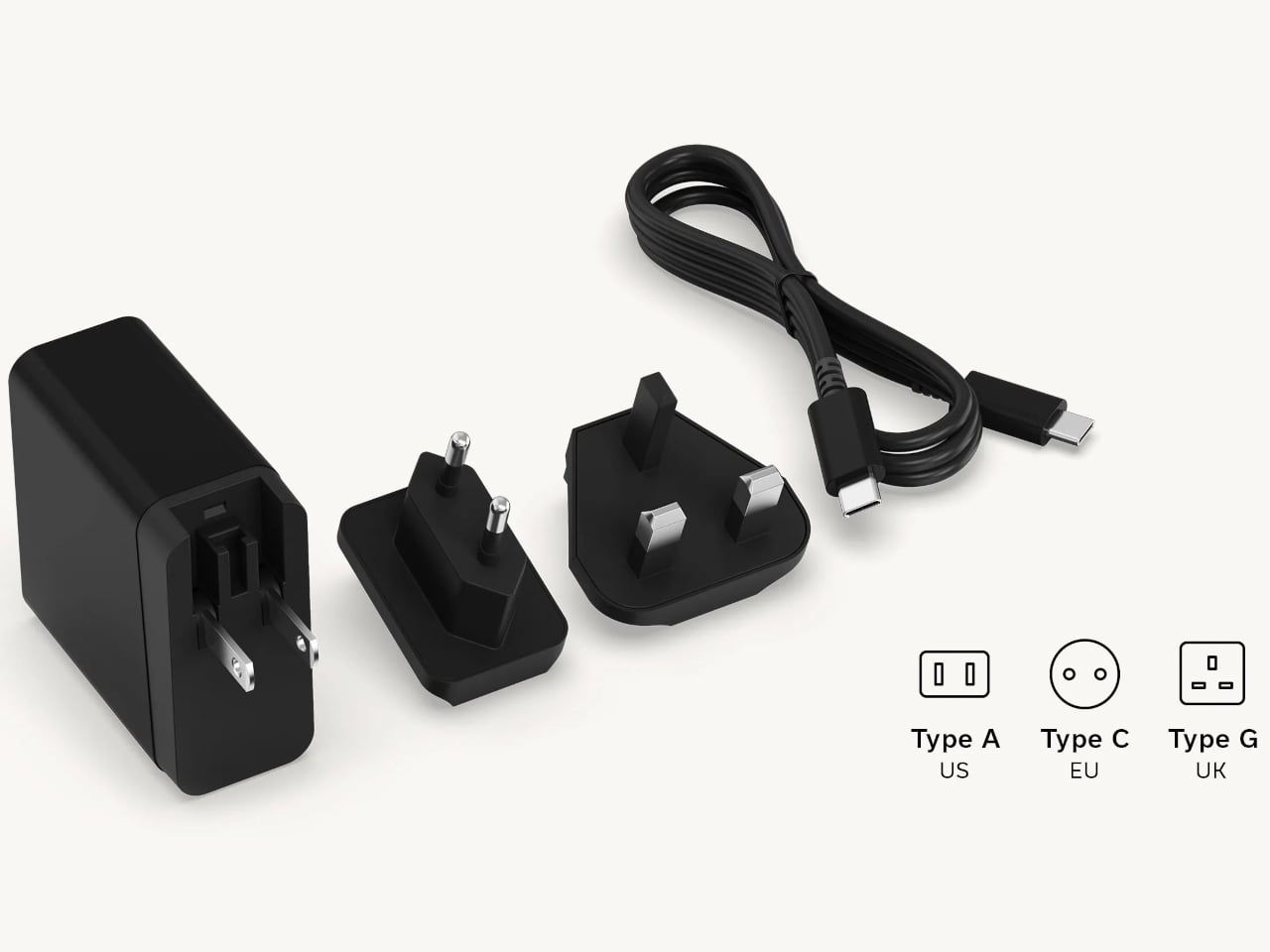
Amazon has spent nearly two decades perfecting the Kindle, turning it into the default eReader for millions of people, and in all that time they’ve steadfastly refused to shrink it down to pocket size or open it up to the broader Android ecosystem. They had every opportunity to merge the best parts of their Kindle line with the form factor of a smartphone, creating a distraction-free reading and productivity device that could actually fit in your jeans pocket and run the apps you already use. Instead, they kept the Kindle locked into its walled garden, kept it at 6 inches or larger, and left a gaping hole in the market for anyone willing to build what they wouldn’t. DuRoBo took that opportunity and ran with it, launching the Krono, a 6.13-inch E Ink tablet running full Android 15 that costs $279.99 and does exactly what Amazon has spent years pretending nobody wants.
The Krono packs an E Ink Carta 1200 display at 300 PPI (matching the sharpness of a Kindle Paperwhite), an octa-core processor, 6GB of RAM, 128GB of storage, a 3,950 mAh battery, and a unique side-mounted Smart Dial that controls screen refresh, frontlight adjustment, voice recording, and web browsing through a single rotary knob. It weighs just 173 grams, measures 154 x 80 x 9 mm, and is available in black or white from DuRoBo’s site or Amazon US. The pitch is straightforward: it’s an eReader, a voice note-taker, a podcast player, and a music device all in one, built on an open platform that lets you install whatever reading app, productivity tool, or communication software you actually want to use. It launched in August 2025 and started shipping in September, quietly carving out space in the niche that BOOX’s Palma lineup has been dominating for the past year.
Six gigs of RAM in an E Ink device is borderline excessive in the best possible way, especially when most eReaders ship with 2GB or less and struggle the moment you try to run anything beyond the stock reading app. The 128GB of storage means you can load an absurd library of ebooks, PDFs, audiobooks, and whatever else without ever worrying about running out of room. Running Android 15 (not some ancient fork, but the actual current OS) gives the Krono access to the full Play Store ecosystem, which is exactly what Amazon has been allergic to for years. You want Kindle, Libby, Moon+ Reader, Pocket, Instapaper, Obsidian, and Spotify all on one device? The Krono lets you do that. A Kindle will let you read Kindle books and maybe listen to Audible if you’re lucky. That’s the entire difference.
The Smart Dial highlights DuRoBo’s industrial design philosophy most clearly – instead of burying every interaction behind capacitive touch menus (which E Ink refresh rates make tedious), they mounted a physical rotary dial on the side of the device that you can press and rotate to trigger different actions depending on context. It’s a design choice borrowed more from cameras and audio gear than from tablets, and it gives the Krono a tactile, mechanical quality that most E Ink slabs completely lack. The back of the device features what DuRoBo calls the Axis, a strip housing six small breathing lights that glow softly on a schedule to gently nudge you back toward focused reading or work. It’s a wellness-adjacent UX detail that could easily feel gimmicky, but in the context of a device explicitly marketed as a “focus hub,” it at least makes thematic sense. The whole package is clearly designed to feel intentional and calm, a deliberate counterpoint to the dopamine-optimized chaos of a smartphone.
DuRoBo is positioning the Krono hard into the distraction-free productivity and mindfulness lane, framing it as the device you reach for when you want to read long-form content, capture ideas through voice notes, or listen to podcasts without getting dragged into Instagram or TikTok. The dual-tone frontlight (warm and cool adjustment) and the paper-like texture of the Carta 1200 display are meant to make extended reading sessions comfortable in a way that backlit screens never quite manage. The built-in speaker and Bluetooth support let it double as a surprisingly capable audio player for music, audiobooks, and podcasts, which gives it utility beyond just being a reading slab. The open Android platform means you can customize it to fit whatever workflow you actually need, whether that’s Notion for notes, Pocket for saved articles, or Spotify for background music while you write. Amazon would never build this, because opening the Kindle platform would undermine their entire content ecosystem lock-in strategy.
The Krono is available now for $279.99; with a fitted TPU case is sold separately, designed to accommodate both the Smart Dial and the Axis breathing lights without blocking either. At that price point, it’s competing directly with the BOOX Palma (which runs around $280 depending on configuration) and sits well above Amazon’s Kindle Paperwhite but below their Kindle Scribe. Whether the Smart Dial, the breathing lights, and DuRoBo’s focus-first branding are enough to justify choosing it over a Palma or just installing a launcher on a Kindle will depend entirely on how much you value that design identity over raw software polish.
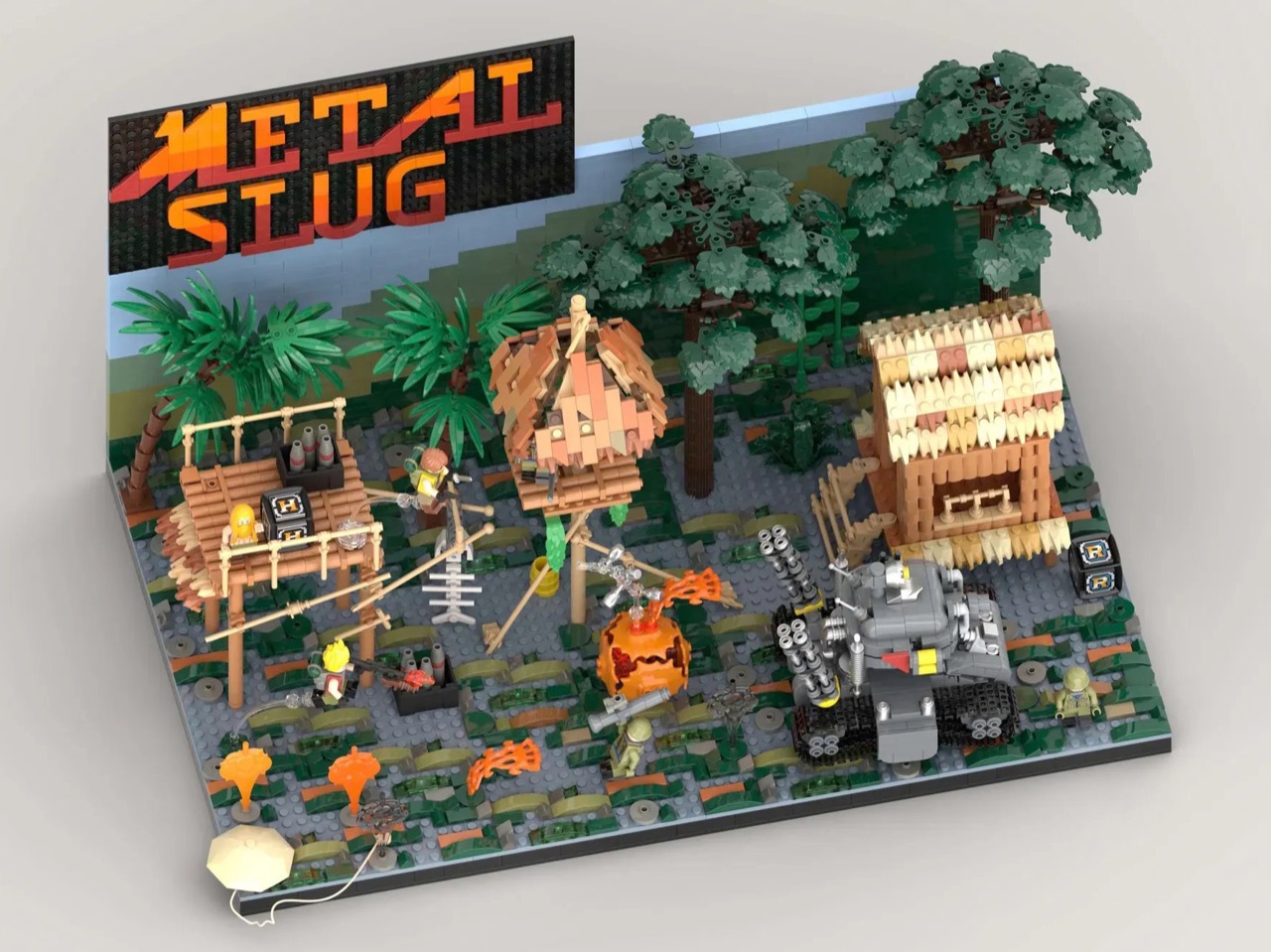
By 1996, the arcade was dying. Virtua Fighter and Tekken had the crowds. Sega’s racing cabinets had the spectacle. The conventional wisdom was that 2D games were finished, and anyone still making pixel art sidescrollers was simply behind the curve. Then Nazca Corporation released Metal Slug on SNK’s Neo Geo hardware, and the conventional wisdom had to sit quietly in a corner for a while. The game’s hand-animated sprites moved with a fluidity that polygon games couldn’t touch, and the humor, panicking soldiers, grateful POWs tossing rocket launchers, a tank that waddled like a toy, made the whole thing feel alive in a way that pure technical showmanship never quite manages.
LEGO Ideas builder MagicBrick has captured a freeze-frame of that world in brick form, reconstructing the game’s iconic jungle mission with 2,701 pieces and 6 minifigures locked into a scene of swamp terrain, rebel soldiers, dense jungle vegetation, and the squat, waddling Super Vehicle-001 tank at the center of it all. It’s a dense, affectionate build made by someone who clearly lost many, many credits to this game, and it shows in every deliberately chosen detail, from the mid-jump Marco Rossi clutching a Heavy Machine Gun to the bearded POW standing by with a reward.
Designer: MagicBrick
The scene is structured like a freeze-frame from the game itself, which is exactly the right instinct. MagicBrick describes the goal as capturing “a dynamic instant where everything is in motion: jumps, actions, and interactions come together to recreate the fast-paced feeling typical of the game,” and the build delivers on that. Marco Rossi in his red jacket is airborne, Heavy Machine Gun in hand. Tarma Roving, yellow jacket, stands ready with a pistol and knife. Three Rebel Army soldiers in green uniforms and helmets fill out the opposition, armed with bazookas and rifles. The swamp base uses tiles in multiple shades to sell the terrain, jungle trees and palms crowd the background, and the brick-built backdrop reflects the arcade color palette of the original game rather than any attempt at realism. That last decision is a smart one. Metal Slug was never interested in realism, and neither is this.
The Super Vehicle-001 is the centerpiece, and MagicBrick has packed a surprising amount of function into a compact footprint. The rear cannons are adjustable, the tracks are functional, and antennas complete the silhouette. Scattered across the scene are the environmental details that will hit Metal Slug veterans like a reflex: ammo crates, yellow barrels, a hanging fish skeleton, a parachute, and both the Heavy Machine Gun and Rocket Launcher power-up pickups rendered in brick. My favorite touch, though, is the grenade sequence, a classic cartoon-logic arc of thrown grenades ending in a mid-air explosion, frozen in plastic at exactly the right moment of absurdity.
Topping the whole structure is the Metal Slug logo itself, rendered in a red-to-orange gradient that makes the build read as a display piece as much as a playset. It’s that combination of environmental storytelling, playable features, and genuine fan knowledge that separates builds like this from generic video game tributes.
LEGO Ideas is the platform where fan-designed MOCs (My Own Creations) gather community votes, with 10,000 supporters needed to trigger an official LEGO review and potential production as a retail set. MagicBrick’s Metal Slug submission hit 100 supporters almost immediately after going live and has been picking up Reddit traction since. If you grew up feeding tokens into a Neo Geo cabinet, head to the LEGO Ideas page and cast your vote here.
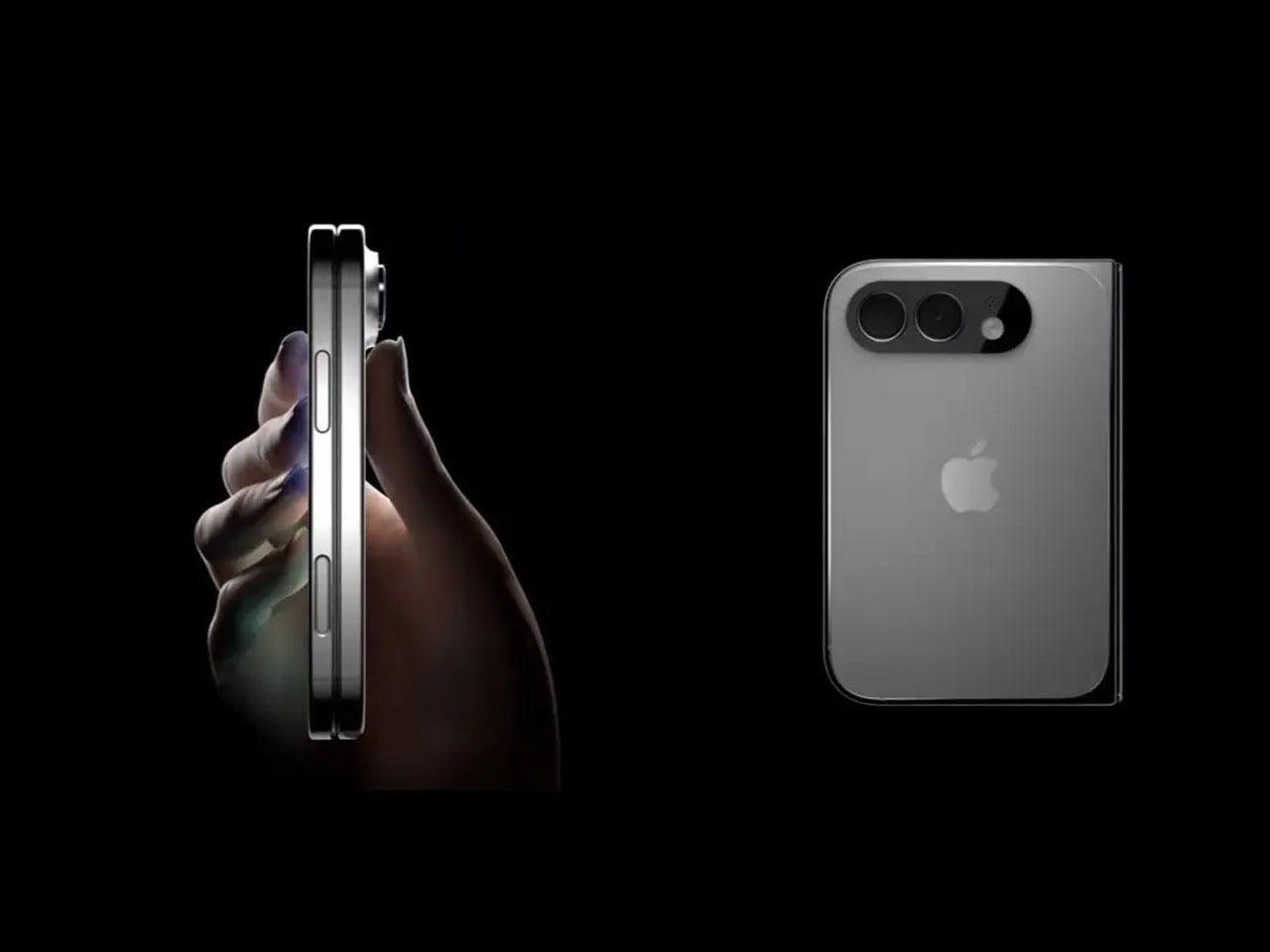
Apple’s first foldable phone, the Apple’s first foldable phone, iPhone Fold (if that’s how it will be called) is one of the most anticipated smartphones in recent memory. While Apple remains tight-lipped about anything concerning the awaited device, rumors, leaks, and concepts have flooded our memories over the years with what the iPhone Fold is and what it will be like.
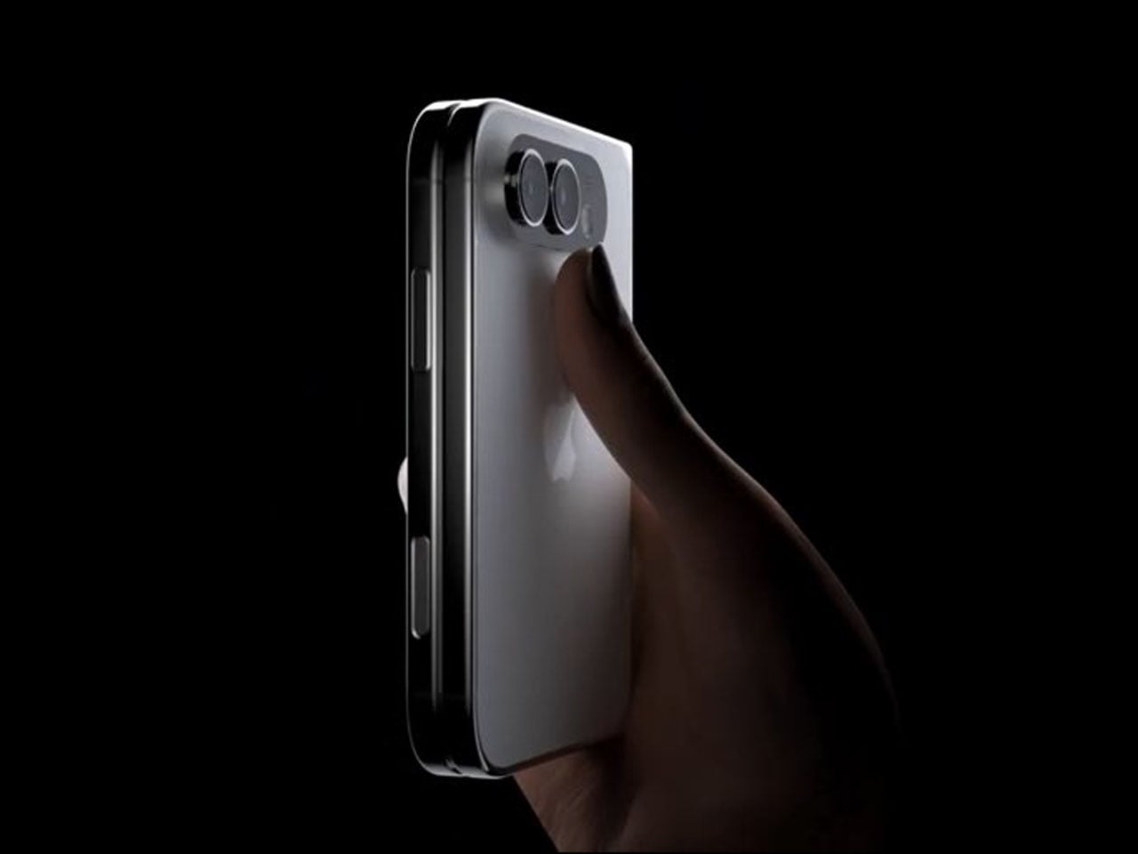
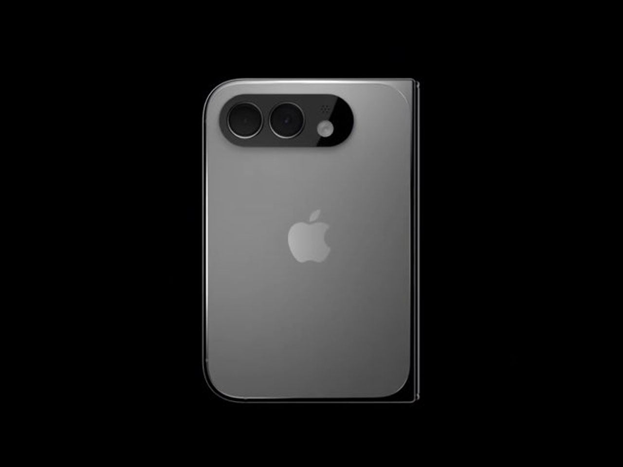
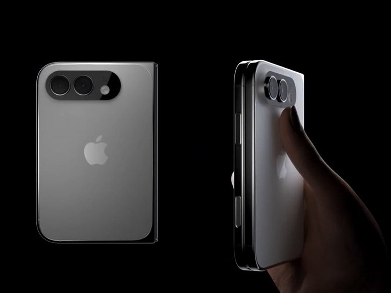
2026 is suggestively the magical year when Apple is expected to launch the foldable iPhone. It has been an unperturbed timeline in almost all the reports we have seen. In the same loop – but without a timeline – a recognized Apple leaker, Majin Bu has shown “actual design of the iPhone Fold” in the latest leaked pictures.
It’s “more beautiful than the previous one,” Bu notes in his update on X, stating that he believes this is “the final design of the future iPhone Fold.” How much context there is in the claim, only time will tell, but Bu has had some correct Apple-related predictions in the past, which suggests he could have some substance to back his claim.
From the leaked pictures, one can visually notice that the camera bump on the back of the foldable device is significantly smaller than that seen in previously rumored designs. The images appear more than renders and supposedly of a prototype, showing the iPhone in a book-style foldable form factor. Appearing to open horizontally to reveal a tablet-like display on the inside.
If the 2026 timeline is to go by – it’s Apple’s golden jubilee year as well – the iPhone Fold should ship alongside the iPhone 18 Pro slated for release in fall this year. But according to a new report from Nikkei Asia, the launch could be delayed. Nikkei reports that Apple has encountered a major setback in the engineering test phase of the foldable iPhone. There have been previously report concerning the foldable display’s crease, but this time, the report notes that the Cupertino giant is facing “more complex engineering challenges than anticipated.” If the issues persist, they could, “in a worst-case scenario,” delay the iPhone Fold launch schedule by some months. It could even mean a postponement until 2027.
Earlier this year, it was rumored that Apple had entered into the manufacturing phase of its first foldable device at Foxconn. New revelations, however, suggest Apple is “notifying” its component suppliers about the possibility of a delay in the “component production schedule for the new foldable iPhone.”
Despite the reports and unauthorized leaks, one thing is definite now. Foldable iPhone – by whatever moniker it comes – is clearly on the horizon. Apple will soon have a competitor for the Samsung Fold and other foldable smartphones on the market. If it is anything like the iPhones that rocked the smartphone world in the late 2000s, the iPhone Fold could repeat that in the late 2020s.
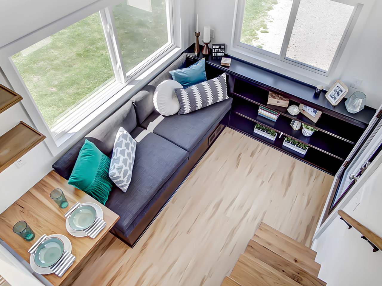
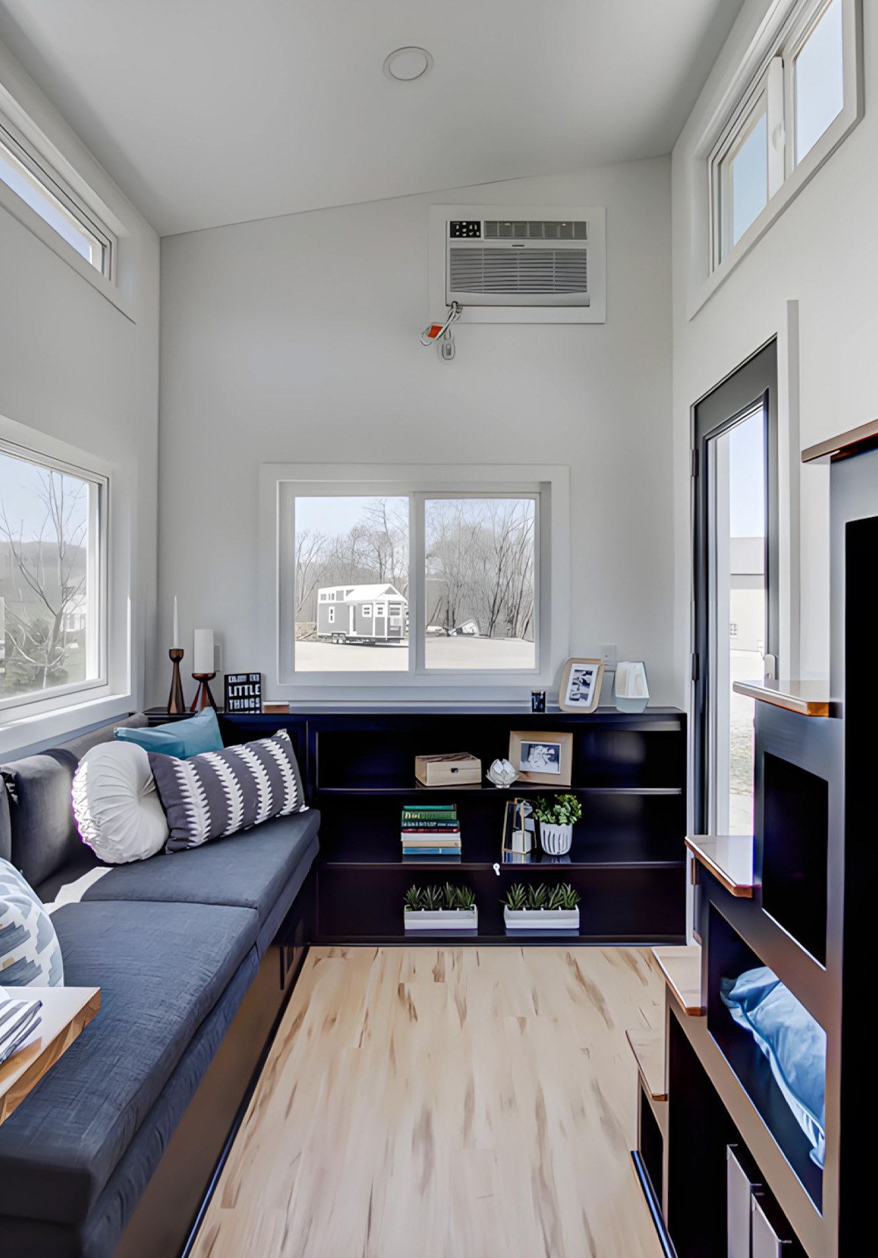
There’s a version of small living that doesn’t ask you to compromise. The Espresso, built by Ohio-based Modern Tiny Living on their popular Mohican platform, makes that case in just 20 feet. Bold and daring, the Espresso is a tiny house on wheels defined by deep blacks, warm wood accents, and a design sensibility that punches well above its square footage.
At its core, the Espresso is a study in restraint done right. The main floor clocks in at 160 square feet, with a 70-square-foot queen bedroom loft above, complete with custom built-ins and shelving. It’s a tight footprint by any measure, but the way the space is organized keeps it from ever feeling like it. The living room anchors one end of the home with a pull-out bench, built-in shelving, and a drop-down dining table that doubles as a desk, making it equally suited to a quiet morning or a dinner for two.
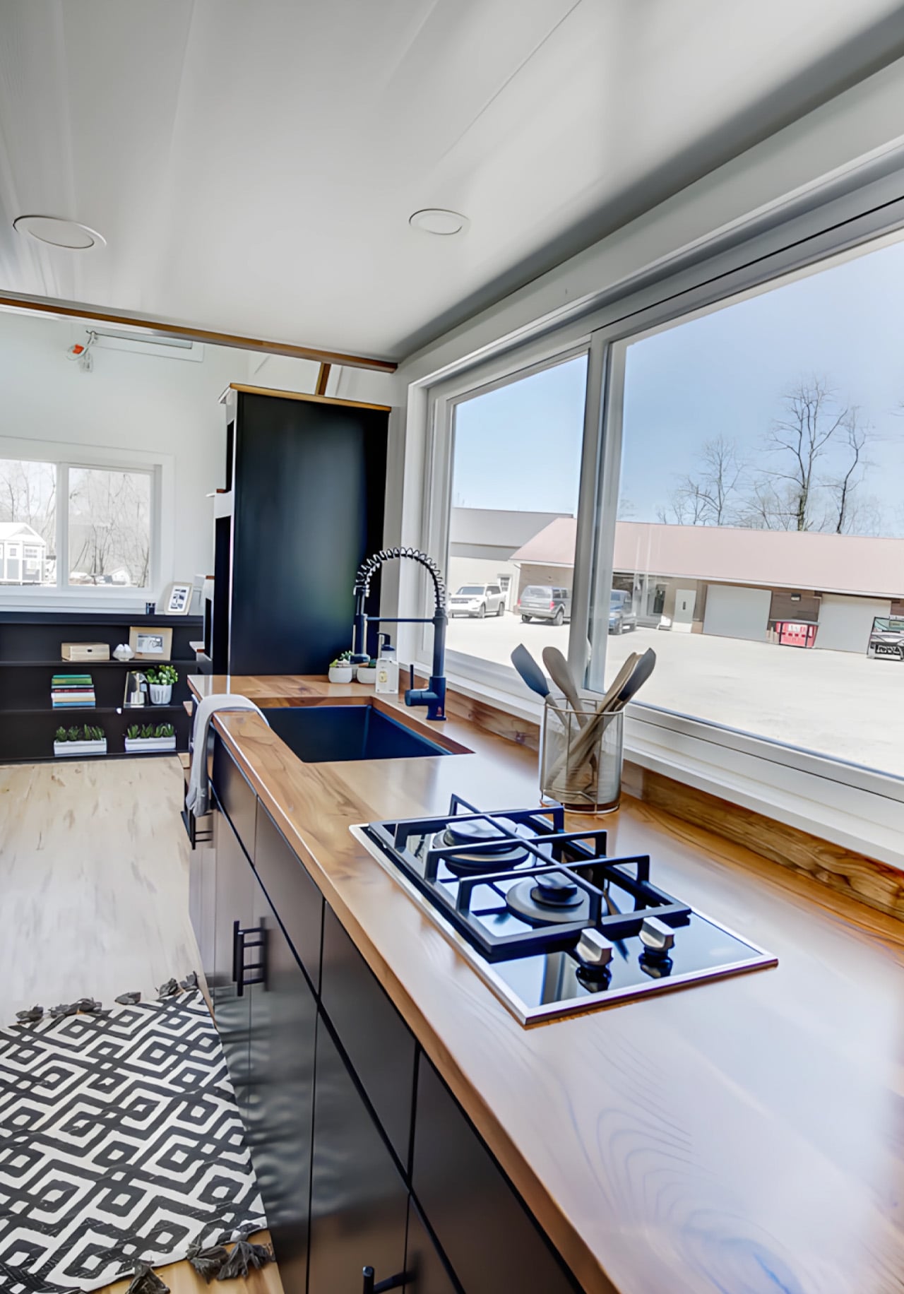
The kitchen is where the Espresso’s aesthetic really comes into focus. An undermount black granite sink pairs with a pull-down matte black faucet, solid wood countertops, a 9.9 cubic foot refrigerator, a two-burner propane cooktop, and a microwave, all working within a palette that feels deliberate rather than default. The matte black hardware package runs throughout the home, tying each room back to the same considered thread. Across from the kitchen, an open closet leads into the bathroom, which keeps things equally functional with a fiberglass insert shower, a flush toilet, and open shelving.
On the outside, the Espresso sits on a double-axle trailer and is finished in engineered wood with a steel roof, keeping maintenance low and durability high. A small exterior storage box handles propane bottles and similar items, quietly solving the off-grid practicalities without interrupting the clean lines of the exterior. The home weighs approximately 9,000 pounds, and its closed-cell spray foam insulation — three inches in the walls and ceilings, four in the floors — means it’s built to handle varied climates without compromise.
What makes the Espresso work isn’t any single feature. It’s the way everything adds up: the convertible furniture, the considered storage, the finish quality that makes the space feel lived-in rather than merely occupied. Modern Tiny Living designed it to deliver all the comforts of modern living in a compact, move-in-ready package, and the result is a tiny home that earns its name in more ways than one. Rich, concentrated, and hard to forget.
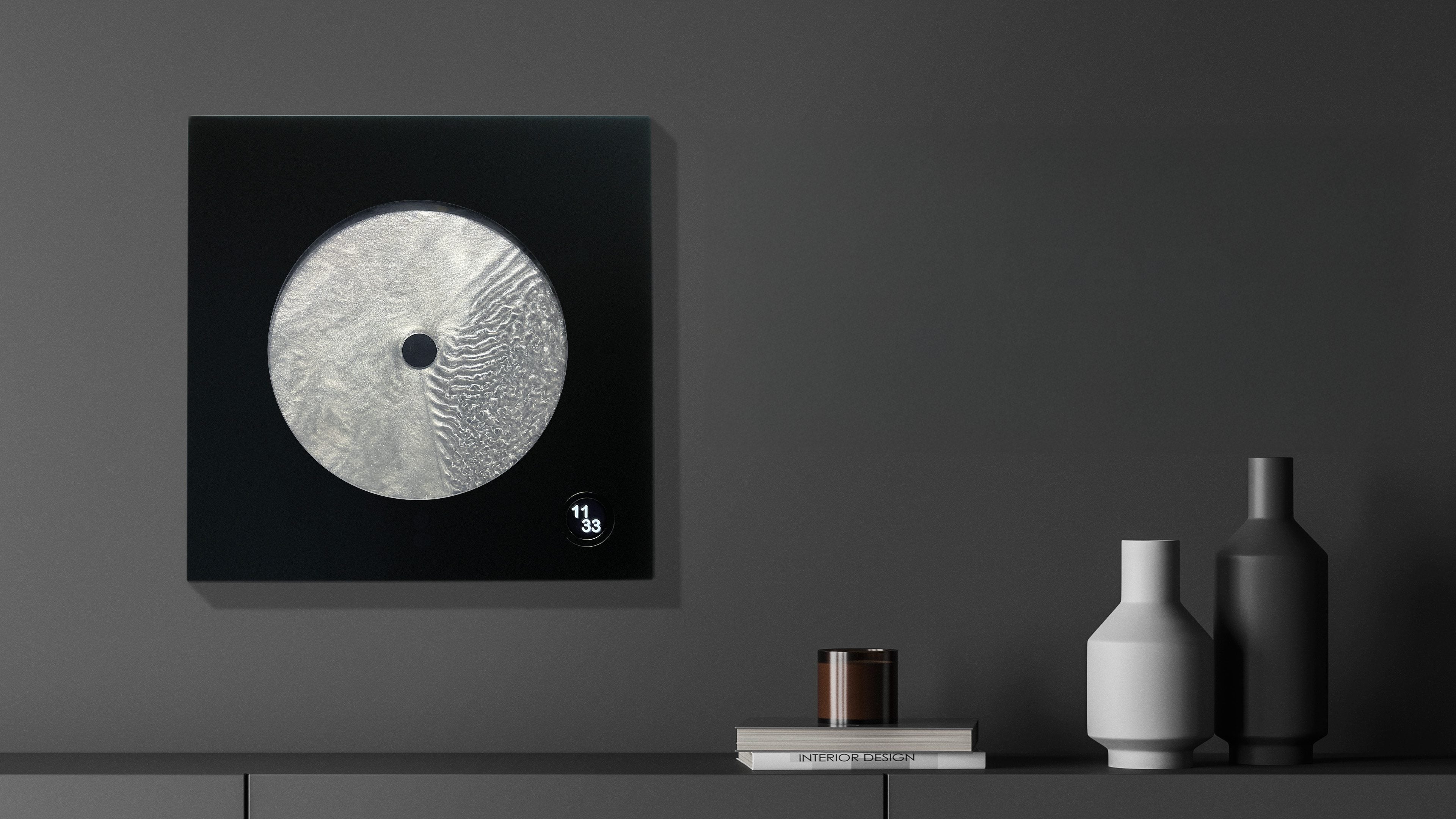
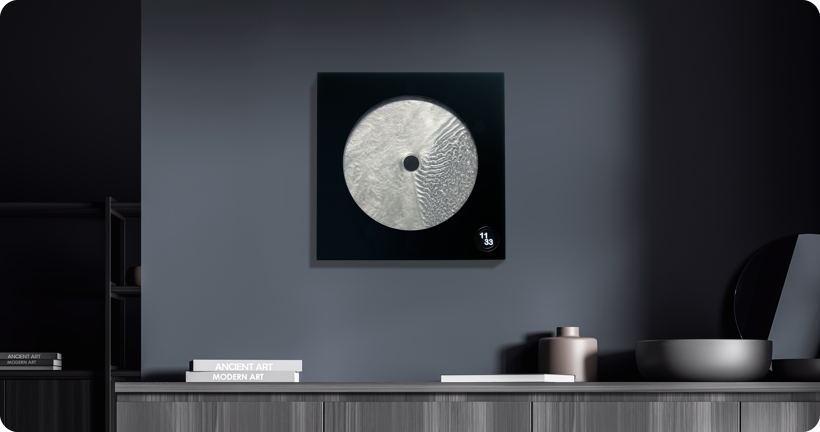
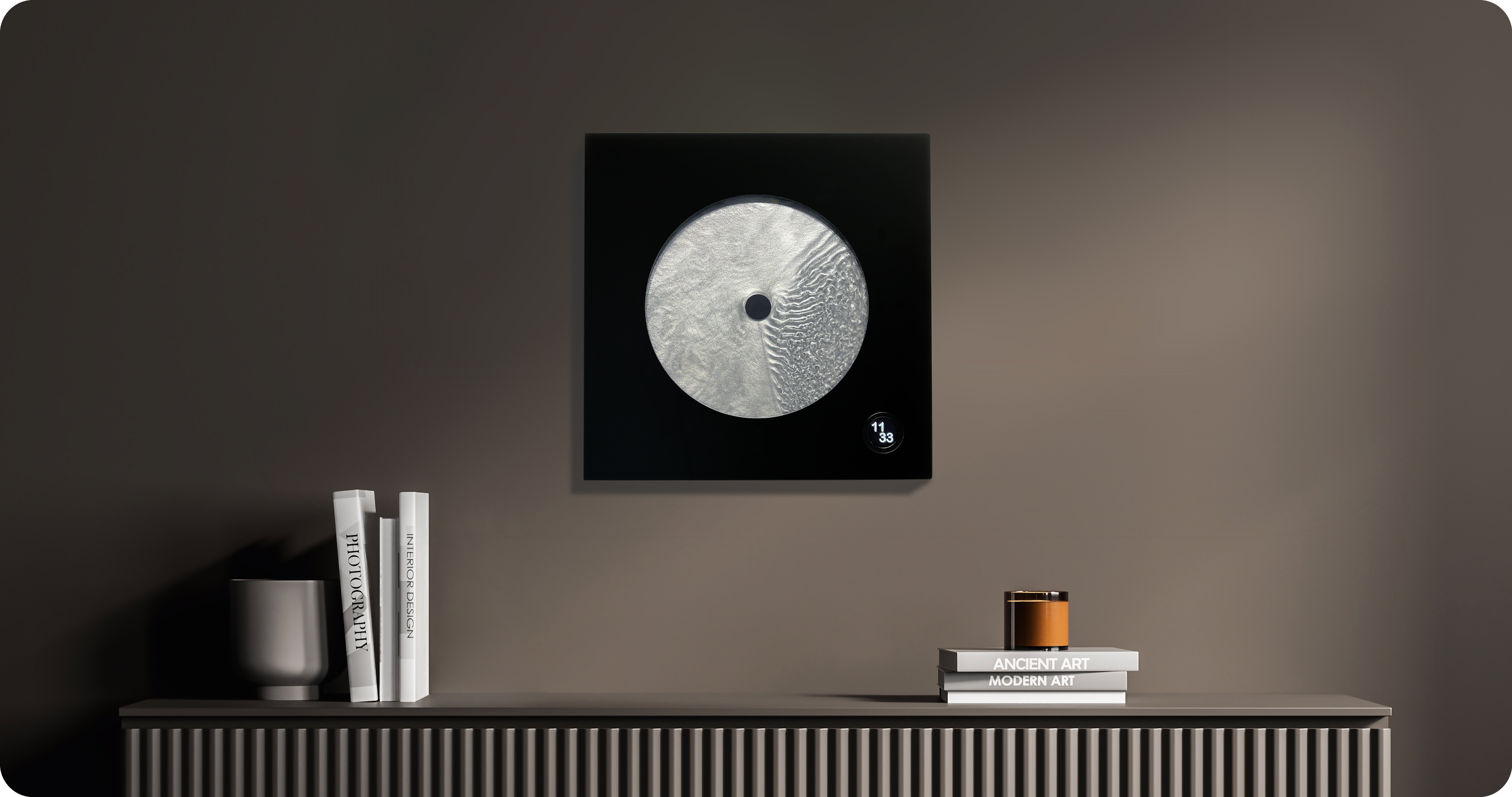
Most clocks are honest about what they are. They count. They tick. They remind you, with mild urgency, that you are late or almost late or about to be. Robert Spillner’s Luna is not a clock that measures time. It stages it. That’s a subtle but loaded distinction, and it’s exactly why this object is worth paying attention to.
Luna is a fluid wall object that translates the principle of the single-hand watch into a kinetic sculpture, making the moment between past and future perceptible. Behind the hand, a trace of turbulent patterns marks the touched past. Ahead of it stretches calm liquid: the untouched future. The present is the thin, moving line between them. It sounds poetic because it is, but it’s also technically precise, which is kind of the whole point.
Spillner trained as an engineer and initially developed components for Formula 1 cars, used by numerous teams, in a culture where speed, optimization, and victory are everything. With Luna, that paradigm is reversed. Instead of lap times, the focus is on mindful observation; instead of chasing the fastest, it is about pausing, about stillness. The pivot reads like a philosophical reversal, not just a career change, and that tension is embedded in the object itself.
At the heart of Luna is a specially developed fluid Spillner calls Zero Flow Technology. Its core consists of distilled water, additives, micro-particles, and a minimal quantity of genuine lunar dust. The exact composition remains deliberately undisclosed, part of the mystery that invites the observer to immerse themselves in the visual experience rather than merely explain it technically. I think that’s the right call. Part of what makes Luna compelling is that it resists easy explanation. You’re not supposed to look at it and think “clever fluid dynamics.” You’re supposed to feel like time has texture.
The lunar dust takes the cosmic concept to its logical conclusion. These are particles billions of years old that once fell from space to Earth, and they are now carriers of time. Each piece comes with a certificate of authenticity documenting the origin of this cosmic additive. That detail is not just a marketing flourish. It changes the nature of the object.
Aesthetically, Luna presents itself as a square wall or stand object, approximately 400 by 400 millimeters, with a black front and a cast acrylic glass pane at its centre that becomes the stage for the fluid time, framed by a solid, matte-black wooden frame. A small LCD touchscreen, 35 millimeters in diameter, merges the cosmic and digital realms. Time and display brightness can be adjusted easily. The screen is discreet enough that it doesn’t compete with the fluid for visual dominance. It supports the piece without stealing from it, and that balance isn’t easy to pull off.
Luna is handcrafted in Germany as a limited edition. The fluid mixture, developed over years in collaboration with a laboratory, requires weeks of fine-tuning for each unique piece. Every Luna carries an engraved serial number and year of manufacture, signed by the artist, and comes with a certificate for the meteorite dust. Only 99 pieces per year are planned, all made on demand. Luna defines itself clearly as an art object with a time function, not as an industrial small series. That self-awareness matters.
The question people tend to ask about objects like this is whether they’re worth it. I’d reframe the question. Luna isn’t competing with your iPhone or your smartwatch. It’s not trying to optimize anything in your day. It’s making an argument about how we relate to time, which is a thing most of us don’t think about until we’re running out of it. The fact that it’s beautiful while doing this isn’t a bonus. It’s the method. Design, when it’s working at its best, changes how you see the thing it’s describing. Luna does that with time. And for an object that started life inside Formula 1 engineering labs, that’s a remarkable distance to travel.
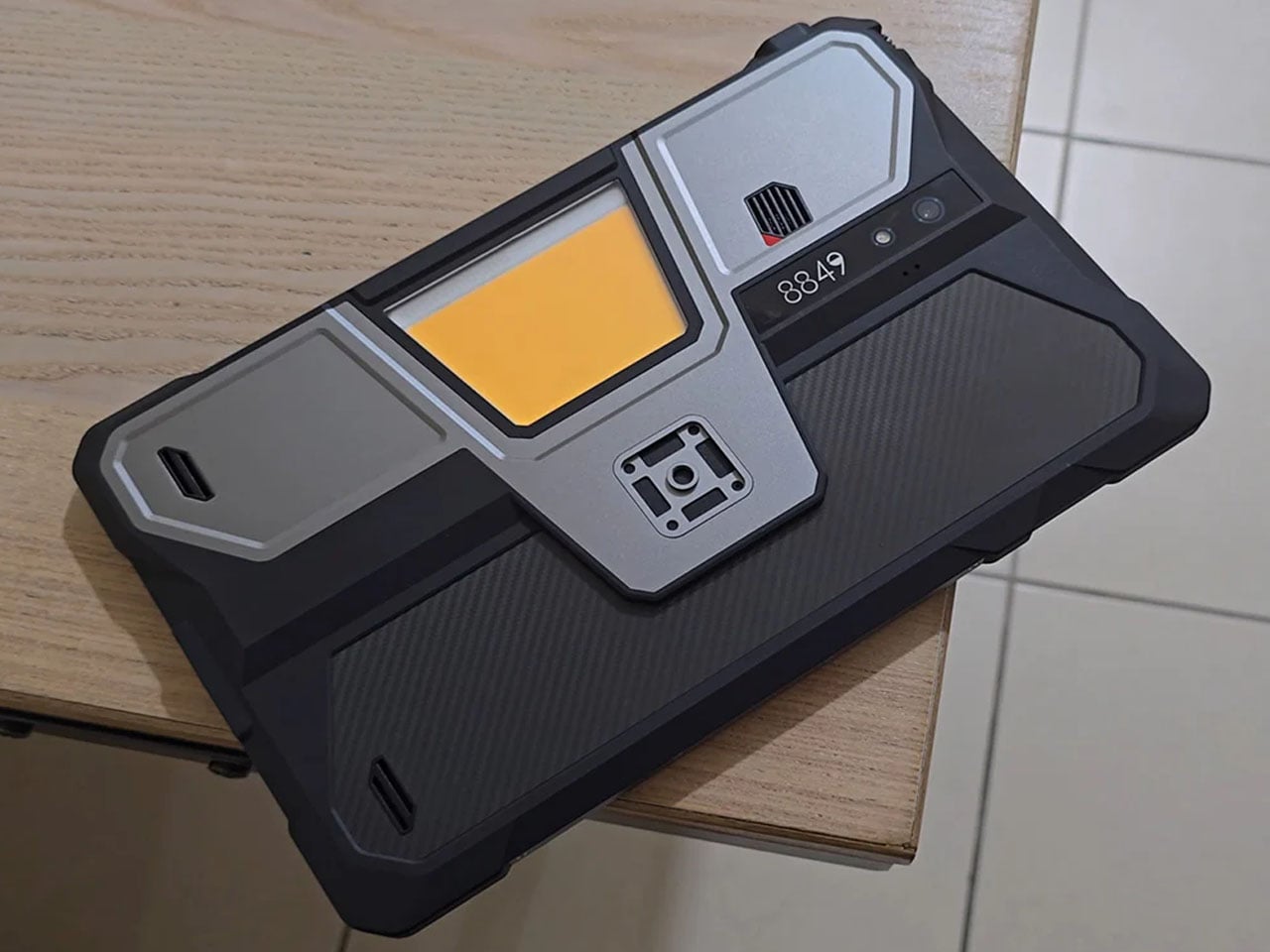
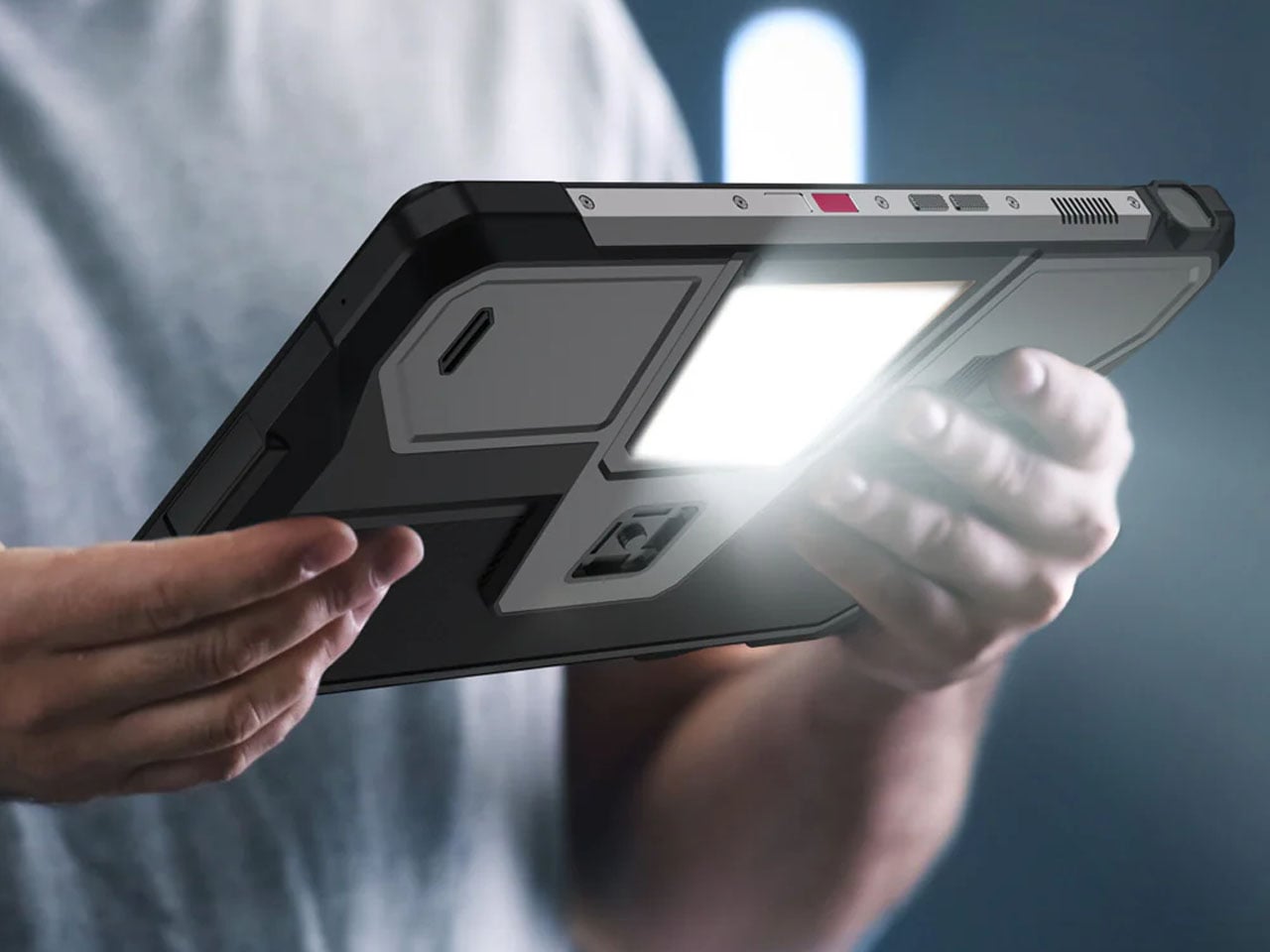
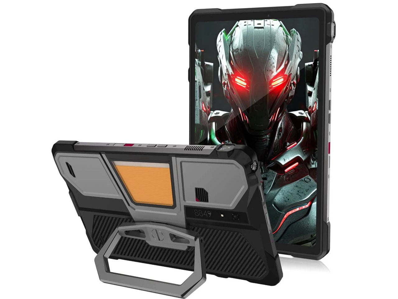
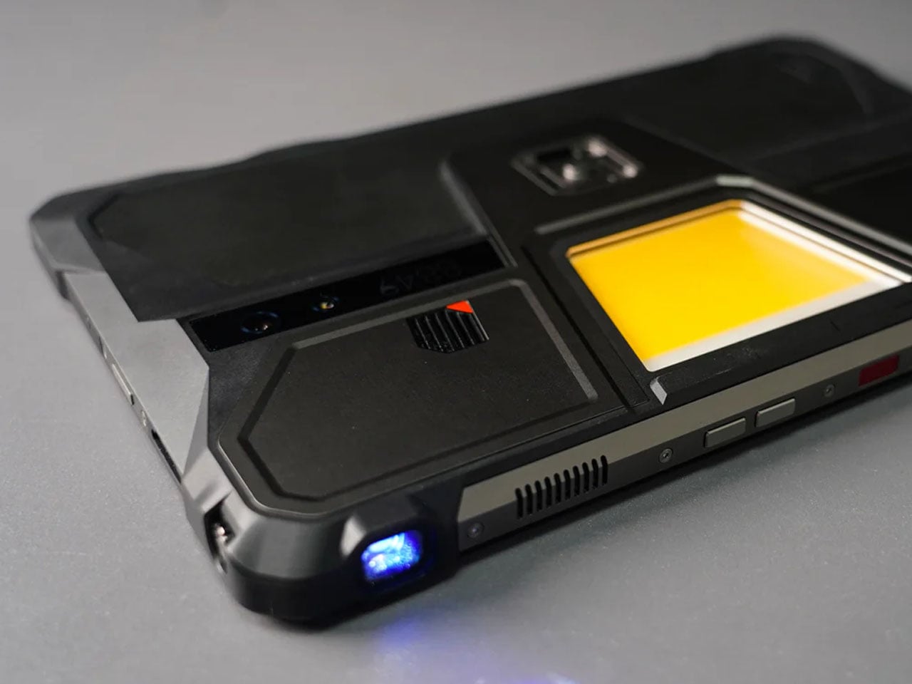
8849tech introduced the Tank Pad last year, leaving the tech world in awe. With the ability to double as a projector, the rugged tablet leapt beyond the already highlighted multitasking capabilities of a normal tablet. Now the beast is back in an improved version to polish out the kinks of the OG version, adding more capabilities for users who demand that little extra.
The Tank Pad Ultra has the same promise of all-weather performance, reliability, and durability as its predecessor. If you’re hoping to buy a sleek, lightweight tablet, this one, weighing 1,345 grams and measuring 170.3×268.3×23.6 mm, is not for you. The device is targeted towards professionals and power users who are constantly exposed to challenging environments. Slated to launch two days from now, the rugged tablet is designed for a niche audience with a specific set of needs.
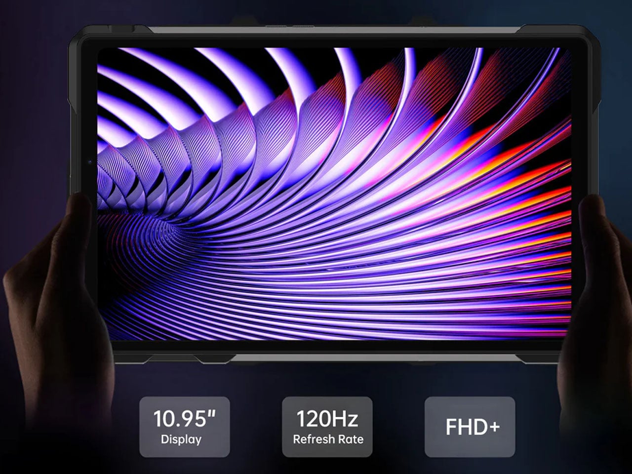
Specifications are the key here as the tab boasts a 10.95-inch, 1920 x 1200 pixel display, which is better than the previous version. Powering the gut is a MediaTek Dimensity 8200 processor, which is a tad slower than the Tank Pad, which has a Dimensity 8300 processor. To support multiple open apps, the 16GB RAM and storage capacity of 512GB (expandable via a microSD card) make things easy for users. Coming onto the integrated DLP projector, it has a 1920 x 1080 pixel resolution. 260 lumens of brightness and auto-focus support. These numbers are technically better than the Tank Pad, which has a 854 x 480 pixel resolution and 100 lumens maximum brightness.
The battery also gets a bump up to 23,400 mAh from the previous 21,000 mAh in the original model. However, both have support for 66W charging, which should be enough to juice up the device for short bursts or power usage in case charging options are limited out in the wild. The Tank Pad Ultra comes with a USB 2.0 Type-C port and the ability to reverse charge your other gadgets. For people who are all-in for a wired multimedia experience, the 3.5mm audio jack is a welcome addition. Since the tablet is going to be used out in unknown environments, it comes loaded with a gyroscope, accelerometer, compass, ambient light sensor, and distance sensor. It also comes with an independent camping light built in to explore in the dark hours.
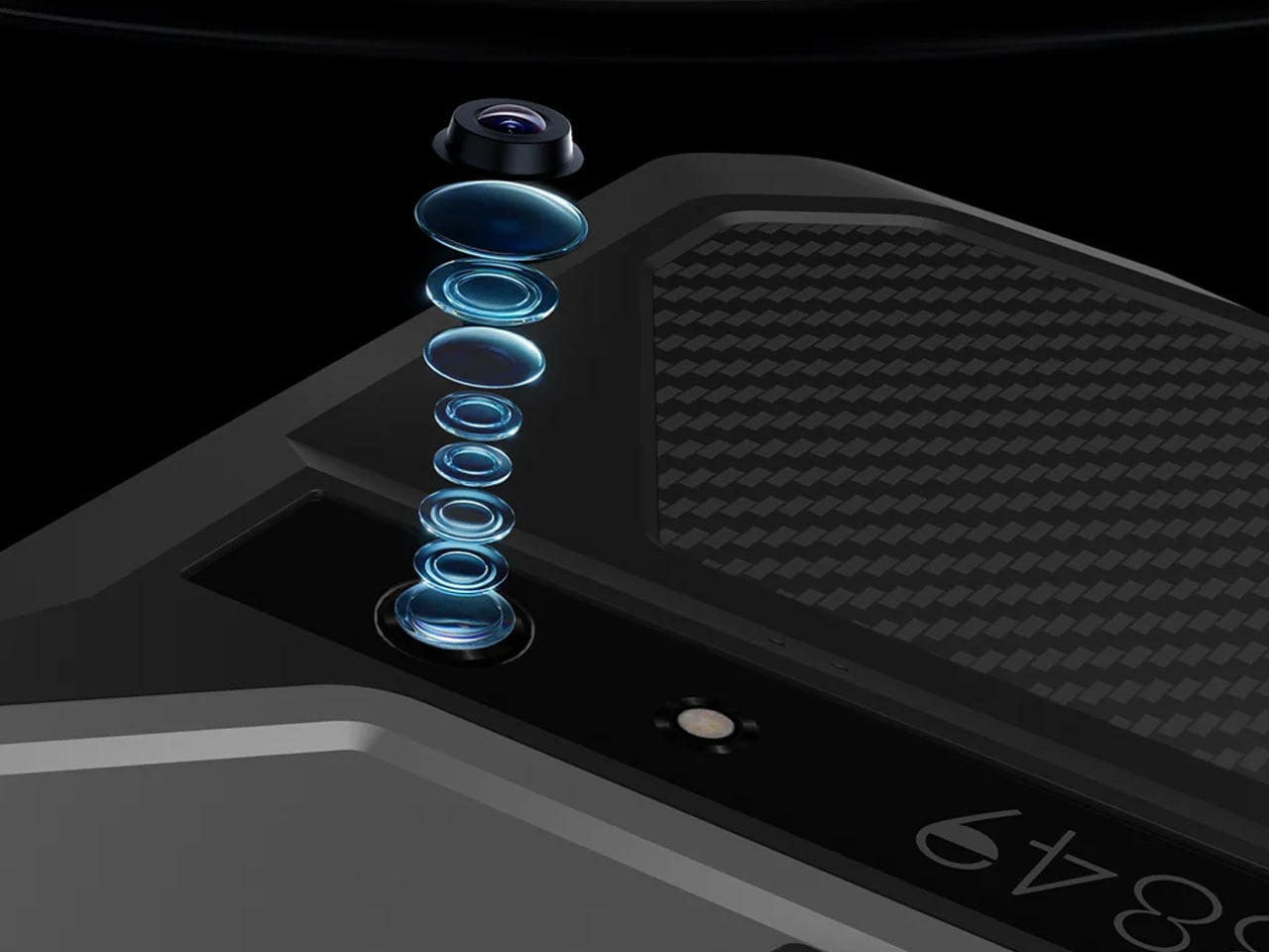
Of course, a mobile device needs to have shooting capabilities, so the Tank Pad Ultra has a 50MP primary camera (with Sony IMX766 sensor) for daylight shooting and a 64MP night vision camera (OV64B) for more awareness of the environment in the dark hours. In the mix is a 32MP front-facing camera (IMX616 sensor), which is potent enough to take video calls in high quality. 8849 has included dual nano SIM card slots with support for 5G NR and 4G LTE networks, which is essential in inhospitable conditions. For a more laid-back connectivity when you arrive back home, the tab has WiFi 6, Bluetooth 5.3, and NFC support.
There’s no word yet on the pricing of this rugged tablet, but going by the price of the previous model, it should be around $550. That information should present itself in a couple of days when the tablet is finally launched.
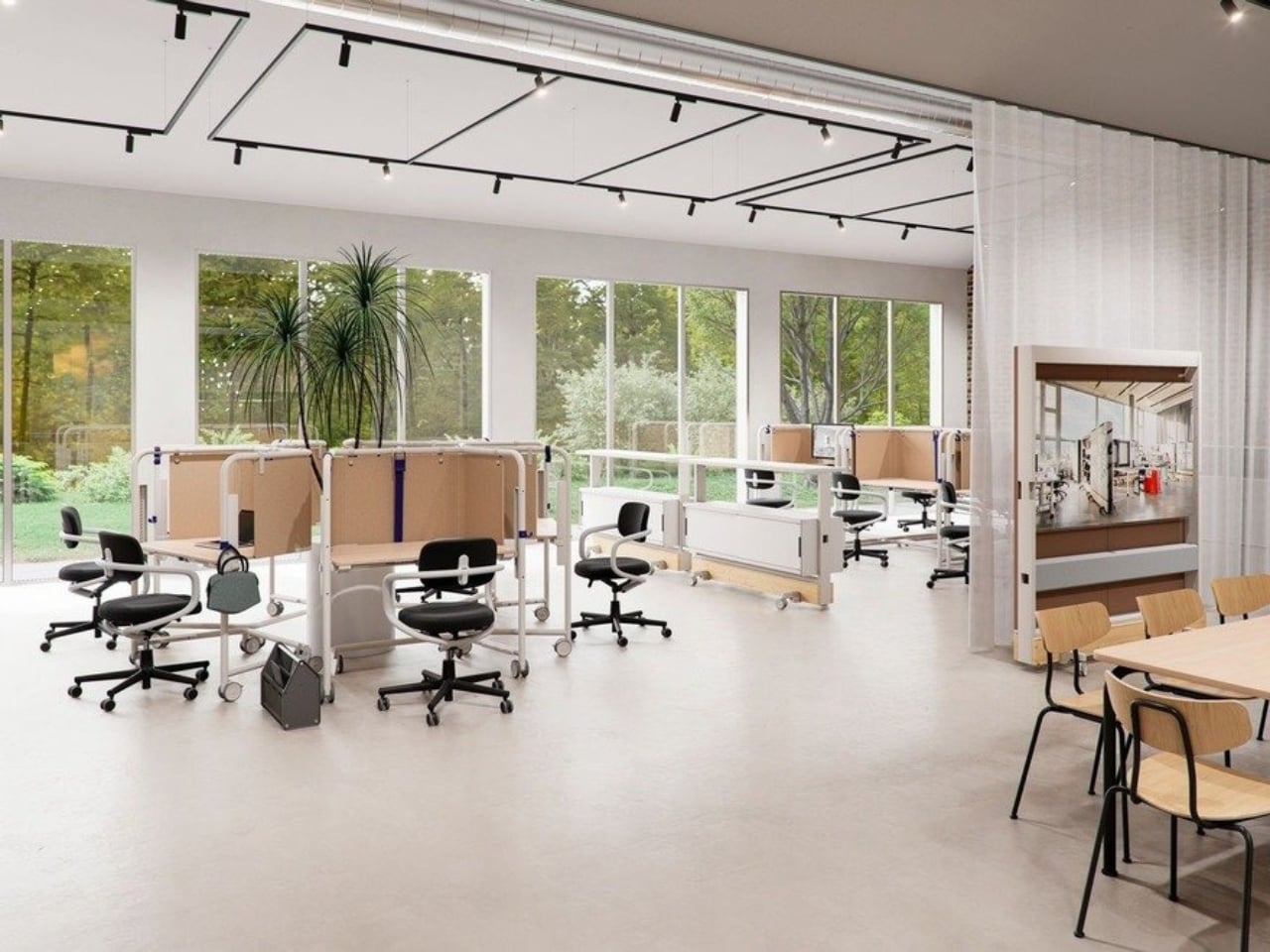
We’ve been designing office desks essentially the same way for decades. Four legs, a flat surface, maybe a drawer if you’re lucky, and an ergonomic chair that costs more than your first car. So when Vitra and German industrial designer Konstantin Grcic quietly dropped the Scout Work Mobile just last month, I paid close attention.
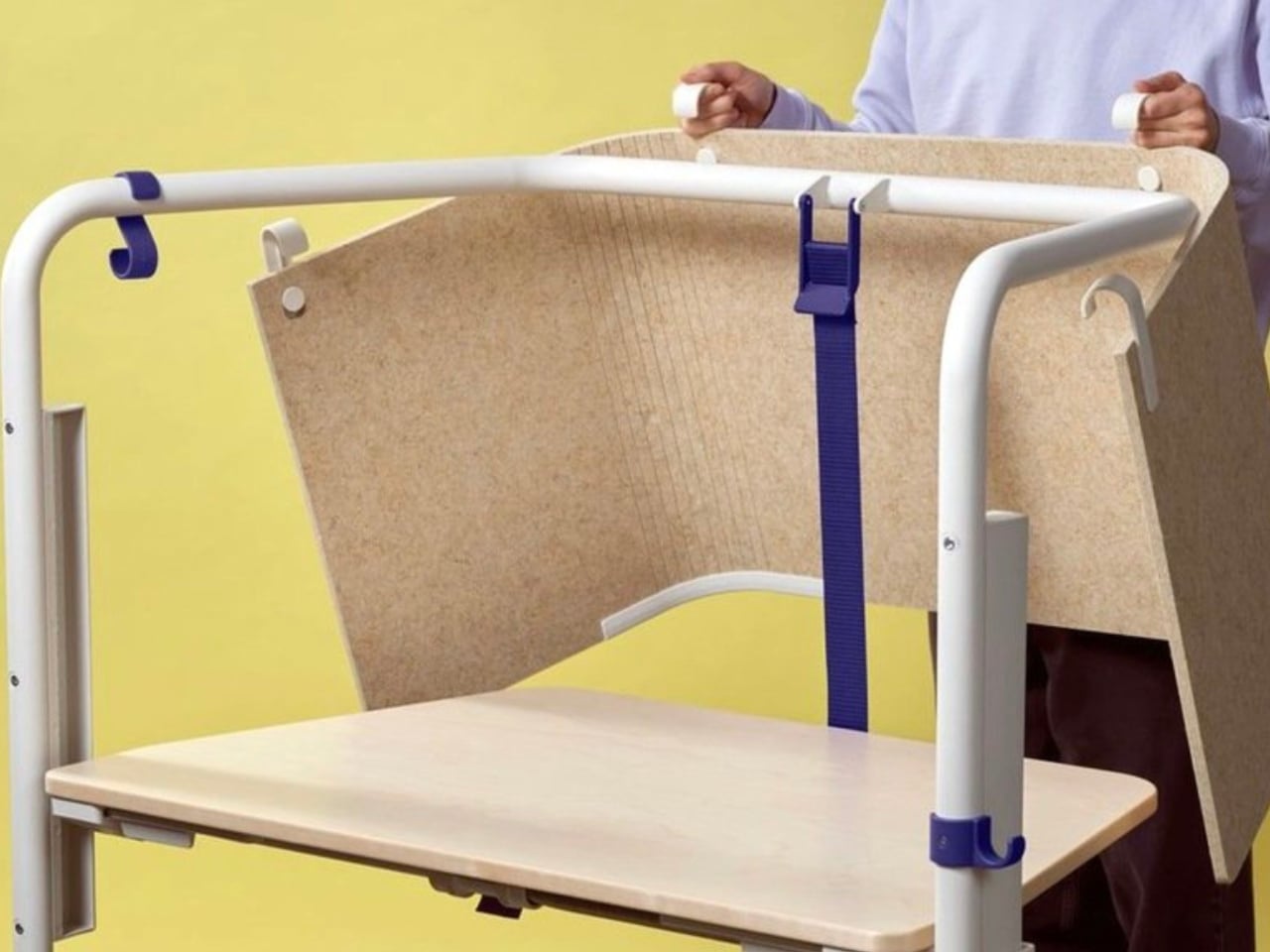
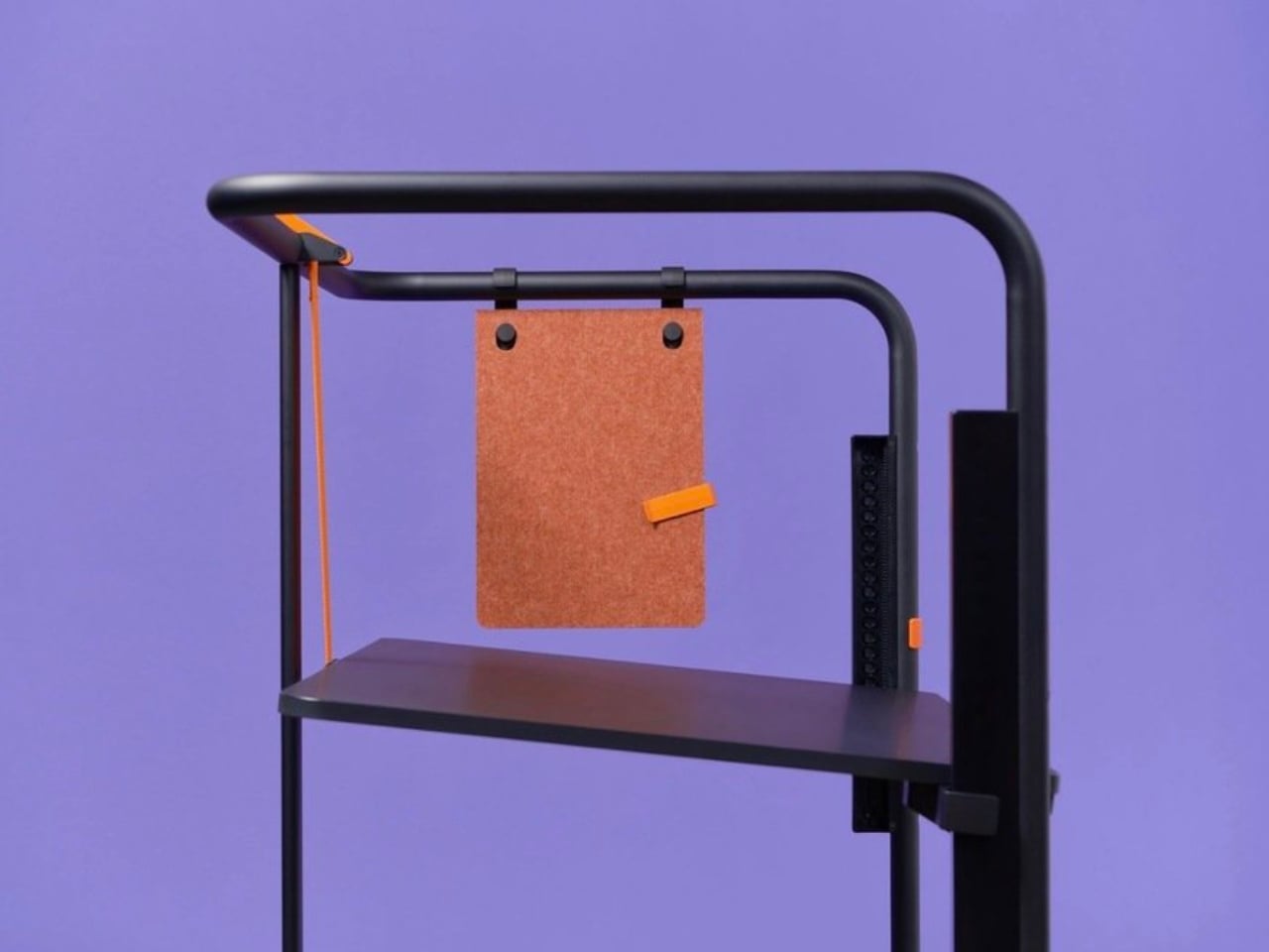
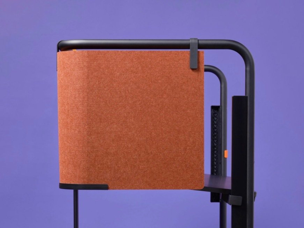
The Scout Work Mobile is part of a larger family of workstation and meeting tables simply called Scout, launched on March 19 of this year. The collection comprises five pieces ranging from stationary desks to mobile variants, and it’s Grcic’s response to how offices actually function today versus how they were designed to function twenty years ago. The Scout Work Mobile is the one that caught my eye: a compact, trapezoidal desk on wheels with a tubular steel frame that rises up and encircles the work surface.
That frame is the whole story, really. It’s not decorative. It’s not there to look good in a mood board (though it absolutely does). The frame acts as a grab handle when you’re rolling the thing across a room, a mounting point for privacy screens, and a place to hang accessories. Without any attachments, it still creates what Vitra describes as a “room-within-a-room” effect, a bit of visual and psychological separation from whatever chaos is happening around you. For those of us who’ve had to MacGyver focus time in open-plan offices using noise-cancelling headphones and pure denial, that feels like a genuine design insight rather than a marketing afterthought.
Grcic is known for what Vitra calls a “severely simple” aesthetic. He doesn’t add things for the sake of adding them, and the Scout Work Mobile reflects that clearly: the height adjustment and tilting function work entirely without electricity. No motors, no app, no firmware updates required. It adjusts by hand. That might sound unremarkable, but compared to the increasingly tech-dependent office furniture being released right now, it reads almost like a radical statement.
The mobile aspect of Scout is where the design really earns its name. Return-to-office mandates are reshaping how companies think about their physical spaces, and the rigid assigned-desk model is quietly becoming a liability. Hot-desking, collaborative hubs, project clusters, training rooms that double as focus spaces. Modern offices are being asked to do a lot more with the same square footage. Scout was built for exactly that kind of environment. You grab it, roll it where you need it, work, and move on. No teardown required. No reconfiguration meeting on the calendar.
Grcic put it plainly in an interview with Vitra Magazine: “The aim is not to replace what already exists. Rather, the system is an extension or complementary offering that responds to different levels and styles of work.” That kind of restraint is rare in product design, where the temptation is always to pitch your thing as the only thing. Scout doesn’t ask to own your whole office. It just wants to be useful wherever you put it.
Aesthetically, it sits in that satisfying middle ground between industrial and refined. The tubular steel frame reads as utilitarian at first glance, but the trapezoidal silhouette and deliberate proportions make it feel considered rather than clinical. It’s the kind of furniture that would look at home in a forward-thinking tech company, a design school studio, or a well-curated co-working space. It isn’t trying to disappear into the background, and it certainly doesn’t need to.
What makes Scout genuinely interesting is that it treats mobility as a first principle rather than a feature tacked on after the fact. Desks on wheels have existed forever, but most of them feel like an afterthought, as if someone just bolted casters onto a standard table and called it agile. Grcic designed the Scout Work Mobile from the ground up with movement in mind, and the difference is visible in every element. Office furniture rarely makes me stop and think twice. The Scout Work Mobile managed to.
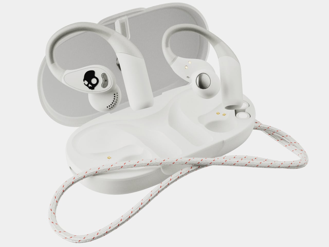
Open-ear earbuds have had a genuine moment over the past year, and it’s easy to understand why. About half of all earbud users have moved toward them, drawn by ambient awareness, ear health, and the comfort of not having anything plugged into their ear canals. The category has grown quickly, and the question now is which designs actually get it right.
The Skullcandy Push 540 Open enters that picture with a clear sense of what’s been bothering people. Thick earhooks that compete with glasses, neckbands that catch on hair and collars, and touch controls that trigger every time headwear grazes the sensor aren’t fringe complaints; they’re consistent ones. Skullcandy took that feedback and built the 540 Open around fixing each of them.
Anyone who has worn open-ear hooks alongside glasses or a hat knows the small but mounting annoyance of too much hardware competing behind the ear. Skullcandy trimmed the earhook thickness based on direct user feedback, and the result is a fit that holds without adding friction to whatever you’re already wearing. It’s the kind of detail you only notice once you stop thinking about it.
The neckband gets the same thoughtful treatment. Unlike rigid or snapping designs found on competing options, Skullcandy’s version drapes naturally, so it won’t fight longer hair or push against a jacket collar. When you pull it off mid-run and don’t have the case on you, the magnetic closure lets it wrap cleanly around your wrist or neck without turning into a tangled nuisance.
Think about what it’s actually like to be deep into a trail run, layered up in a gaiter and hat, headphones that have stayed put the whole time, traffic audible from a distance. That’s the version of open-ear audio the 540 Open is built for. The over-ear hanger keeps things locked in, and the open design keeps the world around you audible.
Battery life is where the 540 Open puts some distance between itself and the competition. At 10 hours per earbud with 32 more in the case, it totals 42 hours, compared to six per earbud for both the Shokz Open Fit Air and JBL Soundgear Sense. The IP44 rating and a 10-minute rapid charge round it out for full days outdoors.
For anyone who trains with a hat on, the ability to disable the touch sensors entirely is a quietly significant option. Most open-ear earbuds don’t offer it. Audio comes from 12mm dynamic drivers, and Bluetooth 5.3 with multipoint pairing means two devices can stay connected at once, so moving between a phone and a laptop mid-workout doesn’t require any extra steps.
At $99.99, it’s $20 less than the Shokz Open Fit Air and $60 less than the JBL Soundgear Sense. What’s more interesting than the price gap is that it doesn’t get there by skimping. Better battery life, a flexible neckband that cooperates with real-world dressing, and comfort details from user feedback aren’t the kind of things that make headlines, but they’re what make the difference on a long day outdoors.
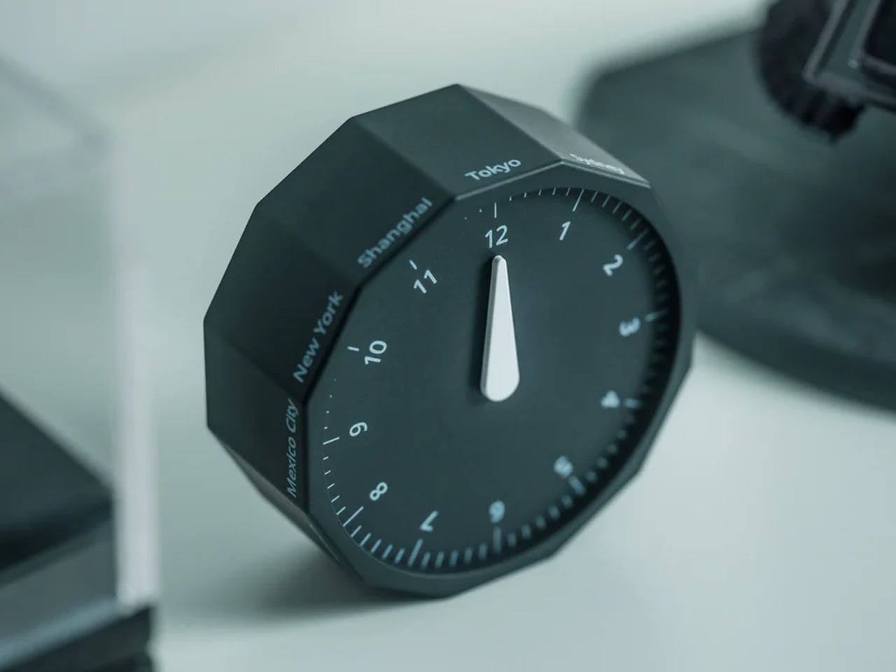
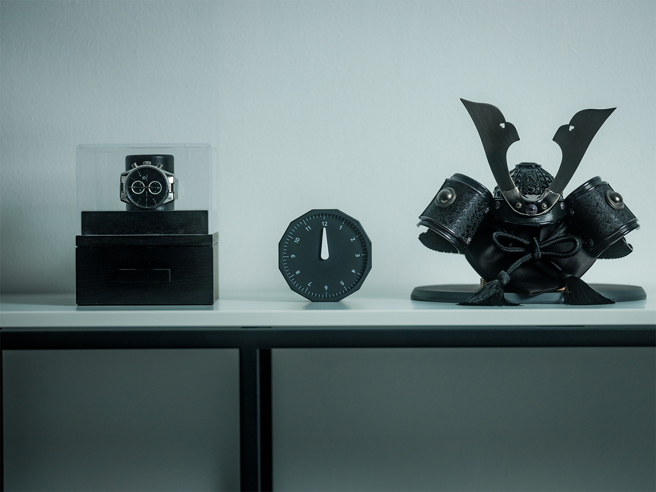
This 12-sided clock turns global timekeeping into a calmer desk ritual
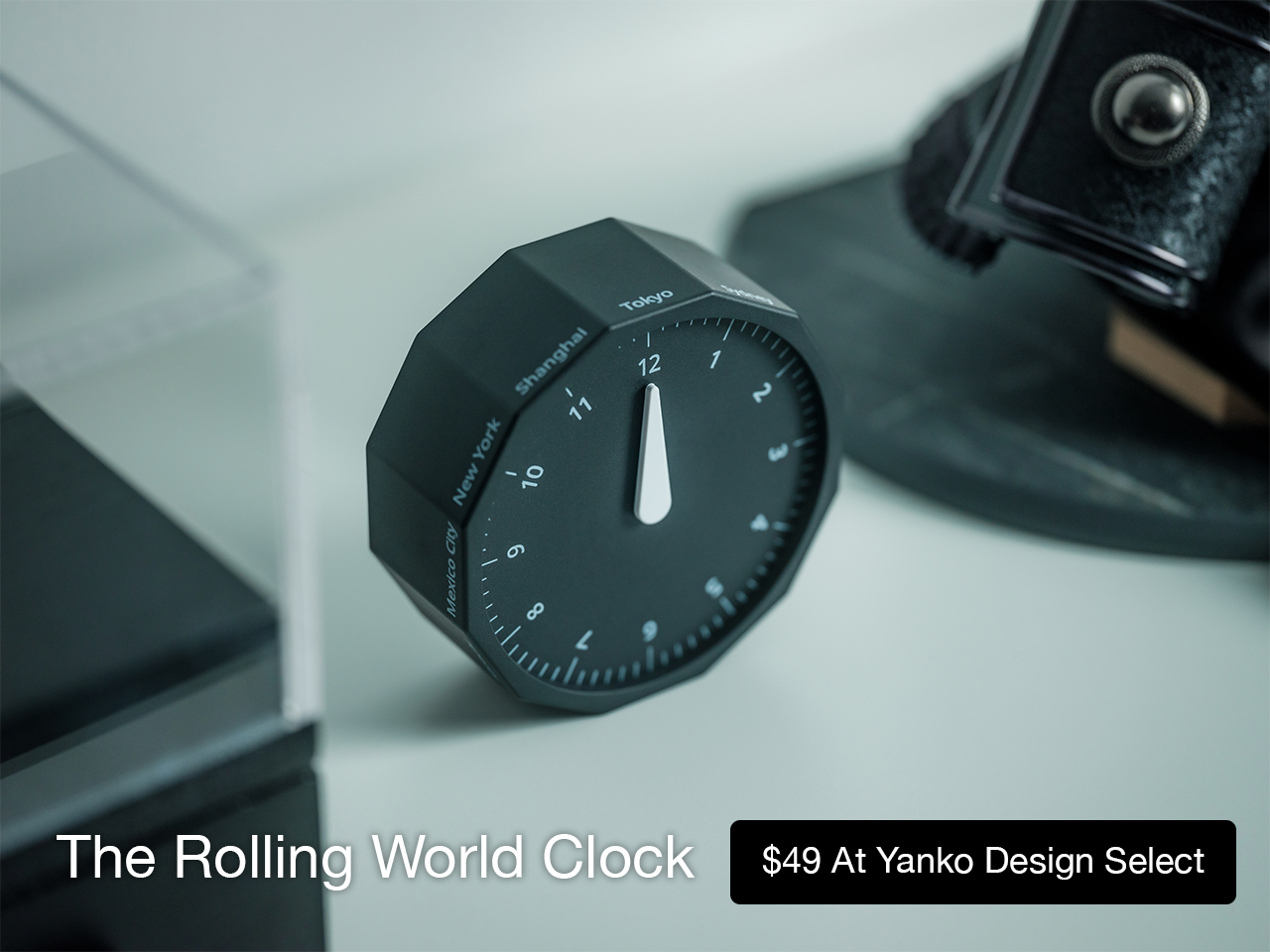
Keeping up with different time zones sounds simple until it becomes part of your everyday routine. You check your phone before a call, open another tab to confirm the hour, do a quick mental calculation, and still second-guess whether it’s too early in Tokyo or too late in New York. Not to forget the perils of push-notifications – a quick check of time leads you down a drain of doom-scrolling that you take an hour to return from! To add a layer of analog convenience in this increasingly digital setup, I present the Rolling World Clock.
Why Traditional World Clocks Never Quite Feel Right
The Rolling World Clock takes a familiar category and gives it a much smarter form. Instead of relying on screens, menus, or a row of tiny city labels, this analog desk object turns world time into a simple physical interaction. Built with 12 sides, each representing a major timezone city, it lets you roll from one location to another and instantly read the local time with a single hand. It’s a cleaner, more tactile answer to a problem that has long been solved in ways that feel unnecessarily digital.
That analog quality is a big part of the appeal. There’s a growing interest in devices that help people step back from constant digital interaction, and this clock fits neatly into that trend without feeling nostalgic for nostalgia’s sake. It still solves a modern problem, especially for people working with global teams or keeping in touch with friends and family abroad, but it does so in a way that feels grounded and human. You’re not swiping, tapping, or toggling between screens. You’re just rolling the object in your hand and reading the time.
Built for modern routines, expressed through simple interactions.
The city lineup also makes it genuinely useful. The 12 sides cover major global time zones, including London, Paris, Cape Town, Moscow, Los Angeles, Karachi, Mexico City, New York, Shanghai, Tokyo, Sydney, and New Caledonia. That gives it enough range to be practical for a wide variety of work and lifestyle needs, whether you’re coordinating meetings, planning travel, or just trying not to message someone at the wrong hour.
Built for a More Intentional Desk
For the desk setup fanatics, there’s also a strong aesthetic argument here. The Rolling World Clock is available in black and white, two finishes that make it easy to integrate into a modern desk setup without fighting for attention. It has the kind of understated presence that works especially well for young professionals who want their workspace to feel differentiated without becoming visually noisy. It’s functional, yes, but it also reads as a design object, the sort of piece that quietly signals taste.
Clean lines, one hand, no distractions.
That balance of utility and personality is what makes this more than a novelty. If you work across cities, collaborate with clients in different regions, or simply like the idea of keeping global time visible without adding another glowing screen to your day, this clock makes a strong case for itself. It taps into a broader shift toward analog tools that feel slower, more deliberate, and more human, while still solving a very modern problem.
Feels as good in the hand as it looks on the desk.
Why It’s Worth Picking Up Now
At $49, the Rolling World Clock lands in a sweet spot for a desk upgrade that feels distinctive without being overcommitted. It also has the kind of giftable appeal that comes from being both useful and conversation-worthy. And with only a few left, it carries just enough urgency to make hesitation a risky move.
If your desk could use an object that feels smarter, calmer, and more intentional than another digital widget, the Rolling World Clock is worth grabbing now. It’s currently available in the Yanko Design Shop in black and white, and with limited stock remaining, this is one of those rare functional design pieces you probably shouldn’t wait on.
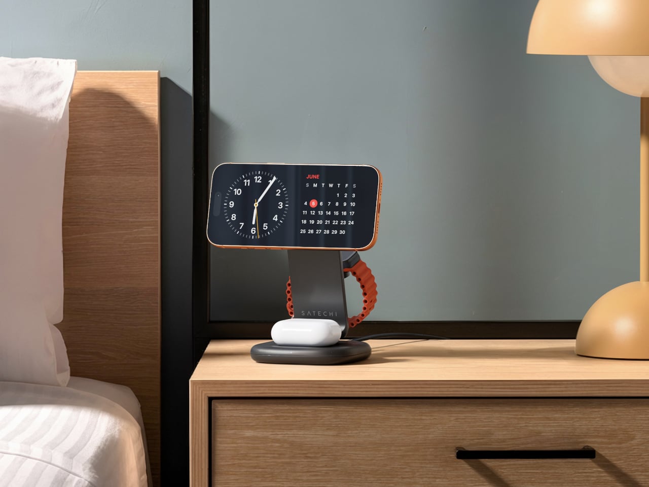
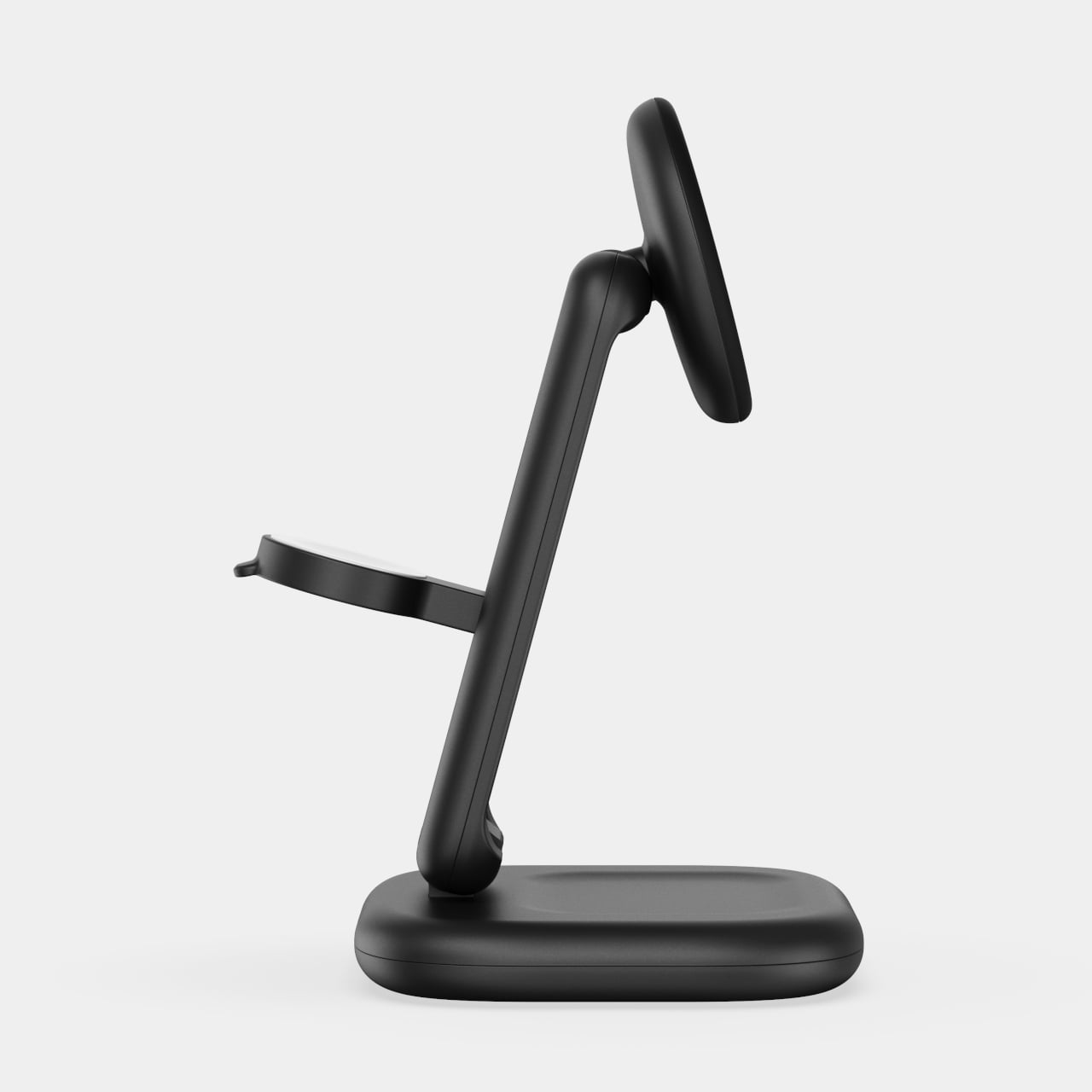
Wireless charging was supposed to simplify things. Instead, most Apple users end up with a tangle of pads and cables on the nightstand, one for the iPhone, another for the Apple Watch, and a separate spot for the AirPods. The technology meant to reduce friction has become its own kind of mess, especially for anyone who’s ever scrambled for a Watch charger before a morning flight.
Satechi’s 3-in-1 Foldable Wireless Charging Stand with Qi2 25W takes aim at that problem. The San Diego brand has updated its best-selling foldable charger with a meaningful upgrade, bumping wireless power delivery for compatible iPhones to 25W, a notable jump from the 15W ceiling most MagSafe-compatible pads have been stuck at. It’s built as a proper desktop stand, not just something you tolerate next to the lamp.
Set the phone down on the magnetic charging surface, and Qi2’s built-in alignment snaps it into position so you don’t lose power from an off-center placement. The Apple Watch sits at a comfortable angle on its dedicated fast-charge module, while the AirPods rest on their own pad below. All three charge simultaneously from a single cable going to the wall, with nothing to juggle.
Apple Watch fast charging requires MFi certification, and Satechi has that covered. The stand supports Series 7 and newer, including Ultra and SE models. Advanced safety protections manage heat and prevent power loss when all three pads are active at once. The magnetic surface on the phone pad also ensures it stays correctly positioned even if you accidentally nudge it during the night.
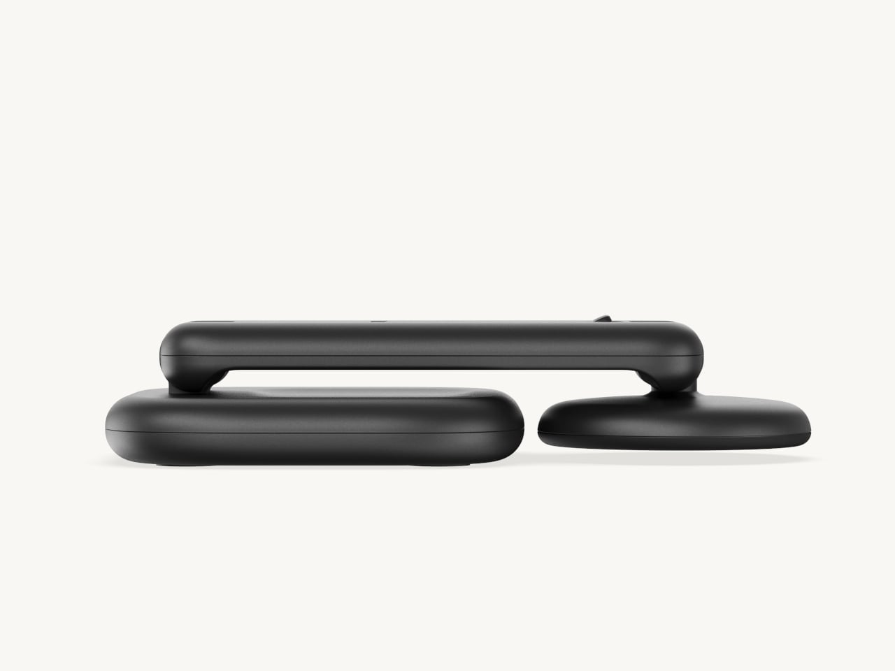
Then there’s the folding design, which is where the stand earns its keep as a travel companion. It collapses into a flat form that fits easily in a carry-on without much bulk, then unfolds into the same stable stand you’re used to at home. There’s no need to rethink your charging setup just because you’ve checked into a different room across town or across the world.
Satechi also includes a 45W USB-C power adapter in the box, which sounds like a minor detail until you’re unpacking in a foreign hotel room. The adapter ships with US, EU, and UK plug attachments, meaning it works across different countries without needing a separate travel adapter. That’s a small but thoughtful decision for anyone whose travels take them to multiple regions throughout the year.
Available now on Satechi.com and Amazon, the stand retails for $129.99 in Space Black. It’s a higher investment than a single-device pad, but consolidating three separate chargers into one that travels as well as it sits on a desk makes that gap easier to justify. For Apple ecosystem users tired of the cable pile next to the bed, this stand offers a much cleaner end to every day.
Budget smartphones have always played the same game of compromises. You get 5G connectivity but lose camera quality, or you get a fast screen but sacrifice battery life. As affordable phones adopt faster network speeds, keeping up with 5G’s energy demands has become one of the biggest challenges for manufacturers trying to keep costs down without leaving users hunting for an outlet before noon.
Realme’s answer to that is the C100 5G, a phone that doesn’t shy away from its budget origins but tries to get the fundamentals right. Built around the energy demands of a full-time 5G device, it leads with a 7,000mAh battery, backed by 45W SuperVOOC fast charging, a capable processor, and a 6.8-inch display that refreshes faster than most phones twice its price.
Designer: realme
Imagine the kind of day that drains most smartphones by mid-afternoon. You’re streaming music during your commute, navigating with GPS through unfamiliar streets, and then spending the evening on video calls or catching up on a show. Realme claims the C100 5G can handle nearly 20 hours of continuous video playback and over 18 hours of GPS navigation before needing a recharge.
When you do eventually need to plug in, the 45W fast charging takes care of the battery fairly quickly. There’s also 6.5W reverse wired charging built in, meaning the phone can act as a power bank for other devices when you’re away from an outlet. It also supports bypass charging, which helps reduce battery strain during extended gaming or heavy usage sessions.
Under the hood is MediaTek’s Dimensity 6300, a 6nm chip that handles 5G connectivity and everyday multitasking without much fuss. The display runs at up to 144Hz, which is genuinely rare at this price point, making scrolling and casual gaming feel noticeably smoother. It peaks at 900 nits of brightness and covers 83% of the NTSC color gamut, holding up decently outdoors.
The rear camera centers on a 50MP main sensor with an f/1.8 aperture and autofocus, capable of solid daylight photography, while the 5MP front camera handles selfies and video calls without complaint. The phone comes in two colors, Blooming Purple with a floral-patterned back and Sprouting Green, both with a matte frame and a squared-off silhouette measuring about 8.88mm thick.
Durability is also factored in, with an IP64 rating for dust and water splash resistance and a claim of 360-degree drop protection with military-grade certification. Running Realme UI 7.0 based on Android 16, the phone also supports external memory cards for additional storage. In Thailand, pricing starts at THB 6,999 (around $215) for 4GB/128GB and THB 7,499 (around $230) for 6GB/128GB.
For a budget phone, the C100 5G makes an interesting case by not competing on camera specs or premium materials, but on the one thing most users are tired of compromising on. Not everyone needs the sharpest sensor or the fastest chipset, but nearly everyone has panicked at a single-digit battery percentage at some point, and Realme clearly knows exactly who it’s building this for.
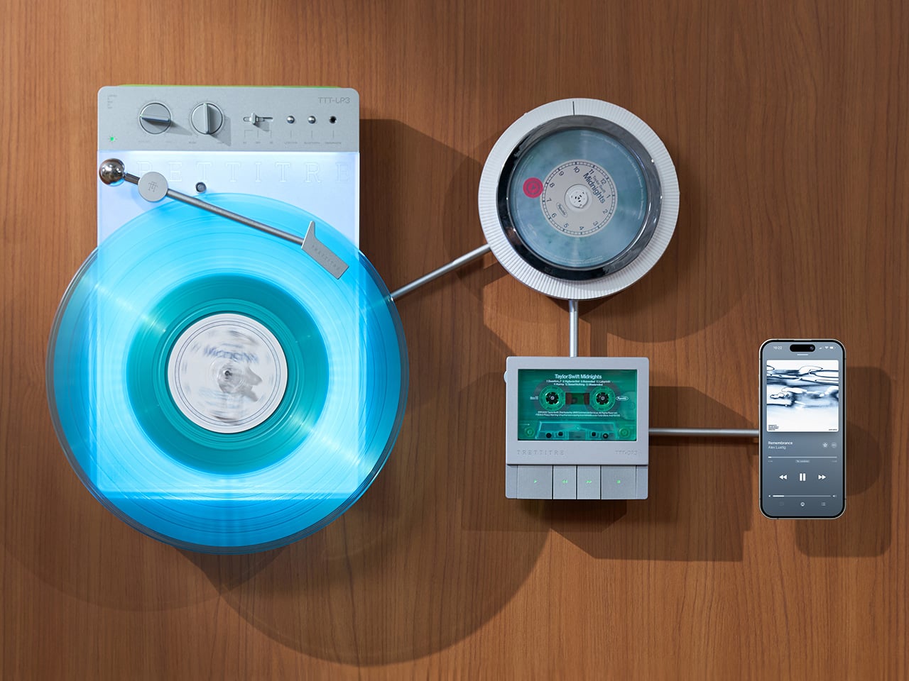
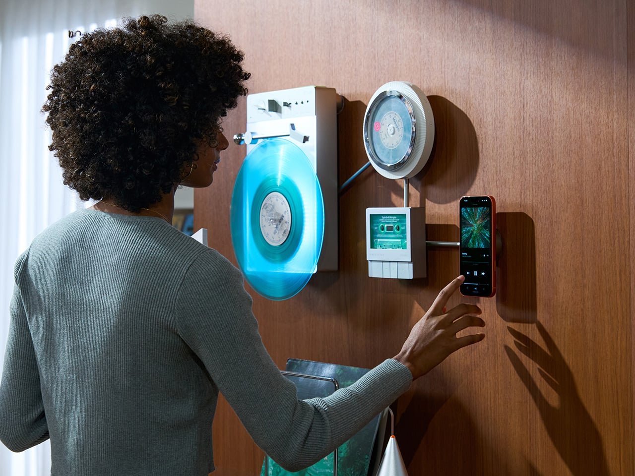
Minimalism in product design has gotten boring. We’re swimming in smooth white rectangles, touch controls that offer zero feedback, and devices designed to vanish. Apple spent two decades training the industry to sand away every visible seam, and now we live in a world where a Bluetooth speaker looks like a cylinder because a cylinder offends nobody. Bang & Olufsen understood early that audio equipment could occupy space like sculpture, could earn its place in a room through presence instead of absence. Teenage Engineering proved that mechanical honesty and playful geometry could coexist with premium materials. Both approaches work because they have a point of view.
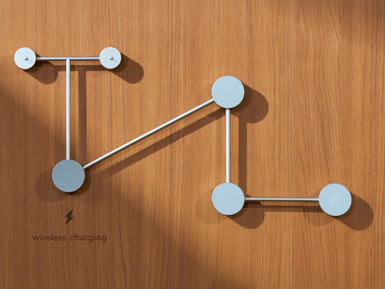
TRETTITRE’s TTT series combines those instincts into something harder to categorize. The TTT-LP3 wireless vinyl player uses CNC-machined aluminum for the main frame and features a diffused lighting panel that spreads light evenly across the surface when music plays. The TTT-DP3 Bluetooth CD player takes inspiration from a UFO-like form with a transparent magnetic cover that rotates open to reveal the spinning disc. The TTT-CP3 cassette player uses a metal housing with sharp geometric lines and mechanical transport keys that deliver clear physical response. All three mount on the TTT-W magnetic modular wall rack, turning physical media playback into a visible, functional part of interior design.
TTT-LP3: A Vinyl Player That Doubles as Ambient Light
The back of the LP3 includes a hidden mounting structure that allows it to hang directly on a wall. You can mount it vertically so the record becomes part of the visual display, or go for the classic horizontal layout. When you want to move it, you lift the silicone leather handle at the top and take it down. The player detaches easily and gives you the freedom to listen wherever you choose. Traditional turntables usually stay exactly where you put them, limiting your options for when and where you listen. The LP3 works a little differently because of the battery and the wall mount’s wireless charging system, which keeps it powered without a visible cable.
Behind the LP3 sits a diffused lighting panel that spreads light evenly across the surface of the unit. When it’s on, the entire body of the player glows softly, designed to feel closer to ambient lighting than decorative lighting. You can change the lighting effects with the touch of a button. When a record spins, the moving shadows create a quiet visual effect. You can also leave the player mounted on the wall as a soft light source even when no music is playing. That ambient quality pushes the LP3 from well-designed product into something more considered: a slow, breathing light fixture that happens to play records.
The LP3 uses a self-balancing tonearm system that automatically sets the correct pressure when the player powers on. You place the record on the platter and lower the needle, and the system handles the rest. Many turntables require careful calibration before they can be used properly, with tonearm balance, tracking pressure, and counterweight adjustment all part of the process. For experienced collectors that process can be enjoyable, but for beginners it often feels complicated. The LP3 removes that barrier entirely while preserving the tactile experience people enjoy. The player supports both 33 RPM and 45 RPM records, and includes a manual control dial that allows small adjustments to playback speed (roughly ±0.5%), useful for older records that may not spin perfectly at their original speed anymore.
Wireless audio is handled through Qualcomm Bluetooth v5.3 with SBC, aptX, aptX HD, and aptX Adaptive, which allows higher-quality and lower-latency wireless audio than basic Bluetooth streaming. For wired setups, the player also includes a 3.5mm audio output. The built-in battery provides up to 6 hours of vinyl playback or up to 3 hours when used purely as an ambient light source. Full specs: dimensions 342×233×87mm, weight 1430g, Audio-Technica AT3600L moving magnet stereo cartridge, CNC-machined aluminum frame with silicone leather carrying strap. The LP3 arrives in June 2026 for Early Bird backers, May 2026 for Fast Delivery backers.
TTT-DP3: Giving the Compact Disc Its Aura Back
The DP3 keeps the reliability of CDs but gives the player a different visual presence. The design takes inspiration from a UFO-like form with a transparent magnetic cover. When the cover rotates open, the disc is partially visible as it spins, turning something simple into a small visual moment. A CD player shaped like a flying saucer with a rotating transparent lid is an audacious idea, and it works because it doesn’t try to evoke nostalgia. It reframes a CD player as a mechanical object of curiosity, something you watch as much as use.
The control buttons include raised tactile dots combined with a gold-embossed finish, making it easy to identify the buttons by touch alone. You can pause or skip tracks without needing to look down at the player. A small OLED display on the player shows track numbers, playback status, and battery level. The interface is intentionally simple so the information you need is visible immediately. A built-in battery allows the DP3 to run for several hours on its own, so you can move it from room to room, bring it to a small gathering, or take it while traveling. Full specs: Ø170×27mm, 324g, supports CD-DA and HDCD formats, Bluetooth 5.4, SNR >70dB, THD <3%, ABS+PC+Metal construction. The DP3 ships in May 2026.
TTT-CP3: Cassette Hardware for Modern Audio Setups
The CP3 keeps the tactile mechanical elements people associate with tapes while updating the electronics inside. The player uses a metal housing with sharp geometric lines that give it a distinctly industrial appearance. Instead of trying to imitate retro plastic designs, the CP3 leans into a more modern interpretation of cassette hardware. The playback controls use independent mechanical keys similar to piano keys. Each press has a clear physical response. Play, rewind, and stop feel deliberate instead of soft or mushy.
Inside the CP3 sits a Bluetooth module that allows cassette audio to stream wirelessly to speakers or headphones. The player decodes analog audio signals with high precision, helping reduce background noise and preserve more detail from the original recording. The result still sounds like cassette tape, but with greater clarity. Full specs: 122×120×32mm, 360g, supports Type I-IV cassette cartridges, Bluetooth 5.4, SNR ≥55dB, THD <3.5%, Metal+PC+ABS construction. The CP3 ships in May 2026.
When Storage Becomes Part of the Spectacle
The TTT-W Magnetic Modular Wall Rack uses an all-metal geometric structure that allows multiple TTT players to be arranged into a clean wall display while keeping them organized and ready to use. The rack integrates magnetic alignment and wireless charging for the vinyl player, so the LP3 can stay powered without visible cables while being part of the room’s design. Two configurations are available: a T-shaped rack (263×196×27mm, 300g) and a magnetic modular wall rack (612×302×27mm, 775g, combined style T+3). Both support wireless charging at 5-10W and use USB-C 5V 2A input.
The Supporting Cast, from Sculptural Speakers to Planar IEMs
TRETTITRE offers a range of add-ons designed to complement the TTT system. The TreSound1 Speaker arrives in concrete and wooden editions, delivering 2×30W + 1×60W output power with a 1″ tweeter, 2.75″ mid-range, and 5.25″ subwoofer for 30Hz-25KHz frequency response. The conical speaker features 360° surround sound, Bluetooth 5.2 with Qualcomm aptX HD, and a sculptural form that occupies space like a piece of furniture. The TreSound Mini is a portable Bluetooth speaker with a 5200mAh battery, 30W RMS output, and 360° surround sound. The TTT-E3 in-ear headphones use a 13mm planar magnetic driver with a 4-strand silver-copper hybrid conductor, available in 3.5mm and 4.4mm configurations. An aluminum alloy side table (300×300×750mm, 1.75kg, max load 50kg) rounds out the ecosystem.
What It Costs to Build the Setup, and When It Ships
The TTT-LP3 wireless vinyl player is available at $229 for Early Bird backers (June 2026 delivery), down from a planned $449 MSRP. The TTT-DP3 Bluetooth CD player is priced at $79 standalone ($179 MSRP), while the TTT-CP3 cassette player is also $79 standalone ($199 MSRP). If you’re a bonafide audiophile, a $399 bundle gets you all three devices. Optional add-ons include the TreSound Mini Bluetooth Speaker at $169 ($299 MSRP), TreSound1 Wooden Edition at $449 ($659 MSRP), TreSound1 Concrete Edition at $499 ($799 MSRP), TTT-E3 planar IEMs at $139 ($239 MSRP), and the TTT Side Table at $89 ($199 MSRP). The campaign runs through April 9, 2026, with worldwide delivery beginning May 15, 2026.
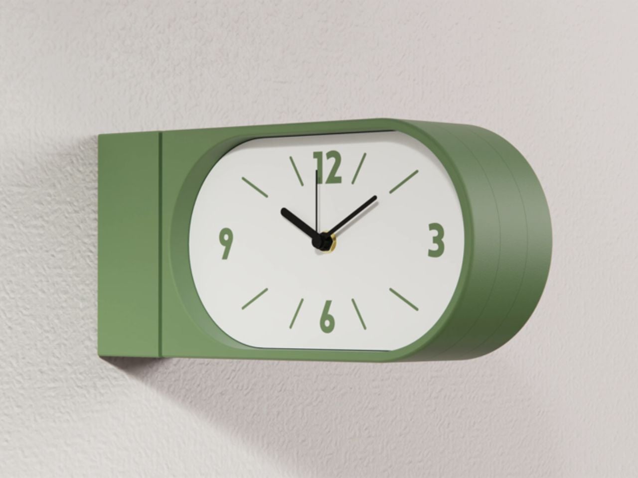
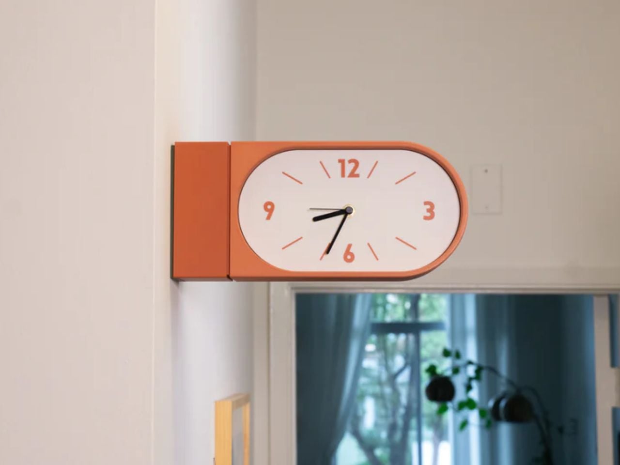
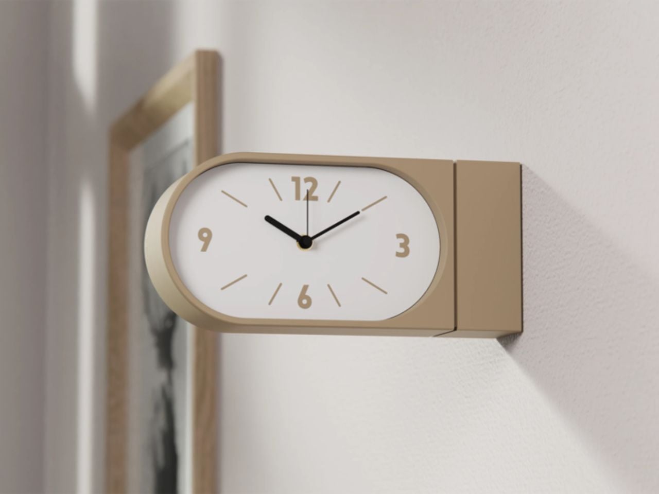
Double-sided wall clocks are not new. They have existed for decades, quietly moving between public and private spaces. While many people associate them with railway stations and institutional corridors across Europe, they also made their way into homes in earlier times, often as decorative yet functional pieces in hallways or larger living spaces. Over time, however, they faded out of domestic interiors, replaced by flatter, more minimal wall clocks designed to sit quietly against a surface.
Turin-based brand Goofball is bringing this format back, but with a distinctly modern lens. Their Perch clock does not just revive an old idea; it reframes it for how we live today.
At first glance, the concept feels familiar. A clock that extends out from the wall, visible from both sides. But in a home setting, this simple shift changes everything. Instead of being something you look at from one fixed position, the clock becomes part of how you move through a space. Whether you are walking into a room, passing through a corridor, or glancing back as you leave, time is always within sight. It feels less like an object placed on a wall and more like something integrated into the rhythm of the room.
The functional decisions are just as thoughtful. The clock runs on two AA batteries, which means there is no need for wiring or complicated installation. It hangs on a bracket and can be easily lifted off when the batteries need to be changed. It is the kind of detail that you might not notice immediately, but it makes living with the product feel effortless.
Visually, the Perch clock embraces minimalism in a way that feels warm rather than clinical. It comes in three colors, allowing it to blend into different interiors while still holding its own presence. The design is clean and restrained, making it suitable for contemporary homes, yet it carries a quiet reference to its past. There is something unmistakably reminiscent of old railway clocks, those objects that once defined shared notions of time and movement.
That sense of nostalgia is part of its charm. It brings a subtle character into a space without feeling overly decorative. It introduces depth to a wall, quite literally, and creates a small moment of curiosity. Guests notice it. People interact with it differently. It becomes a conversation piece without trying too hard.
What makes this product particularly compelling is how it challenges a default assumption. We have grown used to thinking of wall clocks as flat, one-directional objects. This design questions the norm and reminds us that even the most familiar objects can be reimagined.
The response so far reflects this shift in perspective. The first batch sold out quickly, suggesting that people are ready for products that feel both nostalgic and new at the same time. Goofball is currently preparing the second batch, expected to be available in the coming weeks.
In the end, this clock is more than just a timekeeping device. It is a small but meaningful intervention in how we experience space. It takes something we already know, brings back its forgotten domestic presence, and gives it a contemporary voice. It does not just sit on a wall. It changes how the wall and the room around it are perceived.
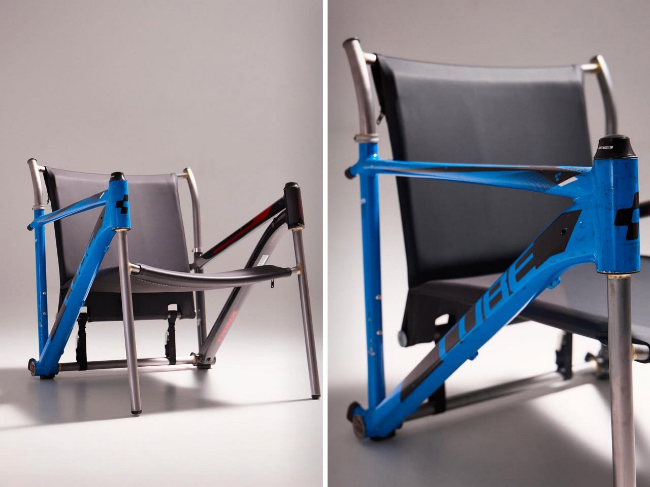
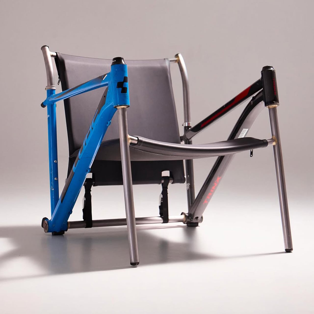
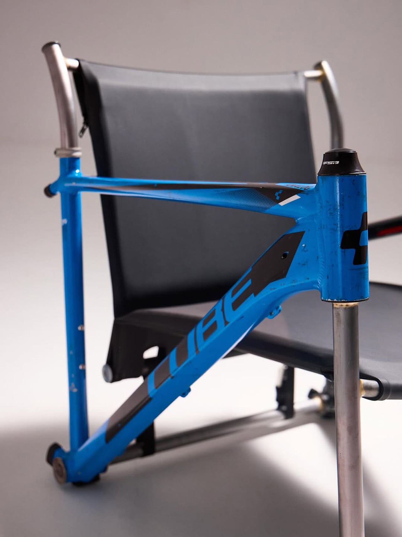
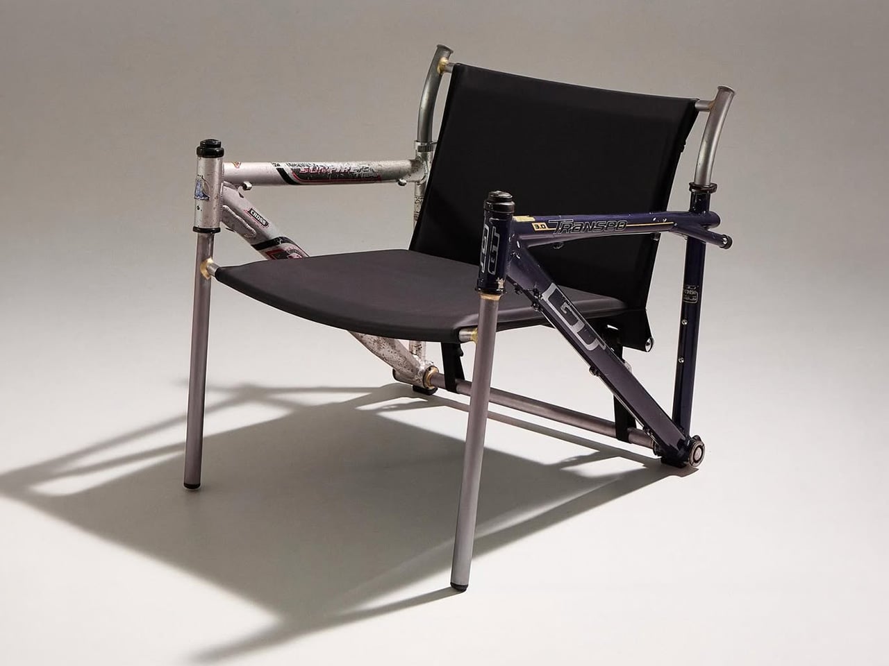
Most upcycling projects ask you to forget what something used to be. Omri Piko Kahan’s bike frame chairs ask the opposite. The geometry is still unmistakably a bicycle frame, the head tube, the top tube, the triangulated rear triangle, all of it present and accounted for, just oriented sideways and asked to hold a person instead of propel one. Kahan, an industrial designer based in Israel, builds lounge chairs from pairs of retired frames, and the whole point is that the donor material remains fully readable, repurposed without being disguised.
Structurally, the approach is clean and considered. Each frame pair is positioned symmetrically, fork and chainstay ends touching the floor as legs, the top tube running horizontally as an armrest. A slung seat and backrest in leather or canvas complete the form. The result has the relaxed posture of a Barcelona chair and the material honesty of something that was clearly built, not styled.
Designer: Omri Piko Kahan
Bicycle frames are absurdly overbuilt for what Kahan is asking them to do. A modern aluminum road frame is engineered to survive repeated impact loads from a rider pushing 300 watts through rough tarmac, and it does that while weighing somewhere between 1,000 and 1,400 grams. The structural surplus in that kind of engineering is enormous, which is why two of them positioned as a chair frame and asked to support a seated adult is, from a load-bearing standpoint, almost comically within spec. The geometry does the rest. Bicycle frames already resolve forces through triangulated sections, and a lounge chair asks for exactly that kind of lateral and compressive stability.
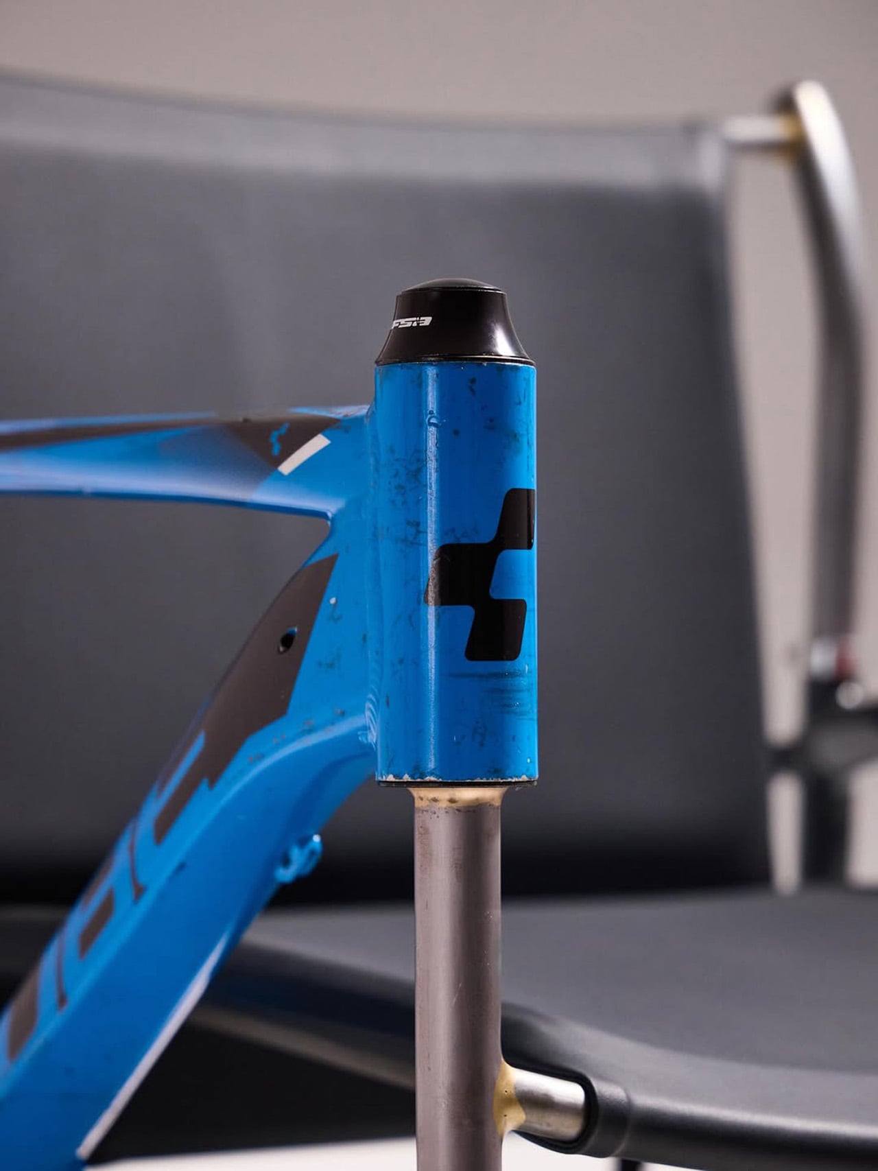
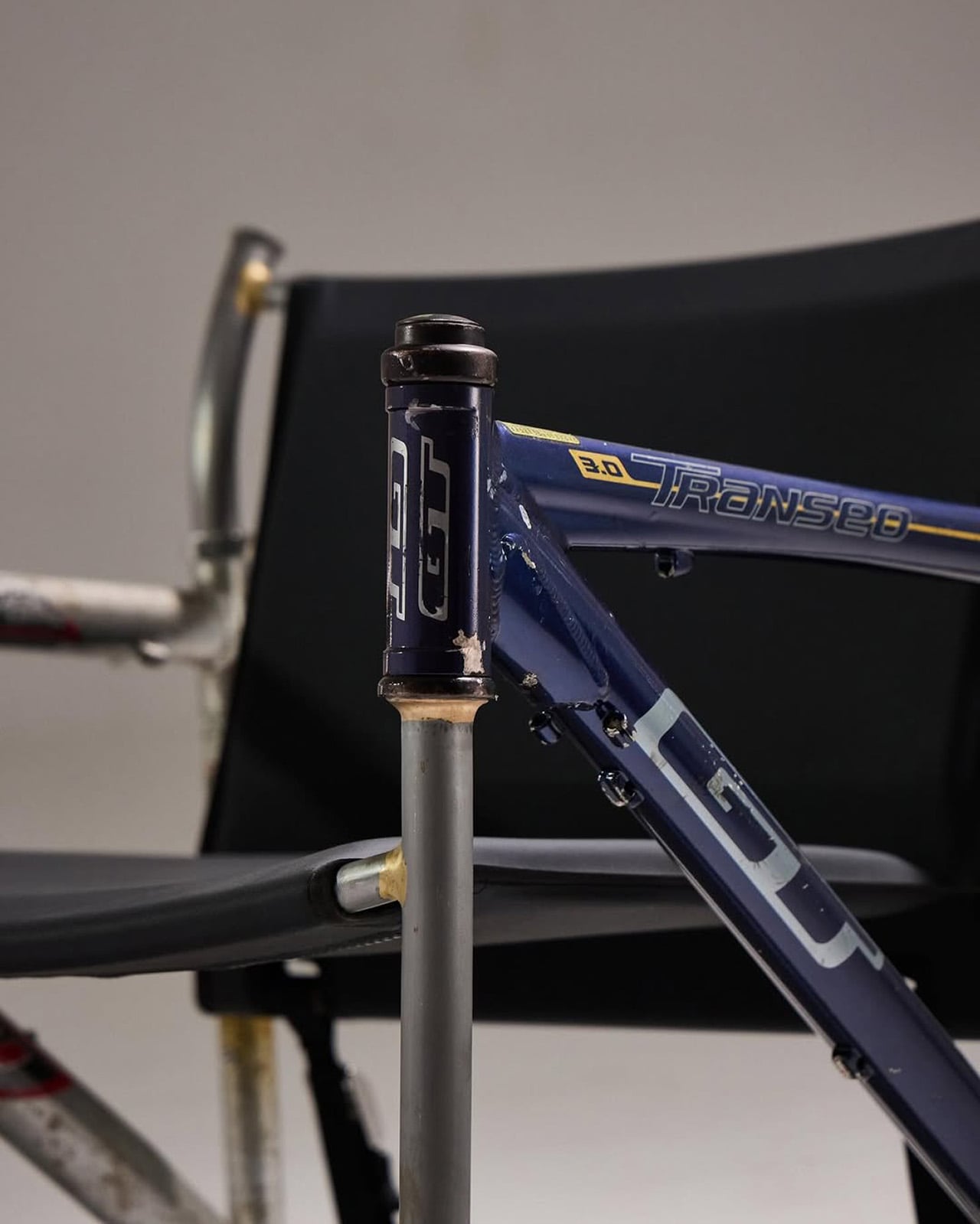
What Kahan has figured out is the orientation problem. Flip a frame on its side and the existing tube angles don’t automatically produce a useful chair geometry. The fork legs and chainstay ends need to hit the floor at the right height relative to each other, the top tube needs to land at armrest height, and the whole thing needs to produce a seat rake that doesn’t pitch you forward or swallow you whole. The matched top tube angles across both frames in the Cube and Trek build suggest this took real iteration, because they align with a precision that reads as deliberate rather than lucky. Filed fillets at the junctions and a custom setback upper support holding the sling confirm someone was paying close attention to finish quality.
The two builds photographed so far, one pairing a blue Cube road frame with a Trek, another combining a GT Transeo 3.0 with what appears to be a Supreme-branded MTB frame, show how much the donor bikes drive the final character of each piece. The GT build in particular has a longer wheelbase geometry that gives the chair a wider, more reclined stance than the Cube version. Kahan is taking custom orders, with pricing worked out per commission, which makes sense given that no two donor frame combinations will produce the same structural or ergonomic outcome.
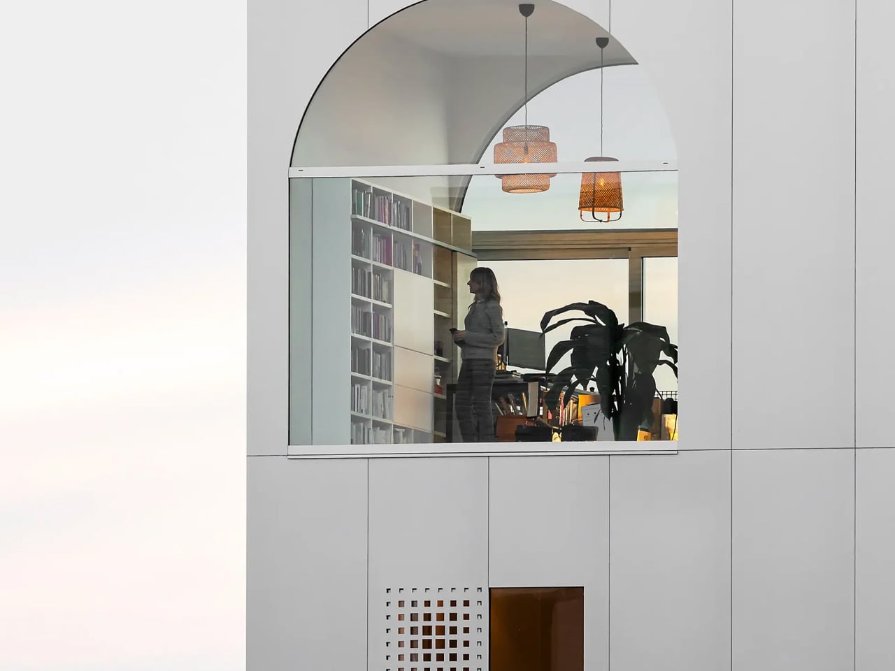
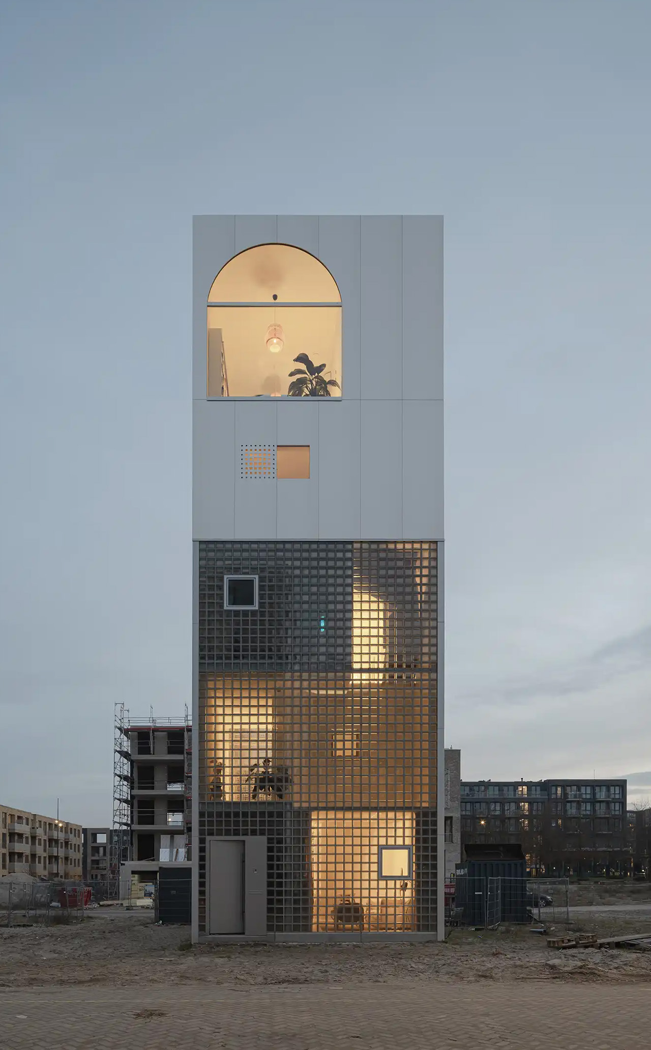
What does a home look like when you throw out the floor plan entirely? For Amsterdam-based firm Studioninedots, the answer is a tower of playfully stacked boxes, each one dedicated to a single moment in life, that rises above one of the Dutch capital’s newest neighborhoods. Completed in 2025, Light House sits on Centrumeiland, a newly developed artificial island district defined by its self-build culture and strong sustainability ambitions.
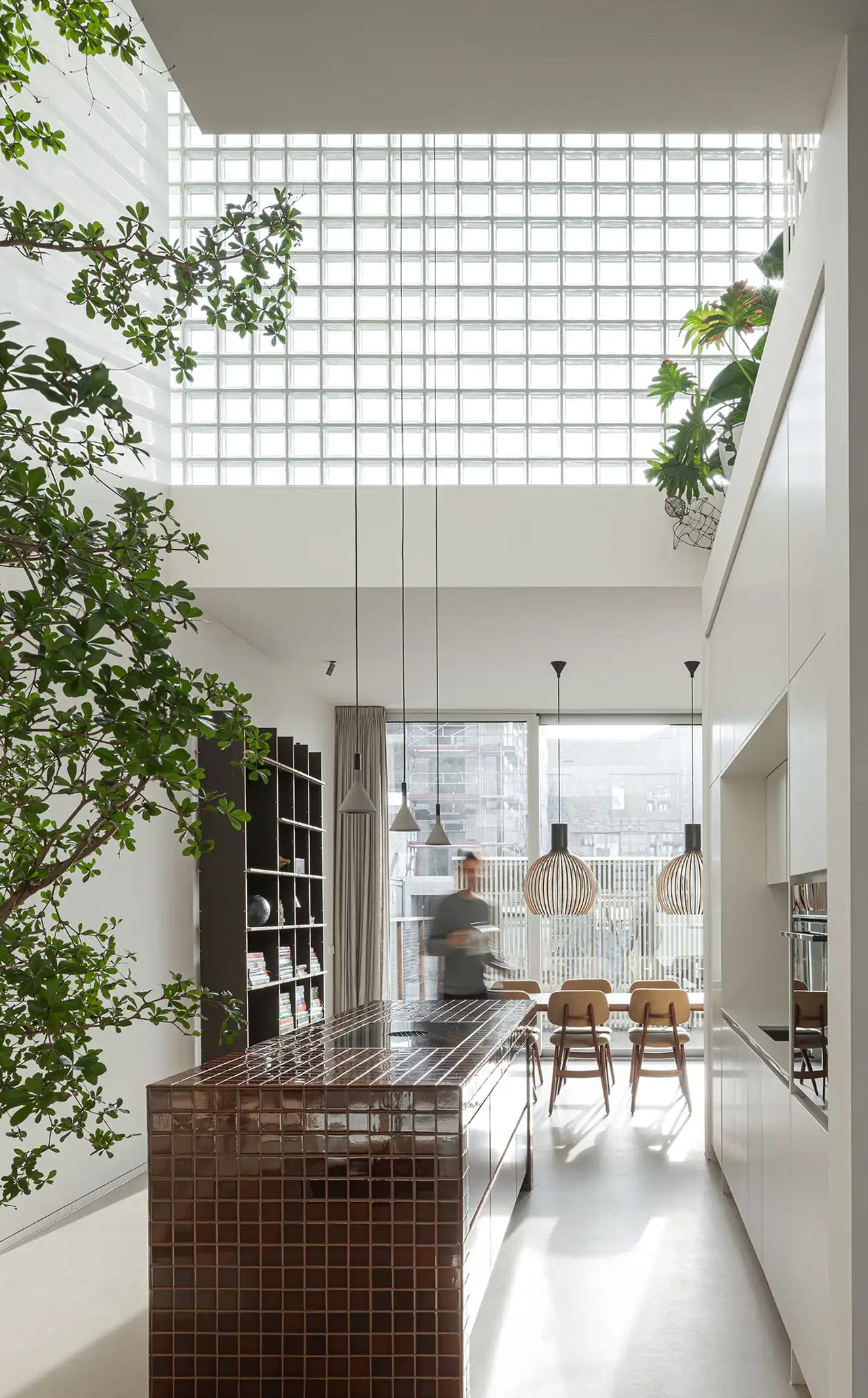
The project began with a simple brief from a couple with two children who wanted a home that would genuinely bring them together. Rather than anchoring daily life to the ground floor the way most houses do, Studioninedots dedicated each of the family’s key activities — eating, gathering, cooking, relaxing — to its own distinct volume, then arranged those volumes vertically into a single, tightly considered composition. The result is a 257-square-meter residence that feels less like a stacked building and more like a small vertical neighborhood.
Movement through the home unfolds through a sequence of open passages and compressed zones, where shifts in scale produce entirely different spatial moods. Smaller, enclosed areas carve out space for focused, quieter activities, while larger voids open up visual connections across levels, dissolving any conventional sense of what is above and what is below. Hovering above the kitchen is a sheltered, secluded volume ideal for yoga or film watching, while the journey through the house culminates at the top in what the architects describe as a “holiday home” within the city. Flanked by arched ceiling-height glass openings, this 14-metre-high gathering room commands panoramic views across the IJmeer lake.
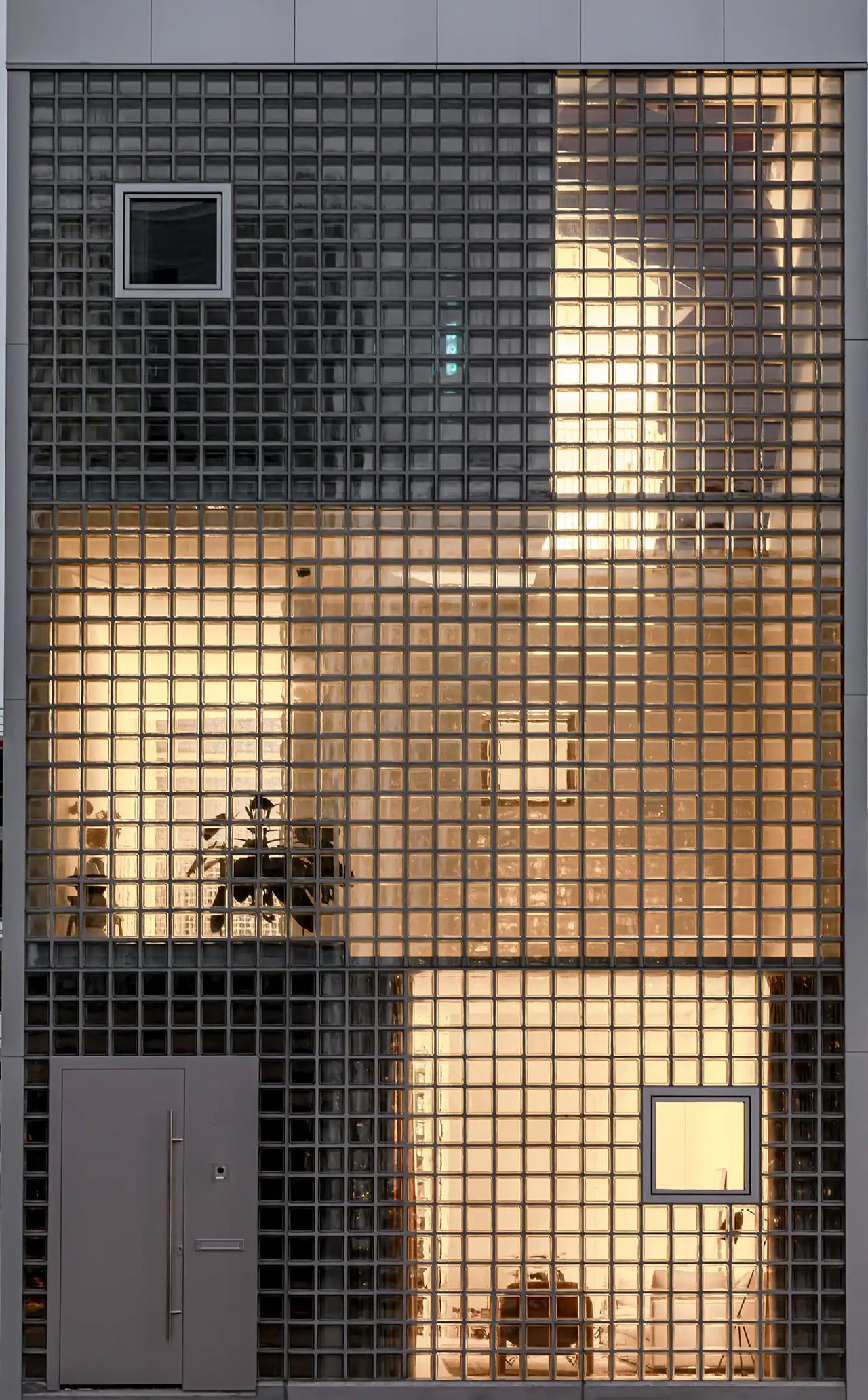
The facade does a lot of the design’s heavy lifting. A wall of square glass blocks wraps the front of the building, filtering natural light into the interior while abstracting the life inside, offering privacy without sacrificing the warmth of daylight. At night, the facade glows from within, giving the house an almost lantern-like presence on the street.
Sustainability is baked into the structure itself. Light House is built as a lightweight system using prefabricated timber components inside a steel frame, a circular and modular method that allows for flexibility, long-term adaptability, and ease of disassembly. The layout is not fixed either, as children grow and priorities shift, the home can be reconfigured to meet whatever the family needs next. Light House is a rare thing: a home that feels entirely personal yet completely considered, one where architecture quietly gets out of the way and lets life fill the space.
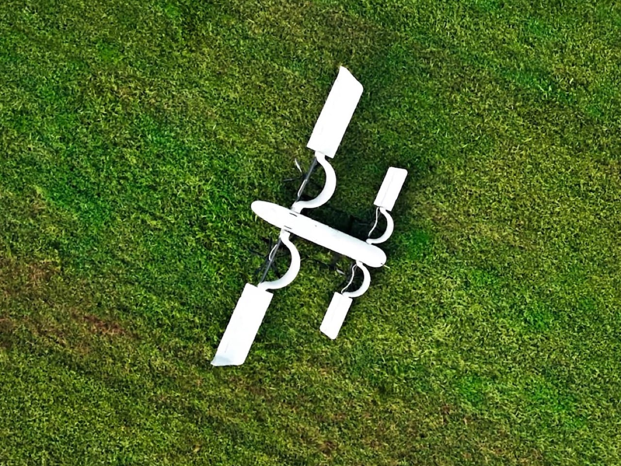
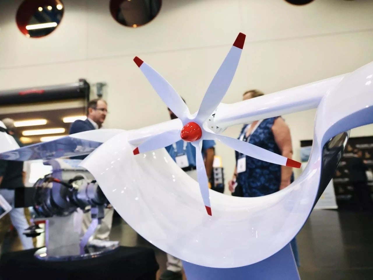
Could the most efficient VTOL design of the 21st century have been sitting in a patent office since 1928? Willard Ray Custer thought so, and spent decades trying to prove it. His channel wing concept, which set propellers into semicircular cutouts in each wing to blast high-velocity air across the lifting surface at low forward speeds, worked well enough that his team demonstrated near-vertical liftoff decades before the term eVTOL existed. Aviation’s mainstream never adopted it, partly because the aircraft of that period were too heavy and partly because the jet age arrived and swept most unconventional configurations off the table. The concept sat in aerospace history books, occasionally surfacing in academic papers and NASA wind tunnel tests, never finding its way into a production aircraft.
HopFlyt is the company making the argument that the wait is finally over. Founded in 2016 by Rob Winston, a former NASA engineer and Marine Corps test pilot, the Maryland-based startup has built the Cyclone, a hybrid VTOL drone that pairs Custer’s channel wing geometry with pivoting mounts, modern composites, and a hybrid electric-fuel drivetrain. The channels orient rearward for vertical takeoff, pivot beneath the wing for forward cruise, and can even act as aerodynamic brakes on descent. HopFlyt claims the configuration cuts climb power consumption by a third compared to conventional VTOLs, holds fuel burn to under three gallons per hour, and enables cargo runs of 250 lbs across 800-plus miles of range. A 2027 commercial launch is the target, aimed squarely at naval resupply, offshore energy logistics, and medical delivery markets.
Designer: HopFlyt
The engineering logic behind the channel wing is cleaner than it might first appear. A conventional fixed wing generates lift by moving through air fast enough for pressure differentials to do their work, which means you need significant forward velocity before the wing becomes useful. Custer’s insight was to bring the air to the wing instead, using a propeller seated inside a curved half-channel to accelerate flow across the lifting surface regardless of forward speed. HopFlyt’s pivoting channel takes this further, allowing the geometry to optimize for hover and cruise independently rather than compromising between them. Chief Engineer Neil Winston, whose background spans NAVAIR flight test, puts it plainly: the ideas were always there, but the digital control systems, electric motors, and lightweight materials needed to execute them simply did not exist until now.
The hybrid drivetrain is what gives the Cyclone its range credentials and separates it from the crowded field of pure-electric eVTOLs currently chasing urban air taxi certifications. Battery power handles the vertical takeoff and hover phases, where the channel wing’s efficiency advantage is most pronounced, while a turbogenerator takes over for forward cruise, extending endurance far beyond what any battery pack realistically supports today. HopFlyt puts the operational cost savings at 90 percent compared to helicopters performing equivalent missions, a figure that, if it holds up under real-world conditions, makes the Cyclone genuinely disruptive in sectors where helicopter logistics are currently the only viable option. Offshore energy platforms and naval resupply operations run on helicopter economics right now, and those economics are punishing.
HopFlyt has reached this point on a fraction of the capital that comparable advanced air mobility startups have burned through, operating out of a private hangar in Maryland with a team whose combined aerospace experience runs to over a century. The company is currently in a Series A raise to fund hybrid-electric prototype development and initiate flight demonstrations ahead of that 2027 target. Whether the Cyclone becomes the aircraft that finally vindicates Willard Ray Custer’s century-old intuition depends on what those demonstrations produce. The aerodynamics have always been sound. Now the rest of the technology has caught up.
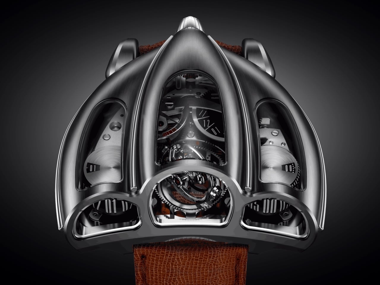
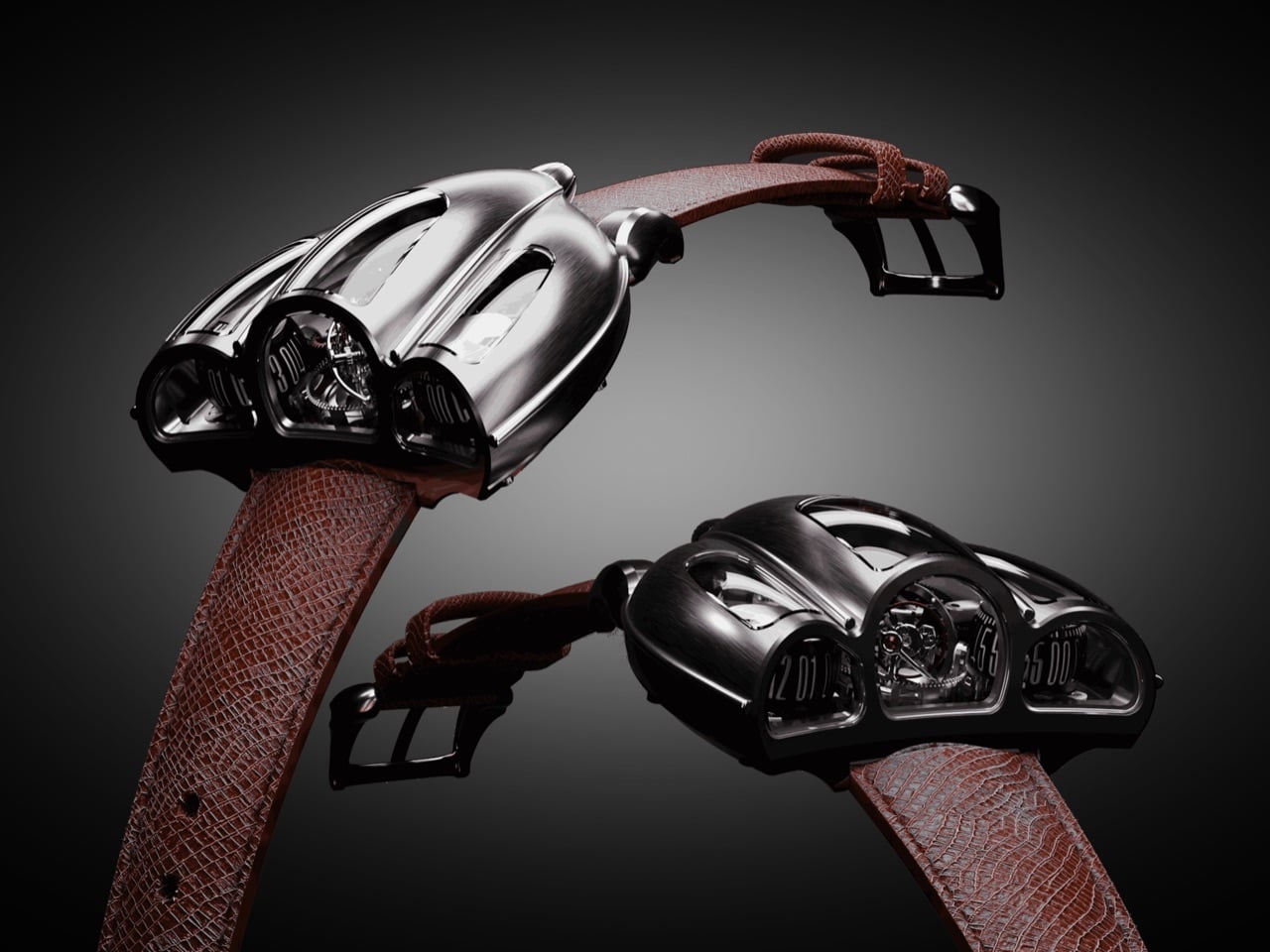
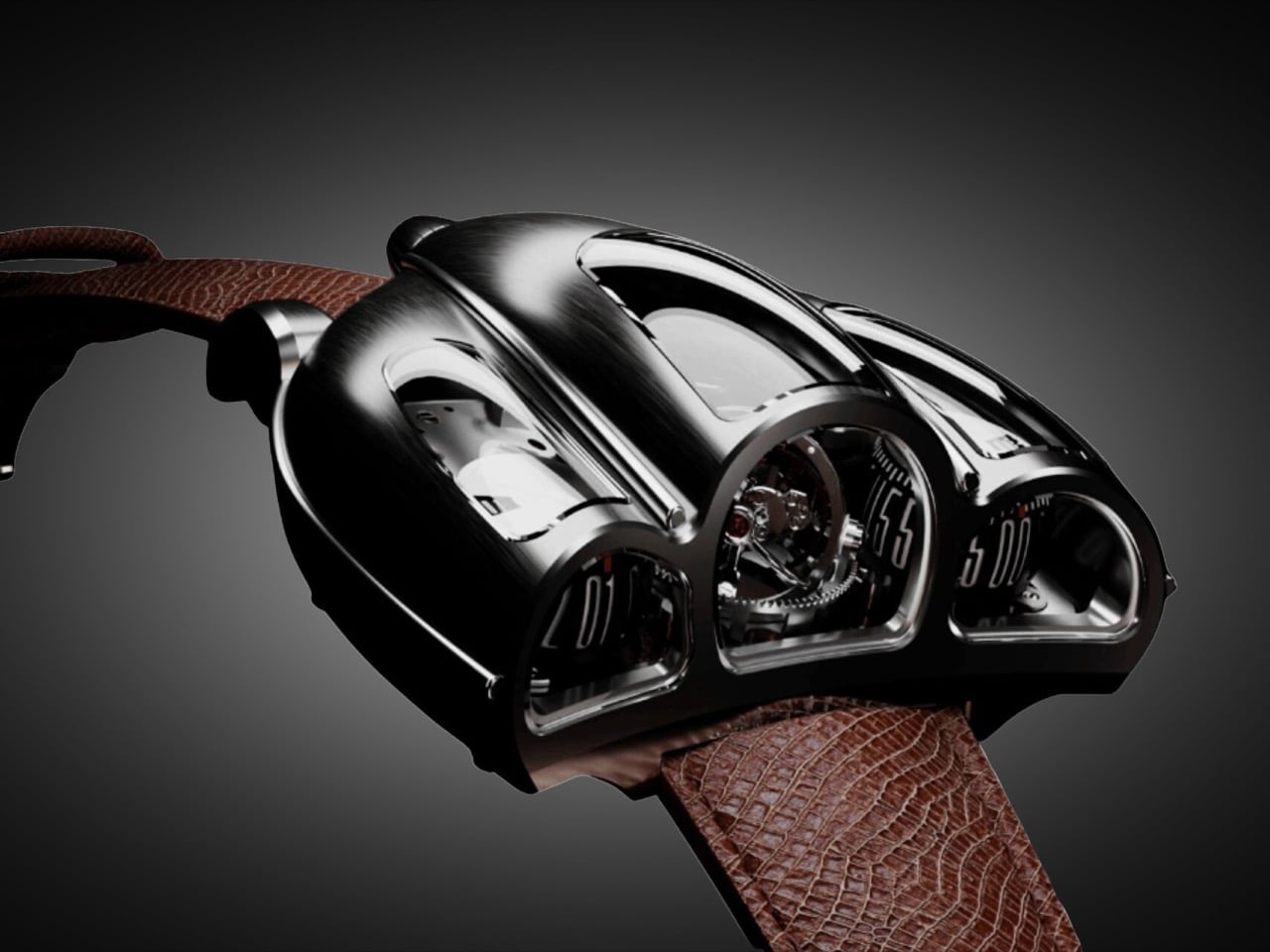
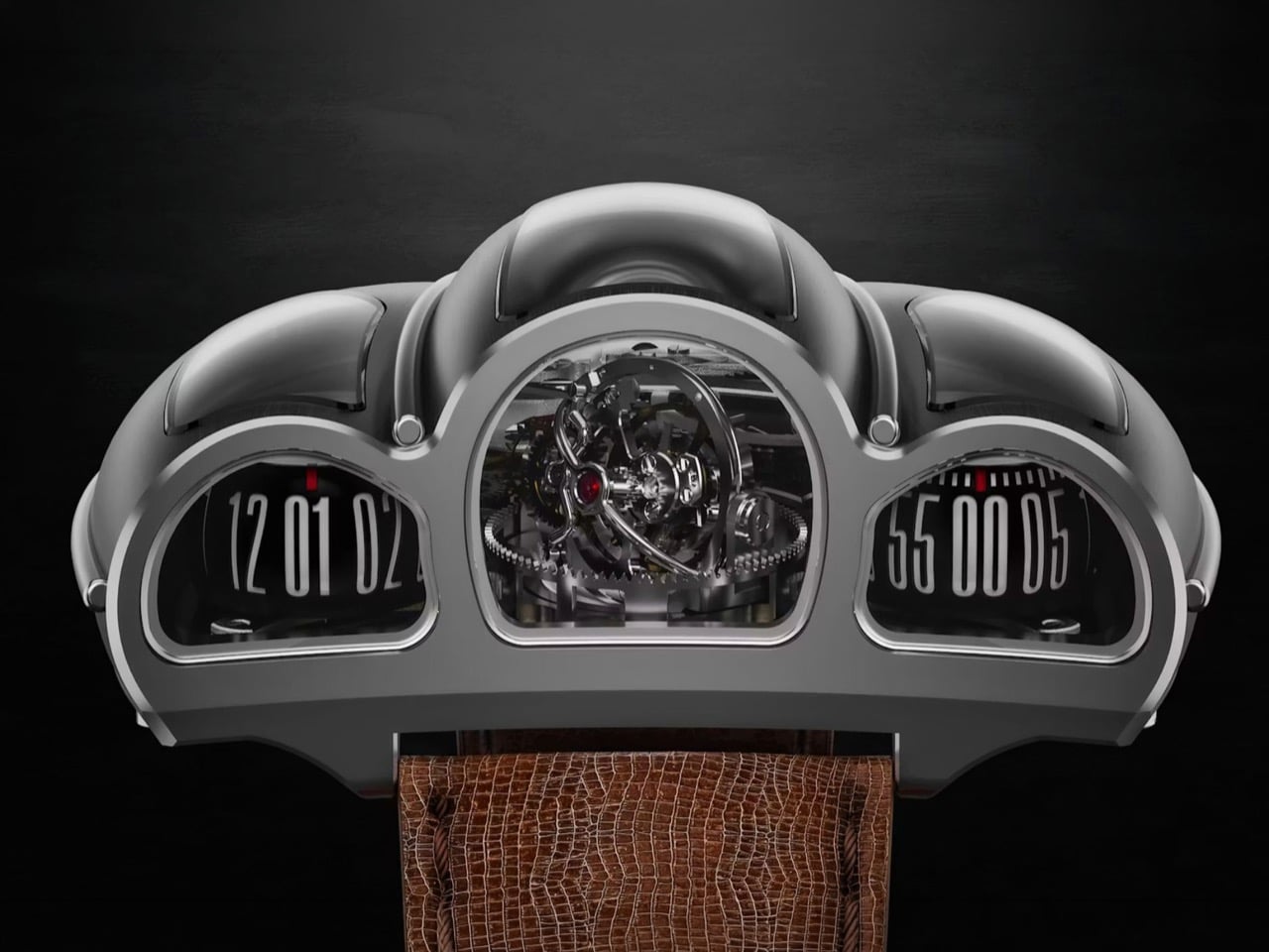
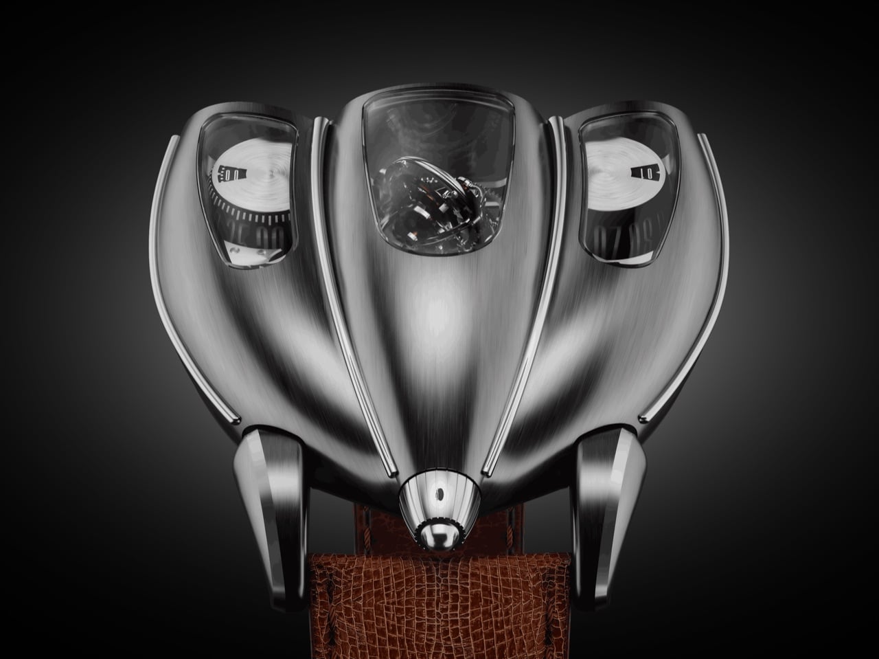
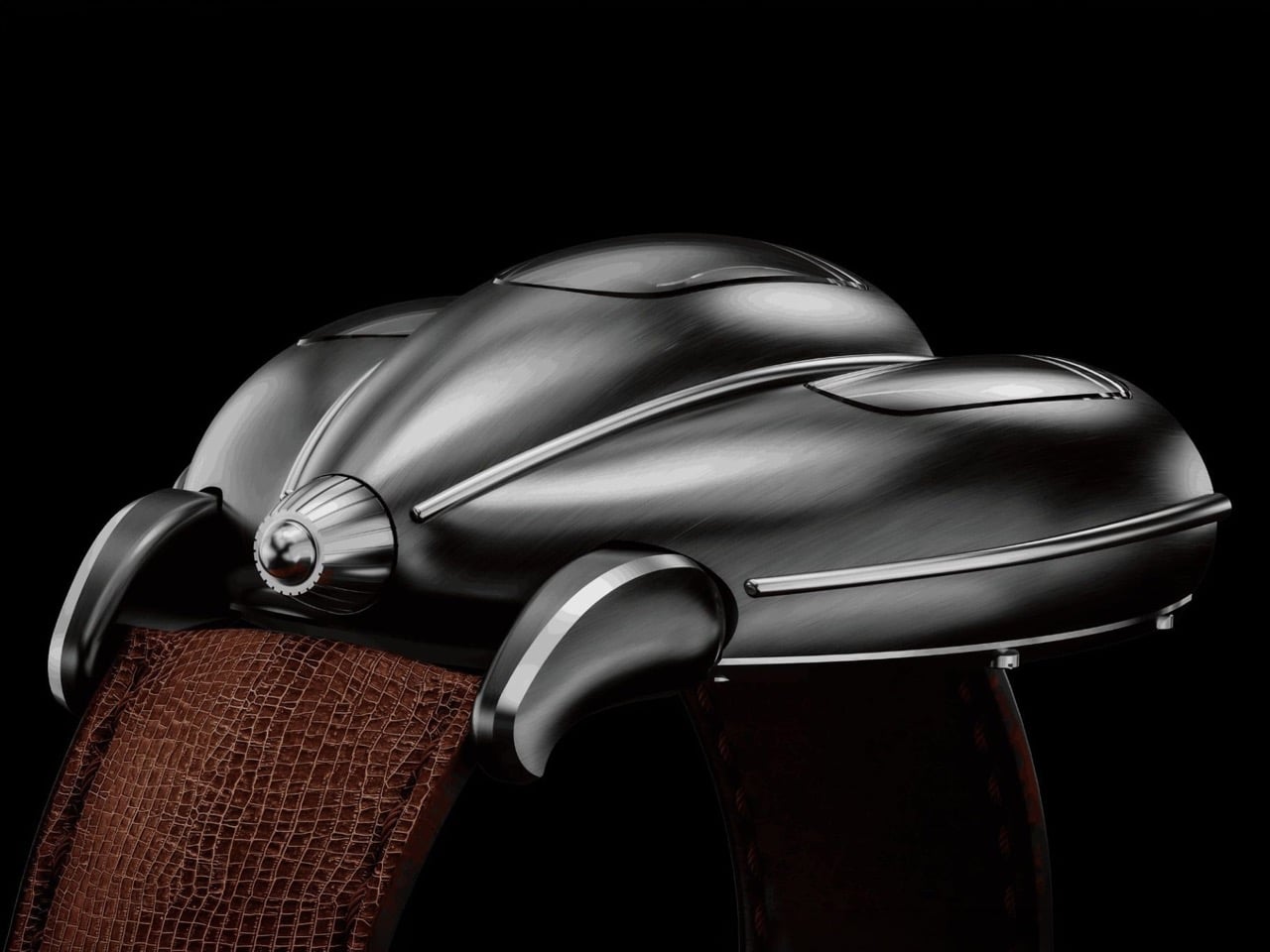
Old sports cars had analog instrument clusters that told you everything through three or four circular gauges mounted in brushed metal housings, each dial showing a different slice of what the engine was doing at any given moment. The information was direct, mechanical, and laid out with the kind of functional clarity that only made sense if you understood how the car worked. Tachometers sat next to oil pressure gauges, fuel levels next to coolant temps, all of it visible through a steering wheel while you were doing 140 km/h on a mountain pass. Desder’s D001 takes that exact visual language and translates it into a wristwatch with a triple-axis tourbillon spinning where the tachometer used to be.
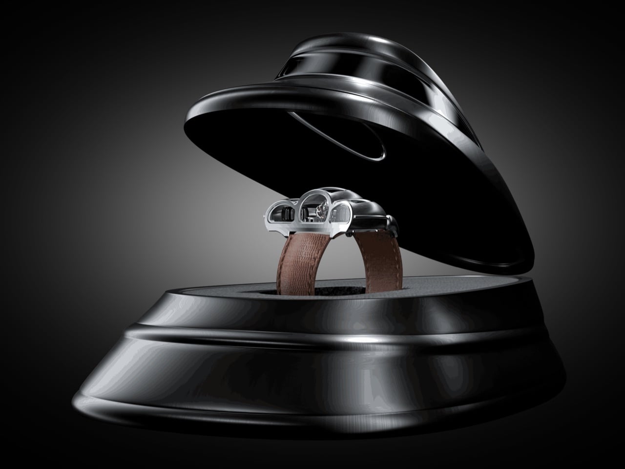
The watch displays time on two separate cylinders, one for jumping hours and one for continuous minutes, flanked by a GMT indicator on the right and a power reserve gauge on the left. Luca Soprana, the master watchmaker who cofounded the Ateliers 7h38 workshop that builds complications for Jacob & Co, designed the caliber with the same obsessive attention to architectural clarity that defined mid-century dashboard design. Mo Coppoletta, the tattoo artist and designer behind collaborations with Bulgari and Montblanc, shaped the case to follow the teardrop aerodynamics of 1920s and 1930s race cars. The watch debuted in April 2026 from Modena, in the heart of Italy’s Motor Valley, limited to six unique pieces. The case wraps around the movement like a coachbuilt body over a chassis, every surface flowing from the mechanical geometry underneath.
Soprana’s caliber is a study in mechanical complexity made legible. The triple-axis tourbillon sits dead center, rotating on three independent axes to counteract gravitational effects on timekeeping accuracy. The movement beats at 3Hz with a 45-hour power reserve, hand-wound through a crown that feels more like a machine interface than a watch component. German silver forms the mainplate and bridges, chosen for its rigidity and traditional finishing properties. Titanium components reduce weight where it matters, while phynox, a high-performance alloy known for extreme strength and corrosion resistance, handles stress points. The entire movement comprises 465 parts, every single one made by hand in Soprana’s Vaumarcus atelier near Neuchâtel. The jumping hour mechanism snaps forward with the kind of mechanical decisiveness that makes you want to watch it cycle through an entire day.
The case construction follows Italian coachbuilding philosophy, where form and function develop together rather than in sequence. Coppoletta designed the case around the movement’s architecture, letting the mechanical volumes dictate the external silhouette. The teardrop shape references 1920s and 1930s aerodynamics, when wind tunnel testing was still a decade away and designers shaped metal based on intuition about airflow. Flowing surfaces connect the cylindrical time displays, each one sitting under domed sapphire crystal that distorts and magnifies depending on viewing angle. The brushed metal finish catches light the way a hand-formed fender does, with subtle variations in surface texture that reveal the construction process. Sculpted lugs integrate directly into the case body without visible seams, continuing the coachbuilt language where every panel flows into the next.
Each of the six pieces carries subtle variations that make it genuinely unique. Coppoletta, whose background in tattooing taught him to treat every commission as an individual artwork, approached each watch as a separate design exercise within the same architectural framework. Different finishing patterns on the case, variations in how the sapphire crystals dome over the displays, minor differences in how the lugs taper into the case body. These aren’t the superficial variations you get when a brand changes dial colors across a limited run. These are structural differences that change how the watch sits on a wrist and how light interacts with the metal surfaces.
The D001 competes with MB&F and Greubel Forsey in the kinetic sculpture category, but carves its own space by grounding the design in automotive heritage rather than abstract futurism. Where MB&F builds machines that look like they belong in science fiction and Greubel Forsey chases chronometric precision with architectural movements, Desder anchors everything in the tangible history of Italian industrial design. The watch references a specific moment when cars were still shaped by hand and instruments were analog by necessity. Pricing is on request, which in this category typically signals seven figures. For collectors who view watches as functional art and value radical design integrated with mechanical innovation, the D001 delivers both. Just don’t expect to wear it through airport security without some explaining.