Smartphones have made information permanently accessible, but that accessibility comes at a price. The same device that shows you a reminder also delivers a notification for something unrelated, which leads to one more app opened, one more five-minute detour, and one more afternoon where the task you meant to remember sits unfinished somewhere in a mental stack. The problem isn’t access to information. It’s the medium through which it arrives.
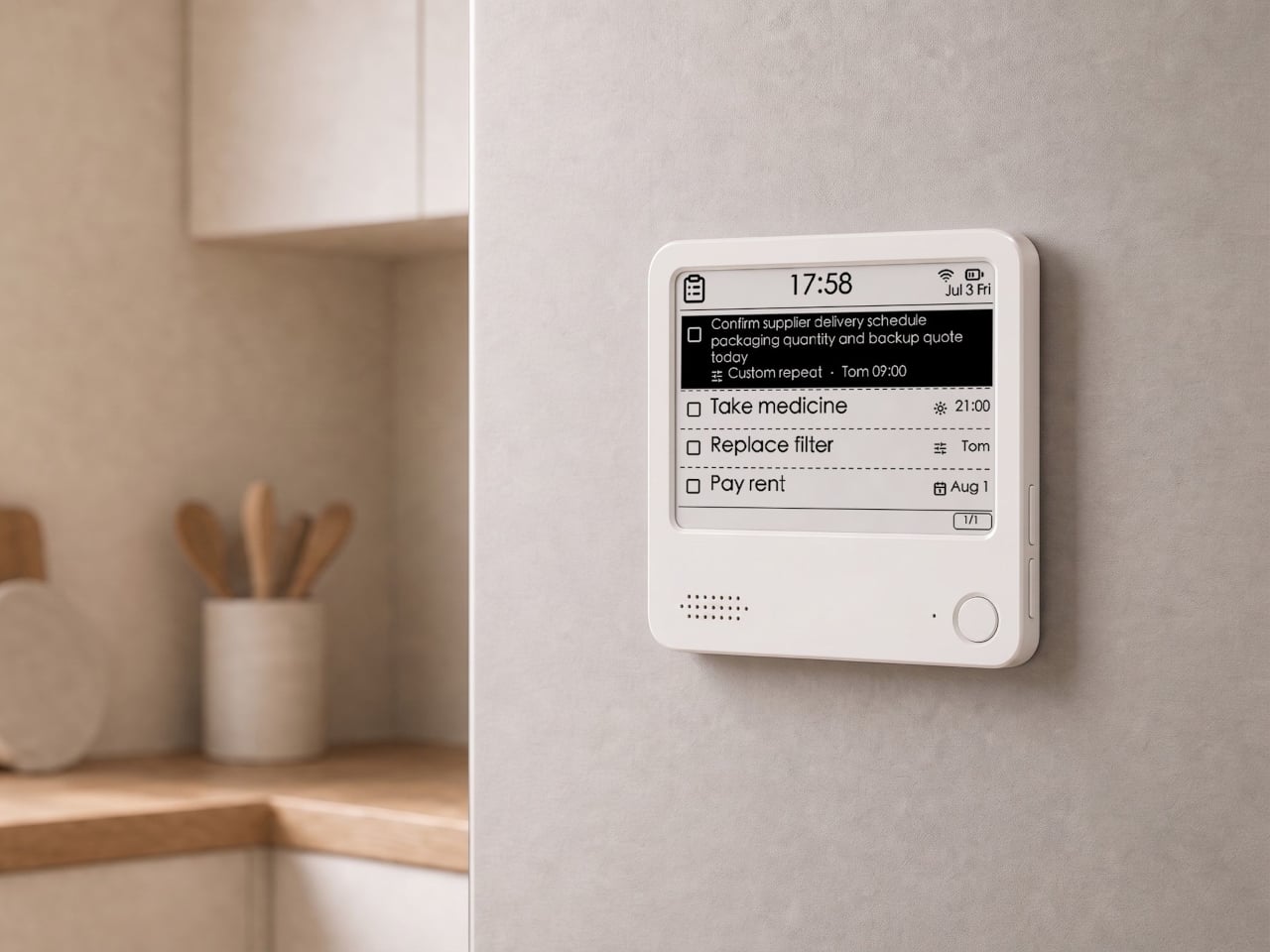
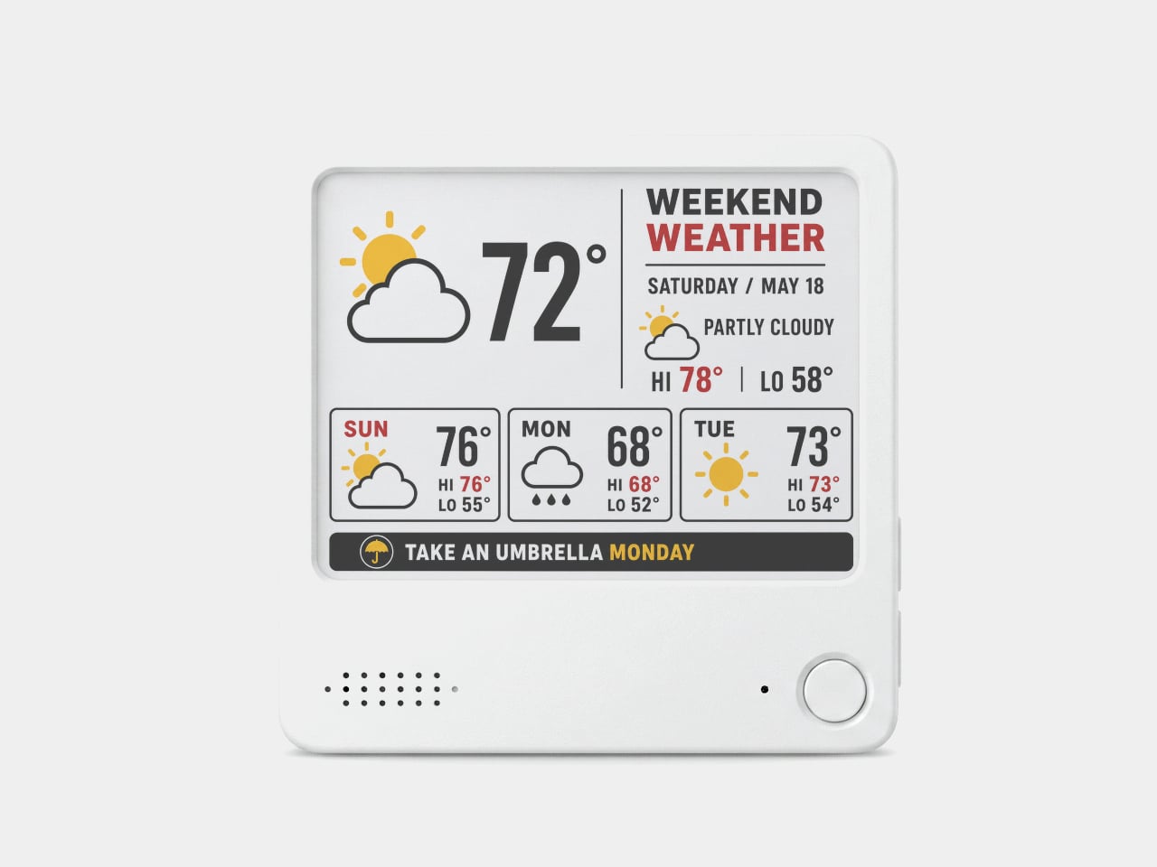
The ZecTrix Note 4 approaches that with a different premise: what if the display that shows your tasks doesn’t connect to your attention the same way a phone screen does? It’s a 4.2-inch e-paper smart display, about the size of a palm, that attaches magnetically to a metal surface and stays there showing whatever you most need to remember, using almost no power to do it.
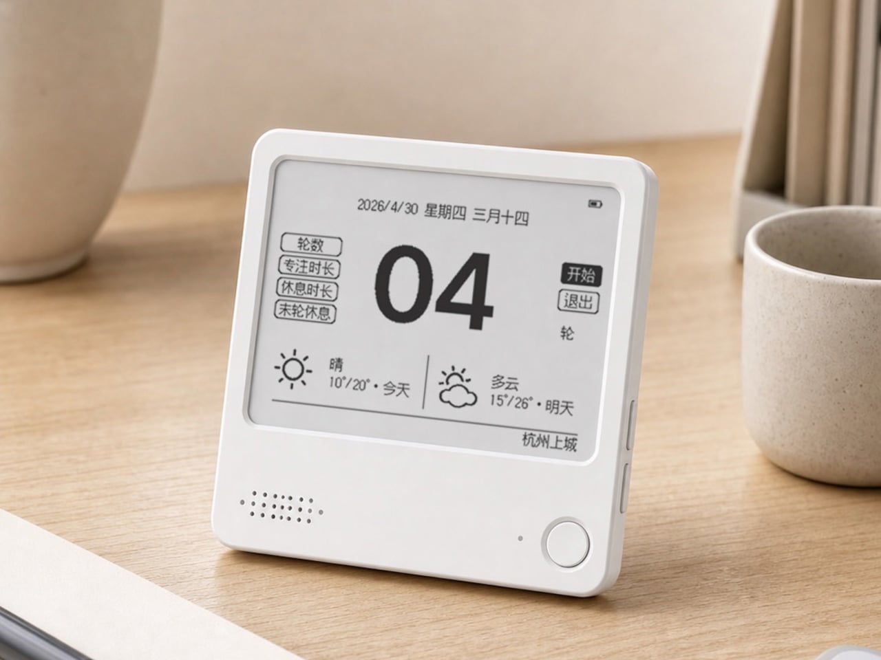
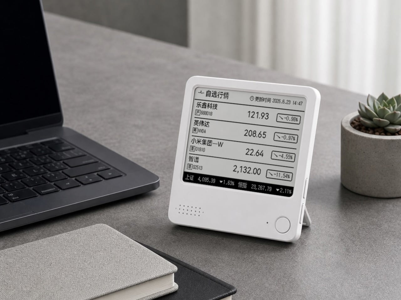
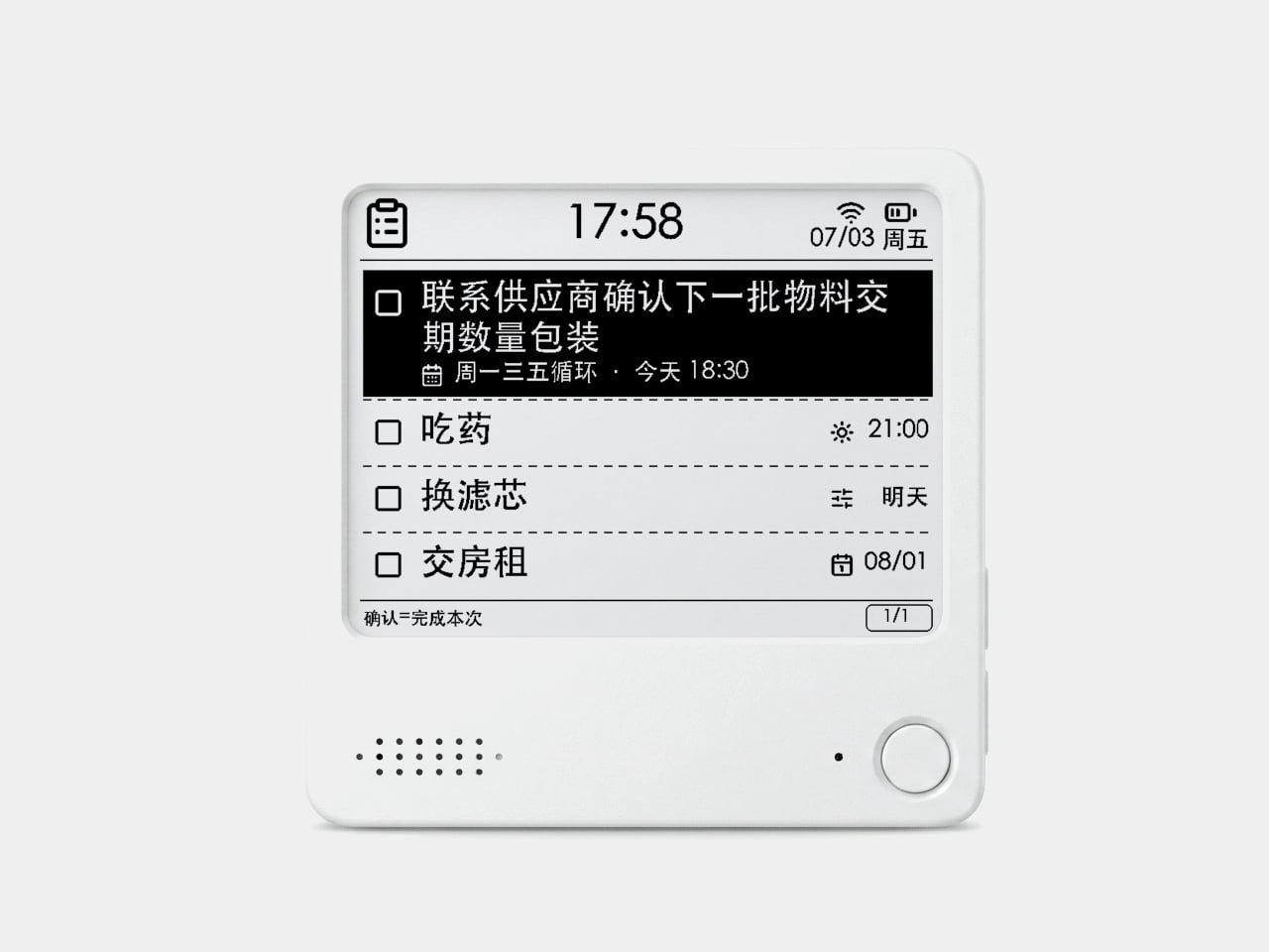
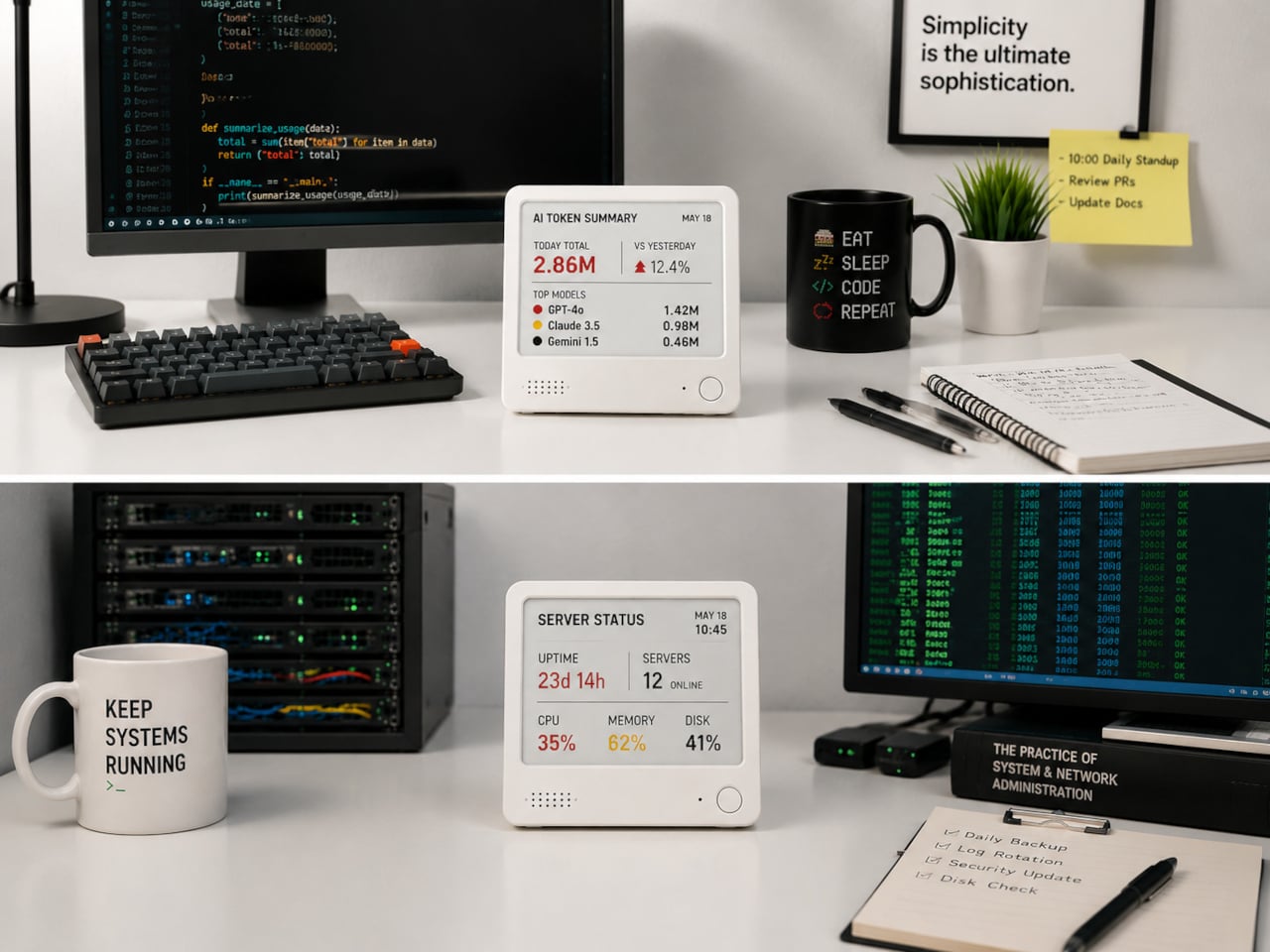
The interaction model is deliberately minimal. Press the physical button, speak your task or reminder, and the device converts that into text and adds it to the display. The built-in AI voice assistant handles the transcription and task management, and the e-paper screen holds whatever it’s showing without any power draw between updates. The display also handles weather, clocks, focus timers, handwritten notes, images, and custom templates.
Hardware underneath is solid for something this compact. An ESP32-S3 dual-core processor with 8 MB of PSRAM and 16 MB of flash handles the AI processing and connectivity, backed by a 2,000 mAh battery, 2.4 GHz Wi-Fi, Bluetooth 5.0, NFC, a speaker, a microphone, and a USB Type-C port for charging. GPIO expansion is also available, which opens the platform to custom hardware additions.
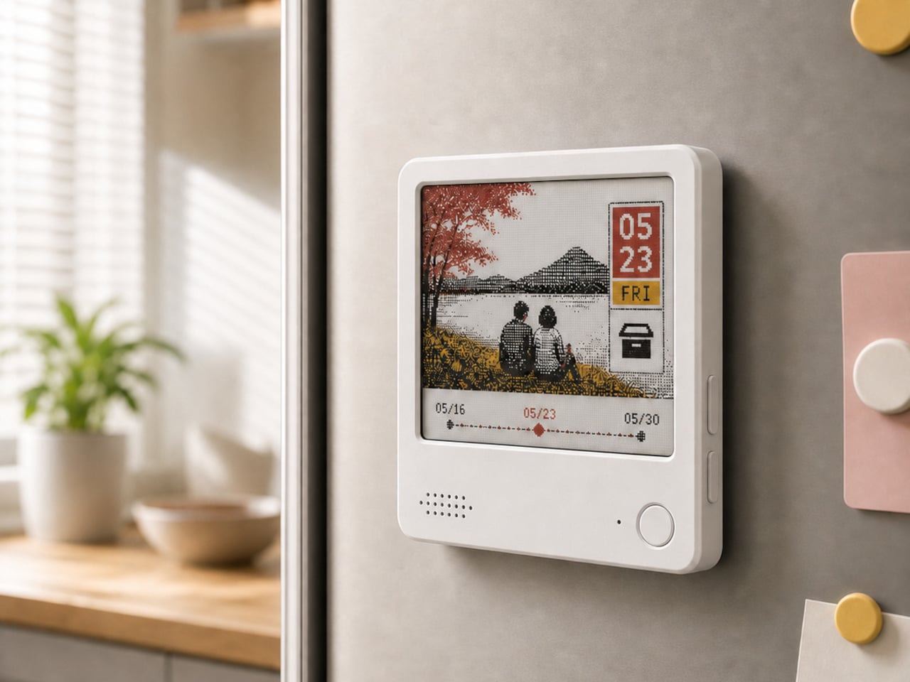
The 97mm x 97mm x 8.75mm square chassis comes in three enclosure variants: an injection-molded Minimal Premium Edition designed for clean desk or kitchen wall placement, a standard Everyday Edition for DIY-minded users, and a Color Edition with open-source 3D model files for those who want to print their own. The magnetic backplate sticks firmly to any suitable metal surface without adhesive or mounting hardware.
For users who want more than a black-and-white display, there’s the Note 4C, which replaces the monochrome panel with a four-color E Ink screen that adds red and yellow to the palette. It runs on the same hardware platform but ships without the consumer AI firmware, positioning it instead as an open development device for people with ESP32 experience. The color panel is slower to refresh, typically over ten seconds per full update, making it better suited to status labels, family photo cards, or API dashboards that update occasionally rather than continuously.
The two products are deliberately distinct rather than tiered versions of the same thing. The Note 4 is a finished product with a lifetime AI voice service included; the Note 4C is an open starting point for a custom build. Both share the same physical form, so the choice comes down to how much of the software someone wants to supply themselves.
The e-reader has been one of the most static product categories of the past two decades. Since the first Kindle appeared in 2007, the form factor has barely evolved: a single screen, a flat back, and dimensions roughly matching a paperback. These devices have gotten lighter, sharper, and more waterproof, but the fundamental design assumption has stayed the same. They’re books without the book part.
A growing number of designers have been working on a different premise: what if an e-reader actually opened like a book? One with two E Ink panels and a real hinge, held the way you’d hold a paperback, where left and right pages exist as physical space. That shared ambition has driven a small but serious cluster of projects building quietly over the past five years.
The proof that e-paper could bend
The idea of folding an E Ink display isn’t new. Back in 2020, E Ink Corporation demonstrated a hinged prototype showing that a bending e-paper panel could survive the mechanical stress of being folded. It never reached retail shelves, but it answered the one question that mattered most at the time: whether the material itself could handle the geometry of a real book.
Designer: E Ink
That prototype didn’t solve everything. It was a controlled demonstration with no commercial roadmap, no software, no battery life to speak of, and no clear form factor beyond the fold itself. What it gave the industry was proof that flexible e-paper was a viable building block rather than a permanent research curiosity. Every foldable E Ink project that came after built on that understanding.
The book illusion finally made real
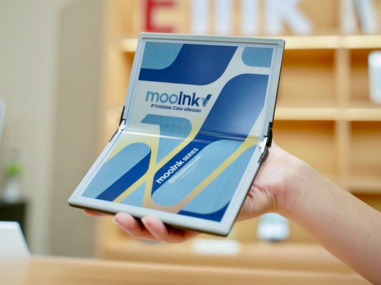
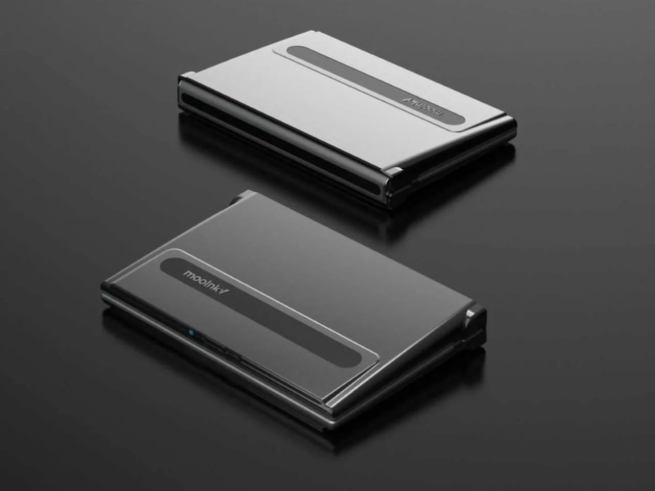
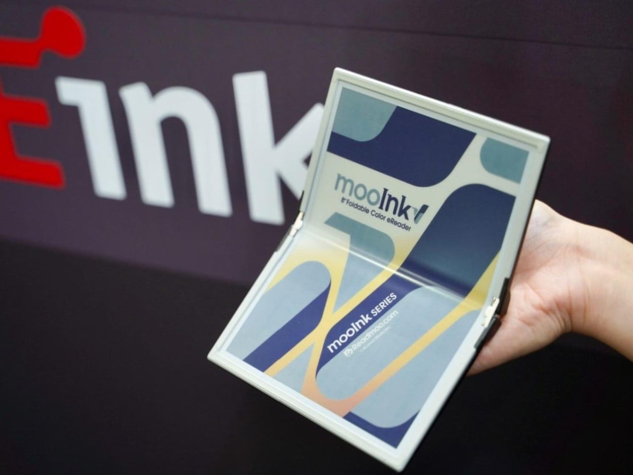
Readmoo’s Mooink V was the first design to make the flexible E Ink concept feel emotionally legible to a general audience. It’s built around an 8-inch Gallery 3 color e-paper display developed in collaboration with E Ink, one that folds down the middle to make the device small enough to pocket when closed and wide enough to feel like a slim paperback when open.
The color display matters more than it might seem. Gallery 3 renders close to 50,000 colors at 300 PPI, expanding the format beyond plain text to illustrated books, comics, and magazines. The fold reportedly passed 200,000 bending tests during development, and when fully open, the crease isn’t dramatic enough to register as a flaw so much as an honest design trade-off.
Mooink V hasn’t had the smoothest road to market, though. Despite genuine buzz at trade shows including Touch Taiwan and SID Display Week, no confirmed retail availability or street price had materialized as of mid-2026. The design made the foldable E Ink book look and feel tangible in a way earlier prototypes hadn’t. Whether it gets there commercially is a different and still open question.
Two screens, no crease
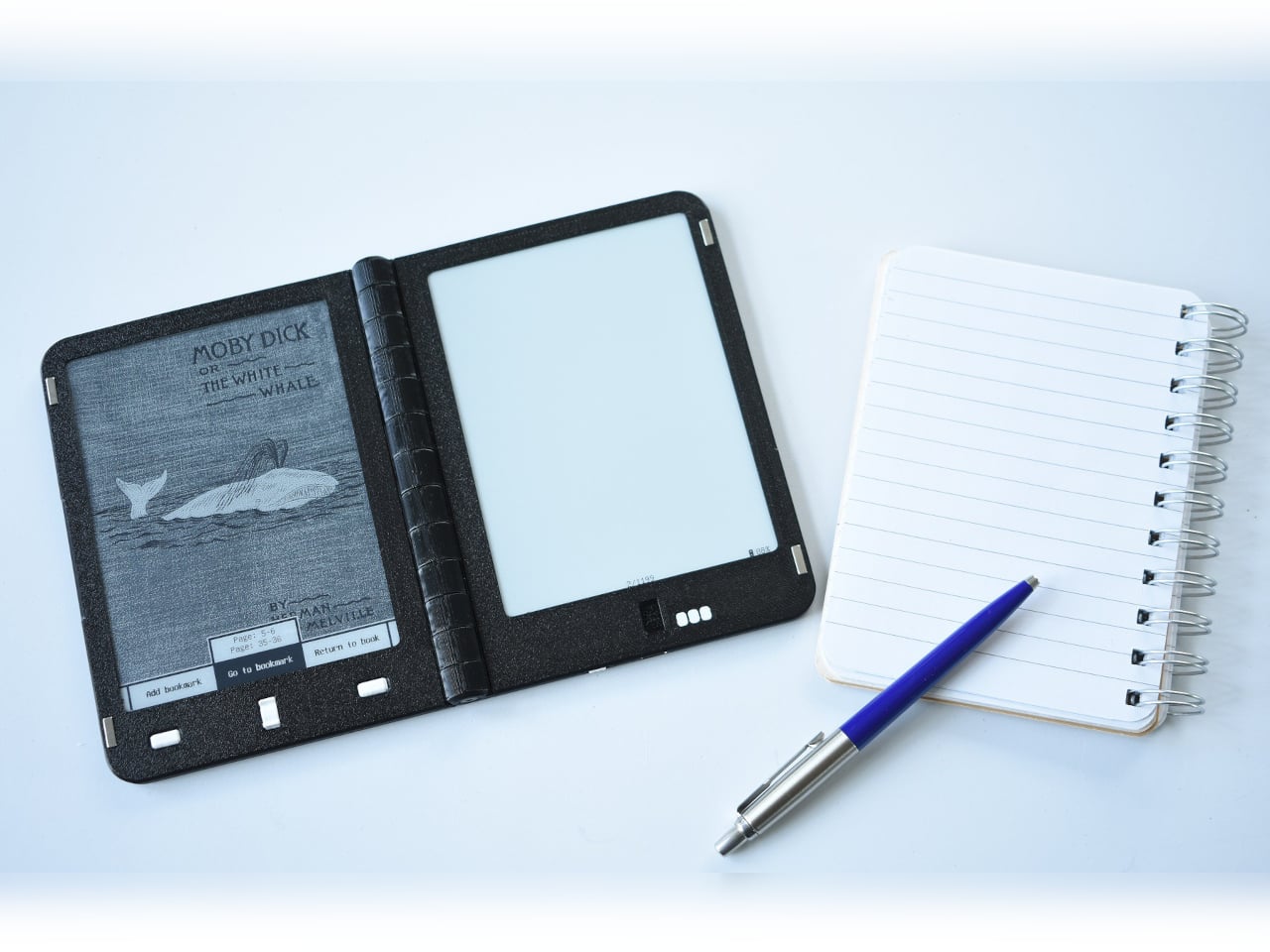
Not everyone building a book-shaped e-reader was willing to bet on a single flexible panel. A parallel design school took a more pragmatic approach: pair two conventional E Ink screens with a well-engineered hinge and let the gutter do the work. The result avoids crease anxiety entirely since neither panel has to bend, though it trades the seamless page illusion for a visible seam you’d have to accept.
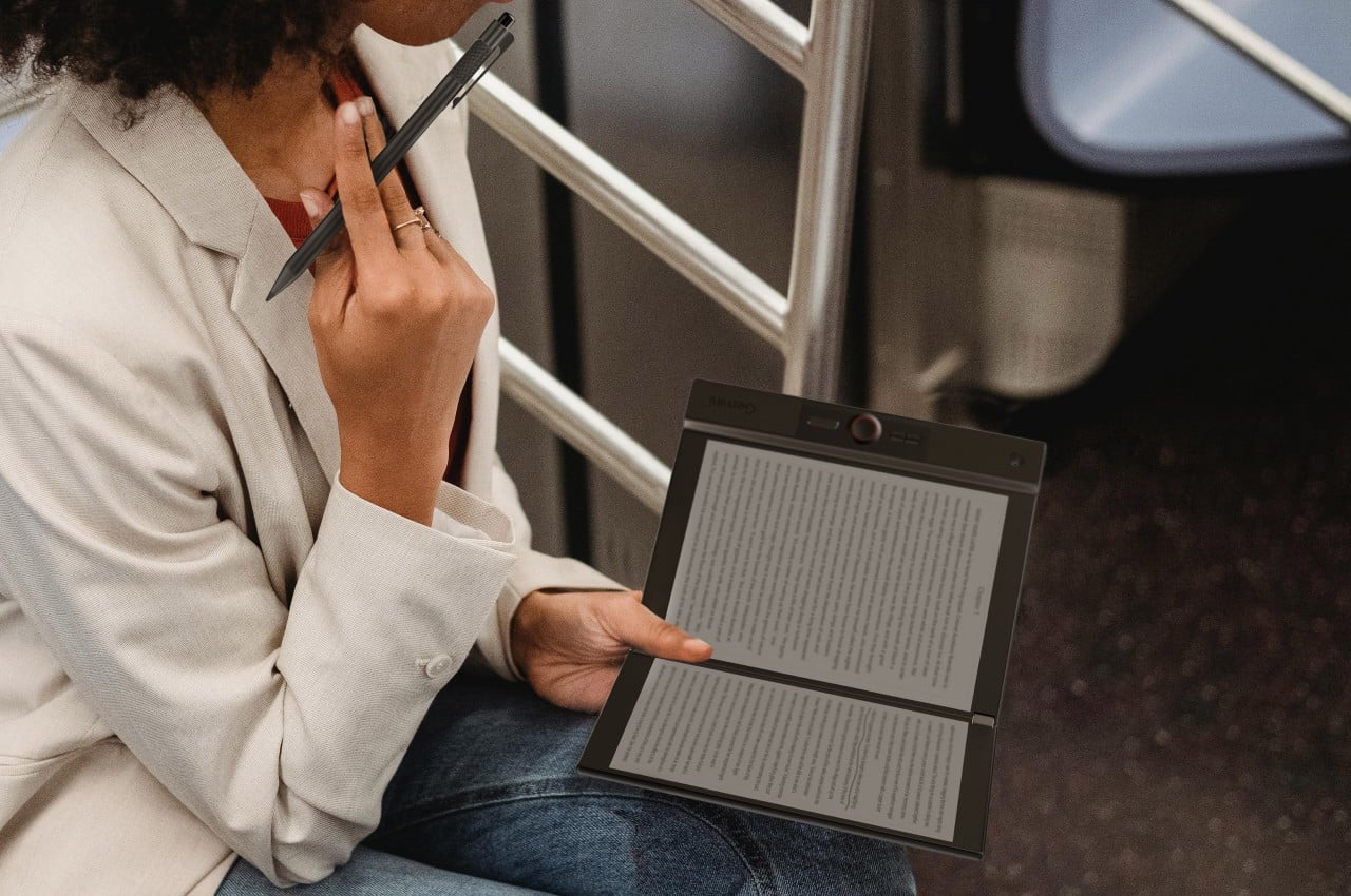
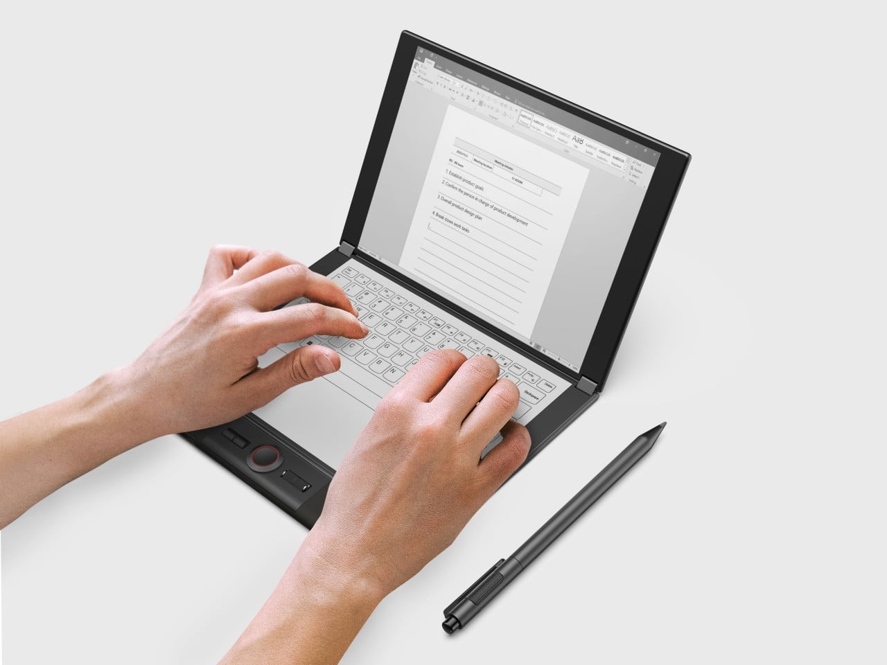
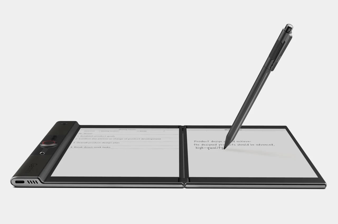
LCFC’s Gemini took the productivity angle furthest, giving both E Ink panels enough real estate to function almost like a laptop, with reading material open on one side and an active workspace on the other. The InkReader Duo concept took a more compact approach, fitting two E Ink screens into a phone-sized form, which made it feel less like a desk tool and more like a pocket notebook.
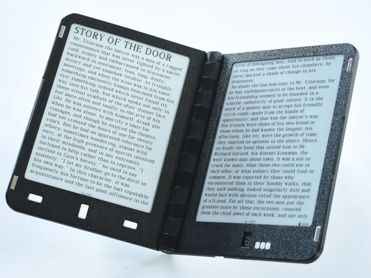
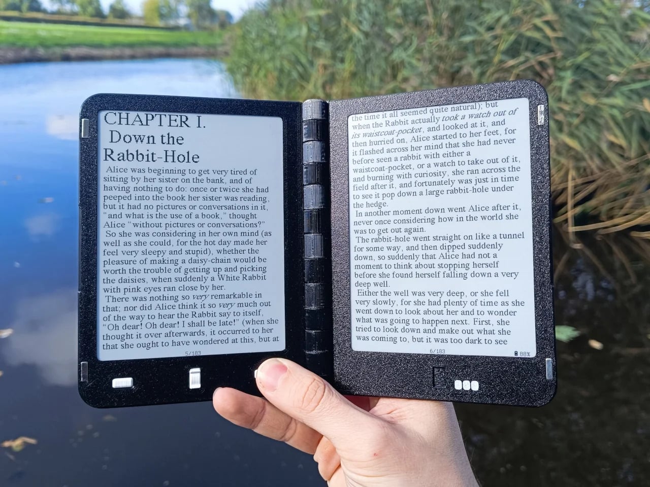
Diptyx went in a different direction altogether. Rather than chasing consumer polish, the project leaned into open-source principles, building a two-panel hinged e-reader without the lock-in that defines most commercial platforms. It isn’t the most refined interpretation of the book-shaped reader, but it made a clear point: the hardware problem was increasingly solvable, and the real challenge was getting the software and ecosystem right.
Not every dual-screen device fits cleanly into this story. The Bluegen OKPad pairs an E Ink panel with a regular LCD screen, which makes for a versatile tablet but undermines the unified reading experience that makes an E Ink book feel coherent. Switching between two fundamentally different display types introduces a visual disconnect that software bridging alone can’t fully smooth over.
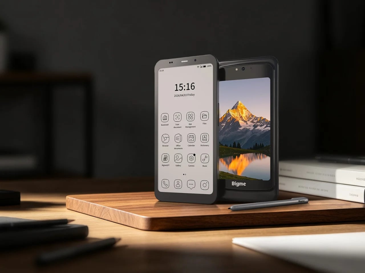
Bigme’s HiBreak Dual 2 runs into a different kind of problem. It’s a smartphone with a secondary E Ink display on the back, which is a genuinely clever idea for managing notifications and extending battery endurance, but it’s shaped and used like a phone rather than a book. A second screen doesn’t automatically recreate the spatial logic of reading a bound object.
Inkleaf is the most pragmatic entry in the foldable E Ink space so far. Instead of chasing a seamless fold, it pairs two 10.3-inch Carta E Ink panels in a notebook-style hinge, with one side for reading and the other for writing. The seam between them works as a gutter rather than a flaw, and the design doesn’t try to hide it.
That workflow proposition is what makes Inkleaf interesting beyond its form factor. Having reference material on one panel while taking notes on the other removes a friction point that every single-screen reader quietly ignores. You don’t need to switch apps, scroll back, or memorize what you just read before writing something down. It’s aimed at a different kind of reader than a Kindle typically serves.
Inkleaf is currently collecting early-access signups ahead of an August 2026 launch, with a broader public release targeted for 2027. That’s a staggered timeline worth noting: the hardware still has to prove itself beyond initial demos, and the software will matter as much as the panels themselves. Carta E Ink is a sensible fit for a writing-focused device, but actual daily use remains the real test.
What Kindle still has to answer for
None of this means the Kindle is suddenly irrelevant. Amazon’s device still wins on price, ecosystem depth, and a friction-free reading experience built up through years of software refinement. If all you want to do is buy a book and read it on a train, nothing in this group of foldable experiments beats a Paperwhite for simplicity. The incumbents aren’t losing sleep yet.
What these devices do expose is a design gap Amazon hasn’t seriously tried to close. A Kindle displays text efficiently, but it doesn’t recreate the spatial logic of reading a bound book: two visible pages, a sense of position, a natural place for margin thoughts. Those aren’t features that get patched in through a software update, which is why the form-factor conversation is overdue.
That’s what this group of foldable and dual-screen E Ink devices has been quietly building toward for the past five years. Not a product category defined by any single winner, but a shared argument about what a digital reading device could look like if it started from the book rather than the screen. Whether any of them fully delivers on that is a question 2027 will help answer.
Waiting in line at a theme park is one of those unavoidable experiences that nobody designs for enthusiastically. The physical infrastructure exists, the rope lines are laid out, and in the best-case scenario, there’s some signage or ambient music to occupy the time. But the queue is fundamentally dead space, a stretch of minutes that happens before the experience begins rather than as part of it. That’s a design problem, and most parks accept it as one that can’t really be solved.
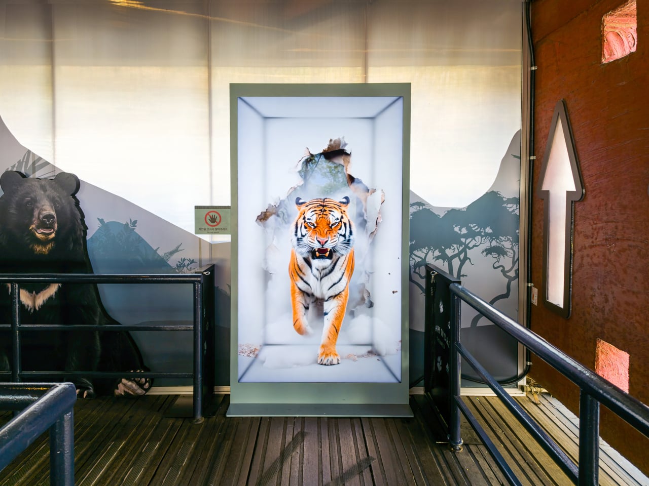
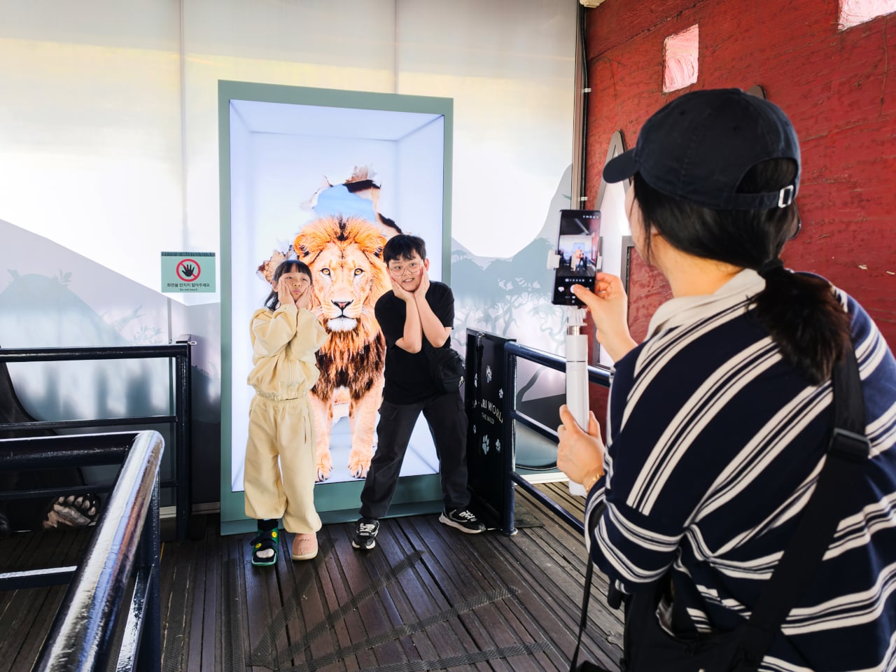
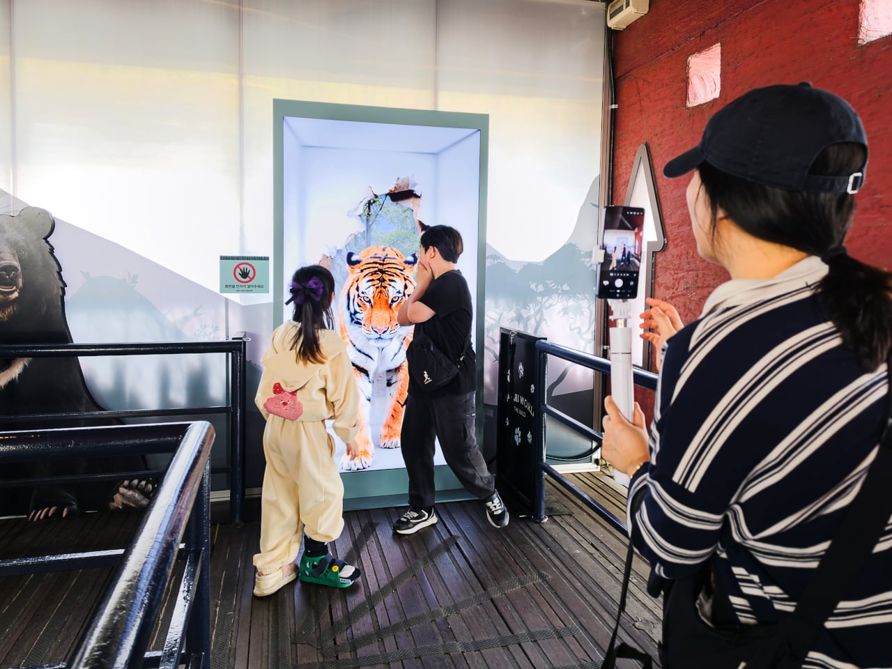
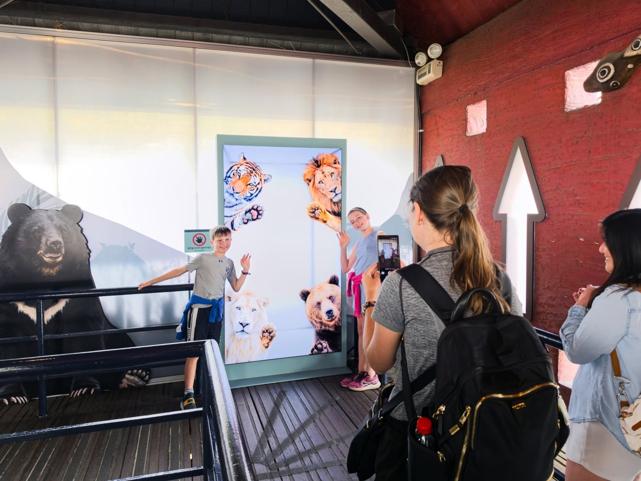
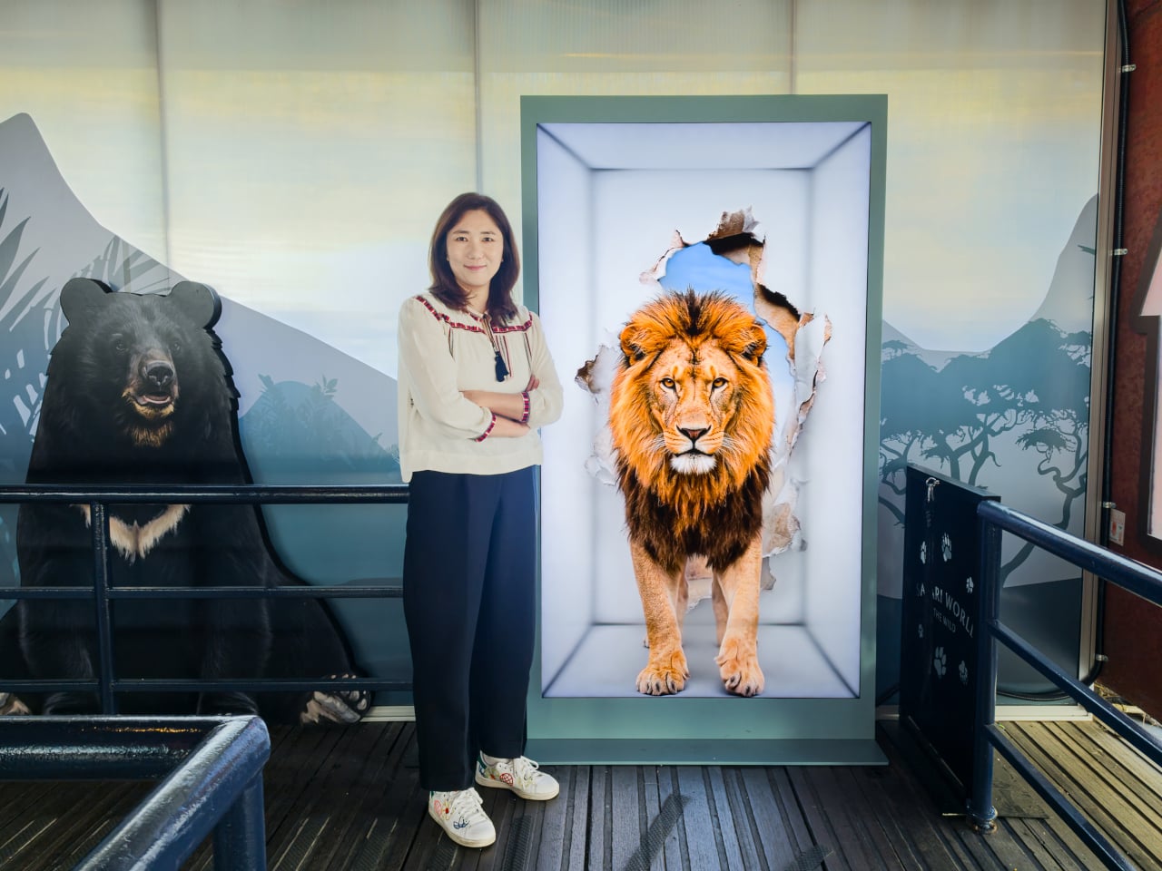
Samsung’s Spatial Signage installation at Everland in South Korea offers a different answer. At the newly renovated Safari World: The Wild attraction in Yongin, the company installed its glasses-free 3D display directly in the queue area, where life-scale tigers and lions appear to surge toward visitors without so much as a pair of 3D glasses required. The wait effectively becomes the opening act.
The technology making that possible is Samsung’s patented 3D Plate system, which uses binocular parallax to deliver separate images to each eye, tricking the brain into perceiving depth the same way it does when looking at real objects at real distances. Unlike the boxy, space-hungry installations that most 3D signage has historically required, the Spatial Signage display slots into the queue corridor in an 85-inch, portrait-oriented panel with a 52 mm profile. There’s nothing protruding into the space, and no hardware for visitors to interact with.
The content for the Everland installation was developed by Klleon, whose team prioritized capturing the natural movement rhythms of the animals rather than exaggerated cinematic effects. The result is a quality of realism that works specifically because of the environment: a queue is typically a narrow, enclosed space where visitors are already looking forward and standing relatively still, which happens to be exactly the viewing geometry where the 3D depth effect lands best.
What that means practically is that the queue line stops being something guests endure and starts being something they talk about. Anticipation for an attraction is one of the least exploited moments in the theme park visit. Visitors heading toward Safari World already have the right frame of mind for a wildlife encounter, and the display capitalizes on that readiness by delivering a preview of that encounter before anyone boards a vehicle or rounds a corner.
The broader implication is about how display technology fits into destination entertainment design. For years, attractions have used projection mapping, animatronics, and theatrical sets to build immersion during rides and shows, but the queue almost always remains a visual afterthought. A display that can occupy a narrow corridor at wall depth, require no headgear, and show content at true-to-life scale without any spatial awkwardness changes what’s possible in that format.
Everland isn’t a retail shelf or a shopping center atrium. The animals aren’t selling anything. They’re there because a flat screen in that corridor would register as background noise, and a three-dimensional tiger at eye level does not. That distinction, between content that is present and content that actually commands attention, is the problem Spatial Signage was built to solve, and the queue turned out to be a rather fitting test.
Spending hours in front of a glowing screen is unavoidable for most people, and the toll it takes on the eyes is a problem the monitor industry hasn’t truly solved. E Ink displays offer a gentler, paper-like alternative that’s far easier to stare at for long stretches, but most of them are painfully slow, limited in resolution, and not really up to the demands of daily computing.
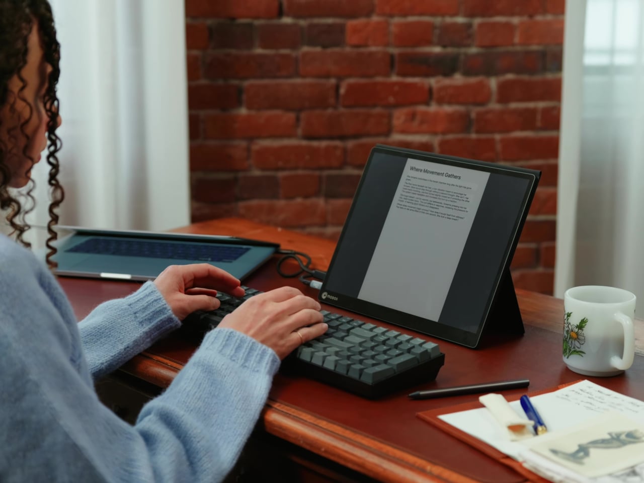
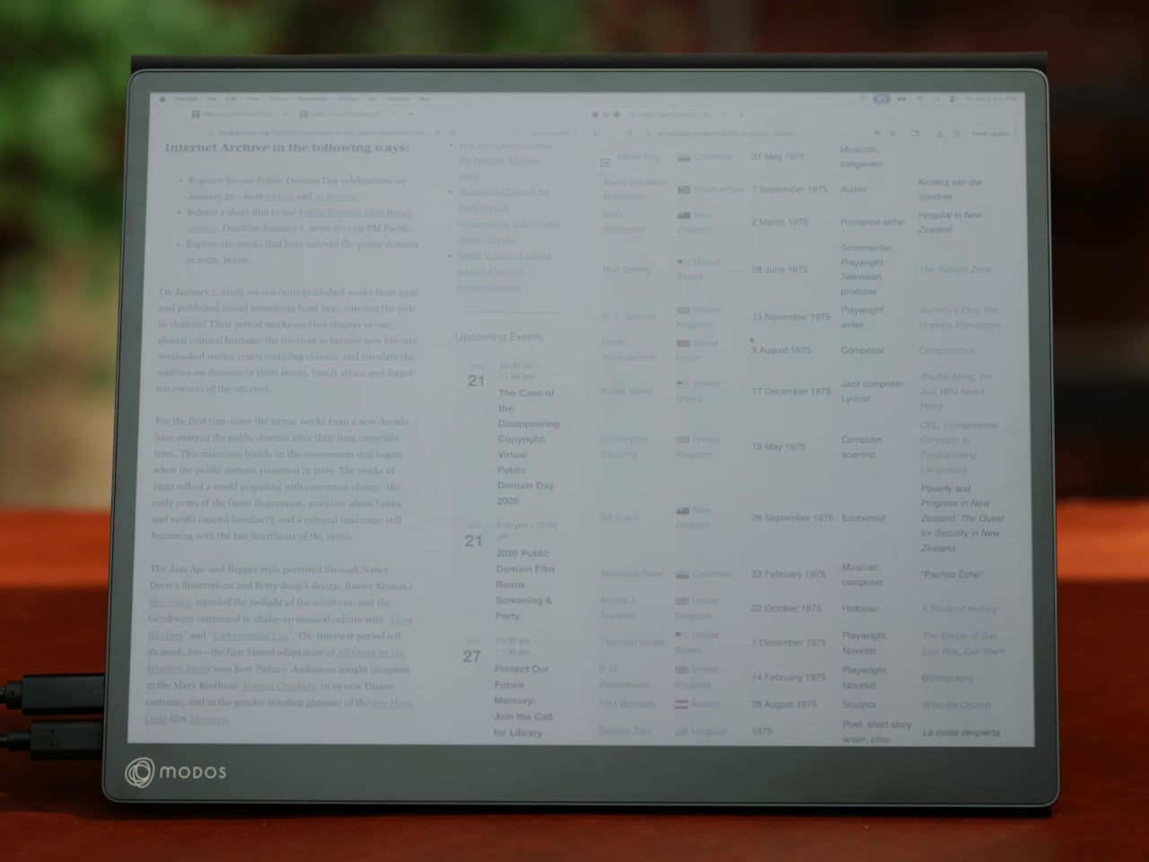
The Modos Flow is Modos Tech’s answer to that problem. Built by a Boston-based hardware startup, it’s a 13.3-inch E Ink portable monitor designed not just for casual reading but for all-day, focused work. It targets the kind of person who needs a real secondary screen but wants to spend less time squinting and more time actually getting things done.
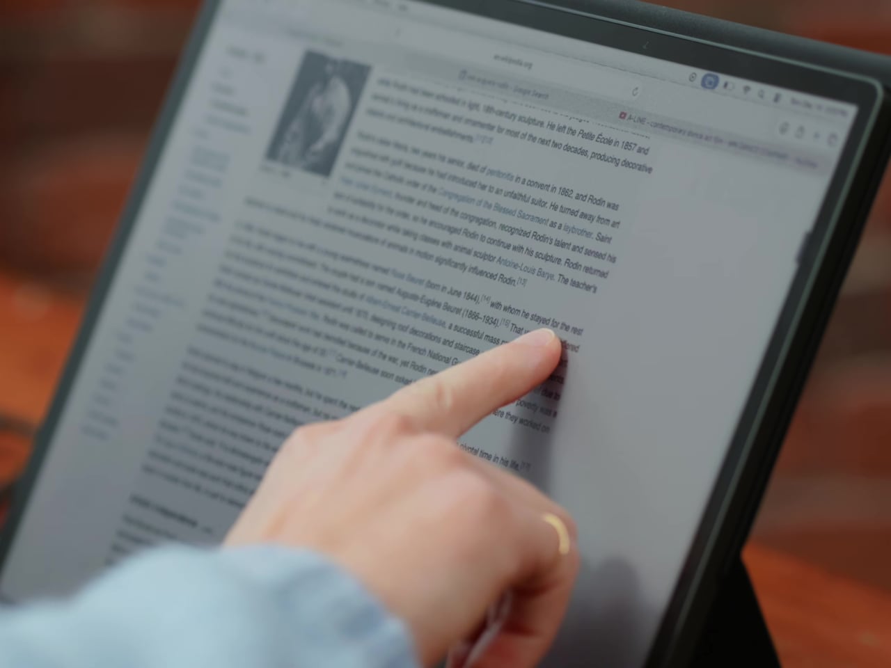
Most E Ink monitors struggle as daily drivers because of their refresh rate. Traditional panels tend to crawl, making anything beyond static document reading a frustrating experience. The Modos Flow uses a custom board with open-source firmware to push its display to 60 Hz, enough to scroll through pages, type without noticeable lag, and use the screen as a functional everyday monitor rather than a glorified e-reader.
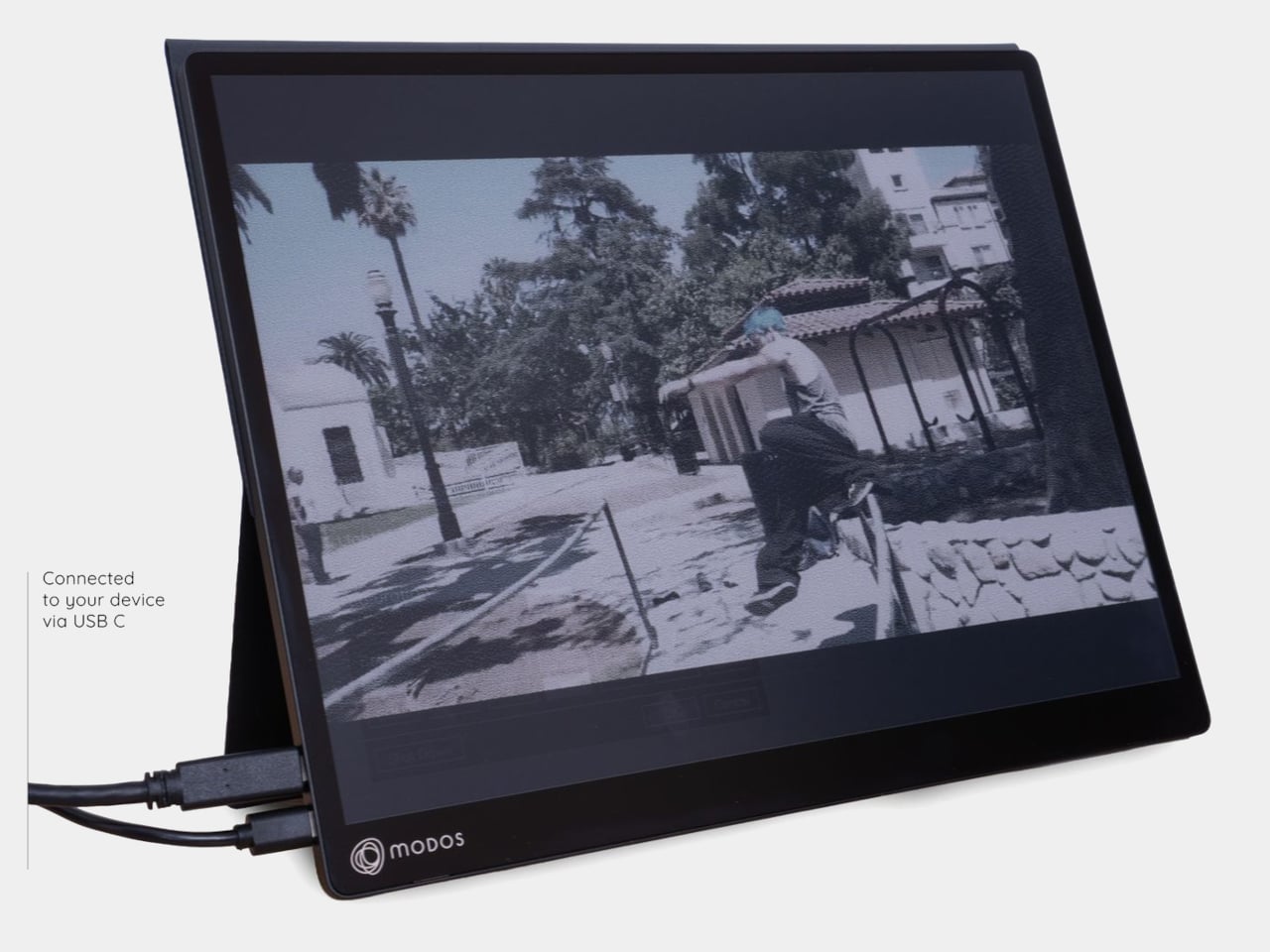
Resolution is also where the Modos Flow separates itself. In black-and-white mode, it renders at 3,200 x 2,400 pixels with a pixel density of 300 PPI, making text crisp enough to satisfy anyone used to retina-grade displays. Color mode brings the resolution down to 1,600 x 1,200 pixels at 150 PPI, which is a fair trade given how rarely E Ink panels offer color at all.
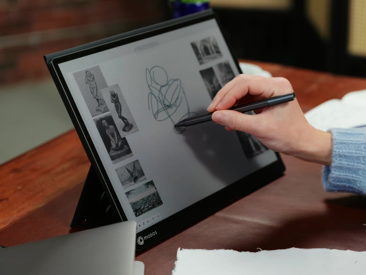
Touch and stylus support round out what’s becoming a surprisingly versatile display. Modos brought the latency down to under 100ms, so annotating a document, sketching ideas, or jotting notes with a stylus actually responds the way you’d want it to. It won’t replace a dedicated drawing tablet, but for someone who routinely works between a laptop and a secondary screen, having that input option without swapping devices is genuinely useful.
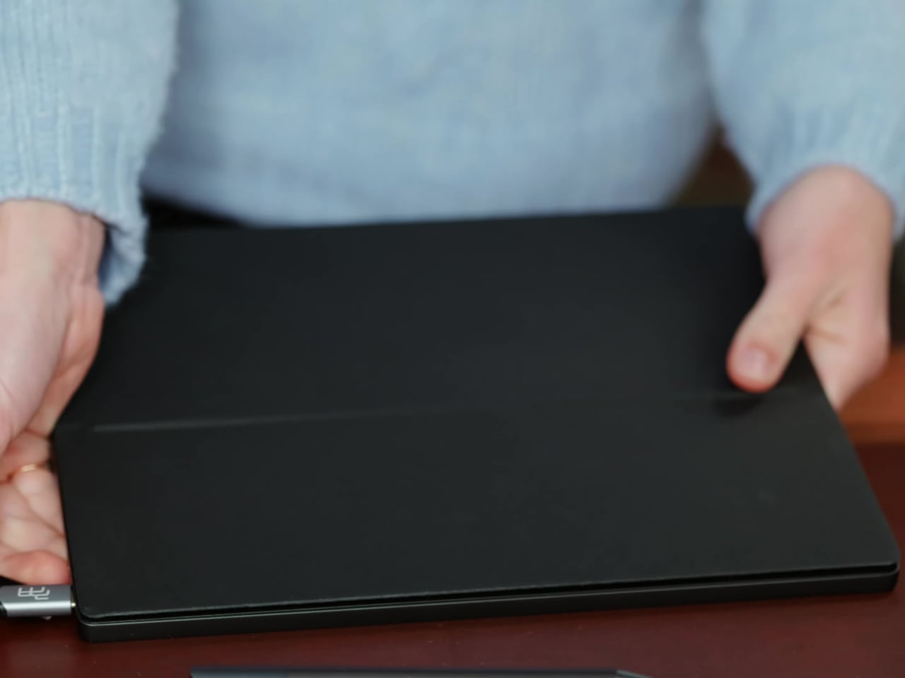
Its physical design is straightforward and practical. A built-in cover doubles as a stand and folds flat for travel, while VESA mounting holes on the back make it easy to attach to a monitor arm or desk mount. Three side buttons let you adjust brightness, contrast, and display mode without touching your computer. Connectivity runs through USB-C with DisplayPort Alt-Mode support, which keeps the setup clean with a single cable.
One of the quieter advantages of E Ink over LCD or OLED is power consumption, and that matters here. When connected to a laptop via USB-C, the Modos Flow draws significantly less power than a conventional secondary monitor, meaning your battery isn’t taking nearly the hit it normally would. It works with Windows, macOS, and Linux out of the box, so there’s no particular setup hurdle to clear. Pricing hasn’t been confirmed yet, but Modos has indicated it should be comparable to other portable monitors.
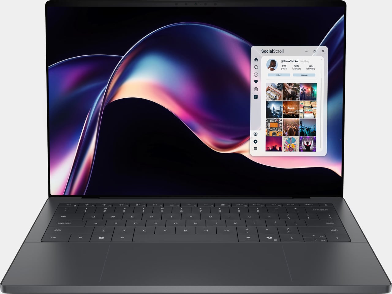
Battery life has been one of the laptop industry’s most persistent design headaches, especially among Windows notebooks. Despite significant gains in chip efficiency, the display consistently ranks among the biggest power consumers in any portable computer. Most laptop screens refresh at a fixed rate regardless of what’s actually on them, which means the panel keeps drawing full power even when you’re sitting completely still, reading a document with nothing on screen changing at all.
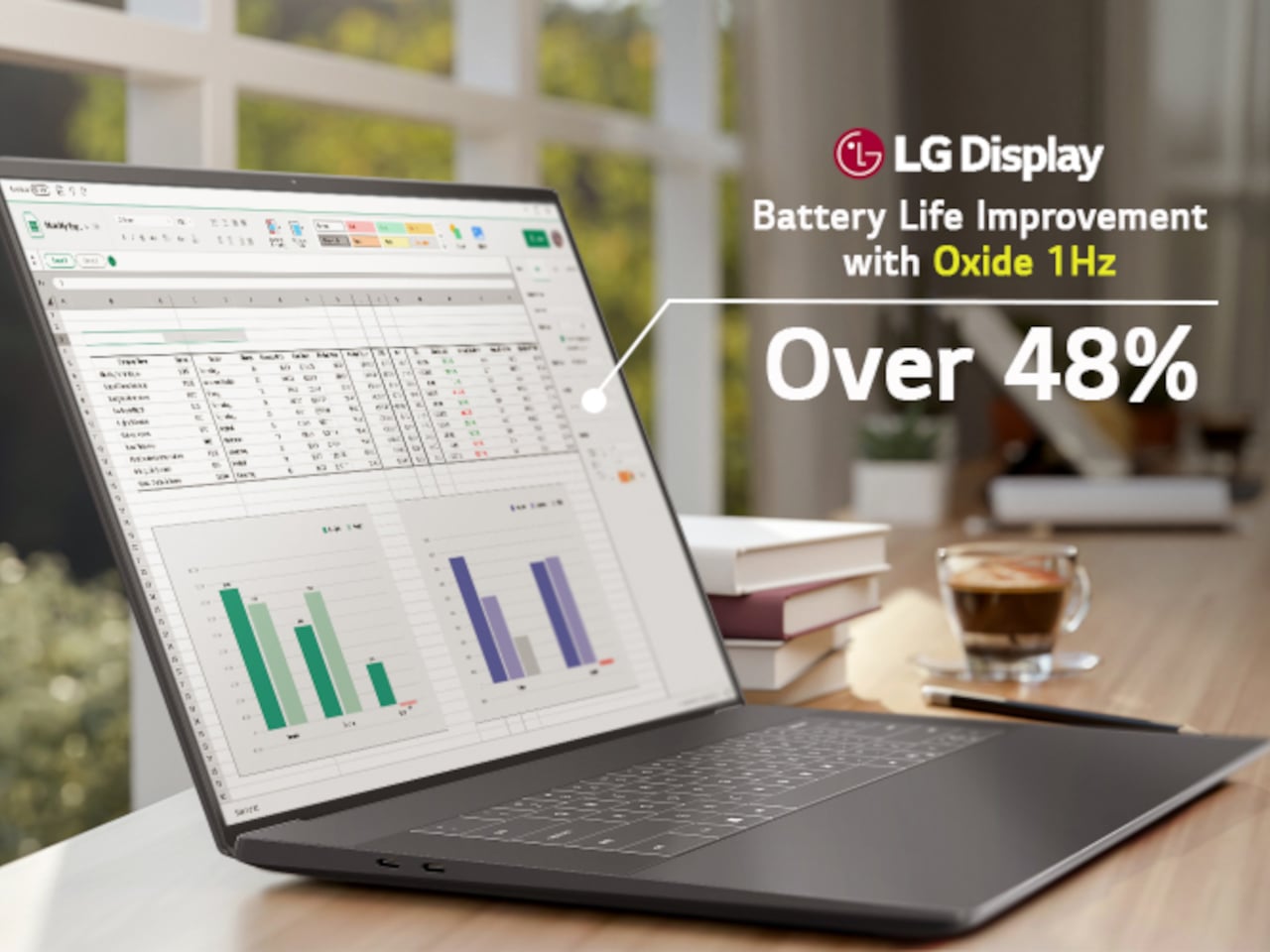
LG Display’s new Oxide 1Hz panel is the first mass-produced LCD laptop screen that doesn’t work that way. Rather than holding a fixed rate, it reads what’s on screen and drops to 1 Hz when the content is static, then scales back up to 120 Hz for video or gaming. LG began mass production on March 22, 2026, claiming the first-ever achievement of this at scale.
The technology relies on custom circuit algorithms and a new oxide material applied to the panel’s thin-film transistor. That oxide holds an electric charge longer than conventional LCD materials, letting the screen maintain a still image without continuously refreshing it. LG claims the result is up to 48% more use on a single charge versus existing solutions, which is a significant number if it holds up in everyday use.
In practice, this matters most during the parts of a workday you spend the bulk of your time in. Checking emails, reading through documents, and sitting on a static slide during a meeting are all moments where a 60 Hz or 120 Hz screen burns power for no real benefit. The Oxide 1Hz panel handles those scenarios at a fraction of the usual draw without any visible difference.
When you do pull up a video or launch something that demands smooth motion, the panel doesn’t hesitate. It detects the change and jumps back up to 120 Hz automatically. There’s no mode to switch into, no setting to toggle, and no trade-off to manage. It just adjusts based on what’s happening on screen, which is how this kind of feature should work in the first place.
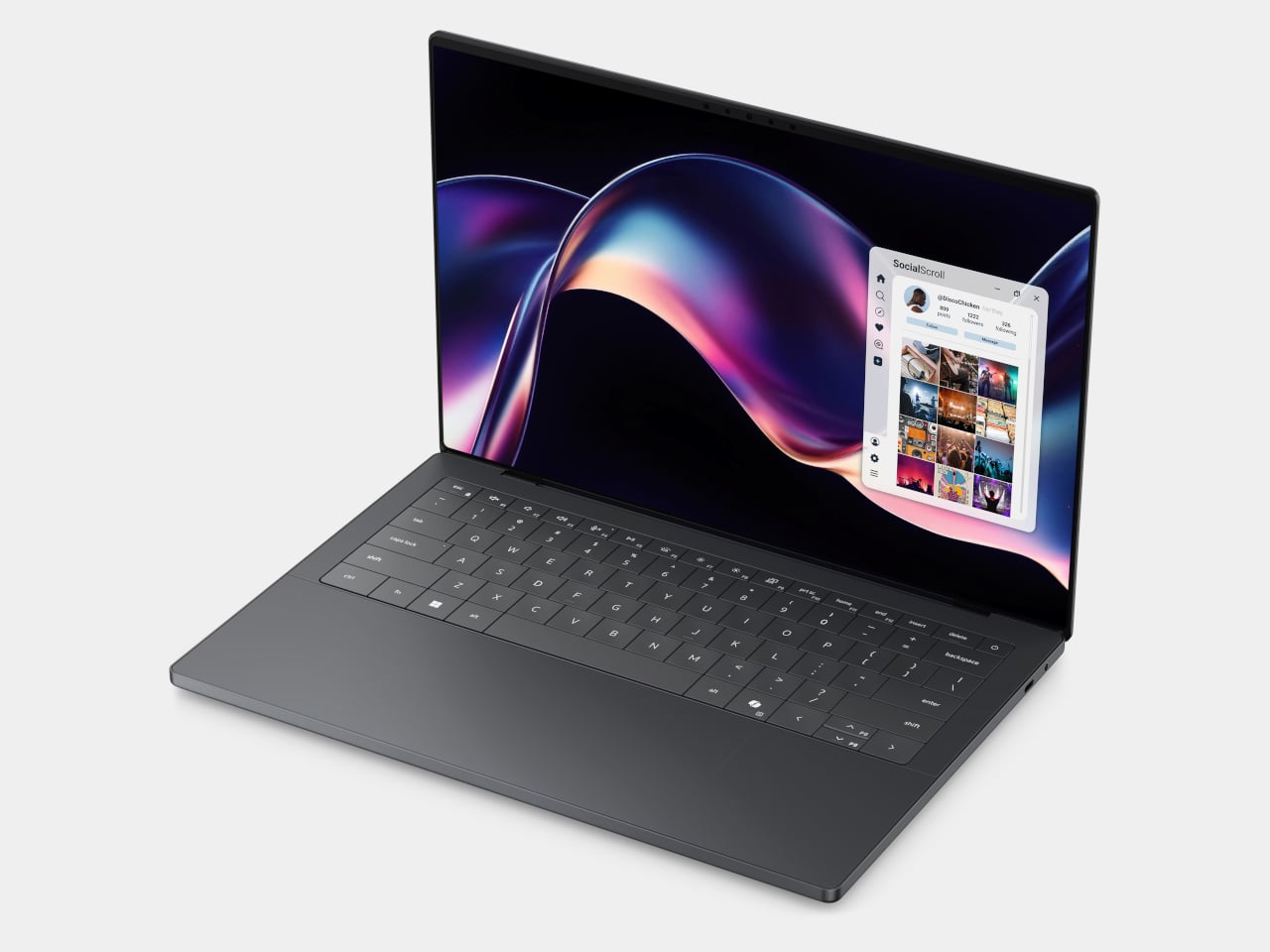
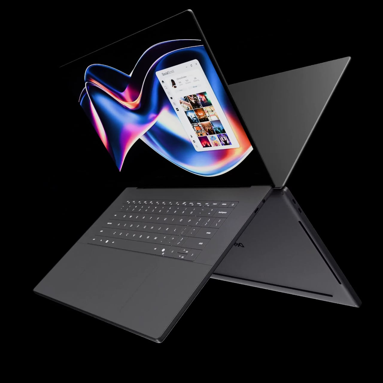
The first laptops to ship with this panel are the Dell XPS 14 and Dell XPS 16 for 2026, both unveiled at CES 2026 in January. The LCD option on both models runs at 1920 x 1200 pixels and 500 nits of brightness. Dell’s OLED option only drops as low as 20 Hz, which means the more affordable LCD configuration actually wins on low-power behavior.
Here’s where it gets interesting from a design standpoint. The display is one of the biggest power consumers in any laptop, so a screen drawing significantly less power during typical use creates real headroom for designers. They can use that headroom to maintain battery size and gain extra runtime, or to trim the battery slightly for a lighter, thinner chassis without giving up the battery life buyers already expect.
Of course, LG is already planning a 1 Hz OLED version of this technology for 2027, which is when things could get more interesting. OLED handles contrast and color in ways LCD can’t match, and pairing that quality with proper low-refresh-rate behavior could push portable laptop design further than it’s been able to go. For now, the Oxide 1Hz LCD is in something you can actually go out and buy.
Most smartphones are designed to be impossible to put down. The screen faces up on every table, the display lights up for every notification, and the cost of checking it one more time is exactly zero. That’s not an accident. The hardware removes friction from compulsive use because removing friction is what makes these devices feel indispensable. The tinyBook Flip concept asks a different question entirely: what if the phone were designed to get out of the way?
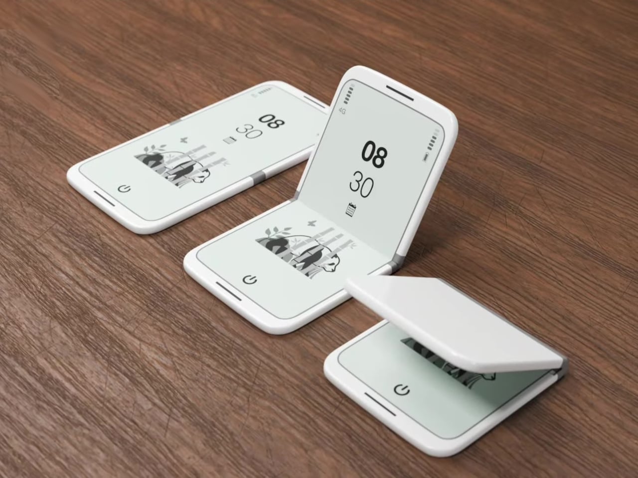
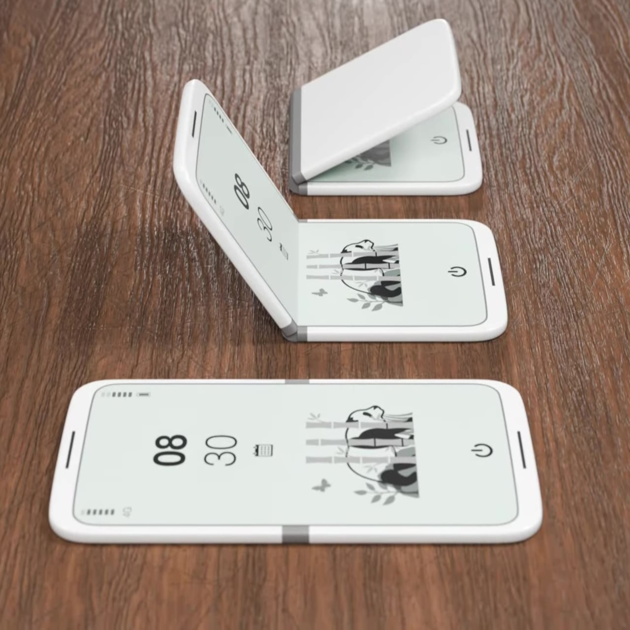
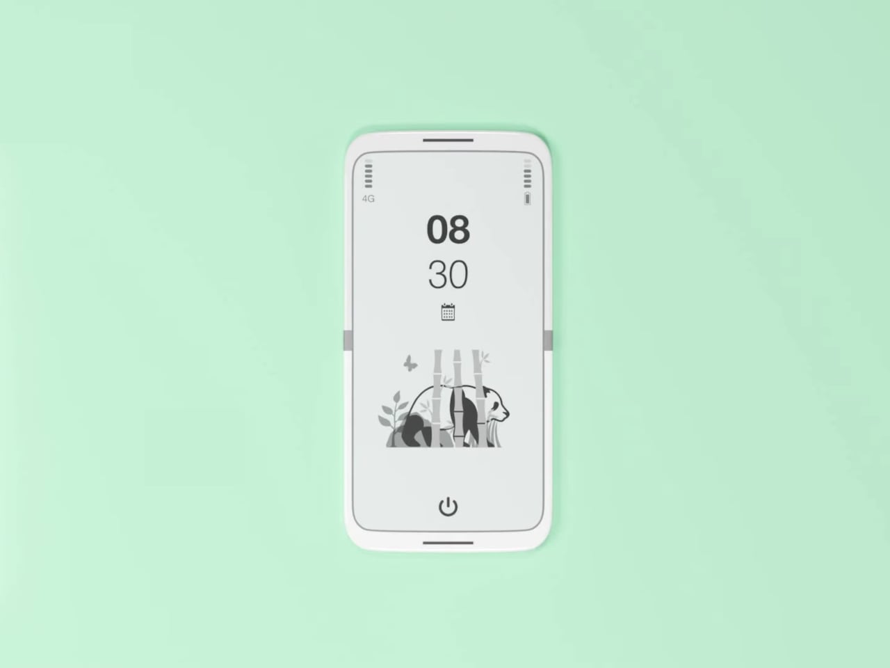
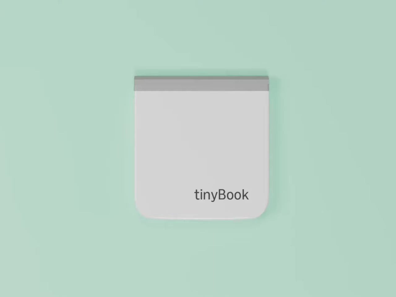
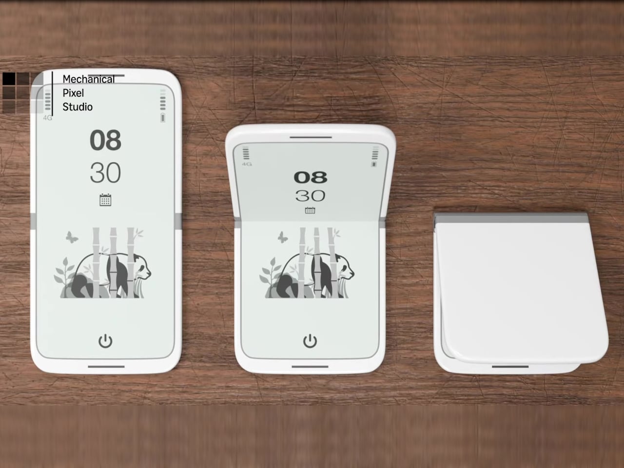
The tinyBook Flip is a vertical foldable phone concept built around a 6.1-inch E Ink display. Closed, it collapses into a compact, near-square form with rounded corners and a matte white finish, something closer in proportion to a folded notecard than a smartphone. The screen disappears entirely when the device is closed shut. No glowing rectangle sitting face-up on the desk, no ambient reminder that there are things to check. Just a small, quiet object.
Designer: Pixel Dynamics
That folded form is doing more work than it might seem. Opening the phone requires a deliberate physical action, and that small added step changes the behavioral math. A reflexive grab becomes a conscious decision. The friction is minimal in absolute terms, maybe two seconds, but two seconds of resistance is often enough to interrupt the loop. The concept treats that interruption as a design feature, which puts it in genuinely different territory from most phones.
The E Ink display adds a second layer of resistance, and this one is less subtle. E ink refreshes slowly, renders in grayscale or muted colors, and handles fast-moving content poorly. Social media feeds become tedious. Short-form video becomes unwatchable. Anything built around color, motion, and rapid visual feedback stops working the way it was designed to. This is precisely the point. The screen’s limitations aren’t engineering compromises left over from an earlier era of display technology; they’re structural properties that make certain behaviors genuinely unpleasant to sustain.
What E Ink handles well is a shorter list, but a coherent one. Text reading, messaging, calendars, and static interfaces are all comfortable at E Ink’s native pace. The renders of the tinyBook Flip show a UI built around exactly these strengths: a large clock face, a calendar widget, and a grayscale illustrated wallpaper. The interface doesn’t reach for capabilities the display can’t support. The phone isn’t trying to do everything; it’s trying to do a narrower set of things without apology.
Foldable E Ink panels aren’t a speculative technology. The hardware exists at the component level and has already appeared in experimental e-readers, though no consumer phone has shipped with one in any meaningful volume. The tinyBook Flip isn’t imagining impossible components; it’s proposing a form factor that manufacturers haven’t yet committed to producing. The distance between those two things is largely commercial, not technical.
There’s also something worth noticing about how the device reads as a physical object in social space. Closed, the tinyBook Flip looks like almost nothing. No visible screen, no status indicators, no glow. A phone that carries no visual weight when it’s not in use sends a different signal than one that’s always broadcasting its presence. Putting it down means it actually disappears from the environment, not just from your hand.
That said, the concept leaves some real friction points unaddressed, and not the intentional kind. E Ink handles camera use, live navigation, video calls, and authentication apps poorly. A foldable hinge adds mechanical complexity and thickness that clean renders tend to obscure. The tinyBook Flip looks resolved in this form, but a production version would have to make tradeoffs that these images don’t show and the concept doesn’t acknowledge.
Still, the more interesting question isn’t whether this specific device could ship. It’s whether a phone that makes itself harder to misuse is a reasonable design goal at all, or whether that’s just a way of describing a phone that most people wouldn’t actually want. The tinyBook Flip lands firmly on one side of that question. Whether the market agrees is a different problem entirely.

 Connexion