❌

Vue lecture

A Hidden Mechanism Turns the Scissor Chair Into a Lounger
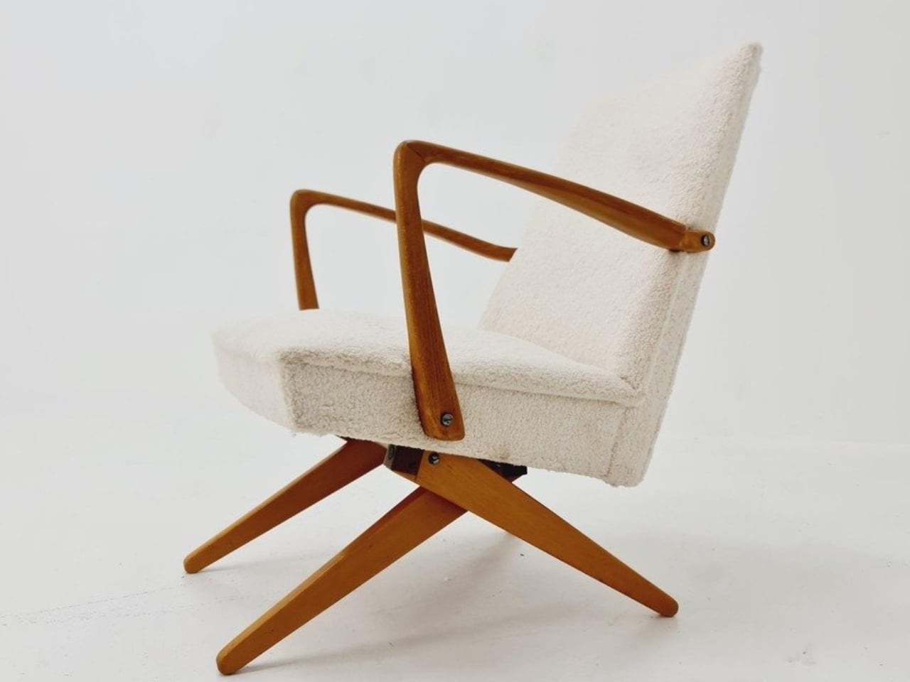
Buying a chair for conversation and buying one for an evening with a book can feel like two separate furniture decisions. One asks you to sit up; the other invites you to sink back. If your living room doesn’t have space for both, the Scissor Chair offers an appealing compromise. Produced by the German company Wilhelm Knoll, this mid-century design changes its sitting position while keeping the appearance of an ordinary upholstered armchair. Its designer remains unknown, but the problem it addresses is familiar.

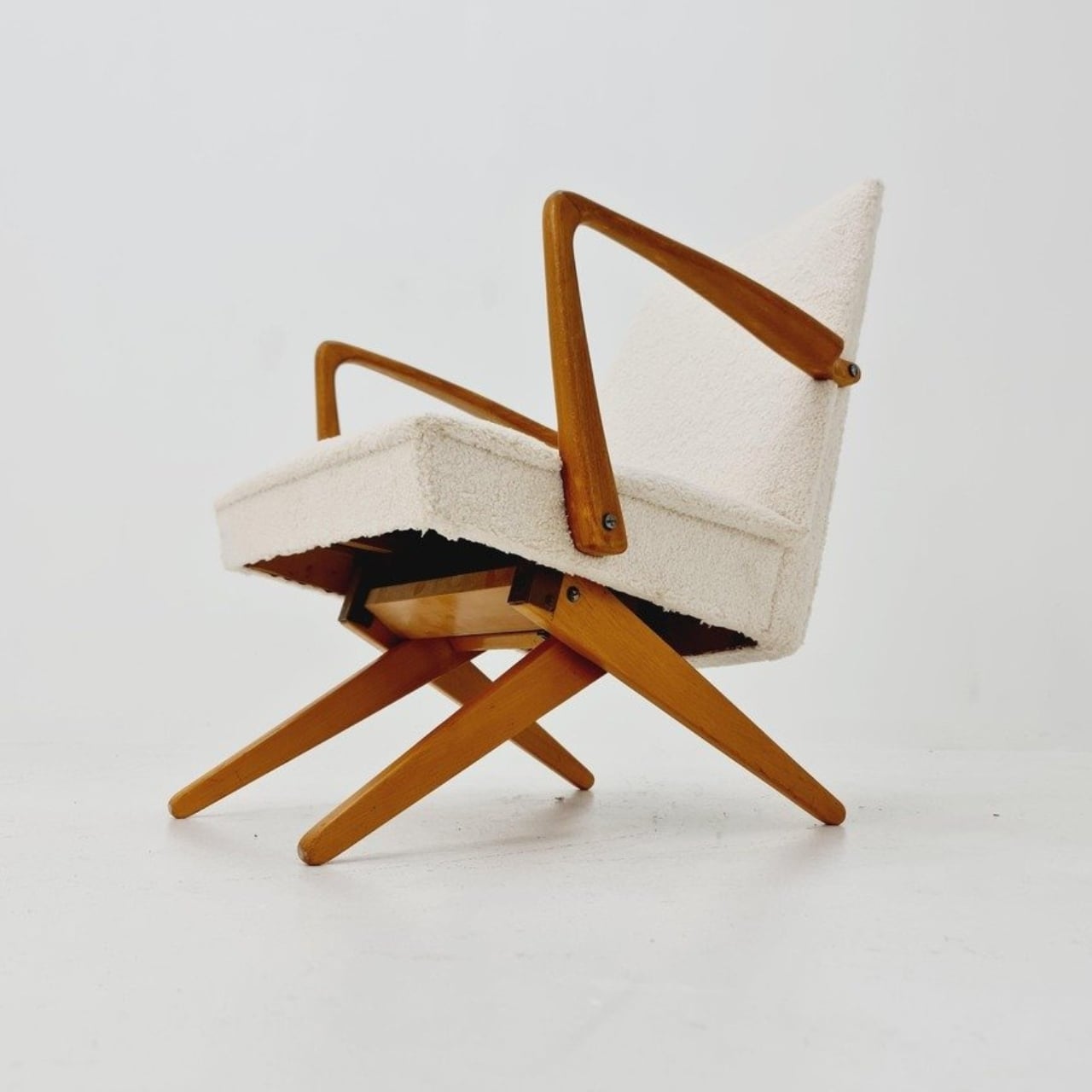
The name gives away the basic geometry. According to a vintage dealer’s description, lifting the armrests allows the crossed legs to unfold. The chair moves between a taller, more upright configuration and a lower lounging position. Instead of leaving the legs stationary while only the backrest moves, the transformation changes the stance of the chair itself. I like that the supporting structure participates in the adjustment. Those wooden legs have a job beyond providing a handsome silhouette.

Designer: Unknown (produced by Wilhelm Knoll)
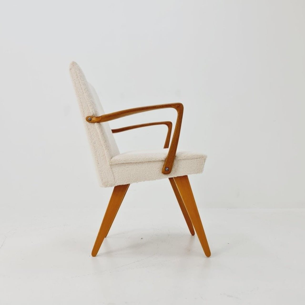
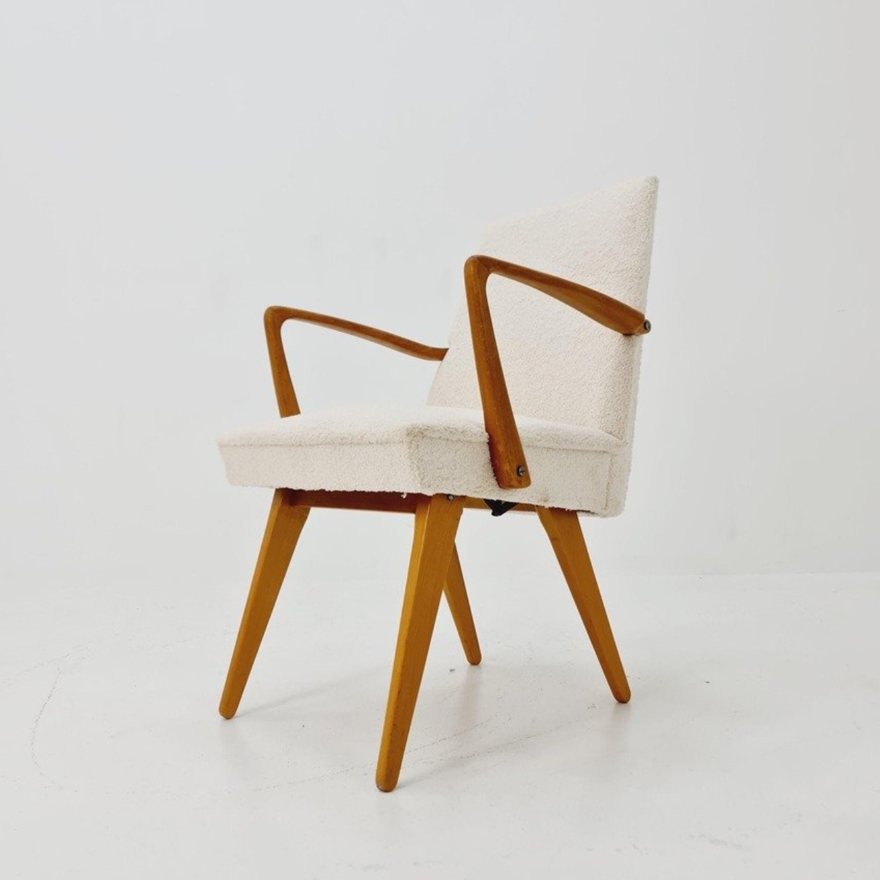
In photographs of a cream-upholstered example, the narrow wooden arms trace an open shape around the seat and back. There’s plenty of air beneath the upholstery, and the legs remain visually separate rather than disappearing inside a boxy base. In the upright position, it looks quite composed. Lowered, the crossed supports become more obvious, and the chair takes on a relaxed, backward-leaning posture. The useful surprise is how little visual fuss accompanies that change.

The adjustment is more substantial than a slight tilt. One dealer lists seat heights of 45 and 36 centimeters for an example, roughly 18 and 14 inches. That’s a difference of about three and a half inches, enough to make these visibly different seating arrangements. Those are seller-provided measurements for a vintage piece, rather than a universal specification, but they help explain the appeal. You’re choosing between two distinct positions, with different relationships to the floor and surrounding furniture.
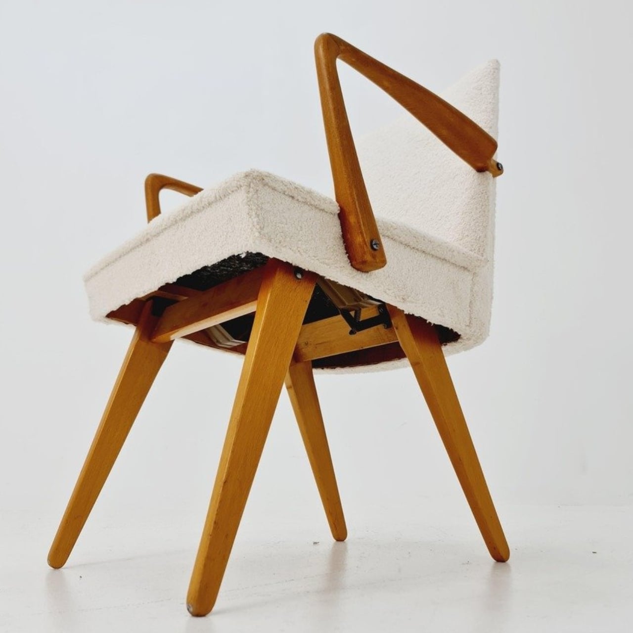
Underneath, the mechanism is considerably busier than the silhouette suggests. A dealer’s underside photograph reveals pivoting metal links, brackets, and a coil spring tucked between the wooden supports. I’d happily leave that view to someone servicing it. From a design perspective, though, the separation makes sense: the mechanical assembly sits beneath the upholstered seat, where it can do its work without dictating the appearance of every surface above it. The chair doesn’t need to look like workshop equipment to have moving parts.

For a smaller living room, I see the attraction as flexibility rather than some miraculous recovery of square footage. A chair that changes posture still needs room around it, especially when its stance changes. The more convincing benefit is having one seat that can suit a conversation and then offer a lower position for unwinding. That’s a modest promise, and a useful one. I’d rather have two clearly differentiated options than an elaborate transformation with no obvious purpose.
The Knoll name deserves a little care here. Wilhelm Knoll was a German business whose roots go back to a Stuttgart leather shop founded in 1865. It shouldn’t be casually confused with the American company Hans Knoll established in 1938, although the businesses share family history. Vintage dealers date Scissor Chair examples to the 1950s. Keeping the manufacturer credit separate from the unidentified designer matters, particularly with an object whose mechanism deserves more attention than a famous surname alone.

Of course, photographs can’t tell me how smoothly a surviving example adjusts or how supportive it feels after an hour. With a vintage moving chair, I’d want the mechanism demonstrated and its condition checked before buying. That practical reservation doesn’t diminish the idea. The Scissor Chair appeals to me because its cleverness is so specific: lift the arms, alter the stance, settle into a different position. A living room doesn’t always need another chair. Sometimes the chair already there could simply offer another way to sit.
The post A Hidden Mechanism Turns the Scissor Chair Into a Lounger first appeared on Yanko Design.
  •  

These Japanese-Made Guitar Scissors Come With Their Own Mini Stand

Even though I already have drawers and boxes of various stationery items, I’m always on the lookout for things that are cute and unique but still useful for work and my hobbies. Scissors are one of those things you can never have too many of, especially if they serve different functions. There are pairs for everyday cutting, for journaling, for cutting things into cute shapes, and some that are just highly decorative.

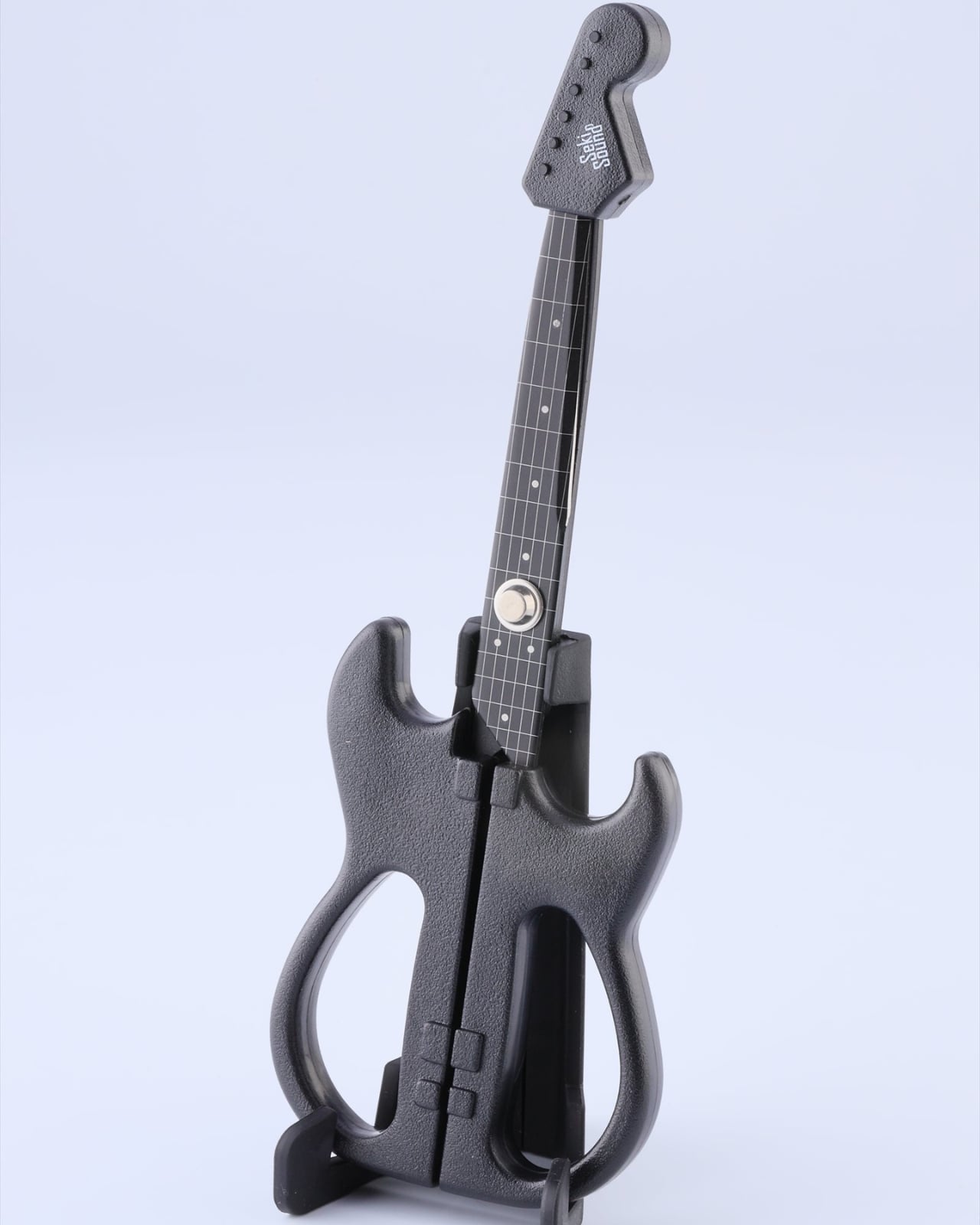
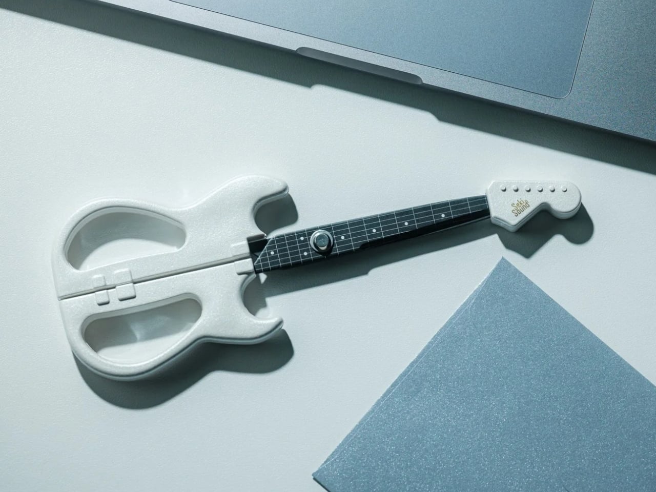
If you love stationery and music, the Rockstar Guitar Scissors may be your next tiny purchase. As the name suggests, it’s a pair of scissors shaped like an electric guitar. But more than just being uniquely shaped, the design itself has a role in storing and using the scissors. It’s the kind of item you might want to keep out of your office drawer, and it could also make a small gift or stocking stuffer this upcoming holiday season.

Click Here to Buy Now: Starting at $30

A lot of differently shaped stationery items can just be novelty things that are good to display on your desk. This one, though, has parts that were thought out to match the theme while making it a functional piece for everyday use. So forget about guitar graphics slapped onto a pair of conventional scissors. This one takes the idea further. Well, it still can’t play actual music, of course.

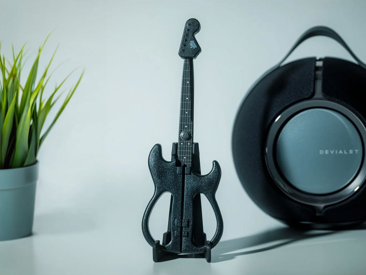
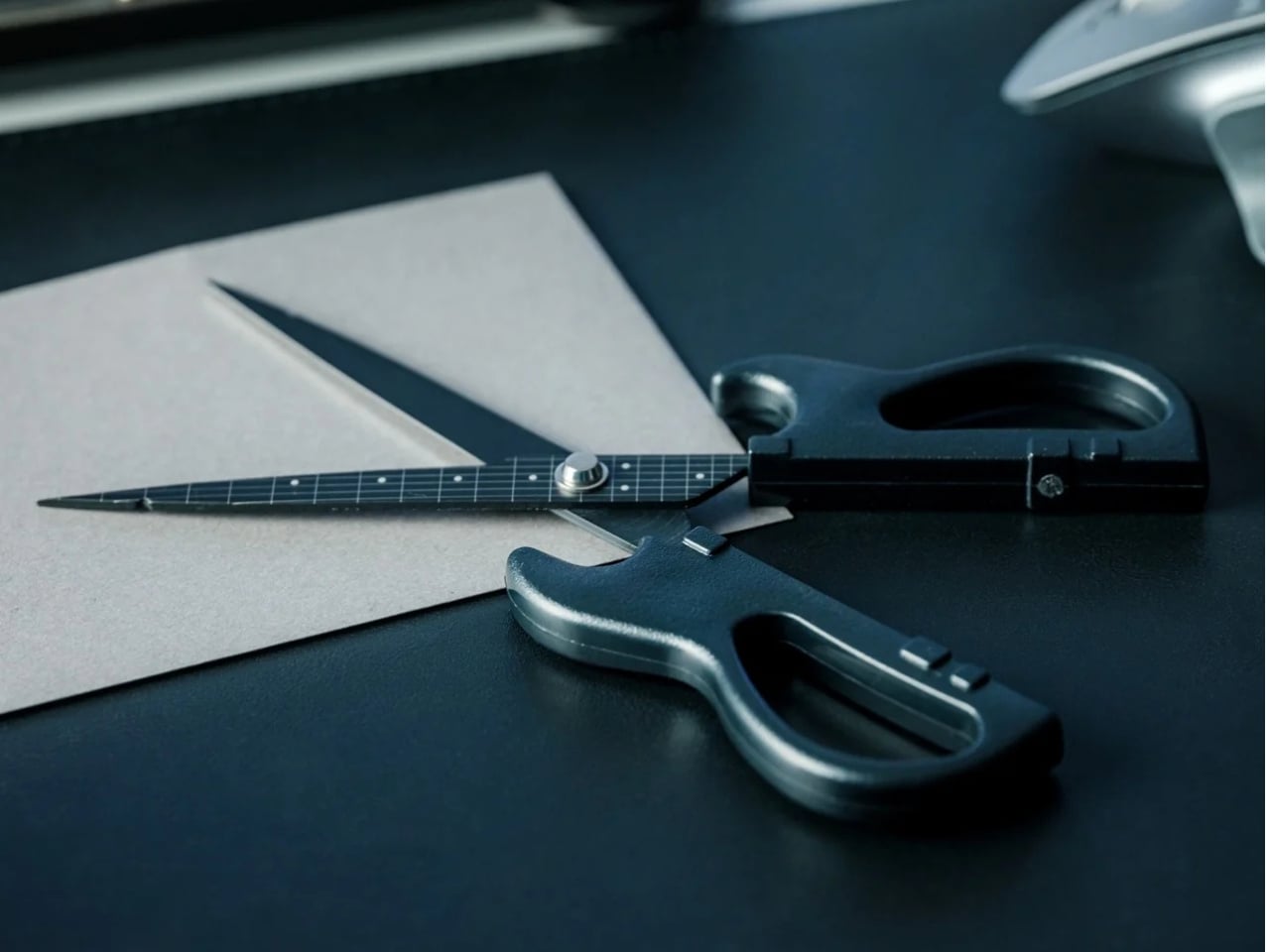
The guitar body separates into the handles, with the finger openings as part of the lower body of the instrument it’s imitating. The narrow neck of the “guitar” separates into the cutting blades. It even has a removable ABS cap that completes the headstock when the scissors are closed. According to the store’s description, the cap also covers the sharp point and prevents the scissors from opening while it’s in place. That gives a decorative detail a useful job when you’re putting the scissors away.

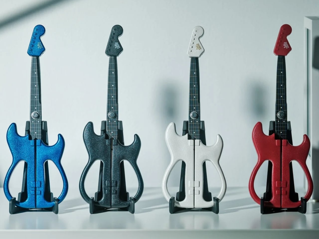
The scissors have stainless steel blades, while the handles and cap use ABS plastic and the stand is made from elastomer. You can choose from three color options: black, metallic blue, and pearl white. They measure about 7.8 inches overall, and the YD Select lists black at US$30; metallic blue and pearl white at US$40 each.

They even come with a stand that holds up your closed scissors like an actual guitar at rest on an instrument stand. For anyone who tends to lose smaller tools among notebooks and pen cases, having a dedicated spot could make them easier to find. Of course, the stand takes up some desk space, so this isn’t really a space-saving solution. It’s more about giving a useful item a place where you’ll actually notice it.

Made in Japan by Nikken Cutlery, the scissors are also known as Seki Sound. Nikken says craftspeople in Seki individually sharpen the blades, and it describes a fluorine-coated finish intended to reduce adhesive sticking when cutting tape. That’s a relevant feature if your stationery projects involve tape, although it shouldn’t be read as a promise that the blades will never need cleaning. The guitar detailing also includes six strings and frets, rather than relying only on the outline.

Compared with options from a big brand like Fiskars, the Rockstar Guitar Scissors put more emphasis on their display-ready shape. Fiskars offers SoftGrip handles, Easy Action spring-assisted opening, and nonstick models, while its MoMA collection puts artwork on familiar scissor handles. The Rockstar design instead turns the whole tool into a miniature instrument, complete with a cap and stand. There isn’t enough evidence to say it cuts better or feels more comfortable than those alternatives; its clearest distinction is how the guitar shape carries through to storage.

I wouldn’t expect the Rockstar Guitar Scissors to replace every specialty scissor in my drawers. What appeals to me is having something with a recognizable personality that still has a reason to be on my desk. For a stationery lover who also loves music, it could make a good holiday gift or stocking stuffer, especially if you’d rather give something useful than another ornament that just sits there. At least this little guitar has a job between its imaginary performances.

The post These Japanese-Made Guitar Scissors Come With Their Own Mini Stand first appeared on Yanko Design.

  •  

Mori the Mushroom Robot Offers Company Without Saying a Word

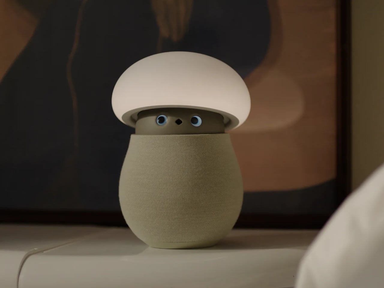
A mushroom with glowing eyes is an easier sell for my nightstand than a miniature humanoid. OKA’s Mori takes that approachable shape and gives it a specific job: offering a little company and a reason to pause, without making another screen the center of attention. Currently offered through an early-purchase program, the companion robot uses light, sound, and movement to bring some presence to a quiet room. The ambition is modest enough to feel appealing.

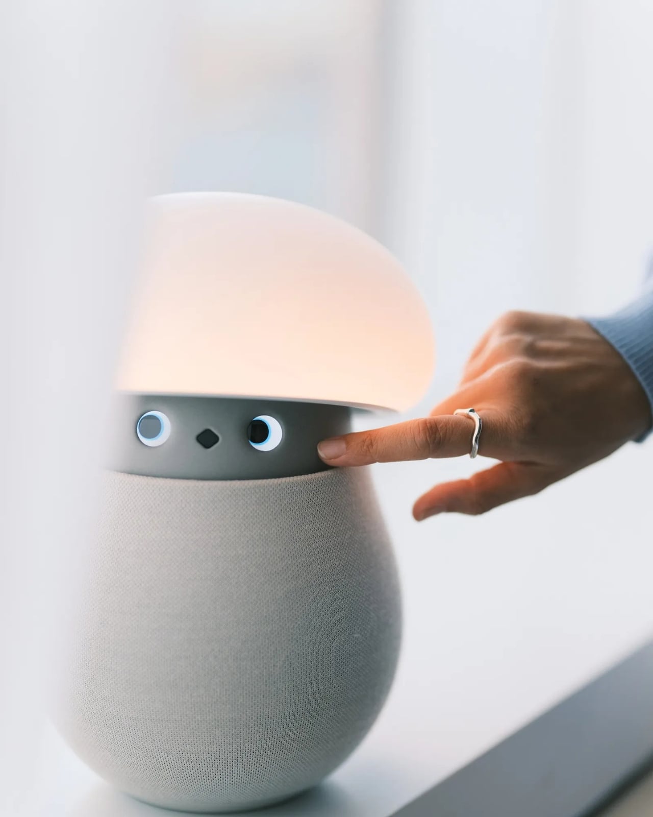
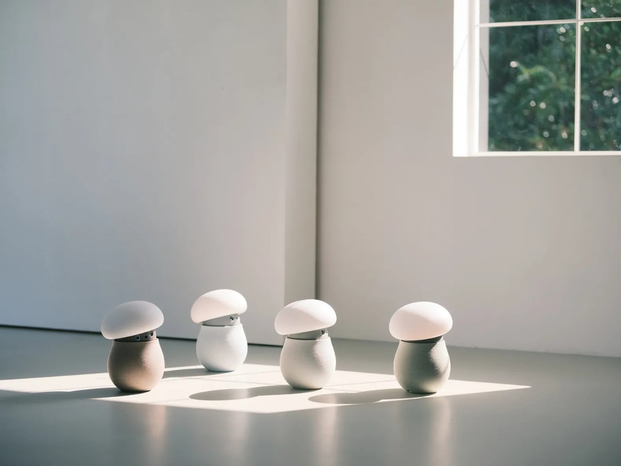
For anyone who wants to unwind without reaching for their phone, the physical design makes a good opening argument. Mori stands just under 12 inches tall at its maximum height, with a broad illuminated cap above a rounded, fabric-covered body. Two eyes peek out from underneath and the fabric contains 25 percent real wool. In the supplied photographs, the proportions suggest a small table lamp that wandered into an animated movie, then decided to stay. I’d happily make room for that silhouette.

Designer: OKA

The backstory gives that friendliness some purpose. OKA cofounder Hua Wang said he spent a decade designing mechanisms that brought people back to their phones. With Mori, he wanted a robot that belonged in a home rather than a large, intrusive machine. That’s a useful starting point. A domestic robot has to earn its place among your furniture before its intelligence becomes particularly interesting.

Mori’s controls lean into that furniture-friendly character. According to OKA, placing both hands on its base starts a guided breathing session, while patting its head makes the cap retract and turns it into a lamp. Light and natural soundscapes provide the setting for those breaks. I like the directness of those gestures. Touching an object to change its behavior feels appropriate here, especially when the proposed activity is stepping away from the usual sequence of opening an app, choosing a menu, and adjusting settings.

Importantly, Mori doesn’t speak in words. Its vocabulary consists of sounds, expressions, light, and movement. That limitation might be its most attractive feature. I don’t particularly want a bedside object to become another conversational obligation. A glance or a small movement leaves more room for interpretation, much like an animated character whose personality comes through before it says anything. The lamp setting also gives its owner a way to dial that personality down, with most companion reactions reduced. Cute still needs an off-ramp.

Of course, those expressive eyes come with a less whimsical consideration: sensing people inside their homes. OKA’s privacy policy says Mori’s core AI runs locally, with camera and microphone inputs processed on the device. Raw audio and image frames are discarded after processing, while recognition information can remain locally to distinguish users. The policy separately allows collection of account, device, and diagnostic information. That distinction matters. Local processing is a welcome design decision, but I’d still read the permissions before inviting a camera-equipped companion onto the dresser.

OKA also says Mori learns and becomes more individual through repeated interaction. That’s the promise I’d reserve judgment on until longer-term use establishes what actually changes. A familiar gesture could become endearing, or simply predictable. The interesting design challenge is giving Mori enough variation to sustain affection without making it demand attention. Its quiet role sets a higher bar than the adorable appearance initially suggests: it needs to remain pleasant when the novelty has worn off.

At $649 before taxes and shipping for First Access orders, Mori is an expensive experiment in companionship. That purchase includes two years of its Nature Time subscription; OKA says basic functions won’t require a paid plan, and the included subscription won’t automatically become a paid one. I’m drawn to the object, but the price makes its everyday behavior more important than its introductory charm. The real payoff would be a robot you enjoy having nearby even when you aren’t actively playing with it. A mushroom-shaped lamp already has a place in a home. Mori has to make the eyes worth paying for.

The post Mori the Mushroom Robot Offers Company Without Saying a Word first appeared on Yanko Design.

  •  

Teenage Engineering’s EP-35 Amp Has a Hidden Cable Compartment

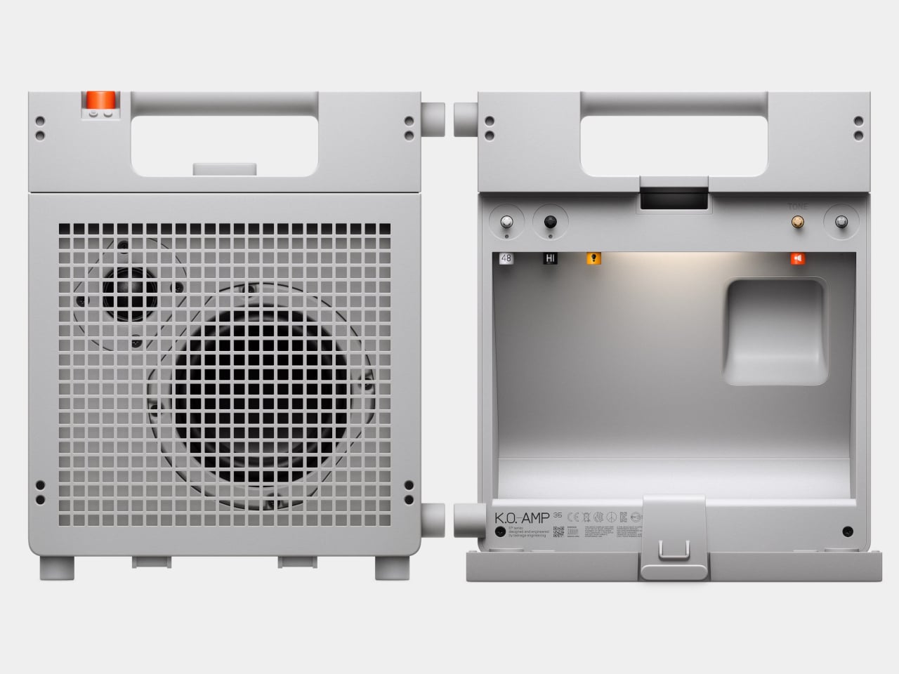
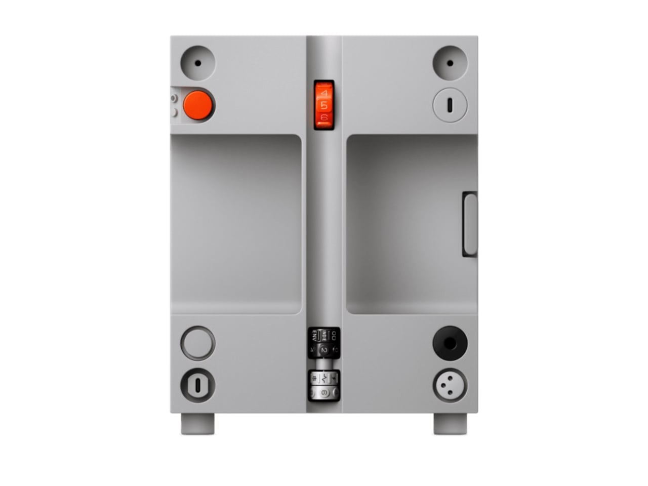
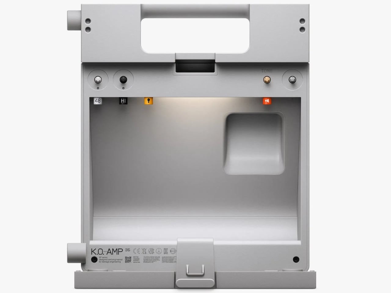
The back of Teenage Engineering’s EP-35 opens to reveal a compartment for cables and accessories. It’s a wonderfully unglamorous feature to put on a music gadget. An amp can look perfectly composed in a product photo, but taking it anywhere means figuring out where the supporting cast goes. Giving those loose pieces a home inside the speaker feels like an acknowledgment of how people actually use their equipment.

That practical streak extends beyond storage. Listed for sale at $399, the EP-35 combines a portable speaker, an instrument amplifier, and a USB audio interface. It accepts guitar, microphone, line-level, Bluetooth, and USB audio, with multiple sources able to play together. The problem it addresses is straightforward: playing guitar over a backing track, or adding vocals, shouldn’t require assembling a small equipment department. Here, those connections meet in one box.

Designer: Teenage Engineering

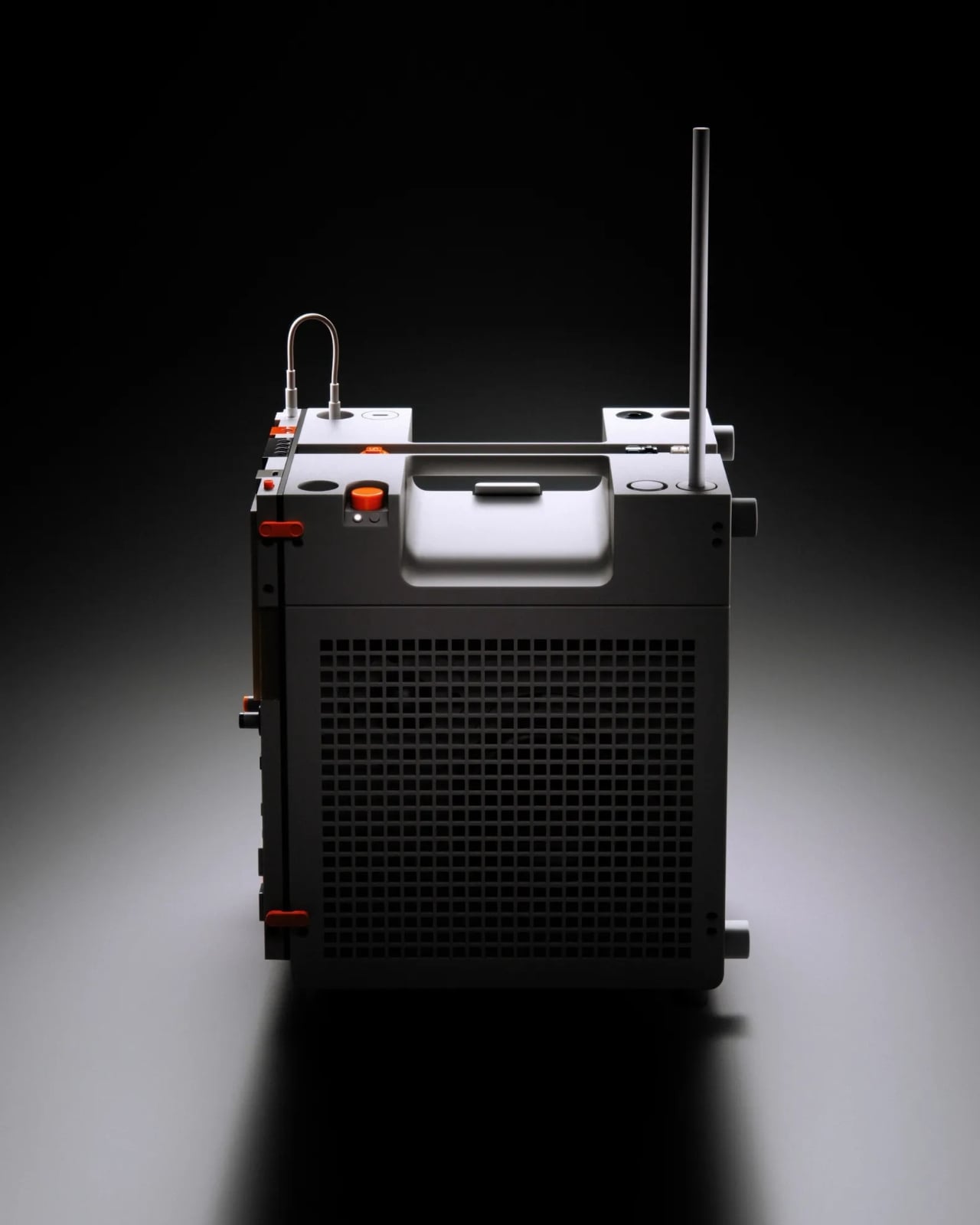
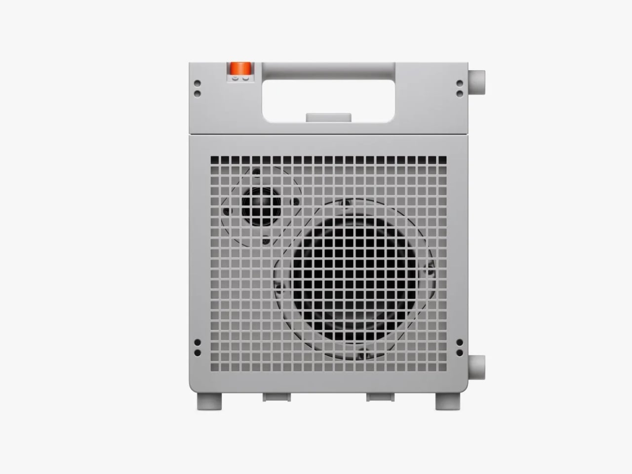
Visually, the EP-35 has the charm of equipment that might belong in a very stylish school science lab. Its gray body, square grille, integrated handle, and orange accents are deliberately matter-of-fact. I like that the speaker drivers remain visible behind the grid. They give the front a slightly awkward, almost characterful expression. Nothing about the proportions suggests an object desperate to disappear into your decor, which is part of its appeal.

The controls make a similar impression. There are physical dials for choosing effects and adjusting their intensity, with eight presets each for guitar and microphone. That’s an approachable arrangement: select a sound, turn a control, hear what changes. I’d rather see that direct relationship on something intended for casual playing than a screen full of options. The microphone effects even include presets called “robo choir” and “frog,” which gives you a fair idea of the intended mood.

The USB audio interface is less visually entertaining but potentially more useful. Connect the EP-35 to a computer and it can serve as a recording interface, giving the same object a role at a desk after it comes home. That continuity makes sense to me. A portable device earns its shelf space more easily when it doesn’t become redundant the moment you’re near a power outlet and a laptop.

Inside the storage compartment, Teenage Engineering has also included a small camp light. It can illuminate the compartment automatically when opened, stay on, or react to incoming audio in disco mode. Tilting the speaker backward makes those LEDs display the battery level. Some of this is useful, some is cheerfully unnecessary. I’m happy with that balance. Checking a battery through a small physical gesture is a more memorable interaction than another tiny percentage readout.

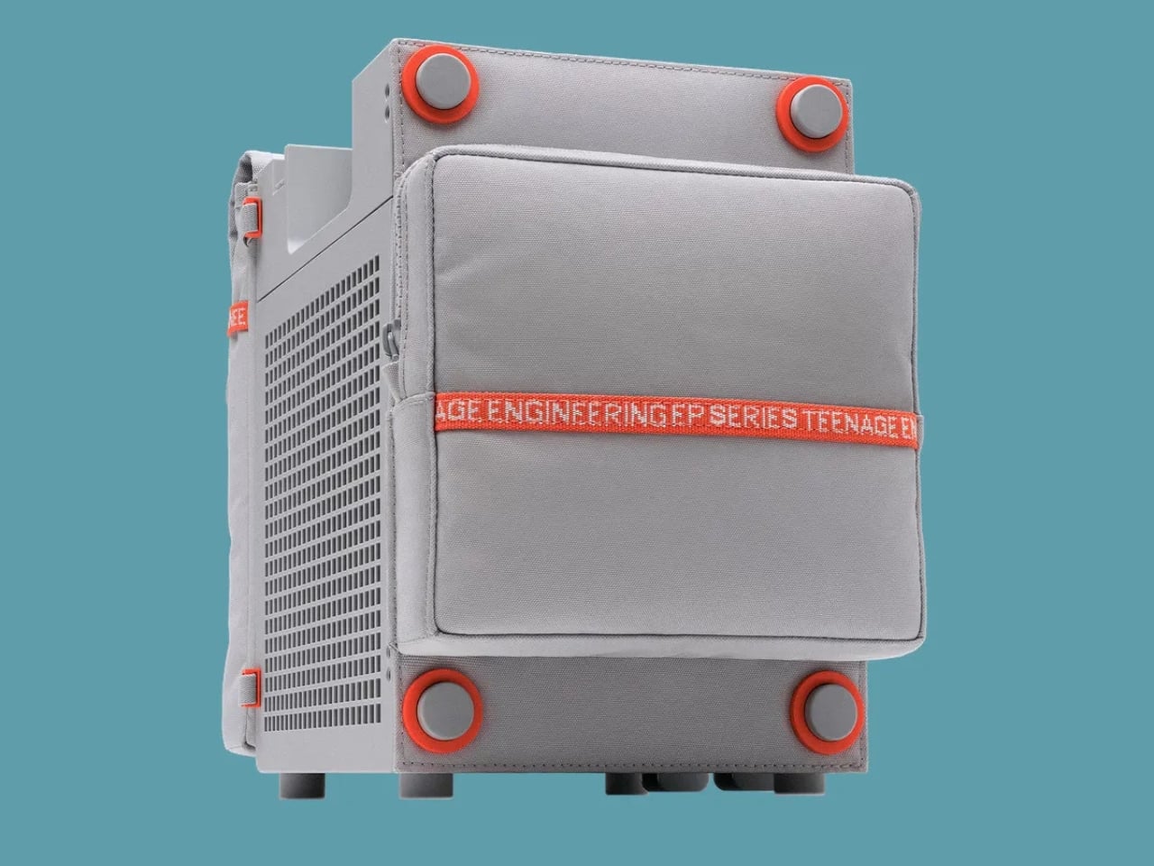
Portability does need a little perspective, though. At about seven pounds, the EP-35 is something you carry by its handle, not casually toss into a small shoulder bag. Teenage Engineering rates battery life at 12 hours with the volume set to five, so that figure shouldn’t be treated as an all-day guarantee at any loudness. It’s also splash-resistant rather than waterproof. Those distinctions matter if the appealing camp light has you mentally packing it for a weekend outdoors.

There’s room to expand the setup, too. Two EP-35s can play Bluetooth audio in stereo through broadcast mode. Teenage Engineering’s instructions let you assign left and right channels by tilting each speaker before starting that mode. Connected instruments take a different route: linking their sound between speakers requires a line-out-to-line-in cable. That’s worth understanding before imagining a completely wireless mini stage. The wireless convenience applies specifically to Bluetooth playback.

For me, the $399 price makes the most sense if those musical connections will get regular use. Someone who only wants background listening would be paying for considerable capability they might never touch. Sound quality still needs a listening test; clever packaging can’t settle that question. But I appreciate the attention paid to what happens between sessions. The music stops, the cables come out, and the EP-35 gives you somewhere to put them. That’s a modest design decision with a very recognizable payoff.

The post Teenage Engineering’s EP-35 Amp Has a Hidden Cable Compartment first appeared on Yanko Design.
  •  

FilaLoom Weaves Yarn Into 3D Prints Without Extra Motors

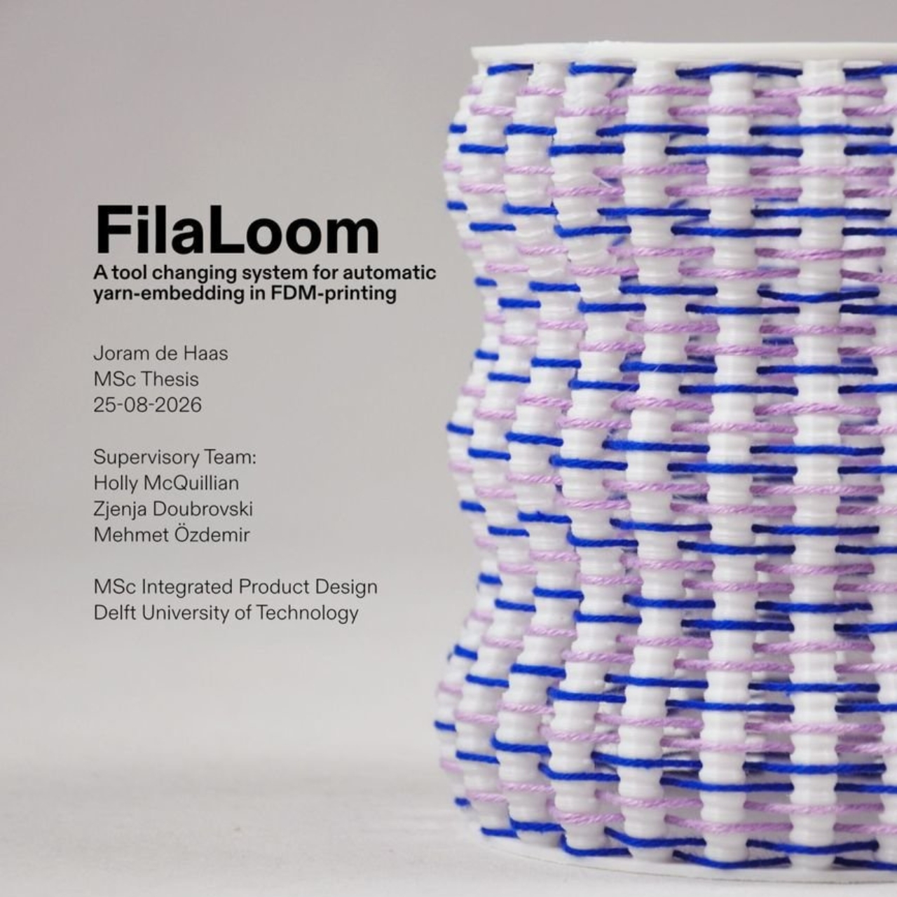
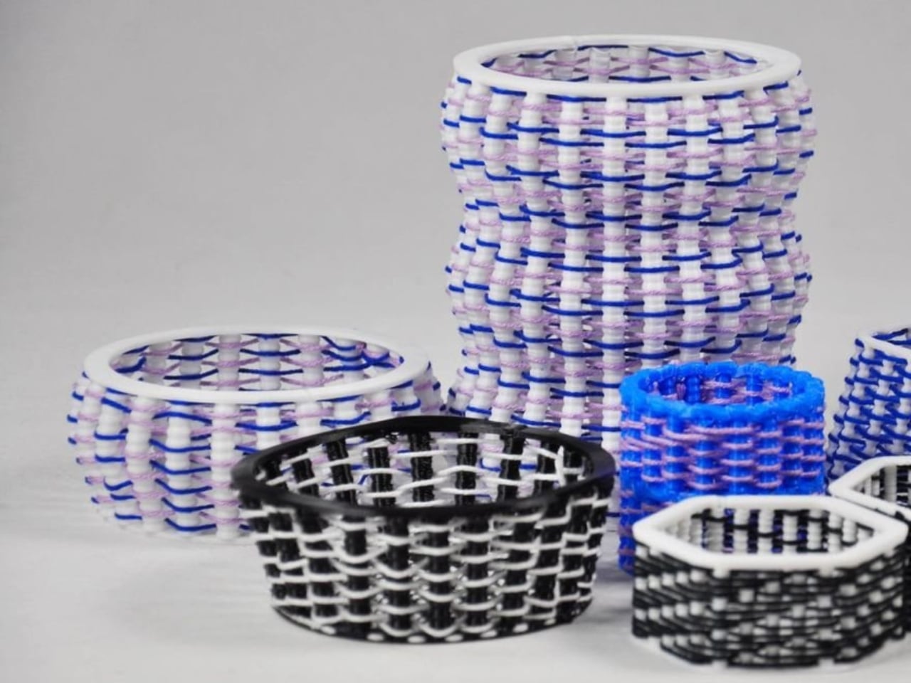
Blue and lilac yarn snakes through white plastic ribs in one of FilaLoom’s samples, giving the object a basketlike appearance that makes me want to pick it up. The appeal is easy to understand: intricate geometry only gets you so far when you want an object with a textile character. FilaLoom brings actual yarn into the process, letting the fibers remain visibly, unapologetically themselves.

Developed by industrial and computational designer Joram de Haas for his master’s thesis in Integrated Product Design at TU Delft, FilaLoom lets a desktop 3D printer automatically weave yarn into printed objects. It addresses a practical fabrication problem: combining printed structures with thread without making yarn placement a separate manual task. It’s a working research project, with DIY files available, rather than a finished consumer accessory.

Designer: Joram de Haas

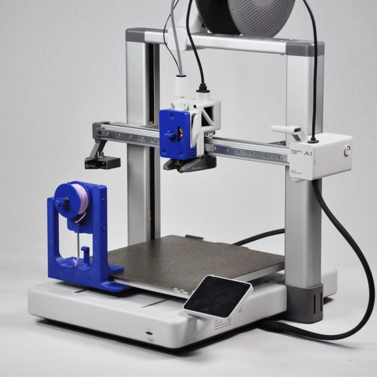
The prototype uses a Bambu Lab A1 fitted with a yarn-depositing tool and a parking station. The printer builds plastic anchor points, picks up the tool, and guides yarn between them. It then parks the tool and resumes printing, securing the yarn where needed. That alternating sequence allows the structure and its textile elements to develop together, rather than requiring someone to thread a completed plastic skeleton afterward.

I like the restraint in the mechanism. FilaLoom uses the printer’s existing movement system, with no additional electronics. A mechanical coupling handles tool changes, while a spring-loaded spool provides adjustable yarn tension. The machine already knows how to move precisely; this attachment gives that movement another useful job.

Visually, the blue-and-lilac sample is a persuasive introduction. Its white vertical elements remain clearly legible, while the colored yarn establishes a contrasting horizontal rhythm. Neither material disappears into the other. To my eye, that makes the construction more interesting than a uniformly textured surface. You can follow the relationship between the ribs and the thread, which gives the pattern a purpose beyond decoration. It looks assembled through its own making.

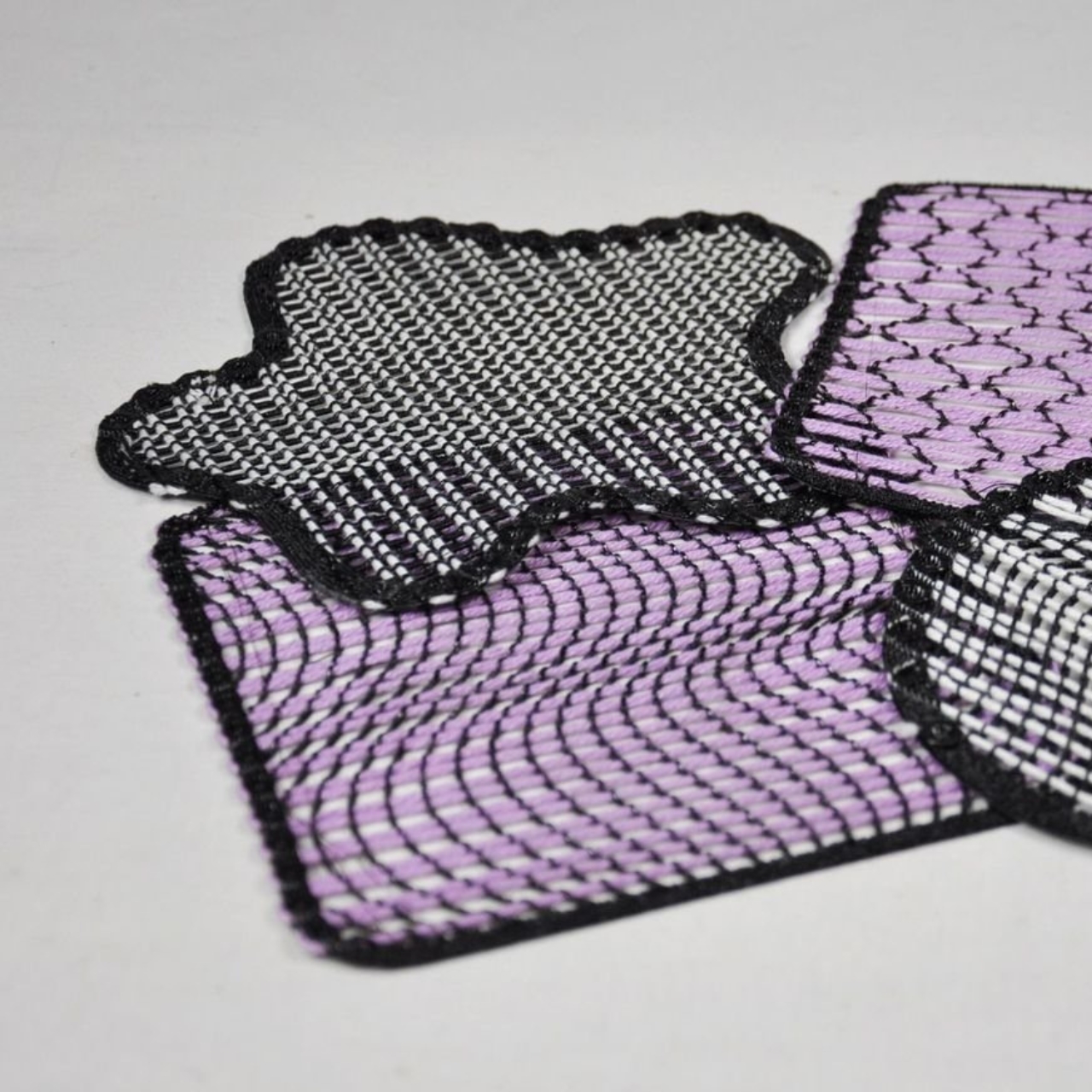
The thesis also explores soft yarn textures and cable-driven interactions, extending the idea beyond basketlike objects. That range matters because a recognizable woven pattern could easily become the project’s entire identity. I’d be more interested in seeing designers use the process to decide where an object should bend, where it needs structure, or where a different surface character would be welcome. Those are design questions worth experimenting with.

The DIY format gives curious makers somewhere to start. De Haas’s GitHub repository provides printable component files and Grasshopper scripts for generating compatible GCode, the instructions that direct the printer’s movements. Still, that’s a more involved proposition than downloading a decorative planter file and pressing print. For a general audience, the useful distinction is that FilaLoom is an invitation to experiment with a fabrication method, not a ready-made home gadget.

There are physical compromises, too. The researchers report that the attachment reduces the A1’s usable combined printing-and-weaving volume to 54% of its original build volume. Yarn tension also needs care: too much can deform a print or pull it off the build plate. These constraints make the prototype more convincing to me, because its expanded capabilities come with clearly described boundaries.

I wouldn’t judge this project by how quickly it might replace a familiar manufacturing process. Its more immediate value is giving designers a way to test combinations they might otherwise have to assemble by hand. Even a small sample can help answer whether a pattern deserves to become a larger object. That feels like an appropriately useful ambition for a research tool.

For me, the strongest outcome would be an object whose form genuinely needs both materials. The yarn shouldn’t have to justify itself as a decorative flourish, and the plastic shouldn’t merely serve as a bulky substitute for thread. FilaLoom makes that relationship available for exploration. I’d happily trade another perfectly smooth printed vase for an experiment that leaves a little more to discover under your fingertips.

The post FilaLoom Weaves Yarn Into 3D Prints Without Extra Motors first appeared on Yanko Design.

  •  

Aery’s Office Chair Offers a Fit You Can Actually Fine-Tune

A desk setup can look perfect and still feel wrong by lunch. The monitor is aligned, the cables are hidden, and the chair matches the room, yet you’re shuffling around trying to get comfortable. That gap between a workspace that photographs well and one that fits the person using it is the more interesting design problem to me. It’s where EFFYDESK’s Aery Ergonomic Chair makes its case.

For anyone whose office occupies a bedroom corner or shares space with the living room, choosing a chair involves a negotiation. You want something you can spend time in, but you also have to look at it after closing the laptop. The Aery approaches that compromise with a mesh back, a cushioned seat, and adjustments that let its proportions work around the person sitting in it.

Designer: effydesk

The mesh is doing some of the visual work here. A tall upholstered back can become a fairly imposing presence beside a small desk. With the Aery, the open surface allows the supporting structure to remain visible, breaking up what could otherwise read as one large block. It still looks like an office chair, especially with that separate headrest, but its outline has a little breathing room.

I appreciate that it doesn’t try to disguise its purpose. In black, the frame, armrests, and cushion form a straightforward piece of working furniture. It isn’t pretending to be a dining chair you could drag into a meeting. That distinction matters in a home office, where choosing something purely for the room’s aesthetic can leave you making compromises every time you sit down.

The fabric-covered cushion gives the design a softer counterpoint to the mesh back. It also offers a combination that may appeal to people who prefer padding beneath them without wanting an upholstered surface behind their entire torso. I like the visual balance between the two. The seat gives the chair some substance, while the open back keeps that substance from extending all the way upward.

The most useful adjustment is also one of the least visually dramatic: the seat slides forward and backward. Rather than changing the chair’s appearance in any meaningful way, it changes how the cushion sits beneath your legs. That’s worth paying attention to if you’ve ever loved the look of a chair but found yourself perched near its edge because sitting all the way back didn’t feel right.

The movable armrests follow the same thinking. They adjust in height, slide in different directions, and rotate, giving you some freedom to place the supports where your arms naturally rest. The appeal is less about collecting adjustment options than avoiding a fixed position that doesn’t suit you. A chair’s silhouette can look perfectly balanced while its armrests feel entirely wrong for the person using it.

The headrest and reclining back introduce a more relaxed posture into the design. I see the appeal for reading through a document or leaning back between tasks, particularly when the desk is where several parts of your day happen. Still, the headrest feels secondary to getting the seat and arms right. Those are the relationships you live with while doing the work.

I haven’t sat in the Aery, so its cushion comfort and the feel of its controls remain open questions. Images and adjustment lists can explain the design, but they can’t tell me whether an armrest stays put when I want it to. That’s what I’d want to check in person, along with how naturally the chair fits beneath my desk.

What appeals to me is how much of the Aery’s design can be put to an everyday use. The mesh changes its visual presence; the cushion changes the sitting surface; the adjustments offer room to work out a better fit. It gives a home-office buyer reasons to look beyond the styled photograph, while still acknowledging that the chair has to live in the room.

The post Aery’s Office Chair Offers a Fit You Can Actually Fine-Tune first appeared on Yanko Design.

  •  

Chess Without a Flat Board: Turner’s Rotating Tower Concept

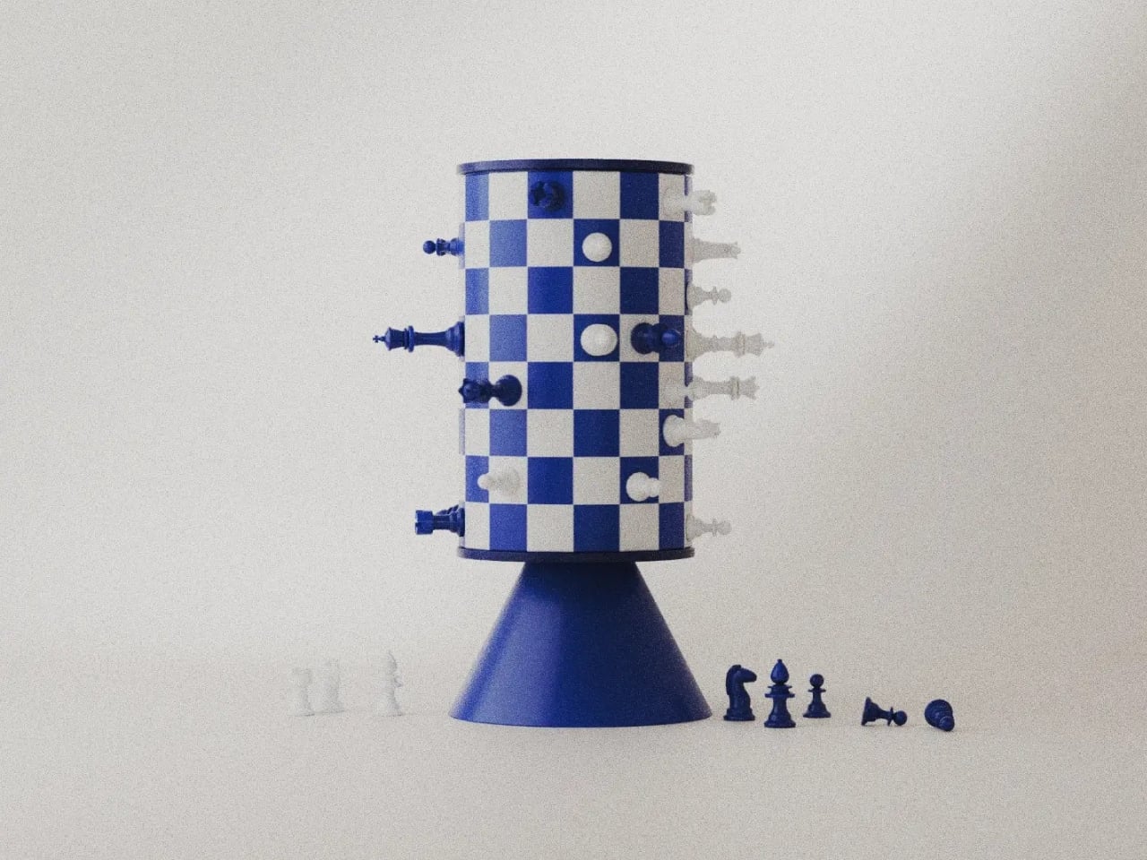
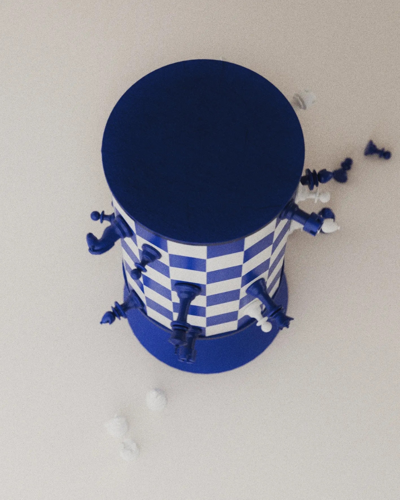
A blue king sticks straight out from a checkerboard cylinder, looking remarkably composed for a piece that should be falling onto the table. That sideways stance explains Turner, a rotating magnetic chess concept by Joffey, faster than a technical diagram could. The immediate problem is gravity: a vertical playing surface needs a way to keep its pieces attached. Magnets provide the proposed answer, letting the familiar chessboard curl upright without leaving its army in a heap.

Created for Day 04 of #productober, under the prompt “magnetic,” Turner explores what happens when a board loops back into itself. It’s a concept rather than a finished product, and I like that its ambition is playful rather than pretending chess needs fixing. The appeal is seeing a familiar game become an object you might want to leave out, even between matches.

Designer: Joffey

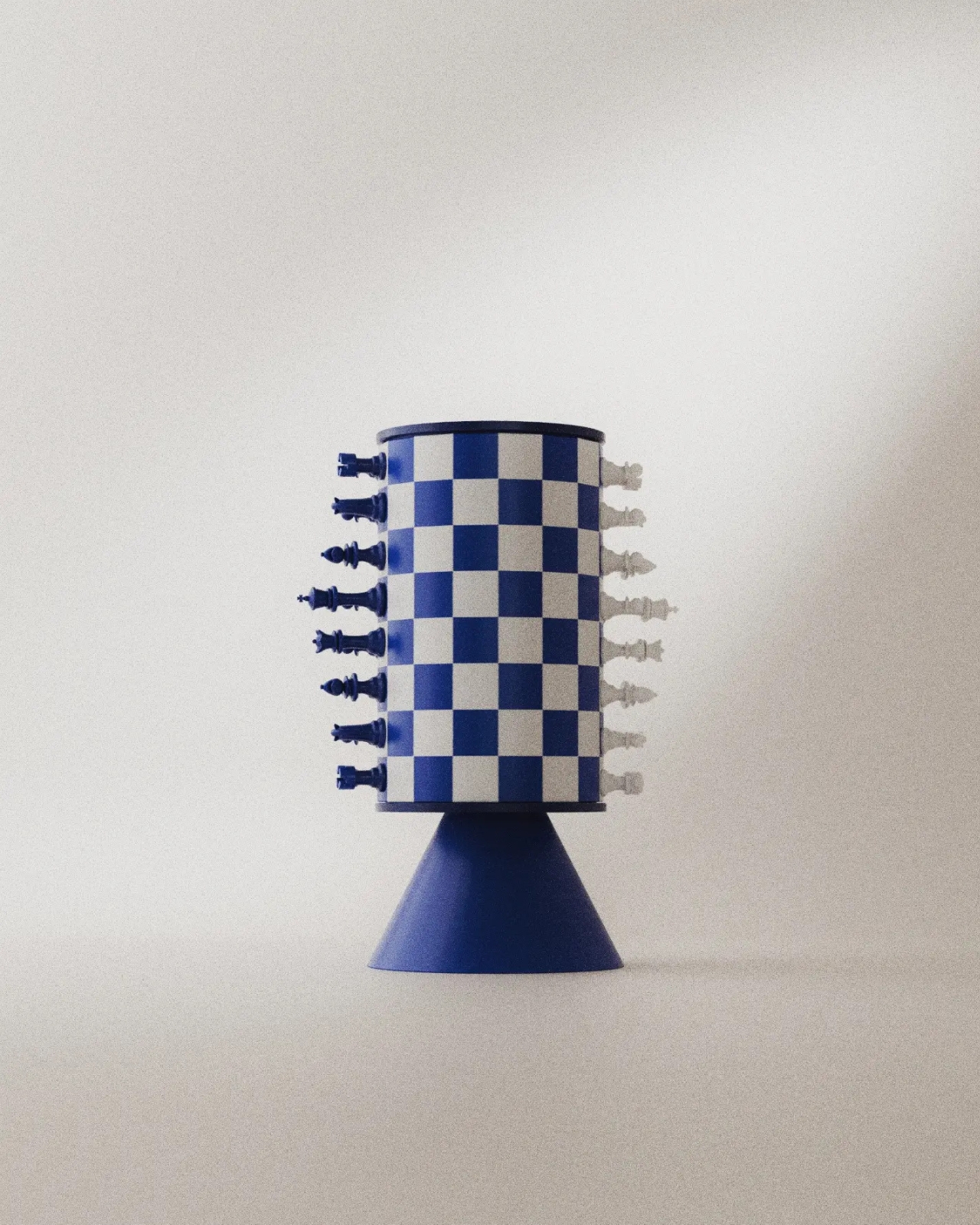
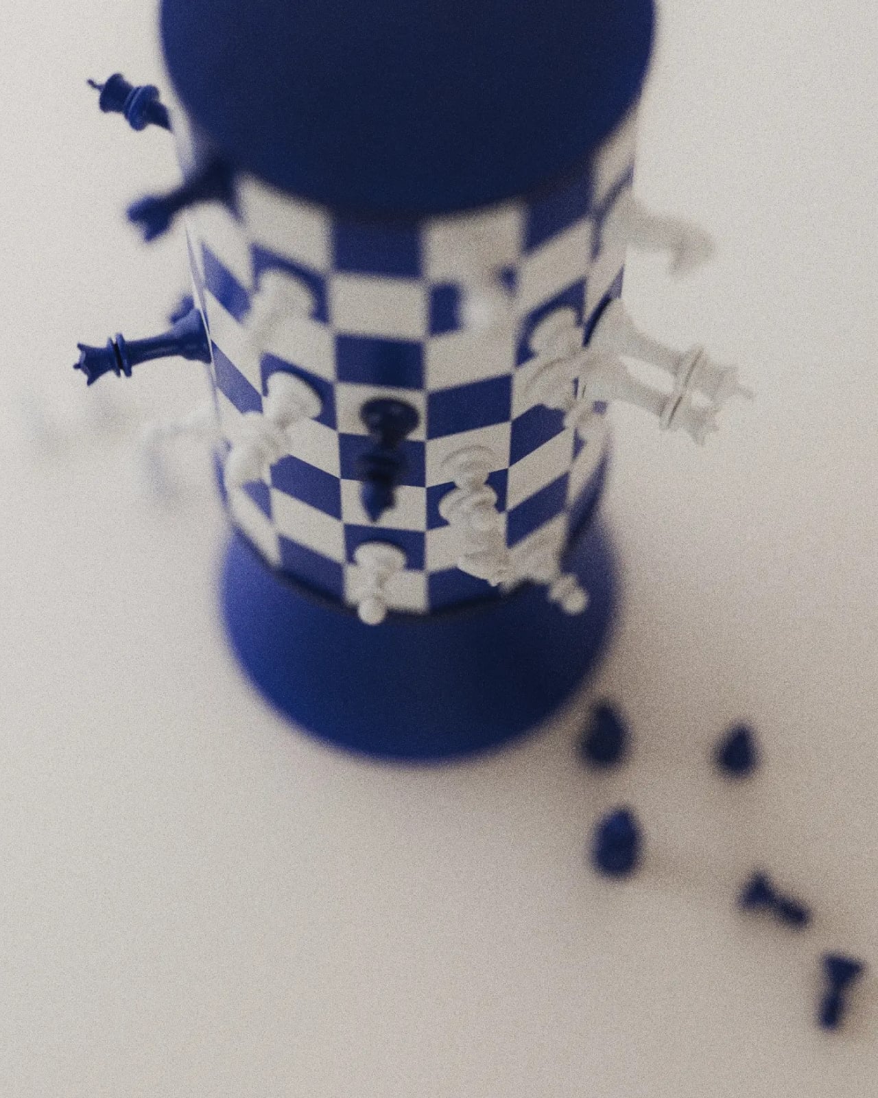
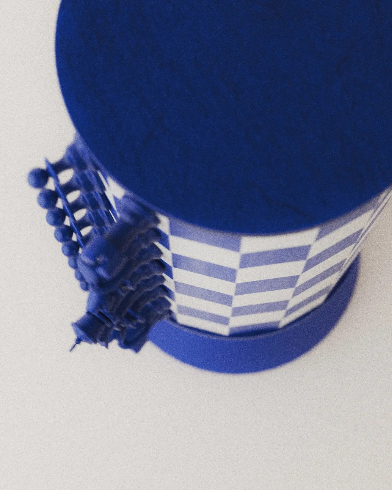
The supplied images show a blue-and-white grid wrapped around a tall cylinder, capped by dark blue circular ends and supported by a flared pedestal. The base gives it the presence of a small tabletop sculpture. From some angles, it resembles an unusually elaborate trophy. From others, the pieces projecting around its circumference make it look like a tiny planet populated entirely by royalty and horses.

The color does a lot of work here. Deep blue replaces the expected black, giving the set a softer domestic character without sacrificing the contrast with white. I’d happily take that over another aggressively futuristic chess redesign. The pieces retain recognizable silhouettes, so the unfamiliar board has familiar companions. You can still pick out a knight or a king without learning a whole new visual language.

Magnetism also earns its place in the design. Remove it, and the central idea stops working. The pieces are intended to cling to the curved surface while the board rotates, bringing different areas into view. That makes turning the board part of the interaction. Instead of simply surveying a flat field, players would need to reveal portions of the position as they go.

That’s also where my enthusiasm meets a practical reservation. A flat chessboard lets both players inspect the entire position at once. Turner’s cylinder necessarily conceals part of the grid from any single viewpoint. Rotation offers a way to look around it, but remembering what’s on the far side could become another demand on your attention. I can imagine enjoying that extra spatial puzzle. I can also imagine wanting my ordinary board back during a particularly complicated game.

The looping surface raises another question: what happens at the point where opposite edges meet? Joffey’s description suggests a changed way of playing, but the supplied material doesn’t establish a complete rule set. It would be a stretch to assign new movement rules to the pieces. Still, the possibility is intriguing. Joining edges could have consequences beyond appearance if the designer chooses to make that continuity part of play.

I appreciate that Turner doesn’t disguise every familiar feature in pursuit of novelty. The pedestal, restrained palette, and recognizable pieces give your eye enough to understand before the curved grid complicates things. Even the pieces set beside the base in the images help establish scale and context, although no dimensions are provided. You understand that this belongs on a table, within reach, rather than behind glass.

For a developed version, I’d care as much about the feel of removing a pawn as the appearance of the cylinder. Magnetic attachment would need to resist slipping while allowing deliberate moves without an awkward tug. The rotation would need similar care: easy enough to use, controlled enough not to become a distraction. Those are unresolved details, but they’re also where an appealing rendering could become a satisfying physical object.

Turner makes me curious enough to want a game, provided someone explains the rules first. Its appeal lies in having to look around a chessboard that usually gives you everything at once. That could be an entertaining complication, even if it never replaces the flat board in the closet.

The post Chess Without a Flat Board: Turner’s Rotating Tower Concept first appeared on Yanko Design.

  •  

Smartwatch Mobile Charger Hidden in a Hershey’s Kiss-Shaped Shell

We’ve gotten used to bringing along power banks when we’re out and about since we don’t want our smartphones to run low on battery during crucial moments. But now we also have to worry about other devices, like smartwatches. Some need less frequent charging than our phones, but there are still times when we forget to charge them before leaving the house. Before you know it, you find yourself needing some extra juice for your wearable.

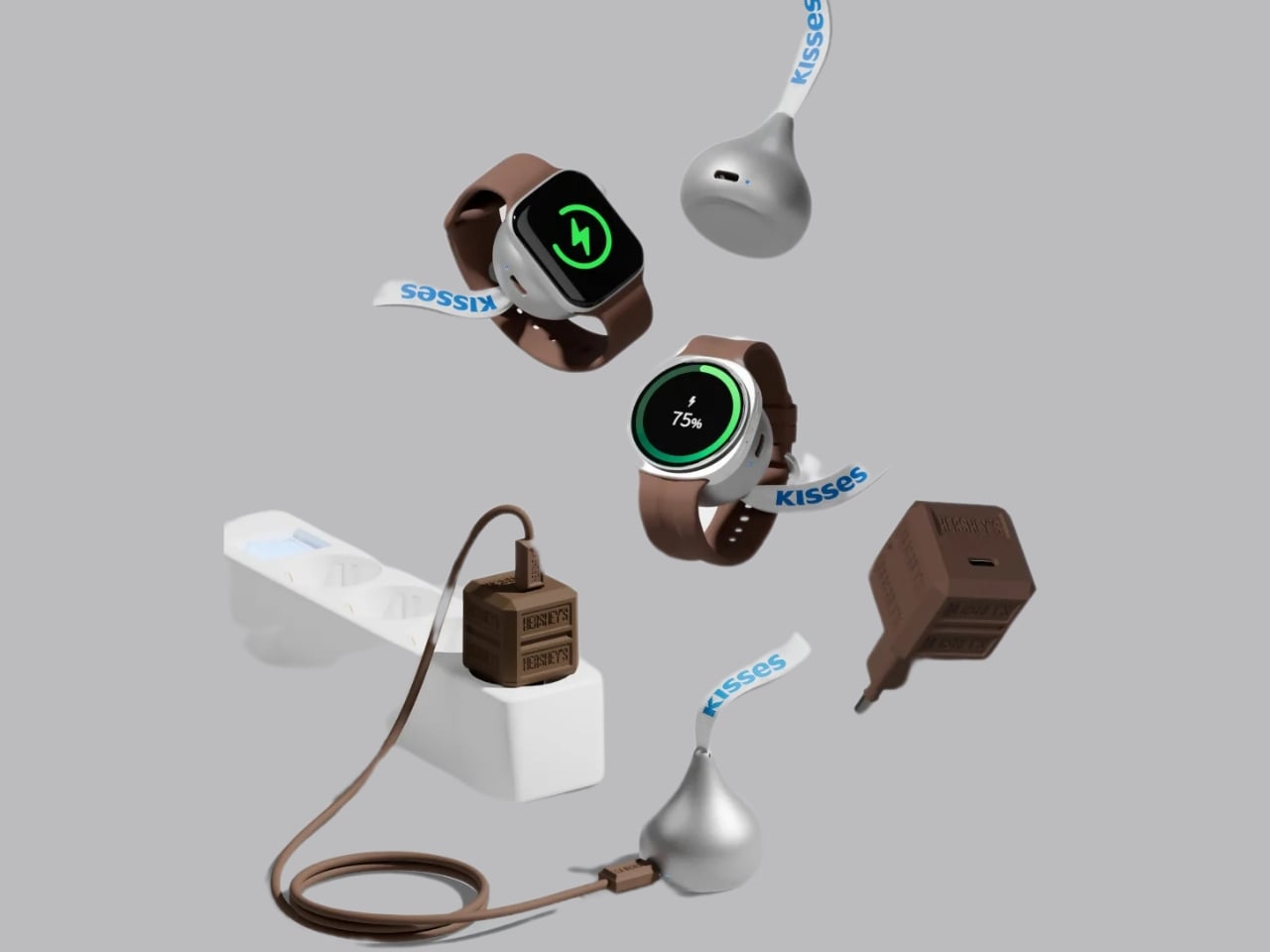
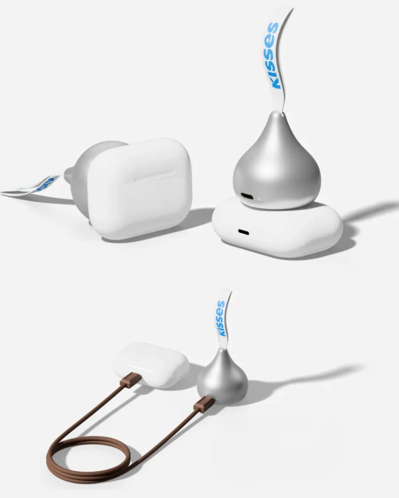
miniduct has found a very cute solution to your problem, if you’re rocking a compatible Apple Watch or Samsung Galaxy Watch, that is. Its Kisses Smart Watch Power Bank is shaped like an actual Hershey’s Kiss. Instead of satisfying your sweet cravings, though, this one will power up your smartwatch while you’re on the go. According to its product information, it has a system that aligns with your watch, but there’s also an option to charge other compatible devices through a USB-C port.

Designer: miniduct

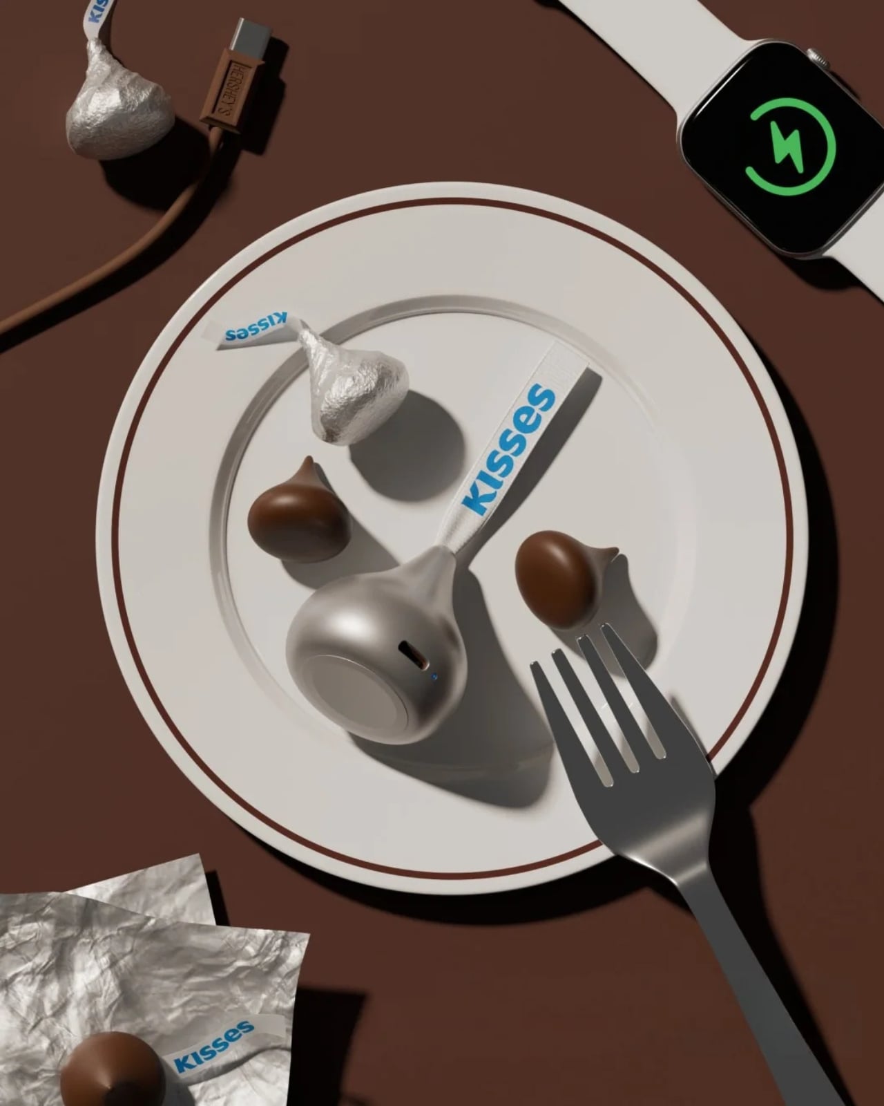
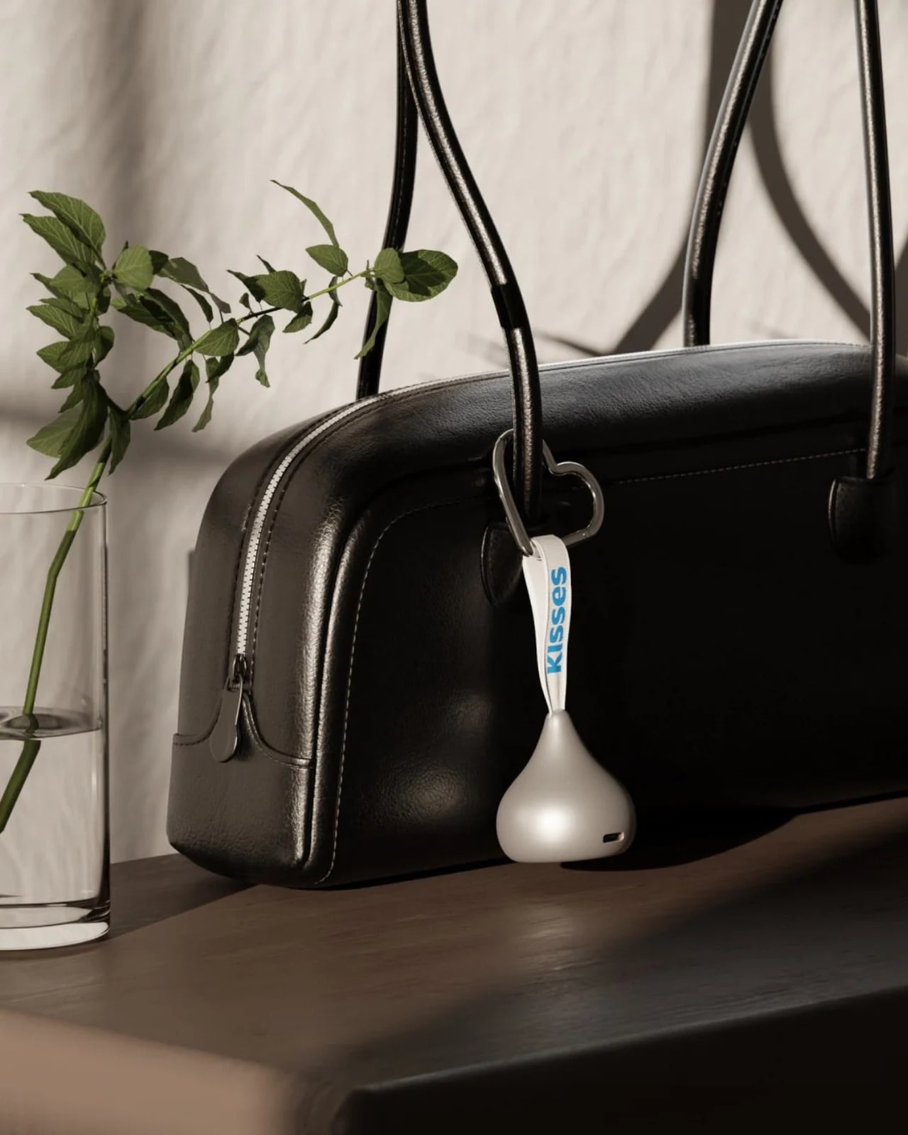
Aside from giving your smartwatch extra life when it’s about to run out of charge, this is a cleverly designed accessory that you can carry around with you. It takes the iconic silhouette of a Hershey’s Kiss and its silver-wrapper look and turns it into something other than a snack. It even comes with the tiny white ribbon bearing the word “Kisses,” which doubles as a strap for attaching the device to your bag or pouch. That’s probably the nicest design detail here: a familiar part of the candy packaging gets a practical purpose.

According to the published specifications, the power bank measures approximately 41 millimeters in diameter and 45 millimeters tall, excluding the ribbon. It weighs 40.2 grams, or about 1.4 ounces, and contains a 700mAh battery. That makes it a small backup for your wearable rather than a replacement for the larger power bank you might already carry for your phone.

The charging system is called Auto Fit, and miniduct describes an internal mechanism that automatically aligns with the watch being charged. Its product information explains that the magnets rotate rather than remain fixed to accommodate Apple and Galaxy watches. You’ll still want to check compatibility with your particular model before buying, rather than assume every watch generation is supported.

The chocolate shape also has a job when you put the charger down. miniduct says it positions the watch at a 20-degree viewing angle on a desk, allowing you to check the screen while it charges. You’ll need to take the watch off your wrist, so a break at your desk is a more practical charging opportunity than a workout.

Of course, the small battery comes with limitations. miniduct estimates that it can provide approximately 40% to 120% of a watch battery’s capacity, depending on the model. Some watches therefore won’t get a complete recharge. The brand also notes that features such as GPS, Bluetooth, and an always-on display can reduce the net charge gained. Think of it as an emergency reserve, not a promise of several days away from an outlet.

The product materials also advertise charging support for compatible earbud cases, including wireless charging for supported AirPods cases. USB-C output provides another option for compatible earbuds or an emergency phone top-up. With only 700mAh available, though, charging a phone is a secondary use rather than the main reason to buy it.

The appeal here is having a backup charger that feels like an accessory you’d actually want to bring along. The ribbon gives it a place on your bag, while the familiar shape gives it some personality when it’s sitting on your desk. You’ll still have to remember to charge the power bank itself, but at least this little reminder looks sweeter than another loose cable.

The post Smartwatch Mobile Charger Hidden in a Hershey’s Kiss-Shaped Shell first appeared on Yanko Design.
  •  

This Japanese Notebook Has Lines That Seem to Disappear as You Write

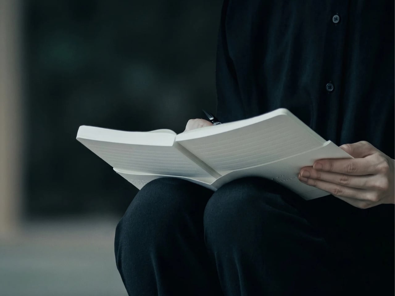
As a hoarder, I mean collector, of notebooks, I prefer ones that don’t have lines because I feel like they inhibit my creativity. Or maybe they remind me of required writing during my school days. But sometimes, when I’m writing in my journal, my handwriting goes haywire. When I try to read back what I wrote, it’s a mess. I used to wish there were a notebook that could help me keep my handwriting in check without leaving visible lines all over the page.

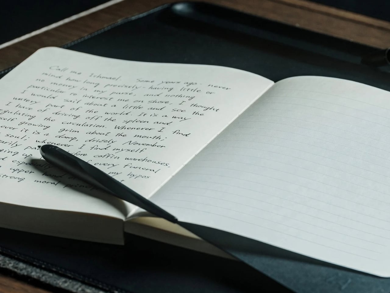
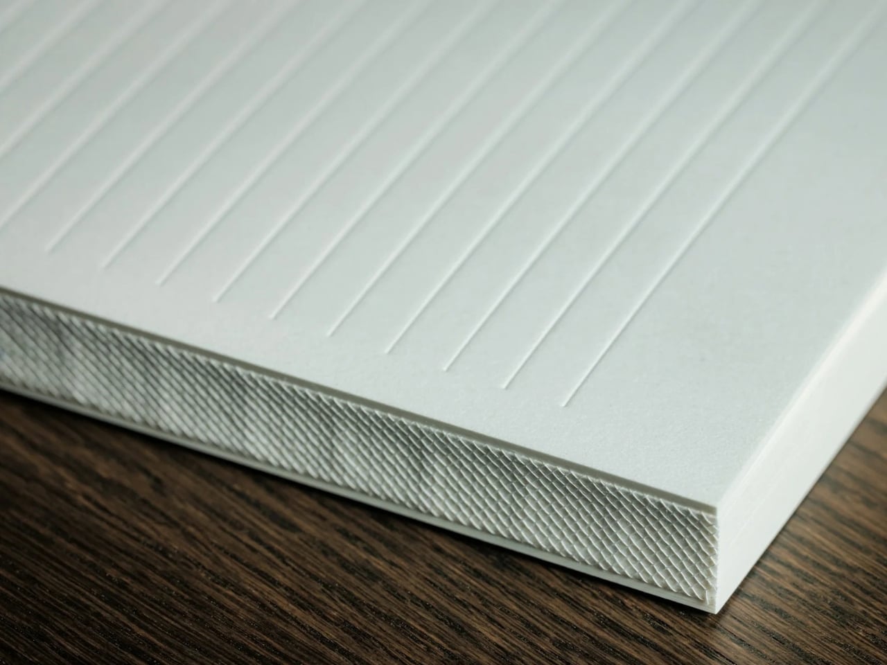
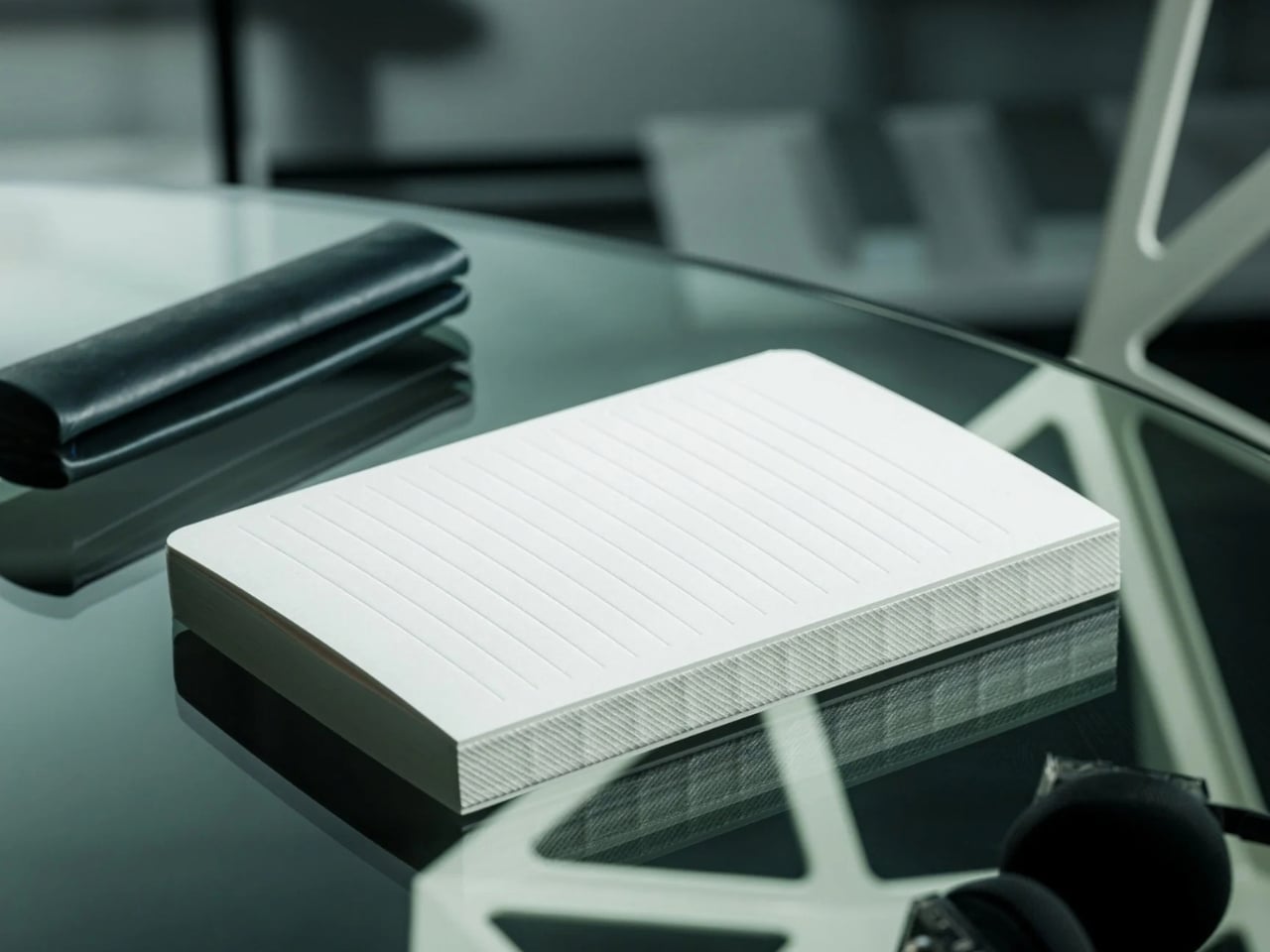
The iA Vanishing Line Notebook has made that wish come true. It’s a premium, handcrafted paper notebook from Information Architects, the company behind the iA Writer app. As the name implies, it has watermark lines that guide you as you write but appear to “disappear” once the page fills with words. There’s no magic or disappearing ink involved. It’s a beautifully designed notebook that lets you enjoy the best of both lined and unlined worlds.

Click Here to Buy Now: $80. Hurry, only 3 available!

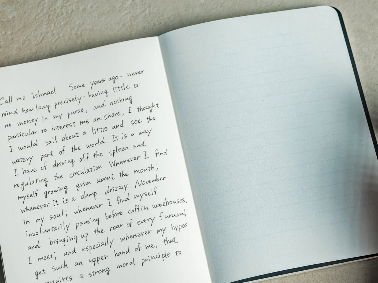
When you crack open the notebook, you’ll see that the lines are visible on an empty page. They serve as a guide for you and your pen, helping you write straight and keep your lines evenly spaced, if that’s how you want to write. I know some people prefer a messier look, but when I’m filling a page with journal entries or other writing I plan to revisit, a little guidance can be welcome.

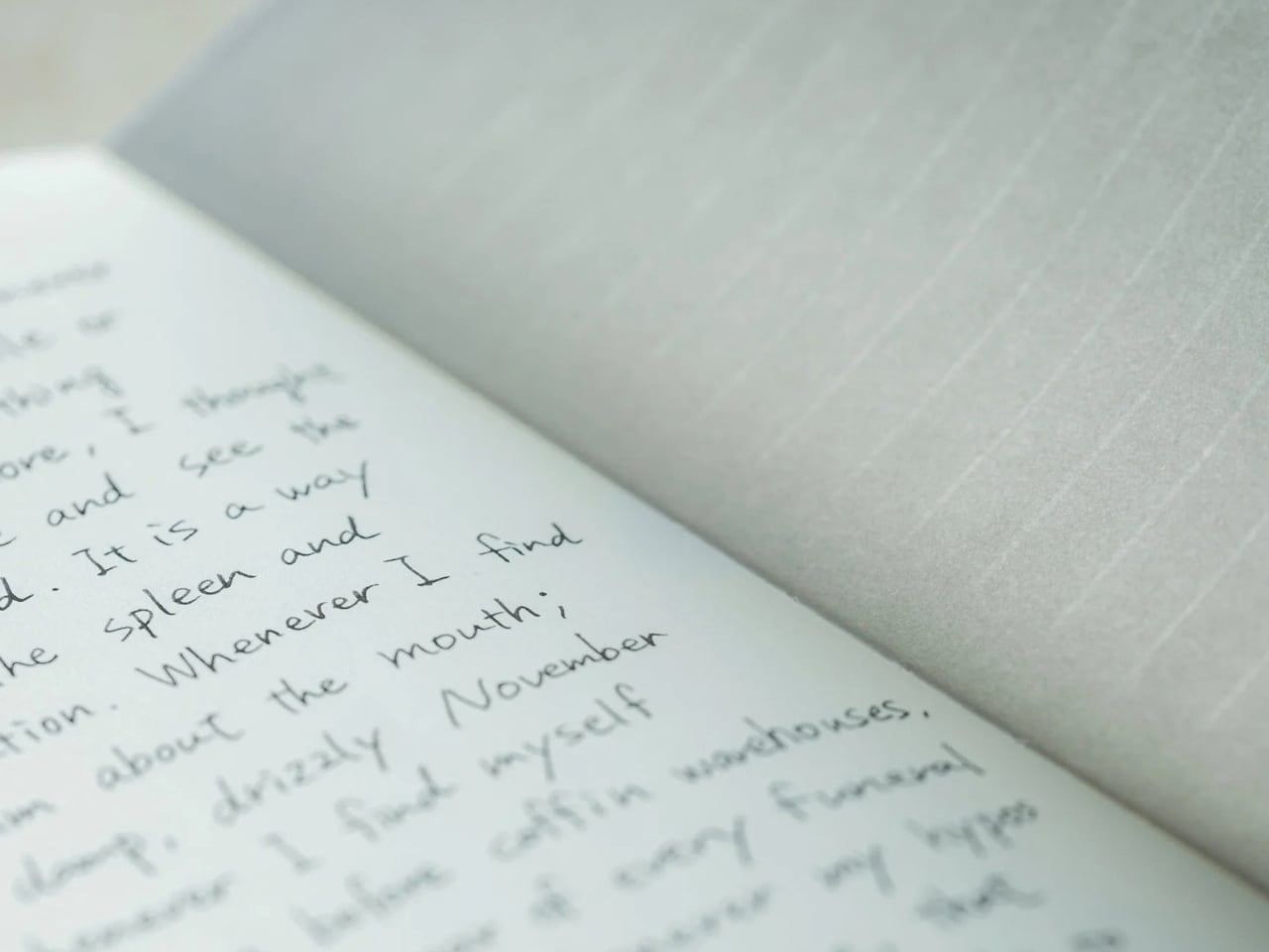
Once you’ve written on the page, the contrast between your writing and the paper makes the lines visually fade into the background. Hence, the notebook’s name. When you read back what you’ve written, your handwriting takes center stage instead of competing with a distracting grid. To be clear, the lines don’t physically vanish, and the effect becomes more noticeable as the page fills up. It won’t change your handwriting, but it could make what you’ve written more pleasant to read.

iA (Information Architects, in case you didn’t know) achieved this without any tricks. The watermark lines had to be faint enough to recede behind the writing but visible enough to help while the page was empty. That balance is the detail I find most interesting. The paper and binding matter, too: the notebook uses Japanese writing paper and opens flat, so you don’t have to hold down one side while trying to finish a sentence. As someone who is a connoisseur of Japanese stationery products, I can appreciate the thought that went into it.

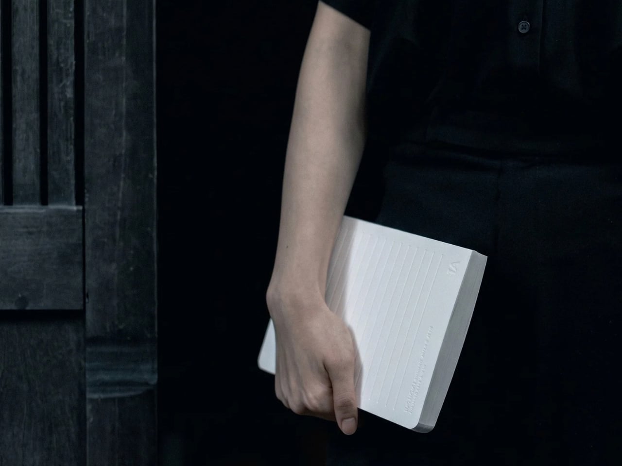
There are other practical details worth noting. The hardcover notebook is A5-sized, with 144 sheets, or 288 pages, and its watermark lines are spaced 10 millimeters apart. Its 81 gsm Araveal White paper is designed to work with most pens and inks, including fountain pens. It’s handcrafted in Japan, and the wooden presentation box gives it the feel of something you might keep on your desk rather than toss into the bottom of a bag. Of course, that also means this is a more considered purchase than an everyday notebook you wouldn’t think twice about using up.

If you usually buy a Moleskine Classic, the difference comes down to what bothers you about an ordinary page. Moleskine offers both plain and ruled layouts, along with practical touches such as a ribbon bookmark, an elastic closure, and an inner pocket. Its ruled pages give you consistent guidance, while its plain pages leave you free to write wherever you like. The iA Vanishing Line Notebook offers a middle ground: its guidelines are there when you need them and less noticeable when you read your work later. Moleskine is the more familiar everyday choice; iA’s design is for someone who cares about that specific writing experience.

I don’t think this notebook will turn every messy journal entry into a masterpiece, and honestly, I wouldn’t want it to. Sometimes the scribbles are part of the fun. But for the days when I want my thoughts to flow freely and still be able to read them afterward, these vanishing lines sound like the compromise I’ve been looking for. It gives my pen a path without making the finished page look like homework.

The post This Japanese Notebook Has Lines That Seem to Disappear as You Write first appeared on Yanko Design.
  •  

Road Barriers Become Benches Without Losing Their Warning Stripes

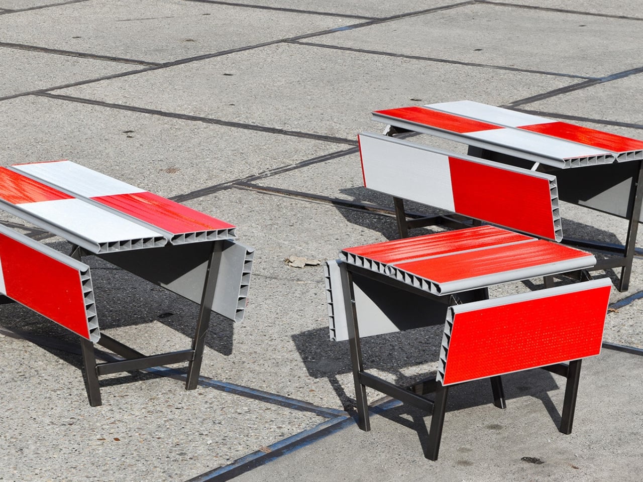
A red-and-white safety barrier isn’t an object I’d normally consider inviting. It’s supposed to interrupt your plans. That’s why the stop! collection by Studio Martins Mezulis and creative 13_0663_tsx makes such a good first impression as a design idea. The outdoor benches and stools borrow the panels of Dutch traffic barriers to make places to sit, addressing a basic need in public space: somewhere to pause.

Waiting for a friend shouldn’t require buying a coffee to justify occupying a chair. I like public seating that treats waiting, resting, and doing very little as perfectly legitimate activities. That’s the practical territory stop! occupies. Presented at Dutch Design Week in Eindhoven, running October 17–25, 2026, the collection invites people to stay for a while using an object associated with sending them elsewhere.

Designers: Studio Martins Mezulis and creative 13_0663_tsx

The starting point is the schrikhek, a red-and-white aluminum barrier used in the Netherlands to alert people to construction and redirect their route. You don’t need to recognize that Dutch term to understand the reference. The warning graphics do most of the explaining. Keeping them visible gives the furniture a little friction: your eyes register a restriction before your brain catches up with the seat.

It’s a fitting project for Studio Martins Mezulis, whose work spans graphic and spatial design. The stripes are doing both jobs here: defining a physical object and carrying a message that the designers are trying to change.

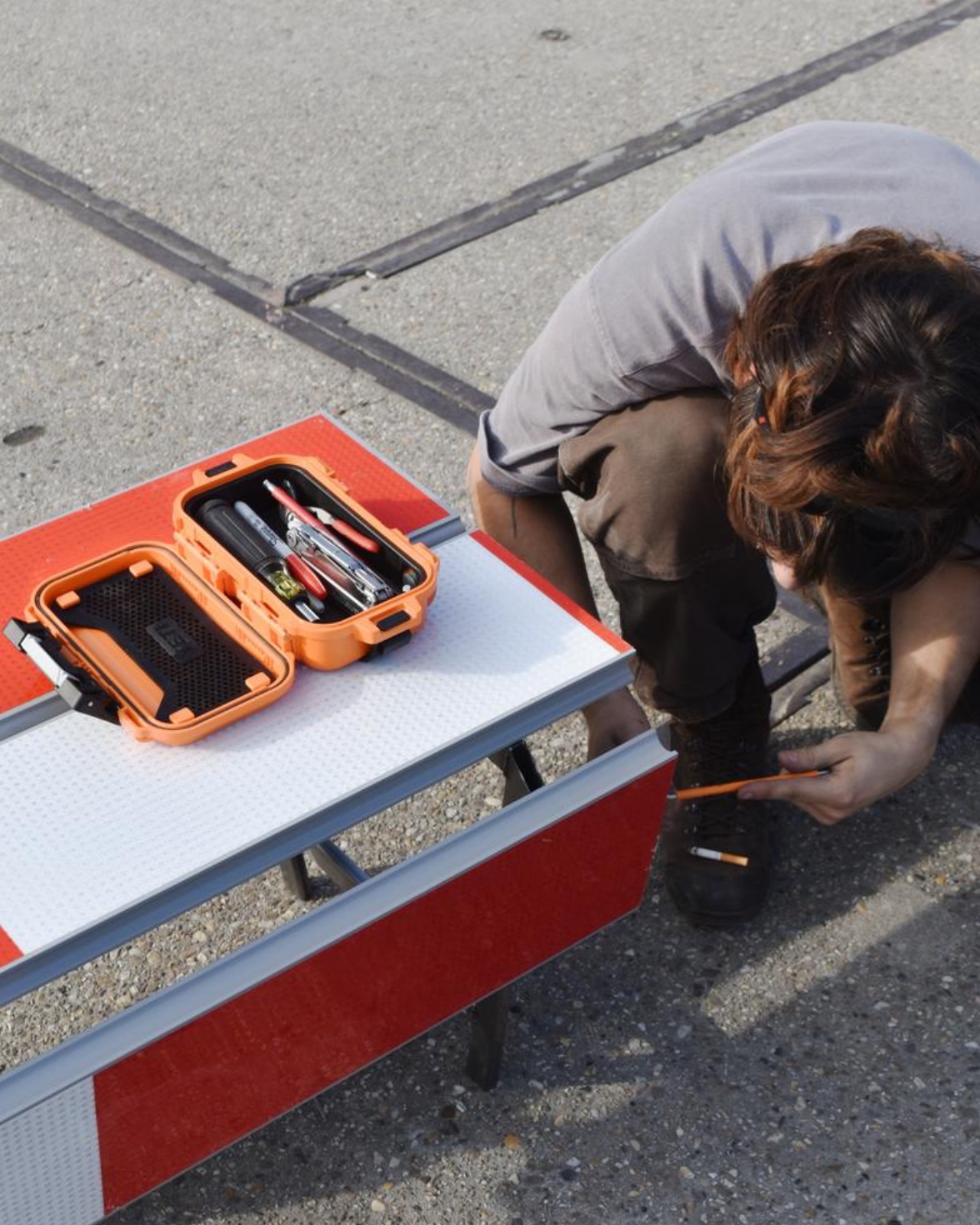
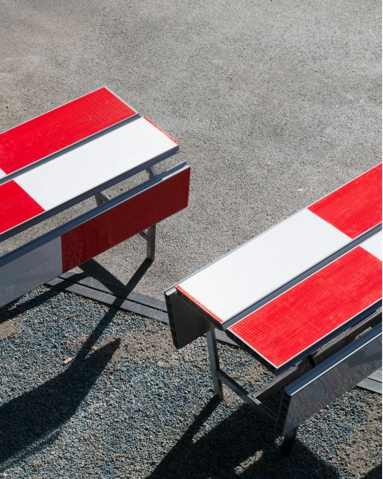
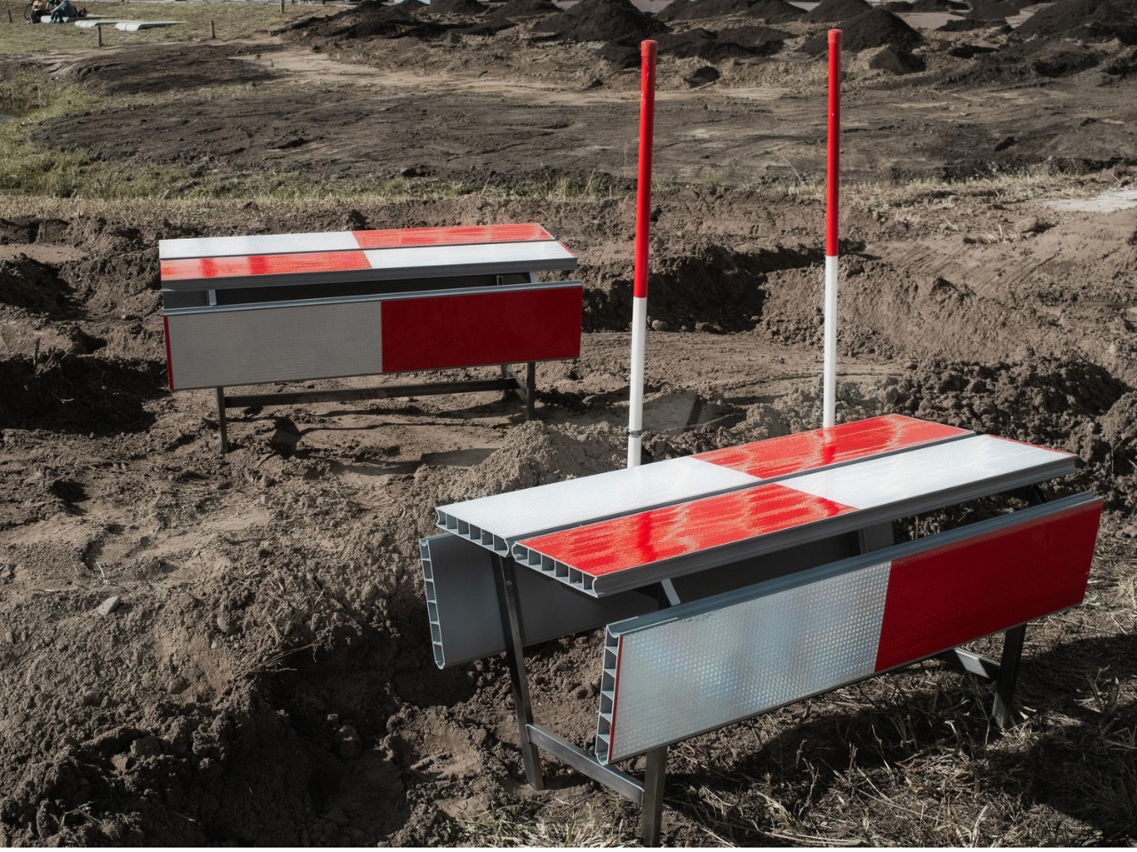
In the project’s render, long striped panels form the seating surfaces, with more panels running vertically along the sides. A narrow framework keeps the assembly visually open. The result looks deliberately assembled from infrastructure rather than dressed up to conceal its origins. I prefer that decision to a more polished makeover. Remove the red and white, and much of the reason to notice these benches disappears.

The published bench dimensions are 1,250 millimeters long, 500 millimeters wide, and 450 millimeters high, or approximately 49 by 20 by 18 inches. Road safety barriers and steel are listed as the materials. Those numbers describe a compact object rather than a sprawling park bench. Its proportions make the proposal easier to picture beside a pedestrian route or within a plaza, although placement would still need careful consideration.

The illustrated benches are also backless and lack armrests. That keeps their form simple and leaves the seat approachable from either side, but it doesn’t offer the support some people need. I’d read them as an invitation to take a short break rather than assume they’re suited to a long afternoon. The graphic wit is persuasive; comfort and durability would need evidence beyond a render.

That distinction matters because public furniture has a job beyond looking good in a design exhibition. Someone needs to understand that they can use it. Here, the same markings that make the collection memorable could initially make a passerby hesitate. I’d be interested to see how quickly people recognize the invitation. A bench occupied by one person might explain the idea better than a nearby project label.

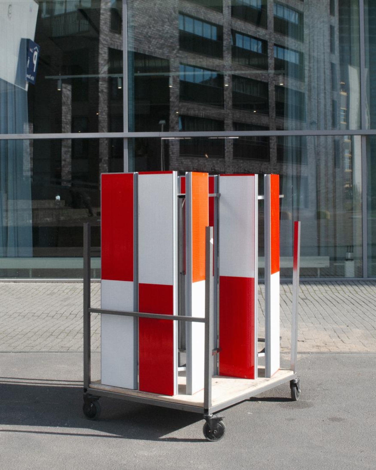
The material story deserves similar precision. According to the project’s Dutch Design Week description, the designer hopes to work with construction infrastructure providers to reclaim decommissioned or discarded panels in the future. That isn’t confirmation that every panel in the current collection has already served at a construction site. Reuse is a proposed direction for expanding the collection, and it’s worth preserving that distinction rather than automatically labeling the furniture recycled.

For me, stop! works best as a modest adjustment to how a street communicates. It gives a familiar public object another use without erasing what made it recognizable. The humor gets your attention, but the seat has to justify keeping it. If the collection develops further, I’d rather see that effort go into making it useful to more people than into adding more visual tricks. A decent place to wait is already a worthwhile design brief.

The post Road Barriers Become Benches Without Losing Their Warning Stripes first appeared on Yanko Design.
  •  

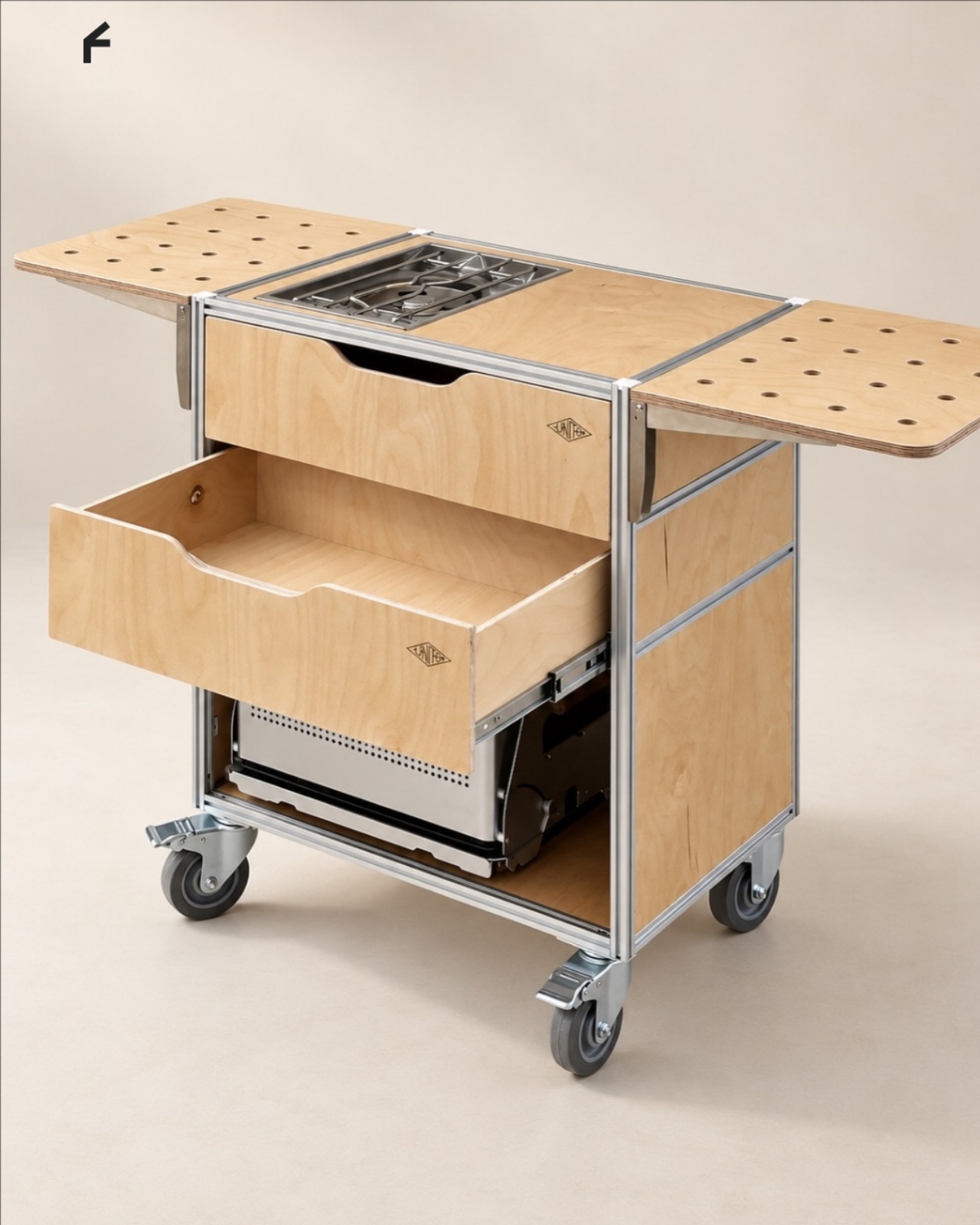
A Coffee Bar Without a Remodel: UNITO’s Rolling Station

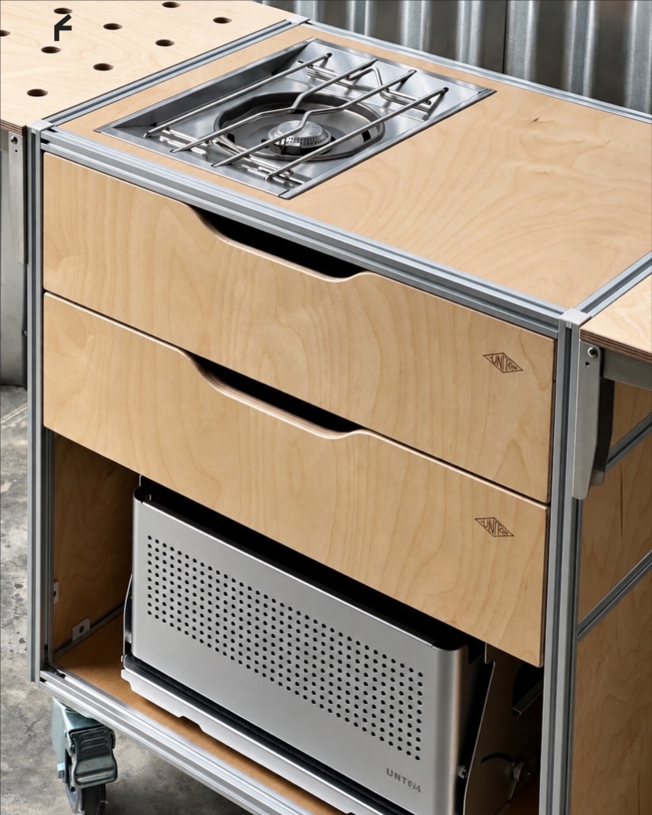
A coffee grinder, a kettle, and a few favorite mugs can turn into a surprisingly territorial collection. Add filters, beans, and the tools that make a morning ritual feel worthwhile, and suddenly the kitchen counter has a second job. UNITO’s Coffee Station offers a dedicated home for that equipment, with wheels underneath so the coffee corner doesn’t have to become a permanent fixture.

Designed by Unito, the station brings preparation space and storage together in a movable counter. Its appeal extends beyond reclaiming kitchen space. For a studio hosting clients or someone setting up a coffee pop-up, it could provide a more organized starting point than a table surrounded by supply boxes. Unito’s founder has described the Coffee Station as part of the brand’s move toward furniture and tools for small businesses.

Designer: Unito

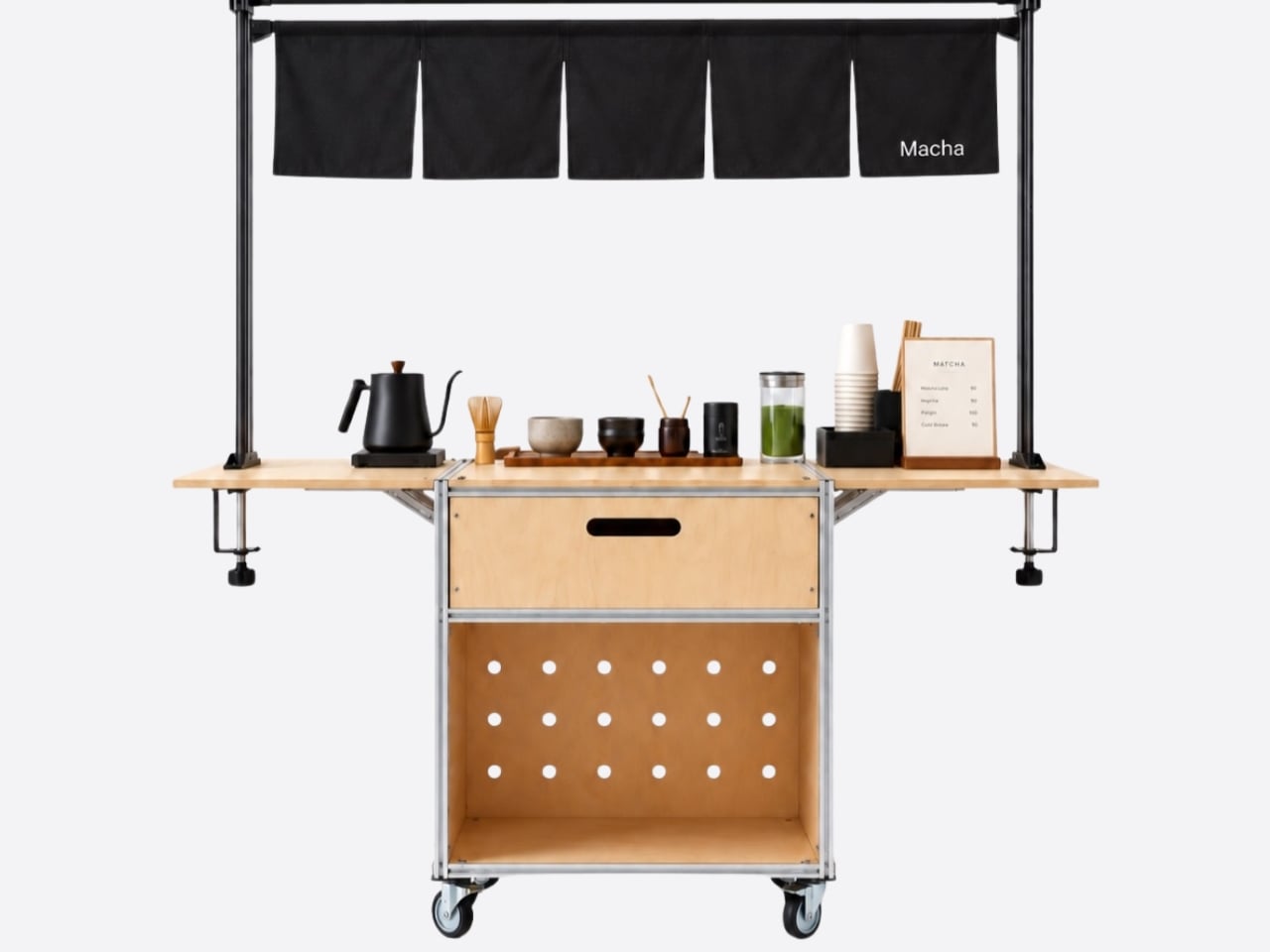
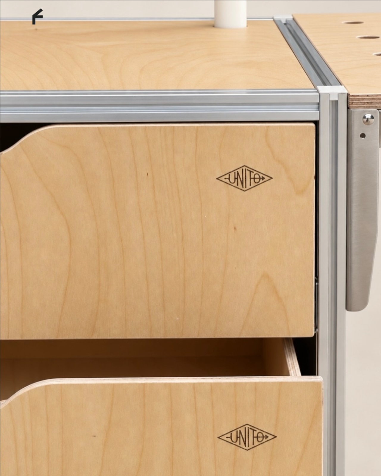
The material combination gives that practical idea some personality. According to the supplied product description, silver anodized aluminum profiles form the frame, while light birch plywood supplies the panels. I like that the design lets both materials retain their identities. The metal outlines the structure with a workshop-like precision; the wood gives the broad surfaces enough warmth to keep the station from reading as purely institutional equipment.

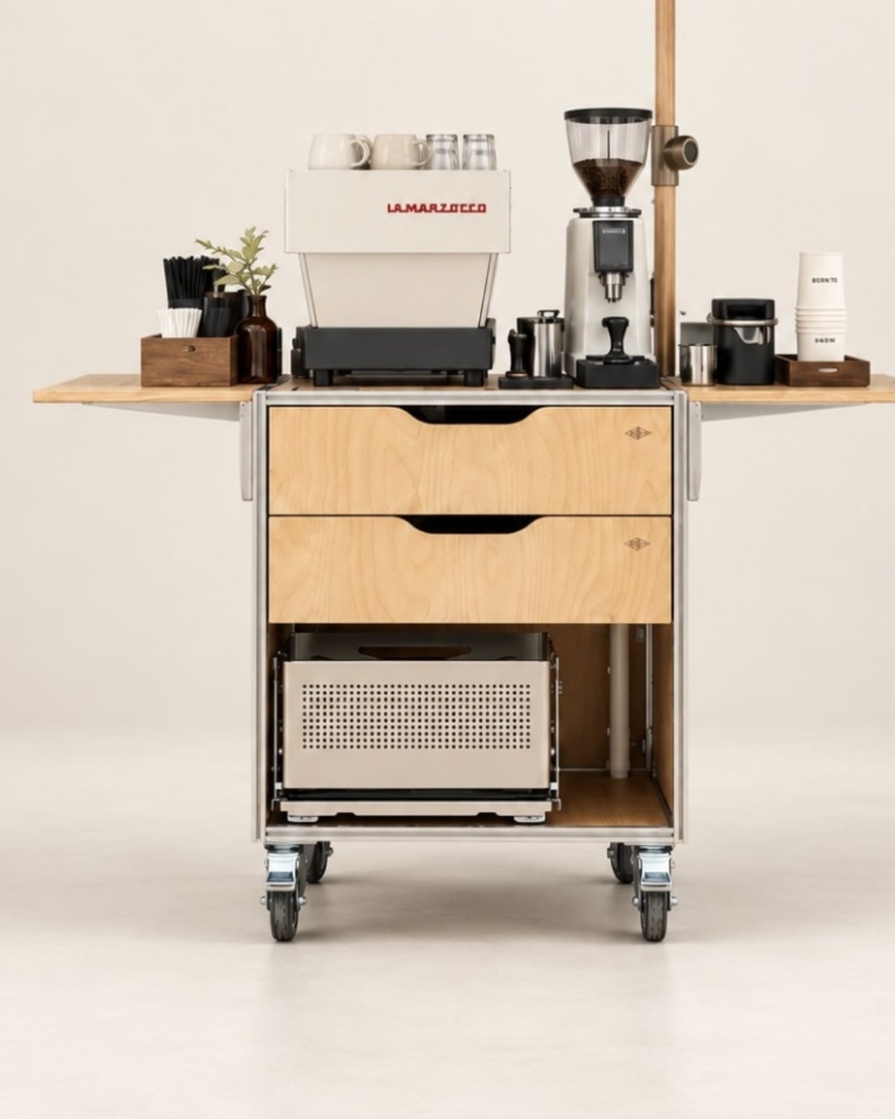
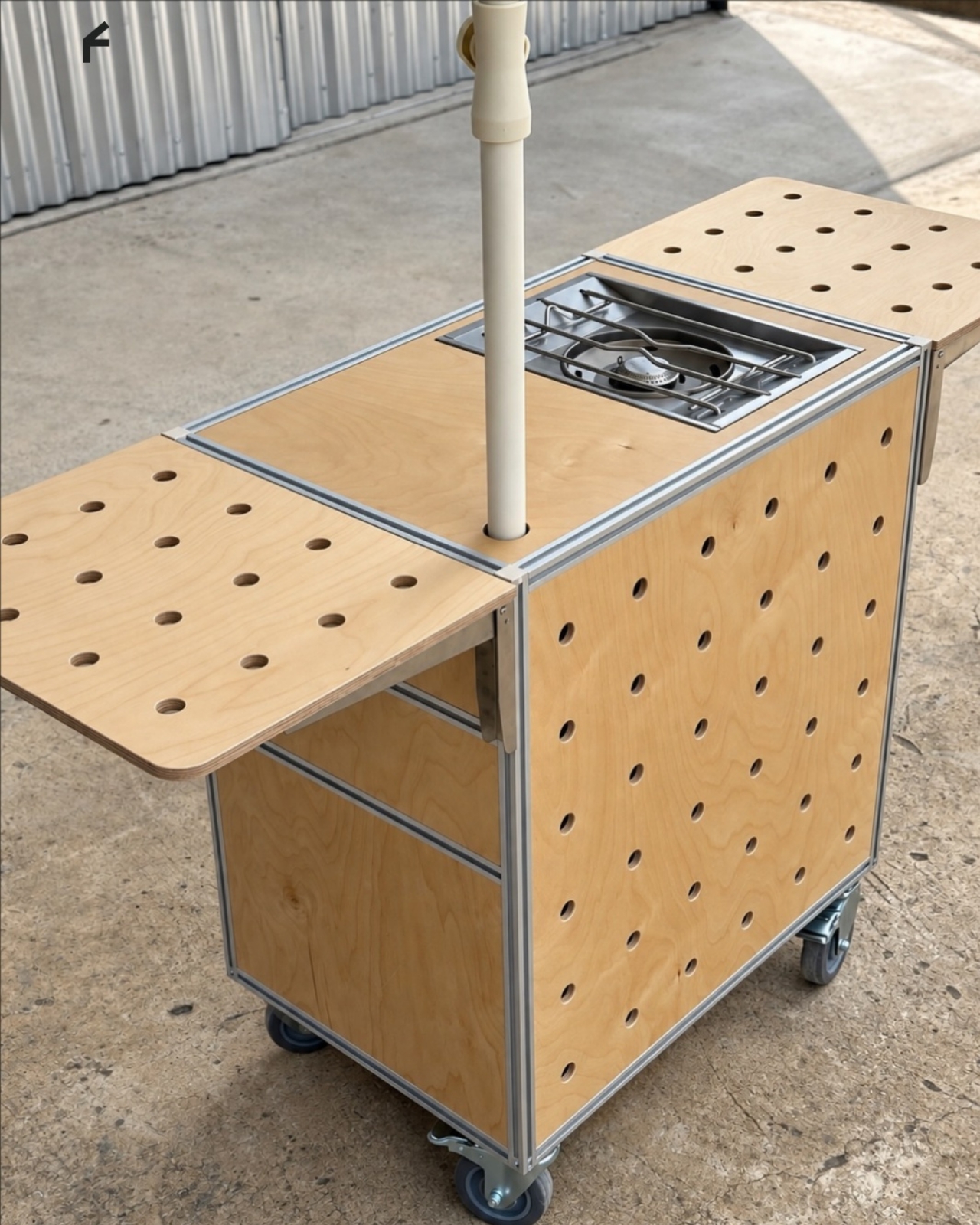
That balance matters for something that might face customers. In the published photographs, the silver framework remains visible around the wooden drawer fronts, and side surfaces extend beyond the central cabinet on supporting brackets. Those extra surfaces look useful for separating preparation from pickup. A cup waiting to be served shouldn’t have to compete with the grinder for the same patch of counter.

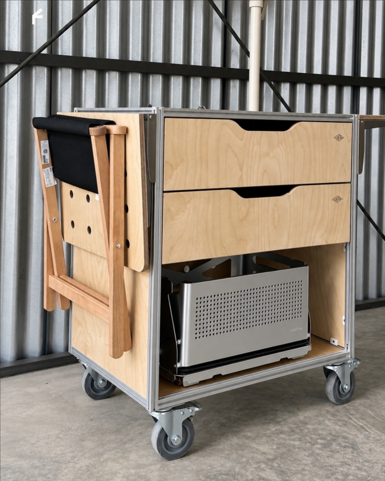
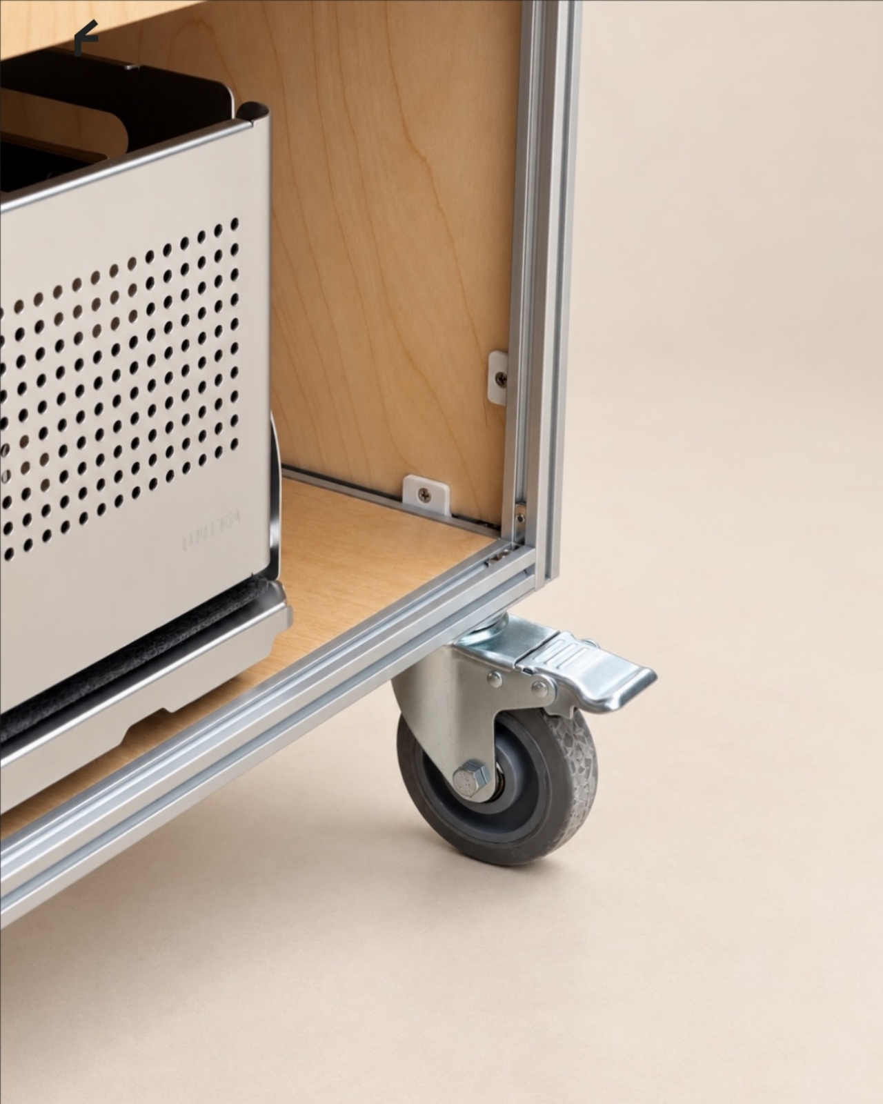
Storage deserves as much attention as the equipment displayed above it. The described configuration includes two soft-close drawers, with an open compartment underneath. The photographs show wide finger-pull cutouts rather than projecting handles. I appreciate that restraint, but the more useful decision is giving small supplies somewhere to disappear. Filters, spoons, and towels could stay close without becoming part of the countertop display.

Then come the wheels, arguably the least glamorous and most consequential detail. The specifications list four locking stainless steel casters, and brake levers are visible in the photographs. That arrangement is intended to let the station move into position and then stay put. I’d still distinguish a rolling workstation from portable luggage. Moving across a suitable floor is a different proposition from negotiating stairs or loading it into a car.

The top also introduces an interesting possibility: it is specified to accept IGT panels or stoves. IGT refers to the Iron Grill Table system, whose modular approach combines frames with cooking and work-surface inserts. For UNITO, the appeal is a surface that could accommodate different tasks rather than permanently committing to one arrangement. Exact insert compatibility still needs confirmation before anyone starts ordering accessories.

The dedicated patio umbrella slot is another thoughtful detail. Published images show an umbrella rising above a fully arranged coffee setup, making the station read like a small service point rather than a kitchen cart parked outside. That could be useful for a temporary outdoor gathering. It doesn’t, however, establish that the plywood is weatherproof or that the station can anchor an umbrella safely in wind.

My favorite potential use is actually the less theatrical one: a shared studio where the coffee setup needs its own territory but the room changes throughout the week. A dedicated station could keep supplies together while allowing the host to rearrange the space. That feels like a convincing reason to put furniture on wheels, especially when building another fixed counter would make the room less flexible.

I wouldn’t call it a complete café or an outdoor kitchen. Those descriptions skip over water, power, cleanup, and the practical demands of serving people. Its more believable contribution is giving coffee equipment a coherent place to live and work. For someone who wants a serious setup without designing the room around it, that’s an appealing amount of commitment.

The post A Coffee Bar Without a Remodel: UNITO’s Rolling Station first appeared on Yanko Design.
  •  

Oboro’s Silver Moon Calendar Is Wall Art You’ll Actually Use

Most of the time, when you need to check a day or date, you open your phone’s default calendar app. For those of us who still use planners, we also like to flip through the calendar pages since our schedules are often written there. But maybe you rarely notice actual wall calendars displayed in offices or living rooms anymore. If there is one, it might be some random promotional gift. It can feel like we’ve stopped carefully choosing a wall or desk calendar that suits our aesthetic or that we find interesting.

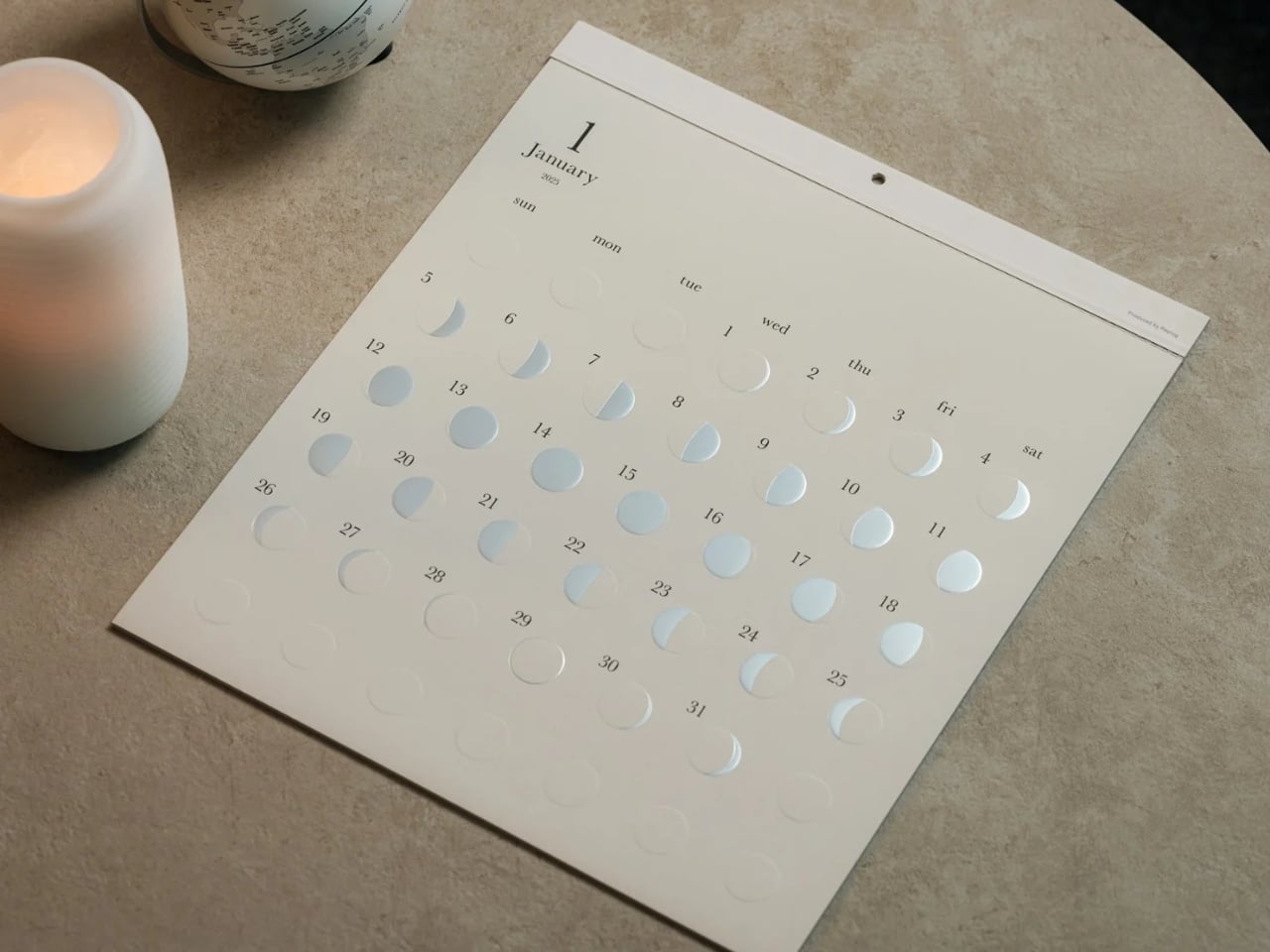
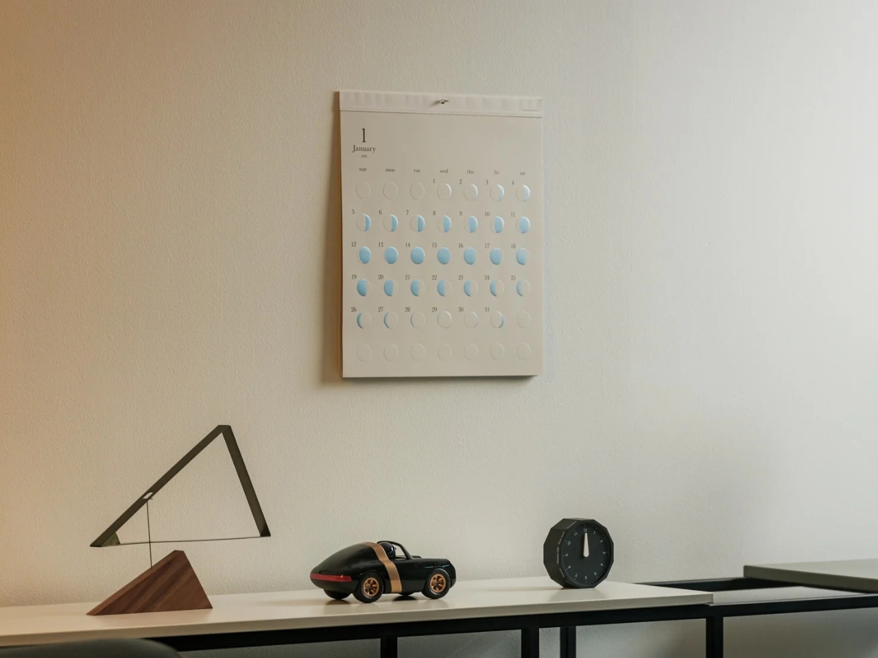
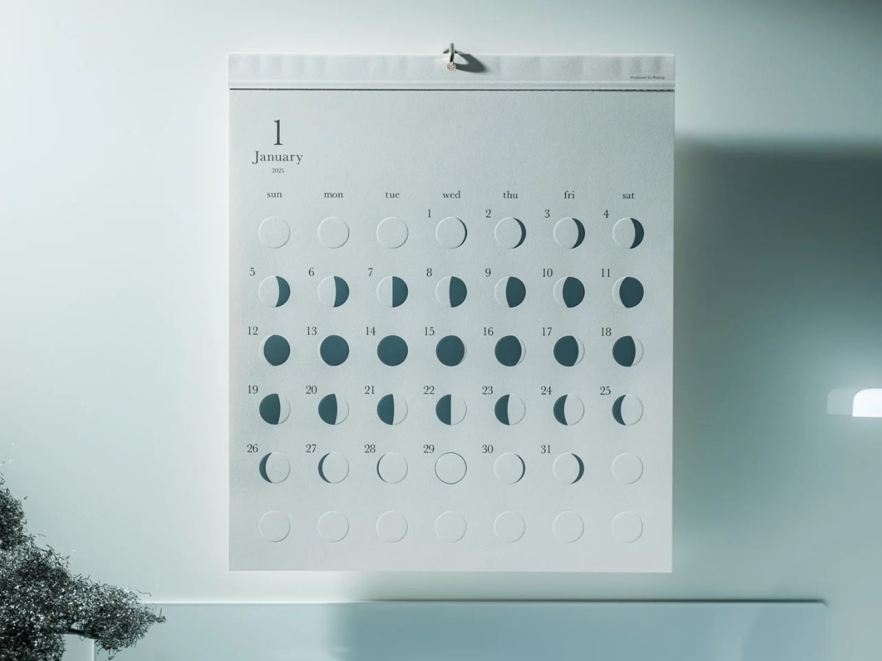
The Oboro Silver Moon Calendar quietly makes itself part of your minimalist space, especially if you love the moon. Created by Replug, it originated as a limited-edition 2025 calendar celebrating the Michiru calendar series’ 10th anniversary. Its name comes from oborozuki, a hazy moon, which inspired the design’s soft appearance. The YD Select listing describes its inspiration as having “serene and mystical qualities.” You might see that misty moon as a reminder that life is impermanent but still beautiful, although that’s a personal interpretation rather than something a calendar needs to explain.

Click Here to Buy Now: $70 Hurry, only 5 left!

Instead of the usual white paper that many wall calendars have, this uses a soft gray-beige paper that evokes a moonlit sky. It could bring a more introspective and relaxing atmosphere to the room, especially when you stare at the calendar while contemplating your life for the rest of the month (well, if you like doing that sort of thing). The subdued background also keeps the metallic details from competing with a bright color palette.

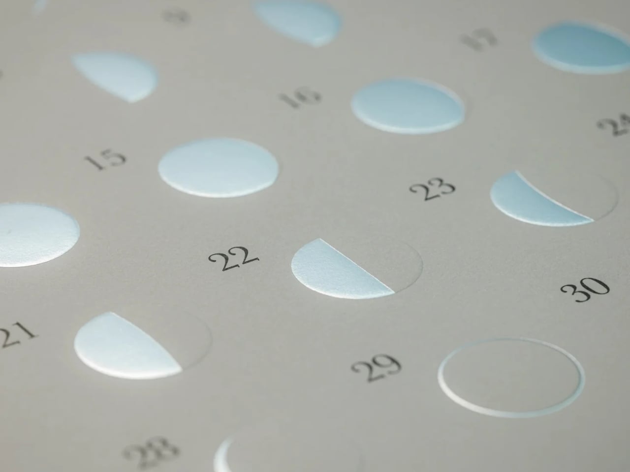
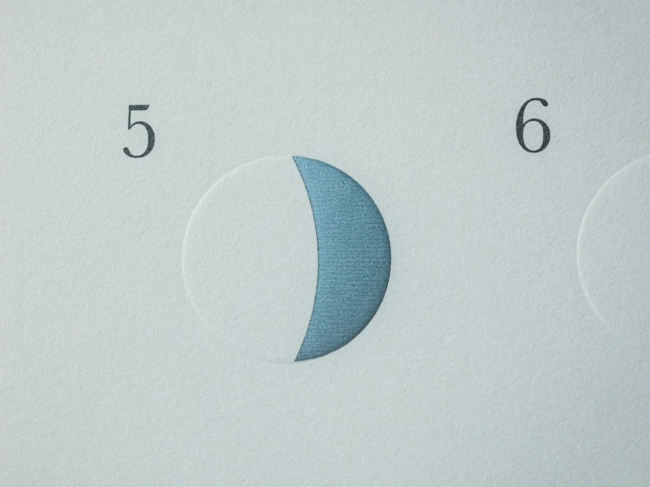
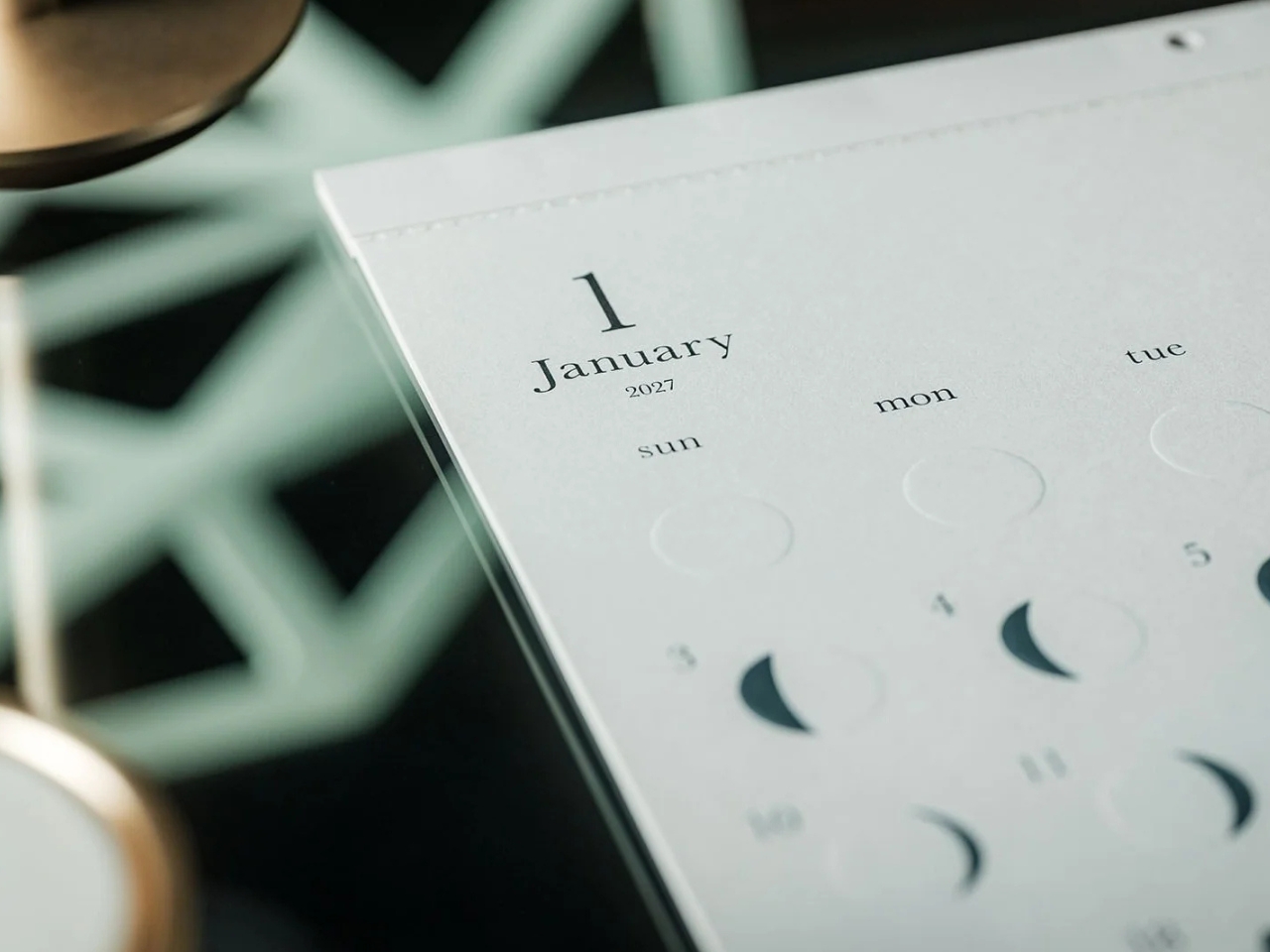
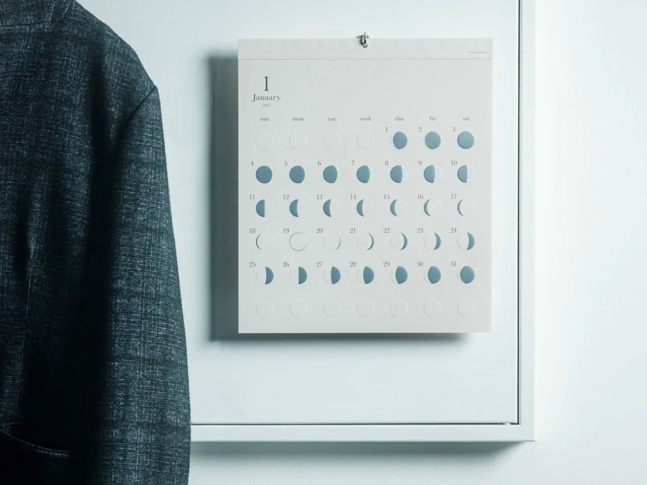
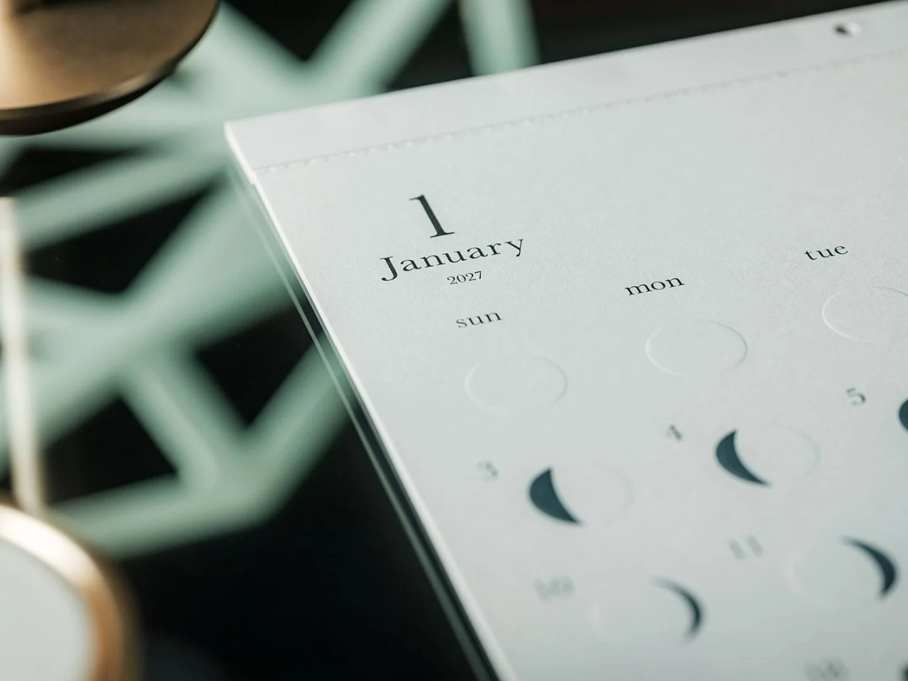
This is primarily a calendar that brings attention to the lunar cycle. It shows the moon’s phases in shimmering, reflective silver foil that catches the light falling on it. That distinction matters: it reflects light rather than producing its own illumination. Its appearance can change depending on the angle of the light, making placement part of the effect. It also has an embossed moon silhouette that adds a tactile element when you touch the calendar. For someone who enjoys small daily rituals, pausing to notice the changing lunar phases could become a grounding moment in an otherwise busy day.

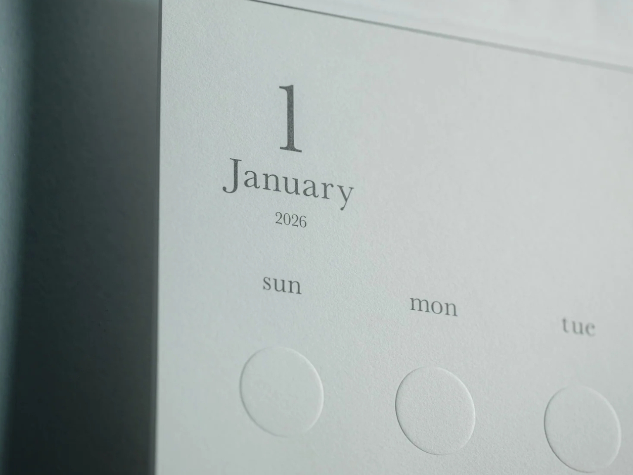
The calendar is made in Japan, with 12 paper sheets measuring approximately 11.7 by 13.5 inches. That gives you a sense of the wall space it needs without making it sound like an oversized art print. The combination of embossing and silver foil is the important design choice here: one gives the paper physical relief, while the other changes how it catches light.

For comparison, MUJI’s 2027 Bagasse Paper Wall Calendar, listed on its European store, uses a Monday-start monthly layout that presents the full month at a glance. Both could appeal to someone who prefers understated stationery, but their priorities differ. MUJI emphasizes straightforward date reference, while Oboro gives lunar phases and decorative surface treatments more attention. Oboro’s appeal is less about improving your scheduling system and more about giving a useful paper object a place in your decor. The better choice depends on what you want to look at every day.

There is also something appealing about checking a calendar without reaching for your phone. If opening an app tends to lead you somewhere else entirely, a paper reference lets you glance at the date and move on. You can still keep your appointments in a digital calendar while choosing something more personal for the wall beside your desk. If you’ve stopped choosing calendars because your phone already handles the practical side, Oboro Silver Moon Calendar gives you a reason to reconsider. It can sit alongside your existing routine, offering something different to notice: the shape of the moon, the texture of the paper, or a brief flash of silver as the light changes.

The post Oboro’s Silver Moon Calendar Is Wall Art You’ll Actually Use first appeared on Yanko Design.
  •  

Espresso Without an Outlet or a Separate Cup

An espresso habit gets complicated the minute you leave the kitchen. You can bring the beans, but the equipment tends to stay beside an outlet, occupying a respectable chunk of counter. Pura Coffee’s PURA NEO Pro, listed for sale at $349, is designed to put heating, extraction, and drinking into one battery-powered object. The problem it tackles is straightforward: making espresso away from your usual setup without packing a miniature coffee station.

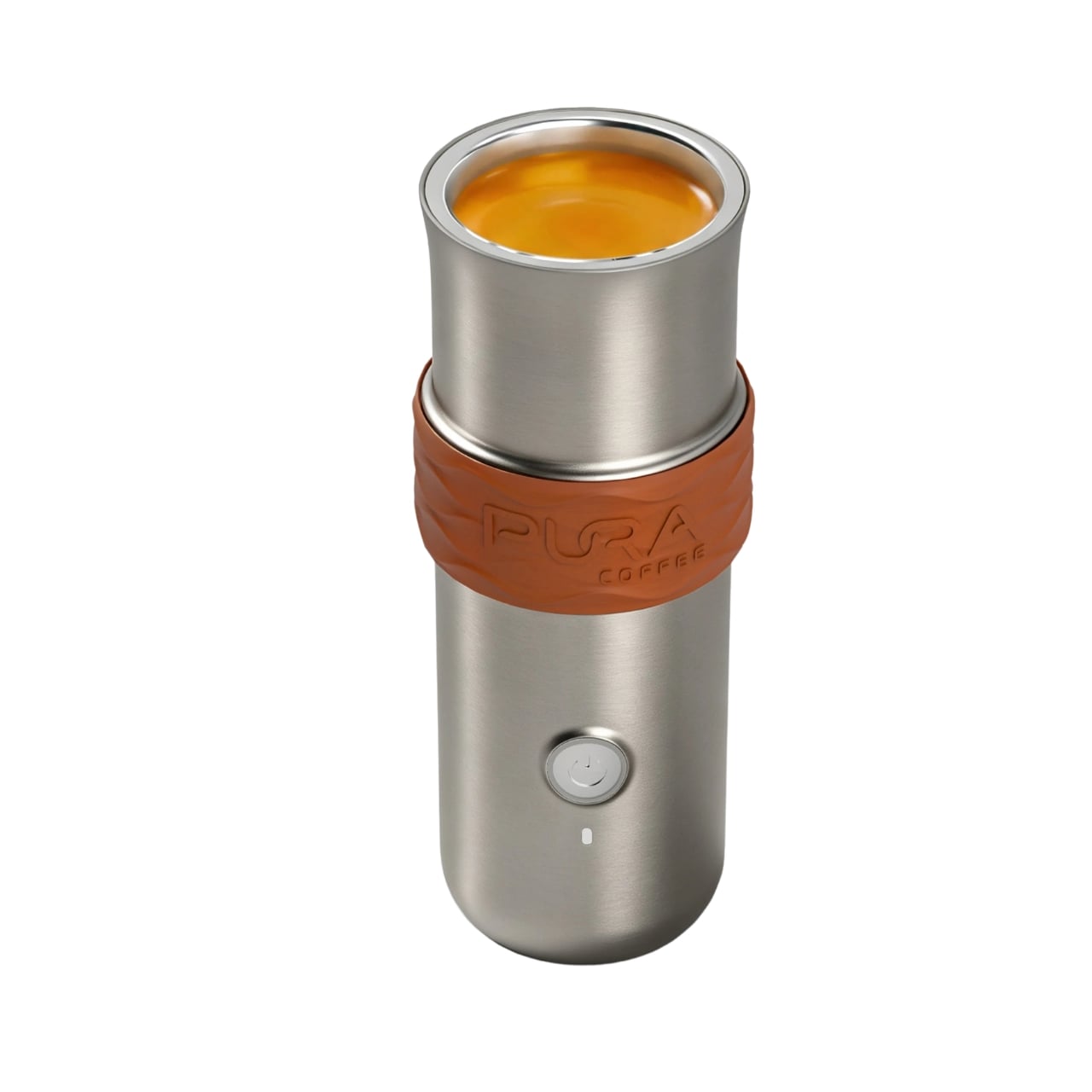
Visually, the NEO Pro looks closer to a travel tumbler than a shrunken kitchen appliance. The company’s imagery shows a cylindrical body, a cup at the top, and a textured brown band around the middle. A circular power button keeps the front relatively uncluttered. I like the restraint here. It looks like an object you could leave beside a laptop without your desk suddenly resembling the equipment shelf behind a coffee bar.

Designer: Pura Coffee

That stacked layout explains the design’s most interesting decision. Pura pumps water upward through the grounds into the drinking cup above, so you don’t need to balance the brewer over a separate vessel. The cup becomes part of the architecture rather than another accessory to remember. The company says upward flow helps wet the coffee bed evenly and reduce channeling. That extraction advantage needs testing, but the integrated cup has an immediately understandable purpose.

The basic controls are refreshingly physical. After a short press followed by a two-second hold to power on, one press starts heated brewing at the default 92°C, roughly 198°F. A double press skips heating and brews using the water’s existing temperature. Pura also uses a colored light ring to communicate status. It’s a sensible division of labor: a button for getting coffee started, with a small visual signal instead of another screen demanding your attention.

Inside, the ambition gets more technical. Pura specifies extraction pressure of 6 to 9 bar at the coffee puck and a five-stage process that moves from pre-infusion through brewing to pressure release. Its roughly three-minute cold-start brewing time is explicitly labeled a design target, not a verified result here. I’d treat that timing as provisional, particularly if the appeal is making a quick cup between meetings rather than enjoying the preparation itself.

Then comes Brew OS, the companion software that lets owners adjust brewing parameters and save combinations as shareable Brew Cards. Pura says the app can also suggest a starting extraction curve from a photograph of a coffee bag or the beans themselves. That’s a potentially useful entry point for someone who wants more guidance than a temperature slider. Importantly, the company describes these suggestions as starting points, while deeper learning from personal taste ratings remains on its roadmap.

I’m more persuaded by saving a recipe than by the prospect of photographing beans. A saved combination gives the tinkering a destination: find settings you like, then stop rebuilding them every morning. For me, that’s a better reason to connect a coffee maker to a phone than simply adding remote controls. Brew OS allows that recipe to be saved and shared, although repeating settings shouldn’t be mistaken for guaranteeing identical flavor.

The practical boundaries matter, too. The water tank holds a maximum of 70 milliliters, about 2.4 fluid ounces, so think espresso-sized servings, not a full commuter mug. Ground coffee is the primary approach, with an optional Nespresso-compatible capsule adapter. Cleanup still involves discarding the grounds and rinsing removable parts; the body cannot be immersed or put in the dishwasher. Portability gets the equipment into your bag, but it doesn’t make the used grounds disappear afterward.

At $349, I’d want the NEO Pro to earn its place through regular use, not just the occasional campsite photo. Its strongest design argument is the cup itself: brewing and drinking share one vertical assembly, with fewer separate objects to arrange. If carrying your espresso routine matters enough to justify the preparation and cleanup, that’s a thoughtful place to start. The app can offer more settings later. First, the coffee needs somewhere to land.

The post Espresso Without an Outlet or a Separate Cup first appeared on Yanko Design.
  •  

DRIFT’s Glass Sculpture Traces Wind Without Moving

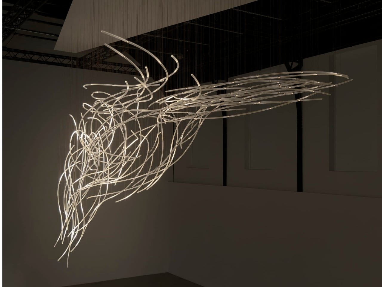
Wind usually needs an accomplice to become visible: a bending tree, a billowing curtain, a plastic bag having a much more cinematic afternoon than it deserves. Air itself gives us very little to look at. Aeolus, a new installation by Amsterdam-based studio DRIFT, takes on that perceptual problem with hundreds of suspended glass rods and light. It gives an invisible force a form you can actually follow.

The studio’s founders, Lonneke Gordijn and Ralph Nauta, have made Aeolus an interactive artwork rather than a conventional light fixture. Presented with Carpenters at London’s Ladbroke Hall from October 13 through 25, 2026, the installation takes its name from the Greek god of the winds. Its shape, though, comes from a specific earthly source: the architecture of the room containing it.

Designer: DRIFT

DRIFT begins with a digital reading of the surrounding architecture, then translates that space into a virtual environment where air can flow. The studio selects one moment from that simulated movement and gives it physical form in glass. That distinction matters. Aeolus isn’t showing a live reading of whatever breeze happens to be passing through the gallery. Its structure holds a chosen instant, while the lighting introduces a separate layer of change.

I like that the room has a say in the result. A sculpture built from its setting feels more considered than an impressive object dropped into an available corner. DRIFT says each installation is generated by its host architecture, so the curves carry information about a particular place. The building becomes part of the design process, even if visitors never see the digital model behind it.

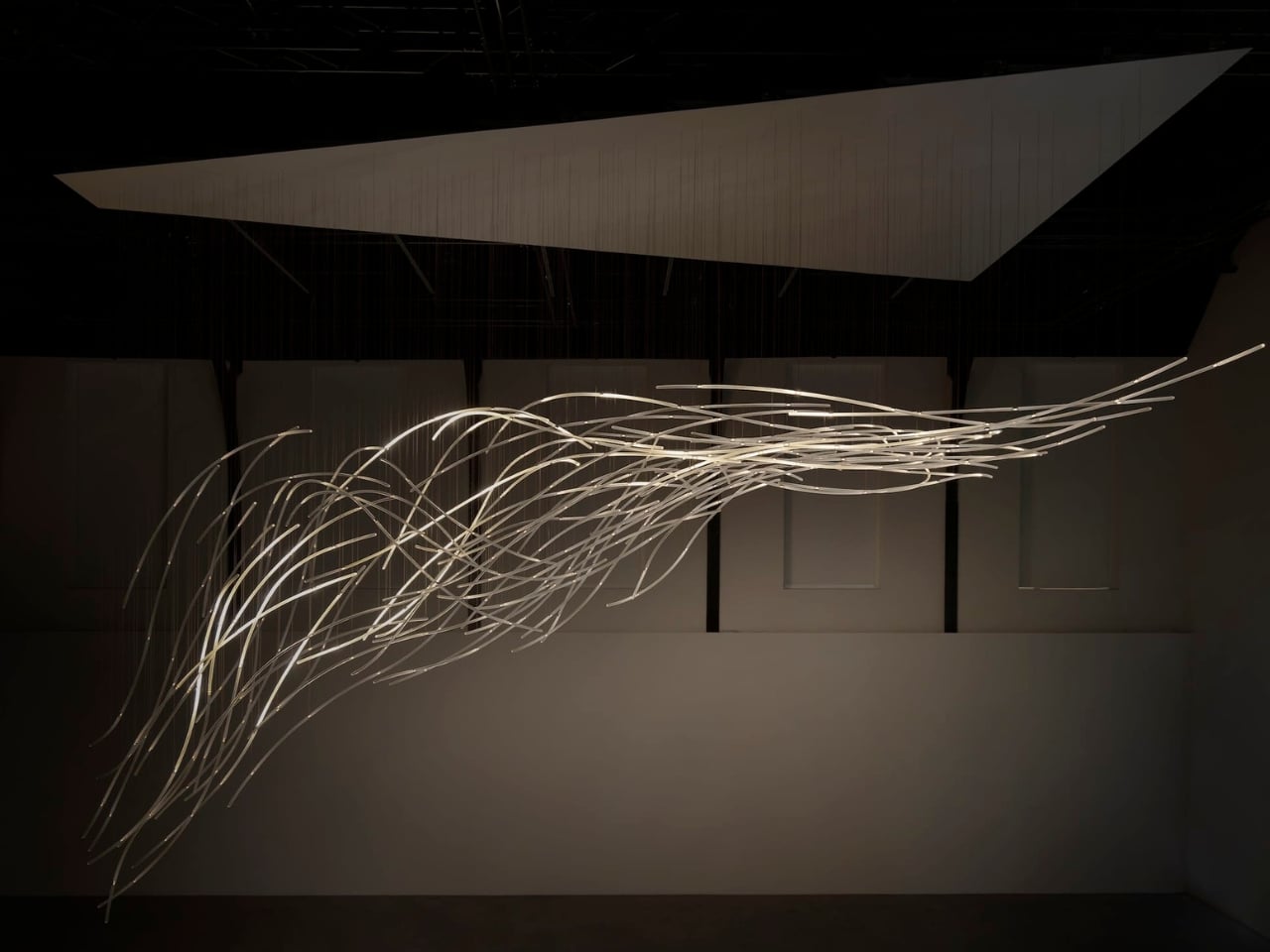
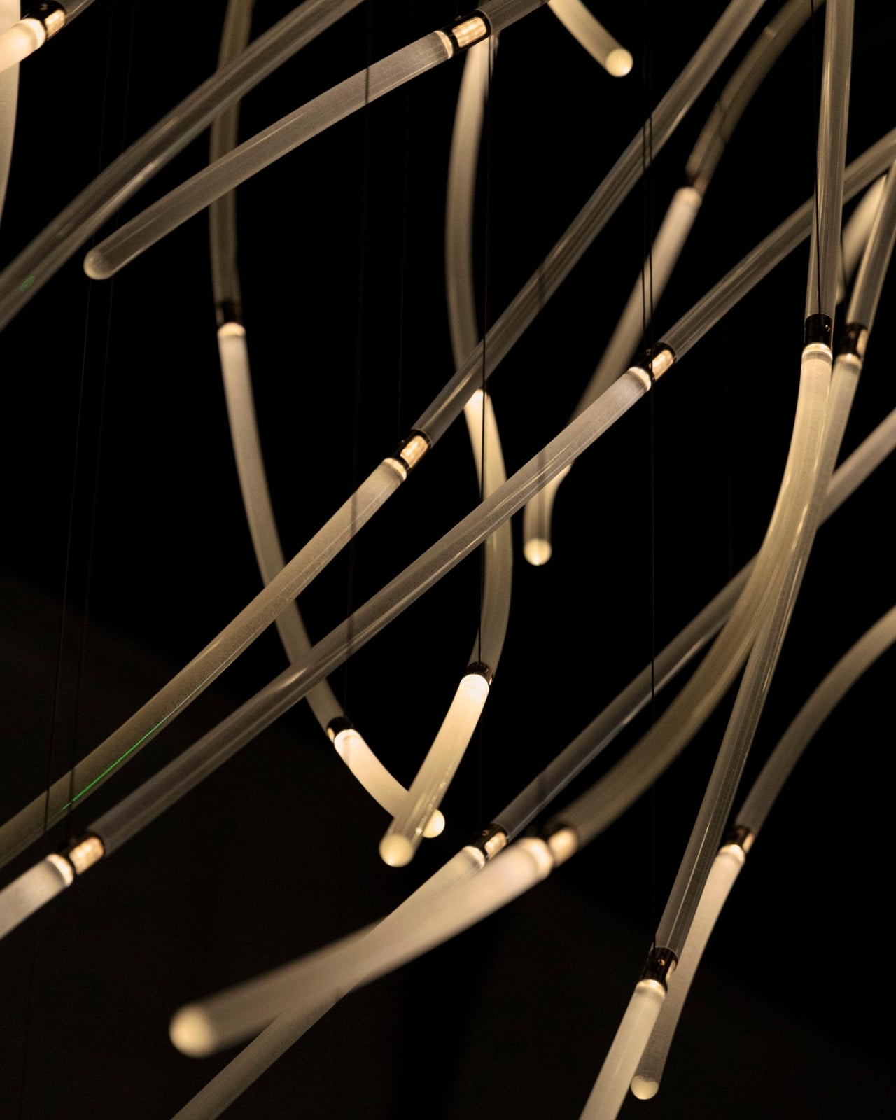
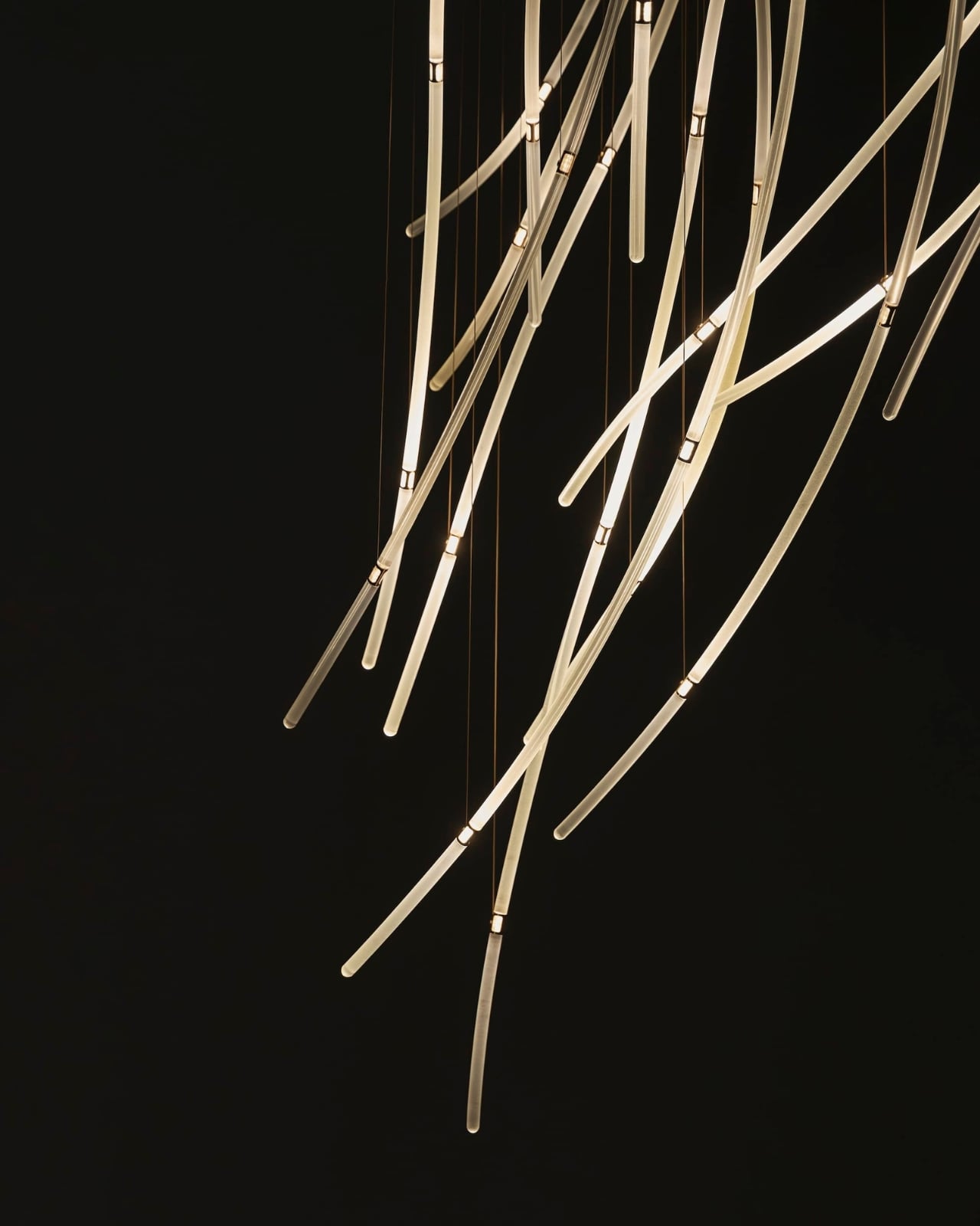
In Benjamin Baccarani’s photographs, the rods gather into a long, sweeping formation, dipping at one end and stretching outward at the other. Fine suspension lines lead up to a broad overhead panel. The material list is more technical than the airy appearance suggests: borosilicate glass rods, stainless steel nodes, custom LEDs, and microcoax cables. I appreciate that contrast. Making an object look almost weightless still requires hardware, connections, and a deliberate relationship with gravity.

The glass itself stays still. According to Carpenters, small lights inside the rods change their rhythm and intensity in response to visitors moving through the space. Waves of illumination create the impression of motion without the sculpture physically shifting. That’s the cleverest choice here. The designers don’t need to swing a roomful of glass around to suggest wind; they let your eyes follow light across a fixed structure, doing much of the perceptual work.

The interaction also gives visitors a meaningful role without turning them into operators. Walking changes the work’s lighting, a relationship that seems appropriately direct for an installation about air and movement. I’m drawn to technology that makes its presence felt through an understandable response. Here, the interesting question is how your movement alters what you see, rather than how many technical features the system contains.

DRIFT frames Aeolus as an invitation to reconsider our relationship with nature. I’d treat that as a starting point for looking, not a transformation any artwork can promise. The more convincing achievement is smaller and more specific: making airflow legible through material and light. You don’t need to leave with a new environmental philosophy to appreciate the way a simulated path has become a collection of precise, luminous curves.

For me, the appeal sits in that modest shift in attention. The room stops being an empty container for an artwork and starts to look like a place shaped by movement. Aeolus makes that movement imaginable while keeping the glass suspended in a single instant. A visitor supplies motion, the lights answer, and the fixed structure takes on another rhythm. The glass gives you time to study a shape that moving air would never hold still for inspection.

The post DRIFT’s Glass Sculpture Traces Wind Without Moving first appeared on Yanko Design.
  •  

Masa’s Wavy Tray Is Sculpture You Can Actually Serve Snacks On

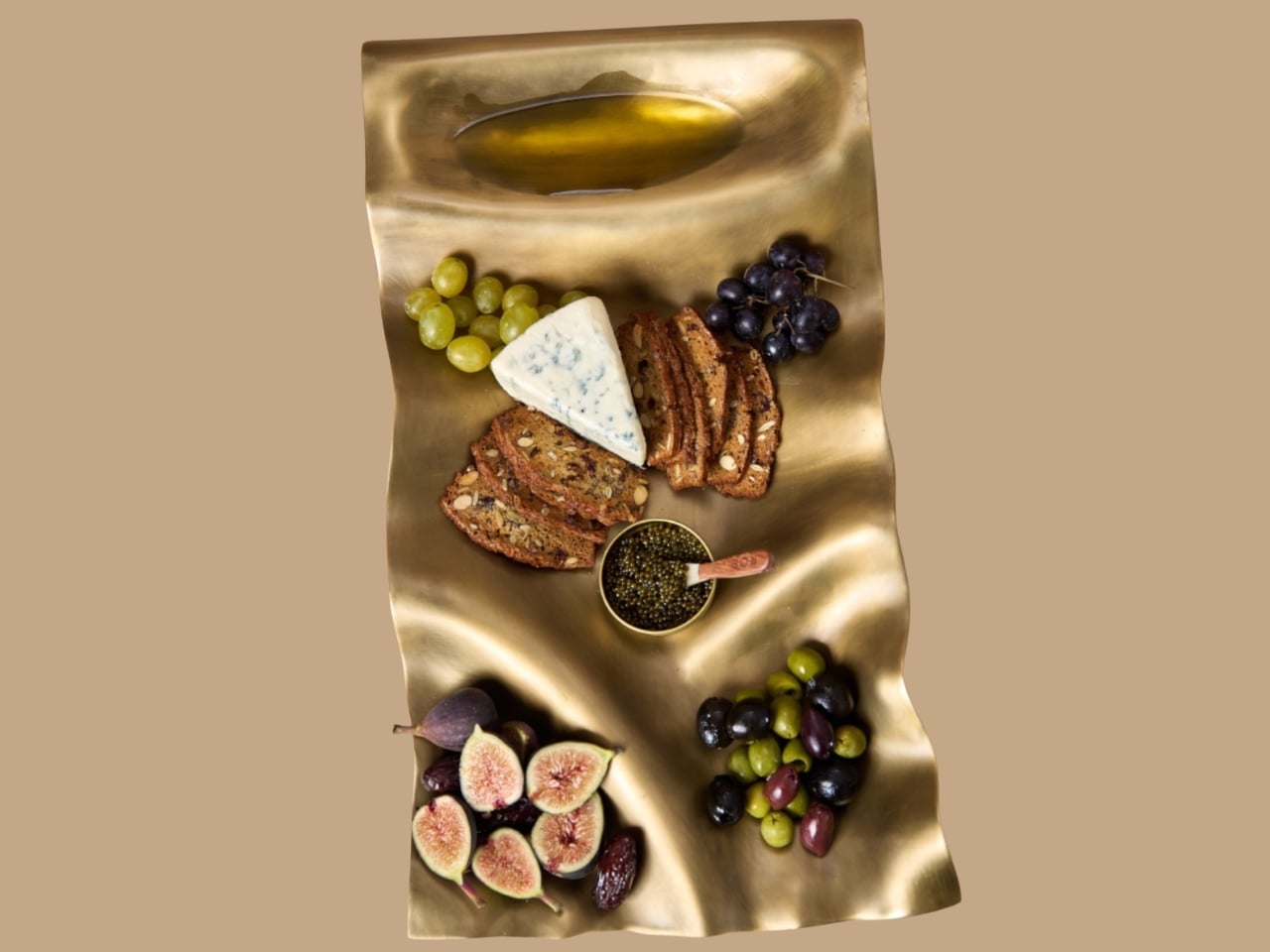
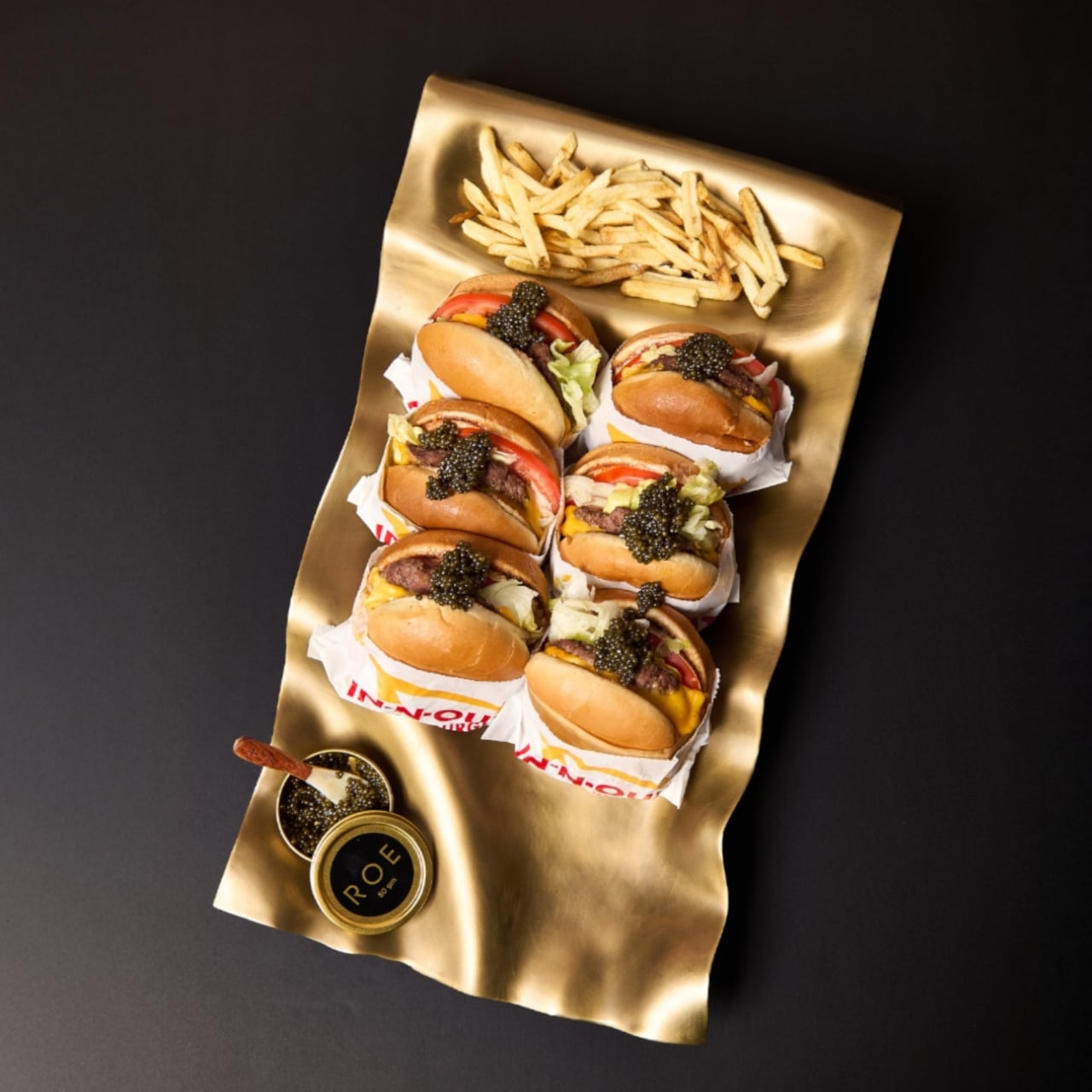
Six burgers, a pile of fries, and generous spoonfuls of caviar are a pretty good way to explain dumæ’s Masa Tray. In the brand’s photographs, the food sits on a rippling brass surface that looks more like a small sculpture than standard serving ware. I like the slightly ridiculous pairing. It also makes the tray’s purpose clear: give dinner a visually interesting home without adding a separate decorative centerpiece.

Designed by Los Angeles brand dumæ and handcrafted in India, Masa addresses that familiar divide between the serving pieces you use and the decorative objects you leave out. Its project description says the brass tray is finished to be food-safe, allowing it to move between both roles. The appeal is having one substantial object that doesn’t need to disappear when everyone finishes eating.

Designer: dumæ

The starting point is the movement of waves, translated into broad rises and shallow dips rather than a literal seashell outline. IADA’s announcement traces the reference to Point Dume, the stretch of coast where dumæ founder Kym Gold grew up. I appreciate that the backstory isn’t required reading. Even without knowing the geography, you can see how the curves break up what could otherwise be a rather stern metal rectangle.

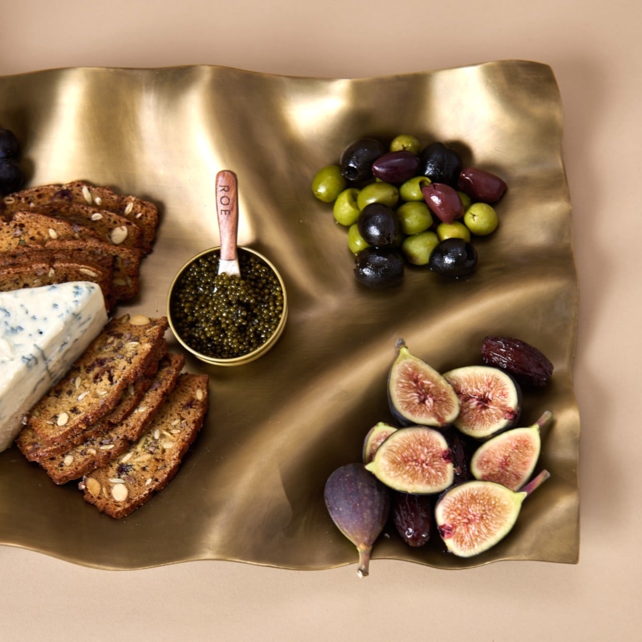
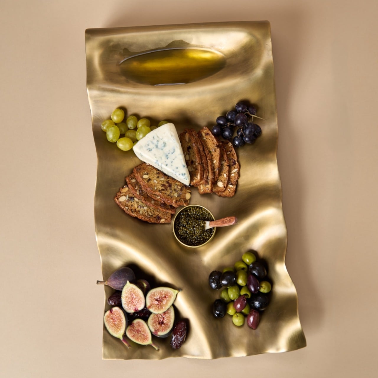
In the close-up photographs, light collects along the higher ridges while the depressions fall into softer shadow. That gives the surface a sense of movement even when it’s covered with crackers and grapes. The edges rise and dip with the rest of the form, so the shape feels continuous rather than decorated afterward. To my eye, that’s the strongest design decision here. The visual interest comes from the tray itself, without needing a pattern applied on top.

Those undulations also deserve a practical look. A sculpted surface offers a different proposition from a flat platter, particularly if you’re arranging small bowls or setting down glasses. I’d treat Masa primarily as a tabletop serving piece rather than assume it’s the ideal tray for carrying drinks across a room. The photographs make a convincing case for loosely arranged food. They don’t establish how securely every vessel would sit, and the distinction matters when the surface is this expressive.

The handcrafting adds another layer. According to the announcement, small differences in form and finish occur from piece to piece. That feels appropriate for a design built around irregular movement; perfect repetition would almost work against the idea. Still, handmade isn’t a performance specification. The individuality is a reason to appreciate the object visually, not evidence that it will resist scratches or survive every kind of use. I’d want the maker’s specific care guidance before treating it as everyday workhorse tableware.

Retail listings put its footprint at approximately 21.5 by 11.5 inches, with a height of 3 inches. That’s worth measuring against your table before imagining a generous spread surrounded by dinner plates. The Happy Kangaroo lists Masa at $595, although it’s marked sold out at the time of writing. At that price, this is a considered decorative purchase with a serving function, and its appeal depends on wanting to see it between meals.

Masa received Platinum recognition in both Kitchen & Dining Room Design and Homewear & Decor at the International Architecture & Design Awards 2026. Those categories neatly reflect its intended overlap: something for the table that can also hold its own elsewhere in the house. The recognition is useful context, though the more persuasive argument is still visible in the photographs: food looks inviting against those broad brass curves.

I’m most persuaded by the burger arrangement. The cheese, figs, and carefully grouped grapes are lovely, but takeout gives the tray a less precious personality. It suggests that owning a sculptural serving piece doesn’t require hosting a perfectly coordinated dinner party. I’d rather see an object like this earn its space under a heap of fries than spend its life waiting for an occasion formal enough to deserve it. The waves are already doing the decorating.

The post Masa’s Wavy Tray Is Sculpture You Can Actually Serve Snacks On first appeared on Yanko Design.
  •  

Kenko’s 18-Gram Pieni III Camera Shoots Without a Screen

Keychain cameras have a certain appeal for those who love to carry a bit of nostalgic charm with them. Well, technically, they’re still digital cameras, but there’s a retro feel to them that appeals to those who remember taking photos before smartphones. They’re cute and tiny enough to carry as accessories, but they still let you take photos and videos to add to your collection.

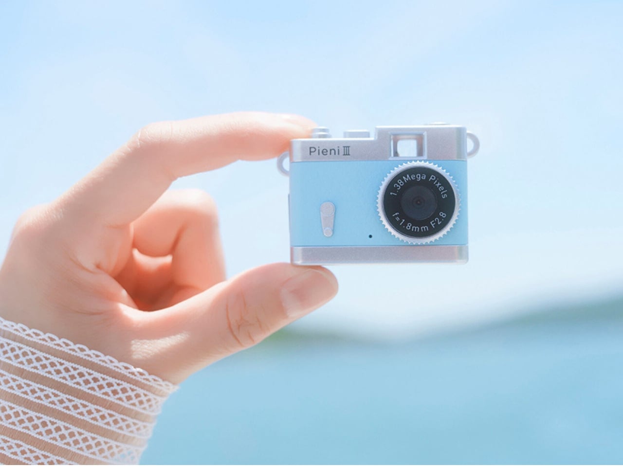
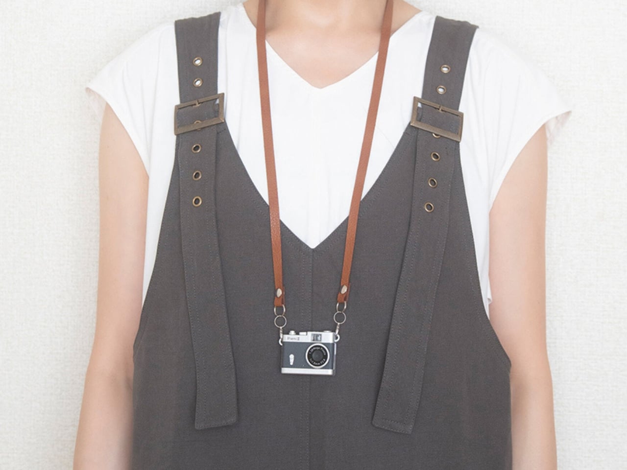
Kenko Tokina has released another tiny camera to add to the fun. The Kenko Pieni III is an ultra-small digital toy camera designed to be worn as a necklace or an accessory. It comes with a neck strap for that purpose. It’s not meant to replace your bigger camera, of course, but it offers another way to take photos and videos.

Manufacturer: Kenko Tokina

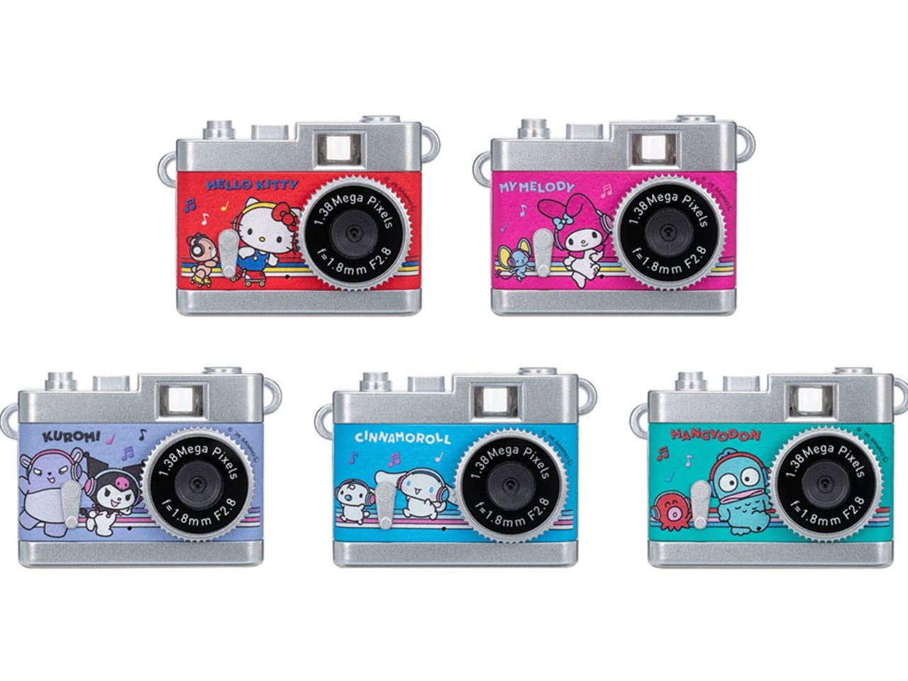
This version of the Pieni camera is just over two inches wide and weighs approximately 18 grams, excluding the memory card and accessories. It comes in a classic camera-style design, so it can also serve as a camera-shaped accessory or a decorative display. But when you want to use it as an actual camera, it can capture still images at 1440 × 960 pixels and videos with audio at 720 × 480 pixels and 30 frames per second.

There’s an important detail behind those photo dimensions, though. The sensor has only 320,000 effective pixels, or 0.32 megapixels, and the camera interpolates the images to create larger files. That doesn’t give you the detail of a higher-resolution sensor. It’s worth keeping your expectations in toy-camera territory rather than expecting crisp images suitable for large prints. But I think this lo-fi aesthetic is part of the appeal of using these toy cameras as a secondary way to capture moments.

It doesn’t have a screen or a viewfinder, so you can’t preview your framing or immediately review what you’ve taken. It can be a way to enjoy capturing a spontaneous moment without worrying about making it perfect, although aiming without a preview may be a challenge for some. There’s also a difference between accepting an imperfect photo and accidentally leaving someone out of the frame, so that uncertainty is part of the trade-off.

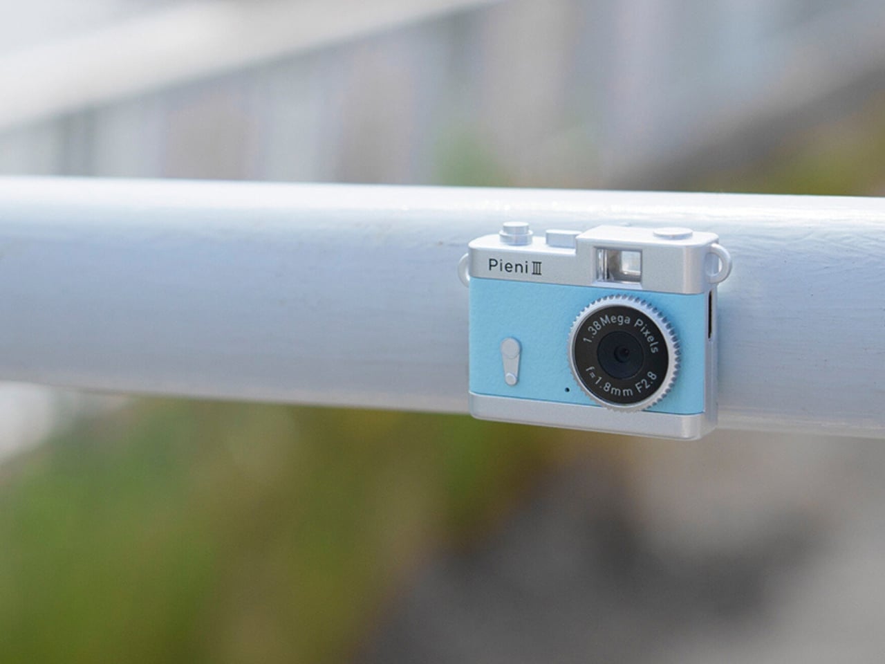
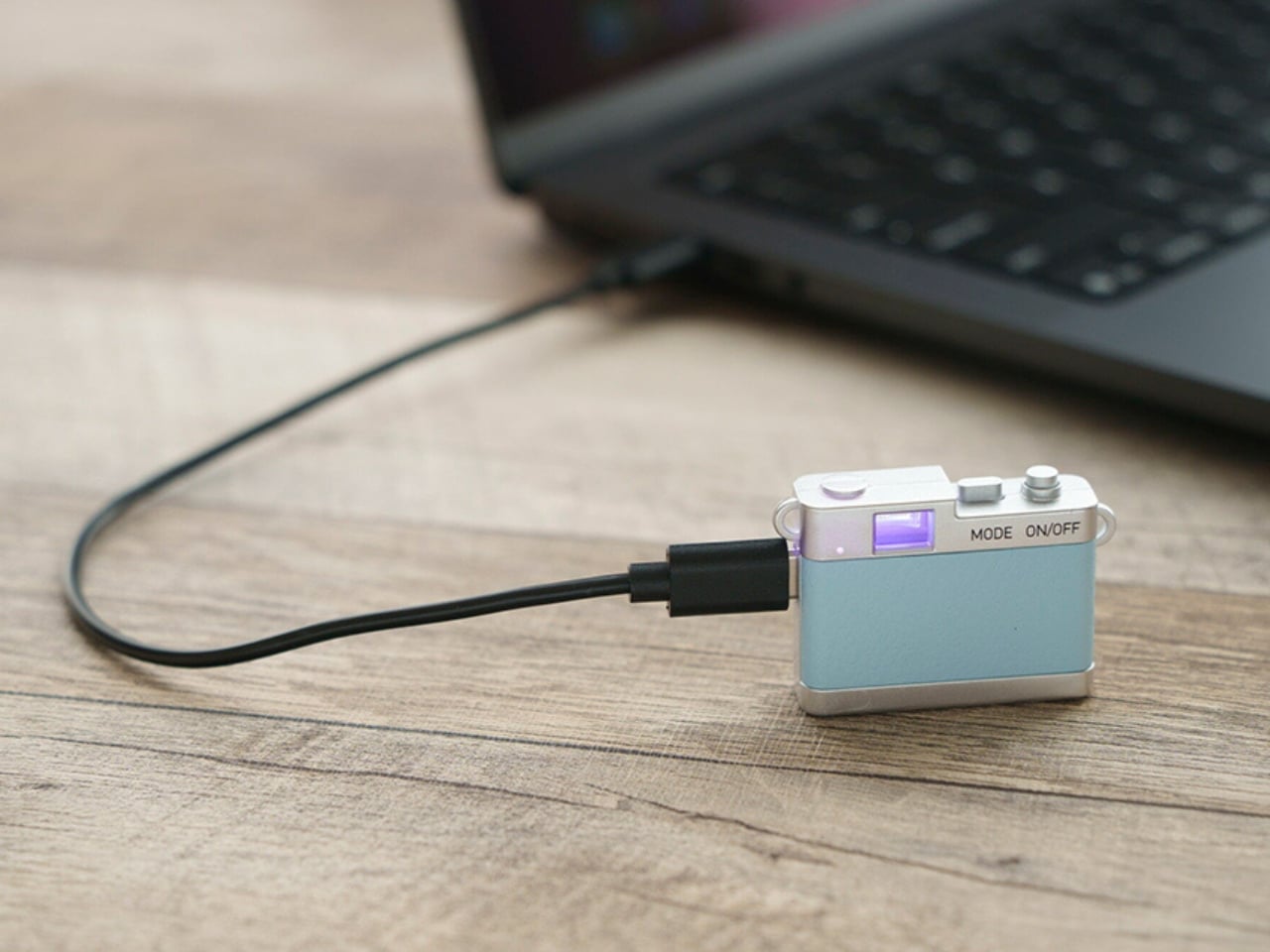
The controls are simple in number, with just two buttons. One handles power and the shutter or video recording, while the other switches between photo and video modes. LEDs indicate which mode you’re using. There aren’t many controls to navigate, although you’ll still need to learn the button presses and signals. The camera also has an integrated rear magnet, so you can attach it to compatible magnetic surfaces, such as a refrigerator or a suitable metal railing. This could be useful for recording yourself when you don’t want to hold the camera. You’ll still need to find a secure position and judge where it’s pointing, especially since there’s no screen to help you set up the shot.

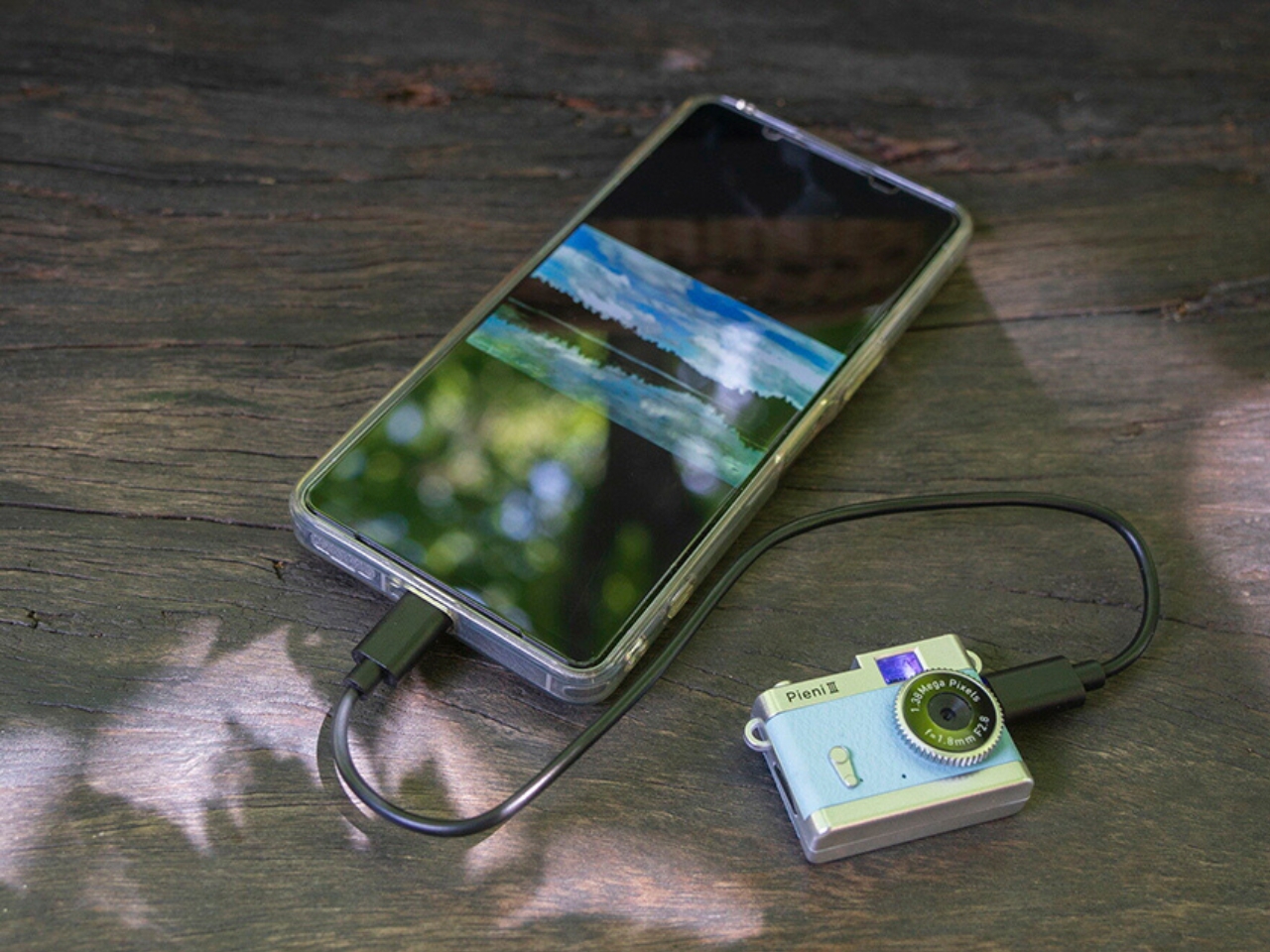
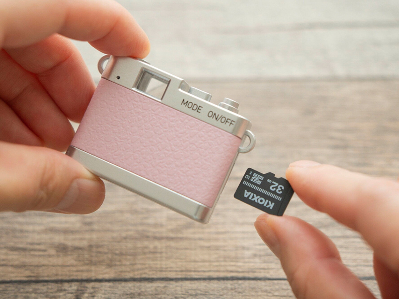
Photos and videos are saved to a separately purchased microSDHC card, with supported capacities ranging from 4 GB to 32 GB. There’s no user-accessible internal storage, so the card is something you’ll need before you start shooting. That’s a small but important extra purchase if you’re planning to give the camera as a gift. To see the results, you can connect the camera to a computer or transfer files directly to a compatible USB-C smartphone using the included USB-C-to-USB-C cable. Kenko Tokina cautions that it doesn’t guarantee compatibility with every smartphone. The USB connection also handles charging, keeping the basic setup fairly compact.

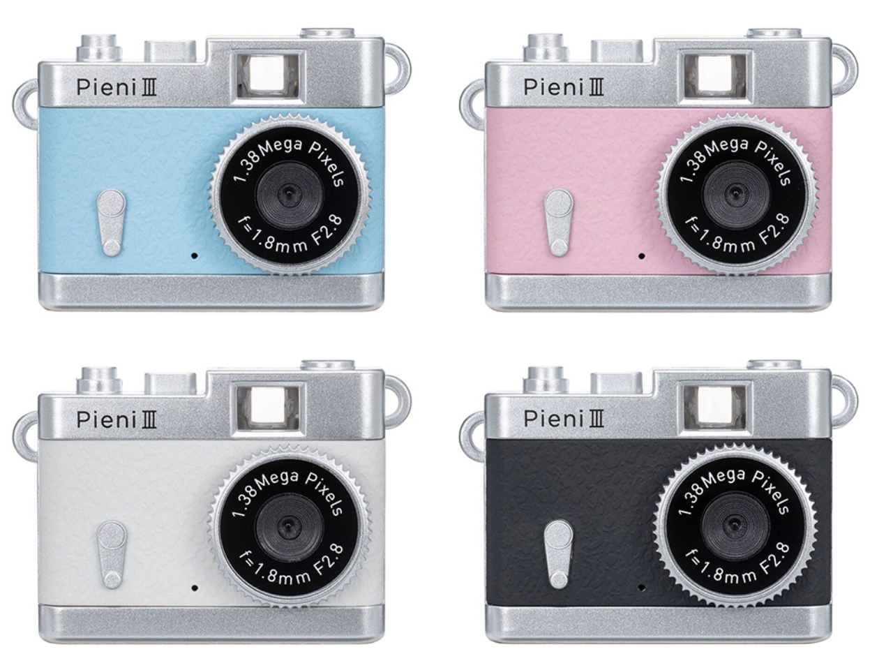
The Pieni III is available in four colors: Soda, Strawberry, Milk, and Black. There are also five character versions in the separate Sanrio Character Toy Camera STREET line, which has the same basic performance as the Pieni III. The range includes Hello Kitty, My Melody, Kuromi, Cinnamoroll, and Hangyodon.

For moments you absolutely need to capture correctly, the lack of framing and immediate review may be frustrating. But if you’re happy to take a few chances, there’s something appealing about putting the camera away without checking every shot. You get to find out later which pictures worked—and which ones missed what you were aiming for.

The post Kenko’s 18-Gram Pieni III Camera Shoots Without a Screen first appeared on Yanko Design.
  •  

Scooby-Doo Birkenstock Concepts Actually Look Like the Gang

A turquoise strap and a tiny “SD” tag turn a caramel clog into Scooby-Doo before you even register the spots. That’s the appeal of “Scooby Birks,” an unofficial Birkenstock × Scooby-Doo concept collection by The Missing Drop. It addresses a familiar design problem: how to wear your affection for a cartoon without looking like you borrowed something from the costume aisle. I’d rather recognize a character through those details than a giant printed face.

Before anyone starts planning a purchase, these are imagined products, not manufactured prototypes. The project has no affiliation with or endorsement from Birkenstock or Warner Bros. Its six designs borrow familiar footwear silhouettes to interpret Mystery Inc. and the Mystery Machine. That distinction matters because the presentation, right down to the packaging, has the confidence of an actual retail campaign.

Designer: The Missing Drop

Scooby’s Boston is the clearest introduction to the idea. Its brown, suede-like surface carries irregular dark patches, while the turquoise buckle strap takes the place of his collar. The dangling gold-colored tag completes the reference. Moving a collar onto an existing shoe strap is an economical decision: the designer gives a familiar component another meaning without needing to reshape the entire clog. Even the rounded toe feels appropriate for this particular character.

Shaggy’s Boston would be my pick, partly because the joke is so pleasantly literal. The concept imagines olive-green shaggy shearling across the upper, paired with a rust-colored, corduroy-textured strap and a little biscuit charm. His green shirt and brown pants become a material palette. It’s deliberately scruffy, but the buckle and recognizable clog shape keep it from reading as a novelty slipper. I’d happily lose the charm and keep everything else.

Velma gets a red Mantova Mary Jane with orange ribbing around the interior, a reference to her sweater that rewards a closer look. It’s probably the easiest design here to separate from its inspiration and wear as an ordinary shoe. Daphne’s purple Namica takes the opposite approach, adding a lavender sole band and a bright green scarf tied beside the buckle. The wedge gives her interpretation a dressier profile, although that dangling scarf raises a practical question about keeping it clear of the ground.

Fred’s Naples translates his outfit into a cream-colored loafer-style upper, blue detailing, and an orange scarf knot. I like the way the moccasin-style stitching gives that polished character a slightly more relaxed expression. Then there’s the Mystery Machine Arizona, with turquoise straps, lime edging, and orange flowers. Including the van is a smart expansion of the collection: it offers a recognizable reference for someone who loves the show but doesn’t particularly identify with one member of the gang.

The shoebox deserves attention, too. Inspired by Scooby Snacks, it uses turquoise, a broad lime diagonal, orange flowers, and oversized “Scooby Birks” lettering. The palette connects it to the van as well as the fictional treats. I like that the packaging allows itself to be louder than the footwear. A box can carry the full cartoon enthusiasm while the shoes get on with being something you might build an outfit around.

The response suggests that this visual shorthand travels well. Designer Julien Buisson-Fizellier, who identifies the project as his work, reported nearly 8 million TikTok views. That’s his reported figure, not evidence of purchase demand, but it helps explain the concept’s appeal as a shared image. You can recognize the reference, pick a favorite, and send it to someone without needing a lengthy explanation.

My reservation is how easily the campaign’s polish could outpace a viewer’s attention to its concept label. The more convincing an imaginary collaboration looks, the more important that disclosure becomes. Still, the design lesson is worth taking seriously. Scooby’s collar already behaves like a strap; Daphne’s scarf can sit beside a buckle. Those connections give the collection its personality. I’d want a real version to preserve that specificity, even if the loose accessories needed another pass before leaving the drawing board.

The post Scooby-Doo Birkenstock Concepts Actually Look Like the Gang first appeared on Yanko Design.
  •  

CHEKT’s Chessboard Refuses to Hide Its Layered Design

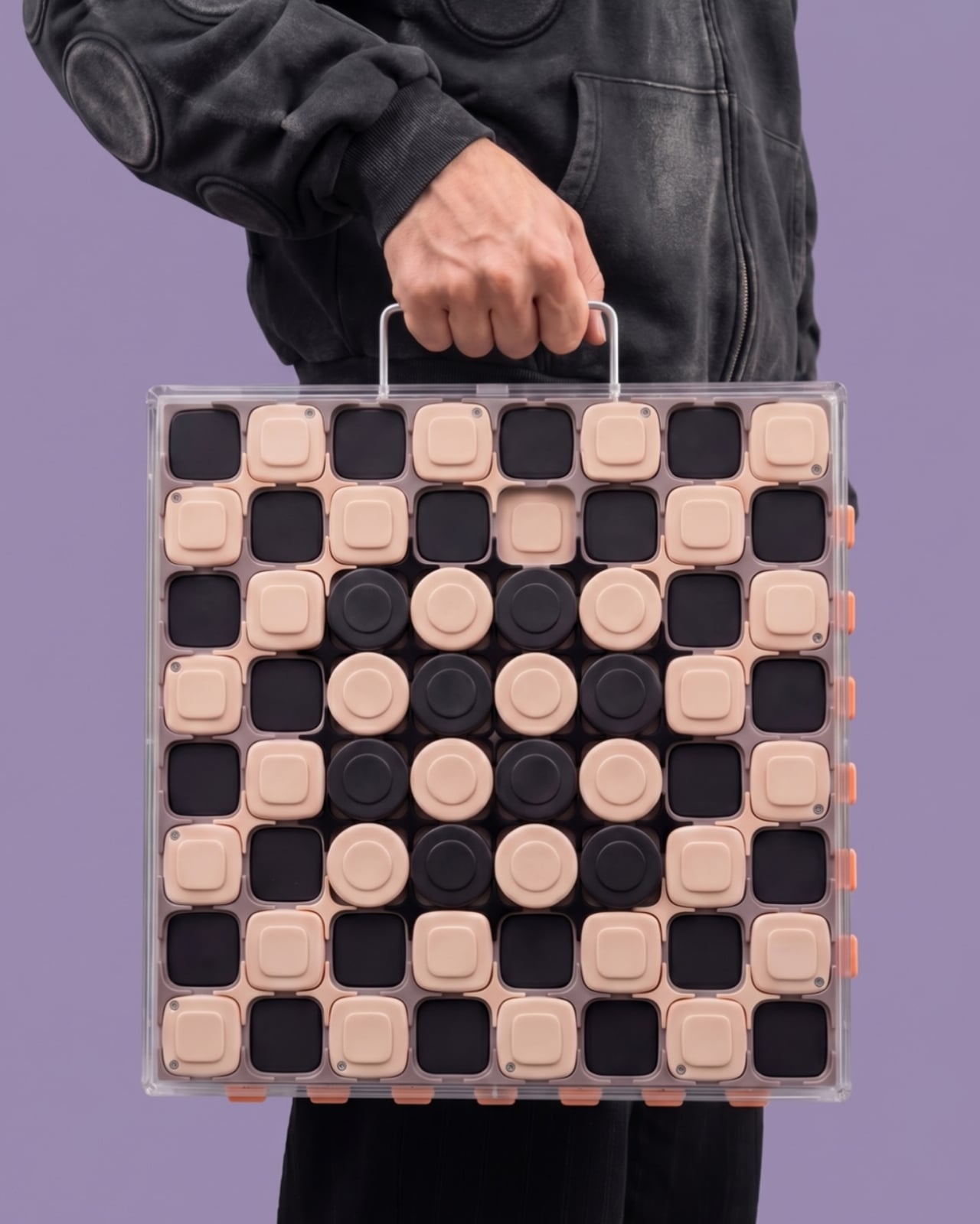
The carrying handle on Jess Wiseman’s CHEKT board is the detail that makes the design click for me. Chessboards have an awkward domestic life: leave one out and it claims a chunk of your table; put it away and playing becomes another thing to unpack. CHEKT’s board design considers that friction through a clear enclosure with a handle, while giving the familiar checkerboard a visual personality closer to a desk accessory than a formal game set.

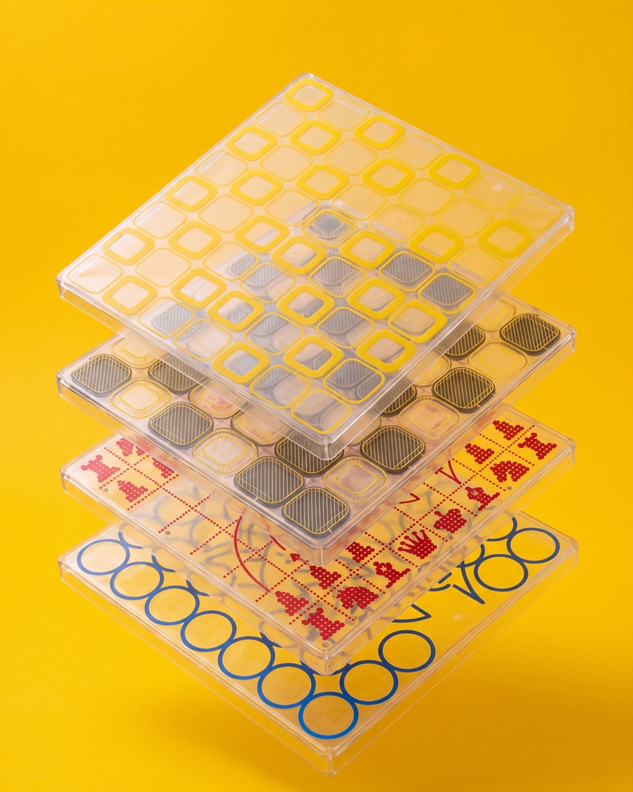
It also addresses a smaller, relatable problem: choosing a board usually means committing to one look. The supplied images show four transparent shells with different graphic treatments, suggesting a way to change the board’s appearance without replacing the underlying object. That’s a more interesting proposition than another beautifully finished slab. I like objects that leave room for your taste to change, especially when they’re likely to spend as much time sitting around as being used.

Designer: Jess Wiseman

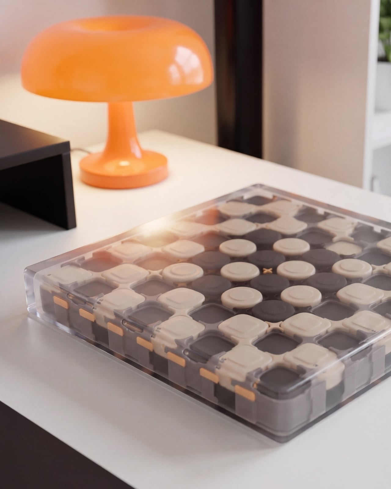
Underneath those shells, CHEKT has an eight-by-eight grid of black and pale peach forms. Rounded corners soften the geometry, and the raised surfaces make it look almost like an oversized keyboard. Circular details occupy the middle area, while square forms dominate elsewhere. The images don’t establish what those individual components do mechanically, so I wouldn’t call them buttons or switches. Visually, though, they give the board depth and rhythm that a printed checkerboard doesn’t have.

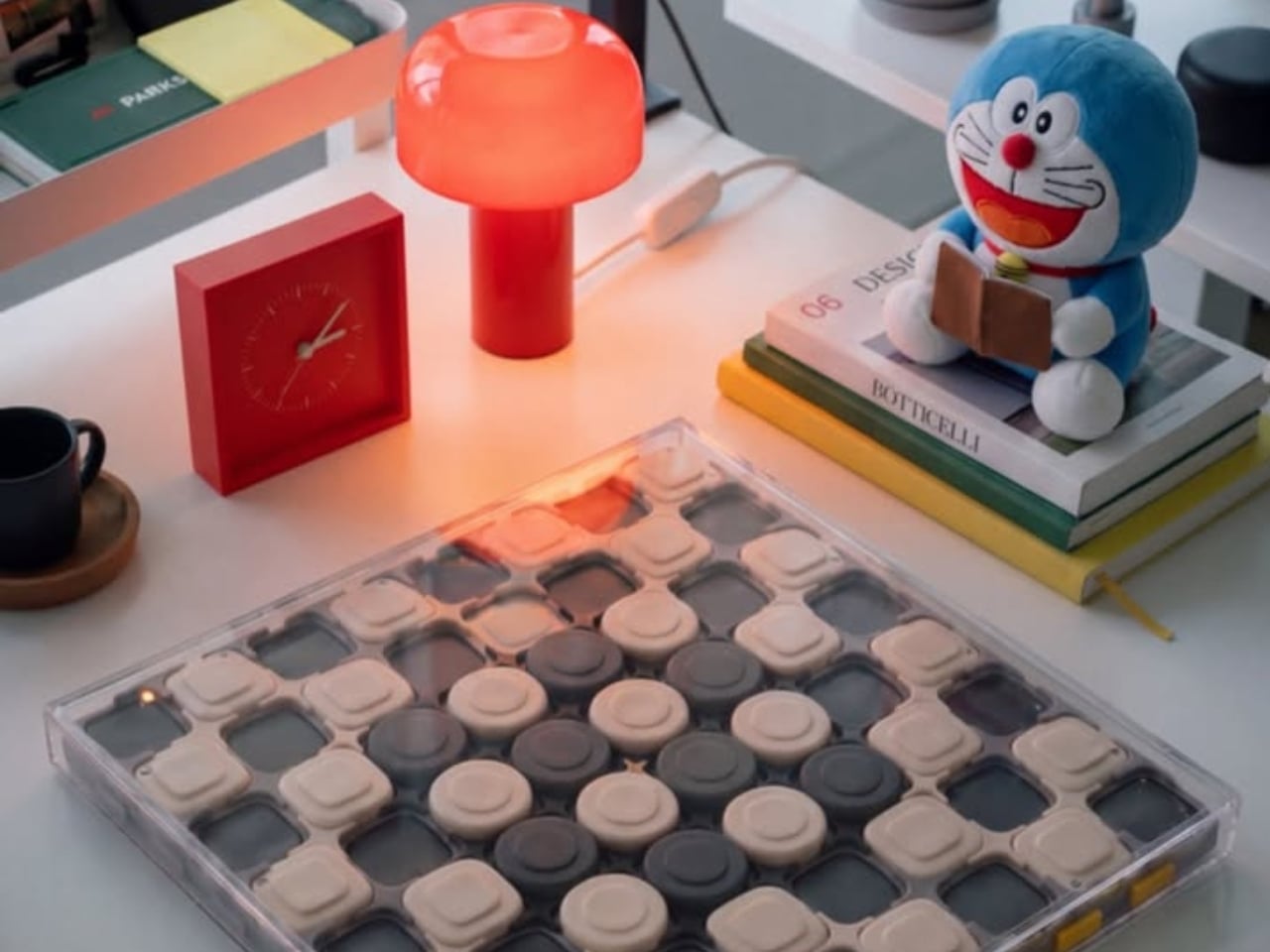
The clear outer enclosure makes those layers visible rather than hiding them behind a finished exterior. Small orange details along the edges interrupt the black-and-peach palette, and the slim, silver-colored handle gives the whole thing a faint briefcase quality. It’s playful without relying on a novelty shape. Sitting on a desk beside an orange mushroom lamp in one image, the board looks quite comfortable sharing space with objects chosen for their appearance.

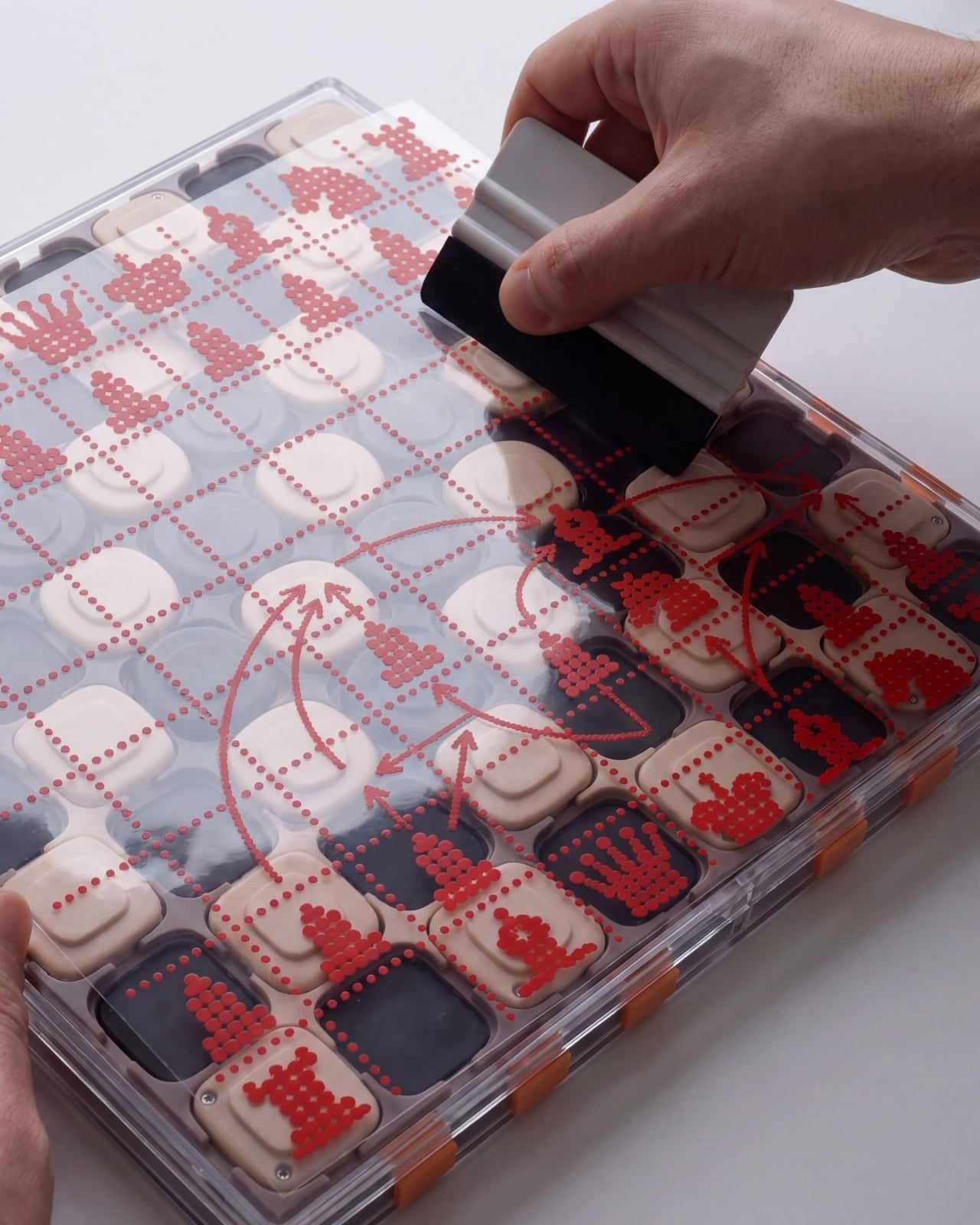
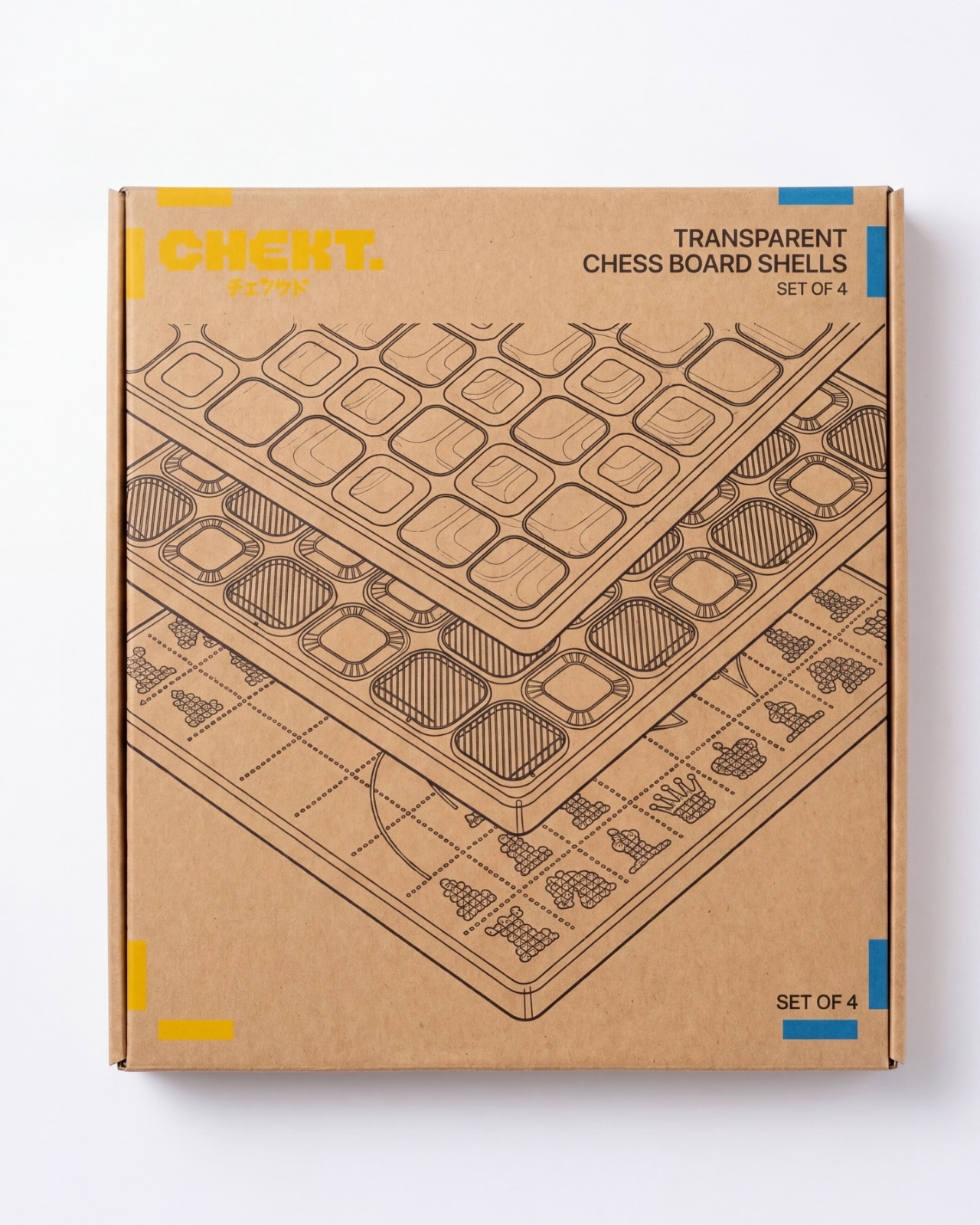
The shell graphics are where the design becomes especially expressive. One uses yellow outlines around the squares, another introduces dark diagonal hatching, and a third has red, dot-built chess-piece illustrations. The fourth features large blue circles and angular linework. They offer different degrees of visual busyness, which matters. A graphic you enjoy looking at across the room might be less welcome when you’re trying to read a complicated position. I’d probably start with the quieter option.

One image shows a hand wiping drawn red arrows from the illustrated shell. That suggests a useful secondary role as a surface for working through moves, explaining a position, or marking an idea before clearing it away. It’s an appealing detail for casual learning because the discussion can happen directly over the board. The specific writing tools and surface compatibility aren’t established here, but the pictured interaction gives the transparent layer a purpose beyond changing the color scheme.

That ability to annotate is arguably more compelling than making a chessboard resemble a collectible gadget. You can imagine two people tracing a possible move rather than trying to explain everything through gestures. It wouldn’t replace learning the rules or recognizing positions, but it could make that conversation easier to follow. For me, this is where the graphic design starts earning its place: the surface becomes something you can use, not merely something to admire.

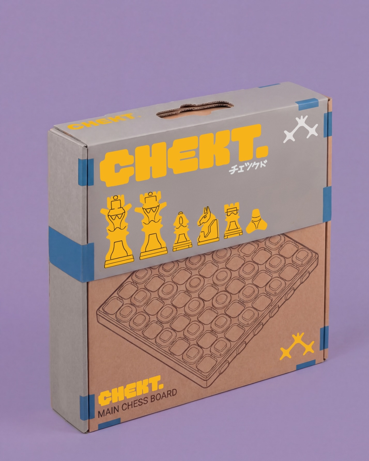
The packaging carries the same attitude. Oversized yellow CHEKT lettering, blue corner accents, chess-piece drawings, and diagrams of the layered board give the boxes a lively, almost hobby-kit character. The shell package explicitly labels its contents as a set of four, making the customization idea legible before anything is opened. I appreciate that clarity. Attractive packaging is more persuasive when it helps explain what the object is, rather than asking the branding to do all the work.

I’d still want to know how the shells attach, how easily their surfaces scratch, and whether the added graphics complicate play. Those answers would determine whether CHEKT feels practical rather than merely photogenic. But the design’s appeal is already clear: it gives a familiar game a place in a less formal room, with an appearance that doesn’t have to be permanent. A chessboard you can carry, customize, and potentially draw on offers several reasons to take it off the shelf.

The post CHEKT’s Chessboard Refuses to Hide Its Layered Design first appeared on Yanko Design.
  •  

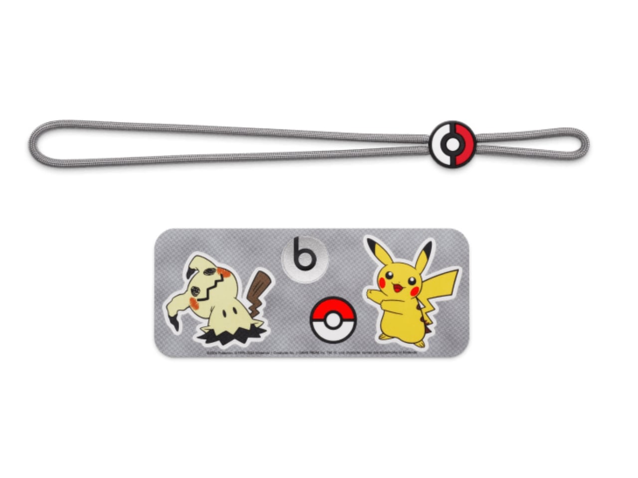
Pokémon Beats Pill Adds Charms Without Raising the Price

2026 is the year when Trainers everywhere celebrate Pokémon’s 30th anniversary, so we expected a lot of new merchandise, themed events, and collaborations with other well-known brands. We’ve seen footwear and apparel rollouts with adidas and PUMA, LEGO sets, even a partnership with the European Space Agency, and food collaborations like Pokémon-themed Hershey’s Kisses. If you’re looking for audio equipment featuring your favorite monster, you’re in luck with this newly announced collaboration.

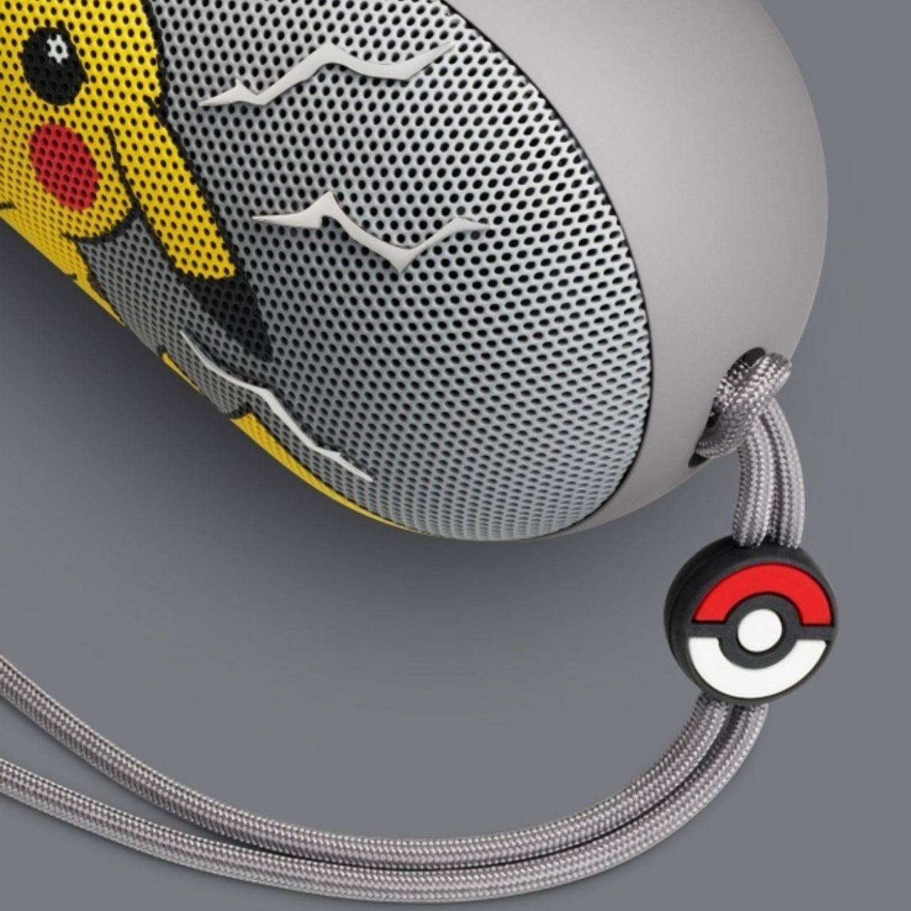
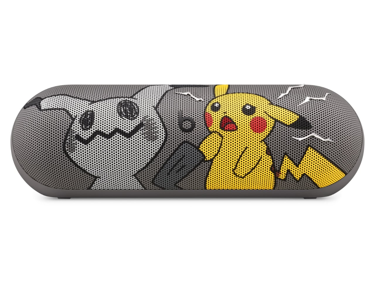
The Pokémon Beats Pill is a Bluetooth speaker announced by audio brand Beats in partnership with The Pokémon Company International. It features two familiar Pokémon characters, the ubiquitous Pikachu and the more mysterious Mimikyu. It brings the bright yellow and minimalist gray associated with these characters to a portable speaker with what Beats calls its signature sound. Both Beats collectors and Pokémon Trainers may want to have this special-edition collaboration to bring their music and other audio content to life.

Designers: Beats x Pokémon

The speaker’s design is a contrast between the electric yellow most identified with Pikachu and a grayscale interpretation of Mimikyu, with the latter hiding beneath a cloth that resembles the former. More than just attaching a logo to the Bluetooth speaker, this is a character-driven design. Both Pokémon appear on the grille, while the speaker itself remains compact and elongated like other Beats Pill devices.

According to Beats, this is also the first Pill release that comes with charms. Trainers who like collecting accessories get the iconic Poké Ball, Pikachu-inspired lightning bolts, and the equally recognizable Beats “b.” The color-matched gray carry lanyard is removable, so there’s a practical carrying accessory alongside the collectible details. It also comes with interactive packaging, which Beats says includes a movable piece, plus special-edition stickers. The exact packaging mechanism isn’t explained in detail on the collaboration page.

The familiar shape has a practical side, too. Its 20-degree upward tilt is designed to direct sound toward your ears when it sits on a table, while the soft-grip silicone backing is intended to make it easier to hold. At 8.6 inches long and 24 ounces, it’s portable enough for a bag, although not pocket-sized. Keeping the existing Pill shape also means the Pokémon treatment doesn’t turn it into a bulky character figurine that needs its own dedicated space.

Specs-wise, the speaker has a bespoke acoustic system that Beats says delivers room-filling sound and deep bass for your favorite tunes, podcasts, or audiobooks. It offers up to 24 hours of battery life and has an IP67 rating for dust and water resistance. That battery figure is a manufacturer claim, not a guarantee for every listening session. You can also charge a compatible phone from the speaker via USB-C, using some of its battery in the process.

You can listen over Bluetooth or plug in a compatible device via USB-C for high-resolution lossless audio. The wired connection matters here; lossless playback isn’t being promised over Bluetooth. You can even pair two Beats Pills together in Amplify Mode or Stereo Mode. The former synchronizes playback across both speakers, while the latter separates the left and right channels. You’ll need a second Pill for either option.

The speaker also supports both iOS and Android devices, so you don’t need an iPhone to use it. One-touch pairing and supported device-location features add to its everyday usefulness. It can also serve as a speakerphone, letting you take calls through the paired speaker rather than reaching for your phone every time. The Pokémon Beats Pill is scheduled to become available in the United States for $149.99 on October 15, 2026, at 8 a.m. PDT, through Apple and Target online and at select Target stores.

For Pokémon fans, the appeal is having a collectible that doesn’t have to stay on a shelf. The collaboration’s announced changes focus on appearance, accessories, and packaging, rather than a Pokémon-specific audio upgrade. If you already own a Pill, the reason to choose this one is mainly the character treatment. For someone looking for a portable speaker, though, Pikachu and Mimikyu give a familiar everyday device some personality.

The post Pokémon Beats Pill Adds Charms Without Raising the Price first appeared on Yanko Design.
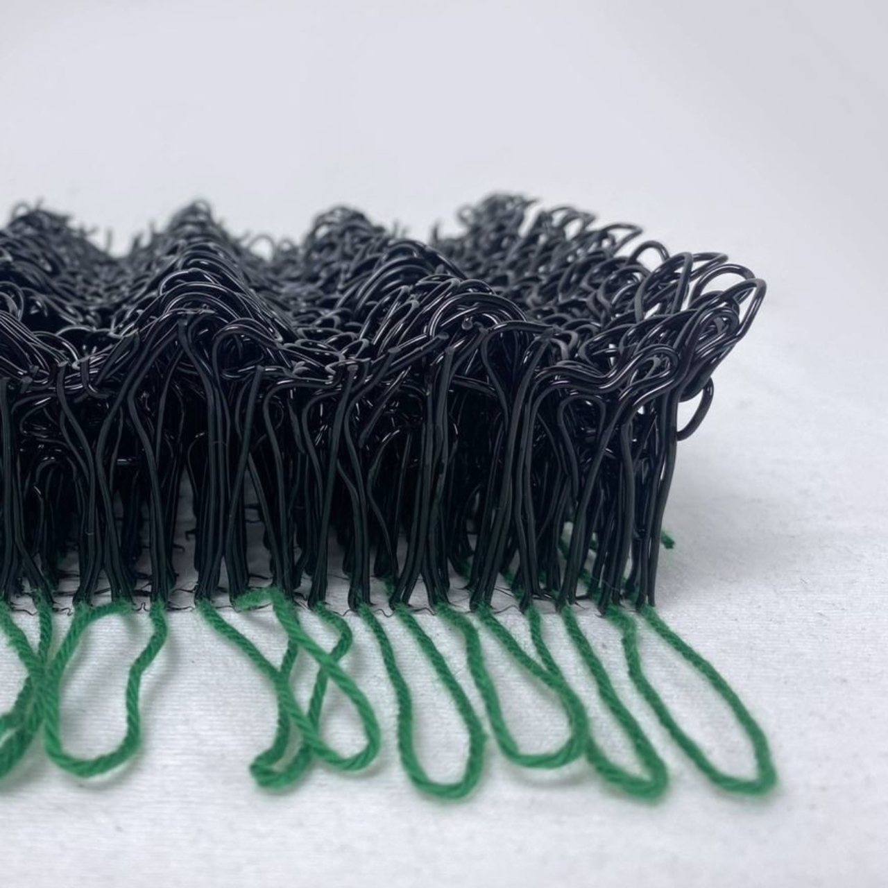
  •  

An Angled Public Bench for Hanging Out Without the Coffee Tab

A bench can give you a place to sit and still make talking surprisingly awkward. Line up two people facing the street, and conversation requires a sideways turn. Add a third, and someone starts leaning around the person in the middle. Free to Face, a public seating project by Lim Junwoo and Hayoung Kang, addresses that everyday mismatch between having somewhere to sit and having somewhere to spend time together.

The designers also frame the project around a larger concern: conversation becoming tied to consumption. Meeting over coffee is lovely, but buying a drink shouldn’t be the entry fee for sitting down with a friend. Free to Face proposes seating that gives people room to gather without a transaction attached. I like that ambition. It makes a modest, understandable request of public space: accommodate people who aren’t necessarily on their way somewhere else.

Designers: Lim Junwoo and Hayoung Kang

Its clearest design move is visible from above. Instead of a straight bench, the seating follows a shallow, angular bend, with round platforms punctuating the ends and middle. People sitting along the two arms can angle toward each other rather than share a single forward-facing view. The arrangement leaves an open area between them, giving conversation a physical center without enclosing the group or turning the furniture into a miniature booth.

That distinction matters to me. A seating arrangement can invite eye contact without making it compulsory. Free to Face’s photographs show people talking across the bend, but the backless layout also leaves room to choose another orientation. I’d rather have furniture that offers a social possibility than furniture that seems to assign everyone a role. A stranger sitting nearby shouldn’t automatically become your conversation partner, and a public bench shouldn’t feel like an icebreaker exercise.

The different surface heights make the project more interesting than its footprint alone suggests. The supplied description presents those levels as options for choosing a sitting position, with unused areas doubling as places for bags or food. In the photographs, one person occupies a raised circular platform while others sit lower. Elsewhere, a tote rests beside its owner. These are fixed surfaces, not an advertised height-adjustment mechanism, so the flexibility comes from how people occupy the structure.

Those little landing spots feel especially useful. A basic bench leaves your lunch, laptop, and bag competing with your lap or the seat beside you. Here, the circular surfaces provide alternatives, and the images demonstrate a shared meal arranged around the middle platform. I’m particularly fond of that use because it makes the social premise concrete. Two people splitting fries need somewhere to put the fries. Design doesn’t always need a more elaborate explanation than that.

Visually, Free to Face has a pale lavender finish, broad flat supports, and exposed structural geometry. The circular tops soften an otherwise angular assembly. A fabrication photograph shows the metal structure before finishing, although the supplied material doesn’t identify its alloy or coating specification. I like that the form remains readable: you can follow the bench’s bend, identify the raised surfaces, and understand several possible uses without consulting an instruction panel.

The studio setting does leave practical questions unanswered. The photographs establish a full-size physical build, not how it performs through rain, summer heat, or years of public use. Back support, comfortable seat heights, and room for someone using a wheelchair would all deserve attention before installation. I wouldn’t dismiss the design for lacking that documentation, but I also wouldn’t treat a staged lunch as proof of comfort or accessibility. Its strongest evidence is the arrangement itself, demonstrated through several uses.

One photograph shows a woman using a laptop alone, which is a welcome detail for a project about connection. Free public space needs to accommodate solitude, too. Sitting quietly shouldn’t count as using social furniture incorrectly. Free to Face appeals to me because its extra surfaces and angled layout offer choices beyond sitting in a row. I’d be happy to see more benches make that effort, especially if they let people linger without needing to order another coffee.

The post An Angled Public Bench for Hanging Out Without the Coffee Tab first appeared on Yanko Design.
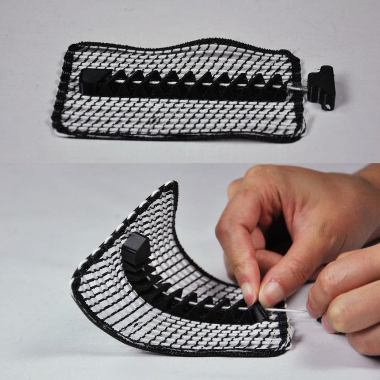
  •  
❌