❌

Vue lecture

The Georgia Art Show Turning 9 Broken 3D Prints Into Music
Every fabrication lab in the country is quietly accumulating a problem. Failed prints, test runs, leftover filament, the ghost of every prototype that didn’t make the cut. Most of it ends up in the bin. Architect Hyojin Kwon noticed this and, instead of moving on, asked a different question: what if all that discarded plastic could hold a note?

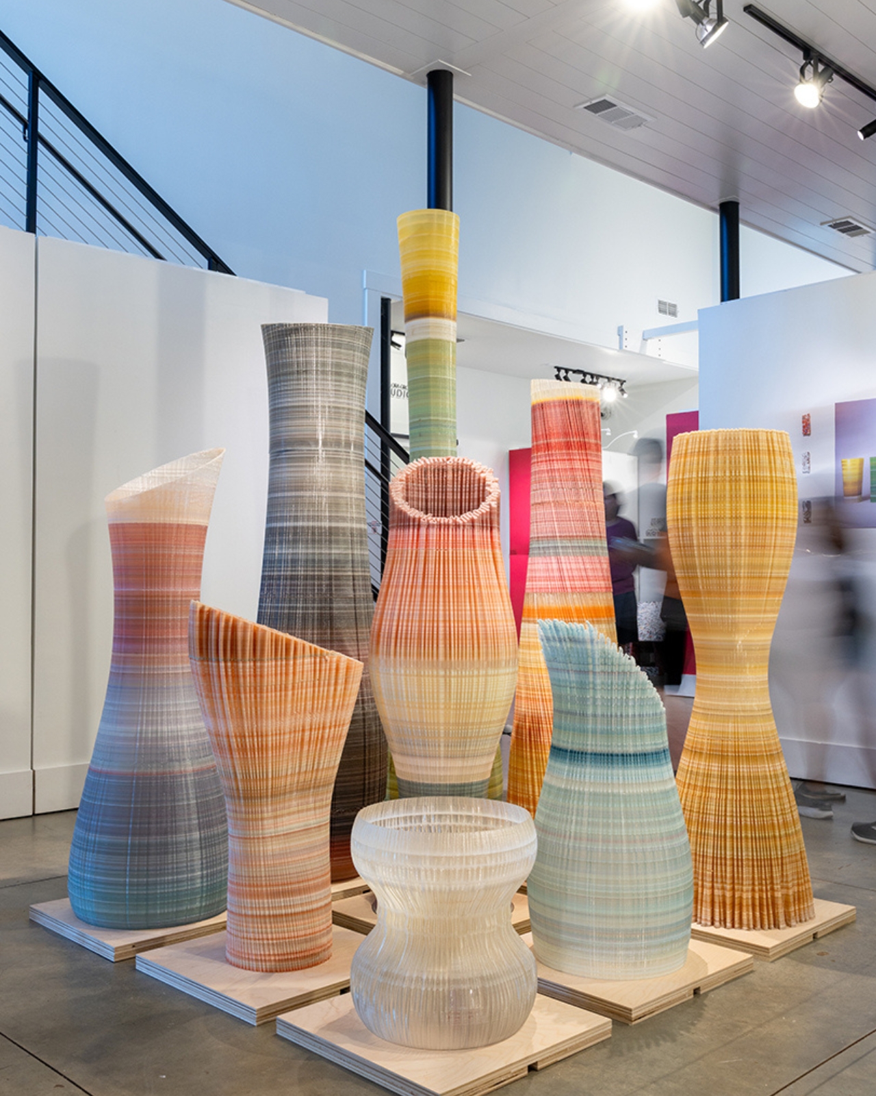
The result is Ninefold: A Distributed Resonant Field, a collaboration between Kwon’s design studio Pre- and Post-, percussionist and composer Jeremy Muller, and architect and material researcher Misri Patel. It’s currently on view at the Reeves House Visual Arts Center in Woodstock, Georgia, through September, and it is one of the more quietly radical things happening in design right now.

Designers: Hyojin Kwon × Jeremy Muller x Misri Patel
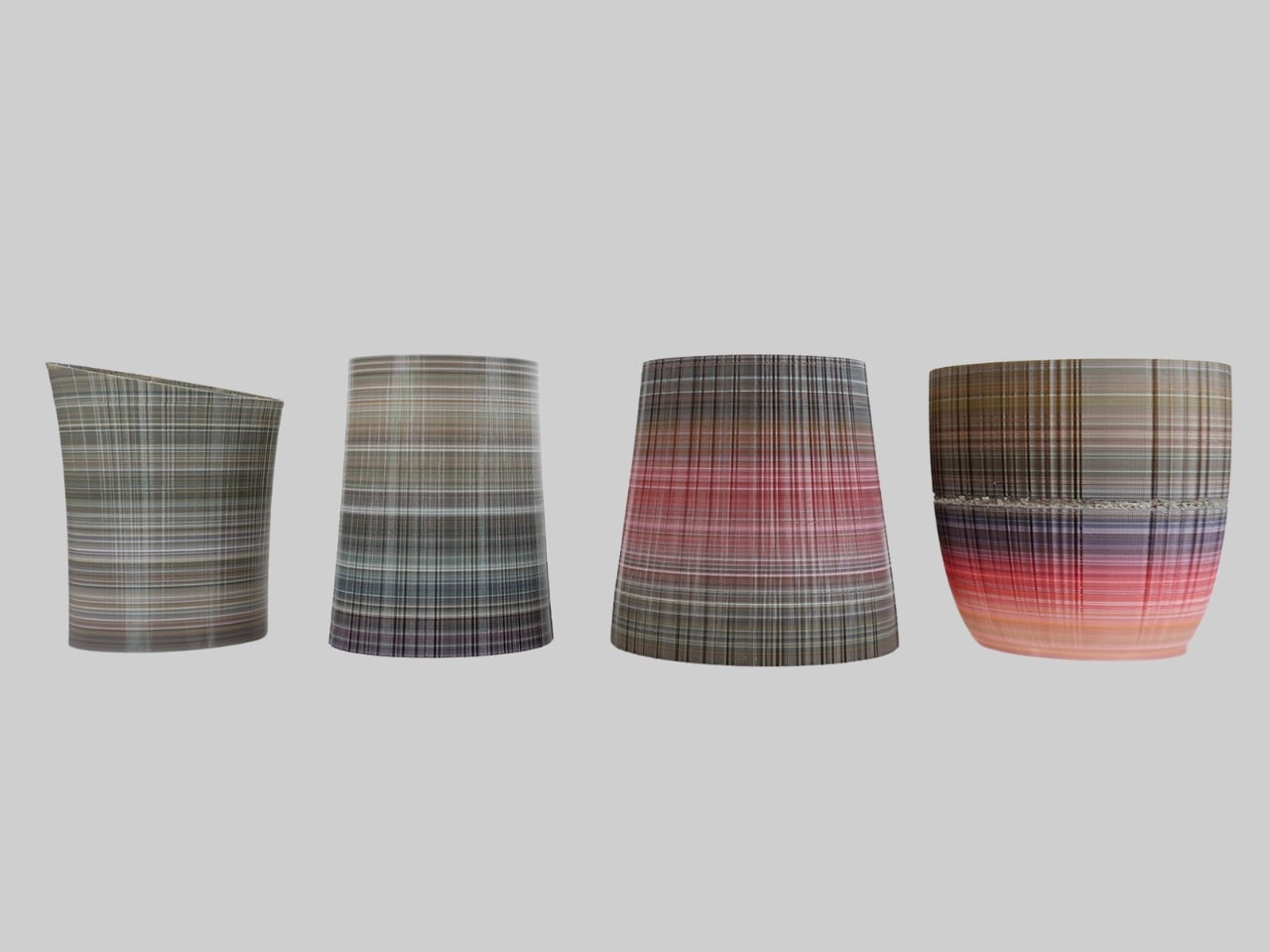
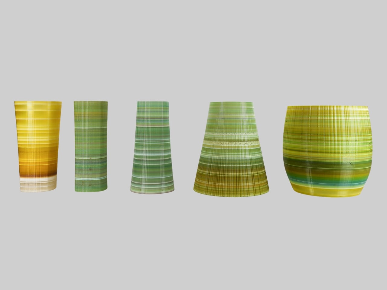
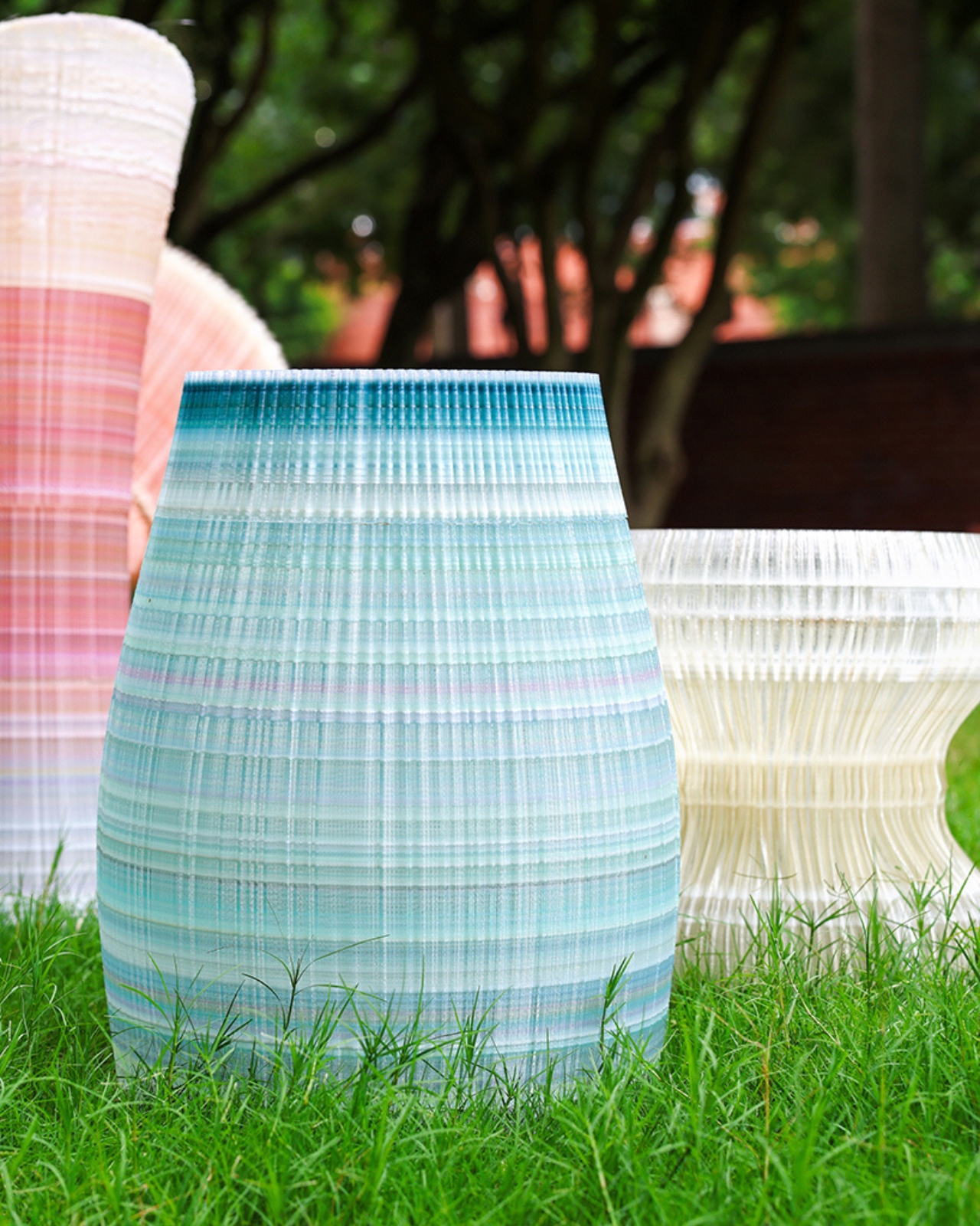
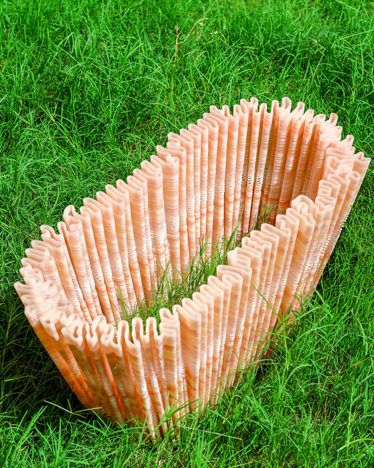
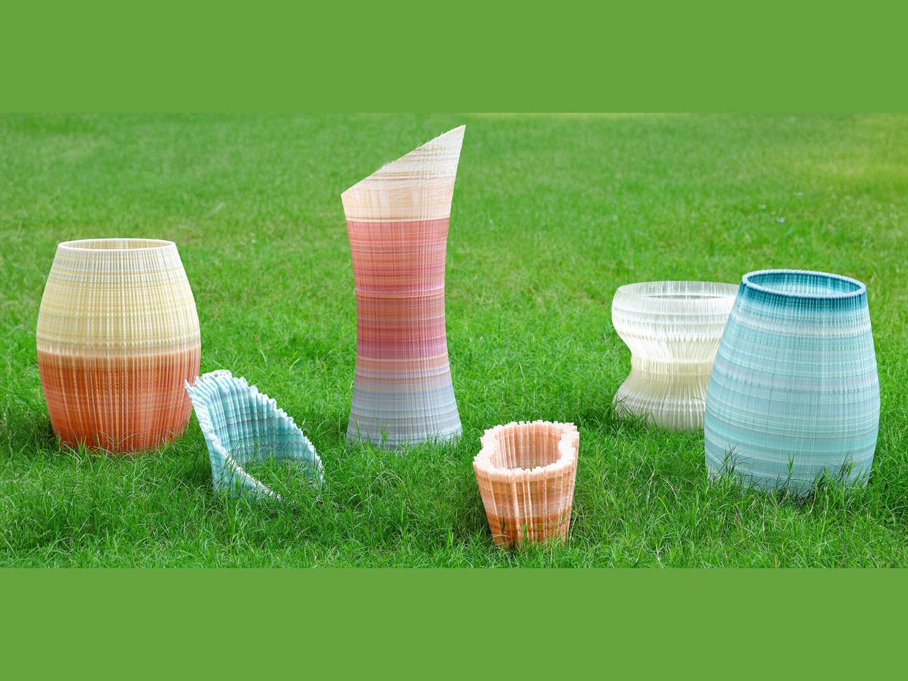
The installation is made up of nine large-scale forms, each one 3D-printed from discarded PLA collected from campus makerspaces and fabrication labs. The team shredded that waste into pellets, blended it with virgin material, and ran it through a pellet-based additive manufacturing process. The resulting objects are not identical. Some grow into tall, slender columns. Others widen into chambers or narrow toward their centers. Each carries its own texture, its own layered color variation from the mixed-batch sourcing, and its own distinct harmonic frequency. Together, they form a distributed sound field, meaning the sound is never coming from one place. It moves with you.
That last part is what makes this more than a sculpture show with a good concept. As you walk through the space, your position changes the acoustic picture entirely. Tones overlap, separate, recede. You’re not passively observing nine objects; you’re completing the field. The project draws on the thinking of composer Edgard Varèse, who called for “organized sound” as architecture, and on the spatial music systems of Iannis Xenakis and Le Corbusier. Those are not small reference points. They’re pointing at a lineage that treats space itself as a musical instrument, and Kwon, Muller, and Patel are building within that tradition using material that would have otherwise ended up as landfill.
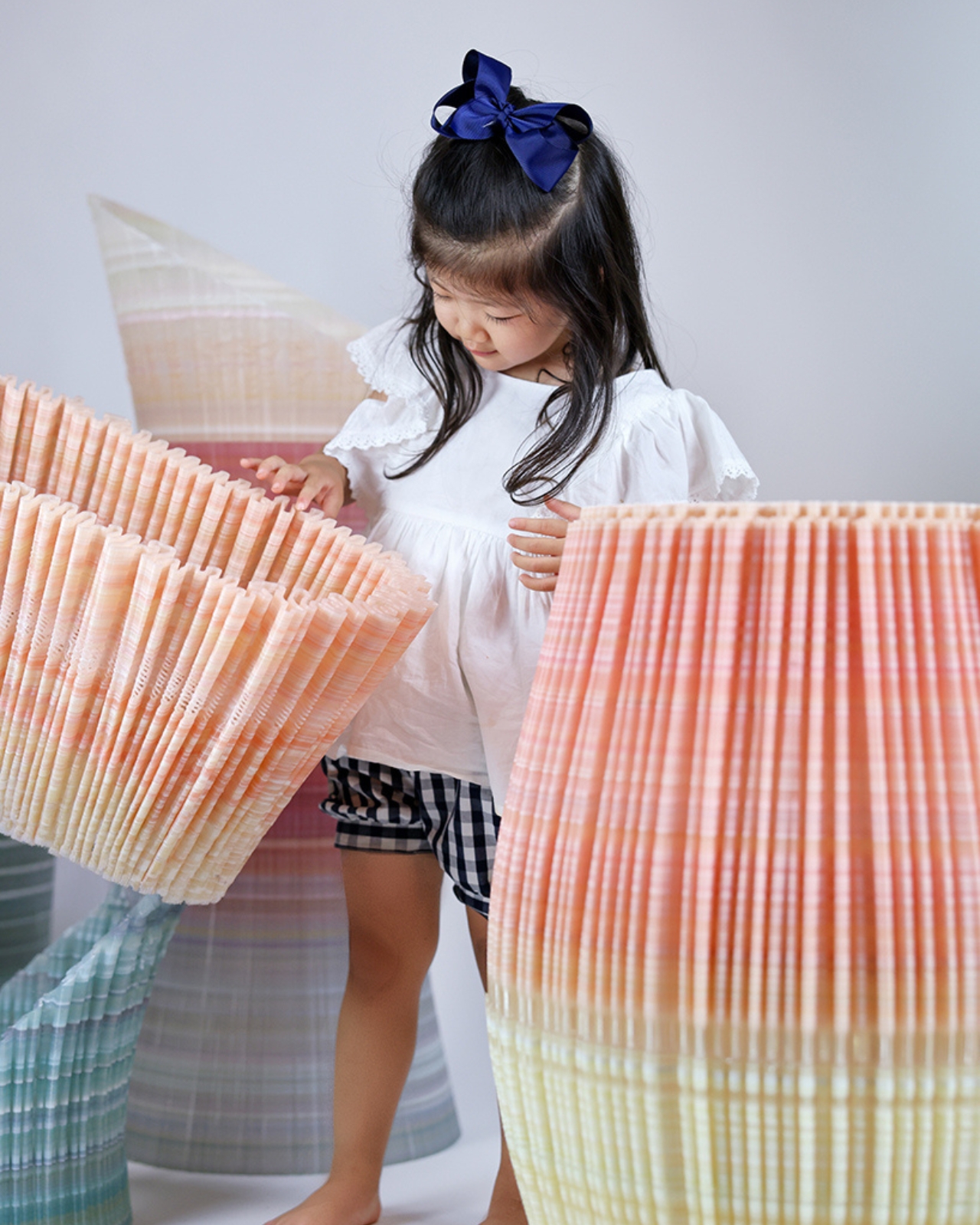
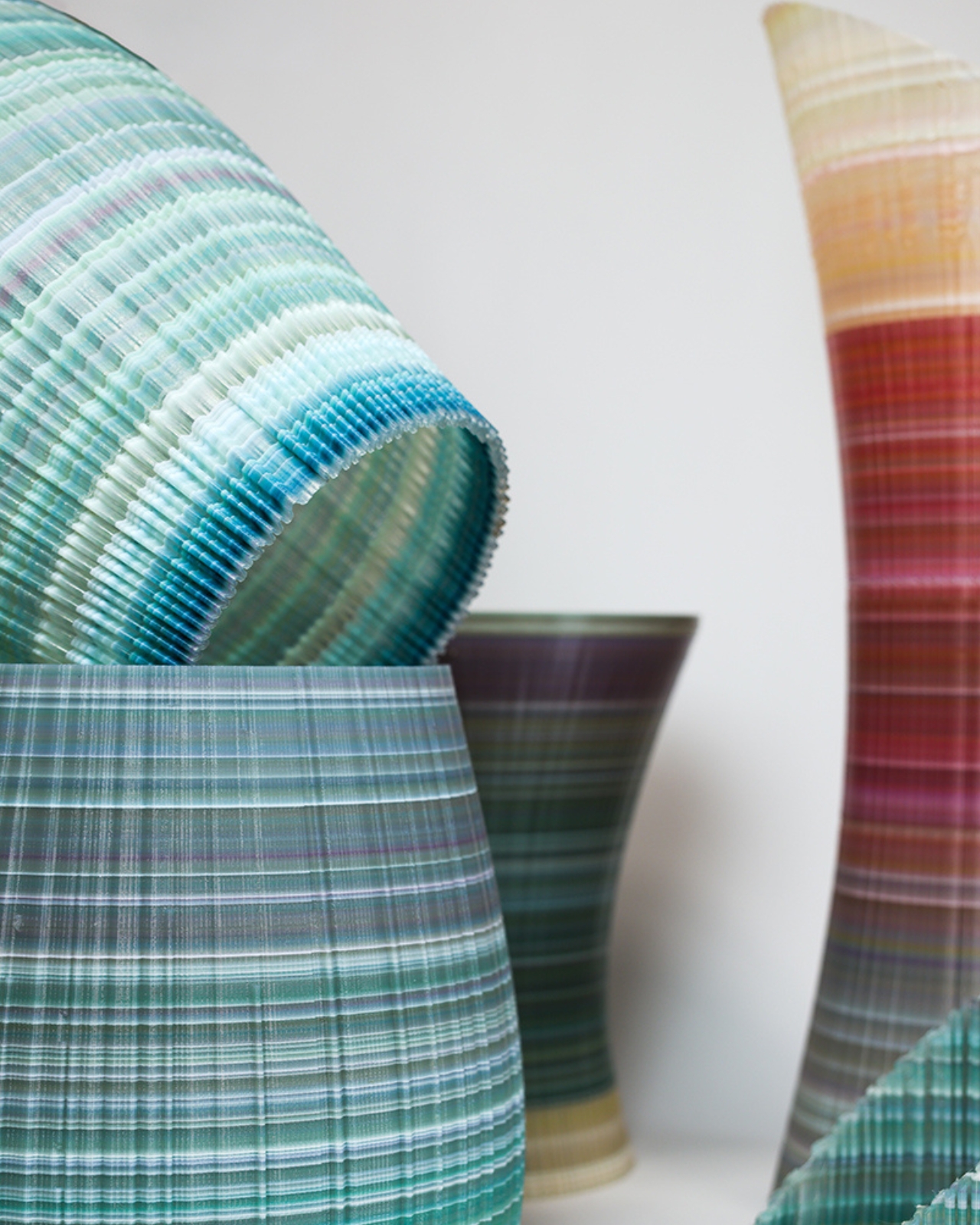
The aspect of Ninefold that deserves real attention is how seriously it takes the material. The layered plastic isn’t hidden or smoothed over into something that looks deliberately “designed.” The texture is part of the expression. You can see the deposition, the color shifts, the history of what it was made from. The project doesn’t pretend the recycling didn’t happen; it foregrounds it. That honesty feels important at a moment when sustainability has become more of a marketing category than an actual practice.
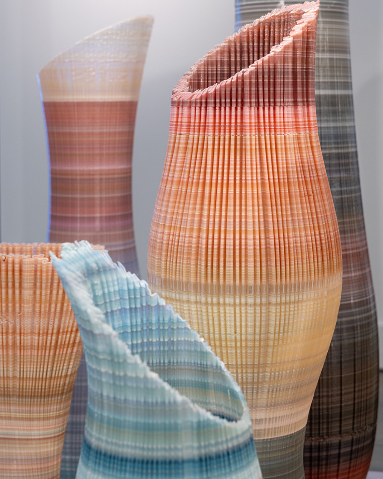
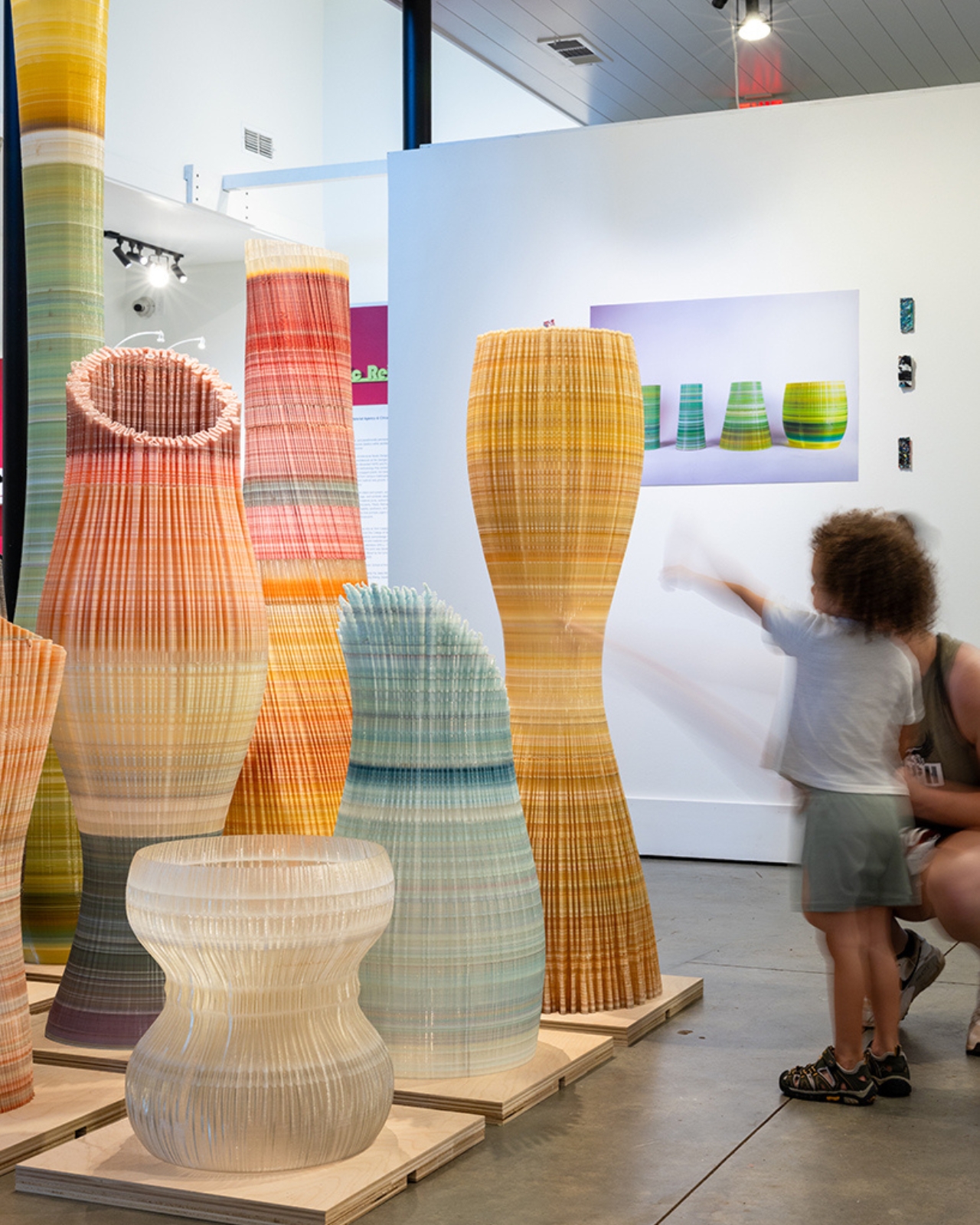
The nine forms were also fabricated in modular sections, which means they can be transported, reconfigured, and reinstalled elsewhere. That might seem like a logistical footnote, but it matters: an installation about material longevity should probably have a long life. These objects weren’t made to be shown once and archived.
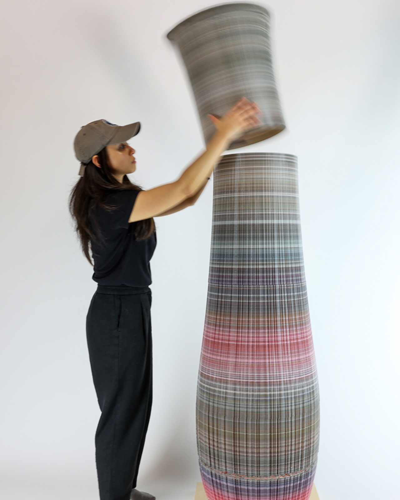
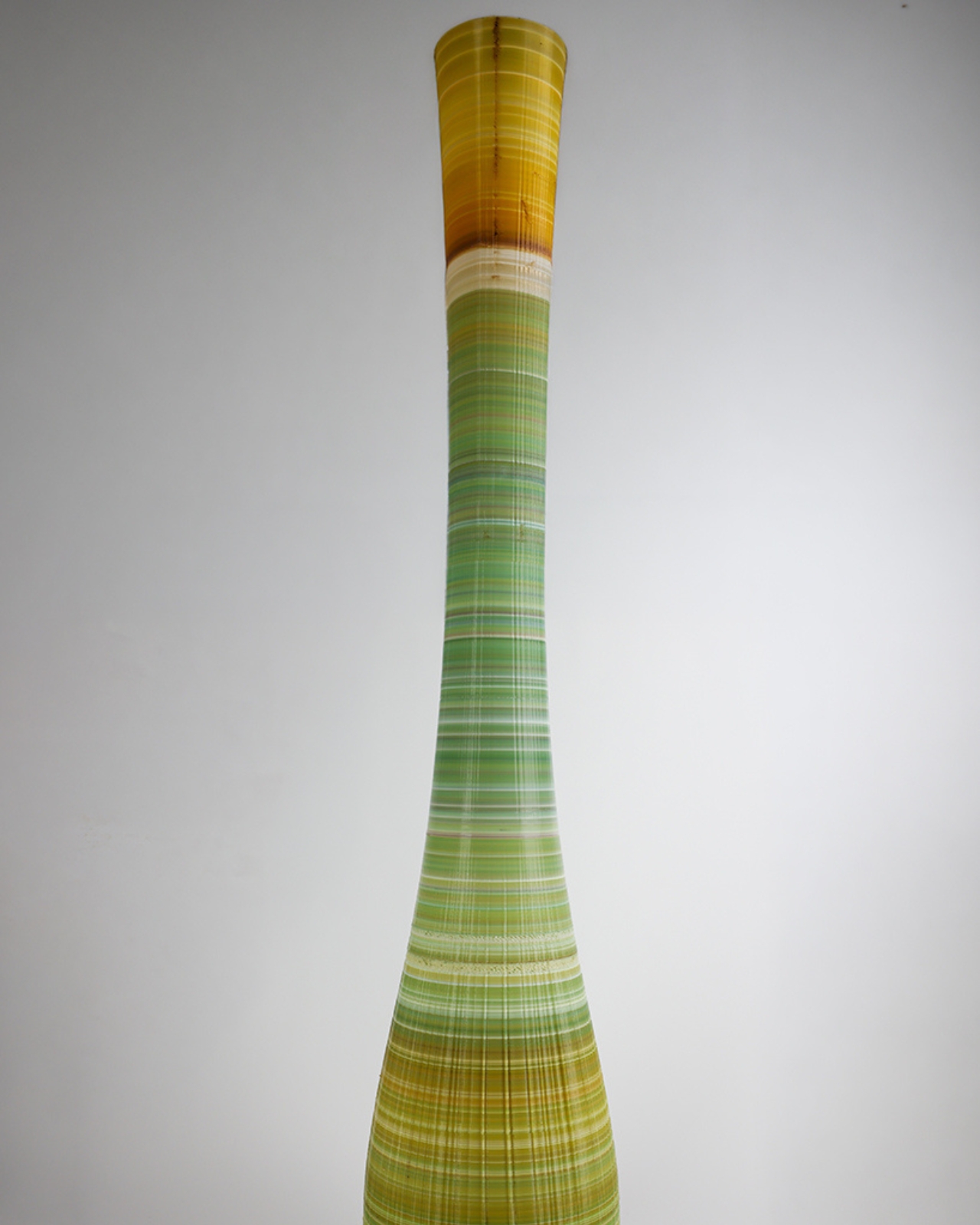
Ninefold is part of a dual exhibition that also includes Plastic Reimagined: Material Agency & Circular Design, developed with students from Georgia Tech’s graduate architecture program and curated by Carolina Cuevas. The full show runs through September at the Reeves House, and admission is free. If you’re near Woodstock, Georgia, it’s worth the trip. If you’re not, the images alone carry something worth sitting with. A lot of projects right now wear sustainability as a label. Ninefold actually earns it, and then manages to also be beautiful, which is rarer than it should be.
The post The Georgia Art Show Turning 9 Broken 3D Prints Into Music first appeared on Yanko Design.


  •  

Konny Just Solved the One Thing Baby Slings Never Could

I am not a parent myself, but I have been around enough parents that I make some unsolicited observations (to myself, to be fair), especially when it comes to them carrying babies and toddlers. Whenever I see them carrying babies on a sling, I keep thinking, “That doesn’t seem to be that comfortable for both the parent and the kid.” So it’s interesting to see baby brands try to come up with design solutions for this kind of problem, since it’s something that will be around forever.

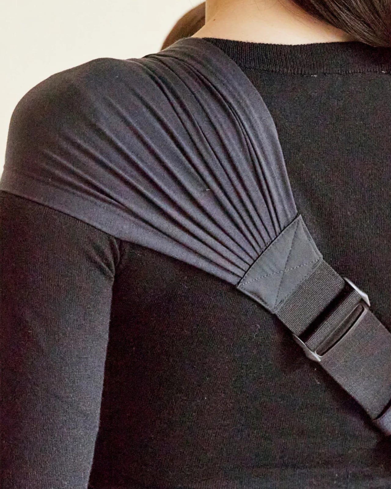
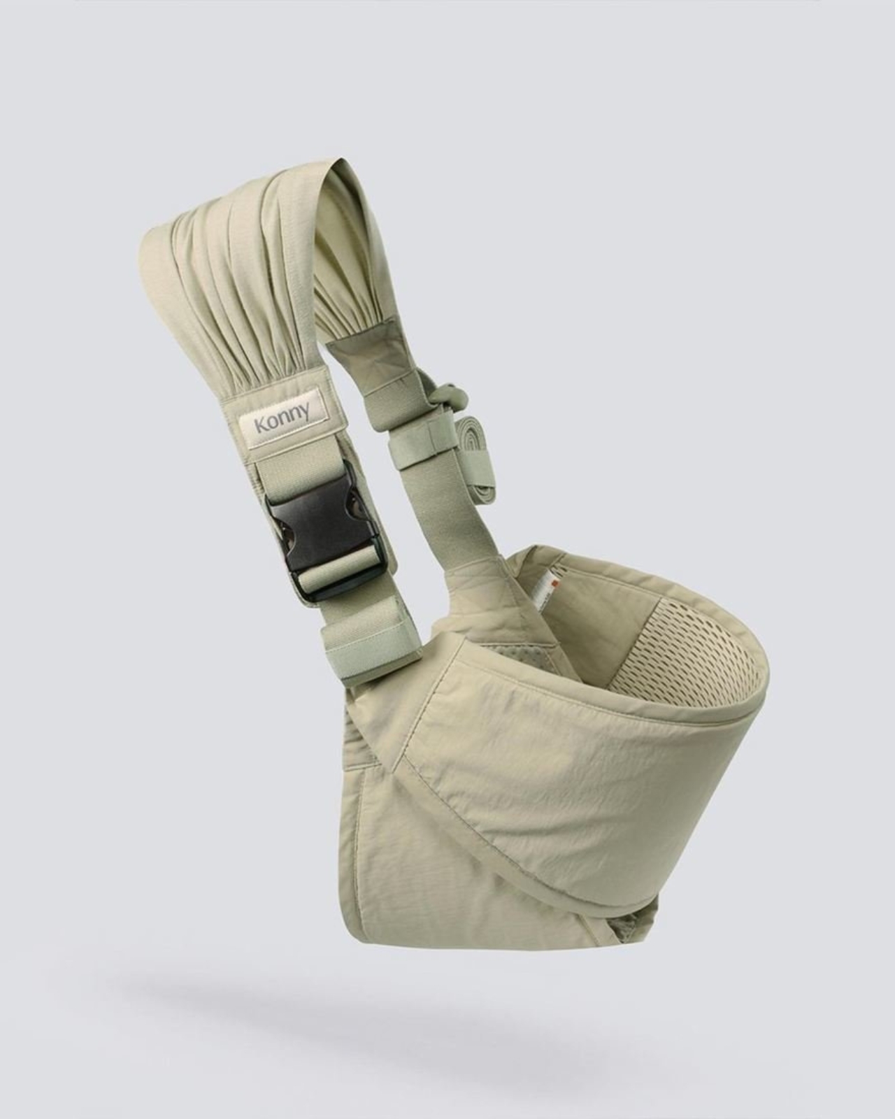
South Korean baby brand Konny’s contribution to easing the life of parents is the Dual Support Hip Seat Carrier. It aims to solve two of the prevalent problems that they face when using slings. First, it has a foldable hip pad and back pad to make it more comfortable for the kid. Second, the parent doesn’t just bear the weight on one shoulder because of this carrier’s Dual Support.

Designer: Konny

This portable baby hip seat carrier’s main purpose is to replicate the security of a parent’s arms so the baby is upright, safe, and comfortable. It has a foldable hip pad combined with a back pad to give this sense of security. It even has a non-slip bottom so the kid will not slide off the seat, which I sometimes see happen with other seat carriers. The seat is made of soft 3D mesh, giving a more comfortable feeling for your baby as you carry them around.

It also takes into consideration the comfort of the parents since they’re carrying the heavy load, so to speak. The carrier has wide shoulder straps that are able to spread the weight evenly across the back to avoid the one-shoulder strain that a lot of parents experience. You also have the option to carry the baby from a hip position or a front-facing hold. The fabric used is the same stretch-and-resilience material that the other Konny Baby Carriers use, a fabric tested and trusted through over one million carriers sold.

The Dual Support Hip Seat Carrier weighs only 0.5 lbs and can be folded into a small enough item to put in a purse or a diaper bag. But when not being used to carry a baby, it can actually function as a chic and stylish bag that you can carry stuff around with. It claims to be a one-size-fits-all accessory as it is accessible for all kinds of body types.

What I find particularly reassuring, especially for those who aren’t baby gear experts, is that the Dual Support Hip Seat Carrier is IHDI certified. The International Hip Dysplasia Institute recognizes baby carriers that actively support healthy hip development in infants, so this isn’t just a comfort win for parents; it’s a safety win for babies, too. That kind of certification adds a layer of trust that goes beyond just good design.

And speaking of good design, the carrier actually won the 2024 Good Design Award, one of the most prestigious design honors in the world. The jury praised it for achieving a “near-perfect balance between infant safety and parental convenience,” and honestly, it’s easy to see why. The fact that it doubles as a bag when you’re not carrying a baby is already a clever touch, but knowing that the structure was the result of dozens of prototypes and extensive real-world customer testing makes it even more impressive.

The Dual Support Hip Seat Carrier is available on konnybaby.com starting at $59.99, and it comes in a range of colors, from classic Charcoal and Black to more playful options like Green Tea and Blue Grey, as well as a Corduroy version for something a little more textured.

As someone who has watched many a parent struggle with a squirming toddler and a lopsided sling, I’d say this is the kind of product that makes you think, “Finally.” It may not replace the full-on baby carrier for long hauls, but for that “carry me now” stage, when your toddler suddenly decides their legs no longer work, this seems like exactly the right tool for the job.

The post Konny Just Solved the One Thing Baby Slings Never Could first appeared on Yanko Design.

  •  

The Italian Lamp That Uses Toy Race Cars as Light Bulbs

Most lighting gets chosen the same way people pick curtains: functional, inoffensive, and quickly forgotten. You walk through a showroom, you point at something that won’t clash with the sofa, and that’s more or less the end of the design conversation. That’s not a criticism of how people live; it’s just an observation of how light, despite being the single most transformative element in any space, rarely gets to have fun.

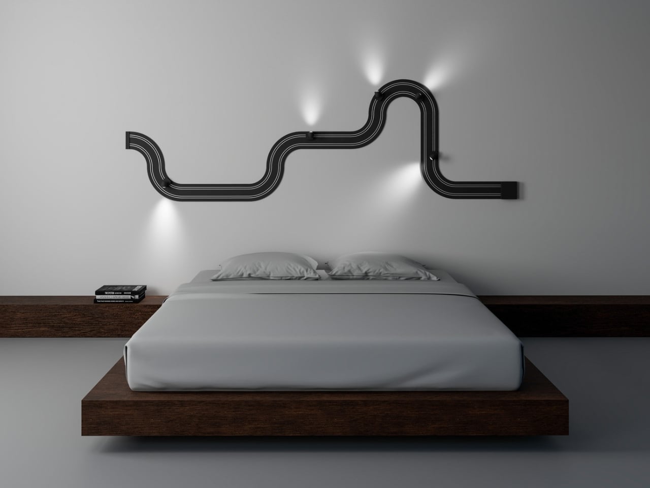
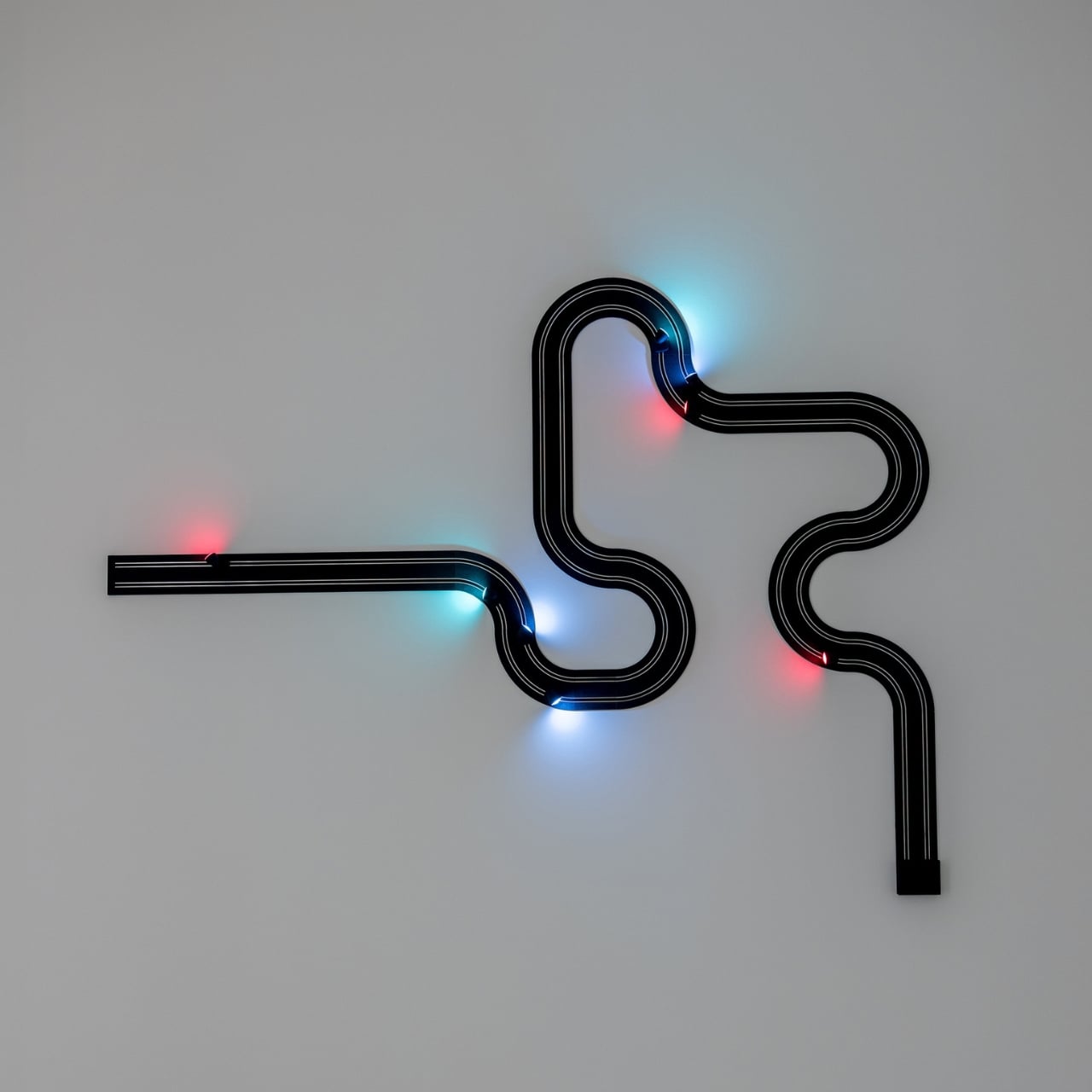
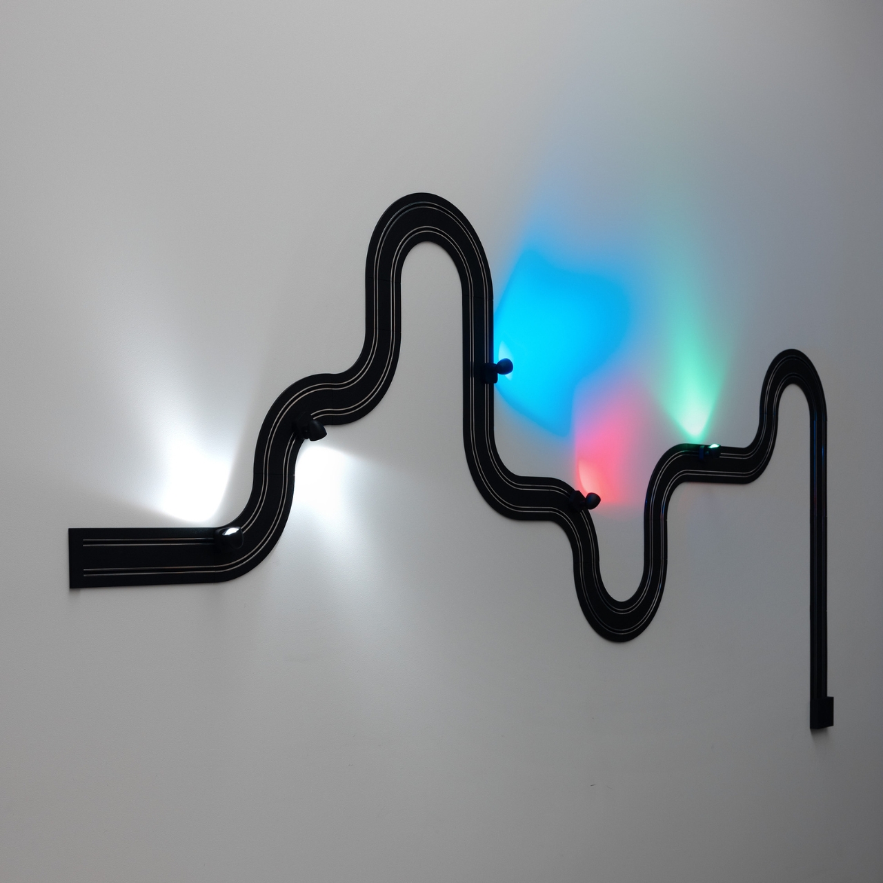
Davide Groppi’s Race of Lights is the exception to all of that. The Italian lighting brand, based in Piacenza and known for making some of the most quietly radical lamps in contemporary design, released Race of Lights in 2025. On paper, it is a modular wall lamp. In reality, it is a slot-car racing track that someone decided should also be your light source, and the whole thing somehow works beautifully.

Designer: Davide Groppi

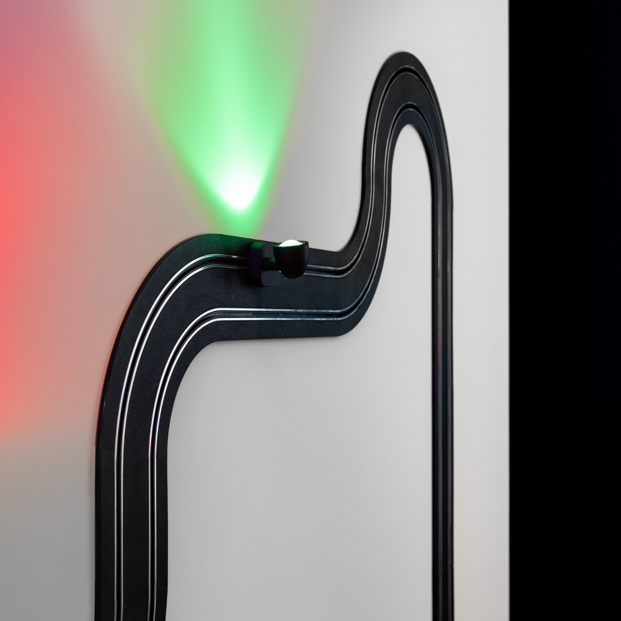
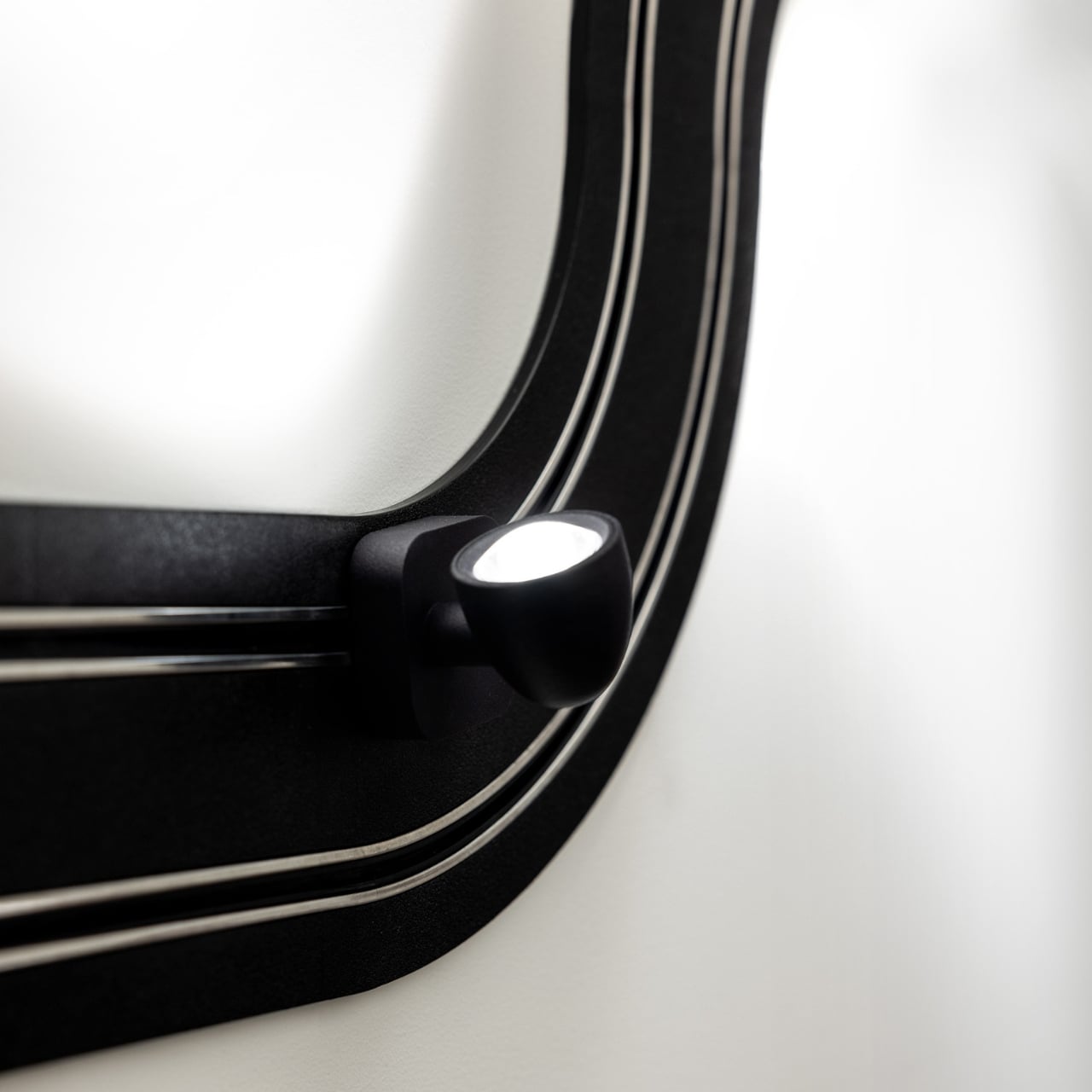
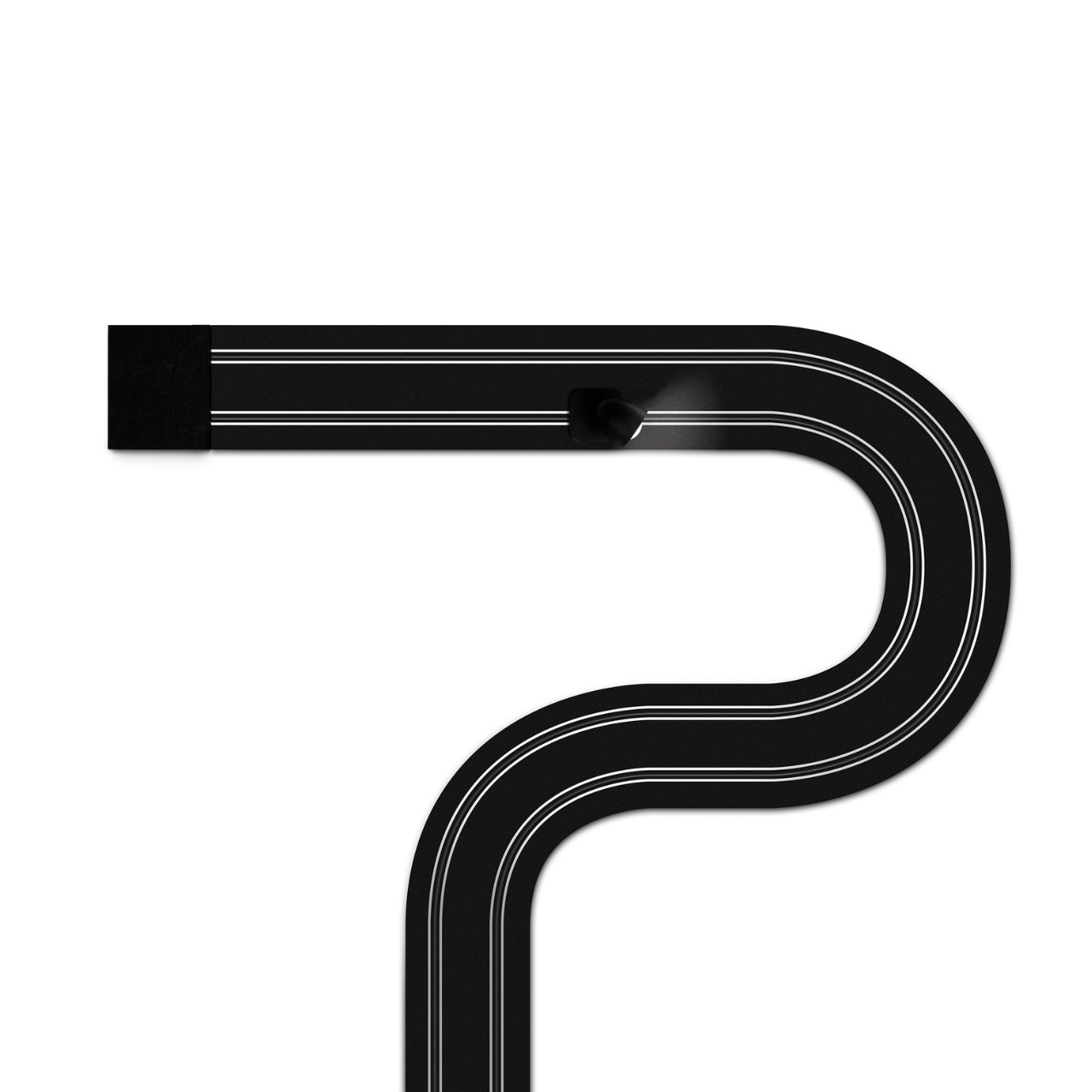
The concept is exactly what it sounds like. An electrified track, made from textured matte black polyethylene, gets mounted on the wall in whatever configuration you want. The track carries current, and the light sources are tiny car-shaped spotlights that snap into place magnetically and can be moved, repositioned, or rearranged any time the mood strikes. The basic kit includes two short straight modules, four longer sections, six curves, and four colored light-cars in green, white, blue, and red. The whole system can run up to five metres across your wall and power up to eight spotlights, each with an adjustable head so you can direct the beam exactly where you want it. This is, objectively, absurd. It is also one of the most genuinely exciting things to come out of the lighting world in years.

What makes Race of Lights so interesting to think about is how it sits within Davide Groppi’s broader body of work. This is a designer who built his reputation on doing less. His lamp Nulla, which won the Compasso d’Oro in 2014, measures just 18 millimetres in diameter and is practically invisible in a ceiling. The name literally translates to “nothing.” The philosophy has always been that the lamp should disappear so the light can remain. Race of Lights does not disappear. It sits on your wall, looped and curved, with little colored cars parked along the track. It makes a statement in the exact opposite direction of everything Groppi has been doing, and yet it makes complete sense.

Because the brand has never really been about minimalism for minimalism’s sake. The design language has always carried a sense of emotion. Groppi has spoken about light as a tool for seduction and curiosity, about design emerging from the heart as much as the mind. Race of Lights just takes that emotional dimension and makes it literal. The inspiration was childhood, specifically the memory of electric slot-car racing sets, the kind where small cars zip around a winding track spread across the living room floor. The track moves to the wall; the cars stay put and illuminate. Play becomes design, and the object retains the spirit of the original thing it was borrowing from.

The result is a piece that functions as a legitimate lighting solution and as a conversation starter and as something closer to a sculptural installation. You can compose it in a new shape whenever you want. That kind of flexibility tends to age well in a space, because you never quite exhaust the possibilities.

Cynics will say it is a gimmick. I understand the instinct, but I think that reading misses the point. Good design has always borrowed from play. The best chairs make sitting feel effortless. The best lamps make light feel intentional. Race of Lights makes light feel like something you chose with genuine enthusiasm rather than resigned practicality.

Lighting does not have to be a decision you make and then stop thinking about. Davide Groppi has spent decades proving that point in quietly different ways. Race of Lights is just the first time the argument came painted in red, white, blue, and green, with tiny cars attached.

The post The Italian Lamp That Uses Toy Race Cars as Light Bulbs first appeared on Yanko Design.

  •  

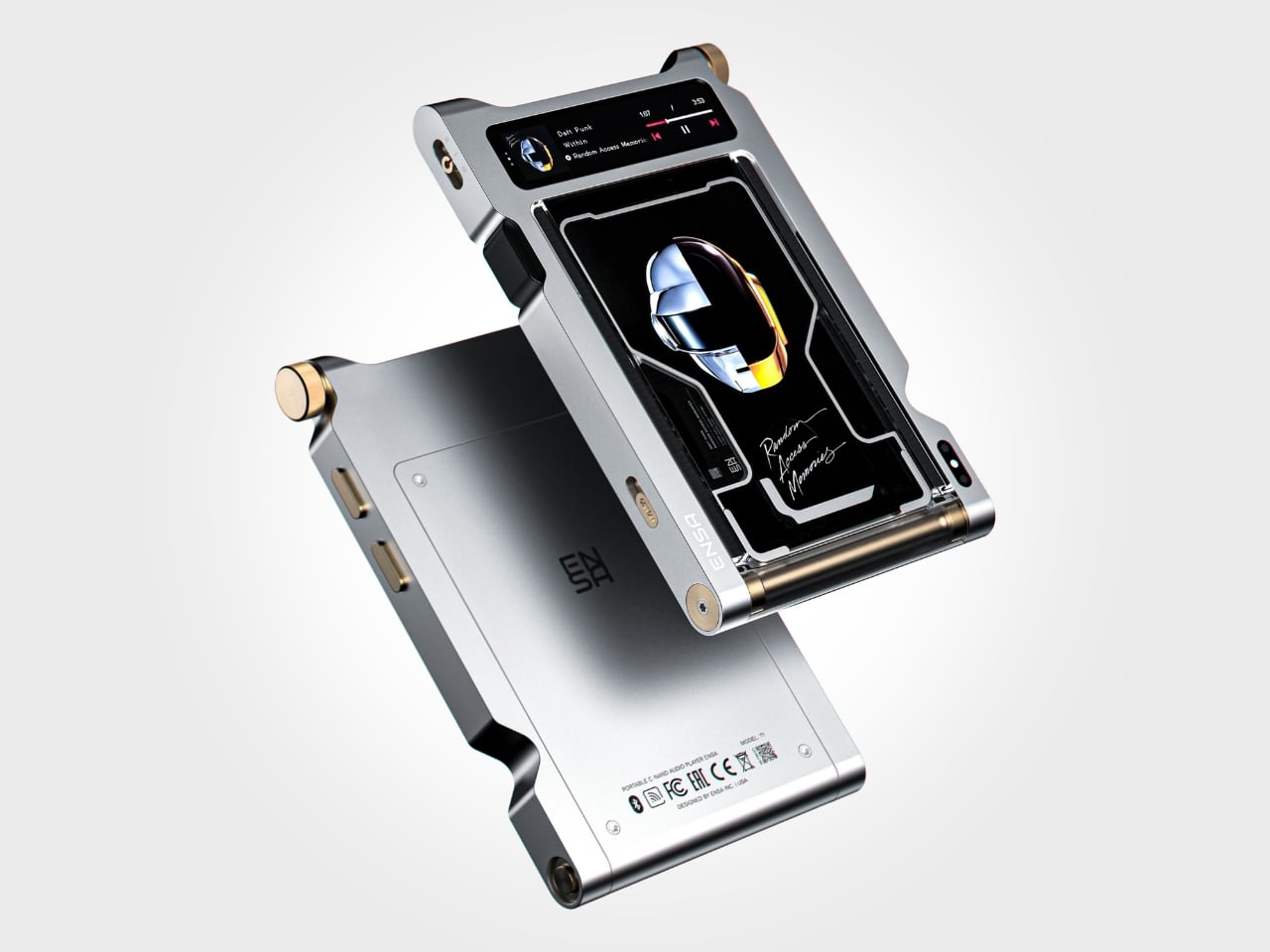
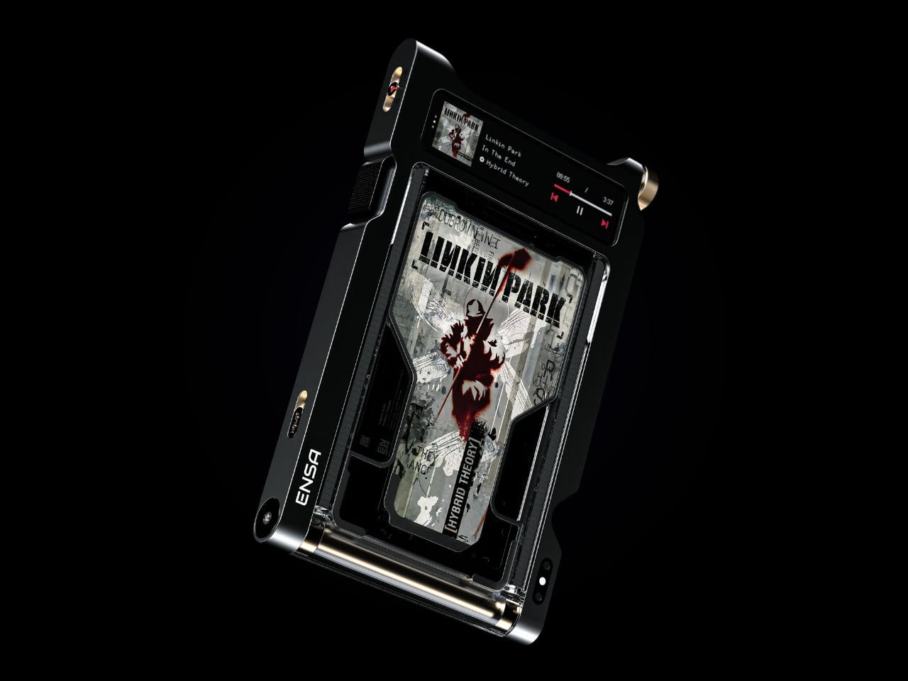
Streaming Took Something From Us. The ENSA T1 Wants It Back

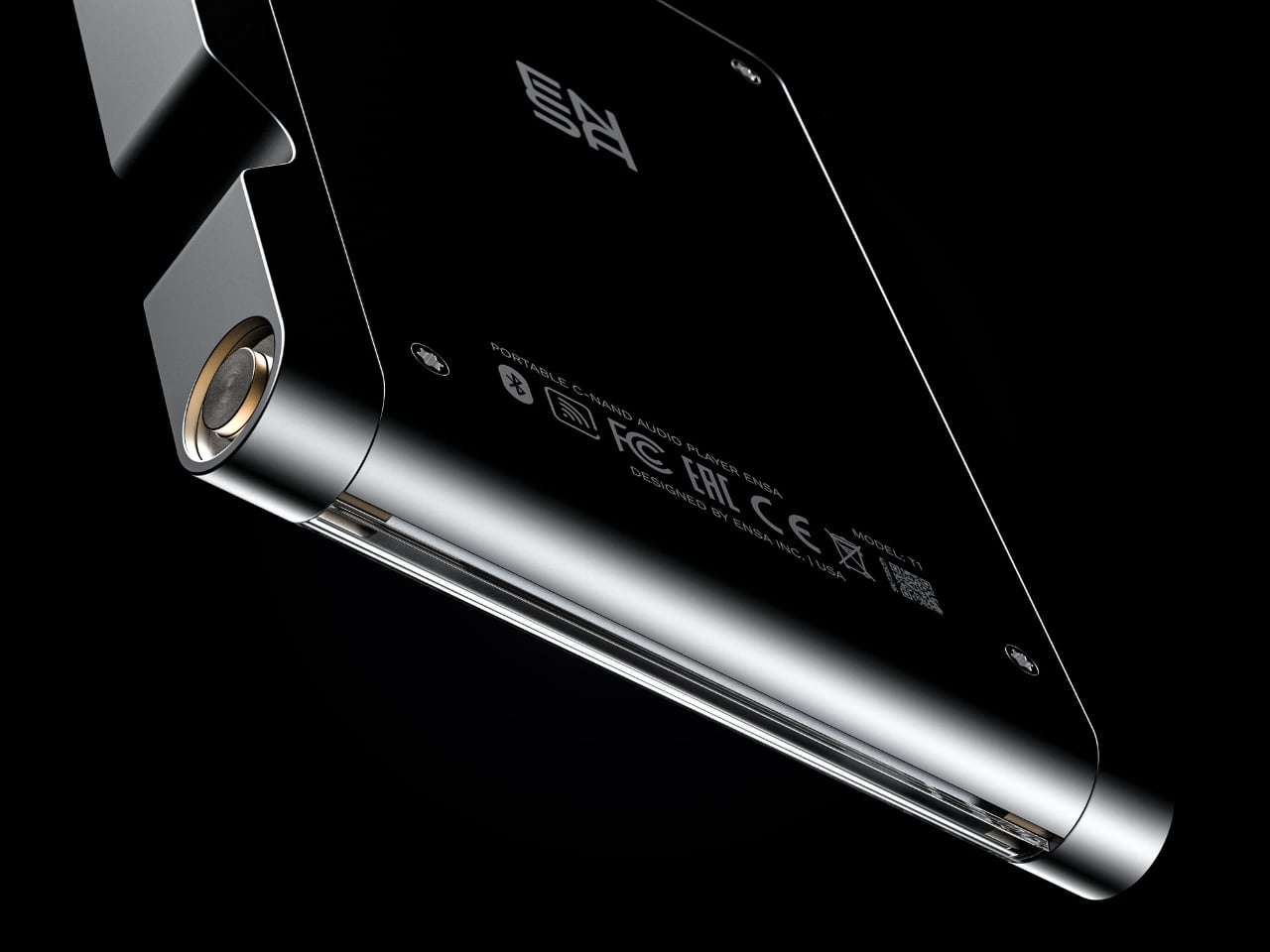
Do you remember the last time music actually demanded something of you? Not just your attention while you scrolled, but your hands. The deliberate pull of a record from its sleeve. The small, mechanical click of a CD case. The unhurried ritual that came before every song, every mood shift, every late-night session on the floor with the volume just loud enough. Vladimir Dubrovin remembers. The California-based multidisciplinary designer has been quietly building a case for returning physicality to the act of listening, and with the ENSA T1, his latest concept design, the argument gets considerably harder to dismiss.

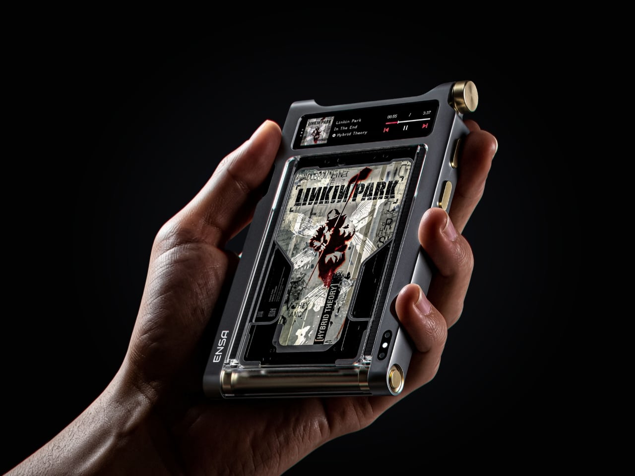
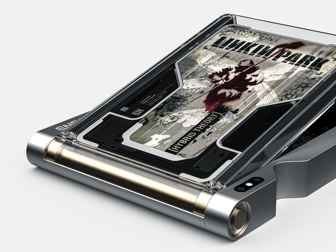
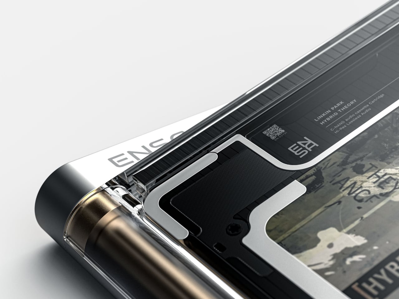
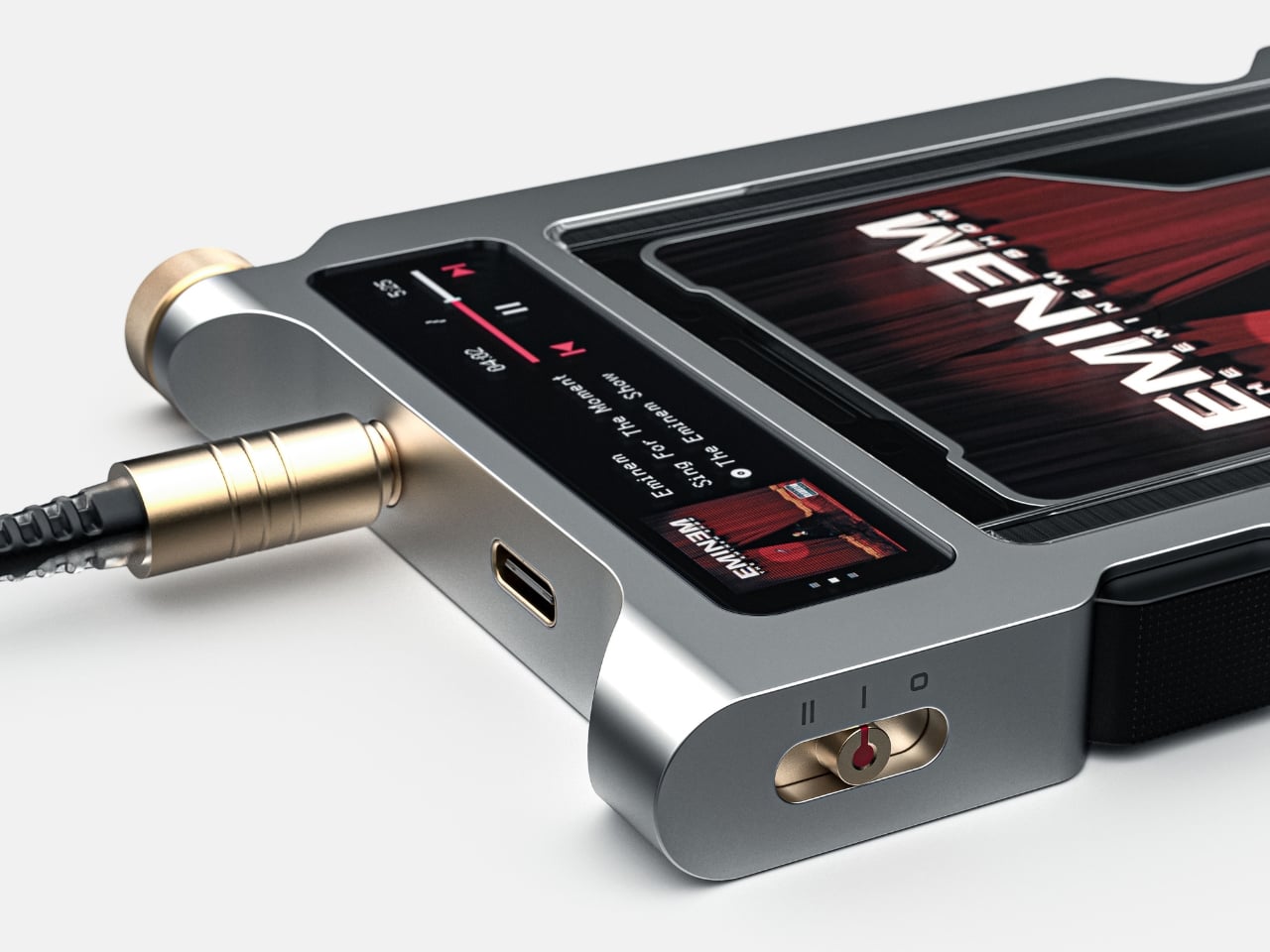
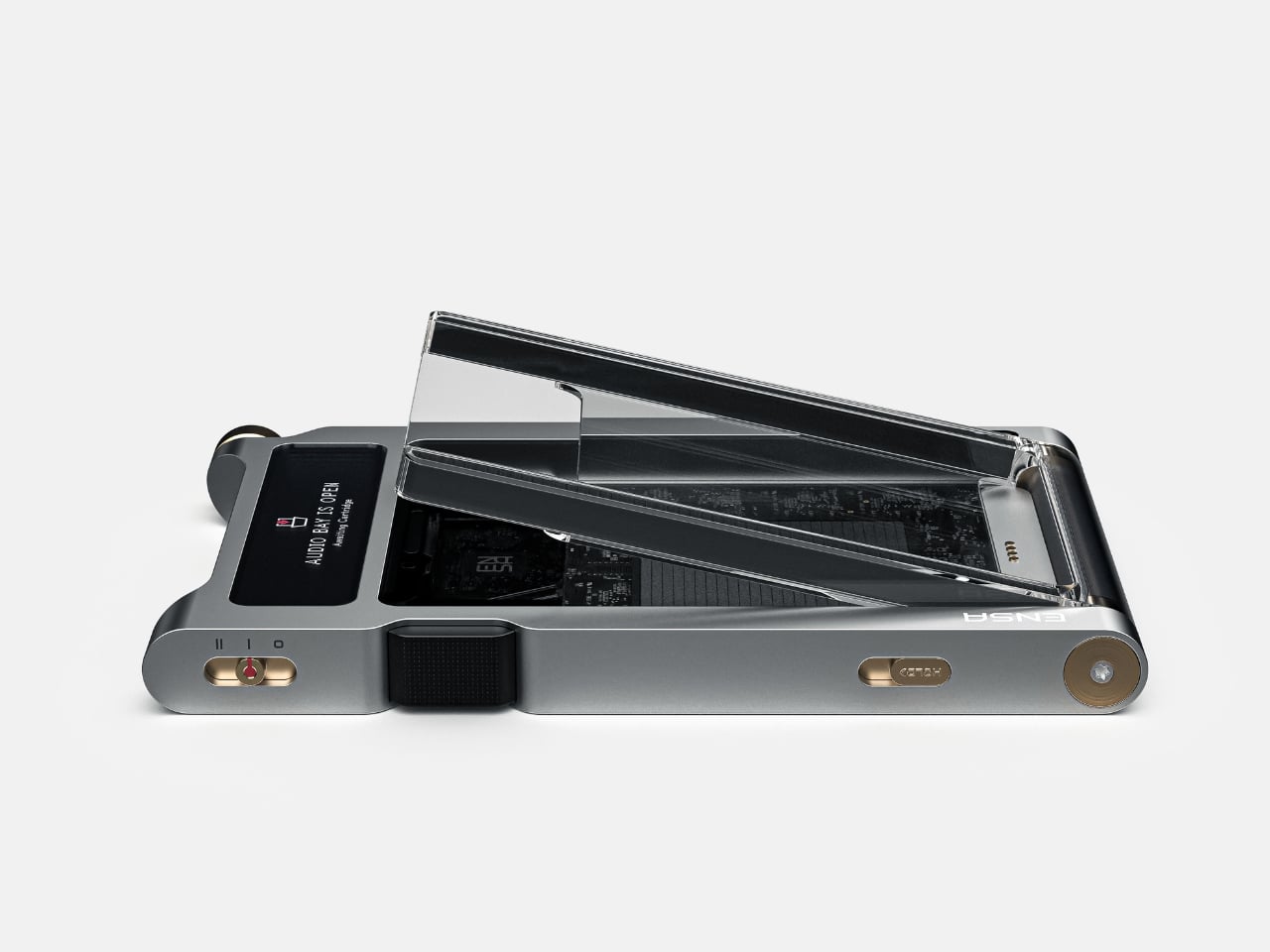
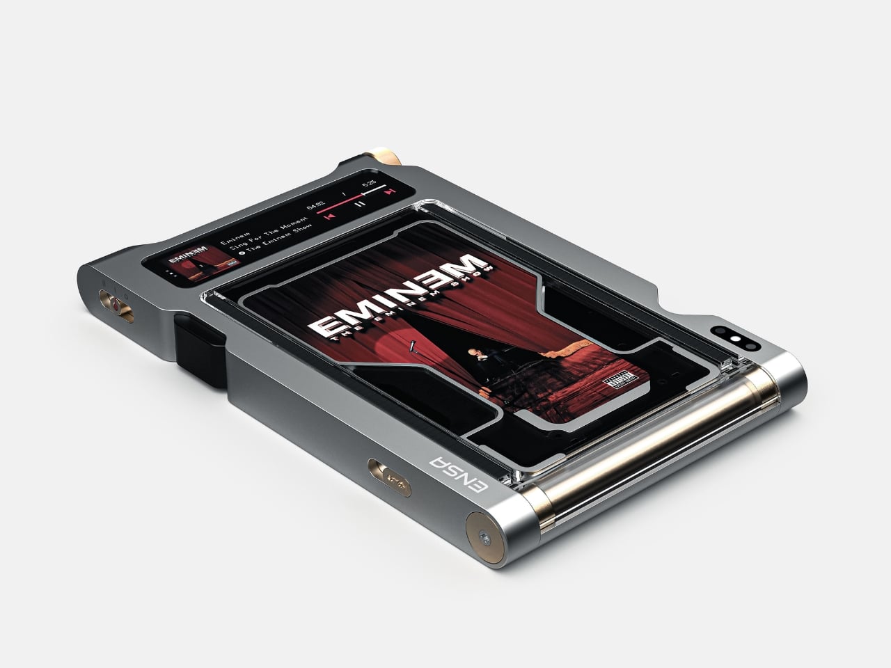
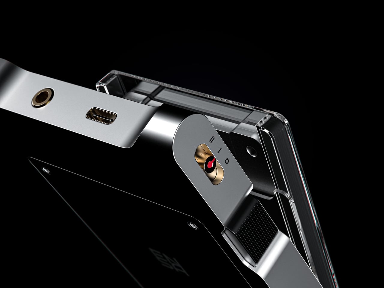
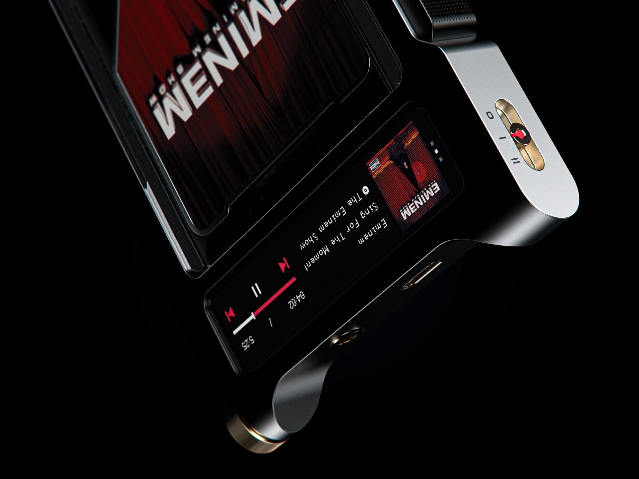
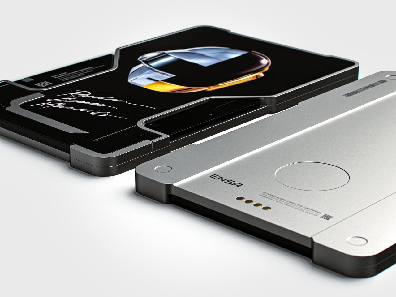
The T1 is the newest addition to Dubrovin’s ENSA line, an evolving design series that began with the ENSA P1, a portable audio player concept that reimagined what a music device could look and feel like in the post-streaming era. The P1 introduced Dubrovin’s concept of C-NAND cartridges: small, disc-shaped, solid-state storage units where each cartridge holds one complete album. There are no moving parts, no spinning mechanisms. They’re fully digital in how they handle audio, but they exist in the physical world the way vinyl does. You pick one up, turn it over, look at it, choose it. The act of choosing your music becomes deliberate again, and that matters more than it sounds.

Designer: Vladimir Dubrovin

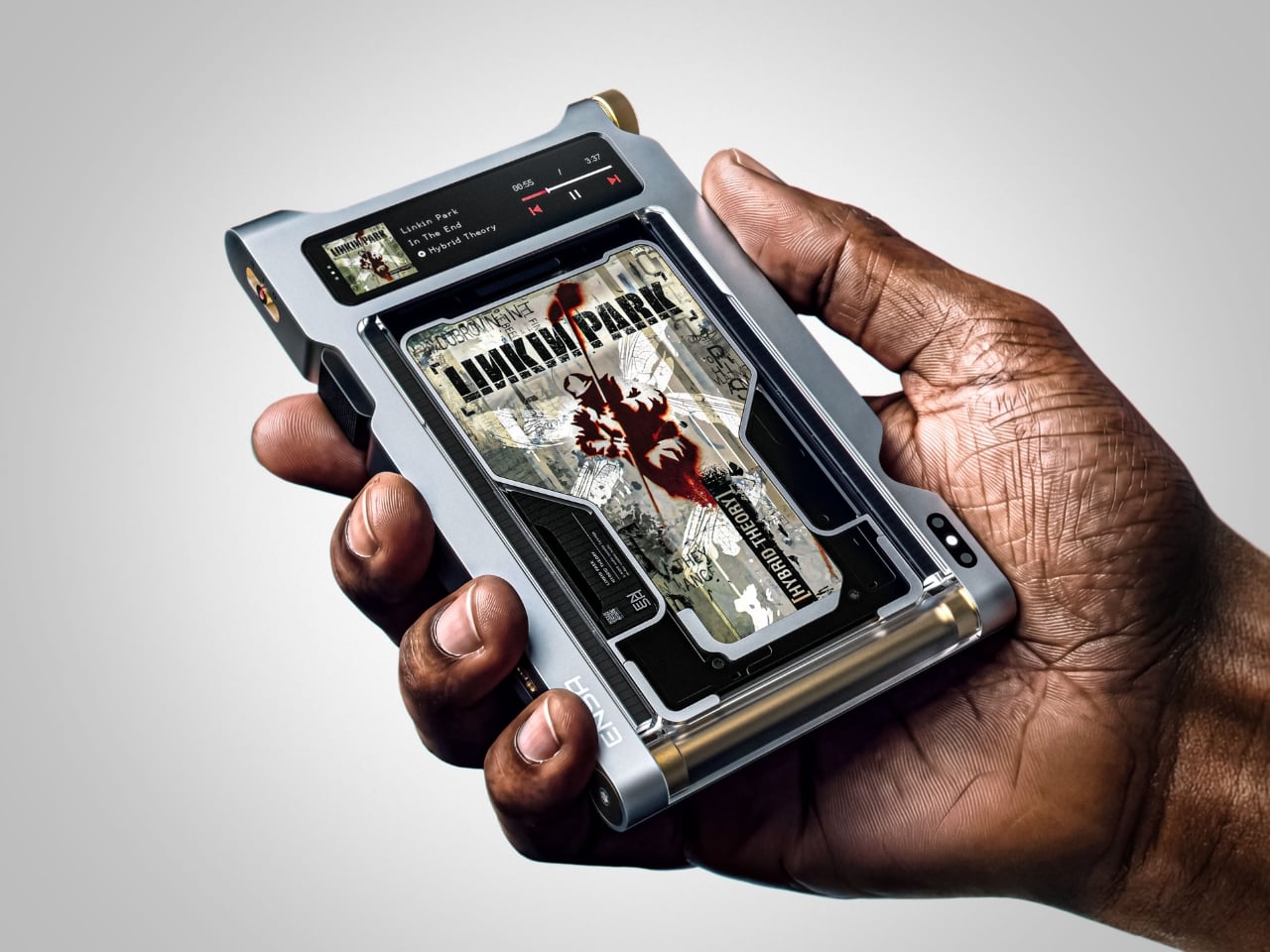
Where the P1 was built for portability and kept its design trim and pocketable, the T1 feels like the next chapter. Visually and conceptually, it carries the same DNA: clean, considered industrial design with an aluminum body and restrained detailing. But the T1 reads as something more anchored, a device you set somewhere permanent and return to, rather than slip into a bag. It’s a design that seems to understand the difference between music you consume and music you actually sit down for.

Aesthetically, Dubrovin’s approach has always felt less like tech product design and more like furniture-level thinking. The ENSA devices belong to the same visual conversation as early Braun electronics or a Dieter Rams concept sketch, where every detail either earns its place or gets removed entirely. The T1 continues that restraint. Its form doesn’t shout, which is precisely why it catches your eye. In a market saturated with speakers shaped like pebbles and smart displays with glowing rings, an audio device that looks like it was designed by someone who genuinely thought about what it means to own a piece of music is genuinely refreshing.

The broader question Dubrovin keeps posing with the ENSA project is one worth sitting with: what did we actually lose when music went weightless? Streaming solved convenience so completely that most of us never stopped to notice what the tradeoff cost. We gained access to everything and lost the kind of focus that comes from committing to a single album, from having music you could see, hold, or lend to a friend. The ENSA T1 is not trying to compete with Spotify. It’s asking whether the experience of music could mean something again, even if you have to build an entirely new format to get there.

It’s a concept project, not a product you can buy, and the realist in me knows that’s a significant caveat. Building out a new physical media format in 2026 is an uphill proposition at best. The infrastructure alone, manufacturing cartridges, convincing labels, and getting devices into homes, would require a level of industry commitment that’s difficult to imagine right now. But design concepts don’t have to ship to matter. The best ones articulate a desire most people feel but haven’t named yet, and the ENSA T1 does exactly that. The desire for music that has weight, that takes up space, that gives you something to do with your hands before the first note plays.

That’s why Dubrovin’s work keeps getting attention. The ENSA line isn’t nostalgic in the way that feels defensive or retrograde. It’s just honest about the fact that we traded something real for something convenient, and it’s asking, politely but persistently, if we’d like it back.

The post Streaming Took Something From Us. The ENSA T1 Wants It Back first appeared on Yanko Design.

  •  

Furniture Made From Wood Scraps You’d Actually Pay For

Every furniture workshop generates a particular kind of guilt. There are the offcuts, the trimmings, the odd-shaped remainders of boards that got cut to size and are now too small for anything useful, or so we assume. Most of them end up as kindling, compost, or landfill. We’ve accepted that as the cost of making things, a small fine paid for the privilege of precision. Studio Booboon is not interested in paying that fine.

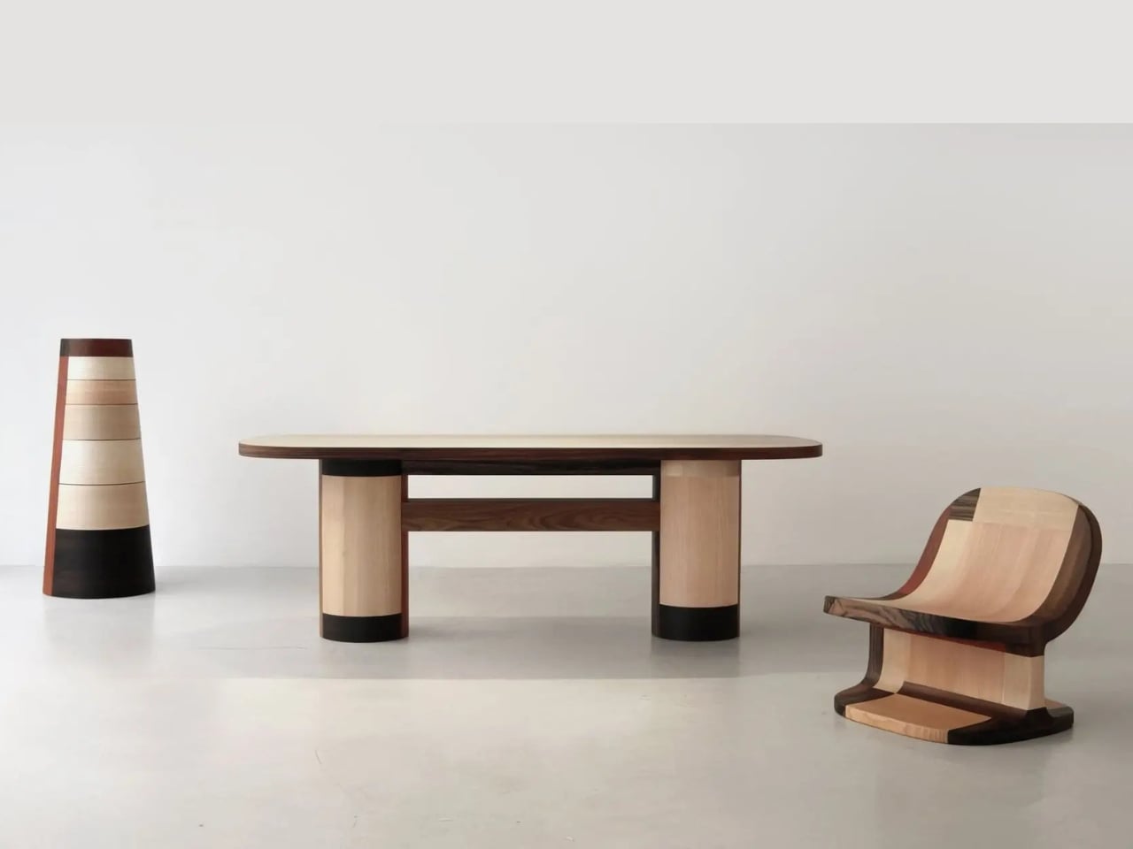
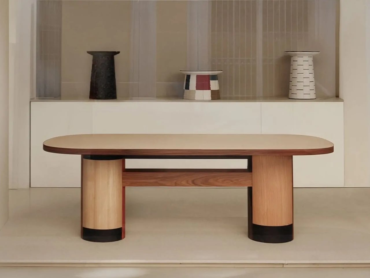
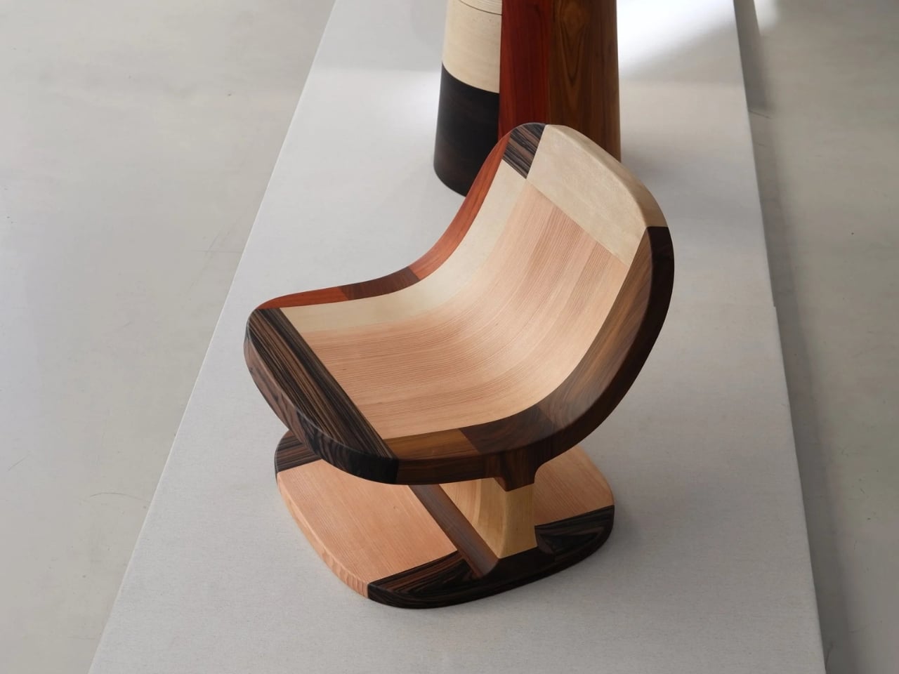
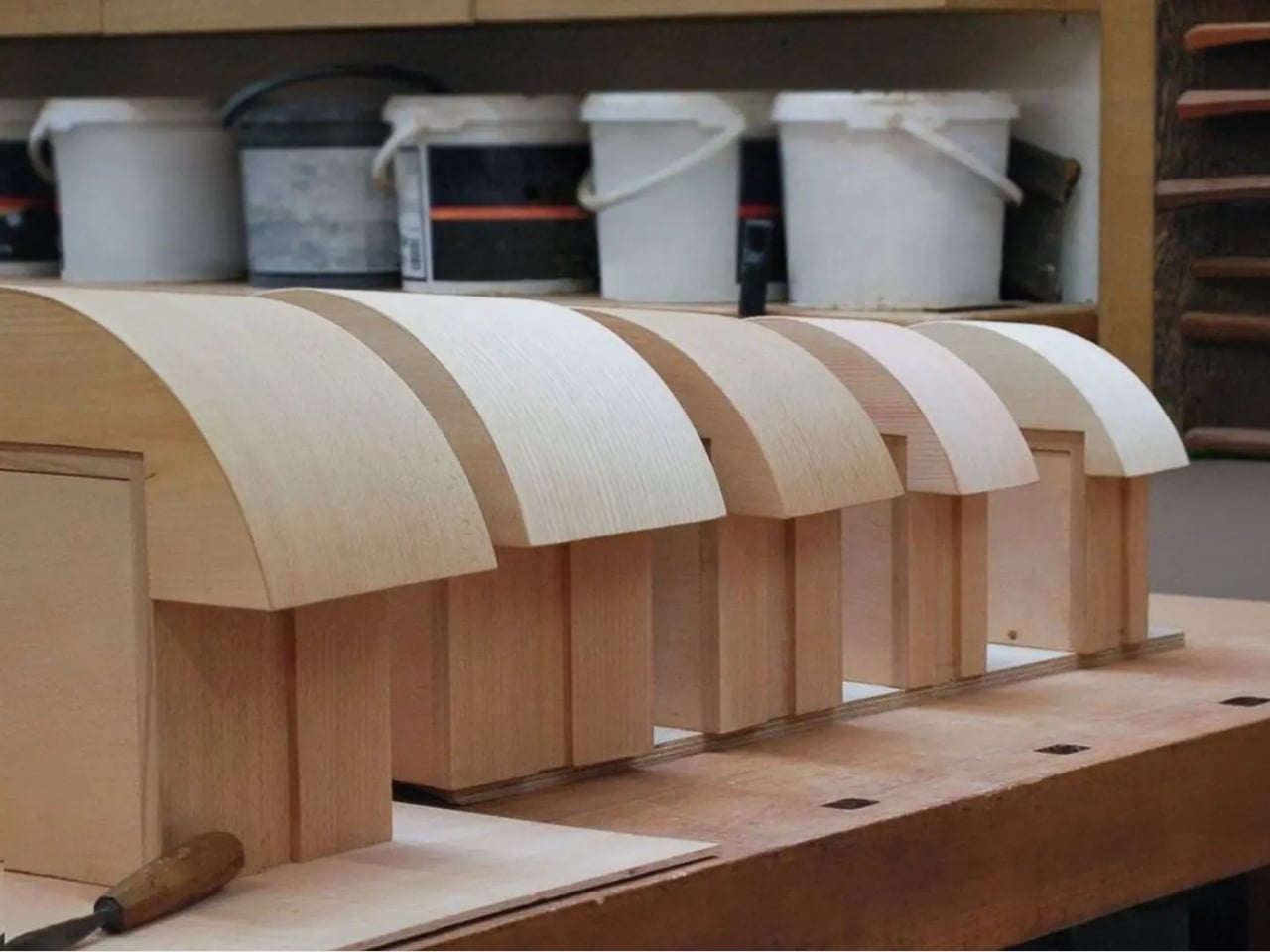
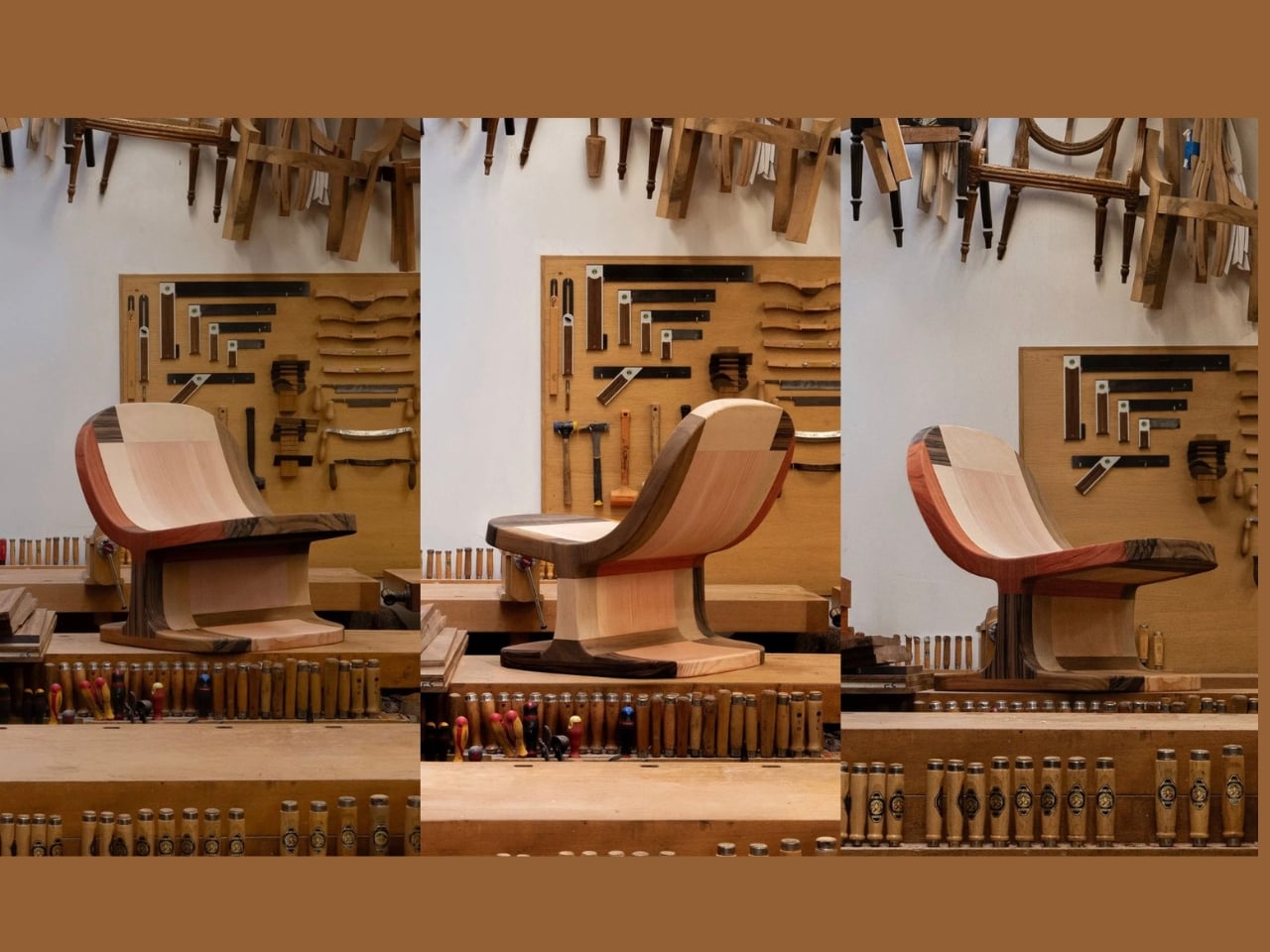
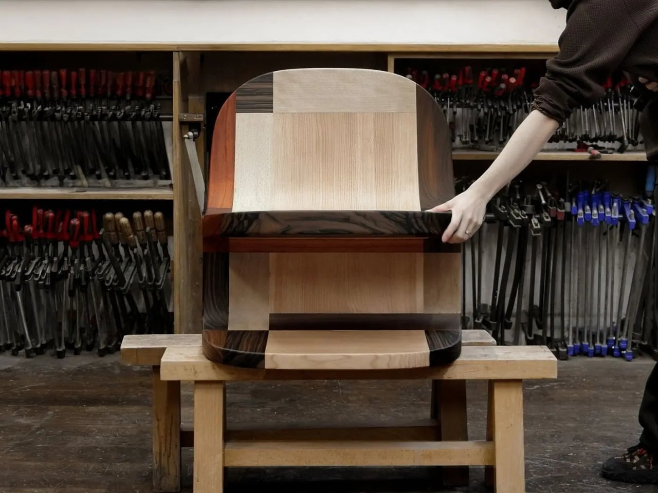
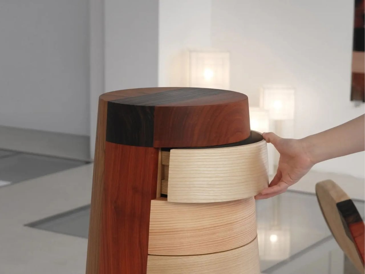
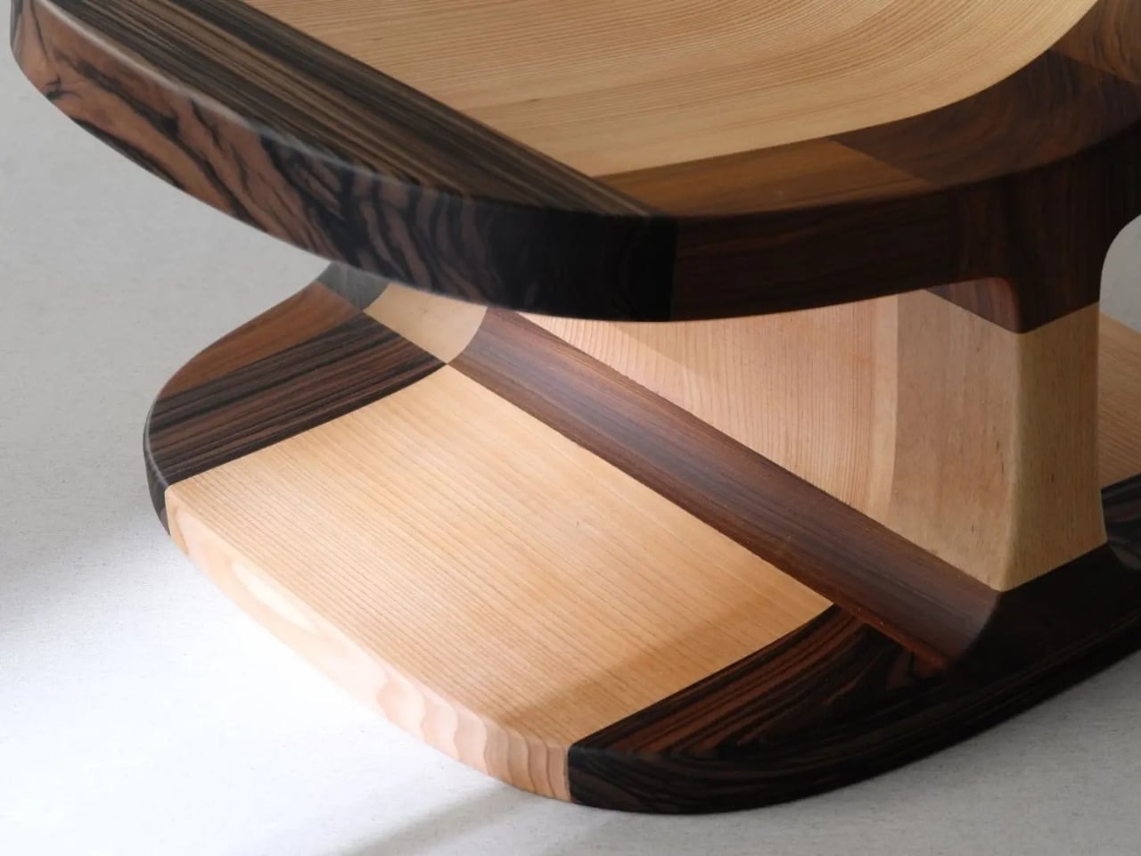
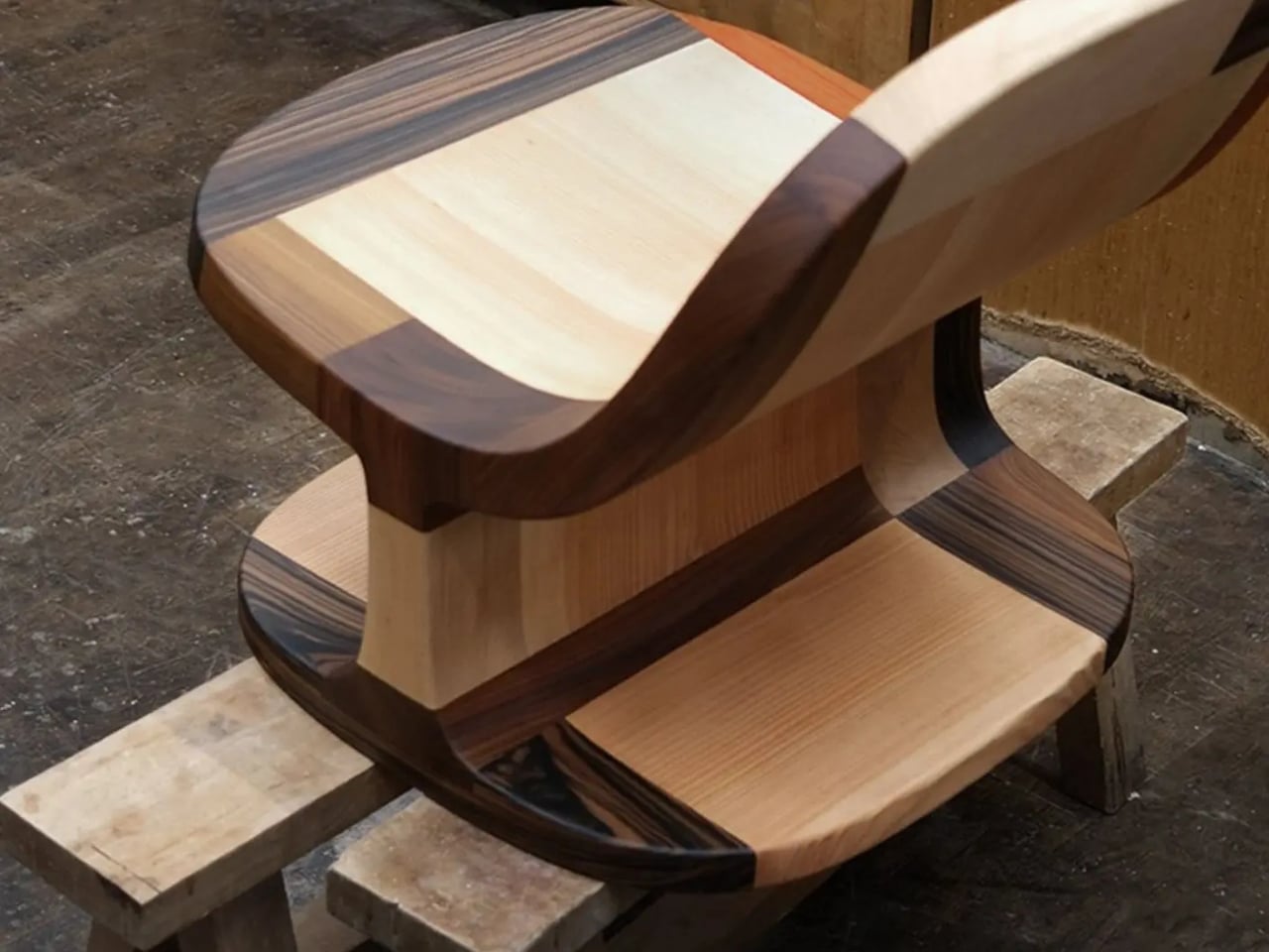
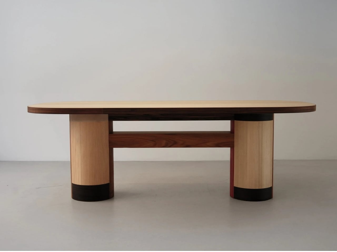
The Copenhagen-based studio, founded by Richard Bone and Jisu Yun, two designers who both trained under Japanese studio Nendo, released their latest collection, Fragments Becoming, and it’s exactly the kind of work that makes you wonder why no one thought to do it this way sooner. The collection is built entirely from timber offcuts, and before you picture something rustic or deliberately imperfect, let me be clear: these pieces are stunning. A cabinet, a dining table, and a lounge chair, each constructed from assembled fragments of discarded wood arranged with such precision and intention that the effect is closer to fine art than furniture-as-apology for sustainability.

Designer: Studio Booboon

The concept the studio uses is something they call “3D marquetry,” which sounds technical but is actually a fairly elegant idea once you sit with it. Traditional marquetry, the kind you’d see on antique furniture or decorative boxes, applies a pattern to a surface. It’s essentially decoration laid on top of structure. What Studio Booboon does instead is treat each fragment of wood as the structure itself. The pattern isn’t on the cabinet door; the door is the pattern. It runs through the object’s entire volume, which means the visual logic and the physical construction are the same thing. That’s not a subtle distinction. That’s a fundamentally different philosophy.

What I appreciate about this approach is that it removes the option to hide mistakes. The studio works with unstained wood, which means every fragment has to earn its place on its own terms, no pigment masking a poor match, no stain blurring the edges. Each piece has to work compositionally before it works functionally. That kind of constraint tends to produce either chaos or brilliance, and in this case, it’s clearly the latter.

Bone and Yun bring a cross-cultural sensibility to the work that shows up in the details. Their debut collection, Playful Reappropriation, released at Milan Design Week 2024, pulled from Korean craft traditions, and Fragments Becoming continues that thread. The materials include hanji (traditional Korean paper), canvas, silk, and Ottchil, a Korean lacquer technique that adds depth without dominating the natural tones of the wood. The combination of a British RCA education, Korean craft heritage, and a shared apprenticeship at Nendo, one of the most conceptually rigorous studios in contemporary design, explains a lot about why this work feels so considered without ever feeling cold.

The collection premiered at Milan Design Week 2026 and later showed at Other Circle 2026 during 3daysofdesign in Copenhagen. That double-billing matters. Milan tends to reward spectacle, while the Copenhagen circuit rewards ideas. The fact that Fragments Becoming landed well in both contexts suggests it’s doing something more than just looking good in photographs, which, for the record, it absolutely does.

Sustainability in design has become such an overused talking point that the word barely registers anymore. Every brand gestures toward it. But there’s a difference between sustainability as a value and sustainability as a method, and Studio Booboon’s work lives in the second category. They’re not telling you the collection is responsible and letting the aesthetics carry a different message. The responsible practice is the aesthetic. The offcut isn’t hidden. It’s the whole point.

That feels rare enough to be worth paying attention to. Design tends to celebrate the new, the seamless, the perfect. Fragments Becoming makes a quiet argument that the incomplete, the leftover, and the discarded might be where the most interesting work is still waiting to happen.

The post Furniture Made From Wood Scraps You’d Actually Pay For first appeared on Yanko Design.

  •  

A Maker Spent Months Building a Pokéball That Jumps and Shoots Smoke

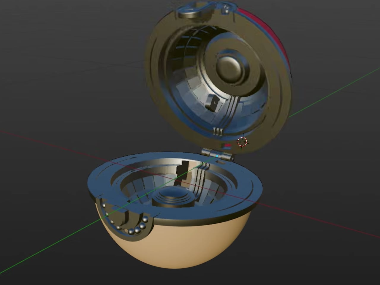
Pokémon has always sold us a very specific fantasy: a compact sphere you can throw into tall grass, watch shimmy three times, and hear that satisfying click. The wiggle is practically cultural shorthand at this point. So when maker Kiara’s Workshop decided to skip the wiggle entirely and build the far stranger, far older Arceus ball instead, the resulting creation landed somewhere between prop design, mechanical engineering, and sheer stubbornness. The kind of project that sounds manageable until you’re three failed prototypes deep.

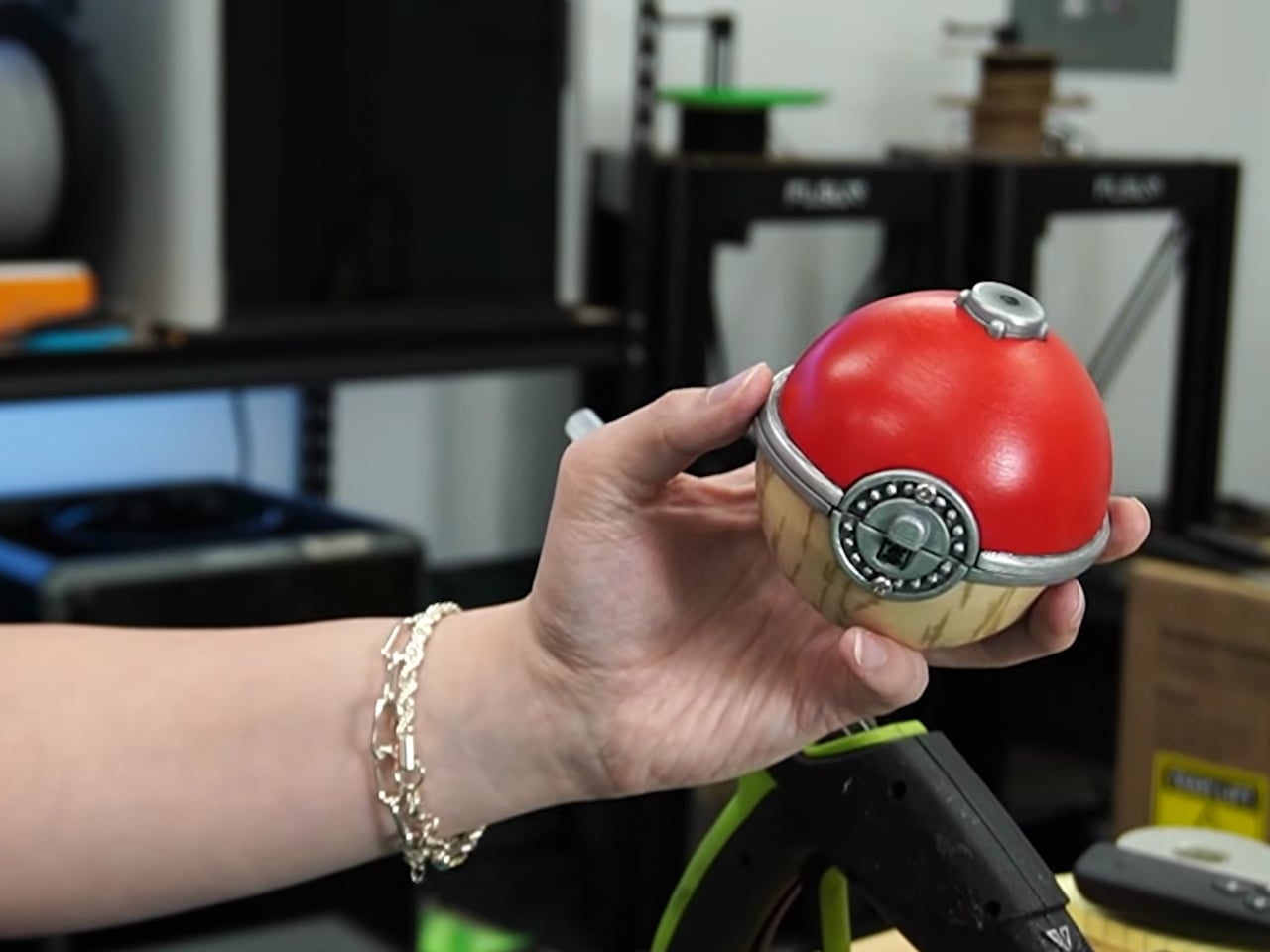
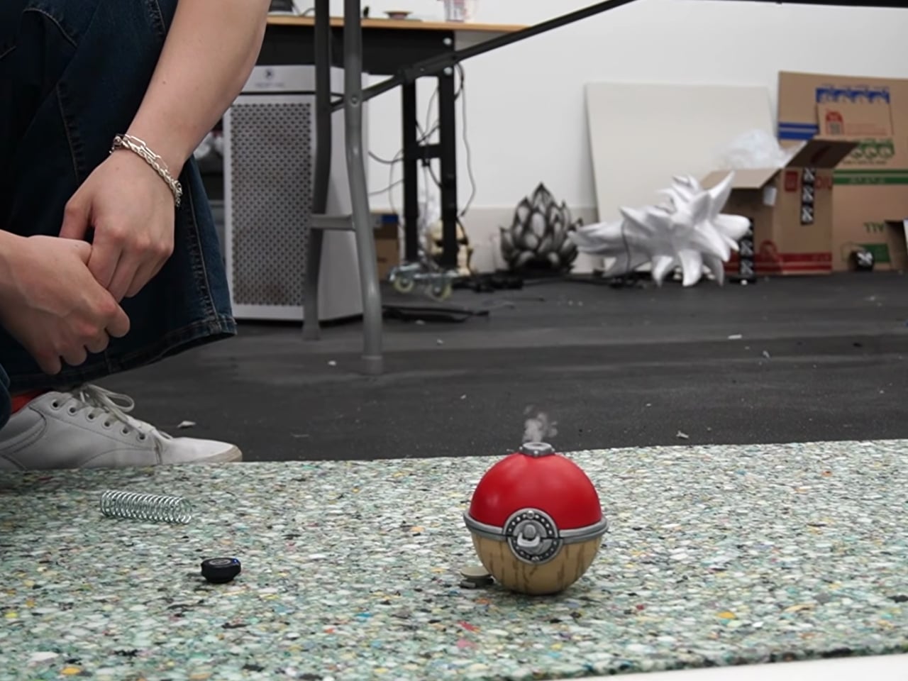
For context: the Arceus ball comes from Pokémon Legends: Arceus, a game set in a much earlier era of the Pokémon world. This isn’t the sleek, mass-produced Pokéball most of us grew up clicking in handheld games. It’s a more primitive artifact, made from Apricorns and Tumblestones in the game’s lore, with an aesthetic that leans ancient and earthy rather than factory-fresh. And its in-game behavior is notably different too. Instead of the classic wiggle sequence, the Arceus ball shoots into the air during a catch and releases a burst of smoke. It’s more dramatic, more theatrical, and a far more interesting design brief.

Designer: Kiara’s Workshop

Kiara’s Workshop had already built functional Pokéballs before, putting out a V1 and V2 that earned a loyal following and a comment section full of people asking when she’d make more. The V3 of the standard Pokéball was still on her list when she decided to take a detour and come back to Pokéballs a different way. The Arceus ball seemed like the simpler bet. It doesn’t have the same intricate mechanical catch sequence as the modern version, so how hard could it be? The answer, as it turned out, was very hard. The build required research, iteration, and a willingness to start over.

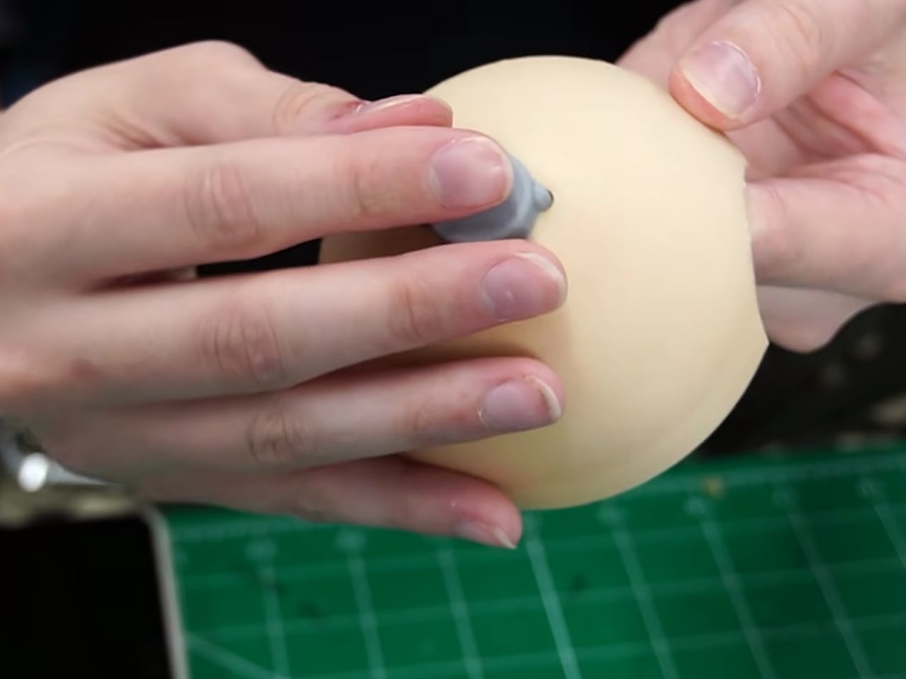
Getting a physical object to jump on cue and simultaneously release smoke on command is not exactly a weekend project. The ancient aesthetic of the ball adds another layer of complexity: it can’t look like it came out of a clean resin mold. It needs texture, weight, and a certain handmade quality that actually complicates production rather than simplifying it. Every element Kiara worked through pointed back to how much thought went into the original game design, even for something that appears on screen for only a few seconds at a time.

Here’s the thing about maker culture that doesn’t get enough attention: it forces a kind of reverse-engineering that’s deeply respectful of the original design, whether that original designer was a game developer or a prop team. When you have to physically build something that only existed as a rendered animation, you start noticing all the decisions that went into it. Kiara’s build is less about having a cool collectible on a shelf (though it would absolutely win any shelf) and more about understanding how design translates, or refuses to translate, between worlds. That’s a genuinely underrated form of design criticism.

Pokémon as a franchise has always been smart about its own mythology. The progression from handcrafted Apricorn balls to industrially manufactured ones mirrors real-world design evolution, from artisanal craft to mass production. What Kiara’s Workshop did was reverse that arc entirely, going from the pixel back to the physical, from the streamlined modern version to the awkward, jumping, smoke-releasing ancient one. It’s a move that requires understanding both the fiction and the fabrication. The result is genuinely impressive, not because it’s a perfect replica, but because it functions on its own terms. It jumps. It smokes. It exists in a way it never was supposed to.

Plenty of makers are building Pokéballs right now, probably on multiple continents simultaneously. But most are going for the one everyone recognizes. Choosing the Arceus ball, with all its mechanical demands and its ancient visual language, says something about what excites Kiara’s Workshop: not the familiar, but the forgotten. And for anyone who’s ever quietly preferred the stranger corners of a franchise over its most iconic pieces, that’s a choice worth appreciating.

The post A Maker Spent Months Building a Pokéball That Jumps and Shoots Smoke first appeared on Yanko Design.

  •  
❌