❌

Vue lecture

5 Gadgets Gen Z Actually Wants to Own Right Now
Something shifted. The generation that grew up with every song, show, and photo living inside a glass rectangle is now buying CD players, handheld consoles, and standalone cameras that do exactly one thing. It is not purely nostalgia driving this. It is the particular relief of owning something that does not send notifications, update itself overnight, or ask for your location. These are objects that simply work.

What connects these five is not a shared aesthetic or price point but a shared resistance. Each gives your hands something real to do, something that clicks, spins, or frames a shot without a screen mediating the exchange. Gen Z did not fall out of love with technology. They fell out of love with technology that treats their attention as the product. These five objects treat it as something worth protecting.

1. Syitren R400 Bluetooth CD Player
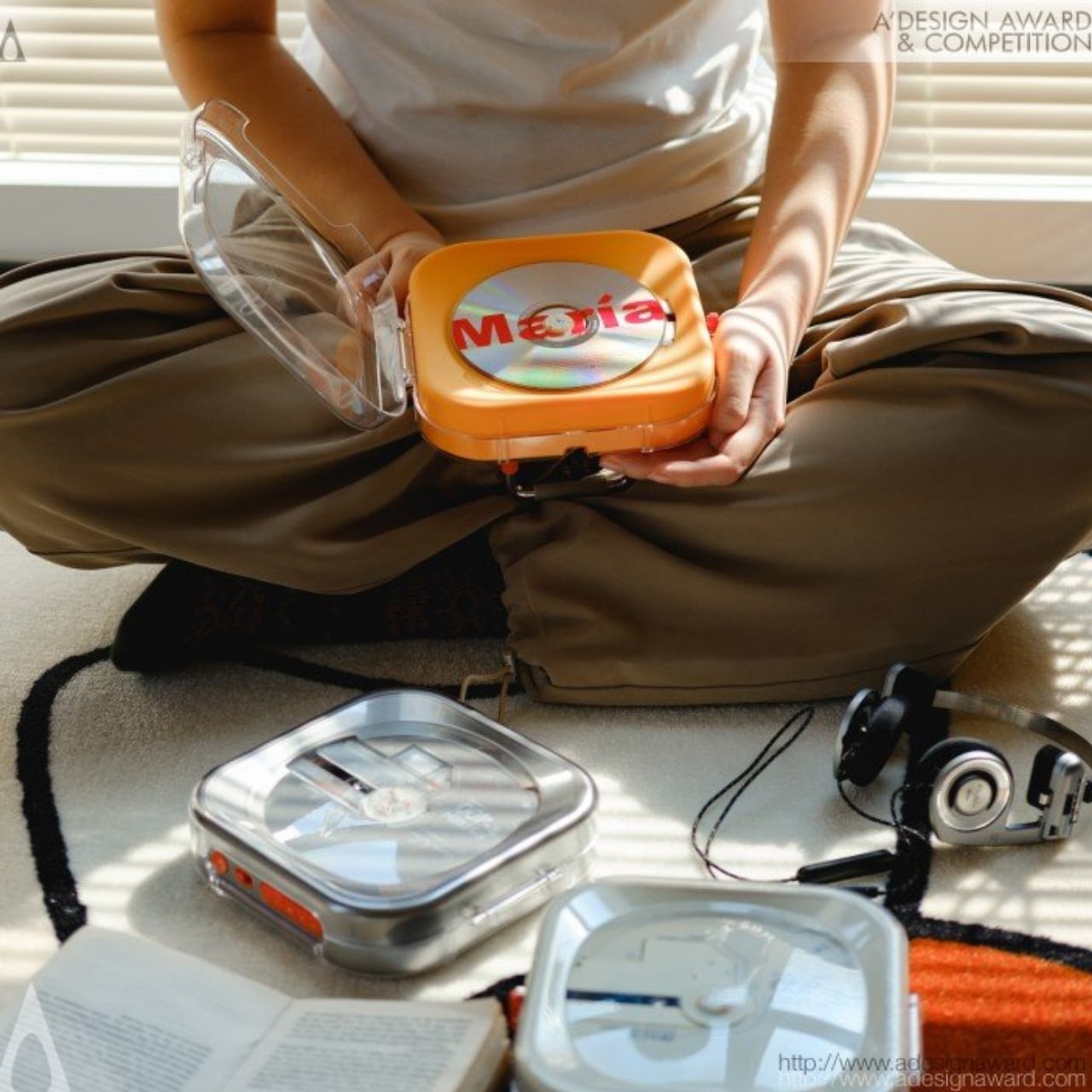
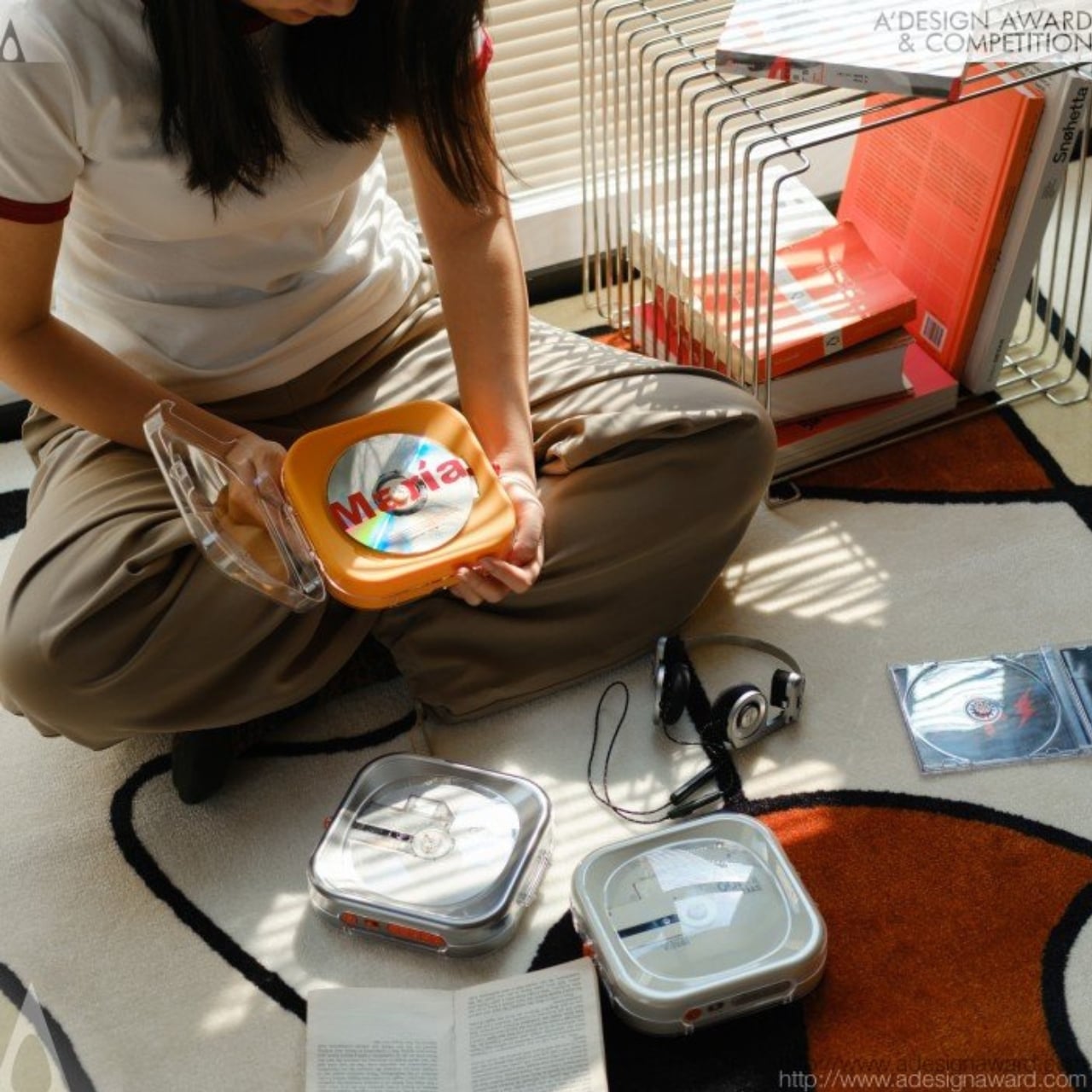
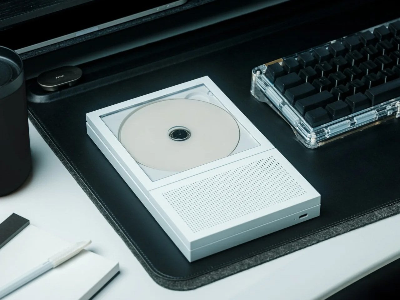
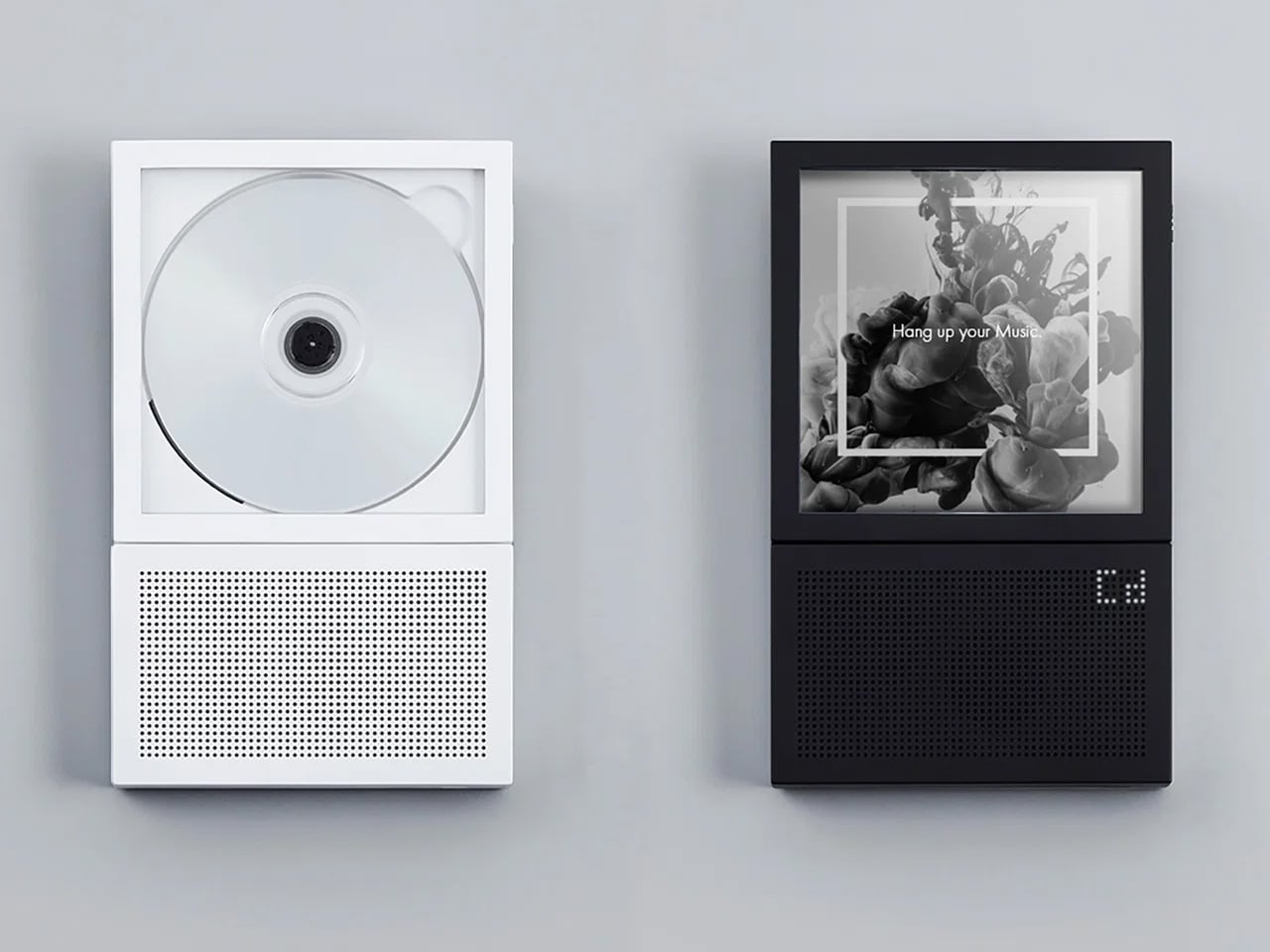
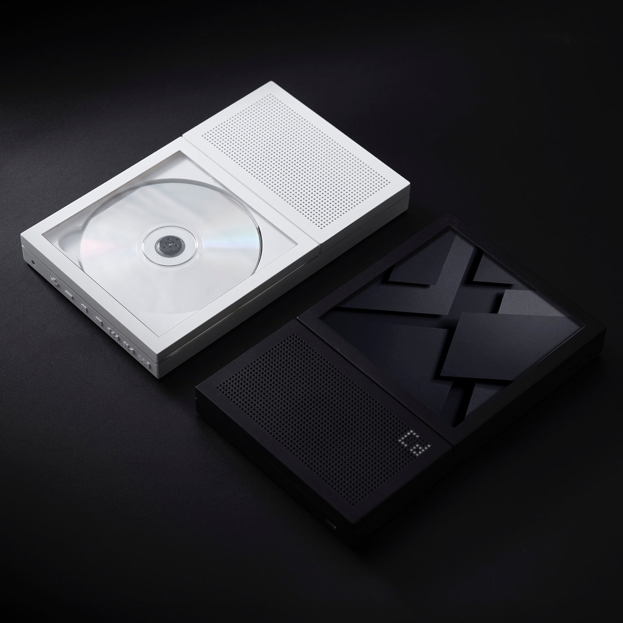
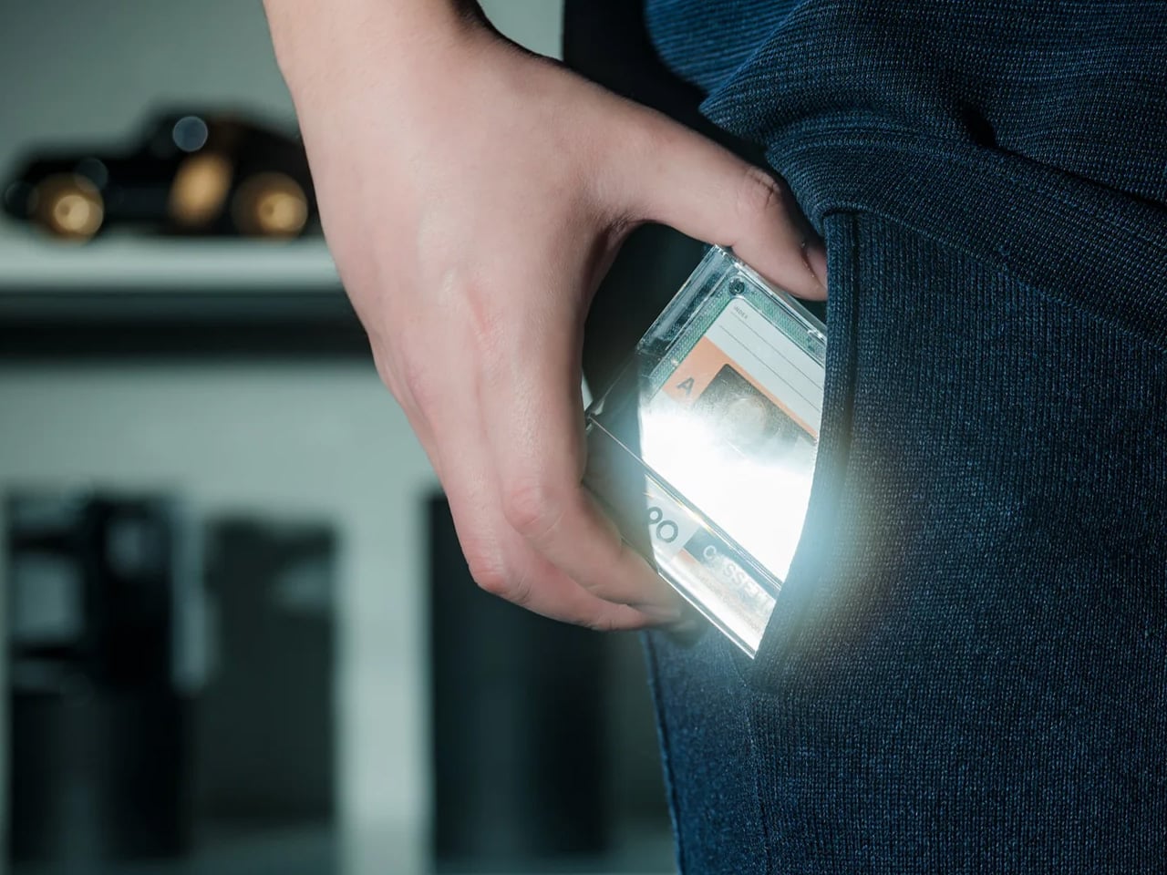
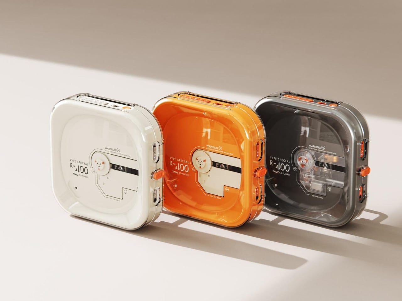
Portable CD players never disappeared, but they did stop trying. For years, the category was defined by bulky Sony boomboxes built around FM radio and cassette tapes as much as CDs. The R400, designed by ORGDOT for Syitren, is the first player in a long time that feels built for how people actually listen today. It is compact, Bluetooth 5.3-first, and designed to look as good on a desk or shelf as it does in your hand on a commute.

Under the shell, a custom Syitren pure CD core delivers a 70dB signal-to-noise ratio for clean, high-fidelity sound. Anti-vibration engineering keeps things skip-free while commuting or walking around. The shell is detachable and customizable, and a sunken charging compartment with a built-in wire groove keeps the cable from bending or fraying over time. Bluetooth or wired, car stereo or headphones, four-plus hours of continuous playback per charge, at a price that doesn’t make you choose between good design and good sound.

What we like

  • The detachable, customizable shell makes it something you can call your own, not just another piece of consumer electronics sitting on a desk.
  • Anti-vibration engineering means it is genuinely designed to be carried around, not just displayed.

What we dislike

  • Four hours of battery covers a workday comfortably but cuts short anything longer without access to a charge.
  • Sony has been quietly pulling back from portable CD players, meaning the R400 steps into a space with almost no competition to pressure it on price or performance.

2. Game Bub
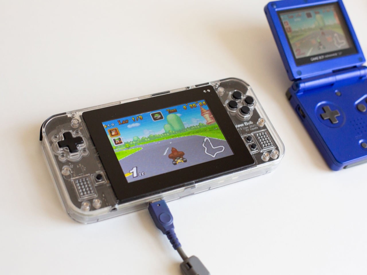
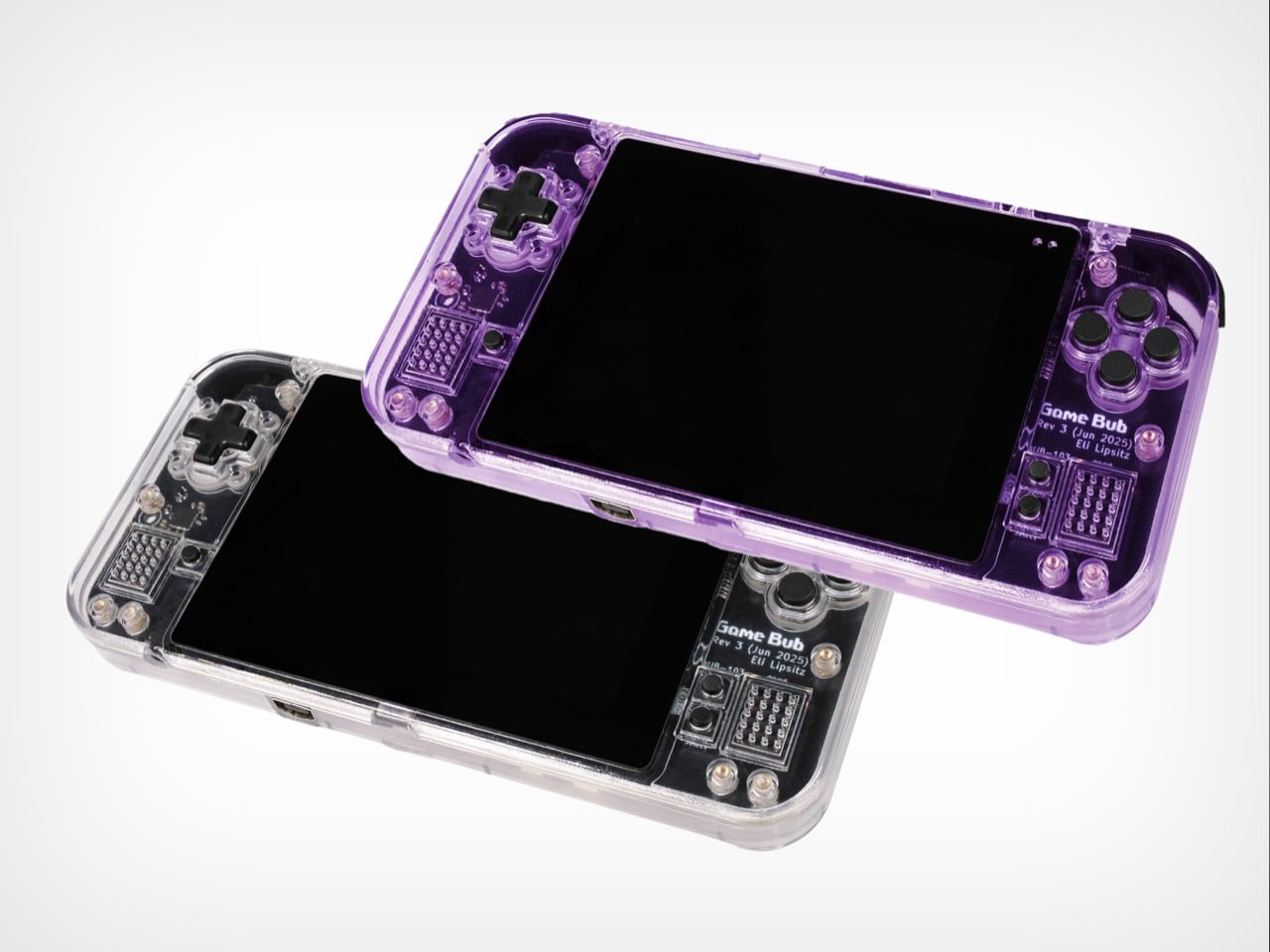
The Game Boy Advance’s design patents expired years ago, and most of what followed has been cheap emulation boxes wearing a familiar shape. Game Bub from Crowd Supply is different. It uses FPGA technology rather than software emulation, recreating the original Game Boy, Game Boy Color, and Game Boy Advance hardware at a circuit level with accuracy that emulators cannot match. The transparent shell, available in Purple and White, makes the whole thing look exactly as it should.

The horizontal GBA form factor is a deliberate choice in a market that keeps going vertical. Button placement feels natural; the shoulder buttons are where your fingers expect them, and dual one-watt stereo speakers handle classic soundtracks properly. USB-C charging, a headphone jack, a microSD slot for firmware updates, display output for big-screen play, Bluetooth Low Energy, 2.4GHz Wi-Fi, and a 3000mAh battery round out a device that earns the word ambitious.

What we like

  • FPGA accuracy means your cartridge collection plays exactly as it was designed to, not approximately as software emulation allows.
  • The horizontal form factor respects what made the GBA comfortable for long sessions, which most of the competition has quietly abandoned.

What we dislike

  • Hardware-level FPGA accuracy comes at a price point that locks out buyers who would otherwise be genuinely interested.
  • Open-source FPGA handhelds tend to have longer firmware update timelines, which requires patience from anyone buying early.

3. Clip&Go Radio
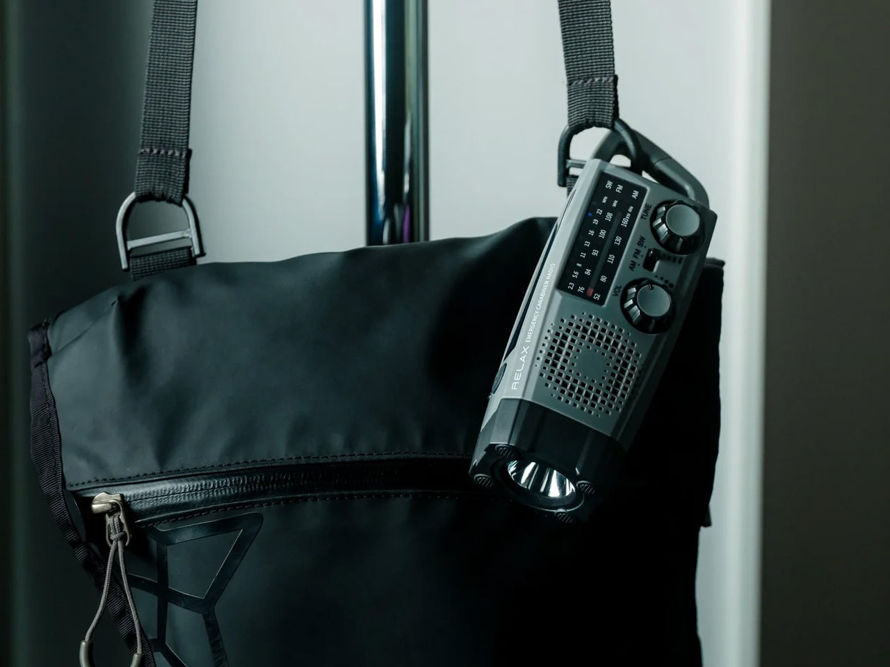
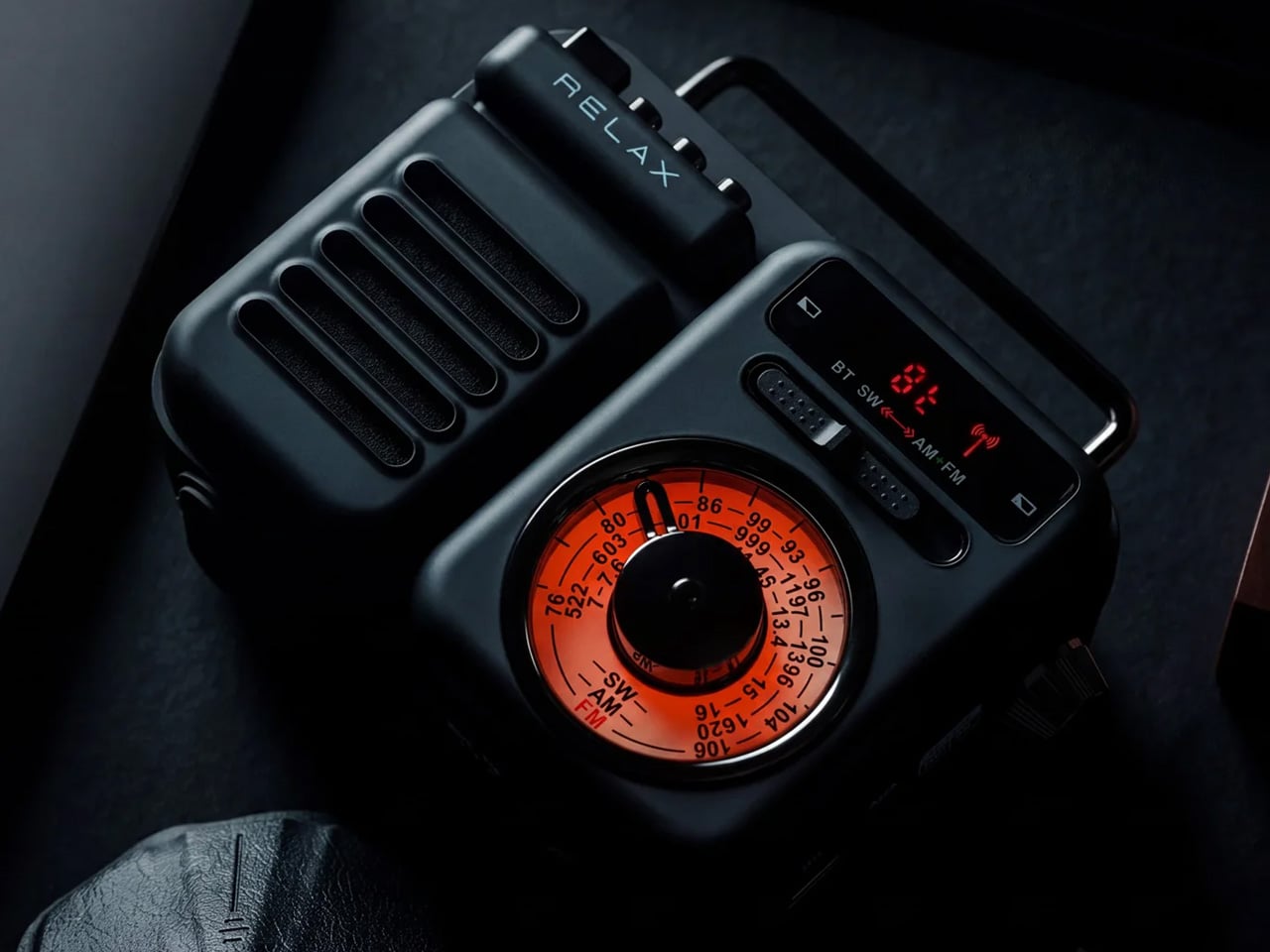
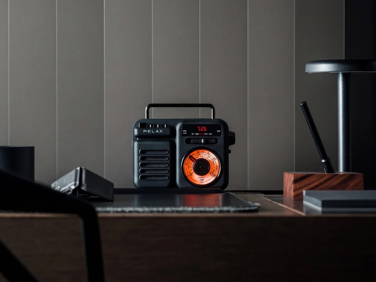
A radio that clips to your backpack and plays FM stations does not sound like a gadget Gen Z would want. The Clip&Go reframes the premise. It is compact enough to attach directly to your gear without thinking about it, built around the idea that the best emergency tool is one already useful before anything goes wrong. A built-in flashlight, hand crank, and solar panel mean it carries more utility than the dial on top suggests.

The physical radio format fits the same logic as the CD player and the handheld. It is a single-purpose device with no algorithm, no autoplay, and no recommendations. You tune a station, clip it on, and go. In a landscape where every device competes for your attention, a radio that does not know you exist feels quietly radical. At $60, it is also the most immediately ownable thing on this list.

Click Here to Buy Now: $60.00

What we like

  • The built-in hand crank and solar panel mean it works when other devices cannot, giving it a utility case that goes well beyond aesthetics.
  • The clip attachment means it genuinely travels with you rather than waiting in a bag pocket to be pulled out.

What we dislike

  • FM signal quality is location-dependent, making the listening experience inconsistent wherever coverage is thin.
  • At $60, it competes with Bluetooth speakers that do more on paper. The case for owning it rests on the single-purpose philosophy, not the spec sheet.

4. Camera (1)
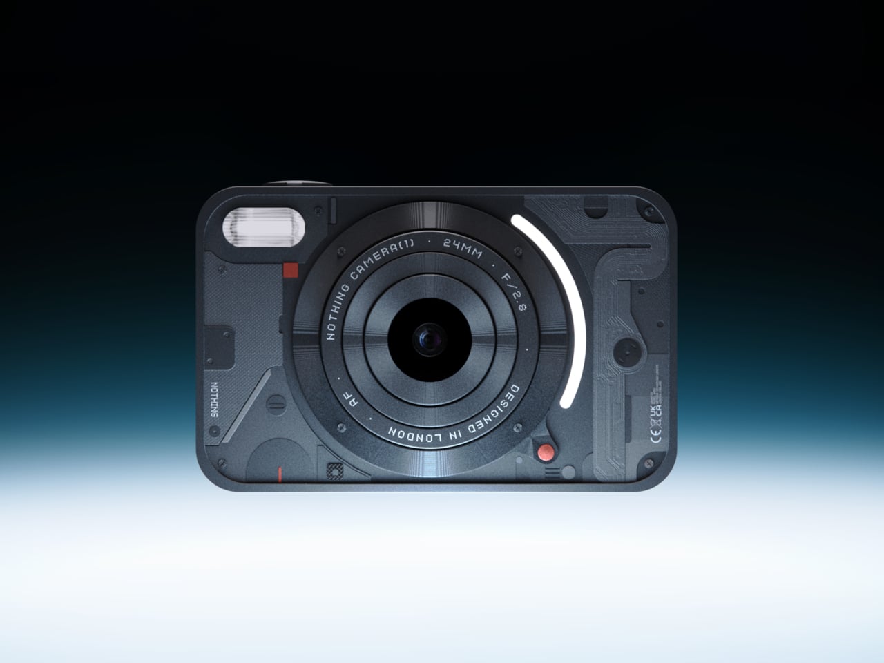
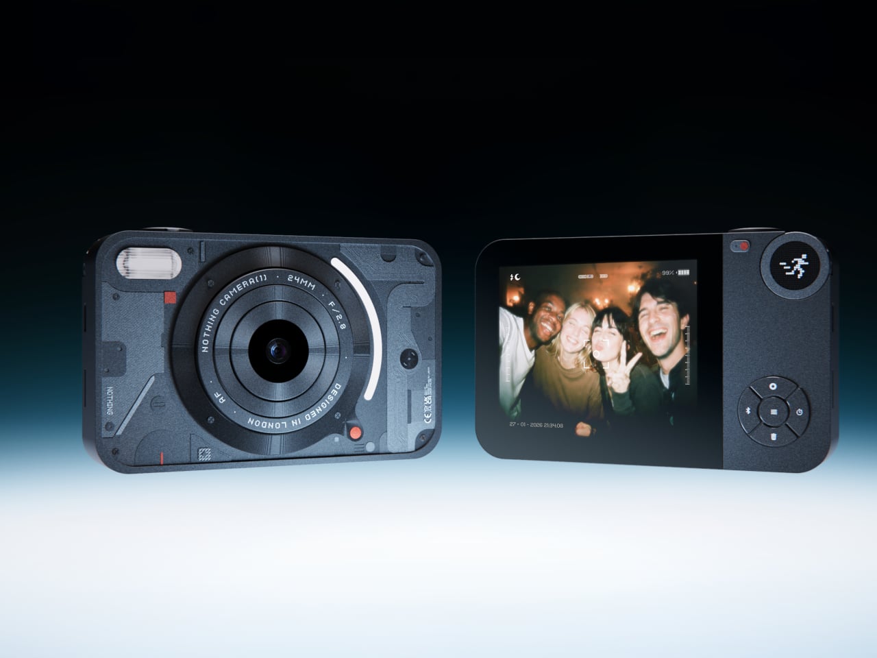
The impulse to pick up a standalone camera again is not about megapixels. It is about separating the act of taking a photograph from the act of being on your phone. Camera (1) is a concept by designer Rishikesh Puthukudy that imagines what a modern compact could feel like if built around physical controls rather than touchscreen menus. Metal body, softly rounded corners, every main control reachable without shifting your grip or glancing away from the scene you are trying to capture.

All the main controls live on one edge: a shutter, a circular mode dial with a dot-matrix glyph display showing simple icons for stills and video, and a D-pad your thumb can reach without looking down. A light strip around the lens pulses for the self-timer, confirms focus, and signals when recording is live, replacing multi-layer software navigation with immediate, readable feedback. The design language pulls from Nothing’s transparent, hardware-forward aesthetic and pushes it into something you would actually want to carry.

What we like

  • Every main control sits within reach of one thumb and index finger, keeping your eyes on the subject rather than hunting through a menu.
  • The light strip communicates camera state through peripheral vision, a smarter solution than burying status information inside a touchscreen.

What we dislike

  • Camera (1) is a concept with no confirmed manufacturer, production timeline, or pricing, which is a real limitation for anyone wanting to own one today.
  • The visual language is closely referential to Nothing’s established aesthetic, which may read as derivative to anyone already familiar with that design direction.

5. elrow miniphone
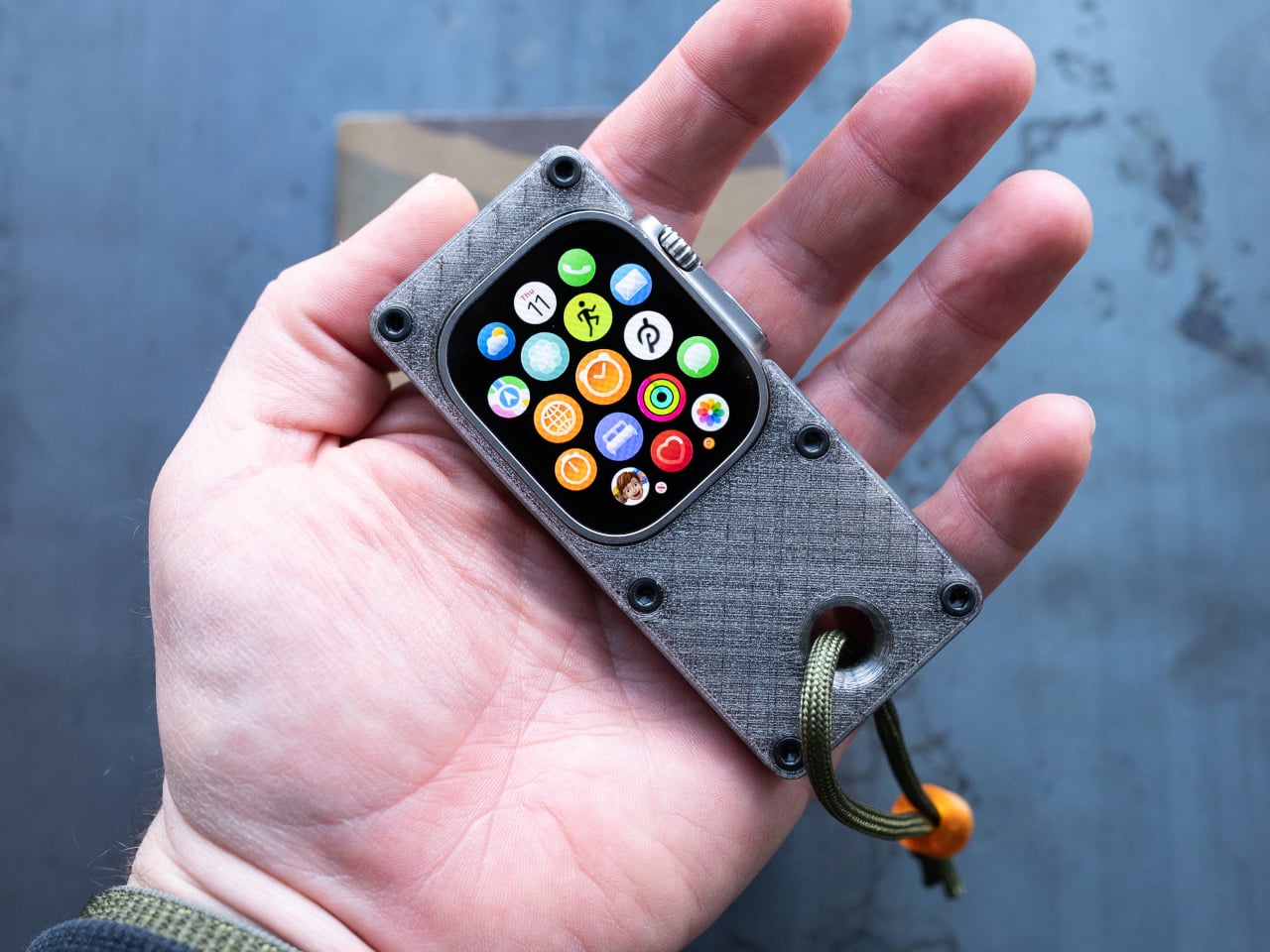
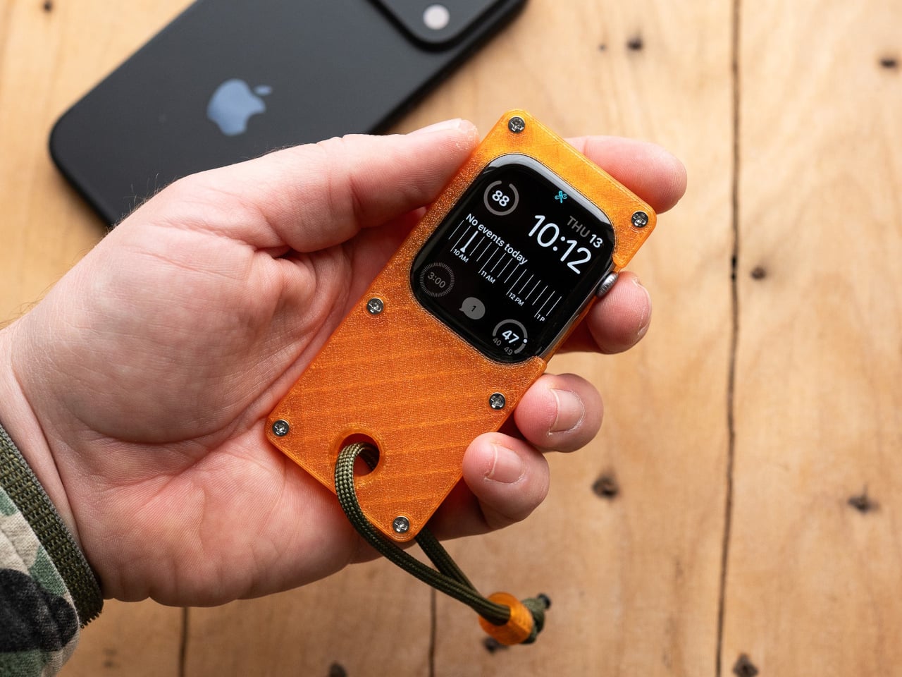
Full smartphones feel like overkill for a generation quietly walking back from maximalism. The Apple Watch on your wrist handles glances but stays awkward for anything more deliberate, and wearing both a smartwatch and an analog watch on the same arm is its own kind of compromise. The elrow miniphone is a 3D-printed case that turns an Apple Watch into a narrow, palm-sized device worn on a lanyard. The Standard fits the 46mm Series 10 and 11. The Ultra fits Apple Watch Ultra 1, 2, and 3.

Both stand around 95mm tall with textured translucent bodies and visible screws that do not attempt to hide how they were built. The back stays open so you can charge without disassembling the case. What elrow industries built is less a gadget and more a posture, a way to carry connectivity without wearing it on your wrist, freeing that space for the mechanical or analog watch you actually want to wear while keeping notifications, Apple Pay, and quick replies within reach.

What we like

  • The open back lets you charge without disassembly, removing the most frustrating everyday friction of any case.
  • Wearing connectivity on a lanyard rather than your wrist opens the door to the analog watch you have been quietly sidelining.

What we dislike

  • As a 3D-printed case, it depends entirely on which Apple Watch model you already own and is not a standalone device.
  • A lanyard-worn device requires real behavioral change to make useful day-to-day rather than just conceptually interesting.

Ownership Is the Point

What this list describes is not a generation running from technology. It is a generation learning to be selective about which technology gets to run on them. A CD player that skips the algorithm. A handheld that plays cartridges at hardware level. A camera built around a shutter click. A lanyard device that frees your wrist. A radio that does not know your name. Five objects. Five things that simply work.

The broader shift is less about any individual product and more about what owning something actually means. Streaming everything is convenient right up until nothing feels like yours. A CD on a shelf, a cartridge in a slot, a photo taken with a camera you held in your hand: these are forms of possession the subscription model quietly erased. Gen Z is taking them back, one physical object at a time.

The post 5 Gadgets Gen Z Actually Wants to Own Right Now first appeared on Yanko Design.

  •  

The Selfie Camera on Your Phone Has Always Been in the Wrong Place

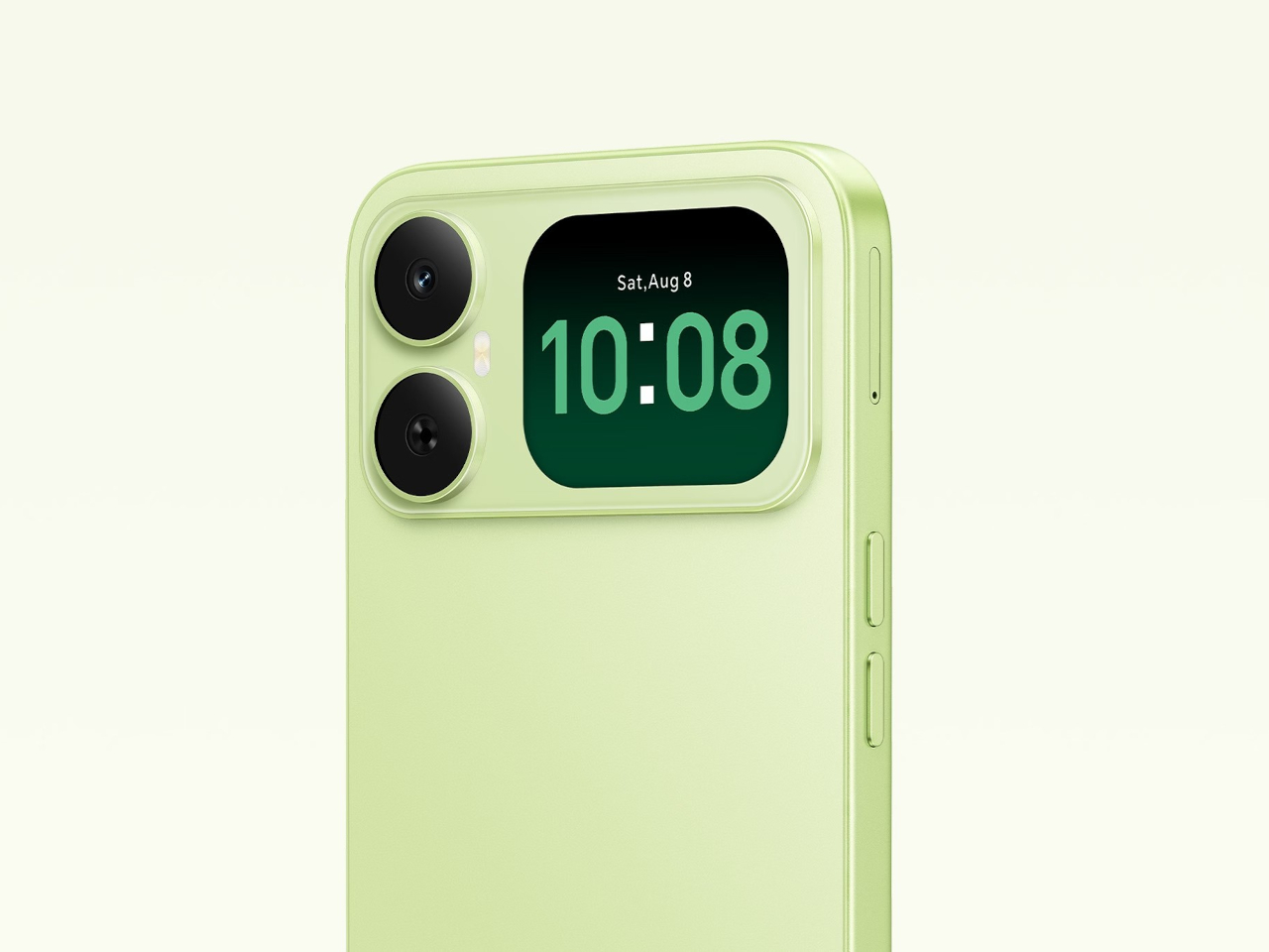
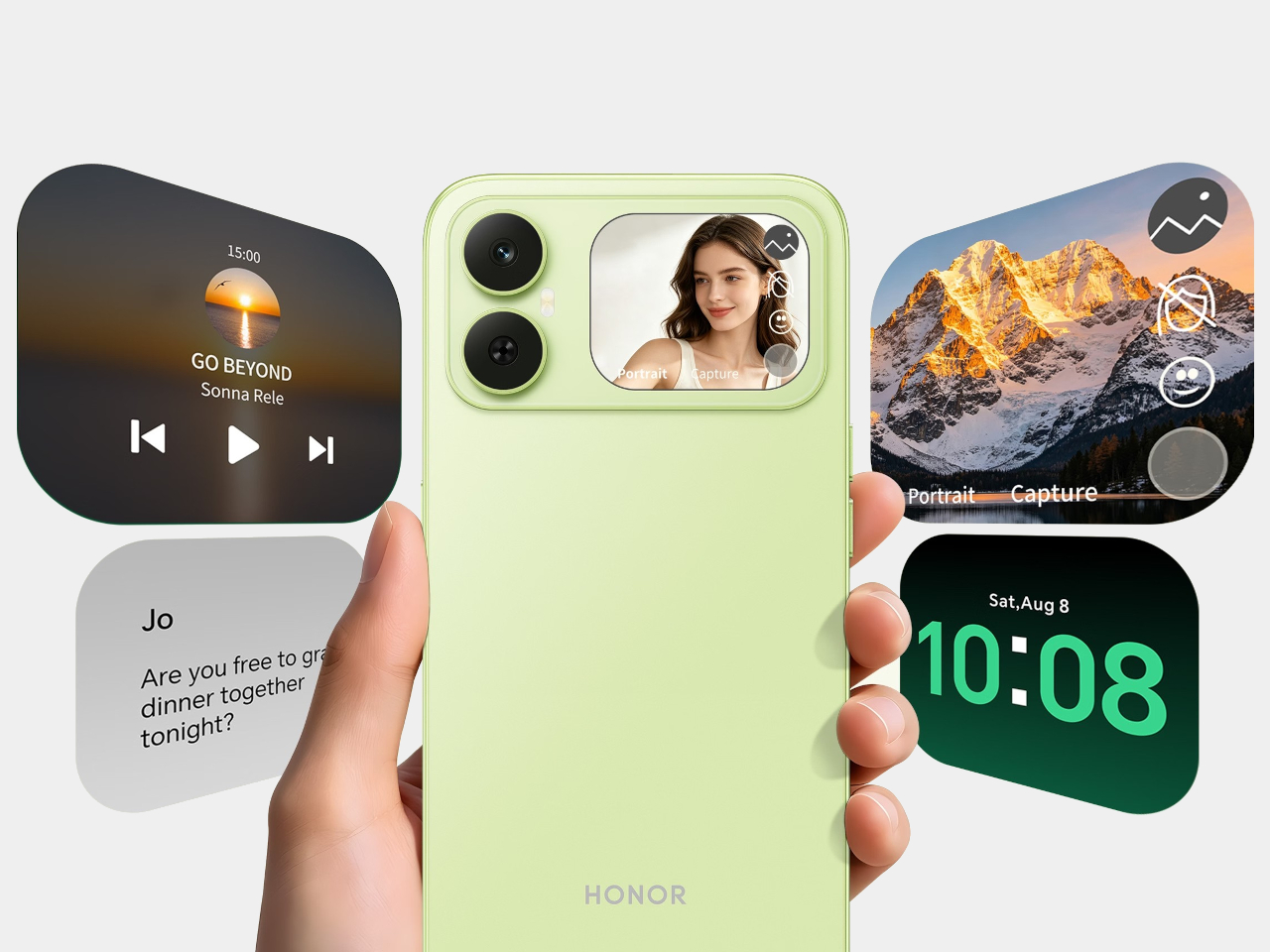
Most budget phones have one screen you stare at and a back you think about. The Honor X5d s makes that back worth a second look by placing a 2.01-inch touchscreen next to its rear camera. It shows the time and alerts, handles music, and helps you take selfies with the better camera. That’s a useful design trick for an inexpensive phone.

The camera island looks like it was built around that display, rather than having a screen tacked on afterward. Two dark circles sit beside it, although Honor lists only one rear camera. Forest Green makes the island pop against a pale back, while Midnight Black keeps things subdued. Either way, the phone’s most interesting feature is visible before you even wake it.

Designer: Honor

That rear screen makes sense when you’re trying to get everyone into a photo. Instead of extending your arm, guessing at the framing, and discovering that someone’s head is missing, you can see the shot while using the 50-megapixel rear camera. A tap on the back takes the picture. There’s also a 5-megapixel front camera, but this arrangement gives selfies another option.

Of course, a phone can’t spend all day posing for pictures. Leave the X5d s face down on a desk, and its little window can still show the time or a call alert. Music controls live there too, so skipping a song doesn’t require turning the whole device over. It’s a small convenience, but those are often the ones you keep using.

On the other side, there’s a 6.78-inch LCD for more than a glance. Its size makes room for videos, messages, and the photos you took, although the 1,576×720 resolution isn’t particularly sharp for such a large panel. The rear display doesn’t fix that limitation. It simply gives quick tasks their own place instead of asking the bigger screen to do everything.

There’s a 6,000mAh battery to keep both screens running, though the phone’s 15W wired charging might test your patience when it finally needs a refill. Honor also provides 64GB of storage and a three-card slot, letting you add a microSD card without sacrificing either SIM. That’s handy if you keep your photos and music on the phone rather than in the cloud.

Inside, the Unisoc T610 processor and 4GB of RAM tell a more familiar budget-phone story. The side-mounted fingerprint reader is convenient, but there’s nothing particularly exotic about the rest of the hardware. In South Africa, the 4GB/64GB version costs R2,499 (about $150), which puts the extra screen in reach of people who aren’t shopping for a flagship just to get a conversation-starting feature.

That display won’t replace your phone’s main screen, nor will it make the X5d s a better choice for demanding games. But it changes the small interactions that fill a day: a glance at a call, a tap to skip a song, a preview before taking a selfie. At this price, giving the back something useful to do feels refreshing.

The post The Selfie Camera on Your Phone Has Always Been in the Wrong Place first appeared on Yanko Design.

  •  

Nike Actually Made Sneakers That Look Like Grandma’s Couch

I lived in an era and a culture where our couches’ designs were pretty maximalist and contained a gazillion details. So when I see similar designs now being touted as “vintage”, I feel a little old but I’m also not surprised. All these floral and brocade prints seem to be a favorite now but I never expected Nike to actually join this party.

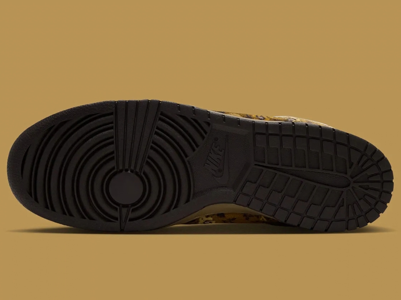
The upcoming new Dunk Lows will be sporting the Golden Hops Brocade design so it will fit right in with your grandma’s couch, a sentence I never thought I would have to write. This line is normally known for their minimalist and clear cut designs but they probably thought it’s about time to bring something different to the table, or more specifically, to your feet.

Designer: Nike

Unlike your usual sneakers from the Dunk Low line with its leather-heavy build, this pair’s entire upper is cut from velvet and features an elaborate floral/brocade pattern. It runs across the toe box, overlays, side panels, and even the heel. This makes your sneakers look like it was upholstered but still with the familiar Dunk Low silhouette.

The colors help sell the whole idea. Golden Hops and Velvet Brown give the floral pattern that warm, lived-in look, while the Pale Ivory details stop the shoes from disappearing into a sea of brown. I can imagine them sitting next to a tasseled lamp and looking perfectly at home, which is probably not a compliment I would give most sneakers. Then again, that is exactly why these caught my attention. They are leaning into the comparison instead of trying to make velvet look sporty.

Even the Swooshes get in on the fun. They have a puffier, stitched appearance rather than lying flat against the upper, with brown piping outlining their shape. The canvas tongue and light-colored laces offer a little visual break from all the flowers. Those details matter because an all-over print can become overwhelming pretty quickly. Here, your eye has somewhere to rest before wandering back to the pattern and finding another tiny flourish you missed the first time.

What would you wear with shoes that look ready to claim a spot in the living room? I would start simple. Dark jeans, relaxed brown pants, or a plain sweater would give them room to be the interesting part of the outfit. You do not need to dress like the entire couch set. In fact, the less competition these sneakers have, the easier it is to appreciate how unusual they are. They could also be a fun way to make an otherwise ordinary fall outfit feel more personal.

That is probably their biggest benefit. If you already own a reliable pair of everyday Dunks, the Golden Hops Brocade is not here to replace them. It is here for the days when your usual shoes feel a little too predictable. The familiar low-top shape keeps the look from feeling completely unfamiliar, while the velvet and floral print give people something to talk about. Whether the first comment you get is a compliment or a couch joke, at least your sneakers will have started a conversation.

There is a practical side to consider, though. Velvet is a different proposition from the leather you might normally expect on a Dunk Low, so I would not treat this as my carefree, wear-it-in-any-weather pair. The texture is part of the appeal, and I would want to keep it looking good. These make more sense as a statement shoe you bring out when the forecast is friendly, not the pair you grab before walking through a downpour.

The shoes are reportedly priced at $125 and expected to arrive in Fall/Winter 2026, although an exact release date has not been announced. If you are looking for a sneaker that will quietly match everything in your closet, this probably is not it. But if you have ever looked at an old floral couch and thought, “You know what? That pattern deserves another chance,” Nike might have made the shoe for you.

The post Nike Actually Made Sneakers That Look Like Grandma’s Couch first appeared on Yanko Design.

  •  

Flat-Pack Furniture That Actually Survives Your Next Move

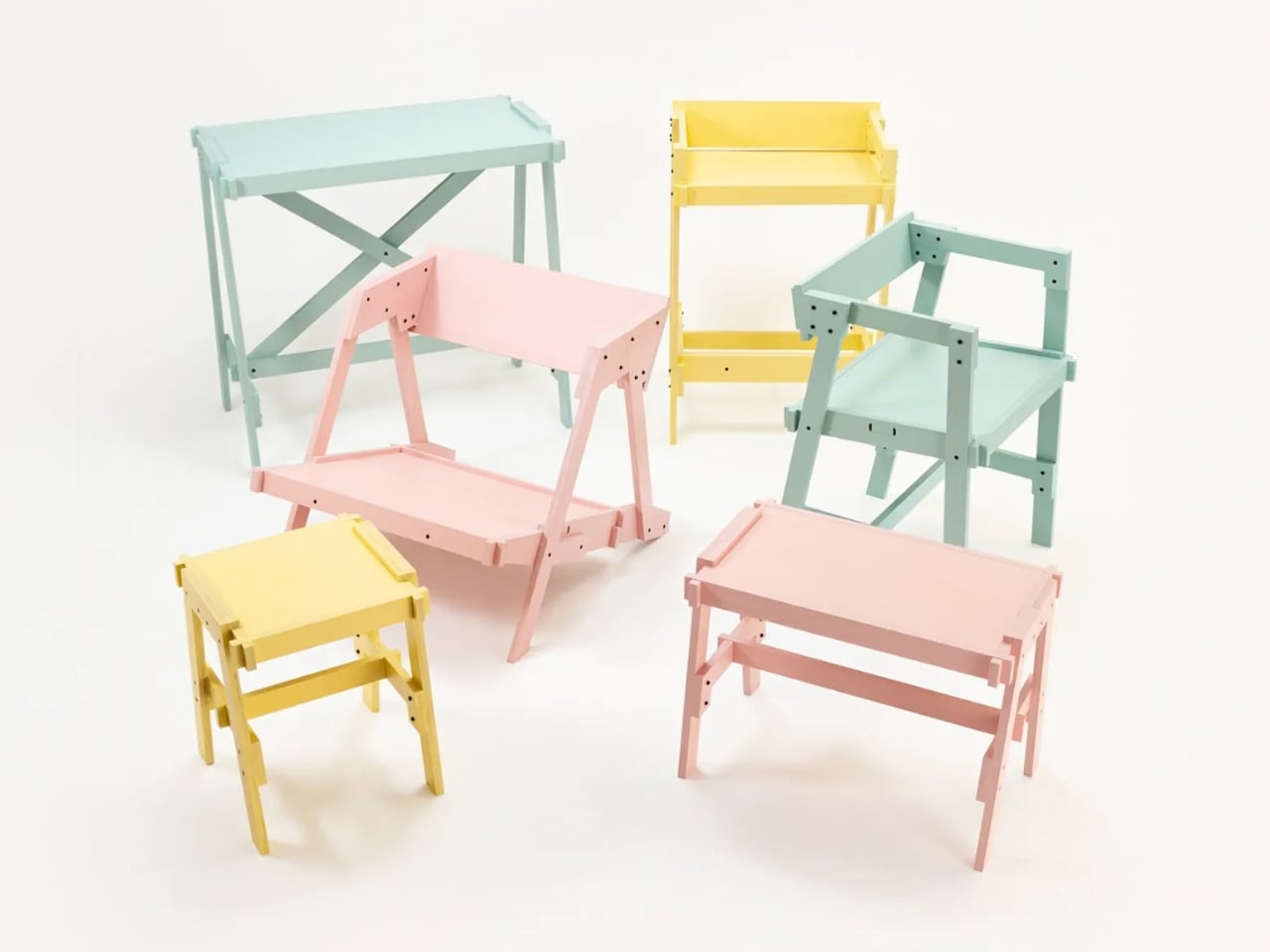
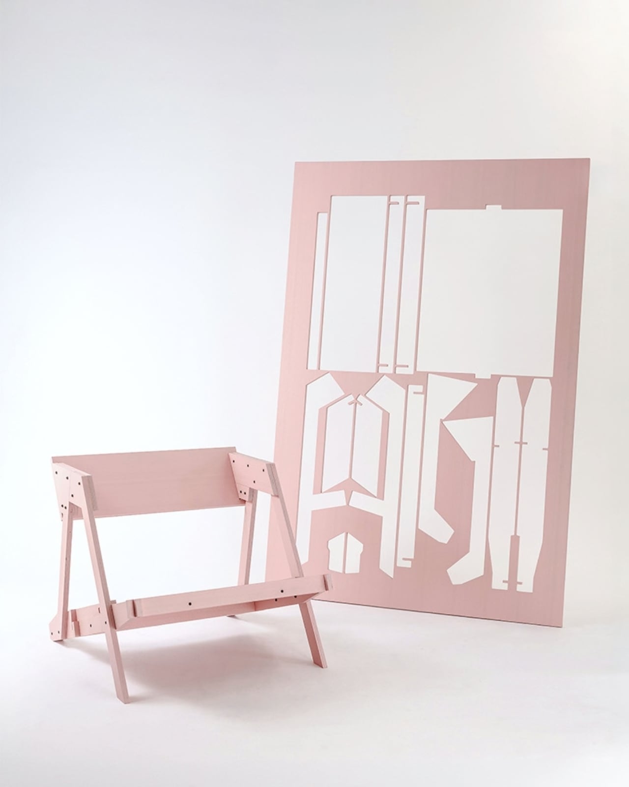
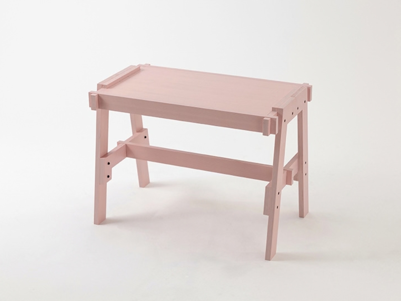
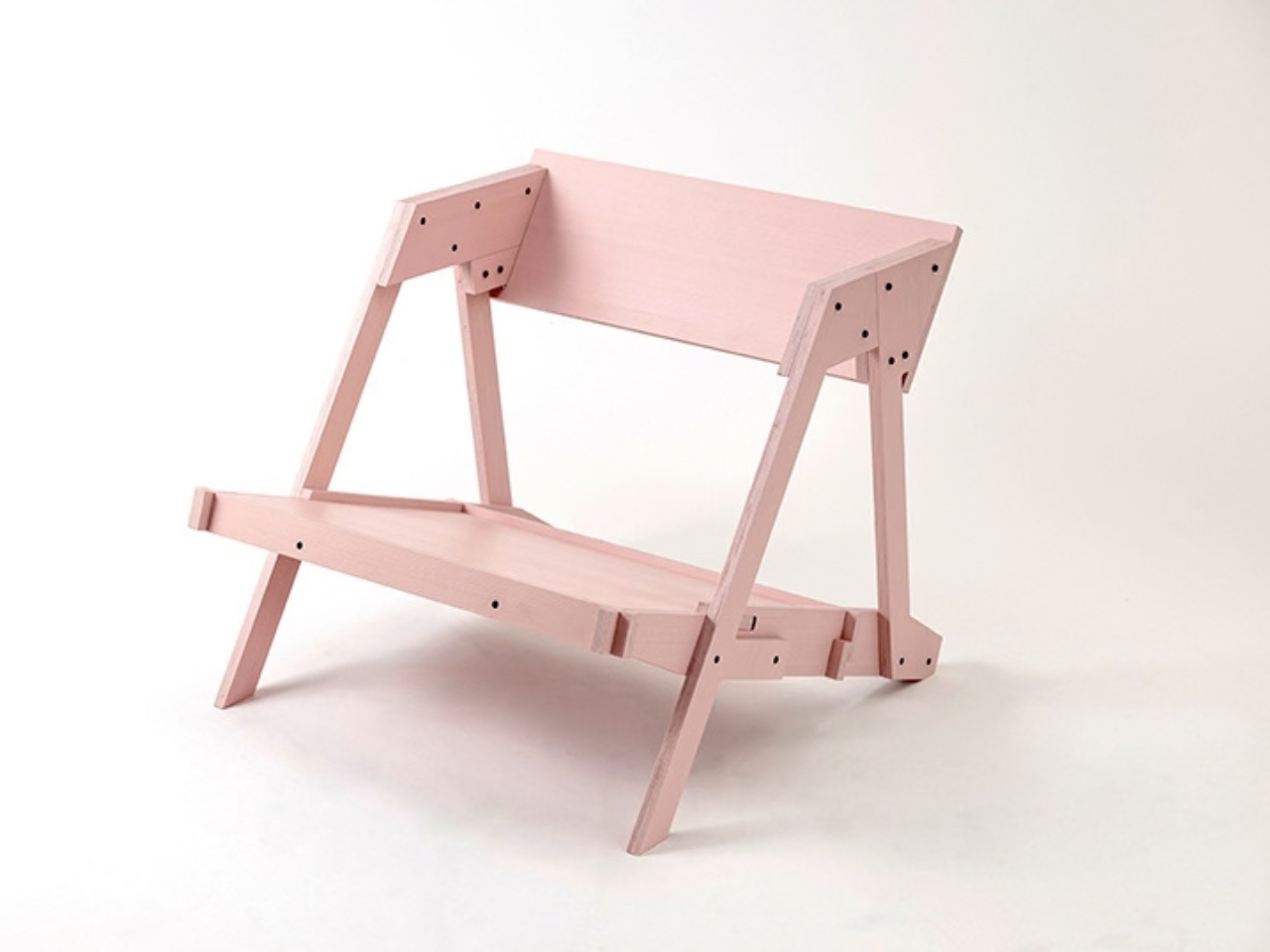
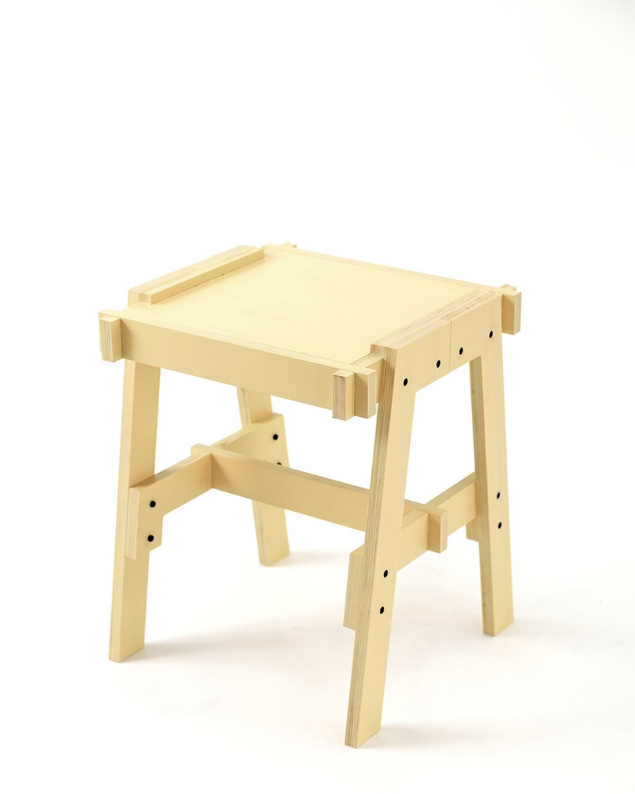
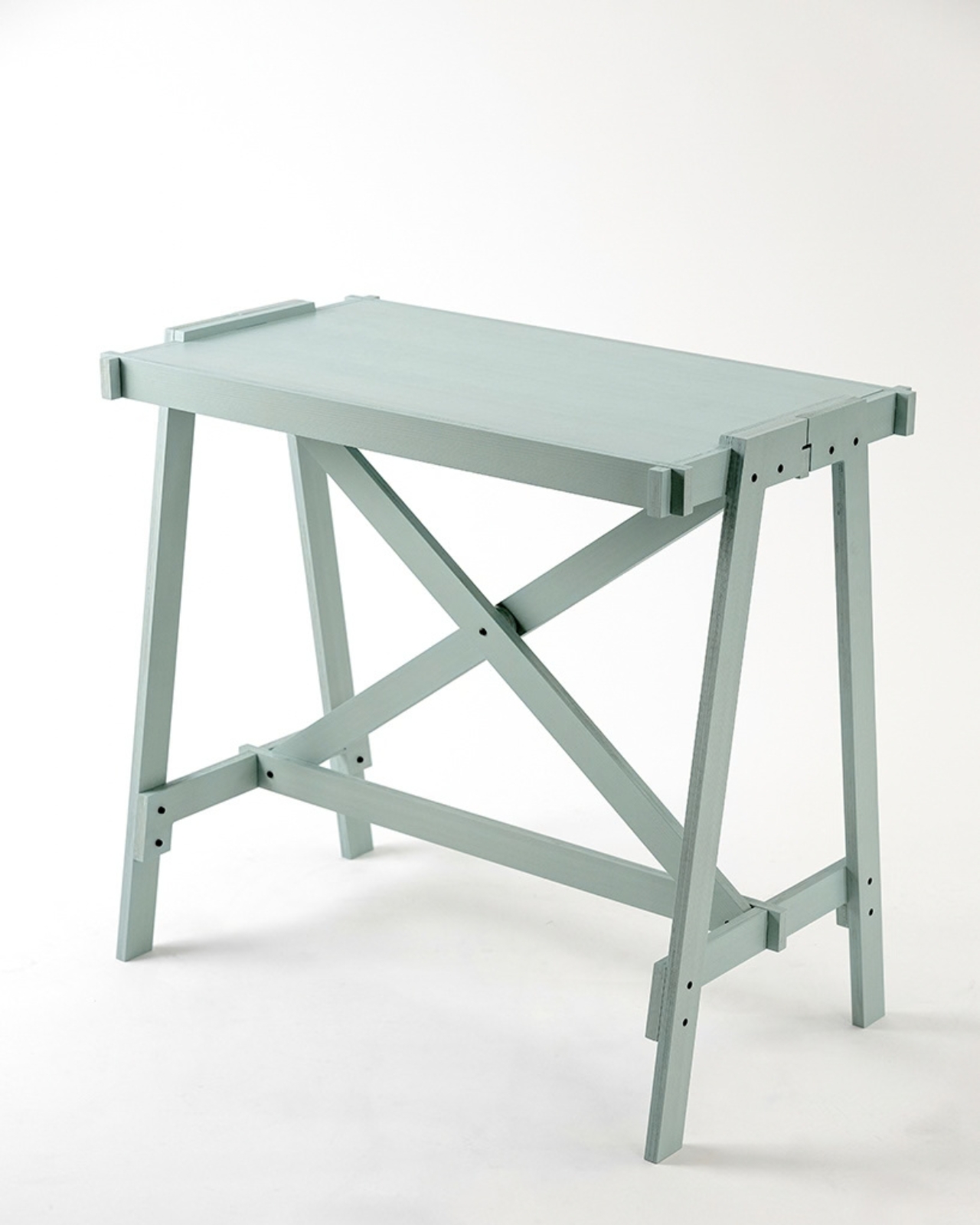
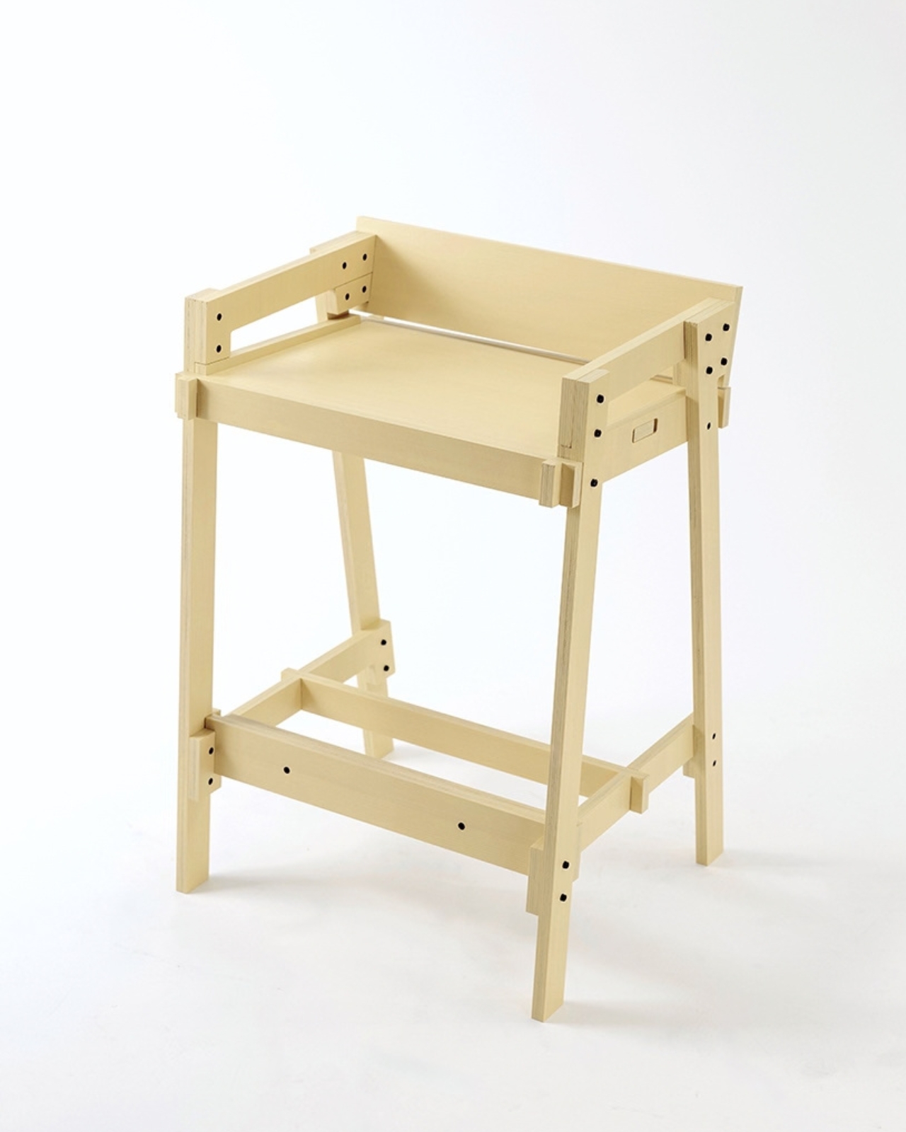
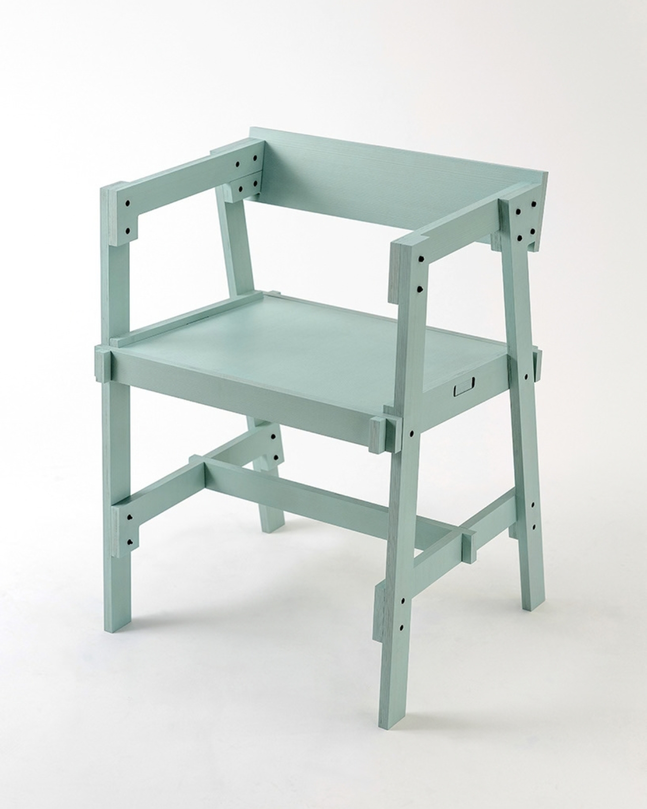
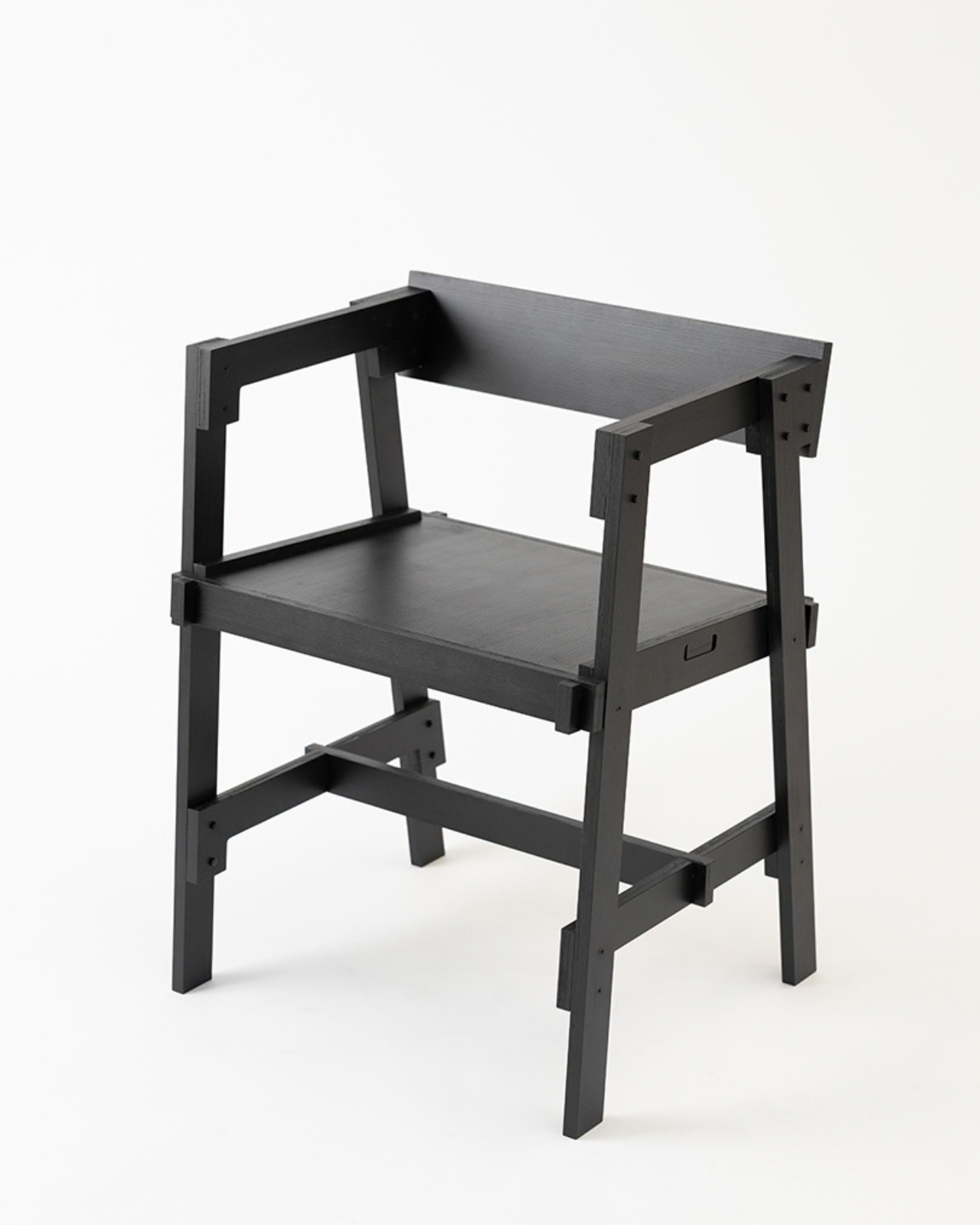
Flat-pack furniture is easy to appreciate on the day it arrives. It fits through the door, and you can usually put it together without much help. The harder test comes later: can it survive a move, come apart cleanly, or be repaired when something goes wrong? FLAT/FORM, a collection by designer Satoshi Itasaka of h220430, is built around those questions. Its pieces use bolts and nuts so they can be assembled, disassembled, repaired, and transported again.

That might sound like a modest ambition, but it changes how I look at the furniture. A dining chair is rarely a one-time purchase for a single room. It may follow you through different apartments, sit beside several tables, and get carried up more stairs than you care to count. FLAT/FORM treats that ongoing life as part of the design brief, rather than leaving it to chance after the first assembly.

Designer: h220430

The material gives the project its character. FLAT/FORM uses 15-millimeter-thick veneer panels made from Japanese cedar trees more than 100 years old, with timber supplied by Miyazaki-based forestry company GROWTHRING. A dining chair and a low table are among the pieces in the collection. Both start from flat panels, a straightforward idea that lets the wood grain do some of the visual work while the construction remains easy to understand.

I like that balance. The collection does not try to disguise how it is made. Its flat planes and visible connections make assembly feel like a considered feature, not an awkward step between opening a box and enjoying the result. That distinction matters because a piece can be visually quiet without feeling anonymous. Here, the simple construction gives the furniture a recognizable point of view, while leaving room for the cedar to be the thing you notice first.

The choice of older cedar also invites a little care in how we talk about the project. Wood with a compelling history does not automatically make a product sustainable, and a furniture collection cannot solve every problem associated with consumption. What FLAT/FORM can offer is a more specific proposition: furniture intended to come apart, travel, and be repaired instead of being treated as finished when its first arrangement stops working. That seems more useful to me than a sweeping environmental promise.

There is a practical kindness to that approach. Moving is already expensive and tiring; furniture should not add a puzzle you are afraid to solve twice. Bolts and nuts are familiar hardware, and the collection’s assembly system is intended to make disassembly possible. None of that guarantees that every move will be effortless. It does mean the designer has acknowledged that people relocate and rearrange their lives, and that a chair ought to have some chance of keeping up.

I would still want to sit in the dining chair before making any grand claims about it. Photographs can tell you plenty about proportion and material, but not how a seat feels through a long dinner. Nor does an elegant assembly concept tell you what the collection costs or how its surfaces will age in a busy home. Those are fair questions for any furniture meant to last, particularly furniture whose appeal rests partly on the idea of keeping it around.

Even with those questions open, FLAT/FORM feels refreshing because it gives flat-pack design a different priority. Convenience at delivery is helpful, but convenience at every stage afterward may be the better measure. A table that can leave one home and settle into another without becoming a burden has a value that is easy to overlook when shopping by appearance alone. Itasaka’s collection makes that overlooked part of ownership visible.

Perhaps that is the quietest, strongest idea here: furniture should be allowed to have a future. FLAT/FORM does not need to look complicated to make that point. It uses flat cedar panels and ordinary fasteners to ask a sensible question of a familiar category: what if getting a piece into your home were only the beginning of a good design? That is a question worth asking before the next box arrives at the door.

The post Flat-Pack Furniture That Actually Survives Your Next Move first appeared on Yanko Design.

  •  

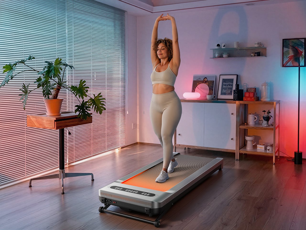
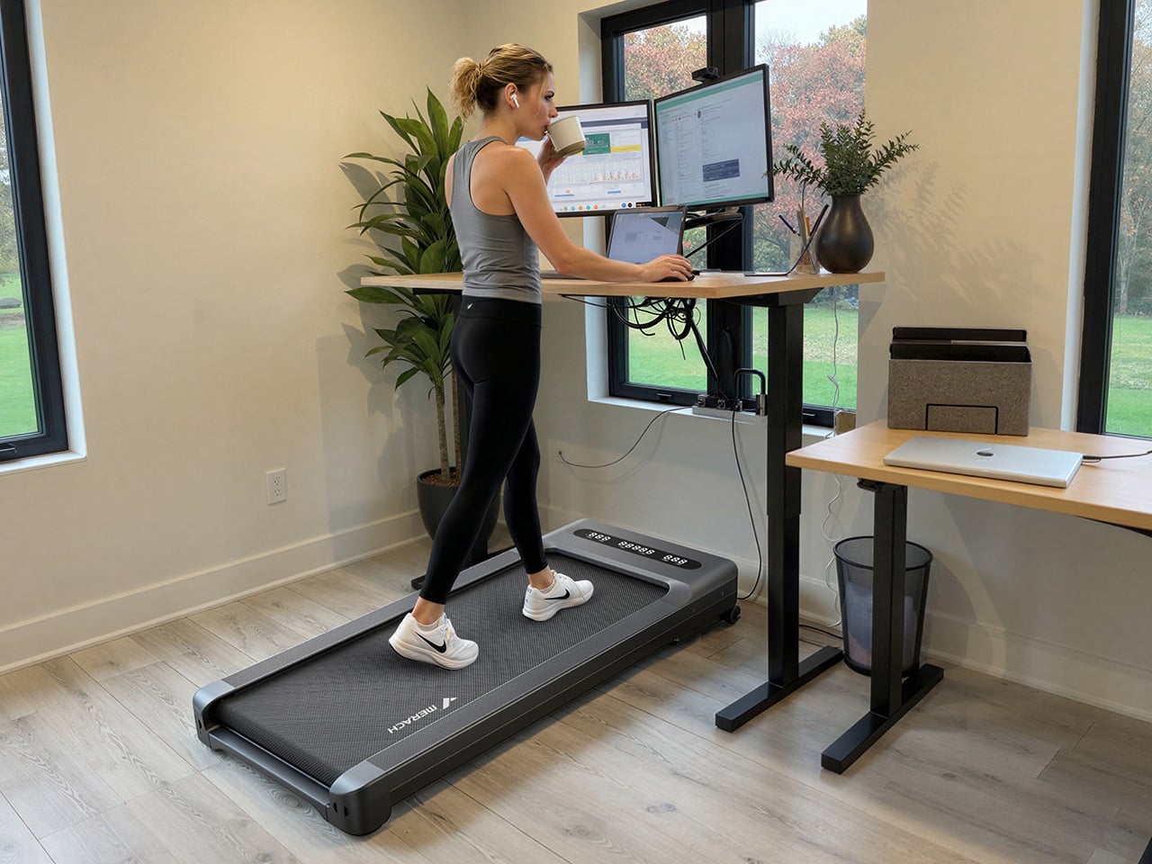
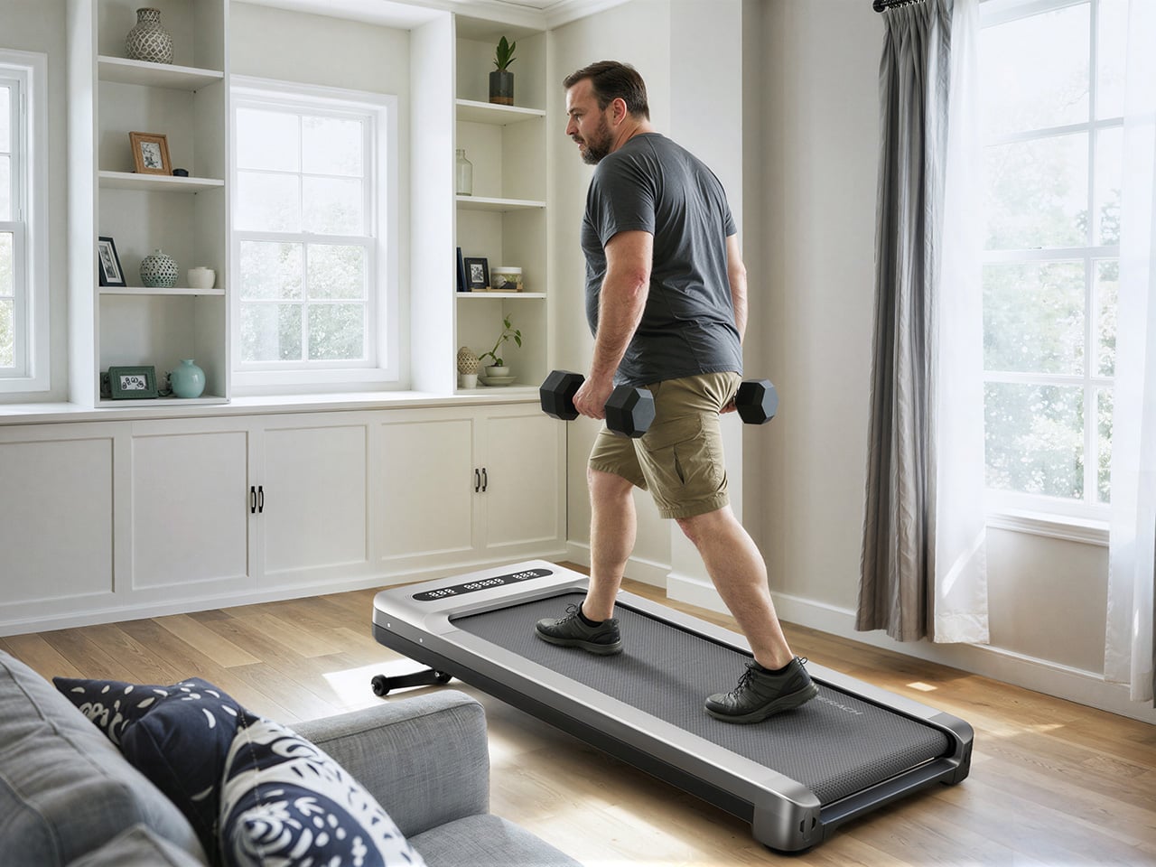
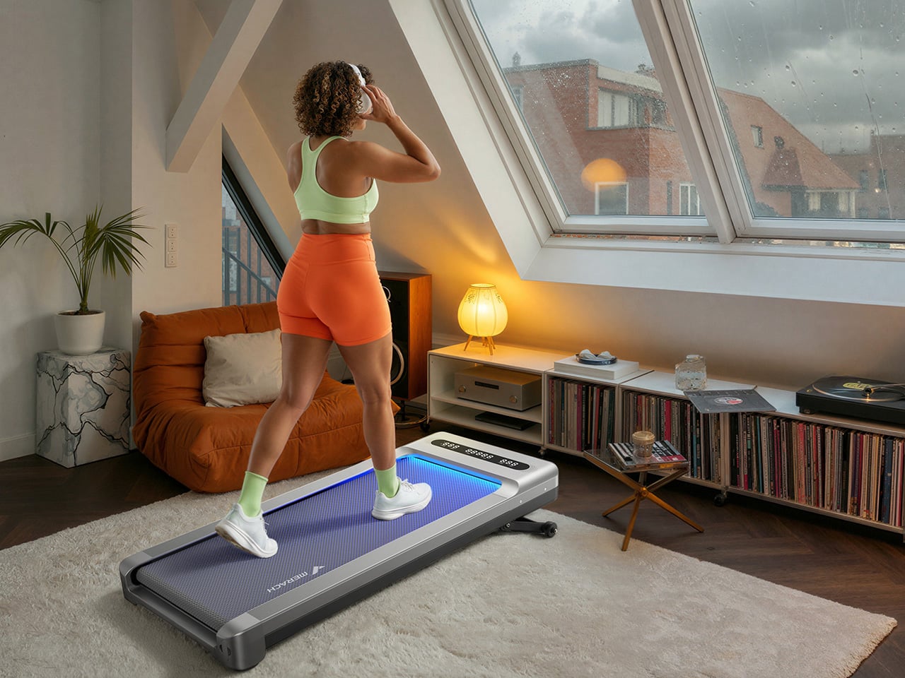
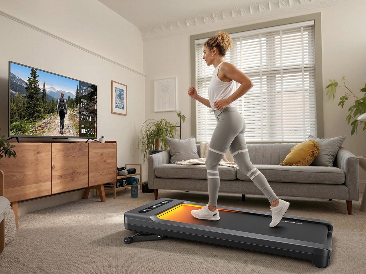
MERACH’s new W60 Plus walking pad boasts 12 incline levels, RGB lights, and a built-in Bluetooth speaker

The under-desk treadmill had its moment, arriving as the perfect sidekick for our sudden work-from-home lives (can you believe it’s been six whole years?). It was the simple, brilliant answer to hitting a step count between calls and emails, and products like the original WalkingPad and the WalkingPad S1 were among the early heroes of that era. We all got one, or knew someone who did, turning home offices into miniature gyms where productivity and light cardio could finally coexist. The problem was that a lot of those machines, true to their budget price tags, started dying after six months of use. Walking pads got a reputation for being disposable, which was a shame, because the core concept was always worth taking seriously.

The UltraWalk W60 Plus is the clearest expression of what MERACH is building toward: a walking pad engineered with permanence at its core. When we caught the brand at IFA 2026, their first major trade show appearance despite an already loyal following built through e-commerce, the walking pad lineup stood out for build quality at a price most competitors couldn’t match. The W60 Plus has 12 automatic incline levels, a third-party SGS-certified motor, and a weight capacity that would make a full-size treadmill raise an eyebrow. Mood lighting and a Bluetooth speaker come along too, which sounds ridiculous until you realize how much more likely you are to use a machine that’s genuinely fun to be around.

Designer: MERACH

Click Here to Buy Now: $288 $499.99 ($211.99 off, use coupon code “MERACHW60”). Hurry, deal ends in 48-hours!

A 3.5 HP Brushless Motor, SGS-Certified Performance, and a Frame Rated for 330 Lb

The W60 Plus runs on a 3.5 HP peak / 1.25 CHP brushless motor with a 42mm diameter and a Hall sensor for precision feedback. Brushless motors are generally more efficient and longer-lasting than brushed ones, and MERACH claims a lifespan of up to 15,000 hours here, which the brand puts against the 300 to 800-hour lifespans typical of budget walking pad motors. The weight capacity sits at 330 lbs under SGS-certified testing conditions. The heavy-duty steel frame doesn’t wobble under a real walking load, which matters more than most spec sheet comparisons. That stability is what separates a machine you’ll want to use from one you’ll come to resent.

The W60 Plus passed SGS’ performance specs evaluation with flying colors. The noise testing came back at under 54 dB at medium speed with a 75 kg test load, which sits comfortably below the ambient volume of a normal conversation. At maximum speed that figure climbs to 60 dB with load, and 55 dB without, meaning the machine stays apartment-friendly even when it’s working hard. There’s also a one-touch mute function for those moments when you absolutely need silence (hello, important video calls). That noise profile lets you walk and watch TV simultaneously without either experience suffering, which is, honestly, the whole point of this category.

Twelve Auto-Incline Levels, a 16.5-Inch-Wide Deck, and a Speed Range Built for Walking

Twelve levels of automatic incline is the feature that separates the W60 Plus from the flat-and-boring competition, and for a machine in this price tier, it’s genuinely unusual. At the highest setting, it shifts from a gentle recovery walk to something that meaningfully elevates your heart rate, particularly through the posterior chain. The speed range of 0.6 to 4.0 MPH keeps things firmly in walking and light jogging territory, and that 4 MPH ceiling is worth acknowledging: this machine won’t satisfy runners. What it will do is make a 3 MPH incline walk feel like real exercise, which for most desk-workers is entirely the point. Incline transitions between levels automatically and smoothly, a detail that matters when you’re trying to maintain a rhythm.

The running deck measures 16.5 inches wide by 41.3 inches long, which MERACH puts at roughly 33% wider than the category standard. That extra width makes for a more natural gait and stride, particularly for taller users or anyone with broader hips. The non-slip surface handles uphill walking and light jogging without issue, and the length means you’re not constantly worrying about the back edge. Team USA heptathlete Annie Kunz has been using the W60 Plus for active recovery and step accumulation, describing it as a way to “jump on here and there when I feel a burst of energy.” Multi-event athletes log enormous volumes of low-intensity cross-training, and a 12-level incline walking pad fits that workflow more naturally than a flat surface ever could.

Sound-Reactive RGB Lighting, a 5W Bluetooth Speaker, and Triple-Platform App Integration

MERACH’s RGB lighting system reacts to step frequency and syncs to audio rhythm, creating a feedback loop between movement, sound, and visual stimulus that turns a walking session into something engaging. A walking pad that’s boring ends up under the sofa permanently, and MERACH clearly treats engagement as a design constraint, not an afterthought. The lighting pairs with a built-in 5W Bluetooth speaker that fills a home office without headphones, which matters when you’re walking through calls or podcasts. The whole feature cluster borrows from the cozy cardio playbook, acknowledging that for most users, habit formation is a bigger obstacle than physical capability. Make the machine enjoyable to use, and the steps take care of themselves.

Full app integration spans MERACH’s own platform, Apple Health, and Google Fit, with real-time tracking of speed, incline, calories, distance, time, and step count across all three. The MERACH app adds guided routines and custom workout programs, which pushes the W60 Plus into territory where it can coach you through a session rather than simply hosting it. An 8-button magnetic remote handles speed, incline, lighting, mute, start/stop, and program selection, and it docks magnetically to the frame when not in use. The LED display gives you a live readout of key metrics without having to pull out your phone. None of it requires a subscription, which at this price is a genuinely welcome detail.

Zero Assembly, 80 Percent Less Floor Space, and a Price That Makes Sense

The W60 Plus ships fully ready to use: unbox it, plug it into a standard 110V outlet, and step on. No assembly means no instruction booklet, no leftover mystery bolts, and no 45-minute YouTube tutorial that’s supposed to take 10 minutes. When you’re done, the vertical folding support stand lets the machine stand upright, which MERACH says cuts the floor-space footprint by up to 80%. The enlarged front transport wheels make it manageable to move even over carpet, which is where most budget transport wheel designs tend to give up. At 67.7 lbs, the W60 Plus isn’t light, so those wheels are doing real work every time you slide this thing out from under the desk.

The UltraWalk W60 Plus launched on May 26, 2026, and is available now through MERACH’s official website in a Grey finish, with the list price marked at $499.99 and the current sale price at $329.99. MERACH is also offering an extra discount code, MERACHW60, which drops the checkout price to $264.00 with free shipping, a much more aggressive number than this category usually sees for a 12-level auto-incline walking pad. The product page also offers optional accident protection from $29.99. Warranty details are not clearly surfaced in the material provided, so that part is best verified directly on MERACH’s store before publication.

Click Here to Buy Now: $288 $499.99 ($211.99 off, use coupon code “MERACHW60”). Hurry, deal ends in 48-hours!

The post MERACH’s new W60 Plus walking pad boasts 12 incline levels, RGB lights, and a built-in Bluetooth speaker first appeared on Yanko Design.

  •  

This Expandable LEGO Frame System Finally Solves the Collector Storage Nightmare

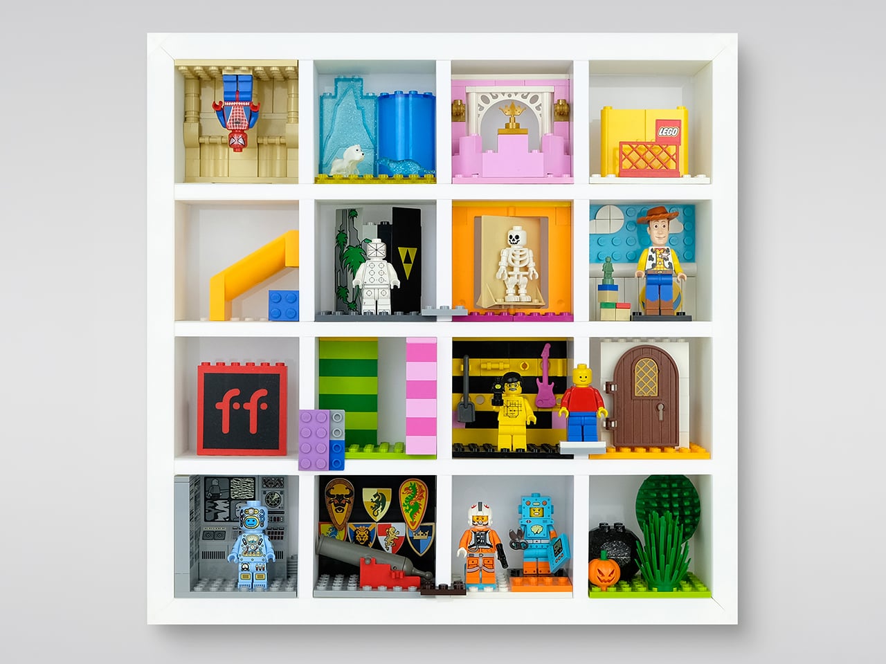
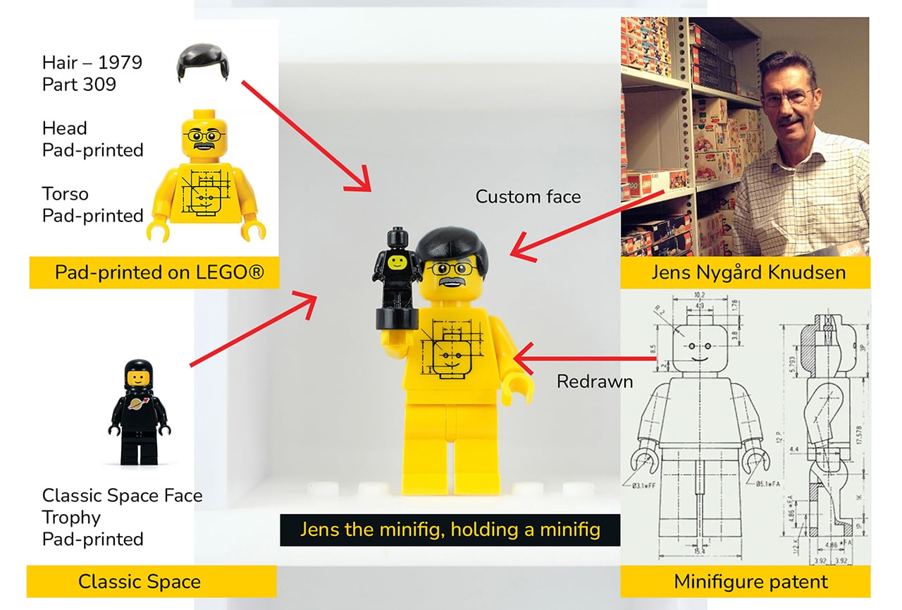
Somewhere in a closet, a perfectly good LEGO minifigure is staring through a plastic bag at the back of a cardboard box. It has a tiny printed face, a surprisingly elaborate hat, and absolutely no audience. Every serious LEGO collector knows the feeling: shelves fill up fast, display cases sell at fixed sizes, and at some point the collection starts living in labeled ziplock bags rather than anywhere it can actually be seen. LEGO has released over 775 Collectible Minifigures across 51 series since 2010, with new figures arriving three times a year, which makes the storage problem a permanent one for anyone collecting seriously. Stephen Peaple, a British-born collector now based in Perth, Australia, had thousands of them and spent four years building the solution he could not find anywhere.

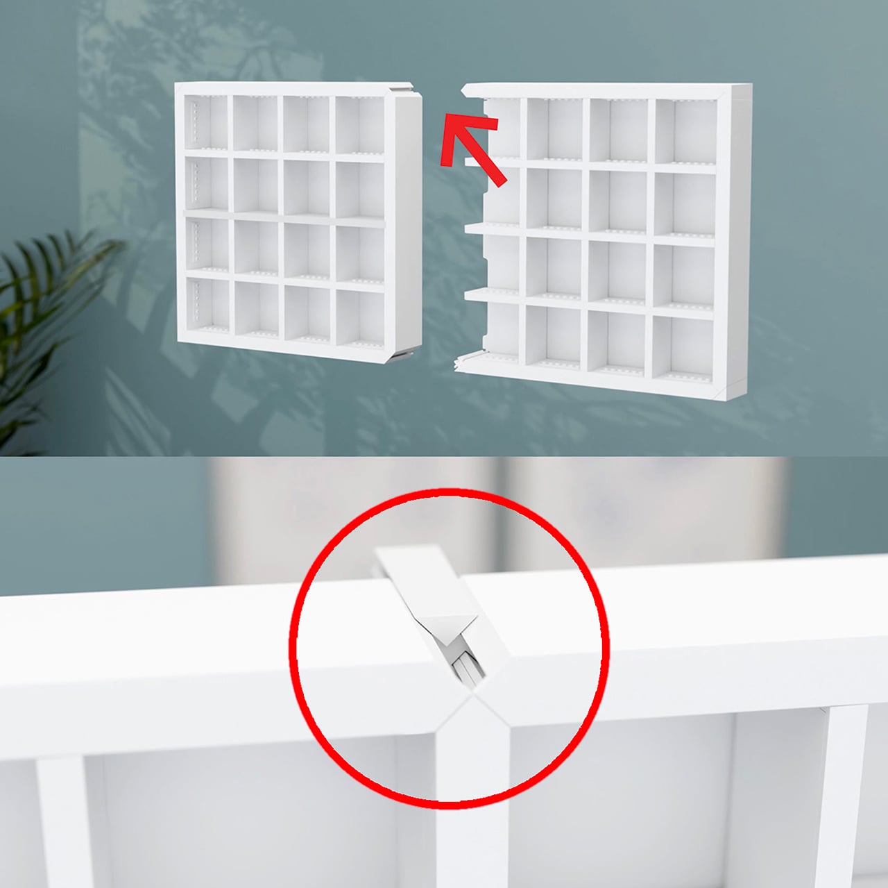
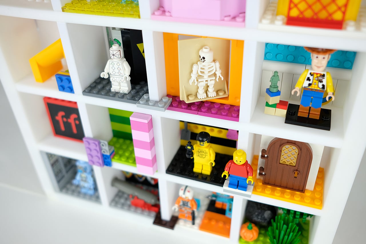
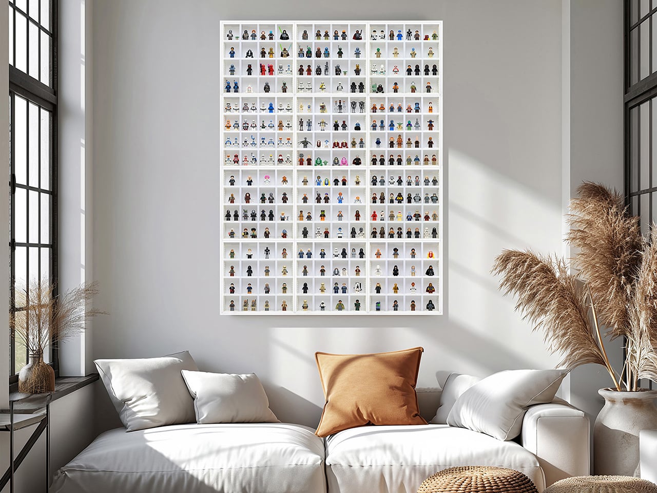
Finity Frames puts a collection on the wall in a clean white grid. A single frame carries 16 spaces, but removable dividers let you make room for bigger figures or pack in a crowd. When the collection grows, connected frames share edges so the display extends as one continuous piece without visual seams or doubled-up borders. Your next minifigure gets a spot without requiring a complete wall makeover. The system is injection-molded ABS, ships flat-packed, and the connection method that makes all of it work is patented.

Designer: Stephen Peaple

Click Here to Buy Now: $55. Hurry, only 5/16 left!

A Display System That Grows With Your LEGO Collection

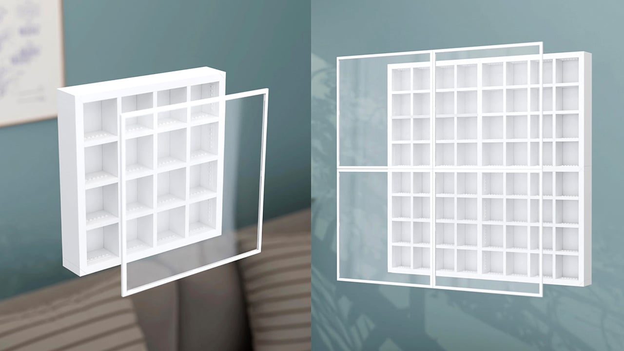
Every Finity Frame is built around a seamless edge connection where neighboring frames share a single border, eliminating the doubled-up edge and any visual gap at the join. This is the core innovation that solves the fixed-size problem inherent in every other display case on the market. It means you can start with a single frame for one series of figures and expand outward in any direction, at any time, without having to replace your original investment. The aesthetic is clean and continuous, looking like a single, cohesive unit no matter how large it gets.

This design approach also makes the system more efficient as it grows. Peaple makes the math explicit: the first frame measures 312mm across, and each connected frame adds just 298mm, because one edge is always shared. This reduces material waste and lowers the cost per additional frame. A 2×2 Collector, for instance, cannot be broken apart into four 1×1 Starters, since it doesn’t include the extra pieces. For context, the most prominent fixed-case competitors max out around 190 minifigures. The Finity Frames Showcase holds 1,056, and two of them together can display over 2,100 figures as a single, unified piece.

Built for Customization and Creative Play

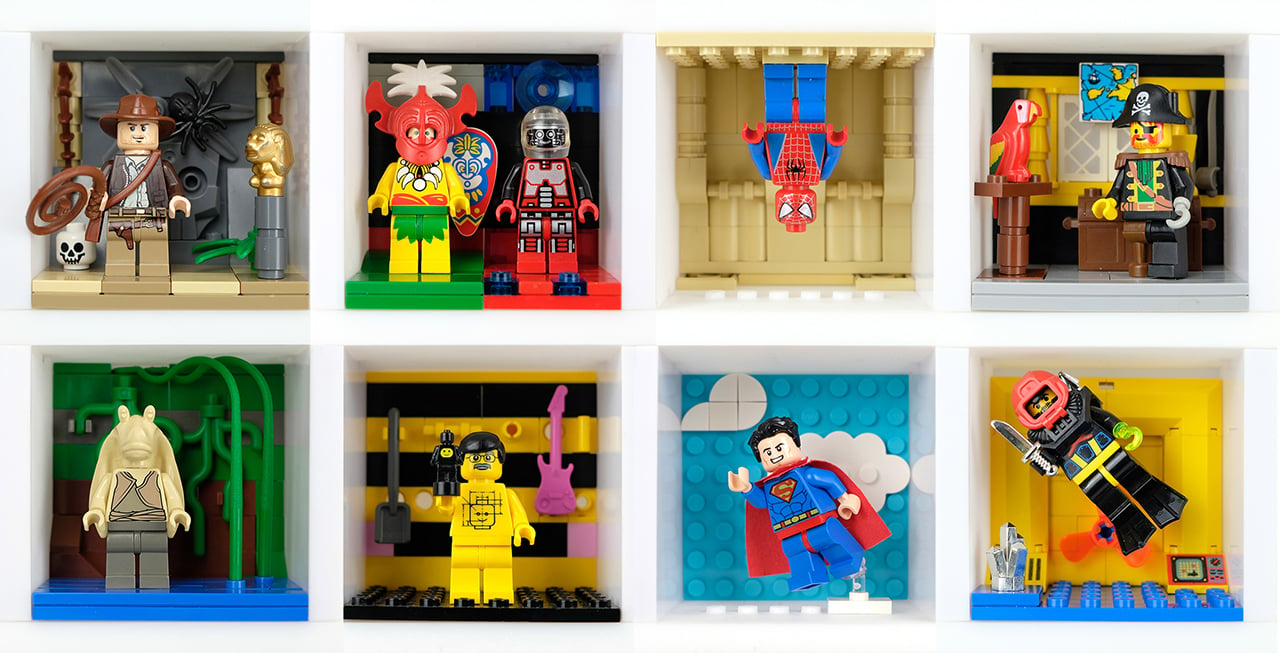
Each Finity Frame ships with three horizontal and three vertical internal slats, forming a standard 4×4 grid. This sixteen-space layout is not arbitrary; it maps exactly to one complete Collectible Minifigures series, which traditionally ships with 16 unique figures. The slats are removable in any combination, yielding 64 different internal layouts. You can pull the vertical dividers out, double-stack figures with jumper plates, and a 1×1 Starter can hold up to 88 minifigures. This flexibility lets you create custom spaces for dioramas, larger vehicles, or oversized figures like the Hulk who need a little extra room.

The system’s dimensions are precisely calibrated to the LEGO System of Play. Internal slats are exactly one brick wide, and the frame edges are exactly two bricks wide. Each compartment accepts a 6×8 LEGO plate or four 3×4 minifigure plates, the same stands that come with CMF packs. This means removing the acrylic cover turns the frame into a wall-mounted baseplate where builds can bridge continuously across spaces and frames. Peaple calls this “bridging,” a feature that turns a static display into a creative canvas. Every horizontal slat even has a built-in row of six studs for securing figures or small builds.

Designed for Collectors of All Kinds

A magnetic Perspex acrylic cover protects the collection from dust and removes in a single pull. It’s made from UV-stable material with built-in absorbers to block harmful light, preventing the slow fading that can damage valuable figures over time. The frame itself is a gallery-white, UV-treated ABS plastic, a color choice meant to disappear behind the collection rather than compete with it. Everything is designed to last, preserving the collection while keeping it easily accessible. The magnetic attachment is secure but quick, so you can get to your figures without fussing with clips or latches.

Flipping the horizontal slats 180 degrees turns the studded surfaces into flat shelves, opening the frame to almost any small-scale collectible. A single 64x64x49mm space can hold Funko Pocket POPs, Be@rbricks, Sonny Angels, or even shot glasses. Removing dividers creates double-height spaces for larger items like vintage Kenner 3¾” figures, Super7 ReAction figures, Playmobil sets, or graded collectible cards in their hard cases. It’s a true cabinet of curiosities, designed for a LEGO collection but adaptable enough for just about anything else that deserves a spot on the wall.

Five Sizes, Starting at $65 USD

The five frame sizes run from the 1×1 Starter at 12.3×12.3 inches (up to 88 minifigures) to the 4×3 Showcase at 47.4×35.7 inches (up to 1,056), with the 1×2 Duo, 2×2 Collector, and 3×2 Lifestyle filling in between. All frames run 55mm deep without the cover, 61mm with, and production units are estimated at 0.9 to 1.1kg for the 1×1 (roughly 2 lbs).

Retail pricing starts at AU$99 (roughly US$65) for the Starter and reaches AU$835 (roughly US$550) for the Showcase. Any size can be extended later through a Frame Extender on finityframes.com, where you input what you already own and order only the additional sets required. The system ships flat-packed globally, with US distribution in place through the manufacturing partner.

Click Here to Buy Now: $55. Hurry, only 5/16 left!

The post This Expandable LEGO Frame System Finally Solves the Collector Storage Nightmare first appeared on Yanko Design.

  •  

5 Best EDC-Style Gadgets Designed to Get You Through Hurricane Season

Hurricane season has a way of exposing which of your belongings are actually useful and which ones just take up drawer space. When the power goes out and the forecast turns ugly, the difference between a stressful night and a manageable one often comes down to a handful of well-designed objects rather than a garage full of supplies.

We pulled together five pieces that cover every real need during an outage, from staying informed to staying lit to staying organized. Each one earns its spot by solving a specific problem without asking you to sacrifice good design along the way.

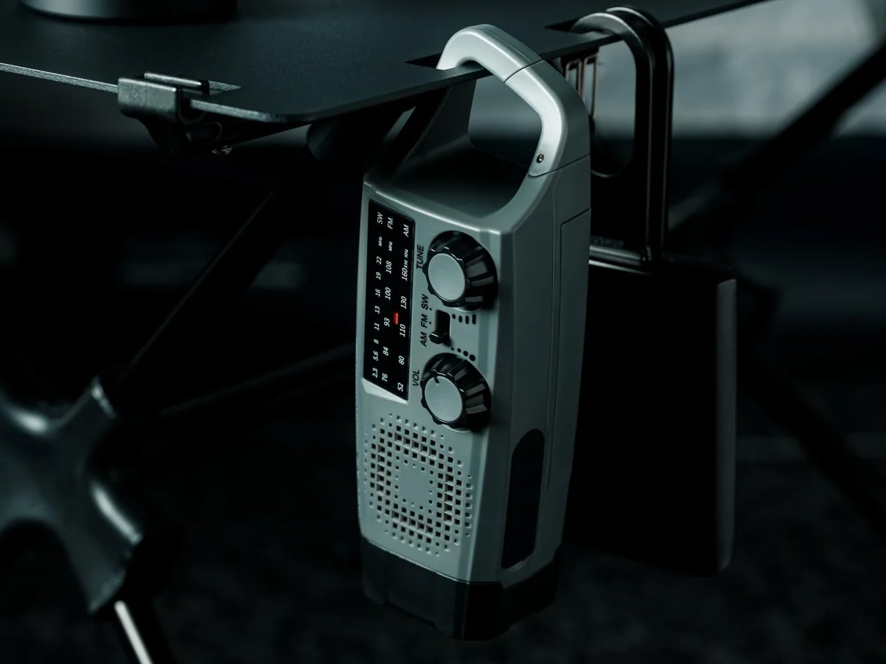
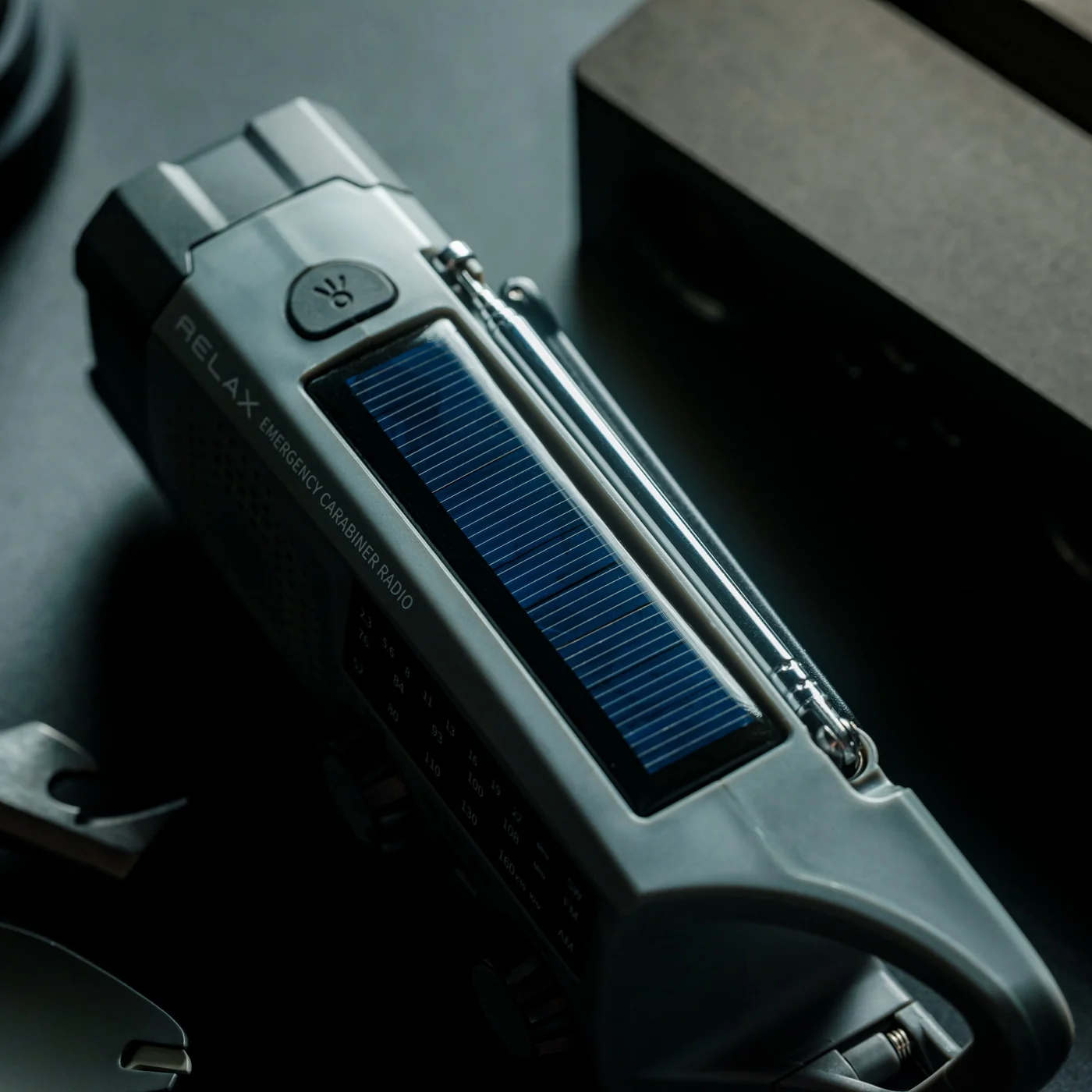
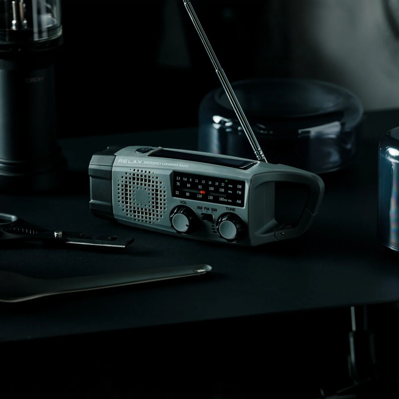
1. Clip&Go Radio

The Clip&Go Radio treats emergency information as something you should never have to search for. Its clip-on form factor means it attaches directly to a bag strap, a belt loop, or a shelf edge, staying within reach the moment a storm warning appears on your phone. It removes the radio from the back of a drawer and puts it exactly where your hand already goes.

For you, this changes what the first ten minutes of an outage actually feel like. Instead of fumbling through boxes for batteries or a charger, you already know where your radio is because it has been clipped to your bag the whole time. That small shift in habit is the difference between calm preparation and last-minute panic when the sky turns dark.

Click Here to Buy Now: $60.00 

What we like:

  • The clip mechanism means it travels with you instead of sitting forgotten until an emergency reminds you it exists
  • Its compact form factor means carrying it never feels like an inconvenience

What we dislike:

  • A clip-on build limits how much space is available for larger speaker components or extended battery life
  • It also means less room for the kind of display or dial controls bigger radios can offer

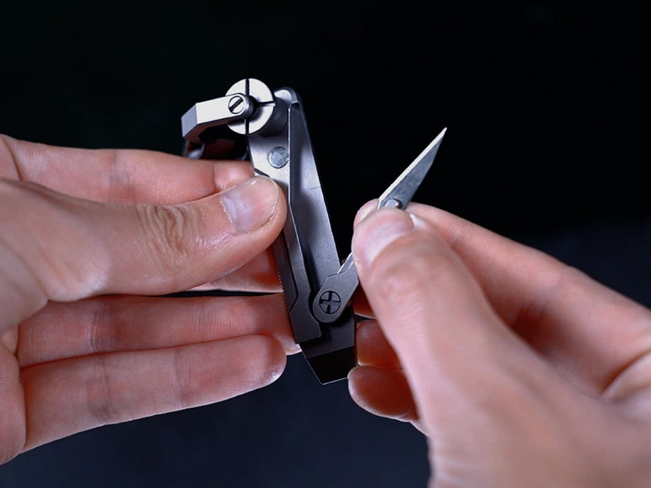
2. JOAT Titanium Multitool

The JOAT earns its name, Jack Of All Trades, by packing six functions into a titanium body just 80mm long and weighing 1.8 ounces. Its keychain loop means it rides alongside your house keys rather than sitting in a toolbox, ready the instant a storm exposes a jammed latch, a loose screw, or a cut strap.

For you, this is the tool that handles the small mechanical failures a storm tends to create without warning. A door that swells shut in the humidity, a tarp that needs tying down, a package that needs opening in a hurry. Because it lives on your keychain, you are never without it, which matters most in the moments you did not think to plan for.

What we like:

  • Titanium construction resists rust and rough handling far better than standard steel builds
  • Its keychain-ready size means it requires zero extra thought about where to store it

What we dislike:

  • At 80mm, it is not built for demanding cutting tasks that a larger blade would handle more easily
  • Some users may miss a locking mechanism that a compact format like this does not include

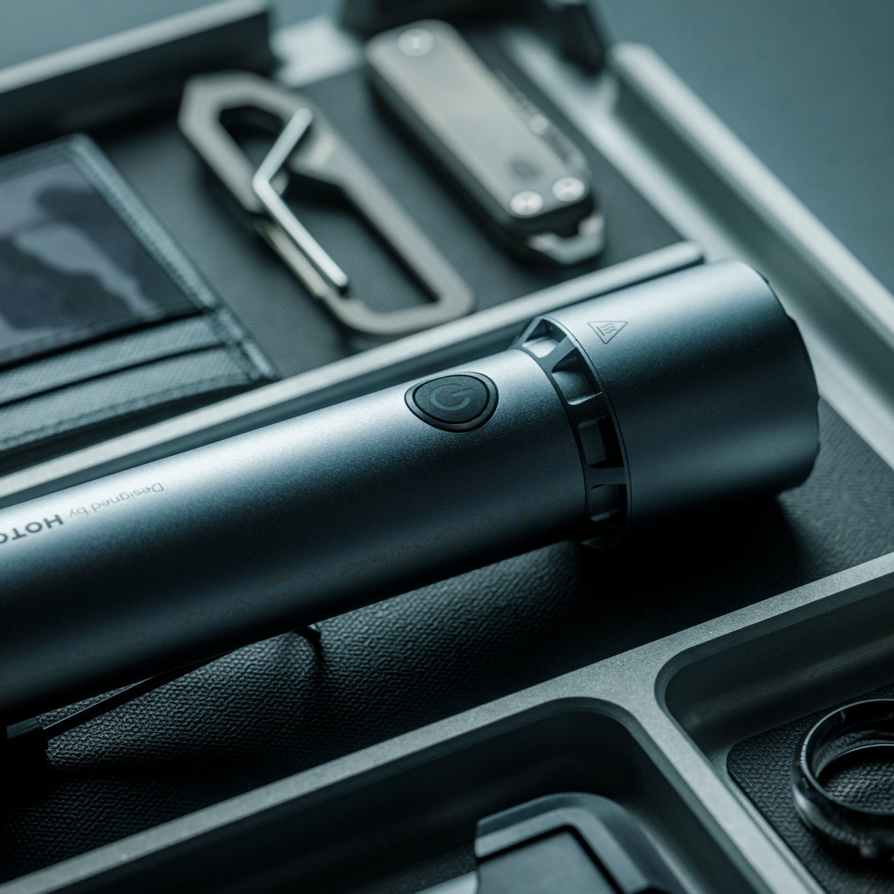
3. Blackout Beam Tactical Flashlight

Light disappears first in a storm and gets missed the most. The Blackout Beam Tactical Flashlight is built specifically for that gap, a rugged beam designed to cut through total darkness rather than the soft glow of a phone screen running on its last bar of battery.

For you, this is about confidence more than convenience. Walking through a dark house to check on a leak, moving through a flooded yard, or signaling for help outside all become far less stressful with a flashlight built for exactly that job. It turns a genuinely unsettling situation into a manageable one, simply by giving you a beam you can trust.

Click Here to Buy Now: $90.00

What we like:

  • Its tactical housing feels built for genuine outdoor and emergency conditions rather than casual bedside use
  • The focused beam design prioritizes distance and clarity over soft ambient light

What we dislike:

  • Tactical styling makes it bulkier and less discreet than a slim everyday carry flashlight
  • Depending on the build, rugged housings can add extra weight to a bag already carrying other gear

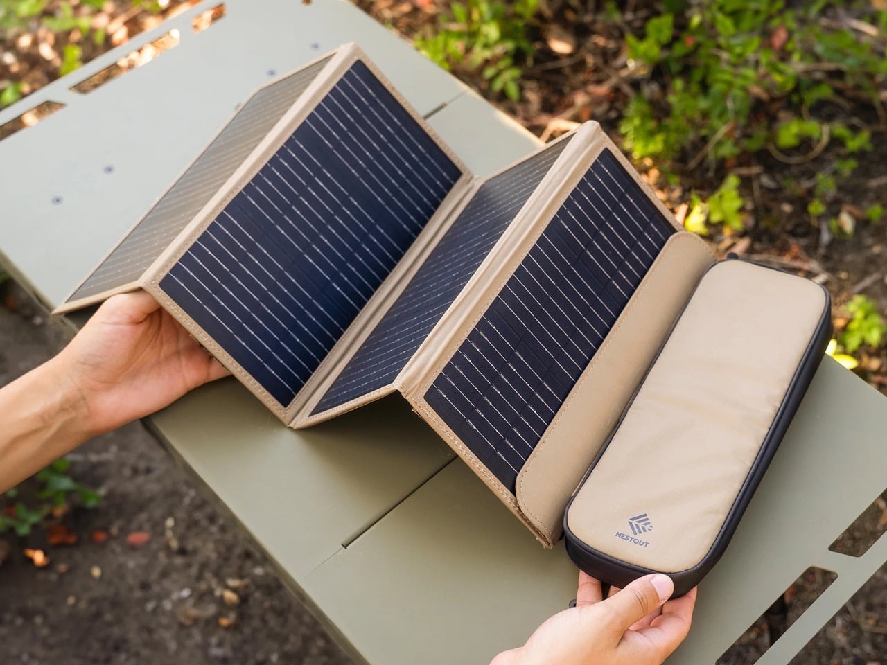
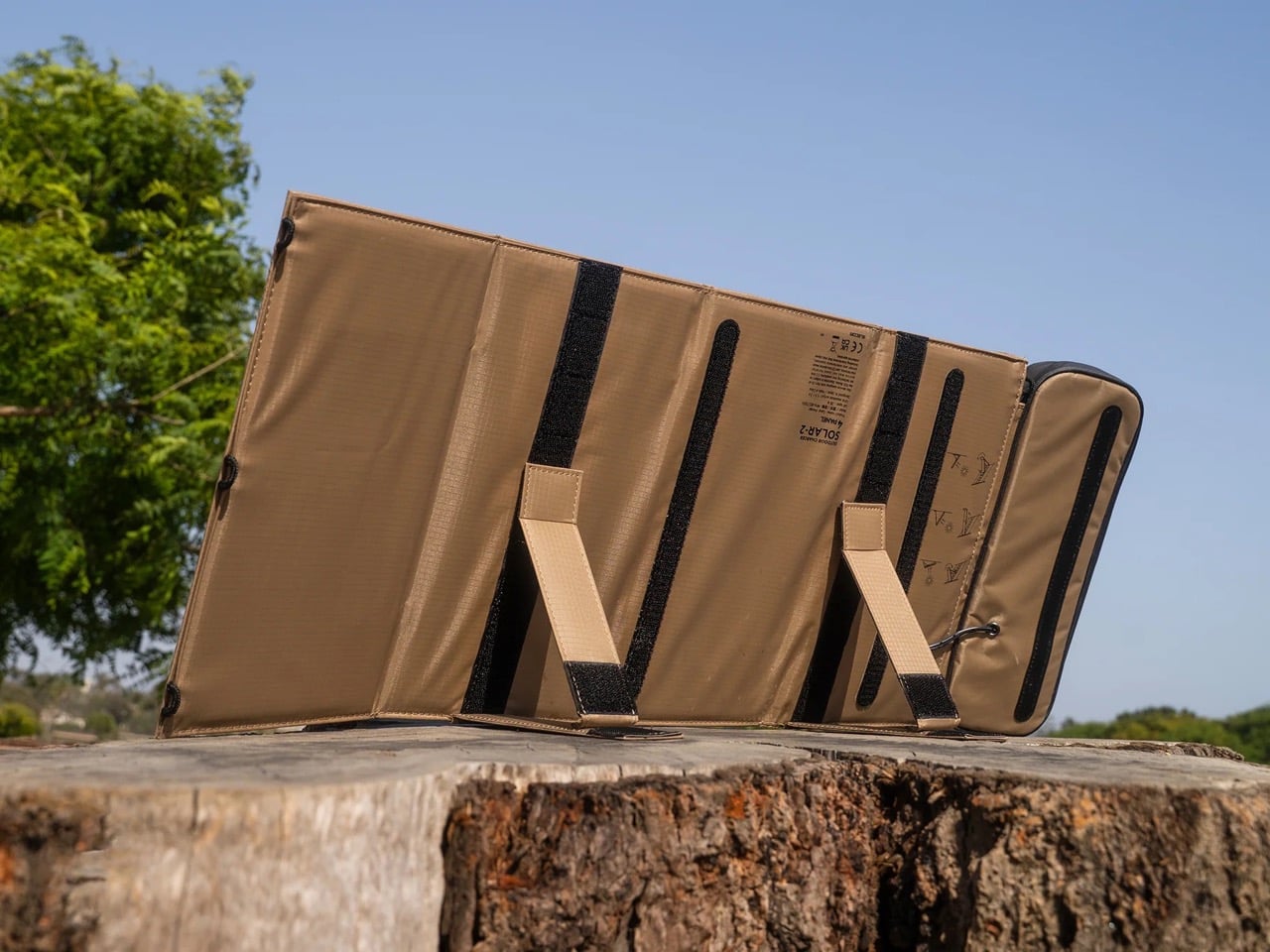
4. NESTOUT Solar Charger

Stored battery power only lasts as long as its charge, but the NESTOUT Solar Charger keeps working as long as the sun does. Its four-panel design folds down into a compact carry format built from rugged, tan colored fabric that feels closer to durable field gear than typical consumer electronics, unfolding into a genuine power source wherever daylight reaches.

For you, this turns a short-term fix into a sustainable one during an extended outage. Instead of watching a power bank slowly drain with no way to refill it, every sunny break in the clouds becomes a chance to top your devices back up. It is the piece that keeps your kit relevant on day three of an outage, not just day one.

What we like:

  • The folding four-panel design packs down small enough to disappear into a bag without adding real weight
  • Its fabric build and neutral tone feel purpose-made for outdoor durability rather than delicate electronics

What we dislike:

  • Solar charging depends entirely on weather and daylight hours, which makes it unreliable during extended cloud cover
  • It also charges more slowly than a wall outlet, so patience becomes part of the process

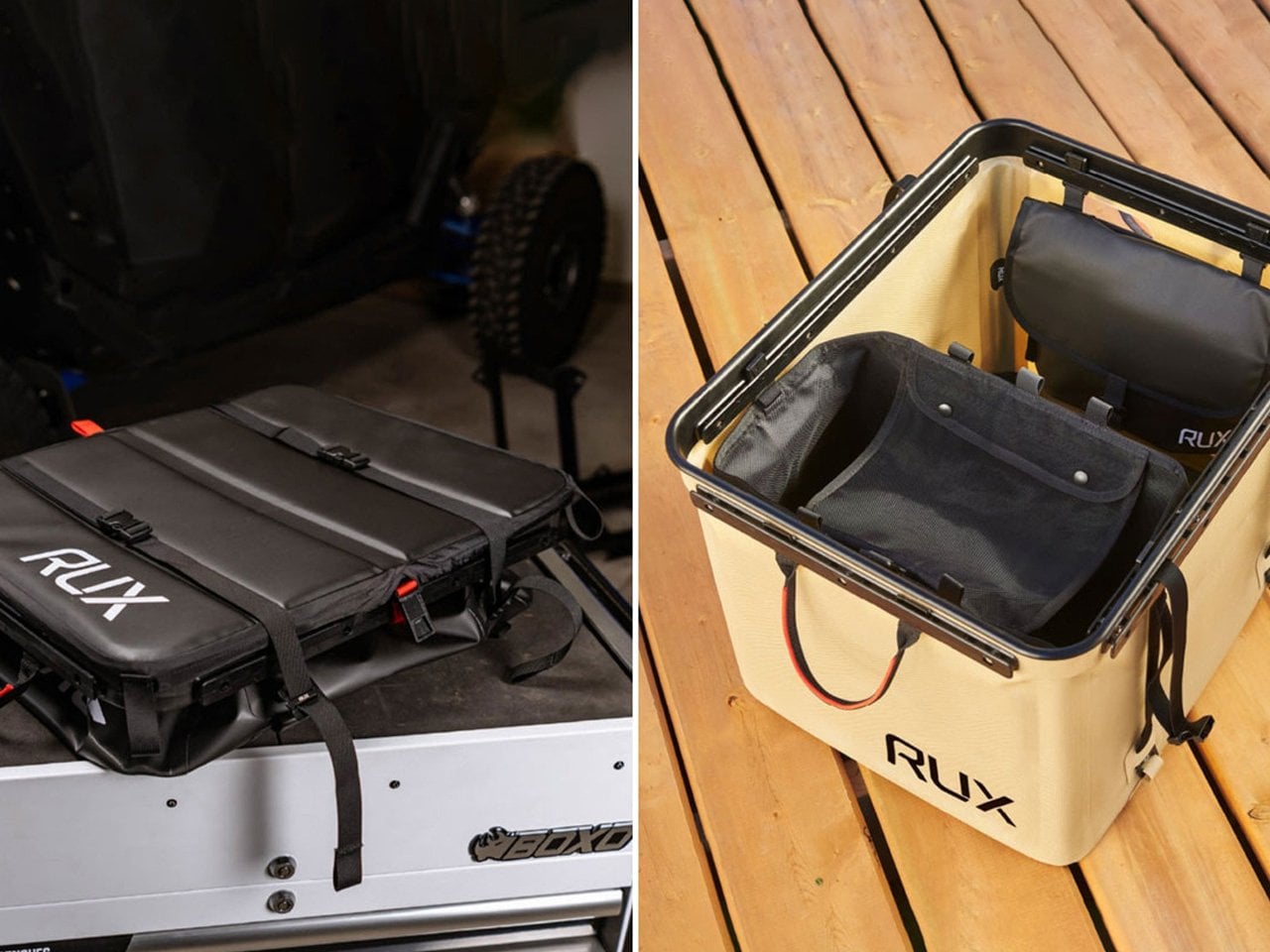
5. Rux Gear Box

None of the gear above stays useful for long if it ends up scattered across drawers instead of ready to grab. The RUX Gear Box solves that with a collapsible body made from TPU-coated nylon that resists weather and wipes clean easily, plus a separate waterproof insert built to keep wet and dry items apart.

For you, this is the piece that turns four individual objects into one coherent system. Instead of hunting for a radio in one room and a flashlight in another while a storm closes in, everything lives in a single box that compresses flat when not in use and expands the moment you need it. It is the difference between a kit and a pile.

What we like:

  • The collapsible design means it takes up almost no storage space until an emergency actually calls for it
  • Its waterproof insert keeps sensitive gear like electronics separated from anything damp

What we dislike:

  • A soft-sided collapsible build offers less rigid protection than a hard shell case would
  • Its flexible material also means it will not stack as neatly as a traditional box-style container

Good Design Doesn’t Skip a Storm

Put together, these five objects cover the four things a real outage actually demands. Information, light, utility, and the power to keep going once the first two days have passed. None of them ask you to sacrifice good design to get there, which is exactly the point.

Hurricane season will keep arriving whether we are ready for it or not, but the objects we choose to meet it with do not have to look like they came from an emergency supply closet. These five prove that being prepared and having good taste were never mutually exclusive to begin with.

The post 5 Best EDC-Style Gadgets Designed to Get You Through Hurricane Season first appeared on Yanko Design.

  •  

After 15 Years, Patek Philippe Returns With a Hand-Wound Chronograph That Stores Energy Like a Bow

Perpetual calendar chronographs are Patek Philippe’s version of a solar eclipse. They do not happen often, and when they do, everyone stops what they’re doing to look up. The last one arrived back in 2011, which in watch years is basically a geological era.

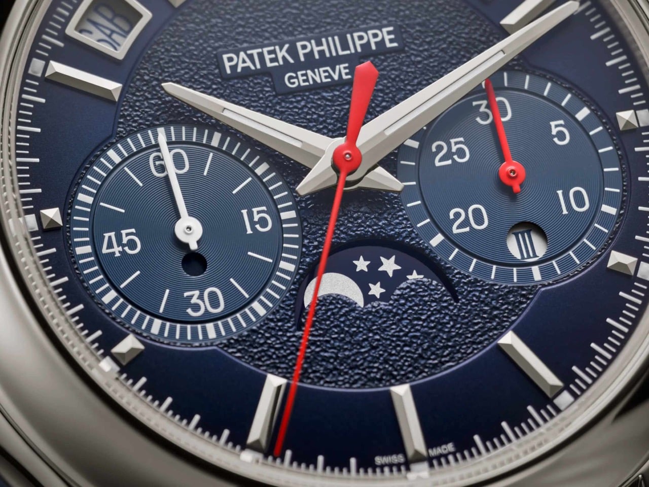
The wait is over, and Patek did not play it safe on the comeback. The new Ref. 5978P-010 is the first watch to combine the brand’s hand-wound chronograph movement with an instantaneous perpetual calendar, a mechanism usually reserved for its most serious grand complications, where every calendar display jumps simultaneously in under 30 milliseconds instead of dragging itself forward at midnight. It debuted at Patek’s seventh Watch Art Grand Exhibition in Milan, limited to 120 platinum pieces at $337,585 each, with a navy dial, red chronograph hands, and calendar text printed in Italian for the occasion. Rare watch, rare city, apparently rare patience too.

Designer: Patek Philippe

The new caliber inside the 5978P-010 is called the CH 29-535 PS QI, a hand-wound movement built from 500 parts. Patek fused two things it already had, the CH 29-535 PS chronograph base from 2009 and the instantaneous calendar module developed for the R CHR 27 PS QI inside references like the 5207, 5308, and 5208. The result is a watch where the day, date, month, leap year, and day and night indicators do not creep forward through the night. Instead, they wait, then snap into their new position together in roughly 30 milliseconds. Even the chronograph’s 30-minute counter gets the same instantaneous treatment, jumping to its next position in one clean motion rather than crawling minute by minute.

Rather than letting a spring slowly push the calendar discs forward, the movement spends hours steadily storing tension, then releases it all at once like a drawn bow. A progressive perpetual calendar can leave a date disc caught mid-flip for a few minutes around midnight, which looks fine until you actually need to read it. This one simply will not do that. The caliber beats at 28,800 vibrations per hour on a Breguet balance spring, and because it is hand-wound, there is no rotor blocking the view, so the full chronograph architecture sits exposed through the sapphire caseback.

The 42mm (1.65 inch) platinum case measures 14.24mm (0.56 inch) thick, with a concave bezel and scalloped lugs lifted from the Calatrava-style cases of the 5208 and 5205, a departure from the ornate shapes Patek usually reserves for this complication. A single diamond sits at 6 o’clock, the hallmark Patek adds to every platinum watch in its catalog. The sunburst navy dial fades into a black-gradient rim around a textured center, with white gold faceted markers and dauphine hands finished in white luminescent coating. Red varnished hands carry the chronograph and small seconds, the only flash of color on the dial. Calendar apertures ring the top of the dial between 10 and 2 o’clock, with the moon phase sitting at 6 and the instantaneous 30-minute counter opposite it at 3.

Patek’s own marketing describes the 5978P-010 as a sporty look timepiece, which is a strange way to describe a platinum perpetual calendar chronograph until you look at it. The navy and red color scheme, paired with a composite strap finished in a fabric weave rather than alligator, borrows more from the Aquanaut than from anything in the formal grand complications catalog. It is not the first time Patek has let its sportier instincts bleed into serious territory. We covered the Cubitus back when it launched, a watch that took the Nautilus’s DNA and reshaped it into something squarer and more divisive. The 5978P-010 is a subtler version of that same impulse, applied to a complication that has spent 85 years dressed for black tie.

The calendar windows on the 5978P-010 are printed in Italian, so Saturday reads SAB instead of SAT, a detail that only makes sense once you know this watch was built for Milan. The strap repeats the gesture in miniature, with a stopping point stitched in the colors of the Italian flag just before the clasp. Patek built the watch for its seventh Watch Art Grand Exhibition, which opened October 2 inside Milan’s CityOval and runs free through October 18. It is one of seven limited editions made for this stop on the tour, a group that also includes enamel-dialed World Time minute repeaters and three carbon-patterned Calatravas in the same tricolore palette. Altogether those seven references add up to 685 pieces, a genuinely small run by Patek’s standards.

There is a catch for anyone outside Italy who wants this watch: all seven Milan editions, including the 5978P-010, sell exclusively through Patek retailers inside the country. Buyers elsewhere wait for one to surface at auction, where past exhibition pieces have historically carried a premium over retail. At $337,585, this was never going to be an impulse buy, and the exclusivity only adds to that. What sticks with me is not the price, it is the choice to dress the brand’s most formal complication pairing in a strap that would not look out of place on a dive watch. Eighty five years after the 1518 started this lineage in stern black and gold, Patek just sent its most serious watch out wearing red sneakers, and somehow it works.

The post After 15 Years, Patek Philippe Returns With a Hand-Wound Chronograph That Stores Energy Like a Bow first appeared on Yanko Design.

  •  

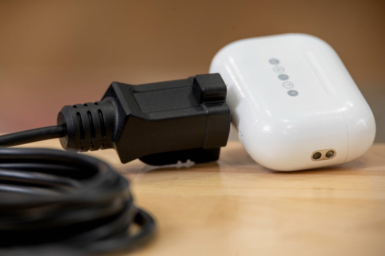
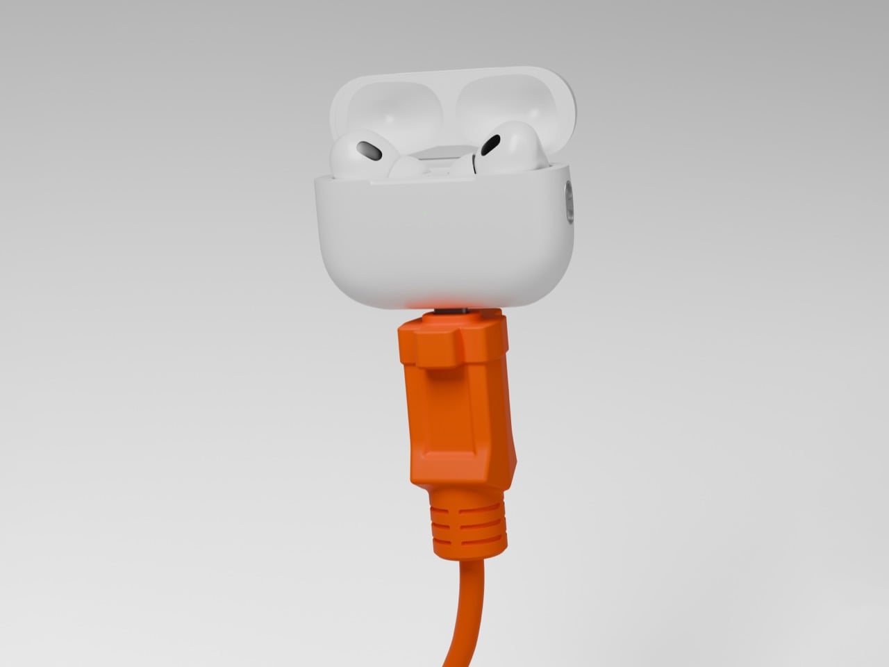
Hilariously Practical USB-C Cable Looks Exactly Like a Construction-Site Extension Cord

There are exactly zero USB-C cables that anyone has ever called beautiful. They come in black, white, or occasionally braided grey, and they all look identical regardless of who made them or what they cost. Pick any of them out of a drawer at random and there is no way to identify the brand without hunting for a logo. They are just cable, featureless and anonymous, which is fine if everything else on your desk is equally low-key. But once you are running a 160W GaN charger that looks like it belongs in a server room, the cable situation starts to feel like it is letting the whole setup down.

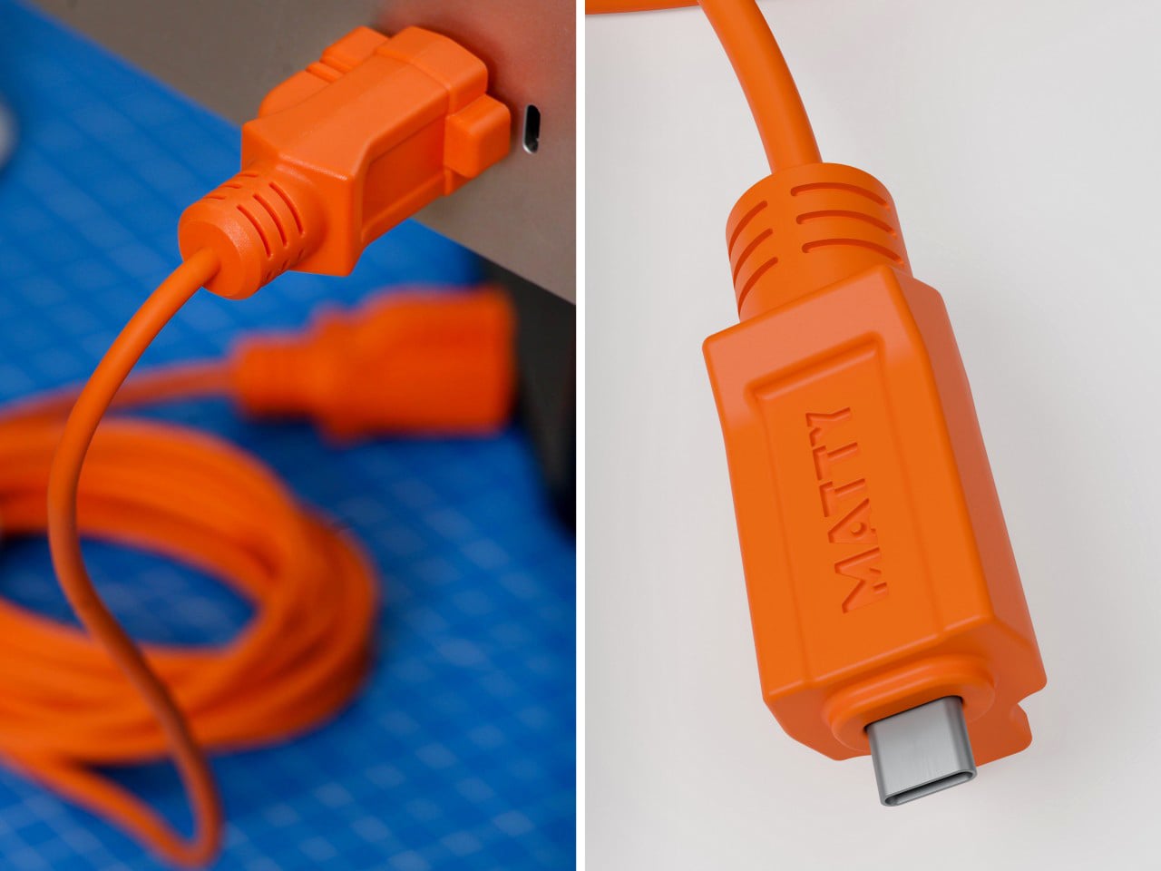
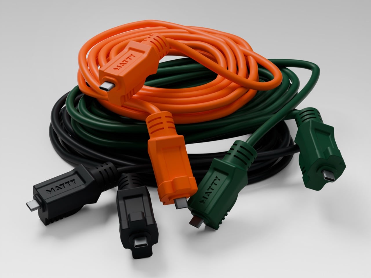
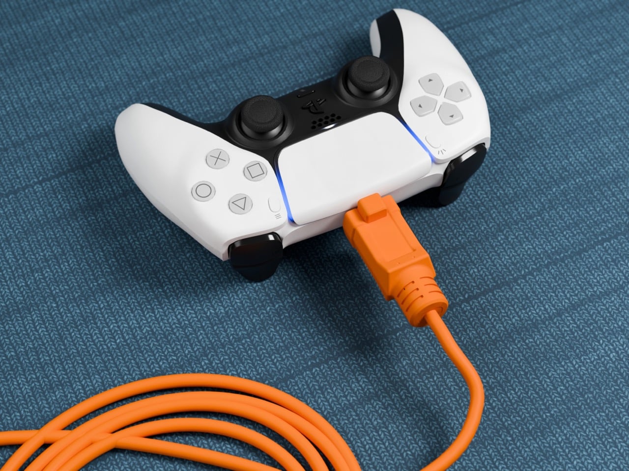
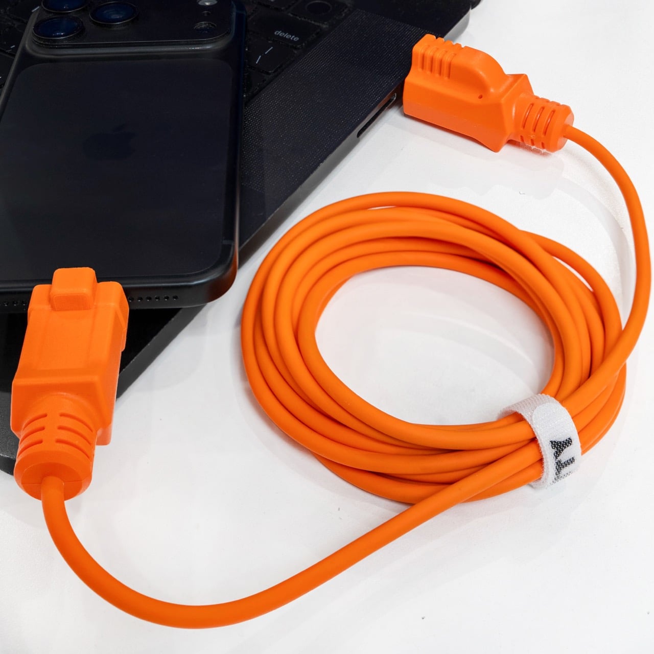
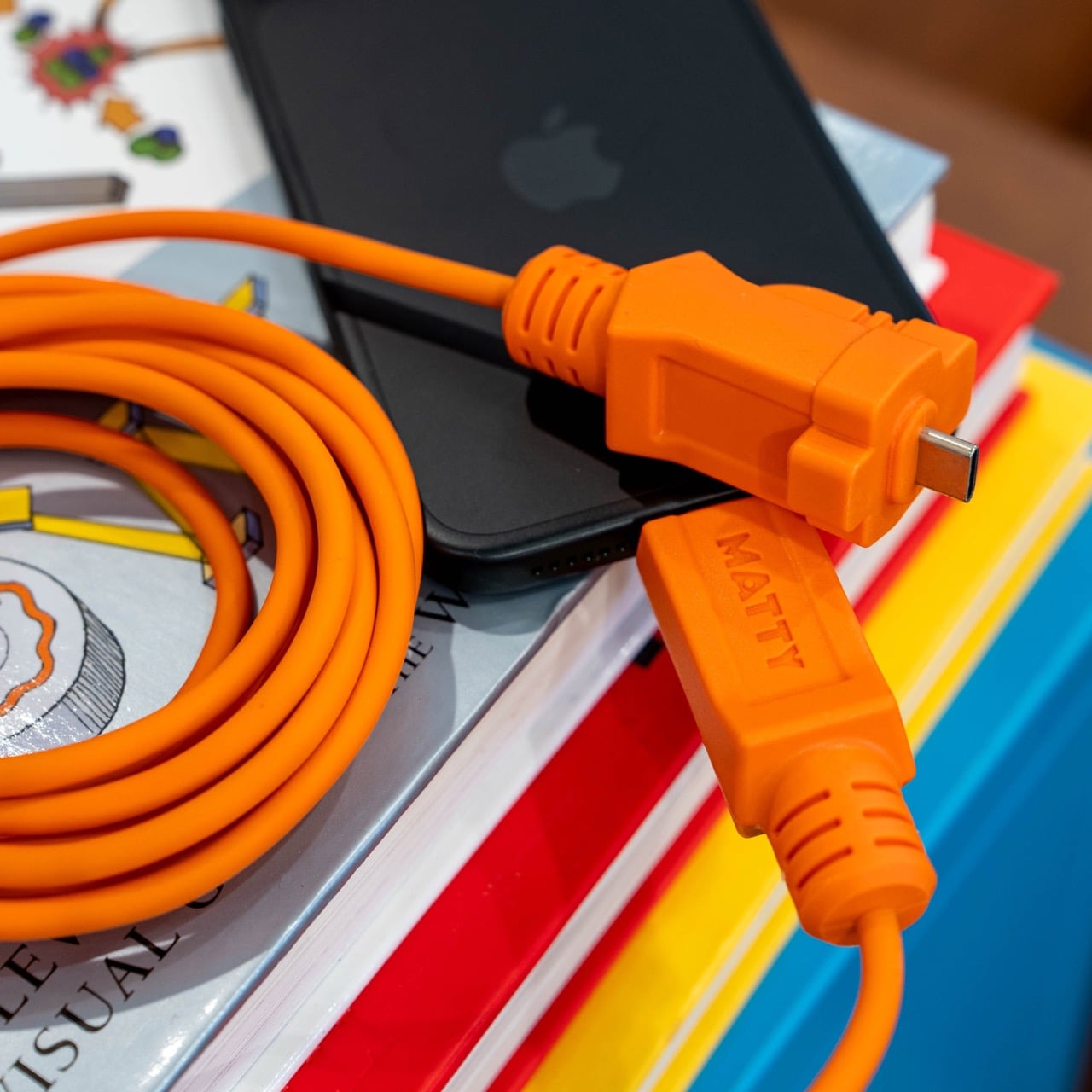
Matty Benedetto has been inventing things nobody asked him to invent since 2019, and this one might be his most wearable idea yet. The Extension-C looks exactly like what the name implies: a proper orange extension cord, right down to the rectangular housing on each end, scaled to USB-C. Ten feet long, rated for 60W charging and data transfer, available in safety orange, outdoor green, and stealth black for $25. Yanko Design has been tracking Benedetto’s work since Unnecessary Inventions first went viral on Instagram, and this is probably the first of his creations where the joke and the product exist in exactly equal measure. It is funny. It also ships.

Designer: Matty Benedetto (Unnecessary Inventions / MATTY)

Each end of the cable is a chunky rectangular housing that calls back to the three-prong outlet plug of a classic American extension cord, scaled down to something that slots into a laptop port but keeps all the visual bulk of the original. The ribbed strain relief detailing running down each housing mirrors what you would expect on actual job-site gear, and it reads as a deliberate design choice rather than ornament. “MATTY” is embossed on each connector cap, and it works because it looks like a certification stamp on real equipment rather than a tech brand inserting itself into the aesthetic. The orange body is thick enough to sell the illusion convincingly. At 10 feet, the cord has actual room to coil the way a real extension cord does, and a 3-foot version of this bit would have landed very differently.

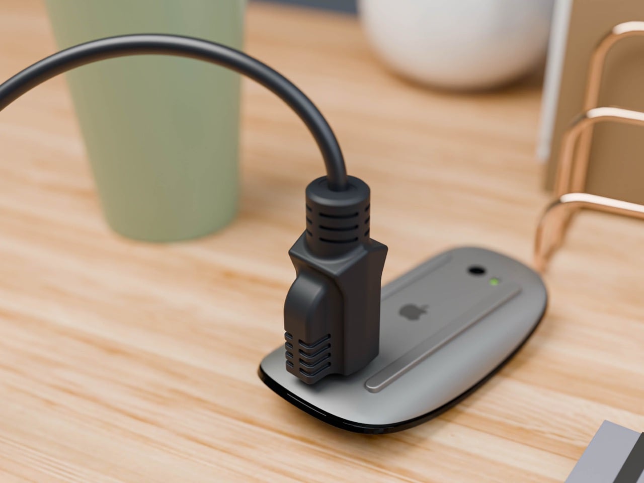
Benedetto has been running Unnecessary Inventions out of his Burlington, Vermont studio since 2019, and the archive now sits at 471 entries. Not every invention makes it to MATTY, the retail arm where purchasable products actually live. The ones that do have typically proven themselves with audiences first and shown enough genuine demand to justify manufacturing. The Extension-C making that cut is a meaningful signal about where Benedetto himself rates this one. We covered his work through several roundups in 2019 and 2020, and revisited it in 2022 when he built a clever fix for the Apple Magic Mouse charging problem. His track record for making absurd things that people genuinely want to own is the most consistent thing about him.

The 60W rating handles most phones, tablets, controllers, and lightweight laptops at full charging speed, covering the realistic daily load on any serious desk setup. Pair it with a 160W GaN charger and the combination has a visual logic that is genuinely satisfying: the charger looks like heavy-duty hardware, and the cable finally looks like it belongs beside it. Safety Orange is the obvious pick for anyone committing fully to the construction-site bit. Outdoor Green makes more sense for a balcony or garden setup where orange would look out of place. Stealth Black drops the gag and keeps the form, and I will predict right now it ends up being the best-seller of the three.

The Extension-C sits at $25, which puts it above the no-name cables that come in 5-packs on Amazon but well below the premium braided options from Anker or Belkin. For what you get on the design side, that is a pretty reasonable trade. There is a broader point buried here about what Benedetto has figured out that most accessory brands have not: cables are so visually forgettable that even a small act of design intention reads as remarkable. The Extension-C is his 471st Unnecessary Inventions entry, and it might be the one where unnecessary and useful finally land in the same sentence without any friction between them. Grab one at thatwasmadebymatty.com, preferably in orange, because going halfway on a bit this committed would be a waste.

The post Hilariously Practical USB-C Cable Looks Exactly Like a Construction-Site Extension Cord first appeared on Yanko Design.

  •  

This 20-Foot Tiny Home on Wheels Proves Better Design Beats More Square Footage

Not every home needs to shout to be heard. Highlands Tiny Homes, based in New South Wales, has built that idea into every corner of the Sierra — a single-level tiny home on wheels that measures just 6 meters in length and does absolutely nothing to apologize for it. It sits on a double-axle trailer and wears its compact footprint like a statement, not a compromise.

The exterior leans into a woodland aesthetic without overdoing it. A pitched corrugated roof, aluminium sash windows, and a considered combination of cladding and Colorbond accents give the Sierra a look that feels rooted — visually grounded in its surroundings regardless of where it’s parked. It’s the kind of exterior that photographs well in a pine clearing or beside a mountain road, reading more like an architect’s bush retreat than a prefab box.

Designer: Highlands Tiny Homes

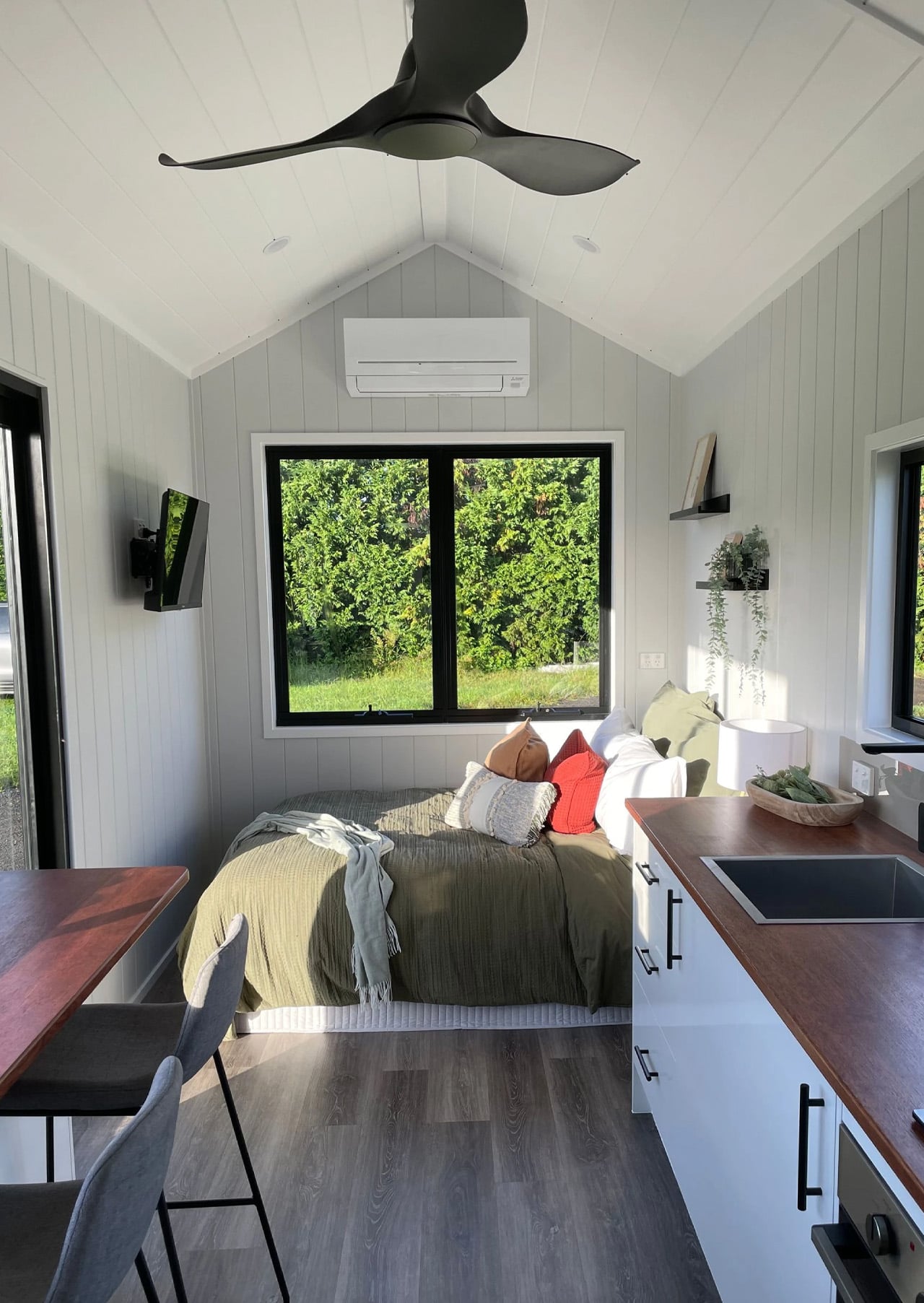
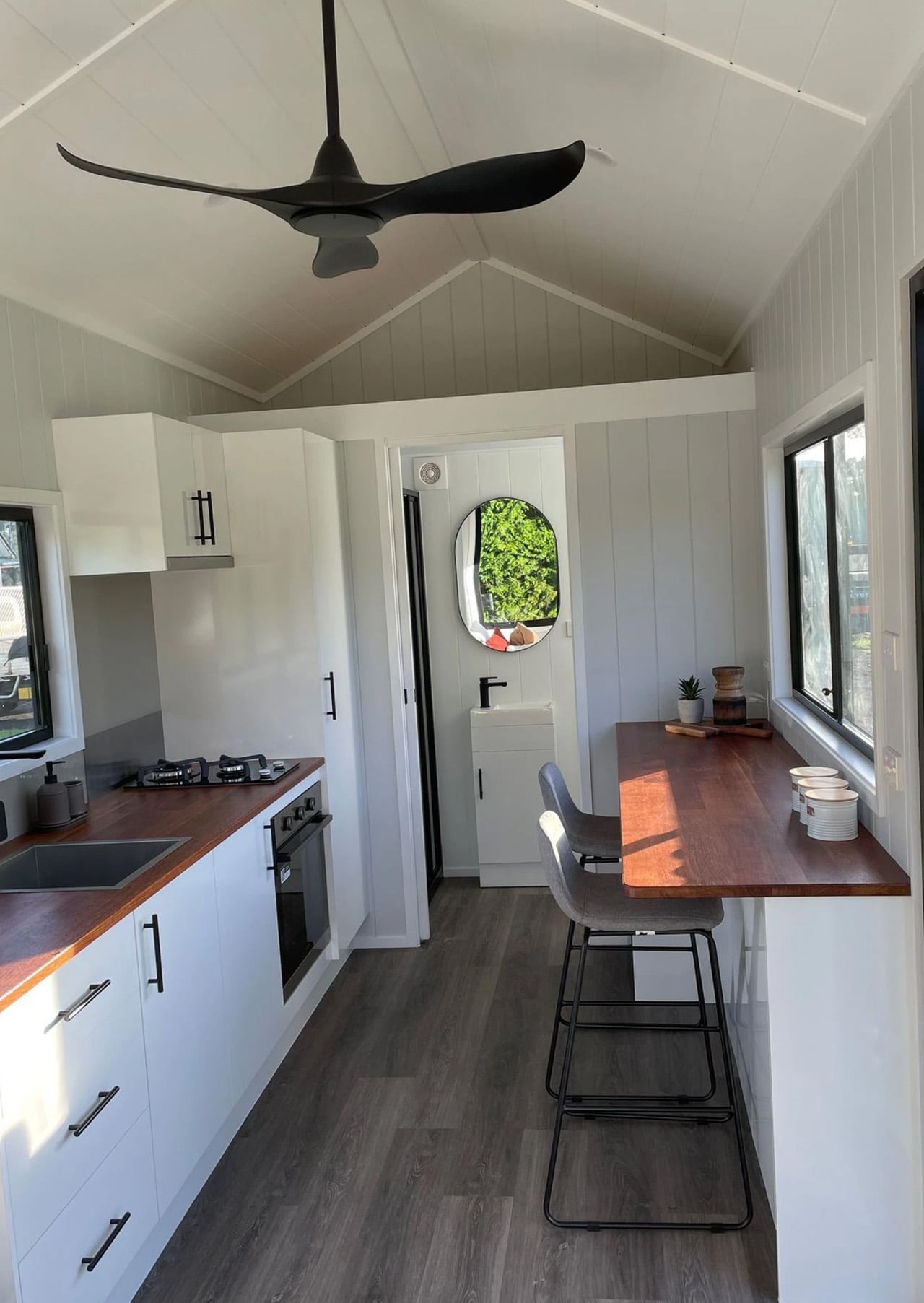
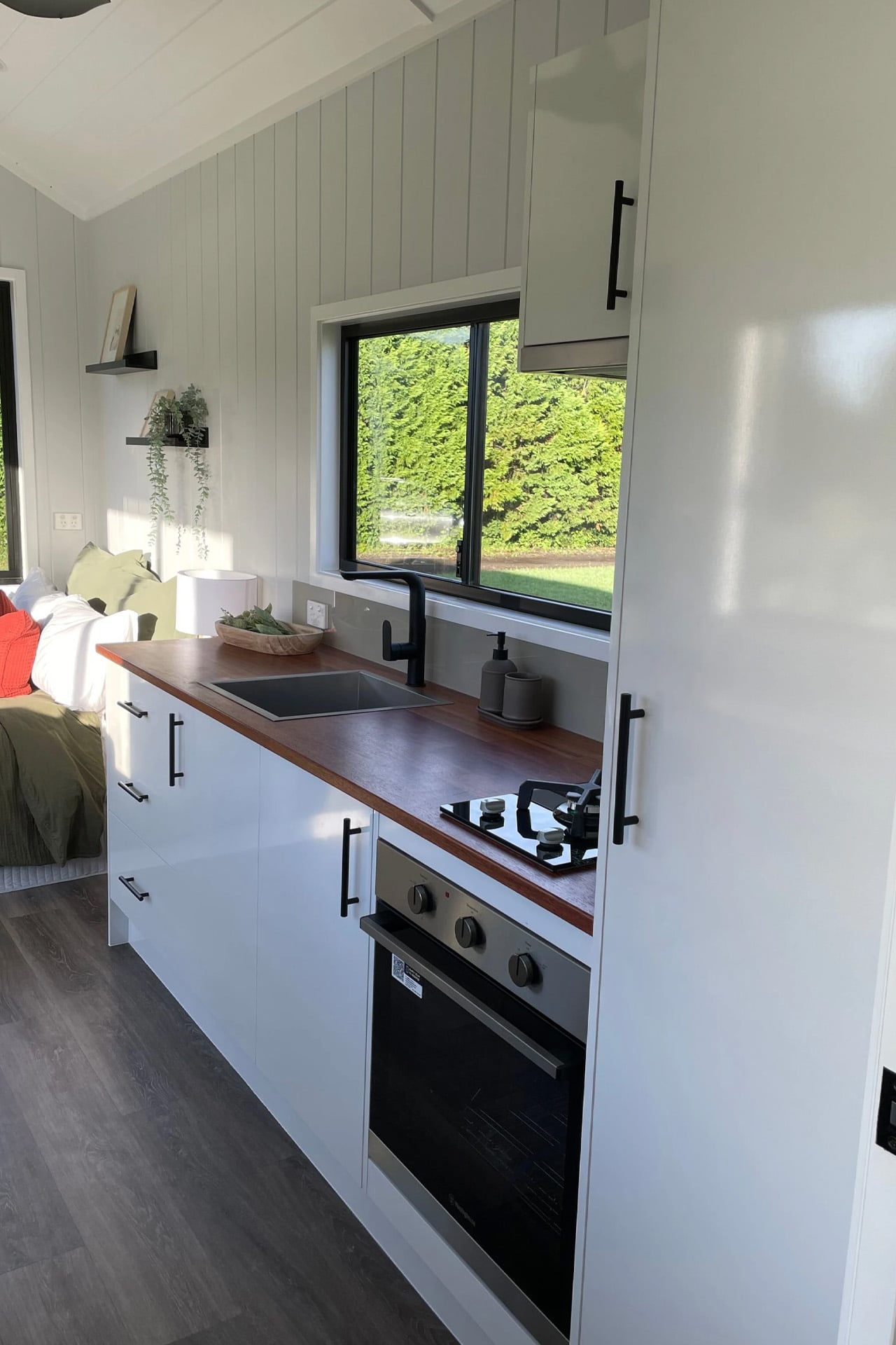
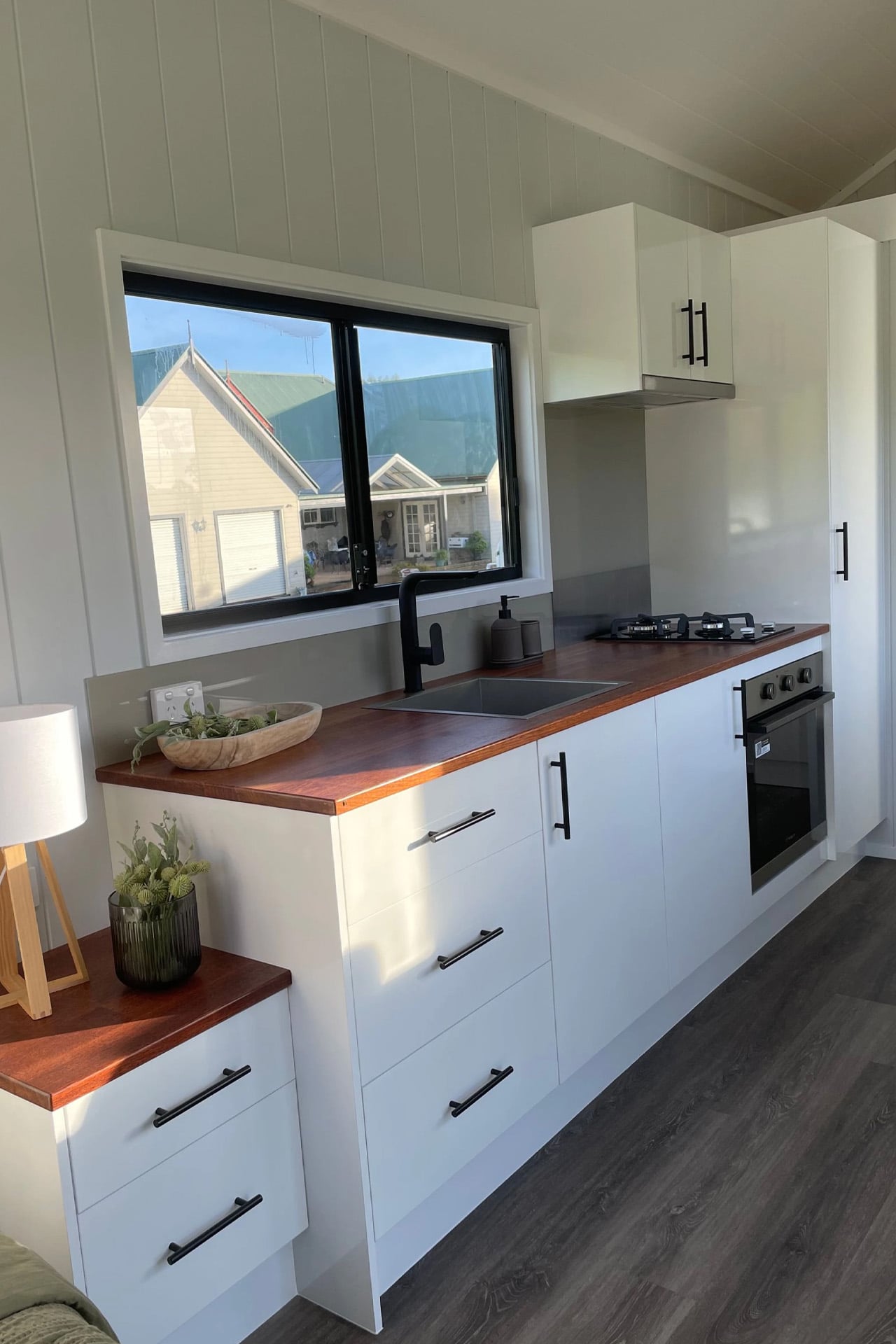
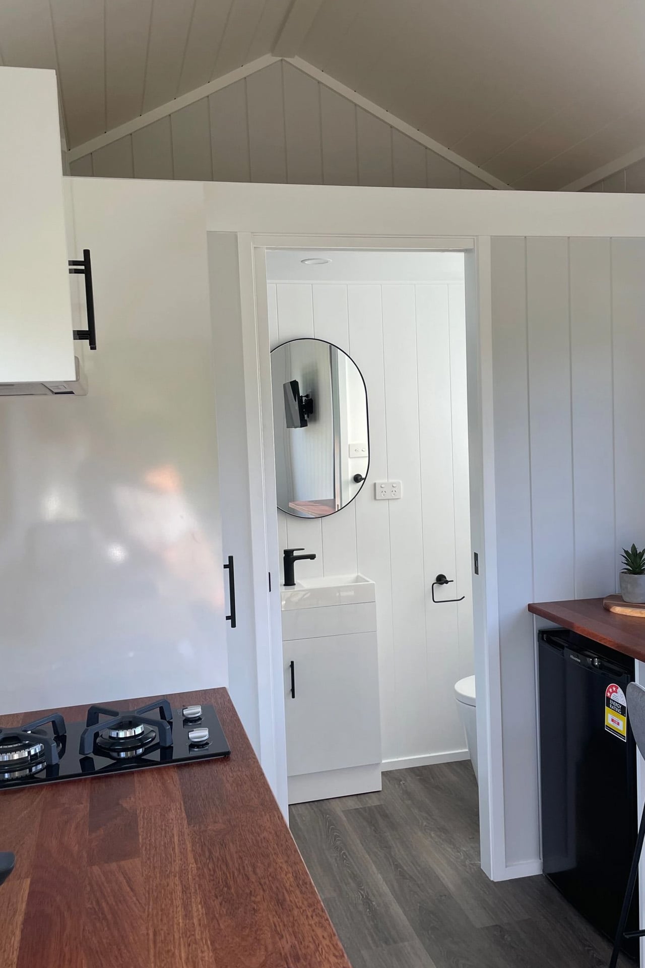
Inside, the single-floor layout prioritizes openness over segmentation. White walls reflect the natural light that pours in through generously sized windows, while wooden countertops and bar seating in the kitchen add warmth without clutter. A ceiling fan overhead keeps things casual. The Sierra isn’t chasing the maximalist tiny-home trend of stacking every possible feature into the ceiling — it’s lean by design, and that restraint is exactly what makes it feel livable.

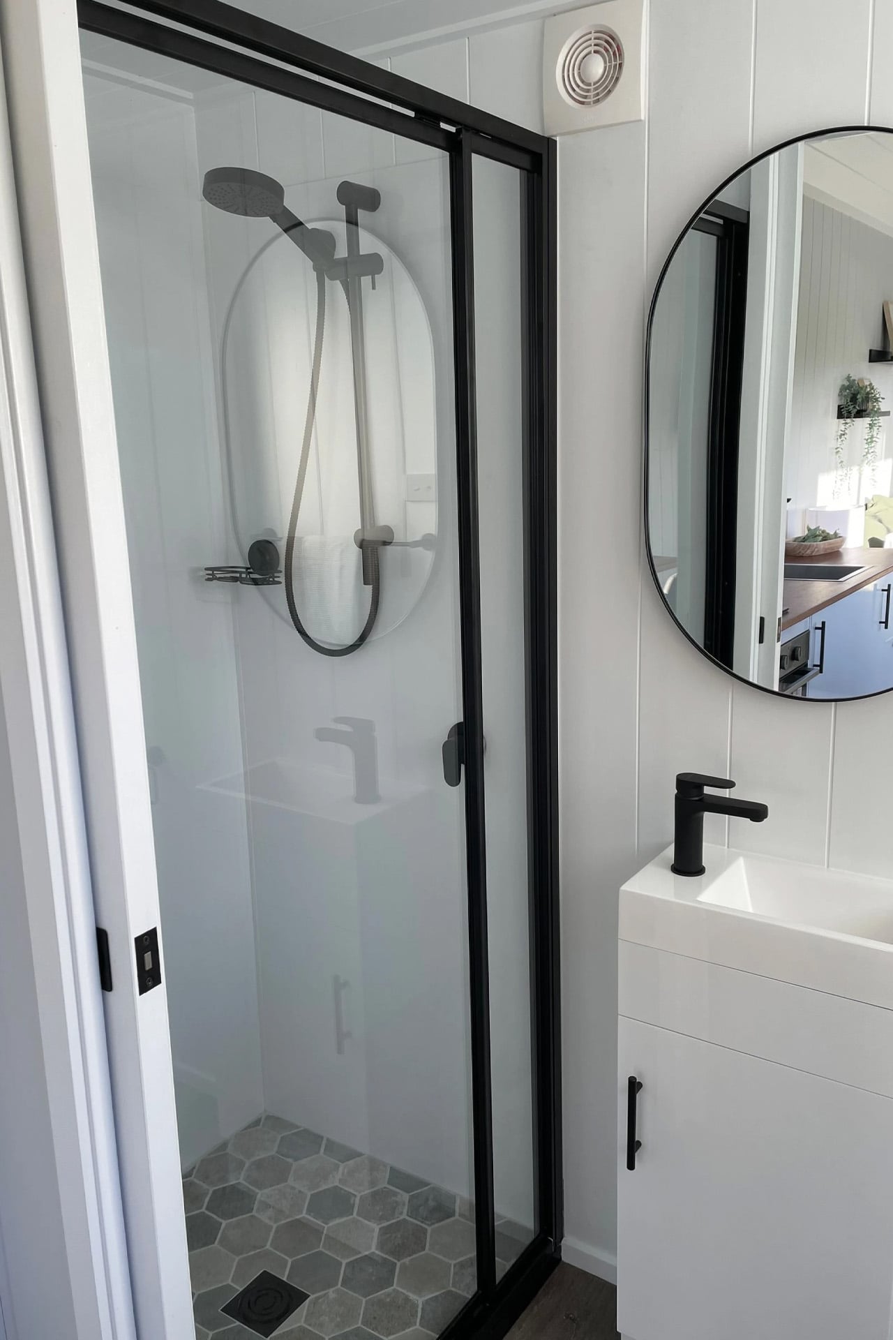
The kitchen claims a meaningful portion of the floor plan, which signals a priority worth noting: this is a home built for people who actually cook, not just for people who want to say they live small. The double bed doubles as a day bed and lounge area, keeping the space flexible without demanding a furniture reconfiguration every morning. The bathroom includes a glass-enclosed shower that feels considered rather than an afterthought.

Priced from US$59,000 including GST, the Sierra 6.0 sits at an entry point that makes serious compact living genuinely accessible. For those needing slightly more room, a 7.2-meter version is also available – same DNA, a little more breathing room.

The Sierra isn’t designed to impress at a trade show. It’s designed to work on a Tuesday morning when you’re making coffee and watching the light move across a wooden countertop. Highlands Tiny Homes has found a rhythm in the Sierra that many larger builds never quite locate — the specific calm that comes from a space that knows exactly what it is and refuses to be anything else.

The post This 20-Foot Tiny Home on Wheels Proves Better Design Beats More Square Footage first appeared on Yanko Design.

  •  

Nespresso x Swarovski: A $299 Coffee Machine Nobody Ignores

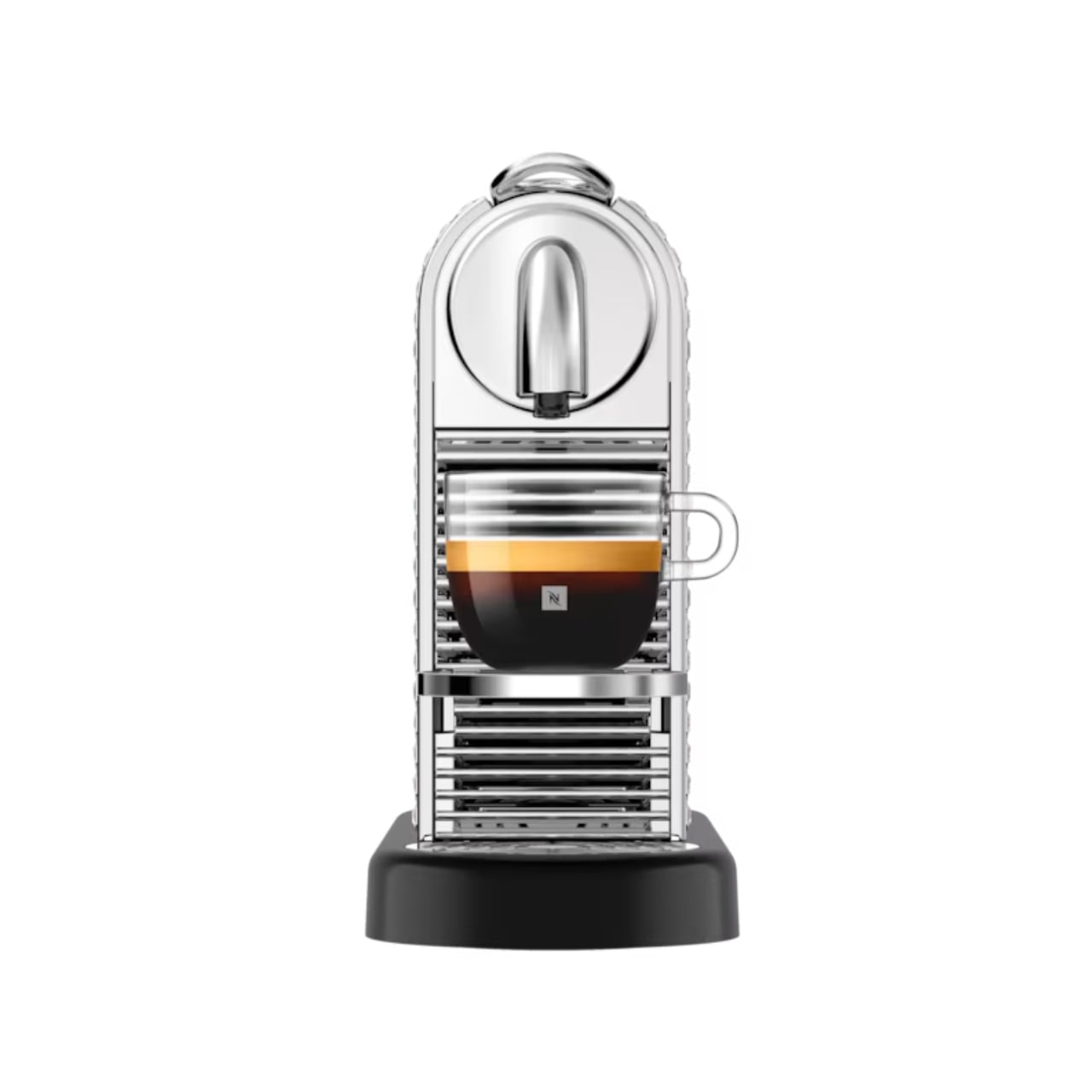
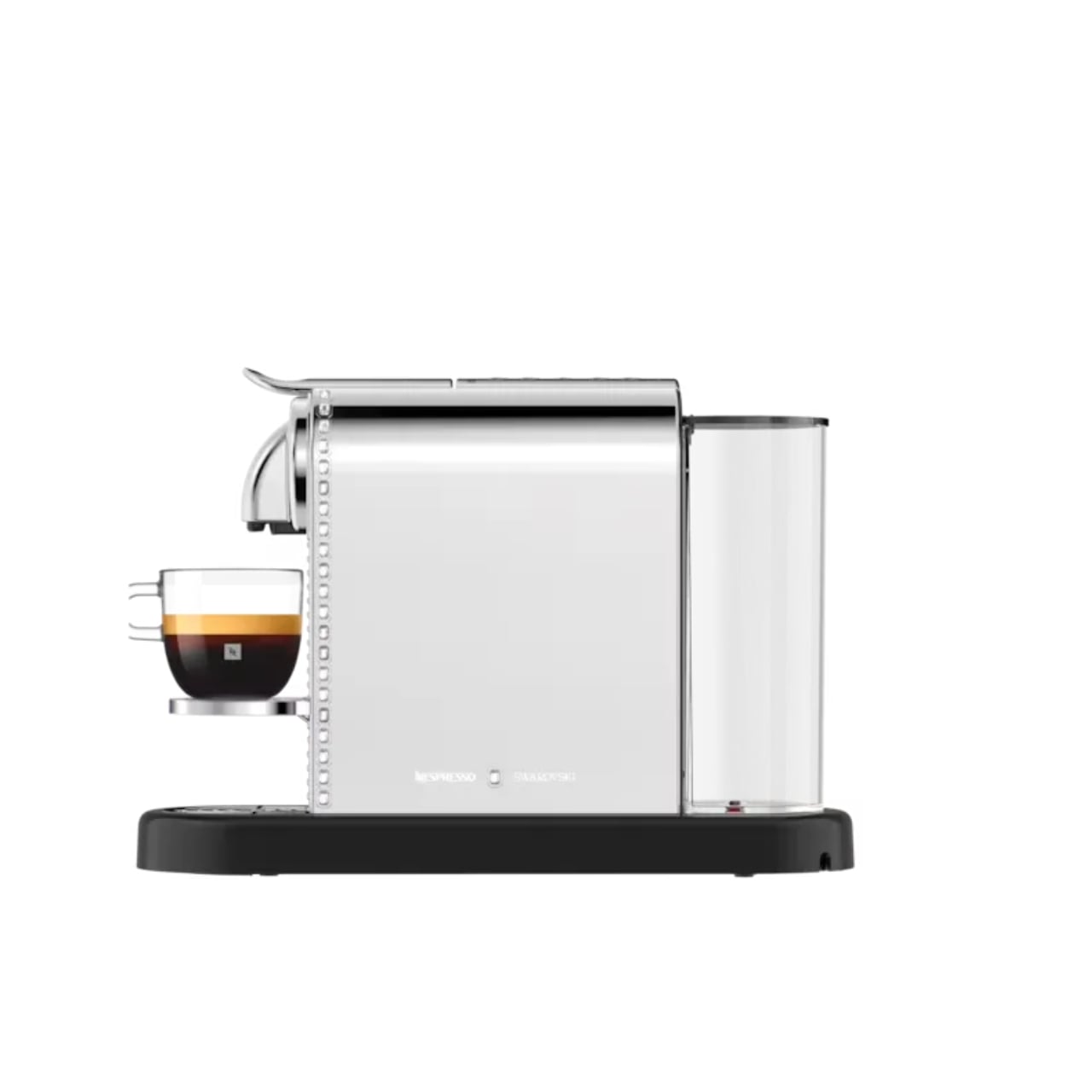
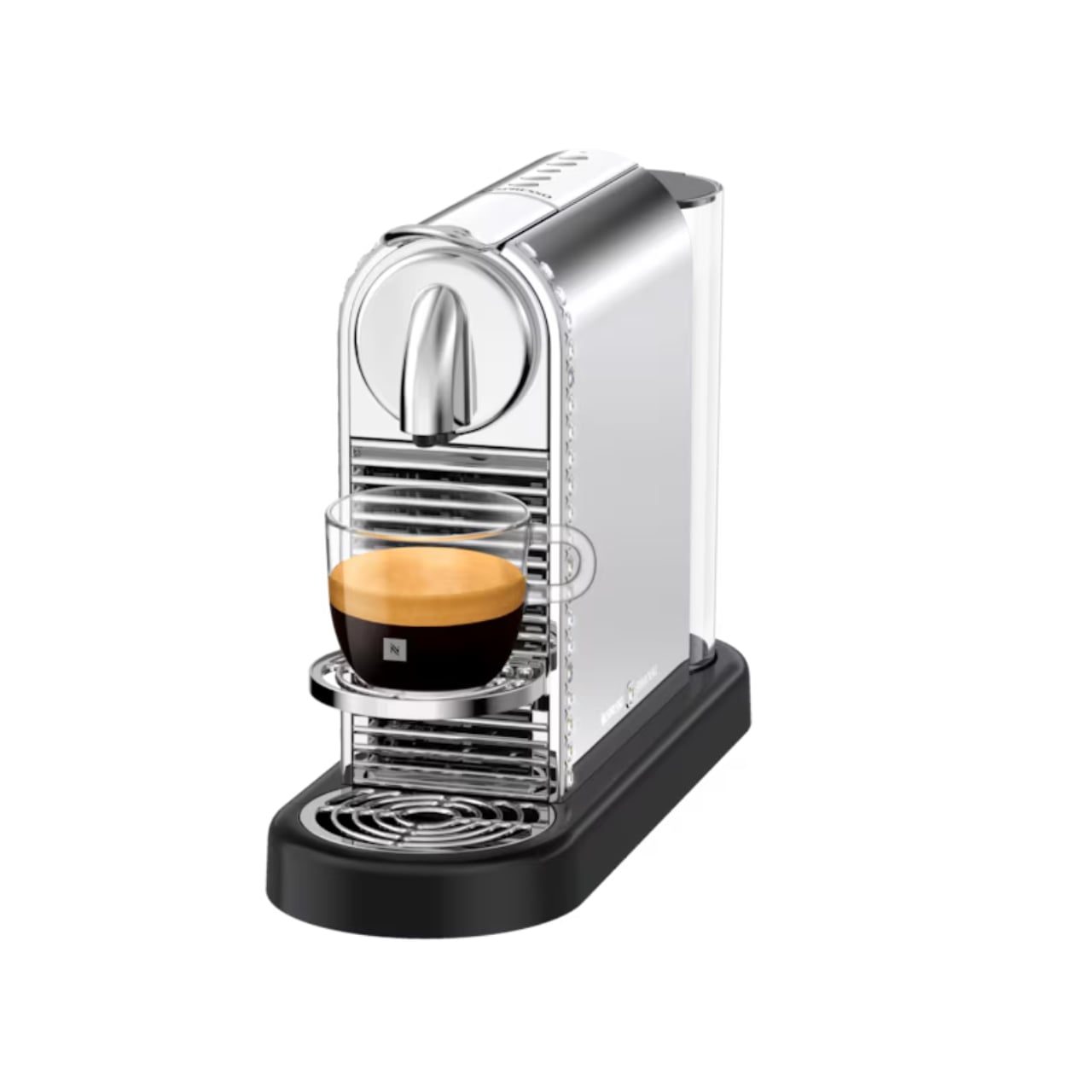
Coffee machines have an awkward relationship with the kitchen counter. We need them within reach every morning, but once the coffee is made, many look like appliances we would rather tuck away. The Nespresso x Swarovski collection takes that small design problem seriously. Its crystal-embellished CitiZ Platinum is a machine meant to stay visible, giving the coffee corner a reason to look considered even when nobody is making a cup.

That does not mean your morning coffee needs an audience. Most of us just want a reliable routine before the day gets loud. But a machine that sits out all day affects how a kitchen feels long after its job is done. I like the idea of treating that presence as part of the design, rather than pretending a frequently used appliance can somehow vanish between cups.

Designer: Nespresso x Swarovski

The limited-edition CitiZ Platinum has a silvery finish, with Swarovski crystals placed around its border. It is a noticeable change, though the machine remains recognizable as a CitiZ Platinum. That balance matters. Covering every surface in sparkle might make for a memorable photograph, but the more useful question is whether you would enjoy seeing it beside your favorite mugs on an ordinary Tuesday.

For me, the answer has less to do with luxury than with attention. Kitchens collect objects by necessity: a toaster, a kettle, a jar of spoons, the mug that never quite makes it back into the cabinet. A crystal-accented coffee machine cannot tidy that counter for you. It can, however, make one of its most permanent residents feel intentional.

The collaboration stretches beyond the machine. Nespresso and Swarovski have carried the festive look into coffee, accessories, and capsule-inspired ornaments. The collection’s packaging draws on Swarovski’s octagonal shape and color palette, so the visual idea follows you from the machine to the smaller things around it. I appreciate that continuity. A special-edition appliance can feel oddly isolated when everything accompanying it looks like business as usual.

There are limited-edition coffees in the collection, too, including Crystal Spark options for Nespresso’s Original and Vertuo systems. That gives the partnership a place in the cup as well as on the counter, though I would keep the two appeals separate. The crystals are a design choice, not a claim that the machine brews better coffee because it has been dressed up.

That distinction makes the product easier to appreciate. You do not have to believe every appliance needs a glamorous makeover to see who this is for. If you have spent time arranging a coffee station, choosing cups you enjoy holding, or finding a spot where the morning light hits just right, the machine fits into an interest you already have. It offers convenience without asking you to give up the pleasure of looking at your space.

It also makes sense as a gift for someone who already has very specific tastes. Coffee can be hard to buy for another person, especially when their preferred capsules and flavors are settled. A design-led machine is a more personal gesture, provided you know it suits their setup. I would check compatibility and availability before getting attached to the idea, particularly with a limited-edition collection.

Of course, sparkle is a matter of taste. Some kitchens look best with almost nothing on the counter; others are happier with color, collections, and objects that start conversations. This CitiZ Platinum belongs to the second group. It asks for a little space and attention, and that is either its charm or a good reason to admire it from afar.

What makes the Nespresso x Swarovski collection interesting is its modest premise beneath all the shine: everyday tools deserve design consideration, too. The machine still has coffee to make. But when that job is done, it remains part of the room. For anyone tired of choosing between a useful counter and a beautiful one, that is a lovely place to start.

The post Nespresso x Swarovski: A $299 Coffee Machine Nobody Ignores first appeared on Yanko Design.

  •  

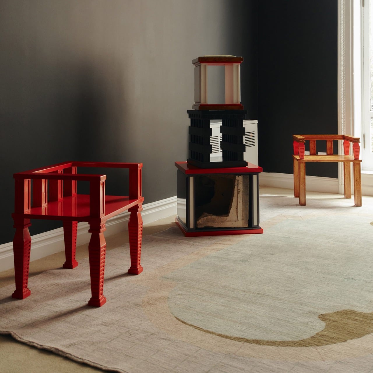
A 1908 New York building’s discarded fragments got turned into furniture instead of being demolished

A renovation across the street from Rafael Prieto’s studio offered an unusually good view of his next project. As decorative pieces came off the facade of a Tribeca building, he arranged to save sixteen that were headed for disposal. Most of us would have watched the scaffolding go up and returned to our emails. Prieto, a Mexico-born designer and creative director based in Tribeca, had other ideas. The result is a furniture exhibition that keeps the building’s ornament alive in some very unexpected forms.

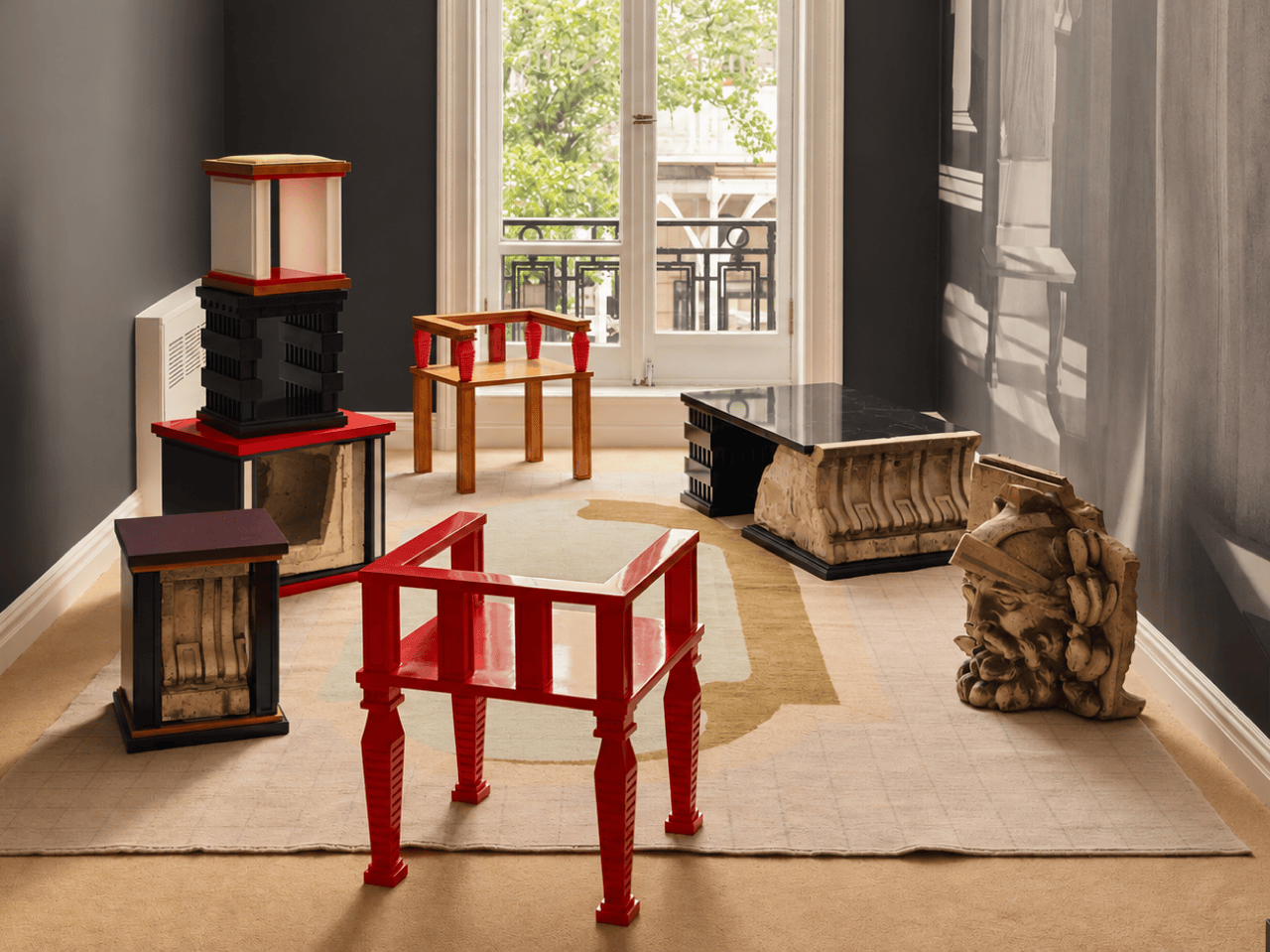
Prieto spent time with the fragments before turning them into the starting point for tables, chairs, and sculptural objects. Weathered ornament sits against painted birch, sometimes tucked inside a crisp new frame. The resulting furniture keeps its New York address close, even when its shape heads somewhere unexpected. Some pieces carry the actual stone; others borrow only its curves, grooves, and proportions. It is a show that rewards looking twice.

Designer: Rafael Prieto

The building across the street is 366 Broadway, now known as Collect Pond House, a twelve-story Beaux-Arts structure designed by Frederick C. Browne in 1908. It was once home to the Royal Typewriter Company, then became a residential co-op in 1979. The facade is densely ornamented: copper cornices, Greek key detailing, marble columns, and keystones carved into bearded faces that have been watching Tribeca change for over a century. A recent multi-year restoration replaced and conserved 65 terra cotta units. A handful of the pieces removed during that process did not make it back onto the building.

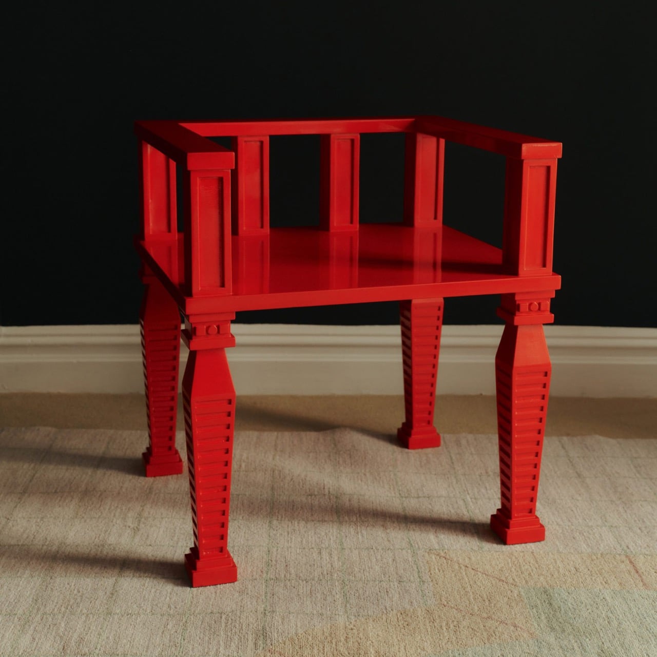
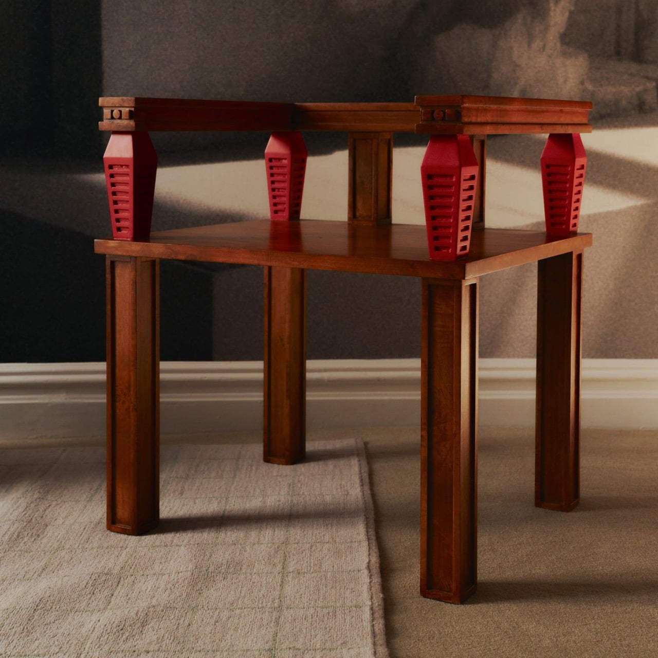
Before cutting anything, Prieto lived with the fragments in his studio for roughly a year and a half. He photographed and scanned each contour and ornament, then layered those images to pull out shapes and combinations that could inform new work. That process produced a design vocabulary rather than any direct copy of the originals. The stepped, ribbed profiles that climb the legs of the red lacquered chair came directly from this translation, somewhere between column fluting and abstracted skyline. It is a method closer to archaeology than furniture-making.

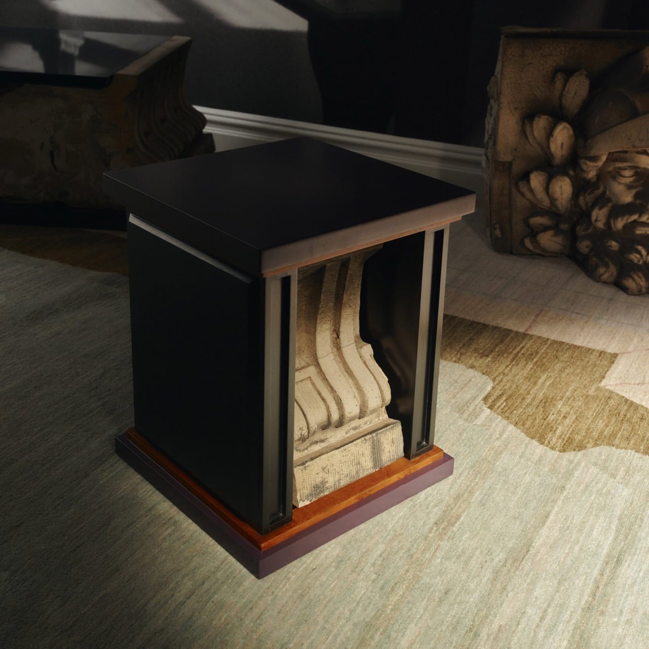
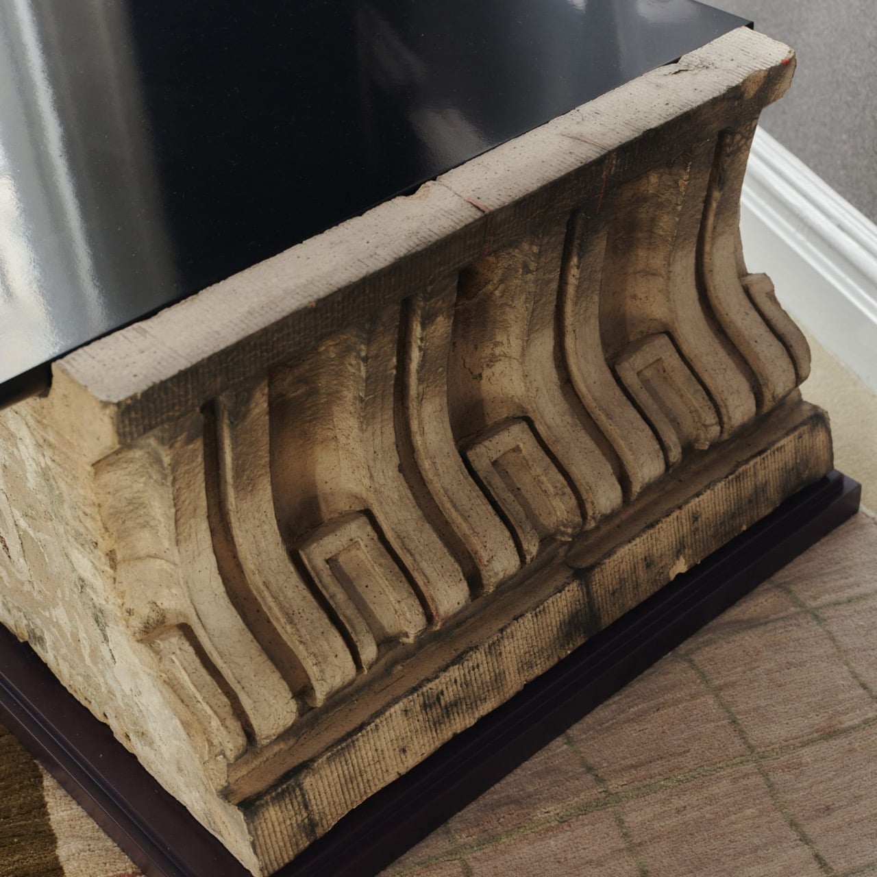
One of the standout pieces has a large carved stone cornice block sitting below a flat black painted tabletop, doing actual structural work. The stone is pale, dense, and loaded with repeating scroll forms, carrying roughly a century of New York weather on its surface. Another piece cages a smaller fragment between vertical black bars inside a cube-shaped form, the stone visible through the gaps like something on display. The medium listing for several works at the gallery confirms “Architectural Fragment” as a named material alongside painted birch. Not every piece carries original stone; some borrow only its shapes.

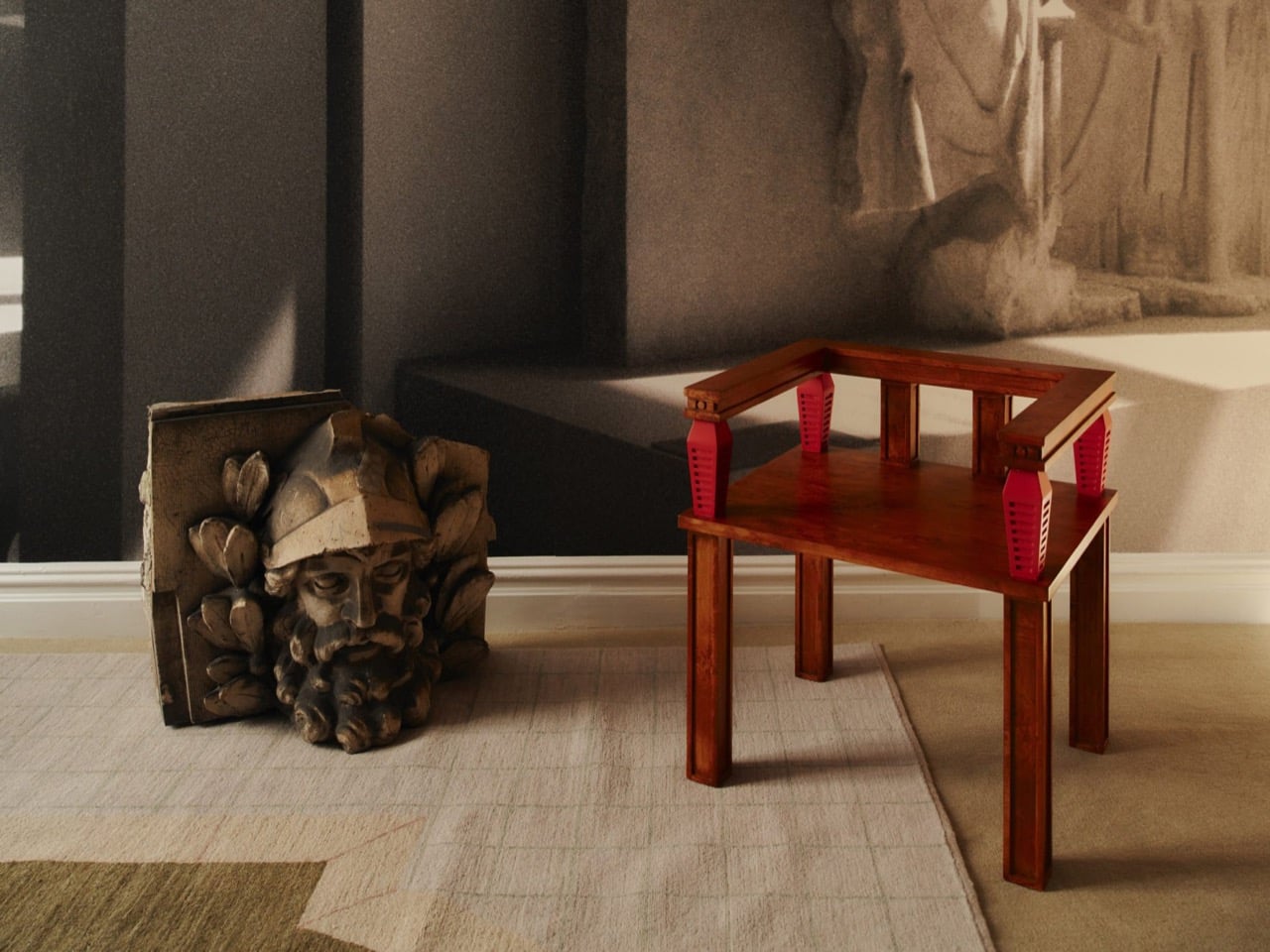
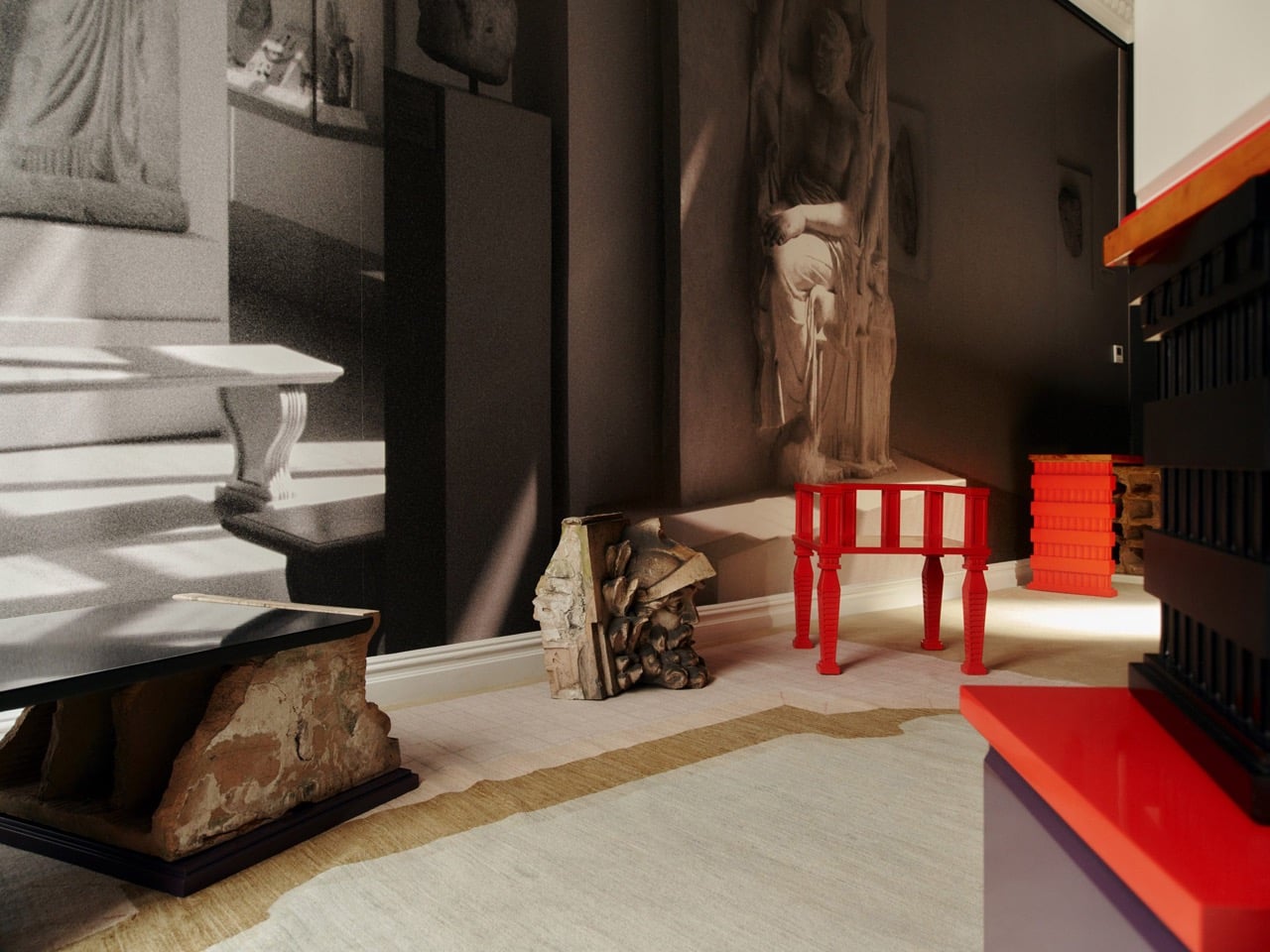
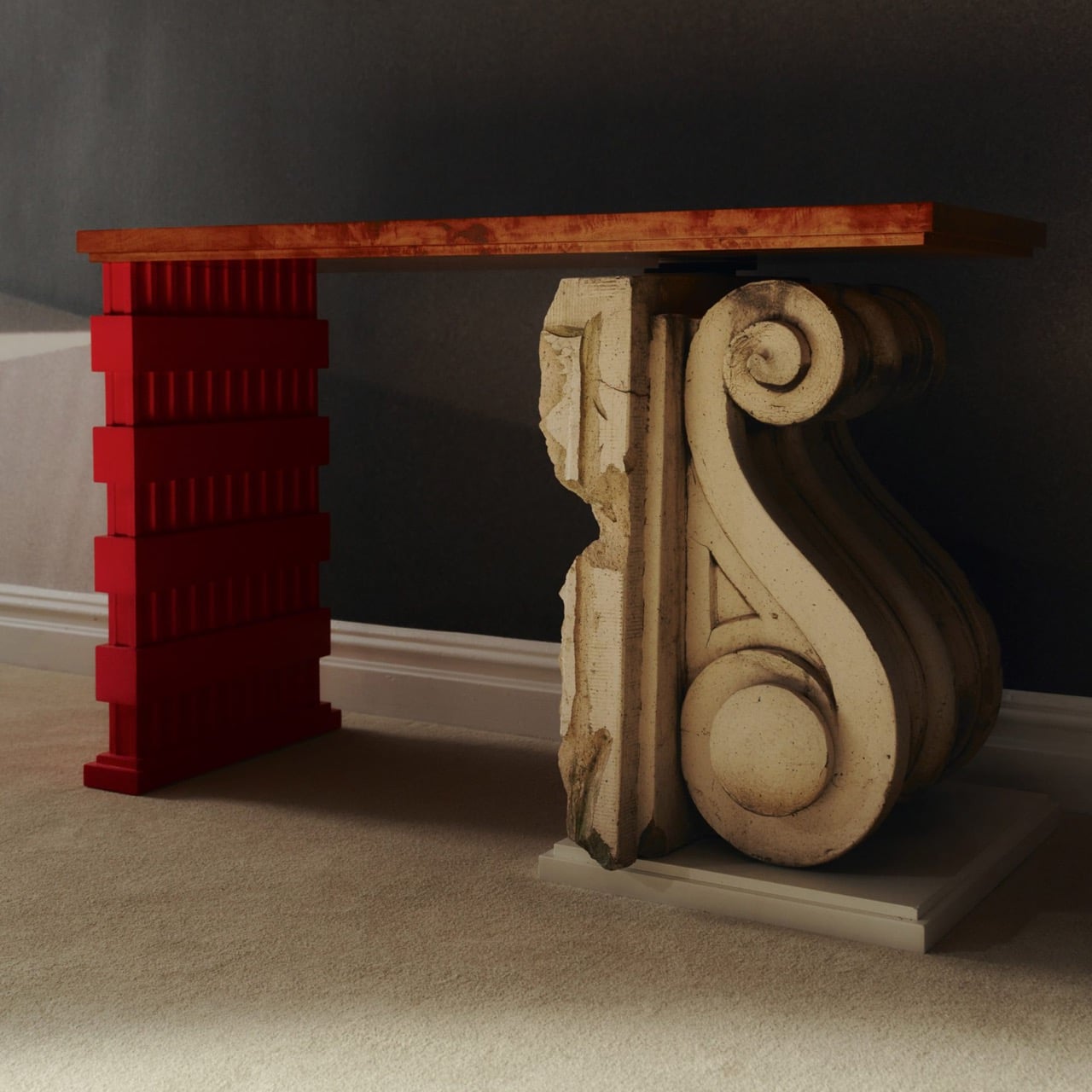
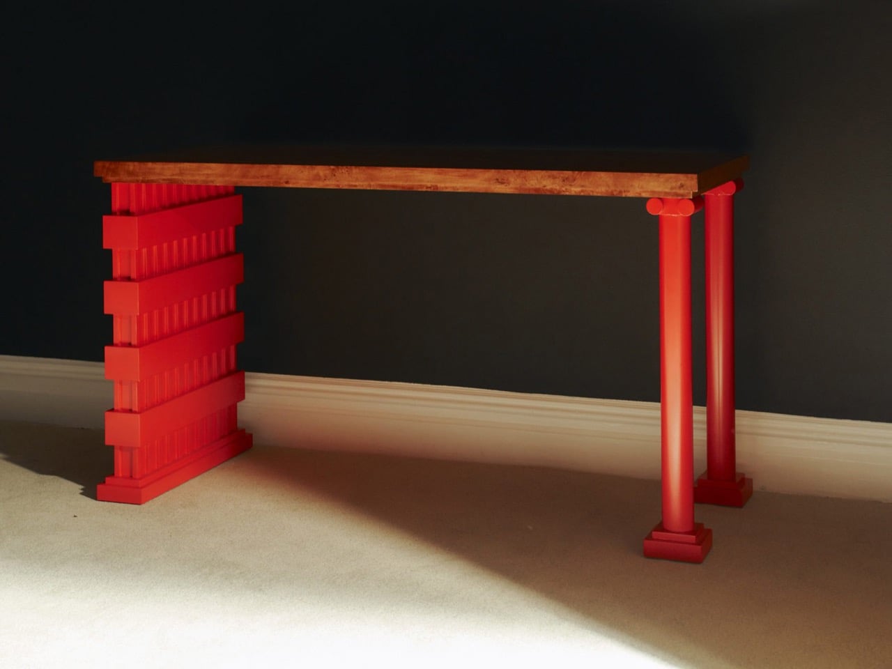
The all-red lacquered chair is the most confident piece in the show, its legs built from stacked, stepped planes that scanning and layering pulled from 366 Broadway’s fluted piers and molded profiles. Its natural birch counterpart deploys the same vocabulary in warm wood, swapping lacquer for grain and adding red geometric arm brackets at the joints. A console table makes the argument most literally: one end sits on a fabricated red plinth, the other rests on an actual salvaged Ionic stone volute, intact and weather-stained. The two supports are not supposed to match. The gallery describes this contrast as the central thread: the hard and the soft, the historic and the contemporary, running through every piece.

Several of the original keystones sit on the gallery floor unaltered, including one carved bearded face in a plumed helmet still stained with moss and a century of city air. Prieto’s analog photography wraps the walls in large-scale architectural murals, produced in collaboration with Wallpaper Projects. The room ends up feeling closer to a photographed ruin than a white-cube gallery, which is entirely the point. He told Family Style that “New York is its architecture,” and that most people talk about the skyline but “don’t look up.” The show does the looking for you.

‘The Future of the Past’ is Prieto’s second solo show with Emma Scully Gallery and runs through December 12 at the Upper East Side location, open Wednesday through Saturday. Pricing and availability are through the gallery directly. The question the collection keeps circling is whether furniture shaped by a building’s discarded ornament carries any of that building’s memory with it. Prieto does not seem interested in settling that question cleanly. The bearded face on the gallery floor looks like he has made his peace with the whole situation.

The post A 1908 New York building’s discarded fragments got turned into furniture instead of being demolished first appeared on Yanko Design.

  •  

4 Marvel Kettlebells for Collectors Who Actually Work Out

If you were ever cast in a Marvel movie that would require you to be in an action scene, probably one of the first things you would do is sign up for a gym membership or start picking up those weights. You would also probably take inspiration from some of those Marvel characters, who are among the most fit actors in this universe. Now if you could put working out and Marvel together, it would be perfect, even if you weren’t actually going to be in a Marvel movie.

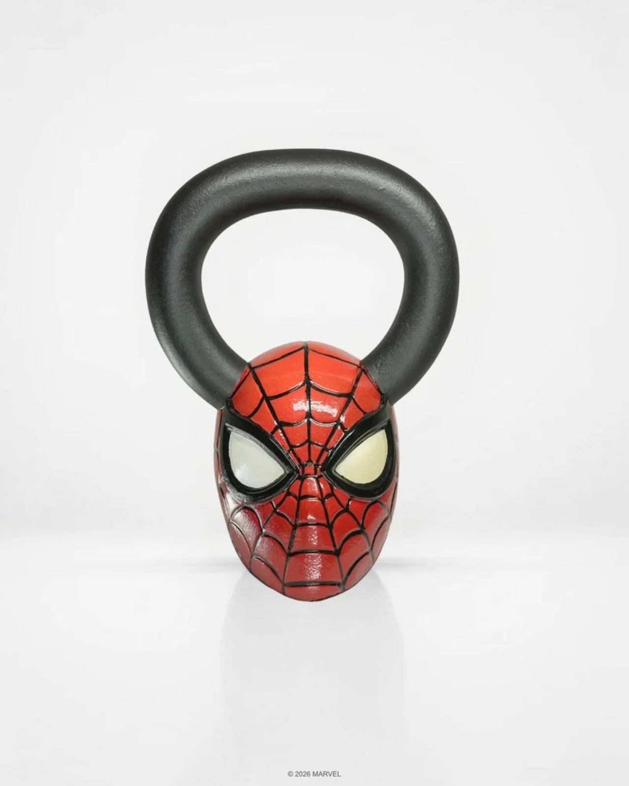
The Marvel Kettlebell Series by SUPERX in partnership with Strict Vision Athletics features four iconic Marvel characters to be part of your workout routine. You have Spider-Man, Wolverine, Venom, and Hulk sculpted into fully functional, premium cast iron kettlebells, and they come in two editions: the Matte Black Bundle and the Hand-Painted Bundle.

Designer: SuperX

These Marvel characters aren’t just painted onto the weights. Each one has a weight-to-character pairing based on the power level and role that they have in the Marvel Universe. The form of the bell itself becomes the respective character, and the handle is integrated into the functionality as well. The kettlebells are cast from high-grade iron with durable powder-coated finishes. The 3D figures are printed in premium resin with hand-painted details.

Spider-Man is the entry-level weight at 30 lbs since he’s more the agility type of superhero. At 40 lbs, Wolverine is more in the mid-range and is meant to build your endurance since he’s the kind of hero that never stays down. Venom, with his symbiote power, is heavier at 50 lbs and needs to be “fed” with a more intense workout. And of course, the heaviest bell at 60 lbs is the Hulk since they all believe he’s the strongest Avenger (well, maybe except for Thor, who says he is).

What makes this series even more special is how the two editions cater to different kinds of Marvel fans. The Matte Black Bundle offers a sleek, uniform finish across all four characters, giving your gym a clean, understated look that doesn’t scream “novelty item.” It’s the kind of thing you could have sitting in your living room next to a coffee table book and it would fit right in.

The Hand-Painted Bundle, on the other hand, is where things get truly collector-level. Each bell is individually hand-finished by a single artist, bringing out the full color and character detail of every figure. With only a handful of these existing per drop, this is less of a fitness purchase and more of a limited-edition art acquisition, one that you can actually use to get stronger. Think of it as the sneaker drop equivalent of home gym equipment: highly limited, art-quality, and the kind of thing most people have never seen before.

And that’s really the whole point of this series. Kettlebell workouts are among the most effective full-body training tools out there, targeting multiple muscle groups at once and helping build explosive power through moves like swings, cleans, and snatches. The progressive weight structure of 30, 40, 50, and 60 lbs means you can start with Spider-Man and work your way up to Hulk-level as your strength grows. It’s essentially a built-in training program disguised as a collector’s set.

For the Marvel fan who has been telling themselves they’ll eventually get around to working out, this might just be the push they need. There’s something motivating about picking up a weight that looks like your favorite superhero, and it’s harder to skip leg day when Wolverine is staring you down. And for the fitness enthusiast who’s already deep in their training routine, swapping out generic weights for a sculpted Wolverine or a menacing Venom is the kind of upgrade that makes getting off the couch a whole lot easier.

The Marvel Kettlebell Series is officially licensed by Marvel and ships from SUPERX’s headquarters in Nashville, Tennessee. Both bundles are available in extremely limited quantities, so if you’re the kind of person who collects things that matter and also wants to get stronger, this one is pretty much made for you.

The post 4 Marvel Kettlebells for Collectors Who Actually Work Out first appeared on Yanko Design.

  •  

Laifen’s Fall Sale Is for the Bathroom Tools You’ve Always Ignored

It’s a little strange when you think about it. People will spend weeks comparing headphones or picking the right coffee maker, yet the hair dryer, shaver, or toothbrush sitting on the bathroom counter rarely gets a second thought. Laifen’s fall lineup is built around fixing exactly that gap, treating everyday personal care tools with the same design attention usually reserved for gadgets people actually brag about owning.

The brand happens to be running one of its bigger sales of the season right now, and it covers four products that together handle nearly every step of a morning routine. Two hair dryers, an electric shaver, and an electric toothbrush, each one designed less like a bathroom appliance and more like something you’d actually want to leave sitting out in view.

Laifen SE 2: The Hair Dryer Most People Should Have Switched to by Now

Most hair dryers get the job done, until something faster comes along and makes the old one feel sluggish by comparison. The Laifen SE 2 runs on a 108,000-RPM brushless motor that pushes air at nearly 48mph, noticeably quicker than what most household dryers manage without resorting to constant blasts of heat. That speed alone cuts a few minutes off the usual routine.

What makes the SE 2 worth a second look is Temperature Cycling Mode, which alternates airflow patterns instead of holding one constant heat level, cutting down on damage from daily drying. 10 drying settings cover most hair types, and at 14.35 ounces without the cord, it’s light enough to hold through a full styling session. The matte white finish fits into almost any bathroom without effort.

Click Here to Buy Now: $112.50 $149.99 (25% off, use coupon code “PRFALLSALE”). Hurry, deal ends in 48-hours!

Laifen Swift 4: The Dryer That Turns an Everyday Step Into a Hair Care Routine

Most people treat drying and hair care as two separate steps, applying oil or serum first and hoping the blast of hot air doesn’t undo the work. The Laifen Swift 4 folds both into one motion through its Nourishing Nozzle, which breaks essential oils into fine particles and distributes them at a steady 136°F, letting the oil work into hair while it dries instead of sitting on top of it.

Behind that trick sits a 115,000-RPM motor pushing air at nearly 51mph, with temperature checks running 1,000 times a second to keep heat steady. Six modes cover everything from a quick blast to a gentler nourishing cycle, while 400 million negative ions calm frizz and 70 million positive ions look after the scalp. It comes in three metallic finishes, none of them loud.

Click Here to Buy Now: $170 $199.99 (15% off, use coupon code “PR15SWIFT4”). Hurry, deal ends in 48-hours!

Laifen P3 Pro: A Shaver Built the Way Premium Gadgets Are Built

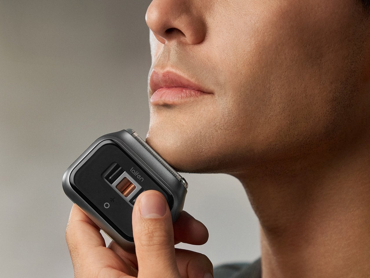
The Laifen P3 Pro Space Gray leads with a detail that has nothing to do with how close it shaves: a transparent motor window borrowed from the exhibition backs of mechanical watches, letting the internals show through instead of hiding behind plain plastic. The body itself is CNC-machined aluminum, a process that takes 9,000 seconds per unit, longer than what most flagship phones require.

At 6.3 ounces and barely bigger than a deck of cards, it slips into a dopp kit or jacket pocket without adding bulk. The dual-drive linear motor reads beard density in real time and adjusts power automatically, so thick patches don’t cause snagging. Two shaver heads handle close, short stubble, a flexible trimmer catches longer hair, and the whole thing carries an IPX7 rating for shower use.

Click Here to Buy Now: $126 $179.99 (30% off, use coupon code “PRFALLSALE”). Hurry, deal ends in 48-hours!

Laifen Wave Pro: The Toothbrush That Actually Pays Attention While You Brush

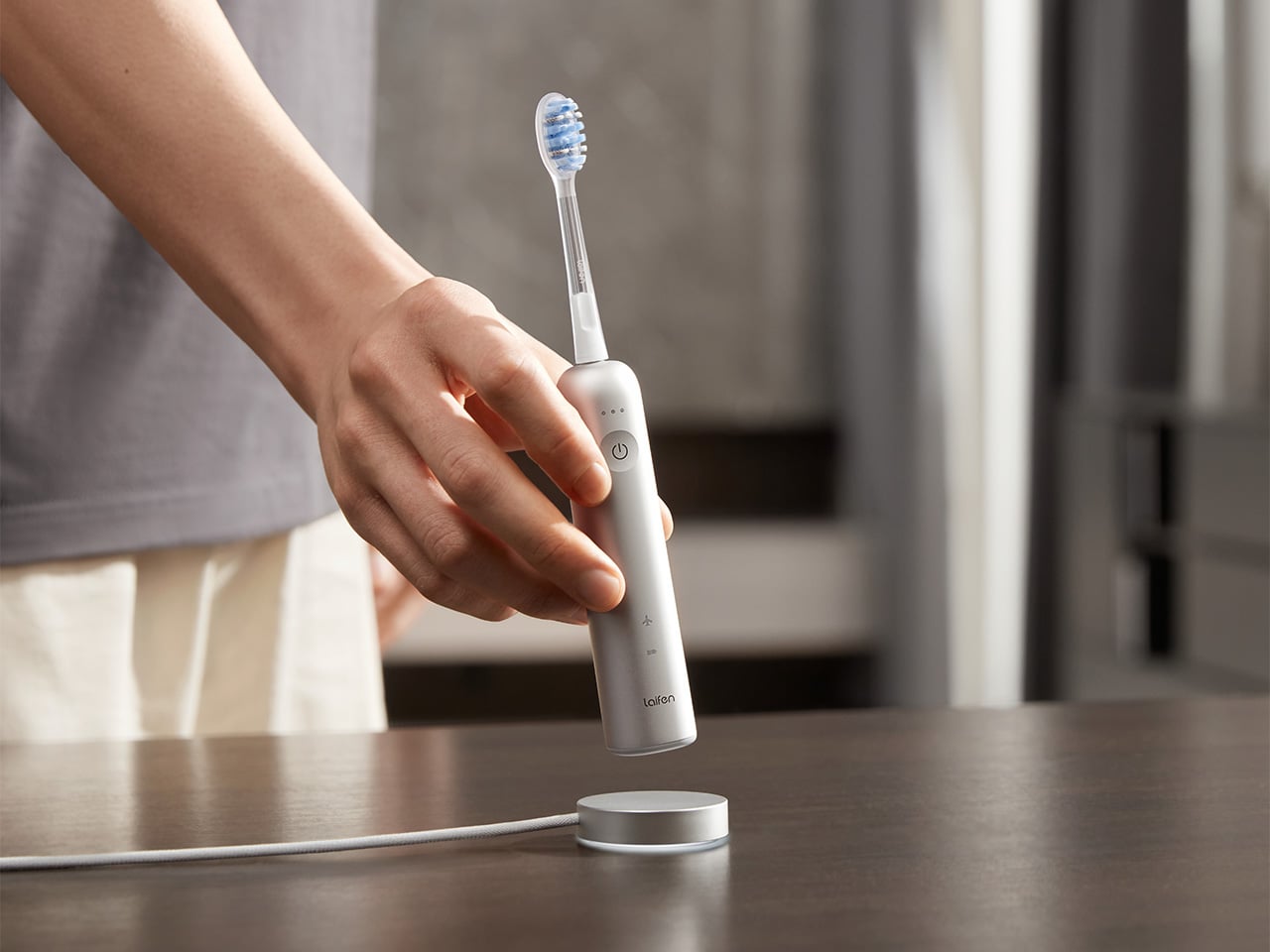
Most people’s relationship with their toothbrush doesn’t involve much thought, which is exactly the assumption the Laifen Wave Pro pushes back on. Its brush head oscillates through a 60-degree arc, wider than most sonic brushes manage, combined with 66,000 vibrations a minute, following a brushing pattern modeled on the Modified Bass technique dentists have recommended for decades. The stainless steel body signals this isn’t an afterthought.

A pressure sensor tracks how hard you’re brushing and dials back motor speed the moment it senses you’re pressing too hard, protecting gums and enamel in the process. Two modes and three intensities give 10 adjustable levels through the companion app, while wireless charging and roughly 70 days of battery life mean it rarely needs attention. A travel pouch and two brush heads round out the package.

Taken together, these four pieces cover the parts of a morning that rarely get a second thought until something better shows up and makes the old routine feel dated. Laifen built each one around a specific daily habit, from drying to shaving to brushing, and the fall lineup lands right as the season nudges people to reset those habits anyway.

Click Here to Buy Now: 96 $119.99 (20% off, use coupon code “PRFALLSALE”). Hurry, deal ends in 48-hours!

The post Laifen’s Fall Sale Is for the Bathroom Tools You’ve Always Ignored first appeared on Yanko Design.

  •  

4 Times a Day the StillFrame Headphones Switch Jobs For You

A lot of people spend the entire eight hours of a working day just sitting in front of their screens. You probably have your speakers on or put on your headphones to listen to some background music or for online meetings. But for those of us who don’t want to spend one-third of the day like this, we go through different “phases,” which means that the audio that accompanies us throughout the day also changes. From commuting to work to sitting down at your workstation to going on a dinner date and finally relaxing at home, you don’t want the same setting all day.

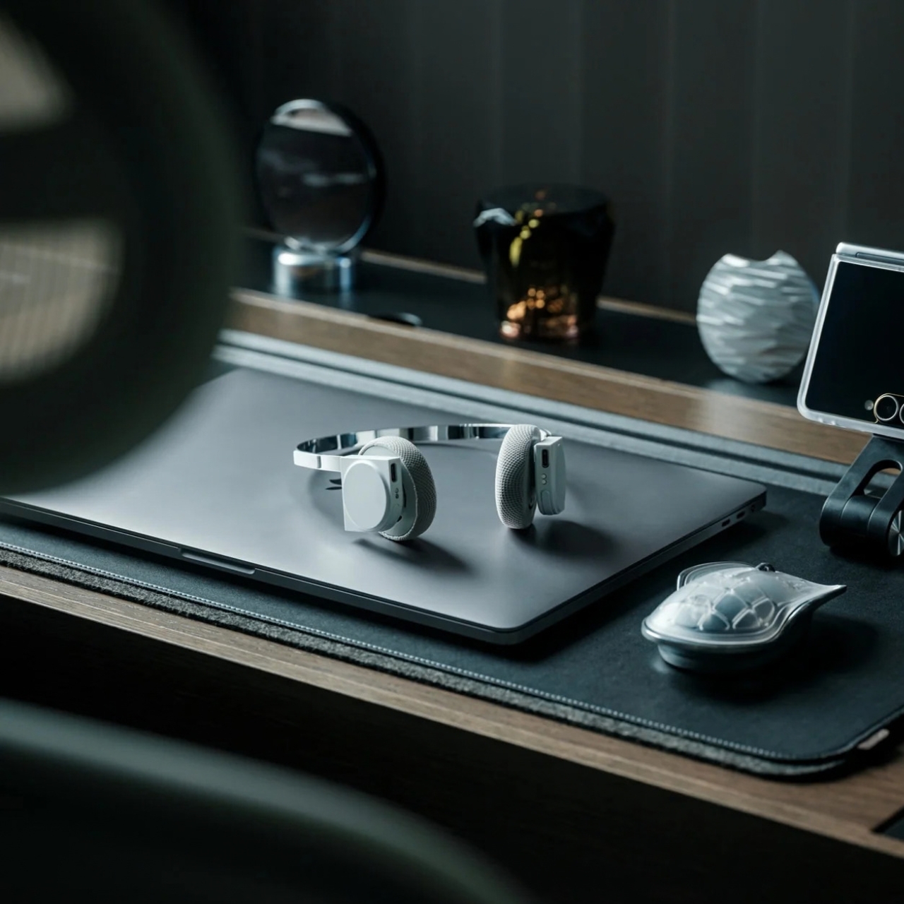
That’s the more interesting way to look at the StillFrame Headphones. Rather than asking them to create one uninterrupted listening session, imagine taking them through a day full of stops and starts. They offer Noise Cancelling and Transparency modes, Bluetooth 5.4 connectivity, a USB-C wired option, and dual microphones with noise control. Each feature has a place in that routine, even if no two days follow quite the same route.

Click Here to Buy Now: $245

The first part of the day for most of those who go to a regular office is the morning commute. You might be on a noisy train with a lot of people talking or walking along a busy street with a lot of city noise. StillFrame’s Noise Cancelling mode will help you focus on what you’re listening to and drown out some of the chaotic noise around you. It is always there as an option for times when you want to immerse yourself in your playlist or the next chapter of the book you’re listening to.

When you do need to let the world back in, you don’t have to turn off your podcast episode at a crucial moment. The headphones have a Transparency Mode option that’s there with a tap for moments when you need to order a coffee or you’re walking somewhere that requires your full attention. Just tap between the two modes for what you need at the moment without having to pause or stop what you’re listening to. It’s also a good reminder that the world isn’t always a distraction.

When you finally reach your office, you might have a scheduled meeting sometime during the day. StillFrame is useful even for work things, as it has dual microphones with noise control so you can shift from consuming audio to communicating with others using the headphones. That doesn’t mean every conversation will sound perfect in every environment. It does mean you can move from a podcast or playlist to a meeting without reaching for a separate pair of headphones just because your role in the audio has changed.

When you finally get home to your cozy bed, you sometimes still want to continue listening to that audiobook, start a new podcast episode, or let some soothing music lull you to sleep. You can choose to continue using your StillFrame headphones over Bluetooth 5.4 or use the USB-C wired option if you’d rather plug in. Either way, the wired option is an alternative to wireless listening and not a reason to assume the headphones will work after their battery runs out.

A few other details help round out the picture. StillFrame weighs 103 grams and has a stainless-steel headband, a minimalist frame, and 40mm drivers. Its ear cushions attach magnetically, making them easy to swap; the white model comes with extra pairs in light gray and turquoise. Battery life is rated at up to 24 hours per charge, though actual use may vary. Those details aren’t the main story here, but they help explain what you’re carrying from one part of the day to the next.

No pair of headphones can make a commute quiet, a meeting short, or a busy day slow down. What StillFrame Headphones offer is a set of ways to respond as those moments change. You can focus, let the world in, take a call, or settle into an evening listen. The best setting isn’t one you choose in the morning and keep all day. It’s the one that fits where you are now.

The post 4 Times a Day the StillFrame Headphones Switch Jobs For You first appeared on Yanko Design.

  •  

A Pocket Concept Built to Catch Design Ideas Before They Get Away

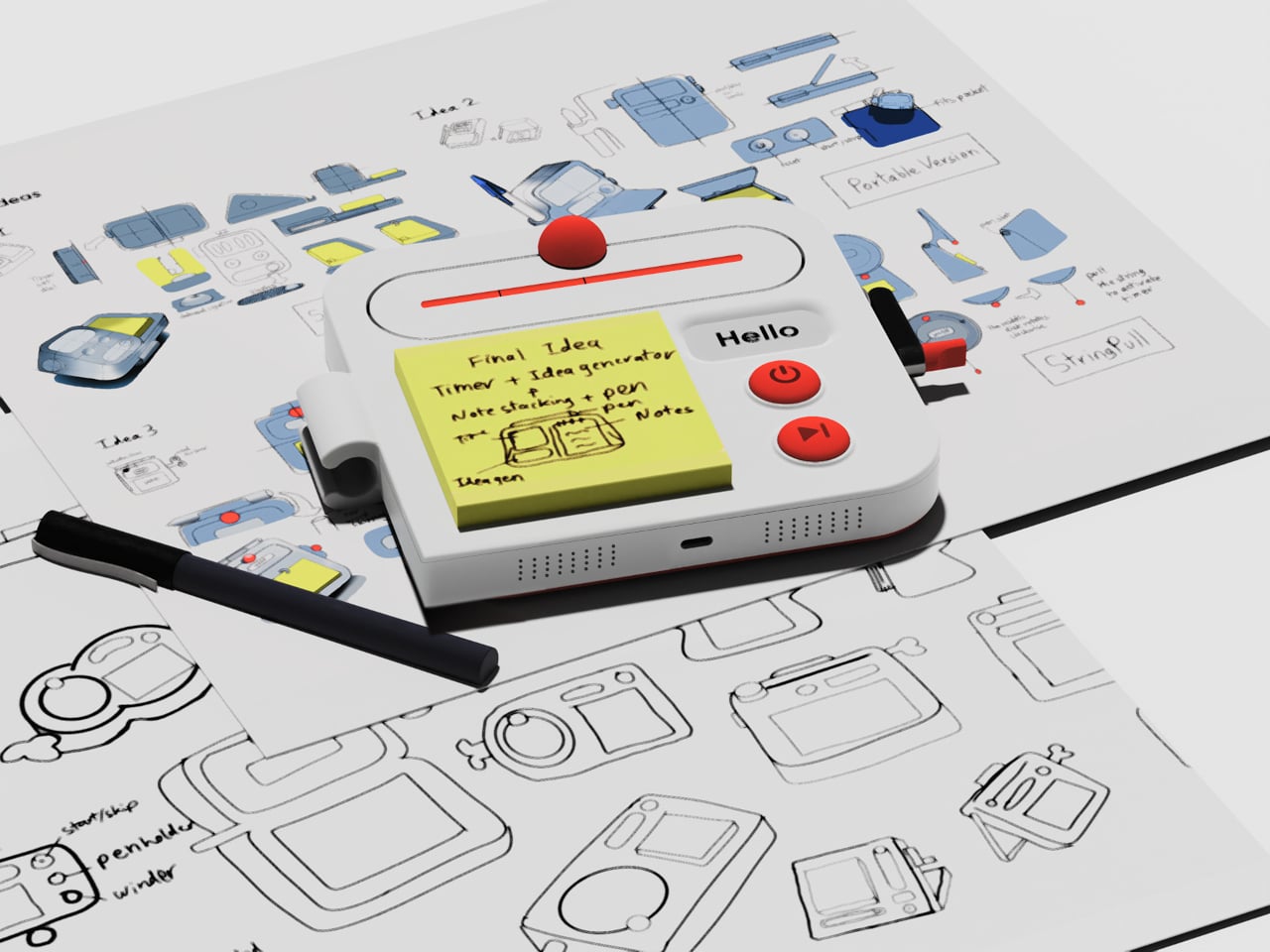
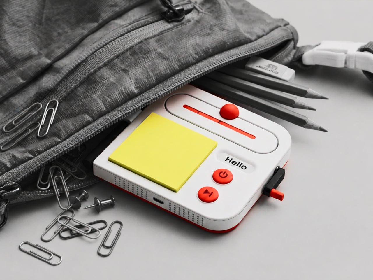
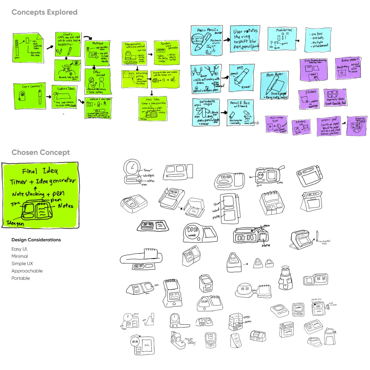
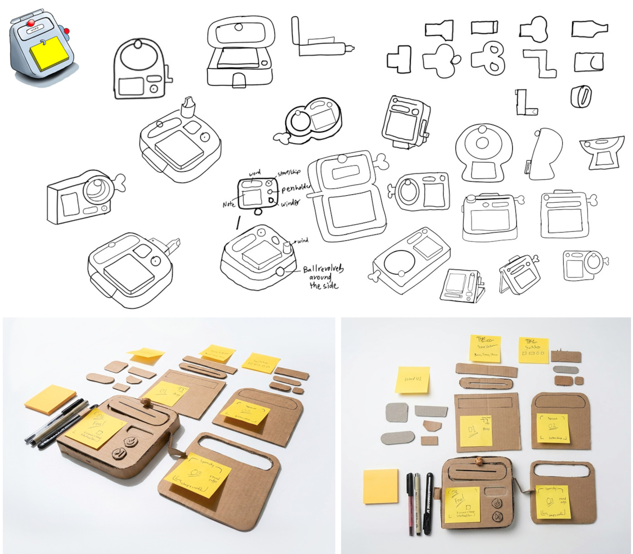
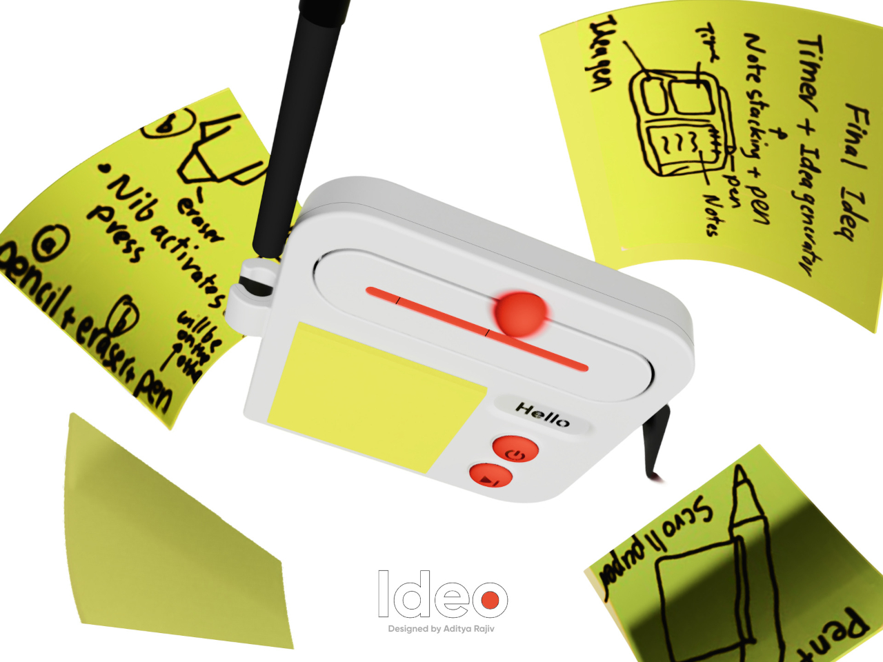
Good ideas don’t always wait until you’ve found the right pen and an empty page. For industrial designers, a quick sketch can turn into a note, then vanish while they’re looking for something to write on. Ideo is a pocket-sized concept that puts a sticky-note pad, a crank-set timer, and a random-word prompt in one place, giving those fleeting thoughts somewhere to land.

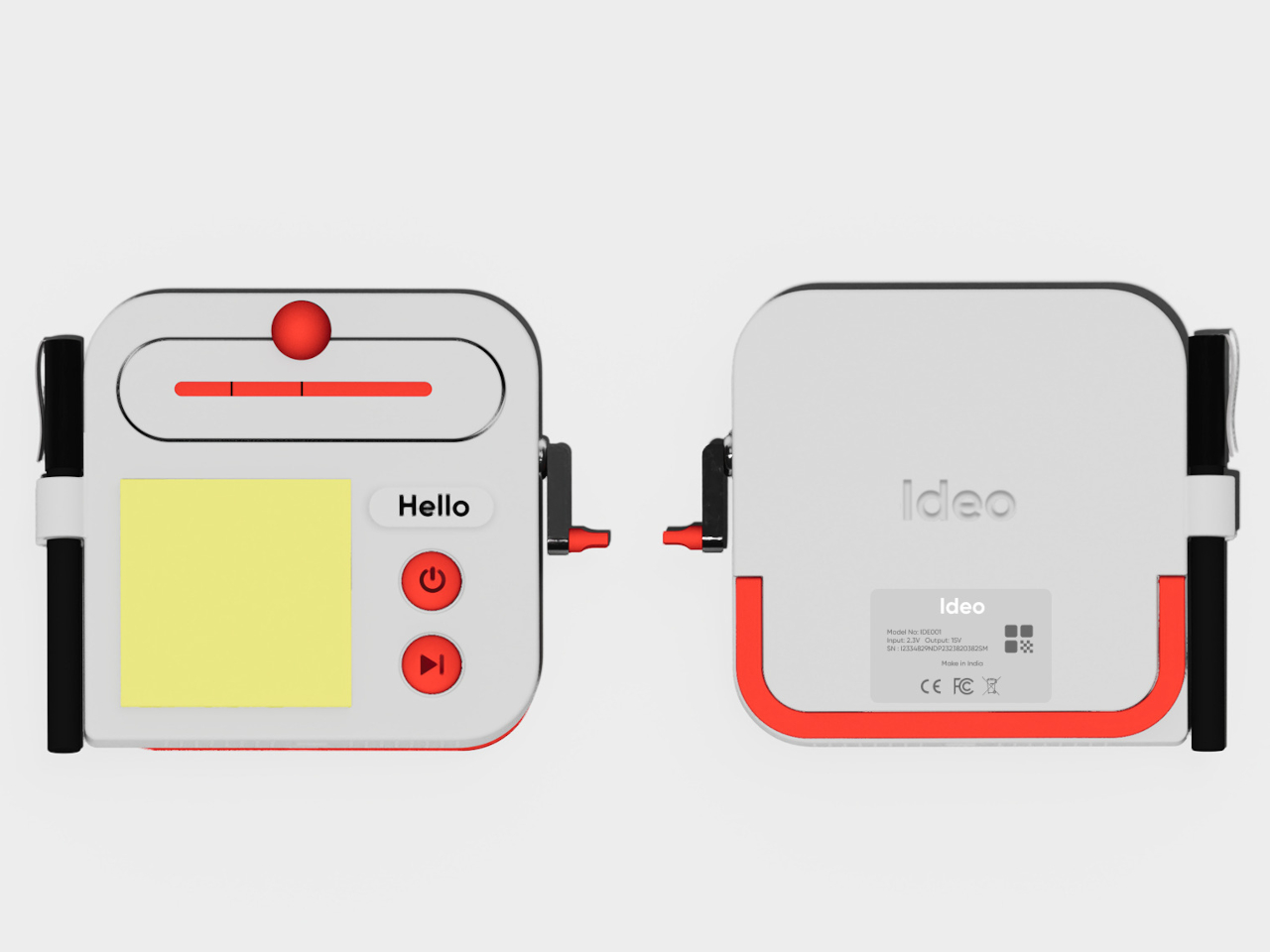
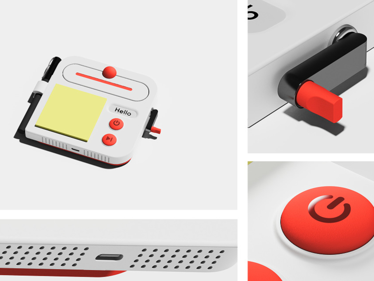
The trick isn’t to replace a sketchbook or ask a computer to finish your thinking. It’s to keep the small tools for getting started within reach. A pen clips to one side of the rounded body, while a stack of sticky notes takes up much of the front. You can jot down a shape, a measurement, or a question before it slips away.

Designer: Aditya Rajiv

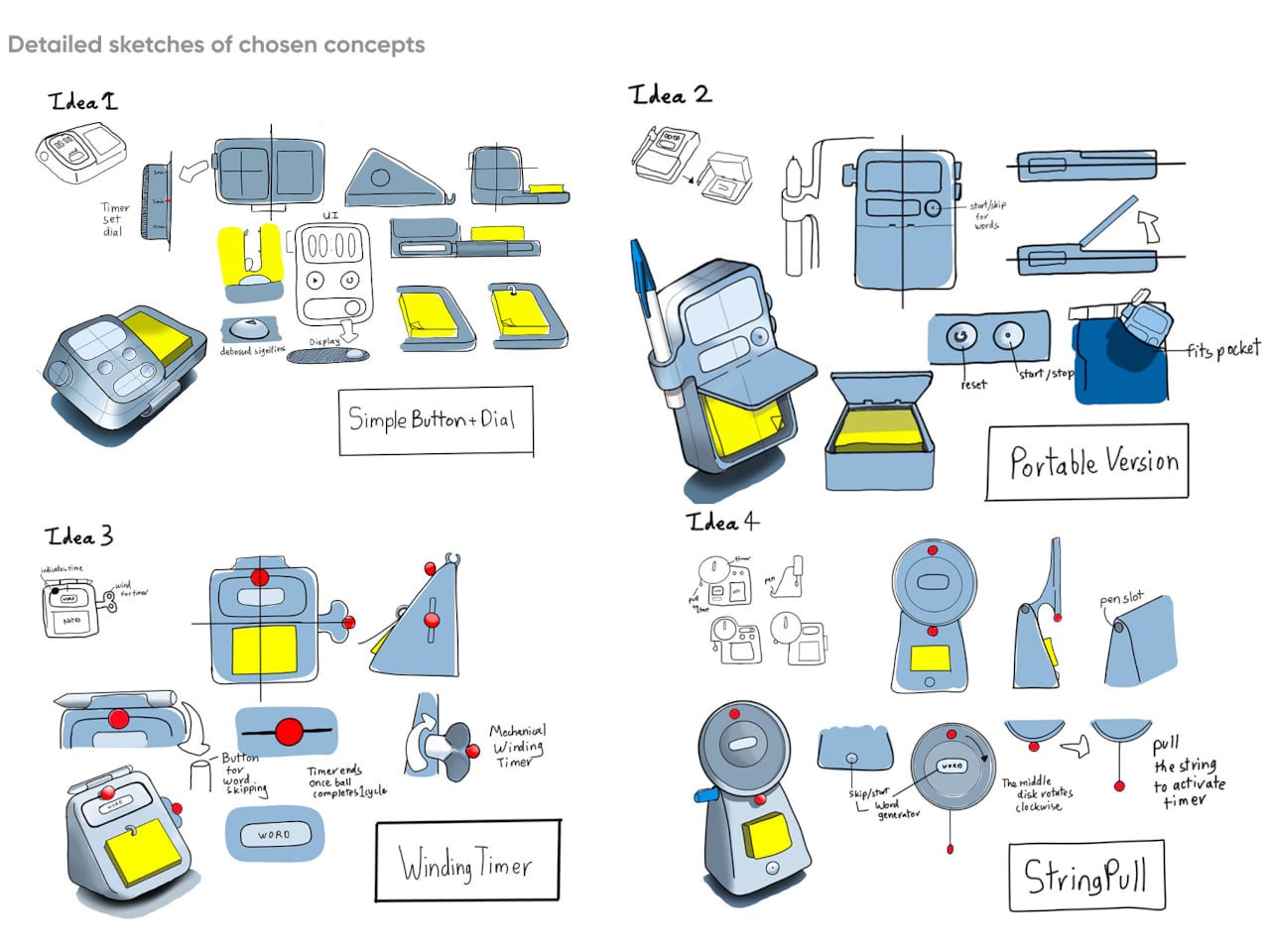
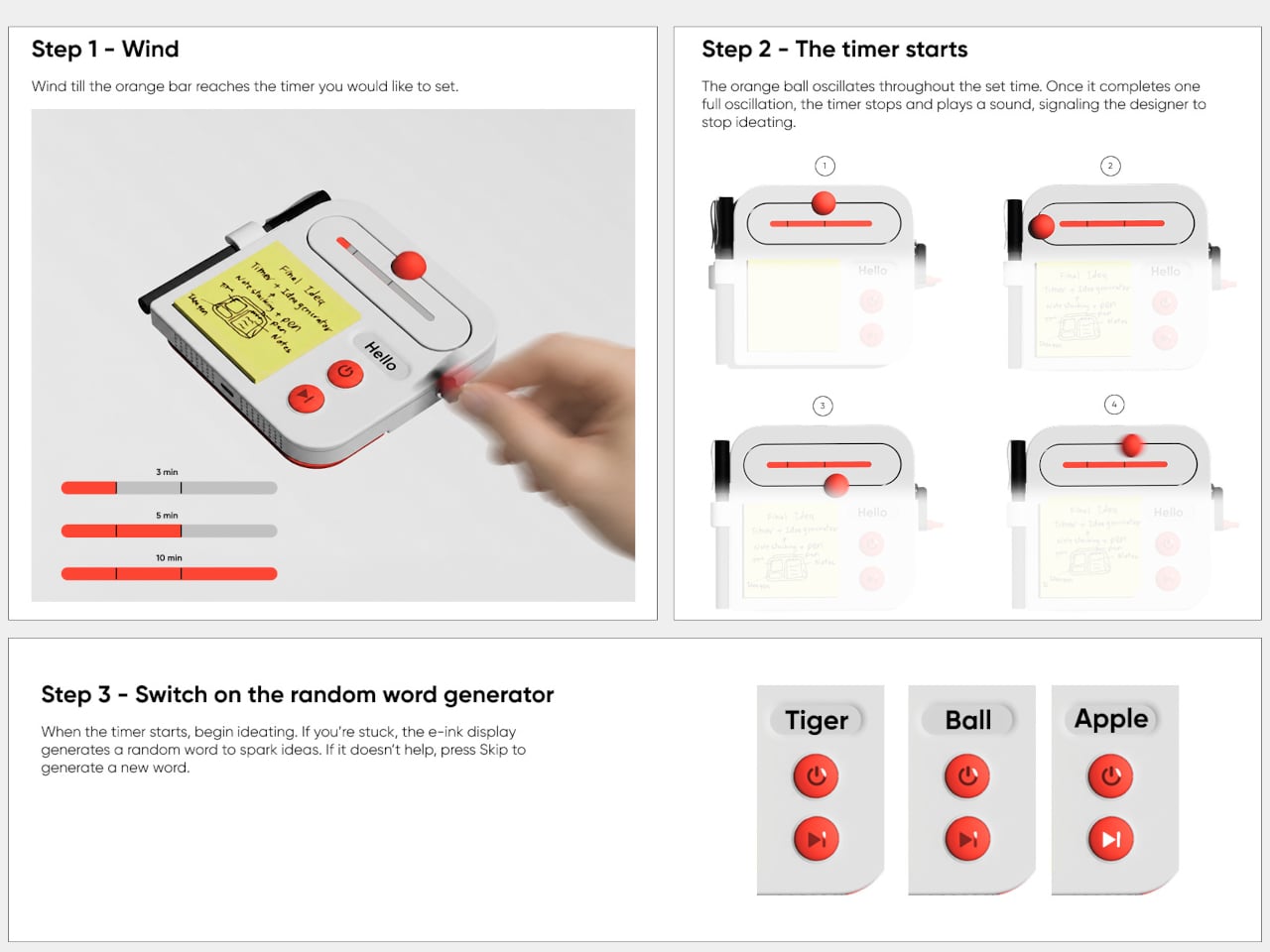
Then there’s the timer, which makes the device a little stranger than an ordinary stationery holder. Turn the crank on the side until the orange bar reaches your chosen duration, and a bright ball moves along the track as time passes. When its cycle finishes, the concept calls for a sound. That gives a short sketching session a visible beginning and end.

A blank note can be surprisingly intimidating when someone asks you for three different directions before lunch. Ideo responds with an e-ink display that presents a random word, such as “tiger” or “apple,” to nudge your thoughts somewhere unexpected. If the word doesn’t help, a physical button skips to another. This isn’t some AI that tries to take over your thinking process but, rather, a nudge to keep your pen moving.

During a workshop, you might have a few minutes to sketch a handle before the group moves on to another idea. The timer keeps that deadline obvious, while the note stays attached to the device until you’re ready to place it beside other sketches. Having the prompt nearby could help when your first drawing feels too much like the one you made yesterday.

There’s a playful contrast between the quiet white housing and its red controls, with the yellow notes taking up nearly half the front. The broad knob and two large buttons look approachable rather than like the controls on a complicated drawing tablet. It almost looks like a child’s toy, which is the perfect idiom for playful and unhindered ideation.

The concept understands a small but familiar delay: the moment between having an idea and finding a place for it. A notepad and pen handle that first step, while the timer and word generator give you a reason to start drawing instead of staring at a blank sheet. Ideo is still a concept, of course, but the scramble for a pen makes its arrangement seem practical.

The post A Pocket Concept Built to Catch Design Ideas Before They Get Away first appeared on Yanko Design.

  •  

Huawei MatePad Pro 12” Review: Stunning Hardware, One Familiar Caveat

PROS:


  • Gorgeous PaperMatte display

  • Very thin and light formfactor

  • Big battery

  • Good speaker

CONS:


  • No built-in Google Play Store

  • Long-term software support remains unclear

RATINGS:

AESTHETICS
ERGONOMICS
PERFORMANCE
SUSTAINABILITY / REPAIRABILITY
VALUE FOR MONEY

EDITOR'S QUOTE:

The MatePad Pro 12" is stylish, light, and lovely to use, with a PaperMatte display that does a lot of the heavy lifting.

Huawei’s tablet lineup is not doing itself many favors right now. The names suggest one thing, the products suggest another, and if you are just a normal person trying to work out which model is which, the whole range can feel oddly muddled. The MatePad Air sounds like it should be the lighter, breezier option, yet the MatePad Pro 12″ is actually the one that feels lighter and more effortless in the hand.

The MatePad Pro Max, by contrast, is much easier to understand. It is the big brother in the family, and it looks the part too, with a very similar design language to the MatePad Pro 12″. That makes this tablet feel like the middle child in Huawei’s lineup, not in a bad way, but in the sense that it sits between the easy-to-place Max and the more confusingly named Air.

Designer: Huawei

The good news is that the product itself is much easier to understand than the naming. The MatePad Pro 12″ is a slim, striking tablet that clearly wants to be useful as well as beautiful. It aims to cover work, entertainment, note-taking, and creative play in one polished package, and for the most part, it succeeds by being pleasant to use rather than merely impressive on paper.

Aesthetics

The MatePad Pro 12″ looks a lot like a smaller MatePad Pro Max, which is no bad thing. The two share the same slim, polished design language, and that gives the Pro 12″ an immediately premium feel. If anything, this size makes the look more approachable. It still has that high-end flagship polish, just in a form that feels a little less dramatic and easier to live with.

Both tablets come in Blue and Space Gray, and the Blue version I received is especially attractive. It has a soft shimmer finish that catches the light nicely without tipping into anything too flashy or fussy. There is also a nice contrast between the shimmer back panel and the glossy side frame, while the slightly rounded edges keep the tablet from feeling too sharp or severe. Together with the circular camera bump, these details give the design a bit more warmth and character without taking away from its clean, premium feel.

Ergonomics

For a 12-inch tablet, the MatePad Pro 12″ is impressively easy to handle. It measures about 10.4 x 6.8 inches (264.2 x 172.9 mm) and is just 0.19 inches thick (4.7 mm), but at 454g, or about 1 pound, it feels lighter in the hand than its size suggests. That makes a real difference in daily use. It is easy enough to hold one-handed for short stretches, and it never feels as cumbersome as some larger tablets do.

Just as importantly, it does not feel flimsy. Despite how thin and light it is, the MatePad Pro 12″ still feels solid and premium in the hand. That balance matters, because a tablet this slim could easily have tipped into feeling delicate. Instead, it feels refined without feeling fragile.

I also received the optional Huawei Glide Keyboard, which weighs 399g, or about 14.1 ounces, and turns the tablet into something much closer to a compact laptop. The typing experience is good, and one detail I especially appreciated is the way the keyboard neatly nests the stylus. It gives the pen a proper place to sit, which means there is less chance of it going missing while you are carrying the tablet around. Small touches like that make the whole setup feel more thought through.

That said, the keyboard is not perfect. The touchpad is a little too easy to trigger, and I often found myself accidentally brushing it while typing, so I ended up turning off Tap to Click. There is also only one viewing angle, which limits flexibility a bit, and the keyboard is not backlit. None of these issues are deal-breakers on their own, but together they make the accessory feel a little less polished than the tablet itself.

Performance

The display of the MatePad Pro 12″ is the obvious star. Huawei’s PaperMatte screens remain one of the company’s best ideas, and that is true here as well. The 12-inch OLED panel looks sharp, bright, and vibrant, while the slim 3.5mm bezels help give it a more immersive feel. Huawei has also embedded the front camera neatly into that thin border, which keeps the front looking clean and uninterrupted rather than broken up by a notch or thicker framing.

What really makes the screen stand out, though, is the PaperMatte finish. Huawei’s PaperMatte displays have impressed me before, and this one is no exception. The matte treatment cuts down on glare without making the panel look flat or dull, which is not always easy to pull off. Huawei says anti-reflection performance is 30 percent better than the previous generation, and that feels believable in everyday use. Even in bright environments, the screen comes remarkably close to reflection-free, and with up to 1600 nits of peak brightness, it stays comfortable for reading, browsing, and longer work sessions without constantly fighting the light.

The speakers are another pleasant surprise. The MatePad Pro 12″ uses a four-speaker setup, and for something this thin and light, it gets plenty loud and has more bass presence than you might expect, which gives music, dialogue, and video a bit more body than a device this slim really ought to manage. It never quite feels like the sound is coming from such a small and thin tablet. The audio can get a little sharp at times, especially at higher volume, but for casual listening and streaming, it still does a very good job.

Battery life has been solid in my use. The MatePad Pro 12″ packs a 10,400mAh battery, and in a fairly normal day of writing, emails, keeping up with my team on Slack, web browsing, and YouTube, it got through to the end of the day without me worrying too much about battery. Huawei rates it for up to 14.7 hours of local video playback, and there is also 40W reverse charging if you need to top up another device.

Software is where the MatePad Pro 12″ becomes a more conditional recommendation. The tablet runs Harmony OS 4.3 out of the box, and there is no built-in support for the Google Play Store or Google Mobile Services here, and while there are workarounds, there is no guarantee every app you rely on will work exactly as expected. That is the main thing potential buyers need to understand going in. The hardware is easy to appreciate straight away. The software side asks for a bit more patience and flexibility.

Huawei’s AppGallery does offer options like GBox, which can help you access apps that depend on Google services, but the experience is not always seamless. In my testing, GBox did not support split-screen, which felt limiting on a tablet that is otherwise clearly built for multitasking. I had better luck with apps downloaded through Aurora, which did work in split-screen, but that still leaves you deciding how comfortable you are relying on third-party app sources. For some people, that will be a manageable compromise. For others, it will be reason enough to hesitate.

On the plus side, Huawei’s own built-in apps for productivity and creativity are genuinely quite capable. GoPaint, in particular, feels feature-rich, with a wide variety of brushes and granular control over how they behave. There are also more ambitious tools like animation, which appears to build movement from your layers, and a timelapse feature that lets you replay a drawing from start to finish. Even if not everyone will use those tools seriously, they help the app feel more than just a token extra.

The Notes app is also packed with features, including AI handwriting-to-text. In my case, the results were not always perfectly accurate, but that may say as much about my handwriting as it does about the software. Either way, it is another example of Huawei putting real effort into its own app ecosystem. So while the lack of built-in Google support remains the bigger issue, the tablet’s first-party software is stronger than you might expect.

Sustainability

Sustainability is not the strongest part of Huawei’s pitch here, at least not from the information currently available. There is plenty of talk about thinness, portability, and productivity, but much less about things like recycled materials, repairability, or broader environmental commitments. More notably, Huawei has not made any official statement about how long the MatePad Pro 12″ will receive software support, which makes it harder to judge the tablet’s long-term value from a sustainability point of view.

What Huawei does emphasize is durability. The company says the MatePad Pro 12″ offers 50 percent better bend resistance than the previous generation, which is a meaningful improvement for a device this thin. A tablet that is less likely to flex or fail in everyday use is at least more likely to stay in service longer. That is not the same thing as a full sustainability strategy, but it still counts for something.

Value

Value is where the MatePad Pro 12″ becomes more complicated. Pricing starts at €1,199, or about $1,330, for the 12GB and 256GB model with a folio cover, rises to €1,299, or roughly $1,440, with the Glide Keyboard, and reaches €1,449, or around $1,610, for the 12GB and 512GB version with the keyboard. For context, Apple’s 11-inch iPad Pro with 256GB of storage starts at $1,199 in the U.S., so Huawei is clearly pricing this in direct flagship territory.

Judged purely on hardware, the MatePad Pro 12″ feels convincingly premium. It is slim, light, beautifully made, and fitted with an excellent display. The problem is that the software caveats do not disappear just because the hardware is this polished. The lack of built-in support for the Google Play Store or Google Mobile Services still makes this a more selective recommendation than the price might suggest. If you are already comfortable with Huawei’s ecosystem, the value makes more sense. If not, the asking price may feel harder to justify.

Verdict

The Huawei MatePad Pro 12″ makes its strongest case through hardware. It is slim, light, beautifully made, and fitted with a PaperMatte display that remains one of Huawei’s real strengths. The speakers are better than you might expect from something this thin, battery life has been solid in my use, and the overall experience feels properly premium. It is the kind of tablet that makes a strong first impression and, for the most part, keeps earning it.

What stops it from being an easy recommendation is software. There is no built-in support for the Google Play Store or Google Mobile Services, and while workarounds exist, they are still workarounds. For buyers already comfortable with Huawei’s ecosystem, that may be manageable. For everyone else, it adds friction to a tablet that is otherwise polished and appealing. The MatePad Pro 12″ is a very good piece of hardware, but it is not the most straightforward premium tablet to buy.

The post Huawei MatePad Pro 12” Review: Stunning Hardware, One Familiar Caveat first appeared on Yanko Design.

  •  

The 90-Year-Old Lamp Nobody Improved On — Until Now

A lamp can look beautiful on a desk and still make it harder to work. The bulb catches your eye, the light lands everywhere except the page, or the fixture takes up the space you needed for a notebook. Louis Poulsen’s reissued PH Piano Lamp starts with a more useful question: How do you put light precisely where it’s needed without making the lamp itself a distraction? Poul Henningsen designed the original for pianists, who needed to see their sheet music without uncomfortable glare.

That problem reaches well beyond the piano. Anyone who has tried to read beside a bright table lamp or work under a harsh overhead light knows the difference between having enough light and having the right light. I like that this reissue hasn’t lost sight of its practical beginnings. Its curved, counterbalanced arm lets the shade move while the lamp stays stable, giving the design a sense of purpose you can read from across the room.

Designer: Poul Henningson for Louis Poulsen

Henningsen first created the Piano Lamp in the early 1930s, building on his PH lighting system, which uses layered shades to manage how light reaches the eye. Louis Poulsen has brought it back as the PH 1/1 Piano Table Lamp Limited Edition 2026, with adjustments intended to make it useful beyond its original setting. It’s an appealing idea for a reissue: keep the reason the object existed, then give more people a reason to use it.

The new version pairs aged brass with glass shades in a color Louis Poulsen calls Dusty Terra Cotta. On paper, that combination sounds richly nostalgic. In practice, its appeal is more specific. The warm-toned glass gives the lamp a softer visual presence, while the long arm and compact shade keep it from feeling like a decorative lamp that has wandered onto a work surface by mistake. You could imagine it near a keyboard, but also beside a book, a sketchpad, or a late-night crossword.

That versatility matters because our rooms rarely serve just one purpose anymore. A dining table becomes a desk. A side table has to accommodate a drink, a charger, and whatever we’re currently reading. Good lighting can make those small shifts easier without demanding that we rearrange the room. The Piano Lamp feels suited to those spaces precisely because it was designed around a task. Its shape may be memorable, but the starting point was helping someone see what they were doing.

I’m also drawn to the fact that it looks a little unusual. The arm has a gentle, almost musical curve, while the shade sits low enough to suggest a conversation between the lamp and whatever is beneath it. Many contemporary lights aim to disappear into the background. This one has a clear silhouette, yet its job is to make the thing you’re doing more comfortable. That balance is harder to achieve than a striking shape alone.

Of course, a limited-edition design lamp isn’t an automatic solution for every desk or budget. If all you need is a cheap light for a spare room, this probably isn’t the practical choice. But it does offer a useful reminder that a lamp’s value isn’t measured only by how brightly it shines. Where the light goes, how it feels, and how easily the fixture fits into daily routines all count. Those are the details you notice after the novelty of a new object wears off.

Louis Poulsen says the PH 1/1 Piano Table Lamp Limited Edition 2026 will be available from October through December 2026. The short window gives it collectible appeal, but I hope that isn’t the only reason people pay attention. Its more interesting quality is how current its original problem still feels. We have plenty of ways to brighten a room. Finding light that helps us focus, without making us squint, remains a much better goal.

The post The 90-Year-Old Lamp Nobody Improved On — Until Now first appeared on Yanko Design.
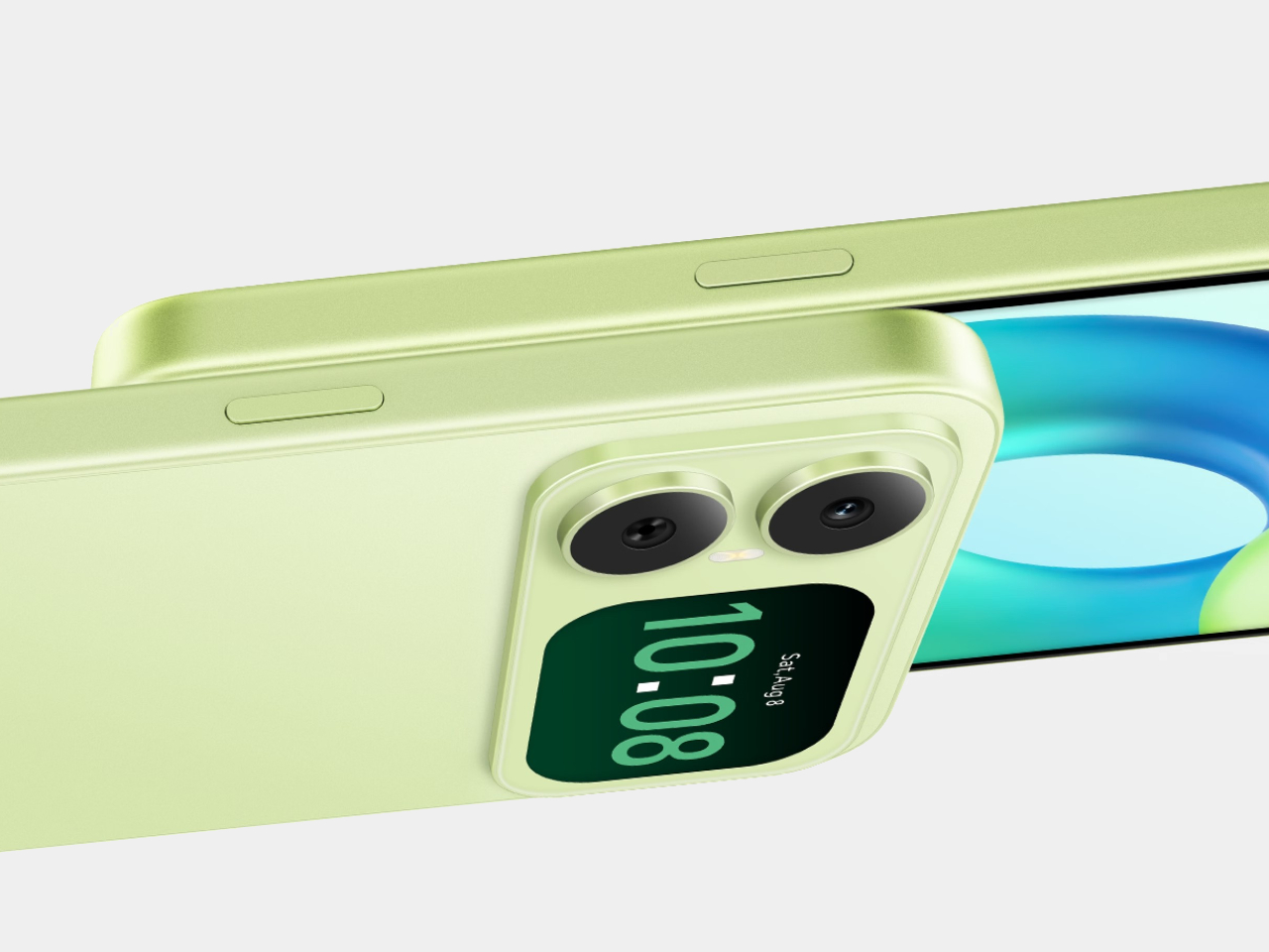
  •  

Mobvoi TicNote smartwatch has one button, and it’s built to remember what you often forget

I know you will relate to one of these telltale moments. A meeting ends, someone gives you three useful details, and by the time you reach your desk, only one remains. The same thing happens after an interview, a doctor’s appointment, a lecture, or when someone rattles off directions while you’re already trying to keep up. We like to think we remember conversations better than we actually do.

Mobvoi’s TicNote Watch is designed to cover that very human failure. Instead of asking you to open an app, find a recorder, or reach for your phone, it gives the watch a dedicated physical recording button. Press and hold it to start recording. The recording can happen without a phone and even works offline. To me, the idea seems pretty interesting for capturing my team’s briefing.

Designer: Mobvoi

Mobvoi TicNote does the heavy lifting for you


Most smartwatches are defined by everything they can do. Notifications, workouts, calls, apps, payments, music, health tracking – the list keeps getting longer. TicNote Watch is different though, as its most important interaction is deliberately narrow. Just press a button and remember what just happened. That makes the hardware control more interesting than it might initially seem. There is something satisfying about a product that behaves more like a lighter, a film camera’s shutter, or a staple gun than another miniature touchscreen computer. The action is physical and doesn’t require you to navigate an interface while somebody is still talking.

In a world where dedicated controls have increasingly disappeared behind glass, putting one back on the wrist becomes a design statement. This smartwatch isn’t trying to make every interaction smarter; rather, it aims to make one interaction nearly impossible to mess up. The double-press gesture adds a smaller version of the same idea, letting users capture a quick thought of up to 60 seconds.

Simple input, surprisingly busy output

What happens after the button press is where the AI kicks in. TicNote Watch can transcribe conversations on the wrist, with live text supporting 17 languages, and users can tap to highlight important statements while a conversation is happening. Once the recording ends, the system can generate an AI summary and mind map. The intended audience for the wearable can be a journalist leaving an interview, a recruiter moving between candidates, a consultant bouncing between meetings, or a graduate student sitting through a campus lecture. For someone spending much of the day listening rather than typing, removing the act of note-taking can be genuinely useful.

There is, however, an obvious social wrinkle. A recorder that lives on your wrist is easy to reach for, but that doesn’t mean everyone around you will be comfortable being recorded. Consent and workplace etiquette matter, particularly in meetings or shared spaces. Mobvoi also claims more than 24 hours of continuous recording and up to 200 hours of local storage, so this isn’t unlimited memory in literal terms. At $249, with a limited-time introductory price of $199, TicNote Watch isn’t really competing on how many smartwatch features it can squeeze onto your wrist. It is built around a premise that doesn’t try to replace your phone, your notebook, and your entire day.


The post Mobvoi TicNote smartwatch has one button, and it’s built to remember what you often forget first appeared on Yanko Design.

  •  

9 Best Gifts for the Person Who Turned Their Living Room Into a Sports Bar

Some people watch the game. Others build a whole experience around it. The living room becomes the venue, the couch becomes the seat, and somehow the right gift makes the whole setup feel intentional rather than assembled over years of impulse buys. These nine picks span every corner of the room, from the screen to the sound to the table that keeps the energy going long after the final whistle blows and nobody is ready to leave just yet.

A great game-day room is not really about having the biggest TV. It is about having a room that works. Sound that fills the space without fighting for attention. A screen that earns its place on the wall even when the game is not on. A table that gives the energy somewhere to go at halftime. These gifts solve real problems in that space, and each one carries enough design thinking behind it to feel like a genuinely considered choice rather than a last-minute add to cart.

1. Portable CD Cover Player

Most pregame rituals revolve around a playlist nobody agreed on. The Portable CD Cover Player changes the format entirely, looking exactly like a CD jewel case standing on edge, which means it earns its shelf spot before anyone presses play. For someone who has put real money into making their living room feel right, a music player that doubles as a sculptural object is the kind of gift that holds its ground in the room long after the season ends and the decorations come down for good.

Beyond the form, it delivers. Slot a disc in and the music plays back with the kind of warmth a streaming service on a phone speaker simply does not replicate. It reads as the pregame companion: the thing that sets the tone before the screen takes over and the broadcast audio fills the room. For the host who treats game day like an event rather than a habit, this is the detail that tells everyone in the room that the person running the setup actually thought it through from the first quarter to the last.

Click Here to Buy Now: $199.00

What We Like

  • The form is genuinely surprising without being gimmicky, earning a permanent shelf spot rather than a junk drawer after the novelty wears off in the first week.
  • At from $199 on YD Select, it sits in a gift tier that feels considered without crossing into impractical territory for most budgets.

What We Dislike

  • Physical media is a deliberate commitment, and someone who has moved entirely to streaming will need to rebuild a CD library, which is either a feature or a friction point depending entirely on who is receiving it.
  • Pricing for different color or finish variants beyond the base entry price is not confirmed on the current listing.

2. Hisense U6SF Pro

The U6SF Pro solves the problem most living rooms never fully address: glare. Sunlight through a window, a lamp left on during an afternoon game, the overhead light nobody turned off before kickoff. A standard panel washes out and flattens the image before halftime arrives, but Hisense’s anti-reflection, glare-free coating treats the room’s actual conditions as part of the design brief. Tom’s Guide’s reviewer noted they never once had to adjust the room lights during a full testing session with this panel in a real living room.

At $699, down from its original launch price of $1,099, the U6SF Pro puts a 1,200-nit Mini LED panel with a native 144Hz refresh rate and a built-in subwoofer into a price bracket that used to feel out of reach for this level of picture performance. That combination of brightness ceiling, motion handling, and built-in bass makes it the natural anchor for a game-day living room that is serious about the setup without being unreasonable about what the whole thing should realistically cost.

What We Like

  • The glare-free anti-reflection coating is a tested, real-world differentiator in rooms that are not dedicated dark home theaters, which describes most living rooms where the game actually gets watched.

What We Dislike

  • The built-in subwoofer is a convenient feature, but committed audio setups will likely still want a dedicated soundbar or speaker pair running alongside it for full-range coverage.
  • Available in larger screen sizes that may not suit every living room layout, so confirming dimensions before committing to this as a gift is worth the extra step.

3. XGIMI MoGo 4

The second-screen problem- where does the overflow crowd watch when the main room fills up- never gets planned for until it is actively happening. The XGIMI MoGo 4 is the answer that does not require buying a second television. A 1080p portable projector with 450 ISO Lumens, a 360-degree adjustable stand, Google TV with licensed Netflix built in, and dual 6W Harman Kardon speakers, it throws up to a 200-inch image from a cylinder compact enough to sit on a coffee table without commanding the room.

The 71.28Wh built-in battery delivers up to 2.5 hours of playtime, covering most games without needing a wall outlet nearby. Running on Wi-Fi 5 and Bluetooth 5.1, the setup is entirely wireless from start to finish. For a host who wants a backyard overflow screen, a garage viewing option, or a second room covered on playoff day, this is the projector that pulls all of that off without a permanent installation, a ceiling mount, or a second cable subscription attached to the monthly bill.

What We Like

  • The 360-degree adjustable stand means it can project onto a ceiling, a garage door, or a blank wall with the same minimal setup effort every single time.
  • Google TV with licensed Netflix built in removes the need for an external streaming stick or any additional device running alongside it out of the box.

What We Dislike

  • At 450 ISO Lumens, bright-room performance has real limits, and this works best in a controlled-light environment rather than a fully sunlit afternoon kickoff.
  • 2.5 hours of battery life covers a standard game comfortably but falls short for overtime-heavy playoff marathons without a power source kept nearby.

4. Come Together

Come Together Adds Rolling Speaker and Mini Fridge to Your Couch

Most game-day setups eventually arrive at the same friction point: someone has to get up to restock the drinks, and that person misses the play everyone is going to be talking about for the next ten minutes. Come Together is a three-piece robotic system designed specifically around that problem. The Tower sits as a calm black cylinder until it is needed, then rises to reveal a built-in mini fridge capable of holding up to five cans, with a tray on top that swaps in for snacks when the cooling function is not the priority.

The Base handles the sound half of the equation. It is a circular spatial audio unit that maps the room, figures out where people are sitting, and positions itself for the best possible coverage without anyone adjusting a thing. A Qi2 wireless charging pad keeps phones topped off through a long game without anyone leaving the couch to find a cable. For the host who has optimized everything else and still loses someone to the kitchen every twenty minutes, this is the piece that quietly closes that gap.

What We Like

  • The Qi2 wireless charging integration solves the dead-phone problem during long games without adding another cable to a setup that is already managed tightly.
  • A spatial audio unit that actively repositions itself for the room’s seating layout is a genuinely considered detail for a couch-forward, game-first viewing environment.

What We Dislike

  • Five cans is comfortable for one or two people but runs short for a full game-day group without a refill run, which somewhat undercuts the core convenience premise.
  • Consumer purchase availability should be confirmed before gifting, as this was covered at the concept-design stage and current retail status should be verified against the original coverage.

5. RetroWave 7-in-1 Radio

The RetroWave 7-in-1 Radio has the look of a vintage Japanese radio and the utility of something designed entirely for now. Behind the tactile tuning dial and compact body, measuring 5.04 inches wide and 3.86 inches tall in ABS resin and iron, it pulls in FM, AM, and shortwave stations, streams music over Bluetooth, plays MP3s via TF card, and carries a built-in flashlight and SOS alarm. For a game-day room, it earns its shelf spot the moment it arrives. Nobody in that room mistakes it for an afterthought.

During a game, its job is focused: fill the room with the pre-broadcast energy, the live radio commentary, or the kind of ambient music that does not demand a playlist decision before kickoff. When the power cuts out, and at some point it does, the radio keeps going in a way a smart speaker or a streaming device simply cannot promise without a signal. At $89, it is the gift that reads as a design object on the shelf and earns the label of genuine essential in the room and well beyond it.

Click Here to Buy Now: $89.00

What We Like

  • Seven real functions in one compact body, covering speaker, MP3, radio, flashlight, clock, power bank, and SOS alarm, with no redundancy in how each one actually gets used.
  • The retro Japanese design language means it lives on a shelf and looks like it belongs there rather than sitting out like a piece of tech that never found a proper home.

What We Dislike

  • The compact dimensions mean speaker output suits ambient listening and pregame music rather than filling a large room at full volume when the crowd gets loud.
  • Shortwave reception quality will vary by location and atmospheric conditions, meaning not every station is equally accessible in every US market throughout the season.

6. IKEA x Xbox YXSTABY Collection

IKEA and Xbox’s YXSTABY furniture collection makes gaming feel more at home

The IKEA and Xbox YXSTABY collection is nine pieces of furniture designed around the specific reality of a living room that doubles as a gaming and viewing setup. The rolling TV stand, the thumbstick-shaped stool, the D-pad cushion: each piece reads clearly as part of the same visual language while functioning as real, everyday furniture rather than themed décor that announces itself too loudly. It is the first time a gaming identity has been built into a living room collection at this level of design seriousness, and the craftsmanship reflects it.

For the person whose living room already functions as a game-day headquarters, these pieces solve the organizational and seating problems that quietly accumulate around a serious setup over time. The rolling TV stand keeps equipment mobile without the floor clutter of static furniture that never quite sits right. The stools double as extra seating the moment the couch fills up before kickoff. Launched in IKEA stores October 1, 2026, the collection ties the room together rather than adding another device to a pile that is already complicated enough.

What We Like

  • Nine coordinated pieces mean gifting one item or several works without the room looking inconsistent, since everything belongs to the same design system from day one.
  • The rolling TV stand solves the real logistical problem of rearranging a viewing setup without unplugging and re-routing every cable in the process.

What We Dislike

  • The gaming-identity aesthetic is deliberate and visible, which suits the target audience perfectly but narrows the appeal for someone who prefers a more neutral living room look throughout their space.
  • Availability in specific IKEA markets should be confirmed before purchasing, since not every location will carry the full nine-piece range at launch without advance stock checks.

7. Department of Play 3-in-1 Table

One Table, 3 Games, Nobody Needs a Game Room

Sanne’s Department of Play table does the math that most game-room setups never quite solve: one table, three games, and no dedicated room required. It converts between pool, ping pong, and dining configurations, which means it earns its square footage in a normal-sized living room rather than demanding a basement or a spare room nobody actually has. For the person who has maxed out the screen and sound side of their setup, this is the piece that extends the experience past the final whistle into the rest of the evening.

Halftime has a specific energy problem. The game pauses, but the room does not settle with it. A table that converts to pool or ping pong in a few steps gives that energy somewhere productive to go rather than everyone drifting toward their phones and losing the thread of why they came over in the first place. It is also the one item on this list that earns equal weight during the offseason, which makes it the most defensible large-format gift in the group by a considerable margin.

What We Like

  • Three fully functional game configurations in one piece means it does not feel like a compromise on any of the three: pool, ping pong, and dining each hold up entirely on their own.
  • It earns its keep in the offseason in a way that purpose-built game-day furniture rarely manages once the season wraps up and the schedule clears.

What We Dislike

  • The footprint is significant, and the room should be measured carefully before committing, especially if the living room already has an established furniture layout that functions well as-is.
  • Converting between configurations takes time and some physical effort, which feels less appealing mid-game when a quick round between plays was the actual goal going in.

8. Hisense CanvasTV

The CanvasTV solves the problem most televisions ignore entirely: what the screen looks like when the game is not on. A 4K QLED Google TV wrapped in a teak frame, it ships with an UltraSlim wall mount already included in the box, letting the panel hug the wall closely enough to read as a framed painting rather than a floating screen. A Hi-Matte anti-glare panel and an RGB light sensor allow it to adapt to the room’s actual lighting conditions throughout the day without anyone touching a setting.

When no one is watching, the Motion Detector blanks the display, cutting to a neutral screen the moment the room empties and switching back to art the moment someone returns. Access to more than 1,000 curated artworks comes built in at no extra subscription cost. At $1,997.99, it is the top-of-list anchor gift for someone whose living room already performs during the game and deserves a screen that holds its own for the other twenty-two hours of the day when the broadcast is off, and the room still needs to look right.

What We Like

  • The UltraSlim wall mount included in the box removes the most common installation friction point and makes the all-in price considerably more honest than it first appears.
  • Over 1,000 curated artworks with no subscription fee attached is a genuine differentiator against competitors that charge a monthly rate for access to their art libraries.

What We Dislike

  • The teak frame aesthetic is specific and intentional, working beautifully in the right interior but unlikely to suit every room style with the same effortless ease.

9. Side A Cassette Speaker

The Side A Cassette Speaker is the easiest item on this list to explain and the hardest to put down once it is in your hands. A Bluetooth speaker shaped and sized exactly like a cassette tape, it sits on a shelf, a coffee table, or a windowsill and reads as a found object rather than a piece of tech left out between uses. For a room that has been carefully assembled piece by piece, it is the kind of small detail that signals genuine taste without demanding any attention at all from the people in the room.

At $49 on YD Select, it functions as the natural lower-budget pick in this lineup: the item that rounds out a larger gift or works entirely on its own when the occasion calls for something thoughtful rather than extravagant. It plays music with enough clarity to carry the room before the main screen takes over, and it does so while looking like something that was always meant to be there rather than something plugged in and forgotten in the corner when the season gets busy and the setup expands.

Click Here to Buy Now: $49.00

What We Like

  • At $49, it sits comfortably in the easy-yes gift tier: specific enough to feel genuinely considered and affordable enough to give without second-guessing the price once it is wrapped.
  • The form is the function. It looks like a cassette, plays music clearly, and earns a permanent shelf spot in a room that has been put together with real care and intention over time.

What We Dislike

  • Speaker output is proportional to its size. It is a pregame and ambient-listening companion rather than a replacement for a dedicated Bluetooth speaker when volume becomes the actual priority of the room.
  • The cassette format is a deliberate nod to a specific era of nostalgia, which works well for the right recipient but may feel too referential for someone who prefers a forward-facing, minimal design language throughout their space.

The Room That Works All Season

A game-day room is really just a room with strong opinions about what it needs to do well. The right screen, the right sound, the right table for when the final whistle goes, and nobody is ready to pack up and head home. Every pick on this list earns its place by solving a real problem in that room rather than adding noise to a setup that is already working well enough on its own without it.

The best part of giving something to the person who has already built the room is that they will actually use it, week after week, throughout the season and past it. These are not conversation pieces or shelf fillers added for their own sake. They are objects that get switched on, picked up, sat in, and genuinely appreciated in real time during a game that matters to the people in that room, and that kind of usefulness is harder to gift than it looks.

The post 9 Best Gifts for the Person Who Turned Their Living Room Into a Sports Bar first appeared on Yanko Design.

  •  
❌