❌

Vue lecture

MERACH’s new W60 Plus walking pad boasts 12 incline levels, RGB lights, and a built-in Bluetooth speaker

The under-desk treadmill had its moment, arriving as the perfect sidekick for our sudden work-from-home lives (can you believe it’s been six whole years?). It was the simple, brilliant answer to hitting a step count between calls and emails, and products like the original WalkingPad and the WalkingPad S1 were among the early heroes of that era. We all got one, or knew someone who did, turning home offices into miniature gyms where productivity and light cardio could finally coexist. The problem was that a lot of those machines, true to their budget price tags, started dying after six months of use. Walking pads got a reputation for being disposable, which was a shame, because the core concept was always worth taking seriously.

The UltraWalk W60 Plus is the clearest expression of what MERACH is building toward: a walking pad engineered with permanence at its core. When we caught the brand at IFA 2026, their first major trade show appearance despite an already loyal following built through e-commerce, the walking pad lineup stood out for build quality at a price most competitors couldn’t match. The W60 Plus has 12 automatic incline levels, a third-party SGS-certified motor, and a weight capacity that would make a full-size treadmill raise an eyebrow. Mood lighting and a Bluetooth speaker come along too, which sounds ridiculous until you realize how much more likely you are to use a machine that’s genuinely fun to be around.

Designer: MERACH

Click Here to Buy Now: $288 $499.99 ($211.99 off, use coupon code “MERACHW60”). Hurry, deal ends in 48-hours!

A 3.5 HP Brushless Motor, SGS-Certified Performance, and a Frame Rated for 330 Lb

The W60 Plus runs on a 3.5 HP peak / 1.25 CHP brushless motor with a 42mm diameter and a Hall sensor for precision feedback. Brushless motors are generally more efficient and longer-lasting than brushed ones, and MERACH claims a lifespan of up to 15,000 hours here, which the brand puts against the 300 to 800-hour lifespans typical of budget walking pad motors. The weight capacity sits at 330 lbs under SGS-certified testing conditions. The heavy-duty steel frame doesn’t wobble under a real walking load, which matters more than most spec sheet comparisons. That stability is what separates a machine you’ll want to use from one you’ll come to resent.

The W60 Plus passed SGS’ performance specs evaluation with flying colors. The noise testing came back at under 54 dB at medium speed with a 75 kg test load, which sits comfortably below the ambient volume of a normal conversation. At maximum speed that figure climbs to 60 dB with load, and 55 dB without, meaning the machine stays apartment-friendly even when it’s working hard. There’s also a one-touch mute function for those moments when you absolutely need silence (hello, important video calls). That noise profile lets you walk and watch TV simultaneously without either experience suffering, which is, honestly, the whole point of this category.

Twelve Auto-Incline Levels, a 16.5-Inch-Wide Deck, and a Speed Range Built for Walking
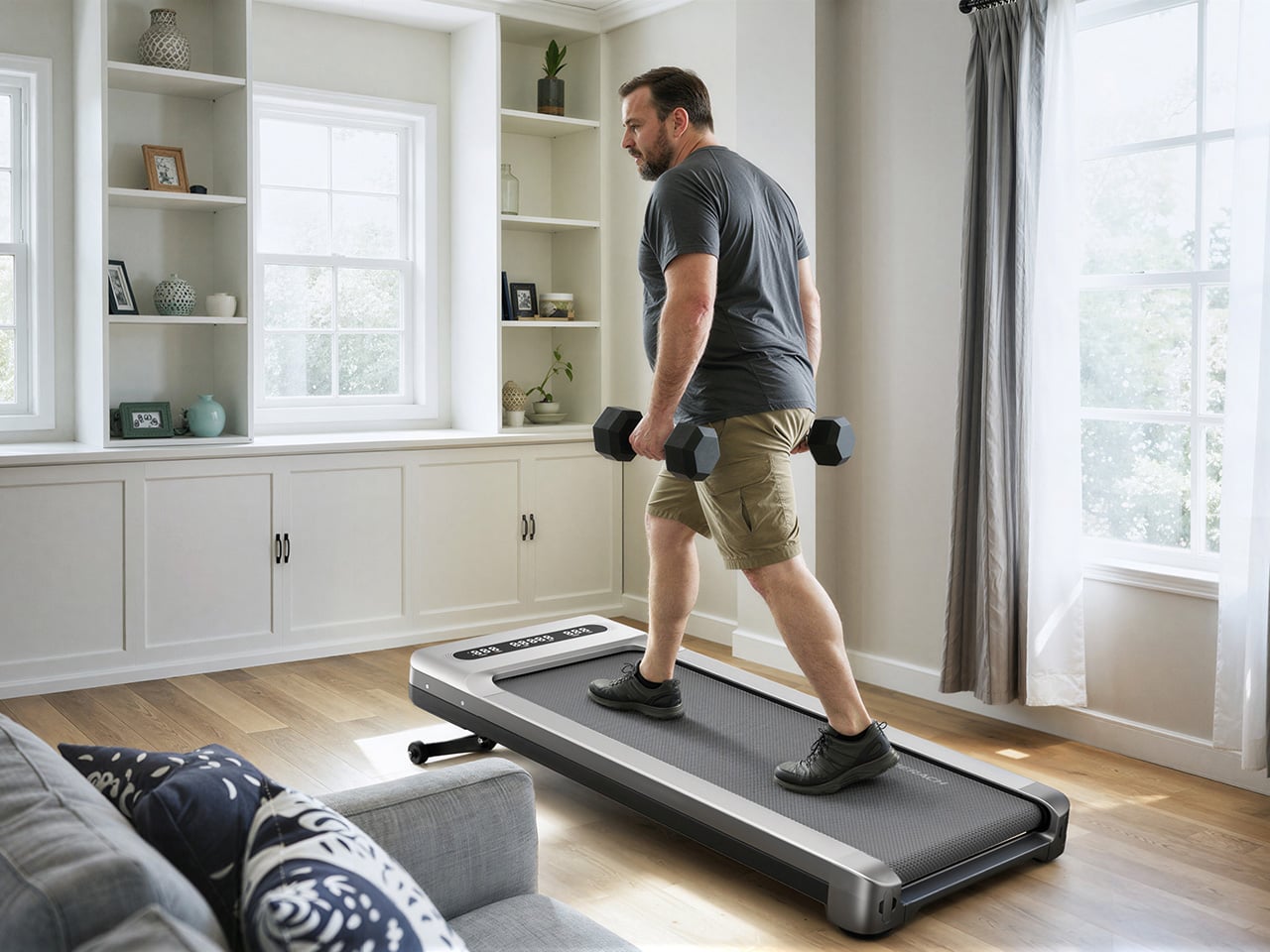
Twelve levels of automatic incline is the feature that separates the W60 Plus from the flat-and-boring competition, and for a machine in this price tier, it’s genuinely unusual. At the highest setting, it shifts from a gentle recovery walk to something that meaningfully elevates your heart rate, particularly through the posterior chain. The speed range of 0.6 to 4.0 MPH keeps things firmly in walking and light jogging territory, and that 4 MPH ceiling is worth acknowledging: this machine won’t satisfy runners. What it will do is make a 3 MPH incline walk feel like real exercise, which for most desk-workers is entirely the point. Incline transitions between levels automatically and smoothly, a detail that matters when you’re trying to maintain a rhythm.

The running deck measures 16.5 inches wide by 41.3 inches long, which MERACH puts at roughly 33% wider than the category standard. That extra width makes for a more natural gait and stride, particularly for taller users or anyone with broader hips. The non-slip surface handles uphill walking and light jogging without issue, and the length means you’re not constantly worrying about the back edge. Team USA heptathlete Annie Kunz has been using the W60 Plus for active recovery and step accumulation, describing it as a way to “jump on here and there when I feel a burst of energy.” Multi-event athletes log enormous volumes of low-intensity cross-training, and a 12-level incline walking pad fits that workflow more naturally than a flat surface ever could.

Sound-Reactive RGB Lighting, a 5W Bluetooth Speaker, and Triple-Platform App Integration
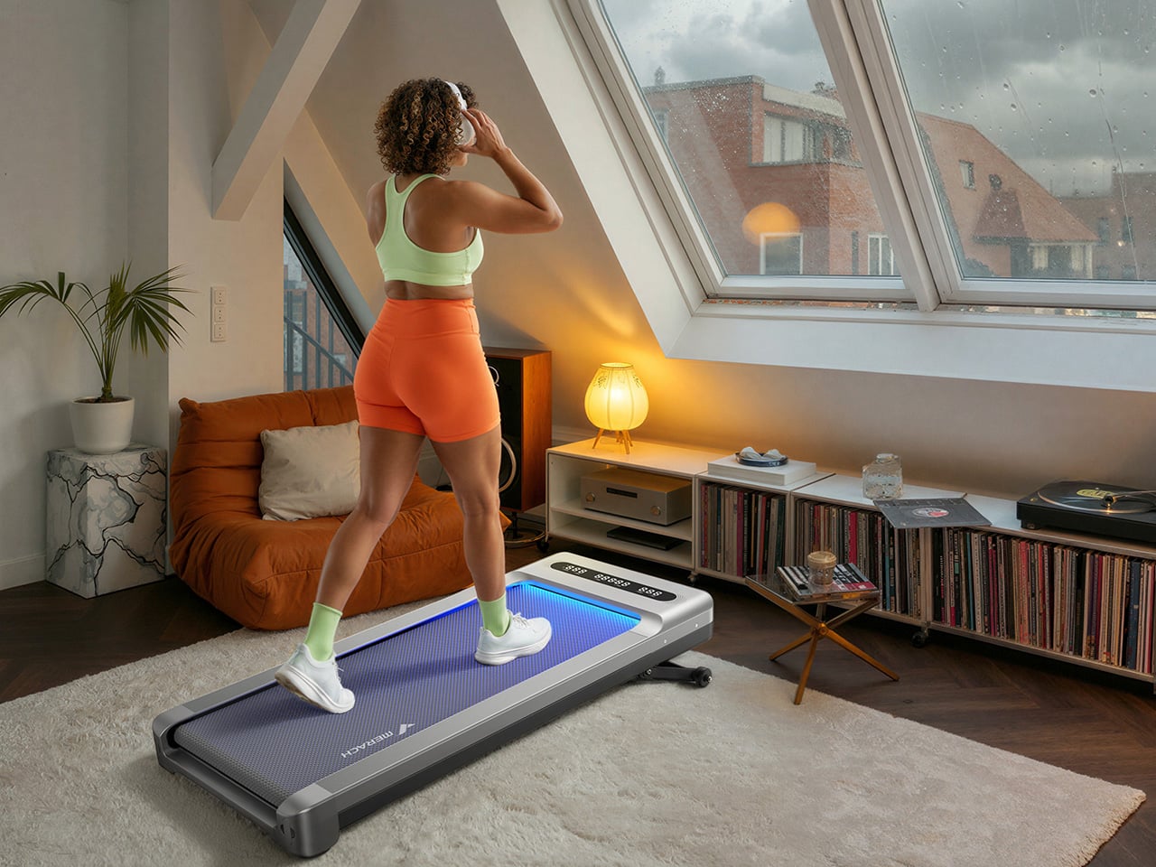
MERACH’s RGB lighting system reacts to step frequency and syncs to audio rhythm, creating a feedback loop between movement, sound, and visual stimulus that turns a walking session into something engaging. A walking pad that’s boring ends up under the sofa permanently, and MERACH clearly treats engagement as a design constraint, not an afterthought. The lighting pairs with a built-in 5W Bluetooth speaker that fills a home office without headphones, which matters when you’re walking through calls or podcasts. The whole feature cluster borrows from the cozy cardio playbook, acknowledging that for most users, habit formation is a bigger obstacle than physical capability. Make the machine enjoyable to use, and the steps take care of themselves.

Full app integration spans MERACH’s own platform, Apple Health, and Google Fit, with real-time tracking of speed, incline, calories, distance, time, and step count across all three. The MERACH app adds guided routines and custom workout programs, which pushes the W60 Plus into territory where it can coach you through a session rather than simply hosting it. An 8-button magnetic remote handles speed, incline, lighting, mute, start/stop, and program selection, and it docks magnetically to the frame when not in use. The LED display gives you a live readout of key metrics without having to pull out your phone. None of it requires a subscription, which at this price is a genuinely welcome detail.

Zero Assembly, 80 Percent Less Floor Space, and a Price That Makes Sense
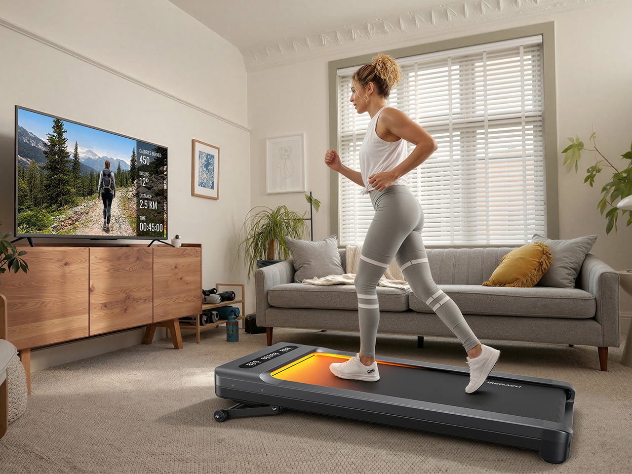
The W60 Plus ships fully ready to use: unbox it, plug it into a standard 110V outlet, and step on. No assembly means no instruction booklet, no leftover mystery bolts, and no 45-minute YouTube tutorial that’s supposed to take 10 minutes. When you’re done, the vertical folding support stand lets the machine stand upright, which MERACH says cuts the floor-space footprint by up to 80%. The enlarged front transport wheels make it manageable to move even over carpet, which is where most budget transport wheel designs tend to give up. At 67.7 lbs, the W60 Plus isn’t light, so those wheels are doing real work every time you slide this thing out from under the desk.

The UltraWalk W60 Plus launched on May 26, 2026, and is available now through MERACH’s official website in a Grey finish, with the list price marked at $499.99 and the current sale price at $329.99. MERACH is also offering an extra discount code, MERACHW60, which drops the checkout price to $264.00 with free shipping, a much more aggressive number than this category usually sees for a 12-level auto-incline walking pad. The product page also offers optional accident protection from $29.99. Warranty details are not clearly surfaced in the material provided, so that part is best verified directly on MERACH’s store before publication.

Click Here to Buy Now: $288 $499.99 ($211.99 off, use coupon code “MERACHW60”). Hurry, deal ends in 48-hours!

The post MERACH’s new W60 Plus walking pad boasts 12 incline levels, RGB lights, and a built-in Bluetooth speaker first appeared on Yanko Design.

  •  

This Expandable LEGO Frame System Finally Solves the Collector Storage Nightmare

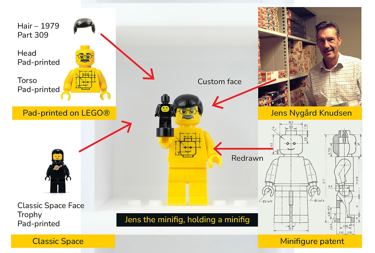
Somewhere in a closet, a perfectly good LEGO minifigure is staring through a plastic bag at the back of a cardboard box. It has a tiny printed face, a surprisingly elaborate hat, and absolutely no audience. Every serious LEGO collector knows the feeling: shelves fill up fast, display cases sell at fixed sizes, and at some point the collection starts living in labeled ziplock bags rather than anywhere it can actually be seen. LEGO has released over 775 Collectible Minifigures across 51 series since 2010, with new figures arriving three times a year, which makes the storage problem a permanent one for anyone collecting seriously. Stephen Peaple, a British-born collector now based in Perth, Australia, had thousands of them and spent four years building the solution he could not find anywhere.

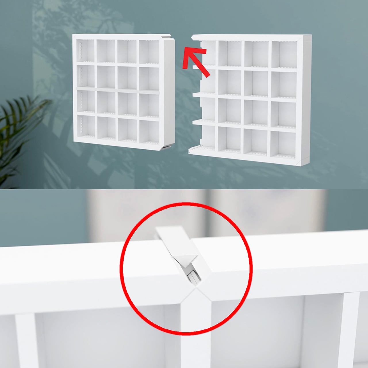
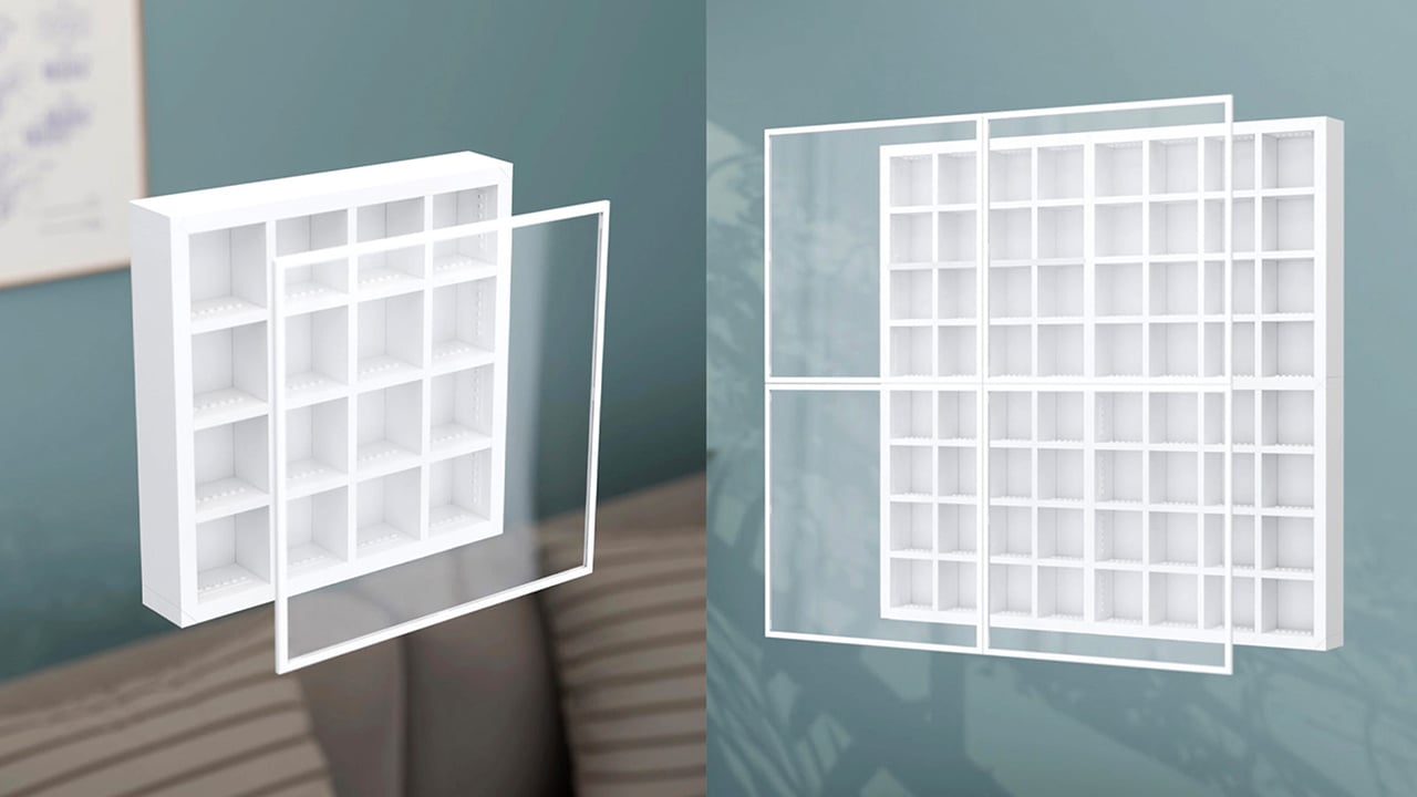
Finity Frames puts a collection on the wall in a clean white grid. A single frame carries 16 spaces, but removable dividers let you make room for bigger figures or pack in a crowd. When the collection grows, connected frames share edges so the display extends as one continuous piece without visual seams or doubled-up borders. Your next minifigure gets a spot without requiring a complete wall makeover. The system is injection-molded ABS, ships flat-packed, and the connection method that makes all of it work is patented.

Designer: Stephen Peaple

Click Here to Buy Now: $55. Hurry, only 5/16 left!

A Display System That Grows With Your LEGO Collection

Every Finity Frame is built around a seamless edge connection where neighboring frames share a single border, eliminating the doubled-up edge and any visual gap at the join. This is the core innovation that solves the fixed-size problem inherent in every other display case on the market. It means you can start with a single frame for one series of figures and expand outward in any direction, at any time, without having to replace your original investment. The aesthetic is clean and continuous, looking like a single, cohesive unit no matter how large it gets.

This design approach also makes the system more efficient as it grows. Peaple makes the math explicit: the first frame measures 312mm across, and each connected frame adds just 298mm, because one edge is always shared. This reduces material waste and lowers the cost per additional frame. A 2×2 Collector, for instance, cannot be broken apart into four 1×1 Starters, since it doesn’t include the extra pieces. For context, the most prominent fixed-case competitors max out around 190 minifigures. The Finity Frames Showcase holds 1,056, and two of them together can display over 2,100 figures as a single, unified piece.

Built for Customization and Creative Play

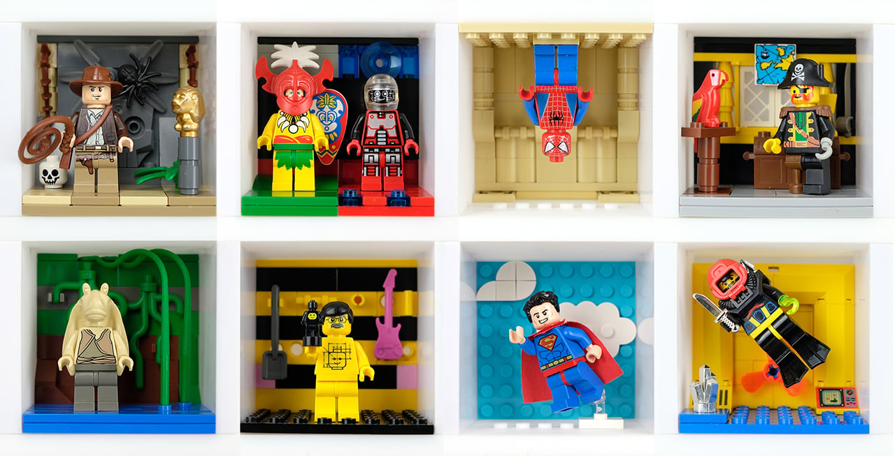
Each Finity Frame ships with three horizontal and three vertical internal slats, forming a standard 4×4 grid. This sixteen-space layout is not arbitrary; it maps exactly to one complete Collectible Minifigures series, which traditionally ships with 16 unique figures. The slats are removable in any combination, yielding 64 different internal layouts. You can pull the vertical dividers out, double-stack figures with jumper plates, and a 1×1 Starter can hold up to 88 minifigures. This flexibility lets you create custom spaces for dioramas, larger vehicles, or oversized figures like the Hulk who need a little extra room.

The system’s dimensions are precisely calibrated to the LEGO System of Play. Internal slats are exactly one brick wide, and the frame edges are exactly two bricks wide. Each compartment accepts a 6×8 LEGO plate or four 3×4 minifigure plates, the same stands that come with CMF packs. This means removing the acrylic cover turns the frame into a wall-mounted baseplate where builds can bridge continuously across spaces and frames. Peaple calls this “bridging,” a feature that turns a static display into a creative canvas. Every horizontal slat even has a built-in row of six studs for securing figures or small builds.

Designed for Collectors of All Kinds

A magnetic Perspex acrylic cover protects the collection from dust and removes in a single pull. It’s made from UV-stable material with built-in absorbers to block harmful light, preventing the slow fading that can damage valuable figures over time. The frame itself is a gallery-white, UV-treated ABS plastic, a color choice meant to disappear behind the collection rather than compete with it. Everything is designed to last, preserving the collection while keeping it easily accessible. The magnetic attachment is secure but quick, so you can get to your figures without fussing with clips or latches.

Flipping the horizontal slats 180 degrees turns the studded surfaces into flat shelves, opening the frame to almost any small-scale collectible. A single 64x64x49mm space can hold Funko Pocket POPs, Be@rbricks, Sonny Angels, or even shot glasses. Removing dividers creates double-height spaces for larger items like vintage Kenner 3¾” figures, Super7 ReAction figures, Playmobil sets, or graded collectible cards in their hard cases. It’s a true cabinet of curiosities, designed for a LEGO collection but adaptable enough for just about anything else that deserves a spot on the wall.

Five Sizes, Starting at $65 USD

The five frame sizes run from the 1×1 Starter at 12.3×12.3 inches (up to 88 minifigures) to the 4×3 Showcase at 47.4×35.7 inches (up to 1,056), with the 1×2 Duo, 2×2 Collector, and 3×2 Lifestyle filling in between. All frames run 55mm deep without the cover, 61mm with, and production units are estimated at 0.9 to 1.1kg for the 1×1 (roughly 2 lbs).

Retail pricing starts at AU$99 (roughly US$65) for the Starter and reaches AU$835 (roughly US$550) for the Showcase. Any size can be extended later through a Frame Extender on finityframes.com, where you input what you already own and order only the additional sets required. The system ships flat-packed globally, with US distribution in place through the manufacturing partner.

Click Here to Buy Now: $55. Hurry, only 5/16 left!

The post This Expandable LEGO Frame System Finally Solves the Collector Storage Nightmare first appeared on Yanko Design.

  •  

After 15 Years, Patek Philippe Returns With a Hand-Wound Chronograph That Stores Energy Like a Bow

Perpetual calendar chronographs are Patek Philippe’s version of a solar eclipse. They do not happen often, and when they do, everyone stops what they’re doing to look up. The last one arrived back in 2011, which in watch years is basically a geological era.

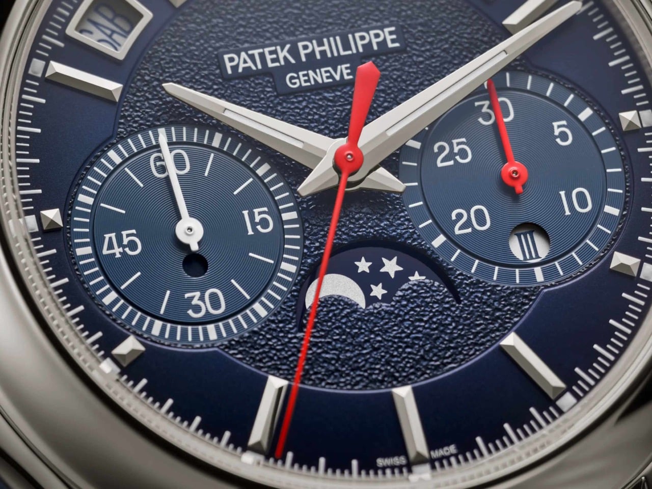
The wait is over, and Patek did not play it safe on the comeback. The new Ref. 5978P-010 is the first watch to combine the brand’s hand-wound chronograph movement with an instantaneous perpetual calendar, a mechanism usually reserved for its most serious grand complications, where every calendar display jumps simultaneously in under 30 milliseconds instead of dragging itself forward at midnight. It debuted at Patek’s seventh Watch Art Grand Exhibition in Milan, limited to 120 platinum pieces at $337,585 each, with a navy dial, red chronograph hands, and calendar text printed in Italian for the occasion. Rare watch, rare city, apparently rare patience too.

Designer: Patek Philippe

The new caliber inside the 5978P-010 is called the CH 29-535 PS QI, a hand-wound movement built from 500 parts. Patek fused two things it already had, the CH 29-535 PS chronograph base from 2009 and the instantaneous calendar module developed for the R CHR 27 PS QI inside references like the 5207, 5308, and 5208. The result is a watch where the day, date, month, leap year, and day and night indicators do not creep forward through the night. Instead, they wait, then snap into their new position together in roughly 30 milliseconds. Even the chronograph’s 30-minute counter gets the same instantaneous treatment, jumping to its next position in one clean motion rather than crawling minute by minute.

Rather than letting a spring slowly push the calendar discs forward, the movement spends hours steadily storing tension, then releases it all at once like a drawn bow. A progressive perpetual calendar can leave a date disc caught mid-flip for a few minutes around midnight, which looks fine until you actually need to read it. This one simply will not do that. The caliber beats at 28,800 vibrations per hour on a Breguet balance spring, and because it is hand-wound, there is no rotor blocking the view, so the full chronograph architecture sits exposed through the sapphire caseback.

The 42mm (1.65 inch) platinum case measures 14.24mm (0.56 inch) thick, with a concave bezel and scalloped lugs lifted from the Calatrava-style cases of the 5208 and 5205, a departure from the ornate shapes Patek usually reserves for this complication. A single diamond sits at 6 o’clock, the hallmark Patek adds to every platinum watch in its catalog. The sunburst navy dial fades into a black-gradient rim around a textured center, with white gold faceted markers and dauphine hands finished in white luminescent coating. Red varnished hands carry the chronograph and small seconds, the only flash of color on the dial. Calendar apertures ring the top of the dial between 10 and 2 o’clock, with the moon phase sitting at 6 and the instantaneous 30-minute counter opposite it at 3.

Patek’s own marketing describes the 5978P-010 as a sporty look timepiece, which is a strange way to describe a platinum perpetual calendar chronograph until you look at it. The navy and red color scheme, paired with a composite strap finished in a fabric weave rather than alligator, borrows more from the Aquanaut than from anything in the formal grand complications catalog. It is not the first time Patek has let its sportier instincts bleed into serious territory. We covered the Cubitus back when it launched, a watch that took the Nautilus’s DNA and reshaped it into something squarer and more divisive. The 5978P-010 is a subtler version of that same impulse, applied to a complication that has spent 85 years dressed for black tie.

The calendar windows on the 5978P-010 are printed in Italian, so Saturday reads SAB instead of SAT, a detail that only makes sense once you know this watch was built for Milan. The strap repeats the gesture in miniature, with a stopping point stitched in the colors of the Italian flag just before the clasp. Patek built the watch for its seventh Watch Art Grand Exhibition, which opened October 2 inside Milan’s CityOval and runs free through October 18. It is one of seven limited editions made for this stop on the tour, a group that also includes enamel-dialed World Time minute repeaters and three carbon-patterned Calatravas in the same tricolore palette. Altogether those seven references add up to 685 pieces, a genuinely small run by Patek’s standards.

There is a catch for anyone outside Italy who wants this watch: all seven Milan editions, including the 5978P-010, sell exclusively through Patek retailers inside the country. Buyers elsewhere wait for one to surface at auction, where past exhibition pieces have historically carried a premium over retail. At $337,585, this was never going to be an impulse buy, and the exclusivity only adds to that. What sticks with me is not the price, it is the choice to dress the brand’s most formal complication pairing in a strap that would not look out of place on a dive watch. Eighty five years after the 1518 started this lineage in stern black and gold, Patek just sent its most serious watch out wearing red sneakers, and somehow it works.

The post After 15 Years, Patek Philippe Returns With a Hand-Wound Chronograph That Stores Energy Like a Bow first appeared on Yanko Design.

  •  

Hilariously Practical USB-C Cable Looks Exactly Like a Construction-Site Extension Cord

There are exactly zero USB-C cables that anyone has ever called beautiful. They come in black, white, or occasionally braided grey, and they all look identical regardless of who made them or what they cost. Pick any of them out of a drawer at random and there is no way to identify the brand without hunting for a logo. They are just cable, featureless and anonymous, which is fine if everything else on your desk is equally low-key. But once you are running a 160W GaN charger that looks like it belongs in a server room, the cable situation starts to feel like it is letting the whole setup down.

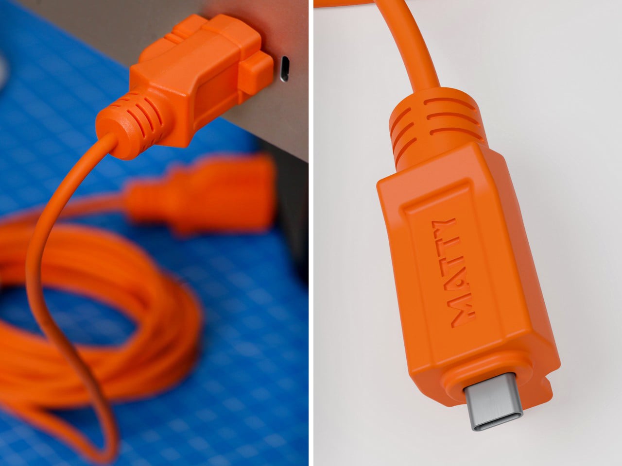
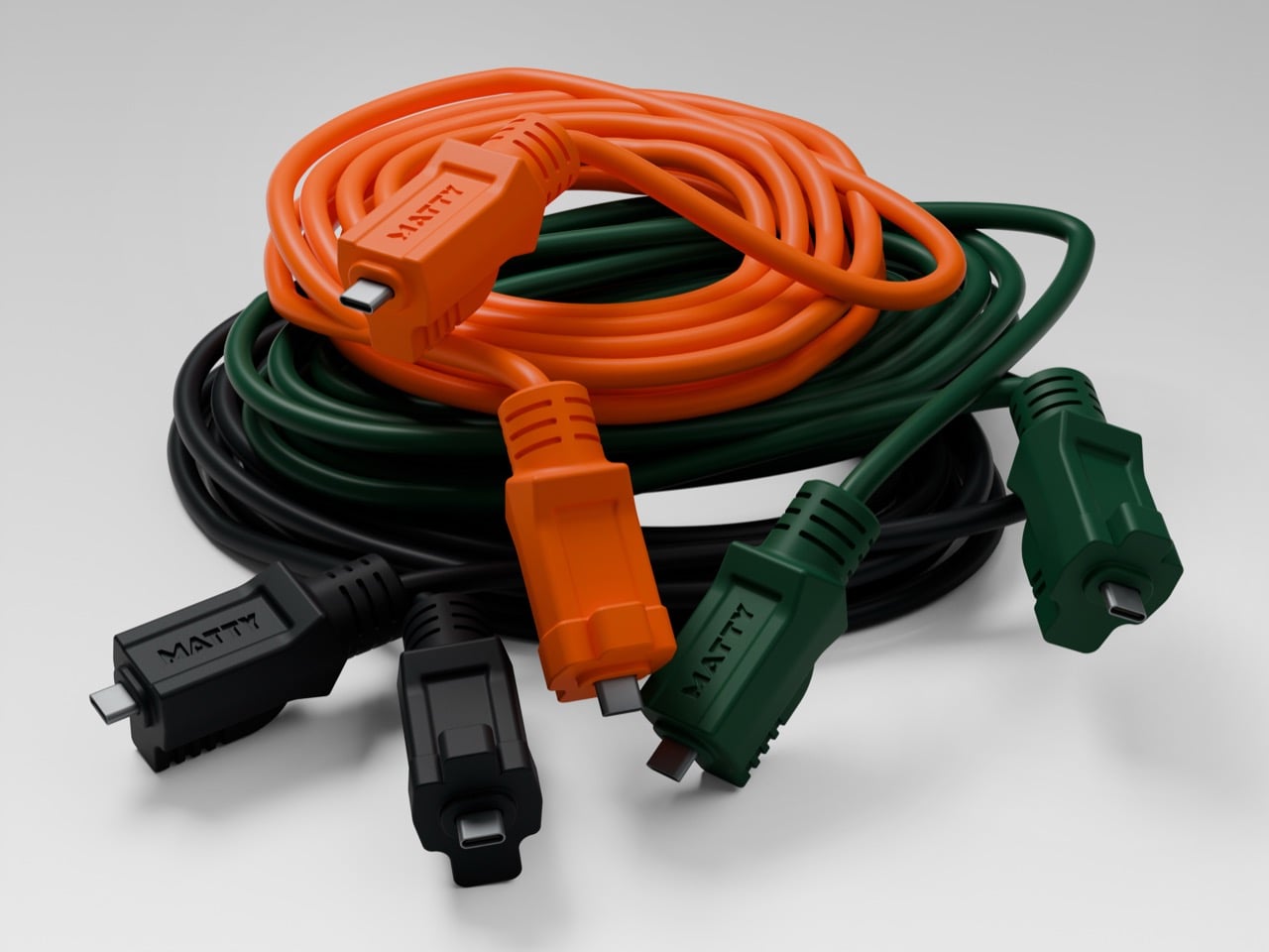
Matty Benedetto has been inventing things nobody asked him to invent since 2019, and this one might be his most wearable idea yet. The Extension-C looks exactly like what the name implies: a proper orange extension cord, right down to the rectangular housing on each end, scaled to USB-C. Ten feet long, rated for 60W charging and data transfer, available in safety orange, outdoor green, and stealth black for $25. Yanko Design has been tracking Benedetto’s work since Unnecessary Inventions first went viral on Instagram, and this is probably the first of his creations where the joke and the product exist in exactly equal measure. It is funny. It also ships.

Designer: Matty Benedetto (Unnecessary Inventions / MATTY)

Each end of the cable is a chunky rectangular housing that calls back to the three-prong outlet plug of a classic American extension cord, scaled down to something that slots into a laptop port but keeps all the visual bulk of the original. The ribbed strain relief detailing running down each housing mirrors what you would expect on actual job-site gear, and it reads as a deliberate design choice rather than ornament. “MATTY” is embossed on each connector cap, and it works because it looks like a certification stamp on real equipment rather than a tech brand inserting itself into the aesthetic. The orange body is thick enough to sell the illusion convincingly. At 10 feet, the cord has actual room to coil the way a real extension cord does, and a 3-foot version of this bit would have landed very differently.

Benedetto has been running Unnecessary Inventions out of his Burlington, Vermont studio since 2019, and the archive now sits at 471 entries. Not every invention makes it to MATTY, the retail arm where purchasable products actually live. The ones that do have typically proven themselves with audiences first and shown enough genuine demand to justify manufacturing. The Extension-C making that cut is a meaningful signal about where Benedetto himself rates this one. We covered his work through several roundups in 2019 and 2020, and revisited it in 2022 when he built a clever fix for the Apple Magic Mouse charging problem. His track record for making absurd things that people genuinely want to own is the most consistent thing about him.

The 60W rating handles most phones, tablets, controllers, and lightweight laptops at full charging speed, covering the realistic daily load on any serious desk setup. Pair it with a 160W GaN charger and the combination has a visual logic that is genuinely satisfying: the charger looks like heavy-duty hardware, and the cable finally looks like it belongs beside it. Safety Orange is the obvious pick for anyone committing fully to the construction-site bit. Outdoor Green makes more sense for a balcony or garden setup where orange would look out of place. Stealth Black drops the gag and keeps the form, and I will predict right now it ends up being the best-seller of the three.

The Extension-C sits at $25, which puts it above the no-name cables that come in 5-packs on Amazon but well below the premium braided options from Anker or Belkin. For what you get on the design side, that is a pretty reasonable trade. There is a broader point buried here about what Benedetto has figured out that most accessory brands have not: cables are so visually forgettable that even a small act of design intention reads as remarkable. The Extension-C is his 471st Unnecessary Inventions entry, and it might be the one where unnecessary and useful finally land in the same sentence without any friction between them. Grab one at thatwasmadebymatty.com, preferably in orange, because going halfway on a bit this committed would be a waste.

The post Hilariously Practical USB-C Cable Looks Exactly Like a Construction-Site Extension Cord first appeared on Yanko Design.
  •  

A 1908 New York building’s discarded fragments got turned into furniture instead of being demolished

A renovation across the street from Rafael Prieto’s studio offered an unusually good view of his next project. As decorative pieces came off the facade of a Tribeca building, he arranged to save sixteen that were headed for disposal. Most of us would have watched the scaffolding go up and returned to our emails. Prieto, a Mexico-born designer and creative director based in Tribeca, had other ideas. The result is a furniture exhibition that keeps the building’s ornament alive in some very unexpected forms.

Prieto spent time with the fragments before turning them into the starting point for tables, chairs, and sculptural objects. Weathered ornament sits against painted birch, sometimes tucked inside a crisp new frame. The resulting furniture keeps its New York address close, even when its shape heads somewhere unexpected. Some pieces carry the actual stone; others borrow only its curves, grooves, and proportions. It is a show that rewards looking twice.

Designer: Rafael Prieto

The building across the street is 366 Broadway, now known as Collect Pond House, a twelve-story Beaux-Arts structure designed by Frederick C. Browne in 1908. It was once home to the Royal Typewriter Company, then became a residential co-op in 1979. The facade is densely ornamented: copper cornices, Greek key detailing, marble columns, and keystones carved into bearded faces that have been watching Tribeca change for over a century. A recent multi-year restoration replaced and conserved 65 terra cotta units. A handful of the pieces removed during that process did not make it back onto the building.

Before cutting anything, Prieto lived with the fragments in his studio for roughly a year and a half. He photographed and scanned each contour and ornament, then layered those images to pull out shapes and combinations that could inform new work. That process produced a design vocabulary rather than any direct copy of the originals. The stepped, ribbed profiles that climb the legs of the red lacquered chair came directly from this translation, somewhere between column fluting and abstracted skyline. It is a method closer to archaeology than furniture-making.

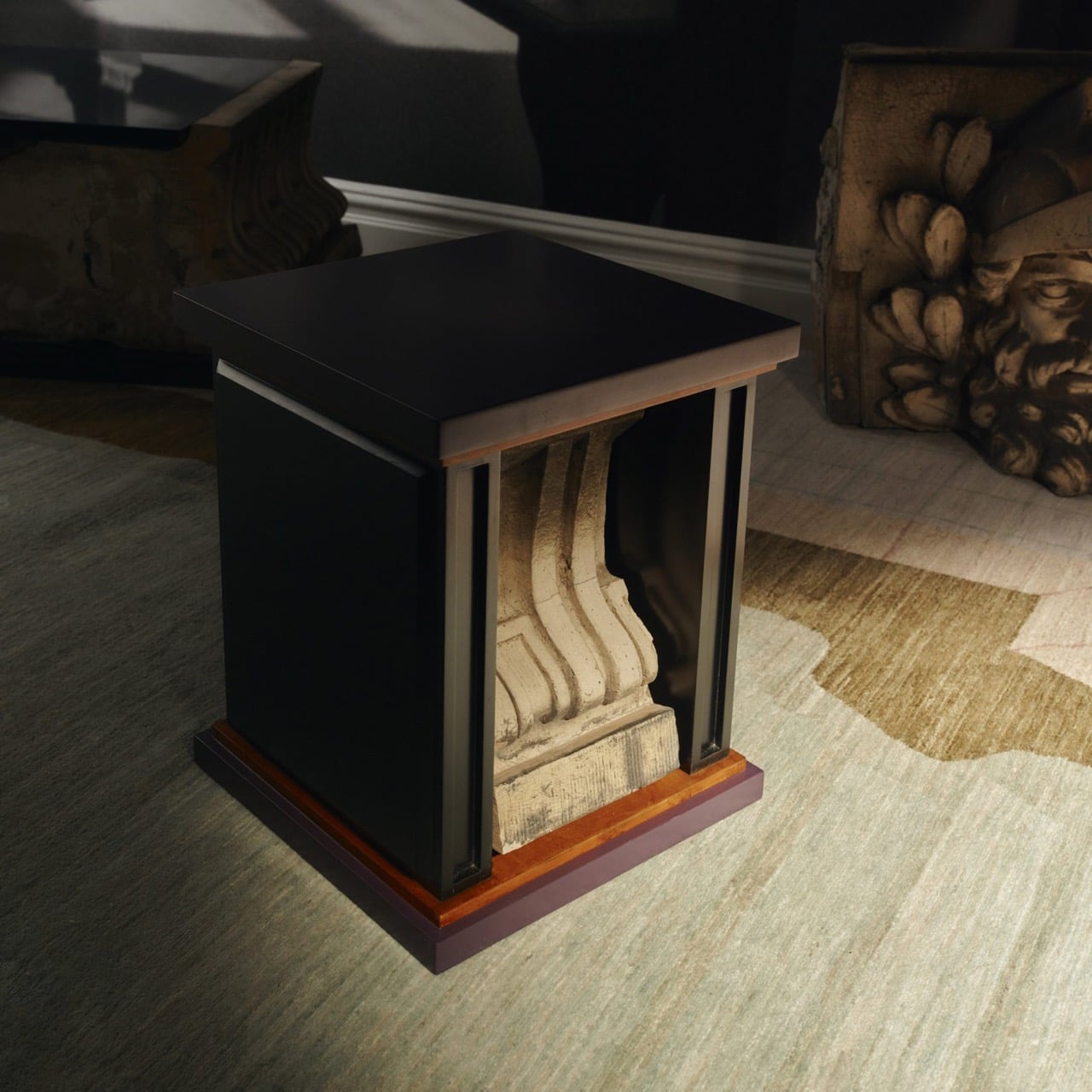
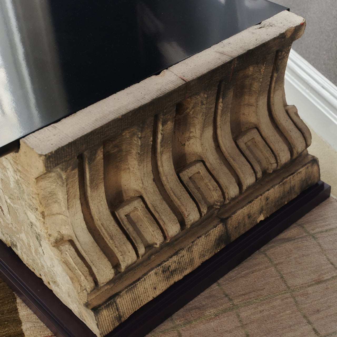
One of the standout pieces has a large carved stone cornice block sitting below a flat black painted tabletop, doing actual structural work. The stone is pale, dense, and loaded with repeating scroll forms, carrying roughly a century of New York weather on its surface. Another piece cages a smaller fragment between vertical black bars inside a cube-shaped form, the stone visible through the gaps like something on display. The medium listing for several works at the gallery confirms “Architectural Fragment” as a named material alongside painted birch. Not every piece carries original stone; some borrow only its shapes.

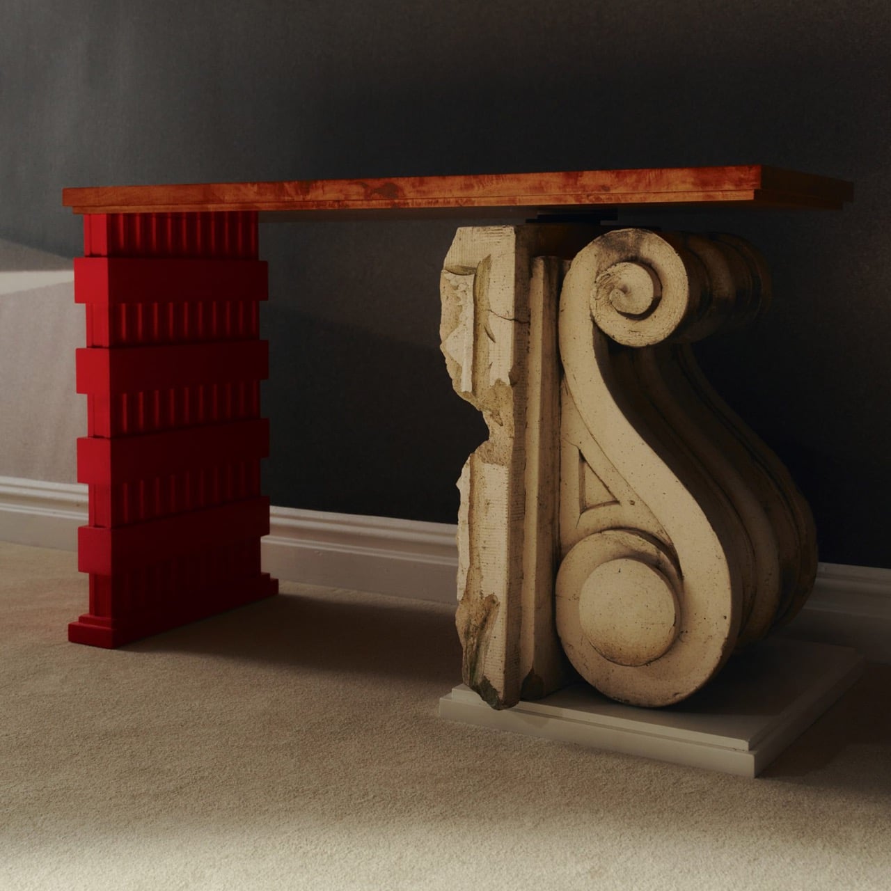
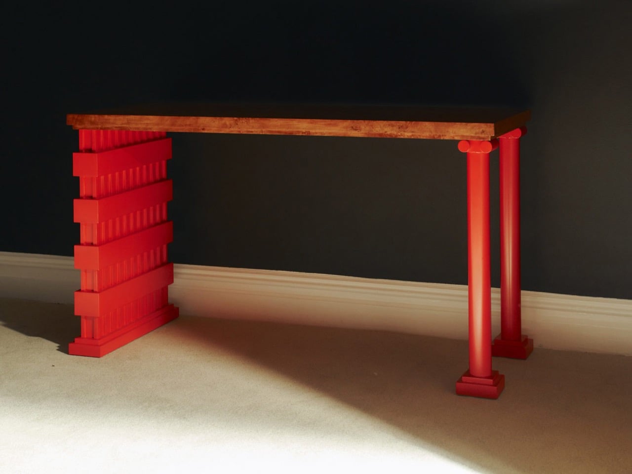
The all-red lacquered chair is the most confident piece in the show, its legs built from stacked, stepped planes that scanning and layering pulled from 366 Broadway’s fluted piers and molded profiles. Its natural birch counterpart deploys the same vocabulary in warm wood, swapping lacquer for grain and adding red geometric arm brackets at the joints. A console table makes the argument most literally: one end sits on a fabricated red plinth, the other rests on an actual salvaged Ionic stone volute, intact and weather-stained. The two supports are not supposed to match. The gallery describes this contrast as the central thread: the hard and the soft, the historic and the contemporary, running through every piece.

Several of the original keystones sit on the gallery floor unaltered, including one carved bearded face in a plumed helmet still stained with moss and a century of city air. Prieto’s analog photography wraps the walls in large-scale architectural murals, produced in collaboration with Wallpaper Projects. The room ends up feeling closer to a photographed ruin than a white-cube gallery, which is entirely the point. He told Family Style that “New York is its architecture,” and that most people talk about the skyline but “don’t look up.” The show does the looking for you.

‘The Future of the Past’ is Prieto’s second solo show with Emma Scully Gallery and runs through December 12 at the Upper East Side location, open Wednesday through Saturday. Pricing and availability are through the gallery directly. The question the collection keeps circling is whether furniture shaped by a building’s discarded ornament carries any of that building’s memory with it. Prieto does not seem interested in settling that question cleanly. The bearded face on the gallery floor looks like he has made his peace with the whole situation.

The post A 1908 New York building’s discarded fragments got turned into furniture instead of being demolished first appeared on Yanko Design.

  •  

The VIVIFoCAL S1 Glasses Focus Themselves So Your Eyes Don’t Have To

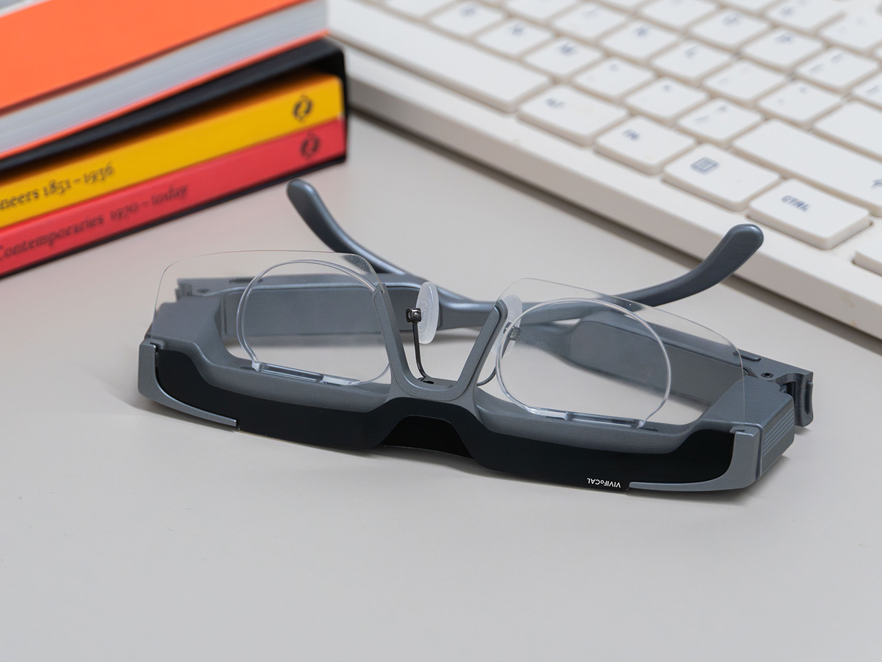
Your phone focuses by firing an invisible laser pulse at whatever you’re aiming it at, timing the bounce, and telling a tiny motor to move some glass. The whole loop finishes in a few hundredths of a second and nobody has thought about it since roughly 2017. VIVIFoCAL has taken that identical hardware recipe, a time of flight sensor, a microcontroller and an actuator, and bolted it onto a pair of glasses pointed at the world instead of at your brunch. The S1 measures how far away the thing you’re looking at is, works out the optical power your eyes need, and mechanically shifts the lenses into position in under 0.1 seconds. It’s autofocus, except the sensor is on your face.

Dr. Zhao, who earned his doctorate at a world-leading university and previously ran an optical R&D laboratory at a major optics company, built VIVIFoCAL around a piece of physics that has not yet been widely adopted by the general public. The S1 uses Alvarez lenses, two complementary freeform elements that change optical power when one slides sideways across the other. Nobel laureate Luis Alvarez patented the principle, and it was then stranded for decades because somebody had to do the sliding. A motor does it now. The result covers 8 inches to infinity in a 40 gram frame, and it launches with VIP pricing from $289.

Designer: VIVIFoCAL

Click here to Reserve Now: $10 (VIP pricing from $289).

A laser, a motor, and the 1967 patent working in the background

Three sensors do the work rather than one. A time of flight laser reads distance, a G-sensor tracks head posture, and an infrared wear detection sensor tells the glasses whether they’re on a face at all, which is how the battery survives being pushed up onto your head mid-conversation. The microcontroller sits between them, converting a distance reading into a lens position and commanding the motor in a single pass. The lenses simply change optical power to match whatever distance you’re looking at, the same job your eyes handle on their own before presbyopia kicks in. VIVIFoCAL calls that loop Instant Focus, and the same time of flight hardware we’ve watched migrate into phones, robot vacuums and door locks is what makes it affordable in eyewear.

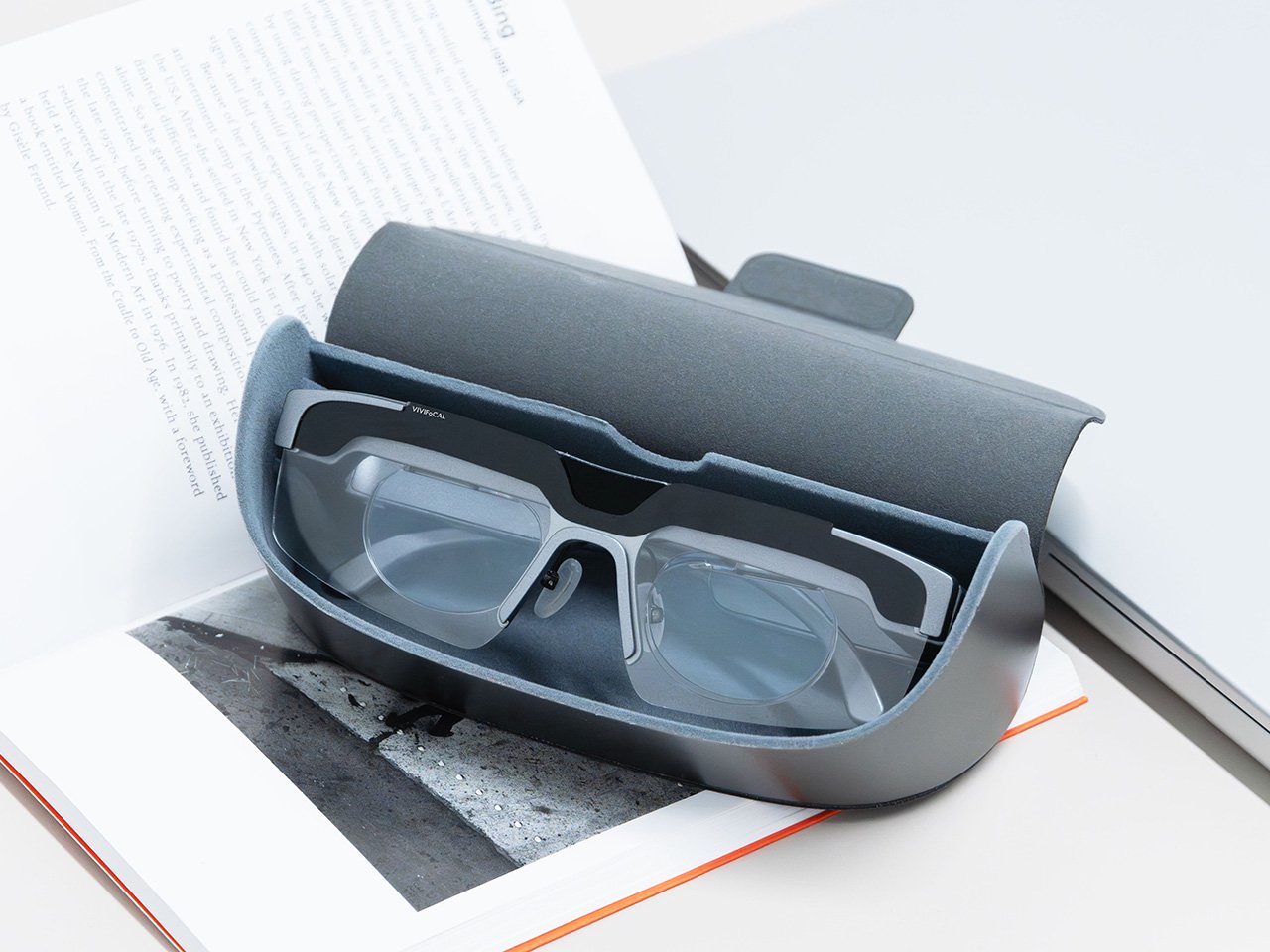
Fitting a moving lens assembly, a rangefinder, a motion sensor, a microcontroller, a motor and a battery into something that still reads as eyewear is the harder half of this product. VIVIFoCAL has pushed the electronics into the brow bar and the temple arms, keeping the optical stack shallow enough that the frame sits on a face instead of announcing itself as hardware. The 160.5 x 160 x 43.5mm envelope is ordinary spectacle territory, which is the entire argument. Every packaging decision is downstream of one goal, helping the wearer see clearly across distances without thinking about the machine doing it.

Progressive lenses ask you to tilt your chin… this doesn’t

Presbyopia is projected to affect 2.1 billion people by 2030, and the standard answer for most of them is a progressive lens with three prescriptions blended into one lens, near at the bottom, distance at the top, intermediate smeared between. Finding the right part of the glass means tilting your chin, and the tradeoff is the narrow tunnel vision that progressive wearers describe, with softness creeping in toward the edges. VIVIFoCAL calls its answer Full-Lens Clarity, where the Alvarez lenses deliver one consistent optical power across the whole lens at every setting instead of splitting it into zones. There is nothing to hunt for and less peripheral distortion to work around. I’ve watched that chin-tilt dance play out for years, so the appeal is obvious.

Progressive glasses are generally built around everyday reading tasks, and for closer or more detailed work plenty of wearers still reach for a second pair or a magnifier. S1’s focusing range starts at 8 inches, which brings fine detail inside the same lens handling everything else. VIVIFoCAL demoed the glasses at WonderFest 2026 against a 1/35 scale miniature, the sort of precision hobby work that has kept optical visors and loupes in business for a century, and the testers who work with their hands responded the way you’d expect. One early tester shared that using S1 in a data center was a productivity gain and a huge plus, because he could walk past equipment and read tiny serial numbers without interrupting his workflow to take out extra readers, switch to other glasses, or use additional visual aids. He no longer carries multiple pairs when he leaves the house.

Forty grams, three nose pad sizes, and all-day power

VIVIFoCAL designed around the fact that head sizes and nose bridge heights vary far more than eyewear brands usually admit, which is why S1 ships with flexible spring hinges and three sizes of interchangeable nose pads to adapt across face shapes. The frame lands at 40 grams bare and 50 with the magnetic front clip, built on TR90 temples, the same material that has quietly taken over lightweight frames and wearable arms across the industry. Those numbers matter because forgetting you’re wearing them is the whole point of automating focus in the first place. A 250mAh battery holds up through 8 hours of constant refocusing and refills over USB-C in about an hour, with normal use stretching to a full day. Glasses that can run flat is still a new idea to make peace with.

A separate pair of lenses attaches behind the Alvarez elements, so one pair carries your prescription to see near and far. Magnetic polarized sunglass lenses snap onto the front for outdoor use with adaptive focus still running underneath. The polycarbonate lenses carry anti-reflective and anti-smudge coatings, transmit more than 90 percent of light, and sit inside a field of view above 110 degrees. The app adds a ±0.5D fine-tuning range on top of the automatic correction, which is how the glasses absorb the slow drift of a presbyopic prescription instead of being replaced. Presbyopia correction tops out at 3.5D, so the deepest cases fall outside what S1 can currently handle.

The bet VIVIFoCAL is making on moving glass

The company isn’t chasing this idea alone. Other teams are working on adaptive focus through liquid crystal lenses or eye tracking instead of a mechanical shift, and the category is young enough that the approaches are still diverging. VIVIFoCAL is betting on the refractive route, real glass moving to change optical power rather than a pixelated layer simulating it, and that bet buys the two things that matter most in eyewear you keep on your face all day. S1 holds above 90 percent light transmittance and a field of view past 110 degrees, which is why the image through it behaves like a lens instead of a screen.

Alvarez lenses have been a lab curiosity since 1967 for one reason, which is that the sliding had to be automated by something small enough to live inside a temple arm. Sensors, motors and microcontrollers have finally shrunk far enough to make that trivial, which makes S1 a triumph of packaging, and packaging is where most wearables actually get decided. Autofocus earned its invisibility in cameras by working so fast nobody noticed it, and 0.1 seconds across 8 inches to infinity puts the same disappearing act in front of your eyes. S1 ships with a 1-year warranty, and a refundable $10 deposit locks in VIP pricing at $289 ahead of the official launch, with either the prescription lens service or the sunglass lens bundle included depending on which one you need. Sixty years is a long time for a good idea to wait for its motor.

Click here to Reserve Now: $10 (VIP pricing from $289).

The post The VIVIFoCAL S1 Glasses Focus Themselves So Your Eyes Don’t Have To first appeared on Yanko Design.

  •  

Designers Already Prototype Hardware – Now They’re Prototyping Demand Too

Every product that finds its way onto these pages eventually meets the same crossroads: the moment a designer takes the thing public. For physical product creators chasing something original enough that established retailers won’t touch it, Kickstarter remains the most democratic proving ground available. The platform has hosted more than 654,000 campaigns since 2009, drawing over $8.5 billion in pledges from more than 23 million backers, with 2025 marking its strongest year on record. That momentum creates a seductive and specific trap: creators see the platform’s gravity and assume a beautiful product with a compelling story will naturally convert into backers. A crowdfunding agency called TCF (The Crowdfunding Formula), which holds Kickstarter Premier Partner status and has facilitated more than $520M raised across campaigns, has spent years watching that assumption fail in real time, and what they built to counter it is one of the more disciplined pre-launch processes in the business.

TCF’s methodology, recently published in full detail, centers on a single observation that most campaigns never act on: interest and purchase intent are not the same signal. Emails, follows, and comments cost nothing to give, which is why none of them predict whether a product sells. Validation asks for money, not opinions, and a small deposit on a product that does not exist yet is the closest available proxy for a real backer, because the act of paying is what carries the information, not the amount. The resulting data resolves three decisions most creators make by guesswork: the price, the positioning, and the audience, all settled before a campaign page exists, before ad spend, and before the outcome is locked in, because those are the three things most likely to break a launch and the three most often decided by assumption. It is a design methodology applied to the market, and it deserves the same respect that designers already extend to physical prototyping.

Circular Ring 2

How a $2 Deposit Separates the Buyers from the Browsers

The process runs on Prelaunch.com. A product page goes live showing the product, the visuals, what it does, how it works, and the characteristics that make it different, with no price. Visitors who want to know more leave their email address, which is the interest signal and only that. A second page then opens, presenting the price alongside an offer: put down a deposit today and receive a discount when it launches. Someone who pays has moved from liking the product to paying for a product with no campaign page, no ship date, and no reviews. Someone who does not pay is interested but not convinced, and that is a result too.

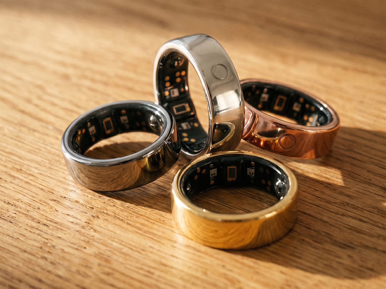
The pushback the deposit mechanism reliably attracts is predictable: does $2 actually prove anything about future purchase behavior? The deposit is the part people push back on, but the $2 is not the point. The act is the point. Getting up, finding a card, and typing the numbers in for something with no campaign page, no ship date, and no reviews is a different order of behavior from tapping a heart, and the people who do it are the closest thing to your future backers that exists before you have any. The Circular Ring 2, a smart health ring, funded in just four minutes and crossed $2.5 million in pledges in under 40 days. Products that open with that kind of velocity tend to do so because the audience already knows it wants the thing, and that certainty is built long before a campaign goes live.

Image Credits: TCF

The Rejection Data Is the Brief

The survey is where validation stops being a scoreboard and starts being useful. From the people who reserved, you learn what actually moved them: whether it was the color, the form, a specific function, the price, or the promise, and which features are carrying the product versus which ones you have been overselling. From the people who left an email and then did not pay, you learn something you cannot get anywhere else: exactly where you lost them, and what would change their mind. The color they wanted was not there. The shape was wrong. It looked too heavy. The price was too high. These are the people who were close enough to care and honest enough to walk away, and their answers are a list of things you can fix before the fix costs anything.

This is co-creation in the most literal sense: meeting your potential buyers before you launch, and letting them tell you what to build. A creator who learns that 60% of their non-converting subscribers balked at weight has a design brief, not a marketing problem. A creator who discovers that two colorways were widely expected but absent has a specification list, not a gap in their ad copy. The survey turns a theoretical audience into an actively contributing one, delivering feedback while the product can still absorb it. Kickstarter’s most successful campaigns tend to share that structure: they do not open to strangers, they open to people who were already consulted.

BB-777 Boombox

Why Validation Doesn’t Always Mean Lowering Your Price

Creators tend to assume validation exists to talk them down. It does not. One agency ran validation on a pet product priced at $30 a unit, and the data showed the right price was $40. The creator had been leaving money on the table, and no amount of instinct would have told them that, because instinct in that situation almost always argues for the safer, lower number. No stated-preference survey, no focus group, and no amount of social engagement would have surfaced it, because stated preference and paid behavior are different instruments measuring entirely different things. Validation is where you settle positioning and audience rather than guessing at them, running price variations, testing different messaging, and finding which audience responds before you have committed to a single frame of campaign video. The point is to find the price, the position, and the audience that let the product reach its full potential, and then launch into that.

The validated price sets reward tiers, and the early discount tested during validation is a trigger that has already been watched working, rather than one you hope will. The reserver surveys told you which characteristics did the persuading, which decides your headline, your hero shot, and the order of your video. You are not inventing arguments for the product; you are repeating the ones your buyers already made. Running price variations and messaging tests before a single production decision is committed changes the campaign from a bet into a brief. The learning does not expire when the campaign closes. A validated price, position, and audience are the same three things an e-commerce store runs on, which is what lets a product keep scaling after the campaign instead of peaking with it.

Kode Dot

The Designer’s Instinct Problem and Why Demand Needs Its Own Prototype

The design process and the validation process ask for decisions in different orders, and that difference matters more than it first appears. A designer who arrives at a product through material, form, and function is not naturally thinking about reservation rates. Validation is the design loop pointed at the three things a physical prototype cannot test: what people will pay, how the product should be framed, and who it is really for. Designers already accept this discipline everywhere else; nobody tools up an injection mold without a prototype. A “do not launch” result from this process is a success, saving a creator a year, a production run, and the damage of a public failure. A careful launch protects more than the person running it; it protects the shared resource of backer trust, which every quiet project erodes.

The question worth answering before a launch is not how big a campaign you can build. It is what you can prove before you build it. Whether that discipline becomes standard practice across the crowdfunding ecosystem or remains the habit of the more methodical subset of creators, the underlying argument is one any designer can recognize. You do not ship a mechanism you have not tested. Treating the market as the final untested component, rather than an assumption baked into launch day, is the shift the methodology is asking for. Across hundreds of millions of dollars raised in crowdfunding projects, the cases where testing these three things costs more than getting them wrong are functionally nonexistent.

The post Designers Already Prototype Hardware – Now They’re Prototyping Demand Too first appeared on Yanko Design.

  •  

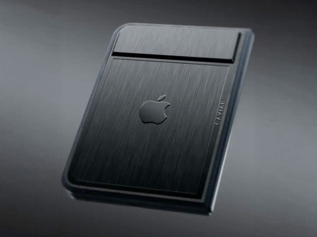
Would you pay $14,000 for an iPhone Duo without any cameras?

Imagine sitting at a table with friends and whipping your phone out. Your friends see it’s a foldable… then as you unfold it, the animation looks suspiciously like the iPhone Duo. Your friends are impressed, they designate you as the group photo taker… and you tell them regrettably that your iPhone Duo has no cameras. Then you add… not only does it not sport any cameras, it also costs fourteen grand.

To be honest, that scenario is entirely imaginary. Mainly for a bunch of key reasons. Caviar built this version of the iPhone Duo for privacy, championing what they call “Privacy, Minimalism, and a Refined Masculine Style.” Someone who sees truth in that ethos isn’t designated photographer material. And if they were, shelling 14k on a phone means you probably have a few extra grand to hire a photographer wherever you go. The only reason someone buys this hare-brained version of the iPhone Duo is because they can. Plain and simple.

Designer: Caviar Global

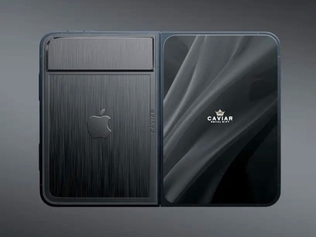
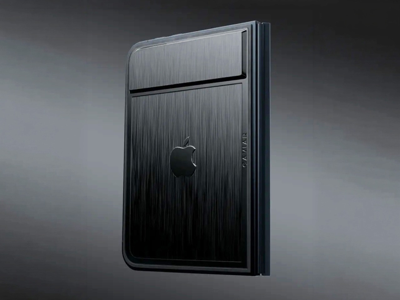
Removing the camera stack from the back of the iPhone Duo does something unexpected: the phone becomes genuinely beautiful. That rear panel, normally dominated by the triple-lens module, turns into a single flat sheet of satin-finished black titanium. No bumps, no rings, no glass circles competing for visual real estate, just one uninterrupted surface that shifts character depending on the light hitting it. Caviar calls the inspiration “supersonic aviation aesthetics,” which sounds like marketing speak until you actually look at the product photos. A blacked-out Apple logo sits flush in the titanium, the Caviar crown marks the opposite panel in a swept fabric-like texture, and the whole thing looks less like a phone and more like a prop from a very expensive spy film.

Apple’s decision to use Touch ID for the iPhone Duo, abandoning Face ID, turns out to be what makes Caviar’s camera-free execution actually hold up. A Face ID phone needs its front camera array to function as a biometric sensor, so pulling that out would mean a very pretty device that cannot unlock. Touch ID lives in the frame rather than behind the screen, so Caviar could strip the entire camera stack, front hole-punch and rear module both, without breaking anything fundamental. Based on product images, the inner display on the Ultimate appears completely clean, no hole-punch interrupting the screen, which makes the inside as seamless as the outside. Two separate design decisions from two separate companies ended up fitting together better than either could have planned.

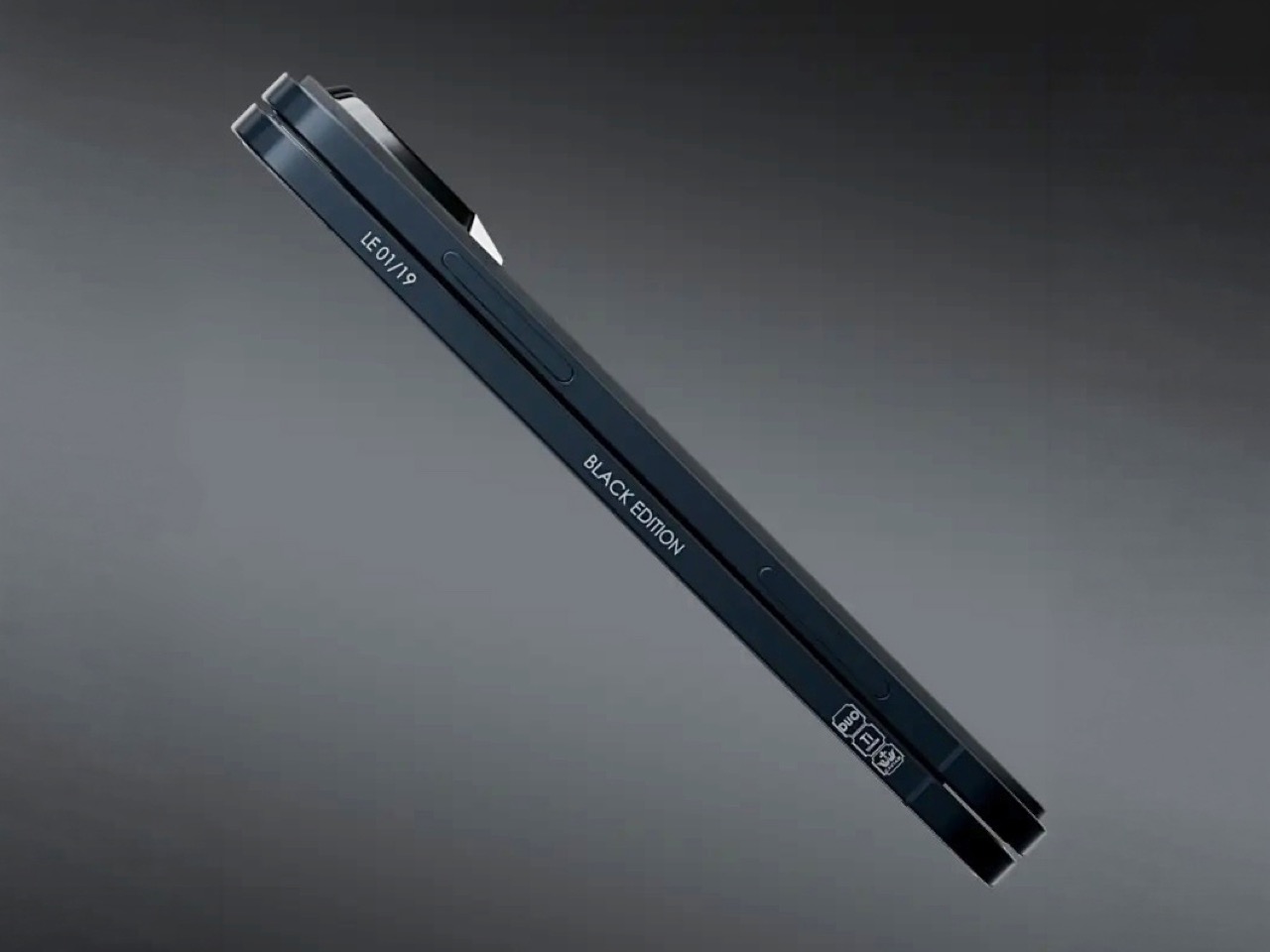
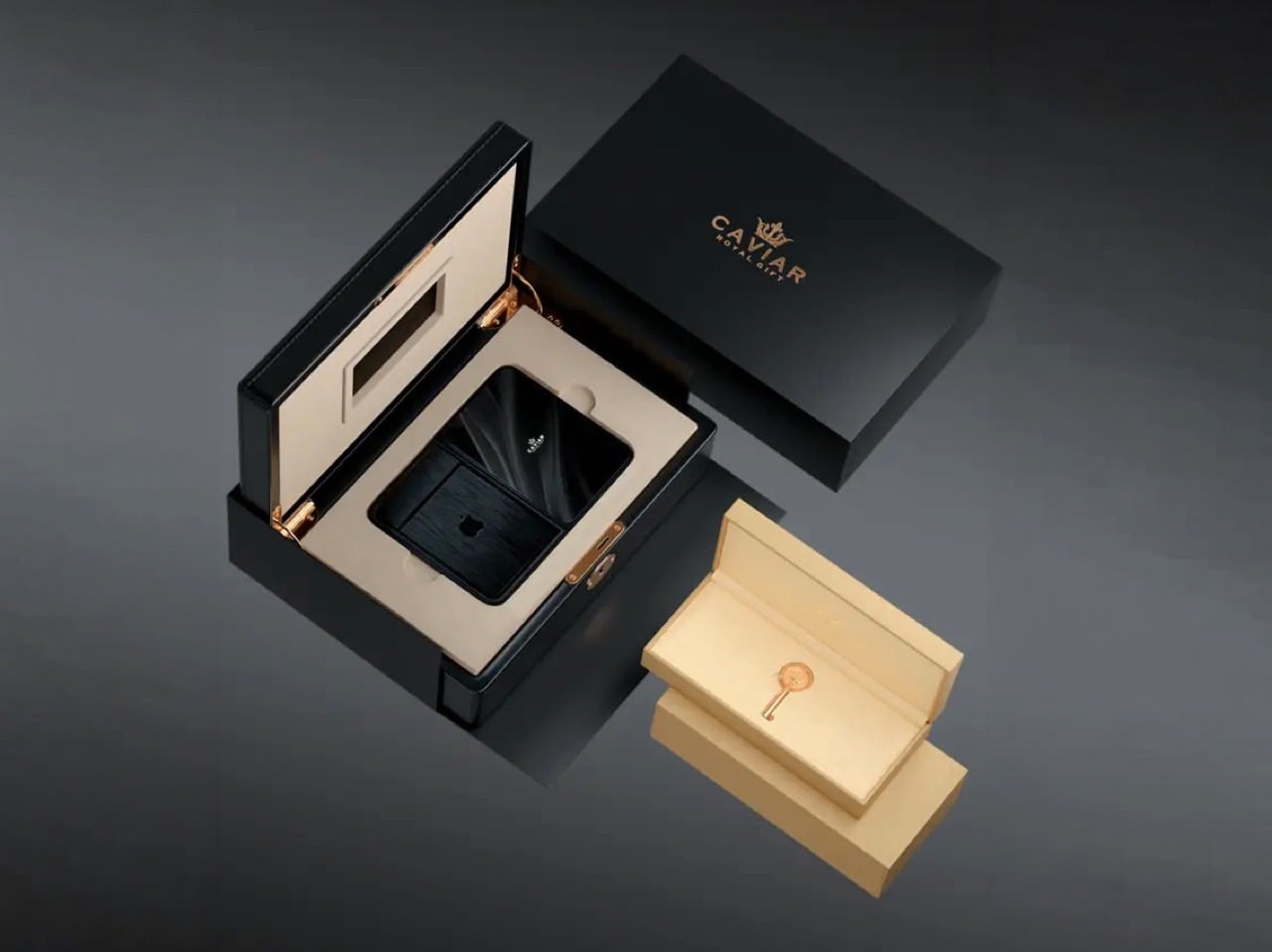
Caviar made 19 of these total. Each unit ships in a custom lockable black luxury box, presented the way a jeweler presents a watch rather than the way Apple ships a phone. A smaller gold-colored wooden case inside holds what appears to be a gold-plated commemorative coin, the kind of object that exists purely to make the unboxing feel like a ceremony. The side of the phone is engraved with a serial number too, for exclusivity. Caviar knows exactly who they are selling to, and made sure the packaging matches the energy.

Caviar has been doing this for years, taking flagship Apple hardware somewhere Apple would never go, for clients who appreciate the gesture. The formula is consistent: start with the most premium Apple product on the market, make it rarer, make it more dramatic, and let the price be the final statement. We have covered their gold-plated and titanium iPhone builds here before, and none of them committed this hard to stripping features as a form of self-expression. At $13,990 for 19 units (mind you, that’s just the 512GB variant), the Ultimate is the purest version of the Caviar argument: a phone that costs seven times its base price because it does less, and somehow makes that sound like the point.

The post Would you pay $14,000 for an iPhone Duo without any cameras? first appeared on Yanko Design.

  •  

Ressence Doesn’t Want Your Watch to Look Like a Watch

Design Mindset, Yanko Design’s weekly podcast, premieres every week with a new guest and a single animating question: what does it actually take to think differently about a design problem. The show is 23 episodes in, and this episode turns its attention to fine watchmaking via someone who arrived in the industry with no allegiance to its conventions. If a mechanical watch didn’t exist today, and a designer received the brief cold, would they give it hands, a crown, a flat dial? That question opens the conversation and also describes exactly what our guest spent 16 years answering in practice. The result is Ressence, a brand whose watches look like nothing else on the wrist.

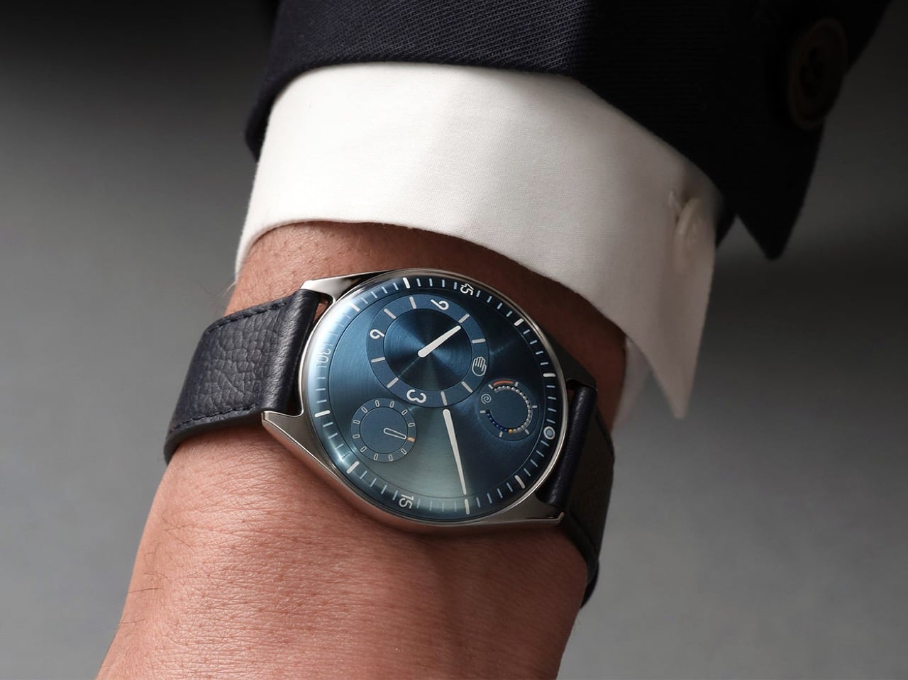
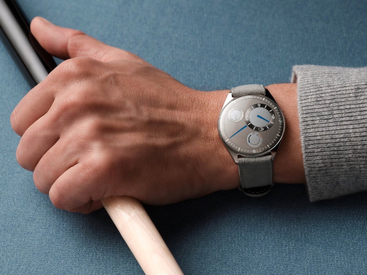
Benoît Mintiens is a Belgian industrial designer who, before he ever touched a watch, designed high-speed trains, aircraft cabins, medical devices, leather goods, and even hunting guns. He founded Ressence in 2010, the name a contraction of Renaissance of the Essentials. The Type Three BB2 won the 2024 Red Dot Award Best of Best, and 2026 brought the same recognition to the TMN. His watches are designed in Antwerp, made in Switzerland, produced in limited editions each year, and worn by people who believe the future is brighter than the past. He is a designer who walked into one of the world’s most convention-bound industries and simply refused to accept what he found there.

Designing from the User Outward

When people ask Benoît how he designs a watch, the answer he gives is never the one they expect, because he starts with the relation between the user and the watch rather than with the movement itself. “Usually I start not with the watch. I start with the relation between you and the watch, and that is, I think, a very important step that very often is forgotten.” Most brands were created by watchmakers who always build from the inside out, from the movement to the wearer. As a designer, Benoît works in the opposite direction, from the user inward to the movement. That physical 180-degree reversal of process changes everything about what a watch ends up looking and feeling like.

Designing the relationship is, in Benoît’s view, fundamentally an ergonomic exercise, rooted in a deep study of physiology and how people interact with objects. The ultimate measure of success is disappearance: “The best product is the one you forget when you use it. Invisible. I’m using it, but I’m not even aware of it.” He tells customers who buy a Ressence that he hopes they forget quickly that they are wearing it, and that forgetting is the proof the design worked. In the rapid-fire round, he completes the sentence “the future belongs to designers who stop asking how to make things and start asking” with five words: “How do you want to feel.” That question is where every Ressence begins.

Challenging Industry Conventions

Until the quartz crisis of the 1970s, watchmaking was about precision, quality, and reliability. When quartz movements arrived at a fraction of the cost of mechanical ones, the industry had to reinvent itself to survive. “Watchmaking has found a way to survive by adding this emotional layer on top of their brands, on top of their physical products. It’s not so much about the physical product anymore. And that’s a pity, I think, as a designer.” Any product, Benoît argues, needs to pass through the survival-of-the-fittest logic of natural evolution to reach the next generation. Watchmaking’s functional evolution largely stopped at the quartz crossroads, and Ressence is attempting to pick it up from there.

A product is defined by multiple dimensions: aesthetics, ergonomics, technique, social context, and production. In watchmaking, only the aesthetic dimension has shifted from brand to brand, and the underlying system architecture has been frozen for two hundred years. Ressence repositions every dimension at once. “The way we show the time, the ergonomics, is actually what defines the aesthetics. Is actually the way we make them. Is actually the technique that lies behind. All these things are intertwined, and they all together create what I call this new paradigm.” The whole has to be logical and coherent, or as Benoît puts it, you end up with a Frankenstein.

The Human Connection to Mechanical Objects

Asked why people still choose to wear mechanical watches when a phone tells time more accurately and without winding, Benoît offers a concept he has been developing for years. “I call it the empathy for gears. We have, as humans, we have empathy for gears.” He builds toward the idea through a Titanic thought experiment: a survivor on floating debris must choose which of two strangers in the water to save, the one he spoke with during the voyage, or the one whose language he could never understand. “As a human, you pick the one you have a relation with.” Products operate by the same logic, and we form bonds most naturally with what we can understand and relate to.

A circuit board is opaque; the workings of a mechanical watch are graspable, even to someone with no technical knowledge. “That is the magic of mechanical watches, is that we feel close to them. Let’s not forget, they tick, they make a sound. They need care. You need to wind them. All these elements will generate a bond between you and the product. And that is why I’m a strong believer in mechanical watches.” Each quality that makes a mechanical watch demanding, the winding, the servicing, the ticking, deepens the relationship between wearer and object. That depth of feeling, Benoît argues, is a human need, and it deserves to be designed for.

Ressence’s Innovations and Design Philosophy

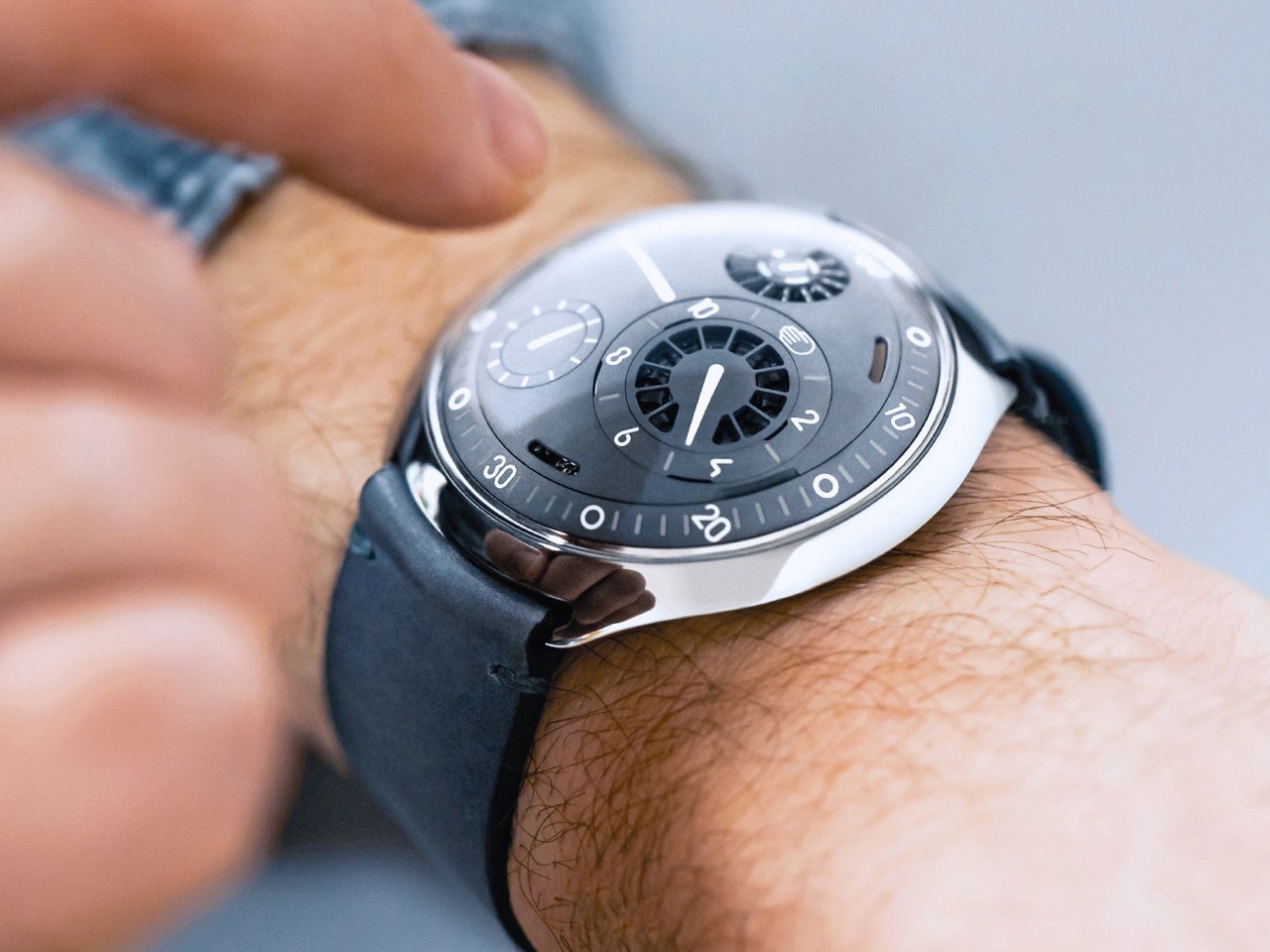
Ressence positions itself as a high-end brand, with Benoît drawing a specific distinction between high-end and luxury. Luxury is decorative and emotional, selling prestige and story; high-end means technically and functionally sophisticated, in service of the person using it. “We would believe that a product gets its relevance, its reason of existence, through the way or the quality the product is executing its function.” The most visible outcome of that philosophy is the Ressence Orbital Convex System, or ROCS, which replaces traditional hands with rotating discs requiring approximately 200 components where a standard watch uses four. The design brief Benoît imposed on himself back in 2008, years before the brand existed, made the mandate clear from the start: “Ressence needs to be original, but not marginal.”

The oil-filled dial, defining models from the Type 3 to the Type 7, has an origin in personal memory. Benoît traces it to childhood Mediterranean sailing trips, navigating overnight to Corsica guided only by an oil-filled ship’s compass in the days before GPS. “This image of the compass, an oil-filled system with inside a mechanical thing that turns around, showing the north. I’m pretty sure this has been the thing that has burned in my brains, and I believe the idea of the Type Three must have come from there.” Oil inside the Type 5 diver eliminates refractions between oil, sapphire, water, and dive mask, delivering a clear dial at any depth. The functional improvement is exactly the point: a diver watch you can actually read underwater.

Production, Materials, and the Future

Getting enough watches from suppliers is, after 16 years of operation, still the hardest thing Ressence faces as an organization. A single watch contains around 400 custom-made parts at extreme precision tolerances, and the Ressence dial is curved in three dimensions where almost every other watch is flat, requiring five-axis machining. Some parts pass through twelve different specialized companies before reaching a watchmaker’s desk. “If today I need more watches and I order them, I will only have them in between nine months and two years. There is no industry like that.” Those lead times explain the prices, the waiting, and the limited annual runs; the scarcity is structural, a consequence of producing something this technically complex as an independent brand.

Benoît is clear-eyed about products and unhurried about brand moving forward. Ressence has a product plan mapped for the next eight years, but brand recognition is the harder work and cannot be forced. “Stick to your vision, and move on and be coherent. I think that’s the central thing.” The reference brands held up as aspirational in watchmaking took fifty years to reach that position, and it was a consequence of what they did, not something they actively pursued. On materials, Benoît describes a fascination with mammoth ivory recovered from Siberia, finding its structure “very, very, very beautiful.” Ressence can be found at ressencewatches.com, on Instagram, and in Antwerp, where visitors are always welcome.

The post Ressence Doesn’t Want Your Watch to Look Like a Watch first appeared on Yanko Design.
  •  

This Zippo case now hides a full DIY micro-toolkit inside

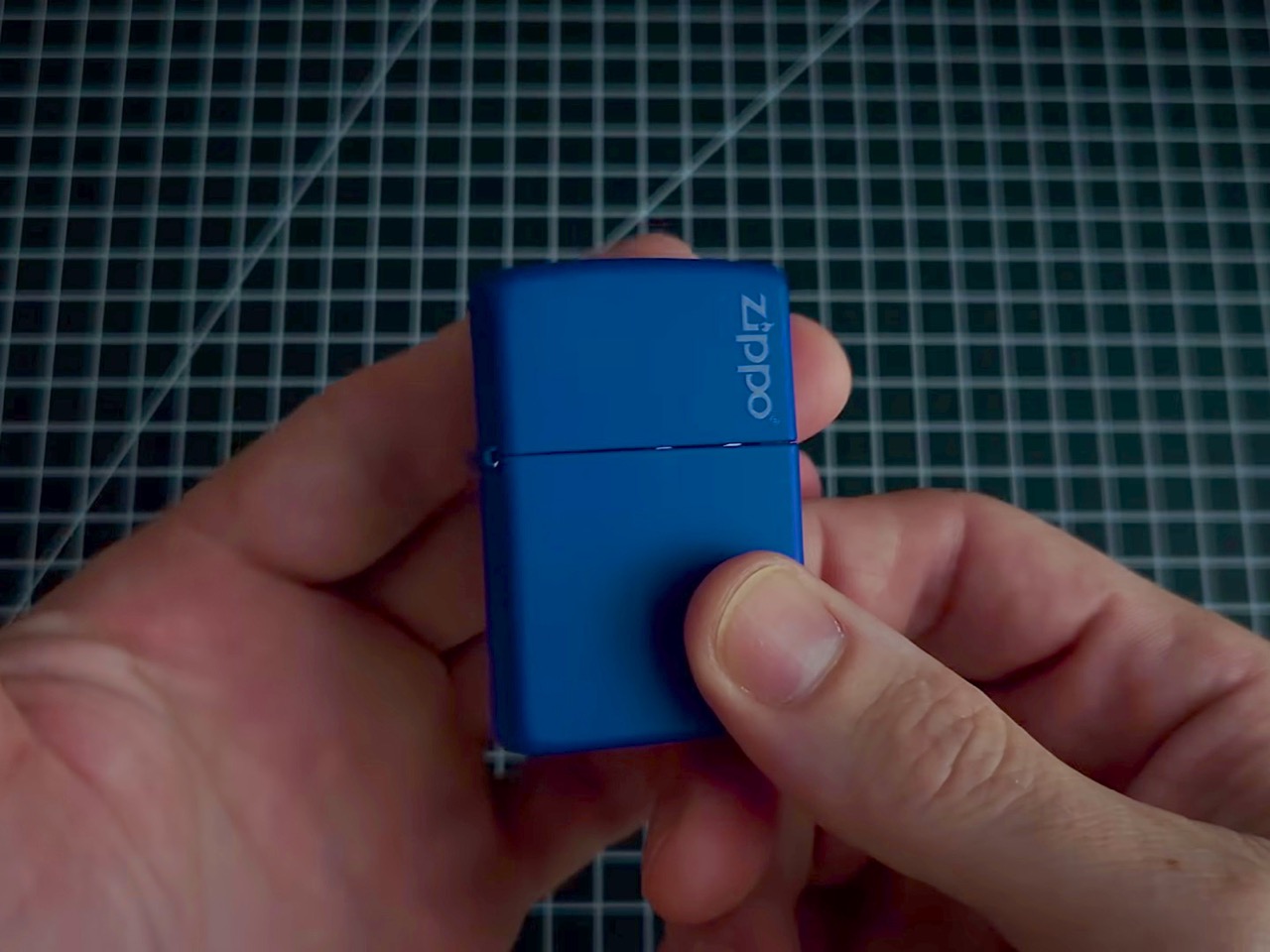
The Zippo lighter has been in pockets since 1932, surviving wars, road trips, and at least a few questionable life decisions. The iconic snap of that hinged lid is the kind of sound permanently lodged in pop culture. But here’s the thing about that stamped steel shell: pull the guts out and what you’re left with is a surprisingly well-engineered little box. It’s the right size, the right heft, and it already has a hinge that clicks with satisfying authority. Someone on the internet finally noticed, and decided to give it a better job.

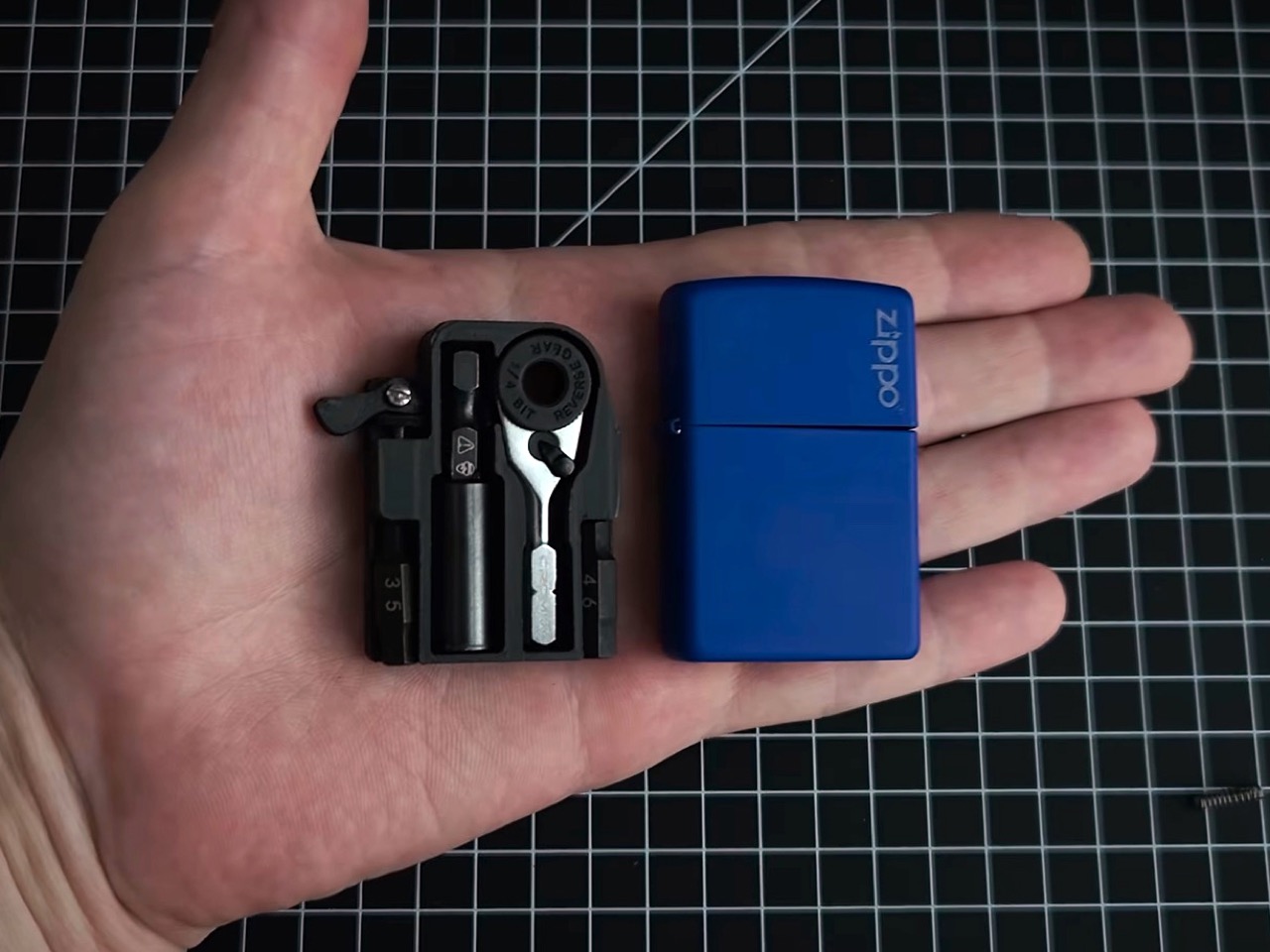
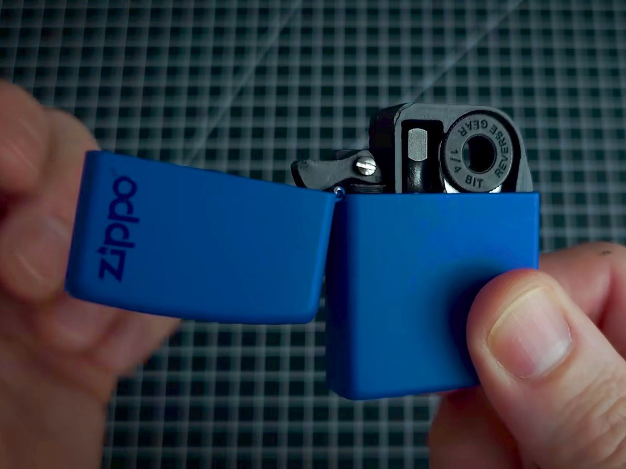
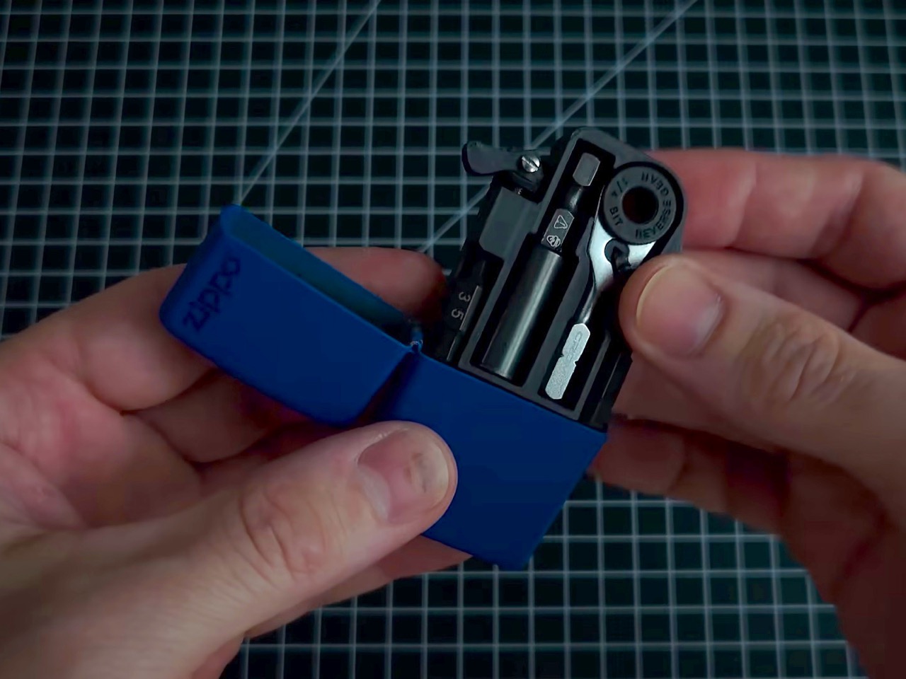
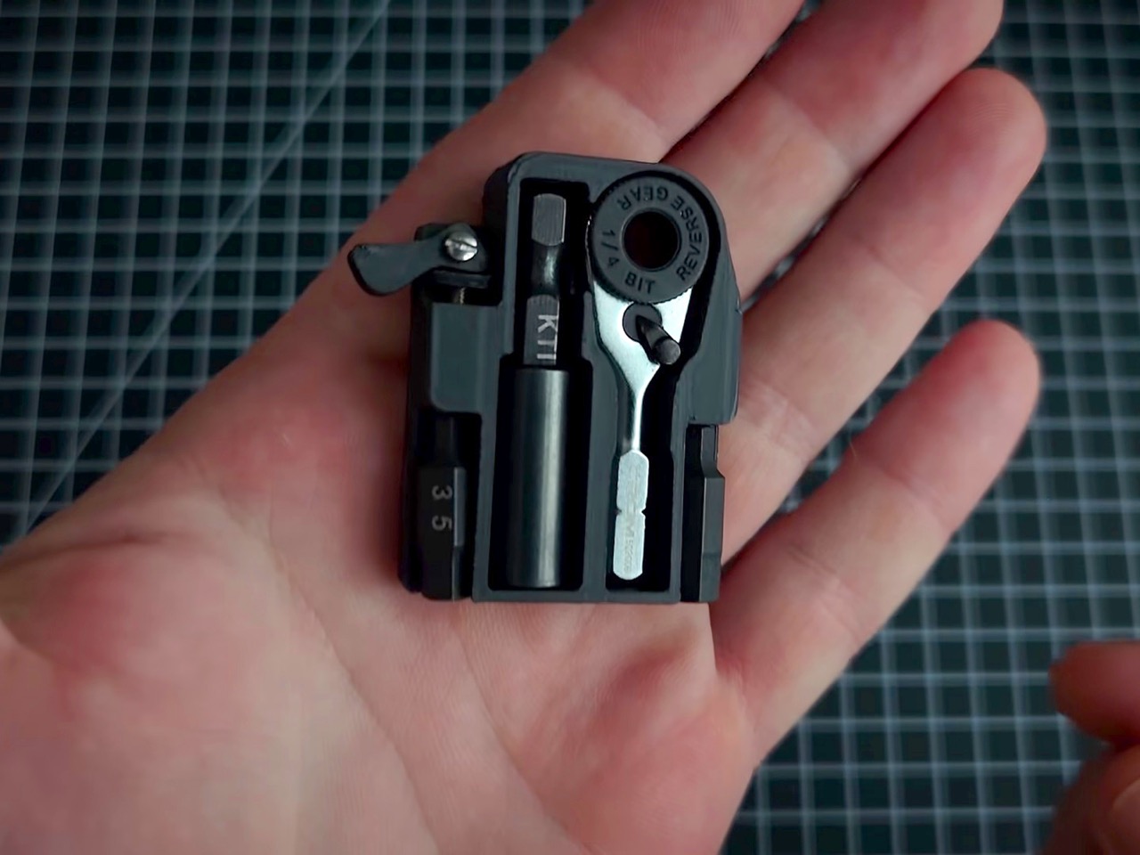
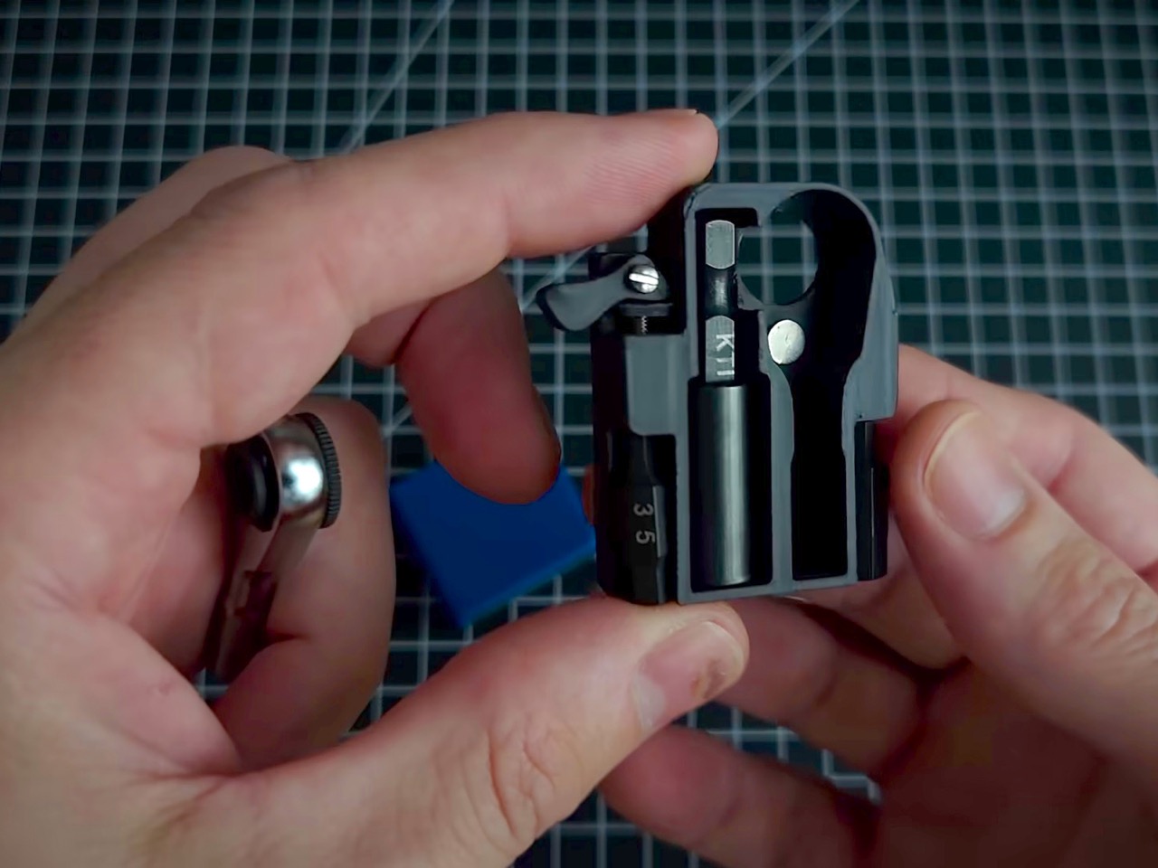
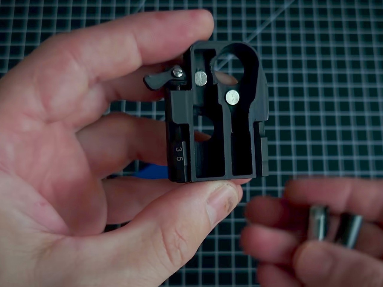
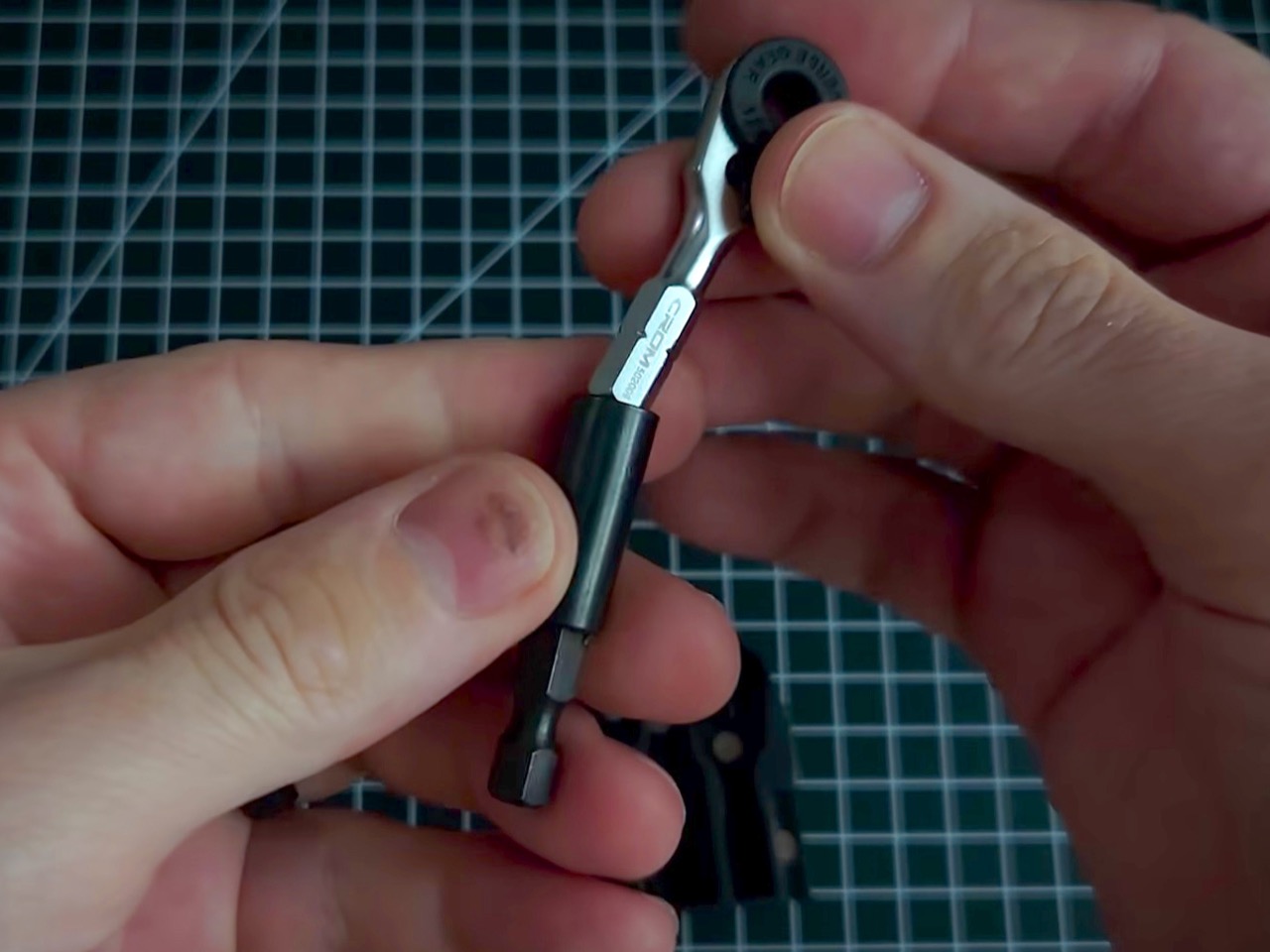
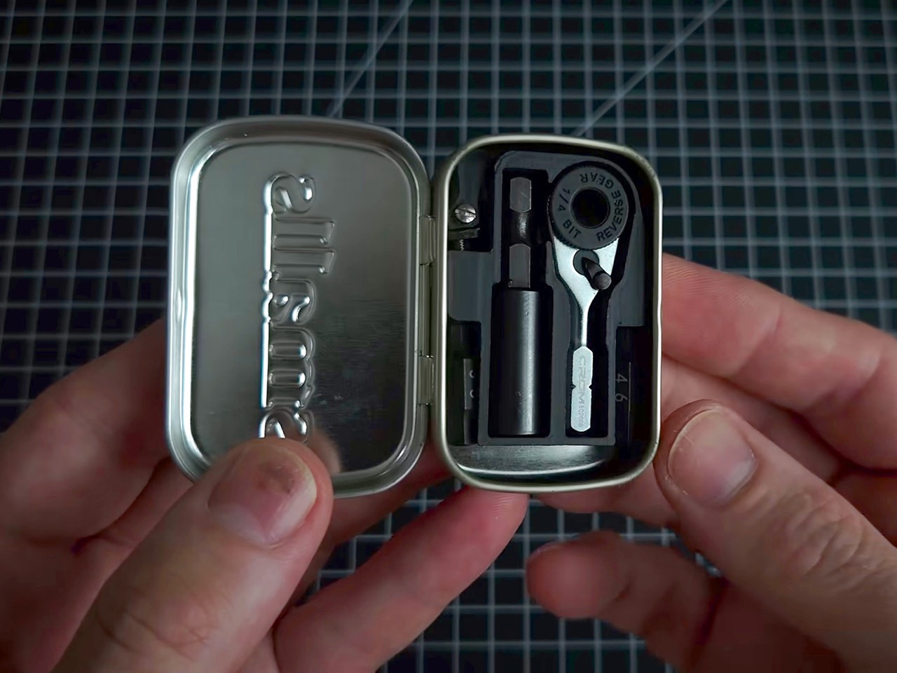
That job is housing a chrome micro ratchet, one of the smallest 1/4-inch bit drivers in the EDC world, nested inside a custom 3D-printed platform. Two Steinwhale precision bits and a Klein utility knife extension fill out the rest of the space, held in place with eyeglass screws. A spring salvaged from a disposable Bic lighter gives the ratchet its push-out action, popping it through a small hole in the back of the case. Embedded magnets make the whole kit stick to any metal surface, which is a genuinely thoughtful touch. It’s scrappy, it’s clever, and the photos of it sitting open in a palm are almost unfairly satisfying.

Designer: Tiny Tool Shop

The 3D-printed platform is a custom insert that drops straight into the Zippo shell, locked down with eyeglass screws, the kind normally reserved for fixing a bent hinge on your reading glasses. Those same tiny screws appear in two spots across the build, which tells you something about how the maker approaches sourcing. Each component gets its own dedicated slot, keeping the ratchet, bits, and extension snug and rattle-free inside the case. The lid snaps shut over the top, and the result feels tighter than it has any right to be for a DIY project. It’s the kind of thing that makes you instinctively look for a price tag.

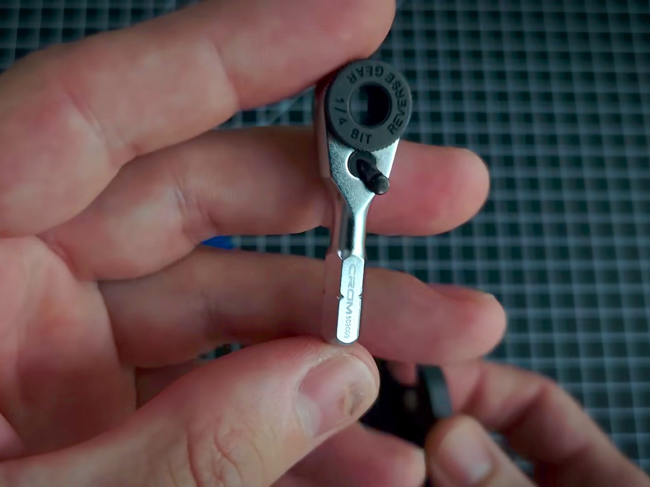
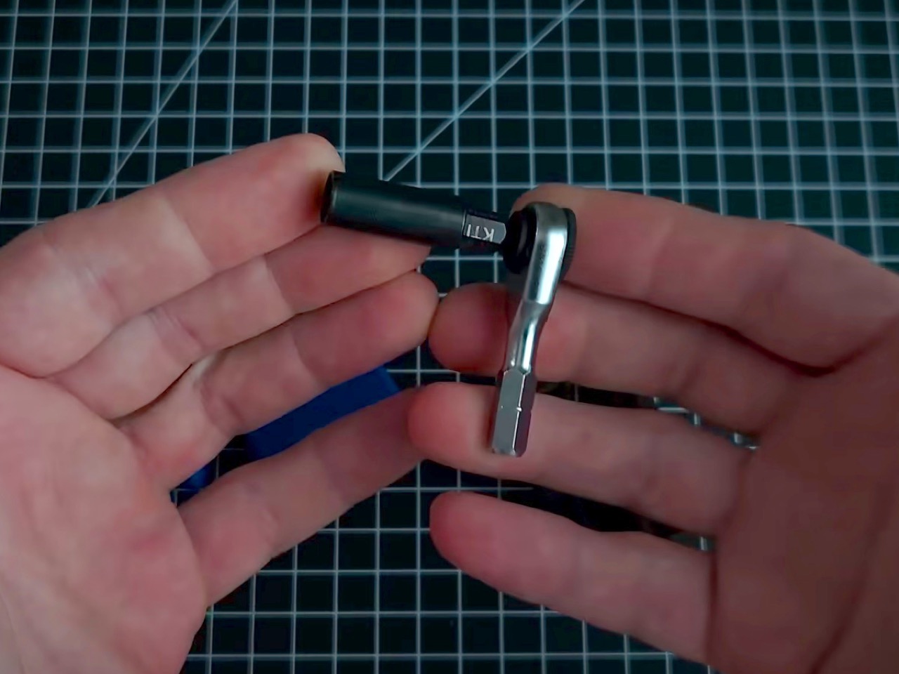
The chrome micro ratchet itself ranks among the smallest 1/4-inch drivers you can actually buy, and its scale is genuinely surprising next to almost anything else in a standard tool drawer. It accepts regular hex bits, so it plays well across the broader EDC and hardware ecosystem without needing proprietary accessories. A Bic lighter spring, salvaged presumably from a spent one on the maker’s desk, sits behind the ratchet and pushes it through a small hole in the Zippo’s back panel with just enough resistance to feel intentional. A Klein utility knife extension threads onto the ratchet for added reach in tight spaces, and when it’s not needed, the ratchet stores directly in the Klein knife’s handle instead. Both configurations tuck away cleanly, and the cross-compatibility means the kit pairs naturally with a knife you might already be carrying.

Steinwhale’s micro bits, built from S2 steel and sized specifically for micro ratchets, fill the two bit slots in the platform. The embedded magnets running through the build let the whole kit park on any nearby metal surface, a quality-of-life detail you’d genuinely appreciate halfway through assembling flatpack furniture with both hands occupied. The kit also fits inside a mini Altoids tin if that’s your preferred housing, though the magnets matter a lot more there since there’s no rear hole to push the ratchet out from. In practice, the Zippo remains the better vessel, slimmer, pocketable, and already equipped with a hinge that feels like it belongs. The Altoids option is a nice backup but the Zippo is clearly the intended home.

The whole build likely comes together for under $30 in parts, assuming you have a 3D printer and a spent Zippo shell on hand. The micro ratchet alone runs around $20, which makes this cheaper than most entry-level multitools with considerably less utility for light daily tasks. A Leatherman Skeletool brings pliers, a blade, and a bit driver for around $65 but also weighs 5 ounces and demands real pocket real estate. This kit trades tool variety for pure pocketability, and if your carry already includes a knife, that trade starts looking very reasonable. The one upgrade worth adding is some tactile labeling on the platform slots, so repacking everything in low light doesn’t become a small-scale puzzle.

The post This Zippo case now hides a full DIY micro-toolkit inside first appeared on Yanko Design.
  •  

Genius ‘Tilted’ Apple Watch Band Makes The Entire Experience 10x More Ergonomic

Have you noticed tilting always makes things ‘ergonomic’? A laptop stand tilts the keyboard towards you – ergonomic. A vertical mouse tilts your hands into a more natural position – ergonomic. A split keyboard often breaks and tilts the layout in two different directions for your hands – very ergonomic. It’s almost stupidly simple that the human body isn’t designed around perfect right angles. We’re filled with curves, joints, and limitations to how we move – so a simple tilt can often make life a lot easier. The Apple Watch apparently just got the memo.

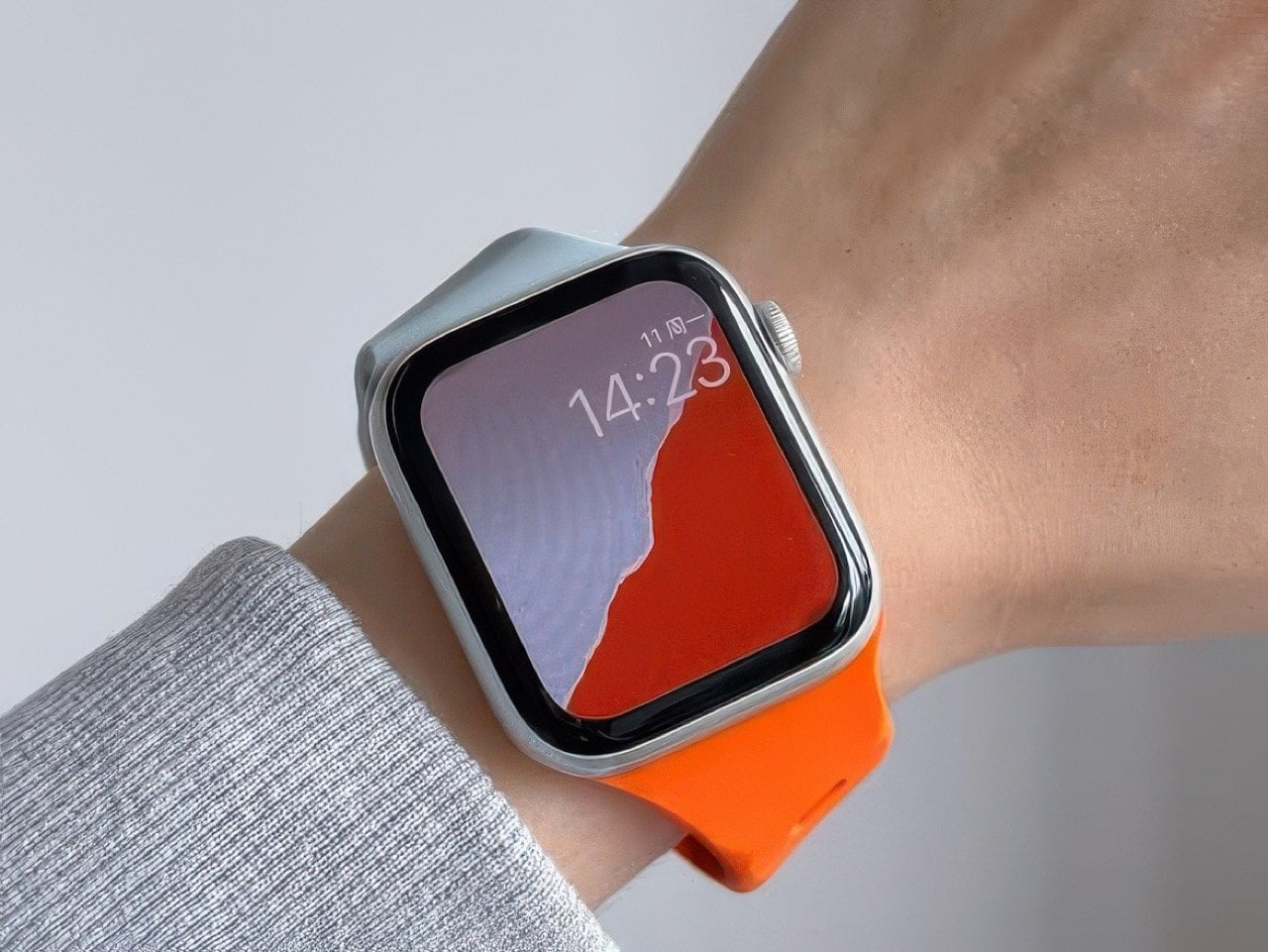
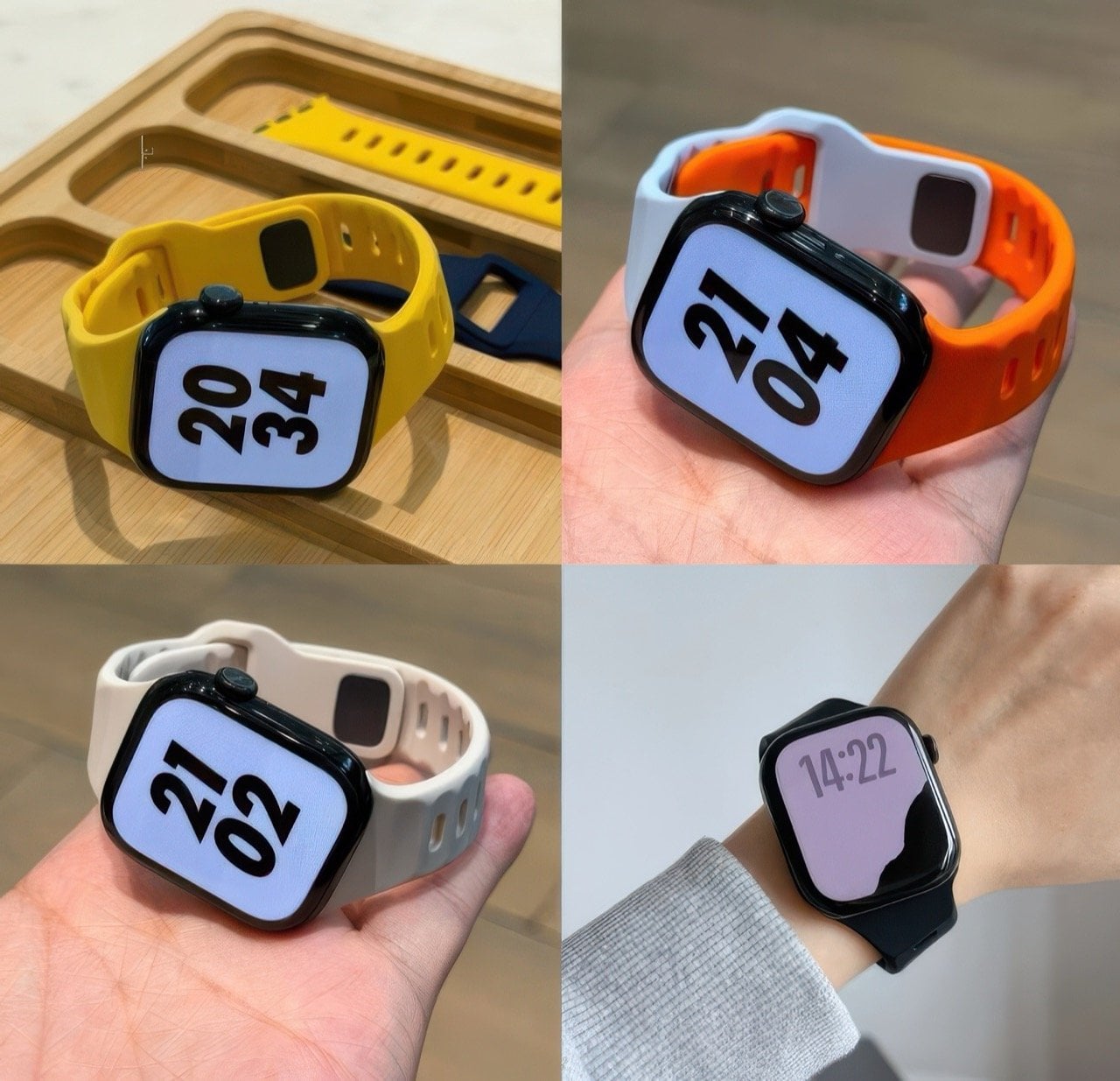
Designed around a very clever 30° tilt, this Tilted Watch Band puts the Apple Watch at a slight slant, so it’s facing you even when your wrist isn’t. Normal protocol is to lift your wrist up perfectly horizontal, so the screen faces you in the right orientation. Tilt the band and you don’t have to make your wrist horizontal anymore – just hold it at a comfortable angle and the Watch screen faces you a lot more naturally, letting you read the time without flexing your hand or your neck too much… perfect for joggers or bikers who don’t have the luxury to orient their hands while mid-activity.

Designer: MXU

Click Here to Buy Now

As ergonomically obsessed as Apple is, I’m surprised nobody from Cupertino thought of building a band like this. Does it mess with the symmetry? Absolutely. Could Apple still elegantly work around it? I have no doubt they could. They did such a brilliant job with the iPhone Duo’s folding animation, a tilted screen feels like child’s play.

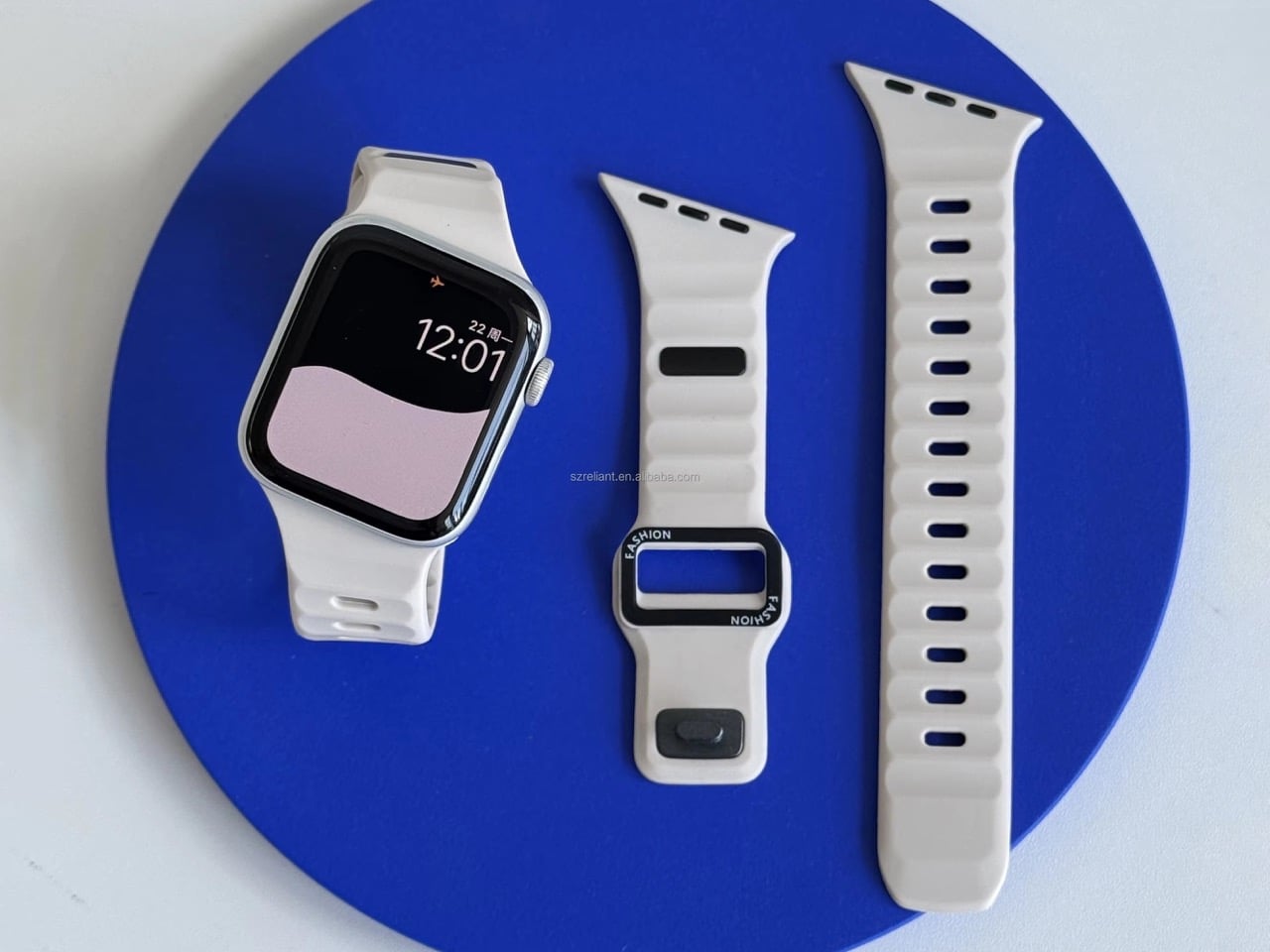
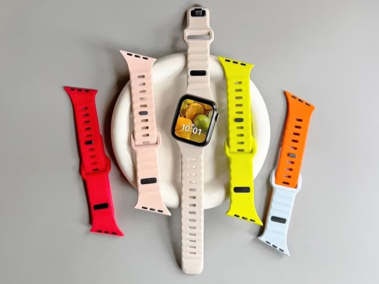
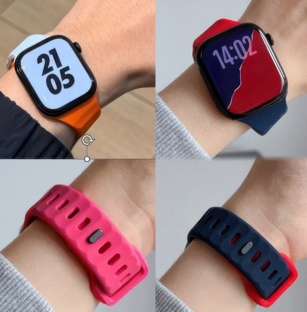
The band comes in a variety of colors, although the best thing you could do is buy a bunch of them and mix and match pairs to create a dual-tone design. The silicone construction makes the band perfect for any kinds of sports, or for people with hypoallergenic requirements. One caveat, however, is that this watch’s tilt makes it so that it only works on the left hand. The clockwise tilt means if you wore the watch on the right hand, the tilt would work against you, requiring you to crane your neck even further than you originally would. Also, the crown would press into your forearm a lot more, which isn’t particularly fun considering you’d have to deal with constantly awakening Siri every few minutes.

The solution, however, is elegantly simple, and works better for smartwatches than it does for watches. You see, reading an analog watch at any tilt or angle is fairly easy – reading a notification on a screen while it’s tilted can be a chore. That specific detail makes the Tilted Watch Band pretty useful, as it reduces the strain on your wrist and neck while you glance down at your wearable.

The Tilted Watch Band is available online through retailers like Amazon, and works with all Watch series and sizes, even with the Ultra. So you can buy and keep the band even through all your watch upgrades over the years!

Click Here to Buy Now

The post Genius ‘Tilted’ Apple Watch Band Makes The Entire Experience 10x More Ergonomic first appeared on Yanko Design.

  •  

MetMo turned a 1912 mechanism into the perfect hands-free tweezers for hobbyists and craftsmen

If the name MetMo rings a bell, that’s because this small Leeds outfit has built its reputation out of taking old mechanical ideas nobody else bothered reviving and turning them into objects people genuinely want to own. We’ve covered the MetMo Driver reworking the mid-century ratchet screwdriver, the Fractal Vise shrinking industrial clamping logic down to desktop scale, and the Pocket Grip channeling a century-old patent into nearly half a million dollars of Kickstarter support. The catalog reads like a museum of mechanisms reimagined with modern metallurgy and CNC precision. Now they’re circling back to something smaller, more delicate, and more universally frustrating than anything they’ve tackled before. Their next target is the humble tweezer.

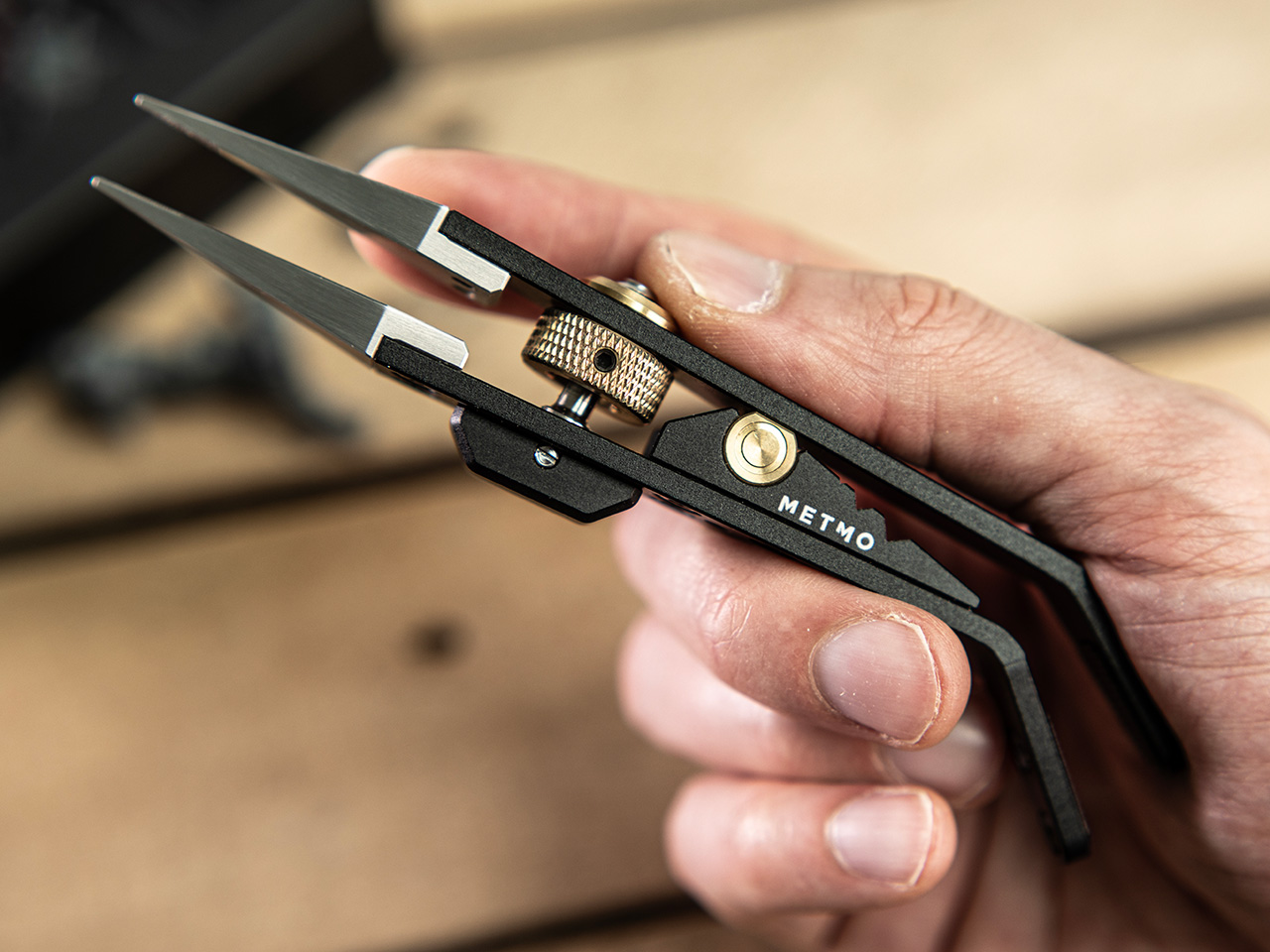
The Precision Grip is calibrated for a different job than MetMo’s earlier clamping tools, the kind of featherlight, controlled pressure needed to hold a model part without crushing it. Where the Pocket Grip chased 21kg of clamping force for daily carry tasks, this one maxes out at 5kg, by design. It runs on a miniaturized drive screw borrowed from precision machining equipment, so you set your grip force once and the jaws hold that position without assistance. That’s the core limitation tweezers can never escape: they hold via sustained finger pressure, and the moment that wavers, the part is gone. For anyone who has ever sacrificed a miniature to the carpet gods, that last sentence is the whole pitch.

Designer: Sean Sykes & James Whitfield (MetMo)

Click Here to Buy Now: $129 $143.33 (10% off). Hurry, only 19/1050 left! Raised over $579,000.

For decades, precision hobbyists have been improvising with tools from completely different disciplines. Jewelers raid surgical supply catalogs. Electronics hobbyists use soldering tongs that launch parts across the room the moment grip pressure drops. Model painters hold tiny figures between their fingers and simply hope for the best. MetMo’s position is that these people deserve something built specifically for the job, and the Precision Grip’s lightly textured jaw tips are designed to grip without marking or damaging delicate surfaces, a distinction that no repurposed dental or electrical tool reliably delivers.

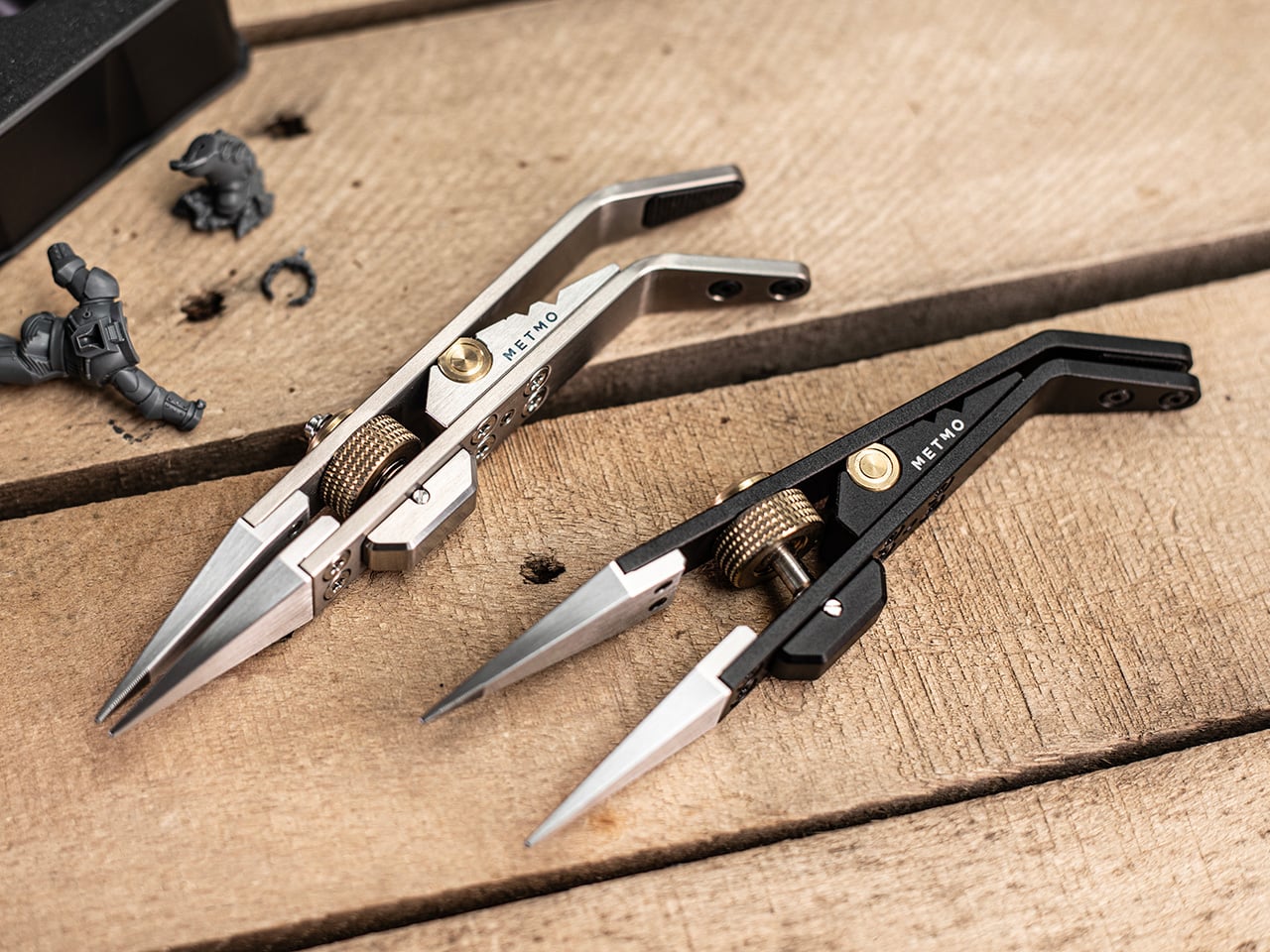
The mechanism at the center of all this is a miniaturized version of the drive screw used in high-precision machining equipment, a category of hardware that lives and dies by tolerance accuracy. A solid barrel hinge keeps both jaws in perfect alignment during clamping, preventing the sideways drift and tip-twist you’d get from a conventional pivot, and that dimensional stability is what makes the needle-nose tips usable for genuinely pinpoint work rather than approximations of it. Turn the knurled screw, the jaws close to exactly where you set them, and they hold there with up to 5kg of clamping force. The underlying mechanism traces back to 1912, which MetMo has made into a design tagline for a reason. It’s a genuinely good mechanism.

The jaw tips carry a patent-pending micro-grip texture that MetMo calls “The Gecko’s Finger,” a name that is slightly ridiculous and also completely on point. Small smooth parts get just enough extra friction at the contact surface to stay put without the jaws needing to clamp any harder, which is the right problem to solve when you’re working on something fragile. Beyond the standard needle-nose stainless steel nibs, the system accepts silicone soft inserts for delicate surfaces, round clamp heads for gripping a part’s inner cavity rather than its outer face, and even custom 3D-printed nippers for shapes no off-the-shelf tip could reach. Individual nibs swap out independently when damaged, without touching the body.

Set the jaws slightly open and a spring-loaded mechanism activates, giving you conventional tweezer behavior for quick sorting tasks without engaging the screw-drive lock every time. When you need both hands free, the Precision Grip clamps into a quick-release mount and becomes a miniature desk vice, holding your part steady while you solder, file, or paint. Three V-grooves machined into the body let you form wire or prop the tool as a makeshift stand, keeping parts right where you left them when you step away. The whole setup is fully ambidextrous, which sounds minor until you’re a lefty who has spent years buying tools that don’t think about you. All of that function lives in a body that measures 134mm (5.3 inches) long, 29mm wide, and 16mm deep.

Aerospace-grade hard-anodized aluminum (70.3g), Grade 5 titanium (83.3g), and surgical stainless steel (114.5g) are the three material variants, and each one maps to a different kind of user. The aluminum is the nimble everyday choice, the titanium balances weight savings and durability for more demanding environments, and the surgical stainless is autoclave-rated and built from high-chromium steel throughout, making it viable for medical and laboratory settings. All three are fully user-serviceable, strippable to individual components for maintenance or repair, with high-tensile screws throughout rather than whatever was cheapest to source. MetMo talks about a 200-year product goal, and the fully serviceable construction is what gives that ambition actual credibility.

Pricing for the Precision Grip runs at £89 ($118 USD) for the Aluminum version, while the Stainless Steel variant is priced at £119 or $157 USD. For serious hobbyists and EDC collectors, the Titanium Precision Grip is priced at £179 or $237 USD. The Precision Grip ships worldwide from the UK and comes with the 200-year repairability guarantee that you could possibly only expect from a company as obsessed with detail and quality as MetMo. MetMo balanced the weight distribution around fine writing instrument ergonomics, giving the body a contour that doesn’t tire your hand across long sessions. It also looks genuinely purposeful doing nothing, like an intricate ornament that earns questions from people passing your desk, which MetMo treats as part of the design brief rather than a happy byproduct.

Click Here to Buy Now: $129 $143.33 (10% off). Hurry, only 19/1050 left! Raised over $579,000.

The post MetMo turned a 1912 mechanism into the perfect hands-free tweezers for hobbyists and craftsmen first appeared on Yanko Design.

  •  

This $899 golf launch monitor tracks your swing in 3D and tells you how to fix it

A decent golf lesson can cost anywhere from $80 to $200 an hour, but the bigger issue usually kicks in after the lesson ends. You leave with a fix, spend the next two weeks practicing on your own, and somehow manage to rehearse the exact mistake you were trying to get rid of. Golf has a funny way of doing that. More practice does not always mean better practice. Launch monitors helped by giving everyday golfers access to shot data that used to live in pro fittings, but numbers alone can still feel like homework. NeoPace’s G10 Pro tries to close that gap by pairing launch monitor stats with an AI coaching layer that explains what happened and what to work on next.

NeoPace, based in Irvine, California, built the G10 Pro around a triple-camera system and a 24 GHz Doppler radar. Two cameras capture the impact zone at up to 480 frames per second, while a third records the full swing at 120fps. The setup feeds into what NeoPace calls TrainerIQ™, an AI system that traces a bad shot through a Body to Club to Ball chain, connecting ball flight to club delivery and then back to the body movement that caused it. That matters because most golfers do not need more raw data, they need help turning data into action. The G10 Pro also rebuilds each swing in 3D, so you can replay it from multiple angles instead of squinting at a flat video and pretending you know what your hips are doing.

Designer: Neopace

Click Here to Buy Now: $899 $1499.99 (40% off). Hurry, only 875/1000 left! Raised over $286,000.

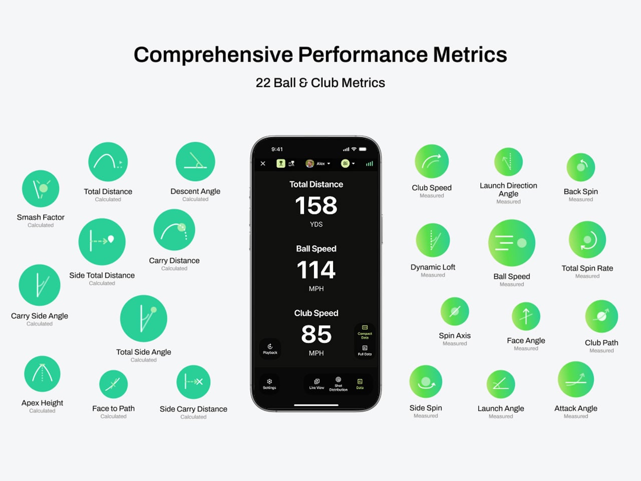
The G10 Pro tracks 22 ball and club metrics, plus 27 body-related metrics covering chest rotation, pelvis movement, wrist angles, elbow flexion, knee sway, and more. That is a pretty wild amount of information for a portable unit that costs $899, especially when most devices in this range focus mainly on ball flight and club numbers. NeoPace also made setup refreshingly simple, with auto alignment and support for both face-on and down-the-line placement. So whether you’re practicing at home, on the range, in the backyard, or sneaking in some swing diagnostics before a round, the G10 Pro feels built for golfers who want coaching-grade feedback without hauling around a tour van full of gear.

Every swing gets captured and rebuilt in full 3D, replayable from any angle, at any moment, from face-on, top-down, and down-the-line, all from a single device you placed once before you started. Most launch monitors give you flat video from a single fixed angle. The stereo camera pair locks the ball at 480 frames per second while the third follows the swing at 120fps, double the impact capture rate of most competing devices. Seeing your own swing from directly above mid-follow-through is the kind of analysis angle instructors have always wanted to show students but rarely had a clean portable way to deliver. NeoPace claims the 3D Replay™ is a first in portable consumer launch monitors at any price, and from everything visible in the current market, that claim holds up.

TrainerIQ™ analyzes your swing and body movement, identifies the likely cause of a miss, and suggests a targeted drill to help you improve. It does not just flag that the face was open at impact and leave you to figure out why. The analysis goes deeper: face 2 degrees open, heel contact, smash factor 1.35, and the root cause is that the body stopped rotating so the hands stepped in to carry the load. That kind of layered breakdown is exactly what a teaching pro walks you through after watching your swing, and the G10 Pro compresses it into automated real-time output after each shot. Golfers can also directly ask TrainerIQ™ questions about their swing and receive personalized, actionable guidance on what to work on next, which makes the system feel less like a stat engine and more like an interactive training partner. TrainerIQ™ then prescribes specific drills based on the diagnosis, closing the loop between data, understanding, and actual practice.

Twenty-seven body-related metrics track how your body moves through every swing, turning posture, timing, and rotation into data you can act on. The tracked parameters span the chest and pelvis in five axes each, lead and trail knee sway and flexion, mid-hands sway and lift, head movement, X-Factor and Sway Gap, lead and trail elbow flexion, wrist angle, shaft angle, and kinetic sequencing factors: Core Gain, Shoulder Gain, Wrist Gain, and Release Factor. Any coach reading that list will recognize it as the full biomechanical picture that motion capture setups in pro training facilities chase. Inside TrainerIQ™, it becomes the evidence base connecting a ball that lands 13 yards short and right to a chest that stopped rotating halfway through the downswing. That translation from raw biomechanics to actionable coaching is where the G10 Pro genuinely earns its price.

Getting the G10 Pro into a session takes three steps: set it down, auto align, and take your shot. That might sound like marketing language, but auto-alignment is a genuine quality-of-life upgrade over monitors that require precise manual positioning every single time. The pan-and-tilt gimbal covers a 120-degree pan range and a 40-degree tilt range, so near-correct placement is close enough. The unit itself measures 217.5 × 47.25 × 44.5 mm without the tripod, compact enough to slide into a range bag without reorganizing everything else in it. The 3,300mAh/7.2V battery runs for four hours with a 1.5-hour fast charge at 15W, which covers a full morning session with room to spare. For golfers who want to practice or play indoors, the G10 Pro is compatible with GSPro and Creative Golf, with additional major simulator platforms currently in development.

NeoPace also says there is no unlock fee or subscription required for simulator connectivity itself, though third-party simulator software fees may still apply. The companion app works with iOS (14.0 and above) and Android (10.0 and above) smartphones and tablets. NeoPace also says the core feature set does not require a subscription. D Swing Analysis and TrainerIQ™ Analysis share an allowance of up to 5 AI-analyzed shots per month, while Premium AI increases the shared allowance to up to 1,000 shots per month and adds features such as Ask TrainerIQ™, Performance Insights, Personalized Drills, Practice Goals, and Cloud Storage.

At $899, the G10 Pro goes toe to toe with the Rapsodo MLM2PRO, its most direct camera-based competitor at the same price. The MLM2PRO does solid work on ball flight data and video, but offers no body tracking, no 3D reconstruction, no AI coaching chain, and face-on-only placement. Stepping further up the market, ball/club/body motion analysis at this depth typically lives in systems costing several times more, usually requiring separate wearables or dedicated motion capture rigs. Honestly, the fact that NeoPace has packed 3D reconstruction, 27 body metrics, and an AI coaching brain into a $899 portable device feels like it should be harder to pull off than it apparently is, and that is the most compelling thing about the G10 Pro.

Click Here to Buy Now: $899 $1499.99 (40% off). Hurry, only 875/1000 left! Raised over $286,000.

The post This $899 golf launch monitor tracks your swing in 3D and tells you how to fix it first appeared on Yanko Design.
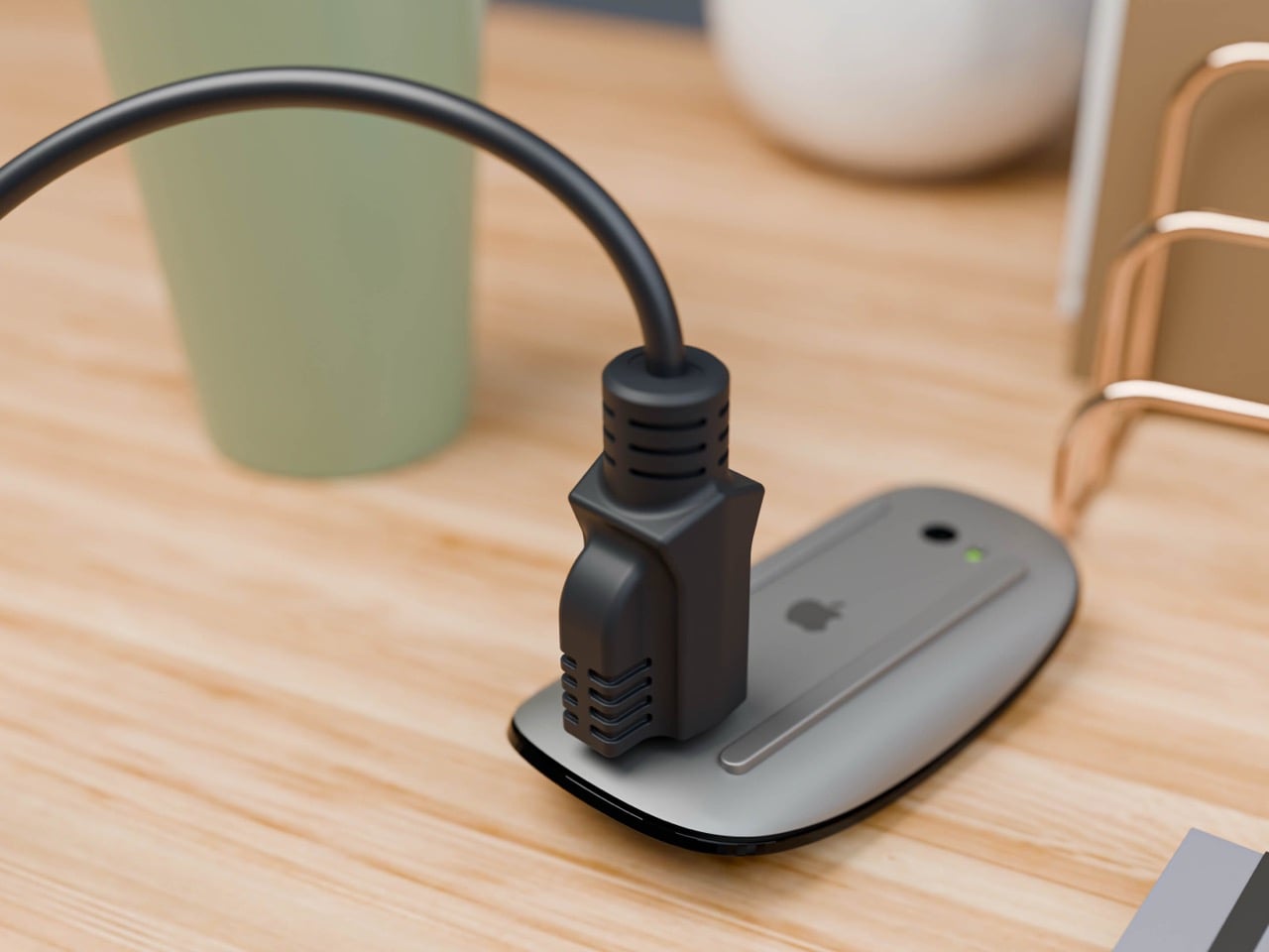
  •  

iPod Classic emulator for the Samsung Galaxy Z Fold8 finally gets the size and aspect ratio right

Apple has the opportunity to do something really cool here! An emulator going by the name of Classipod has been doing the rounds on the Google Play Store, letting you run an iPod Classic style interface on any Android phone of your choosing. The only problem is that Apple never really made a 9:20 iPod Classic. Every iPod Classic had a short, stout design and as it stands, there are only two Android phones that currently fit this bill, and both fold.

A video on Instagram showed the Classipod interface on a Galaxy Z Fold8 and I can’t help but feel like this almost exactly looks like the classic iPod. The proportions are damn near perfect, the interface still makes me nostalgic, and those color options absolutely slap! The only real problem is that, like all good things, Classipod came to Android before it did to the iPhone Duo… but if someone from Apple’s software team is reading this (hey Craig!), just go ahead and give us an Apple Music skin that brings back the iPod Classic! Pretty please??

Designer: Adeeteya

Here’s what I find so funny about running Classipod on a Z Fold8 – sure, it almost matches the iPod Classic’s form factor, but even when folded shut, it’s still thinner than the iPod! I’m talking hinge, two sets of screens, two batteries, an entire processor, cameras galore, all that packed into something that measures 9.7mm thick while the iPod Classic, which is just a tiny screen, battery, SoC, and a massive flash drive, measures 10.5mm in thickness. Then again, the iPod Classic packs an aux input too, which you’ll never see on a foldable phone.

But hold the Z Fold8 in your hand and the Classipod definitely scratches the itch of owning vintage Apple gear. The weight and heft, the analog interface, and that gorgeous jogwheel that is sure to get your muscle memory kicking in instantly. You sideload music so it plays locally (no streaming), and you can do everything, from searching for artists to making playlists. And yes, if you’re asking, the jogwheel has haptic feedback so it actually does feel like the iPod of yesteryears.

There are a few iPod emulators on the App Store, but none as good as the Classipod. I guess someone could vibecode one overnight and run it on an iPhone Duo soon, but until then, turns out the most faithful recreation of an iPod Classic exists… just on an Android device!

The post iPod Classic emulator for the Samsung Galaxy Z Fold8 finally gets the size and aspect ratio right first appeared on Yanko Design.

  •  

Gorgeous LEGO Book Nook Has a Steam Train Blasting Straight Through Its Snowy Pages

Every kid who grew up with Chris Van Allsburg’s The Polar Express remembers that moment where the story stops behaving like a story. A train just shows up, chugging straight out of the snow and into a kid’s actual bedroom, and suddenly bedtime reading feels a little bit dangerous in the best way. That’s the exact energy LEGO builder CrazyInventor is chasing with Winter Express, and yes, I see what you did there with that title, very smart way to dodge a certain mouse-shaped legal team while still getting the reference across loud and clear. Except here the train doesn’t stop at bursting out of the pages. It runs straight through the whole book, cover to cover, like the story just wasn’t big enough to hold it.

The result looks like someone left a hardback open on a shelf and a Victorian steam engine decided to use it as a shortcut. Gold trim, a red ribbon bookmark, snow dusted across the back cover like a sky full of stars, this thing reads more like a diorama that happens to be shaped like a book than a book that happens to have a train in it. And once you spot the tiny second train hiding inside the pages, you’ll understand why this project cracked 1,000 supporters in about three days flat.

Designer: CrazyInventor

The book itself steals the show before the train even enters the conversation. It’s a navy blue hardback with rounded gold corner guards and matching gold bands running down a curved spine, the kind of cover treatment you’d expect on a leather-bound classic rather than a pile of ABS plastic. A gold plaque on the front reads “Winter Express” in a wood-grain frame, and a red ribbon bookmark hangs off the top edge like someone set the book down mid-chapter and wandered off to make tea. Flip to the back cover and it’s scattered with pale blue round studs, doing double duty as either falling snow or a starry winter sky, depending on how you’re feeling that day.

A black and gold Victorian locomotive takes over from there, complete with a glowing headlamp, a cowcatcher up front, and Technic side rod detailing, coming straight out of a snow-capped rock tunnel carved into the front cover. A matching passenger coach trails out the other side through the spine, decked out in scrollwork trim with its own lit lanterns and a roof stacked with skis and sleds. Snowy pine trees, cobblestone tiles, and two working lampposts fill out the base, along with a frozen little pond built from trans-blue tiles.

My favorite detail is buried in the pages themselves. Look closely at the tan interior spread and there are cutout windows revealing a second, micro-scale train crossing a tiny stone viaduct, a whole miniature railway hiding inside the book that the big train is currently smashing its way through. It’s a small touch, but it’s the kind of layered thinking that separates a fun MOC from a genuinely great one.

Winter Express landed on LEGO Ideas on September 15 and has already pulled in 1,291 supporters, cruising well past the first 1,000-vote milestone toward the 5,000 mark it needs next. If cozy winter dioramas with a little bit of chaos baked in are your thing, go to the LEGO Ideas page and add your support and watch this one keep climbing.

The post Gorgeous LEGO Book Nook Has a Steam Train Blasting Straight Through Its Snowy Pages first appeared on Yanko Design.
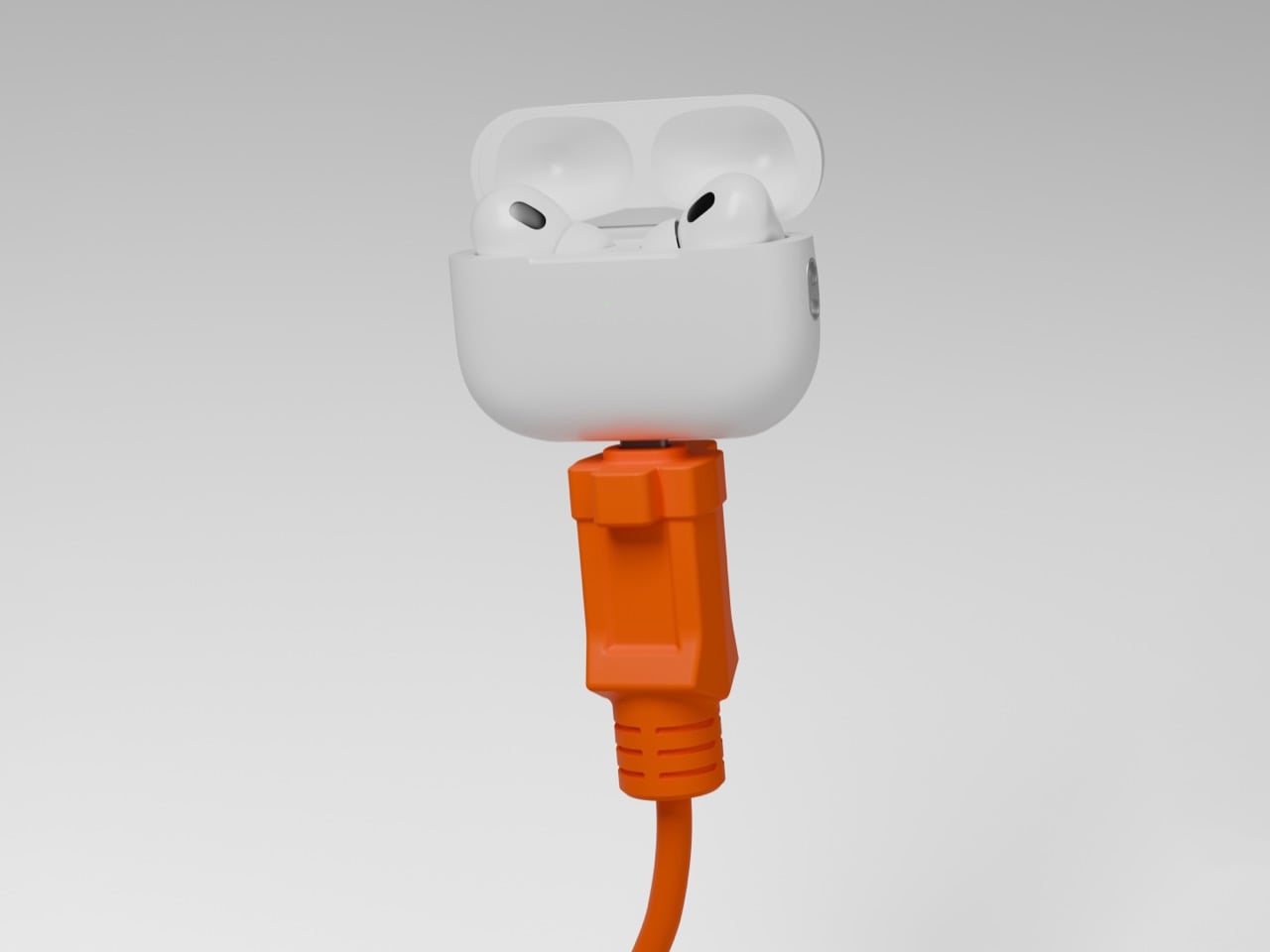
  •  

A Designer turned Xiaomi’s Logo into a Multi-Utility Vehicle Concept

Side profile of the Xiaomi Horizon concept MPV in blue-to-lavender paint, parked on a white platform above still water.

You know that little rounded square Xiaomi uses as its logo? The one a Japanese design legend spent actual months tuning with a math equation just to get the curve right? Lucas Angelo looked at that shape and thought, sure, why not build a car out of it. The result is the Xiaomi Horizon, and I mean that almost literally. The tailgate is one giant glowing squircle. The wheels are squircles. The whole rear end reads like someone blew up an app icon to the size of a minivan.

It sounds like a gimmick until you remember Xiaomi’s entire EV strategy is basically “make our products feel like they all came from the same brain,” and a car shaped logo is honestly not the dumbest way to pull that off. Whether it should be a Multi Purpose Vehicle or something else entirely is a separate question, and we will get to it. But credit where it is due, this thing has more brand DNA baked into its sheet metal than most concepts manage with an entire mood board of heritage references.

Designer: Lucas Angelo

Front three-quarter view of the Horizon against a tall black louvered wall, with mountains visible in the background.

Rear three-quarter view of the Horizon at dusk, showing its illuminated red squircle taillight and the Xiaomi wordmark.

That squircle obsession is not Angelo inventing a bit for fun. Back in 2021, Xiaomi hired Kenya Hara, the design legend behind MUJI’s whole visual identity, to redraw its logo. He landed on a superellipse formula, dialed to a value called n equals 3, which is the mathematically precise sweet spot between a perfect square and a perfect circle. People online mocked it as three hundred grand for rounded corners. Angelo apparently took it a lot more seriously than the internet did, because Horizon’s entire rear fascia is basically that formula rendered at automotive scale, ringed in individually lit LEDs so it glows like a screensaver whenever the car is parked.

Front three-quarter view of the Horizon showing its illuminated Cascade Grille and squircle wheel hubs.

Straight-on rear view of the Horizon on a salt-flat-like surface, with its glowing red squircle taillight centered.

The front end plays a similar game with something Xiaomi calls the Cascade Grille, a full width lattice of tiny illuminated squares that fade in a stepped pattern across the nose. It is not a functional intake so much as a light show, which tracks for a brand that made its name on phones and smart speakers before it ever touched a chassis. Xiaomi’s actual head of automotive design, Li Tianyuan, cut his teeth on the BMW iX and the i Vision Circular, a concept that turned BMW’s kidney grille into a digital display. Angelo landing in almost the same conceptual neighborhood, independently, says his instincts are pointed in a direction the real design team already validated once.

Side view of the Horizon parked in front of a spiked black wall, taillight lit, with snowy peaks behind it.

Here is where things get spicy. China’s premium electric MPV segment has a body count, and the most famous casualty is the Li Auto Mega, a smooth, curvy one box people mover that the internet immediately nicknamed the hearse. One owner slapped high speed train decals on his because the jokes wrote themselves, and Li Auto’s own design chief was still publicly defending the car more than two years later. A big blank slab of a rear end on an MPV is basically an invitation for the internet to decide what it looks like for you, and it is never flattering.

The Horizon driving down a city street past a billboard

This is exactly the trap Horizon’s illuminated tailgate sidesteps. Instead of a flat dark void back there, you get a glowing signature the size of a barn door, something to actually look at instead of squint at. Whether Xiaomi ever builds anything like this is unlikely, especially now that the real Xiaomi has already picked its answer to the family hauler question with the SkyNomad, an EREV SUV with a fridge and a bed mode rather than a sliding door MPV. But Horizon is a fun reminder that sometimes the best way to honor a brand is to take its smallest, most mocked design decision and blow it up until everyone has to take it seriously.

The post A Designer turned Xiaomi’s Logo into a Multi-Utility Vehicle Concept first appeared on Yanko Design.
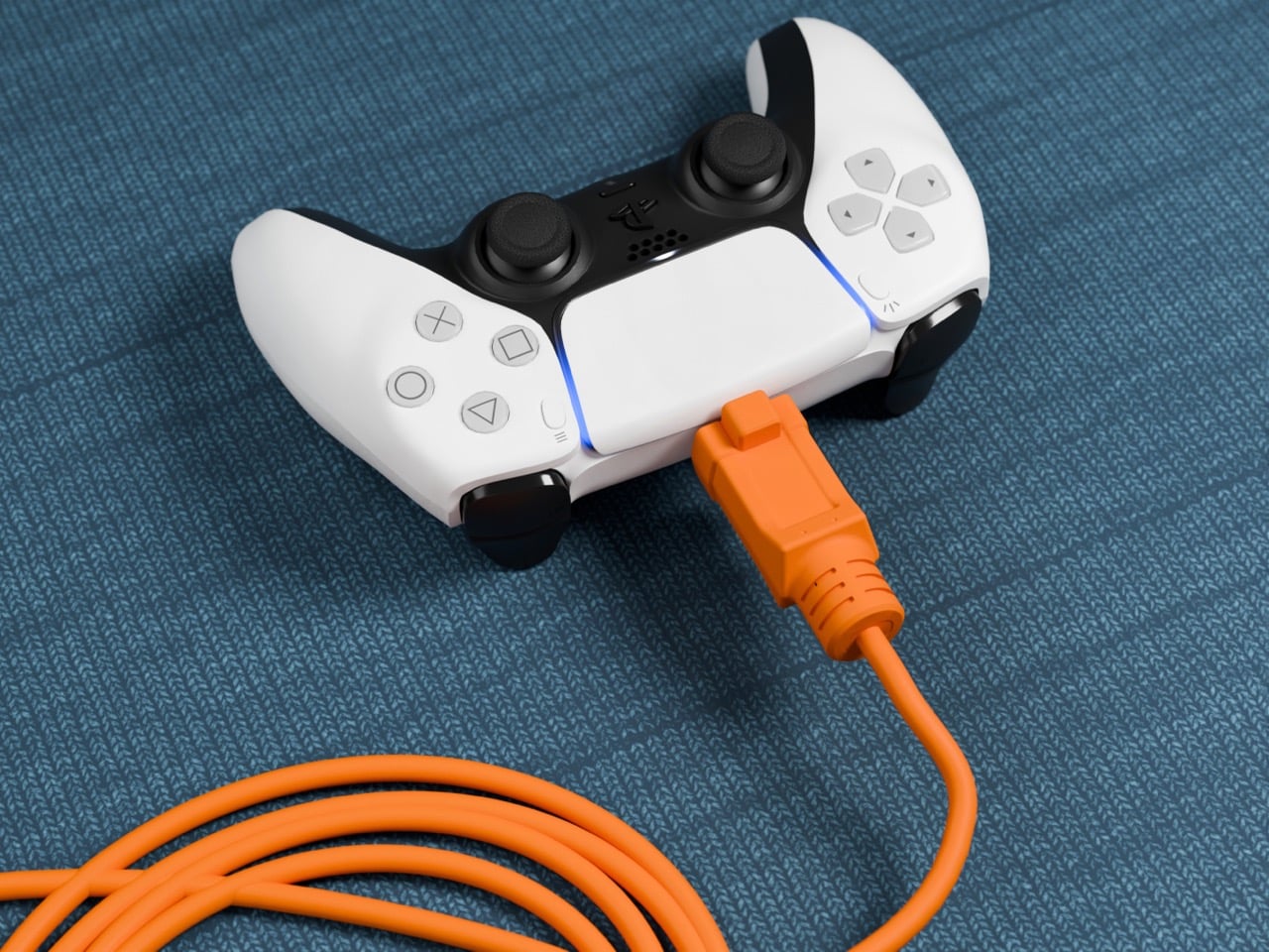
  •  

Apple is Working on Two iPhone Game Controllers Under its Beats Brand

Concept Beats branded iPhone game controller, close-up on the right grip showing X, Y, A, B face buttons, thumbstick, and red Beats logo, with the clamped iPhone home screen visible at left, lit in red.

Concept Image

Apple and the gaming crowd have always had one of those relationships where you nod at each other across a party and never actually walk over. Apple makes the chips, brags about them beating a PS5 in some benchmark slide, then goes right back to talking about spreadsheets and stargazing apps. Gamers, meanwhile, buy a Steam Deck or a Switch and never think about the iPhone in their pocket as a gaming device at all. Bloomberg’s Mark Gurman just reported that Apple wants to finally cross the room, having spent over a year quietly developing its own gaming controllers for the iPhone. The bigger twist is who gets to wear the name tag. Rather than an Apple logo, the hardware is reportedly launching under Beats, the audio label Apple has been slowly turning into its lifestyle catch-all since buying it in 2014.

Code unearthed in a leaked macOS 26.7 build gives the rumor real teeth, naming two unreleased devices, T6502 and T1057, each carrying its own dedicated controller profile instead of placeholder code. Both come with the standard gamepad vocabulary, sticks, triggers, a D-pad, face buttons, the stuff every controller on the planet already has. T6502 keeps things simple and wired. T1057 adds Bluetooth, motion sensors, and a noticeably different haptic engine, suggesting more than one idea is being tested at once. Nothing is priced, dated, or confirmed, but the code alone says this has moved well past a mood board.

Designer: Apple

Concept Beats branded iPhone game controller shown fully assembled with an iPhone clamped in the center, both grips visible with D-pad, thumbsticks, and red Beats logos, set against a dark background with a large red Beats logo behind it.

Gurman’s sourcing on the branding is the part I keep chewing on. He says Beats executives are leading both the engineering and the product concept, not just slapping a logo on something Apple’s industrial design team already finished. His reasoning is that the culture and lifestyle around gaming controllers fits Beats better than it fits Apple, and that the sub-brand gives the company room to use cheaper materials and a louder design without dragging down the premium finish people expect from anything wearing the actual Apple logo. Read between the lines and that is Apple admitting its own aesthetic has a ceiling. Titanium and glass photograph beautifully, but nobody wants to grip a cold slab for a three-hour Genshin Impact session. Beats, with its glossy plastics and its very unserious relationship with color, is a far more honest home for an object designed to be squeezed, dropped, and thrown in a backpack pocket.

Concept Beats branded iPhone game controller in two separated halves with the iPhone floating above, left grip showing D-pad and right grip showing face buttons, both with red Beats logos, resting on a dark reflective surface.

There is a decent trade-off lurking here too, and it is worth naming before anyone gets too excited. T6502, the wired one, is basic by design, which means it will likely be the cheaper, more disposable option with none of the motion sensing or richer haptics that make a controller feel alive. T1057 sounds like the one worth wanting, but Bluetooth controllers introduce pairing friction and battery anxiety that a simple USB-C plug-in never has to deal with. Apple will have to pick a lane, or price the two far enough apart that the choice makes sense, and so far there is no signal on either price or release window. History also isn’t fully on Apple’s side. The company has floated controller ideas for years without shipping one, and it once required developers to support the Siri Remote’s accelerometer as a de facto gaming input before quietly dropping that mandate. A leaked profile in a beta build is not a keynote slide.

Close-up of the left grip of a concept Beats branded iPhone game controller, showing the D-pad, thumbstick, and red Beats logo, with the clamped iPhone visible in soft focus behind it.

Where this actually matters long term is the software Apple has already built around it. iOS 26 shipped a dedicated Games app that pulls your library, your Game Center friends, and Apple Arcade into one hub across iPhone, iPad, Mac, and Apple TV, and Arcade itself has quietly grown past 250 titles for $6.99 a month. A first-party controller, even a scrappy Beats-branded one, gives all of that infrastructure something physical to plug into, which is a very different goal from just selling more hardware. It also puts Apple in the odd position of competing with its own shelf space, since the Apple Store already sells the Backbone One and the SteelSeries Nimbus, and we covered how Backbone’s own Pro model already chases full-size ALPS sticks and forty-hour battery life at a premium price. Razer’s brand new Prio takes the opposite approach entirely, folding down to credit card size for people who would rather not carry a controller-shaped commitment at all. Apple showing up now, later than everyone, wearing someone else’s logo, says less about gaming and more about how Apple treats every category it enters late. Quietly, sideways, and only once it has found a version of itself that does not feel like Apple at all.

The post Apple is Working on Two iPhone Game Controllers Under its Beats Brand first appeared on Yanko Design.
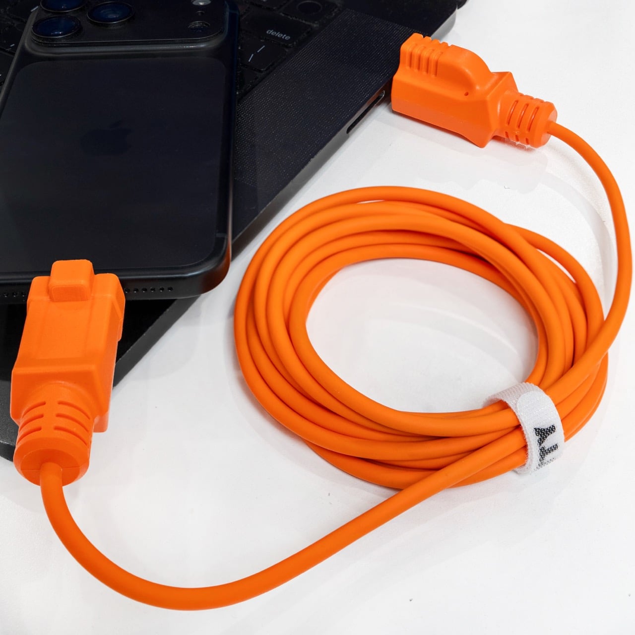
  •  

This Supercharged Grand Tourer Was Built Using a 90-Year-Old Metal-Shaping Tool

The GTX in Riviera blue, all splitter, vents, and a rear wing that towers over the roofline.

There is a tool called an English wheel that has been shaping aluminum car panels since roughly the 1930s. It is a big metal hoop with a roller in the middle, and you push sheet metal through it by hand until it curves the way you want. It sounds like something you would find in a blacksmith’s shed, not in the workshop of a car aiming for 1,200 horsepower. Yet that is exactly the tool Coventry Metalcraft used to hand-form the body of the new Jensen Interceptor GTX, alongside laptops running computational fluid dynamics software. Old-world muscle meets new-world math, and somehow both sides showed up to the same car without arguing.

Jensen International Automotive unveiled the GTX in early September, and it is a strange beast by design. It is Jensen’s first ever clean-sheet car, built to preview a whole new Interceptor lineup, and it gets there using ten English wheels worked by more than 30 artisans, alongside digital design data from studio Avant Design and mixed-reality checks nobody in 1966 could have dreamed of. The result is a 960 bhp supercharged V8 grand tourer wearing hand-beaten aluminum panels shaped partly by algorithms. Britain’s oldest car-forming trick just got a very modern wingman.

Designer: Avant Design

Under the hood: a 6.8-liter supercharged V8 from Late Model Engines, wrapped in carbon and gold foil.

Long bonnet, fastback roofline, and a wing that ruins the original Interceptor's silhouette on purpose.

Avant Design, based out of Royal Leamington Spa, is the studio responsible for translating the original 1966 Interceptor’s proportions into something that reads as contemporary rather than costume. The long bonnet survives, the tightly drawn greenhouse survives, and the wraparound rear glass that made the original such a distinctive shape is still there, even if a towering rear wing now partially blocks the view of it. What is new is the front end, with slim horizontal LED lighting and enormous carbon intakes replacing the old car’s chrome-heavy face. Interestingly, this is not Avant’s first crack at reimagining this exact silhouette. Back in 2023, the studio quietly published a concept called the E-Ceptor, an electric take on the Interceptor with reworked rear glazing and a fresh grille graphic. The GTX effectively took that speculative sketch and gave it a supercharged V8 instead of a battery pack.

Diffuser, quad exhausts, and a wing built for lap times.

A full-width taillight and a wing pulled straight from GT3 territory.

The aluminum decision, both for the chassis and the body, was not driven by sentiment. David Duerden, Jensen International’s managing director, put it plainly when explaining why the GTX skipped carbon fiber entirely. He does not want the car riding like “a skateboard,” which is a fair concern given how punishing a stiff carbon tub can feel on a road built for a Sixties grand tourer, not a modern track special. Aluminum chassis structures are also considerably cheaper to produce in small batches, since they avoid the expensive tooling that carbon fiber demands before a single panel gets made. For a car expected to sell in the dozens rather than the thousands, that economic math matters more than bragging rights about carbon weave.

No screen, just a MoTeC dash, roll cage, and switchgear built for business.

That economic logic is exactly why the English wheel earns its keep here. Hand-forming panels sidesteps the tooling costs that would sink a low-volume carbon fiber program before it ever reached a customer. Coventry Metalcraft’s artisans still shape every piece the old-fashioned way, but they are working from digital surfaces that Avant Design refined using CFD modeling, chasing the 350 kilograms of downforce the GTX needs to behave itself at speed. It is a genuinely odd combination of a seventy-year-old forming technique and simulation software that did not exist when the original Interceptor left the Kelvin Way factory. Jensen is betting its entire comeback on that combination holding together, and so far, from what we have seen, it seems to be working rather beautifully.

The post This Supercharged Grand Tourer Was Built Using a 90-Year-Old Metal-Shaping Tool first appeared on Yanko Design.

  •  

TECNO’s Lamborghini Phone Draws Its Logo in Light Using 177 Mini LEDs

TECNO POVA 8 Pro 5G Tonino Lamborghini Limited Edition

The most expensive Lamborghini phone ever made was a $6,000 slab of hand-stitched leather and gold plating called the 88 Tauri, and it ran Android KitKat on a Snapdragon 801. That was CES 2015, peak era for buying two-year-old silicon at four times the price because someone put a bull on it. Tonino Lamborghini made three of those phones between 2013 and 2017, then went away. The name has now resurfaced on the back of a TECNO POVA that costs about $490, and the badge is finally earning its position. It gets drawn in light instead of stamped in metal.

On the POVA 8 Pro 5G Tonino Lamborghini Limited Edition, the Italian brand’s “L” is rendered by 177 individually controlled mini-LEDs in TECNO’s Alive Matrix panel, and the red Pulse Line down the center of the back is a passive optical effect built from internal mirror structures sandwiched between two coating layers at different physical heights. Rotate it and the red rises out of the black, then drops back in. The phone is spec-identical to the standard POVA 8 Pro, so every difference you are paying for is a surface decision. Thai prices start at 15,999 baht for 8GB and 256GB, topping out at 19,999 baht for 12GB and 512GB. There is no US release and no US carrier certification.

Designer: TECNO Design Team, in collaboration with Tonino Lamborghini S.p.A.

Mechanical Grammar, Translated

The brief TECNO gave itself was to take a vocabulary that belongs to cars and make it belong to a slab of glass and aluminum, and the way in usually decides whether that kind of project reads as clever or as a paste job. The team started with the visual codes of mechanical design rather than the logo itself: body lines, cooling grilles, honeycomb patterns, exhaust-inspired detailing. That’s the right instinct. A shield pasted onto a black rectangle says nothing. A shield built from the same geometric logic as an engine bay at least has a reason to exist there. The result is the Signature Shield pattern ringing the Pulse Line, a hexagonal structure lifted from Tonino Lamborghini’s own emblem and mechanical detailing rather than invented fresh for the phone. It gives the back of the device an actual sense of depth and structure instead of a flat decal sitting on top of a chassis that was never designed with it in mind.

The Manufacturing Problem Nobody Sees

The interesting part isn’t the pattern, it’s how TECNO built it. Getting that Pulse Line to shift color under different lighting angles required internal mirror structures processed to redirect light the way a curved mirror does, stacked underneath a brightness-enhancing first layer that behaves closer to a lacquer finish than a printed graphic. Between the two layers sits a real, physical height difference, which is what gives the effect actual depth rather than the flat printed texture you get on most co-branded rear panels. TECNO describes this as one of the most complex rear-cover processes it has run on a POVA product, and the harder problem wasn’t making one unit look right, it was getting thousands of units to look right consistently. That’s a legitimate manufacturing achievement on a phone priced well under $500, and it’s the kind of detail that gets lost entirely once a press release compresses it down to “premium finish.”

POVA 8 Pro 5G Tonino Lamborghini Limited Edition with a 144Hz Display

A Skin That Goes All the Way Through

TECNO didn’t stop at the shell, which is the part most co-branded phones treat as optional. The software carries the same black-and-red system with reworked icon outlines, nudging soft rounded shapes toward hexagon and shield silhouettes so the interface reads as an extension of the hardware rather than a wallpaper slapped over stock Android. TECNO says the software work alone took close to four months, covering the boot animation, dynamic wallpapers, ringtones, and the Alive Matrix “L” effect. The accessories continue the bit: a braided black-and-red cable, a case built from TPU and polycarbonate carved with a Kevlar-inspired carbon fiber texture. None of it is essential to how the phone functions, but all of it is the difference between a badge and a bit that someone actually thought through.

What a Tonino Lamborghini Badge Used to Cost

Worth sitting with how far this pulls the brand from its own history. This partnership started back in March at MWC, where TECNO and Tonino Lamborghini unveiled the POVA Metal Tonino Lamborghini Limited Edition alongside a water-cooled mini gaming PC concept carrying the same red-and-gunmetal language into laptops, tablets, and earphones. That first phone felt closer to the old playbook than this one does. The 88 Tauri and its 2014 sibling, the Antares, were built around leather, gold plating, and price tags that assumed the badge alone justified the markup. The 2017 Alpha One dialed the ornamentation down but kept the price near $2,100. Automobili Lamborghini’s own collaborations, including the Oppo Find X Automobili Lamborghini Edition at €1,700 against a €1,000 base phone, followed the same math: better materials, a visible badge, a premium that tracked the logo rather than the manufacturing. This is the first Lamborghini phone where the badge shows up as a production process instead of a price justification, and it happens to be the cheapest one the family has ever put its name on. For the full spec rundown on the rear panel construction, we’ve covered the hardware side of this phone in detail already.

Close-up of the TECNO POVA 8 Pro 5G Tonino Lamborghini Limited Edition phone's camera bump

Price, Availability, and the Fine Print

Thailand has this now, sold through BaNANA, IT CITY, Jaymart, and other retailers since August 21, with early buyers getting a Tonino Lamborghini backpack and a Tecno Watch 3 Active thrown in. Pricing for India and other markets hasn’t landed yet as of this writing. If you’re reading from the US, this one isn’t coming your way in any official form. TECNO has no FCC certification and no carrier partnerships stateside, so anything that turns up on a resale site is a gray-market import with no warranty support behind it. Worth knowing before anyone gets attached to a color they’ll never see in a carrier store.

The Badge, Recalibrated

TECNO didn’t need Tonino Lamborghini’s name to sell a $490 phone with a good screen and a big battery, which makes the choice to spend four months on software and reinvent the rear-cover process for a mid-ranger feel almost backward by traditional luxury-licensing logic. Usually the name does the selling and the hardware coasts. Here the hardware earns the attention and the name rides along for once. Whether that model survives past a limited run is a separate question, since Tonino Lamborghini’s own history with phones has always run in short bursts before going quiet for years. For now, the badge looks better on a light source than it ever did on leather.

The post TECNO’s Lamborghini Phone Draws Its Logo in Light Using 177 Mini LEDs first appeared on Yanko Design.

  •  

Foam Earplugs Haven’t Changed Since the 1970s — This Spiral Design Just Made Them Obsolete

The humble foam earplug has been functionally unchanged since the 1970s: roll it down, jam it in, hope it expands to a seal, and find it somewhere in the sheets by 2 AM. It’s one of the few everyday objects that design culture has genuinely never come for, maybe because the attenuation numbers technically work, or maybe because nobody with enough resources was annoyed enough to fix it. The Ears 360 Silence, a CE-certified soft silicone earplug from Paris, is a structural redesign of that whole idea. Its retractable spiral wraps into the outer ear’s helix rather than anchoring in the canal, locking the plug flat and flush against the head with 24 dB SNR measured to EN 352-2:2020 and a peak of 29.9 dB at the frequency range where snoring and human voices live. The foam never had a chance.

Youcef Abdaoui runs a studio near Paris and started prototyping the Silence in 2024 with a bent wire and a bit of putty, just to test whether a helix-anchoring spiral could hold in an ear. It did, and the dozens of iterations that followed produced a product France voted Product of the Year 2026, consumer-elected rather than jury-awarded, which tells you something about how it performs in actual ears. Ears 360 has since shipped to more than 120,000 customers through their store, 500+ pharmacies and B2B partners before going international. The Silence is not a prototype; it is certified to EN 352-2:2020, mass-produced, and more than 14,000 units are already in stock. I got to see a pair in person, and the silicone finish reads as serious product, not a health-aisle impulse buy.

Designer: Youcef Abdaoui

Click Here to Buy Now: $21 $35 (40% off). Hurry, only 57/300 left!

The ear is already a spiral. The outer rim of the pinna is anatomically called the helix, a curved ridge that traces a partial revolution around the auricle, and deeper inside, the cochlea completes that geometry: a full spiral chamber, coiled like a snail shell, that converts sound pressure into neural signal. Nature returns to the spiral for the same reason architects do: it distributes force without concentration points, the same logic behind a nautilus shell or the tight coil of a fern fiddlehead before it unfurls. The Ears 360 Silence works with that architecture: the spiral holds, not the tip. The spiral wraps laterally into the helix and locks through geometry, bearing almost no canal pressure, which is the whole reason the plug sits flush against the head rather than protrudes from it.

Loop-style reusable earplugs have made a design virtue of their visibility, with a circular protrusion sitting outside the ear canal as a deliberate aesthetic statement. That works at a concert, but it becomes a pressure point the moment you roll onto your side in bed, which is the situation most people are buying earplugs for in the first place. The Silence’s spiral body measures 18.44 mm by 15.49 mm, slim enough that there’s nothing significant pressing against a pillow. The profile looks almost deceitfully small for what it’s actually doing inside the helix. Side sleepers have been the quiet losers in every previous generation of earplug design, and this is the first form factor that treats their use case as the primary constraint rather than an afterthought.

One spiral body, two levels of silence, switchable in seconds from 24 dB to 29 dB. The standard configuration ships with four tip sizes across diameters of 9.9, 10.9, 11.9, and 12.9 mm, covering a genuinely wide range of ear canal openings, and delivers 24 dB SNR in filter mode, enough to take a busy street down to library territory without muffling conversation entirely. The Swim & Work Kit clips on triple-flange tips that push attenuation up to 29 dB, entering genuine worksite and industrial territory. User satisfaction data from Ears 360 puts concert approval at 91% and commute approval at 97%, and the founder confirmed to me directly that concert use is a genuine design intention, not a marketing add-on. The IPX7 waterproof rating keeps the spiral pool-ready alongside the kit’s triple-flange seal.

One Silence replaces hundreds of disposable foam earplugs, full stop. The body is made to last for years, the silicone tips are replaceable instead of throwing the product away, and the packaging is compact by design so every shipment travels as a slim letter, not a parcel. There’s no offset scheme or carbon language layered on top to make it sound more considered than it is. The Silence is reusable by nature: wash it, swap the tips, keep the body. Replacement tip sets extend the product’s life instead of replacing it, and the compact packaging uses a fraction of the material of a standard box.

Pricing starts at €18 (roughly $21) for a single unit with carry case and tip set, with the Silence and Swim & Work Kit bundle at €27, a Duo Pack at €39, a Duo plus Kit at €49, and the new ALL COLORS pack at €59, which includes one pair in each of the three current colorways. Black, Pink, and Green are all available now. Every unit carries the 2-year EU legal warranty of conformity, which is meaningful for a product whose longevity pitch depends on actually outlasting the disposable foam it replaces. Delivery is November 2026, and the Ears 360 Silence is also available at ears-360.com.

Click Here to Buy Now: $21 $35 (40% off). Hurry, only 57/300 left!

The post Foam Earplugs Haven’t Changed Since the 1970s — This Spiral Design Just Made Them Obsolete first appeared on Yanko Design.

  •  
❌