❌

Vue lecture

Garmin’s New Watches Go 320 Hours Without Dying on You

The most frustrating moment for a sports watch to fail is when you need it most: halfway through a long route with no easy way to recharge, or standing over a golf shot on an unfamiliar course with no clear sense of the distance. Garmin’s Enduro 4 and Approach S72 tackle different versions of that problem. One is built to keep working deep into an adventure. The other puts more useful information within reach before and after every swing.

They make an interesting pair because neither treats design as decoration. The Enduro 4 favors battery life, low weight and quick access to maps. The Approach S72 gives golfers a brighter, more visual way to understand the course and their game. Both have premium materials and comfortable fabric bands, but their real appeal is how those choices serve the person wearing them.

Designer: Garmin

Garmin Enduro

For the Enduro 4, battery life is the headline. Garmin rates it for up to 320 hours in activity mode or up to 90 days in smartwatch mode, with solar charging under the conditions behind those estimates. That is a meaningful promise for someone planning an ultramarathon, a backpacking trip or several days away from an outlet. I would still treat those numbers as best-case figures, but the design priority is clear: spend less time managing the watch and more time moving.

Its 51mm case is substantial, yet Garmin says the watch weighs 66 grams. A titanium bezel and scratch-resistant Power Sapphire lens bring durability, while a fiber-reinforced polymer case helps keep the weight down. The 1.4-inch MIP display is less showy than a vivid AMOLED screen, but paired with the solar lens, it suits a watch built around endurance. The fabric band and white-and-red LED flashlight are thoughtful details for long days that may turn into nights.

The improvements are not limited to how long the watch lasts. Garmin says the Enduro 4 has 50% more RAM than the Enduro 3 and map panning that is 30% faster. Grade-adjusted pace tools offer a better way to judge effort on hills, while stamina features help athletes see how their endurance changes during training. Garmin Epic can group activities across multiple days. Together, those features address a familiar problem: plenty of data, but not always enough context to use it.

Garmin Approach S72

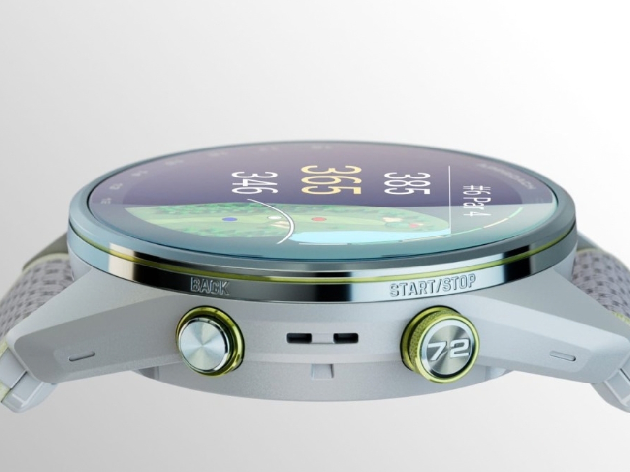
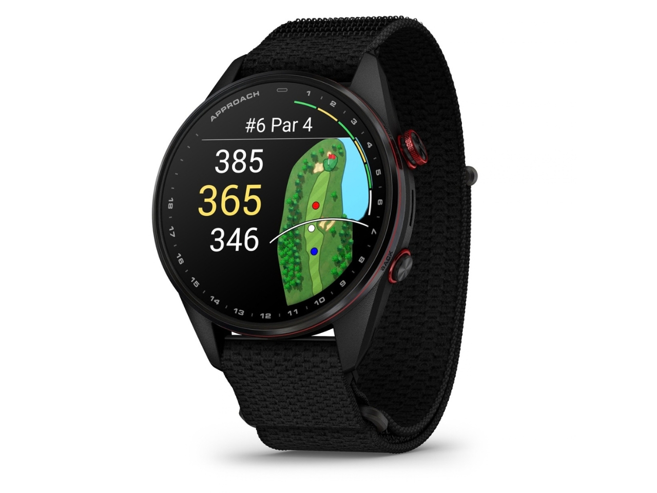
The Approach S72 takes the opposite visual approach. Available in 43mm and 47mm sizes, it has a bright AMOLED display, a titanium bezel, a sapphire lens and a lightweight ComfortFit fabric band. I like the choice of two sizes here. A golf watch needs enough screen space to make a hole legible at a glance, but it also has to feel comfortable through a round and look at home afterward.

Its most intriguing idea is connecting golf performance to what is happening with the player. The watch can show heart-rate trends alongside a completed round, while swing metrics include hand speed, backswing length and wrist rotation. On the driving range, golfers can log practice sessions rather than leaving that work outside their broader activity record. None of this guarantees a lower score, but it could make practice feel more purposeful than guessing which part of a swing went wrong.


The course tools are more immediate. Green reading uses contour data to help golfers judge a line on select courses, while aerial imagery provides a clearer look at the hole ahead. Post-round putting analytics can reveal tendencies in speed, direction and make rate. These are the features that could save a few uncertain decisions during play, then give someone a specific thing to work on afterward. Some require a Garmin Golf membership, a detail worth checking before buying.

Battery life matters here, too, though on a different scale. Garmin rates the 47mm S72 for up to 20 hours of golf activity or 16 days in smartwatch mode; the 43mm model is rated for up to 15 hours and 10 days, respectively. Add heart-rate, stress and sleep tracking, and it becomes easier to see why Garmin designed this as an everyday watch rather than a device you pull out only for tee time.

Neither watch is trying to do everything for everyone. The Enduro 4 makes the strongest case for people whose plans regularly outlast ordinary battery life; the S72 is for golfers who want clearer decisions and better feedback. What connects them is a useful design principle: the best sports technology should reduce the little uncertainties that distract you from the activity you came to enjoy.
The post Garmin’s New Watches Go 320 Hours Without Dying on You first appeared on Yanko Design.

  •  

This $70 Plate Is for People Who Refuse to Let Fried Food Sit in Its Own Oil

Now that I’m learning to cook more, I’m pretty excited to experiment with dishes I see online. The results aren’t always ready for other people to try. I still have a lot to figure out. On some days, though, I keep it simple and fry something. That brings up a familiar problem: getting rid of excess oil before the food reaches my plate. Usually, I move it from the pan to a rack or paper towel, then transfer it again when I’m ready to eat. What if I could skip one of those transfers?

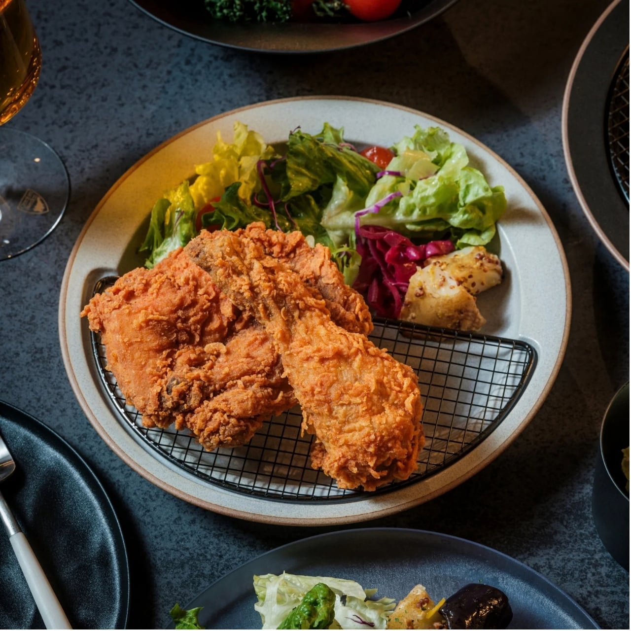
The Half-Moon Plate is more than a nicer way to serve food for a photo. It pairs a ceramic plate with a half-moon-shaped rack that sits over one side. You can place fried food on the rack to let excess oil and moisture drain away while leaving the other side available for a salad, vegetables, rice, or another side dish. Instead of draining food in one place and serving it in another, the plate brings those steps together.

Click Here to Buy Now: Starting at $70

That arrangement matters when timing is everything. If you’ve made tempura, fried chicken, or crispy potatoes, you probably don’t want them sitting in a puddle of oil while you finish getting dinner ready. Elevating the food gives the oil somewhere to go and may help it stay crisp until you eat. You still need to give freshly fried food time to drain; the plate simply gives you a way to do it at the table or as part of your final plating.

I also like that the design doesn’t make the rack the whole story. The open half of the plate leaves room for the rest of the meal, so the fried food doesn’t have to take over. You can see everything together before you sit down, rather than juggling a cooling rack, paper towels, and a separate serving dish. For someone cooking in a small kitchen, or someone who just wants fewer things on the counter, that’s an appealing idea.

The half-moon shape gives the plate its visual identity, but it also creates a natural division between the main dish and its sides. If you’re trying to be more mindful of portions, that division may be a useful visual cue. It won’t measure a balanced meal for you, and draining surface oil doesn’t make fried food automatically healthy. What it can do is encourage you to think about what else belongs on the plate alongside your crispy favorite.

Compared with an everyday dinner plate from a big brand such as IKEA, the Half-Moon Plate asks a little more of its design. A conventional plate gives you one uninterrupted surface and works with almost any meal. This one is more specialized: the rack makes the most sense when food needs to drain or when you want to keep it elevated before eating. That makes it less of an all-purpose replacement for your existing dishes and more of an addition for meals where its distinctive layout earns its place. The plate is listed starting at $70.

Of course, a plate like this won’t eliminate every step. You’ll still need to handle hot food carefully, wait for it to drain, and wash the rack afterward. Those are worth considering if you’re looking for the quickest possible cleanup. But if you already make fried food regularly, combining a draining surface and a serving plate could make the trip from pan to table feel more organized. When you don’t need the rack, you can lift it off and use the ceramic plate on its own. That flexibility is important: a design meant for one kind of meal is easier to justify when it can still be useful on other days. I’d reach for the rack when I’m making something crisp and use the plate by itself when dinner calls for a simpler presentation.

The Half-Moon Plate won’t make me a better cook overnight. I’ll still have to get the timing, seasoning, and frying right. But it does address one small frustration I know well: watching something come out of the pan beautifully crisp, only to wonder where to put it while I finish the meal. If it helps me serve dinner with fewer transfers and a little less fuss, that’s a design choice I can appreciate.

The post This $70 Plate Is for People Who Refuse to Let Fried Food Sit in Its Own Oil first appeared on Yanko Design.
  •  

PocketBook Gave Its $198 E-Reader the One Trick Old Nokia Phones Had

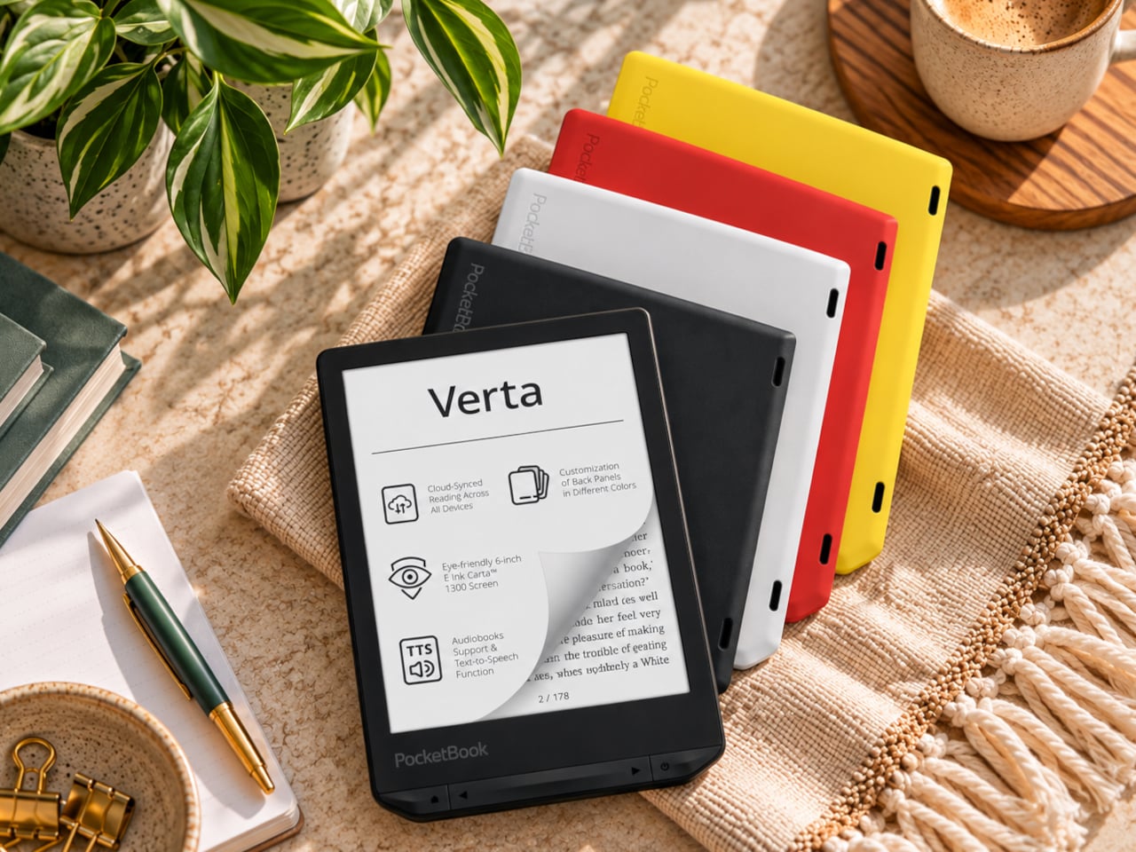
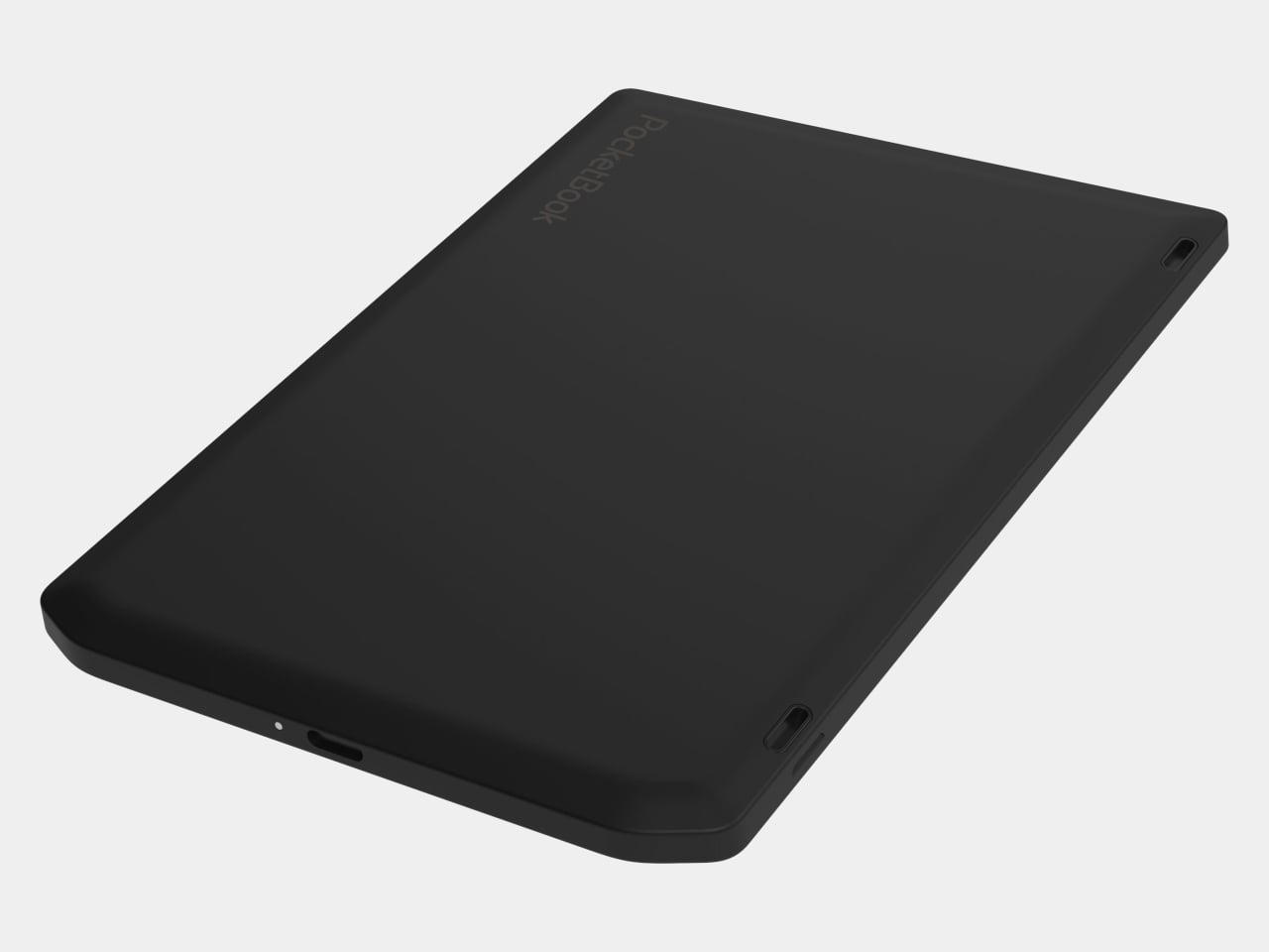
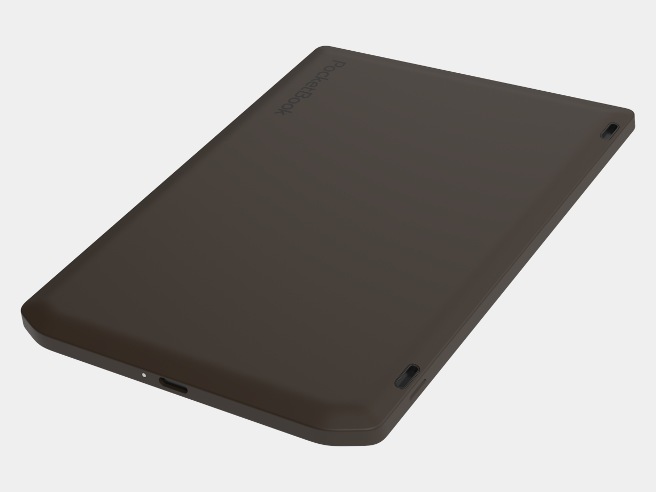
E-readers are supposed to replace physical books, but they strangely come mostly in black or gray, unlike colorful and distinctive book covers. Although not a complete design overhaul, Pocketbook’s new Verta and Verta Color e-readers offer a simple fix, and no, it doesn’t require slapping on a case. You can change the color of the e-reader by swapping the back panel while maintaining its slim shape and keeping the screen and page-turn buttons uncovered.

That’s a rather different approach to personalization than slipping on a protective cover. The interchangeable panels are sold separately, so you can keep a few colors around and switch when your taste changes. More importantly, they replace the back rather than wrapping over the front. There’s no extra flap to fold behind the reader when you settle into a chair with a book.

Designer: PocketBook

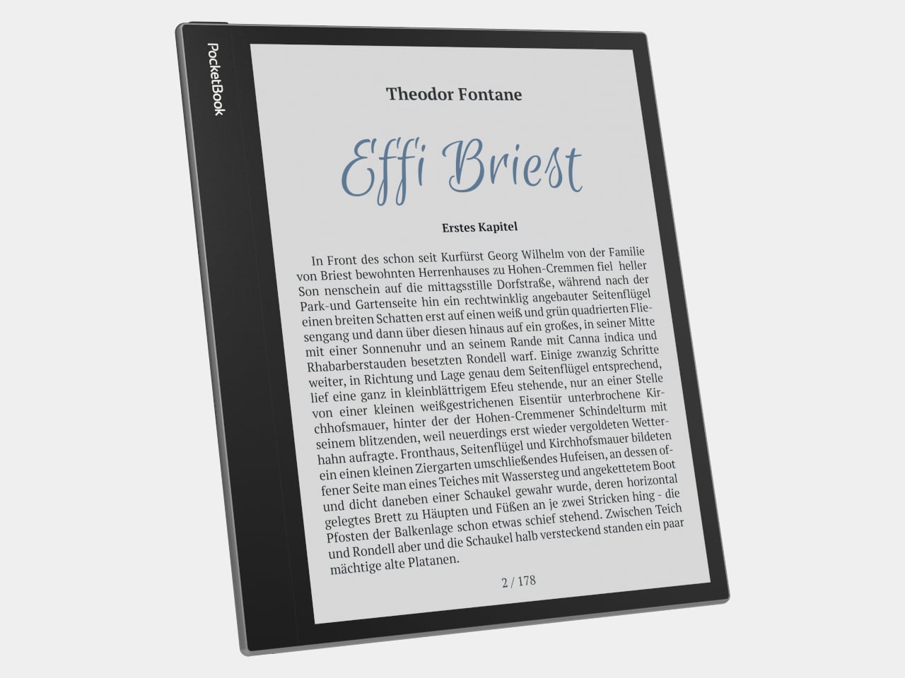
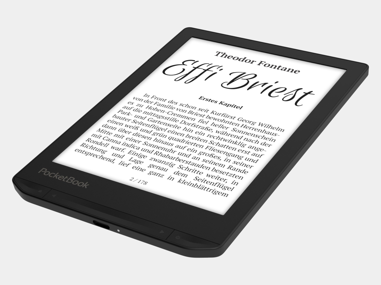
The front stays familiar in the best way. Both readers have a 6-inch touchscreen and enlarged page-turn buttons beneath it, giving your thumb another way forward when the screen is smudged or your hands are occupied. Each measures just 0.28 inches thick and weighs about 4.9 ounces, a size that suits a jacket pocket or an overstuffed bag on the commute.

Choose the regular Verta, and you get a 6-inch E Ink Carta 1300 display at 300 pixels per inch, built for the sort of long novel that makes you miss your stop. SMARTlight lets you adjust brightness and warmth as daylight disappears. It also offers Dark Mode, so you can keep reading in bed without a bright white page facing the person beside you.

The Verta Color is for readers who want their covers, illustrated pages, and comics to retain some color. Its E Ink Kaleido 3 screen renders monochrome text at 300 pixels per inch, but color drops to 150 pixels per inch. Those numbers matter if you read fine print in graphic novels; the color option gives illustrations some life, not the punch of a tablet.

Both have 16GB of storage, Wi-Fi for downloading books, and Bluetooth audio for audiobooks or text-to-speech, though you’ll need headphones or another compatible listening device. PocketBook also supports a broad range of file formats and borrowing through library apps. That flexibility comes in handy when the next book you want isn’t sitting in a single company’s store waiting for you.

An IPX4 rating gives the pair protection against splashes, not an invitation to use them in the bath. Their 1,500mAh batteries are meant to last up to two months, depending on how you read, although that figure comes from PocketBook rather than an independent test. The removable backs add personality, but they’re not a replacement for a protective case if the reader needs one.

PocketBook plans to release both in November 2026, pricing the Verta at €169 (about $198) and the Verta Color at €179 (about $209). Both are marked as coming soon on its storefront. The cleverest trick, though, is letting you change the color of something you hold for hours on end without asking a protective case to do the decorating for you.

The post PocketBook Gave Its $198 E-Reader the One Trick Old Nokia Phones Had first appeared on Yanko Design.
  •  

RIMOWA’s 2 New Colors Quietly Solve the Baggage Claim Problem

At baggage claim, a good suitcase can have one frustrating flaw: it looks like everyone else’s. Rows of black and gray cases roll past, and the bag you chose for its clean design becomes surprisingly hard to pick out. Color seems like an easy answer, until the options swing too far the other way. Not everyone wants their luggage to look like a highlighter.

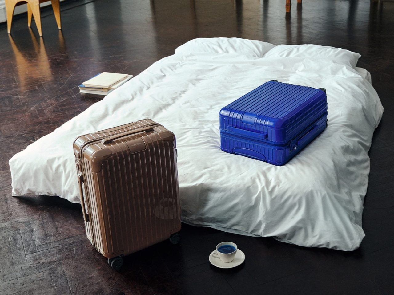
RIMOWA’s new Umber and Ultramarine collection offers a more considered choice. Umber is an earthy brown; Ultramarine is a deep, saturated blue. Both give the brand’s familiar luggage a distinct presence without asking travelers to trade a design they like for a novelty print. The colors extend to bags and accessories, too, so someone building a travel setup has more to choose from than a single suitcase.

Designer: Rimowa

I’m drawn to Umber because brown is an unusual choice for a hard-shell case. It has the warmth of an old leather travel bag, but on RIMOWA’s grooved Essential silhouette, it feels sharper and more contemporary. It’s a color for someone who wants to move away from black without feeling conspicuous at the hotel desk. I can imagine it looking just as right on a short work trip as it would on a longer vacation.

Ultramarine makes a different case for itself. It has enough depth to feel substantial, but it won’t disappear into a lineup of dark luggage. RIMOWA’s campaign connects the shades to historical pigments, drawing Umber from earth tones and Ultramarine from the blue associated with lapis lazuli. That backstory could have felt overly precious. Here, it gives the colors a useful design logic: these are rich, recognizable hues, not shades chosen just because they photograph well this season.

The execution matters as much as the palette. On the Essential suitcases, the color carries across the hardware for a monochromatic finish. That keeps the eye on the shape of the case and the rhythm of its grooves, rather than breaking it up with contrasting details. It’s a small decision, but one that makes the suitcases feel designed as complete objects instead of existing models dipped in new paint.

There’s also an appealing restraint to the wider collection. RIMOWA has brought the colors into its Groove bags, including a Mini Shopping Bag offered in both shades, while select smaller pieces come in Umber. That gives frequent travelers the option of a coordinated set, but it doesn’t demand one. I’d be more inclined to choose one piece I’d use often than to make every bag I own match my carry-on.

That’s where this release has a practical payoff. A more distinctive suitcase may be easier to recognize when bags are coming off the carousel, and a color you genuinely enjoy carrying can make familiar travel routines feel a little less anonymous. Neither benefit needs to be exaggerated. Umber and Ultramarine won’t create more packing space or make a delayed flight arrive sooner. They solve a quieter problem: useful luggage doesn’t have to feel interchangeable.

Of course, color is only part of a buying decision at this price. RIMOWA lists the Essential Cabin in Ultramarine at $990, so I’d still choose the size and configuration that suit my trips before choosing a shade. The collection is most compelling if you already like the Essential suitcase or want one of the smaller bags on its own. A beautiful color can make the right purchase more satisfying; it can’t turn the wrong suitcase into the right one.

For me, the success of Umber and Ultramarine is that they let two different personalities inhabit the same recognizable design. Umber feels calm and adaptable. Ultramarine has more energy, but enough depth to avoid feeling like a passing gimmick. That’s a good way to think about luggage you’ll live with beyond the excitement of buying it: not whether it looks striking in a campaign, but whether you’ll still be glad to spot it when it comes around the carousel.

The post RIMOWA’s 2 New Colors Quietly Solve the Baggage Claim Problem first appeared on Yanko Design.
  •  

A $249 Smart Lock That Still Opens When You’ve Forgotten to Charge It

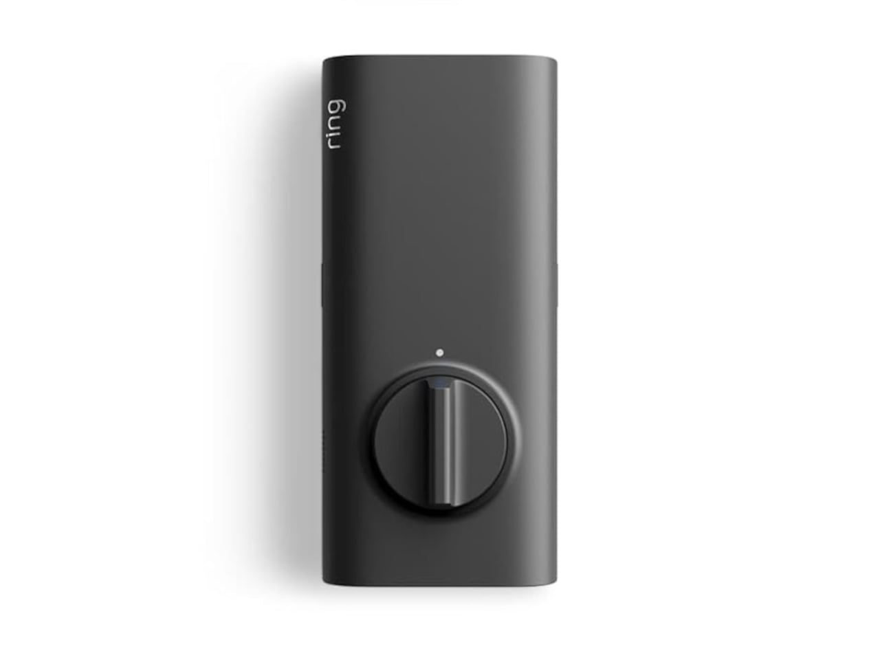
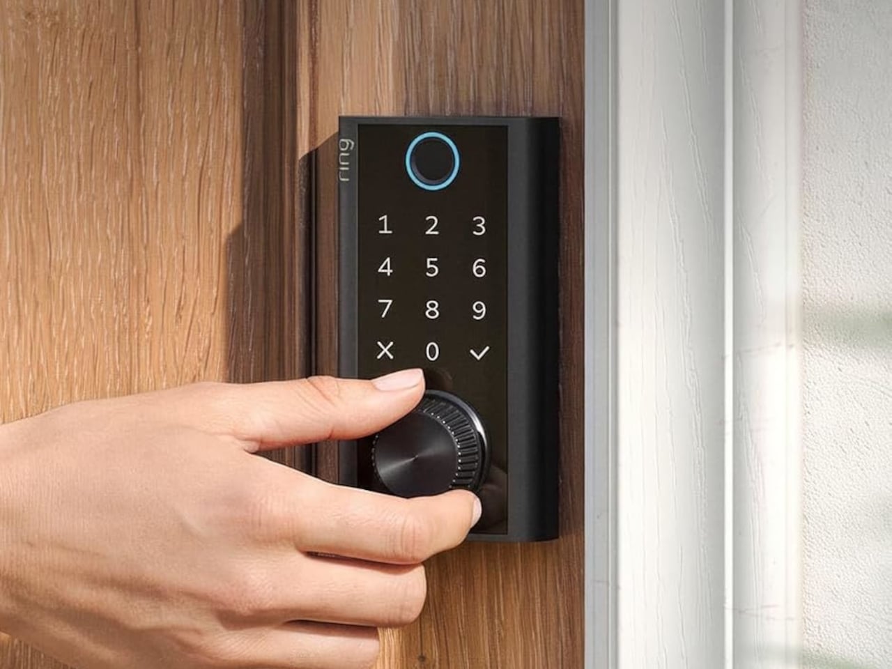
Smart locks sound like the future until you’re standing outside with groceries and the lock won’t wake up because of a dead battery. Although there are different methods to address that, Ring’s first-ever Smart Lock has a rather ingenious solution: an almost literal crank. Simply turn a dial a few times to power the keypad just long enough to key in your code.

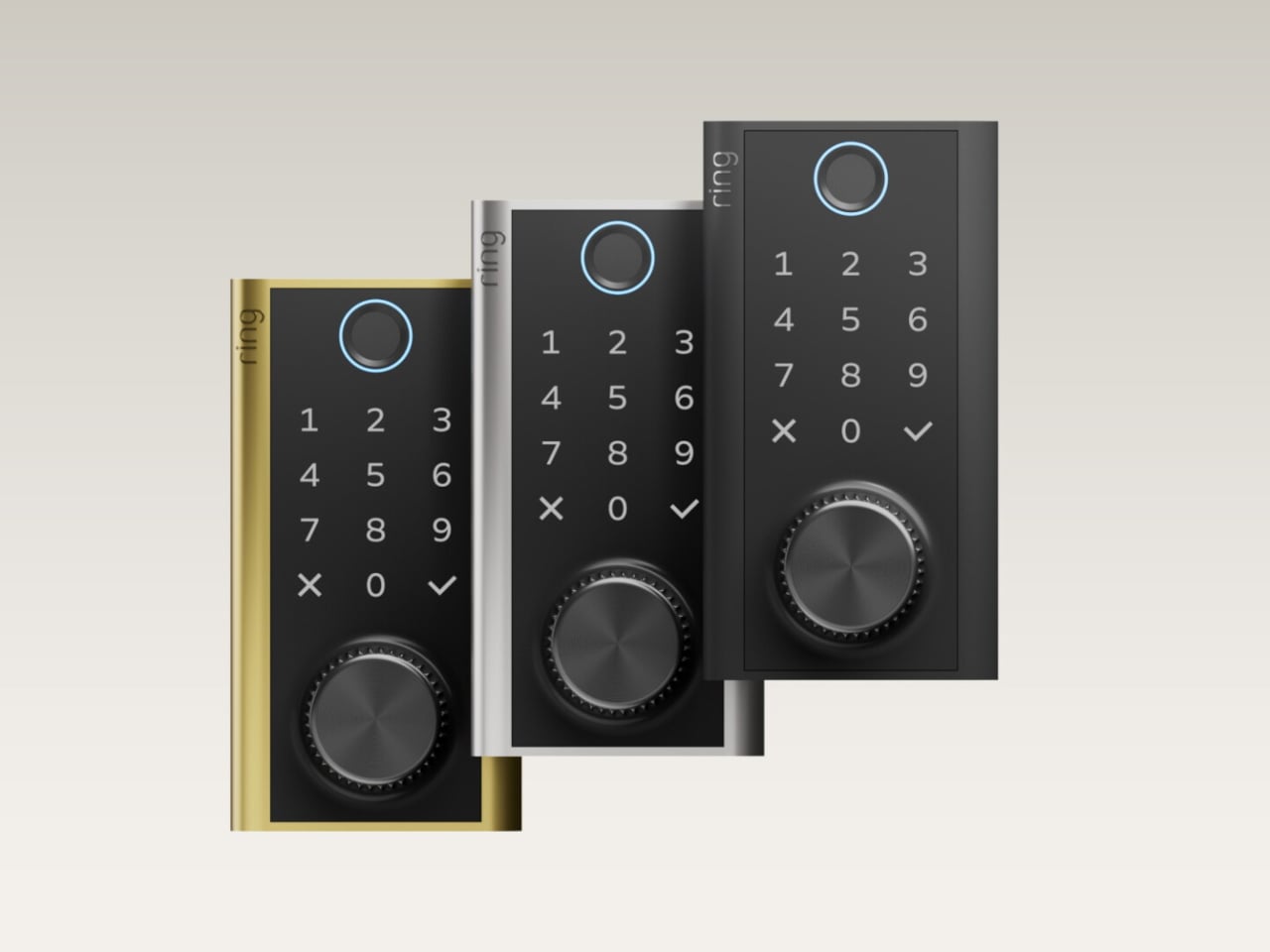
It’s simple yet effective, and it doesn’t require you to fumble for a cover to replace the battery. The knurled dial sits beneath the backlit touchscreen keypad, with a circular fingerprint reader topping them all. All in all, the design looks more like a stack of controls instead of a deadbolt with electronics just bolted on.

Designer: Amazon

On regular days or nights, you can simply touch the fingerprint reader instead of digging for keys in your bag or pocket. You can also give a visitor a PIN that only works during a set time window. The Ring app also offers yet another way to let you in, and it also allows you to check the lock remotely, including Alexa voice control. These are the typical features you’d expect from a smart lock, but Ring does one better.

Most keyless locks require a cable or a spare battery before they even wake up, which isn’t exactly the fastest or the easiest when you only have one hand free. Ring puts that backup in that same free hand, figuratively. Simply turn the dial to “charge” the lock, almost like cranking some lever for power. It’s an almost comical analogy, but it gets the job done.

Of course, you don’t charge the Ring Smart Lock by turning the dial endlessly. That’s what the Quick Release Ultra Battery Pack is for. That battery is rechargeable, which means you don’t need to worry about extra wiring or hardware when installing the Smart Lock. It works with a standard single-cylinder deadbolt, making it immediately compatible with many doors.

One thing to note is that remote features depend on Amazon Sidewalk rather than your home Wi-Fi. That could spare you a trip back to check whether the door locked, or let you admit someone while you’re away, provided there’s coverage where you live. Ring says unlocking at the door happens locally, but Sidewalk remains a requirement for the connected functions. It’s a condition beneath the promise of convenience.

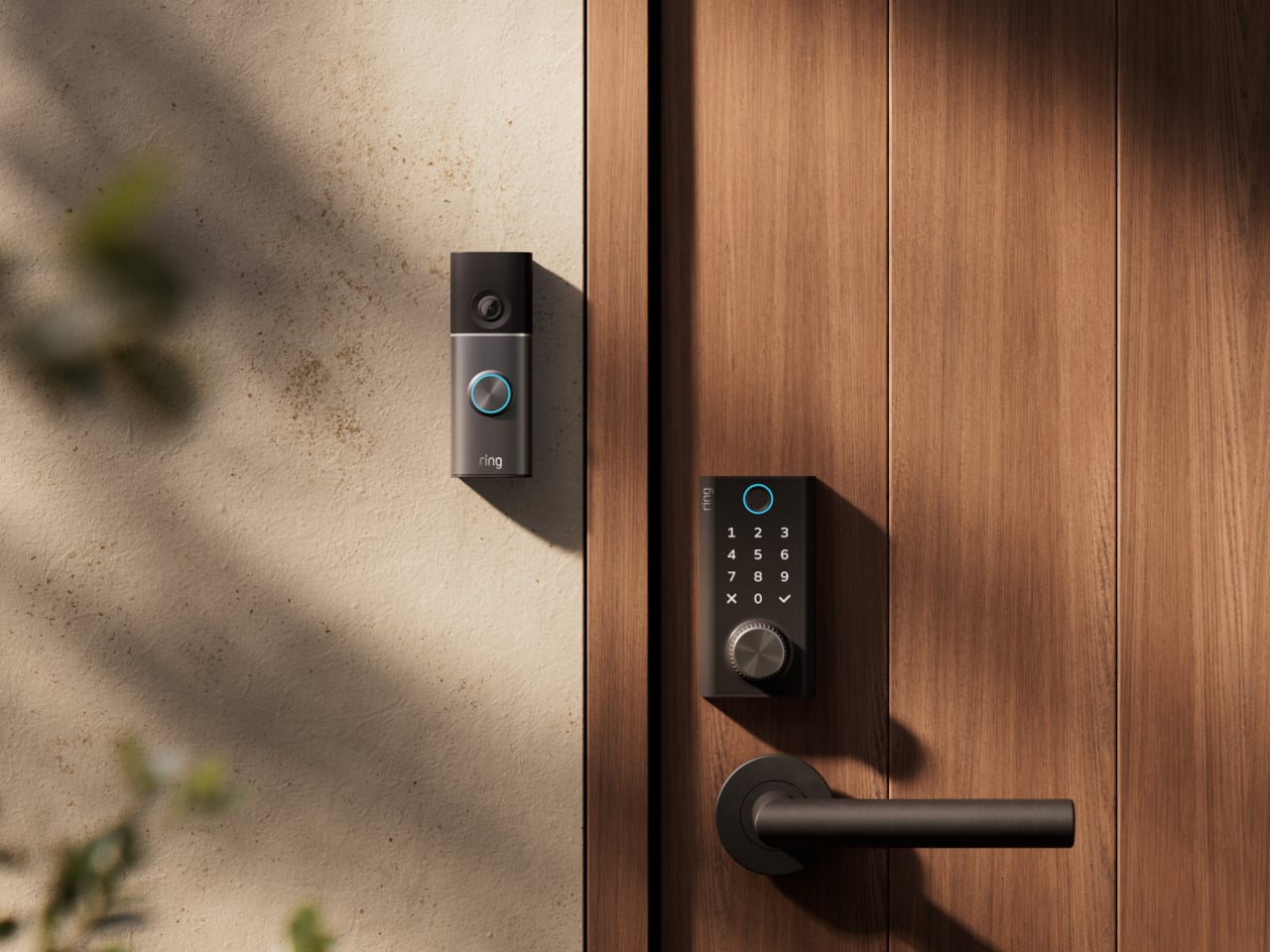
The lock can share the Ring app’s activity feed with Ring’s other products such as doorbell, cameras, and alarms, so you get a more holistic view of everything that happens at home even when you’re away. That said, it doesn’t have a camera of its own, which is a subtle nudge to get a Ring doorbell, too.

Black, silver, and brass finishes are planned, with a $249 price and U.S. availability expected in early 2027, pending regulatory authorization. For now, some details about the Ring Smart Lock have yet to be fully disclosed, including battery life. Regardless, it’s an interesting and low-tech solution to a high-tech problem that makes you feel you’re in control, even in such an emergency.

The post A $249 Smart Lock That Still Opens When You’ve Forgotten to Charge It first appeared on Yanko Design.
  •  

This $175 Wii-style Smart paddle turns your TV into a pickleball court

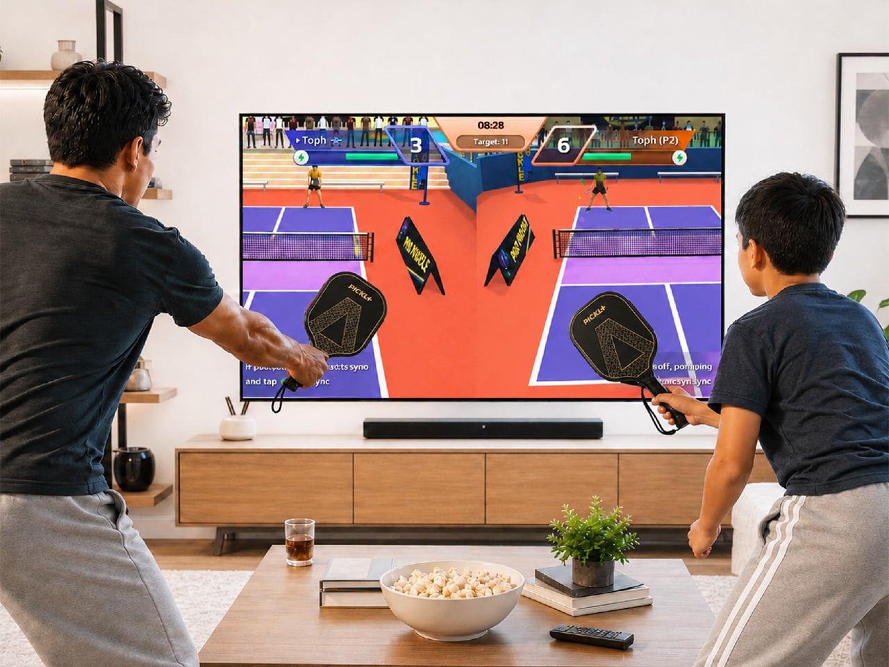
Pickleball has officially escaped the court. At some point in the last two years, it stopped being ironic and became a lifestyle: parking lots of suburban rec centers filled up, TikTok feeds followed, then came the celebrity investors, the professional leagues, the branded paddle drops, and the kind of mainstream saturation that tells you a sport has officially graduated from niche to undeniable. Getting turned into a Wii-style digital pastime is, at this point, a rite of passage for any sport that has truly made it. Tennis got there. Golf got there. Boxing, baseball, bowling. MegaShot Pickl+ is the moment pickleball collects that particular badge, and it does so with an actual sensor-embedded pickleball racket for authentic gameplay, not some generic rectangular controller.

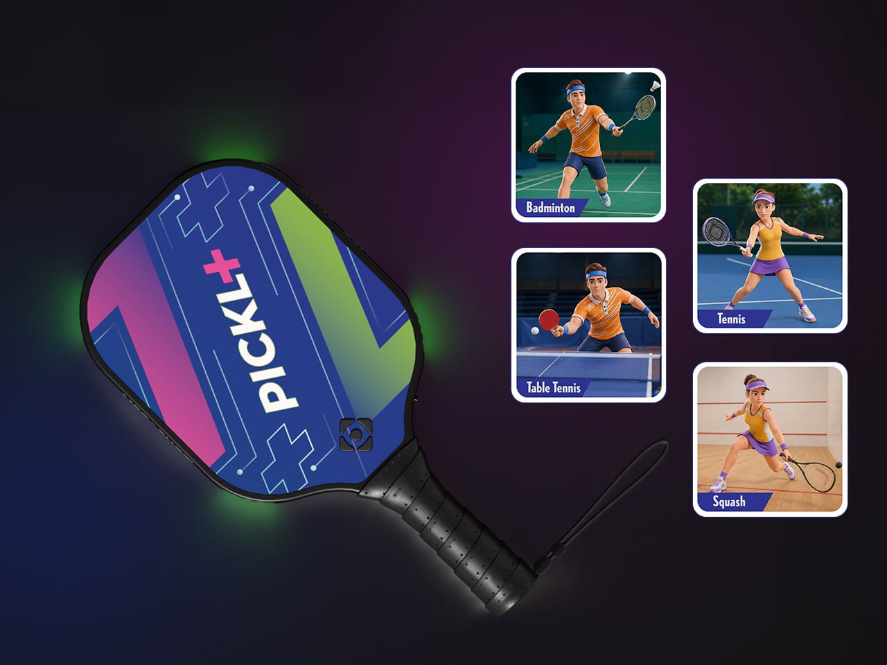
The smart paddle pairs with your phone, tablet, or laptop over Bluetooth and sends the game to your TV (via an included cable) for big-screen play, mimicking your real swing movements on screen and firing haptic feedback through the handle on every hit. A split-screen mode lets you play multiplayer on the same screen too, making it a great family entertainer. No court reservation, no weather to negotiate with. The Wii taught an entire generation that swinging something in your living room could feel surprisingly real. Pickl+ is betting that a generation raised on that premise is ready to do it again, this time for the sport that has genuinely taken over the world, and without an extra console to add to the mix. The Starter Edition is on Kickstarter now for $175, down from a planned retail price of $249 and the campaign has been backed 500% in just 24 hours! Pickl+ will be compatible with sports like tennis, ping pong, and badminton with more racket sports planned for the same smart-paddle platform.

Designer: MegaShot

Click Here to Buy Now: $175 $249 (30% off). Hurry, only a few left!

Under the hood, Pickl+ is built around a 9-axis sensor that reads the angle, speed, and arc of every swing for precise motion tracking. The haptic feedback responds distinctly to different kinds of hits, making the on-screen action feel genuinely tied to what your arm is actually doing. The paddle weighs around 300 grams, carries a 2000 mAh battery rated for up to five hours of continuous play, and charges over USB-C. Bluetooth 5.2 handles the wireless pairing, while an MHL cable connects your phone to the TV when the living room demands a proper screen. The app runs on Android 14+, iOS 18+, Windows, and macOS. Setup is as minimal as it sounds: download, charge, pair, connect, play. Unlike the Wii, Switch, or the Meta Quest, no extra console or hardware needed.

Most gaming hardware asks you to adapt to the machine: learn the buttons, the gestures, the control scheme. Pickl+ goes the other direction. You know how to hold a paddle, and you know what a swing feels like. Rather than turning a conventional controller into a sports accessory, Pickl+ turns the sports object itself into the controller. The technology is essentially trying to disappear into the physical experience, which is part of what makes it a more interesting object than just a clever game controller.

Ten-plus game modes ship at launch, including Streak, Practice, Split Mode, Career, Local Multiplayer, Target, and Beach Mode, with more already in the pipeline. VIP unlocks exclusive virtual courts, daily bonus challenges, glowing paddle effects, custom ball trails, and profile cosmetics.

Before the Kickstarter campaign went live, the beta version of the paddle was showcased at New York Toy Fair, where people across different age groups, including gaming enthusiasts and industry experts, got hands-on time with the motion tracking, gameplay, etc. It gave MegaShot an early real-world read on how quickly people understood and enjoyed the experience. Motion gaming can look impressive in a controlled demo; the real test is whether someone can pick up the paddle, understand what to do, and immediately have fun. New York Toy Fair gave MegaShot that read before asking anyone to back the campaign.

MegaShot arrived at this with receipts. Before Pickl+, the company built a smart bat, which sounds hyperlocal until the numbers land: 100,000+ units sold worldwide, 2,700+ Amazon reviews, and ratings above 4.5 across Google, Amazon, the Play Store, and iOS. The Smart Bat earned the team a spot on Shark Tank India, coverage across major publications, and placement on Walmart shelves. Cricket was a demanding proving ground, the kind of sport where precision hardware lives or dies by real player feedback. That foundation gave MegaShot a validated tech stack, a battle-tested supply chain, and the track record that earns trust going into a bigger, more globally ambitious launch.

Pickleball is the entry point for something larger. The same paddle hardware is designed to eventually support tennis, badminton, table tennis, and squash, with the VIP Pass carrying across sports as they are added. That roadmap turns Pickl+ from a single-sport product into a platform for multiple racket-sport experiences, which changes the value calculation considerably. The most globally accessible racket sport of this decade is also, as it turns out, the perfect vehicle for a company that built its credibility in one market and is now ready to find out how far a smart paddle can travel.

The Starter Edition, one smart paddle and an MHL cable, is available at its $175 Kickstarter launch price, versus a planned $249 retail price. Duo packs start at $275 for two paddles with a cable, while the Starter VIP Duo Pack, which throws in a VIP Pass, runs $315.

The Signature Edition, the premium single-paddle option, comes in at $349. The Signature Duo Edition bundles two premium paddles with cables, a VIP Pass, and protective sleeves for $499. Worldwide shipping begins in early 2027, covering the US, Canada, the UK, Germany, Australia, New Zealand, UAE, and India.

Click Here to Buy Now: $175 $249 (30% off). Hurry, only a few left!

The post This $175 Wii-style Smart paddle turns your TV into a pickleball court first appeared on Yanko Design.
  •  

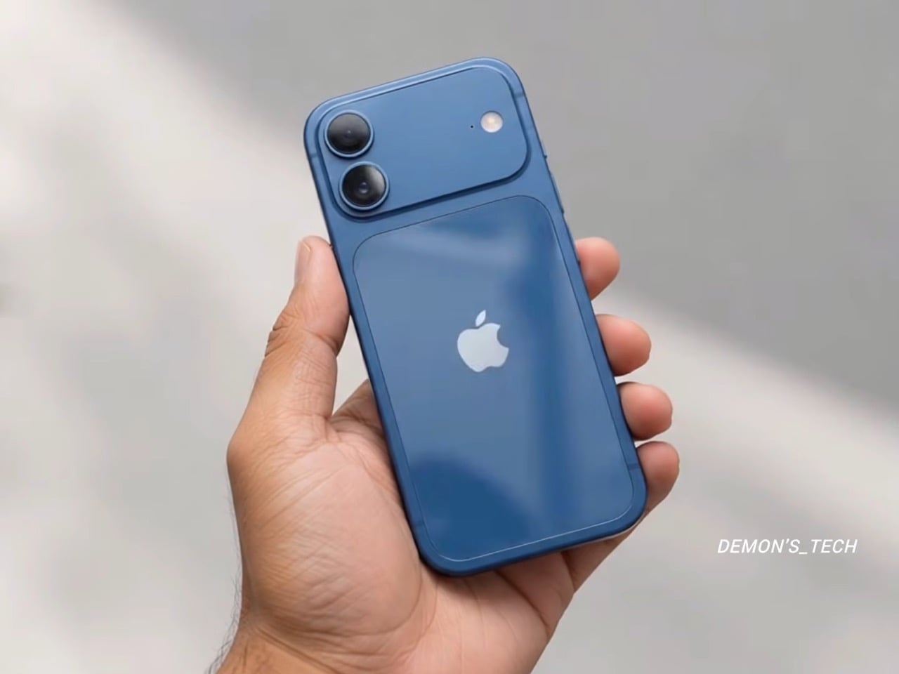
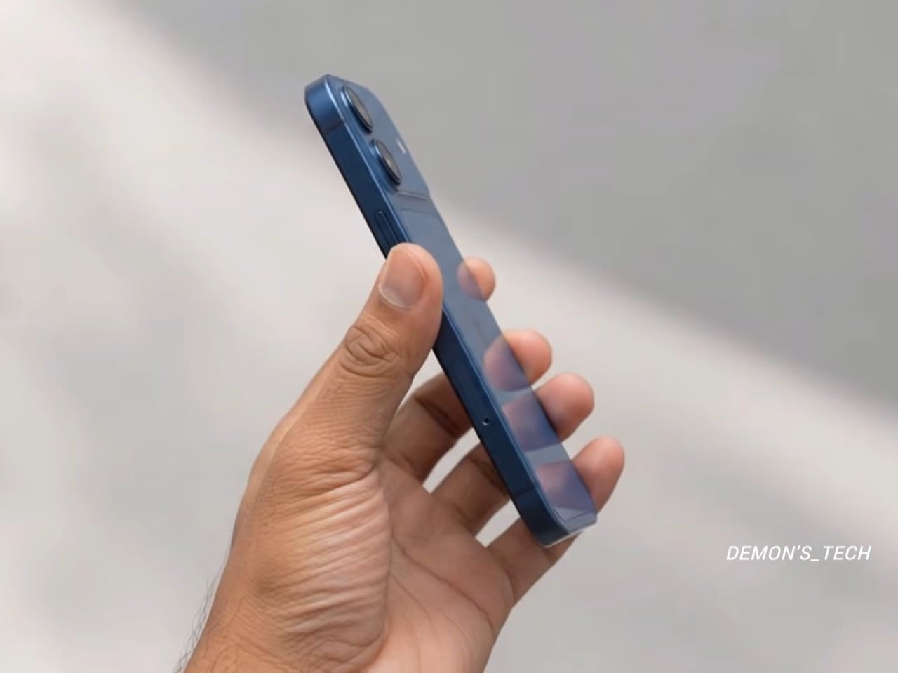
Apple’s iPhone 18 is getting a ‘cheaper’ A20 chip to keep the overall phone affordable

Apple has a long habit of handing last year’s brain to this year’s regular iPhone. The iPhone 15 shipped with the A16 chip while the 15 Pro got the shiny new A17 Pro, and nobody stormed Cupertino with pitchforks. It works because people shop for cameras and battery life, and nobody has ever asked a store clerk about die size. The iPhone 18 is about to run the same play with a twist. This time the regular model gets a brand new A20 chip, except it arrives months after everyone else’s.

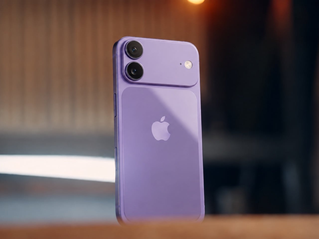
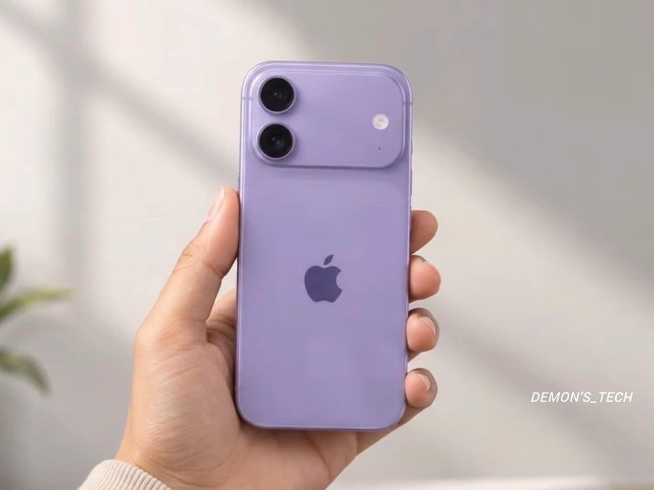
The chip is the A20, and a leaked solder ball map analyzed on Weibo by user 白饭炒白米饭 (reported by Notebookcheck on October 1) suggests it is a slimmed down sibling of the A20 Pro. That Pro chip already powers the iPhone 18 Pro, starting at $1,199, and the iPhone Duo, starting at $1,999. Both reportedly use TSMC’s 2nm process, but the standard version supposedly keeps the AI hardware and trims the GPU, cache, and clock speeds. The base iPhone 18 is expected in spring 2027, and Apple has announced no price or date. So what does Apple cut when it wants a cheaper 2nm chip, and what does it refuse to touch?

Designer: Demon’s Tech

A Smaller Die Than Last Year’s Chip, on a Pricier 2nm Node

The standard A20’s bare die is estimated at 70 to 80 mm², which would make it smaller than the A19 at 82.8 mm² and well under the A20 Pro’s 98.8 mm². A die is the actual slab of silicon, and every square millimeter you shave off means more chips per wafer and a lower bill. On 2nm the savings count for more, since Notebookcheck’s report notes those wafers cost significantly more than earlier nodes. Our own look at the base iPhone 18 pegged its body as basically an iPhone 17 in disguise, so there is no fresh industrial design to pay for either. Apple looks to be spending the budget on silicon instead.

Apple reportedly gets there by halving the cache. The standard A20 is expected to carry 8 MB of L2 cache for its two super cores and 4 MB for its four efficiency cores, which is 50% less than the A20 Pro. Cache is the small, ultra fast memory sitting right next to the processor cores, so a smaller helping can mean slightly more trips out to slower memory under heavy load. It is also one of the most direct ways to shrink a die, because SRAM, the circuitry cache is built from, has scaled poorly on recent chip nodes. Honestly, it is the smartest corner to trim, since you will never see a cache spec on a phone box.

Why the A20 Pro Gets Fancy Packaging and the A20 Skips It

The A20 Pro reportedly uses WMCM, short for wafer-level multi-chip module, which places the processor and its memory side by side instead of stacking one on the other. That layout lets the chip connect straight to the vapor chamber, the cooling plate Apple introduced with the iPhone 17 Pro. Apple says the new Pro design delivers up to 40% better sustained performance than the 17 Pro. The standard A20 is expected to stay with traditional package-on-package, where the memory sits on top of the chip like a hat. A hat is cheap and compact, but it also traps heat right where you do not want it.

Packaging is how Apple reportedly gets the A20 Pro to 4.93 GHz, a figure from the leak analysis that Apple has never confirmed. The standard A20 is expected to clock considerably lower, so it likely does not need the same cooling tricks. Pair that with an expected 5-core GPU against the Pro’s 7 cores, and the gap could show up in a long gaming session. Past base chips trailed their Pro siblings by one GPU core, so a two-core deficit would be wider than usual. The vapor chamber stole the show in the iPhone 17 Pro teardown we covered, and the leak says nothing about the base model getting similar cooling.

The AI Hardware Apple Keeps, and What Spring 2027 Looks Like

The AI side of the chip reportedly survives the cuts largely intact. The leak says the A20 keeps the same dual 16-core Neural Engine as the Pro, the dedicated block that handles on-device AI tasks, along with its own 4 MB cache. The system-level cache, a shared pool of memory every part of the chip can tap, may grow from the A19’s 12 MB to 16 MB. The memory bus is also expected to widen to 96 bits, matching the Pro, which means more data can flow to the chip per second. In real life that means live translation and photo cleanup running on the phone instead of waiting on a server.

The iPhone Duo (the one with the open and close animation we gushed over) runs the same A20 Pro, so Apple’s fall lineup now shares one chip. The base model is expected to follow in spring 2027 with a lighter version of that platform. Apple has confirmed no date, price, or chip for it, so every number here is a leak. The iPhone 17 started at $799 and the Pros just rose $100, so the base model’s price is the number to watch. Back in the A16 days the hand-me-down chip was a consolation prize, but this time the regular iPhone gets a fresh 2nm brain with a little muscle trimmed, a deal I would happily take.

The post Apple’s iPhone 18 is getting a ‘cheaper’ A20 chip to keep the overall phone affordable first appeared on Yanko Design.

  •  

This $20 Thank-You Card Just Solved Saying Thanks Without Overcomplicating It

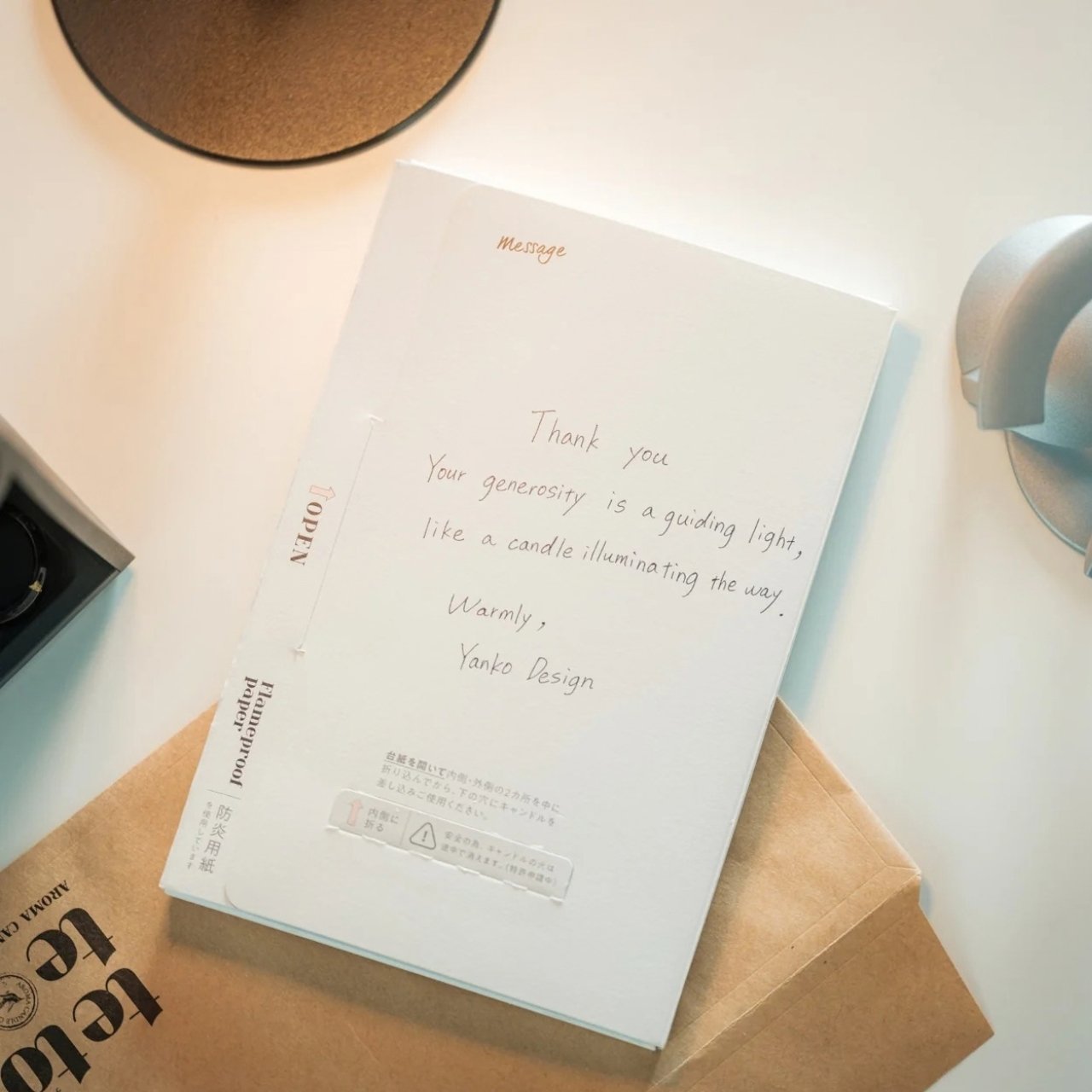
Giving out thank-you cards after a wedding or another event is not automatic anymore. Plenty of people still keep the custom alive, but others send a group email, post a message on social media, or simply move on to the next thing. I, for one, like receiving thank-you notes, whether they are personalized or not. They give me something to remember the occasion by, and I might even tuck one into my journal. When a note comes with a small gift, it feels all the more thoughtful. It tells me the sender wanted to give me something I could enjoy after the event was over.

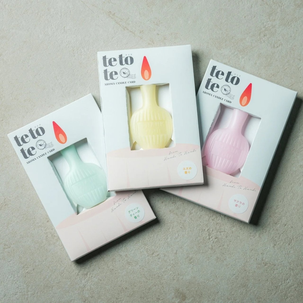
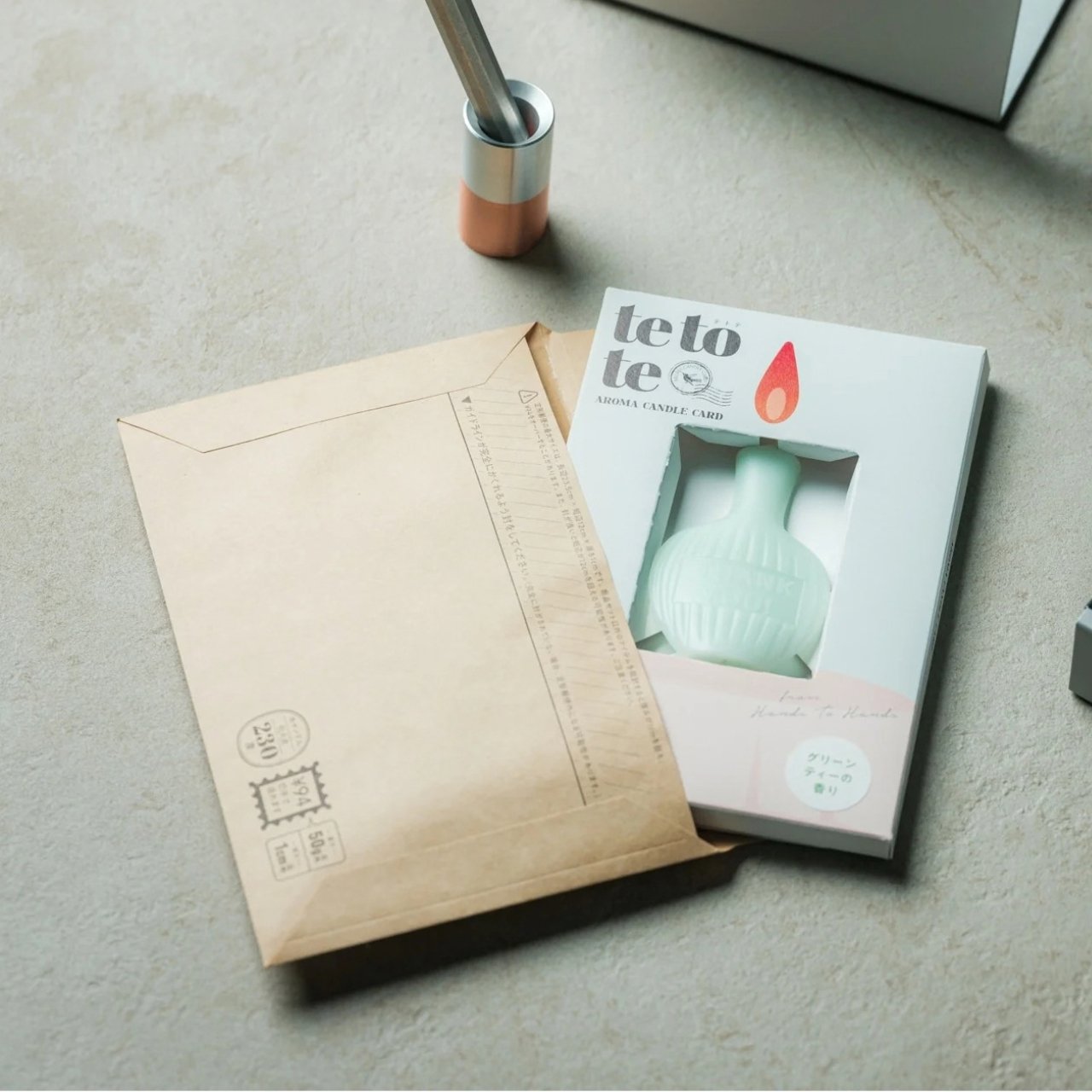
That is the idea behind the AromaCandle Thank You Card. It pairs a greeting card with a scented candle, turning a familiar gesture into something the recipient can read, display, and light. The written message delivers the thank-you, while the candle gives that message a little more time to linger. Even if someone eventually parts with the card because they do not like keeping paper around, they can still enjoy the candle. Well, until it burns out, of course.

Click Here to Buy Now: $20. Hurry, only 2 left!

At its heart, the design brings together two things people already give separately: a card with a personal message and a small gift. That combination is what makes it useful. You do not have to hunt for a candle that suits the occasion and then find a card to go with it. You still have room to write something specific, whether you are thanking a guest for attending your wedding or a friend for helping you move. The product is made in Japan, but its most appealing design choice is simple: it makes the card and candle feel like parts of the same gesture.

You have three options when it comes to the star, or rather, the flame of the show, which is the candle: Sakura (pink), Yuzu (yellow), and Green Tea (green). All three scents are associated with Japanese culture, even though the scents themselves were developed by artisans in Paris and New York. The smells and the colors as well can evoke the feeling of calm, freshness, and serenity once the receiver lights it up. It comes in a minimalist and elegant form and is shaped like a mini bottle with the actual words “Thank You” etched onto it directly.

For comparison, you could buy a Hallmark thank-you card and pair it with a Yankee Candle. That approach gives you more freedom to choose the exact card and candle you want, which might matter if you know your recipient’s favorite fragrance. The AromaCandle Thank You Card offers a different kind of convenience: the two elements are already designed to go together. At its $20 price tag, it is an option for someone who wants to give more than a card without shopping for a separate present. It is not a replacement for a larger candle, but it does make a small thank-you feel more complete.

That makes it especially appealing for occasions when a gift feels appropriate but a large one would feel excessive. You could give it to someone who hosted dinner, looked after your pet, or helped make an event run smoothly. It also offers an alternative to sending a quick text when you want to acknowledge someone’s effort more personally. The candle is a pleasant extra, but it does not have to carry the sentiment on its own. A few sincere, handwritten lines are what will make the gift feel like it came from you.

The AromaCandle Thank You Card solves a small but familiar problem: wanting to say more than “thanks” without making the gesture complicated. Its card gives you space to put your gratitude into words, and its candle gives the recipient something to enjoy afterward. Neither needs to be grand to be meaningful. Sometimes the most memorable part of a gift is simply knowing that someone took a moment to choose it, write a note, and hand it to you.

The post This $20 Thank-You Card Just Solved Saying Thanks Without Overcomplicating It first appeared on Yanko Design.

  •  

A Pen Holder That Actually Looks Like Desk Art

When it comes to stationery and my work and leisure desk, I consider my aesthetic to be messycore and maximalist. Having a lot of pens and other supplies on hand whether for work or for my journaling sessions is normal for me. I tried to use some desk organizers, but it seems that there is order in my chaos and I can still find what I need when I need it, although it doesn’t really look all that Instagrammable. That hasn’t stopped me from looking at and exploring desk organizers and pen holders, especially ones that look different from the usual.

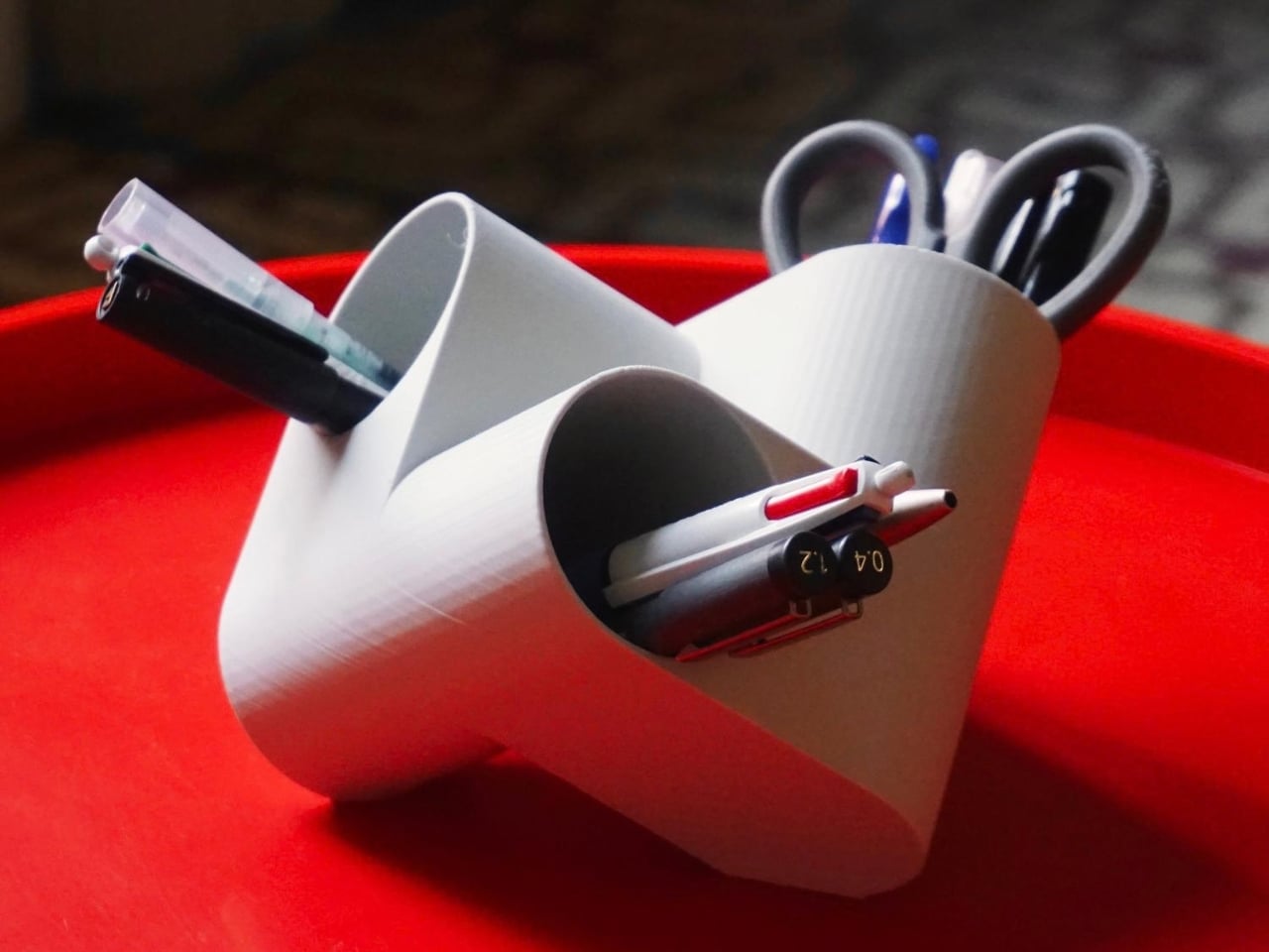
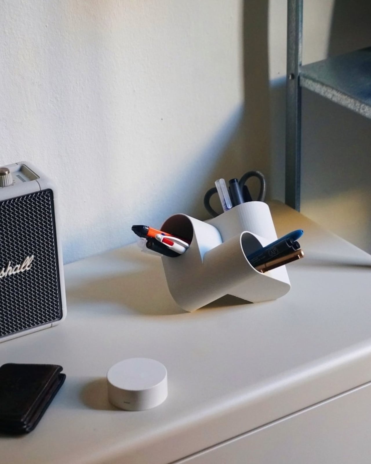
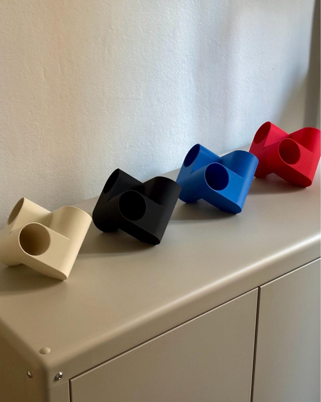
Ciclo is one such pen holder from Spanish industrial designer Eduardo Blanco. The way it’s designed is for you to have more space for your various stationery items and also to give your desk a kind of sculptural-looking organizer that looks good in person and also when you decide to do a post of how your desk looks at the moment. The inspiration for the design actually comes from mathematics and the name itself has ties to it.

Designer: Eduardo Blanco

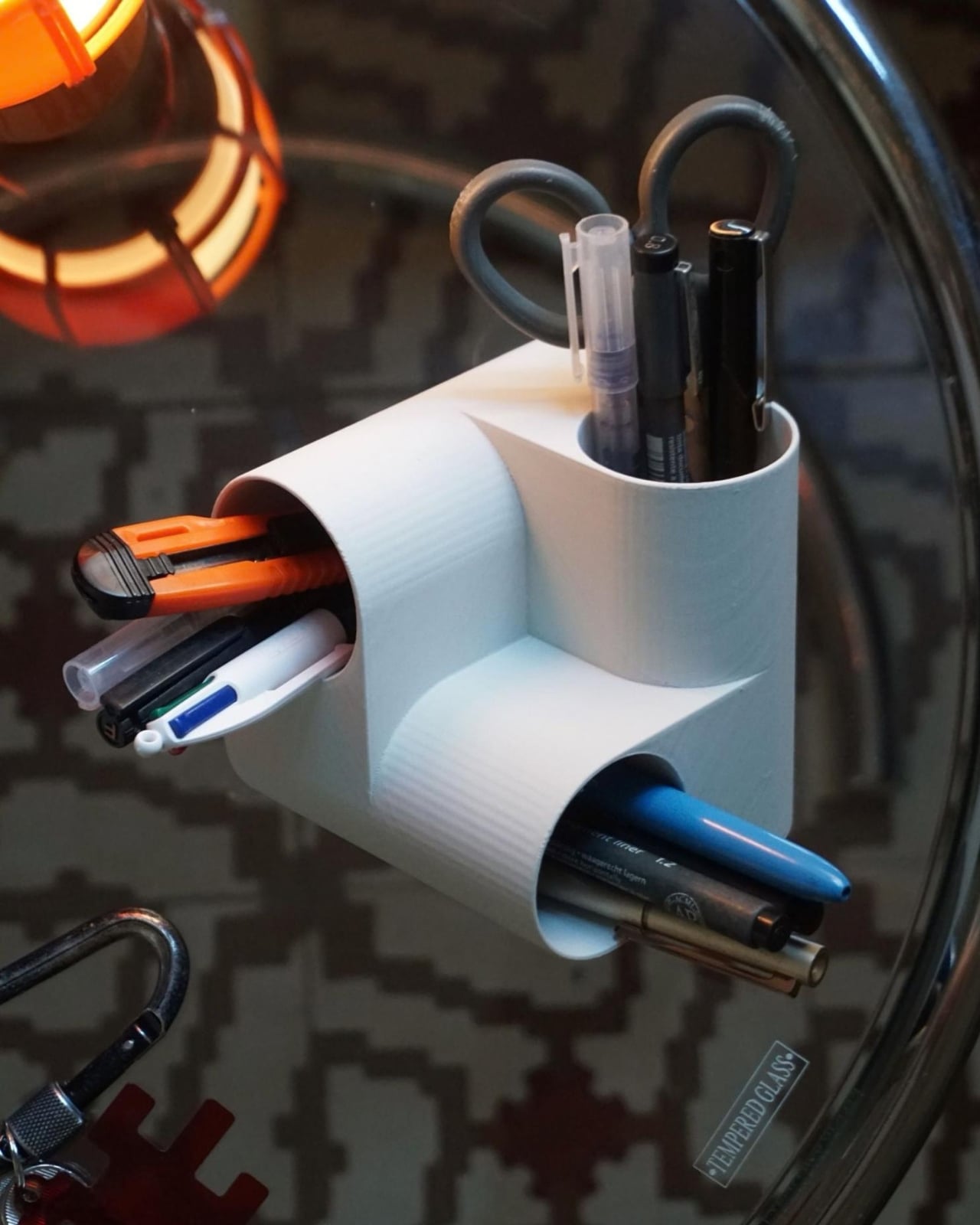
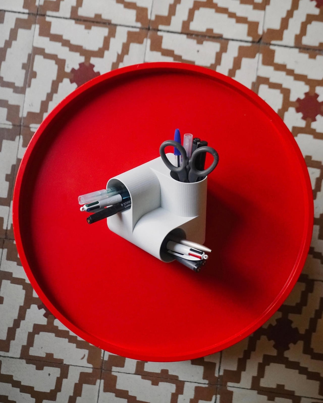
Blanco said he wanted something that didn’t look banal on his desk. The inspiration comes from the Cartesian coordinate system, using three cylinders repeated around the same axis that are stacked and joined one on top of the other. Think about the X, Y, Z axes discussed during math classes (which I would rather forget) but brought to life as a sculptural stationery object. What would normally be a mundane or ordinary object is transformed into a well-designed piece that would look at home at an office desk, a creative workspace, or your side table. Aside from looking beautiful just sitting there, it also means you have three spaces to put your pencils, pens, markers, scissors, cutter, and other supplies you need to organize on your desk.

And honestly, that’s where Ciclo wins me over. Even for someone like me, whose desk looks like a stationery store had a very good time, there’s something undeniably appealing about having one piece that anchors the whole thing visually. You don’t have to be a minimalist to appreciate a beautiful object. If anything, if you’re already going the maximalist route, you might as well make sure some of those items on your desk are actually worth looking at, and Ciclo definitely qualifies. There’s also something kind of fun about having a mathematically inspired piece sitting among your journaling supplies and highlighter collection.

What I also find interesting about Ciclo is the way it challenges how seriously we take the objects we use every day. Most of us grab whatever cheap plastic pen cup is on sale at the office supply store, and that’s perfectly fine. It works. But Blanco’s approach asks a simple but quietly radical question: why settle for something that just works when you could have something that also makes you pause for a second and go, “huh, that’s actually really cool”? That shift in thinking is kind of what separates good design from great design, and it’s exactly what makes Ciclo stand out in a product category that designers have largely ignored.

It’s also worth noting that Ciclo was selected as part of Lagranja Design’s Open Design Editions 2026, a program that spotlights emerging and thoughtful design work, and was presented during Barcelona Design Week. That’s not a small nod. It means the design community sees real value in what Blanco created here, and that Ciclo is more than just a pretty object to put on display.

Whether you keep a very tidy, carefully curated desk or your workspace is a glorious organized mess like mine, Ciclo is the kind of object that earns its spot. It’s a pen holder, sure, but it’s also a small, quiet statement that the things you keep close while you work or create don’t have to be boring. And in a world where so many of us spend a huge chunk of our day at our desks, that feels like it actually matters.

The post A Pen Holder That Actually Looks Like Desk Art first appeared on Yanko Design.

  •  

Two Bedrooms, Two Bathrooms, and a 700-Square-Foot Tiny Home That Doesn’t Feel Tiny

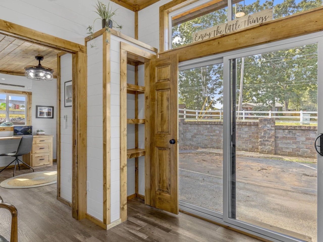
Some homes earn their square footage. The Acadia by Sweet-Haus Tiny Cabin Company is one of them — a 700-square-foot, single-level home that packs two bedrooms and two full bathrooms into a footprint that feels genuinely generous. It sits on a quad-axle trailer, stretching 50 feet in length and 13.6 feet wide, which puts it firmly in park model territory — the kind of home you place once and actually live in.

Sweet-Haus builds out of Chesnee, South Carolina, and the Acadia carries that craftsmanship through every detail. The open-concept layout keeps the living, dining, and kitchen spaces connected — no wasted hallways, no chopped-up rooms. Large black windows flood the interior with natural light, and the black LowE 3 windows with argon gas fill-in do real thermal work, keeping the home efficient without sacrificing the look. The crinkle-cut matte roof and Advantech subfloor round out a build quality that punches well above the $176,500 MSRP.

Designer: Sweet-Haus Tiny Cabin Company

The kitchen is a full-size one, not a compromise version. It comes with a Haier stainless steel cabinet-depth fridge with bottom freezer, a 24″ Haier range, and an 18″ Haier dishwasher — a lineup that treats cooking as something that actually happens in this home. The cabinetry is custom Ergo-craft® millwork, milled from 3/4″ solid wood with soft-close hardware and custom-made pulls. It reads like furniture, not filler.

Both bedrooms accommodate a queen or king bed base with built-in storage drawers underneath, and each room connects to a full bathroom with a large vanity. The bathrooms offer a choice between a standalone shower or a tub/shower combo — a rare option at this scale. R19 insulation runs through the ceilings and floors, and a three-head HVAC system keeps the climate dialed in room by room. The Acadia is HUD-certified, which opens up financing options and simplifies placement in communities across South Carolina and North Carolina.

What Sweet-Haus has built with the Acadia is a home that doesn’t negotiate with itself. Most tiny homes ask you to give something up — ceiling height, counter space, closet room.

This one has built-in closets, two full baths, and a kitchen you’d actually cook in. At 700 square feet, it’s the version of tiny living where the word “tiny” stops mattering entirely.

The post Two Bedrooms, Two Bathrooms, and a 700-Square-Foot Tiny Home That Doesn’t Feel Tiny first appeared on Yanko Design.

  •  

Corsair’s Xeneon Edge is the Stream Deck you always wanted, but bigger and better

Elgato unveiled a little box of 15 LCD buttons in 2017, priced at $149.95, and it quietly rearranged how streamers sat at their desks. The Stream Deck got so popular that Corsair bought Elgato’s gaming business in 2018. Then the obvious question hung around for years: what if the buttons were just a screen? A screen can be any button, any dial, any chart, or any chat window, and it never runs out of room for one more shortcut. Anyone who has maxed out a 15-key pad knows that pain. Corsair eventually got around to answering.

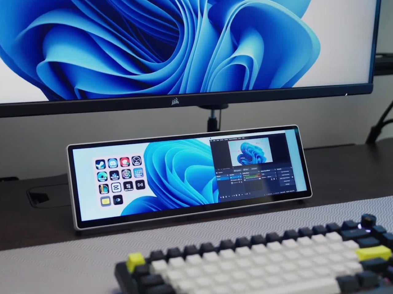
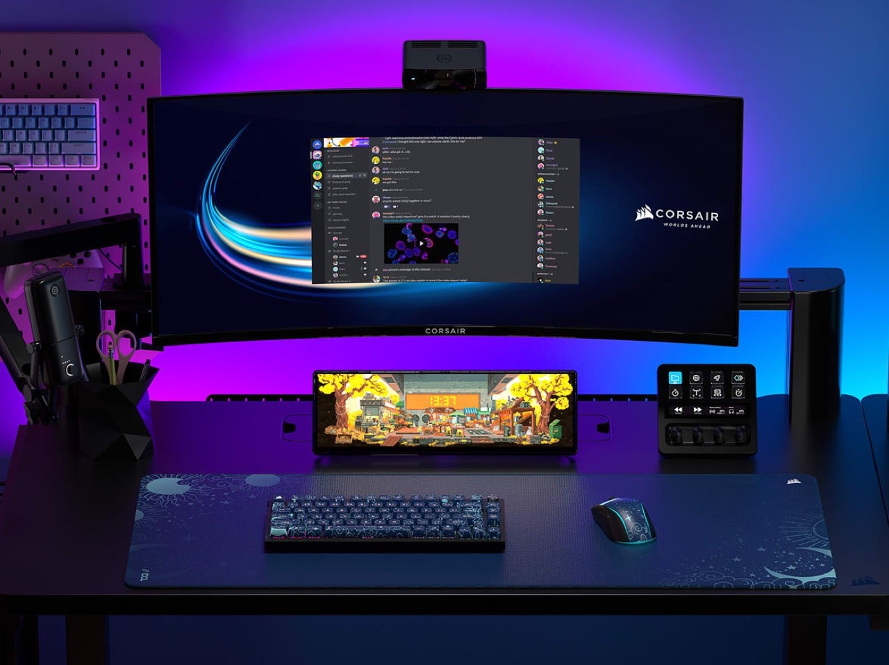
The answer is the Xeneon Edge, a 14.5-inch touchscreen with a 2560 x 720 panel and a 32:9 shape that sits under your main monitor like a very ambitious soundbar. It runs Elgato’s Stream Deck software, so your old button grid gets a much bigger canvas. Fourteen magnets, a detachable stand, and two ¼-20 threads let it live on a desk, a steel panel, or inside your PC case. It lists at $249.99 and is currently $199.99 at Corsair in the US, in all five colors.

Designer: Corsair

A 32:9 strip built for the stuff you only glance at

Think of 32:9 as two 16:9 monitors glued side by side, then shrunk until they fit beneath your main screen. The body measures about 14.6 by 4.7 by 0.8 inches (372 x 120 x 20mm) and weighs roughly 2.2 pounds (1 kg). That works out to about 183 pixels per inch, tighter than the 163 you get on a 27-inch 4K monitor, so small text stays crisp. At 720 pixels tall, the screen is shallow enough to tuck under a monitor without crowding your view. It also rotates to portrait, which turns it into a tall column beside your main display.

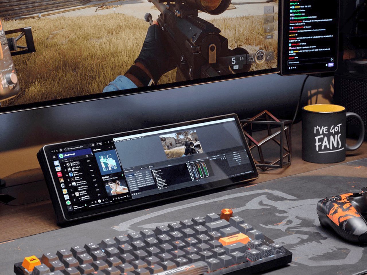
On a typical Tuesday, Spotify, Discord, a calendar, and your GPU temps all want a window, and your main screen is busy with actual work. Park them on the Edge and they stay put, one glance away, while you do your thing above. Video calls can live there too, so a meeting you only half-care about stays visible without eating your spreadsheet. Nothing needs alt-tabbing, and nothing gets lost behind a browser with 40 tabs. It’s the same idea as a phone propped next to your keyboard, except it’s wider, brighter, and plugged into your PC.

Fourteen magnets, two threads, and a 360mm radiator slot

Fourteen magnets sit under the plastic shell, so the Edge sticks to any steel surface without scratching it. That includes a steel desk, a PC side panel, a monitor stand, and yes, a fridge, if the cable is long enough. Inside a case, it takes the place of a 360mm radiator, a slot built for three 120mm fans, and it’s thinner than a regular case fan, so clearance is rarely an issue. Corsair also sells an LCD kit that mounts it into the side panel of the Frame 4000D and 5000D cases. Your build’s best view just got a clock and a temperature gauge.

Two ¼-20 threads on the back, the same screw size camera gear uses, let you hang the Edge from Elgato Multi-Mount hardware or any standard AV arm. That mount-anywhere thinking echoes the Elgato accessory support on Corsair’s Platform:6 desk, which we covered at its Gamescom reveal. Corsair also posts free 3D-printable accessories on Printables, including a taller stand that raises the screen behind a keyboard. The community has jumped in too, and Corsair has spotlighted a modular adapter mount from a creator named Naaackers. If you can think of a place for a screen, someone has either printed a bracket for it or soon will.

Widgets in iCUE and the Elgato Marketplace

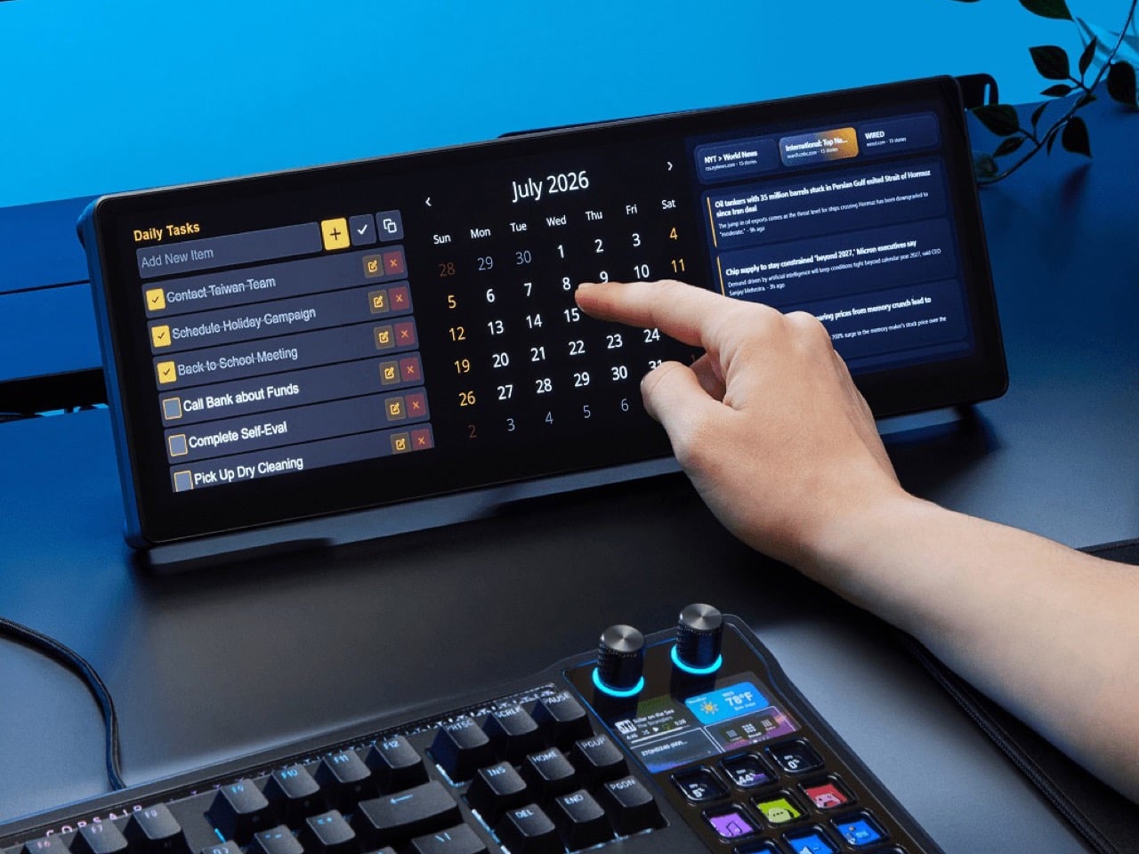
Plug it in and Windows treats the Edge as an ordinary second monitor, touch included. Corsair’s iCUE software for Windows adds widgets on top: a clock, a calendar, weather, news headlines, a task list, and system sensors showing CPU and GPU temps. Each widget lands on a grid you arrange yourself, so your layout can look as busy or as clean as you like. Since May 2026, widgets live on the Elgato Marketplace, where anyone can download or build one. Corsair’s developer docs even point to AI coding tools as a shortcut, which means a custom widget can start as a plain-English wish.

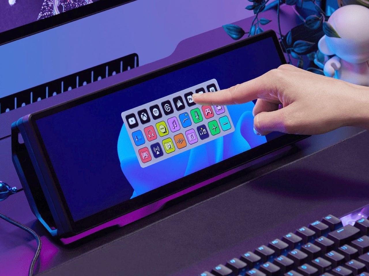
The widget that matters most for old Stream Deck fans is the native Stream Deck widget in iCUE. It drops a full grid of tappable keys onto the Edge, and you add actions in Elgato’s Stream Deck software exactly as you would for a physical deck. Resize the grid and you get more keys than any 15-button pad ever offered. Launch a game, mute your mic, switch an OBS scene, or toggle your desk lights, each with one tap. Because the screen is still a screen, the same strip can show your calendar or GPU temps right next to the keys.

A bright 2560 x 720 panel and touch that behaves like a phone

The panel is AHVA, Corsair’s version of IPS, so colors and viewing angles hold up even when you’re looking at it from the side. It runs 2560 x 720 at 60Hz with 350 nits of peak brightness, plenty for a desk lit by a window and a lamp. Touch is 5-point capacitive, the same technology as your phone, so tapping, swiping, and pinching all feel familiar. A single USB-C cable with DP Alt Mode (video over USB-C) can carry picture and power when your PC supports it. HDMI 2.0 covers everything else, and Corsair includes cables for both in the box.

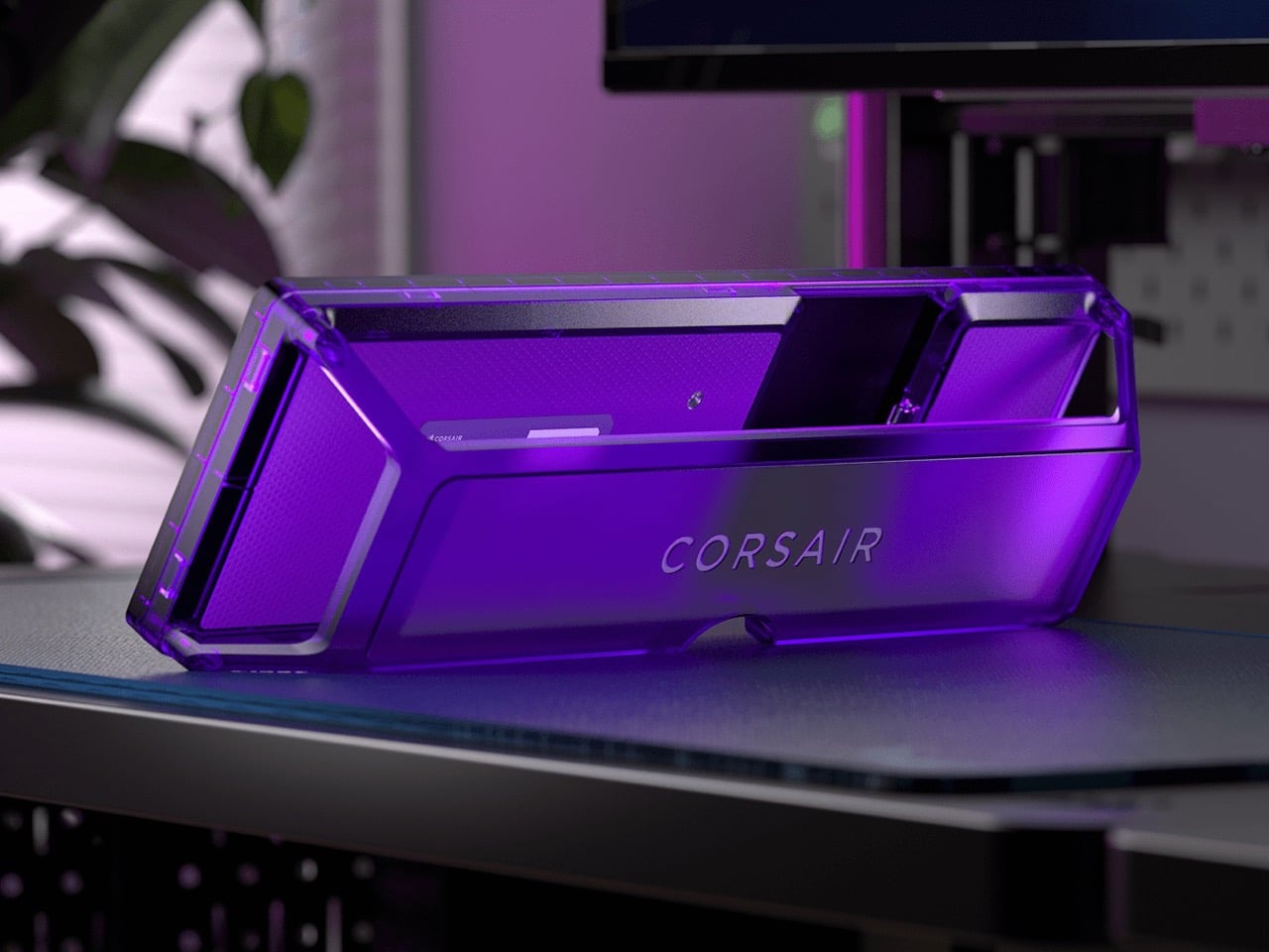
Not every shell is black, either. Colors include black, white, and the translucent Atomic Purple, Crystal, and Smoke, which channel the see-through plastic of late-90s gadgets. We’ve seen that look return in a fully transparent Game Boy Color mod and Analogue’s Game Boy Color-inspired Pocket, and it suits a desk accessory just as well. Translucent plastic also makes the stand look like part of the design, not an afterthought. Pick whichever matches your keyboard, or your mood, or your last impulse buy.

Price, rivals, and where the Edge fits on your desk

The Xeneon Edge lists at $249.99 and is currently $199.99 at Corsair in the US, across all five colors, with a three-year warranty and a zero-dead-pixel guarantee. For comparison, Elgato’s 15-key Stream Deck MK.2 lists at $149.99, and the 32-key Stream Deck XL lists at $249.99. The Edge costs the same as the XL and brings an actual display to the party. ASUS makes the closest rival, the ProArt PA147CDV, a 14-inch 32:9 touchscreen with a physical dial and pen support, but it runs a lower 1920 x 550 resolution and sells for roughly twice the Edge’s list price. Cheap no-name touchscreens exist too, but most skip the magnets, the threads, and the Stream Deck tie-in.

The Stream Deck taught desks that a small control room beside the keyboard beats hunting through menus. The Edge keeps that lesson and swaps the plastic keys for pixels that can become anything. It mounts where you want it, shows what you need, and gets better as the widget library grows. It’s available now at Corsair’s site for $199.99 in the US while the current sale runs, with $249.99 as the regular price. Fifteen buttons were a good start. A 14.5-inch strip of pixels is a much better sequel.

The post Corsair’s Xeneon Edge is the Stream Deck you always wanted, but bigger and better first appeared on Yanko Design.

  •  

A Reading Light That Actually Clips to Your Hair, Not Your Book

Any bookworm worth their salt has experienced reading a book under the covers with a flashlight after their parents said it was time for lights out. When we got older and no longer had to follow a bedtime, we switched to bedside lamps or clip-on reading lights. Those two options, however, come with their own set of problems. A bedside lamp isn’t always the most comfortable option, especially when you need to change positions while lying down. A clip-on light, meanwhile, adds extra weight to the book, and you may have to keep adjusting it as you read.

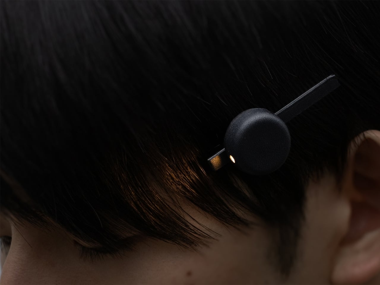
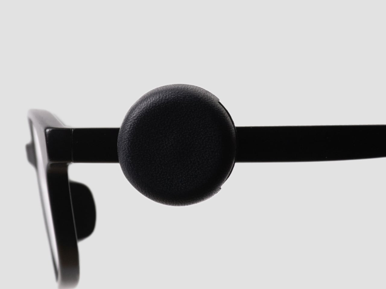
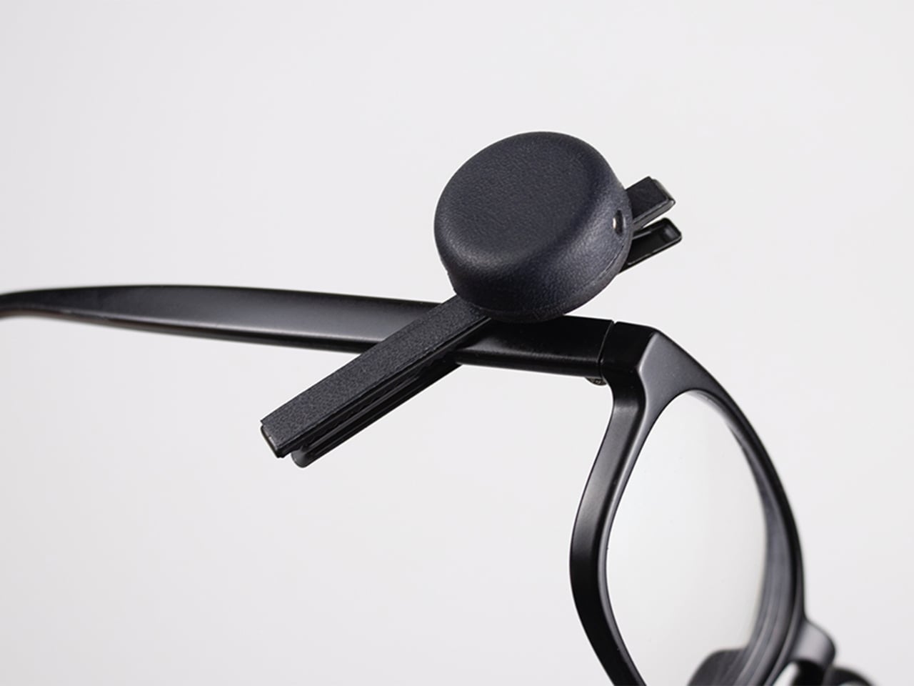
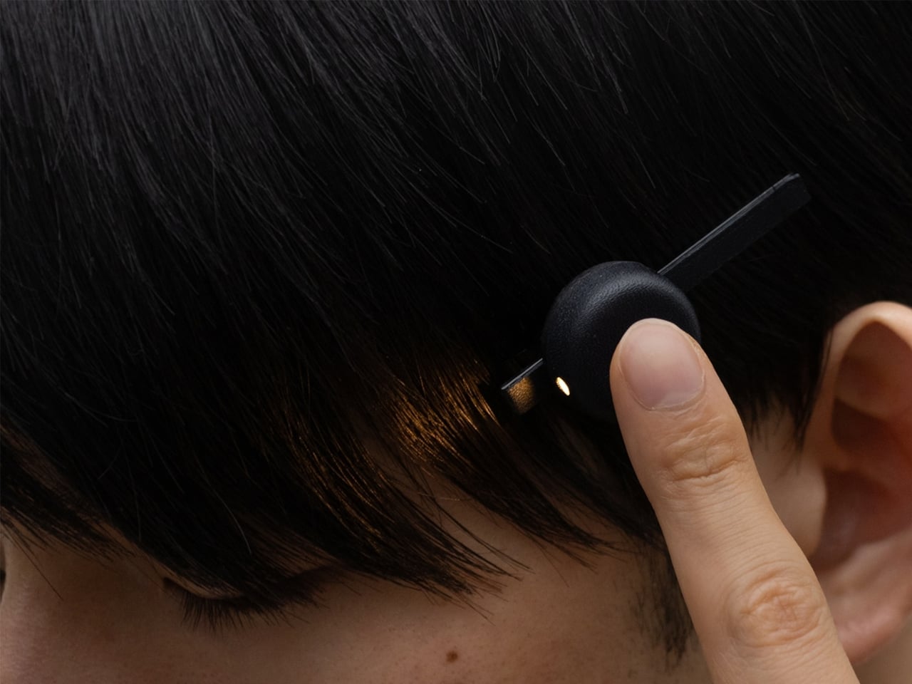
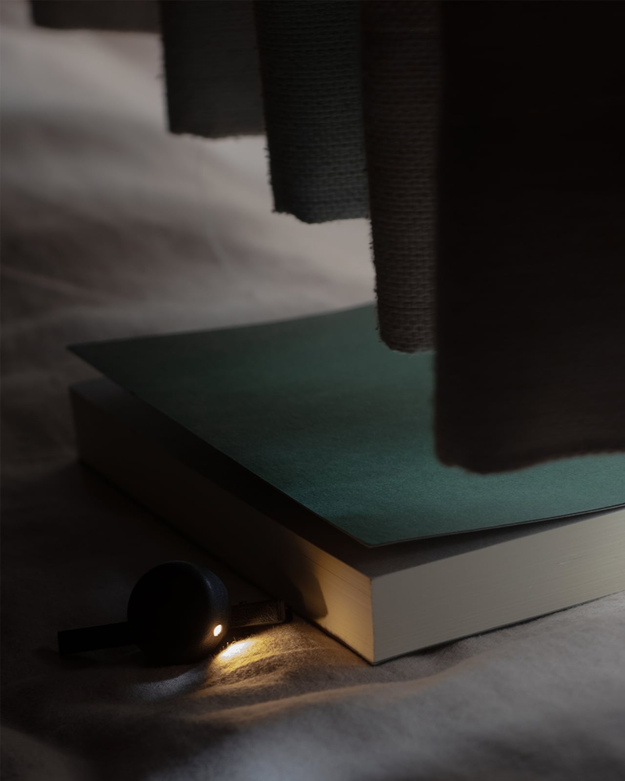
This is the problem that Ryo Matsuoka seeks to solve with the concept for the Wearable Reading Light. As the name implies, it’s a light that you actually wear, so it moves with you as you read while lying in bed. The small light attaches magnetically to a clip worn in your hair. It can also attach directly to eyeglass frames made of magnetic metal, though not to every pair of reading glasses. You can angle the light toward your book while reading with the room lights off before going to sleep.

Designer: Ryo Matsuoka

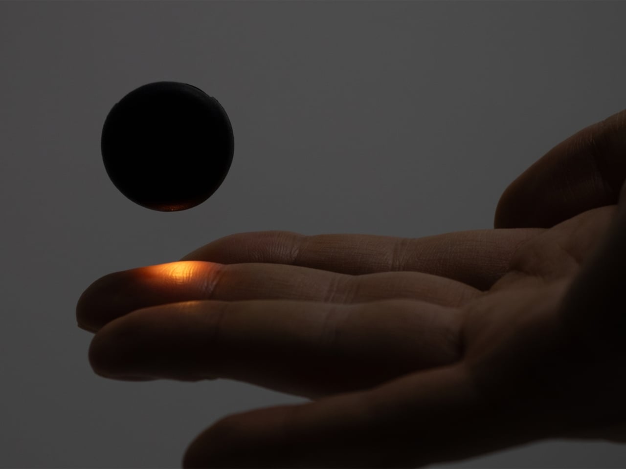
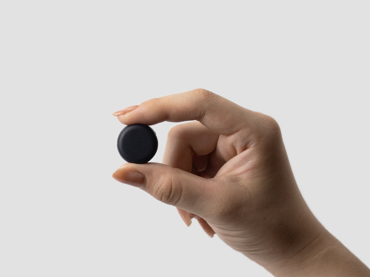
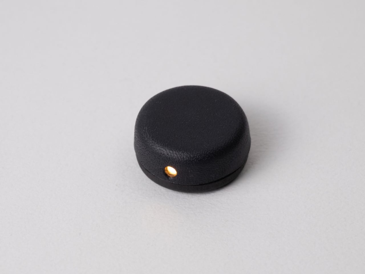
The light has a wet-formed leather exterior, with three-dimensional shaping that gives it a smooth, rounded form. It doesn’t really look like your typical reading light; it’s designed to look more like a small accessory. The light unit measures 24 × 24 × 12 mm (about 0.94 × 0.94 × 0.47 inches) and weighs only 4.5 g (about 0.16 ounces), so it adds very little weight to what you’re wearing. Its compact shape also keeps it from looking like a headlamp when it’s clipped into your hair.

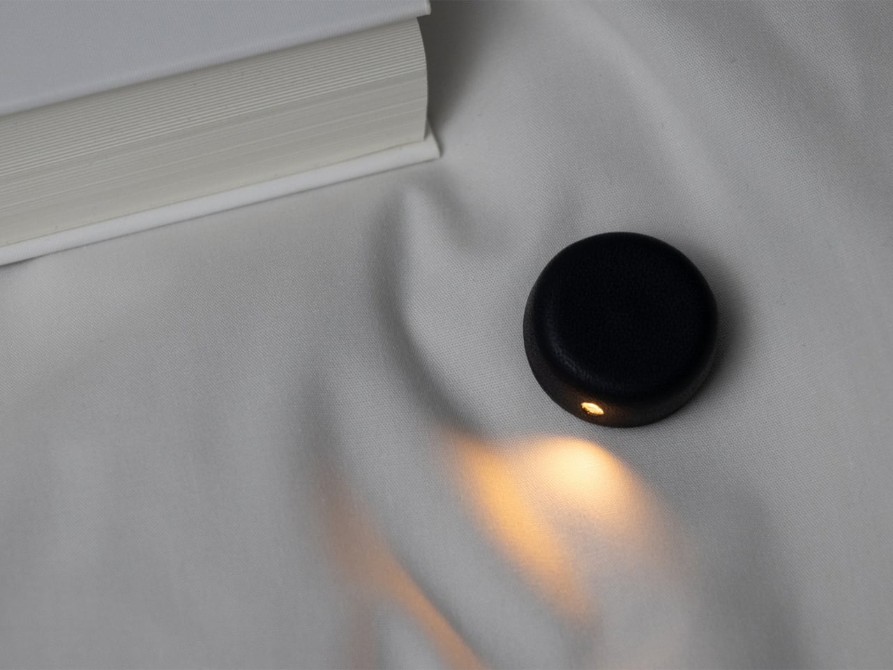
The indigo-dyed wood is another detail worth noticing. Together with the leather, it gives the device a more crafted appearance than you might expect from a small electronic gadget. Matsuoka has kept the technology out of sight beneath the leather, leaving the exterior clean and simple. In the photos, you mostly see a dark, rounded form and the small opening where the light shines through.

You can adjust the brightness across three levels, since the amount of light you want may depend on your surroundings or personal preference. There’s a hidden button to switch the light on, while a touch sensor controls the dimming. Those controls matter for something this small: you can make adjustments without adding a prominent switch to the design. The magnetic connection also lets you change the light’s angle, so you’re not stuck with one position if you shift around in bed.

It uses a replaceable coin battery, such as a CR1632, rather than a built-in rechargeable one. That means you won’t have to stop reading to charge it, provided you have a spare battery on hand. Matsuoka chose this approach with long-term use in mind: when the battery runs out, you can replace it instead of retiring the whole light because its rechargeable battery has degraded. The leather and wood were selected with that same idea in mind, as materials the designer expects to age well over time.

There’s also a dedicated storage case made from the same wet-formed leather and wood. It holds both the light and the clip, giving these tiny pieces a place to go when you’re done reading. That’s a practical touch for an object small enough to disappear among the things on a nightstand or at the bottom of a bag. It also makes the light feel like a complete design rather than just a clever attachment.

What makes the Wearable Reading Light interesting isn’t simply that it’s small. It’s that Matsuoka has moved the light away from the book altogether. You can hold a paperback without a clip tugging on its cover, and the light can stay with you when you change positions. For anyone who likes to end the day with a few pages in bed, that could make a familiar routine a little more comfortable. The concept doesn’t promise to replace every bedside lamp, but it offers an alternative for readers who have never quite found the right place to put one.

The post A Reading Light That Actually Clips to Your Hair, Not Your Book first appeared on Yanko Design.

  •  

Seiko’s New Panda Chronograph gives your wrist a playful personality without sacrificing function

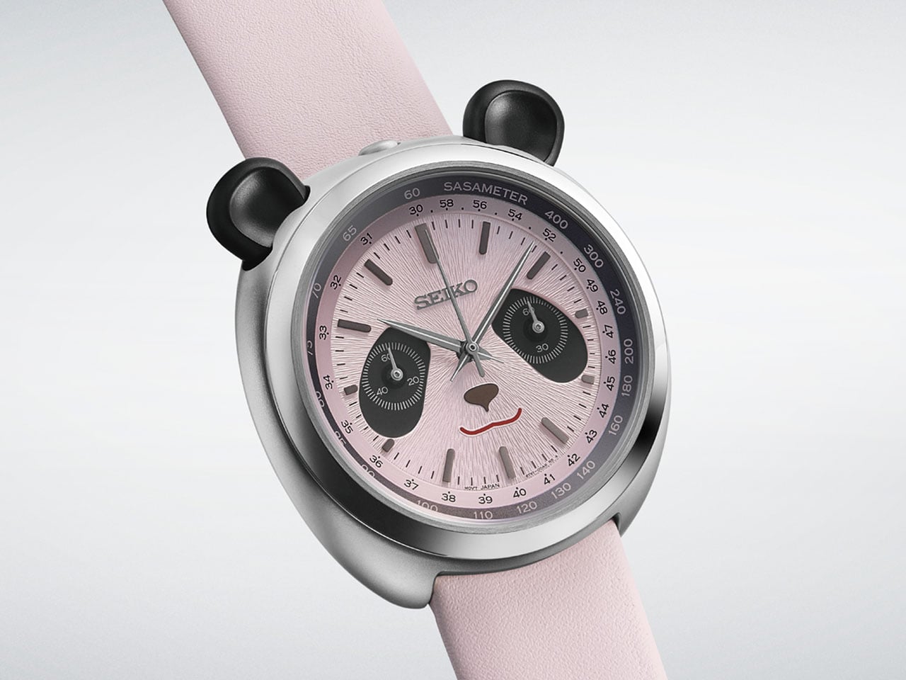
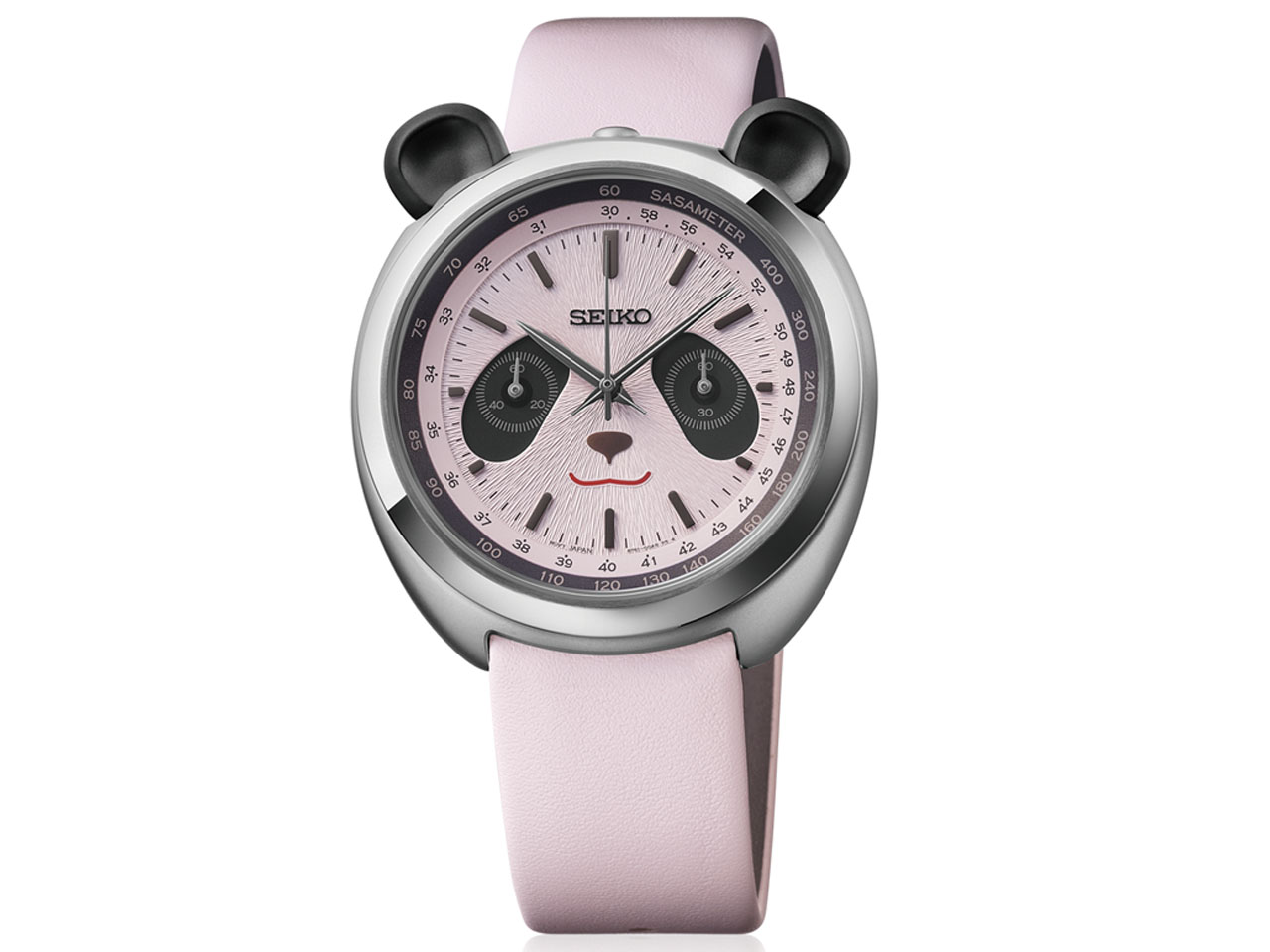
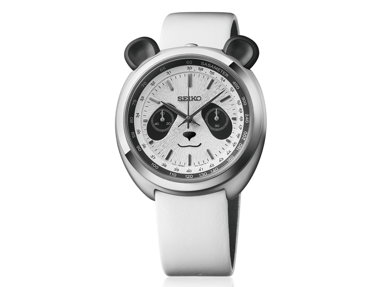
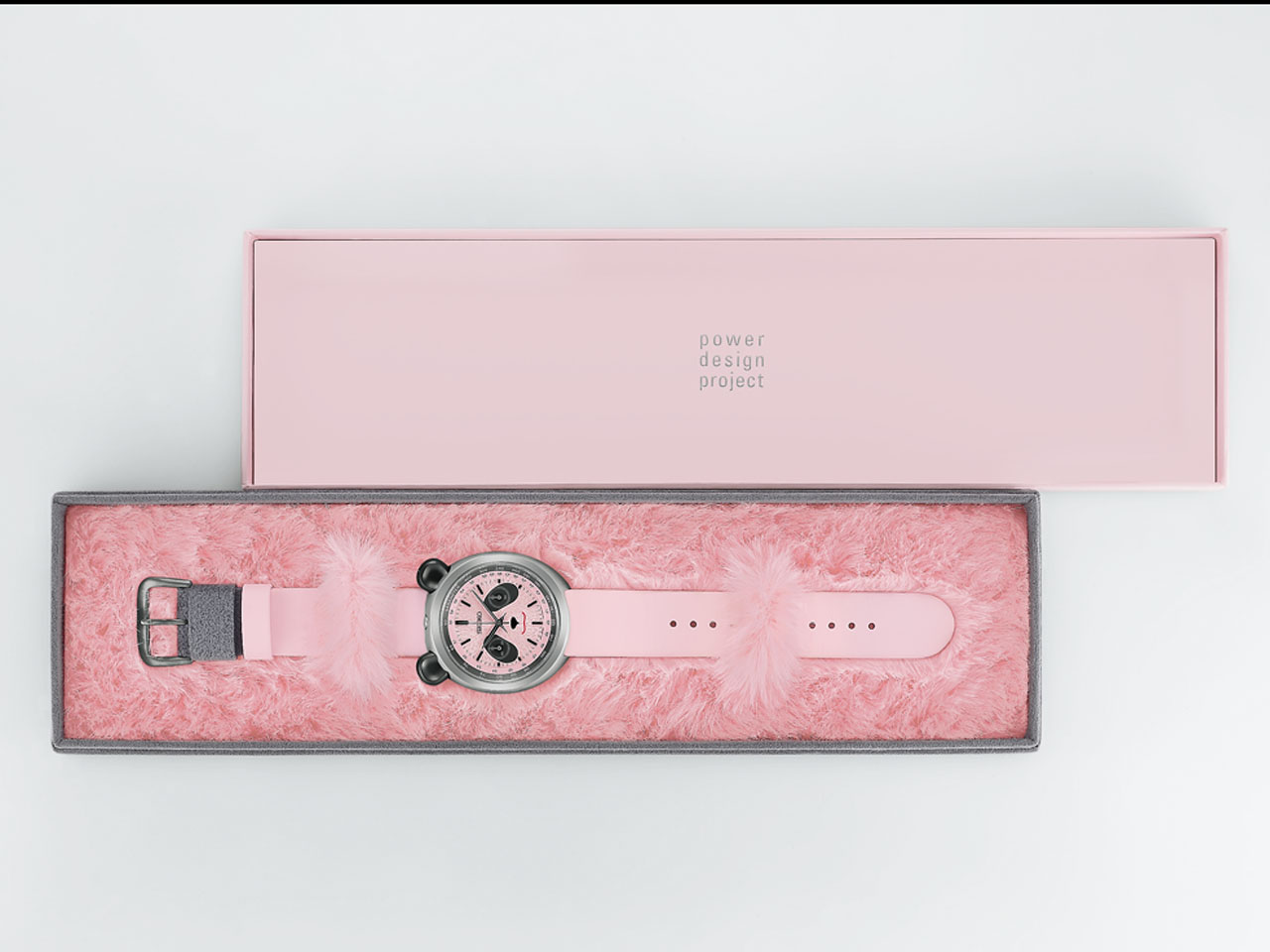
There are plenty of watches that get called “panda” because of their black-and-white dials. Seiko decided to take that nickname a little more literally, creating the Power Design Project Panda Chronograph. The timepiece is a playful mechanical-looking chronograph that actually puts a panda’s face on the dial, which is quite fun, to be honest.

The idea first appeared as a concept at Seiko’s Incredibly Specialized Watch Exhibition in 2024. Designer Kiyotaka Sakai wondered what a chronograph would look like if the word “panda” wasn’t just a collector’s nickname. The production versions – HHK001P and HHK002P – stay remarkably close to that original thought. The watch is designed to make you smile, but it still has the proportions, finishing and functionality of a proper Seiko chronograph.

Designer: Seiko

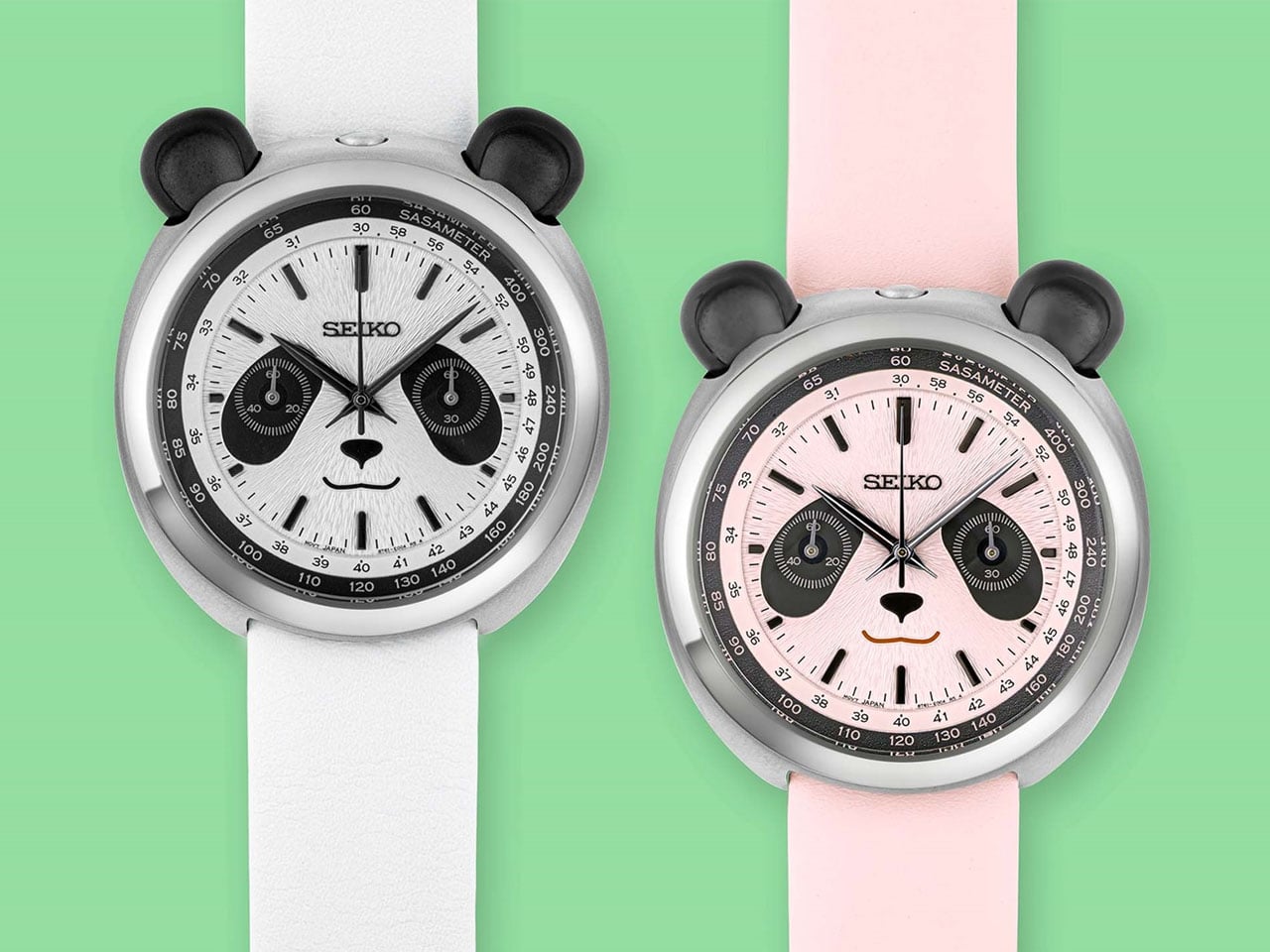
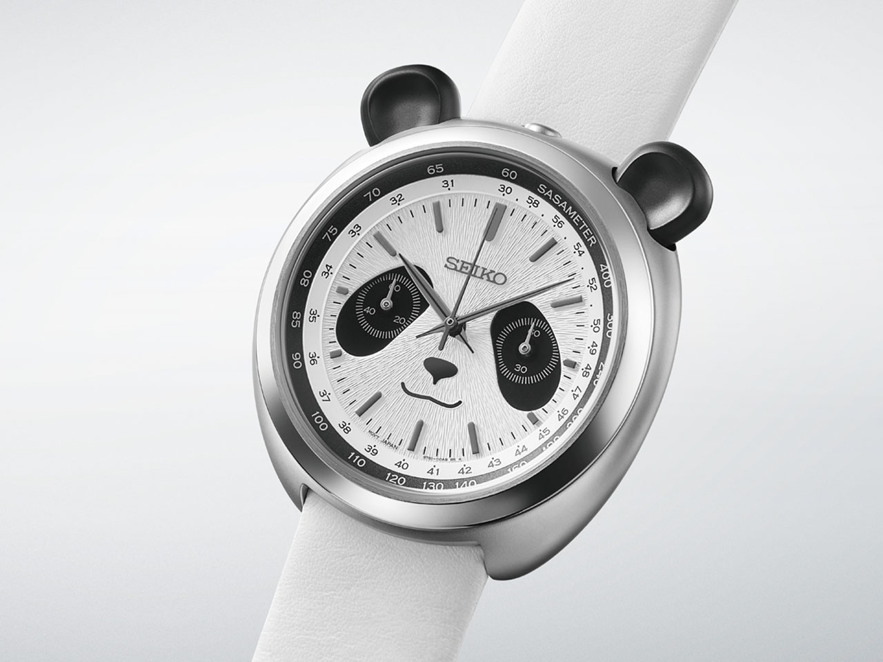
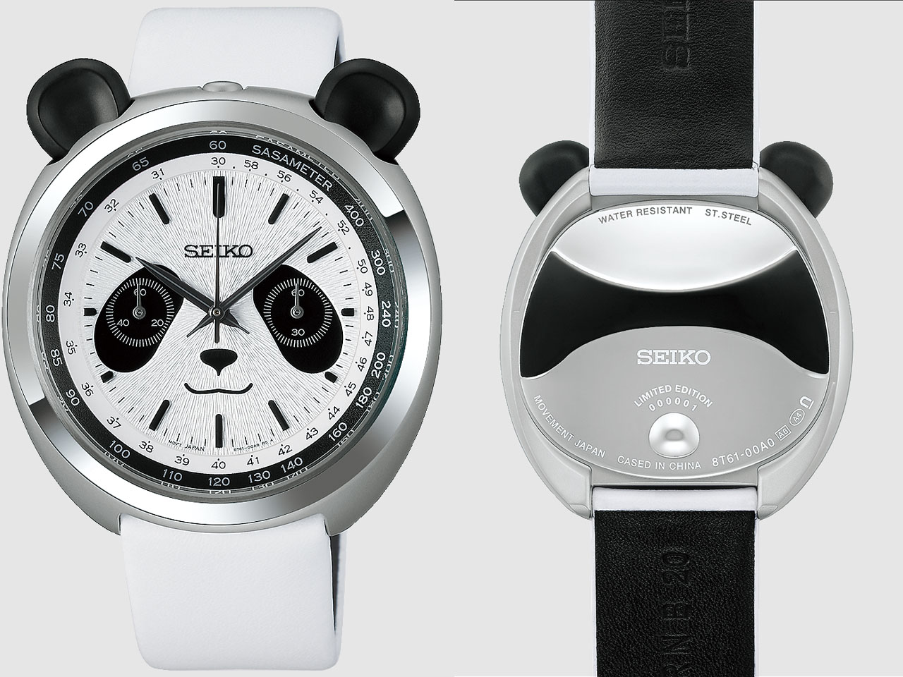
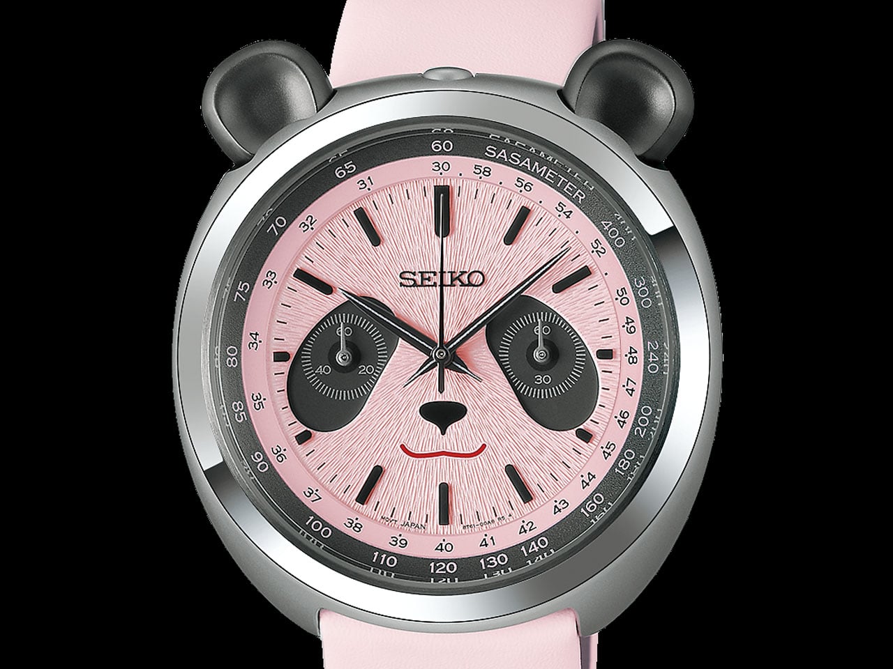
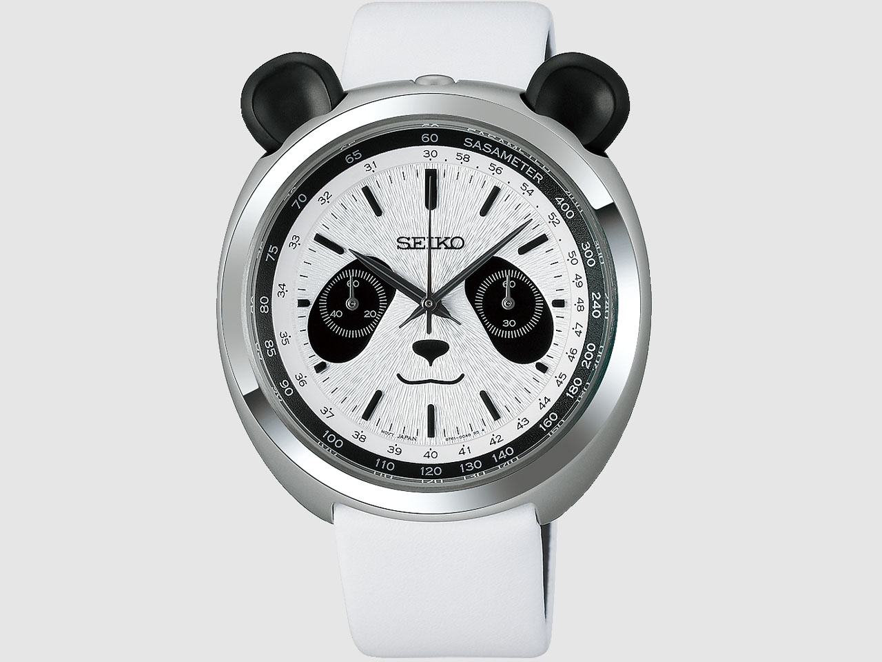
The first thing you notice is the face, where black subdials naturally become the panda’s eye patches, while a small nose and curved mouth sit below them. The two chronograph pushers rise above the case like ears, giving the watch an expression that is surprisingly easy to read. It sounds like a gimmick on paper, but the proportions make it work.

Seiko has carried the theme into details that are easier to miss. The dial has a radial texture intended to resemble panda fur, while the hour and minute hands take inspiration from bamboo leaves. The tachymeter scale around the edge gets a suitably playful name: “SASAMETER,” from sasa, the Japanese word for bamboo. It remains a functional tachymeter, with Seiko noting that it could theoretically measure a panda running at around 30 km/h.

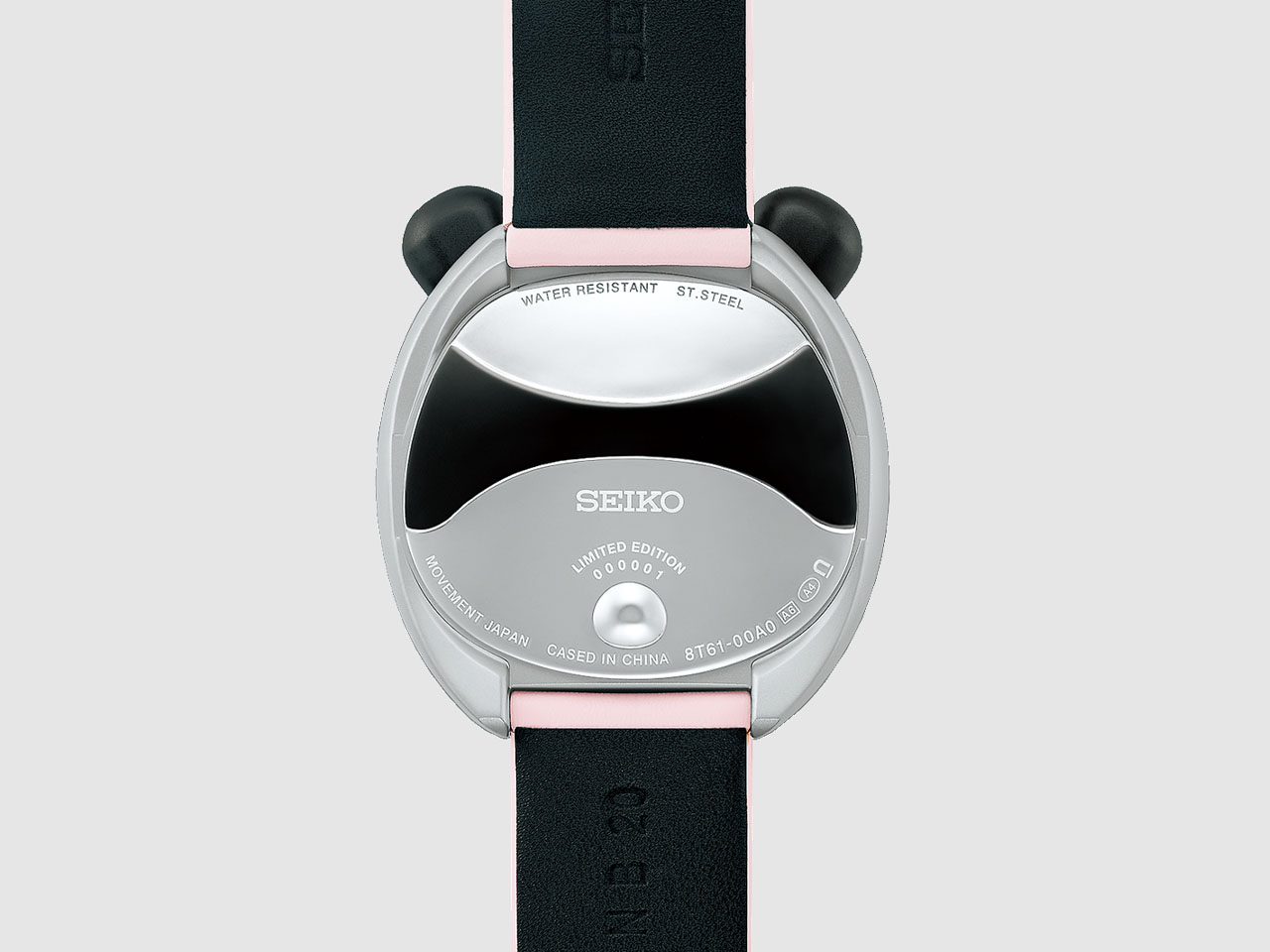
The 43mm stainless-steel case is 14.6mm thick and uses hidden lugs, which help keep its footprint from feeling quite as large as those numbers suggest. The recessed crown sits between the ear-like pushers, while the caseback continues the joke with a rounded profile and a small three-dimensional tail.

Underneath, there is no complicated mechanical movement trying to compete with the design. Seiko uses its quartz Caliber 8T61, which provides hours, minutes, central chronograph seconds and a 60-minute counter with 1/5-second measurement. It is rated to an accuracy of ±15 seconds per month and offers 30-meter water resistance.

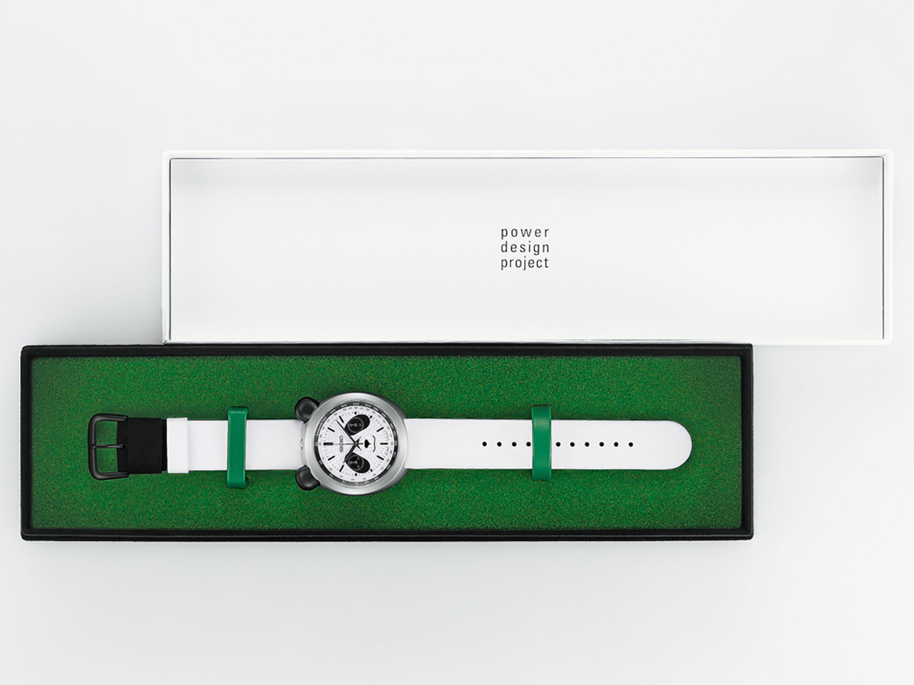
The watch comes on a cowhide leather strap with suede-like sections. This is a cute attempt to bring the panda theme into something you actually feel when wearing it. Out of the two versions, the HHK001P is the familiar black-and-white panda, limited to 3,000 pieces. The HHK002P swaps the usual colors for pink and gray, inspired by the appearance of newborn pandas, which are born with pink skin before developing their characteristic black-and-white fur. That version is limited to 2,000 pieces. Both watches are priced at $540 and are scheduled for release in November 2026.

The post Seiko’s New Panda Chronograph gives your wrist a playful personality without sacrificing function first appeared on Yanko Design.

  •  

This $59 Cork Wallet Makes Your Overstuffed Bifold Look Embarrassing

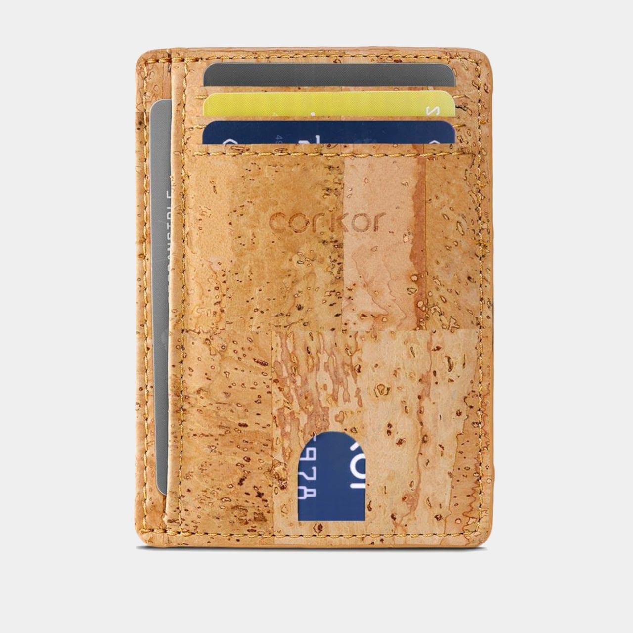
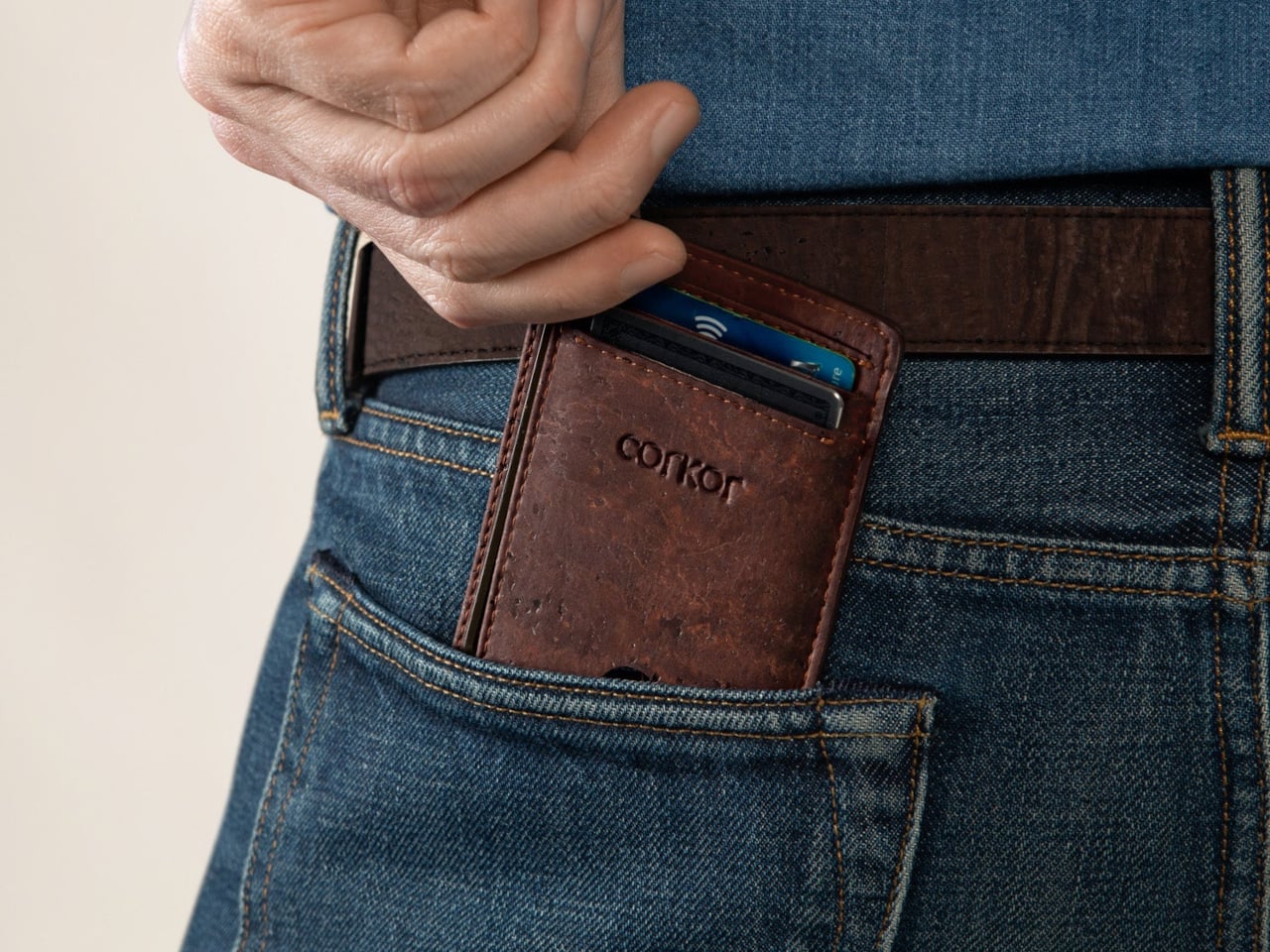
Most wallets don’t start out bulky. They get there one receipt, spare card, and folded bill at a time, until slipping one into a front pocket feels like packing a book. Corkor’s slim card holder asks you to carry less, then makes that decision feel less austere with a cork exterior. Its appeal lies in the material as well as its size.

Cork is something you pull from a bottle or pin notes into, not what you reach for when paying for coffee. Here, its irregular grain gives the wallet character without needing decorative hardware or branding. Stitched edges and stacked pockets keep the shape familiar, but the surface feels different from the smooth leather and synthetic finishes that dominate everyday carry.

Designer: Corkor

The layout keeps your most-used cards in three slots, with an ID window and two compartments for folded bills. A small opening on the front helps you nudge a card upward rather than digging at its edge. Keep only the cards you actually use, though, because squeezing too many into those pockets would inevitably change how slim the wallet feels in your pocket.

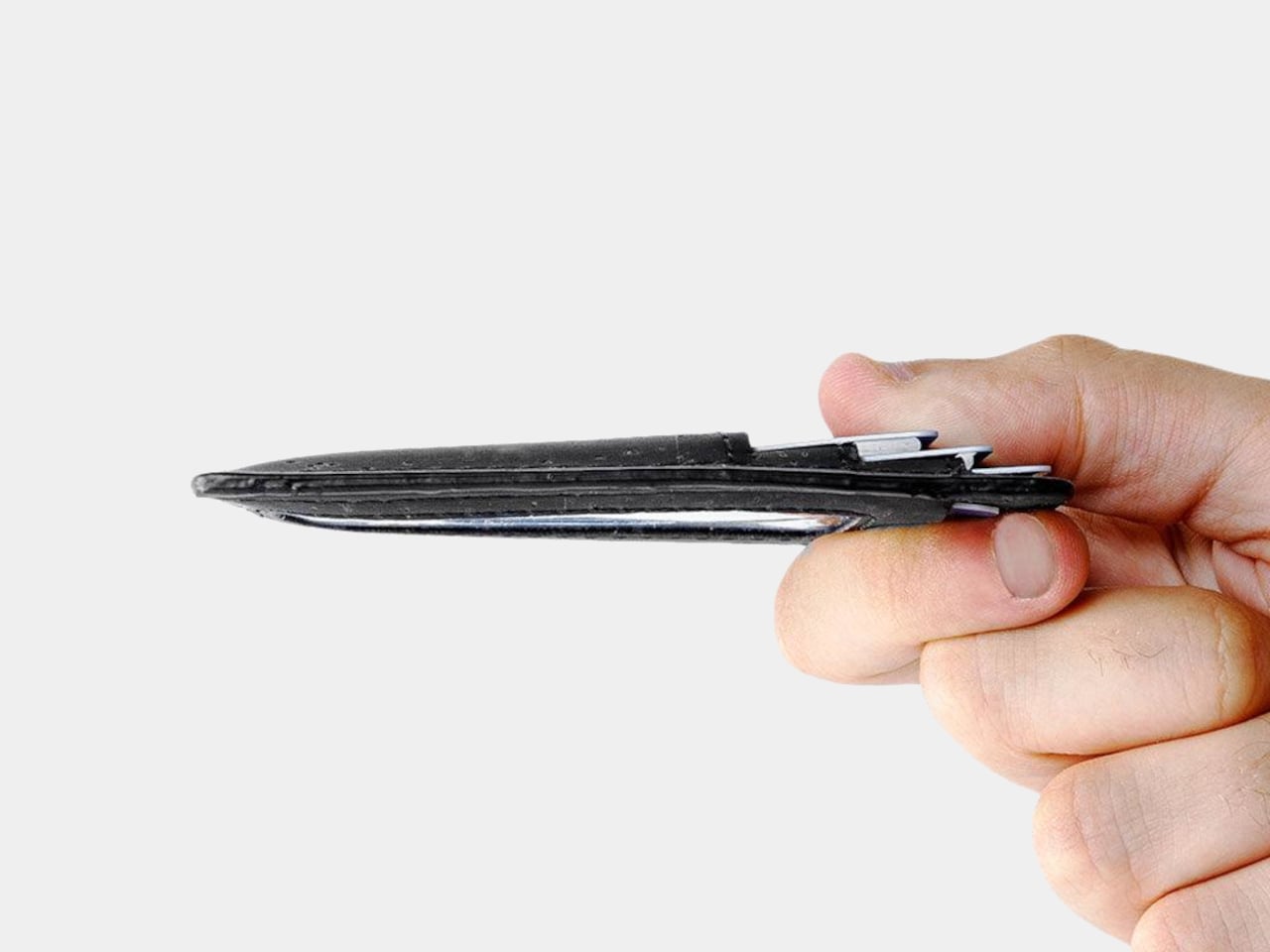
At 4.3 inches tall, 3.2 inches wide, and 0.4 inches thick when empty, the holder takes up less room than a traditional bifold. It weighs just 0.70 ounces before you add anything. You can leave home with a payment card, an ID, and a little cash without carrying a stack of compartments you’ll never open during a long, busy day away from home.

Cork has a purpose beyond its unusual appearance. The thin, pliable material lets the holder bend gently instead of feeling like a rigid little case, and Corkor describes it as water-repellent and easy to clean. For someone who wants an animal-free alternative to leather, that makes the material choice part of the daily experience rather than a claim printed on a label.

The cork comes from Portugal, where Corkor also makes the holder in-house. That doesn’t mean a wallet can settle every question about sustainability, but it does give this one a clear material identity. Corkor says its packaging is recyclable or compostable, and the card holder is certified vegan. Those details matter most when they’re paired with something you actually want to keep using.

Of course, minimalism has limits. There’s no coin pocket, and those folded bills won’t be as quick to sort through as cash in a full-size wallet. RFID-blocking construction is included to help protect compatible cards from skimming, but it won’t prevent other kinds of theft. This is a holder for an edited pocket, not a place to stash whatever the day hands you.

Corkor prices the holder at $59, which might seem steep for something designed to carry so little. That small footprint is precisely the point. The soft, mottled cork makes a familiar stack of slots feel unexpectedly personal, while the slim layout encourages you to leave the clutter behind. Once you’ve pared things down, that front pocket might finally have room for more than your wallet.

The post This $59 Cork Wallet Makes Your Overstuffed Bifold Look Embarrassing first appeared on Yanko Design.
  •  

Bloom Built a Cat Tower Around the Cat You Haven’t Got Yet

A kitten might be happy with a hideaway, but give it a few months and that same nook starts looking cramped. Add another cat, and a single perch becomes contested territory. Bloom takes that problem literally, building a cat tower from separate cylindrical modules that can be arranged as its occupants grow. It starts small instead of demanding space for a feline family.

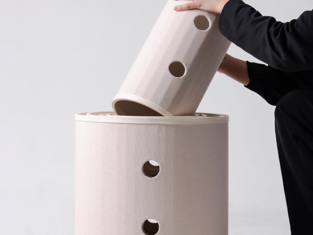
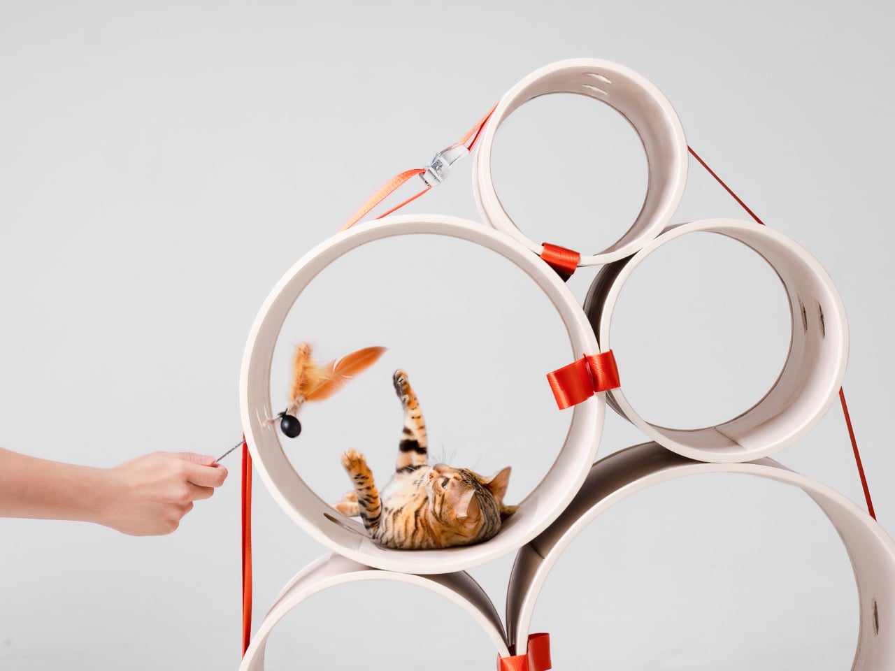
Most cat towers arrive as a collection of platforms, posts, and houses, whether your cat needs all of them or not. Their bulk can make a living room feel as if it has been furnished around the pet. Bloom swaps that predetermined silhouette for a cluster of open tubes, each one a place to curl up, climb through, or watch the room.

Designers: Joonseo Choi, Taewoon Kang

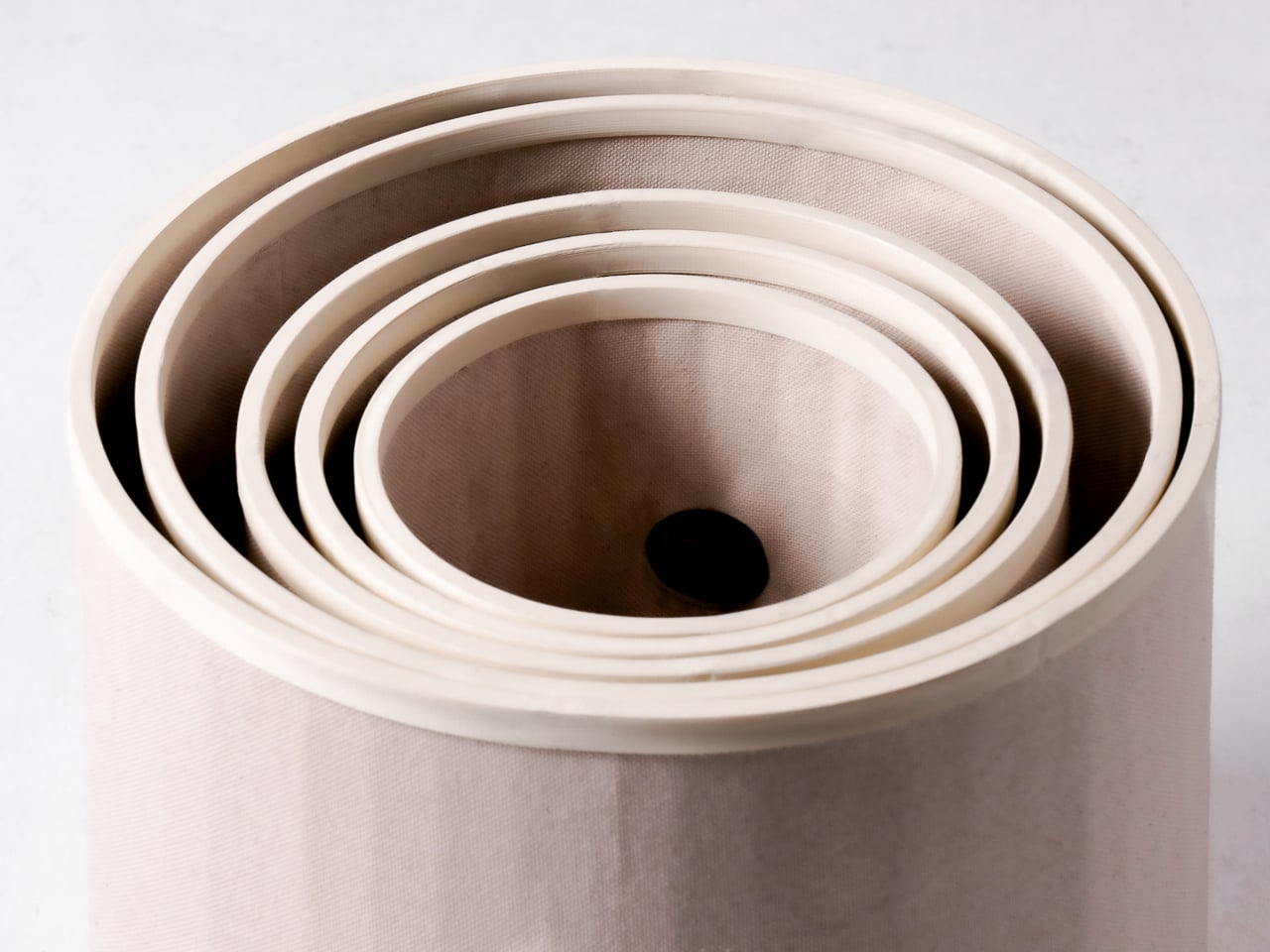
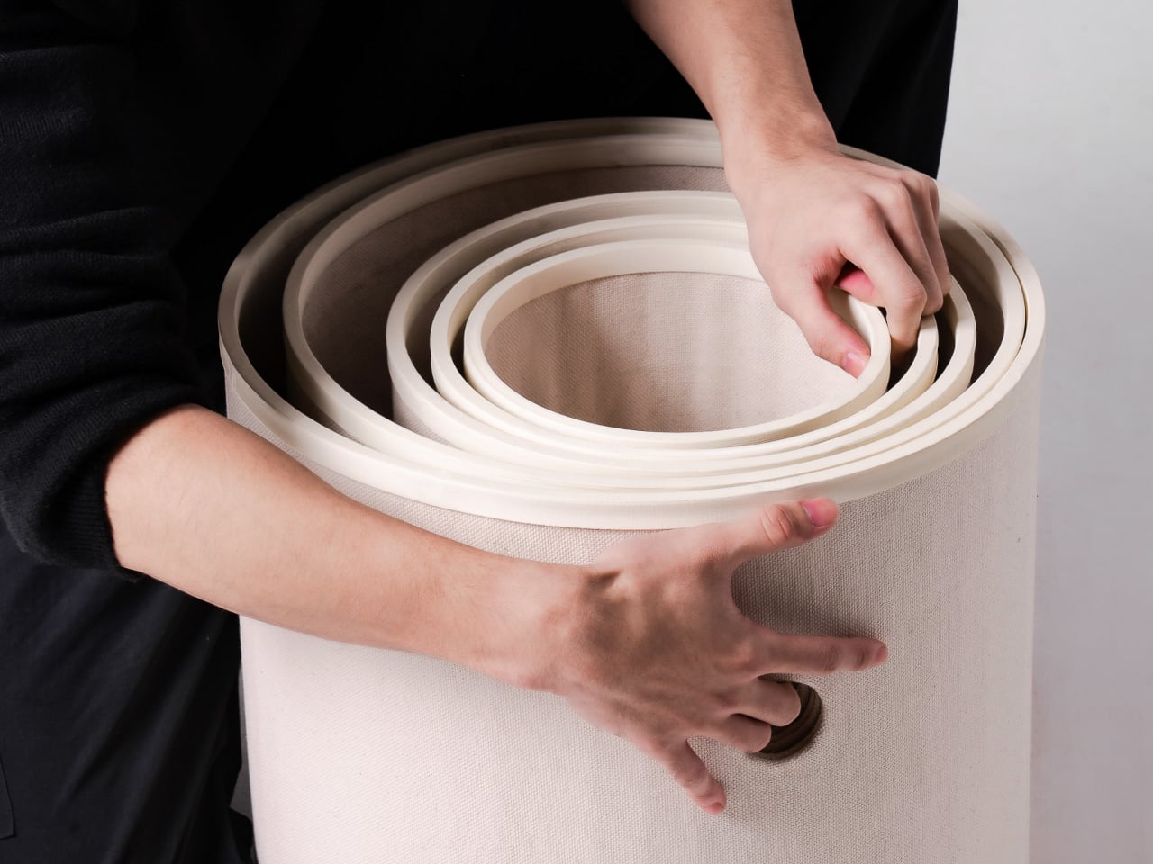
Those cylinders come in several diameters, so arranging them feels closer to stacking play objects than assembling pet furniture. A smaller cat can settle into a tighter opening, while a larger one has room to stretch out in a wider tube. The circles also give Bloom its character: soft, repeating forms that can take different shapes instead of committing your room to one tower.

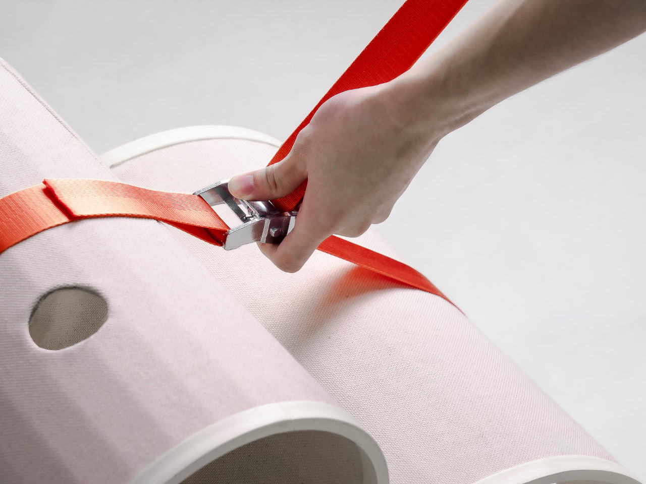
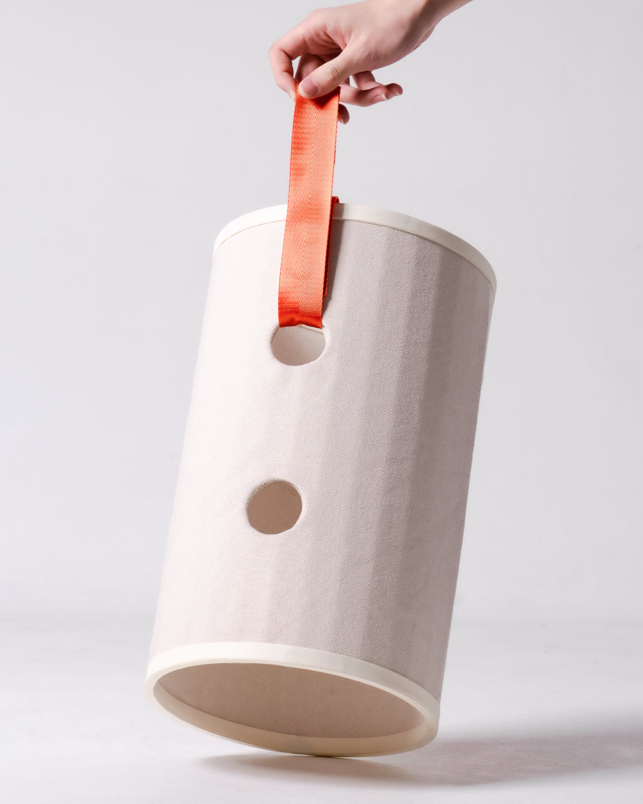
Of course, loose tubes wouldn’t make much of a cat tower once the occupants started leaping about. Bloom uses orange straps to hold the modules together, with hook-and-loop fastening that makes them easier to attach and detach. The straps add a punch of color to the pale cylinders, but their important job is letting you change the arrangement without committing to a rebuild.

You might begin with two tubes near the sofa, then add another when your kitten starts climbing above everybody’s heads. If a second cat joins the household, a wider cluster could give each animal somewhere to pause without fighting over the same opening. The exact layout can follow the cats, rather than asking them to adapt to whatever configuration came in a box.

The holes along the sides serve another purpose beyond giving the straps somewhere to attach. Slide a toy toward one, and a cat tucked inside has something to investigate, while you get a way to join the game without reaching into the tube. It’s a detail, but it turns the enclosed space into somewhere for interaction rather than just another hiding place.

There are still questions a concept can’t answer. A tall arrangement would need to stay steady under a cat’s weight, especially if one launches itself at an upper opening. Bloom doesn’t specify load limits or explain how every possible configuration would be supported, so that flexibility shouldn’t be mistaken for unlimited stacking. For now, its flexibility remains an intriguing, unproven design proposition.

Still, Bloom understands something about cats that a fixed tower often misses: the creature you bring home won’t always be small, and it might not always be alone. Its tubes can be rearranged as that story changes, while its openings leave room for curiosity. The furniture doesn’t need to grow overnight; it can take shape alongside the animals that claim it.

The post Bloom Built a Cat Tower Around the Cat You Haven’t Got Yet first appeared on Yanko Design.

  •  

25-foot motorhome with flexible interior has private shower, murphy bed, and home office on the road

Looking for a motorhome that has two living areas, a private bathroom with a stand-up shower, a big bed to sleep in after a long day, and still has room to fit in a desk to work on the move? Welcome the new Wonder Series Motorhome for 2027 from Canadian builder Leisure Travel Vans.

Leisure Travel Vans is famous for packing in a lot of usable space in a Class C motorhome, which other manufacturers wouldn’t dare. Check, for instance, this new 2027 Wonder FX, which is a flexible mobile home measuring under 25 feet (24.9 ft) in length and 10 feet high. Arriving with a brand-new floor plan, the motorhome is designed to be a place where you will never miss your home. How? Let’s figure out together in detail below.

Designer: Leisure Travel Vans

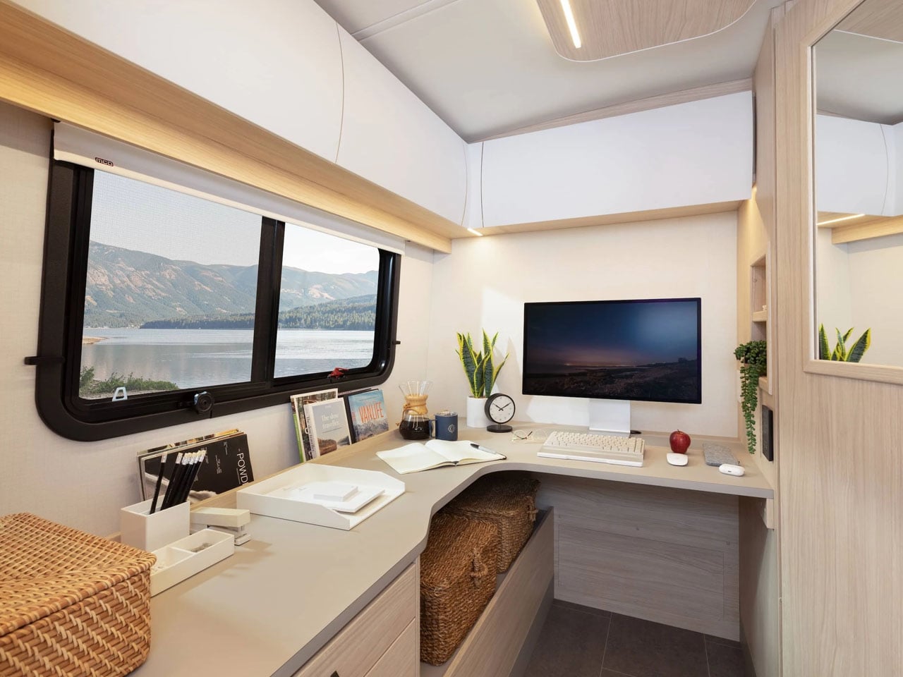
An interesting display of transforming furniture, a dry bathroom, and a living room-like home theater setup, the Wonder FX comprises a floor plan that adapts to your needs. At the back of the motorhome is the nice L-shaped leather couch with a big awning-style window. A sizable TV can be mounted right in front of the sofa. Available for customization for clients, the Wonder FX comes with some premium color and material options that can be picked to personalize the interior. The option to transform the living area into a home office is my personal favorite choice on this motorhome. Desk or living area – the choice is yours!

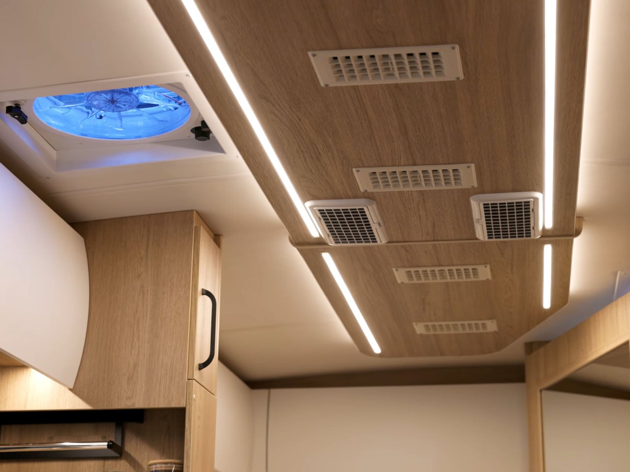
The entire length of the motor home alley is well lit by light strips, while the ducted air conditioning and heat furnace installed maintain the temperature inside the premium finished interior. The AC and the power: USB and USB-C outlets in the living room are powered by the battery and the onboard inverter (details later). The living room is finished with pull-out drawers in the sofa, overhead curved storage space, also running in an L-shape, and a lagoon table which you can use for casual work, if you’re not going to work excessively when on the road.

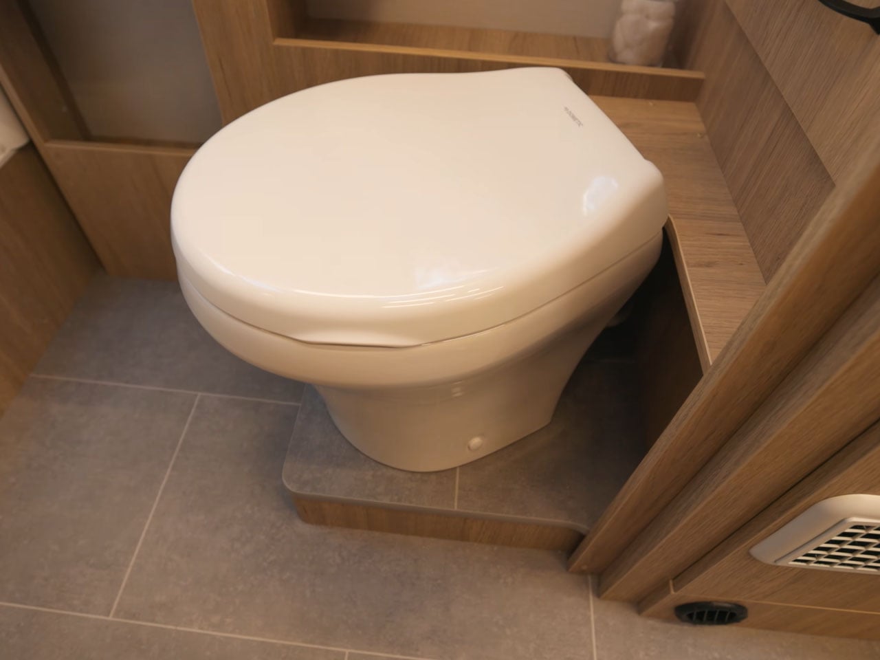
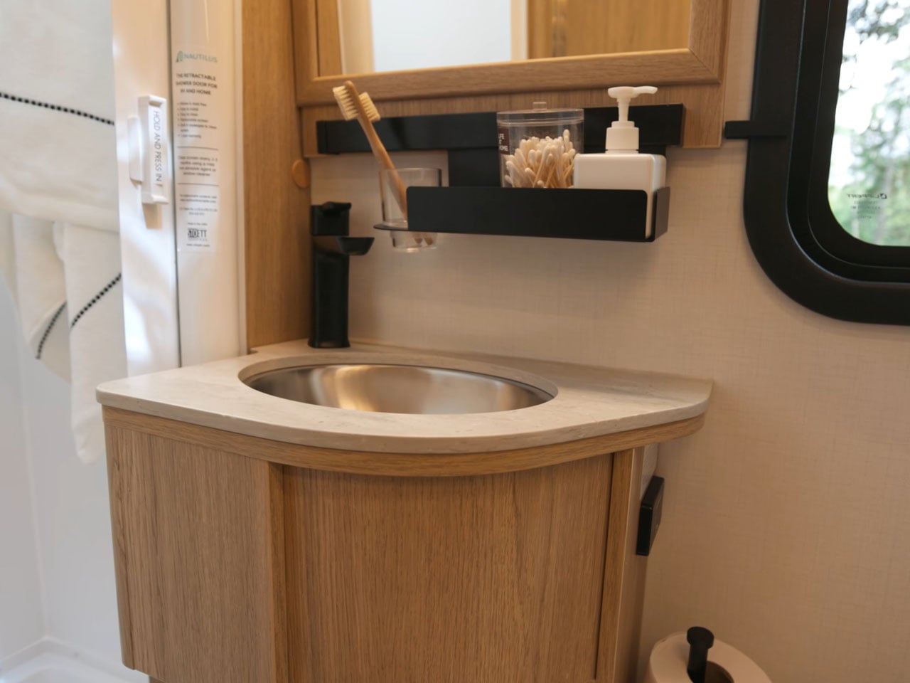
The bathroom adjacent to the living room has a unique bendable door, opening up the space inside for a standing shower, sink, and a toilet. Upfront, just behind the entry door, is the galley area complete with nice deep drawers and cabinetry for storage, a two-burner induction cooktop, concrete countertop, stainless steel sink, and an exciting pull-out pantry. The fridge and microwave go on the opposite side of the kitchen prep area. When you have a group of people over, you get two additional lounge seats on the front alongside the fridge side of the galley, behind the driver. The two separate seats can also be used together as a chaise lounge or as a little dining space with a table in between.

The best part is reserved for last. At night, you can flat-fold these lounge seats and pull down the Murphy bed from the wall, and your walk-around bedroom with a 65-inch-wide bed is ready. Wonder FX is based on a Ford Transit Cutaway Chassis. It features an on-demand water heater and runs on a 270-Ah lithium battery. You also have a 3,000-W inverter and a 4-kW generator to keep the remotely controlled lighting powered up at all times. Options for Starlink and a solar array are not included in the starting price of approximately $200,000.

The post 25-foot motorhome with flexible interior has private shower, murphy bed, and home office on the road first appeared on Yanko Design.

  •  

5 Gadgets Gen Z Actually Wants to Own Right Now

Something shifted. The generation that grew up with every song, show, and photo living inside a glass rectangle is now buying CD players, handheld consoles, and standalone cameras that do exactly one thing. It is not purely nostalgia driving this. It is the particular relief of owning something that does not send notifications, update itself overnight, or ask for your location. These are objects that simply work.

What connects these five is not a shared aesthetic or price point but a shared resistance. Each gives your hands something real to do, something that clicks, spins, or frames a shot without a screen mediating the exchange. Gen Z did not fall out of love with technology. They fell out of love with technology that treats their attention as the product. These five objects treat it as something worth protecting.

1. Syitren R400 Bluetooth CD Player

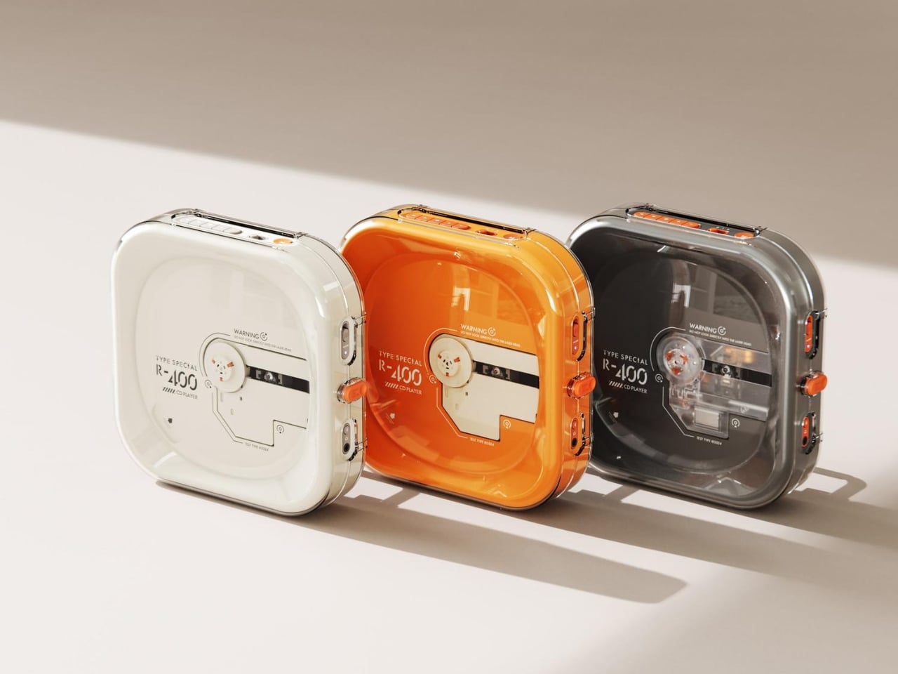
Portable CD players never disappeared, but they did stop trying. For years, the category was defined by bulky Sony boomboxes built around FM radio and cassette tapes as much as CDs. The R400, designed by ORGDOT for Syitren, is the first player in a long time that feels built for how people actually listen today. It is compact, Bluetooth 5.3-first, and designed to look as good on a desk or shelf as it does in your hand on a commute.

Under the shell, a custom Syitren pure CD core delivers a 70dB signal-to-noise ratio for clean, high-fidelity sound. Anti-vibration engineering keeps things skip-free while commuting or walking around. The shell is detachable and customizable, and a sunken charging compartment with a built-in wire groove keeps the cable from bending or fraying over time. Bluetooth or wired, car stereo or headphones, four-plus hours of continuous playback per charge, at a price that doesn’t make you choose between good design and good sound.

What we like

  • The detachable, customizable shell makes it something you can call your own, not just another piece of consumer electronics sitting on a desk.
  • Anti-vibration engineering means it is genuinely designed to be carried around, not just displayed.

What we dislike

  • Four hours of battery covers a workday comfortably but cuts short anything longer without access to a charge.
  • Sony has been quietly pulling back from portable CD players, meaning the R400 steps into a space with almost no competition to pressure it on price or performance.

2. Game Bub

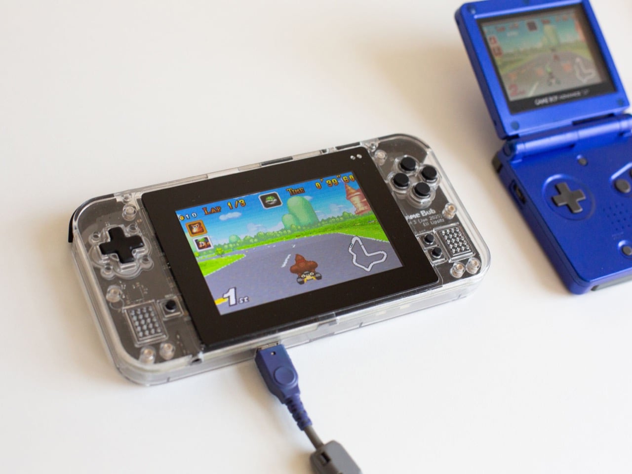
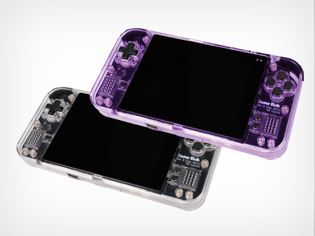
The Game Boy Advance’s design patents expired years ago, and most of what followed has been cheap emulation boxes wearing a familiar shape. Game Bub from Crowd Supply is different. It uses FPGA technology rather than software emulation, recreating the original Game Boy, Game Boy Color, and Game Boy Advance hardware at a circuit level with accuracy that emulators cannot match. The transparent shell, available in Purple and White, makes the whole thing look exactly as it should.

The horizontal GBA form factor is a deliberate choice in a market that keeps going vertical. Button placement feels natural; the shoulder buttons are where your fingers expect them, and dual one-watt stereo speakers handle classic soundtracks properly. USB-C charging, a headphone jack, a microSD slot for firmware updates, display output for big-screen play, Bluetooth Low Energy, 2.4GHz Wi-Fi, and a 3000mAh battery round out a device that earns the word ambitious.

What we like

  • FPGA accuracy means your cartridge collection plays exactly as it was designed to, not approximately as software emulation allows.
  • The horizontal form factor respects what made the GBA comfortable for long sessions, which most of the competition has quietly abandoned.

What we dislike

  • Hardware-level FPGA accuracy comes at a price point that locks out buyers who would otherwise be genuinely interested.
  • Open-source FPGA handhelds tend to have longer firmware update timelines, which requires patience from anyone buying early.

3. Clip&Go Radio

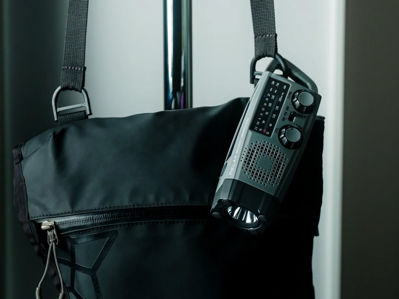
A radio that clips to your backpack and plays FM stations does not sound like a gadget Gen Z would want. The Clip&Go reframes the premise. It is compact enough to attach directly to your gear without thinking about it, built around the idea that the best emergency tool is one already useful before anything goes wrong. A built-in flashlight, hand crank, and solar panel mean it carries more utility than the dial on top suggests.

The physical radio format fits the same logic as the CD player and the handheld. It is a single-purpose device with no algorithm, no autoplay, and no recommendations. You tune a station, clip it on, and go. In a landscape where every device competes for your attention, a radio that does not know you exist feels quietly radical. At $60, it is also the most immediately ownable thing on this list.

Click Here to Buy Now: $60.00

What we like

  • The built-in hand crank and solar panel mean it works when other devices cannot, giving it a utility case that goes well beyond aesthetics.
  • The clip attachment means it genuinely travels with you rather than waiting in a bag pocket to be pulled out.

What we dislike

  • FM signal quality is location-dependent, making the listening experience inconsistent wherever coverage is thin.
  • At $60, it competes with Bluetooth speakers that do more on paper. The case for owning it rests on the single-purpose philosophy, not the spec sheet.

4. Camera (1)

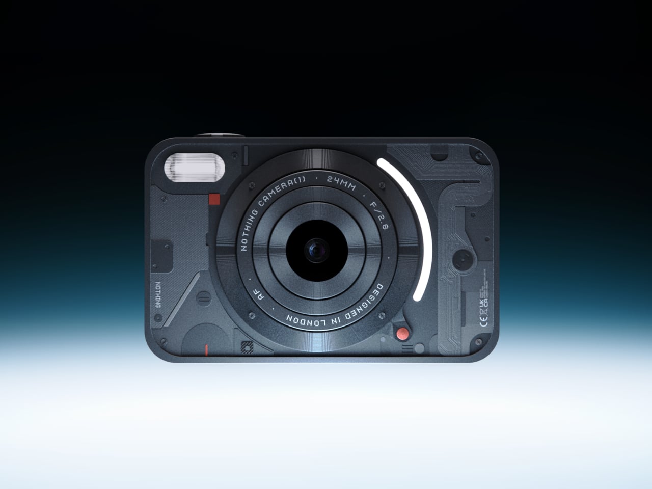
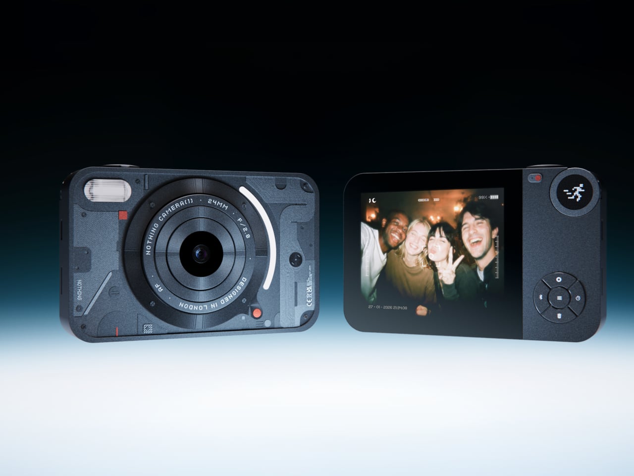
The impulse to pick up a standalone camera again is not about megapixels. It is about separating the act of taking a photograph from the act of being on your phone. Camera (1) is a concept by designer Rishikesh Puthukudy that imagines what a modern compact could feel like if built around physical controls rather than touchscreen menus. Metal body, softly rounded corners, every main control reachable without shifting your grip or glancing away from the scene you are trying to capture.

All the main controls live on one edge: a shutter, a circular mode dial with a dot-matrix glyph display showing simple icons for stills and video, and a D-pad your thumb can reach without looking down. A light strip around the lens pulses for the self-timer, confirms focus, and signals when recording is live, replacing multi-layer software navigation with immediate, readable feedback. The design language pulls from Nothing’s transparent, hardware-forward aesthetic and pushes it into something you would actually want to carry.

What we like

  • Every main control sits within reach of one thumb and index finger, keeping your eyes on the subject rather than hunting through a menu.
  • The light strip communicates camera state through peripheral vision, a smarter solution than burying status information inside a touchscreen.

What we dislike

  • Camera (1) is a concept with no confirmed manufacturer, production timeline, or pricing, which is a real limitation for anyone wanting to own one today.
  • The visual language is closely referential to Nothing’s established aesthetic, which may read as derivative to anyone already familiar with that design direction.

5. elrow miniphone

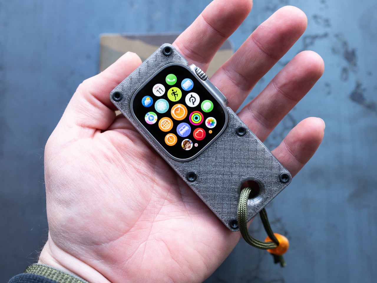
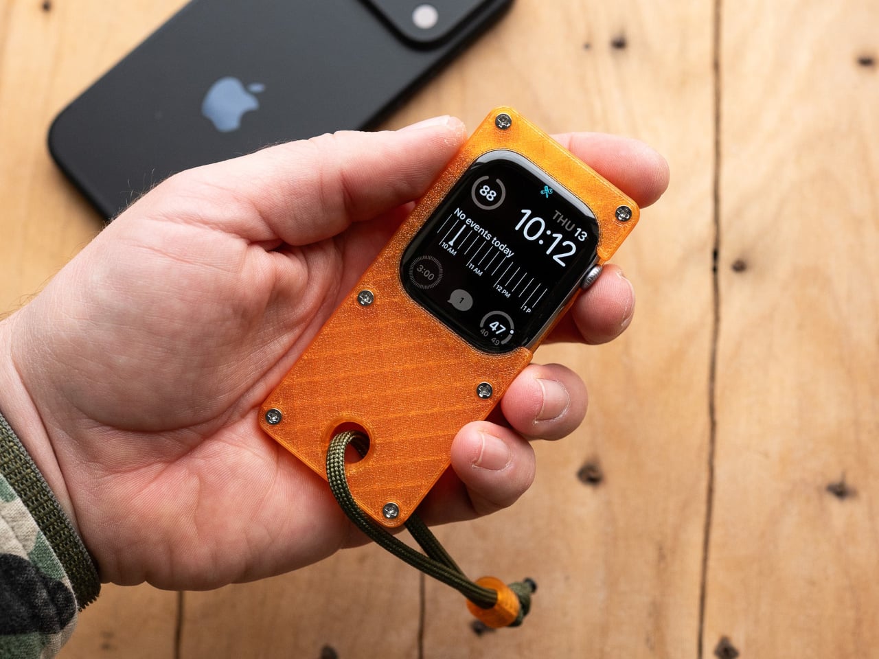
Full smartphones feel like overkill for a generation quietly walking back from maximalism. The Apple Watch on your wrist handles glances but stays awkward for anything more deliberate, and wearing both a smartwatch and an analog watch on the same arm is its own kind of compromise. The elrow miniphone is a 3D-printed case that turns an Apple Watch into a narrow, palm-sized device worn on a lanyard. The Standard fits the 46mm Series 10 and 11. The Ultra fits Apple Watch Ultra 1, 2, and 3.

Both stand around 95mm tall with textured translucent bodies and visible screws that do not attempt to hide how they were built. The back stays open so you can charge without disassembling the case. What elrow industries built is less a gadget and more a posture, a way to carry connectivity without wearing it on your wrist, freeing that space for the mechanical or analog watch you actually want to wear while keeping notifications, Apple Pay, and quick replies within reach.

What we like

  • The open back lets you charge without disassembly, removing the most frustrating everyday friction of any case.
  • Wearing connectivity on a lanyard rather than your wrist opens the door to the analog watch you have been quietly sidelining.

What we dislike

  • As a 3D-printed case, it depends entirely on which Apple Watch model you already own and is not a standalone device.
  • A lanyard-worn device requires real behavioral change to make useful day-to-day rather than just conceptually interesting.

Ownership Is the Point

What this list describes is not a generation running from technology. It is a generation learning to be selective about which technology gets to run on them. A CD player that skips the algorithm. A handheld that plays cartridges at hardware level. A camera built around a shutter click. A lanyard device that frees your wrist. A radio that does not know your name. Five objects. Five things that simply work.

The broader shift is less about any individual product and more about what owning something actually means. Streaming everything is convenient right up until nothing feels like yours. A CD on a shelf, a cartridge in a slot, a photo taken with a camera you held in your hand: these are forms of possession the subscription model quietly erased. Gen Z is taking them back, one physical object at a time.

The post 5 Gadgets Gen Z Actually Wants to Own Right Now first appeared on Yanko Design.

  •  

The Selfie Camera on Your Phone Has Always Been in the Wrong Place

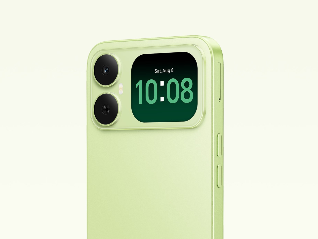
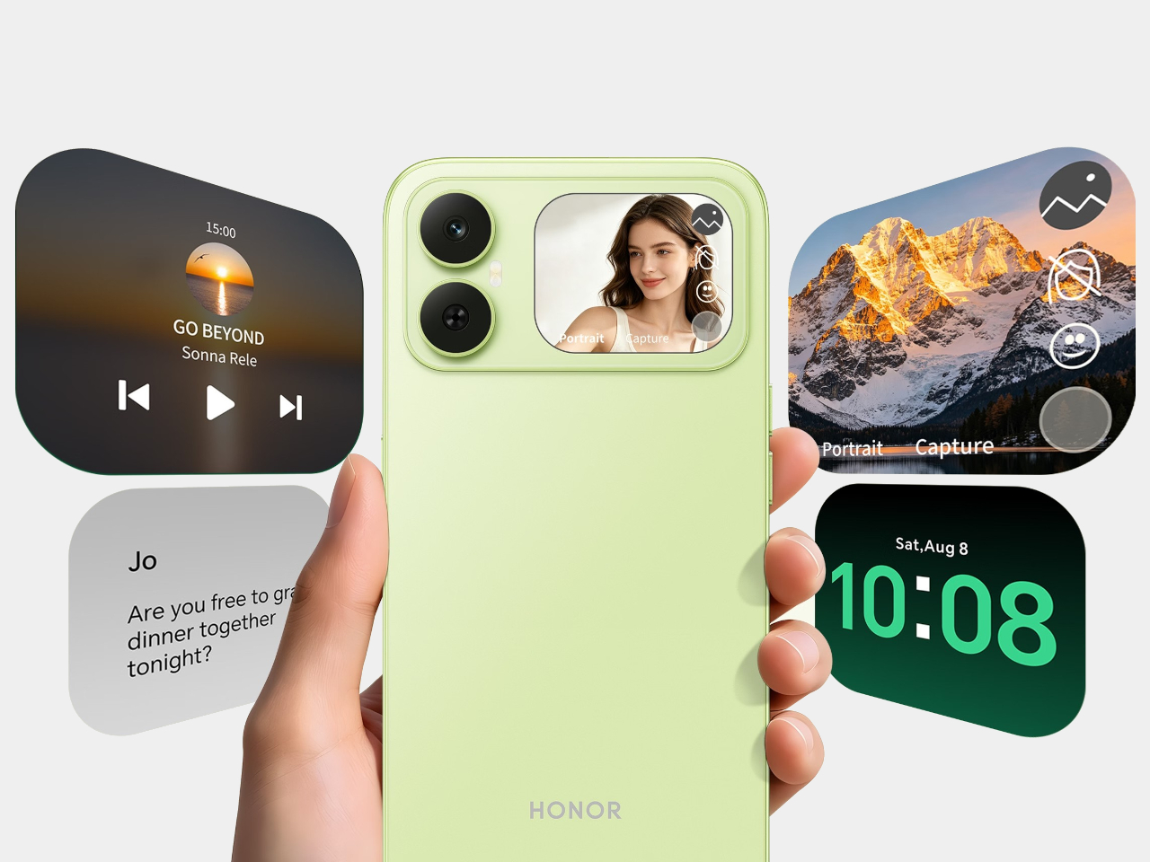
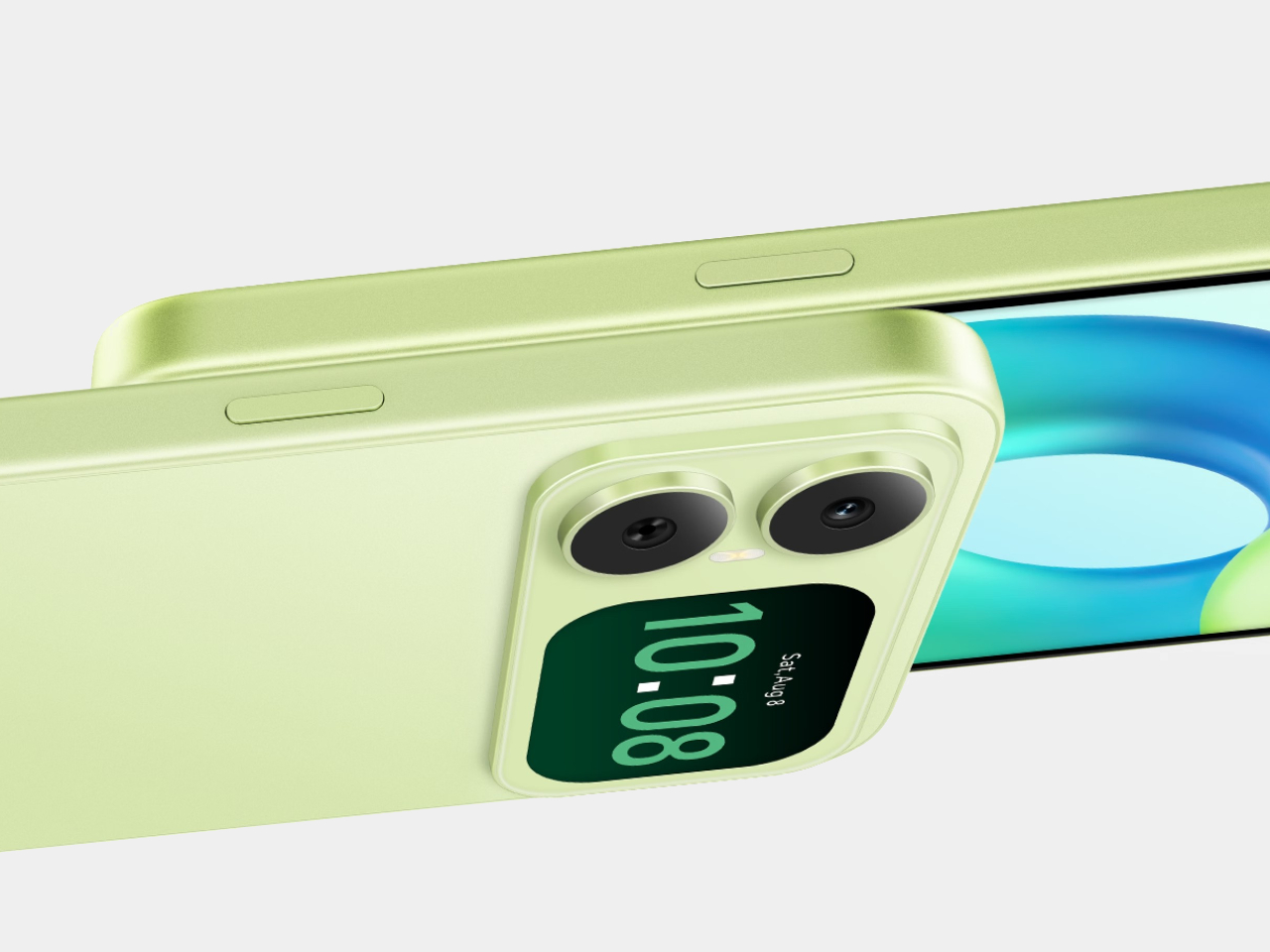
Most budget phones have one screen you stare at and a back you think about. The Honor X5d s makes that back worth a second look by placing a 2.01-inch touchscreen next to its rear camera. It shows the time and alerts, handles music, and helps you take selfies with the better camera. That’s a useful design trick for an inexpensive phone.

The camera island looks like it was built around that display, rather than having a screen tacked on afterward. Two dark circles sit beside it, although Honor lists only one rear camera. Forest Green makes the island pop against a pale back, while Midnight Black keeps things subdued. Either way, the phone’s most interesting feature is visible before you even wake it.

Designer: Honor

That rear screen makes sense when you’re trying to get everyone into a photo. Instead of extending your arm, guessing at the framing, and discovering that someone’s head is missing, you can see the shot while using the 50-megapixel rear camera. A tap on the back takes the picture. There’s also a 5-megapixel front camera, but this arrangement gives selfies another option.

Of course, a phone can’t spend all day posing for pictures. Leave the X5d s face down on a desk, and its little window can still show the time or a call alert. Music controls live there too, so skipping a song doesn’t require turning the whole device over. It’s a small convenience, but those are often the ones you keep using.

On the other side, there’s a 6.78-inch LCD for more than a glance. Its size makes room for videos, messages, and the photos you took, although the 1,576×720 resolution isn’t particularly sharp for such a large panel. The rear display doesn’t fix that limitation. It simply gives quick tasks their own place instead of asking the bigger screen to do everything.

There’s a 6,000mAh battery to keep both screens running, though the phone’s 15W wired charging might test your patience when it finally needs a refill. Honor also provides 64GB of storage and a three-card slot, letting you add a microSD card without sacrificing either SIM. That’s handy if you keep your photos and music on the phone rather than in the cloud.

Inside, the Unisoc T610 processor and 4GB of RAM tell a more familiar budget-phone story. The side-mounted fingerprint reader is convenient, but there’s nothing particularly exotic about the rest of the hardware. In South Africa, the 4GB/64GB version costs R2,499 (about $150), which puts the extra screen in reach of people who aren’t shopping for a flagship just to get a conversation-starting feature.

That display won’t replace your phone’s main screen, nor will it make the X5d s a better choice for demanding games. But it changes the small interactions that fill a day: a glance at a call, a tap to skip a song, a preview before taking a selfie. At this price, giving the back something useful to do feels refreshing.

The post The Selfie Camera on Your Phone Has Always Been in the Wrong Place first appeared on Yanko Design.
  •  

Nike Actually Made Sneakers That Look Like Grandma’s Couch

I lived in an era and a culture where our couches’ designs were pretty maximalist and contained a gazillion details. So when I see similar designs now being touted as “vintage”, I feel a little old but I’m also not surprised. All these floral and brocade prints seem to be a favorite now but I never expected Nike to actually join this party.

The upcoming new Dunk Lows will be sporting the Golden Hops Brocade design so it will fit right in with your grandma’s couch, a sentence I never thought I would have to write. This line is normally known for their minimalist and clear cut designs but they probably thought it’s about time to bring something different to the table, or more specifically, to your feet.

Designer: Nike

Unlike your usual sneakers from the Dunk Low line with its leather-heavy build, this pair’s entire upper is cut from velvet and features an elaborate floral/brocade pattern. It runs across the toe box, overlays, side panels, and even the heel. This makes your sneakers look like it was upholstered but still with the familiar Dunk Low silhouette.

The colors help sell the whole idea. Golden Hops and Velvet Brown give the floral pattern that warm, lived-in look, while the Pale Ivory details stop the shoes from disappearing into a sea of brown. I can imagine them sitting next to a tasseled lamp and looking perfectly at home, which is probably not a compliment I would give most sneakers. Then again, that is exactly why these caught my attention. They are leaning into the comparison instead of trying to make velvet look sporty.

Even the Swooshes get in on the fun. They have a puffier, stitched appearance rather than lying flat against the upper, with brown piping outlining their shape. The canvas tongue and light-colored laces offer a little visual break from all the flowers. Those details matter because an all-over print can become overwhelming pretty quickly. Here, your eye has somewhere to rest before wandering back to the pattern and finding another tiny flourish you missed the first time.

What would you wear with shoes that look ready to claim a spot in the living room? I would start simple. Dark jeans, relaxed brown pants, or a plain sweater would give them room to be the interesting part of the outfit. You do not need to dress like the entire couch set. In fact, the less competition these sneakers have, the easier it is to appreciate how unusual they are. They could also be a fun way to make an otherwise ordinary fall outfit feel more personal.

That is probably their biggest benefit. If you already own a reliable pair of everyday Dunks, the Golden Hops Brocade is not here to replace them. It is here for the days when your usual shoes feel a little too predictable. The familiar low-top shape keeps the look from feeling completely unfamiliar, while the velvet and floral print give people something to talk about. Whether the first comment you get is a compliment or a couch joke, at least your sneakers will have started a conversation.

There is a practical side to consider, though. Velvet is a different proposition from the leather you might normally expect on a Dunk Low, so I would not treat this as my carefree, wear-it-in-any-weather pair. The texture is part of the appeal, and I would want to keep it looking good. These make more sense as a statement shoe you bring out when the forecast is friendly, not the pair you grab before walking through a downpour.

The shoes are reportedly priced at $125 and expected to arrive in Fall/Winter 2026, although an exact release date has not been announced. If you are looking for a sneaker that will quietly match everything in your closet, this probably is not it. But if you have ever looked at an old floral couch and thought, “You know what? That pattern deserves another chance,” Nike might have made the shoe for you.

The post Nike Actually Made Sneakers That Look Like Grandma’s Couch first appeared on Yanko Design.
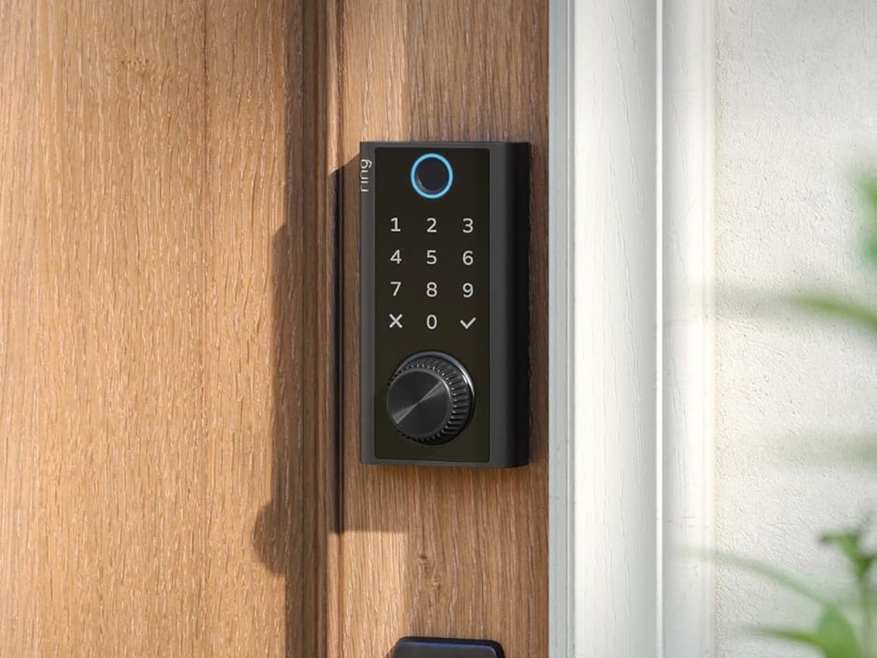
  •  

Flat-Pack Furniture That Actually Survives Your Next Move

Flat-pack furniture is easy to appreciate on the day it arrives. It fits through the door, and you can usually put it together without much help. The harder test comes later: can it survive a move, come apart cleanly, or be repaired when something goes wrong? FLAT/FORM, a collection by designer Satoshi Itasaka of h220430, is built around those questions. Its pieces use bolts and nuts so they can be assembled, disassembled, repaired, and transported again.

That might sound like a modest ambition, but it changes how I look at the furniture. A dining chair is rarely a one-time purchase for a single room. It may follow you through different apartments, sit beside several tables, and get carried up more stairs than you care to count. FLAT/FORM treats that ongoing life as part of the design brief, rather than leaving it to chance after the first assembly.

Designer: h220430

The material gives the project its character. FLAT/FORM uses 15-millimeter-thick veneer panels made from Japanese cedar trees more than 100 years old, with timber supplied by Miyazaki-based forestry company GROWTHRING. A dining chair and a low table are among the pieces in the collection. Both start from flat panels, a straightforward idea that lets the wood grain do some of the visual work while the construction remains easy to understand.

I like that balance. The collection does not try to disguise how it is made. Its flat planes and visible connections make assembly feel like a considered feature, not an awkward step between opening a box and enjoying the result. That distinction matters because a piece can be visually quiet without feeling anonymous. Here, the simple construction gives the furniture a recognizable point of view, while leaving room for the cedar to be the thing you notice first.

The choice of older cedar also invites a little care in how we talk about the project. Wood with a compelling history does not automatically make a product sustainable, and a furniture collection cannot solve every problem associated with consumption. What FLAT/FORM can offer is a more specific proposition: furniture intended to come apart, travel, and be repaired instead of being treated as finished when its first arrangement stops working. That seems more useful to me than a sweeping environmental promise.

There is a practical kindness to that approach. Moving is already expensive and tiring; furniture should not add a puzzle you are afraid to solve twice. Bolts and nuts are familiar hardware, and the collection’s assembly system is intended to make disassembly possible. None of that guarantees that every move will be effortless. It does mean the designer has acknowledged that people relocate and rearrange their lives, and that a chair ought to have some chance of keeping up.

I would still want to sit in the dining chair before making any grand claims about it. Photographs can tell you plenty about proportion and material, but not how a seat feels through a long dinner. Nor does an elegant assembly concept tell you what the collection costs or how its surfaces will age in a busy home. Those are fair questions for any furniture meant to last, particularly furniture whose appeal rests partly on the idea of keeping it around.

Even with those questions open, FLAT/FORM feels refreshing because it gives flat-pack design a different priority. Convenience at delivery is helpful, but convenience at every stage afterward may be the better measure. A table that can leave one home and settle into another without becoming a burden has a value that is easy to overlook when shopping by appearance alone. Itasaka’s collection makes that overlooked part of ownership visible.

Perhaps that is the quietest, strongest idea here: furniture should be allowed to have a future. FLAT/FORM does not need to look complicated to make that point. It uses flat cedar panels and ordinary fasteners to ask a sensible question of a familiar category: what if getting a piece into your home were only the beginning of a good design? That is a question worth asking before the next box arrives at the door.

The post Flat-Pack Furniture That Actually Survives Your Next Move first appeared on Yanko Design.
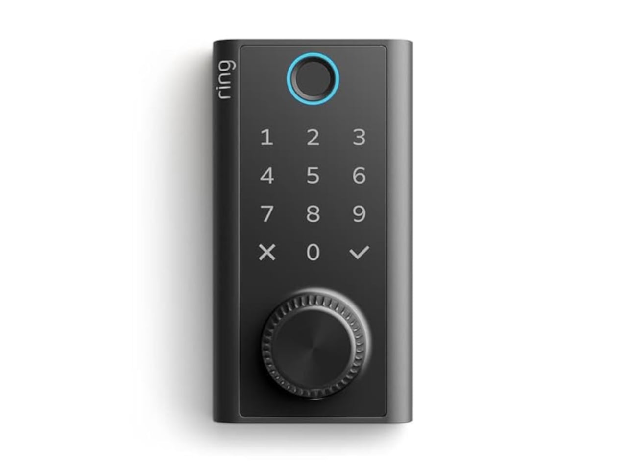
  •  
❌