❌

Vue lecture

This Electric Superbike Wears Its Battery Like a Honeycomb

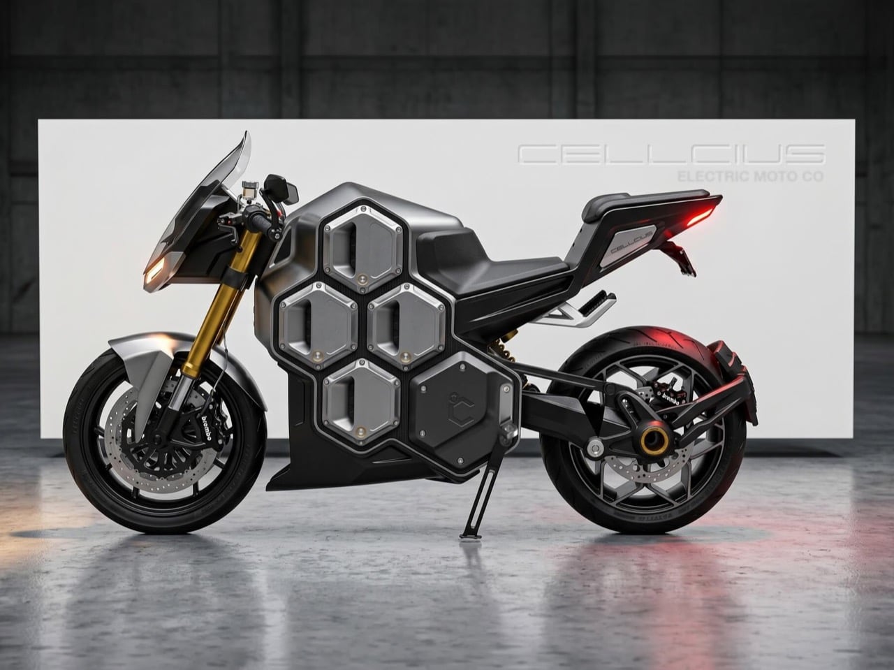
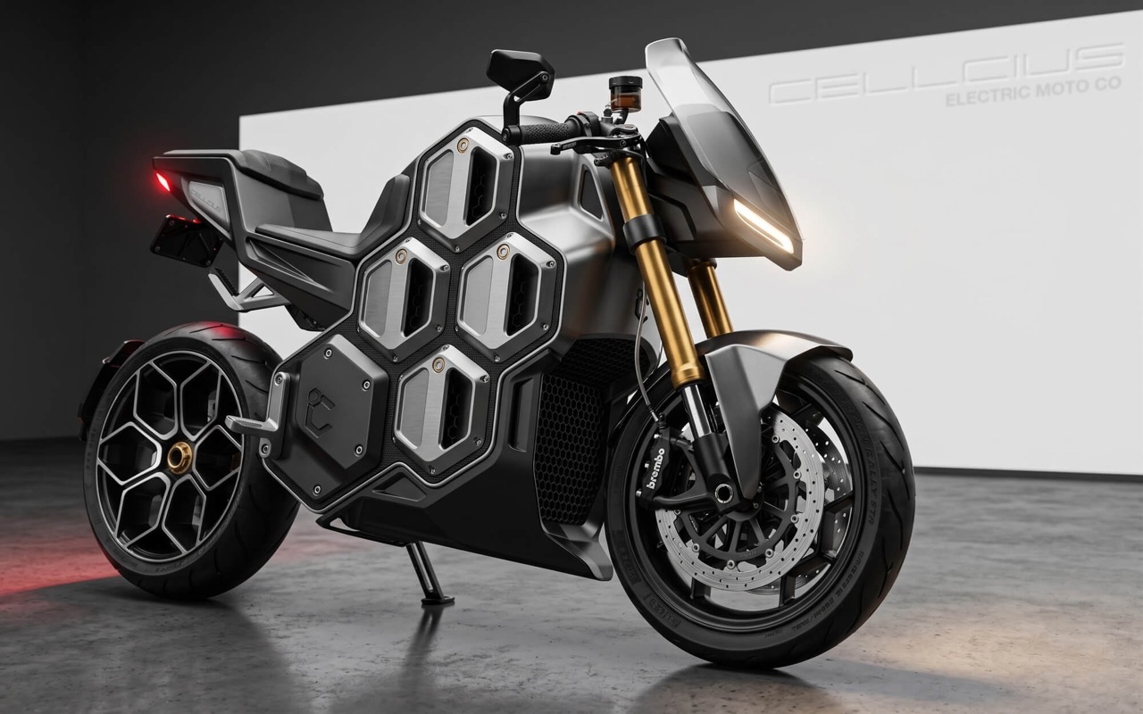
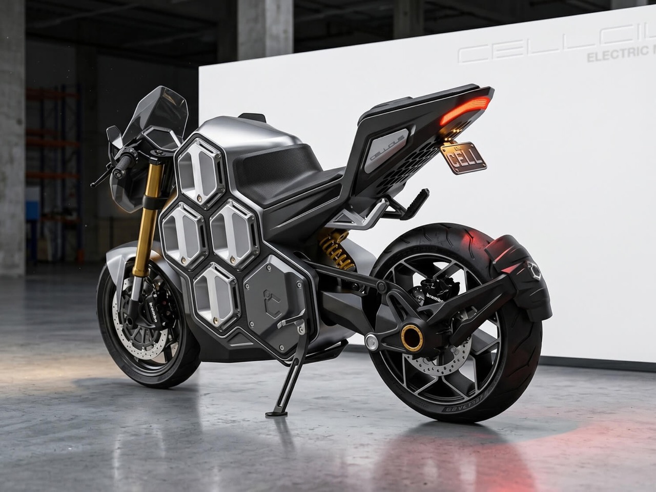
Bees settled on the hexagon ages ago, and nobody has topped it since. The shape packs the most storage into the least material, which is why it turns up in honeycomb aircraft panels and in the way round battery cells get stacked together. Brisbane’s Clandestine Design Group took the hint and built an entire electric superbike around it. The Cellcius C-01 is a hypersport concept whose battery is split into eight hexagonal cells that you can pull out and swap. Those cells line the bike’s flanks like honeycomb, and the result is one of the more striking EV silhouettes I’ve seen in a while.

Neil Davidson, who founded Clandestine in 2014 after 14 years as Creative Director at CMD, has loved motorcycles since he was a three-year-old farm kid on a dirt bike. That obsession shows. The C-01 won a 2026 Australian Good Design Award in the Concept Design category. It is still a concept, so there is no price tag or showroom date yet. The studio’s pitch is that electric bikes force a choice between heavy track machines and short-range commuters, and the Hex-Core battery system lets one bike be both. Load two cells for the commute or all eight for the track, and the same machine changes its personality to match.

Designer: Clandestine Design Group

Two Cells for the Commute, Eight for the Track

Each Hex-Core cell holds 3 kWh, so the bike carries anywhere from 6 kWh to 24 kWh depending on how many you load. By the studio’s numbers, the weight swings from 353 lb (160 kg) as a commuter to 485 lb (220 kg) as a track bike. Do the math and each cell works out to roughly 22 lb (10 kg), a weight you could carry up a flight of stairs. Two cells also fit Australia’s Learner Approved Motorcycle Scheme (LAMS), a rulebook that keeps new riders on tamer bikes, according to the studio. I can’t think of another superbike that can shrink for a learner permit and then bulk up for a lap day.

Kawasaki’s Ninja e-1 launched in the US at $7,599, weighs 309 lb (140 kg), and carries two removable 1.5 kWh packs that Kawasaki rates at 41 miles in Road mode. Zero’s 2026 SR/F, the usual benchmark for a serious electric streetfighter, packs 17.3 kWh into a body listed at about 500 lb (227 kg). Fully loaded, the C-01 claims 24 kWh at 485 lb, beating the Zero on both counts. That makes the Ninja and the SR/F look like the two ends of a spectrum the C-01 wants to cover with one chassis. Kawasaki’s two-pack setup proves removable batteries work for city riders, and the C-01 keeps adding packs until it hits superbike territory.

A Honeycomb You Can Carry Home

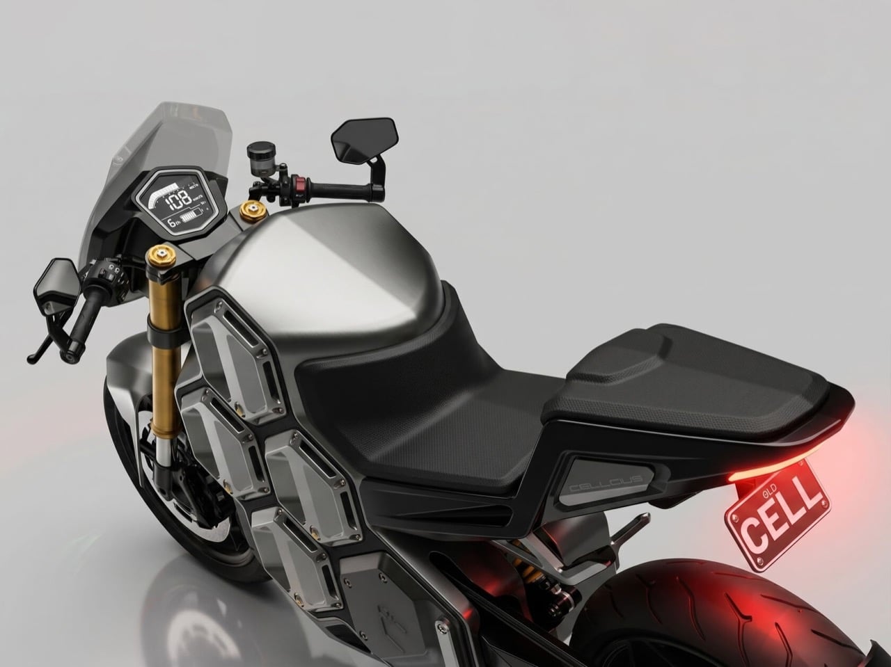
A wall-mounted smart dock charges several cells at once, so a fresh set is always waiting for a swap, a trick the studio calls “zero-minute” hot-swapping. Apartment dwellers get an ergonomic backpack that carries cells indoors for charging at a regular wall outlet. Riders who would rather skip the hauling can plug into a flush CCS port on top of the tank, which hooks into standard street-side fast chargers. Empty bays double as mounts for hex-shaped duffel bags, which keeps luggage inside the silhouette instead of hanging panniers off it. That setup goes straight at the studio’s stated target, urban apartment dwellers who have nowhere to plug in.

Pulled out of the bike, a cell turns into a portable power station with AC and USB outlets, according to the studio. That is the power tool battery logic every contractor already lives with, where one pack format runs a drill, a saw, and a work light. DeWalt and Milwaukee built huge product families on that idea, and the C-01 wants a superbike in the club. The studio also sees room for an aftermarket of Hex-Core accessories, from luggage to those power stations. A 5G app handles keyless RFID or PIN entry, over-the-air updates, and firmware tuning based on payload.

Shaft Drive, a Venturi Tail, and the Case for Swappable Superbikes

High-pressure ram intakes feed air in at speed while a low-pressure exhaust in the tail pulls it back out, a Venturi effect the studio says passively extracts motor heat without heavy fans. Power reaches the rear wheel through a fully enclosed carbon shaft drive, which the studio calls silent and maintenance-free. BMW has been putting shafts on motorcycles since the R32 in 1923, so the idea has real pedigree. Brembo brakes and fully adjustable Öhlins suspension round out a spec sheet that reads like a track-day wish list. My one wish is for the angular flyscreen to echo the hexagons a little more, since right now it reads like it came from a different bike.

Australia’s Good Design Awards date to 1958, and the Concept Design category, new since 2025, judges early-stage ideas on form, function, feasibility, and safety. A win there rewards the thinking, and the thinking here is easy to admire. My favorite part is that the battery, usually the thing EV designers hide under a tank cover, becomes the main visual feature. Electric bikes have spent years arguing over range versus weight, and the C-01 answers by letting the rider settle it each morning. Bees figured out the hexagon without a design degree, and a Brisbane studio just reminded the motorcycle world how well it stacks.

The post This Electric Superbike Wears Its Battery Like a Honeycomb first appeared on Yanko Design.

  •  

DRIFT’s Glass Sculpture Traces Wind Without Moving

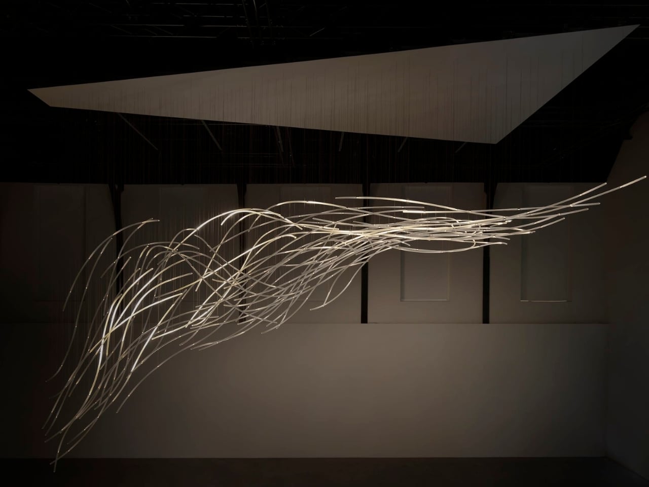
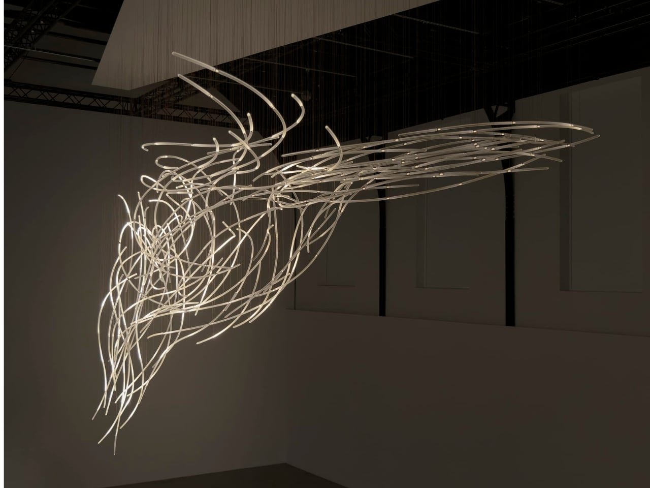
Wind usually needs an accomplice to become visible: a bending tree, a billowing curtain, a plastic bag having a much more cinematic afternoon than it deserves. Air itself gives us very little to look at. Aeolus, a new installation by Amsterdam-based studio DRIFT, takes on that perceptual problem with hundreds of suspended glass rods and light. It gives an invisible force a form you can actually follow.

The studio’s founders, Lonneke Gordijn and Ralph Nauta, have made Aeolus an interactive artwork rather than a conventional light fixture. Presented with Carpenters at London’s Ladbroke Hall from October 13 through 25, 2026, the installation takes its name from the Greek god of the winds. Its shape, though, comes from a specific earthly source: the architecture of the room containing it.

Designer: DRIFT

DRIFT begins with a digital reading of the surrounding architecture, then translates that space into a virtual environment where air can flow. The studio selects one moment from that simulated movement and gives it physical form in glass. That distinction matters. Aeolus isn’t showing a live reading of whatever breeze happens to be passing through the gallery. Its structure holds a chosen instant, while the lighting introduces a separate layer of change.

I like that the room has a say in the result. A sculpture built from its setting feels more considered than an impressive object dropped into an available corner. DRIFT says each installation is generated by its host architecture, so the curves carry information about a particular place. The building becomes part of the design process, even if visitors never see the digital model behind it.

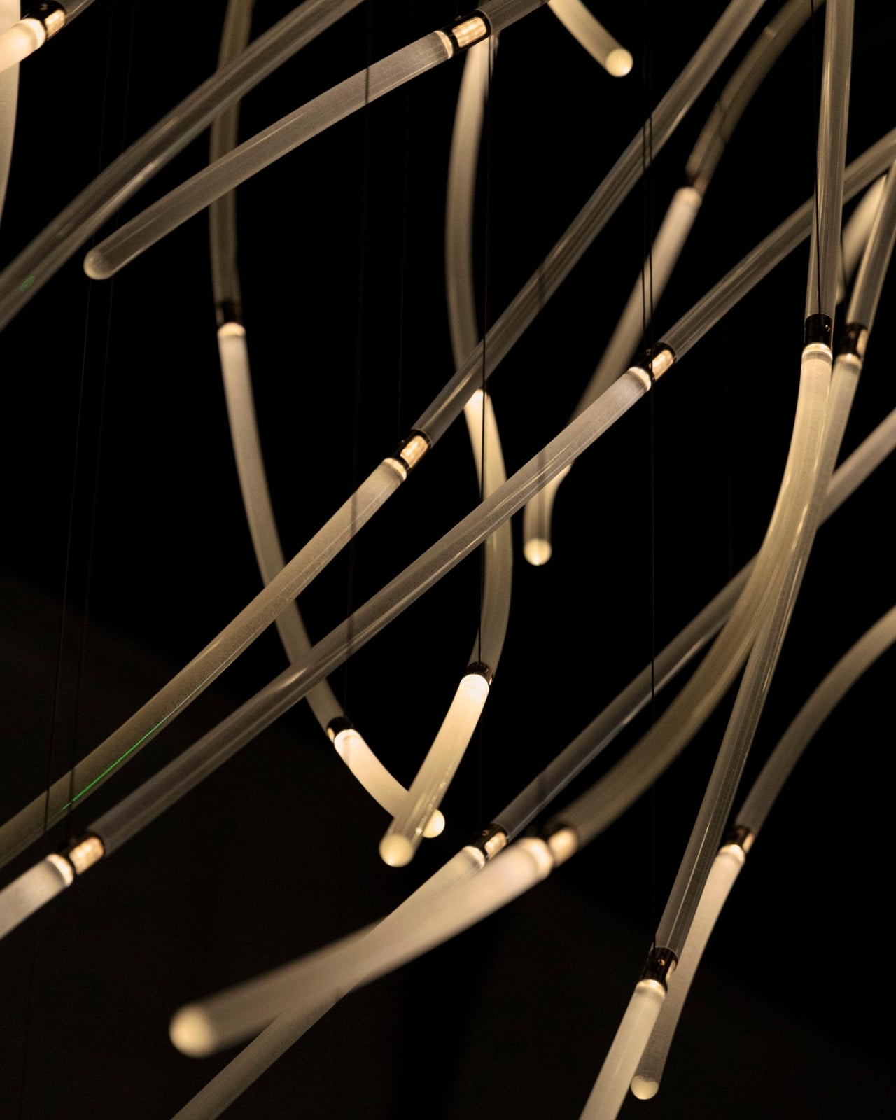
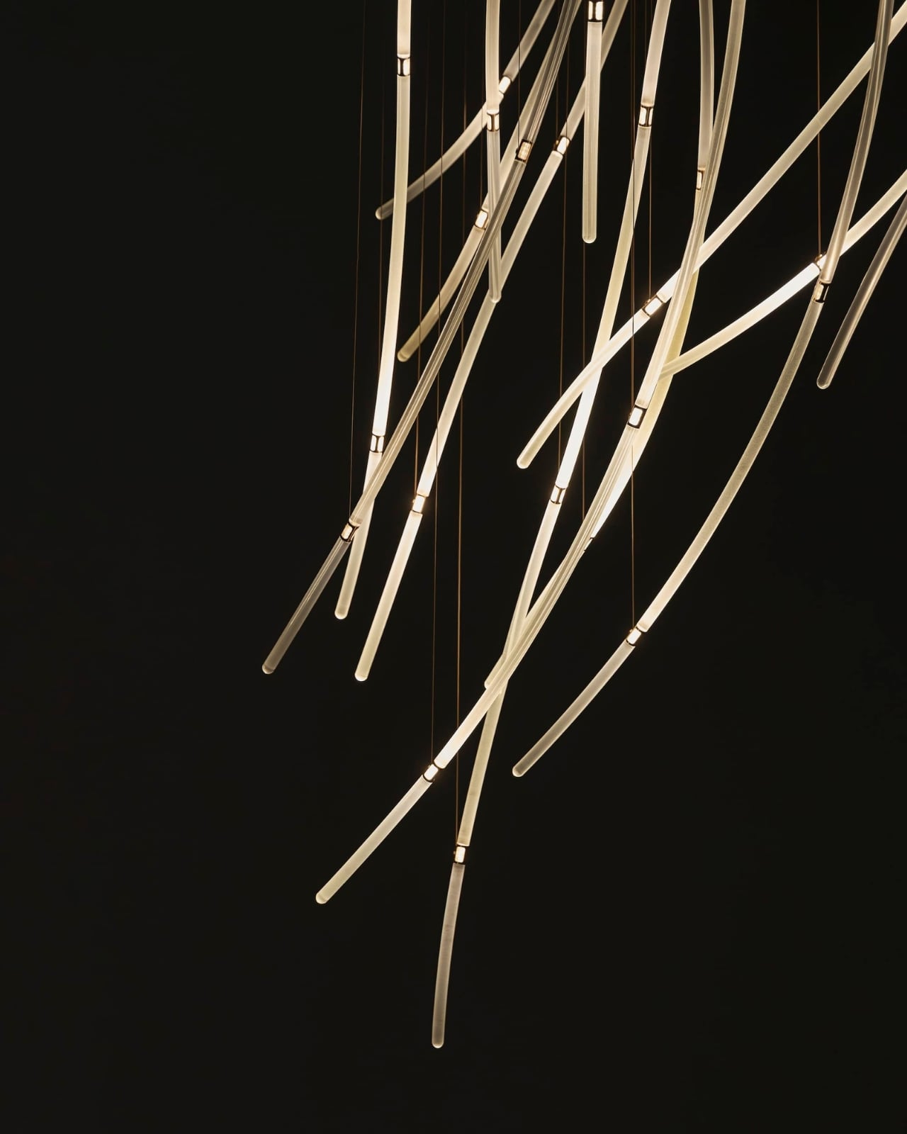
In Benjamin Baccarani’s photographs, the rods gather into a long, sweeping formation, dipping at one end and stretching outward at the other. Fine suspension lines lead up to a broad overhead panel. The material list is more technical than the airy appearance suggests: borosilicate glass rods, stainless steel nodes, custom LEDs, and microcoax cables. I appreciate that contrast. Making an object look almost weightless still requires hardware, connections, and a deliberate relationship with gravity.

The glass itself stays still. According to Carpenters, small lights inside the rods change their rhythm and intensity in response to visitors moving through the space. Waves of illumination create the impression of motion without the sculpture physically shifting. That’s the cleverest choice here. The designers don’t need to swing a roomful of glass around to suggest wind; they let your eyes follow light across a fixed structure, doing much of the perceptual work.

The interaction also gives visitors a meaningful role without turning them into operators. Walking changes the work’s lighting, a relationship that seems appropriately direct for an installation about air and movement. I’m drawn to technology that makes its presence felt through an understandable response. Here, the interesting question is how your movement alters what you see, rather than how many technical features the system contains.

DRIFT frames Aeolus as an invitation to reconsider our relationship with nature. I’d treat that as a starting point for looking, not a transformation any artwork can promise. The more convincing achievement is smaller and more specific: making airflow legible through material and light. You don’t need to leave with a new environmental philosophy to appreciate the way a simulated path has become a collection of precise, luminous curves.

For me, the appeal sits in that modest shift in attention. The room stops being an empty container for an artwork and starts to look like a place shaped by movement. Aeolus makes that movement imaginable while keeping the glass suspended in a single instant. A visitor supplies motion, the lights answer, and the fixed structure takes on another rhythm. The glass gives you time to study a shape that moving air would never hold still for inspection.

The post DRIFT’s Glass Sculpture Traces Wind Without Moving first appeared on Yanko Design.

  •  

Huawei Watch D3 Review: A Game Changer for On-Wrist Blood Pressure Monitoring

PROS:


  • Cuff-style blood pressure reading with 24-hour ambulatory monitoring

  • Quiet measurement that didn’t disturb my sleep

  • Streamlined ensign and comfortable everyday fit

  • Good battery life

  • Comprehensive health and fitness tracking alongside everyday smartwatch features

CONS:


  • Limited third-party app selection

  • Not suitable for swimming or showering

RATINGS:

AESTHETICS
ERGONOMICS
PERFORMANCE
SUSTAINABILITY / REPAIRABILITY
VALUE FOR MONEY

EDITOR'S QUOTE:

The Huawei Watch D3 pairs quiet blood pressure monitoring with everyday comfort and style.

Hypertension, or high blood pressure, is a major cause of premature death worldwide and increases the risk of heart disease, stroke, and kidney damage. Nearly half of U.S. adults have it, according to the CDC. Yet it often causes no noticeable symptoms, so feeling fine does not necessarily mean your blood pressure is where it should be.

The Huawei Watch D3 puts blood pressure measurement on your wrist, using an inflatable airbag built into the strap and offering scheduled readings throughout the day and night. That sounds like a recipe for a bulky, rather clinical accessory, but the watch I received looks nothing of the sort. More importantly, it is comfortable enough that I was happy to keep wearing it, including overnight. Huawei has squeezed some unusual hardware into a familiar package, and after living with it, I am impressed by how little fuss it adds to my day.

Designer: Huawei

Aesthetics
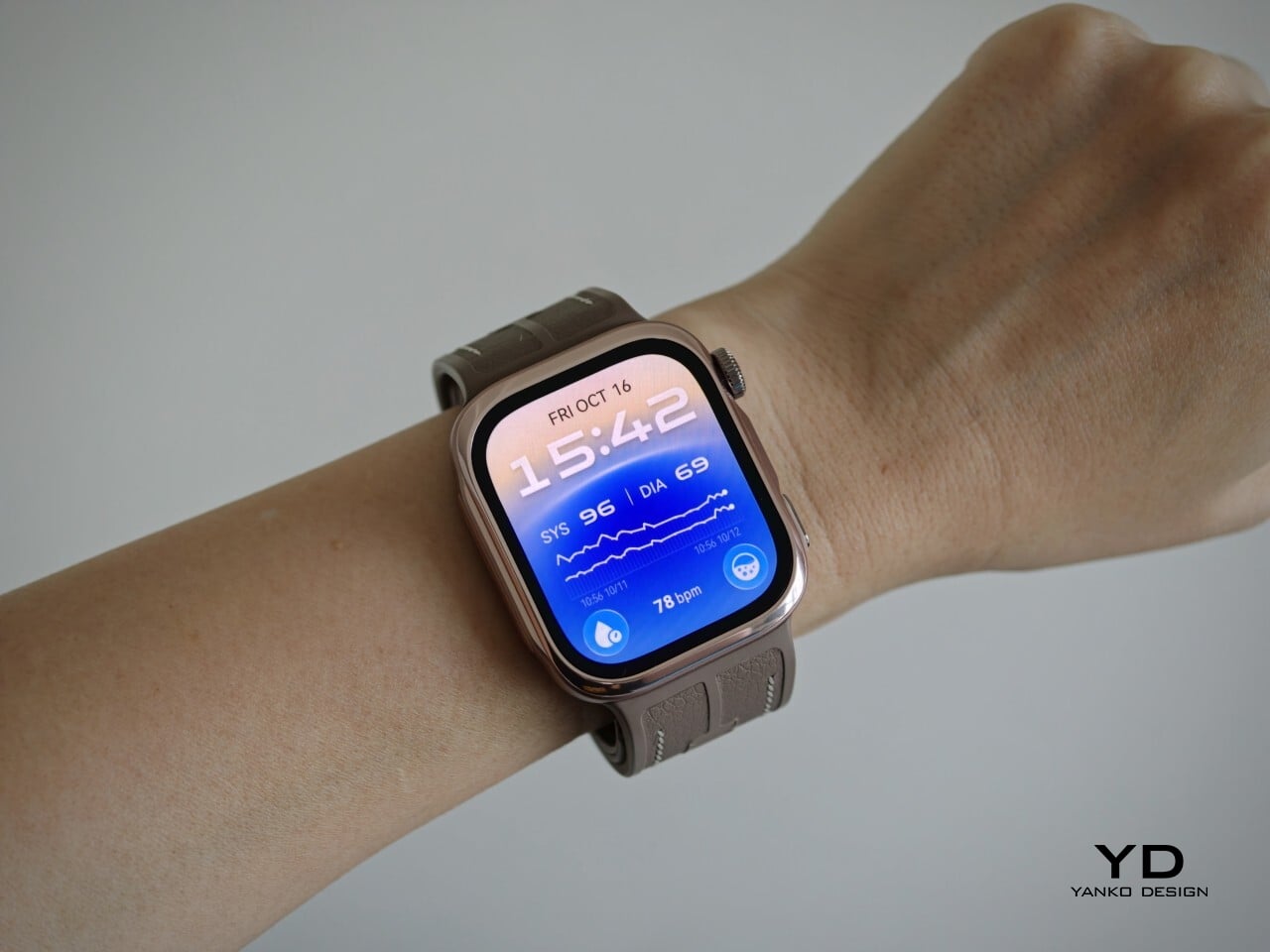
Huawei has made the Watch D3 surprisingly discreet, and that is one of its biggest design strengths. This is a health-focused smartwatch with more going on under the surface than most, yet it does not look overly technical or awkwardly bulky. Instead, it comes across as clean, polished, and easy to wear, which helps it feel like a proper everyday smartwatch rather than a specialist device.

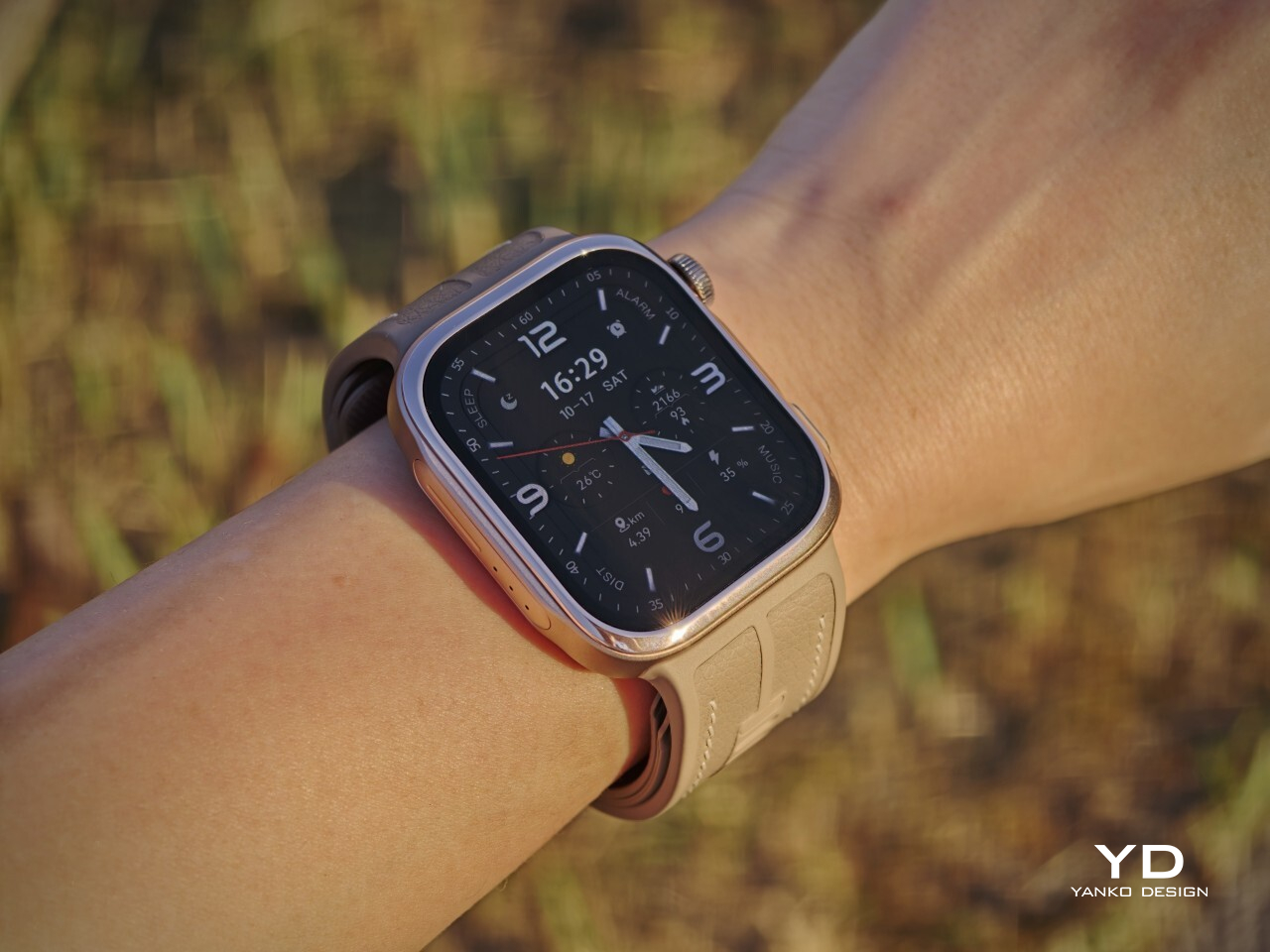
Visually, it sits somewhere between the clean familiarity of an Apple Watch and the more assertive presence of an Apple Watch Ultra, giving it a look that feels both familiar and slightly more rugged. Huawei offers the Watch D3 in three color options: White, Black, and Mocha Gold. I received the Mocha Gold version, and it gives the watch a warmer, slightly more elevated look than the other finishes. The rectangular-shaped case is paired with a color-matched fluoroelastomer strap, which also houses the airbag used for blood pressure measurement.

Ergonomics
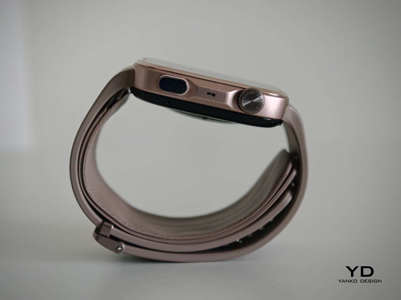
For a smartwatch with a tiny airbag tucked into its strap, the Watch D3 is surprisingly easy to wear. On paper, it is not a small device at 1.83 x 1.61 x 0.44 inches, but it never feels ungainly or overengineered once it is actually on your wrist. The 1.92-inch rectangular display fits well and doesn’t overwhelm the wrist, keeping the overall look streamlined. Huawei has also trimmed the thickness down from 0.52 inches on the Watch D2 to 0.44 inches here, and that slimming makes a real difference. The D3 feels less like a specialist gadget and more like a smartwatch you can throw on in the morning without a second thought.

In practice, the bigger surprise is how quickly it stops feeling unusual. The Watch D3 feels like an ordinary smartwatch on the wrist in the best possible sense. The strap is inevitably thicker than a conventional smartwatch band because it contains the inflatable airbag, but I never found it cumbersome. If anything, that unusual construction fades into the background faster than expected, which is not something I would have assumed before wearing it.
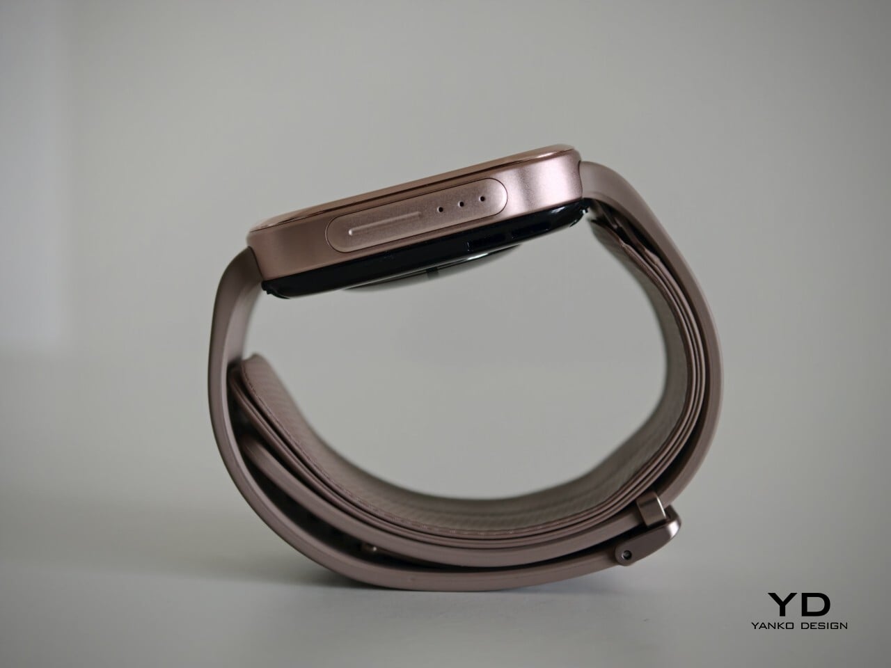
The weight helps here too. At around 1.41 ounces without the strap, the Watch D3 feels substantial enough to come across as a proper piece of hardware, but not heavy enough to become annoying over the course of a full day. Fit matters more on the Watch D3 than it does on a typical smartwatch. Huawei accounts for that with a paper measuring guide and two strap sizes. A watch built around blood pressure readings needs to fit properly, and the D3 feels better for that extra attention.

Performance
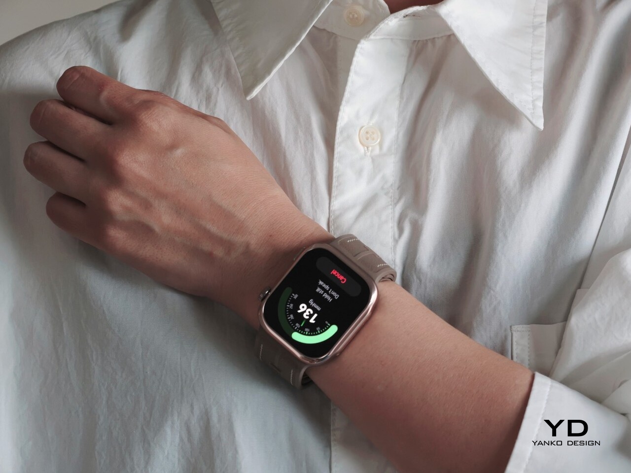
Blood pressure monitoring is the main reason to consider the Watch D3, but what surprised me first was how quiet it is. It makes virtually no sound during a reading, with the increasing pressure around my wrist providing the only obvious sign that anything is happening. The sensation is noticeable, as you would expect from an inflatable strap, but the process feels discreet enough that taking a reading does not become a bother.

There are medical credentials behind the feature, too. According to Huawei, the Watch D3’s blood pressure measurement has obtained NMPA medical device registration in China and CE certification under the European Union’s Medical Device Regulation, commonly called CE-MDR.

The Watch D3 also supports ambulatory blood pressure monitoring, or ABPM, which schedules repeated measurements over a 24-hour period, including while you sleep. Rather than giving you one isolated reading, it builds a record of how your blood pressure changes throughout the day and night. Huawei Health brings those results together into a report showing daytime, nighttime, and overall averages, which you can save or share with your doctor.
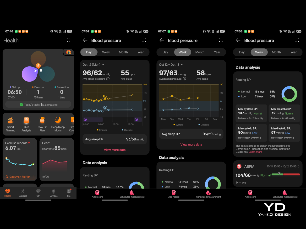
That does not mean you can forget about the process entirely. During waking hours, you still need to pause, keep still, and hold the watch at heart level, following the positioning instructions. You can adjust the measurement schedule rather than stick with the default intervals. Overnight, the watch takes readings automatically without requiring you to assume the daytime posture. Thankfully, those nighttime readings did not bother me or wake me up.

There is also a dedicated feature for measuring blood pressure before and after six workout types, covering indoor and outdoor running, walking, and cycling. You take an initial reading before starting, then begin another measurement within two minutes of finishing. There is a reason those changes are worth studying. Research using clinical exercise tests has linked certain blood pressure responses during exercise and recovery with a higher risk of developing hypertension or experiencing cardiovascular events later on.

Beyond blood pressure, the D3 covers heart rate, sleep, blood oxygen saturation, and skin temperature, with ECG available in supported regions. Fitness tracking is solid too, with more than 80 workout modes. It works well as an everyday companion for keeping an eye on activity, workouts, and daily movement without making every walk feel like homework.
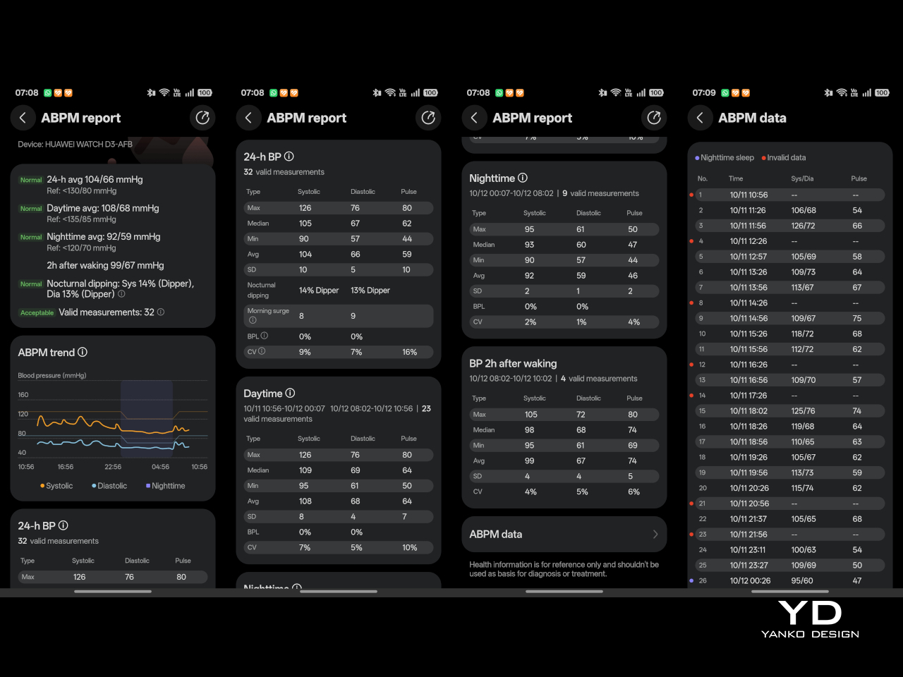
The everyday smartwatch features are more familiar. The D3 runs HarmonyOS and works with both Android and iOS, although the experience is not identical across the two platforms. Bluetooth calling and music playback are supported, but the limited third-party app selection leaves less room to expand beyond the built-in tools.

With a compatible Android phone, you can respond to supported messages using quick replies or the on-screen keyboard. Message replies are not supported when the watch is paired with an iPhone, which is worth knowing before you buy. Offline maps are available for supported models, while NFC payment support depends on your region and the available payment service. Having NFC hardware does not automatically mean it will work with your usual cards.
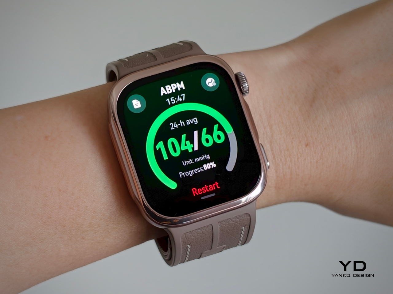
Battery life has been good in my use, too. Huawei quotes up to six days under typical conditions, dropping to around one day with ABPM enabled. My typical-use results were close to that six-day claim, while I comfortably passed a day with ambulatory monitoring enabled. Measurement frequency matters here, since Huawei’s ABPM battery test uses 15-minute intervals, so your results may differ depending on your settings.

Charging speed is okay rather than especially quick, but outside ABPM sessions, I was not constantly looking for the charger. The supplied charger uses a USB-C rather than USB-A, which is a welcome change. That is one less reason to keep an older USB-A power adapter around.

Sustainability

The Watch D3 has an IP68 rating, but that is not an invitation to take it swimming or into the shower. Huawei advises against both because of the air openings used by the blood pressure system. The watch is not water- or dust-resistant while taking a measurement, so those openings need to stay clean and dry. It requires a little more care around water than you might expect from an everyday smartwatch.

The strap feels durable, although Huawei does not provide wear-test figures to put that impression into context. It is removable, so a tear would not necessarily mean replacing the whole watch, provided Huawei makes compatible replacement straps available. That is useful for keeping the D3 in service, but the broader sustainability picture remains unclear. I would have liked more information about recycled materials, repair options, and long-term software support.

Value
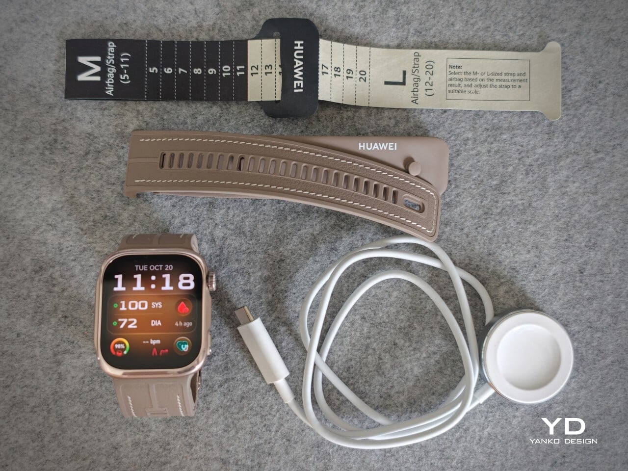
The Watch D3 costs £399.99 (roughly $533) in the UK and €449 (roughly $505) in Europe, so it is not exactly an impulse purchase. Whether that feels expensive depends on what you want from your watch. The D3’s appeal is having cuff-style blood pressure readings and 24-hour ambulatory monitoring in something you can wear throughout the day and overnight.

If those are features you will use regularly, the price becomes easier to justify, especially given how comfortable I found it. I am also impressed by how streamlined the whole package feels, considering the specialized hardware tucked inside the watch and strap. You are getting more than an extra health metric on a screen, without having to wear something that feels like medical equipment. If you mostly want notifications and workout tracking, though, I would be less inclined to pay for blood pressure hardware that rarely gets used.

Verdict
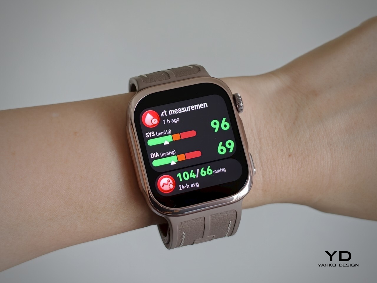
The Watch D3 impressed me most by making its unusual hardware so easy to live with. Blood pressure readings are quiet, the strap never felt cumbersome, and overnight measurements did not wake me up. Battery life was good, too, particularly outside ambulatory monitoring sessions. I never felt I was putting up with an awkward gadget just to use its blood pressure features.

I would still like a broader selection of third-party apps and clearer information about repair options and long-term support. The price also makes more sense if blood pressure monitoring will be a regular habit rather than an occasional curiosity. It is a tool to use alongside professional care, not a reason to diagnose yourself or change medication based on your readings. With that understood, the D3 earns my recommendation for combining useful blood pressure features with the comfort and discretion of an everyday smartwatch.

The post Huawei Watch D3 Review: A Game Changer for On-Wrist Blood Pressure Monitoring first appeared on Yanko Design.

  •  

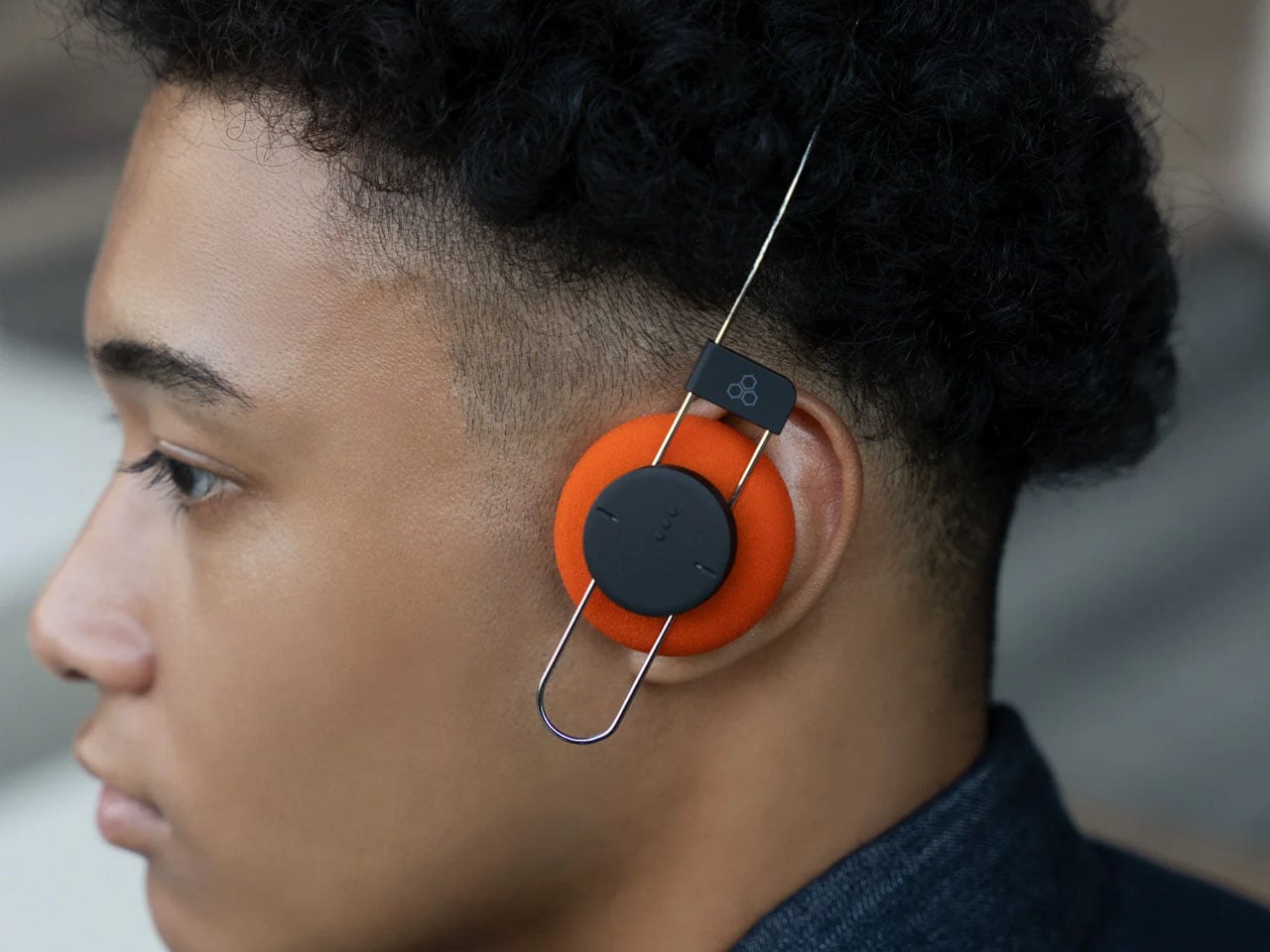
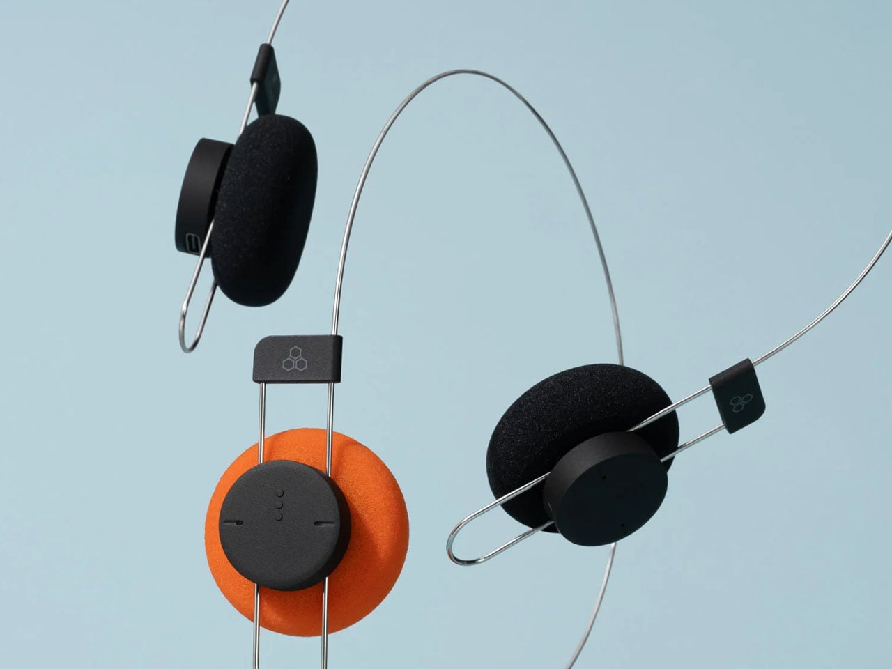
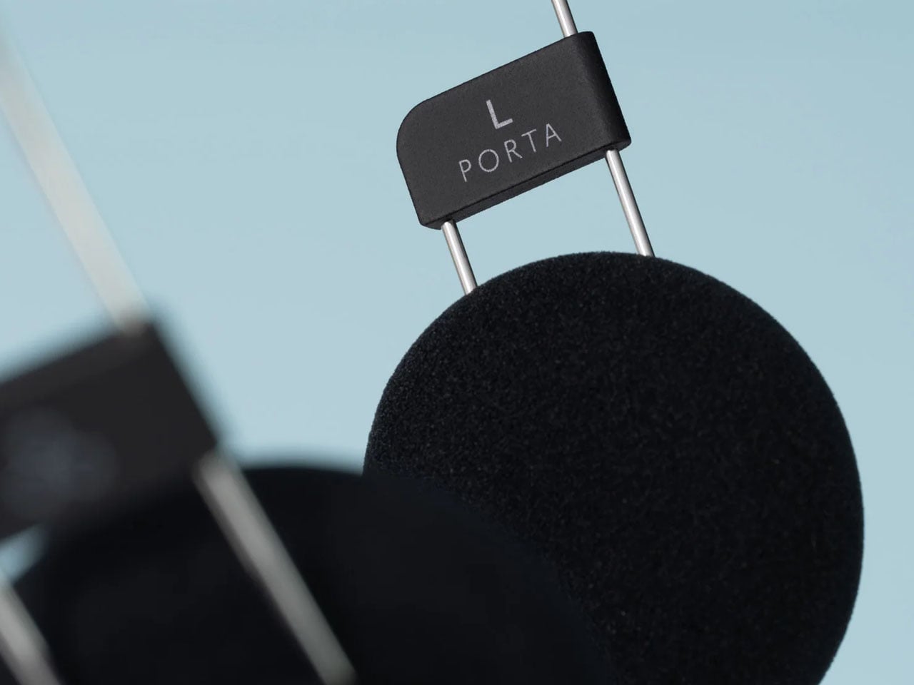
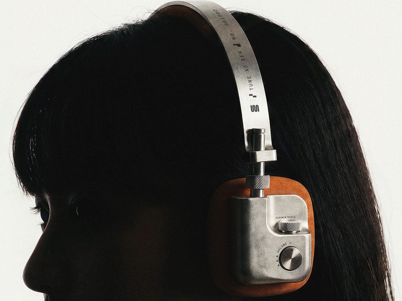
Final’s Porta wireless on-ear headphones strip back the headband to just 40 grams

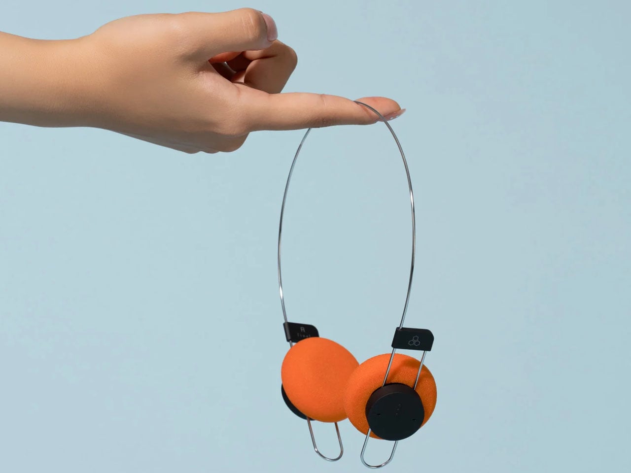
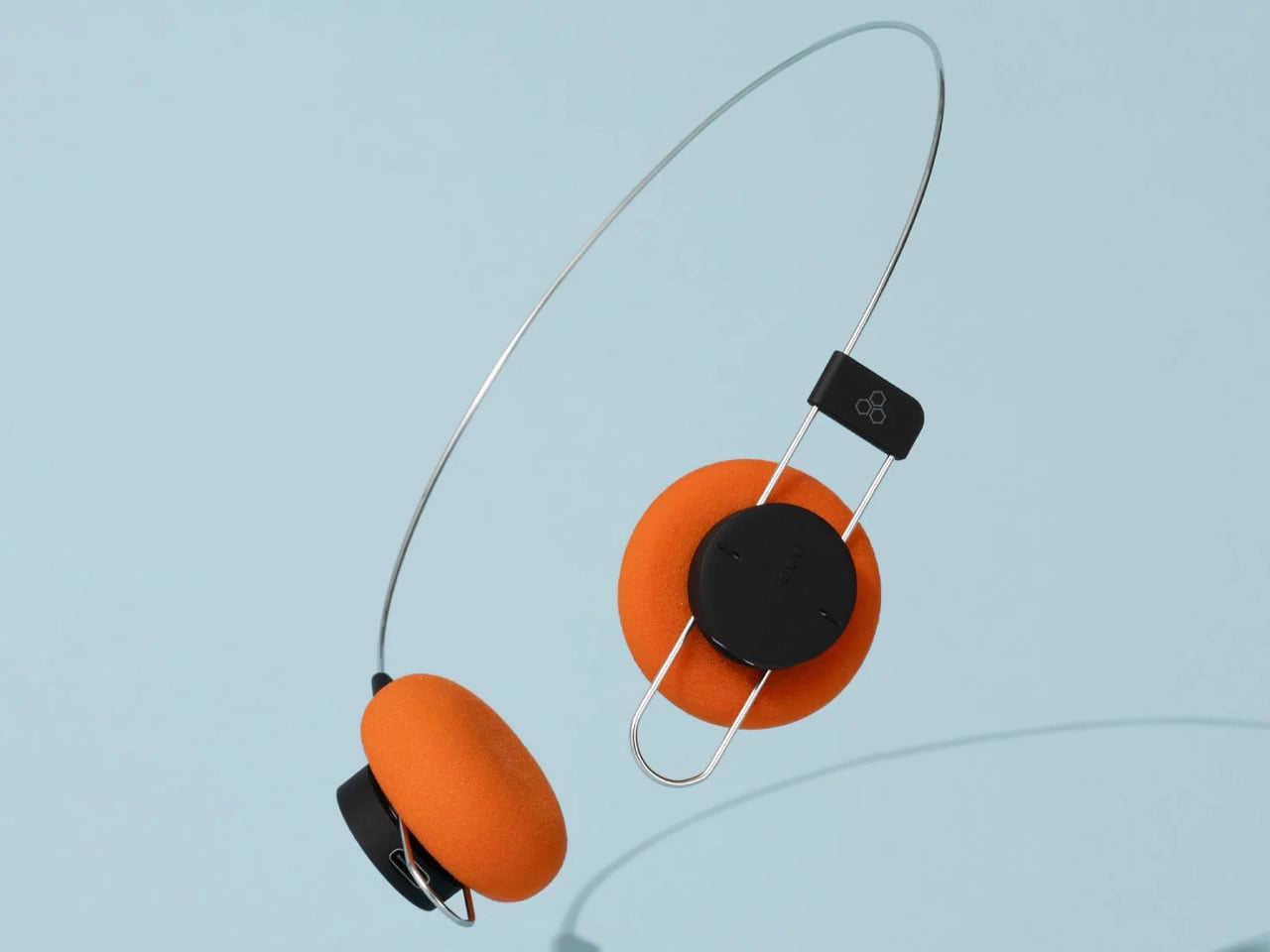
Japanese audio brand Final has introduced Porta, a pair of wireless on-ear headphones that rethink one of the most familiar elements of headphone design – the headband. Unlike most headphones with a conventional padded arch, the Porta uses a minimal, single-wire structure called AirWire, reducing the headphones’ weight to approximately 40 grams while aiming to make extended listening more comfortable.

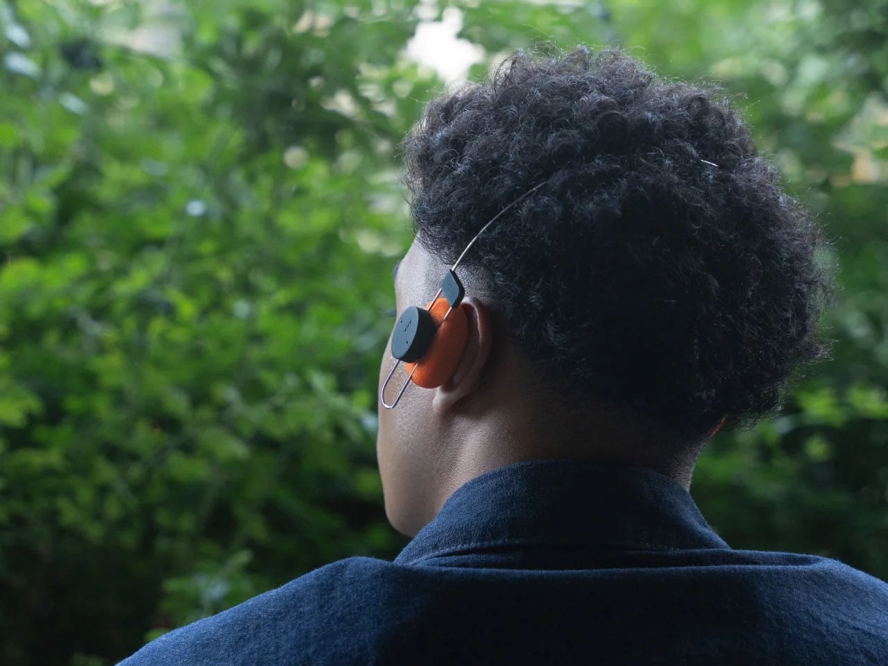
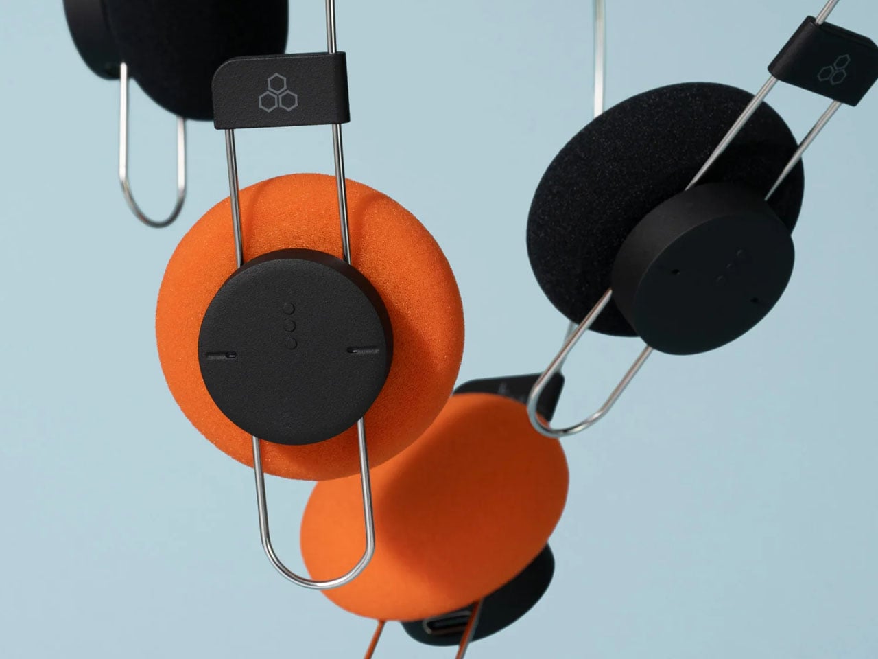
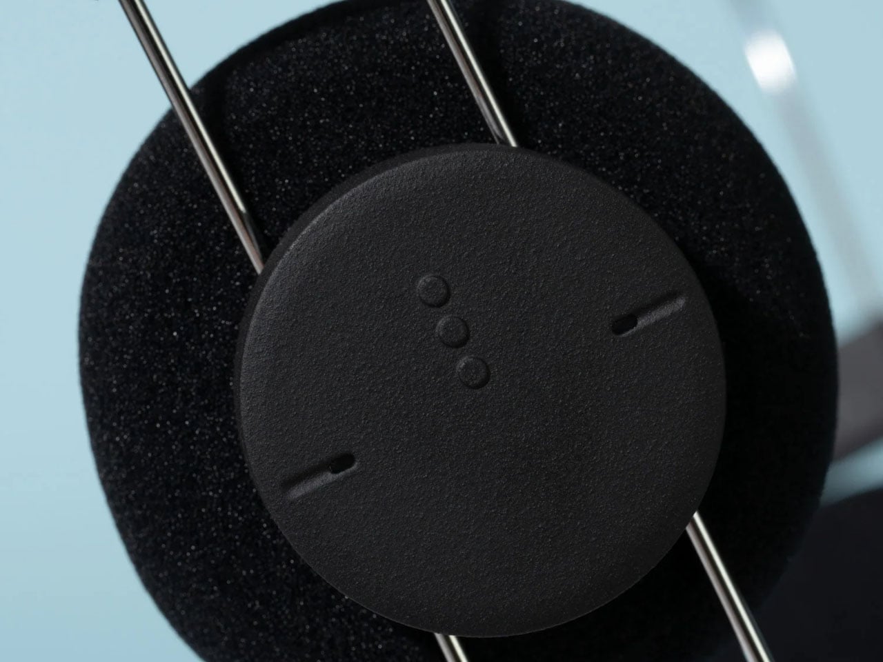
The AirWire design minimises the area of contact between the headphones and the wearer’s head. According to Final, this approach reduces pressure on the top of the head, a common source of discomfort with traditional headphones. The lightweight construction also gives the Porta an unusually stripped-back appearance, with a thin metal-like frame connecting two compact earcups. The pair of cans is a minimalist accessory that goes well with your other no-nonsense gadgets.

Designer: Final

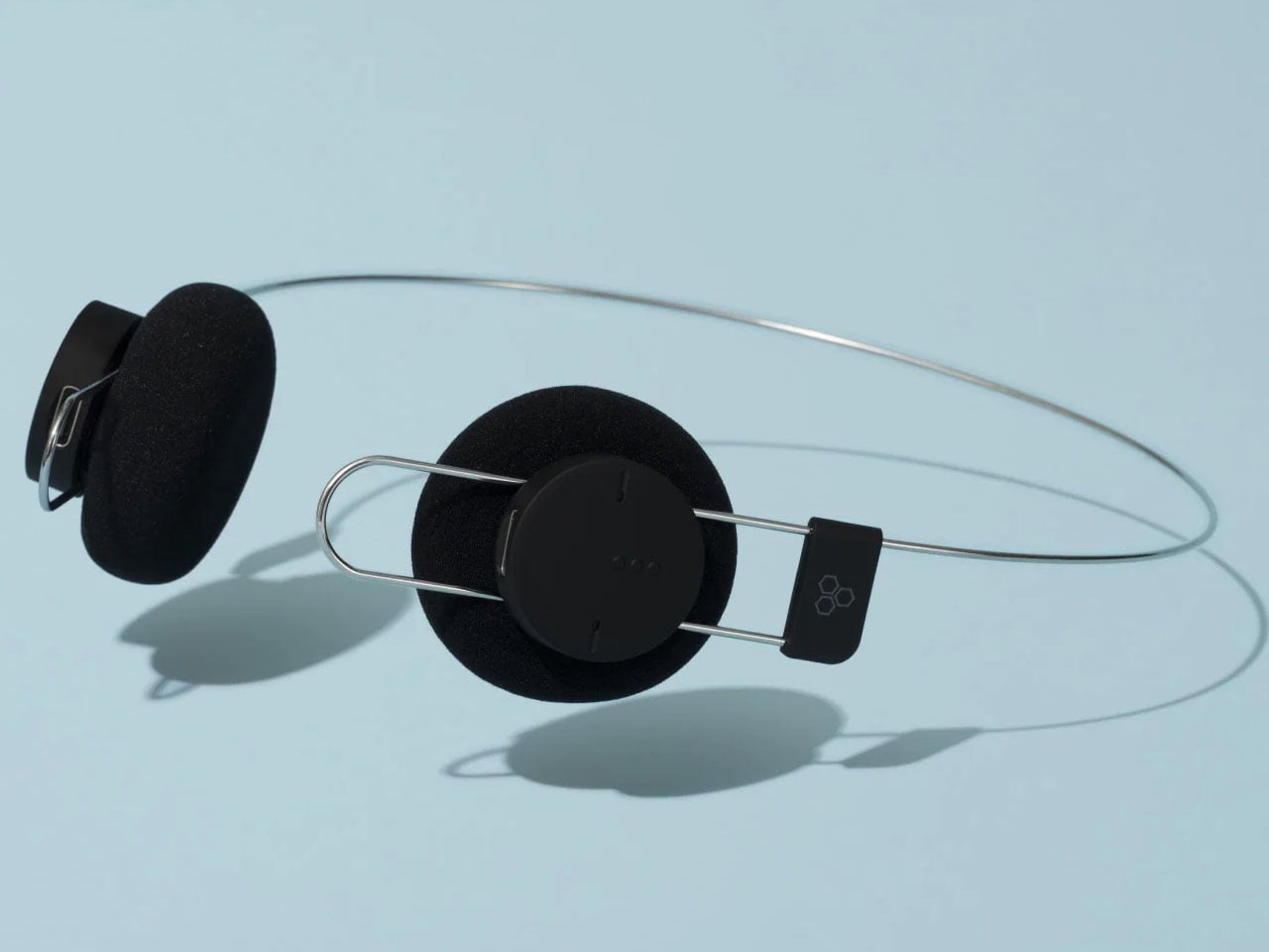
Porta’s aesthetic draws on the visual language of older portable audio equipment. Its orange ear pads recall the bright accents associated with classic Sony Walkman headphones, while a black version offers a more understated alternative. Both variants share the same main body, with the ear-pad colour providing the visual distinction. Final also plans to sell replacement ear pads separately in 2027, giving owners the option to refresh the look without replacing the entire product.
Despite its lightweight construction and retro appearance, the pair of cans incorporates modern wireless connectivity. Bluetooth 5.4 enables connection to compatible devices, while support for the SBC and AAC audio codecs provides compatibility with a broad range of smartphones and other Bluetooth audio sources. The headphones have a stated frequency response of 20Hz to 20kHz.
Final says the Porta has been tuned to deliver a lively presentation, with a sense of depth and substance in the midrange and lower frequencies. The company highlights vocal weight as a particular consideration in its sound design, addressing the challenge of maintaining a full listening experience in a lightweight headphone enclosure. These are manufacturer claims rather than independently verified performance results.

A 57mAh lithium-ion battery provides up to eight hours of music playback on a charge. Recharging takes approximately 90 minutes through USB-C, keeping the charging process straightforward. The headphones also carry an IPX4 rating, indicating resistance to water splashes, which offers some protection during everyday use and light exercise.

The design does involve trade-offs. The Porta does not offer active noise cancellation, a feature found in many contemporary wireless headphones. Its modest battery capacity and eight-hour rated playback time also place the emphasis on everyday convenience and low weight rather than extended listening between charges.

Final has priced the Porta at ¥12,800 (approximately $80), with availability in Japan scheduled for October 23, 2026. International availability has not been confirmed, although the brand sells products through its Amazon storefront.

The post Final’s Porta wireless on-ear headphones strip back the headband to just 40 grams first appeared on Yanko Design.

  •  

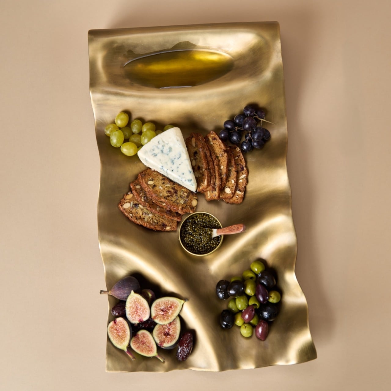
Masa’s Wavy Tray Is Sculpture You Can Actually Serve Snacks On

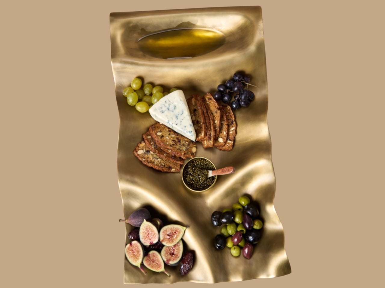
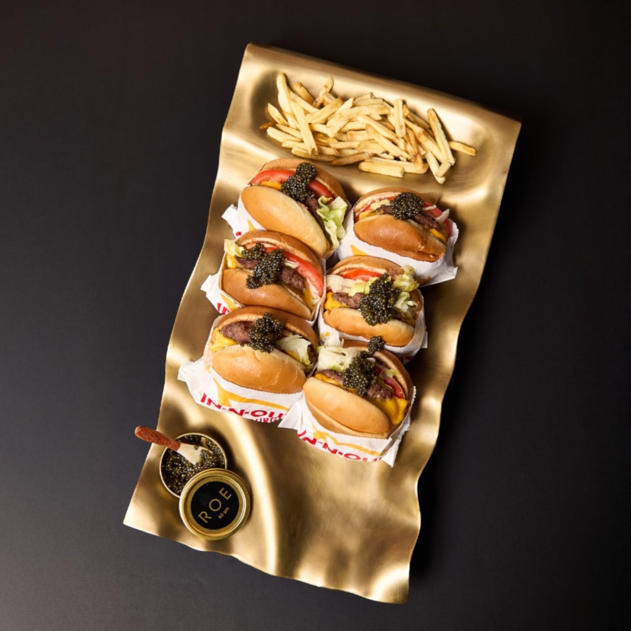
Six burgers, a pile of fries, and generous spoonfuls of caviar are a pretty good way to explain dumæ’s Masa Tray. In the brand’s photographs, the food sits on a rippling brass surface that looks more like a small sculpture than standard serving ware. I like the slightly ridiculous pairing. It also makes the tray’s purpose clear: give dinner a visually interesting home without adding a separate decorative centerpiece.

Designed by Los Angeles brand dumæ and handcrafted in India, Masa addresses that familiar divide between the serving pieces you use and the decorative objects you leave out. Its project description says the brass tray is finished to be food-safe, allowing it to move between both roles. The appeal is having one substantial object that doesn’t need to disappear when everyone finishes eating.

Designer: dumæ

The starting point is the movement of waves, translated into broad rises and shallow dips rather than a literal seashell outline. IADA’s announcement traces the reference to Point Dume, the stretch of coast where dumæ founder Kym Gold grew up. I appreciate that the backstory isn’t required reading. Even without knowing the geography, you can see how the curves break up what could otherwise be a rather stern metal rectangle.

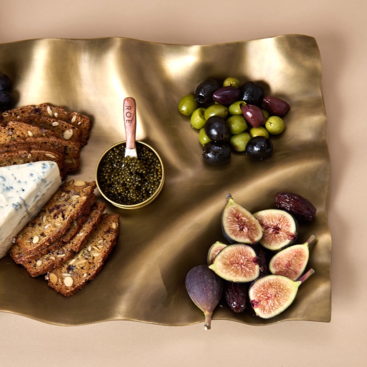
In the close-up photographs, light collects along the higher ridges while the depressions fall into softer shadow. That gives the surface a sense of movement even when it’s covered with crackers and grapes. The edges rise and dip with the rest of the form, so the shape feels continuous rather than decorated afterward. To my eye, that’s the strongest design decision here. The visual interest comes from the tray itself, without needing a pattern applied on top.

Those undulations also deserve a practical look. A sculpted surface offers a different proposition from a flat platter, particularly if you’re arranging small bowls or setting down glasses. I’d treat Masa primarily as a tabletop serving piece rather than assume it’s the ideal tray for carrying drinks across a room. The photographs make a convincing case for loosely arranged food. They don’t establish how securely every vessel would sit, and the distinction matters when the surface is this expressive.

The handcrafting adds another layer. According to the announcement, small differences in form and finish occur from piece to piece. That feels appropriate for a design built around irregular movement; perfect repetition would almost work against the idea. Still, handmade isn’t a performance specification. The individuality is a reason to appreciate the object visually, not evidence that it will resist scratches or survive every kind of use. I’d want the maker’s specific care guidance before treating it as everyday workhorse tableware.

Retail listings put its footprint at approximately 21.5 by 11.5 inches, with a height of 3 inches. That’s worth measuring against your table before imagining a generous spread surrounded by dinner plates. The Happy Kangaroo lists Masa at $595, although it’s marked sold out at the time of writing. At that price, this is a considered decorative purchase with a serving function, and its appeal depends on wanting to see it between meals.

Masa received Platinum recognition in both Kitchen & Dining Room Design and Homewear & Decor at the International Architecture & Design Awards 2026. Those categories neatly reflect its intended overlap: something for the table that can also hold its own elsewhere in the house. The recognition is useful context, though the more persuasive argument is still visible in the photographs: food looks inviting against those broad brass curves.

I’m most persuaded by the burger arrangement. The cheese, figs, and carefully grouped grapes are lovely, but takeout gives the tray a less precious personality. It suggests that owning a sculptural serving piece doesn’t require hosting a perfectly coordinated dinner party. I’d rather see an object like this earn its space under a heap of fries than spend its life waiting for an occasion formal enough to deserve it. The waves are already doing the decorating.

The post Masa’s Wavy Tray Is Sculpture You Can Actually Serve Snacks On first appeared on Yanko Design.

  •  

The 8 Best EDC Designs of October 2026

The most useful thing in your bag is often the thing you forgot to pack. Scissors for a stubborn package, a light for a dark stairwell, a driver for the screw working loose on your gear. October’s EDC selection starts with Eiger’s eight-function scissors, then moves through seven other designs that give familiar tasks a more considered form, without assuming everyone needs to carry an entire miniature workshop every day.

Pocket space is limited, so every extra object needs a reason to come along. A pen that packs down, a wallet stripped to the essentials, and a charger built around one USB-C port approach that constraint differently. Some designs combine jobs; others concentrate on doing one thing well. The appeal lies in finding something that earns its place in your daily routine without giving you more than you actually need.

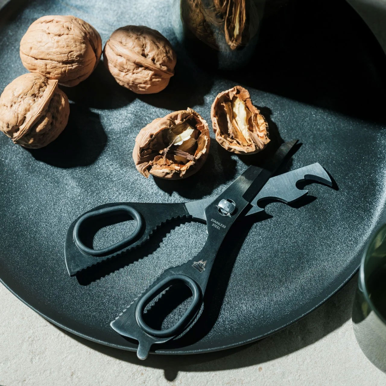
1. Eiger 8-in-1 Scissors

EigerTool starts with a pair of scissors and works the extra functions into their existing geometry. Made by hand in Sanjo, Niigata, the SUS420J2 stainless-steel tool combines cutting with a knife, can opener, bottle opener, screw-cap opener, shell cracker, prying tool, and gas-release function. It’s a sensible starting point for an everyday tool: the main cutting action stays accessible, rather than being a miniature attachment you have to dig out of a handle before opening a stubborn package.

At 5.1 inches long and 53 grams, Eiger is better understood as a small bag tool than a keychain accessory. An included leather case covers it between uses, while a red NITE IZE carabiner gives it a place outside the bag. The black finish comes from an oxidation coloring treatment that the maker says improves corrosion resistance. That doesn’t remove the need for care: EigerTool recommends washing and thoroughly drying the scissors before storage, particularly after messy jobs around camp.

Click Here to Buy Now: $65.00

What we like

  • Scissors take priority, with seven supporting functions.
  • The leather case and bag-attachment carabiner are included.

What we dislike

  • The five-inch length favors bag carry over a keychain.
  • The steel still needs washing and thorough drying after use.

2. RolTine 2.0 Titanium Tape Measure

COMANDI-Corres puts two ways of measuring into a titanium disc measuring 46 millimeters across and 18 millimeters thick. RolTine 2.0 contains a retractable 150-centimeter tape for conventional measurements, plus a rolling wheel for following contours. The wheel’s 150-millimeter circumference provides the reference: count complete turns, then add the remaining dial reading. It’s an appealing approach for checking rounded objects or curved edges, provided you’re willing to keep track of rotations rather than expect an electronic readout to do the arithmetic.

The Grade 5 titanium frame is skeletonized around the mechanism, giving this tape measure some of the exposed complexity associated with mechanical watches. An embedded magnet adds a way to park it on a steel toolbox between measurements. The important qualification is availability; February 2027 is the estimated shipping date. For now, its most convincing idea is giving curved measurements a place beside the straight tape without doubling pocket clutter.

Click Here to Buy Now: $75 $130 (42% off). Hurry, only 12/370 left! Raised over $130,000.

What we like

  • Retractable tape and rolling measurement share one compact body.
  • The embedded magnet provides a convenient place to park it.

What we dislike

  • Rolling measurements require manually tracking complete rotations.
  • February 2027 delivery is an estimate, not confirmed availability.

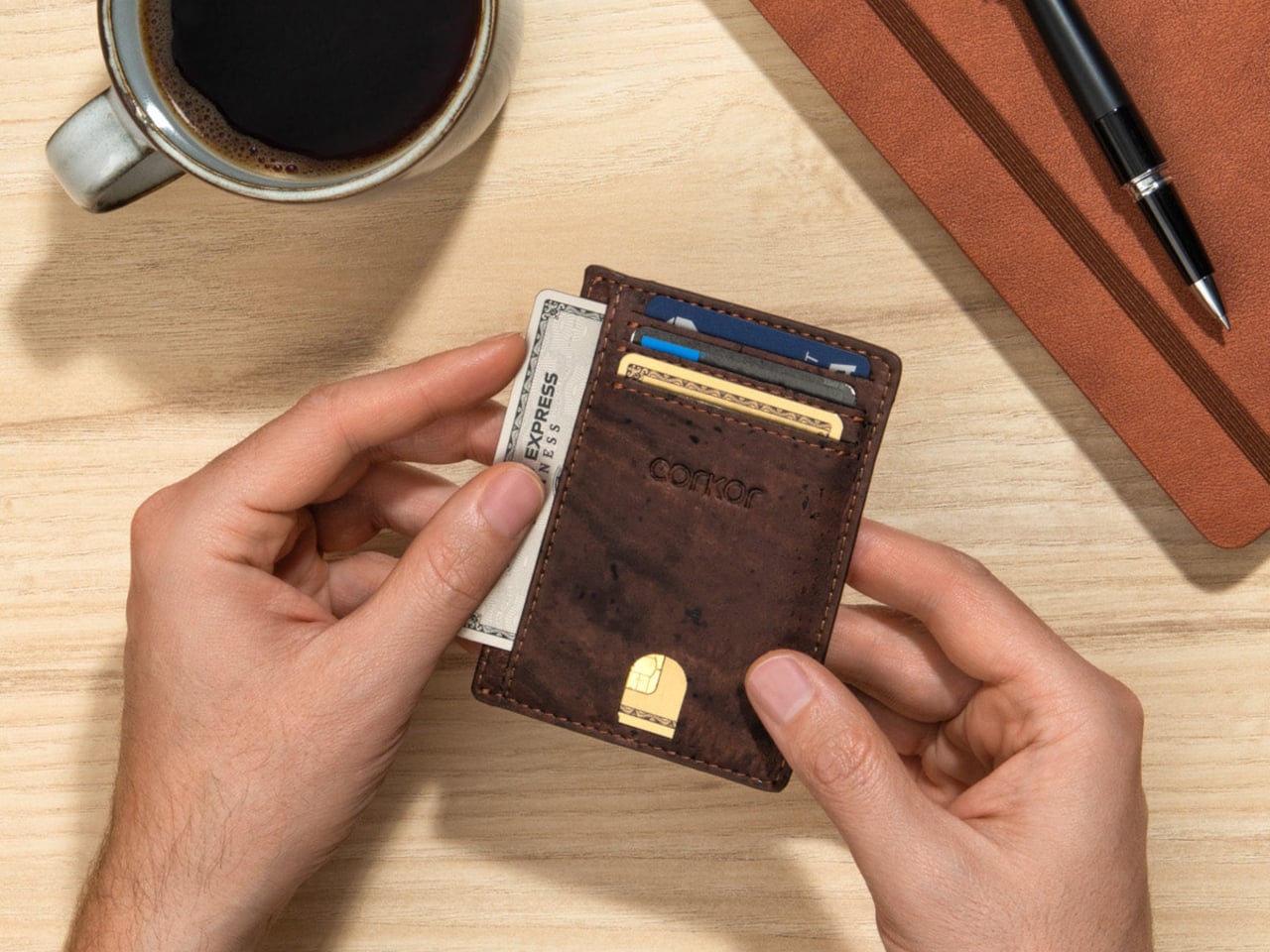
3. Corkor Front-Pocket Cork Wallet

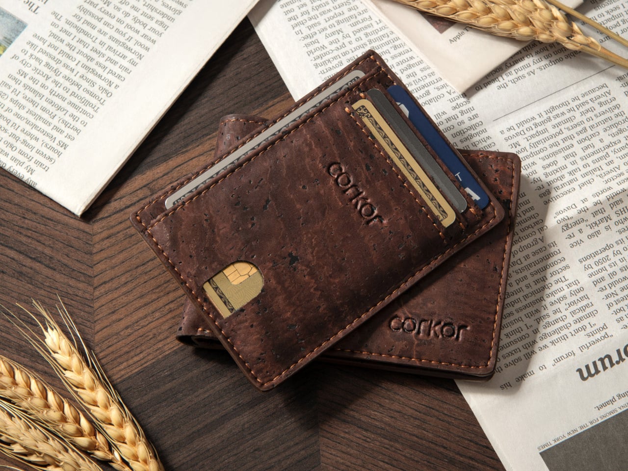
Not every EDC improvement needs another mechanism. Corkor’s Front-Pocket Cork Wallet makes its case through a familiar card-holder layout and an unusual material. The Portuguese brand uses cork for an animal-free exterior, with three card slots, an ID window, and two compartments for folded bills. At a listed 20 grams, it starts light before you add your essentials. The surface gives the collection a welcome material change, particularly if your carry already contains plenty of black plastic and brushed metal.

The dimensions are 110 by 80 by 10 millimeters, which makes restraint part of the design rather than an optional extra. Add spare cards and receipts, and you start working against the point of a slim holder. Corkor includes RFID-blocking construction, but the more tangible daily benefit is the straightforward division between cards, ID, and cash. There’s no coin pocket, and bills need folding. It suits someone ready to edit their wallet, not someone looking to relocate an overstuffed bifold.

What we like

  • The animal-free cork exterior offers an alternative to leather.
  • Dedicated card, ID, and cash compartments keep the layout straightforward.

What we dislike

  • There’s no compartment for loose change.
  • Folded bills are less convenient to sort than cash in a full-size wallet.

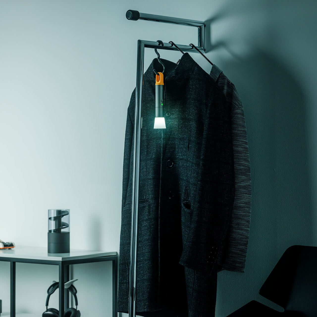
4. CasaBeam Everyday Flashlight

CasaBeam takes a less tactical approach to the everyday flashlight. The body combines ABS and aluminum alloy, with a hanging loop and an included diffuser cap that broaden where the light can work. Adjust the beam for a concentrated spot or wider illumination, then stand the flashlight upright for ambient use. That flexibility matters more here than aggressive styling: one light can move between a bag, a bedside table, and a shelf.

The listing specifies up to 1,000 lumens, three brightness levels, a 2,600mAh rechargeable battery, and USB-C charging. Its claimed 24-hour runtime applies at the low setting, not maximum brightness. At 6.14 inches long and 175 grams, this is a deliberate bag-carry choice rather than something that disappears beside your keys. The useful design move is keeping handheld and stationary lighting together, so you don’t need to reserve the flashlight exclusively for the next power cut or an occasional camping trip.

Click Here to Buy Now: $50.00

What we like

  • The included diffuser extends its role into ambient lighting.
  • An adjustable beam and hanging loop offer different working arrangements.

What we dislike

  • At 175 grams, it’s substantial for pocket carry.
  • The longest advertised runtime requires the lowest brightness setting.

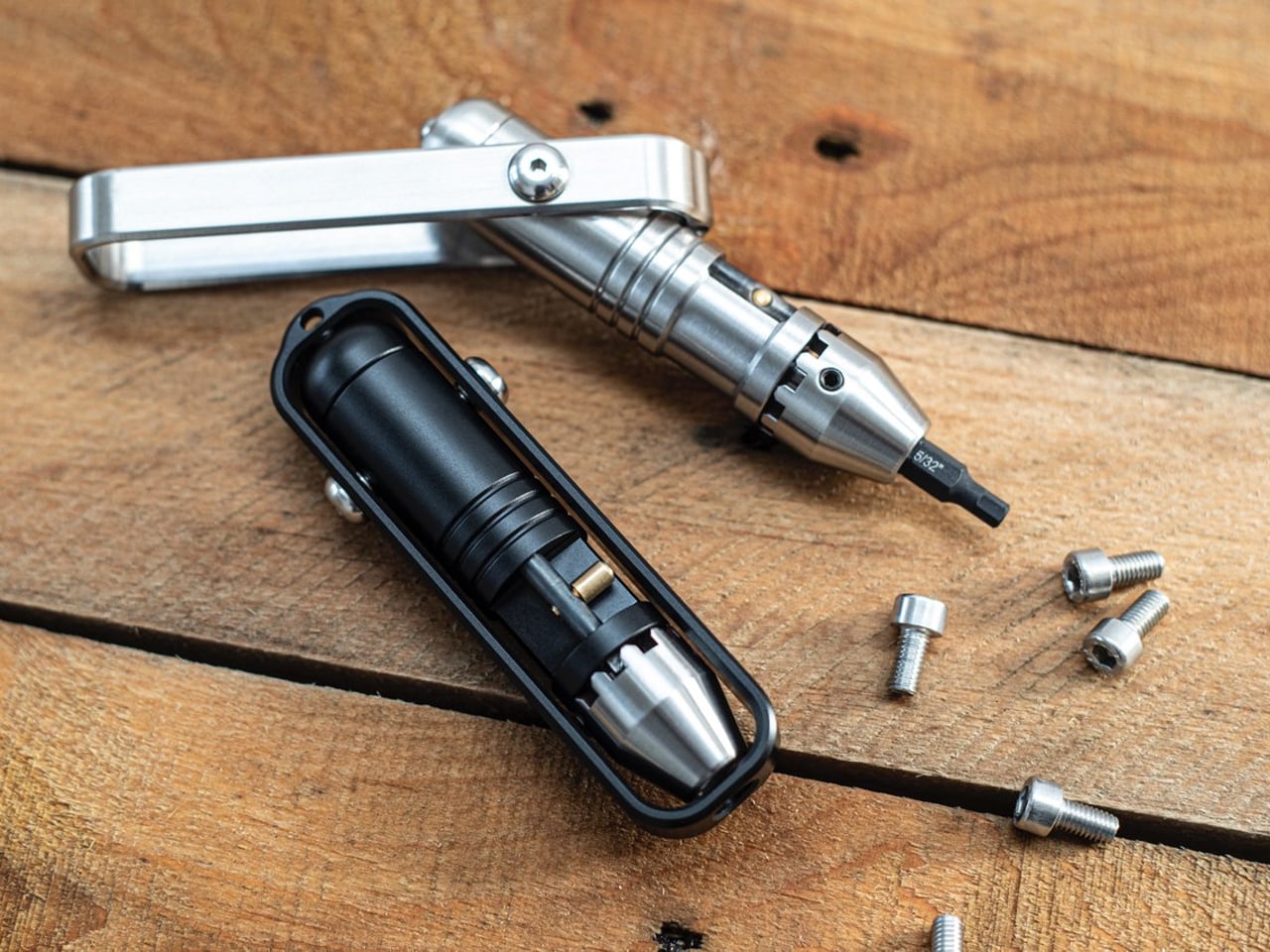
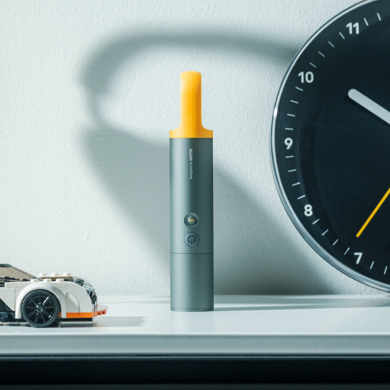
5. MetMo Pocket Driver

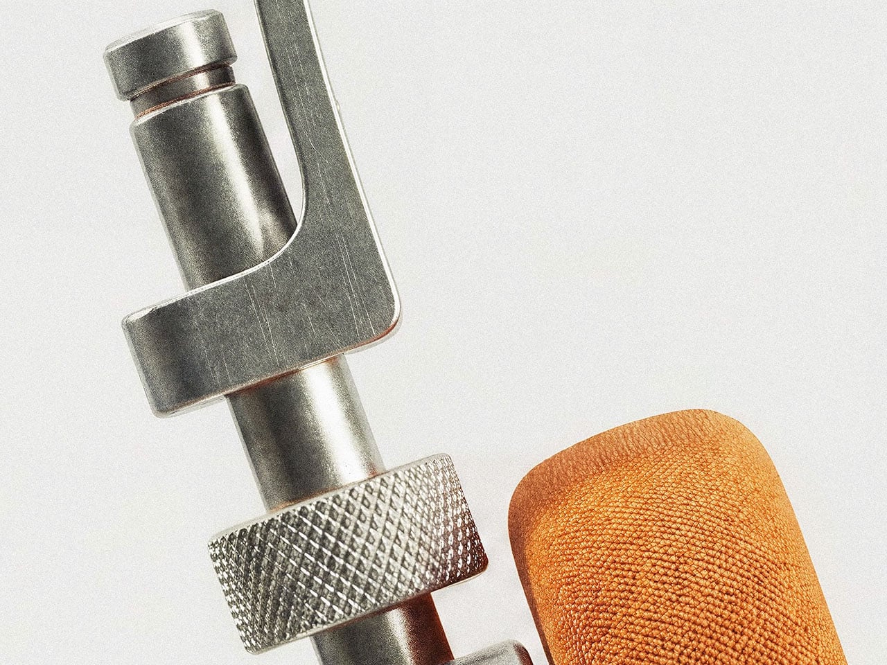
The MetMo Pocket Driver features its own dedicated tool, built around a reversible ratchet and a handle that folds outward. Keep it inline for a narrow approach, or open the handle into a T configuration when you need a different grip. Standard quarter-inch hex-bit compatibility is the important practical detail: you can choose bits around your own equipment instead of buying into a proprietary format. It’s a compact repair tool whose working parts remain visible during each turn.

MetMo lists the black aluminum version at 103 millimeters long and 109 grams, with hardened steel among its working materials. The handle stores two bits, enough to keep frequently used sizes with the driver without carrying an entire bit case. That also sets a limit: repairs needing several different heads require extra storage. It earns a place for people who tighten and adjust things throughout the week. If you rarely encounter a loose screw, it’s another handsome object to carry.

What we like

  • The reversible ratchet works with multiple handle positions.
  • Standard quarter-inch hex bits let you tailor it to your equipment.

What we dislike

  • Only two bits fit inside the handle.
  • Its 109-gram weight needs justifying if fastening jobs are rare.

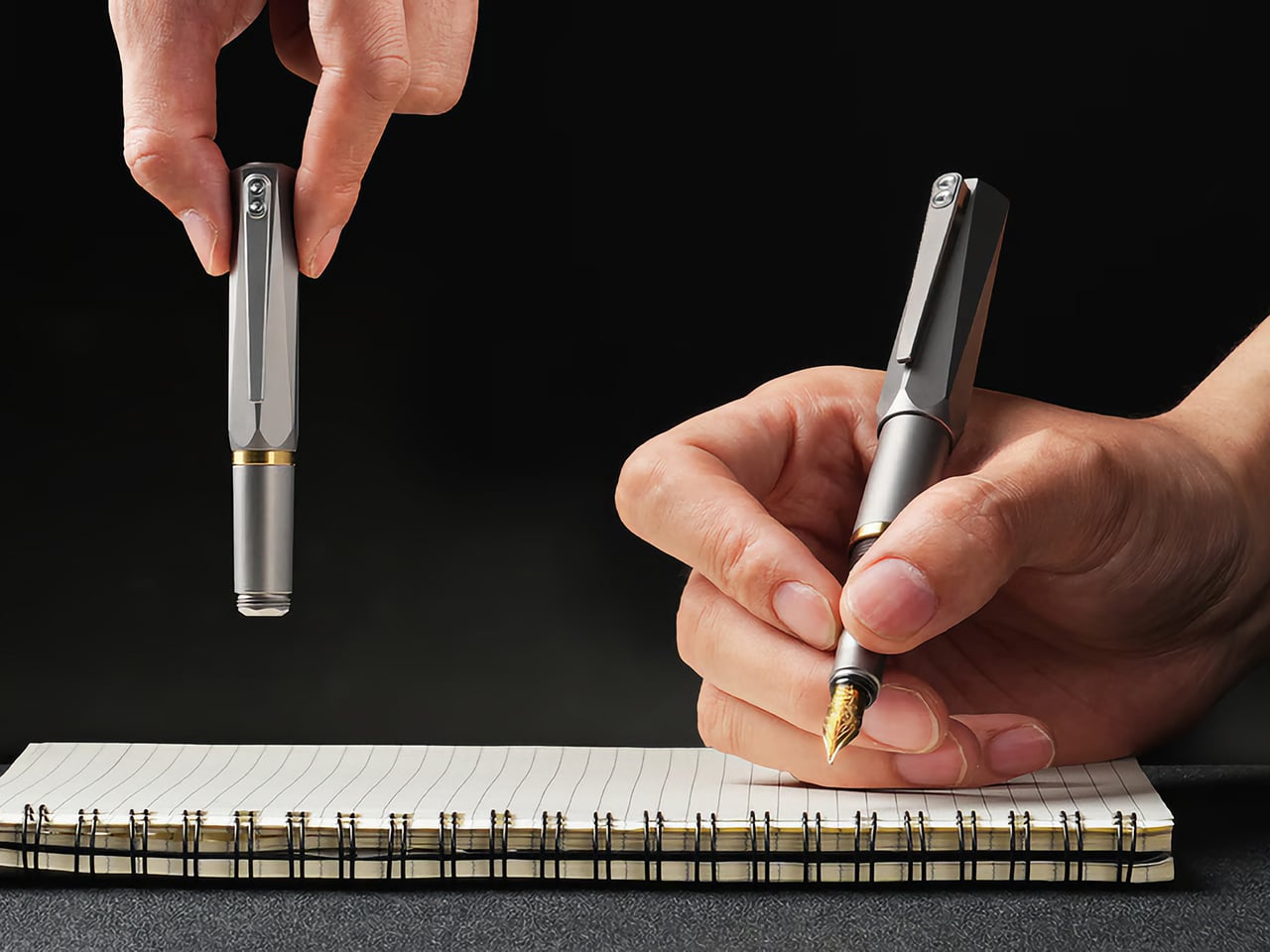
6. Lumink Titanium Fountain Pen

EyeQ’s Lumink addresses the awkward part of carrying a fountain pen: the length that makes it comfortable to write with can make it inconvenient to pocket. Its threaded configuration changes from approximately 96 millimeters in carry form to 140 millimeters for writing. The Grade 5 titanium body has twelve facets designed to stop it rolling away, plus a pocket clip.

The writing end uses a German nib, and the seller lists compatibility with international cartridges and converters. That gives owners a choice between convenient replacements and filling from bottled ink. Belloc describes a threaded cap and internal gasket intended to prevent drying between uses. There’s still a setup step before writing, unlike the instant deployment of a click pen. That makes Lumink better suited to someone who enjoys a writing instrument’s mechanics than someone who needs the quickest possible signature.

What we like

  • A short carry form becomes a full-length writing instrument.
  • Cartridge and converter compatibility provides different filling options.

What we dislike

  • Threaded setup adds a step before writing.
  • Fountain-pen cleaning remains part of ownership.

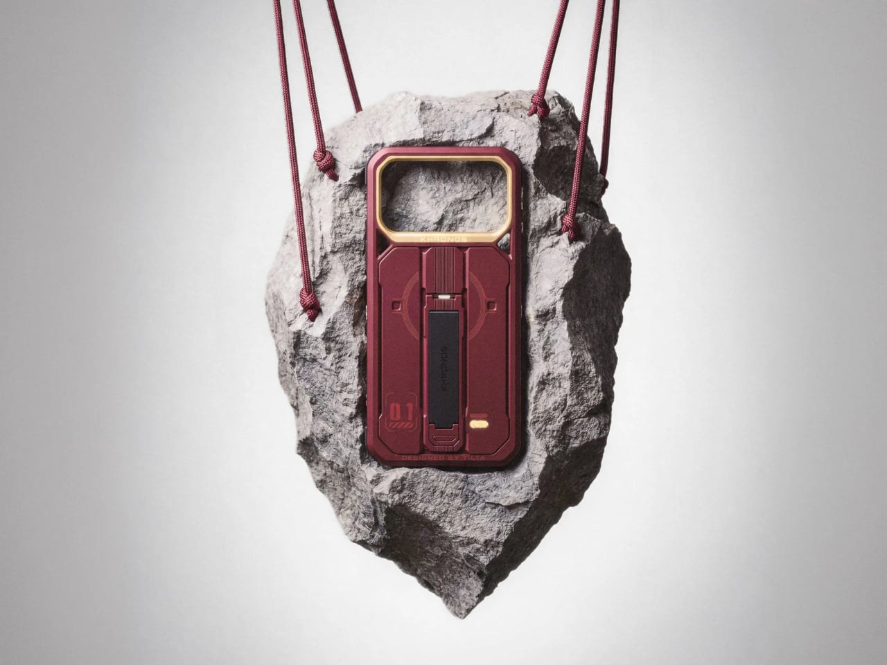
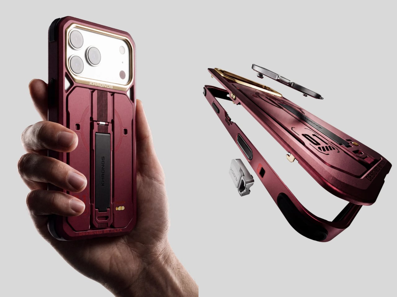
7. Tilta Khronos Core Limited Edition Kit

Tilta’s Khronos Core Limited Edition Kit treats a phone case as a small platform for everyday accessories. A CNC-machined aluminum frame accepts four backplates without tools: a kickstand plate, rotating ring plate, transparent keepsake compartment, or card holder. The card holder takes up to three cards behind a latched cover, while the transparent option leaves space for a photograph. Available for iPhone 18 Pro and Pro Max, it changes the function of the phone’s exterior rather than changing its color.

The kit includes short and long straps, with magnetic quick-release attachments and multiple mounting points on the frame. This supports different carrying arrangements, including wearing the phone across your body. Its strongest EDC argument is consolidation: a card plate could replace a separate wallet for a short outing. The compromise is buying several configurations when you may favor only one. Tilta’s standard case already includes the kickstand backplate, so the complete kit makes sense only if you’ll use the alternatives regularly.

What we like

  • Four tool-free backplates let the same frame serve different purposes.
  • The three-card compartment could replace a separate holder for short outings.

What we dislike

  • This kit is specific to iPhone 18 Pro and Pro Max.
  • The extra backplates add little value if you only use the kickstand.

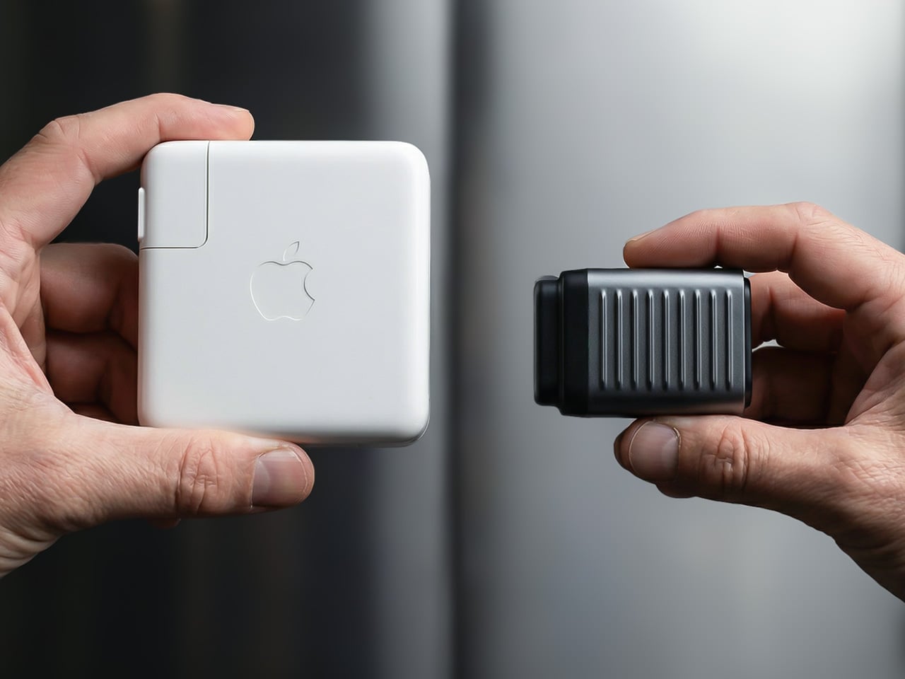
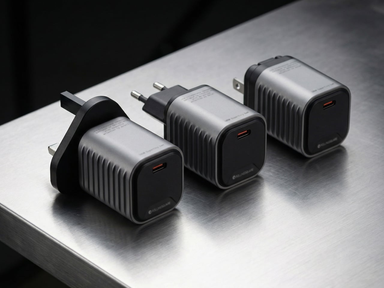
8. Rolling Square Supertiny 100W GaN Charger

Rolling Square’s Supertiny 100W is the bag essential in this selection, rather than another object to clip onto your keys. Introduced through crowdfunding, it concentrates its advertised 100-watt output into a single USB-C port. The US version has folding prongs, a useful detail when the charger shares a pouch with cables and other equipment. EU and UK versions use different fixed plug arrangements, so the tiny footprint shouldn’t be treated as identical across every regional version or every travel setup.

The appeal is straightforward if you carry a compatible USB-C laptop and want to leave a larger adapter at home. One capable port avoids the extra sockets and bulk of a multiport charger, but also limits the standard setup to one connected device.

What we like

  • The single-port layout prioritizes compactness over extra connections.
  • Folding prongs on the US model make packing more convenient.

What we dislike

  • One USB-C port limits the standard setup to one device.
  • Current retail availability of the 100W version remains unverified.

Carry for the Jobs You Actually Do

Start with the small inconvenience that repeats. If you keep borrowing scissors, that’s a stronger reason to carry Eiger than any function count. If you regularly repair equipment, build a bit selection around the MetMo. A wallet or charging adapter might make a bigger difference than either. The useful test is what an object replaces, or what specific job it makes possible, rather than how impressive it looks laid out.

Leave room for changing your mind, too. A bag packed for commuting doesn’t need the same tools as one packed for a weekend away, and a phone case with card storage may make a separate holder unnecessary. The aim isn’t to assemble all eight into a matching collection. It’s to find the one or two objects that deserve to stay packed after the novelty has worn off and life resumes.

The post The 8 Best EDC Designs of October 2026 first appeared on Yanko Design.

  •  

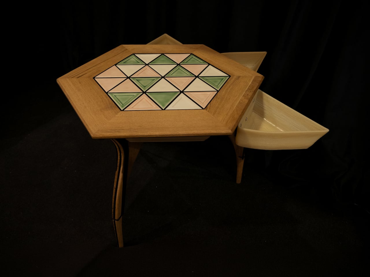
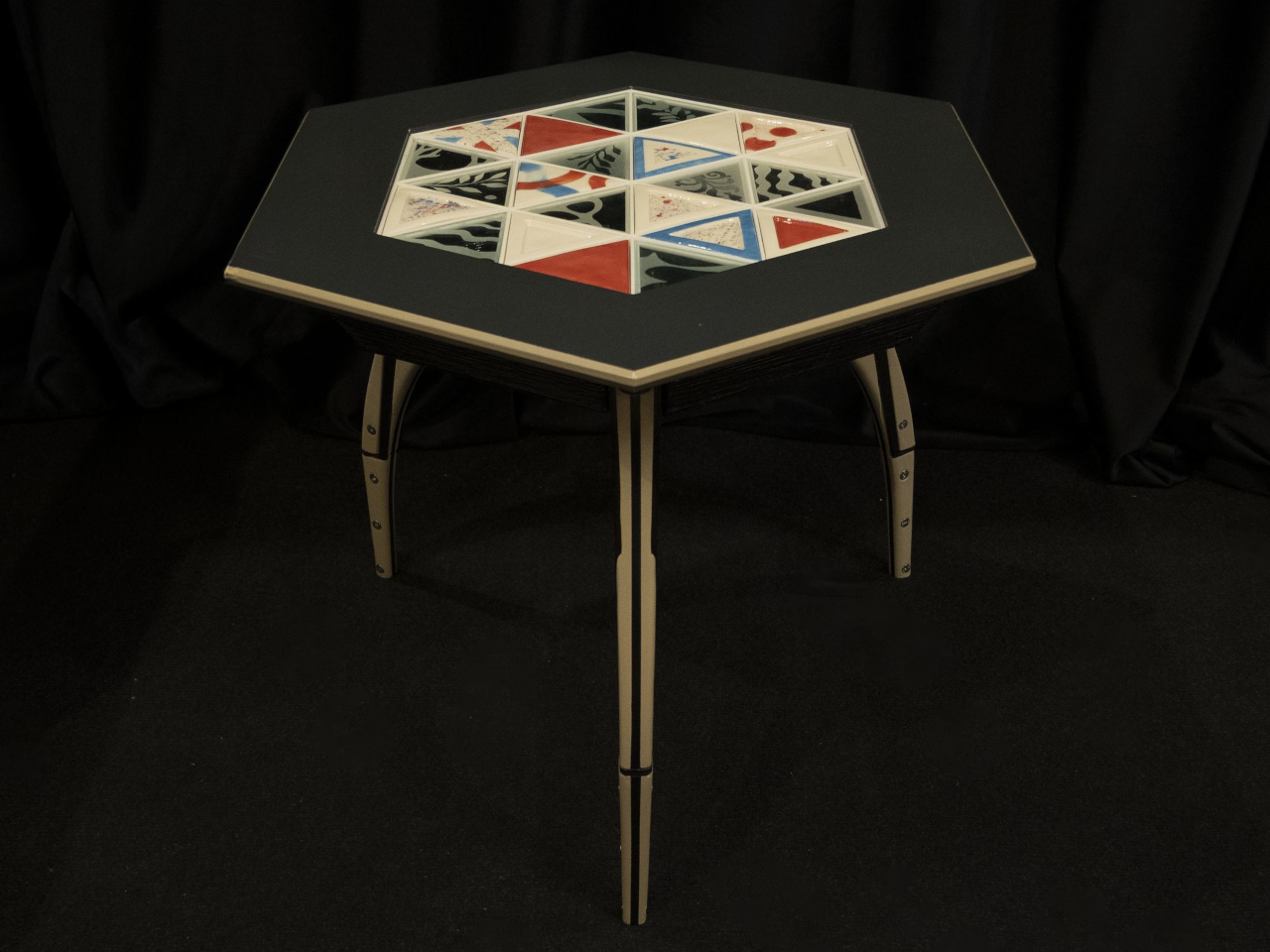
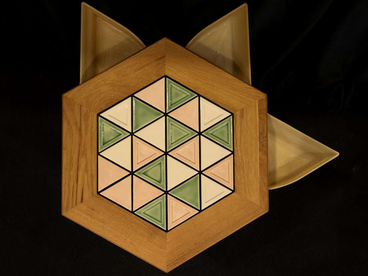
LUMVIA Coffee Table Prototype Pairs a Customizable Mosaic With Hidden Drawers

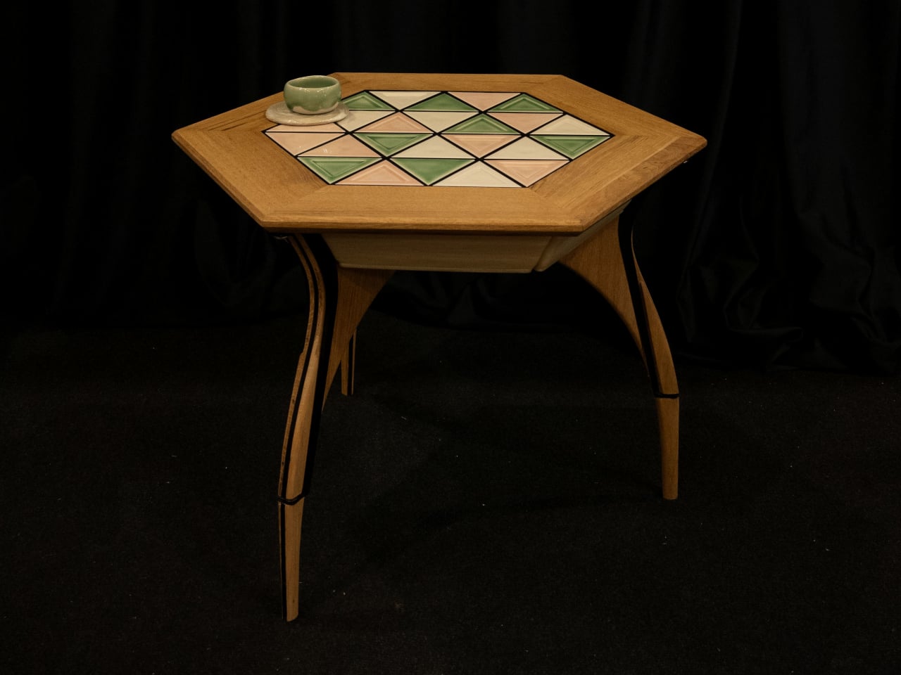
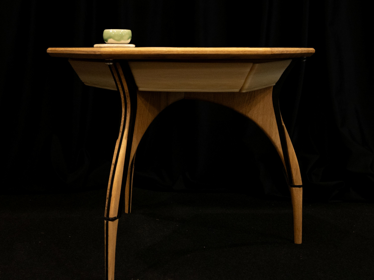
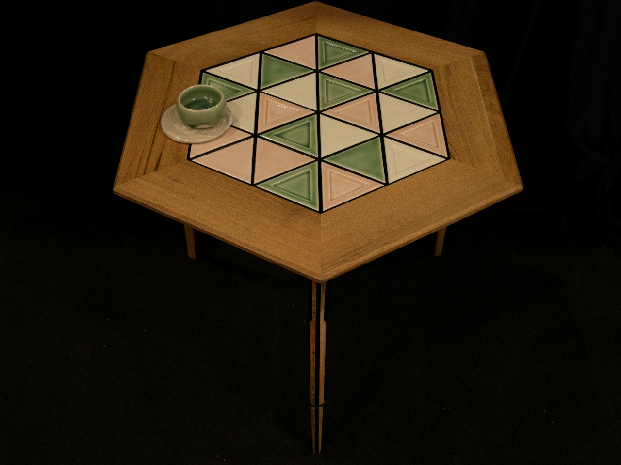
Choosing a coffee table usually means choosing a finish you’ll be living with for years. LUMVIA leaves that decision open a little longer, with interchangeable mosaic tiles that let you change the tabletop’s pattern instead of replacing the furniture. Developed by Romania’s mkt, the coffee table prototype puts that freedom inside a solid oak frame, with hidden storage underneath for the less decorative things.

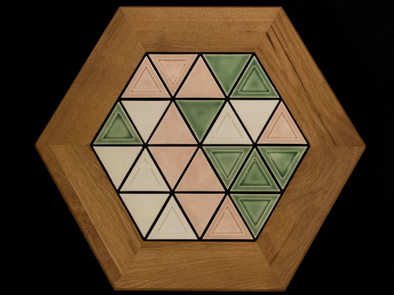
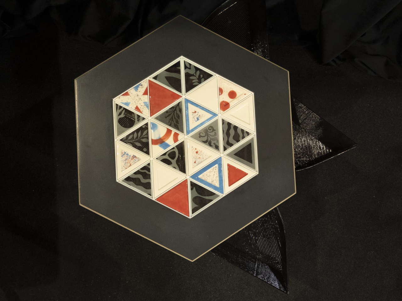
The top has a hexagonal outline, with a broad wooden border surrounding 24 triangular tiles. Those repeated shapes give every arrangement a common structure, even when the colors change completely. You could group similar shades together or scatter contrasting pieces across the surface, turning the same geometry into a quiet backdrop or something that competes with the coffee cups for your attention.

Designer: mkt

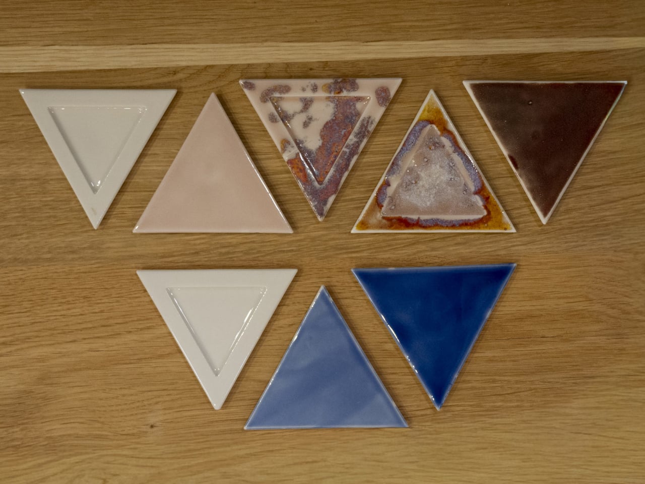
There’s more to the customization than picking a favorite color, of course. Ceramic and glass provide different material options, while the lines between the tiles can be black or white. Dark separators make the individual triangles more pronounced against pale pieces; lighter ones soften that contrast. Even before rearranging anything, changing those lines alters how strongly the mosaic announces itself in a room.

That flexibility becomes particularly appealing when the rest of the room changes. A new rug might make yesterday’s tabletop feel a little too busy, while a neutral sofa could leave space for a bolder composition. LUMVIA’s removable tiles are intended to accommodate those shifts, letting owners revise the pattern over time rather than treating the original selection as a permanent decorating commitment.

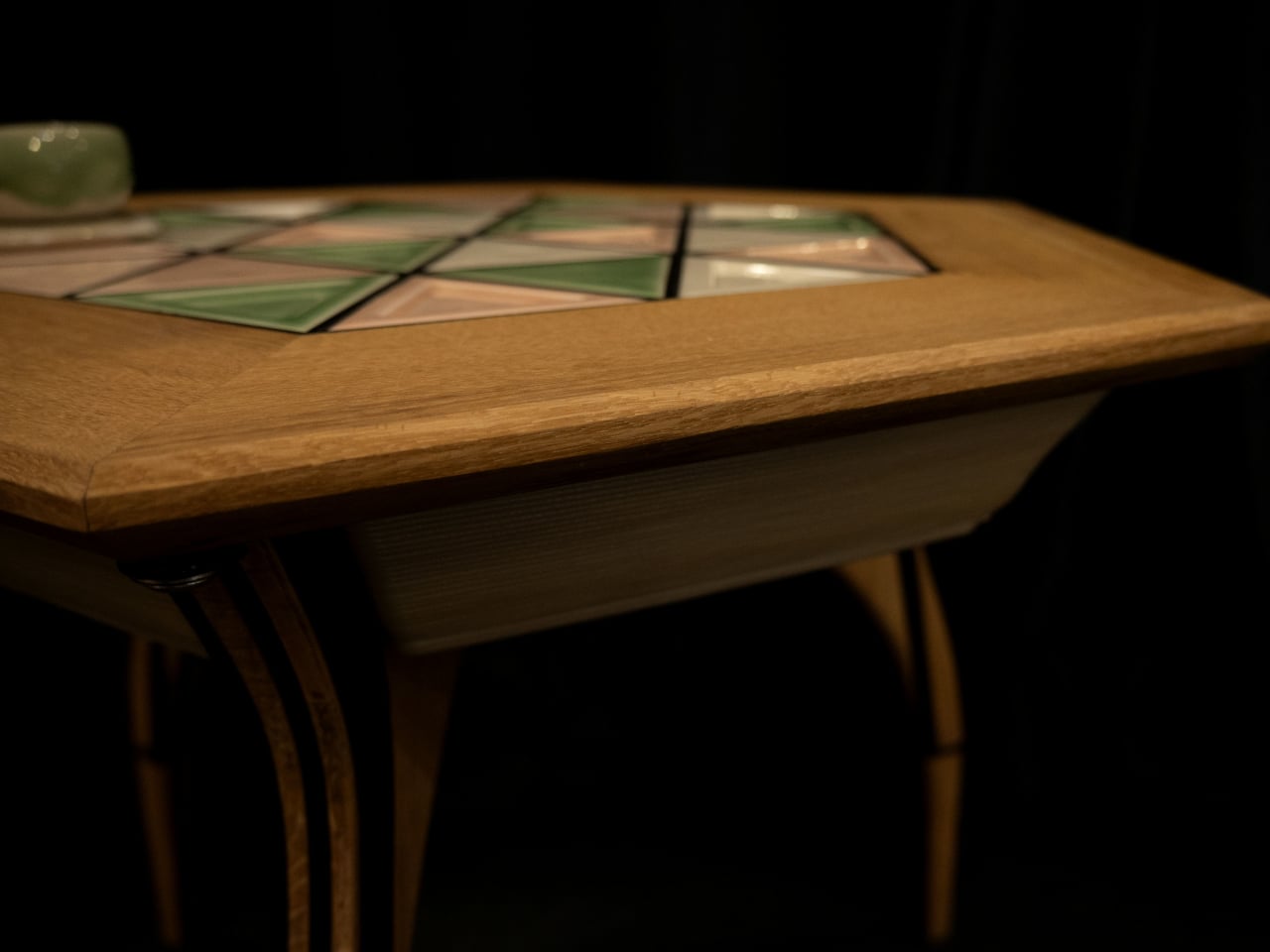
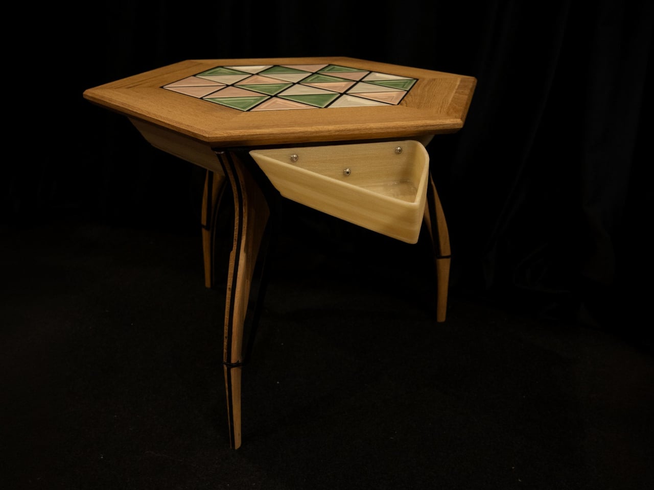
The geometry continues underneath, where triangular drawers offer somewhere to tuck away the small objects that tend to collect around a sofa. Their shape follows the mosaic above, rather than introducing a rectangular box below it. There’s a practical tradeoff here, though: an angular compartment won’t suit everything, even if it gives keys or other small belongings a place away from the tabletop.

Both the drawers and the grid supporting the tiles are 3D-printed, placing digital manufacturing beneath the more familiar wood, ceramic, and glass. The approach gives the repeated triangular forms a role in construction as well as decoration. A separate wood version uses interlocking wooden tiles, offering another way to build a pattern without introducing ceramic or glass into the surface.

Still, a surface that invites rearranging also needs to work when you’re setting down a hot drink. Some tiles have recessed triangular details, while others are plain, making the choice about texture as well as color. How those pieces sit together, stay in place, and handle everyday spills will matter just as much as the pleasure of choosing which triangle goes where next.

LUMVIA remains a customizable prototype rather than a mass-produced table, and its configurator includes a step for selecting extra tiles. Having spare pieces could let you test different combinations without replacing the whole set every time your tastes change. You’ll still need somewhere to keep all the triangles that aren’t on display, though. Even a coffee table makeover can leave you with leftovers.

The post LUMVIA Coffee Table Prototype Pairs a Customizable Mosaic With Hidden Drawers first appeared on Yanko Design.

  •  

SolidSafe Duo Magnetic Power Bank Is Shaped to Fit Apple’s Folding iPhone

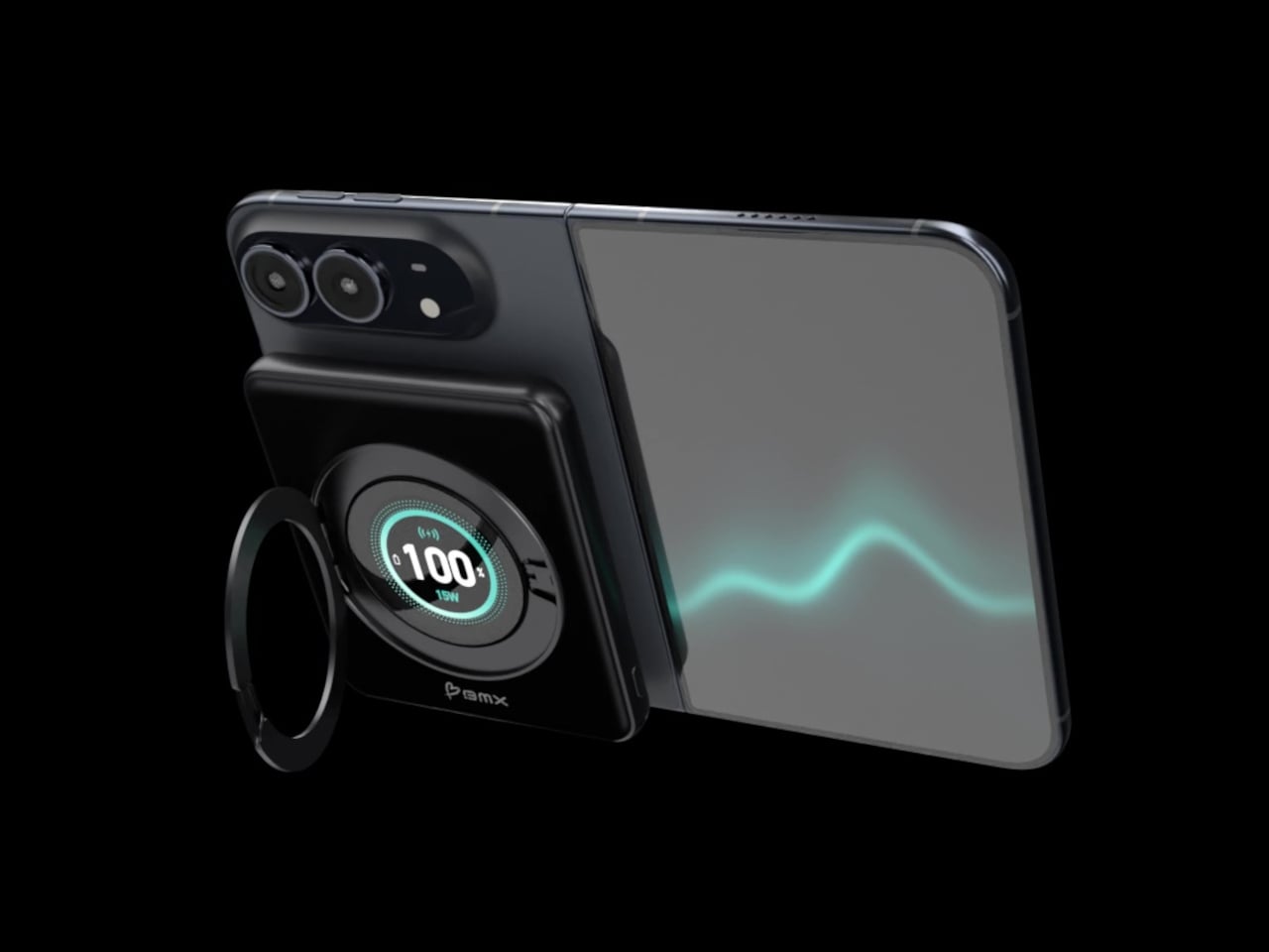
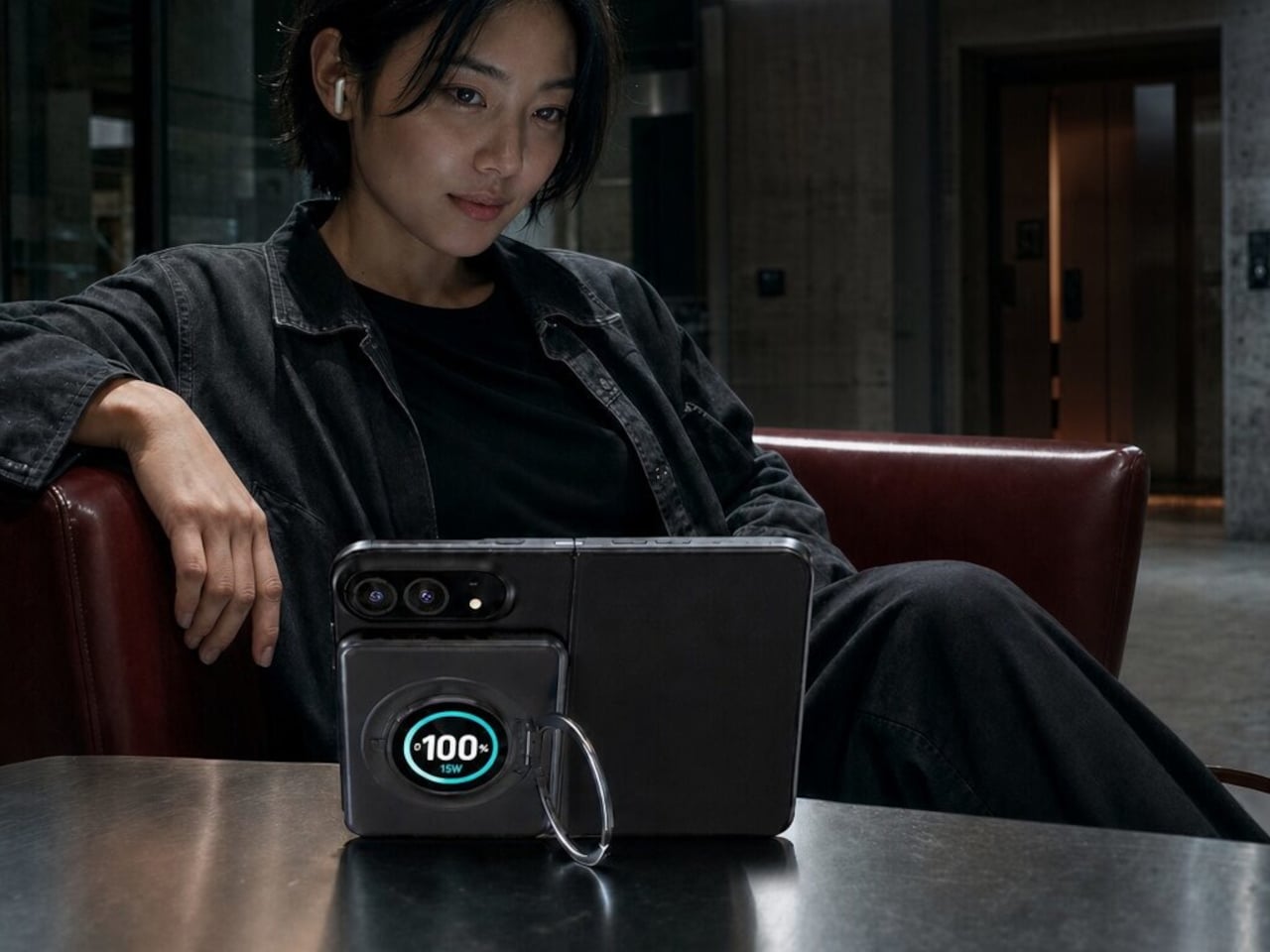
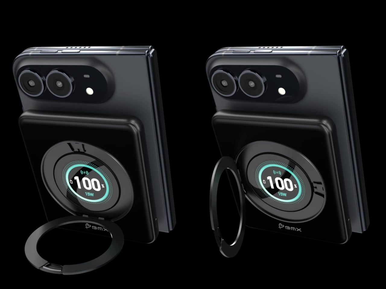
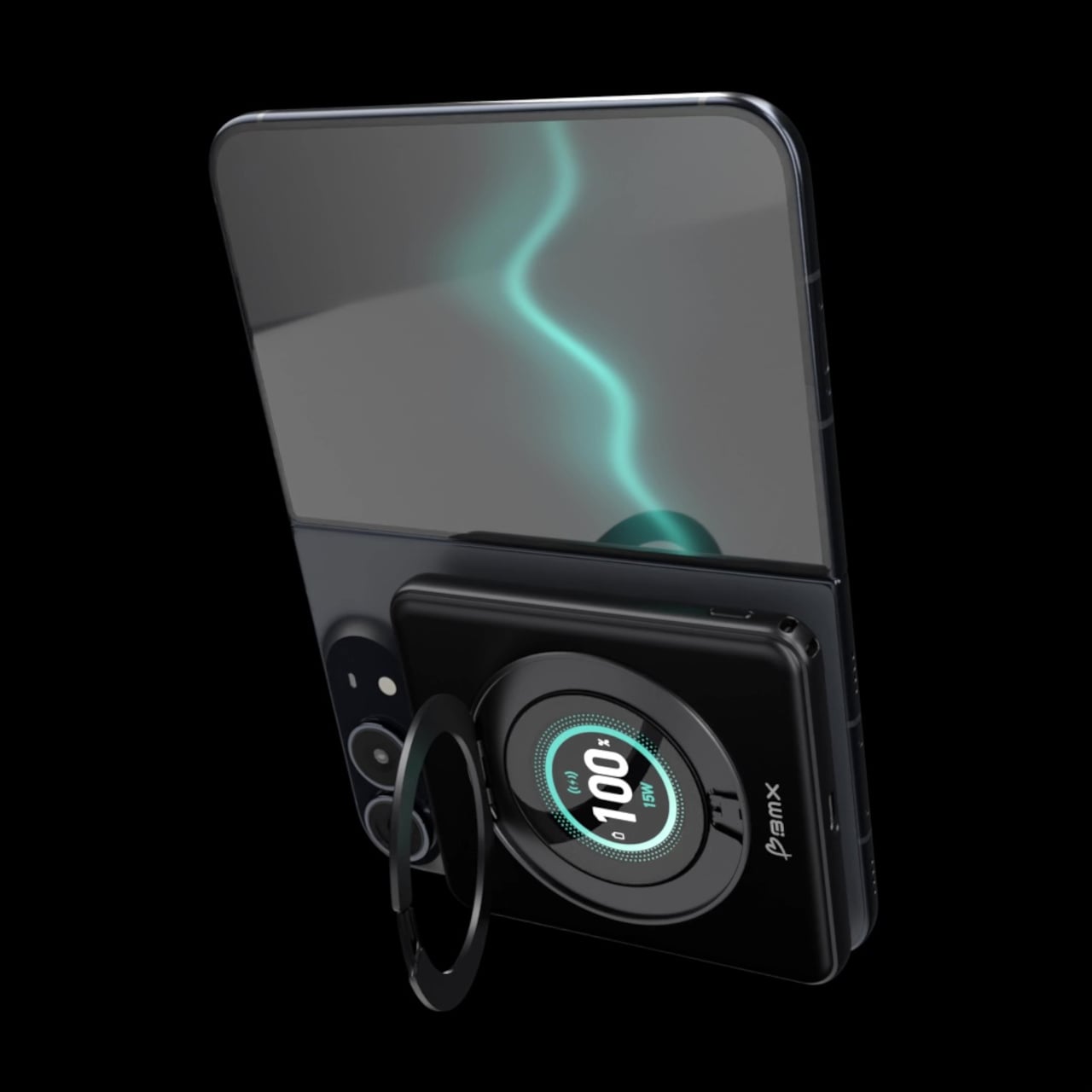
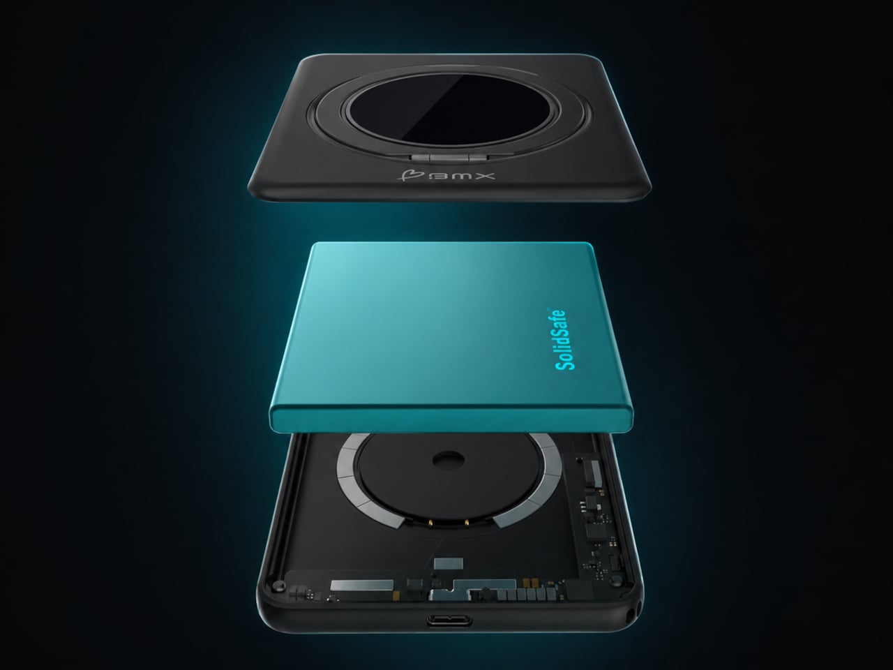
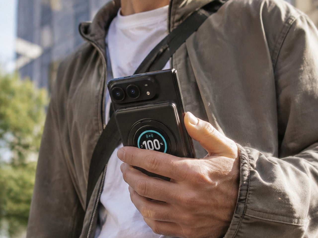
Magnetic charging makes attaching a battery easy, but it doesn’t guarantee that the battery will fit your phone’s shape. Apple’s folding iPhone Duo introduces a shorter body that gives accessories less room to stretch. BMX’s SolidSafe Duo responds with a compact, 5,000mAh power bank designed around those proportions, bringing a rotating stand, color display, and attached USB-C cable along for the ride.

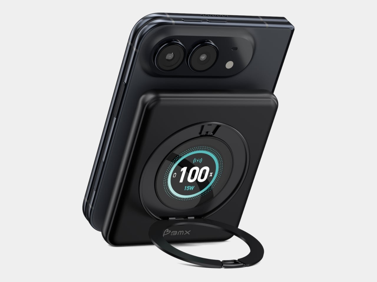
The difference starts inside, where a custom-shaped battery cell lets the enclosure follow the Duo’s footprint instead of extending beyond its edges. The black, CNC-machined aluminum housing has rounded corners and a broad face that sits below the cameras. That gives the accessory a more deliberate relationship with the phone, although matching its outline doesn’t make the added thickness disappear, of course.

Designer: BMX (Better Mobile Experience)

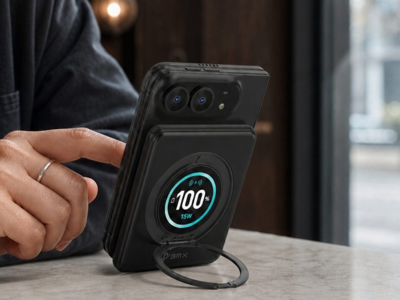
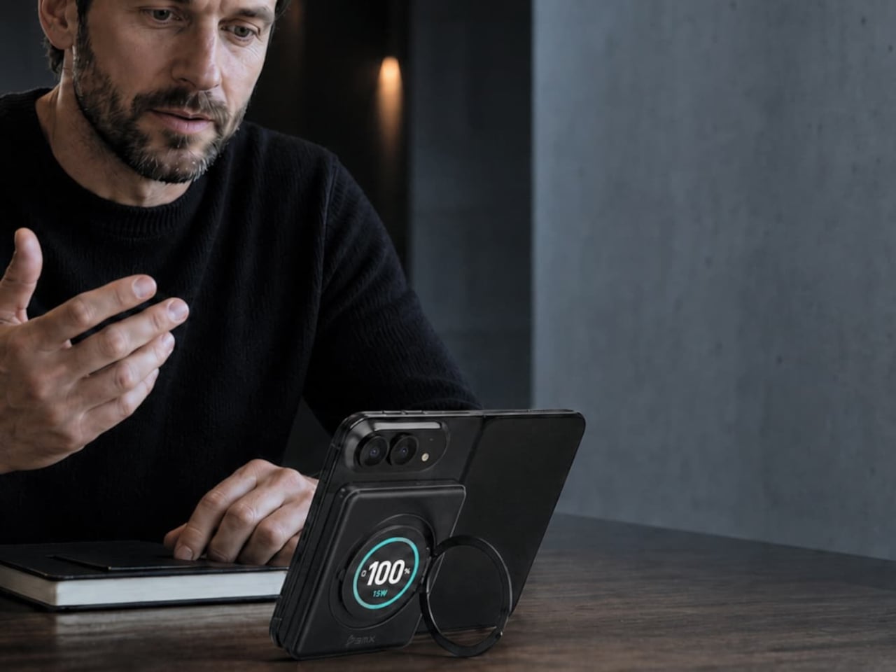
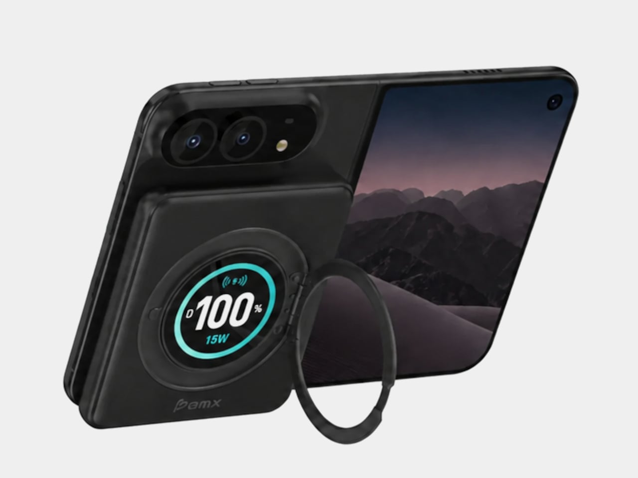
A circular ring folds out from the back and rotates 360°, giving the phone support in portrait or landscape orientation. Reading a recipe on the counter could give way to watching a video over lunch without detaching the battery. The stand makes particular sense for an unfolded screen, which offers more room to watch but also more phone to hold in your hand.

Nestled inside that ring is a full-color display showing the power bank’s remaining charge and live charging wattage. The distinction matters because the percentage belongs to the accessory, not your iPhone. It also gives you a way to check both your reserve and the current power output, rather than assuming that an attached battery is always charging at its advertised maximum speed.

The attached USB-C cable doubles as a lanyard, so wired charging doesn’t begin with a search through your bag. Plug it into a compatible device for up to 20W output, or use it to refill the power bank at up to 15W. It’s a simple detail, but it keeps the wired option available even when the rest of your charging gear is elsewhere.

Wireless charging, meanwhile, tops out at a claimed 15W, below the iPhone Duo’s supported 25W maximum. You’re getting a tailored shape rather than the phone’s fastest wireless charging. Connecting two devices also changes the numbers, splitting output between 10W over USB-C and 5W wirelessly. That could help another device through the afternoon, but neither connection retains its single-device maximum in that arrangement.

The SolidSafe name also needs a little unpacking. BMX uses semi-solid-state cells and says their reduced liquid electrolyte content helps lower fire risk compared with conventional lithium-ion batteries. That’s a reduced-risk claim, not a promise that the battery can’t fail. The rigid aluminum enclosure also helps dissipate heat, according to BMX, rather than preventing the pack from becoming warm while it charges your phone.

Available for $79.99 in the US, SolidSafe Duo adds about 0.43 inch of thickness and 4.47 ounces to your phone. Those numbers deserve as much attention as its compact outline, particularly when the phone itself already folds shut. Having a stand and cable built into the battery means fewer loose accessories to pack, but a thicker stack to slide back into your pocket.

The post SolidSafe Duo Magnetic Power Bank Is Shaped to Fit Apple’s Folding iPhone first appeared on Yanko Design.

  •  

Kenko’s 18-Gram Pieni III Camera Shoots Without a Screen

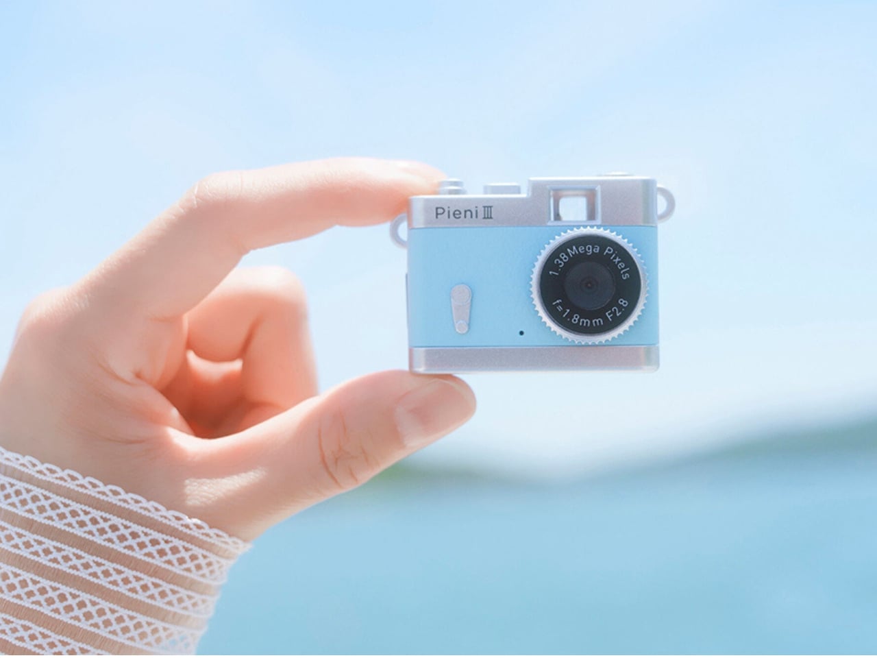
Keychain cameras have a certain appeal for those who love to carry a bit of nostalgic charm with them. Well, technically, they’re still digital cameras, but there’s a retro feel to them that appeals to those who remember taking photos before smartphones. They’re cute and tiny enough to carry as accessories, but they still let you take photos and videos to add to your collection.

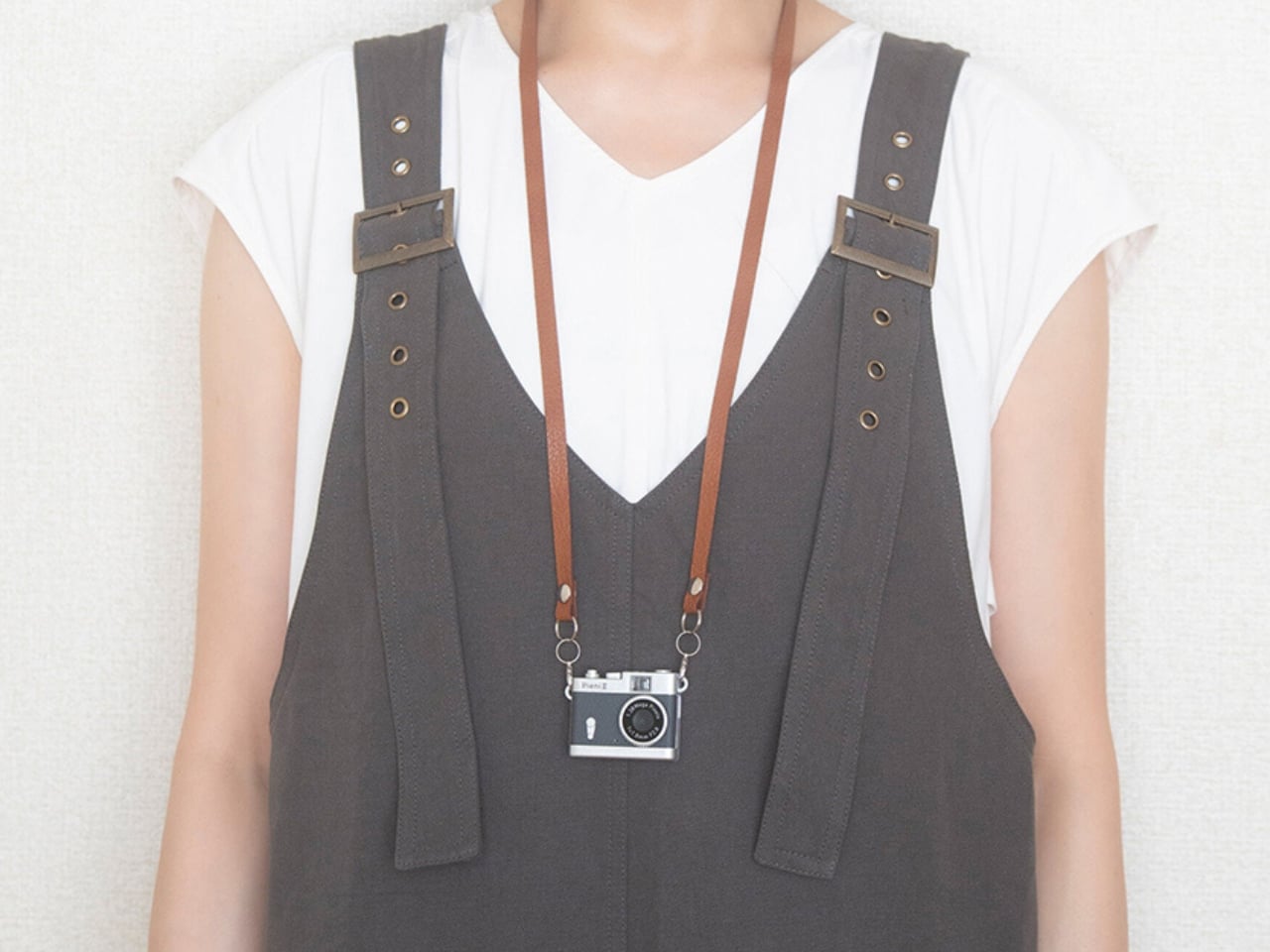
Kenko Tokina has released another tiny camera to add to the fun. The Kenko Pieni III is an ultra-small digital toy camera designed to be worn as a necklace or an accessory. It comes with a neck strap for that purpose. It’s not meant to replace your bigger camera, of course, but it offers another way to take photos and videos.

Manufacturer: Kenko Tokina

This version of the Pieni camera is just over two inches wide and weighs approximately 18 grams, excluding the memory card and accessories. It comes in a classic camera-style design, so it can also serve as a camera-shaped accessory or a decorative display. But when you want to use it as an actual camera, it can capture still images at 1440 × 960 pixels and videos with audio at 720 × 480 pixels and 30 frames per second.

There’s an important detail behind those photo dimensions, though. The sensor has only 320,000 effective pixels, or 0.32 megapixels, and the camera interpolates the images to create larger files. That doesn’t give you the detail of a higher-resolution sensor. It’s worth keeping your expectations in toy-camera territory rather than expecting crisp images suitable for large prints. But I think this lo-fi aesthetic is part of the appeal of using these toy cameras as a secondary way to capture moments.

It doesn’t have a screen or a viewfinder, so you can’t preview your framing or immediately review what you’ve taken. It can be a way to enjoy capturing a spontaneous moment without worrying about making it perfect, although aiming without a preview may be a challenge for some. There’s also a difference between accepting an imperfect photo and accidentally leaving someone out of the frame, so that uncertainty is part of the trade-off.

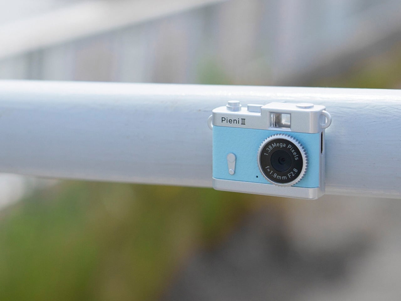
The controls are simple in number, with just two buttons. One handles power and the shutter or video recording, while the other switches between photo and video modes. LEDs indicate which mode you’re using. There aren’t many controls to navigate, although you’ll still need to learn the button presses and signals. The camera also has an integrated rear magnet, so you can attach it to compatible magnetic surfaces, such as a refrigerator or a suitable metal railing. This could be useful for recording yourself when you don’t want to hold the camera. You’ll still need to find a secure position and judge where it’s pointing, especially since there’s no screen to help you set up the shot.

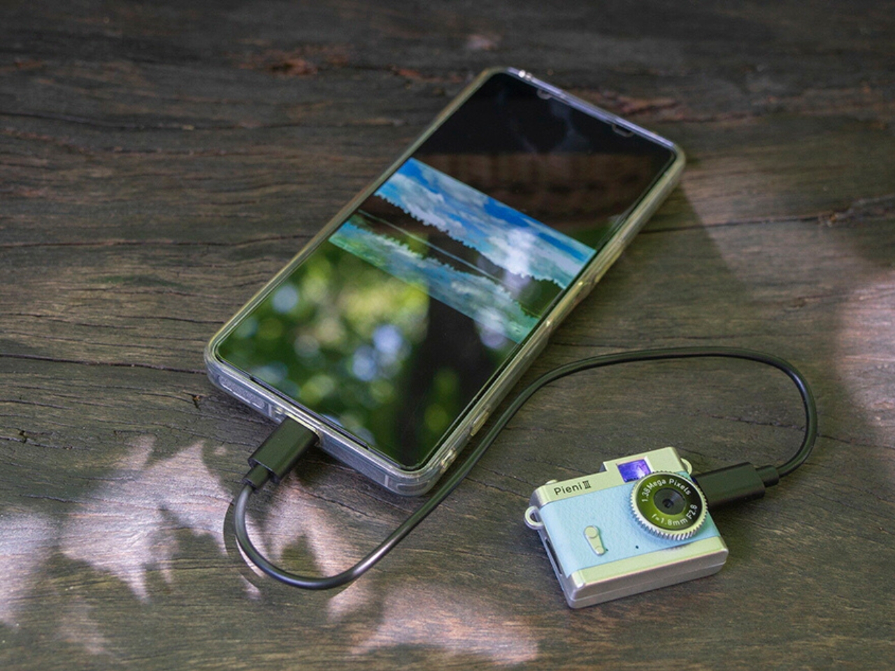
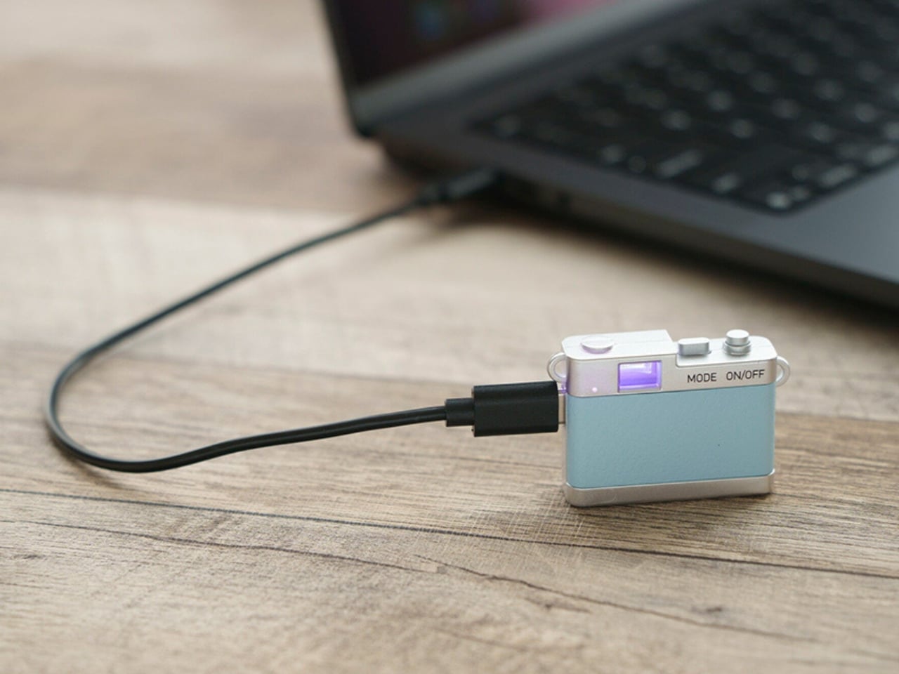
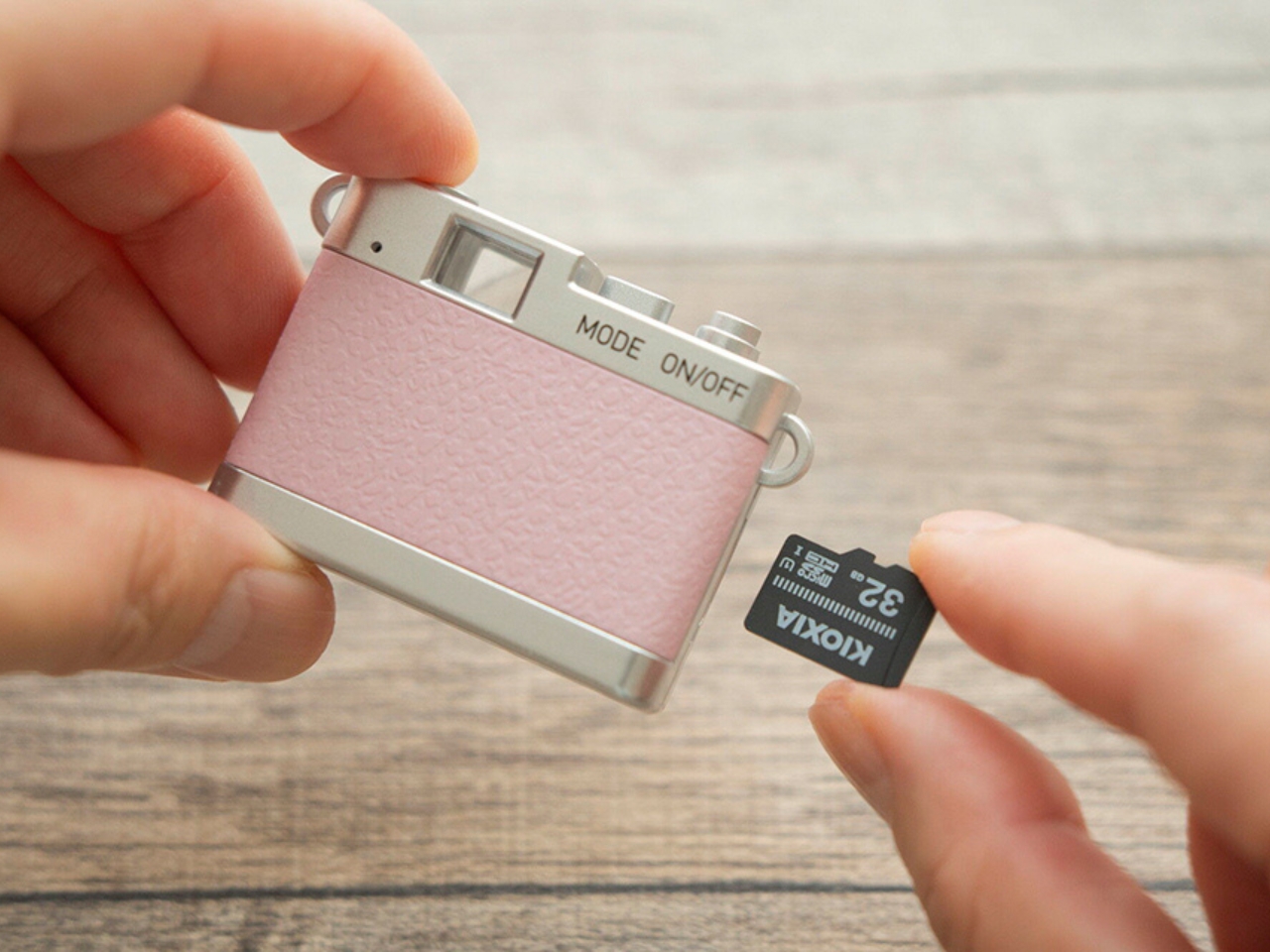
Photos and videos are saved to a separately purchased microSDHC card, with supported capacities ranging from 4 GB to 32 GB. There’s no user-accessible internal storage, so the card is something you’ll need before you start shooting. That’s a small but important extra purchase if you’re planning to give the camera as a gift. To see the results, you can connect the camera to a computer or transfer files directly to a compatible USB-C smartphone using the included USB-C-to-USB-C cable. Kenko Tokina cautions that it doesn’t guarantee compatibility with every smartphone. The USB connection also handles charging, keeping the basic setup fairly compact.

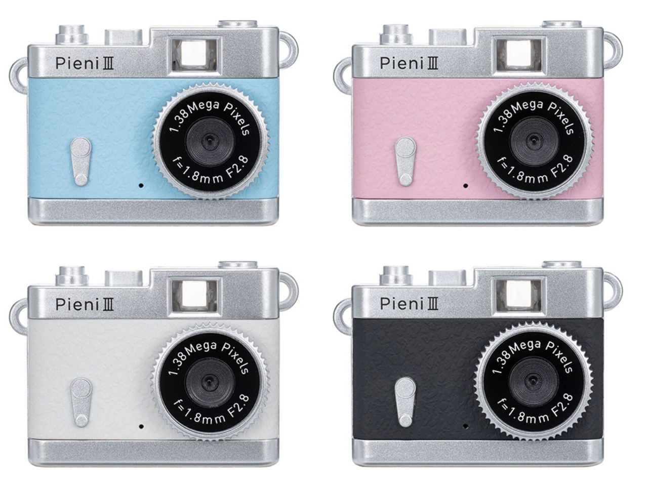
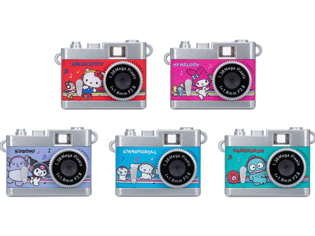
The Pieni III is available in four colors: Soda, Strawberry, Milk, and Black. There are also five character versions in the separate Sanrio Character Toy Camera STREET line, which has the same basic performance as the Pieni III. The range includes Hello Kitty, My Melody, Kuromi, Cinnamoroll, and Hangyodon.

For moments you absolutely need to capture correctly, the lack of framing and immediate review may be frustrating. But if you’re happy to take a few chances, there’s something appealing about putting the camera away without checking every shot. You get to find out later which pictures worked—and which ones missed what you were aiming for.

The post Kenko’s 18-Gram Pieni III Camera Shoots Without a Screen first appeared on Yanko Design.

  •  

Benks’ new Kevlar iPhone 18 Pro cases look like they’re ready for a holiday cruise

Kevlar has spent most of its career in serious places, like bulletproof vests, racing tires, and the occasional helmet. Chemist Stephanie Kwolek invented it at DuPont in 1965, and I doubt anyone in that lab imagined a functional fabric like Kevlar would one day be asked to look classy. Today the fiber basically has a second life as a fashion fabric. I find that delightfully absurd, like learning your bodyguard also had a career as a swimsuit model. Benks has been leaning into that split personality for a while, and its latest drop takes it somewhere sunnier.

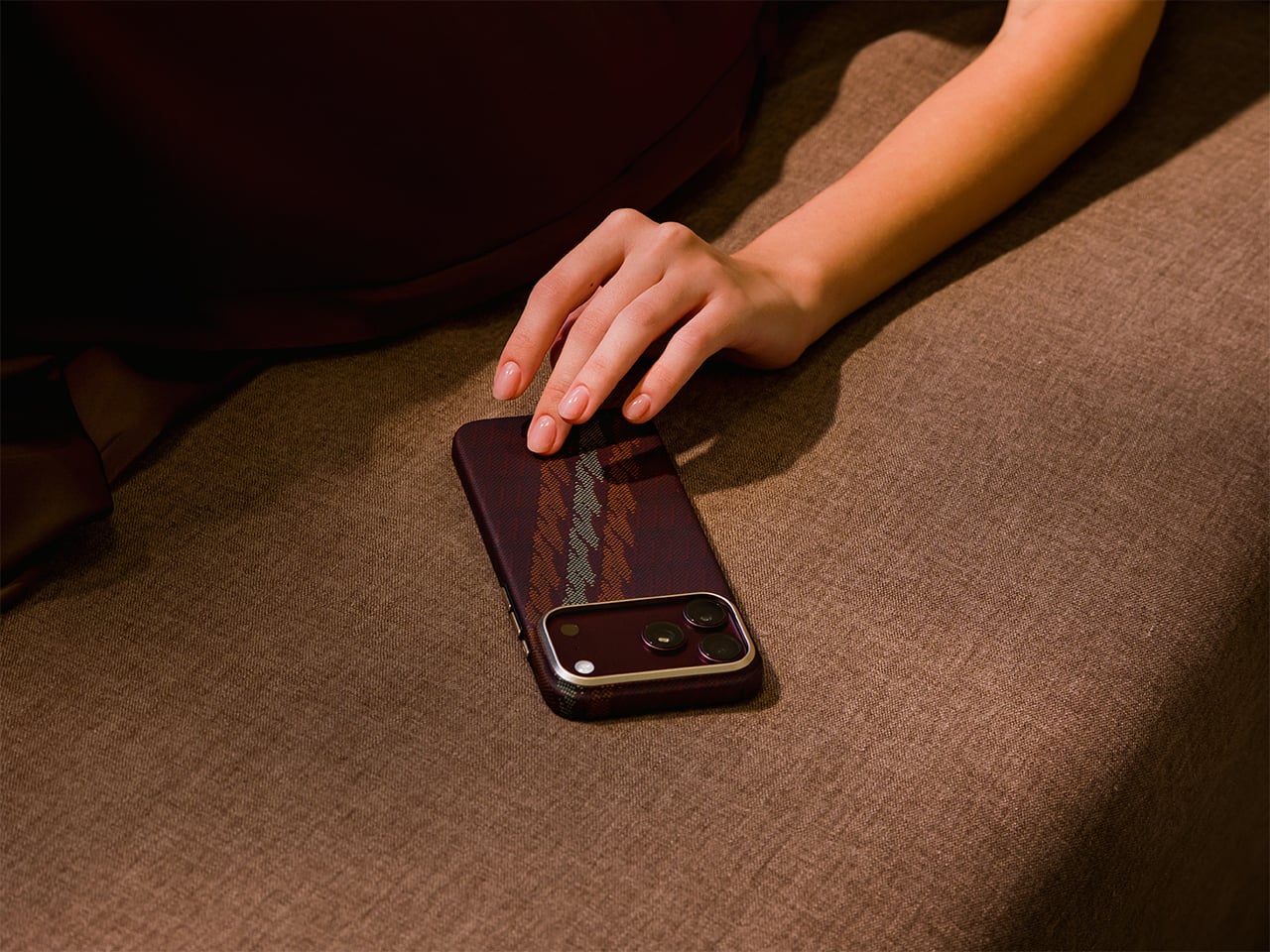
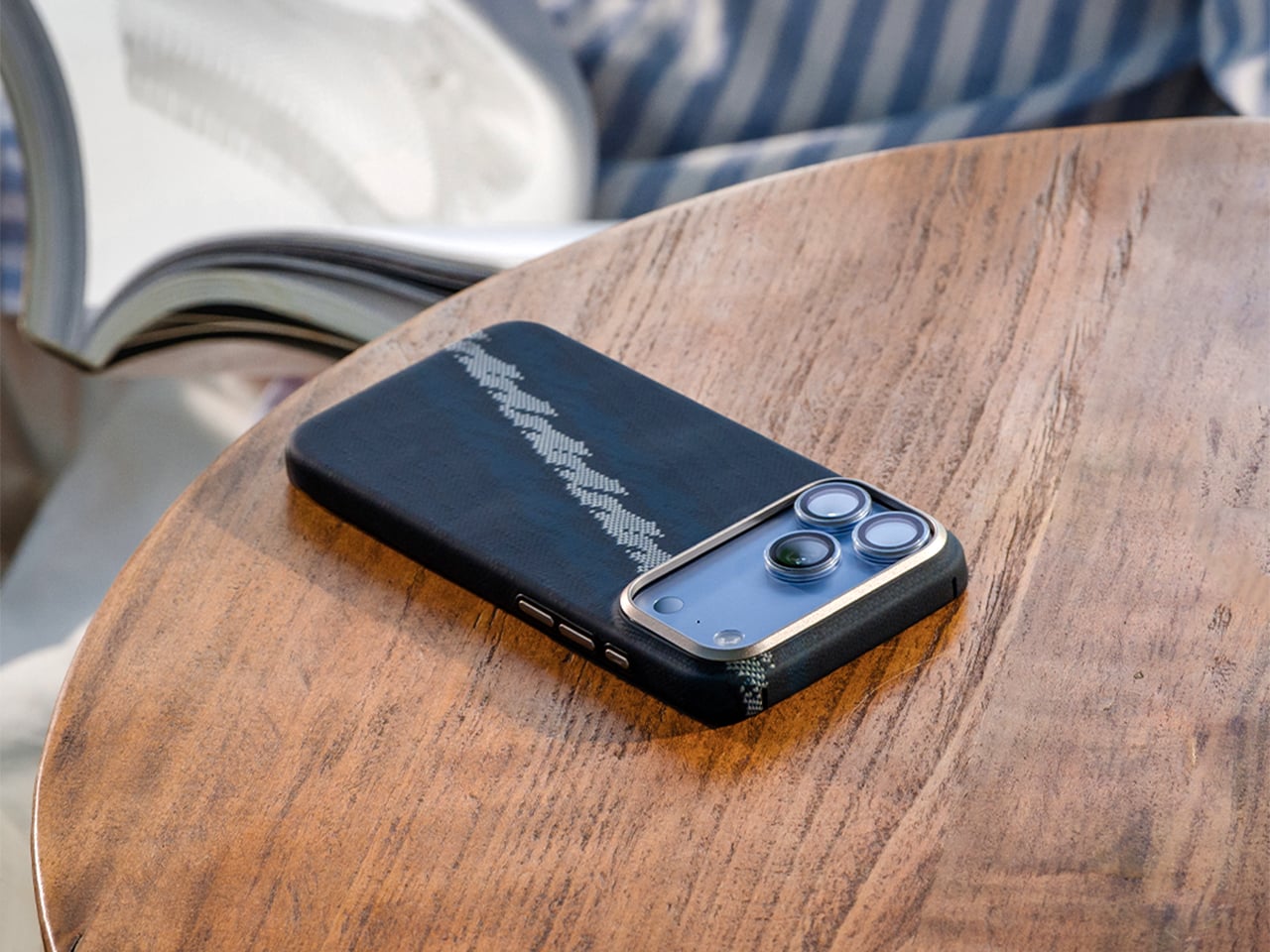
Meet Haven Azure and Haven Rouge, two Kevlar cases for the iPhone 18 Pro and Pro Max, priced at $69.99 each. Benks weaves the pattern directly into the Kevlar fiber using a 600D floating jacquard technique, rather than printing it onto the surface. That means the design is part of the weave itself, not just a layer of color that can scuff off. Azure ripples in layered blues, Rouge glows in warm reds, and both wrap the phone in a slim, full coverage shell. Building on the ArmorAir, the Haven series features a taller raised metal camera frame for enhanced lens protection, along with an upgraded ArmorKey that fully covers the Camera Control button. The result is a slim, full-coverage case that offers more comprehensive protection without compromising its refined design. Same tough stuff, just dressed for vacation.

Designer: Benks

Click Here to Buy Now: $69.99 Haven Azure | Click Here to Buy Now: Haven Rouge.

An 1800s Loom Trick, Now Running on Kevlar

Jacquard weaving builds a design into the cloth by lifting individual threads in a programmed order, a trick Joseph-Marie Jacquard automated with punched cards in the early 1800s. Silk mills near Lake Como, Benks’ stated inspiration, have long used the technique for ties. Benks applies the same logic to Kevlar, letting some threads float over others so colors and shapes appear in the weave. The 600D figure is a denier rating, which tells you how thick the yarn is. According to Benks, strands finer and more densely woven than the common 1500D give a smoother surface and a slimmer case. A loom from 1804 would recognize the idea instantly.

Getting color into Kevlar takes effort, and most of us picture the fiber as black and nothing else. Benks says the Haven colorways are woven into the fiber structure, with no laminated surface layer to peel, so the texture you feel is the weave itself. The brand has been heading here for a while, from the Knight ArmorAir with its champagne horse that reads like pixel art made from industrial fiber, to these flowing ripples. Benks bills the 600D Kevlar jacquard as an industry first, and the product shots show why it wants the credit. Big diagonal sweeps also suit a phone better than tiny repeating logos ever could.

Azure Cools Things Down, Rouge Warms Them Up

Azure sets a deep navy base and runs a diagonal band of lighter blues down the back, a bit like sunlight breaking up on lake water. Benks describes the pattern as gentle ripples in layered blue tones. Look closely at the product shots and the lighter threads read like tiny stitched pixels, which gives the band a cross-stitch charm. Rouge flips the mood with a burgundy base and a pale gold band, and Benks calls the shade Rouge Valley Red, with woven contour lines meant to recall warm valleys at dusk. Honestly, Azure feels like a lake breeze and Rouge feels like a glass of wine.

Benks shows both cases on all four iPhone 18 Pro colors, which are Black, Glacier, Burgundy, and Silver. Rouge on Burgundy looks like the obvious match, since phone and case speak the same dark red language. Azure beside Glacier makes sense too, though the blues also look sharp against Silver and Black. Each colorway has a matching ArmorPop grip and stand at $29.99 for anyone who wants the full set. The Haven tagline is “somewhere between here and away,” which also describes my mental state every Friday afternoon. Pick the mood first, then let your phone color follow.

Metal Frame, Enclosed Keys, Built-In Magnets

The iPhone 18 Pro is the first iPhone with a physical variable aperture, so its camera plateau deserves a proper guard. Haven wraps it in a raised metal frame that Benks says helps shield the lenses from scratches and bumps. Raised screen edges keep the display off flat surfaces without adding bulk. Enclosed ArmorKeys cover the side buttons, camera button included, and Benks promises crisp, responsive clicks. Cutouts line up with the ports, and the Kevlar texture wraps around the edges for a slip-resistant grip. A built-in magnetic core handles MagSafe accessories, so your charger, wallet, and grip stay where you put them.

Haven Azure and Haven Rouge are listed at $69.99 each on Benks’ site, with versions for the iPhone 18 Pro and the Pro Max (they’ll fit the 17 Pro series too). The cases boast a one year warranty, free shipping on orders of $39 or more, and a 30 day return window. Matching ArmorPop grips sit on the same product pages if you want to coordinate. Protection and personality have usually sat on separate shopping lists for phone cases, and weaving color straight into Kevlar is a neat way to merge them. Kevlar went from body armor to brunch, and I suspect it has a few more lives left.

Click Here to Buy Now: $69.99 Haven Azure | Click Here to Buy Now: Haven Rouge.

The post Benks’ new Kevlar iPhone 18 Pro cases look like they’re ready for a holiday cruise first appeared on Yanko Design.

  •  

Nothing’s Ear (open) should have been a CMF product all along… Here’s proof

I’ll say it: Nothing launched the Ear (open) under the wrong logo. The open-ear buds debuted in 2024 at $149, wrapped in Nothing’s signature transparent look, and they were good enough to win a Red Dot Product Design award. Still, every time I looked at them, my brain kept whispering “CMF.” Open-ear buds are the casual, colorful, sweat-friendly second pair you toss in a gym bag, which describes CMF’s entire personality. Even Nothing seems to have noticed, since the Ear (open) now comes in soft blue for $99 in the US. That’s CMF money in a CMF color, wearing a Nothing name tag.

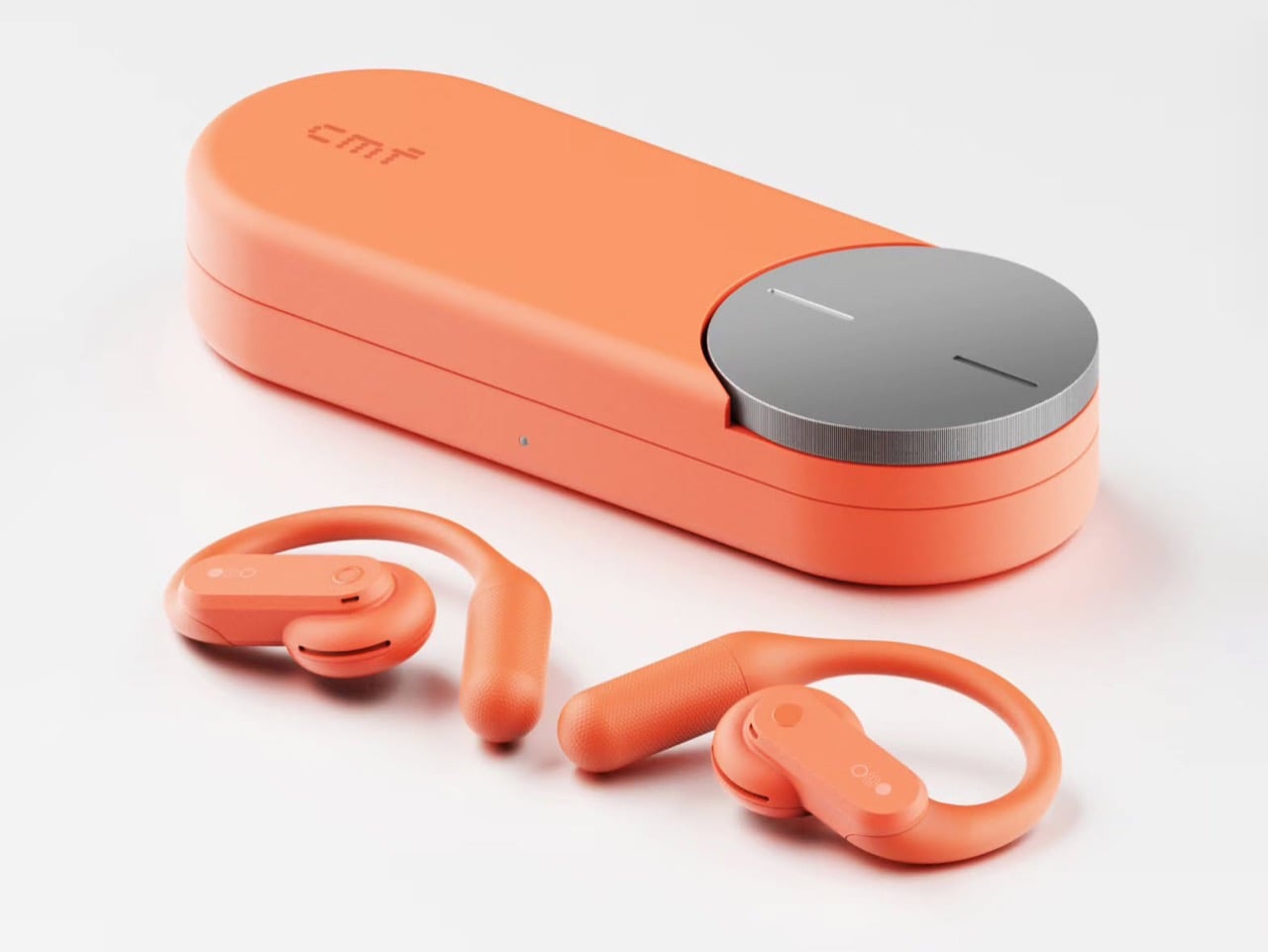
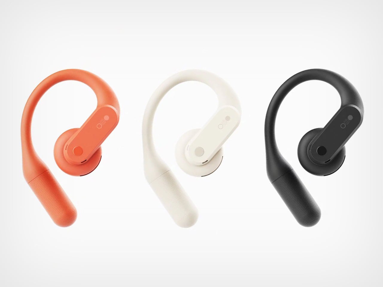
Apparently I’m not alone in this conspiracy theory. Industrial designer Shreyansh Onial, whose CMF Flip foldable concept got a reaction from Carl Pei himself, built the CMF Ear (open) that Nothing never released, and it looks like it rolled straight off CMF’s assembly line. The over-ear hook stays, but the transparent panels give way to solid Coral, Light Grey, and Dark Grey. Each bud gets a chunky physical button, and the pill-shaped case borrows the knurled Smart Dial from CMF’s $99 Clip Pro. It’s the alternate-universe launch I didn’t know I was waiting for.

Designer: Shreyansh Onial

Trading Nothing’s see-through shell for CMF’s candy-colored hooks

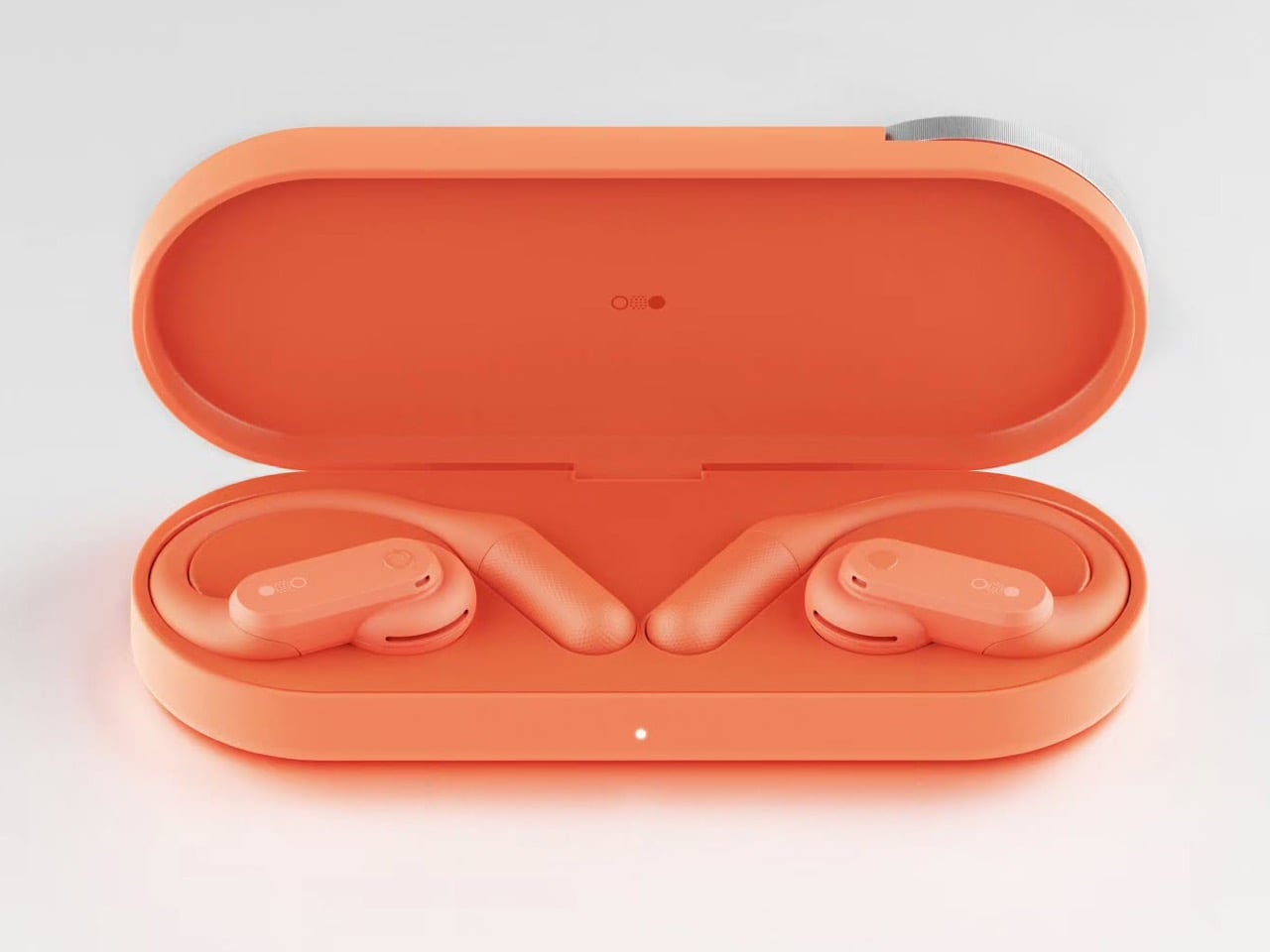
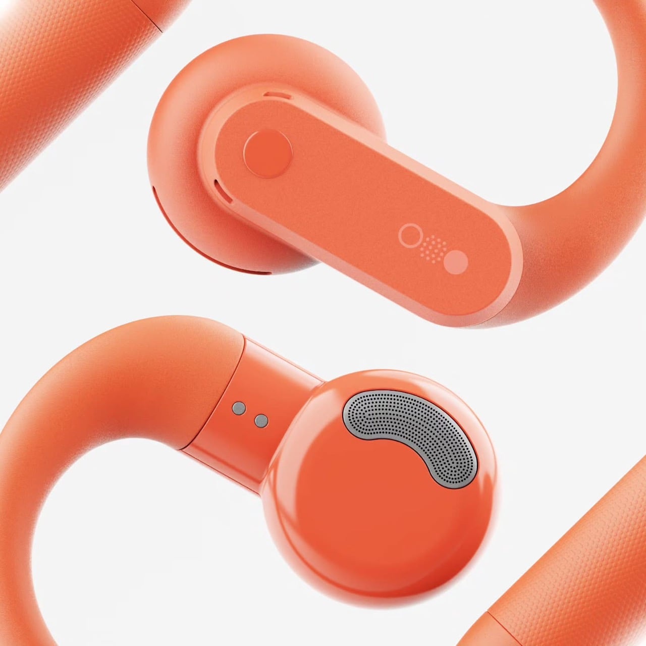
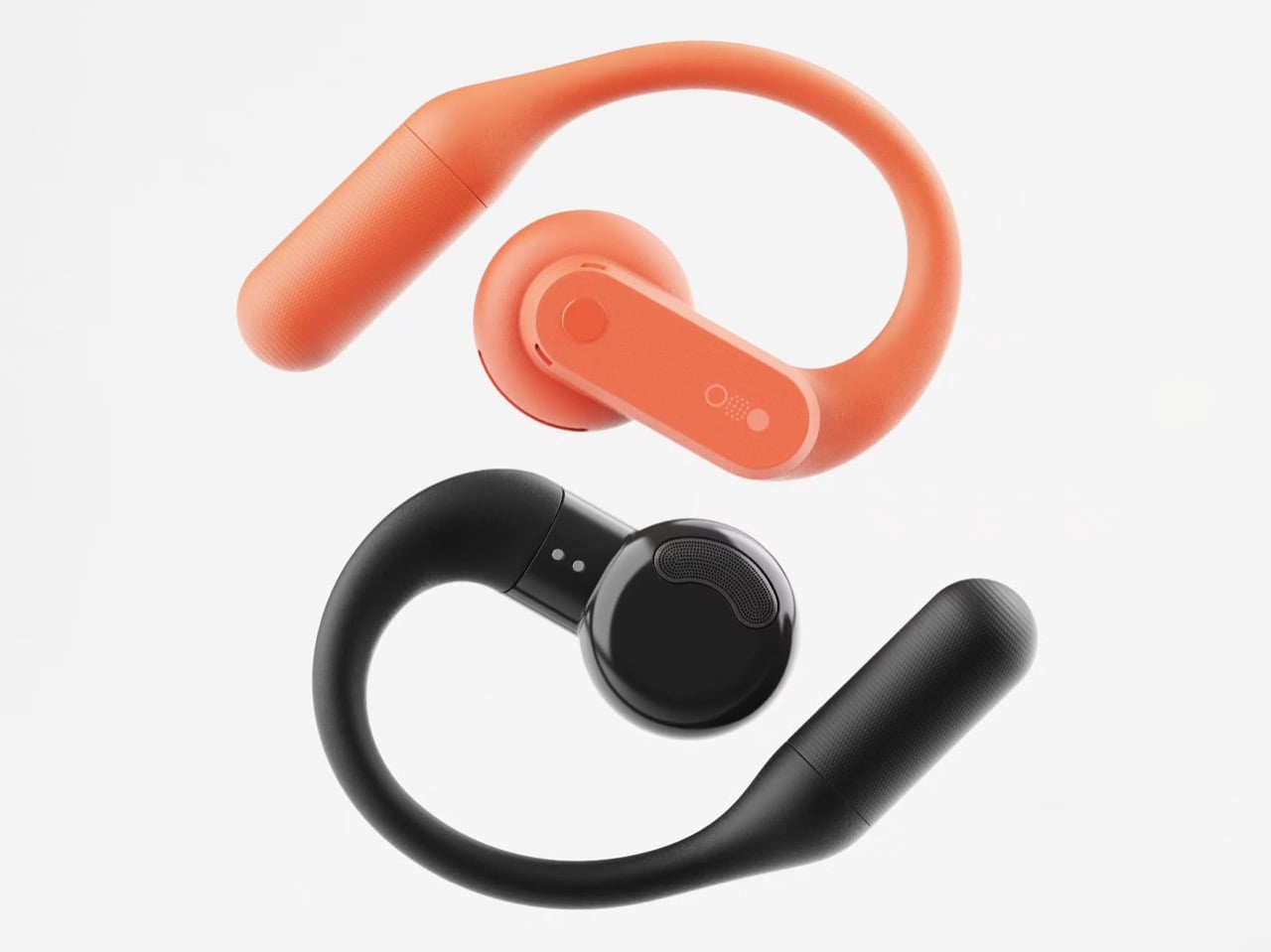
Coral, Light Grey, and Dark Grey carry the whole concept, and they match the Clip Pro’s palette exactly. Transparency is Nothing’s calling card, though on the Ear (open) much of the surface is a silicone ear hook anyway. Onial goes fully opaque, with a soft matte finish on the hook and a glossier coat on the round acoustic pod that sits by your ear canal. The outer face is a rounded pill panel with a single round button and a tiny glyph made of a circle, a dot grid, and a filled dot. The battery tail picks up a fine stippled texture, which gives sweaty fingers something to grip.

A real button on each bud fixes the biggest workout annoyance with the Ear (open), which relies on pinch controls that get fiddly with slippery fingers. CMF already gave the Clip Pro physical buttons for exactly this reason, so the move fits the brand’s own playbook. Flip the bud around and you’ll find a perforated metal grille shaped like a little kidney bean, plus two pogo pins on a short collar for charging. That bean grille is my favorite detail, because it gives the bud an oddly cartoonish face. It also mirrors the soft circles of the dial on the case. The whole thing feels friendly and approachable, which suits a pair built for sweat and sidewalks.

The Clip Pro’s Smart Dial case meets a hook built for runners

The case comes straight from CMF’s Clip Pro, a deep pill-shaped capsule with a knurled metal dial set into one end of the lid. On the Clip Pro, that Smart Dial adjusts volume, controls playback, answers calls, and triggers pairing. CMF put the same dial on its Buds Pro 2, and it has since become the brand’s signature move. Onial adds a dot-matrix “cmf” wordmark on the lid, a front status LED, and a USB-C port on the side. Inside, molded cradles hold the two hooks in a neat V, with a charging pocket waiting for each acoustic pod.

Over-ear hooks anchor behind the ear, which keeps them planted through runs, burpees, and sprints for the bus. The Clip Pro’s C-shaped clip hugs the ear’s outer edge instead, a format better suited to commutes and long desk days. That leaves the runner with a CMF-shaped hole in their gym bag, since CMF currently offers nothing for them (lowercase n). A dial makes even more sense here, because twisting a knob on the case beats digging through phone menus mid-stretch. Pair it with real buttons on the buds and you get a workout setup that never asks for a precise touch gesture.

Where a CMF Ear (open) would land in a crowded open-ear market

Open-ear audio got crowded fast, with Bose’s Ultra Open sitting at the top for $299 and Sony’s LinkBuds Clip, Huawei’s FreeClip, and Shokz’s hook-style buds filling out the field. The Clip Pro landed at $99 with LDAC support, a 10.8mm driver, and up to 32.5 hours of total battery. The Ear (open) counters with a bigger 14.2mm driver, 8 hours per charge, and 30 hours with its case. Each Ear (open) bud weighs 0.29 oz (8.1 grams), while each Clip Pro bud weighs 0.21 oz (5.9 grams). A CMF hook could split the difference, pairing the Ear (open)’s stable fit and big driver with the Clip Pro’s dial, buttons, and price.

The blue Ear (open) already sells for $99 in the US, the same price as the Clip Pro, so Nothing has basically priced its own product at CMF level. Moving it under the CMF badge would make that price tag look like a plan instead of a markdown. It would also free Nothing to return later with a pricier transparent sequel, flipping the usual order where the premium brand gets the good stuff first. CMF became an independent Nothing subsidiary headquartered in India last year, and a signature sport bud would give the young brand another reason to stand apart from its parent. Onial’s renders already look ready for the shelf. Sometimes the little sibling deserves the new toy first.

The post Nothing’s Ear (open) should have been a CMF product all along… Here’s proof first appeared on Yanko Design.

  •  

The Tinde Tiny House Gives Its Covered Porch a Dramatic A-Frame Roof

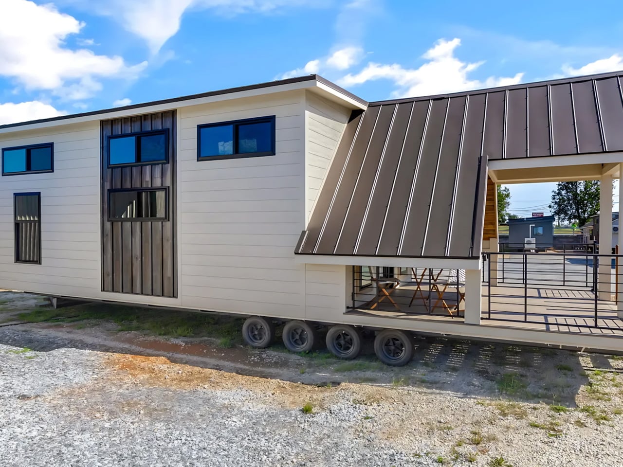
The Tinde’s most distinctive space sits outside its front door. A steeply pitched roof stretches over a generous covered porch, giving this tiny house the entrance of a woodland cabin. Built by South Carolina’s Sweet-Haus Tiny Cabin Company, the customizable park model measures 48 feet long and 14 feet wide, with a main-floor bedroom, a loft, and a flexible bonus room.

That porch gives the home a place to spread out without enclosing every available inch. In the photographed build, pale siding and dark railings frame the deck, while wood lining beneath the roof brings warmth to the entrance. The unusually sharp roofline dominates the front elevation, with a taller, more conventional volume rising behind it to accommodate the interior’s upper level.

Designer: Sweet-Haus Tiny Cabin Company

Inside, the extra width allows a living room furnished with a sofa, coffee table, and separate armchair. A built-in counter with stool seating provides a spot for meals or laptop work without introducing another freestanding table. The arrangement leaves the central floor comparatively open, an important distinction in a home where the living area also handles circulation between the entrance and kitchen.

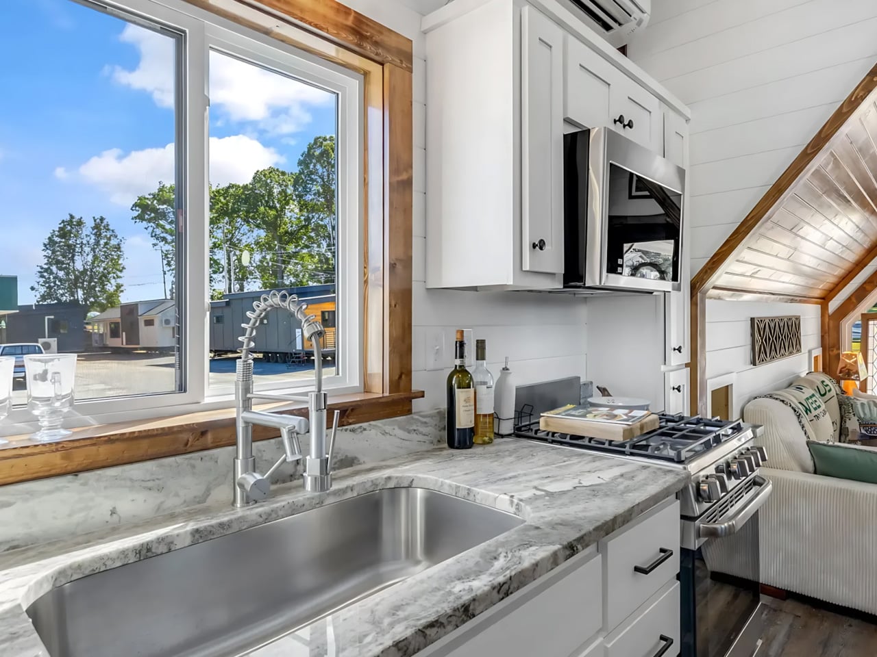
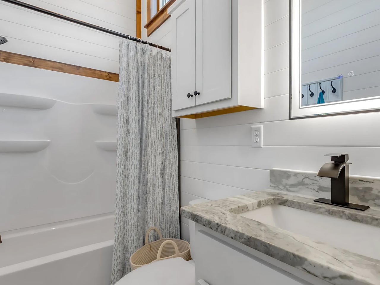
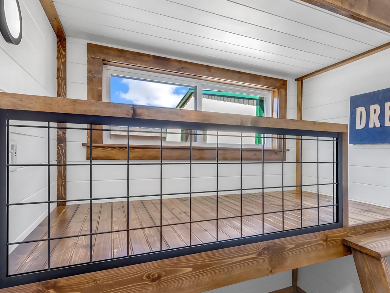
The kitchen gathers an oven, four-burner propane cooktop, microwave, and refrigerator into a compact working area, supported by overhead and lower cabinetry. Farther back, the bathroom includes a bathtub and shower combination, vanity, and flushing toilet. A separate bedroom keeps the primary sleeping space downstairs, so occupants don’t have to climb to the loft every night. That makes the upstairs accommodation an option rather than a daily obligation.

The bonus room offers the most consequential choice in the floor plan. Sweet-Haus lists potential uses including bunks, laundry, an office, or storage, allowing buyers to prioritize the activity that would otherwise crowd the main living space. The company says the bedroom, loft, and bonus room can accommodate up to six sleepers, depending on configuration. That’s sleeping capacity, rather than six equally private bedrooms.

There are useful distinctions between the available configurations. The bonus room comes as an open space, with single upper-bunk and double-bunk arrangements listed as upgrades. Bathroom options include a tub-shower or a walk-in shower without an upcharge. These decisions matter more than a paint selection: each changes how the limited interior can serve a household, particularly when guests, laundry, and working from home compete for space.

Sweet-Haus currently lists a starting price of $131,000 for the Tinde, while its options page identifies the dramatic A-frame roof as a $15,000 upgrade. Buyers should distinguish the photographed cabin from the base specification. Its appeal is clear: the design devotes substantial space to gathering, indoors and out, while leaving one small room available for whatever the household needs most.

The post The Tinde Tiny House Gives Its Covered Porch a Dramatic A-Frame Roof first appeared on Yanko Design.

  •  

This Minimalist Bamboo Coffee Table Hides Everyday Clutter in Plain Sight

A coffee table usually has a fairly straightforward job: hold a cup of coffee, a few books, and whatever else happens to accumulate in the living room. But what if it could accommodate everyday clutter without putting any of it on display? Designed by Marek Kounovský of MK Designers in collaboration with Prague-based furniture company Frayer, the Handle Table takes this familiar piece of furniture and gives it a more considered purpose. Made primarily from bamboo, the table incorporates concealed storage, an integrated handle, and a restrained silhouette that allows its material and construction to take center stage.

The design takes inspiration from the Japanese principle of hodo-hodo, which loosely translates to the idea of “just enough.” Rooted in moderation and balance, the philosophy encourages appreciating things that serve their purpose without excess. Kounovský translates this thinking into furniture by reducing the table to its essential elements. Rather than introducing elaborate mechanisms or decorative features, he focuses on proportion, geometry, and the relationship between form and function. Every visible detail has a reason to exist, and the absence of unnecessary embellishment gives the table its distinct character.

Designer: MK Designers

One of its most interesting features is the concealed storage compartment, which is incorporated directly into the table’s geometry. Coffee tables often become gathering places for remote controls, magazines, chargers, and other small objects that are useful to have nearby but can quickly make a room feel cluttered. Handle Table addresses this familiar situation by providing a dedicated space for everyday belongings while preserving its clean exterior. The compartment remains visually discreet, allowing the table to maintain its sculptural appearance even as it performs an additional function.

The integrated handle is another subtle yet important element of the design. Rather than appearing as a separate attachment, it is incorporated into the tabletop itself, creating a functional feature that feels consistent with the overall composition. This detail makes the table easier to move and reposition, an especially relevant consideration for contemporary interiors where furniture frequently accommodates different activities throughout the day. The table can shift between spaces and arrangements without demanding a permanent position, extending its usefulness beyond that of a conventional stationary coffee table.

Material selection plays an equally significant role in the project. Bamboo forms the main structure, bringing its recognizable grain and natural texture into the otherwise reduced design. The surface is treated with an oil-based wood stain, developed through experimentation with application techniques suited specifically to bamboo. Instead of concealing the material beneath an opaque coating, the finish emphasizes its inherent structure and tactile qualities. The resulting surface gives the table a sense of depth while retaining the character of the bamboo itself.

This attention to finishing is particularly important in a design with so few visual elements. Without decorative distractions, the material becomes one of the primary ways the object communicates its identity. The stained bamboo, precise construction, and carefully controlled proportions work together to create visual interest through restraint. Even the concealed compartment contributes to this approach, demonstrating how practical considerations can become part of the furniture’s fundamental structure rather than additions made after the form has been established.

First presented at the 14th Czech Design Week international design festival in Prague, Handle Table reflects the collaboration between Kounovský’s design practice and Frayer’s approach to bamboo furniture. The project brings together an interest in thoughtful material treatment and an understanding of how furniture participates in everyday routines. Its simplicity is the result of deliberate decisions about what to include, what to conceal, and what can be left out altogether.

There is something appealing about furniture that makes room for the realities of daily life without constantly drawing attention to its cleverness. Handle Table does not attempt to reinvent the coffee table through an abundance of features. Instead, it refines the familiar object through a few carefully integrated gestures. The storage keeps essentials close, the handle makes movement easier, and the bamboo brings warmth and texture to its compact form. In a category where additional features are often presented as improvements, Kounovský offers a different proposition: perhaps a well-designed object needs only enough to do its job beautifully.

The post This Minimalist Bamboo Coffee Table Hides Everyday Clutter in Plain Sight first appeared on Yanko Design.

  •  

This pixel-covered MINI concept makes the Hyundai Ioniq 5 look subtle

Hyundai got everybody talking about pixels in 2019, when the 45 EV Concept showed up in Frankfurt with square-cut lights, and the Ioniq 5 carried the idea to showrooms in 2021. Hyundai even named the look Parametric Pixel and spread it across the headlights, taillights, and wheels. It was a smart move, and it gave the Ioniq 5 a face you could pick out of a parking lot from across the street. Still, Hyundai used pixels like a seasoning, a sprinkle here and a dash there. Somebody was bound to dump the whole shaker.

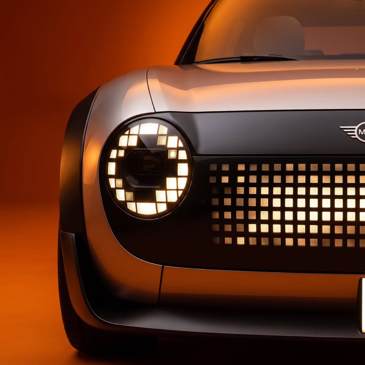
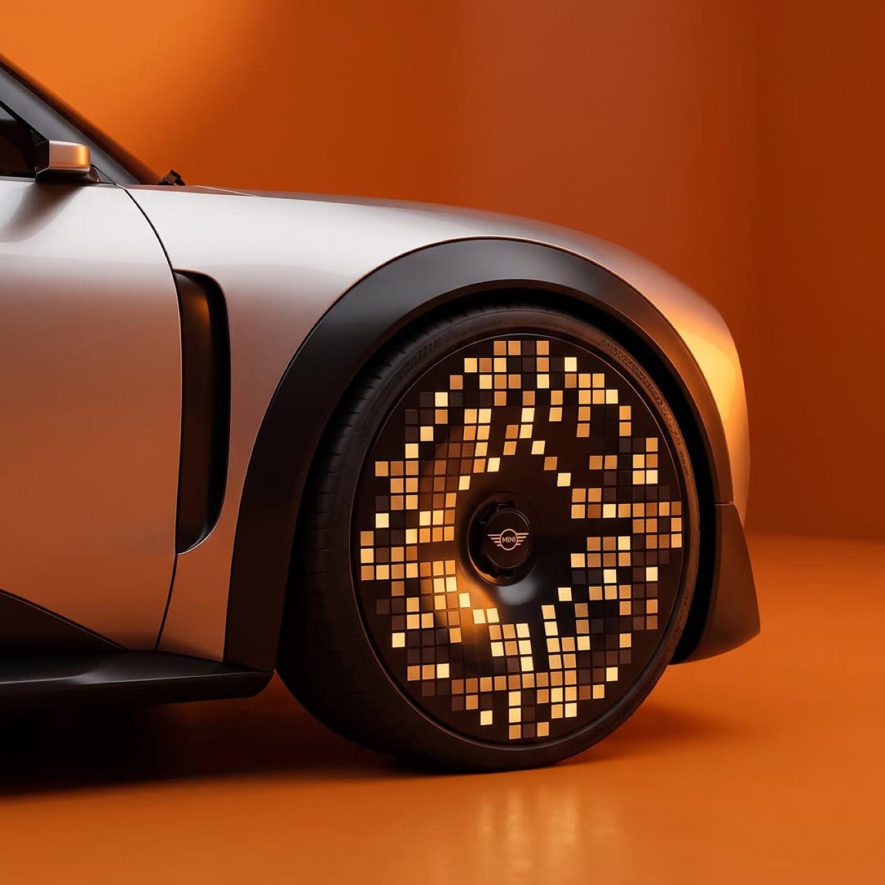
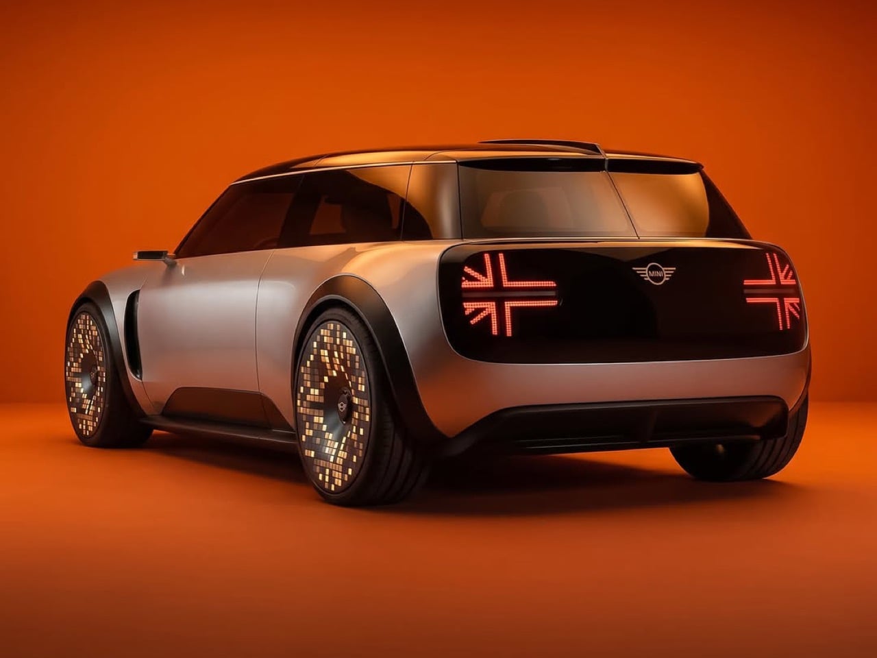
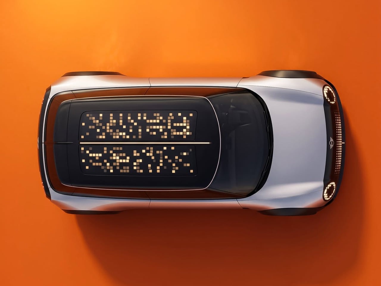
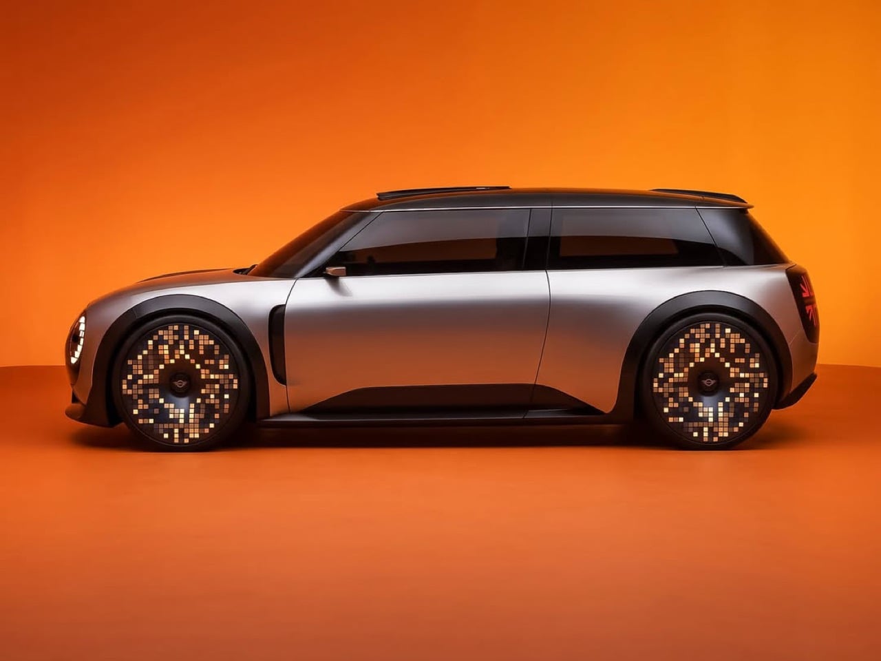
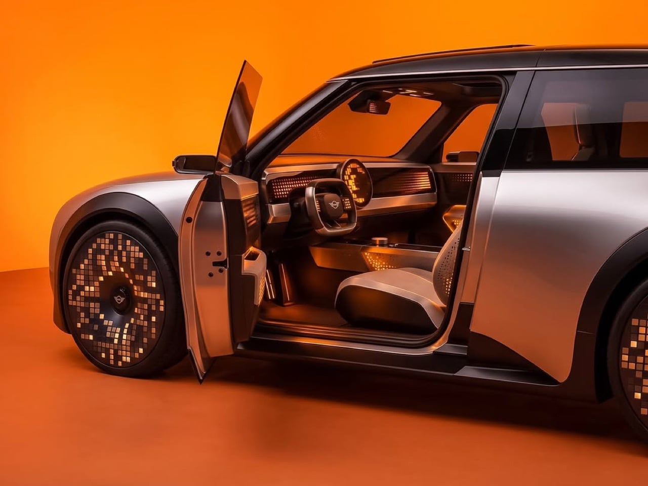
That somebody is Uygar, a Turkey-based designer who calls himself a professional daydreamer, and the shaker is a MINI. The headlights keep MINI’s round shape but fill the rings with squares, a dot-matrix grille owns the nose, and each wheel is a glowing mosaic disc. The Union Jack taillights are rebuilt out of red pixels, a nod to the flag lamps from MINI’s 2018 facelift. It’s a long-roof five-door with stubby overhangs, a dark roof, and satin champagne-silver paint, so the pixels do the talking. I tried counting the squares on one wheel and gave up when my coffee went cold.

Designer: Uygar (uygarspots)

Round headlights, square pixels, and a grille that glows

MINI’s round headlight is the closest thing the brand has to a signature, so Uygar leaves the circle alone and changes what it is made of. Each ring becomes a loop of little squares wrapped around a dark projector lens, like a digital eye with a very serious pupil. Below it, the closed grille is a dot-matrix field that glows brightest at the center and fades toward the edges. A thin vertical light bar drops from the bumper like a tiny exclamation mark. From a block away the face looks friendly, and up close you can count the grid.

Hyundai keeps its pixels inside the lamps, so the Ioniq 5 still reads as a car with a few digital accents. Here the whole nose becomes one display, so the face reads as a single graphic. That suits a brand whose cars have worn a cheeky expression since Alec Issigonis’s original Mini arrived in 1959. The production Cooper EV already lets owners pick from three light signatures, so a face that changes mood is hardly a leap. This one has far more dots to play with, and I suspect it would be a menace at red lights.

The wheels and taillights carry the pixel jewelry

The wheels are where the idea gets silly in the best way. Each one is a full disc covered in amber squares, arranged in a swirl that thins out toward the rim and bunches up around the MINI wings at the hub. Some squares glow bright while others sit nearly dark, so the whole disc looks caught mid-sparkle. Hyundai’s pixel wheels ask you to read the pattern in the metal, and these ask you to read it in light. Park one at night and you have a disco ball on each corner, minus the awkward dance lessons.

The rear is the cleanest trick in the set. A black glass band spans the tailgate and holds two Union Jack lamps built from red dots, with the MINI wings sitting between them. MINI introduced flag-style taillights in 2018, using the turn signals for the horizontal bars and the brake lights for the vertical ones. Then the 2022 Aceman concept drew a Union Jack across its grille in matrix LEDs. This render finishes the thought by building the flag from pixels, which is where a flag made of light was always headed.

MINI already flirted with pixels, and this is the follow-through

MINI did not wander into this blind. The Aceman concept appeared in July 2022 and made its first public showing at Gamescom in Cologne, which tells you exactly who the brand was flirting with. Its matrix LED headlights and grille drew Lite-Brite comparisons, a nod to the glowing peg toy Hasbro launched in 1967, and the right headlamp could even wink. The Cooper EV that followed took a calmer path, with round lamps, three light signatures, and a 9.4 inch (240mm) round OLED screen inside. The pixel face was the Aceman’s loudest idea, and production turned the volume down.

Uygar’s concept feels like the alternate timeline where nobody in the design review said “maybe a little less.” Hyundai sprinkled, MINI nibbled, and this render tips the whole shaker over the car. If I owned a MINI and somebody offered me these wheels, I would ask where to sign, then ask where the off switch is. The little British hatch has always been the brand most willing to act like a toy, and a toy with a glowing face is hard to argue with. Dump the whole shaker, I say, and let the pixels fall where they may.

The post This pixel-covered MINI concept makes the Hyundai Ioniq 5 look subtle first appeared on Yanko Design.

  •  

Scooby-Doo Birkenstock Concepts Actually Look Like the Gang

A turquoise strap and a tiny “SD” tag turn a caramel clog into Scooby-Doo before you even register the spots. That’s the appeal of “Scooby Birks,” an unofficial Birkenstock × Scooby-Doo concept collection by The Missing Drop. It addresses a familiar design problem: how to wear your affection for a cartoon without looking like you borrowed something from the costume aisle. I’d rather recognize a character through those details than a giant printed face.

Before anyone starts planning a purchase, these are imagined products, not manufactured prototypes. The project has no affiliation with or endorsement from Birkenstock or Warner Bros. Its six designs borrow familiar footwear silhouettes to interpret Mystery Inc. and the Mystery Machine. That distinction matters because the presentation, right down to the packaging, has the confidence of an actual retail campaign.

Designer: The Missing Drop

Scooby’s Boston is the clearest introduction to the idea. Its brown, suede-like surface carries irregular dark patches, while the turquoise buckle strap takes the place of his collar. The dangling gold-colored tag completes the reference. Moving a collar onto an existing shoe strap is an economical decision: the designer gives a familiar component another meaning without needing to reshape the entire clog. Even the rounded toe feels appropriate for this particular character.

Shaggy’s Boston would be my pick, partly because the joke is so pleasantly literal. The concept imagines olive-green shaggy shearling across the upper, paired with a rust-colored, corduroy-textured strap and a little biscuit charm. His green shirt and brown pants become a material palette. It’s deliberately scruffy, but the buckle and recognizable clog shape keep it from reading as a novelty slipper. I’d happily lose the charm and keep everything else.

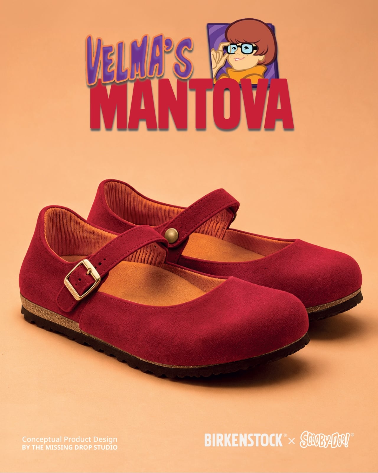
Velma gets a red Mantova Mary Jane with orange ribbing around the interior, a reference to her sweater that rewards a closer look. It’s probably the easiest design here to separate from its inspiration and wear as an ordinary shoe. Daphne’s purple Namica takes the opposite approach, adding a lavender sole band and a bright green scarf tied beside the buckle. The wedge gives her interpretation a dressier profile, although that dangling scarf raises a practical question about keeping it clear of the ground.

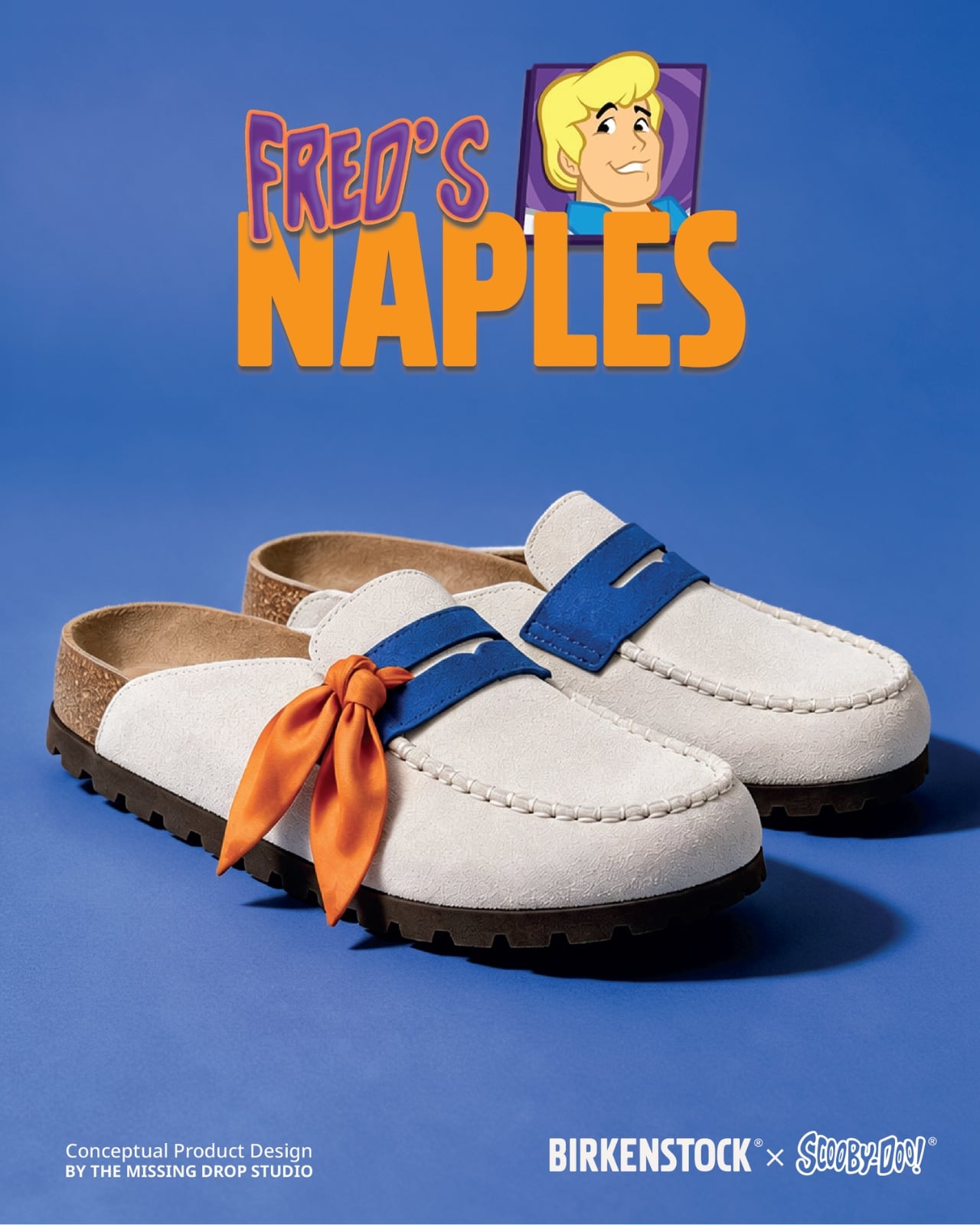
Fred’s Naples translates his outfit into a cream-colored loafer-style upper, blue detailing, and an orange scarf knot. I like the way the moccasin-style stitching gives that polished character a slightly more relaxed expression. Then there’s the Mystery Machine Arizona, with turquoise straps, lime edging, and orange flowers. Including the van is a smart expansion of the collection: it offers a recognizable reference for someone who loves the show but doesn’t particularly identify with one member of the gang.

The shoebox deserves attention, too. Inspired by Scooby Snacks, it uses turquoise, a broad lime diagonal, orange flowers, and oversized “Scooby Birks” lettering. The palette connects it to the van as well as the fictional treats. I like that the packaging allows itself to be louder than the footwear. A box can carry the full cartoon enthusiasm while the shoes get on with being something you might build an outfit around.

The response suggests that this visual shorthand travels well. Designer Julien Buisson-Fizellier, who identifies the project as his work, reported nearly 8 million TikTok views. That’s his reported figure, not evidence of purchase demand, but it helps explain the concept’s appeal as a shared image. You can recognize the reference, pick a favorite, and send it to someone without needing a lengthy explanation.

My reservation is how easily the campaign’s polish could outpace a viewer’s attention to its concept label. The more convincing an imaginary collaboration looks, the more important that disclosure becomes. Still, the design lesson is worth taking seriously. Scooby’s collar already behaves like a strap; Daphne’s scarf can sit beside a buckle. Those connections give the collection its personality. I’d want a real version to preserve that specificity, even if the loose accessories needed another pass before leaving the drawing board.

The post Scooby-Doo Birkenstock Concepts Actually Look Like the Gang first appeared on Yanko Design.

  •  

This porcelain Pioneer DJ setup belongs in a museum, not an Ibiza nightclub

David Guetta just won DJ Mag’s Top 100 DJs poll for a record sixth time, and I have a very specific idea for his trophy shelf. Somebody on the internet has turned a Pioneer DJ setup into Korean blue-and-white porcelain, tigers and all. Two decks and a four-channel mixer, glazed bone white and hand-painted (well, AI-painted) in cobalt blue. It looks like something you’d find behind glass at the Met, right before a security guard asks you to step back. It’s also the most Guetta-coded object I’ve seen all year, because a guy who headlines weekly Ibiza residencies deserves a rig that looks as expensive as the bottle service.

The setup comes from creators patchkims and takitani.lab, who posted it as the “Joseon Baekja Prototype,” complete with a “1 of 1, no restock” caption that reads like a sneaker drop. It’s an AI render, so nobody’s shipping it to Guetta’s villa anytime soon. The idea still lands, though. Each jog wheel carries a tiger and a magpie under a pine tree, lifted straight from Korean folk painting, and the screens swap waveforms for misty mountains and waterfalls. Suddenly your DJ gear graduates from booth equipment to living room centerpiece, which is a fun flex for anyone, let alone the world’s No. 1 DJ.

Designers: patchkims & takitani.lab

Kkachi horangi is a genre of Korean folk painting where a deliberately goofy tiger, nicknamed the idiot tiger, plays the aristocratic yangban, and a smug magpie in a pine tree speaks for the common people. Both jog wheels here carry that exact scene, with the cat prowling below and the bird looking unbothered above. The two decks get different tiger poses, so the platters work like a call and response. Joseon painters used the setup to poke fun at the ruling class, and now it sits under the palms of whoever runs the dance floor. That is either delicious irony or very on-brand for a king of the booth.

The screens trade waveforms for misty peaks, a waterfall, a pavilion, and a pair of moons, echoing Irworobongdo, the sun, moon and five peaks painting that stood behind the king’s throne in Joseon palaces. The sun and moon stood for the king and queen, so the painting doubled as a majesty backdrop. A headliner on a raised stage occupies similar real estate, so the throne comparison writes itself. The original sun burned red, and going cobalt turns it into a second moon, which suits a room that wakes up after midnight. Calling a DJ booth a throne room is a stretch, but watch a stadium crowd hang on a Guetta build-up and the royalty comparison stops feeling silly.

Joseon Korea made white its signature after the green celadon era of Goryeo, and cobalt-painted porcelain sat at the top of the pile. The pigment was rare and imported from China, so when supply dried up, court kilns improvised with iron-brown, and some banquet wares wore painted imitations of blue-and-white called gahwa, literally fake painting. A porcelain Pioneer rig conjured by AI is a 2026 gahwa, a convincing stand-in for an object nobody has actually fired in a kiln. I’m weirdly fine with that, because the Joseon court got there first. Meanwhile, Christie’s has estimated a genuine 15th-century cobalt jar at roughly $2 million to $3 million, so the real thing sets the bar high.

The real-world version of this lineup runs two AlphaTheta CDJ-3000X players at $2,999 each plus a Pioneer DJ DJM-A9 mixer at $2,899, roughly $8,900 in the US. The render looks closer to the older CDJ-2000NXS2 generation, disc slots and all. Pioneer did sell a limited white CDJ-2000NXS2-W run in 2017, so colorway flexes are old news for the brand. I imagine if such a product were to exist, it would probably cost in the hundreds of thousands. That being said, I’m sure an enthusiastic deejay with money to throw could acquire this for their den. Guetta, SHM, heck even Shaq… I’m looking at y’all.

The post This porcelain Pioneer DJ setup belongs in a museum, not an Ibiza nightclub first appeared on Yanko Design.

  •  

These retro-modern Headphones put audio adjustments on physical dials and tactile switches

Adjusting your headphones shouldn’t mean searching for a tiny button or guessing where to tap a touch-sensitive surface. TUNE X3 explores a more hands-on approach, using knurled dials and physical switches that let users feel their way through everyday audio adjustments. Designed by Pressec Design as part of a fictional product family, these concept headphones make tactile interaction a defining feature of their industrial design.

The headphones pair a brushed aluminium chassis with high-contrast orange textile padding across the ear cushions and headband. The raw metallic finish recalls mid-century studio equipment, while the saturated fabric creates a bold visual contrast. Exposed fasteners and a wide-profile headband reinforce the utilitarian character, giving TUNE X3 the appearance of precision equipment. This is a detour from the currently trending minimalist consumer gadgets. It’s like bringing in a muscle car in the era of Tesla EVs.

Designer: Pressec Design

The physical controls are the core of the niche concept. Dedicated dials and tactile switches handle volume, treble, and active noise cancellation (ANC), giving users distinct controls for common listening toggles. Their knurled surfaces provide texture under the fingers, making the interface feel more deliberate than a smooth touch panel. The design suggests a listening experience in which users can reach for a control, recognize it by touch, and make adjustments without navigating an onscreen menu. While the concept does not establish how the controls perform in practice, it places physical interaction at the heart of the headphone experience.

TUNE X3 is part of the same fictional product family as the CINE X3. The designer developed both concepts around a consistent visual language, carrying shared characteristics across the collection without simply repeating the same shapes. Materials, proportions, finishes, and hardware details establish continuity while allowing each product to retain its own identity.

The project also explores how Vizcom can support product-family development by using previous designs as references. This approach helps designers preserve a recognizable character across multiple concepts while continuing to explore distinct forms and functions.

TUNE X3 remains a conceptual design, with no confirmed release date, price, or technical specifications. Its core idea is straightforward – physical controls can make headphone interaction feel more immediate and intentional, while giving the product a distinctive identity shaped by the way users handle it.

The post These retro-modern Headphones put audio adjustments on physical dials and tactile switches first appeared on Yanko Design.

  •  

Clevetura S Keyboard Review: Swipe Across the Keys Instead of Reaching for a Mouse

PROS:


  • Innovative combination of keyboard and touchpad in one

  • Compact, lightweight design

  • Customizable gestures and sensitivity

  • Supports 3 Bluetooth and 1 USB-C connections

CONS:


  • Has a bit of a learning curve for accuracy and speed

  • Premium price tag

RATINGS:

AESTHETICS
ERGONOMICS
PERFORMANCE
SUSTAINABILITY / REPAIRABILITY
VALUE FOR MONEY

EDITOR'S QUOTE:

The Clevetura CLVX S brings typing and navigation together in a compact design that gives your mouse hand less traveling to do.

Keyboards and mice have shared our desks for decades, but our hands still have to travel between them whenever typing gives way to clicking. That familiar shuffle becomes especially noticeable when there’s barely enough room for a laptop, let alone another accessory. The Clevetura S offers an interesting solution by turning the keys themselves into a touchpad, giving your fingers another way to get around without leaving the keyboard.

Also known as the CLVX S, this compact, 78-key keyboard brings Clevetura’s TouchOnKeys technology to a more portable design. The Windows version reviewed here can handle familiar gestures without additional software, although there’s plenty to customize if you want to. More importantly, it makes an unusual interaction surprisingly useful, even if sliding across letters and keeping resting fingers from triggering gestures take a little getting used to.

Designer: Clevetura

Aesthetics

Upfront, the Clevetura S looks almost like someone forgot to leave space between the keys. The flat keycaps sit unusually close together, giving the 78-key layout a tidy, almost tiled appearance. There’s a practical reason for that, of course. Fingers need to travel across the surface as comfortably as they press down on it, and generous gaps would make that second job considerably less inviting.

An anodized aluminum base gives the keyboard its silver lower half, while polycarbonate covers the top and ABS plastic forms the keycaps. Both black and white versions retain that silver body, which is particularly noticeable against the darker finish. I would have preferred an entirely black option for a simpler look, though the contrast does make the thin profile a little more obvious when viewed from the side.

Otherwise, there isn’t much to distract from that continuous field of keys, save for the extra markings explaining their secondary functions. Two buttons below the spacebar provide physical left- and right-click controls, recalling the arrangement on older laptops. Then there’s the per-key RGB lighting, which can turn this relatively understated keyboard into something considerably more colorful. Fortunately, those lights also have practical roles beyond decorating your desk.

Ergonomics

At roughly 403g, the Clevetura S doesn’t ask for much commitment when you’re packing a laptop bag. Its body measures approximately 11.5 inches wide, 5.12 inches deep, and just 0.49 inches (12.4mm) thick, making it easy to accommodate on smaller desks, too. The closely fitted keycaps don’t leave many edges sticking out, although I’d still use the included fabric pouch rather than let them rub against everything else.

The scissor switches feel familiar if you’re coming from a decent laptop keyboard, with around 1.2mm of travel. Typing is perfectly serviceable, though it probably won’t steal the attention of someone devoted to mechanical switches. Folding feet let you raise the back, but there’s only one elevated position. That keeps setup simple, provided you’re comfortable with either the flat profile or the available incline.

The more interesting benefit shows up when you need to scroll through a reference or reposition the cursor between sentences. Instead of reaching sideways, you can make that movement right where you’ve been typing. Your chair and screen position still matter, of course. The Clevetura S simply reduces the back-and-forth, although its flat, closely fitted keys take some getting used to when finding your usual typing rhythm.

Performance

The central key area doubles as the touchpad, automatically switching between recognizing finger movements and registering keypresses. Sliding across letters feels a little peculiar at first, but my fingers didn’t catch on the edges, and pointer control worked well. Scrolling through a document becomes especially convenient when you’re jumping back into writing every few moments. A light tap handles clicking without requiring you to press a letter.

That automatic switching does have to contend with personal habits, however. Mine involves keeping fingers on the home row, which happens to sit inside the touchpad area. This frequently triggered three-finger gestures when I hadn’t intended anything of the sort. Sensitivity adjustments and the option to disable unwanted gestures provide useful flexibility, though finding the right balance is something to budget time for rather than expect immediately.

Clevetura’s Adaptive Intelligence, or AI, can help by selecting a sensitivity level after studying 10,000 typed characters. Training requires the TouchOnKeys app and a USB connection, with touch recognition disabled while it runs. A separate mouse is handy during that process, although you can pause training if necessary. Thankfully, this particular AI has a fairly modest assignment: learning when your fingers mean to type rather than swipe.

The lighting makes that second role easier to follow, and a little more entertaining, too. In my setup, a white trail followed my finger across the keys, almost like leaving a trace of magic behind. Checking the battery dims the surrounding lighting and uses illuminated number keys to show the remaining charge. Even the function row gets involved, with touch sliders for volume and backlight brightness.

Windows recognizes supported touchpad gestures without installing additional software, but TouchOnKeys opens up more settings, including profiles for different apps. Three Bluetooth slots and a USB-C connection let you select between up to four devices, one at a time. That’s useful if your desk serves more than one computer. The cable also handles charging and provides the wired connection required for firmware updates.

Clevetura advertises up to 44 hours of continuous use without backlighting, which is an important qualification for anyone drawn to those colorful effects. That’s the manufacturer’s estimate rather than a result measured here, so it shouldn’t become a promise of weeks between charges. Wired operation remains available at a desk, while wireless endurance deserves particular attention if you’re planning to travel with the lighting switched on.

Sustainability

The aluminum and plastic construction follows a fairly familiar recipe, and there’s no documented recycled content to give the CLVX S a particular advantage on materials. Clevetura rates its keys for 3 million presses, although that remains a manufacturer specification rather than a prediction of service life. The more useful question is how easily this unusual keyboard can be maintained once everyday use starts leaving its mark.

Here, the same integration that makes TouchOnKeys possible also limits what owners can replace. Clevetura warns against removing or swapping keycaps because doing so can damage the keyboard, and the battery isn’t easily user-replaceable either. Routine surface cleaning and manufacturer support therefore matter more than they would on a board designed for tinkering. It’s worth understanding that arrangement before expecting mechanical-keyboard levels of customization or straightforward repairs.

Value

At $199, discounted from $209, the Windows model sits well above the price of many conventional compact keyboards. The extra cost is easier to understand when you consider what you’re paying for: typing and pointer control in the same footprint. Separate devices offer more freedom to choose each component, but they also need more space. Clevetura’s appeal is having those everyday functions share one portable object.

That could be particularly attractive when you’re writing code, checking references, or moving between shortcuts and controls in creative software. Quick navigation stays close, even if detailed drawing or extended pointer work still calls for a separate mouse. The Clevetura S doesn’t have to handle every task equally well to be useful. Its value depends on how often you make those small trips away from the keys.

Verdict

Combining a keyboard and touchpad sounds simple enough until your fingers have to tell the two jobs apart. Clevetura gives that idea a thoughtful physical form, from the closely fitted keys to lighting that explains what’s happening beneath your hands. My habit of resting on the home row made gesture sensitivity especially important, but the pointer control itself worked well and gave the unusual surface a practical purpose.

The Clevetura CLVX S makes the strongest impression when space is limited and typing is regularly interrupted by a scroll or a click. Its price deserves consideration, and the flat surface won’t replace everyone’s favorite keyboard feel. Still, there’s something pleasing about editing a sentence, sliding across the letters to move the cursor, and carrying on without sending a hand off to find another device.

The post Clevetura S Keyboard Review: Swipe Across the Keys Instead of Reaching for a Mouse first appeared on Yanko Design.

  •  

Porsche Mission S ditches the center screen for a driver-focused supercar cockpit

Porsche has unveiled the Mission S, a vision model that previews its evolving design language and introduces plans for a new mid-engine super sports car positioned above the 911. The German automaker describes the performance machine as the foundation for a permanent addition to its lineup, combining motorsport influences with a more focused approach to driving.

Revealed in Queens, New York, the Mission S also draws attention to Porsche’s history. The location recalls the 1953 appearance of the 550 Spyder on the same pier, a car that helped establish the company’s reputation in the United States. The new concept carries that legacy forward through proportions and details inspired by several of the marque’s historic sports cars.

Designer: Porsche

Its exterior centres on a low nose, rounded headlights and pronounced front fenders that recall the 911. The flat front end takes inspiration from the 911 GT1, while the roofline extending beneath the rear wing references the 959. At the back, a design treatment derived from the GT1 creates a layered, car-within-a-car effect. These references are integrated into a contemporary form rather than reproduced as retro styling.

A continuous line connects the front and rear light signatures, visually tying the body together. Above it, the sculpted surfaces emphasise the car’s muscular proportions; below, exposed technical elements reinforce its functional character. The centrally positioned engine makes the familiar Porsche roofline possible, while a cooling arrangement inspired by the 917’s radiator fan and an integrated active rear wing bring engineering details into the visual design. The wheels reinterpret the distinctive dial-like pattern of the 928, with an emphasis on lightweight construction.

On the inside, Porsche takes a less screen-dependent approach to the driving experience. The cabin draws on the 550 Spyder and 356, using flowing lines across the dashboard and doors to create a low, enclosed cockpit. Traditional switches and physical controls sit alongside digital displays, with the layout arranged around the driver. White, grey and red accents reference the brand’s racing colours.

The instrument cluster is a central feature. Five round instruments sit behind the steering wheel, with an analogue rev counter at the centre and a digital display behind it. Their arrangement can change with the selected driving mode, adapting the presentation to the driver’s needs. A redesigned Sport Chrono element combines analogue styling with digital functions, while push-pull controls provide direct access to selected vehicle settings.

Porsche has also left out a permanently installed central touchscreen and passenger display. Instead, a retractable smartphone holder compatible with MagSafe allows a personal device to serve as a navigation or information screen when needed. The My Porsche app provides access to vehicle functions and offers historically inspired designs for the digital instrument displays.

For now, Mission S remains a vision model, not a production car with confirmed performance figures or a launch date. Porsche has, however, announced development of a new mid-engine super sports car platform. Its eventual production models will show how much of this concept’s design and driver-focused philosophy makes it to the road.

The post Porsche Mission S ditches the center screen for a driver-focused supercar cockpit first appeared on Yanko Design.

  •  

CHEKT’s Chessboard Refuses to Hide Its Layered Design

The carrying handle on Jess Wiseman’s CHEKT board is the detail that makes the design click for me. Chessboards have an awkward domestic life: leave one out and it claims a chunk of your table; put it away and playing becomes another thing to unpack. CHEKT’s board design considers that friction through a clear enclosure with a handle, while giving the familiar checkerboard a visual personality closer to a desk accessory than a formal game set.

It also addresses a smaller, relatable problem: choosing a board usually means committing to one look. The supplied images show four transparent shells with different graphic treatments, suggesting a way to change the board’s appearance without replacing the underlying object. That’s a more interesting proposition than another beautifully finished slab. I like objects that leave room for your taste to change, especially when they’re likely to spend as much time sitting around as being used.

Designer: Jess Wiseman

Underneath those shells, CHEKT has an eight-by-eight grid of black and pale peach forms. Rounded corners soften the geometry, and the raised surfaces make it look almost like an oversized keyboard. Circular details occupy the middle area, while square forms dominate elsewhere. The images don’t establish what those individual components do mechanically, so I wouldn’t call them buttons or switches. Visually, though, they give the board depth and rhythm that a printed checkerboard doesn’t have.

The clear outer enclosure makes those layers visible rather than hiding them behind a finished exterior. Small orange details along the edges interrupt the black-and-peach palette, and the slim, silver-colored handle gives the whole thing a faint briefcase quality. It’s playful without relying on a novelty shape. Sitting on a desk beside an orange mushroom lamp in one image, the board looks quite comfortable sharing space with objects chosen for their appearance.

The shell graphics are where the design becomes especially expressive. One uses yellow outlines around the squares, another introduces dark diagonal hatching, and a third has red, dot-built chess-piece illustrations. The fourth features large blue circles and angular linework. They offer different degrees of visual busyness, which matters. A graphic you enjoy looking at across the room might be less welcome when you’re trying to read a complicated position. I’d probably start with the quieter option.

One image shows a hand wiping drawn red arrows from the illustrated shell. That suggests a useful secondary role as a surface for working through moves, explaining a position, or marking an idea before clearing it away. It’s an appealing detail for casual learning because the discussion can happen directly over the board. The specific writing tools and surface compatibility aren’t established here, but the pictured interaction gives the transparent layer a purpose beyond changing the color scheme.

That ability to annotate is arguably more compelling than making a chessboard resemble a collectible gadget. You can imagine two people tracing a possible move rather than trying to explain everything through gestures. It wouldn’t replace learning the rules or recognizing positions, but it could make that conversation easier to follow. For me, this is where the graphic design starts earning its place: the surface becomes something you can use, not merely something to admire.

The packaging carries the same attitude. Oversized yellow CHEKT lettering, blue corner accents, chess-piece drawings, and diagrams of the layered board give the boxes a lively, almost hobby-kit character. The shell package explicitly labels its contents as a set of four, making the customization idea legible before anything is opened. I appreciate that clarity. Attractive packaging is more persuasive when it helps explain what the object is, rather than asking the branding to do all the work.

I’d still want to know how the shells attach, how easily their surfaces scratch, and whether the added graphics complicate play. Those answers would determine whether CHEKT feels practical rather than merely photogenic. But the design’s appeal is already clear: it gives a familiar game a place in a less formal room, with an appearance that doesn’t have to be permanent. A chessboard you can carry, customize, and potentially draw on offers several reasons to take it off the shelf.

The post CHEKT’s Chessboard Refuses to Hide Its Layered Design first appeared on Yanko Design.

  •  
❌