A solo traveler needs a compact camping solution on his bike. To satiate this adventure group, a new league of bike RVs/campers is coming of age. After having already seen the likes of a wooden camper behind a bike to this hard-walled bike camper with a slide-out component to increase the compact living space for two people, it’s time now to spare some thought for this new bike RV built from scratch (quite literally) by Attoparsec YouTube channel.
The YouTuber has put out a detailed video illustrating and talking us through the entire build. You can see the complete video embedded above. If you want an idea of what’s been done and how he has created a pedal-powered bicycle RV or camper, as you may, read on.
Designer: Attoparsec
Attoparsec starts off with getting a home and industrial cargo trike, which he wasn’t able to use right away for the base. After addressing significant design and mechanical flaws (we’ll try and detail a few of them below), the custom bike was readied, and then the living solution was installed atop.
Constructed to be taken to Burning Man, Attoparsec restructured the donor trike’s mechanical flaw of a single brake cable splitting into a Y to trigger the two rear brakes. Since this caused uneven pulling, which could have been dangerous with the eventual load onboard, the YouTuber created a dual-cable brake lever that worked as a linkage mechanism to create an ideal balance at the rear wheels to brake together. custom mechanical solution also included retrofitting a new differential in addition to the brake system.
This wasn’t the only thing that required tweaking. The cargo bed on this standard trike also needed some expansion. The bed was custom extended toward the rear using round aluminum tubing for structural rigidity and to make it spacious enough to fit one sleeping adult. The compact 8-foot-long, 4-foot-wide living compartment to go on it would ensure comfort for a solo traveler. But extending the frame without moving the rear axle caused problems. The DIYer had to fine-tune it with the use of two heavy-duty trailer jacks with wheels to safeguard the camping structure from tipping over in a wheelie.
The sleeping enclosure sits on raised, reinforced frame risers and is built with rigid foam insulation. The structure is taped together to ensure the sun and the playa dust remain outside when the bike RV is stationed at the Burning Man. The bicycle camper is provided with a solar-powered refrigerator and draws its energy from a Jackery backup battery bank. According to the DIYer, the mobile home on a bike features a transformable interior that adjusts between lounging and sleeping easily. It fared well weathering storms and rain on the dry lake bed of the Black Rock Desert in Nevada.
Natural, consistent photo colors across all cameras
Strong video capability
Bright, immersive AMOLED display with thin bezel
Excellent battery life
CONS:
High price
Optional teleconverter kit limits lens options while in use
RATINGS:
AESTHETICS
ERGONOMICS
PERFORMANCE
SUSTAINABILITY / REPAIRABILITY
VALUE FOR MONEY
EDITOR'S QUOTE:
With standout cameras and top-tier hardware, the Find X10 Pro Max nails nearly every mark. Just be ready to pay for the privilege
In 2026, nearly every major phone maker is eager to add “Pro Max” to their flagship lineups. Oppo is now joining this trend with its Find X10 Pro Max. Whether you see the naming as bold or just another industry move, one thing is hard to ignore. Even when manufacturers like Oppo pack their phones with leading-edge hardware and arguably superior imaging, they still face the ongoing challenge of measuring up to Apple’s influence at the top of the market.
This device brings a massive 6.78-inch AMOLED display and debuts the industry’s first trio of 200-megapixel cameras. Its battery is also among the largest found in any mainstream smartphone. Oppo claims this phone stands out for both design and capability. After spending time with the Find X10 Pro Max, I set out to discover if this “Pro Max” truly lives up to its name or simply chases a label.
Designer: OPPO
Aesthetics
The Oppo Find X10 Pro Max carries forward some of the Find X9 Pro’s most recognizable design elements, including its signature square camera bump, now paired with an oval accent for the color sensor and LED. Oppo offers this flagship in two finishes. The Titanium Grey edition features a single sculpted piece of glass with contours that flow seamlessly into the camera area, softening the visual impact and giving the phone an understated, professional vibe. The grey itself is subtle, with hints of mauve appearing under certain lighting conditions.
For this review, I received the Luna White edition, which channels inspiration from classic cameras and reimagines the look for a contemporary audience. The camera island sports a matte silver metallic finish with knurled detailing, highlighted by Hasselblad’s signature orange accent ring. The back showcases a subtle fabric-inspired pattern, with Oppo and Hasselblad branding on the side. While both colors exude sophistication, those who prefer darker tones or bolder shades may find themselves wishing for greater variety in the color lineup.
Ergonomics
Despite its impressive size and powerful hardware, the Oppo Find X10 Pro Max manages to feel thoughtfully balanced in hand. My review unit is the global version, which comes with a substantial 8000mAh battery and weighs 235 grams (about 8.29 ounces) in Titanium Grey or 233 grams (about 8.22 ounces) in Luna White. The EU version features a slightly smaller 7150mAh battery and is a bit lighter at 228 grams (about 8.04 ounces) for Titanium Grey and 226 grams (about 7.97 ounces) for Luna White. Measuring 161.32 x 76.57 x 8.40 mm, or approximately 6.35 x 3.02 x 0.33 inches, this phone clearly fits into the large flagship category, yet its slim profile keeps it manageable.
The weight of the Find X10 Pro Max is certainly noticeable each time you pick it up, although the distribution helps maintain comfort during longer use. Both color options have a matte back and frame that do an excellent job resisting fingerprints and smudges, while also offering a velvety texture that is genuinely pleasant to touch. The device maintains a clean look throughout the day and feels luxurious with every interaction. The edges are only slightly curved, almost flat and straighter than on many other flagships, so they do not dig into your hand but may affect comfort depending on how you hold the phone over time.
Performance
The Oppo Find X10 Pro Max delivers the kind of fluid, responsive experience you expect from a flagship. Powered by the Dimensity 9600 Pro, the phone handles daily tasks, multitasking, and demanding apps without any noticeable lag or slowdowns. ColorOS 17 brings a polished feel with more refinement than revolution, ensuring that every interaction is smooth and intuitive. Everything from app launches to switching between tasks happens with impressive speed and reliability.
The large 6.78-inch LTPO AMOLED display stands out with a sharp 2772 × 1272 resolution and vibrant colors, thanks to BT.2020 coverage and 10-bit color support. Bezels measure just 1.15mm and are perfectly symmetrical, which makes the screen feel even more expansive. With up to 3,600 nits peak HDR brightness, visibility outdoors is excellent. The adaptive refresh rate ranges from 1 to 120Hz for smooth scrolling, while 144Hz is available in select gaming scenarios for extra fluidity. The speakers provide plenty of volume, though sound quality does not really stand out.
Hasselblad Hi-Res (50MP) mode, main camera, 1x
Main Camera, 1x
Over the past few years, smartphone cameras have leaned heavily on computational processing to overcome the limitations of small lenses. Sometimes the results are impressive, but too much digital magic can leave photos looking punchy or even artificial. With the Find X10 Pro Max, Oppo takes a different route by aiming for images that genuinely match what you saw in real life. The brand continues its collaboration with Hasselblad to fine-tune color science, and this generation introduces the LUMO True Image Engine, which keeps colors believable and resists the urge to overdo sharpening or saturation.
Oppo debuts the industry’s first triple 200-megapixel camera system in the Find X10 Pro Max. You get a 200MP main camera (Samsung ISOCELL HPC, 1/1.3″, f/1.5 with OIS), a 200MP ultra-wide (Samsung ISOCELL HP5, 1/1.56″, f/2.2 with autofocus), and a 200MP periscope telephoto (Samsung ISOCELL HP5, 1/1.56″, f/2.1 with OIS). Flip the phone around and you’ll find a 50MP front camera (Samsung ISOCELL JN5, 1/2.75”, autofocus, 100° FOV).
Ultrawide, 0.5x
Telephoto, 3x
Telephoto, 6x
The headline megapixel count is only part of the story. The main sensor leverages DeepPix technology, redesigning each pixel to improve light-gathering efficiency and preserve detail even in challenging conditions. It delivers up to 17 stops of dynamic range for images full of nuance from shadow to highlight. Daylight photos are crisp and vibrant, and low-light shots stay clear and accurate.
Most flagships treat ultra-wide cameras as a weak spot, but Oppo breaks that trend by using the same large sensor in both its ultra-wide and telephoto modules as in the main camera. The ultra-wide’s 13mm-equivalent focal length provides an expansive 124-degree field of view and captures sharp images across the frame. There is still some noticeable lens distortion at the edges, which is common for lenses this wide, but overall image quality remains impressively crisp. Color consistency is another area where Oppo truly excels. Tones stay remarkably uniform across all three lenses, so your shots always look cohesive.
Ultrawide, 0.5x
Main Camera, 1x
Main Camera, 1x
Telephoto, 3x
Personally, I love shooting with the telephoto camera on the X10 Pro Max. It is genuinely a treat for anyone who enjoys zoom photography. Hasselblad Master mode is another highlight because it delivers a more natural, less processed look that gives images a classic photographic character rather than an overdone “smartphone” feel. For those who want total control, Pro mode within Hasselblad Master mode allows for granular manual adjustments.
For users seeking more flexibility, Oppo offers a Hasselblad Teleconverter Kit in Luna White that includes a MagSafe-compatible case, lens adapter plate, teleconverter lens, lens bracket, shoulder strap, and pouch, all in silver or white with orange accents to match the Luna White phone version. While I love how visually unified the kit appears, attaching the lens adapter plate blocks both the main and ultra-wide lenses at once, just like on the Find X9 Pro teleconverter. This can limit your photo options when using the kit.
Telephoto Converter, 20x
Telephoto Converter, 40x
Oppo’s camera app supplies a nice set of filters. The selection is not as broad as Vivo’s catalog but still offers plenty of creative and customizable choices. Each filter lets you tweak tonality, saturation, and intensity to match your style preferences. My main gripe is with how OPPO lays out these filters: instead of small thumbnails along the bottom edge like most brands use, you only see one filter preview filling the UI at a time. This makes it tougher to quickly browse options and can slow down creative experimentation.
Filter UI
Open Gate Mode
Video performance keeps pace with stills. All three rear cameras support up to 8K at 30fps, 4K at 60fps, and even 4K at 120fps for dramatic slow motion. The front camera supports up to 4K at 60fps for sharp selfies and vlogs. If you apply creative filters during recording, output is capped at 1080p at 30fps. Open Gate recording is available on all rear cameras as well, so creators can leverage every pixel for flexible cropping in post-production.
My global review unit features a massive 8000mAh battery, while the EU version is equipped with a still-impressive 7150mAh cell. Both models support fast charging, with 80W SUPERVOOC wired charging making it easy to top up quickly and 50W AIRVOOC wireless charging for added convenience. Battery life is outstanding. It easily lasts more than a full day of heavy use and can reach two days with moderate usage.
Main Camera, 1x, Night
Sustainability
Oppo positions the Find X10 Pro Max as a durable and future-proof flagship, but most of its claims align with what’s now expected at the high end. The phone comes with IP66, IP68, and IP69 ratings, so it stands up well to dust and water in a wide range of scenarios. Both the front and back are protected by OPPO Crystal Guard Glass, co-developed with Corning, promising solid scratch and drop resistance. SGS Five-Star Drop Resistance Certification adds further reassurance, though these certifications have become standard for premium smartphones.
Oppo also states that the battery should retain over 80% of its original capacity after five years of typical use, which is consistent with leading brands but does not set a new bar. The promise of five years of major Android OS updates and six years of security patches is definitely good news for long-term owners and matches current flagship expectations. That said, it would be great to see Oppo take additional steps in sustainability, such as using more recycled materials in construction and offering easier repair options, to truly stand out in this space.
Value
Official pricing was unavailable at the time of writing this review, but the Oppo Find X10 Pro Max is rumored to launch at €1,799 (about $1,900) for the 16GB+512GB EU version. This firmly places it among the highest-priced flagships on the market and marks a clear jump from last year’s Find X9 Pro (€1,299, or around $1,370) and even the Find X9 Ultra (€1,699, or about $1,790). A significant part of this price hike likely comes from soaring RAM and storage costs, driven by increased demand from the AI boom and broader tech trends.
If these figures are correct, Oppo will face an uphill battle. Even with top-of-the-line hardware and some of the best mobile imaging features available, nearly two thousand dollars is a serious investment, especially as many consumers are feeling economic pressure. The EU version of the Find X10 Pro Max is even more expensive than both the iPhone 18 Pro Max with 512GB of storage and the Samsung Galaxy S26 Ultra 512GB model in the U.S. For Oppo to justify this price point, buyers will need to be truly convinced by its unique camera system and design philosophy. Otherwise, many may find more value in established alternatives from Apple or Samsung.
Verdict
The Oppo Find X10 Pro Max stands out as a well-balanced flagship that gets almost everything right and, at times, feels nearly flawless. What really sets it apart is its excellent mobile photography, from the industry-first triple 200-megapixel camera system to the natural color science developed in partnership with Hasselblad. Everyday performance is smooth, build quality is unquestionably premium, and battery life ranks among the best available in any flagship.
On the flip side, the high price tag puts the Find X10 Pro Max in direct competition with industry giants. While it delivers top-tier hardware and leading imaging capability, buyers must be willing to stretch both their expectations and their budgets. For those who put a premium on cutting-edge camera features and want an alternative to Apple or Samsung, Oppo’s latest is a compelling choice. For everyone else, especially those mindful of budget, there are several strong alternatives on the market that may offer a more accessible fit.
We’ve gotten used to bringing along power banks when we’re out and about since we don’t want our smartphones to run low on battery during crucial moments. But now we also have to worry about other devices, like smartwatches. Some need less frequent charging than our phones, but there are still times when we forget to charge them before leaving the house. Before you know it, you find yourself needing some extra juice for your wearable.
miniduct has found a very cute solution to your problem, if you’re rocking a compatible Apple Watch or Samsung Galaxy Watch, that is. Its Kisses Smart Watch Power Bank is shaped like an actual Hershey’s Kiss. Instead of satisfying your sweet cravings, though, this one will power up your smartwatch while you’re on the go. According to its product information, it has a system that aligns with your watch, but there’s also an option to charge other compatible devices through a USB-C port.
Aside from giving your smartwatch extra life when it’s about to run out of charge, this is a cleverly designed accessory that you can carry around with you. It takes the iconic silhouette of a Hershey’s Kiss and its silver-wrapper look and turns it into something other than a snack. It even comes with the tiny white ribbon bearing the word “Kisses,” which doubles as a strap for attaching the device to your bag or pouch. That’s probably the nicest design detail here: a familiar part of the candy packaging gets a practical purpose.
According to the published specifications, the power bank measures approximately 41 millimeters in diameter and 45 millimeters tall, excluding the ribbon. It weighs 40.2 grams, or about 1.4 ounces, and contains a 700mAh battery. That makes it a small backup for your wearable rather than a replacement for the larger power bank you might already carry for your phone.
The charging system is called Auto Fit, and miniduct describes an internal mechanism that automatically aligns with the watch being charged. Its product information explains that the magnets rotate rather than remain fixed to accommodate Apple and Galaxy watches. You’ll still want to check compatibility with your particular model before buying, rather than assume every watch generation is supported.
The chocolate shape also has a job when you put the charger down. miniduct says it positions the watch at a 20-degree viewing angle on a desk, allowing you to check the screen while it charges. You’ll need to take the watch off your wrist, so a break at your desk is a more practical charging opportunity than a workout.
Of course, the small battery comes with limitations. miniduct estimates that it can provide approximately 40% to 120% of a watch battery’s capacity, depending on the model. Some watches therefore won’t get a complete recharge. The brand also notes that features such as GPS, Bluetooth, and an always-on display can reduce the net charge gained. Think of it as an emergency reserve, not a promise of several days away from an outlet.
The product materials also advertise charging support for compatible earbud cases, including wireless charging for supported AirPods cases. USB-C output provides another option for compatible earbuds or an emergency phone top-up. With only 700mAh available, though, charging a phone is a secondary use rather than the main reason to buy it.
The appeal here is having a backup charger that feels like an accessory you’d actually want to bring along. The ribbon gives it a place on your bag, while the familiar shape gives it some personality when it’s sitting on your desk. You’ll still have to remember to charge the power bank itself, but at least this little reminder looks sweeter than another loose cable.
Smartphones have become the focal point of everyday carry, but their slim profiles leave little room for the small essentials people take everywhere. Ninja Labs, a Los Angeles-based company, offers a simple alternative with the MagSafe Flex Pouch. The accessory is a detachable silicone pocket that turns the back of a MagSafe-compatible smartphone into expandable storage for everyday items.
Unlike conventional magnetic wallets designed primarily for cards, the Flex Pouch uses a flexible, stretchy compartment to accommodate objects of different shapes and sizes. It can hold credit cards, IDs, cash, coins, wireless earbuds, and even a car key fob. According to Ninja Labs, the pocket can accommodate anything from a single card to a stack of 20, making it a versatile option for people who want to carry fewer accessories.
The design is centered on a proprietary memory silicone blend that expands to roughly twice its original size before contracting again. Rather than relying on zippers, buttons, or rigid compartments, the material stretches around its contents. Its naturally grippy surface helps keep items in place, while the open-top construction allows quick access. When emptied, the pouch returns to its original compact form.
Ninja Labs says the material retained more than 90 percent of its original stretch after 10,000 stretching cycles, offering an indication of its intended durability. However, the company advises against carrying regular house keys or other sharp-edged objects that could puncture the silicone.
The MagSafe version introduces a refreshing change to the original Flex Pouch concept. Earlier versions integrated the pocket directly into an iPhone case, making it a permanent part of the phone’s exterior. The new accessory is a standalone unit that attaches magnetically to a MagSafe-compatible iPhone or case and can be removed whenever it is no longer needed. Android users can also use it with a suitable magnetic case, although the pouch does not provide phone protection of its own.
This detachable format makes the accessory adaptable to different situations. It can carry cards and cash for a quick errand, earbuds and a car fob while travelling, or small personal-care items during a night out. The flexible construction also allows it to accommodate bulkier objects than a traditional flat wallet, although adding more contents inevitably creates a pronounced bulge at the back of the phone.
The MagSafe Flex Pouch is priced at $59 and is available in pink, baby blue, lavender, and black, with transparent silicone and a sparkling pink finish among the options. Ninja Labs offers worldwide shipping, with international delivery listed at $10, so you can try it out right away. You can also go for their case cover version if MagSafe is not your thing.
As a hoarder, I mean collector, of notebooks, I prefer ones that don’t have lines because I feel like they inhibit my creativity. Or maybe they remind me of required writing during my school days. But sometimes, when I’m writing in my journal, my handwriting goes haywire. When I try to read back what I wrote, it’s a mess. I used to wish there were a notebook that could help me keep my handwriting in check without leaving visible lines all over the page.
The iA Vanishing Line Notebook has made that wish come true. It’s a premium, handcrafted paper notebook from Information Architects, the company behind the iA Writer app. As the name implies, it has watermark lines that guide you as you write but appear to “disappear” once the page fills with words. There’s no magic or disappearing ink involved. It’s a beautifully designed notebook that lets you enjoy the best of both lined and unlined worlds.
When you crack open the notebook, you’ll see that the lines are visible on an empty page. They serve as a guide for you and your pen, helping you write straight and keep your lines evenly spaced, if that’s how you want to write. I know some people prefer a messier look, but when I’m filling a page with journal entries or other writing I plan to revisit, a little guidance can be welcome.
Once you’ve written on the page, the contrast between your writing and the paper makes the lines visually fade into the background. Hence, the notebook’s name. When you read back what you’ve written, your handwriting takes center stage instead of competing with a distracting grid. To be clear, the lines don’t physically vanish, and the effect becomes more noticeable as the page fills up. It won’t change your handwriting, but it could make what you’ve written more pleasant to read.
iA (Information Architects, in case you didn’t know) achieved this without any tricks. The watermark lines had to be faint enough to recede behind the writing but visible enough to help while the page was empty. That balance is the detail I find most interesting. The paper and binding matter, too: the notebook uses Japanese writing paper and opens flat, so you don’t have to hold down one side while trying to finish a sentence. As someone who is a connoisseur of Japanese stationery products, I can appreciate the thought that went into it.
There are other practical details worth noting. The hardcover notebook is A5-sized, with 144 sheets, or 288 pages, and its watermark lines are spaced 10 millimeters apart. Its 81 gsm Araveal White paper is designed to work with most pens and inks, including fountain pens. It’s handcrafted in Japan, and the wooden presentation box gives it the feel of something you might keep on your desk rather than toss into the bottom of a bag. Of course, that also means this is a more considered purchase than an everyday notebook you wouldn’t think twice about using up.
If you usually buy a Moleskine Classic, the difference comes down to what bothers you about an ordinary page. Moleskine offers both plain and ruled layouts, along with practical touches such as a ribbon bookmark, an elastic closure, and an inner pocket. Its ruled pages give you consistent guidance, while its plain pages leave you free to write wherever you like. The iA Vanishing Line Notebook offers a middle ground: its guidelines are there when you need them and less noticeable when you read your work later. Moleskine is the more familiar everyday choice; iA’s design is for someone who cares about that specific writing experience.
I don’t think this notebook will turn every messy journal entry into a masterpiece, and honestly, I wouldn’t want it to. Sometimes the scribbles are part of the fun. But for the days when I want my thoughts to flow freely and still be able to read them afterward, these vanishing lines sound like the compromise I’ve been looking for. It gives my pen a path without making the finished page look like homework.
Candles have stepped beyond being just decorative objects that are placed on a dining table or shelf. Today, they are becoming artistic installations, architectural statements, sensory experiences, and even functional design objects. Designers across the world are transforming the humble candle into sculptural pieces that blur the line between art, craft, and innovation.
These evolving creations reflect changing lifestyles, where everyday products are expected to combine beauty, functionality, craftsmanship, and emotional value within contemporary interiors. Here are some fascinating examples showing how contemporary design is reinventing the everyday candle.
1. Murano Glass Candles: Where Venetian Craft Meets Modern Luxury
Murano glass candles blend traditional craftsmanship with contemporary design, turning everyday candles into artistic decor objects. Known for their vibrant colors, flowing patterns, and handcrafted finishes, these candles create a warm visual experience that feels both elegant and sculptural. Their glass vessels often become statement pieces within modern interiors, adding character even when unlit.
What makes these candles especially appealing today is their lasting value beyond fragrance. Instead of being discarded after use, the handcrafted containers can be repurposed as decorative accents, small storage pieces, or collectible objects.
CADAR’s latest candle collection transforms traditional candles into sculptural objects crafted from exquisite hand-blown Murano glass. Created in collaboration with Venini, each candle is designed as a glossy glass sphere assembled from multiple rounded components that fit together seamlessly. The rich transparency, smooth finish, and substantial weight of the Murano glass give every piece a refined, collectible quality. Instead of functioning as simple candle holders, the vessels feel like contemporary art pieces that interact beautifully with light, reflection, and shadow.
The collection stands out through its dramatic use of color and the timeless craftsmanship of Murano glass. Deep cobalt blue, emerald green, ruby red, amber, smoky charcoal, and soft lavender create striking combinations with exceptional depth and luminosity. The high-gloss surfaces amplify the intensity of each shade, allowing the glass to glow almost like liquid under changing light. Together, the candles create a sophisticated visual experience where fragrance, craftsmanship, and Murano glass artistry merge into one luxurious design statement.
2. Flame to Elegance: The Candle That Becomes a Japanese Lantern
Some contemporary candle designs are moving beyond single-use functionality by transforming into decorative objects after the wax has melted away. Inspired by minimal, thoughtful design philosophies, these candles are crafted to evolve and do not simply disappear after use. This approach adds a deeper sense of purpose and emotional value to everyday objects.
The concept also reflects the growing importance of sustainability and long-lasting craftsmanship in modern design. Instead of creating waste, the candle continues to serve as a functional or decorative piece, encouraging reuse and mindful living.
Designed by James Kaoru Bury, the Chouchin Candle reinterprets the traditional Japanese lantern through a refined and contemporary candle design. Inspired by the soft glow of a classic “chouchin” lantern, the pillar-shaped candle features a dual-layer wax construction that combines functionality with atmospheric lighting. The inner core burns like a conventional candle, while the exterior is made from a patented non-melting wax that forms a translucent shell. As the flame flickers within, the outer layer gently diffuses the light, creating a warm lantern-like glow that enhances the surrounding ambiance.
Developed in collaboration with Pegasus Candle Co. Ltd in Kurashiki, Japan, the candle is designed for elegance and practicality. The non-melting exterior safely contains liquid wax, eliminating dripping and removing the need for a separate tray. With a burn time of nearly 60 hours and replaceable candle refills, the product also emphasizes longevity and sustainability while maintaining its calm, sculptural presence.
3. The Candle Disc: Tracking Time Through Melting Wax
Contemporary candle design is increasingly exploring the deeper meaning of time, transformation, and human experience through the way candles burn and evolve. Rather than remaining simple decorative objects, some candles are designed to change shape gradually as the wax melts, turning the burning process itself into a visual and emotional experience.
These ideas reflect a growing interest in mindful and experiential design. This is because modern candles are no longer valued only for fragrance or ambiance, but also for the atmosphere and reflection they inspire.
Designed by Seokoo Yeo, the Candle Go reimagines the traditional candle as a functional time-tracking object. Instead of a standard upright candle with a burning wick, the product uses a rotating disc-shaped wax candle mounted on an axis. A built-in warming element gradually melts the wax in a radial pattern, creating a visual representation of passing time. As sections of the wax disappear, gravity naturally causes the disc to rotate, turning the candle into a dynamic and interactive experience that feels both sculptural and meditative.
The product combines minimalist design with productivity-focused functionality. The changing wax pattern acts like a visual timer, allowing users to intuitively track work sessions, goals, or moments of focus. Melted wax is neatly collected in a lower chamber, keeping surfaces clean while eliminating the need for an open flame. Once the candle disc fully melts away, it reveals a hidden medal inside, transforming the product into a symbolic reward system that celebrates time spent productively and intentionally.
4. Scented Candle Cards: Compact Design for Modern Lifestyles
Scented candle cards are introducing a new and compact approach to candle design, rethinking how fragrance products can be experienced in everyday life. Unlike traditional candles housed in heavy containers, these designs are lightweight, portable, and minimal in form. Their slim structure and creative presentation make them feel modern, functional, and visually distinctive.
Beyond convenience, these candles reflect the growing interest in interactive and experience-driven products. Their compact format makes them suitable for gifting, travel, hospitality, and creative packaging concepts.
The AromaCandle Thank You Card transforms the traditional candle into a compact sensory experience that combines fragrance, design, and personal messaging. The product features an ultra-thin aromatic candle paired with a slim foldable card that functions as both packaging and a display stand. Once opened, the candle can be placed into a dedicated slot and lit, creating a warm glow and subtle fragrance while the handwritten message is read. Its minimalist construction makes the object feel delicate, elegant, and highly thoughtful.
The product stands out through its clever balance of aesthetics, functionality, and emotional design. Available in fragrances such as Sakura, Green Tea, and Yuzu, each candle is designed to evoke a distinct atmosphere through scent and color. The fire-retardant paper structure and self-extinguishing candle design add practicality and safety to the experience. Compact enough to be mailed like a standard card, the product reimagines candles as intimate objects that create memorable moments through light, fragrance, and personal connection.
5. Sfumato Candle: Inspired by Leonardo da Vinci’s Artistic Technique
Modern candle design is increasingly embracing craftsmanship, turning candles into carefully made artisanal objects rather than mass-produced decor items. In the process, starting from hand-poured wax to sculpted forms and detailed finishes, craftsmanship plays a major role in creating candles that feel unique and personal. Designers often experiment with textures, layered colors, and handcrafted techniques to give each candle its own identity and character.
This focus on craft also highlights the value of slow, thoughtful production. Many contemporary candles are created using traditional methods combined with modern design ideas, resulting in pieces that celebrate skill, creativity, and material quality. Beyond fragrance, these candles reflect the growing appreciation for handmade products that bring artistry and authenticity into everyday living.
The Sfumato Candle reimagines the everyday candle as a sculptural design object inspired by architecture and materiality. Designed by Kegan McDaniel, the candle is housed in a cast concrete vessel that gives it a bold, stone-like appearance with a refined architectural presence. Its minimalist form and textured finish make it feel more like a contemporary décor piece than a traditional scented candle. The sturdy concrete exterior adds depth and permanence, creating a calming visual experience even before the candle is lit.
The collection combines fragrance, color, and craftsmanship into a cohesive sensory design. Available in scents such as Tuscan Fields, Amalfi Citrus, and Sicilian Sage, each candle is paired with distinctive shades of green, yellow, and red inspired by Italian landscapes. The name “Sfumato,” borrowed from Leonardo da Vinci’s famous painting technique, reflects the soft, atmospheric quality the product aims to create. Together, the architectural vessel, earthy textures, and immersive fragrances transform the candle into a sophisticated object designed for relaxation and ambiance.
Modern candles are evolving beyond simple décor into immersive lifestyle objects that combine craftsmanship, innovation, sustainability, and emotional storytelling. Today’s designs focus on sculptural forms, sensory experiences, reusable materials, and atmospheric lighting, transforming candles into meaningful objects that engage the emotions and the surrounding space.
A red-and-white safety barrier isn’t an object I’d normally consider inviting. It’s supposed to interrupt your plans. That’s why the stop! collection by Studio Martins Mezulis and creative 13_0663_tsx makes such a good first impression as a design idea. The outdoor benches and stools borrow the panels of Dutch traffic barriers to make places to sit, addressing a basic need in public space: somewhere to pause.
Waiting for a friend shouldn’t require buying a coffee to justify occupying a chair. I like public seating that treats waiting, resting, and doing very little as perfectly legitimate activities. That’s the practical territory stop! occupies. Presented at Dutch Design Week in Eindhoven, running October 17–25, 2026, the collection invites people to stay for a while using an object associated with sending them elsewhere.
Designers: Studio Martins Mezulis and creative 13_0663_tsx
The starting point is the schrikhek, a red-and-white aluminum barrier used in the Netherlands to alert people to construction and redirect their route. You don’t need to recognize that Dutch term to understand the reference. The warning graphics do most of the explaining. Keeping them visible gives the furniture a little friction: your eyes register a restriction before your brain catches up with the seat.
It’s a fitting project for Studio Martins Mezulis, whose work spans graphic and spatial design. The stripes are doing both jobs here: defining a physical object and carrying a message that the designers are trying to change.
In the project’s render, long striped panels form the seating surfaces, with more panels running vertically along the sides. A narrow framework keeps the assembly visually open. The result looks deliberately assembled from infrastructure rather than dressed up to conceal its origins. I prefer that decision to a more polished makeover. Remove the red and white, and much of the reason to notice these benches disappears.
The published bench dimensions are 1,250 millimeters long, 500 millimeters wide, and 450 millimeters high, or approximately 49 by 20 by 18 inches. Road safety barriers and steel are listed as the materials. Those numbers describe a compact object rather than a sprawling park bench. Its proportions make the proposal easier to picture beside a pedestrian route or within a plaza, although placement would still need careful consideration.
The illustrated benches are also backless and lack armrests. That keeps their form simple and leaves the seat approachable from either side, but it doesn’t offer the support some people need. I’d read them as an invitation to take a short break rather than assume they’re suited to a long afternoon. The graphic wit is persuasive; comfort and durability would need evidence beyond a render.
That distinction matters because public furniture has a job beyond looking good in a design exhibition. Someone needs to understand that they can use it. Here, the same markings that make the collection memorable could initially make a passerby hesitate. I’d be interested to see how quickly people recognize the invitation. A bench occupied by one person might explain the idea better than a nearby project label.
The material story deserves similar precision. According to the project’s Dutch Design Week description, the designer hopes to work with construction infrastructure providers to reclaim decommissioned or discarded panels in the future. That isn’t confirmation that every panel in the current collection has already served at a construction site. Reuse is a proposed direction for expanding the collection, and it’s worth preserving that distinction rather than automatically labeling the furniture recycled.
For me, stop! works best as a modest adjustment to how a street communicates. It gives a familiar public object another use without erasing what made it recognizable. The humor gets your attention, but the seat has to justify keeping it. If the collection develops further, I’d rather see that effort go into making it useful to more people than into adding more visual tricks. A decent place to wait is already a worthwhile design brief.
A coffee grinder, a kettle, and a few favorite mugs can turn into a surprisingly territorial collection. Add filters, beans, and the tools that make a morning ritual feel worthwhile, and suddenly the kitchen counter has a second job. UNITO’s Coffee Station offers a dedicated home for that equipment, with wheels underneath so the coffee corner doesn’t have to become a permanent fixture.
Designed by Unito, the station brings preparation space and storage together in a movable counter. Its appeal extends beyond reclaiming kitchen space. For a studio hosting clients or someone setting up a coffee pop-up, it could provide a more organized starting point than a table surrounded by supply boxes. Unito’s founder has described the Coffee Station as part of the brand’s move toward furniture and tools for small businesses.
The material combination gives that practical idea some personality. According to the supplied product description, silver anodized aluminum profiles form the frame, while light birch plywood supplies the panels. I like that the design lets both materials retain their identities. The metal outlines the structure with a workshop-like precision; the wood gives the broad surfaces enough warmth to keep the station from reading as purely institutional equipment.
That balance matters for something that might face customers. In the published photographs, the silver framework remains visible around the wooden drawer fronts, and side surfaces extend beyond the central cabinet on supporting brackets. Those extra surfaces look useful for separating preparation from pickup. A cup waiting to be served shouldn’t have to compete with the grinder for the same patch of counter.
Storage deserves as much attention as the equipment displayed above it. The described configuration includes two soft-close drawers, with an open compartment underneath. The photographs show wide finger-pull cutouts rather than projecting handles. I appreciate that restraint, but the more useful decision is giving small supplies somewhere to disappear. Filters, spoons, and towels could stay close without becoming part of the countertop display.
Then come the wheels, arguably the least glamorous and most consequential detail. The specifications list four locking stainless steel casters, and brake levers are visible in the photographs. That arrangement is intended to let the station move into position and then stay put. I’d still distinguish a rolling workstation from portable luggage. Moving across a suitable floor is a different proposition from negotiating stairs or loading it into a car.
The top also introduces an interesting possibility: it is specified to accept IGT panels or stoves. IGT refers to the Iron Grill Table system, whose modular approach combines frames with cooking and work-surface inserts. For UNITO, the appeal is a surface that could accommodate different tasks rather than permanently committing to one arrangement. Exact insert compatibility still needs confirmation before anyone starts ordering accessories.
The dedicated patio umbrella slot is another thoughtful detail. Published images show an umbrella rising above a fully arranged coffee setup, making the station read like a small service point rather than a kitchen cart parked outside. That could be useful for a temporary outdoor gathering. It doesn’t, however, establish that the plywood is weatherproof or that the station can anchor an umbrella safely in wind.
My favorite potential use is actually the less theatrical one: a shared studio where the coffee setup needs its own territory but the room changes throughout the week. A dedicated station could keep supplies together while allowing the host to rearrange the space. That feels like a convincing reason to put furniture on wheels, especially when building another fixed counter would make the room less flexible.
I wouldn’t call it a complete café or an outdoor kitchen. Those descriptions skip over water, power, cleanup, and the practical demands of serving people. Its more believable contribution is giving coffee equipment a coherent place to live and work. For someone who wants a serious setup without designing the room around it, that’s an appealing amount of commitment.
They say AI will steal our jobs. Whoever trims that stubborn strip of grass along the lawn’s edge seems to have excellent job security. We’ve got robots driving around gardens, mapping their surroundings, and keeping the grass neatly cut, yet the border still has a habit of becoming someone’s weekend assignment. Personally, that’s a job I’d be delighted to hand over.
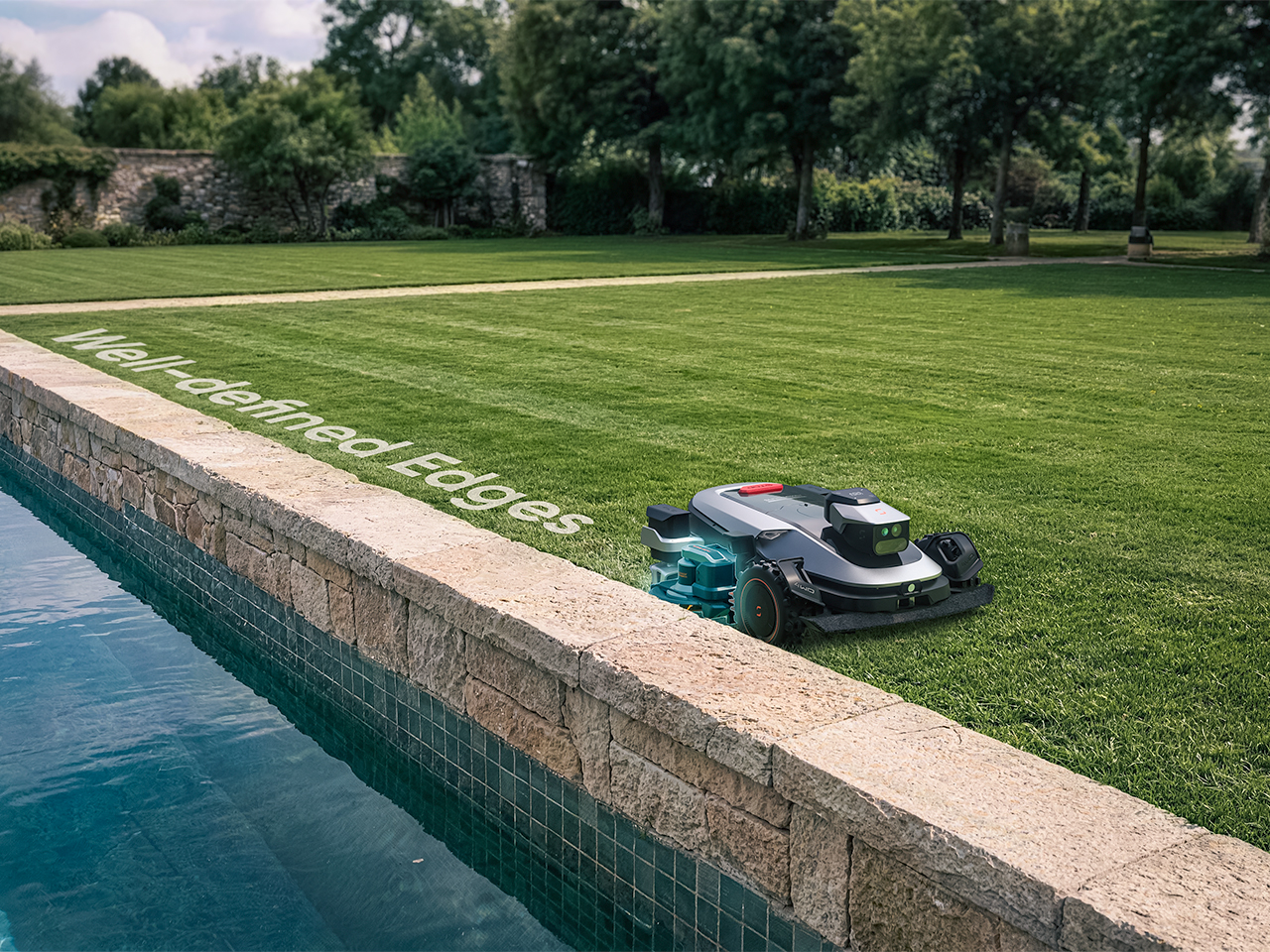
Sunseeker’s upcoming X8 Plus looks eager to apply. Its EdgeZero 2.0 trimming system targets a zero-inch edge gap, according to the company, putting that leftover strip squarely on the agenda. Set for a preview at Equip Expo 2026, the robotic mower also brings solid-state LiDAR, stereo vision, and network-assisted satellite positioning. An impressive résumé, although the edge-cutting hardware is what makes me want to schedule the interview.
A mower can follow a boundary accurately and still leave grass behind if its blades cannot reach it. Knowing where the border is and cutting right up to it are separate assignments. Sunseeker describes EdgeZero 2.0 as its answer to the second one, though the announcement leaves the mechanism’s finer details unexplained. That’s the part I’d want a closer look at: how the trimming tool reaches the border while the mower’s body stays clear. A clean pass beside a raised edge would tell a useful story.
Getting into position is its own engineering task. The X8 Plus uses nRTK, a form of satellite positioning that draws correction data from a network of reference stations. In plain English, those corrections help tighten up the machine’s estimate of where it is. Sunseeker combines that positioning with solid-state LiDAR and stereo vision, giving the mower several sources of information as it navigates. Your garden may look peaceful from the patio; the robot has quite a bit to figure out down there.
Sharing the Lawn With the Locals
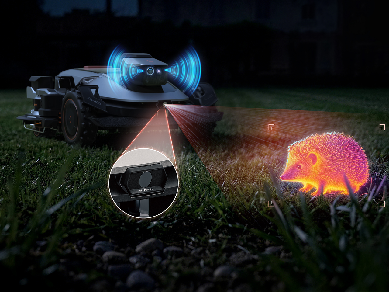
There’s an infrared camera in the mix, too, which Sunseeker says supports animal-friendly operation. That’s a worthwhile consideration for a machine sharing outdoor space with creatures that have never checked its mowing schedule. The announcement doesn’t establish exactly how the system identifies or responds to different animals, so I’d keep the promise modest for now. Still, accounting for the lawn’s other residents belongs in the design brief. The grass might stay put, but everything passing through it gets a vote in how smoothly an autonomous mower’s afternoon goes.
Sunseeker Elite already explores that relationship between sensing and physical movement in its existing X7 Gen 2 and X7 Plus Gen 2. Those models combine satellite positioning with visual mapping, while all-wheel drive and floating dual cutting discs address traction and uneven ground. That provides useful context for the X8 Plus: software has to work with wheels, blades, and the shape of the property. I like that the new preview brings attention back to the finishing work. A mower’s route can look beautifully organized on an app, but the result still gets judged from the garden chair.
A Closer Look at Equip Expo 2026
Equip Expo should provide a closer look at Sunseeker’s approach. The show runs October 20-23, 2026, at the Kentucky Exposition Center in Louisville, Kentucky, with Sunseeker at Indoor Booth #1190 and Outdoor Booth #7460D. The company plans an interactive mower-vision experience, letting visitors see imagery from a machine’s perspective, alongside outdoor slope demonstrations. Seeing what a mower perceives could make that long sensor list considerably easier to understand.
Pricing and retail availability for the X8 Plus aren’t specified in the announcement, so the zero-inch edge target remains a reason to watch its development rather than retire the trimmer immediately. For me, though, it’s a persuasive direction to pursue. Finishing the borders would remove a very specific reason for a person to follow the robot outside and pick up another tool. If Sunseeker can make that work reliably, I’m perfectly comfortable with this particular job disappearing. The person who used to do it can have Saturday morning back.
Most museums are designed like very expensive shoeboxes. Art hates sunlight, so architects seal the walls, bolt on some skylights, and call it a day. Aedas went the other direction in Hangzhou and wrapped an entire museum in glass, then twisted it into two interlocking rings for good measure. The Yohoo Museum sits on an island in an artificial lake, glowing like a piece of polished jade, which is exactly the point. The shape is borrowed from the ritual jade rings of the Liangzhu culture, a Neolithic civilization that thrived in this part of China around 5,000 years ago.
Ken Wai, Global Design Principal at Aedas, led the design of the 57,650-square-foot (5,356-square-meter) building, completed in 2024 inside Liangzhu Yohoo Park (that’s Yohoo, not Yahoo the search engine. I know, I made that mistake too). The glass is a translucent multilayer laminate Aedas calls “emerald glass,” and it filters daylight into a soft, even wash across the galleries. A steel frame lets the ends of the rings lift off the ground with no visible support, creating covered plazas underneath. The project won Architectural Design of the Year and a Gold in the Cultural category at the International Design Awards, a juried global competition for built work.
Designers: Aedas, Ken Wai
Liangzhu jade comes in two signature shapes, the bi and the cong. The bi is a flat disc with a hole in the center, while the cong is a chunky tube that’s square outside and round inside. Later Chinese tradition read the bi as heaven and the cong as earth, and archaeologists say both starred in royal ceremonies honoring the sky. Each of the museum’s rings wraps around an open void, and Aedas frames these circular light wells as a link between heaven and earth. From above, the voids read like the drilled centers of two bi discs, and the squared-off island underneath does a decent cong impression if you squint.
Aedas says the two interlocking rings stand for two separate heritages, Liangzhu culture and the Grand Canal. The lake around the island connects to that canal, a roughly 1,100-mile (1,776-kilometer) waterway whose oldest sections date back more than 2,500 years. Hangzhou sits at its southern end, and the canal is largely what turned the city from a sleepy town into a booming trade hub. UNESCO listed the canal in 2014 and the Liangzhu ruins in 2019, so the building is basically two World Heritage sites holding hands. That’s a lot of symbolism for one roofline, but the form carries it so gracefully that I’m happy to play along.
A single steel frame carries the whole building, and Aedas used it to peel both ends up off the ground like the corner of a sticker. Those lifted edges overhang the entrances and shelter a pair of public plazas, which in the photos are getting plenty of use. One shot shows a school group picnicking under the curved soffit while two kids sprint past the camera, presumably fleeing a teacher. The underside is wrapped in smooth white panels, and beneath it a diamond grid of glass slopes down to meet the pavement. The result is a shaded waterfront room open to anyone, whether or not they ever step inside the galleries.
Up top, the galleries sit under a dense white steel diagrid, with translucent glass filling every gap in the structure. Interior photos show a bright, nearly shadowless hall where two visitors look like they’ve wandered into a cloud. The entrance volume uses greener, more jade-toned glass in horizontal bands, so the building’s color shifts depending on which face you’re looking at. American readers might recognize the strategy from Steven Holl’s Bloch Building at the Nelson-Atkins Museum in Kansas City, where translucent channel-glass volumes glow like lanterns. Aedas stretches the idea across a twisting, double-curved envelope, and the firm says parametric modeling kept that geometry efficient to build.
A white boardwalk zigzags across the lake to the museum, swelling into circular viewing pods that repeat the ring motif at walking scale. It’s a slow, wiggly approach, and it hands visitors plenty of different angles on the building before they arrive. A broader bridge links the island to the main park on the other side, where curving paths and a petal-shaped flower garden keep the theme going. Aerial shots also show the less poetic context, with apartment towers and older industrial blocks crowding the shoreline. That backdrop works in the museum’s favor, because a glowing glass knot reads even louder next to rows of identical high-rises.
Yuhang already has one famous lake-bound jade museum. David Chipperfield’s Liangzhu Museum opened in 2008 as four travertine bars set on a lake, linked to the park by bridges, with an exhibition island off to the south. Tadao Ando added a concrete cultural center nearby in 2016. Both architects treated Liangzhu’s heritage as something heavy and permanent, which makes sense for artifacts that spent 5,000 years underground. Aedas kept the same lake, island, and bridge recipe and swapped the stone for light. I keep wondering which version the original jade carvers would prefer, since their whole craft was coaxing a soft glow out of solid stone.
Most of the time, when you need to check a day or date, you open your phone’s default calendar app. For those of us who still use planners, we also like to flip through the calendar pages since our schedules are often written there. But maybe you rarely notice actual wall calendars displayed in offices or living rooms anymore. If there is one, it might be some random promotional gift. It can feel like we’ve stopped carefully choosing a wall or desk calendar that suits our aesthetic or that we find interesting.
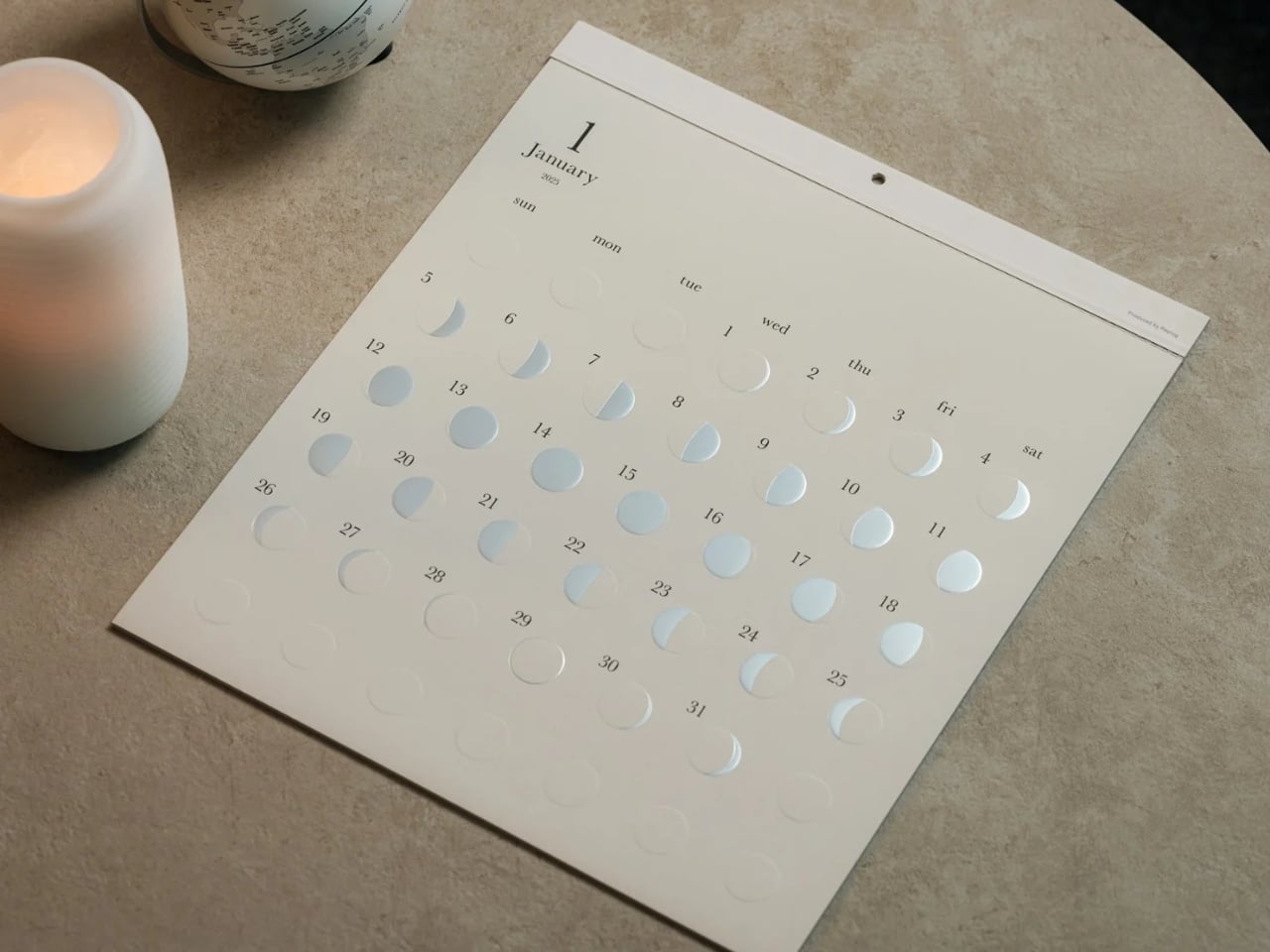
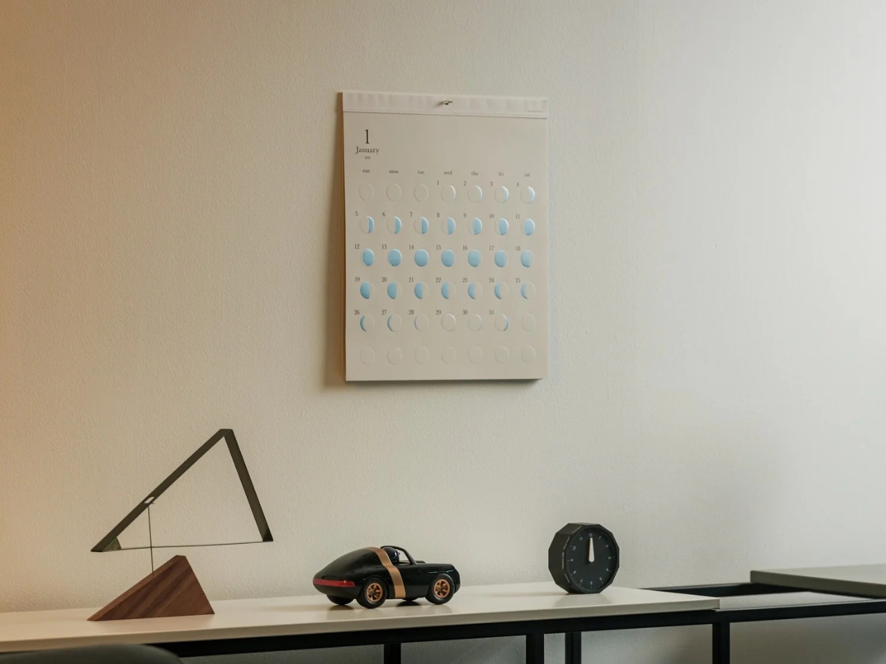
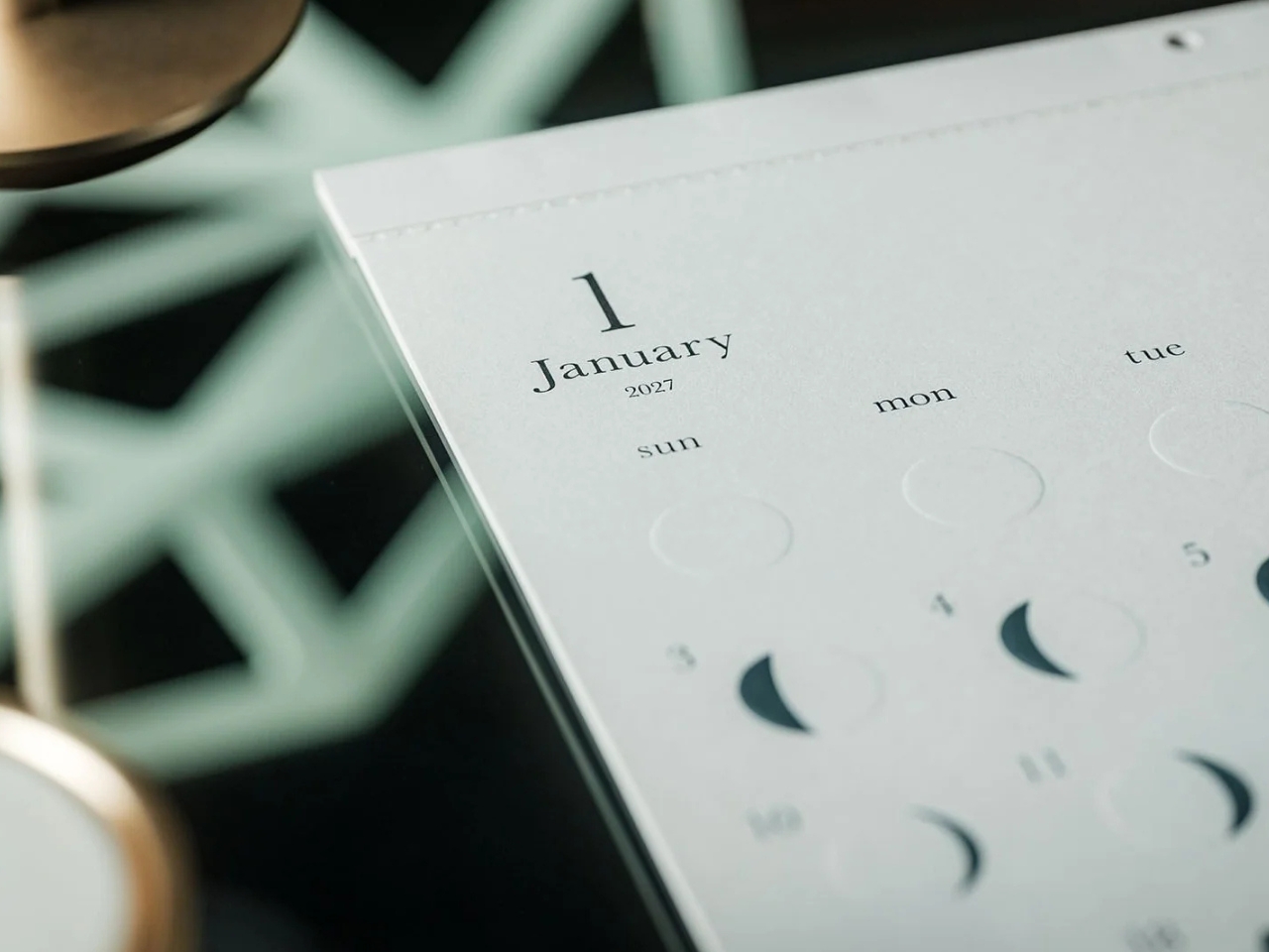
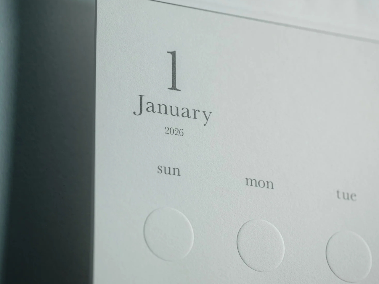
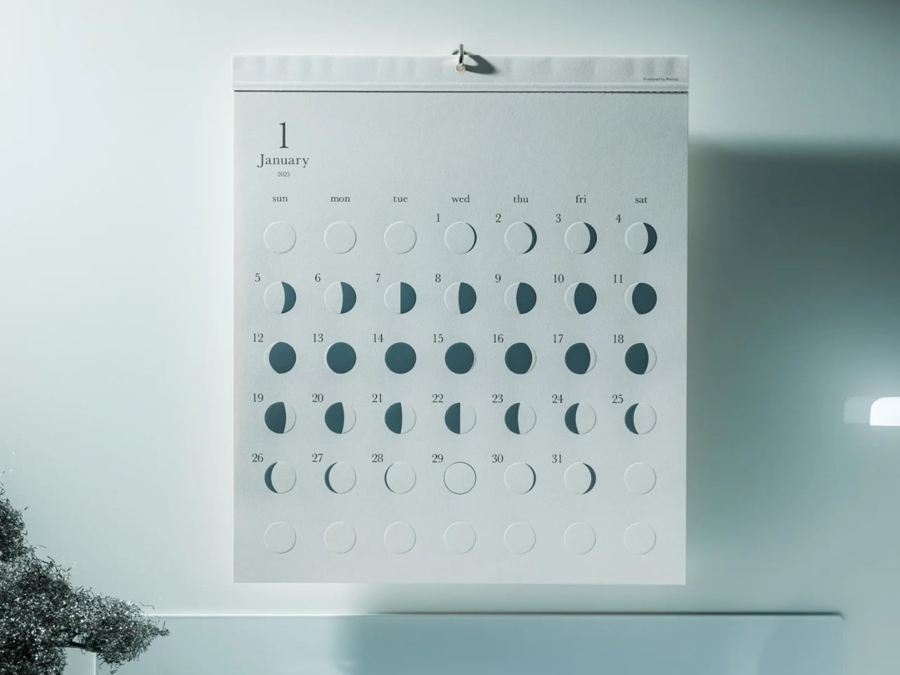
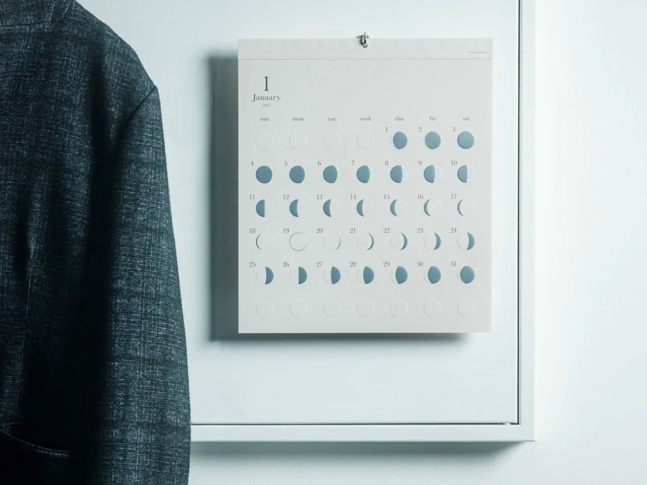
The Oboro Silver Moon Calendar quietly makes itself part of your minimalist space, especially if you love the moon. Created by Replug, it originated as a limited-edition 2025 calendar celebrating the Michiru calendar series’ 10th anniversary. Its name comes from oborozuki, a hazy moon, which inspired the design’s soft appearance. The YD Select listing describes its inspiration as having “serene and mystical qualities.” You might see that misty moon as a reminder that life is impermanent but still beautiful, although that’s a personal interpretation rather than something a calendar needs to explain.
Instead of the usual white paper that many wall calendars have, this uses a soft gray-beige paper that evokes a moonlit sky. It could bring a more introspective and relaxing atmosphere to the room, especially when you stare at the calendar while contemplating your life for the rest of the month (well, if you like doing that sort of thing). The subdued background also keeps the metallic details from competing with a bright color palette.
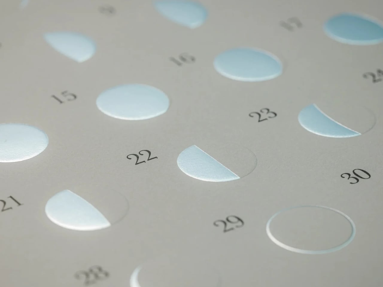
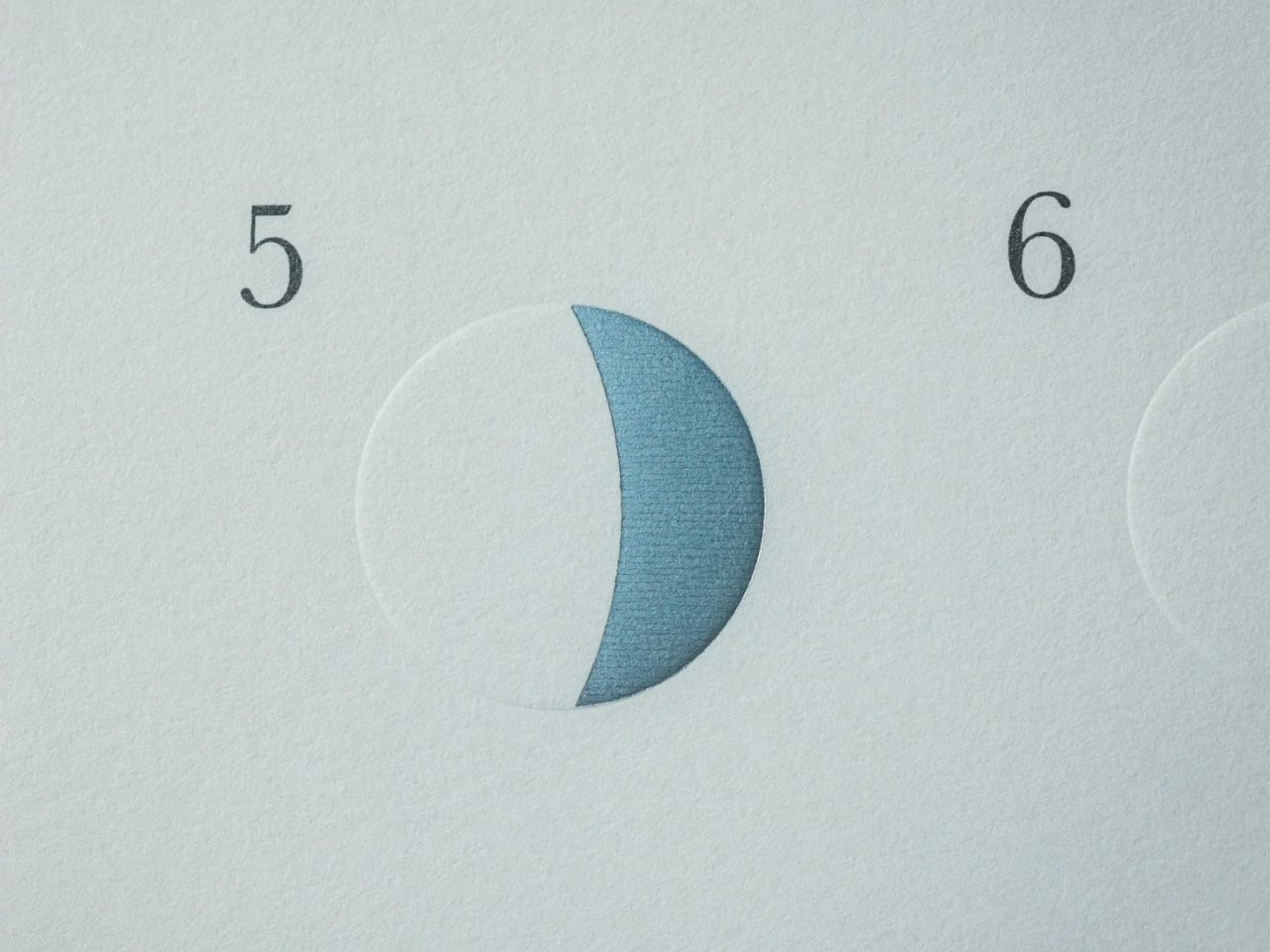
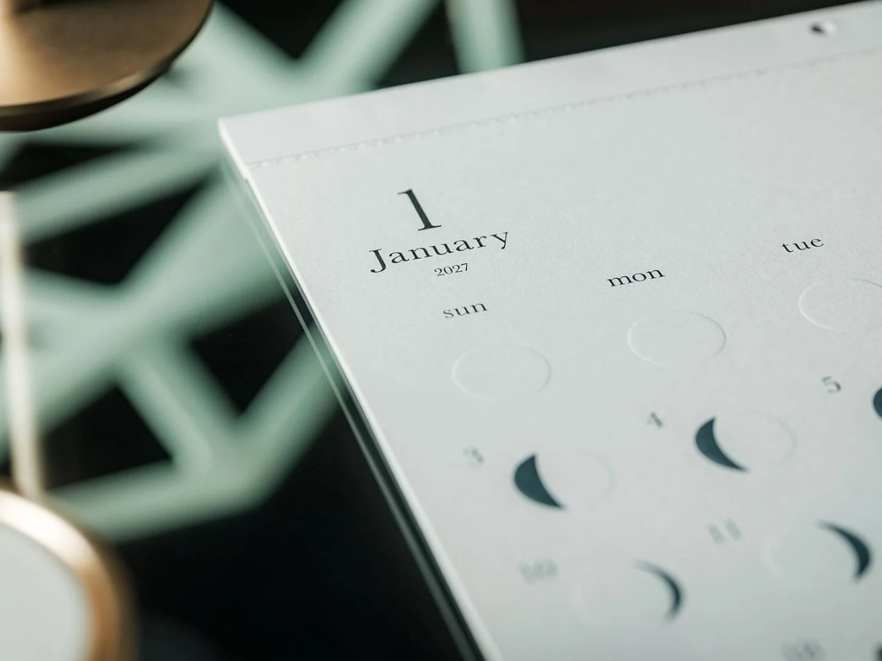
This is primarily a calendar that brings attention to the lunar cycle. It shows the moon’s phases in shimmering, reflective silver foil that catches the light falling on it. That distinction matters: it reflects light rather than producing its own illumination. Its appearance can change depending on the angle of the light, making placement part of the effect. It also has an embossed moon silhouette that adds a tactile element when you touch the calendar. For someone who enjoys small daily rituals, pausing to notice the changing lunar phases could become a grounding moment in an otherwise busy day.
The calendar is made in Japan, with 12 paper sheets measuring approximately 11.7 by 13.5 inches. That gives you a sense of the wall space it needs without making it sound like an oversized art print. The combination of embossing and silver foil is the important design choice here: one gives the paper physical relief, while the other changes how it catches light.
For comparison, MUJI’s 2027 Bagasse Paper Wall Calendar, listed on its European store, uses a Monday-start monthly layout that presents the full month at a glance. Both could appeal to someone who prefers understated stationery, but their priorities differ. MUJI emphasizes straightforward date reference, while Oboro gives lunar phases and decorative surface treatments more attention. Oboro’s appeal is less about improving your scheduling system and more about giving a useful paper object a place in your decor. The better choice depends on what you want to look at every day.
There is also something appealing about checking a calendar without reaching for your phone. If opening an app tends to lead you somewhere else entirely, a paper reference lets you glance at the date and move on. You can still keep your appointments in a digital calendar while choosing something more personal for the wall beside your desk. If you’ve stopped choosing calendars because your phone already handles the practical side, Oboro Silver Moon Calendar gives you a reason to reconsider. It can sit alongside your existing routine, offering something different to notice: the shape of the moon, the texture of the paper, or a brief flash of silver as the light changes.
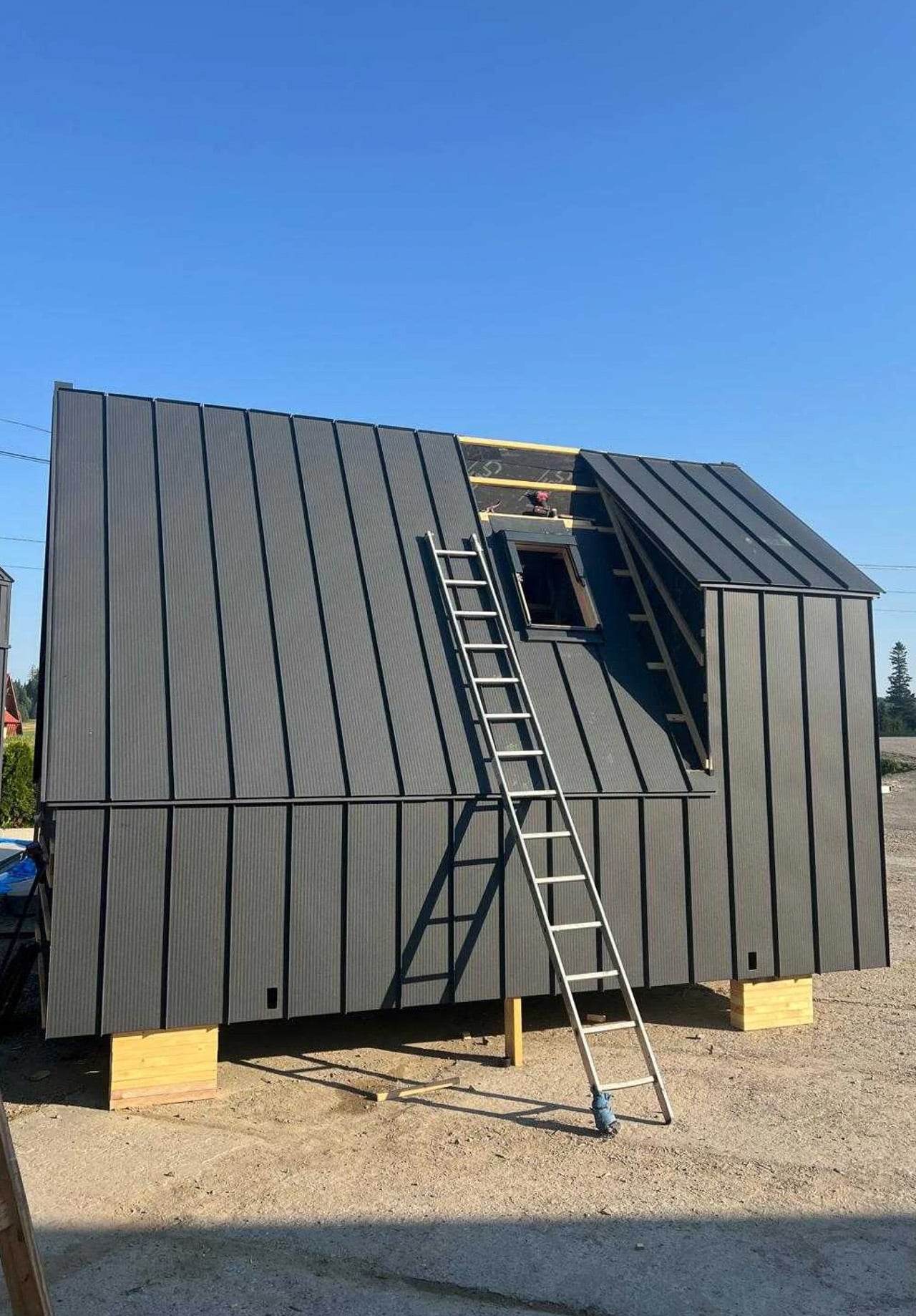
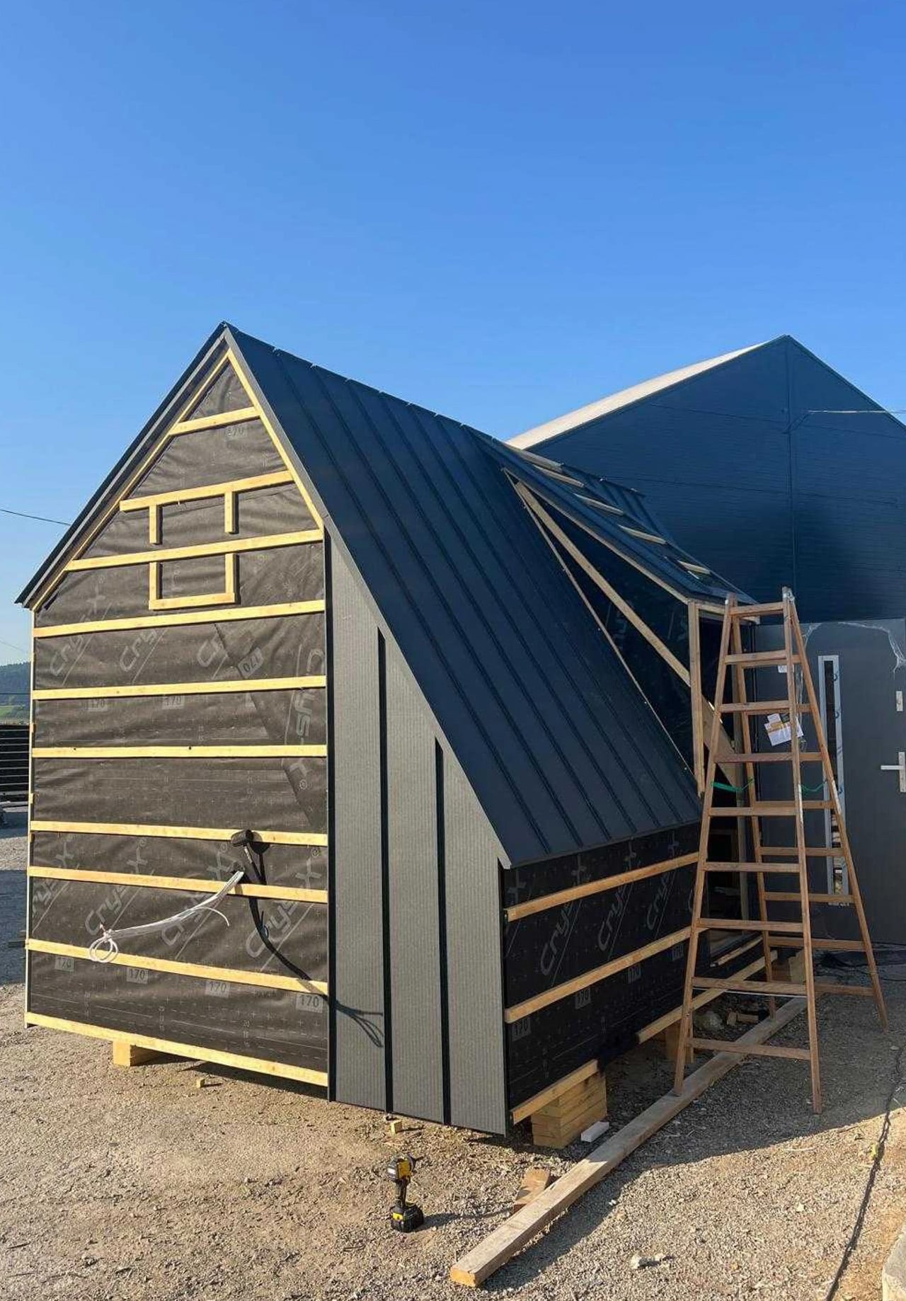
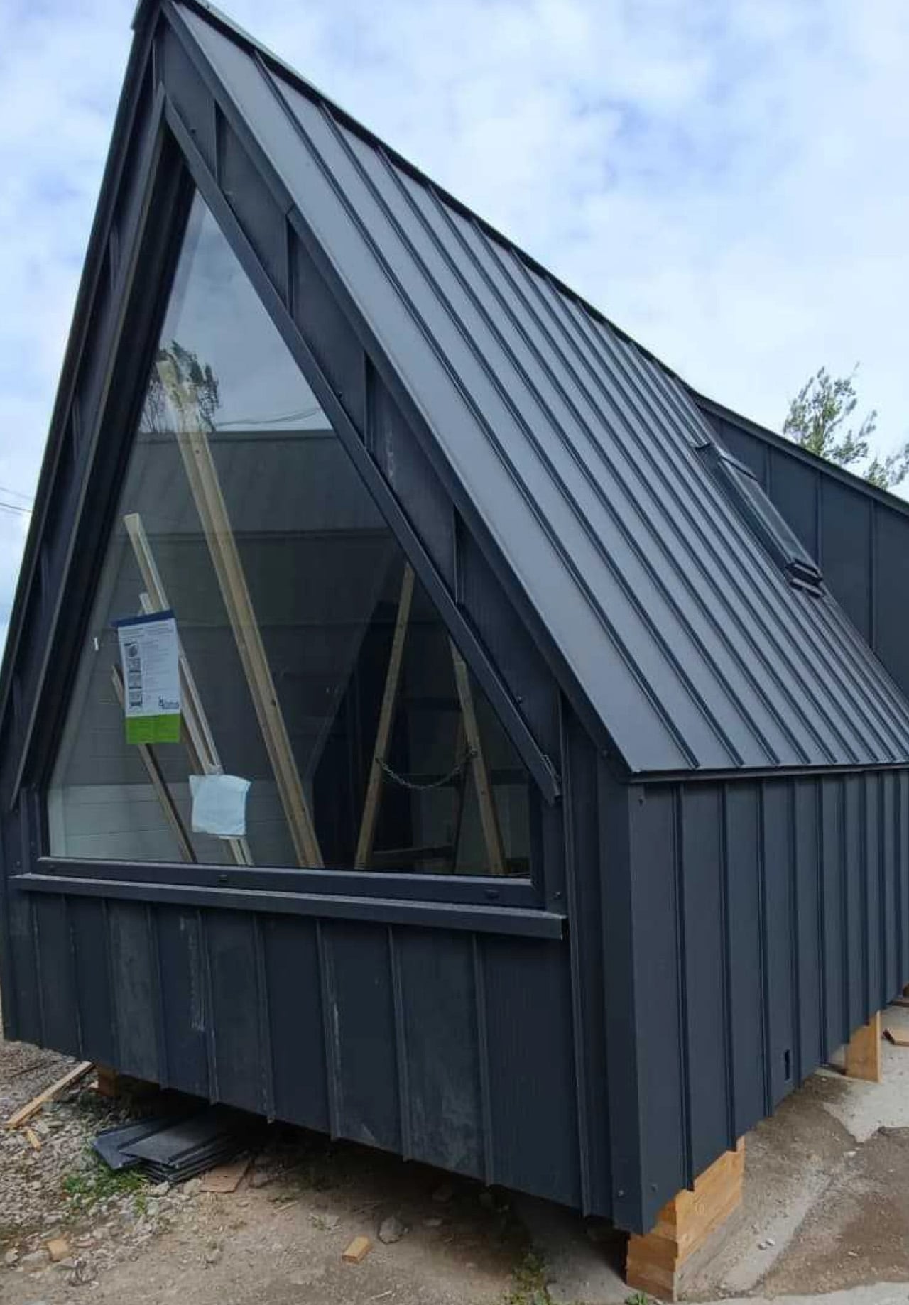
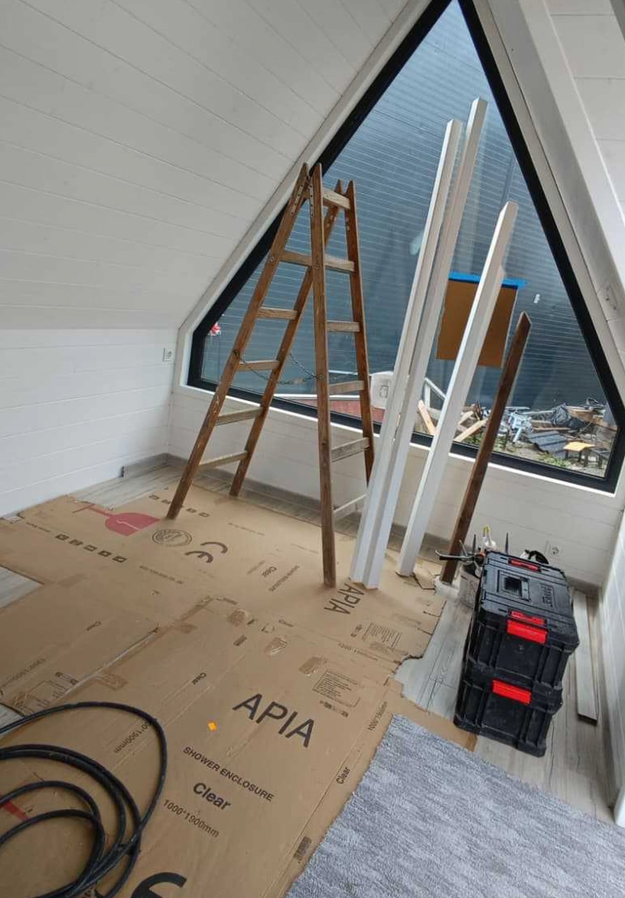
A large triangular window fills one end of the Mini Brda With Bay Window, giving this compact cabin a generous outlook. The entrance sits on the side, beneath its own projecting roof section, leaving the glazed end uninterrupted. Offered by Polish company Mini Domy, the design keeps its distinctive A-frame silhouette while making room for more than a bed beneath a pitched roof.
The model’s specification lists dimensions of 4.51 by 3.2 meters, giving it a footprint of approximately 155 square feet. Dark metal cladding covers the exterior, with pronounced seams emphasizing the steep roof. Those angled surfaces give the cabin its character, although they also make furnishing the edges less straightforward than arranging a conventional rectangular room.
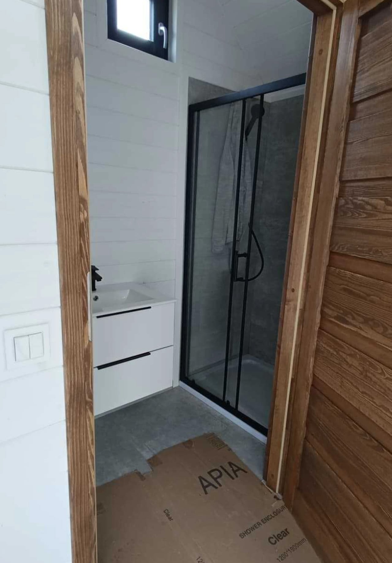
Inside, white-painted tongue-and-groove paneling follows the roof slopes, making the geometry visible rather than concealing it behind a flat ceiling. Wood-look flooring introduces a contrasting tone underfoot. Published photographs show the cabin before furnishing is complete, so the interior is best understood through a combination of construction images and the proposed layout.
Most of the accommodation occupies one shared room, combining cooking, lounging, and sleeping. A planned bed doubles as daytime seating, avoiding the floor-space demands of a separate sofa. There’s no sleeping loft or ladder to negotiate. The compromise is privacy: beyond the bathroom, daily activities share the same compact space, with little separation between preparing breakfast and making the bed.
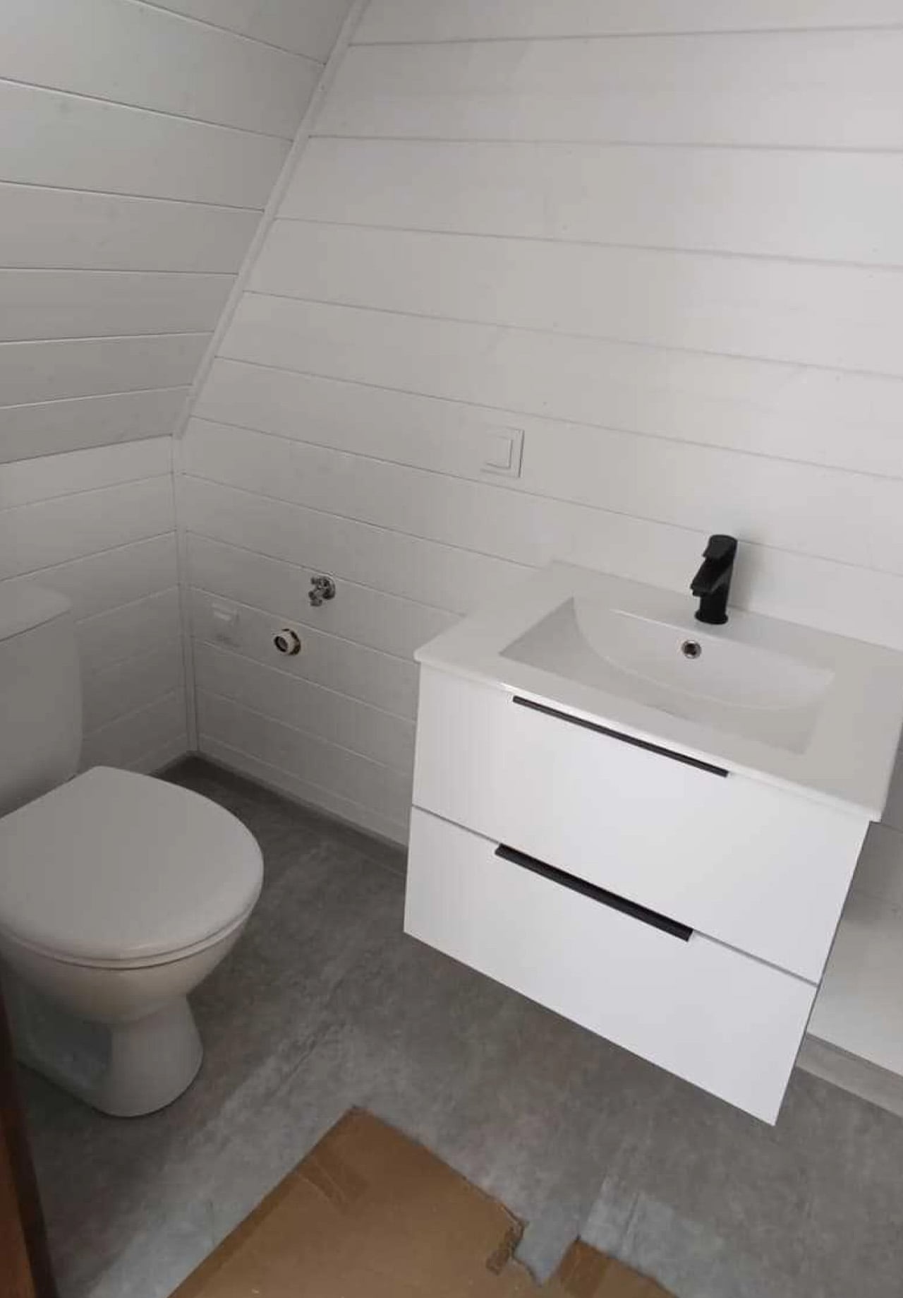
The kitchen specification is modest but useful, listing cabinetry, a sink, and a camping-style stove. That suggests simple holiday cooking rather than an apartment kitchen shrunk to fit. The separate bathroom includes a shower, basin, toilet, and water heater. Photographs show a wall-mounted vanity with drawers, providing storage without taking the cabinet all the way down to the floor.
Mini Domy’s offer specifies 10 centimeters of mineral-wool insulation, double-glazed windows, and air conditioning with a heating function. These are meaningful provisions for a small cabin, but they aren’t enough to establish comfort in every climate. The company itself qualifies year-round use on the broader Mini Brda page with the need for appropriate insulation and heating.
A dedicated trailer is optional rather than integral to the version pictured. The downloadable offer lists the cabin at US$15,000, though it also gives the quotation a two-month validity period without a visible issue date. Buyers should confirm current pricing, equipment, transport, and installation directly rather than treating that figure as a complete project budget. As a weekend retreat, the arrangement makes sense: keep the bathroom enclosed, let furniture do double duty, and reserve the glazed end for the view. Longer stays would make the shared room’s limits harder to ignore.
An espresso habit gets complicated the minute you leave the kitchen. You can bring the beans, but the equipment tends to stay beside an outlet, occupying a respectable chunk of counter. Pura Coffee’s PURA NEO Pro, listed for sale at $349, is designed to put heating, extraction, and drinking into one battery-powered object. The problem it tackles is straightforward: making espresso away from your usual setup without packing a miniature coffee station.
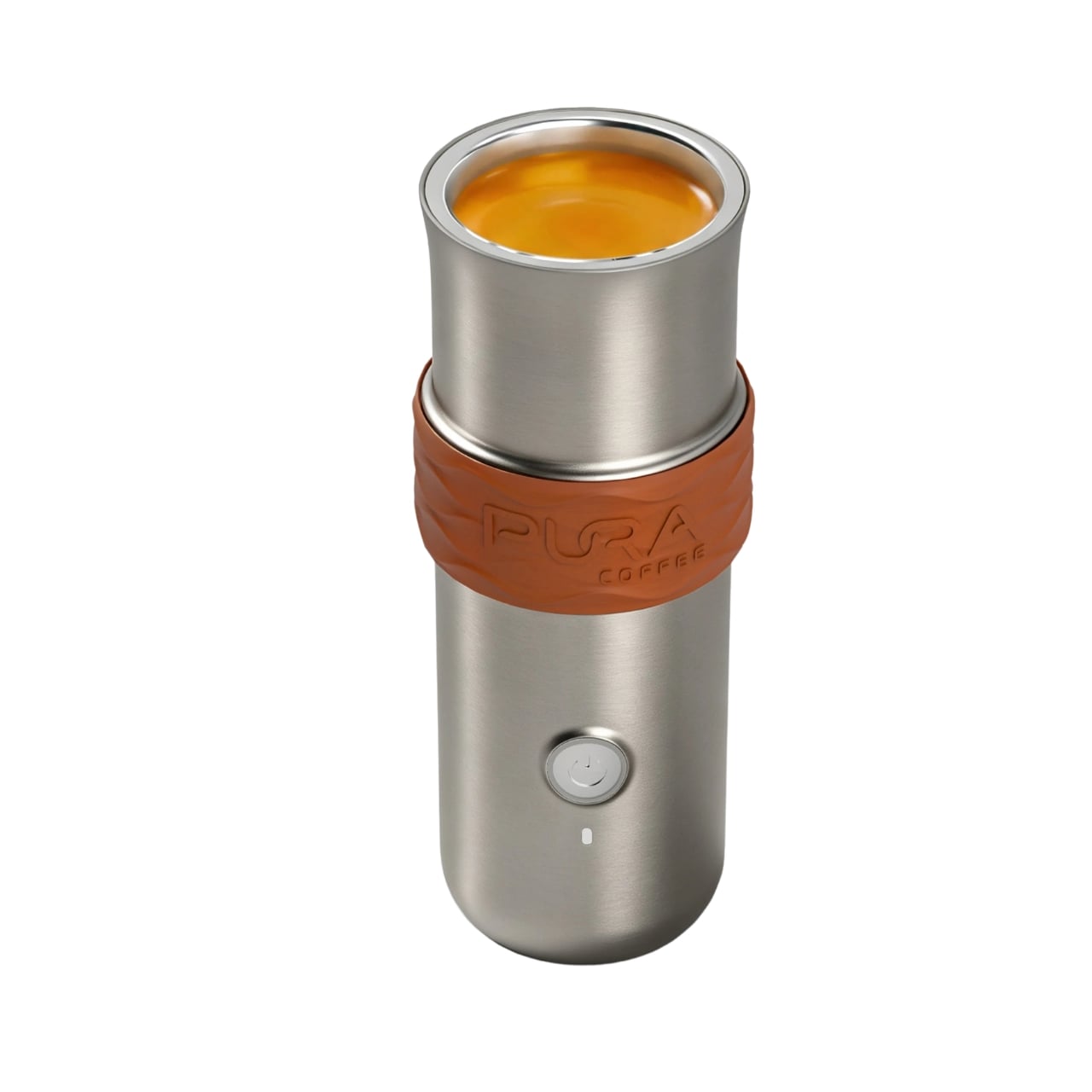
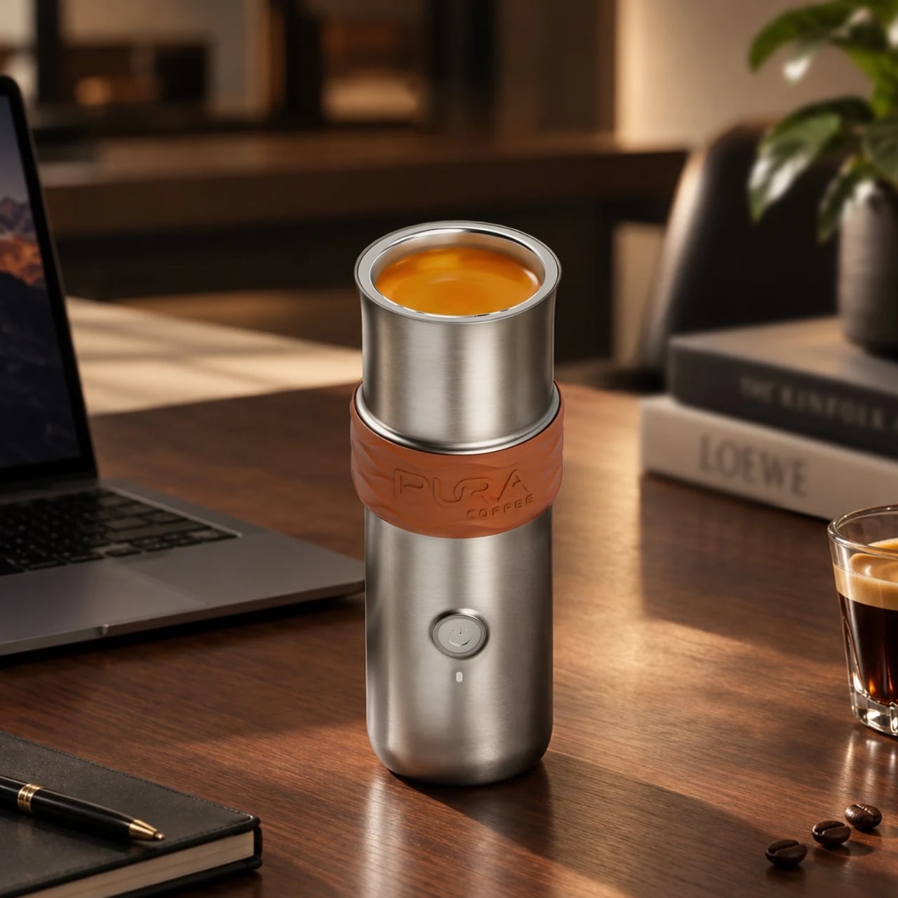
Visually, the NEO Pro looks closer to a travel tumbler than a shrunken kitchen appliance. The company’s imagery shows a cylindrical body, a cup at the top, and a textured brown band around the middle. A circular power button keeps the front relatively uncluttered. I like the restraint here. It looks like an object you could leave beside a laptop without your desk suddenly resembling the equipment shelf behind a coffee bar.
That stacked layout explains the design’s most interesting decision. Pura pumps water upward through the grounds into the drinking cup above, so you don’t need to balance the brewer over a separate vessel. The cup becomes part of the architecture rather than another accessory to remember. The company says upward flow helps wet the coffee bed evenly and reduce channeling. That extraction advantage needs testing, but the integrated cup has an immediately understandable purpose.
The basic controls are refreshingly physical. After a short press followed by a two-second hold to power on, one press starts heated brewing at the default 92°C, roughly 198°F. A double press skips heating and brews using the water’s existing temperature. Pura also uses a colored light ring to communicate status. It’s a sensible division of labor: a button for getting coffee started, with a small visual signal instead of another screen demanding your attention.
Inside, the ambition gets more technical. Pura specifies extraction pressure of 6 to 9 bar at the coffee puck and a five-stage process that moves from pre-infusion through brewing to pressure release. Its roughly three-minute cold-start brewing time is explicitly labeled a design target, not a verified result here. I’d treat that timing as provisional, particularly if the appeal is making a quick cup between meetings rather than enjoying the preparation itself.
Then comes Brew OS, the companion software that lets owners adjust brewing parameters and save combinations as shareable Brew Cards. Pura says the app can also suggest a starting extraction curve from a photograph of a coffee bag or the beans themselves. That’s a potentially useful entry point for someone who wants more guidance than a temperature slider. Importantly, the company describes these suggestions as starting points, while deeper learning from personal taste ratings remains on its roadmap.
I’m more persuaded by saving a recipe than by the prospect of photographing beans. A saved combination gives the tinkering a destination: find settings you like, then stop rebuilding them every morning. For me, that’s a better reason to connect a coffee maker to a phone than simply adding remote controls. Brew OS allows that recipe to be saved and shared, although repeating settings shouldn’t be mistaken for guaranteeing identical flavor.
The practical boundaries matter, too. The water tank holds a maximum of 70 milliliters, about 2.4 fluid ounces, so think espresso-sized servings, not a full commuter mug. Ground coffee is the primary approach, with an optional Nespresso-compatible capsule adapter. Cleanup still involves discarding the grounds and rinsing removable parts; the body cannot be immersed or put in the dishwasher. Portability gets the equipment into your bag, but it doesn’t make the used grounds disappear afterward.
At $349, I’d want the NEO Pro to earn its place through regular use, not just the occasional campsite photo. Its strongest design argument is the cup itself: brewing and drinking share one vertical assembly, with fewer separate objects to arrange. If carrying your espresso routine matters enough to justify the preparation and cleanup, that’s a thoughtful place to start. The app can offer more settings later. First, the coffee needs somewhere to land.
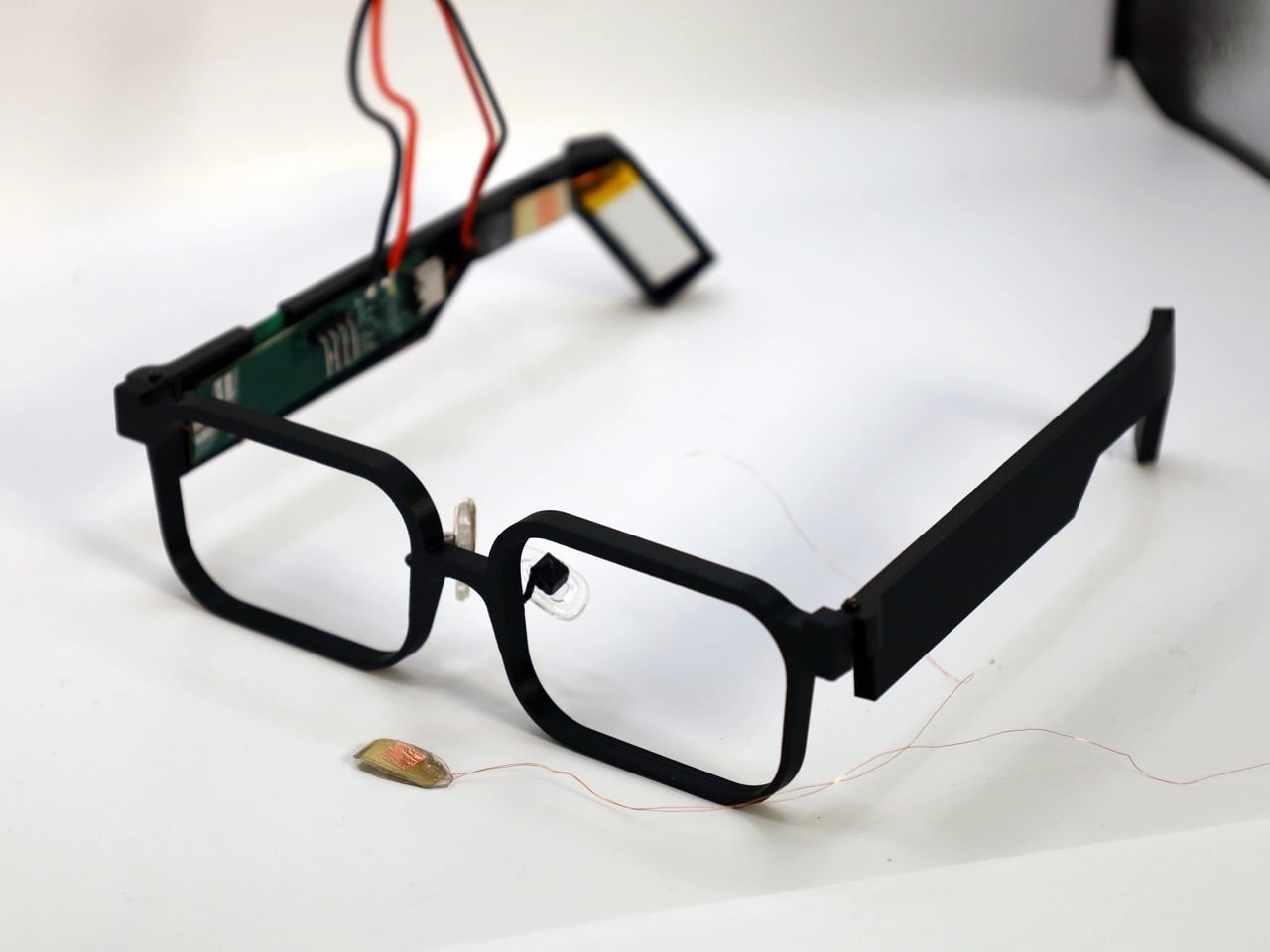
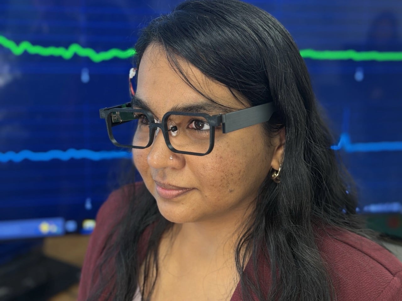
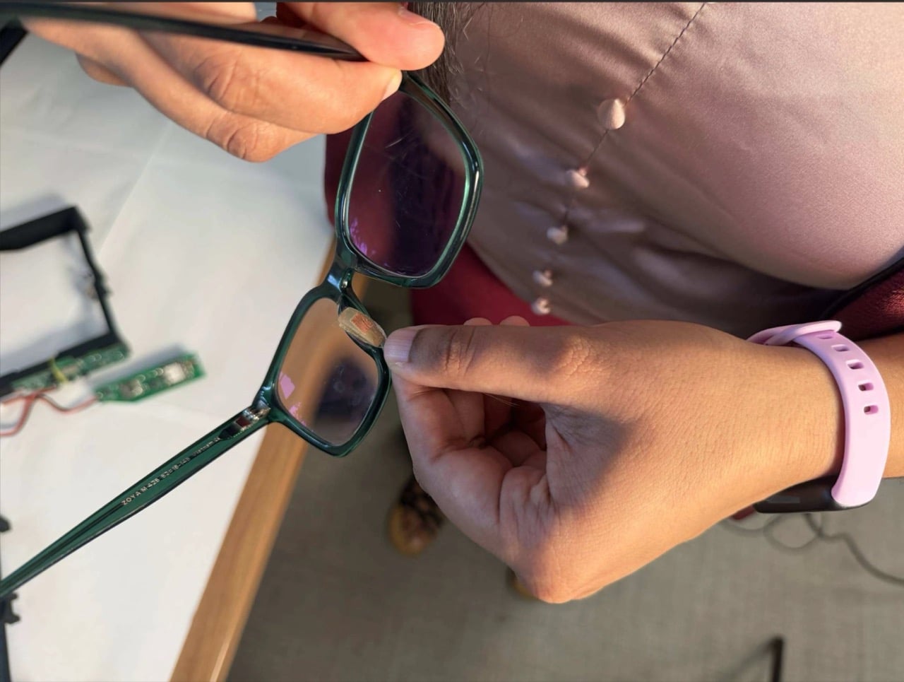
Your face is a power plant, and you’ve been running it for free your whole life. Every blink and jaw clench releases a tiny burst of mechanical energy that simply vanishes. A team at Northwestern University figured out how to catch it, using static electricity, the same stuff that makes a balloon stick to your hair. Their prototype glasses, GlassTENG, use that energy to run sensors tracking your pulse, blinks, and teeth clenching. As a feat of energy harvesting it’s fantastic, and I’d love to see it in everything from earbuds to shoe insoles.
Then the other shoe drops, because smart glasses are already the most side-eyed gadget around, with Meta’s Ray-Bans filming strangers in coffee shops and a battery that needs its case after a few hours serving as the only real limit. GlassTENG’s three sensors, built by Nivedita Arora’s VAK Embodied Systems Lab, draw just 4.1 microwatts combined, and the team wants to go fully battery-free next. That would remove the last speed bump on always-on face computers. Your pulse and jaw clenches are deeply personal data, and glasses like these could log them around the clock. Then again, if such glasses are coming anyway, I’d much rather they ran on blinks than on lithium-ion cells strapped to my head.
A Silicone Sandwich That Turns Blinks Into Voltage
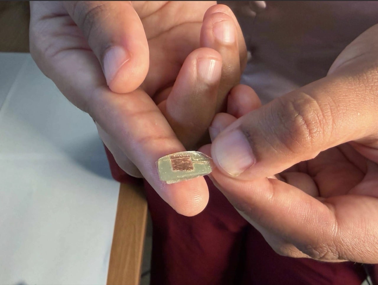
The sensor is a two-layer sandwich of PDMS, a soft silicone, and FEP, a slick fluoropolymer from the Teflon family. When the layers press together and spring apart, one hogs electrons from the other, which is the balloon-and-hair trick in a lab coat. Silver electrodes, each 150 nanometers thick, collect the resulting voltage. Pulse is the faintest signal, around 50 to 100 millivolts, while blinks and eyebrow raises land at 200 to 500 millivolts. A hard jaw clench climbs to about 1.5 volts, which is a wide enough range for one thin stack to tell a heartbeat from a chomp.
The silicone is Sylgard 184, mixed 10 to 1, degassed, spin-coated to roughly 490 microns (about 0.02 inches), and left to cure overnight. The FEP gets blasted with oxygen plasma on both sides, which roughens the surface so more of it touches the silicone. The team started by etching one side, then found that doing both measurably boosted the signal. Bare silicone faces your skin while the charge-trading interface stays sealed inside, so skin oils can’t muck up the readings. It’s baking show energy, just with a vacuum chamber instead of an oven.
Three Sensors, Three Spots, and Your Head Doing the Clamping
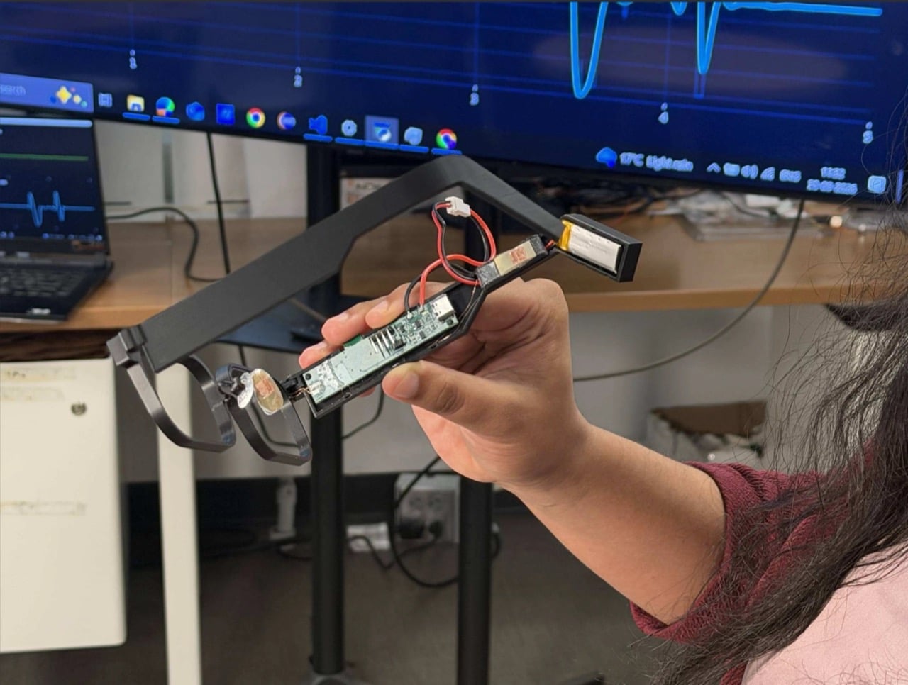
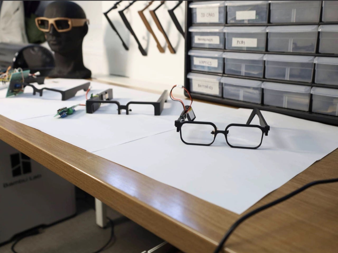
One sensor sits on the nose bridge over the angular artery, where it reads pulse, forceful blinks, and eyebrow raises. A second hangs off a small arm near the temple, aimed at the superficial temporal artery to catch clenching, tapping, and chewing. The third is embedded in the temple arm above the ear, and here the design gets clever, because the natural clamp of the frame on your head supplies the contact pressure for free. Early 3D-printed nose pads gave patchy contact, so the team swapped in adjustable off-the-shelf pads from regular eyewear. Decades of optician ergonomics beat the custom part, which is a humbling result for any designer.
In a study with 20 people, half of them daily glasses wearers, a Random Forest classifier (a machine-learning model that takes votes from many decision trees) sorted six activities with 93.8% accuracy. Forceful blinks and teeth tapping both hit 99%. Heart rate landed within 1.82 beats per minute of a Polar H10 chest strap, measured on 10 seated volunteers at rest. Talking was the weak spot at 55%, and the system mistook it for eating 37% of the time, since both work the same jaw muscle. For now, your glasses might assume you’re mid-sandwich when you’re just mid-rant, and honestly, I know people like that.
4.1 Microwatts: The Number Every Battery Spec Should Fear
Those 4.1 microwatts cover the sensing front-end, the circuitry that cleans up the sensor signal, and they look tiny next to the alternatives. The paper pegs optical pulse sensors (the glowing green lights on your smartwatch) at 1 to 10 milliwatts, and gel-based muscle sensors at 10 to 160 milliwatts. On a 100 mAh battery, the authors calculate that the GlassTENG front-end would cost less than half a minute of runtime, where an optical sensor would burn through hours. The prototype still uses a small battery for its microcontroller and Bluetooth, and fully battery-free operation is listed as future work. Even so, shrinking the sensing bill to almost nothing is what lets a frame stay a frame.
Ray-Ban Meta Gen 3 starts at $449 and rates nine hours per charge, while the Meta Ray-Ban Display runs $799, and that charging case remains the main limit on how long those glasses can watch the world. GlassTENG has no price or release date, so nobody is buying it this holiday season. I’d happily see self-powered sensing in earbuds, insoles, and medical patches. Glasses are the tricky one, because the cleverer the sensor gets, the fewer excuses a company has to leave it off. Still, if face computers are coming regardless, I’ll take the pair powered by my own twitchy eyelids over the one with a lithium cell parked next to my temple.
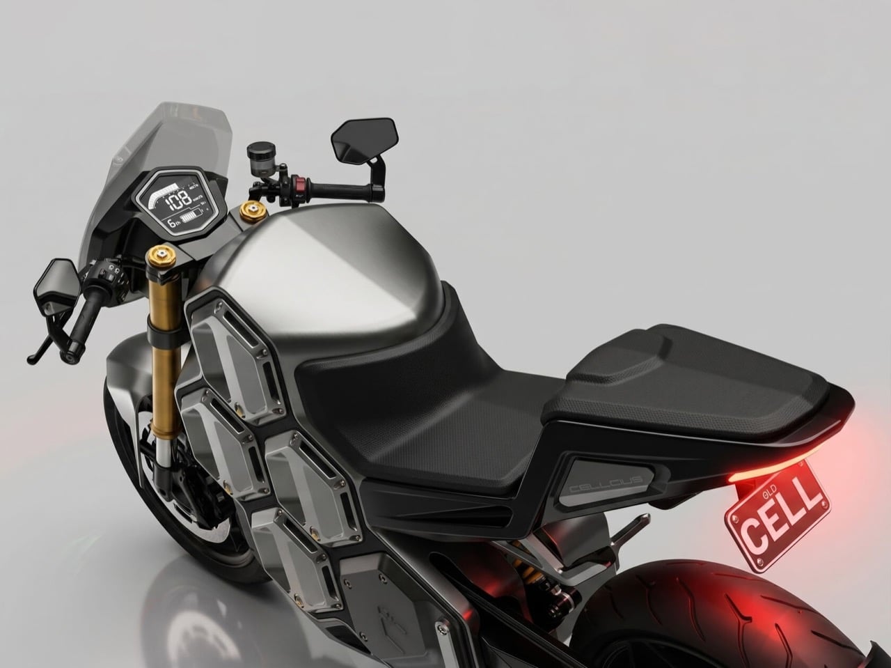
Bees settled on the hexagon ages ago, and nobody has topped it since. The shape packs the most storage into the least material, which is why it turns up in honeycomb aircraft panels and in the way round battery cells get stacked together. Brisbane’s Clandestine Design Group took the hint and built an entire electric superbike around it. The Cellcius C-01 is a hypersport concept whose battery is split into eight hexagonal cells that you can pull out and swap. Those cells line the bike’s flanks like honeycomb, and the result is one of the more striking EV silhouettes I’ve seen in a while.
Neil Davidson, who founded Clandestine in 2014 after 14 years as Creative Director at CMD, has loved motorcycles since he was a three-year-old farm kid on a dirt bike. That obsession shows. The C-01 won a 2026 Australian Good Design Award in the Concept Design category. It is still a concept, so there is no price tag or showroom date yet. The studio’s pitch is that electric bikes force a choice between heavy track machines and short-range commuters, and the Hex-Core battery system lets one bike be both. Load two cells for the commute or all eight for the track, and the same machine changes its personality to match.
Each Hex-Core cell holds 3 kWh, so the bike carries anywhere from 6 kWh to 24 kWh depending on how many you load. By the studio’s numbers, the weight swings from 353 lb (160 kg) as a commuter to 485 lb (220 kg) as a track bike. Do the math and each cell works out to roughly 22 lb (10 kg), a weight you could carry up a flight of stairs. Two cells also fit Australia’s Learner Approved Motorcycle Scheme (LAMS), a rulebook that keeps new riders on tamer bikes, according to the studio. I can’t think of another superbike that can shrink for a learner permit and then bulk up for a lap day.
Kawasaki’s Ninja e-1 launched in the US at $7,599, weighs 309 lb (140 kg), and carries two removable 1.5 kWh packs that Kawasaki rates at 41 miles in Road mode. Zero’s 2026 SR/F, the usual benchmark for a serious electric streetfighter, packs 17.3 kWh into a body listed at about 500 lb (227 kg). Fully loaded, the C-01 claims 24 kWh at 485 lb, beating the Zero on both counts. That makes the Ninja and the SR/F look like the two ends of a spectrum the C-01 wants to cover with one chassis. Kawasaki’s two-pack setup proves removable batteries work for city riders, and the C-01 keeps adding packs until it hits superbike territory.
A Honeycomb You Can Carry Home
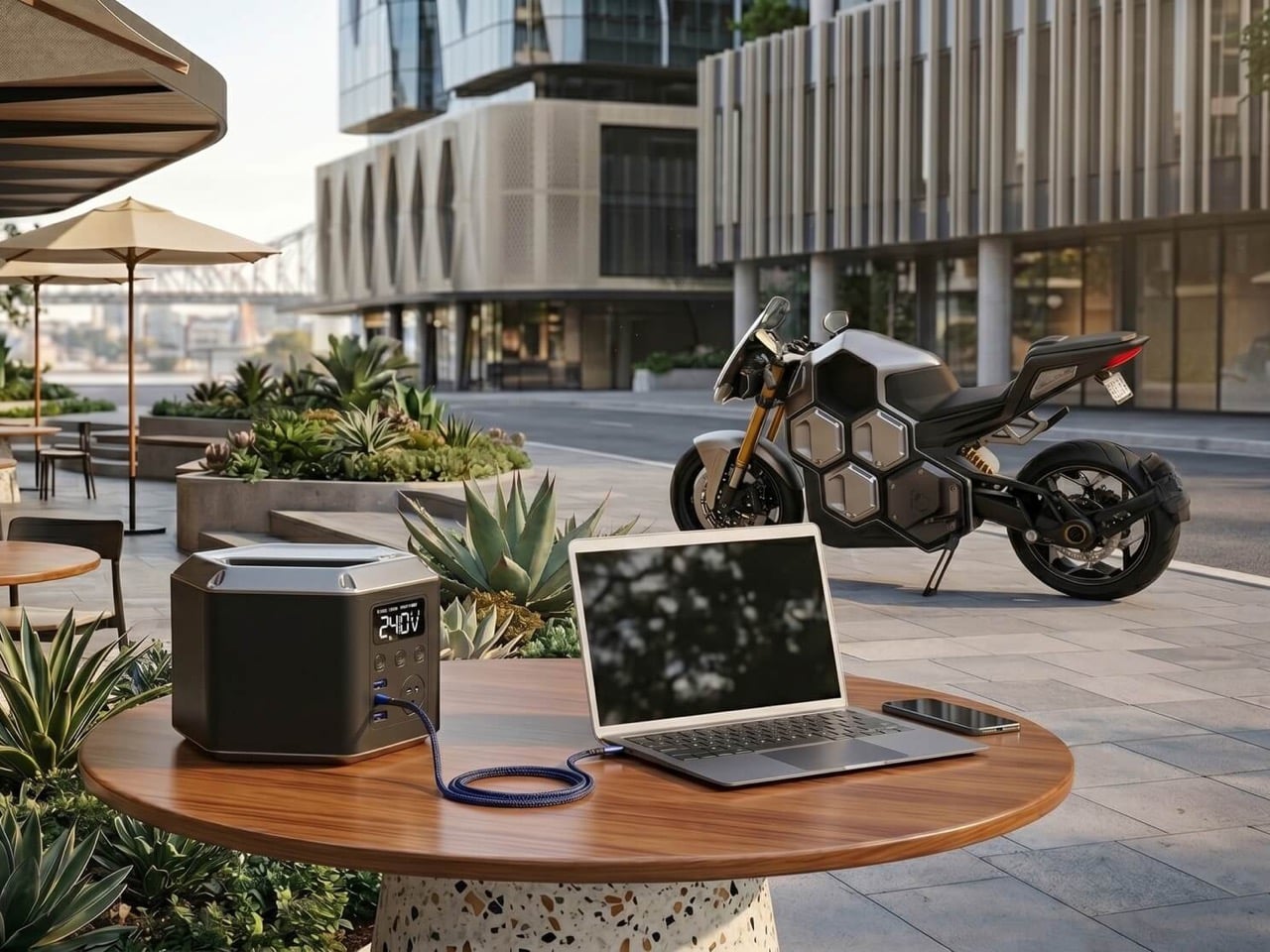
A wall-mounted smart dock charges several cells at once, so a fresh set is always waiting for a swap, a trick the studio calls “zero-minute” hot-swapping. Apartment dwellers get an ergonomic backpack that carries cells indoors for charging at a regular wall outlet. Riders who would rather skip the hauling can plug into a flush CCS port on top of the tank, which hooks into standard street-side fast chargers. Empty bays double as mounts for hex-shaped duffel bags, which keeps luggage inside the silhouette instead of hanging panniers off it. That setup goes straight at the studio’s stated target, urban apartment dwellers who have nowhere to plug in.
Pulled out of the bike, a cell turns into a portable power station with AC and USB outlets, according to the studio. That is the power tool battery logic every contractor already lives with, where one pack format runs a drill, a saw, and a work light. DeWalt and Milwaukee built huge product families on that idea, and the C-01 wants a superbike in the club. The studio also sees room for an aftermarket of Hex-Core accessories, from luggage to those power stations. A 5G app handles keyless RFID or PIN entry, over-the-air updates, and firmware tuning based on payload.
Shaft Drive, a Venturi Tail, and the Case for Swappable Superbikes
High-pressure ram intakes feed air in at speed while a low-pressure exhaust in the tail pulls it back out, a Venturi effect the studio says passively extracts motor heat without heavy fans. Power reaches the rear wheel through a fully enclosed carbon shaft drive, which the studio calls silent and maintenance-free. BMW has been putting shafts on motorcycles since the R32 in 1923, so the idea has real pedigree. Brembo brakes and fully adjustable Öhlins suspension round out a spec sheet that reads like a track-day wish list. My one wish is for the angular flyscreen to echo the hexagons a little more, since right now it reads like it came from a different bike.
Australia’s Good Design Awards date to 1958, and the Concept Design category, new since 2025, judges early-stage ideas on form, function, feasibility, and safety. A win there rewards the thinking, and the thinking here is easy to admire. My favorite part is that the battery, usually the thing EV designers hide under a tank cover, becomes the main visual feature. Electric bikes have spent years arguing over range versus weight, and the C-01 answers by letting the rider settle it each morning. Bees figured out the hexagon without a design degree, and a Brisbane studio just reminded the motorcycle world how well it stacks.
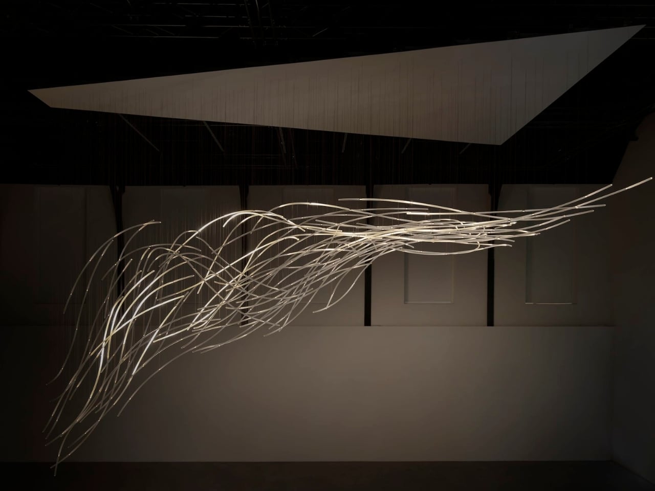
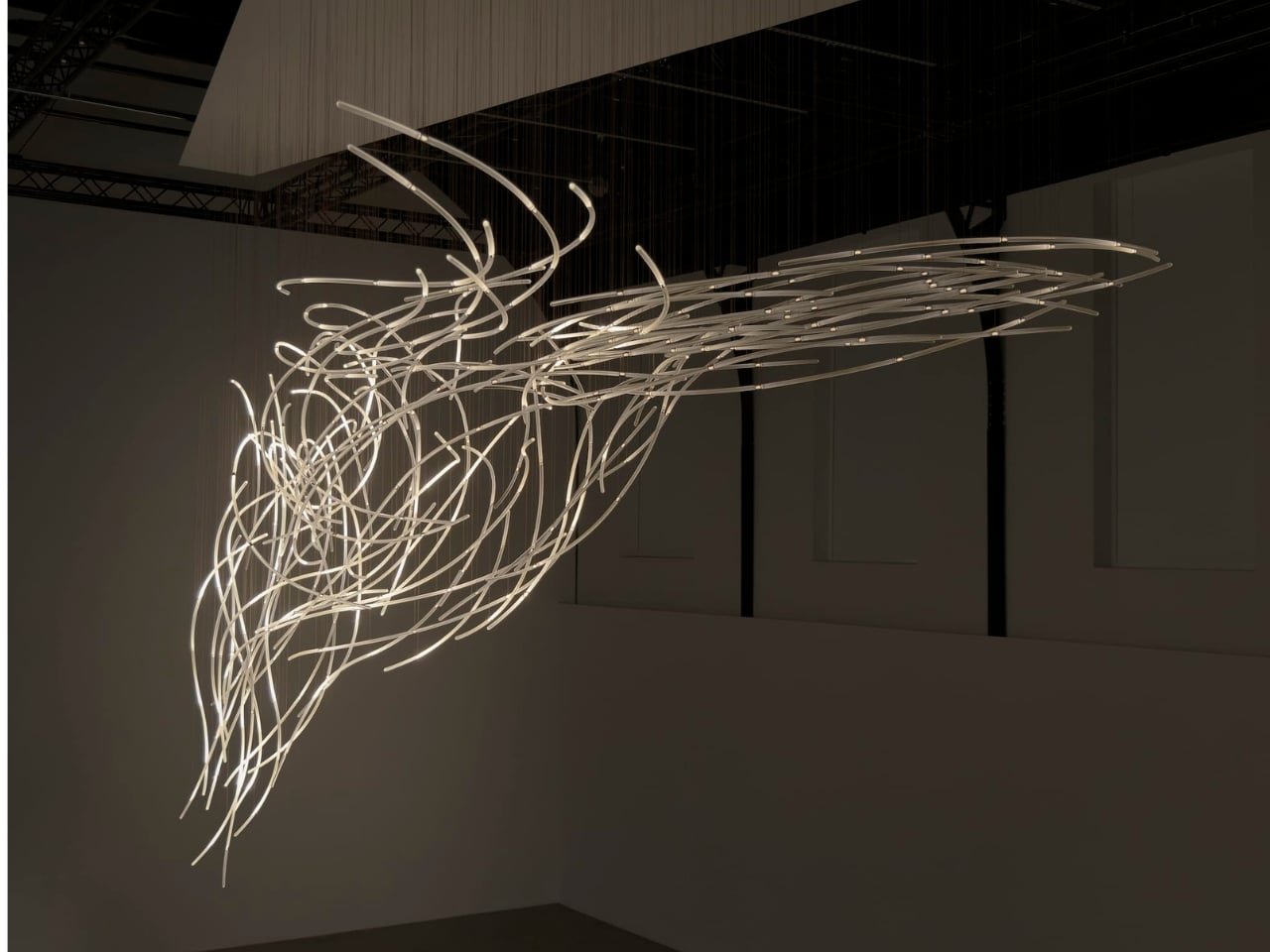
Wind usually needs an accomplice to become visible: a bending tree, a billowing curtain, a plastic bag having a much more cinematic afternoon than it deserves. Air itself gives us very little to look at. Aeolus, a new installation by Amsterdam-based studio DRIFT, takes on that perceptual problem with hundreds of suspended glass rods and light. It gives an invisible force a form you can actually follow.
The studio’s founders, Lonneke Gordijn and Ralph Nauta, have made Aeolus an interactive artwork rather than a conventional light fixture. Presented with Carpenters at London’s Ladbroke Hall from October 13 through 25, 2026, the installation takes its name from the Greek god of the winds. Its shape, though, comes from a specific earthly source: the architecture of the room containing it.
Designer: DRIFT
DRIFT begins with a digital reading of the surrounding architecture, then translates that space into a virtual environment where air can flow. The studio selects one moment from that simulated movement and gives it physical form in glass. That distinction matters. Aeolus isn’t showing a live reading of whatever breeze happens to be passing through the gallery. Its structure holds a chosen instant, while the lighting introduces a separate layer of change.
I like that the room has a say in the result. A sculpture built from its setting feels more considered than an impressive object dropped into an available corner. DRIFT says each installation is generated by its host architecture, so the curves carry information about a particular place. The building becomes part of the design process, even if visitors never see the digital model behind it.
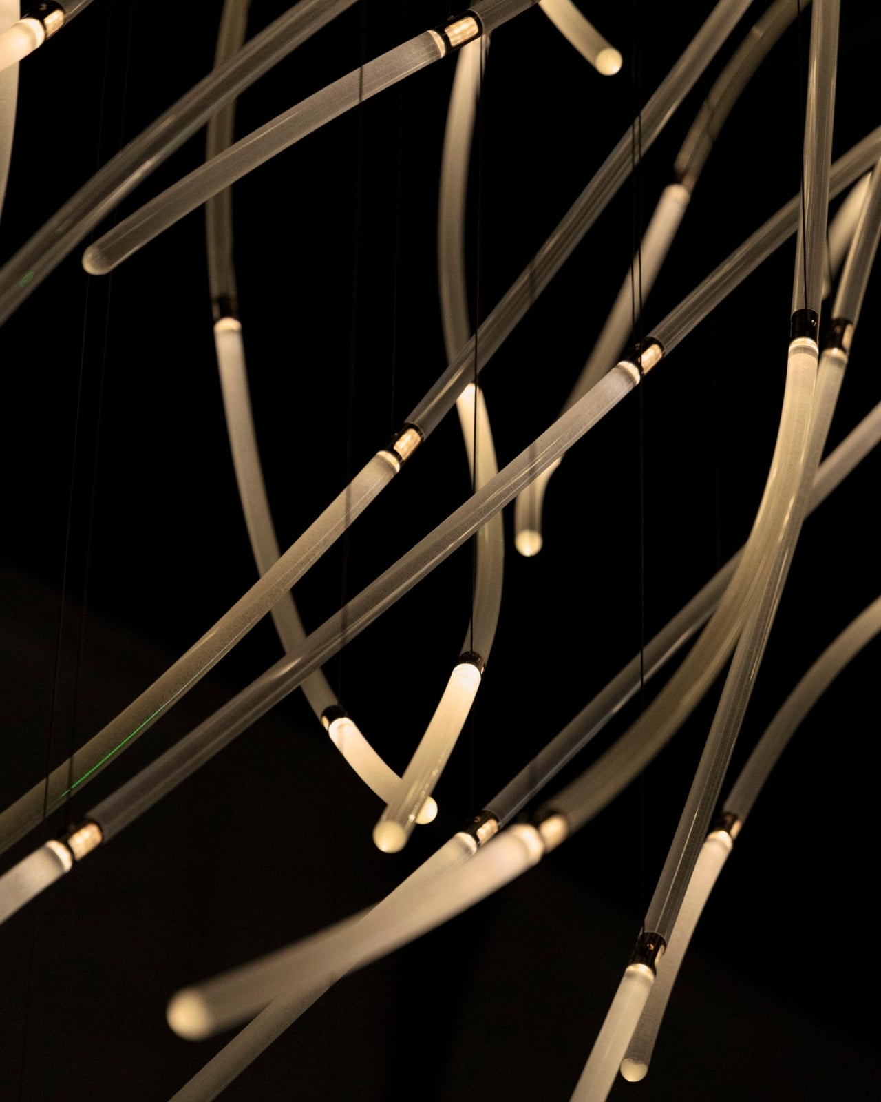
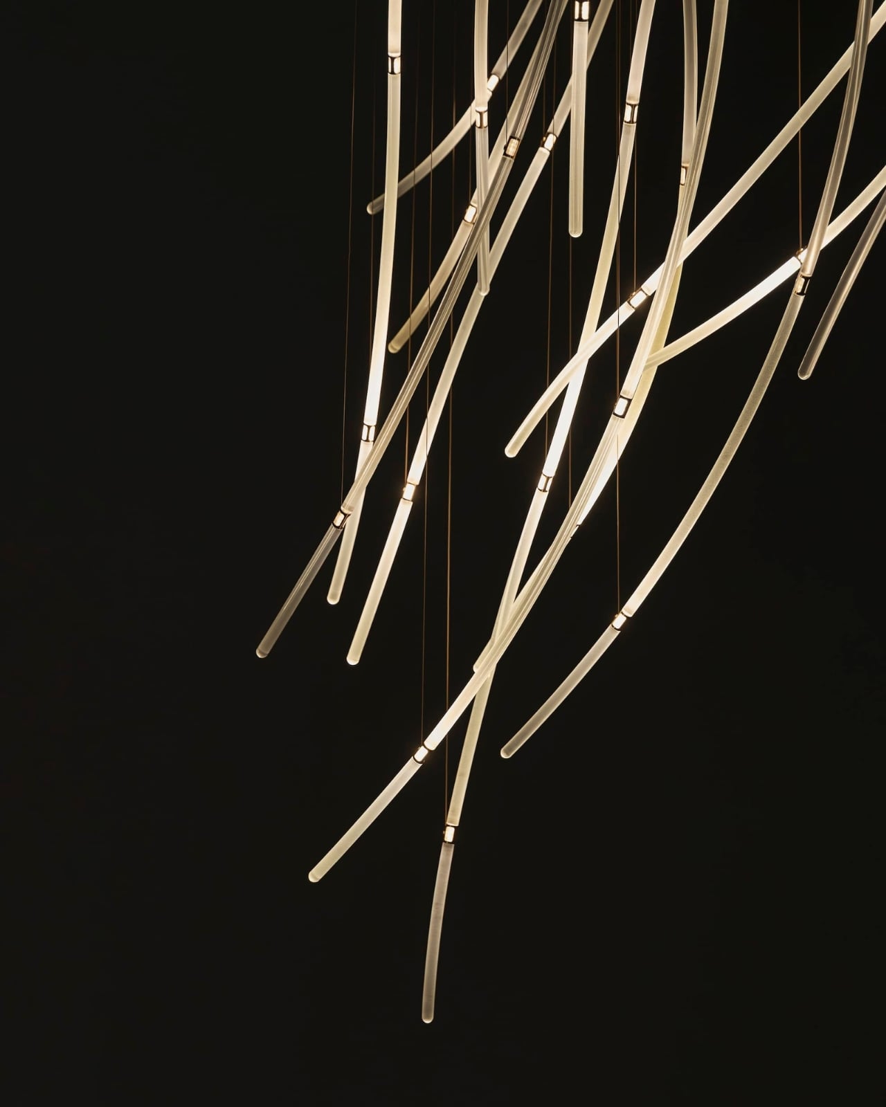
In Benjamin Baccarani’s photographs, the rods gather into a long, sweeping formation, dipping at one end and stretching outward at the other. Fine suspension lines lead up to a broad overhead panel. The material list is more technical than the airy appearance suggests: borosilicate glass rods, stainless steel nodes, custom LEDs, and microcoax cables. I appreciate that contrast. Making an object look almost weightless still requires hardware, connections, and a deliberate relationship with gravity.
The glass itself stays still. According to Carpenters, small lights inside the rods change their rhythm and intensity in response to visitors moving through the space. Waves of illumination create the impression of motion without the sculpture physically shifting. That’s the cleverest choice here. The designers don’t need to swing a roomful of glass around to suggest wind; they let your eyes follow light across a fixed structure, doing much of the perceptual work.
The interaction also gives visitors a meaningful role without turning them into operators. Walking changes the work’s lighting, a relationship that seems appropriately direct for an installation about air and movement. I’m drawn to technology that makes its presence felt through an understandable response. Here, the interesting question is how your movement alters what you see, rather than how many technical features the system contains.
DRIFT frames Aeolus as an invitation to reconsider our relationship with nature. I’d treat that as a starting point for looking, not a transformation any artwork can promise. The more convincing achievement is smaller and more specific: making airflow legible through material and light. You don’t need to leave with a new environmental philosophy to appreciate the way a simulated path has become a collection of precise, luminous curves.
For me, the appeal sits in that modest shift in attention. The room stops being an empty container for an artwork and starts to look like a place shaped by movement. Aeolus makes that movement imaginable while keeping the glass suspended in a single instant. A visitor supplies motion, the lights answer, and the fixed structure takes on another rhythm. The glass gives you time to study a shape that moving air would never hold still for inspection.
Cuff-style blood pressure reading with 24-hour ambulatory monitoring
Quiet measurement that didn’t disturb my sleep
Streamlined ensign and comfortable everyday fit
Good battery life
Comprehensive health and fitness tracking alongside everyday smartwatch features
CONS:
Limited third-party app selection
Not suitable for swimming or showering
RATINGS:
AESTHETICS
ERGONOMICS
PERFORMANCE
SUSTAINABILITY / REPAIRABILITY
VALUE FOR MONEY
EDITOR'S QUOTE:
The Huawei Watch D3 pairs quiet blood pressure monitoring with everyday comfort and style.
Hypertension, or high blood pressure, is a major cause of premature death worldwide and increases the risk of heart disease, stroke, and kidney damage. Nearly half of U.S. adults have it, according to the CDC. Yet it often causes no noticeable symptoms, so feeling fine does not necessarily mean your blood pressure is where it should be.
The Huawei Watch D3 puts blood pressure measurement on your wrist, using an inflatable airbag built into the strap and offering scheduled readings throughout the day and night. That sounds like a recipe for a bulky, rather clinical accessory, but the watch I received looks nothing of the sort. More importantly, it is comfortable enough that I was happy to keep wearing it, including overnight. Huawei has squeezed some unusual hardware into a familiar package, and after living with it, I am impressed by how little fuss it adds to my day.
Designer: Huawei
Aesthetics
Huawei has made the Watch D3 surprisingly discreet, and that is one of its biggest design strengths. This is a health-focused smartwatch with more going on under the surface than most, yet it does not look overly technical or awkwardly bulky. Instead, it comes across as clean, polished, and easy to wear, which helps it feel like a proper everyday smartwatch rather than a specialist device.
Visually, it sits somewhere between the clean familiarity of an Apple Watch and the more assertive presence of an Apple Watch Ultra, giving it a look that feels both familiar and slightly more rugged. Huawei offers the Watch D3 in three color options: White, Black, and Mocha Gold. I received the Mocha Gold version, and it gives the watch a warmer, slightly more elevated look than the other finishes. The rectangular-shaped case is paired with a color-matched fluoroelastomer strap, which also houses the airbag used for blood pressure measurement.
Ergonomics
For a smartwatch with a tiny airbag tucked into its strap, the Watch D3 is surprisingly easy to wear. On paper, it is not a small device at 1.83 x 1.61 x 0.44 inches, but it never feels ungainly or overengineered once it is actually on your wrist. The 1.92-inch rectangular display fits well and doesn’t overwhelm the wrist, keeping the overall look streamlined. Huawei has also trimmed the thickness down from 0.52 inches on the Watch D2 to 0.44 inches here, and that slimming makes a real difference. The D3 feels less like a specialist gadget and more like a smartwatch you can throw on in the morning without a second thought.
In practice, the bigger surprise is how quickly it stops feeling unusual. The Watch D3 feels like an ordinary smartwatch on the wrist in the best possible sense. The strap is inevitably thicker than a conventional smartwatch band because it contains the inflatable airbag, but I never found it cumbersome. If anything, that unusual construction fades into the background faster than expected, which is not something I would have assumed before wearing it.
The weight helps here too. At around 1.41 ounces without the strap, the Watch D3 feels substantial enough to come across as a proper piece of hardware, but not heavy enough to become annoying over the course of a full day. Fit matters more on the Watch D3 than it does on a typical smartwatch. Huawei accounts for that with a paper measuring guide and two strap sizes. A watch built around blood pressure readings needs to fit properly, and the D3 feels better for that extra attention.
Performance
Blood pressure monitoring is the main reason to consider the Watch D3, but what surprised me first was how quiet it is. It makes virtually no sound during a reading, with the increasing pressure around my wrist providing the only obvious sign that anything is happening. The sensation is noticeable, as you would expect from an inflatable strap, but the process feels discreet enough that taking a reading does not become a bother.
There are medical credentials behind the feature, too. According to Huawei, the Watch D3’s blood pressure measurement has obtained NMPA medical device registration in China and CE certification under the European Union’s Medical Device Regulation, commonly called CE-MDR.
The Watch D3 also supports ambulatory blood pressure monitoring, or ABPM, which schedules repeated measurements over a 24-hour period, including while you sleep. Rather than giving you one isolated reading, it builds a record of how your blood pressure changes throughout the day and night. Huawei Health brings those results together into a report showing daytime, nighttime, and overall averages, which you can save or share with your doctor.
That does not mean you can forget about the process entirely. During waking hours, you still need to pause, keep still, and hold the watch at heart level, following the positioning instructions. You can adjust the measurement schedule rather than stick with the default intervals. Overnight, the watch takes readings automatically without requiring you to assume the daytime posture. Thankfully, those nighttime readings did not bother me or wake me up.
There is also a dedicated feature for measuring blood pressure before and after six workout types, covering indoor and outdoor running, walking, and cycling. You take an initial reading before starting, then begin another measurement within two minutes of finishing. There is a reason those changes are worth studying. Research using clinical exercise tests has linked certain blood pressure responses during exercise and recovery with a higher risk of developing hypertension or experiencing cardiovascular events later on.
Beyond blood pressure, the D3 covers heart rate, sleep, blood oxygen saturation, and skin temperature, with ECG available in supported regions. Fitness tracking is solid too, with more than 80 workout modes. It works well as an everyday companion for keeping an eye on activity, workouts, and daily movement without making every walk feel like homework.
The everyday smartwatch features are more familiar. The D3 runs HarmonyOS and works with both Android and iOS, although the experience is not identical across the two platforms. Bluetooth calling and music playback are supported, but the limited third-party app selection leaves less room to expand beyond the built-in tools.
With a compatible Android phone, you can respond to supported messages using quick replies or the on-screen keyboard. Message replies are not supported when the watch is paired with an iPhone, which is worth knowing before you buy. Offline maps are available for supported models, while NFC payment support depends on your region and the available payment service. Having NFC hardware does not automatically mean it will work with your usual cards.
Battery life has been good in my use, too. Huawei quotes up to six days under typical conditions, dropping to around one day with ABPM enabled. My typical-use results were close to that six-day claim, while I comfortably passed a day with ambulatory monitoring enabled. Measurement frequency matters here, since Huawei’s ABPM battery test uses 15-minute intervals, so your results may differ depending on your settings.
Charging speed is okay rather than especially quick, but outside ABPM sessions, I was not constantly looking for the charger. The supplied charger uses a USB-C rather than USB-A, which is a welcome change. That is one less reason to keep an older USB-A power adapter around.
Sustainability
The Watch D3 has an IP68 rating, but that is not an invitation to take it swimming or into the shower. Huawei advises against both because of the air openings used by the blood pressure system. The watch is not water- or dust-resistant while taking a measurement, so those openings need to stay clean and dry. It requires a little more care around water than you might expect from an everyday smartwatch.
The strap feels durable, although Huawei does not provide wear-test figures to put that impression into context. It is removable, so a tear would not necessarily mean replacing the whole watch, provided Huawei makes compatible replacement straps available. That is useful for keeping the D3 in service, but the broader sustainability picture remains unclear. I would have liked more information about recycled materials, repair options, and long-term software support.
Value
The Watch D3 costs £399.99 (roughly $533) in the UK and €449 (roughly $505) in Europe, so it is not exactly an impulse purchase. Whether that feels expensive depends on what you want from your watch. The D3’s appeal is having cuff-style blood pressure readings and 24-hour ambulatory monitoring in something you can wear throughout the day and overnight.
If those are features you will use regularly, the price becomes easier to justify, especially given how comfortable I found it. I am also impressed by how streamlined the whole package feels, considering the specialized hardware tucked inside the watch and strap. You are getting more than an extra health metric on a screen, without having to wear something that feels like medical equipment. If you mostly want notifications and workout tracking, though, I would be less inclined to pay for blood pressure hardware that rarely gets used.
Verdict
The Watch D3 impressed me most by making its unusual hardware so easy to live with. Blood pressure readings are quiet, the strap never felt cumbersome, and overnight measurements did not wake me up. Battery life was good, too, particularly outside ambulatory monitoring sessions. I never felt I was putting up with an awkward gadget just to use its blood pressure features.
I would still like a broader selection of third-party apps and clearer information about repair options and long-term support. The price also makes more sense if blood pressure monitoring will be a regular habit rather than an occasional curiosity. It is a tool to use alongside professional care, not a reason to diagnose yourself or change medication based on your readings. With that understood, the D3 earns my recommendation for combining useful blood pressure features with the comfort and discretion of an everyday smartwatch.
Japanese audio brand Final has introduced Porta, a pair of wireless on-ear headphones that rethink one of the most familiar elements of headphone design – the headband. Unlike most headphones with a conventional padded arch, the Porta uses a minimal, single-wire structure called AirWire, reducing the headphones’ weight to approximately 40 grams while aiming to make extended listening more comfortable.
The AirWire design minimises the area of contact between the headphones and the wearer’s head. According to Final, this approach reduces pressure on the top of the head, a common source of discomfort with traditional headphones. The lightweight construction also gives the Porta an unusually stripped-back appearance, with a thin metal-like frame connecting two compact earcups. The pair of cans is a minimalist accessory that goes well with your other no-nonsense gadgets.
Porta’s aesthetic draws on the visual language of older portable audio equipment. Its orange ear pads recall the bright accents associated with classic Sony Walkman headphones, while a black version offers a more understated alternative. Both variants share the same main body, with the ear-pad colour providing the visual distinction. Final also plans to sell replacement ear pads separately in 2027, giving owners the option to refresh the look without replacing the entire product.
Despite its lightweight construction and retro appearance, the pair of cans incorporates modern wireless connectivity. Bluetooth 5.4 enables connection to compatible devices, while support for the SBC and AAC audio codecs provides compatibility with a broad range of smartphones and other Bluetooth audio sources. The headphones have a stated frequency response of 20Hz to 20kHz.
Final says the Porta has been tuned to deliver a lively presentation, with a sense of depth and substance in the midrange and lower frequencies. The company highlights vocal weight as a particular consideration in its sound design, addressing the challenge of maintaining a full listening experience in a lightweight headphone enclosure. These are manufacturer claims rather than independently verified performance results.
A 57mAh lithium-ion battery provides up to eight hours of music playback on a charge. Recharging takes approximately 90 minutes through USB-C, keeping the charging process straightforward. The headphones also carry an IPX4 rating, indicating resistance to water splashes, which offers some protection during everyday use and light exercise.
The design does involve trade-offs. The Porta does not offer active noise cancellation, a feature found in many contemporary wireless headphones. Its modest battery capacity and eight-hour rated playback time also place the emphasis on everyday convenience and low weight rather than extended listening between charges.
Final has priced the Porta at ¥12,800 (approximately $80), with availability in Japan scheduled for October 23, 2026. International availability has not been confirmed, although the brand sells products through its Amazon storefront.
Six burgers, a pile of fries, and generous spoonfuls of caviar are a pretty good way to explain dumæ’s Masa Tray. In the brand’s photographs, the food sits on a rippling brass surface that looks more like a small sculpture than standard serving ware. I like the slightly ridiculous pairing. It also makes the tray’s purpose clear: give dinner a visually interesting home without adding a separate decorative centerpiece.
Designed by Los Angeles brand dumæ and handcrafted in India, Masa addresses that familiar divide between the serving pieces you use and the decorative objects you leave out. Its project description says the brass tray is finished to be food-safe, allowing it to move between both roles. The appeal is having one substantial object that doesn’t need to disappear when everyone finishes eating.
Designer: dumæ
The starting point is the movement of waves, translated into broad rises and shallow dips rather than a literal seashell outline. IADA’s announcement traces the reference to Point Dume, the stretch of coast where dumæ founder Kym Gold grew up. I appreciate that the backstory isn’t required reading. Even without knowing the geography, you can see how the curves break up what could otherwise be a rather stern metal rectangle.
In the close-up photographs, light collects along the higher ridges while the depressions fall into softer shadow. That gives the surface a sense of movement even when it’s covered with crackers and grapes. The edges rise and dip with the rest of the form, so the shape feels continuous rather than decorated afterward. To my eye, that’s the strongest design decision here. The visual interest comes from the tray itself, without needing a pattern applied on top.
Those undulations also deserve a practical look. A sculpted surface offers a different proposition from a flat platter, particularly if you’re arranging small bowls or setting down glasses. I’d treat Masa primarily as a tabletop serving piece rather than assume it’s the ideal tray for carrying drinks across a room. The photographs make a convincing case for loosely arranged food. They don’t establish how securely every vessel would sit, and the distinction matters when the surface is this expressive.
The handcrafting adds another layer. According to the announcement, small differences in form and finish occur from piece to piece. That feels appropriate for a design built around irregular movement; perfect repetition would almost work against the idea. Still, handmade isn’t a performance specification. The individuality is a reason to appreciate the object visually, not evidence that it will resist scratches or survive every kind of use. I’d want the maker’s specific care guidance before treating it as everyday workhorse tableware.
Retail listings put its footprint at approximately 21.5 by 11.5 inches, with a height of 3 inches. That’s worth measuring against your table before imagining a generous spread surrounded by dinner plates. The Happy Kangaroo lists Masa at $595, although it’s marked sold out at the time of writing. At that price, this is a considered decorative purchase with a serving function, and its appeal depends on wanting to see it between meals.
Masa received Platinum recognition in both Kitchen & Dining Room Design and Homewear & Decor at the International Architecture & Design Awards 2026. Those categories neatly reflect its intended overlap: something for the table that can also hold its own elsewhere in the house. The recognition is useful context, though the more persuasive argument is still visible in the photographs: food looks inviting against those broad brass curves.
I’m most persuaded by the burger arrangement. The cheese, figs, and carefully grouped grapes are lovely, but takeout gives the tray a less precious personality. It suggests that owning a sculptural serving piece doesn’t require hosting a perfectly coordinated dinner party. I’d rather see an object like this earn its space under a heap of fries than spend its life waiting for an occasion formal enough to deserve it. The waves are already doing the decorating.
The most useful thing in your bag is often the thing you forgot to pack. Scissors for a stubborn package, a light for a dark stairwell, a driver for the screw working loose on your gear. October’s EDC selection starts with Eiger’s eight-function scissors, then moves through seven other designs that give familiar tasks a more considered form, without assuming everyone needs to carry an entire miniature workshop every day.
Pocket space is limited, so every extra object needs a reason to come along. A pen that packs down, a wallet stripped to the essentials, and a charger built around one USB-C port approach that constraint differently. Some designs combine jobs; others concentrate on doing one thing well. The appeal lies in finding something that earns its place in your daily routine without giving you more than you actually need.
1. Eiger 8-in-1 Scissors
EigerTool starts with a pair of scissors and works the extra functions into their existing geometry. Made by hand in Sanjo, Niigata, the SUS420J2 stainless-steel tool combines cutting with a knife, can opener, bottle opener, screw-cap opener, shell cracker, prying tool, and gas-release function. It’s a sensible starting point for an everyday tool: the main cutting action stays accessible, rather than being a miniature attachment you have to dig out of a handle before opening a stubborn package.
At 5.1 inches long and 53 grams, Eiger is better understood as a small bag tool than a keychain accessory. An included leather case covers it between uses, while a red NITE IZE carabiner gives it a place outside the bag. The black finish comes from an oxidation coloring treatment that the maker says improves corrosion resistance. That doesn’t remove the need for care: EigerTool recommends washing and thoroughly drying the scissors before storage, particularly after messy jobs around camp.
Scissors take priority, with seven supporting functions.
The leather case and bag-attachment carabiner are included.
What we dislike
The five-inch length favors bag carry over a keychain.
The steel still needs washing and thorough drying after use.
2. RolTine 2.0 Titanium Tape Measure
COMANDI-Corres puts two ways of measuring into a titanium disc measuring 46 millimeters across and 18 millimeters thick. RolTine 2.0 contains a retractable 150-centimeter tape for conventional measurements, plus a rolling wheel for following contours. The wheel’s 150-millimeter circumference provides the reference: count complete turns, then add the remaining dial reading. It’s an appealing approach for checking rounded objects or curved edges, provided you’re willing to keep track of rotations rather than expect an electronic readout to do the arithmetic.
The Grade 5 titanium frame is skeletonized around the mechanism, giving this tape measure some of the exposed complexity associated with mechanical watches. An embedded magnet adds a way to park it on a steel toolbox between measurements. The important qualification is availability; February 2027 is the estimated shipping date. For now, its most convincing idea is giving curved measurements a place beside the straight tape without doubling pocket clutter.
Retractable tape and rolling measurement share one compact body.
The embedded magnet provides a convenient place to park it.
What we dislike
Rolling measurements require manually tracking complete rotations.
February 2027 delivery is an estimate, not confirmed availability.
3. Corkor Front-Pocket Cork Wallet
Not every EDC improvement needs another mechanism. Corkor’s Front-Pocket Cork Wallet makes its case through a familiar card-holder layout and an unusual material. The Portuguese brand uses cork for an animal-free exterior, with three card slots, an ID window, and two compartments for folded bills. At a listed 20 grams, it starts light before you add your essentials. The surface gives the collection a welcome material change, particularly if your carry already contains plenty of black plastic and brushed metal.
The dimensions are 110 by 80 by 10 millimeters, which makes restraint part of the design rather than an optional extra. Add spare cards and receipts, and you start working against the point of a slim holder. Corkor includes RFID-blocking construction, but the more tangible daily benefit is the straightforward division between cards, ID, and cash. There’s no coin pocket, and bills need folding. It suits someone ready to edit their wallet, not someone looking to relocate an overstuffed bifold.
What we like
The animal-free cork exterior offers an alternative to leather.
Dedicated card, ID, and cash compartments keep the layout straightforward.
What we dislike
There’s no compartment for loose change.
Folded bills are less convenient to sort than cash in a full-size wallet.
4. CasaBeam Everyday Flashlight
CasaBeam takes a less tactical approach to the everyday flashlight. The body combines ABS and aluminum alloy, with a hanging loop and an included diffuser cap that broaden where the light can work. Adjust the beam for a concentrated spot or wider illumination, then stand the flashlight upright for ambient use. That flexibility matters more here than aggressive styling: one light can move between a bag, a bedside table, and a shelf.
The listing specifies up to 1,000 lumens, three brightness levels, a 2,600mAh rechargeable battery, and USB-C charging. Its claimed 24-hour runtime applies at the low setting, not maximum brightness. At 6.14 inches long and 175 grams, this is a deliberate bag-carry choice rather than something that disappears beside your keys. The useful design move is keeping handheld and stationary lighting together, so you don’t need to reserve the flashlight exclusively for the next power cut or an occasional camping trip.
The included diffuser extends its role into ambient lighting.
An adjustable beam and hanging loop offer different working arrangements.
What we dislike
At 175 grams, it’s substantial for pocket carry.
The longest advertised runtime requires the lowest brightness setting.
5. MetMo Pocket Driver
The MetMo Pocket Driver features its own dedicated tool, built around a reversible ratchet and a handle that folds outward. Keep it inline for a narrow approach, or open the handle into a T configuration when you need a different grip. Standard quarter-inch hex-bit compatibility is the important practical detail: you can choose bits around your own equipment instead of buying into a proprietary format. It’s a compact repair tool whose working parts remain visible during each turn.
MetMo lists the black aluminum version at 103 millimeters long and 109 grams, with hardened steel among its working materials. The handle stores two bits, enough to keep frequently used sizes with the driver without carrying an entire bit case. That also sets a limit: repairs needing several different heads require extra storage. It earns a place for people who tighten and adjust things throughout the week. If you rarely encounter a loose screw, it’s another handsome object to carry.
What we like
The reversible ratchet works with multiple handle positions.
Standard quarter-inch hex bits let you tailor it to your equipment.
What we dislike
Only two bits fit inside the handle.
Its 109-gram weight needs justifying if fastening jobs are rare.
6. Lumink Titanium Fountain Pen
EyeQ’s Lumink addresses the awkward part of carrying a fountain pen: the length that makes it comfortable to write with can make it inconvenient to pocket. Its threaded configuration changes from approximately 96 millimeters in carry form to 140 millimeters for writing. The Grade 5 titanium body has twelve facets designed to stop it rolling away, plus a pocket clip.
The writing end uses a German nib, and the seller lists compatibility with international cartridges and converters. That gives owners a choice between convenient replacements and filling from bottled ink. Belloc describes a threaded cap and internal gasket intended to prevent drying between uses. There’s still a setup step before writing, unlike the instant deployment of a click pen. That makes Lumink better suited to someone who enjoys a writing instrument’s mechanics than someone who needs the quickest possible signature.
What we like
A short carry form becomes a full-length writing instrument.
Cartridge and converter compatibility provides different filling options.
What we dislike
Threaded setup adds a step before writing.
Fountain-pen cleaning remains part of ownership.
7. Tilta Khronos Core Limited Edition Kit
Tilta’s Khronos Core Limited Edition Kit treats a phone case as a small platform for everyday accessories. A CNC-machined aluminum frame accepts four backplates without tools: a kickstand plate, rotating ring plate, transparent keepsake compartment, or card holder. The card holder takes up to three cards behind a latched cover, while the transparent option leaves space for a photograph. Available for iPhone 18 Pro and Pro Max, it changes the function of the phone’s exterior rather than changing its color.
The kit includes short and long straps, with magnetic quick-release attachments and multiple mounting points on the frame. This supports different carrying arrangements, including wearing the phone across your body. Its strongest EDC argument is consolidation: a card plate could replace a separate wallet for a short outing. The compromise is buying several configurations when you may favor only one. Tilta’s standard case already includes the kickstand backplate, so the complete kit makes sense only if you’ll use the alternatives regularly.
What we like
Four tool-free backplates let the same frame serve different purposes.
The three-card compartment could replace a separate holder for short outings.
What we dislike
This kit is specific to iPhone 18 Pro and Pro Max.
The extra backplates add little value if you only use the kickstand.
8. Rolling Square Supertiny 100W GaN Charger
Rolling Square’s Supertiny 100W is the bag essential in this selection, rather than another object to clip onto your keys. Introduced through crowdfunding, it concentrates its advertised 100-watt output into a single USB-C port. The US version has folding prongs, a useful detail when the charger shares a pouch with cables and other equipment. EU and UK versions use different fixed plug arrangements, so the tiny footprint shouldn’t be treated as identical across every regional version or every travel setup.
The appeal is straightforward if you carry a compatible USB-C laptop and want to leave a larger adapter at home. One capable port avoids the extra sockets and bulk of a multiport charger, but also limits the standard setup to one connected device.
What we like
The single-port layout prioritizes compactness over extra connections.
Folding prongs on the US model make packing more convenient.
What we dislike
One USB-C port limits the standard setup to one device.
Current retail availability of the 100W version remains unverified.
Carry for the Jobs You Actually Do
Start with the small inconvenience that repeats. If you keep borrowing scissors, that’s a stronger reason to carry Eiger than any function count. If you regularly repair equipment, build a bit selection around the MetMo. A wallet or charging adapter might make a bigger difference than either. The useful test is what an object replaces, or what specific job it makes possible, rather than how impressive it looks laid out.
Leave room for changing your mind, too. A bag packed for commuting doesn’t need the same tools as one packed for a weekend away, and a phone case with card storage may make a separate holder unnecessary. The aim isn’t to assemble all eight into a matching collection. It’s to find the one or two objects that deserve to stay packed after the novelty has worn off and life resumes.

 Connexion


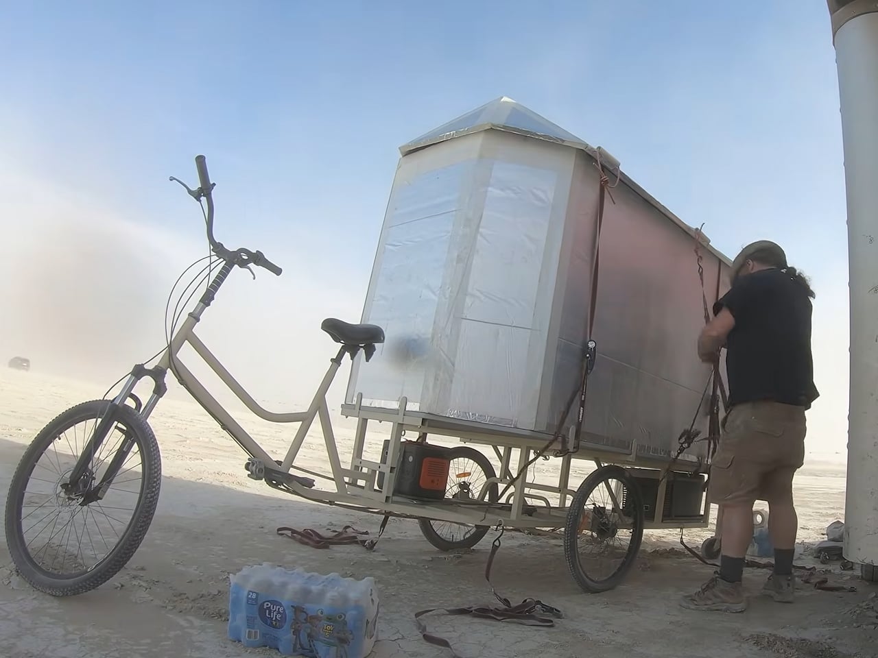

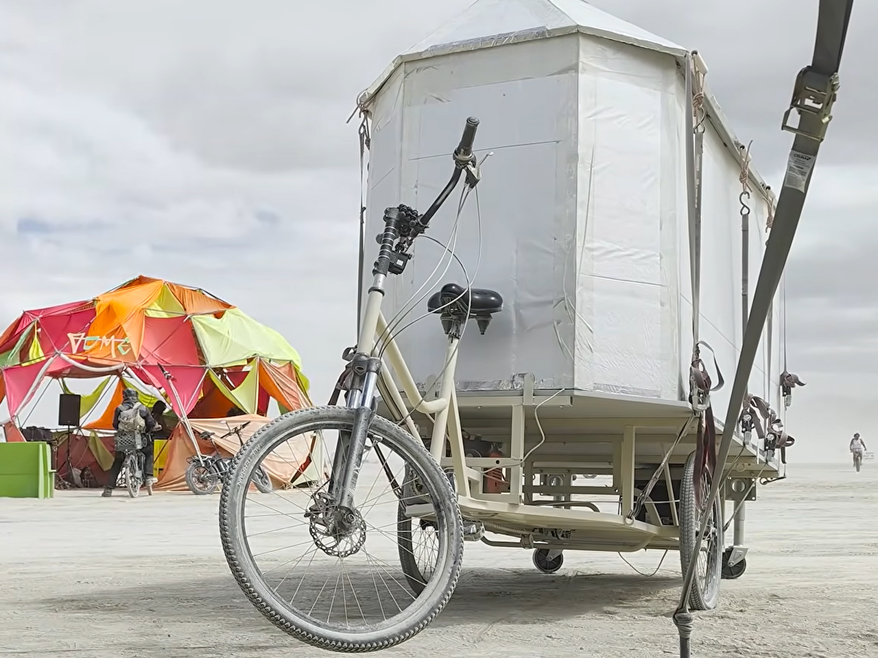
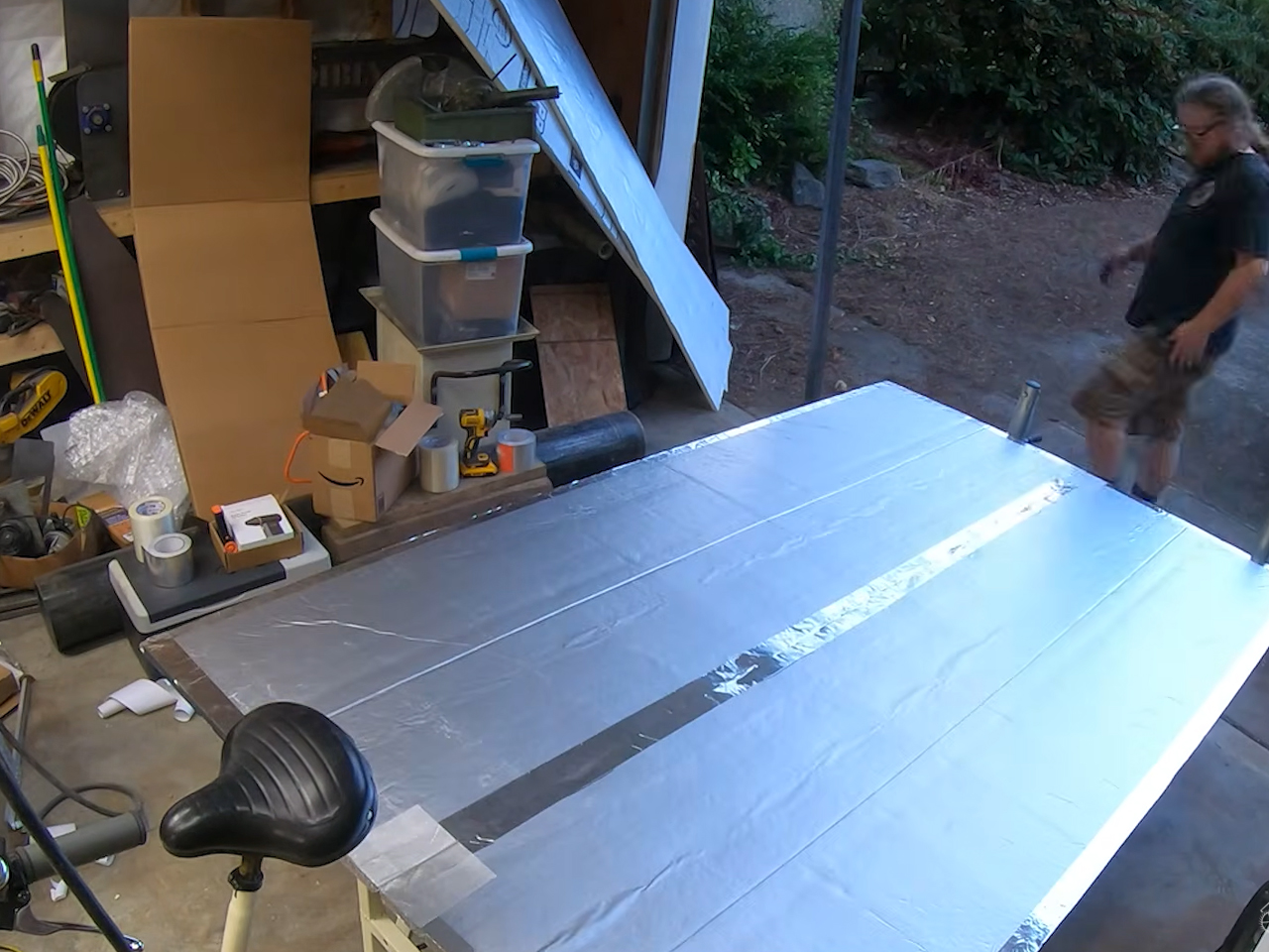
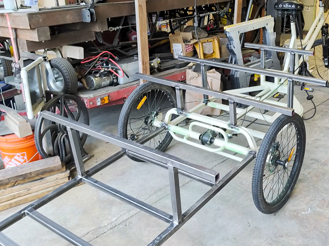
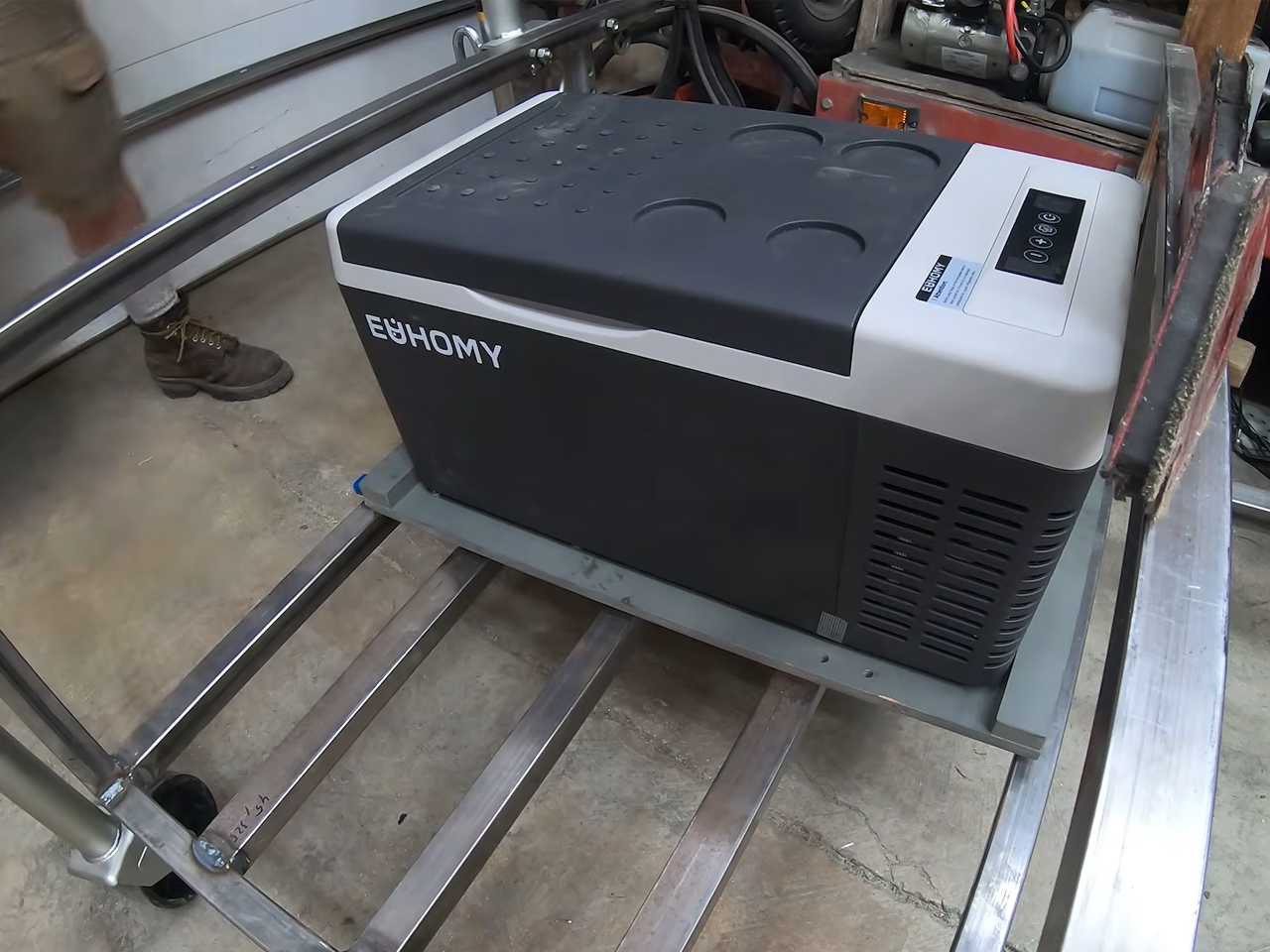
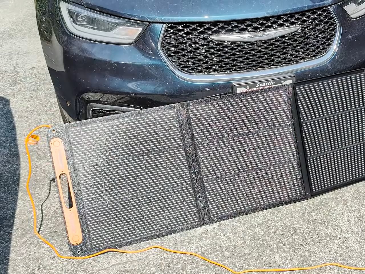
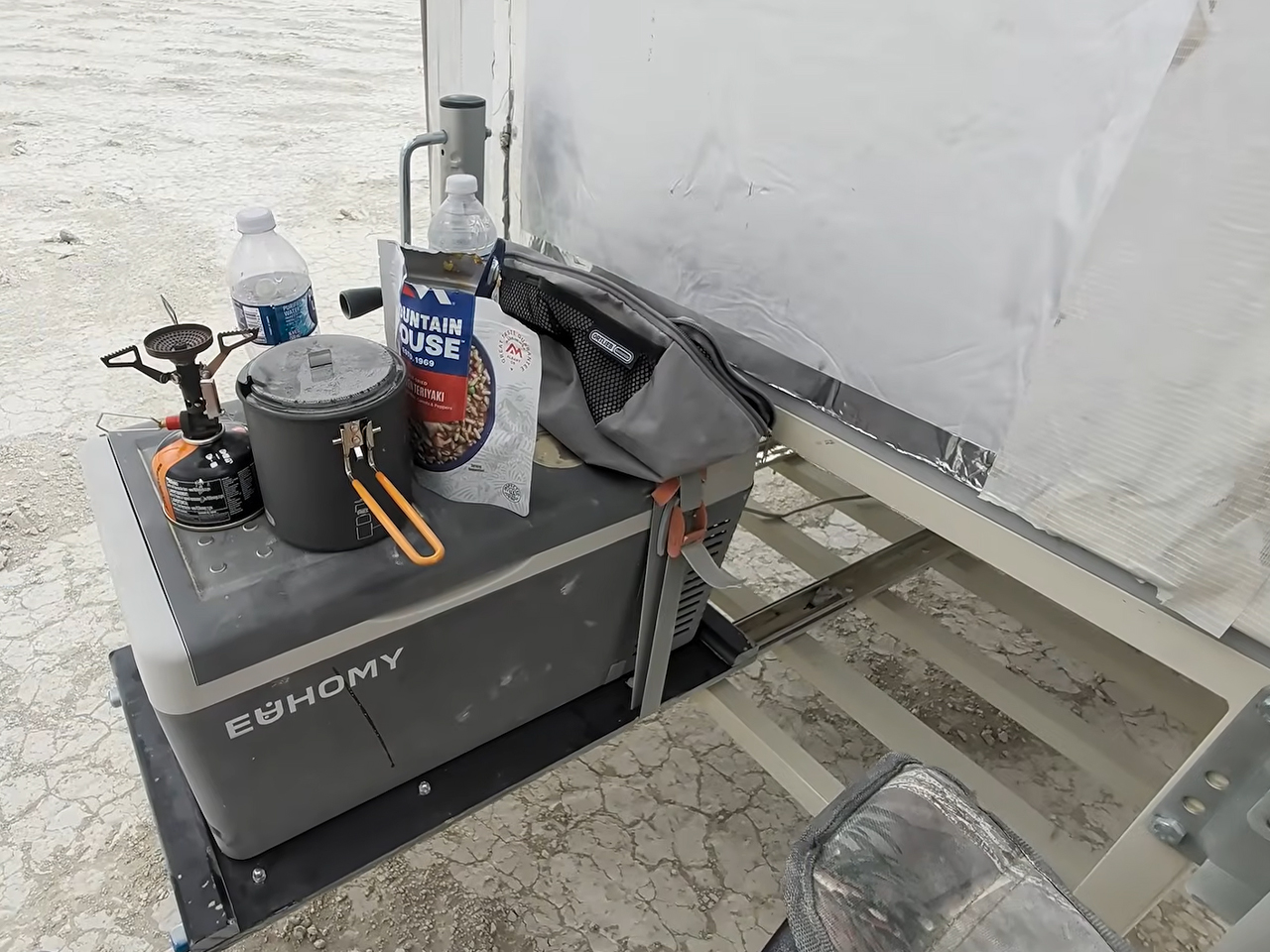

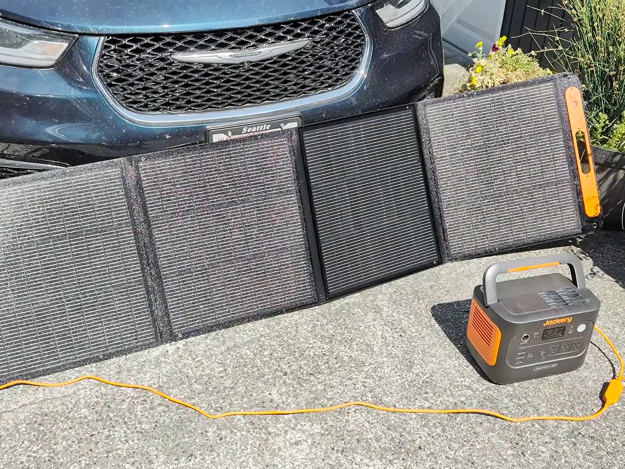
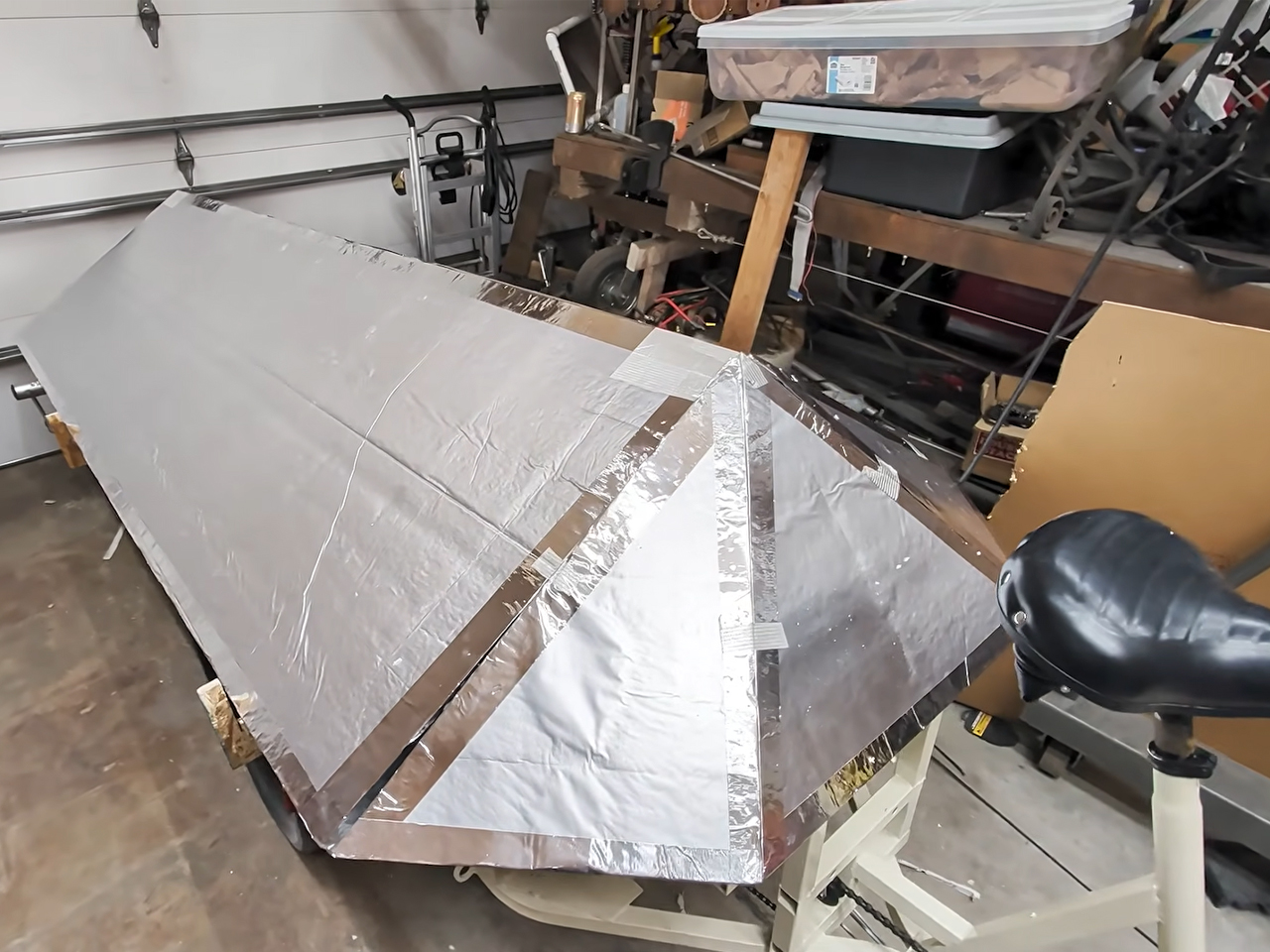

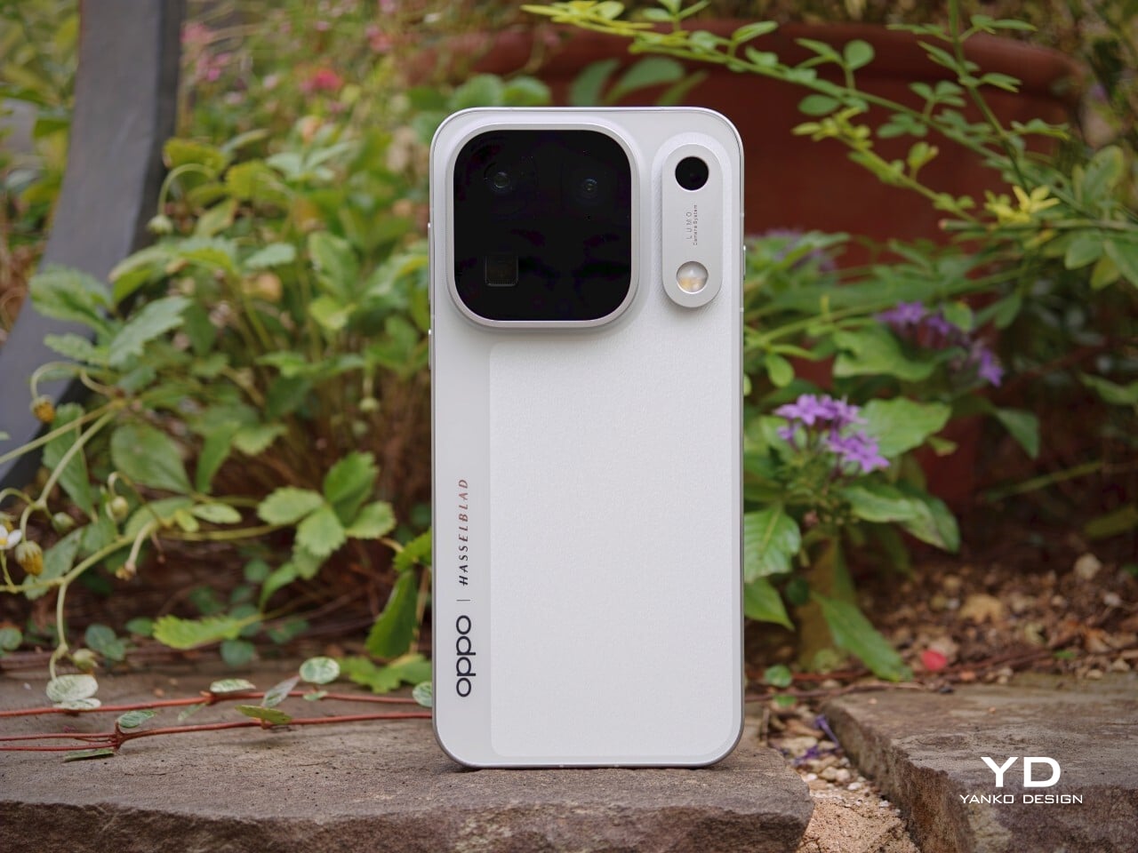
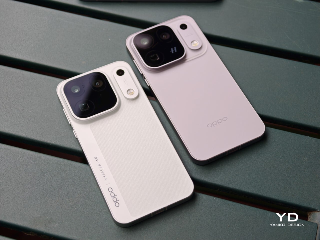
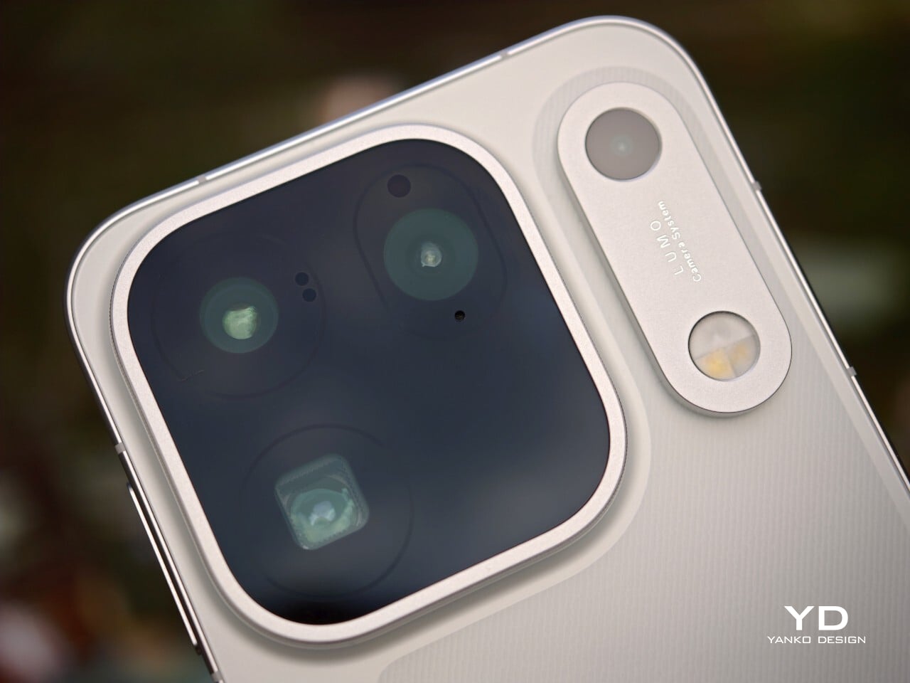
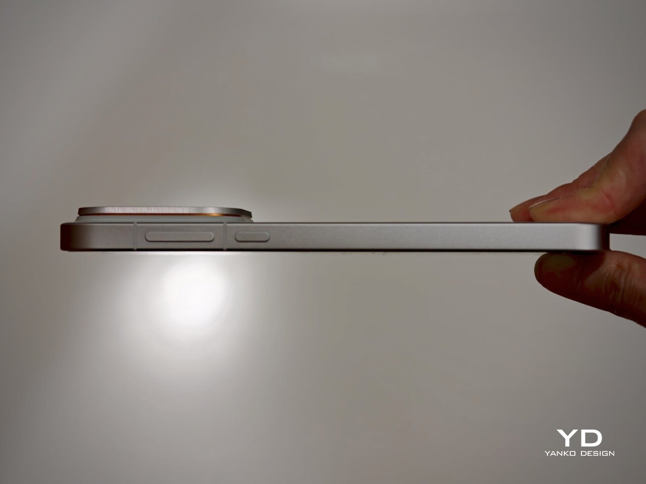
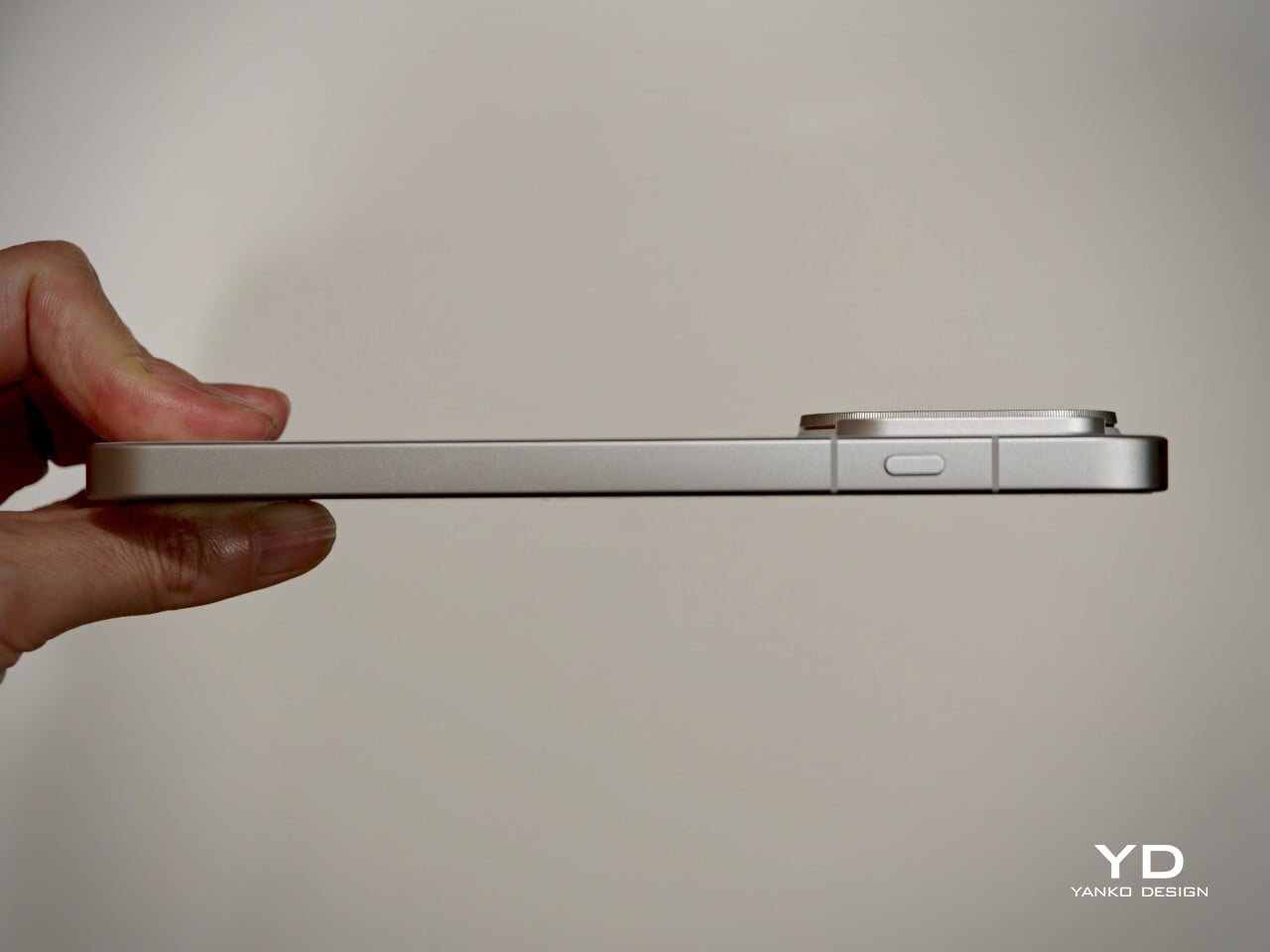
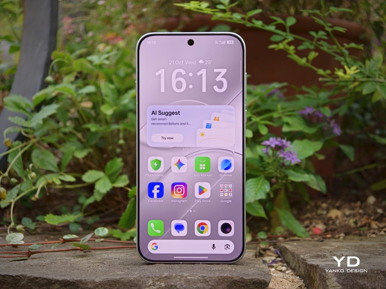
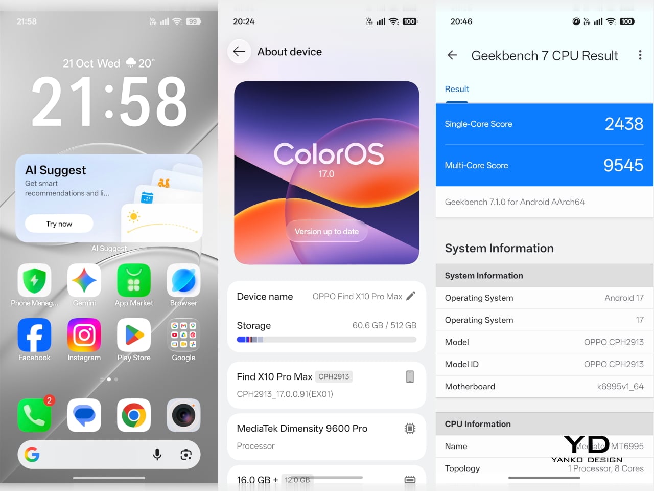

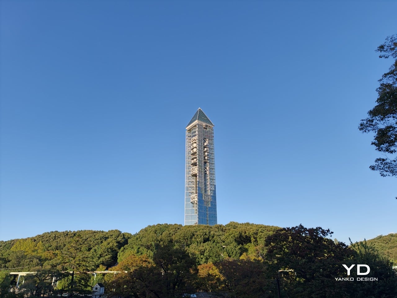


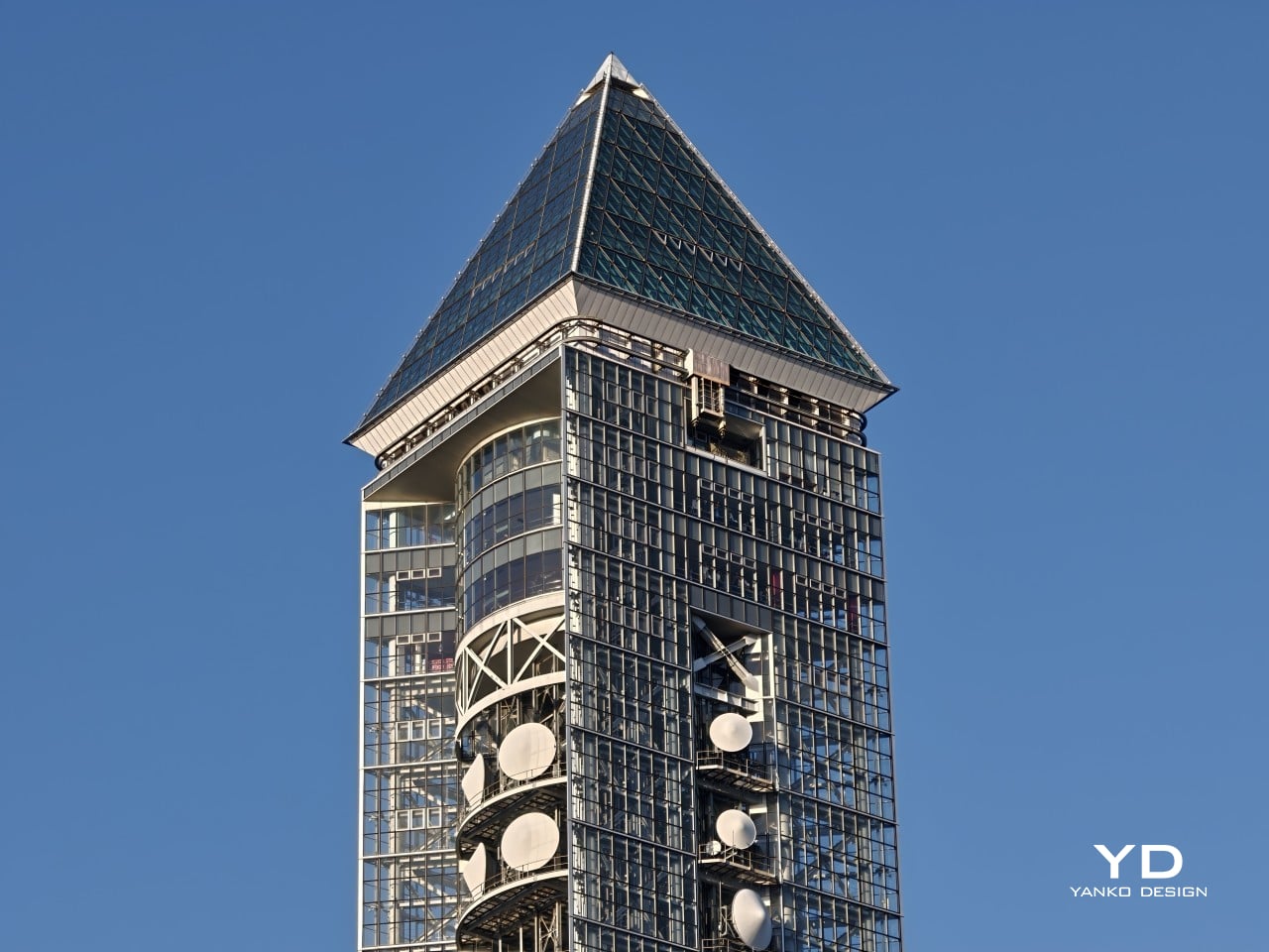




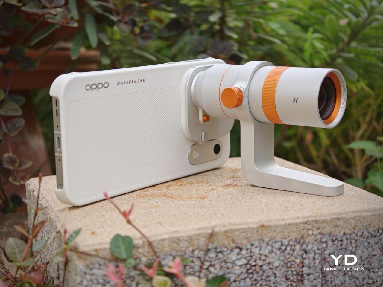


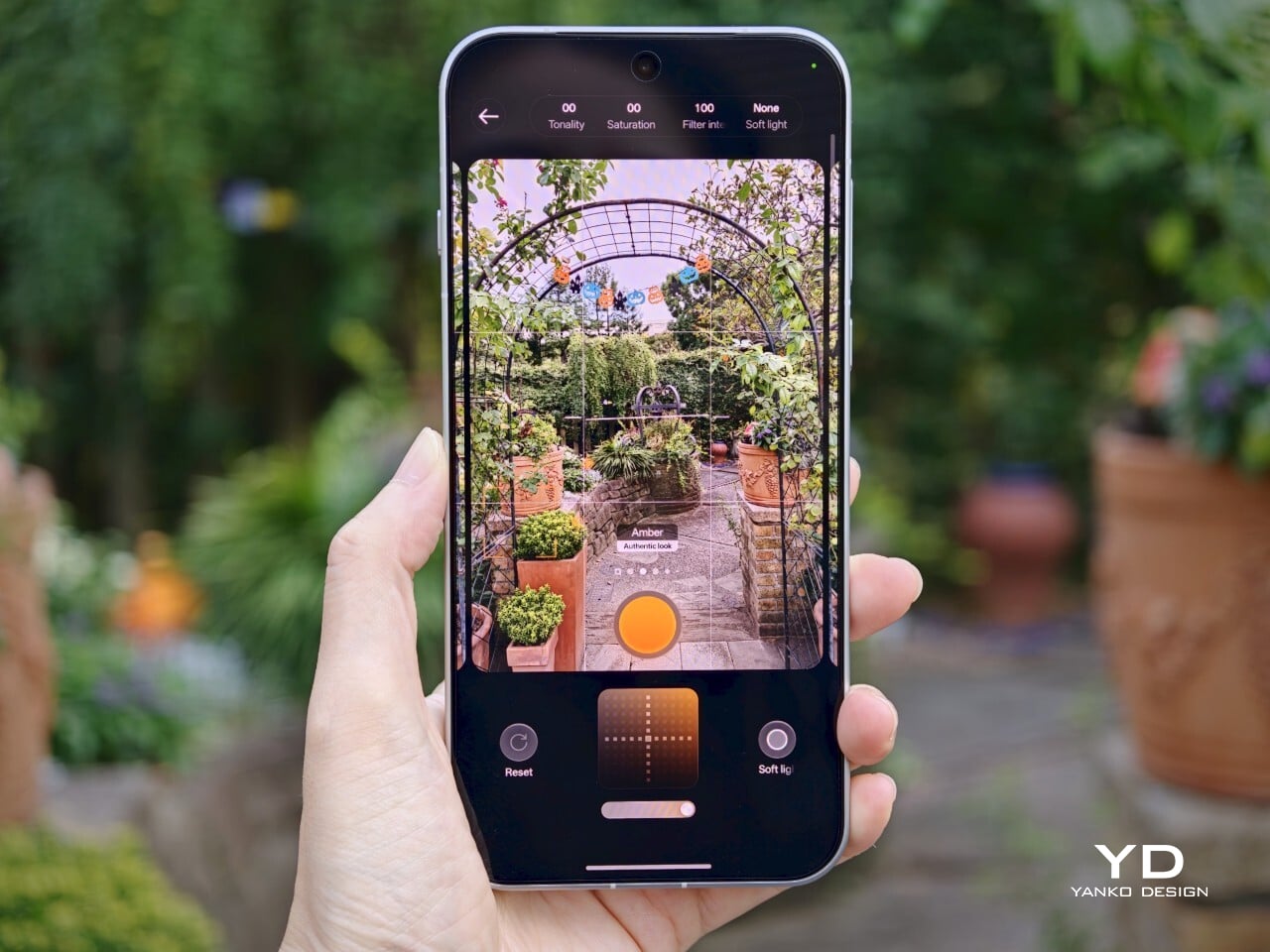
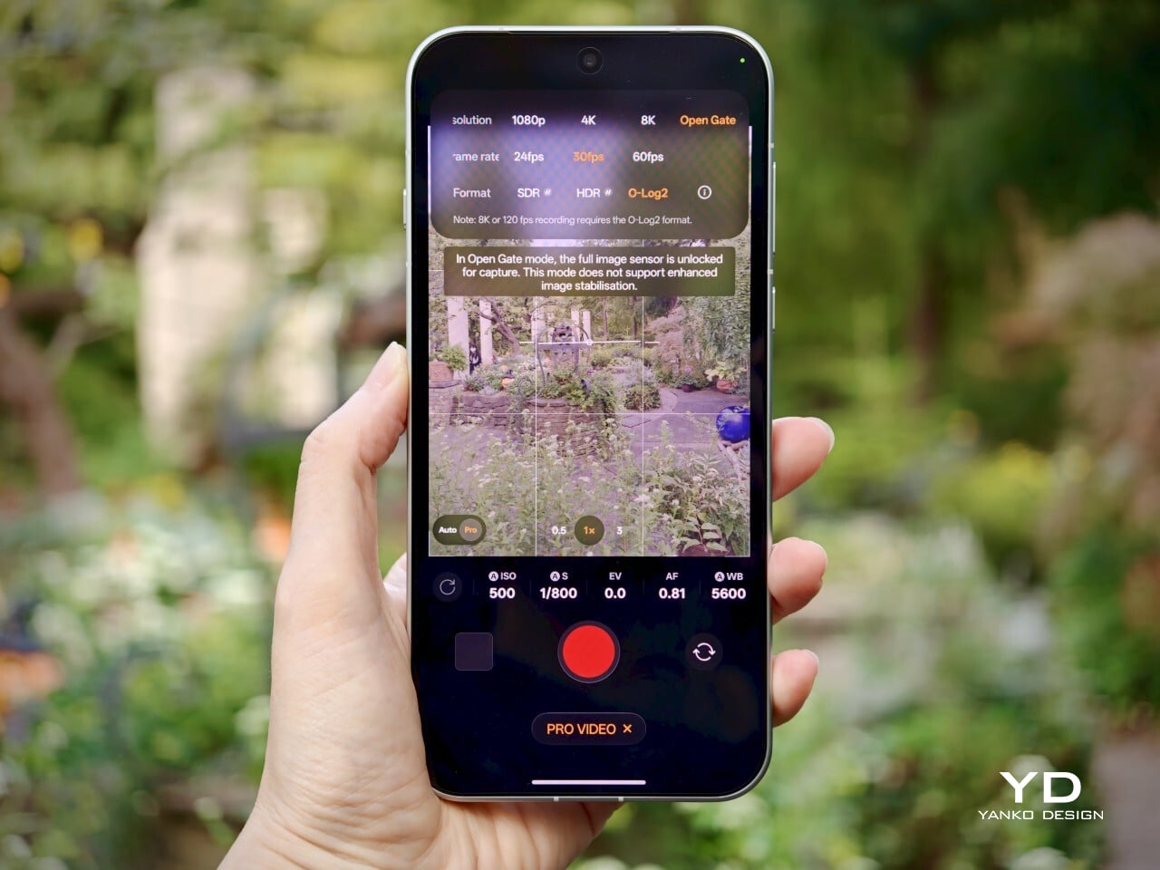

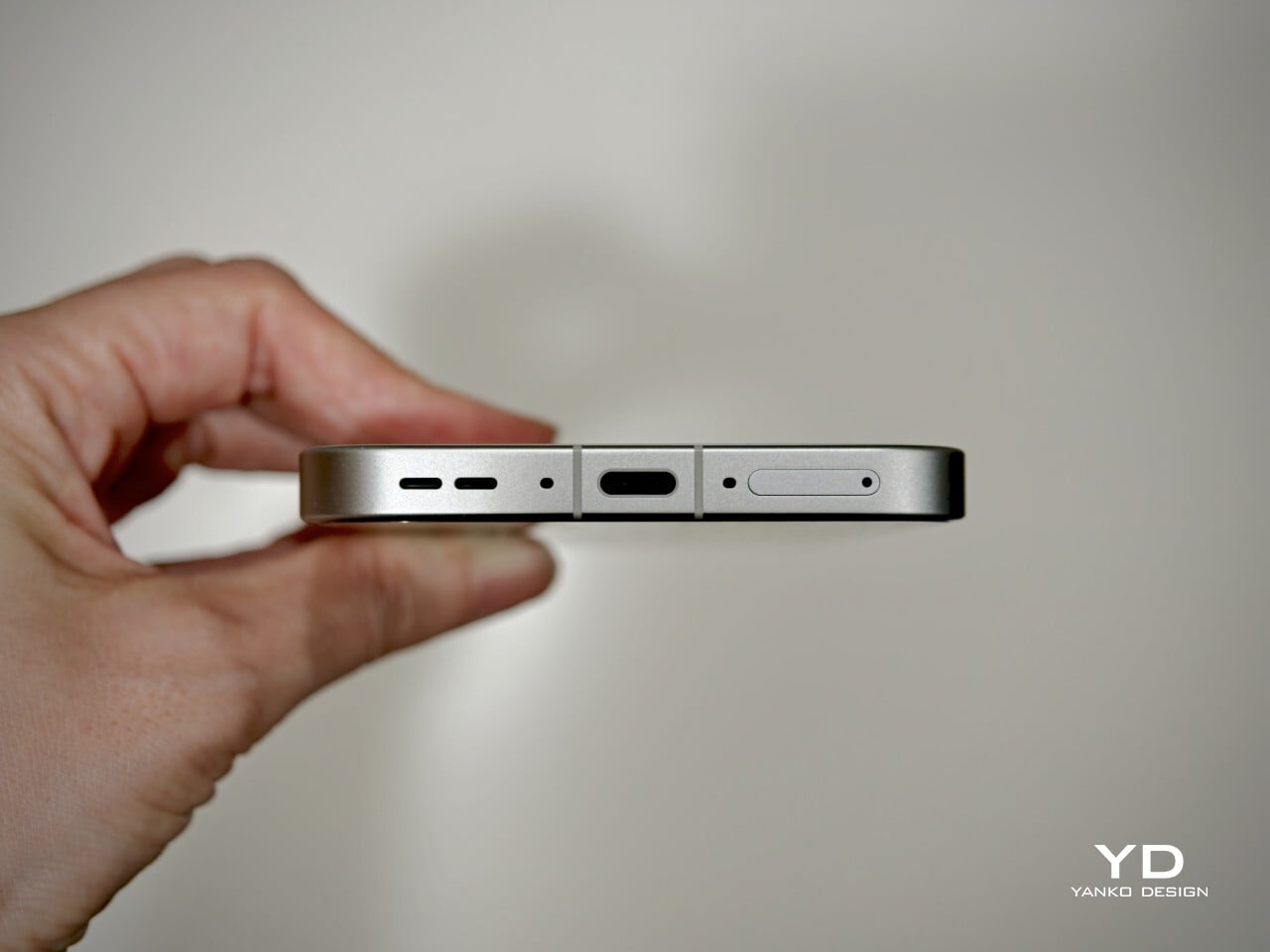
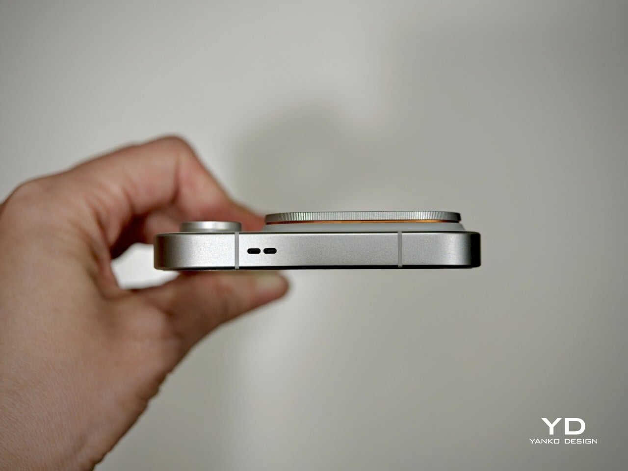
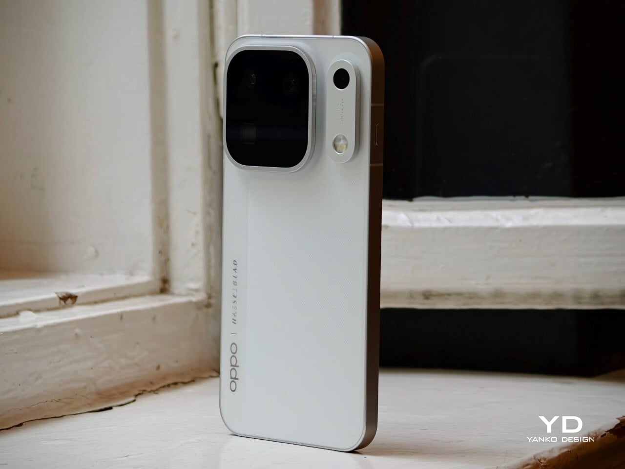
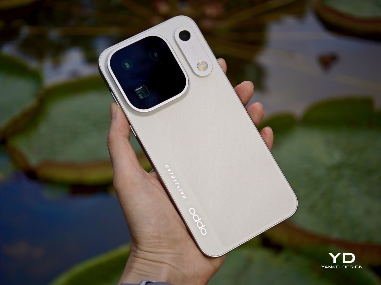
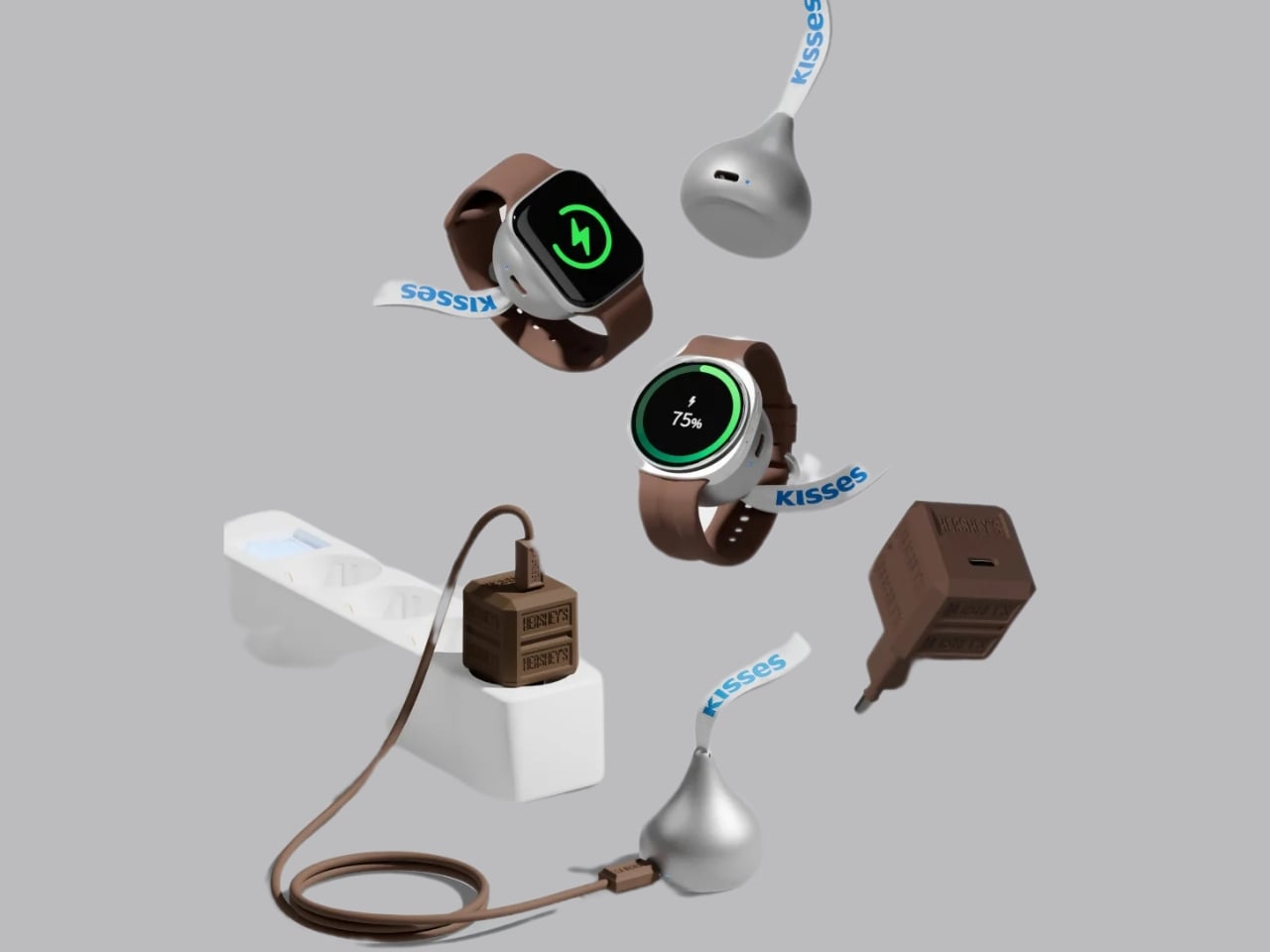
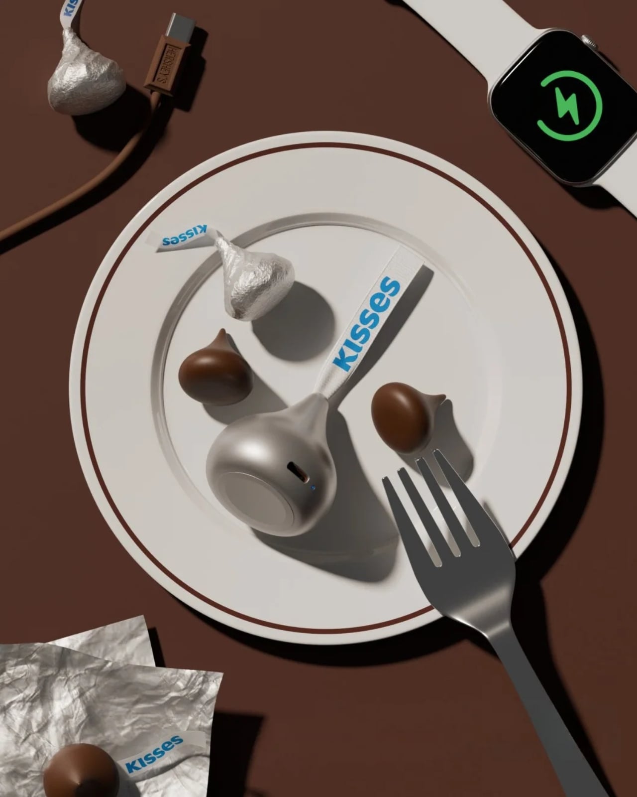
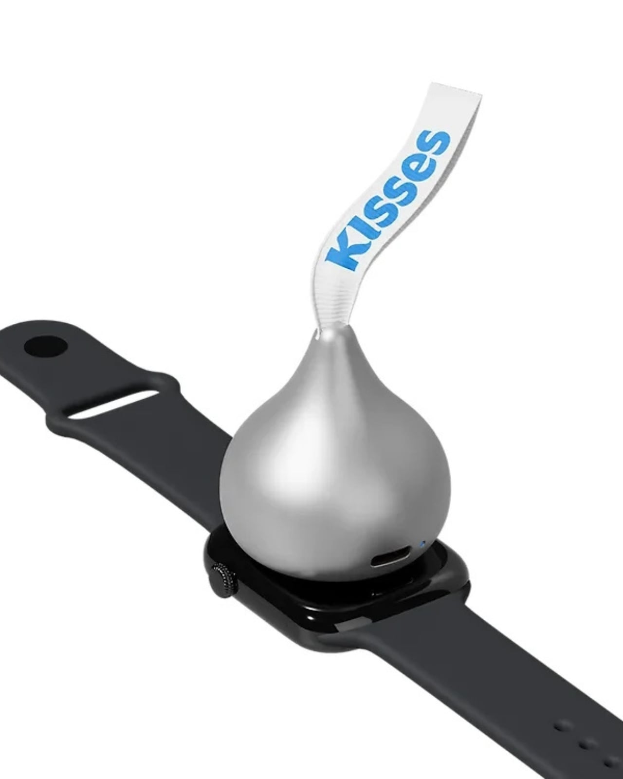
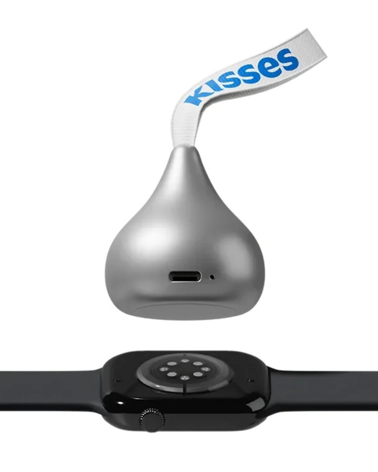
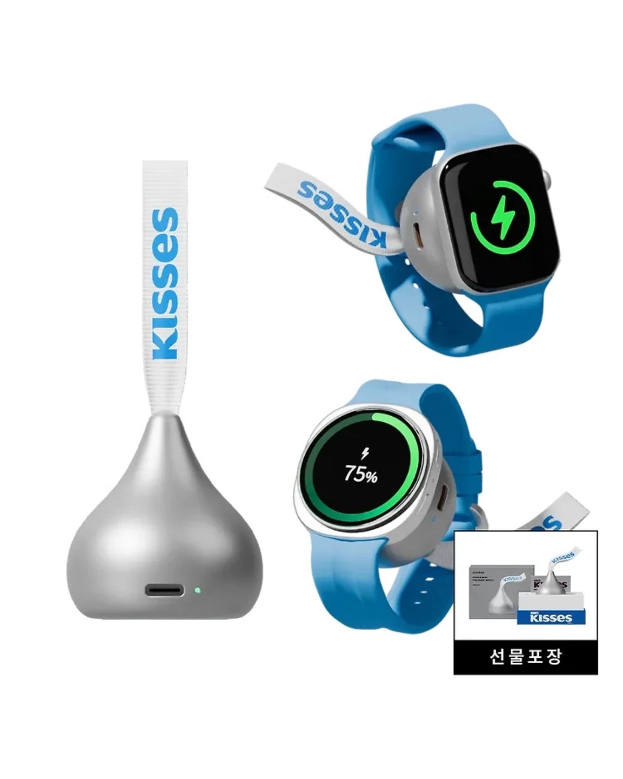
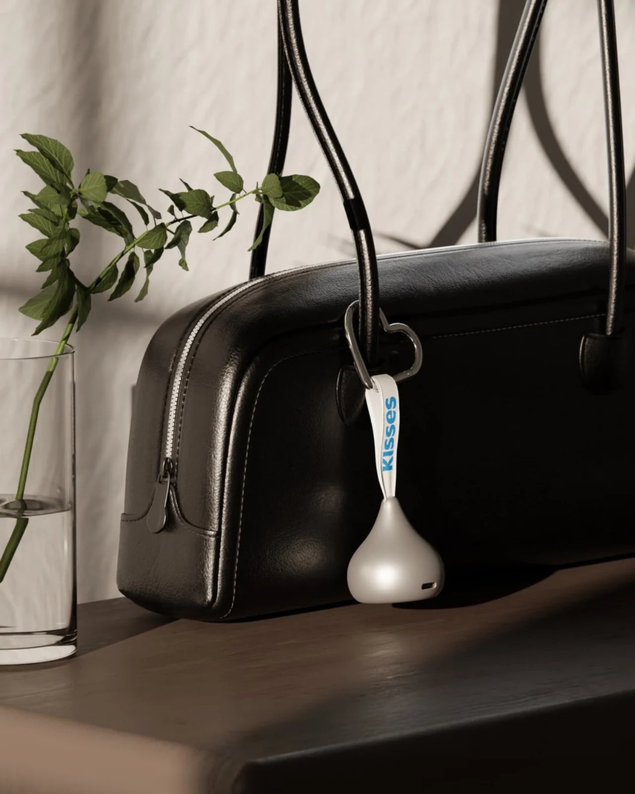
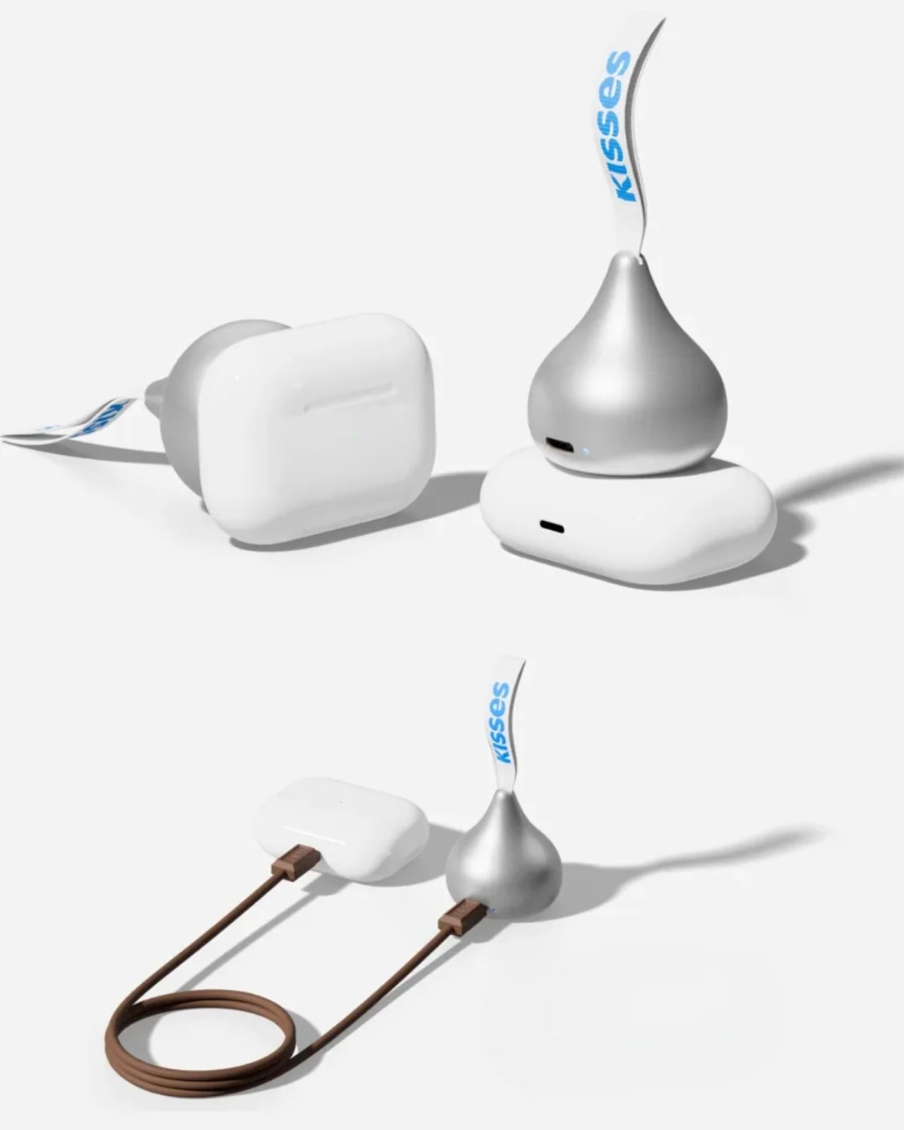
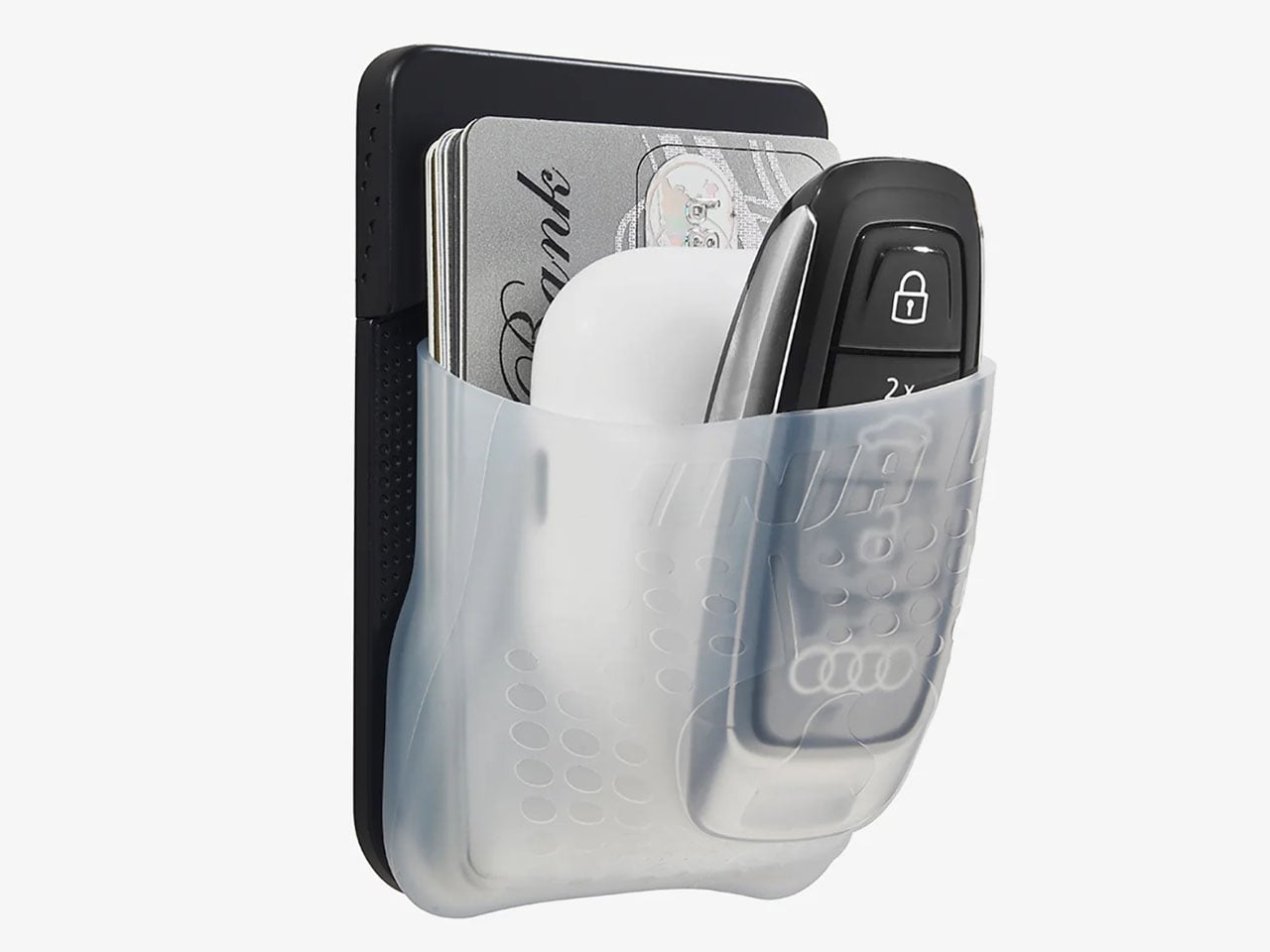
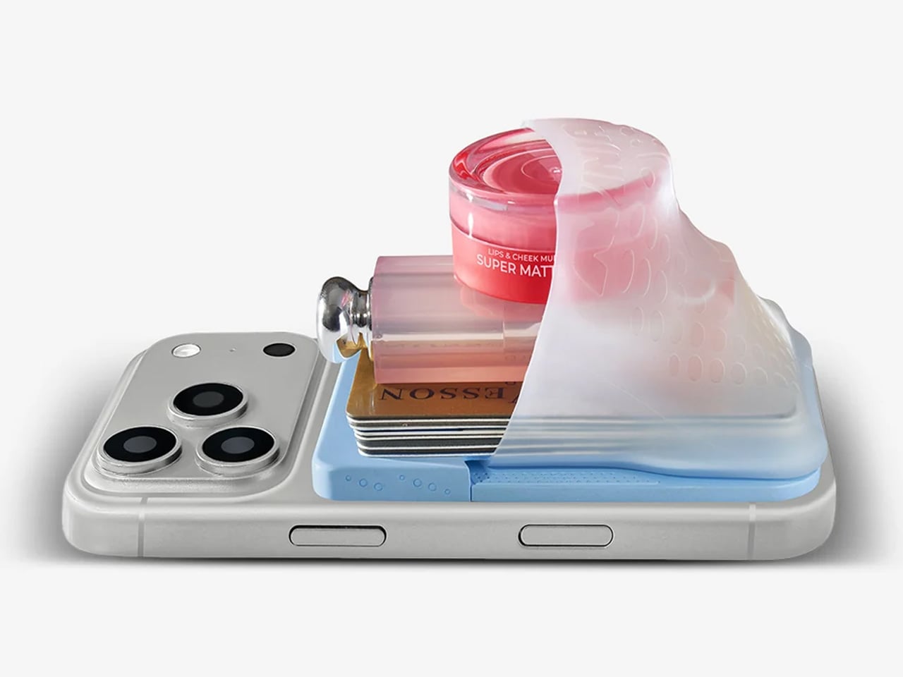
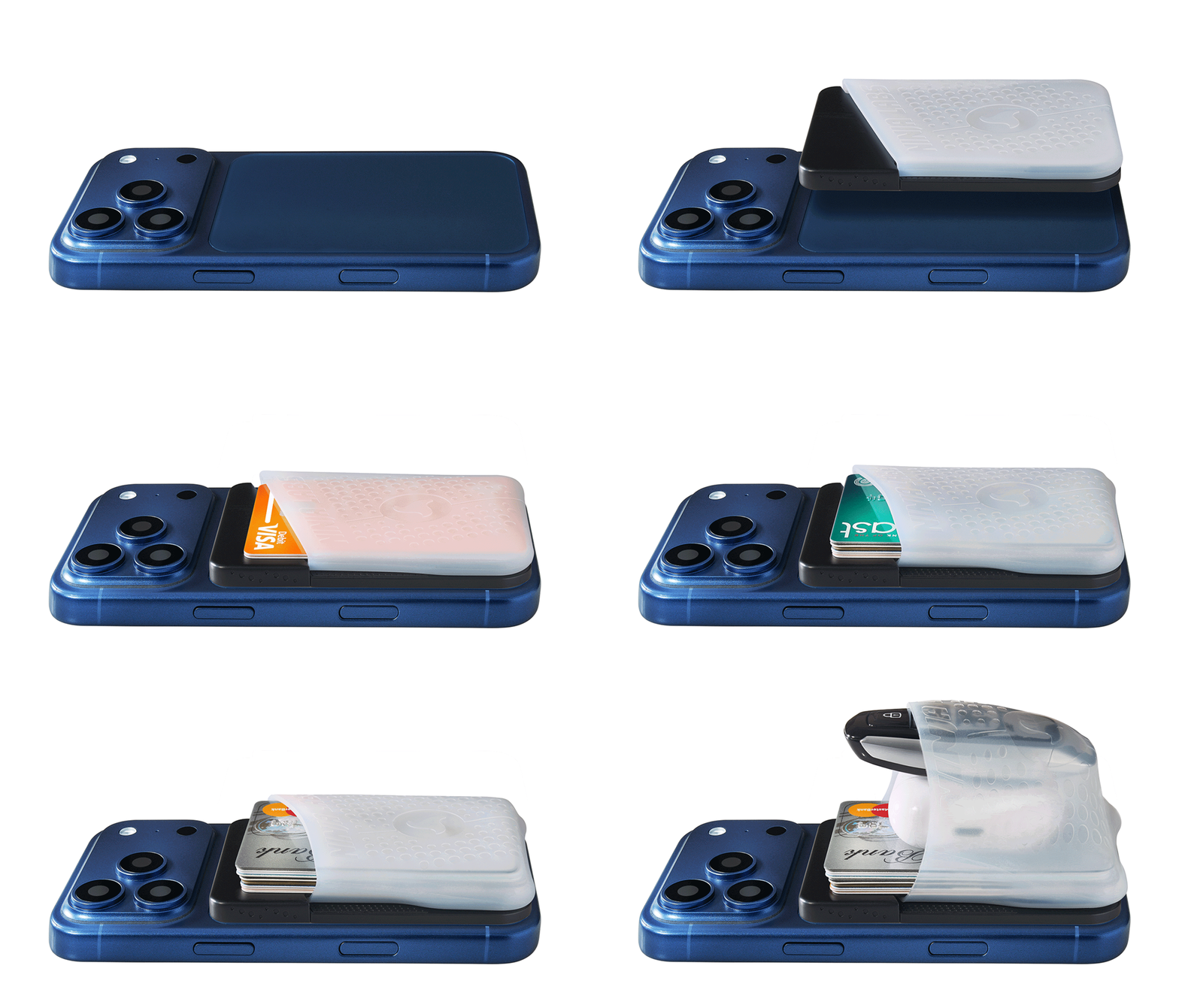
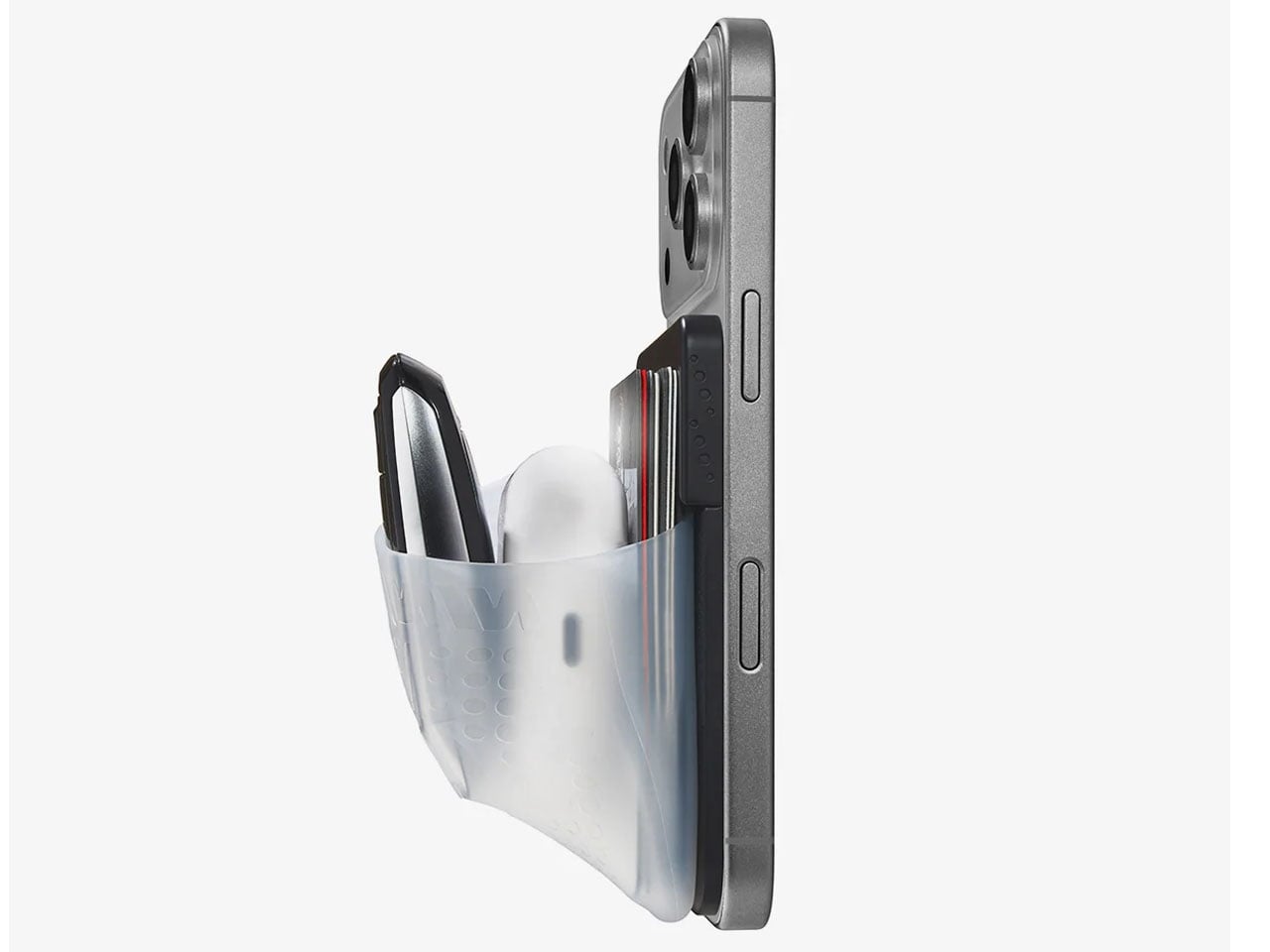
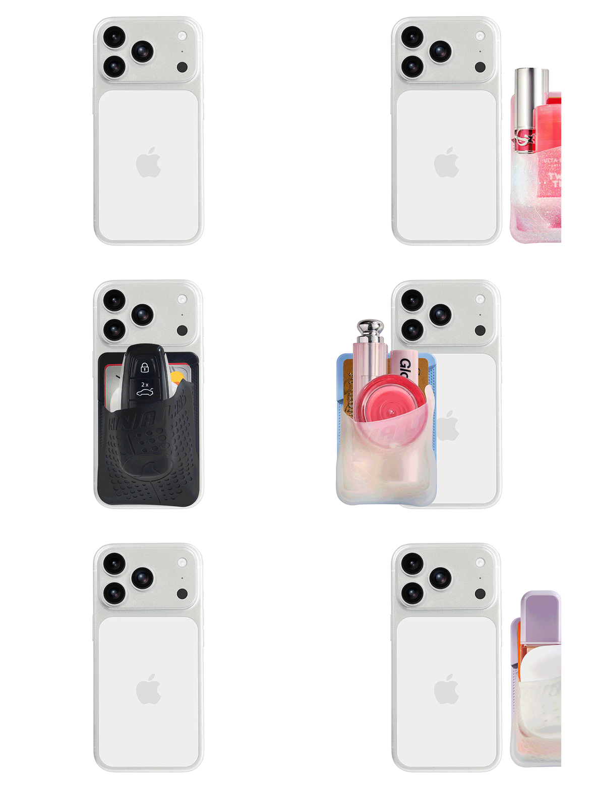
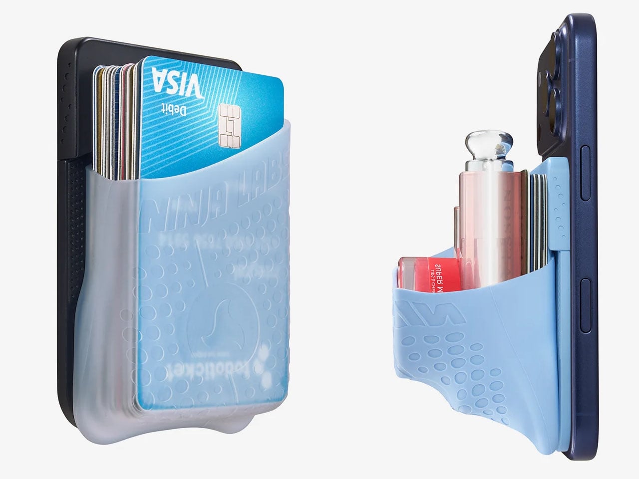
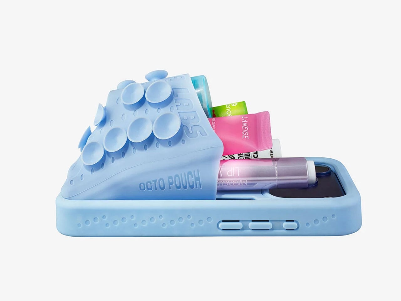
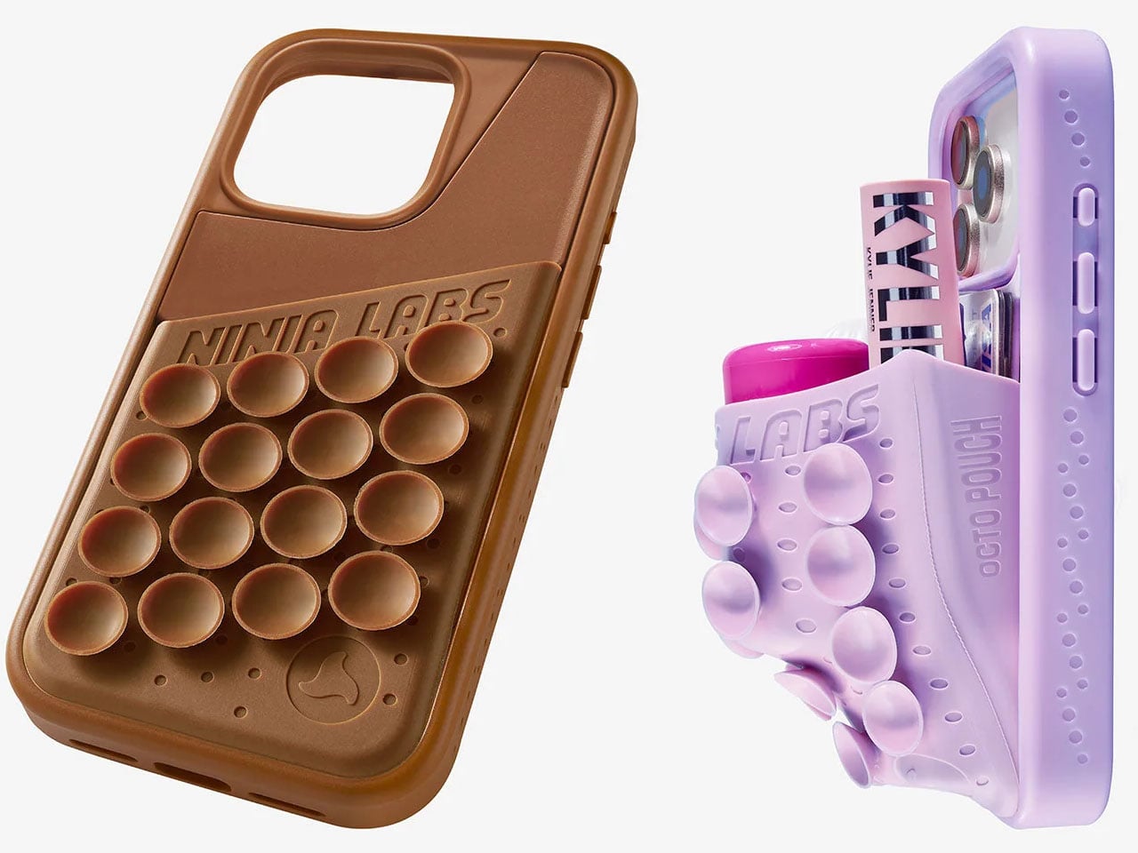
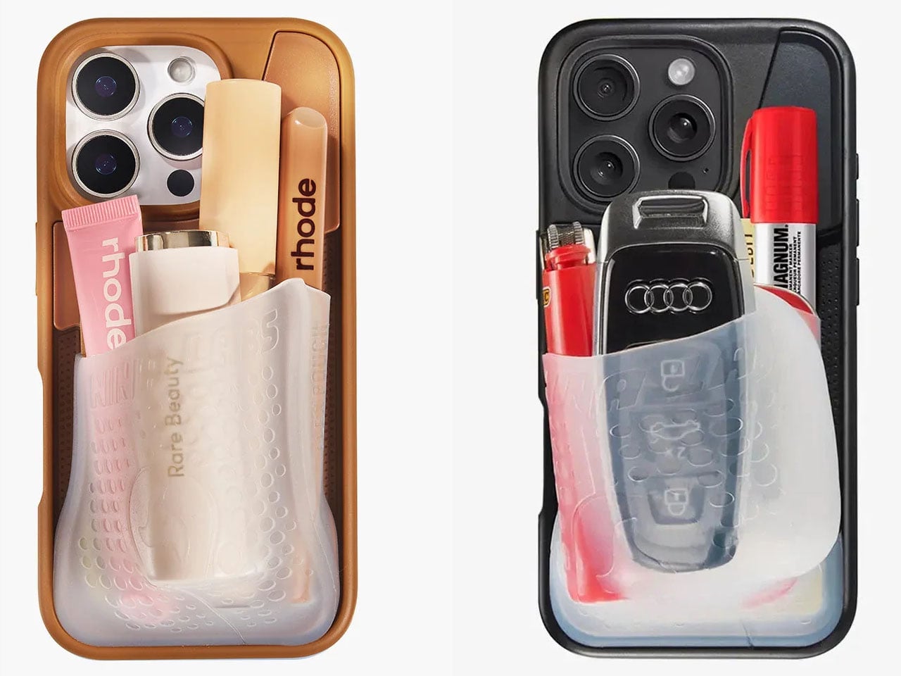





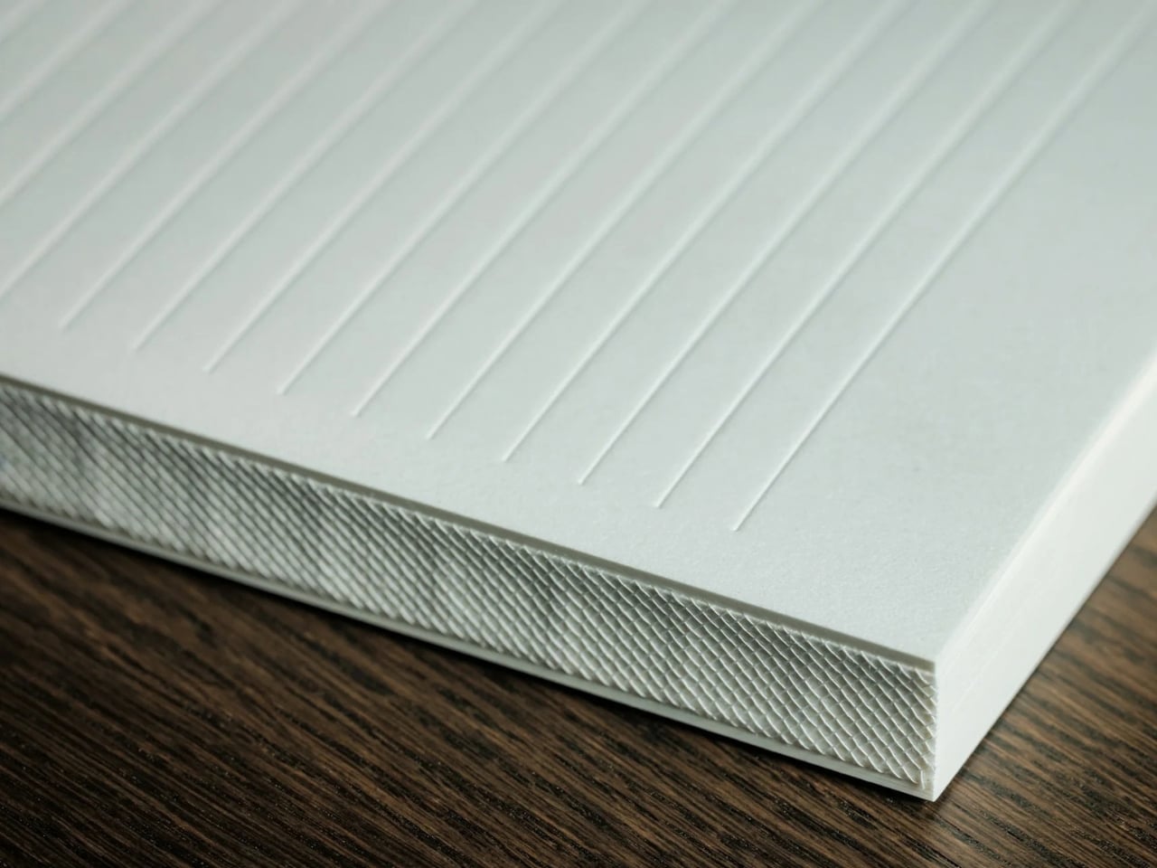
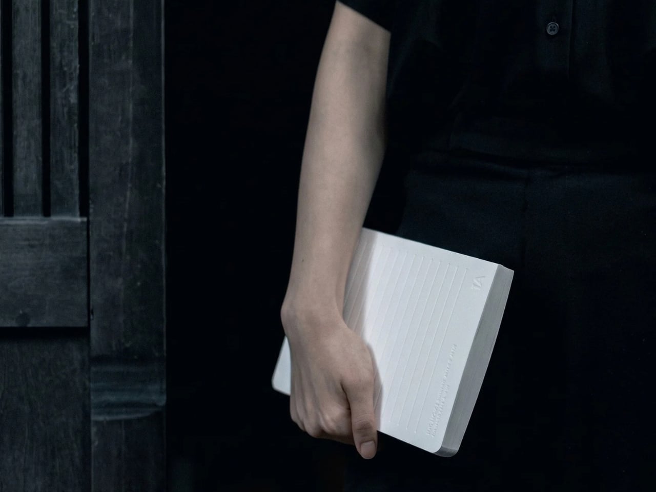
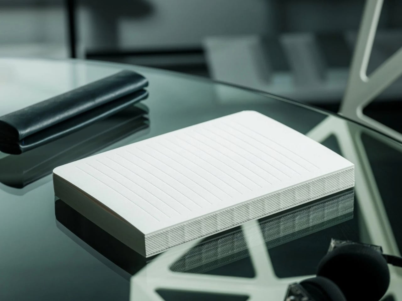
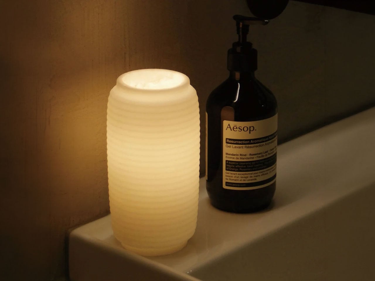
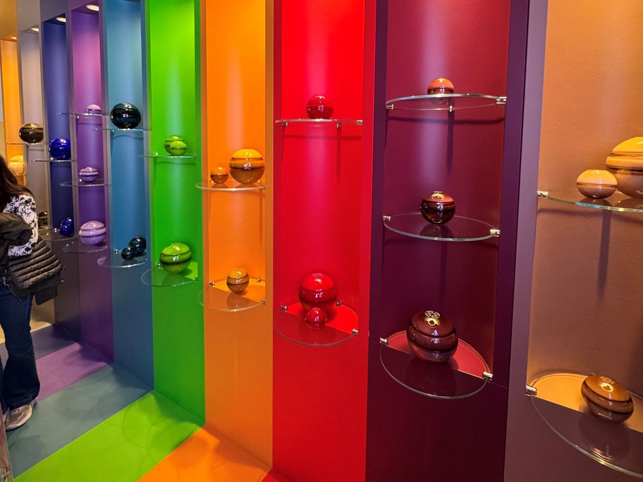
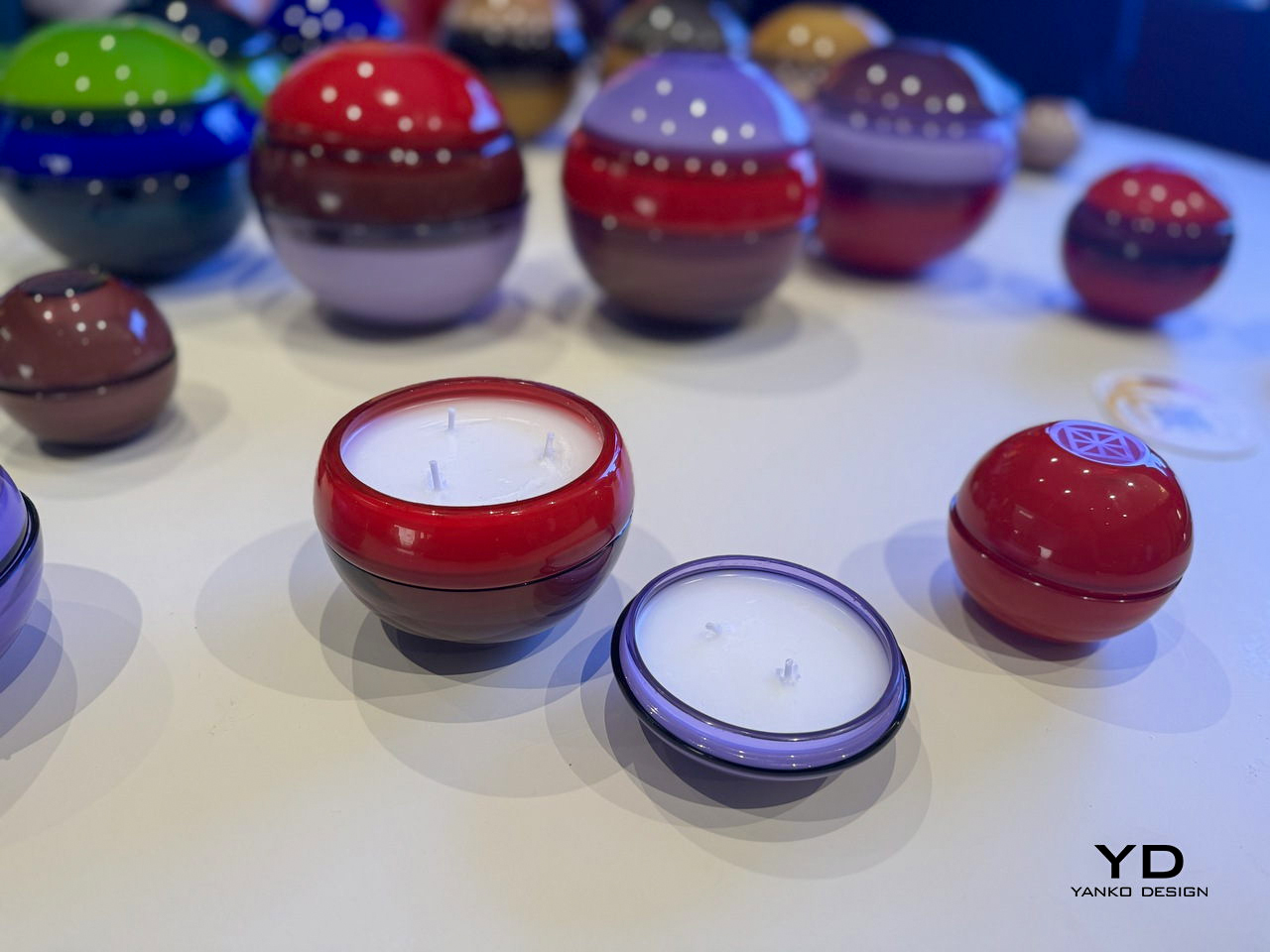
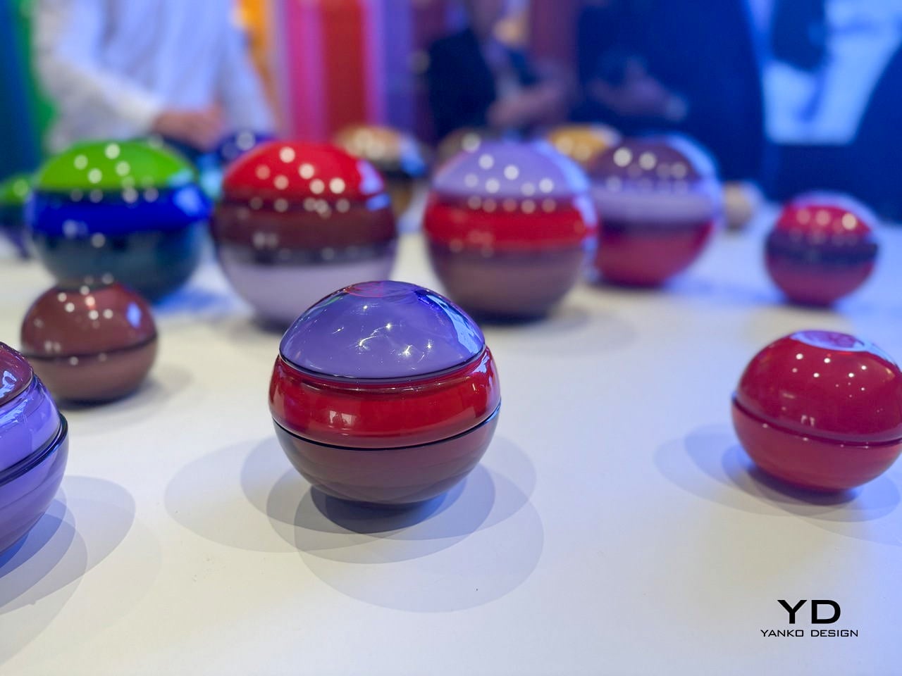
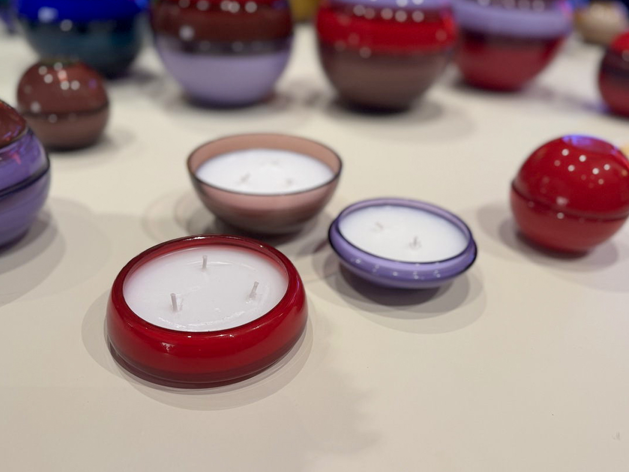
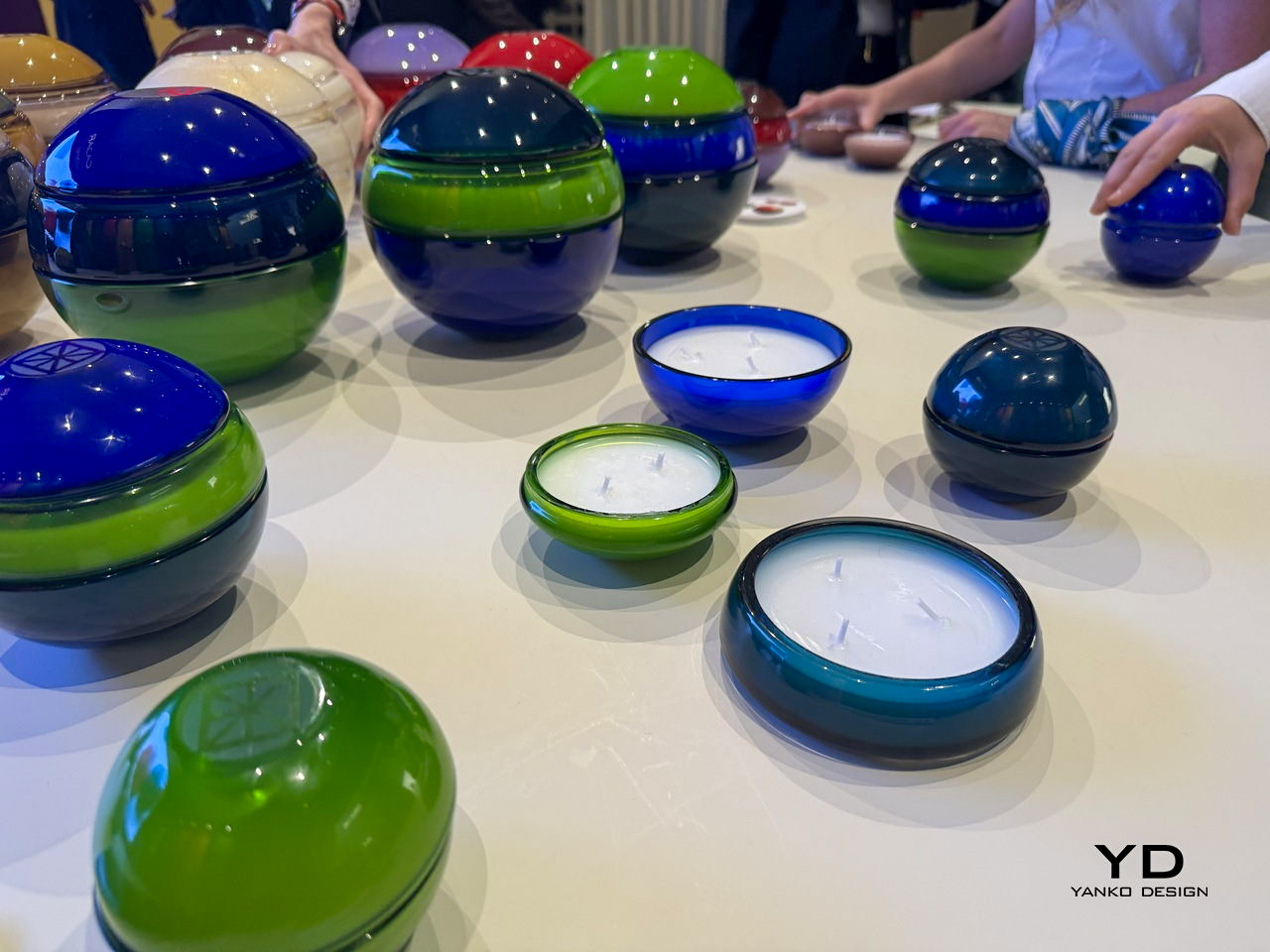
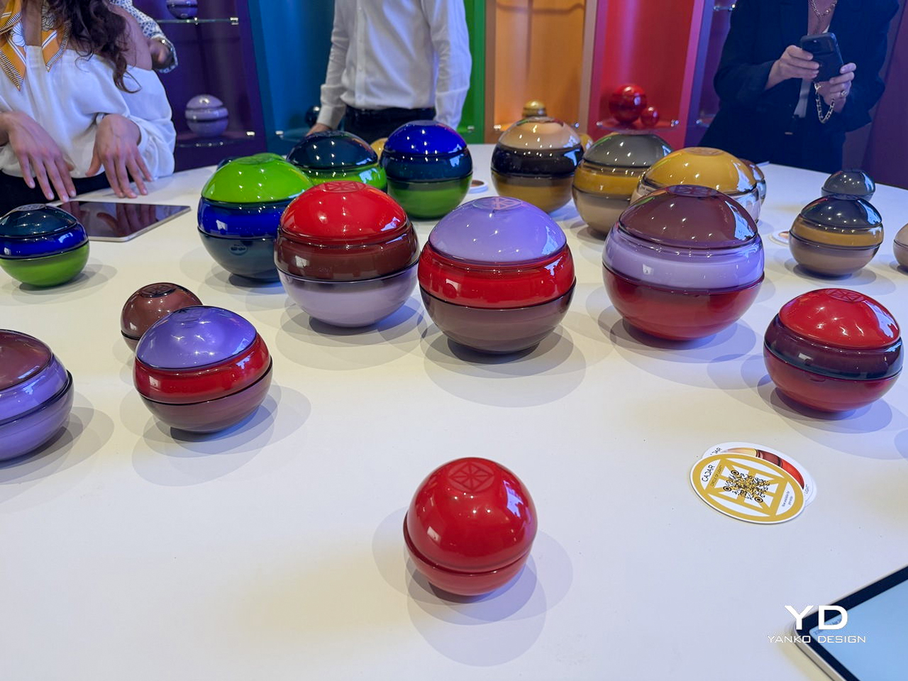
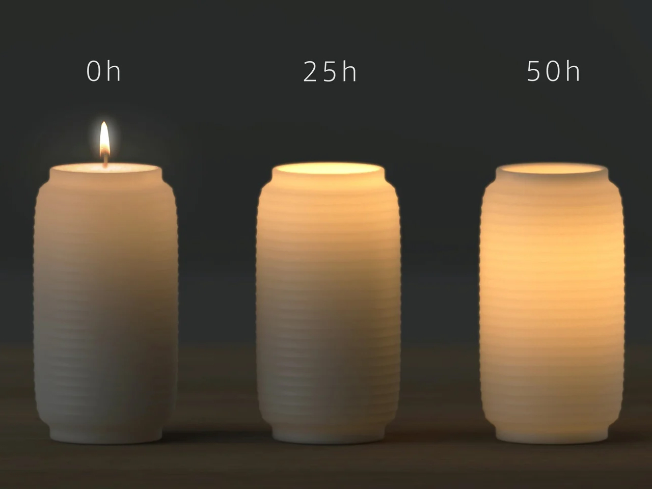
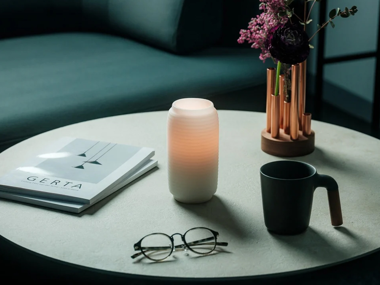
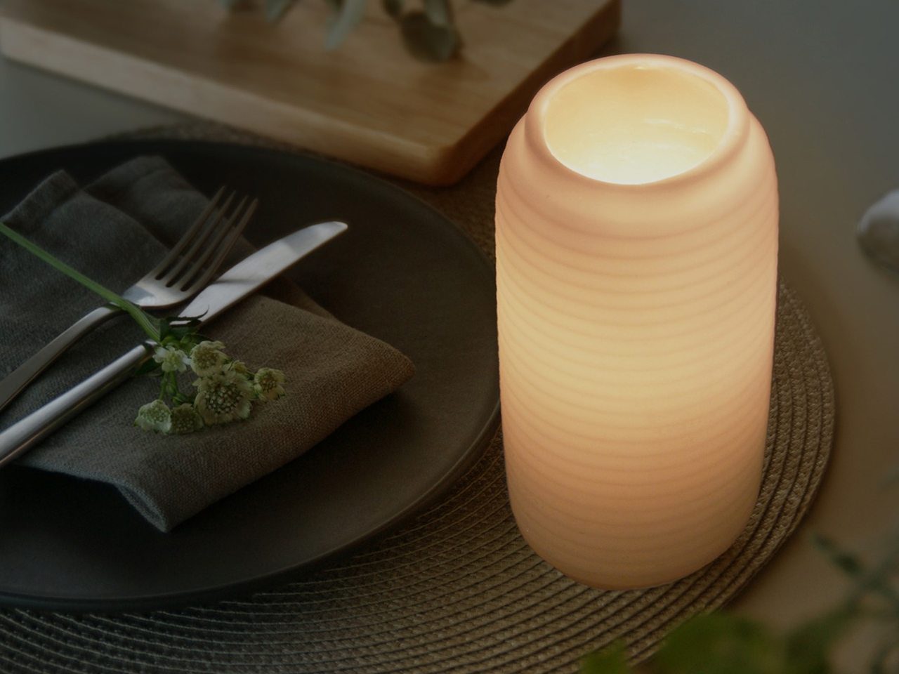

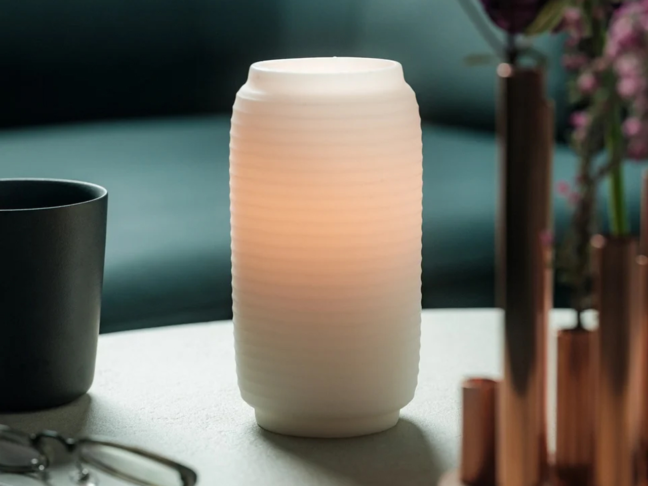
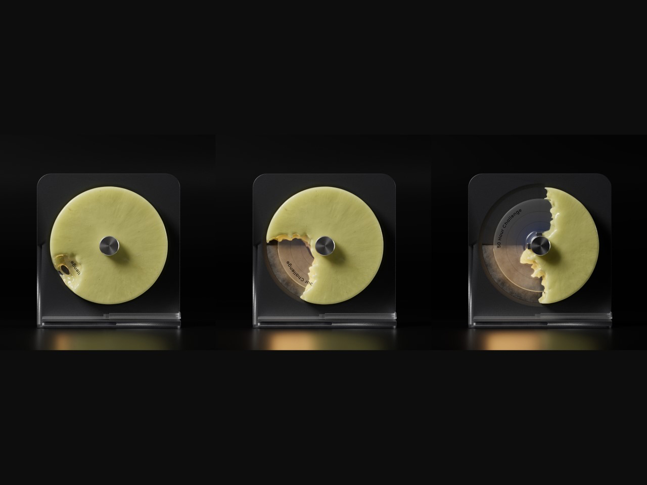
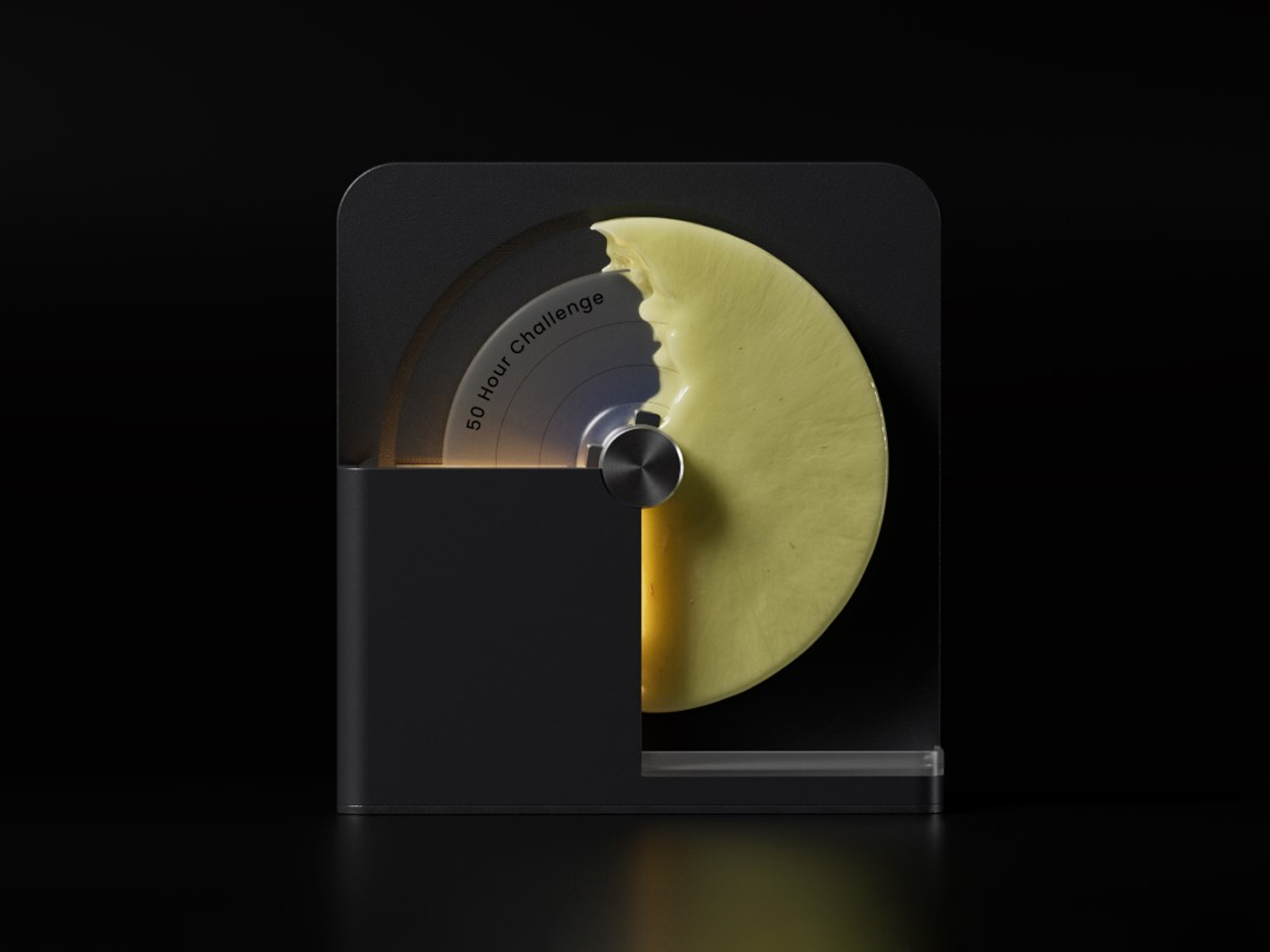
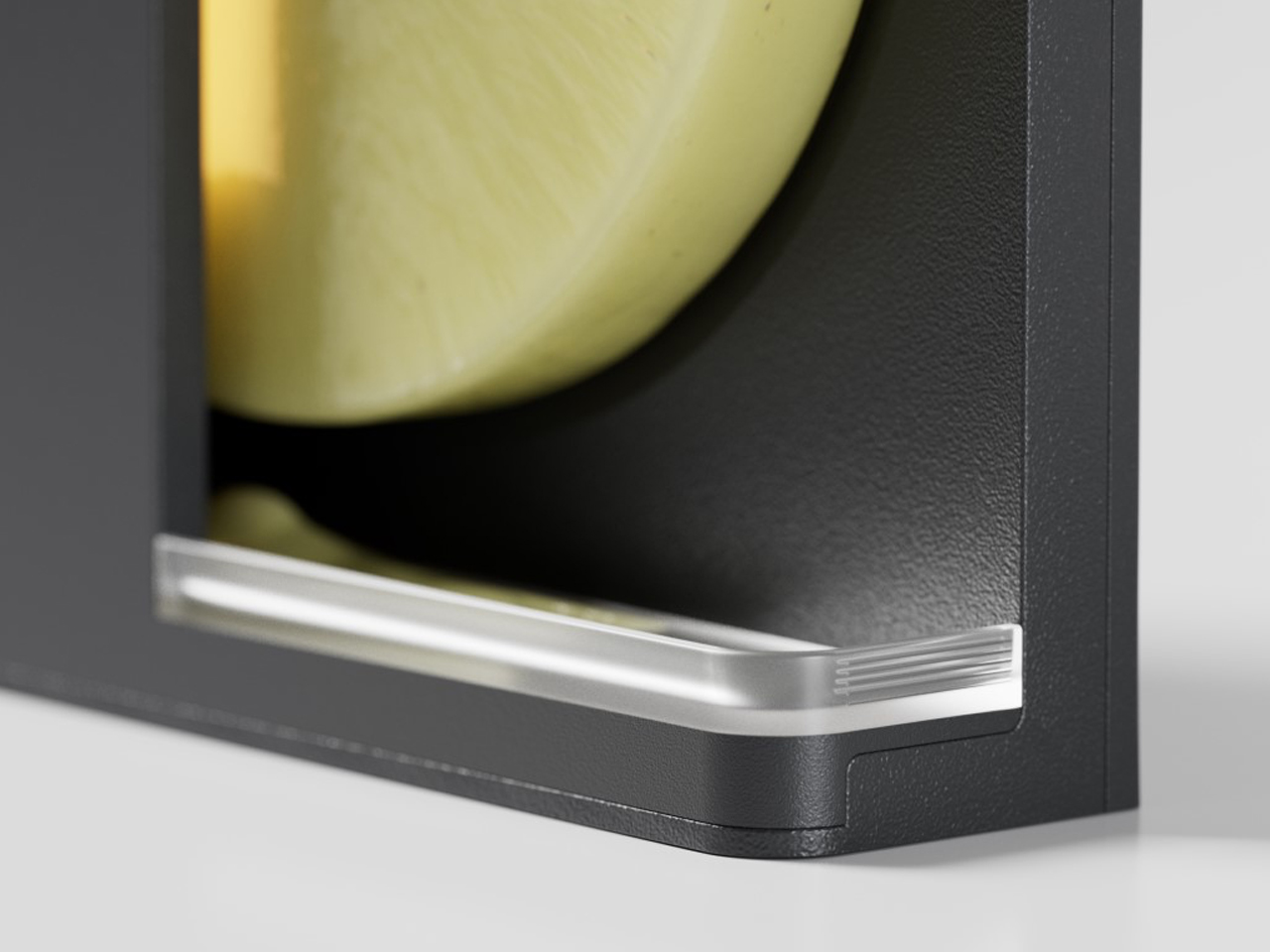

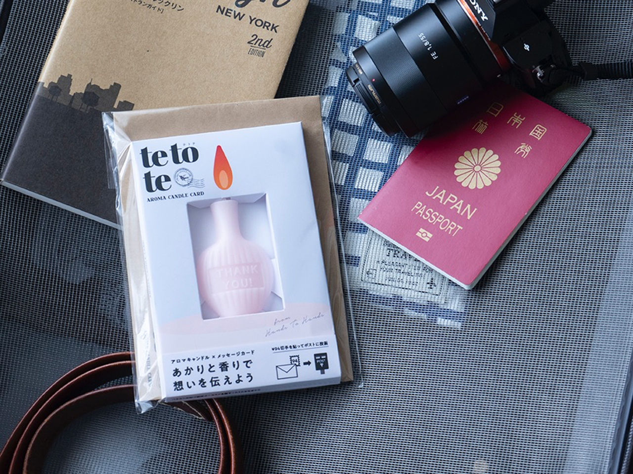
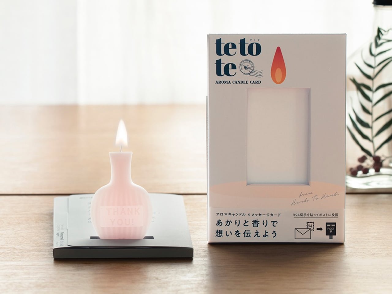
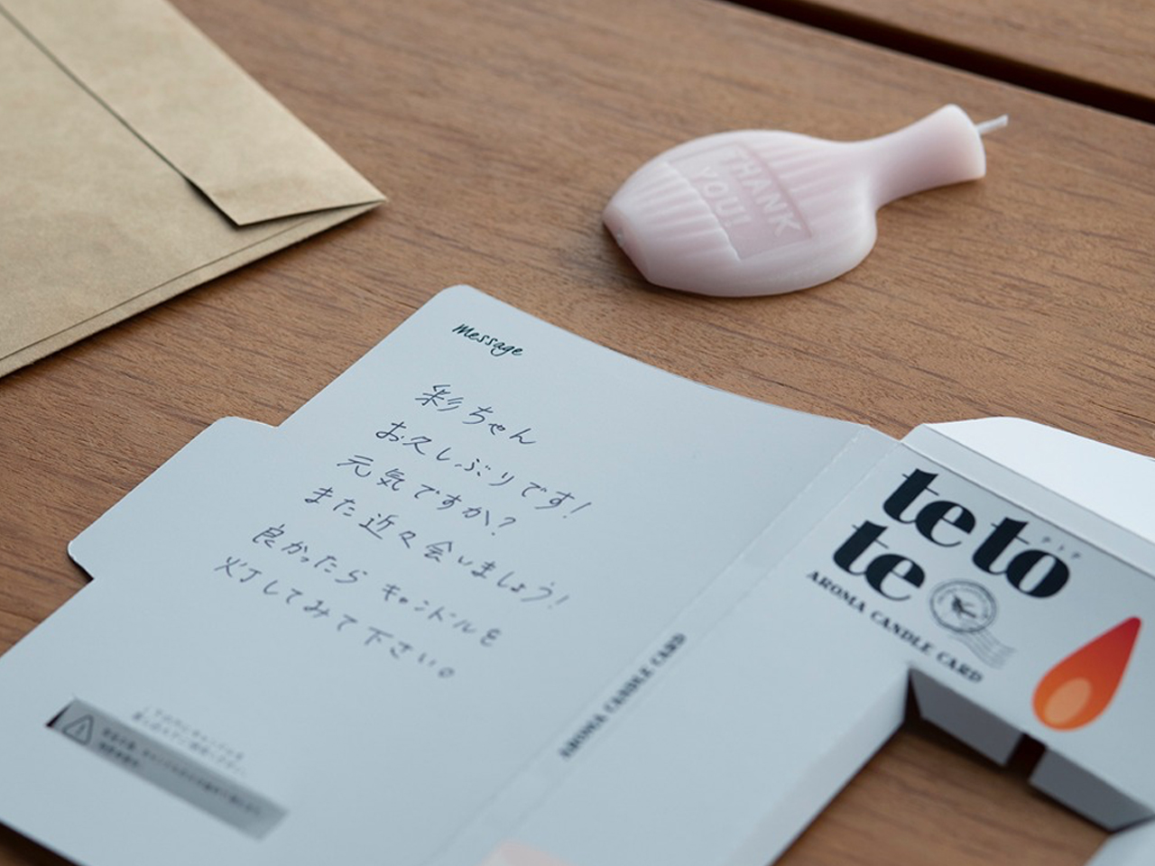

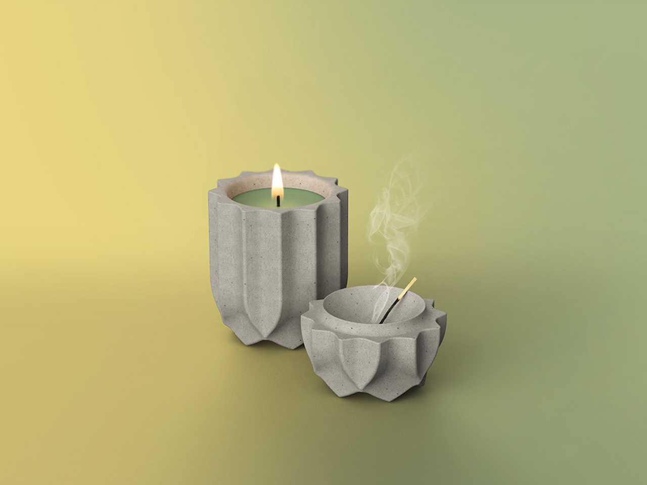
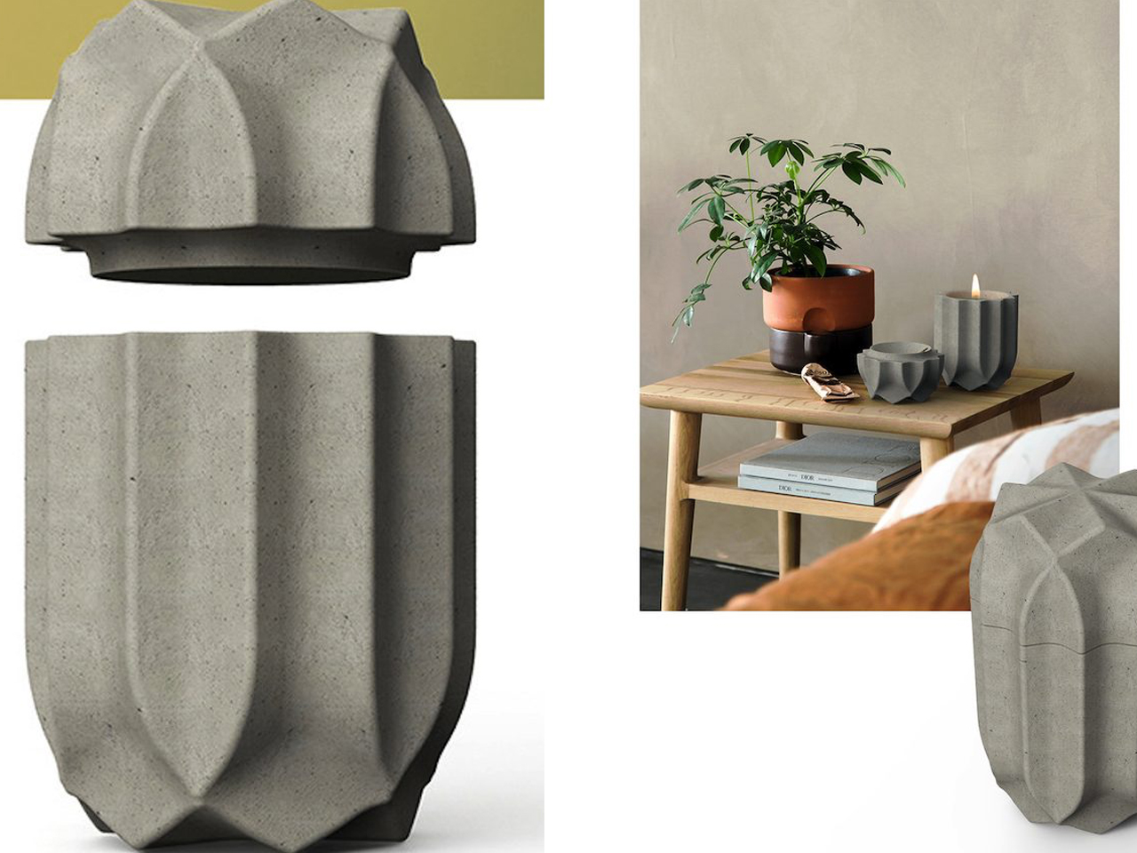

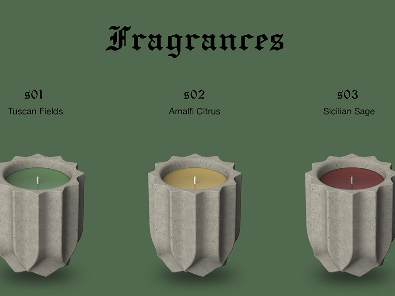
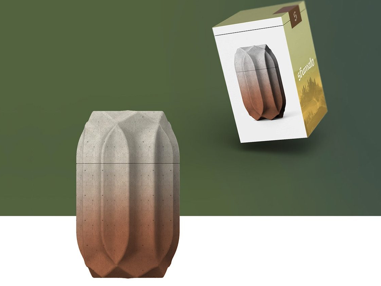
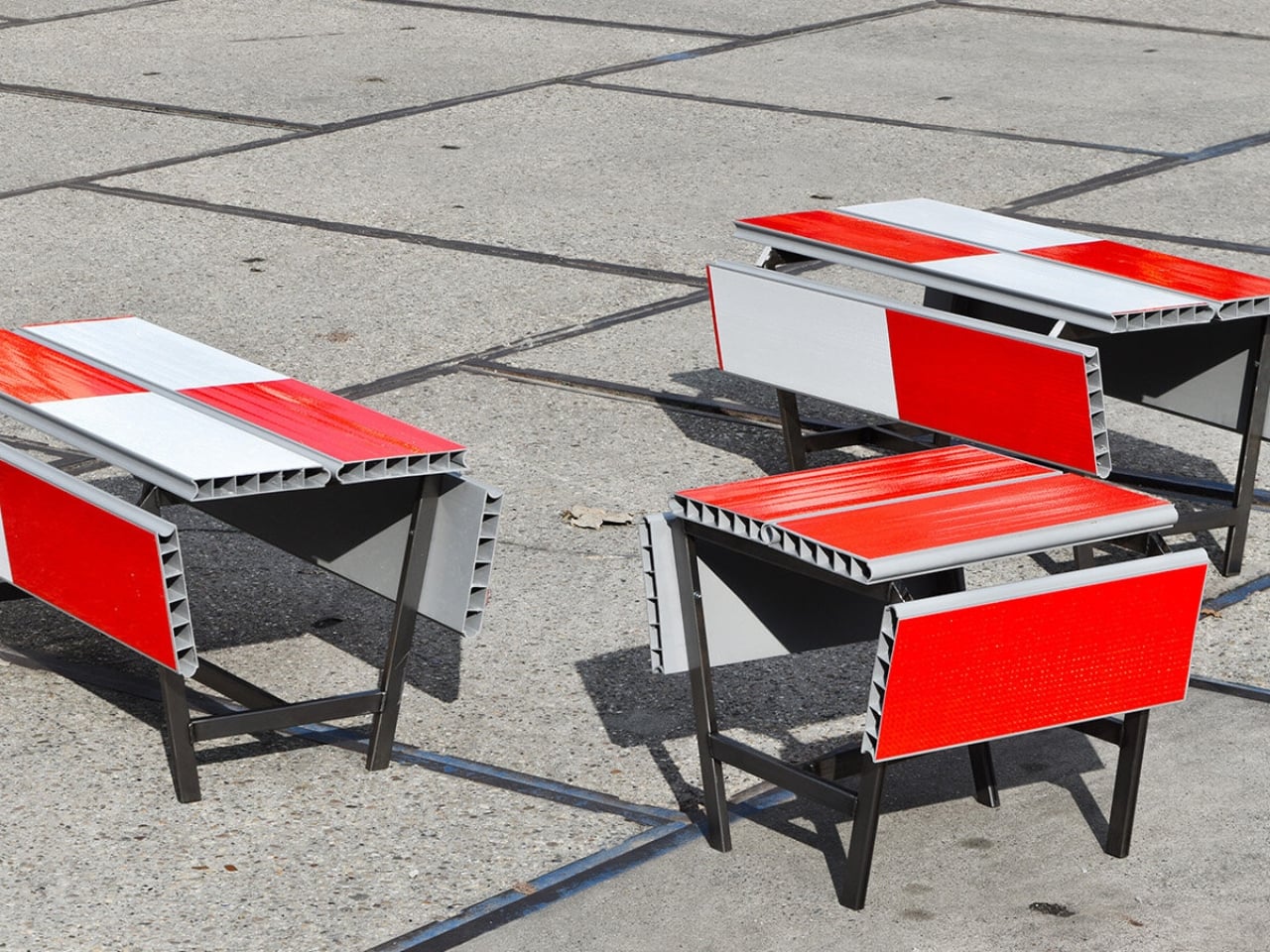

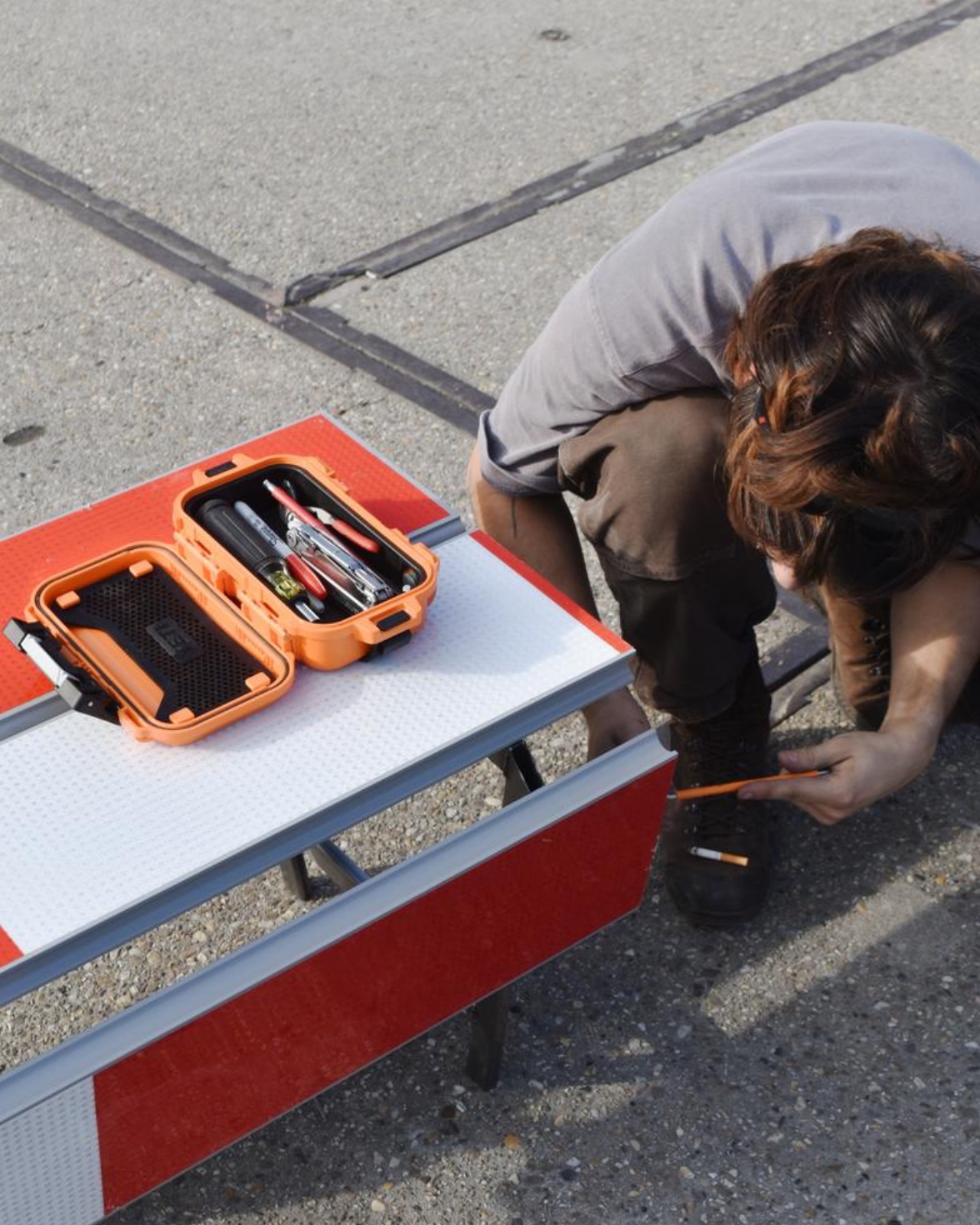
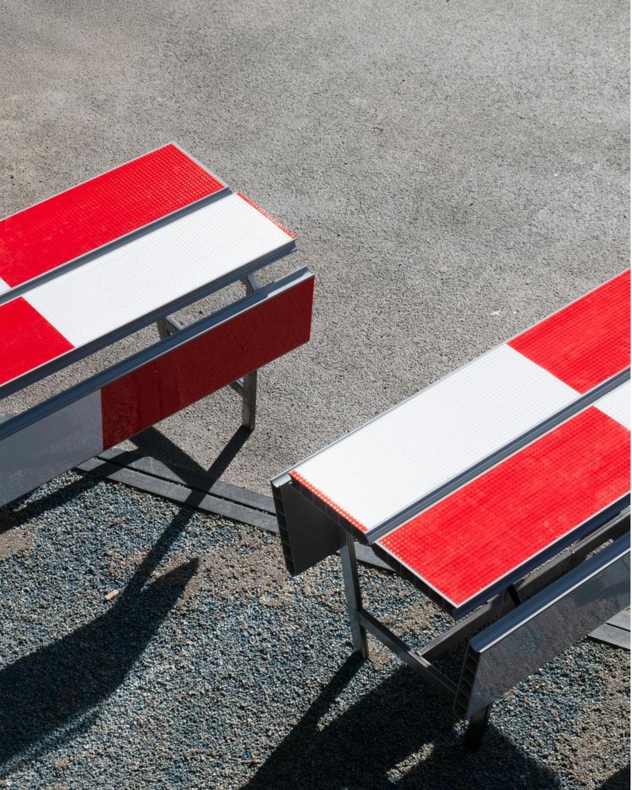
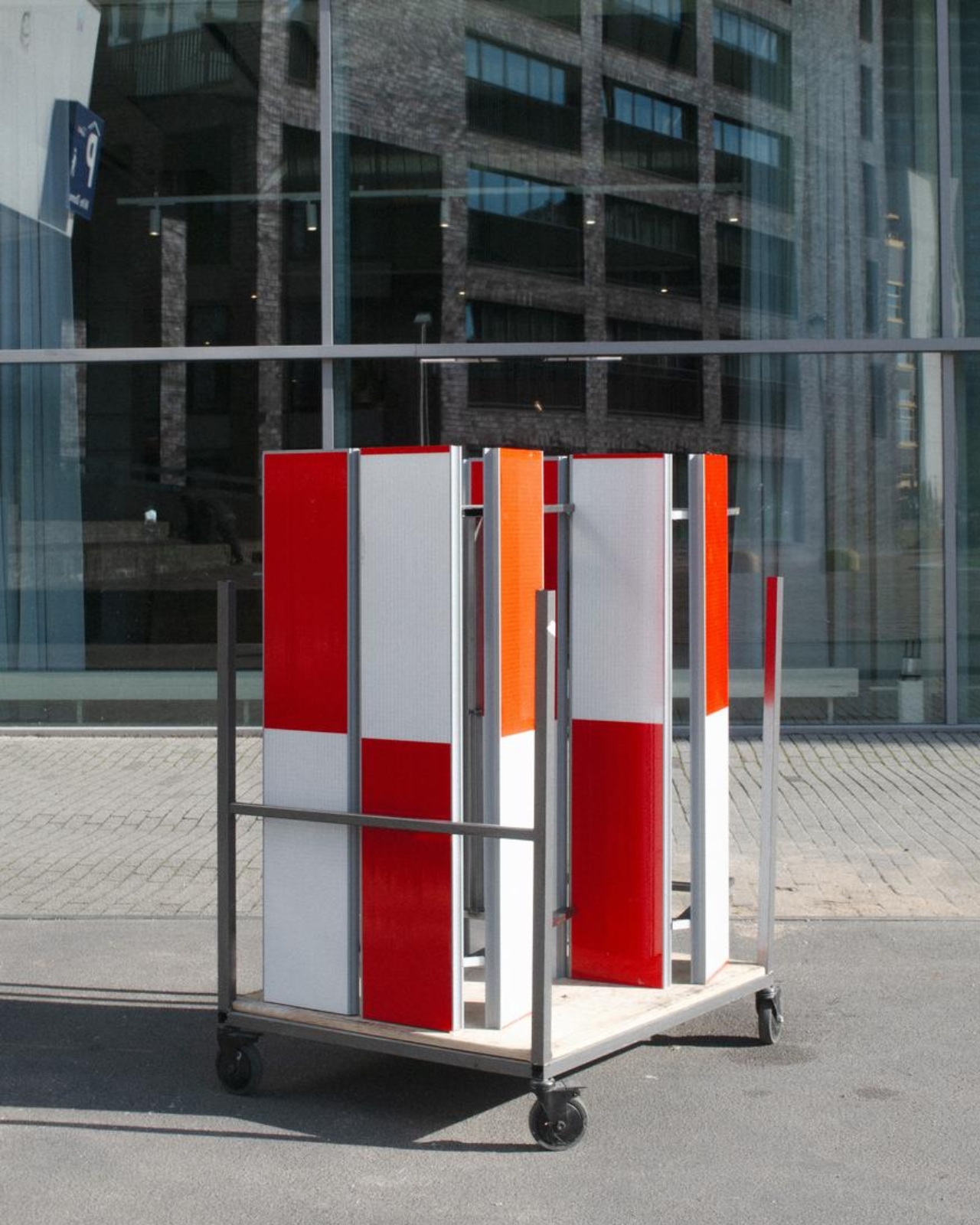
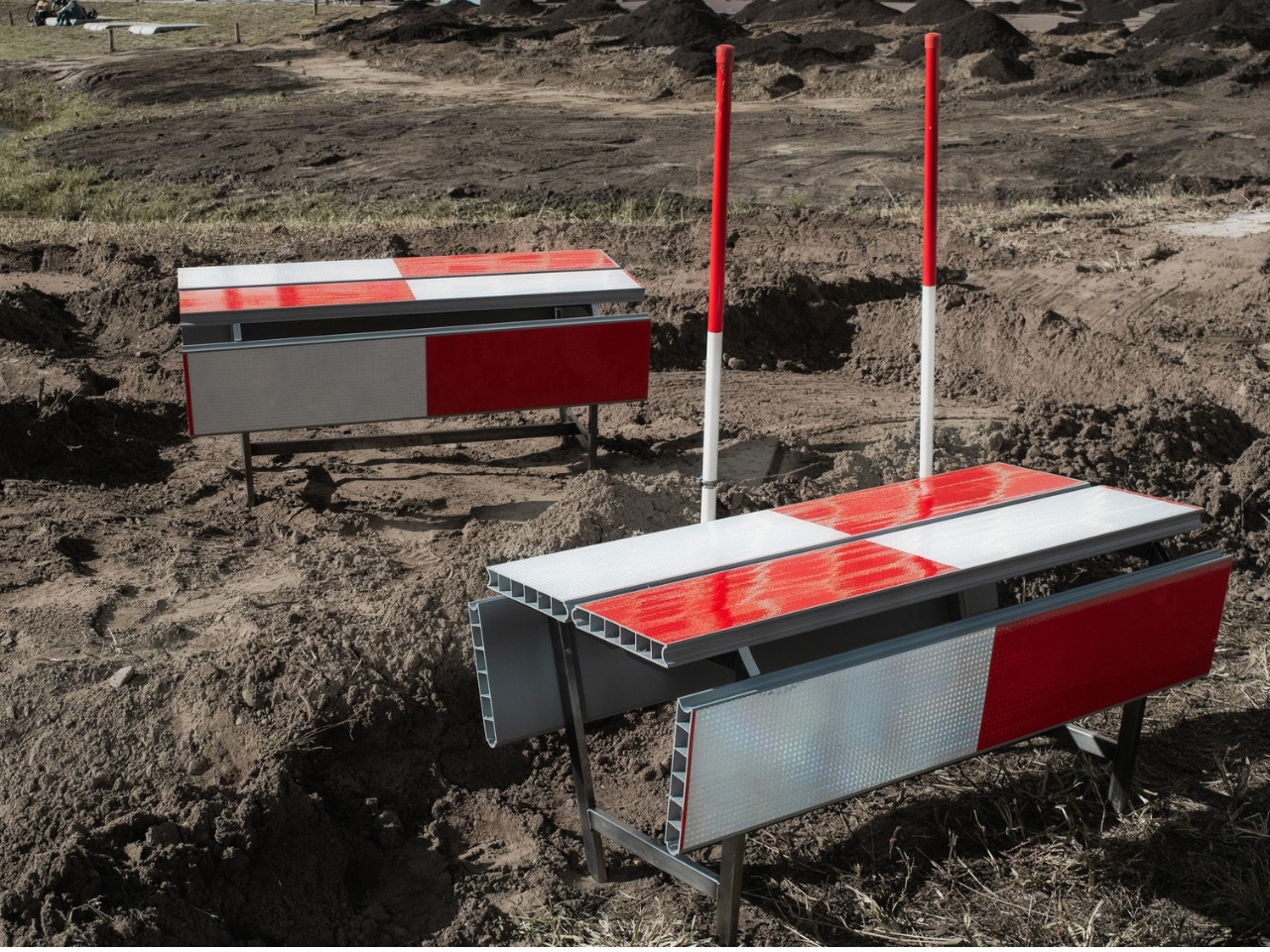
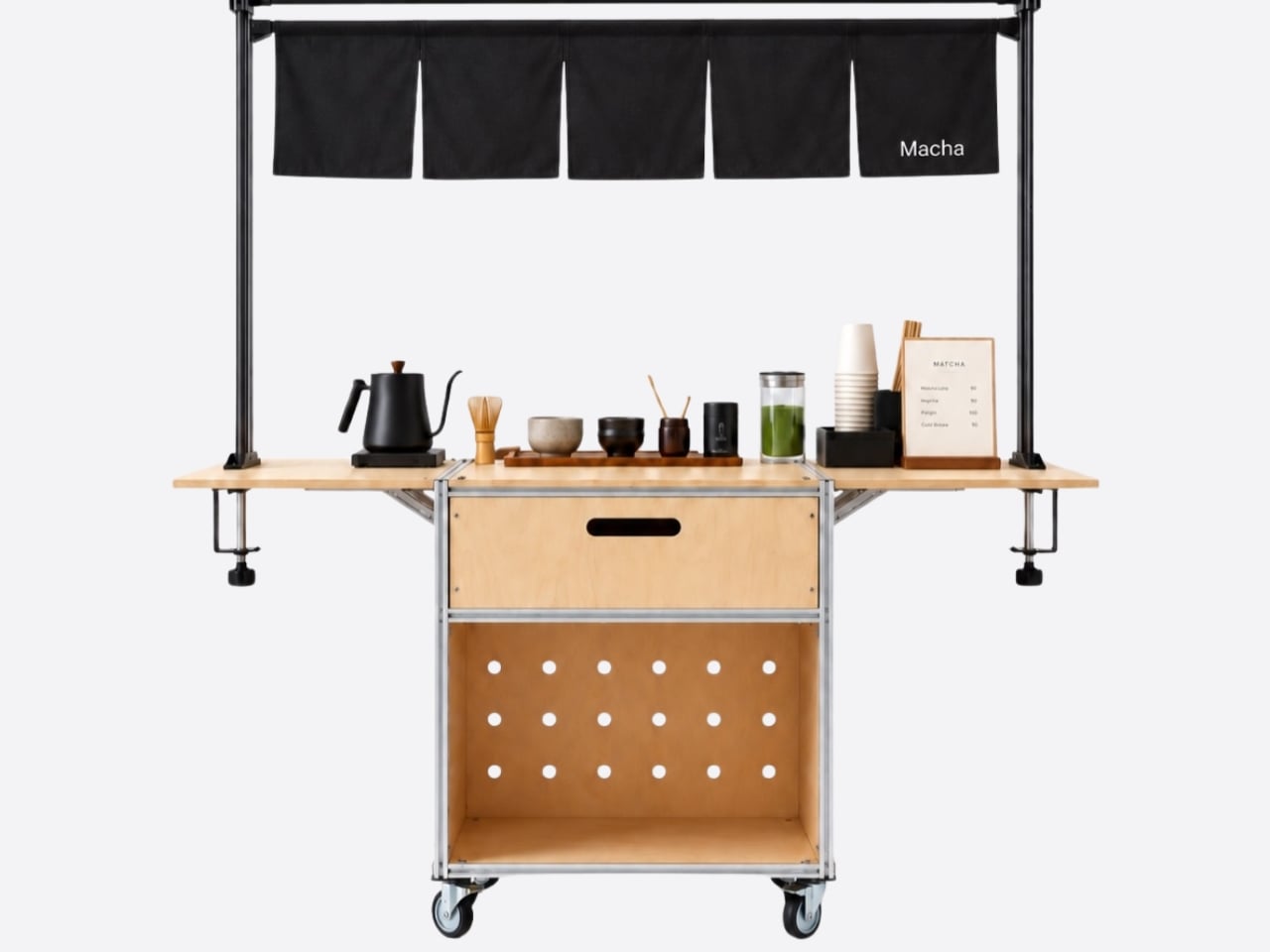
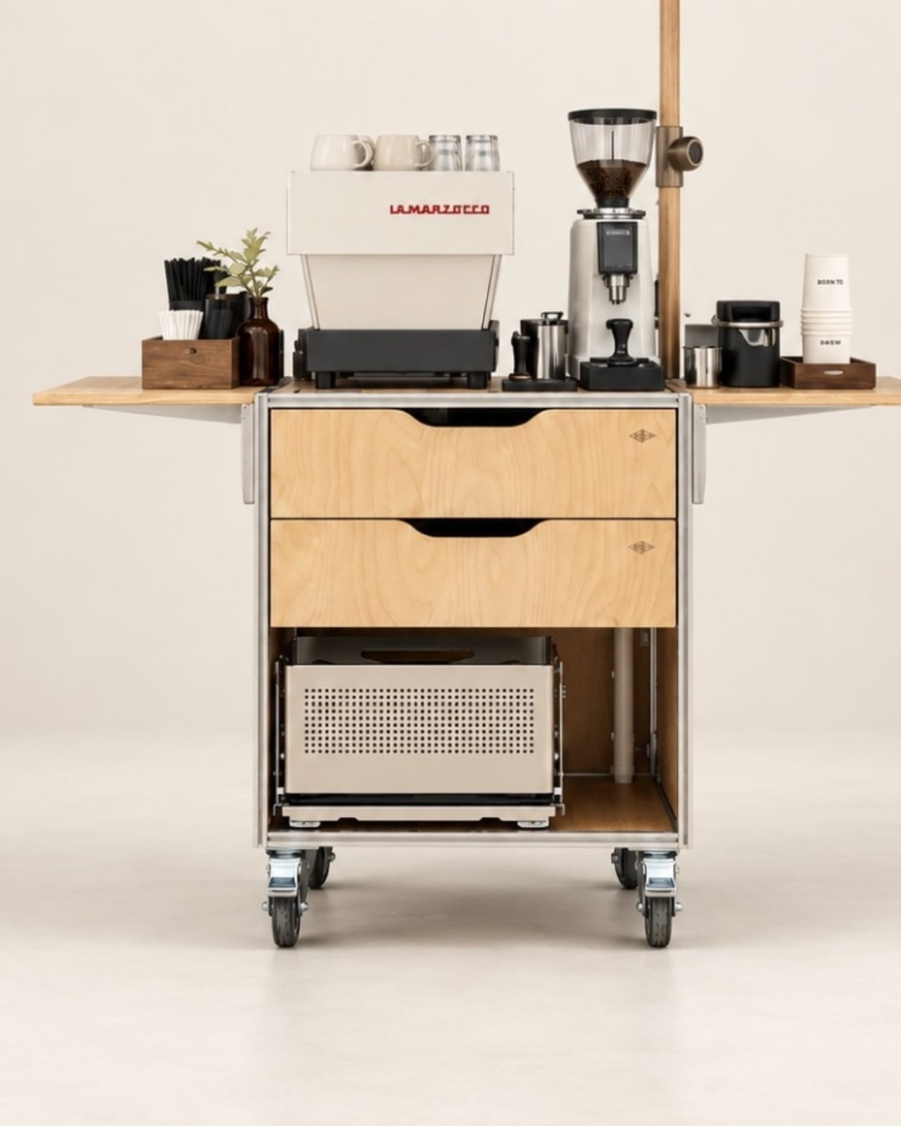
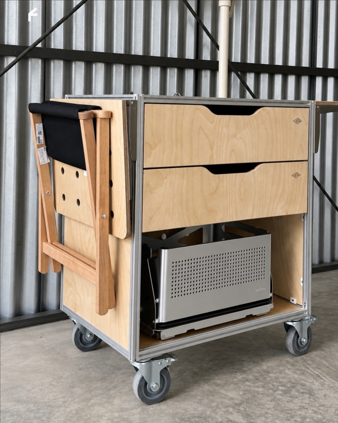
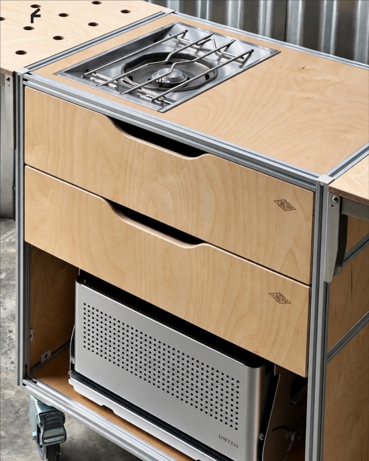
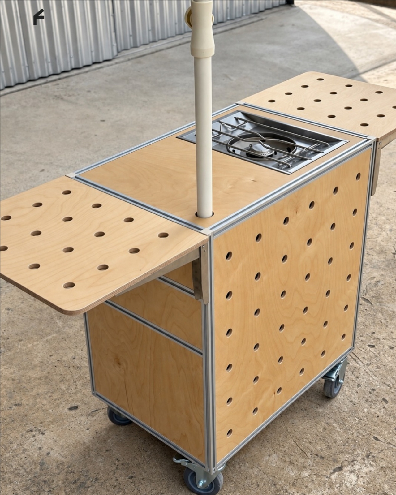
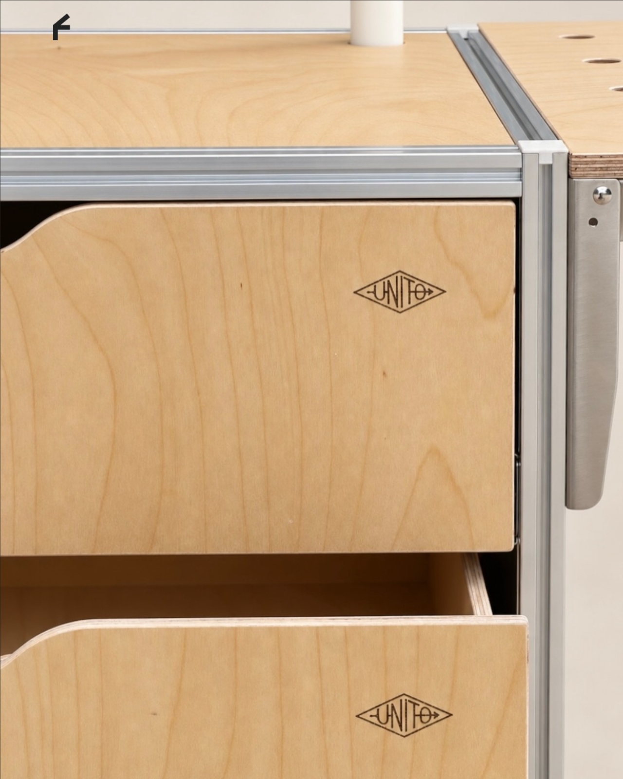
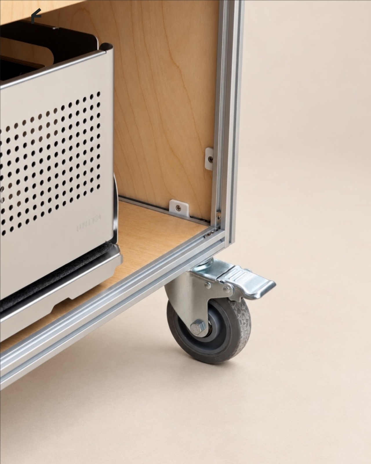
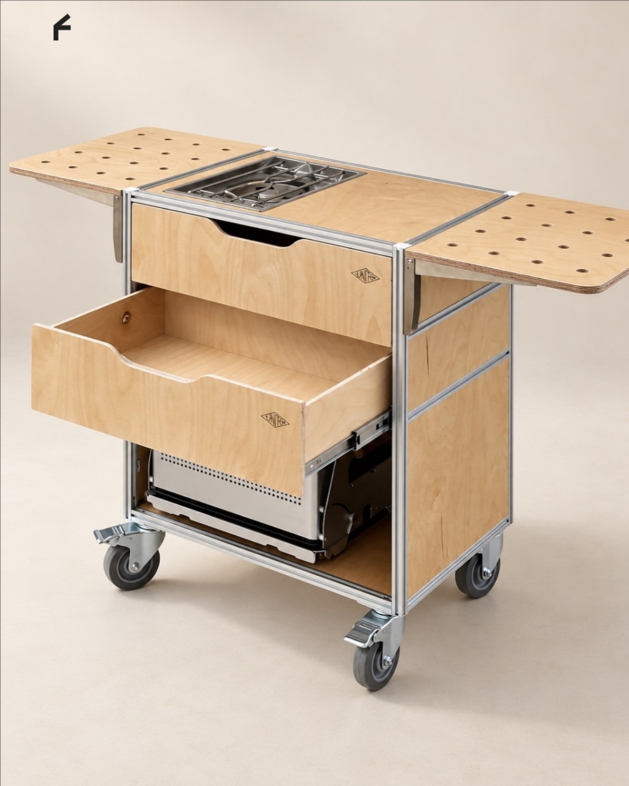

 2.0 trimming system targets a zero-inch edge gap, according to the company, putting that leftover strip squarely on the agenda. Set for a preview at Equip Expo 2026, the robotic mower also brings solid-state LiDAR, stereo vision, and network-assisted satellite positioning. An impressive résumé, although the edge-cutting hardware is what makes me want to schedule the interview.