❌

Vue lecture

The VIVIFoCAL S1 Glasses Focus Themselves So Your Eyes Don’t Have To

Your phone focuses by firing an invisible laser pulse at whatever you’re aiming it at, timing the bounce, and telling a tiny motor to move some glass. The whole loop finishes in a few hundredths of a second and nobody has thought about it since roughly 2017. VIVIFoCAL has taken that identical hardware recipe, a time of flight sensor, a microcontroller and an actuator, and bolted it onto a pair of glasses pointed at the world instead of at your brunch. The S1 measures how far away the thing you’re looking at is, works out the optical power your eyes need, and mechanically shifts the lenses into position in under 0.1 seconds. It’s autofocus, except the sensor is on your face.

Dr. Zhao, who earned his doctorate at a world-leading university and previously ran an optical R&D laboratory at a major optics company, built VIVIFoCAL around a piece of physics that has not yet been widely adopted by the general public. The S1 uses Alvarez lenses, two complementary freeform elements that change optical power when one slides sideways across the other. Nobel laureate Luis Alvarez patented the principle, and it was then stranded for decades because somebody had to do the sliding. A motor does it now. The result covers 8 inches to infinity in a 40 gram frame, and it launches with VIP pricing from $289.

Designer: VIVIFoCAL

Click here to Reserve Now: $10 (VIP pricing from $289).

A laser, a motor, and the 1967 patent working in the background

Three sensors do the work rather than one. A time of flight laser reads distance, a G-sensor tracks head posture, and an infrared wear detection sensor tells the glasses whether they’re on a face at all, which is how the battery survives being pushed up onto your head mid-conversation. The microcontroller sits between them, converting a distance reading into a lens position and commanding the motor in a single pass. The lenses simply change optical power to match whatever distance you’re looking at, the same job your eyes handle on their own before presbyopia kicks in. VIVIFoCAL calls that loop Instant Focus, and the same time of flight hardware we’ve watched migrate into phones, robot vacuums and door locks is what makes it affordable in eyewear.

Fitting a moving lens assembly, a rangefinder, a motion sensor, a microcontroller, a motor and a battery into something that still reads as eyewear is the harder half of this product. VIVIFoCAL has pushed the electronics into the brow bar and the temple arms, keeping the optical stack shallow enough that the frame sits on a face instead of announcing itself as hardware. The 160.5 x 160 x 43.5mm envelope is ordinary spectacle territory, which is the entire argument. Every packaging decision is downstream of one goal, helping the wearer see clearly across distances without thinking about the machine doing it.

Progressive lenses ask you to tilt your chin… this doesn’t

Presbyopia is projected to affect 2.1 billion people by 2030, and the standard answer for most of them is a progressive lens with three prescriptions blended into one lens, near at the bottom, distance at the top, intermediate smeared between. Finding the right part of the glass means tilting your chin, and the tradeoff is the narrow tunnel vision that progressive wearers describe, with softness creeping in toward the edges. VIVIFoCAL calls its answer Full-Lens Clarity, where the Alvarez lenses deliver one consistent optical power across the whole lens at every setting instead of splitting it into zones. There is nothing to hunt for and less peripheral distortion to work around. I’ve watched that chin-tilt dance play out for years, so the appeal is obvious.

Progressive glasses are generally built around everyday reading tasks, and for closer or more detailed work plenty of wearers still reach for a second pair or a magnifier. S1’s focusing range starts at 8 inches, which brings fine detail inside the same lens handling everything else. VIVIFoCAL demoed the glasses at WonderFest 2026 against a 1/35 scale miniature, the sort of precision hobby work that has kept optical visors and loupes in business for a century, and the testers who work with their hands responded the way you’d expect. One early tester shared that using S1 in a data center was a productivity gain and a huge plus, because he could walk past equipment and read tiny serial numbers without interrupting his workflow to take out extra readers, switch to other glasses, or use additional visual aids. He no longer carries multiple pairs when he leaves the house.

Forty grams, three nose pad sizes, and all-day power
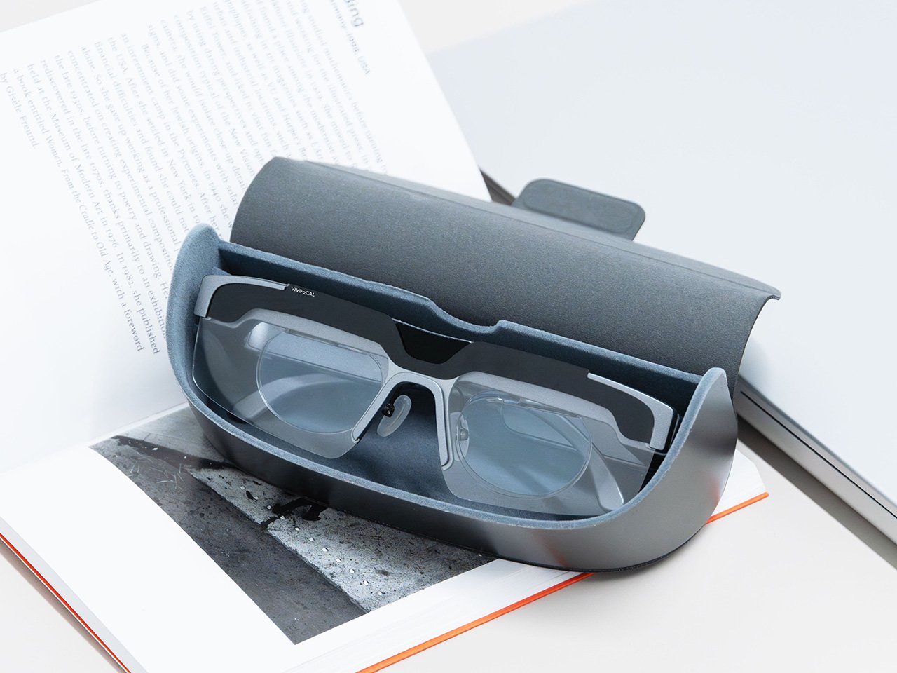
VIVIFoCAL designed around the fact that head sizes and nose bridge heights vary far more than eyewear brands usually admit, which is why S1 ships with flexible spring hinges and three sizes of interchangeable nose pads to adapt across face shapes. The frame lands at 40 grams bare and 50 with the magnetic front clip, built on TR90 temples, the same material that has quietly taken over lightweight frames and wearable arms across the industry. Those numbers matter because forgetting you’re wearing them is the whole point of automating focus in the first place. A 250mAh battery holds up through 8 hours of constant refocusing and refills over USB-C in about an hour, with normal use stretching to a full day. Glasses that can run flat is still a new idea to make peace with.

A separate pair of lenses attaches behind the Alvarez elements, so one pair carries your prescription to see near and far. Magnetic polarized sunglass lenses snap onto the front for outdoor use with adaptive focus still running underneath. The polycarbonate lenses carry anti-reflective and anti-smudge coatings, transmit more than 90 percent of light, and sit inside a field of view above 110 degrees. The app adds a ±0.5D fine-tuning range on top of the automatic correction, which is how the glasses absorb the slow drift of a presbyopic prescription instead of being replaced. Presbyopia correction tops out at 3.5D, so the deepest cases fall outside what S1 can currently handle.

The bet VIVIFoCAL is making on moving glass
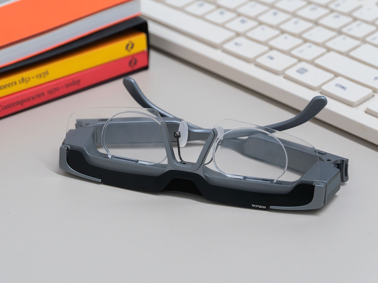
The company isn’t chasing this idea alone. Other teams are working on adaptive focus through liquid crystal lenses or eye tracking instead of a mechanical shift, and the category is young enough that the approaches are still diverging. VIVIFoCAL is betting on the refractive route, real glass moving to change optical power rather than a pixelated layer simulating it, and that bet buys the two things that matter most in eyewear you keep on your face all day. S1 holds above 90 percent light transmittance and a field of view past 110 degrees, which is why the image through it behaves like a lens instead of a screen.

Alvarez lenses have been a lab curiosity since 1967 for one reason, which is that the sliding had to be automated by something small enough to live inside a temple arm. Sensors, motors and microcontrollers have finally shrunk far enough to make that trivial, which makes S1 a triumph of packaging, and packaging is where most wearables actually get decided. Autofocus earned its invisibility in cameras by working so fast nobody noticed it, and 0.1 seconds across 8 inches to infinity puts the same disappearing act in front of your eyes. S1 ships with a 1-year warranty, and a refundable $10 deposit locks in VIP pricing at $289 ahead of the official launch, with either the prescription lens service or the sunglass lens bundle included depending on which one you need. Sixty years is a long time for a good idea to wait for its motor.

Click here to Reserve Now: $10 (VIP pricing from $289).

The post The VIVIFoCAL S1 Glasses Focus Themselves So Your Eyes Don’t Have To first appeared on Yanko Design.
  •  

Designers Already Prototype Hardware – Now They’re Prototyping Demand Too

Every product that finds its way onto these pages eventually meets the same crossroads: the moment a designer takes the thing public. For physical product creators chasing something original enough that established retailers won’t touch it, Kickstarter remains the most democratic proving ground available. The platform has hosted more than 654,000 campaigns since 2009, drawing over $8.5 billion in pledges from more than 23 million backers, with 2025 marking its strongest year on record. That momentum creates a seductive and specific trap: creators see the platform’s gravity and assume a beautiful product with a compelling story will naturally convert into backers. A crowdfunding agency called TCF (The Crowdfunding Formula), which holds Kickstarter Premier Partner status and has facilitated more than $520M raised across campaigns, has spent years watching that assumption fail in real time, and what they built to counter it is one of the more disciplined pre-launch processes in the business.

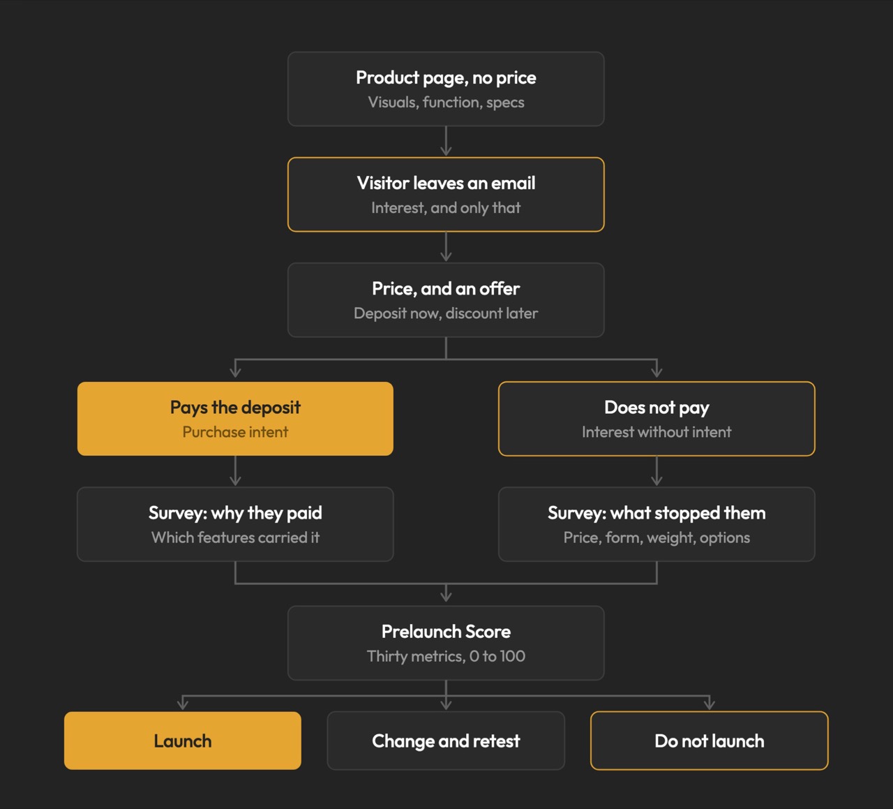
TCF’s methodology, recently published in full detail, centers on a single observation that most campaigns never act on: interest and purchase intent are not the same signal. Emails, follows, and comments cost nothing to give, which is why none of them predict whether a product sells. Validation asks for money, not opinions, and a small deposit on a product that does not exist yet is the closest available proxy for a real backer, because the act of paying is what carries the information, not the amount. The resulting data resolves three decisions most creators make by guesswork: the price, the positioning, and the audience, all settled before a campaign page exists, before ad spend, and before the outcome is locked in, because those are the three things most likely to break a launch and the three most often decided by assumption. It is a design methodology applied to the market, and it deserves the same respect that designers already extend to physical prototyping.

Circular Ring 2

How a $2 Deposit Separates the Buyers from the Browsers

The process runs on Prelaunch.com. A product page goes live showing the product, the visuals, what it does, how it works, and the characteristics that make it different, with no price. Visitors who want to know more leave their email address, which is the interest signal and only that. A second page then opens, presenting the price alongside an offer: put down a deposit today and receive a discount when it launches. Someone who pays has moved from liking the product to paying for a product with no campaign page, no ship date, and no reviews. Someone who does not pay is interested but not convinced, and that is a result too.

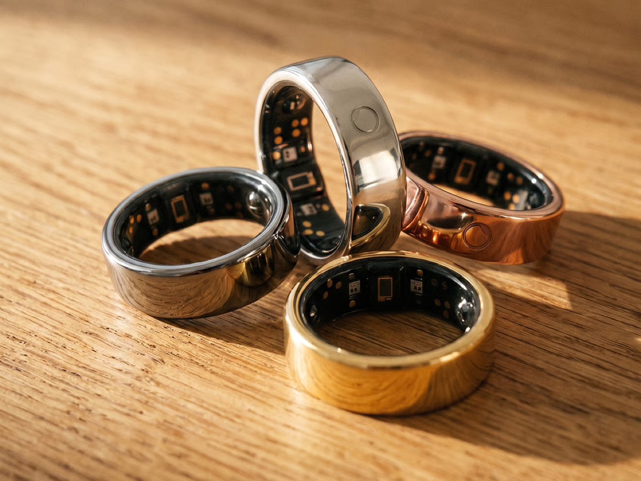
The pushback the deposit mechanism reliably attracts is predictable: does $2 actually prove anything about future purchase behavior? The deposit is the part people push back on, but the $2 is not the point. The act is the point. Getting up, finding a card, and typing the numbers in for something with no campaign page, no ship date, and no reviews is a different order of behavior from tapping a heart, and the people who do it are the closest thing to your future backers that exists before you have any. The Circular Ring 2, a smart health ring, funded in just four minutes and crossed $2.5 million in pledges in under 40 days. Products that open with that kind of velocity tend to do so because the audience already knows it wants the thing, and that certainty is built long before a campaign goes live.

Image Credits: TCF

The Rejection Data Is the Brief

The survey is where validation stops being a scoreboard and starts being useful. From the people who reserved, you learn what actually moved them: whether it was the color, the form, a specific function, the price, or the promise, and which features are carrying the product versus which ones you have been overselling. From the people who left an email and then did not pay, you learn something you cannot get anywhere else: exactly where you lost them, and what would change their mind. The color they wanted was not there. The shape was wrong. It looked too heavy. The price was too high. These are the people who were close enough to care and honest enough to walk away, and their answers are a list of things you can fix before the fix costs anything.

This is co-creation in the most literal sense: meeting your potential buyers before you launch, and letting them tell you what to build. A creator who learns that 60% of their non-converting subscribers balked at weight has a design brief, not a marketing problem. A creator who discovers that two colorways were widely expected but absent has a specification list, not a gap in their ad copy. The survey turns a theoretical audience into an actively contributing one, delivering feedback while the product can still absorb it. Kickstarter’s most successful campaigns tend to share that structure: they do not open to strangers, they open to people who were already consulted.

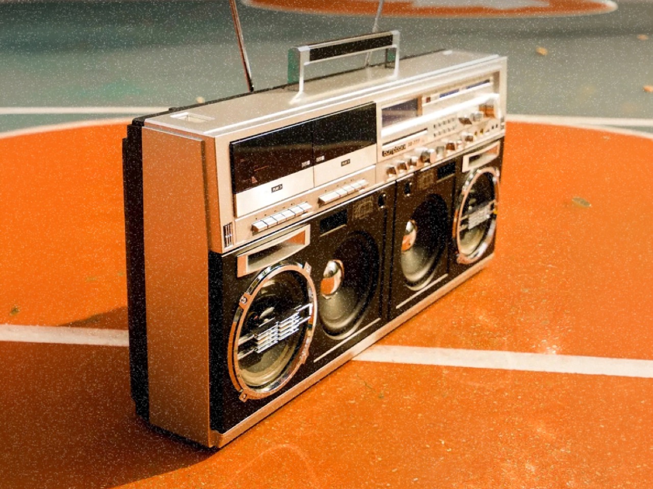
BB-777 Boombox

Why Validation Doesn’t Always Mean Lowering Your Price

Creators tend to assume validation exists to talk them down. It does not. One agency ran validation on a pet product priced at $30 a unit, and the data showed the right price was $40. The creator had been leaving money on the table, and no amount of instinct would have told them that, because instinct in that situation almost always argues for the safer, lower number. No stated-preference survey, no focus group, and no amount of social engagement would have surfaced it, because stated preference and paid behavior are different instruments measuring entirely different things. Validation is where you settle positioning and audience rather than guessing at them, running price variations, testing different messaging, and finding which audience responds before you have committed to a single frame of campaign video. The point is to find the price, the position, and the audience that let the product reach its full potential, and then launch into that.

The validated price sets reward tiers, and the early discount tested during validation is a trigger that has already been watched working, rather than one you hope will. The reserver surveys told you which characteristics did the persuading, which decides your headline, your hero shot, and the order of your video. You are not inventing arguments for the product; you are repeating the ones your buyers already made. Running price variations and messaging tests before a single production decision is committed changes the campaign from a bet into a brief. The learning does not expire when the campaign closes. A validated price, position, and audience are the same three things an e-commerce store runs on, which is what lets a product keep scaling after the campaign instead of peaking with it.

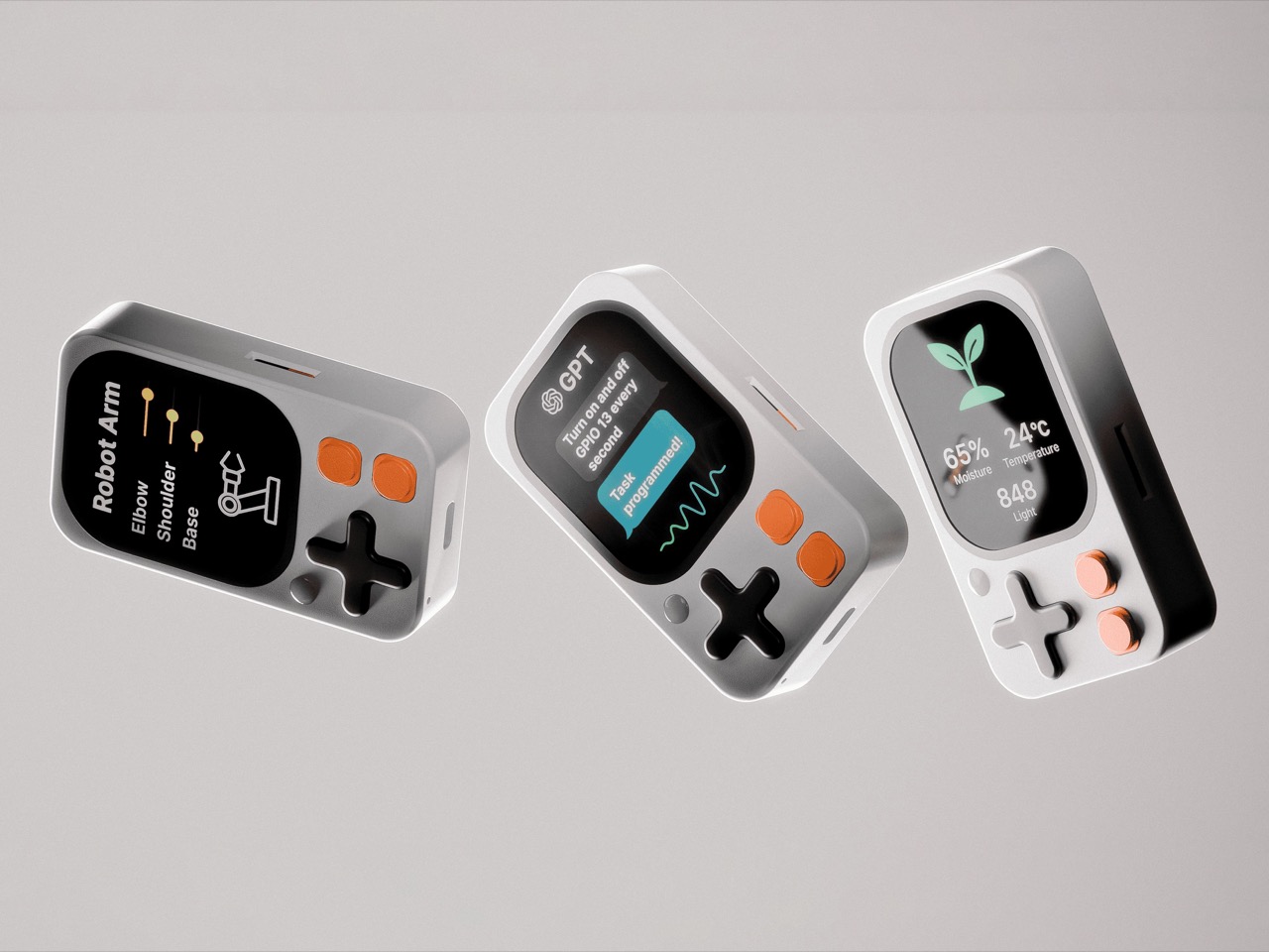
Kode Dot

The Designer’s Instinct Problem and Why Demand Needs Its Own Prototype

The design process and the validation process ask for decisions in different orders, and that difference matters more than it first appears. A designer who arrives at a product through material, form, and function is not naturally thinking about reservation rates. Validation is the design loop pointed at the three things a physical prototype cannot test: what people will pay, how the product should be framed, and who it is really for. Designers already accept this discipline everywhere else; nobody tools up an injection mold without a prototype. A “do not launch” result from this process is a success, saving a creator a year, a production run, and the damage of a public failure. A careful launch protects more than the person running it; it protects the shared resource of backer trust, which every quiet project erodes.

The question worth answering before a launch is not how big a campaign you can build. It is what you can prove before you build it. Whether that discipline becomes standard practice across the crowdfunding ecosystem or remains the habit of the more methodical subset of creators, the underlying argument is one any designer can recognize. You do not ship a mechanism you have not tested. Treating the market as the final untested component, rather than an assumption baked into launch day, is the shift the methodology is asking for. Across hundreds of millions of dollars raised in crowdfunding projects, the cases where testing these three things costs more than getting them wrong are functionally nonexistent.

The post Designers Already Prototype Hardware – Now They’re Prototyping Demand Too first appeared on Yanko Design.
  •  

Would you pay $14,000 for an iPhone Duo without any cameras?

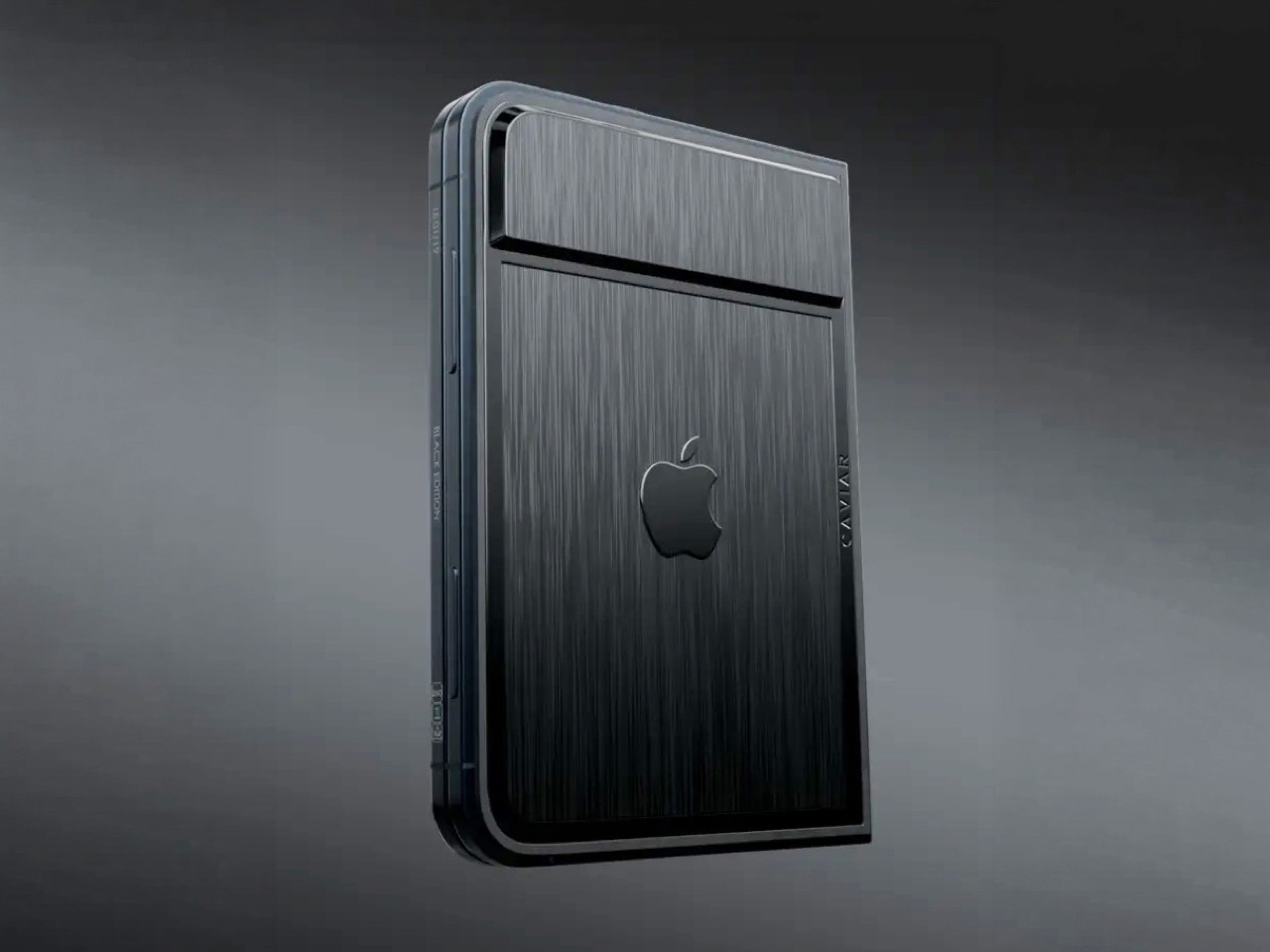
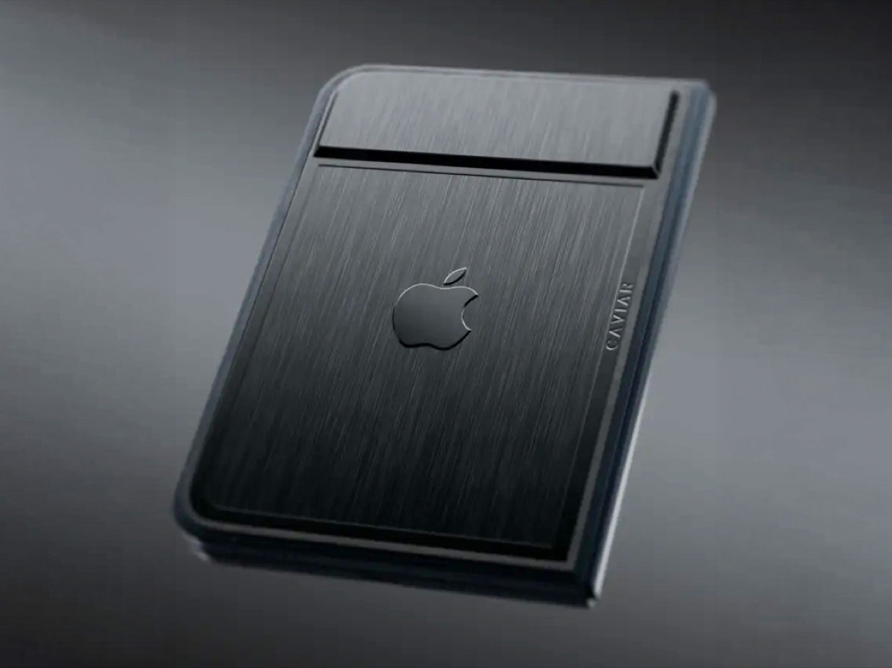
Imagine sitting at a table with friends and whipping your phone out. Your friends see it’s a foldable… then as you unfold it, the animation looks suspiciously like the iPhone Duo. Your friends are impressed, they designate you as the group photo taker… and you tell them regrettably that your iPhone Duo has no cameras. Then you add… not only does it not sport any cameras, it also costs fourteen grand.

To be honest, that scenario is entirely imaginary. Mainly for a bunch of key reasons. Caviar built this version of the iPhone Duo for privacy, championing what they call “Privacy, Minimalism, and a Refined Masculine Style.” Someone who sees truth in that ethos isn’t designated photographer material. And if they were, shelling 14k on a phone means you probably have a few extra grand to hire a photographer wherever you go. The only reason someone buys this hare-brained version of the iPhone Duo is because they can. Plain and simple.

Designer: Caviar Global

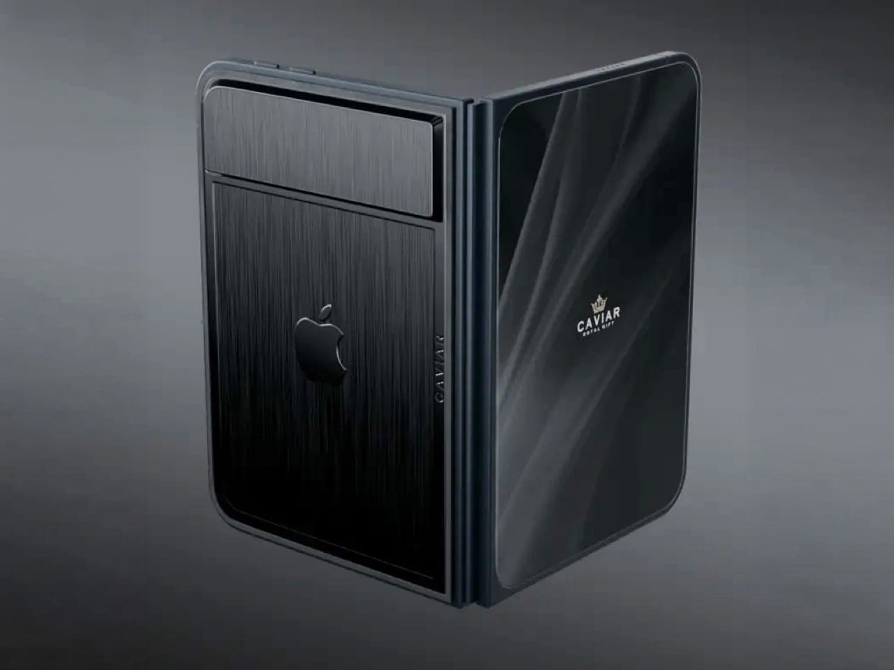
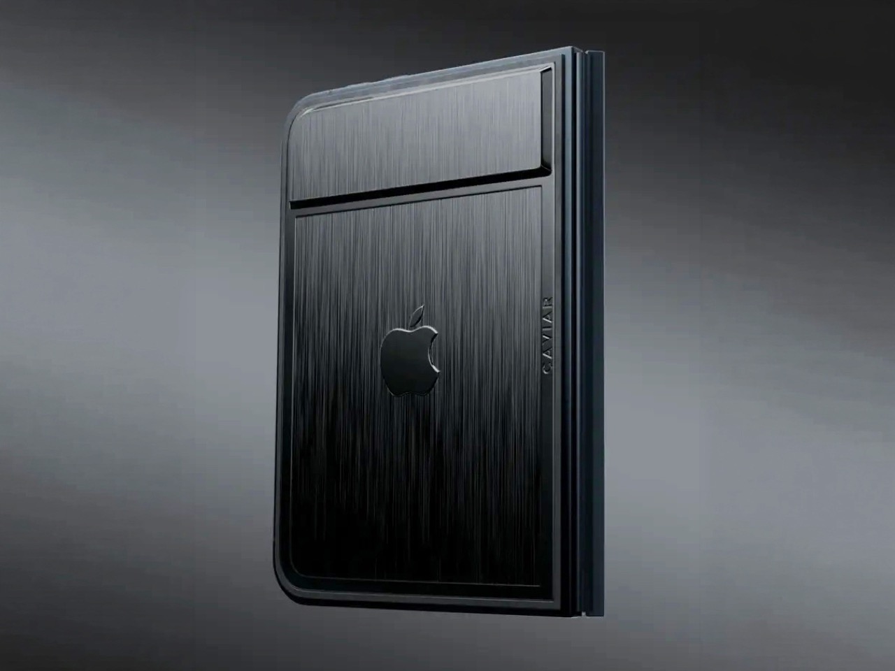
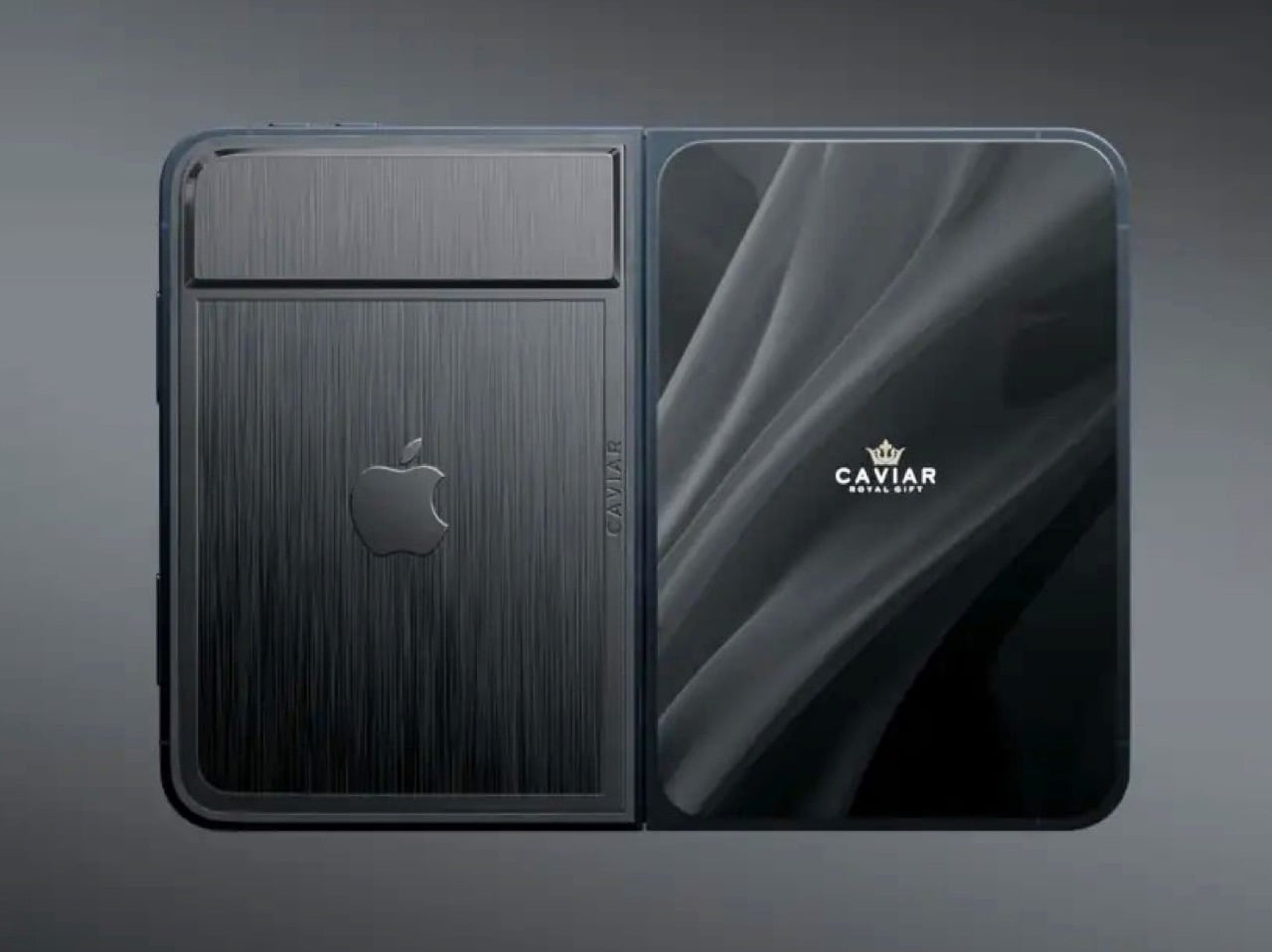
Removing the camera stack from the back of the iPhone Duo does something unexpected: the phone becomes genuinely beautiful. That rear panel, normally dominated by the triple-lens module, turns into a single flat sheet of satin-finished black titanium. No bumps, no rings, no glass circles competing for visual real estate, just one uninterrupted surface that shifts character depending on the light hitting it. Caviar calls the inspiration “supersonic aviation aesthetics,” which sounds like marketing speak until you actually look at the product photos. A blacked-out Apple logo sits flush in the titanium, the Caviar crown marks the opposite panel in a swept fabric-like texture, and the whole thing looks less like a phone and more like a prop from a very expensive spy film.

Apple’s decision to use Touch ID for the iPhone Duo, abandoning Face ID, turns out to be what makes Caviar’s camera-free execution actually hold up. A Face ID phone needs its front camera array to function as a biometric sensor, so pulling that out would mean a very pretty device that cannot unlock. Touch ID lives in the frame rather than behind the screen, so Caviar could strip the entire camera stack, front hole-punch and rear module both, without breaking anything fundamental. Based on product images, the inner display on the Ultimate appears completely clean, no hole-punch interrupting the screen, which makes the inside as seamless as the outside. Two separate design decisions from two separate companies ended up fitting together better than either could have planned.

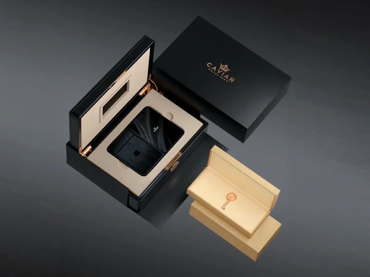
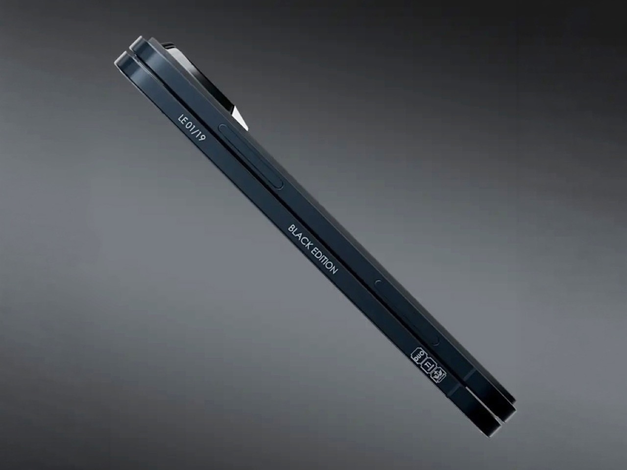
Caviar made 19 of these total. Each unit ships in a custom lockable black luxury box, presented the way a jeweler presents a watch rather than the way Apple ships a phone. A smaller gold-colored wooden case inside holds what appears to be a gold-plated commemorative coin, the kind of object that exists purely to make the unboxing feel like a ceremony. The side of the phone is engraved with a serial number too, for exclusivity. Caviar knows exactly who they are selling to, and made sure the packaging matches the energy.

Caviar has been doing this for years, taking flagship Apple hardware somewhere Apple would never go, for clients who appreciate the gesture. The formula is consistent: start with the most premium Apple product on the market, make it rarer, make it more dramatic, and let the price be the final statement. We have covered their gold-plated and titanium iPhone builds here before, and none of them committed this hard to stripping features as a form of self-expression. At $13,990 for 19 units (mind you, that’s just the 512GB variant), the Ultimate is the purest version of the Caviar argument: a phone that costs seven times its base price because it does less, and somehow makes that sound like the point.

The post Would you pay $14,000 for an iPhone Duo without any cameras? first appeared on Yanko Design.
  •  

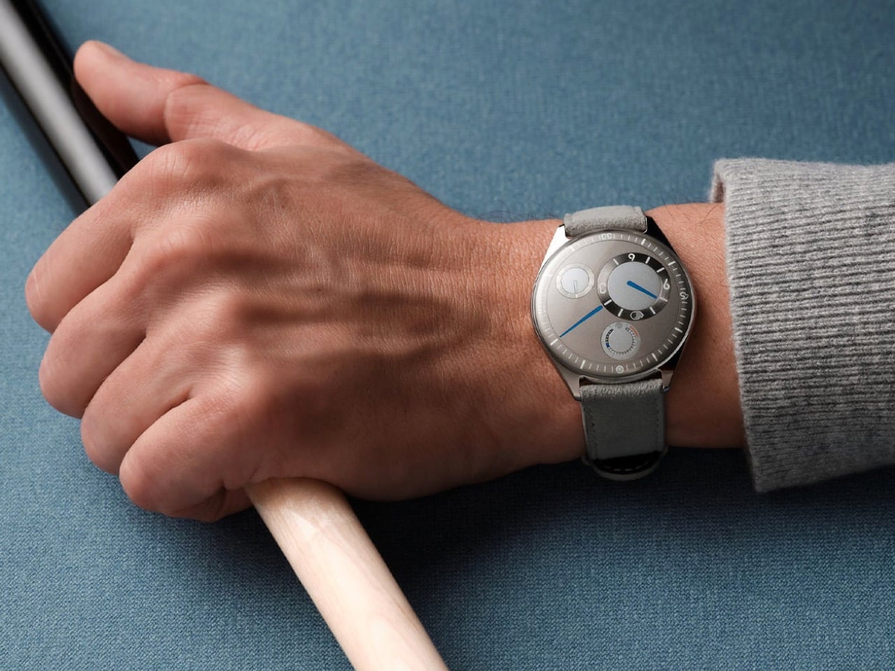
Ressence Doesn’t Want Your Watch to Look Like a Watch

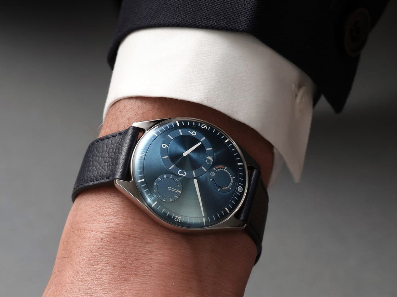
Design Mindset, Yanko Design’s weekly podcast, premieres every week with a new guest and a single animating question: what does it actually take to think differently about a design problem. The show is 23 episodes in, and this episode turns its attention to fine watchmaking via someone who arrived in the industry with no allegiance to its conventions. If a mechanical watch didn’t exist today, and a designer received the brief cold, would they give it hands, a crown, a flat dial? That question opens the conversation and also describes exactly what our guest spent 16 years answering in practice. The result is Ressence, a brand whose watches look like nothing else on the wrist.

Benoît Mintiens is a Belgian industrial designer who, before he ever touched a watch, designed high-speed trains, aircraft cabins, medical devices, leather goods, and even hunting guns. He founded Ressence in 2010, the name a contraction of Renaissance of the Essentials. The Type Three BB2 won the 2024 Red Dot Award Best of Best, and 2026 brought the same recognition to the TMN. His watches are designed in Antwerp, made in Switzerland, produced in limited editions each year, and worn by people who believe the future is brighter than the past. He is a designer who walked into one of the world’s most convention-bound industries and simply refused to accept what he found there.

Designing from the User Outward

When people ask Benoît how he designs a watch, the answer he gives is never the one they expect, because he starts with the relation between the user and the watch rather than with the movement itself. “Usually I start not with the watch. I start with the relation between you and the watch, and that is, I think, a very important step that very often is forgotten.” Most brands were created by watchmakers who always build from the inside out, from the movement to the wearer. As a designer, Benoît works in the opposite direction, from the user inward to the movement. That physical 180-degree reversal of process changes everything about what a watch ends up looking and feeling like.

Designing the relationship is, in Benoît’s view, fundamentally an ergonomic exercise, rooted in a deep study of physiology and how people interact with objects. The ultimate measure of success is disappearance: “The best product is the one you forget when you use it. Invisible. I’m using it, but I’m not even aware of it.” He tells customers who buy a Ressence that he hopes they forget quickly that they are wearing it, and that forgetting is the proof the design worked. In the rapid-fire round, he completes the sentence “the future belongs to designers who stop asking how to make things and start asking” with five words: “How do you want to feel.” That question is where every Ressence begins.

Challenging Industry Conventions

Until the quartz crisis of the 1970s, watchmaking was about precision, quality, and reliability. When quartz movements arrived at a fraction of the cost of mechanical ones, the industry had to reinvent itself to survive. “Watchmaking has found a way to survive by adding this emotional layer on top of their brands, on top of their physical products. It’s not so much about the physical product anymore. And that’s a pity, I think, as a designer.” Any product, Benoît argues, needs to pass through the survival-of-the-fittest logic of natural evolution to reach the next generation. Watchmaking’s functional evolution largely stopped at the quartz crossroads, and Ressence is attempting to pick it up from there.

A product is defined by multiple dimensions: aesthetics, ergonomics, technique, social context, and production. In watchmaking, only the aesthetic dimension has shifted from brand to brand, and the underlying system architecture has been frozen for two hundred years. Ressence repositions every dimension at once. “The way we show the time, the ergonomics, is actually what defines the aesthetics. Is actually the way we make them. Is actually the technique that lies behind. All these things are intertwined, and they all together create what I call this new paradigm.” The whole has to be logical and coherent, or as Benoît puts it, you end up with a Frankenstein.

The Human Connection to Mechanical Objects

Asked why people still choose to wear mechanical watches when a phone tells time more accurately and without winding, Benoît offers a concept he has been developing for years. “I call it the empathy for gears. We have, as humans, we have empathy for gears.” He builds toward the idea through a Titanic thought experiment: a survivor on floating debris must choose which of two strangers in the water to save, the one he spoke with during the voyage, or the one whose language he could never understand. “As a human, you pick the one you have a relation with.” Products operate by the same logic, and we form bonds most naturally with what we can understand and relate to.

A circuit board is opaque; the workings of a mechanical watch are graspable, even to someone with no technical knowledge. “That is the magic of mechanical watches, is that we feel close to them. Let’s not forget, they tick, they make a sound. They need care. You need to wind them. All these elements will generate a bond between you and the product. And that is why I’m a strong believer in mechanical watches.” Each quality that makes a mechanical watch demanding, the winding, the servicing, the ticking, deepens the relationship between wearer and object. That depth of feeling, Benoît argues, is a human need, and it deserves to be designed for.

Ressence’s Innovations and Design Philosophy

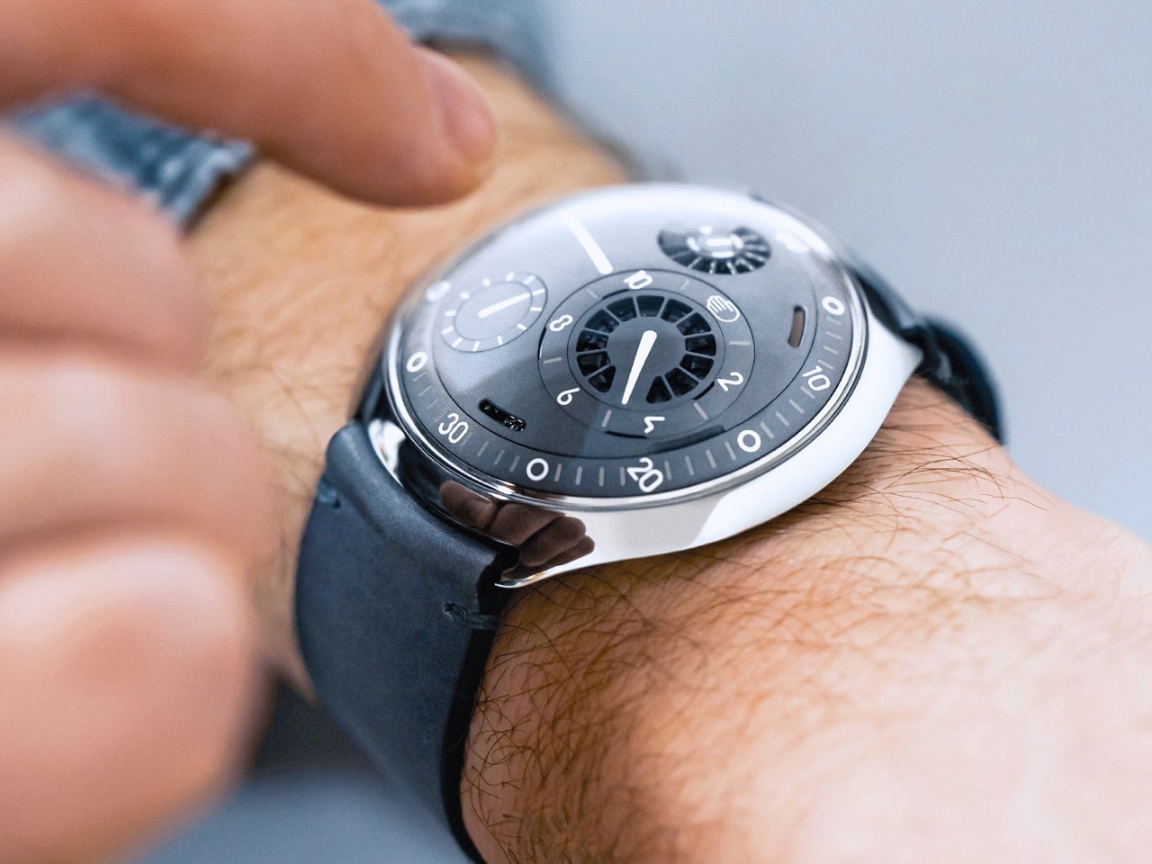
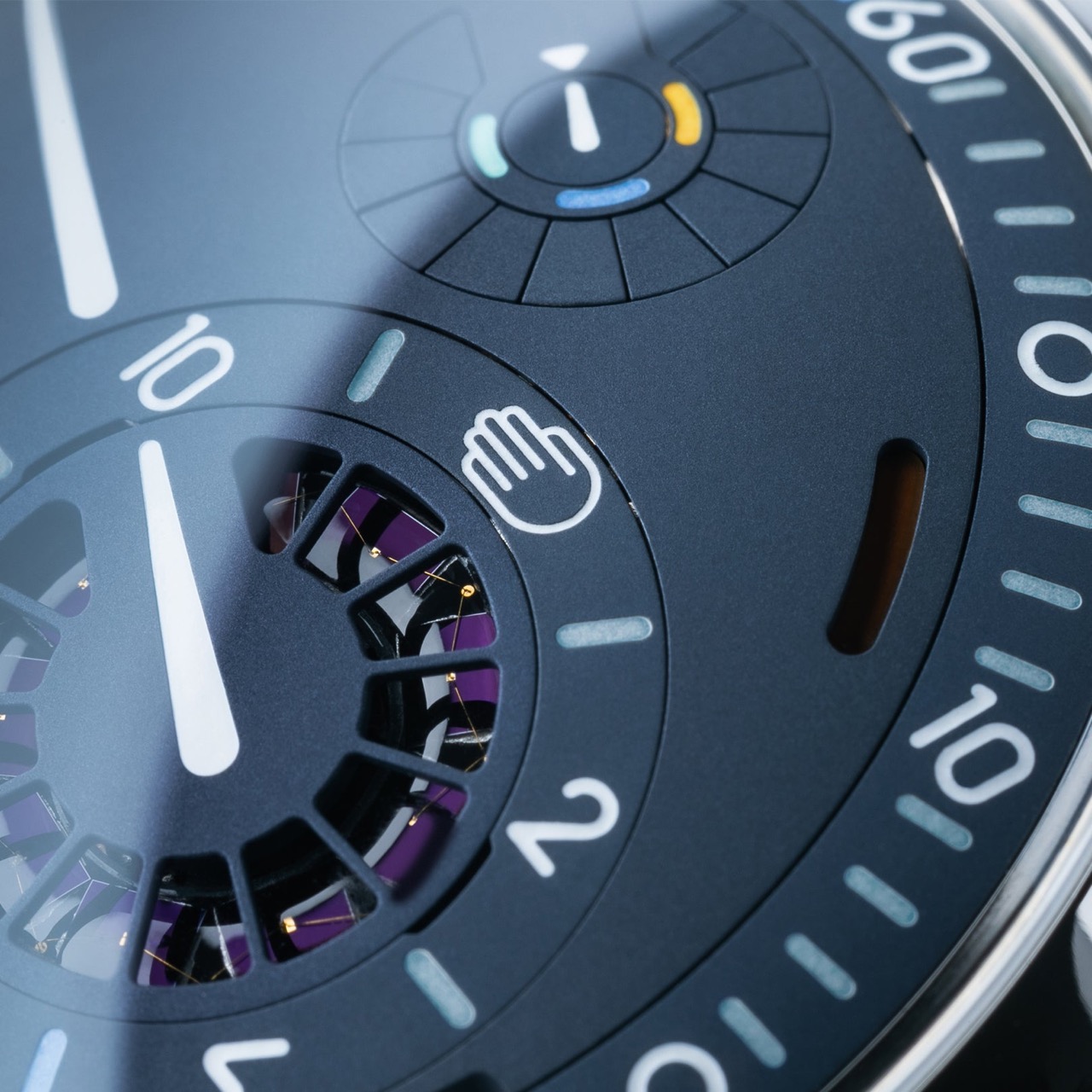
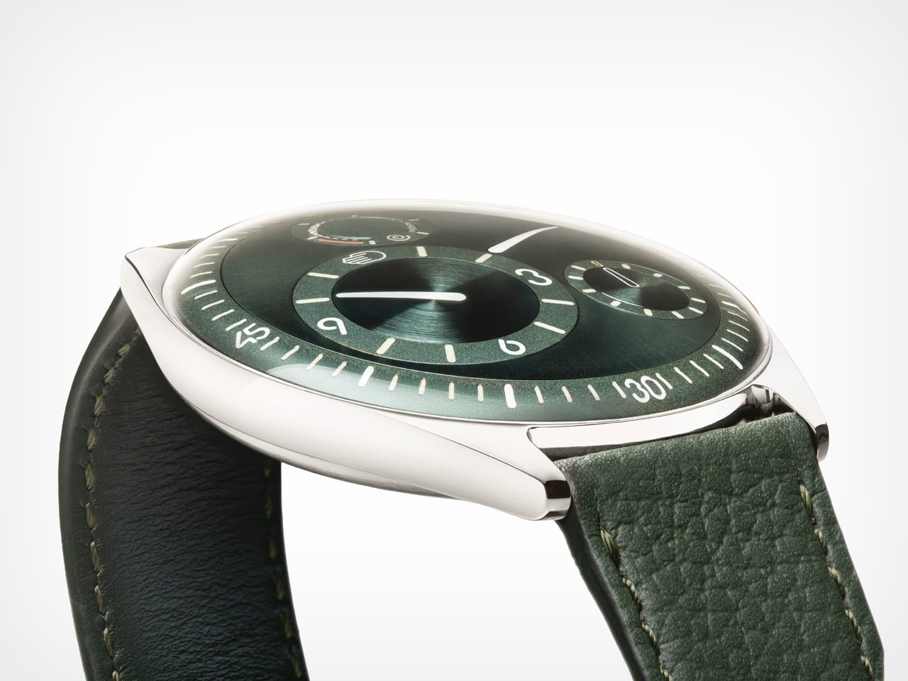
Ressence positions itself as a high-end brand, with Benoît drawing a specific distinction between high-end and luxury. Luxury is decorative and emotional, selling prestige and story; high-end means technically and functionally sophisticated, in service of the person using it. “We would believe that a product gets its relevance, its reason of existence, through the way or the quality the product is executing its function.” The most visible outcome of that philosophy is the Ressence Orbital Convex System, or ROCS, which replaces traditional hands with rotating discs requiring approximately 200 components where a standard watch uses four. The design brief Benoît imposed on himself back in 2008, years before the brand existed, made the mandate clear from the start: “Ressence needs to be original, but not marginal.”

The oil-filled dial, defining models from the Type 3 to the Type 7, has an origin in personal memory. Benoît traces it to childhood Mediterranean sailing trips, navigating overnight to Corsica guided only by an oil-filled ship’s compass in the days before GPS. “This image of the compass, an oil-filled system with inside a mechanical thing that turns around, showing the north. I’m pretty sure this has been the thing that has burned in my brains, and I believe the idea of the Type Three must have come from there.” Oil inside the Type 5 diver eliminates refractions between oil, sapphire, water, and dive mask, delivering a clear dial at any depth. The functional improvement is exactly the point: a diver watch you can actually read underwater.

Production, Materials, and the Future

Getting enough watches from suppliers is, after 16 years of operation, still the hardest thing Ressence faces as an organization. A single watch contains around 400 custom-made parts at extreme precision tolerances, and the Ressence dial is curved in three dimensions where almost every other watch is flat, requiring five-axis machining. Some parts pass through twelve different specialized companies before reaching a watchmaker’s desk. “If today I need more watches and I order them, I will only have them in between nine months and two years. There is no industry like that.” Those lead times explain the prices, the waiting, and the limited annual runs; the scarcity is structural, a consequence of producing something this technically complex as an independent brand.

Benoît is clear-eyed about products and unhurried about brand moving forward. Ressence has a product plan mapped for the next eight years, but brand recognition is the harder work and cannot be forced. “Stick to your vision, and move on and be coherent. I think that’s the central thing.” The reference brands held up as aspirational in watchmaking took fifty years to reach that position, and it was a consequence of what they did, not something they actively pursued. On materials, Benoît describes a fascination with mammoth ivory recovered from Siberia, finding its structure “very, very, very beautiful.” Ressence can be found at ressencewatches.com, on Instagram, and in Antwerp, where visitors are always welcome.

The post Ressence Doesn’t Want Your Watch to Look Like a Watch first appeared on Yanko Design.
  •  
❌