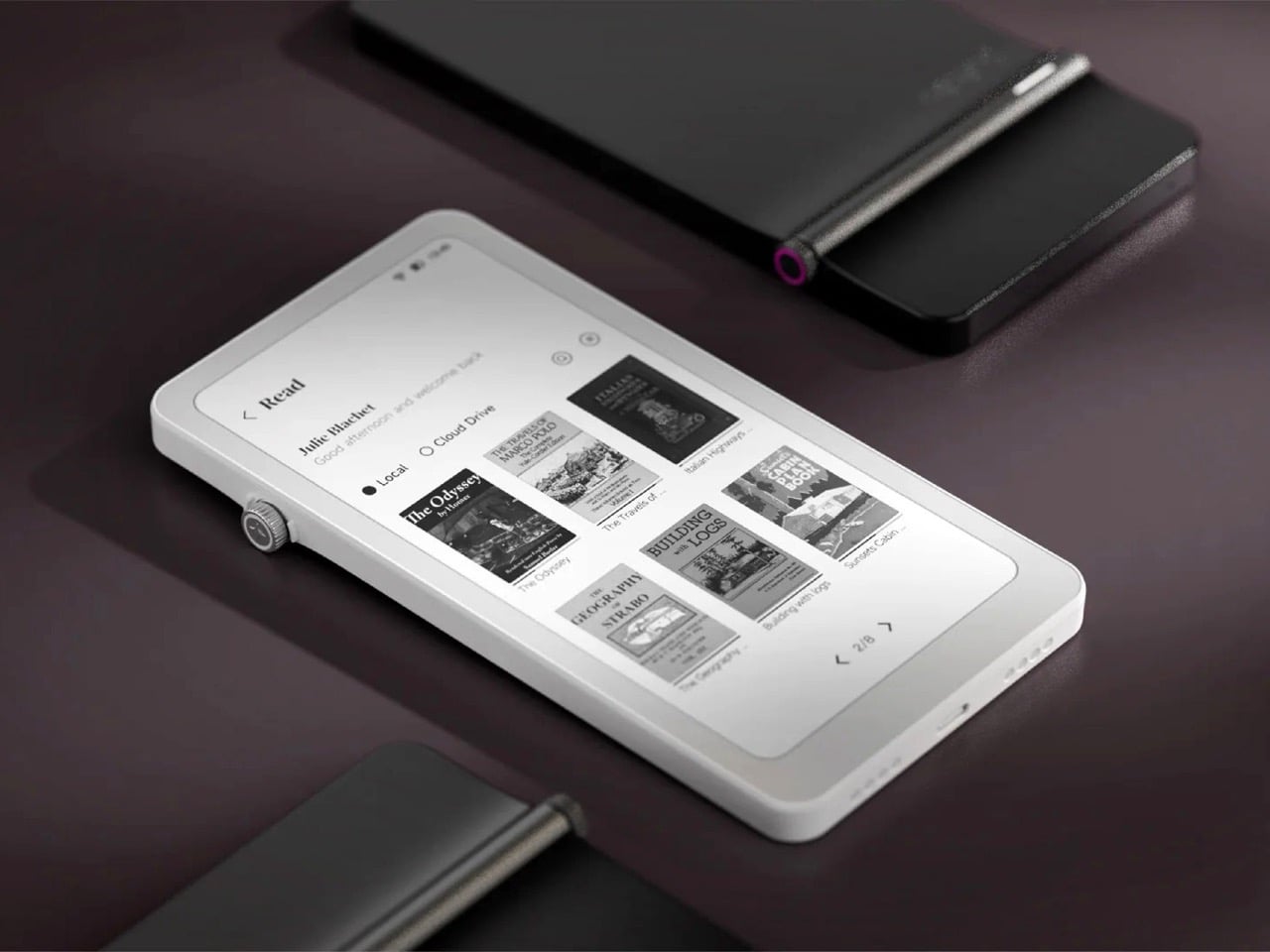
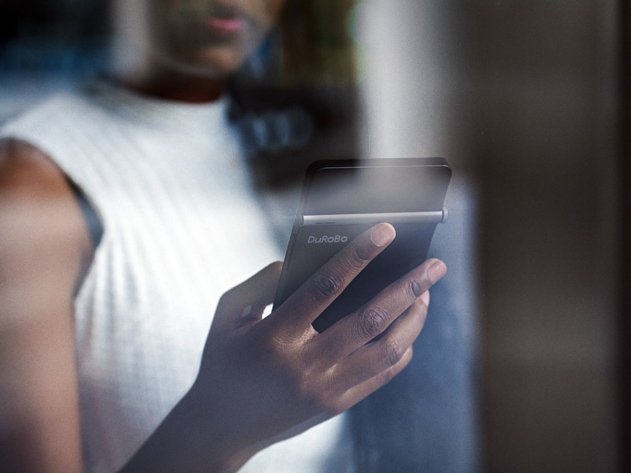
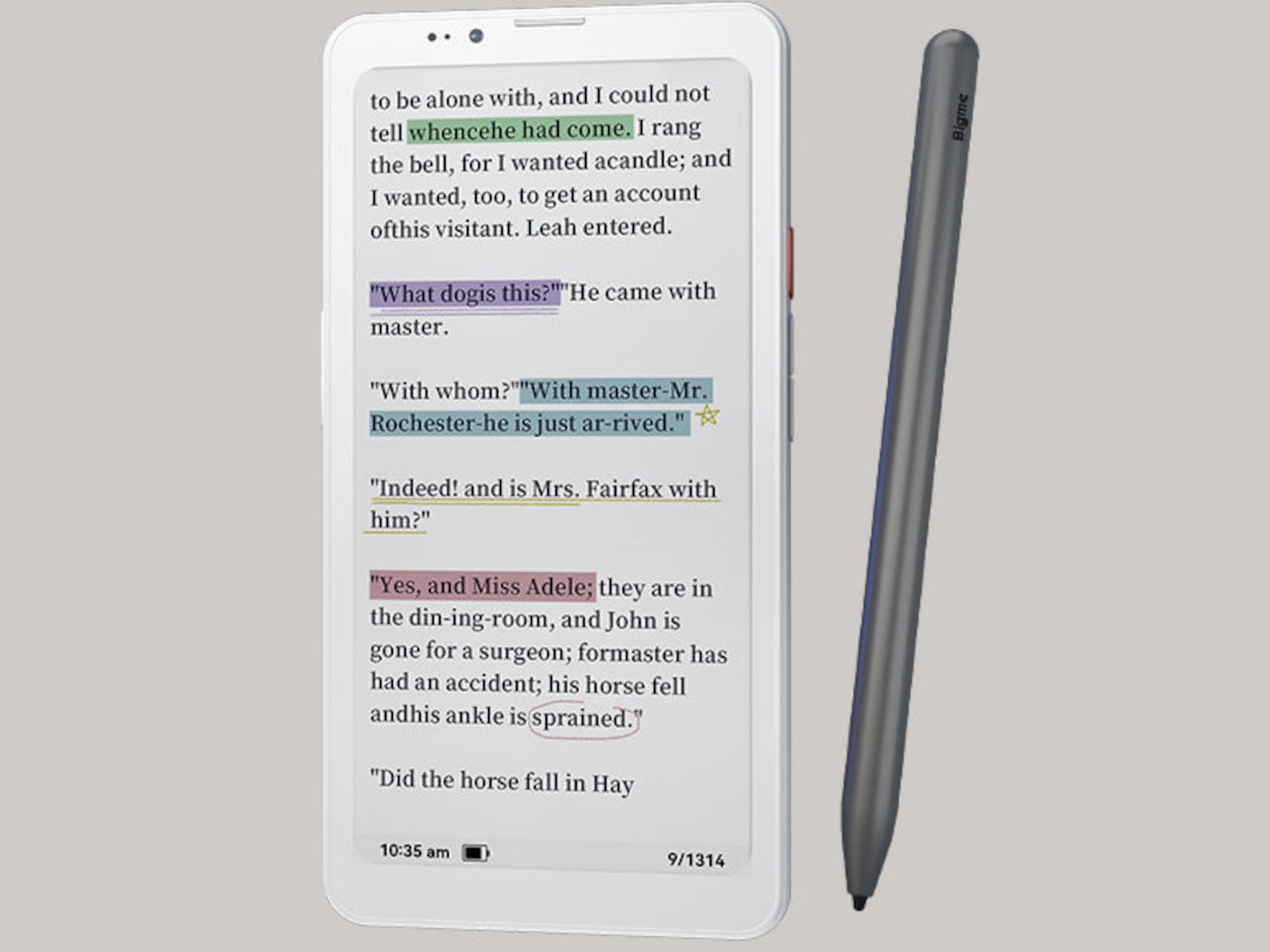
Amazon has spent nearly two decades perfecting the Kindle, turning it into the default eReader for millions of people, and in all that time they’ve steadfastly refused to shrink it down to pocket size or open it up to the broader Android ecosystem. They had every opportunity to merge the best parts of their Kindle line with the form factor of a smartphone, creating a distraction-free reading and productivity device that could actually fit in your jeans pocket and run the apps you already use. Instead, they kept the Kindle locked into its walled garden, kept it at 6 inches or larger, and left a gaping hole in the market for anyone willing to build what they wouldn’t. DuRoBo took that opportunity and ran with it, launching the Krono, a 6.13-inch E Ink tablet running full Android 15 that costs $279.99 and does exactly what Amazon has spent years pretending nobody wants.
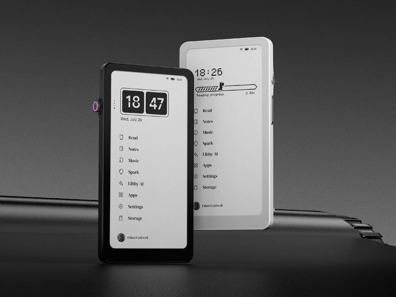
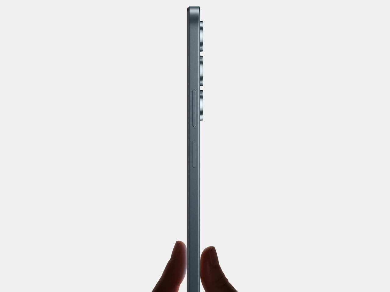
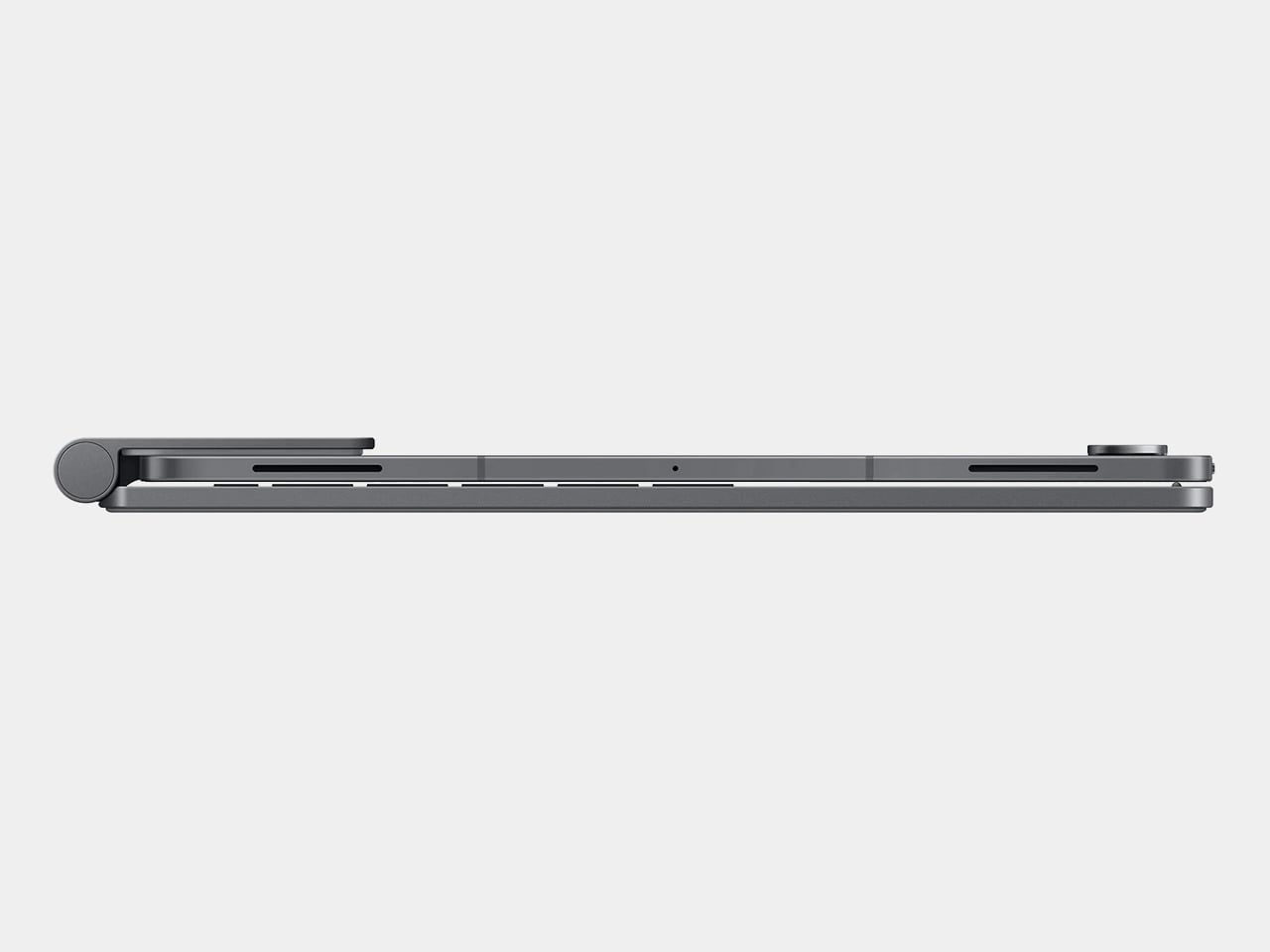
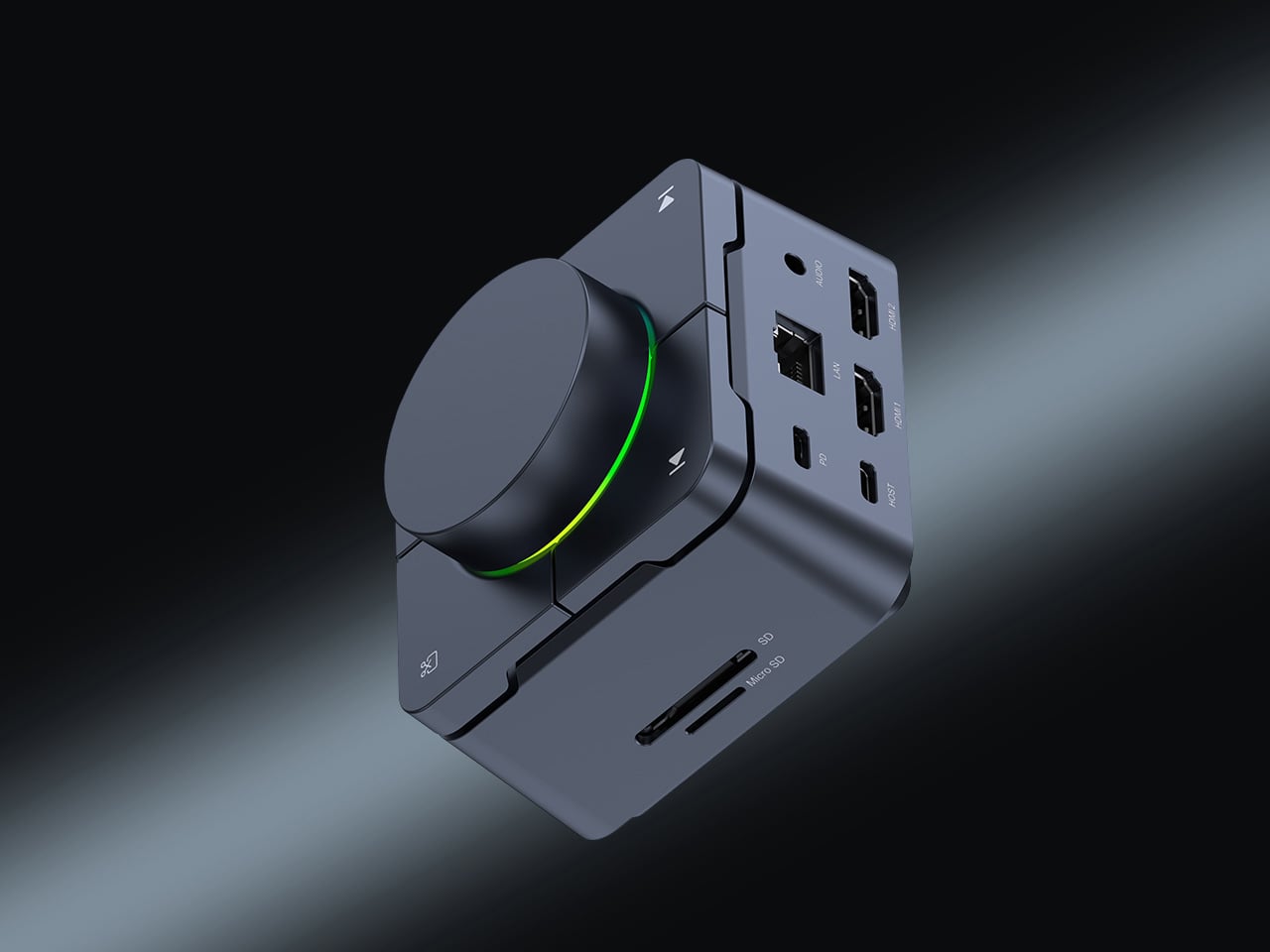
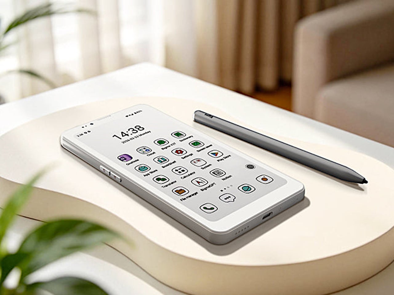
The Krono packs an E Ink Carta 1200 display at 300 PPI (matching the sharpness of a Kindle Paperwhite), an octa-core processor, 6GB of RAM, 128GB of storage, a 3,950 mAh battery, and a unique side-mounted Smart Dial that controls screen refresh, frontlight adjustment, voice recording, and web browsing through a single rotary knob. It weighs just 173 grams, measures 154 x 80 x 9 mm, and is available in black or white from DuRoBo’s site or Amazon US. The pitch is straightforward: it’s an eReader, a voice note-taker, a podcast player, and a music device all in one, built on an open platform that lets you install whatever reading app, productivity tool, or communication software you actually want to use. It launched in August 2025 and started shipping in September, quietly carving out space in the niche that BOOX’s Palma lineup has been dominating for the past year.
Six gigs of RAM in an E Ink device is borderline excessive in the best possible way, especially when most eReaders ship with 2GB or less and struggle the moment you try to run anything beyond the stock reading app. The 128GB of storage means you can load an absurd library of ebooks, PDFs, audiobooks, and whatever else without ever worrying about running out of room. Running Android 15 (not some ancient fork, but the actual current OS) gives the Krono access to the full Play Store ecosystem, which is exactly what Amazon has been allergic to for years. You want Kindle, Libby, Moon+ Reader, Pocket, Instapaper, Obsidian, and Spotify all on one device? The Krono lets you do that. A Kindle will let you read Kindle books and maybe listen to Audible if you’re lucky. That’s the entire difference.
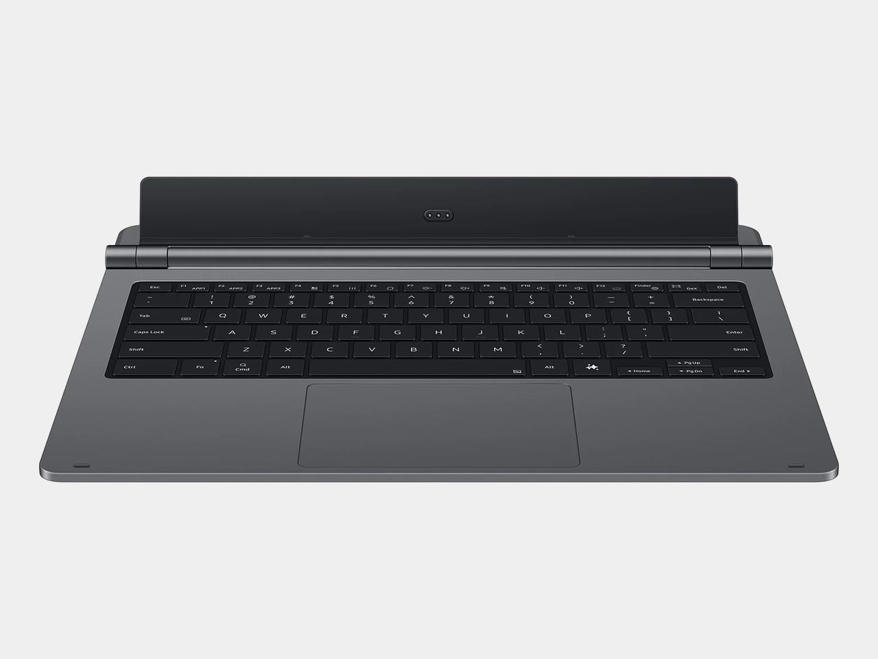
The Smart Dial highlights DuRoBo’s industrial design philosophy most clearly – instead of burying every interaction behind capacitive touch menus (which E Ink refresh rates make tedious), they mounted a physical rotary dial on the side of the device that you can press and rotate to trigger different actions depending on context. It’s a design choice borrowed more from cameras and audio gear than from tablets, and it gives the Krono a tactile, mechanical quality that most E Ink slabs completely lack. The back of the device features what DuRoBo calls the Axis, a strip housing six small breathing lights that glow softly on a schedule to gently nudge you back toward focused reading or work. It’s a wellness-adjacent UX detail that could easily feel gimmicky, but in the context of a device explicitly marketed as a “focus hub,” it at least makes thematic sense. The whole package is clearly designed to feel intentional and calm, a deliberate counterpoint to the dopamine-optimized chaos of a smartphone.
DuRoBo is positioning the Krono hard into the distraction-free productivity and mindfulness lane, framing it as the device you reach for when you want to read long-form content, capture ideas through voice notes, or listen to podcasts without getting dragged into Instagram or TikTok. The dual-tone frontlight (warm and cool adjustment) and the paper-like texture of the Carta 1200 display are meant to make extended reading sessions comfortable in a way that backlit screens never quite manage. The built-in speaker and Bluetooth support let it double as a surprisingly capable audio player for music, audiobooks, and podcasts, which gives it utility beyond just being a reading slab. The open Android platform means you can customize it to fit whatever workflow you actually need, whether that’s Notion for notes, Pocket for saved articles, or Spotify for background music while you write. Amazon would never build this, because opening the Kindle platform would undermine their entire content ecosystem lock-in strategy.
The Krono is available now for $279.99; with a fitted TPU case is sold separately, designed to accommodate both the Smart Dial and the Axis breathing lights without blocking either. At that price point, it’s competing directly with the BOOX Palma (which runs around $280 depending on configuration) and sits well above Amazon’s Kindle Paperwhite but below their Kindle Scribe. Whether the Smart Dial, the breathing lights, and DuRoBo’s focus-first branding are enough to justify choosing it over a Palma or just installing a launcher on a Kindle will depend entirely on how much you value that design identity over raw software polish.
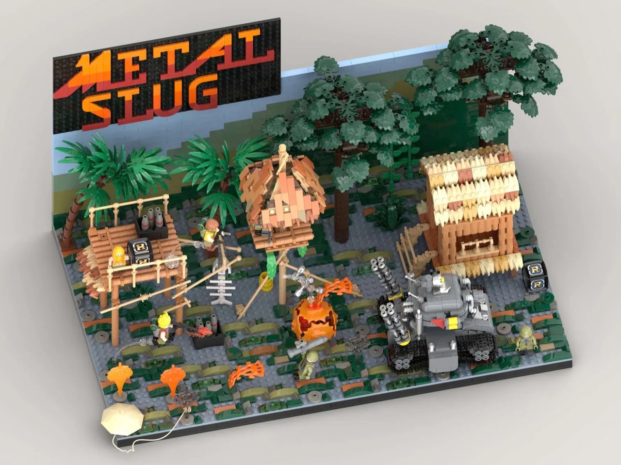
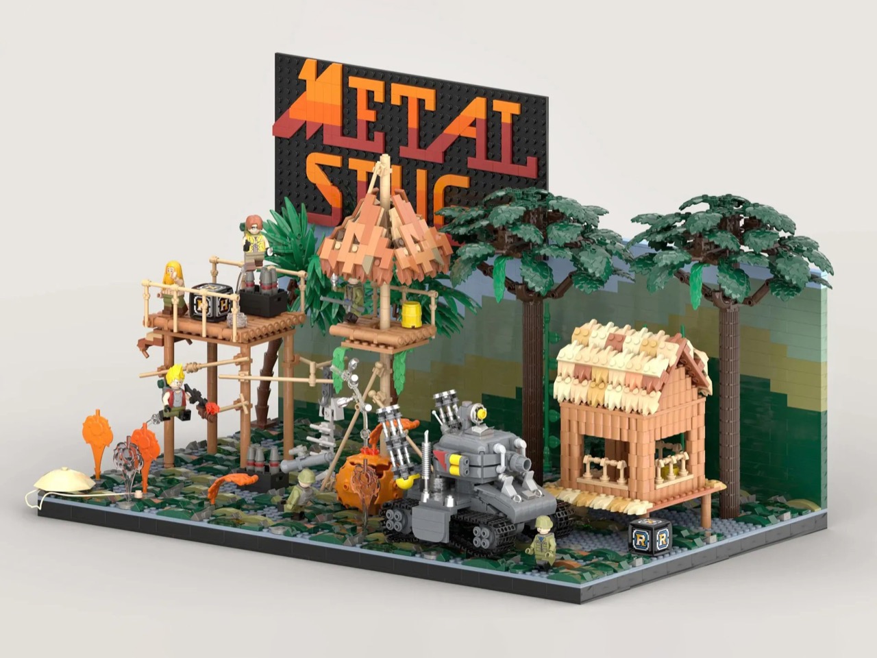
By 1996, the arcade was dying. Virtua Fighter and Tekken had the crowds. Sega’s racing cabinets had the spectacle. The conventional wisdom was that 2D games were finished, and anyone still making pixel art sidescrollers was simply behind the curve. Then Nazca Corporation released Metal Slug on SNK’s Neo Geo hardware, and the conventional wisdom had to sit quietly in a corner for a while. The game’s hand-animated sprites moved with a fluidity that polygon games couldn’t touch, and the humor, panicking soldiers, grateful POWs tossing rocket launchers, a tank that waddled like a toy, made the whole thing feel alive in a way that pure technical showmanship never quite manages.
LEGO Ideas builder MagicBrick has captured a freeze-frame of that world in brick form, reconstructing the game’s iconic jungle mission with 2,701 pieces and 6 minifigures locked into a scene of swamp terrain, rebel soldiers, dense jungle vegetation, and the squat, waddling Super Vehicle-001 tank at the center of it all. It’s a dense, affectionate build made by someone who clearly lost many, many credits to this game, and it shows in every deliberately chosen detail, from the mid-jump Marco Rossi clutching a Heavy Machine Gun to the bearded POW standing by with a reward.
Designer: MagicBrick
The scene is structured like a freeze-frame from the game itself, which is exactly the right instinct. MagicBrick describes the goal as capturing “a dynamic instant where everything is in motion: jumps, actions, and interactions come together to recreate the fast-paced feeling typical of the game,” and the build delivers on that. Marco Rossi in his red jacket is airborne, Heavy Machine Gun in hand. Tarma Roving, yellow jacket, stands ready with a pistol and knife. Three Rebel Army soldiers in green uniforms and helmets fill out the opposition, armed with bazookas and rifles. The swamp base uses tiles in multiple shades to sell the terrain, jungle trees and palms crowd the background, and the brick-built backdrop reflects the arcade color palette of the original game rather than any attempt at realism. That last decision is a smart one. Metal Slug was never interested in realism, and neither is this.
The Super Vehicle-001 is the centerpiece, and MagicBrick has packed a surprising amount of function into a compact footprint. The rear cannons are adjustable, the tracks are functional, and antennas complete the silhouette. Scattered across the scene are the environmental details that will hit Metal Slug veterans like a reflex: ammo crates, yellow barrels, a hanging fish skeleton, a parachute, and both the Heavy Machine Gun and Rocket Launcher power-up pickups rendered in brick. My favorite touch, though, is the grenade sequence, a classic cartoon-logic arc of thrown grenades ending in a mid-air explosion, frozen in plastic at exactly the right moment of absurdity.
Topping the whole structure is the Metal Slug logo itself, rendered in a red-to-orange gradient that makes the build read as a display piece as much as a playset. It’s that combination of environmental storytelling, playable features, and genuine fan knowledge that separates builds like this from generic video game tributes.
LEGO Ideas is the platform where fan-designed MOCs (My Own Creations) gather community votes, with 10,000 supporters needed to trigger an official LEGO review and potential production as a retail set. MagicBrick’s Metal Slug submission hit 100 supporters almost immediately after going live and has been picking up Reddit traction since. If you grew up feeding tokens into a Neo Geo cabinet, head to the LEGO Ideas page and cast your vote here.
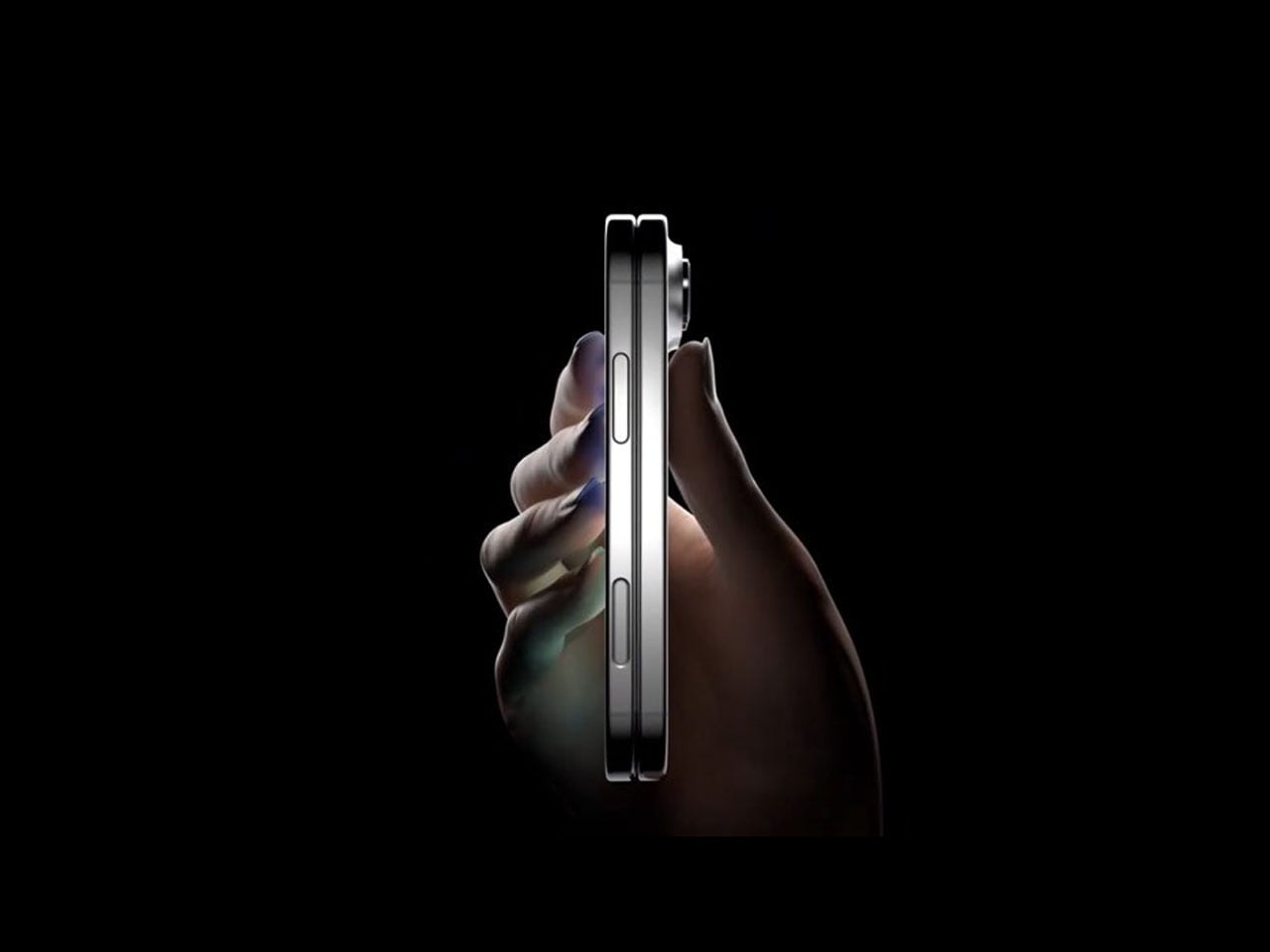
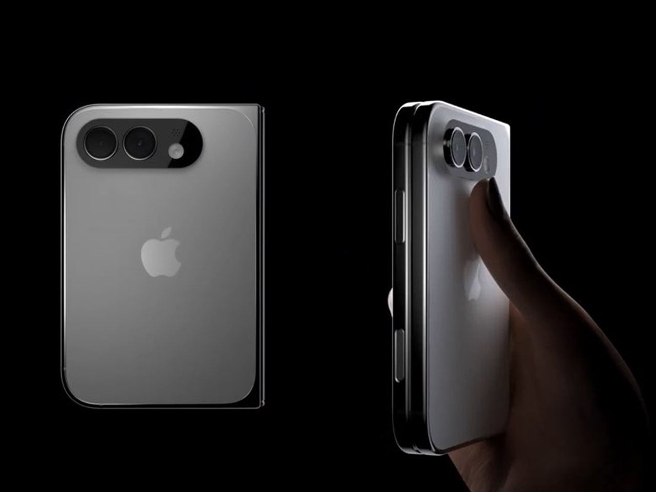
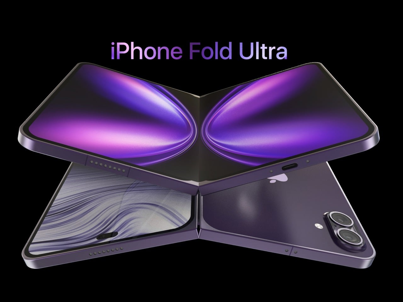
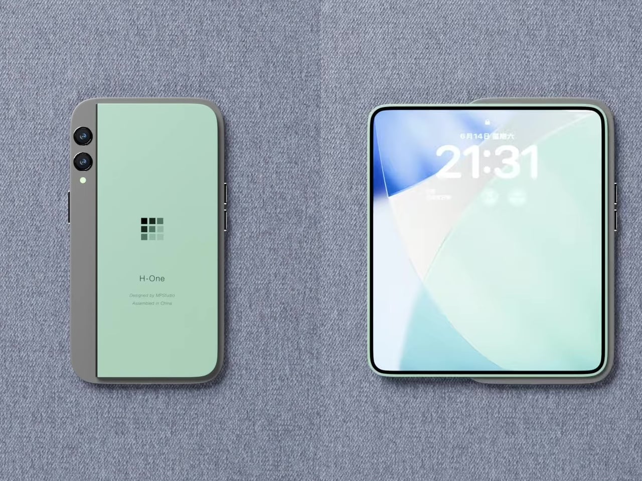
Apple’s first foldable phone, the Apple’s first foldable phone, iPhone Fold (if that’s how it will be called) is one of the most anticipated smartphones in recent memory. While Apple remains tight-lipped about anything concerning the awaited device, rumors, leaks, and concepts have flooded our memories over the years with what the iPhone Fold is and what it will be like.
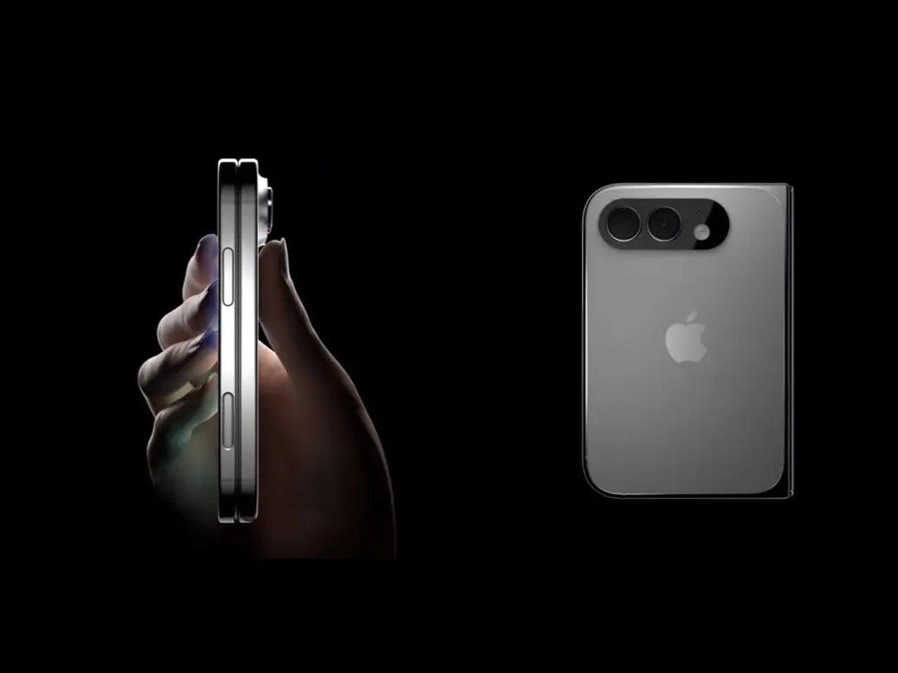
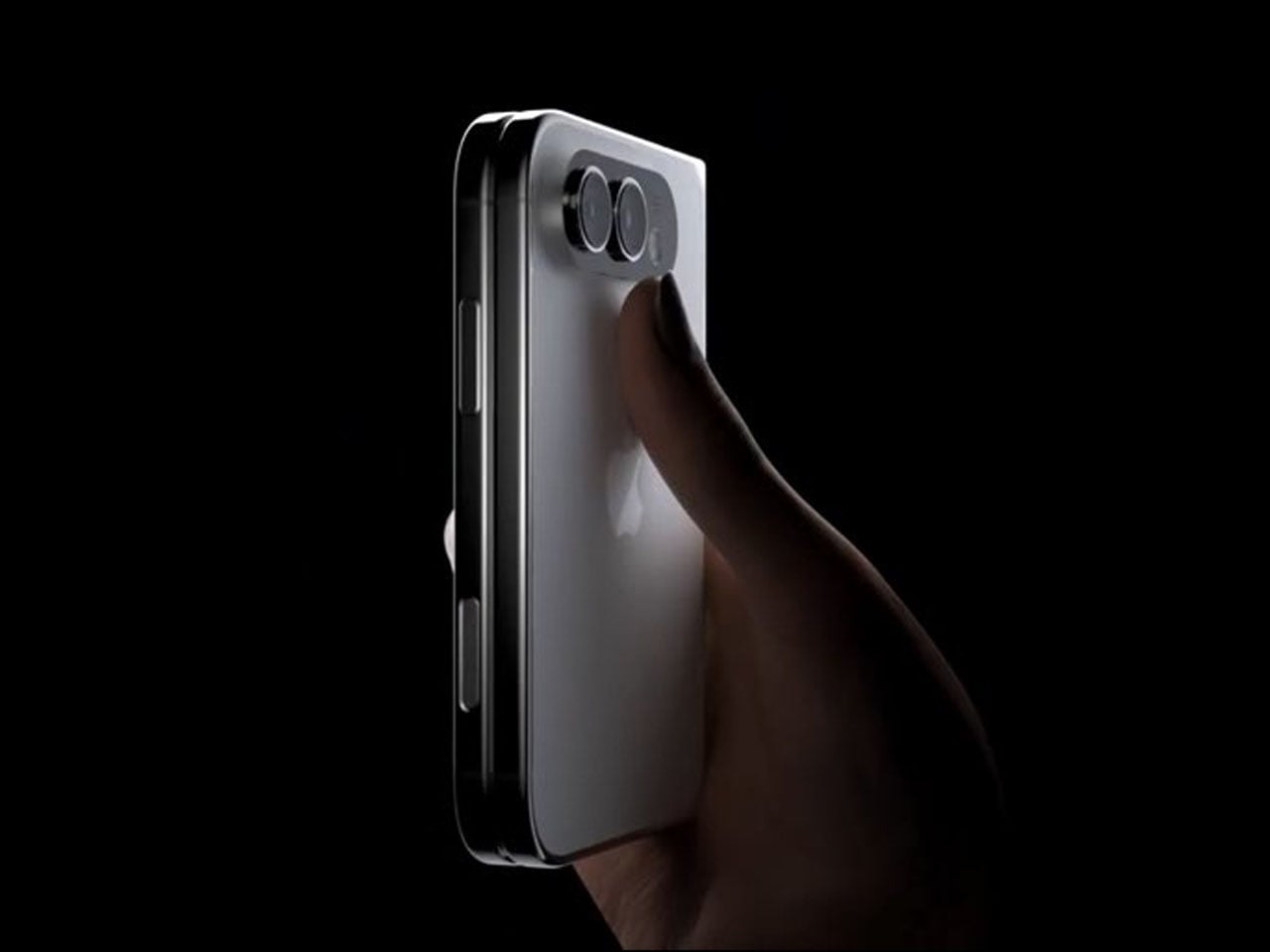
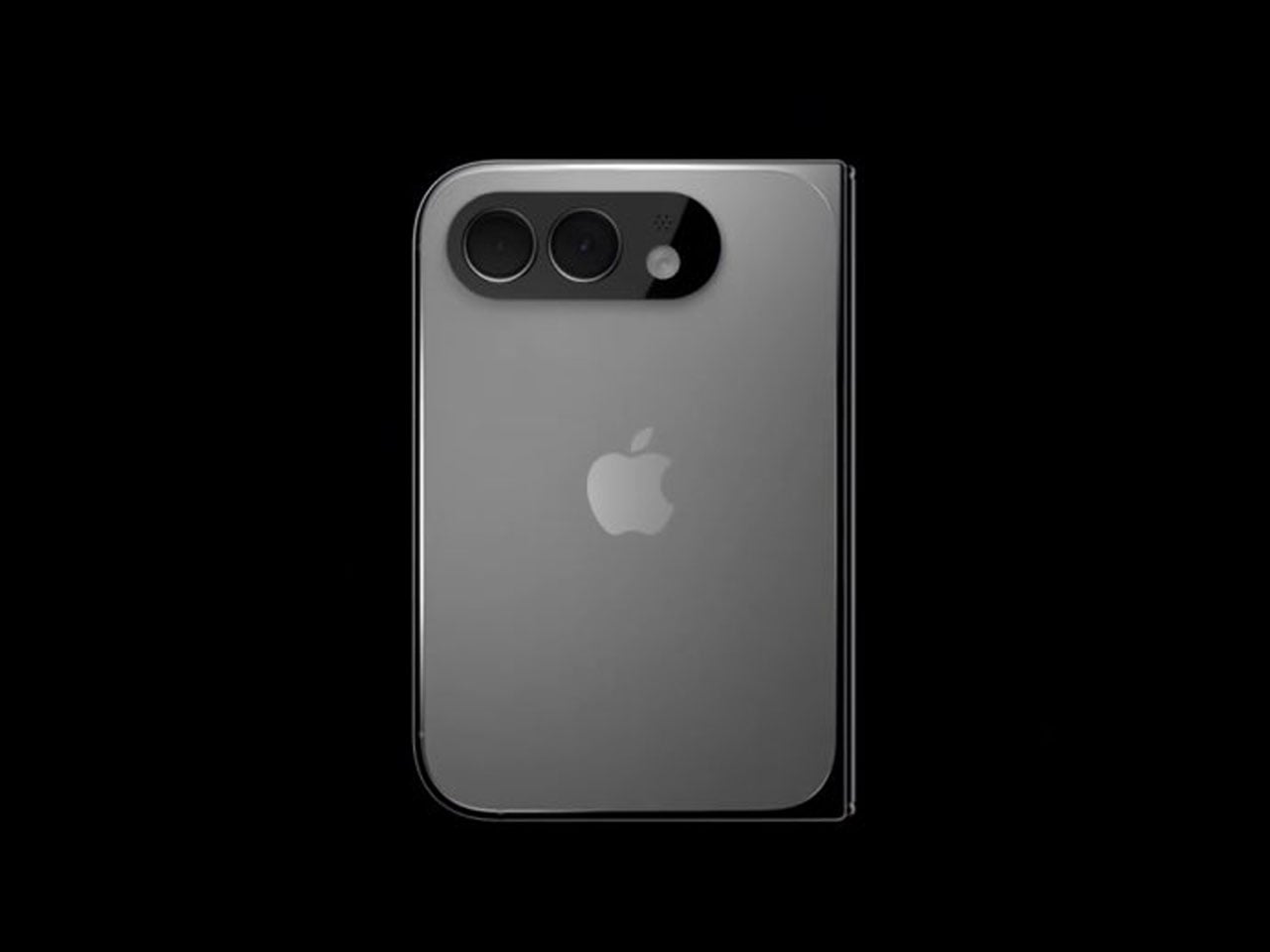
2026 is suggestively the magical year when Apple is expected to launch the foldable iPhone. It has been an unperturbed timeline in almost all the reports we have seen. In the same loop – but without a timeline – a recognized Apple leaker, Majin Bu has shown “actual design of the iPhone Fold” in the latest leaked pictures.
It’s “more beautiful than the previous one,” Bu notes in his update on X, stating that he believes this is “the final design of the future iPhone Fold.” How much context there is in the claim, only time will tell, but Bu has had some correct Apple-related predictions in the past, which suggests he could have some substance to back his claim.
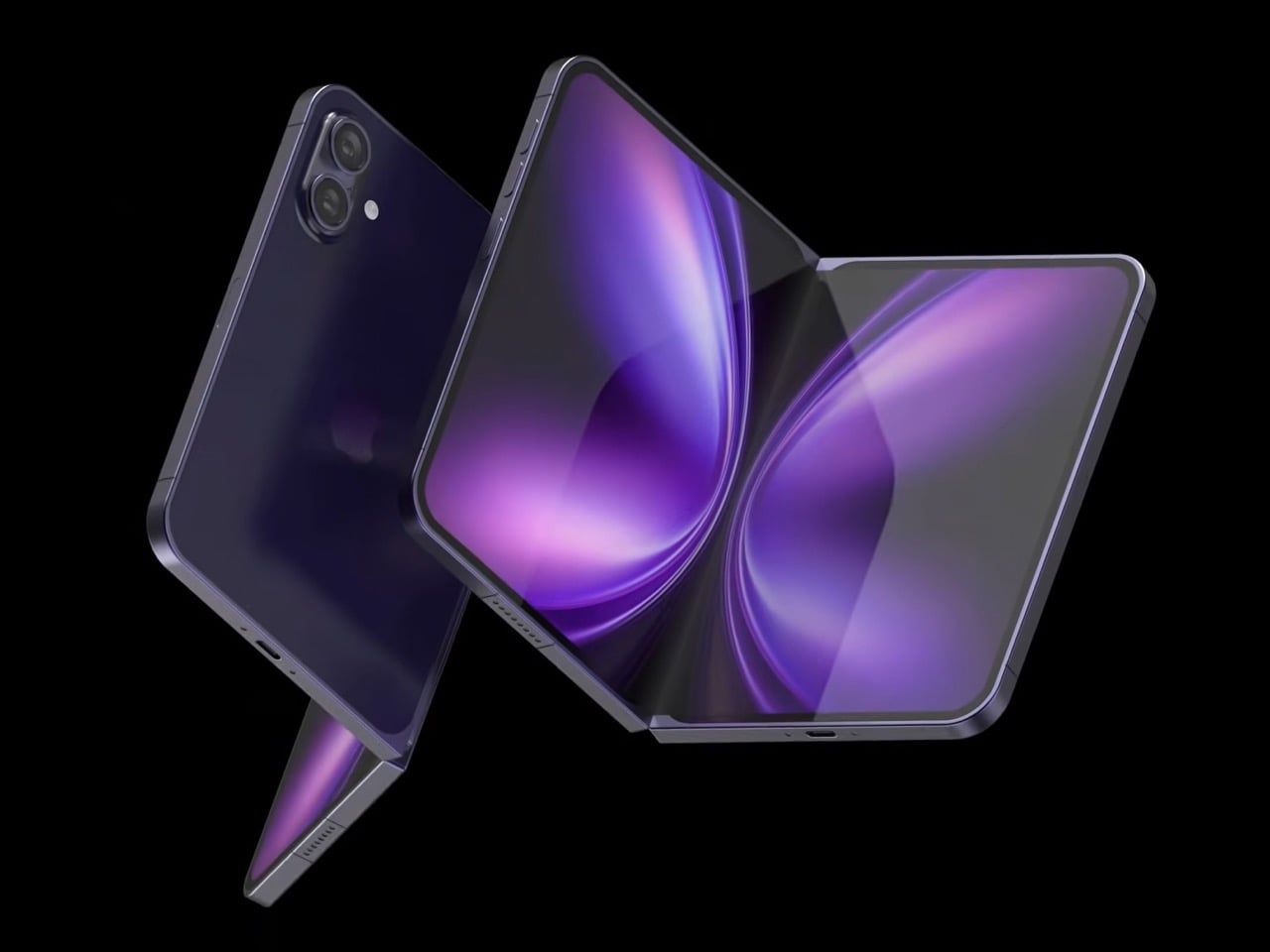
From the leaked pictures, one can visually notice that the camera bump on the back of the foldable device is significantly smaller than that seen in previously rumored designs. The images appear more than renders and supposedly of a prototype, showing the iPhone in a book-style foldable form factor. Appearing to open horizontally to reveal a tablet-like display on the inside.
If the 2026 timeline is to go by – it’s Apple’s golden jubilee year as well – the iPhone Fold should ship alongside the iPhone 18 Pro slated for release in fall this year. But according to a new report from Nikkei Asia, the launch could be delayed. Nikkei reports that Apple has encountered a major setback in the engineering test phase of the foldable iPhone. There have been previously report concerning the foldable display’s crease, but this time, the report notes that the Cupertino giant is facing “more complex engineering challenges than anticipated.” If the issues persist, they could, “in a worst-case scenario,” delay the iPhone Fold launch schedule by some months. It could even mean a postponement until 2027.
Earlier this year, it was rumored that Apple had entered into the manufacturing phase of its first foldable device at Foxconn. New revelations, however, suggest Apple is “notifying” its component suppliers about the possibility of a delay in the “component production schedule for the new foldable iPhone.”
Despite the reports and unauthorized leaks, one thing is definite now. Foldable iPhone – by whatever moniker it comes – is clearly on the horizon. Apple will soon have a competitor for the Samsung Fold and other foldable smartphones on the market. If it is anything like the iPhones that rocked the smartphone world in the late 2000s, the iPhone Fold could repeat that in the late 2020s.
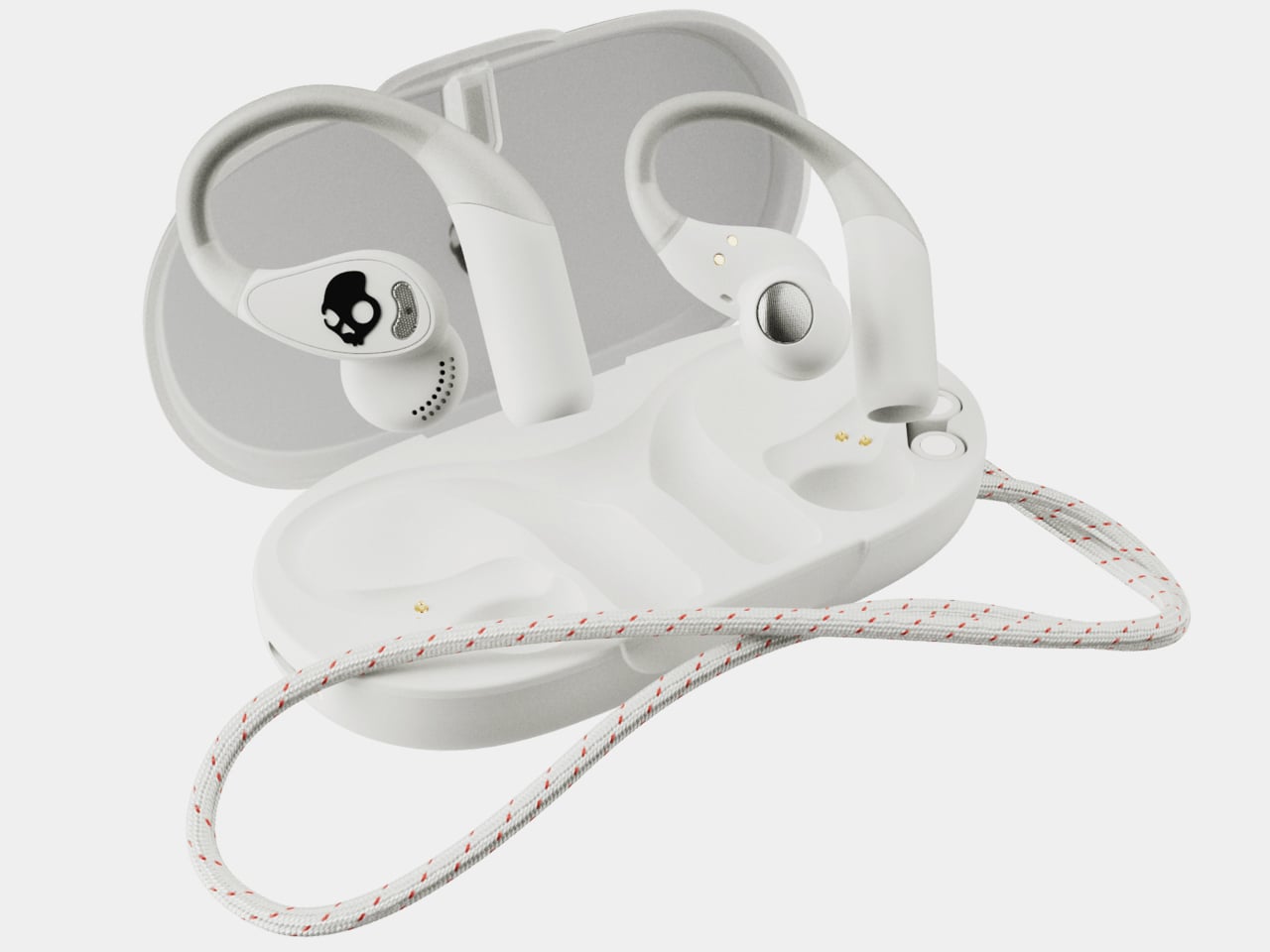
Open-ear earbuds have had a genuine moment over the past year, and it’s easy to understand why. About half of all earbud users have moved toward them, drawn by ambient awareness, ear health, and the comfort of not having anything plugged into their ear canals. The category has grown quickly, and the question now is which designs actually get it right.
The Skullcandy Push 540 Open enters that picture with a clear sense of what’s been bothering people. Thick earhooks that compete with glasses, neckbands that catch on hair and collars, and touch controls that trigger every time headwear grazes the sensor aren’t fringe complaints; they’re consistent ones. Skullcandy took that feedback and built the 540 Open around fixing each of them.
Anyone who has worn open-ear hooks alongside glasses or a hat knows the small but mounting annoyance of too much hardware competing behind the ear. Skullcandy trimmed the earhook thickness based on direct user feedback, and the result is a fit that holds without adding friction to whatever you’re already wearing. It’s the kind of detail you only notice once you stop thinking about it.
The neckband gets the same thoughtful treatment. Unlike rigid or snapping designs found on competing options, Skullcandy’s version drapes naturally, so it won’t fight longer hair or push against a jacket collar. When you pull it off mid-run and don’t have the case on you, the magnetic closure lets it wrap cleanly around your wrist or neck without turning into a tangled nuisance.
Think about what it’s actually like to be deep into a trail run, layered up in a gaiter and hat, headphones that have stayed put the whole time, traffic audible from a distance. That’s the version of open-ear audio the 540 Open is built for. The over-ear hanger keeps things locked in, and the open design keeps the world around you audible.
Battery life is where the 540 Open puts some distance between itself and the competition. At 10 hours per earbud with 32 more in the case, it totals 42 hours, compared to six per earbud for both the Shokz Open Fit Air and JBL Soundgear Sense. The IP44 rating and a 10-minute rapid charge round it out for full days outdoors.
For anyone who trains with a hat on, the ability to disable the touch sensors entirely is a quietly significant option. Most open-ear earbuds don’t offer it. Audio comes from 12mm dynamic drivers, and Bluetooth 5.3 with multipoint pairing means two devices can stay connected at once, so moving between a phone and a laptop mid-workout doesn’t require any extra steps.
At $99.99, it’s $20 less than the Shokz Open Fit Air and $60 less than the JBL Soundgear Sense. What’s more interesting than the price gap is that it doesn’t get there by skimping. Better battery life, a flexible neckband that cooperates with real-world dressing, and comfort details from user feedback aren’t the kind of things that make headlines, but they’re what make the difference on a long day outdoors.
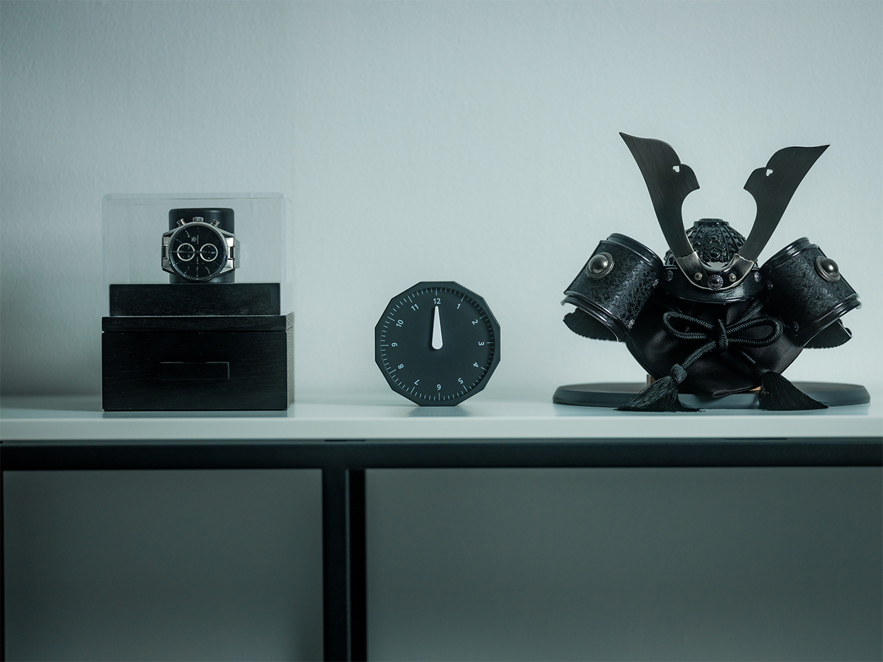
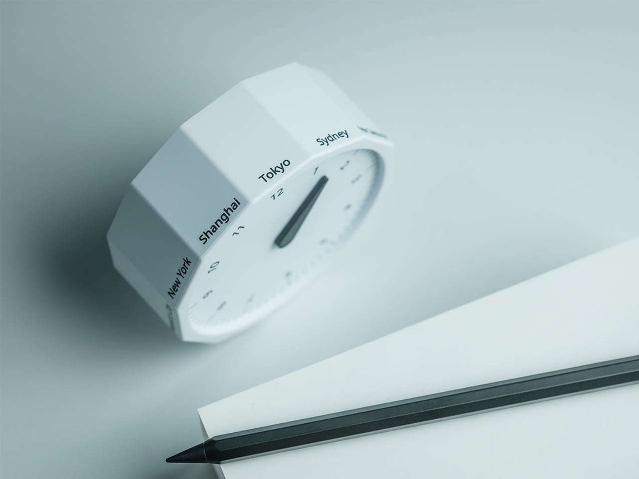
This 12-sided clock turns global timekeeping into a calmer desk ritual
Keeping up with different time zones sounds simple until it becomes part of your everyday routine. You check your phone before a call, open another tab to confirm the hour, do a quick mental calculation, and still second-guess whether it’s too early in Tokyo or too late in New York. Not to forget the perils of push-notifications – a quick check of time leads you down a drain of doom-scrolling that you take an hour to return from! To add a layer of analog convenience in this increasingly digital setup, I present the Rolling World Clock.
Why Traditional World Clocks Never Quite Feel Right
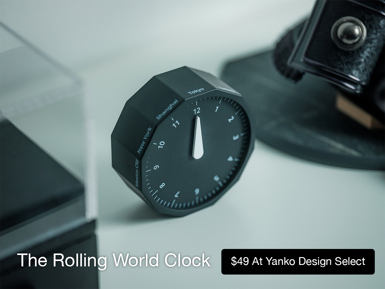
The Rolling World Clock takes a familiar category and gives it a much smarter form. Instead of relying on screens, menus, or a row of tiny city labels, this analog desk object turns world time into a simple physical interaction. Built with 12 sides, each representing a major timezone city, it lets you roll from one location to another and instantly read the local time with a single hand. It’s a cleaner, more tactile answer to a problem that has long been solved in ways that feel unnecessarily digital.
That analog quality is a big part of the appeal. There’s a growing interest in devices that help people step back from constant digital interaction, and this clock fits neatly into that trend without feeling nostalgic for nostalgia’s sake. It still solves a modern problem, especially for people working with global teams or keeping in touch with friends and family abroad, but it does so in a way that feels grounded and human. You’re not swiping, tapping, or toggling between screens. You’re just rolling the object in your hand and reading the time.
Built for modern routines, expressed through simple interactions.
The city lineup also makes it genuinely useful. The 12 sides cover major global time zones, including London, Paris, Cape Town, Moscow, Los Angeles, Karachi, Mexico City, New York, Shanghai, Tokyo, Sydney, and New Caledonia. That gives it enough range to be practical for a wide variety of work and lifestyle needs, whether you’re coordinating meetings, planning travel, or just trying not to message someone at the wrong hour.
Built for a More Intentional Desk
For the desk setup fanatics, there’s also a strong aesthetic argument here. The Rolling World Clock is available in black and white, two finishes that make it easy to integrate into a modern desk setup without fighting for attention. It has the kind of understated presence that works especially well for young professionals who want their workspace to feel differentiated without becoming visually noisy. It’s functional, yes, but it also reads as a design object, the sort of piece that quietly signals taste.
Clean lines, one hand, no distractions.
That balance of utility and personality is what makes this more than a novelty. If you work across cities, collaborate with clients in different regions, or simply like the idea of keeping global time visible without adding another glowing screen to your day, this clock makes a strong case for itself. It taps into a broader shift toward analog tools that feel slower, more deliberate, and more human, while still solving a very modern problem.
Feels as good in the hand as it looks on the desk.
Why It’s Worth Picking Up Now
At $49, the Rolling World Clock lands in a sweet spot for a desk upgrade that feels distinctive without being overcommitted. It also has the kind of giftable appeal that comes from being both useful and conversation-worthy. And with only a few left, it carries just enough urgency to make hesitation a risky move.
If your desk could use an object that feels smarter, calmer, and more intentional than another digital widget, the Rolling World Clock is worth grabbing now. It’s currently available in the Yanko Design Shop in black and white, and with limited stock remaining, this is one of those rare functional design pieces you probably shouldn’t wait on.
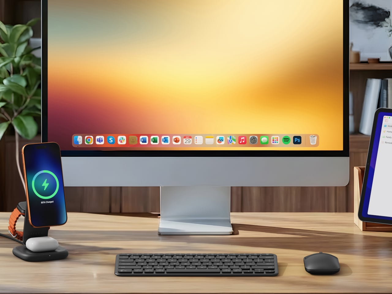
Wireless charging was supposed to simplify things. Instead, most Apple users end up with a tangle of pads and cables on the nightstand, one for the iPhone, another for the Apple Watch, and a separate spot for the AirPods. The technology meant to reduce friction has become its own kind of mess, especially for anyone who’s ever scrambled for a Watch charger before a morning flight.
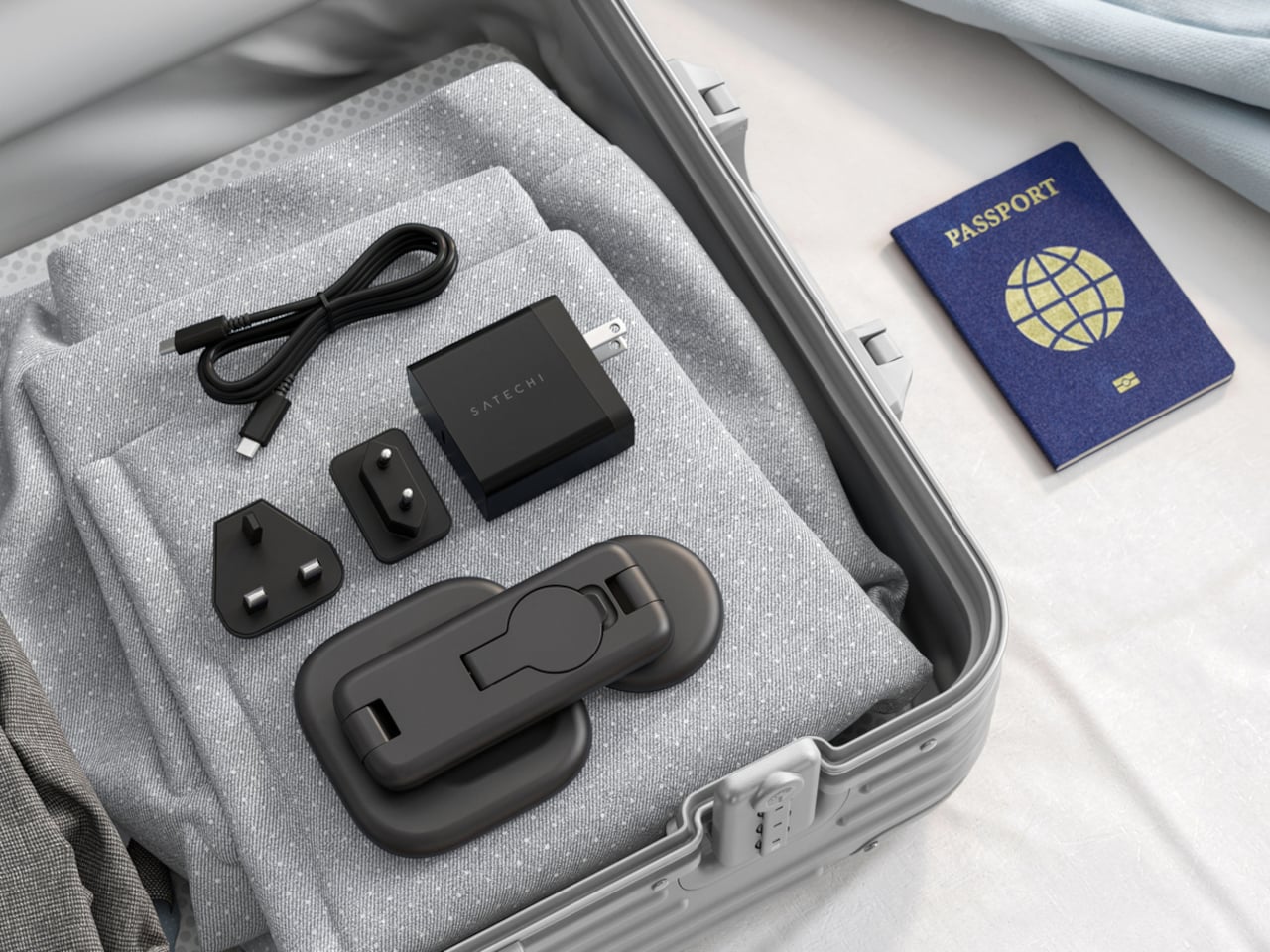
Satechi’s 3-in-1 Foldable Wireless Charging Stand with Qi2 25W takes aim at that problem. The San Diego brand has updated its best-selling foldable charger with a meaningful upgrade, bumping wireless power delivery for compatible iPhones to 25W, a notable jump from the 15W ceiling most MagSafe-compatible pads have been stuck at. It’s built as a proper desktop stand, not just something you tolerate next to the lamp.
Set the phone down on the magnetic charging surface, and Qi2’s built-in alignment snaps it into position so you don’t lose power from an off-center placement. The Apple Watch sits at a comfortable angle on its dedicated fast-charge module, while the AirPods rest on their own pad below. All three charge simultaneously from a single cable going to the wall, with nothing to juggle.
Apple Watch fast charging requires MFi certification, and Satechi has that covered. The stand supports Series 7 and newer, including Ultra and SE models. Advanced safety protections manage heat and prevent power loss when all three pads are active at once. The magnetic surface on the phone pad also ensures it stays correctly positioned even if you accidentally nudge it during the night.
Then there’s the folding design, which is where the stand earns its keep as a travel companion. It collapses into a flat form that fits easily in a carry-on without much bulk, then unfolds into the same stable stand you’re used to at home. There’s no need to rethink your charging setup just because you’ve checked into a different room across town or across the world.
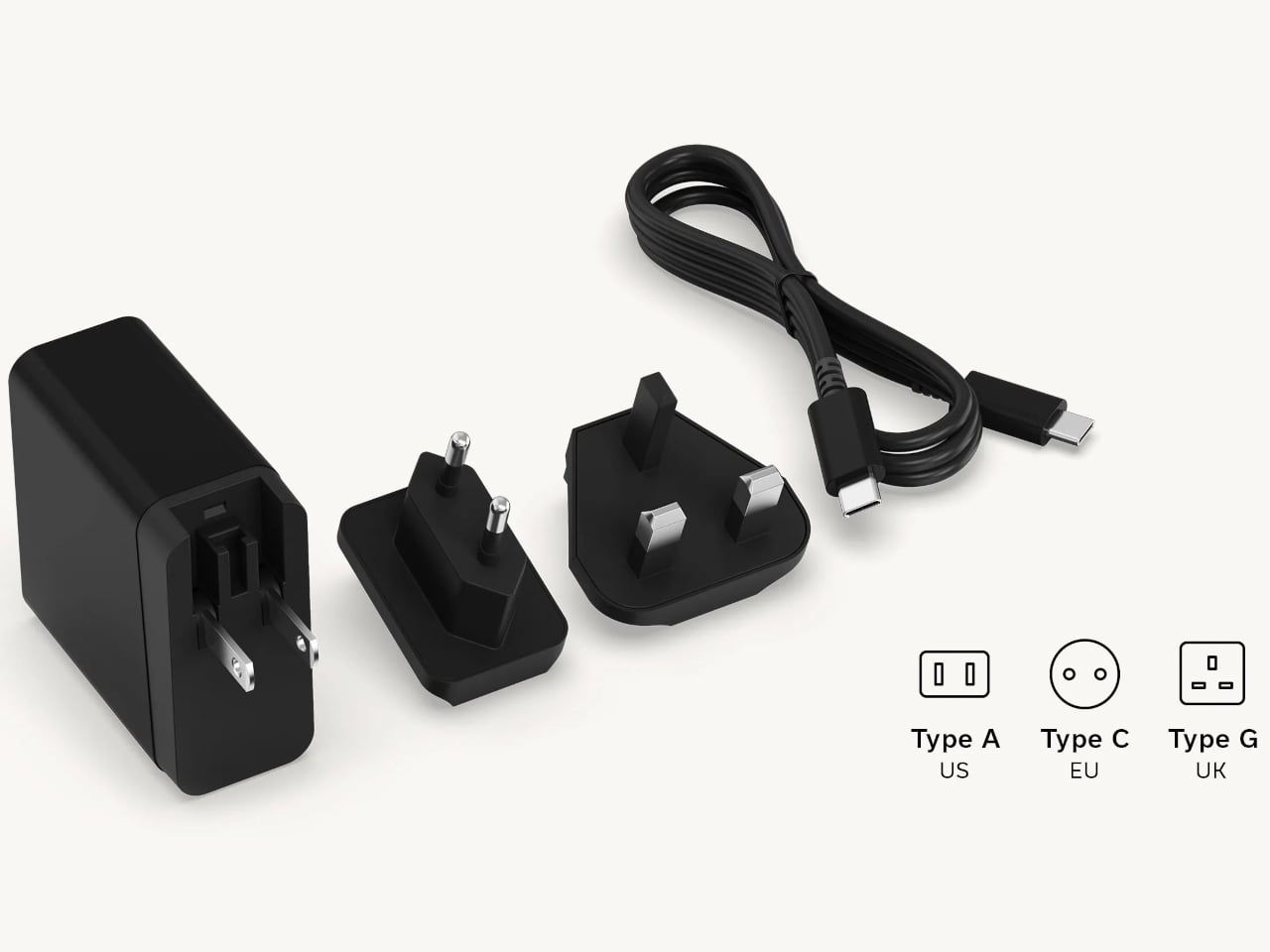
Satechi also includes a 45W USB-C power adapter in the box, which sounds like a minor detail until you’re unpacking in a foreign hotel room. The adapter ships with US, EU, and UK plug attachments, meaning it works across different countries without needing a separate travel adapter. That’s a small but thoughtful decision for anyone whose travels take them to multiple regions throughout the year.
Available now on Satechi.com and Amazon, the stand retails for $129.99 in Space Black. It’s a higher investment than a single-device pad, but consolidating three separate chargers into one that travels as well as it sits on a desk makes that gap easier to justify. For Apple ecosystem users tired of the cable pile next to the bed, this stand offers a much cleaner end to every day.
Budget smartphones have always played the same game of compromises. You get 5G connectivity but lose camera quality, or you get a fast screen but sacrifice battery life. As affordable phones adopt faster network speeds, keeping up with 5G’s energy demands has become one of the biggest challenges for manufacturers trying to keep costs down without leaving users hunting for an outlet before noon.
Realme’s answer to that is the C100 5G, a phone that doesn’t shy away from its budget origins but tries to get the fundamentals right. Built around the energy demands of a full-time 5G device, it leads with a 7,000mAh battery, backed by 45W SuperVOOC fast charging, a capable processor, and a 6.8-inch display that refreshes faster than most phones twice its price.
Designer: realme
Imagine the kind of day that drains most smartphones by mid-afternoon. You’re streaming music during your commute, navigating with GPS through unfamiliar streets, and then spending the evening on video calls or catching up on a show. Realme claims the C100 5G can handle nearly 20 hours of continuous video playback and over 18 hours of GPS navigation before needing a recharge.
When you do eventually need to plug in, the 45W fast charging takes care of the battery fairly quickly. There’s also 6.5W reverse wired charging built in, meaning the phone can act as a power bank for other devices when you’re away from an outlet. It also supports bypass charging, which helps reduce battery strain during extended gaming or heavy usage sessions.
Under the hood is MediaTek’s Dimensity 6300, a 6nm chip that handles 5G connectivity and everyday multitasking without much fuss. The display runs at up to 144Hz, which is genuinely rare at this price point, making scrolling and casual gaming feel noticeably smoother. It peaks at 900 nits of brightness and covers 83% of the NTSC color gamut, holding up decently outdoors.
The rear camera centers on a 50MP main sensor with an f/1.8 aperture and autofocus, capable of solid daylight photography, while the 5MP front camera handles selfies and video calls without complaint. The phone comes in two colors, Blooming Purple with a floral-patterned back and Sprouting Green, both with a matte frame and a squared-off silhouette measuring about 8.88mm thick.
Durability is also factored in, with an IP64 rating for dust and water splash resistance and a claim of 360-degree drop protection with military-grade certification. Running Realme UI 7.0 based on Android 16, the phone also supports external memory cards for additional storage. In Thailand, pricing starts at THB 6,999 (around $215) for 4GB/128GB and THB 7,499 (around $230) for 6GB/128GB.
For a budget phone, the C100 5G makes an interesting case by not competing on camera specs or premium materials, but on the one thing most users are tired of compromising on. Not everyone needs the sharpest sensor or the fastest chipset, but nearly everyone has panicked at a single-digit battery percentage at some point, and Realme clearly knows exactly who it’s building this for.
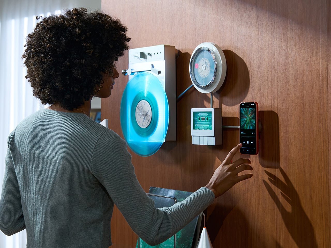
Minimalism in product design has gotten boring. We’re swimming in smooth white rectangles, touch controls that offer zero feedback, and devices designed to vanish. Apple spent two decades training the industry to sand away every visible seam, and now we live in a world where a Bluetooth speaker looks like a cylinder because a cylinder offends nobody. Bang & Olufsen understood early that audio equipment could occupy space like sculpture, could earn its place in a room through presence instead of absence. Teenage Engineering proved that mechanical honesty and playful geometry could coexist with premium materials. Both approaches work because they have a point of view.
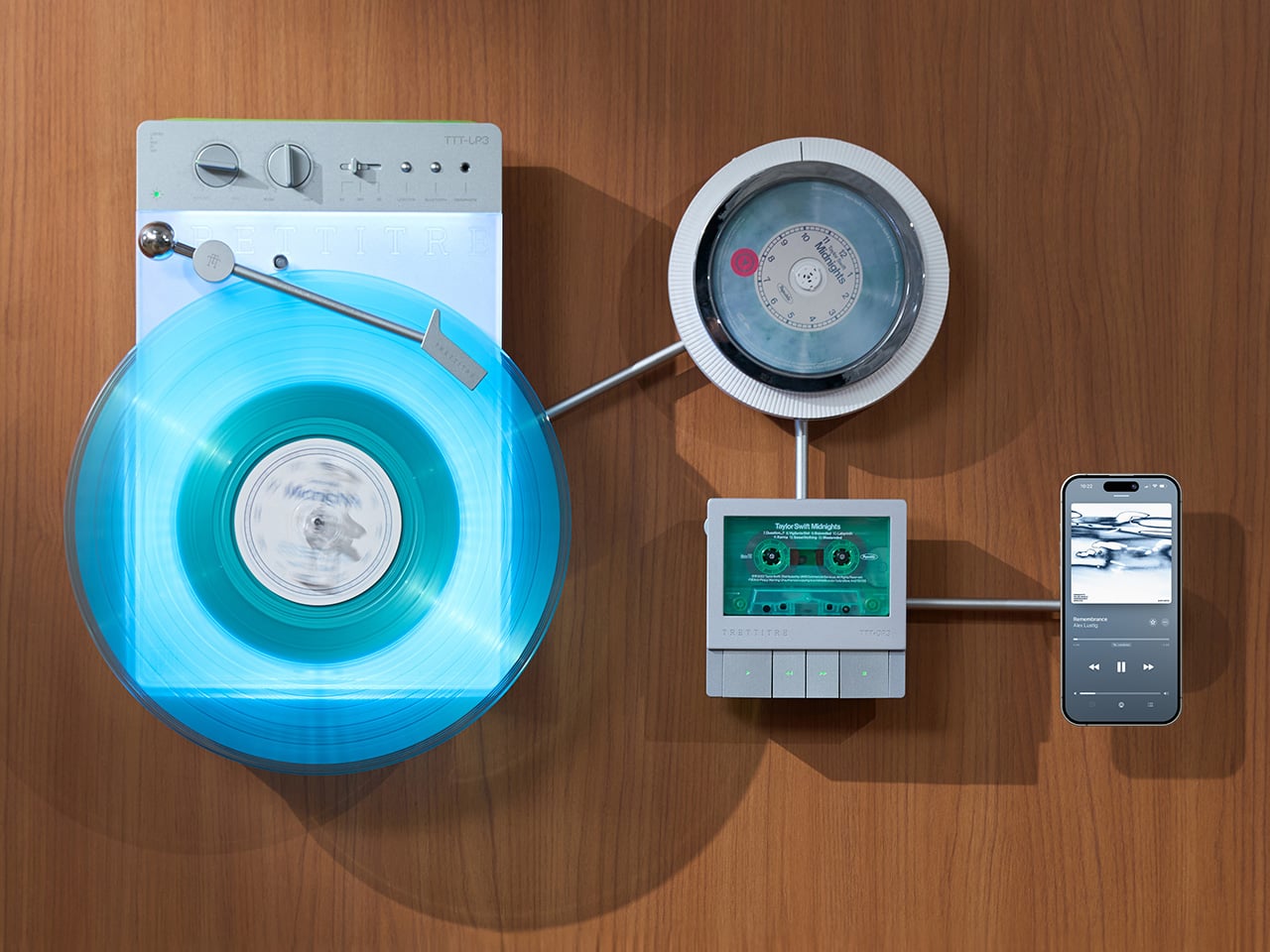
TRETTITRE’s TTT series combines those instincts into something harder to categorize. The TTT-LP3 wireless vinyl player uses CNC-machined aluminum for the main frame and features a diffused lighting panel that spreads light evenly across the surface when music plays. The TTT-DP3 Bluetooth CD player takes inspiration from a UFO-like form with a transparent magnetic cover that rotates open to reveal the spinning disc. The TTT-CP3 cassette player uses a metal housing with sharp geometric lines and mechanical transport keys that deliver clear physical response. All three mount on the TTT-W magnetic modular wall rack, turning physical media playback into a visible, functional part of interior design.
TTT-LP3: A Vinyl Player That Doubles as Ambient Light
The back of the LP3 includes a hidden mounting structure that allows it to hang directly on a wall. You can mount it vertically so the record becomes part of the visual display, or go for the classic horizontal layout. When you want to move it, you lift the silicone leather handle at the top and take it down. The player detaches easily and gives you the freedom to listen wherever you choose. Traditional turntables usually stay exactly where you put them, limiting your options for when and where you listen. The LP3 works a little differently because of the battery and the wall mount’s wireless charging system, which keeps it powered without a visible cable.
Behind the LP3 sits a diffused lighting panel that spreads light evenly across the surface of the unit. When it’s on, the entire body of the player glows softly, designed to feel closer to ambient lighting than decorative lighting. You can change the lighting effects with the touch of a button. When a record spins, the moving shadows create a quiet visual effect. You can also leave the player mounted on the wall as a soft light source even when no music is playing. That ambient quality pushes the LP3 from well-designed product into something more considered: a slow, breathing light fixture that happens to play records.
The LP3 uses a self-balancing tonearm system that automatically sets the correct pressure when the player powers on. You place the record on the platter and lower the needle, and the system handles the rest. Many turntables require careful calibration before they can be used properly, with tonearm balance, tracking pressure, and counterweight adjustment all part of the process. For experienced collectors that process can be enjoyable, but for beginners it often feels complicated. The LP3 removes that barrier entirely while preserving the tactile experience people enjoy. The player supports both 33 RPM and 45 RPM records, and includes a manual control dial that allows small adjustments to playback speed (roughly ±0.5%), useful for older records that may not spin perfectly at their original speed anymore.
Wireless audio is handled through Qualcomm Bluetooth v5.3 with SBC, aptX, aptX HD, and aptX Adaptive, which allows higher-quality and lower-latency wireless audio than basic Bluetooth streaming. For wired setups, the player also includes a 3.5mm audio output. The built-in battery provides up to 6 hours of vinyl playback or up to 3 hours when used purely as an ambient light source. Full specs: dimensions 342×233×87mm, weight 1430g, Audio-Technica AT3600L moving magnet stereo cartridge, CNC-machined aluminum frame with silicone leather carrying strap. The LP3 arrives in June 2026 for Early Bird backers, May 2026 for Fast Delivery backers.
TTT-DP3: Giving the Compact Disc Its Aura Back
The DP3 keeps the reliability of CDs but gives the player a different visual presence. The design takes inspiration from a UFO-like form with a transparent magnetic cover. When the cover rotates open, the disc is partially visible as it spins, turning something simple into a small visual moment. A CD player shaped like a flying saucer with a rotating transparent lid is an audacious idea, and it works because it doesn’t try to evoke nostalgia. It reframes a CD player as a mechanical object of curiosity, something you watch as much as use.
The control buttons include raised tactile dots combined with a gold-embossed finish, making it easy to identify the buttons by touch alone. You can pause or skip tracks without needing to look down at the player. A small OLED display on the player shows track numbers, playback status, and battery level. The interface is intentionally simple so the information you need is visible immediately. A built-in battery allows the DP3 to run for several hours on its own, so you can move it from room to room, bring it to a small gathering, or take it while traveling. Full specs: Ø170×27mm, 324g, supports CD-DA and HDCD formats, Bluetooth 5.4, SNR >70dB, THD <3%, ABS+PC+Metal construction. The DP3 ships in May 2026.
TTT-CP3: Cassette Hardware for Modern Audio Setups
The CP3 keeps the tactile mechanical elements people associate with tapes while updating the electronics inside. The player uses a metal housing with sharp geometric lines that give it a distinctly industrial appearance. Instead of trying to imitate retro plastic designs, the CP3 leans into a more modern interpretation of cassette hardware. The playback controls use independent mechanical keys similar to piano keys. Each press has a clear physical response. Play, rewind, and stop feel deliberate instead of soft or mushy.
Inside the CP3 sits a Bluetooth module that allows cassette audio to stream wirelessly to speakers or headphones. The player decodes analog audio signals with high precision, helping reduce background noise and preserve more detail from the original recording. The result still sounds like cassette tape, but with greater clarity. Full specs: 122×120×32mm, 360g, supports Type I-IV cassette cartridges, Bluetooth 5.4, SNR ≥55dB, THD <3.5%, Metal+PC+ABS construction. The CP3 ships in May 2026.
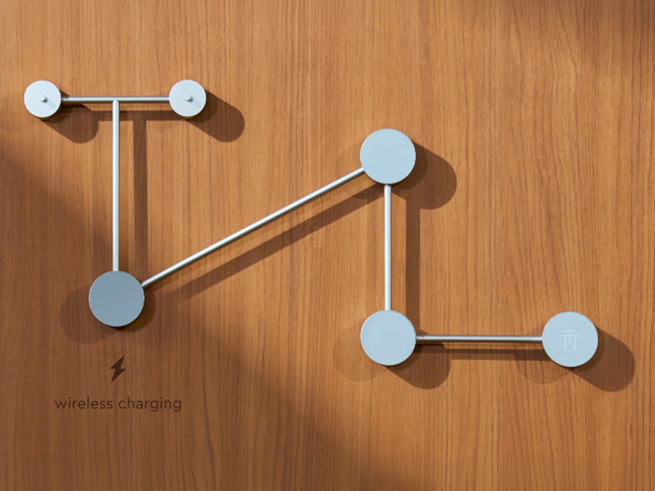
When Storage Becomes Part of the Spectacle
The TTT-W Magnetic Modular Wall Rack uses an all-metal geometric structure that allows multiple TTT players to be arranged into a clean wall display while keeping them organized and ready to use. The rack integrates magnetic alignment and wireless charging for the vinyl player, so the LP3 can stay powered without visible cables while being part of the room’s design. Two configurations are available: a T-shaped rack (263×196×27mm, 300g) and a magnetic modular wall rack (612×302×27mm, 775g, combined style T+3). Both support wireless charging at 5-10W and use USB-C 5V 2A input.
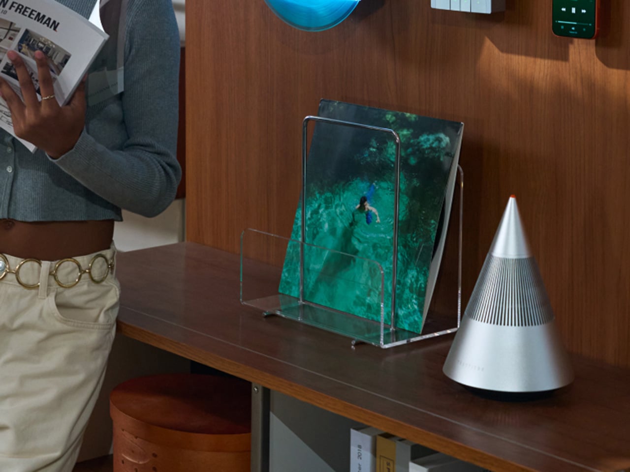
The Supporting Cast, from Sculptural Speakers to Planar IEMs
TRETTITRE offers a range of add-ons designed to complement the TTT system. The TreSound1 Speaker arrives in concrete and wooden editions, delivering 2×30W + 1×60W output power with a 1″ tweeter, 2.75″ mid-range, and 5.25″ subwoofer for 30Hz-25KHz frequency response. The conical speaker features 360° surround sound, Bluetooth 5.2 with Qualcomm aptX HD, and a sculptural form that occupies space like a piece of furniture. The TreSound Mini is a portable Bluetooth speaker with a 5200mAh battery, 30W RMS output, and 360° surround sound. The TTT-E3 in-ear headphones use a 13mm planar magnetic driver with a 4-strand silver-copper hybrid conductor, available in 3.5mm and 4.4mm configurations. An aluminum alloy side table (300×300×750mm, 1.75kg, max load 50kg) rounds out the ecosystem.
What It Costs to Build the Setup, and When It Ships
The TTT-LP3 wireless vinyl player is available at $229 for Early Bird backers (June 2026 delivery), down from a planned $449 MSRP. The TTT-DP3 Bluetooth CD player is priced at $79 standalone ($179 MSRP), while the TTT-CP3 cassette player is also $79 standalone ($199 MSRP). If you’re a bonafide audiophile, a $399 bundle gets you all three devices. Optional add-ons include the TreSound Mini Bluetooth Speaker at $169 ($299 MSRP), TreSound1 Wooden Edition at $449 ($659 MSRP), TreSound1 Concrete Edition at $499 ($799 MSRP), TTT-E3 planar IEMs at $139 ($239 MSRP), and the TTT Side Table at $89 ($199 MSRP). The campaign runs through April 9, 2026, with worldwide delivery beginning May 15, 2026.
Double-sided wall clocks are not new. They have existed for decades, quietly moving between public and private spaces. While many people associate them with railway stations and institutional corridors across Europe, they also made their way into homes in earlier times, often as decorative yet functional pieces in hallways or larger living spaces. Over time, however, they faded out of domestic interiors, replaced by flatter, more minimal wall clocks designed to sit quietly against a surface.
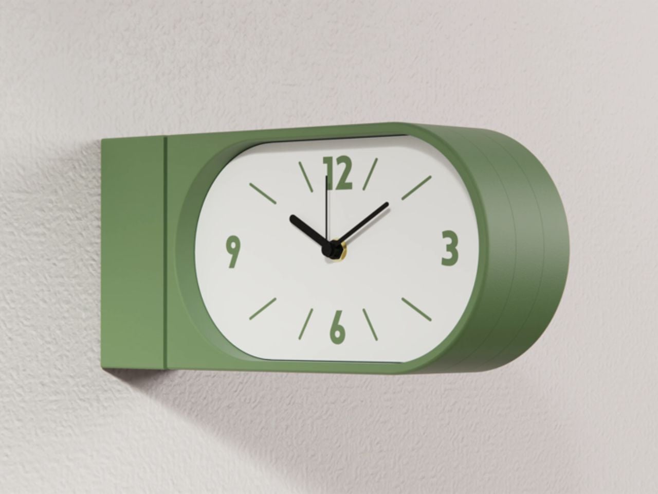
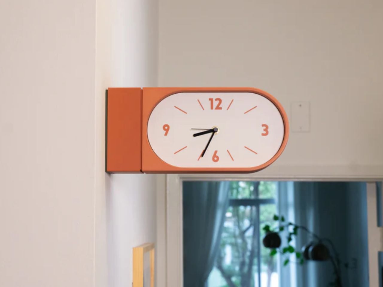
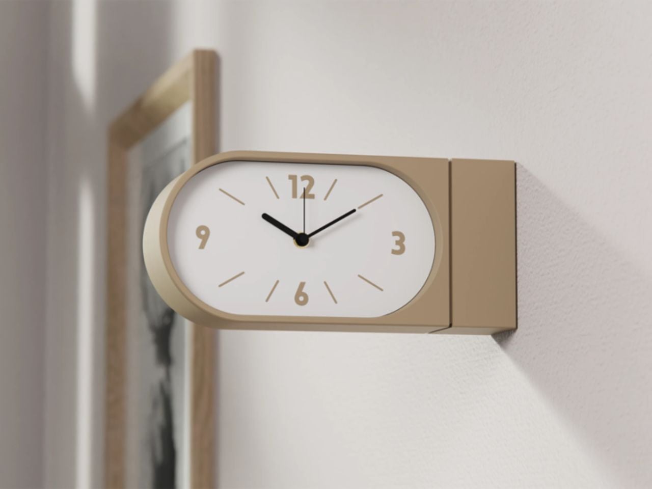
Turin-based brand Goofball is bringing this format back, but with a distinctly modern lens. Their Perch clock does not just revive an old idea; it reframes it for how we live today.
At first glance, the concept feels familiar. A clock that extends out from the wall, visible from both sides. But in a home setting, this simple shift changes everything. Instead of being something you look at from one fixed position, the clock becomes part of how you move through a space. Whether you are walking into a room, passing through a corridor, or glancing back as you leave, time is always within sight. It feels less like an object placed on a wall and more like something integrated into the rhythm of the room.
The functional decisions are just as thoughtful. The clock runs on two AA batteries, which means there is no need for wiring or complicated installation. It hangs on a bracket and can be easily lifted off when the batteries need to be changed. It is the kind of detail that you might not notice immediately, but it makes living with the product feel effortless.
Visually, the Perch clock embraces minimalism in a way that feels warm rather than clinical. It comes in three colors, allowing it to blend into different interiors while still holding its own presence. The design is clean and restrained, making it suitable for contemporary homes, yet it carries a quiet reference to its past. There is something unmistakably reminiscent of old railway clocks, those objects that once defined shared notions of time and movement.
That sense of nostalgia is part of its charm. It brings a subtle character into a space without feeling overly decorative. It introduces depth to a wall, quite literally, and creates a small moment of curiosity. Guests notice it. People interact with it differently. It becomes a conversation piece without trying too hard.
What makes this product particularly compelling is how it challenges a default assumption. We have grown used to thinking of wall clocks as flat, one-directional objects. This design questions the norm and reminds us that even the most familiar objects can be reimagined.
The response so far reflects this shift in perspective. The first batch sold out quickly, suggesting that people are ready for products that feel both nostalgic and new at the same time. Goofball is currently preparing the second batch, expected to be available in the coming weeks.
In the end, this clock is more than just a timekeeping device. It is a small but meaningful intervention in how we experience space. It takes something we already know, brings back its forgotten domestic presence, and gives it a contemporary voice. It does not just sit on a wall. It changes how the wall and the room around it are perceived.
Spending hours in front of a glowing screen is unavoidable for most people, and the toll it takes on the eyes is a problem the monitor industry hasn’t truly solved. E Ink displays offer a gentler, paper-like alternative that’s far easier to stare at for long stretches, but most of them are painfully slow, limited in resolution, and not really up to the demands of daily computing.
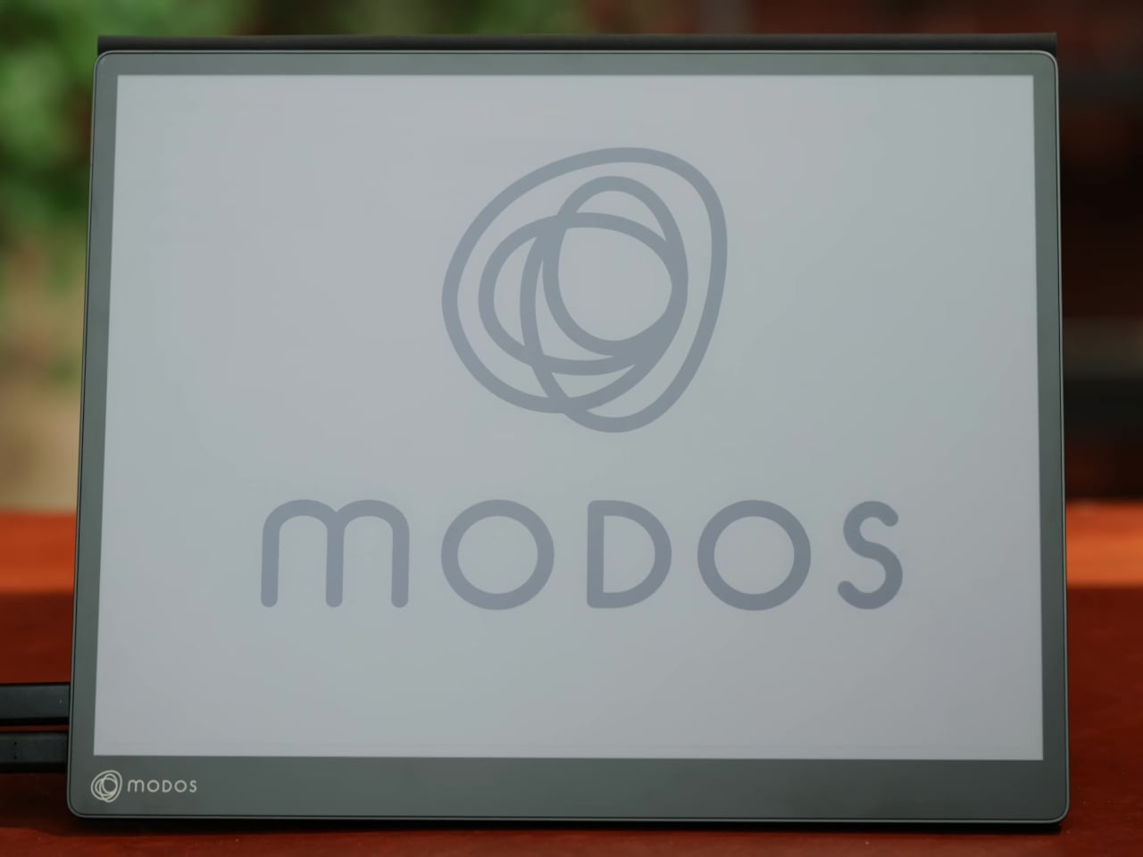
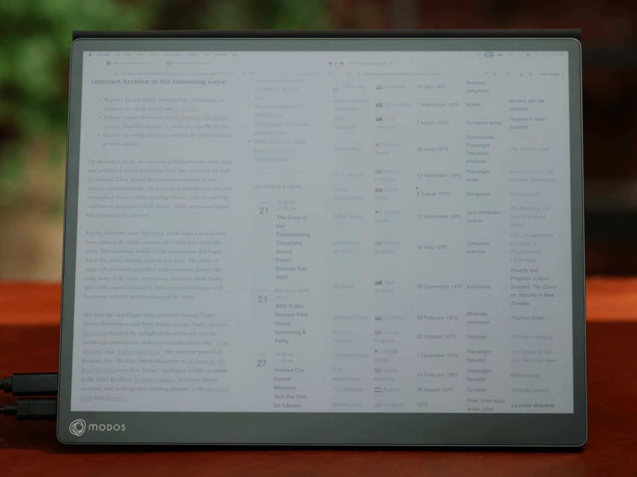
The Modos Flow is Modos Tech’s answer to that problem. Built by a Boston-based hardware startup, it’s a 13.3-inch E Ink portable monitor designed not just for casual reading but for all-day, focused work. It targets the kind of person who needs a real secondary screen but wants to spend less time squinting and more time actually getting things done.
Most E Ink monitors struggle as daily drivers because of their refresh rate. Traditional panels tend to crawl, making anything beyond static document reading a frustrating experience. The Modos Flow uses a custom board with open-source firmware to push its display to 60 Hz, enough to scroll through pages, type without noticeable lag, and use the screen as a functional everyday monitor rather than a glorified e-reader.
Resolution is also where the Modos Flow separates itself. In black-and-white mode, it renders at 3,200 x 2,400 pixels with a pixel density of 300 PPI, making text crisp enough to satisfy anyone used to retina-grade displays. Color mode brings the resolution down to 1,600 x 1,200 pixels at 150 PPI, which is a fair trade given how rarely E Ink panels offer color at all.
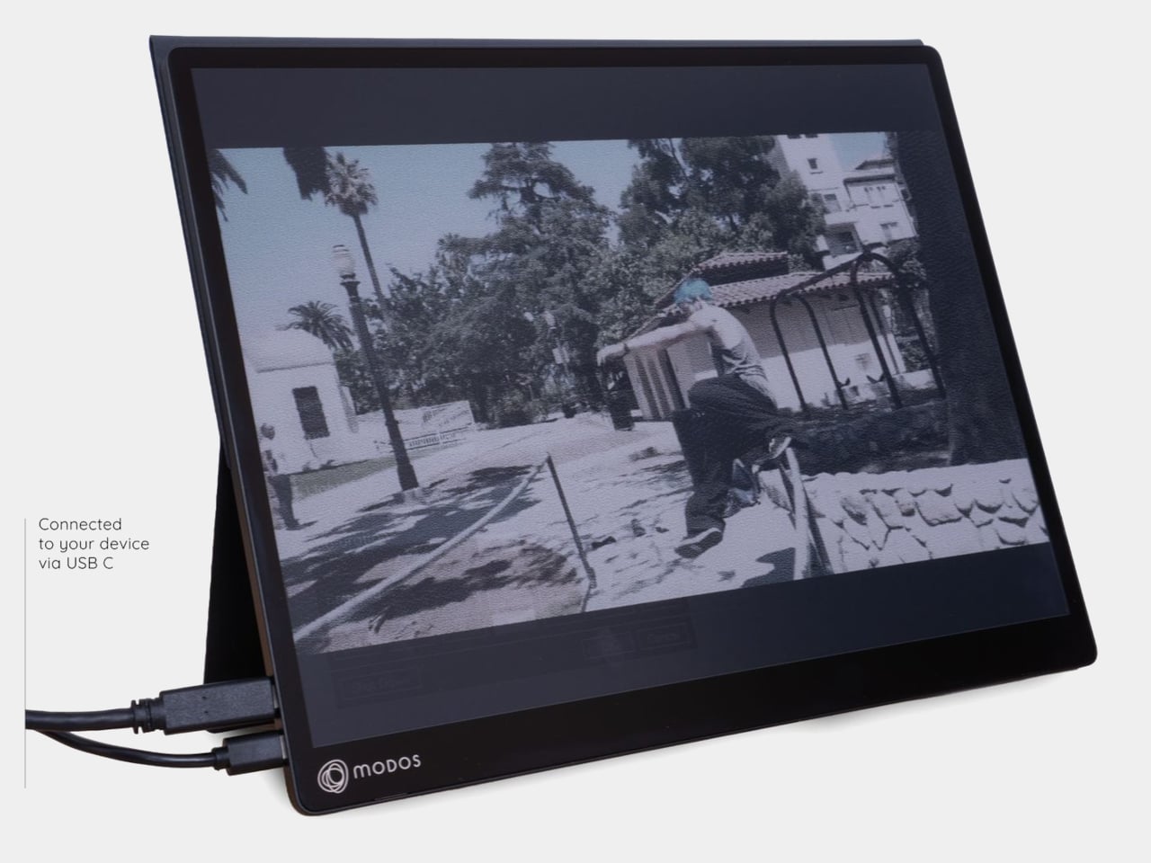
Touch and stylus support round out what’s becoming a surprisingly versatile display. Modos brought the latency down to under 100ms, so annotating a document, sketching ideas, or jotting notes with a stylus actually responds the way you’d want it to. It won’t replace a dedicated drawing tablet, but for someone who routinely works between a laptop and a secondary screen, having that input option without swapping devices is genuinely useful.
Its physical design is straightforward and practical. A built-in cover doubles as a stand and folds flat for travel, while VESA mounting holes on the back make it easy to attach to a monitor arm or desk mount. Three side buttons let you adjust brightness, contrast, and display mode without touching your computer. Connectivity runs through USB-C with DisplayPort Alt-Mode support, which keeps the setup clean with a single cable.
One of the quieter advantages of E Ink over LCD or OLED is power consumption, and that matters here. When connected to a laptop via USB-C, the Modos Flow draws significantly less power than a conventional secondary monitor, meaning your battery isn’t taking nearly the hit it normally would. It works with Windows, macOS, and Linux out of the box, so there’s no particular setup hurdle to clear. Pricing hasn’t been confirmed yet, but Modos has indicated it should be comparable to other portable monitors.
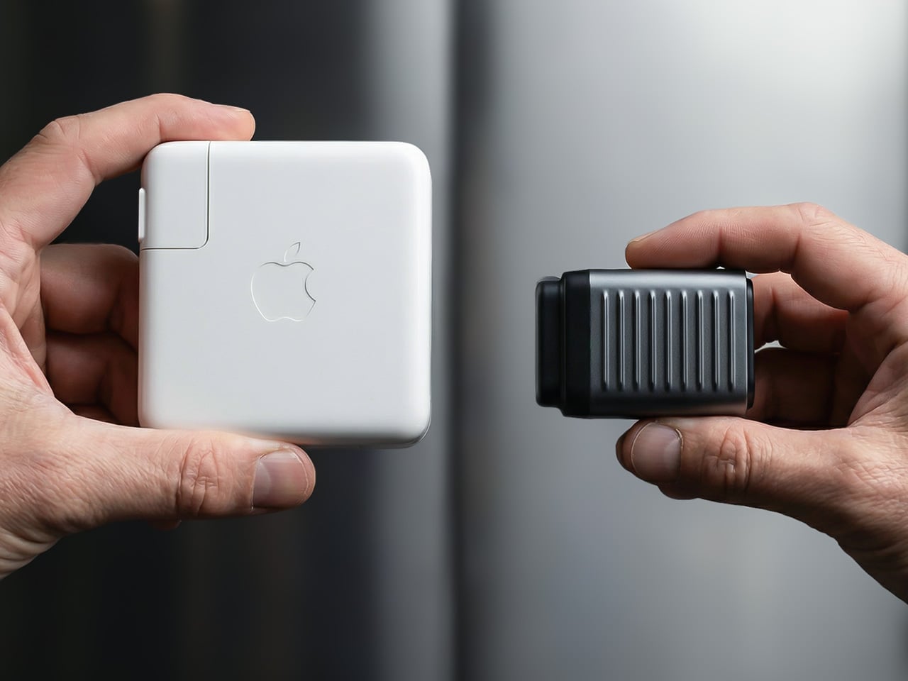
There’s a reason it’s called a charging ‘brick’. It charges, and it’s honestly brick-shaped. Laptops and phones have gotten thinner in the past decade, but their chargers honestly haven’t. GaN technology changes that. I’ve sung praise for GaN chargers in the past, and I swear by the one in my laptop bag right now, which replaces 4 different chargers while being the size of a hockey puck. Now Rolling Square’s gone and made the GaN charger even smaller.
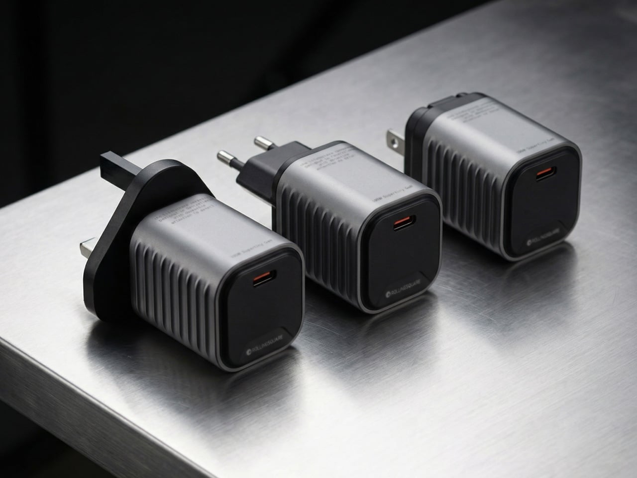
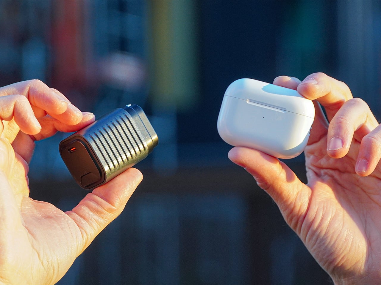
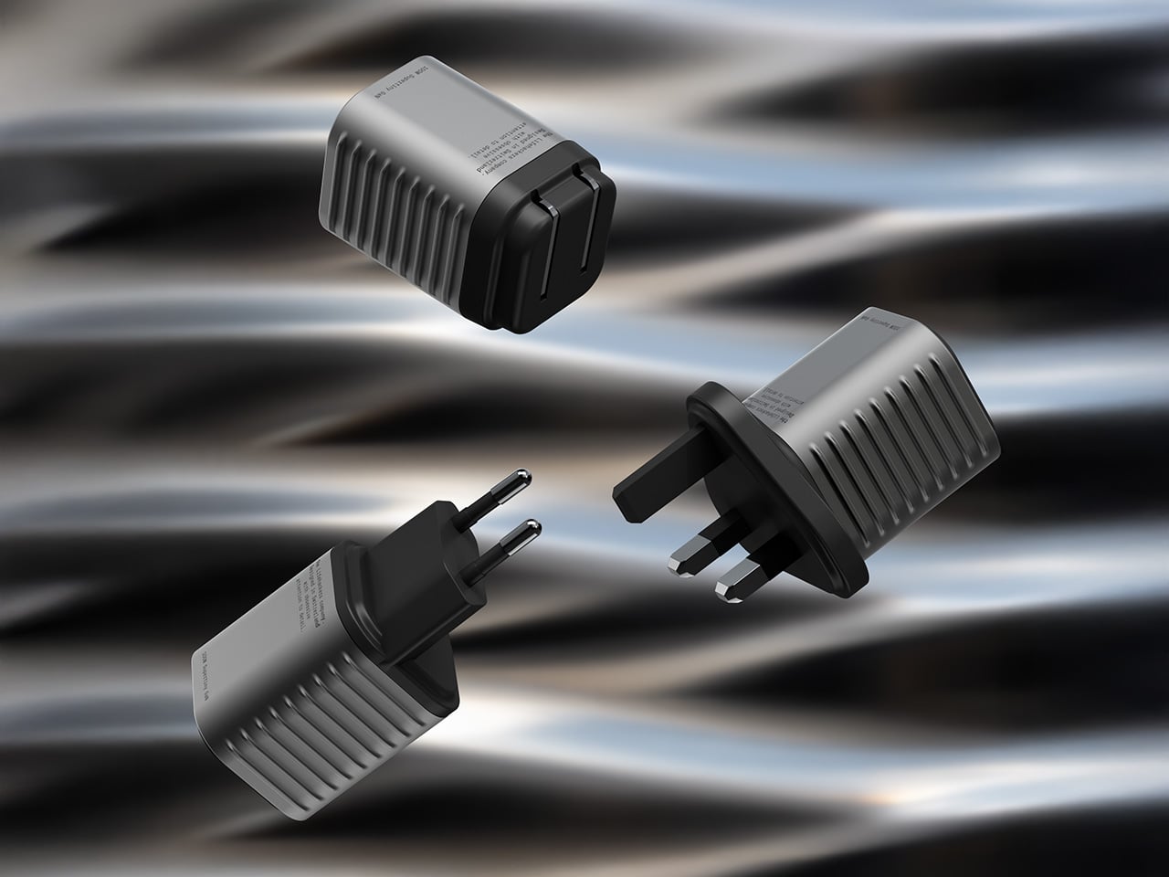
Holding the title of the world’s smallest 100W charger, the aptly named Supertiny is 65% smaller than Apple’s 96W charging brick, but packs enough power to fast-charge your laptop without breaking a sweat. At just 2 inches long and 1.38 inches wide, the Supertiny is as small as your Airpods case, fitting in your palm or even your pocket. It comes in three global plug formats (US with foldable prongs, EU, and UK), weighs between 100 and 115 grams depending on the variant, and packs a single USB-C port to supercharge your laptop. But pair it with Rolling Square’s inCharge Life 2in1 cable and you can now fast-charge your laptop as well as your phone together.
Gallium Nitride has been around since the 1990s, first used in LEDs and satellite solar cells, but it took decades for the tech to migrate into consumer charging. The advantage is straightforward: GaN produces significantly less heat than traditional silicon, which means you can push more power through a smaller chipset without needing massive heat sinks or bulky casings to prevent thermal meltdown. Silicon-based chargers lose a chunk of energy as heat, which is why your old laptop brick could double as a hand warmer after an hour of use. GaN flips that equation. It’s ruthlessly efficient, converting around 95% of the energy from the wall into actual charging power, with only 5% lost to heat. That efficiency gain is what allows Rolling Square to cram 100W of power delivery into a form factor that genuinely feels like it shouldn’t be possible.
The Supertiny measures 2 inches long on the US version with foldable prongs, 3.19 inches on the EU model, and 2.81 inches on the UK variant (the EU and UK versions come with fixed prongs). To achieve this ridiculously compact format, the company rebuilt the internal voltage transformer from scratch, optimizing how components align to reduce wasted space and lower operating temperatures. Advanced heat conduction silicon and thermal sheets route heat away from critical areas, and the exterior design plays a functional role too. The ribbed pattern running along the sides prevents your fingertips from making full contact with the surface when you unplug it after charging. Flat surfaces conduct heat directly to your skin, ribbed surfaces don’t. It’s a small detail, but it’s the kind of thing that separates thoughtful industrial design from spec-sheet engineering.
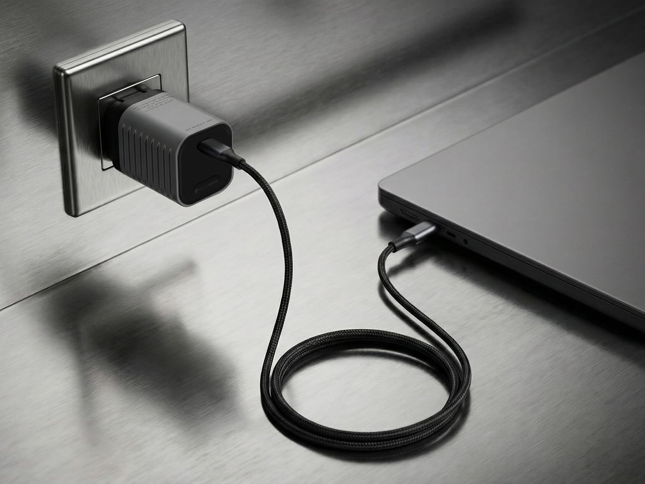
The charger outputs 100W max through its single USB-C port, with support for Power Delivery 3.0 and PPS (Programmable Power Supply) that adjusts voltage between 3.3V and 21V depending on what your device needs. That means it’ll fast-charge a MacBook Pro, a Dell XPS, a Lenovo ThinkPad, or any other USB-C laptop at full speed. In case you’re wondering, yes, it can handle e-bikes and e-scooters too, albeit at 100W. For phones and tablets, it delivers fast charging across iPhones, Samsung Galaxy devices, Google Pixels, and pretty much anything else with a USB-C port. The lack of multiple ports is deliberate. Rolling Square designed this charger for people who want maximum power in minimum space, and adding extra ports would have inflated the size.
If you need to charge two devices simultaneously, Rolling Square offers the inCharge Life 2in1 cable as an optional add-on. This modular cable splits the 100W output intelligently between two devices, letting you charge your laptop and phone together from a single power source. The cable stretches 1.5 meters (about 5 feet), features a durable nylon braid reinforced with aramid fiber, and uses premium metal connectors built to last. Rolling Square backs it with a lifetime replacement guarantee: if the cable ever fails, you submit a short video showing it fully cut along with your order number, and the company ships a replacement immediately. No returns, no forms, no hassle.
Rolling Square is a Switzerland-based company that’s been refining everyday tech problems since 2014, starting with the original inCharge keyring cable that packed multiple charging connectors into a tiny form factor you could attach to your keys. The company followed that up with the AirCard wallet tracker, the TAU keyring power bank, and a lineup of modular MagSafe accessories under the EDGE Pro branding. The Supertiny is their 19th product launch, and it fits the company’s design philosophy cleanly: solve one specific problem extremely well, make it as small as physics allows, and build it to last. Rolling Square products tend to be the kind of gear you don’t notice until you need them, at which point you wonder how you ever lived without them.
The Supertiny 100W GaN Charger comes in three versions: US, EU, and UK plugs. Early pricing starts at $46 for a single unit, or a $68 bundle that also includes the inCharge Life 2in1 cable. Rolling Square is shipping the chargers globally starting in May 2026, and all three versions carry full international safety certifications including TUV Rheinland. The company backs the product with a two-year warranty and a 30-day return policy. I touted GaN chargers as a tech must-have in 2025, so if you’re reading this now and you still don’t own one, take it from me. You, your cluttered workdesk, and your heavy laptop bag will thank me.
At a time when living spaces are shrinking while expectations from them continue to expand, this design presents a thoughtful response that is both rooted in tradition and aligned with contemporary needs.
Emerging from the context of rising housing pressures in Taiwan, where compact homes are increasingly becoming the norm, the project addresses a fundamental question: how can furniture adapt to limited space without compromising comfort or experience? Rather than treating furniture as static, single-purpose objects, the designer reimagines them as dynamic systems capable of transformation.
Designer: Che-Chia Hsu
At the heart of this piece lies a deep engagement with traditional Chinese woodworking techniques, particularly the precision of tenon joints. These joints move beyond being structural solutions and become expressions of calculated craftsmanship, where geometry, material behavior, and human interaction converge. The result is a construction that feels both minimal and robust, relying on accuracy instead of excess.
The furniture set is designed to integrate storage and seating within a compact footprint. A chair is concealed within the table and can be pulled out, unfolded, and expanded into a functional seat. The process is intuitive: the chair is extracted, the seat and backrest are opened, and the backrest angle is adjusted using velcro. The transformation is smooth and unobtrusive, allowing the object to shift roles effortlessly.
What distinguishes this design is its reliance on the user’s own body as part of the structural system. Instead of depending entirely on rigid supports, the chair uses the tension generated by the sitter to stabilize the backrest. This introduces a subtle interaction between user and object, where the act of sitting becomes integral to how the design performs. The experience feels efficient, responsive, and quietly intelligent.
Material choices reinforce this balance between function and experience. Lightweight pine wood panels provide durability while ensuring ease of movement. Paired with gray cotton linen fabric, the design introduces a tactile softness that enhances comfort. The fabric is breathable and visually understated, complementing the natural warmth of the wood. Together, these materials create a calm, cohesive aesthetic suited to contemporary interiors.
The development of the project reflects a layered and rigorous process. The designer began by studying traditional joinery techniques through literature, followed by hands-on training under a woodcraft master. This immersion enabled a deeper understanding of the craft beyond theory. Building on this foundation, the designer explored ways to translate these techniques into a modern, functional context through research and experimentation.
What emerges is a design that treats constraint as a starting point rather than a limitation. The piece brings together traditional knowledge and contemporary living patterns, shaping an object that adapts, responds, and participates in everyday use. It reflects a way of designing where space, material, and human interaction are considered together, resulting in furniture that feels considered, purposeful, and in tune with the realities of modern living.
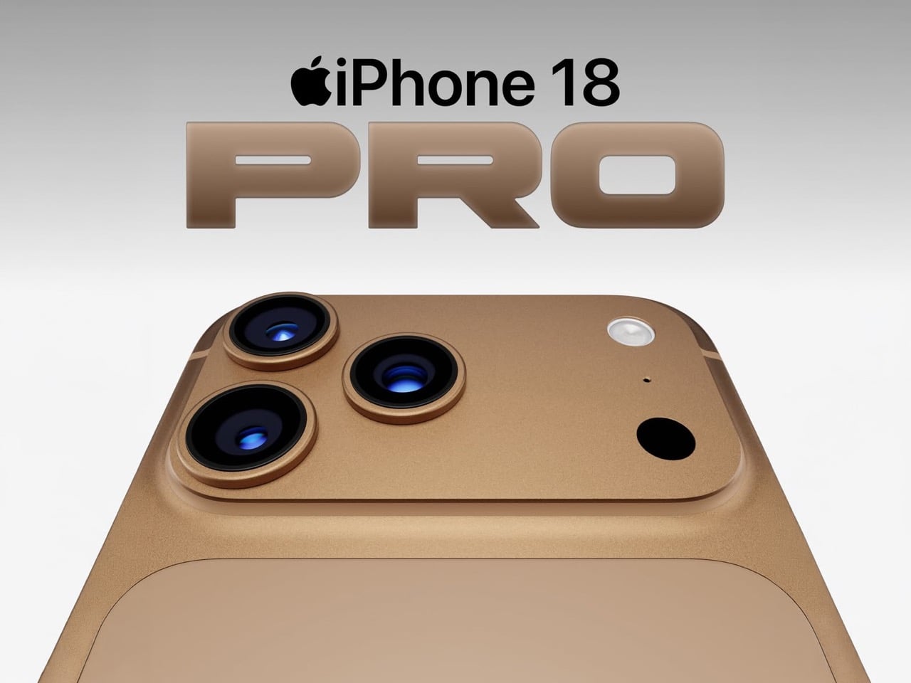
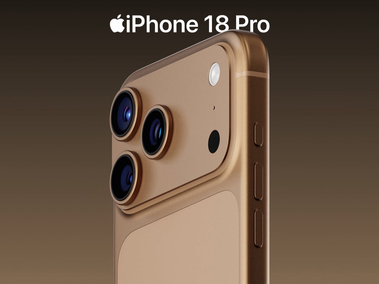
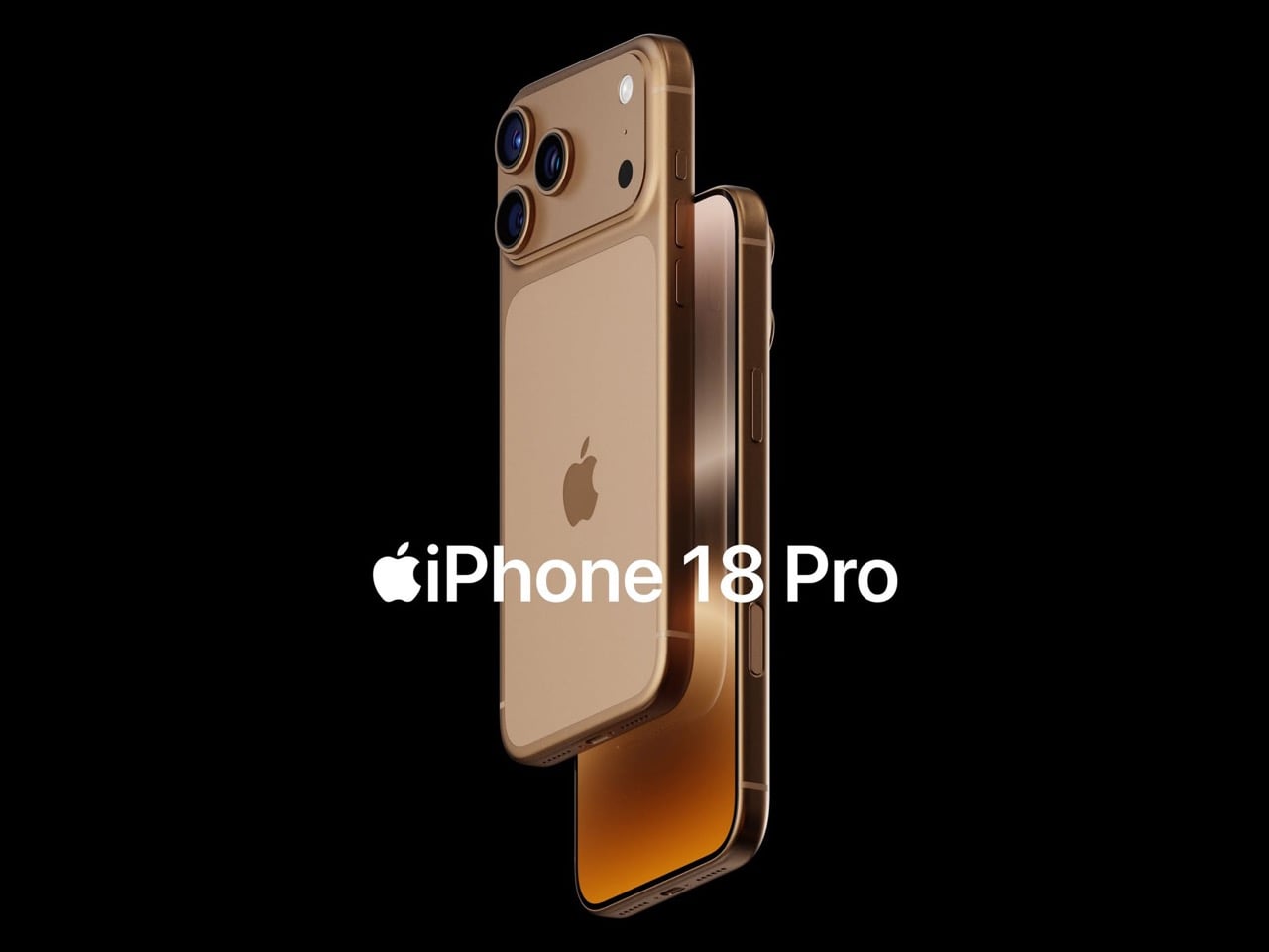
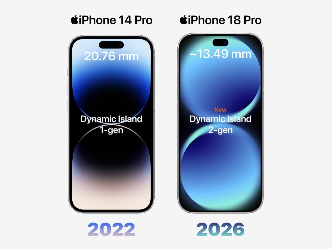
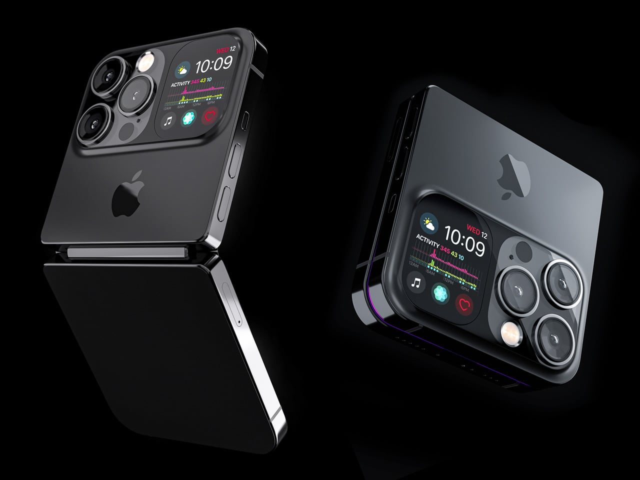
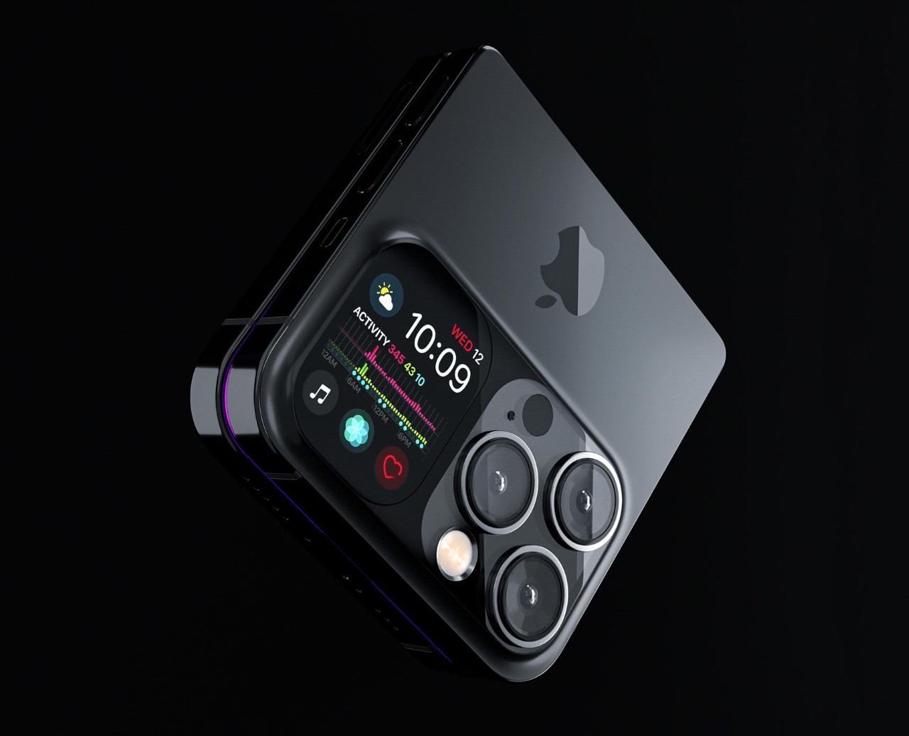
Apple has spent four years refusing to touch the Dynamic Island, treating it like some untouchable monument to software-hardware integration. Samsung cycled through three foldable generations in that time. Google rebooted the Pixel lineup twice. Nothing went from startup curiosity to legitimate competitor. And the iPhone 14 Pro’s pill-shaped cutout just sat there, exactly the same width, height, and visual footprint on the 15 Pro, 16 Pro, and 17 Pro. Leaked screen protectors sourced from Weibo now suggest Apple has finally decided four years is long enough, and the company is gearing up to shrink the Dynamic Island by roughly 35 percent on the iPhone 18 Pro. The mechanism is straightforward: move the Face ID flood illuminator under the display, leave only the infrared camera and front lens in the cutout, and suddenly that wide pill becomes a narrow sliver sitting unobtrusively at the top of the screen. The infrared flood illuminator that powers Face ID is moving under the display on the iPhone 18 Pro, leaving only the infrared camera requiring a physical cutout alongside the front-facing lens.
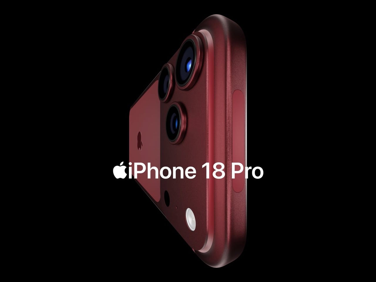
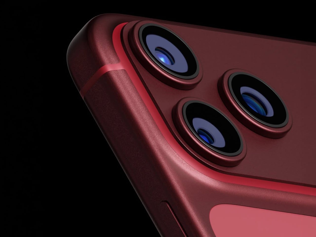
But the Dynamic Island shrinkage is hardly the headline here, because the iPhone 18 Pro is also the phone where Apple trades in its most iconic color for something it has never tried before on a Pro model. Bloomberg’s Mark Gurman reports that Apple is testing a deep red finish for the 18 Pro lineup, a shade closer to burgundy than the bright Product Red tones the company used on standard models years ago. Apple removed black from the Pro lineup with the iPhone 17 Pro, the first time in the series’ history that no dark option existed, and the 18 Pro appears set to continue that direction rather than course-correct. September 2026 is the expected launch window, which makes this arguably the most important incremental iPhone in years. It is widely believed to be the last model in this design language before Apple delivers a radical overhaul for the 20th anniversary iPhone in 2027, so whatever ships this fall is likely your final chance to buy an iPhone that looks like an iPhone has looked since 2017.
Designer: Volodymyr Lenard
Leaker Ice Universe claimed the Dynamic Island cutout on the iPhone 18 Pro models will be approximately 35% narrower than it is on the iPhone 17 Pro models, with a width of around 13.5mm down from around 20.7mm. That figure refers to the default on-screen Dynamic Island width including surrounding black pixels, not the physical hardware cutout itself, but the visual difference should be immediately apparent in daily use. The iPhone 17 Pro’s Island is a wide, commanding presence even at rest. The 18 Pro’s leaked cutout reads almost delicate by comparison, a narrow pill sitting unobtrusively at the top of the screen. Apple will still need to revisit four years of Live Activities design and the entire interaction vocabulary built around the existing Island’s dimensions, which is a reasonable explanation for why this transition is taking as long as it is. Android manufacturers have shipped under-display cameras for years, with visible quality tradeoffs that Apple’s user base simply would not accept on a thousand-dollar phone. Holding the line until the technology meets the standard, rather than shipping it to win a spec sheet argument, is the kind of call that frustrates people in the short term and builds loyalty over time.
Under the hood, the A20 Pro chip built on TSMC’s advanced 2nm process promises roughly 15% faster performance and up to 30% better power efficiency compared to the current 3nm A19 Pro. Paired with 12 GB of RAM across the lineup, the new silicon should power smoother Apple Intelligence features, enhanced on-device AI processing, and better multitasking. Connectivity upgrades include Apple’s first in-house C2 5G modem, replacing reliance on Qualcomm components. The modem supports improved mmWave performance and expanded satellite connectivity, potentially enabling always-connected cellular service via NR-NTN standards for emergency messaging and basic data in remote areas without traditional coverage. Battery life stands out as a major highlight, especially for the iPhone 18 Pro Max. Leakers report a capacity jump to 5,100 to 5,200 mAh, the largest ever in an iPhone, enabled by a slightly thicker chassis measuring around 8.8mm up from 8.75mm on the iPhone 17 Pro Max. The added thickness and weight would accommodate the bigger cell while the more efficient 2nm chip helps stretch usage even further. Some projections suggest up to 40 hours of mixed use on a single charge.
The deep red finish represents a significant departure for a Pro lineup that has historically favored controlled, conservative colors like graphite, silver, gold, and muted titanium shades. Rumors of purple and brown finishes have also circulated, but Gurman believes those are just variants of the same red idea. The decision to skip black for a second consecutive year has already generated polarized reactions among enthusiasts, with some welcoming the bold direction and others mourning the loss of the classic understated aesthetic. For buyers who want black, Gurman specifically noted that the foldable iPhone is being designed with conservative space gray and silver finishes, suggesting Apple is deliberately separating its color identity across product lines. The iPhone 18 Pro may read as a modest update on paper, but as the final iteration of a design language that has defined the modern iPhone for nearly a decade, it carries more symbolic weight than any spec sheet can communicate.
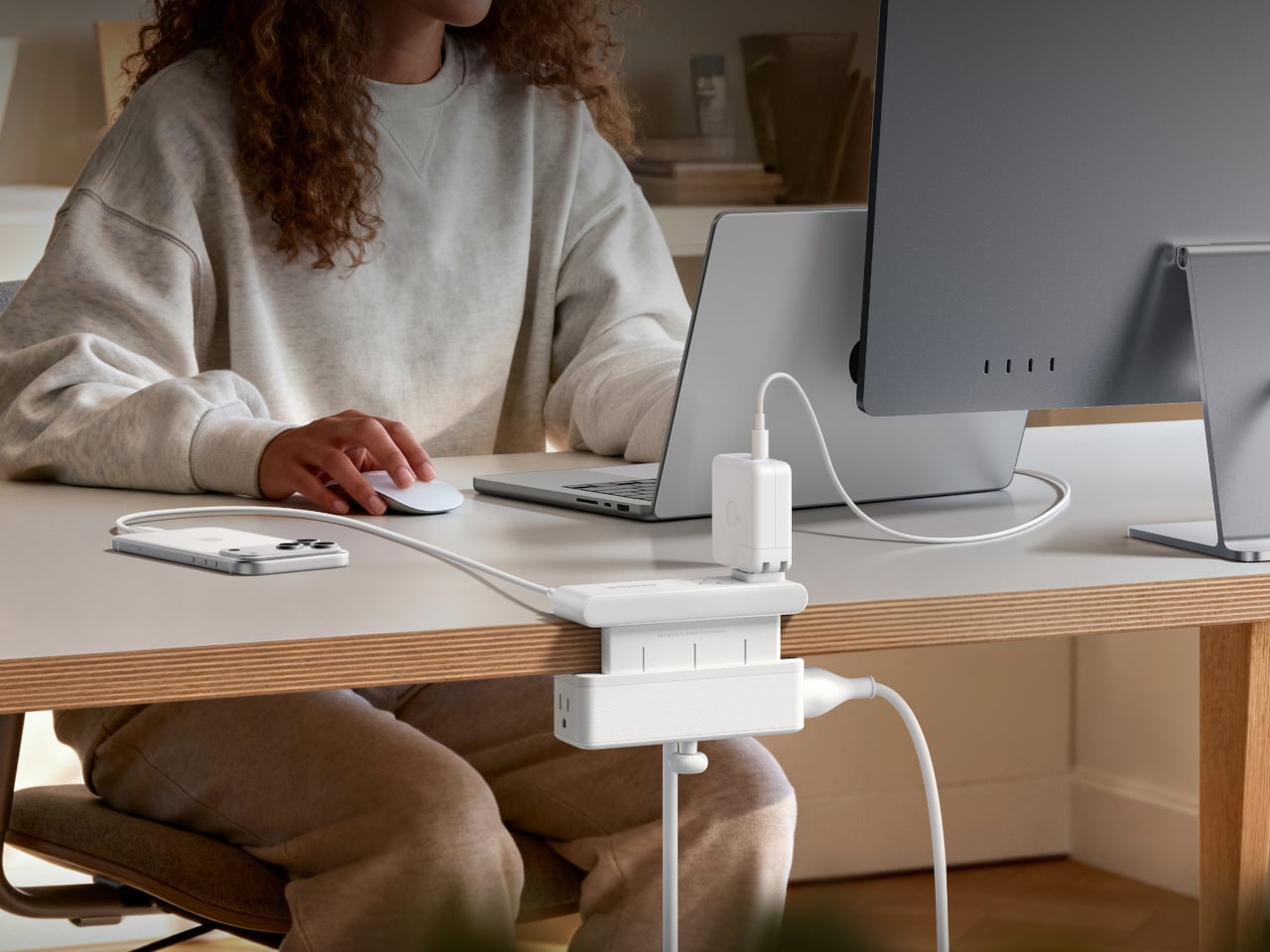
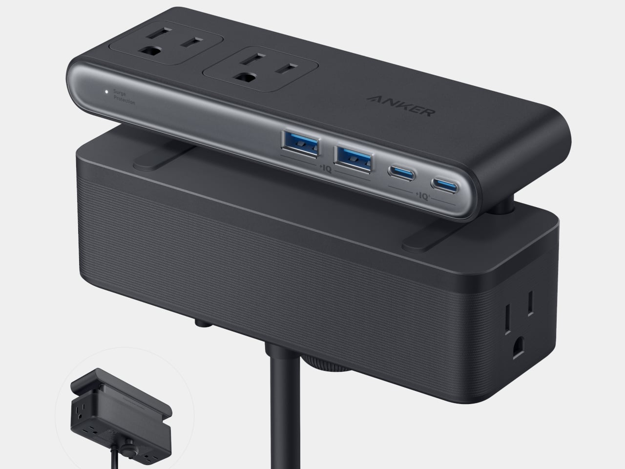
Desks have gotten more crowded. Between the laptop, the monitor, the phone, and whatever Bluetooth peripherals have accumulated over the past few years, keeping everything charged without making a mess has become its own challenge. Power strips have always been the go-to solution, but most still end up on the floor or behind furniture, at the end of a cable that creates the very clutter it was supposed to fix.
Anker’s Nano Power Strip (10-in-1, 70W, Clamp) approaches that problem from a different angle, quite literally. Instead of sitting on a surface or hiding under a desk, it clamps onto the desk edge, putting 10 ports right where they’re actually useful. First unveiled at CES 2026 and now available in the US for $69.99, it aims to reduce the mess that most power strips quietly make worse.
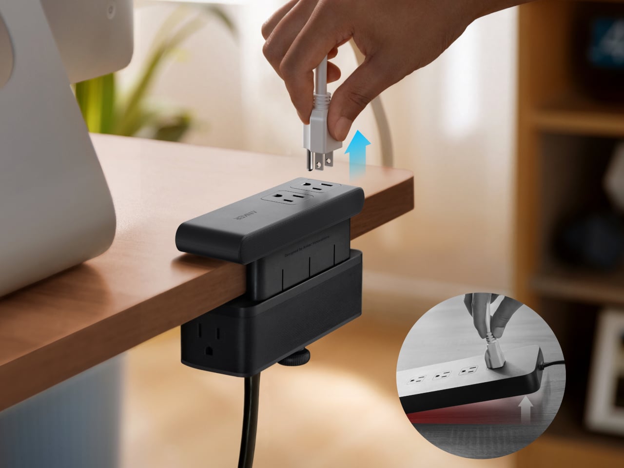
The clamp structure sits on either side of the desk edge, with ports distributed across its upper and lower sections. Six AC outlets handle the larger plugs, while two USB-A and two USB-C ports take care of smaller devices. Splitting the ports between two zones keeps things from crowding on one side, a small but practical detail that makes the strip feel properly considered rather than just generously stocked.
The USB-C charging capability is where the performance stands out. A single USB-C port can deliver up to 70W, enough to run a MacBook or most other laptops without needing a separate wall adapter. That output relies on GaN technology, which keeps the strip slim at just 0.75 inches thick despite the power output, and avoids the extra heat and bulk that older charging components tend to generate.
Installing it takes seconds. The adjustable clamp fits desk edges between 0.6 and 1.8 inches thick, covering most standard desks, and locks in firmly enough for one-hand use. That might sound like a minor detail, but plugging in a cable while the strip shifts around is exactly the kind of daily irritation that compounds. A stable mount means you’re not bracing the strip with your other hand every single time.
Anker also built in 1,500J of surge protection, along with a smart overload mechanism that includes a reset button. When it trips, the button pops out to cut power instantly. Press it again, and it’s back to normal. It’s a simple failsafe, but a useful one on a strip mounted at desk height, where a sudden power surge or overloaded circuit could easily go unnoticed until something stops working.
Anker markets it for gaming and office setups alike, and it’s easy to see why. Gaming desks accumulate powered accessories faster than most, from peripherals to controllers to headset chargers. The dual-zone layout helps spread those cables rather than pile them in one corner, and the 0.75-inch profile doesn’t take up surface space or interfere with the kind of clean, organized desk that people actually put effort into building.
Cable clutter isn’t going anywhere, but it can at least be contained. The Nano Power Strip doesn’t reinvent the power strip so much as it rethinks where one should live. At $69.99, it’s a reasonable ask for 10 ports, 70W of GaN-powered fast charging, and a desk-mounted solution that keeps the tangle off the floor and closer to where it actually gets used.
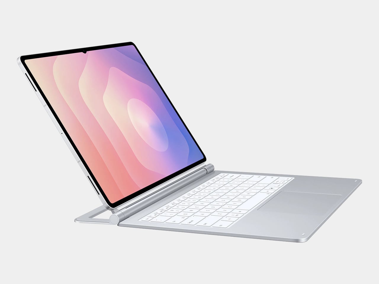
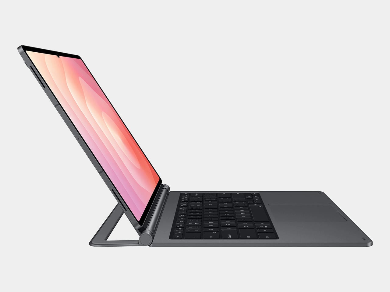
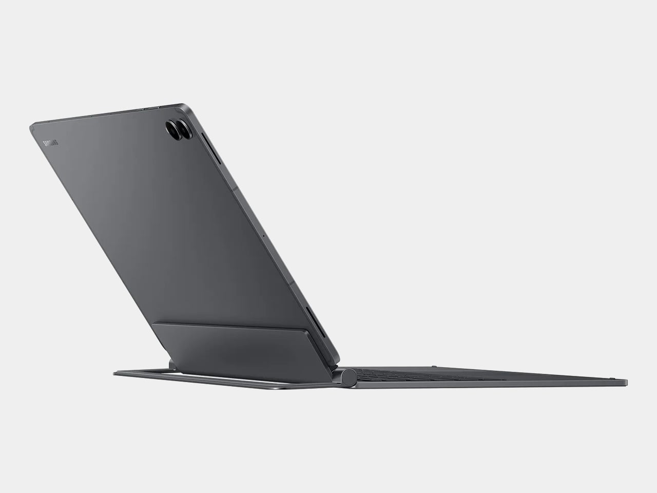
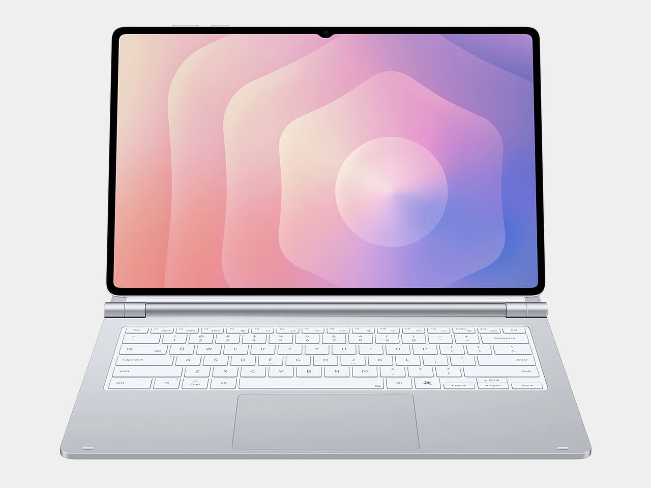
The tablet-as-laptop pitch has been a hard sell for years, and a lot of the blame lands on the accessories. Keyboard covers for Android tablets have historically been thin on features and even thinner on build quality, which makes the whole productivity argument feel shakier than it should. Samsung’s $1,200 Galaxy Tab S11 Ultra is serious hardware, and for a while, its keyboard options weren’t keeping up.
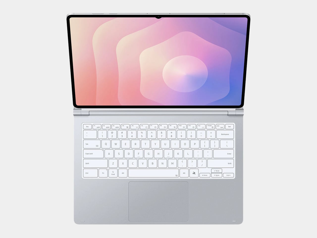
The Galaxy Tab S11 Ultra Pro Keyboard is Samsung’s answer to that. Available in Gray and Silver for $399.99, it connects via pogo pins at the rear of the tablet, with no Bluetooth pairing or cables required. Opening the lid wakes the device, and closing it puts everything to sleep, so the whole thing behaves less like an accessory and more like a laptop right from the start.
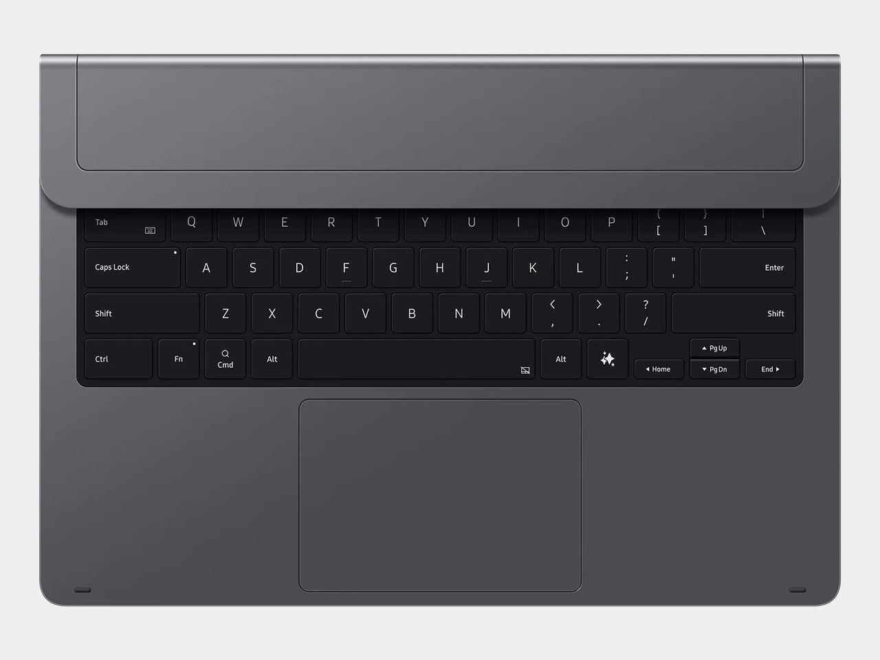
The build quality reflects the price in most of the right ways. The body is aluminum alloy, the hinge is reinforced metal, and a secondary kickstand at the rear props the whole assembly into a stable, laptop-like posture at whatever angle you prefer. The result looks noticeably more considered than Samsung’s Book Cover Keyboard Slim, which never really felt like it belonged on a $1,200 device.
The 80-key layout goes beyond a standard QWERTY arrangement. A dedicated DeX key switches the Tab S11 Ultra into Samsung’s desktop mode, where apps run in freely movable windows, closer in feel to Windows than Android. A Galaxy AI key gives you one-press access to AI tools without switching apps, and three customizable function keys can each be mapped to open whatever you need most.
For long stretches of writing or working across multiple documents, those shortcuts matter more than they might look on a spec sheet. The pogo pin connection also eliminates the Bluetooth pairing and dropout issues that plague most wireless keyboard accessories. And since the Pro Keyboard draws power directly from the tablet, there’s no separate battery to charge, and nothing to run out at an inconvenient moment.
The trackpad is 14.6% larger than the one on Samsung’s previous keyboard accessory, a small percentage that translates to real estate you’ll actually notice in DeX mode. The extra surface area gives you more room for precise gestures and window management, and that significantly reduces the number of times you’re forced to reach up and touch the screen during long work sessions.
At $399.99, the Pro Keyboard is nearly twice the price of Samsung’s own Book Cover Keyboard Slim and $50 more than Apple’s Magic Keyboard for the 13-inch iPad Pro. Adding it to the Galaxy Tab S11 Ultra’s $1,200 starting price puts the total at around $1,600, which puts you in comfortable MacBook Air territory, minus the dedicated operating system and the convenience of a unified device.
There are also some obvious gaps at this price. The Pro Keyboard has no backlighting, a noticeable oversight for anyone who regularly works late or in dim spaces. It also doesn’t protect the back of the tablet, which is a curious omission for a $400 accessory. And since it’s designed exclusively for the Galaxy Tab S11 Ultra, there’s no using it with anything else in Samsung’s lineup.
Most desk setups are inherited. The nomad’s is earned. Everything that makes it into the bag has already passed a strict and largely unconscious test — weight, versatility, the ability to make a stranger’s table feel like a place worth working from. Over months and years of moving between cities, time zones, and co-working spaces, the digital nomad ends up with a carefully curated set of tools that are small by necessity but thoughtful by design.
The interesting thing about these objects is what happens when the travel slows down. When a lease gets signed, a proper desk arrives, and the bag starts being unpacked with more intention. The tools that survived the road do not lose their relevance on a permanent surface. Many of them were built with the kind of considered design that rewards exactly this kind of scrutiny. They look better than most things bought specifically for a home office, hold up longer, and carry the kind of personal history that makes a workspace feel genuinely inhabited. This is for that moment. Eight objects that lived in the bag for a reason, and deserve a permanent home for the same one.
1. OrigamiSwift Folding Mouse
The OrigamiSwift is what happens when industrial design takes portability seriously. Weighing just 40 grams and folding flat to a profile thin enough to slip between notebook pages, it removes the usual tension between compact and comfortable. On a desk, it unfolds in under half a second, snapping into a full-sized ergonomic shape that sits naturally in the hand. For anyone who has suffered through the cramped mechanics of a standard travel mouse, this feels like a genuine upgrade.
The Bluetooth connectivity is quick, and the origami-inspired fold keeps the mechanism tactile enough that using it becomes a small ritual rather than a chore. At the desk, it earns a permanent spot not because it compensates for a lack of options, but because the transformation itself is satisfying. It is the kind of tool that makes you reconsider how you work, and then makes the work feel slightly more considered. Portable by design, permanent by choice.
Folds to near-invisible thinness at just 4.5mm, making it one of the most carry-friendly mice ever built without compromising on ergonomic full-size comfort
Activates in under half a second with a single flip, making the transition from travel bag to working mouse feel immediate and effortless
What we dislike
At 40 grams, the lightweight build may feel insubstantial for users accustomed to the heft and resistance of a traditional full-sized mouse
Bluetooth-only connectivity means no wired fallback for tasks where even minor wireless latency becomes a frustration
2. Fidget Cube
The Fidget Cube arrived at a time when open-plan offices made visible restlessness a liability and invisible anxiety a norm. Antsy Labs built something straightforward in response: a small cube with six distinct tactile surfaces, each mapped to a different kind of fidget. Click. Glide. Flip. Breathe. Roll. Spin. The vocabulary is simple, the execution is precise, and the result is a desk object that earns its keep without demanding attention from anyone but you.
For digital nomads who have spent years suppressing the impulse to tap or spin something through a long layover or tense client call, the Fidget Cube offers quiet permission. On a permanent desk, it sits within reach without asking for attention. The black and graphite colorways blend cleanly into most setups, looking less like a toy and more like a considered detail. It is not a gimmick. It is self-awareness shaped into an object.
What we like
Six distinct tactile surfaces cover a wide range of fidgeting behaviors in a single pocket-sized cube, making it genuinely versatile across different stress responses and focus modes
Discreet colorways like Midnight Black and Graphite blend seamlessly into professional setups without drawing unwanted attention in shared or client-facing workspaces
What we dislike
The clicking surfaces can produce audible sounds that may distract colleagues in quiet, open-plan, or library-style work environments
The cube format offers no digital or productivity-tracking integration for users who want data on their focus habits or stress patterns
3. Nothing Power (1) Battery Bank
Nothing built its reputation on the Glyph interface, a grid of LED lights that turned the back of a phone into a notification display and a design statement. The Power (1) carries that language into a battery bank, using transparent layers, bold light paths, and illuminated interactions to make a utilitarian object feel worth looking at. The design philosophy is direct: good design is not just about appearance, it is about how an object makes you feel when you reach for it.
For a nomad who has charged devices from airport benches and café stools, a power bank is rarely a display piece. The Nothing Power (1) challenges that. Sitting on a desk, the Glyph illumination gives charging status a visual presence that feels more like an ambient display than a simple indicator light. It treats the desk as a stage and every object on it as a conscious choice. Few battery banks have ever earned that kind of consideration.
What we like
The Glyph interface turns a charging indicator into a visual experience, making it arguably the only power bank designed to look genuinely intentional, sitting on a desk permanently
Transparent design layers reflect Nothing’s ethos of honest, open construction, giving the object a premium quality that stands apart from every other battery bank on the market
What we dislike
The Nothing Power (1) is currently a concept design and is not yet available as a finished commercial product
Exact battery capacity, output wattage, and pricing remain unconfirmed, making direct comparison with available alternatives difficult at this stage
4. HubKey Gen2
Desk clutter tends to accumulate in layers: a dock for the monitor, an adapter for the second screen, a hub for storage. Somewhere between them sits a tangle of cables that each solves a single problem in isolation. The HubKey Gen2 treats that as a design problem worth solving from the inside out. It is an 11-in-1 USB-C hub with a hardware control surface on top, offering programmable shortcut keys, a central dial, 100W power delivery, and 2.5Gbps Ethernet in a compact cube footprint.
The display support is what separates it from a standard hub. Two HDMI ports, each running a 4K display at 60Hz, mean a laptop becomes a proper dual-monitor workstation without extra adapters. For a nomad settling in, that shift from single-screen café work to a dual-screen editing setup is significant. The shortcut keys and central dial bring a physical control layer to software-heavy workflows, keeping hands on the desk rather than hunting through menus on a trackpad.
What we like
Dual 4K HDMI outputs at 60Hz eliminate the need for a separate display dock when transitioning from a travel setup to a full home workstation
The programmable shortcut keys and central knob return a satisfying physical dimension to digital workflows, reducing time spent navigating software menus
What we dislike
The compact cube form factor may feel crowded once all 11 ports are simultaneously in active use, which limits clean cable management around the unit
Fully customizing the shortcut keys requires additional software configuration, adding a setup investment before the productivity benefit becomes fully apparent
5. Rolling World Clock
Keeping track of time zones is one of the quieter friction points of nomadic life. The Rolling World Clock solves it most physically: you roll it. A 12-sided form with each face representing a major timezone city, a single hand reads the local time wherever it lands. London. Tokyo. New York. The gesture is intuitive, and the result is a genuinely useful desk object without trying to be more.
Available in black and white, this is the kind of object that earns its place through curiosity rather than scale. Guests pick it up. Colleagues ask about it. It turns a functional necessity into a small conversation. For the nomad who has lived across time zones and built relationships across continents, there is something quietly satisfying about having those cities represented not on a screen, but held in your hand.
The tactile rolling interaction makes checking international time a deliberate, physical gesture rather than a reflexive phone unlock
Covers 12 major timezone cities in a clean, minimalist form that works equally well as a functional desk piece or a shelf object
What we dislike
Limited to 12 preset cities, which may not include every timezone relevant to users with contacts in less commonly represented regions
The single analog hand offers general time orientation rather than precise minute-level accuracy, which may not suit users with tight cross-timezone scheduling needs
6. Orbitkey Desk Mat Slim
A desk mat either disappears into the background or it becomes the visual anchor of the entire setup. The Orbitkey Desk Mat Slim is built for the second outcome, designed with the restraint of the first. Made from premium vegan leather on top and 100% recycled PET felt underneath, it layers material integrity with practical function. The anti-slip backing holds the mat planted, while the magnetic cable holder keeps wires from drifting toward the edges, where they become a distraction.
Notes, receipts, and napkin sketches are the inevitable artifacts of nomadic work, and they tend to pile up without a clear home. The document hideaway is the detail that tips this mat from surface to organizer. The slim front pocket keeps loose papers horizontal, accessible, and out of sight. For someone accustomed to a shared café counter or a hotel tray table, this level of surface order feels less like a feature and more like a quiet exhale.
What we like
The document hideaway pocket reduces visible desk clutter without adding bulk, making it one of the more intelligent storage details found on any desk mat
Vegan leather and recycled PET felt construction deliver both a refined visual quality and a material responsibility that most desk accessories still lack
What we dislike
The slim format may feel too narrow for users with wide multi-monitor setups who need significant horizontal coverage across their full desk surface
The magnetic cable holder works best with a small number of cables and may become less effective in more heavily wired configurations
7. Flow Timer
The Pomodoro method has been around since the late 1980s, and most people who use it rely on a phone timer or a browser tab. Neither is ideal. The Flow Timer replaces that with something solid. Cast in metal, with dual customizable presets for focus and break intervals, it lives on the desk as a functional timer and an object of intention. The visual arc tells you where you are in the session without a notification or a screen unlock.
For nomads who have long been their own productivity managers, a physical timer brings a different quality of commitment than a screen-based one. The act of setting it is deliberate. The focus-to-break transition is automatic. Sitting in a permanent spot, it becomes a small anchor for the rhythm of the day. Available in three colorways, the Flow Timer is one of those rare accessories that improves both how you work and how the desk looks while you do it.
What we like
Automatic switching between focus and break intervals removes the friction of resetting a timer mid-session, keeping the workflow continuous and uninterrupted
Solid metal construction and three considered colorways make it an aesthetic desk object as much as a productivity tool
What we dislike
The absence of a digital display means reading the visual arc requires a brief adjustment period before the feedback becomes truly instinctive
As a dedicated single-function device, it competes for surface space against multi-purpose tools in more minimal or compact desk setups
8. Memento Business Card Log
There is a specific quality to the business cards that collect at the bottom of a travel bag. Each one marks a moment, a conversation, a person worth remembering. The Memento Business Card Log was made for exactly this. Designed by Re+g, a Japanese brand with roots in thoughtful stationery craft, it holds up to 120 cards with a dedicated handwriting space beside each one for a characteristic, a date, or a detail that brings the memory back clearly.
The two-point slit system keeps cards secure without sleeves or adhesive, and the special binding allows pages to be easily reordered as professional relationships evolve. For a nomad building a network across cities and industries, this is the kind of object that earns its desk placement not through technology but through intention. It is a record of everywhere you have been and everyone who mattered enough to keep. That is rare, and the design knows it.
The two-point slit system and reorderable binding make the organization genuinely flexible, allowing the log to grow and shift alongside a professional network over time
Handwritten note spaces beside each card transform a simple storage product into a meaningful personal archive of the conversations that shaped a career on the road
What we dislike
A maximum of 120 cards may feel limiting for high-volume networkers who accumulate contacts rapidly across multiple cities, conferences, and industries
The analog format, while entirely intentional, offers no digital sync or search capability for users who need to cross-reference contacts across devices
These Gadgets Were Never Just for the Bag
There is a moment in every nomad’s life when the bag starts feeling less like freedom and more like a deadline. When the tools that carried you through airports and co-working spaces deserve something more settled. These eight objects were always portable by design, but built with the kind of intention that reads just as well on a permanent desk. Good design does not ask where it is. It just works.
The idea here is not to stop moving. It is to stop treating permanence as a downgrade. A folding mouse, a tactile timer, a rolling clock, a mat that holds your cables and your notes — taken together, they form a desk that feels chosen rather than assembled. The nomad who gives these a home is not giving anything up. They are just finally working somewhere worthy of the tools they already carry.
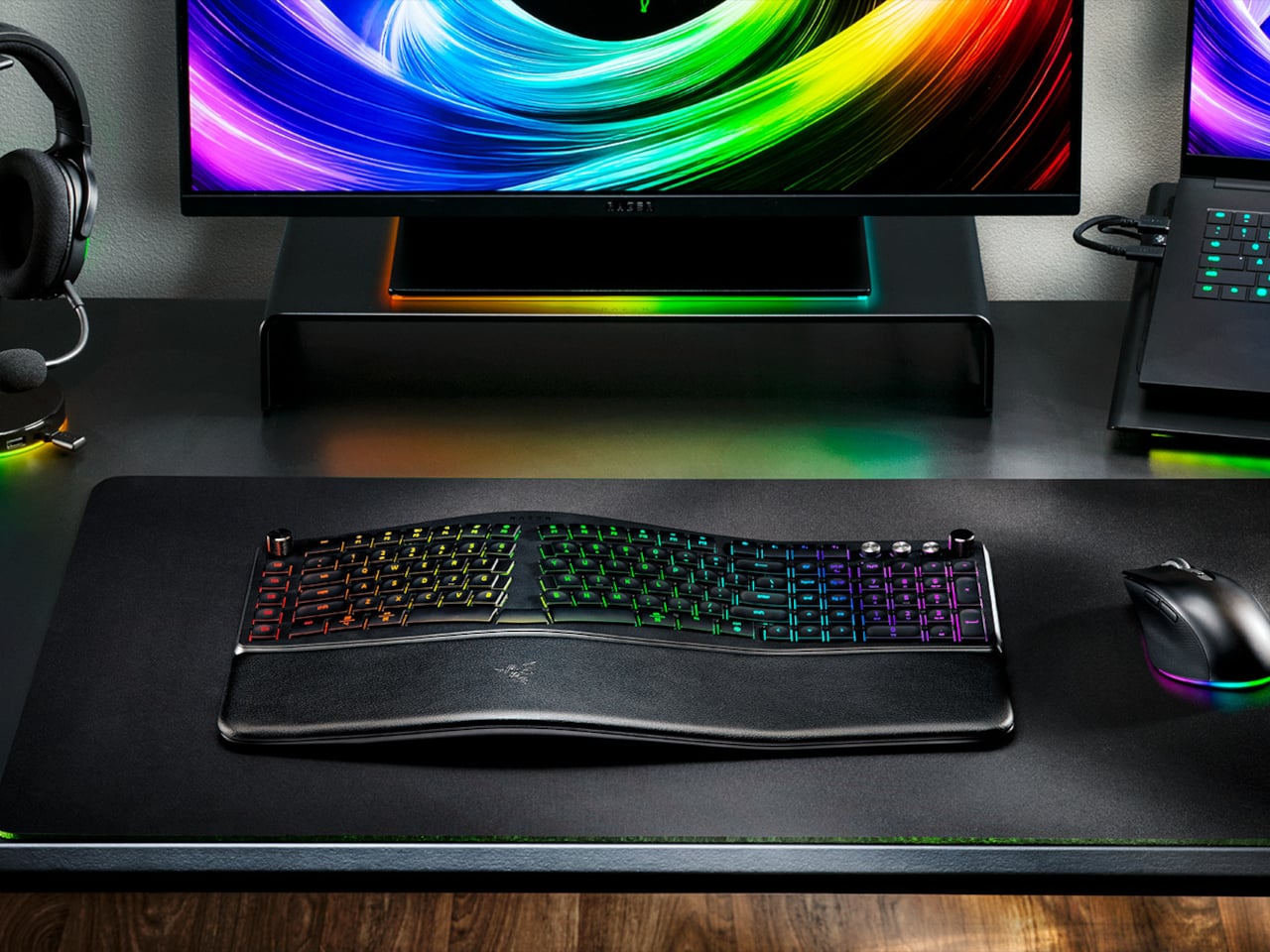
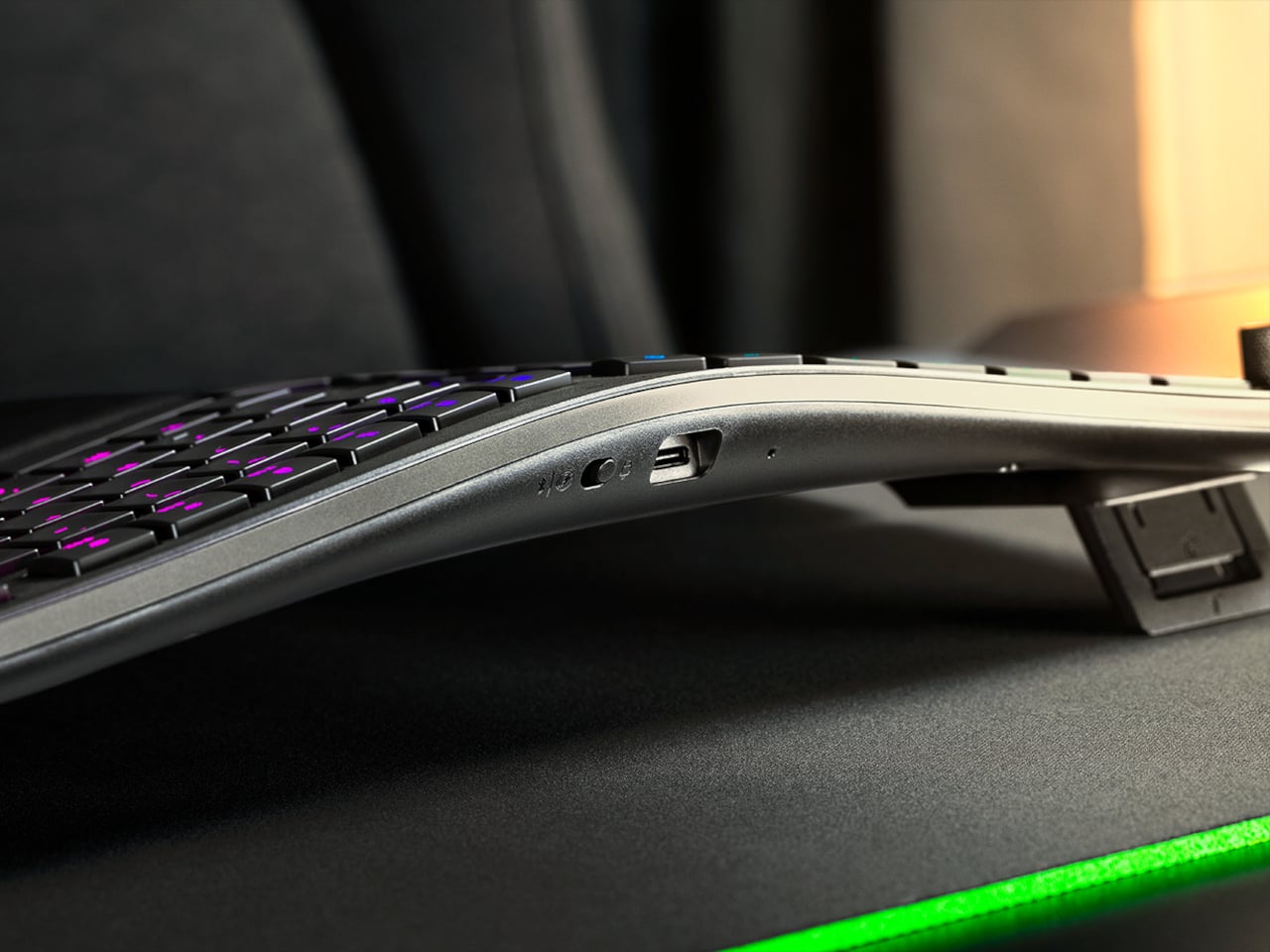
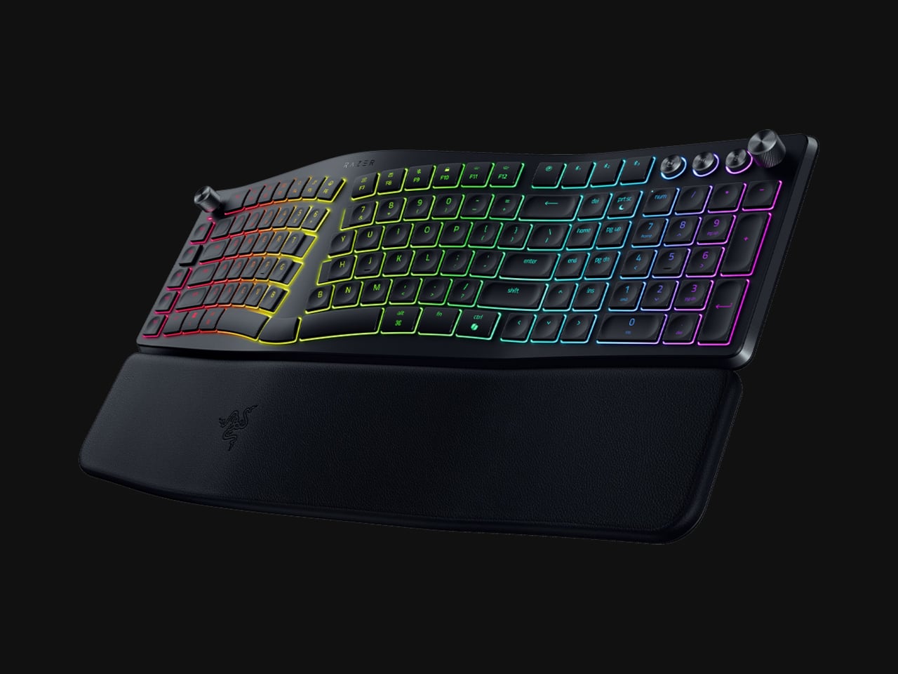
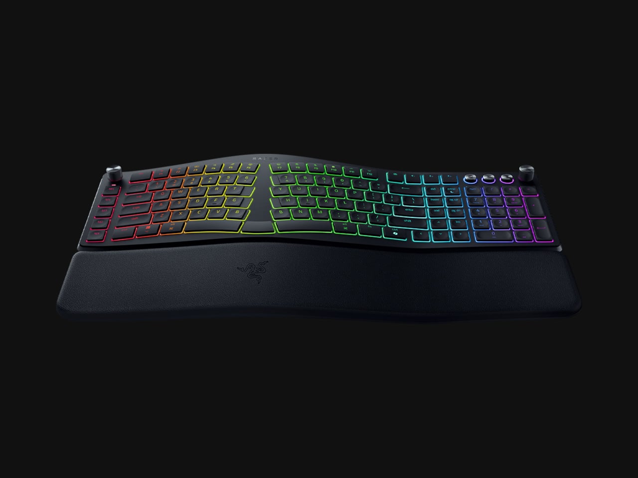
Ergonomic keyboards have a reputation problem. They work, technically, but most of them look like they were designed by someone who’d never sat through a full workday. The splits are too wide, the angles too aggressive, and the learning curve steep enough to make you miss the flat keys you’ve always known. Plenty of people give it a try and quietly go back to what they had before.
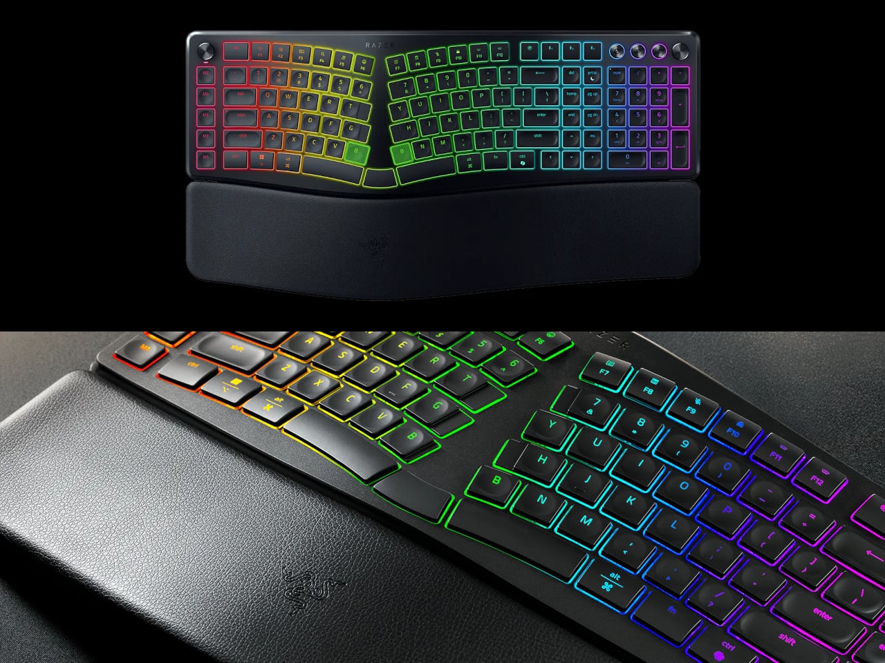
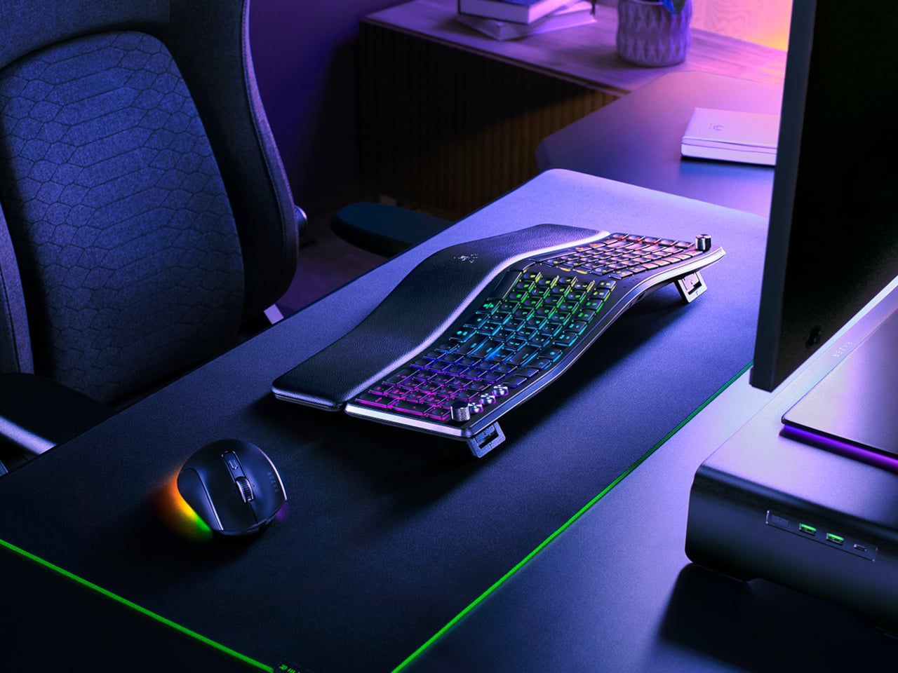
Razer’s answer is the Pro Type Ergo, its first wireless split ergonomic keyboard, built with that frustration clearly in mind. Rather than throwing you into a radical new layout, it’s tuned to feel approachable from the very first keystroke. The split gently angles your hands into a more natural alignment, easing the sideways reach that makes most forearms ache by mid-afternoon, without asking you to completely relearn how to type.
One of the more interesting layout choices is the dual “B” key arrangement, with one on each side of the split, along with an extra backspace tucked between two space bars. The idea is that both thumbs take on common actions, so you’re reaching less and crossing your fingers over each other less throughout the day. It’s a small shift that makes more sense the longer you sit with it.
The keycaps are ultra-low-profile, fitted with subtle spherical indents that nudge your fingertips into the right position without you having to think about it. Sound-dampening layers and tuned stabilizers underneath keep the typing noise low enough for open offices and video calls. Shorter key travel also means less physical effort per keystroke, which doesn’t sound like much until you’ve been at your desk for six hours straight.
The wrist rest is permanently integrated rather than removable, which turns out to be a feature rather than a limitation. It’s just always there, supporting your wrists from the moment you sit down without any extra setup. A 10-degree base slope sets the starting angle, and five tilt positions, from flat to seven degrees forward or back, let you dial in the fit depending on your desk height and preference.
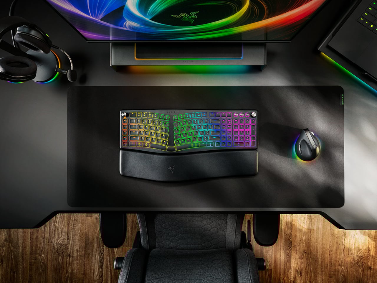
A Razer Command Dial lets you assign up to eight functions, expandable to 100 via Razer Synapse, while five macro keys along the left side keep your most-used shortcuts within easy reach. There’s also a dedicated AI Prompt Master key that handles things like drafting emails, summarizing blocks of text, or kicking off a research query in a single press, without pulling you out of whatever window you’re already in.
Connectivity spans Razer HyperSpeed Wireless at 2.4 GHz, three Bluetooth profiles, and USB-C wired mode, with support for up to five devices total. Razer Chroma RGB backlighting covers 19 customizable zones and can be switched off entirely for offices where animated key lighting might not go over well. The design is clean and understated, a far cry from the aggressively lit gaming keyboards Razer is better known for.
The Pro Type Ergo retails at $189.99, about $30 more than Razer’s conventional Pro Type Ultra from 2021. For anyone who types for a living and has been quietly working around the ache of a standard keyboard layout, that extra cost starts to feel a lot less significant once you’ve spent a full day on something that actually fits how your hands are supposed to sit.
For most people, the smartphone screen is where focus goes to die. Even when you pick one up with a purpose, the bright OLED glare, the notifications, and the endless scroll have a way of pulling you elsewhere. Screen fatigue is real, blue light is a genuine concern, and the push for digital wellness has grown loud enough that even tech companies have started quietly acknowledging it.
The Bigme HiBreak Plus takes a different approach to the smartphone entirely. Built around a 6.13-inch E Ink Kaleido 3 color display, it runs on Android 14 with full Google Play support and connects via dual 4G SIM, making it a genuinely functional phone. But unlike everything else in your pocket, it defaults to a mode that’s easier on the eyes and harder to mindlessly abuse.
E Ink displays on smartphones have always had one obvious weakness: the refresh rate. Previous devices refreshed so slowly that casual scrolling felt like a real chore. The HiBreak Plus addresses that with a remarkably high 52 FPS refresh rate for an E Ink display, making it responsive enough for reading, annotating, and light browsing without the ghost-image flicker that dogged earlier E Ink phones.
The display’s advantages don’t stop at being easy to look at. E Ink panels are naturally readable under direct sunlight without any brightness cranked up, which means you can check maps, take notes outdoors, or read in the afternoon light without squinting. There’s no backlight shining toward your face either, just a soft, paper-like surface that reflects the ambient light around it.
A front light with 36 brightness levels handles the dimmer end of things. It reads the surrounding environment and automatically calibrates brightness and color temperature, going from a cool, crisp tone for morning work to a warm amber glow at night. There’s no digging through menus or manually adjusting sliders; the phone handles it quietly in the background, adapting to wherever you happen to be.
Handwriting support, via an optional stylus, adds another layer to what the phone can do. Writing directly on the E Ink surface feels closer to putting pen to paper than tapping on glass. It makes the HiBreak Plus a natural fit for jotting down thoughts during a commute, capturing ideas in a meeting, or working through a long reading session with annotations in the margins.
The rest of the specs are functional rather than flashy: an octa-core processor, 4GB of RAM, 64GB of storage, GPS, a fingerprint sensor in the power button, and a 4500 mAh battery that should comfortably outlast most conventional smartphones thanks to the energy-efficient E Ink display. The whole package weighs just 193g, light enough to slip into a shirt pocket without a second thought.
Of course, there are some downsides as well, ones that go beyond the screen refresh rate and color vibrancy. Although not exactly outdated, 4G LTE caps data speed significantly, and the rather modest RAM and storage capacity don’t do it any favors either. That said, at a $299 price point ($249 on pre-order), you are getting a pocket-sized color e-reader that can also make calls and connect to the Internet, without the usual distracting trappings of a smartphone.
On April 1st, 2026, Apple turns 50. For a company that has spent half a century rewriting the rules of consumer technology, the milestone deserves something genuinely transformative. The Macintosh redefined personal computing. The iPod gave an entire generation a new relationship with music. The original iPhone, unveiled in 2007, combined a phone, a music player, and the internet into a single glass rectangle and made every competitor look outdated overnight. The iPhone Fold is real, and it’s coming.
Leaks from early 2026 paint a detailed picture: a book-style foldable powered by the A20 Pro chip on a 2nm process, backed by a 5,500mAh battery, with a 7.8-inch creaseless OLED inner display and a 5.5-inch outer screen. Pricing is expected to start around $2,400, and while a September announcement seems likely, most analysts believe shipments may not begin until December. Designers, modders, and concept artists have spent years filling the void with their own visions of a folding iPhone, each carrying a distinct theory about what Apple should prioritize. These five concepts map the full range of that imagination and capture exactly how much is riding on the real thing.
1. iPhone iFold by Michal Dufka — The Clamshell That Makes Sense
Designer Michal Dufka’s iPhone iFold is built on restraint. Rather than reinventing the iPhone’s entire identity, it applies a clamshell fold to the form factor people already love, drawing direct inspiration from the MotoRAZR and Samsung Galaxy Z Flip. The phone closes into a compact, pocketable square and opens into a full iPhone experience with a generously large display. For anyone who has quietly missed a phone that actually fits in a jeans pocket, this concept speaks to that feeling.
What sets the iFold apart is the secondary display placed beside the camera bump. When the phone is closed, that smaller screen surfaces notifications, time, and essential stats without requiring you to open the device at all. It functions almost like an Apple Watch built into the back of the phone. With Apple’s always-on display technology mature enough for this kind of ambient use, the dual-display setup feels less like speculation and more like a logical next step.
What We Like
The secondary display mirrors Apple Watch notification behavior, making glanceable information genuinely useful without ever opening the phone
The clamshell format makes the iPhone pocket-friendly for the first time in years without sacrificing screen size when it matters
What We Dislike
The clamshell form limits overall screen real estate compared to the expanded tablet surface that a book-style foldable provides
Hinge durability over sustained daily use is entirely unexplored here, and it remains the most critical engineering question for any clamshell design
2. iPhone Fold Ultra by 4RMD — When the Specs Match the Ambition
Design studio 4RMD’s iPhone Fold Ultra is grounded in credibility. Built directly from reported leaks rather than pure creative license, the concept presents a book-style foldable with dual 48MP rear cameras, a 24MP ultra-wide front camera, and the A20 Pro chip running on a 2nm process. Three color options appear across the renders: White, Black, and Deep Purple. At an estimated $2,299, this concept sits at the very top of Apple’s lineup with total conviction.
That Deep Purple colorway deserves its own moment. It is a deliberate callback to the iPhone 14 Pro’s most celebrated finish, and it lands differently on a book-style foldable. Something about that color on a device this ambitious reads as genuinely luxurious, the kind of finish that reframes a $2,299 price tag from a shock into a statement. 4RMD clearly understands Apple’s visual grammar, and this concept shows what happens when research and aesthetics share the same design space.
What We Like
Specs pulled from verified leaks give this concept real credibility, making it feel like a preview of what is actually coming rather than pure speculation
The Deep Purple colorway is a smart, crowd-pleasing callback to one of Apple’s most recognized and beloved finishes
What We Dislike
The “Ultra” label sets an expectation that demands exceptional build quality, and no concept can fully address whether the real device will deliver on that promise
Crease visibility across the inner display remains unaddressed, which continues to be the most persistent criticism of every book-style foldable on the market
3. iPhone Fold by Svyatoslav Alexandrov — The One That Replaces Two Devices
Svyatoslav Alexandrov’s iPhone Fold concept, created for the YouTube channel ConceptsiPhone, thinks in bigger terms than anything else on this list. Starting as a standard smartphone with a 6.3-inch outer display, it unfolds into a squarish 8-inch tablet that sits clearly in iPad Mini territory. This is not a phone with a bonus screen bolted on. It is a device designed to make carrying both an iPhone and an iPad feel genuinely redundant.
Alexandrov replaces Face ID with a full-display Touch ID fingerprint sensor, keeping the front notch minimal and clean. The rear carries the iPhone 12 Pro’s complete camera array: wide, ultra-wide, telephoto lenses, a LiDAR scanner, and flash. MagSafe compatibility and 5G readiness are already confirmed in the concept, adding meaningful weight to its productivity pitch. Whether the device supports the Apple Pencil is left open, but given an 8-inch inner display, its absence would feel like a missed opportunity.
What We Like
The full-display Touch ID is a clean and creative solution that keeps the front uncluttered while solving Face ID’s known complications on foldable form factors
The iPad Mini-sized inner screen makes a practical, real-world case for consolidating two devices into one without any meaningful compromise
What We Dislike
Removing Face ID eliminates one of the iPhone’s most seamless and trusted authentication features, which most users rely on dozens of times every day
Leaving Apple Pencil support unconfirmed weakens what should naturally be this concept’s strongest argument for productivity
4. iPhone Fold by Mechanical Pixel — The Foldable That Doesn’t Actually Fold
Mechanical Pixel’s concept takes the most unconventional approach on this list, and the reasoning is worth understanding. Rather than bending the iPhone itself, the design keeps the main body completely rigid and attaches a separate foldable display to the rear panel instead. The core phone experience remains exactly as people know it, maintaining the familiar dimensions and feel that iPhone users already rely on. That additional screen only enters the picture when a larger surface is specifically needed.
That rear foldable panel sits raised on a platform above the phone’s back, unfolding outward into a larger, squarish tablet surface when required. The layered profile is clearly visible from the side, giving the device a deliberately experimental and modular quality. The camera module remains in its standard position, completely unaffected by the additional display layer. The logic is unconventional, but the core argument of preserving the primary iPhone experience from any foldable compromise is genuinely hard to dismiss.
What We Like
Keeping the main body rigid entirely sidesteps the crease and long-term hinge durability problems that define every conventional foldable on the market today
The modular approach means the everyday iPhone experience is never degraded or compromised by the mechanics of the foldable element
What We Dislike
The raised rear platform creates an unrefined, layered side profile that sits well outside anything Apple’s design language has ever produced or endorsed
The prototype-like aesthetic makes it very difficult to imagine this direction surviving Apple’s notoriously demanding and detail-oriented product design process
5. iPhone V — The One Someone Actually Built
Every concept on this list exists as a digital render. The iPhone V is different. A YouTuber modder physically dismantled an iPhone X, extracted its internal components, and rebuilt the entire device inside a Motorola Razr chassis. The result is a working, folding iPhone that runs real iOS, carries a Retina-quality display, and folds in half like a classic flip phone. As a proof of concept, it is extraordinary. As a finished product, every question comes flooding in.
What makes the iPhone V genuinely compelling is not fit, finish, or polish, because it has none in any conventional sense. It is the straightforward fact that someone cared enough to prove the idea could actually work using parts that already exist. The folding mechanism and device thickness still need serious refinement. A working clamshell iPhone running authentic iOS is, in the end, a more persuasive argument for this form factor than any polished render has managed to be.
What We Like
The iPhone V is the only entry on this list that is fully functional, running real iOS inside an actual working clamshell device
Its physical existence proves the clamshell iPhone concept is viable using genuine Apple hardware, well beyond anything a render can demonstrate
What We Dislike
The repurposed Motorola Razr chassis produces a build that falls far short of consumer-grade fit, finish, and structural refinement
Hinge mechanism quality and overall device thickness remain significant engineering challenges that the mod cannot resolve, and they are exactly what Apple needs to solve
The Concepts That Made the Wait Worthwhile
Fifty years in, Apple is still the company that makes you wait. The iPhone Fold concepts here are not just exercises in creative imagination — they are a record of what designers and makers have been asking for, year after year. Some nailed the form factor. Others got the specs exactly right. A few did both. Together, they have shaped the entire conversation around a device that already feels utterly inevitable.
When the real iPhone Fold arrives, it will be measured against each of these visions. That is the power of concept design — it sets the bar before the product ships. Apple turning 50 while holding back its most ambitious device is pure theater. The design community has been writing this script for years. The only question is whether the real thing can live up to what the imagination has already built.