Don’t blindly trust Apple’s build quality… this durable iPhone 17 Pro case has 20-foot drop protection
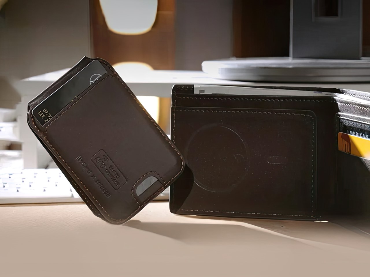
Remember bendgate? That infamous moment when the iPhone 6 Plus buckled under pressure, quite literally bending in people’s pockets and sparking a global conversation about smartphone durability. Apple learned from that debacle, but SUPCASE has taken the lesson to an entirely different level with their new UB Grip Pro case for the iPhone 17 Pro series. SUPCASE has essentially built a fortress around Apple’s latest flagship, complete with military-grade protection that makes the original bendgate controversy look like a gentle warm-up exercise. This case doesn’t just protect your phone; it turns it into an indestructible communication device that belongs in a superhero’s arsenal.
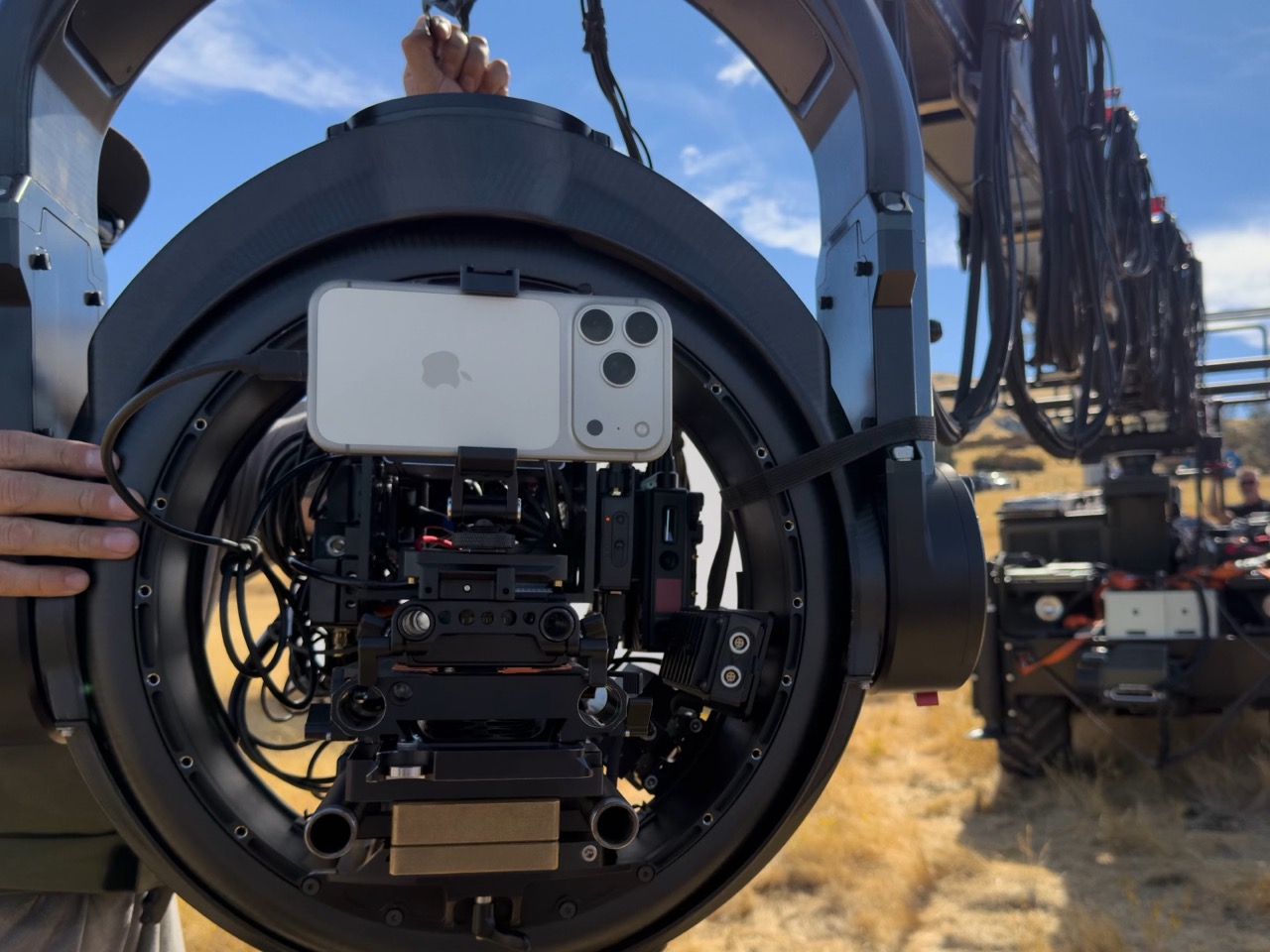
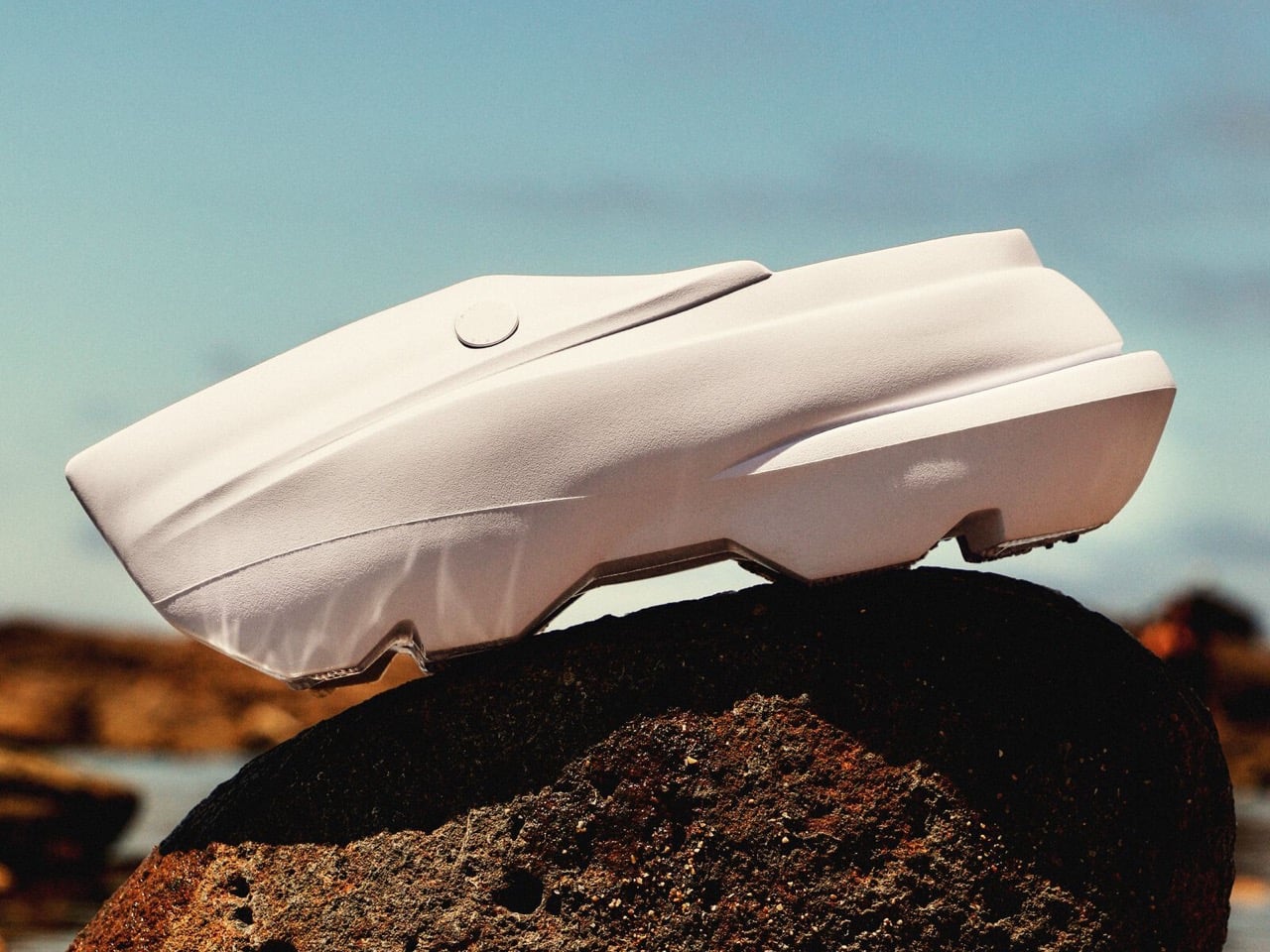
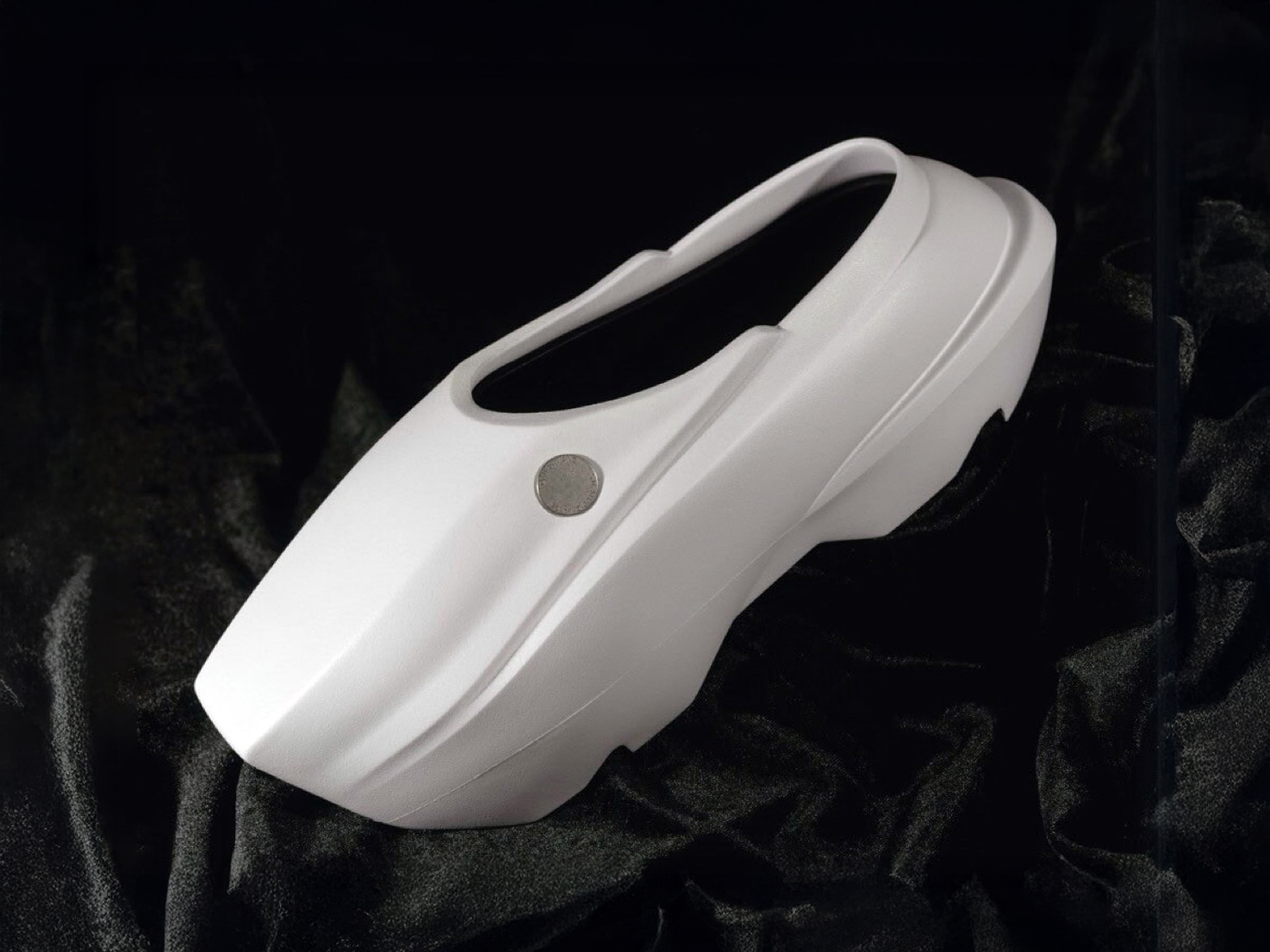
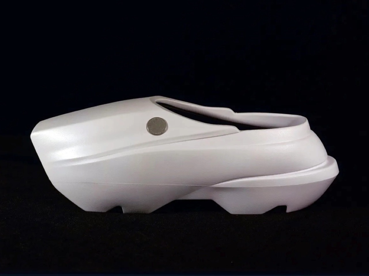
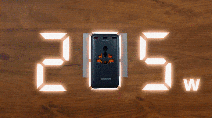
The UB Grip Pro represents SUPCASE’s evolution from their legendary Unicorn Beetle Pro series, trading the aggressive angular ridges for what they call “structural elegance.” The company has managed to create something that looks like it rolled off the assembly line of a high-end military contractor, complete with precision-milled aluminum components and a design language that screams industrial sophistication. The case wraps around the iPhone 17 Pro’s new aluminum-glass hybrid back and that distinctive horizontal camera bar with the kind of protection typically reserved for equipment heading into combat zones. SUPCASE claims 20-foot drop protection, which means your phone could theoretically survive falling from a second-story window and still boot up ready for your next video call. The four-corner airbag design distributes impact forces like a professional stunt coordinator, ensuring that even the most dramatic accidents become mere footnotes in your phone’s survival story.
Designer: Jet Weng
Click Here to But Now: $29.69 $32.99 (10% off, use coupon code “YANKOIP17”). Hurry, deal ends in 48-hours!

The integrated kickstand is rated to survive over 55,000 open-close cycles as per SUPCASE’s testing. SUPCASE built this component from aluminum alloy, giving it the kind of durability you’d expect from your own MacBook’s hinge rather than a some nondescript smartphone accessory online. The kickstand offers 120-degree portrait positioning and 57-degree landscape angles, perfect for taking advantage of the iPhone 17 Pro’s enhanced dual video recording capabilities. The ring grip function doubles as a security feature, essentially making it impossible to drop your phone during those one-handed photography sessions. When folded flat, the kickstand disappears into the case’s contours like a hidden weapon in a spy thriller, maintaining that sleek profile while keeping serious functionality at your fingertips.

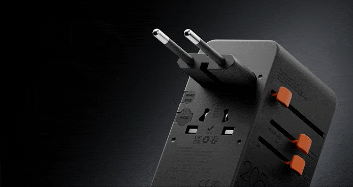
SUPCASE’s approach to MagSafe compatibility reads like something from a physics textbook. They’ve incorporated N52 magnets that generate seven times the magnetic force of standard cases, creating a hold strength of up to 1,800 grams. This means your iPhone will stick to magnetic car mounts with the tenacity of a gecko on glass, even during the bumpiest off-road adventures. The magnetic array ensures perfect alignment with MagSafe chargers, delivering the full 25W wireless charging speed without any of the positioning guesswork that plagues weaker magnetic cases. The magnets are strategically positioned to work seamlessly with the relocated Apple logo on the iPhone 17 Pro’s back panel, creating a perfectly centered aesthetic when using clear MagSafe accessories.

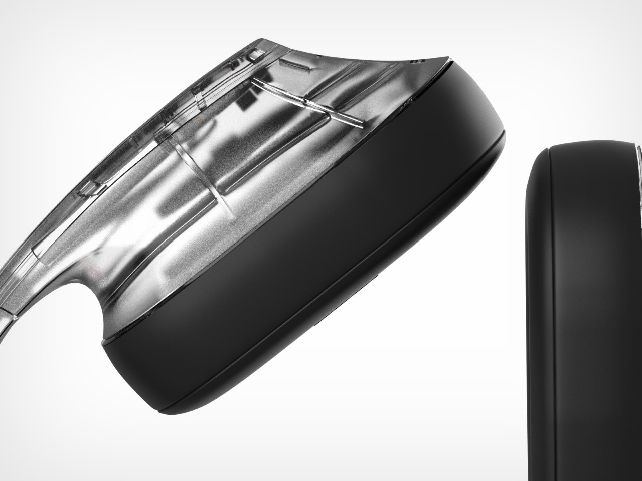
The camera zone usually wears the bruises, and the iPhone 17 Pro’s camera bar asks for dedicated protection. Reinforced impact zones wrap the rectangular module without turning it into a brick, a detail that matters in pockets and bags. Raised borders create clearance on tables while avoiding the harsh lip that snags on fabrics. Materials around this area feel denser and more resilient, which echoes the protective story without adding theatrical thickness. Photography stays comfortable to grip, especially when the ring is tucked and the case’s side texture takes over.

The Camera Control button features 19 copper conductors that deliver ultra-responsive feedback, making every shutter press feel as crisp and immediate as the bare phone. This level of precision engineering typically appears in professional camera equipment, not smartphone cases. The case’s textured surfaces provide grip security without sacrificing the premium feel that iPhone users expect. SUPCASE has managed to create a surface that feels substantial and secure in your hand while maintaining the kind of finish quality that wouldn’t look out of place in a luxury car interior.

The included 9H tempered glass screen protector completes the 360-degree protection package, turning your iPhone 17 Pro into a virtually indestructible communication device. Unlike many case manufacturers who treat screen protection as an afterthought or expensive add-on, SUPCASE includes premium glass protection right in the box. The 0.33mm thickness maintains touch sensitivity while providing hardness levels that rival sapphire crystal. The installation process integrates seamlessly with the case design, creating a unified protection system rather than a collection of separate accessories. This comprehensive approach means your iPhone receives laboratory-grade protection from the moment you unbox the case.

The UB Grip Pro comes in four colorways that complement the iPhone 17 Pro’s new finish options: classic black for stealth operations, Guldan for those who prefer darker sophistication, coral that matches the phone’s rumored new color options, and azure that adds a pop of personality to the industrial design. Each color maintains the same premium finish quality and attention to detail that makes this case feel like a custom piece of tactical equipment. SUPCASE has priced the UB Grip Pro competitively for what amounts to comprehensive protection that could save you from a costly device replacement. Available through SUPCASE’s official store and Amazon, this case promises to add armor-like properties to your phone, making it so strong even Hulk wouldn’t be able to bend it… probably.
Click Here to But Now: $29.69 $32.99 (10% off, use coupon code “YANKOIP17”). Hurry, deal ends in 48-hours!
The post Don’t blindly trust Apple’s build quality… this durable iPhone 17 Pro case has 20-foot drop protection first appeared on Yanko Design.