PROS:
- Striking "Sunset Glow" Golden Hour design
- 4K 60fps video recording on a mid-tier smartphone
- Powerful 50MP ZEISS Super Telephoto Camera
- Large 6,500mAh battery with super-fast 90W charging
CONS:
- 8MP ultra-wide camera is decent but mediocre
- No wireless charging
RATINGS:
SUSTAINABILITY / REPAIRABILITY
EDITOR'S QUOTE:
The vivo V70 proves that a clear camera identity and premium materials still matter at this price.
The mid-range smartphone segment is crowded in ways that make individual products hard to distinguish. Specs converge, designs flatten, and most phones feel interchangeable within days. vivo’s V70 enters that space with a clear point of view: a ZEISS-co-engineered telephoto camera tuned for stage photography and travel, a large battery built for long days, and a physical design that genuinely tries to look and feel like something worth keeping.
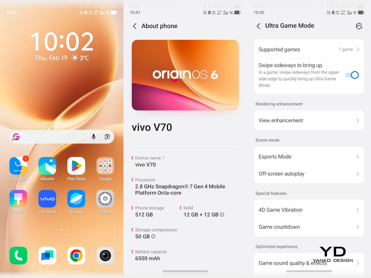
The v70 also introduces the Golden Hour edition, the most visually expressive option in the lineup, with an etched glass back, an aerospace-grade aluminum frame, and a ZEISS camera module with serious hardware inside. Running OriginOS 6 on a Snapdragon 7 Gen 4, it promises a telephoto-first camera experience for concerts and travel, backed by a 6,500mAh battery. Does the full package deliver on all of it? Read on.
Designer: vivo
Aesthetics
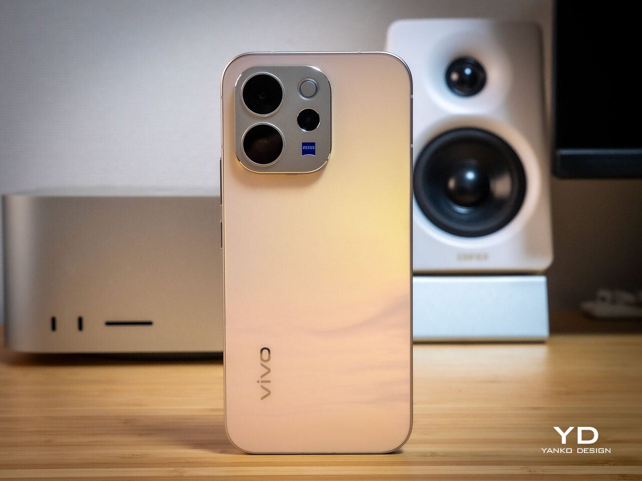
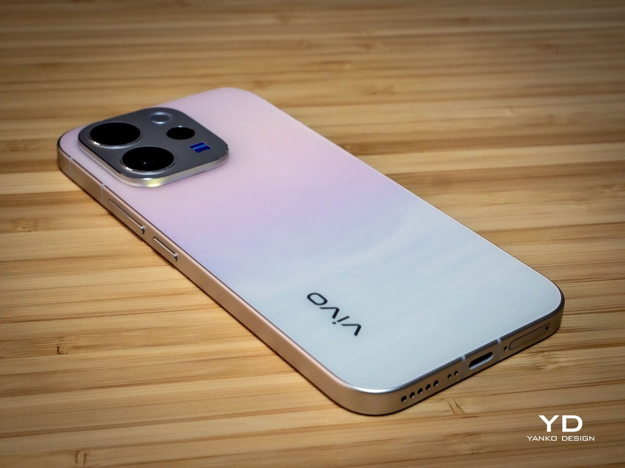
Of all the V70’s color options, the Golden Hour edition is the one most worth talking about. vivo uses a specialized chemical etching process to form micron-scale texture on the back glass, creating a diffuse reflection that reads as refined matte from a distance but reveals subtle warmth in direct light. It’s fingerprint-resistant and smooth without feeling slippery, a noticeably more considered finish than the glossy or painted backs that dominate this price tier.
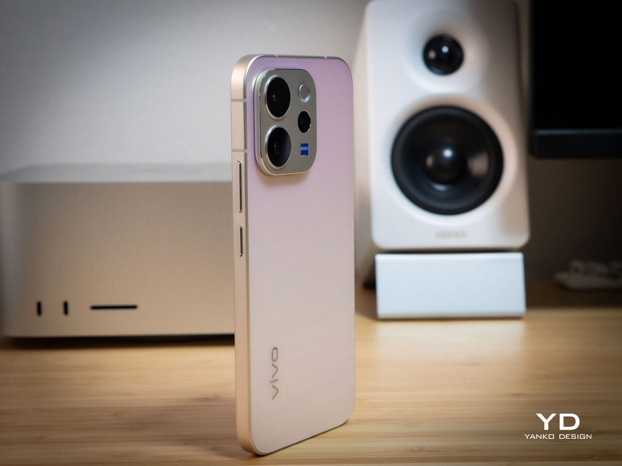
What’s more surprising is that the back doesn’t stay a single color. Depending on the viewing angle and ambient lighting, it shifts toward a cooler, slightly bluish hue you wouldn’t expect from a finish called Golden Hour. That unexpected chromatic movement makes it more visually engaging than a standard gradient, the kind of surface detail that keeps catching your eye without you fully understanding why.
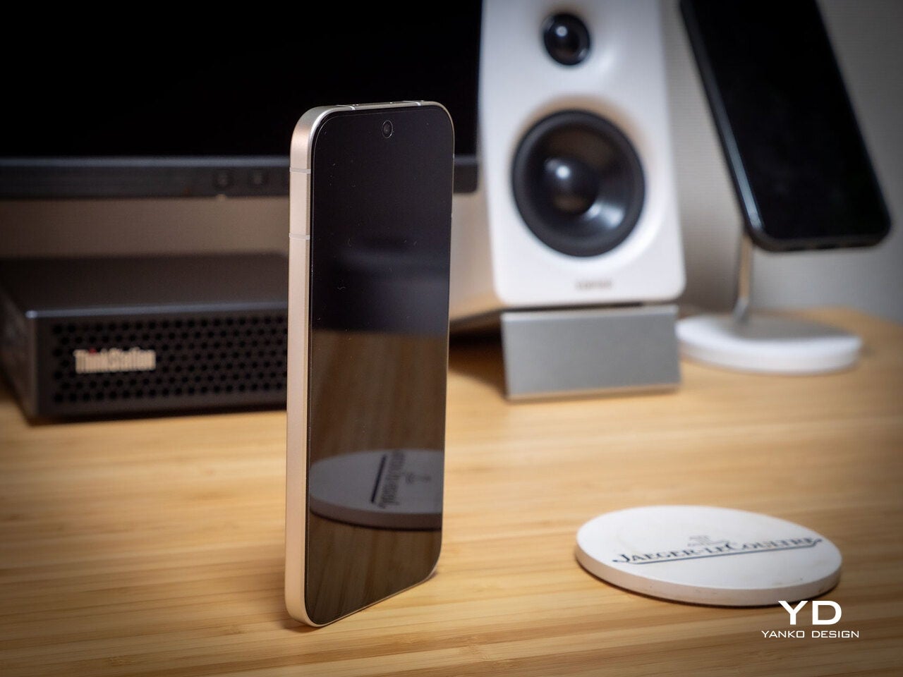
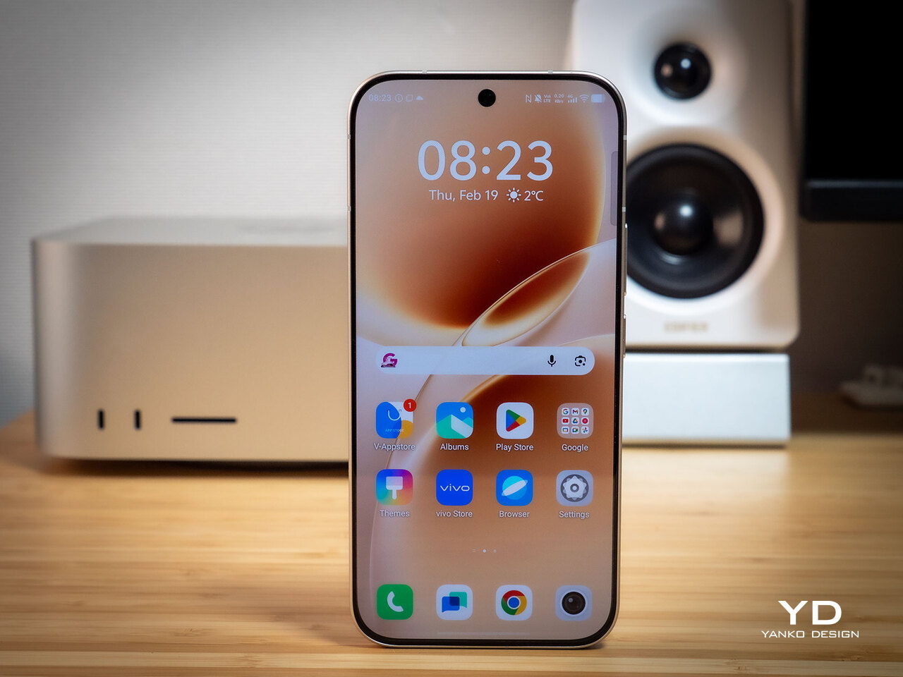
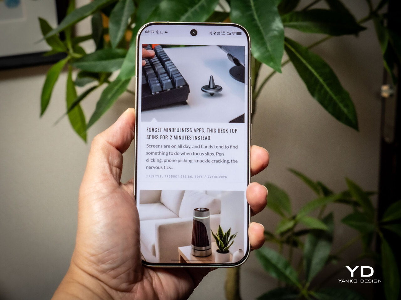
Around the front, the aerospace-grade aluminum alloy frame wraps a flat display with ultra-thin bezels measuring just 1.25 mm on the sides. Rounded corners soften the silhouette without cheapening it, and the flat screen is a deliberate departure from curved-edge designs that can distort content near the edges. The overall impression is controlled and considered rather than flashy, which suits the V70’s personality well.
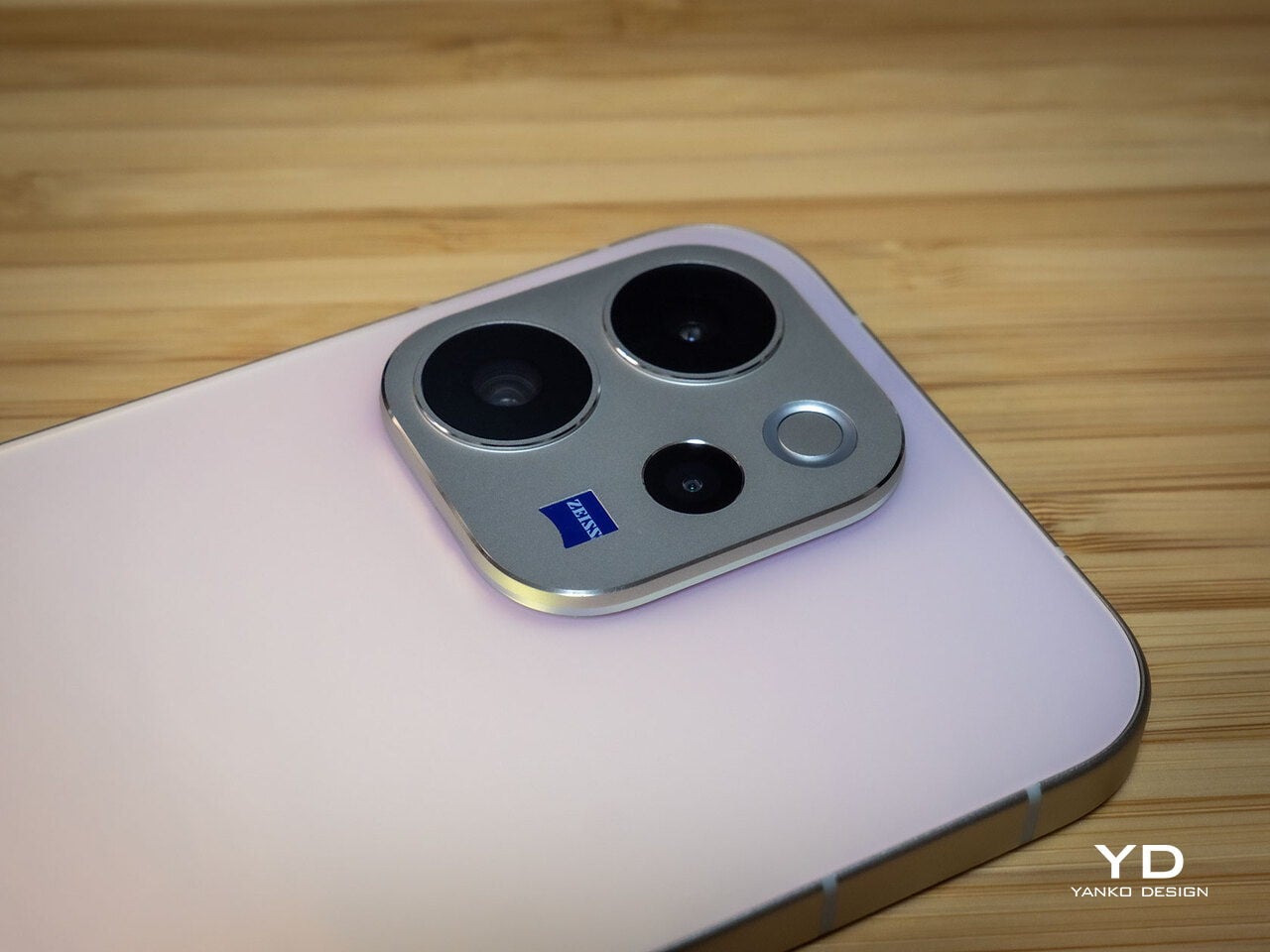
On the back, the camera module is a rounded metallic rectangle sitting just 3.29mm above the surface, low enough that the phone doesn’t rock noticeably on a table. Three lens rings and a ZEISS badge keep the composition clean without feeling crowded. It’s a well-executed rear panel that reinforces the premium identity without needing extra ornamentation to make the point.
Ergonomics
At 194g light and 7.59mm thick in the Golden Hour configuration, the vivo V70 feels present without being heavy. The matte AG glass provides enough grip for confident one-handed use without a case, and the flat sides and rounded corners make it comfortable to hold at its screen size. Weight distribution is balanced, which matters more for all-day carry than any single spec on a data sheet.
The 3D Ultrasonic Fingerprint Scanning 2.0 is one of the more underrated features here. It works reliably with damp fingers, meaning no frustrating tap-and-retry cycle after a workout or a skincare routine. Best of all, it’s located a good distance away from the bottom, so you don’t have to precariously shift your hand from its natural holding position just to unlock the phone.
Performance
Under the hood, the vivo V70’s Snapdragon 7 Gen 4 with LPDDR5X memory and UFS 4.1 storage handles everyday tasks and multitasking without hesitation, and a 4,200mm² vapor chamber keeps sustained performance steady during longer camera sessions. It’s not a chipset that headlines benchmark charts, but it delivers consistent, smooth day-to-day performance, which is more relevant to what the V70 is actually designed for than theoretical peak numbers.
The 6.59-inch 1.5K OLED runs at 120Hz with 459 PPI and peaks at 5,000 nits local brightness, which holds up well in direct sunlight and makes reviewing photos outdoors genuinely practical. Colors are rich without being oversaturated, and the 1.07-billion color depth makes gradient-heavy AI-edited shots look smooth rather than banded. It’s one of the better mid-range displays available at this price tier right now.


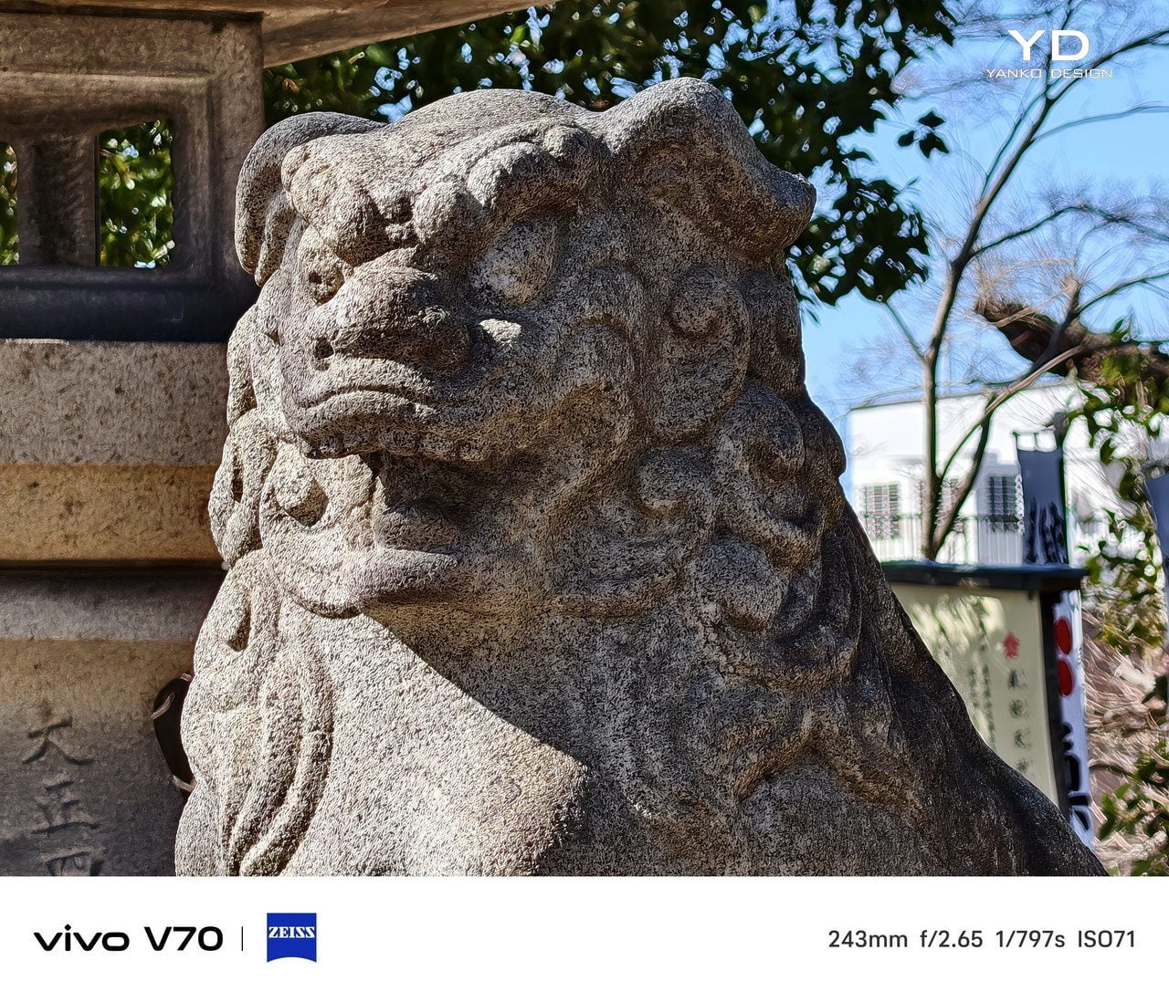
The camera system’s two stars are the 50MP main and 50MP periscope telephoto. The main uses a Sony LYT-700V sensor with a 1/1.56-inch surface area and OIS, delivering consistent, detailed portraits across daylight and mixed lighting. The telephoto uses a 1/1.95-inch sensor with its own OIS and a periscope structure that enables 10x zoom in a compact body. Both cameras consistently outperform what you’d expect at this price.


Of the three rear cameras, the 8MP ultra-wide is where things get more ordinary. It’s functional for casual wide shots, but the gap in detail and dynamic range between it and the main and telephoto cameras is noticeable. Given the vivo V70’s travel ambitions, wide landscape shots will come out looking more ordinary than portraits taken at the same destination. The phone’s real camera personality clearly lives in the other two lenses.


AI Stage Mode is a genuine differentiator if you attend live events regularly. At 10x zoom from 10m to 20m away, the AI Image Enhancement Algorithm and AI Style Portrait Technology combine to pull facial detail and expression clarity from performers under challenging stage lighting. It won’t replace a dedicated camera at that distance, but for a phone that fits in your jacket pocket, the results hold up surprisingly well.
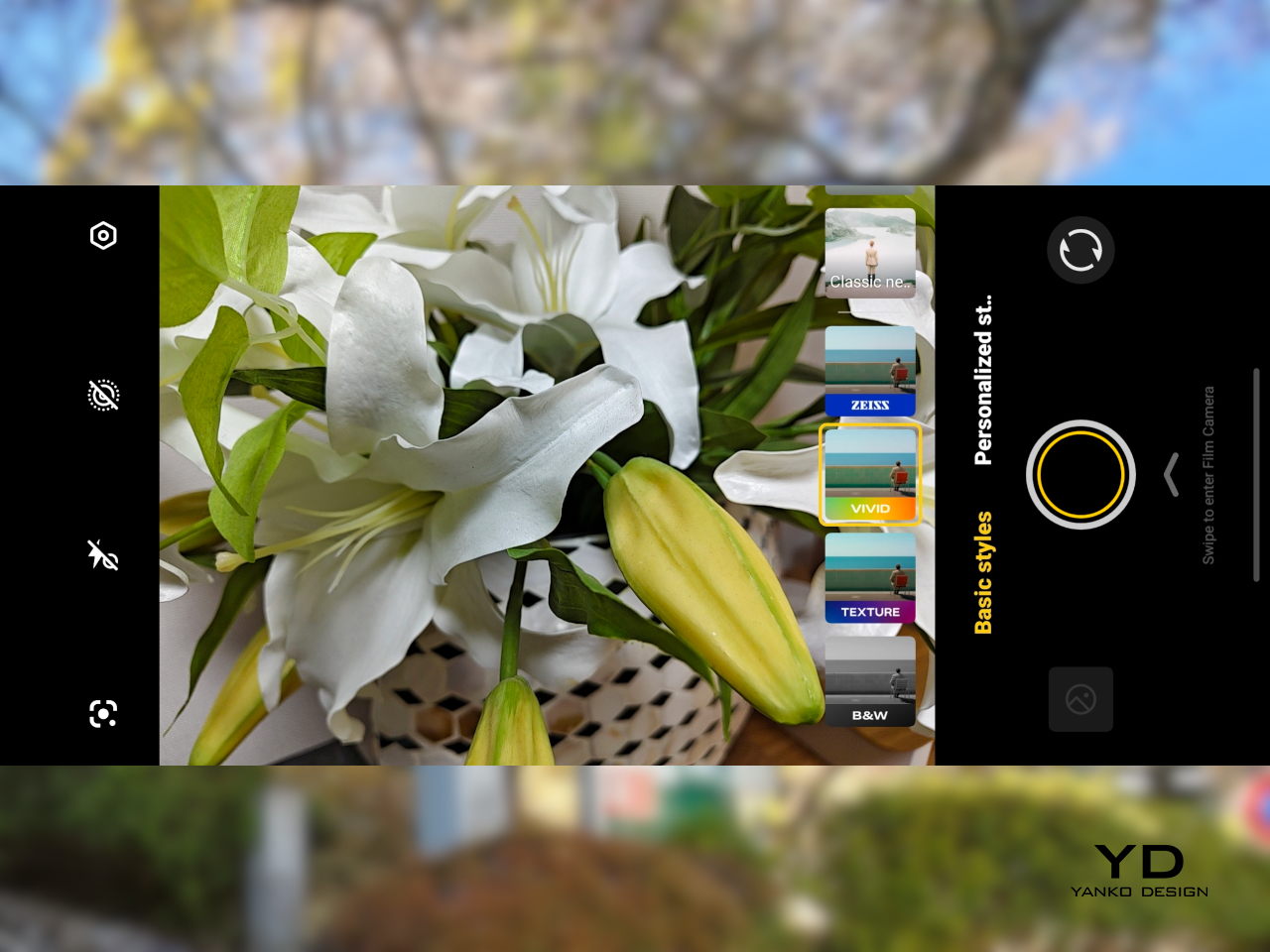
Video gets a meaningful upgrade with 4K 60fps, the first time the vivo V series has offered this, and footage looks cinematic when lighting cooperates. AI Audio Noise Eraser in post-editing selectively reduces wind noise, crowd chatter, or ambient sound from recorded clips. It sounds like a spec sheet bullet point until you actually try cleaning up a concert recording with it, and then it becomes a feature you’d miss on another phone.
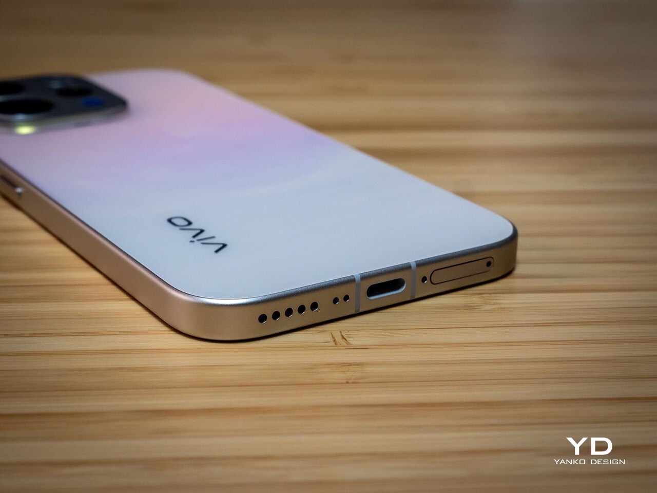
Battery life is a genuine strength. The 6,500mAh BlueVolt battery with 90W FlashCharge handles a full day of heavy use and then some, including heavy video playback. Wireless charging still isn’t part of the package, though, which will matter to those who’ve built it into their daily routine, but fast wired charging and a genuinely large battery soften that trade-off considerably.
Sustainability
vivo commits to four generations of OS updates and 6 years of security patches for the V70, placing it firmly in the category of phones worth keeping rather than replacing every two years. That’s the most meaningful sustainability argument a phone can make, applying regardless of materials or recycling programs. Longer software support means slower obsolescence, and slower obsolescence means less electronic waste accumulating on a shelf somewhere.
IP68 and IP69 ratings, combined with what vivo calls 10-Facet Drop Resistance, lower the anxiety of carrying a polished phone through real conditions. IP69 covers high-pressure water jets, going well beyond typical rain scenarios. That durability confidence changes how casually you handle the phone day to day, and there’s something genuinely reassuring about owning a device you don’t have to constantly worry about.
The material choices also support long-term ownership. Aerospace-grade aluminum and etched AG glass age more gracefully than glossy plastic, which yellows, scratches, and starts looking tired within a year of daily use. The matte texture stays presentable with minimal cleaning, and IP68/IP69 combined with drop resistance gives the V70 a realistic chance of surviving the accidents that typically end mid-range phones early.
Value
The V70 packages premium design, a ZEISS telephoto-first camera system, a strong OLED display, fast charging, and long software support into a price tier that usually demands more compromises. The Golden Hour finish gives it a visual identity that stands above most phones at its price, and the combination of AI Stage Mode with ZEISS Multifocal Portrait focal lengths makes it genuinely specialized rather than just generically capable.
The 8MP ultra-wide is the honest weak spot, and travelers who rely heavily on wide shots will feel that gap. Wireless charging is also absent. But what the V70 does well, it does consistently, and the combination of a premium-feeling design, a capable telephoto system, and 6 years of security updates makes it a phone that’s easy to justify and hard to grow out of quickly.
Verdict
The vivo V70 in Golden Hour is one of the more cohesive mid-range phones available right now. The etched glass with its unexpected bluish shift, the aluminum frame, the ultrasonic fingerprint sensor, the bright 1.5K OLED, and the ZEISS telephoto and portrait system all work together in a way that makes the phone feel intentional rather than assembled from a spec sheet and a parts catalog.
The 8MP ultra-wide and the absence of wireless charging are unfortunate blemishes on what is otherwise a remarkably well-rounded package. Both are real trade-offs rather than dealbreakers, though, and the vivo V70 earns its place as a phone that’s genuinely hard to fault for what it costs, especially if portrait photography, concert shooting, and long battery life are what matter most to you.
The post vivo V70 Review: A Concert Photographer’s Phone in Mid-Range Clothes first appeared on Yanko Design.