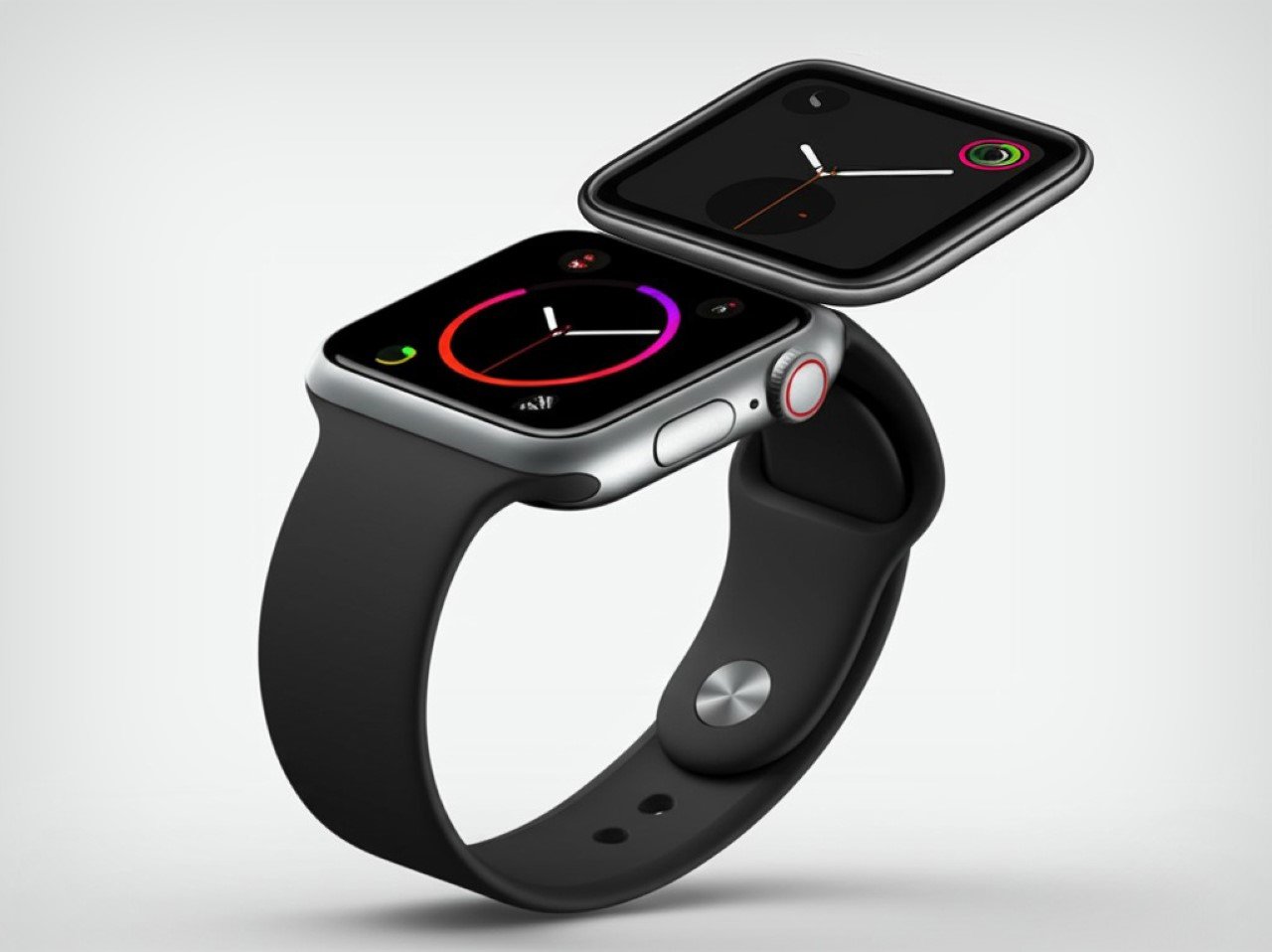
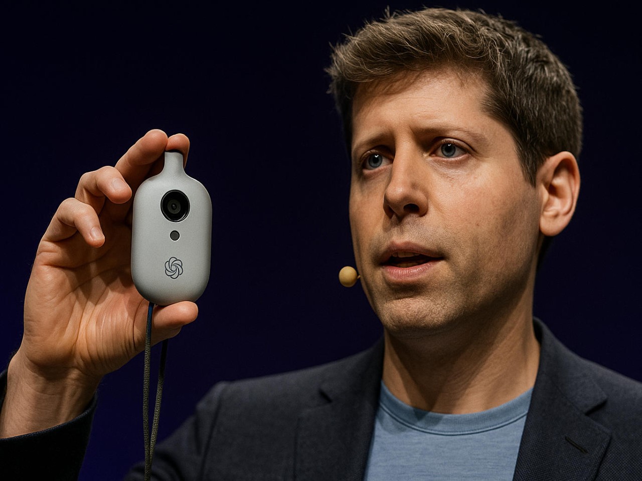
Everything We Know About Jony Ive’s $6.5 Billion Dollar ‘Secret’ AI Gadget
Let’s be honest, the tech world hasn’t felt this electric since Steve Jobs pulled the original iPhone from his pocket. Sure, we felt a few sparks fly in 2024 when Rabbit and Humane announced their AI devices, but that died down pretty quickly post-launch. However, when news broke that OpenAI had acquired Jony Ive’s mysterious startup “io” for a staggering $6.5 billion, the speculation machine kicked into overdrive. What exactly are the legendary Apple designer and ChatGPT’s creators cooking up together? The official announcement speaks vaguely of “a new family of products” and moving beyond traditional interfaces, but the details remain frustratingly sparse.
What we do know with certainty is limited. OpenAI and Ive’s company, io, are building something that’s reportedly “screen-free,” pocket-sized, and designed to bring AI into the physical world in a way that feels natural and ambient. The founding team includes Apple veterans Scott Cannon, Evans Hankey, and Tang Tan, essentially the hardware dream team that shaped the devices in your pocket and on your wrist. Beyond these confirmed facts lies a vast expanse of rumors, educated guesses, and wishful thinking. So let’s dive into what this device might be, with the appropriate grains of salt at the ready.
The Design: Ive’s Aesthetic Philosophy Reimagined

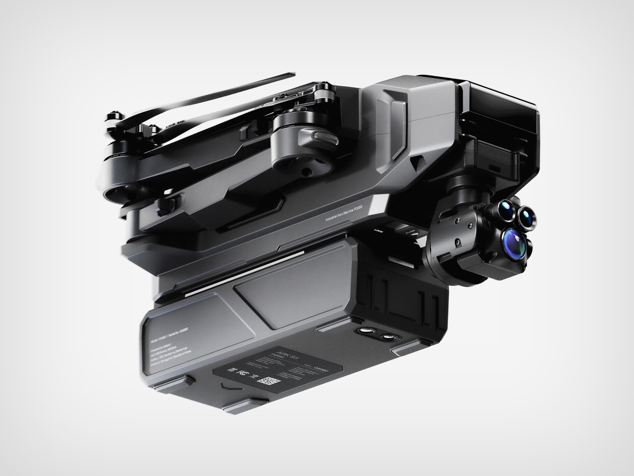
AI Representation
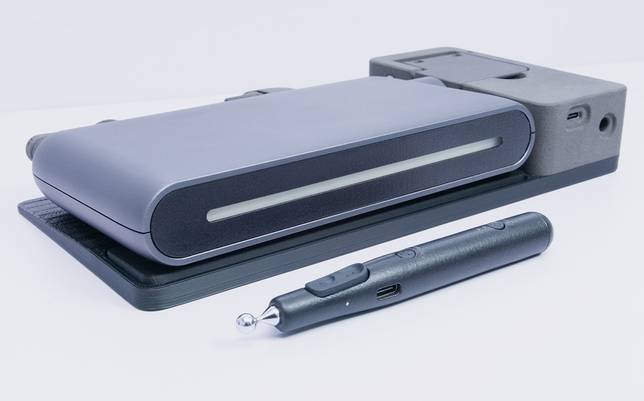
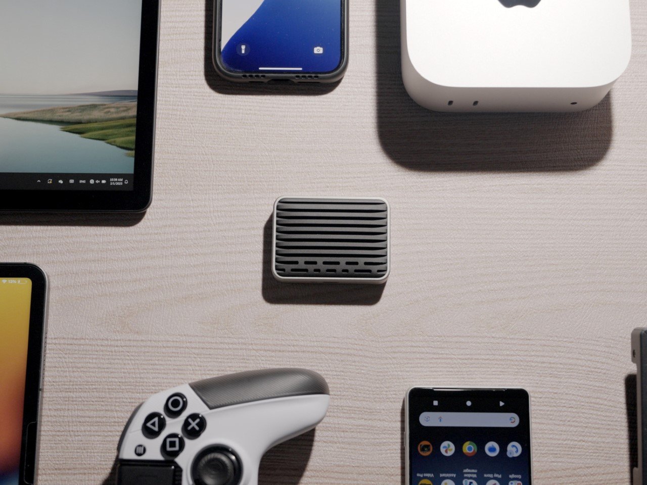
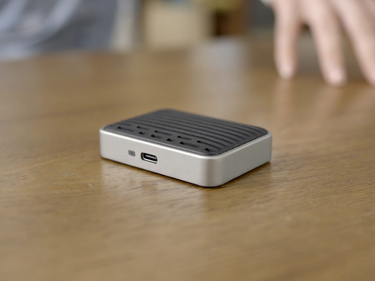
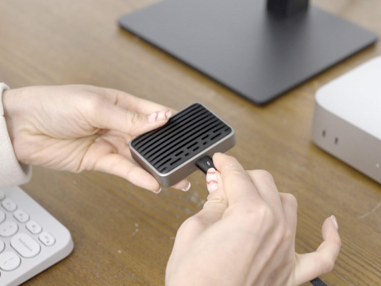
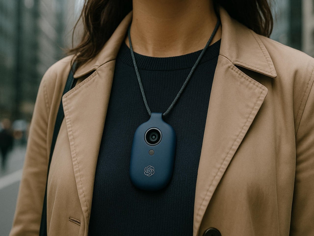
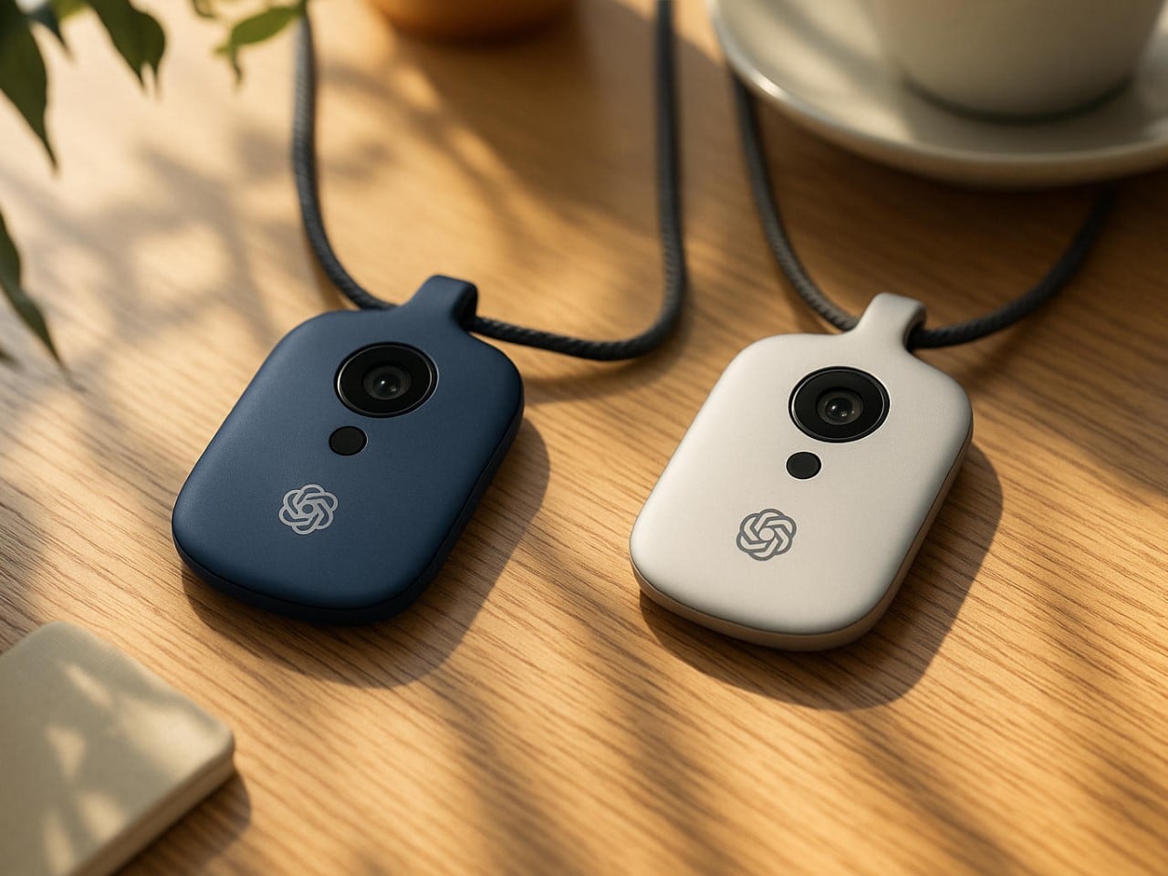
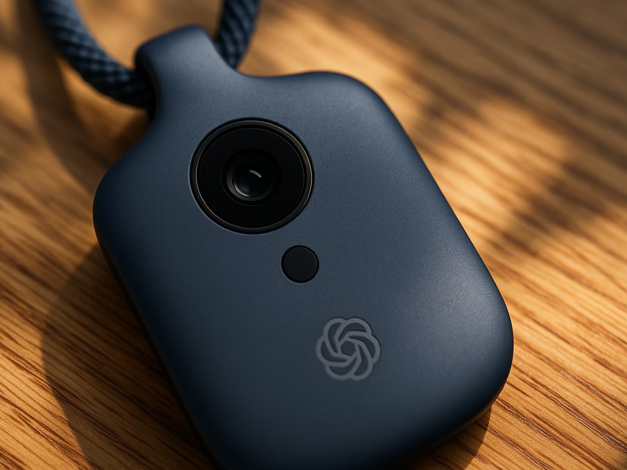
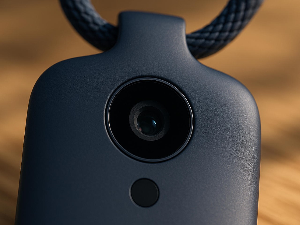
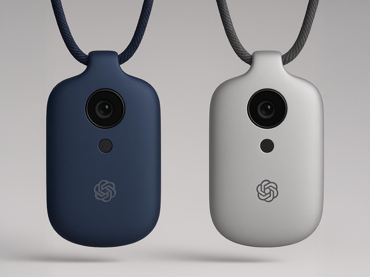
If there’s one thing we can reasonably predict, it’s that whatever emerges from Ive’s studio will be obsessively considered down to the micron. His design language at Apple prioritized simplicity, honest materials, and what he often called “inevitable” solutions, designs that feel so right they couldn’t possibly be any other way. A screen-free AI device presents a fascinating challenge: how do you create something tactile and intuitive without the crutch of a display?
I suspect we’ll see a device that feels substantial yet effortless in the hand, perhaps with a unibody construction milled from a single piece of material. Aluminum seems likely given Ive’s history, though ceramic would offer an interesting premium alternative with its warm, almost organic feel. The absence of a screen suggests the device might rely on subtle surface textures, perhaps with areas that respond to touch or pressure. Ive’s obsession with reducing visual complexity, eliminating unnecessary seams, screws, and buttons, will likely reach its logical conclusion here, resulting in something that looks deceptively simple but contains remarkable complexity.
Color choices will probably be restrained and sophisticated, think the elegant neutrals of Apple’s “Pro” lineup rather than the playful hues of consumer devices. I’d wager on a palette of silver, space gray, and possibly a deep blue, with surface finishes that resist fingerprints and wear gracefully over time. The environmental considerations that have increasingly influenced Ive’s work will likely play a role too, with recycled materials and sustainable manufacturing processes featured prominently in the eventual marketing narrative.
Technical Possibilities: AI in Your Pocket
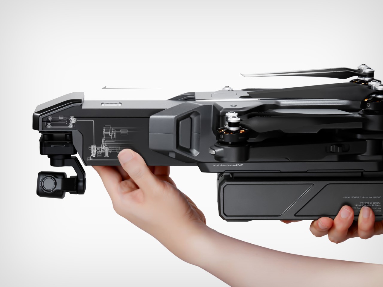
AI Representation
The technical challenge of creating a screen-free AI device is immense. Without a display, every interaction becomes an exercise in invisible design, the device must understand context, anticipate needs, and communicate through means other than visual interfaces. This suggests an array of sophisticated sensors and input methods working in concert.
Voice recognition seems an obvious inclusion, likely using multiple microphones for spatial awareness and noise cancellation. Haptic feedback, perhaps using Apple-like Taptic Engine technology or something even more advanced, could provide subtle physical responses to commands or notifications. The device might incorporate motion sensors to detect when it’s being handled or carried, automatically waking from low-power states. Some reports hint at environmental awareness capabilities, suggesting cameras or LiDAR might be included.
The processing requirements for a standalone AI device are substantial. Running large language models locally requires significant computational power and memory, all while maintaining reasonable battery life. This points to custom silicon, possibly developed with TSMC or another major foundry, optimized specifically for AI workloads. Whether OpenAI has the hardware expertise to develop such chips in-house remains an open question, though their Microsoft partnership might provide access to specialized hardware expertise. Battery technology will be crucial; a device that needs charging multiple times daily would severely limit its utility as an always-available AI companion.
The User Experience: Beyond Screens and Apps
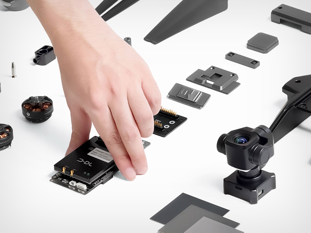
AI Representation
The most intriguing aspect of this rumored device is how we’ll actually use it. Without a screen, traditional app paradigms become irrelevant. Instead, we might see a return to conversational computing, speaking naturally to an assistant that understands context and remembers previous interactions. The “ambient computing” vision that’s been promised for years might finally materialize.
I imagine a device that feels less like a gadget and more like a presence, something that fades into the background until needed, then responds with uncanny intelligence. Perhaps it will use subtle audio cues or haptic patterns to indicate different states or notifications. The lack of a visual interface could actually enhance privacy; without a screen displaying potentially sensitive information, the device becomes more discreet in public settings. Of course, this also raises questions about accessibility, how will deaf users interact with a primarily audio-based device?
Integration with existing ecosystems will be crucial for adoption. Will it work seamlessly with your iPhone, Android device, or Windows PC? Can it control your smart home devices or integrate with your calendar and messaging apps? The answers remain unknown, but OpenAI’s increasingly broad partnerships suggest they understand the importance of playing nicely with others. The real magic might come from its predictive capabilities, anticipating your needs based on time, location, and past behavior, then proactively offering assistance without explicit commands.
Market Positioning and Price Speculation
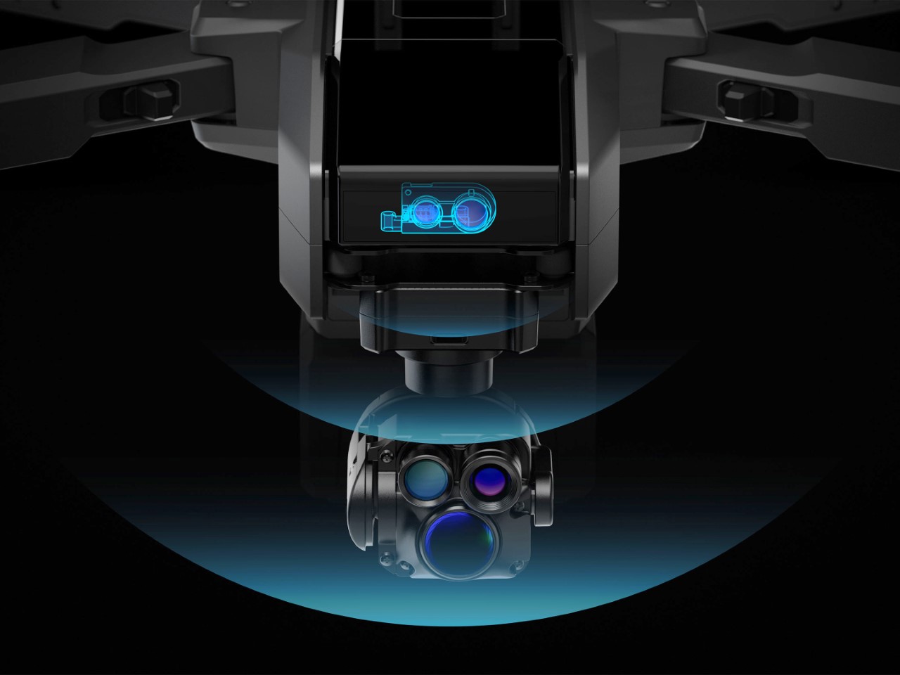
AI Representation
How much would you pay for an AI companion designed by the man behind the iPhone? The pricing question looms large over this project. Premium design and cutting-edge AI technology don’t come cheap, suggesting this will be positioned as a high-end device. Looking at adjacent markets provides some clues, Humane’s AI Pin launched at $699, while Rabbit’s R1 came in at $199, though both offer significantly less sophisticated experiences than what we might expect from OpenAI and Ive.
My educated guess places the device somewhere between $499 and $799, depending on capabilities and materials. A lower entry point might be possible if OpenAI adopts a subscription model for premium AI features, subsidizing hardware costs through recurring revenue. The target market initially appears to be tech enthusiasts and professionals, people willing to pay a premium for cutting-edge technology and design, before potentially expanding to broader consumer segments as costs decrease and capabilities improve.
As for timing, the supply chain whispers and regulatory tea leaves suggest we’re looking at late 2025 at the earliest, with full availability more likely in 2026. Hardware development cycles are notoriously unpredictable, especially for first-generation products from newly formed teams. The $6.5 billion acquisition price suggests OpenAI sees enormous potential in this collaboration, but also creates substantial pressure to deliver something truly revolutionary.
The Competitive Landscape: A New Category Emerges
AI Representation
The AI hardware space is still in its infancy. Early entrants like Humane have struggled with fundamental questions about utility and user experience. What makes a dedicated AI device compelling when smartphones already offer capable assistants? The answer likely lies in specialized capabilities that phones can’t match, perhaps always-on contextual awareness without battery drain, or privacy guarantees impossible on multipurpose devices.
OpenAI and Ive are betting they can define a new product category, much as Apple did with the iPhone and iPad. Success will require not just technical excellence but a compelling narrative about why this device deserves space in your life. The competition won’t stand still either, Apple’s rumored AI initiatives, Google’s hardware ambitions, and countless startups will ensure a crowded marketplace by the time this device launches.
The most fascinating aspect might be how this hardware play fits into OpenAI’s broader strategy. Does physical embodiment make AI more trustworthy, useful, or personable? Will dedicated devices provide capabilities impossible through software alone? These philosophical questions underpin the entire project, suggesting that Ive and Altman share a vision that extends beyond quarterly profits to how humans and AI will coexist in the coming decades.
What This Could Mean for the Future of Computing
AI Representation
If successful, this collaboration could fundamentally reshape our relationship with technology. The screen addiction that defines contemporary digital life might give way to something more ambient and less demanding of our visual attention. AI could become a constant companion rather than an app we occasionally summon, always listening, learning, and assisting without requiring explicit commands for every action.
The privacy implications are both promising and concerning. A device designed from the ground up for AI interaction could incorporate sophisticated on-device processing, keeping sensitive data local rather than sending everything to the cloud. Conversely, an always-listening companion raises obvious surveillance concerns, requiring thoughtful design and transparent policies to earn user trust.
For Jony Ive, this represents a chance to define the post-smartphone era, potentially creating his third revolutionary product category after the iPod and iPhone. For OpenAI, hardware provides a direct channel to users, bypassing platform gatekeepers like Apple and Google. The stakes couldn’t be higher for both parties, and for us, the potential users of whatever emerges from this collaboration.
Waiting for the Next Big Thing
AI Representation
The partnership between OpenAI and Jony Ive represents the most intriguing collision of AI and design talent we’ve seen yet. While concrete details remain scarce, the ambition is clear: to create a new kind of computing device that brings artificial intelligence into our physical world in a way that feels natural, beautiful, and essential.
Will they succeed? History suggests caution; creating new product categories is extraordinarily difficult, and first-generation devices often disappoint (raise your hands if you own a bricked Humane AI Pin or Rabbit R1. Yet the combination of OpenAI’s technical prowess and Ive’s design sensibility offers reason for optimism. Whatever emerges will undoubtedly be thoughtfully designed and technically impressive. Whether it finds a permanent place in our lives depends on whether it solves real problems in ways our existing devices cannot.
For now, we wait, analyzing every patent filing, supply chain rumor, and cryptic statement for clues about what’s coming. The anticipation itself speaks volumes about the state of consumer technology: in an era of incremental smartphone updates and me-too products, we’re hungry for something genuinely new. Jony Ive and Sam Altman just might deliver it.
The post Everything We Know About Jony Ive’s $6.5 Billion Dollar ‘Secret’ AI Gadget first appeared on Yanko Design.