Liquid Glass – the tech world’s abuzz with this new term from Apple’s design playbook following their reveal of the new slew of operating systems at WWDC 2025. What is liquid glass? Well, it’s a multi-tier strategy on Apple’s part to redefine interfaces, moving away from the minimalist elements to introduce gorgeously refractive glass-like modules instead. These glass elements interact with screen elements by bending light like real glass would. Think of holding a magnifying glass to a newspaper to watch the text around the edges warp while the center stays clear.
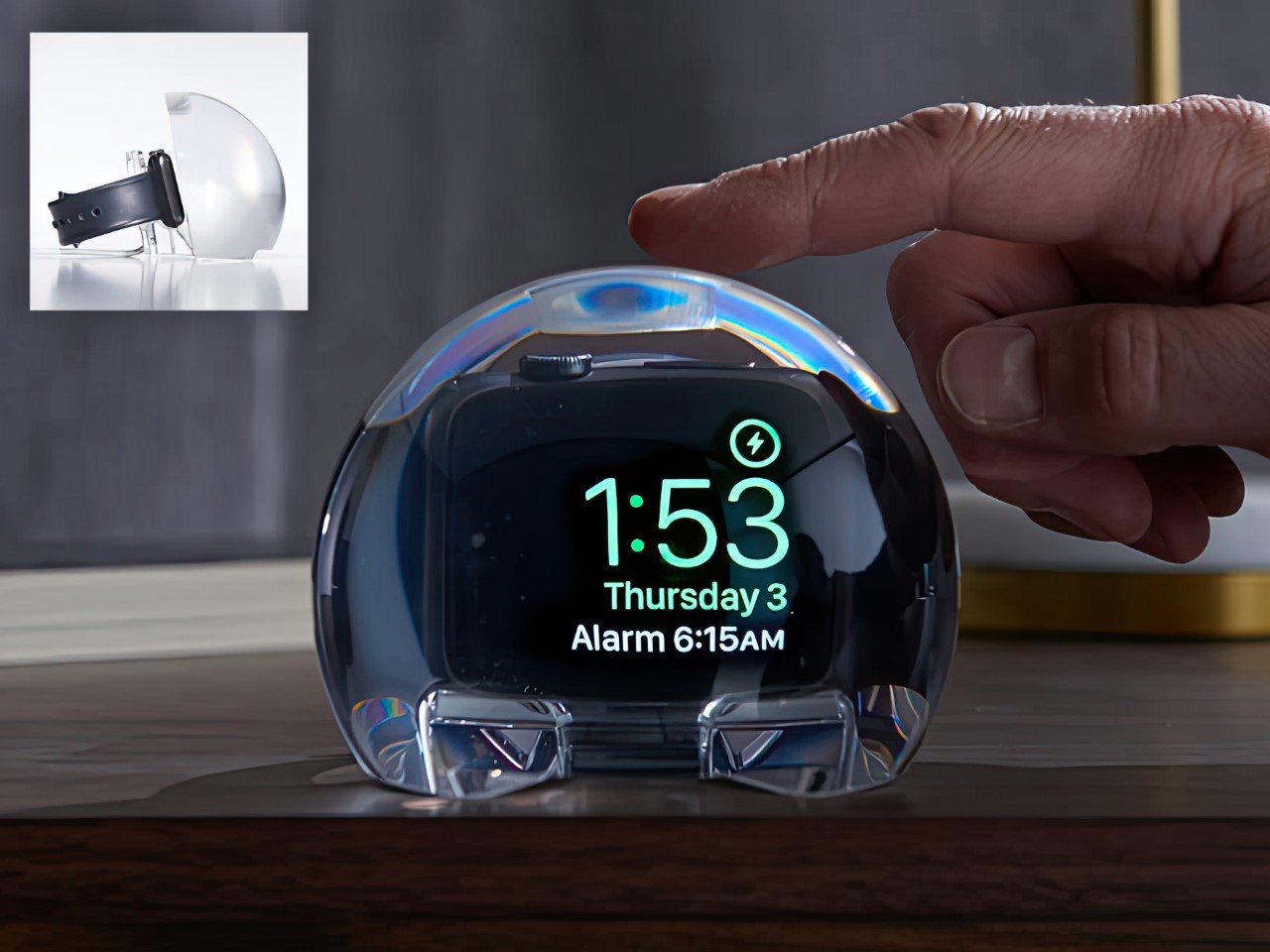
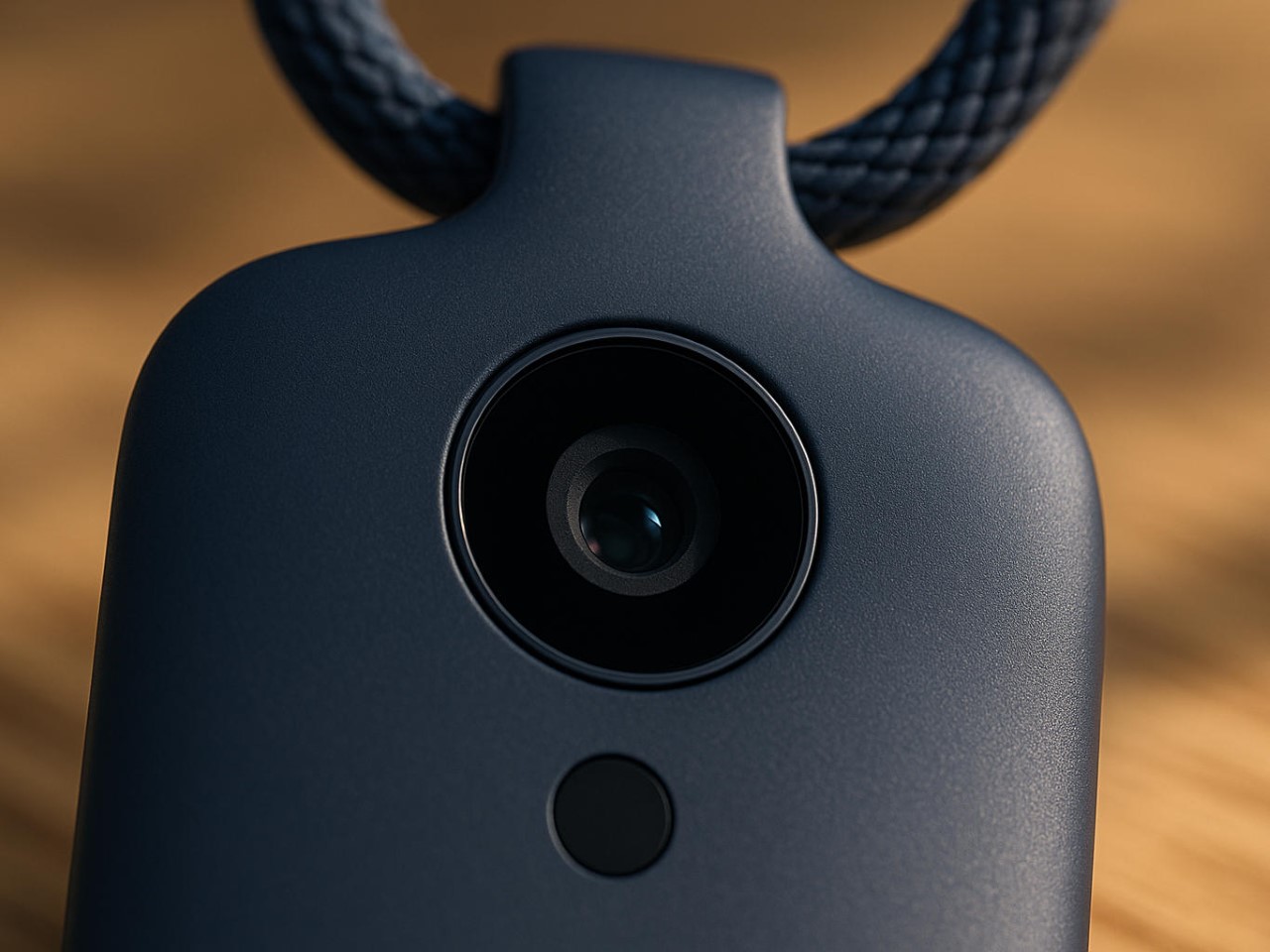
There’s speculation that this move towards glass-based interfaces was a conscious effort to further Apple’s spatial interface goals… but to be honest, we were in love with Liquid Glass back as early as 2021. What do I mean? Well, I’m talking about the NightWatch, an Apple Watch dock from 4 years ago that did exactly what Liquid Glass did, amplify the watch’s screen into a gorgeous liquid orb while your watch was charging!
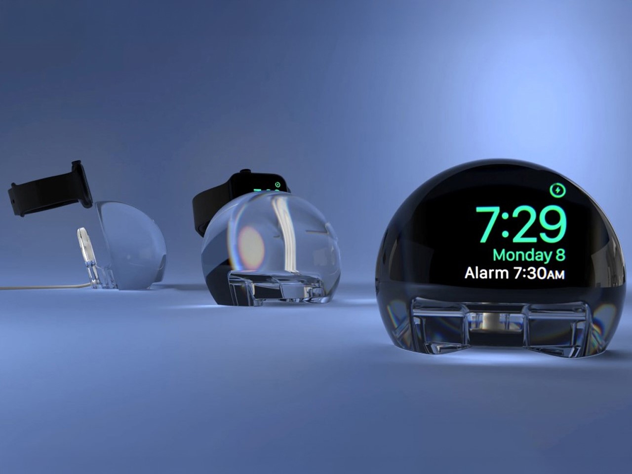
The NightWatch, as its name so succinctly implies, is a dock for your watch while it charges overnight. Shaped like a massive orb, this dock turns your watch’s night-time charging face into a massive, magnified alarm clock that’s easier to see. Moreover, the dock amplifies the watch’s audio too (through clever design details), transforming your Watch into a makeshift alarm clock that works remarkably well.
There’s no hidden components, no inner trickery – the entire NightWatch is a cleverly designed, solid piece of lucite that does three things remarkably well. First, it docks the Apple Watch and charger inside it, magnifying the watch screen so the numbers are clearly legible even from a couple of feet away. Secondly, channels located strategically under the Watch’s speaker units amplify the sound (sort of like how your voice is louder when you cup your hands around your mouth) so your alarm rings louder. Thirdly (and this might be the best feature yet), the lucite orb is touch-sensitive. Which means a mere tap on the surface causes your Watch screen to wake so you can see the time!
The dock may have been designed in 2021, but its design philosophies align with Apple’s Liquid Glass push brilliantly. Liquid Glass is all about mimicking real-world materials, bringing physicality to the digital world while still maintaining a pristine aesthetic that boosts focus and highlights important elements. That’s exactly what the NightWatch does too – it takes the Watch’s flat digital interface and brings real-world physicality to it through the refraction and magnification of the clear lucite. It also helps easily highlight important elements by enlarging your watch face for clearer timekeeping. The NightWatch is compatible with all Apple Watch series (as long as your watch doesn’t have a case on it).
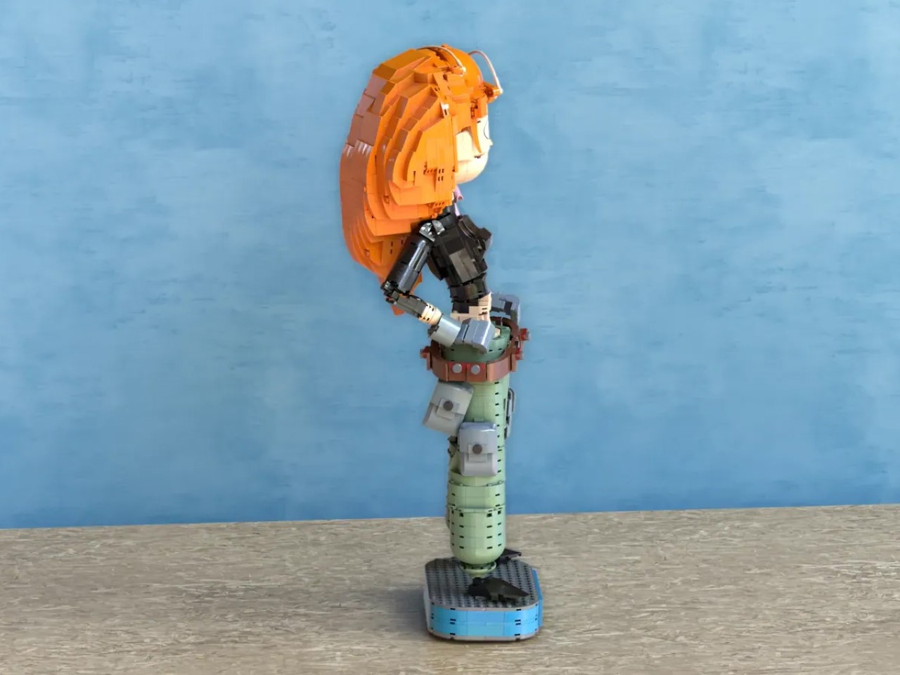
I didn’t know how much I needed Kim Possible back until I scrolled on the internet to stumble across this build staring back at me in glorious LEGO form – cargo pants, sassy side-eye, Rufus casually perched on her shoulder. For anyone who raced home from school to catch Kim flipping through air ducts and dodging laser beams, seeing her back (albeit in LEGO) feels somewhat cathartic – like the world really needs her to fight all the supervillains destabilizing the earth right now.
Crafted meticulously from 1,165 LEGO bricks, this build by teljesnegyzet captures every bit of Kim’s swagger in a statue standing 21 inches tall. That fiery orange hair, constructed from carefully layered wedge plates, is practically a sculpture on its own. You can almost see it waving dramatically after a perfectly executed backflip. The attention to detail is peak LEGO nerd territory, down to the perfectly recreated cargo pants using sand green tiles layered sideways. Pure genius.
Designer: teljesnegyzet
Rufus, the tiny naked mole-rat sidekick, hasn’t been overlooked either. He’s neatly built from just about 40 bricks, perched on Kim’s shoulder, looking a bit skeptical, just as he should. Cleverly, his position is adjustable with a hidden Technic pin, giving collectors that extra bit of fun when deciding exactly how judgmental Rufus should look today.
What’s impressive here is how the build stays authentic without relying on printed details. Kim’s iconic black crop top and even the eyebrow arch are entirely brick-built, letting simple shapes and smart brick choices do all the work. It’s classic LEGO magic, turning basic geometry into instantly recognizable characters. No shortcuts, no stickers, just genuine creativity.
With just over 130 days to reach the 5,000 supporter milestone on LEGO Ideas (currently around 1,831 supporters and counting), this feels doable. The comments section is buzzing with fans rediscovering Kim, others impressed by the design itself, even those who had to Google “who’s Kim Possible” first. This blend of spot-on nostalgia and clever building technique is exactly the kind of project that LEGO Ideas thrives on.
Whether this hits the shelves officially or stays a stunning fan-made concept, it’s proof of how strongly early 2000s Disney Channel nostalgia resonates. And to be honest, with the current state of global affairs, I really could do with some positive affirmation… even if it stands at 21 inches tall and reminds me of a time when life was so much better. If you share the same belief, you can head down to the LEGO Ideas website to cast your vote for this fan-made build.
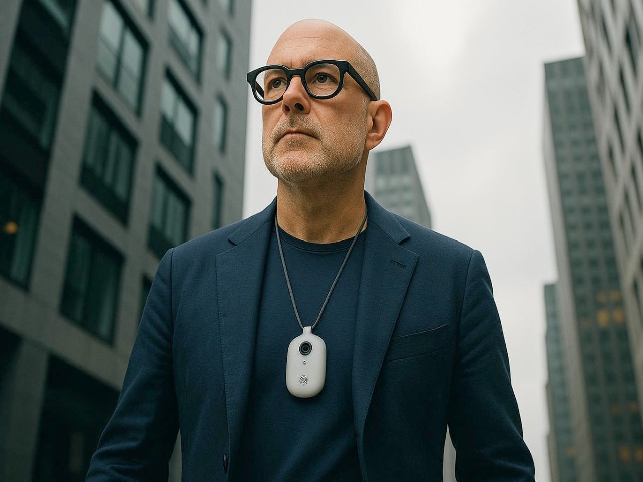
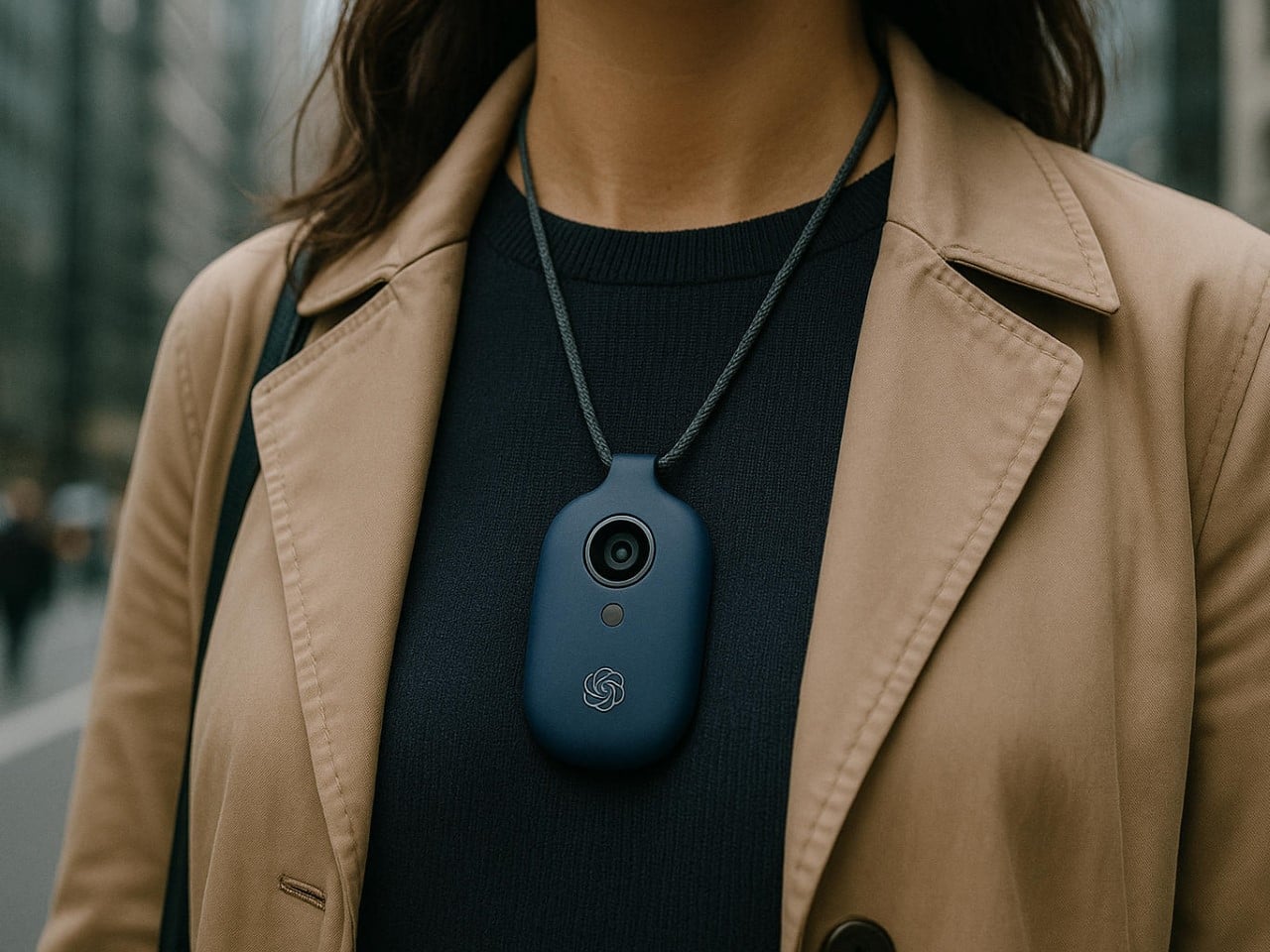
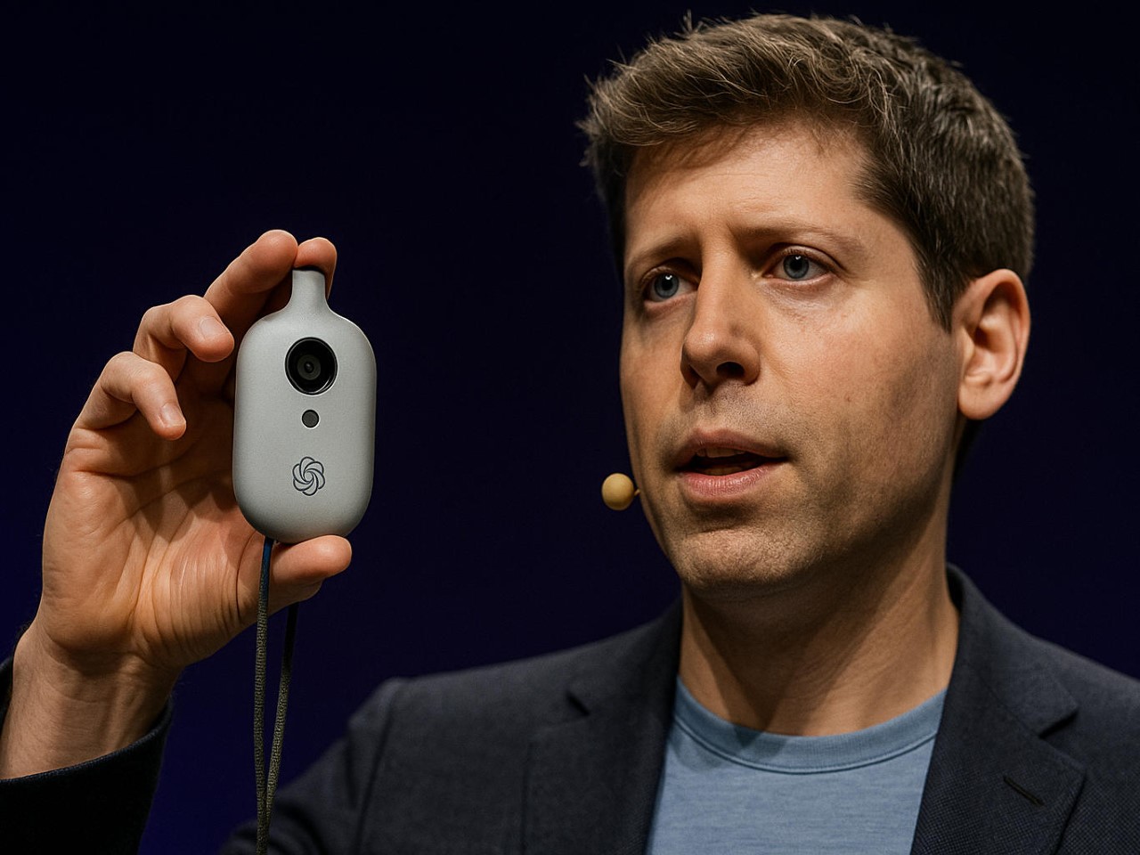
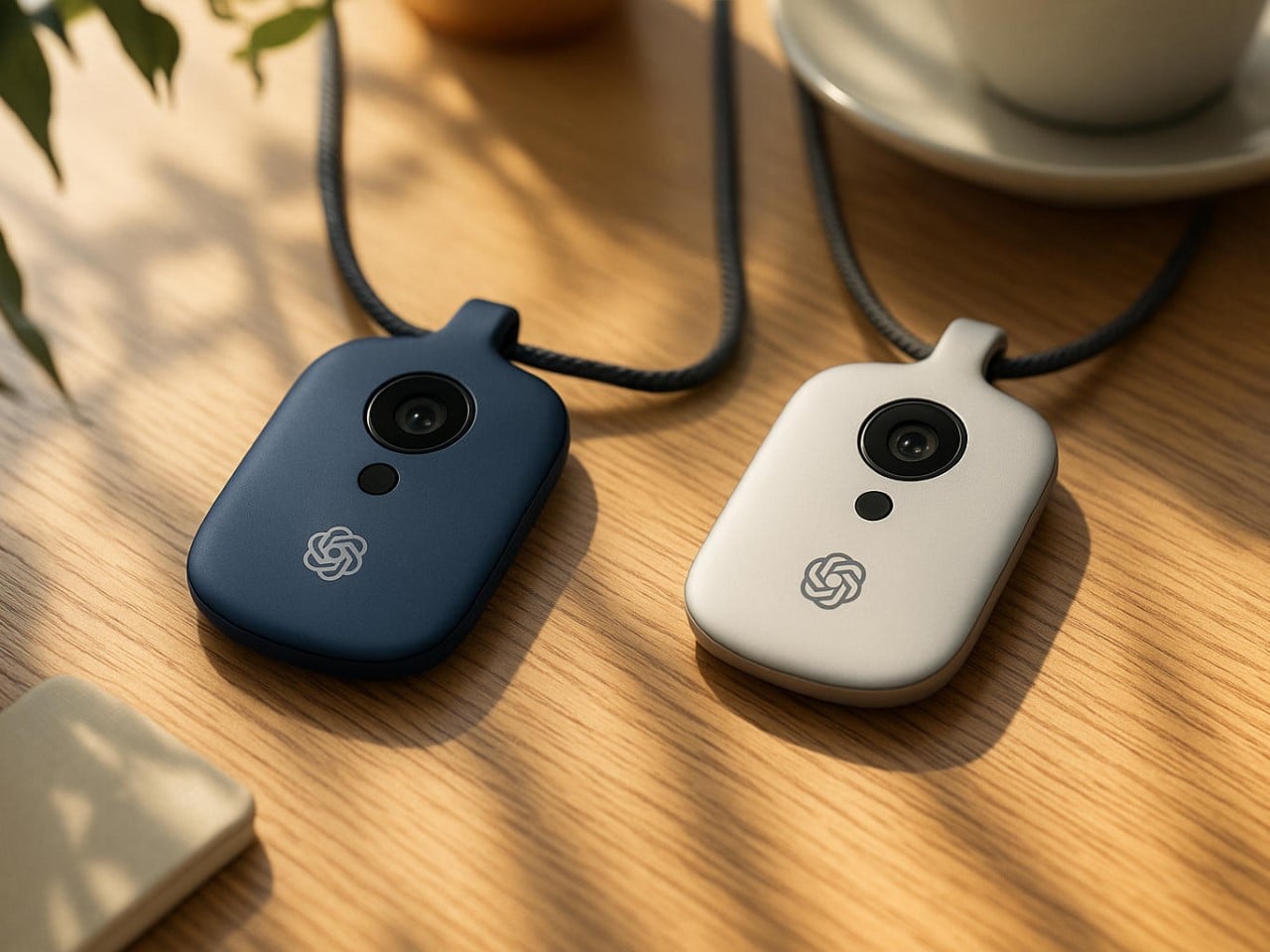
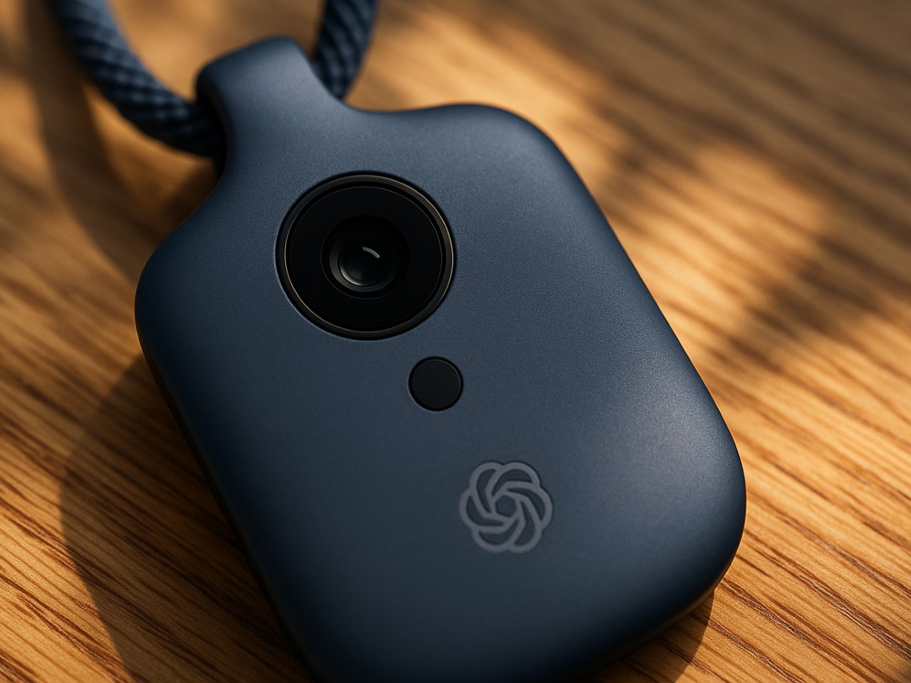
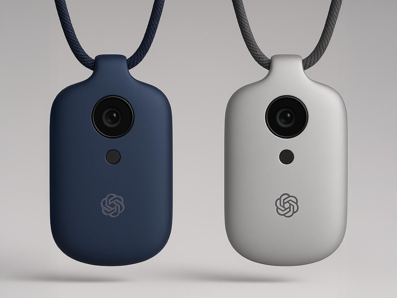
Let’s be honest, the tech world hasn’t felt this electric since Steve Jobs pulled the original iPhone from his pocket. Sure, we felt a few sparks fly in 2024 when Rabbit and Humane announced their AI devices, but that died down pretty quickly post-launch. However, when news broke that OpenAI had acquired Jony Ive’s mysterious startup “io” for a staggering $6.5 billion, the speculation machine kicked into overdrive. What exactly are the legendary Apple designer and ChatGPT’s creators cooking up together? The official announcement speaks vaguely of “a new family of products” and moving beyond traditional interfaces, but the details remain frustratingly sparse.
What we do know with certainty is limited. OpenAI and Ive’s company, io, are building something that’s reportedly “screen-free,” pocket-sized, and designed to bring AI into the physical world in a way that feels natural and ambient. The founding team includes Apple veterans Scott Cannon, Evans Hankey, and Tang Tan, essentially the hardware dream team that shaped the devices in your pocket and on your wrist. Beyond these confirmed facts lies a vast expanse of rumors, educated guesses, and wishful thinking. So let’s dive into what this device might be, with the appropriate grains of salt at the ready.
The Design: Ive’s Aesthetic Philosophy Reimagined
AI Representation
If there’s one thing we can reasonably predict, it’s that whatever emerges from Ive’s studio will be obsessively considered down to the micron. His design language at Apple prioritized simplicity, honest materials, and what he often called “inevitable” solutions, designs that feel so right they couldn’t possibly be any other way. A screen-free AI device presents a fascinating challenge: how do you create something tactile and intuitive without the crutch of a display?
I suspect we’ll see a device that feels substantial yet effortless in the hand, perhaps with a unibody construction milled from a single piece of material. Aluminum seems likely given Ive’s history, though ceramic would offer an interesting premium alternative with its warm, almost organic feel. The absence of a screen suggests the device might rely on subtle surface textures, perhaps with areas that respond to touch or pressure. Ive’s obsession with reducing visual complexity, eliminating unnecessary seams, screws, and buttons, will likely reach its logical conclusion here, resulting in something that looks deceptively simple but contains remarkable complexity.
Color choices will probably be restrained and sophisticated, think the elegant neutrals of Apple’s “Pro” lineup rather than the playful hues of consumer devices. I’d wager on a palette of silver, space gray, and possibly a deep blue, with surface finishes that resist fingerprints and wear gracefully over time. The environmental considerations that have increasingly influenced Ive’s work will likely play a role too, with recycled materials and sustainable manufacturing processes featured prominently in the eventual marketing narrative.
Technical Possibilities: AI in Your Pocket
AI Representation
The technical challenge of creating a screen-free AI device is immense. Without a display, every interaction becomes an exercise in invisible design, the device must understand context, anticipate needs, and communicate through means other than visual interfaces. This suggests an array of sophisticated sensors and input methods working in concert.
Voice recognition seems an obvious inclusion, likely using multiple microphones for spatial awareness and noise cancellation. Haptic feedback, perhaps using Apple-like Taptic Engine technology or something even more advanced, could provide subtle physical responses to commands or notifications. The device might incorporate motion sensors to detect when it’s being handled or carried, automatically waking from low-power states. Some reports hint at environmental awareness capabilities, suggesting cameras or LiDAR might be included.
The processing requirements for a standalone AI device are substantial. Running large language models locally requires significant computational power and memory, all while maintaining reasonable battery life. This points to custom silicon, possibly developed with TSMC or another major foundry, optimized specifically for AI workloads. Whether OpenAI has the hardware expertise to develop such chips in-house remains an open question, though their Microsoft partnership might provide access to specialized hardware expertise. Battery technology will be crucial; a device that needs charging multiple times daily would severely limit its utility as an always-available AI companion.
The User Experience: Beyond Screens and Apps
AI Representation
The most intriguing aspect of this rumored device is how we’ll actually use it. Without a screen, traditional app paradigms become irrelevant. Instead, we might see a return to conversational computing, speaking naturally to an assistant that understands context and remembers previous interactions. The “ambient computing” vision that’s been promised for years might finally materialize.
I imagine a device that feels less like a gadget and more like a presence, something that fades into the background until needed, then responds with uncanny intelligence. Perhaps it will use subtle audio cues or haptic patterns to indicate different states or notifications. The lack of a visual interface could actually enhance privacy; without a screen displaying potentially sensitive information, the device becomes more discreet in public settings. Of course, this also raises questions about accessibility, how will deaf users interact with a primarily audio-based device?
Integration with existing ecosystems will be crucial for adoption. Will it work seamlessly with your iPhone, Android device, or Windows PC? Can it control your smart home devices or integrate with your calendar and messaging apps? The answers remain unknown, but OpenAI’s increasingly broad partnerships suggest they understand the importance of playing nicely with others. The real magic might come from its predictive capabilities, anticipating your needs based on time, location, and past behavior, then proactively offering assistance without explicit commands.
Market Positioning and Price Speculation
AI Representation
How much would you pay for an AI companion designed by the man behind the iPhone? The pricing question looms large over this project. Premium design and cutting-edge AI technology don’t come cheap, suggesting this will be positioned as a high-end device. Looking at adjacent markets provides some clues, Humane’s AI Pin launched at $699, while Rabbit’s R1 came in at $199, though both offer significantly less sophisticated experiences than what we might expect from OpenAI and Ive.
My educated guess places the device somewhere between $499 and $799, depending on capabilities and materials. A lower entry point might be possible if OpenAI adopts a subscription model for premium AI features, subsidizing hardware costs through recurring revenue. The target market initially appears to be tech enthusiasts and professionals, people willing to pay a premium for cutting-edge technology and design, before potentially expanding to broader consumer segments as costs decrease and capabilities improve.
As for timing, the supply chain whispers and regulatory tea leaves suggest we’re looking at late 2025 at the earliest, with full availability more likely in 2026. Hardware development cycles are notoriously unpredictable, especially for first-generation products from newly formed teams. The $6.5 billion acquisition price suggests OpenAI sees enormous potential in this collaboration, but also creates substantial pressure to deliver something truly revolutionary.
The Competitive Landscape: A New Category Emerges
AI Representation
The AI hardware space is still in its infancy. Early entrants like Humane have struggled with fundamental questions about utility and user experience. What makes a dedicated AI device compelling when smartphones already offer capable assistants? The answer likely lies in specialized capabilities that phones can’t match, perhaps always-on contextual awareness without battery drain, or privacy guarantees impossible on multipurpose devices.
OpenAI and Ive are betting they can define a new product category, much as Apple did with the iPhone and iPad. Success will require not just technical excellence but a compelling narrative about why this device deserves space in your life. The competition won’t stand still either, Apple’s rumored AI initiatives, Google’s hardware ambitions, and countless startups will ensure a crowded marketplace by the time this device launches.
The most fascinating aspect might be how this hardware play fits into OpenAI’s broader strategy. Does physical embodiment make AI more trustworthy, useful, or personable? Will dedicated devices provide capabilities impossible through software alone? These philosophical questions underpin the entire project, suggesting that Ive and Altman share a vision that extends beyond quarterly profits to how humans and AI will coexist in the coming decades.
What This Could Mean for the Future of Computing
AI Representation
If successful, this collaboration could fundamentally reshape our relationship with technology. The screen addiction that defines contemporary digital life might give way to something more ambient and less demanding of our visual attention. AI could become a constant companion rather than an app we occasionally summon, always listening, learning, and assisting without requiring explicit commands for every action.
The privacy implications are both promising and concerning. A device designed from the ground up for AI interaction could incorporate sophisticated on-device processing, keeping sensitive data local rather than sending everything to the cloud. Conversely, an always-listening companion raises obvious surveillance concerns, requiring thoughtful design and transparent policies to earn user trust.
For Jony Ive, this represents a chance to define the post-smartphone era, potentially creating his third revolutionary product category after the iPod and iPhone. For OpenAI, hardware provides a direct channel to users, bypassing platform gatekeepers like Apple and Google. The stakes couldn’t be higher for both parties, and for us, the potential users of whatever emerges from this collaboration.
Waiting for the Next Big Thing
AI Representation
The partnership between OpenAI and Jony Ive represents the most intriguing collision of AI and design talent we’ve seen yet. While concrete details remain scarce, the ambition is clear: to create a new kind of computing device that brings artificial intelligence into our physical world in a way that feels natural, beautiful, and essential.
Will they succeed? History suggests caution; creating new product categories is extraordinarily difficult, and first-generation devices often disappoint (raise your hands if you own a bricked Humane AI Pin or Rabbit R1. Yet the combination of OpenAI’s technical prowess and Ive’s design sensibility offers reason for optimism. Whatever emerges will undoubtedly be thoughtfully designed and technically impressive. Whether it finds a permanent place in our lives depends on whether it solves real problems in ways our existing devices cannot.
For now, we wait, analyzing every patent filing, supply chain rumor, and cryptic statement for clues about what’s coming. The anticipation itself speaks volumes about the state of consumer technology: in an era of incremental smartphone updates and me-too products, we’re hungry for something genuinely new. Jony Ive and Sam Altman just might deliver it.
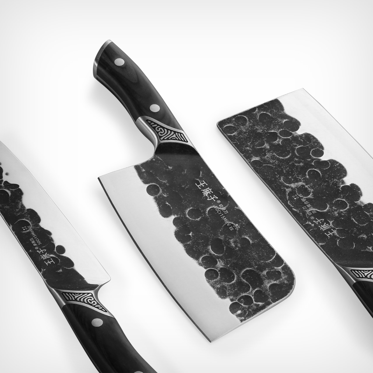
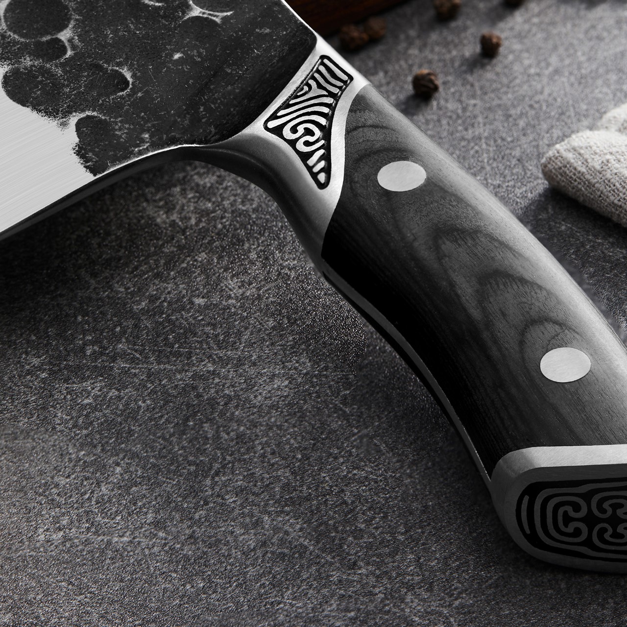
I’ve seen grunge, distressed, even hammered finishes – this is different. The Yin Mo Star Kui knives from Beijing Wang Mazi Tech are perhaps the most alluring set of kitchen knives I’ve rested my eyes on. A lot of kitchen knives resort to simple, functional design details (after all, they aren’t made for looks, they’re made for high-octane kitchen environments), but the Yin Mo Star Kui take functionality and merge it with aesthetic excellence in a way that elevates the knife’s visual DNA without taking too much from its performance.
In fact, as a winner of the A’ Design Award, one could argue that these knives are actually the pinnacle of form and function. They’re made with perfect proportions, a good ergonomic grip, a full-tang design, and that eye-catching battered finish that makes the knives look like cutting instruments that were weathered by asteroids.
Designer: Beijing Wang Mazi Technology
The set comprises 4 knives (although the images show just three) made from high-carbon steel, with a unique hot/cold forging method that results in high edge retention. Each knife is characterized by 3 unique details – first, the charred wood handles that play into the knife’s black and white aesthetic beautifully, secondly, the taotie pattern found at the tip of the handle, giving each knife its signature, and thirdly, the knife’s gorgeously weathered design that features multiple craters that give it a sense of gravitas. The texture, however, is immediately polished off as you move your eye downwards, revealing the blade’s sharp edge.
Each knife’s steel is made by hot-forging the steel at 1040°C, and then cooling it to -196°C. The hot forging process improves the overall strength and toughness by optimizing the shape and eliminating imperfections. The cooling enhances the crystal structure to increase resistance to deformation. Meanwhile, the rough texture on the top of the knives creates enough air pockets to allow the blade to glide through sticky or starchy foods without them adhering to the knife blades. Try sticking a suction pad on a textured surface and you’ll see it fails – the same principle applies here too.
Each knife set comes with a holder that allows you to put the knives on display, almost like you would a precious Katana. The holder doesn’t conceal the blade the way most knife holders do – instead, it conceals just the edge (for protection’s sake), but keeps that cratered, textured surface visible to the eye, given that it’s easily the knife’s highlight.
Motorola famously worked with Steve Jobs to bring iTunes to the Razr. Jobs hated the idea of having their software run on someone else’s hardware (which is why he created the iPhone), but up until Apple was ready to formally launch a phone, Jobs reluctantly partnered with Motorola. Now, for what it’s worth, there’s a Moto Razr out there, not with iTunes, but rather, with Windows XP running on it!
Shared on Reddit by Constant_Vehicle7539, this foldable Moto Razr 40 Ultra is running an emulated version of the famous Windows OS. The best part is that when opened halfway, it actually becomes a mini laptop of sorts, giving you a functional (or aesthetically functional, if I’m being accurate) Windows laptop – perhaps the smallest one ever made.
Designer: Constant_Vehicle7539
It’s crazy to actually see this in action. Constant_Vehicle7539 uses the Vectras VM QEMU emulator to run a Windows XP build on the phone. While there’s really no photo of the phone actually running an instance of the desktop (Constant_Vehicle7539 probably just didn’t take any photos), the images here show the boot screen and a few images of the OS setup. My favorite part is when the phone’s half open, looking like a miniature laptop with a touch keyboard. Apparently, Vectras VM offers different emulators, even Windows 11… but for us OG Windows users from back in the day, when we rocked Razrs, Ericssons, and Nokia N Series phones, this is a match made in heaven.
The emulator allows you to run an instance of Windows on any Android, so if you’ve got a dormant old phone lying in a cabinet gathering dust, this is a fun project you could work on. Your friends will be absolutely shocked to see Windows running on a smartphone. However, the only thing more shocking than this is the one time a crazy hacker managed to port iOS 18 onto a Nokia Lumia phone, making the operating system think it was an iPhone (with functional TouchID too!)
A good case protects your phone, a better case protects your phone without compromise, and a great case gives it extra features. I’ve seen phone cases that get away with doing the bare minimum. The TORRAS Ostand OFitness case isn’t one of those accessories. Aside from protecting your iPhone against impact, making it feel more ergonomic with rounded edges, retaining its MagSafe and wireless charging abilities, as well as enabling its Camera Control feature, the Ostand OFitness also packs a slim, popout ring that rotates a full 360° to let you prop your phone up without needing an external stand.
We saw the Ostand OFitness and the Ostand OAir at TORRAS’ booth at CES 2025, and the thing with any good company is that it iterates on its best-selling product – the Ostand range. The new Ostand OFitness is more durable and more ergonomic than before – but there’s more. The stand also allows your iPhone to wirelessly charge 30% faster than previous versions, and the MagSafe gets a boost thanks to hidden magnets that reinforce the feature for better accessory attachment. The Ostand OAir has the same features too, except with enhanced AirMax cushioning around the corners that feel like a puffer jacket for your phone. Neat, no?
Make a product good enough and chances are it’ll get ripped off almost immediately. However, I’m yet to see a ripoff of the Ostand series of cases from TORRAS. The reason being (and I saw this first-hand in 2024), they’re over-engineered to the point of being impossible to replicate without pouring millions into R&D. That O-shaped stand (which is where the series gets its name from), is a technical marvel, with space-grade metallic components small enough for the eye to barely see, magnets so slim they’re almost paper thin – but also incredibly powerful, and a hinge that’s ridiculously sleek, bringing laptop-hinge-level friction into something that’s just a couple millimeters thick.
The Ostand OFitness builds on that stellar R&D with a case that’s somehow even better than before. It comes in five pastel shades that are equal parts subtle yet eye-catching, with a frosted transparent plastic back that’s fingerprint and smudge-proof, and a TPU bumper with built-in Airstrip Airbags that provide extra protection to your phone from drops and bumps. Meanwhile, the outside of the bumper is lined with textural dots that enhance your grip, giving those airbags a run for their money because you’ll probably never accidentally drop your phone. Meanwhile, the camera bump gets its own 1.5mm protective lip to absorb any impact so your phone’s precious lens system remains unscathed.
The star of the show, however, is that O-shaped ring that sits absolutely flush into the case-back. It isn’t like those snap-on rings or pop-sockets that protrude from the back of your phone, absolutely ruining the aesthetic. You barely know it’s there when it’s shut, but tuck your finger into the slight divet, and you can prop open the ring, which can then be used as a grip or a stand. The ring’s hinge is fairly stiff, so it holds its angle like the friction-hinge seen on laptops. This means you can prop your phone up at any angle, going from a mere 20° all the way up to 60°. The ring also rotates on its hub like a hubless wheel (thanks to that incredibly engineered design), allowing you to prop your phone in landscape or portrait.
Built into the ring are a series of magnets that allow the ring to snap shut securely, but they also serve to ‘boost’ your phone’s MagSafe powers. Most cases can sometimes interfere with your iPhone’s MagSafe magnetic array, but with the right boost, the Ostand OFitness actually ‘increases’ the MagSafe power, allowing accessories to snap on way more securely. Meanwhile, all the buttons remain accessible through individual button bumps, although the Camera Control area gets a cutout, allowing your finger to intuitively sit in the groove and control the camera features using the phone’s capacitive touch surface.
Meanwhile, the Ostand OAir has a slightly more unique design thanks to those exaggerated bumpers on the top and bottom, providing an extra layer of edge-protection along with the same features as the Ostand OFitness. Sometimes a case is more than just a protective cover and functional tool for people, it’s also a style statement – that’s where the Ostand OAir comes in, quite literally making your phone look like it’s wearing a classy puffer jacket!
That said, the cases aren’t for a specific demographic. They’re quite literally for everybody because they enhance the iPhone’s usability. The O-ring can be used for functionality or fidget, making it perfect for content creators, consumers, or anyone in between. And hey, don’t worry about these cases turning yellow with time – TORRAS stands behind its cases and has been doing so for the past 16 years. If they can engineer a magnetic ring with a 360° swiveling design, they can ensure their products don’t yellow or patina with time!
Somewhere between building nuclear fusion reactors and decoding the human genome, humanity paused… and decided that peeing shouldn’t be a messy ordeal. Enter the Nautilus urinal: a piece of plumbing so thoughtfully engineered that it makes the 100-year-old standard look like a cruel prank played on pants and public floors everywhere.
Scientists at the University of Waterloo – yes, fittingly named – approached the urinal problem with the same earnest precision usually reserved for spacecrafts and particle accelerators. They didn’t just eyeball it. They fired a dyed-water jet through a urethra-mimicking nozzle onto test surfaces angled meticulously between 0 and 90 degrees. What they found would make even Newton nod approvingly: angles over 30 degrees are splash factories. Anything shallower drastically tames the wild energy of a stream. That led them to craft the Nautilus, a urinal that captures and channels urine like a fluid dynamics masterpiece, reducing splashback by a staggering 98%.
Designers: Kaveeshan Thurairajah, Xianyu (Mabel) Song, J D Zhu, Mia Shi, Ethan A Barlow, Randy C Hurd, Zhao Pan (University of Waterloo)
Visually, it’s a sleek swirl of ceramic engineering, a tighter, more inviting spiral that looks more like a modernist sculpture than a bathroom fixture. Unlike the brutish slanted walls of traditional urinals, the Nautilus hugs the stream, guiding it along a smooth, gentle curve with the elegance of a Formula 1 racetrack designed purely for liquids. And while there’s a brutalist Cornucopia prototype that looks like it came from Elon Musk’s fever dream, the Nautilus is the undisputed champion, working for users of almost any height, which is kind of a miracle when you realize how unregulated the chaos of public restroom aim usually is.
And this wasn’t just an aesthetic choice. The Nautilus was torture-tested with poor aim scenarios, erratic flow rates, and simulated misfires. Yet, it consistently captured everything with a grace that makes you wonder why we tolerated Jackson Pollock floors for so long. The data is even more satisfying: switching North America over to Nautilus-style urinals could save up to 10 million liters (2.6 million gallons) of water per day. That’s not small change when cities are scraping the barrel for every drop.
It’s easy to romanticize grand challenges – curing cancer, saving the planet – but life is a patchwork quilt stitched from a thousand tiny annoyances. Pee splash isn’t glamorous, but it’s real. It’s the kind of everyday indignity that quietly erodes dignity and comfort without anyone noticing until suddenly, they’re standing in it.
That’s the magic of design thinking at its best: no problem too petty, no dignity too small to preserve. And the payoff is tangible. Imagine cleaner public bathrooms, lower maintenance costs, fewer eco-unfriendly cleaning products being dumped down the drain. Suddenly, a small tweak in geometry feels like it shifts the axis of civilization a few degrees toward better.
Maybe the real sign of a society leveling up isn’t flying cars or robot butlers. Maybe it’s how little urine ends up where it shouldn’t be.
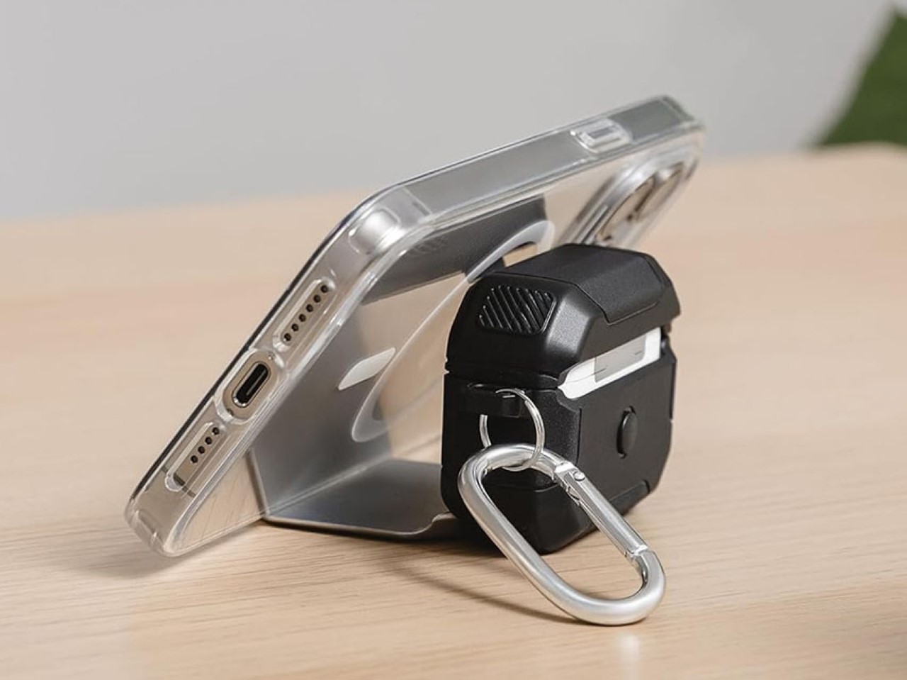
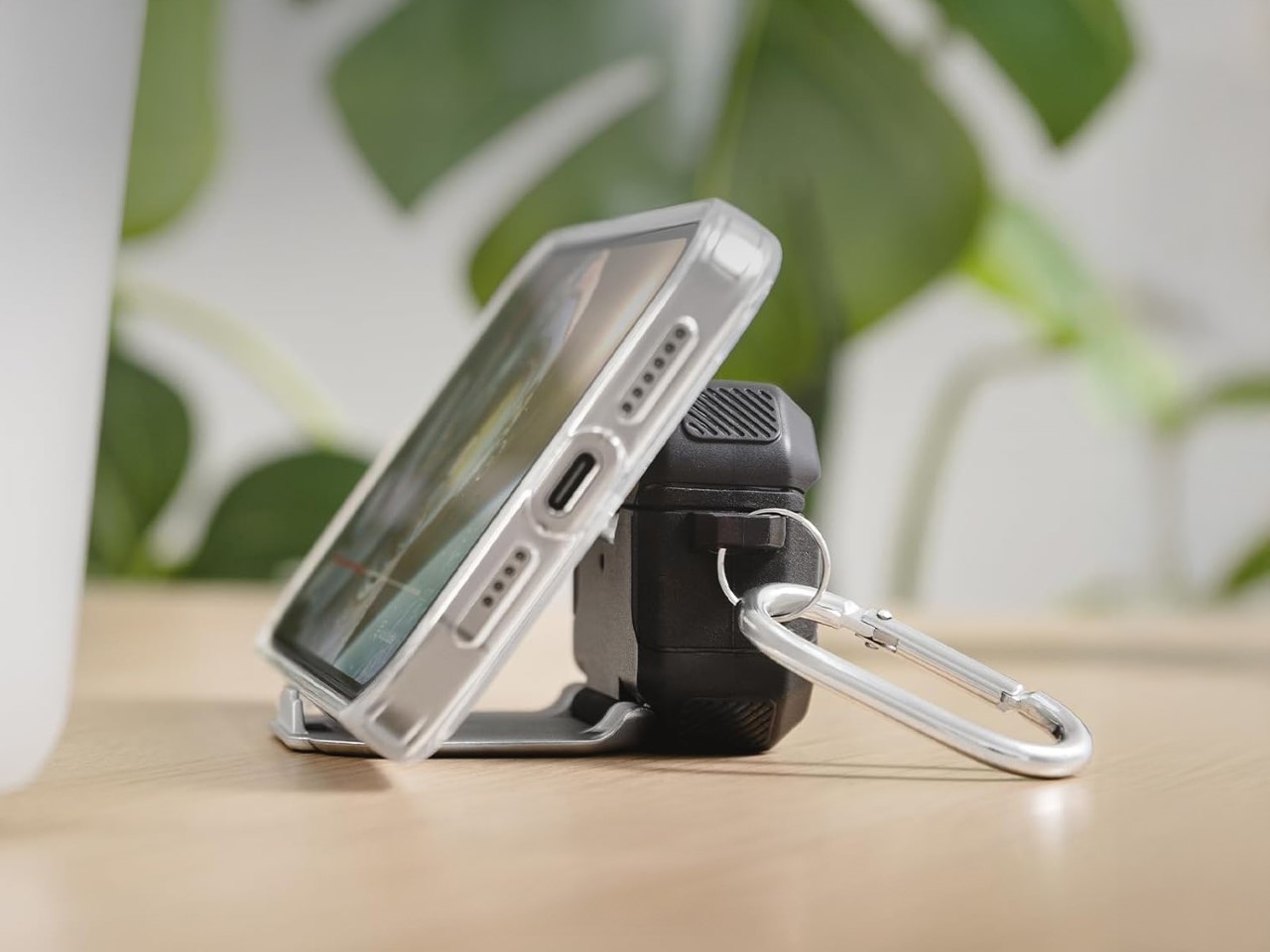
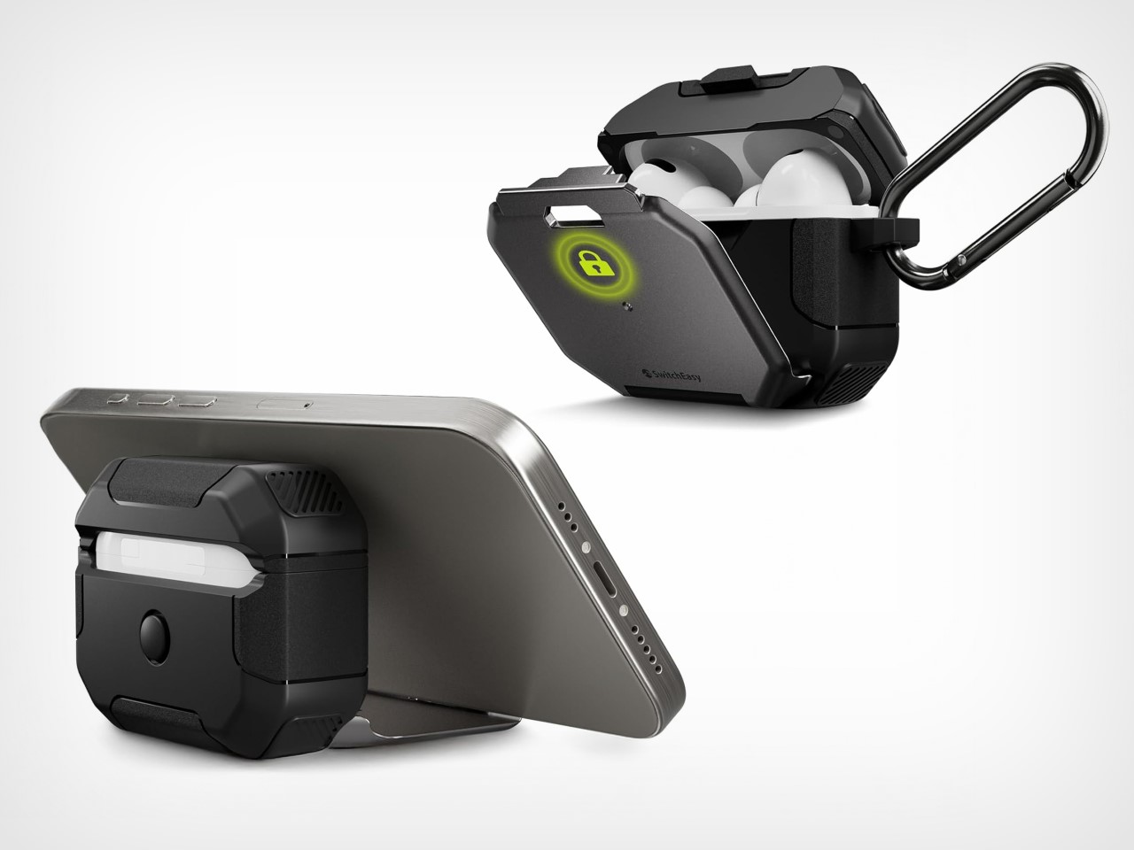
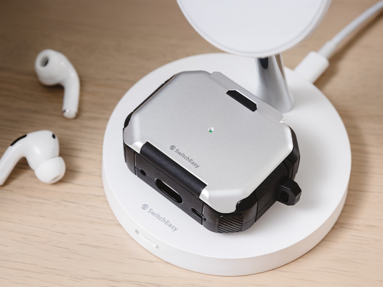
Do the AirPods really need a case? I mean sure, the earbuds themselves come with a broader case, but does that case need an extra protective shell? On most occasions, I’d say no, but this particular case from SwitchEasy drives a hard bargain. Baked into this protective case is a built-in stand that allows you to prop up your phone, whether it’s to watch movies or take video calls… and I absolutely love it.
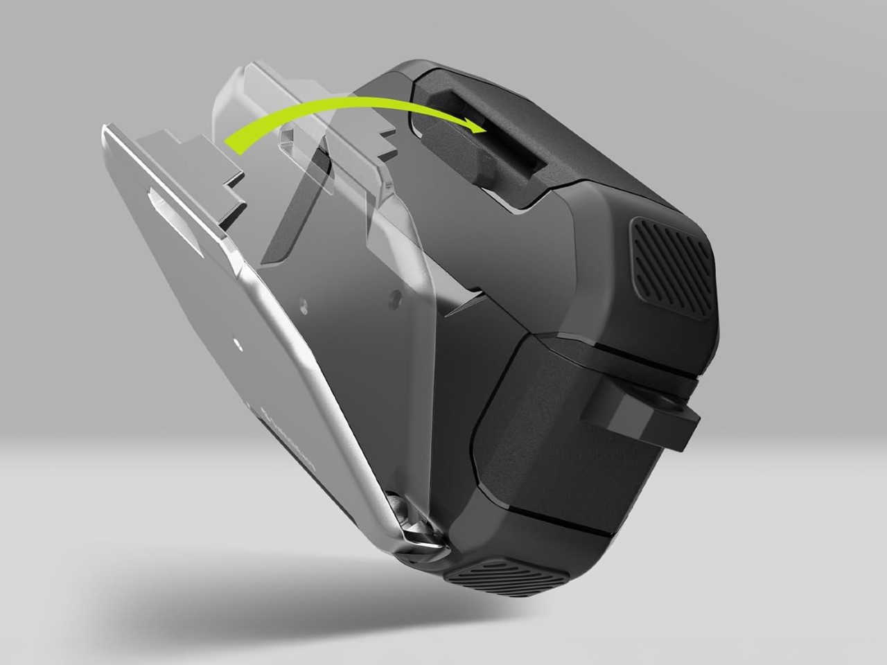
The SwitchEasy Defender+ (quite a rugged, testosterone-y name if you ask me) was designed to protect your AirPods from any kind of damage they could experience. Falling off a table, falling off two tables, maybe even three. However, that feature seems fairly secondary to the Defender+’s built-in kickstand that gives your phone its very own dock, which you can use even in vertical mode with most regular-sized phones.
The Defender+ comes with a TPU construction that absorbs shock, preventing your AirPods case from any impact up to 10 feet. That means your case is more impervious to scuff marks that stand out against its otherwise plain, glossy white exterior. However, there’s that metal plate on the front that does a little more damage protection. You see, aside from working as a kickstand, it works as a clasp that keeps your AirPods case shut, preventing it from accidentally opening.
To access your AirPods, you need to disengage the metal plate to allow the lid to open – sort of like two-factor protection for your earbuds. Pop the earbuds out, wear them, and then prop your phone on the Defender+’s stand and you have a de-facto portable movie theater, complete with Spatial Audio from the AirPods.
The SwitchEasy Defender+ starts at 21.99, and comes with a carabiner clip to accompany the case itself. The case supports wireless charging too, so you could easily place your AirPods face-up on any charging surface and it begins juicing your earbuds. Meanwhile, a nifty hole cut through the metal plate lets you see its charging light, so you’re never left with a pair of dead AirPods because you didn’t see the battery notification.
Bali. The name alone conjures images of verdant rice paddies, ancient temples, and a spiritual calm that feels almost mythical, perhaps even a touch overplayed in travel brochures. Yet, capturing that elusive essence in architecture, particularly for hotels, remains a profound challenge. Too often, concrete structures land like disconnected objects, disrupting the very tranquility visitors chase. It forces us to ask: how do you build in Bali, harmonizing with its spirit, rather than just building on its land?
Archigods, an Indonesian firm deeply familiar with this context, offers a compelling response. Their concept for a boutique hotel isn’t about imposing scale but fostering a gentle embrace of the landscape. Named the “Blooming Ring,” the design envisions a circular structure cradling a central oasis – a literal sanctuary within a sanctuary. It feels less like an imposing building and more like an organic landform emerging naturally from the earth, whispering integration rather than shouting arrival.
Designer: Archigods
The circular layout is pivotal – Think ancient enclosures or communal gathering spaces; the form inherently turns inward, focusing energy and attention on the lush courtyard. This central space, planned with local flora and calming water features, becomes the hotel’s vibrant, green heart. Guest rooms radiate outwards, offering privacy, yet the core experience constantly pulls you back to this shared, protected haven, fostering a subtle sense of community amidst personal retreat.
Forget predictable smooth render or ubiquitous timber cladding. Archigods proposes embedding crushed pistachio shells within the facade’s plaster. Yes, actual pistachio shells. It’s a wonderfully quirky bit of material alchemy, turning food waste into architectural texture. Imagine the subtle, variegated surface catching the tropical light – tactile, unexpected, and deeply earthy, a far cry from sterile perfection.
This textural innovation sits alongside locally sourced bamboo and timber, materials intrinsically linked to Balinese building traditions. The pistachio shell facade provides a fascinating counterpoint – familiar natural materials meet clever, sustainable upcycling. It’s a statement about resourcefulness, minimizing environmental impact, and creating a building that truly feels rooted, right down to its unique, shell-flecked skin telling a quiet story of reuse.
The design intent clearly targets wellness and sensory rejuvenation. Movement through the space would likely follow the ring’s gentle curve, revealing constant glimpses of the central garden, reinforcing that connection to nature. Natural light is choreographed to flood interiors, while views are carefully framed towards tranquility. The material palette – those intriguing shells, the warm wood, cool stone – aims to create a tactile journey, contributing to a sense of grounded calm.
This project aligns beautifully with the principles of biophilic design, striving to weave nature seamlessly into the built environment. The Blooming Ring feels like a mature, sensitive application, specifically tuned to the Balinese context. It sidesteps flashy architectural gymnastics, prioritizing experiential richness derived from its embracing form, its careful manipulation of light, and that standout sustainable material choice.
Although conceptual, Archigods’ Blooming Ring presents a potent vision for hospitality design in places demanding deep respect for nature and culture. It champions architecture that doesn’t merely occupy space but actively collaborates with the landscape, using innovative, sustainable materials to enhance the restorative escape Bali promises.
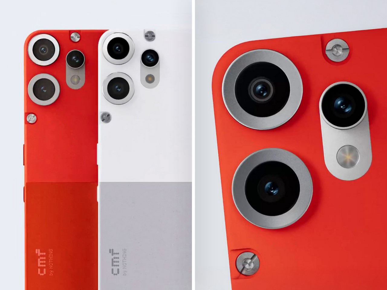
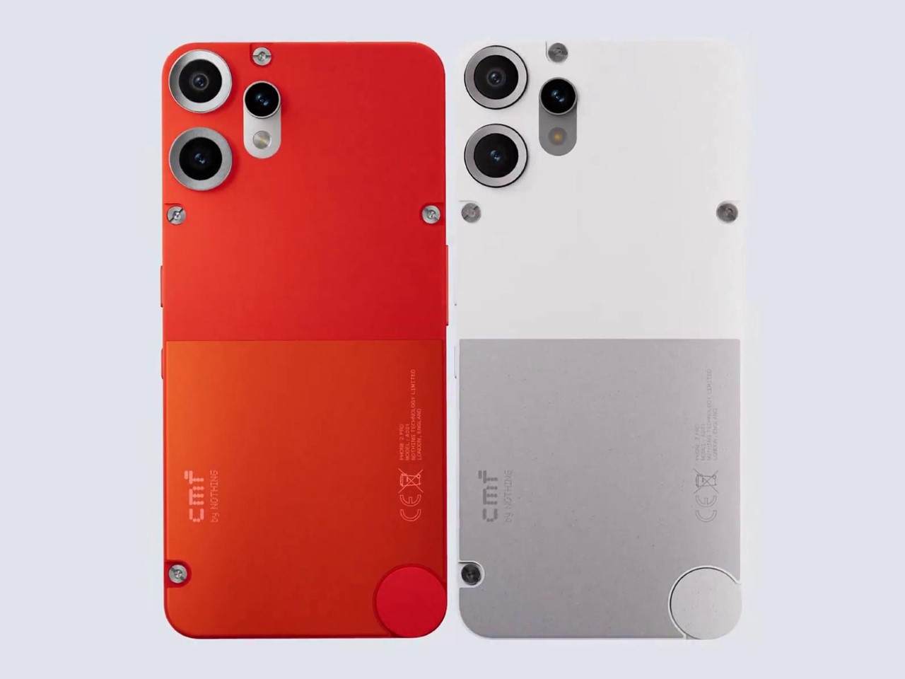
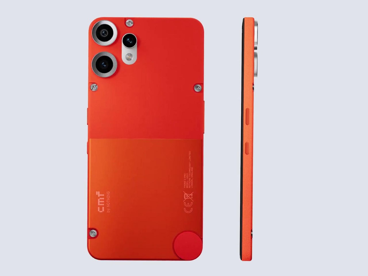
The only company better than Google at leaking their own phone designs seems to be Carl Pei’s Nothing. After weeks of constant teasing different details of the Phone (3a) and (3a) Pro’s design, they’re back with their latest device from the company’s budget wing, CMF. The CMF Phone 2 is slated to launch on the 28th of this month, but Nothing decided to lift the veil on its design a week in advance, getting its Asia-focused market excited well in time to line up to buy the device. The CMF Phone 2 Pro (yes, the budget line has a Pro variant too) was officially revealed in a video on Twitter (do we still have to call it X?), showcasing two beautiful colorways – white and that eye-catching orange.
The design is a masterclass in iterative evolution. The overall flavor of the phone remains the same, with the plastic body, the customizable backplate, and the knob on the bottom right corner of the back. However, the camera layout gets a revamp, going from a capsule-shaped build to two individual metal rings and one capsule beside them. This confirms all past sources, bringing the camera count of this budget-beast to 3 lenses. Eggs might be expensive, but camera lenses apparently are a dime a dozen!
Designer: CMF by Nothing
While the camera layout hasn’t been particularly new information (we learnt about it more than a month ago), the new design reveals an interesting backplate upgrade. While last year’s model had a single-color backplate, punctuated by the camera layout and the knob at the bottom, the Phone 2 Pro’s design comes with a dual-tone finish. The orange and white variants both showcase an interplay between matte and metallic finishes on the backplate, giving the phone’s blockish form an exciting visual break. As an industrial designer, I absolutely love it – it’s exciting without looking gaudy (like some budget phones and their atrocious holographic shimmering backs). The design is subtle and sophisticated – something that still lets you set yourself apart as design-conscious even in the budget-phone category.
CMF confirmed earlier that the Phone 2 Pro will be powered by MediaTek’s Dimensity 7300 Pro, a modest upgrade over the previous 7300. It’s a 6nm SoC built for efficiency and mid-range performance. It’s not flagship power, but it has enough punch to keep up with demanding games and multitasking, and that silky 120Hz display refresh rate CMF teased for battle royale enthusiasts. That detail alone places this phone squarely in the gamer-on-a-budget lane.
The triple camera setup features a 50MP wide sensor, another 50MP telephoto lens with 2x optical zoom, and an 8MP ultrawide for those expansive cityscapes and group shots. Early samples teased with the tagline “Built for light, depth and detail” suggest a sensor configuration that leans hard into contrast and sharpness. If the software pipeline holds up, this could be one of the few affordable phones where the telephoto isn’t an afterthought.
One element CMF hasn’t confirmed is whether that dual-tone design will extend to additional colors at launch. If orange and white are just the start, this might be a new wave of expressive hardware. CMF is pushing aesthetic diversity with functional depth—think Playdate meets Android. It feels like the next step for Nothing’s design-forward philosophy: take the playful transparency of the original Nothing Phone and evolve it into modular expressionism.
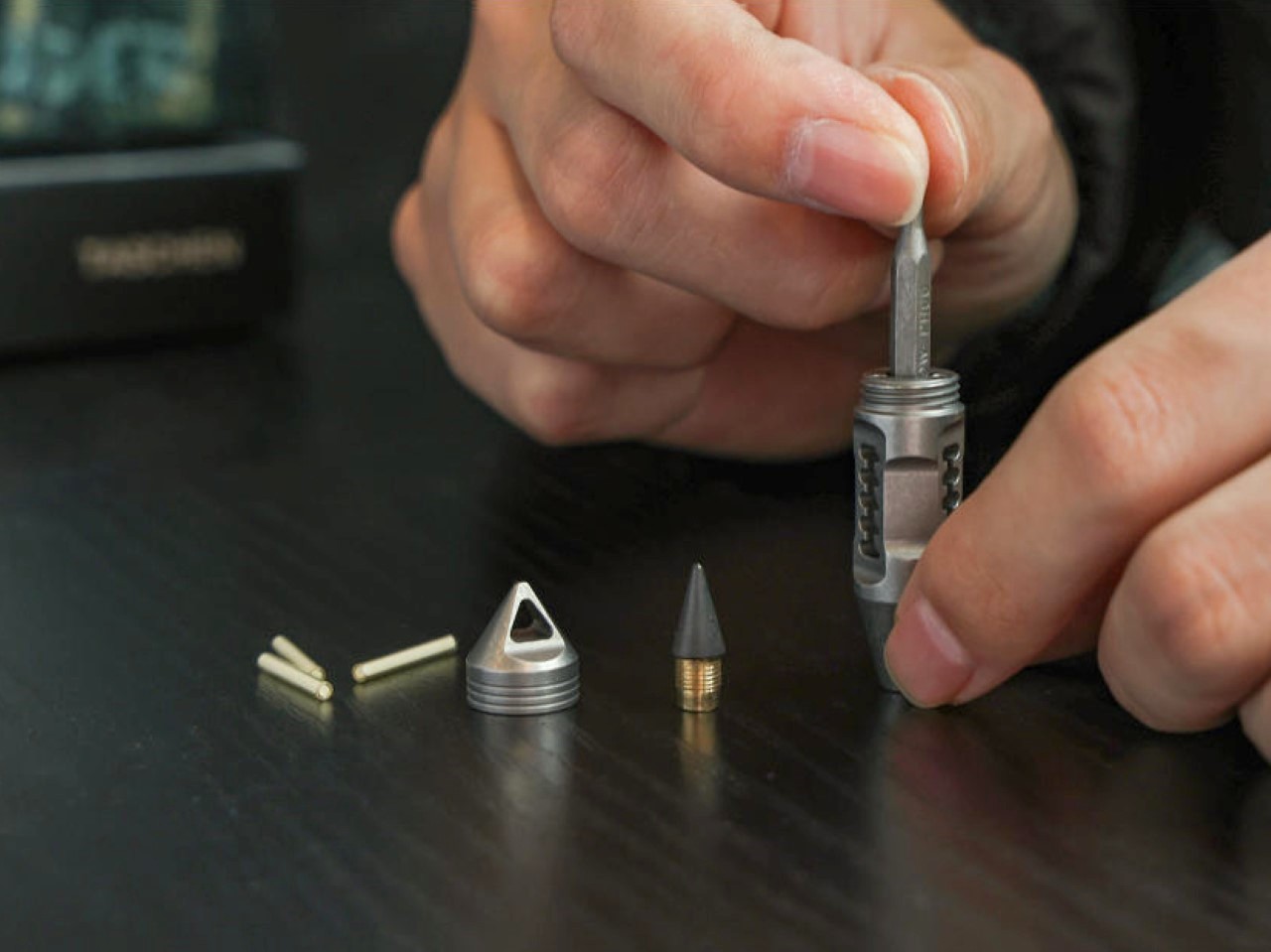
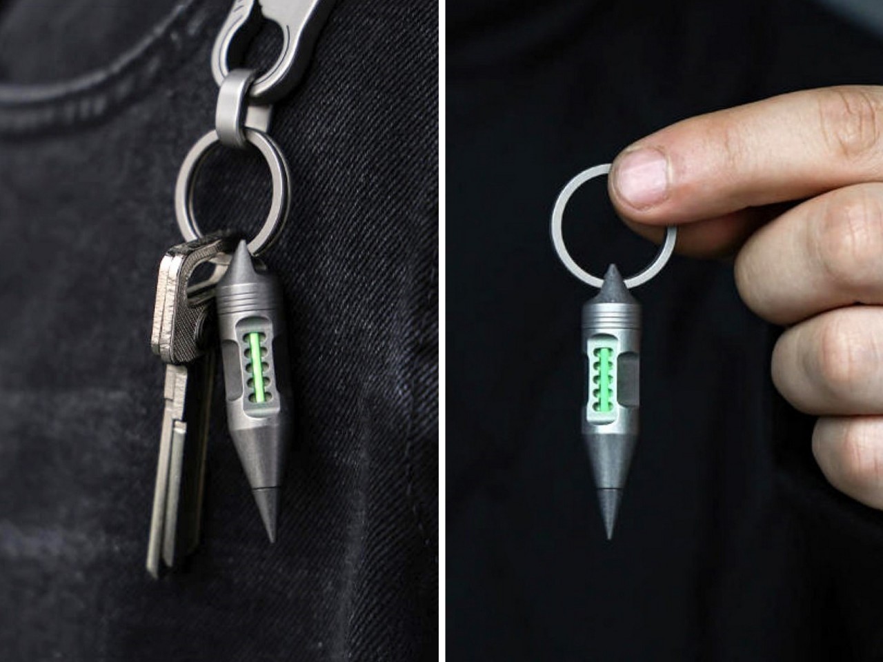
I swear there’s probably a secret society of EDC makers who are constantly challenging each other to make the gosh darn tiniest EDC possible. It’s relentless, and every single week or month I see a new EDC that’s smaller yet somehow just as capable as its predecessor. Meet the Wolf Fang 2.0, a pint-sized EDC barely over 2 inches long. Designed to look quite like the fang of a cyberpunk animal, it serves as possibly the tiniest pencil ever made. Equipped with an eternal pen tip, the Wolf Fang 2.0 can write for decades, and when you’re not using it to draw, it also works as a pry tool, a box opener, and even a bit driver, thanks to the fact that the fang’s hollow design can store precisely one hex bit.
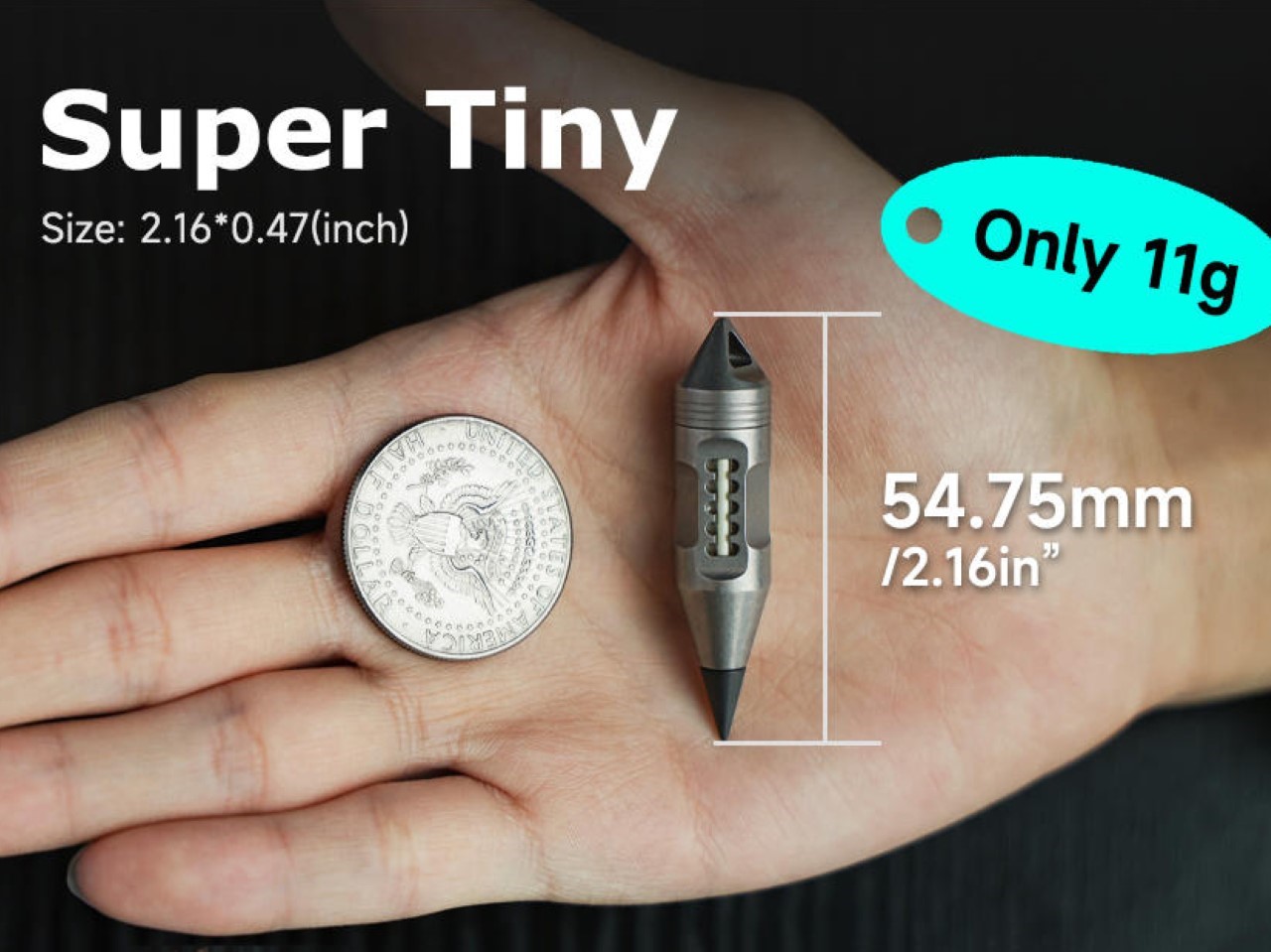
Somewhere between a survivalist’s toolbox and a designer’s desk toy lies the Wolf Fang 2.0. At just 2.17 inches long and weighing a featherlight 0.49 ounces, it’s shockingly easy to underestimate. But underestimate it once, and you’ll be borrowing one from the guy who saw the Kickstarter page before you did.
This thing is tiny, but it’s built like a tank. Machined from aerospace-grade titanium, it trades bulk for resilience, holding its own in a world of cheaper, G10-and-steel wannabes. Titanium isn’t just overkill here—it’s the secret sauce that allows the Wolf Fang 2.0 to stay so minuscule without sacrificing an ounce of durability. You can toss it onto concrete, wear it on a hike through rain or sand, let it rattle around on your keychain, or even drive your car over it. It’ll come back looking like it just left the CNC mill.
The fang shape lends this EDC perfectly to writing. Sure, it feels like a bit of a pencil stub, but unlike a pencil stub that’s usually at the end of its journey, the Wolf Fang 2.0 can write for literal miles. Instead of traditional ink, it uses a specially alloyed metal tip that oxidizes on contact with paper, leaving a dark, legible mark—no smudges, no refills, no drying out. The tip is replaceable, but you likely won’t need to anytime soon. This pen doesn’t leak, run out, or fade, and it works in conditions where standard pens give up—cold, heat, or even zero gravity if you ever find yourself in orbit.
But the writing end is only one-third of the story. Unscrew the back and inside you’ll find a hidden magnetic bit driver. Paired with internal bit storage that cleverly nests a 1/6-inch hex bit, it turns the pendant into a quick-fix machine. Whether you’re tightening screws on your EDC knife or opening up a stubborn battery compartment, the Wolf Fang 2.0 is ready. Heck, you can even use the bits (or the pen tip) to open boxes, and for especially stubborn paint lids, the reverse end of the Wolf Fang 2.0 serves as a makeshift pry bar. Every inch of space on the Wolf Fang’s body is utilized to a fault, leaving no real estate bare. Excess material is removed, resulting in cutouts on three sides of the fang’s cylindrical body, and if you thought the designers would just leave it at that, it’s where the EDC’s tritium vials shine through, making it visible and accessible at night.
The tritium slots are where the Wolf Fang 2.0 really flirts with jewelry status. Designed to house three 2mm x 16mm glow tubes, it emits a low, perpetual glow that feels part tactical, part cyberpunk. When worn as a necklace, it’s both a statement and a beacon—visible in the dark, impossible to ignore. There’s an energy to it, like carrying a little bit of future tech around your neck. Most people wear metal dog tags or animal fangs around their necks – this, in its own unique way, is a fusion of both!
The Wolf Fang 2.0 is an ideal EDC for anyone with a creative streak. Instead of tucking a pencil behind your ear, the fang is perfect to have on your person, either as an edgy pendant, as a keychain essential, or even as a zipper pull. Use it when you need it, forget about it when you don’t, the Wolf Fang 2.0 challenges the notion of how much it can achieve with its hyper-compact design. Replacing over a 100 pencils while also simultaneously vowing to last a lifetime, the Wolf Fang starts at a cool $32 and ships globally starting June 2025.
Usually, I never give a drinking water bottle a second glance. Water costs hardly anything, and it’s such a utility/necessity that elevating it to a design icon level is something only luxury brands like Evian or Dasani attempt at doing. That basically means the remaining 90% of brands have the most boring water bottle designs on the planet, made to be used and thrown – but the Sprinkle bottle doesn’t look at packaging that way.
Designed to capture the journey of their water, Sprinkle’s bottles come in 3 design formats – one in glacial form, one in an intermediary stage, and one as glacial water that usually then gets bottled at source. The bottle comes sans label, allowing this beautiful distinction to stand out, while its overall motto remains to be a brand that doesn’t dwell in excess. The lack of a label reinforces Sprinkle’s overall “REDESIGN TO REDUCE” mindset.
Designer: Prompt Design for M.WATER COMPANY LTD.
The Sprinkle bottle evokes a sense of purity, with its crystal-like design. It’s entirely clear, with the bottle looking almost like an ice sculpture itself. There’s no label, no graphic, not even an interplay of matte and gloss surfaces. It’s all monolithic and shimmery, which really allows the 3-part design to shine through.
The bottle displays the water’s journey from source to sip. It starts with a block of arctic ice, which slowly melts into glacial form, finally becoming the spring water we associate with freshness and purity. The journey of ice to water is also a cautionary tale of sorts, showing climate change through design. The bottle’s design journey shows the loss of ice caps, and sure, while we’re left with a lot of drinking water as a result, there’s still a sense of unstoppable change and of loss that’s difficult to shake.
The bottle was designed by the folks at Prompt Design, who had to work with a unique set of challenges. Apart from needing to create a bottle that was impactful and memorable enough to stand out on a grocery shelf or refrigerator, they also had to work around the label bit, finding unique places to list important information. To that end, the company devised a way to print the barcodes on top of the bottle cap, keeping the entire bottle itself looking incredibly pristine.
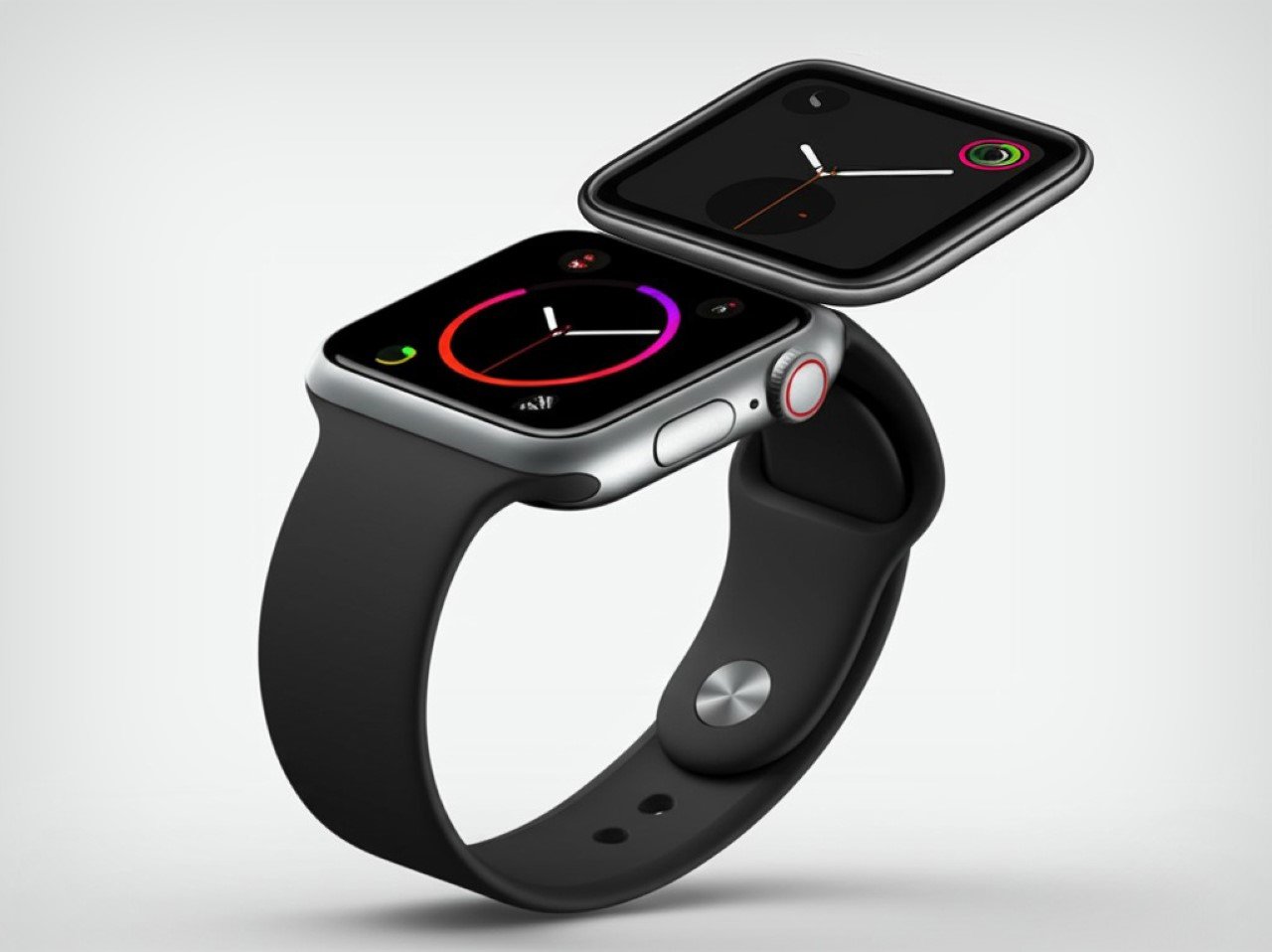
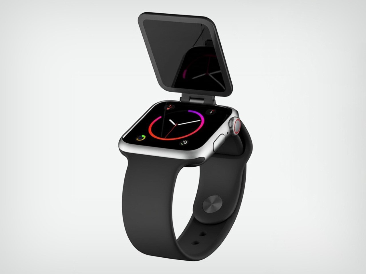
Forget the Apple Watch as you know it. New patents discovered at the USPTO (United States Patent and Trademark Office) show that Apple’s looking to incorporate foldable tech into its smartwatch series. If these patents are foreshadowing the future, we could be looking at a dual-screen Apple watch that basically feels like a tiny flip phone on your wrist. That isn’t all, the patent also looks to factor cameras into the wearable, giving you a tiny yet capable FaceTime device that lets you take video calls directly from your wrist.
The patent, filed by Apple Design Lead Vladimir Krneta, details a potential watch with ‘movable’ screens. While this doesn’t immediately imply a flip-phone-style clamshell smartwatch, Apple’s patent document showcases drawings of one, leading to speculation that maybe that’s the format Apple’s gravitating towards. The rest of the images in this article are visualizations based on the patent documents, created using AI. Although Apple has no immediate plans of launching a folding watch, the fact that they’ve filed the patent means that the R&D branch is working on a potential use-case of a foldable wearable for your wrist… with included cameras that turns the watch into something vastly more useful than a mere health wearable. But will it run Apple Intelligence???
Designer: Apple
Conceptual Visualization
Image Credits: Apple via United States Patent and Trademark Office
“A user may want the display to be extended when using certain applications, making phone/ video calls, playing games, browsing the web, etc,” the patent describes. “On the other hand, the user may want the display to be folded for convenience and portability, such as when the user is going about their day-to-day activities, outdoor activities, etc.”
Conceptual Visualization
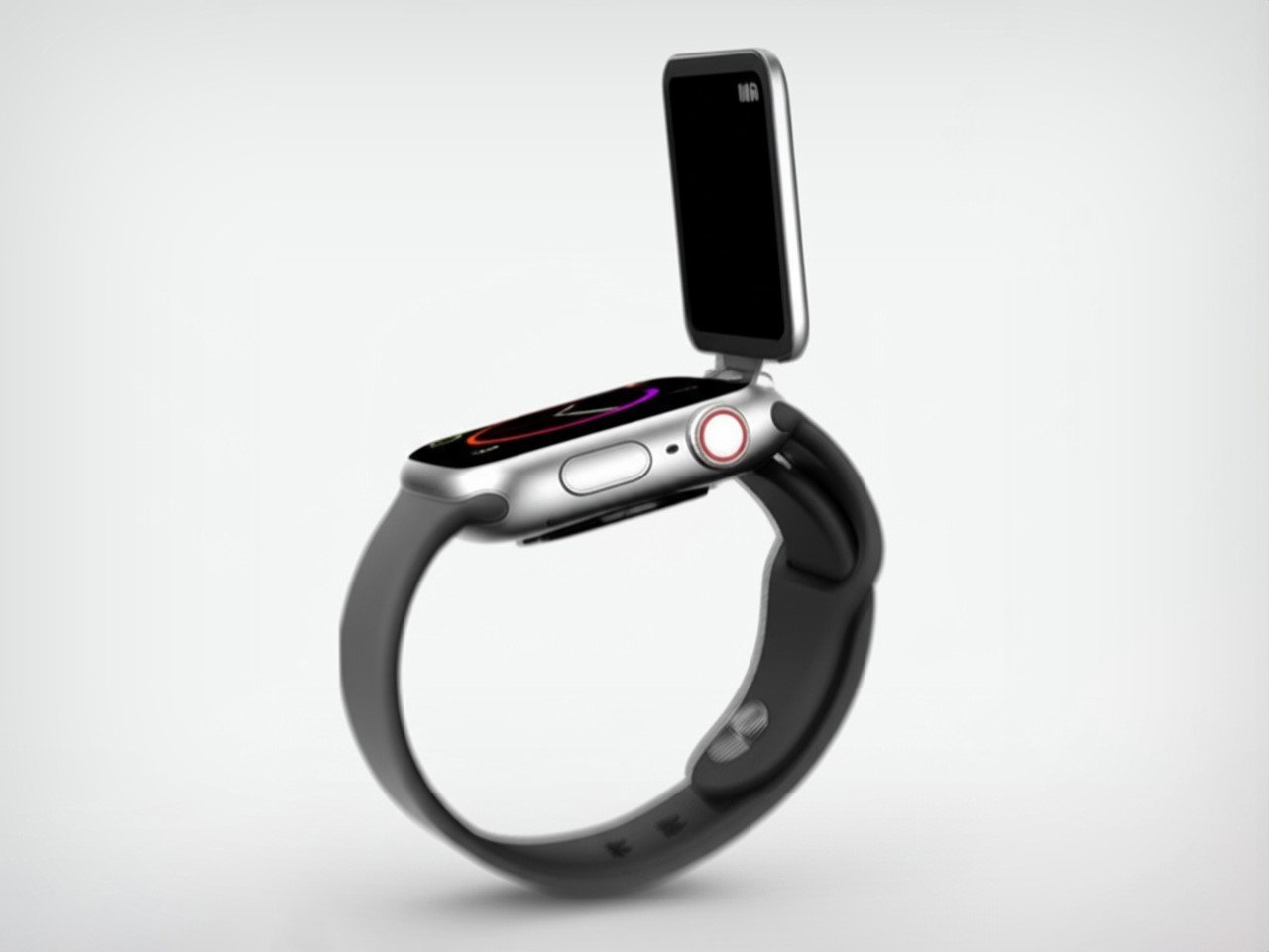
The patent goes on to highlight other features, potentially turning the ‘health wearable’ into a practical extension of your phone. “For example, the wearable electronic device of the present disclosure can provide intuitive access and enhanced usability of features for convenient video calling, camera usage, web browsing, messaging, and interfacing social media.”
This description is supplemented by the proposed inclusion of multiple cameras – something Apple (and even other makers) have notably left out of their smartwatches. The patent hints at possibly two cameras (like in a phone), one for external capture as well as a wearer-facing camera for video calls.
Conceptual Visualization
It’s worth noting that this patent was filed in 2023 and discovered only recently by news outlets combing through the millions of patents at the USPTO. What Apple is doing with the Watch is not too different from what they did with the iPhone, i.e., replace a larger device. The iPhone was supposed to be a powerful laptop that fits in your hand, and now, Apple is scaling it down further, turning the Watch into an iPhone that fits on your wrist.
However, it’s best to take these patents with a massive grain of salt because Apple files hundreds of patents each year, hardly 1% of which actually translate to real products. If the foldable watch does become a reality, it wouldn’t be the first wrist-worn foldable device. A long time ago, Motorola teased a bendable phone that was flexible enough to fit around your wrist like a chunky bracelet. Sony’s even teased smartwatches with e-ink straps that change in color. Although both these are examples of products that never became mainstream, Apple tends to play the long game very well, waiting for the right time to launch the right, polished product. Until then, we apparently have a folding iPhone on the horizon!
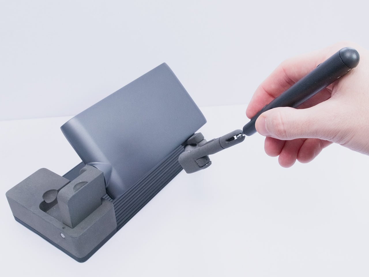
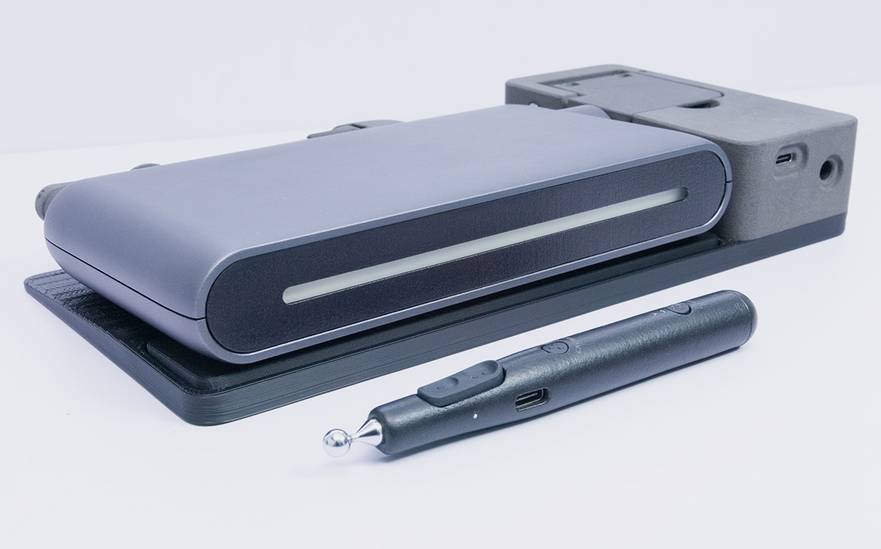
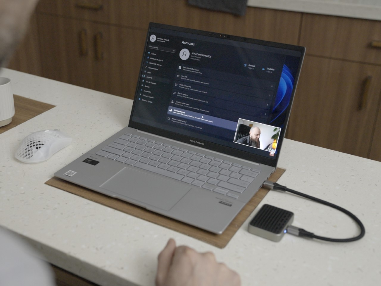
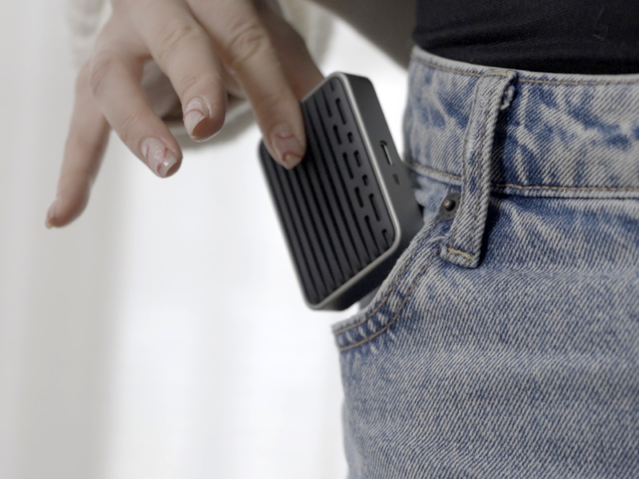
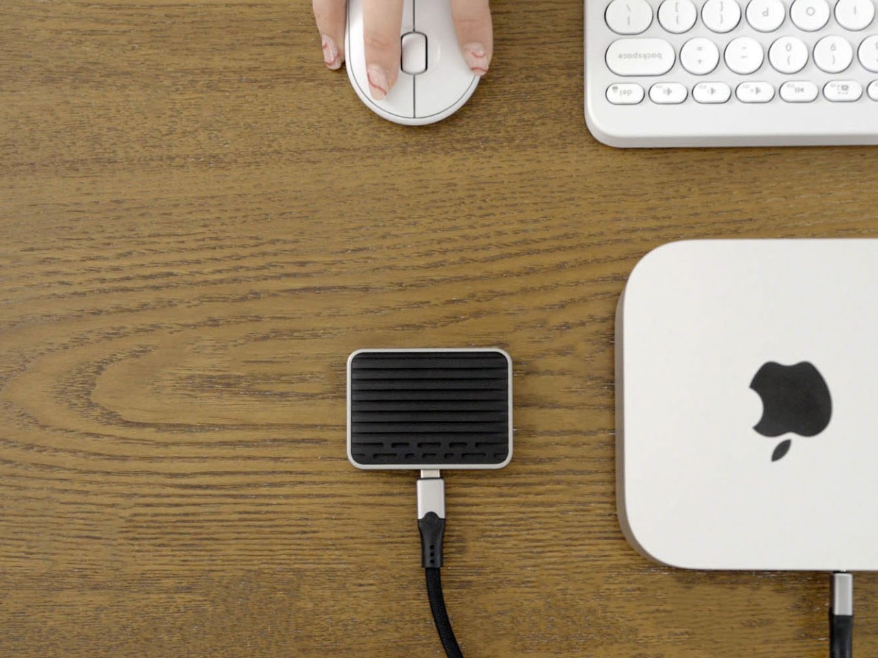
Going to CES is a lot like going on a treasure hunt. You know you’re going to be surrounded by tech, but a lot of the stuff you see is either mediocre or iterative. Only one in maybe a thousand or two thousand products actually achieves something so game-changing, you stop, observe, interact, and then praise. At this year’s CES in Las Vegas, the Haply MinVerse was that product for me. At first glance, it looked like an unassuming input device, but the moment I placed my hand on it, everything changed. This wasn’t a typical mouse. It moved in ways no mouse ever had before—through three dimensions instead of two—and, more importantly, it let me feel what was happening on the screen.
The MinVerse, developed by Haply Robotics, introduces a level of tactile interaction that redefines digital creation. Instead of passively gliding through surfaces, it reacts to the virtual world, pushing back when encountering solid surfaces, offering the sensation of weight, and making digital objects feel real. Sculpting in 3D suddenly felt natural, as if I was actually pushing clay rather than manipulating polygons. Controlling objects felt precise, like my hands were directly influencing on-screen physics. I’ve spent years playing VR games knowing fully well that the virtual wall in front of me isn’t real… but with the MinVerse, I tried touching a 3D surface, and the mouse stopped my hand the moment it hit resistance. That’s truly mind-bending.
The MinVerse was developed by the folks at Haply Robotics as an iterative improvement to their Inverse robot. The Inverse (which I saw first) is a 3D input and haptic feedback device designed for industrial and scientific applications. It’s impressive, but it isn’t consumer-grade. Realizing that 3D input should be for consumers and smaller creators too, Haply designed the MinVerse, a smaller, flatter, and more advanced version of its predecessor. About the size of a large power-bank, the MinVerse sits at just 40mm or 1.5 inches in height, with the ability to be used on its own, attached to a computer mouse, or even a stylus – effectively revolutionizing fields like design, engineering, creative coding, game development, and even gaming itself.
The device measures 240mm (9.4 inches) wide, 120mm (4.7 inches) deep, and 40mm (1.5 inches) tall when folded shut. Open it and you notice how unique it looks compared to any mouse you’ve ever seen, but you also immediately get the hang of it in minutes without really any learning curve. The mouse’s parallel linkage arms allow for any movement on a 2D plane, but lift your hand off the floor and you realize that you can now manipulate the same cursor in another axis.
A 4kHz refresh rate means smooth usage whether you’re modeling or gaming. Plus, its force feedback, ranging from 2N to 4N, ensures that users don’t just see virtual objects but physically sense them. If a cursor hits a wall, the MinVerse pushes back, making the digital barrier feel solid… and I can’t stress enough how much of a quantum leap this combination of 3D manipulation and haptic reaction is for a lot of professions.
For 3D artists and designers, it offers a way to sculpt, model, and manipulate objects with realistic force feedback. Instead of relying solely on visual cues, they can feel the depth, texture, and weight of their creations. Game developers using software like Blender and Unity can position assets, adjust camera angles, and refine animations with an intuitive sense of touch, making workflows more natural.
Engineers and robotics enthusiasts benefit from the precise force feedback when controlling robotic arms or piloting drones. Instead of abstract joystick movements, they can physically feel the machine’s response, leading to more accurate and immersive control. Even gamers will find the experience transformative—whether it’s feeling the tension of a bowstring, the weight of a sword, or the kickback of a firearm, the MinVerse brings digital interactions closer to reality.
Imagine designing a product and being able to feel how its parts fit together before manufacturing. Or training in a simulated environment where the controls respond like real-world machinery. This technology has the potential to go beyond creative industries, extending into education, medical training, and even remote-controlled robotics.
I’ll be honest – Haptic feedback isn’t new, but integrating it into a consumer device at this level is a major leap forward. The device recreates the sensation of textures, resistance, and force, allowing users to feel surfaces, materials, and physical interactions as if they were truly there. The MinVerse does for mice what the Oculus Rift did in 2012 for VR headsets – make them popular, affordable, compact, and potentially create a new device category for consumers and professionals.
The MinVerse is available for a discounted price of $670 for early adopters, studios (both design and gaming), robotics startups, engineers, and 3D modelers/animators. It’s not cheap – but devices that are a generational leap aren’t supposed to be budget-focused. It comes in a gorgeous matte-metallic space-grey finish along with a comprehensive kit of modules. The modular attachments—including a stylus, a 2D mouse mode, and a VR controller—allow the MinVerse to switch functions seamlessly. The MinVerse connects via USB-C and features a wireless stylus, with a wireless mouse mode coming soon.
Choosing a strap for your watch is like choosing a paint-job for your car. Or the furniture for your house. It adds an aesthetic, sometimes functional layer to the watch, just like choosing yellow paint is an aesthetic + functional choice for a cab, or choosing bunk-beds is an aesthetic + functional choice for a home with a single bedroom for two siblings, or a dorm. Watches come in hundreds (if not thousands) of varieties, and so do watch straps… but you can boil these straps down to 5 broad materials – Metal, Leather, Rubber (or Silicon), NATO (Nylon), or Canvas. So, does it make sense to spend time deliberating on what material works with your watch? Absolutely!
Each material offers its own balance of comfort, durability, and aesthetic appeal, making it crucial to consider how it fits into your daily routine and personal style. Whether you’re a suit-and-tie kind of person, a weekend explorer, or someone who just wants a reliable everyday watch, there’s a strap that perfectly suits your needs. Let’s break down each option to help you decide.
Metal Straps – Classic, Durable, and Timeless
Metal straps, often made from stainless steel or titanium, are the definition of versatility. They pair effortlessly with both formal and casual watches, making them a staple for anyone who values longevity and a refined aesthetic. A well-crafted metal bracelet adds heft and presence to a watch, making it feel more substantial on the wrist. Whether it’s the sleek polish of a Rolex Jubilee bracelet or the rugged appeal of an Omega Seamaster’s chunky links, or even the Milanese-style mesh on your Tissot Seastar, metal straps exude confidence and durability.
They work best with dive watches, dress watches, and chronographs, complementing cases that range from slim and elegant to bold and industrial. Metal straps fit seamlessly into business attire, evening wear, and even smart-casual outfits. However, they might not be the best choice for extreme outdoor activities, as they can feel heavy and less comfortable in hot weather.
Pros:
Exceptional durability
Waterproof and sweatproof
Timeless aesthetic
Excellent resale value
Low maintenance
Perfect for professional settings
Cons:
Generally heavier than other options
Can be expensive
May pull arm hair
Limited flexibility in formal situations
Can be challenging to size properly
Leather Straps – Sophisticated, Versatile, and Full of Character
Leather straps remain the quintessential choice for dress watches and classic timepieces, offering an unmatched level of sophistication and elegance. Available in countless varieties – from classic calfskin to exotic alligator and ostrich – leather straps can transform the character of a watch while providing excellent comfort. They’re particularly suited to dress watches, vintage timepieces, and chronographs.
The versatility of leather is remarkable, with different treatments and finishes allowing for both formal and casual applications. A black alligator strap can elevate a watch to black-tie status, while a distressed brown leather strap can create a perfect casual vintage look. They work exceptionally well with business attire and formal wear, though certain casual leather varieties can complement everyday casual wear as well.
Pros:
Develops unique patina over time
Excellent comfort
Wide range of styles and colors
Perfect for formal occasions
Ages beautifully
Easy to change
Cons:
Requires maintenance
Not water-resistant
Can deteriorate in hot climates
May show wear quickly
More expensive for quality options
Rubber Straps – Sporty, Waterproof, and Built for Action
Rubber straps have come a long way from their humble beginnings as purely utilitarian options for dive watches. Today’s rubber straps are available in various grades and compositions, from natural rubber to sophisticated synthetic compounds, offering supreme comfort and durability. They’re ideal for sports watches, dive watches, and any timepiece that might be exposed to water or physical activity.
High-end rubber straps, like those from Oysterflex by Rolex or Vulcanized rubber by Richard Mille, have elevated this material to luxury status. They’re also a standard fixture for most smartwatches, making them uniquely dichotomic, so don’t let people look down on you for wearing rubber straps. Rubber, or sometimes even silicone, can be hypoallergenic too, making them perfect for people with sensitive skin.
Pros:
Extremely durable
Waterproof
Easy to clean
Comfortable in all weather
Perfect for active lifestyles
Anti-allergenic
Cons:
Can attract dust
May not age as gracefully as leather
Limited formal applications
Quality varies significantly
Can trap moisture against skin
NATO Straps – Military Roots with Modern Versatility
Born from military specifications in the 1970s, NATO straps have evolved from purely functional items to fashion statements in their own right. Made from woven nylon, these straps are lightweight, breathable, and incredibly secure, as they loop under the watch case to prevent the watch from falling off if a spring bar fails. Their affordability and wide range of colors make them a go-to option for those who like to switch up their watch’s look frequently.
NATO straps are perfect for field watches, tool watches, and casual dive watches, giving them a rugged yet approachable vibe. They pair well with relaxed, everyday outfits—think jeans, a T-shirt, and a vintage-style watch. While they’re not ideal for formal occasions, they excel in outdoor adventures and summer wear, offering unmatched comfort in hot and humid conditions.
Pros:
Extremely affordable
Easy to change
Highly secure
Wide variety of colors and patterns
Comfortable in hot weather
Water-resistant
Cons:
Can look too casual for formal occasions
May add thickness to the watch
Can wear out relatively quickly
Some designs may appear too busy
Not suitable for dress watches
Canvas Straps – Rugged, Lightweight, and Understated
Canvas straps represent a perfect middle ground between the casualness of NATO straps and the sophistication of leather. These fabric straps, often made from cotton or linen, offer a unique texture and visual interest that can complement both vintage and modern timepieces. They work particularly well with field watches, pilot watches, and casual everyday timepieces.
The informal nature of canvas makes these straps perfect for weekend wear and casual settings, while still maintaining a more refined appearance than their NATO cousins. They’re especially suitable for summer months and tropical climates, offering excellent breathability while adding a touch of adventure to any watch they’re paired with.
Remember when we OWNED things? I’m not talking about houses and cars being affordable, I’m talking about a time before the tyranny of subscription fees. You didn’t pay monthly fees for the right to see a movie – you owned a disc with the movie on it and it belonged to you for your entire life. Your external hard disk (yes, the ones we used so lovingly back in the 2010s) was yours to own – it wasn’t a cloud subscription you paid to access periodically. Small monthly fees sure made things seem easier when they actually aren’t – and I think we’re beginning to realize this sooner than later. We create and consume more data now than we ever did… which is why owning your own high-storage SSD makes so much sense in 2025.
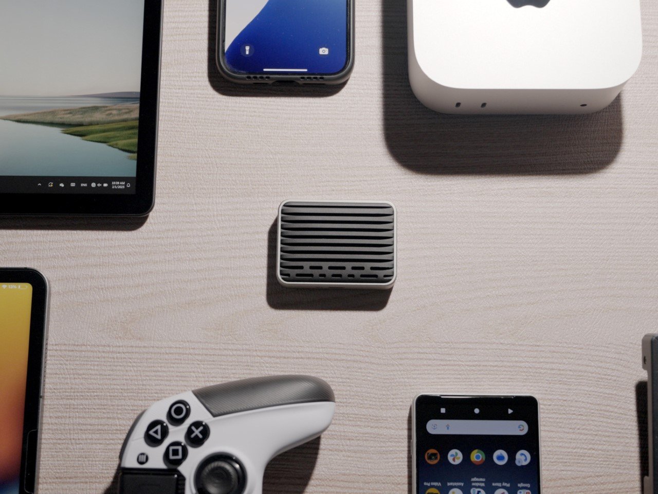
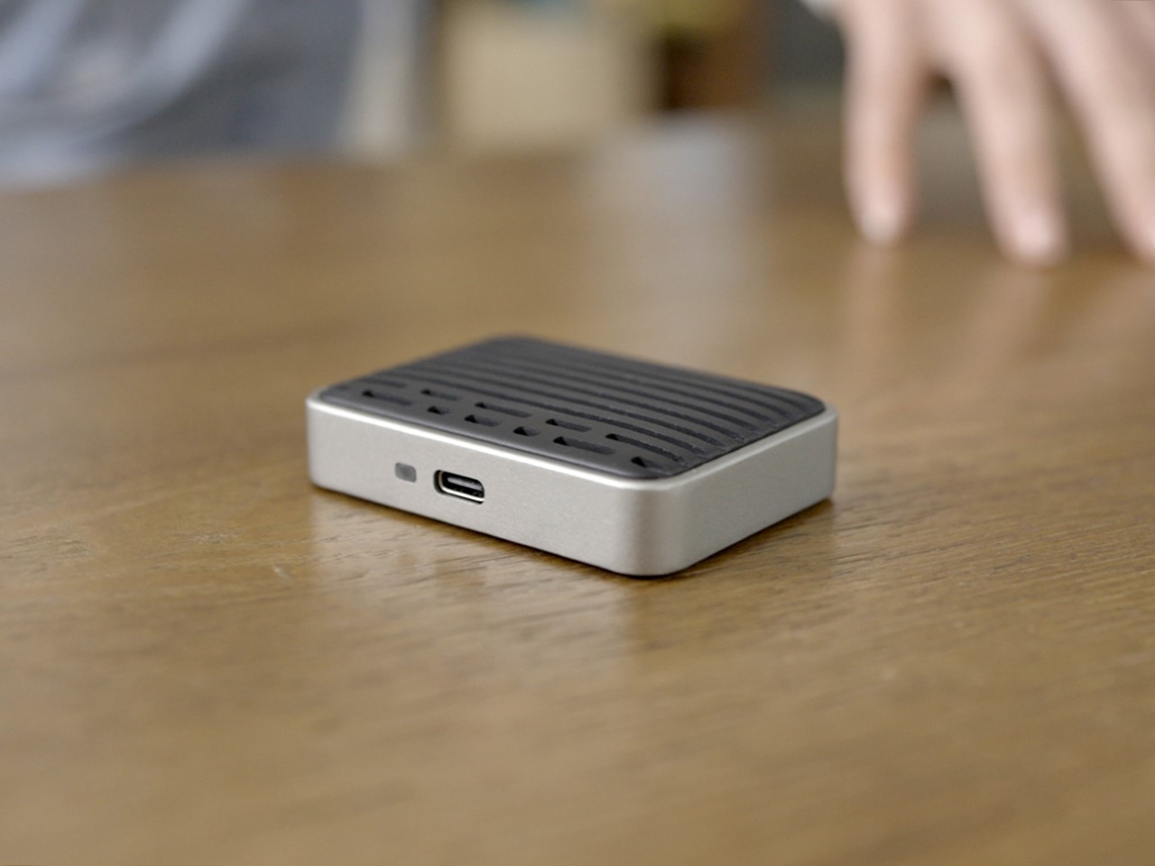
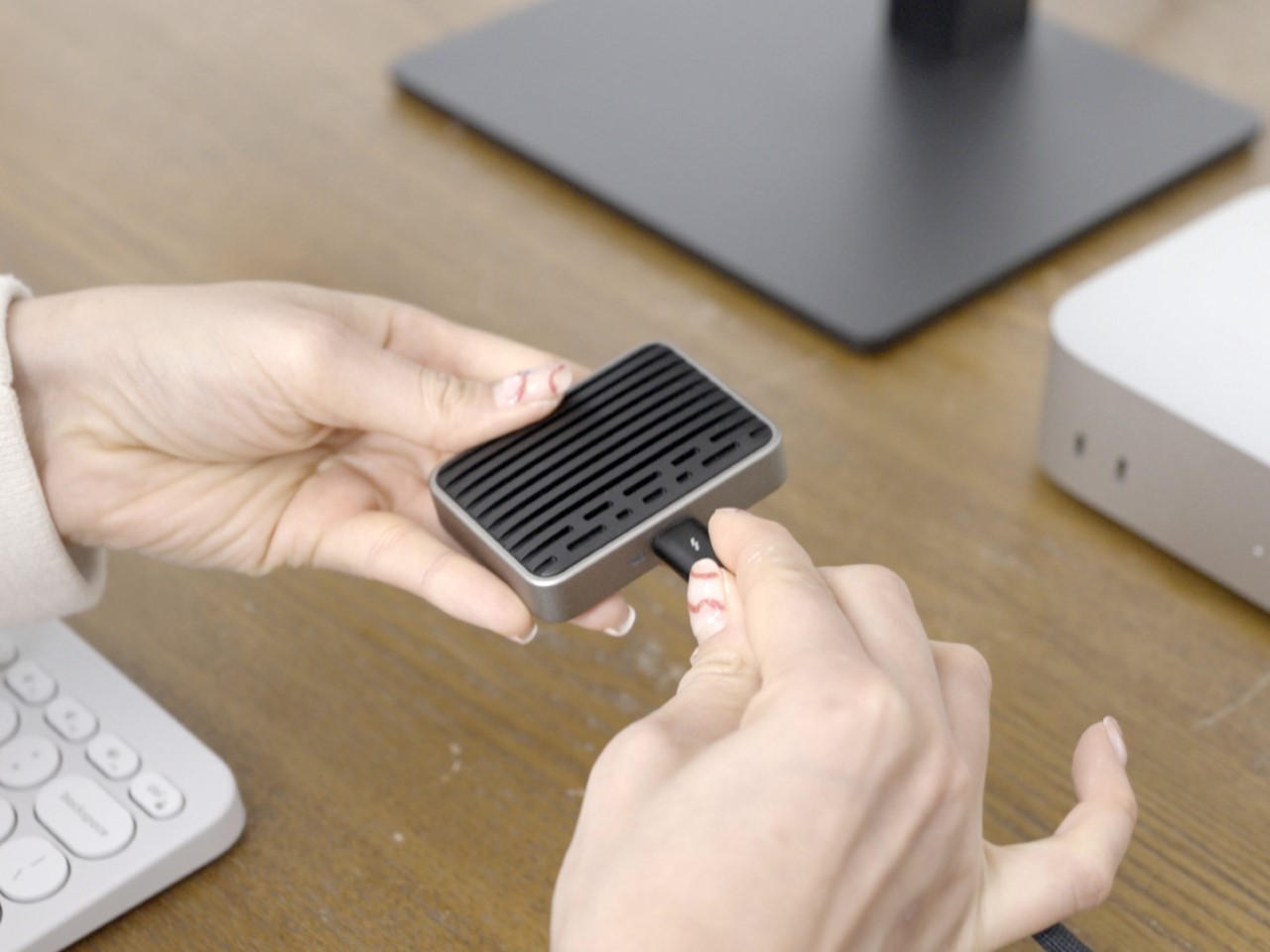
Imagine carrying your entire digital life in your pocket—movies, games, work files, and backups—all accessible at speeds so fast they make cloud storage feel ancient. That’s the promise of the Comet Thunderbolt 5 Portable SSD, a tiny but ridiculously powerful external drive that redefines storage as we know it. With transfer speeds of up to 7,000MB/s, this thing moves data at speeds so fast your gigabit internet would feel like dial-up.
To put that speed into perspective, transferring a full 4K movie with Thunderbolt 5 takes just five seconds. It takes the average human 1 minute to reach this sentence, which means you could have transferred 20 movies in this time. Compared to a standard USB 3.2 Gen2 SSD, this drive is seven times faster, which means that whether you’re editing 8K footage, rendering complex 3D models, or moving terabytes of raw photos, your workflow won’t just be smoother—it’ll feel instantaneous.
The highlight of the Comet is that it helps you reclaim ownership of your data and your storage. The tiny device is roughly the size of a stack of credit cards, but boasts storage starting at 1TB and going to 4TB, giving you enough room to store hundreds of AAA games, thousands of high-resolution photos, or an entire library of 4K movies. The 4TB model? That’s basically a Premium Google Drive subscription in your pocket, minus the fees and the agony of waiting for downloads on a half-decent internet connection. If you’re the kind of person who hoards media like a digital dragon, this drive lets you keep everything offline, secure, and instantly accessible.
The Comet SSD works seamlessly whether you’re on a Windows PC, Mac, Linux system, PS5, Xbox Series X|S, or a professional editing rig. While Thunderbolt 5 enables its top-tier speeds, it also plays nice with Thunderbolt 3, Thunderbolt 4, USB4, and even older USB 3.2 standards, giving you backward compatibility so that the SSD works perfectly with all your devices.
The SSD might be tiny but it isn’t fragile. The IP65-rated chassis is resistant to water, dust, and drops from up to two meters, meaning you can toss it in a bag, drop it on the floor, or even get caught in the rain without losing your data. The fanless aluminum casing keeps it cool under load, ensuring long-term reliability even when transferring terabytes of data.
And the best part? The price. $129 gets you the 1TB model, while the top-tier 4TB version goes for $279—a fraction of what some premium SSDs cost. We used to own things – the Comet SSD brings that era back by giving you ownership of your storage… without the fees, without the cloud, and without the possibility of it being hacked/leaked or worse, monetized for ads.
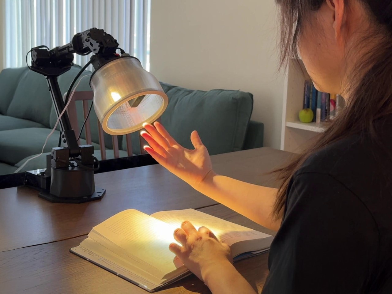
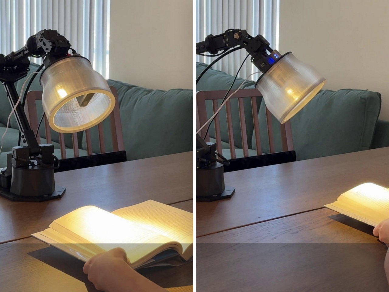
Apple’s latest experiment in robotics feels like a love letter to Pixar’s Luxo Jr. The tiny, energetic desk lamp that hops onto the screen before every Pixar film has always been more than just a mascot—it’s a symbol of character-driven storytelling. Now, Apple’s researchers have taken that same playful, emotive energy and brought it into a real-world robotic lamp, designed not just to function, but to interact, express, and even entertain. Researchers at Apple presented a paper titled ‘ELEGNT’ (Expressive and Functional Movement Design for Non-Anthropomorphic Robot) along with a comprehensive video of the lamp in action.
There’s a poetic connection here. Steve Jobs, the man who shaped Apple’s design philosophy, was also the visionary who helped Pixar become an animation powerhouse. The DNA of both companies has always been about creating technology that feels approachable—whether through the friendly curves of an iPhone or the lifelike expressions of an animated toy. Apple’s robotic lamp embodies that same philosophy, proving that robots don’t need to be powerful to be meaningful. They just need to be relatable.
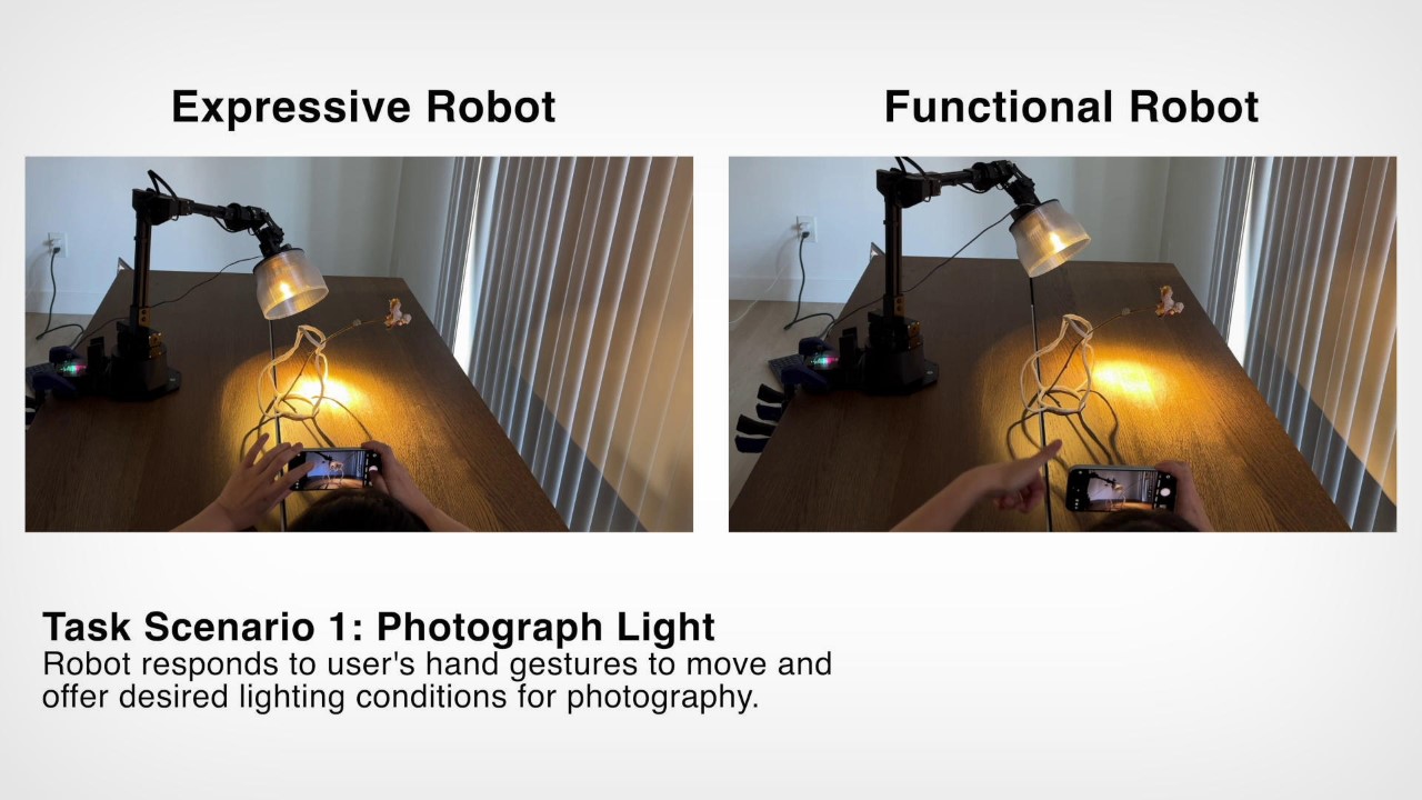
Developed by Apple’s Machine Learning Research division, this robotic lamp is more than an automated light source. It gestures, reacts, and even sulks when it’s left behind. A demonstration video shows it performing tasks in two modes: “Functional,” where it simply executes commands, and “Expressive,” where it adds personality to its movements. The difference is striking. Instead of cold efficiency, the expressive mode makes interactions feel natural—like the lamp is part of the room’s social fabric, not just an object within it.
In one scene, the lamp hears music and starts swaying, an irresistible display of curiosity. In another, it glances outside before describing the weather, as if pausing to check for itself. When it reminds a user to drink water, it nudges the glass forward—not as a command, but as a gentle encouragement. These small but thoughtful gestures tap into something deeply human: the way we naturally ascribe personality to objects that behave in familiar ways.
This is why anthropomorphism in robotics matters. People don’t just want machines that work—they want machines they can connect with. A robot that can convey joy, hesitation, or even mild disappointment is far more engaging than one that simply executes tasks. It’s a lesson we’ve seen play out in animated films for decades, and it’s one that robotics engineers are beginning to embrace. In a way it also helps shed the impression of robots being scary (Skynet, Terminator, Transformers, Ultron) by embracing more delicate, humane characteristics instead.
Apple’s research aligns with earlier reports from Mark Gurman suggesting the company is developing a home robot with an articulating arm and an iPad-like interface. Speculated to launch by 2026 or 2027, it could integrate with smart home systems and even act as a companion device. If Apple is serious about bringing robotics into consumer spaces, this expressive lamp could be a glimpse of what’s to come.
For now, this experiment serves as a reminder that technology doesn’t have to be rigid or clinical to be useful. The best machines aren’t just the ones that perform tasks efficiently—they’re the ones that make us feel something. And if a desk lamp can make you smile just by hanging its head in disappointment, Apple might be onto something special. You can read the entire research paper on Apple’s website here.
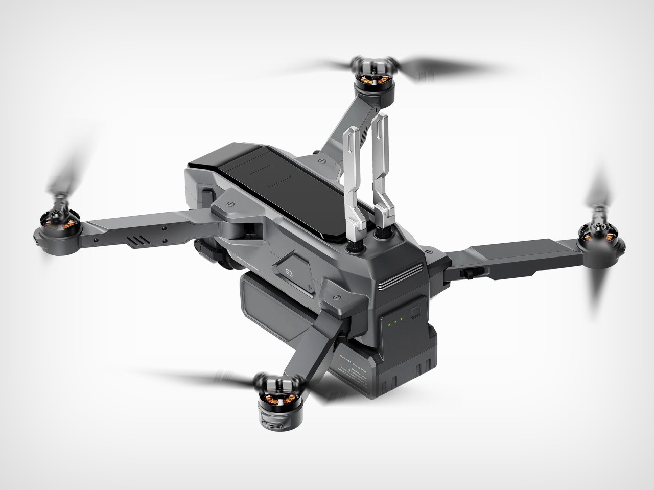
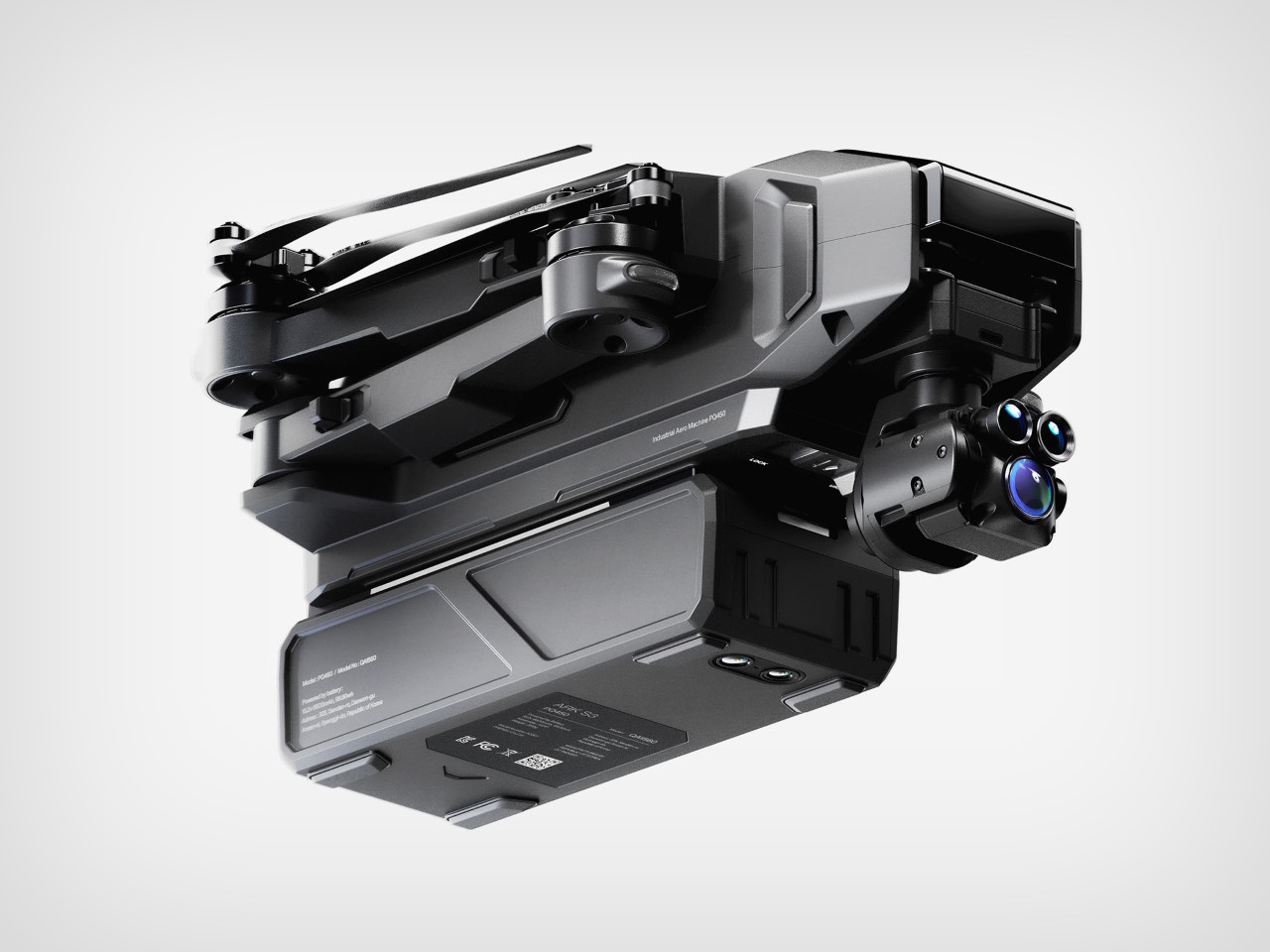
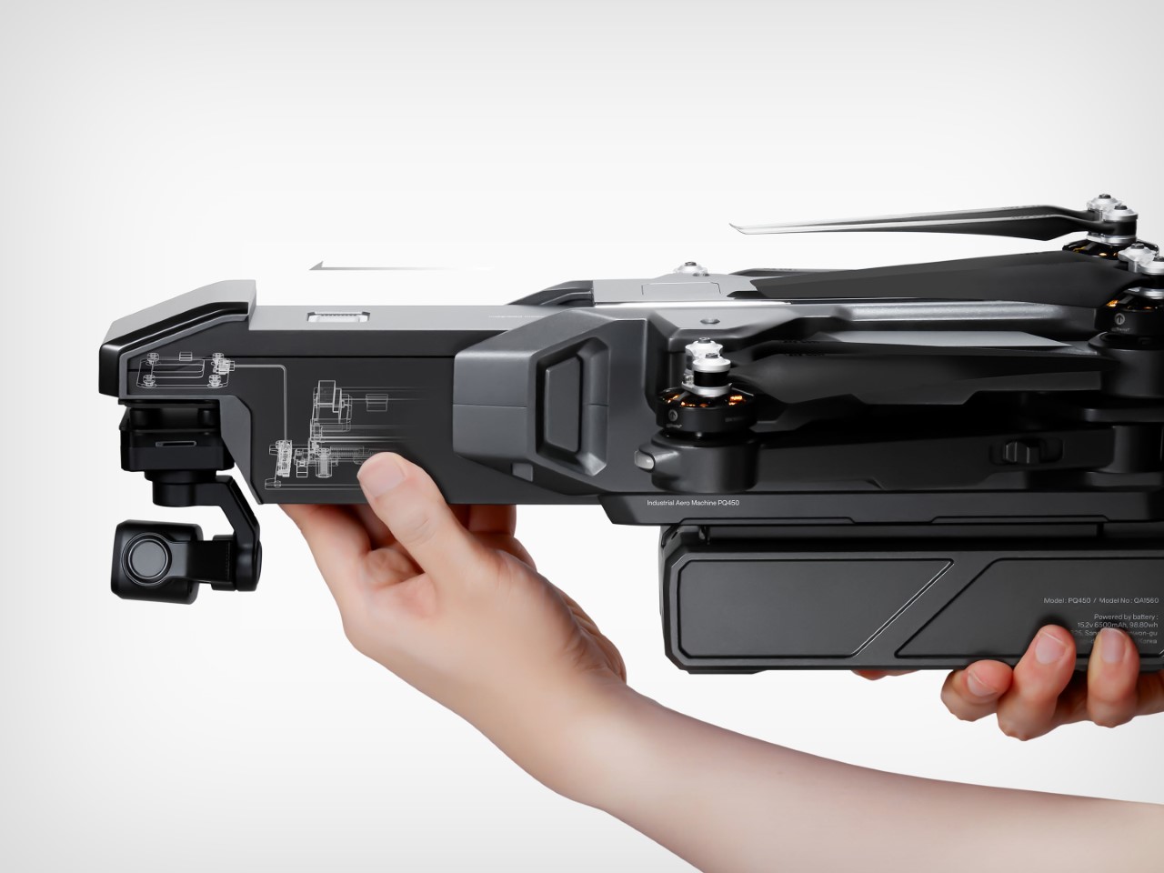
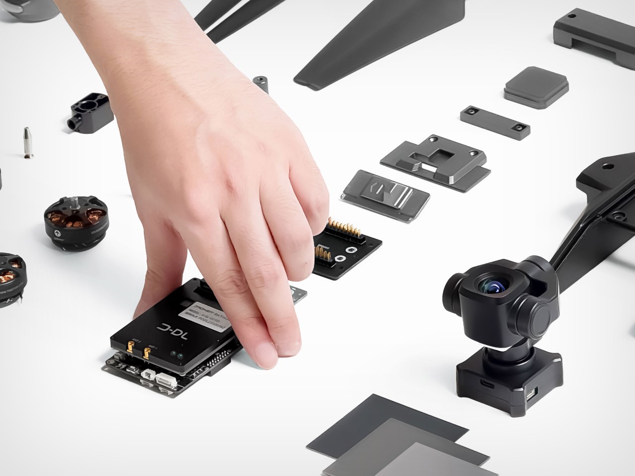
Here’s my hot take for 2025, technology that cannot be upgraded is genuinely consumer-unfriendly. Framework proved it was possible by designing a sleek laptop that featured totally upgradable components – most gaming PCs are entirely upgradable too – so why not phones? Why not tablets? And why not drones?
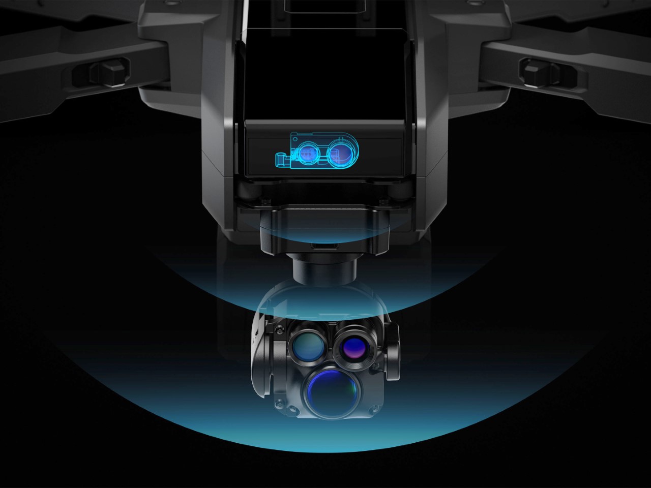
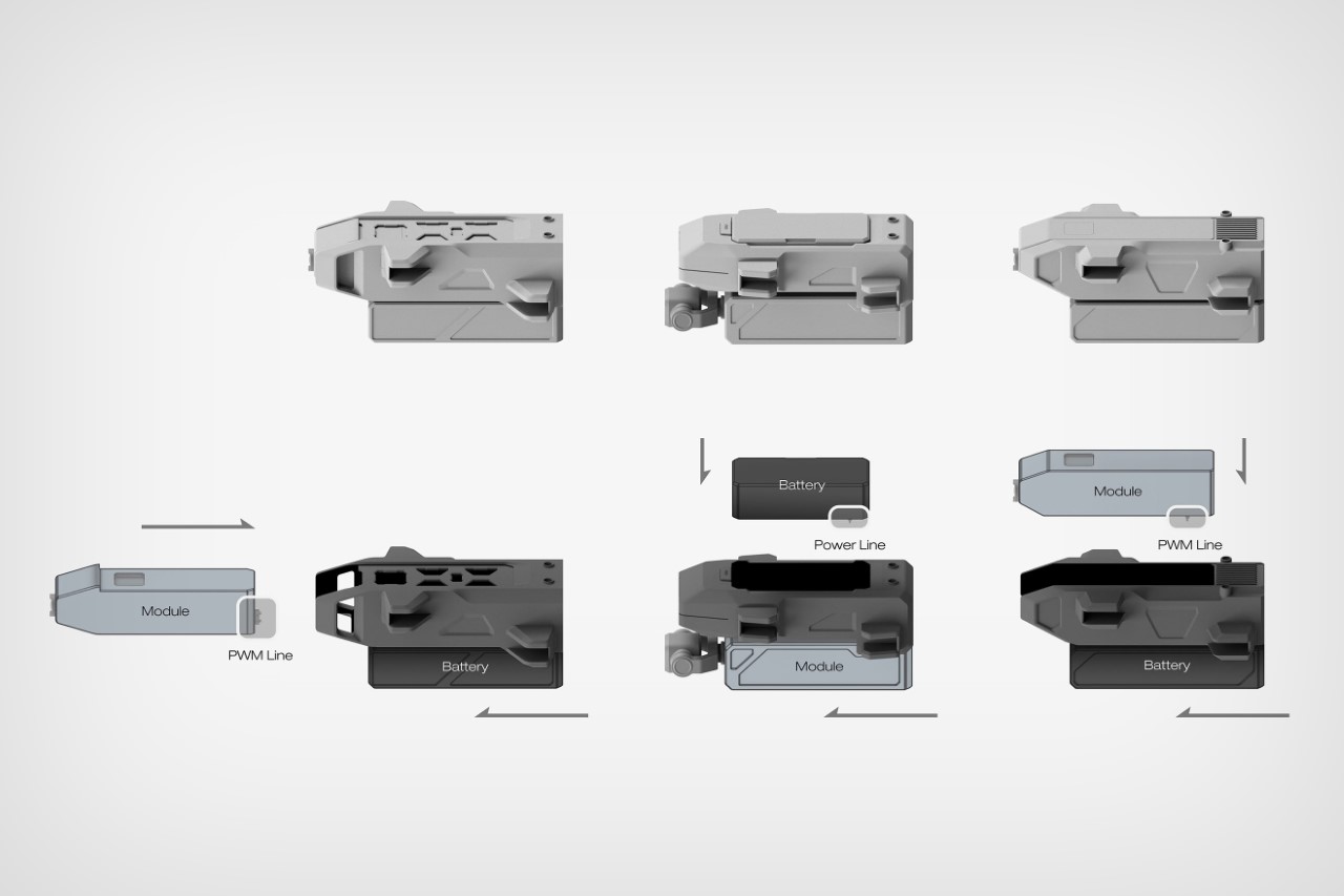
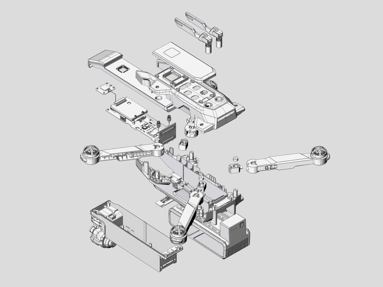
Drones are devices that you probably buy once or twice in your lifetime. Nobody buys a new drone every 2 years – they use the one they have for as long as possible before upgrading (that’s only if they need to upgrade)… which really means you’re stuck with backward tech for a fairly long time. To combat this, Ethan White designed the ARK – a modular drone with an architecture that features removable and upgradable components. Need a new battery? Swap it out. Want a better camera lens? Substitute the older one for a newer model.
Designer: Ethan White
“Traditional drones require complete hardware changes or airframe redesigns to perform different roles. The ARK, however, offers an integrated solution with the simple act of swapping module pack,” says Ethan. Although the drone references Noah’s Ark, it quite literally represents the metaphor of the ‘Ship of Theseus’ – a thought experiment revolving around a ship that remains constant, with its parts gradually replaced over time.
The way the ARK is designed balances purposeful bulkiness with aerodynamics. Sure, laptops can be sleek for cosmetic reasons – but drones need to shed every single ounce they can for efficiency – a heavy or bulky drone can’t fly as well as a lithe, aerodynamic one – so making a drone that’s easy to disassemble, modular, and upgradable presents a unique challenge.
Components can’t be interwoven with each other inside a single outer body. The battery needs to exist independent of the PCB. The motors, sensors, cameras, every element has to be positioned very thoughtfully, so that they can be individually removed and replaced.
To that end, the ARK has a remarkable design, featuring components that interlock together when in use, and separate when you need to perform a swap. All this while still making sure you’ve got a drone that’s portable, foldable, and aerodynamic. The modularity also means you can purpose-build your drone based on your needs. Want something for entertainment, choose a basic package. Want a multimedia beast, upgrade your camera. Want to record at night, swap the daytime camera for a module that supports night vision. Want better range, add better antennas on top. You can build your drone with precise intent, just like you would your PC.
The drone features upgradable PCBs, cameras, propellers/motors, battery packs, and even other components like anti-collision sensors. Although conceptual, Ethan is working on a proof-of-concept and states that he’s aiming for IP43 water and dust resistance, along with a 30-minute flight-time. That might sound dull on paper, but I’d choose 30 minutes of flight with an absolutely incredible camera lens and sensor over 50-60 minutes with a fairly basic lens array. Plus, things will only get better with time – and as a consumer, you directly benefit from it.
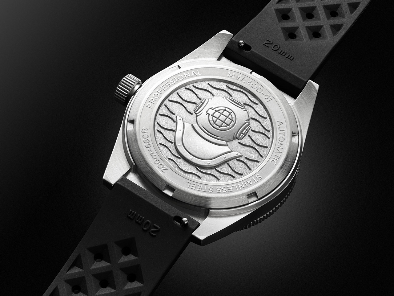
Microbrands in the watch world often capture attention by blending accessibility, quality, and striking designs. Montoir, a Chicago-based brand with Swiss-made credentials, entered the scene in late 2023 with its first dive watch. It was a standout debut—a stylish, robust timepiece with a Sellita automatic movement and serious 200m water resistance. Now, Montoir is back with the MWMOD-01 V2 Dive Watch, offering the same successful formula with an exciting twist: bold new colors.
Dive watches have a storied legacy, but Montoir takes that history and redefines it with precision and craftsmanship. The exterior is the definition of a modern classic. Crafted from 316L stainless steel, it combines various finishes—horizontal brushing, mirror polishing, and a lightly blasted dial—for a sophisticated and versatile aesthetic. Under the minimal-functional exterior is the customized Sellita SW200-1 Swiss automatic movement—a hallmark of reliability. Montoir has fine-tuned the movement to a no-date configuration, creating a clean, distraction-free dial. The 38-hour power reserve and robust build ensure it’s as functional as it is stylish.
The new collection boasts dial options in Mint, Salmon, Cool Grey, and Green, alongside existing hues like Polar White, Black, and Blue. These colors are complemented by subtle refinements to the design, ensuring that each variant feels like more than just a palette swap. A green bezel insert paired with the green dial is particularly eye-catching, making it the standout piece of the collection. For the other colors, black bezels maintain a timeless, understated appeal.
The new colors aren’t just cosmetic—they reflect Montoir’s effort to create a timepiece that fits seamlessly into anyone’s wardrobe. The Salmon dial, for example, exudes vintage warmth, while the Cool Grey is a masterclass in understated elegance. Paired with Montoir’s combination of brushed and polished finishes, every variant tells its own story while staying true to the brand’s DNA.
At 40.5mm in diameter and just under 12mm in height, the stainless steel case maintains the same balanced proportions as its predecessor. The brushed finish with polished accents gives it a versatile aesthetic—equally at home underwater or at a casual dinner. The unidirectional bezel with a detailed 60-minute scale ensures functionality for diving enthusiasts, while a double-domed sapphire crystal with anti-reflective coatings keeps the dial legible under all conditions. The solid caseback, featuring an embossed diving helmet, adds a distinctive touch. Inside, the MWMOD-01 V2 draws its power from the Sellita SW200-1 automatic movement. This Swiss-made workhorse, a reliable alternative to the ETA 2824-2, offers a 38-hour power reserve and operates at a smooth 28,800 vibrations per hour. While it’s a proven performer, Montoir’s choice to omit a date complication keeps the dial refreshingly clean and focused on legibility.
Speaking of the dial, the new lightly sandblasted matte finish adds depth and texture. The oversized indices, coated in Super-LumiNova BGW9, glow brightly in low-light conditions, as do the hour and minute hands. Depending on the color variant, you’ve got yourself a wonderful contrast between the hands and the watch face. The lighter face shades opt for black hands, making them visible at a glance, while the richer watch faces come with polished chrome-like hands that glimmer in the light, instantly catching your eye.
The watches come equipped with a 20mm tropic-style strap made from recycled FKM rubber. The strap’s quick-release system makes swapping bands effortless, adding to the watch’s versatility. The rubber strap means this is truly a bonafide diver watch, designed to easily take on your diving adventures as a fish takes to water. The watch’s rated for 200m or 20ATM of water resistance too. For those drawn to value-driven watches, the Montoir MWMOD-01 V2 is a compelling option. With Kickstarter pricing starting at $375 for early backers (or $450 after the initial 48-hour window), the watch offers a lot of bang for the buck. For a Swiss-made dive watch with professional-grade specs, the final retail price of $750 still represents strong value.
This second installment from Montoir refines everything the company got right with its first series, building on it with fresh aesthetics and thoughtful design tweaks. Whether you’re an experienced connoisseur or a first-time buyer looking for a robust, stylish diver, the MWMOD-01 V2 is a worthy contender for your collection – especially given its Swiss-made movement at an authentic, non-marked-up price tag.