Most good projects die by a rough cut. You print a crisp lattice, reach for the hobby knife, and five seconds later, there is a gouge exactly on the outer surface – a part that’s easily visible. That small heartbreak is what HOZO Design set out to delete with NeoBlade, a cordless cutter that trades brute force for forty-thousand-times-per-second ultrasonic finesse. The idea is simple: let vibration slice through projects with the perfection of a knife through room-temperature butter.
NeoBlade looks and feels like a chunky marker that fits perfectly into your grip. Battery clicks into the tail, blade peeks from the nose, and the whole tool tips the scale at 6.4 ounces, so even a long session of trimming support material will not sprain a wrist. Press the trigger gently, and Precision mode fires in quick bursts, perfect for knocking a single nub off a resin mini. Pull past the detent, and Continuous mode hums until you let go, turning foam board or acrylic sheet into respectful, silent ribbons. A perfect gizmo for finishing touches on all your projects.
Forty kilohertz of motion means the edge never drags long enough to melt plastic or splinter wood. Instead, it slips forward under light pressure, one microscopic slice after another, leaving a glassy face that looks almost molded. A smart driver reads resistance on the fly and feeds anywhere from nine to forty watts to the actuator, so switching from soft PLA to stubborn ABS feels seamless. There is no temperature dial to chase, no speed knob, no guesswork.
Keeping the tip cool is the job of a tiny turbofan buried in the barrel. Air enters through side vents, slides across the metal core, and exits behind your hand, dropping blade temperature far below the scorch line of common filaments. The handle stays comfortable, the cut stays clean, and warping never starts. Two bright LEDs flank the blade to fill shadows that magnify mistakes, a small but welcome nod to late-night builds.
HOZO ships six blade profiles in snap-forward cartridges. A 30-degree spear handles everyday trimming, a longer spear dives deeper stock, a curved slice glides through vinyl and leather, a twin-edge scores parallel grooves, and two chisel tips tackle carving and cleanup. Used blades press into a one-way slot on the cartridge, so they retire safely instead of migrating to a drawer where future you will forget they exist. The tool cap hides a stubby driver and a magnet that holds the fresh blade steady while you line up the tang, a little UX grace that feels earned on a cluttered bench.
Changing the Battery
The NeoBlade Creator Combo includes the TurboDock, an extra Battery Pack, and a set of trial blades
Cordless convenience lives or dies by downtime, so NeoBlade ships with an optional TurboDock that charges the handle and a spare cell in about thirty minutes. Slide one battery out, slide the other in, twist, and you are back to slicing before the printer’s next layer cures. Makers on a tighter budget can rely on the USB-C port in the grip, though that route parks the cutter for an hour or more. Early Kickstarter pledges locked in the full kit for $99 USD, a tidy slice off the planned $149 retail tag. The Creator Combo (priced at a discounted $149) packs the NeoBlade, a TurboDock, an extra battery, and a spare blade trial kit with 6 blades.
But don’t confuse this with one of those cheap cutters on Amazon or that soldering iron that you also use to burn off imperfections in 3D prints. Because the edge oscillates instead of tearing, you avoid the fuzzy bead that hot-wire cutters leave in foam and the ragged fringe delivered by abrasive wheels. Clean edges mean less post-processing, which in turn means more time for tuning the slicer profile or experimenting with paint. Model makers, cosplay armor builders, prop shops, even electronics hobbyists who need to notch an enclosure without filling the room with ABS dust will notice the difference on day one.
NeoBlade lands at a sweet spot between pocketable craft knives and industrial ultrasonic stations that never leave a lab. It gives hobbyists, cosplay armor fabricators, prop builders, and small-batch product designers a push-button guarantee of clean edges and repeatable results. By making ultrasonic cutting as casual as clicking a pen, HOZO turns the most stressful step of fabrication into the easiest. Projects move forward, sanding blocks stay clean, and the next big idea arrives sooner because the last one didn’t stall at the trimming stage.
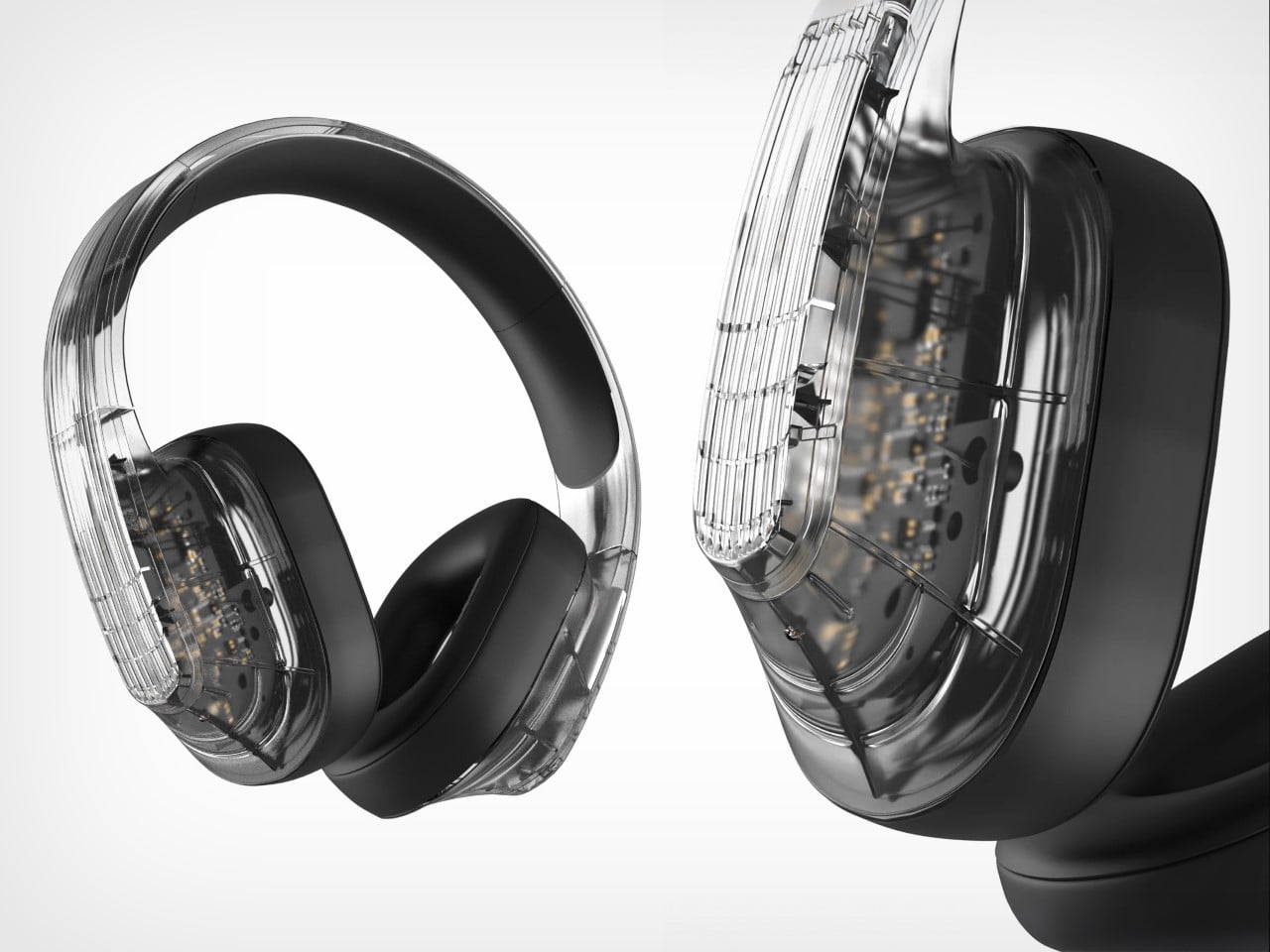
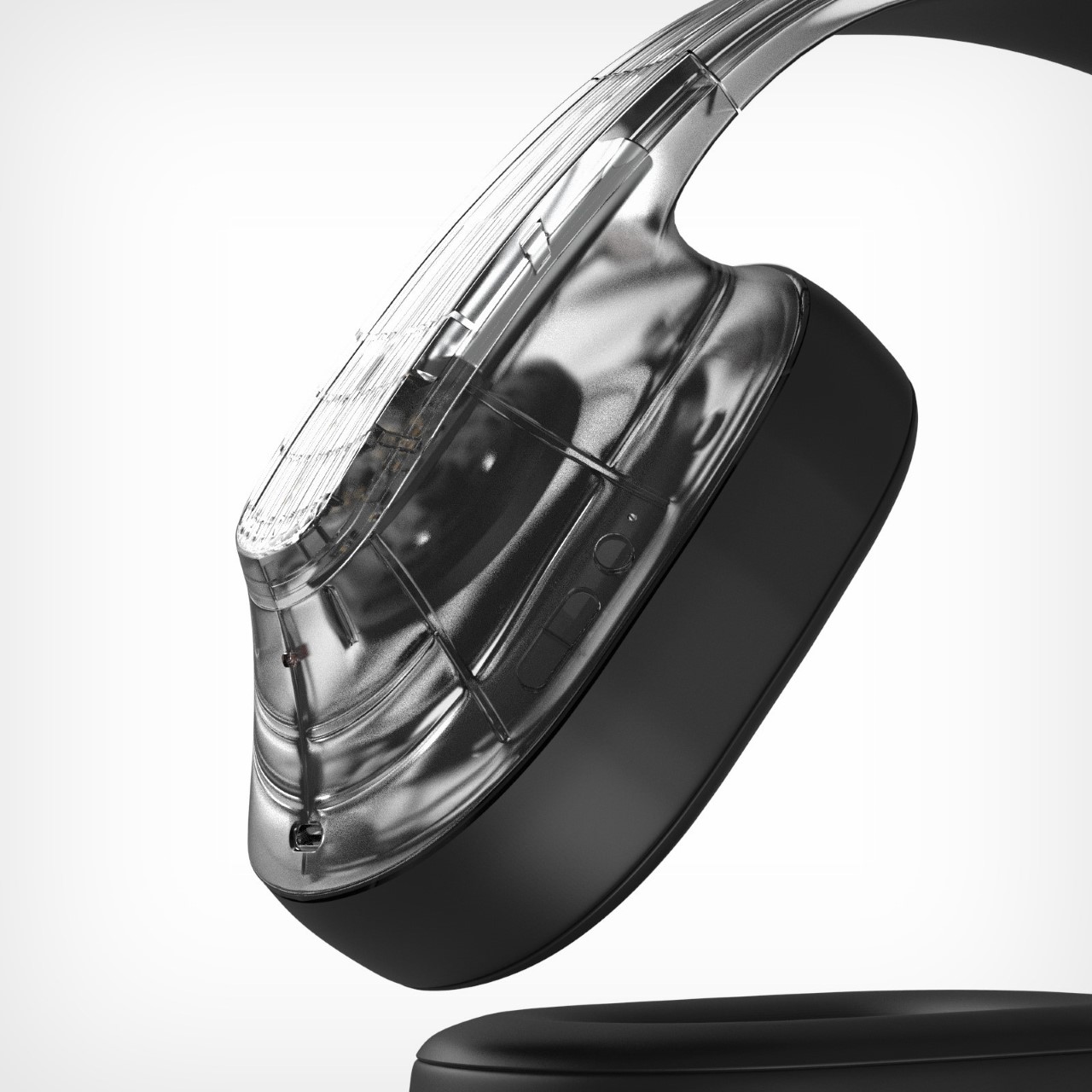
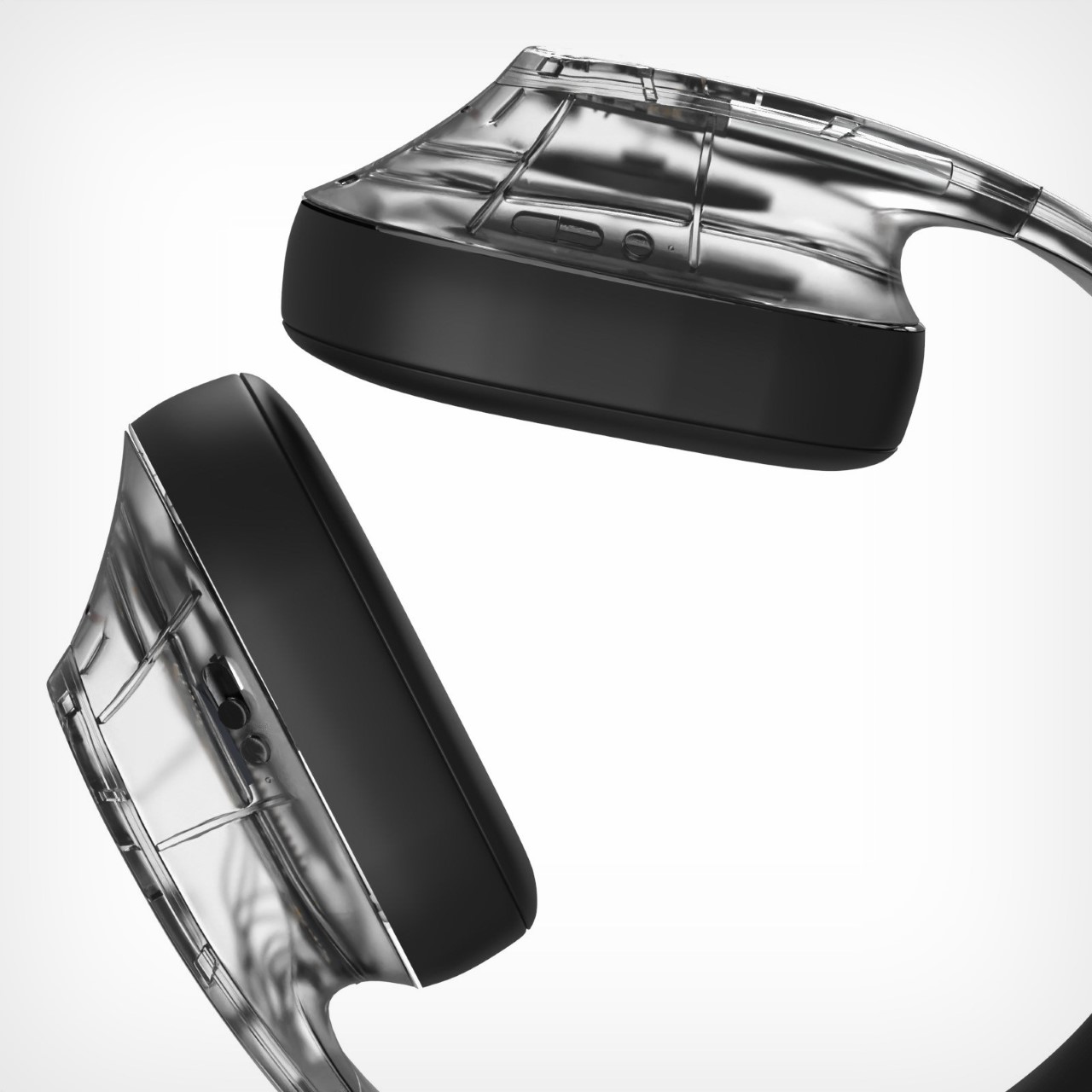
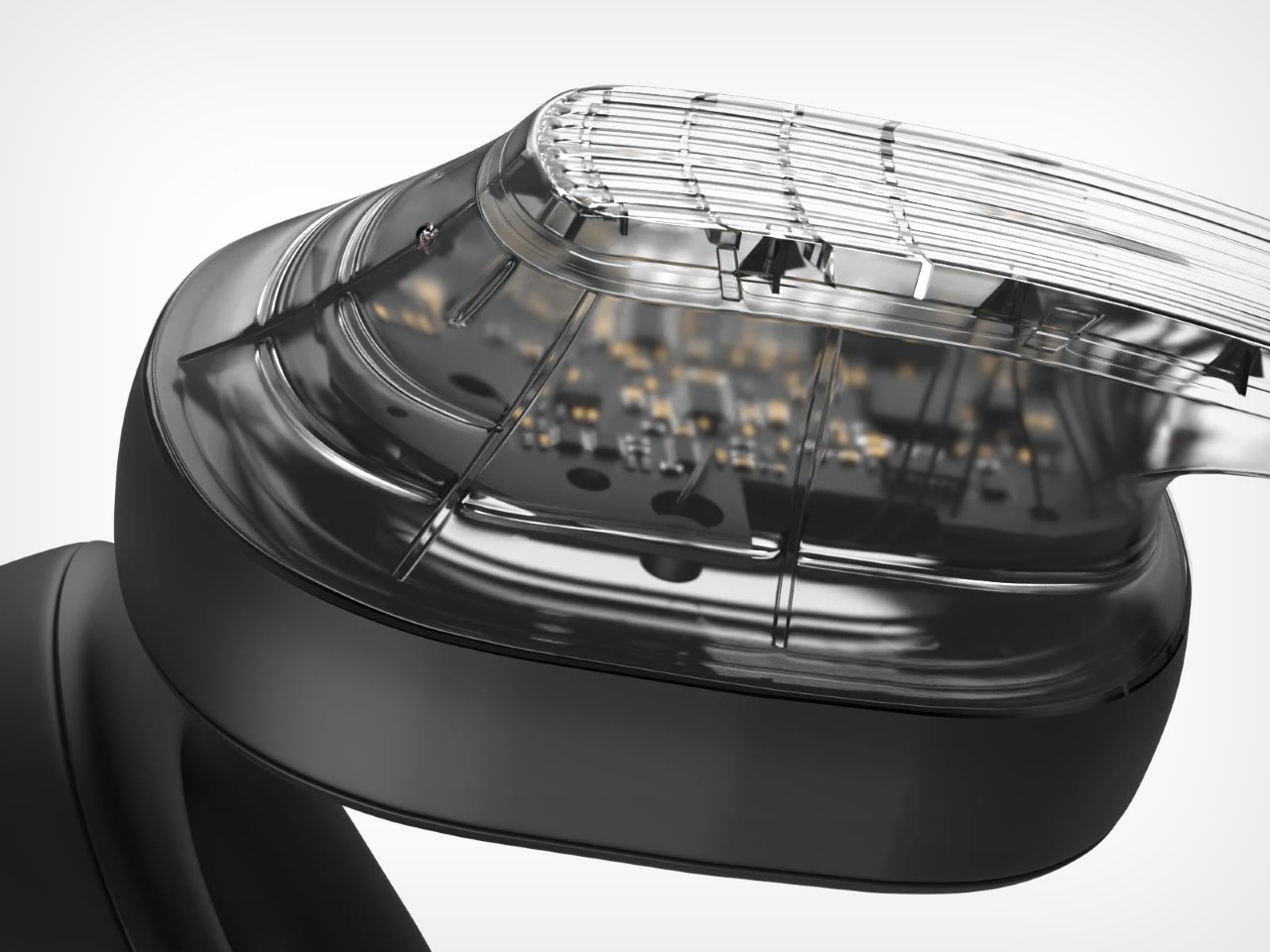
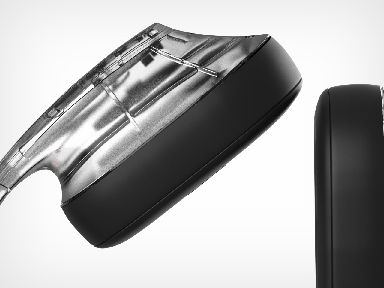
For a company that single-handedly revived transparent tech, the Headphones (1) have absolutely no transparency in their design. If you saw this video dated a month or so ago, it was Nothing literally confirming that they were due to debut their first over-ears. The internet’s been asking for Nothing to build AirPods Max ‘killers’ for a while, and it seems like Carl Pei finally had his cards in place to make this play…
However, images from a private preview earlier last week showed what the headphones looked like – and the internet has thoughts. A lot of people on Reddit can’t help notice the odd shape, commenting on how it looks different from what they expected… and that’s a good thing. Subverting expectations is great if you can create a design that’s somehow received more positively than the consumer’s expectations. The problem is that Nothing’s ardent fan base now always has the highest expectations. And as a fan, I did too.
Call me pedantic, but Nothing’s entire design DNA was transparency. Whether it was the earbuds or the phones, there was always an element of ‘see-through’ in their tech. Not so much in the phones, given how densely components are packed inside, but the Ear (1), Ear (a), and Ear (open) all had a transparent outer housing that let you peer into the electronics below. While the ‘alleged’ Headphones (1) do have a transparent shell, the design is FAR from actually transparent. In fact, it’s entirely opaque, except for one can-hugging outer shell that doesn’t really let you ‘peer into the headphones.’
That’s when I stumbled upon the ‘Spectrum’ headphones by Monica Bhyrappa. These phones were especially designed for wearers with autism, allowing them to experience less sensory load as compared to other humans. Autistic people experience the world very differently, and an overload of sensory input can easily overwhelm them. The Spectrum are a specially-tuned pair of noise-canceling headphones designed to phase out too many noises, allowing wearers to focus on audio that actually matters.
The design brief is spectacular, and I’m all for accessible tech, but I couldn’t help but also notice one of Monica’s concept renders, which featured a set of transparent cans… and the second I saw them, I knew exactly what I wanted the Nothing Headphones (1) to look like.
Nothing’s ethos is broadly to make tech fun again – not through awkward shapes, but through an eye-catching design that boasts transparency. You have a broader appreciation for tech if you know what’s inside it, or at least that’s what I personally believe. Beats by Dre had this entire scandal following a teardown that revealed metal cubes inside the headphones, added with zero purpose other than to make them feel ‘heavier’ and therefore ‘premium’. Nothing’s transparent tech was supposed to be an open challenge to that.
Are the upcoming Headphones (1) ‘fun’? I’m sure there’s a set of people who love the design, and a set of people who think it’s funky, but not specifically for them. That isn’t the point I’m trying to make. What I personally wish is that the headphones adopted the ‘transparency’ design direction more aggressively. Headphones aren’t like phones. They’re thicker, have more air gaps to allow for vibrating components and air-based resonance. This inherently allows for headphones to have a lot of empty space on the inside – empty space that is PERFECT for beautifully showcasing through transparency.
No, I don’t want glyphs on my headphones. But I do wish they looked a little different. I wish they championed transparency more than they currently are… because let’s not deny that Monica Bhyrappa’s Spectrum headphones do look absolutely gorgeous!
There was a time when listening to an album meant more than tapping a screen. You’d open a case, slide in a disc, and sit with the music from start to finish. The ClearFrame CD Player revives that experience not with nostalgia, but with intent. It doesn’t just play your albums. It exhibits them.
Set behind a crystal-clear shell, the disc spins like a sculpture in motion. Your album art, once forgotten in a drawer or buried on Spotify, now floats on your wall or desk like a curated gallery piece.
In an era of algorithmic playlists and invisible files, ClearFrame is a reminder that presence still matters.
The Player That Reframed My Daily Routine
At first, I thought it was just a beautiful object—something I’d admire occasionally, maybe play once a week. But within days, ClearFrame had reshaped my habits. It became my morning ritual companion, my afternoon focus anchor, and surprisingly, my way of rediscovering albums I forgot I loved.
Plays full albums while I cook or read
Loops a single track to help me write
Turns guests into curious onlookers who ask, “Wait… is that a CD player?”
There’s a strange power in seeing your music—watching the disc spin, the LED glow, the cover art behind the clear face. Suddenly, sound becomes sculpture.
Designed to Display, Built to Play
Transparent Polycarbonate Shell The album becomes the focal point—protected but never hidden.
Visible Circuit Board Honest engineering that feels like part of the design, not a secret.
Floating Disc Mechanism Smooth motion + warm LED lighting gives each playback a ritualistic calm.
Wall-mountable or Desktop-friendly Display like a photo frame or place beside your speaker setup.
Bluetooth 5.1 + Headphone Jack Stream wirelessly or go classic with a plug-in.
USB-C charging + 7–8 hour Battery. Portable enough to carry room to room.
Multiple playback modes Loop a track, let the album ride, or pause for silence.
ClearFrame isn’t trying to be “smart.” It’s trying to be present, and in doing so, becomes more essential.
Why Physical Still Wins
The more digital our lives become, the more we crave something real, something to touch, see, and return to. ClearFrame doesn’t replace streaming. It offers an alternative state of mind.
You choose an album. You see it. You hear it all the way through. No shuffling. No ads. No interruptions.
It’s a gentle confrontation with the way we consume music today, and a subtle push to slow down, look up, and listen better.
Design That Reflects Discipline
ClearFrame’s visual simplicity hides a surprising depth of thought.
It was developed by a Tokyo-based team known for merging tech with clarity, removing friction, not adding features. Every detail—the sharp edges, the floating CD, the matte circuit board—was chosen to showcase music as something worth displaying.
It doesn’t shout. It just sits there, spinning, glowing, doing one thing well. That’s the power of restraint.
Who It’s For
Design Enthusiasts
A daily-use object that elevates your space and sparks conversation.
Music Lovers Rediscovering the Physical
ClearFrame transforms forgotten CDs into something worth revisiting.
Minimalists & Analog Fans
No apps. No updates. No distractions. Just the disc, the art, and you.
A Living Album Cover for Everyday Life
What would your favorite album look like framed in motion? Imagine a desk that becomes a music gallery. A bedroom wall that reflects your taste—literally. ClearFrame doesn’t just play music. It turns your albums into an ongoing exhibition.
It’s not about going back in time. It’s about bringing what mattered back into view.
Not just a CD player, but a daily reminder that music deserves your full attention. ClearFrame is available now for $199.
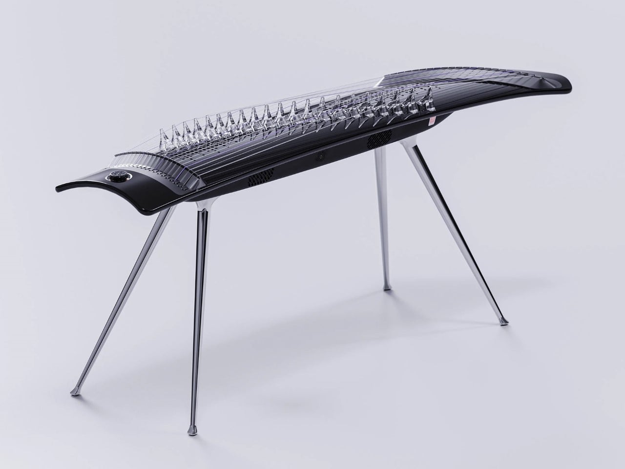
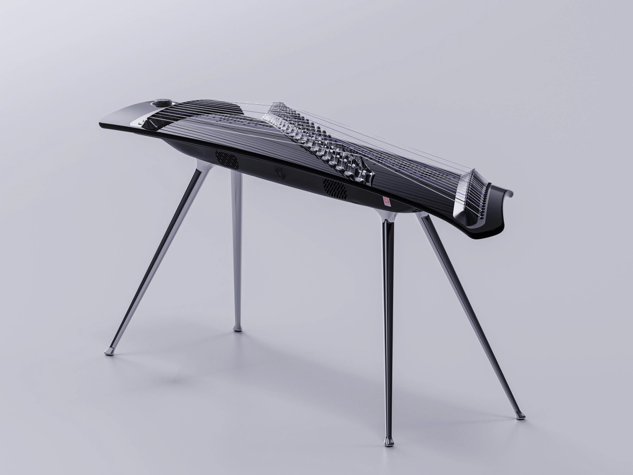
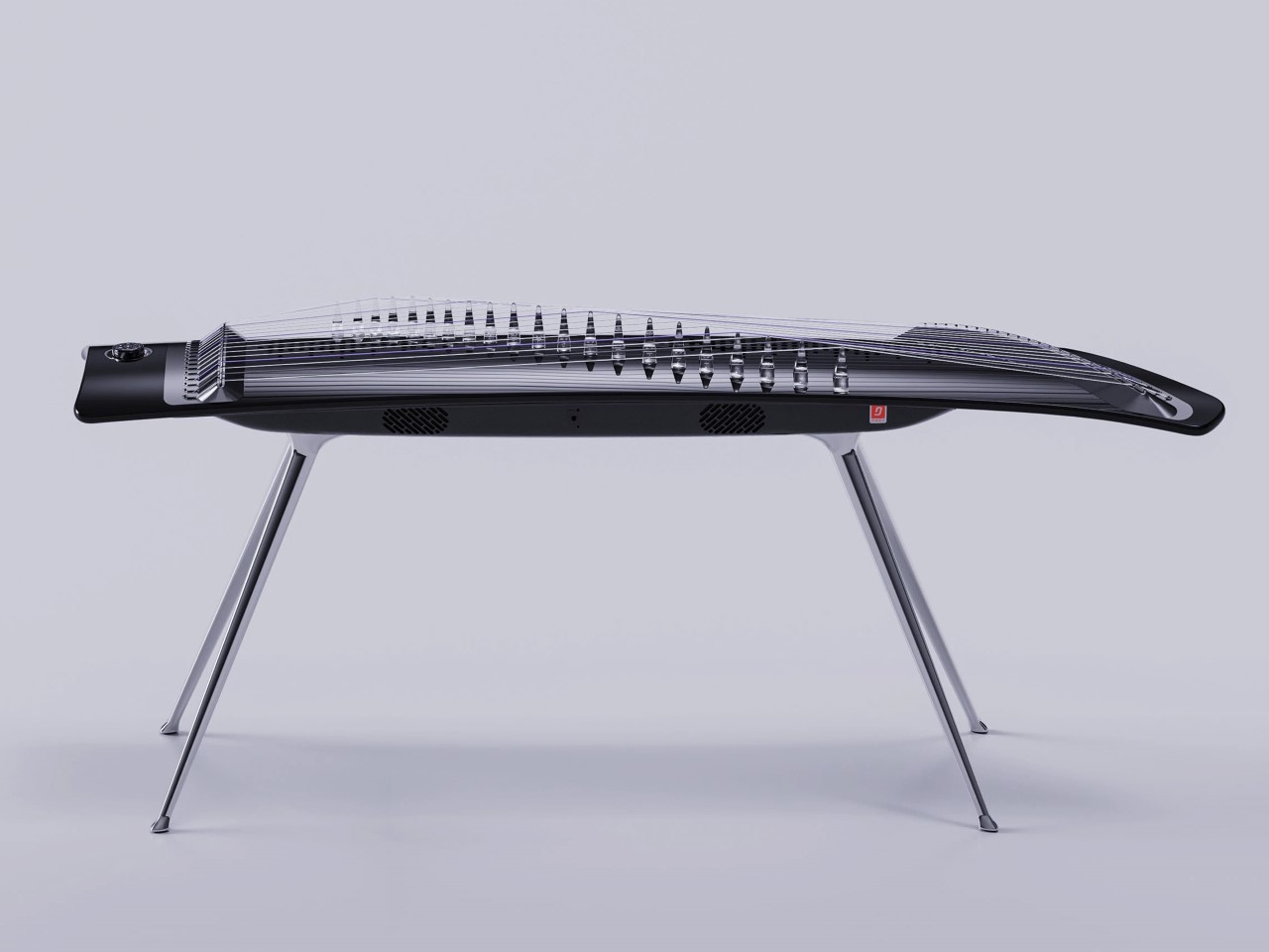
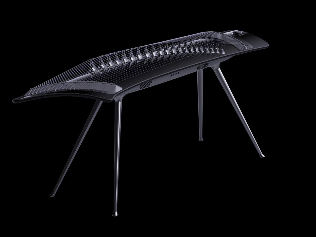
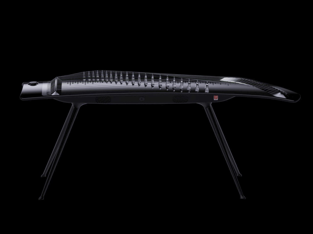
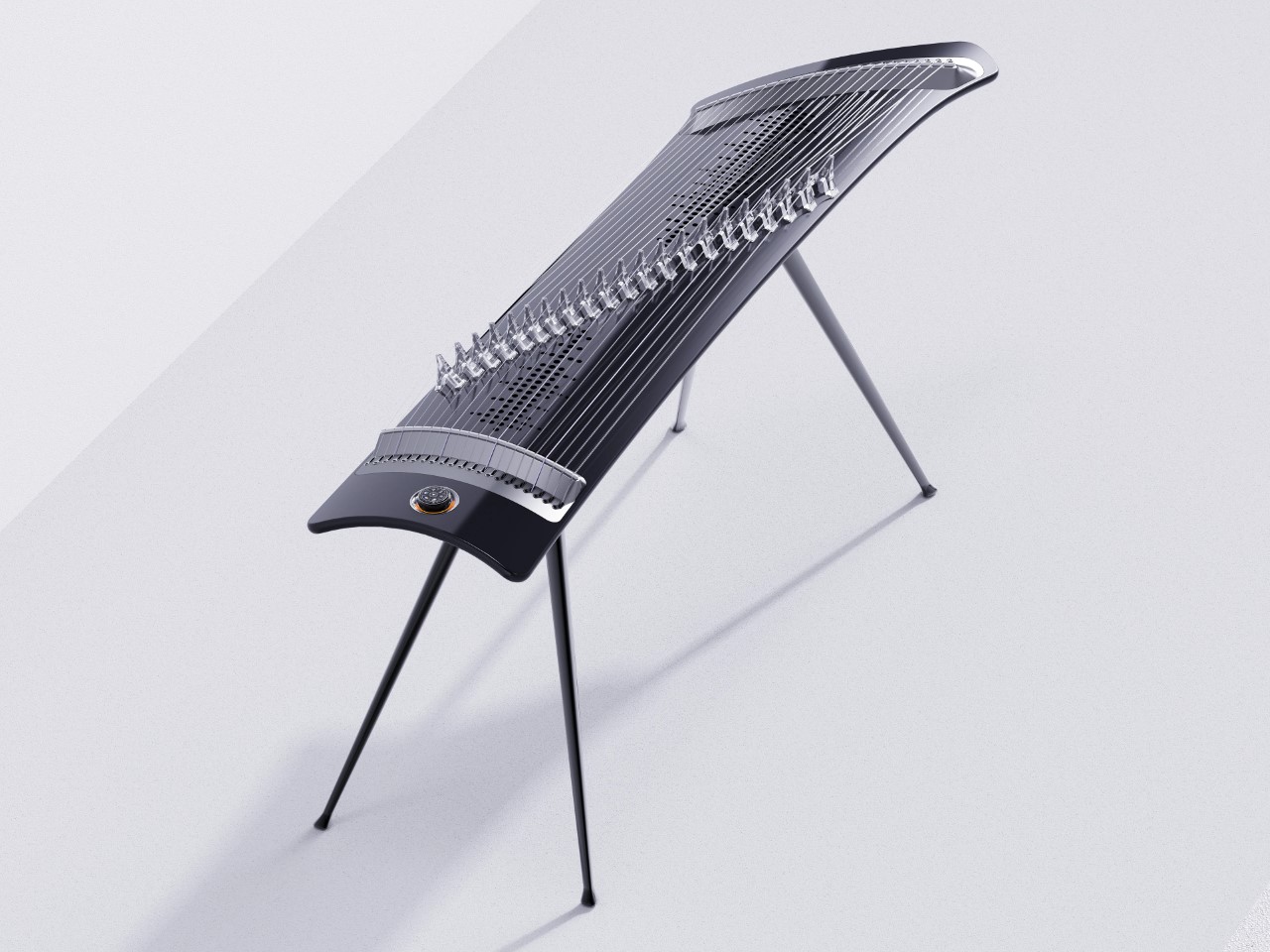
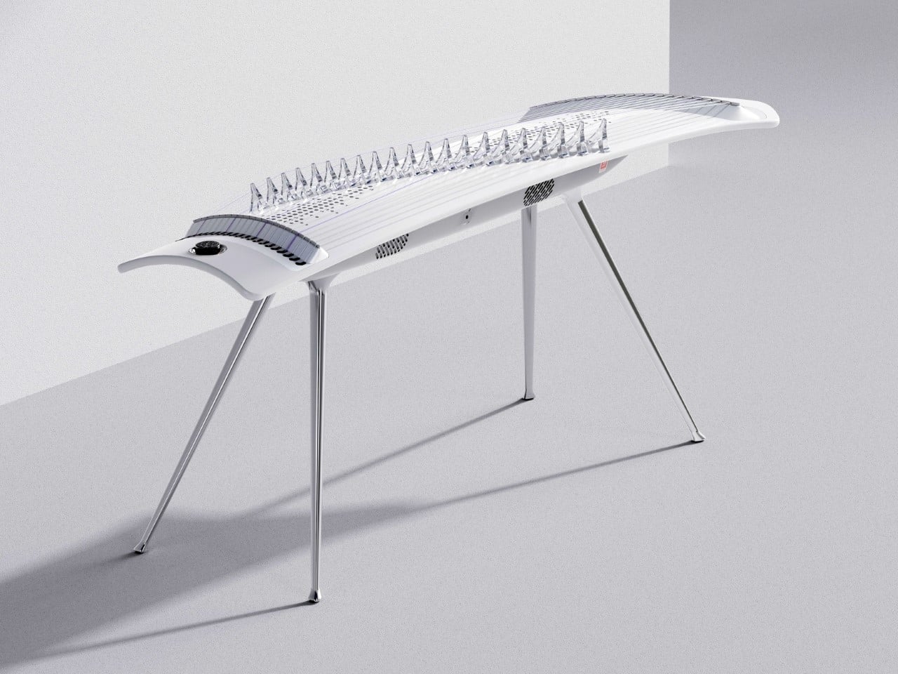
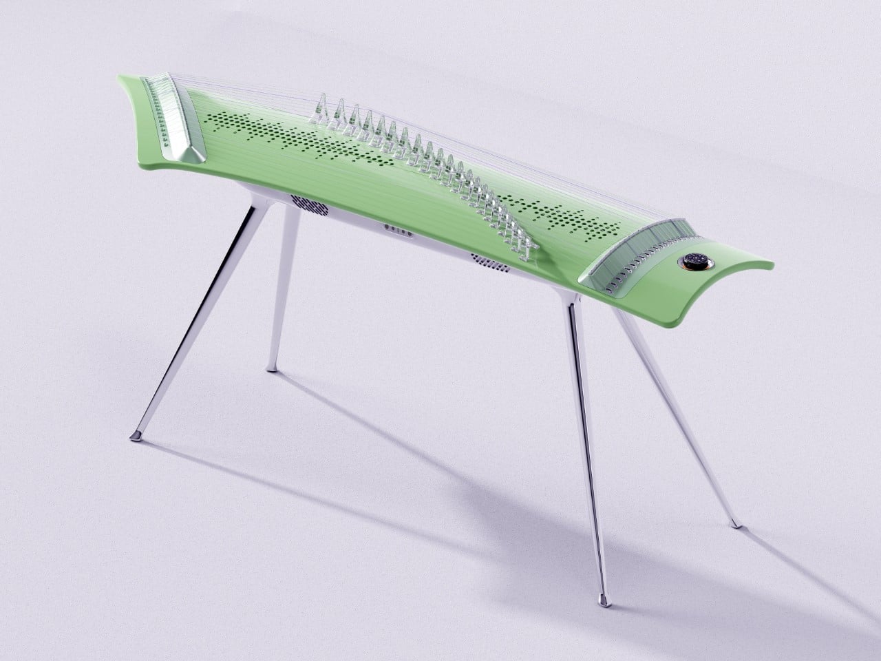
Remember when musical instruments were simply tools for creating sound? That era is rapidly disappearing as technology transforms our relationship with music. The E-Zither by Jade Inno exemplifies this evolution, taking the traditional Chinese guzheng (a 2,500-year-old zither) and catapulting it into the 21st century with a design that would make Dieter Rams nod in approval. The swooping streamline structure and undulating surface create a sculptural silhouette that appears to float before the performer, simultaneously honoring traditional imagery while completely redefining its expression. What makes this concept particularly fascinating is how it manages to blend technological innovation with cultural preservation, something we rarely see executed with such thoughtful precision.
This isn’t some half-baked concept destined for perpetual “coming soon” status either. Jade Inno has already completed small-scale trial production and plans to release the E-Zither in the Chinese market first. The instrument represents the first implementation of the brand’s new design language, establishing a visual and structural framework for future products. Its sleek, minimalist aesthetic disguises a wealth of functionality that transforms the traditional playing experience. The crystal zither pegs add both visual elegance and practical lightness, while the acoustically optimized perforation pattern underneath enhances sound diffusion for a more immersive tonal experience. Each design element serves both form and function, creating a cohesive whole that feels simultaneously familiar and revolutionary.
Designers: Qi Liu & Ou Sheng
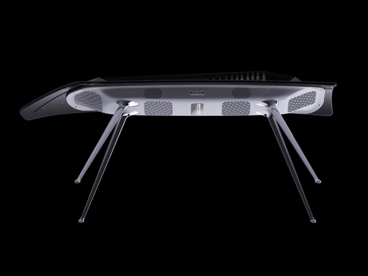
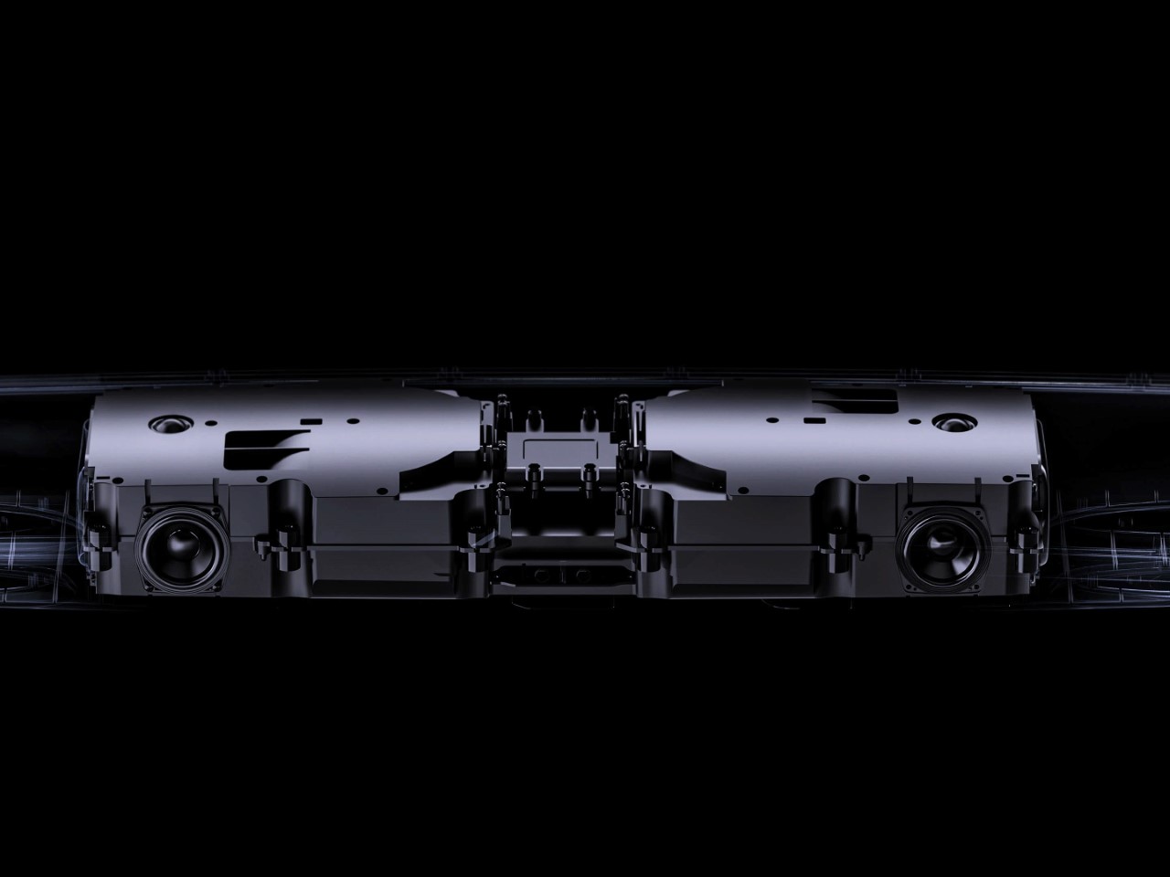
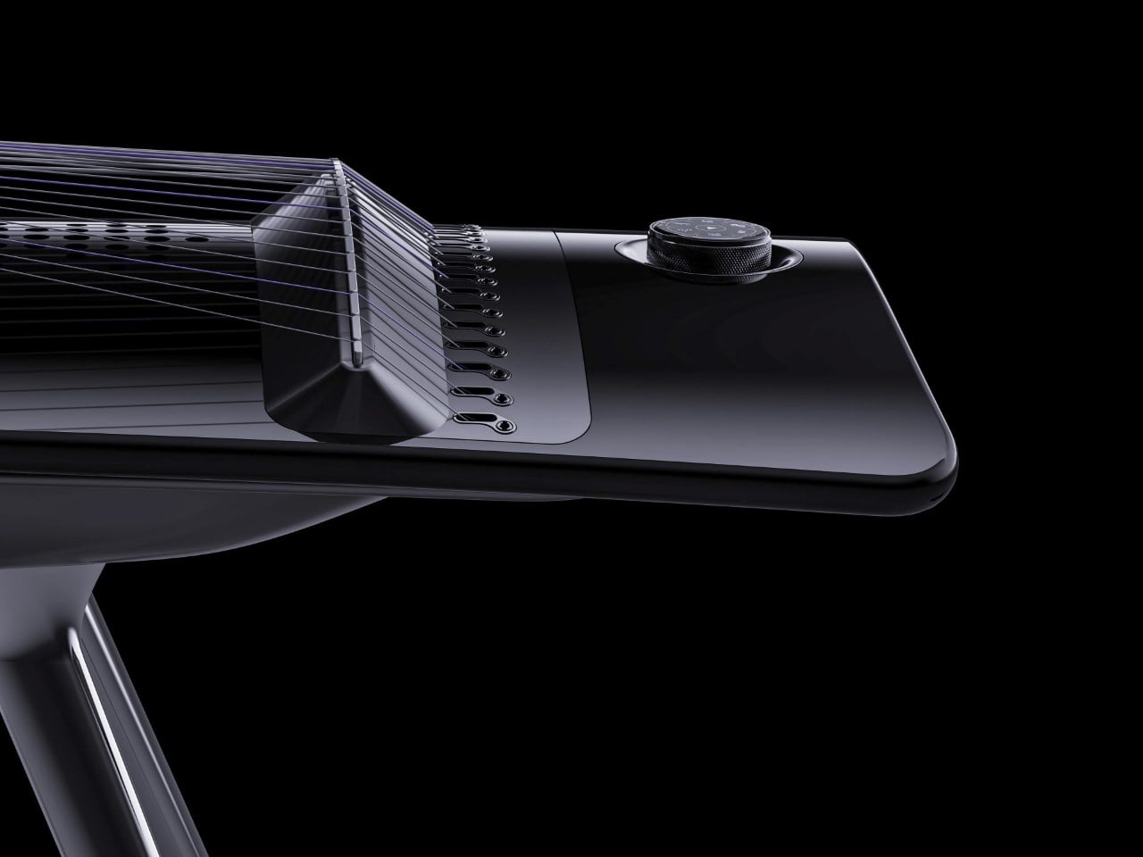
Under its elegant exterior, the E-Zither packs serious technological muscle. The instrument integrates 12 distinct functions including a tuner, drum machine, wireless microphone, Bluetooth speaker, and dynamic atmosphere lighting. Eight built-in high-fidelity speaker units deliver 300W peak power, while an NXP DSP chip with acoustic master tuning technology ensures pristine sound reproduction.
The one-key switching between eight different tones allows for unprecedented versatility, giving musicians the ability to shift sonic palettes instantly. That circular control knob isn’t just pretty either; crafted from CNC anodized aluminum with a fine matte finish, it houses controls for tone switching, volume adjustment, and Bluetooth pairing. The 360° dynamic surround lighting system moves with the music, creating what the company calls a “4D immersive experience” that extends beyond mere sound.
The practical considerations are equally impressive. Lightweight, detachable legs make assembly, transport, and storage remarkably straightforward, addressing a common pain point for traditional guzheng players who struggle with the instrument’s typical bulk and weight. This adaptability makes the E-Zither equally suitable for professional stage performances and teaching environments.
The dual-purpose nature of the instrument as both a professional musical tool and entertainment device opens it to a broader audience than traditional zithers could ever reach. For musicians looking to bridge ancient tradition with modern capability, this electronic guzheng offers a compelling vision of how cultural instruments can evolve without losing their soul. I’ll be watching closely to see if Jade Inno can successfully bring this striking concept to global markets after its initial Chinese release.
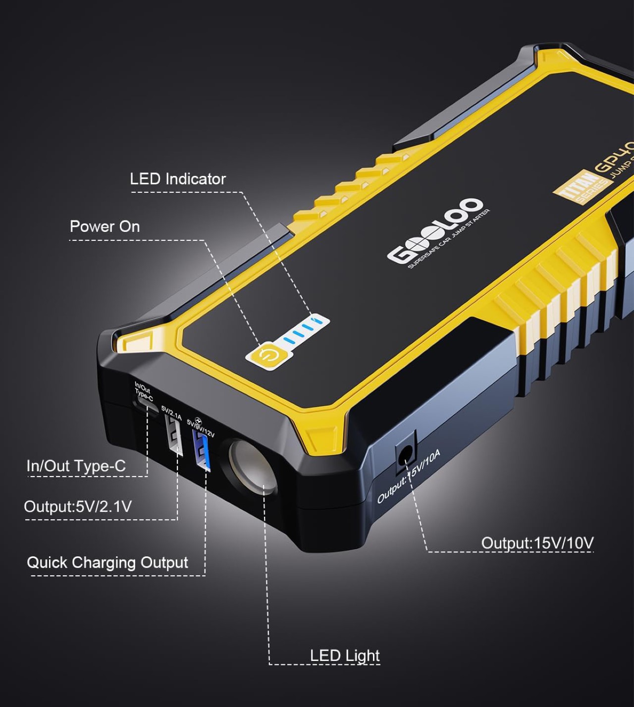
We’ve all been there – stranded in a parking lot with a dead car battery, frantically calling for help while your phone battery dwindles to single digits. It’s a modern catch-22 that perfectly captures our dependence on technology. Your car needs electricity to start, your phone needs power to call for help, and you’re stuck in the middle with neither.
The GOOLOO GP4000 jump starter elegantly solves this dual-crisis scenario with a device that’s essentially two lifelines in one compact package. This multifunctional powerhouse doesn’t compromise on either function, delivering serious jump-starting capability alongside substantial power bank functionality. In a world where most multi-function gadgets typically excel at one feature while merely tolerating the other, the GP4000 stands out by refusing to make that trade-off.
The specs here are genuinely impressive for what might become one of the essential emergency gadgets for modern drivers. Packing a mighty 4000A peak current, this device can breathe life into all gasoline engines and diesel engines up to a massive 10.0L displacement. That covers everything from your neighbor’s compact Civic to your uncle’s heavy-duty F-250. The portable power station operates in temperatures ranging from a frigid -4°F to a scorching 140°F, making it reliable in virtually any climate you might encounter. A single charge provides enough juice for approximately 60 jump starts, which, unless you’re operating an absolute rust-bucket, should last you quite some time. The rugged construction features reinforced corners that can withstand the inevitable drops and bumps that come with roadside emergencies. The built-in LED flashlight becomes even more essential, especially when you’re fumbling with jumper cables in the dark. Different modes support regular, strobe, or SOS blinking patterns, making this a practical must-have for every car owner.
On the power bank side, the 24,000mAh capacity rivals dedicated premium power banks on the market, making this one of the most versatile tech essentials for drivers who demand reliable backup power. The charging arsenal includes dual USB ports and a USB-C port, allowing you to simultaneously charge multiple devices. This capacity translates to roughly 10 full charges for an iPhone or 6 for a Samsung Galaxy device. The inclusion of fast-charging technology means your devices get back to full power quickly, which is particularly valuable during emergencies. The LED indication display provides clear information about remaining battery life, preventing any unwelcome surprises when you need power most. While many multifunctional devices skimp on secondary features, GOOLOO has implemented 10 different safety protections, including overcurrent, short circuit, and overcharge prevention for both the jump starter and charging functions.
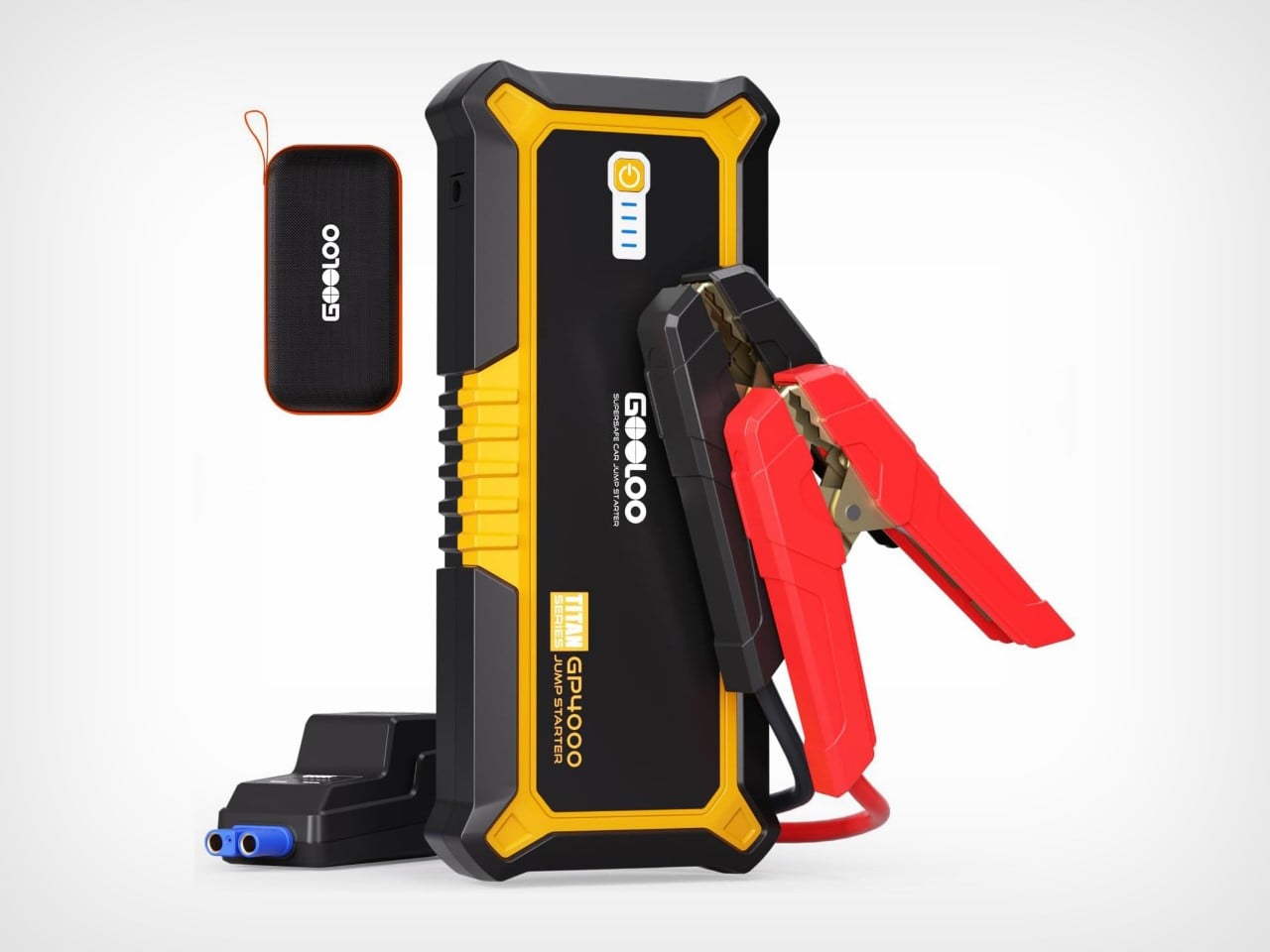
What’s particularly interesting is how GOOLOO has managed to pack this innovative emergency tech into a form factor that remains genuinely portable. At 8.97 × 3.92 × 1.49 inches, it’s certainly larger than your pocket-sized power bank, but still compact enough to store in a glove compartment or trunk without sacrificing valuable space. The ergonomic handle design makes it easy to grip even with gloves on during winter emergencies. The bright orange accents serve both aesthetic and practical purposes, making the device easy to spot in a cluttered trunk or at night.
For tech enthusiasts and everyday drivers alike, the GP4000 represents a compelling convergence of emergency preparedness and daily utility that could easily earn a spot among the best-designed portable jump starters available today. The GP4000 eliminates the need to carry separate devices for different power emergencies, streamlining your emergency kit while actually improving functionality. It also saves you a crisis call to AAA. The power bank ships along with detachable jumper cables, as well as a nifty hard-shell carrying case.
Remember when you’d spend hours tapping your phone screen, deploying sunflowers and peashooters to hold back the endless tide of the undead? Plants vs Zombies was a 2009-10 cultural phenomenon that turned lawn defense into an obsession for hundreds of millions of players. That quirky tower defense title with its adorable plants and dopey zombies somehow managed to hook everyone from hardcore gamers to grandparents who’d never touched a game before. Now, a decade after we all collectively worried about zombies eating our brains, LEGO Ideas has unveiled a pitch-perfect brick recreation that captures the essence of PopCap’s masterpiece in 1100 meticulously arranged pieces.
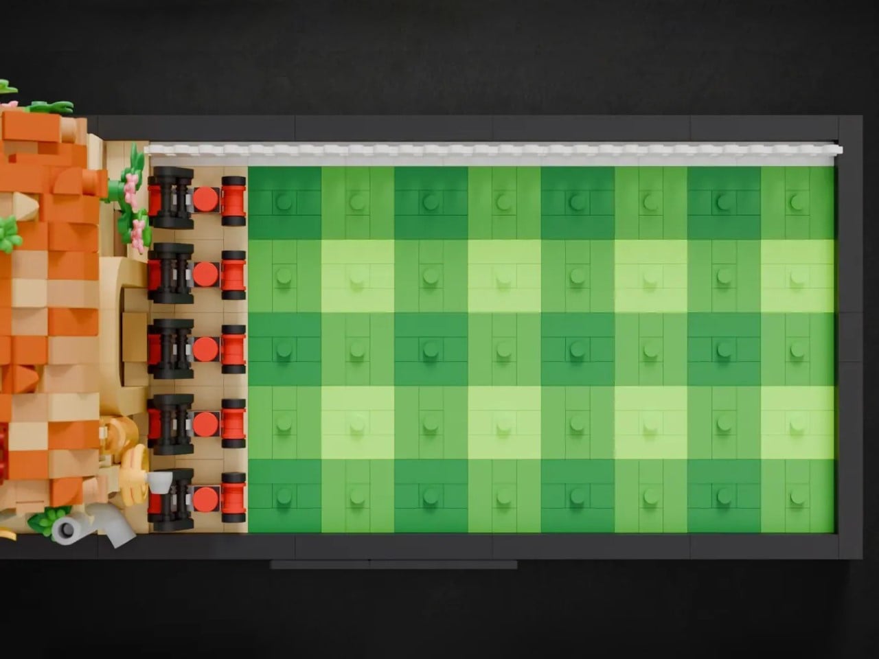
First off, translating a digital game to physical LEGO form is tricky business, but this set absolutely nails it. The designer has recreated that iconic suburban battlefield with the precision of someone who clearly spent way too many hours (like the rest of us) strategically placing cherry bombs and potato mines. The layout is instantly recognizable: a neatly gridded front lawn, the modest little house with its characteristic roof, and of course, the stars of the show – those plucky plants and brain-hungry zombies, all rendered in brick form that somehow preserves their cartoonish charm while working within LEGO’s geometric constraints.
Designer: KrafftPunk
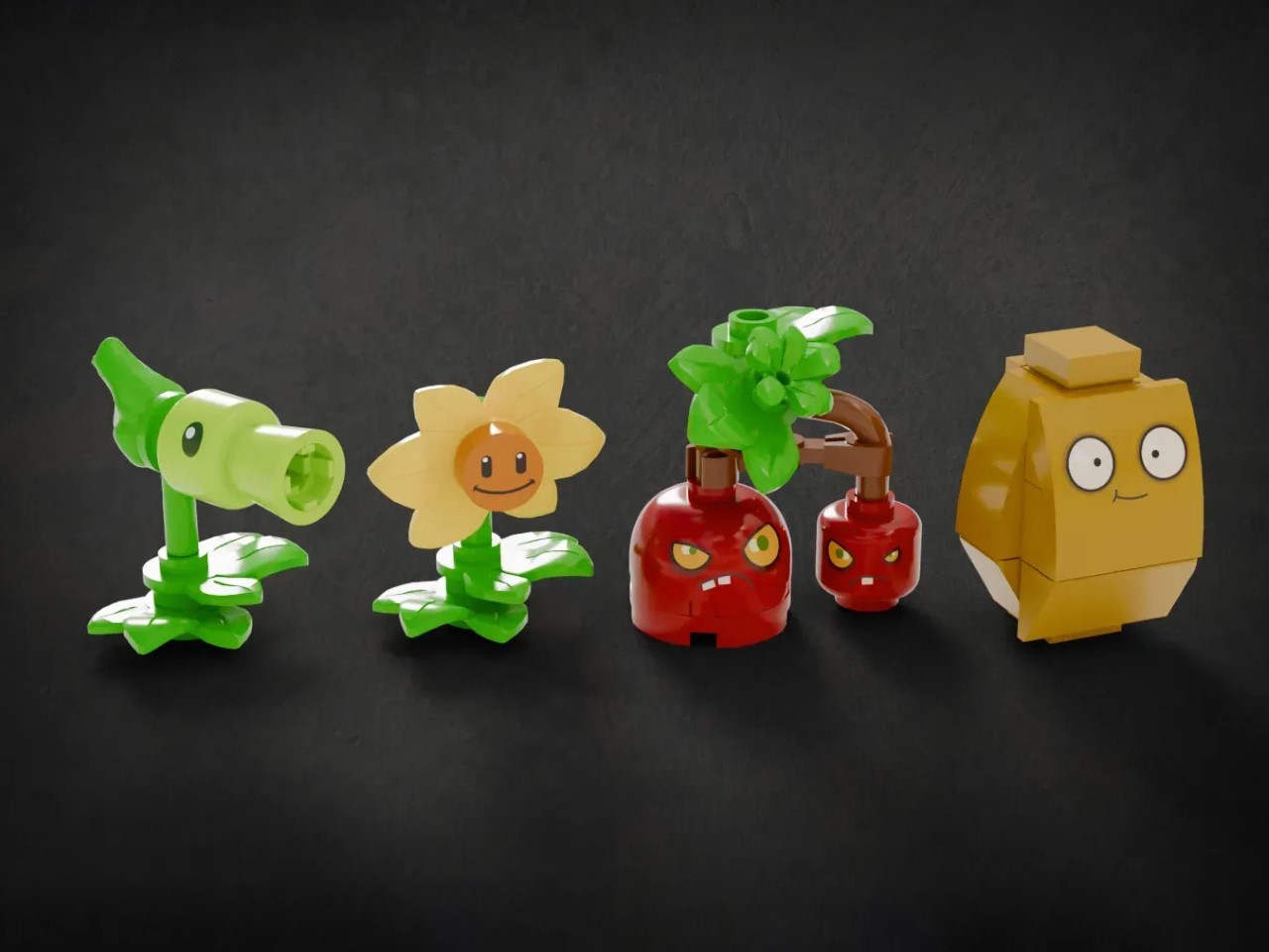
The front lawn unfolds in a neat grid of various green plates, lightly studded to anchor eight distinct brick-built plant figures. Closest to the house, a row of potato mines – each built from black clips and red round tiles – bleeds into neatly clipped hedges of sunflowers. Their smiling yellow heads perch on layered leaf elements. Next come two rows of shooters: bright green Peashooters flank two icy-blue Snow Pea models, each barrel perched on a stacked-tile stalk. A chomper with a bulbous purple head and hinged jaw snaps open among them. Two walnut figures, carved from angled bricks into squat, worried eyes, guard the final lane beside a white picket fence.
The plant lineup is a greatest hits collection that would make any PvZ veteran smile. The Peashooter’s signature green head has been captured with surprising nuance using just a handful of pieces. The Sunflower beams with that same dopey optimism that made it the backbone of every successful defense strategy. Wall-nut’s worried expression somehow translates perfectly to LEGO form, complete with those anxious eyebrows that always made you feel a little guilty about putting him in harm’s way. The Snow Pea, Cherry Bomb, and Potato Mine round out the plant defenders, each one immediately recognizable despite their miniature size and blocky construction.
On the zombie side, the roster’s a little limited, but it’s still enough to really seal the deal. The minifigures are tweaked to go from your happy yellow beings to olive-green zombies with their signature expressions, gangly teeth, and ripped clothes – all created through mere decals. One of the zombies even holds the brains flag, officially representing the offensive side of the game.
The lawn grid is (to a degree) functionally playable. Plants and zombies can be positioned and moved across the battlefield, essentially turning the set into a physical version of the game. You could absolutely use this as a tabletop strategy game, moving zombies forward one space per turn while the plants defend their territory. The modular design allows for endless reconfigurations, letting you recreate your favorite defensive layouts or experiment with new strategies that would never work in the actual game. I’m already imagining house rules for a competitive two-player version where one person controls plants and the other zombies.
This set represents LEGO at its finest – taking something beloved from pop culture and transforming it into an interactive brick experience that works on multiple levels. For the casual fan, it’s a nostalgic nod to a game that ate up countless hours of their life. For serious LEGO collectors, it’s a display piece filled with clever building techniques and character designs. And for those who want to actually play with their LEGO (imagine that!), it’s a physical board game that captures the strategic essence of its digital inspiration. But first, the set needs to make it through the LEGO Ideas voting cycle… although with over 4,700 votes, it’s well on its way to hitting the 10k mark that will then send it to LEGO’s internal team to review whether it fits well into LEGO’s box-set collection. If you want to see that happen, go ahead and cast a vote for the Plants vs. Zombies build on the LEGO Ideas website here!
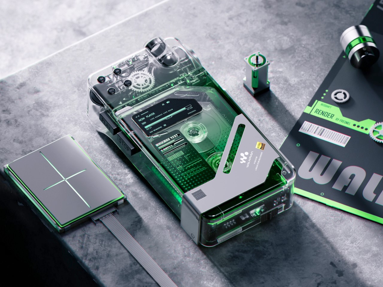
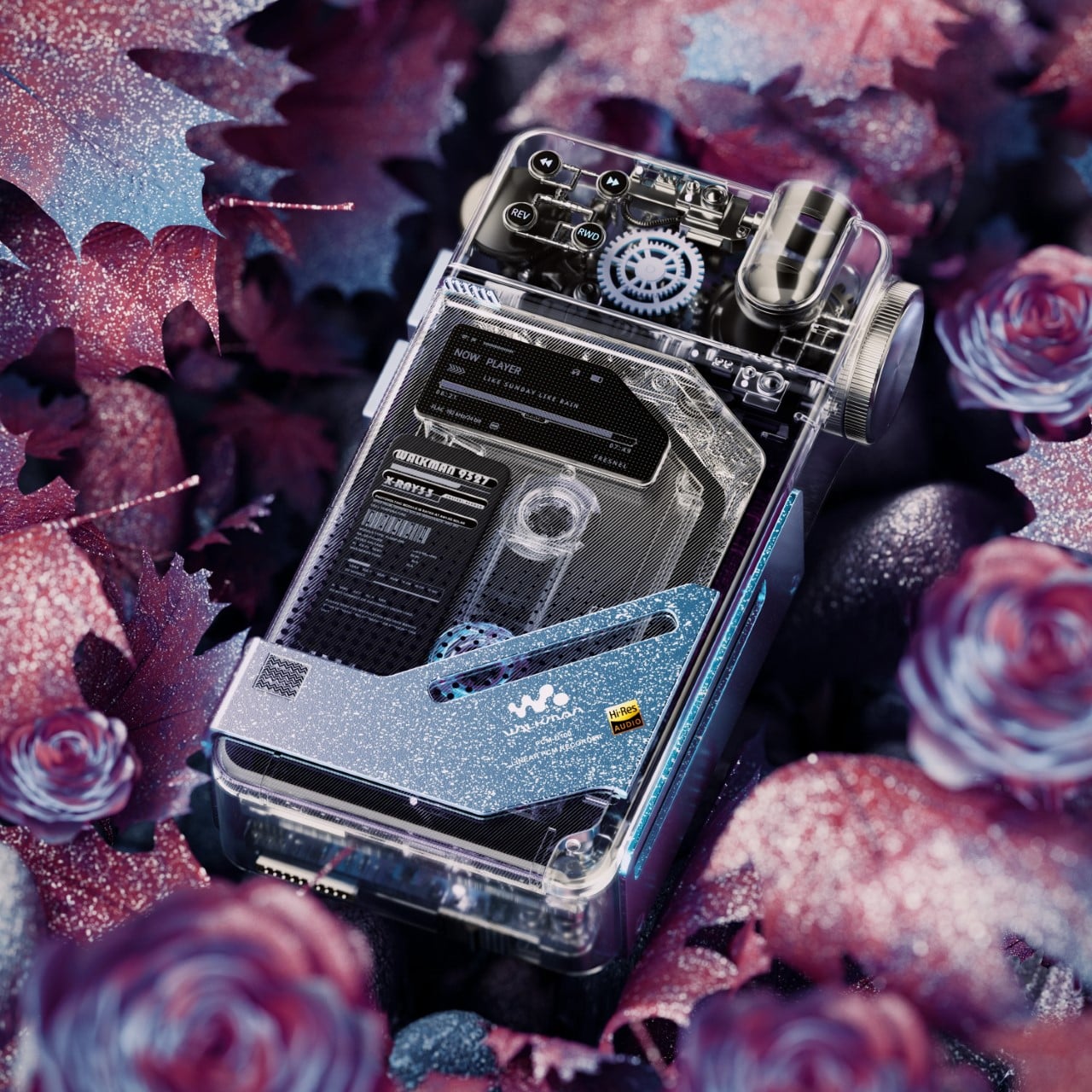
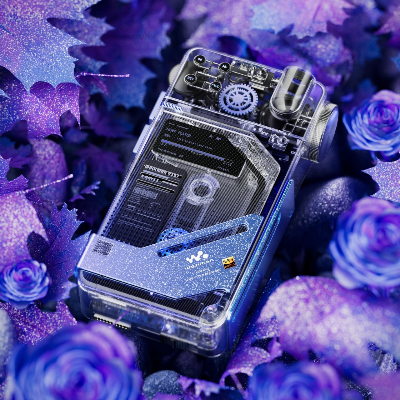
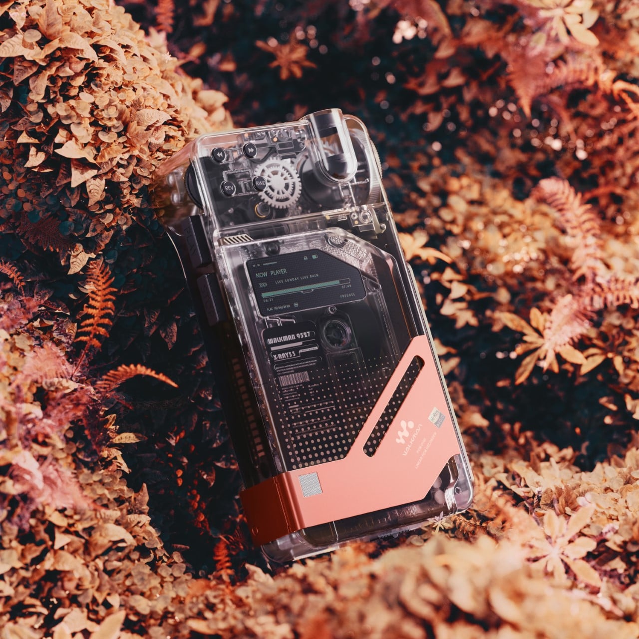
I’ve seen a lot of transparent tech in my day, but this Sony Walkman-meets-Blade Runner recorder is the kind of object that makes me want to empty my wallet immediately while simultaneously wondering if I’ve wandered into some alternate timeline where tech actually looks cool again. The transparent cassette recorder concept perfectly captures that rare intersection of nostalgia and futurism that’s currently dominating design circles. While Nothing’s transparent earbuds and phones have been teasing us with glimpses of circuitry for years, this concept goes full exhibitionist with its mechanics, letting you watch those gears and rollers work their analog magic through crystal-clear housing. The device is unapologetically retro-futuristic, combining the tactile satisfaction of physical media with the aesthetic of something you’d find in Ghost in the Shell.
The execution here is particularly striking because it doesn’t just slap a clear case on old tech and call it a day. The top-mounted mechanical elements with their perfectly visible gear systems remind me of luxury watches, where the movement becomes the centerpiece. That digital display nestled among analog components creates a delicious tension between old and new technologies. The pixel-perfect UI elements visible through the clear housing suggest this isn’t just a dumb playback device but something with computational intelligence. Those tiny control buttons along the top edge look deliberately reminiscent of 80s Sony recorders, hitting that sweet spot between tactile satisfaction and miniaturization.
Designer: M Fresnel
Whoever designed this clearly understands why cassettes are having their second (or is it third?) cultural moment. Vinyl’s comeback was about sound quality and large-format art, but cassettes? They’re about the mechanical ritual, the satisfying click when you press record, and watching the spools turn. This concept leans hard into that physical experience by making it visual as well as tactile. The industrial design shows remarkable restraint, too – the corners are precisely chamfered, the proportions maintain that perfect handheld dictaphone form factor (roughly 4×2.5 inches if I had to guess), and there’s just enough technical detailing to give it character without veering into gaudy territory.
Timing couldn’t be better for something like this to hit production. With Teenage Engineering’s TP-7 field recorder selling out despite its $1,200 price tag and cassette sales growing 28% year-over-year, there’s clearly an appetite for premium recording devices that buck the “just use your phone” mentality. What makes this concept particularly clever is how it bridges generations – boomers recognize the form factor from their reporting days, Gen X gets nostalgic about mixtapes, millennials appreciate the vaporwave aesthetic, and Gen Z gets another analog format to discover and fetishize on TikTok. If this actually hit production with decent specs (24-bit/96kHz recording would be my baseline expectation), I’d wager it could command $400-500 easily in today’s premium audio market.
The ultimate irony? This gorgeously transparent device reveals everything except whether it will ever make it past the concept stage. And that’s the cruelest tease of all.
I would watch an unboxing video a 100 more times if it used these materials instead of plastic and virgin cardboard. The year is 2025, we’ve unboxed products for decades at this point, and nothing has changed at all. Apart from packages now being smaller and shipping without chargers (we’re looking at you, Apple), we really haven’t advanced much in terms of designing for end-of-life.
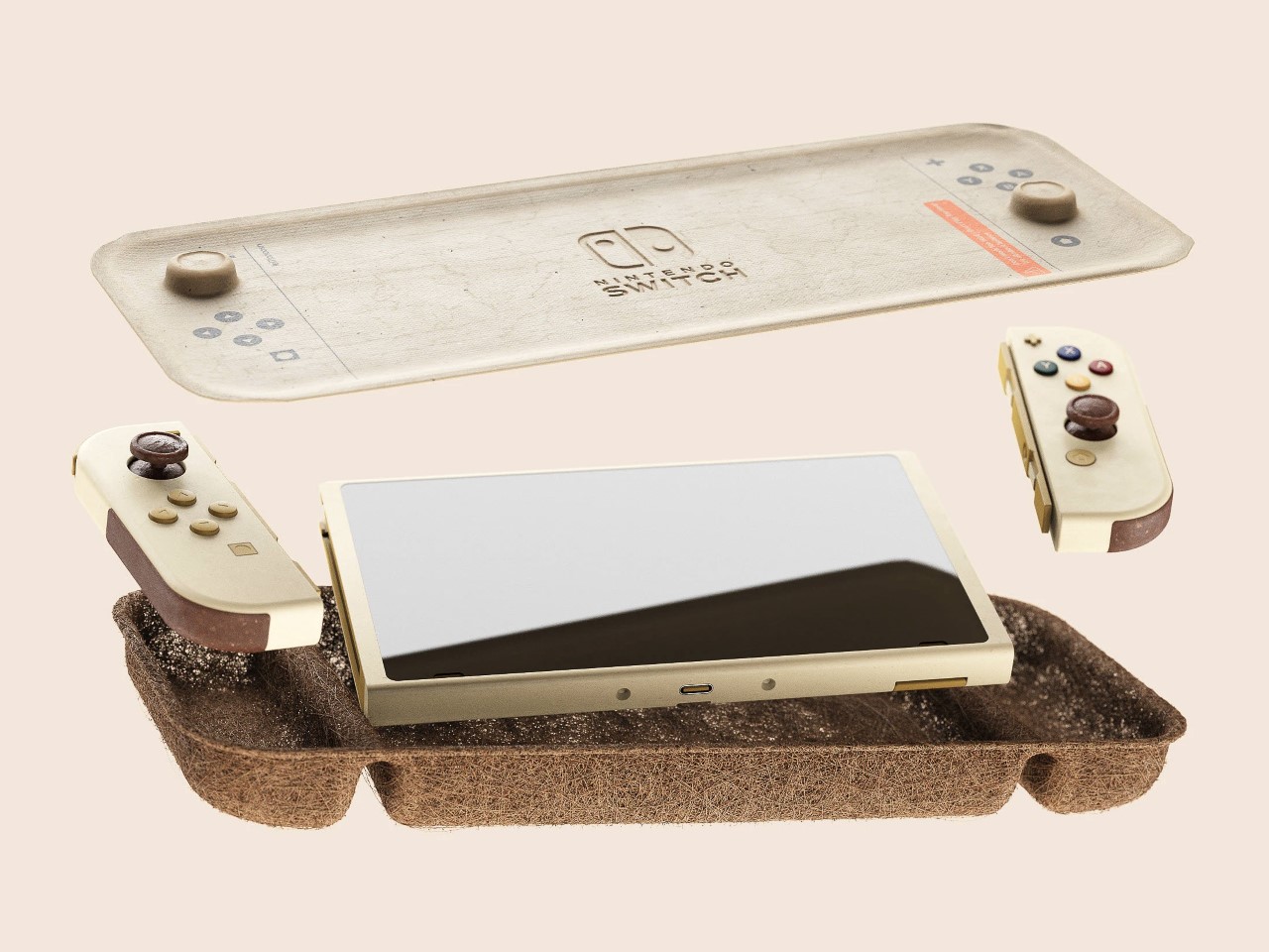
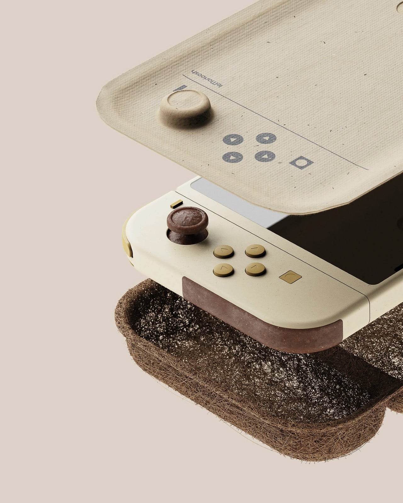
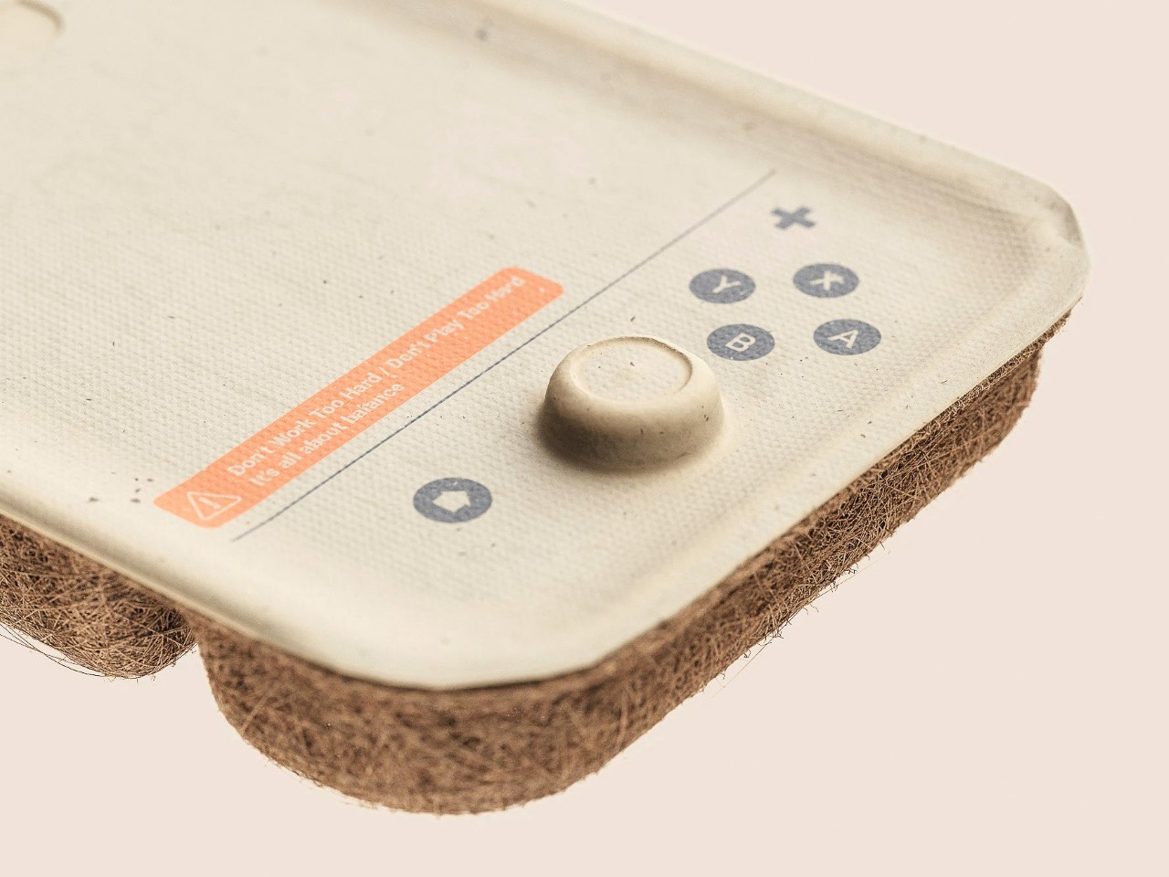
A product’s package is literally the most single-use item on the planet. Apart from probably retaining the box for fondness’ sake, nobody keeps the packaging for their Switch, iPhone, iPad, drone, or laptop. These boxes are MEANT to be thrown away 90% of the time – so why are we still using materials NOT made for a single-use mentality? This unique Nintendo Switch packaging from Björn Van Egroo
Designer: Björn Van Egroo
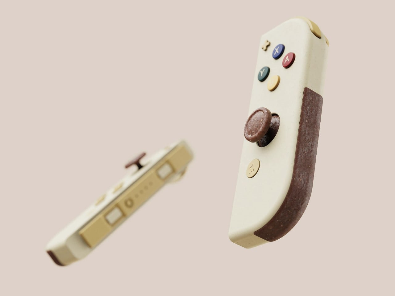
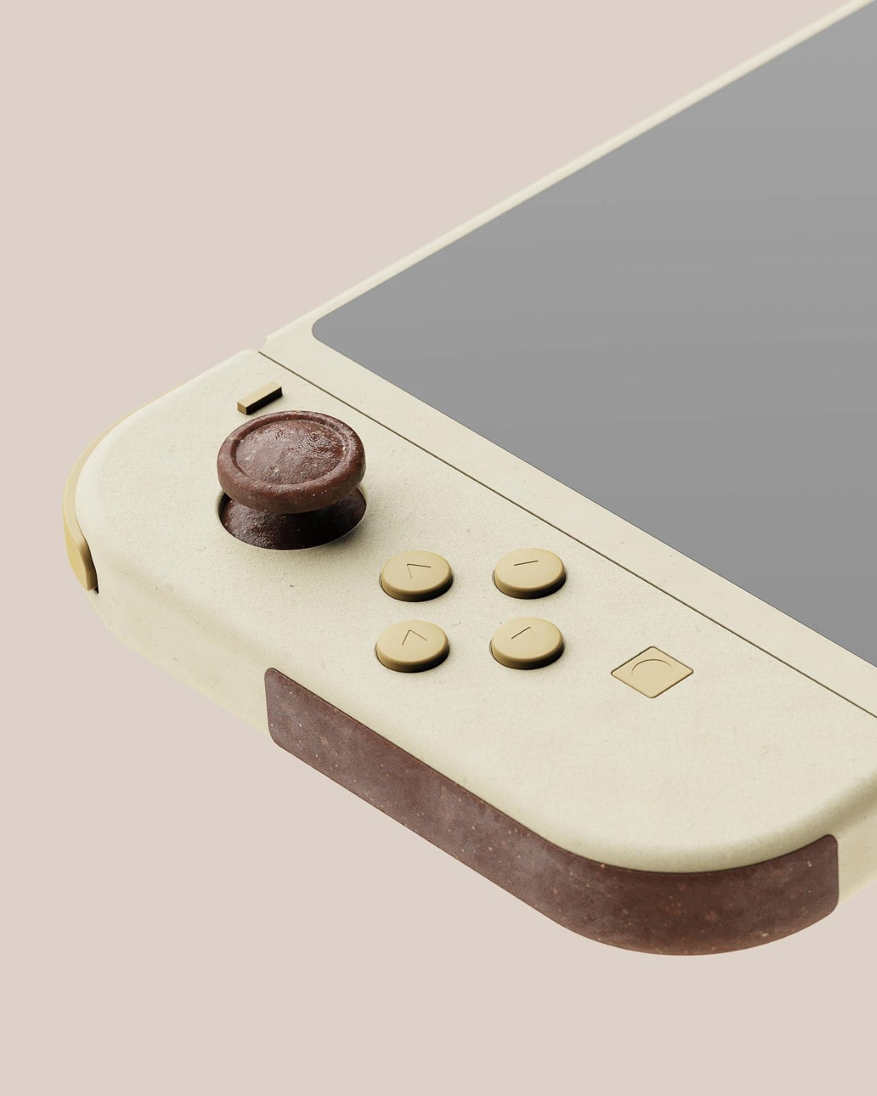
Born from a 3D rendering material experimentation exercise, Egroo’s Nintendo Switch packaging redesign actually taps into something raw and fundamentally game-changing. You don’t need to mold plastic blister shells inside pristine cardboard boxes wrapped with plastic film… a product’s packaging can use materials like compressed coconut fiber, recycled paper, and even sugarcane fiber (bagasse) to create packaging that’s bespoke, filled with character, and shock-absorbing.
Would something like this work for gadgets? Here’s the reality check – yes and no. Yes, it could for a lot of gadgets. But also, no, it couldn’t because the supply chain is way too set in its ways to hard-pivot to an experimental set of materials for millions and millions of gadgets shipped worldwide. This particular concept also has a mild risk of water seepage through the coco fiber, but nothing that can’t be fixed with a little redesign.
I cringe as I have to cut through plastic blister packs every time I order a mouse, or a set of batteries, or a charging cable. Similarly, receiving an almost perfect-looking cardboard box with a Bluetooth speaker inside, only to then throw the box out immediately after unboxing my product, feels just as wasteful. Egroo’s simple material exploration presents a shift that I would HAPPILY endorse.
We’ve got no shortage of recycled and recyclable materials. A simple Google search will tell you that 9 billion coconut husks are discarded annually. Sugarcane pulp, a byproduct of sugar production, is discarded by a factor of 700 million tonnes per year. Paper waste goes into millions of tonnes too. ALL these can easily be rerouted into packaging products instead. Maybe not immediately for tech products (although there are companies using molded pulp instead of styrofoam), but hey… if molded pulp trays are good for eggs (which are way more fragile than your average tech product), then why not for gadgets?
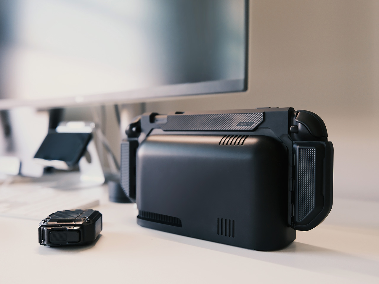
Remember when slapping a case on your phone felt like admitting defeat; a bulky, rubbery admission that you valued function over form? Thankfully, times have changed. Now, cases are as much about expressing yourself as they are about surviving that dreaded butter-fingers moment. And in the world of gaming, especially with the newly debuted Nintendo Switch 2, that need for protection and personality becomes even more crucial, SUPCASE is redefining how gamers think about protection – not as an afterthought, but as part of the gaming ritual.
Let’s be real, the Nintendo Switch is basically a handheld shrine to our favorite digital worlds; a device we’ll clutch on commutes, huddle with on couches, and maybe, just maybe, rage-quit less when it’s wrapped in something that can take a beating. Now in its second avatar, the Switch 2 even more capable, even more powerful, and arguably, deserving of an even more design-driven approach when it comes to accessories. Enter Jet Weng, Design Director at SUPCASE, and the mastermind behind the company’s philosophy of fusing robust protection with thoughtful design. His approach isn’t about slapping armor on tech, it’s about creating a symbiotic relationship between the device and the user.
Weng’s journey began, unsurprisingly, with a childhood steeped in tinkering with the most vivid memory being that of disassembling his uncle’s Walkman at the age of 10. “Every day of my childhood was surrounded by the process of taking devices apart, diagnosing problems, repairing, and reassembling,” he recalls. This hands-on education fostered a deep understanding of how things work; a foundation upon which he would later build his design ethos. It’s this innate curiosity that sets his work apart, first with his Behance portfolio that prioritized “feasible concepts that are fused with a poetic touch”, followed by his journey to turn protective cases into engineered solutions rather than mere accessories.
The SUPCASE UB Pro for the Switch 2 is a prime example of Weng’s vision. The UB Pro is a meticulously crafted exoskeleton designed to enhance the Switch 2 experience, not hinder it. It boasts military-grade protection, meeting MIL-STD-810G standards; meaning it can withstand some serious drops and bumps. A 2.5mm raised bezel shields the screen from scratches, while the ergonomic grip and anti-slip texture ensure a secure, comfortable hold, even during marathon gaming sessions.
But the UB Pro is more than a fortress; it’s a testament to Weng’s belief in blending “feasibility” with a “poetic touch.” The case’s design is streamlined, hugging the console and Joy-Cons without adding unnecessary bulk. Constructed from German Bayer polycarbonate, the material resists yellowing, dust, and fingerprints, maintaining its clarity and premium feel over time. It’s a case that looks good, feels good, and performs even better.
Anyone who owned the original Switch knows the frustration of removing a case every time you wanted to dock and play on the big screen. The first-ever person to attempt solving this problem, Weng addressed this pain point head-on with SUPCASE’s original dockable Switch case; a product that was a first of its kind and quickly became a gamer favorite. He recalls, “The biggest challenge was making sure the case didn’t interfere with the Switch’s connection to the dock.” The team went through countless prototypes, tweaking dimensions and internal structures until they achieved a perfect fit. This dedication to solving real-world problems is what elevates SUPCASE’s designs above the competition.
Jet Weng
Weng doesn’t just design cases; he designs experiences. He starts by analyzing user pain points, then collaborates with his team to brainstorm creative, yet feasible solutions. He understands that good design is subjective, depending on the product’s purpose. “For example, with a repair tool, function is always the top priority; but for something like a lipstick case, form may take precedence,” he explains. For the UB Pro, function and form are in perfect harmony; protection and ergonomics blend seamlessly with aesthetics.
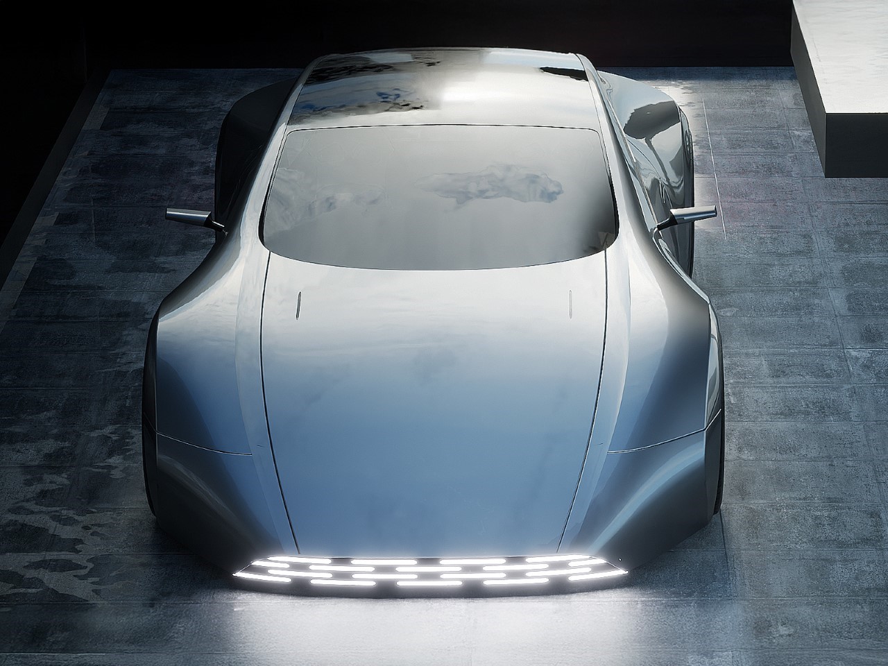
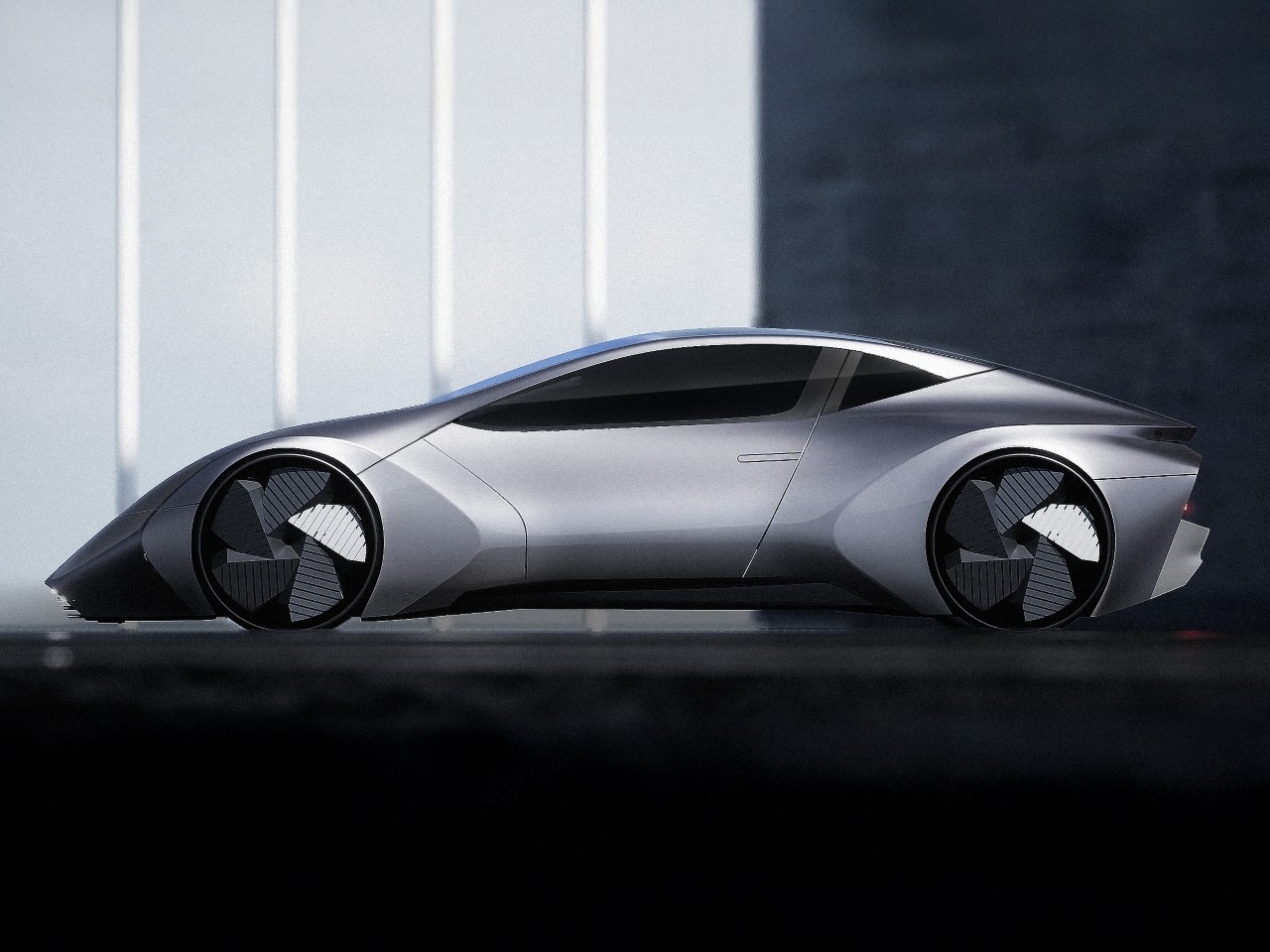
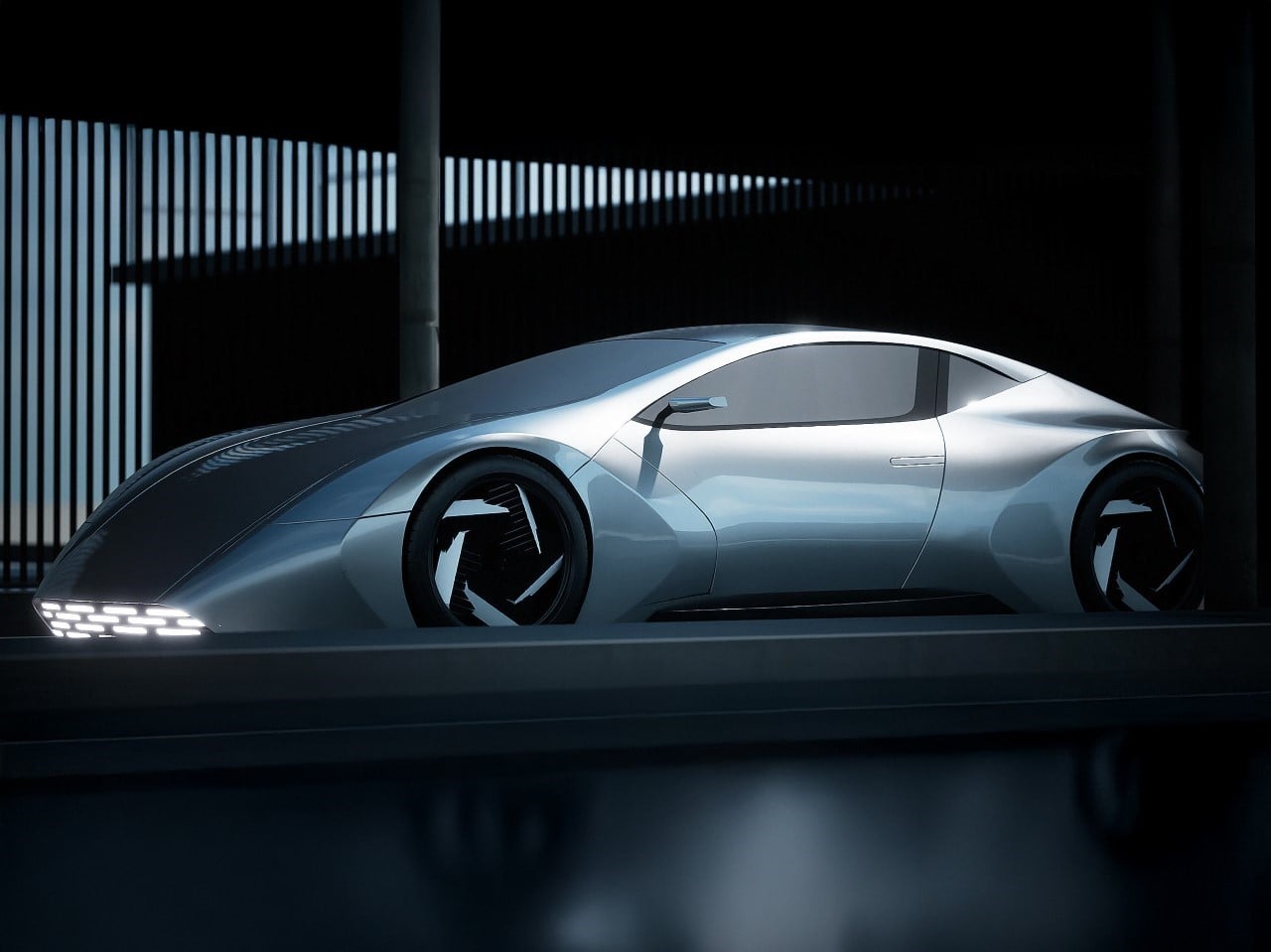
The Kia Elan was never a chart-topping icon, but for those who remember it, it carried a certain charm. A compact roadster borrowed from Lotus DNA, it was Kia’s unlikely flirtation with sportiness in the mid-’90s. Fast forward to today, and designer JinTae Tak is revisiting that lineage, not by replicating the original, but by extracting its essence and reshaping it for the electric era.
The Kia Elan EV concept doesn’t just hint at a new design language, it commits to one. You won’t find soft curves or classic sports car proportions here. Instead, the Elan EV cuts through convention with brutal, origami-like surfaces and a stance that hugs the ground like it’s part of the architecture. There’s no pretense of retro styling, just deliberate, sculpted form driven by the freedoms afforded by EV platforms.
Designer: JinTae Tak
JinTae Tak’s main objective was to use electrification as a design opportunity, not just an engineering shift. With no bulky combustion engine to accommodate, the Elan EV lowers its nose dramatically, resulting in a pronounced wedge silhouette. It’s sharp and aggressive, but not impractical. The side profile is where this decision is most apparent. The car hunkers forward, creating a visual tension that draws your eye from the subtle peak of the roofline down into the low-slung nose. This isn’t just for drama. It’s a studied way of reinterpreting the low center of gravity look of the original Elan, now translated into a closed-top GT form.
Look closely and you’ll notice how many times the same narrow, angular motif repeats across the body. From the pinch at the A-pillar to the fender transitions and the flush door seams, it’s a consistent language of compression and expansion. There’s a kind of visual rhythm in how these angles play with the light, almost architectural.
From the front, the EV’s lighting treatment makes an immediate statement. A series of segmented LEDs span the nose, mirroring the rear lighting in layout and attitude. It gives the car a clear identity, especially in low light. The hood, with its severe wedge, risks looking overly narrow, but JinTae solves this with a visual trick. The wide fender volumes spill out toward the ground, offsetting the narrowness of the centerline and pulling the car visually wider.
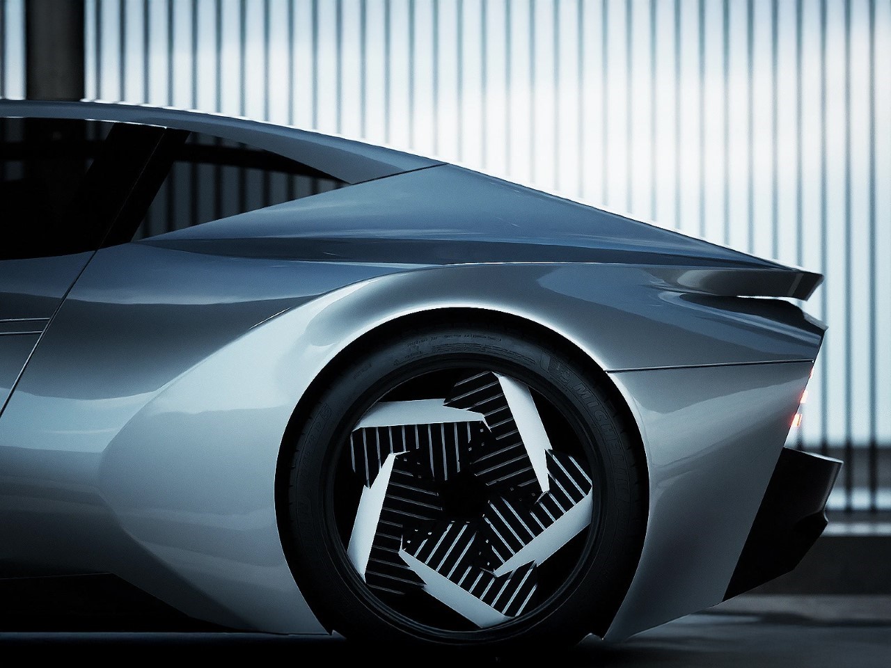
Swing around to the rear and the fenders become the main event. Unlike the original Elan’s simple surfacing, the Elan EV revels in volume here. The horizontal gesture is emphasized with precision, letting the taillights slice across cleanly. It’s one of the more direct nods to the roadster roots of the original car, though executed with today’s taste for muscular silhouettes and precise geometry.
Even the wheels are worth a second look. They’re huge, visually enclosed, and likely designed to aid aerodynamics, typical EV priorities. But their styling doubles down on the overall theme, angular, directional, and aggressive.
Given the conceptual nature, there’s no spec sheet, no drivetrain details, and no promises of production. That’s not really the point. The Kia Elan EV is a design study that explores how brands can revisit the past without repeating it. It’s not a tribute to the old Elan. It’s a conversation with it.
Liquid Glass – the tech world’s abuzz with this new term from Apple’s design playbook following their reveal of the new slew of operating systems at WWDC 2025. What is liquid glass? Well, it’s a multi-tier strategy on Apple’s part to redefine interfaces, moving away from the minimalist elements to introduce gorgeously refractive glass-like modules instead. These glass elements interact with screen elements by bending light like real glass would. Think of holding a magnifying glass to a newspaper to watch the text around the edges warp while the center stays clear.
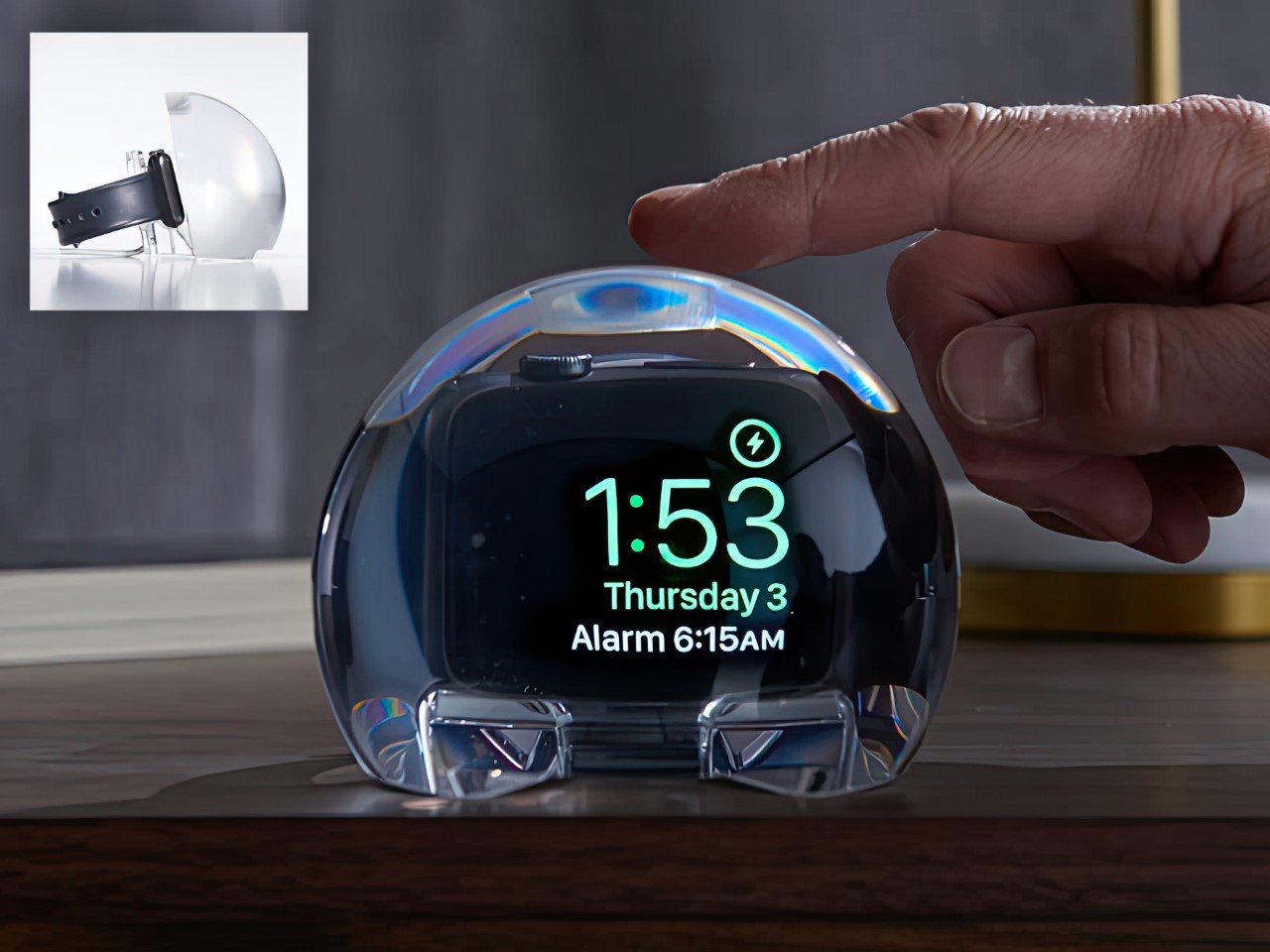
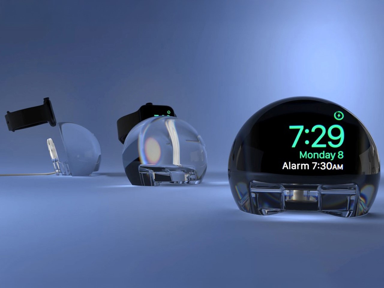
There’s speculation that this move towards glass-based interfaces was a conscious effort to further Apple’s spatial interface goals… but to be honest, we were in love with Liquid Glass back as early as 2021. What do I mean? Well, I’m talking about the NightWatch, an Apple Watch dock from 4 years ago that did exactly what Liquid Glass did, amplify the watch’s screen into a gorgeous liquid orb while your watch was charging!
The NightWatch, as its name so succinctly implies, is a dock for your watch while it charges overnight. Shaped like a massive orb, this dock turns your watch’s night-time charging face into a massive, magnified alarm clock that’s easier to see. Moreover, the dock amplifies the watch’s audio too (through clever design details), transforming your Watch into a makeshift alarm clock that works remarkably well.
There’s no hidden components, no inner trickery – the entire NightWatch is a cleverly designed, solid piece of lucite that does three things remarkably well. First, it docks the Apple Watch and charger inside it, magnifying the watch screen so the numbers are clearly legible even from a couple of feet away. Secondly, channels located strategically under the Watch’s speaker units amplify the sound (sort of like how your voice is louder when you cup your hands around your mouth) so your alarm rings louder. Thirdly (and this might be the best feature yet), the lucite orb is touch-sensitive. Which means a mere tap on the surface causes your Watch screen to wake so you can see the time!
The dock may have been designed in 2021, but its design philosophies align with Apple’s Liquid Glass push brilliantly. Liquid Glass is all about mimicking real-world materials, bringing physicality to the digital world while still maintaining a pristine aesthetic that boosts focus and highlights important elements. That’s exactly what the NightWatch does too – it takes the Watch’s flat digital interface and brings real-world physicality to it through the refraction and magnification of the clear lucite. It also helps easily highlight important elements by enlarging your watch face for clearer timekeeping. The NightWatch is compatible with all Apple Watch series (as long as your watch doesn’t have a case on it).
I didn’t know how much I needed Kim Possible back until I scrolled on the internet to stumble across this build staring back at me in glorious LEGO form – cargo pants, sassy side-eye, Rufus casually perched on her shoulder. For anyone who raced home from school to catch Kim flipping through air ducts and dodging laser beams, seeing her back (albeit in LEGO) feels somewhat cathartic – like the world really needs her to fight all the supervillains destabilizing the earth right now.
Crafted meticulously from 1,165 LEGO bricks, this build by teljesnegyzet captures every bit of Kim’s swagger in a statue standing 21 inches tall. That fiery orange hair, constructed from carefully layered wedge plates, is practically a sculpture on its own. You can almost see it waving dramatically after a perfectly executed backflip. The attention to detail is peak LEGO nerd territory, down to the perfectly recreated cargo pants using sand green tiles layered sideways. Pure genius.
Designer: teljesnegyzet
Rufus, the tiny naked mole-rat sidekick, hasn’t been overlooked either. He’s neatly built from just about 40 bricks, perched on Kim’s shoulder, looking a bit skeptical, just as he should. Cleverly, his position is adjustable with a hidden Technic pin, giving collectors that extra bit of fun when deciding exactly how judgmental Rufus should look today.
What’s impressive here is how the build stays authentic without relying on printed details. Kim’s iconic black crop top and even the eyebrow arch are entirely brick-built, letting simple shapes and smart brick choices do all the work. It’s classic LEGO magic, turning basic geometry into instantly recognizable characters. No shortcuts, no stickers, just genuine creativity.
With just over 130 days to reach the 5,000 supporter milestone on LEGO Ideas (currently around 1,831 supporters and counting), this feels doable. The comments section is buzzing with fans rediscovering Kim, others impressed by the design itself, even those who had to Google “who’s Kim Possible” first. This blend of spot-on nostalgia and clever building technique is exactly the kind of project that LEGO Ideas thrives on.
Whether this hits the shelves officially or stays a stunning fan-made concept, it’s proof of how strongly early 2000s Disney Channel nostalgia resonates. And to be honest, with the current state of global affairs, I really could do with some positive affirmation… even if it stands at 21 inches tall and reminds me of a time when life was so much better. If you share the same belief, you can head down to the LEGO Ideas website to cast your vote for this fan-made build.
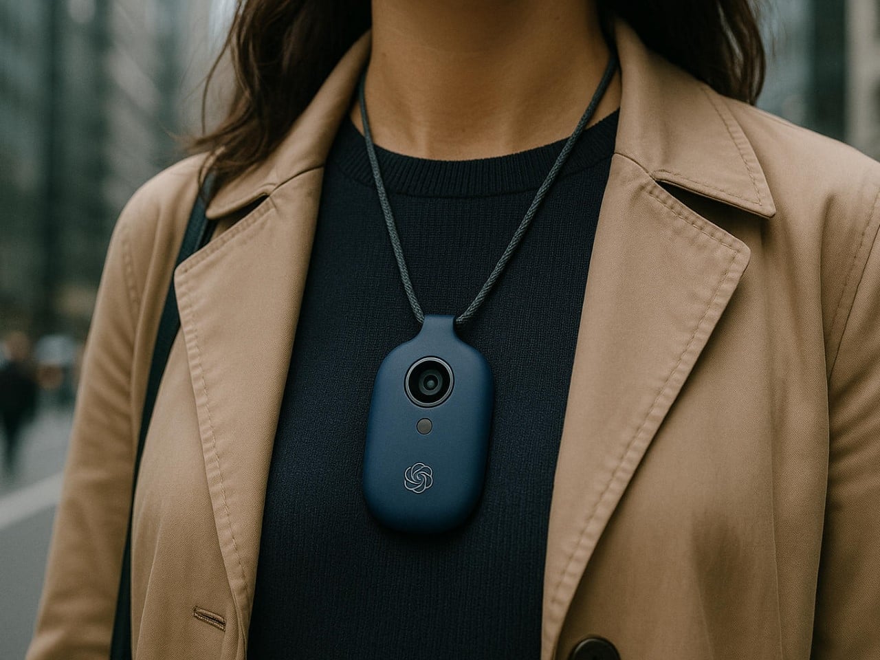
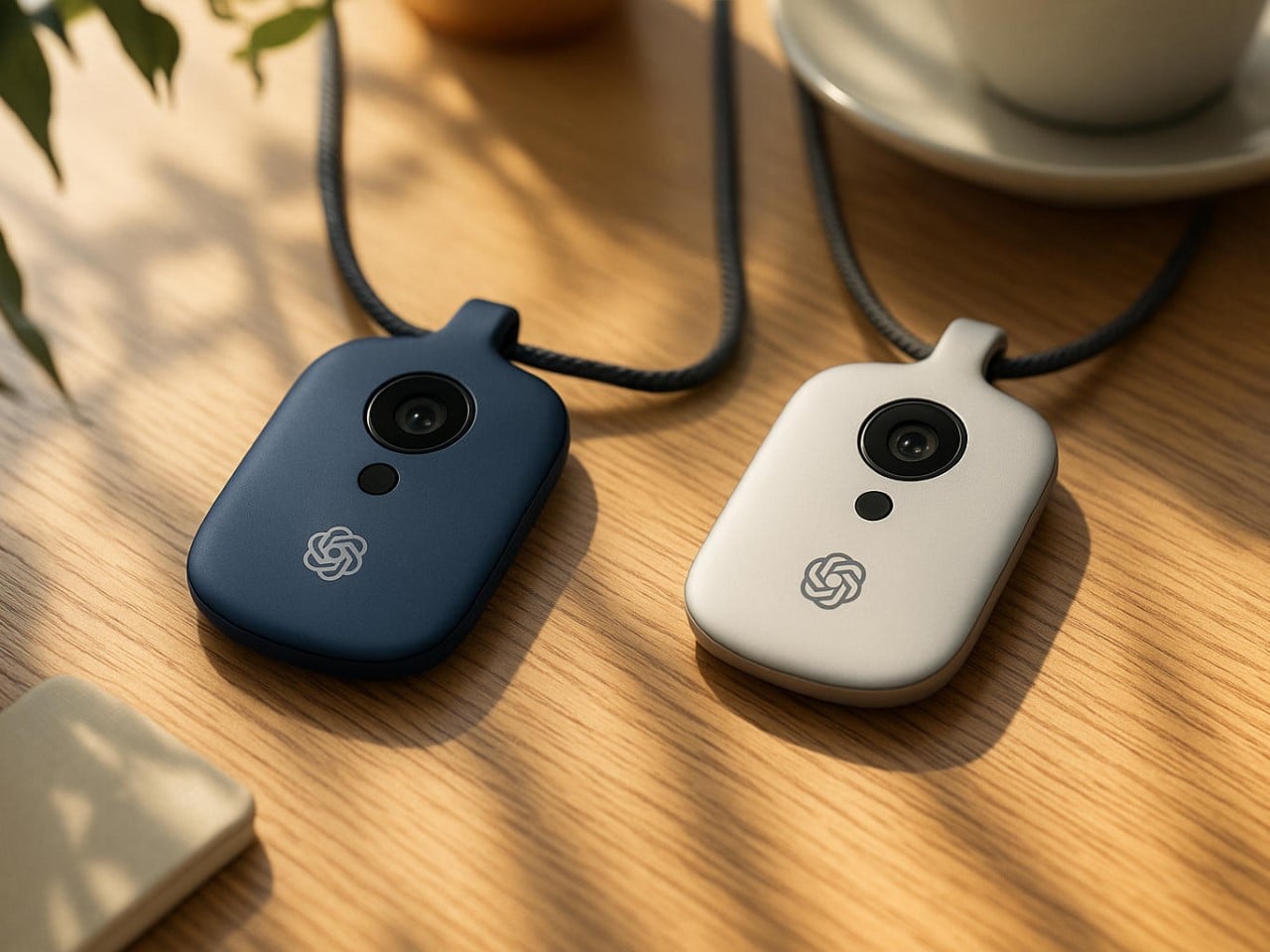
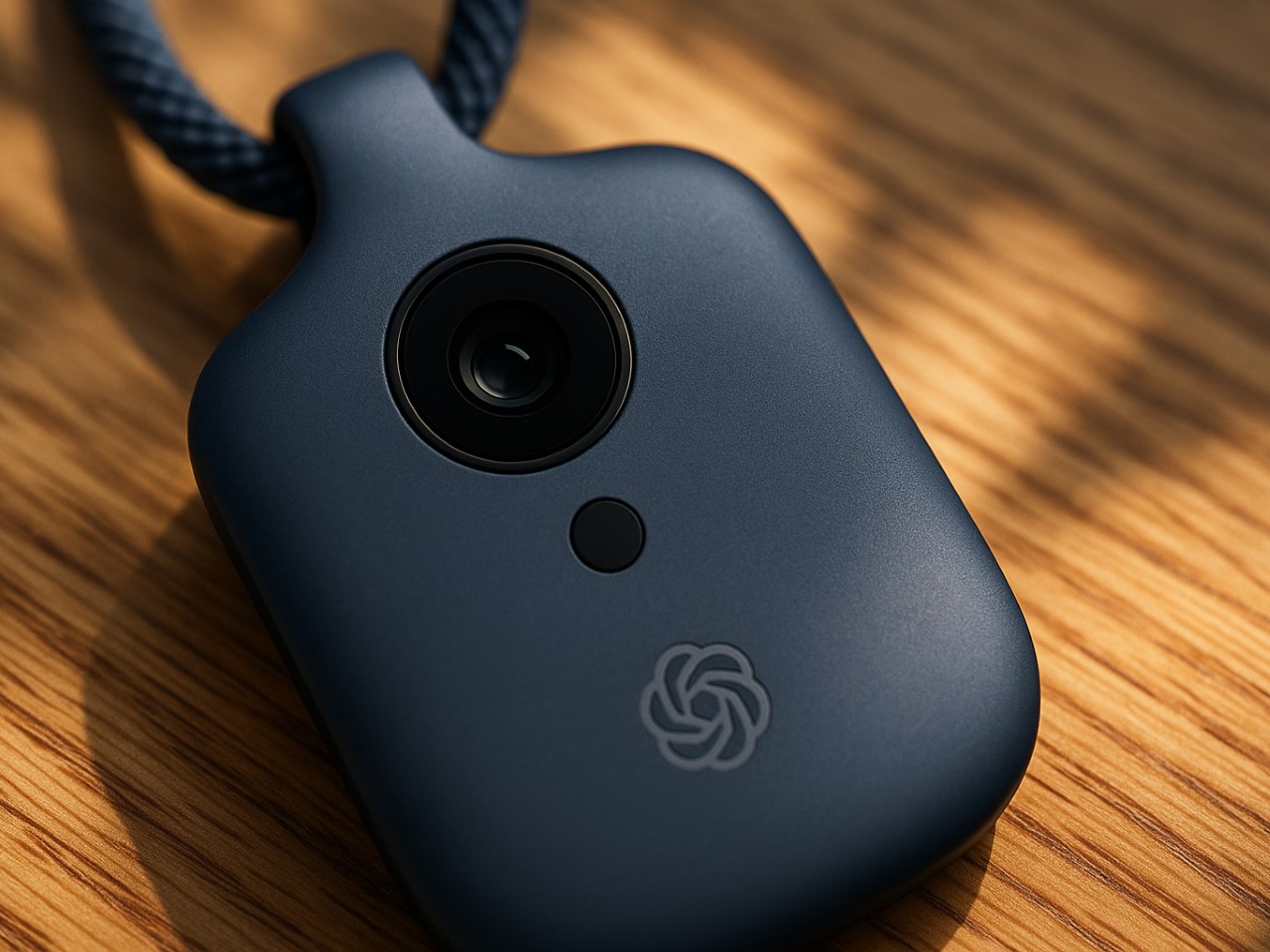
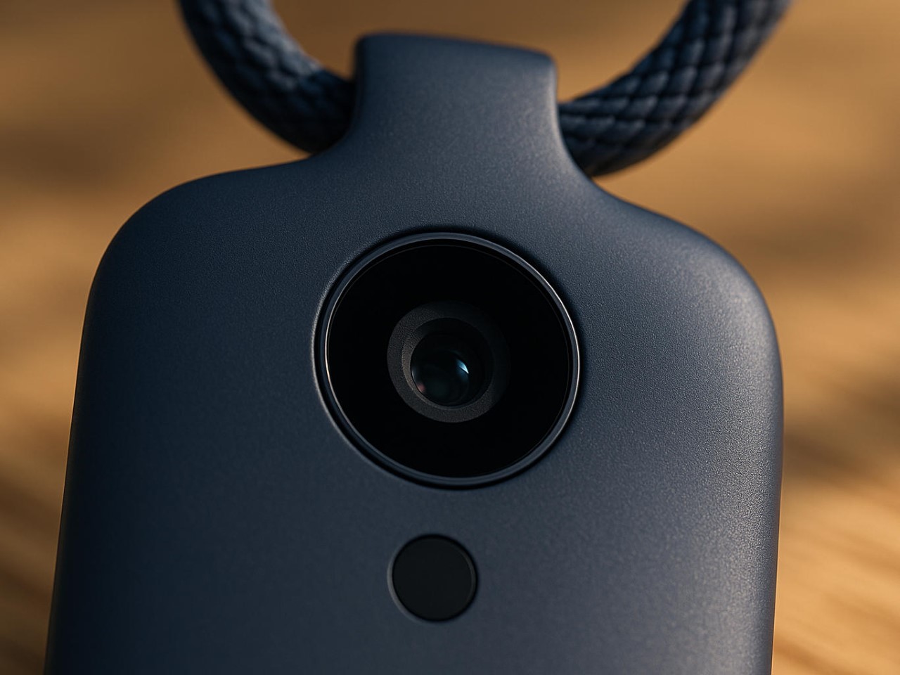
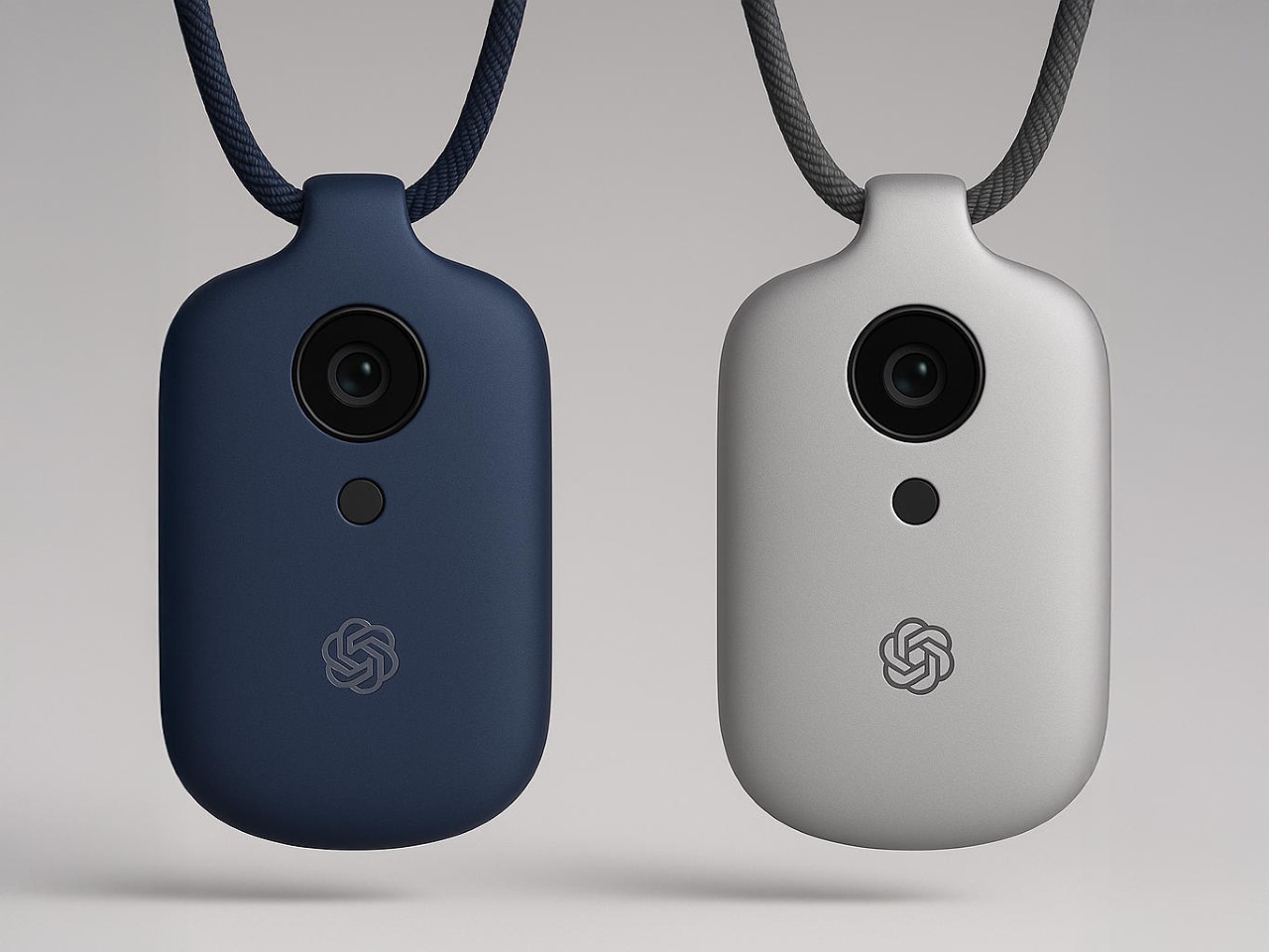
Let’s be honest, the tech world hasn’t felt this electric since Steve Jobs pulled the original iPhone from his pocket. Sure, we felt a few sparks fly in 2024 when Rabbit and Humane announced their AI devices, but that died down pretty quickly post-launch. However, when news broke that OpenAI had acquired Jony Ive’s mysterious startup “io” for a staggering $6.5 billion, the speculation machine kicked into overdrive. What exactly are the legendary Apple designer and ChatGPT’s creators cooking up together? The official announcement speaks vaguely of “a new family of products” and moving beyond traditional interfaces, but the details remain frustratingly sparse.
What we do know with certainty is limited. OpenAI and Ive’s company, io, are building something that’s reportedly “screen-free,” pocket-sized, and designed to bring AI into the physical world in a way that feels natural and ambient. The founding team includes Apple veterans Scott Cannon, Evans Hankey, and Tang Tan, essentially the hardware dream team that shaped the devices in your pocket and on your wrist. Beyond these confirmed facts lies a vast expanse of rumors, educated guesses, and wishful thinking. So let’s dive into what this device might be, with the appropriate grains of salt at the ready.
The Design: Ive’s Aesthetic Philosophy Reimagined
AI Representation
If there’s one thing we can reasonably predict, it’s that whatever emerges from Ive’s studio will be obsessively considered down to the micron. His design language at Apple prioritized simplicity, honest materials, and what he often called “inevitable” solutions, designs that feel so right they couldn’t possibly be any other way. A screen-free AI device presents a fascinating challenge: how do you create something tactile and intuitive without the crutch of a display?
I suspect we’ll see a device that feels substantial yet effortless in the hand, perhaps with a unibody construction milled from a single piece of material. Aluminum seems likely given Ive’s history, though ceramic would offer an interesting premium alternative with its warm, almost organic feel. The absence of a screen suggests the device might rely on subtle surface textures, perhaps with areas that respond to touch or pressure. Ive’s obsession with reducing visual complexity, eliminating unnecessary seams, screws, and buttons, will likely reach its logical conclusion here, resulting in something that looks deceptively simple but contains remarkable complexity.
Color choices will probably be restrained and sophisticated, think the elegant neutrals of Apple’s “Pro” lineup rather than the playful hues of consumer devices. I’d wager on a palette of silver, space gray, and possibly a deep blue, with surface finishes that resist fingerprints and wear gracefully over time. The environmental considerations that have increasingly influenced Ive’s work will likely play a role too, with recycled materials and sustainable manufacturing processes featured prominently in the eventual marketing narrative.
Technical Possibilities: AI in Your Pocket
AI Representation
The technical challenge of creating a screen-free AI device is immense. Without a display, every interaction becomes an exercise in invisible design, the device must understand context, anticipate needs, and communicate through means other than visual interfaces. This suggests an array of sophisticated sensors and input methods working in concert.
Voice recognition seems an obvious inclusion, likely using multiple microphones for spatial awareness and noise cancellation. Haptic feedback, perhaps using Apple-like Taptic Engine technology or something even more advanced, could provide subtle physical responses to commands or notifications. The device might incorporate motion sensors to detect when it’s being handled or carried, automatically waking from low-power states. Some reports hint at environmental awareness capabilities, suggesting cameras or LiDAR might be included.
The processing requirements for a standalone AI device are substantial. Running large language models locally requires significant computational power and memory, all while maintaining reasonable battery life. This points to custom silicon, possibly developed with TSMC or another major foundry, optimized specifically for AI workloads. Whether OpenAI has the hardware expertise to develop such chips in-house remains an open question, though their Microsoft partnership might provide access to specialized hardware expertise. Battery technology will be crucial; a device that needs charging multiple times daily would severely limit its utility as an always-available AI companion.
The User Experience: Beyond Screens and Apps
AI Representation
The most intriguing aspect of this rumored device is how we’ll actually use it. Without a screen, traditional app paradigms become irrelevant. Instead, we might see a return to conversational computing, speaking naturally to an assistant that understands context and remembers previous interactions. The “ambient computing” vision that’s been promised for years might finally materialize.
I imagine a device that feels less like a gadget and more like a presence, something that fades into the background until needed, then responds with uncanny intelligence. Perhaps it will use subtle audio cues or haptic patterns to indicate different states or notifications. The lack of a visual interface could actually enhance privacy; without a screen displaying potentially sensitive information, the device becomes more discreet in public settings. Of course, this also raises questions about accessibility, how will deaf users interact with a primarily audio-based device?
Integration with existing ecosystems will be crucial for adoption. Will it work seamlessly with your iPhone, Android device, or Windows PC? Can it control your smart home devices or integrate with your calendar and messaging apps? The answers remain unknown, but OpenAI’s increasingly broad partnerships suggest they understand the importance of playing nicely with others. The real magic might come from its predictive capabilities, anticipating your needs based on time, location, and past behavior, then proactively offering assistance without explicit commands.
Market Positioning and Price Speculation
AI Representation
How much would you pay for an AI companion designed by the man behind the iPhone? The pricing question looms large over this project. Premium design and cutting-edge AI technology don’t come cheap, suggesting this will be positioned as a high-end device. Looking at adjacent markets provides some clues, Humane’s AI Pin launched at $699, while Rabbit’s R1 came in at $199, though both offer significantly less sophisticated experiences than what we might expect from OpenAI and Ive.
My educated guess places the device somewhere between $499 and $799, depending on capabilities and materials. A lower entry point might be possible if OpenAI adopts a subscription model for premium AI features, subsidizing hardware costs through recurring revenue. The target market initially appears to be tech enthusiasts and professionals, people willing to pay a premium for cutting-edge technology and design, before potentially expanding to broader consumer segments as costs decrease and capabilities improve.
As for timing, the supply chain whispers and regulatory tea leaves suggest we’re looking at late 2025 at the earliest, with full availability more likely in 2026. Hardware development cycles are notoriously unpredictable, especially for first-generation products from newly formed teams. The $6.5 billion acquisition price suggests OpenAI sees enormous potential in this collaboration, but also creates substantial pressure to deliver something truly revolutionary.
The Competitive Landscape: A New Category Emerges
AI Representation
The AI hardware space is still in its infancy. Early entrants like Humane have struggled with fundamental questions about utility and user experience. What makes a dedicated AI device compelling when smartphones already offer capable assistants? The answer likely lies in specialized capabilities that phones can’t match, perhaps always-on contextual awareness without battery drain, or privacy guarantees impossible on multipurpose devices.
OpenAI and Ive are betting they can define a new product category, much as Apple did with the iPhone and iPad. Success will require not just technical excellence but a compelling narrative about why this device deserves space in your life. The competition won’t stand still either, Apple’s rumored AI initiatives, Google’s hardware ambitions, and countless startups will ensure a crowded marketplace by the time this device launches.
The most fascinating aspect might be how this hardware play fits into OpenAI’s broader strategy. Does physical embodiment make AI more trustworthy, useful, or personable? Will dedicated devices provide capabilities impossible through software alone? These philosophical questions underpin the entire project, suggesting that Ive and Altman share a vision that extends beyond quarterly profits to how humans and AI will coexist in the coming decades.
What This Could Mean for the Future of Computing
AI Representation
If successful, this collaboration could fundamentally reshape our relationship with technology. The screen addiction that defines contemporary digital life might give way to something more ambient and less demanding of our visual attention. AI could become a constant companion rather than an app we occasionally summon, always listening, learning, and assisting without requiring explicit commands for every action.
The privacy implications are both promising and concerning. A device designed from the ground up for AI interaction could incorporate sophisticated on-device processing, keeping sensitive data local rather than sending everything to the cloud. Conversely, an always-listening companion raises obvious surveillance concerns, requiring thoughtful design and transparent policies to earn user trust.
For Jony Ive, this represents a chance to define the post-smartphone era, potentially creating his third revolutionary product category after the iPod and iPhone. For OpenAI, hardware provides a direct channel to users, bypassing platform gatekeepers like Apple and Google. The stakes couldn’t be higher for both parties, and for us, the potential users of whatever emerges from this collaboration.
Waiting for the Next Big Thing
AI Representation
The partnership between OpenAI and Jony Ive represents the most intriguing collision of AI and design talent we’ve seen yet. While concrete details remain scarce, the ambition is clear: to create a new kind of computing device that brings artificial intelligence into our physical world in a way that feels natural, beautiful, and essential.
Will they succeed? History suggests caution; creating new product categories is extraordinarily difficult, and first-generation devices often disappoint (raise your hands if you own a bricked Humane AI Pin or Rabbit R1. Yet the combination of OpenAI’s technical prowess and Ive’s design sensibility offers reason for optimism. Whatever emerges will undoubtedly be thoughtfully designed and technically impressive. Whether it finds a permanent place in our lives depends on whether it solves real problems in ways our existing devices cannot.
For now, we wait, analyzing every patent filing, supply chain rumor, and cryptic statement for clues about what’s coming. The anticipation itself speaks volumes about the state of consumer technology: in an era of incremental smartphone updates and me-too products, we’re hungry for something genuinely new. Jony Ive and Sam Altman just might deliver it.
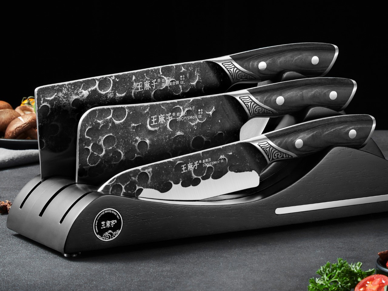
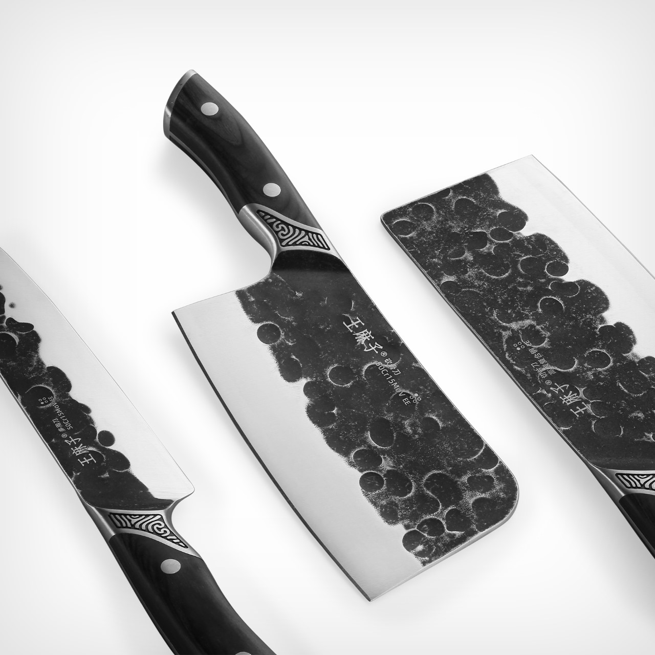
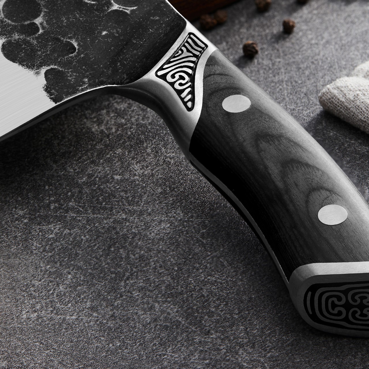
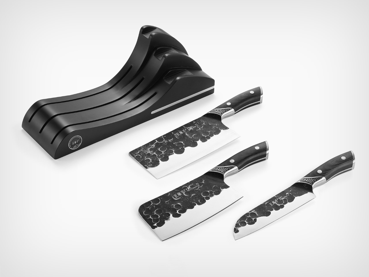
I’ve seen grunge, distressed, even hammered finishes – this is different. The Yin Mo Star Kui knives from Beijing Wang Mazi Tech are perhaps the most alluring set of kitchen knives I’ve rested my eyes on. A lot of kitchen knives resort to simple, functional design details (after all, they aren’t made for looks, they’re made for high-octane kitchen environments), but the Yin Mo Star Kui take functionality and merge it with aesthetic excellence in a way that elevates the knife’s visual DNA without taking too much from its performance.
In fact, as a winner of the A’ Design Award, one could argue that these knives are actually the pinnacle of form and function. They’re made with perfect proportions, a good ergonomic grip, a full-tang design, and that eye-catching battered finish that makes the knives look like cutting instruments that were weathered by asteroids.
Designer: Beijing Wang Mazi Technology
The set comprises 4 knives (although the images show just three) made from high-carbon steel, with a unique hot/cold forging method that results in high edge retention. Each knife is characterized by 3 unique details – first, the charred wood handles that play into the knife’s black and white aesthetic beautifully, secondly, the taotie pattern found at the tip of the handle, giving each knife its signature, and thirdly, the knife’s gorgeously weathered design that features multiple craters that give it a sense of gravitas. The texture, however, is immediately polished off as you move your eye downwards, revealing the blade’s sharp edge.
Each knife’s steel is made by hot-forging the steel at 1040°C, and then cooling it to -196°C. The hot forging process improves the overall strength and toughness by optimizing the shape and eliminating imperfections. The cooling enhances the crystal structure to increase resistance to deformation. Meanwhile, the rough texture on the top of the knives creates enough air pockets to allow the blade to glide through sticky or starchy foods without them adhering to the knife blades. Try sticking a suction pad on a textured surface and you’ll see it fails – the same principle applies here too.
Each knife set comes with a holder that allows you to put the knives on display, almost like you would a precious Katana. The holder doesn’t conceal the blade the way most knife holders do – instead, it conceals just the edge (for protection’s sake), but keeps that cratered, textured surface visible to the eye, given that it’s easily the knife’s highlight.
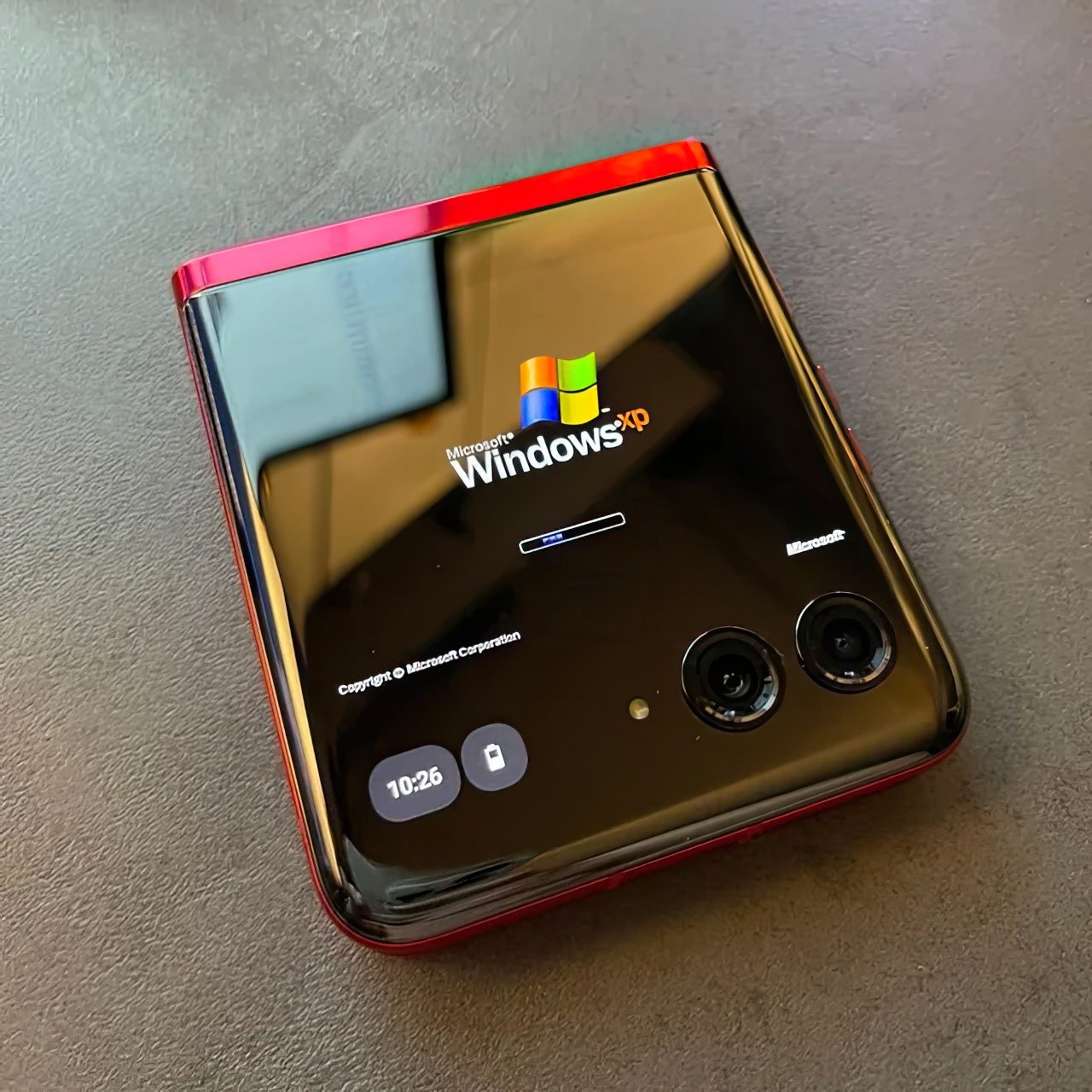
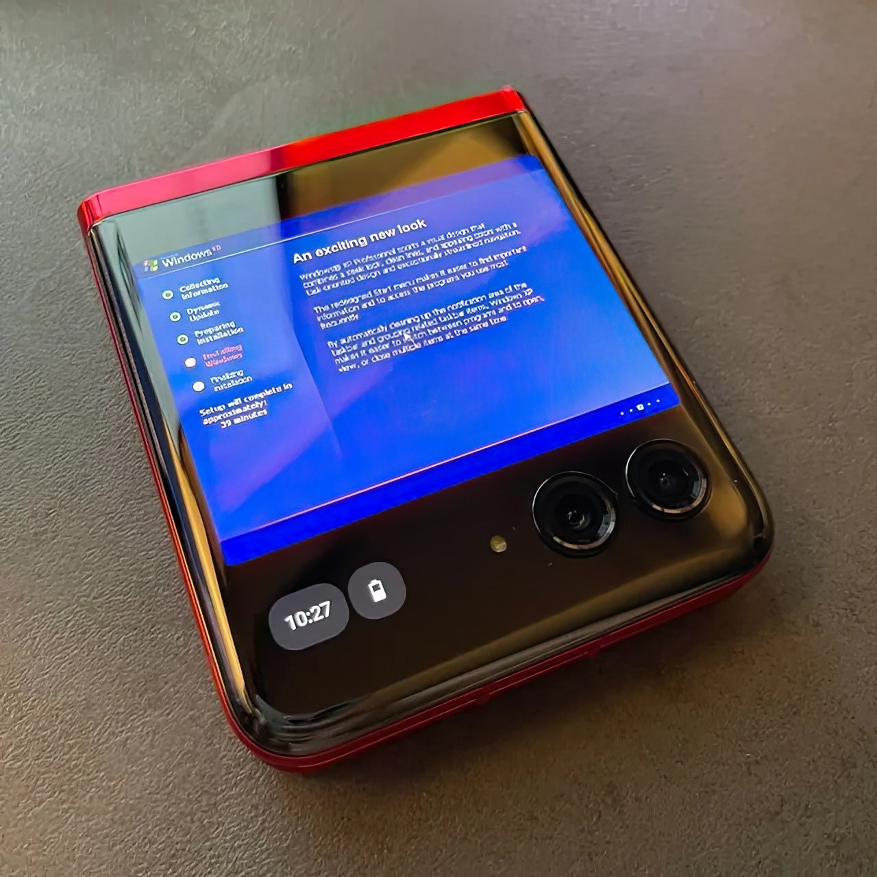
Motorola famously worked with Steve Jobs to bring iTunes to the Razr. Jobs hated the idea of having their software run on someone else’s hardware (which is why he created the iPhone), but up until Apple was ready to formally launch a phone, Jobs reluctantly partnered with Motorola. Now, for what it’s worth, there’s a Moto Razr out there, not with iTunes, but rather, with Windows XP running on it!
Shared on Reddit by Constant_Vehicle7539, this foldable Moto Razr 40 Ultra is running an emulated version of the famous Windows OS. The best part is that when opened halfway, it actually becomes a mini laptop of sorts, giving you a functional (or aesthetically functional, if I’m being accurate) Windows laptop – perhaps the smallest one ever made.
Designer: Constant_Vehicle7539
It’s crazy to actually see this in action. Constant_Vehicle7539 uses the Vectras VM QEMU emulator to run a Windows XP build on the phone. While there’s really no photo of the phone actually running an instance of the desktop (Constant_Vehicle7539 probably just didn’t take any photos), the images here show the boot screen and a few images of the OS setup. My favorite part is when the phone’s half open, looking like a miniature laptop with a touch keyboard. Apparently, Vectras VM offers different emulators, even Windows 11… but for us OG Windows users from back in the day, when we rocked Razrs, Ericssons, and Nokia N Series phones, this is a match made in heaven.
The emulator allows you to run an instance of Windows on any Android, so if you’ve got a dormant old phone lying in a cabinet gathering dust, this is a fun project you could work on. Your friends will be absolutely shocked to see Windows running on a smartphone. However, the only thing more shocking than this is the one time a crazy hacker managed to port iOS 18 onto a Nokia Lumia phone, making the operating system think it was an iPhone (with functional TouchID too!)
A good case protects your phone, a better case protects your phone without compromise, and a great case gives it extra features. I’ve seen phone cases that get away with doing the bare minimum. The TORRAS Ostand OFitness case isn’t one of those accessories. Aside from protecting your iPhone against impact, making it feel more ergonomic with rounded edges, retaining its MagSafe and wireless charging abilities, as well as enabling its Camera Control feature, the Ostand OFitness also packs a slim, popout ring that rotates a full 360° to let you prop your phone up without needing an external stand.
We saw the Ostand OFitness and the Ostand OAir at TORRAS’ booth at CES 2025, and the thing with any good company is that it iterates on its best-selling product – the Ostand range. The new Ostand OFitness is more durable and more ergonomic than before – but there’s more. The stand also allows your iPhone to wirelessly charge 30% faster than previous versions, and the MagSafe gets a boost thanks to hidden magnets that reinforce the feature for better accessory attachment. The Ostand OAir has the same features too, except with enhanced AirMax cushioning around the corners that feel like a puffer jacket for your phone. Neat, no?
Make a product good enough and chances are it’ll get ripped off almost immediately. However, I’m yet to see a ripoff of the Ostand series of cases from TORRAS. The reason being (and I saw this first-hand in 2024), they’re over-engineered to the point of being impossible to replicate without pouring millions into R&D. That O-shaped stand (which is where the series gets its name from), is a technical marvel, with space-grade metallic components small enough for the eye to barely see, magnets so slim they’re almost paper thin – but also incredibly powerful, and a hinge that’s ridiculously sleek, bringing laptop-hinge-level friction into something that’s just a couple millimeters thick.
The Ostand OFitness builds on that stellar R&D with a case that’s somehow even better than before. It comes in five pastel shades that are equal parts subtle yet eye-catching, with a frosted transparent plastic back that’s fingerprint and smudge-proof, and a TPU bumper with built-in Airstrip Airbags that provide extra protection to your phone from drops and bumps. Meanwhile, the outside of the bumper is lined with textural dots that enhance your grip, giving those airbags a run for their money because you’ll probably never accidentally drop your phone. Meanwhile, the camera bump gets its own 1.5mm protective lip to absorb any impact so your phone’s precious lens system remains unscathed.
The star of the show, however, is that O-shaped ring that sits absolutely flush into the case-back. It isn’t like those snap-on rings or pop-sockets that protrude from the back of your phone, absolutely ruining the aesthetic. You barely know it’s there when it’s shut, but tuck your finger into the slight divet, and you can prop open the ring, which can then be used as a grip or a stand. The ring’s hinge is fairly stiff, so it holds its angle like the friction-hinge seen on laptops. This means you can prop your phone up at any angle, going from a mere 20° all the way up to 60°. The ring also rotates on its hub like a hubless wheel (thanks to that incredibly engineered design), allowing you to prop your phone in landscape or portrait.
Built into the ring are a series of magnets that allow the ring to snap shut securely, but they also serve to ‘boost’ your phone’s MagSafe powers. Most cases can sometimes interfere with your iPhone’s MagSafe magnetic array, but with the right boost, the Ostand OFitness actually ‘increases’ the MagSafe power, allowing accessories to snap on way more securely. Meanwhile, all the buttons remain accessible through individual button bumps, although the Camera Control area gets a cutout, allowing your finger to intuitively sit in the groove and control the camera features using the phone’s capacitive touch surface.
Meanwhile, the Ostand OAir has a slightly more unique design thanks to those exaggerated bumpers on the top and bottom, providing an extra layer of edge-protection along with the same features as the Ostand OFitness. Sometimes a case is more than just a protective cover and functional tool for people, it’s also a style statement – that’s where the Ostand OAir comes in, quite literally making your phone look like it’s wearing a classy puffer jacket!
That said, the cases aren’t for a specific demographic. They’re quite literally for everybody because they enhance the iPhone’s usability. The O-ring can be used for functionality or fidget, making it perfect for content creators, consumers, or anyone in between. And hey, don’t worry about these cases turning yellow with time – TORRAS stands behind its cases and has been doing so for the past 16 years. If they can engineer a magnetic ring with a 360° swiveling design, they can ensure their products don’t yellow or patina with time!
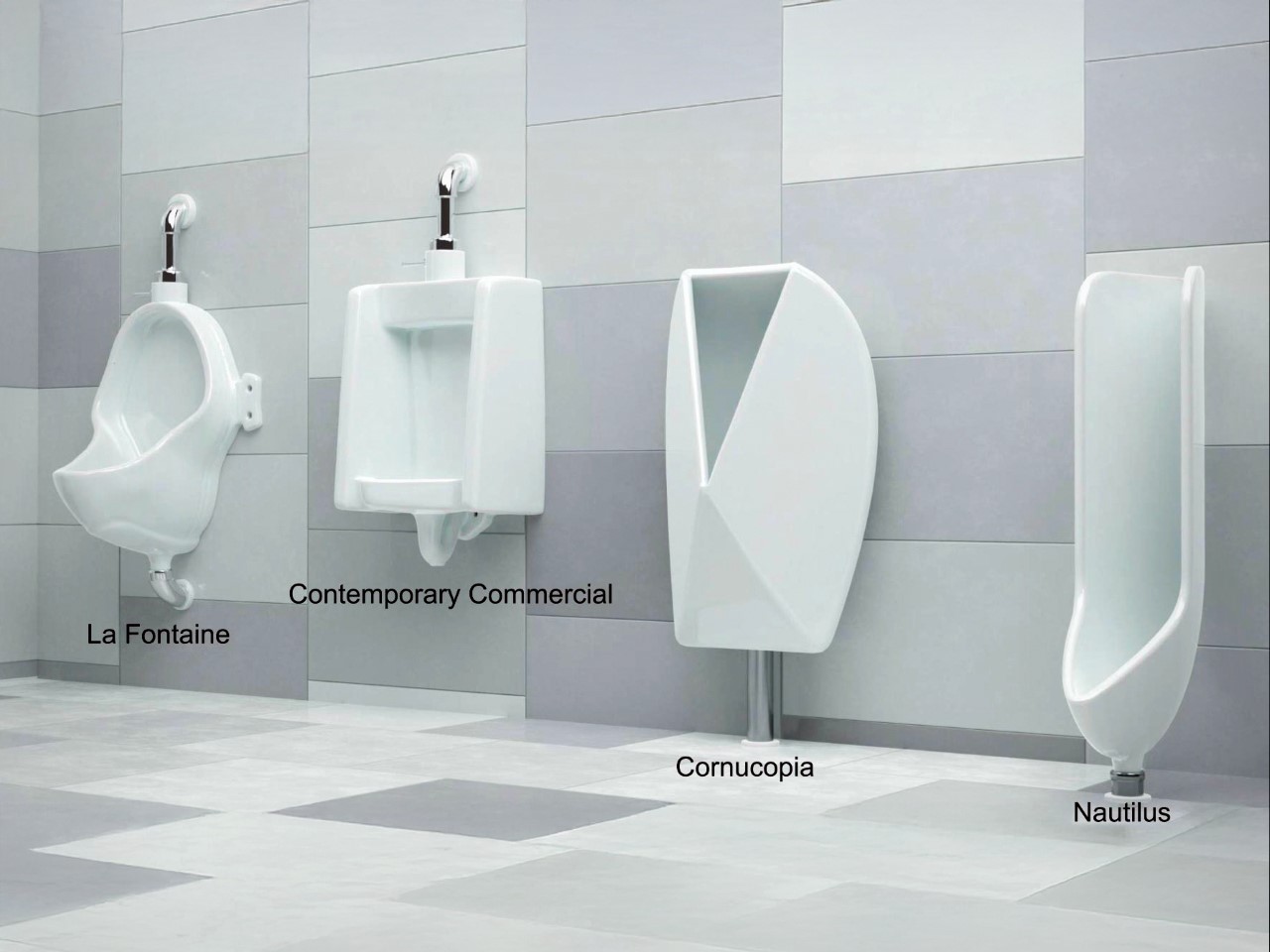
Somewhere between building nuclear fusion reactors and decoding the human genome, humanity paused… and decided that peeing shouldn’t be a messy ordeal. Enter the Nautilus urinal: a piece of plumbing so thoughtfully engineered that it makes the 100-year-old standard look like a cruel prank played on pants and public floors everywhere.
Scientists at the University of Waterloo – yes, fittingly named – approached the urinal problem with the same earnest precision usually reserved for spacecrafts and particle accelerators. They didn’t just eyeball it. They fired a dyed-water jet through a urethra-mimicking nozzle onto test surfaces angled meticulously between 0 and 90 degrees. What they found would make even Newton nod approvingly: angles over 30 degrees are splash factories. Anything shallower drastically tames the wild energy of a stream. That led them to craft the Nautilus, a urinal that captures and channels urine like a fluid dynamics masterpiece, reducing splashback by a staggering 98%.
Designers: Kaveeshan Thurairajah, Xianyu (Mabel) Song, J D Zhu, Mia Shi, Ethan A Barlow, Randy C Hurd, Zhao Pan (University of Waterloo)
Visually, it’s a sleek swirl of ceramic engineering, a tighter, more inviting spiral that looks more like a modernist sculpture than a bathroom fixture. Unlike the brutish slanted walls of traditional urinals, the Nautilus hugs the stream, guiding it along a smooth, gentle curve with the elegance of a Formula 1 racetrack designed purely for liquids. And while there’s a brutalist Cornucopia prototype that looks like it came from Elon Musk’s fever dream, the Nautilus is the undisputed champion, working for users of almost any height, which is kind of a miracle when you realize how unregulated the chaos of public restroom aim usually is.
And this wasn’t just an aesthetic choice. The Nautilus was torture-tested with poor aim scenarios, erratic flow rates, and simulated misfires. Yet, it consistently captured everything with a grace that makes you wonder why we tolerated Jackson Pollock floors for so long. The data is even more satisfying: switching North America over to Nautilus-style urinals could save up to 10 million liters (2.6 million gallons) of water per day. That’s not small change when cities are scraping the barrel for every drop.
It’s easy to romanticize grand challenges – curing cancer, saving the planet – but life is a patchwork quilt stitched from a thousand tiny annoyances. Pee splash isn’t glamorous, but it’s real. It’s the kind of everyday indignity that quietly erodes dignity and comfort without anyone noticing until suddenly, they’re standing in it.
That’s the magic of design thinking at its best: no problem too petty, no dignity too small to preserve. And the payoff is tangible. Imagine cleaner public bathrooms, lower maintenance costs, fewer eco-unfriendly cleaning products being dumped down the drain. Suddenly, a small tweak in geometry feels like it shifts the axis of civilization a few degrees toward better.
Maybe the real sign of a society leveling up isn’t flying cars or robot butlers. Maybe it’s how little urine ends up where it shouldn’t be.
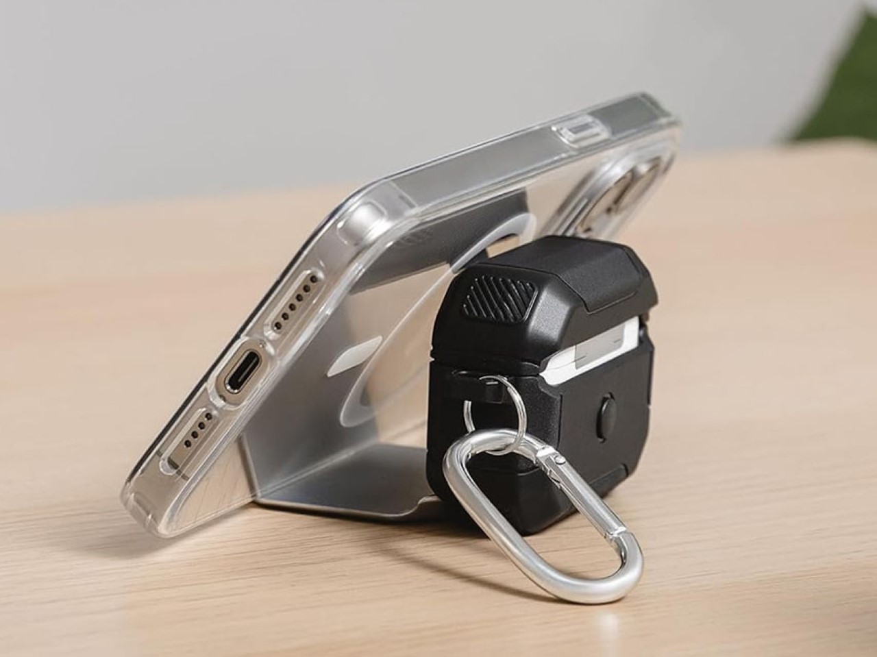
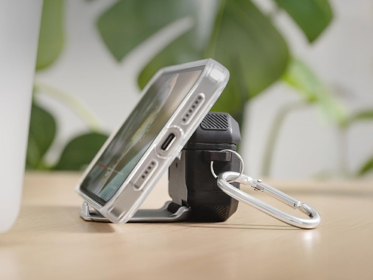
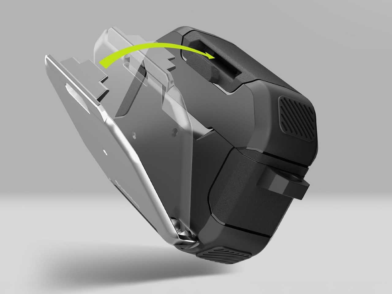
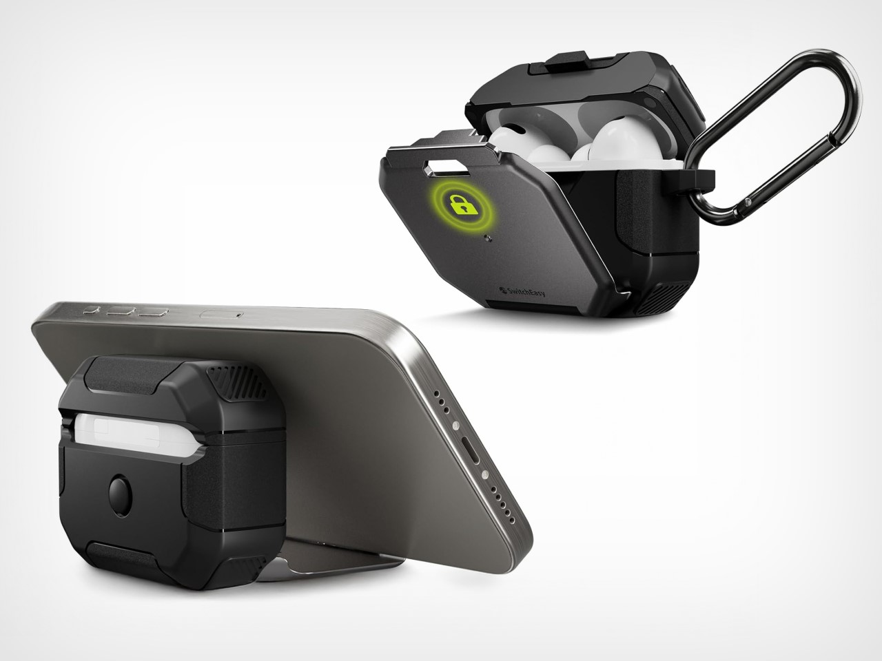
Do the AirPods really need a case? I mean sure, the earbuds themselves come with a broader case, but does that case need an extra protective shell? On most occasions, I’d say no, but this particular case from SwitchEasy drives a hard bargain. Baked into this protective case is a built-in stand that allows you to prop up your phone, whether it’s to watch movies or take video calls… and I absolutely love it.
The SwitchEasy Defender+ (quite a rugged, testosterone-y name if you ask me) was designed to protect your AirPods from any kind of damage they could experience. Falling off a table, falling off two tables, maybe even three. However, that feature seems fairly secondary to the Defender+’s built-in kickstand that gives your phone its very own dock, which you can use even in vertical mode with most regular-sized phones.
The Defender+ comes with a TPU construction that absorbs shock, preventing your AirPods case from any impact up to 10 feet. That means your case is more impervious to scuff marks that stand out against its otherwise plain, glossy white exterior. However, there’s that metal plate on the front that does a little more damage protection. You see, aside from working as a kickstand, it works as a clasp that keeps your AirPods case shut, preventing it from accidentally opening.
To access your AirPods, you need to disengage the metal plate to allow the lid to open – sort of like two-factor protection for your earbuds. Pop the earbuds out, wear them, and then prop your phone on the Defender+’s stand and you have a de-facto portable movie theater, complete with Spatial Audio from the AirPods.
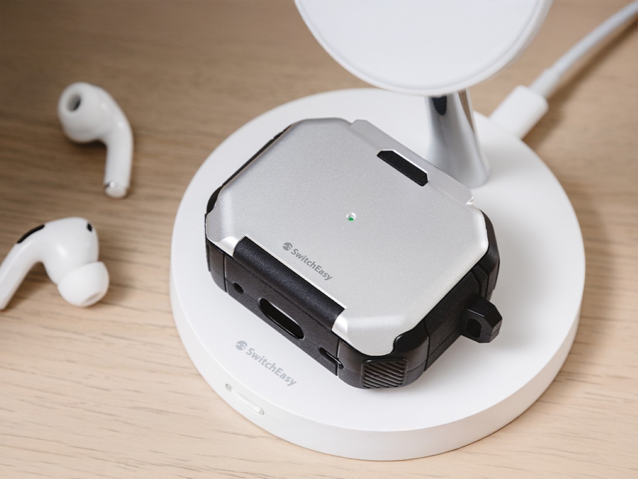
The SwitchEasy Defender+ starts at 21.99, and comes with a carabiner clip to accompany the case itself. The case supports wireless charging too, so you could easily place your AirPods face-up on any charging surface and it begins juicing your earbuds. Meanwhile, a nifty hole cut through the metal plate lets you see its charging light, so you’re never left with a pair of dead AirPods because you didn’t see the battery notification.
Bali. The name alone conjures images of verdant rice paddies, ancient temples, and a spiritual calm that feels almost mythical, perhaps even a touch overplayed in travel brochures. Yet, capturing that elusive essence in architecture, particularly for hotels, remains a profound challenge. Too often, concrete structures land like disconnected objects, disrupting the very tranquility visitors chase. It forces us to ask: how do you build in Bali, harmonizing with its spirit, rather than just building on its land?
Archigods, an Indonesian firm deeply familiar with this context, offers a compelling response. Their concept for a boutique hotel isn’t about imposing scale but fostering a gentle embrace of the landscape. Named the “Blooming Ring,” the design envisions a circular structure cradling a central oasis – a literal sanctuary within a sanctuary. It feels less like an imposing building and more like an organic landform emerging naturally from the earth, whispering integration rather than shouting arrival.
Designer: Archigods
The circular layout is pivotal – Think ancient enclosures or communal gathering spaces; the form inherently turns inward, focusing energy and attention on the lush courtyard. This central space, planned with local flora and calming water features, becomes the hotel’s vibrant, green heart. Guest rooms radiate outwards, offering privacy, yet the core experience constantly pulls you back to this shared, protected haven, fostering a subtle sense of community amidst personal retreat.
Forget predictable smooth render or ubiquitous timber cladding. Archigods proposes embedding crushed pistachio shells within the facade’s plaster. Yes, actual pistachio shells. It’s a wonderfully quirky bit of material alchemy, turning food waste into architectural texture. Imagine the subtle, variegated surface catching the tropical light – tactile, unexpected, and deeply earthy, a far cry from sterile perfection.
This textural innovation sits alongside locally sourced bamboo and timber, materials intrinsically linked to Balinese building traditions. The pistachio shell facade provides a fascinating counterpoint – familiar natural materials meet clever, sustainable upcycling. It’s a statement about resourcefulness, minimizing environmental impact, and creating a building that truly feels rooted, right down to its unique, shell-flecked skin telling a quiet story of reuse.
The design intent clearly targets wellness and sensory rejuvenation. Movement through the space would likely follow the ring’s gentle curve, revealing constant glimpses of the central garden, reinforcing that connection to nature. Natural light is choreographed to flood interiors, while views are carefully framed towards tranquility. The material palette – those intriguing shells, the warm wood, cool stone – aims to create a tactile journey, contributing to a sense of grounded calm.
This project aligns beautifully with the principles of biophilic design, striving to weave nature seamlessly into the built environment. The Blooming Ring feels like a mature, sensitive application, specifically tuned to the Balinese context. It sidesteps flashy architectural gymnastics, prioritizing experiential richness derived from its embracing form, its careful manipulation of light, and that standout sustainable material choice.
Although conceptual, Archigods’ Blooming Ring presents a potent vision for hospitality design in places demanding deep respect for nature and culture. It champions architecture that doesn’t merely occupy space but actively collaborates with the landscape, using innovative, sustainable materials to enhance the restorative escape Bali promises.