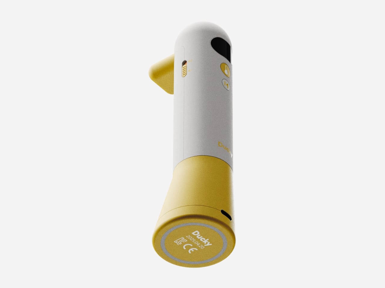
ITDA Concept Offers A Minimalist Approach to Family Connection at Home
It is easy to take for granted how much technology we surround ourselves with every day, but somehow, even surrounded by screens, real connections at home can feel harder than ever. That is the challenge at the heart of ITDA, a concept design from Korea that aims to help families find each other again in the most gentle and thoughtful way possible.
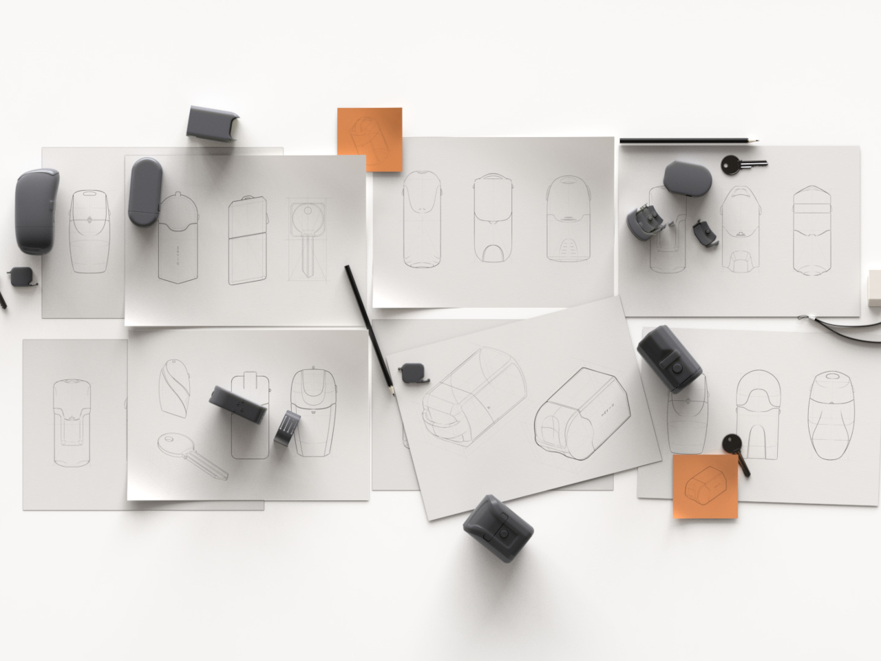
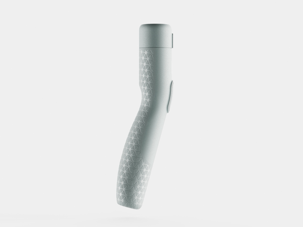
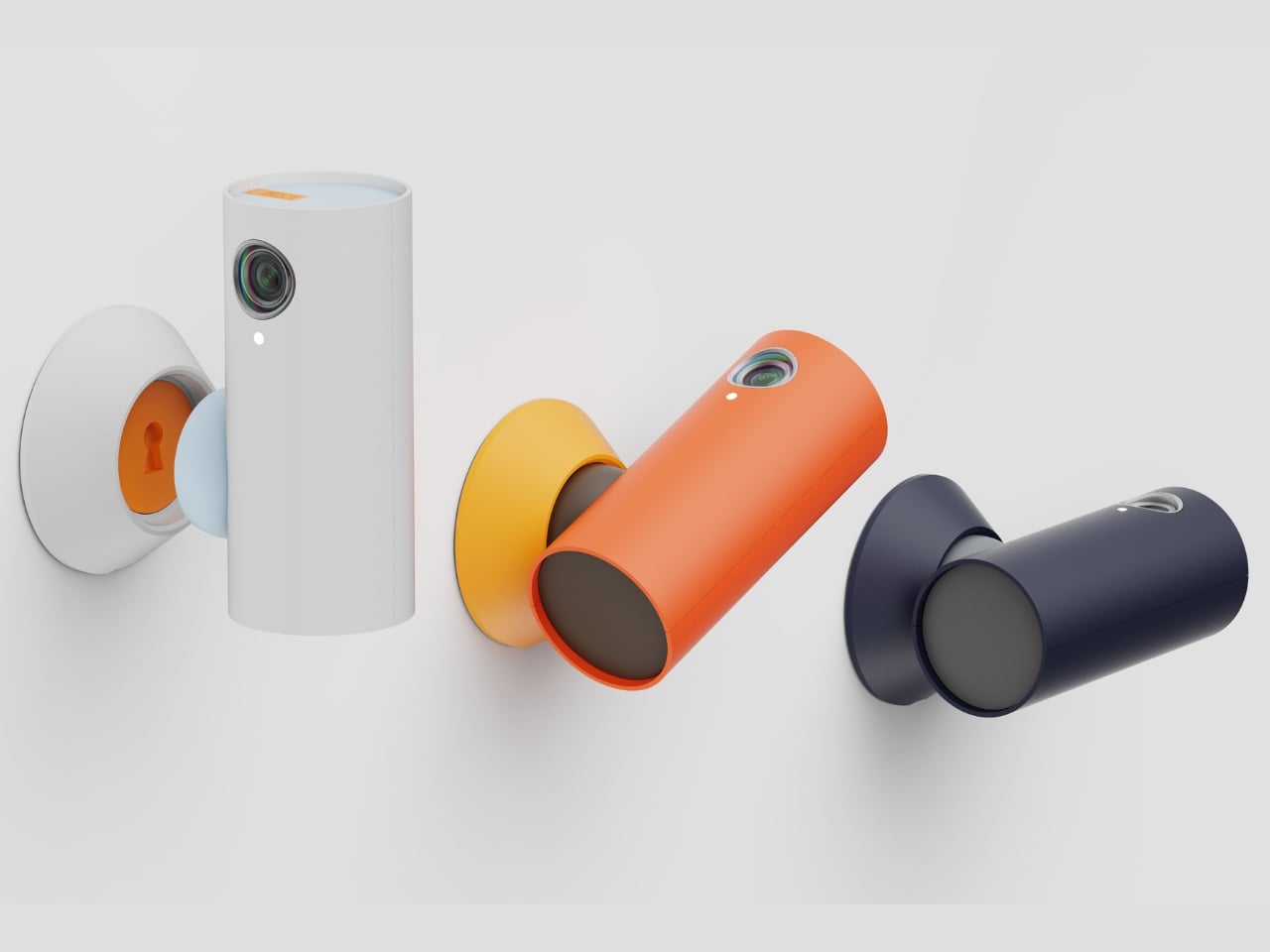
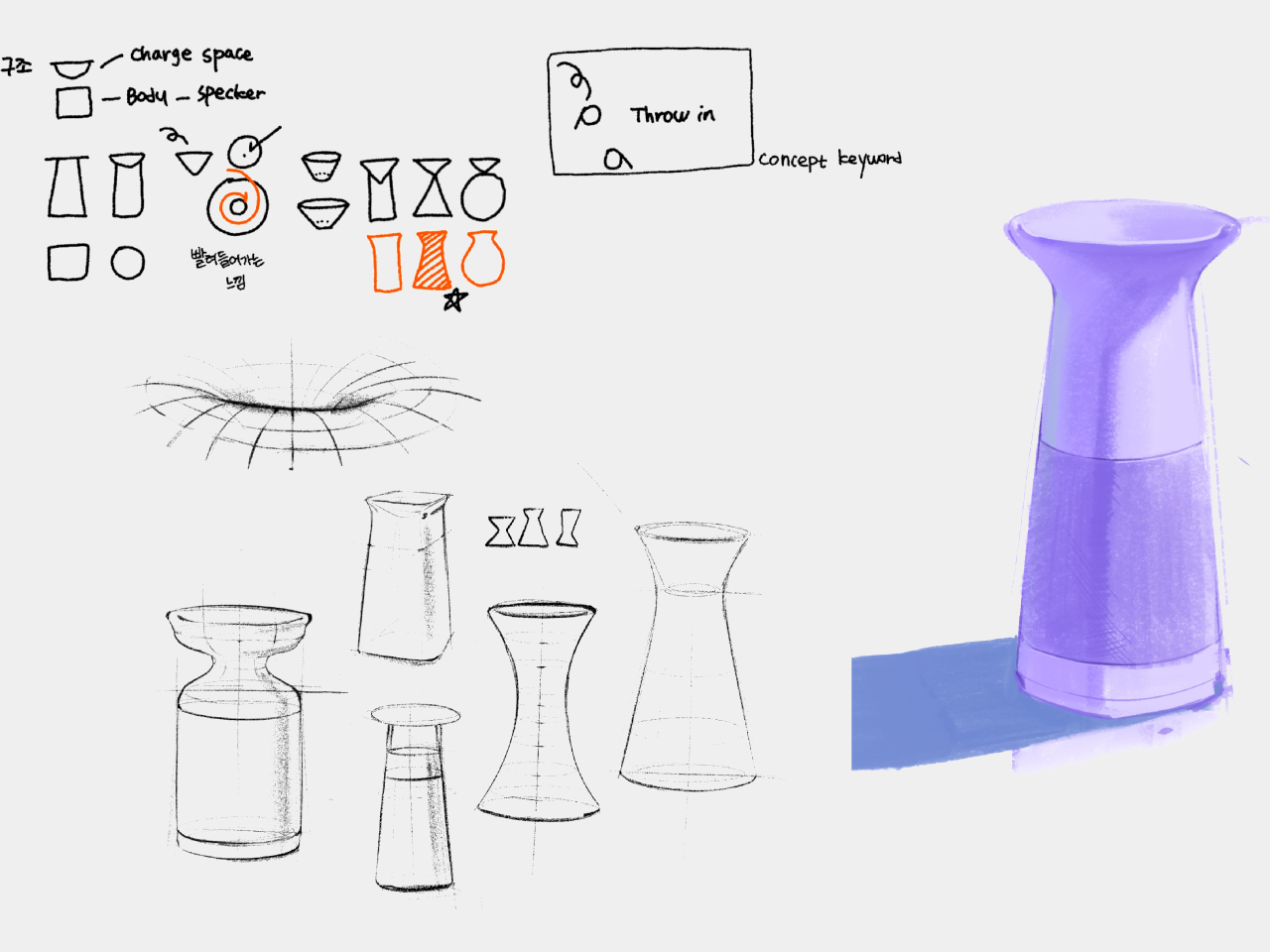
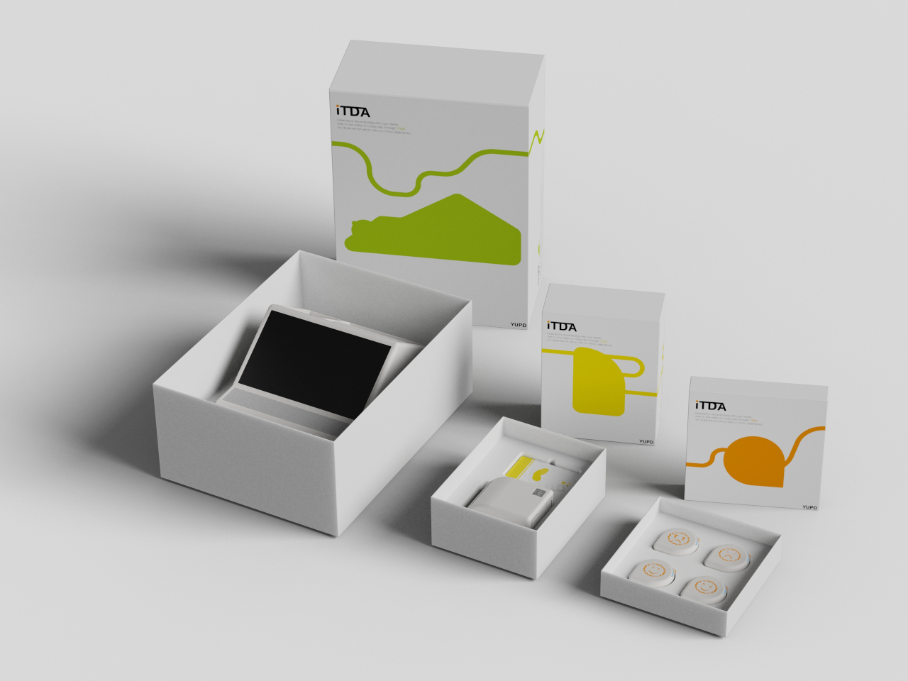
The name ITDA comes from a Korean word that means “to connect,” and that philosophy runs through every detail. This is not just another smart gadget or an app notification fighting for your attention. Instead, ITDA is a collection of gentle, tactile objects designed to quietly restore the little moments we have been missing, those exchanges of feeling and warmth that get lost in the shuffle of daily life.
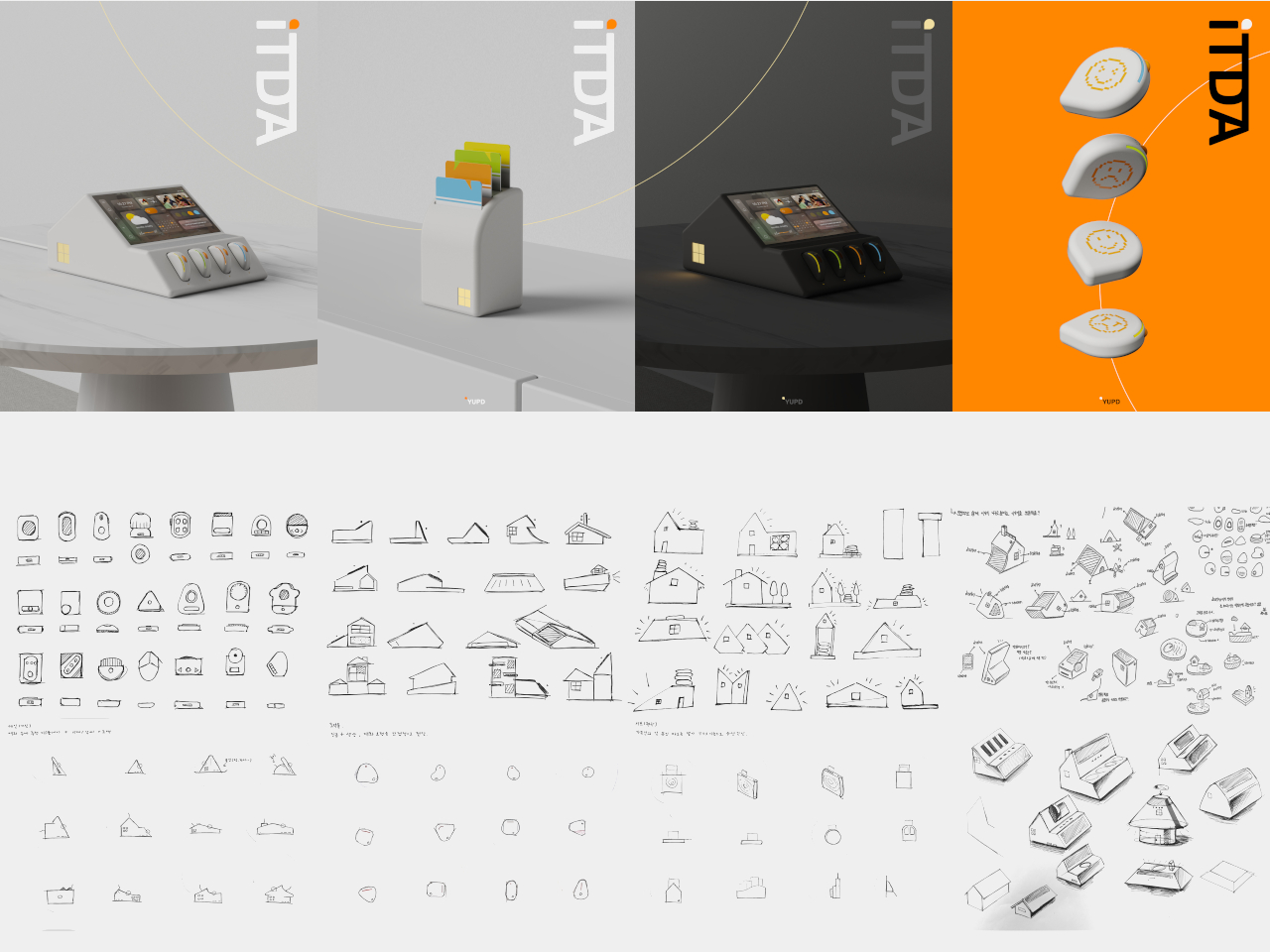
Designers: Hyunwoo Jung, Yehoon Cho, Sieun Cha, Gayeon Kim
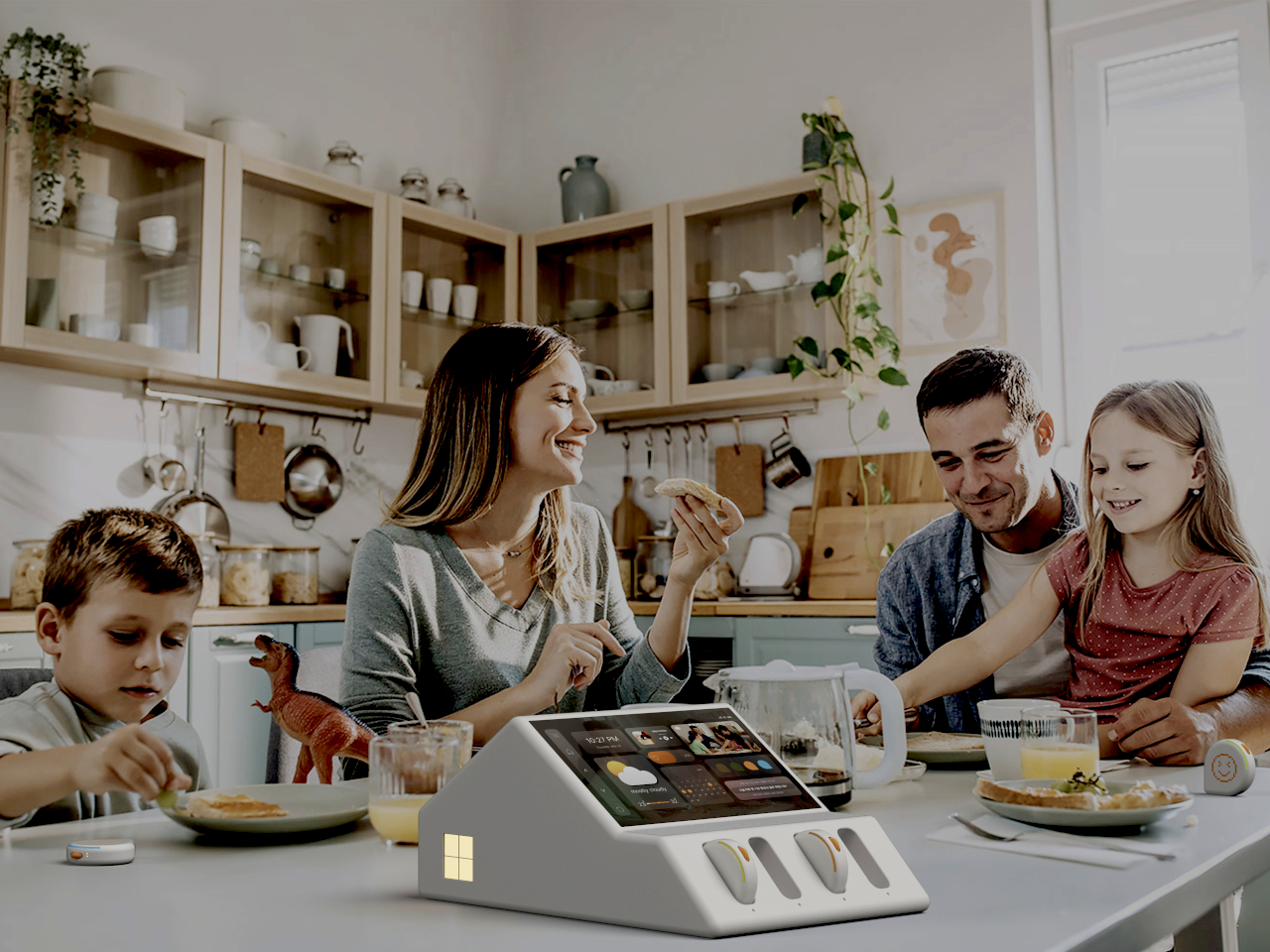
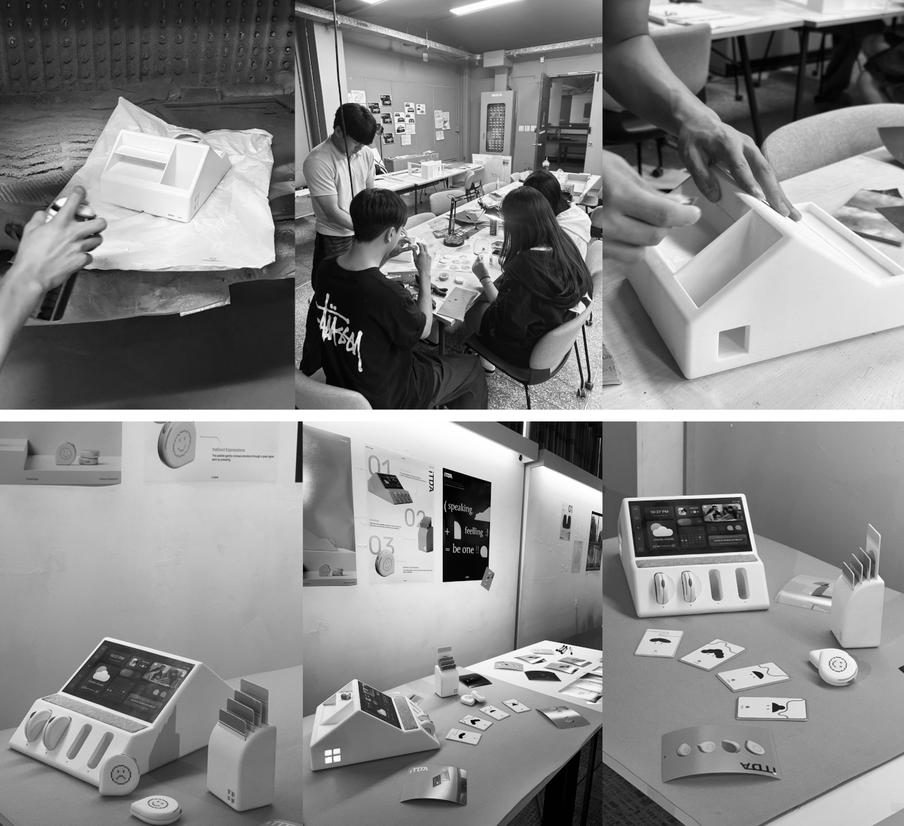
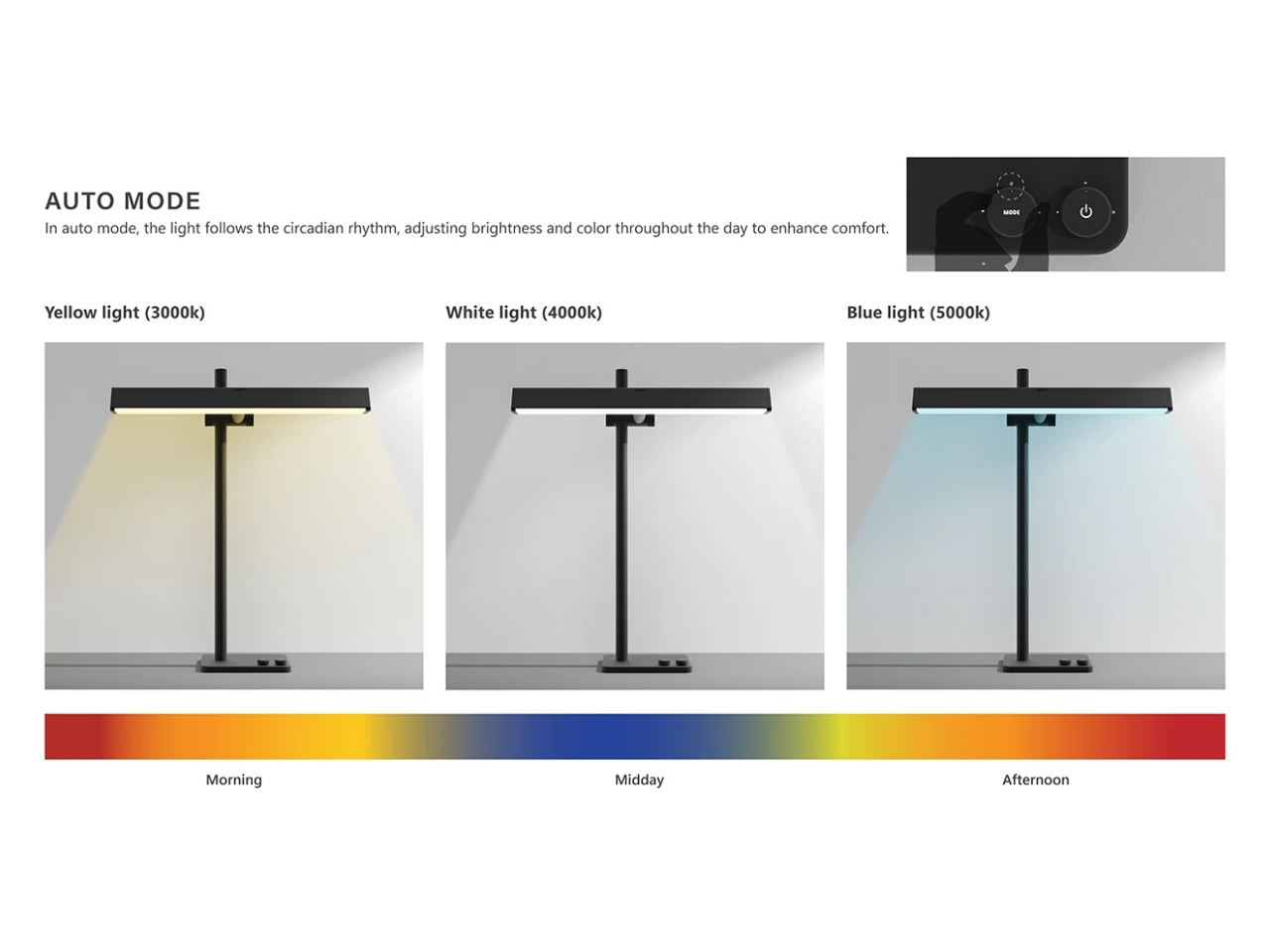
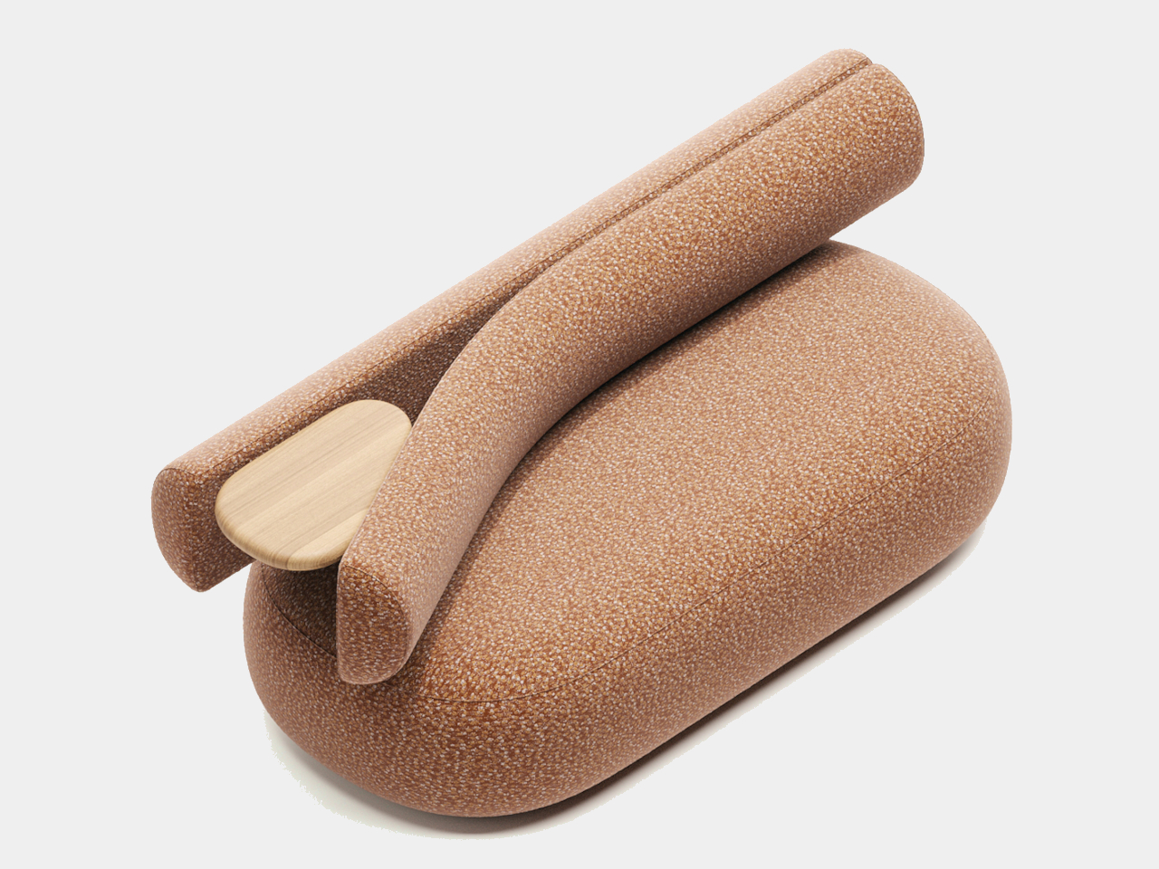
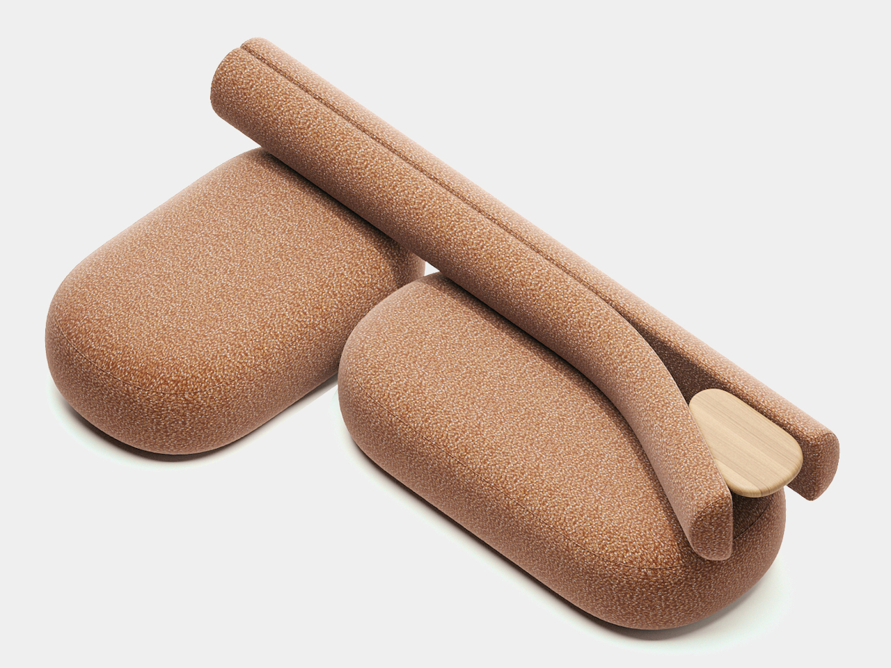
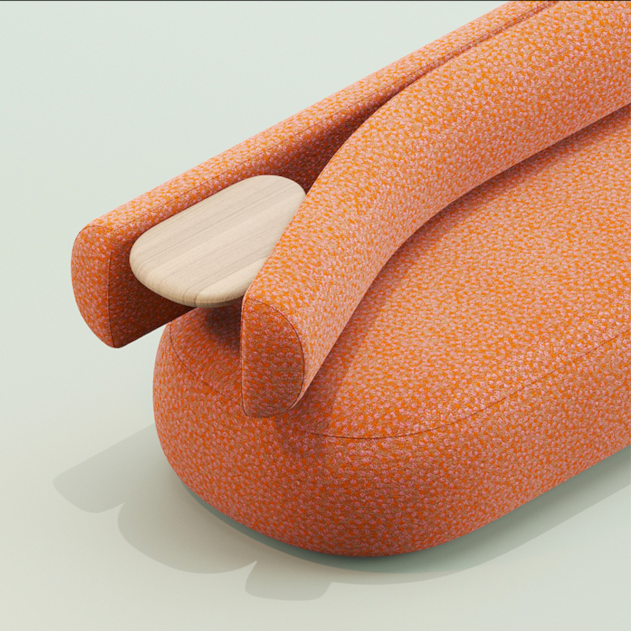
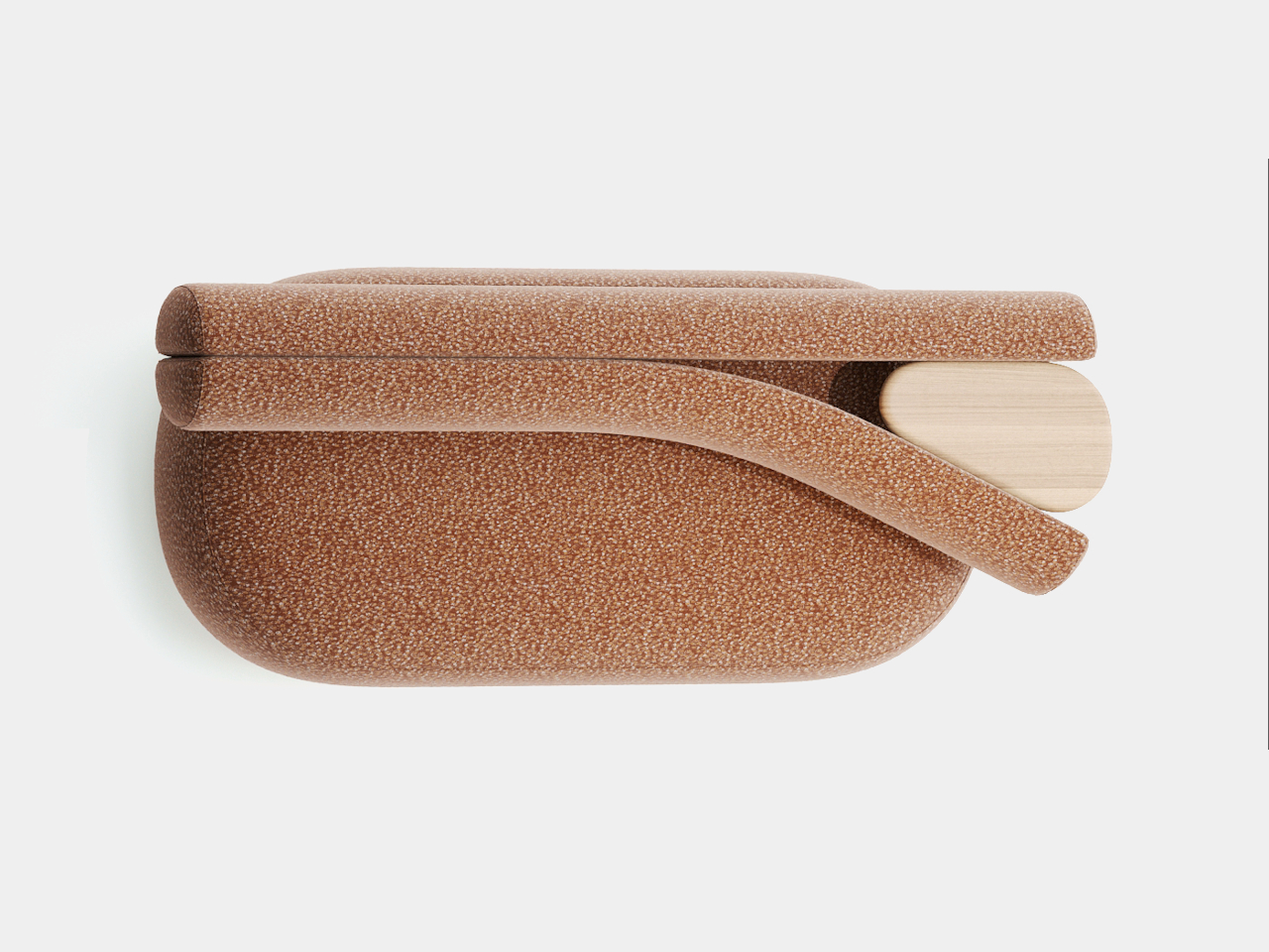
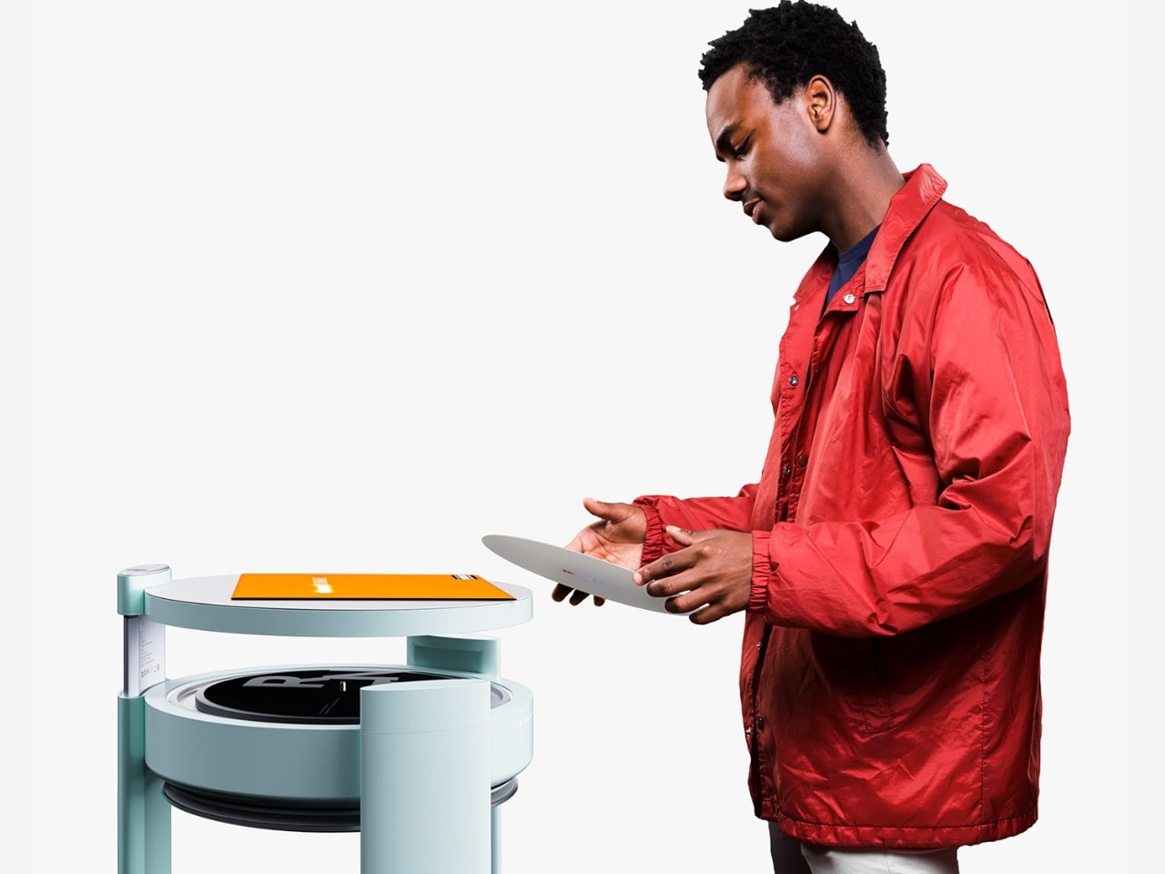
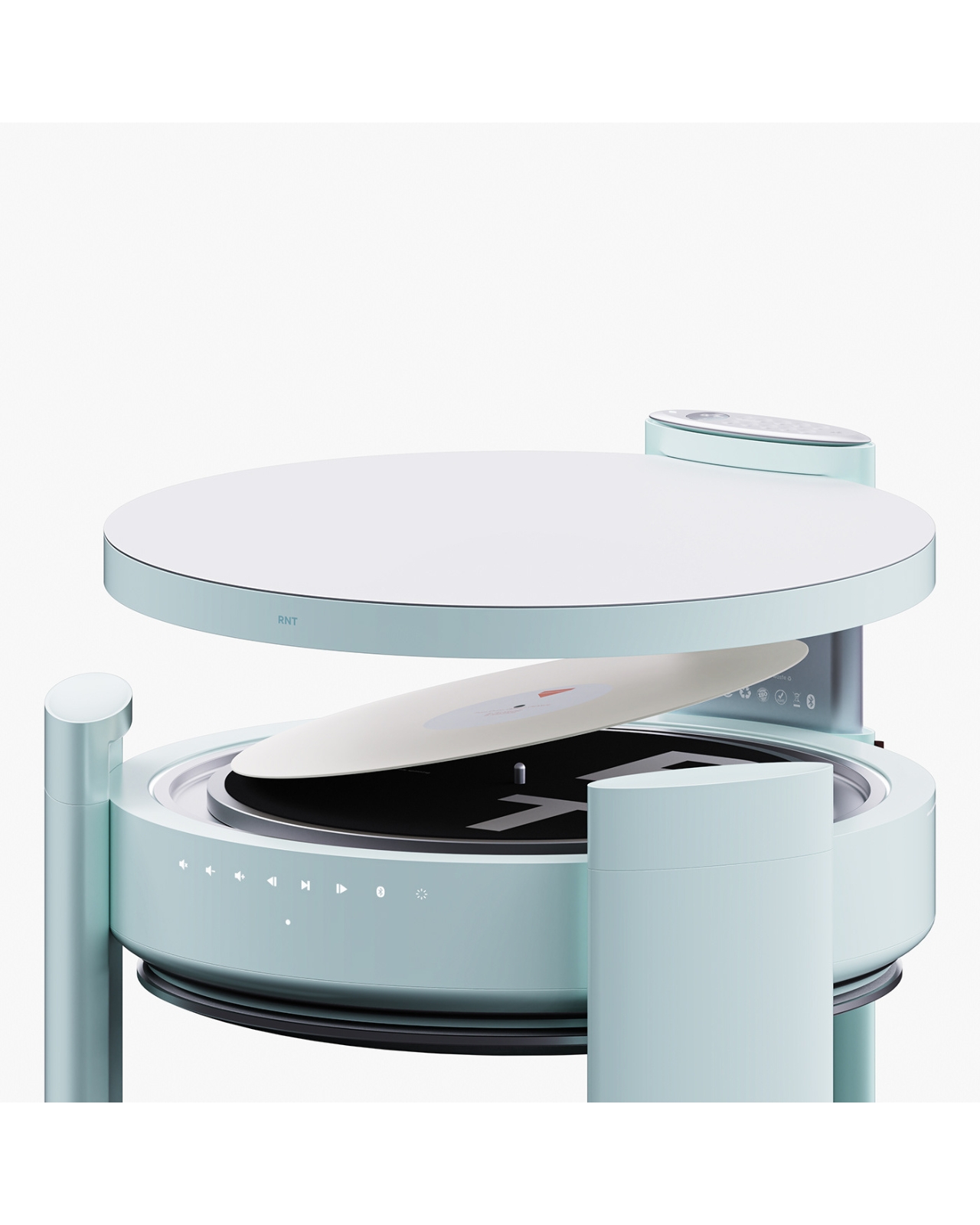
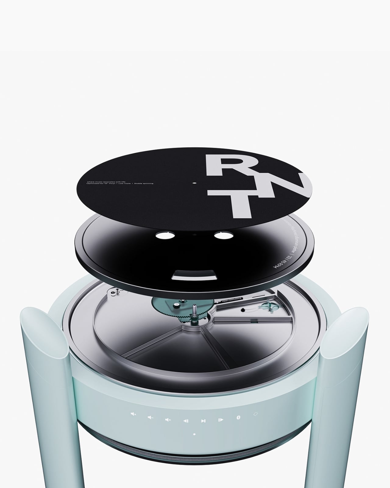
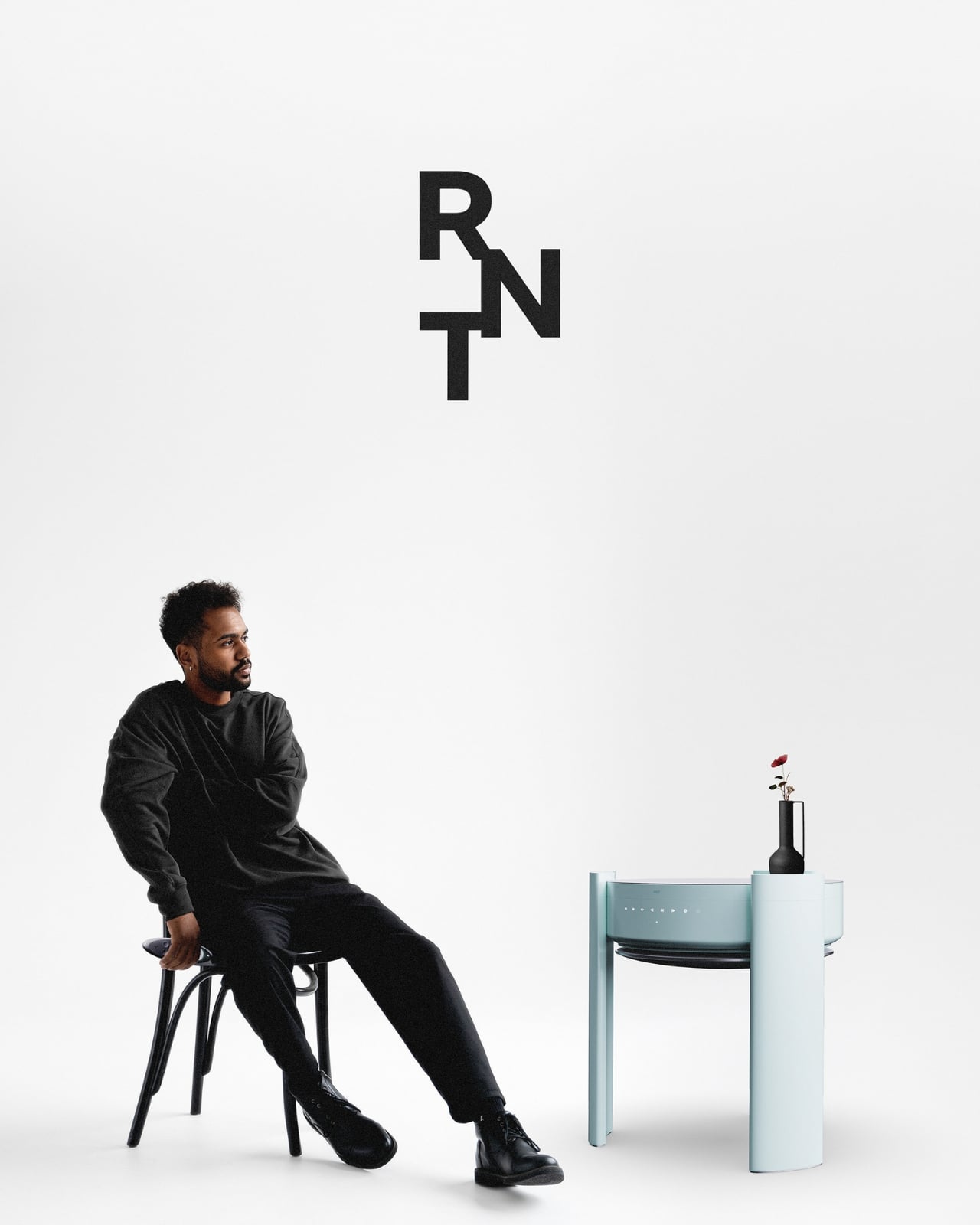
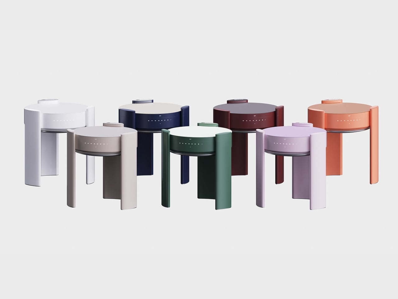
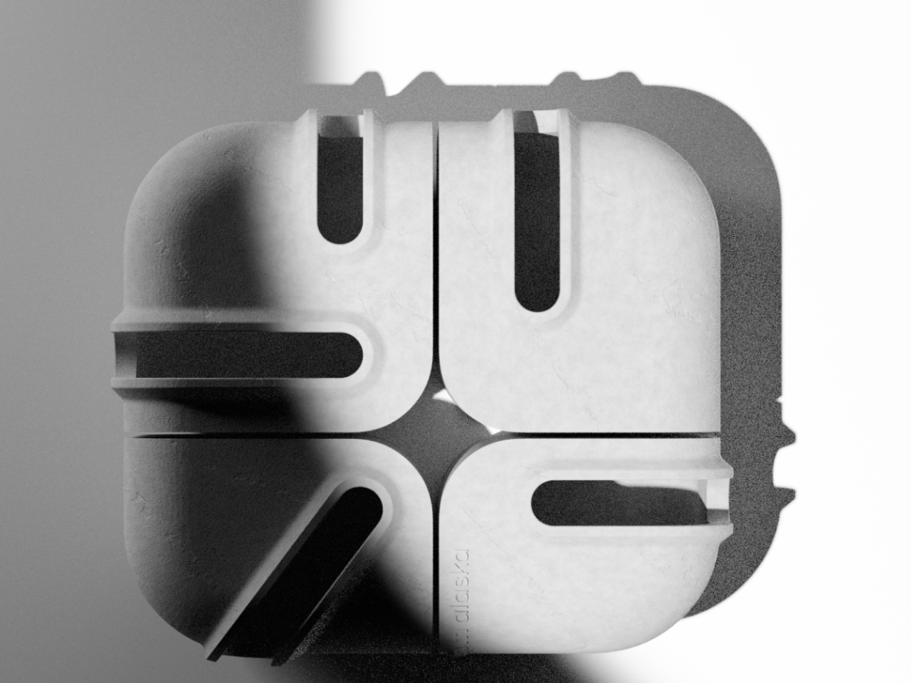
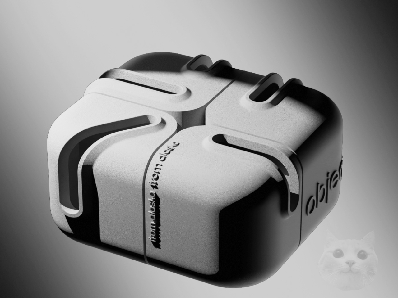
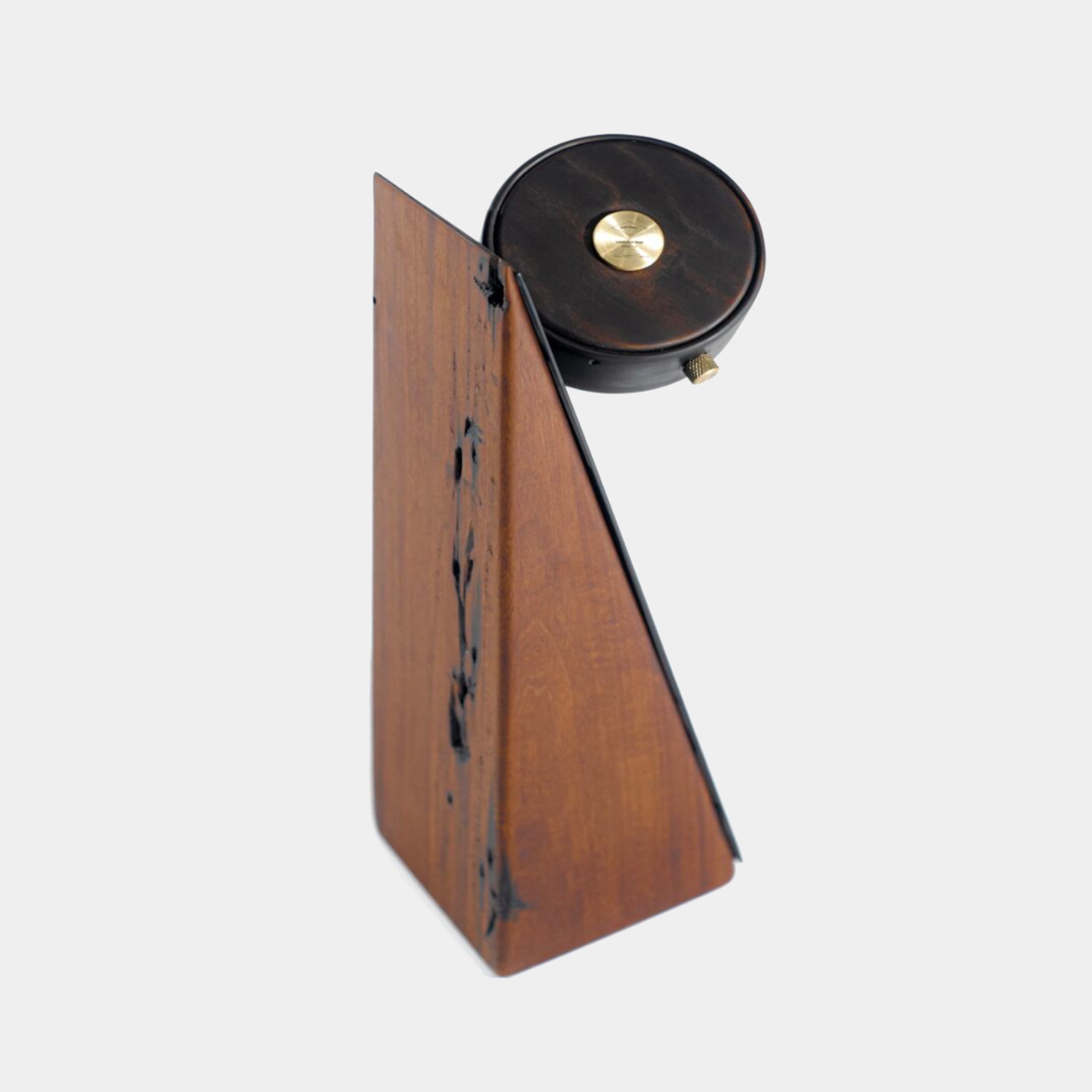
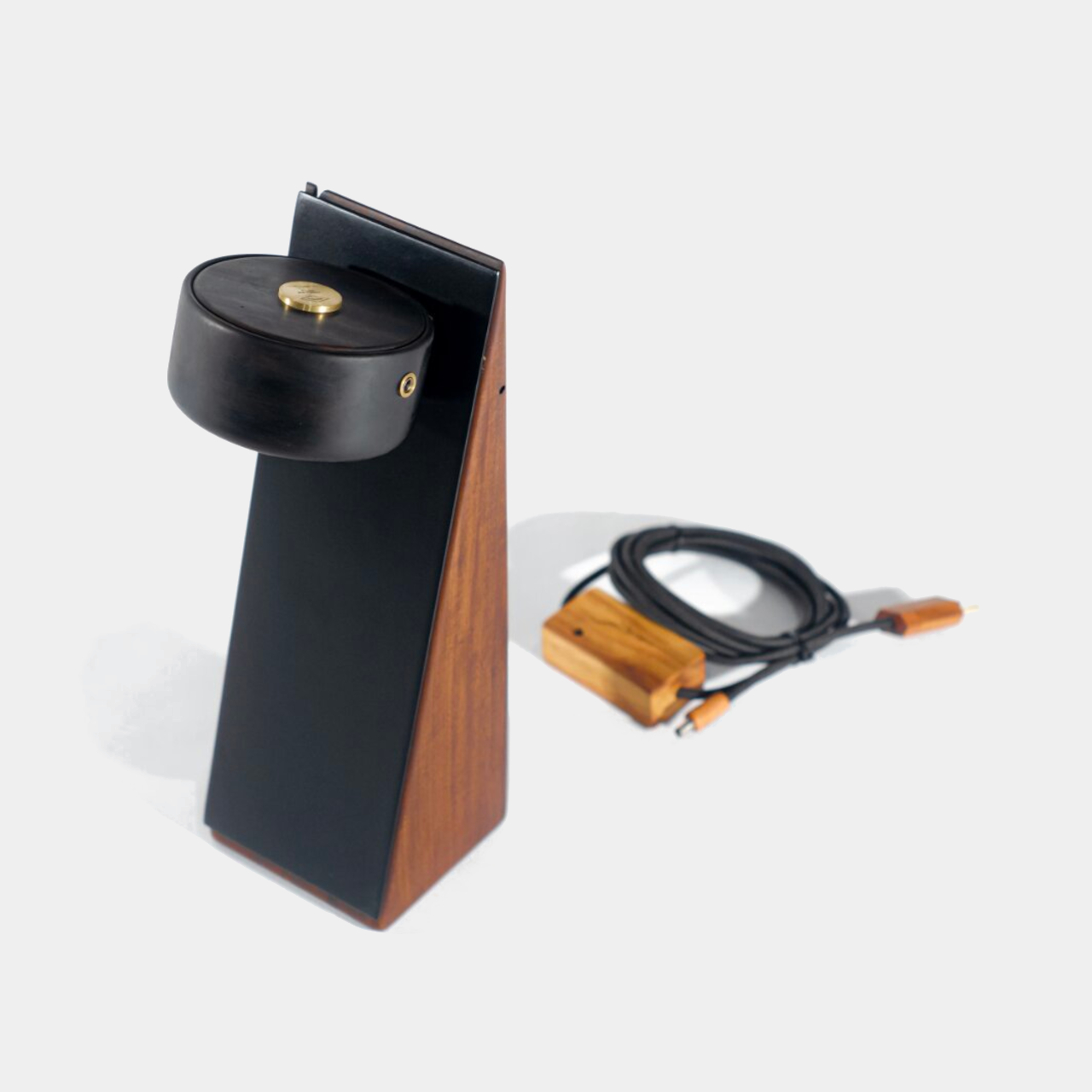
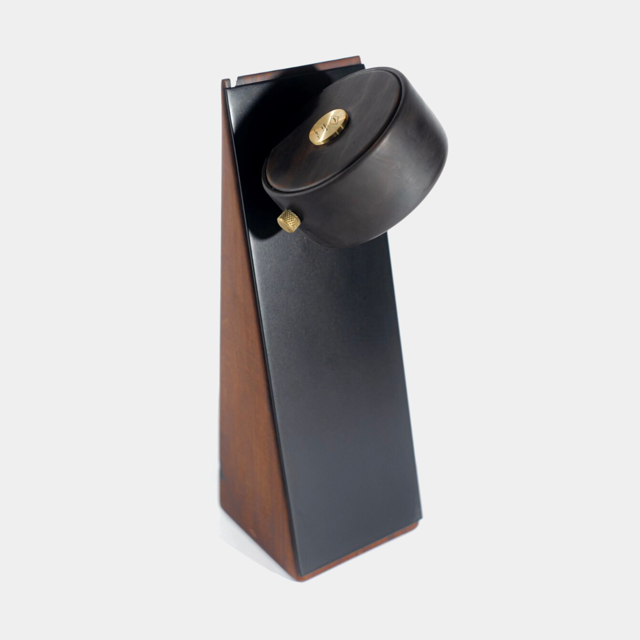
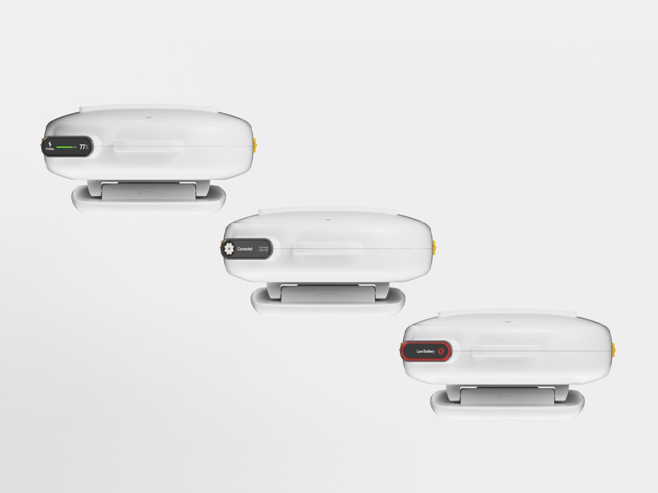
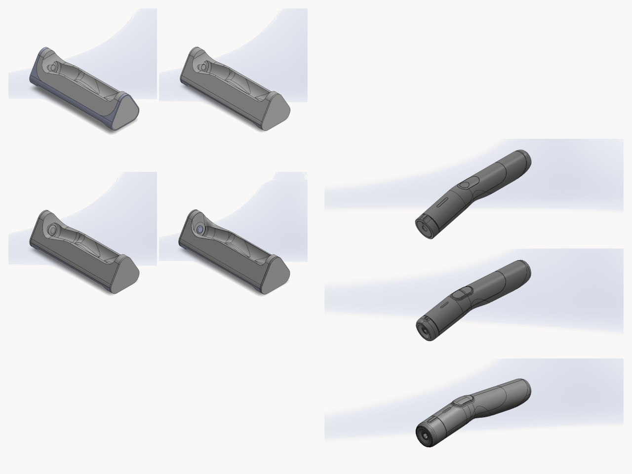
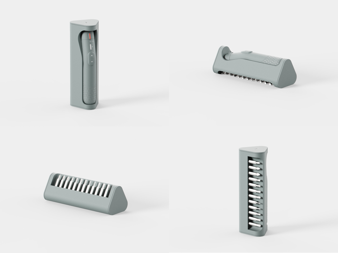
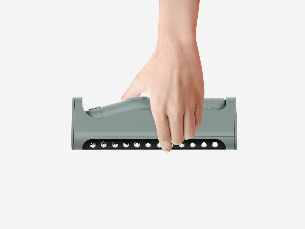
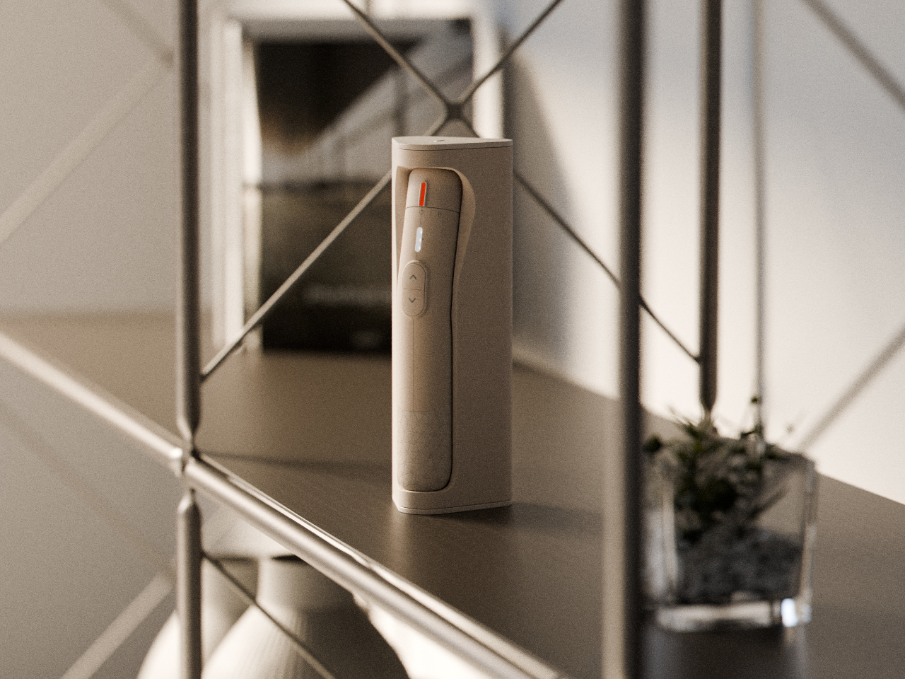
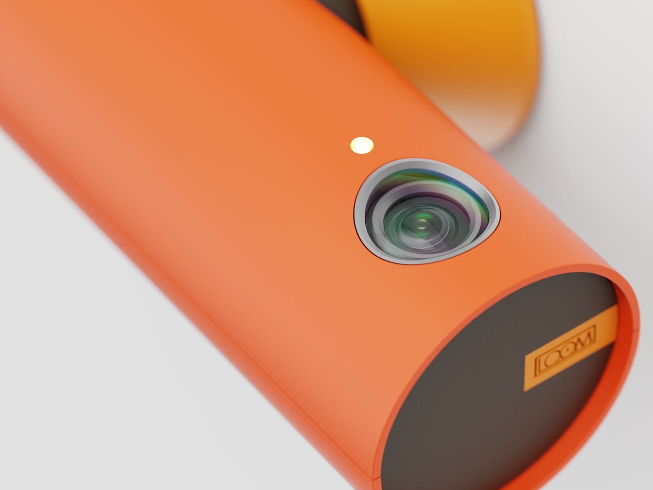
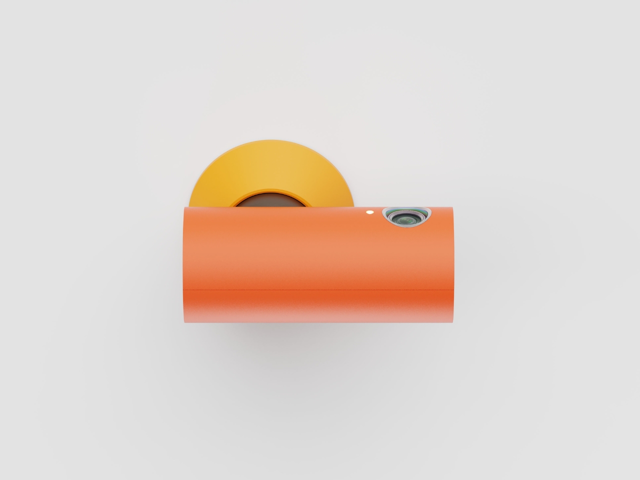
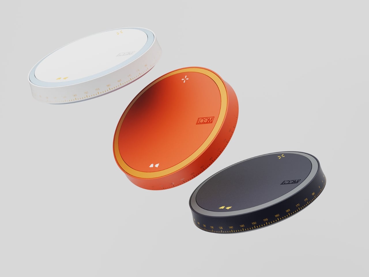
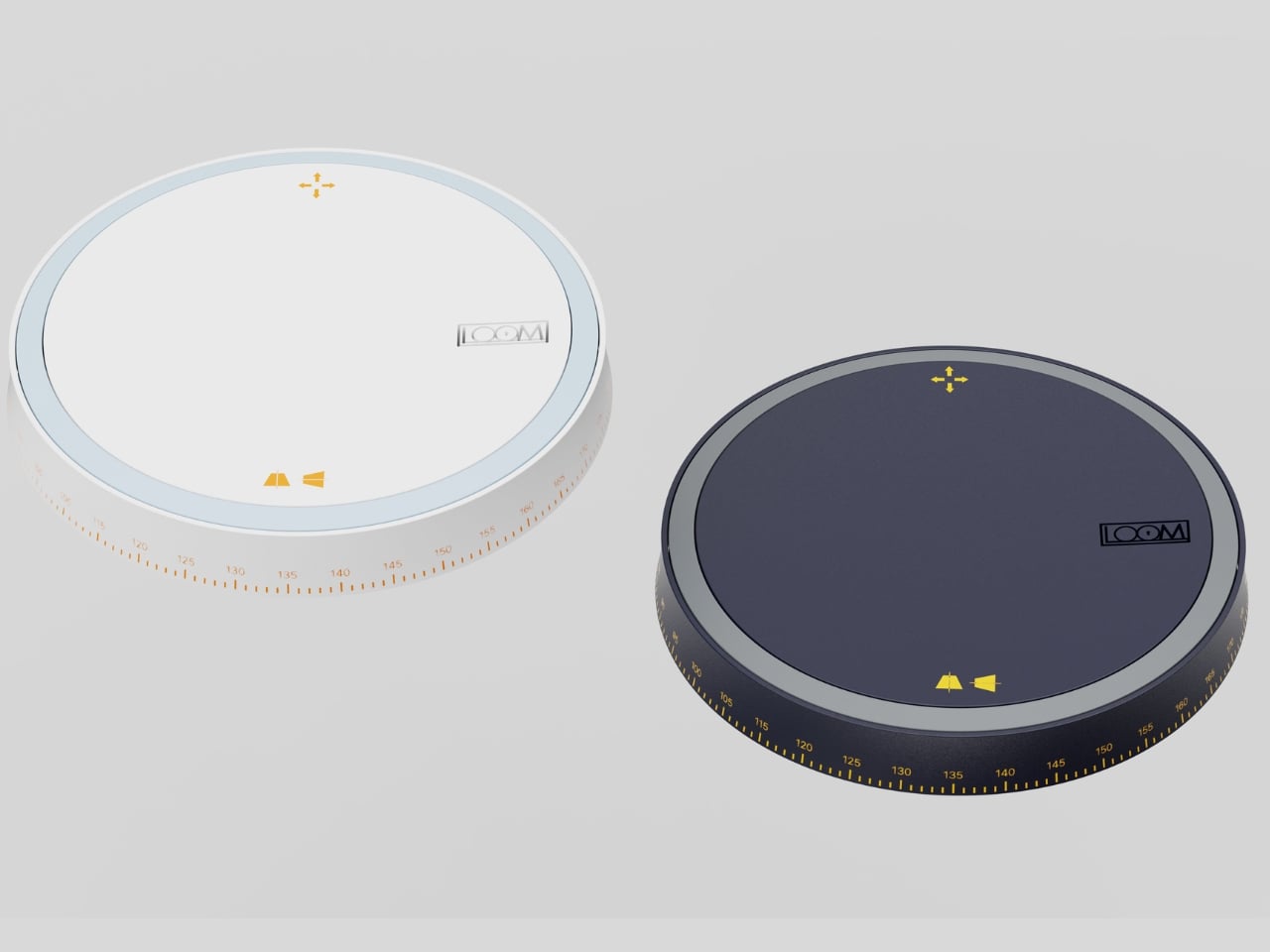
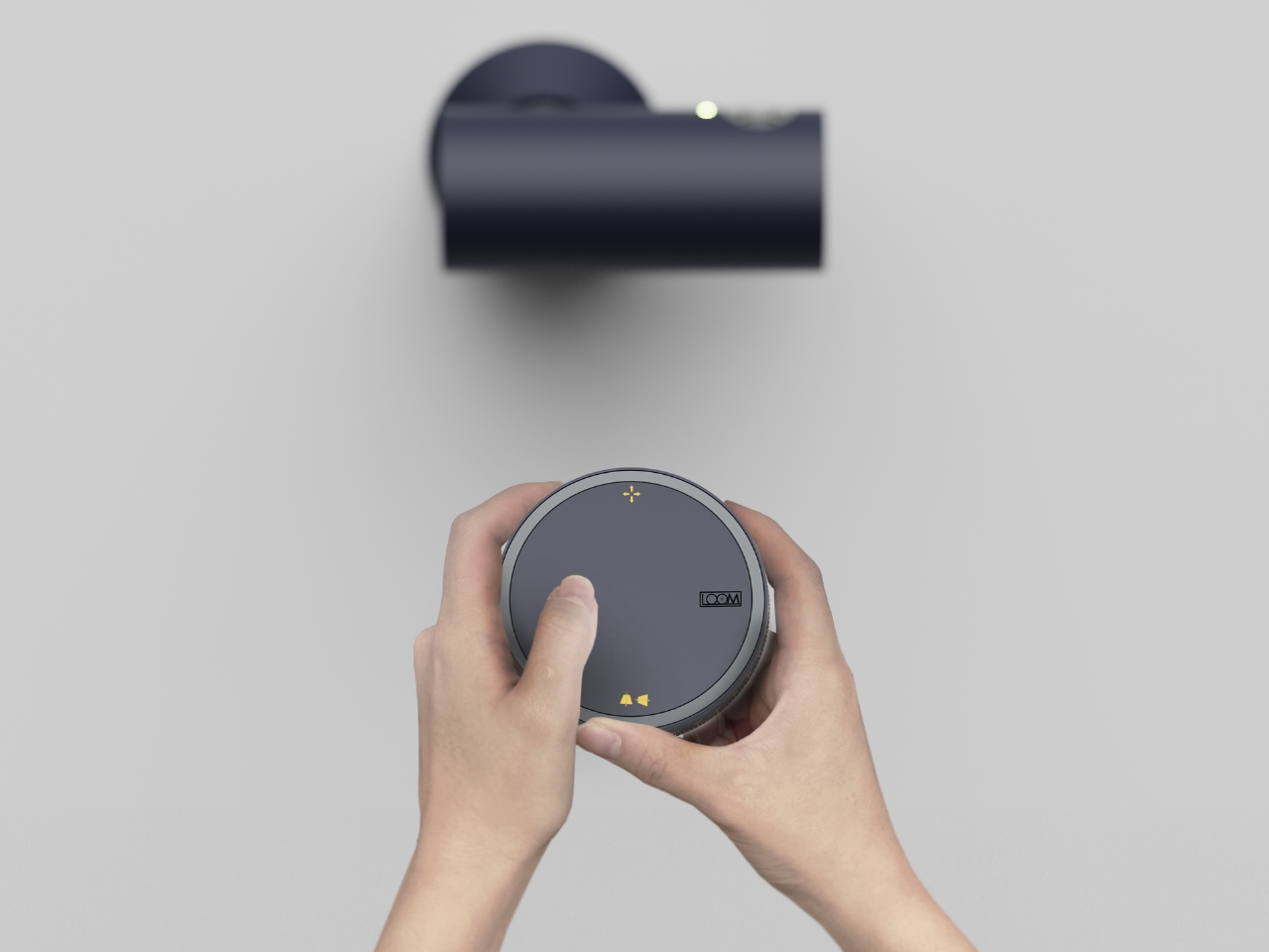
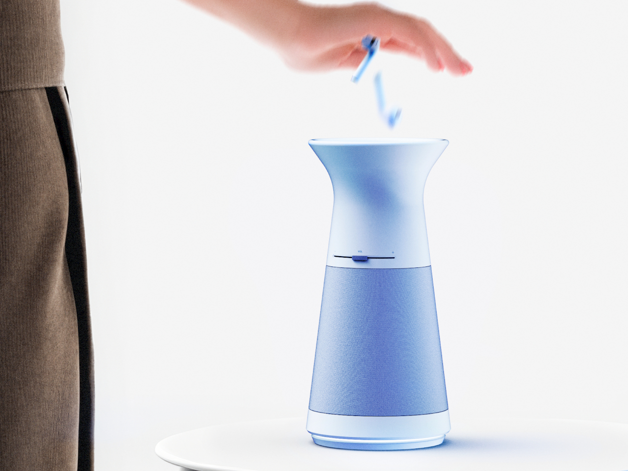
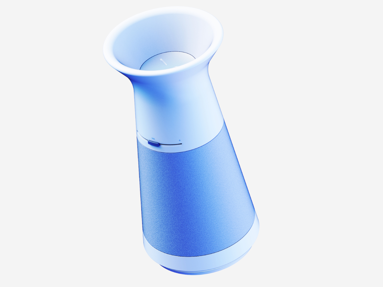
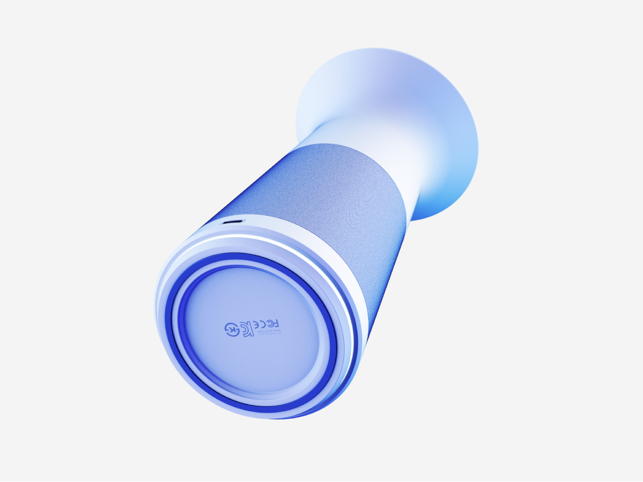
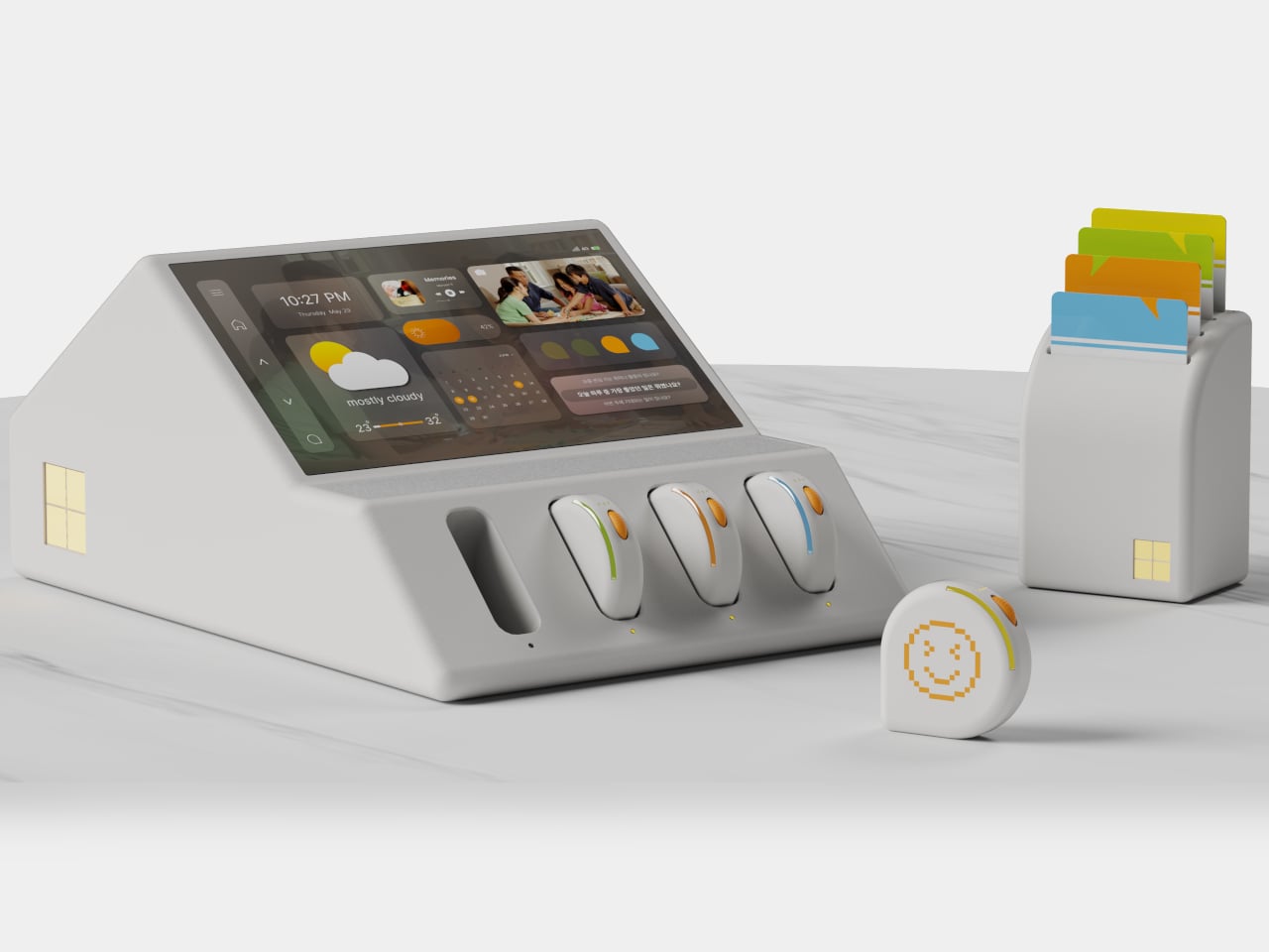
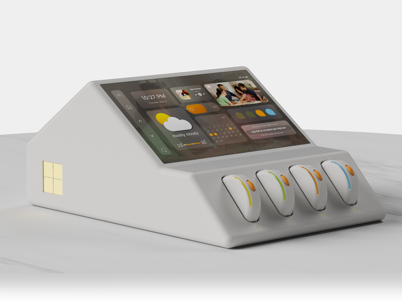
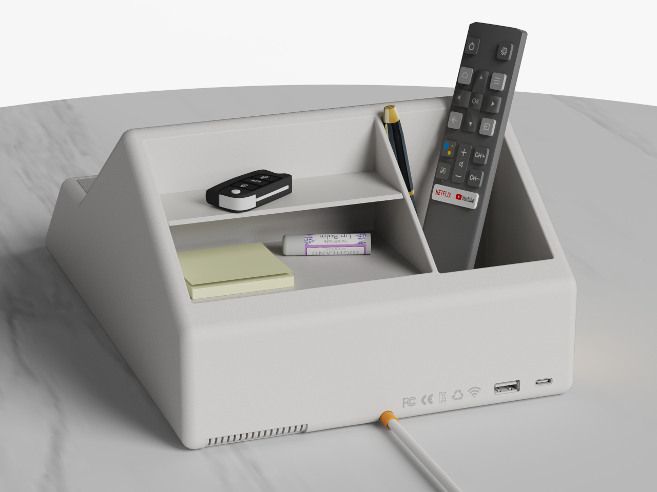
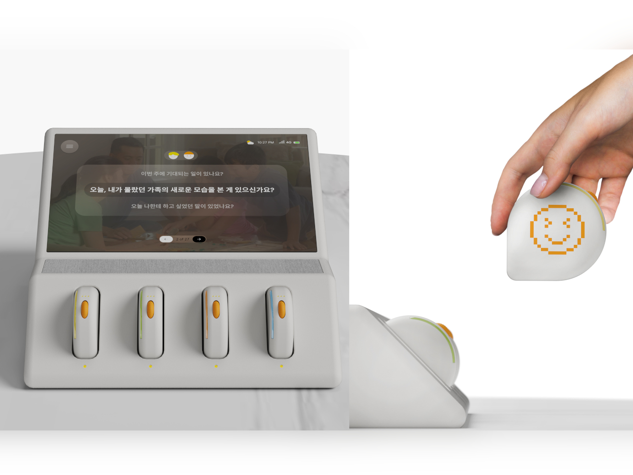
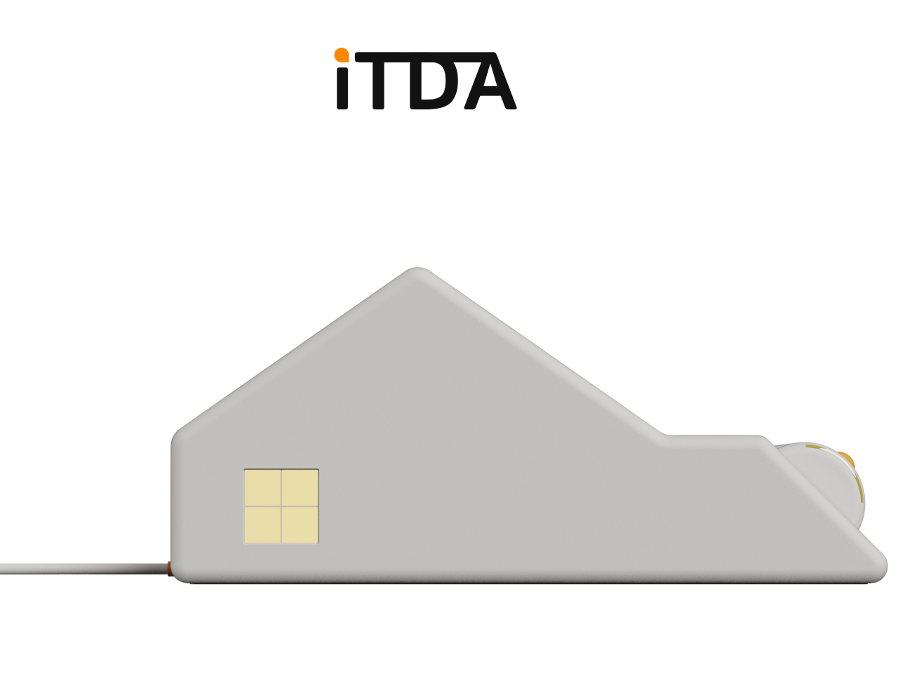
At the center of the system is TOPI, a device that looks more like a minimalist home sculpture than anything you would expect from a tech product. Set it on the kitchen table or by the entryway, and it becomes a gentle hub for conversation. Instead of sending out alerts or lighting up with endless information, TOPI introduces topics when family members are together, using a display that feels inviting rather than commanding. There is even a little shelf on its back for keys or treasures, which feels like a reminder that the belongings we carry say as much about us as our words do.
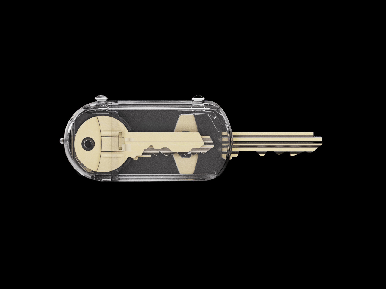
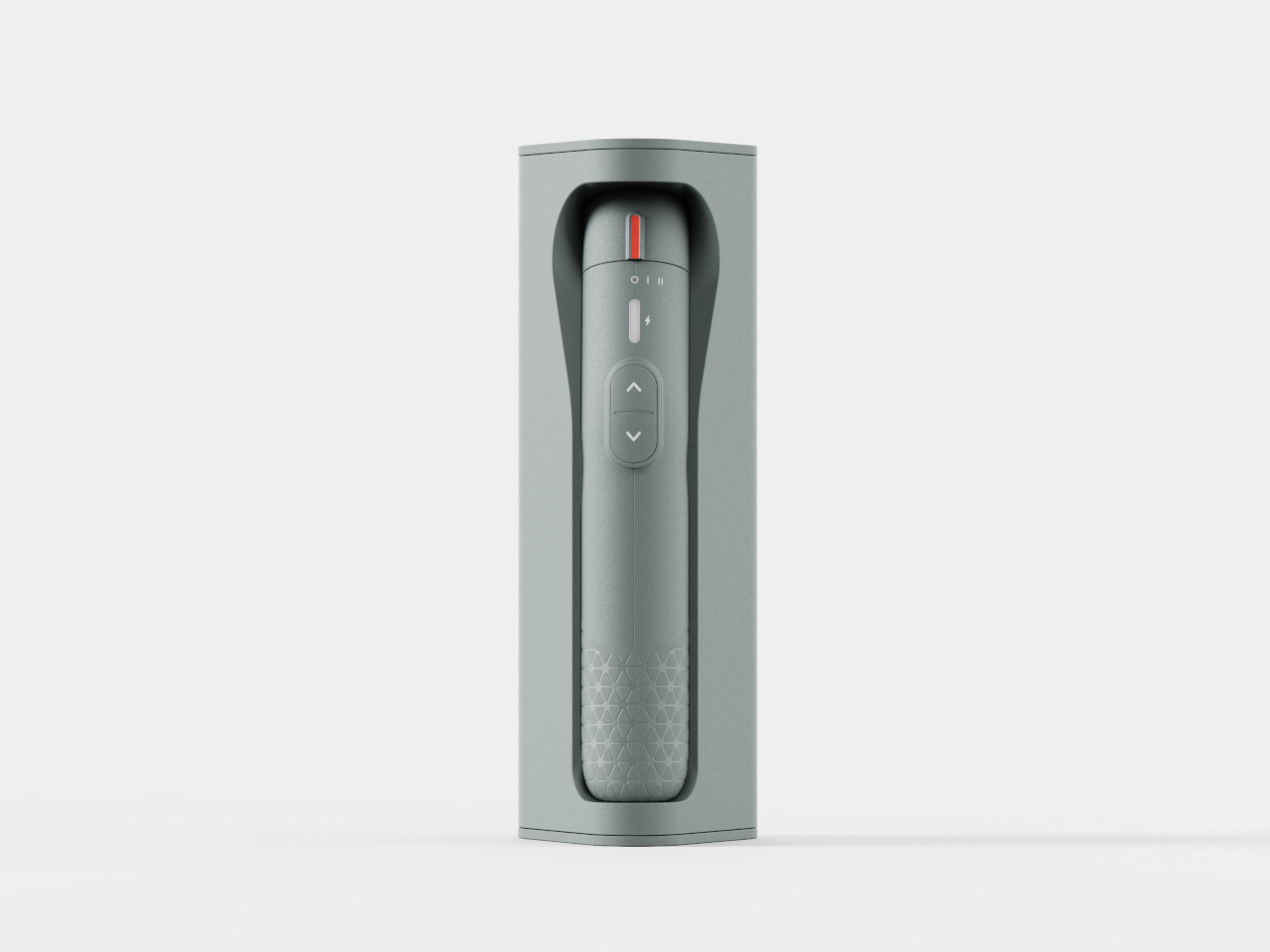
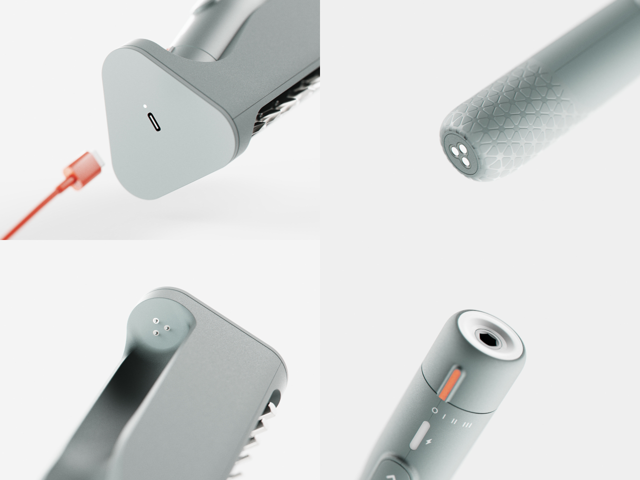
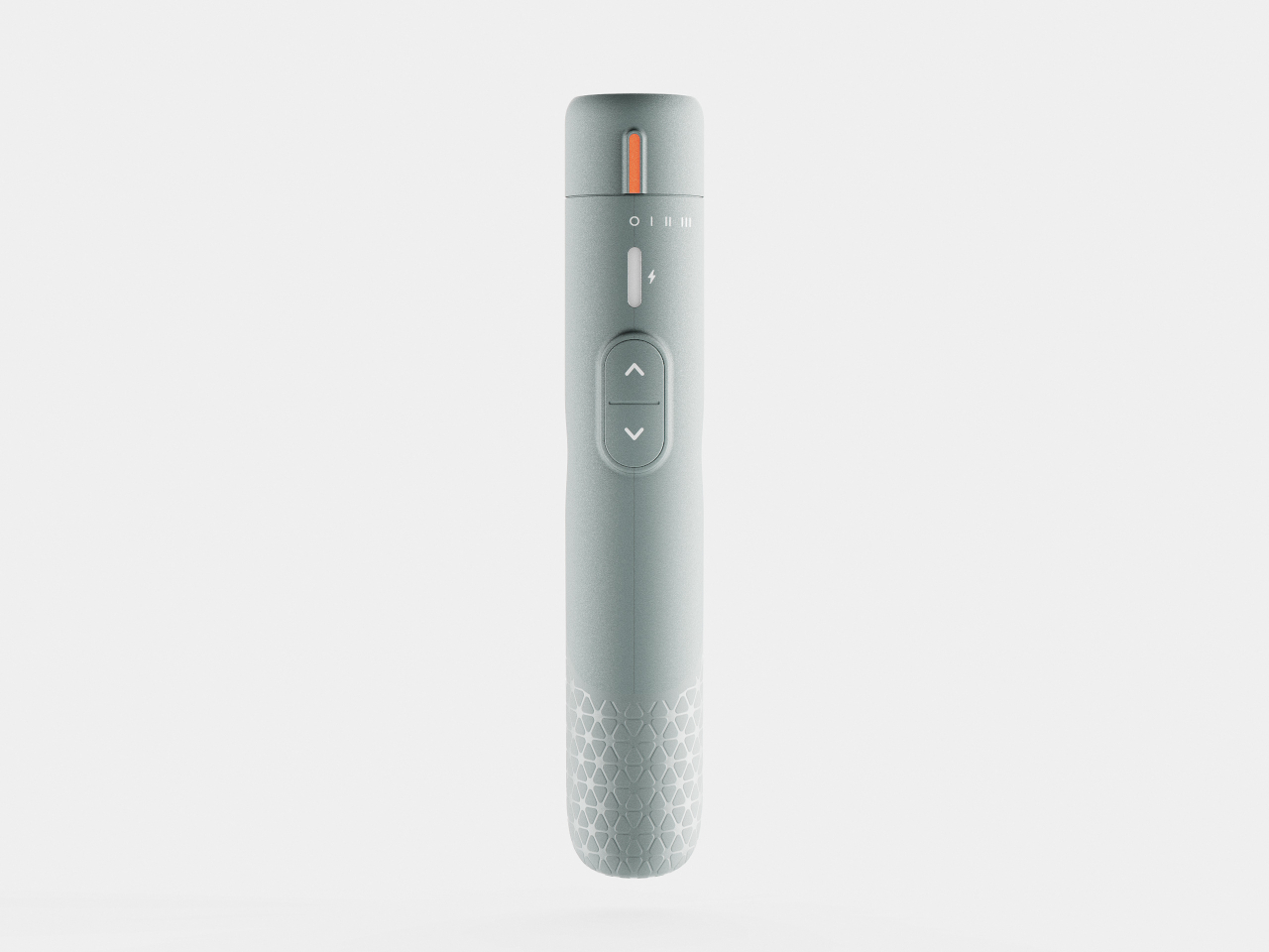
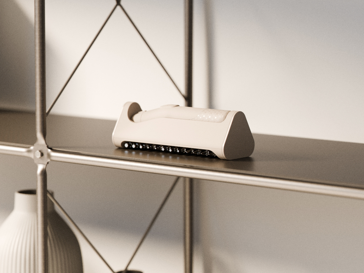
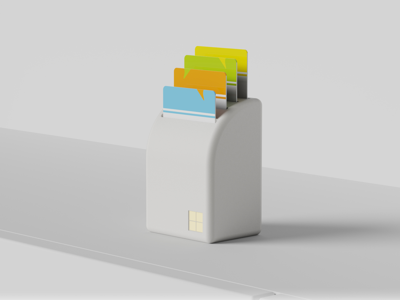
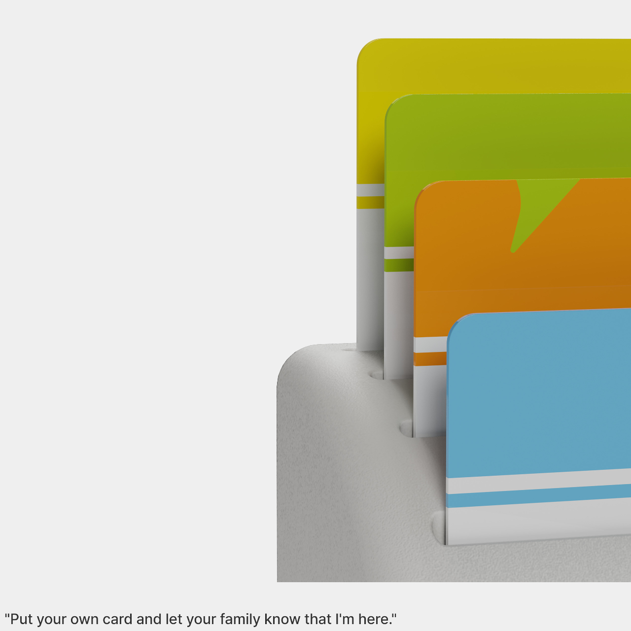
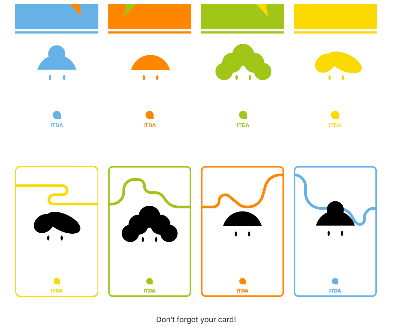
The rest of the collection is just as quietly clever. TILO gives a more humane spin on that drab office time card. Instead of something you dread, it welcomes you home with a familiar voice as soon as you step in the door and put in your personal card. It is the kind of touch that could easily become a small but meaningful ritual, the sound of someone who cares, right when you need it most.
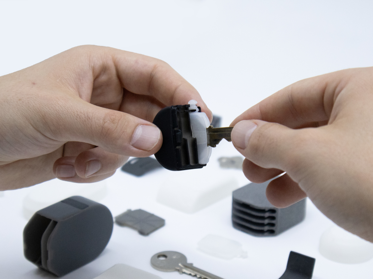
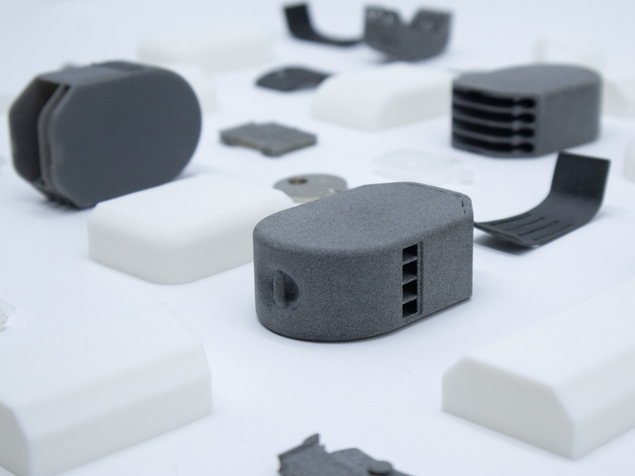
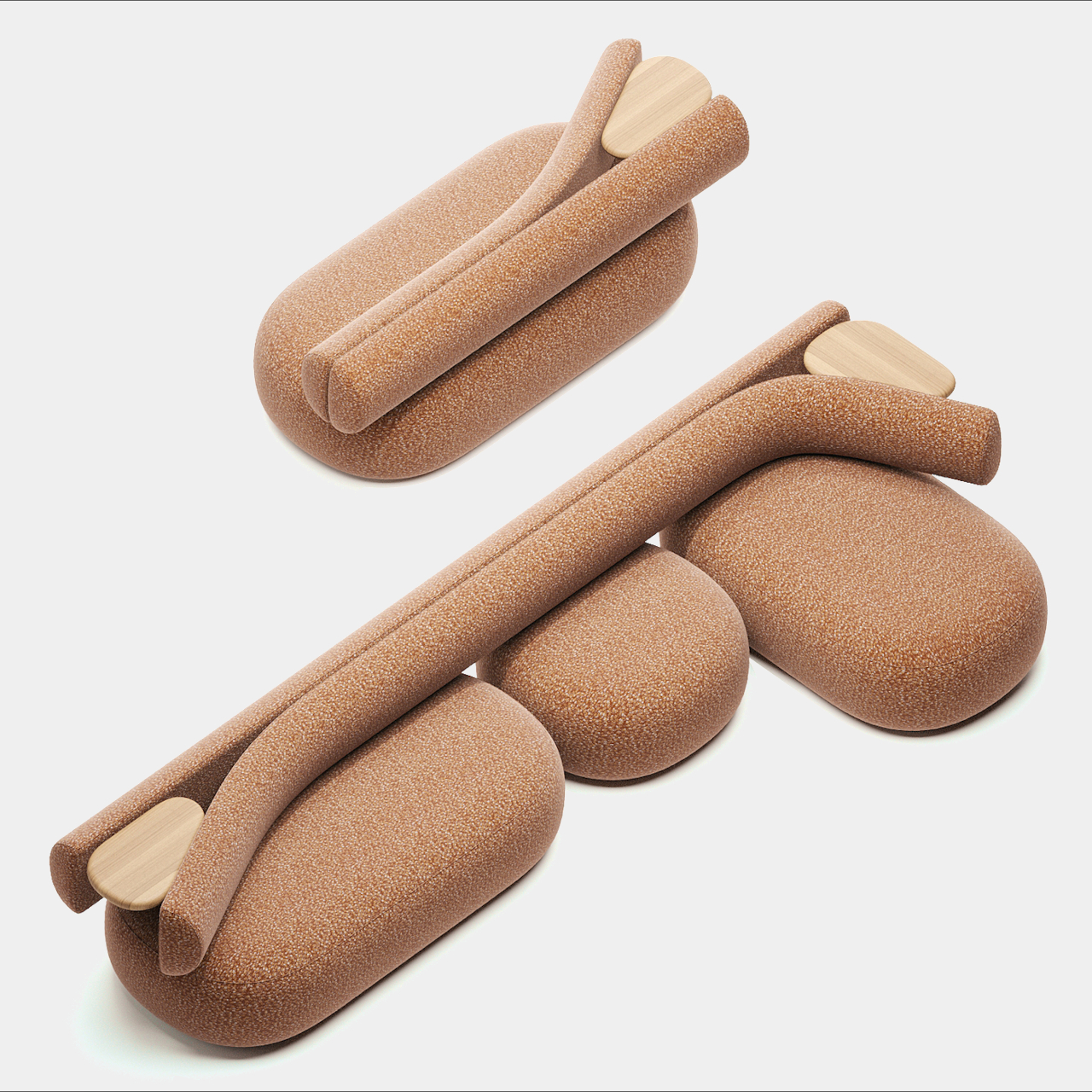
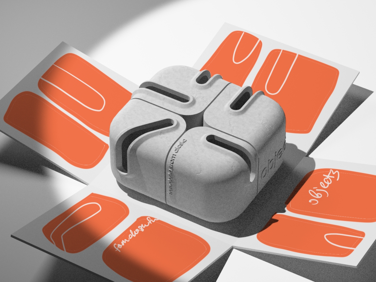
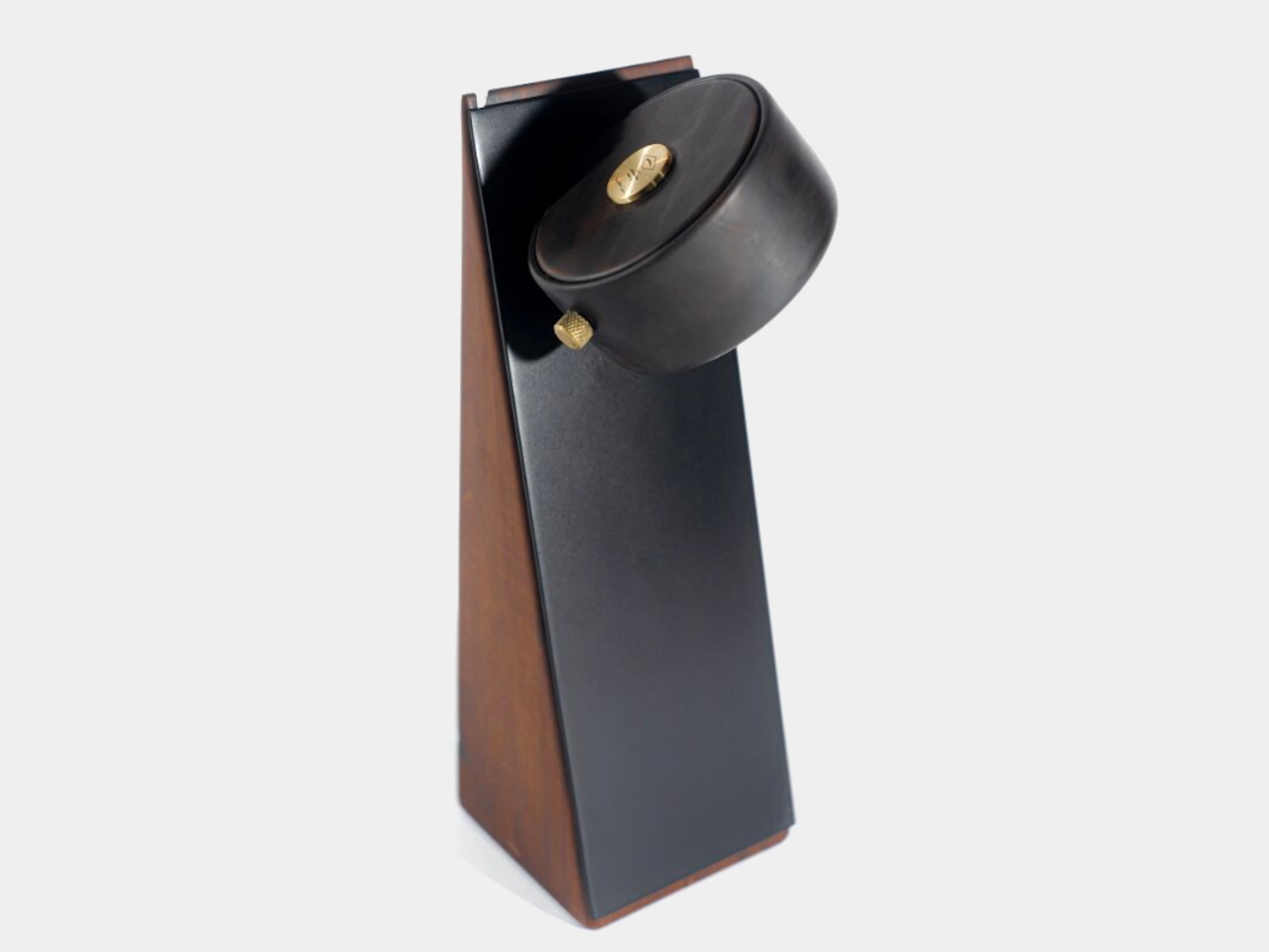
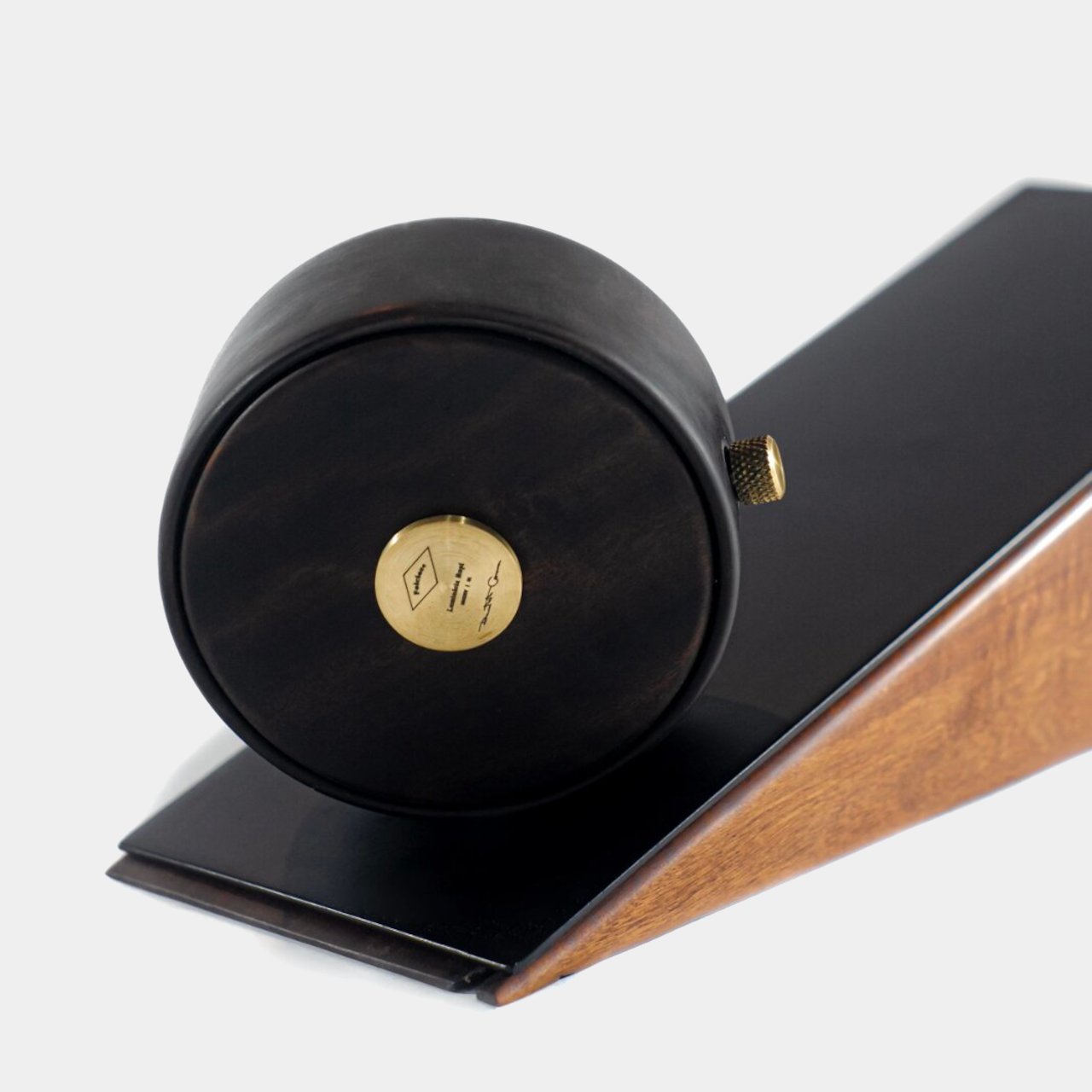
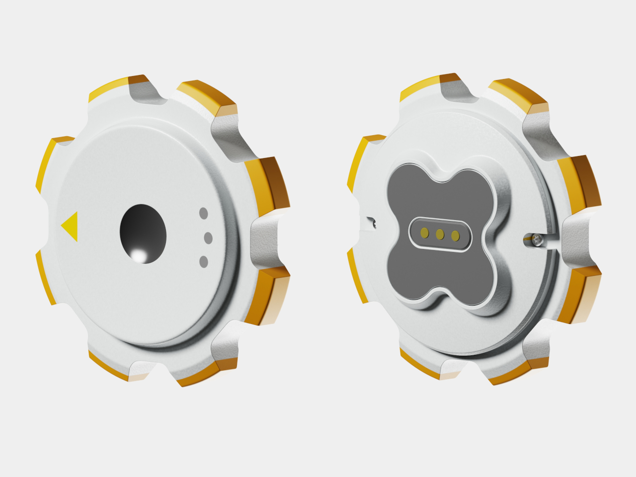
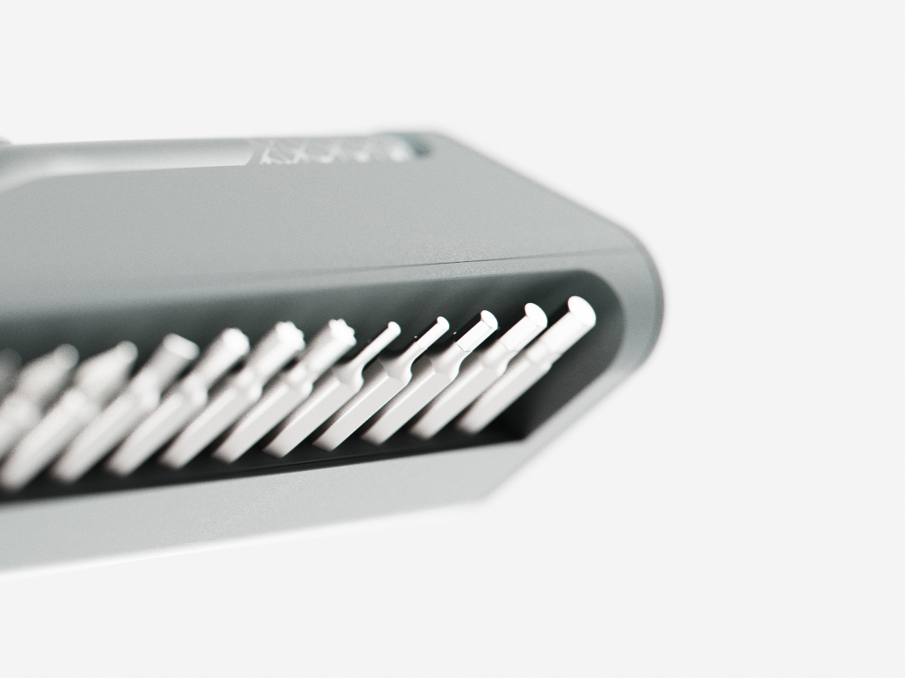
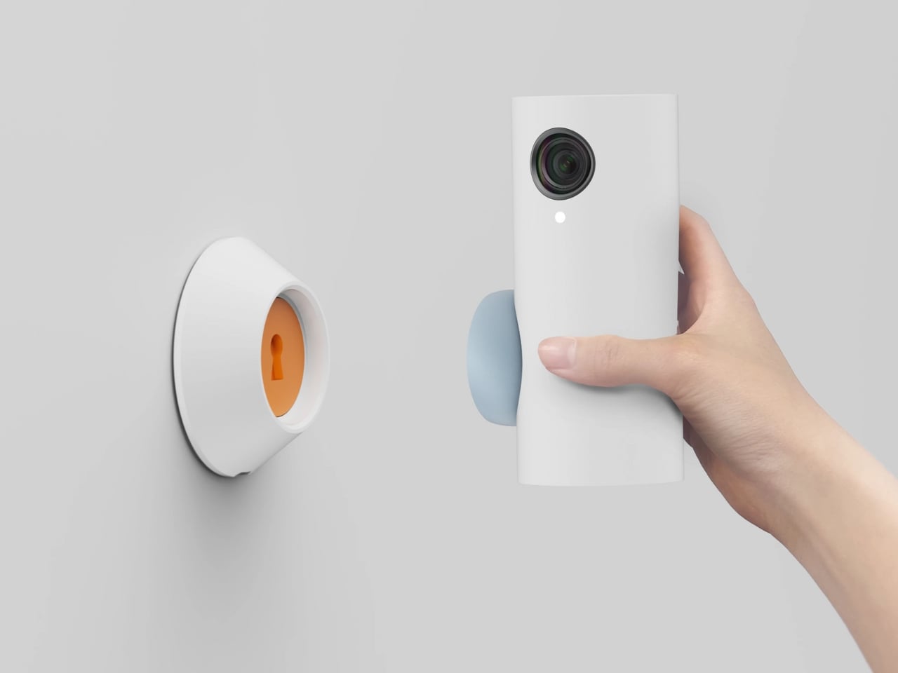
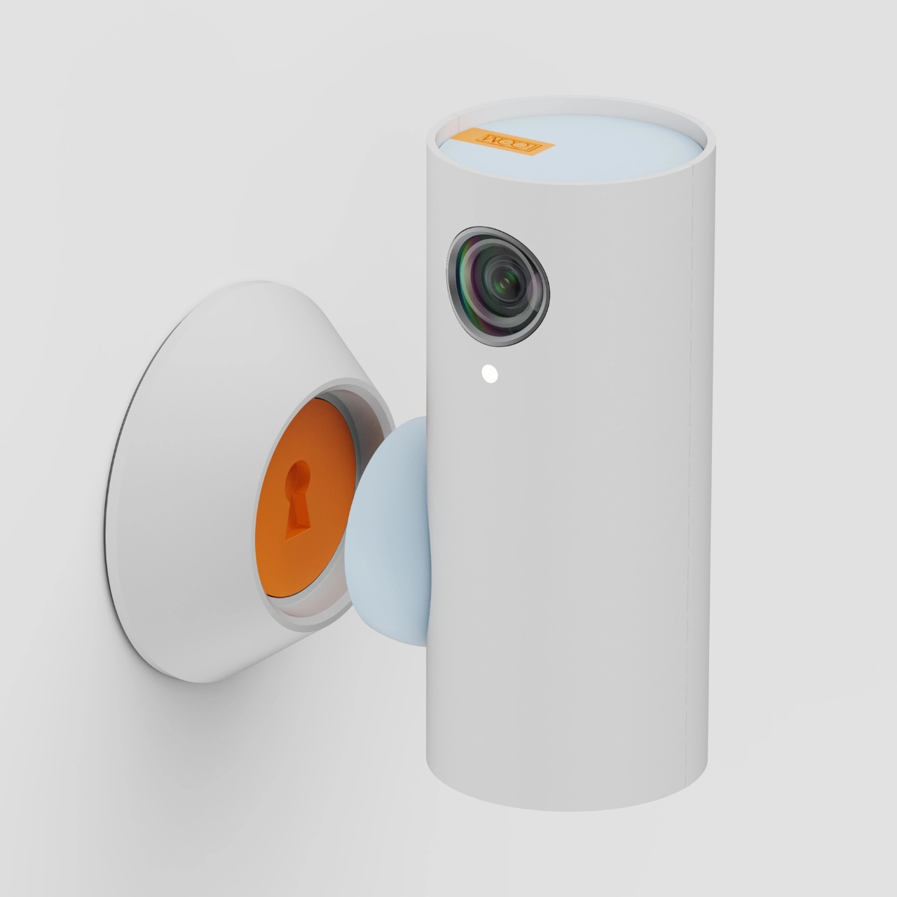
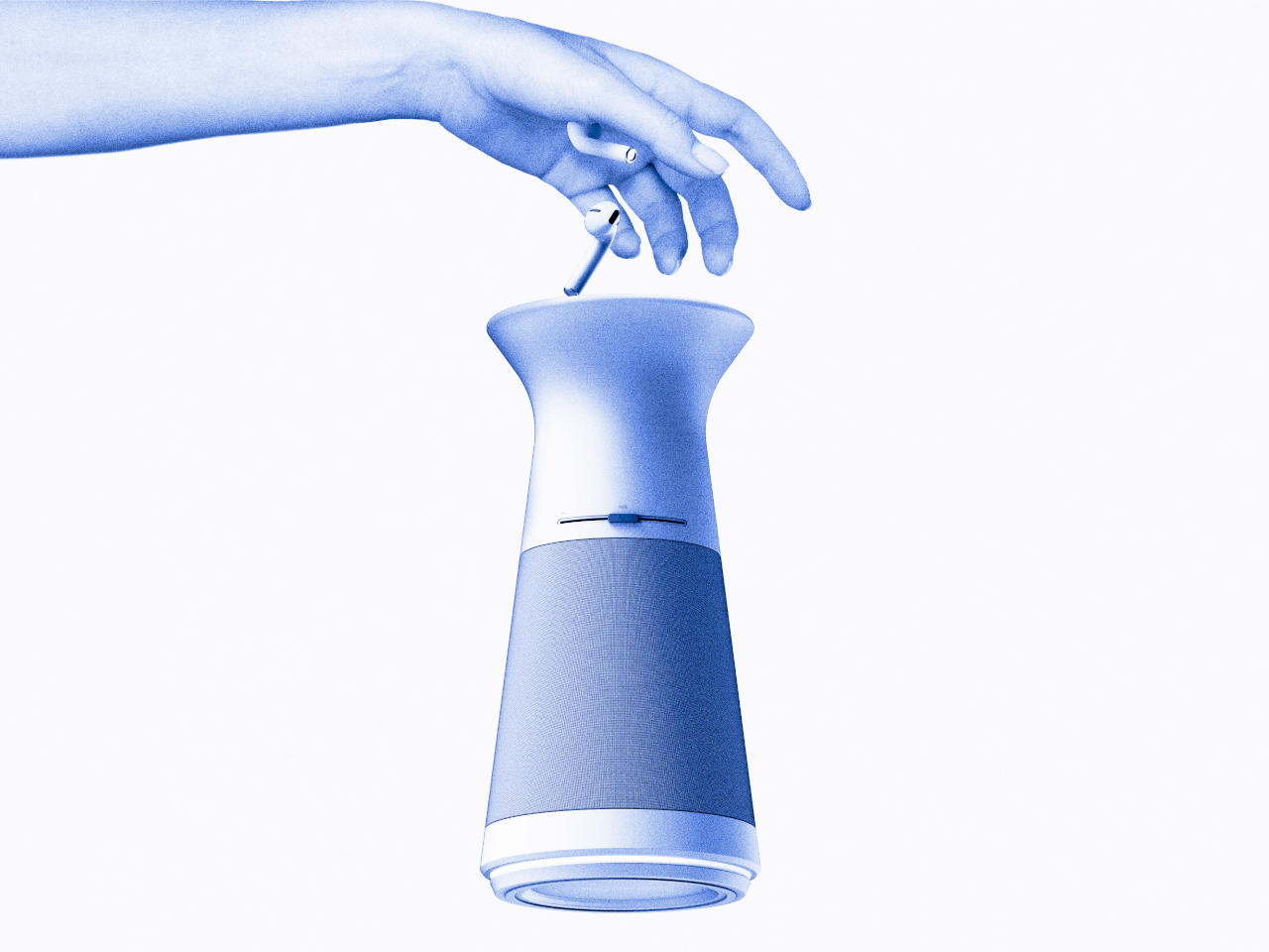
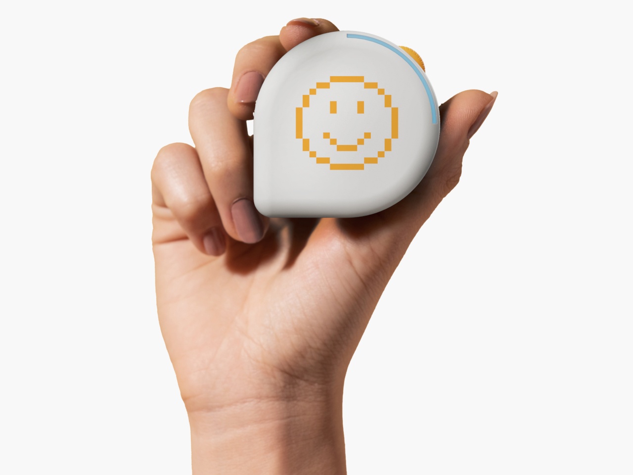
Then there is TOK, a pebble-shaped device made for those times when words are tough to find. Instead of forcing a conversation, TOK lets you send a simple signal, by inserting the pebble-shaped object into TOPI that matches your mood, messages that say, “I am thinking of you,” or “I would like to talk.” It is nonverbal, simple, and maybe even a little poetic, especially for anyone who has ever wished they could reach out without having to explain everything.

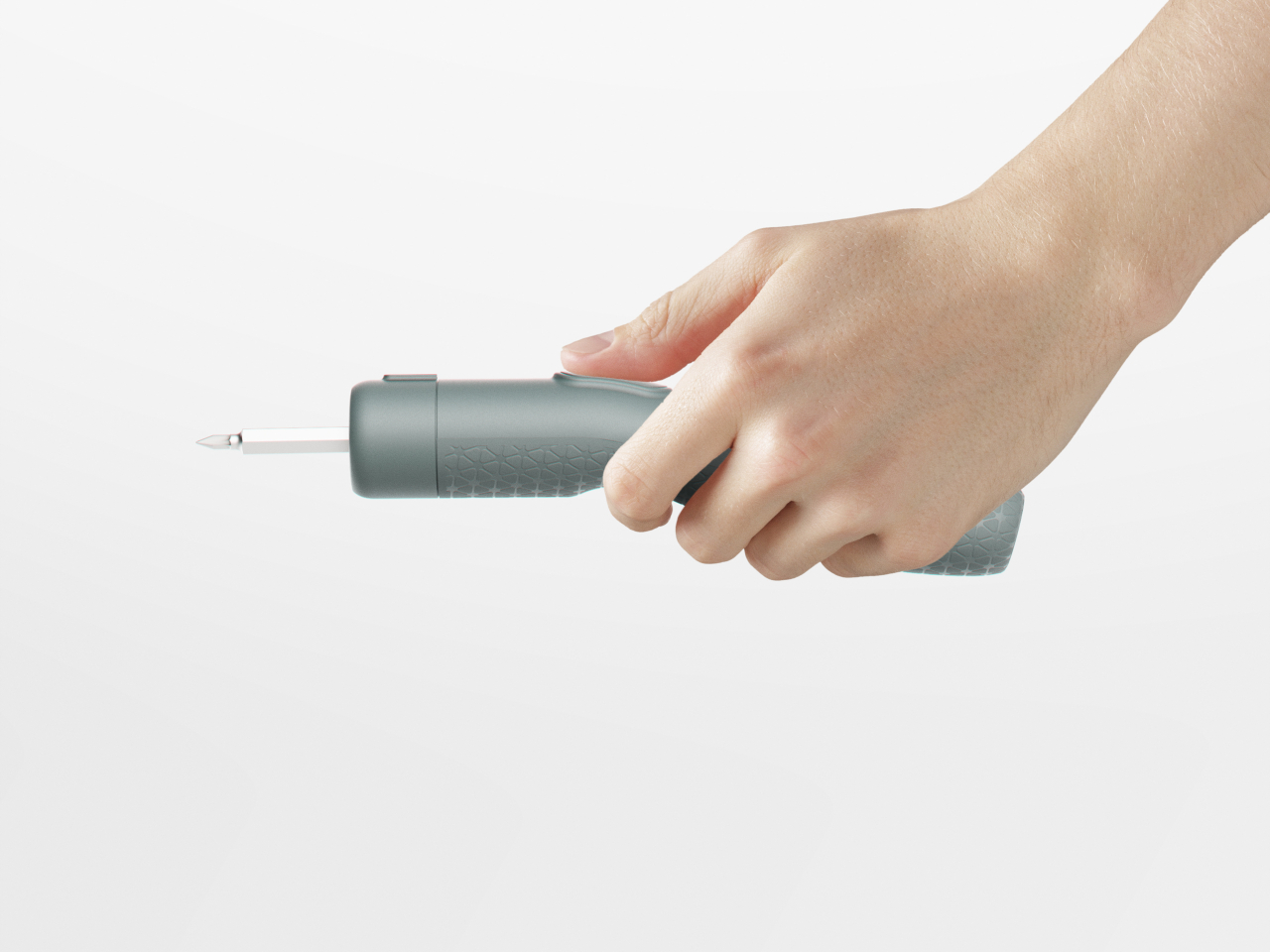
What is striking about ITDA is how little it asks of you. There are no complicated screens to navigate, no endless setup menus, and no pressure to perform. The forms are gentle and approachable, meant to blend into your home rather than take it over. Every element, from the way you interact with the devices to the materials themselves, feels designed for comfort and calm.

It is worth remembering that ITDA is just a concept right now, not something you can buy and plug in tomorrow. But as a piece of design thinking, it feels especially timely. In a world where smart often means louder, brighter, and busier, ITDA turns the volume down and gently nudges us back toward each other. Maybe that is the real innovation: a reminder that sometimes, the most important connections do not happen on a screen, they happen in the quiet spaces we make for each other.
The post ITDA Concept Offers A Minimalist Approach to Family Connection at Home first appeared on Yanko Design.