Vue lecture

Il y a de nouveaux articles disponibles, cliquez pour rafraîchir la page.

FlexFusion brings 5 hair styling tools in one device

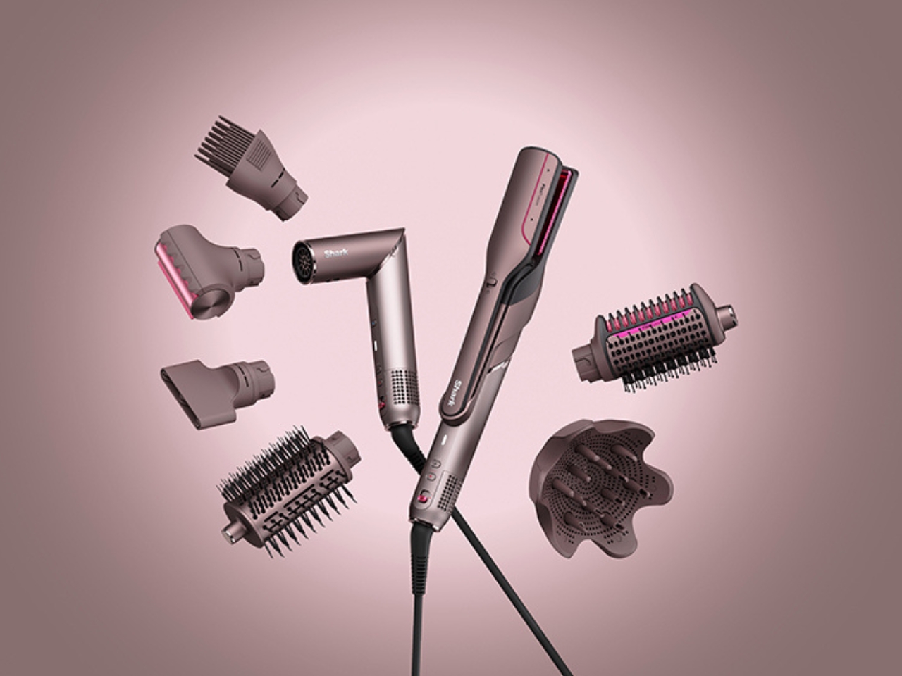
If you love beautiful hair but dread the countertop clutter from too many styling tools, the new FlexFusion by LAYER and Shark Beauty could be the answer you’ve been waiting for. This device brings together five essential hair styling tools into one streamlined, elegant system that’s designed to fit every beauty routine and lifestyle.

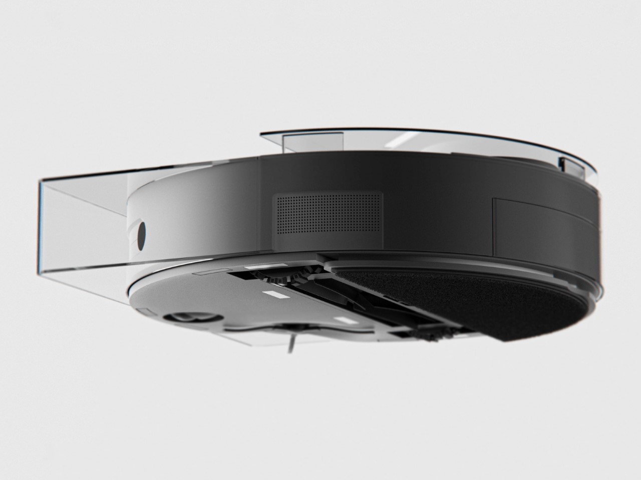
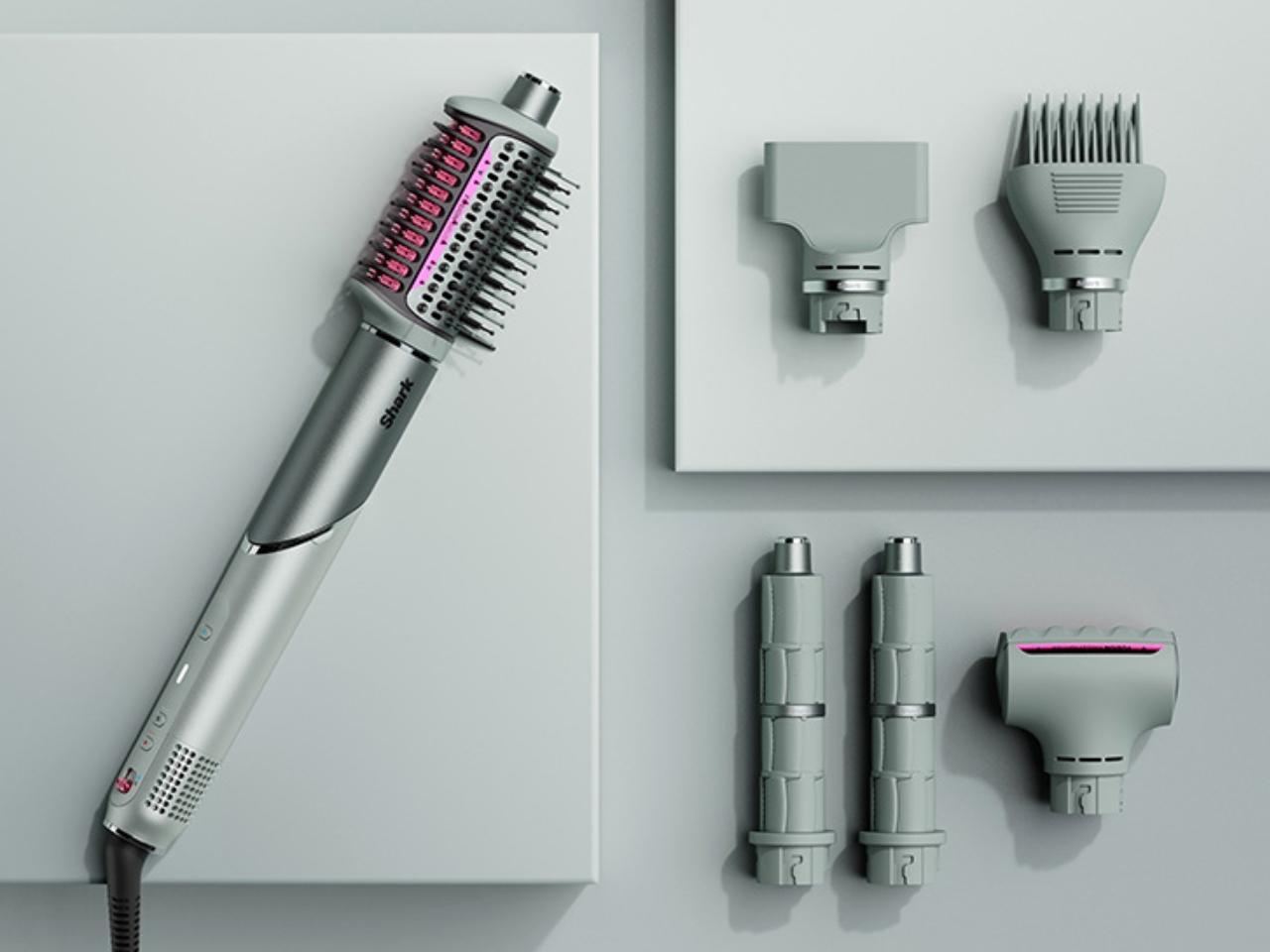
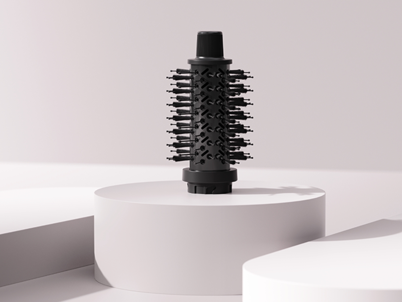
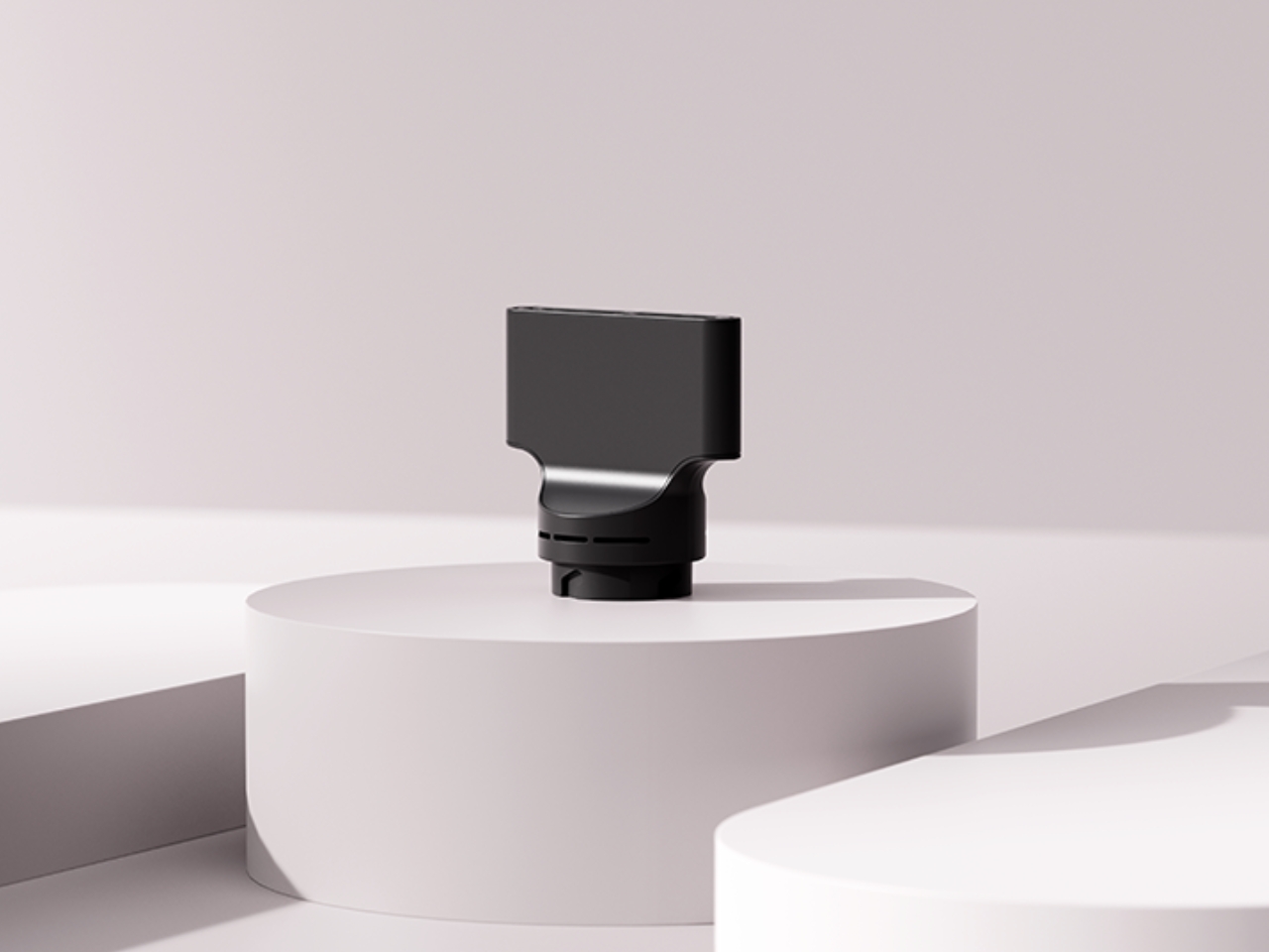
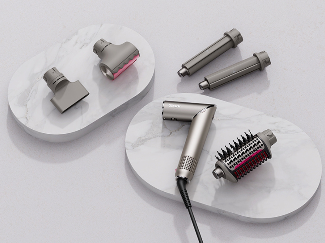
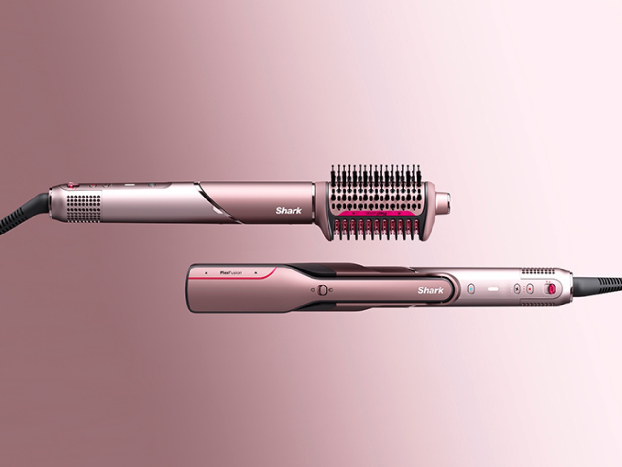
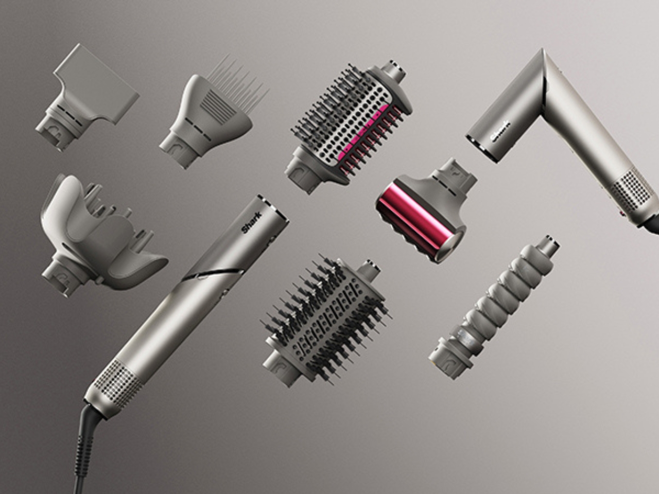
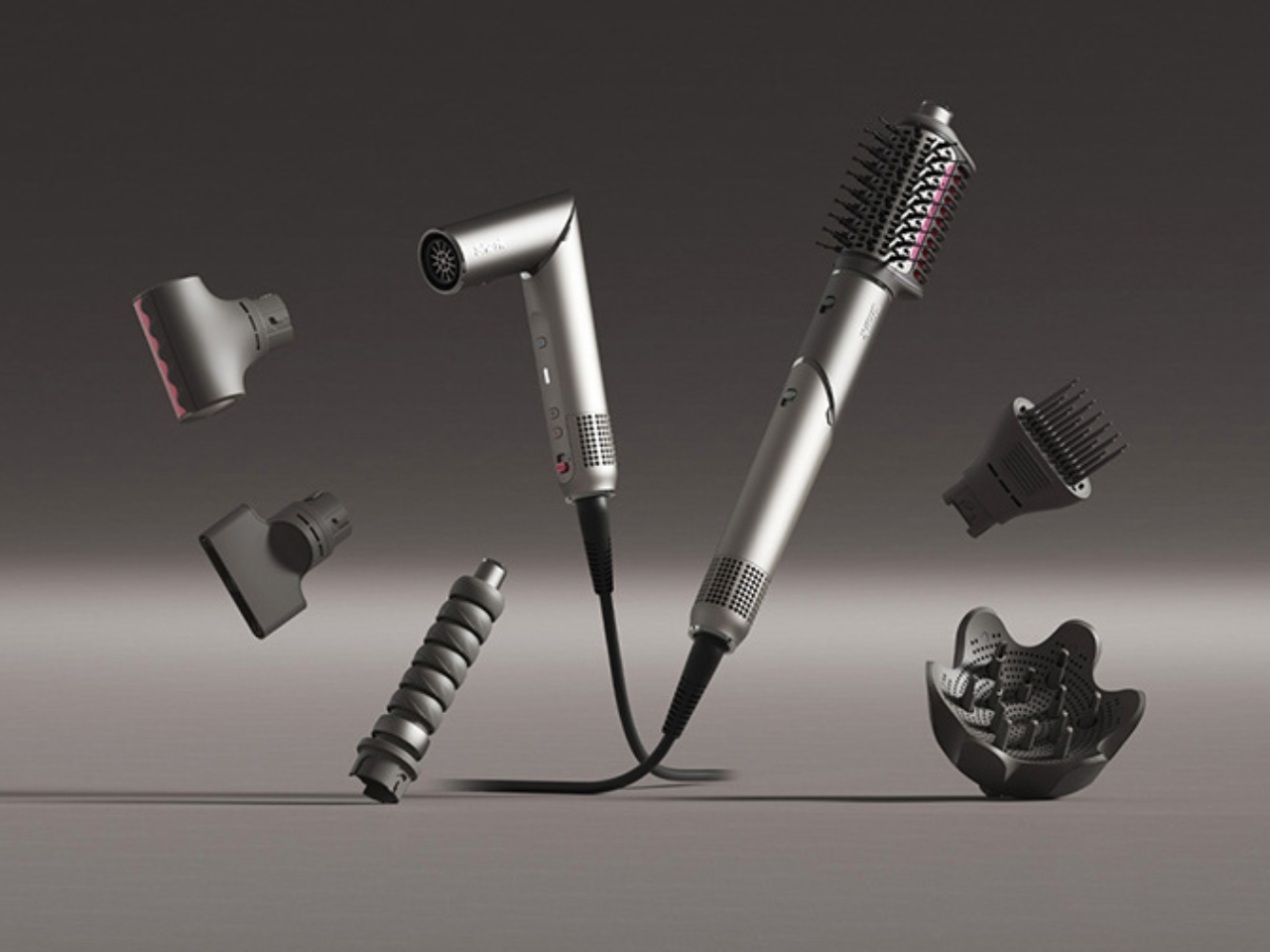
FlexFusion was created by experience design agency LAYER, led by founder Benjamin Hubert, in close partnership with Shark Beauty. The result is a modular 5-in-1 hair styling tool that merges a ceramic straightener, hot brush, auto-wrap curlers, concentrator, and diffuser. Whether you’re looking to smooth, straighten, curl, or define your hair’s natural texture, FlexFusion makes it simple to achieve your favorite looks without juggling multiple devices. Each attachment connects easily using a plug-and-play system, so you can switch between styling options in just seconds.

Designer: LAYER and Shark Beauty

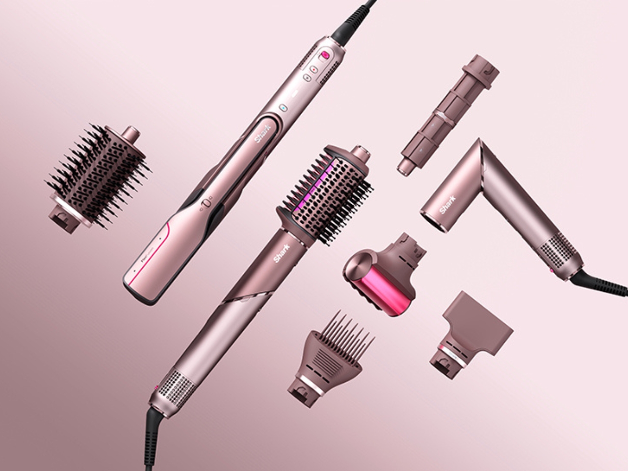
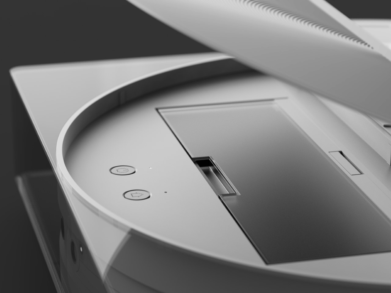
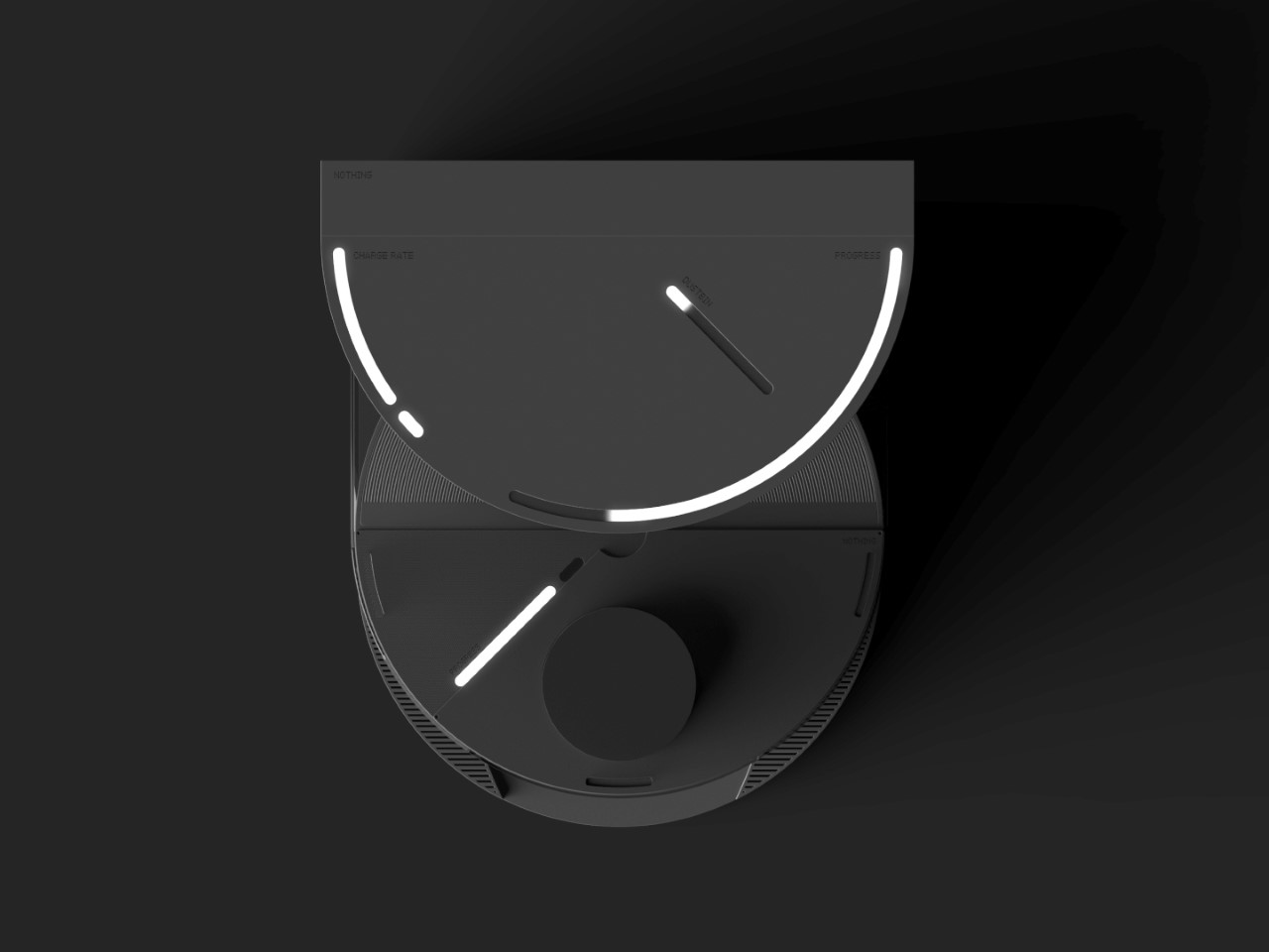
This innovation isn’t just about convenience. FlexFusion was carefully engineered to suit all hair types and styling preferences, reducing the need for multiple devices and making it easier to keep your space tidy. The device features a digital interface with precise temperature and airflow controls, including a special “Scalp Shield” mode that helps protect delicate new hair growth from excessive heat. The controls are designed around an intuitive “island” system that makes it easy to find and adjust the settings you need, even if you’re new to advanced styling tools.

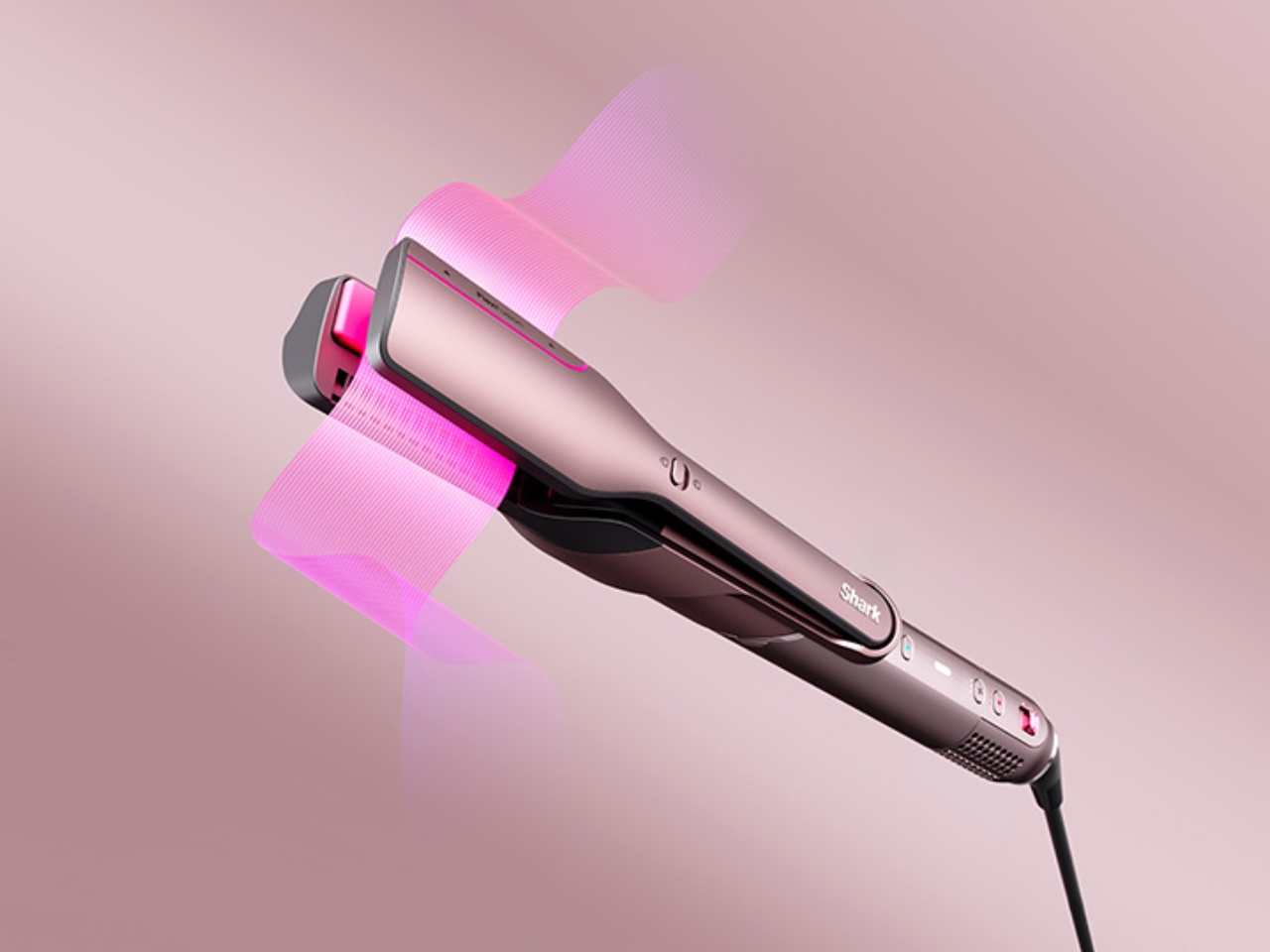
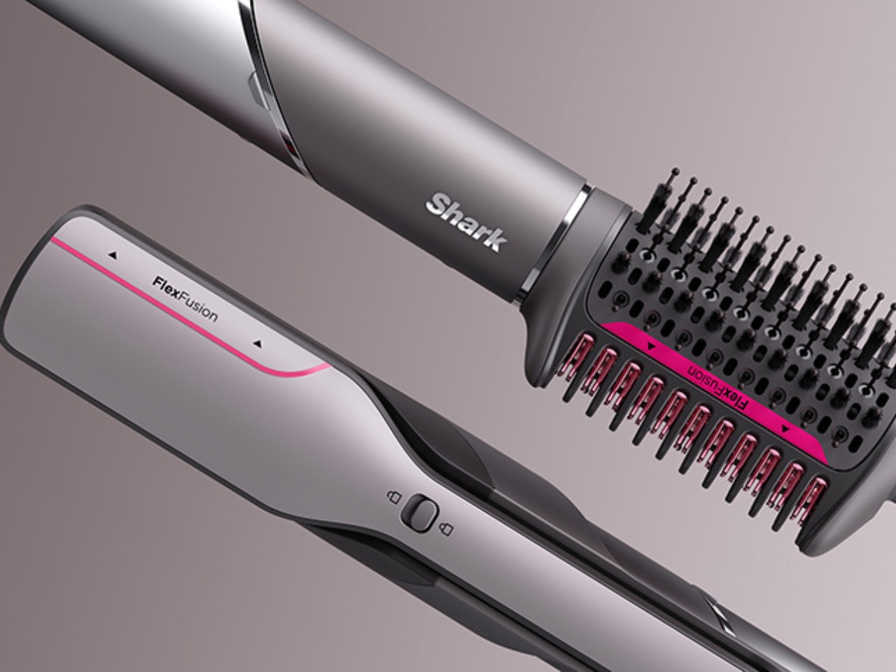
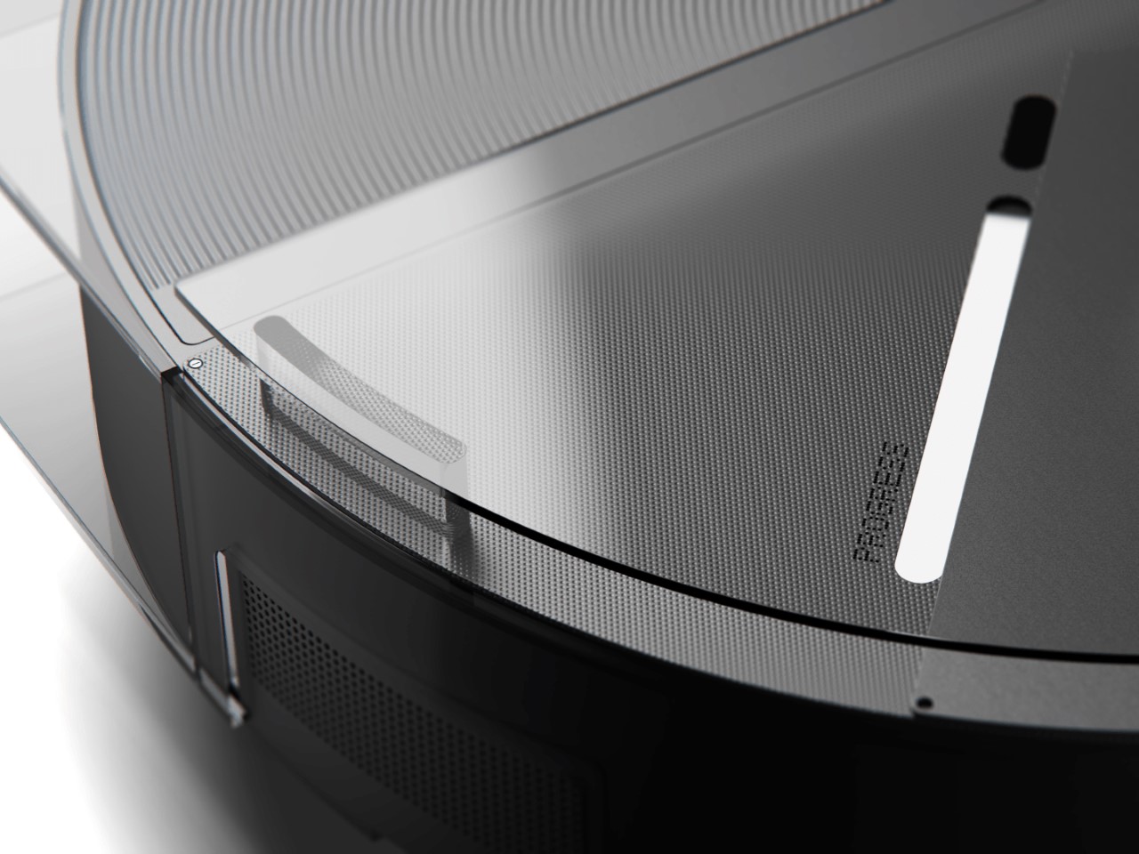
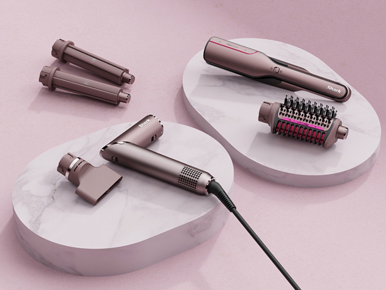
Design isn’t an afterthought here. FlexFusion’s sculptural, ergonomic shape is inspired by the natural curves of your hand and scalp, providing a secure grip and comfortable experience every time you style. Subtle design cues like creased transitions and chamfered edges guide your hands and highlight key performance areas, while a satin metallic finish adds a touch of luxury and sophistication to your vanity. Air inlets and outlets are positioned for efficiency and precision, blending seamlessly into the tool’s sleek silhouette.

The launch of FlexFusion is part of an ongoing creative partnership between LAYER and Shark Beauty, aimed at redefining the aesthetics and usability of everyday beauty tools. Their shared goal is to create a unified design language for the brand’s portfolio, making beauty routines more enjoyable and accessible for everyone. Benjamin Hubert, the founder of LAYER, describes FlexFusion as a product that “simplifies the beauty process without compromising on performance.” It’s a vision that feels right on target for today’s busy women, collectors, and anyone who wants their self-care routine to feel as beautiful and thoughtful as the results.

With its blend of cutting-edge function and elegant design, FlexFusion is poised to become an essential for those who want to streamline their styling routine while elevating the everyday ritual of self-care. If you’re looking to replace your crowded drawer of hair tools with a single stylish solution, FlexFusion could be your next beauty must-have.

The post FlexFusion brings 5 hair styling tools in one device first appeared on Yanko Design.

Why this Android + Apple Trackable Wallet Could Change Your EDC Game Forever

As someone who just bought an Apple Watch not too long ago, I can’t begin to tell you what a heaven-sent it is to be able to ‘summon’ your phone through the watch. I’m decently organized, but I do tend to leave my phone, wallet, keys around the house sometimes, and I just wish there was a way to track or summon your wallet the way you would your phone – WITHOUT fitting a godawful AirTag inside it. Sure, there are cards that help you track your wallet too – until you switch from iOS to Android, and then suddenly you need a new tracker. By that metric, Seinxon has accomplished something genuinely clever: creating the first wallet that plays nice with both Apple Find My and Google Find My Device simultaneously. For those of us living in mixed-device households (or who might switch platforms someday), this dual-ecosystem approach solves a real problem rather than creating another walled garden.

The wallet launched at $65 for early backers (34% off the planned $99 retail), which initially seemed steep until you dig into the technical details. Most tracking wallets are essentially leather pouches with a slot for an AirTag or a Chipolo card. The Seinxon integrates both tracking systems natively, eliminating bulk while tapping into Apple’s network of nearly a billion devices and Google’s massive Android ecosystem. Honestly, this is genuinely smart engineering that acknowledges how people actually use technology across multiple platforms and devices.

Designer: Seinxon

Click Here to Buy Now: $65 $99 (34% off) Hurry! Only 14 days left. Raised over $79,000

The tracking capability alone would make this interesting, but Seinxon packed in five additional features without creating a bulky monstrosity. The detachable magnetic cardholder serves double duty as a phone stand, addressing the awkward “prop your phone against a water glass during lunch” problem we’ve all experienced. The magnetic attachment feels substantial in a satisfying, Apple-accessory kind of way – strong enough to stay put but not so powerful that it requires a wrestling match to separate components.

The wallet’s somewhat modular design means you can detach the card holder and have it hooked to your phone, while the bifold remains in your pant pocket. It’s a nice way to separate elements based on where you need them. The card holder, however, has all the tracking tech, so it’s best placed back in the wallet when you’re not using its phone-stand feature.

The built-in NFC business card functionality transforms the wallet from passive storage into an active networking tool. Tap your wallet against someone’s phone, and your contact details transfer instantly. This feature has existed in various forms for years, but integration into something you already carry eliminates the need for yet another gadget. The implementation here matters – the NFC chip remains powered even when the wallet battery runs low, ensuring your digital business card works even if tracking temporarily doesn’t.

This might be the first wallet with an IP rating, but it doesn’t hurt that the Seinxon Trackable Wallet+ is IP68 certified. This specification means the wallet can survive submersion in 1.5 meters of water for 30 minutes – plenty of protection for rain, spills, or the occasional accidental washing machine trip. Achieving this level of water resistance with multiple electronic components requires careful gasket design and material selection. The company apparently tested prototypes through 200 submersion cycles to validate the waterproofing claims. It just means the wallet’s durable against water and splashes, I don’t recommend jumping into a pool with it.

Battery life typically becomes the Achilles heel of smart accessories, especially those running multiple radios. Seinxon addressed this potential weakness by incorporating wireless charging, eliminating fiddly ports that could compromise waterproofing. The Qi-compatible charging coil works with standard charging pads, though the company recommends their own charging mat for optimal alignment. According to their testing data, a full charge powers the wallet for approximately three weeks of normal use. The battery itself is a custom 400mAh lithium polymer cell rated for 500+ charge cycles before capacity degradation becomes even slightly noticeable.

The physical design balances tech integration with wallet fundamentals. At just 14mm thin, it maintains a reasonably slim profile while accommodating up to eight cards plus cash. The exterior uses vegetable-tanned leather from an Italian tannery that meets environmental certification standards, while also boasting RFID-blocking features that prevent your cards from digital theft and unwarranted scanning. The stitching pattern cleverly conceals antenna placement while maintaining signal strength, showing attention to both aesthetics and functionality.

The interface handles both Apple and Google tracking setups through a unified process rather than forcing users through separate workflows. Location history, battery status, and NFC card customization all live within a clean interface that doesn’t require a computer science degree to navigate. The company promises three years of software updates, addressing the common concern that crowdfunded products become abandonware shortly after delivery.

The Seinxon Trackable Wallet+ represents what crowdfunding platforms do best: enabling innovative solutions that larger companies overlook because they’re too invested in their ecosystems. By bridging the Apple-Google divide while adding genuinely useful features, Seinxon has created something that solves actual problems rather than inventing new ones. The wallet starts at a rather impressive $65, which definitely undercuts most wallets, let alone paying for a wallet, a phone stand, an AirTag, and an Android tracker. The 6-in-1 Seinxon Trackable Wallet+ ships globally starting July 2025.

Click Here to Buy Now: $65 $99 (34% off) Hurry! Only 14 days left. Raised over $79,000

The post Why this Android + Apple Trackable Wallet Could Change Your EDC Game Forever first appeared on Yanko Design.

Windows 11 dévoile son Handoff pour une continuité parfaite entre PC et smartphone

Hey, bonne nouvelle, Microsoft s’apprête à ajouter sa propre version du “Handoff” d’Apple à Windows 11, et je suis sûr que vous allez adorer, surtout si vous êtes du genre à jongler entre plusieurs appareils, genre un PC et un smartphone.

En effet, lors du récent Microsoft Build 2025 qu’Akash Varshney, Senior Product Manager de l’équipe Windows Cross-Devices and Experiences, a dévoilé ces nouvelles fonctionnalités qui vont enfin connecter nos appareils de façon intelligente. Et contrairement à ce qu’on pourrait croire, Microsoft ne se contente pas de copier Apple puisqu’ils poussent le concept encore plus loin.

The Nothing Robot Vacuum (1) brings transparent tech to Smart Homes, along with a Glyph Interface

If you think just about the Nothing.tech company ethos of bringing fun back to tech while still being design-driven and meaningful, that ethos can apply to pretty much any category of product. Sure, Nothing’s best known for their earbuds, phones, and even other accessories like the CMF Watch Pro… so here’s a proposition – what if we took Nothing’s ethos and brought it to other products that are a bit of a visual afterthought? The robot vacuum, for instance, is a fairly ‘boring’ looking product. Its job is literally to scuttle around the house cleaning up after your mess, so for the most part, its design is driven by function rather than expression. However, by bringing the robot vacuum under the Nothing design umbrella, Soo Hyun Lim and PDF HAUS have uplifted an otherwise dull-looking appliance into something that inherently feels more modern – because it borrows its design cues directly from Nothing’s modern-looking smartphones.

Designers: Soo Hyun Lim & PDF HAUS

Meet the Nothing Robot Vacuum (1), a tongue-in-cheek fan-made concept that ports Nothing’s DNA onto a familiar product template. Most robot vacuums are the same shape and size, so how could you possibly make things interesting? Well, LEDs and transparent covers, of course! The Robot Vacuum (1) has a circular profile that’s then outfitted with a transparent D-shaped outer shell, giving it an almost ‘preserved in glass’ kind of look. Sensors are where they belong (on the front as well as on the top), and although you can’t entirely make a robot vacuum transparent, what with all the dust and dirt, Hyun Lim does something clever by bringing the Glyph Interface to the product. What does the interface do? Well, it acts as a progress bar that lets you know how much cleaning’s left. Similarly, Glyph lights on the vacuum’s docking station light up to indicate charging process as well as letting you know the fill-status on the station’s dustbin, so you know when to throw the trash out every week or so.

With the aesthetic appeal of a fancy turntable, the Nothing Robot Vacuum (1) highlights a kind of Bauhaus-meets-Scandinavian minimalism that companies like Bang&Olufsen have come to showcase so well with their products. The vacuum looks classy, not appliance-y, which is quite a win because of how menial its task actually is. I mean, sure some appliances have boring jobs, like thermostats and dehumidifiers, but that’s no reason they should look ‘boring’, right? Well, the Nothing Robot Vacuum (1) rejects that stereotype.

As far as the design goes, the vacuum comes in 3 colors – black, white, and grey. Just from a top view, you instantly recognize the Nothing design template. The Glyph Interface at the 7 o’clock position, the transparent elements along the body, and a radial pattern on the upper half of the circular top that sort of resembles the coils in the wireless charging zone on the smartphones. It’s simple, yet cleverly executed.

Just like with the phones, you’ve got microtextures galore, along with text screen-printed onto the transparent elements like the upper guard (that prevents the sensors on top from being damaged), and the front transparent bumper that helps the robot vacuum easily maneuver into corners. Moreover, Hyun Lim mentions that the vacuum is constructed from recycled plastic and aluminum, which seems like a nice sustainability touch that goes well with the ‘clean’ image of the vacuum cleaner.

Although conceptual, Hyun Lim does give the robot vacuum a fair bit of detail. You’ve got a rotary broom on the front, along with a vibrating wet mop that helps get grease, grime, and other stains off your floor. The simple design is complemented by a simple UX – you can lift the lid to access the robot’s power button or open its water reservoir to replenish it between cleaning sessions. The sensors on the front and top help the vacuum navigate through the house, while an app on the phone gives you all the controls you need to set schedules, paths, no-go zones, and charging times. Plus, when the robot vacuum runs low on juice, it automatically goes and docks in its station, where the battery gets charged and the dust-tank gets cleaned.

The docking station is just as minimal as the vacuum itself, and serves as a place where your appliance goes to take a pit-stop. Once docked, the Robot Vacuum (1) charges its batteries, while performing a self-clean operation so it’s good to go for round 2. This means the mop head gets cleaned with water, and the dust/dirt tank gets disposed into the docking station’s larger ‘dustbin’. When the dustbin gets filled (after a couple of days of cleaning), all you need to do is empty the trash bag inside and replace it with a new one. That’s where the docking station’s Glyph lights come handy, letting you know your vacuum’s charging rate, along with the dustbin’s current capacity.

Although the Robot Vacuum (1) is purely conceptual at this point, it does prove that Nothing’s approach to redefining technology as ‘accessible fun’ is quite a winning and versatile one. The Robot Vacuum (1) doesn’t exist but there’s no reason it shouldn’t. Carl, you listening?

The post The Nothing Robot Vacuum (1) brings transparent tech to Smart Homes, along with a Glyph Interface first appeared on Yanko Design.

This fusion of a hoverboard, e-scooter and skateboard is a PMD done right

Hoverboards and electric scooters come with their own set of advantages and irks that influence the buying decision. While hoverboard is the preferred choice for short jaunts, e-scooters with an average range of 10-40 miles are well suited for extended trips in the city. E-scooters also come with the advantage of better top speeds and performance.

On the hind side, e-scooters are more expensive and less swanky when compared to hoverboards. Someone looking for hands-free freedom of commuting in cities once in a while over short distances is much better off with a hoverboard or a trusted skateboard. What if we could have the best of both worlds? Of course, anything is possible in the concept design realm.

Designer: Eojin Jeon, Sumin Park, Changyu Seo and Geunyeong Do

Craving urban freedom without compromising on style, comfort, or ease of navigating around without having to worry about running out of juice is what this Personal Mobility Device (PMD) aims to target. Dubbed Modi, the vehicle is a mix of a hoverboard and e-scooter, adapting the best features of both to appeal to every kind of city dweller. According to the designers, the motivation behind the design is to address modern-day transportation issues. Even the current league of PMDs has become a “nuisance on the roads due to their heavy weight, large size, and disorderly presence.”

Conventional personal mobility vehicles are heavy and securely parking them at random palaces can be a headache if you are already in the rush of things. Modi aims to get over these problems with a compact and lightweight design that can be easily carried or stored in your backpack when not in use. The PMD comes with retractable footrests for design integrity without compromising the function. These footrests provide stability and comfort while riding, and simply vanish away when not in use.

Although the designers have not detailed in about the working mechanism of the PMD, I assume it reacts to the pressure applied with your feet in either direction. The thing is much more stable than a self-balancing hoverboard that for some reason has never earned my confidence for its operating mechanism. That said, the personal commuter is also going to appeal to people who love skateboards, and always wanted a battery-powered alternative!

The post This fusion of a hoverboard, e-scooter and skateboard is a PMD done right first appeared on Yanko Design.

Motorola just debuted its AirTag Killer with Android-compatible tracking and a clever extra feature

Motorola just announced its Android-based device tracker, and I’m sure if you saw it too, you’d have the same thoughts as I did. It looks very familiar… Almost too familiar. Modeled precisely on Apple’s AirTag, the Moto Tag is a tiny tracking device that works within the Android OS, allowing you to effectively and accurately track your belongings. When I first saw the Moto Tag, I found myself feeling a familiar sense of smugness at the fact that an Android company copied Apple (they did with the removal of the headphone jack, with the camera notch)… but then I remembered that the inverse is also true. The WWDC event was pretty much Apple announcing Android-like features for the iPhone, and rebranding Artificial Intelligence to Apple Intelligence. The catch there was that Apple took its sweet time to implement these features, but also did a better job. If you extend that benefit of doubt the other way, it becomes a lot easier to appreciate the Moto Tag for what it brings to the table.

Designer: Motorola

Like the AirTag, the Moto Tag is a small, circular disc slightly larger than a quarter. It boasts a user-replaceable CR2032 battery that Motorola claims will last a full year on a single charge. While it lacks a built-in keyring loop (there’s a clever reason why it copies the AirTag so shamelessly), it integrates seamlessly with the revamped Google Find My Device network. This ensures easy pairing with countless Android smartphones, allowing users to locate and even make the Moto Tag play a sound for easier retrieval.

Looking towards the future, Motorola has equipped the Moto Tag with ultrawideband (UWB) technology. This paves the way for “precision tracking,” a feature that will provide detailed on-screen instructions for finding the tracker when you’re in close proximity. While similar to Apple’s Precision Finding with AirTags, this functionality currently awaits an update to Google’s Find My Device network.

However, the Moto Tag boasts a unique feature that sets it apart: a built-in button. This button, cleverly placed where the “M” of the Motorola logo sits, can be pressed to make your paired smartphone ring. This comes in handy in those moments when you’ve misplaced your phone but have the Moto Tag within reach.

The multi-functionality doesn’t stop there. The button can also be used to trigger the camera shutter or recording button on Motorola phones, or any Android phone for that matter, making capturing content on the go a breeze. Finally, the Moto Tag is IP67 rated for dust, water, and dirt resistance, ensuring it can withstand everyday bumps and spills without compromising its tracking abilities.

But before you bash Motorola for being unimaginative or blatantly copying a product’s shape and size, there truly IS a clever reason why Motorola probably chose to make their tracking device look almost exactly like their competitor. Apple’s AirTag already has a flourishing accessory ecosystem. From holders and hangers to carabiners and even stickers that let you attach your AirTag to the inner lining of suitcases and laptop bags, the AirTag has no shortage of accessories to accompany it… and by copying the AirTag’s form factor, Motorola’s ensured absolute compatibility of every one of these accessories with the Moto Tag too. It’s genius, to leverage your competitor’s success to boost your own product. Isn’t it?!

The post Motorola just debuted its AirTag Killer with Android-compatible tracking and a clever extra feature first appeared on Yanko Design.

❌