Vue lecture

Il y a de nouveaux articles disponibles, cliquez pour rafraîchir la page.

Kodak Charmera is a tiny, retro digital camera that you can hang on your bag

I remember receiving single‑use Kodak cameras when I was young and the excitement of never knowing how the photo I took would turn out until it was developed. Of course, cameras now are much more advanced, with most people using their phone’s camera or other digital cameras to capture memories. Some still print those photos in a fun mix of analog and digital. Kodak is bringing a touch of nostalgia with its newest product and merging it with a current trend that several brands are following.

Charmera is a mini digital camera that resembles the Kodak Fling single‑use camera from the 80s and 90s. It’s the same size and follows a similar retro look, but instead of disposing of it after use, you can keep it and recharge it when the battery runs out. It also has a blind‑box element: you don’t know which camera design you’ll get when you buy one.

Designer: Kodak

This camera is small enough that you can use it as a charm on your bag thanks to its keychain loop. It measures about 2.2 inches and weighs just 30 grams. You can easily pull it out when you want to take a photo—or even a video. But don’t expect the polished look you get from most cameras, as it only has a 1.6‑megapixel CMOS sensor that produces photos at 1440 × 1080 resolution and videos at 30 fps. Think of it as taking grainy, noisy photos and videos, similar to what you could achieve with disposable cameras.

On its own, the Charmera can store only two photos, but you can attach a microSD card to take many more. It charges via a USB cable. The camera also includes a few filters, themed frames, and a date stamp to give it a retro feel. As for the blind‑box aspect, you don’t know which of the seven vintage designs you’ll receive. There’s even a “secret edition”, a camera with a transparent shell, that is the rarest of them all. If you want to collect all six other designs, you can purchase a complete set that contains every style without repetition.

So, whether you’re a longtime Kodak fan who still keeps those faded prints in a shoebox, a millennial who loves the tactile joy of a “surprise” unboxing, or a collector hunting for that perfect retro‑meets‑digital treasure, the Charmera camera lands right in the sweet spot. It invites you to pause the endless scroll of perfect‑pixel feeds and instead savor a little imperfection: a grainy snap, a quirky filter, and a date‑stamp that feels like a tiny time capsule.

The post Kodak Charmera is a tiny, retro digital camera that you can hang on your bag first appeared on Yanko Design.

Ouf, les 54 jeux de l'iPod Click Wheel sont sauvés !

En septembre de l’année dernière, une mission d’apparence impossible s’est achevée avec succès ! Tous les 54 jeux iPod classic / nano équipés de la molette cliquable (Click Wheel) ont été sauvés de l’extinction numérique par une équipe de développeurs passionnés . Le dernier rescapé, Real Soccer 2009, a même rejoint récemment cette arche de Noé numérique après des mois d’efforts acharnés.

L’histoire commence en réalité il y a près de deux décennies. En 2006, Apple lance les premiers jeux pour iPod via l’iTunes Store. 9 titres débarquent d’abord : Bejeweled, Cubis 2, Mahjong, Mini Golf, Pac-Man, Tetris, Texas Hold ‘Em, Vortex et Zuma.

Mais voilà le drame. Apple stoppe la vente de l’iPod équipé de cette molette en 2011, supprimant les jeux de l’iTunes Store. Les propriétaires ne peuvent plus re-télécharger leurs achats et pire encore, le système DRM Fairplay d’Apple lie chaque jeu à la fois au compte iTunes ET à l’ordinateur qui l’a téléchargé. Un double verrouillage insurmontable et à 4,99 $ pièce, ça représente quand même 270 $ pour la collection complète des jeux. Les boules.

Mais c’est là qu’intervient Olsro, développeur français à qui la communauté des fans d’iPod doit cette prouesse. Avec l’aide de Quix, un autre passionné, ils découvrent une faille dans le système de protection d’Apple. Ainsi en créant une machine virtuelle QEMU, ils parviennent à autoriser et synchroniser les jeux sur n’importe quel iPod compatible.

La VM stocke alors les clés de déchiffrement et peut fonctionner entièrement hors ligne et cela garantit que les jeux resteront accessibles “pour l’éternité”, même si Apple décide de fermer définitivement ses serveurs d’authentification.

La quête du dernier jeu, Real Soccer 2009, a même tourné au cauchemar technique. Disques durs défaillants, corruption de données, échecs répétés mais la persévérance a payé et le saint Graal a finalement rejoint la collection.

Ce projet de préservation des jeux **iPod **fonctionne avec les iPod Nano 3G à 5G et les iPod Classic 5G à 7G, ce qui couvre l’essentiel du parc iPod capable de faire tourner ces jeux.

Mais au-delà de l’exploit technique, cette initiative soulève encore une fois la question de la propriété numérique. Combien de logiciels, de jeux, d’œuvres numériques disparaissent chaque année faute de préservation ?? Ces 54 titres iPod représentent pour les historiens du jeu vidéo un moment charnière dans l’histoire du divertissement portable, juste avant l’avènement de l’écosystème iPhone.

Heureusement, ce projet GitHub rassemble aujourd’hui tous les outils nécessaires. Machine virtuelle pré-configurée, instructions détaillées, fichiers de jeux et la communauté peut désormais synchroniser ces pépites du gaming portable sur leurs iPod vintage.

Voilà, si vous avez l’un de ces vieux iPod qui traine dans un tiroir, vous allez pouvoir lui réinstaller vos jeux préférés payés rubis sur l’ongle très facilement !

Source

1517 clones open source de vos jeux cultes préférés - Le trésor caché des gamers nostalgiques

Depuis que j’ai découvert OSGameClones, je kiffe chercher et retrouver certains de mes jeux d’enfance en version open source et bien sûr gratuite !

Car oui, le projet OSGameClones c’est un peu la caverne d’Ali Baba pour tous ceux qui ont grandi avec une manette dans les mains (ou un clavier pour ma part). Le site répertorie méticuleusement tous les remakes, clones et réimplémentations open source de jeux commerciaux, et le meilleur c’est que la plupart sont jouables sur des machines modernes, y compris Linux et même votre Steam Deck.

Vous y retrouvez donc des pépites comme OpenRCT2 pour RollerCoaster Tycoon 2, qui non seulement fait tourner le jeu original mais ajoute le support des hautes résolutions et du multijoueur. Ou encore OpenMW qui réimplémente complètement le moteur de Morrowind avec des graphismes améliorés. Sans oublier CorsixTH pour Theme Hospital, qui fonctionne maintenant sur n’importe quel OS moderne.

Le projet est hébergé sur GitHub , et est activement maintenu. Tout est organisé dans des fichiers YAML structurés qui catégorisent les jeux par langages de programmation (50+ langages différents !), genres (30+ catégories), et même par thèmes comme fantasy ou sci-fi.

Ce qui est vraiment cool je trouve, c’est surtout la distinction que fait le site entre les différents types de projets. Un “remake” c’est quand l’exécutable et parfois les assets sont recréés en open source. Un “clone” c’est un jeu très similaire ou inspiré par l’original. Et parfois on trouve même des “projets officiels” où les créateurs originaux ont libéré le code source eux-mêmes.

D’ailleurs, pour les fans de jeux de stratégie, vous avez OpenXcom qui réimplémente UFO: Enemy Unknown et X-COM: Terror From the Deep. Pour les amateurs d’action, DevilutionX fait revivre Diablo sur pratiquement n’importe quelle plateforme. Et si vous êtes plutôt RPG, Daggerfall Unity a recréé tout Daggerfall dans le moteur Unity avec des mods et des améliorations graphiques de malade.

Tous ces projets sont utiles pour les joueurs ayant des machines peu puissantes ou pour ceux qui veulent faire tourner leurs classiques préférés sous Linux. C’est aussi top pour la préservation du patrimoine JV, vu que beaucoup de ces vieux jeux ne fonctionnent de toute façon plus sur les systèmes modernes.

Un autre aspect sympa, c’est que comme tout est open source, n’importe qui peut contribuer à améliorer ces jeux. Vous pouvez donc corriger des bugs qui existaient dans l’original, ajouter de nouvelles fonctionnalités, ou même porter le jeu sur de nouvelles plateformes.

Et pour ceux qui veulent explorer d’autres ressources similaires, il existe aussi Awesome Game Remakes sur GitHub, qui est une liste maintenue activement de remakes open source ainsi que cette page de SensCritique qui recense des remakes open source vraiment chouettes, même si la plupart nécessitent les données du jeu original pour fonctionner.

Puis quand on voit des projets comme Julius pour Caesar III, fheroes2 pour Heroes of Might and Magic II, ou OpenTTD pour Transport Tycoon Deluxe, je le dit que la communauté open source fait un boulot incroyable pour préserver et améliorer ces classiques. Ces développeurs permettent à toute une génération de redécouvrir ces jeux mythiques sans avoir à galérer avec DOSBox ou des émulateurs.

Le plus impressionnant reste peut-être re3 et ses dérivés qui ont reverse-engineered GTA III et Vice City, même si Rockstar n’a pas vraiment apprécié l’initiative et l’a fait disparaitre. Ou OpenJK qui maintient et améliore Jedi Academy et Jedi Outcast pour la communauté Star Wars.

Voilà et si vous cherchez par où commencer, le site propose des tags “complete” et “playable” pour identifier rapidement les projets les plus aboutis. Vous pouvez aussi filtrer par langage de programmation si vous voulez contribuer à un projet dans votre langage de prédilection.

Bref, OSGameClones c’est la ressource ultime pour tous les nostalgiques du gaming qui veulent revivre leurs souvenirs d’enfance tout en profitant des bénéfices du monde de l’open source !

Il connecte Animal Crossing à l'IA en hackant la mémoire de sa GameCube

20 ans plus tard, les vieilles consoles continuent de nous surprendre… La preuve avec ce hack complètement barré qui transforme une GameCube de 2001 en client pour nos IA modernes.

Josh Fonseca a en effet réussi l’exploit de connecter ChatGPT à Animal Crossing via l’émulateur Dolphin. Pas de mod de la cartouche, pas de modification du code original, mais juste du bon vieux Python qui lit et écrit dans la RAM émulée pendant que le jeu tourne.

Hé oui, le mec n’a même pas touché une seule ligne du code original du jeu. Il a “simplement” identifié les adresses mémoire où le jeu stocke les dialogues (0x81298360 pour les curieux) et remplacé le texte à la volée. L’émulateur Dolphin pense faire tourner les dialogues d’origine, mais en fait il affiche du contenu généré par une IA qui tourne sur un serveur cloud.

Techniquement, c’est malin comme approche puisque la GameCube n’a que 24 MB de RAM et un processeur PowerPC à 485 MHz. Il lui est donc impossible de faire tourner un LLM dessus. Du coup il a créé une sorte de pont mémoire entre l’émulateur et le LLM. Son script Python surveille cette adresse en mémoire via le processus Dolphin, récupère le contexte du dialogue, l’envoie à l’IA, et réinjecte la réponse dans la mémoire émulée.

Ce qui complique vraiment les choses, c’est qu’Animal Crossing n’utilise pas du texte brut pour ses dialogues. Le jeu a son propre langage de contrôle avec des codes pour les pauses, les émotions, les effets sonores. Un peu comme du HTML mais version Nintendo 2001, ce qui fait qu’il a fallu créer deux IA : une première qui génère le dialogue créatif (le “Writer AI”) et une autre qui ajoute tous les codes techniques (le “Director AI”).

Voici un extrait :

# A small sample of the control codes I had to encode/decode
CONTROL_CODES = {
 0x00: "<End Conversation>",
 0x03: "<Pause [{:02X}]>", # e.g., <Pause [0A]> for a short pause
 0x05: "<Color Line [{:06X}]>", # e.g., <Color Line [FF0000]> for red
 0x09: "<NPC Expression [Cat:{:02X}] [{}]>", # Trigger an emotion
 0x59: "<Play Sound Effect [{}]>", # e.g., <Play Sound Effect [Happy]>
 0x1A: "<Player Name>",
 0x1C: "<Catchphrase>",
}

# The magic byte that signals a command is coming
PREFIX_BYTE = 0x7F

Je trouve ça cool comme projet car les joueurs rêvent depuis longtemps de dialogues plus variés dans Animal Crossing. En effet, si comme moi, vous n’êtes pas pro-gamer sur Animal Crossing, vous ignorez surement que Nintendo limite les villageois à 8 types de personnalité, ce qui rend les conversations hyper répétitives après quelques heures de jeu.

Avec ce hack, les villageois peuvent donc maintenant discuter de l’actualité mondiale, critiquer Tom Nook sur ses pratiques immobilières douteuses, ou même avoir des conversations philosophiques sur le sens de la vie dans votre village virtuel. Le mod est sur Github pour ceux qui veulent tester sur émulateur.

Notez que la communauté de décompilation d’Animal Crossing a joué un rôle crucial dans ce projet car sans leur travail pour convertir le code PowerPC en C lisible, identifier ces adresses mémoire spécifiques aurait été un cauchemar. C’est grâce donc à eux que le développeur a pu comprendre comment le jeu gère ses dialogues en interne.

Bref, je trouve ça assez marrant qu’une console vielle de +20 ans capable de fonctionner totalement offline (car à l’époque Nintendo était allergique à Internet), soit finalement indirectement “connectée” (via l’émulateur) pour utiliser ce qui se fait de plus hype en ce moment, à savoir l’IA (les LLMs plus exactement).

Comme je vous le disais, pour l’instant, ce hack fonctionne sur la version GameCube originale du jeu via l’émulateur Dolphin. L’auteur mentionne qu’une adaptation sur du vrai matériel serait possible avec le Broadband Adapter officiel, mais nécessiterait beaucoup plus de travail. Les versions ultérieures sorties sur DS, Wii ou Switch utiliseraient une architecture mémoire différente, mais techniquement, rien n’empêche d’adopter une approche similaire.

Comme quoi, avec un peu d’ingéniosité, on peut moderniser n’importe quel jeu rétro !

Indiana Jones et le prototype perdu du Commodore 64

Je viens de tomber sur une pépite qui va faire chavirer le cœur des nostalgiques du Commodore 64 !

Le site Games That Weren’t a déniché un prototype jouable d’Indiana Jones and the Last Crusade ! Mais attention, ce n’est pas un prototype officiel de l’époque. Il s’agit d’une conversion fan-made de la version aventure point-and-click propulsée par le moteur SCUMM que les adeptes du C64 n’ont jamais eu la chance d’essayer à l’époque.

Mais avant de vous en dire plus, je vous emmène avec moi en 1989. Lucasfilm Games sort 2 jeux Indiana Jones. D’un côté, il y a le jeu d’action / plateforme qui a bel et bien débarqué sur C64. Et de l’autre, le jeu d’aventure graphique qui tourne grâce au fameux moteur SCUMM (oui, celui de Monkey Island, pour les connaisseurs). Mais voilà, coup dur pour les fans du C64 c’est que cette version aventure ne s’est jamais frayé un chemin jusqu’à leur machine chérie. Elle est malheureusement restée l’exclusivité des ordinateurs 16 bits.

Et en 2012, un certain Thorsten Harth, alias “Brick Bambi”, développeur allemand audacieux de son état, se dit : “Et si je portais ce jeu SCUMM sur Commodore 64 ?” Un défi de taille quand on mesure les limitations techniques de la bécane 8 bits face à ses homologues 16 bits. Le bonhomme s’est acharné pendant plusieurs années sur cette conversion homebrew, jonglant entre graphiques bitmap et caractères pour optimiser la mémoire. Il avait même réservé 4K de RAM juste pour le son (de $A000 à $AFFF pour les experts).

D’ailleurs, côté musique, Joachim Wijnhoven avait été recruté en 2016 pour s’occuper de la bande-son. Thorsten lui avait commandé la “Raiders March” pour l’écran titre et de fin, mais aussi toute une série de thèmes spécifiques : la musique de la carte, de Venise, des catacombes, du château Brunwald, la marche d’Hitler, le piano d’Henry, la salle du Graal… Un travail de titan ! Roland Hermans, une autre recrure devait même s’occuper des effets sonores comme les coups frappés dans la bibliothèque, la cascade ou les étagères qui tombent. Le jeu devait alors alterner entre musique et effets sonores… Hé oui, pas les deux en même temps, question de limitations techniques.

Mais voilà, malgré l’aide apportée par d’autres personnes, la réalité a fini par rattraper notre développeur. Entre trois jeunes enfants à élever et un job à assurer, Thorsten se retrouve à court de temps. En 2017, une sortie cartouche avait même été discutée, mais Thorsten avait répondu que la complexité du jeu demanderait encore plusieurs années… le problème n’était pas les limitations de la RAM ou le CPU, mais bien les limites de temps. Du coup, en 2018, le projet est annoncé comme abandonné…

Snif…

A l’époque, son objectif initial c’était de boucler au moins le premier chapitre complet : Barnet College, la maison d’Henry, Venise, la bibliothèque et les catacombes. Tout ce qui précède le château Brunwald en fait. Et bonne nouvelle : c’est exactement ce que contient le prototype de Thorsten qui vient d’être retrouvé ! Joachim Wijnhoven, qui avait reçu une preview en décembre 2018, l’a généreusement partagée avec Games That Weren’t. C’est d’ailleurs une démo impressionnante avec beaucoup de contenu et d’interactions possibles.

Pour les fans de l’époque, l’absence de la version SCUMM d’Indy III sur C64 sonnait comme le glas et beaucoup ont commencé à lorgner du côté de l’Amiga ou du PC après cette déception. Alors voir aujourd’hui ce prototype homebrew refaire surface, même s’il date de 2012-2018 et non de 1989, c’est comme déterrer un trésor perdu digne du Dr. Jones lui-même.

Ce prototype de Thorsten est donc désormais archivé et dispo pour tous les nostalgiques qui souhaitent explorer ce qui aurait pu être l’une des conversions homebrew les plus audacieuses du Commodore 64. Et en bonus, pour les amateurs, les musiques composées par Joachim ont été publiées en 2023 dans une release appelée “Archimedes’ Dial” , et vous pouvez même retrouver les vidéos originales de Brick Bambi sur YouTube montrant le jeu en action.

Voilà, qui sait, peut-être qu’un jour quelqu’un reprendra le flambeau pour finir cette conversion légendaire…

When Crisis Becomes Canvas: The Q Timex 1972 Time Machine Reissue Proves Accessible Design Never Goes Out of Style

When time travel costs less than your phone bill, something interesting happens to our perception of value and design. The Q Timex 1972 Time Machine Reissue carries the DNA of design born from chaos, back when the watchmaking industry faced what historians call the Quartz Crisis , a technological upheaval that threatened to destroy centuries of Swiss mechanical tradition. While European manufacturers scrambled to preserve their heritage, American brand Timex saw opportunity where others saw disaster.

Designer: Timex

This new reissue, priced at $249 for the silver variant and $279 for the gold , represents more than nostalgic throwback marketing. The watch embodies a moment when crisis forced innovation, when accessibility became a design philosophy rather than a compromise. In a world where good design often carries prohibitive price tags, the Time Machine Reissue stands as proof that democratic design principles still matter.

Design Democracy in a 39mm Package

The original 1972 Q Timex emerged during American watchmaking’s most defining period. Swiss manufacturers, comfortable with their mechanical supremacy, initially dismissed quartz technology as a passing fad . Timex took the opposite approach, embracing the precision of quartz while wrapping it in bold, unapologetically American aesthetics. The hexagonal link bracelet wasn’t trying to mimic Swiss elegance. The tonneau case didn’t apologize for its unconventional proportions.

These design choices reflected a different philosophy entirely. Where Swiss watches emphasized exclusivity and tradition, the Q Timex prioritized accessibility and forward-thinking design. The floating hour markers, achieved through applied indices that cast subtle shadows around the dial , created visual depth without requiring expensive manufacturing techniques. Each element served both functional and aesthetic purposes.

The wood-grain dial pattern, available in deep red on the gold-toned case, represented pure design confidence. This wasn’t subtle or understated. The Time Machine demanded attention, celebrating its quartz precision rather than hiding it. For a brand targeting everyday Americans, this boldness made perfect sense.

The coin-operated battery hatch on the caseback tells its own story about user-centered design. In 1972, when the original cost $125 (equivalent to roughly $800 today) , Timex understood that luxury shouldn’t require specialized service. Users could replace their own batteries using a simple coin, eliminating the need for expensive watchmaker visits.

Disruption as Creative Catalyst

Understanding the Quartz Crisis context makes the Time Machine’s design choices even more meaningful. Between 1970 and 1985, Swiss watch industry employment plummeted from 89,450 to just 32,000 workers . Traditional watchmaking faced an existential threat as Japanese companies like Seiko introduced accurate, affordable quartz movements that outperformed mechanical alternatives.

Timex, already positioned as an accessible American brand, adapted faster than established players. The company recognized that quartz technology offered more than just accuracy. It enabled new design possibilities, freed from the size constraints of mechanical movements. The Time Machine’s distinctive case shape, measuring 39mm wide and 43mm long , maximized visual impact while maintaining comfortable wearability.

The acrylic crystal choice reflected both practical and aesthetic considerations. While mineral or sapphire crystals offered superior scratch resistance, acrylic provided the domed profile that defined 1970s watch design . This wasn’t cost-cutting but conscious design decision, preserving the authentic visual character that made the original distinctive.

Modern production techniques allow the reissue to improve on certain aspects while maintaining historical accuracy. The applied hour markers now sit higher above the dial surface, creating more dramatic shadows and enhanced legibility . The quartz movement delivers accuracy within milliseconds per day , far exceeding the precision possible with 1970s technology.

Each design element reflects the original’s democratic philosophy. The 20mm lug width accepts standard straps, ensuring easy customization. Water resistance to 50 meters provides practical everyday protection without unnecessary complexity. The stainless steel construction, now made from recycled materials , demonstrates how responsible manufacturing can coexist with accessible pricing.

The tonneau case shape deserves particular attention for its ergonomic intelligence. Unlike round cases that can feel disconnected from the wrist’s natural curves, the Time Machine’s elongated profile follows the arm’s contours. This creates a more integrated wearing experience, especially important for a watch designed for daily use rather than occasional display.

Sustainability Meets Storytelling

The recycled stainless steel used in both case and bracelet represents thoughtful evolution rather than marketing gimmick . Timex didn’t simply recreate the 1972 original but adapted its principles for contemporary concerns. The steel maintains identical durability and finish quality while reducing environmental impact, proving that sustainable practices can enhance rather than compromise design integrity.

This approach reflects broader shifts in how we understand luxury and value. The original Time Machine succeeded because it delivered premium design elements at accessible prices. The reissue maintains this philosophy while addressing modern sustainability expectations. The result feels both historically authentic and contemporarily relevant.

The gold-tone option, available for $279, demonstrates how surface treatments can dramatically alter a watch’s character without changing fundamental proportions. Against the wood-grain red dial, the warm metal creates a distinctly 1970s aesthetic that feels both retro and timeless. The silver version offers more versatility for contemporary styling while maintaining the same design DNA.

When History Becomes Tomorrow

The Time Machine’s revival coincides with broader renewed interest in 1970s design across multiple industries. Architecture, furniture, and automotive design all show influence from this period’s bold geometric forms and expressive color palettes. The watch industry’s embrace of vintage-inspired designs reflects this cultural shift, but few brands execute it with the Time Machine’s historical authenticity.

Perfect timing meets perfect proportions. The 39mm case size, considered large for 1972, now aligns perfectly with contemporary preferences . This sizing sweet spot works across different wrist sizes, offering substantial presence without overwhelming smaller arms. The proportional relationship between case, dial, and bracelet creates visual harmony that transcends temporal fashion trends. Unlike many modern watches that chase ever-larger dimensions, the Time Machine found its ideal size decades ago.

Modern watch enthusiasts appreciate the Time Machine’s honesty about its quartz movement. Electronic precision takes center stage rather than hiding behind mechanical mimicry. The clean dial layout, punctuated by the date window at 3 o’clock, prioritizes legibility over ornamentation. This functional approach feels refreshingly direct in an era of increasingly complex watch designs. No complications clutter the face, no subdials demand attention.

Those hexagonal bracelet links deserve recognition for their ergonomic sophistication. Each link articulates smoothly around the wrist’s curves while maintaining structural integrity. The polished surfaces catch and reflect light dynamically, creating visual interest without relying on precious metals or gem settings. Thoughtful engineering creates luxury-level aesthetics at accessible price points. The bracelet flows like liquid metal, conforming to your wrist’s natural movement patterns. Even after extended wear, comfort never becomes an issue.

Success comes from understanding that good design should be democratic rather than exclusive. The Q Timex 1972 Time Machine Reissue delivers hand-finished details, quality materials, and distinctive aesthetics typically reserved for watches costing significantly more. At $249, it challenges industry assumptions about pricing and quality relationships. Contemporary design culture increasingly values authenticity over artificial scarcity. The Time Machine demonstrates market appetite for products that prioritize genuine design merit over manufactured exclusivity.

Timex preserved the original’s essential character while adapting it for modern manufacturing and usage patterns. Superficial vintage styling gets replaced by respectful historical translation. The Q Timex 1972 Time Machine Reissue proves that crisis-born design can transcend its origins to become genuinely timeless. Democracy wins over exclusivity. Innovation trumps tradition. For $249, you get wearable proof that good design belongs to everyone.

The post When Crisis Becomes Canvas: The Q Timex 1972 Time Machine Reissue Proves Accessible Design Never Goes Out of Style first appeared on Yanko Design.

Uxn - La machine virtuelle de 100 lignes qui fait tourner des apps sur votre Game Boy

C’est l’histoire d’un couple d’artistes développeurs qui largue les amarres pour vivre sur un voilier dans le Pacifique Nord. Pas de connexion internet stable, pas d’électricité illimitée, juste l’océan et quelques panneaux solaires…

C’est dans ces conditions que Devine Lu Linvega et Rek Bell de 100 Rabbits ont créé Uxn, une machine virtuelle qui tient en 100 lignes de C et qui fait tourner des applications graphiques complètes sur à peu près n’importe quoi, de votre vieille Game Boy Advance à votre Raspberry Pi Pico.

Le truc vraiment génial avec Uxn, c’est qu’elle ne prend que 64KB en RAM. Pour vous donner une idée, c’est environ 65 000 fois moins que ce que Chrome bouffe juste pour afficher cette page. Et pourtant, avec ces 64KB, vous pouvez faire tourner un éditeur de texte complet, un logiciel de dessin, un environnement de livecoding musical, et même des jeux comme Oquonie ou Donsol.

Sorcellerie me direz-vous ? Et bien non, c’est tout à fait possible en revenant aux fondamentaux de l’informatique et en appliquant les principes du permacomputing.

L’idée du permacomputing, c’est de créer des systèmes informatiques résilients et durables. Au lieu de racheter un nouveau PC tous les 3 ans parce que le dernier Windows rame, vous créez des logiciels qui tourneront encore dans 20 ans sur le matériel d’aujourd’hui. C’est une philosophie qui maximise la durée de vie du hardware et minimise la consommation énergétique. Et Uxn incarne parfaitement cette approche.

Pour programmer sur Uxn, vous devez utilise Uxntal, un langage assembleur basé sur une stack machine avec notation postfixe. Par exemple, au lieu d’écrire 3 + 4, vous écrivez 3 4 +. Ça peut paraître bizarre au début, mais c’est redoutablement efficace. Et contrairement à ce qu’on pourrait penser, Uxntal supporte même des concepts avancés comme les fonctions lambda et la programmation fonctionnelle.

Ce qui est vraiment cool avec cet OS, c’est sa portabilité. Le même fichier ROM Uxn peut tourner sur votre PC Linux avec SDL2, sur une Nintendo DS, sur un navigateur web, sur DOS, sur une PlayStation Vita, et même sur des trucs complètement barrés comme un télétypographe ou un STM32. C’est exactement comme les ROMs des vieilles consoles en fait… Vous créez votre programme une fois, et il tourne partout où il y a un émulateur Uxn.

Les applications disponibles sont d’ailleurs impressionnantes. Il y a Left, un éditeur de texte graphique, Noodle qui permet de dessiner, Orca qui est un environnement de livecoding pour créer de la musique, Nasu qui édite des sprites, Turye qui crée des polices de caractères. Et tout ça dans des fichiers de 10 à 15KB maximum.

L’écosystème Uxn est aussi super accessible pour les développeurs. La documentation sur GitHub liste des dizaines d’émulateurs, d’outils et de tutoriels. Il y a même des compilateurs comme Dotal et Funktal qui permettent d’écrire dans des langages de plus haut niveau et de compiler vers Uxntal. La communauté est aussi très active sur IRC (#uxn sur libera.chat) et Discord, et les workshops d’introduction sont excellents pour débuter.

Maintenant, pour installer Uxn sur votre machine, c’est super simple. Sur Linux, vous installez SDL2 (sudo apt install libsdl2-dev sur Ubuntu), vous téléchargez l’émulateur, et vous lancez vos ROMs. Vous pouvez même développer directement sur Uxn avec Bicycle, un REPL interactif, ou Dexe, un éditeur hexadécimal.

Ce que j’adore avec Uxn, c’est que ça remet en question tout ce qu’on considère comme acquis dans le développement moderne. On n’a pas besoin de 8GB de RAM et d’un framework JavaScript de 500MB pour faire une calculatrice. On peut créer des outils puissants et élégants avec des contraintes extrêmes. Et le fait que tout ça vienne de deux personnes vivant sur un bateau, alimentées par de l’énergie solaire, ça rajoute une dimension poétique au projet.

Donc si vous cherchez une alternative radicale à la course à la puissance, si vous voulez explorer ce qu’on peut faire avec des systèmes minimaux, ou si vous êtes juste curieux de voir comment on peut faire tenir un OS complet dans moins de mémoire qu’une photo Instagram, Uxn vaut vraiment le détour.

Car parfois, c’est bon d’en enlever un peu pour retrouver l’essentiel.

Commodore 64 Ultimate Returns in Style with Glowing and Gold Editions

The Commodore 64 was one of those computers that defined an entire generation’s relationship with technology, complete with its chunky beige case and that satisfying mechanical keyboard that made every keystroke feel deliberate. These days, most of our computing happens on sleek, minimalist devices that prioritize function over personality, which makes the new Commodore 64 Ultimate series feel like a breath of fresh air.

What makes this modern revival particularly interesting is how it doesn’t just slap some retro styling onto contemporary hardware and call it a day. Instead, the Ultimate series comes in three distinct flavors, each designed to appeal to different types of nostalgia seekers while actually being useful computers you can plug into your modern setup.

Designer: Commodore

The BASIC Beige edition is probably what most people picture when they think of a faithful C64 recreation. It sports that familiar cream-colored plastic case that screams 1980s home computing, complete with a proper mechanical keyboard that delivers the same tactile satisfaction as the original. Of course, underneath that nostalgic exterior, you’ll find modern conveniences like HDMI output and USB ports, so you won’t have to hunt down vintage monitors or deal with finicky RF connections.

Then there’s the Starlight Edition, which takes the retro concept in a completely different direction. This version features a translucent case packed with sound-reactive LEDs that pulse and change colors based on whatever game or music you’re playing. The effect is pretty spectacular, especially when you consider they’ve also created the world’s first translucent mechanical keyboard PCB, allowing the internal lighting to shine through each key as you type.

The real showstopper, however, is the Founders Edition, which is limited to just 6,400 units. This golden beauty takes inspiration from the legendary millionth C64 that Commodore produced back in the day, featuring a translucent amber case that gives off a warm, premium glow. The attention to detail here is impressive, with 24k gold-plated badges, satin gold keycaps, and a comprehensive collector’s package that includes everything from a commemorative certificate to an exclusive t-shirt and even a gold dog tag necklace.

All three editions share the same modernized guts, which means you get contemporary features like SD card slots for easy game loading, Ethernet connectivity, and compatibility with both vintage peripherals and modern accessories. The mechanical keyboards across all versions aren’t just for show either, they’re fully functional and maintain compatibility with original C64 software, so these aren’t just expensive display pieces gathering dust on your shelf.

What’s particularly clever about this approach is how it taps into the growing trend of technostalgia without falling into the trap of being purely decorative. Sure, these computers look fantastic sitting on your desk, but they’re also genuinely useful for anyone interested in retro computing, programming, or just experiencing what home computing felt like before everything moved to touchscreens and cloud services.

That said, you’ll need to be prepared for some compromises. The limited production runs mean these won’t be cheap, and the Founders Edition in particular is clearly aimed at serious collectors rather than casual users. The translucent cases and LED lighting, while visually striking, might not appeal to everyone’s aesthetic preferences either.

The Commodore 64 Ultimate series succeeds because it understands that good retro design isn’t just about copying old aesthetics. Instead, it takes the best parts of the original experience, the tactile keyboard, the distinctive case design, the immediate boot-up satisfaction, and combines them with modern reliability and connectivity. The result is something that feels both familiar and fresh, proving that sometimes the best way forward is to take a thoughtful look backward.

The post Commodore 64 Ultimate Returns in Style with Glowing and Gold Editions first appeared on Yanko Design.

Tata yoyo, le jeu vidéo

— Article rédigé par l’ami Remouk (DansTonChat) – Merci à lui —

Vous fouillez une brocante et vous trouvez une vieille console portable… Un modèle que vous ne connaissez pas. En parfait état et pas chère, qu’est-ce que vous faites ? Vous l’achetez et une fois rentré chez vous, hop on met quelques piles et on lance le seul jeu fourni avec : Pipistrello and the Cursed Yoyo !

Voilà pour le contexte, en fait, je crois que ça sert simplement à expliquer pourquoi le jeu est “à l’ancienne”, en pixel art, musiques 8-bit, la myriade d’options graphiques, etc. Comme si on avait besoin d’explications ?! Peu importe, le jeu est lancé, alors autant y jouer. :)

Infinite Mac vous permet d'intégrer un vieux Mac dans vos pages web

Vous savez ce qui manquait vraiment à Internet ? La possibilité de coller un Mac System 1.0 de 1984 dans n’importe quelle page web. Et bien c’est maintenant possible grâce à Mihai Parparita, le génie derrière Infinite Mac, qui vient de sortir une fonctionnalité qui va faire kiffer tous les nostalgiques et les passionnés d’histoire informatique.

Son projet, qui permet déjà d’émuler tous les Mac OS de 1984 à 2005 directement dans le navigateur, peut maintenant être intégré dans n’importe quelle page web. Genre comme une vidéo YouTube, mais avec un Mac dedans.

LEGO Island Portable – Le retour du classique de 1997 sur toutes les plateformes

Attention les nostalgiques ! Si vous avez grandi dans les années 90 avec un PC sous Windows 95 et que vous étiez fan de LEGO, y’a de fortes chances que vous ayez passé des heures sur LEGO Island. Ce jeu culte de 1997 où on incarnait Pepper Roni, le livreur de pizzas le plus cool de l’île, vient de recevoir une seconde jeunesse grâce au projet isle-portable.

Pour ceux qui ne connaissent pas, LEGO Island c’était LE jeu en monde ouvert avant l’heure. On pouvait se balader librement sur une île peuplée de personnages loufoques qui se démontaient dans tous les sens pour nous faire marrer. Entre les courses de jet-ski, les missions de dépannage et la fameuse poursuite en hélicoptère où on balançait des pizzas sur le méchant Brickster (oui, des pizzas, le truc qui l’avait aidé à s’échapper), c’était du grand n’importe quoi mais qu’est-ce qu’on adorait ça !

Saramonic Air Wireless Mic Brings Retro-Futuristic Flair to Creators’ Toolkits

Audio equipment typically prioritizes function over form, leaving content creators with gear that performs well but looks utterly forgettable. The new Saramonic Air wireless microphone system breaks this convention entirely, wrapping professional-grade recording capabilities inside a design that genuinely deserves attention. This dual-channel system transforms the mundane necessity of wireless audio into something that actually enhances your creative setup.

The design language speaks volumes about Saramonic’s intentions here. Rather than following the typical black-box approach, the Air system embraces retro-futuristic aesthetics with refined metal shells and carefully considered proportions. The galactic gray finish catches light beautifully, while subtle internal illumination adds a sophisticated touch that suggests premium engineering. Every curve and angle feels intentional, creating visual harmony that complements modern cameras and mobile devices.

Designer: Saramonic

Weighing just 11 grams each, the transmitters practically disappear when clipped onto clothing, yet their compact form houses impressive technical capabilities. The 9.7mm lavalier microphone features a 6mm diaphragm that captures significantly more detail than standard alternatives. This larger surface area translates into richer audio reproduction, from deep bass tones to crisp high frequencies that bring interviews and dialogue to life.

The charging case deserves particular recognition as a design masterpiece. Its transparent lid reveals the transmitters inside like precious instruments, while LED battery indicators provide essential information without cluttering the aesthetic. The pocket-friendly dimensions ensure portability never becomes a compromise, and the automatic charging function eliminates workflow interruptions. This attention to both form and function exemplifies thoughtful industrial design.

Technical sophistication hides beneath the beautiful exterior. Two-level intelligent noise cancellation suppresses ambient sound without introducing unwanted artifacts, while customizable EQ modes enhance vocal clarity naturally. The built-in limiter protects against audio spikes, and a safety track provides additional security for critical recordings. These features work transparently, allowing creators to focus on content rather than technical adjustments.

Connectivity options reflect modern production needs perfectly. USB-C, Lightning, and traditional 3.5mm outputs ensure compatibility across virtually any device combination. The system can simultaneously feed two devices, supporting workflows where creators need to record for both professional cameras and social media platforms. The receiver’s full-color display provides real-time monitoring without requiring separate apps or complicated setup procedures.

The front-facing pickup design minimizes plosives while maintaining a clean on-camera appearance. This consideration for visual aesthetics extends the design philosophy beyond mere technical specifications. Content creators can confidently feature the microphone system in their shots, knowing it enhances rather than detracts from production value.

Professional creators will appreciate how the Air system elevates their entire kit’s visual appeal. The retro-futuristic design suggests serious attention to craft, while the compact form factor respects the mobile nature of modern content creation. At $139 to $169 depending on configuration, this system delivers both striking aesthetics and genuine performance improvements that justify the investment for creators who value both sound quality and visual design.

The post Saramonic Air Wireless Mic Brings Retro-Futuristic Flair to Creators’ Toolkits first appeared on Yanko Design.

Naviguez dans un océan de rétro-computing avec ce site qui propose + de 59,6 To de logiciels vintage !

Bonne nouvelle : Le site discmaster a réouvert ses portes !

Voici un site expérimental absolument génial qui va vous permettre de naviguer et rechercher des programmes anciens, des jeux rétro, et des magazines vintage dispo sur archive.org. Imaginez pouvoir retrouver les pépites de votre jeunesse et les jeux et applications qui vous ont fait rêver à l’époque des ordinateurs 8-bits. Et bien, c’est désormais possible !

Le site en question, c’est discmaster.textfiles.com, et il recense pas moins de 968 541 579 fichiers totalisant 59,6 To de données. Autant dire que vous avez de quoi faire ! Ce qui est vraiment cool, c’est que ce site est compatible avec les navigateurs modernes mais également vintage, ce qui signifie que vous pourrez l’utiliser aussi bien sur votre ordinateur actuel que sur votre vieille machine de guerre.

Comment modder une Game Boy avec du matos basique de chez basique

Quand j’étais jeune, j’ai eu la chance d’avoir une Game Boy originale et au fil des années, j’avais accumulé pas mal de jeux. Malheureusement un jour, un membre malfaisant de ma famille a quasiment tout volé pour les revendre à je ne sais qui, mais j’ai quand même réussi à sauver ma GB d’origine et surtout Tetris qui est, encore aujourd’hui, mon jeu préféré.

Je n’y joue pas souvent, mais je sais que si un jour elle tombe en panne, grâce à ce projet, je pourrais la réparer sans souci et même avoir de nouvelles fonctionnalités super cools. D’ailleurs qui n’a jamais rêvé de pimper sa bonne vieille Game Boy tout en conservant son look d’origine indémodable ?

Knight on the Moon - Un nouveau clone de Zelda version SF sur la NES

Savez-vous ce qu’on peut faire avec 2 MHz de puissance de calcul, 2 Ko de RAM et une palette de 52 couleurs ? Non ? Et bien avec ça, en 1986, Nintendo créait The Legend of Zelda, le chef-d’œuvre qui a changé nos vies !

Et en 2025 pendant que certains perdent leur temps à emmerder le monde avec leurs obsessions pathologiques, d’autres comme le développeur kn56k ont décidé de relever le même défi que Nintendo à l’époque pour créer de nouvelles aventures. C’est le cas de Knight on the Moon, un jeu qui transpose le gameplay légendaire de Zelda sur une mystérieuse lune extraterrestre. Exit Hyrule et la fantasy médiévale, bonjour les vaisseaux spatiaux et les aliens hostiles !

Raspberry Pi 5 Case is more than just a cute homage to the Nintendo 64

There is no shortage of “retro mini” consoles today that try to relive the glorious past of gaming. But while it’s definitely fun to walk down memory lane once in a while, many of these designs reveal the limitations of simply trying to repeat the past. Powerful as they might be, these devices are restricted to simply running a select number of games, not even the whole library of titles available to the original console they’re trying to imitate.

Conversely, you can always dress up some single-board computer or SBC such as the Raspberry Pi and get the same feeling but with a bit more flexibility. Despite looking like a tiny gaming console, you can use it for more than just playing around. That’s the experience that this Nintendo-inspired case tries to bring to the Raspberry Pi 5, but it thankfully does more than just put the small computer inside a candy-colored chassis.

Designer: RetroFlag

Although probably less loved than the quirky-looking GameCube that it followed, the Nintendo 64 still had a notable existence in video game history as the last major home console to use a cartridge when everyone was already moving to optical discs. It may also be one of the last to adopt rather odd shapes for both the console itself as well as its controller, going outside the boundaries of the simple box that would define home consoles for the next decade or so. It’s no surprise, then, that some people have had a fondness for the N64, and those might find comfort in this RPi recreation.

The 64Pi, as this case is so subtly named, mimics the general shape of the Nintendo 64 console, a low box with odd protruding circles on its front corners. But unlike the monochromatic color scheme of the larger originals, this case splits the design between a white bottom and a translucent turquoise top. This makes it look more like the candy-inspired iMac G3 that coincidentally launched around the N64’s lifetime. Given its diminutive size, this motif gives the 64Pi an even cuter appearance that really drives home the fact that it’s a machine meant for gaming.

It isn’t just a cover-up, though, and neither is it a simple Raspberry Pi case. It actually has a few features that go above and beyond trying to recreate a gaming console experience, such as routing two of the four USB ports to the front, right where the game controllers would normally connect. It also has special buttons for Power and Reset, the latter of which could be programmed to any action on the RPi. Finally, it also adds a heat sink and a cooling fan, just in case you really want to push the small computer’s capabilities to the limit.

As adorable and as functional as the 64Pi case might be, it does have a raise a few concerns. The cramped space, for example, might not actually be good for both performance as well as the structural integrity of the board itself. It also makes the GPIO ports unreachable, which would have been a missed opportunity for implementing a cartridge-like system that would make the 64Pi even more flexible and desirable.

The post Raspberry Pi 5 Case is more than just a cute homage to the Nintendo 64 first appeared on Yanko Design.

Atari x Nubeo limited edition Watches bring the chaos of Asteroids to your wrist

Even before turntables and instant cameras became fashionable again, the gaming industry has already been obsessed with old-school design. Whether it’s actually playing those classic titles or creating new games in a pixelated retro style, both gamers and designers have been harnessing the power of nostalgia to craft products that connect generations of people and keep the history of gaming alive.

Sometimes it’s not just the games themselves but even the merchandise that pulls at the heartstrings of fans of these cherished games. This watch, for example, might not actually let you play the iconic Asteroids game (which sounds like an idea for a smartwatch app), but it does bring not only the charm of those amorphous objects representing colliding asteroids, it even recreates the rather chaotic atmosphere of the game as well.

Designers: Atari x Nubeo

After Pong, Asteroids was arguably one of the most iconic first titles that graced the gigantic arcade cabinets in the youth of the gaming industry. Its graphics and concept were simple, but its mechanics could be unforgiving. You basically shoot down asteroids and UFOs passing by that may collide with you, all with very limited moving capabilities. It can get pretty messy quickly, with a random assortment of objects filling the large screen. Now imagine all those in a circle small enough to sit on your wrist.

That’s the adrenaline-pumping atmosphere that the limited edition Ventana Automatic watches are trying to convey every time you try to look at the time. Celebrating the game’s 45th anniversary, this Atari Asteroids watch brings all the familiar elements of the game and shrinks it down to a scale that, if it were actually a game, would be a sordid mess.

The triangular ship in the center moves to track the passing of each second, while two UFOs, colored differently from the asteroids, mark the minutes and hours using a unique layered disc system that rotates concentric circles instead of moving hands. This element adds a distinctive flair to the watch that easily sets it apart from more serious-looking timepieces.

1

The Ventana Automatic Atari Asteroids watch is powered by a Japanese automatic movement. The graphic elements are printed with Swiss Super-LumiNova, giving the watch an eerie glow in the dark. Available in Nova Nightfall, Plasma Pumpkin, Nebula Blue, Supernova Red, and Celestial Citrine colors, the limited edition watch will be something that gaming history fans and collectors might want to quickly reach for while supplies last.

The post Atari x Nubeo limited edition Watches bring the chaos of Asteroids to your wrist first appeared on Yanko Design.

The Top 10 Retro Design Elements to Add Nostalgia to Modern Products

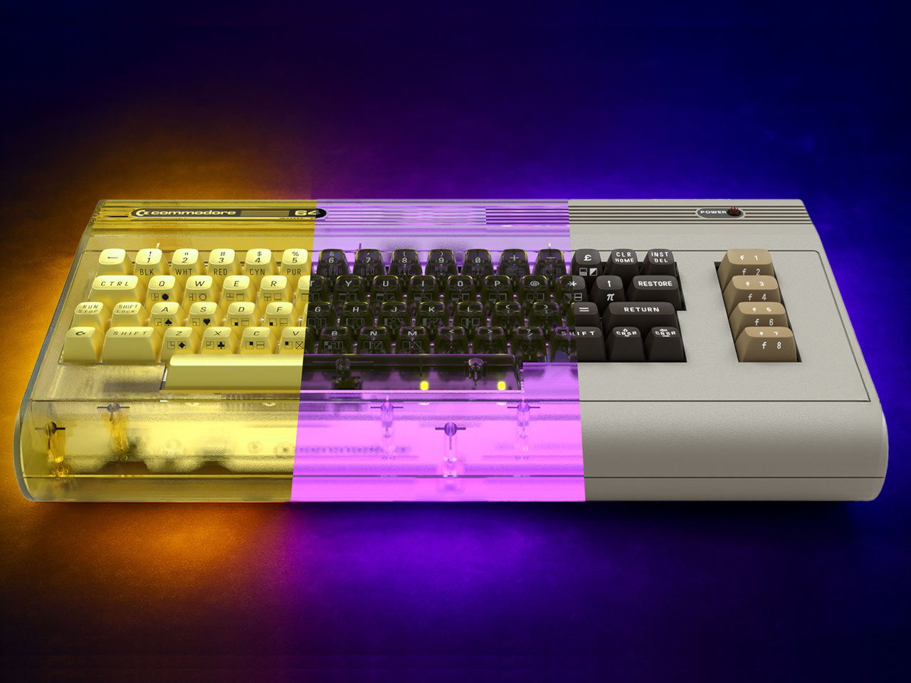
As we start with a new era, Generation Alpha, a millennial such as me seeks comfort in the nostalgic touch of retro design. Retro for me is the era of rebellion, polka prints, Andy Warhol and the comfort of knobs and tactile interfaces over touch screens. Retro design effortlessly blends nostalgic elements with modern aesthetics, creating a refreshing yet familiar atmosphere. Inspired by vintage styles from the 1950s to the 1980s, it fosters comfort and a connection to history.

By using iconic shapes, vibrant colors, and distinctive materials, retro design reconnects us with cultural references and pays homage to the past. This approach not only produces timeless pieces that resonate across generations but also enriches our contemporary experience. Let’s dive into the elements of retro design we can use to add to touch of nostalgia to our modern product design and some examples that show how brands are incorporating this trend seamlessly into their work.

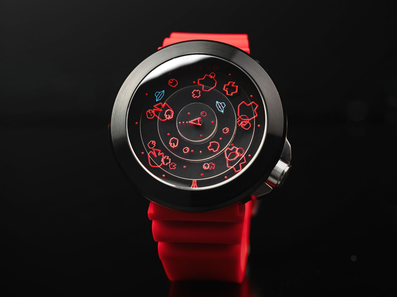
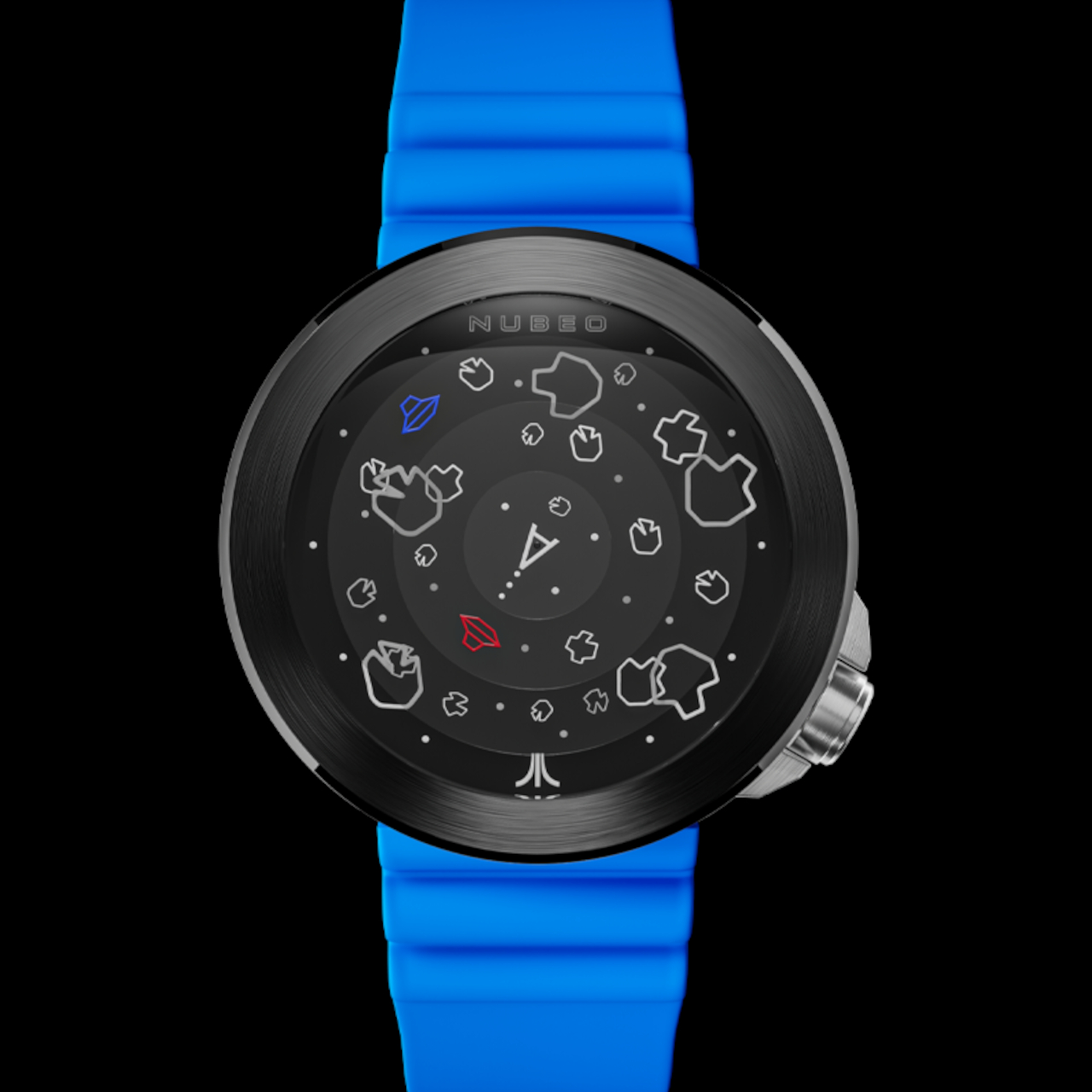
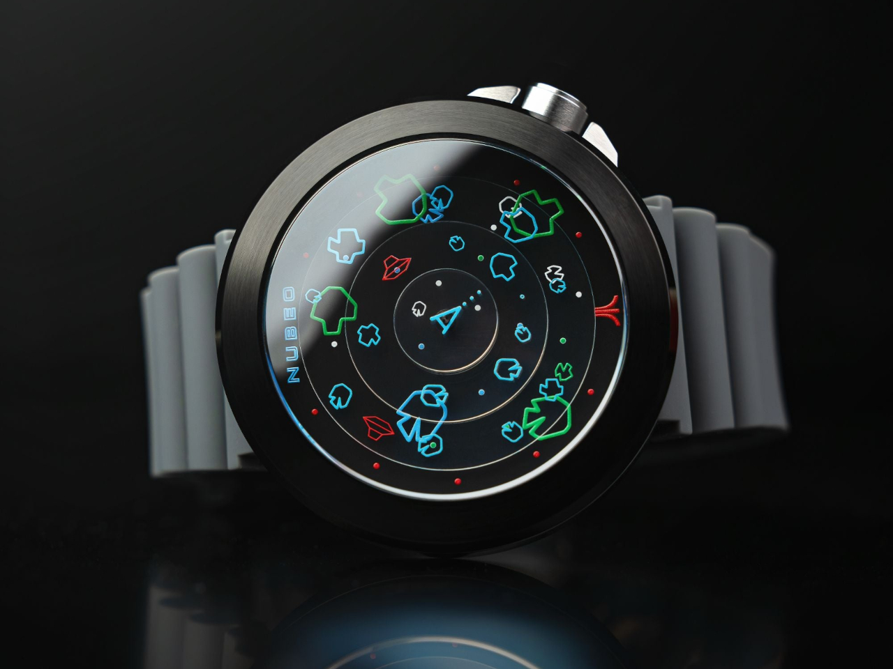
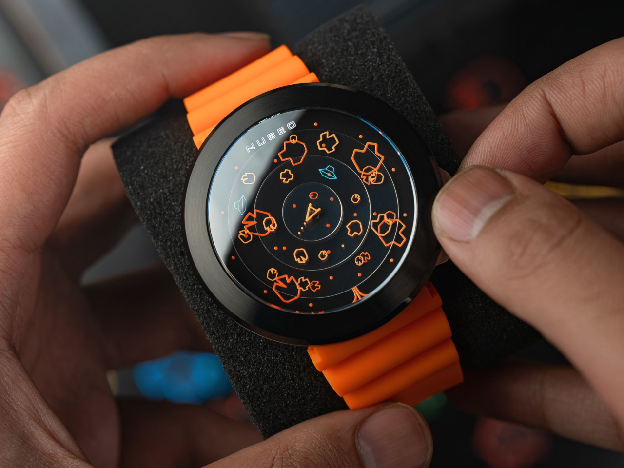
1. Bold Color Palette

Retro design thrives on the use of bold colors to evoke a sense of nostalgia and vibrancy. Drawing inspiration from the vivid palettes of the 1950s to the 1980s, it incorporates hues like mustard yellow, teal, burnt orange, and avocado green. These striking colors are often used in combination to create eye-catching contrasts that capture attention and energize spaces. Whether applied to furniture, textiles, or accessories, bold colors in retro design serve to highlight iconic shapes and patterns, making each piece a statement of personality and style. This dynamic use of color bridges past and present, creating timeless appeal.

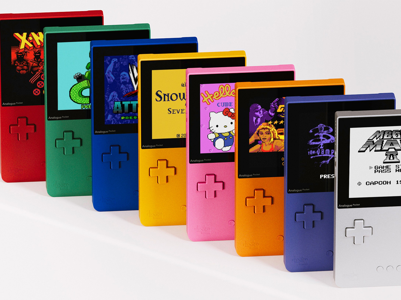
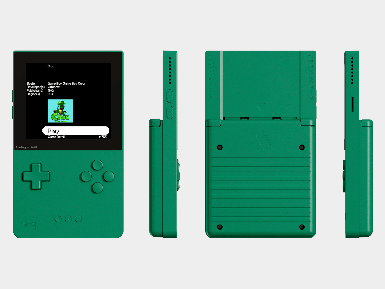
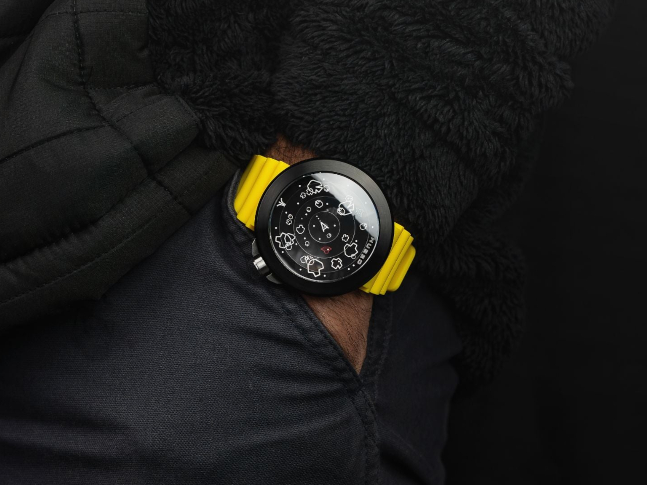
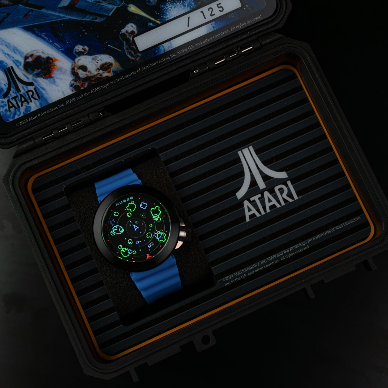
The Analogue Pocket Classic brings a vibrant twist to retro gaming with its striking palette of bold colors, including indigo, red, green, blue, yellow, pink, orange, and silver, all meticulously color-matched to the original Game Boy Color. This sleek product has a playful aesthetic that appeals to gamers of all ages, making it a standout piece in any collection. Perfectly blending vintage charm with contemporary flair, the Classic edition is a colorful celebration of gaming history.

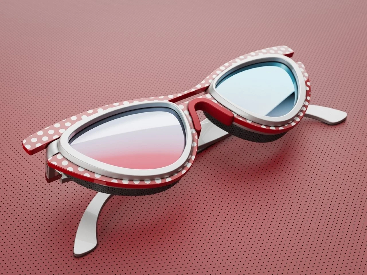
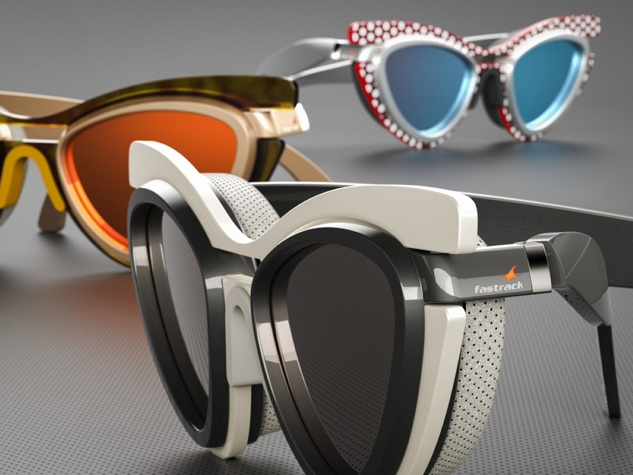
Serhan Yenilmez’s “Cat Eye” glasses draw inspiration from the iconic cat-shaped ‘librarian’ frames of the ’50s and ’60s. Featuring added layers for a bold, chunky look, these glasses blend classic elegance with modern sophistication through details like leather pads and mix-and-match materials. All parts of the glasses are designed to be detachable, allowing for customizable styles to suit the wearer’s preferences, imparting a distinct appearance. Go from sleek to chunky, to attention grabbing prints to a minimal tone – it’s all upto your customization for that day.

2. Large Prints

The retro era is vividly remembered for its bold prints, florals, and striking motifs, which became hallmarks of the time. These design elements were ubiquitous, gracing everything from home interiors to fashion. Bold prints, often featuring geometric shapes and vibrant colors, captured the spirit of innovation and optimism.

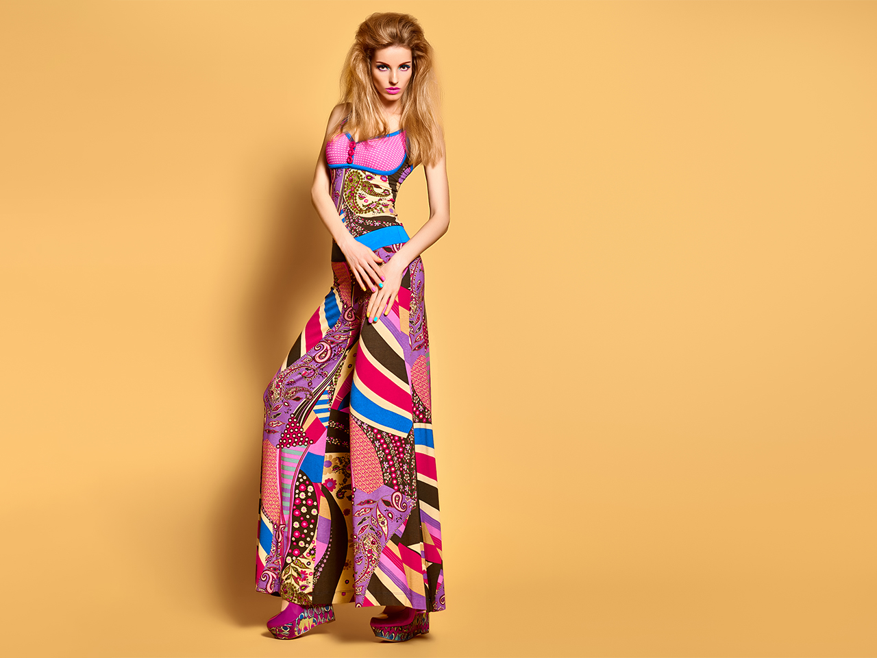
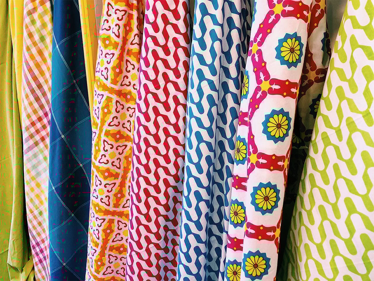
Florals, with their oversized blooms and lush patterns, added a touch of nature-inspired elegance and whimsy. Striking motifs, such as paisleys and abstract designs, reflected the era’s experimental and free-spirited ethos. Together, these elements created a visually dynamic aesthetic that was both expressive and timeless, leaving a lasting impact on design history.

During the mid-20th century, such designs adorned everything from wallpaper and upholstery to fashion and accessories, infusing spaces and wardrobes with a lively, playful energy. The use of large prints in retro design not only adds a touch of whimsy but also emphasizes the era’s experimental spirit. These bold patterns continue to inspire modern design, blending past influences with contemporary tastes. Big geometric patterns provide a sense of familiarity and nostalgia. The combination of bold colors and geometric prints is essential to retro design, making a vibrant statement that speaks volumes.
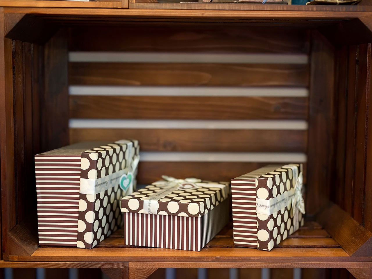
3. Iconic Motifs

Iconic motifs like polka dots played a significant role in defining retro design, adding a playful and timeless charm to various elements of style. Originating in the mid-20th century, polka dots became synonymous with the era’s fashion, appearing on dresses, accessories, and home decor. Their simple yet bold pattern, often featuring evenly spaced dots on contrasting backgrounds, created a lively visual appeal that resonated with the era’s spirit of fun and creativity. Polka dots brought a sense of whimsy and lightheartedness, making them a favorite choice for those looking to infuse their spaces and wardrobes with a touch of retro flair.


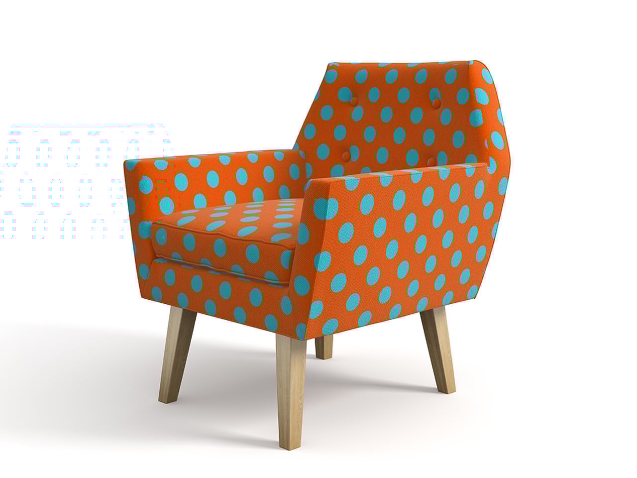
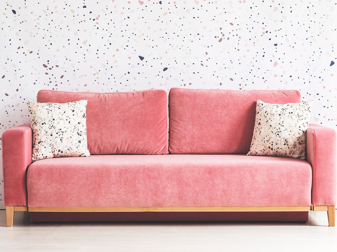
The use of bold, large polka dot prints in vibrant colors to upholster this armchair infuses it with old-world charm and nostalgia. It is characterized by evenly spaced, small, medium, or large circular shapes placed on a contrasting background to make them stand out. This striking contrast enhances its visual appeal and evokes a sense of timeless elegance. Whether polka dots are used in clothing, accessories, or home decor, their simple yet bold pattern infuses a sense of vintage charm and nostalgia.

The polka print of this sofa chair is a statement piece, with polka’s ruling the retro era. The polka also brings to mind iconic designers like Yayoi Kusama who have elevated the use of this humble pattern to a whole new level, amplifying its cult status. Adding such a print to your room makes it a eye-catcher and a discussion starter for fellow retro-lovers.

4. Classic Typography

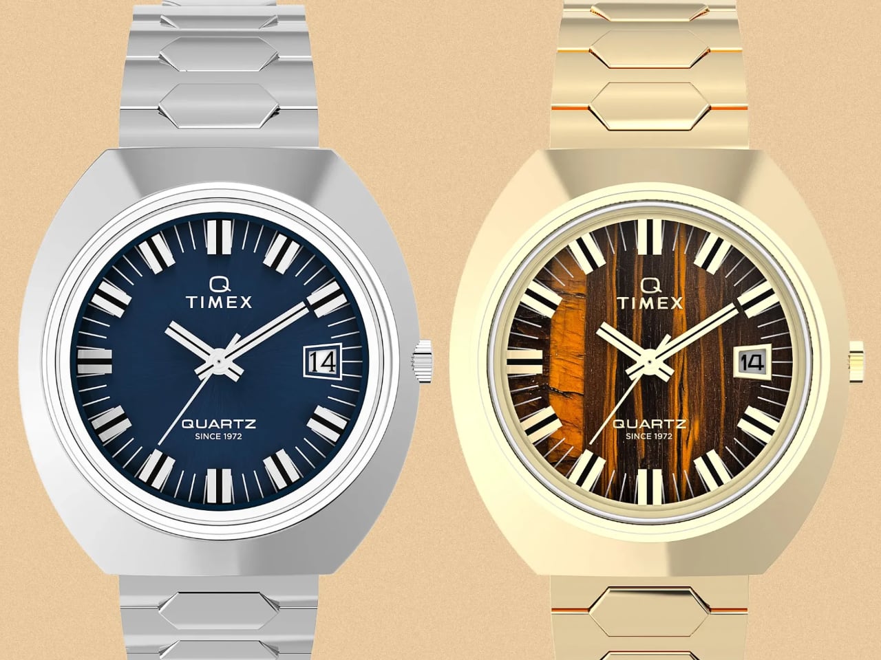
Typography during the retro era was characterized by bold, expressive fonts that mirrored the dynamic cultural shifts of the time. From the elegant serifs of the 1950s to the psychedelic scripts of the 1960s and the chunky, geometric typefaces of the 1970s, each style reflected the prevailing aesthetic trends and societal mood. Retro typography was not just functional but also an art form, used extensively in advertising, posters, and packaging to capture attention and convey messages with flair. Its impact is enduring, as these distinctive fonts continue to influence modern design even today.

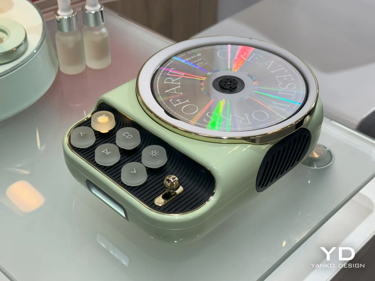
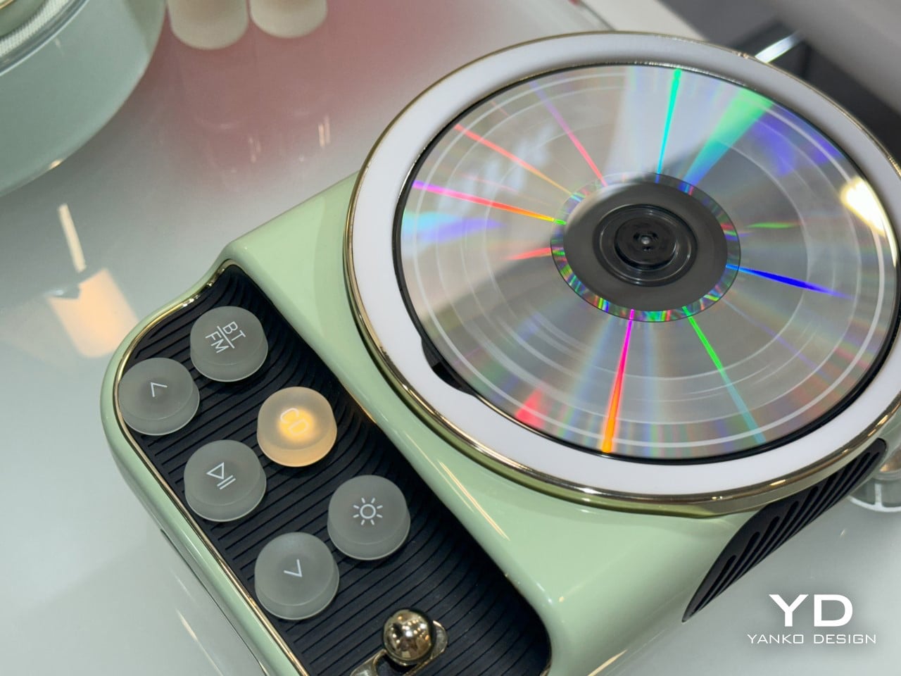
The Semetor K8 CD player captures the charm of retro design with its playful aesthetic, featuring classic typewriter-inspired fonts on its translucent buttons. This adorable player pays homage to 1950s European appliances, boasting an open top that lets you watch the CD spin, reminiscent of vinyl on a gramophone. It combines vintage style with modern features, including Bluetooth connectivity, an FM radio, and a warm ambient lamp, making it a delightful addition to any space. The K8 beautifully merges nostalgic typography with contemporary functionality, perfect for late-night listening sessions.

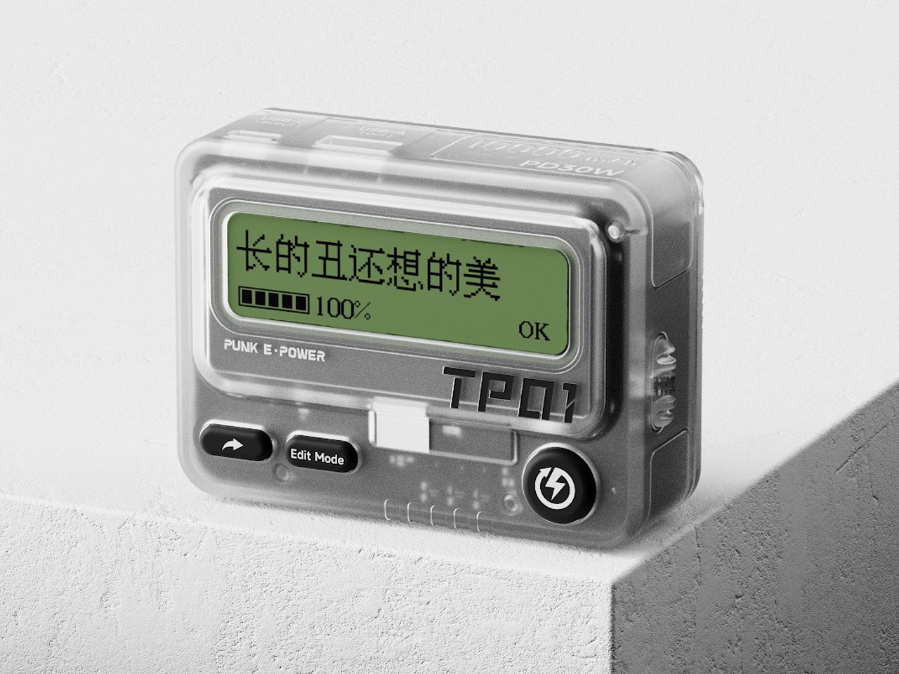
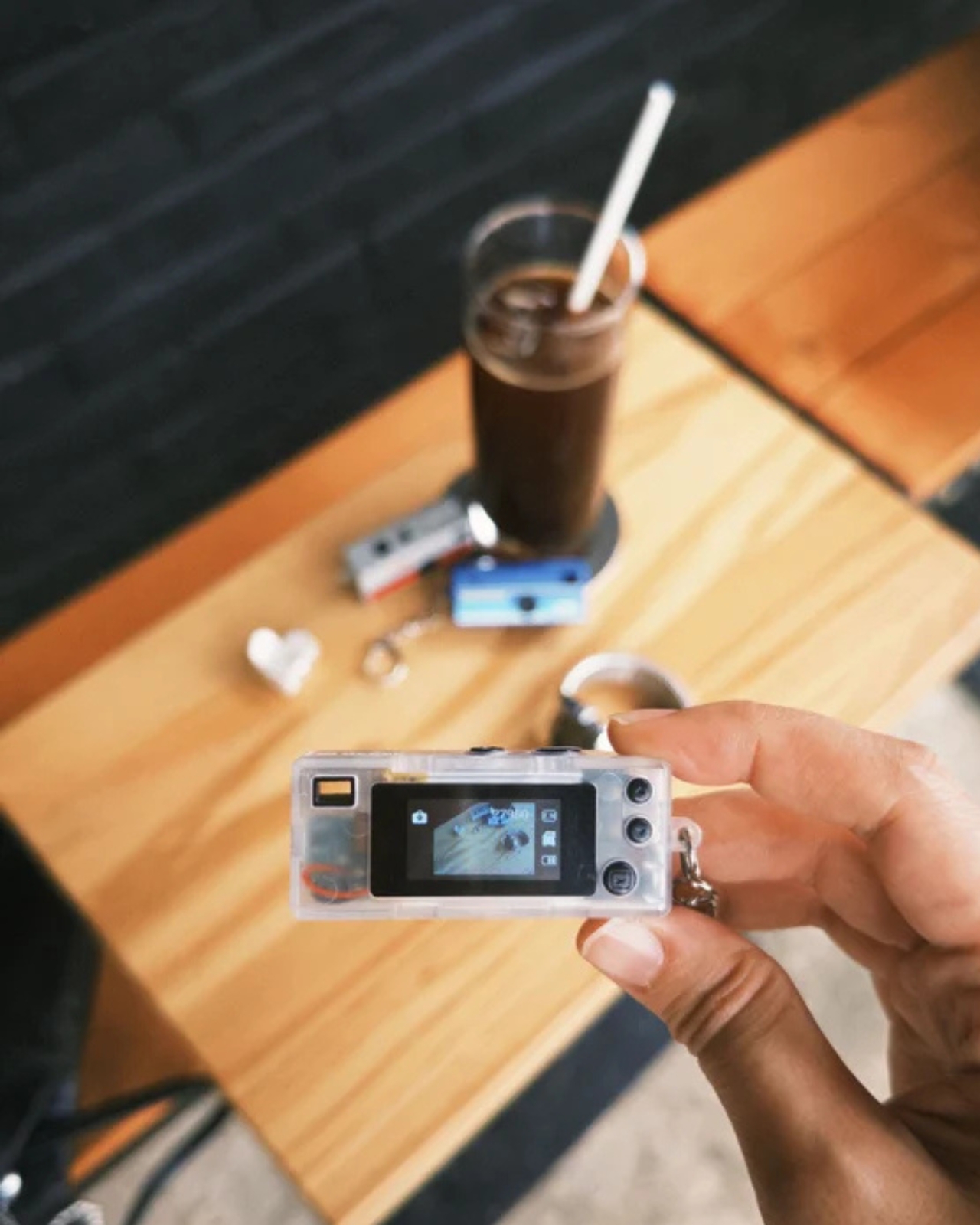
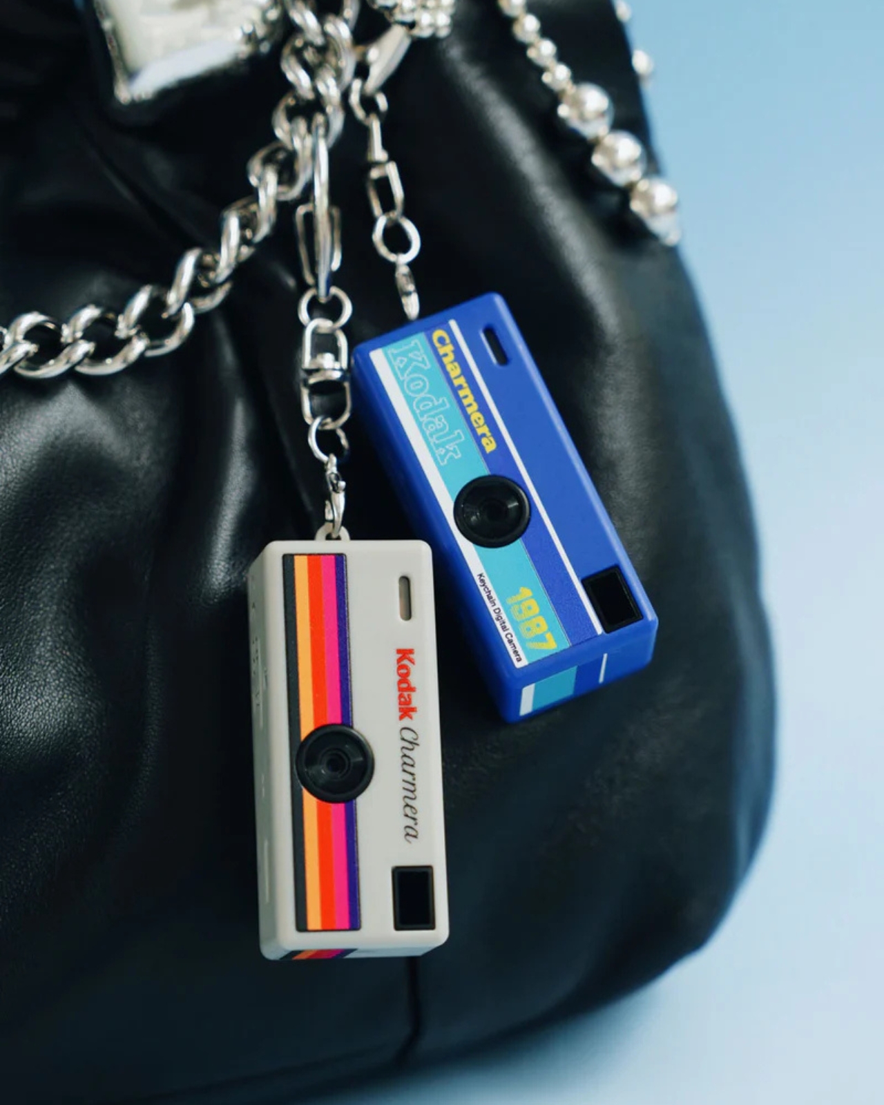
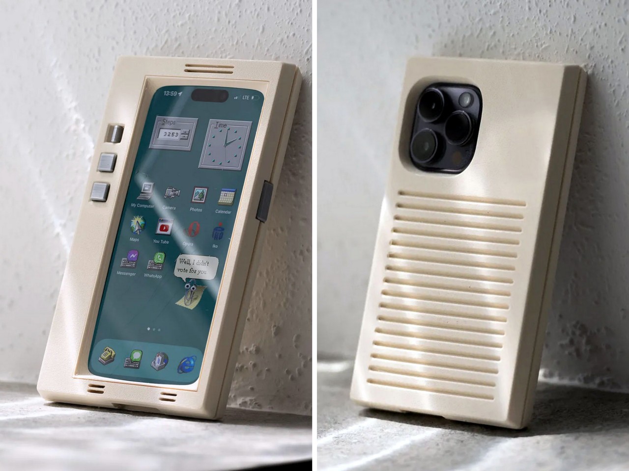
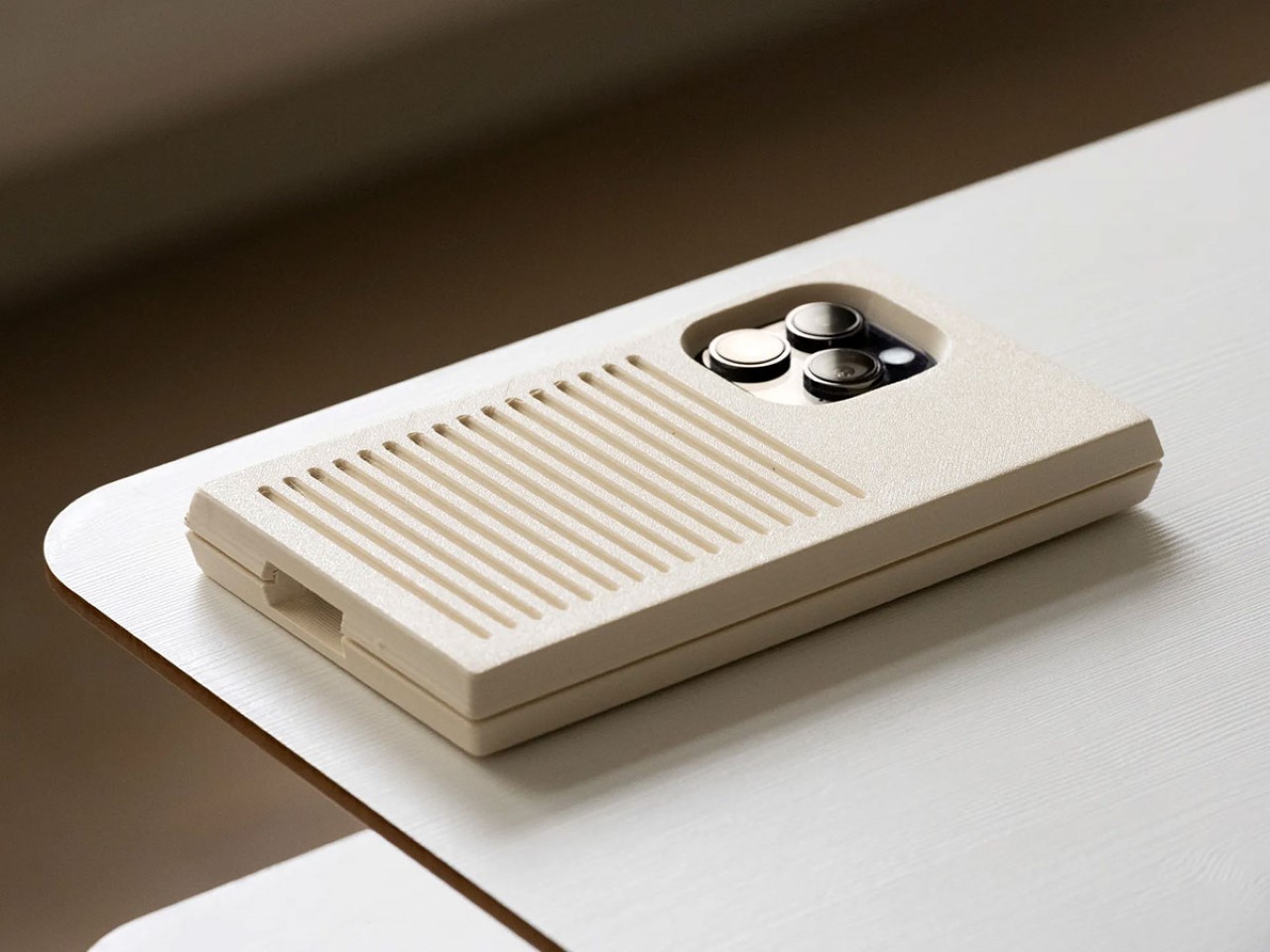
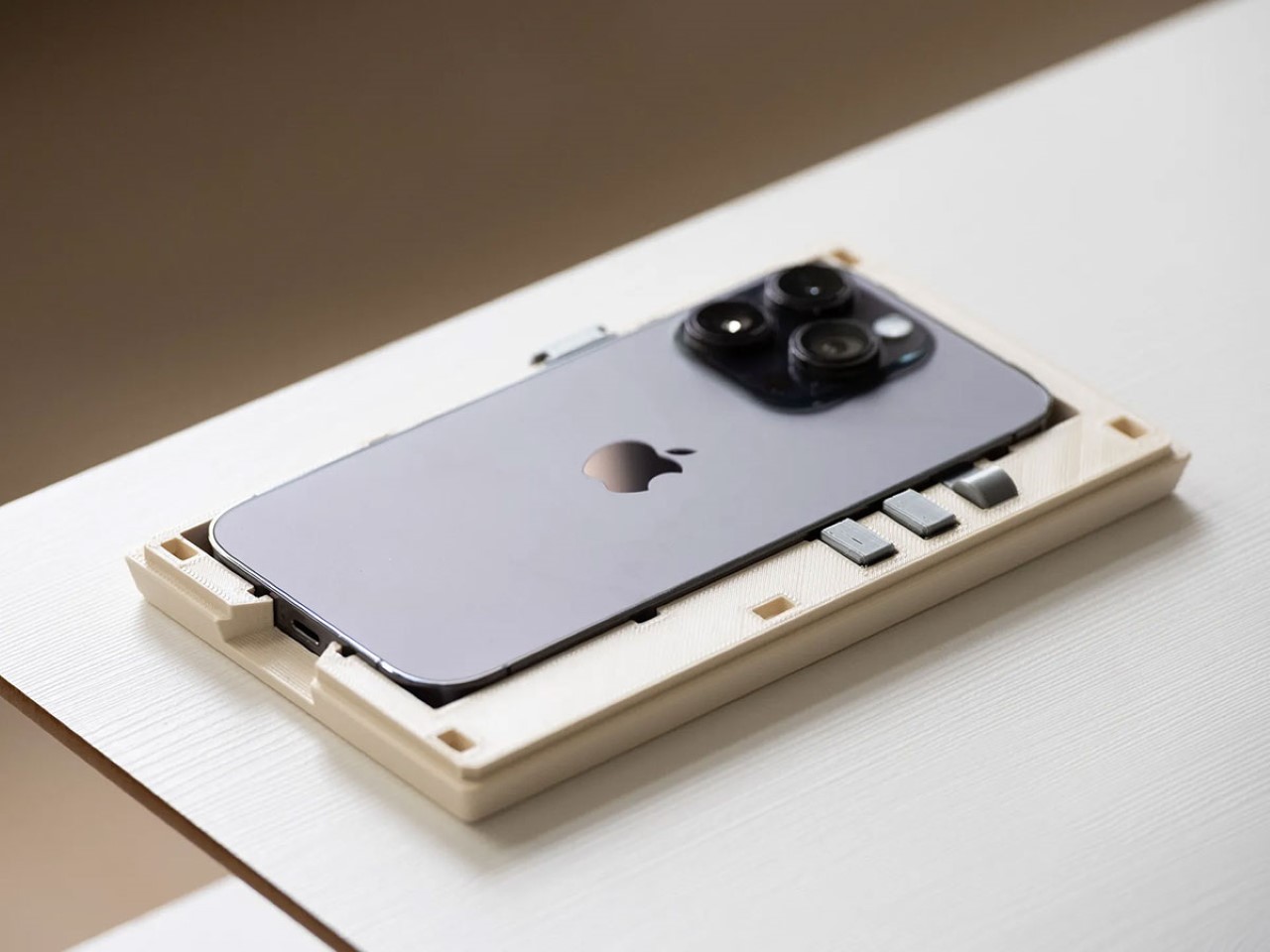
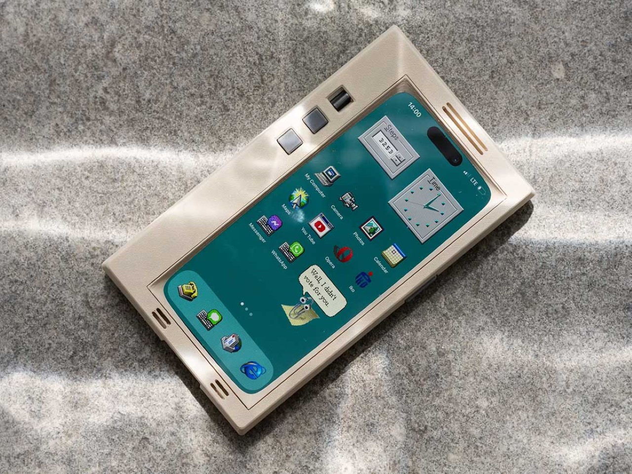
This concept design reimagines the classic beeper as a modern power bank, seamlessly blending retro design with contemporary functionality. Embracing the nostalgic aesthetic, it features a translucent shell and vibrant colors, along with a minimalist interface that includes few chunky buttons. This playful nod to the past not only enhances usability but also appeals to younger generations who may be unfamiliar with traditional pagers, celebrating the charm of retro design in a modern context.

5. Natural Wood

Natural wood played a pivotal role in retro design, infusing spaces with warmth and authenticity. During the mid-20th century, wood was a favored material for its versatility and timeless appeal. Iconic furniture pieces, like those from the Scandinavian and Mid-Century Modern movements, showcased clean lines and organic forms, highlighting the beauty of natural grains and finishes. Wood paneling was also popular in interiors, adding texture and depth to walls and ceilings. This emphasis on natural materials reflected a desire to bring the outdoors in, creating harmonious environments.

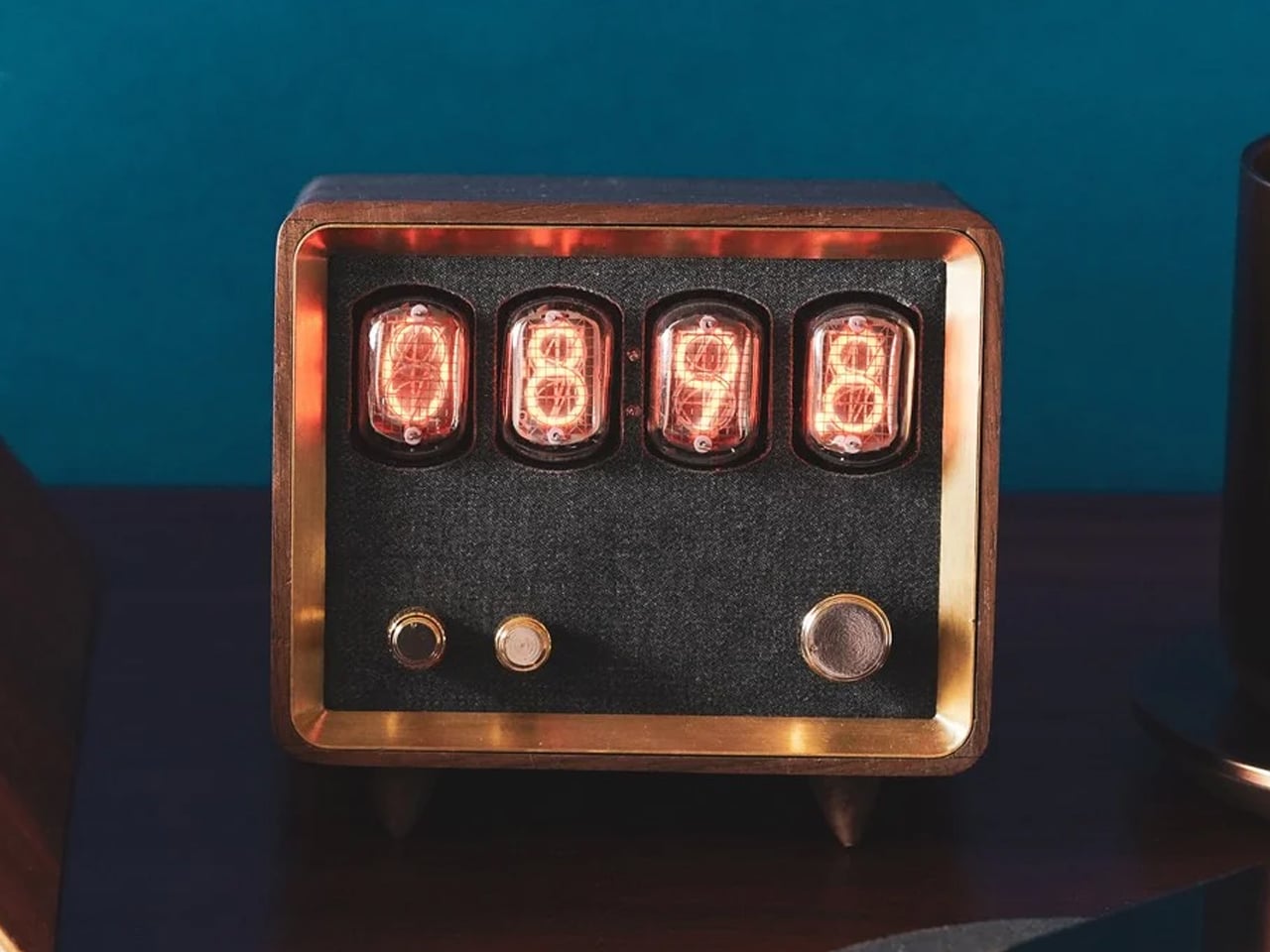
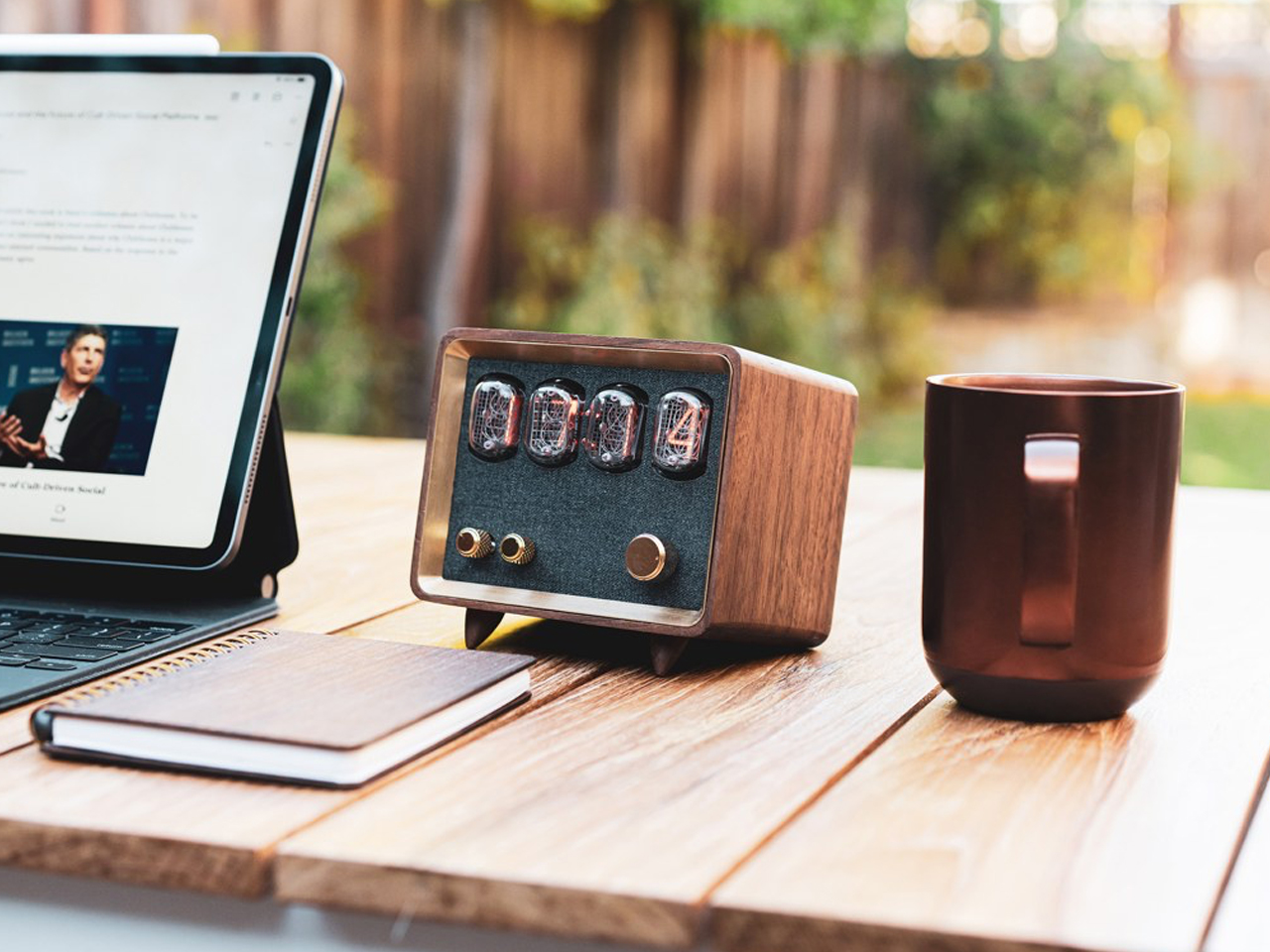
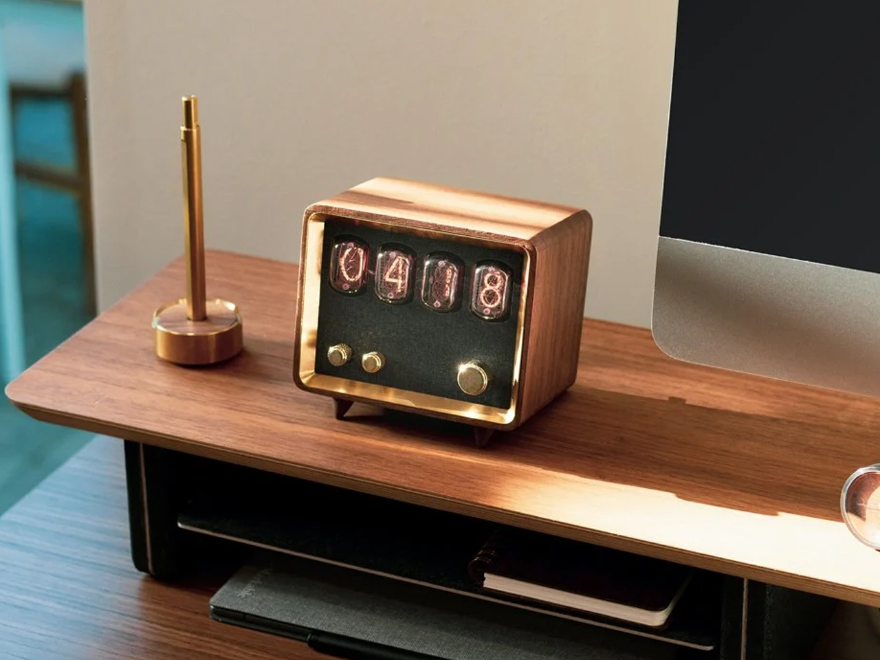
Embracing the retro revival, the Retio is an all-in-one radio, Bluetooth speaker, and clock that harmonizes nostalgic design with modern technology. Handcrafted in California, it features a walnut wood body that highlights the timeless appeal of wood in retro aesthetics, complemented by brass accents and stunning vintage Nixie tubes. Retio supports Bluetooth 5.0 and boasts a powerful 10W Class-D amplifier for exceptional sound quality, offering up to six hours of playback on a 6800mAh battery. Each unit is unique, celebrating the beauty of natural wood while delivering contemporary functionality, making it a perfect embodiment of retro design.

6. Plush Fabrics

Plush fabrics were integral to achieving the cozy, inviting ambiance characteristic of the retro aesthetic. Velvet, chenille, and corduroy were popular choices, adding texture and a sense of luxury to furniture and decor. Upholstered sofas, armchairs, and drapery in plush fabrics not only provided comfort but also contributed to the visual warmth of a space. The tactile quality of these fabrics invited relaxation and social interaction, embodying the retro focus on creating welcoming, lived-in environments that are both stylish and functional.

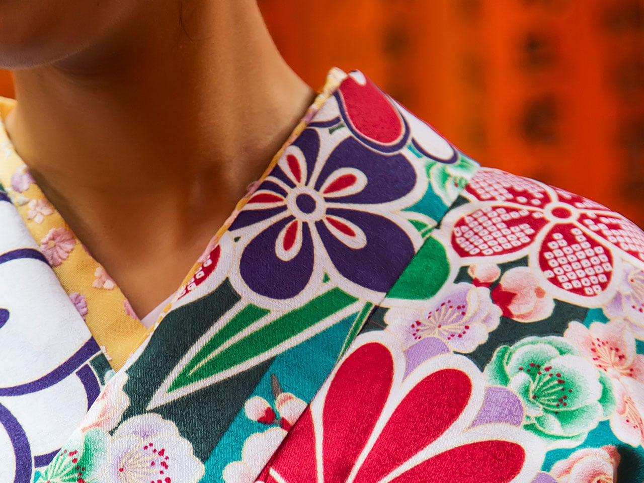
The Easy Yukata is a stunning Japanese garment that simplifies tradition with its innovative “hook and loop” fastener system. Made from 100% breathable cotton and featuring a durable polyester obi, the Easy Yukata combines the ease of a bathrobe with the elegance of a kimono. Its traditional design incorporates soft, plush fabrics that invite comfort, allowing one to enjoy the beauty of Japanese culture with every wear.

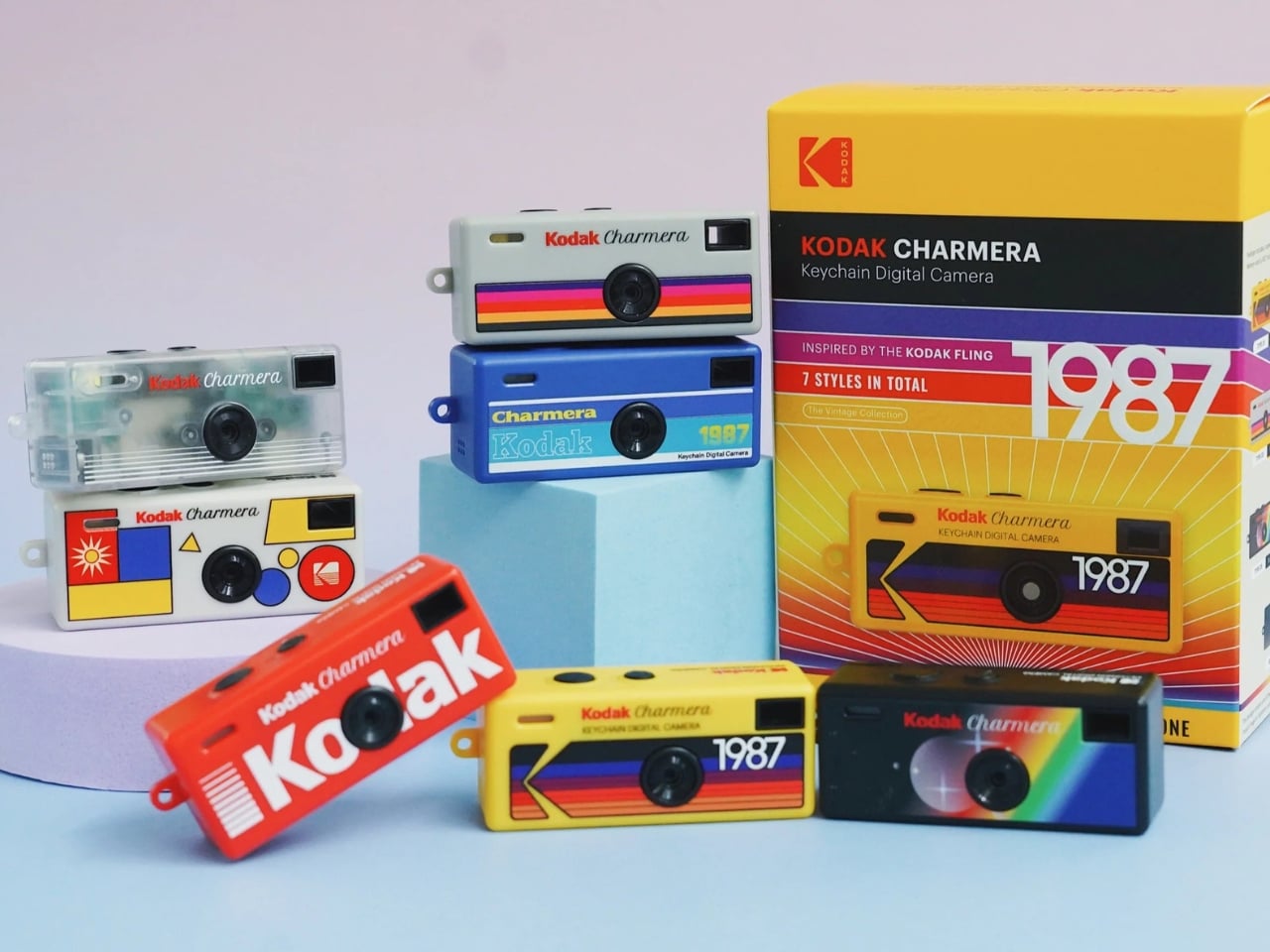
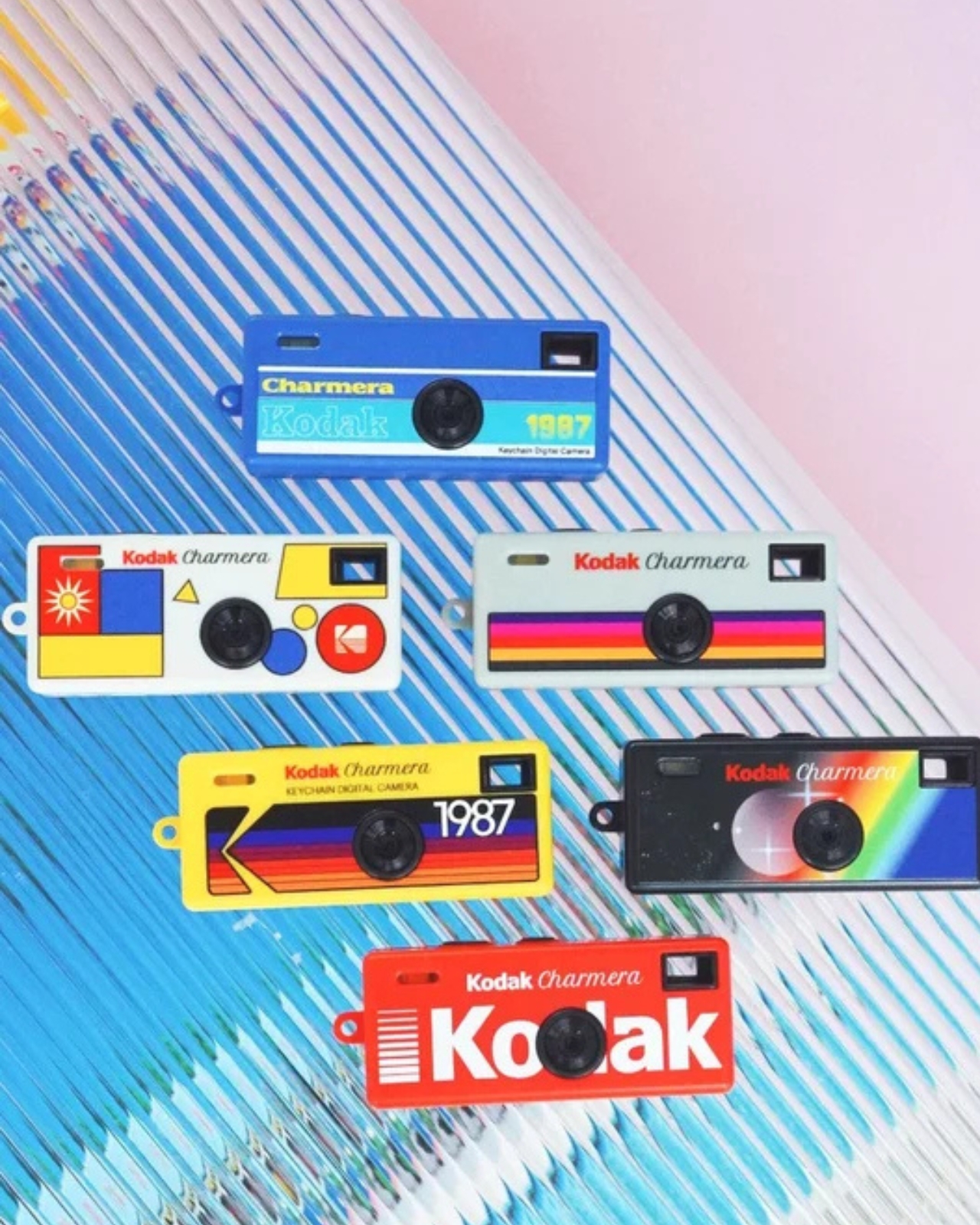
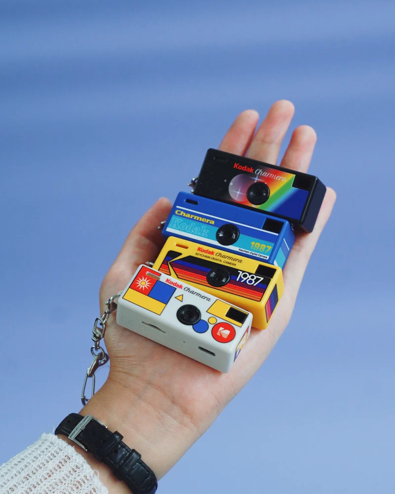
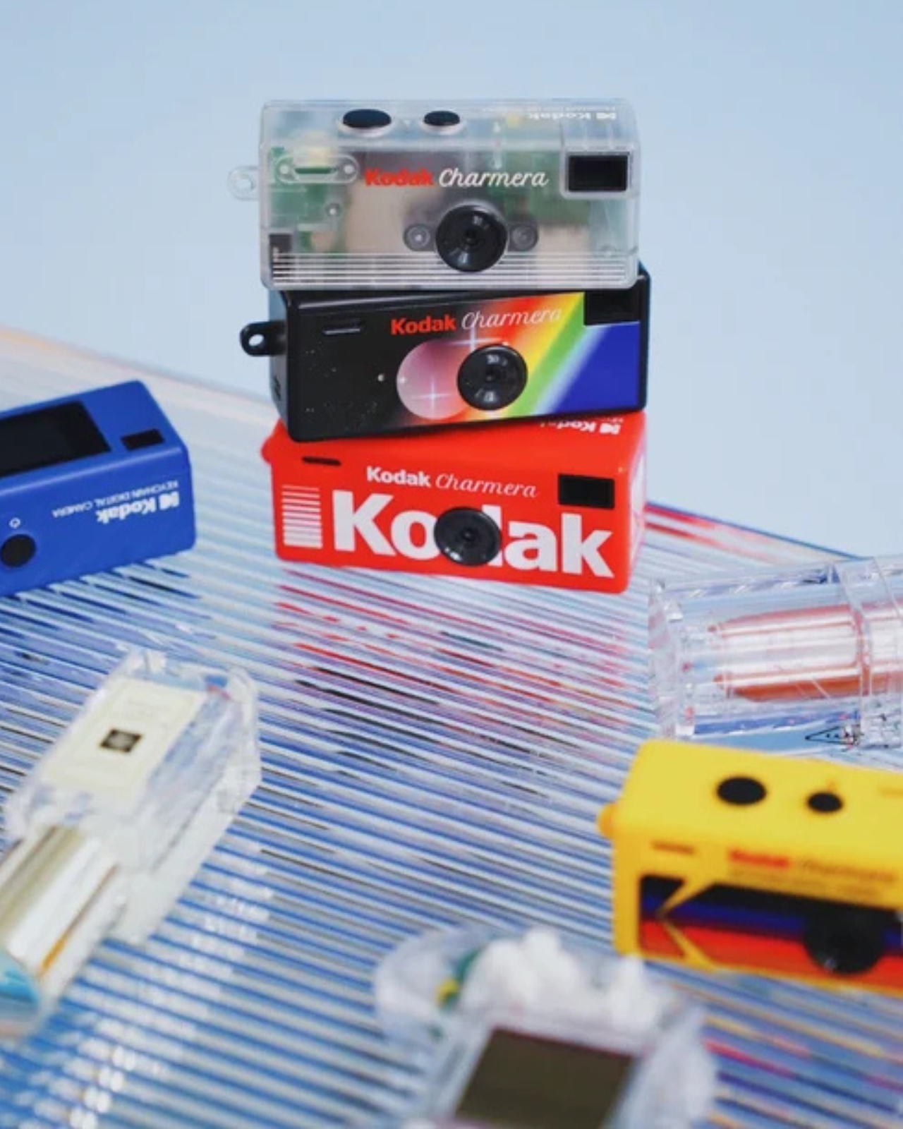
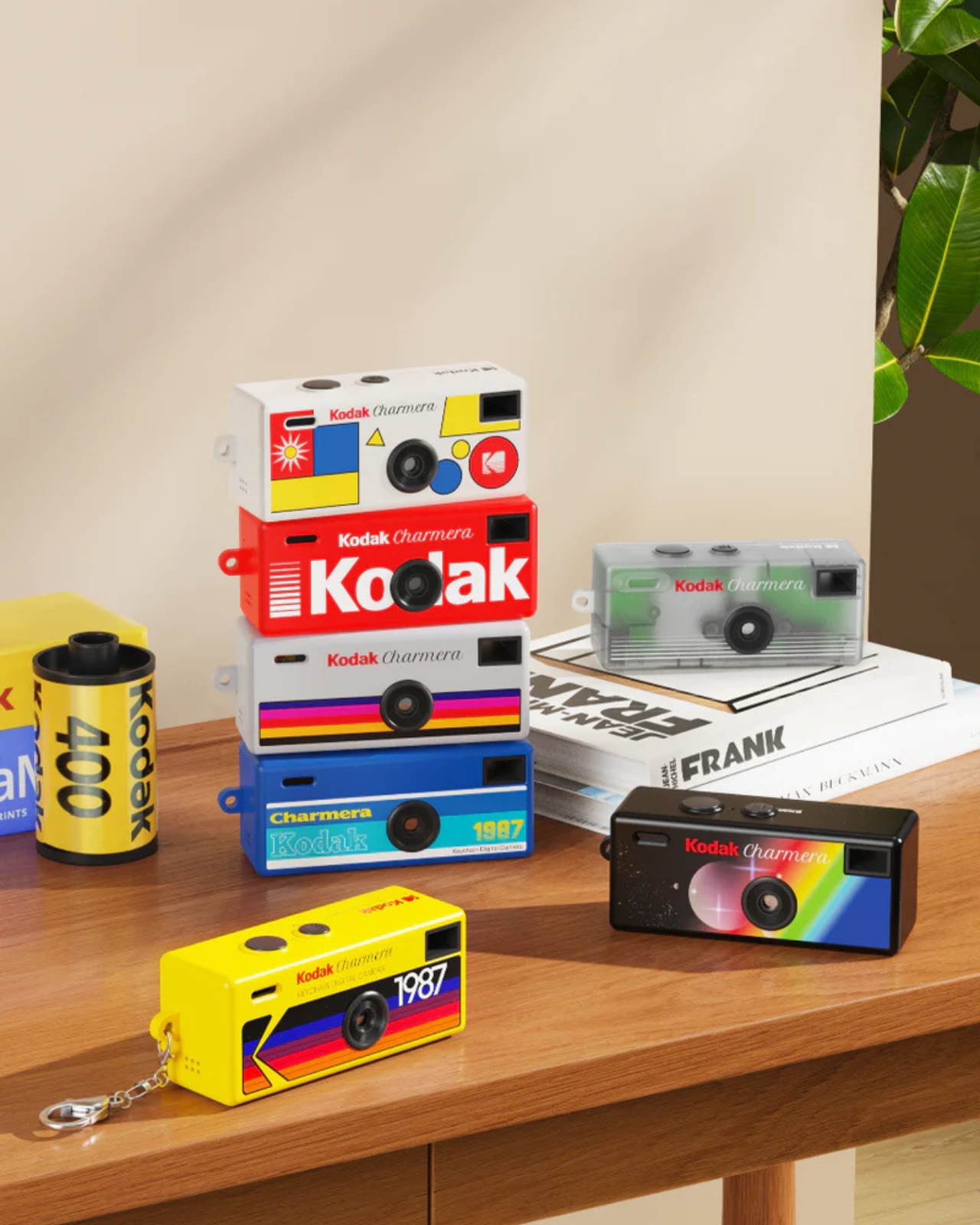
7. Product Packaging

Patterns and prints in packaging are key elements that emphasize retro designs, evoking nostalgia and capturing the essence of bygone eras. During the retro period, packaging often featured bold geometric shapes, whimsical illustrations, and vibrant color palettes, creating eye-catching and memorable visuals. These designs were not just about aesthetics; they also conveyed the product’s identity and brand story in an era when consumer culture was booming.

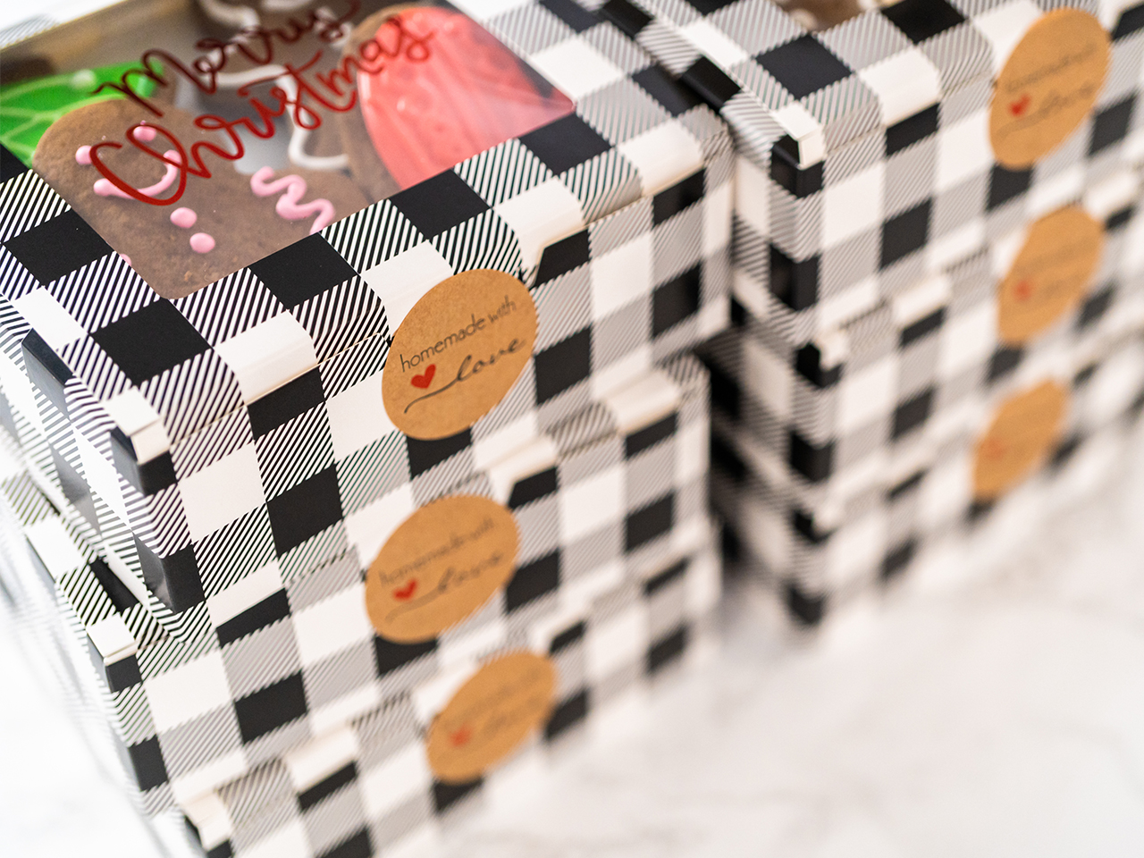
Stripes, polka dots, checkered patterns and stylized florals were commonly used to create a distinctive look that stood out on store shelves. Today, these retro-inspired packaging designs continue to appeal to consumers by offering a sense of familiarity and charm, bridging the gap between past and present while celebrating the timeless appeal of vintage aesthetics. These cake boxes showcase a timeless black-and-white pattern that adds an old-world charm to the Christmas festival. It is perfect for presenting your festive cakes and the simplicity of black and white allows the patterns to stand out without the complexity of bright and contrasting colors.

8. Craftsmanship

Craftsmanship is integral to retro-inspired design, celebrating the meticulous attention to detail and artisanal techniques of past eras. This focus on quality and authenticity is evident in the careful selection of materials and the skilled work that goes into each piece. Lighting, furniture and accessories incorporate hand-blown work on materials such as glass, metalwork and more, adding unique character. This emphasis on craftsmanship honors traditional methods and connects us to the past, ensuring that retro-inspired creations are both timeless and enduring, appealing to those who value history and innovation.

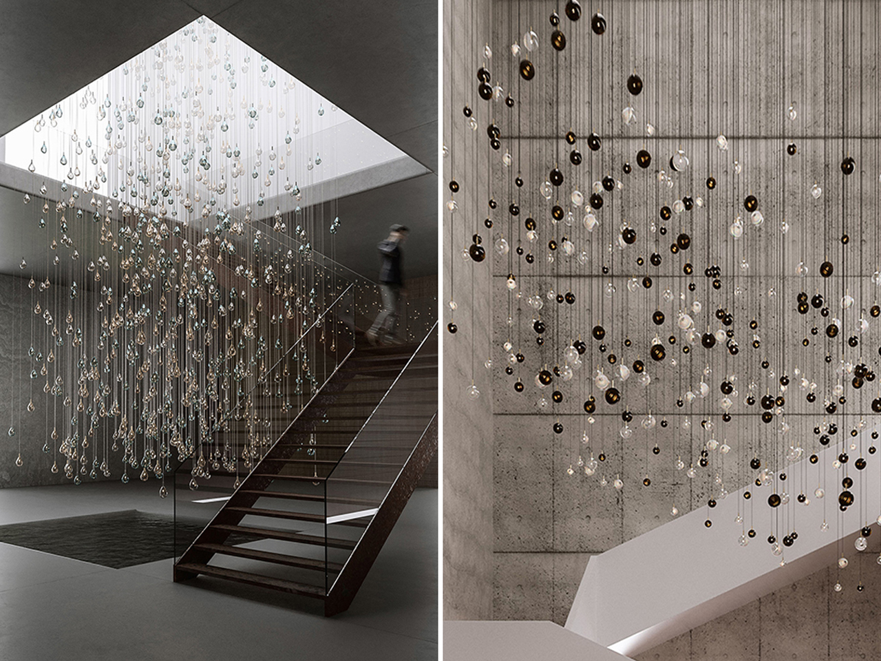
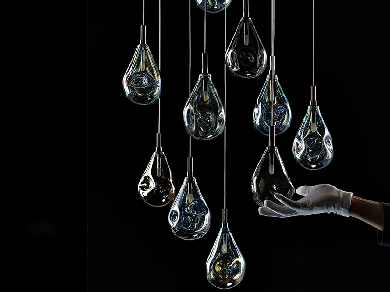
Bomma beautifully connects retro aesthetics with traditional craftsmanship in their glass crystal light fixtures, reviving the classic Czechoslovakian glassmaking heritage. Each piece reflects a whimsical elegance, inspired by natural forms while embracing the charm of bygone eras. With a series of collections, Bomma showcases the artistry of hand-blown glass, ensuring each item is a unique work of art. Collaborating with sister brand Rückl, the Metamorphosis collection merges exquisite hand-cut crystal with innovative lighting designs, embodying the timeless beauty of craftsmanship and the beauty of retro design.

9. Cultural Relevance

Retro design holds significant cultural relevance and evokes a deep sense of nostalgia, as it captures the essence of past eras that many people cherish. By incorporating elements from the 1950s to the 1980s, retro design taps into collective memories, reminding us of iconic styles and trends that shaped those decades. This design approach resonates with those who experienced these eras firsthand and appeals to younger generations intrigued by vintage aesthetics. Ultimately, retro design bridges the past and present, offering a comforting familiarity and timeless appeal.

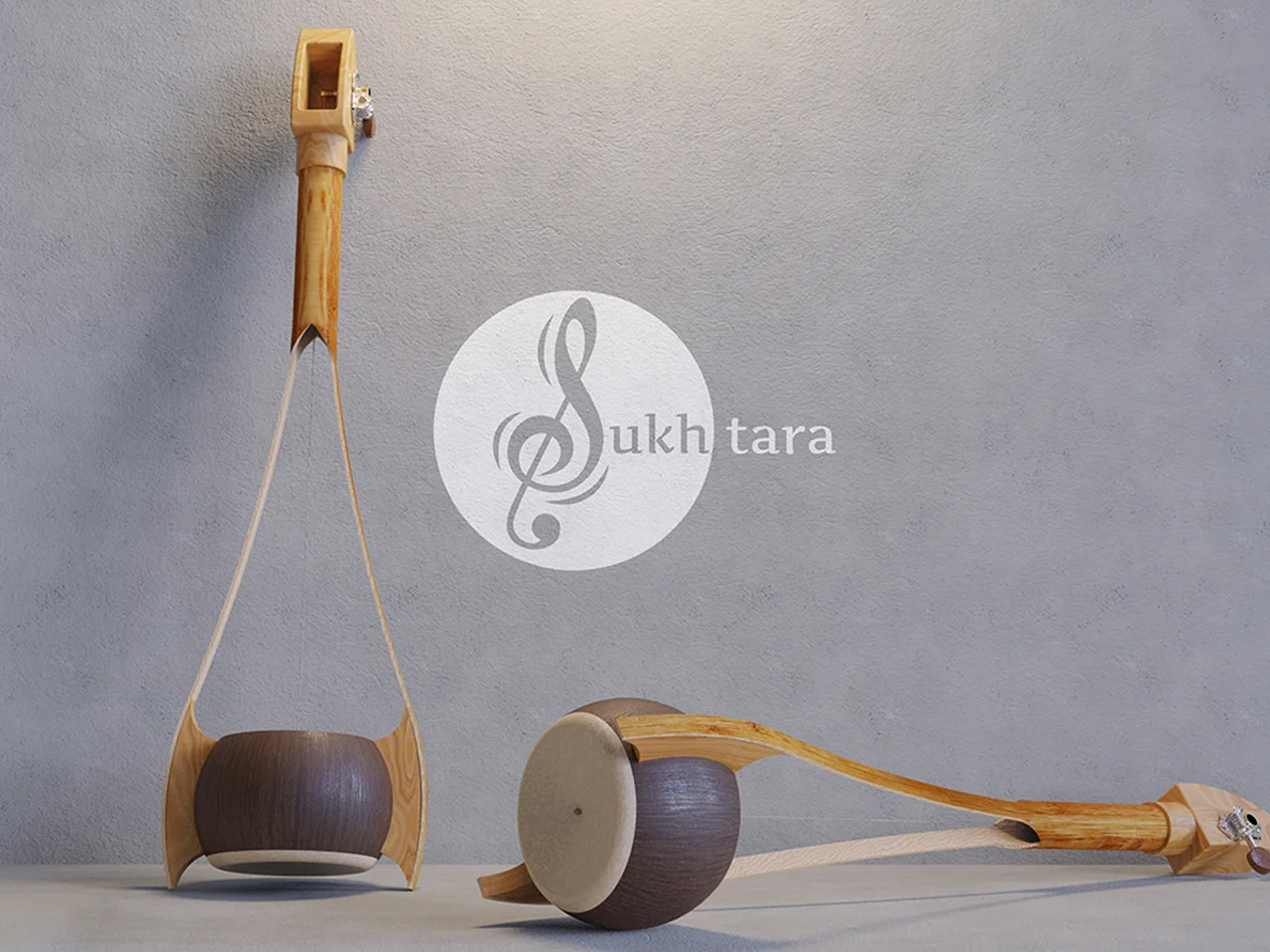
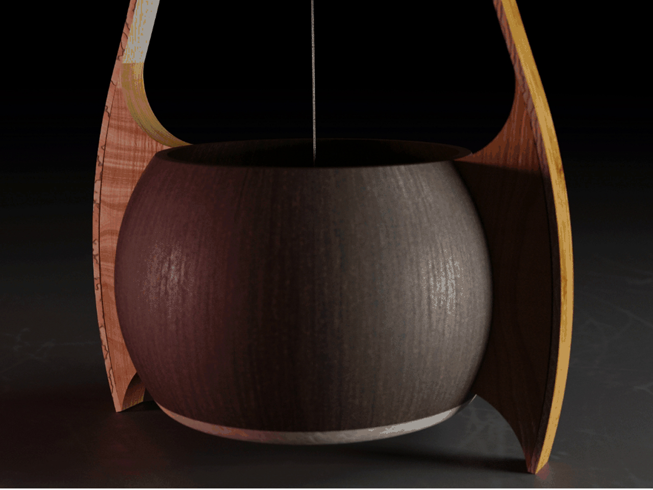
The Sukhtara is a modern reinterpretation of the Ektara, a string instrument from East India with origins over a thousand years old. While the Ektara has remained largely unchanged since its emergence between 1700 B.C. and the 7th century C.E., Arnab Patra, an Indian design student, has updated its structure to revitalize this classic instrument for contemporary use. Retaining its retro wooden build, the Sukhtara is crafted from a coconut or gourd shell, bamboo, metal strings, wood, and goatskin, elegantly blending traditional craftsmanship with a fresh, modern approach that celebrates its rich heritage.

10. Vintage Design

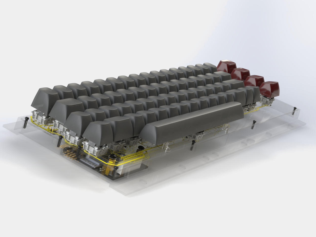
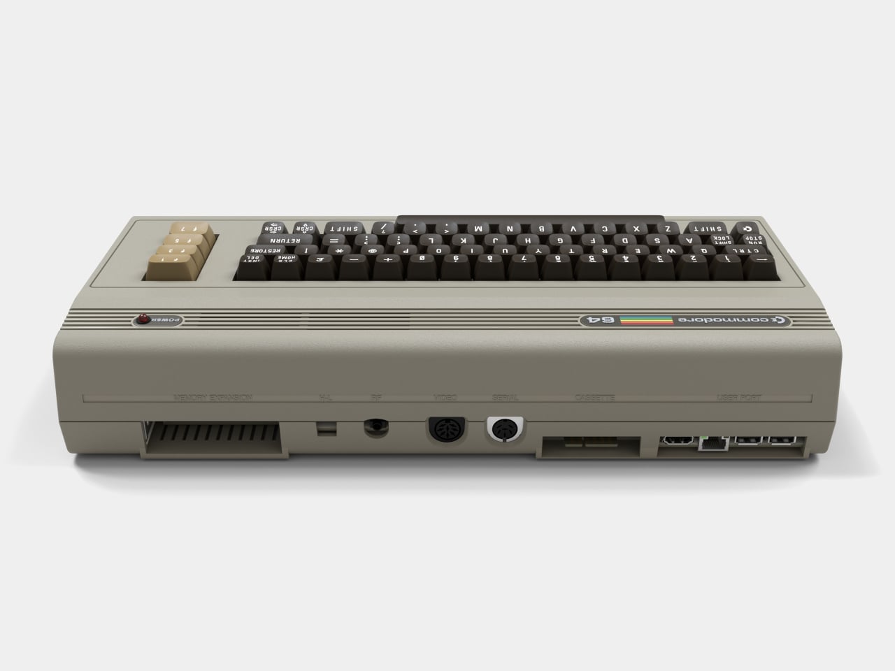
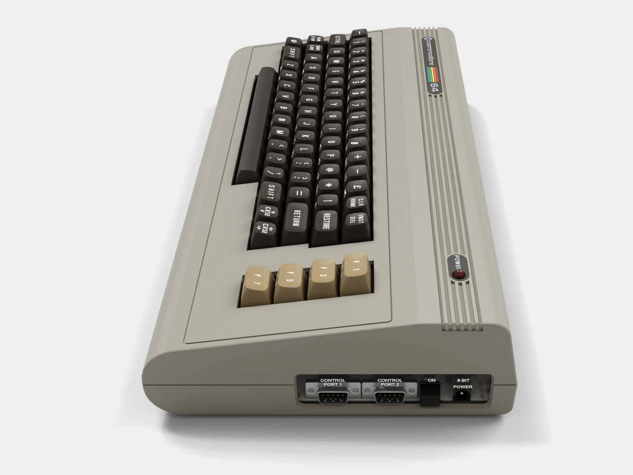
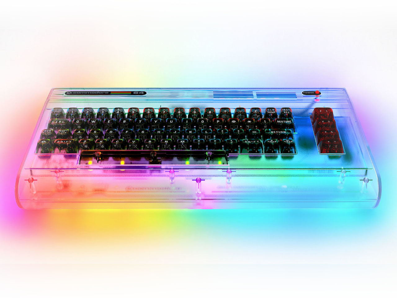
Retro and vintage design, while often used interchangeably, have distinct characteristics that set them apart. Retro design refers to the revival or imitation of styles from the past, particularly those from the mid-20th century, like the 1950s to the 1980s. In contrast, vintage design involves original items or styles from a specific time period, typically over 20 years old. Vintage pieces carry the authenticity and history of their era, often showcasing aged materials and craftsmanship. While both evoke nostalgia, retro is a reinterpretation, whereas vintage is a preservation of the past.

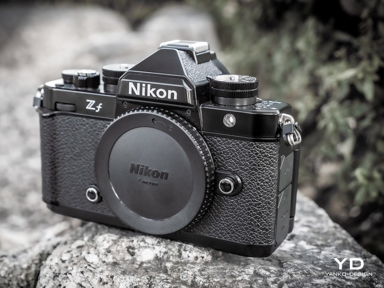
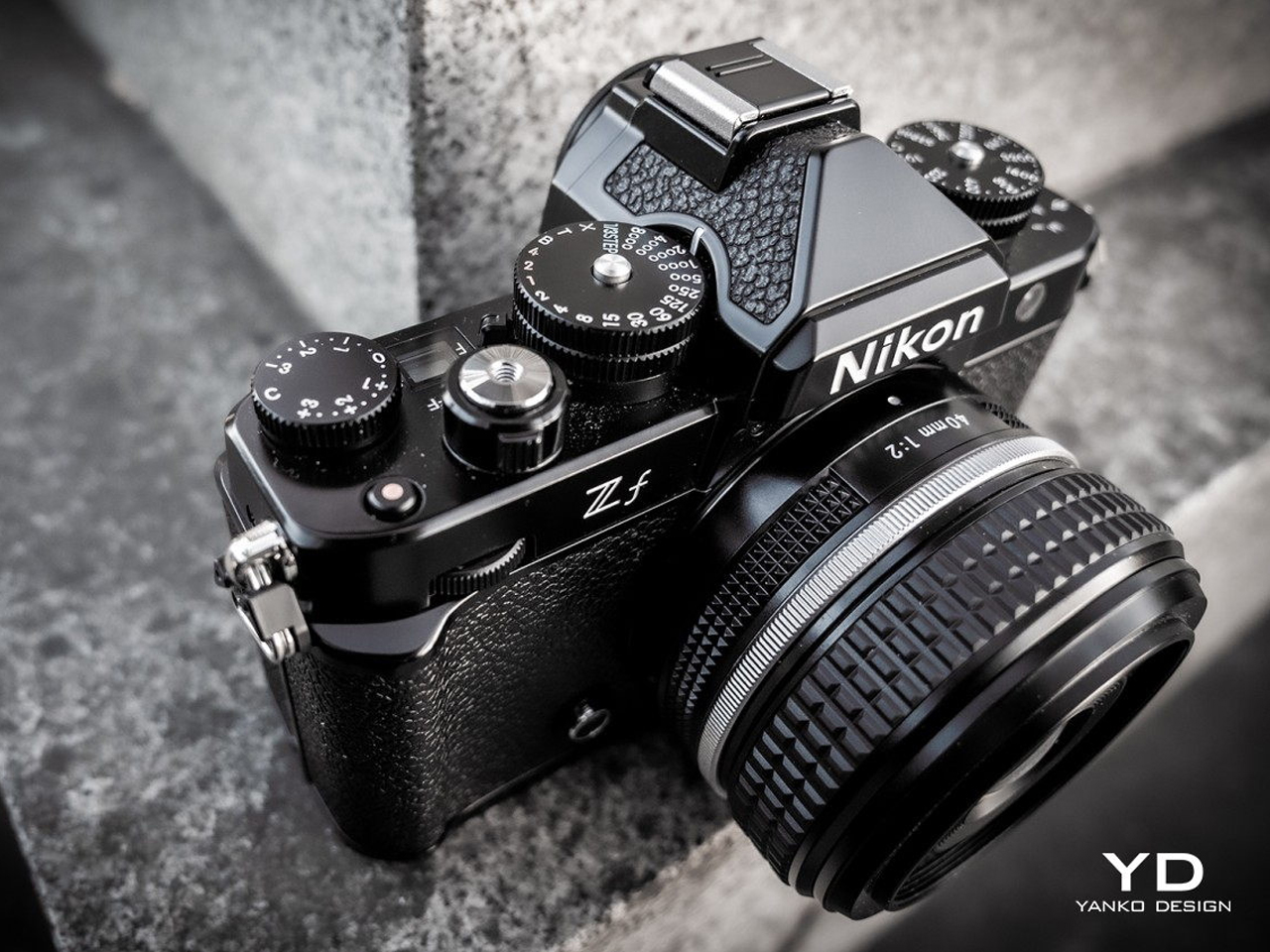
The Nikon Zf seamlessly blends retro design with modern performance, evoking the classic SLR aesthetics of Nikon’s early cameras through its sleek all-black body, brass dials, and leatherette covering. Featuring a 24MP full-frame BSI CMOS sensor and an advanced Expeed 7 processor, it excels in subject recognition and autofocus. The Zf delivers stunning images with precise color accuracy, 8-stop in-body image stabilization, and 4K video recording, making it a versatile choice for photographers who appreciate the charm of vintage design alongside contemporary functionality.

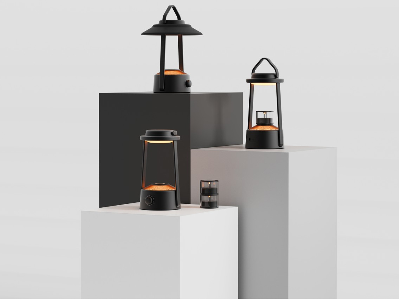
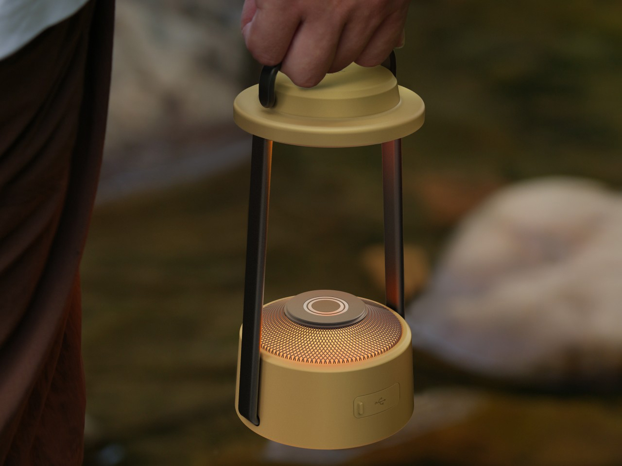
This innovative camping lantern concept reimagines traditional gas lanterns, bringing retro design into the modern era with rechargeable LEDs instead of hazardous fuels. Inspired by historical aesthetics, it features a modular candle design that can be stacked for increased brightness or used independently for a softer glow. Both the light tubes and candles emit a warm yellow light, evoking a nostalgic ambiance perfect for reading. Along with this, the lantern’s battery can charge other devices, making it a versatile companion for outdoor adventures while celebrating the charm of classic design under the stars.

Together, these elements create products that celebrate history while remaining relevant in today’s design landscape.

The post The Top 10 Retro Design Elements to Add Nostalgia to Modern Products first appeared on Yanko Design.

This Retro iPhone Case turns it into a Makeshift Old Windows PC with Clippy and Internet Explorer

Quite literally the opposite of Back to the Future, this iPhone 16 Pro case is more like “Forward to the Past”.

When you buy a phone, chances are you spring for a case immediately for one of two reasons – to either protect your phone, or to personalize it. However, Printables user Retron Print may have invented a new reason to add a case to your phone. Meet the iPhone Retro Case – a case that takes your cutting-edge smartphone and transforms it into a marvel of old-school technology. The two-part case sandwiches your phone in between, turning it into an old-timey CRT monitor (albeit with a functional main camera and dynamic island). To complement the case’s old-school design, Retron Print also equipped the phone with a retro home screen and custom icons and widgets. Although I’d personally love to have the iPhone stick to a Macintosh-based system, this one is unabashedly Windows, with a non-functional Clippy icon on the screen. Quite a downgrade from Siri and Apple Intelligence, no?

Designer: Retron Print

The beauty of the case is that it justifies every aspect of its retro design without compromise. Look at monitors from times of yore and they often had thick, chunky bezels. While most monitors came with a ‘chin’ which would either house a floppy disk reader or just control buttons, this retro case shifts the asymmetric chin to the side, with front-facing buttons that actually work. Built cleverly into the case’s mechanism are buttons that face forwards, but trigger the action and volume buttons on the side of the iPhone. The detailing’s prebuilt into the case’s design, and all you need to really do is 3D print and then assemble.

On the front, the case features an oval frame reminiscent of old CRT monitors, although it doesn’t obstruct the screen in any way. It’s a small but meaningful detail that gives the case a distinctly vintage vibe. Around the back, long, deep grooves evoke the look of classic desktop computers and also provide better grip. These thoughtful design elements ensure that while the case embraces nostalgia, it still offers the user a modern experience with improved functionality and tactile appeal. Meanwhile, speaker systems are accounted for too, with slots on the top and bottom that let you listen to audio from your iPhone.

When it comes to color options, Retron Print suggests using filament in shades like sandy beige, gray, or light brown to fully capture the retro essence. These muted tones are reminiscent of the classic electronics from decades past, enhancing the nostalgic appeal. This attention to detail extends to the print process itself. The case’s front and back panels are best printed on a textured print plate, adding an extra dimension to the overall look and feel, while the buttons should be printed on a smooth plate to maintain their tactile nature.

For those eager to bring a bit of retro flair to their iPhone, the case is available for iPhone 14 and iPhone 15 models. You can purchase the STL files for just $10 on Printables.com and print the case yourself, although this just includes the retro case’s 3D files and not the wallpaper and app icons. When it comes to color options, Retron Print suggests using filament in shades like sandy beige, gray, or light brown to fully capture the retro essence. These muted tones are reminiscent of the classic electronics from decades past, enhancing the nostalgic appeal.

However, commercial use of this model is restricted. To sell prints of this design, users must become a member of the Retron Print Commercial Club, ensuring that the creator, AndrzejG, receives credit and support for their work. This stipulation ensures that while the model is available for personal use, it remains protected against unauthorized distribution.

The post This Retro iPhone Case turns it into a Makeshift Old Windows PC with Clippy and Internet Explorer first appeared on Yanko Design.

❌