Vue lecture

Il y a de nouveaux articles disponibles, cliquez pour rafraîchir la page.

Silva Wood Collection by KFI Studios: Steam-Bent Beech Furniture Designed by Union Design

When solid beech wood flows from floor to backrest in a single steam-bent arc, you’re witnessing KFI Studios push the boundaries of what wood furniture can achieve. Silva, the company’s first fully wood collection, exemplifies material honesty and sculptural restraint.

Designer: KFI Studios

Designed in collaboration with Union Design, Silva rejects the noise of contemporary furniture design in favor of something more enduring: curves that follow the wood’s natural character, finishes that reveal rather than conceal grain patterns, and forms that balance timeless craft with approachable modern sensibility.

A Collection Built on Natural Warmth

Silva includes guest chairs, lounge chairs, stools, and coordinating tables across occasional, standard, counter, and bar heights. The versatility makes it equally at home in workplace lounges, hospitality environments, and social spaces where warmth matters more than clinical precision.

“It’s our first full wood collection, and something we’ve wanted to do for a long time,” says Chris Smith, CEO of KFI Studios. “It’s got that natural warmth and character that makes spaces feel instantly inviting.”

The signature detail defining the collection is that steam-bent rear leg. It flows in a single graceful line from floor to backrest, giving each piece a sculptural quietness that traditional joinery methods simply can’t achieve. The lounge chair in particular pushes wood bending techniques into elegant, continuous arcs that demonstrate what happens when material capability meets design ambition.

Design Details That Honor the Material

Every curve, edge, and contour in Silva was calibrated to highlight beech wood’s natural grain and inherent character. Gently rounded edges on seating pieces create tactile comfort without over-designing. Softly shaped square tabletops offer practical surface area while maintaining the collection’s organic aesthetic language.

“Every curve, edge, and contour was carefully considered to highlight the material, create comfort, and offer a sense of simplicity,” says Jeff Theesfeld, founder of Union Design.

The solid wood construction extends throughout the collection, with subtle engineering details that enhance functionality without compromising aesthetic purity. Guest chairs stack three high for space-efficient storage, making them practical for venues that need flexible seating arrangements. Stools feature chromed steel footrests that add durability and comfort while maintaining visual lightness. Table tops come in two configurations: wood tops with soft edge profiles that emphasize organic warmth, or optional laminate tops with knife edge profiles for environments requiring enhanced durability.

The finish palette expands beyond traditional wood tones into territory that feels distinctly contemporary. Seven stain options include Natural, Timber, Coffee, and Black alongside modern color-drenched hues: Navy, Evergreen, and Clay. These colored finishes don’t obscure the wood grain. They enhance it, letting the material’s natural texture show through while introducing unexpected color depth.

Chairs can be specified with or without upholstered seats. When upholstery enters the equation, KFI Studios offers a wide selection of graded-in textiles or COM options, allowing designers to calibrate comfort and aesthetic expression to specific project requirements.

Silva and the Biophilic Design Resurgence

According to Jeff Theesfeld, Silva arrives at a moment when designers are increasingly prioritizing wellbeing through material choices. Biophilic design, the practice of connecting interior environments to natural elements, continues gaining momentum as research confirms what intuition already suggested: natural materials and calming tactility improve how people experience spaces.

Silva’s all-wood construction, paired with finishes that enhance rather than hide wood grain, brings grounding presence to environments that benefit from nature-inspired warmth. As workplace design evolves beyond stark minimalism and hospitality spaces seek differentiation through material authenticity, collections like Silva offer designers tools to create environments that feel both contemporary and fundamentally human.

The collection represents more than aesthetic preference. It signals a broader shift toward furniture that prioritizes enduring material quality over trend-driven surface treatments, toward forms that respect craft traditions while serving modern spatial requirements.

The post Silva Wood Collection by KFI Studios: Steam-Bent Beech Furniture Designed by Union Design first appeared on Yanko Design.

Apple’s 3D-Printed Titanium Apple Watch: When Manufacturing Becomes Design Philosophy

Apple’s shift to 3D-printed titanium marks a turning point, not just for wearables, but for how material innovation becomes the foundation for meaningful design change. Every Apple Watch Ultra 3 and titanium Series 11 case now emerges from additive manufacturing using 100 percent recycled aerospace-grade titanium powder. The process cuts raw material consumption in half and saves over 400 metric tons this year alone.

Designer: Apple

The mirrored polish catches light like traditionally forged luxury timepieces. The featherweight durability feels indistinguishable from cases that started as solid titanium blocks. But these surfaces hide a manufacturing revolution that transforms waste into possibility, turning production constraints into design advantages Swiss watchmakers using forged steel never imagined.

The Material Challenge That Changed Everything

Traditional watch case manufacturing works subtractively. Large titanium blocks get machined down until the case emerges, with excess material becoming waste. 3D printing reverses this entirely. Six lasers build each case layer by layer, over 900 times, until the form reaches near-final shape using only what the design actually needs.

“It wasn’t just an idea: it was an idea that wanted to become a reality,” Kate Bergeron, Apple’s vice president of Product Design, explains. The team spent over a decade watching 3D printing mature across industries. Hospitals printed prosthetics. Astronauts manufactured tools aboard the International Space Station. But cosmetic parts at consumer electronics scale remained impossible until Apple solved the titanium puzzle.

The material itself fought back. Titanium powder needs atomization to 50 microns, like sifting ultra-fine sand. But at that scale, oxygen content becomes critical. Too much oxygen, and hitting the powder with lasers risks fireworks instead of precision manufacturing. The materials science team engineered a low-oxygen titanium powder that could withstand six simultaneous lasers without compromising aerospace-grade quality.

Design Unlocked Through Process

The 3D printing breakthrough delivered benefits traditional forging never could. The process enables texture printing in locations previously inaccessible during manufacturing. For cellular Apple Watch models, this solved a critical waterproofing challenge.

Cellular cases require a plastic-filled split to enable antenna functionality. The bonding between metal and plastic determines water resistance performance. 3D printing allowed Apple to print specific textures on the inner metal surface, dramatically improving how plastic bonds to titanium.

For swimmers doing open-water laps, athletes training in downpours, or anyone caught in unexpected rain, that improved bonding translates to confidence the watch survives submersion without compromise. Better waterproofing emerges without adding bulk or sacrificing the slim profile that keeps the watch comfortable through 14-hour days.

“This has now opened up the opportunity for even more design flexibility than what we had before,” Bergeron notes. That flexibility already extended beyond Apple Watch. The new iPhone Air’s USB-C port features a titanium enclosure 3D-printed with the same recycled powder. The incredibly thin yet durable design only became possible through additive manufacturing.

Sustainability as Systems Change

The environmental mathematics tell a compelling story. Apple’s additive process uses half the raw titanium compared to subtractive machining of previous generations. That 50 percent reduction translates to two watches from material previously required for one.

“We’re extraordinarily committed to systems change,” Sarah Chandler, Apple’s vice president of Environment and Supply Chain Innovation, states. “We’re never doing something just to do it once: we’re doing it so it becomes the way the whole system then works.”

This aligns with Apple 2030, the company’s goal to achieve carbon neutrality across its entire footprint by decade’s end. All electricity powering Apple Watch manufacturing already comes from renewable sources like wind and solar. The 3D printing advancement represents another major step toward eliminating waste throughout the production chain.

The process preserves material quality without compromise. Ultra 3 maintains its durability and lightweight form for everyday adventurers. Series 11’s polished mirror finish stays pristine. Both deliver better environmental performance using the same or superior materials compared to traditionally machined cases.

Manufacturing Precision at Scale

Each 3D printer houses a galvanometer with six lasers working simultaneously. Layer thickness must hit exactly 60 microns. A precision squeegee spreads powder at microscopic tolerances. Speed matters for scalability, but precision matters for design standards.

“We have to go as fast as we possibly can to make this scalable, while going as slow as we possibly can to be precise,” Bergeron explains. After printing completes, operators vacuum excess powder during rough depowdering. An ultrasonic shaker removes powder trapped in case interlocks during fine depowdering. A thin electrified wire saws between each case during singulation while liquid coolant manages heat. Automated optical inspection verifies dimensions and cosmetics before cases move to final processing.

The multiyear journey started with demos and proofs of concept. Apple tested 3D printing at smaller scales in previous product generations before committing to this titanium breakthrough. Each incremental step validated the next possibility. The specific alloy composition, the printing process itself, the quality control protocols, all required continuous optimization to meet Apple’s exacting standards.

Design Philosophy Meets Environmental Imperative

What makes this achievement remarkable isn’t just the technical complexity. It’s how Apple made sustainability inseparable from design excellence. The polished titanium finish looks identical whether machined or printed. Performance remains unchanged or improves. Durability meets or exceeds previous generations.

According to Apple, environment is a core value for every team. The 3D printing technology offered material efficiency critical for reaching Apple 2030 goals. But the team refused to compromise aesthetics or functionality to hit environmental targets. Instead, they engineered a solution delivering all three simultaneously.

The manufacturing breakthrough also demonstrates how production constraints can drive design innovation rather than limit it. Printing textures in previously inaccessible locations improved waterproofing. Additive manufacturing enabled thinner, more durable USB-C ports. Material efficiency created new design possibilities instead of restricting existing ones.

“When we come together to innovate without compromise across design, manufacturing, and our environmental goals, the benefits are exponentially greater than we could ever imagine,” Chandler adds. By merging manufacturing efficiency with environmental responsibility, Apple turns sustainability into a creative asset rather than a corporate checkbox.

“We’re only beginning to imagine where additive manufacturing can take us,” Bergeron notes. The 3D-printed titanium Apple Watch cases prove manufacturing processes can become design philosophy. When production efficiency, material sustainability, and aesthetic excellence align, the result transcends simple environmental compliance. It becomes a new standard for what responsible design looks like at scale.

Key Takeaways

Manufacturing becomes design opportunity: 3D printing shifts titanium production from wasteful subtraction to efficient addition, cutting material use by 50 percent while enabling new design possibilities.

Sustainability unlocks features: The additive process allowed texture printing in previously inaccessible locations, directly improving waterproofing performance for cellular models without adding bulk.

Scale meets precision: Apple’s approach sets a manufacturing precedent, proving consumer electronics can achieve millions of identical premium-quality cases through 3D printing with 100 percent recycled materials.

Cross-product innovation: Breakthroughs developed for Apple Watch extended to iPhone Air’s impossibly thin USB-C port, demonstrating how solving constraints for one product unlocks possibilities across entire product lines.

The post Apple’s 3D-Printed Titanium Apple Watch: When Manufacturing Becomes Design Philosophy first appeared on Yanko Design.

Make It So: LEGO’s 3,600-Piece U.S.S. Enterprise NCC-1701-D Is the Ultimate Trek Tribute

Trekkies, clear your coffee tables. LEGO is launching the U.S.S. Enterprise NCC-1701-D, and this isn’t your childhood spaceship set. At 3,600 pieces and two feet long, this is the Galaxy-class flagship from Star Trek: The Next Generation rendered in meticulous brick form. It’s designed for adults who grew up watching Picard sip Earl Grey and want that same starship commanding their desk space.

Designer: LEGO

The set drops November 28, 2025 for $399.99, and LEGO isn’t holding back on the details. This is the definitive brick-built version of arguably the most beloved Enterprise design, complete with screen-accurate proportions, functional saucer separation, and enough minifigures to staff the bridge. Whether you’re a lifelong Trekkie or a design enthusiast who appreciates iconic sci-fi aesthetics, this set delivers serious display presence.

What makes this release special is how LEGO balanced accuracy with buildability. The Enterprise-D has always been a challenging design to capture because of its smooth, sweeping lines and distinctive saucer-meets-engineering-hull silhouette. LEGO’s designers nailed it, creating a model that reads instantly as Picard’s ship from any angle while maintaining the satisfying tactility that makes LEGO builds so rewarding.

Design Accuracy Meets Functional Features

The centerpiece feature is the detachable command saucer. Just like in the show, the saucer section separates from the secondary hull, letting you recreate one of the Enterprise-D’s most dramatic maneuvers. This isn’t just a cosmetic trick; the engineering required to make a sturdy separation mechanism while maintaining the ship’s graceful lines shows real design sophistication. The connection points are hidden beautifully, so the joined ship looks seamless.

LEGO captured the Enterprise-D’s signature warp nacelles with striking fidelity. The red and blue detailing on these engines is instantly recognizable to any TNG fan, and seeing them rendered in brick form with proper color gradients and proportions is genuinely impressive. The nacelle pylons sweep back at the correct angle, and the overall stance on the included display stand gives the ship that dynamic, forward-leaning energy that made the original VFX model so memorable.

Built for Interaction and Display

This isn’t a static model locked behind glass. The rear shuttlebay opens to reveal two Type-15 Shuttlepods tucked inside, ready for away missions. These tiny craft are surprisingly detailed for their scale, complete with proper hull markings and recognizable silhouettes. Being able to physically open the shuttlebay and extract these little vessels adds a layer of interaction that transforms the model from sculpture to storytelling tool.

The angled display stand deserves special mention. Rather than a boring flat base, LEGO designed a stand that tilts the Enterprise at a dramatic angle, as if banking into warp speed or executing a tactical maneuver. A schematic plaque with ship statistics sits at the base, adding that museum-quality presentation polish. This stand transforms the model into a legitimate piece of desk art rather than just a toy on a shelf.

For builders who want every construction detail at their fingertips, the LEGO Builder app provides 3D digital instructions alongside the printed manual. You can rotate, zoom, and view assembly steps from any angle on your phone or tablet, which is genuinely helpful for a build this complex and detailed.

The Crew You Need

Nine minifigures ship with the set, representing the iconic TNG bridge crew plus a few beloved supporting characters. You get Picard (with teacup, naturally), Riker (complete with trombone and stand for jazz night), Worf, Data (with his cat Spot), Dr. Crusher, Geordi, Troi, Guinan, and Wesley Crusher. Each figure comes with custom accessories that reference their character perfectly. Data gets Spot, the cat he famously cared for while learning about emotions. Picard gets his Earl Grey tea. Riker gets his trombone because of course he does.

The accessory selection goes deep: phasers, tricorders, PADDs, engineering cases, even a portable tractor beam generator. LEGO clearly consulted with people who know this show inside and out, choosing items that feel authentic to the TNG universe rather than generic sci-fi props. These aren’t just decorative additions; they’re storytelling tools that let you recreate specific episodes or imagine new adventures.

Collectability and Display Presence

At 24 inches long, 19 inches wide, and 11 inches tall (including stand), this Enterprise commands serious real estate. That scale is intentional. This is designed to be a showpiece, the kind of build that anchors a room and starts conversations. The detailing holds up to close inspection, which is exactly what a centerpiece model needs to do. From across the room it reads as a sleek, powerful starship. Up close, you appreciate the clever techniques LEGO’s designers used to achieve those curves and gradients within the constraints of rectangular bricks.

For serious collectors, LEGO is offering a bonus Type-15 Shuttlepod as a gift with purchase during the launch window, plus other limited-time bonuses like Classic Animation Scenes. The set also earns 2,600 LEGO Insiders Points, which is a nice bonus for people already invested in LEGO’s ecosystem. With only 10,000 sets produced initially (per LEGO’s typical Icons limited run strategy), this will likely appreciate in value for those who keep it sealed.

The U.S.S. Enterprise NCC-1701-D represents everything LEGO’s Icons line does best: taking beloved cultural touchstones and translating them into buildable, displayable art. This isn’t a toy, though it has playful elements. It’s not quite a model kit, though it requires serious building skill. It exists in that sweet spot where nostalgia, design appreciation, and hands-on creativity converge. For $399.99, you’re getting 3,600 pieces of carefully engineered brick design that lets you spend hours building, then years displaying. That’s a fair trade for the flagship of the Federation.

The post Make It So: LEGO’s 3,600-Piece U.S.S. Enterprise NCC-1701-D Is the Ultimate Trek Tribute first appeared on Yanko Design.

Nike Project Amplify: Powered Footwear Designed to Make Movement Accessible

Nike reinvents movement with powered footwear, aiming to do for running what e-bikes did for urban mobility. The sports giant unveiled Project Amplify, the world’s first powered footwear system designed to make running and walking accessible to millions who previously found sustained movement intimidating or physically out of reach. Unlike elite performance gear designed to shave seconds off race times, Project Amplify targets everyday athletes who want to move more, go farther, and actually enjoy the experience.

Designer: Nike

While several startups explored exoskeletal running concepts, Nike’s Project Amplify is the first to reach this level of integration and scalability. The announcement positions powered footwear as an inclusivity tool rather than a performance enhancer, explicitly designed for recreational athletes running at a 10-12 minute mile pace. For a parent jogging with a stroller or a new runner tackling hill repeats, Project Amplify promises a new layer of agency. This approach echoes Nike’s founding ethos that “if you have a body, you are an athlete,” updated for an era where assistive technology can remove physical barriers to participation.

System Design and Human Integration

The system combines four components into a wearable exoskeleton: a lightweight motor, a drive belt, a rechargeable battery cuff, and a carbon fiber-plated running shoe that functions with or without the robotic assist. Built on motion algorithms developed at Nike’s Sport Research Lab, the design targets natural lower leg and ankle movement patterns. Athletes who tested the system describe it as feeling like “a second set of calf muscles” or “part of their body” during use.

The design goal centers on augmentation rather than replacement. Nike’s approach makes uphill terrain feel like flat ground and turns a typical 12-minute mile into a 10-minute mile with less perceived exertion. The carbon fiber shoe maintains performance credentials even when disconnected from the motor system, addressing concerns about dependency on powered assistance.

Testing involved over 400 athletes across 2.4 million steps (equivalent to 12,000 laps around a 200-meter track), with Nike iterating through nine hardware versions to achieve the seamless integration athletes reported. Michael Donaghu, VP of Create The Future, Emerging Sport and Innovation at Nike, positions the technology as something that “adds movement to your life,” whether that means exploring new routes, extending outdoor time, or making exercise adherence sustainable long-term.

Notice the seamless integration of the drive belt and the sculpted battery cuff in Nike’s official imagery. The ergonomic and aesthetic details set a new standard for wearable robotics.

Inclusive Performance Philosophy

What distinguishes Project Amplify is the user-centered design philosophy behind it. Rather than optimizing performance for competitive runners shaving seconds off race times, Nike explicitly designed for recreational athletes running at a 10-12 minute mile pace. The target users are people who want to extend their walking commutes, run longer without fatigue, or simply make movement feel less intimidating and more fun.

This inclusive approach to performance design updates Nike’s founding ethos for an era where assistive technology can democratize access to movement experiences previously limited by physical capability or conditioning. The development process reflects this commitment to real-world usability, with testing focused on achieving the seamless integration that makes athletes report the system feels like part of their body.

Project Amplify launches alongside three other Nike innovations this October: Air apparel technology in the Therma-FIT Air Milano Jacket, advanced cooling systems in Aero-FIT performance gear, and neuroscience-based footwear designed to promote calm and focus. Still in performance readiness testing, the powered footwear system is being developed in partnership with robotics company Dephy, with broad consumer availability planned for the coming years.

With Project Amplify, Nike lays the groundwork for a new era of accessible, technology-driven movement. Expect follow-ups as the story develops.

The post Nike Project Amplify: Powered Footwear Designed to Make Movement Accessible first appeared on Yanko Design.

Design Philosophy: When Automotive Thinking Meets Micromobility

Rivian didn’t simply add another e-bike to the market. Through their new ALSO spinoff, they applied automotive-grade engineering to reimagine what two-wheeled transportation could become when stripped of mechanical constraints. The TM-B e-bike represents a fundamental shift in how we think about pedal-powered vehicles, replacing century-old drivetrain conventions with a software-defined riding experience.

Designer: Rivian

What emerges is a platform for modular micromobility that prioritizes adaptability over specialization. The design philosophy centers on one radical premise: remove the mechanical connection between pedaling and propulsion, then rebuild the entire vehicle around what becomes possible.

Proportions Freed from Mechanical Constraint

Traditional bicycle design bows to the demands of mechanical drivetrains. Chains dictate frame geometry. Derailleurs determine clearances. Gear ratios constrain wheel sizing. The TM-B dismisses these limitations entirely.

The pedal-by-wire system, which Rivian calls DreamRide, severs the physical link between your legs and the wheels. When you pedal, you’re powering a generator. That energy charges the battery, which then drives a motor at the rear wheel. The implications for design freedom are profound.

Frame tubes can be sized for structural efficiency rather than mechanical routing. Standover height becomes a pure ergonomic decision. Wheel placement optimizes handling instead of accommodating chain length. The entire architecture flows from rider needs rather than mechanical requirements.

Full suspension with 120mm travel front and rear creates spatial generosity in how the bike absorbs terrain. Those gold-anodized stanchions aren’t just premium visual cues, they signal a riding experience tuned for urban chaos and trail exploration equally.

Modular Surfaces: One Frame, Multiple Identities

The top frame isn’t fixed structure but rather a design canvas that transforms the vehicle’s purpose in seconds. This modularity enables three distinct configurations without tools or complex adjustment procedures.

Swap in a solo seat configuration, and the TM-B becomes a personal urban runner with dual water bottle mounts. The proportions read athletic, lean, focused. Slide in the bench seat instead, and suddenly spatial relationships shift. The bike lengthens visually. Room for a passenger or substantial cargo alters how you perceive the vehicle’s stance and capability.

Mount the utility cargo rack, and form follows function most overtly. That 77-pound capacity reshapes what this platform enables: grocery runs, equipment transport, daily errands that traditionally demanded four wheels. The transformations require no tools. Seconds to swap. The design intelligence lies in creating attachment points that disappear when not in use while providing industrial-grade strength when loaded.

Each configuration tells a different spatial story while maintaining design coherence. The frame proportions accommodate all three personalities without compromise.

Material Reduction Through Digital Shifting

Eliminating the mechanical drivetrain removes visual and tactile complexity from the entire right side of the bike. This creates unprecedented surface cleanliness that most e-bikes can’t achieve because they still rely on traditional bicycle components.

No derailleur hanging vulnerably from the dropout. No cassette stack creating width at the rear wheel. No chain requiring guards, maintenance, or lubricant. The Gates carbon belt drive (on the pedal input side) delivers power silently and permanently to the generator, not to the wheel directly. It’s designed to outlast the bike itself with zero maintenance intervals.

This material reduction extends to the cockpit. Traditional bikes clutter the handlebars with shifter pods, brake levers, and sometimes throttle controls. The TM-B consolidates everything through a central touchscreen that floats between the grips. Gear selection happens through software, not mechanical clicking. Ten levels of pedal assist adjust seamlessly. Sport, Trail, All Purpose, and Conserve modes reshape the riding character without adding physical controls.

The visual result is clean surfaces throughout. The bike reads as intentionally minimal rather than stripped down, because the design removed complexity rather than hiding it.

Battery Architecture as Design Element

Most e-bikes conceal batteries within frame tubes, prioritizing invisibility over accessibility. The TM-B makes power storage a designed interaction.

Two removable battery options (538Wh and 808Wh) twist free without tools. The larger capacity delivers 100-mile range, extraordinary for a vehicle this size. But range becomes secondary to the design thinking behind making batteries user-facing rather than integrated.

USB-C charging at up to 240W means these packs double as portable power banks. The batteries become part of your broader electronic ecosystem rather than single-purpose components. Pull a battery, charge your laptop at a coffee shop, return it to the bike. The design acknowledges that modern urban life revolves around managing multiple devices, not just transportation.

An e-ink display on each battery provides status without requiring phone connectivity, giving you physical feedback and immediate information. This creates designed confidence where you know exactly how much range remains before needing to swap or charge.

Lighting Rituals: Biomotion Safety

Integrated lighting typically means front and rear LEDs that meet minimum legal requirements. The TM-B’s lighting philosophy comes from automotive safety research.

Biomotion lighting highlights the rider’s body movement (head, arms, legs) rather than just illuminating the bike’s extremities. Studies show that drivers recognize moving human forms faster than static vehicle shapes, especially in peripheral vision. The lighting system transforms the rider into a more recognizable threat that drivers process earlier.

This isn’t decorative accent lighting but rather lighting as designed protective intervention. It borrows from decades of automotive human factors research and applies it to two-wheeled vulnerability.

Security Through Remote Architecture

Physical locks represent designed failure. Cable locks cut easily. U-locks require carrying bulk. Frame locks add weight. The TM-B makes theft functionally pointless through software architecture.

When you walk away, the bike automatically locks the battery, wheels, and frame. Not physically, but electronically. Attempt to ride a locked TM-B and nothing responds. The motor won’t engage. The battery won’t discharge. The entire vehicle becomes an expensive sculpture.

Remote bricking takes this further. Report a bike stolen, and ALSO can disable it remotely. The bike becomes worthless to a thief: not resellable, not rideable, not even useful for parts. Security becomes invisible, permanent, and comprehensive without adding physical bulk or weight.

Regenerative Braking as Range Extension

Hydraulic disc brakes handle primary stopping. But regenerative braking captures energy during deceleration and feeds it back to the battery.

The design outcome: up to 25% range extension from energy that typically dissipates as heat. It’s not dramatic enough to feel like engine braking in an EV car. It’s subtle, seamless, almost unnoticeable, which represents successful design integration rather than engineered compromise.

The system demonstrates how automotive EV thinking translates to micromobility. Every descent, every slow-down, every controlled deceleration becomes an opportunity to extend range without conscious rider input.

Manufactured Variants as Design Personas

Three trim levels don’t just offer different equipment but represent distinct design philosophies about what this platform should express.

The Launch Edition ($4,500, spring 2026) introduces the concept with unique blue, purple, and other launch finishes that communicate newness and differentiation. It’s ALSO announcing they’ve arrived with something visually distinct.

The Performance trim (same price, summer 2026) adds air suspension and higher output motor specs. Design shifts from introduction to capability. This version targets riders who prioritize dynamic range over value positioning.

The Base model (under $4,000, late 2026) strips back to essentials with 60-mile battery and simplified spec. The design message becomes accessibility: getting this platform’s core benefits to wider audiences without the premium finish work.

Each trim tells a clear story about who this bike serves and why. The pricing strategy keeps Performance and Launch identical, making the choice about timing and aesthetics rather than value hierarchy.

The Quad Evolution: Four-Wheeled Platform Thinking

ALSO’s roadmap extends beyond two wheels to pedal-assisted quads designed for cargo delivery.

The TM-Q vehicles represent the same core philosophy applied to different constraints. Remove mechanical drivetrain limitations. Build software-defined platforms. Enable modular transformation. Optimize for bike lane operation rather than automotive infrastructure.

The design thread connecting the TM-B and TM-Q products is platform thinking: creating foundational architecture that supports multiple form factors rather than designing discrete vehicles. It’s how automotive manufacturers approach product development, now applied to micromobility at urban scale.

Form as Manifestation of Vertically Integrated Engineering

The TM-B doesn’t source components from Shimano, Bosch, or other e-bike suppliers. Rivian developed the battery, motor, electronics, and software in-house. This vertical integration enables design decisions impossible with off-the-shelf components. Where most e-bikes still rely on partial automotive supplier components, Rivian’s approach is pure ground-up integration applying full automotive engineering rigor to two-wheeled transport.

The pedal-by-wire system exists because Rivian controlled the entire drivetrain stack. The security architecture works because they own the software. The battery packaging succeeds because they designed the cells and the enclosures simultaneously.

What you see in the TM-B’s form is the physical manifestation of engineering control. Proportion and surface decisions made possible only when every component answers to a single design vision rather than marketplace constraints.

Over-the-air updates will refine this bike’s behavior throughout its life. The riding characteristics you experience at delivery represent a starting point, not a fixed state. Software-defined vehicles evolve. The TM-B’s design accommodates continuous improvement rather than planned obsolescence. Service and repairs happen at Rivian’s automotive service centers, not traditional bike shops, treating the TM-B as an extension of their vehicle ecosystem.

Why This Matters for Design

The ALSO TM-B demonstrates what becomes possible when automotive engineering rigor meets micromobility scale. It’s not about making bikes more expensive or complex but about removing century-old mechanical constraints and rebuilding around what riders actually need.

Modular transformation without tools. Batteries as portable power rather than hidden components. Security through software instead of physical locks. Drivetrain without mechanical compromise. Lighting that makes riders more visible through human factors research rather than brighter bulbs.

Rivian took their EV platform thinking (vertical integration, software-defined experiences, continuous improvement through updates) and scaled it to two wheels. The result challenges what we accept as inevitable in bicycle design.

The TM-B isn’t trying to be a better traditional bike. It’s showing what happens when you throw out the script entirely and rebuild from first principles. That’s what makes it worth studying, regardless of whether you ever plan to buy one.

The post Design Philosophy: When Automotive Thinking Meets Micromobility first appeared on Yanko Design.

IKEA Transforms Its Most Beloved Chair Into Something Completely Different

IKEA has fundamentally reimagined its most enduring furniture icon, and the result is nothing short of transformative. The POANG armchair, a global bestseller that has graced millions of homes since 1977, just received its most significant design evolution in nearly five decades. The late Noboru Nakamura, the chairs original designer, came out of retirement in 2022 to personally oversee this dramatic redesign before his passing in April 2023. His final act was removing the signature headrest entirely, creating a low-back version that prioritizes social interaction over solitary comfort.

Designer: IKEA

The Design Philosophy Behind the Cut

Nakamuras approach to this redesign exemplifies the intersection of form, function, and human behavior that defines exceptional furniture design. Known affectionately as Nacka within IKEA, Nakamura built his reputation on radical simplicity: The Japanese flag only has a circle. Its so simple. I like to approach my design in a similar way. This philosophy guided his most decisive design choice for the POANGs evolution, one strategic cut that fundamentally altered the chairs social dynamic.

The elimination of the headrest serves multiple purposes beyond aesthetics. By lowering the overall profile and opening the back, Nakamura created seating that encourages conversation rather than retreat. The modification transforms the chair from a personal sanctuary into an invitation for interaction, reflecting contemporary living patterns where multipurpose spaces demand furniture that adapts to various social contexts.

Technical Excellence Meets Social Innovation

The low-back POANG retains every technical element that made the original a design classic while introducing subtle improvements that enhance its contemporary relevance. The frame construction uses the same layer-glued birch veneer with clear acrylic lacquer finish that has proven durable across millions of units sold worldwide. The signature cantilever design, with its engineered flex and gentle rocking motion, remains unchanged, preserving what Nakamura called the emotional richness that furniture should provide.

However, the proportional changes are significant. The lower seat height and reduced back create a more approachable silhouette that works particularly well in smaller spaces where the originals commanding presence might overwhelm. The chair now accommodates users up to 242 pounds and comes with IKEAs standard 10-year limited warranty, maintaining the brands commitment to accessible durability.

Material Innovation and Sustainability Integration

The updated POANG incorporates contemporary sustainability practices without compromising on comfort or aesthetics. The cushion system features polyurethane foam comfort filling with recycled polyester wadding comprising a minimum of 80% recycled content. The removable, machine-washable covers come in cotton-linen blends designed for real-world use, addressing one of the primary maintenance concerns of the original design.

Color options reflect both contemporary tastes and historical references. The bold Vissle red pays homage to the vibrant palette that defined 1970s Scandinavian design, while new black and beige options provide versatile neutrals for modern interiors. Frame finishes include natural beige and black-brown, each treated to highlight the natural wood grain that defines the POANGs visual identity.

Historical Context and Design Legacy

The POANGs journey from concept to global icon illustrates the enduring power of thoughtful design. Originally named POEM when it debuted on IKEAs 1977 catalogue cover, the chair underwent construction improvements in 1992 that reduced manufacturing costs while maintaining quality. The rename to POANG, Swedish for point, reflected its refined status as a design statement rather than merely functional seating.

Nakamuras design philosophy centered on furniture as emotional experience rather than static object. A chair shouldnt be a tool that binds or holds the sitter, he explained in 2016. It should rather be a tool that provides us with emotional richness, and creates an image where we can let off frustration or stress by swinging. This philosophy shaped not only the POANGs signature cantilever flexibility but also informed his decision to create a more socially oriented variant decades later.

With approximately 1.5 million POANG chairs sold annually, the design has become one of furniture historys most successful pieces. Even IKEA founder Ingvar Kamprad used the same POANG for 32 years, testament to both its durability and timeless appeal.

Market Positioning and Consumer Impact

The low-back POANGs pricing strategy maintains IKEAs commitment to accessible design while reflecting the enhanced manufacturing precision required for the modified proportions. Basic configurations start at $99, with premium fabric options reaching $139. This pricing positions the chair competitively within both the entry-level market and the mid-range seating category dominated by contemporary furniture brands.

The launch timing as part of IKEAs Nytillverkad collection, celebrating the companys 80th anniversary, provides additional context for understanding this redesigns significance. Rather than simply creating a variant, IKEA positioned the low-back POANG as a tribute to Nakamuras legacy while addressing contemporary living patterns that prioritize flexibility and social interaction.

Expert Analysis: Design Impact and Future Implications

From a design perspective, the low-back POANG represents more than aesthetic modification. It demonstrates how established design can evolve to meet changing cultural needs without abandoning core principles. The chairs success will likely influence other manufacturers to reconsider how traditional furniture forms can be adapted for contemporary social patterns.

The timing of this release, following significant disruptions to home living patterns, suggests IKEAs recognition that furniture must adapt to spaces that serve multiple functions. The low-back design accommodates this need while preserving the design integrity that made the original endure for nearly five decades.

Availability and Long-Term Considerations

The low-back POANG is currently available through IKEAs retail channels and online platform as part of the limited Nytillverkad collection. While IKEA has not specified whether this variant will become a permanent offering, the significant investment in design development and manufacturing tooling suggests potential for ongoing production based on market response.

For consumers considering the low-back versus traditional POANG, the choice ultimately depends on intended use. The original remains superior for reading, relaxation, and solitary activities, while the new version excels in social settings, smaller spaces, and contemporary interiors where furniture serves multiple functions.

The Design Legacy Continues

Nakamuras final design represents the best of Scandinavian design philosophy: purposeful simplicity that enhances human experience. The low-back POANG proves that even icons can evolve when guided by the same principles that made them successful initially. In removing elements rather than adding them, Nakamura created something that feels both familiar and revolutionary, a fitting conclusion to a design career dedicated to furniture that serves not just bodies, but human connection.

The low-back POANG stands as proof that great design transcends trends by focusing on fundamental human needs. As living spaces continue to evolve, furniture that prioritizes adaptability and social connection over static function will likely define the next era of home furnishing. Nakamuras final contribution ensures that the POANG remains relevant for another generation of users seeking furniture that enhances rather than dictates how they live.

The post IKEA Transforms Its Most Beloved Chair Into Something Completely Different first appeared on Yanko Design.

The 2025 Hyundai Elantra N: Korea’s Performance Statement That Actually Delivers


PROS:


  • Exceptional performance-per-dollar: delivers ~Type R pace for ~$11k less.

  • Front-end grip and composure: e‑LSD reins in torque and keeps line mid-corner.

  • Large performance breaks: strong bite, progressive feel, no fade in spirited use.

  • 8‑speed wet DCT: rapid shifts, smart logic, smooth commuting, robust launch control.

  • Adaptive dampers: real spread from Normal comfort to Sport attack.

CONS:


  • Firm ride and road noise can fatigue on rough pavement in Sport modes.

  • Styling is polarizing; aero and accents won’t suit subtle tastes.

RATINGS:

AESTHETICS
ERGONOMICS
PERFORMANCE
SUSTAINABILITY / REPAIRABILITY
VALUE FOR MONEY

EDITOR'S QUOTE:

Track-ready when you want it, daily-friendly when you need it; performance without the premium tax

The 2025 Elantra N arrived at my driveway on a Monday morning, and within the first five minutes behind the wheel, I understood why Hyundai’s N division has earned its reputation. This is not a compromised daily driver with sporty aspirations. This is a legitimate performance machine that happens to be practical enough for grocery runs.

Designer: Hyundai

At around $33,000, the Elantra N undercuts the Honda Civic Type R by roughly $11,000 while delivering 276 horsepower through a chassis that feels purpose-built for enthusiast driving. That price gap matters, especially when you consider what you’re getting for the money.

Design and Ergonomics: Cohesive Performance Inside and Out

Hyundai’s “circuit sophistication” shows up everywhere: from the functional front intakes and aero management outside to the way your hands, eyes, and torso interface with the car inside. The Elantra N looks planted because it is, and the cockpit is arranged to help you drive it that way.

Air is managed with purpose outside; inputs are managed with equal intent inside. The N-mode buttons live exactly where your thumbs fall, the paddles are immediate, and the thick-rim wheel keeps your hands quiet and steady. Grippy suede on key touch zones favors control over flash. The heavily bolstered seats don’t just photograph sporty. They hold you when lateral loads build, without punishing you in the commute. Seat bolstering and hip-point height align with the car’s low roll attitude, so you feel the chassis working rather than bracing against it.

Information carries the same restraint. The N-specific cluster surfaces telemetry you want when you’re pushing, yet it never overwhelms during a coffee run. Compared to the GR Corolla’s rally bravado or the Type R’s anime aggression, Hyundai’s drama feels purposeful rather than performative. The Volkswagen GTI offers restrained elegance, the Golf R delivers understated menace, but Hyundai targets buyers who want their performance intentions visible from three lanes away.

If you want your performance car to advertise its intent from three lanes over, the Elantra N obliges. If you want the cockpit to back that up with clean ergonomics and low noise-to-signal while you’re actually driving, it does that, too. The N-specific blue accents and geometric wheel design create visual cohesion that feels intentional rather than applied by committee.

Technology That Stays Out Of The Way

The 10.25-inch touchscreen runs Hyundai’s latest infotainment system with Apple CarPlay and Android Auto. The interface is responsive and logical. I never fumbled through menus trying to find basic functions. The navigation system worked reliably, though I primarily used CarPlay during my test week.

Hyundai’s SmartSense safety suite is standard, including forward collision warning, blind-spot monitoring, and lane-keeping assist. The systems work unobtrusively in Normal mode. They’re more intrusive in Sport modes, which makes sense because the car is more aggressive in those settings. You can disable most features if they annoy you.

The sound system is good but not exceptional. It’s clear and reasonably powerful, adequate for daily use but not audiophile-grade. The active exhaust provides most of the soundtrack anyway, especially in Sport mode where it pops and crackles on overrun like a proper performance car should.

Daily Driving Reality Check

I drove the Elantra N for seven days as my only vehicle. I ran errands, sat in traffic, made highway trips, and attacked back roads whenever the opportunity presented itself. The car excelled in all those scenarios without demanding unreasonable compromises.

Fuel economy averaged 25 mpg in my mixed driving, which included plenty of enthusiastic acceleration and some sustained highway cruising. The EPA rates it at 22 city and 31 highway. Those numbers are realistic if you can resist the urge to use all that power constantly.

The ride quality is firm but never harsh. The engine note at highway speeds is present but not intrusive. The wind noise is well-controlled. This is a car you can live with every day without feeling like you’re making sacrifices for performance capability.

The Competition Context

The Honda Civic Type R costs around $44,000 and offers 315 horsepower with more aggressive styling. It’s the benchmark for front-wheel-drive performance, and it holds that crown for good reason. But that $11,000 price gap is significant, especially when the Elantra N delivers 90% of the Type R’s capability at 75% of the cost.

The Volkswagen GTI offers hot hatch refinement at a similar price point but with less power and a softer character. It’s the mature choice where the Elantra N is the enthusiast’s choice.

What Works And What Doesn’t

The Elantra N succeeds because Hyundai committed fully to the performance mission without half-measures. The chassis is properly sorted. The engine delivers usable power across the rev range. The DCT transmission offers performance and convenience in equal measure. The brakes inspire confidence. These fundamentals matter more than any individual feature or specification.

The styling won’t appeal to everyone. It’s aggressive with large intakes, a prominent rear wing, and N-branded blue accents throughout. You’ll either love the look or find it too much. There’s no middle ground, and Hyundai clearly doesn’t care about attracting buyers who want subtle performance.

The ride quality might be too firm for some buyers, particularly in Sport modes. If you prioritize comfort over handling precision, this probably isn’t your car. But if you value dynamic capability and driving engagement, the firm suspension makes sense.

The Bottom Line

The 2025 Hyundai Elantra N with the 8-speed DCT delivers legitimate performance sedan capability at a price that undercuts its primary competition by thousands of dollars. It’s quick, engaging, practical enough for daily use, and genuinely fun to drive hard. Hyundai’s N division has proven it can build cars that satisfy enthusiast drivers without requiring premium pricing.

This is the performance sedan for buyers who want the driving experience without the luxury brand markup. It’s honest, capable, and more enjoyable than its price tag suggests it has any right to be. After a week of driving it in every scenario from rush hour traffic to empty back roads, I came away impressed by how well Hyundai balanced performance and practicality.

The automatic transmission adds a layer of accessibility without compromising the car’s enthusiast credentials. Whether you’re navigating downtown traffic or attacking a favorite back road, the DCT adapts seamlessly to deliver exactly the experience you want.

If you’re shopping for a performance sedan under $35,000, the Elantra N deserves serious consideration. It’s not trying to be everything to everyone. It’s focused on delivering driving enjoyment, and it succeeds without apology.

The Subaru WRX starts around $32,000 with all-wheel drive and 271 horsepower. It’s a different character entirely, built for rally-inspired traction rather than front-wheel-drive dynamics. The WRX feels more utilitarian where the Elantra N feels more refined.

The post The 2025 Hyundai Elantra N: Korea’s Performance Statement That Actually Delivers first appeared on Yanko Design.

The Porsche Cayenne Electric Wants You to Forget Physical Buttons Exist

Porsche revealed the interior of its upcoming electric Cayenne on September 30, 2025, and I’m experiencing the kind of cognitive dissonance that only comes from loving something I fundamentally disagree with. The cabin features what the company calls the largest continuous digital surface in any Porsche to date. Translation: screens everywhere. As someone who prefers minimal dashboard clutter, I should hate this. But Porsche’s execution here is genuinely impressive, even if it represents everything wrong with modern automotive design philosophy.

Designer: Porsche

Let me be clear about my bias upfront. After reviewing vehicles for over a decade, I’ve developed a strong preference for physical controls. Give me a rotary dial for volume, actual buttons for climate control, and a small display for Apple CarPlay. That’s all I need. Everything else just creates more opportunities for distraction and frustration. The industry’s obsession with touchscreens has turned dashboards into iPad showrooms, and I’m tired of it. But then Porsche goes and creates something like this.

Three Layers of Interaction

Porsche’s approach to the Cayenne Electric interior centers on what I’d describe as three distinct interaction layers. First, there’s the glance layer: a 14.25-inch curved OLED instrument cluster that bends horizontally to favor the driver’s sightline, paired with an optional augmented-reality head-up display. This is information you consume without touching anything.

Second is the touch layer, anchored by what Porsche calls the Flow Display. This is where the interface design gets genuinely interesting, and where my skepticism starts to crack.

Third is the tactile layer: physical buttons for key functions that you use most frequently while driving. Temperature, fan speed, volume. The stuff that should never require diving through touchscreen menus when you’re moving at highway speeds.

This three-layer framework represents Porsche trying to reconcile driver focus with customer demand for integrated entertainment. Rather than creating a single wall of glass like some competitors, the brand is using curvature, AR guidance, and selective hard controls to maintain some connection to traditional cockpit ergonomics.

The Flow Display

Porsche’s Flow Display is the center of the Cayenne Electric’s interior story. It’s a curved OLED that drops from the dashboard toward the console, so your wrist meets the glass at a natural angle rather than an upright plane. The curve is functional for reach and for stabilizing taps on the lower interface zones. Directly ahead, the 14.25-inch curved OLED cluster bends along a different axis to favor the driver’s sightline, which keeps EV power, navigation, and assistance info legible at a glance.

Together they make the largest continuous digital surface Porsche has put in a production cabin, but the company still leaves physical buttons for key functions to reduce menu diving in motion. Five predefined color schemes can be applied across the cluster, Flow Display, and passenger screen through a Themes App, turning the software layer into part of the cabin’s material palette.

I’ve seen plenty of curved displays in vehicles over the years, from the Mercedes-Benz S-Class to the Cadillac Escalade. Most feel gimmicky, like the design team added curves just because they could. The Flow Display’s vertical curve actually serves a purpose. After years of stretching to tap screens in various test vehicles, I appreciate the thought behind meeting my fingers at a more comfortable angle. It’s a subtle detail, but one that suggests actual human factors testing rather than pure aesthetics.

The Themes App detail is worth noting because it shows Porsche treating digital surfaces as coordinated design elements rather than isolated screens. You’re not just picking a wallpaper. You’re establishing a visual language across the entire dashboard that integrates with your interior trim choices. For a brand that obsesses over material quality and color matching, this makes more sense than I’d like to admit.

When Two Screens Aren’t Enough

An optional 14.9-inch passenger display lets the right seat control media, apps, and navigation features, with video playback allowed while driving. Porsche says the setup avoids distracting the driver, and several reports add that a polarized layer limits visibility from the driver’s angle. Keep it for road trips and copilots who actually manage routes, otherwise it risks duplicating what phones already do better.

My personal preference would be to use my phone for entertainment content. It’s already configured with my accounts, my preferences, my content libraries. Why do I need a separate infotainment ecosystem that inevitably provides a worse user experience? But I recognize that many people want more integration, more seamless connectivity between their vehicle and their digital life. That’s the market speaking, and manufacturers are listening.

The augmented-reality head-up display projects guidance and speed into the driver’s forward view with an effective size of 8.7 inches. Use it if you like arrows on the road ahead. If you don’t, the curved cluster is already doing the glance work. I’ve used HUDs in countless vehicles, and my opinion on them remains unchanged. Some people swear by them. I find them distracting and unnecessary, one more piece of visual information competing for attention when you should be watching the road.

The Screen Debate

Stephan Durach, BMW’s Senior Vice President for UI/UX Development, recently told BMW Blog that passenger screens are in high demand, especially in larger vehicles. “People are asking for that,” he explained. “People say, ‘I want to have a dedicated screen for consuming content.’ There is room. So, you can think about that.”

I understand the appeal from a product planning perspective. American buyers love options and choices. If some customers want passenger entertainment systems, why not offer them? The counterargument is that just because people ask for something doesn’t mean it’s a good idea. We’re increasingly treating vehicles like mobile living rooms, with every occupant consuming their own content through their own screen. At some point, we’ve lost the plot on what cars are actually for.

What Porsche Isn’t Saying Yet

The interior recently revealed focused on the digital interface rather than full performance specifications. Porsche hasn’t disclosed final power output, acceleration figures, or detailed battery specifications in this announcement. Those details will presumably arrive with the world premiere at the end of 2025.

What we do know is that Porsche will offer an 11-kW wireless charging pad, launching first in Europe in 2026 before expanding to other markets. I’ve tested wireless charging systems in a few vehicles, and while the convenience factor is undeniable, the efficiency loss compared to wired charging makes me question the value proposition. You’re paying more for the privilege of slower, less efficient charging, though the 11-kW capability is reasonably competitive for inductive systems.

Standard air suspension comes on all models, with optional rear-wheel steering that reduces the turning circle. That’s genuinely useful in a vehicle this size, making parking lot maneuvering significantly easier. The Active Ride system from the Panamera and Taycan will also be available, providing impressive body control and ride comfort.

The Electric Cayenne in Context

Porsche’s commitment to keeping the combustion-powered Cayenne well into the next decade reveals something important about EV adoption. The market isn’t progressing as quickly as manufacturers hoped a few years ago. Rather than forcing a full electric transition, Porsche is hedging its bets by offering both powertrains simultaneously. The same strategy applies to the Macan, where the electric version will coexist with a new gasoline-powered model arriving in 2028.

This pragmatic approach makes sense given current market realities. Some buyers want electric. Many don’t, at least not yet. Offering both options maximizes potential sales while giving the charging infrastructure more time to mature. The Cayenne Electric represents Porsche’s best effort at making EVs appealing to luxury SUV buyers who might otherwise stick with traditional engines.

As for the interior’s screen situation, it’s simultaneously the most impressive and most excessive I’ve seen from Porsche. The execution is genuinely impressive, with thoughtful ergonomics and quality OLED displays. The three-layer interaction model shows more restraint than a pure touchscreen approach, and the Flow Display’s vertical curve actually solves reach and tap accuracy problems rather than just looking different.

But I can’t shake the feeling that we’ve collectively normalized maximum complexity when minimum would serve most people better. Porsche is doing this well because customers are demanding integrated entertainment and the brand is responding with curvature, selective physical controls, and coordinated design language. That doesn’t mean it’s the right direction, just that it’s the direction the market is pushing everyone.

The world premiere happens at the end of 2025, with deliveries expected to begin in 2026. Porsche hasn’t announced pricing yet, but expect a significant premium over the gasoline model. You’re paying for advanced electric powertrain technology, the largest continuous digital surface in any Porsche, and apparently, enough screens to satisfy the most demanding copilots.

The post The Porsche Cayenne Electric Wants You to Forget Physical Buttons Exist first appeared on Yanko Design.

Huawei Paris Launch: Watch GT 6 Pro and Ultimate 2 add underwater messaging, cycling power, and medical grade health

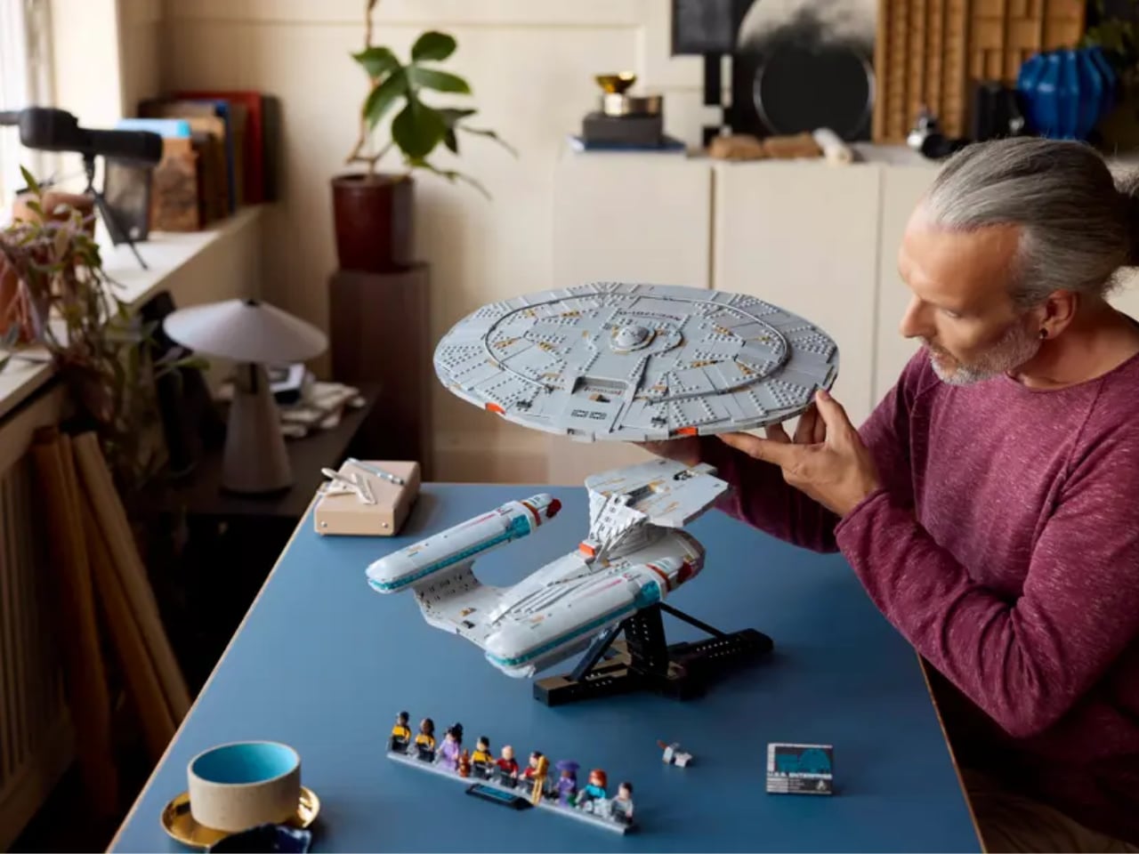
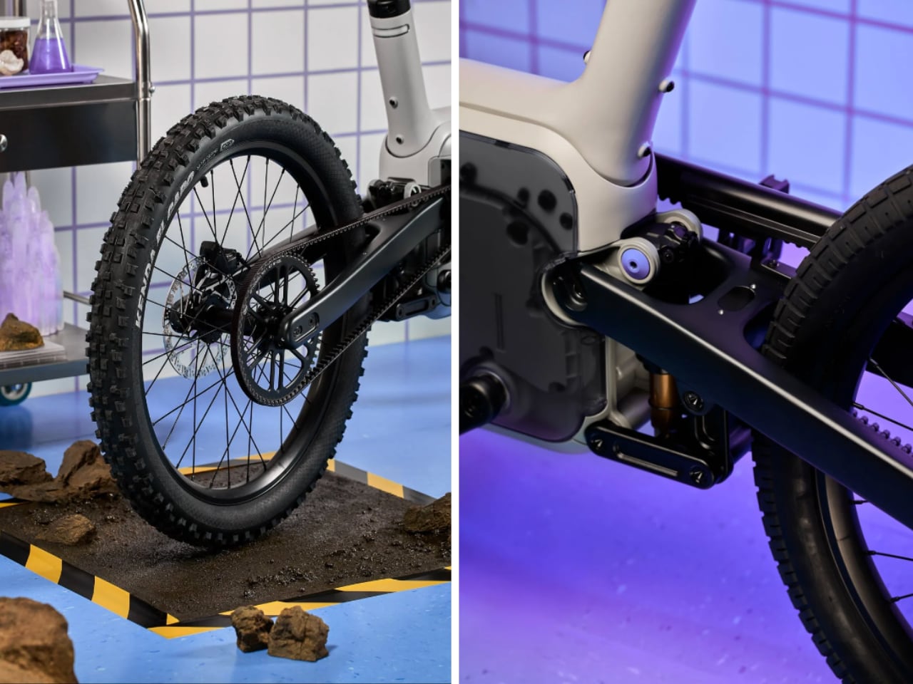
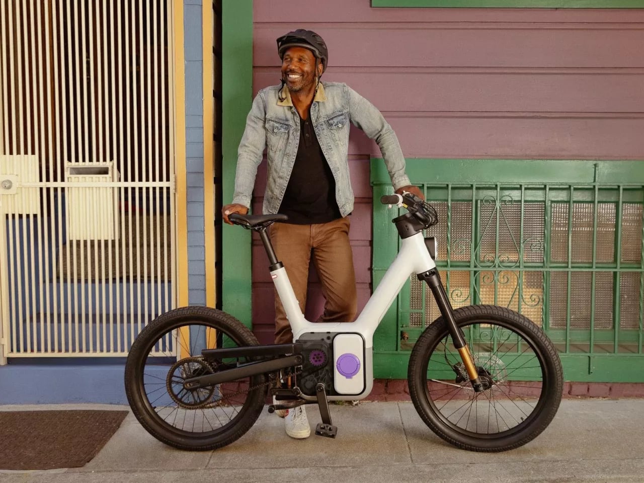
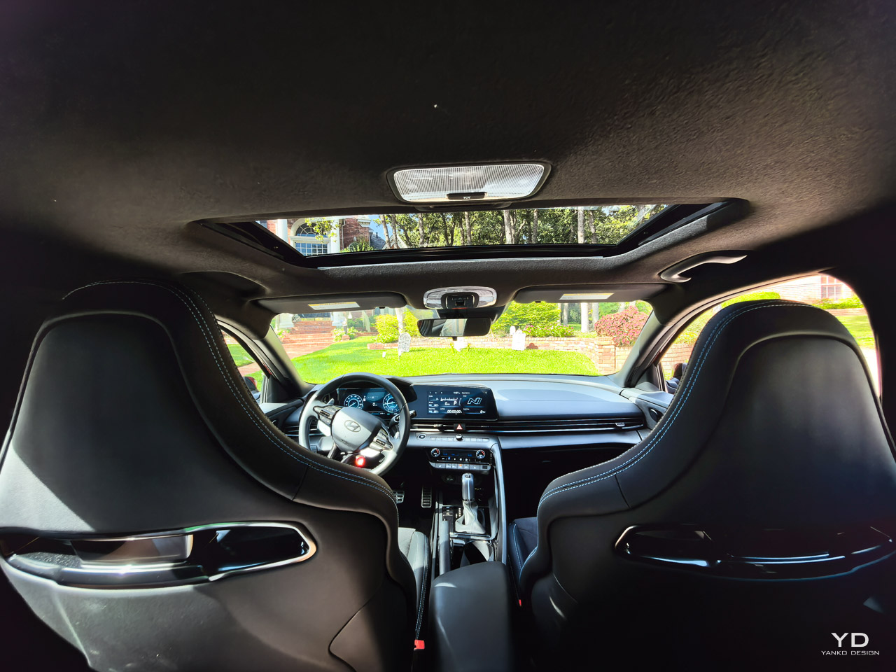
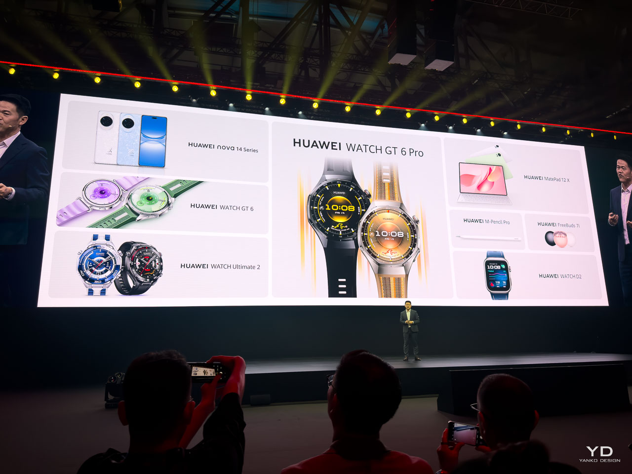
At Paris’s Vélodrome National, Huawei staged its most ambitious ecosystem showcase to date. The event focused on an interconnected lineup of wearables, smartphones, tablets, audio, and creative software. The strategy challenges Apple’s ecosystem advantage while addressing gaps competitors have not resolved.

Designer: Huawei

Huawei reports 200 million wearable shipments worldwide and cites the number one global position in wrist-worn devices during the first half of 2025. The GT Series alone has shipped 54 million units. These totals frame why Huawei sees itself as a category leader.

Consider a cyclist who needs real-time power data without expensive meters, a diver 40 meters down losing buddy contact, a creator editing 4K footage on location, someone requiring medical-grade blood pressure monitoring, or an artist who wants PC-level tools on mobile. This Paris showcase addresses each scenario with technology that stretches what consumer electronics can do.

Revolutionary Technology Addresses Real-World Problems

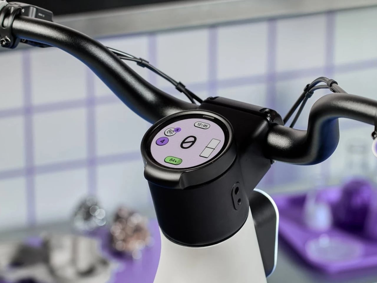
This launch connects breakthrough innovations across product categories to solve problems competitors have not addressed. The Watch GT 6 Pro introduces what Huawei describes as an industry-first virtual cycling power system that calculates real-time output without external power meters. According to Huawei, more than 1,000 wind tunnel experiments informed resistance models for varied riding scenarios. Riders enter basic inputs, including bike weight and body weight, then see power data in real time.

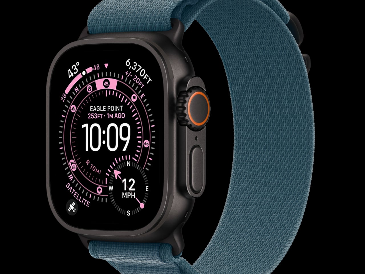
The Ultimate 2 debuts what Huawei positions as a sonar-based underwater messaging system. Divers can exchange preset messages at depths up to 30 meters, which addresses a safety gap that traditional dive computers do not solve. The system allows pairing with up to 50 diving buddies before descent, with preset message capability once underwater. During emergencies, pressing the upper left button sends an SOS alert that propagates through nearby watches, creating a multi-point safety network extending coverage beyond the initial 30-meter range through relay capabilities.

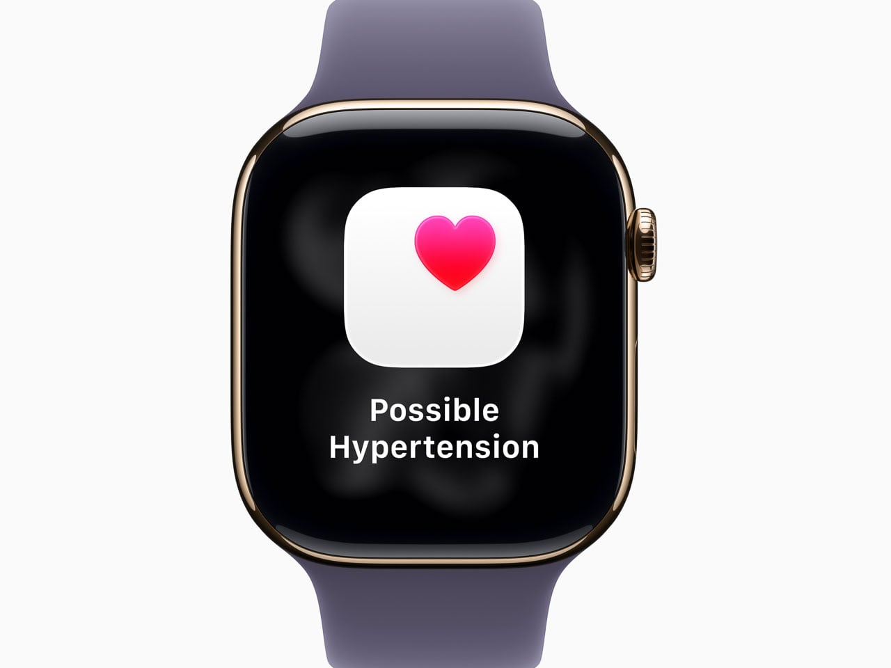
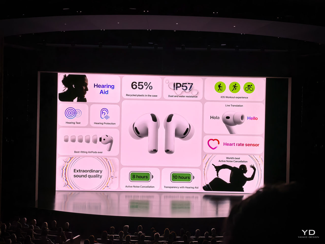
The Watch D2 offers 24-hour ambulatory blood pressure monitoring that Huawei says is certified by TÜV Rheinland. The goal is clinical-grade accuracy in a consumer device. Users can set up to 10 separate reminders per day or configure multiple consecutive measurements within custom time periods with 30 or 60-minute intervals. PulseWave Arrhythmia Analysis provides continuous heart health monitoring in the background, while a new emotional well-being indicator adds mental health tracking.

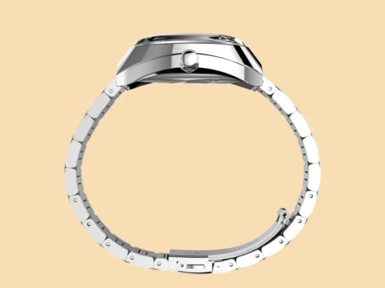
Complete Wearables Portfolio: Four Watches Targeting Every User

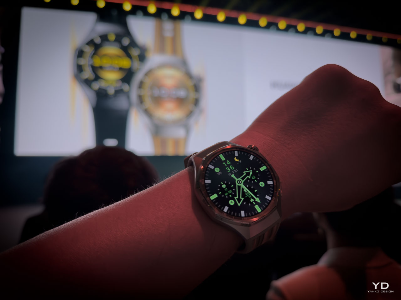
Watch GT 6 Pro: Professional Sports Authority

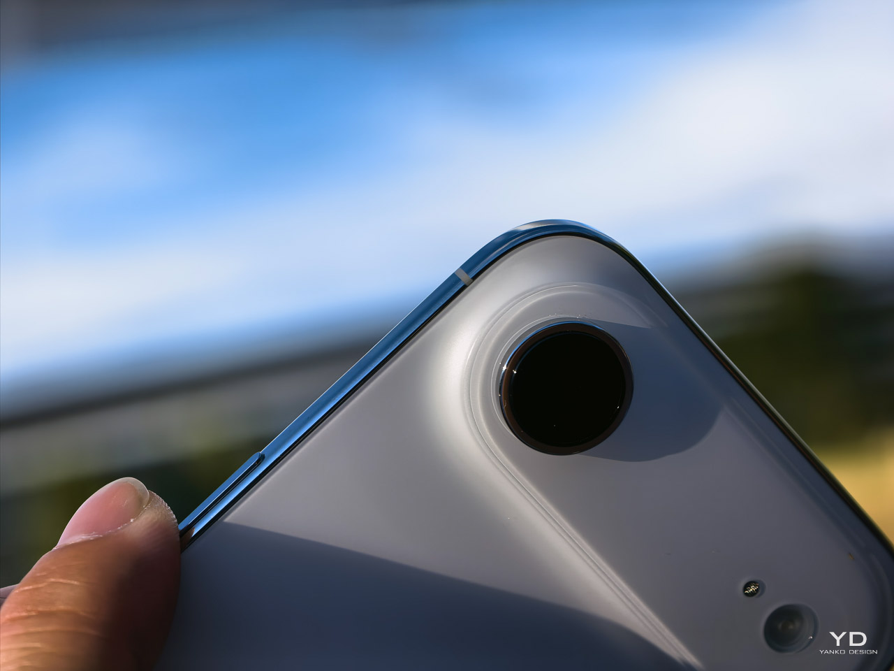
The GT 6 Pro keeps the octagonal design and adds a 3D bezel for dynamic highlights. The 1.47-inch AMOLED reaches 3,000 nits peak brightness, a 150 percent improvement for sunlight visibility. Aerospace-grade titanium with a hard coating improves scratch resistance. IP69 and 5ATM ratings support high-pressure water jets and swimming. Do not use these ratings to imply scuba diving.

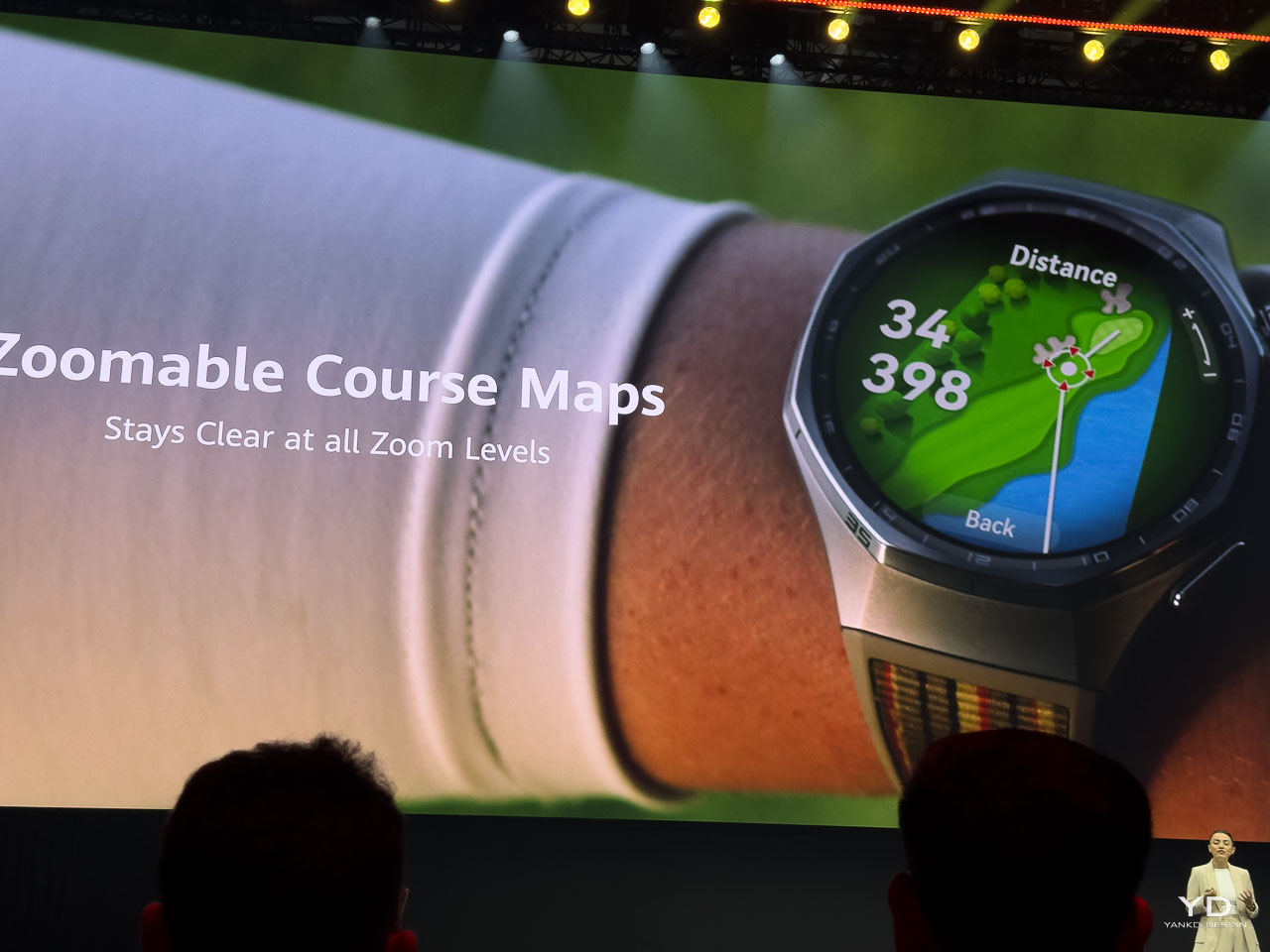
Battery life reaches up to 21 days with light use and about 12 days in typical use. High-silicon batteries increase energy density by 37 percent. Trail running mode runs up to 40 hours, a 67 percent increase. Golf integration includes over 17,000 courses worldwide with precise distance measurements between 82 points.

The watch features the new Huawei Sunflower positioning system with 20% enhanced accuracy and introduces the 32G IMU sensor for improved fall detection. Sports capabilities span skiing (three modes including snowboarding and cross-country), running with real-time form analysis, and golf with half-scoring after each ninth hole.

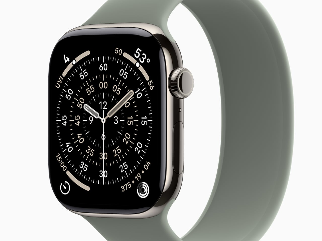
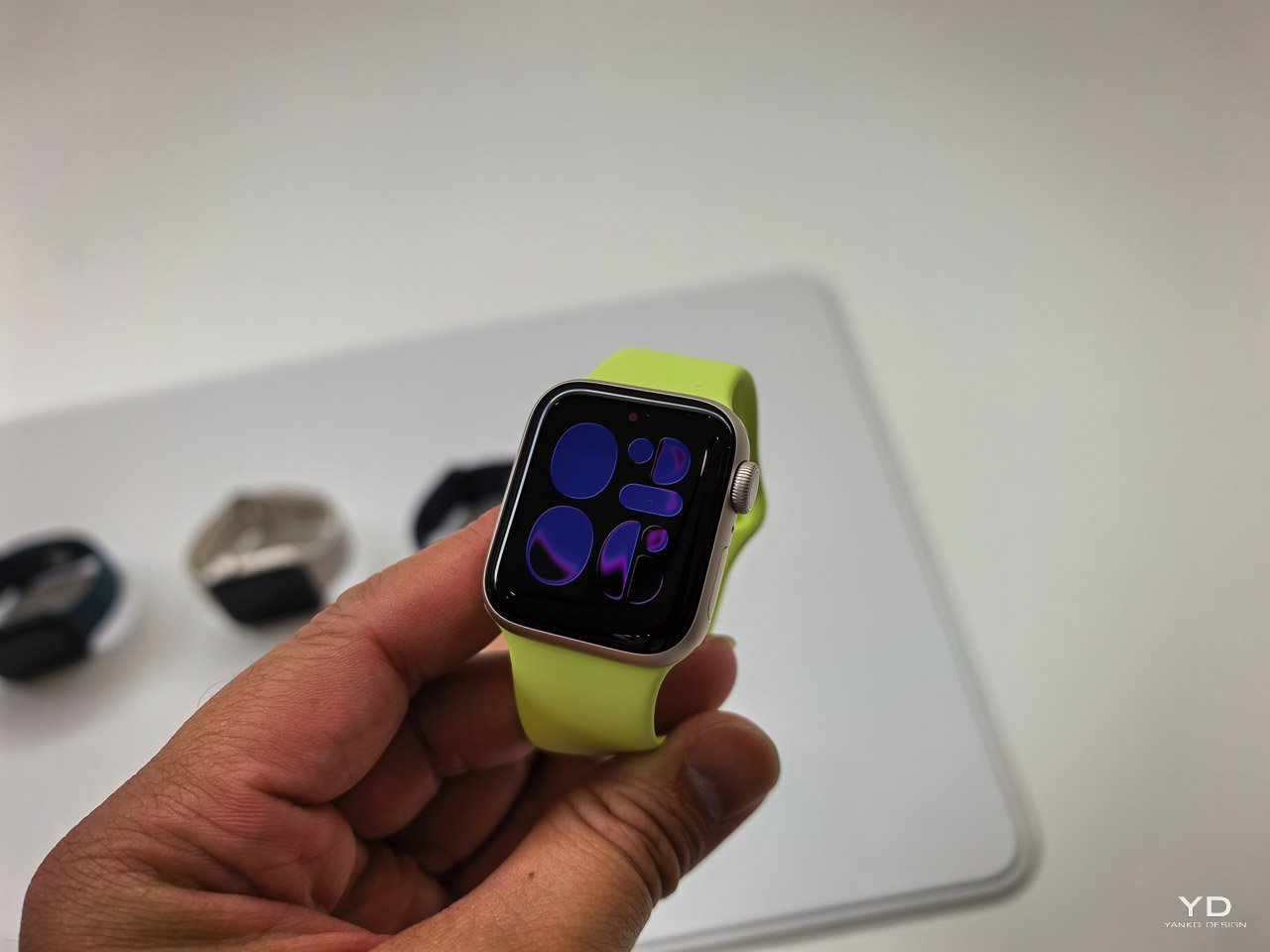
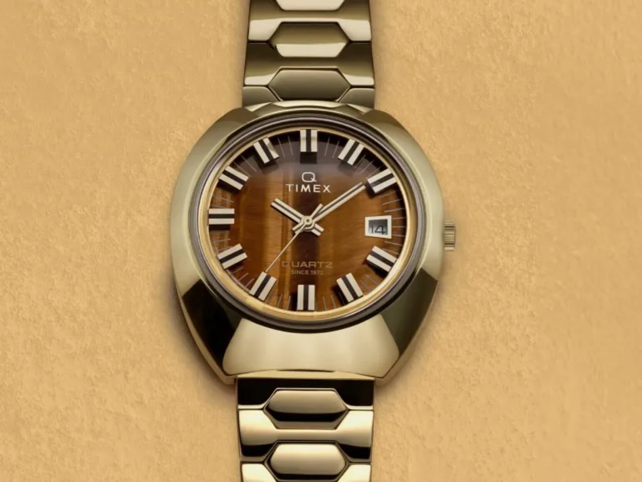
Watch GT 6: Emotional Intelligence for Mainstream Users

The standard GT 6 focuses on comprehensive health monitoring with emotion detection capability. According to Huawei, the watch can intelligently detect and record three different emotional states with upgraded emotional well-being features compared to previous generations. Over 100 animated “PatWatch” faces provide instant mood enhancement, while guided breathing exercises offer relaxation support.

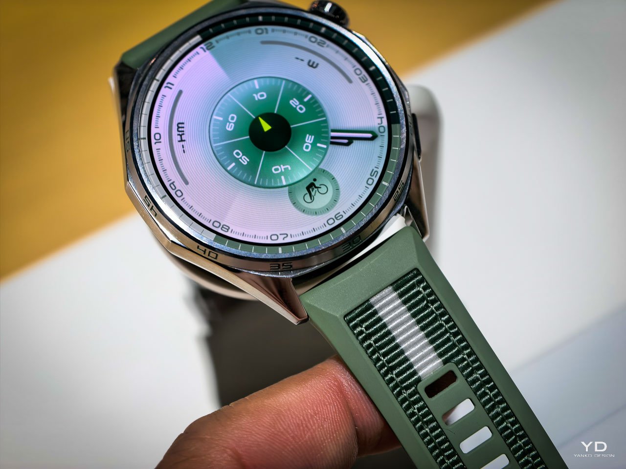
The 41mm model features adjustable loop lugs for smaller wrists, with a rounded bezel and numbered scales creating a sleeker appearance. The purple corrugated strap combines fashion with all-day comfort, available in five color options for personalization. Construction uses 316L stainless steel that balances durability with lightweight comfort for daily wear.

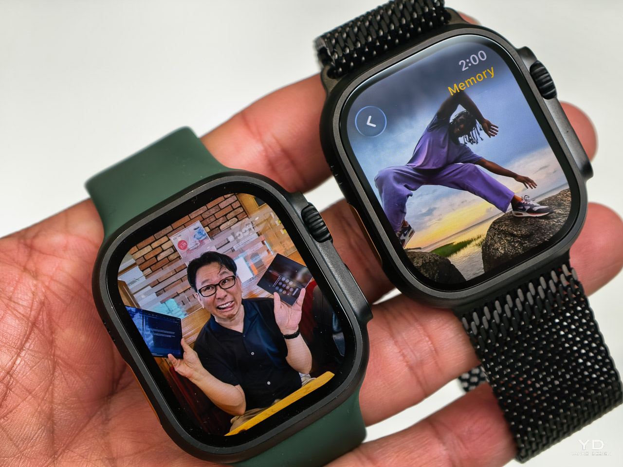
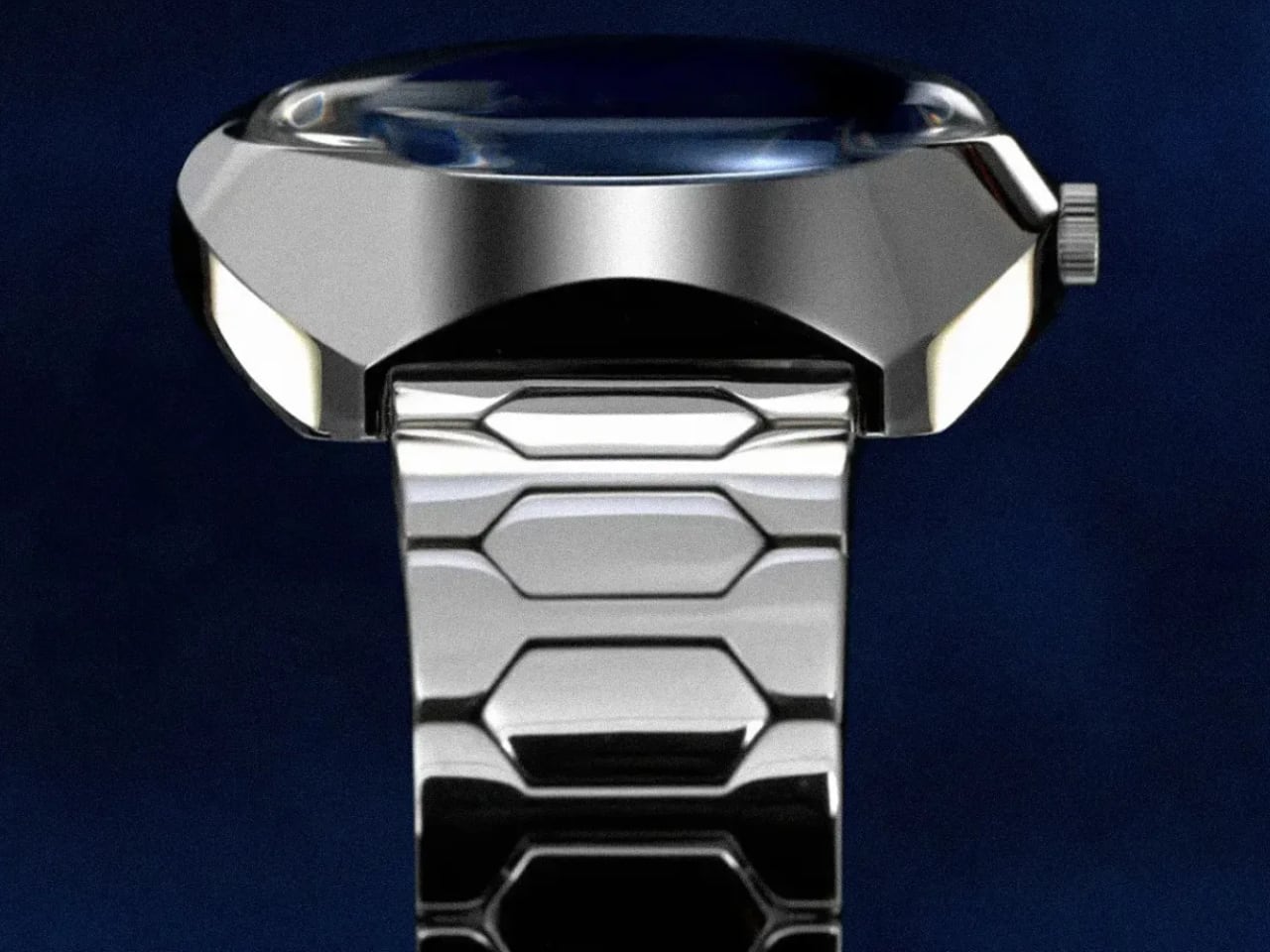
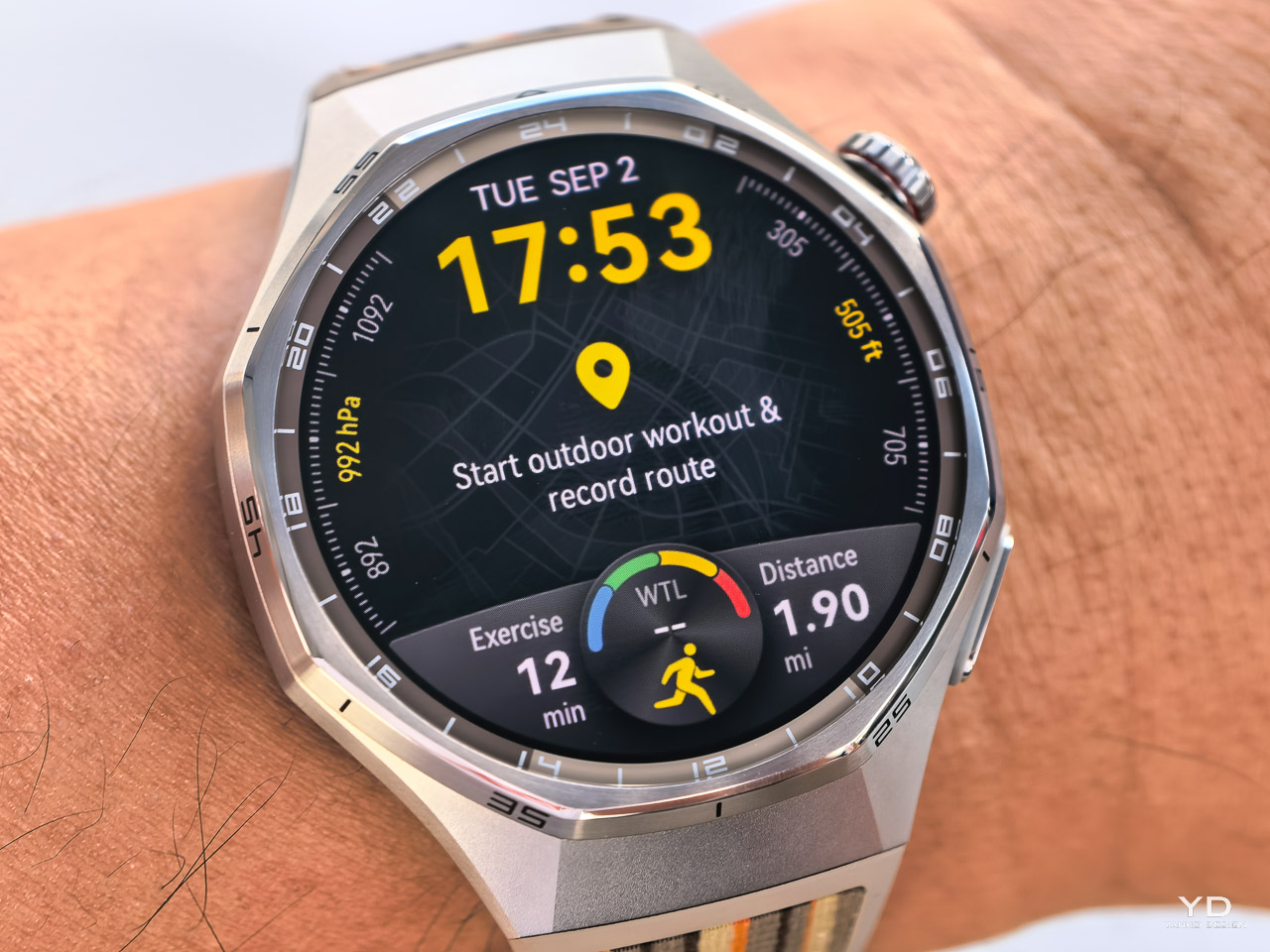
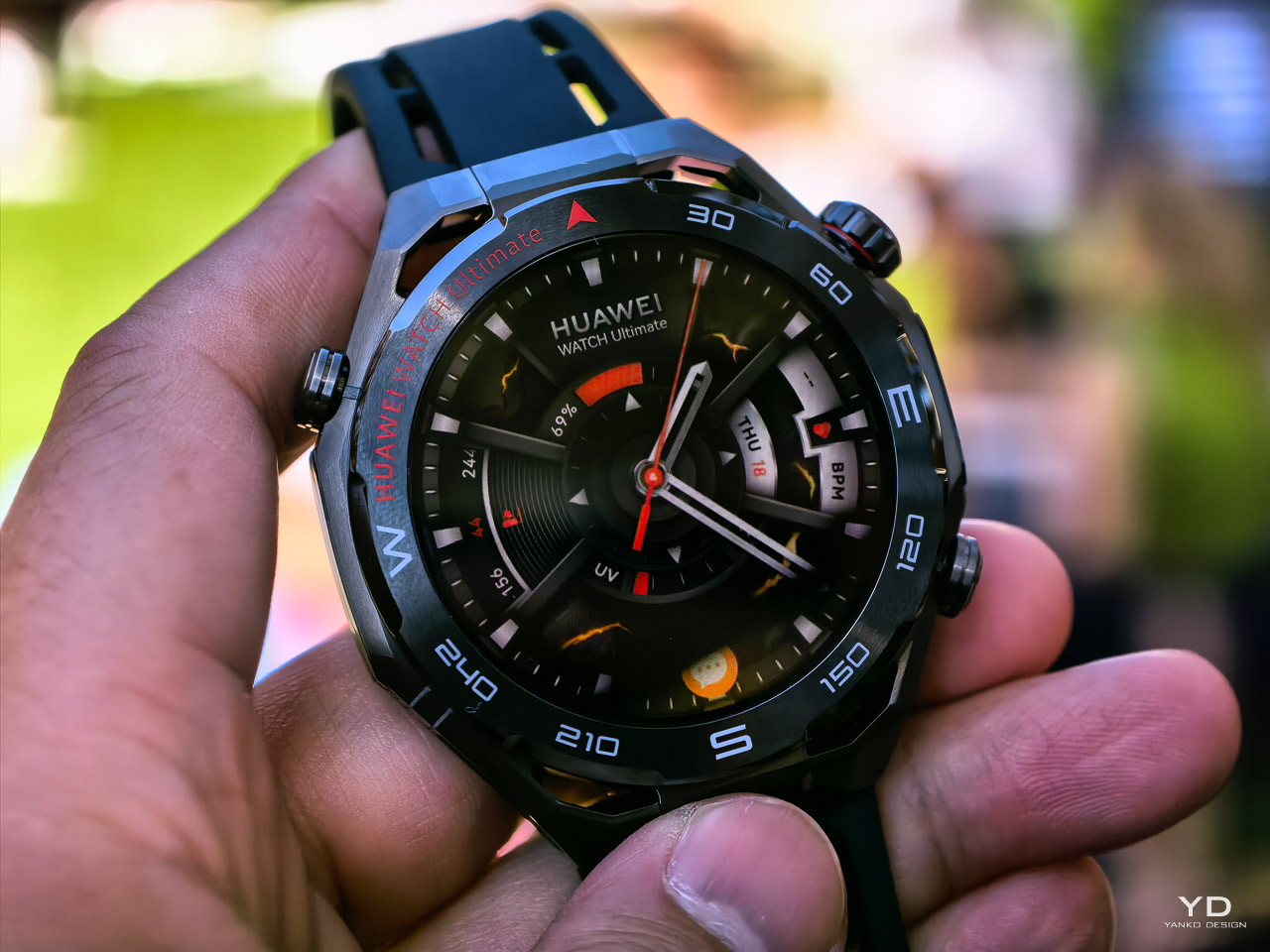
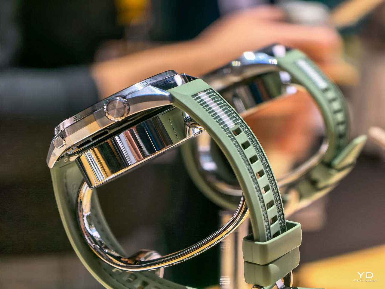
Watch Ultimate 2: Extreme Adventure Technology

The Ultimate 2 represents Huawei’s direct challenge to the Apple Watch Ultra’s adventure positioning. According to Huawei, the octagonal hollow design uses zirconium-based liquid metal construction with enhanced hardness coating that triples case durability compared to previous generations. The 3,500 nit LTPO display ensures visibility in conditions where Apple Watch Ultra users struggle with screen readability.

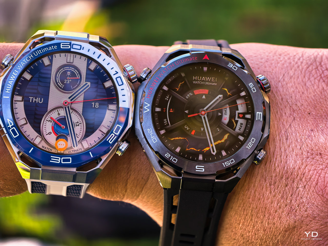
Huawei describes a re-engineered antenna that uses the case as a booster for NFC payments, eSIM calls, and navigation in weak-signal areas. The company claims improved route precision versus competing outdoor watches. Independent testing will need to confirm this. Battery performance reaches 4.5 days with all features active, extending to 11 days in battery saver mode. For context, Apple Watch Ultra delivers 36 hours with intensive use, making Huawei’s claims significant if validated.

Golf integration spans over 70,000 course maps worldwide with AI caddy functions providing club suggestions and green slope directions. Camera control supports Insta360 and DJI devices with simple double-tap commands, transforming activity stats into dynamic video stickers for sports like hiking, biking, snowboarding, diving, and skiing. This ecosystem integration directly targets adventure content creators who find Apple Watch camera controls limited.

The X-TAP all-in-one sensing system combines ECG, PPG, and tactile sensors positioned on both the side and back of the watch for what Huawei describes as faster, more comprehensive health monitoring than competing devices. At high altitudes, real-time fingertip SpO2 measurement helps guard against altitude sickness risks that traditional wrist-based sensors may miss. AI noise reduction using an NPU earned the highest five-star certification from SGS, ensuring crystal-clear calls in wind and noise conditions where other smartwatches fail. Huawei positions these capabilities as superior to Apple Watch Ultra’s more basic health sensors and communication features.

Smartphone Innovation: Nova 14 Series Redefines Mobile Photography

Nova 14 Pro: Ultra Chroma Camera System Breakthrough

The Nova 14 Pro introduces Huawei’s first Ultra Chroma Camera system with a 50MP RYYB sensor and physical variable aperture. According to the company, color restoration accuracy has increased by 120%, with spatial resolution improvements exceeding 100,000 times compared to traditional smartphones. The XD Portrait Engine uses advanced algorithms to optimize portrait photography across multiple zoom levels.

The front camera system features a 50MP ultra portrait dual camera delivering 5x digital zoom and 2x optical zoom. Huawei’s industry-exclusive zoom technology provides 0.8x to 5x range effortlessly, while the industry’s first front ultra-speed snapshot captures falling objects with remarkable clarity. Three built-in portrait themes – Natural, Delicate, and Stylish – offer immediate customization options.

The ultra-thin 7.78mm body features curved edges in Pure White, Crystal Blue, and Classical Black colors. The 6.78-inch quad-curve display supports 120Hz adaptive refresh rate, powered by a 5,500mAh battery with 100W SuperCharge Turbo. AI capabilities include Best Expression for post-capture facial adjustments and AI Remove for unwanted element elimination.

Advanced AI features extend beyond photography to interactive experiences. Lock screen games include Emoji Cross for bouncing emojis and AirHoop for gesture-controlled basketball shooting. AI messaging hides content when someone peers over shoulders, while exclusive AI gesture control enables touchless operation – scrolling videos while cooking or capturing screenshots by grabbing air.

Nova 14: Mainstream Excellence with Premium Features

The standard Nova 14 achieves even greater thinness at 7.18mm while maintaining the same 5,500mAh battery and 100W fast charging as the Pro model. The 6.7-inch OLED flat-edge display supports 120Hz refresh rates with intelligent adjustment capabilities down to 20Hz for battery optimization.

Camera upgrades include a 50MP RYYB ultra-vision main camera, telephoto lens, and ultra-wide macro camera system. The adaptive multifocal dual flash captures perfect moments in challenging lighting conditions, while maintaining color consistency across zoom ranges from 1x to 10x magnification.

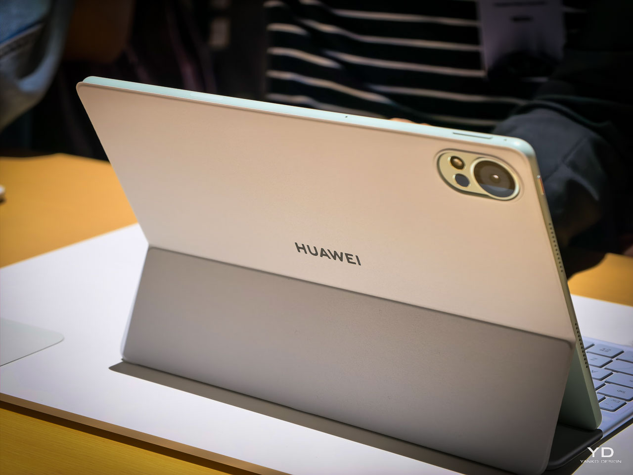
Professional Tablet Computing: MatePad 12X Brings PC-Level Capabilities

The MatePad 12X features a pearlescent finish with seamless all-metal body construction, available in elegant green and pristine white colors. At 5.9mm thickness and 555g weight, it achieves ultra-portable dimensions while maintaining professional capabilities that directly challenge iPad Pro dominance in creative markets.

The upgraded paper matte display uses high-precision nanoscale etching technology, reducing sparkle by 50% compared to previous generations. The 12-inch LCD panel delivers 1000 nits peak brightness with 140Hz refresh rate, featuring an 88% screen-to-body ratio and 3:2 aspect ratio optimized for productivity workflows.

Huawei Notes includes AI handwriting enhancement and note replay functionality, synchronizing written notes with audio recordings for comprehensive meeting capture. PC-level video editing capabilities, developed in partnership with Phil Mora, enable professional content creation on mobile. The new drawing feature allows animation creation directly on video tracks using the M-Pencil Pro.

Performance improvements reach 27% better than previous models through enhanced hardware and more efficient cooling systems. Wi-Fi 7 connectivity provides enhanced stability for gaming and live streaming, while the large battery supports 66W supercharge capability. Live multitask features unlock interactive touch controls for editing and office tasks.

M-Pencil Pro: Professional Creative Tool Revolution

The M-Pencil Pro incorporates over 300 precision components with advanced pressure sensors detecting subtle touch variations. The premium tip features three layers – nickel, gold, and platinum – for premium tactile feedback that rivals professional art tools. Three interchangeable pen tips serve different creative needs.

Gesture control enables pinch-to-open radial menu access, while the embedded micromotor provides subtle vibration feedback confirming commands. The quick button launches preset favorite applications with single presses. Nearlink technology ensures accurate stroke translation, while the innovative rotate gesture automatically aligns brushes with stylus tilt and rotation for authentic artistic expression.

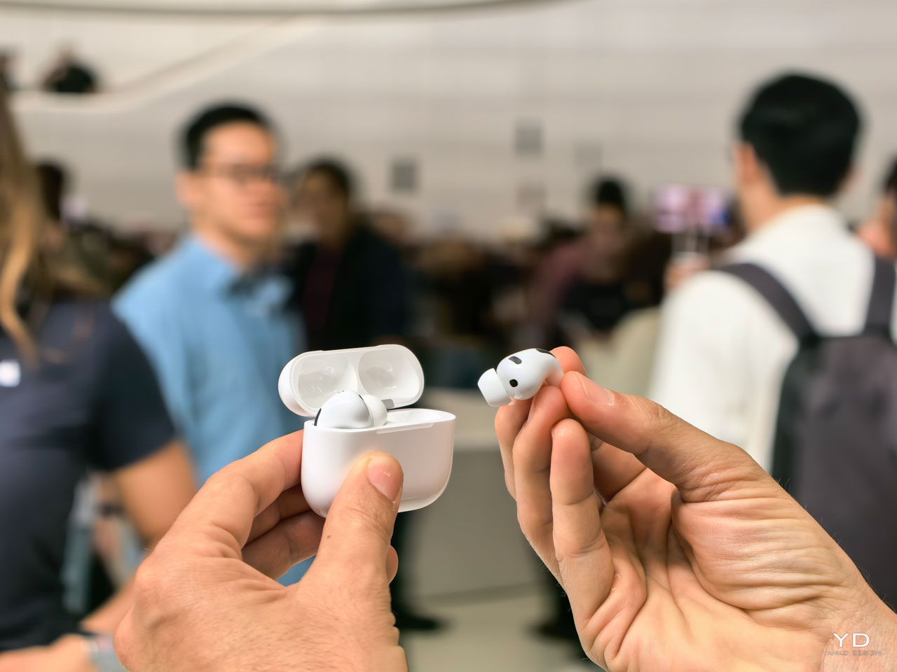
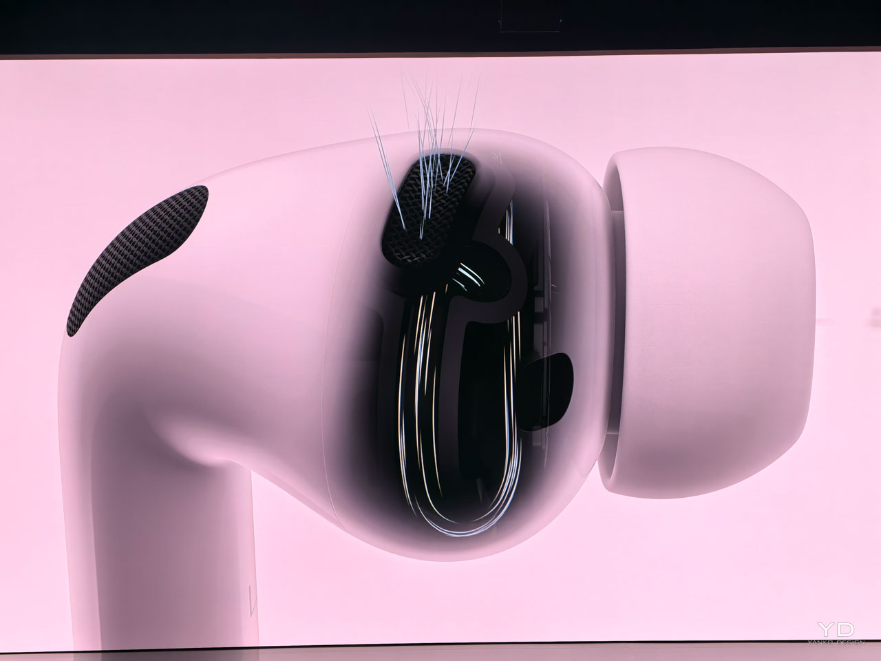
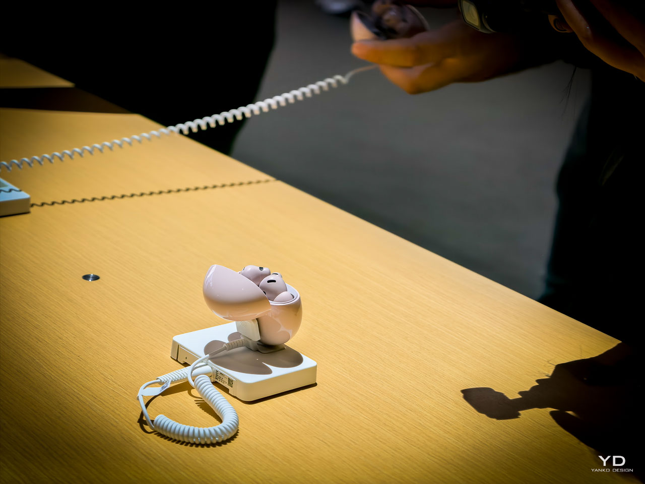
Audio Excellence: FreeBuds 7i Advances Noise Cancellation

The FreeBuds 7i introduces Dynamic ANC 4.0, which Huawei describes as their most advanced noise cancellation technology. The system intelligently adapts to ambient environments, automatically adjusting cancellation levels with faster response times and lower latency than previous generations. Performance enables clear audio immersion in noisy cafes or crowded subway environments.

Bone conduction microphones enable clear calls in environments with noise levels up to 90 decibels. The new six-axis head motion sensor provides 360-degree head tracking for spatial audio experiences with independent sound field calculation capability. This works universally with any phone or tablet, not just Huawei devices.

The circular case design fits naturally into bags or pockets, available in Mirandi Pink, White, and Black colors. Four ear tip sizes ensure proper fit across different users. The new Huawei Audio Connect app, compatible with both Android and iOS devices, launches at the end of September in major application stores.

Creative Ecosystem: GoPaint Community and Tools

The MatePad 12X comes pre-installed with the acclaimed GoPaint app, which now serves over 5 million users across 30+ countries. Intelligent color extraction allows effortless color sampling from any image, while the recently added animation feature enables frame-by-frame animation creation without limits.


The 2025 GoPaint Activity opens with five categories, including an all-new animation category. Last year’s activity received over 6,000 high-quality submissions while partnering with over 20 art schools. This creative ecosystem demonstrates Huawei’s commitment to fostering digital artistry beyond hardware capabilities.

Strategic Positioning: Ecosystem Warfare and Brand Evolution

This launch represents Huawei’s most direct challenge to Apple’s ecosystem integration, addressing specific pain points competitors have ignored. The underwater communication system creates an entirely new product category for adventure sports enthusiasts, while cycling virtual power eliminates cost barriers that neither Garmin nor Apple has solved comprehensively.

The Nova 14 series’ Ultra Chroma camera technology directly challenges Google’s computational photography leadership and Apple’s portrait mode capabilities. According to Huawei, the 120% improvement in color restoration accuracy could reshape smartphone photography expectations among professional users if validated through independent testing. For tablet productivity, the MatePad 12X’s PC-level capabilities with M-Pencil Pro target iPad Pro users who find Apple’s ecosystem limiting for professional creative work. The Phil Mora video editing partnership and animation features suggest deeper understanding of creative professional requirements than previous Android tablet manufacturers. Medical-grade blood pressure monitoring positions Huawei ahead of traditional consumer health tracking, potentially opening healthcare market segments that smartwatch competitors have struggled to penetrate with clinical credibility.

Beyond technical specifications, Huawei positions itself as “a brand for the young at heart,” recognizing that younger users seek to be seen, heard, and understood while focusing on personal growth. This manifests through animated watch faces, gesture controls, creative tools, and community-building initiatives that integrate entertainment elements with lifestyle experiences.

The Huawei Health Multi-Pass provides up to 90 days of free access to partner services for GT 6 and Ultimate 2 purchasers, while regional payment partnerships span Europe, Latin America, and Asia-Pacific markets. The “Enjoy Your Moment” proposition has reached 18 countries with almost 1,000 events and over 6,000 attendees, extending beyond hardware into lifestyle experiences. Aggressive pricing challenges established competitors: Watch GT 6 starts at $249, while the GT 6 Pro begins at €379, offering unique capabilities that Apple Watch and Garmin alternatives lack.

Testing Will Determine Real-World Performance Claims

While Huawei’s specifications and demonstrations appear impressive across all product categories, independent testing will determine whether these devices deliver on their ambitious promises. The cycling virtual power accuracy, underwater communication reliability, medical-grade blood pressure monitoring, Ultra Chroma camera performance, and PC-level tablet productivity require verification under real-world conditions.

The company’s track record provides confidence, but several technologies represent entirely new territory for consumer devices. The Ultimate 2’s underwater communication, the Nova 14’s Ultra Chroma imaging system, the MatePad 12X’s professional creative capabilities, and the Watch D2’s medical certifications need validation against established benchmarks in their respective categories.

Comprehensive testing will evaluate battery life claims under actual usage patterns, camera performance across lighting conditions, tablet productivity workflows, and the practical utility of health monitoring advances. This Paris launch represents significant technological ambition across multiple product categories – now the industry will discover whether execution matches the innovation promises.

Conclusion: Ecosystem Warfare Intensifies

Huawei’s Paris showcase demonstrates that the next phase of consumer electronics competition won’t be won through individual product superiority, but through comprehensive ecosystem experiences that solve real-world problems competitors have ignored. By addressing specific pain points – from cycling power measurement to underwater communication to medical-grade health monitoring – while maintaining ecosystem coherence, Huawei has positioned itself as the most credible challenger to Apple’s integrated approach.

The success of this strategy will depend on execution quality, software ecosystem development, and the company’s ability to maintain innovation momentum across multiple product categories simultaneously. For consumers, this marks the most ambitious expansion of an ecosystem challenger focused on solving specific problems rather than matching existing solutions.

The post Huawei Paris Launch: Watch GT 6 Pro and Ultimate 2 add underwater messaging, cycling power, and medical grade health first appeared on Yanko Design.

Apple’s Liquid Glass Eliminates Interface Chaos Without Clean Design Compromise

Apple’s new Liquid Glass design language refracts light, adapts to context, and, for the first time, makes iPhone, iPad, Mac, Watch, TV, and Vision Pro feel like one family instead of six separate worlds. Today’s announcement of iOS 26, iPadOS 26, macOS Tahoe, watchOS 26, tvOS 26, and visionOS 26 finally addresses the fundamental interface problem that overwhelms users when every app competes for attention simultaneously.

Designer: Apple

Liquid Glass Design Philosophy Transforms How Interfaces Feel

For the first time, Apple has coordinated visual changes across all six platforms simultaneously while preserving what makes each operating system unique. This unified approach eliminates the jarring disconnection between devices that forces users to mentally readjust interfaces constantly.

Liquid Glass works as a translucent material inspired by visionOS that uses real-time specular highlights for depth and reflections while dynamically transforming to prioritize content over interface chrome. The system affects controls, navigation, app icons, widgets, and typography, not just window decoration.

Adaptive numerals shift based on context. Tab bars and sidebars resize intelligently as users scroll. Lock screen text adapts to underlying imagery for optimal readability. When reading articles, controls fade gracefully. During video editing, timeline tools become prominent while other elements recede naturally.

The philosophy demonstrates sophisticated restraint, recognizing that people switch between iPhone, iPad, and Mac throughout their workday constantly. Visual consistency reduces cognitive friction while platform-specific optimizations preserve each device’s core strengths.

However, this beauty comes with trade-offs. The GPU-intensive rendering means older hardware shows simplified effects. More critically, transparency looks gorgeous indoors but reduces contrast in direct sunlight. On iPhone 17 Pro, the translucency feels alive, though outdoors contrast sometimes slips, a fundamental tension between aesthetic appeal and practical usability that runs throughout Apple’s implementation.

Apple Intelligence Live Translation in iOS 26 Tackles Communication Barriers

International conference calls and travel create genuine language barriers that slow down professional work. Apple Intelligence introduces Live Translation across Messages, FaceTime, Phone calls, and AirPods without the awkward delays that plague existing translation tools.

The implementation supports English, French, German, Portuguese, Spanish, Chinese, Japanese, and Korean in beta, with additional language support rolling out throughout 2025. Visual intelligence gains ChatGPT integration for screenshot analysis plus search connections to Google, Etsy, and other supported applications for finding similar images and products.

Genmoji creation lets users combine multiple emoji for more precise expression than settling for approximate matches. Workout Buddy brings personalized spoken motivation to Apple Watch, iPhone, and AirPods during exercise sessions using generative voices built from Apple Fitness+ trainer data.

Developer Integration Expands Intelligence Ecosystem

New developer APIs let third-party apps integrate directly with on-device Apple Intelligence models. Apps like Streaks now intelligently suggest and categorize to-do items, while CARROT Weather provides unlimited conversational weather insights. Detail: AI Video Editor helps creatives by generating teleprompter scripts from outlines or existing text.

The on-device foundation model enables privacy-protected features that work offline, positioning Apple Intelligence as enhancement rather than replacement for human capabilities.

Liquid Glass in iOS 26 Eliminates Daily Phone Frustrations

Robocalls and customer service holds remain unnecessarily stressful despite decades of smartphone evolution. Call Screening automatically handles unknown numbers while Hold Assist waits on line until live agents become available, finally automating the tedious aspects of phone communication.

Lock Screen customization includes adaptive time presentation that adjusts to imagery and delightful 3D spatial scenes that respond to lighting conditions and usage patterns. The adaptive design ensures readability across different wallpapers and times of day.

Enhanced Communication and Media Features

Messages gains screening for unknown senders, poll creation, and conversation backgrounds. Apple Music adds Lyrics Translation and Pronunciation features for select songs across multiple language pairs. Apple Maps introduces Visited Places tracking while Apple Wallet expands order tracking capabilities in beta.

The new Apple Games app creates a personalized gaming destination for discovering and reconnecting with favorite titles. CarPlay users get a compact view for incoming calls, Tapbacks in Messages, plus widgets and Live Activities.

AirPods receive significant updates allowing creators to record high-quality content and remotely control Camera app capture, bridging professional and consumer workflows.

iPadOS 26 Desktop-Class Windowing Maintains Touch Simplicity

Professional iPad users have complained about windowing limitations for years without adequate solutions. iPadOS 26 introduces an entirely new windowing system that organizes and switches between apps while maintaining iPad’s signature simplicity, the biggest iPadOS release ever.

Multiple windows cooperate intelligently without the chaos that plagues traditional desktop environments. A new menu bar appears with a swipe down from the top or cursor movement to the edge, bridging touch and cursor interfaces elegantly without compromising either interaction method.

Home and lock screen widgets plus app icons gain a new “clear look” that integrates seamlessly with Liquid Glass principles. The aesthetic maintains visual hierarchy while reducing interface noise.

Professional Workflow Enhancements

The supercharged Files app offers new organization capabilities and folder customization. Dock folders provide convenient access to downloads and documents from anywhere. The Preview app arrives on iPad with Apple Pencil Markup and AutoFill integration, making document workflows seamless instead of requiring third-party workarounds.

Journal comes to iPad for capturing everyday moments and special events using Apple Pencil or touch. Creative professionals gain Background Tasks, enhanced audio input control, and high-quality local recording capabilities that bring iPad closer to desktop-class content creation.

On iPad M4, the new windowing system finally feels intuitive, but older models show lag when managing multiple windows simultaneously. It shows Apple’s design ambition outpacing its hardware support, a reminder that innovation always moves faster than compatibility.

macOS Tahoe Transparent Menu Bar Transforms Desktop Experience

Desktop search hasn’t fundamentally changed since the 1990s despite massive computing power increases. macOS Tahoe delivers Spotlight’s biggest update ever with new browsing views, enhanced search, and action capabilities for sending emails or creating events through quick keys.

Search transforms from file finding into a command center for everything. Shortcuts integrate with Apple Intelligence models for complex task automation. The updated Control Center offers new personalization options alongside extensive customization choices.

Visual Customization Meets Functional Design

Folder icons can be customized with color, symbols, or emoji. Wallpapers and tints interact directly with Liquid Glass elements, creating cohesive visual experiences that adapt to user preferences. The menu bar becomes completely transparent, expanding visual space without hardware changes.

Live Activities from iPhone now appear directly on Mac for real-time event tracking. Continuity brings iPhone Phone app features including Recents, Favorites, Voicemails, Call Screening, and Hold Assist directly to Mac, dissolving device boundaries.

On MacBook, the transparent menu bar is elegant at night but chaotic against a messy desktop, another example of the aesthetic versus practicality tension running throughout Liquid Glass implementation.

watchOS 26 Predictive Health Monitoring Gains FDA Validation

Fitness tracking has focused on reactive data collection rather than proactive health insights. Apple Watch gains a sleep score feature for understanding sleep quality and taking steps toward more restorative rest.

FDA-cleared hypertension notifications represent a significant medical advancement, alerting users when signs of chronic high blood pressure are detected so they can begin potentially lifesaving behavioral changes or treatment. The feature uses machine learning algorithms validated in large clinical studies but remains limited to Apple Watch Series 9 and later, Apple Watch Ultra 2 and later.

Enhanced Interaction and Productivity

watchOS 26 introduces two new watch faces: Flow and Exactograph. Smart Stack hints offer proactive prompts for actionable suggestions that appear when most relevant. Live Translation in Messages automatically translates texts into preferred languages.

A new wrist flick gesture dismisses notifications, silences alarms, and returns to the watch face on Series 9 and later models. On Apple Watch, wrist flick works instantly, while hypertension alerts inspire trust but raise accuracy questions. It positions Apple as both a lifestyle brand and a quasi-medical provider, which raises trust and liability questions. The Notes app finally arrives on Apple Watch, completing the productivity suite across Apple’s ecosystem.

Workout Buddy provides personalized, motivational audio insights during workouts with dynamic generative voices, while the Workout app debuts its biggest layout update since introduction.

Apple TV Social Features Transform Living Room Entertainment

Apple TV has lacked genuine social capabilities despite being shared household devices. Sing-along sessions reach new levels through Sing in Apple Music, transforming iPhones into wireless microphones for Apple TV with friends joining to queue songs or react with onscreen emoji.

Real-time lyrics and visual effects bring performances to life on the biggest screen in the home, making group entertainment interactive instead of passive consumption. Contact Posters on FaceTime simplify video calling from the living room while profile updates allow users to quickly return to personalized recommendations, playlists, and watchlists.

Vision Pro Persistent Spatial Computing Enables Collaboration

visionOS 26 brings powerful spatial experiences including widgets that integrate seamlessly into users’ spaces and persist across sessions instead of resetting each time. More expressive, realistic Personas and spatial scenes offer lifelike depth for photos.

Spatial browsing transforms Safari articles and lets developers embed 3D objects directly into web pages. Users can share Vision Pro experiences with people in the same room for collaborative movie watching or work sessions. iPhone unlocking while wearing Vision Pro plus hand and eye data saving makes sharing easier than ever.

A new interactive Jupiter environment lets users accelerate time to observe the planet’s massive storms swirling across its surface. Native playback support arrives for 180-degree, 360-degree, and wide field-of-view content from action cameras including Insta360, GoPro, and Canon models.

Comprehensive Accessibility Features Expand User Access

New accessibility features bring comprehensive customization to the Apple ecosystem. Accessibility Nutrition Labels on the App Store inform users of supported accessibility features before downloading apps, improving discoverability for users with disabilities.

The Magnifier app for Mac connects to external cameras for users with low vision to zoom in and interact with surroundings. Accessibility Reader offers systemwide reading mode with extensive font, color, and spacing options plus Spoken Content support.

Braille Access provides powerful interaction methods for braille users with connected displays. Live Listen controls come to Apple Watch with real-time Live Captions for users who are deaf or hard of hearing, ensuring the design revolution includes comprehensive user access.

Historical Context Reveals Design Evolution Strategy

Liquid Glass represents Apple’s most significant design evolution since the iOS 7 transformation from skeuomorphic to flat design in 2013. This latest pivot toward adaptive translucency aims to solve the interface chaos created by decades of feature accumulation across multiple platforms.

The simultaneous rollout across six platforms signals Apple’s confidence in unified design language while acknowledging the performance and usability trade-offs. GPU-intensive rendering limits older devices to simplified effects, and contrast issues in bright environments reveal the ongoing tension between beauty and functionality.

All updates are available today as free software downloads. Apple Intelligence launches in beta with expanding language support throughout 2025. Some features remain region-limited, particularly hypertension notifications which require specific hardware and regulatory approval.

This coordinated approach demonstrates how thoughtful design philosophy can unify technical capabilities across an entire ecosystem while maintaining each platform’s unique identity, a balance that will define Apple’s interface evolution for years to come.

The post Apple’s Liquid Glass Eliminates Interface Chaos Without Clean Design Compromise first appeared on Yanko Design.

AirPods Pro 3 Hands-On: The Ultimate Everyday Wearable That Redefines Personal Technology

Wireless earbuds reached a ceiling two years ago. Every major brand promises the same three things: decent sound, acceptable battery life, and noise cancellation that works sometimes. The result feels like choosing between different flavors of mediocre, where each model excels at one thing while failing at everything else.

Designer: Apple

Many years of testing dozens of wireless earbuds reveals the same pattern every time. Premium models cost $300+ but still can’t handle phone calls in windy conditions. Budget options sound terrible during workouts. Mid-range choices offer compromise everywhere without excellence anywhere.

After experiencing the AirPods Pro 3 this week, those industry limitations feel like ancient history. The difference becomes apparent the moment you slide them into your ears and feel that perfect seal lock into place. This isn’t another incremental upgrade promising slightly better battery life or marginally improved sound. These breakthrough capabilities work together seamlessly to redefine what wireless audio can accomplish in your daily life.

The Fit Changes Everything

Putting on the AirPods Pro 3 feels different from any previous generation. The internal architecture was completely re-engineered while the external geometry of the ear tip was aligned to the center of the body for increased stability. The pre-installed ear tips fit perfectly right out of the box, creating that satisfying acoustic seal without any pressure points. Having five different tip sizes available, including a new XXS size, means virtually everyone can find their ideal fit.

This improved design delivers the most secure and best-fitting AirPods ever, utilizing over 10,000 ear scans with more than 100,000 hours of user research and an unparalleled dataset of more than 300 million points. The IP57 sweat and water resistance marks the first time any AirPods model offers this level of protection, built to handle tough workouts and unpredictable weather.

Audio That Delivers on Over-Ear Promises

The new multiport acoustic architecture precisely controls the airflow that carries sound into the ear, helping deliver an exceptional spatial listening experience. With next-generation Adaptive EQ, this architecture transforms the bass response, widens the soundstage so you hear every instrument, and brings vivid vocal clarity to higher frequencies across music, shows, and calls.

Active noise cancellation delivers a massive leap forward, delivering up to 2x more effectiveness than AirPods Pro 2, with 4x more noise removed compared to the original AirPods Pro. Apple demonstrated this across multiple challenging environments during the demo: the constant drone of airplane cabins, the clatter and conversation of busy restaurants, and the persistent hum of office HVAC systems.

Across every environment during the controlled demos, the AirPods Pro 3 eliminated distracting background noise while preserving every nuance of your music, movies, and calls. The restaurant demo proved particularly impressive – cutting through the complex mix of conversation, kitchen noise, and background music that typically makes wireless earbuds struggle. The result is the world’s best ANC of any in-ear wireless headphones, made possible with ultra-low noise microphones and advanced computational audio combined with new foam-infused ear tips for greater passive noise isolation.

A more personalized Transparency mode means your own voice and the people speaking to you sounds more natural than ever, helping you stay connected to your surroundings without missing a beat. While listening to music with ANC enabled, AirPods Pro 3 now provide up to eight hours of music playback – a 33 percent increase over the previous generation.

Live Translation That Actually Works

Live Translation enables in-person communication across select languages and is available in beta. This transformational, hands-free capability is powered by computational audio and Apple Intelligence to help people easily connect whether they’re traveling to a new place, collaborating at work or school, or simply catching up with the people who matter most.

The system works through three key components, as demonstrated during Apple’s presentation. First, the AirPods microphones capture speech from both conversation participants. Second, computational models on your iPhone process the audio and generate translations using on-device Apple Intelligence. Third, the translated audio plays directly in your ears while simultaneously lowering the volume of the original speaker, creating space for you to process and think about what you’re hearing.

Unlike many translation devices that get confused when multiple people speak simultaneously, the AirPods Pro 3 handle complex audio environments with remarkable precision. The advanced microphone array and computational audio processing can isolate individual voices even in group conversations, ensuring accurate translations without the frustrating errors that plague other devices.

The deliberate pacing is intelligent. The system includes natural pauses that give your brain time to absorb the translated information before continuing. During the demo, these thoughtful breaks became essential for processing complex conversations rather than getting overwhelmed by a constant stream of translated audio.

When both people have AirPods with Live Translation enabled, the experience becomes seamless. Each person hears the other’s words translated into their preferred language, with the original speech automatically dimmed in the background. For conversations where only one person has the capability, your iPhone transforms into a horizontal display, showing live transcription of your words in the other person’s language.

The on-device processing means everything works without Wi-Fi or cellular connectivity once the language models are downloaded to your iPhone.

For international travelers, the AirPods Pro 3 become your essential translation partners that hear what you hear. Having traveled extensively to Japan and China where English isn’t widely spoken, this feature is a genuine game-changer for navigating foreign countries. The AirPods don’t just translate conversations – they should theoretically work for train announcements, airport boarding calls, and street-level interactions that make international travel challenging.

Think of it this way: your AirPods Pro 3 are constantly listening to your environment, ready to translate whatever audio reaches your ears. Whether it’s a subway announcement in Tokyo, a restaurant server explaining the menu in Shanghai, or directional help from locals, your translation partners are always active and processing the world around you.

Live Translation launches with support for English, French, German, Portuguese, and Spanish, with the crucial additions of Japanese, Korean, and Chinese (simplified) arriving before year-end – perfectly timed for travelers heading to Asia.

Heart Rate Sensing That Means Business

AirPods Pro 3 introduce Apple’s smallest ever heart rate sensor – a custom photoplethysmography (PPG) sensor that shines invisible infrared light pulsed at 256 times per second to measure light absorption in blood flow. Combined with sensor fusion from the AirPods Pro accelerometers, gyroscope, GPS, and a new on-device AI model on iPhone, users can start up to 50 different workout types, track their heart rate and calories burned, close their Move ring, and earn awards in the Fitness app.

With just AirPods Pro 3 and iPhone, you’ll also have access to Workout Buddy, a fitness experience powered by Apple Intelligence that incorporates your workout data and fitness history to generate personalized, motivational insights during your session. For added motivation, Apple Fitness+ users with AirPods Pro 3 can now view real-time performance metrics directly onscreen, such as heart rate, calories burned, progress on their Move ring, and the Burn Bar.

AirPods Pro 3 also increase battery life in Transparency mode by 67 percent over the previous generation with up to 10 hours with a single charge.

Hearing Assistance That Actually Matters

Beyond fitness tracking, the AirPods Pro 3 is a breakthrough for anyone with mild hearing loss. The automatic conversation boost feature dynamically elevates voices while reducing background noise, making conversations clearer and more intelligible in challenging acoustic environments.

Having mild hearing loss myself, this feature addresses one of the most frustrating daily experiences: trying to follow conversations in restaurants, offices, or crowded spaces where background noise overwhelms speech. The AirPods Pro 3 act as sophisticated hearing aids, amplifying the specific frequencies needed for speech clarity while suppressing distracting environmental sounds.

The 10-hour battery life in Transparency mode with hearing aid features enabled means all-day support without worrying about power. More importantly, both your own voice and others speaking to you sound more natural than ever, eliminating the artificial or echo-like quality that can make traditional hearing aids feel intrusive.

The Verdict After Initial Testing

After extensive testing with everything from $2,000 custom-fitted Breggz earbuds to premium over-ear headphones like the AirPods Max I reviewed for Yanko Design, the AirPods Pro 3 delivers something genuinely surprising. While the Breggz offered exceptional three-dimensional spatial audio and perfect custom molding, they came with significant downsides: unreliable touch controls during workouts, unknown long-term support from a new brand, and connectivity uncertainties that made them impractical for daily use despite their audio excellence.

The AirPods Pro 3 eliminates these compromises entirely. The audio quality matches what you’d expect from earbuds costing eight times more, while the integrated health tracking eliminates the need for separate fitness devices.

Most impressively, every feature enhancthe others rather than creating feature bloat. The perfect fit enables accurate heart rate sensing. The translation capability works seamlessly because of the superior microphone array. The extended battery life supports all-day hearing aid functionality.

For anyone still using previous-generation wireless earbuds, the upgrade path is clear. The combination of perfect fit, exceptional audio, hands-free translation, and precise health monitoring creates possibilities that extend far beyond traditional earbuds into genuine life enhancement territory.”

The post AirPods Pro 3 Hands-On: The Ultimate Everyday Wearable That Redefines Personal Technology first appeared on Yanko Design.

Apple’s September Event Reveals 10 Design Breakthroughs That Change Everything

Every September, Apple shows the world what’s possible when design meets engineering. This year’s “Awe Dropping” event delivered innovations that solve problems you didn’t know existed. Your iPhone, watch, and headphones are about to feel ancient.

These changes affect daily life in ways that become obvious once you experience them. Apple redesigned fundamental aspects of how we interact with technology. Here are the ten biggest design insights from Apple’s latest event.

iPhone Air proves ultra-thin phones can be incredibly strong

Apple debuted the all-new iPhone Air, the thinnest iPhone ever made, with pro performance. iPhone Air features a breakthrough titanium design that is elegant and light yet strong. The company solved the biggest challenge in thin phone design.

The back of iPhone Air is now protected with Ceramic Shield, and the front cover uses Ceramic Shield 2, delivering 3x better scratch resistance. This makes iPhone Air more durable than any previous iPhone. Strength and thinness no longer require compromise. Apple reversed years of increasing thickness through engineering breakthroughs.

This creates new possibilities for how phones feel in pockets and hands. The titanium frame provides structural integrity without adding bulk.

Center Stage camera creates perfect selfies automatically

Apple announced iPhone 17, featuring the new Center Stage front camera that takes selfies to the next level. The technology automatically frames selfies and video calls without manual adjustment. Bad selfie angles become impossible with this intelligent system.

The camera tracks faces and adjusts composition in real time. Video calls look professional without any effort from users. Group selfies include everyone perfectly without awkward repositioning.

Machine learning understands photography rules better than most people. The system creates flattering angles and proper framing consistently across all lighting conditions.

Aluminum unibody design revolutionizes Pro model construction

Apple built the iPhone 17 Pro with an Apple-designed vapor chamber that is laser-welded into a strong, light, and thermally conductive aluminum unibody. This delivers Apple’s best-ever performance and an enormous leap in battery life. The design represents a major departure from previous titanium construction.

The vapor chamber enables superior heat management during intensive tasks. Aluminum provides structural strength while remaining lightweight. The unibody construction eliminates weak points found in multi-piece designs.

This design choice prioritizes thermal performance over premium materials. The engineering breakthrough enables sustained high performance without overheating.

ProMotion displays become standard across all iPhone models

The 6.3-inch Super Retina XDR display with ProMotion is bigger and brighter, enabling supersmooth scrolling, immersive gaming, and improved efficiency on the base iPhone 17. Apple removed artificial barriers between product tiers. Smooth scrolling becomes available to everyone who buys an iPhone.

Gaming performance improves dramatically across all price points. The technology that made Pro models special now defines the entire lineup. This democratization of premium features shows Apple’s confidence in its technology leadership.

Users no longer need to choose between affordability and display quality.

Ceramic Shield 2 advances smartphone durability science

The new Ceramic Shield 2 front cover is tougher than any smartphone glass or glass-ceramic, with 3x better scratch resistance than the previous generation and reduced glare. For the first time, Ceramic Shield protects the back of Pro devices, delivering 4x better resistance to cracks than previous back glass.

This creates complete protection against drops and scratches. Users can feel confident using phones without bulky cases. Repair costs decrease significantly over the device lifetime.

Apple pushed material science boundaries to achieve these improvements. The technology makes phones more reliable and longer-lasting for everyday use.

Apple Watch gains hypertension monitoring capabilities

Apple introduced Apple Watch Series 11, offering the most comprehensive set of health features yet, longer battery life, an even more durable cover glass, and 5G cellular capabilities. Apple Watch Series 11 empowers users with notifications for signs of chronic high blood pressure, also known as hypertension.

Healthcare becomes proactive rather than reactive with this technology. Users receive early warnings about potential heart problems. Apple Watch positions itself as essential medical equipment.

FDA clearance for hypertension notifications is expected soon, and the feature will be available in more than 150 countries and regions this month. The feature could prevent heart attacks and strokes through early detection.

Sleep Score feature transforms rest quality understanding

With watchOS 26, Apple Watch can help users understand the quality of their sleep and how to make it more restorative with a new sleep score feature. Sleep is fundamental to a person’s health and critical to daily restoration.

The system analyzes multiple factors including heart rate and temperature. Users get actionable insights for improving sleep quality. The scoring system makes complex sleep data understandable for everyone.

This transforms how people think about rest and recovery. Sleep becomes measurable and improvable rather than mysterious.

AirPods Pro 3 delivers world-class noise cancellation

AirPods Pro 3 deliver unbelievable sound quality and the world’s best in-ear Active Noise Cancellation. They remove up to 2x more noise than the previous-generation AirPods Pro, and 4x more than the original AirPods Pro. This advancement eliminates more environmental distractions than ever before.

The updated design helps AirPods Pro 3 fit even better and provides greater in-ear stability during activities like running, HIIT, yoga, and more. Comfort improves alongside acoustic performance. Active users can trust the earbuds to stay secure during intense movement.

The engineering breakthrough makes quiet spaces possible anywhere. Concentration and focus become achievable in noisy environments.

Live Translation eliminates language barriers instantly

Live Translation comes to AirPods, making face-to-face conversations easier by helping users connect even if they don’t speak the same language. The earbuds become universal communication tools for any situation. Language barriers disappear during face-to-face interactions.

Business meetings across cultures become seamless experiences. Travel to foreign countries feels less intimidating. The technology bridges communication gaps through elegant design innovation.

This transforms how people interact across different languages and cultures. Real-time translation makes global communication effortless.

Crossbody Straps acknowledge changing phone usage patterns

The Crossbody Strap is compatible with iPhone 17 Silicone Case with MagSafe, iPhone 17 Pro cases, iPhone 17 Pro Max cases, iPhone Air Case with MagSafe, and iPhone Air Bumper. Apple officially acknowledges that phones function as primary creative tools.

Photography becomes more stable with hands-free operation. Content creators get professional camera stability from their phones. The design makes phones feel more like professional camera equipment than communication devices.

This accessory represents a fundamental shift in how Apple views phone usage. Mobile photography becomes a serious creative medium worthy of professional accessories.

Apple’s September 2025 event shows how thoughtful design solves real problems people face daily. These innovations prove that premium technology can become accessible while pushing entirely new boundaries. The changes affect how we work, communicate, and create content in meaningful ways that will reshape daily interactions with technology.

The post Apple’s September Event Reveals 10 Design Breakthroughs That Change Everything first appeared on Yanko Design.

When Crisis Becomes Canvas: The Q Timex 1972 Time Machine Reissue Proves Accessible Design Never Goes Out of Style

When time travel costs less than your phone bill, something interesting happens to our perception of value and design. The Q Timex 1972 Time Machine Reissue carries the DNA of design born from chaos, back when the watchmaking industry faced what historians call the Quartz Crisis , a technological upheaval that threatened to destroy centuries of Swiss mechanical tradition. While European manufacturers scrambled to preserve their heritage, American brand Timex saw opportunity where others saw disaster.

Designer: Timex

This new reissue, priced at $249 for the silver variant and $279 for the gold , represents more than nostalgic throwback marketing. The watch embodies a moment when crisis forced innovation, when accessibility became a design philosophy rather than a compromise. In a world where good design often carries prohibitive price tags, the Time Machine Reissue stands as proof that democratic design principles still matter.

Design Democracy in a 39mm Package

The original 1972 Q Timex emerged during American watchmaking’s most defining period. Swiss manufacturers, comfortable with their mechanical supremacy, initially dismissed quartz technology as a passing fad . Timex took the opposite approach, embracing the precision of quartz while wrapping it in bold, unapologetically American aesthetics. The hexagonal link bracelet wasn’t trying to mimic Swiss elegance. The tonneau case didn’t apologize for its unconventional proportions.

These design choices reflected a different philosophy entirely. Where Swiss watches emphasized exclusivity and tradition, the Q Timex prioritized accessibility and forward-thinking design. The floating hour markers, achieved through applied indices that cast subtle shadows around the dial , created visual depth without requiring expensive manufacturing techniques. Each element served both functional and aesthetic purposes.

The wood-grain dial pattern, available in deep red on the gold-toned case, represented pure design confidence. This wasn’t subtle or understated. The Time Machine demanded attention, celebrating its quartz precision rather than hiding it. For a brand targeting everyday Americans, this boldness made perfect sense.

The coin-operated battery hatch on the caseback tells its own story about user-centered design. In 1972, when the original cost $125 (equivalent to roughly $800 today) , Timex understood that luxury shouldn’t require specialized service. Users could replace their own batteries using a simple coin, eliminating the need for expensive watchmaker visits.

Disruption as Creative Catalyst

Understanding the Quartz Crisis context makes the Time Machine’s design choices even more meaningful. Between 1970 and 1985, Swiss watch industry employment plummeted from 89,450 to just 32,000 workers . Traditional watchmaking faced an existential threat as Japanese companies like Seiko introduced accurate, affordable quartz movements that outperformed mechanical alternatives.

Timex, already positioned as an accessible American brand, adapted faster than established players. The company recognized that quartz technology offered more than just accuracy. It enabled new design possibilities, freed from the size constraints of mechanical movements. The Time Machine’s distinctive case shape, measuring 39mm wide and 43mm long , maximized visual impact while maintaining comfortable wearability.

The acrylic crystal choice reflected both practical and aesthetic considerations. While mineral or sapphire crystals offered superior scratch resistance, acrylic provided the domed profile that defined 1970s watch design . This wasn’t cost-cutting but conscious design decision, preserving the authentic visual character that made the original distinctive.

Modern production techniques allow the reissue to improve on certain aspects while maintaining historical accuracy. The applied hour markers now sit higher above the dial surface, creating more dramatic shadows and enhanced legibility . The quartz movement delivers accuracy within milliseconds per day , far exceeding the precision possible with 1970s technology.

Each design element reflects the original’s democratic philosophy. The 20mm lug width accepts standard straps, ensuring easy customization. Water resistance to 50 meters provides practical everyday protection without unnecessary complexity. The stainless steel construction, now made from recycled materials , demonstrates how responsible manufacturing can coexist with accessible pricing.

The tonneau case shape deserves particular attention for its ergonomic intelligence. Unlike round cases that can feel disconnected from the wrist’s natural curves, the Time Machine’s elongated profile follows the arm’s contours. This creates a more integrated wearing experience, especially important for a watch designed for daily use rather than occasional display.

Sustainability Meets Storytelling

The recycled stainless steel used in both case and bracelet represents thoughtful evolution rather than marketing gimmick . Timex didn’t simply recreate the 1972 original but adapted its principles for contemporary concerns. The steel maintains identical durability and finish quality while reducing environmental impact, proving that sustainable practices can enhance rather than compromise design integrity.

This approach reflects broader shifts in how we understand luxury and value. The original Time Machine succeeded because it delivered premium design elements at accessible prices. The reissue maintains this philosophy while addressing modern sustainability expectations. The result feels both historically authentic and contemporarily relevant.

The gold-tone option, available for $279, demonstrates how surface treatments can dramatically alter a watch’s character without changing fundamental proportions. Against the wood-grain red dial, the warm metal creates a distinctly 1970s aesthetic that feels both retro and timeless. The silver version offers more versatility for contemporary styling while maintaining the same design DNA.

When History Becomes Tomorrow

The Time Machine’s revival coincides with broader renewed interest in 1970s design across multiple industries. Architecture, furniture, and automotive design all show influence from this period’s bold geometric forms and expressive color palettes. The watch industry’s embrace of vintage-inspired designs reflects this cultural shift, but few brands execute it with the Time Machine’s historical authenticity.

Perfect timing meets perfect proportions. The 39mm case size, considered large for 1972, now aligns perfectly with contemporary preferences . This sizing sweet spot works across different wrist sizes, offering substantial presence without overwhelming smaller arms. The proportional relationship between case, dial, and bracelet creates visual harmony that transcends temporal fashion trends. Unlike many modern watches that chase ever-larger dimensions, the Time Machine found its ideal size decades ago.

Modern watch enthusiasts appreciate the Time Machine’s honesty about its quartz movement. Electronic precision takes center stage rather than hiding behind mechanical mimicry. The clean dial layout, punctuated by the date window at 3 o’clock, prioritizes legibility over ornamentation. This functional approach feels refreshingly direct in an era of increasingly complex watch designs. No complications clutter the face, no subdials demand attention.

Those hexagonal bracelet links deserve recognition for their ergonomic sophistication. Each link articulates smoothly around the wrist’s curves while maintaining structural integrity. The polished surfaces catch and reflect light dynamically, creating visual interest without relying on precious metals or gem settings. Thoughtful engineering creates luxury-level aesthetics at accessible price points. The bracelet flows like liquid metal, conforming to your wrist’s natural movement patterns. Even after extended wear, comfort never becomes an issue.

Success comes from understanding that good design should be democratic rather than exclusive. The Q Timex 1972 Time Machine Reissue delivers hand-finished details, quality materials, and distinctive aesthetics typically reserved for watches costing significantly more. At $249, it challenges industry assumptions about pricing and quality relationships. Contemporary design culture increasingly values authenticity over artificial scarcity. The Time Machine demonstrates market appetite for products that prioritize genuine design merit over manufactured exclusivity.

Timex preserved the original’s essential character while adapting it for modern manufacturing and usage patterns. Superficial vintage styling gets replaced by respectful historical translation. The Q Timex 1972 Time Machine Reissue proves that crisis-born design can transcend its origins to become genuinely timeless. Democracy wins over exclusivity. Innovation trumps tradition. For $249, you get wearable proof that good design belongs to everyone.

The post When Crisis Becomes Canvas: The Q Timex 1972 Time Machine Reissue Proves Accessible Design Never Goes Out of Style first appeared on Yanko Design.

❌