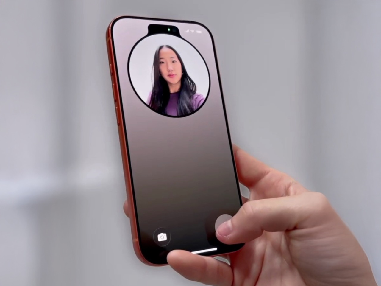
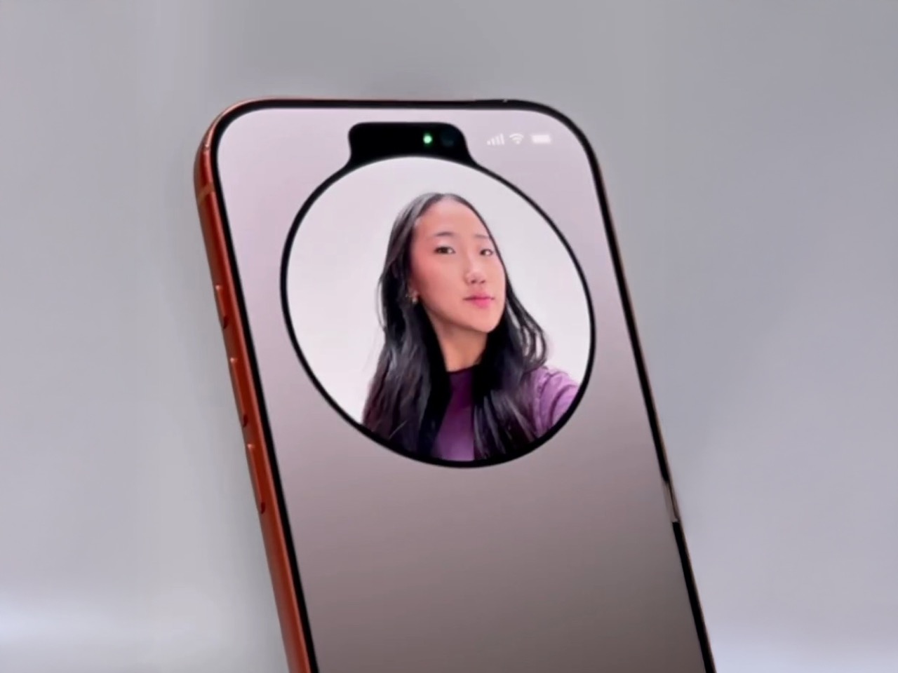
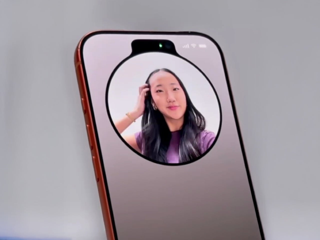
Never have I seen something so audaciously brilliant I actually summon a CEO to help make it a reality but Tim Cook… if you’re reading this, this lock-screen mirror definitely needs to ship on the next iOS build. Put together by Jakub Zegzulka, an ex-Apple, Meta, and OpenAI fellow, this tiny little feature is perhaps more important than FaceID itself!
How many times have you stepped out for a meeting with friends or for an interview, having no idea what you look like… or whether you’ve got food stuck in your teeth? You unlock your phone, open the camera app, and flip to the front-facing camera to do a quick vibe-check. It’s a 3-step process that absolutely doesn’t need to be a 3-step process. Instead, Zegzulka’s solution involves just long-pressing on the camera icon on the bottom right of your lock screen. That brings up a tiny window emerging off the dynamic island, giving you a quick preview of yourself. You can check your hair, fix your make-up, adjust your specs, run your tongue across your teeth, or just quickly check out that annoying zit that appeared at the wrong place and wrong time.
Zegzulka didn’t outline much, except a quick video demo of this feature on Threads. Although that was enough to gather nearly 2K likes in just over a day. The Lock Screen Mirror isn’t an app. It’s just a quick interaction that lets you open the camera’s viewfinder right on your lock screen for checking your appearance. The tiny circular window is almost exactly the size of a make-up mirror, and the feature is legitimately handy, even for me as a guy who has fairly curly hair that needs to just be ruffled before I step out.
Heck, imagine going an entire hour on a date with spinach stuck in your teeth and them being polite enough to not point out. Instead, you just do a quick check, get that pesky piece of green stuck on your pearly whites, and you’re good to go. It’s such a tiny-yet-life-enhancing feature that Apple could totally ship with their next build. You’re NOT opening your camera app with this lock screen mirror function, just a preview. You could drag your finger up and have the app open like it traditionally does, but a feature like this would probably eliminate the need to, if all you need to do is see if you look good right before you meet your friends, your future boss, or the potential love of your life.
Un développeur qui s’ennuyait s’est dit qu’il allait se faire un petit side-projet histoire de s’occuper un peu. Rien de foufou, juste reproduire
Screen Studio
(30 balles par mois) dans un navigateur et en full gratos pour que tout le monde puisse en profiter !
Et je pense que le gars a créé quelque chose qui va forcement faire grincer pas mal de dents dans l’industrie du screen recording !
Screen Studio, pour ceux qui ne connaissent pas, c’est un peu la Rolls des outils d’enregistrement d’écran sous macOS. Des animations fluides, du zoom automatique, des effets 3D sympas, bref tout ce qu’il faut pour faire des vidéos de démo qui claquent la fesse molle de vos mamans et de vos papas. Le seul problème, c’est que ça coûte un cuy (c’est un
rongeur
) et que c’est réservé aux utilisateurs Mac. Et ça, ça laisse quand même pas mal de monde sur le carreau.
Le créateur de
Screen Now
a donc eu l’idée de faire la même chose, mais gratuit, et utilisable directement dans le navigateur. Comme ça, pas d’installation, pas de compte à créer… Vous ouvrez Chrome (marche pas sous Firefox), vous allez sur le site, et vous lancez l’enregistrement de votre screencast.
La liste des fonctionnalités fait un peu peur parce qu’il y a beaucoup de choses mais vous allez voir c’est très cool. Y’a par exemple la possibilité de mettre votre vidéo d’écran en vue 3D avec perspective, rotation et contrôle d’angle, exactement comme avec les outils pros.
Y’a moyen aussi de mettre des animations d’entrée et de sortie personnalisables avec fade, slide et pop. Y’a aussi de l’upload de backgrounds personnalisés en PNG, JPG ou WebP (et une bonne liste de background proposés par l’outil). Du zoom amélioré avec timeline interactive, du Picture-in-Picture pour votre tête et des effets de flou sur l’arrière-plan de la caméra. La timeline pour le montage propose aussi de la duplication d’éléments.
Vous pouvez même capturer l’audio de votre système en même temps que votre micro, avec mixage automatique pour un son équilibré. Le cropping vidéo gère l’ajustement du ratio et les overlays texte sont entièrement personnalisables.
Le plus dingue, c’est que le projet a bénéficié d’optimisations techniques assez impressionnantes. Le rendering vidéo est maintenant 10 fois plus rapide qu’au début, le sync audio-vidéo a été corrigé pour éliminer 99% des problèmes de freezing à l’export et bien sûr, Screen Now est une PWA (Progressive Web Apps), ce qui signifie que vous pouvez l’installer comme une vraie application sur votre ordinateur tout en gardant les avantages du web.
L’auto-save fonctionne via le stockage du navigateur (local storage) et vous pouvez gérer plusieurs projets et exporter tout ça en MP4 ou GIF avec des réglages de qualité et résolution.
La forme de caméra peut être circulaire en plus des classiques rectangulaire et carrée et il y a des raccourcis clavier pour accélérer le workflow. Bref, tout ce qu’on attend d’un outil semi-pro.
Bref, si vous voulez vous lancer dans le screencast ou tout simplement enregistrer une démo rapide ou une explication dans le cadre d’un dépannage, l’outil est accessible sur
screen.now
.
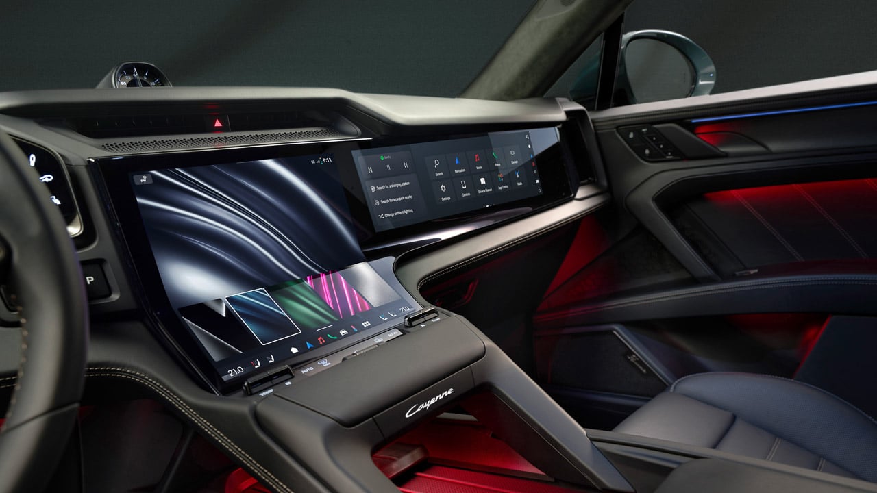
Porsche revealed the interior of its upcoming electric Cayenne on September 30, 2025, and I’m experiencing the kind of cognitive dissonance that only comes from loving something I fundamentally disagree with. The cabin features what the company calls the largest continuous digital surface in any Porsche to date. Translation: screens everywhere. As someone who prefers minimal dashboard clutter, I should hate this. But Porsche’s execution here is genuinely impressive, even if it represents everything wrong with modern automotive design philosophy.
Designer: Porsche
Let me be clear about my bias upfront. After reviewing vehicles for over a decade, I’ve developed a strong preference for physical controls. Give me a rotary dial for volume, actual buttons for climate control, and a small display for Apple CarPlay. That’s all I need. Everything else just creates more opportunities for distraction and frustration. The industry’s obsession with touchscreens has turned dashboards into iPad showrooms, and I’m tired of it. But then Porsche goes and creates something like this.
Three Layers of Interaction
Porsche’s approach to the Cayenne Electric interior centers on what I’d describe as three distinct interaction layers. First, there’s the glance layer: a 14.25-inch curved OLED instrument cluster that bends horizontally to favor the driver’s sightline, paired with an optional augmented-reality head-up display. This is information you consume without touching anything.
Second is the touch layer, anchored by what Porsche calls the Flow Display. This is where the interface design gets genuinely interesting, and where my skepticism starts to crack.
Third is the tactile layer: physical buttons for key functions that you use most frequently while driving. Temperature, fan speed, volume. The stuff that should never require diving through touchscreen menus when you’re moving at highway speeds.
This three-layer framework represents Porsche trying to reconcile driver focus with customer demand for integrated entertainment. Rather than creating a single wall of glass like some competitors, the brand is using curvature, AR guidance, and selective hard controls to maintain some connection to traditional cockpit ergonomics.
The Flow Display
Porsche’s Flow Display is the center of the Cayenne Electric’s interior story. It’s a curved OLED that drops from the dashboard toward the console, so your wrist meets the glass at a natural angle rather than an upright plane. The curve is functional for reach and for stabilizing taps on the lower interface zones. Directly ahead, the 14.25-inch curved OLED cluster bends along a different axis to favor the driver’s sightline, which keeps EV power, navigation, and assistance info legible at a glance.
Together they make the largest continuous digital surface Porsche has put in a production cabin, but the company still leaves physical buttons for key functions to reduce menu diving in motion. Five predefined color schemes can be applied across the cluster, Flow Display, and passenger screen through a Themes App, turning the software layer into part of the cabin’s material palette.
I’ve seen plenty of curved displays in vehicles over the years, from the Mercedes-Benz S-Class to the Cadillac Escalade. Most feel gimmicky, like the design team added curves just because they could. The Flow Display’s vertical curve actually serves a purpose. After years of stretching to tap screens in various test vehicles, I appreciate the thought behind meeting my fingers at a more comfortable angle. It’s a subtle detail, but one that suggests actual human factors testing rather than pure aesthetics.
The Themes App detail is worth noting because it shows Porsche treating digital surfaces as coordinated design elements rather than isolated screens. You’re not just picking a wallpaper. You’re establishing a visual language across the entire dashboard that integrates with your interior trim choices. For a brand that obsesses over material quality and color matching, this makes more sense than I’d like to admit.
When Two Screens Aren’t Enough
An optional 14.9-inch passenger display lets the right seat control media, apps, and navigation features, with video playback allowed while driving. Porsche says the setup avoids distracting the driver, and several reports add that a polarized layer limits visibility from the driver’s angle. Keep it for road trips and copilots who actually manage routes, otherwise it risks duplicating what phones already do better.
My personal preference would be to use my phone for entertainment content. It’s already configured with my accounts, my preferences, my content libraries. Why do I need a separate infotainment ecosystem that inevitably provides a worse user experience? But I recognize that many people want more integration, more seamless connectivity between their vehicle and their digital life. That’s the market speaking, and manufacturers are listening.
The augmented-reality head-up display projects guidance and speed into the driver’s forward view with an effective size of 8.7 inches. Use it if you like arrows on the road ahead. If you don’t, the curved cluster is already doing the glance work. I’ve used HUDs in countless vehicles, and my opinion on them remains unchanged. Some people swear by them. I find them distracting and unnecessary, one more piece of visual information competing for attention when you should be watching the road.
The Screen Debate
Stephan Durach, BMW’s Senior Vice President for UI/UX Development, recently told BMW Blog that passenger screens are in high demand, especially in larger vehicles. “People are asking for that,” he explained. “People say, ‘I want to have a dedicated screen for consuming content.’ There is room. So, you can think about that.”
I understand the appeal from a product planning perspective. American buyers love options and choices. If some customers want passenger entertainment systems, why not offer them? The counterargument is that just because people ask for something doesn’t mean it’s a good idea. We’re increasingly treating vehicles like mobile living rooms, with every occupant consuming their own content through their own screen. At some point, we’ve lost the plot on what cars are actually for.
What Porsche Isn’t Saying Yet
The interior recently revealed focused on the digital interface rather than full performance specifications. Porsche hasn’t disclosed final power output, acceleration figures, or detailed battery specifications in this announcement. Those details will presumably arrive with the world premiere at the end of 2025.
What we do know is that Porsche will offer an 11-kW wireless charging pad, launching first in Europe in 2026 before expanding to other markets. I’ve tested wireless charging systems in a few vehicles, and while the convenience factor is undeniable, the efficiency loss compared to wired charging makes me question the value proposition. You’re paying more for the privilege of slower, less efficient charging, though the 11-kW capability is reasonably competitive for inductive systems.
Standard air suspension comes on all models, with optional rear-wheel steering that reduces the turning circle. That’s genuinely useful in a vehicle this size, making parking lot maneuvering significantly easier. The Active Ride system from the Panamera and Taycan will also be available, providing impressive body control and ride comfort.
The Electric Cayenne in Context
Porsche’s commitment to keeping the combustion-powered Cayenne well into the next decade reveals something important about EV adoption. The market isn’t progressing as quickly as manufacturers hoped a few years ago. Rather than forcing a full electric transition, Porsche is hedging its bets by offering both powertrains simultaneously. The same strategy applies to the Macan, where the electric version will coexist with a new gasoline-powered model arriving in 2028.
This pragmatic approach makes sense given current market realities. Some buyers want electric. Many don’t, at least not yet. Offering both options maximizes potential sales while giving the charging infrastructure more time to mature. The Cayenne Electric represents Porsche’s best effort at making EVs appealing to luxury SUV buyers who might otherwise stick with traditional engines.
As for the interior’s screen situation, it’s simultaneously the most impressive and most excessive I’ve seen from Porsche. The execution is genuinely impressive, with thoughtful ergonomics and quality OLED displays. The three-layer interaction model shows more restraint than a pure touchscreen approach, and the Flow Display’s vertical curve actually solves reach and tap accuracy problems rather than just looking different.
But I can’t shake the feeling that we’ve collectively normalized maximum complexity when minimum would serve most people better. Porsche is doing this well because customers are demanding integrated entertainment and the brand is responding with curvature, selective physical controls, and coordinated design language. That doesn’t mean it’s the right direction, just that it’s the direction the market is pushing everyone.
The world premiere happens at the end of 2025, with deliveries expected to begin in 2026. Porsche hasn’t announced pricing yet, but expect a significant premium over the gasoline model. You’re paying for advanced electric powertrain technology, the largest continuous digital surface in any Porsche, and apparently, enough screens to satisfy the most demanding copilots.
Working on the go always feels like a compromise. You’re stuck with tiny laptop keyboards that cramp your hands, or you’re juggling a separate keyboard, mouse, and maybe a portable monitor that never quite fits together properly. The whole setup becomes this awkward dance of cables and stands.
The KeyGo Ultra-Slim Folding Keyboard throws out that rulebook entirely. This isn’t just another portable keyboard with a gimmicky feature tacked on but a genuine rethinking of what mobile productivity can look like when you stop accepting limitations as inevitable.
The first thing you notice about KeyGo is how substantial it feels. The CNC-anodized aluminum construction gives it that MacBook-level heft and finish that makes most plastic peripherals feel cheap by comparison. This isn’t trying to be the lightest option but the most satisfying one to use.
The 180-degree foldable design is where the engineering really shows. The hinge mechanism transitions smoothly from closed to fully open without any wobble or flex. At 800 grams and folding down to just 324mm wide, it slips into most laptop bags without dominating your carry weight.
Lighting That Actually Matters
Those RGB backlighting modes aren’t just for show (though they do look fantastic). The three lighting options serve real purposes: breathing mode for low-light work, solid color for distraction-free typing, and rainbow wave for when you want your workspace to feel more alive. The FN + Q/W/E shortcuts make switching between them effortless.
The lighting system goes beyond basic functionality to create an emotional connection with your workspace. There’s something satisfying about watching the rainbow wave ripple across the keys as you type, or having the breathing effect gently pulse during those late-night work sessions. It’s the kind of detail that transforms a tool into something you genuinely enjoy using.
Two Input Methods, Infinite Possibilities
Here’s where KeyGo gets interesting. That 12.8-inch touchscreen sitting above the keyboard isn’t just a novelty but a genuine second display with 1920×720 resolution and full ten-finger touch support. The fully laminated glass eliminates that annoying air gap you get with cheaper displays.
The screen works as a traditional second monitor for multitasking, but the touch capability transforms how you interact with your devices. Swipe between apps, drag files directly with your fingers, or use it as a massive touchpad when you need precision. The 72% NTSC color gamut makes it suitable for creative work too.
Universal Compatibility Done Right
KeyGo works with everything: Windows, macOS, Linux, Android, and even iOS devices. The dual USB-C ports (one for power only, the other for full functionality) plus a USB-A port mean you’re never hunting for the right adapter. Turn your tablet into a productivity powerhouse or add touch input to that old desktop that’s never had it.
The scissor-switch keys are quiet enough for coffee shop work but responsive enough for serious typing sessions. Whether you’re coding, writing, or managing spreadsheets, the keyboard feels like a natural extension of your workflow rather than a compromise you have to work around.
Scenarios That Actually Make Sense
Picture this: you’re working remotely and need to reference documents while writing. Instead of constantly alt-tabbing, your references live on the KeyGo screen while you type on the main display. Or you’re editing video and want timeline controls at your fingertips without cluttering your main workspace.
The modular design adapts to different environments, too. Desktop setup when you’re at home, mobile workstation when you’re traveling, or even mounted in a car for those times when your vehicle becomes your office. The easy-to-clean surface makes it practical for medical or shared environments.
The Future of Portable Productivity
KeyGo represents something bigger than just another keyboard upgrade. It’s proof that portable productivity doesn’t have to mean settling for less. By combining tactile typing with versatile touch input, it creates new possibilities for how we work, create, and interact with our devices.
Sometimes the best innovations come from refusing to accept that things have to work a certain way. KeyGo makes mobile productivity feel less like a compromise and more like a genuine choice. It’s the kind of product that makes you wonder why everyone else is still doing things the hard way.