Vue lecture

Il y a de nouveaux articles disponibles, cliquez pour rafraîchir la page.

This Wooden Basket Becomes a Low Table When You Flip It Upside Down

There’s a familiar moment that happens when you carry food, cups, and random essentials to a park, balcony, or floor seating setup and then realize you still need a stable surface to put any of it on. Most people improvise with a bag or a corner of a blanket. Small-space living and casual gatherings reward objects that can do two jobs without taking up twice the storage, but most furniture is still designed around one fixed purpose.

This Convertible Basket Table concept works as both a carry basket and a low table in one form. By simply inverting it, the basket becomes a stable table surface suitable for picnics or casual indoor use. The design combines storage, portability, and easy transformation, making it ideal for relaxed gatherings and compact living spaces.

Designer: Siya Garg

In basket mode, the structured wooden body has a built-in handle and a container that can hold the messy mix of picnic items, fruit, napkins, a book, or a small speaker. The form feels sturdy rather than floppy, carrying like a proper object with a clear handle instead of a tote that collapses when you set it down. That sturdiness is what makes the flip transformation credible. It’s definitely not a soft bag pretending to be furniture.

Once inverted and unfolded, it becomes a low table that works with floor cushions, outdoor blankets, or a casual living room setup. Low tables are the unsung heroes of flexible spaces. They work as coffee tables, game surfaces, or quick work perches, but they’re rarely portable. This one travels in your hand and arrives as a surface, which is a surprisingly underexplored idea.

A square knot side lock keeps the form secure when needed. It’s a rope-based closure that tightens the sides without complicated latches, click mechanisms, or hardware that will eventually strip or break. The whole thing is quiet, tool-free, and easy to replace if the rope wears out, which fits the picnic vibe better than snapping plastic clips would.

The build draws on traditional woodworking throughout. Pattern making involved pine wood in alternating grain directions and a chevron pattern using alternating teak and pine strips. Assembly relies on mortise and tenon joints and sliding mortise and tenon joints to hold the structure together without screws, so the connections are strong enough to handle the repeated flipping and carrying that the concept demands.

The design doesn’t ask you to change how you live, it just quietly accommodates the way you already move through the day. A basket when you’re going somewhere, a table when you arrive, and a warm wooden object that looks like someone actually made it rather than assembled it from a flat pack.

The post This Wooden Basket Becomes a Low Table When You Flip It Upside Down first appeared on Yanko Design.

vivo V70 Review: A Concert Photographer’s Phone in Mid-Range Clothes

PROS:


  • Striking "Sunset Glow" Golden Hour design

  • 4K 60fps video recording on a mid-tier smartphone

  • Powerful 50MP ZEISS Super Telephoto Camera

  • Large 6,500mAh battery with super-fast 90W charging

CONS:


  • 8MP ultra-wide camera is decent but mediocre

  • No wireless charging

RATINGS:

AESTHETICS
ERGONOMICS
PERFORMANCE
SUSTAINABILITY / REPAIRABILITY
VALUE FOR MONEY

EDITOR'S QUOTE:

The vivo V70 proves that a clear camera identity and premium materials still matter at this price.

The mid-range smartphone segment is crowded in ways that make individual products hard to distinguish. Specs converge, designs flatten, and most phones feel interchangeable within days. vivo’s V70 enters that space with a clear point of view: a ZEISS-co-engineered telephoto camera tuned for stage photography and travel, a large battery built for long days, and a physical design that genuinely tries to look and feel like something worth keeping.

The v70 also introduces the Golden Hour edition, the most visually expressive option in the lineup, with an etched glass back, an aerospace-grade aluminum frame, and a ZEISS camera module with serious hardware inside. Running OriginOS 6 on a Snapdragon 7 Gen 4, it promises a telephoto-first camera experience for concerts and travel, backed by a 6,500mAh battery. Does the full package deliver on all of it? Read on.

Designer: vivo

Aesthetics

Of all the V70’s color options, the Golden Hour edition is the one most worth talking about. vivo uses a specialized chemical etching process to form micron-scale texture on the back glass, creating a diffuse reflection that reads as refined matte from a distance but reveals subtle warmth in direct light. It’s fingerprint-resistant and smooth without feeling slippery, a noticeably more considered finish than the glossy or painted backs that dominate this price tier.

What’s more surprising is that the back doesn’t stay a single color. Depending on the viewing angle and ambient lighting, it shifts toward a cooler, slightly bluish hue you wouldn’t expect from a finish called Golden Hour. That unexpected chromatic movement makes it more visually engaging than a standard gradient, the kind of surface detail that keeps catching your eye without you fully understanding why.

Around the front, the aerospace-grade aluminum alloy frame wraps a flat display with ultra-thin bezels measuring just 1.25 mm on the sides. Rounded corners soften the silhouette without cheapening it, and the flat screen is a deliberate departure from curved-edge designs that can distort content near the edges. The overall impression is controlled and considered rather than flashy, which suits the V70’s personality well.

On the back, the camera module is a rounded metallic rectangle sitting just 3.29mm above the surface, low enough that the phone doesn’t rock noticeably on a table. Three lens rings and a ZEISS badge keep the composition clean without feeling crowded. It’s a well-executed rear panel that reinforces the premium identity without needing extra ornamentation to make the point.

Ergonomics

At 194g light and 7.59mm thick in the Golden Hour configuration, the vivo V70 feels present without being heavy. The matte AG glass provides enough grip for confident one-handed use without a case, and the flat sides and rounded corners make it comfortable to hold at its screen size. Weight distribution is balanced, which matters more for all-day carry than any single spec on a data sheet.

The 3D Ultrasonic Fingerprint Scanning 2.0 is one of the more underrated features here. It works reliably with damp fingers, meaning no frustrating tap-and-retry cycle after a workout or a skincare routine. Best of all, it’s located a good distance away from the bottom, so you don’t have to precariously shift your hand from its natural holding position just to unlock the phone.

Performance

Under the hood, the vivo V70’s Snapdragon 7 Gen 4 with LPDDR5X memory and UFS 4.1 storage handles everyday tasks and multitasking without hesitation, and a 4,200mm² vapor chamber keeps sustained performance steady during longer camera sessions. It’s not a chipset that headlines benchmark charts, but it delivers consistent, smooth day-to-day performance, which is more relevant to what the V70 is actually designed for than theoretical peak numbers.

The 6.59-inch 1.5K OLED runs at 120Hz with 459 PPI and peaks at 5,000 nits local brightness, which holds up well in direct sunlight and makes reviewing photos outdoors genuinely practical. Colors are rich without being oversaturated, and the 1.07-billion color depth makes gradient-heavy AI-edited shots look smooth rather than banded. It’s one of the better mid-range displays available at this price tier right now.

The camera system’s two stars are the 50MP main and 50MP periscope telephoto. The main uses a Sony LYT-700V sensor with a 1/1.56-inch surface area and OIS, delivering consistent, detailed portraits across daylight and mixed lighting. The telephoto uses a 1/1.95-inch sensor with its own OIS and a periscope structure that enables 10x zoom in a compact body. Both cameras consistently outperform what you’d expect at this price.

Of the three rear cameras, the 8MP ultra-wide is where things get more ordinary. It’s functional for casual wide shots, but the gap in detail and dynamic range between it and the main and telephoto cameras is noticeable. Given the vivo V70’s travel ambitions, wide landscape shots will come out looking more ordinary than portraits taken at the same destination. The phone’s real camera personality clearly lives in the other two lenses.

AI Stage Mode is a genuine differentiator if you attend live events regularly. At 10x zoom from 10m to 20m away, the AI Image Enhancement Algorithm and AI Style Portrait Technology combine to pull facial detail and expression clarity from performers under challenging stage lighting. It won’t replace a dedicated camera at that distance, but for a phone that fits in your jacket pocket, the results hold up surprisingly well.

Video gets a meaningful upgrade with 4K 60fps, the first time the vivo V series has offered this, and footage looks cinematic when lighting cooperates. AI Audio Noise Eraser in post-editing selectively reduces wind noise, crowd chatter, or ambient sound from recorded clips. It sounds like a spec sheet bullet point until you actually try cleaning up a concert recording with it, and then it becomes a feature you’d miss on another phone.

Battery life is a genuine strength. The 6,500mAh BlueVolt battery with 90W FlashCharge handles a full day of heavy use and then some, including heavy video playback. Wireless charging still isn’t part of the package, though, which will matter to those who’ve built it into their daily routine, but fast wired charging and a genuinely large battery soften that trade-off considerably.

Sustainability

vivo commits to four generations of OS updates and 6 years of security patches for the V70, placing it firmly in the category of phones worth keeping rather than replacing every two years. That’s the most meaningful sustainability argument a phone can make, applying regardless of materials or recycling programs. Longer software support means slower obsolescence, and slower obsolescence means less electronic waste accumulating on a shelf somewhere.

IP68 and IP69 ratings, combined with what vivo calls 10-Facet Drop Resistance, lower the anxiety of carrying a polished phone through real conditions. IP69 covers high-pressure water jets, going well beyond typical rain scenarios. That durability confidence changes how casually you handle the phone day to day, and there’s something genuinely reassuring about owning a device you don’t have to constantly worry about.

The material choices also support long-term ownership. Aerospace-grade aluminum and etched AG glass age more gracefully than glossy plastic, which yellows, scratches, and starts looking tired within a year of daily use. The matte texture stays presentable with minimal cleaning, and IP68/IP69 combined with drop resistance gives the V70 a realistic chance of surviving the accidents that typically end mid-range phones early.

Value

The V70 packages premium design, a ZEISS telephoto-first camera system, a strong OLED display, fast charging, and long software support into a price tier that usually demands more compromises. The Golden Hour finish gives it a visual identity that stands above most phones at its price, and the combination of AI Stage Mode with ZEISS Multifocal Portrait focal lengths makes it genuinely specialized rather than just generically capable.

The 8MP ultra-wide is the honest weak spot, and travelers who rely heavily on wide shots will feel that gap. Wireless charging is also absent. But what the V70 does well, it does consistently, and the combination of a premium-feeling design, a capable telephoto system, and 6 years of security updates makes it a phone that’s easy to justify and hard to grow out of quickly.

Verdict

The vivo V70 in Golden Hour is one of the more cohesive mid-range phones available right now. The etched glass with its unexpected bluish shift, the aluminum frame, the ultrasonic fingerprint sensor, the bright 1.5K OLED, and the ZEISS telephoto and portrait system all work together in a way that makes the phone feel intentional rather than assembled from a spec sheet and a parts catalog.

The 8MP ultra-wide and the absence of wireless charging are unfortunate blemishes on what is otherwise a remarkably well-rounded package. Both are real trade-offs rather than dealbreakers, though, and the vivo V70 earns its place as a phone that’s genuinely hard to fault for what it costs, especially if portrait photography, concert shooting, and long battery life are what matter most to you.

The post vivo V70 Review: A Concert Photographer’s Phone in Mid-Range Clothes first appeared on Yanko Design.

Forget Mindfulness Apps, This Desk Top Spins for 2 Minutes Instead

Screens are on all day, and hands tend to find something to do when focus slips. Pen clicking, phone picking, knuckle cracking, the nervous tics of modern desk work. Most “mindfulness” solutions are still apps, which is a bit ironic when the problem is too much screen time. There’s something to be said for a small mechanical object that gives your brain a reset without asking for any attention in return.

Amsterdam Dynamics’ ST-01 is a modular spinning top and tactile focus object built for desks, hands, and minds that rarely get a break. It’s intentionally simple but not single-purpose, offering multiple mechanical interactions with no correct sequence. You use one when you need it or work through all of them. No app, no setup, no instructions, just the object and whatever your hands feel like doing with it.

Designer: Antonio Lo Presti (Amsterdam Dynamics)

A gentle twist sets ST-01 rotating smoothly, and it’s engineered to keep going for over two minutes. That’s long enough to watch while thinking through a problem, waiting for a file to render, or cooling down after a difficult meeting. It functions as a visual anchor, something calm and physical in a field of notifications and browser tabs that all want something from you.

Pressing the top triggers a satisfying mechanical click with clear tactile feedback, the kind of repeatable, purposeful sensation that replaces the nervous habit of clicking pens or tapping a keyboard. Amsterdam Dynamics calls it “reset focus,” which is accurate if not exactly humble. The middle disc can also be flipped like a coin, adding a small decision-making tool and another texture to the interaction when you need a nudge in either direction.

Of course, there’s a modular construction underneath all of that. ST-01 is built from three parts that can be taken apart and snapped back together, held in alignment by two precisely positioned magnets. That magnetic core keeps the structure stable during spinning while making it easy to disassemble by hand. There’s also a built-in magnet that lets it stick to metal surfaces, which is either a neat trick or a genuinely useful parking spot depending on your desk.

CNC-machined, anodized aerospace-grade aluminum means it’s solid in the hand, balanced, and finished in a way you notice the first time you pick it up. Cheap fidget toys flex, squeak, and wear out quickly. ST-01 is designed to stay on the desk for a long time, with Amsterdam Dynamics framing it as “a beautiful object, made to last a lifetime” and something that can eventually be passed on.

That’s an unusual positioning for what is essentially a desk toy, but it fits the overall idea. ST-01 doesn’t ask for a lifestyle change, a daily streak, or a subscription. It just gives your hands a few repeatable interactions and a place to return when the work gets loud, which turns out to be the kind of quiet, mechanical company a desk actually needs.

The post Forget Mindfulness Apps, This Desk Top Spins for 2 Minutes Instead first appeared on Yanko Design.

This Air Purifier Concept Looks Like Scandinavian Audio Gear

Air purifiers tend to look like medical equipment and come with apps you didn’t ask for. They arrive with dashboards, push notifications, and Wi-Fi setup rituals that turn “cleaner air” into another thing to manage on a phone. Most of them sit in corners behind plants because they look clinical, and no one wants to acknowledge the white plastic box while having guests over for dinner.

The Beolab Air 1 is a concept air purifier designed to sit in a room without announcing itself. It was developed as a student project and draws inspiration from the calm, material-driven design language of Bang & Olufsen’s Beolab line, though it’s not affiliated with the company in any way. The goal was to see what happens when you apply that kind of sculptural thinking to clean air, instead of just adding another screen to the wellness toolkit.

Designers: Ahaan Varma, Malhar Gadnis, Michelle Sequeira, Sharanya Karkera

The most refreshing part of the concept is the interaction model. A single button press is all it takes to start, with no app pairing, no IoT setup, and no onboarding routine. The project frames this as “digital detox,” which is a reasonable description when most purifiers try to sell you sensor graphs and weekly air quality reports. You turn it on the way you’d turn on a lamp or a speaker, then leave it to work.

The materials do a lot of the talking. Angled teak wooden ridges wrap the body and function as vents for filtered air, so the aesthetic choice also serves a purpose. Textured aluminum handles the rest of the exterior. The project’s own critique of the category is blunt: plastic yellows and looks cheap over time, while wood and metal age better. A purifier built to look like a piece of considered furniture has a better chance of earning a spot on a sideboard than one that resembles a hospital accessory.

Under the surface, there’s a plausible engineering stack. A high-efficiency BLDC fan delivers strong airflow while staying quiet, a HEPA filter handles particulate capture, and an MQ135 gas sensor pairs with PM2.5 sensing to monitor air quality without forcing anyone into an app. The concept keeps the monitoring internal and the feedback subtle, a soft ambient light band that changes gently rather than a display demanding attention.

Of course, that ambient feedback is the whole point. Clean air is invisible and usually silent, and a purifier that communicates the same way feels more appropriate than one with a scrolling PM2.5 count on a bright panel. You can check in when you feel like it, and the rest of the time it just works.

The concept calls out a genuine gap in the category: people want wellness that integrates quietly into a room, not hospital aesthetics, and yet another app. Whether or not Beolab Air 1 ever gets built, asking what a purifier looks like when treated with the same care as a premium speaker is a question the category probably needed someone to ask.

The post This Air Purifier Concept Looks Like Scandinavian Audio Gear first appeared on Yanko Design.

IKEA Just Made a Mouse-Shaped Speaker That Kids Can Actually Carry

IKEA’s GREJSIMOJS collection started with a dog-shaped lamp that dims when you hold its head for bedtime, turning a light switch into something closer to petting a sleepy puppy. The limited collection is more than just about cute animals, but also about playful behavior baked into everyday objects. That same thinking now shows up in a tiny Bluetooth speaker shaped like a mouse, with four stubby legs and a braided tail that doubles as a carry loop.

The GREJSIMOJS portable Bluetooth speaker is a small, mouse-shaped character IKEA calls a “cute little music friend” for playful people of all ages. It is meant to follow kids from room to room, turning background sound into something they can carry and interact with, while still being a straightforward wireless speaker for parents who just want podcasts in the kitchen or bedtime audiobooks without fumbling with phone speakers.

Designer: Marta Krupińska (IKEA)

Picture a child drawing at a desk, the purple mouse sitting nearby quietly playing an audiobook or favorite songs. Pairing is as simple as connecting a phone over Bluetooth, and the sound is tuned for everyday listening rather than shaking walls. The built-in volume limit protects sensitive ears, so kids can turn it up without parents needing to hover over the controls constantly or worry about hearing damage.

The braided tail makes it easy for small hands to grab and move the speaker from bedroom to living room. Charging happens over USB-C, though the cable and adapter are sold separately, and IKEA says adults should handle that part. The speaker cannot play while charging, which creates a split that lets kids control what they listen to while adults manage batteries and power.

The multi-speaker mode lets the mouse pair with other IKEA Bluetooth speakers supporting the same feature. That means the same music can play from multiple spots, turning a hallway and playroom into one sound zone without complicated app setups. It is an easy way to make dance parties or tidy-up time feel coordinated, even if the tech behind it stays invisible to everyone involved.

The collection’s goal is to inspire play and togetherness across the home, and the mouse fits that mission well. IKEA notes that £1 from every GREJSIMOJS product sold during a set period goes to the Baby Bank Alliance, adding a layer of purposeful giving. More than just decor, the speaker is a small facilitator for shared stories, music, and movement in family spaces without needing complicated setup rituals.

The GREJSIMOJS mouse speaker, like the dog lamp, treats technology as something that should feel approachable and a bit silly rather than cold. Rather than competing with serious audio gear, it is trying to make rooms feel more alive without asking kids to sit still or parents to manage another app. In homes where screens already demand enough attention, a small purple mouse that quietly pipes in sound might be exactly the kind of tech everyone can agree on.

The post IKEA Just Made a Mouse-Shaped Speaker That Kids Can Actually Carry first appeared on Yanko Design.

Maingear Retro98 Is the 90s Dream PC Finally Built with 2026 Hardware

Late-’90s desktops hummed under desks in beige towers that always felt heavier than they should. CRTs flickered, CD drives whirred, and somewhere in every PC gamer’s mind lived a fantasy build they only saw in shop windows or magazine ads. The gap between the family PC that struggled with Quake and the dream rig you sketched in notebooks, complete with turbo buttons and drive bays, felt impossibly wide.

Maingear’s Retro98 is that fantasy finally built. The limited-run sleeper PC uses a retro beige SilverStone tower with a working turbo button and keyed power lockout, but hides 2026 hardware inside. The pitch is simple: 1998 on the outside, 2026 inside. It is the machine your younger self would have lost their mind over if they could see past the beige and understood what an RTX 5070 even meant.

Designer: Maingear

Water-cooled Retro98α

Retro98 feels more like a drop than a product line. Maingear limited it to 38 units: 32 standard builds and six water-cooled Retro98α rigs with braided ketchup-and-mustard cables. The brand positions it as something you will not find at a big-box store, and points out that you will not even find a Radio Shack next week. Each system is hand-built by a single technician, making it feel closer to a limited sneaker release than a typical prebuilt.

Even the lowest spec overshoots anything you could have imagined in 1998. The Retro98 5070 pairs an NVIDIA GeForce RTX 5070 with an Intel Core Ultra 7 265K, 32 GB of DDR5 at 6000 MT/s, and a 2 TB NVMe SSD. This is the kind of machine that runs Cyberpunk smoothly while looking like it should be loading StarCraft from a stack of jewel cases on the desk.

Of course, the front-panel rituals matter as much as the internals. The keyed power lock feels like something your parents would have used to keep you off the PC, and the fully functional turbo button now toggles performance profiles instead of pretending to overclock a 486. These physical interactions turn booting up into a tiny ceremony, a reminder of when pressing power felt like entering a different world rather than unlocking another screen.

Behind the retro faceplate, you still get modern conveniences. USB-C on the front, Wi-Fi 7, Bluetooth 5.4, and a clean Windows 11 install without bloatware. The machine is not trying to recreate the pain of driver floppies or IRQ conflicts. It is just borrowing the shell and the attitude. You get the look and the jokes, but you also get quiet fans, instant game launches, and none of the frustration.

Retro98 is not about value per frame but about finally owning the mythical beige tower you stared at in catalogs. It is for people who remember sharing a/s/l in chat rooms and slapping CRTs after another buffer underrun, and who now have the budget to indulge that memory. A beige box with a turbo button probably should not feel fresh in 2026, but somehow it does, which says more about how boring glass-and-RGB towers have gotten than it does about nostalgia.

The post Maingear Retro98 Is the 90s Dream PC Finally Built with 2026 Hardware first appeared on Yanko Design.

ROG Just Built the Gaming Headset Audiophiles Always Wanted

Gaming headsets tend to lean bass-heavy and closed-back, with flashy branding and mics that sound good enough for Discord but not much else. Planar-magnetic hi-fi headphones sound incredible but usually lack microphones and look out of place next to RGB keyboards. Players who care about both soundstage and winning often juggle two pairs or compromise, because the two worlds rarely meet in one product without awkward concessions.

That is where ROG Kithara comes in. It is ROG’s first open-back planar-magnetic gaming headset, developed with HIFIMAN. The collaboration brings 100mm planar drivers into a headset that still has a proper boom mic, in-line controls, and all the plugs you need for PCs, consoles, DACs, and laptops. It treats games like they deserve hi-fi instead of just tolerating them as background noise.

Designer: ROG (ASUS)

The planar drivers deliver an 8Hz to 55kHz frequency response with very low distortion, which translates into deep, controlled bass and crisp treble without smearing. The open-back design creates a wider, more natural soundstage, so footsteps, reloads, and distant movement sit in believable positions instead of clustering in your head. It helps both immersion and tactical awareness without needing surround processing that usually just muddies everything.

Playing a competitive shooter, you can distinguish a teammate reloading behind you from an enemy stepping on metal two floors up. The fast transient response keeps those cues sharp, and the open-back architecture stops explosions from masking subtle sounds entirely. You react faster because you are not guessing where anything came from. You are actually hearing it placed in space the way the sound designer intended it.

The on-cable MEMS boom microphone covers the full 20Hz to 20kHz range with a high signal-to-noise ratio, so your voice sounds more natural than typical narrow-band gaming mics. Separate signal paths for audio and mic on the dual 3.5mm cable keep game sound from bleeding into chat, which your squad will quietly appreciate even if they never ask what headset you switched to or notice until the crosstalk disappears.

The balanced cable with swappable 4.4mm, 3.5mm, and 6.3mm plugs lets you move from a desktop DAC to a laptop or console without changing headsets. The included USB-C to dual 3.5mm adapter covers modern laptops and handhelds. With 16-ohm impedance, Kithara is easy to drive without a rack of gear just to get it loud enough for late-night sessions.

Of course, the metal frame, eight-level headband adjustment, and two sets of ear pads, leatherette with mesh for focused sound and velour for a softer feel, mean you can tune comfort and tonality. The open-back design leaks sound and is best in quiet rooms, but for players who want one headset that handles ranked matches, long story games, and critical music listening, Kithara feels like a rare crossover that actually respects both sides.

The post ROG Just Built the Gaming Headset Audiophiles Always Wanted first appeared on Yanko Design.

This Concept Makes Reading a Physical Ritual, Not an App Reminder

The intention to read a physical book more often usually gets buried under phones, streaming, and vague guilt about never finishing that stack on the nightstand. Reading is not just opening a book; it is a whole arc from deciding to start to actually making it through chapters without drifting away. Lead is a small family of objects designed to sit around a book and quietly support that arc.

Lead is a design concept that treats reading as a story with a beginning, rising action, climax, and resolution. The name is a contraction of “Let’s read” and the first word of the slogan “lead back to the era of reading,” and the system uses three products, Bookeeper, Candle, and Quill, to give each phase of a reading session its own physical cue instead of relying on app notifications you will probably dismiss.

Designers: Yoo Chaeyeon, Kwon Eui Hwan, Yang Jinoo, Lee Sooyeon, Ha Seongmin

Coming home, you drop your book into Bookeeper, where it sits hidden behind a calm green panel. Earlier, you set a time to read, and as that moment approaches, the base lifts and the book slowly emerges from behind the screen. Instead of a phone notification buzzing and vanishing, the book itself appears, a quiet reminder that this is the slot you promised yourself you would actually use.

Candle is a slim vertical light that links to Bookeeper by default, then switches into timer mode with a twist of its ring. Before you dive into the pages, you set how long you want to read, and Candle becomes both atmosphere and clock. As you move through chapters, you can sense how your pace matches the time you set, adjusting speed without feeling chased by a digital countdown ticking in the corner.

When a line or idea sticks, Quill is a smart pen that lets you write by hand in a notebook or margin, then flip into scan mode to store that text on a device later. It has two main modes, transcription and scan, so you can copy favourite phrases, jot down reflections, and then capture them without breaking the flow. A bookmark element on the back lets Quill rest in the book when you pause.

All three objects share dark bases and a calm, translucent green for the parts that move or light up, so they feel like a family without shouting for attention. The interactions are borrowed from analog reading rituals, taking a book off a shelf, lighting a candle, picking up a pen, but layered with just enough technology to guide habit without dragging you back to a screen.

Lead is less about adding gadgets to the reading table and more about designing a gentle structure around a physical book. Bookeeper brings you back at the right time, Candle holds the space and the clock, and Quill helps you remember why the session mattered. When reading often gets squeezed between notifications and feeds, a trio of objects that simply lead you back to the page feels like a quietly radical idea.

The post This Concept Makes Reading a Physical Ritual, Not an App Reminder first appeared on Yanko Design.

HOVSTEP Helps ADHD Focus with Helicopter Missions That Actually End

Modern work and study days are chopped into tiny fragments, with multiple tabs, apps, and timers all competing for attention. Even well-intentioned plans fall apart because time feels abstract and slippery, especially if you lean toward ADHD or time-blindness. Checking the clock becomes another interruption instead of a guide. HOVSTEP is a concept that tries to make time feel like one clear mission instead of a background anxiety.

HOVSTEP treats each block of time like a helicopter mission. It is both a physical clock and an app-linked timer, inspired by how a mission helicopter takes off with one purpose, completes it, and returns. The idea is to help you see a study session, assignment, or break as a single mission you dispatch and then bring home, with a beginning, middle, and end that are all visible at once.

Designer: Ho joong Lee, Ho taek Lee

Opening the app in the morning, you drop studies, tasks, breaks, and games into short mission slots across the day. The app shows your routine by time zone, then switches to an analog view where each mission has a clear start, end, and remaining time. When a mission starts, a little helicopter icon descends, and the activity timer kicks in with an alarm, making the transition feel deliberate.

HOVSTEP shows time passing with a yellow hand that appears on the clock face when a mission begins, rotating once around the dial and showing how much of that block is left. It is framed as the helicopter being dispatched, flying its route, and returning when the hand lands back at 12. You are watching a mission unfold and trying to stay with it until the end.

The object itself is a small helicopter-shaped clock that can sit on a monitor or hang on a wall. A rotor on top acts as the analog hand, a digital display shows timer information, and side buttons let you adjust volume and timer details. A center button on top turns the clock on and starts missions manually, so you can run a quick focus block without opening the app.

The design is grounded in research about how people with ADHD often respond better to movement, change, and short time units than to static digits. By turning each activity into a dispatched mission with a visible arc and clear end, HOVSTEP reduces the need to constantly check the clock. You get a sense of flow, knowing that as long as the yellow hand is moving, you are still inside the mission.

The project’s line, “One mission completed, one step closer to focus,” captures the spirit. Instead of promising to fix attention with another app, HOVSTEP reframes time as a series of small, winnable missions. Sometimes the most helpful tools for focus are the ones that make progress visible and finite, one flight at a time, instead of asking you to manage an infinite stream of minutes.

The post HOVSTEP Helps ADHD Focus with Helicopter Missions That Actually End first appeared on Yanko Design.

REDMAGIC 11 Air Review: Fan-cooled Gaming Flagship at Just 207g, $499

PROS:


  • Slimmer and lighter design for a gaming smartphone

  • Distinctive gaming aesthetic

  • Large 7,000 mAh battery with 80W fast charging

  • More Accessible price point

CONS:


  • No wireless charging

  • Mediocre 8MP ultra-wide camera

  • Basic IP54 dust and water resistance

RATINGS:

AESTHETICS
ERGONOMICS
PERFORMANCE
SUSTAINABILITY / REPAIRABILITY
VALUE FOR MONEY

EDITOR'S QUOTE:

The REDMAGIC 11 Air doesn't apologize for being a gaming phone, but wraps it in the slimmest, lightest package the brand has made yet.

Gaming phones have split off into their own design species, leaning into transparent backs, RGB lighting, and visible cooling that looks more like sci‑fi props than communication devices. The REDMAGIC 11 Pro, which we reviewed recently, took that to its extreme with a liquid‑cooling window showing coolant flowing like spaceship controls. It made a strong visual statement but was unapologetically a gamer’s machine first and everything else a distant second.

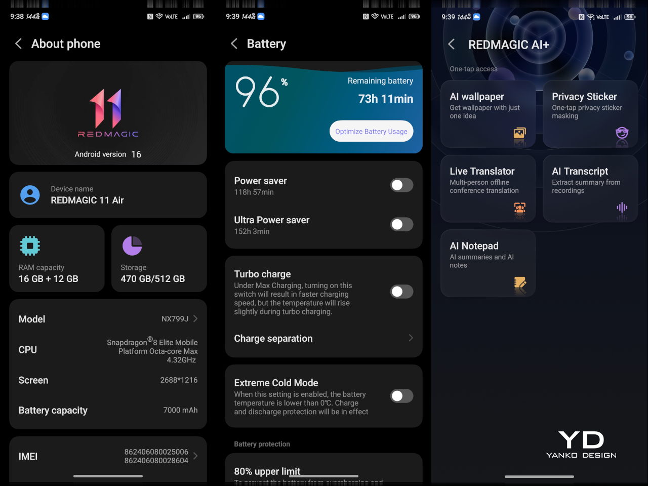
REDMAGIC 11 Air tries to keep the same esports‑grade performance, active cooling, and transparent style in a slimmer frame. It packs a Snapdragon 8 Elite, 7,000mAh battery, 6.85‑inch 144Hz OLED, and 24,000 RPM fan into a 7.85mm, 207g body. Whether this Air approach can balance hardcore gaming with something closer to everyday usability, or just becomes a slightly thinner version of the same uncompromising brick, is worth finding out.

Designer: REDMAGIC

Aesthetics

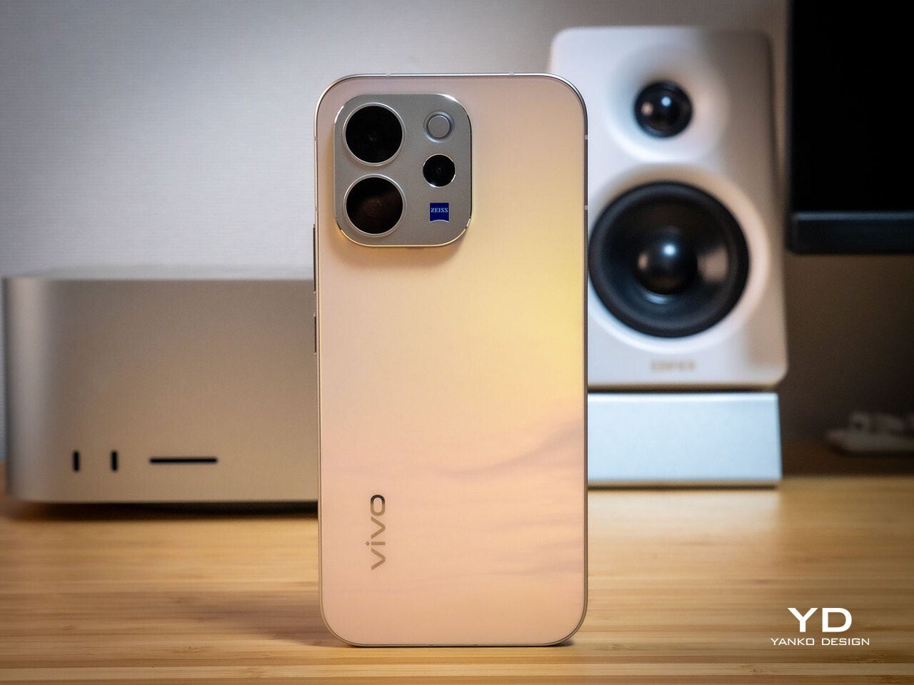
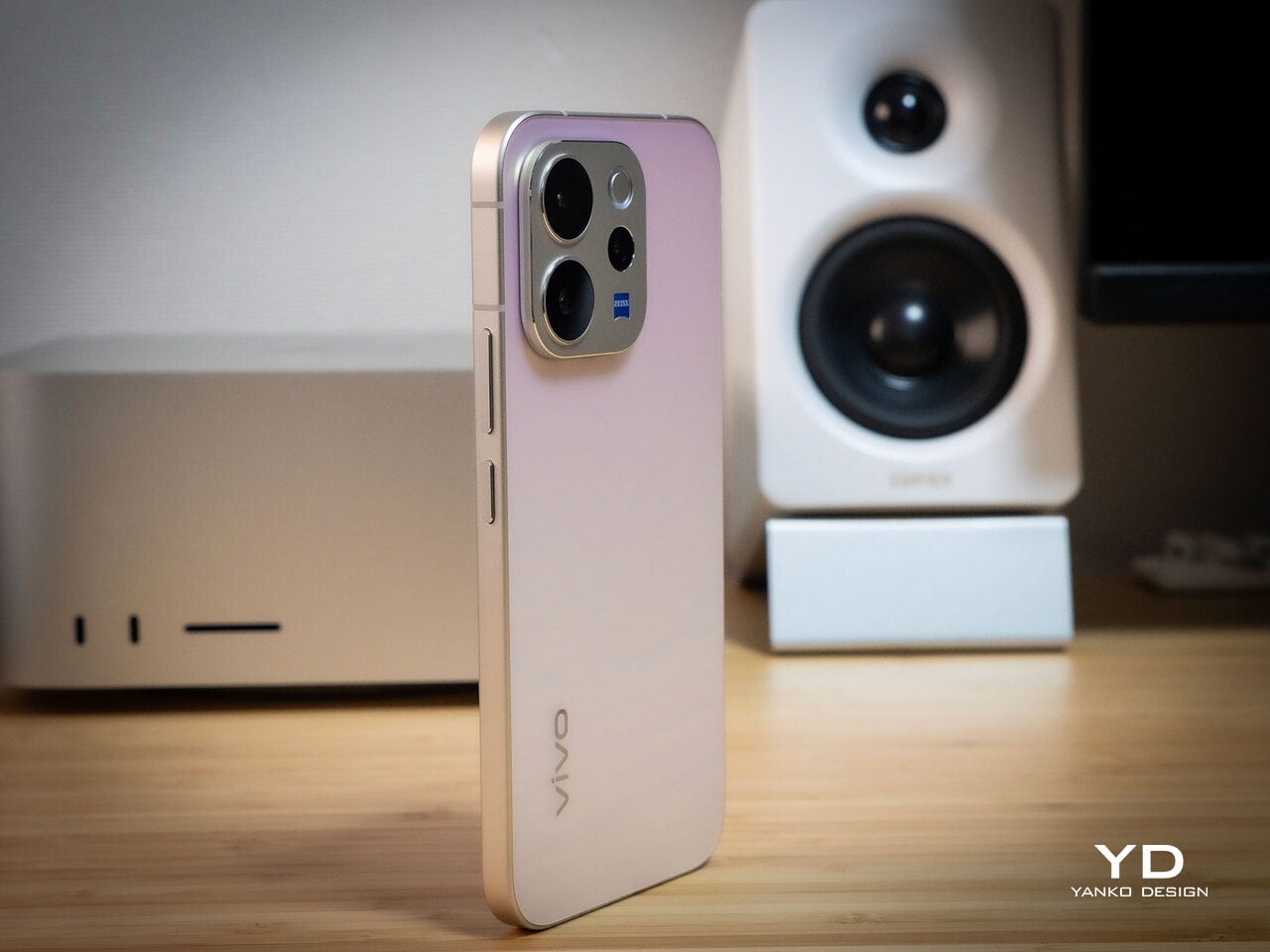
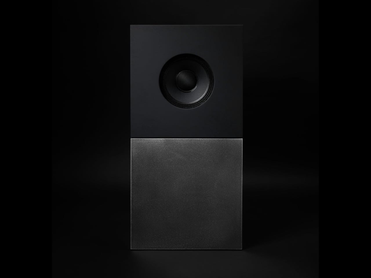
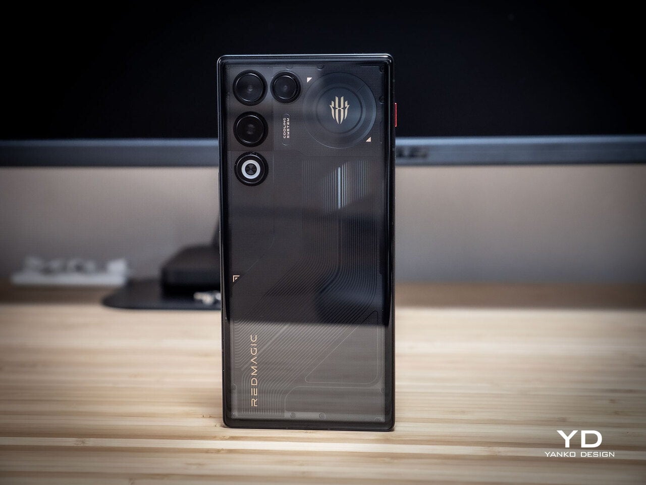
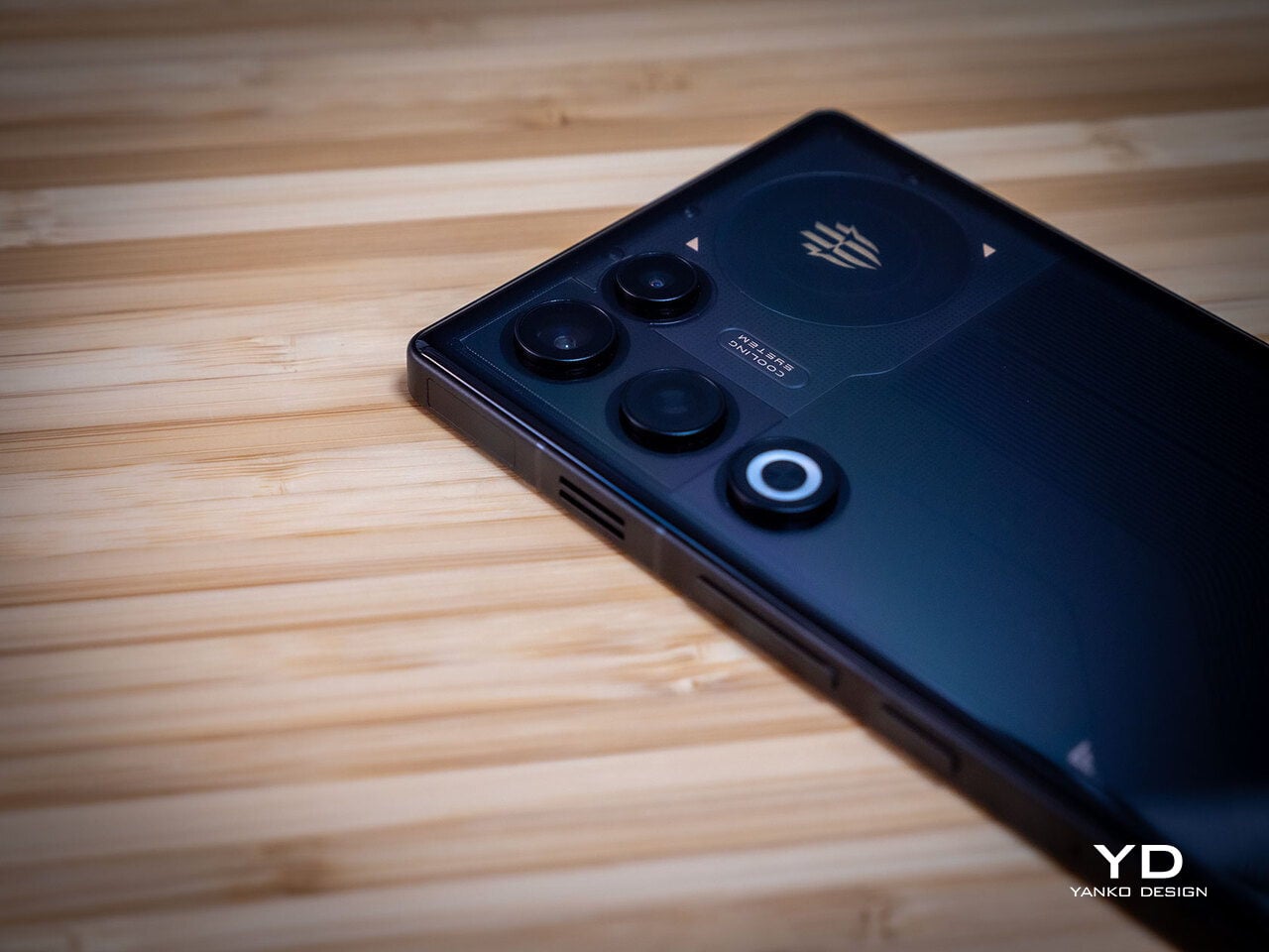
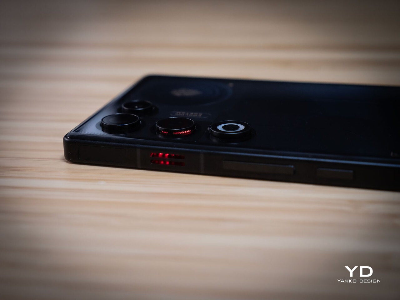
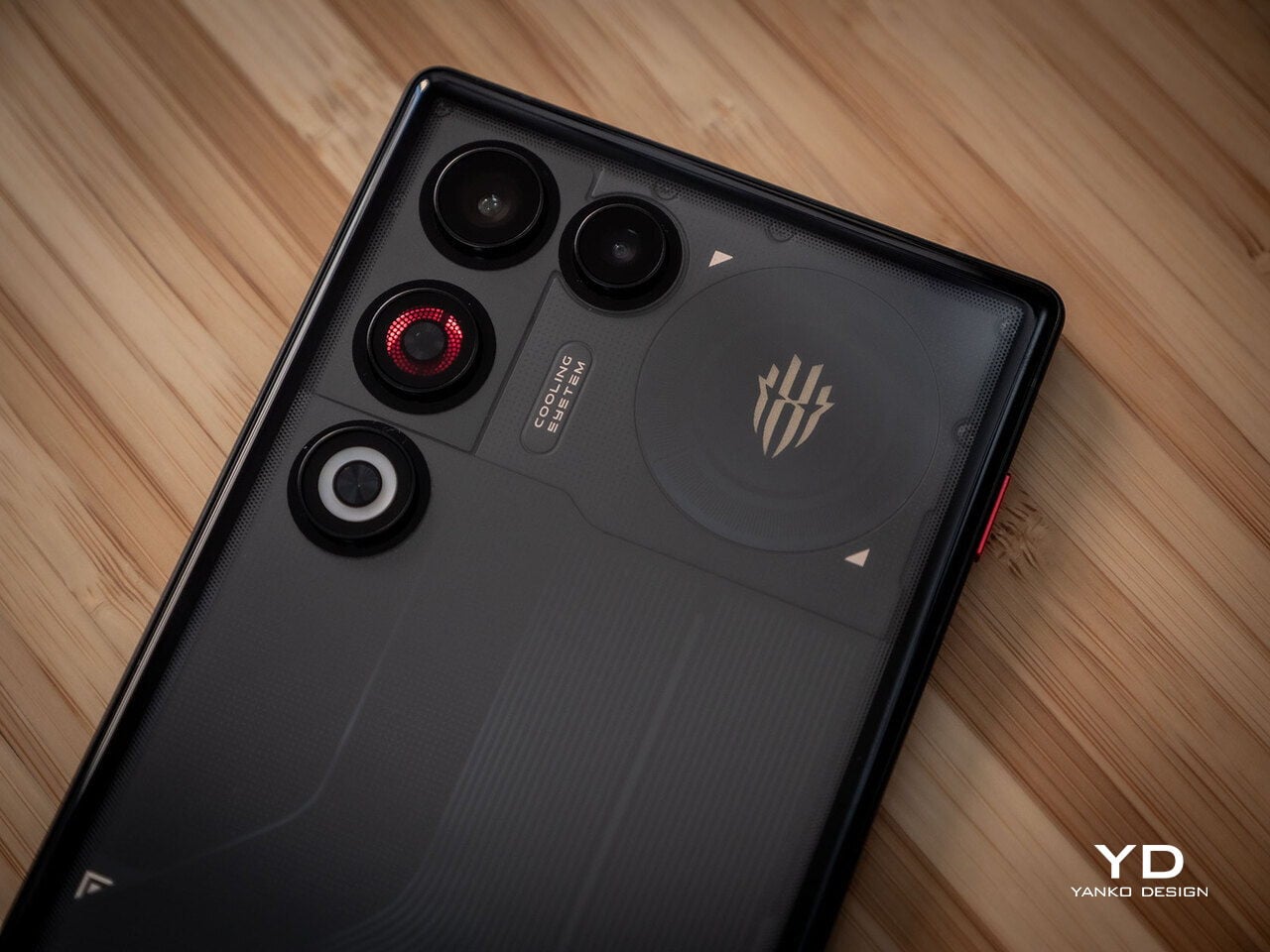
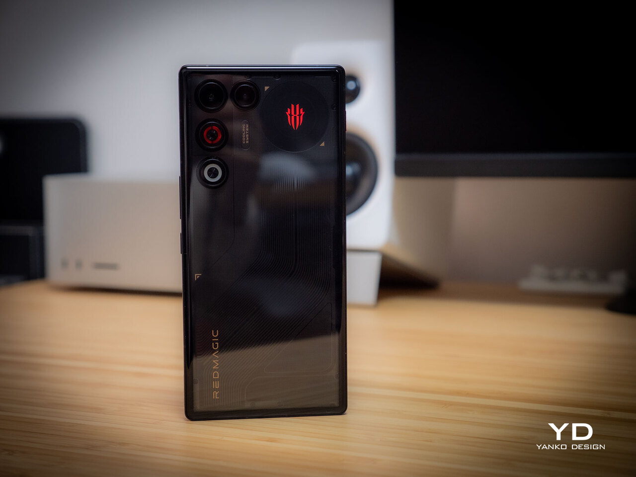
The moment you see the REDMAGIC 11 Air, it announces itself as a gaming phone. Phantom transparent black and Prism transparent white finishes expose stylized internals, circuit‑like etching, and RGB‑lit fan and logo elements. This is not subtle or generalist; it is a cyberpunk, sci‑fi motif that wants to sit next to mechanical keyboards rather than hide in a leather case.

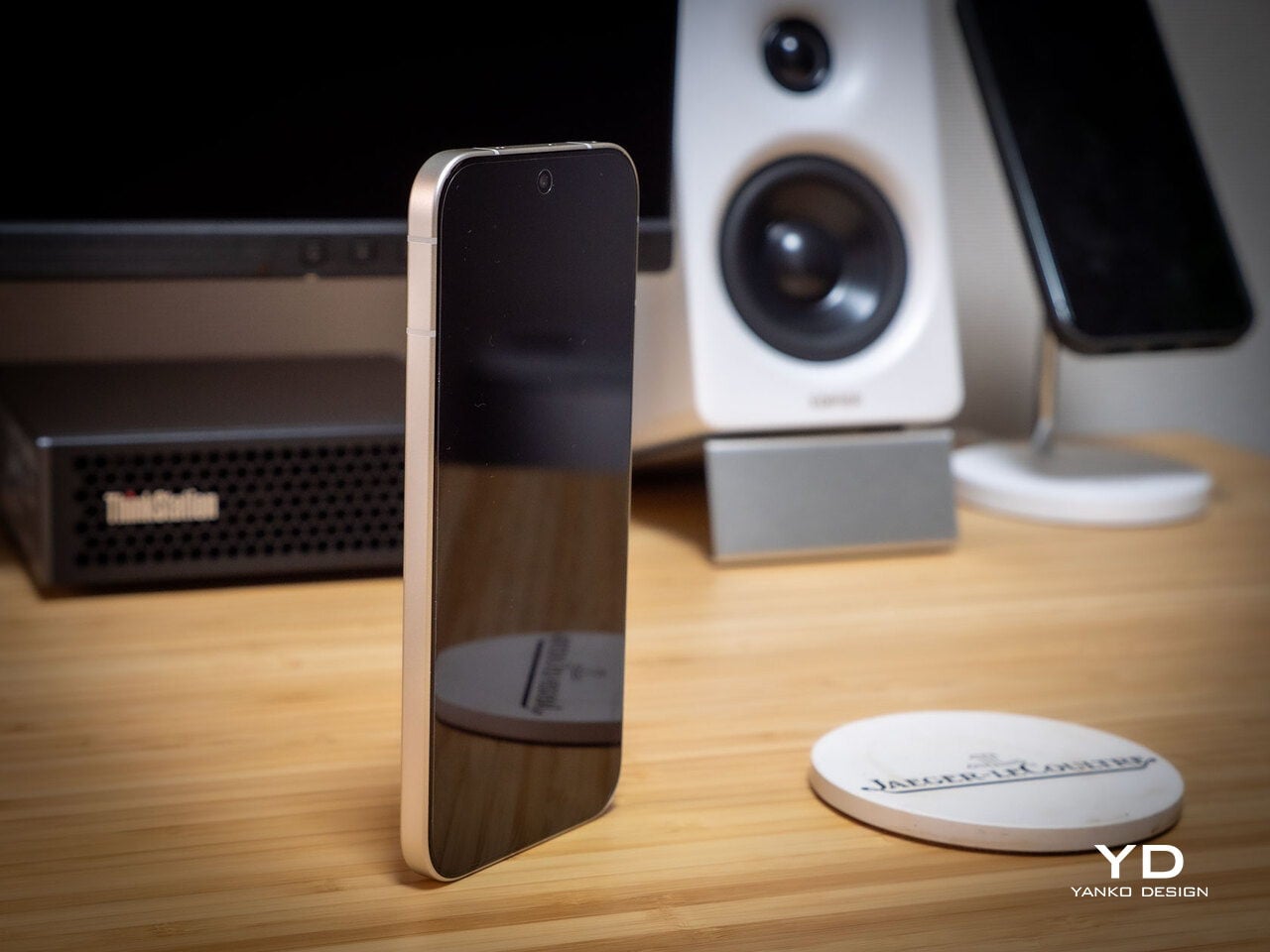
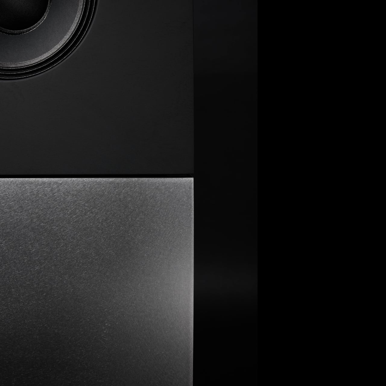
Despite the gaming‑first aesthetic, materials feel more refined than expected. The aluminum alloy frame, Gorilla Glass front and back, and 7.85mm thickness give it a solid feel. It is positioned as the lightest in the REDMAGIC lineup, which matters compared to the heavier 11 Pro. The curves and 20:9 aspect ratio help it sit more naturally in the hand, even if the styling still clearly prioritizes gamers over minimalists.

RGB lighting and transparent elements add atmosphere without chaos. Fan and logo lights sync with in‑game audio, making the back feel alive during sessions, but both can be toned down or disabled when you want less conspicuous carry. That duality helps if you like the gaming aesthetic but occasionally need to bring the phone into neutral environments where flashing lights feel out of place.

Ergonomics

Living with the 11 Air daily, the slimmer and lighter design makes a real difference. Long landscape gaming sessions feel less fatiguing, and the phone slips into pockets more easily than expected, given the 6.85‑inch display. The curved back and aluminum frame help with grip, and the 20:9 screen ratio balances a wide gaming canvas with something that still fits in most hands without constant readjusting.

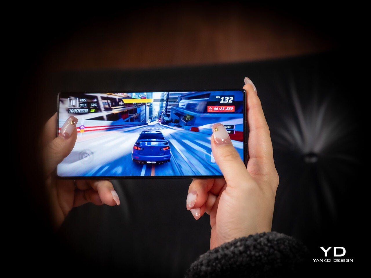
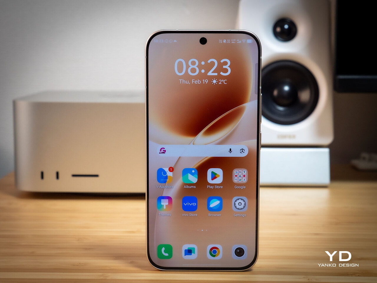
The large screen dominates the front with a 95.1% screen‑to‑body ratio and slim bezels. That is great for immersion, but leaves little room to rest thumbs without touching the screen during landscape play. Fortunately, the shoulder triggers take over some of that load, letting the screen act more like a viewfinder while the top edges handle key inputs when you need them most.

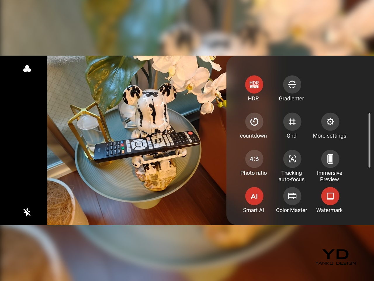
Controls are where the gaming focus becomes clear. The 520Hz physical shoulder triggers are tuned for low‑latency and now work in portrait and landscape, giving flexibility for different games. Combined with the 0809 X‑axis linear motor for 4D haptics, the phone feels more like a handheld console, especially when triggers are mapped to aiming or abilities through Game Space’s interface.

Outside of gaming, the transparent back and RGB accents may not suit every situation, but the size and weight make it easier to carry than the 11 Pro or older gaming phones. One‑handed use is still a stretch given the display size, but basic tasks like messaging and browsing feel manageable if you are already used to large phones or phablets.

Performance

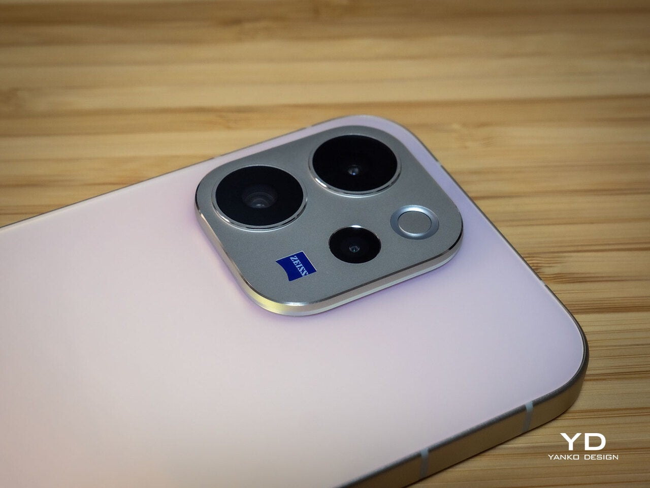
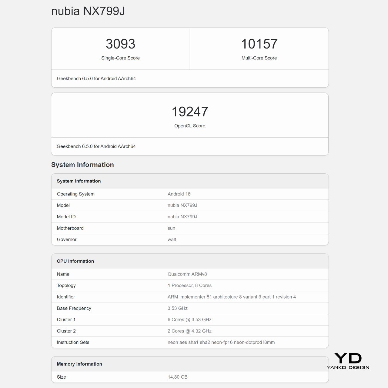
At the core sits the Snapdragon 8 Elite paired with RedCore R4, LPDDR5X RAM, and UFS 4.1 storage. Clock speeds reach 4.32GHz on the Oryon CPU and 1,250MHz on the Adreno 830 GPU. The dedicated RedCore R4 and CUBE scheduling engine focuses on stable frame rates rather than just benchmark spikes, which matters more in sustained gaming, where consistency beats bursts.

The ICE Cooling System backs that up with a large vapor chamber, graphene thermal layers, and a 24,000 RPM turbo fan. Unlike the REDMAGIC 11 Pro’s dramatic liquid‑cooling window showing coolant flowing like sci‑fi, the REDMAGIC 11 Air hides cooling under the transparent back. It opts for slimness while still actively managing CPU and GPU temperatures during long sessions, which keeps performance from throttling halfway through a match.

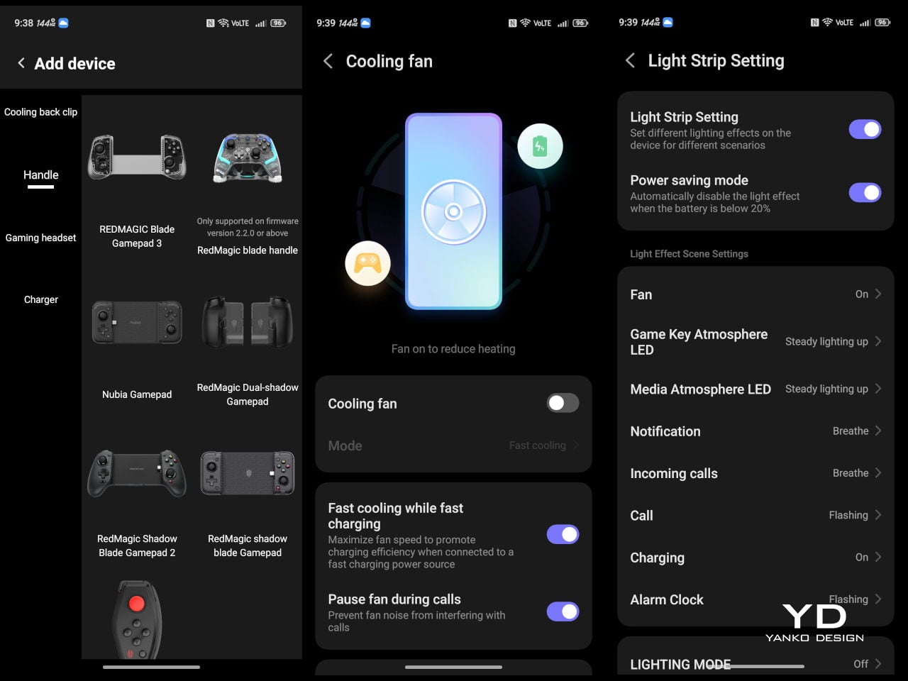
The active cooling fan is audible when it spins up under heavy load. It is not loud enough to overpower game audio, but it is noticeable in quiet rooms. For a device prioritizing sustained performance, this is expected, and fan behavior can be tuned in Game Space if you prefer cooler operation or less noise during specific sessions or when gaming in shared spaces.

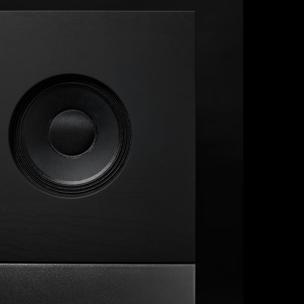
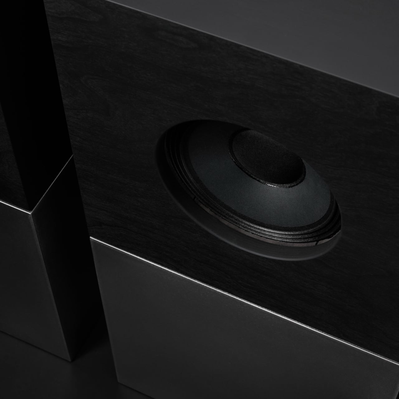
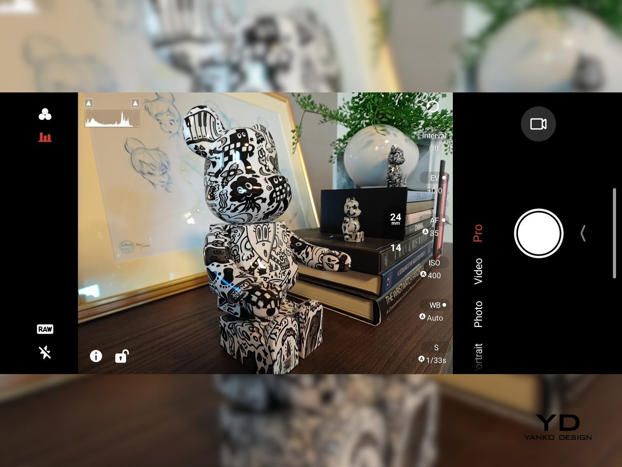
Cameras are solid without being the headline. The 50 MP main sensor with OIS delivers clean photos for social media and casual shots, and the 16 MP front camera handles selfies and video calls well enough. The 8MP ultra-wide camera is a bit of a disappointment in this day and age, but it’s not exactly terrible. These are clearly not camera‑phone specs, but they work fine for anyone who needs decent everyday photography alongside gaming.

Battery and charging are part of the performance story. The 7,000 mAh battery is generous in this slim chassis, going over a day with general use, and hours upon hours of binging video streaming at max brightness. The 80W fast charging refills quickly, while Charge Separation routes power to the motherboard during plugged‑in gaming, reducing heat and protecting battery health over time.

Worth noting is the absence of wireless charging. For a phone focused on performance and internal cooling, skipping wireless charging feels like a conscious choice to prioritize battery size, thermals, and layout. It is not a deal‑breaker with rapid wired charging, but it is worth keeping in mind if you are used to charging pads between sessions or overnight.

Sustainability

Durability starts with materials. The aluminum alloy frame, Gorilla Glass GG7i front, and Gorilla Glass 5 back give a solid, premium feel that should handle knocks better than plastic gaming phones. The combination of metal and tempered glass makes it feel built to survive being tossed into bags, dropped onto desks, and carried through crowds without showing age too quickly or feeling fragile.

IP54 dust and water resistance is a pragmatic compromise. For a device packed with vents, fans, and shoulder triggers, pushing water resistance higher would likely require trade‑offs in cooling capacity or thickness. The phone will survive light rain or dusty environments, but it is not meant for submersion or rough outdoor abuse, worth keeping in mind if you game near water or in harsh conditions.

Value

At launch, the REDMAGIC 11 Air starts at $499 ($529 in the US and Canada) for 12 GB + 256 GB and goes up to $599 ($629 in North America) for 16 GB + 512 GB. That puts it in upper mid‑range territory, but with hardware rivaling more expensive phones in gaming performance, especially when you factor in cooling, battery, and gaming‑specific controls that most flagships skip entirely.

Value shows up in what you get for that money. At this price, you are getting Snapdragon 8 Elite, active cooling with a 24,000 RPM fan and vapor chamber, 7,000mAh battery with 80W charging, 6.85‑inch 144Hz OLED, and 520 Hz shoulder triggers. Many similarly priced phones focus on cameras or slimness, leaving gaming performance to throttle once heat builds, so the 11 Air feels like a focused tool rather than a jack‑of‑all‑trades.

Of course, this focus narrows the audience. The transparent, RGB‑lit, cyberpunk design and heavy emphasis on Game Space features, triggers, and haptics make the 11 Air most appealing to mobile gamers. For someone who barely plays and cares more about camera versatility or minimalist aesthetics, much of what makes this device interesting will feel like overkill or actively off‑putting.

Contrasting it with the REDMAGIC 11 Pro helps clarify positioning. The Pro leans harder into showpiece territory with its visible liquid‑cooling window and heavier footprint, while the 11 Air trades some spectacle for slimness and lighter weight. For gamers who want REDMAGIC’s performance and style but prefer something easier to carry daily, the Air’s pricing and positioning make sense as a more practical but still gaming‑centric option.

Verdict

REDMAGIC 11 Air takes the brand’s familiar ingredients, transparent design, RGB accents, active cooling, shoulder triggers, and wraps them in a slimmer chassis that feels more manageable than previous monsters. It does not pretend to be a mainstream flagship, but within its lane of delivering stable high‑fps gaming and distinct visual identity, it hits targets convincingly. The flagship silicon, thermal management, and gaming controls make it hard to ignore if mobile gaming matters to you.

For people who treat mobile gaming seriously and who like the idea of a semi‑transparent, cyber‑mech slab with a fan inside more than a polished glass rectangle, REDMAGIC 11 Air makes a strong case. It will not convert everyone, and it is not trying to, but for the crowd it speaks to, it offers a rare mix of performance, personality, and practicality at a price undercutting many conventional flagships while still feeling like a purpose‑built tool.

The post REDMAGIC 11 Air Review: Fan-cooled Gaming Flagship at Just 207g, $499 first appeared on Yanko Design.

This Case Fixes iPhone’s Weak Selfie Camera with a Second Screen

The iPhone’s rear cameras keep getting better, but selfies still rely on a smaller, lower-resolution front sensor, and storage upgrades cost considerably more than a microSD card. People who shoot a lot of photos and video feel squeezed on both fronts, choosing between spending hundreds on internal storage or dealing with blurry front-camera selfies. Selfix is a case for the iPhone 17 Pro that tackles both problems at once.

Selfix is a case for the iPhone 17 Pro and Pro Max that adds a circular 1.6-inch AMOLED screen to the back and hides a microSD slot inside. The rear screen acts as a tiny viewfinder so you can use the 48 MP rear cameras for selfies, while the card slot lets you add up to 2 TB of storage without touching Apple’s upgrade menu or monthly cloud fees.

Designer: Selfix

The rear display mirrors the camera view so you can frame yourself, adjust in real time, and pick any of the rear lenses, from ultra-wide group shots to telephoto portraits. You get the main sensor’s larger 1/1.28-inch glass, Night Mode, and up to 8× optical zoom for selfies, instead of guessing with a cropped front camera and hoping everyone fits into the narrower field of view.

Selfix connects through the phone’s USB-C port and does not need a separate app. You snap the case on, open the camera, and the rear screen wakes up. A dedicated button on the case lets you turn the display off when you are not using it to save battery. The idea is to feel like a built-in second screen, not another gadget that needs pairing, permissions, and a drawer full of instructions.

The case includes a microSD slot that supports cards up to 2 TB, using the same USB-C connection to integrate with the phone. A 512 GB card costs around $50, while Apple’s $200 jump for the same capacity makes swappable storage a compelling alternative. Heavy shooters can archive trips or projects without paying monthly cloud fees or deleting older work to make room for new sessions.

Selfix is made from high-quality TPU and comes in Oat White, Blush Pink, and Midnight Black, sized to match the 17 Pro and Pro Max. It adds some thickness, bringing the total to 17mm, but in return, you get a grippy shell, a second screen, and a hidden storage bay. The design aims to look like a natural extension of the phone rather than a bolt-on camera rig or accessory that screams afterthought.

Selfix is aimed at people who care enough about image quality to use the rear cameras for everything, and who are tired of juggling storage or paying the upgrade tax. A case that quietly turns the iPhone into a dual-screen shooter with expandable memory makes you wonder why the phone did not ship this way, especially when the rear cameras already outclass the front by a significant margin, and storage remains artificially expensive.

The post This Case Fixes iPhone’s Weak Selfie Camera with a Second Screen first appeared on Yanko Design.

This Doughnut Chair Has One Bite Missing, and That’s Your Seat

Most chairs are clearly assembled objects, with legs, a seat, and a backrest, all stacked and joined together. Sculptural lounge pieces sometimes flip that script and feel more like a single volume that has been carved or sliced. Chunk is a concept that leans into that second approach, imagining seating as a doughnut with a bite taken out rather than a frame with cushions bolted on, treating furniture as something you edit rather than assemble.

The designer imagined a chair that looks like a doughnut with a chunk removed. The missing piece becomes the seat and the opening for the backrest, while the rest of the ring wraps around in a continuous loop. The concept is less about novelty and more about seeing how far a single looping form can be pushed into something you can actually sit in, where the absence of material defines the place for the body.

Designer: Liam de la Bedoyere

Both the seat and backrest share the same oval cross-section, but as the base curves up to become the backrest, that oval quietly swaps its length and width. It is wide and low where you sit, then gradually becomes tall and narrow as it rises behind you. The section never breaks; it just morphs along the path, which gives the chair a sense of motion even when it is still and empty.

The “bite” creates a bowl-like seat that cradles the hips and thighs, while the rising loop offers a relaxed backrest rather than a rigid upright. The proportions suggest a low, lounge-style posture, closer to a reading chair or a corner piece in a living room than a dining chair. The continuous curve encourages you to lean back and sink in, not perch on the edge ready to stand again.

A near-cylindrical form can look like it might roll away, but the geometry and internal structure are tuned to keep the center of gravity low and slightly behind the seat. The base is subtly flattened, and a denser core at the bottom would keep it from tipping forward when someone leans back. The result is a chair that looks precarious from some angles but behaves like a grounded lounge piece once you sit.

The monolithic upholstery, a textured fabric that wraps the entire volume without obvious breaks, reinforces the idea of a single chunk of material. The form reads differently as you move around it, sometimes like a shell, sometimes like a curled leaf, sometimes like a coiled creature. It is the kind of chair that anchors a corner or gallery-like space, inviting you to walk around it before you decide to sit down and settle in.

Chunk uses subtraction as its main design move, starting from a complete ring and then removing just enough to create a place for the body. For a category that often defaults to adding parts, there is something satisfying about a chair that feels like it has been edited down to a single, looping gesture, with one decisive bite turning an abstract volume into a place to rest, read, or just sink into for a while.

The post This Doughnut Chair Has One Bite Missing, and That’s Your Seat first appeared on Yanko Design.

Tray210 Proves Recycled Plastic Doesn’t Have to Look Grey and Boring

Recycled plastic products often fall into two camps: grey utilitarian bins or loud, speckled experiments that feel more like proof of concept than something you want on your desk. Tray210 recycled, a collaboration between Korean studio intenxiv and manufacturer INTOPS under the rmrp brand, takes a different approach, using recycled plastics and waste additives to create a tray that feels like a considered object first and an eco story second, treating material diversity as part of the design language.

Tray210 recycled is a circular tray with three compartments, an evolution of the original Tray210 form. It grew out of INTOPS’ grecipe eco-material platform and hida’s CMF proposals, which is a long way of saying it is the result of a tight loop between material science and industrial design. The goal was to pursue material diversity and break away from the cheap recycled stereotype, making something that belongs in sight rather than hidden under a desk.

Designer: Intenxiv x INTOPS

The form is intuitive, a 210 mm circle with a raised, ribbed bar running across the middle and two shallow wells on either side. The central groove is sized for pens, pencils, or chopsticks, and the ribs keep cylindrical objects from rolling away. The side compartments are open and shallow, perfect for earbuds, clips, rings, or keys. It is the kind of layout you understand at a glance without needing instructions or labels; just place your pen where the grooves are.

The material story is where Tray210 recycled gets interesting. Multiple recycled blends reflect their sources: Clam and Wood use 80 percent recycled PP with shell and wood waste, Charcoal adds 15 percent charcoal to 80 percent recycled PP, and Stone uses 10–50 percent recycled ABS. Transparent and Marble variants use recycled PC or PCABS with ceramic particles or marble-like pigment. Each colorway is visually tied to its waste stream, making the origin legible and intentional.

The aim is to create a design closer to the lifestyle rmrp pursues, breaking away from the impression recycled plastic generally gives. The Clam and Wood versions read as soft, muted pastels with fine speckling, Charcoal feels like a deep, almost architectural grey, and Stone and Transparent lean into translucency and particulate. Instead of hiding the recycled content, the CMF work uses it as texture and character, closer to terrazzo or stoneware than to injection-molded scrap that just happens to be grey.

The combination of clear zoning and tactile surfaces makes Tray210 recycled feel at home on a desk, entryway shelf, or bedside table. The central groove keeps your favorite pen or stylus always in the same place, while the side wells catch whatever tends to float around, from SD cards to jewelry. The different material stories let you pick a version that matches how you want the space to feel: calm, earthy, industrial, or a bit more playful.

A simple tray can carry a lot of design thinking, from intuitive ergonomics to material storytelling and responsible sourcing. Tray210 recycled is not trying to save the world on its own, but it does show how recycled plastic can be turned into something you actually want to touch and keep in sight. For people who care about both what an object does and what it is made from, that is a quiet but meaningful upgrade over another anonymous catch-all that eventually ends up in a drawer.

The post Tray210 Proves Recycled Plastic Doesn’t Have to Look Grey and Boring first appeared on Yanko Design.

Nocs Braque Stacks Two Cubes into a 25kg Sculptural Stereo System

Most hi-fi speakers still look like anonymous black rectangles, even when they sound great. A few brands treat speakers as furniture or sculpture, but often at the expense of engineering. Braque by Nocs tries to sit in the middle, a pair of cubes that are as considered visually as they are technically, treating stereo as both sound and composition rather than one serving the other as an afterthought.

Nocs calls Braque “two cubes, one sculptural stereo system,” and each speaker is a stacked pair, a CNC-machined plywood enclosure on top of a 25 kg solid-steel base. Built in numbered editions, assembled in Estonia with the steel cube handcrafted in Sweden, and tuned back at Nocs Lab, Braque signals that this is not a mass-market soundbar or a safe play for casual listeners who just want something wireless.

Designer: Nocs Design

The upper cube is rigid plywood finished in deep matte-black oil, chosen for tonal warmth and acoustic integrity, and the lower cube is a hand-welded, brushed steel block that anchors the system physically and visually. Sorbothane isolation pads sit between them, decoupling the enclosure from the base so the driver can move without shaking the furniture or smearing the soundstage. Together, the two volumes form a study in symmetry, a minimal yet expressive composition.

The acoustic core is an 8-inch Celestion FTX0820 coaxial driver with a 1-inch compression tweeter at its center, powered by dual Hypex FA122 modules delivering 125 W per side with integrated DSP. The coaxial layout gives a point-source image, and the active 2-way design lets Nocs control crossover and EQ precisely, resulting in a 42 Hz–20 kHz response that is tuned rather than guessed at from a passive circuit.

Nocs describes their studio-sound approach as tuning like sculpture, not adding but uncovering, working with artists and engineers to balance emotion, texture, and detail. The dual-cube design is part of that, lifting the driver to ear height when seated and using mass and isolation to keep the presentation clean and stable at real-world volumes. The idea is that a speaker should reveal music rather than shape it into a brand’s house curve.

Braque offers both analog and digital inputs, RCA and XLR for analog, plus S/PDIF, AES/EBU, and coaxial for digital, and it is meant to connect directly to turntables with a phono stage, streamers, or studio interfaces. There is no built-in streaming or app layer, which feels intentional; you bring your own source and let the speakers handle amplification and conversion from there without trying to be a whole ecosystem.

Braque behaves in a living room or studio as two strict cubes that read like small pieces of Cubist architecture until you press play. For people who want their speakers to be part of the composition of a space, not just equipment pushed into corners, the combination of Celestion drivers, Hypex power, and that heavy steel base makes Braque feel like a very deliberate answer to how a stereo should look and sound in 2025, where form and performance finally coexist without one apologizing for the other.

The post Nocs Braque Stacks Two Cubes into a 25kg Sculptural Stereo System first appeared on Yanko Design.

This Square Player Refuses to Stream Music, and That’s the Point

Streaming services turned album covers into tiny squares you scroll past on your way to something else. Phones made music convenient, but also turned it into background noise competing with notifications, emails, and every app demanding attention at once. You used to hold a record sleeve and feel like you owned something specific. Now your entire library is just files in a folder somewhere, and nothing about that experience feels remotely special or worth paying attention to.

Sleevenote is musician Tom Vek’s attempt to give digital albums their own object again. It’s a square music player with a 4-inch screen that matches the shape of album artwork, designed to show covers, back sleeves, and booklet pages without any other interface getting in the way. The device only plays music you actually buy and download from places like Bandcamp, deliberately skipping Spotify and Apple Music to keep ownership separate from the endless scroll.

Designers: Tom Vek, Chris Hipgrave (Sleevenote)

The hardware is a black square that’s mostly screen from the front, with a thick body and rounded edges that make it feel more like a handheld picture frame than a phone. Physical playback buttons sit along one side so you can skip tracks without touching the screen. When you hold it, the weight and thickness are noticeable. This isn’t trying to slip into a pocket; it’s trying to sit on your desk or rest in your hand like a miniature album sleeve.

The screen shows high-resolution artwork, back covers, lyrics, and credits supplied through the Sleevenote platform. You swipe through booklet pages while listening, and the interface stays out of the way so the album art fills the entire square without overlays or buttons. The whole point is that the device becomes the album cover while music plays, which works better in practice than it sounds on paper when you describe it.

Sleevenote won’t let you stream anything. It encourages you to “audition” music on your phone and only put albums you truly love on the player, treating it more like a curated shelf than a jukebox with everything. This sounds good in theory, but means carrying a second device that can’t do anything except play the files you’ve already bought, which feels like a lot of friction for album art, no matter how nice the screen looks.

Sleevenote works as a small act of resistance against music as disposable content. For people who miss having a physical relationship with albums, a square player that only does one thing might feel like a shrine worth keeping. Whether that’s worth the price for a device with a screen barely bigger than your phone is a different question, but the idea that digital music deserves its own object makes more sense than cramming everything into the same distracted rectangle.

The post This Square Player Refuses to Stream Music, and That’s the Point first appeared on Yanko Design.

Bene Just Built Office Furniture You Can Reconfigure Without Any Tools

Offices keep buying furniture that looks permanent, which works fine until someone needs the room to do something different. A workshop space becomes a presentation area, a meeting room needs to turn into individual work zones, and nobody wants to wait three days for facilities to show up with screwdrivers. The furniture just sits there looking expensive and immovable while everyone works around it instead of with it.

PIXEL by Bene is designer Didi Lenz’s answer, and it looks almost suspiciously simple. Each piece is a 36 x 36 cm cube made from raw pine plywood with visible grain and knots all over the surface. Lenz says it isn’t really furniture, which makes sense when you see people stacking them into benches, flipping them into tables, or just using one as a side storage box with a handle cut into the side.

Designer: Didi Lenze (Bene)

The wood is completely untreated, so every cube looks slightly different depending on which part of the tree it came from. Some have dark knots near the corners, others show lighter grain patterns, and the plywood edges are exposed instead of hidden under veneer. It definitely reads as workshop material rather than corporate office product, which seems to be the whole point. You can see the screws holding the corners together.

The cubes stack easily because they’re all the same size, and the cutout handles on two sides let you carry them around or fold them over to connect boxes side by side. Add a white laminate top and a stack becomes a work table. Add casters to the bottom, and it rolls wherever you need it. PIXEL Rack adds metal frames that turn stacks into proper shelving or room dividers with slots for whiteboards and plants.

Bene shows photos of teams building entire project rooms by hand. Boxes stacked three high become benches for workshops, racks filled with boxes create semi-transparent walls between work zones, and tops laid across stacks turn into standing height tables. The setups look intentionally unfinished, like someone is still building them, which is probably the aesthetic Lenz wanted. Nothing looks bolted down or precious.

The system works because it assumes people will move things around themselves without asking permission. You need more seating for a presentation, so you grab some boxes from the storage wall and stack them into rows. The presentation ends, and those same boxes become side tables or go back to holding supplies. Heck, they can turn into a bar for an event if you add the right tops.

Raw plywood has obvious trade-offs. It’ll get dinged and stained over time, the surface isn’t smooth enough for detailed work, and the workshop look won’t suit every office brand. The fixed 36 cm dimension means everything is the same height whether you’re sitting, standing, or storing things, which can feel awkward. Some people will look at PIXEL and just see fancy storage crates, which isn’t entirely wrong.

But the system makes sense for spaces that need to change shape constantly. Co-working areas, design studios, classrooms, and pop-up shops can rebuild their layout between sessions without calling anyone. The wood looks honest and approachable instead of intimidating, and you don’t need instructions to figure out that boxes stack. PIXEL by Bene basically gives you building blocks that happen to be office furniture, or maybe it’s the other way around.

The post Bene Just Built Office Furniture You Can Reconfigure Without Any Tools first appeared on Yanko Design.

AYANEO Just Built a 115Wh Strix Halo Handheld and Killed Portability

Gaming handhelds are supposed to fit in your hands, but AMD’s new Strix Halo processors generate serious heat and drain batteries faster than you can finish a boss fight. The GPD Win 5 and OneXFly Apex responded by strapping external battery packs to their backs, which works, but looks like your handheld is wearing a fanny pack in the wrong spot. It’s practical but awkward, and it raises an obvious question: if you’re adding external batteries anyway, why not just make the whole device bigger?

AYANEO apparently asked that same question and decided to run with it. The AYANEO NEXT II skips external packs entirely, hiding a massive 115Wh battery and a 9.06-inch OLED inside a thick, sculpted body that feels more like a portable gaming monitor with grips than something you’d slip into a backpack. It’s AYANEO’s answer to Strix Halo’s power demands, and the solution involves simply accepting that this thing was never going to be pocketable in the first place.

Designer: AYANEO

The design doesn’t apologize for its size. Deep grips flare outward like a proper gamepad, and the body is thick enough to house dual cooling fans without turning into a space heater. Hall effect sticks sit where your thumbs expect them, surrounded by a floating D-pad, dual touchpads, and speakers that actually face you instead of firing sound into your lap. It looks less like a Switch rival and more like someone decided gaming monitors needed handles attached.

That 9.06-inch screen uses an unusual 3:2 aspect ratio instead of the typical widescreen shape most games expect. You get a gorgeous OLED panel with refresh rates up to 165Hz and brightness that peaks at 1100 nits, which sounds fantastic until you realize most games will either add black bars or run nowhere near 165 frames per second at this resolution anyway. Still, it’s lovely for desktop windows and emulators that appreciate the extra vertical space.

The 115Wh battery is where things get complicated. Everything stays hidden inside for a cleaner look and more console-like feel, but that capacity might cause questions at airport security since many airlines cap carry-on batteries at 100Wh. You also can’t swap batteries when one dies, and constantly feeding an 85-watt processor means faster charge cycles and potential long-term wear. You’re looking at two to three hours of heavy gaming before hunting for an outlet.

The dual cooling fans work hard to keep Strix Halo from overheating, and you’ll definitely hear them during intense sessions. AYANEO claims it can sustain up to 85 watts, which should let the integrated Radeon graphics handle modern games at respectable settings, though you’ll also feel warmth radiating from the vents. This is less a grab-and-go portable and more something you carry from the couch to the desk when you need a scenery change.

AYANEO loaded the NEXT II with premium controls that enthusiasts will genuinely appreciate. Hall effect sticks and triggers promise zero drift, dual-stage trigger locks switch between smooth analog and clicky digital modes, and rear buttons plus dual touchpads give you more inputs than a standard controller. A magnetic haptic motor adds feedback that tries to mimic console vibration, and the AYASpace software hides Windows behind a console-style launcher with performance tuning options built in.

The AYANEO NEXT II essentially stops pretending to be portable. It won’t fit in a jacket pocket, might get flagged at airport security, and is almost certainly too heavy for comfortable one-handed play in bed. But if you want something that feels more like a small gaming monitor with built-in controls rather than a device you’d actually carry around town, this oversized approach makes a strange kind of sense. You just have to accept that portability took a back seat to screen size and battery capacity.

The post AYANEO Just Built a 115Wh Strix Halo Handheld and Killed Portability first appeared on Yanko Design.

DIY 3D-Printed Clamshell Turns BOOX Palma Into a Tiny Laptop

Palmtops and UMPCs are experiencing a quiet resurgence among people who want something more focused than a laptop and more tactile than a phone. Compact e-ink devices and tiny Bluetooth keyboards have become affordable building blocks for exactly this kind of project, letting makers combine them into pocketable machines tailored to writing, reading, or just tinkering. The result is a small but growing wave of DIY cyberdecks and writerdecks that feel like modern reinterpretations of classic Psion palmtops.

The Palm(a)top Computer v0 is one of those projects, born on Reddit when user CommonKingfisher decided to pair a BOOX Palma e-ink Android phone with a compact Bluetooth keyboard and a custom 3D-printed clamshell case. The result looks like a cross between a vintage Psion and a modern writerdeck, small enough to slide into a jacket pocket but functional enough to handle real writing and reading sessions on the go.

Designer: CommonKingfisher

The core hardware is straightforward. The BOOX Palma sits in the top half of the shell, while a CACOE Bluetooth mini keyboard occupies the bottom half. The keyboard was originally glued into a PU-leather folio, which the maker carefully peeled off using gentle heat from a hair dryer to expose the bare board. When opened, the two halves form a tiny laptop layout with the e-ink screen above and the keyboard below.

The clamshell itself is 3D-printed in a speckled filament that looks like stone, with two brass hinges along the spine giving it a slightly retro, handcrafted feel. Closed, it resembles a small hardback book with the Palma’s camera cutout visible on the back. Open, the recessed trays hold both the screen and keyboard flush, turning the whole thing into a surprisingly polished handheld computer, considering it’s a first prototype.

The typing experience is functional but not perfect. The maker describes it as “okay to type on once you get used to it,” and thumb typing “kinda works,” though it’s not ideal for either style. You can rest the device on your lap during a train ride and use it vertically like a book, with the Palma displaying an e-book and the keyboard ready for quick notes or annotations.

The build has a few issues that the maker plans to fix in the next version. It’s top-heavy, so it needs to lie flat or gain a kickstand or counterweight under the keyboard, possibly a DIY flat power bank. The hinge currently lacks friction and needs a hard stop around one hundred twenty degrees to keep the screen upright. There are also small cosmetic tweaks, like correcting the display frame width.

Palm(a)top Computer v0 shows how off-the-shelf parts and a 3D printer can turn a niche e-ink phone into a bespoke palmtop tailored to one person’s workflow. Most consumer gadgets arrive as sealed rectangles you can’t modify, but projects like this embrace iteration and imperfection. It’s less about having all the answers and more about building something personal that might inspire the next version.

The post DIY 3D-Printed Clamshell Turns BOOX Palma Into a Tiny Laptop first appeared on Yanko Design.

Freewrite Wordrunner Counts Words With Clicking Mechanical Wheels

Writers spend more time with their keyboards than any other tool, yet most options are either gaming boards covered in RGB lights or cheap office slabs optimized for cost rather than comfort. Neither category really thinks about what writers actually need, which is a keyboard that can keep up with long sessions without killing your wrists and maybe even help you stay focused when the blank page starts feeling oppressive.

Freewrite’s Wordrunner is a mechanical keyboard built specifically for writing, complete with a built-in mechanical word counter and sprint timer. It works with any device that accepts a USB or Bluetooth keyboard, from laptops and desktops to tablets and phones, and its core features live in the hardware rather than in yet another app or cloud service that you’ll forget to open halfway through your writing session.

Designer: Freewrite

The standout feature is the Wordometer, an eight-digit electromechanical counter with rotating wheels driven by a coreless motor and controlled by an internal microprocessor. It tracks words in real time using a simple algorithm based on spaces and punctuation, stays visible even when the keyboard is off, and can be reset with a mechanical lever to the left of the display. The counter makes a soft clicking sound as the wheels turn, giving you tactile and audible feedback every time you hit a milestone.

The keyboard also includes a built-in sprint timer that lets you run Pomodoro-style sessions or custom writing sprints without leaving your desk. Subtle red and green lights keep you on track, and you can configure the timer to count up or down depending on how you prefer to work. The standard function row has been replaced with writer-centric keys like Find, Replace, Print, and Undo, plus three programmable macro keys labeled Zap, Pow, and Bam for whatever shortcuts you use most.

The typing experience is what you’d expect from a premium mechanical keyboard. High-quality tactile switches, multiple layers of sound dampening, and a gasket mount design deliver what beta testers kept calling “so satisfying.” Each switch is rated for eighty million presses, which should be enough to see you through multiple novels without the keys wearing out. The die-cast aluminum body gives the board a heft and solidity that plastic keyboards can’t match, keeping it planted on your desk no matter how fast your fingers fly.

Tucked into the top right corner is a multi-directional joystick that controls media playback and volume, so you can adjust your music without touching the mouse or breaking flow. Connectivity is equally flexible. The Wordrunner supports wired USB-C and Bluetooth, pairs with up to four devices at once, and switches between them with a keystroke. It works with Windows, macOS, iPadOS, and Android without requiring special software, which means you can move it between machines without reconfiguring anything.

Wordrunner is designed for writers who want their keyboard to be more than a generic input device. It turns progress into something physical with the mechanical word counter, structures writing sessions with the built-in timer, and wraps it all in a solid, retro-industrial chassis that looks like a specialized tool rather than consumer electronics. It’s less about flashy features and more about making the act of writing feel intentional every time you sit down to work.

The post Freewrite Wordrunner Counts Words With Clicking Mechanical Wheels first appeared on Yanko Design.

❌