Vue lecture

Il y a de nouveaux articles disponibles, cliquez pour rafraîchir la page.

The World’s Tallest Timber Skyscraper Is in Sydney, and It Rises 600 Feet Into the Sky

Sydney is on the verge of claiming a significant architectural milestone. Atlassian Central, a 39-floor hybrid timber tower currently nearing completion, is set to become the world’s tallest building of its kind, surpassing the existing record holder by a considerable margin.

Designed by BVN and SHoP Architects as part of a larger development in Sydney, Australia, the tower will top out at 183 m (600 ft). That makes it more than twice the height of Milwaukee’s Ascent, which currently holds the title of world’s tallest hybrid timber skyscraper at 86.6 m (284 ft). According to the Council on Tall Buildings and Urban Habitat (CTBUH), the premier authority on building heights, Atlassian Central will claim the record upon completion, ahead of any proposals not yet approved.

Designer: BVN & SHoP Architects

The structure relies on a hybrid system of concrete, steel, and engineered wood, a combination that sets it apart from purely timber towers like Norway’s Mjøstårnet. The use of concrete and steel allows the building to reach heights that timber alone could not sustain, while glued-laminated timber columns and cross-laminated timber slabs, sourced from Europe, are incorporated throughout. In total, roughly 10,000 cubic meters (353,000 cubic ft) of engineered wood will be used in the build.

Sustainability is woven into the design beyond the choice of materials. The facade integrates solar panels alongside an automation system developed by specialist EBSA, which is expected to significantly reduce the building’s mechanical cooling requirements. SHoP Architects describe the commercial floors as being organized into seven stacked four-story “habitat” modules, each framed by the hybrid timber structure and designed to maximize natural ventilation, provide access to landscaped terraces, and support workplace well-being through a connection to natural environments.

The tower’s program is varied. The lower floors will house a hostel, and the project will incorporate an existing building on the site, which is being restored and folded into the lobby. The majority of the remaining floors are dedicated to office space, interspersed with multiple open garden areas that reinforce the building’s emphasis on greenery and natural light.

An exact completion date has not been confirmed, but Atlassian Central is expected to be finished in late 2026 or sometime in 2027. When it opens, it will represent not just a new height record for hybrid timber construction, but a meaningful step forward in demonstrating what sustainable high-rise architecture can look like at scale.

The post The World’s Tallest Timber Skyscraper Is in Sydney, and It Rises 600 Feet Into the Sky first appeared on Yanko Design.

TypeToRace - Le jeu qui transforme vos cours de dactylo en Fast & Furious

J'sais pas si parmi vous, y'en a qui ont déjà pris des cours de dactylographie genre à l'école où vous deviez taper "asdf jkl;" durant des heures en regardant un écran tristounet mais j'imagine que c'était chiant à mourir ! Hé bien quelqu'un a eu l'idée de transformer ça en jeu de course arcade façon Outrun sous stéroïdes !

TypeToRace, c'est un jeu de course 3D gratuit qui tourne directement dans votre navigateur et où votre vitesse dépend de votre capacité à taper des mots rapidement. Plus vous tapez vite, plus votre voiture accélère et vous vous retrouvez donc à foncer sur une route synthwave avec des néons roses et bleus partout pendant que vous tentez de taper "algorithm" sans faire de faute (oui c'est en anglais).

Le concept mélange TypeRacer (le classique des tests de frappe) avec un gameplay à la Subway Surfers. Et y'a pas juste la vitesse qui compte, puisqu'il faut aussi esquiver des obstacles et gérer des power-ups pour attaquer vos adversaires. Du coup, ça devient un vrai jeu vidéo et pas juste un test de dactylographie déguisé.

Ambiance Tron pour apprendre à taper vite ( Source )

L'esthétique synthwave avec ses couleurs néon et son ambiance rétro-futuriste des années 80 est plutôt cool. En tout cas, moi j'adore et ça change des interfaces austères des outils de typing classiques où on a l'impression d'être revenu en 1995 devant un terminal DOS. D'ailleurs, si vous cherchez d'autres moyens ludiques de vous améliorer, Wordsmash façon Tetris est aussi une excellente option pour bosser sa mémoire musculaire.

Notre jeu du jour vous met face à des adversaires contrôlés par l'IA et vous pouvez grimper dans les classements au fur et à mesure que vous progressez. C'est gratuit, ça ne nécessite aucun téléchargement, vous ouvrez juste le site et c'est parti mon kiki.

Bon après, on va pas se mentir, ce genre de jeu c'est surtout fun les 15 premières minutes avant que ça devienne un peu répétitif. Mais pour s'entraîner à taper plus vite tout en ayant l'impression de jouer plutôt que de bosser, y'a pire. Et puis si vous avez des gamins qui galèrent sur le clavier, ça peut être un bon moyen de les motiver sans les traumatiser avec des exercices barbants.

Puis si vous êtes du genre compétiteur, vous pouvez aussi aller voir du côté de TypeRacer pour vous mesurer à de vrais humains . Mais pour le fun immédiat et l'ambiance visuelle, TypeToRace fait le job.

Voilà, si vous voulez tester votre vitesse de frappe tout en vous prenant pour un pilote de course dans un univers à la Blade Runner, c'est par ici que ça se passe... Et pitié ne pliez pas en deux votre clavier de rage si vous perdez !

Wikipedia vs archive.today - 700 000 liens en sursis

Un peu moins de 700 000 liens, c'est le nombre de références vers archive.today que Wikipedia envisage de supprimer d'un coup ! Et la raison est assez dingue... en fait le service d'archivage a planqué du code DDoS dans son CAPTCHA afin d'attaquer le blog d'un mec qui a eu le malheur de chercher l'identité du fondateur du site.

L'histoire est tordue vous allez voir...

En 2023, un blogueur du nom de Jani Patokallio publie un article sur son blog Gyrovague pour tenter d'identifier le créateur d'archive.today, un certain "Denis Petrov" (probablement un pseudo). Pas de quoi fouetter un chat, sauf que le principal intéressé n'a visiblement pas kiffé.

Du coup, un bout de JavaScript s'est retrouvé comme de par hasard dans la page CAPTCHA du service, exécutant une requête vers le blog de Patokallio toutes les 300 millisecondes. Chaque visiteur qui passait par le CAPTCHA devenait alors un soldat involontaire d'une attaque DDoS.

Et le bonhomme ne s'est pas arrêté là... il a ensuite menacé de créer un site porno avec le nom du blogueur. On est vraiment dans la réponse proportionnée, clairement.

Le souci, c'est que Wikipedia utilise archive.today de manière MASSIVE. Cela représente 695 000 liens répartis sur environ 400 000 pages. C'est le deuxième fournisseur d'archives de toute l'encyclopédie !

Du coup, les éditeurs se retrouvent face à un sacré dilemme. D'un côté, on a ceux qui veulent tout blacklister parce que "la sécurité de vos lecteurs, ça passe avant les citations". Et de l'autre, ceux qui rappellent que le service contient des archives qu'on ne trouve NULLE PART ailleurs, même pas sur la Wayback Machine .

Bon courage pour trouver un remplaçant les mecs !

Et petit détail qui n'en est pas un, au passage... En fait, archive.today sert aussi à contourner des paywalls. C'est pratique pour vérifier des sources, ou lire de supers articles sans payer mais techniquement c'est illégal.

Mais quand la source originale a disparu, on fait comment ? Et c'est là tout l'intérêt de ces services d'archivage.

Bon, les paywalls, on comprend tous pourquoi ça existe. Produire de l'info de qualité, ça coûte un bras. Sauf que c'est quand même un truc un peu naze. Vous bossez, vous produisez un contenu top, et au final y'a que 10 personnes qui payent pour le lire. Et ce sont les mêmes 10 personnes qui sont pigistes et qui vont reprendre votre info pour la diffuser gratuitement sur leur média ! On le voit avec Mediapart... des enquêtes énormes derrière un paywall, et toute la presse qui reprend leurs scoops sans payer. Je trouve ça vraiment dommage.

Moi, ce que j'aime dans le fait d'écrire sur le web, c'est que vous me lisiez. Et mettre du contenu derrière un paywall, ça voudrait dire que plein d'entre vous ne me liraient plus. C'est pour cela que même le contenu que je réserve en avant-première sur Patreon , au bout de quelques semaines, je le libère pour tout le monde.

Quand je vois The Verge par exemple qui en met dans tous les sens... ben j'y vais plus. J'ai pas envie de payer un abonnement de plus pour une valeur ajoutée pas folle. C'est un peu comme les bandeaux cookies, à savoir un effet de bord regrettable du web moderne. On doit faire avec parce que personne n'a trouvé mieux comme idée...

Bref, entre les DDoS vengeurs, les 700 000 liens en sursis et les paywalls qui pourrissent tout ... le web ouvert, c'est pas gagné les amis. Voilà voilà.

Source

Street Fighter II - Une faute d'orthographe corrigée grâce au mollet de Guile

Street Fighter II, c'est dans l'esprit de la plupart d'entre nous, 1991, les salles d'arcade qui puent la clope et les pièces de 10 francs qui s'enchaînent... et surtout un écran-titre qui affiche "WORLD WARRIER" au lieu de "WORLD WARRIOR". Ouais, y'avait une coquille dans le titre d'un des jeux de baston les plus légendaires de l'univers et personne ne l'a jamais su !

Magnifique hein ?

Le problème, c'est que sur les bornes d'arcade Capcom CPS1, les graphismes sont gravés dans des puces ROM. Du vrai read-only qu'on grave une bonne fois pour toutes et qu'on ne touche PLUS après. Et en 1991, les puces ROM coûtaient un bras et les délais de production étaient assez dingues... Donc impossible pour Capcom de faire regraver quoi que ce soit même pour une malheureuse lettre.

Nous sommes donc toujours en 1991, à 3 jours de la deadline pour livrer le code ROM (la seule puce encore modifiable à ce stade) et quelqu'un se rend compte du bug.

Horreur malheur ! C'est la panique et tout le monde se met à réfléchir à une solution... Quand soudain, un hack digne des plus belles bidouilles émerge de ces cerveaux endoloris par tant de travail.

Il faut savoir que sur le CPS1, chaque graphisme est découpé en "tiles" c'est à dire des petits carrés de 8×8 pixels. Et le truc important, c'est que chaque tile ne contient pas une lettre entière mais un BOUT de lettre. Le logo "WORLD WARRIOR", c'est en fait une mosaïque de 16 tiles collées les unes aux autres, et chaque carreau contient des fragments des lettres voisines. Impossible donc de toucher à ces carreaux une fois gravés dans la ROM graphique... Mais la table qui dit "colle CE carreau ICI avec CETTE palette de couleurs"... ça, c'était encore modifiable dans la ROM code.

Le hic c'est qu'il fallait composer avec les tiles existantes car pas moyen d'en créer de nouvelles !

Du coup, l'équipe s'est mise à passer au crible les centaines de tiles déjà gravées dans la ROM, une par une, pour trouver des morceaux compatibles avec les bonnes lettres. Et bonne nouvelle... pour certaines tiles, ils ont trouvé des équivalents dans le mot "WORLD" sur l'écran-titre. Et en réarrangeant le puzzle, ils ont réussi à afficher presque tout "WARRIOR" correctement. Presque. Parce que le "i", lui, ressemblait maintenant à un "L" minuscule... il manquait le point mes amis !!

Et c'est là que ça devient du grand art car pour dessiner ce petit point, il leur fallait un carreau avec quasi rien dessus. Ils ont fini par repérer la tile 0x96 dans la ROM... un carré de 8×8 avec UN SEUL pixel allumé dans le coin bas gauche. Ce pixel appartient en fait au mollet de Guile. Ni plus ni moins.

En changeant sa palette (exit la teinte vert kaki, bonjour la couleur du logo), ils l'ont ensuite collé 3 fois au bon endroit pour dessiner le point du "I". Et personne n'a finalement rien capté pendant des DÉCENNIES.

Hé voilà comment, si vous avez joué à Street Fighter II en arcade dans les années 90, vous aviez littéralement un bout de la jambe de Guile planqué dans l'écran-titre sans le savoir. Magnifique non ?

C'est Fabien Sanglard qui a déterré toute cette histoire il y a quelques années, en analysant le code source du CPS1, aidé d'une interview d'Akira Nishitani (un des créateurs du jeu) datant de 1991.

C'est le genre de bidouille qu'on ne fait plus aujourd'hui avec les mises à jour en ligne mais à l'époque, quand la ROM était gravée, c'était FINITO donc fallait se débrouiller avec ce qu'on avait sous la main quand y'avait un souci.

OFIS Rebuilt This 122sq.m. Post-War Home Without Losing Its Soul

Settled quietly within Naselje Murgle, one of Ljubljana’s most thoughtfully conceived residential neighborhoods, the House Under the Poplars is a 122-square-meter reconstruction and extension that speaks softly and means it. Completed in 2025 by OFIS Arhitekti, the project reads less as a statement of ambition and more as an act of architectural respect, a house that earns its place not by standing out but by understanding exactly where it stands.

Murgle was never meant to be remarkable in a conventional sense. Designed by Slovenian architects France and Marta Ivanšek and built through self-construction phases between 1965 and 1982, the settlement became a quietly radical model of ecological, human-scaled living long before sustainability entered the architectural vocabulary. Its distinctly Scandinavian character, shaped in part by the Ivanšeks’ time in Sweden, gave the neighborhood a collective identity rooted not in signature gestures but in shared, low-tech intelligence.

Designer: OFIS Arhitekti

Led by Rok Oman and Špela Videčnik, OFIS Arhitekti approached the project with the kind of cultural sensitivity that most renovations only gesture toward. The intent was never to impose a new architectural language onto an existing one but to refine and carefully elevate what was already there. The studio leaned into Murgle’s founding principles, treating them not as limitations but as the clearest possible brief for what this house needed to become.

The new glazed façade opens generously toward the garden, framing a mature birch tree with an ease that feels entirely uncontrived. Vertical timber slats line the side glazing, offering privacy to the main living space without cutting it off from the broader landscape. The covered atrium connects the primary bedroom and its ensuite bathroom to the rest of the house, creating a sequence of spaces that feel considered without ever feeling overcalculated.

Inside, timber cladding runs across the walls and ceiling in a move that unifies the interior and gives the whole house its warmth. A wine cellar sits beneath a glass floor panel in the living room, one of the project’s more unexpected gestures, and all the better for it. The rest of the program stays deliberately modest: a single additional bedroom suite and a small study, a reminder that restraint, when properly applied, is its own kind of luxury.

The House Under the Poplars does not try to reinvent Murgle. It tries to honor it, and in doing so, quietly sets a standard for what thoughtful, sensitive reconstruction can look like in a neighborhood that has always asked its residents to think beyond themselves. As a project, it resists easy categorization. It is not a restoration, not a reimagining, but something far more useful: a considered continuation of an idea that was already worth keeping.

The post OFIS Rebuilt This 122sq.m. Post-War Home Without Losing Its Soul first appeared on Yanko Design.

A 20-Square-Meter Boulder-Shaped Cabin That Blends Right Into The Pyrenees

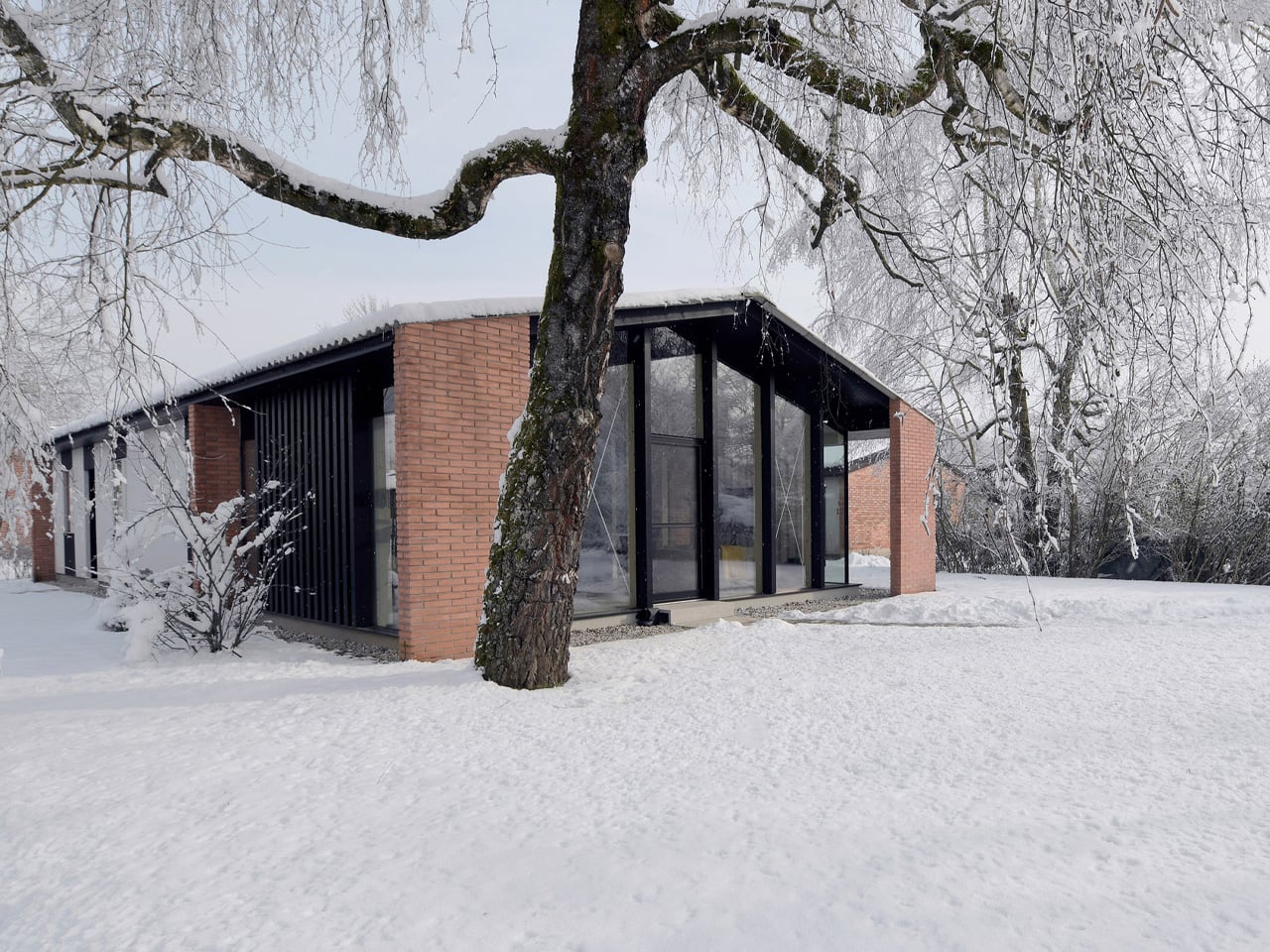
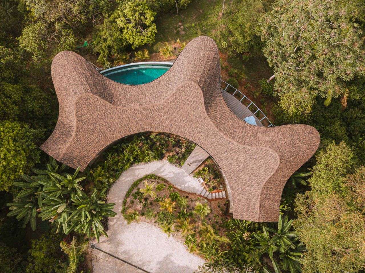
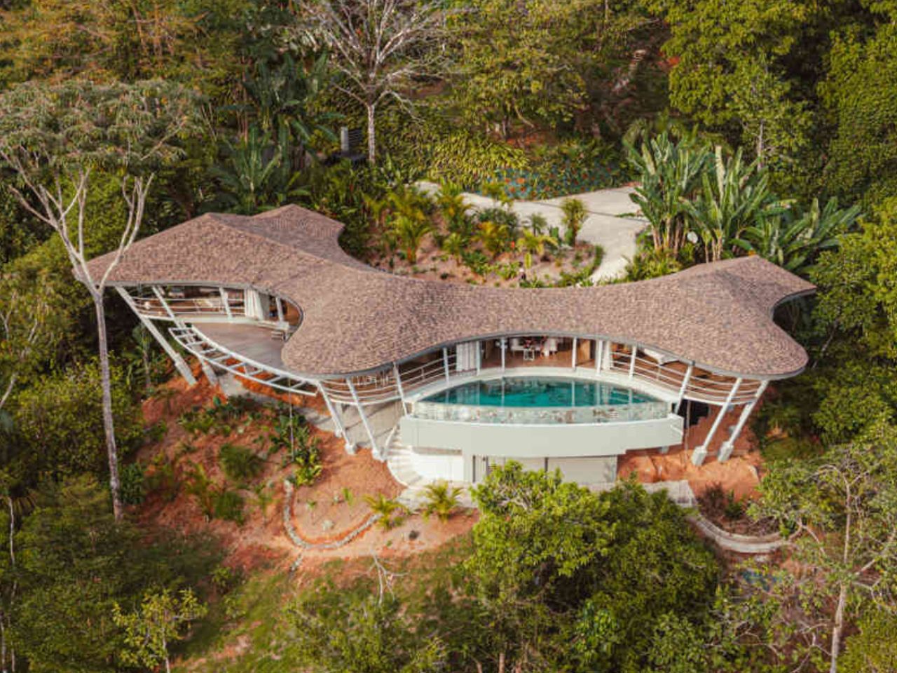
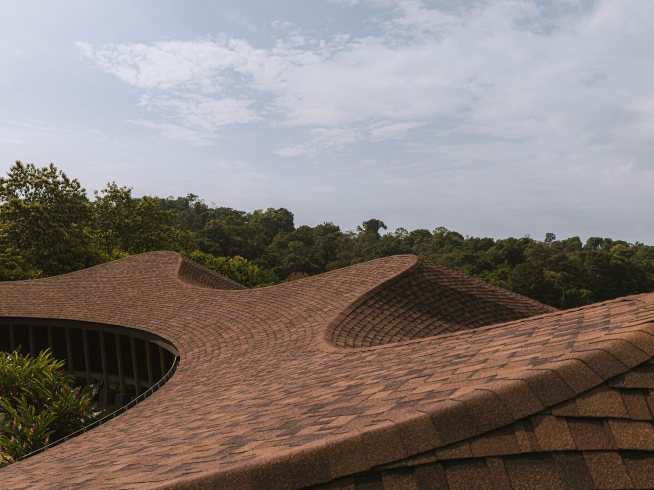
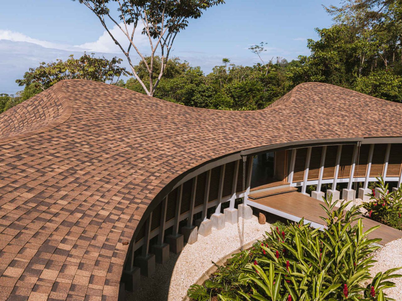
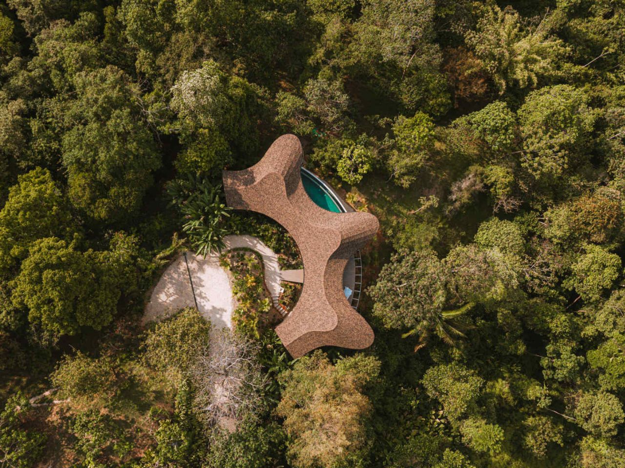
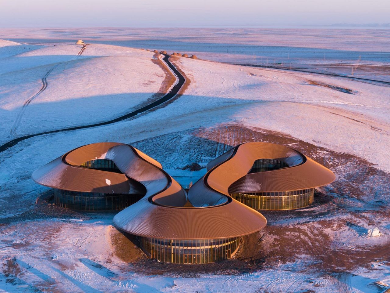
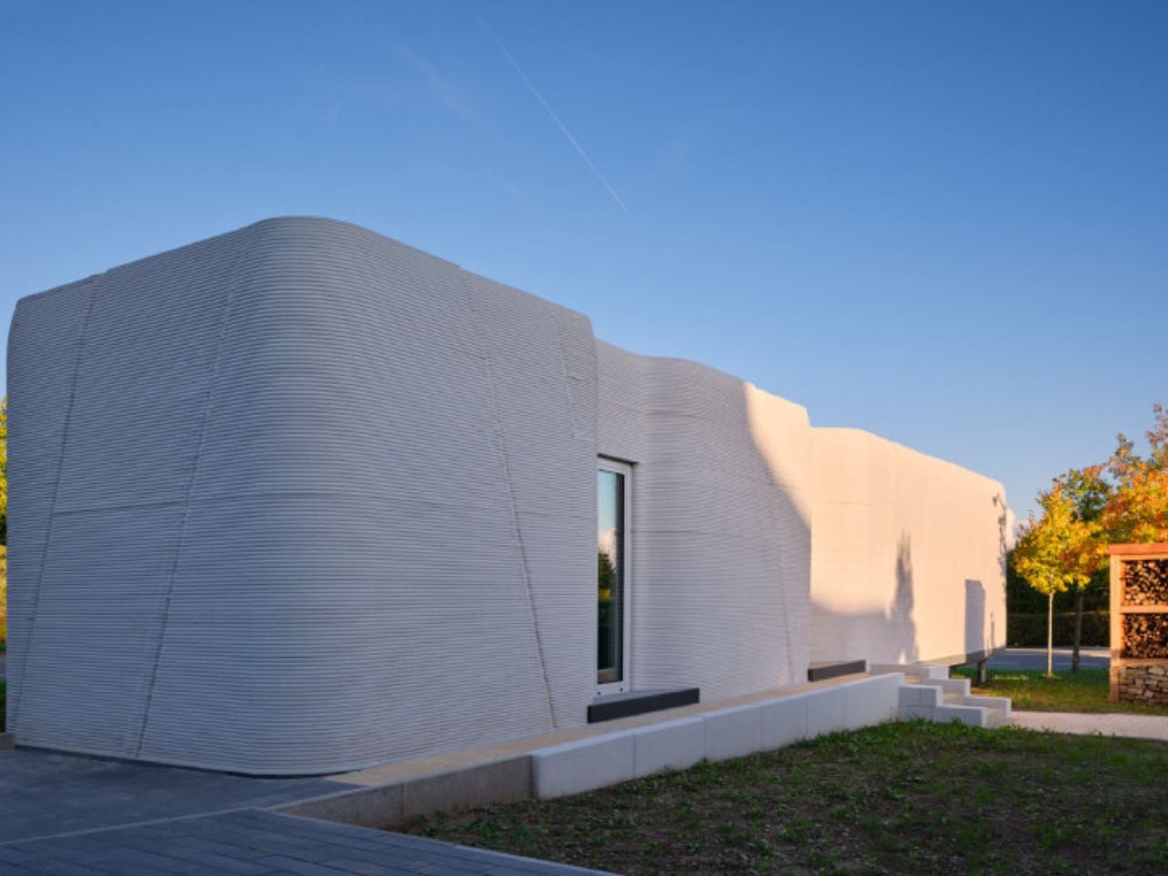
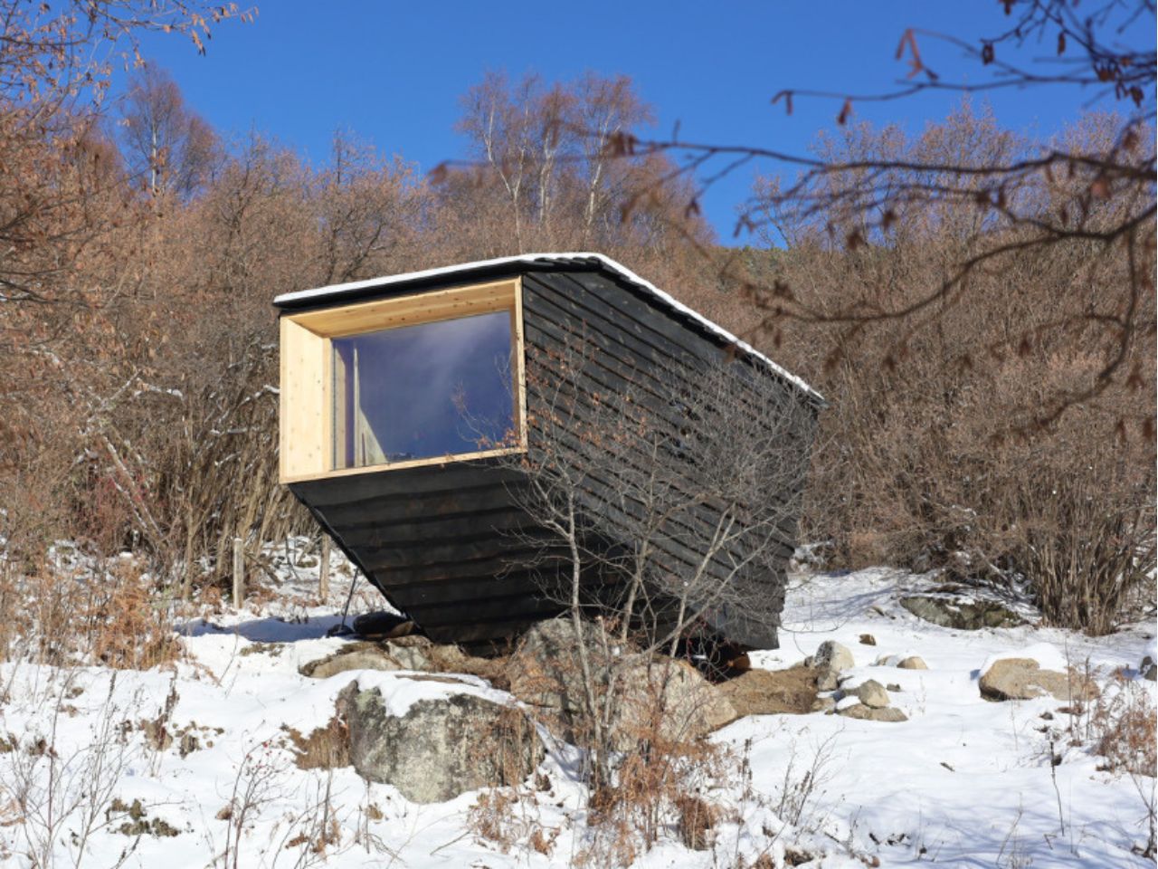
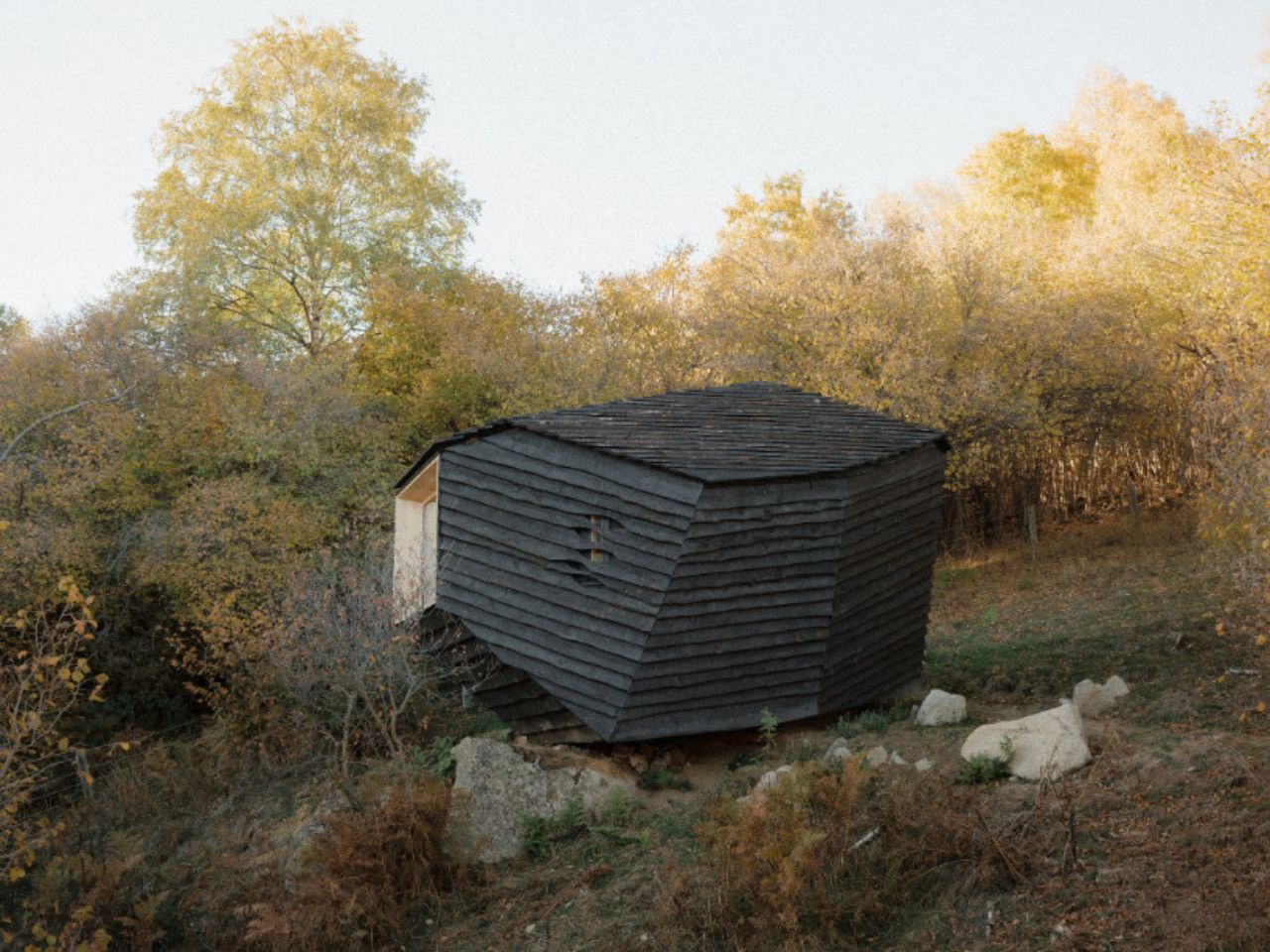
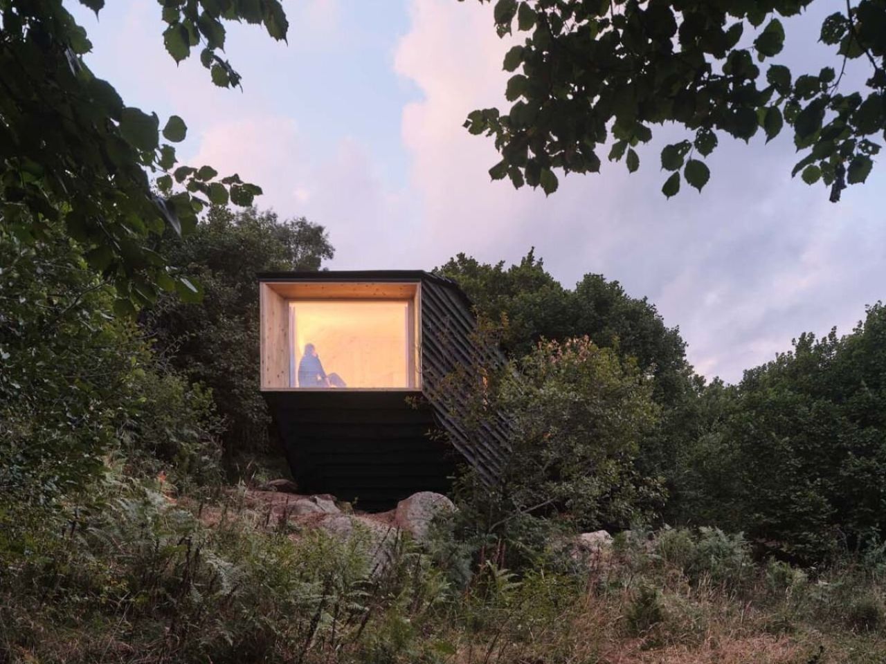
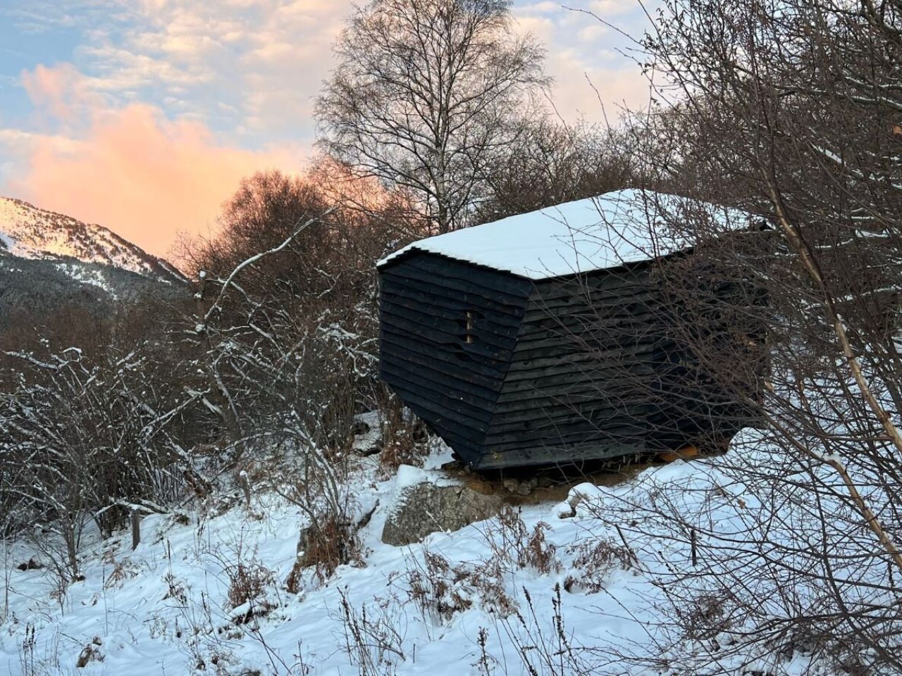
High in the Pyrenees, where forests, rock, and weather dictate their own quiet rules, Forestone Cabin appears less like a building and more like a geological event. At just 20 square meters, this experimental wooden dwelling does not announce itself as architecture in the conventional sense. Instead, it feels as though it has always been there, something solid that rolled down the mountain long before anyone thought to give it a name.

Designed and built by the 2025 cohort of the Master’s in Ecological Architecture and Advanced Construction at IAAC – Institute of Advanced Architecture of Catalonia, Forestone Cabin is part of the Bio for Piri initiative, led by Fundació Catalunya La Pedrera and funded by the Biodiversity Foundation through European Next Generation funds. The project champions regenerative forestry and the intelligent use of local timber sourced from Pyrenean forests in Alinyà, Lleida, an ambition that is embedded into every layer of the cabin.

Designer: IAAC – Institute for Advanced Architecture of Catalonia

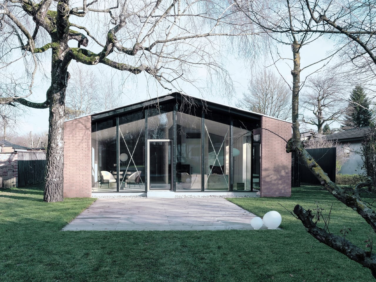
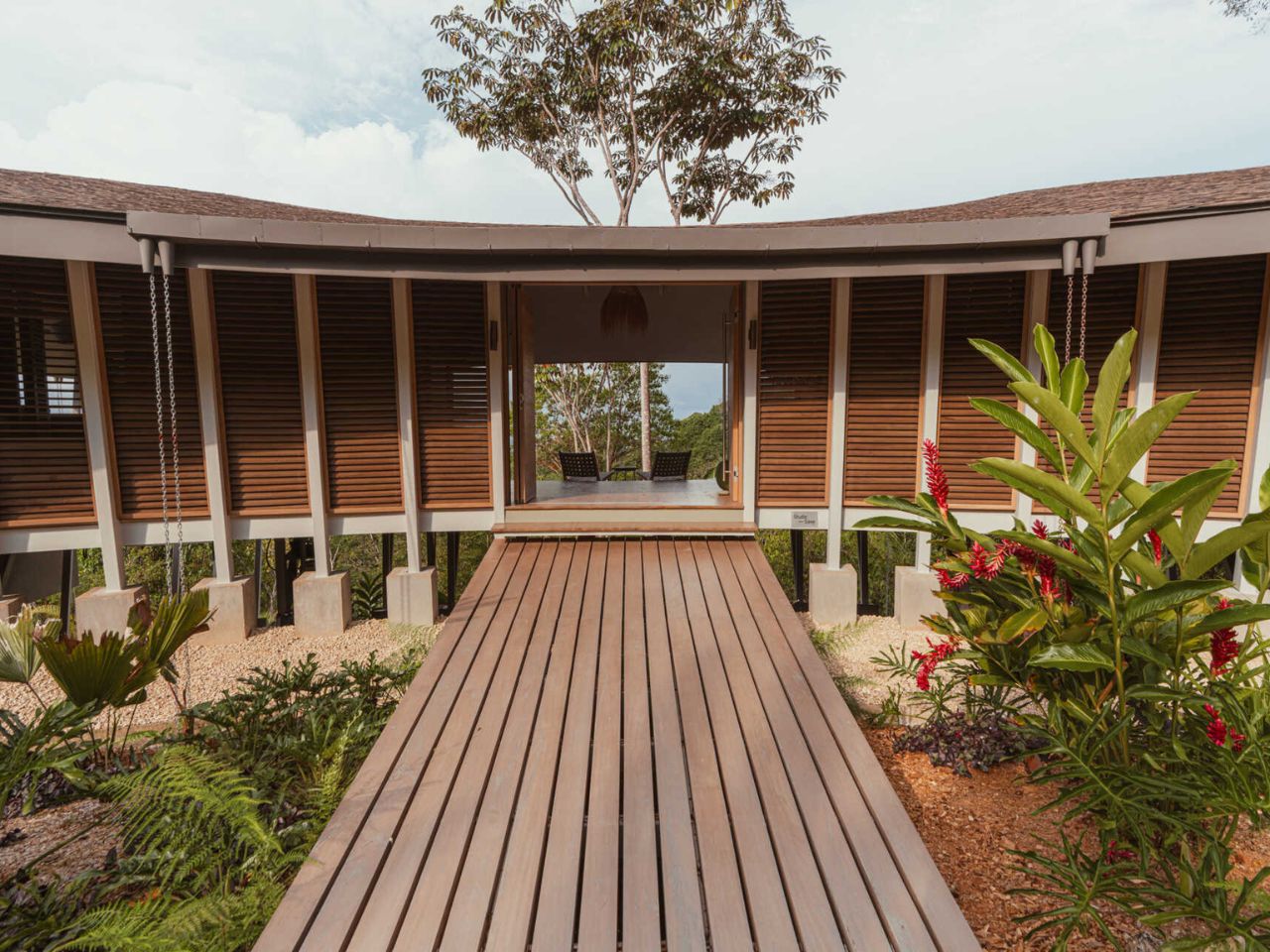
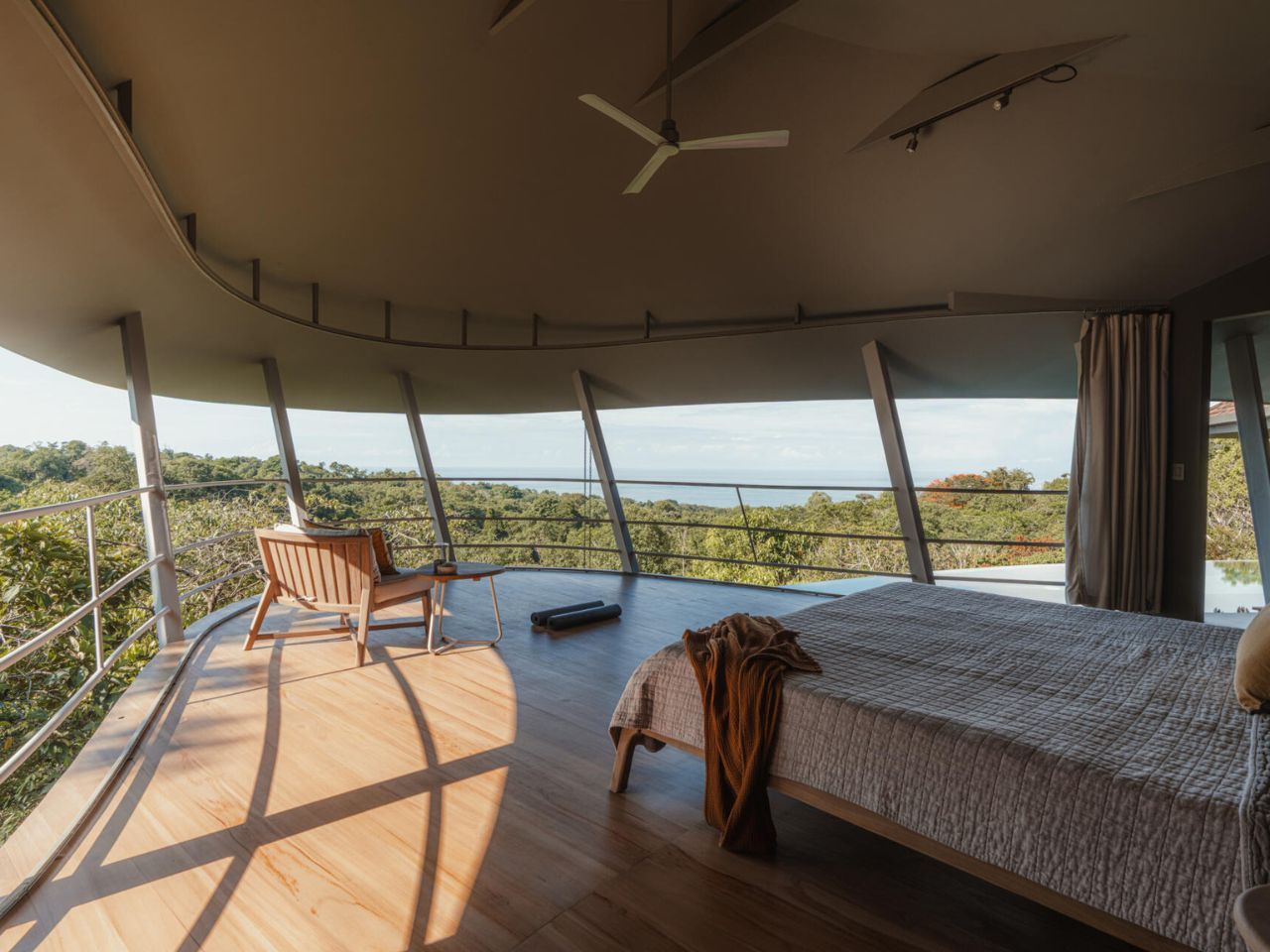
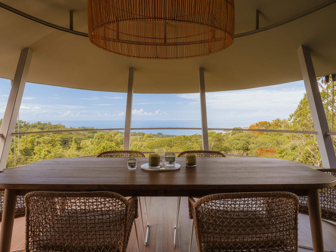
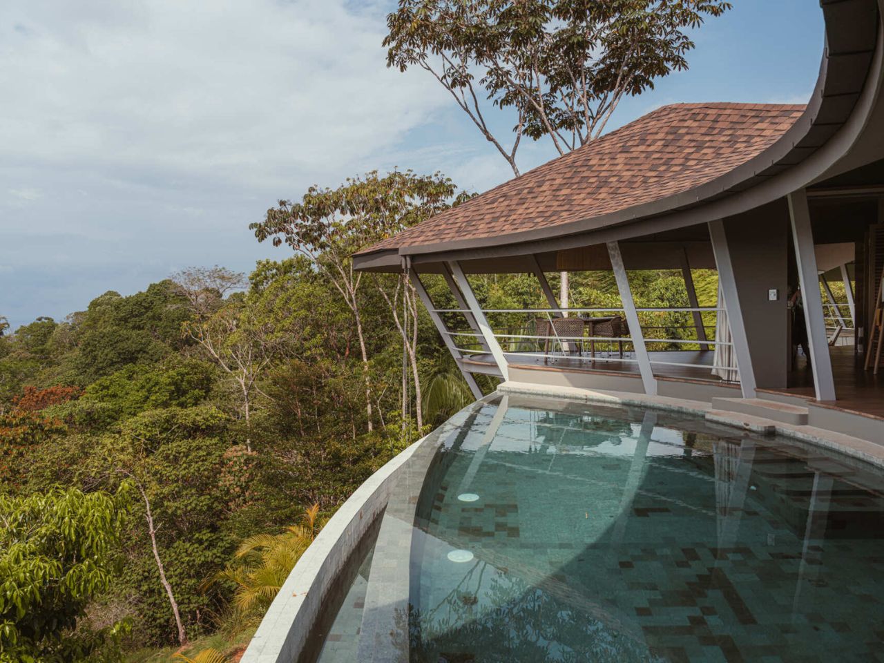
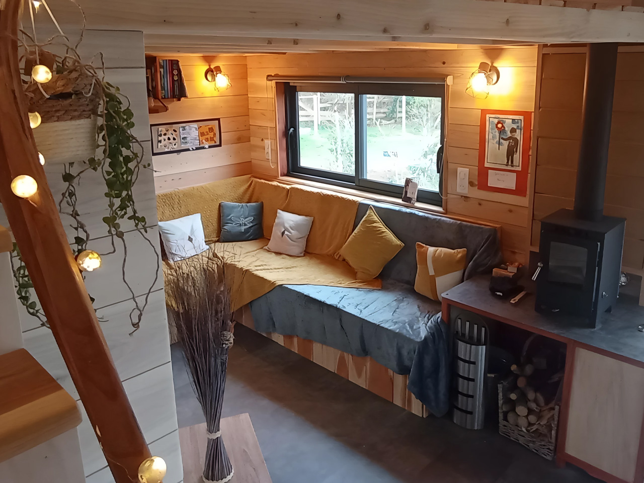
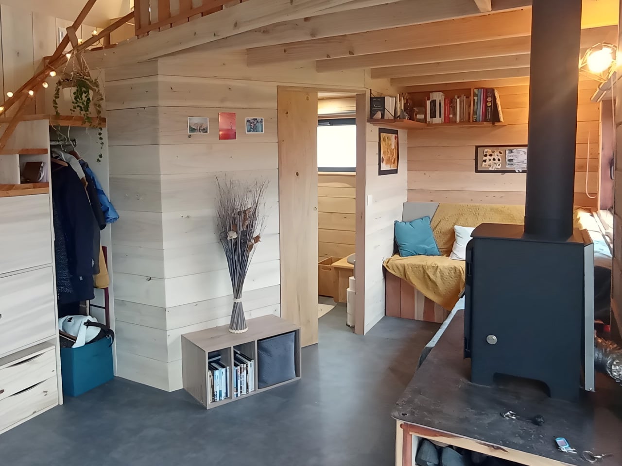
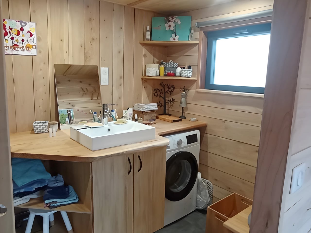
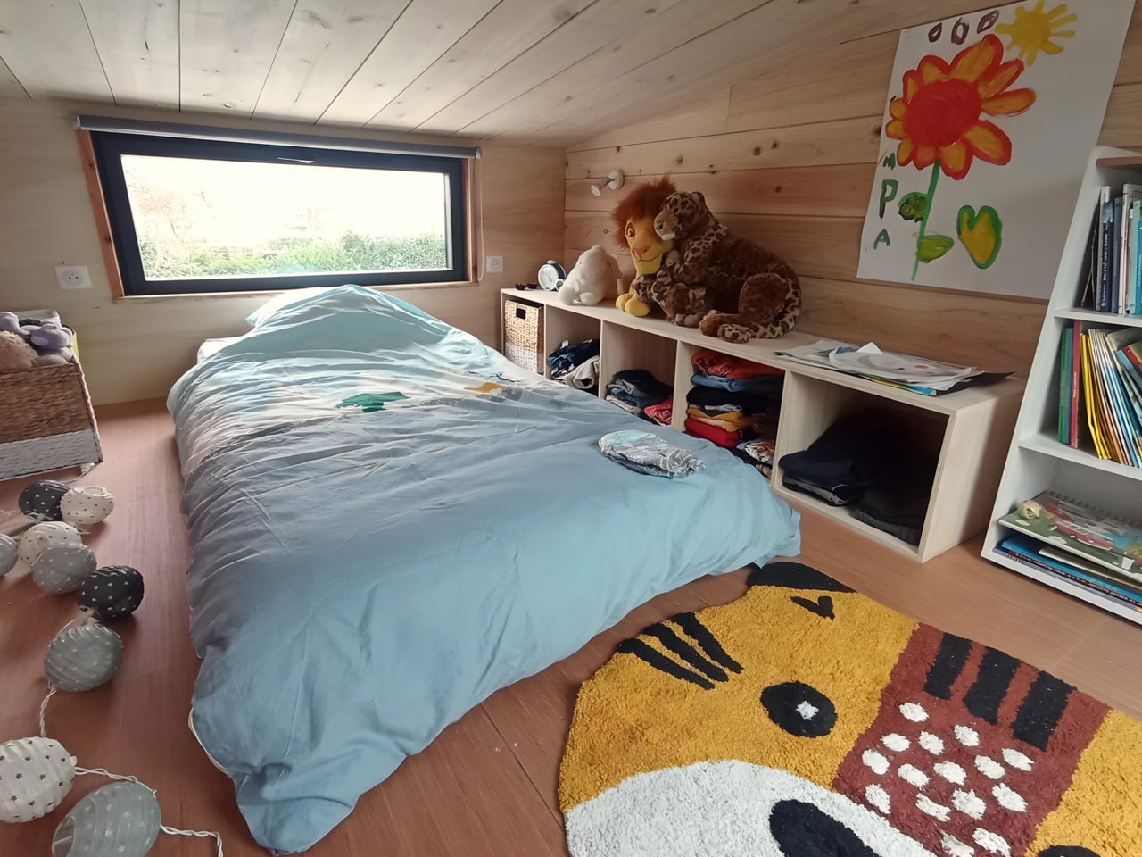
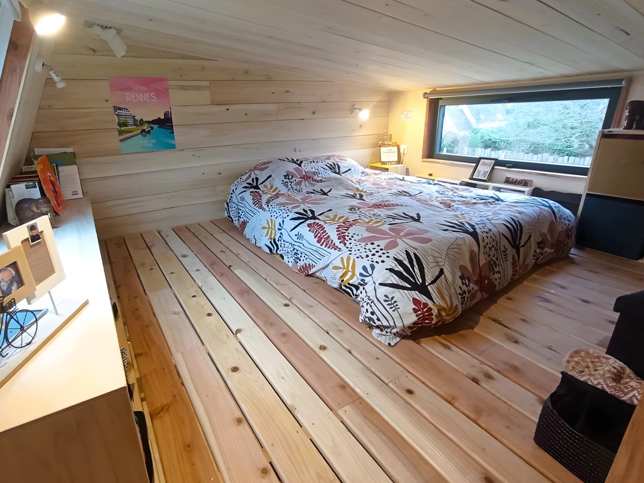
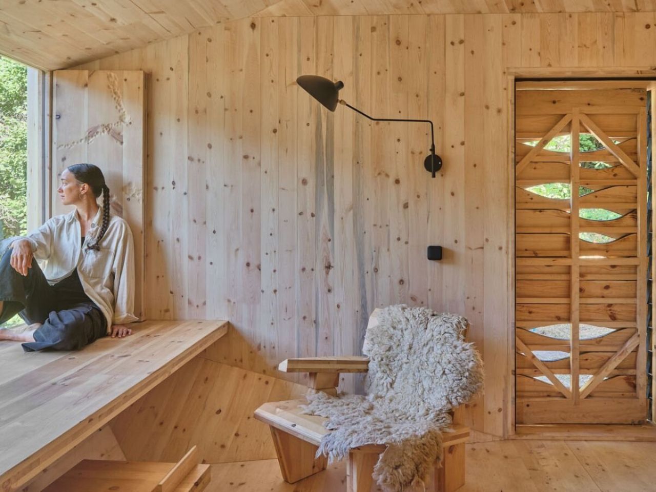
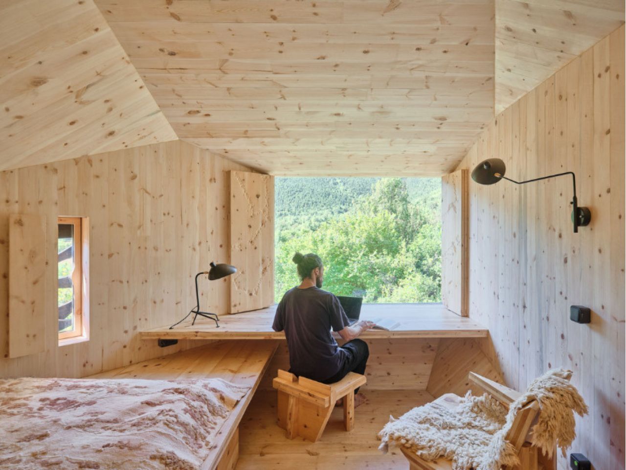
Installed at MónNatura Sort, the cabin occupies a sloping site near an existing mountain hostel. Designed to host two people, it compresses a sleeping area, workspace, and bathroom into a compact yet carefully calibrated interior. Nothing here is excessive. Every surface, angle, and opening earns its place.

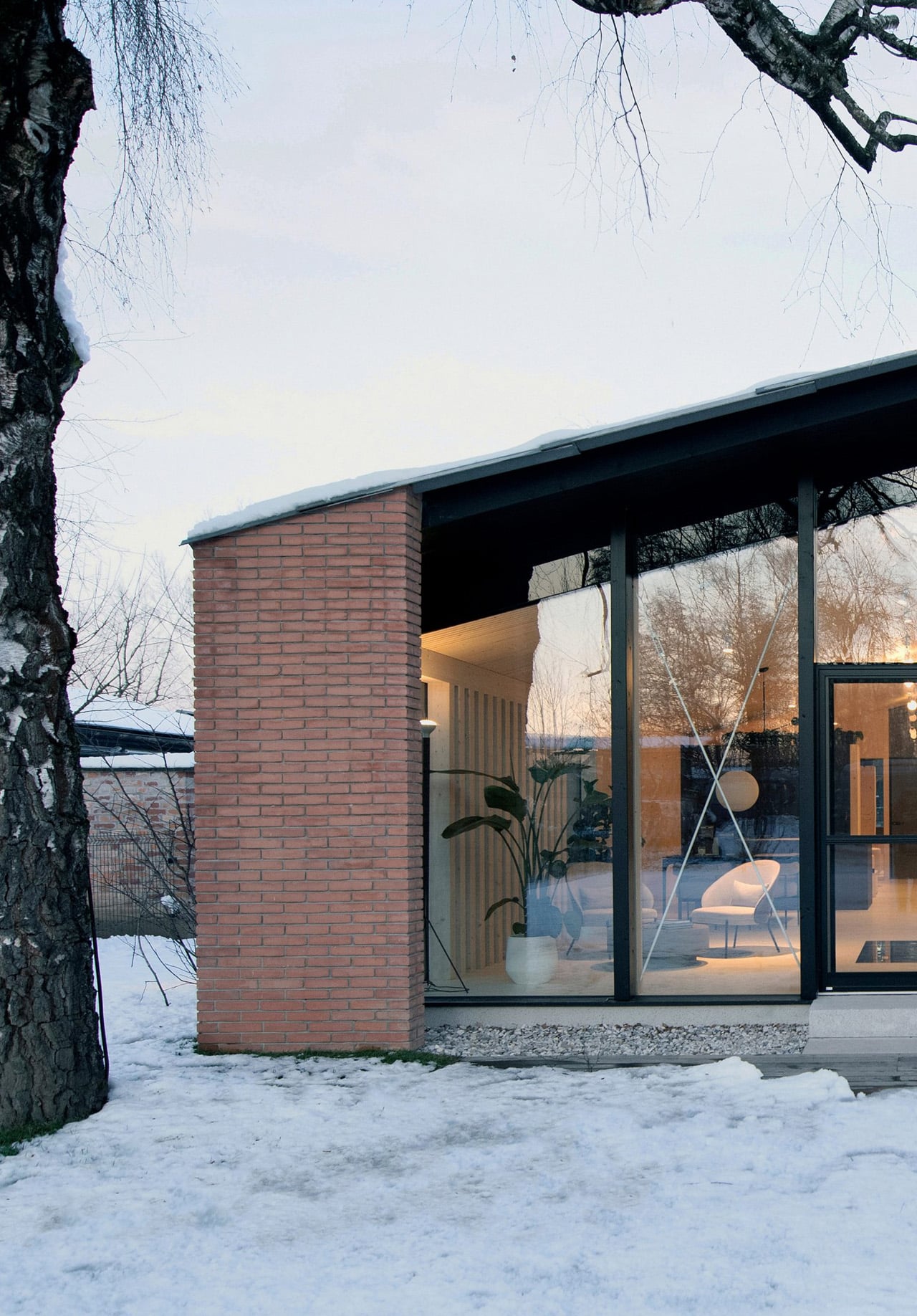
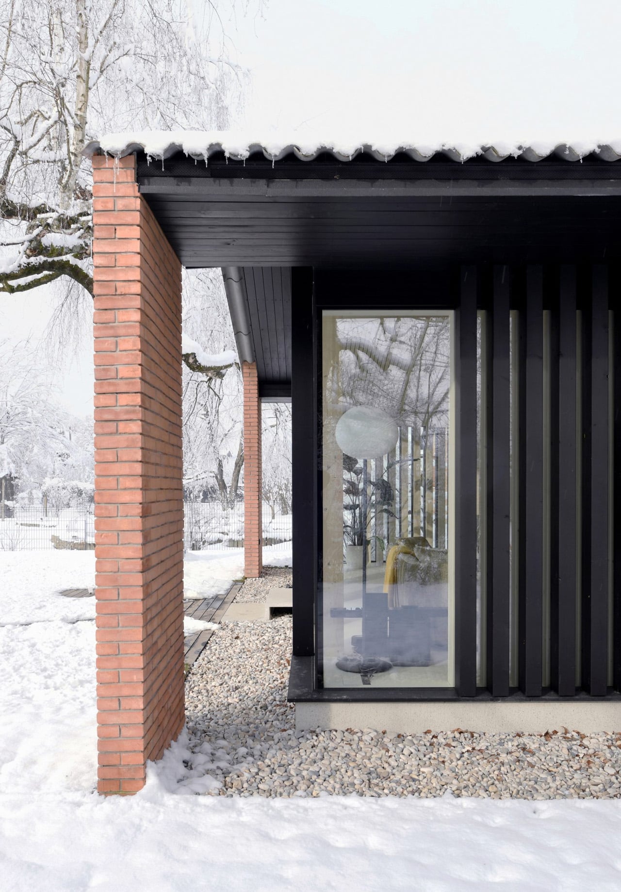
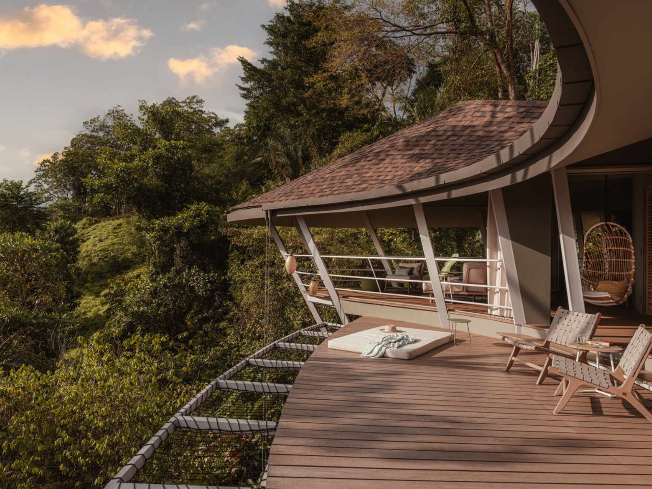
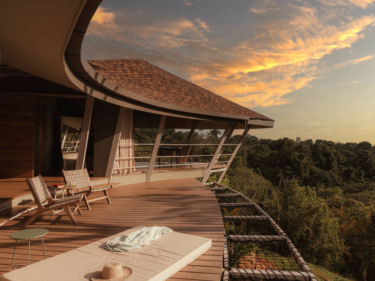
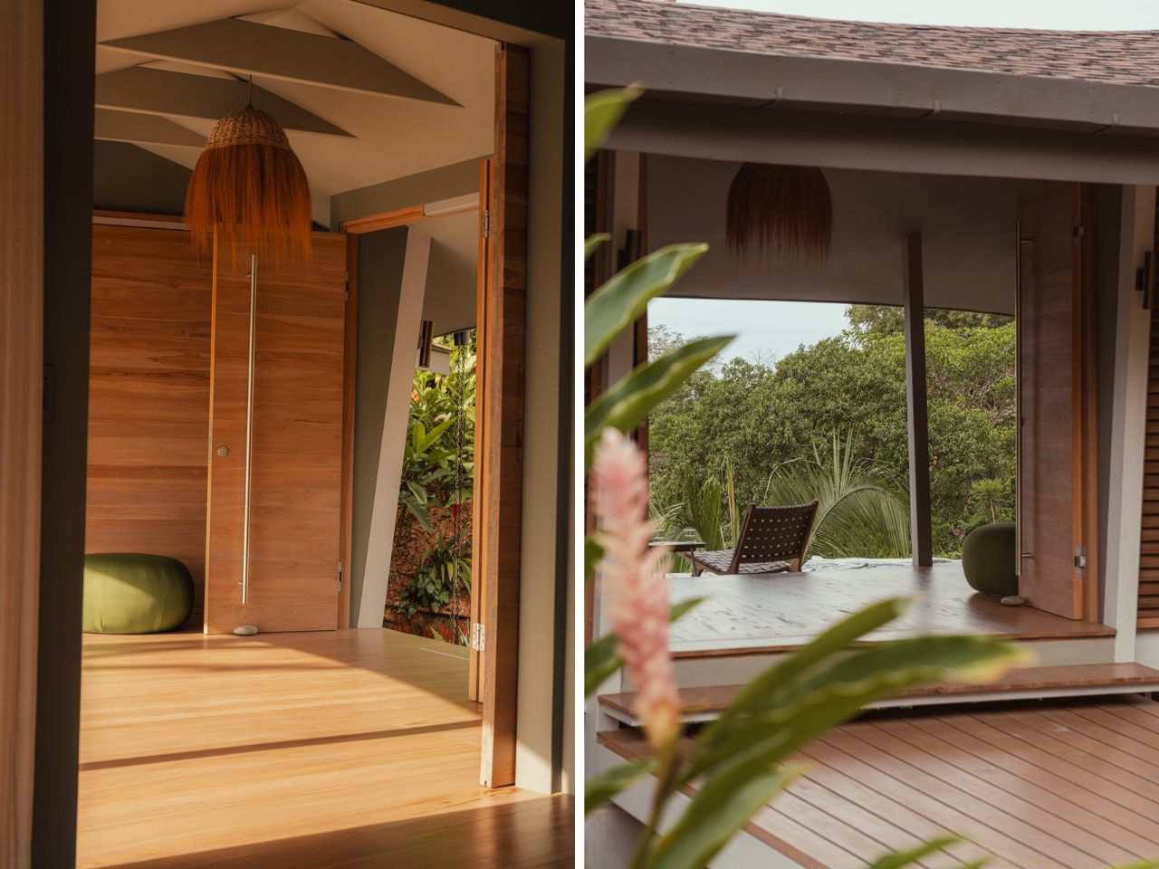
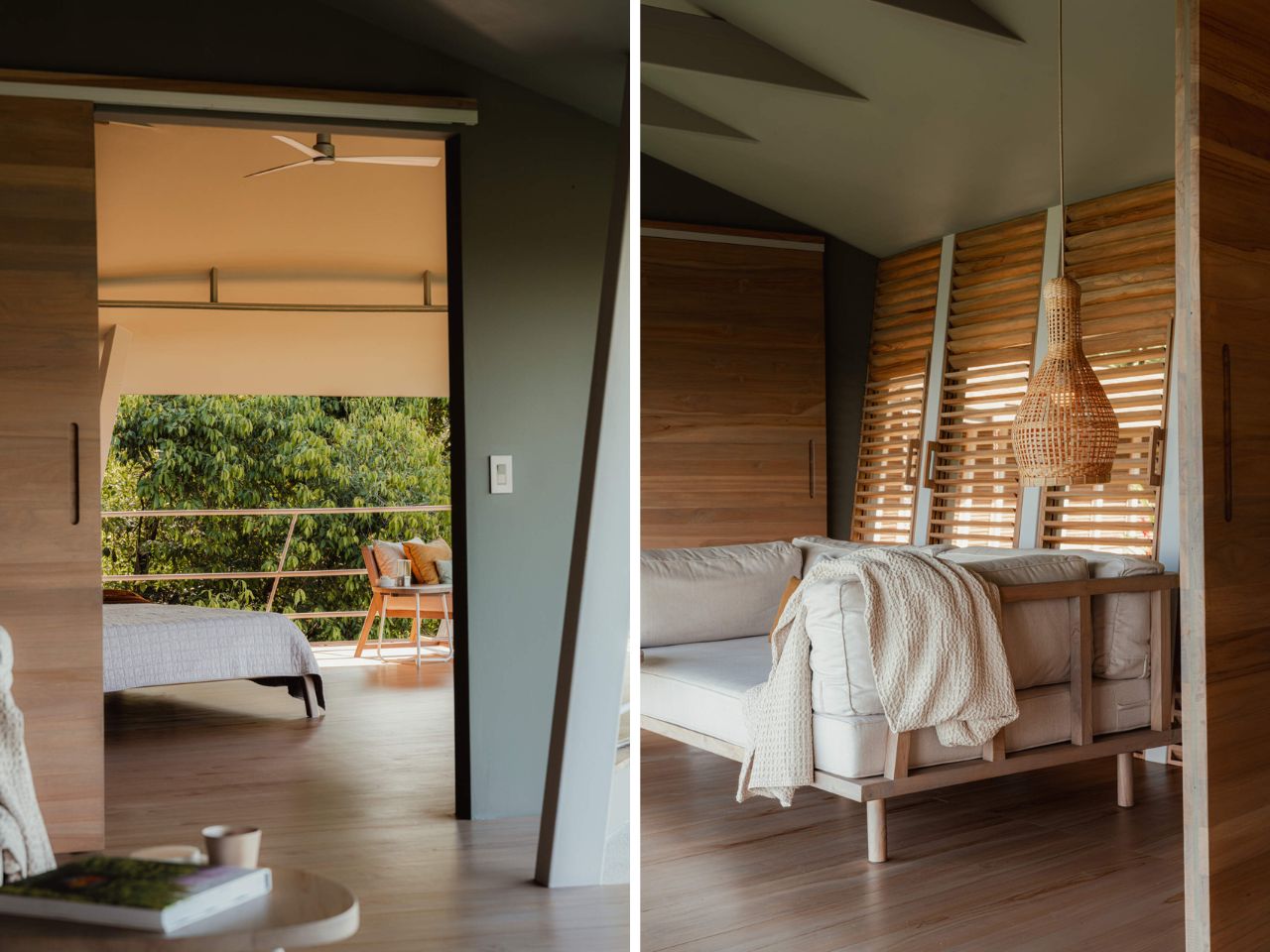
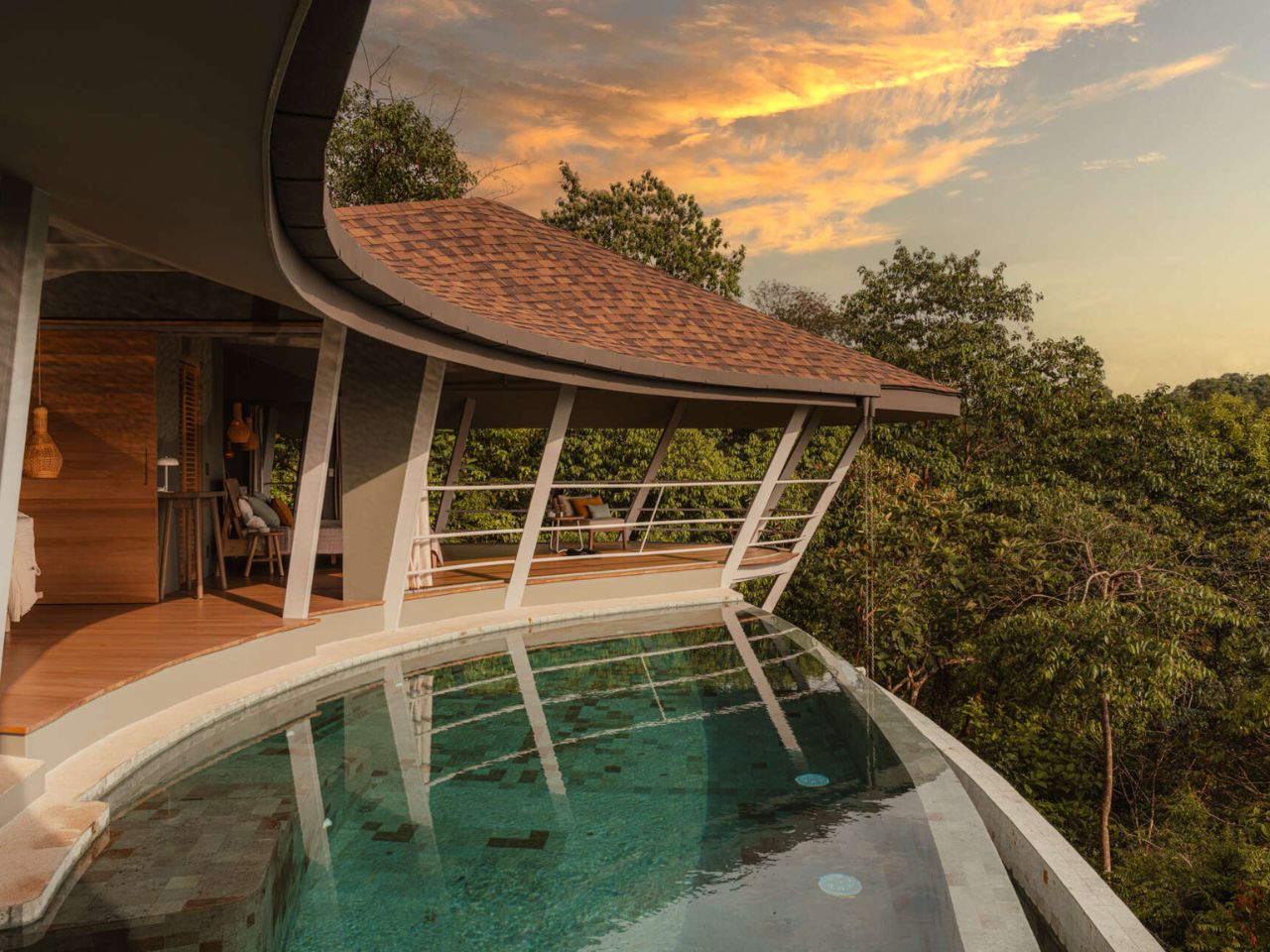
Formally, the cabin takes its cues directly from the landscape. Its faceted geometry, composed of inclined walls and a sloping roof, responds to solar exposure, climatic conditions, and internal program, subtly shaping how the interior is experienced. Ceiling heights shift almost imperceptibly to define zones, while precisely positioned openings frame views of the Pyrenean mountains and allow cross ventilation. At night, operable wooden shutters seal the cabin into complete darkness, eliminating light pollution and supporting the site’s astronomical activities. It is a reminder that sometimes the most sustainable gesture is knowing when to disappear.

The exterior is clad in pine boards with natural edges, charred using the Japanese Yakisugi, or Shou Sugi Ban, technique. Burned by the students themselves, the wood gains resistance to insects, water, mold, and fire, while also carrying symbolic weight. Fire is a constant presence in Pyrenean forest management, and even the name Pyrenees traces back to pyros, the Greek word for fire. Here, charring becomes both protection and narrative.

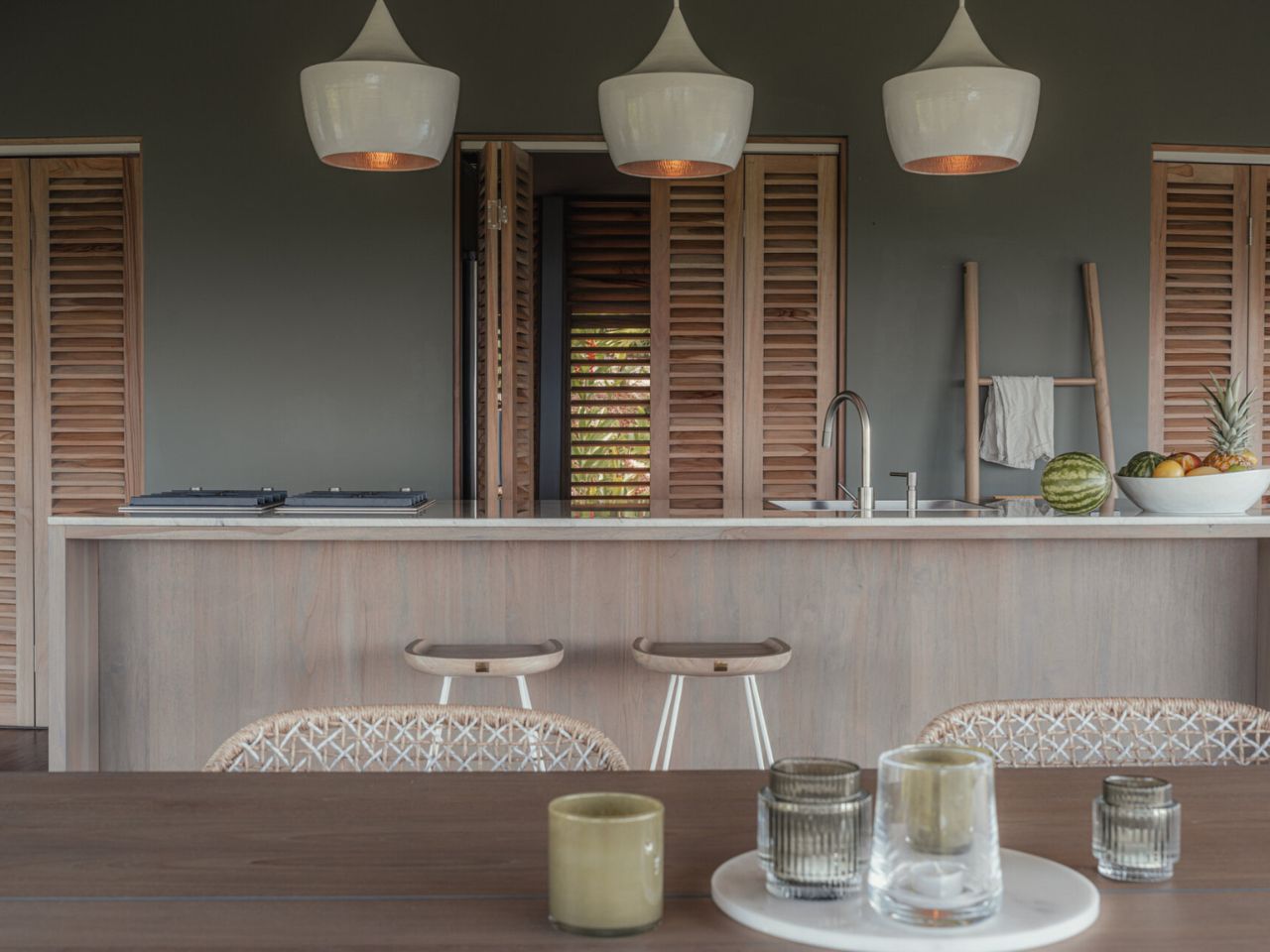
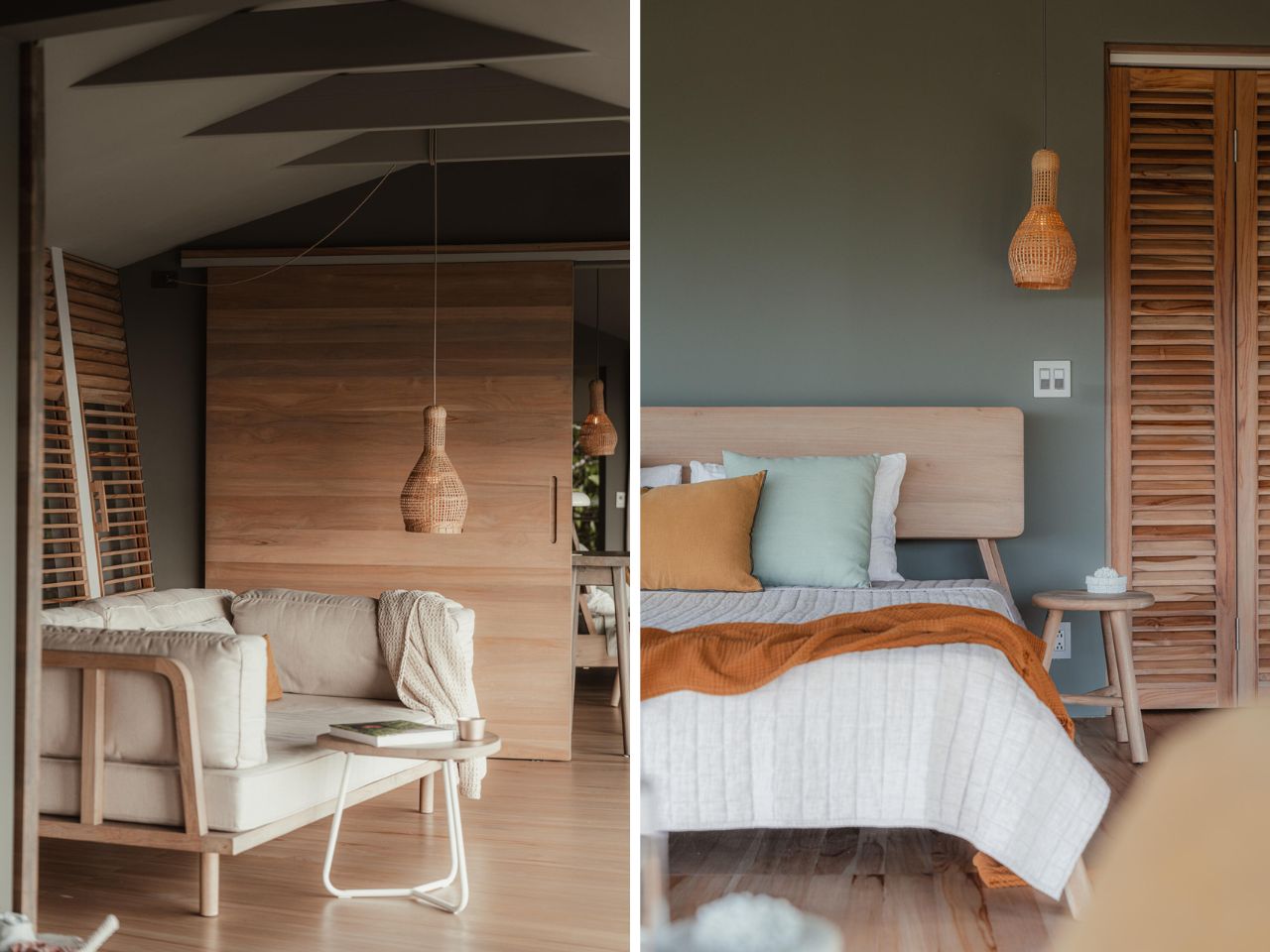
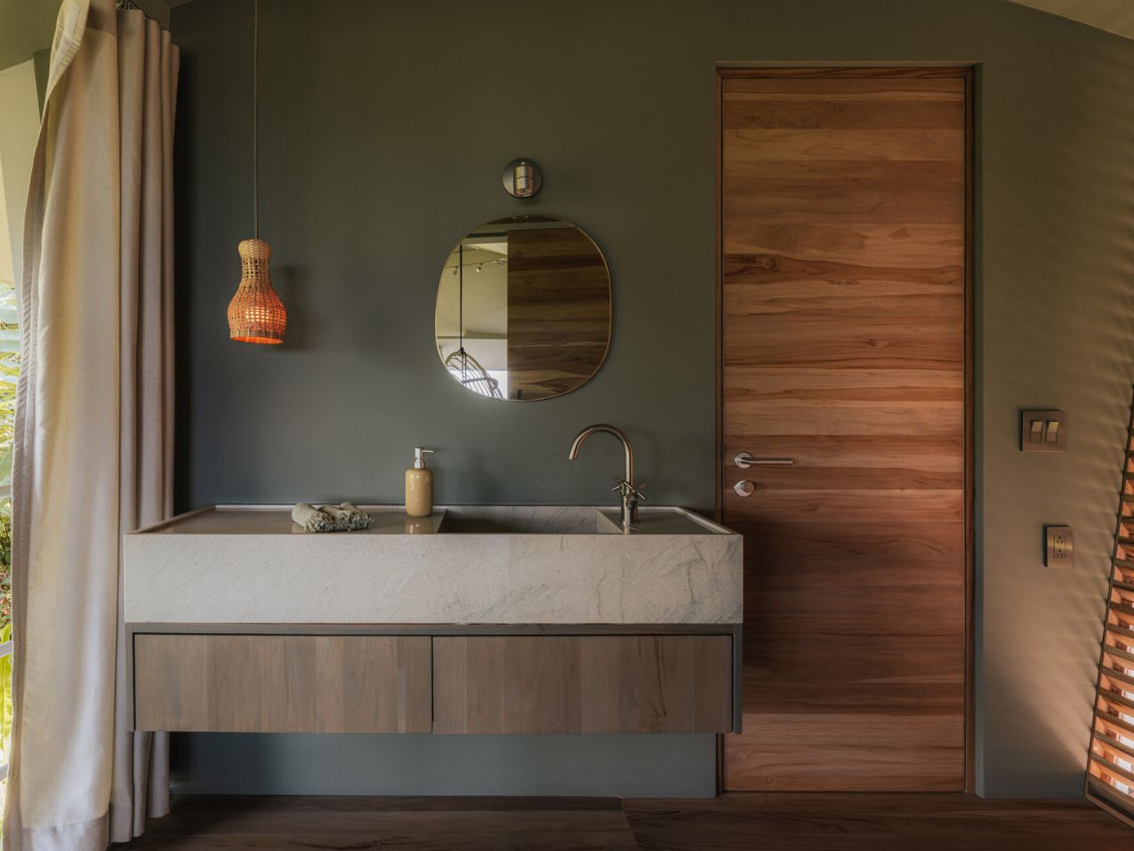
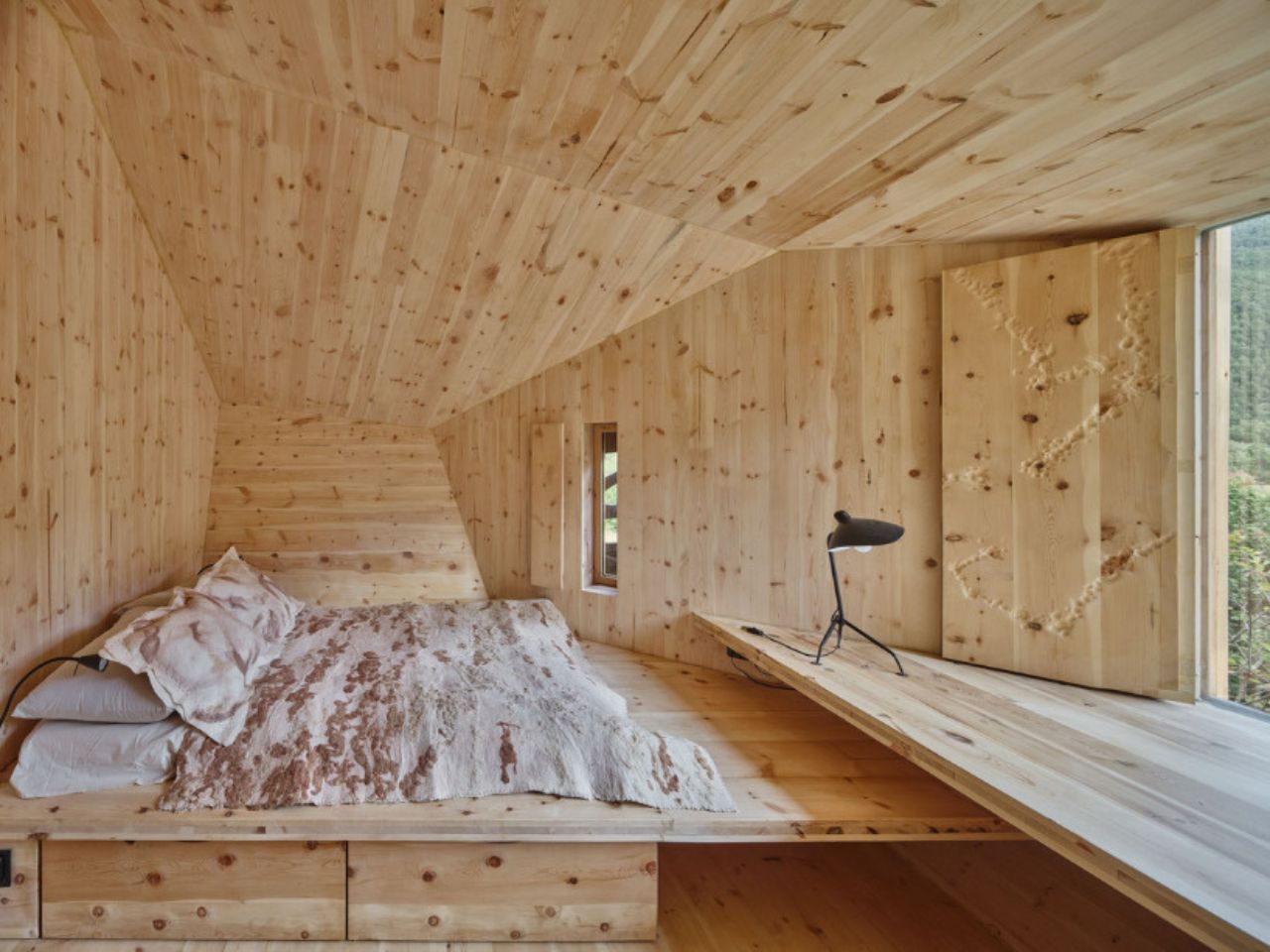
Inside, Forestone transforms into a fully integrated wooden environment. Custom-designed CLT elements form not only the structure but also the furniture, including beds, seating, storage, and the washbasin counter. All components were fabricated by students at Valldaura Labs. Architecture, structure, and furniture collapse into a single material system, reinforcing a hands-on approach where making is inseparable from thinking.

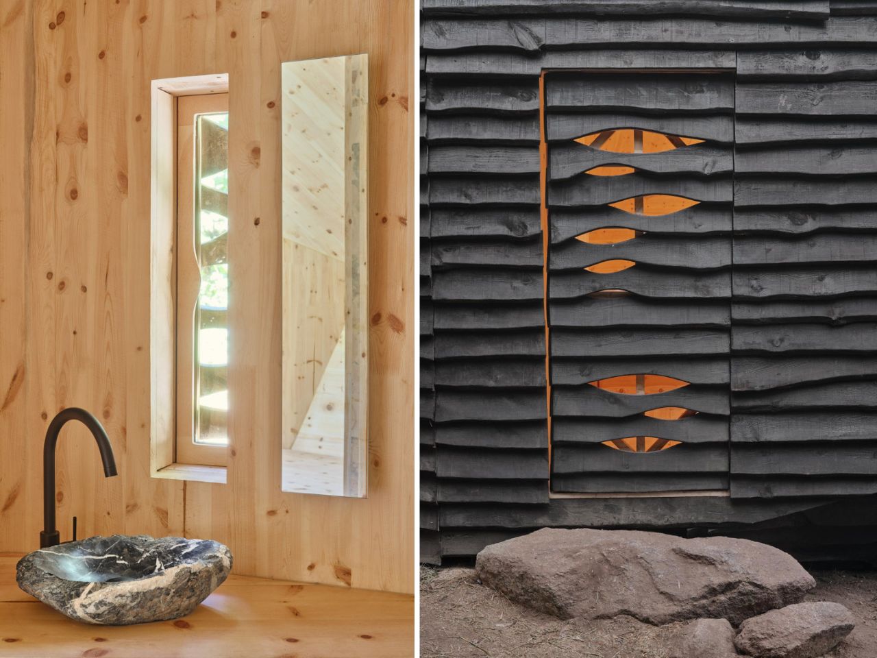
The material story does not end with timber. During a wool festival in the nearby town of Sort, students collaborated with local farmers to collect sheep’s wool, later transformed into felt with the support of Dutch artist Rian van Dijk. The resulting blankets, rugs, and pillowcases introduce softness and warmth while grounding the project in local agricultural cycles. A stone sourced from the surrounding landscape was hand-carved into a washbasin, turning a found object into a daily ritual.

From the outset, Forestone Cabin was designed as a prototype. Its modular CLT system, dry assembly methods, and reliance on local materials allow it to be adapted, replicated, or dismantled with minimal impact. More than a cabin, it proposes a model for inhabiting forest landscapes responsibly, one that aligns education, craftsmanship, and ecological stewardship.

Opening to guests in January 2026 at MónNatura Pirineu, Forestone Cabin offers visitors more than shelter. It offers a way of thinking about forests not as resources to extract from, but as systems to participate in, carefully, thoughtfully, and with respect.

The post A 20-Square-Meter Boulder-Shaped Cabin That Blends Right Into The Pyrenees first appeared on Yanko Design.

This Costa Rican Home Chooses Air, Rhythm, and Silence Over Walls

Perched high above the Pacific coastline in Bahía Ballena, Costa Rica, Ojo de Nila is a house that feels less like an object placed on land and more like a continuation of it. Designed by Studio Saxe, with interiors by Atelier Sandra Richard, the home was created for a Swiss couple seeking a slower, more elemental way of living shaped by air, light, and landscape rather than mechanical systems and rigid enclosures.

A clear modular logic guides the architecture. A repeating series of structural bays follows the natural contours of the hillside, allowing the house to hover above the forest canopy instead of cutting into it. This decision preserves vegetation and natural water flow beneath the home while giving the structure a lightness that feels respectful of its setting. The modules do not read as repetition in the conventional sense. Instead, they become the framework for movement, rhythm, and flow.

Designer: Studio Saxe and Atelier Sandra Richard

Above these modules, the roof undulates in soft waves, behaving almost like a newly formed landform. Rather than acting as a simple cover, it mirrors the rolling topography of the surrounding hills and establishes a calming visual cadence as one moves through the house. The roofline continuously frames the Pacific Ocean, ensuring that the horizon remains a constant presence, never a backdrop but always an active participant in daily life.

Arrival is defined by elevation and openness. As you enter, there is no dramatic reveal or enclosed threshold. Instead, the house immediately opens itself to the ocean. The absence of enclosure on the ocean-facing side dissolves any clear boundary between inside and outside. Movement through the home is accompanied by the sound of wind through the forest, shifting light, and the distant rhythm of waves below.

The dining area is fully open to the landscape, with no windows or doors separating it from the environment. Meals unfold in direct conversation with climate and view, reinforcing a lifestyle centered on natural comfort. Adjacent to this space, the kitchen sits within the same modular grid. A long island anchors the room, illuminated by three pendant lights, while additional storage is discreetly tucked behind folding doors to maintain visual calm.

The living room balances structure and softness. A solid wood frame sofa grounds the space, layered with neutral cushions and tactile throws that invite rest. Rich timber flooring adds warmth underfoot, tying the interior palette back to the surrounding forest.

The bedroom continues this dialogue with nature through a curved open-air form. The sweeping roof and angled supports frame uninterrupted views of both forest and ocean. A low timber bed and minimal furnishings ensure that attention remains on light, air, and the ever-changing landscape beyond.

In the bathroom, restraint becomes luxury. A floating timber vanity topped with stone sits at the center of the space, while slatted wood and soft curtains filter light and create privacy without full enclosure. The result is a room that feels tactile, quiet, and gently connected to its surroundings.

Outside, the pool extends toward the horizon, visually blending with the sky and ocean. From above, its circular form reads like an eye, like a reflection, inspiring the home’s name. This gesture reinforces the idea of the house as an observer, always in dialogue with the landscape it inhabits. The deck echoes the pool’s curves, creating shaded and open zones shaped by the modular structure and flowing roof.

Ojo de Nila ultimately demonstrates how modular construction can enable expressive architecture without overpowering its context. Through repetition that allows curvature and structure that guides airflow, the house achieves a quiet, deeply considered balance between design and environment, inviting its inhabitants to live with nature rather than against it.

The post This Costa Rican Home Chooses Air, Rhythm, and Silence Over Walls first appeared on Yanko Design.

This Steppe Visitor Center Treats a Volcano as Landscape, Not Landmark

On the southern edge of the Xilingol Steppe in northern China, architecture does not arrive as an interruption. It emerges as a continuation of the land itself. The Volcano In Visitor Center by PLAT ASIA is embedded within the geological structure of a C-shaped extinct volcano formed nearly 150,000 years ago during the Pleistocene Epoch. Here, design is guided not by monumentality, but by a careful negotiation with time, terrain, and climate, framing architecture as co-growth rather than construction.

Completed in December 2025 as part of the first phase of the Baiyinkulun Steppe and Volcano Tourism Resort, the project occupies a rare and expansive geological context. The Baiyinkulun Steppe and Volcano Area is home to 108 volcanoes and lies approximately 380 kilometers north of Tiananmen Square. The surrounding landscape is a mosaic of ecosystems, including wetlands, forests, lakes, open steppe, sandy land, and seasonal snowfields, where environmental fragility and vast scale exist side by side.

Designer: PLAT ASIA

PLAT ASIA began working in the region in 2021, when early site surveys revealed a large excavated area to the west of the volcanic cone. Exposed for nearly a decade, this disturbed ground had become vulnerable to erosion. Rather than expanding into untouched terrain, the architects deliberately chose to build on this damaged site, using architecture as a stabilizing presence. The visitor center thus becomes part of a broader ecological strategy, limiting further impact while supporting long-term landscape recovery.

Formally, the volcano itself becomes the primary design reference. The architecture follows the existing topography through a continuous curved roof and three circular volumes positioned at different elevations. Together, these elements trace a conical silhouette that echoes the geometry of the volcanic landform. A winding corridor measuring 274 meters connects the volumes into a continuous loop, guiding visitors around the volcanic ash ring. Movement is central to the experience. The project is designed to be walked, circled, and gradually revealed.

As visitors move along the roof corridor, expansive views unfold toward the surrounding steppe, sandy land, lakes, and neighboring volcanoes. In contrast, inward-facing spaces form a crater-like enclosure that houses the program, including visitor services, a cafe, a bookstore, exhibition spaces, administrative offices, and a restaurant. This spatial rhythm shifts between openness and enclosure, mirroring the volcanic landscape itself.

Outdoor spaces are seamlessly integrated into the architectural layout. A visitor service courtyard accommodates temporary events such as art fairs, while an open square between the exhibition and restaurant volumes functions as an outdoor theater. Eco bleachers embedded into the eastern slope provide seating oriented toward both the roof structure and the wider landscape, reinforcing architecture as a viewing framework rather than an isolated object.

Climate plays a defining role in shaping the project. The region experiences a temperate continental climate with strong winds and heavy snowdrifts in winter and spring. Temperatures can drop as low as- 43 degrees Celsius. The building’s curved profile reduces wind pressure and shear forces, while extended roof eaves protect outdoor spaces from snow accumulation and frame expansive views of the steppe. Weather-resistant metal panel cladding improves thermal performance, while glass curtain walls reflect the volcanic terrain and maintain visual continuity between interior and exterior spaces.

Material choices further ground the project in its context. Locally sourced volcanic stone is used across the site to define pathways and public squares through thin stone slabs laid close to the ground. Weathering steel platforms are embedded directly into the terrain, allowing the architecture to age alongside the landscape over time.

Rather than asserting itself as a singular landmark, the Volcano In Visitor Center establishes a spatial framework that responds to geology, climate, and movement. It positions architecture as a restrained extension of the volcanic environment, inviting exploration while preserving a deep and lasting connection between people and the ancient ground beneath their feet.

The post This Steppe Visitor Center Treats a Volcano as Landscape, Not Landmark first appeared on Yanko Design.

NVIDIA négociait avec Anna's Archive pour entraîner ses IA... et les emails ont fuité

Bon, celle-là elle est gratinée. NVIDIA, le géant des GPU, a directement contacté Anna's Archive pour accéder à environ 500 To de livres piratés. Contacté, négocié, payé. Comme ça, tranquillou.

C'est une class action (dossier n°1:26-cv-00002 au tribunal fédéral de New York, pour ceux qui veulent aller checker) qui a fait fuiter ces fameux emails internes. En gros, un membre de l'équipe "data strategy" de NVIDIA a négocié un accès haute vitesse aux collections piratées de la bibliothèque. Et le plus beau dans l'histoire c'est qu'Anna's Archive les a PRÉVENUS que les données étaient illégales. Genre, texto : "Vous avez une autorisation interne pour ça ?"

La réponse est arrivée en moins d'une semaine. Feu vert. Sauf que bon, quand on lit ça avec du recul, c'est quand même sacrément culotté.

Le contexte, c'était surtout la pression de livrer pour la GTC 2023 (la Developer Conference de NVIDIA). Fallait nourrir les modèles d'IA coûte que coûte, et le dataset Books3 (196 000 bouquins issus de Bibliotik), plus LibGen, Sci-Hub, Z-Library... ça faisait un buffet de 500 To et de leur côté Anna's Archive facturait des dizaines de milliers de dollars pour l'accès rapide.

Sérieux, j'aurais aimé voir la tête du service juridique de NVIDIA en lisant cet email...

En parallèle, Anna's Archive se prend un procès complètement délirant puisque Spotify, Universal Music, Warner et Sony réclament 13 000 milliards de dollars (13 TRILLIONS, soit à peu près le PIB de la Chine). C'est en lien avec leur backup de 300 To de Spotify dont je vous avais parlé ici. Le juge Rakoff a émis une injonction mondiale le 20 janvier, ce qui a fait tomber plusieurs domaines du site .

NVIDIA plaide le "fair use" évidemment. Mouais. On verra bien ce qu'en pensera le juge, mais quand les emails prouvent qu'on t'a prévenu que c'était illégal et que t'as quand même dit "go"... c'est pas ouf comme défense.

En attendant, entre le procès Spotify et ces emails, Anna's Archive est devenue l'ennemi public numéro un de toute l'industrie du contenu sur le web.

Affaire à suivre !

Source

Your Dog Can Now Turn On the Lights (No, Really)

We’re living through a strange moment where our refrigerators are smarter than ever, our thermostats learn our habits, and now, apparently, dogs can control household appliances. The Dogosophy Button, developed by researchers at The Open University’s Animal-Computer Interaction Laboratory, is a wireless switch designed specifically for canine use. Think of it as a smart home device, but instead of asking Alexa, you’re teaching your golden retriever.

This isn’t some novelty gadget cooked up to go viral on TikTok. The button is the result of years of serious research led by Professor Clara Mancini, who runs the ACI Lab. Initially created for assistance dogs who need to help their owners turn on lights, fans, or kettles, the button has now been launched to the public for any dog owner who wants to give their pet a bit more agency. The philosophy behind it, called “Dogosophy,” centers on designing technology around how dogs actually experience the world, rather than forcing them to adapt to our human habits.

Designer: The Open University’s Animal-Computer Interaction Laboratory

So what makes this button dog-friendly? Start with color. Dogs see the world differently than we do, and blue happens to be one of the colors they can recognize most clearly. The button’s push pad is a bright blue, set against a white casing that creates high contrast, making it easier to spot against floors, walls, or furniture. The slightly curved, raised shape means dogs can press it from various angles without needing pinpoint accuracy, which anyone who’s watched a dog enthusiastically miss their water bowl can appreciate.

The button itself is built to handle the reality of being used by an animal. The outer casing is sturdy plastic designed to withstand repeated nose-booping and paw-whacking. The push pad has a textured surface that helps dogs grip without slipping, whether they’re using their snout or paw. Inside, a small light flashes when the button is pressed, soft enough not to hurt their eyes but clear enough to confirm the action worked. It’s the kind of thoughtful design that comes from actually studying how dogs interact with objects, not just shrinking human tech down to pet size.

The system is refreshingly simple. Each set includes the button, a receiver, and basic mounting hardware. The receiver plugs into whatever appliance you want your dog to control, from a lamp to a fan to a kettle. The button connects wirelessly up to 40 meters away, giving you flexibility in where you place it. Press the button once, the appliance turns on. Press it again, it turns off. No app required, no monthly subscription, no “please update your firmware” notifications.

For assistance dogs, this kind of tool is genuinely useful. A dog trained to help someone with mobility issues could turn on a light when their owner enters a dark room or switch on a fan during hot weather. But the public release opens up more playful possibilities. Your dog could theoretically learn to turn on a fan when they’re overheated, activate a toy dispenser when they’re bored, or signal when they want attention by flipping a lamp on and off like a furry poltergeist.

Of course, training matters. Professor Mancini tested the button with her own husky, Kara, noting that huskies are notoriously stubborn compared to more biddable breeds like Labradors. The button works if your dog is motivated and you’re patient. This isn’t plug-and-play; it’s more like plug-and-train-with-treats-and-repetition.

The Dogosophy Button is priced at £96 (including VAT) and is currently available through retailers like Story & Sons. Whether it becomes a legitimate tool for pet owners or just an interesting experiment in animal-computer interaction remains to be seen. But there’s something appealing about the idea of designing technology that considers more than just human needs. Professor Mancini puts it plainly: humans have built a world measured for ourselves, often pushing other species out. A button that meets dogs on their terms feels like a small step toward sharing space more thoughtfully.

The post Your Dog Can Now Turn On the Lights (No, Really) first appeared on Yanko Design.

This Award-Winning Bookstore Looks Like a Portal to Outer Space

Picture walking through a bustling marketplace in China and suddenly stumbling upon what looks like a giant celestial machine that’s crashed through the ceiling. That’s exactly the vibe designer Li Xiang was going for with the Huai’an Zhongshuge Bookstore, and let me tell you, this place is absolutely wild.

Located in Jiangsu Province and completed in 2023, this isn’t your typical cozy corner bookshop with reading nooks and potted plants. Instead, Li Xiang of X+Living studio created something that feels like you’ve stepped through a portal into another dimension. The bookstore just snagged the 2025 Platinum A’ Design Award in Interior Space and Exhibition Design, which is basically the design world’s way of saying “this is incredibly special.”

Designer: Li Xiang

What makes this space so mind-blowing? It’s all about those massive three-dimensional structures that look like astronomical instruments floating inside the store. Imagine concentric rings and geometric forms inspired by celestial mechanics, all reimagined as bookshelves and display areas. The books themselves seem to defy gravity, positioned on these dramatic structures in ways that make you feel like you’re browsing a library floating somewhere in deep space.

But here’s the thing that really gets me about this design. Li Xiang didn’t just want to create something that looked cool for Instagram (though it absolutely does). There’s a deeper philosophy at work here. He describes the project as tearing open a spacetime rift in the midst of everyday city life, which sounds dramatic but actually makes total sense when you think about it.

Li Xiang believes that in our fast-paced modern world, many people have lost the ability to dream. We get stuck in routines, moving through identical concrete cityscapes, dealing with the mundane realities of daily life. His idea was to create a space where people could detach from all that, even just briefly, and rediscover something more imaginative within themselves. As he puts it, the architectural space becomes an extension of dreamlike reality, a spiritual revelation suspended above the ordinary city below.

That’s pretty powerful stuff for a retail space, right? But it works because the design truly commits to the concept. Those exaggerated celestial forms aren’t just decoration. They break up the monotony of reinforced concrete and rectangular spaces that dominate urban architecture. When you’re surrounded by these cosmic structures, your brain kind of has no choice but to shift gears and enter a different mental space.

What I really appreciate is how this fits into the broader Zhongshuge philosophy. This bookstore chain follows a principle of “chain but not replicate, each store with its own cultural style.” So while there are other Zhongshuge locations across China, each one tells its own story and creates a unique experience. The Huai’an location chose to go full sci-fi spectacular, and the results speak for themselves.

From a technical standpoint, pulling this off wasn’t simple either. The project had to overcome some seriously complex spatial and structural challenges to create that feeling of cosmic vastness within what’s actually a confined retail area. Those massive rings and irregular geometric forms needed precise engineering to work safely while maintaining that surreal, gravity-defying aesthetic.

There’s something really special about seeing retail design pushed this far. We’re used to stores being functional, maybe pleasant, occasionally stylish. But Li Xiang took a different approach entirely, creating an environment that prioritizes experience and emotion over conventional retail logic. It’s architecture that values your mental space, that wants you to feel something beyond just the transaction of buying books.

If you’re someone who gets excited about the intersection of design, technology, and culture, this bookstore represents something important. It shows us that commercial spaces don’t have to be boring or predictable. They can be destinations, experiences, even forms of art that make us think differently about the everyday spaces we move through. And maybe, just maybe, they can help us remember how to dream a little.

The post This Award-Winning Bookstore Looks Like a Portal to Outer Space first appeared on Yanko Design.

Anna's Archive vient de sauvegarder la totalité de Spotify

Vous connaissez Anna's Archive , cette bibliothèque pirate qui sauvegarde tous les livres et articles scientifiques de l'humanité ? Hé bien ils viennent de s'attaquer à un nouveau chantier : sauvegarder Spotify (en tout cas le plus possible), c'est à dire des millions de morceaux + de la métadonnées, soit ~300 téraoctets de données !!

Anna's Archive se focalise normalement sur le texte (livres, et documents de recherche) parce que c'est ce qui a la plus haute densité d'information mais leur mission, c'est de préserver le savoir et la culture de l'humanité, et ça inclut donc aussi la musique. Et comme ils ont trouvé un moyen de scraper Spotify à grande échelle, ils se sont dit "Hey pourquoi pas ? On est des oufs".

Et ça donne la plus grande base de données de métadonnées musicales jamais rendue publique, avec 186 millions d'ISRCs uniques (ces codes qui identifient chaque enregistrement). Pour vous donner un ordre de grandeur, MusicBrainz n'en a que 5 millions. Niveau fichiers audio, ils ont aussi archivé environ 86 millions de morceaux, ce qui représente 99,6% des écoutes sur la plateforme (même si ça ne fait "que" 37% du catalogue total). Donc si vous écoutez un morceau au hasard sur Spotify, y'a 99,6% de chances qu'il soit dans l'archive.

Pour trier tout ça, ils ont utilisé la métrique "popularité" de Spotify qui va de 0 à 100. Ainsi, pour les morceaux avec une popularité supérieure à 0, ils ont récupéré quasiment tout en qualité originale (OGG Vorbis 160kbit/s) et pour les morceaux à popularité 0 (soit ~70% du catalogue, des trucs que personne n'écoute), ils ont réencodé en OGG Opus 75kbit/s pour gagner de la place… mais ils ne sont pas allés au bout de la longue traîne (trop de stockage pour trop peu de gain, et pas mal de contenu “bof” à popularité 0). Pour 99% des gens ça sonne pareil, même si je sais que les audiophiles vont me tuer dans les commentaires ^^.

En regardant les stats qu'ils ont produit à partir de ce qui a été scrappé, les 3 morceaux les plus populaires (Die With A Smile de Lady Gaga et Bruno Mars, BIRDS OF A FEATHER de Billie Eilish, et DtMF de Bad Bunny) ont été streamés plus de fois que les 20 à 100 millions de morceaux les moins populaires combinés. Bon, ils précisent aussi que la popularité est très dépendante du moment, donc ce top est un peu arbitraire mais ça montre à quel point la longue traîne est looooongue sur les plateformes de streaming...

Après le problème avec la préservation musicale actuelle (ce qu'on retrouve sur les sites de Torrent par exemple), c'est qu'elle se concentre uniquement sur les artistes populaires et la qualité maximale (FLAC lossless). Du coup, y'a plein de musique obscure qui ne survit que si une seule personne décide de la partager. Et ces fichiers sont souvent mal seedés. Et c'est pour ça que je trouve l'approche d'Anna's Archive plutôt pas mal car elle consiste à archiver tout ce qui existe (ou presque), même en qualité "suffisante", plutôt que de se concentrer sur un sous-ensemble en qualité parfaite.

Et comme vous vous en doutez, tout est distribué via des torrents, avec les métadonnées déjà disponibles (moins de 200 Go compressés) et les fichiers audio qui arrivent progressivement par ordre de popularité. Note la base s'arrête à juillet 2025, donc tout ce qui est sorti après peut ne pas être là (même s'il y a quelques exceptions).

Bref, c'est la première archive de préservation musicale vraiment ouverte, que n'importe qui peut mirrorer s'il a assez de stockage et voilà comment grâce à l'aide de tout le monde, le patrimoine musical de l'humanité sera protégé pour toujours des catastrophes naturelles, des guerres, des coupes budgétaires et autres désastres... Par contre, pas sûr que ça la protège de la boulimie des IA génératives.

Merci à Lilian pour l'info !

Source

3D-Printed Tiny Home Cuts Build Time in Half and Challenges Luxembourg’s Housing Crisis

In Niederanven, a quiet commune east of Luxembourg City, a small concrete dwelling is rewriting expectations for housing innovation. Designed by ODA Architects in collaboration with Coral Construction Technologies, Tiny House LUX is the nation’s first fully 3D-printed residence, a test case in using robotic fabrication to deliver faster, cheaper, and more energy-efficient homes. At just 47 square meters of usable space, the structure is modest, but the architectural ambitions behind it are anything but small.

Created to address Luxembourg’s ongoing housing shortage, the home was printed in less than 28 hours per phase, an extraordinary reduction in build time compared to conventional masonry or timber construction. The speed is significant in a country where demand vastly outpaces supply: Luxembourg needs approximately 7,000 new apartments each year, yet only under 4,000 are completed. This imbalance fuels some of the highest housing costs in Europe. A 47 m² apartment in the capital can exceed €560,000, while the estimated price of the 3D-printed prototype is roughly one-third less, a difference that begins to make entry-level housing more attainable.

Designer: ODA Architects

Energy performance is central to the project’s value. Solar panels on the roof generate enough electricity to power daily usage, while a film-based underfloor heating system removes the need for water pipes, radiators, or boilers. After printing, the walls are packed with insulation made from low-impact materials to minimize long-term energy consumption. The architects emphasize simplicity: systems that are easy to run, maintain, and repair over the life of the home rather than engineering complexity that becomes costly later.

Inside, the layout is intentionally straightforward for efficient living. A small south-facing entrance leads into a corridor that connects every major room, from a technical area and bathroom to a bedroom at the end of the plan. To the left of the entrance, an open living, dining, and kitchen zone forms a single continuous space. A door opens to a terrace on the south side, linking the interior to outdoor space and the surrounding garden. Openings facing north and northeast bring light into the home, reinforcing the idea that a compact footprint can still be bright, breathable, and connected to nature.

Beyond design considerations, 3D printing reduces construction waste, limits the use of heavy machinery, and lowers labor needs by following precise digital instructions. The municipality of Niederanven is leasing the home to a young resident for ten years under its Hei wunne bleiwen initiative, which supports community engagement and starter housing. To offset construction emissions, the project also includes a commitment to plant 21 trees.

For now, Tiny House LUX remains a prototype. But its promise is clear: a new building method that pairs architectural intelligence with urgency, offering a practical, scalable model for affordable, low-energy housing in Luxembourg, and possibly beyond.

The post 3D-Printed Tiny Home Cuts Build Time in Half and Challenges Luxembourg’s Housing Crisis first appeared on Yanko Design.

File-Hunter - L'archive MSX qui aurait rendu fou votre moi de 1985

Vous vous souvenez du MSX, cette machine 8 bits des années 80 qui a fait rêver toute une génération avant que le PC ne vienne tout écraser ? Hé bien y'a un site qui a décidé de préserver absolument TOUT ce qui existe pour cette plateforme, et quand je dis tout, c'est vraiment tout.

File-Hunter , c'est le projet d'un gars passionné, Arnaud de Klerk , qui depuis 1999 (oui, ça a 25 ans ce truc) archive méticuleusement chaque fichier, chaque jeu, chaque démo, chaque magazine lié à l'écosystème MSX. Le site existe même depuis l'époque où FONY créait encore du contenu pour les systèmes 8-bit . Donc autant dire que c'est une vraie institution de la préservation rétro.

Le site propose au téléchargement pas moins de 24 catégories de contenu. Des jeux évidemment (MSX1, MSX2, MSX2+, Turbo-R), mais aussi des démos, des disk-magazines, des émulateurs, des polices, des systèmes d'exploitation, des ROMs système, du contenu technique, des manuels, des livres, des magazines numérisés, de la musique, des programmes, du code source... Bref, si ça concerne le MSX et que ça existe quelque part sur Terre, y'a de fortes chances que ce soit archivé ici.

Côté formats, c'est la fête du slip vintage ^^ puisqu'on y trouve des fichiers DMK pour les disquettes, des TSX et CAS pour les cassettes, des conversions ROM, des fichiers VHD pour les disques virtuels, et même des trucs en LaserDisc. Y'a aussi des versions modifiées de jeux, des traductions anglaises, des cheats, des maps, des sauvegardes... C'est vraiment le genre de collection qui fait baver n'importe quel collectionneur.

Et le truc cool c'est que vous pouvez jouer directement dans votre navigateur sans rien installer . En effet, le site propose une plateforme de jeux MSX et même Amiga jouables online, optimisée pour téléphones et tablettes. Et pour ceux qui préfèrent tout récupérer d'un coup, pas la peine de tout scraper (vous finiriez pas vous faire bannir votre IP), car y'a un torrent complet disponible et même une appli Android. Le fichier allfiles.txt pèse plus de 3 Mo, ce qui vous donne une idée de l'ampleur du bazar.

Bref, si vous avez un petit coup de nostalgie MSX ou si vous voulez découvrir ce que c'était que le gaming avant que tout devienne du photorealistic next-gen, File-Hunter est votre destination du jour. Et comme d'hab, un grand merci à Lorenper pour le partage !

This French Tiny House Finally Makes Downsizing Realistic for Families

French tiny house builder Atelier Bois d’ici has unveiled its largest creation to date, and the Tiny XXL is challenging long-held assumptions about downsizing with children. Stretching 26 feet in length and 11.5 feet in width, this mobile dwelling offers 430 square feet of thoughtfully designed living space that actually feels livable for a family of four. Most French tiny homes measure just 8.2 feet wide, making them feasible for regular road travel but challenging for families seeking genuine comfort. The XXL breaks from this tradition with its extra-wide footprint, sacrificing easy mobility for the kind of space that transforms tiny living from a compromise into a legitimate lifestyle choice.

The trade-off requires a special permit for towing on public roads, which positions this home as a semi-permanent dwelling rather than a frequent traveler. That’s not necessarily a dealbreaker. If you’re planning to park it somewhere beautiful and stay put, the extra breathing room is worth far more than the freedom to move every few months. The layout addresses one of the biggest pain points in family tiny living, which is privacy. Two separate bedroom lofts sit on opposite sides of the home, giving parents and children their own retreats without the awkwardness of sharing one cramped sleeping area. The main floor dedicates generous square footage to a full kitchen and living area where the family can gather without bumping elbows at every turn.

Designer: Atelier Bois d’ici

Atelier Bois d’ici brings exceptional craftsmanship to every build, operating as much more than a construction company. Manager Jean-Daniel runs a sawmill and wood storage facility on the same property as the workshop, creating an integrated approach to tiny house building that starts with raw logs rather than processed lumber. This connection to the material allows the team to incorporate up to 12 different wood species into a single home, using redwood, chestnut, walnut, and beech to create depth and character throughout the space. Natural timber cladding wraps the exterior, creating warmth that carries through to the interior spaces with an eclectic aesthetic that feels worlds away from the clinical minimalism often associated with tiny homes.

The sustainability credentials run deep. Every piece of timber comes from within 30 kilometers of the workshop, sourced through local or short-circuit supply chains that keep the environmental footprint minimal. The team avoids all toxic chemical treatments, letting the natural properties of carefully selected woods provide durability and weather resistance. This philosophy transforms each build into a showcase of regional materials and traditional woodworking techniques that have been refined over generations. It’s a thoroughly French approach to construction, where quality and provenance matter just as much as the final product.

Practical amenities make daily life comfortable. A full bathroom includes a shower, sink, and composting toilet, while a washer/dryer combo machine handles laundry needs without requiring trips to a laundromat. The kitchen comes fully equipped for meal preparation, centered around a dining area that serves as the home’s social hub. A 50-liter electric water heater provides hot water throughout, and a wood-burning fireplace adds both ambiance and heating during colder months. The XXL sits on a rugged agricultural chassis built to handle the weight and stress of the larger structure, ensuring stability for decades of stationary living.

For families weighing the move to smaller living, the Tiny XXL offers proof that downsizing doesn’t require sacrificing comfort or personal space. It’s a home that takes the tiny house concept seriously while refusing to ignore the practical realities of raising kids in close quarters. The result is something that feels more like a real home than a temporary experiment in minimalism, built with old-world craftsmanship for modern sustainable living.

The post This French Tiny House Finally Makes Downsizing Realistic for Families first appeared on Yanko Design.

❌