Vue lecture

Il y a de nouveaux articles disponibles, cliquez pour rafraîchir la page.

5 Portable Work Setups That Work Outdoors, in Parks And Even Beaches

The line between work and home has blurred into an architectural dialogue. Today’s hybrid living isn’t about working from the kitchen counter but about rethinking how domestic spaces support productivity and calm. Designers now aim to create environments that balance efficiency with ease, where furniture performs multiple roles without sacrificing elegance or comfort.

For high-net-worth homeowners, this shift is about investing in experiences that enhance their lifestyle and property value. Portable chairs and adaptive workstations have evolved into design essentials, dynamic and ergonomic, fluid enough to move with the rhythms of daily life, redefining how we live and work within our spaces.

1. Ergonomic Intelligence and Wellness Value

The strength of any portable workspace lies in its ergonomic foundation. Temporary, low-quality setups often lead to long-term strain and reduced focus. True wellness ROI comes from minimizing physical fatigue through design that supports the body’s rhythm, integrating temperature-responsive materials, balanced support, and kinetic flexibility rather than relying on surface aesthetics alone.

When selecting furniture, prioritize chairs with dynamic lumbar support and workstations with seamless height adjustment. The ideal setup becomes a biophilic cocoon, comforting, adaptive, and attuned to your natural movement, ensuring that even during long digital sessions, productivity and physical harmony remain perfectly aligned.

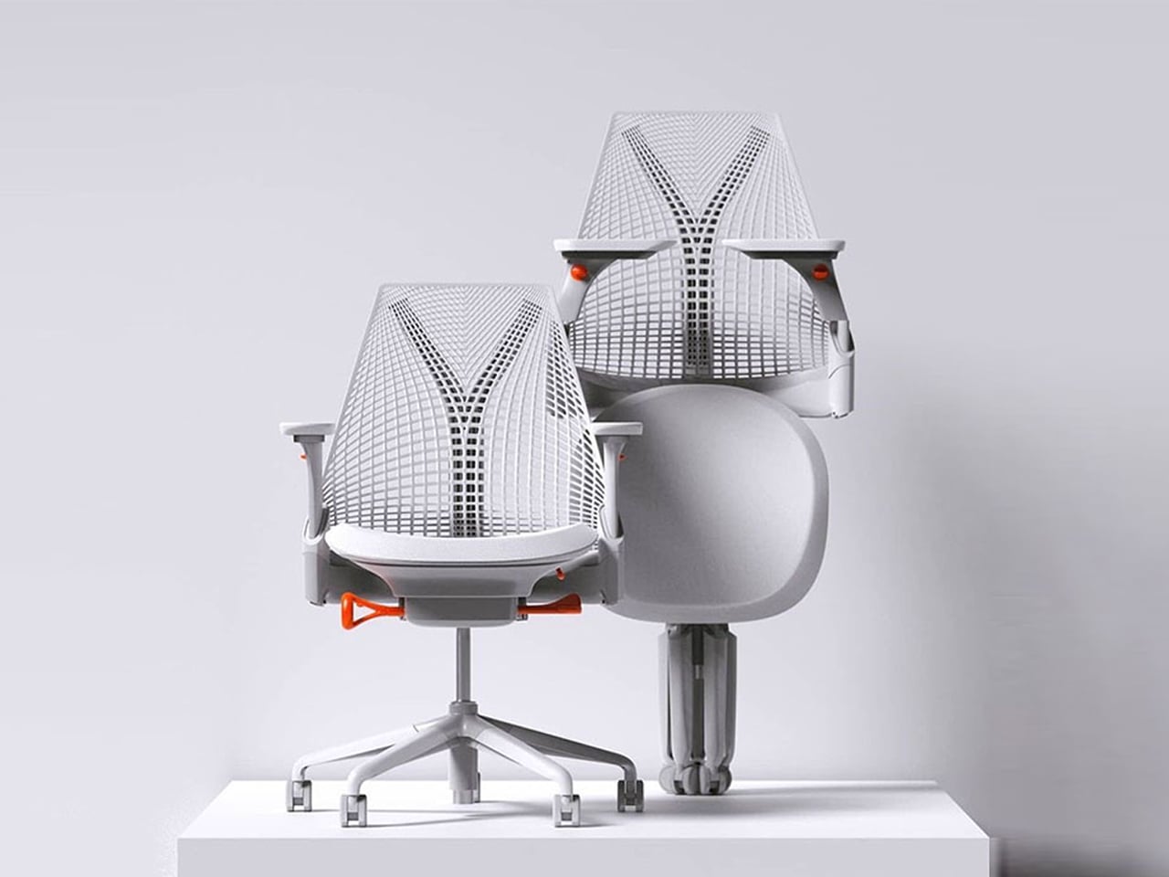
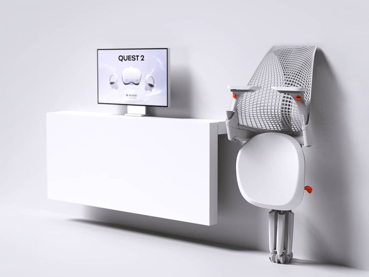
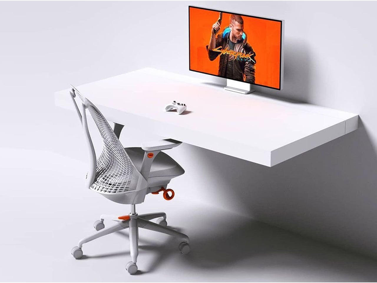
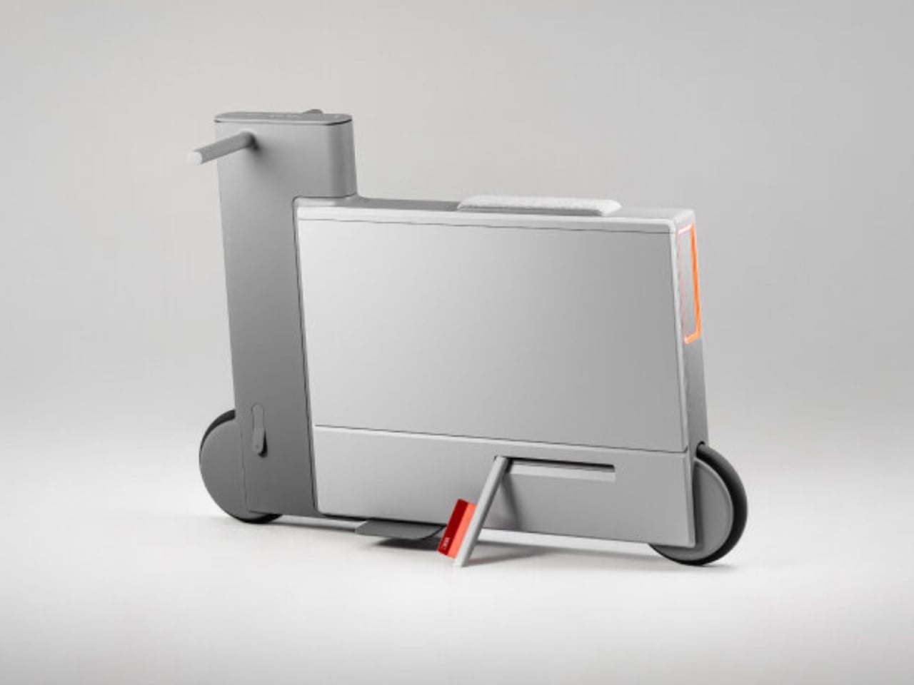
The Sayl concept chair by Charley reflects the changing ways we live, work, and play. As homes have evolved into hybrid offices, gyms, social spaces, and relaxation zones, our furniture needs have changed too. Charley even considers the hours we spend gaming or binge-watching, recognizing that chairs today must support multiple activities while remaining comfortable and functional. Designed by Herman Miller, the Sayl chair combines high-end design with practical usability, allowing users to maximize their space without sacrificing luxury or ergonomics.

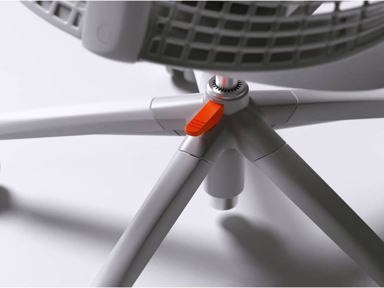
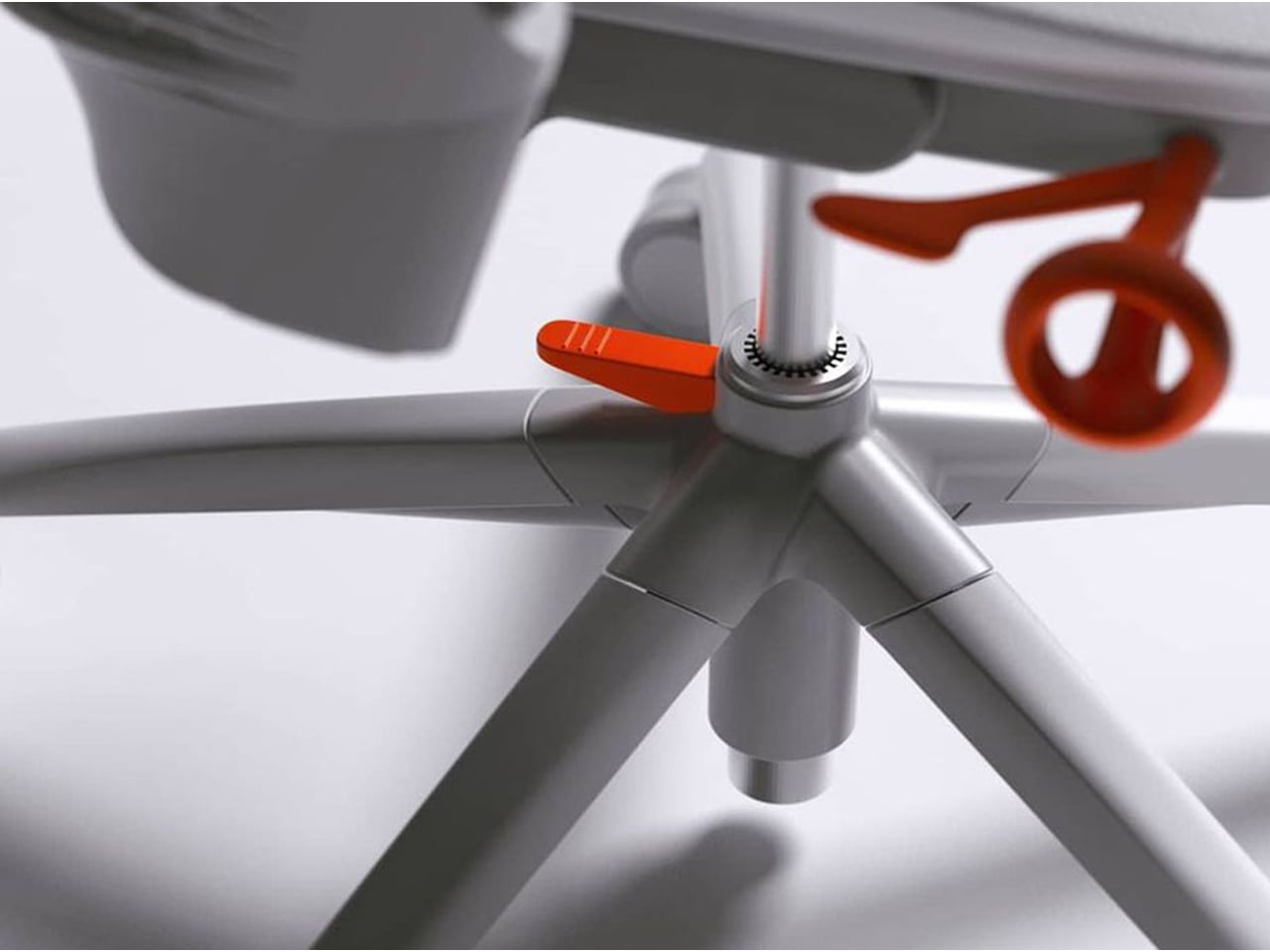
The chair’s muted grey tones ensure it blends effortlessly into any interior, while bright orange accents draw attention to pivotal touchpoints, making it intuitive to use. A foot pedal mechanism allows the chair to collapse easily, providing a convenient, space-saving solution for modern homes. In the post-pandemic era, furniture design has shifted towards modular, flexible, multifunctional, and compact solutions. The Sayl chair embodies all these qualities, offering a versatile, stylish, and practical seating option for today’s hybrid lifestyle.

2. Aesthetic Integrity and Material Authenticity

Every portable unit should carry a strong aesthetic value that complements its architectural surroundings. Materials must feel genuine and timeless, like solid wood, brushed metal, and high-performance textiles that reveal craftsmanship rather than conceal it. This honesty of composition creates visual depth and emotional connection, reinforcing the idea that beauty lies in authenticity, not imitation.

The design should remain sculptural yet understated, integrating seamlessly into curated interiors. Its finish must align with the home’s palette, allowing it to coexist gracefully within the space. When not in use, it should rest as a quiet architectural accent rather than a workplace intrusion.

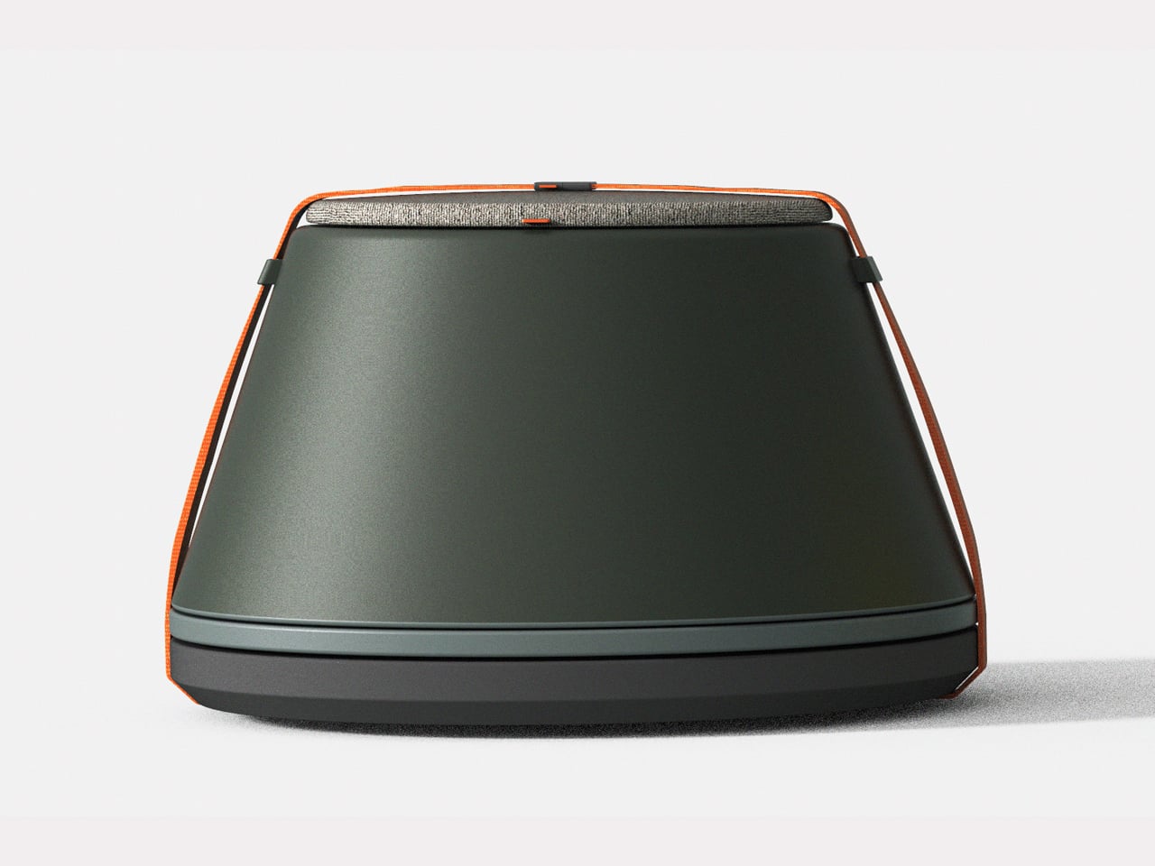
Working from home has spared many from long commutes and office distractions, yet it has also made work feel more solitary. Sitting by the same wall each day, even in a well-designed home office, can feel disconnected from the world beyond virtual meetings. While folding furniture remains popular for its space-saving benefits, stackable, all-weather alternatives are emerging as a smarter choice. Industrial designer Gökçe Nafak introduces the uuma, a portable table-and-chair combo designed as a single stackable unit that transitions effortlessly between indoor and outdoor settings.

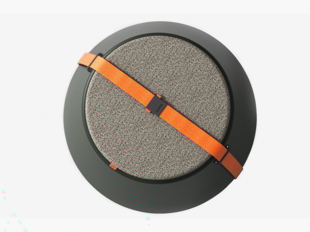
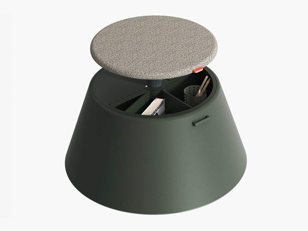
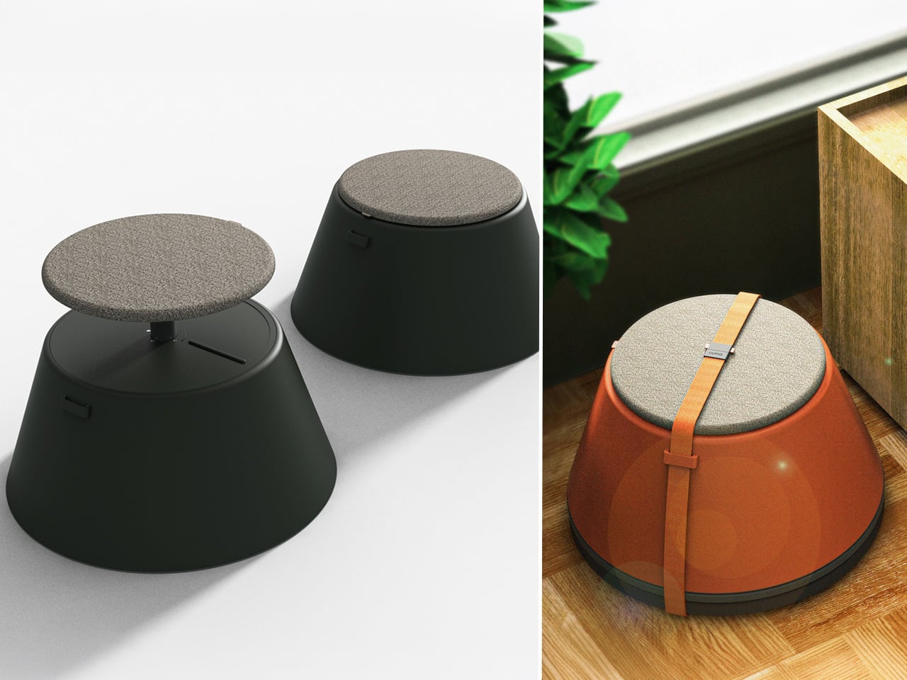
Perfect for those who enjoy working in the garden, on the balcony, or in flexible spaces, the uuma blends convenience with creativity. Made from fibreglass, it is lightweight, durable, and sustainable. Its modular design features a height-adjustable metal frame and detachable parts that assemble easily. The chair transforms into a table within moments, offering comfort, portability, and style in three vibrant, modern colors.

3. Spatial Flow and Footprint Efficiency

The effectiveness of any modern workstation depends on how well it manages spatial flow. In compact urban homes, every inch counts, making footprint reduction a key design priority. A thoughtfully designed system should retract or fold away seamlessly, minimizing its physical presence while supporting the need for adaptable, multi-functional living spaces that evolve throughout the day.

Mobility and refinement define its usability. Tables and desks should transition effortlessly from work to leisure, enabling a quick shift from boardroom mode to family dining. Silent, non-marking wheels and intuitive movement reflect superior engineering and respect for interior balance.

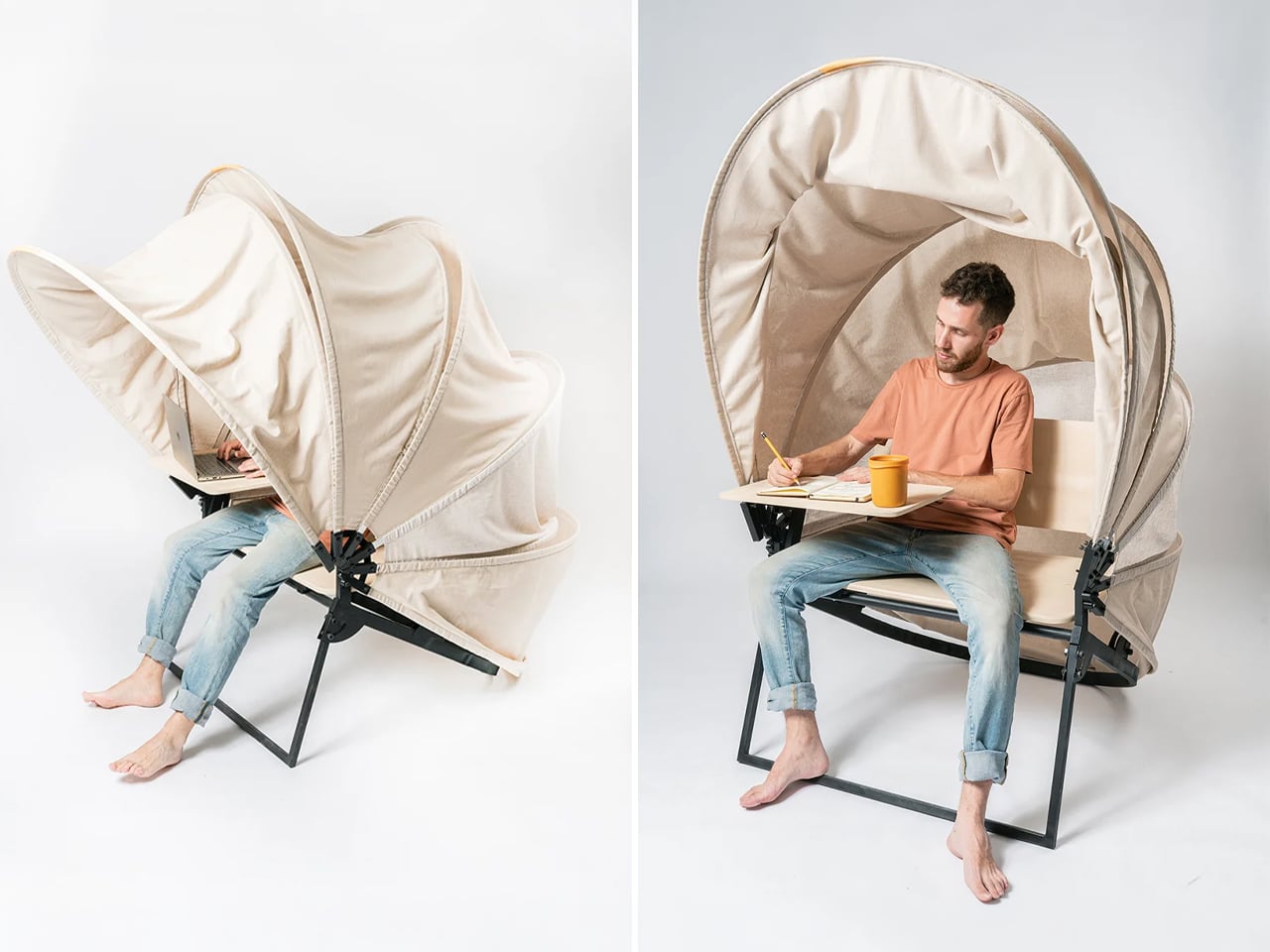
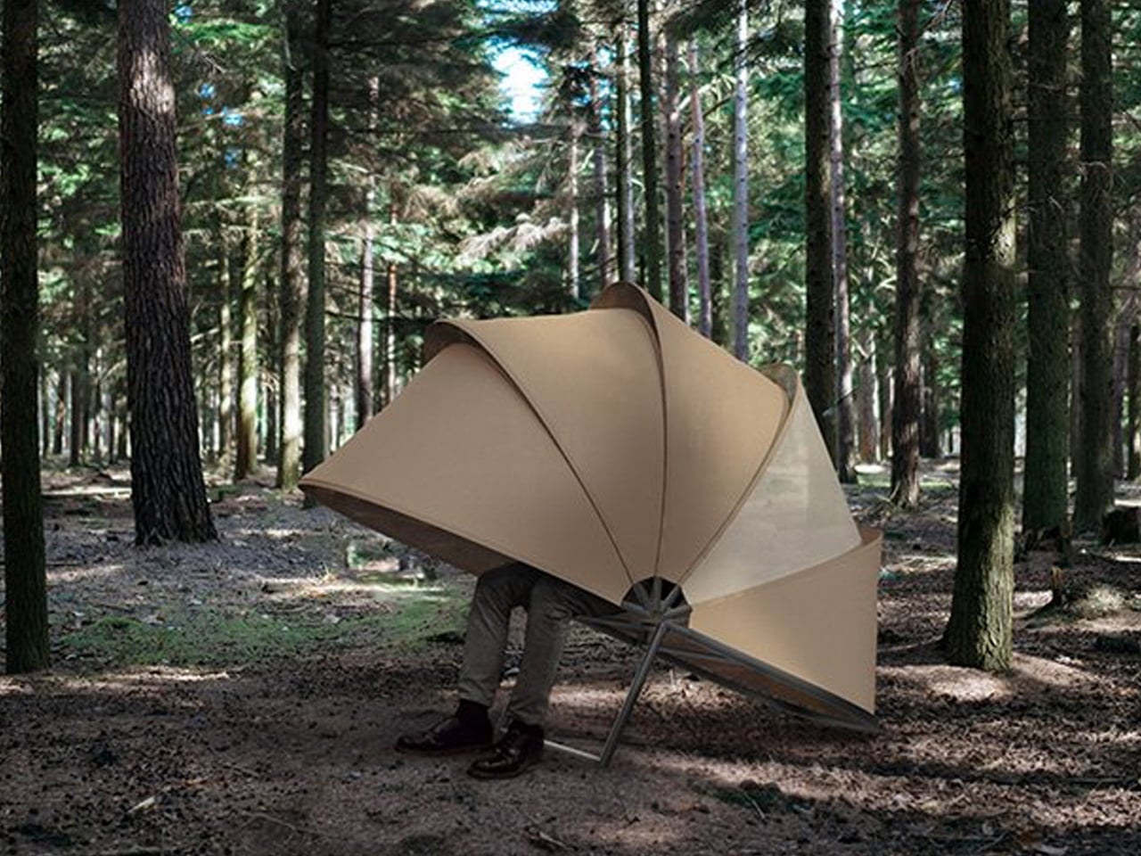
In a shared workspace like WeWork, or a peaceful spot under a tree, flexibility defines modern work culture. Industrial designer Matan Rechter responded to this shift with Shelly, a personal outdoor workspace that combines privacy, shade, and portability for those who prefer working outside. Inspired by the remote work movement, Shelly was designed to bring focus and comfort to outdoor environments like public parks.

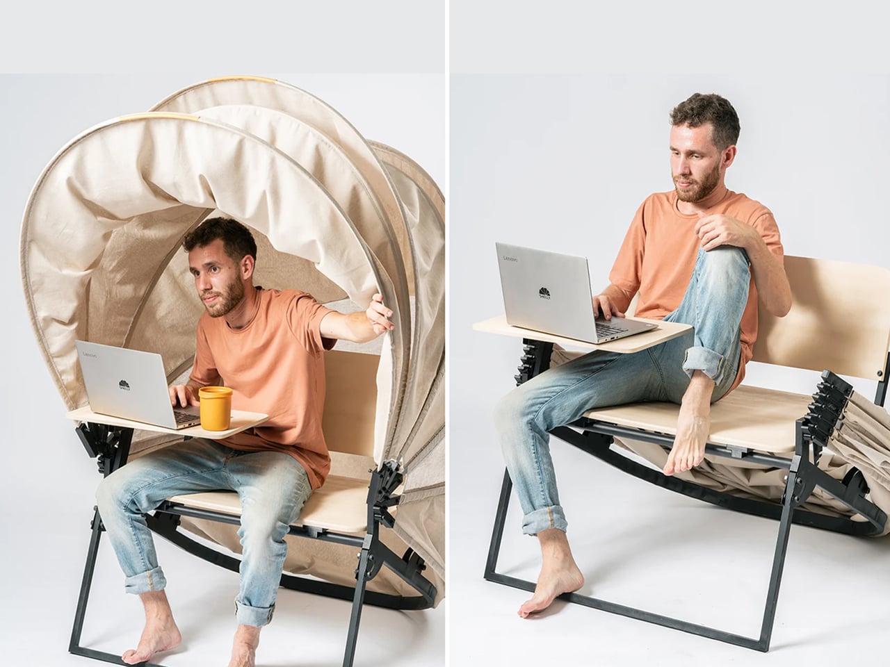
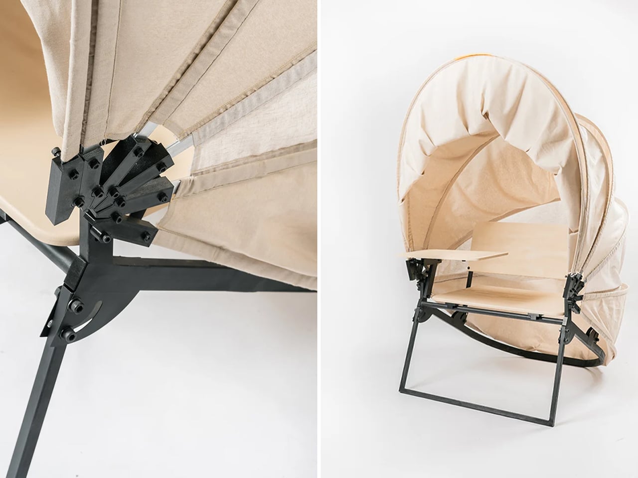
Its name comes from its shell-like canopy that folds in and out with ease. Built from lightweight aluminium profiles and durable Cordura fabric, Shelly shields users and electronics from harsh UV rays. The canopy’s retractable design, reminiscent of an armadillo’s shell, provides instant shade and convenience. Compact and portable, Shelly transforms outdoor work into a comfortable, productive, and stylish experience anywhere, anytime.

4. Technological Integration and Power Autonomy

A modern hybrid workstation should function as a self-sufficient ecosystem, anticipating digital needs without visual clutter. True design intelligence lies in seamless connectivity, like built-in charging, concealed wiring, and intuitive access that keeps the workspace both elegant and efficient. Power autonomy ensures independence from fixed outlets, supporting the growing demand for mobility and flexibility in home environments.

Features such as integrated induction charging pads, hidden cable channels, and optional battery packs transform furniture into an adaptive tool. These enhancements merge aesthetics with performance, allowing users to remain connected, productive, and untethered within any architectural setting.

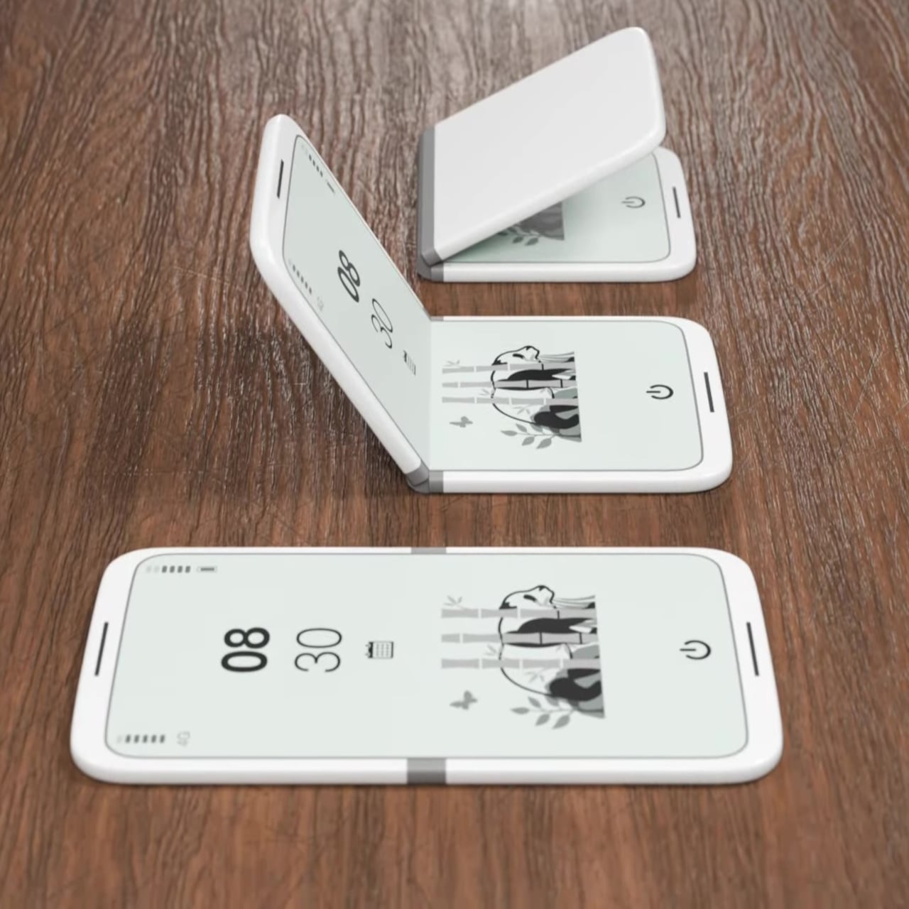
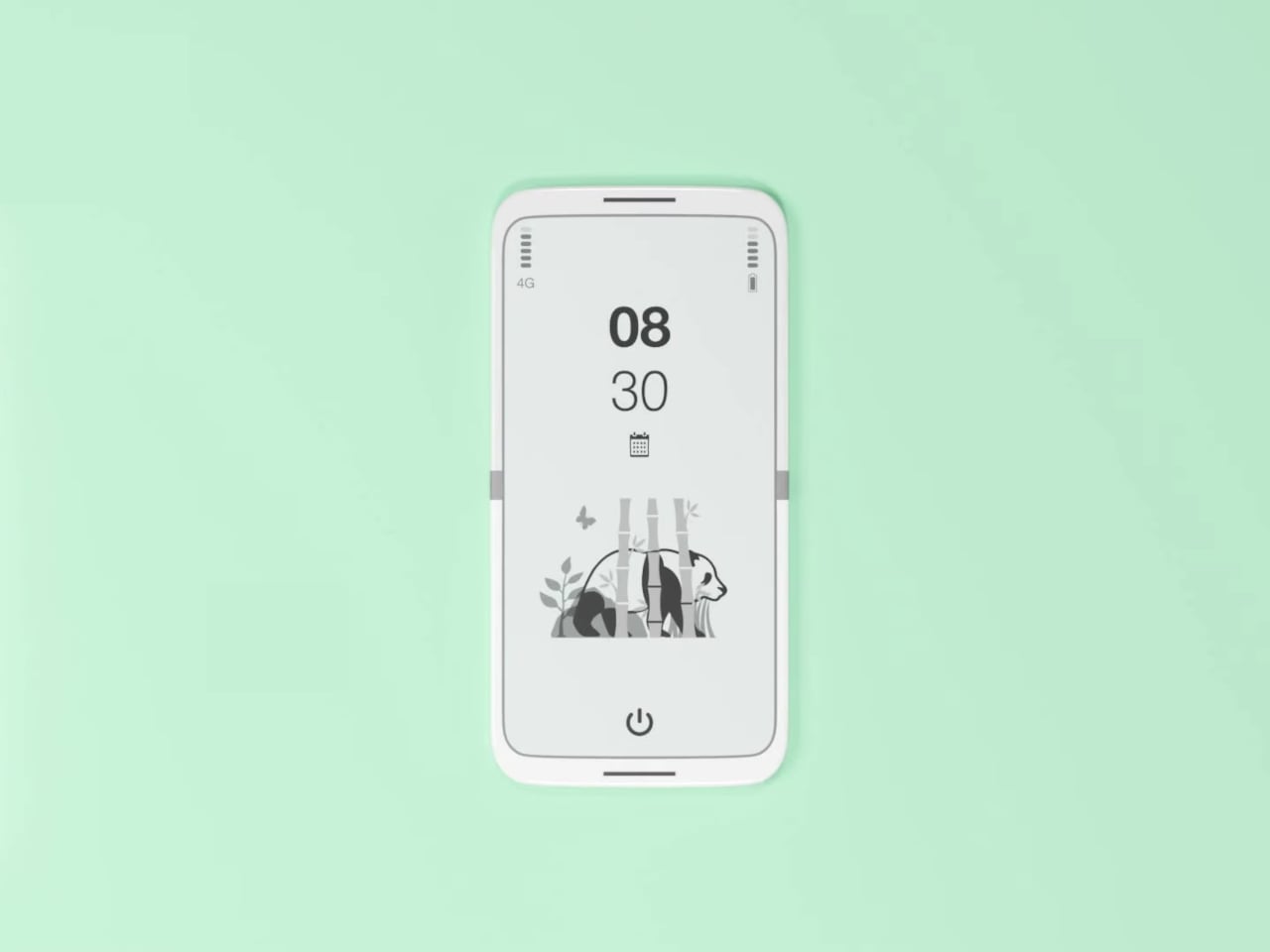
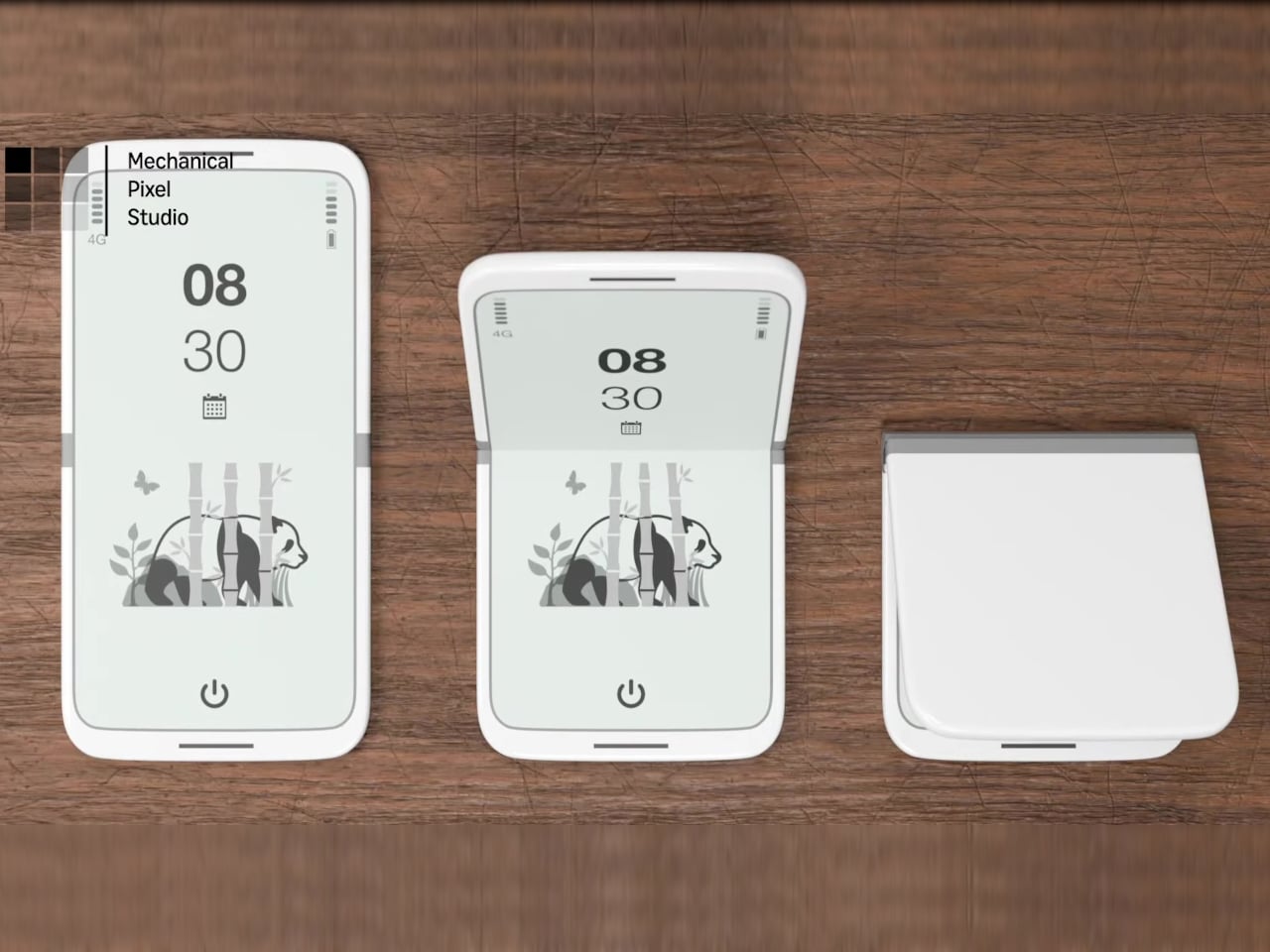
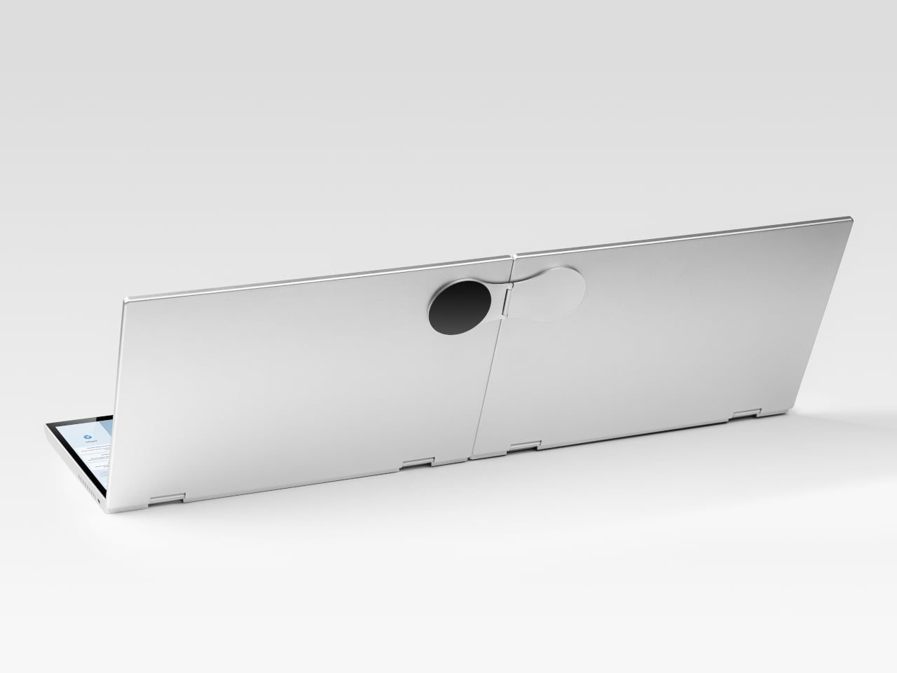
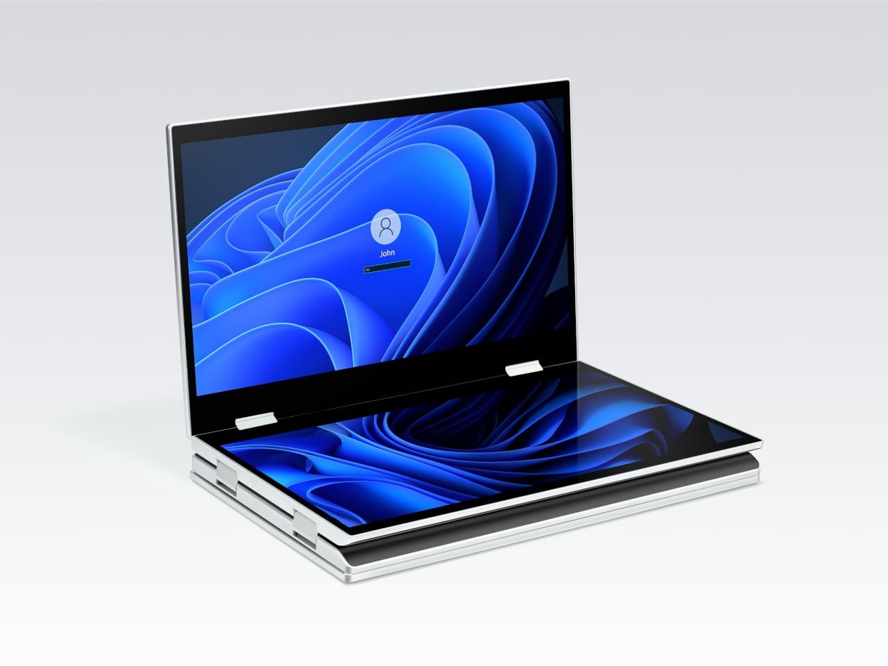
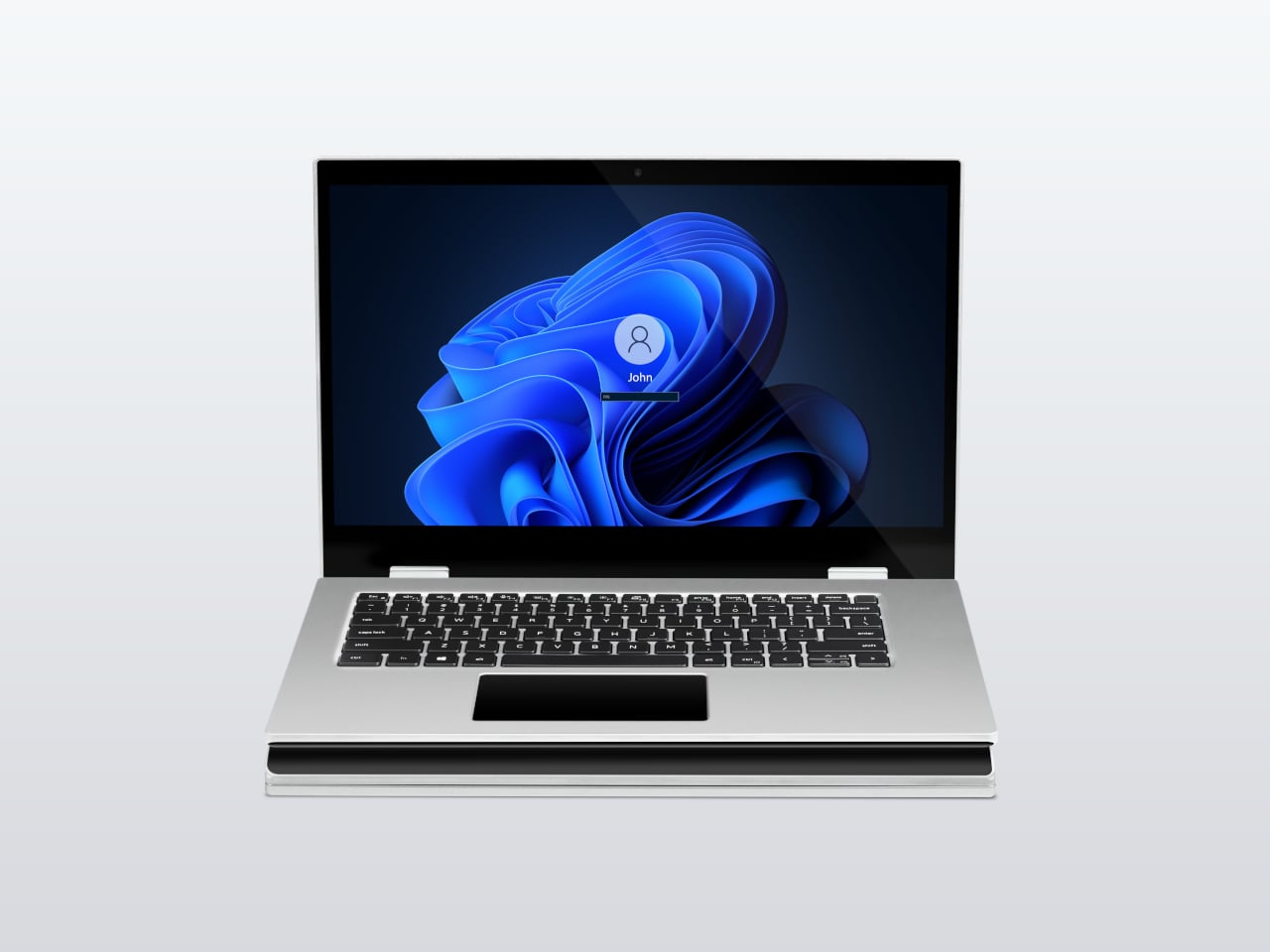
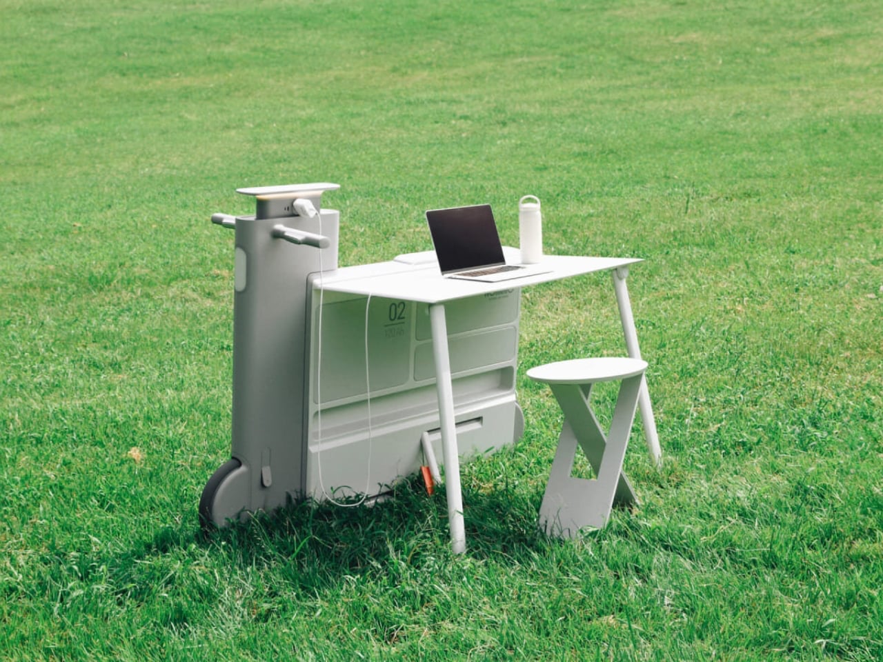
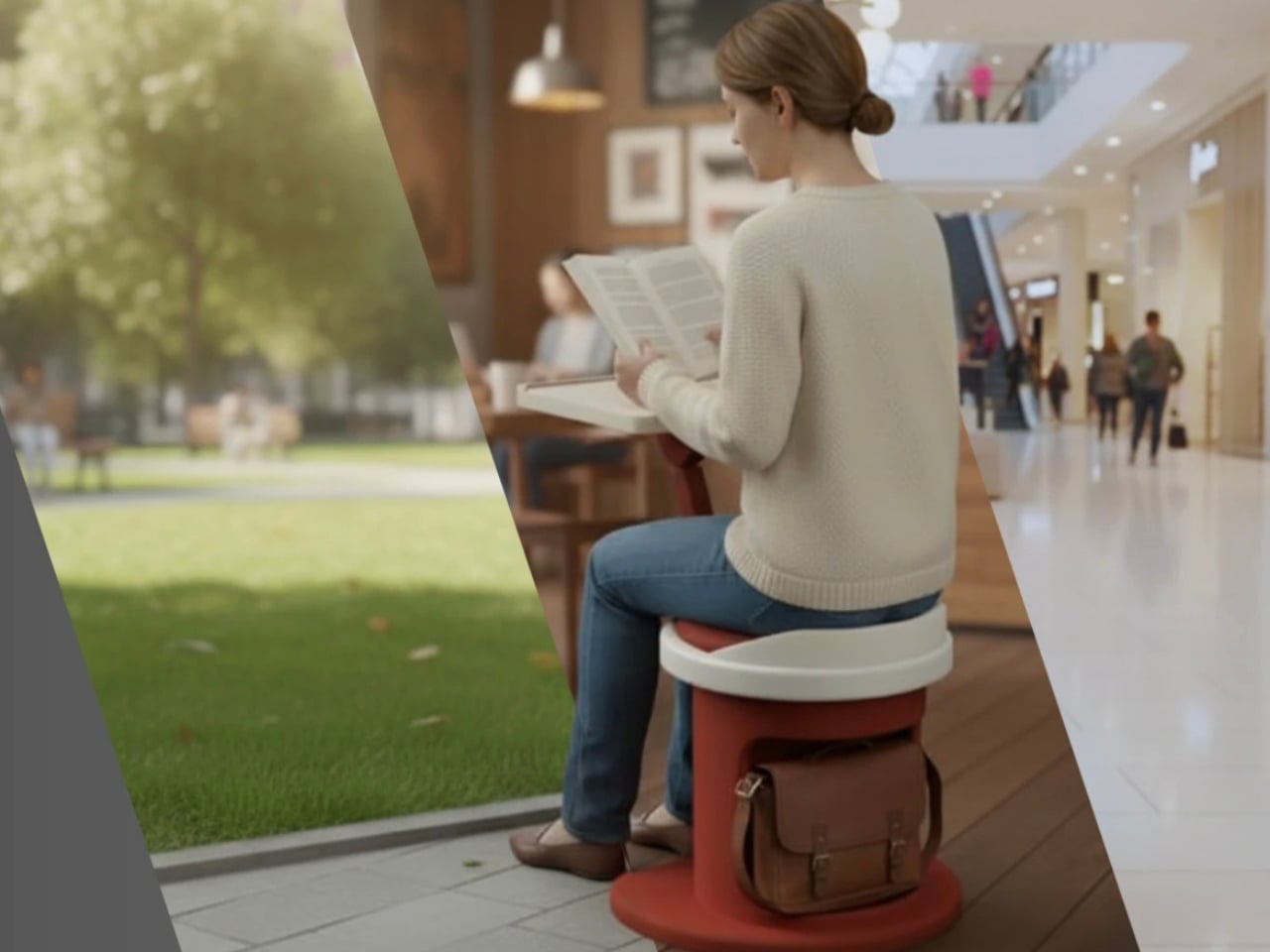
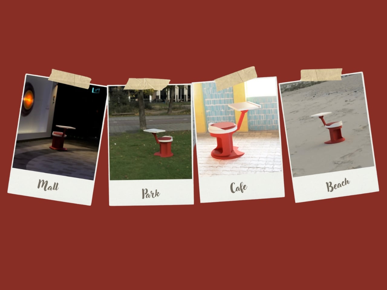
Another standout example is Worknic, a portable desk developed through the Samsung Design Membership program, sponsored by Samsung Electronics. Designed for flexibility, Worknic allows users to set up a functional workspace anywhere, whether in a home, park, or even on the beach, giving them the freedom to change their environment whenever needed.

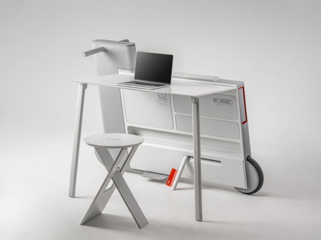
The desk is built on wheels, making it easy to move and position in the ideal spot. Once in place, it unfolds to reveal a worktable, stands, and a built-in power source, while a pull-out stool completes the setup. Although details about battery life, weight, and additional features are limited, the concept prioritizes mobility, convenience, and adaptability. Worknic offers a creative solution for those who want a portable, fully equipped office that keeps productivity and inspiration in balance.

5. Design Resilience and Longevity Investment

For discerning homeowners, longevity defines true value. A well-crafted workstation should possess design resilience, built to endure daily use while retaining its original elegance and performance. This durability ensures a higher return on investment, setting it apart from fast furniture options that quickly lose both form and function.

Choosing established design houses and proven construction techniques guarantees structural integrity and timeless appeal. A five-to-ten-year warranty offers assurance that the piece is not just a purchase but a long-term architectural companion, blending endurance with refined craftsmanship for years of dependable, sophisticated use.

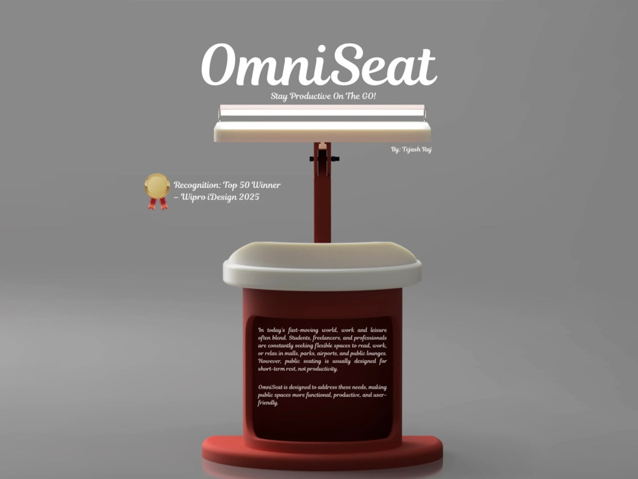
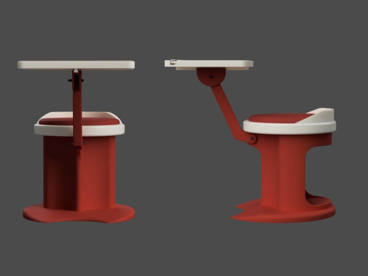
For those constantly on the move, finding a comfortable place to rest or work can be challenging. Cities often lack public resting areas beyond cafés and restaurants, making it tempting to carry a portable chair, though the idea quickly loses appeal due to its bulk and inconvenience. Recognising this need, designer Tejash Raj created the OmniSeat, a compact and ergonomic seating concept designed for people who stay productive while travelling, commuting, or working outdoors.

The OmniSeat features a lightweight frame, built-in storage, and device holders, all folding neatly into a slim form that fits in a backpack or attaches to a bike rack. A detachable tray accommodates laptops or tablets, with cable clips to keep cords tidy. Combining portability, comfort, and function, the OmniSeat offers a glimpse into the future of mobile workspaces.

The high-design portable workstation redefines the boundaries of work and home, merging productivity with tranquillity. It transforms interiors into fluid, balanced spaces where focus meets ease. Its true value lies in the freedom to work anywhere, capturing sunlight, inspiration, and connection without sacrificing comfort or creativity.

The post 5 Portable Work Setups That Work Outdoors, in Parks And Even Beaches first appeared on Yanko Design.

This E Ink Foldable Phone Concept Punishes Doomscrolling by Design

Most smartphones are designed to be impossible to put down. The screen faces up on every table, the display lights up for every notification, and the cost of checking it one more time is exactly zero. That’s not an accident. The hardware removes friction from compulsive use because removing friction is what makes these devices feel indispensable. The tinyBook Flip concept asks a different question entirely: what if the phone were designed to get out of the way?

The tinyBook Flip is a vertical foldable phone concept built around a 6.1-inch E Ink display. Closed, it collapses into a compact, near-square form with rounded corners and a matte white finish, something closer in proportion to a folded notecard than a smartphone. The screen disappears entirely when the device is closed shut. No glowing rectangle sitting face-up on the desk, no ambient reminder that there are things to check. Just a small, quiet object.

Designer: Pixel Dynamics

That folded form is doing more work than it might seem. Opening the phone requires a deliberate physical action, and that small added step changes the behavioral math. A reflexive grab becomes a conscious decision. The friction is minimal in absolute terms, maybe two seconds, but two seconds of resistance is often enough to interrupt the loop. The concept treats that interruption as a design feature, which puts it in genuinely different territory from most phones.

The E Ink display adds a second layer of resistance, and this one is less subtle. E ink refreshes slowly, renders in grayscale or muted colors, and handles fast-moving content poorly. Social media feeds become tedious. Short-form video becomes unwatchable. Anything built around color, motion, and rapid visual feedback stops working the way it was designed to. This is precisely the point. The screen’s limitations aren’t engineering compromises left over from an earlier era of display technology; they’re structural properties that make certain behaviors genuinely unpleasant to sustain.

What E Ink handles well is a shorter list, but a coherent one. Text reading, messaging, calendars, and static interfaces are all comfortable at E Ink’s native pace. The renders of the tinyBook Flip show a UI built around exactly these strengths: a large clock face, a calendar widget, and a grayscale illustrated wallpaper. The interface doesn’t reach for capabilities the display can’t support. The phone isn’t trying to do everything; it’s trying to do a narrower set of things without apology.

Foldable E Ink panels aren’t a speculative technology. The hardware exists at the component level and has already appeared in experimental e-readers, though no consumer phone has shipped with one in any meaningful volume. The tinyBook Flip isn’t imagining impossible components; it’s proposing a form factor that manufacturers haven’t yet committed to producing. The distance between those two things is largely commercial, not technical.

There’s also something worth noticing about how the device reads as a physical object in social space. Closed, the tinyBook Flip looks like almost nothing. No visible screen, no status indicators, no glow. A phone that carries no visual weight when it’s not in use sends a different signal than one that’s always broadcasting its presence. Putting it down means it actually disappears from the environment, not just from your hand.

That said, the concept leaves some real friction points unaddressed, and not the intentional kind. E Ink handles camera use, live navigation, video calls, and authentication apps poorly. A foldable hinge adds mechanical complexity and thickness that clean renders tend to obscure. The tinyBook Flip looks resolved in this form, but a production version would have to make tradeoffs that these images don’t show and the concept doesn’t acknowledge.

Still, the more interesting question isn’t whether this specific device could ship. It’s whether a phone that makes itself harder to misuse is a reasonable design goal at all, or whether that’s just a way of describing a phone that most people wouldn’t actually want. The tinyBook Flip lands firmly on one side of that question. Whether the market agrees is a different problem entirely.

The post This E Ink Foldable Phone Concept Punishes Doomscrolling by Design first appeared on Yanko Design.

XbooK’s $1,999 Triple-Screen Laptop Is One Bag Instead of Three Monitors

Anyone who has worked remotely long enough knows the moment a single laptop screen stops being enough. It’s usually the day you’re cross-referencing three documents at once, or the morning you realize your financial model needs a live chart in one window while you edit formulas in another. The standard fix is an external monitor or a portable screen extender, which works fine until you’re hauling a bag that feels like it’s punishing you for being productive.

The XbooK takes a different approach by folding three full 14-inch touchscreens into a single aluminum laptop body that closes to just 1.5 inches thick. At 7.5 lbs, it’s heavier than a typical ultrabook. The tradeoff, though, is straightforward: you’re not carrying a laptop plus accessories. You’re carrying the whole setup in one piece.

Designer: XbooK

All three screens run at 1920×1080 with 400 nits of brightness each. The machine is powered by an Intel Core Ultra 7 with 32GB of DDR5 RAM and a 1TB SSD, with Wi-Fi 7 and Bluetooth 5.0 onboard. That’s capable hardware, though nothing unusual for a mid-to-high-range laptop in 2025. What makes those specs interesting here is what they’re pushing: 42 inches of combined touchscreen that unfolds in seconds without a single cable involved.

In full Workstation Mode, all three screens run simultaneously alongside an embedded mechanical keyboard and a 10-point touchpad. Connectivity covers Thunderbolt 4, two USB-C ports, and an AUX jack, with a 1,600×1,200 front camera that’s sharper than most built-in laptop cameras. The 70Wh battery has to power all of that, and battery life under a three-screen load is something any serious buyer should push the company on before committing.

For days when the full spread is overkill, the XbooK also works in a two-screen mode or as a conventional single-screen laptop. The latter folds everything up and makes the device look surprisingly ordinary from the outside, except for the two thick slabs sitting underneath the keyboard. That adaptability is one of the more genuinely practical aspects of the design: you’re not locked into the workstation configuration every time you open the lid.

At $1,999 (down from a listed $2,999), it’s priced for professionals who already spend that much on monitors and docking stations. XbooK ships from the US with orders promised to be processed within 3 to 5 business days. The refund-before-shipping policy and fulfillment language have the texture of a startup still scaling up. Spending that much on a device from a company with no established hardware track record is a different kind of commitment than buying from a brand with a decade of products behind it.

Screen real estate is one of the last things portable computing has consistently failed to solve, and most multi-screen laptop concepts have been either too fragile or too awkward for daily travel. The XbooK has a cleaner physical premise than anything built around magnets or external rails. How the hinges and chassis hold up after a year on the road, though, is still an open question that no amount of spec-sheet confidence can close.

The post XbooK’s $1,999 Triple-Screen Laptop Is One Bag Instead of Three Monitors first appeared on Yanko Design.

8 Best Desk Accessories for Men That Don’t Look Like They Came From a Corporate Supply Closet

There’s a version of a desk setup that communicates everything about how little thought went into it. A black mesh organizer from the bottom shelf of a supply closet. A mouse pad that came free with something else. A cable clip in beige. The desk functions, technically, and does so with a level of visual enthusiasm that matches a waiting room.

The accessories below were designed by people who thought about this harder. Some carry authentic 1970s Italian design heritage. Some are running AI in the background to actively shape your environment. One contains material roughly 20 million years older than the Earth it now rests on. What they share is a quality of intentionality. Each was built as an object worth keeping on a desk, not just stashing in a drawer, because it earns its surface area through how it works, how it looks, or both at once. For men who have graduated from the corporate supply closet aesthetic, these eight represent a meaningfully different set of options.

1. Lenovo AI Workmate Concept

Working alone all day carries a specific kind of friction that most desk setups quietly ignore. Questions accumulate, decisions pile up, and the AI tools meant to support you sit behind a keyboard input that gives nothing back spatially or visually. Lenovo’s AI Workmate Concept, unveiled at MWC 2026, takes that problem seriously enough to build a physical object around it. The result is a desk companion in the most literal sense: a spherical head on an articulated arm mounted on a circular base, with animated eyes on its front display that shift and orient as it processes and responds. The form is compact, the presence is deliberate, and the intent is clear from the first time it moves.

The arm is the most consequential design decision here. Because it moves, the Workmate can orient itself toward whatever holds attention in front of it, a document laid flat on the desk, a person leaning back in their chair, or something happening at the periphery. That range of motion is what separates it from a smart speaker that has been given a screen and called a companion. Spatial awareness is embedded in its posture, not just its software. For men who spend long hours alone at a desk and find text-based AI interaction increasingly impersonal and context-free, the Workmate proposes something more honest about what presence and assistance can look like from an object sharing your workspace.

What We Like

  • Articulated arm gives the device genuine spatial awareness, orienting toward objects and people rather than remaining static
  • Animated eyes on the front display make AI interaction feel more present and less transactional than any screen-based interface

What We Dislike

  • Currently a concept unveiled at MWC 2026, with availability, pricing, and final specs still unconfirmed
  • The novelty of animated eyes may carry more emotional weight than the practical functionality justifies over time

2. Levitating Pen 2.0: Cosmic Meteorite Edition

Most pens sit on a desk and do nothing interesting when they’re not being used. The Levitating Pen 2.0 Cosmic Meteorite Edition refuses that arrangement entirely. It floats at a 23.5-degree angle above its magnetic base, creating a suspension that stops people mid-sentence when they notice it. The design draws from spacecraft aesthetics, specifically the visual language of the USS Enterprise, and the tip incorporates a genuine fragment of Muonionalusta meteorite, a material approximately 20 million years older than the Earth it now rests on. It functions as a working ballpoint pen, which means it is simultaneously a collector’s object, a desk focal point, and a writing tool occupying the same physical form.

What keeps this from reading as pure novelty is how it behaves in your hands. The Levitating Pen is fidget-worthy in the best sense, the kind of object you reach for during a long call or a pause between tasks without consciously planning to. For men who collect objects with a verifiable reason behind them, the meteorite tip offers something most limited editions simply don’t: provenance with a story that doesn’t require a certificate to feel real. You’re holding material from beyond the solar system. That fact changes the weight of the object in your hand when you stop to think about it, and that shift is exactly what separates a desk accessory from a desk object worth keeping.

Click Here to Buy Now: $399.00

What We Like

  • Genuine Muonionalusta meteorite tip connects the pen to a tangible, verifiable piece of cosmic history
  • Magnetic levitation display creates a desk focal point that requires no ongoing maintenance once positioned

What We Dislike

  • The floating display requires a flat, stable surface, limiting where it can sit effectively
  • Limited edition production means restocking after sellout is not guaranteed for future buyers

3. BOB Desk Organizer

Joe Colombo designed BOB in 1970, at a time when desk organizers were either plastic trays with zero intentionality or overengineered systems that looked more complicated than the mess they were supposed to fix. He chose neither direction. BOB is a compact polyurethane gel form, elongated and low-profile, almost pill-shaped when viewed from above, with one end rising into a soft dome and the other tapering nearly flat. B-Line, an Italian label dedicated to reissuing objects from discontinued original molds, brought it back in 2023 across five colorways: terracotta, slate blue, mustard yellow, warm white, and a frosted translucent version called ice. The selection alone suggests a designer thinking about rooms rather than offices.

The top surface divides into three functional zones without any visible partition between them. The dome end opens into a large oval scoop for bulkier items. The center holds a three-by-four grid of individual circular holes, each sized precisely for a single pen or brush. The tapered tail offers two horizontal slot grooves for flat objects like rulers or small notebooks. None of this reads as a feature list in person. It reads as a single continuous gesture that happens to keep things organized along the way. For men who want a desk object with actual design history behind it rather than a branding story retrofitted over generic injection molding, BOB is nearly impossible to improve on.

What We Like

  • Rooted in authentic 1970s Italian design history, reissued from Joe Colombo’s original mold by B-Line
  • Three distinct functional zones are built into one continuous organic form with no visible hardware or dividers

What We Dislike:

  • Polyurethane gel construction may show surface wear or discoloration with extended daily use
  • The low-profile form works best for lighter objects and may not support heavier desk tools effectively

4. DEEP

DEEP operates on a premise most desk lamps don’t bother with: the working environment around you should configure itself to match what you are about to do, rather than waiting for you to adjust it manually. Switch it on with a spinning-top-inspired power button, tell it whether you’re studying, coding, reading, or doing creative work, and it adjusts both light quality and ambient sound before you’ve had to think about either. A camera positioned at eye level monitors your focus state in real time, functioning like a built-in productivity coach without requiring a separate app or a separate device taking up additional surface area.

What separates DEEP from a connected lamp with a smart home feature set is what it does across repeated sessions. The system saves your manual adjustments over time, builds a personal profile from the conditions that consistently work best for you, and begins applying them automatically without being prompted. Side buttons allow precise overrides for days when the default doesn’t fit. For men whose desks have become cluttered with single-function devices that each do one thing adequately, DEEP represents a genuine consolidation. It folds a lamp, an ambient sound environment, and a passive focus monitor into a single object that becomes more attuned to how you work the longer it stays on your desk.

What We Like

  • AI builds a personal focus profile across sessions and applies your optimal working conditions automatically over time
  • Combines lighting, ambient sound, and real-time focus monitoring without requiring any additional hardware

What We Dislike

  • Camera-based focus tracking may feel uncomfortable for users sensitive to passive environmental monitoring
  • Ambient sound adjustment effectiveness varies significantly based on an individual’s working environment and noise tolerance

5. Rolling World Clock

Every desk clock tells you one thing. This one tells you twelve. The Rolling World Clock is a 12-sided object with a single hand and an operation that couldn’t be more direct: set it on any face, and the hand reads the correct local time for the city printed on that side. The twelve cities span the major global time zones, including London, Paris, Cape Town, Moscow, Los Angeles, Karachi, Mexico City, New York, Shanghai, Tokyo, Sydney, and New Caledonia. For men who manage work across multiple time zones or simply have family spread across continents, the mental arithmetic of figuring out what time it is somewhere else is one of the more persistent small irritations in a working day, and this object removes it without adding a screen.

The design decision that makes this worth keeping on a desk rather than just owning is the total absence of anything unnecessary. No digital display. No charging cable. No app. Just a tactile, rollable object you turn to the city you need and set down. Available in black and white, it occupies desk or shelf space without reading as a gadget or demanding attention it hasn’t earned. There’s a quiet pleasure to the interaction that most clocks don’t provide: the act of picking it up, choosing a place in the world, and reading the time. There is a physical engagement with global time that a phone screen never manages to replicate.

Click Here to Buy Now: $49.00

What We Like

  • Covers twelve major time zones in a single tactile object with no digital display, no app, and no charging required
  • Minimal form reads equally well on a desk or shelf without visually registering as a tech accessory

What We Dislike

  • A single clock hand requires slightly more reading attention than a digital display for precise timekeeping
  • The 12-city selection covers major zones well, but may not include every specific time zone a user needs regularly

6. Fidget Cube

The case for keeping a dedicated fidget object on a desk is more rational than it sounds from the outside. Restless hands during long calls, slow-loading processes, or decisions you’re turning over without fully committing to are a real and recurring part of working at a desk, and the Fidget Cube was built precisely for that condition. Six sides offer six different tactile surfaces: a cluster of clickable buttons, a gliding joystick, a row of flip switches, a smooth surface designed for the thumb’s natural breathing motion, a rolling ball set into one face, and a spinning disc. The variety means your hands will find a preferred surface quickly and return to it across the session without thinking about it.

What keeps this from reading as a toy is the restraint built into how it was designed. It doesn’t look out of place on a desk or conference table, particularly in the Midnight black colorway, which sits visually neutral among the standard dark objects that populate most professional environments. For men who have noticed that physical repetitive movement genuinely sharpens how they think through a problem, this is one of the more honest tools available at any price point. It takes a real behavioral truth seriously and gives your hands a quiet, clean way to act on it without disrupting anyone around you or drawing attention to what you’re doing.

What We Like

  • Six distinct tactile surfaces address a wide range of fidgeting habits within one compact, pocketable object
  • Discreet colorways, particularly Midnight black, keep it visually neutral in professional desk environments

What We Dislike

  • Some click mechanisms can produce an audible sound in quiet rooms or during video calls
  • Serves no secondary organizational function on a desk, occupying surface space with a purely tactile purpose

7. MOFT Z Sit-Stand Desk

Sit-stand desks have spent years being expensive, physically large, or permanently locked to a specific room. The MOFT Z takes a completely different approach, collapsing to something closer to a slim notebook in thickness while delivering a full ergonomic range through an origami-inspired Z-structure. It provides one standing mode and three seated position angles, which is enough postural variety to meaningfully shift how you feel across a long working session. For men who divide their time between home, a co-working space, a client’s office, or anywhere other than a fixed desk, the ability to carry a sit-stand setup in a bag removes an ergonomic compromise that most standing desk products are structurally incapable of solving.

The weight is what makes it a genuine solution rather than a clever concept. Ergonomic equipment that stays home because it’s too heavy or awkward to transport defeats the purpose of improving how you work across different locations. The MOFT Z doesn’t have that problem. Unfold it in seconds, set your laptop on the surface, and you’ve built the same ergonomic posture you’d have at a standing desk that costs several times more and cannot leave the floor it occupies. For anyone who has watched their posture decline steadily across a long afternoon of flat laptop work, this is a practical correction that goes where you go and requires no tools, no assembly, and no installation to use.

What We Like

  • Origami Z-structure provides one standing mode and three seated positions with no setup tools required
  • Ultra-lightweight, paper-thin folded profile makes it genuinely portable across different working locations

What We Dislike

  • Surface area restricts how much additional equipment can sit alongside a laptop in standing mode
  • Stability may be reduced under heavier setups or on surfaces that aren’t completely flat and firm

8. LEGO-Style Silicone Cable Organizer

Cable management has a way of being solved temporarily and then quietly abandoned. The solution works for a week, then a new cable enters the setup, or the organizer shifts position, or it turns out the adhesive left a mark on the desk. This silicone cable organizer approaches the problem differently. Shaped after a lozenge pack, it uses peg-topped cylindrical columns to wrap and hold individual cables in separate, stable positions. Multiple units can be stacked or arranged in rows, and three sizes cover the range from a single charging cable to a full multi-device setup: a 2×2 mini, a 3×3 medium, and a 2×5 large, with the option to place two cables on top of each other within the same row.

The design was born from a specific personal frustration: cables tangling with other items inside a bag, the kind of small recurring annoyance that accumulates into a genuine grievance over time. That origin shows in how focused the solution is. There’s no overengineering, no branded clip mechanism, no custom routing system that only works with certain cable gauges. The micro suction tape base grips the desk surface firmly without permanent adhesion, meaning it moves when the setup changes and holds when it doesn’t. For men who have gone through two or three cable management products and quietly abandoned all of them, the directness here is precisely the argument for this being the last one you need.

What We Like

  • Three modular sizes cover setups from a single cable to a full multi-device workspace without custom parts
  • Micro suction tape base holds securely without permanent adhesion, leaving the desk surface undamaged

What We Dislike

  • Silicone material collects lint and dust more readily than hard plastic alternatives
  • The LEGO-inspired visual style reads as playful and may not suit every desk aesthetic preference

The Best Desk Is One You Actually Thought About

A desk says something whether you intend it to or not. It communicates how seriously you take the hours you spend there, what kind of work you believe deserves a proper environment, and whether the objects around you were chosen or simply accumulated. The eight accessories above represent a different kind of accumulation, one where every item on the surface has a reason to be there, a story worth telling, or a function that genuinely improves how the day moves.

None of them require a complete overhaul. One rolling clock, one floating pen, one lamp that learns how you work — any single object from this list shifts the energy of a desk in a direction worth going. The corporate supply closet aesthetic isn’t inevitable. It just tends to win by default when no one pays attention. These eight are the case for paying attention.

The post 8 Best Desk Accessories for Men That Don’t Look Like They Came From a Corporate Supply Closet first appeared on Yanko Design.

Track Trailer reinvents Tvan, one of the toughest off-roading trailers with roomier MK6 model

Track Trailer, the name behind the famous Tvan off-road camper trailers, needs little introduction. It has been powering the overlanding experience in Australia and worldwide for a good part of four decades now. Over the years, we have seen some interesting variants of the Tvan, which has now reached the MK6. The sixth iteration in the successful portfolio, Tvan MK6 Model, retains the same aluminum body, which runs in the bloodline, but is more spacious and even more comfortable.

As the appearance suggests, the new Tvan MK6 is available in four variants and is almost identical to its predecessors. What changes are the interior space and the headroom, which make the MK6 a different entrant in the same effective branding of the world’s toughest off-roading trailer.

Designer: Track Trailer

Track Trailer first tried reworking the interior space with the MK5 model. It was done staying within the confines of the Tvan styling: no pop-up roof attachment, but a slight raise in roof height. With the MK6, the company has also stayed true to its design ideology. It has only increased headroom, stretched the neck forward, and pushed the sides of the trailer outward to increase the interior space by up to 20%.

The expansion to the trailer permits more natural light inside the cabin, which is constructed using an aluminum sandwich-panel construction. Moreover, the MK6 features a durable chassis based on an advanced suspension system that enables it to roll comfortably on rugged terrains and off-road destinations. With its ruggedness assured, the camping trailer is ideal for all types of adventures, which is facilitated by its quick setup and clever storage designed throughout its exterior and also on the inside.

MK6 measures 16-foot-long and 6.3 feet wide, the trailer has an interesting storage cabinet in the extended nose up front, comprising a pantry and up to 95 liters fridge/freezer. Slightly further back is the slide-out kitchen with a three-burner gas stove, a full-size sink connected to a 108L fresh water tank, and a storage drawer topped with a prep area.

The most interesting part of the MK6 camping trailer is the rear hatch design. It features Track Trailer’s patented Skyward Lift Up Deck, which combines the hatch and the hard-floor deck. The electric lock system allows the two to lift up in unison for quick and direct access into the living space of the trailer. Just when you need it, a tent can be attached to the trailer to increase the living quarters.

Inside is a double bed surrounded by large windows and overhead and sidewall storage. LED lighting and dual roof hatches complete the design. Since the MK6 is available in four variants, each is designed differently for off-the-grid living. The entry-level Inspire features a 125Ah lithium battery that draws energy from a 200W rooftop solar panel, while a 350W inverter takes care of the power backup. Firetail accommodates a pair of 125Ah batteries, a 2000W inverter, and some premium features in the kitchen.

Tvan MK6 Murranji adds a 200W solar panel to the Firetail setup, but leaves out the inverter. The top-of-the-line, Lightning, on the other hand, comes with a 500Ah battery. It features a 2,000W inverter and a 360W solar panel to complete its all-electric setup. Each of these models can have further upgrades with add-ons like awnings and more. MK6 starts at AU$69,900 (approximately $50,000) with the mentioned amenities.

The post Track Trailer reinvents Tvan, one of the toughest off-roading trailers with roomier MK6 model first appeared on Yanko Design.

Solo queuers rejoice! Call of Duty: Warzone update brings back solos and Verdansk (again)

Warzone fans decried Raven Software and Treyarch's decision to only have quad queues for Black Ops Royale. The team has now updated the battle royale modes to bring back Solo queues and the Standard Battle Royale mode with Verdansk as the big map, even in the face of Black Ops Royale's success.

Call of Duty: Warzone screenshots for Black Ops Royale.

Call of Duty: Warzone screenshots for Black Ops Royale.

People inside Microsoft are fighting to drop Windows 11's mandatory Microsoft Account requirements during setup

Microsoft's big sweeping set of improvements coming soon to Windows 11 don't address its controversial Microsoft account requirements, but that might soon change.

Windows 11 UI with option to specify user directory

Windows 11 UI with option to specify user directory

Microsoft unveils MAJOR improvements coming to Windows 11 this year — movable Taskbar, reduced RAM usage, less AI and ads, and much more CONFIRMED: "We are evolving how Windows is built behind the scenes to raise the quality bar"

After feeling the heat from macOS and Linux, Microsoft is getting its act together and making significant changes to Windows 11 that will bring it up to par with the competition.

Windows 11

This is the moment Windows fans have been hoping would come.

Microsoft launches new Feedback Hub — but will it actually fix Windows 11?

Microsoft is launching the "largest update ever" to the Feedback Hub, featuring a unified submission flow and modernized navigation to prove it’s finally listening to Windows 11 critics.

Windows 11 Start Logo

Adding the option to move the Taskbar on Windows 11 will serve as an act of good faith to users.

Call of Duty: Modern Warfare (2019) obliterated its all-time high player count on Steam — and kept on going

The Steam Spring Sale has seen an unexpected surge in Call of Duty players, but not for Black Ops 7. This title from 2019 has obliterated its previous player count because it's only $6.

Call of Duty: Modern Warfare is seeing a huge surge in players on Steam.

Thanks to the Steam Spring Sale, Call of Duty: Modern Warfare is absolutely flying.

Dear Microsoft, if you want me to use an account so badly, why is Windows 11 breaking them?

Microsoft wants everyone on a Microsoft Account, but the latest Windows 11 update is breaking sign-ins with a fake "no internet" error for Teams, Office, and other Microsoft apps.

Microsoft Teams on Windows

Some users cannot sign in to Microsoft Teams (free) and other Microsoft apps on Windows 11.

Microsoft’s latest AI image generator aims for accuracy over hype, but it’s not top‑tier just yet

Microsoft’s latest image model, MAI-Image-2, vaults to #3 on the global leaderboards, marking a major shift toward internal AI development over OpenAI reliance.

MAI-Image-2 samples

A sample of images generated by MAI-Image-2 illustrates the realism the model is capable of.

This new translation tool turns your real thoughts into "LinkedIn Speak" — and it’s as cursed as you’d imagine

LinkedIn is a land of corporate speak and "aura farming," but a new tool makes playing the professional game a little bit easier (and a lot funnier).

LinkedIn logo at a tech conference

LinkedIn is a massive social network, but I rarely find it useful.

❌