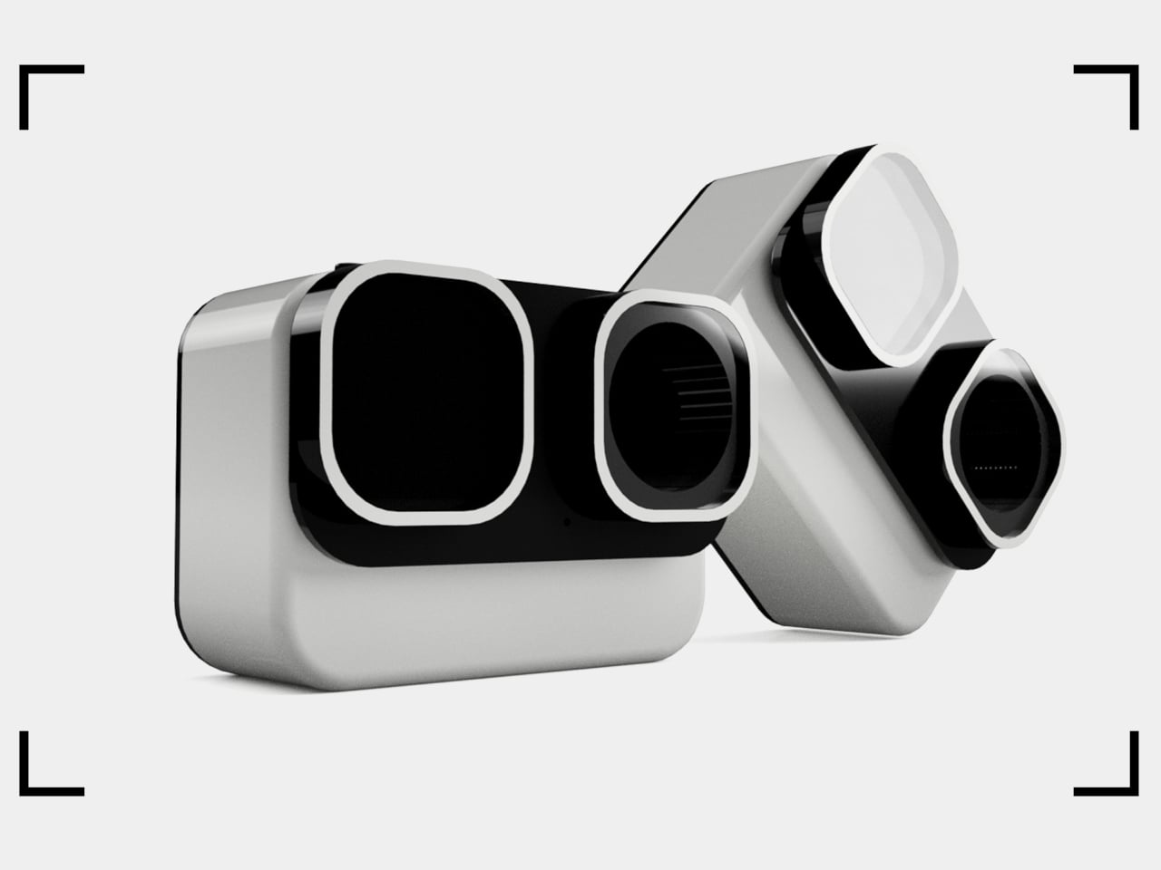
Satechi’s $130 Foldable 3-in-1 Charger Now Hits 25W for iPhones
Wireless charging was supposed to simplify things. Instead, most Apple users end up with a tangle of pads and cables on the nightstand, one for the iPhone, another for the Apple Watch, and a separate spot for the AirPods. The technology meant to reduce friction has become its own kind of mess, especially for anyone who’s ever scrambled for a Watch charger before a morning flight.
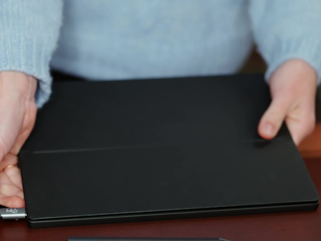
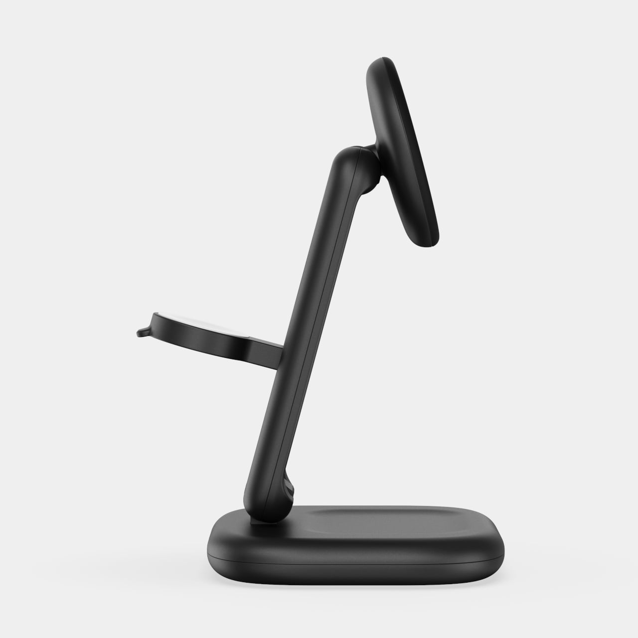
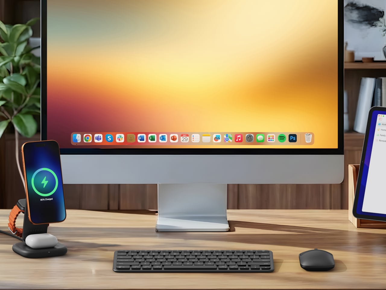
Satechi’s 3-in-1 Foldable Wireless Charging Stand with Qi2 25W takes aim at that problem. The San Diego brand has updated its best-selling foldable charger with a meaningful upgrade, bumping wireless power delivery for compatible iPhones to 25W, a notable jump from the 15W ceiling most MagSafe-compatible pads have been stuck at. It’s built as a proper desktop stand, not just something you tolerate next to the lamp.
Designer: Satechi
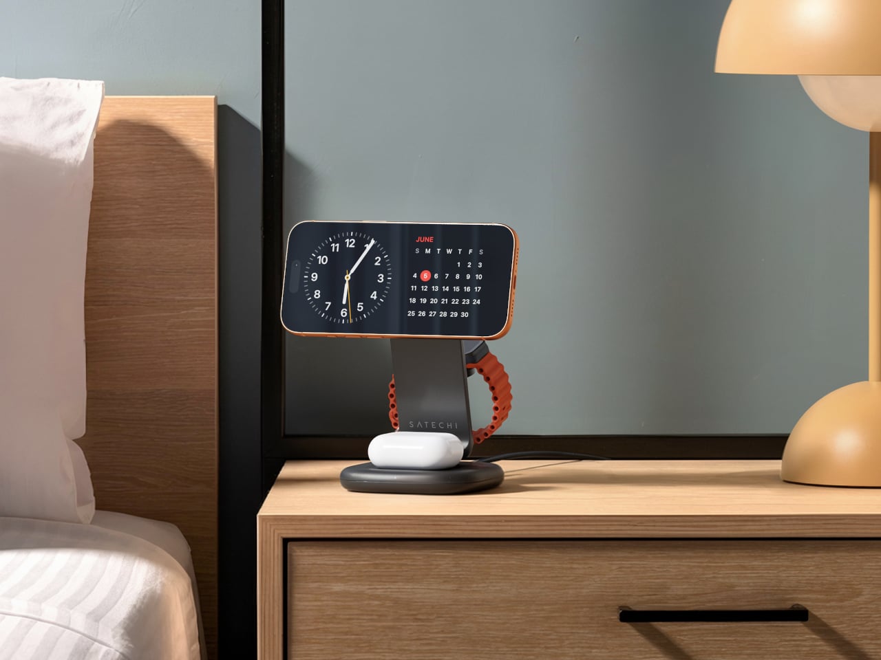
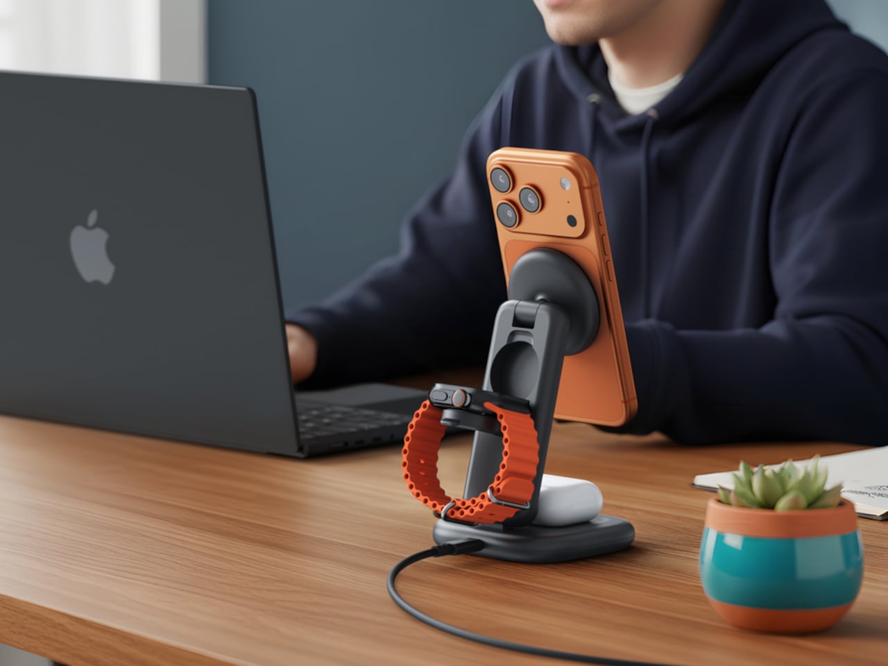
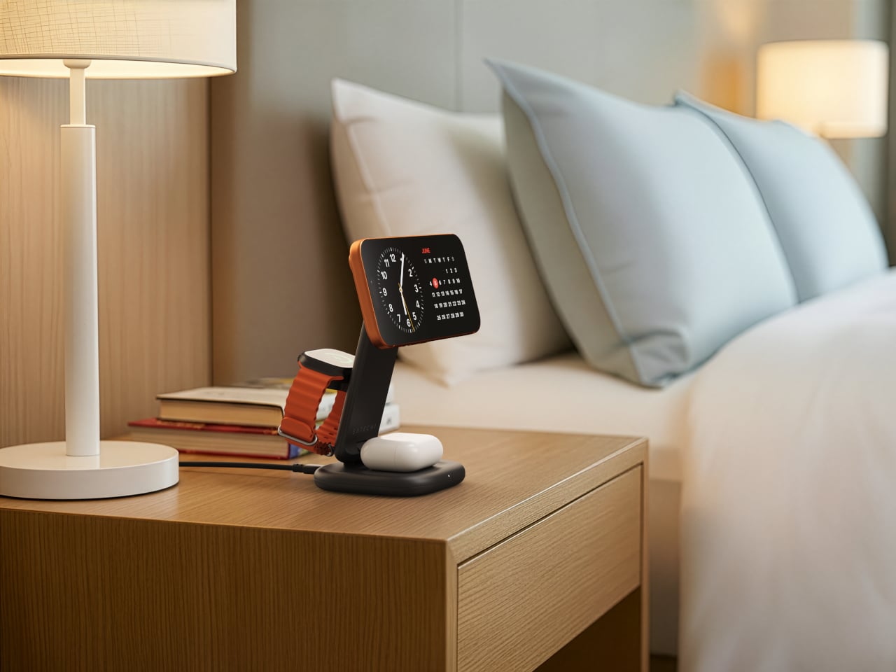
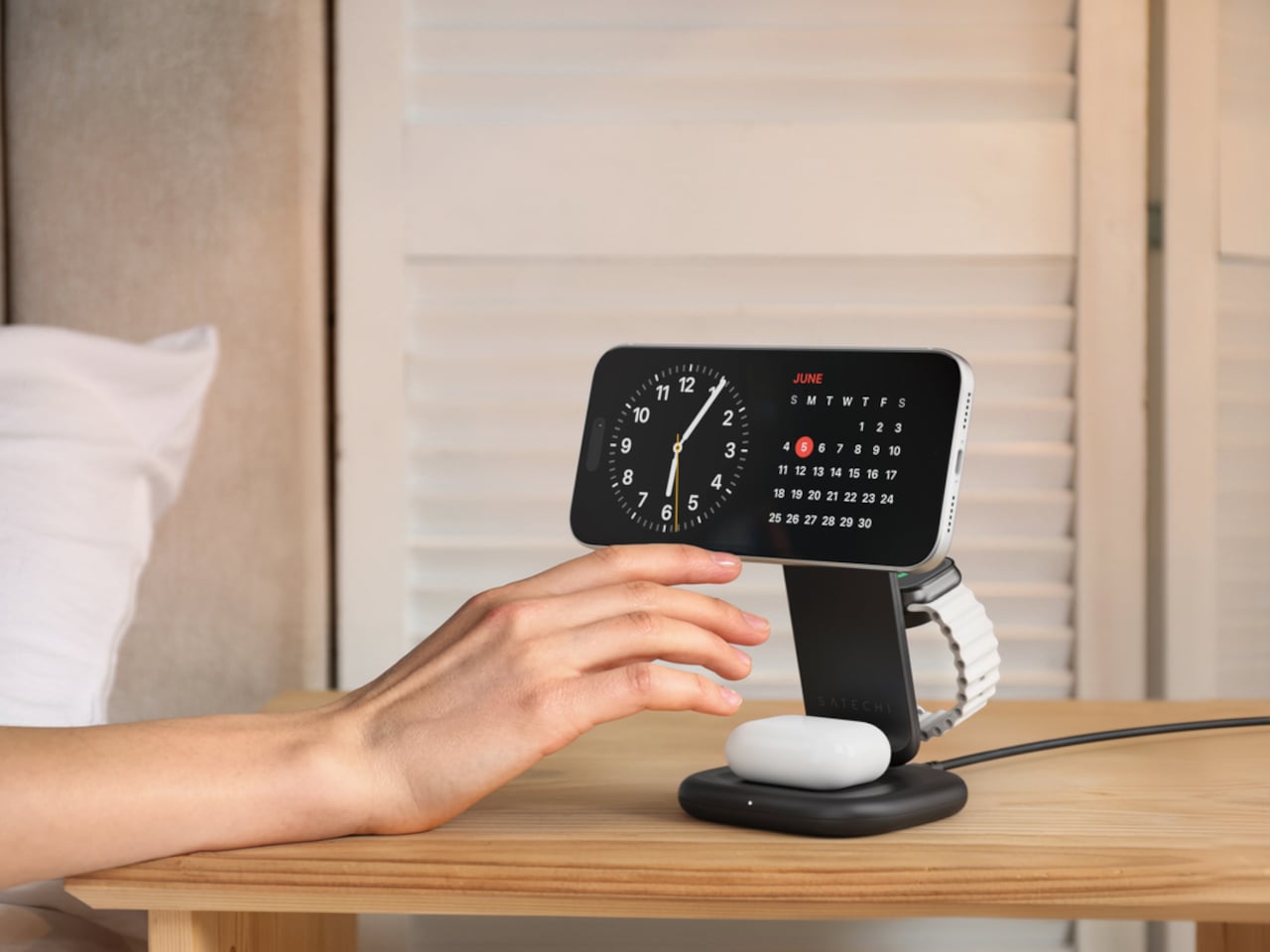
Set the phone down on the magnetic charging surface, and Qi2’s built-in alignment snaps it into position so you don’t lose power from an off-center placement. The Apple Watch sits at a comfortable angle on its dedicated fast-charge module, while the AirPods rest on their own pad below. All three charge simultaneously from a single cable going to the wall, with nothing to juggle.
Apple Watch fast charging requires MFi certification, and Satechi has that covered. The stand supports Series 7 and newer, including Ultra and SE models. Advanced safety protections manage heat and prevent power loss when all three pads are active at once. The magnetic surface on the phone pad also ensures it stays correctly positioned even if you accidentally nudge it during the night.
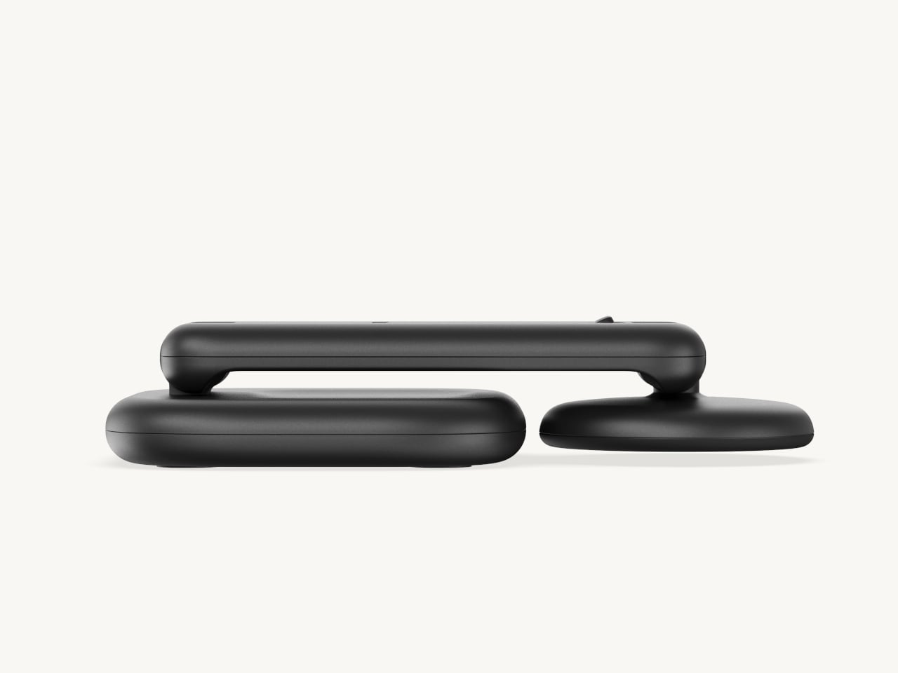
Then there’s the folding design, which is where the stand earns its keep as a travel companion. It collapses into a flat form that fits easily in a carry-on without much bulk, then unfolds into the same stable stand you’re used to at home. There’s no need to rethink your charging setup just because you’ve checked into a different room across town or across the world.
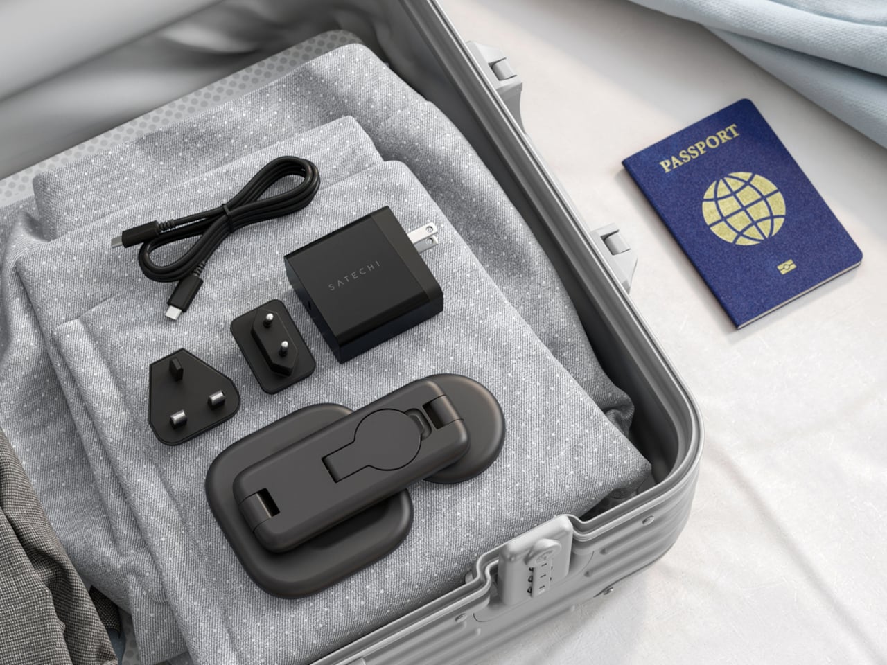
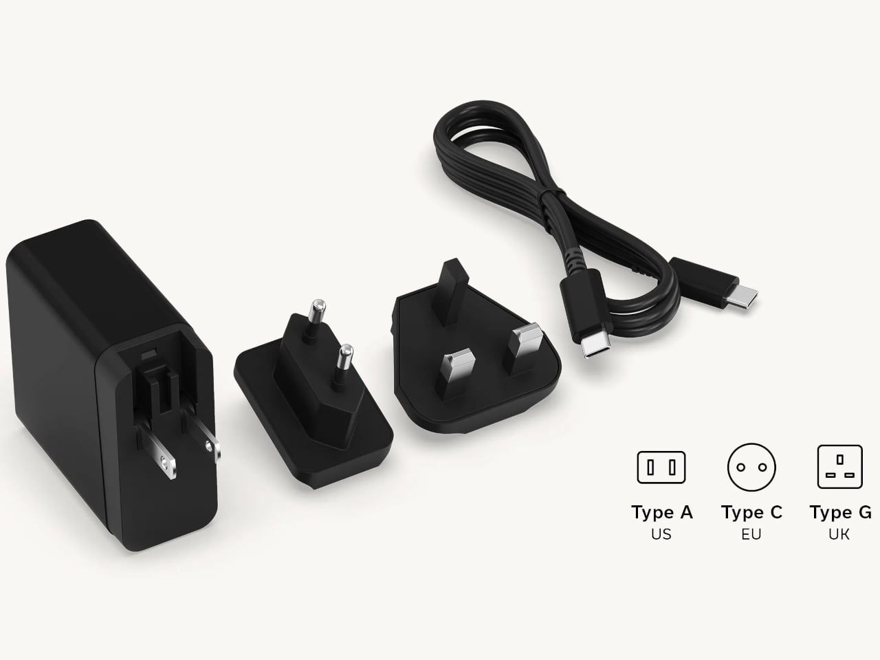
Satechi also includes a 45W USB-C power adapter in the box, which sounds like a minor detail until you’re unpacking in a foreign hotel room. The adapter ships with US, EU, and UK plug attachments, meaning it works across different countries without needing a separate travel adapter. That’s a small but thoughtful decision for anyone whose travels take them to multiple regions throughout the year.
Available now on Satechi.com and Amazon, the stand retails for $129.99 in Space Black. It’s a higher investment than a single-device pad, but consolidating three separate chargers into one that travels as well as it sits on a desk makes that gap easier to justify. For Apple ecosystem users tired of the cable pile next to the bed, this stand offers a much cleaner end to every day.
The post Satechi’s $130 Foldable 3-in-1 Charger Now Hits 25W for iPhones first appeared on Yanko Design.