A UK tribunal has allowed a £2.1 billion lawsuit over Microsoft’s cloud licensing to move forward, adding new pressure to how Windows Server is priced outside Azure.
Microsoft Excel was originally created as competition for Lotus 1-2-3, which has had lasting effects on my favorite spreadsheet software. Here's how a small shortcut taken in the '80s has lasted through until 2026.
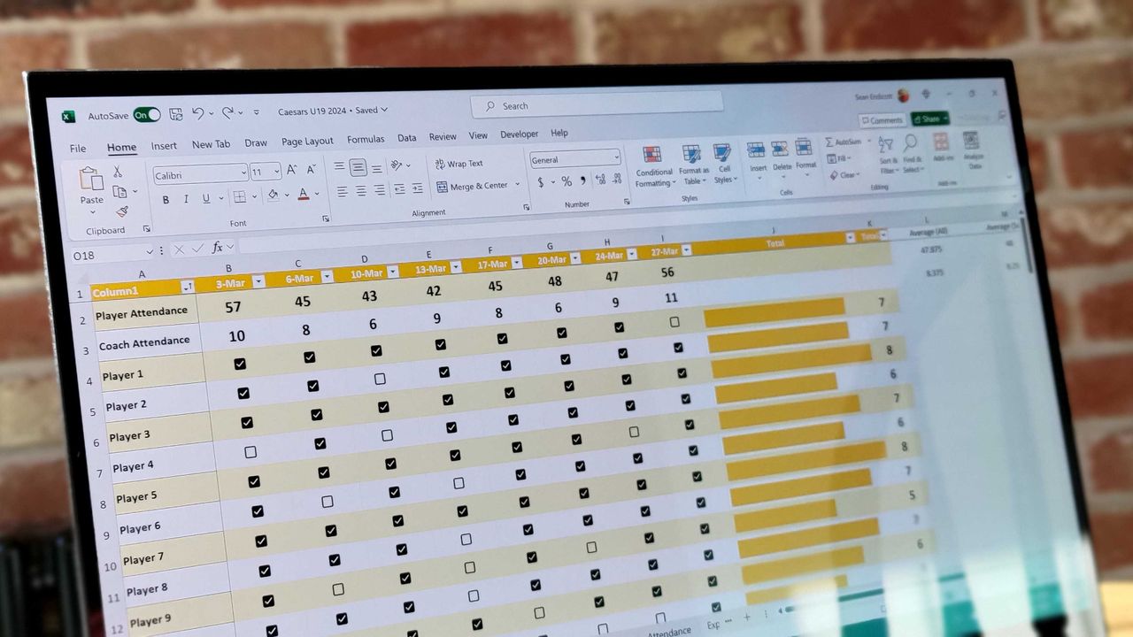
Excel spreadsheet with checkboxes
The upcoming checkboxes feature in Microsoft Excel makes it easy to visualize certain data.
Microsoft Is Pulling the Plug on Office LTSC 2021 If you’re still using Office LTSC 2021, the clock is ticking. Microsoft has confirmed that support for Office LTSC 2021 will officially end on October 13, 2026. After that: No security updates No bug fixes No technical support Your apps like Word, Excel, and PowerPoint will […]
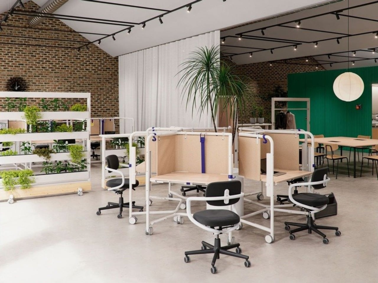
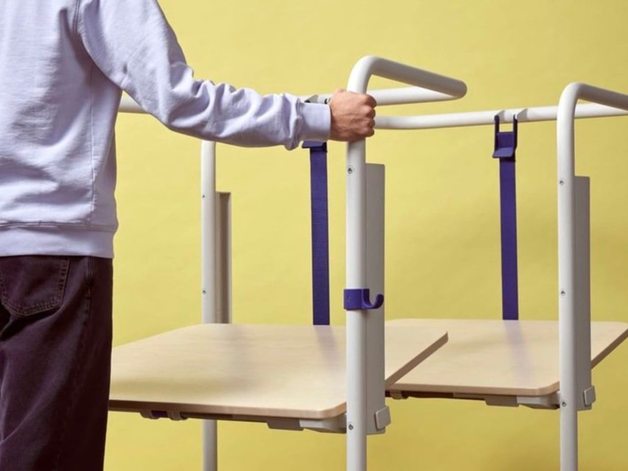
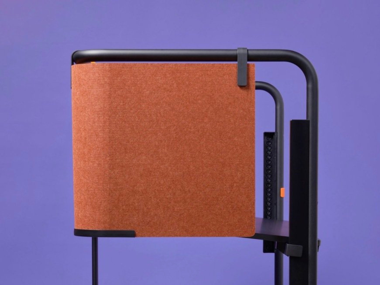
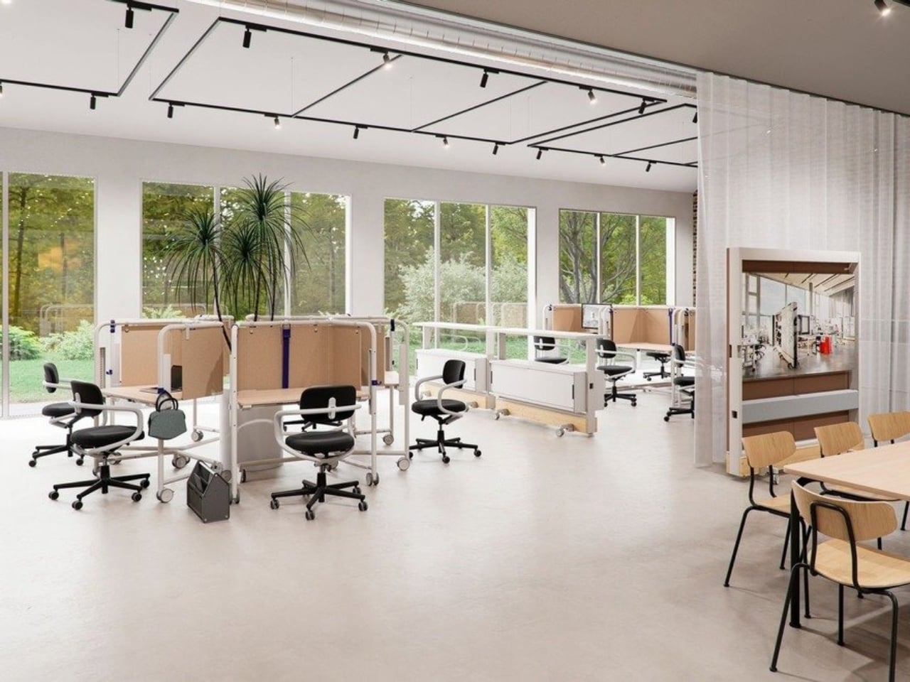
We’ve been designing office desks essentially the same way for decades. Four legs, a flat surface, maybe a drawer if you’re lucky, and an ergonomic chair that costs more than your first car. So when Vitra and German industrial designer Konstantin Grcic quietly dropped the Scout Work Mobile just last month, I paid close attention.
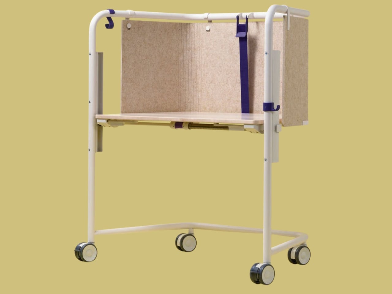
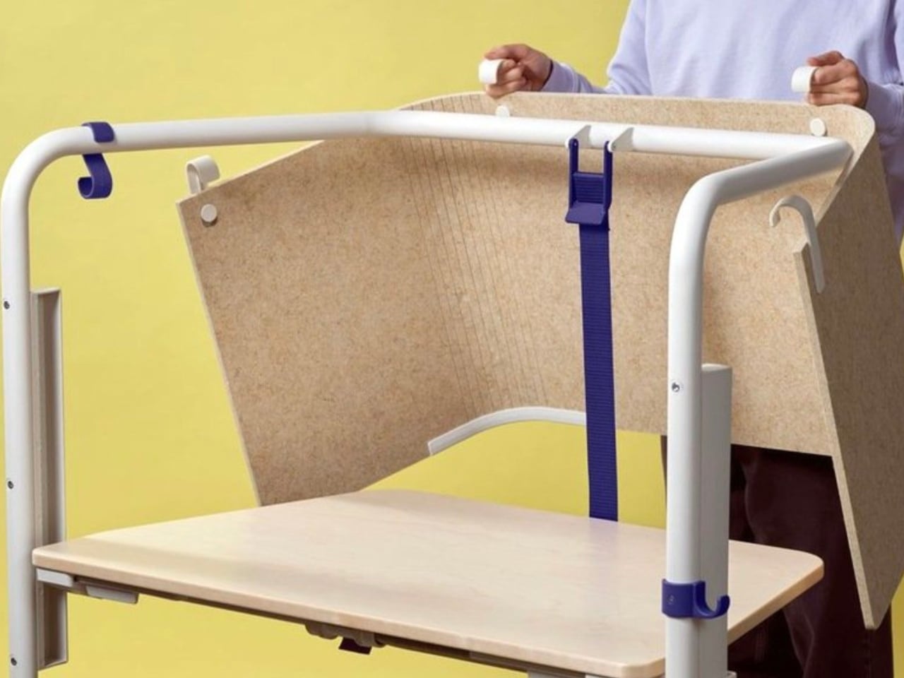
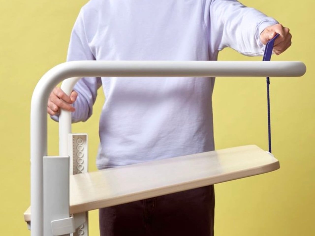
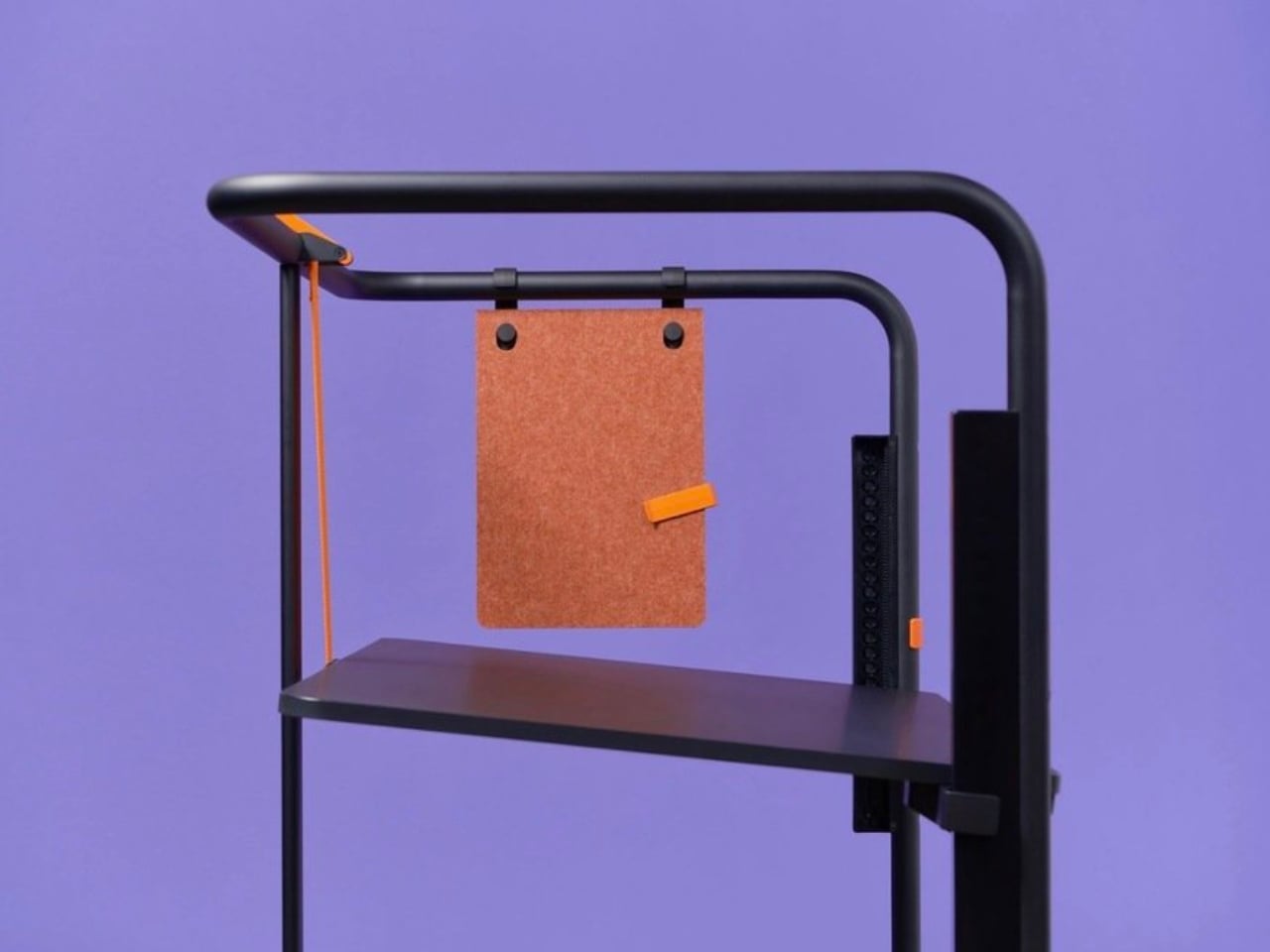
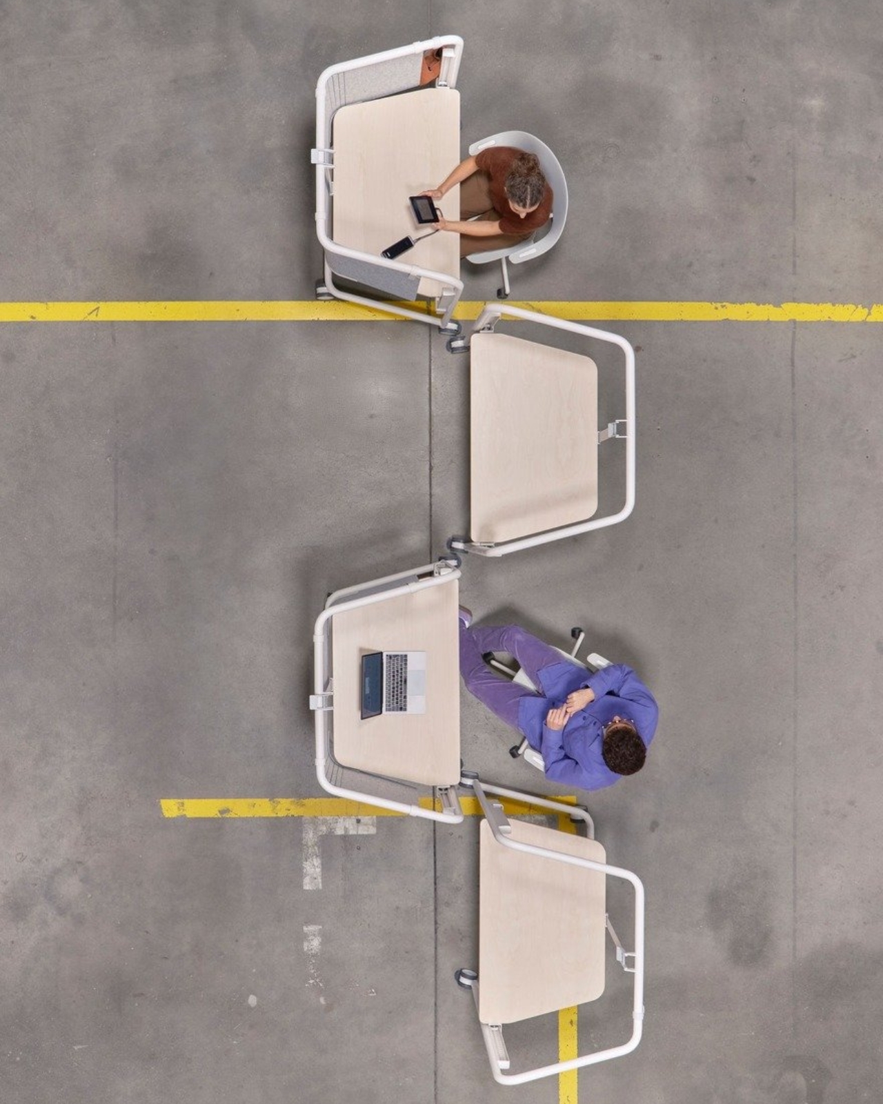
The Scout Work Mobile is part of a larger family of workstation and meeting tables simply called Scout, launched on March 19 of this year. The collection comprises five pieces ranging from stationary desks to mobile variants, and it’s Grcic’s response to how offices actually function today versus how they were designed to function twenty years ago. The Scout Work Mobile is the one that caught my eye: a compact, trapezoidal desk on wheels with a tubular steel frame that rises up and encircles the work surface.
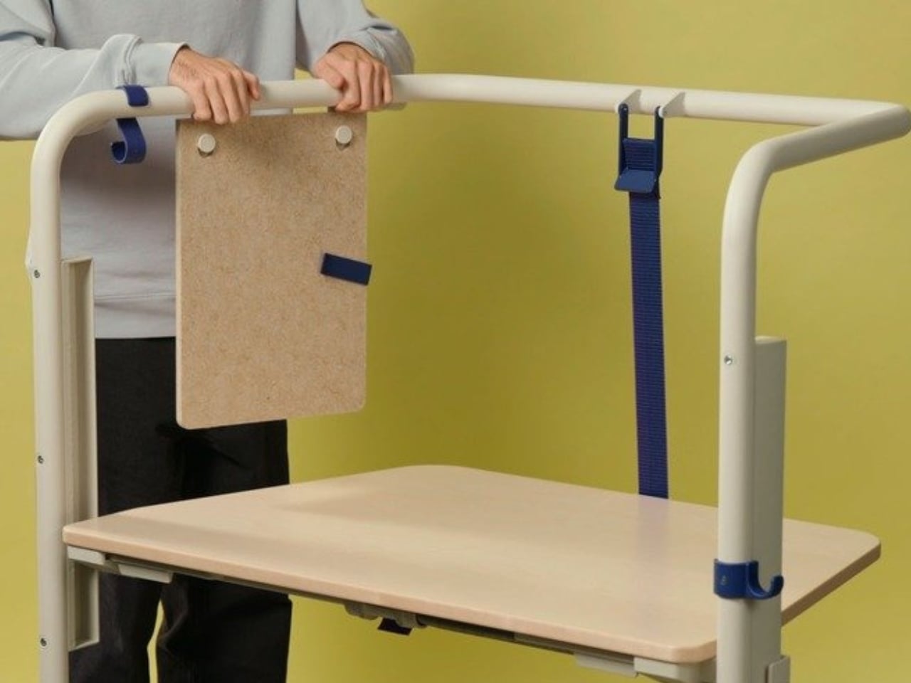
That frame is the whole story, really. It’s not decorative. It’s not there to look good in a mood board (though it absolutely does). The frame acts as a grab handle when you’re rolling the thing across a room, a mounting point for privacy screens, and a place to hang accessories. Without any attachments, it still creates what Vitra describes as a “room-within-a-room” effect, a bit of visual and psychological separation from whatever chaos is happening around you. For those of us who’ve had to MacGyver focus time in open-plan offices using noise-cancelling headphones and pure denial, that feels like a genuine design insight rather than a marketing afterthought.
Grcic is known for what Vitra calls a “severely simple” aesthetic. He doesn’t add things for the sake of adding them, and the Scout Work Mobile reflects that clearly: the height adjustment and tilting function work entirely without electricity. No motors, no app, no firmware updates required. It adjusts by hand. That might sound unremarkable, but compared to the increasingly tech-dependent office furniture being released right now, it reads almost like a radical statement.
The mobile aspect of Scout is where the design really earns its name. Return-to-office mandates are reshaping how companies think about their physical spaces, and the rigid assigned-desk model is quietly becoming a liability. Hot-desking, collaborative hubs, project clusters, training rooms that double as focus spaces. Modern offices are being asked to do a lot more with the same square footage. Scout was built for exactly that kind of environment. You grab it, roll it where you need it, work, and move on. No teardown required. No reconfiguration meeting on the calendar.
Grcic put it plainly in an interview with Vitra Magazine: “The aim is not to replace what already exists. Rather, the system is an extension or complementary offering that responds to different levels and styles of work.” That kind of restraint is rare in product design, where the temptation is always to pitch your thing as the only thing. Scout doesn’t ask to own your whole office. It just wants to be useful wherever you put it.
Aesthetically, it sits in that satisfying middle ground between industrial and refined. The tubular steel frame reads as utilitarian at first glance, but the trapezoidal silhouette and deliberate proportions make it feel considered rather than clinical. It’s the kind of furniture that would look at home in a forward-thinking tech company, a design school studio, or a well-curated co-working space. It isn’t trying to disappear into the background, and it certainly doesn’t need to.
What makes Scout genuinely interesting is that it treats mobility as a first principle rather than a feature tacked on after the fact. Desks on wheels have existed forever, but most of them feel like an afterthought, as if someone just bolted casters onto a standard table and called it agile. Grcic designed the Scout Work Mobile from the ground up with movement in mind, and the difference is visible in every element. Office furniture rarely makes me stop and think twice. The Scout Work Mobile managed to.
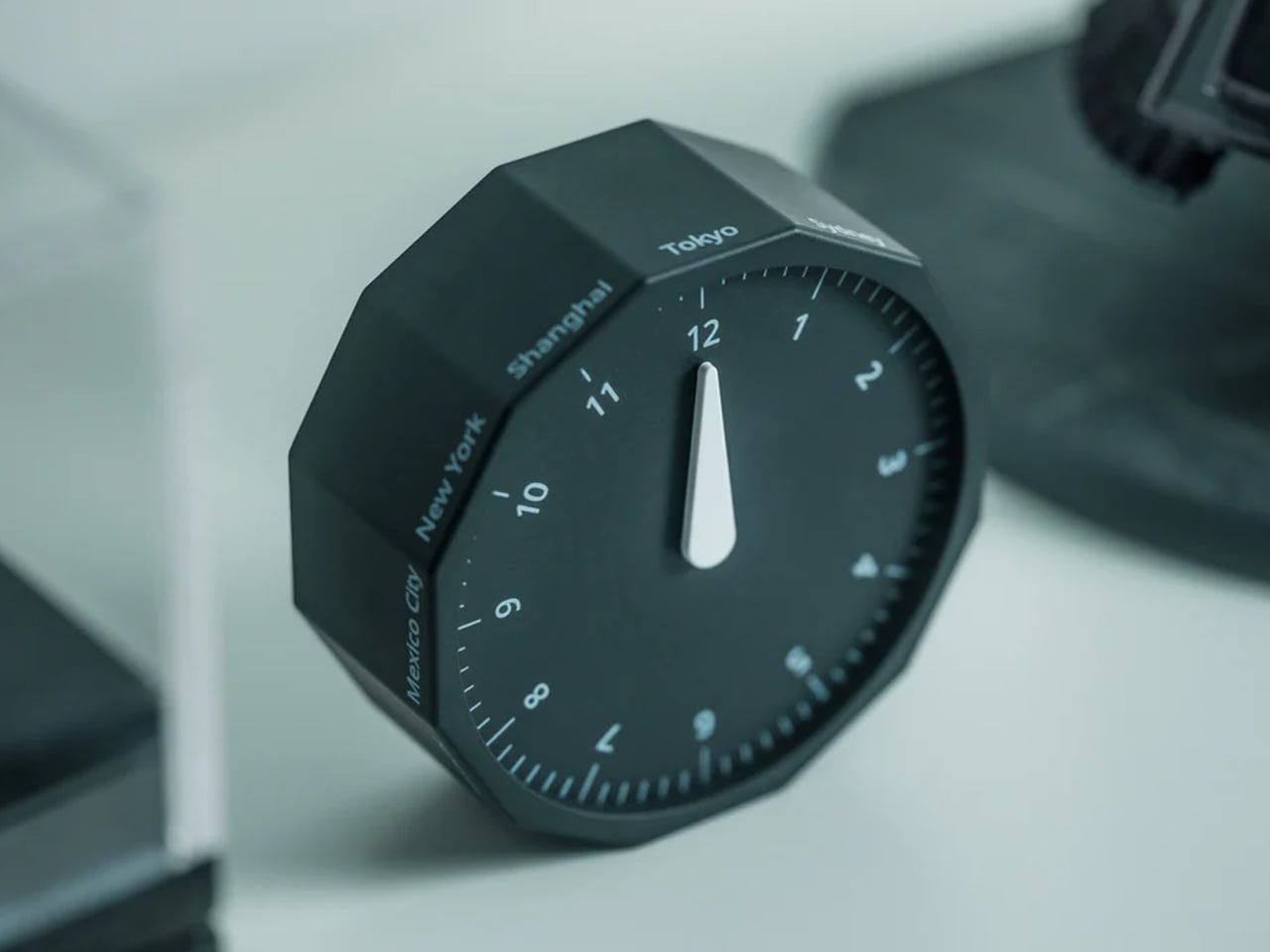
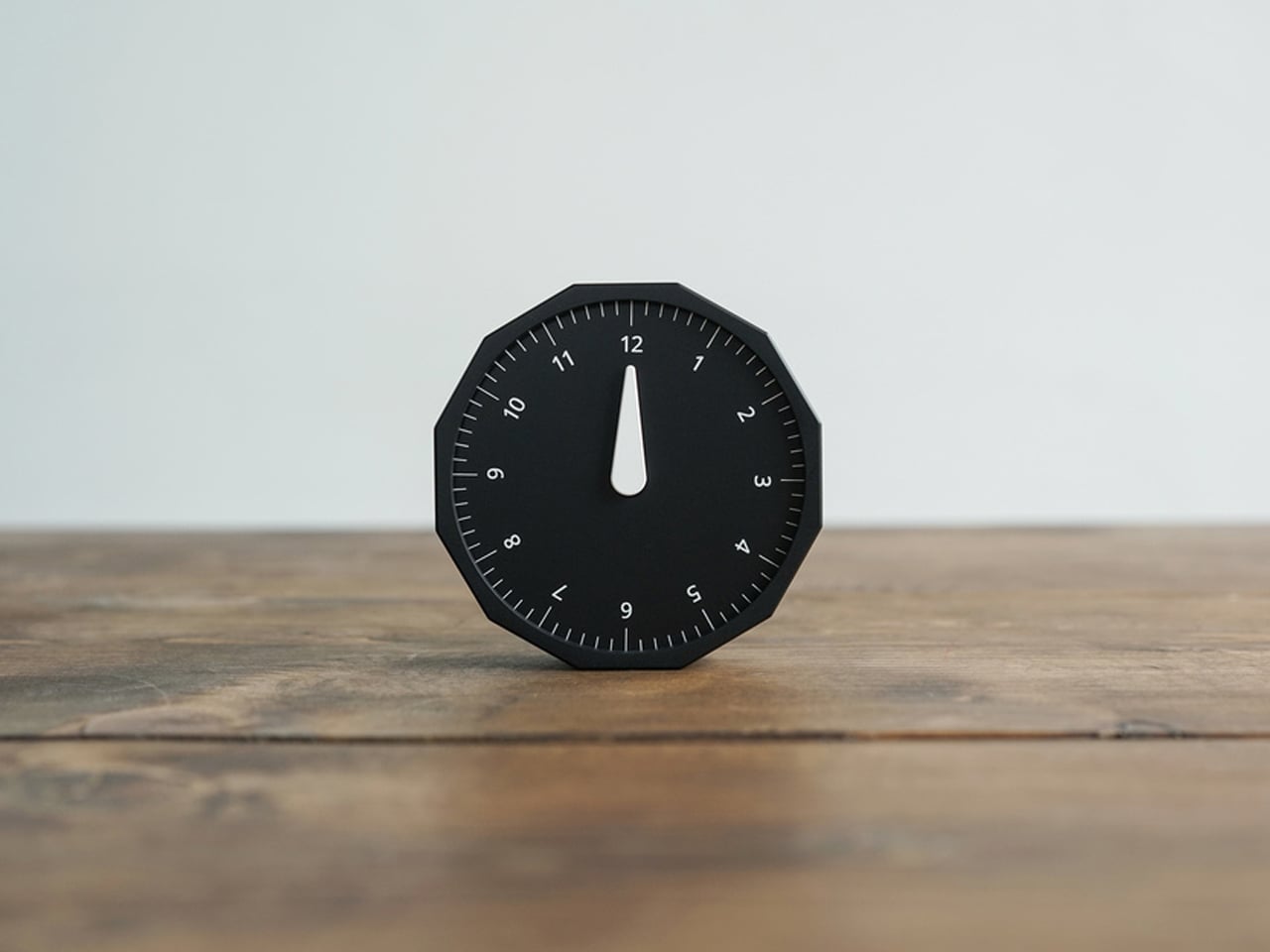
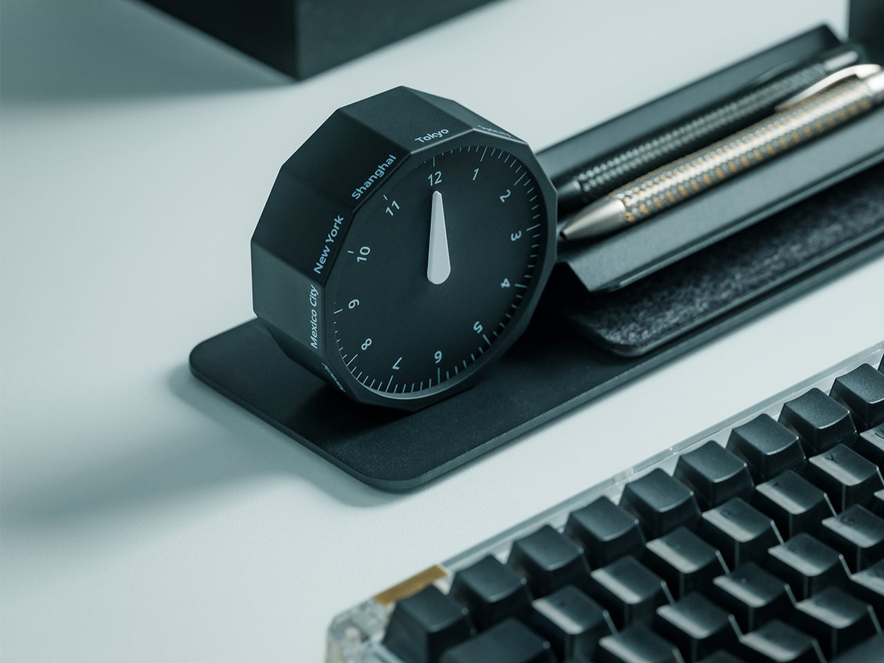
This 12-sided clock turns global timekeeping into a calmer desk ritual
Keeping up with different time zones sounds simple until it becomes part of your everyday routine. You check your phone before a call, open another tab to confirm the hour, do a quick mental calculation, and still second-guess whether it’s too early in Tokyo or too late in New York. Not to forget the perils of push-notifications – a quick check of time leads you down a drain of doom-scrolling that you take an hour to return from! To add a layer of analog convenience in this increasingly digital setup, I present the Rolling World Clock.
Why Traditional World Clocks Never Quite Feel Right
The Rolling World Clock takes a familiar category and gives it a much smarter form. Instead of relying on screens, menus, or a row of tiny city labels, this analog desk object turns world time into a simple physical interaction. Built with 12 sides, each representing a major timezone city, it lets you roll from one location to another and instantly read the local time with a single hand. It’s a cleaner, more tactile answer to a problem that has long been solved in ways that feel unnecessarily digital.
That analog quality is a big part of the appeal. There’s a growing interest in devices that help people step back from constant digital interaction, and this clock fits neatly into that trend without feeling nostalgic for nostalgia’s sake. It still solves a modern problem, especially for people working with global teams or keeping in touch with friends and family abroad, but it does so in a way that feels grounded and human. You’re not swiping, tapping, or toggling between screens. You’re just rolling the object in your hand and reading the time.
Built for modern routines, expressed through simple interactions.
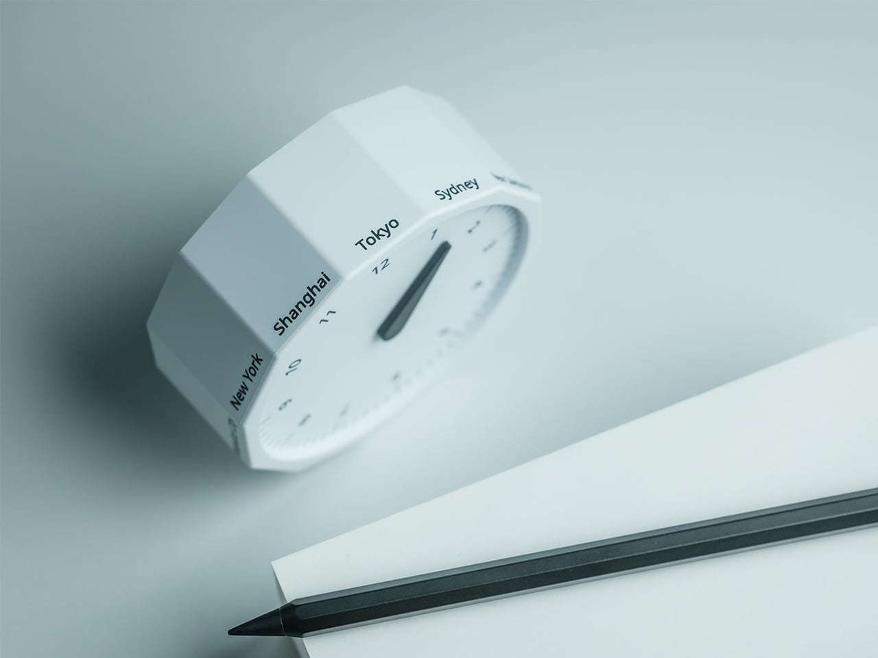
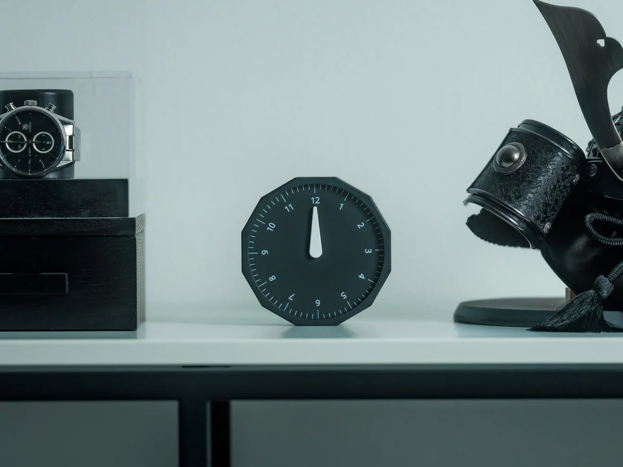
The city lineup also makes it genuinely useful. The 12 sides cover major global time zones, including London, Paris, Cape Town, Moscow, Los Angeles, Karachi, Mexico City, New York, Shanghai, Tokyo, Sydney, and New Caledonia. That gives it enough range to be practical for a wide variety of work and lifestyle needs, whether you’re coordinating meetings, planning travel, or just trying not to message someone at the wrong hour.
Built for a More Intentional Desk
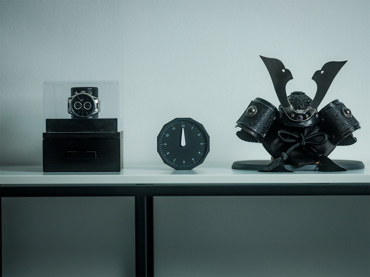
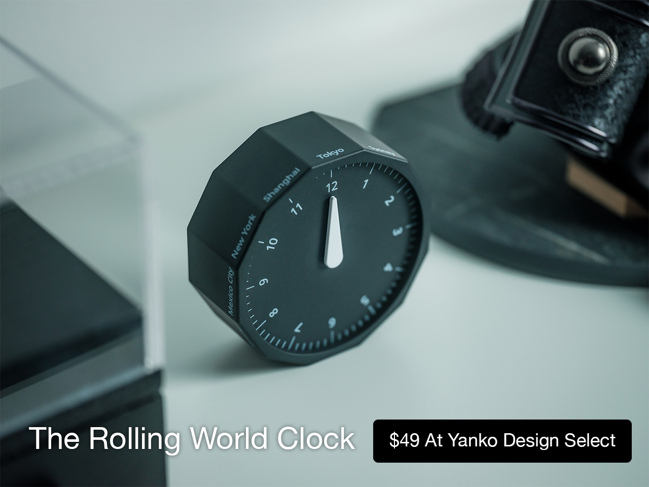
For the desk setup fanatics, there’s also a strong aesthetic argument here. The Rolling World Clock is available in black and white, two finishes that make it easy to integrate into a modern desk setup without fighting for attention. It has the kind of understated presence that works especially well for young professionals who want their workspace to feel differentiated without becoming visually noisy. It’s functional, yes, but it also reads as a design object, the sort of piece that quietly signals taste.
Clean lines, one hand, no distractions.
That balance of utility and personality is what makes this more than a novelty. If you work across cities, collaborate with clients in different regions, or simply like the idea of keeping global time visible without adding another glowing screen to your day, this clock makes a strong case for itself. It taps into a broader shift toward analog tools that feel slower, more deliberate, and more human, while still solving a very modern problem.
Feels as good in the hand as it looks on the desk.
Why It’s Worth Picking Up Now
At $49, the Rolling World Clock lands in a sweet spot for a desk upgrade that feels distinctive without being overcommitted. It also has the kind of giftable appeal that comes from being both useful and conversation-worthy. And with only a few left, it carries just enough urgency to make hesitation a risky move.
If your desk could use an object that feels smarter, calmer, and more intentional than another digital widget, the Rolling World Clock is worth grabbing now. It’s currently available in the Yanko Design Shop in black and white, and with limited stock remaining, this is one of those rare functional design pieces you probably shouldn’t wait on.
Une coalition d'entreprises européennes vient de lancer Euro-Office, une suite bureautique open source qui ambitionne de concurrencer Microsoft 365. Le problème, c'est que le projet est un fork d'OnlyOffice, et ce dernier accuse Nextcloud et IONOS de violer sa licence.
Un projet présenté au Bundestag
Euro-Office a été dévoilé le 27 mars à Berlin, directement au Bundestag. Derrière le projet, on retrouve huit organisations européennes : IONOS, Nextcloud, Eurostack, XWiki, OpenProject, Soverin, Abilian et BTactic.
L'idée est de proposer une suite bureautique capable d'éditer documents, tableurs et présentations, avec une compatibilité Microsoft complète, le tout sous contrôle européen.
Plutôt que de repartir de zéro, la coalition a choisi de forker le code open source d'OnlyOffice, jugé plus moderne et performant dans un navigateur que les alternatives dérivées de LibreOffice. Une préversion est d'ailleurs déjà proposée sur GitHub, et la première version stable est annoncée pour cet été.
OnlyOffice accuse de violation de licence
Et voilà que ça se complique. Deux jours après l'annonce, OnlyOffice a publié un billet de blog accusant Nextcloud et IONOS de violer les conditions de sa licence AGPL v3.
Le reproche est précis : Euro-Office aurait supprimé toutes les références à la marque OnlyOffice, alors que la licence impose de conserver le logo et les attributions dans les travaux dérivés. Ces conditions supplémentaires ont été ajoutées en mai 2021 via la section 7 du fichier LICENSE.txt.
Côté Nextcloud, on se défend en affirmant que les forks font partie de l'ADN de l'open source. L'entreprise dit avoir consulté Bradley M. Kuhn, le créateur de la licence AGPL, qui soutiendrait leur position "à 100 %".
La Free Software Foundation serait aussi de leur côté. Nextcloud avance par ailleurs que la collaboration directe avec OnlyOffice était compliquée, pointant les origines russes de l'équipe fondatrice. OnlyOffice rétorque que sa propriété intellectuelle est détenue en Lettonie (Ascensio System SIA) depuis 2009, que sa holding est à Singapour, et que l'activité russe a été cédée à des investisseurs locaux en 2019.
La souveraineté numérique en toile de fond
Le timing n'est pas anodin. Partout en Europe, des administrations et des entreprises cherchent à réduire leur dépendance aux outils américains.
Euro-Office arrive avec un argument fort : une suite bureautique développée et hébergée en Europe, sans dépendance vis-à-vis d'acteurs non européens. C'est exactement ce que réclament plusieurs gouvernements depuis des années.
C'est quand même un drôle de démarrage pour un projet censé incarner la souveraineté numérique européenne. On lance une alternative à Microsoft en forkant le code d'une société enregistrée en Lettonie mais aux racines russes, et trois jours plus tard on se retrouve avec une accusation de violation de licence sur les bras.
Le fond du débat juridique est intéressant : est-ce qu'on peut forker un logiciel AGPL et retirer les mentions de la marque originale ?
60 Mo de source maps (ces fichiers qui permettent de remonter du code minifié à l'original) ont été oubliés dans un paquet npm. Et voilà comment Anthropic a involontairement balancé en public le code source complet de Claude Code, son outil à 2.5 milliards de dollars de revenus annuels.
Alors qu'est-ce qui s'est passé exactement ?
Hé bien hier, la version 2.1.88 du package @anthropic-ai/claude-code sur le registre npm embarquait un fichier .map de 59.8 Mo. Un truc normalement réservé au debug interne, sauf que ce fichier .map contenait les pointeurs vers les 1 900 fichiers TypeScript originaux, en clair. Chaofan Shou, un développeur chez Solayer Labs, a alors repéré la boulette et l'a partagée sur X. Le temps qu'Anthropic réagisse, le code était déjà mirroré partout sur GitHub, avec 41 500+ forks en quelques heures. Autant dire que le dentifrice ne rentrera pas dans le tube !
Pour ma part, j'avais un petit dépôt à moi assez ancien avec quelques trucs relatifs à Claude Code, qui n'avait rien à voir avec tout ça, qui s'est même retrouvé striké... Ils ratissent large avec leur DMCA donc.
Et là, c'est la fête pour les curieux comme moi parce que les entrailles de l'outil révèlent pas mal de surprises. Côté architecture, on découvre environ 40 outils internes avec gestion de permissions, un moteur de requêtes de 46 000 lignes de TypeScript, un système multi-agents capable de spawner des essaims de sous-tâches en parallèle, et un pont de communication entre le terminal et votre éditeur VS Code ou JetBrains. Le tout tourne sur Bun (pas Node.js ^^) avec Ink pour l'interface terminal. Par contre, pas de tests unitaires visibles dans le dump.
Côté mémoire, c'est plutôt bien pensé puisqu'au lieu de tout stocker bêtement dans la fenêtre de contexte du modèle, l'outil utilise un fichier texte MEMORY.md ultra-léger (genre 150 caractères par entrée) qui sert d'index de pointeurs. Les vraies données, elles, sont distribuées dans des fichiers thématiques chargés à la demande, et les transcripts bruts ne sont jamais relus entièrement, mais juste fouillés à la recherche d'identifiants précis. L'agent traite en fait sa propre mémoire comme un "hint" ce qui le force à vérifier toujours le vrai code avant d'agir. En gros, il a une mémoire sceptique, et pour moi c'est clairement le truc le plus intéressant du dump.
Y'a aussi un truc qui s'appelle KAIROS (mentionné 150 fois dans le code) qui est un genre de mode daemon autonome. En fait, pendant que vous allez chercher votre café, l'agent tourne en arrière-plan et fait ce qu'ils appellent autoDream : il consolide sa mémoire dans des fichiers JSON, vire les contradictions et transforme les observations vagues en données structurées. Comme ça, quand vous revenez devant votre écran, le contexte est nettoyé.
Et puis le code balance aussi la roadmap interne d'Anthropic (bon courage au service comm ^^). On y trouve les noms de code des modèles... Capybara pour un variant de Claude 4.6, Fennec pour Opus 4.6, et un mystérieux Numbat qui n'est pas encore sorti. D'ailleurs, les commentaires internes révèlent que Capybara v8 a un taux de fausses affirmations qui tourne autour de 30%, ce qui est une grosse régression par rapport aux 17% de la v4. Y'a même un "Undercover Mode" qui permet à l'agent de contribuer à des repos publics sans révéler d'infos internes (c'est sympa pour les projets open source).
Anthropic a confirmé la fuite : "C'était un problème de packaging lié à une erreur humaine, pas une faille de sécurité. Aucune donnée client n'a été exposée." Mouais, attention quand même, parce que le code est déjà partout et n'en repartira pas. Et même si aucun secret client n'a fuité, exposer l'architecture complète d'un agent IA à 2.5 milliards de revenus, c'est pas rien non plus.
Bon, et maintenant qu'est-ce qu'on peut en faire ? Bah pas mal de choses en fait.
Par exemple, le
système de mémoire auto-correcteur
est un pattern directement réutilisable pour vos propres agents IA. L'architecture "index léger + fichiers à la demande" résout élégamment le problème de la pollution de contexte qui fait halluciner les LLM sur les longues sessions. Les +40 outils internes permettent aussi de comprendre comment structurer un système de permissions granulaires dans un
agent autonome
. Et le concept KAIROS/autoDream, la consolidation mémoire pendant l'idle, c'est une idée qu'aucun outil open source n'implémente encore. Autant dire que les alternatives open source à Claude Code ou Codex vont monter en gamme dans les jours qui viennent. Et le code est
déjà nettoyé, réécris en Rust et mis sur GitHub
si vous voulez fouiller. Bon, pas sûr que le pattern autoDream soit simple à reimplémenter, mais le système de mémoire oui.
Je trouve ça assez marrant que le code proprio d'une boite qui a aspiré tout l'open source du monde voire plus, sans autorisation, pour le revendre sous la forme de temps machine / tokens, devienne lui aussi en quelque sorte "open source" sans qu'on leur demande leur avis ^^. La vie est bien faite.
Maintenant, pour les développeurs qui publient sur npm, la leçon est limpide : Vérifiez votre .npmignore et votre champ files dans package.json. Ou plutôt, lancez la commande npm pack --dry-run dans votre terminal avant chaque publish. Ça prend 2 secondes et ça vous montre exactement ce qui sera inclus dans le paquet. Ça aurait évité 60 Mo de secrets industriels qui partent en public.
Bref, un .npmignore bien configuré, ça coûte 0 euro. Alors qu'une fuite de propriété intellectuelle évaluée à 2.5 milliards... un peu plus !
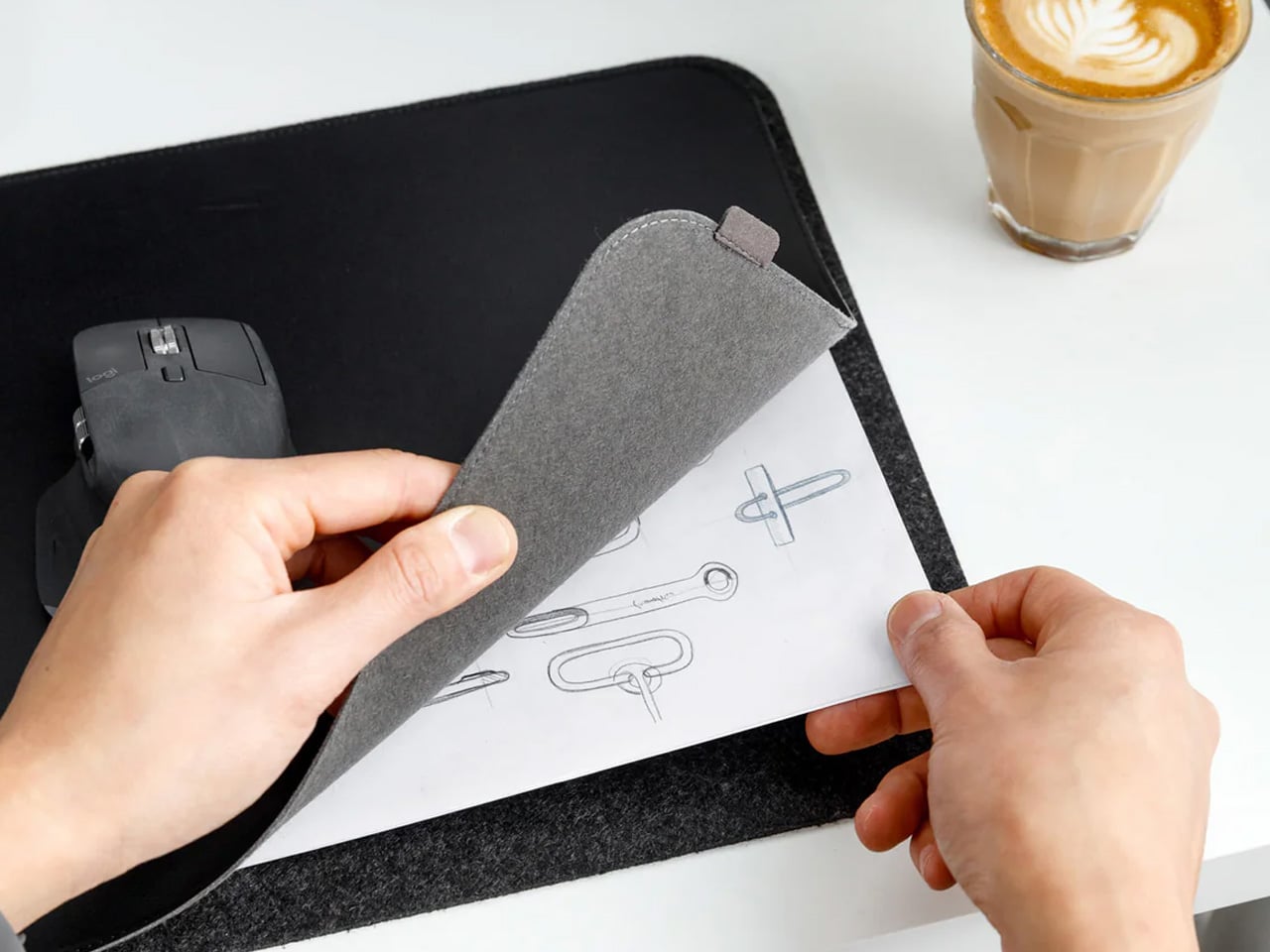
Most desk setups are inherited. The nomad’s is earned. Everything that makes it into the bag has already passed a strict and largely unconscious test — weight, versatility, the ability to make a stranger’s table feel like a place worth working from. Over months and years of moving between cities, time zones, and co-working spaces, the digital nomad ends up with a carefully curated set of tools that are small by necessity but thoughtful by design.
The interesting thing about these objects is what happens when the travel slows down. When a lease gets signed, a proper desk arrives, and the bag starts being unpacked with more intention. The tools that survived the road do not lose their relevance on a permanent surface. Many of them were built with the kind of considered design that rewards exactly this kind of scrutiny. They look better than most things bought specifically for a home office, hold up longer, and carry the kind of personal history that makes a workspace feel genuinely inhabited. This is for that moment. Eight objects that lived in the bag for a reason, and deserve a permanent home for the same one.
1. OrigamiSwift Folding Mouse
The OrigamiSwift is what happens when industrial design takes portability seriously. Weighing just 40 grams and folding flat to a profile thin enough to slip between notebook pages, it removes the usual tension between compact and comfortable. On a desk, it unfolds in under half a second, snapping into a full-sized ergonomic shape that sits naturally in the hand. For anyone who has suffered through the cramped mechanics of a standard travel mouse, this feels like a genuine upgrade.
The Bluetooth connectivity is quick, and the origami-inspired fold keeps the mechanism tactile enough that using it becomes a small ritual rather than a chore. At the desk, it earns a permanent spot not because it compensates for a lack of options, but because the transformation itself is satisfying. It is the kind of tool that makes you reconsider how you work, and then makes the work feel slightly more considered. Portable by design, permanent by choice.
Folds to near-invisible thinness at just 4.5mm, making it one of the most carry-friendly mice ever built without compromising on ergonomic full-size comfort
Activates in under half a second with a single flip, making the transition from travel bag to working mouse feel immediate and effortless
What we dislike
At 40 grams, the lightweight build may feel insubstantial for users accustomed to the heft and resistance of a traditional full-sized mouse
Bluetooth-only connectivity means no wired fallback for tasks where even minor wireless latency becomes a frustration
2. Fidget Cube
The Fidget Cube arrived at a time when open-plan offices made visible restlessness a liability and invisible anxiety a norm. Antsy Labs built something straightforward in response: a small cube with six distinct tactile surfaces, each mapped to a different kind of fidget. Click. Glide. Flip. Breathe. Roll. Spin. The vocabulary is simple, the execution is precise, and the result is a desk object that earns its keep without demanding attention from anyone but you.
For digital nomads who have spent years suppressing the impulse to tap or spin something through a long layover or tense client call, the Fidget Cube offers quiet permission. On a permanent desk, it sits within reach without asking for attention. The black and graphite colorways blend cleanly into most setups, looking less like a toy and more like a considered detail. It is not a gimmick. It is self-awareness shaped into an object.
What we like
Six distinct tactile surfaces cover a wide range of fidgeting behaviors in a single pocket-sized cube, making it genuinely versatile across different stress responses and focus modes
Discreet colorways like Midnight Black and Graphite blend seamlessly into professional setups without drawing unwanted attention in shared or client-facing workspaces
What we dislike
The clicking surfaces can produce audible sounds that may distract colleagues in quiet, open-plan, or library-style work environments
The cube format offers no digital or productivity-tracking integration for users who want data on their focus habits or stress patterns
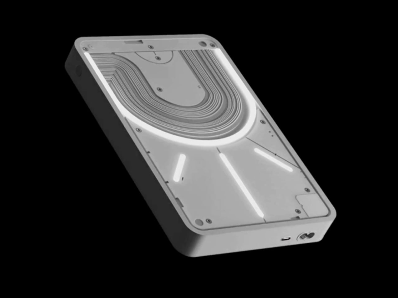
3. Nothing Power (1) Battery Bank
Nothing built its reputation on the Glyph interface, a grid of LED lights that turned the back of a phone into a notification display and a design statement. The Power (1) carries that language into a battery bank, using transparent layers, bold light paths, and illuminated interactions to make a utilitarian object feel worth looking at. The design philosophy is direct: good design is not just about appearance, it is about how an object makes you feel when you reach for it.
For a nomad who has charged devices from airport benches and café stools, a power bank is rarely a display piece. The Nothing Power (1) challenges that. Sitting on a desk, the Glyph illumination gives charging status a visual presence that feels more like an ambient display than a simple indicator light. It treats the desk as a stage and every object on it as a conscious choice. Few battery banks have ever earned that kind of consideration.
What we like
The Glyph interface turns a charging indicator into a visual experience, making it arguably the only power bank designed to look genuinely intentional, sitting on a desk permanently
Transparent design layers reflect Nothing’s ethos of honest, open construction, giving the object a premium quality that stands apart from every other battery bank on the market
What we dislike
The Nothing Power (1) is currently a concept design and is not yet available as a finished commercial product
Exact battery capacity, output wattage, and pricing remain unconfirmed, making direct comparison with available alternatives difficult at this stage
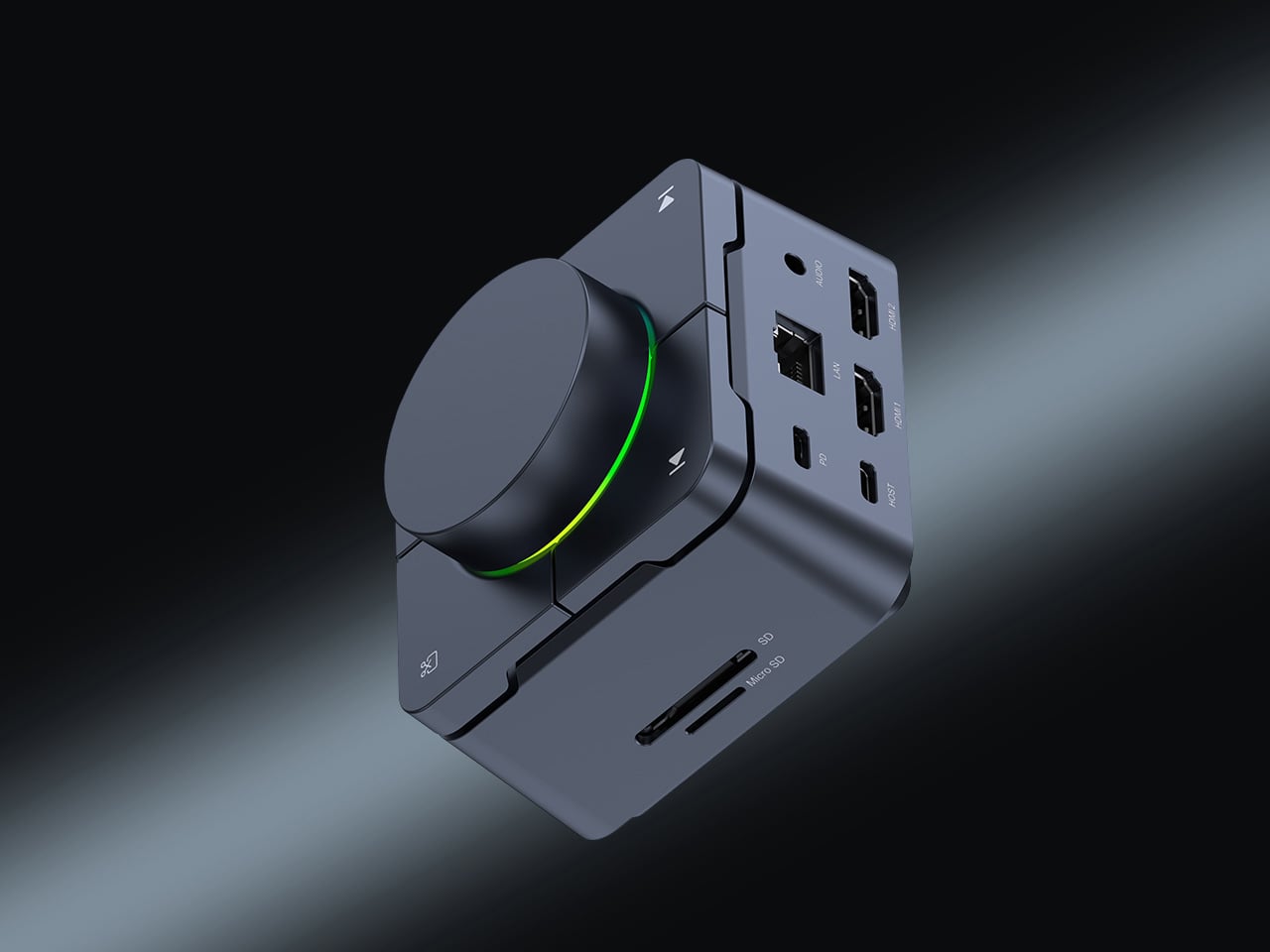
4. HubKey Gen2
Desk clutter tends to accumulate in layers: a dock for the monitor, an adapter for the second screen, a hub for storage. Somewhere between them sits a tangle of cables that each solves a single problem in isolation. The HubKey Gen2 treats that as a design problem worth solving from the inside out. It is an 11-in-1 USB-C hub with a hardware control surface on top, offering programmable shortcut keys, a central dial, 100W power delivery, and 2.5Gbps Ethernet in a compact cube footprint.
The display support is what separates it from a standard hub. Two HDMI ports, each running a 4K display at 60Hz, mean a laptop becomes a proper dual-monitor workstation without extra adapters. For a nomad settling in, that shift from single-screen café work to a dual-screen editing setup is significant. The shortcut keys and central dial bring a physical control layer to software-heavy workflows, keeping hands on the desk rather than hunting through menus on a trackpad.
What we like
Dual 4K HDMI outputs at 60Hz eliminate the need for a separate display dock when transitioning from a travel setup to a full home workstation
The programmable shortcut keys and central knob return a satisfying physical dimension to digital workflows, reducing time spent navigating software menus
What we dislike
The compact cube form factor may feel crowded once all 11 ports are simultaneously in active use, which limits clean cable management around the unit
Fully customizing the shortcut keys requires additional software configuration, adding a setup investment before the productivity benefit becomes fully apparent
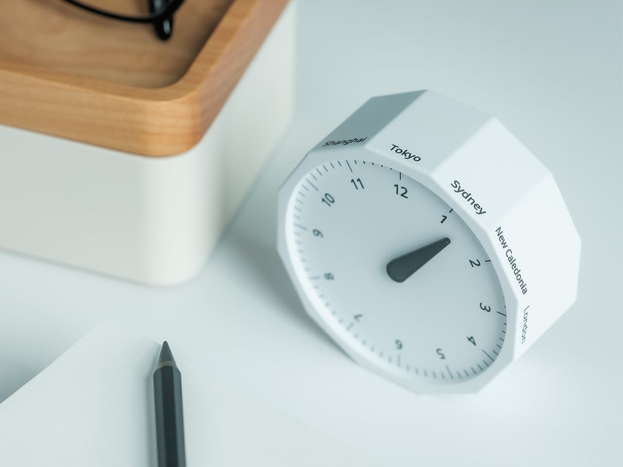
5. Rolling World Clock
Keeping track of time zones is one of the quieter friction points of nomadic life. The Rolling World Clock solves it most physically: you roll it. A 12-sided form with each face representing a major timezone city, a single hand reads the local time wherever it lands. London. Tokyo. New York. The gesture is intuitive, and the result is a genuinely useful desk object without trying to be more.
Available in black and white, this is the kind of object that earns its place through curiosity rather than scale. Guests pick it up. Colleagues ask about it. It turns a functional necessity into a small conversation. For the nomad who has lived across time zones and built relationships across continents, there is something quietly satisfying about having those cities represented not on a screen, but held in your hand.
The tactile rolling interaction makes checking international time a deliberate, physical gesture rather than a reflexive phone unlock
Covers 12 major timezone cities in a clean, minimalist form that works equally well as a functional desk piece or a shelf object
What we dislike
Limited to 12 preset cities, which may not include every timezone relevant to users with contacts in less commonly represented regions
The single analog hand offers general time orientation rather than precise minute-level accuracy, which may not suit users with tight cross-timezone scheduling needs
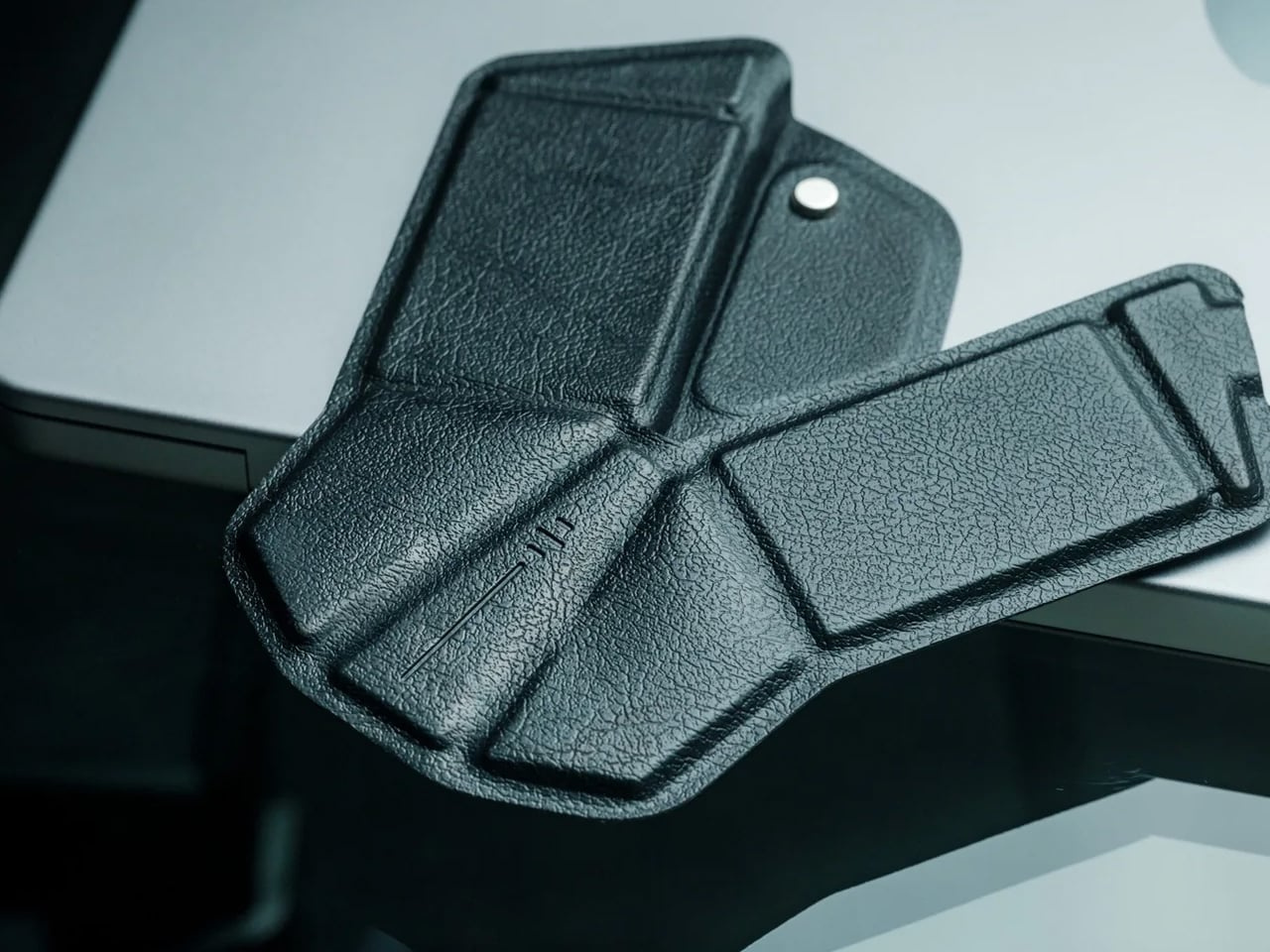
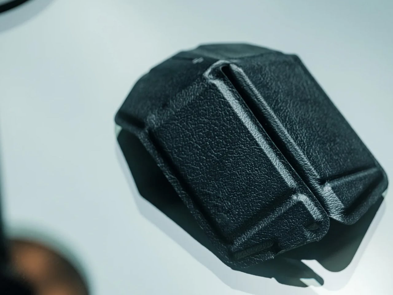
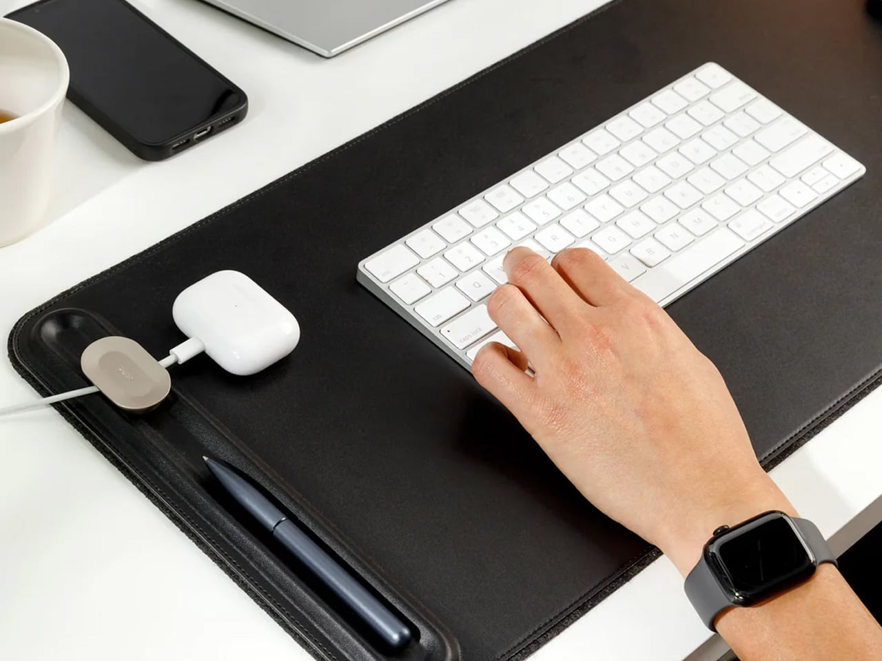
6. Orbitkey Desk Mat Slim
A desk mat either disappears into the background or it becomes the visual anchor of the entire setup. The Orbitkey Desk Mat Slim is built for the second outcome, designed with the restraint of the first. Made from premium vegan leather on top and 100% recycled PET felt underneath, it layers material integrity with practical function. The anti-slip backing holds the mat planted, while the magnetic cable holder keeps wires from drifting toward the edges, where they become a distraction.
Notes, receipts, and napkin sketches are the inevitable artifacts of nomadic work, and they tend to pile up without a clear home. The document hideaway is the detail that tips this mat from surface to organizer. The slim front pocket keeps loose papers horizontal, accessible, and out of sight. For someone accustomed to a shared café counter or a hotel tray table, this level of surface order feels less like a feature and more like a quiet exhale.
What we like
The document hideaway pocket reduces visible desk clutter without adding bulk, making it one of the more intelligent storage details found on any desk mat
Vegan leather and recycled PET felt construction deliver both a refined visual quality and a material responsibility that most desk accessories still lack
What we dislike
The slim format may feel too narrow for users with wide multi-monitor setups who need significant horizontal coverage across their full desk surface
The magnetic cable holder works best with a small number of cables and may become less effective in more heavily wired configurations
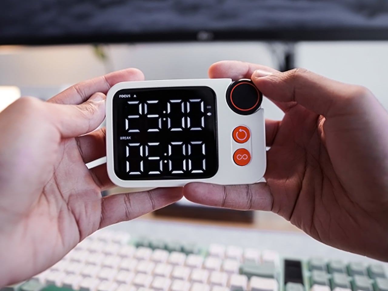
7. Flow Timer
The Pomodoro method has been around since the late 1980s, and most people who use it rely on a phone timer or a browser tab. Neither is ideal. The Flow Timer replaces that with something solid. Cast in metal, with dual customizable presets for focus and break intervals, it lives on the desk as a functional timer and an object of intention. The visual arc tells you where you are in the session without a notification or a screen unlock.
For nomads who have long been their own productivity managers, a physical timer brings a different quality of commitment than a screen-based one. The act of setting it is deliberate. The focus-to-break transition is automatic. Sitting in a permanent spot, it becomes a small anchor for the rhythm of the day. Available in three colorways, the Flow Timer is one of those rare accessories that improves both how you work and how the desk looks while you do it.
What we like
Automatic switching between focus and break intervals removes the friction of resetting a timer mid-session, keeping the workflow continuous and uninterrupted
Solid metal construction and three considered colorways make it an aesthetic desk object as much as a productivity tool
What we dislike
The absence of a digital display means reading the visual arc requires a brief adjustment period before the feedback becomes truly instinctive
As a dedicated single-function device, it competes for surface space against multi-purpose tools in more minimal or compact desk setups
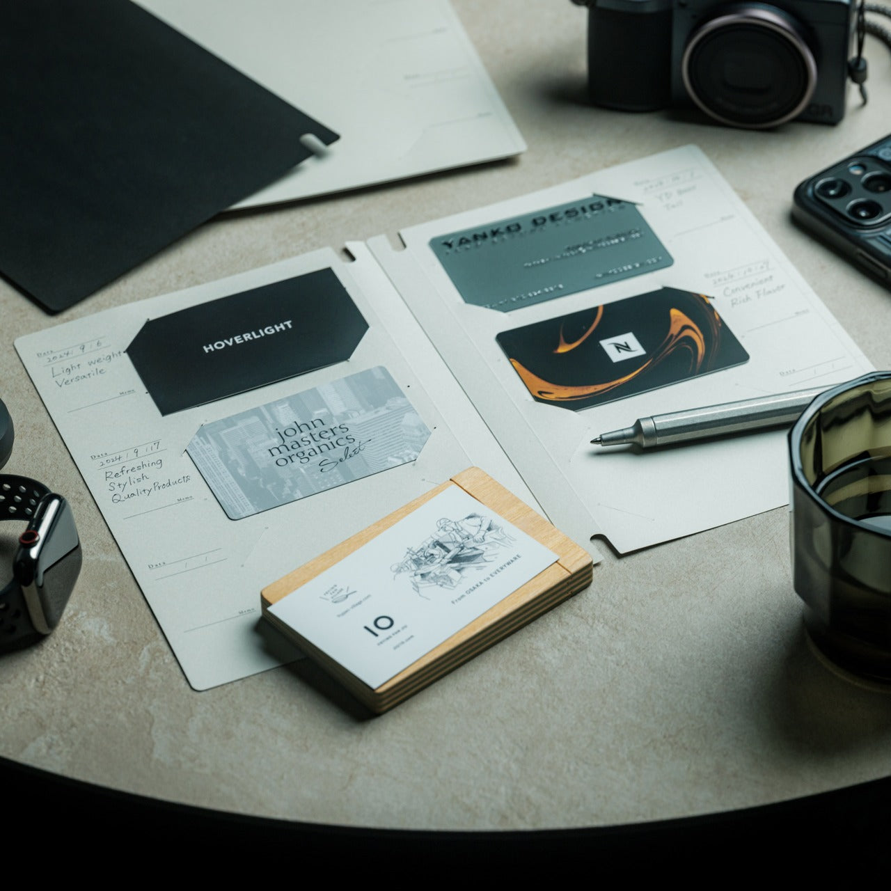
8. Memento Business Card Log
There is a specific quality to the business cards that collect at the bottom of a travel bag. Each one marks a moment, a conversation, a person worth remembering. The Memento Business Card Log was made for exactly this. Designed by Re+g, a Japanese brand with roots in thoughtful stationery craft, it holds up to 120 cards with a dedicated handwriting space beside each one for a characteristic, a date, or a detail that brings the memory back clearly.
The two-point slit system keeps cards secure without sleeves or adhesive, and the special binding allows pages to be easily reordered as professional relationships evolve. For a nomad building a network across cities and industries, this is the kind of object that earns its desk placement not through technology but through intention. It is a record of everywhere you have been and everyone who mattered enough to keep. That is rare, and the design knows it.
The two-point slit system and reorderable binding make the organization genuinely flexible, allowing the log to grow and shift alongside a professional network over time
Handwritten note spaces beside each card transform a simple storage product into a meaningful personal archive of the conversations that shaped a career on the road
What we dislike
A maximum of 120 cards may feel limiting for high-volume networkers who accumulate contacts rapidly across multiple cities, conferences, and industries
The analog format, while entirely intentional, offers no digital sync or search capability for users who need to cross-reference contacts across devices
These Gadgets Were Never Just for the Bag
There is a moment in every nomad’s life when the bag starts feeling less like freedom and more like a deadline. When the tools that carried you through airports and co-working spaces deserve something more settled. These eight objects were always portable by design, but built with the kind of intention that reads just as well on a permanent desk. Good design does not ask where it is. It just works.
The idea here is not to stop moving. It is to stop treating permanence as a downgrade. A folding mouse, a tactile timer, a rolling clock, a mat that holds your cables and your notes — taken together, they form a desk that feels chosen rather than assembled. The nomad who gives these a home is not giving anything up. They are just finally working somewhere worthy of the tools they already carry.
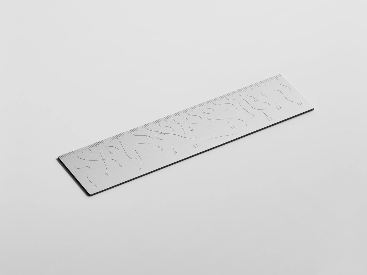
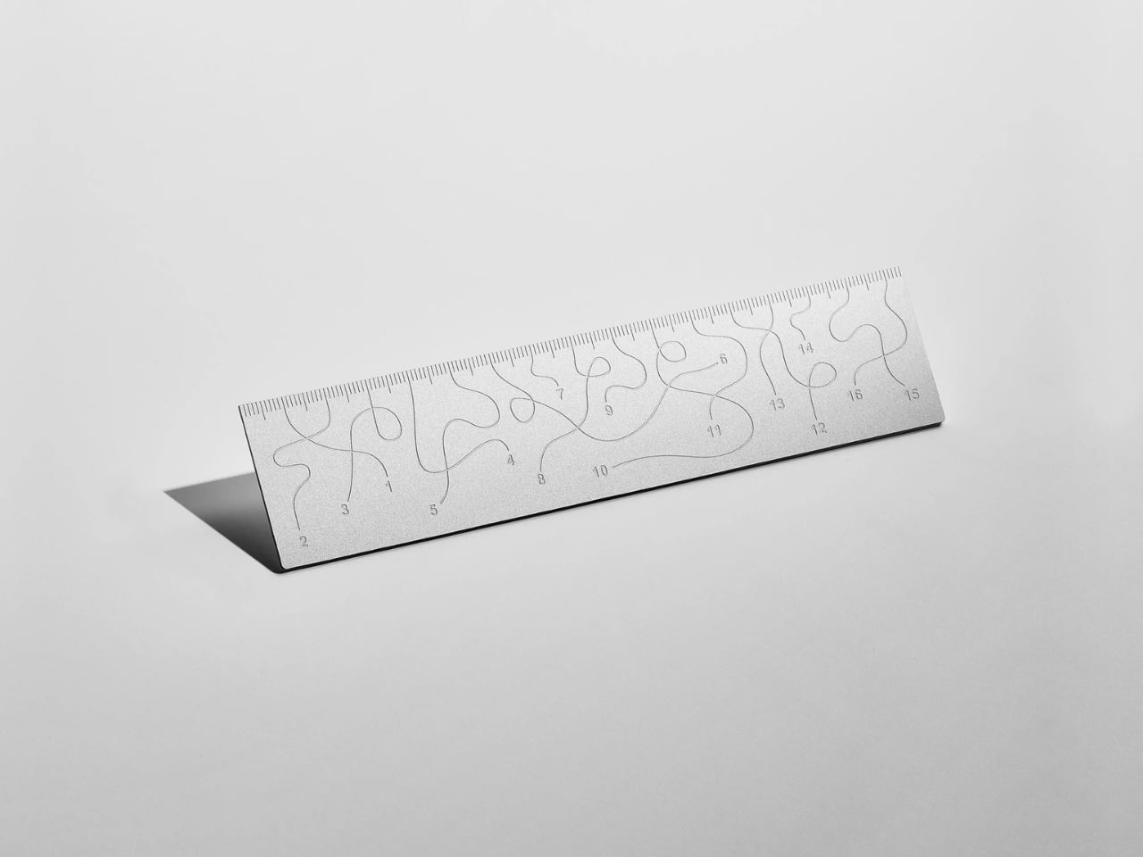
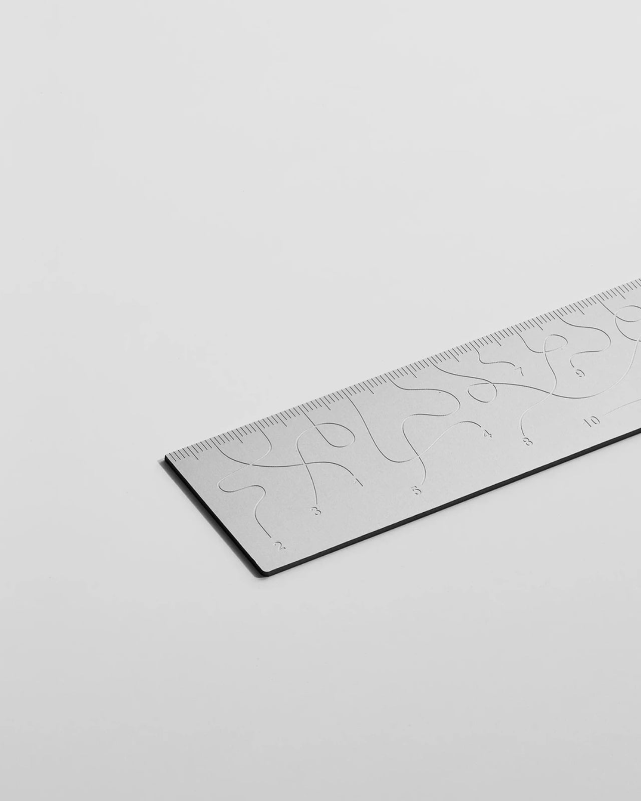
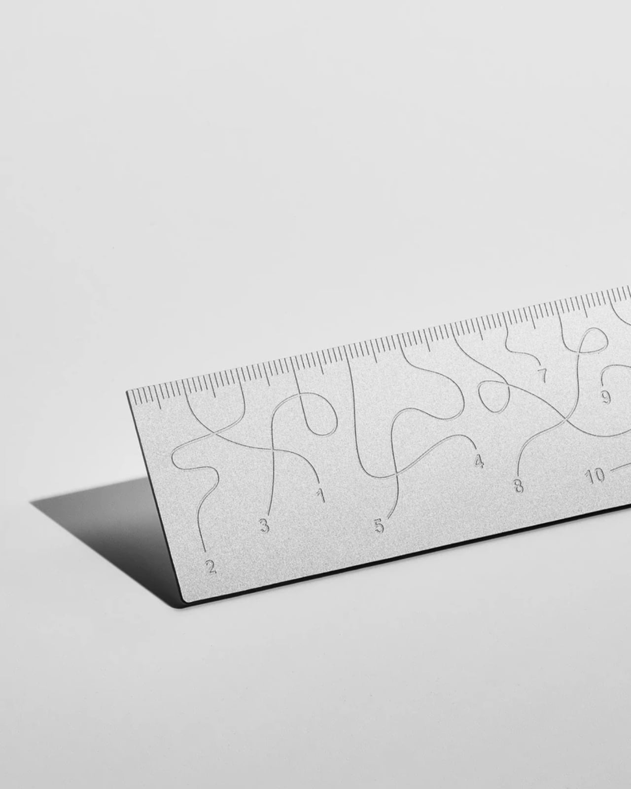
Pick up the WAY ruler and the first thing you notice is that it feels exactly right. It’s small, made from anodized aluminum, and has the kind of weight and finish that signals intention without announcing itself. It’s the sort of object that sits comfortably in a shirt pocket or on the edge of a desk and looks like it belongs in both places. Then you look closer at the markings, and something shifts.
The inscriptions on the WAY don’t run in a clean, predictable line the way ruler markings are supposed to. They wind. They curve and drift across the surface of the aluminum like a path traced through a landscape, referencing, quite literally, the idea of small winding roads and the wandering nature of travel and discovery. The numbers and measurements are there, engraved directly into the material with digital precision, but they’re arranged in a way that asks you to slow down and actually read them rather than glance and move on. It’s legible. Just not immediately.
The engraving itself is worth paying attention to. Kral chose to cut the inscriptions directly into the anodized aluminum rather than printing or applying them as a secondary layer. That decision gives the markings a permanence and a tactility that you don’t get with most production objects at this scale. You can feel the grooves if you run a finger across the surface. The graphic quality of the lettering is considered without being decorative for its own sake. It reads as design that knows exactly what it’s doing, which is what makes the playfulness land rather than feel arbitrary.
The object is small enough to be considered an accessory as much as a tool. Kral has always worked at a scale that pays attention to how things actually live in your hands and in your space, and the WAY is consistent with that. It doesn’t try to be a statement piece in the way that some design objects do, where the visual drama is the whole point. The WAY is quieter than that. The drama is embedded in the detail, in that moment when you realize the markings are doing something unexpected and you have to orient yourself before you can use it.
That slight disorientation is the concept, and it’s a sharp one. There’s a real tension running through modern product design right now, one where the drive to make something visually striking starts to work against the thing it was actually built to do. We’ve all used something that looked incredible but made us work harder than we needed to. Packaging that’s beautiful but impossible to open. Interfaces that prioritize visual elegance over intuitive use. Apps designed to delight that end up frustrating. The WAY ruler doesn’t rail against any of that. It just holds up a small, well-made mirror to it. It’s more of a wink than a manifesto.
The difference between a provocation and a critique matters here. Kral isn’t punishing you for picking up the WAY. The experience of using it is still pleasant. The aluminum feels considered, the engraving is precise, and the object as a whole is genuinely lovely. He’s not making something bad on purpose to prove a point. He’s making something that’s slightly impractical in a very deliberate, very elegant way, and letting you sit with that paradox.
And he followed through on it. The WAY isn’t a prototype or a one-off shown at a design fair and then retired to a shelf. Kral produced a batch and sells them directly through his studio’s website. That matters. It means the object gets to exist in the world the way all good design should, in someone’s hand, on someone’s desk, doing its quiet, considered, slightly inconvenient thing in real life.
At a time when so much product design either chases pure utility or drifts so far toward aesthetics that it forgets what it was originally supposed to do, the WAY ruler manages to be a little bit about both. It’s funny, it’s beautiful, and it makes you think. A ruler, of all things. Leave it to Tomas Kral.
Razer's Viper V4 Pro gaming mouse improves upon its predecessor, though it's still very expensive. Even so, it's a top-tier option for competitive players.
The Razer Viper V4 Pro
The Razer Viper V4 Pro is a refresh of its popular predecessor, and improves upon it with a variety of elevated features and functionalities.
Europol vient de coordonner un coup de filet massif contre le dark web. En dix jours, 23 pays ont fermé plus de 373 000 sites frauduleux qui proposaient des contenus pédocriminels.
Le plus ironique : l'opérateur n'a jamais livré la moindre donnée, il arnaquait ses propres clients. Et ces clients sont désormais dans le viseur de la police.
Une opération dans 23 pays
L'opération Alice a été lancée le 9 mars et a duré dix jours. Sous la direction des autorités allemandes et avec le soutien d'Europol, des policiers de 23 pays ont participé à ce coup de filet, de la France aux États-Unis en passant par la Suisse, l'Australie et le Royaume-Uni.
L'enquête avait démarré en 2021 autour d'une plateforme baptisée "Alice with Violence CP", qui proposait des contenus pédocriminels à la vente sur le dark web. Au total, 105 serveurs ont été saisis, tous hébergés en Allemagne, et l'opérateur a été identifié : un homme de 35 ans basé en Chine, visé par un mandat d'arrêt international.
L'arnaqueur arnaqué
Le détail qui rend cette affaire si particulière : le suspect n'a jamais livré les contenus qu'il vendait. Il gérait environ 90 000 sites sur le réseau Tor qui proposaient des "packs" de 17 à 215 euros, payables en Bitcoin. Les acheteurs recevaient en échange... rien du tout.
En cinq ans d'activité, il a encaissé 345 000 euros auprès de 10 000 clients qui pensaient acheter des contenus pédocriminels. Un escroc qui arnaque des criminels, en somme.
440 suspects identifiés
Sauf que ces clients, même s'ils n'ont rien reçu, ont quand même tenté d'acheter des contenus illégaux. Europol a donc remonté les paiements en cryptomonnaies et identifié 440 personnes à travers le monde.
Plus de 100 d'entre elles font l'objet d'enquêtes actives. En Suisse, cinq personnes ont été placées en détention. En Allemagne, 14 suspects sont visés par des procédures. La France a mobilisé l'Office de protection des mineurs pour sa part de l'enquête.
On a quand même un type qui a monté 373 000 faux sites depuis la Chine et qui a encaissé 345 000 euros en arnaquant des gens qui voulaient acheter les pires contenus imaginables. Et grâce à lui, la police a maintenant une liste de 440 noms.