Vue lecture

Il y a de nouveaux articles disponibles, cliquez pour rafraîchir la page.

Preciosa To Make Light Feel Like a Living Thing at Milan 2026

Light has always been design’s most underrated material. We talk endlessly about furniture, textiles, and surfaces, but light? It usually plays the supporting role, the thing that makes everything else look good. Preciosa Lighting is quietly changing that conversation, and their latest collection, Drifting Lights, might be the most convincing argument they’ve made yet.

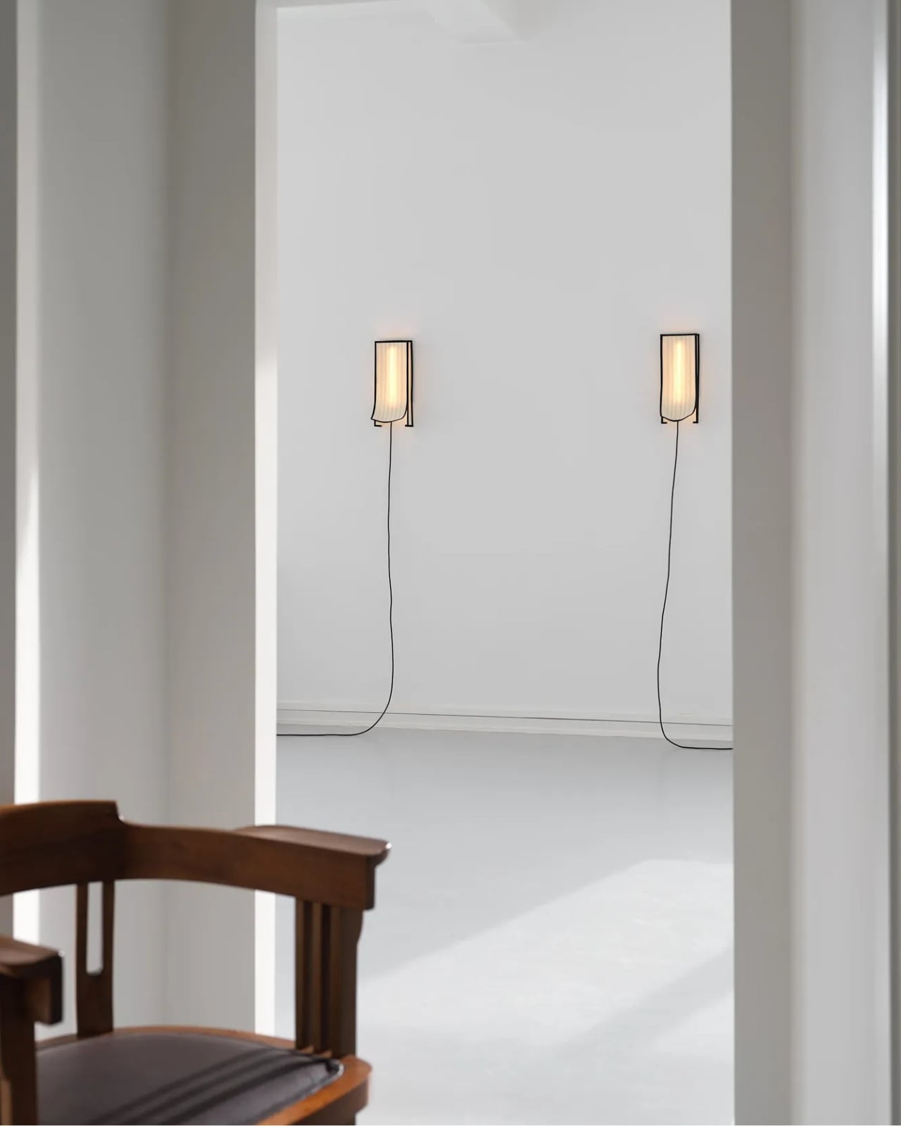
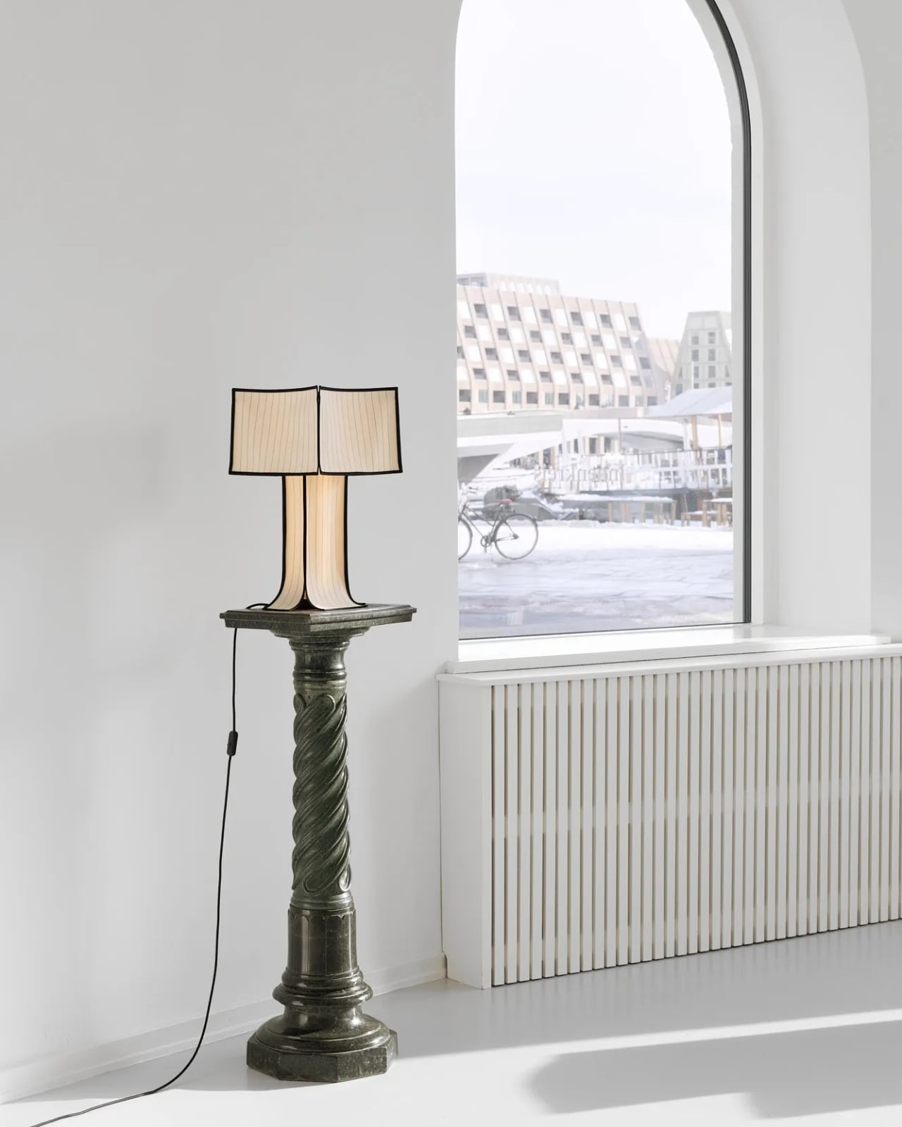
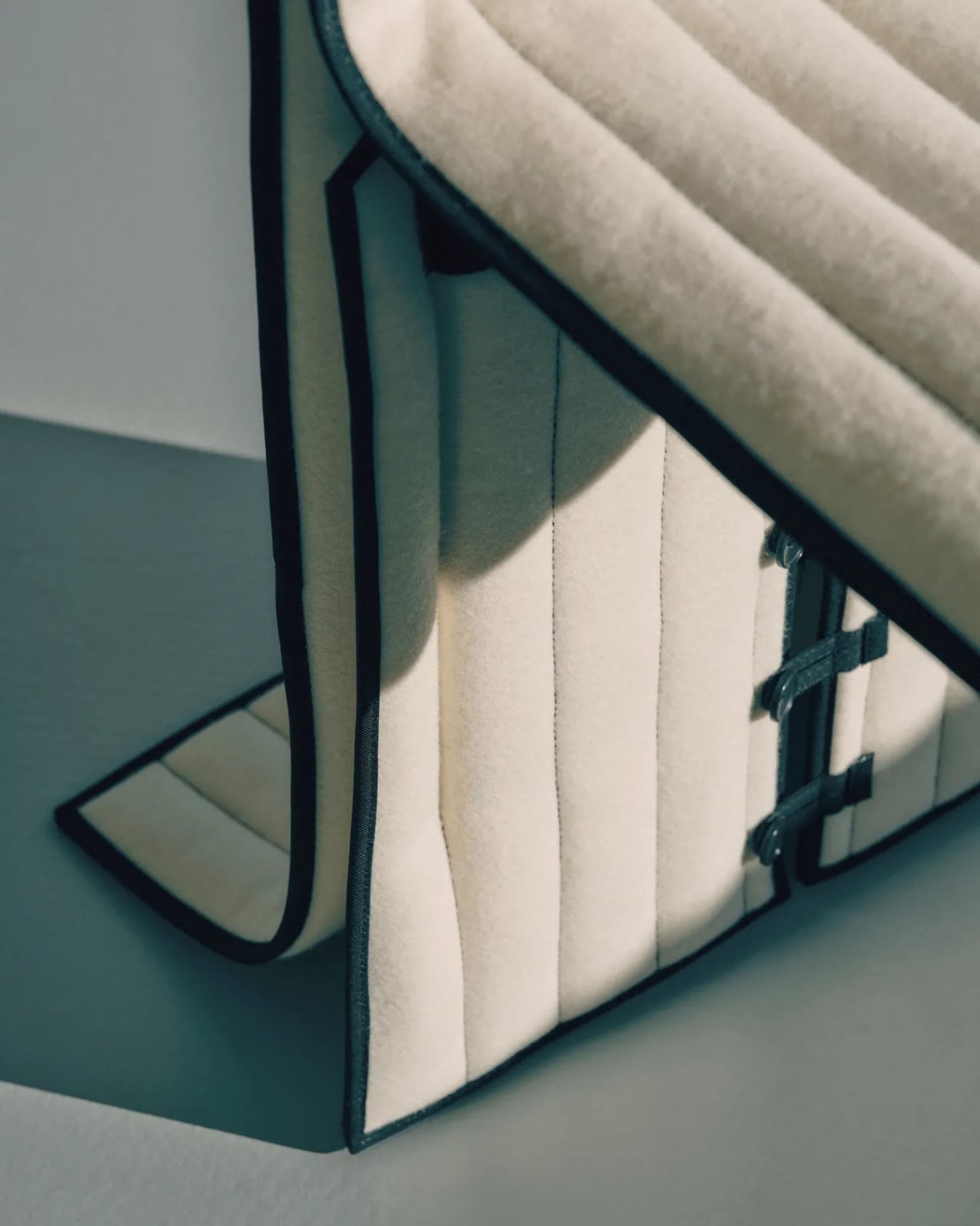
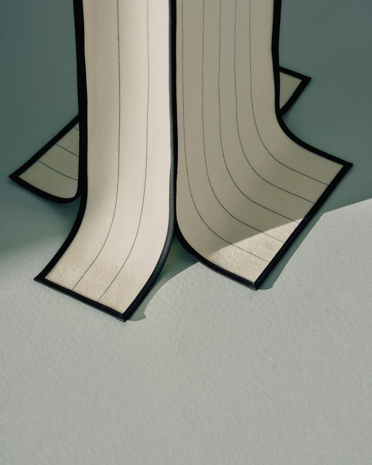
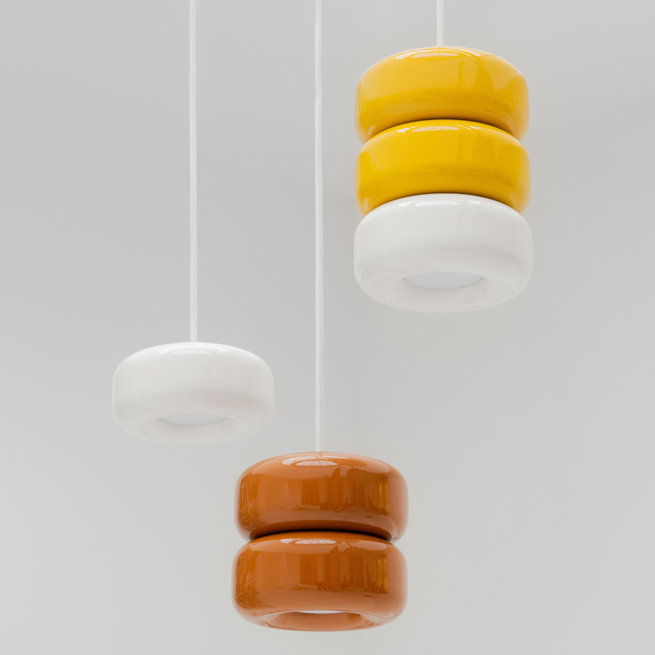
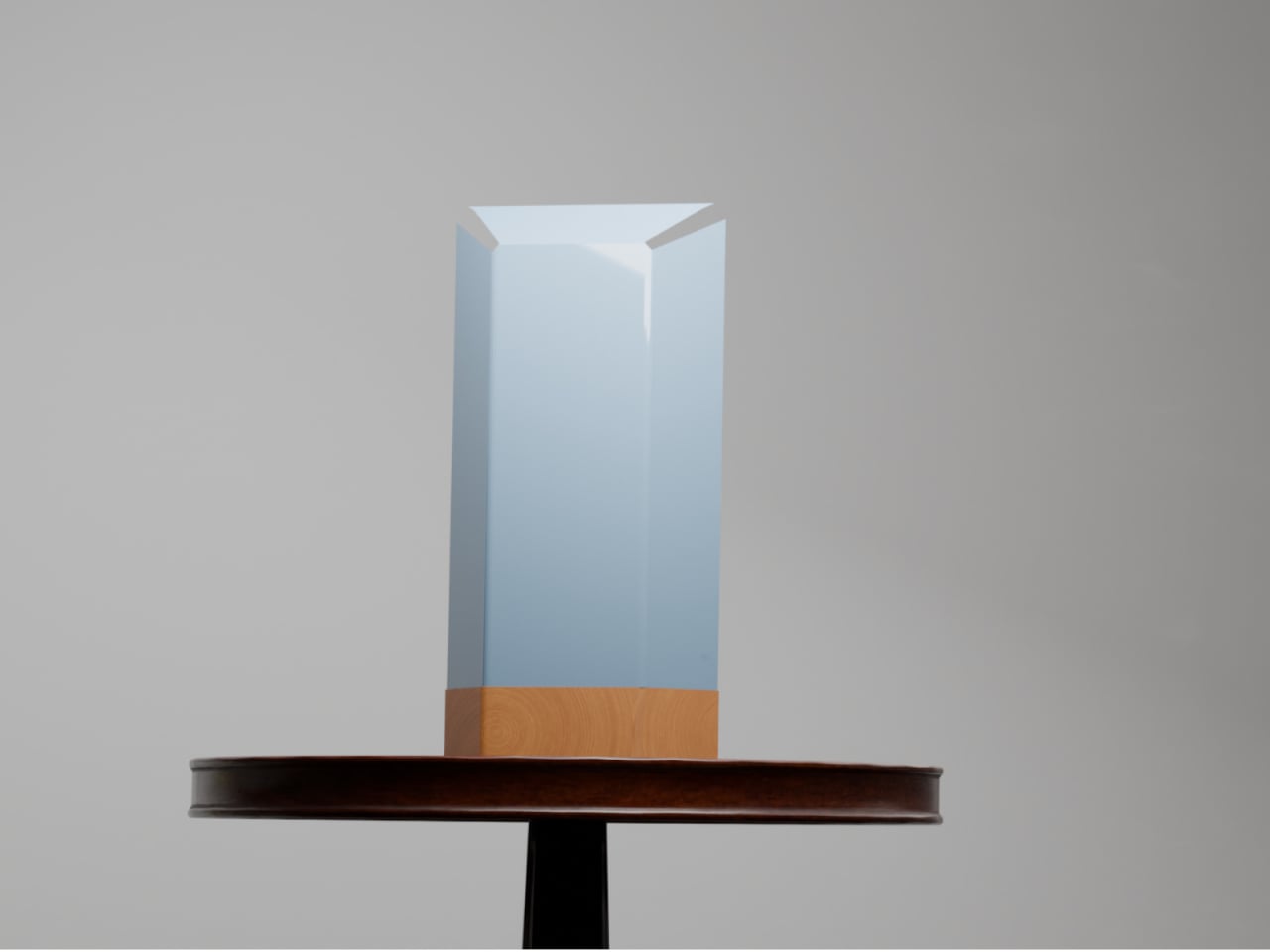
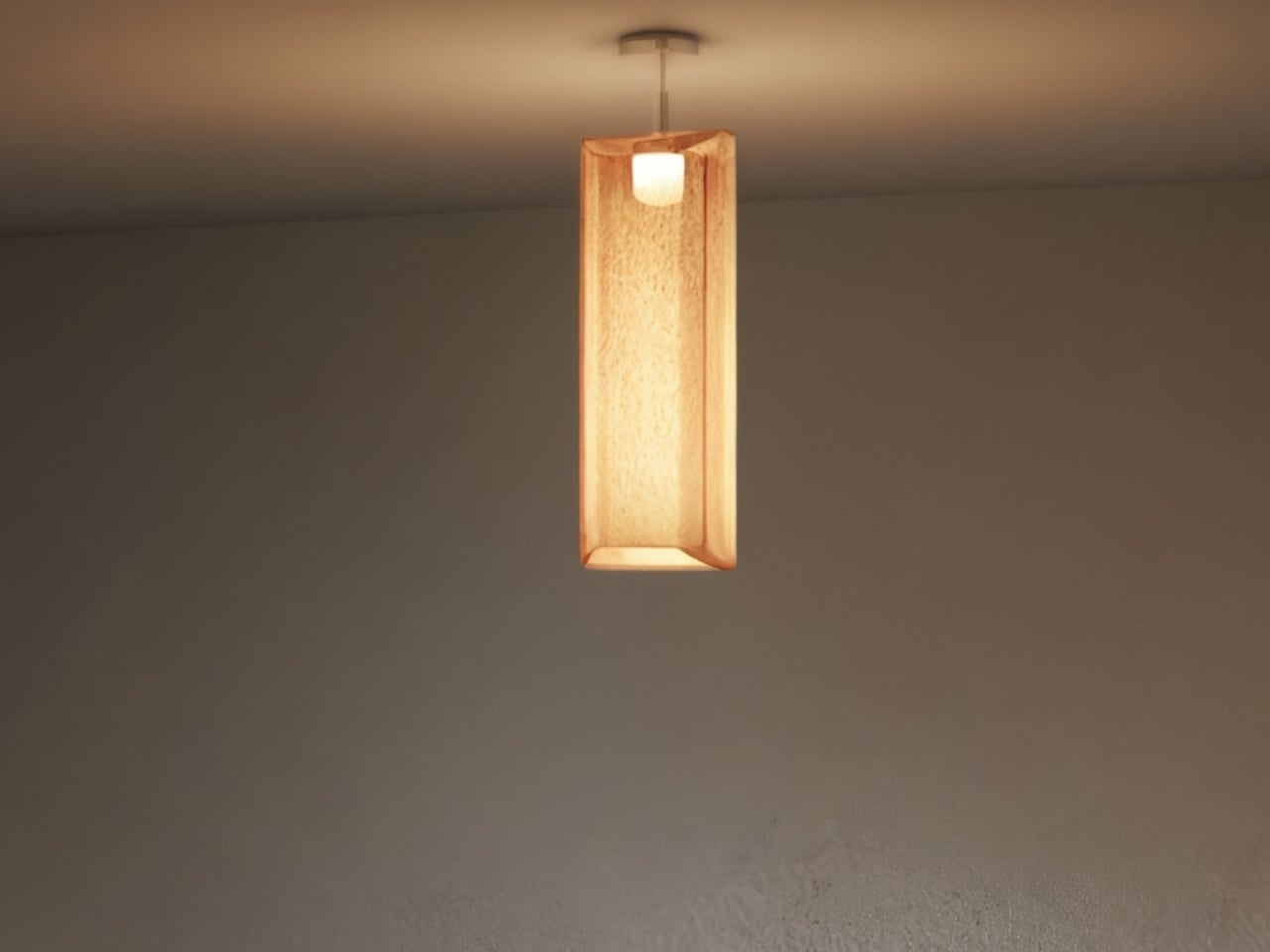
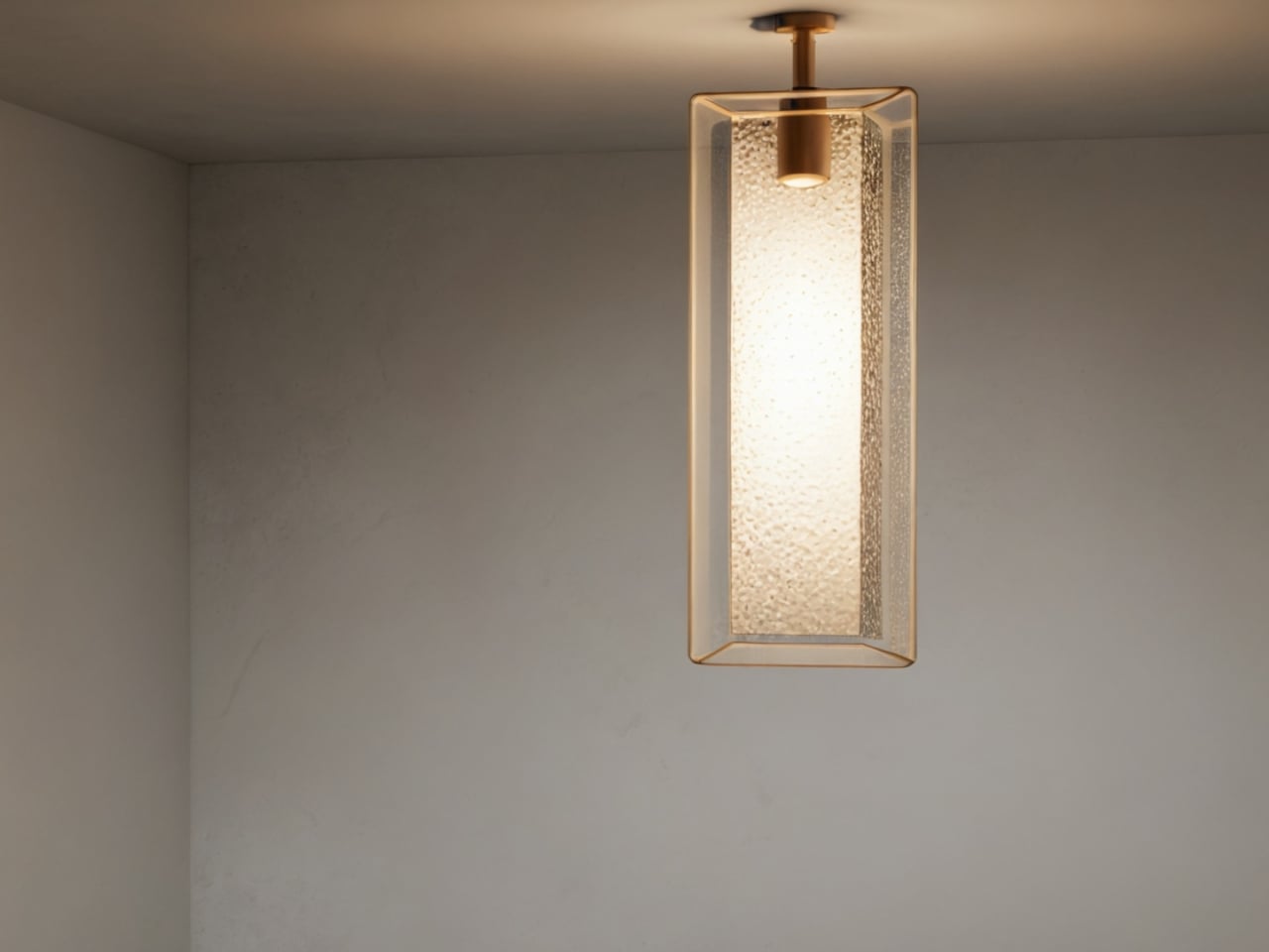
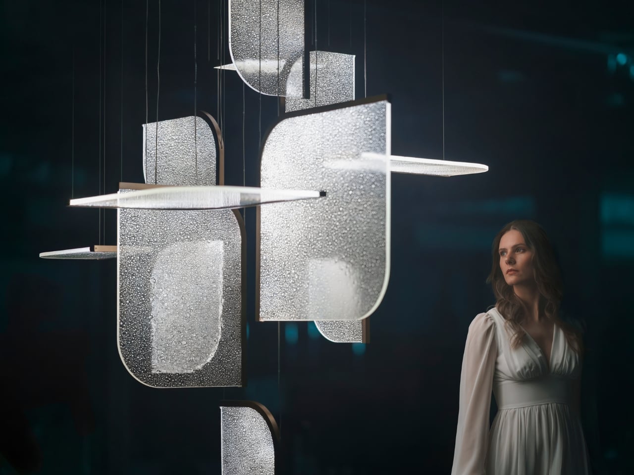
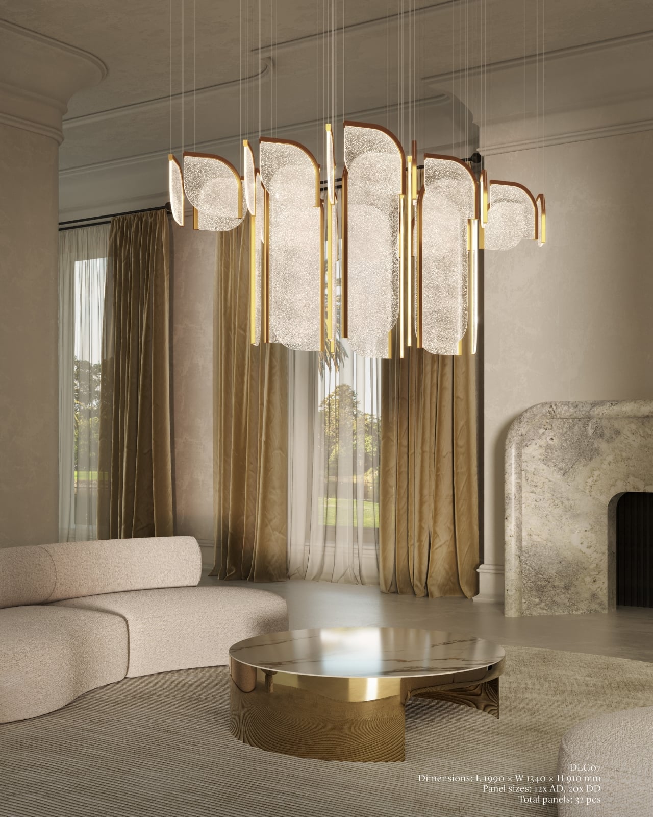
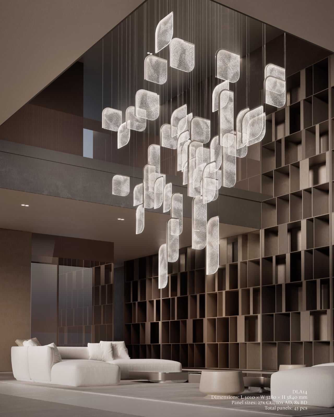
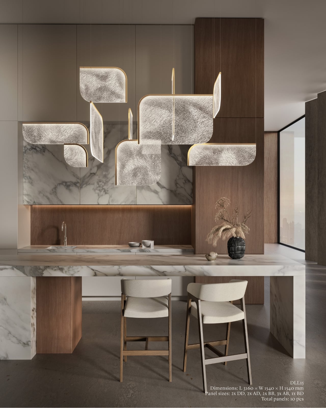
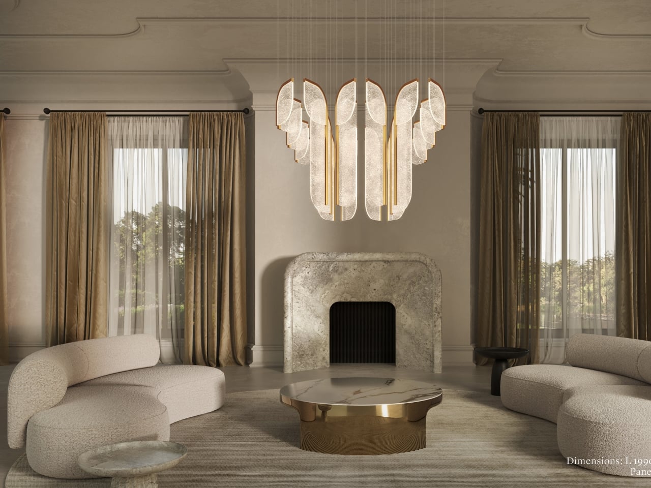
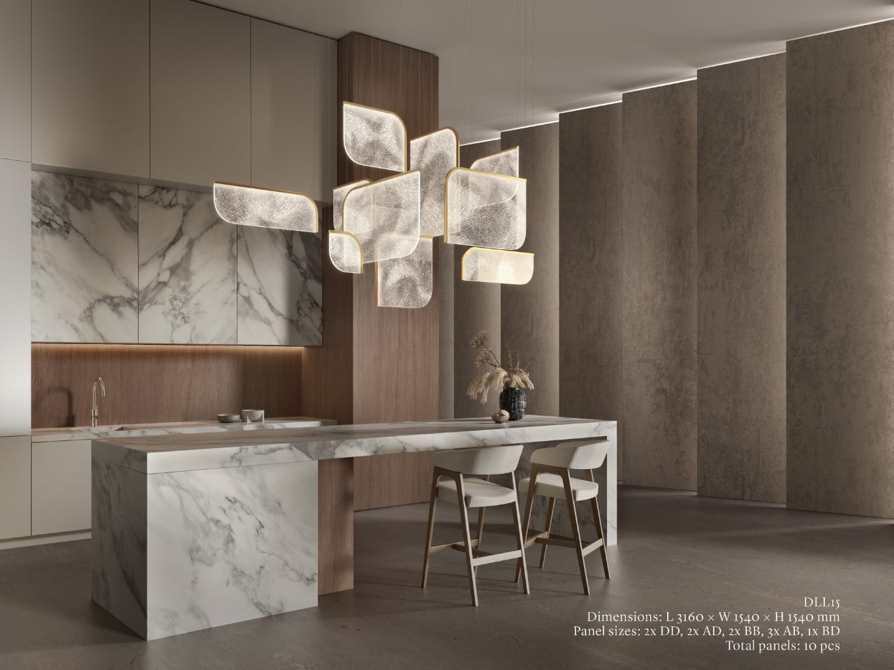
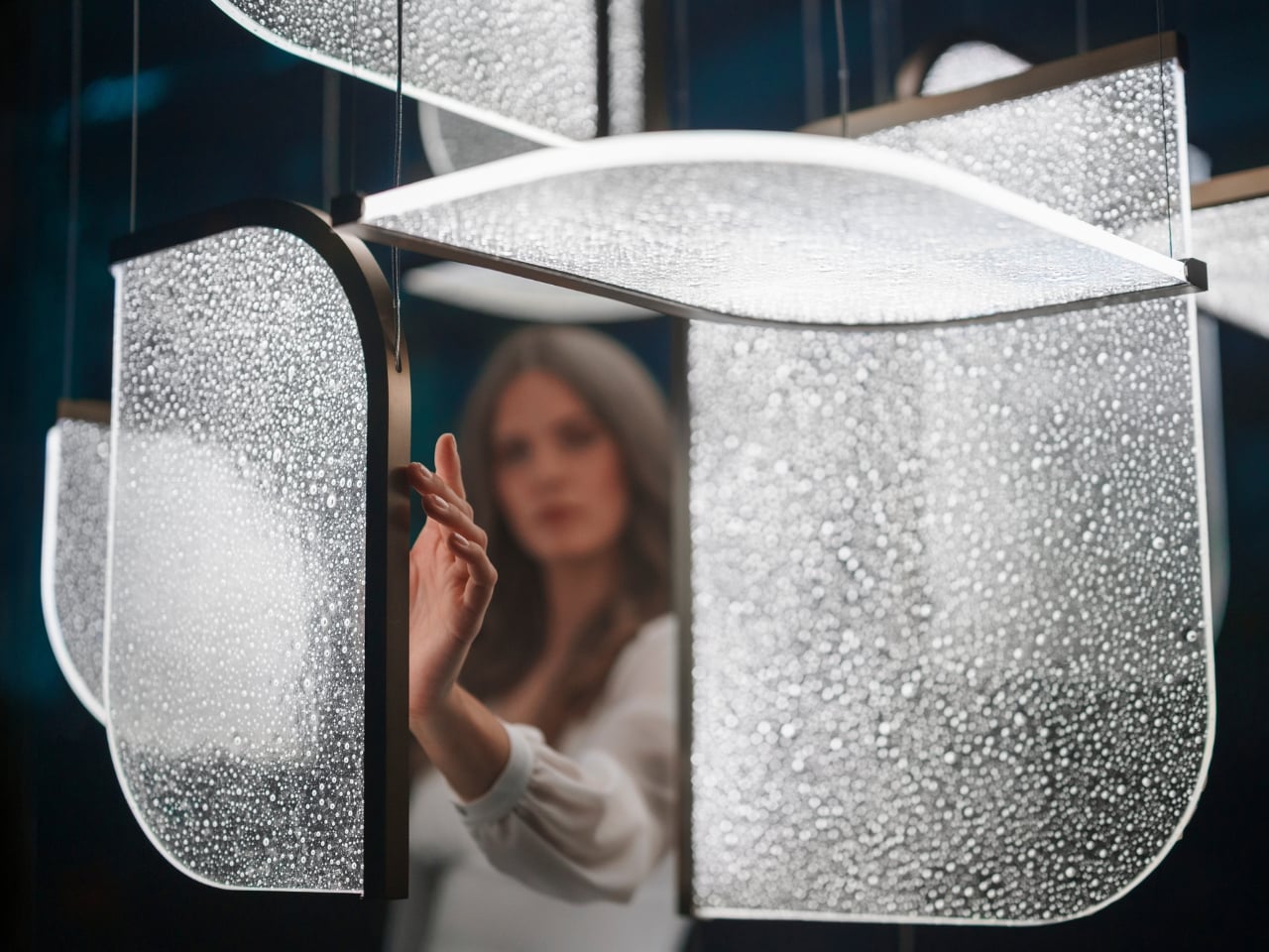
The Czech brand has been doing this long enough to know the difference between novelty and genuine craft. Their heritage is rooted in traditional glassmaking, but what they’ve built with Drifting Lights feels like a very deliberate step forward. Each piece is made up of oblong and square glass panels slotted into a stainless-steel frame that discreetly conceals an LED strip. Inside each panel, the glass has been infused with countless tiny air bubbles. When light passes through, it doesn’t just illuminate the glass. It gets lost in it, scattering through those bubbles in a way that looks less like electricity and more like light deciding where it wants to go.

Designer: Preciousa Lighting

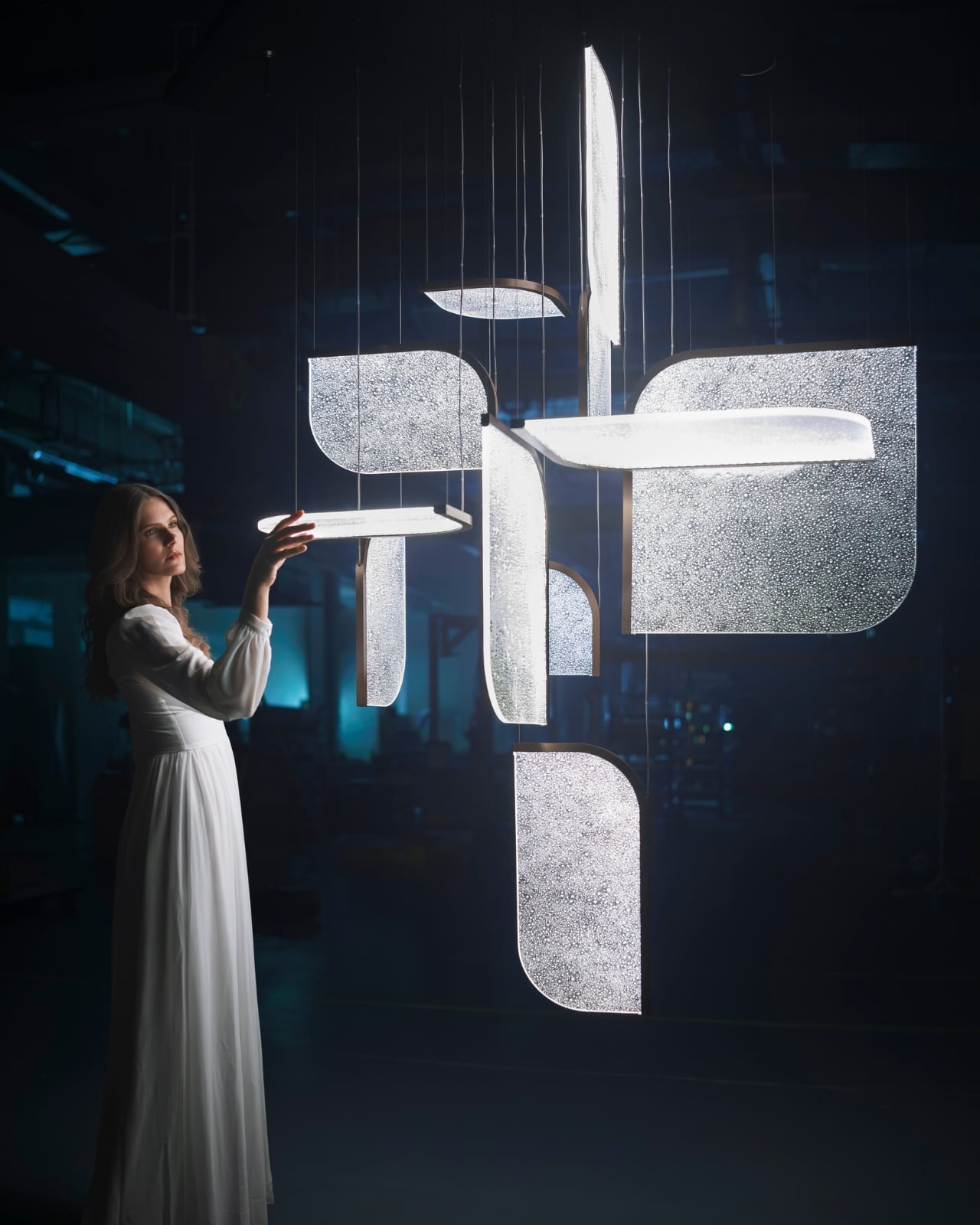
For Milan Design Week 2026, Preciosa is bringing the full Drifting Lights experience to the Tempesta Art Gallery in Brera, and the scale alone is worth paying attention to. The installation spans approximately 30 square metres and features 60 glass panels suspended vertically and horizontally, forming a structure measuring 8.7 by 3.2 by 3 metres. Set against a dark interior, the panels will be animated using 3D spatial mapping and RGBW technology, cycling through colour sequences from red to pink to green. Co-Creative Directors Michael Vasku and Andreas Klug put it plainly: the installation aims at “creating space to slow down, pause and wonder.”

I appreciate that framing, because Milan Design Week is genuinely relentless. Every brand is competing for the loudest moment, the most shareable installation, the boldest statement. There is a real temptation to optimise for the 15-second video clip rather than the actual experience of standing in a room. Preciosa is betting on the opposite, and I think that’s the smarter play. The colour sequence from red to pink to green reads like an emotional arc rather than a tech demo, referencing love, passion, and inner peace. Whether or not you buy the symbolism, you can’t argue with the atmosphere it creates.

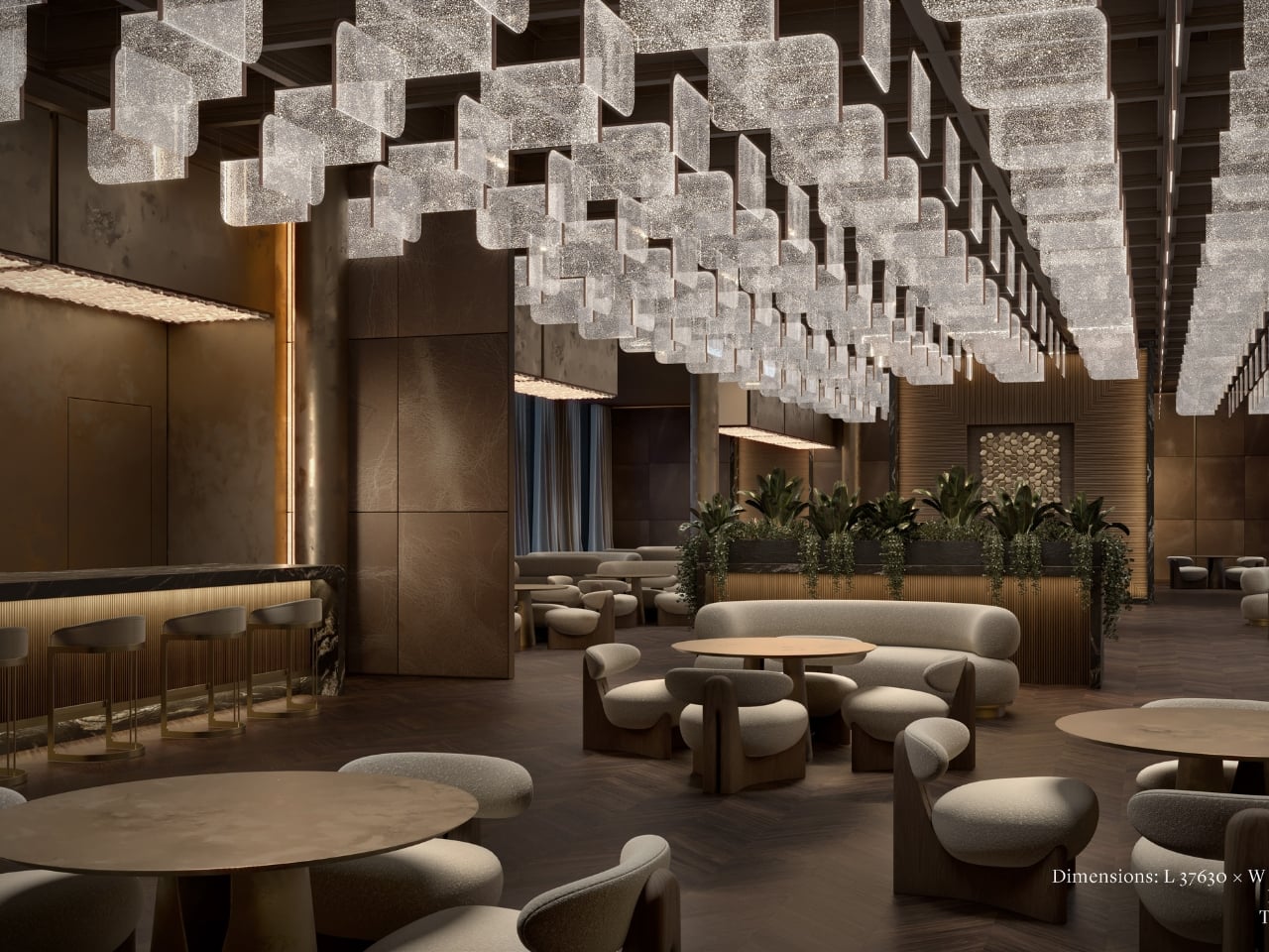
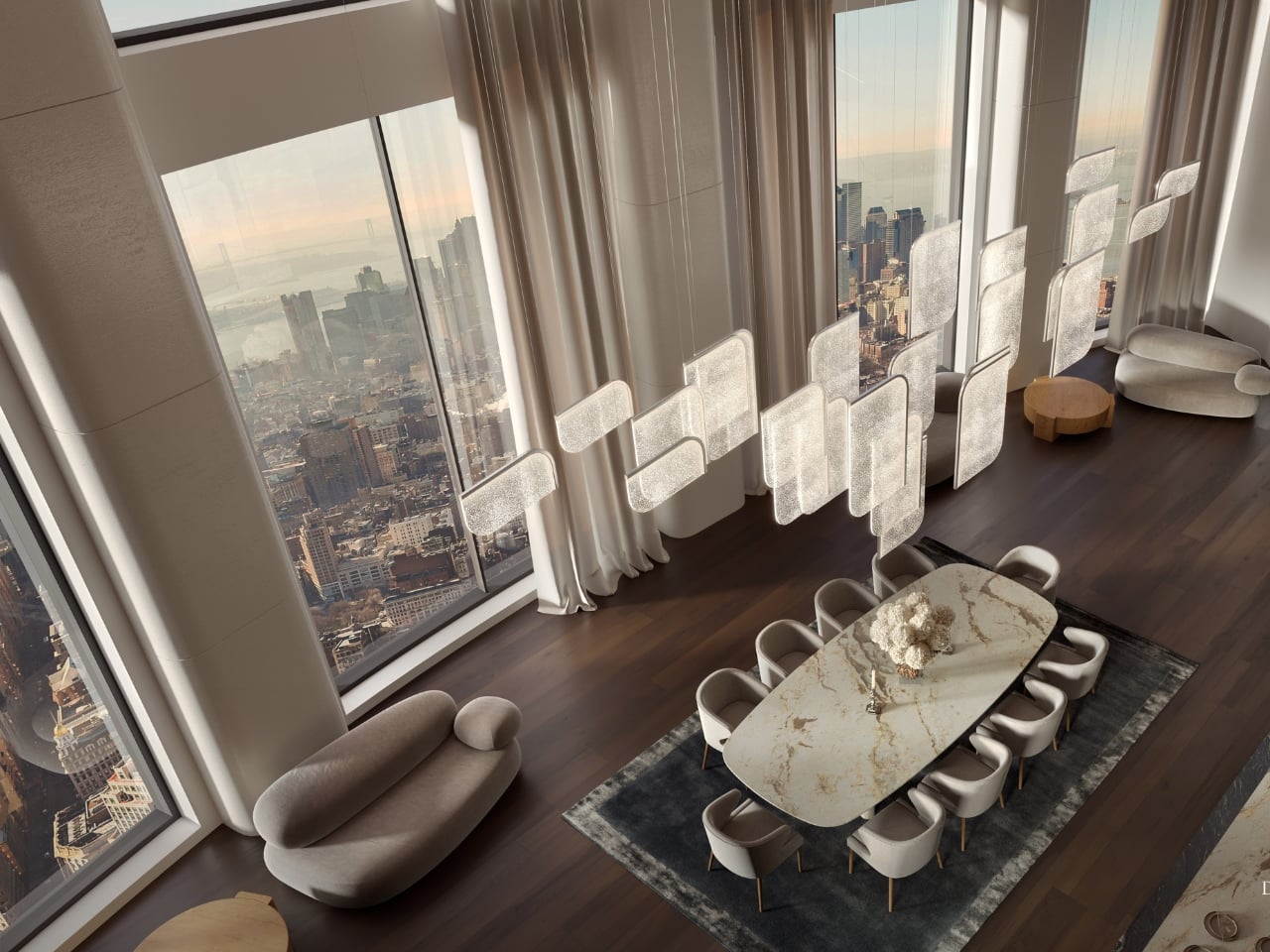
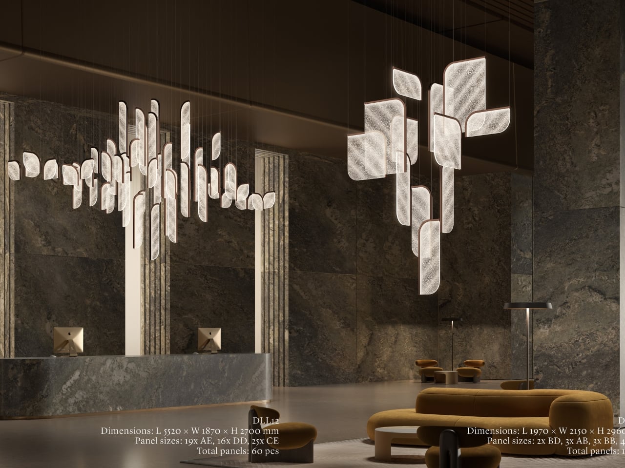
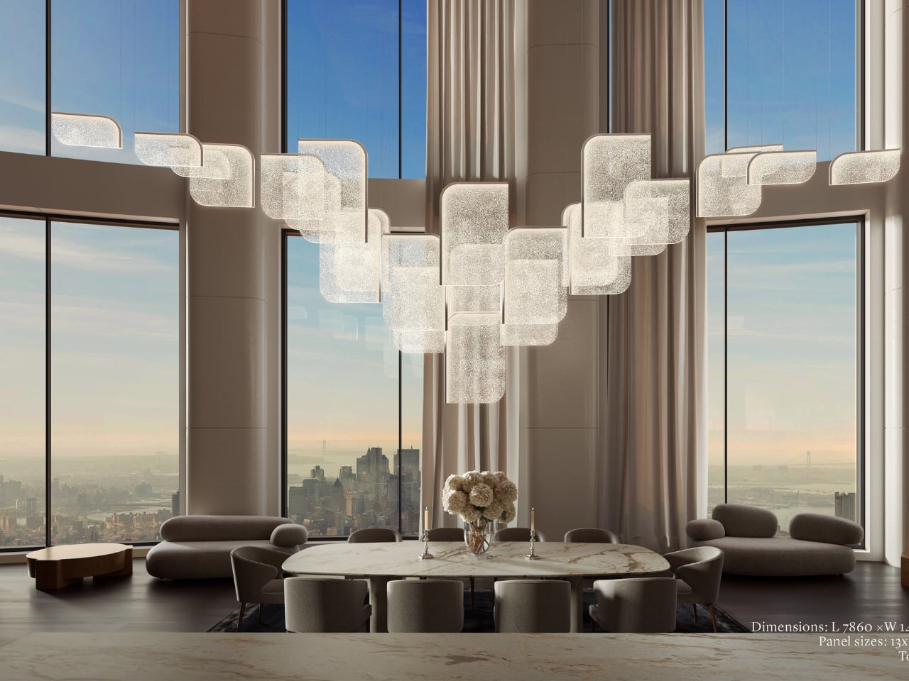
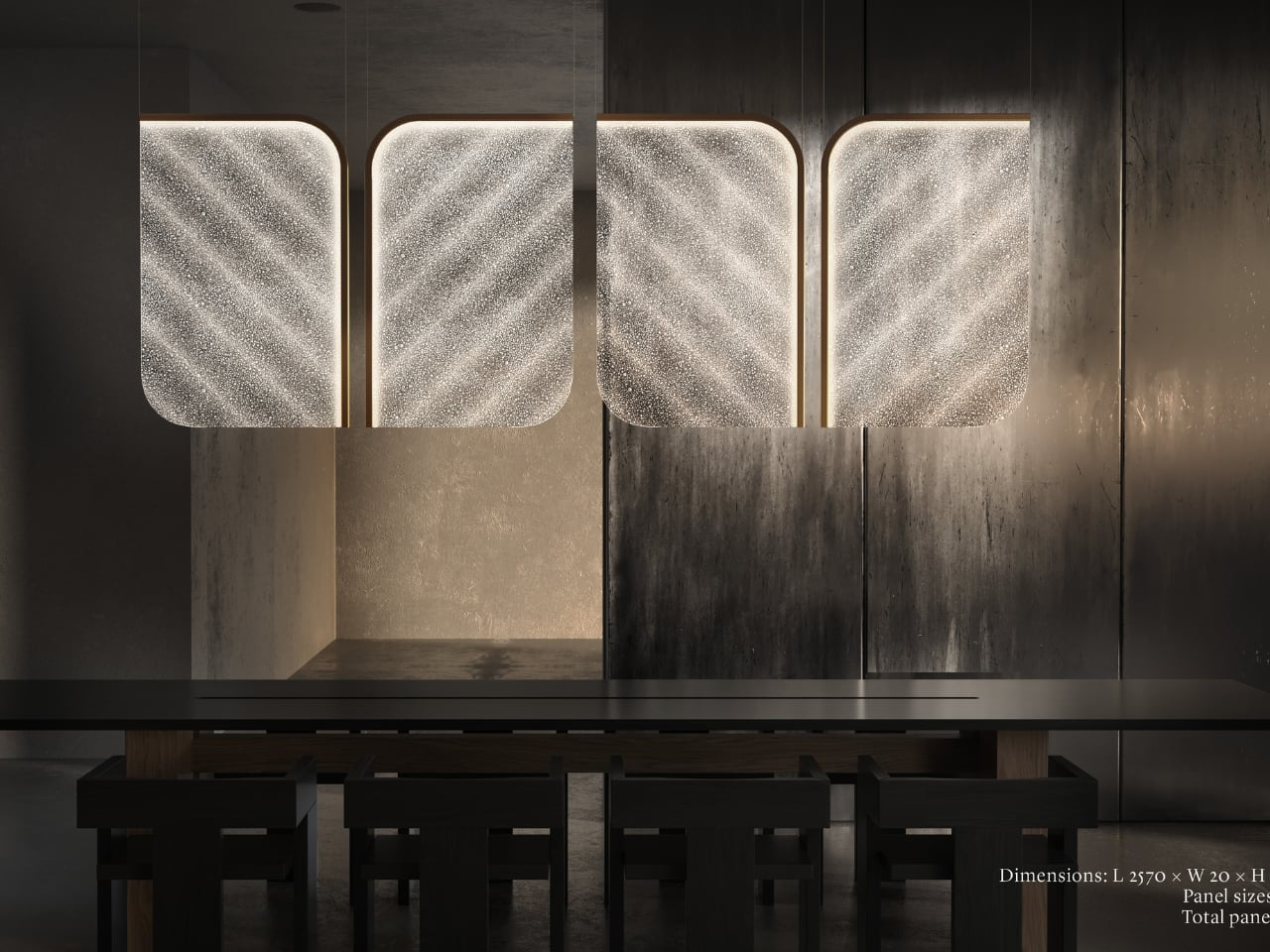
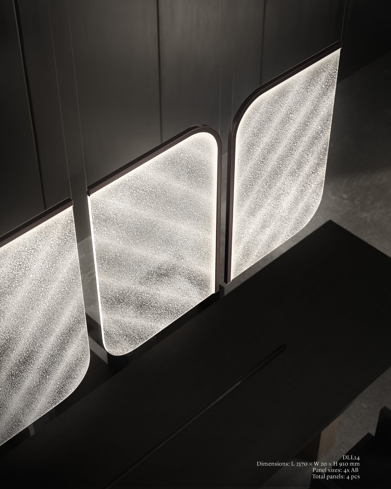
A design object earns its place when it works just as well outside a gallery as inside one, and Drifting Lights has clearly been thought through on that level. The panels come in ten sizes, with different metal frame finishes and the option to orient them vertically or horizontally. The same collection can fill a grand hotel lobby or anchor a living room without losing its character. For bespoke projects, Preciosa can apply a painting technique that introduces pigment bubbles into the glass, giving each panel a layer of quiet individuality. The bubbled glass can also be enhanced with their Fused Veil pattern, which shifts the direction of light and adds even more visual complexity.

Under static illumination, Drifting Lights is calm and composed. Switch to dynamic mode and the panels come alive, with light moving from one to the next like ink dispersing through water. The gradients bloom, soften, and recombine. It’s the kind of effect that makes you stay in a room longer than you planned, which is, ultimately, what great lighting is supposed to do.

Preciosa has had a strong run at Fuorisalone in recent years, with recognised installations at Zona Tortona and Euroluce. The move to Tempesta on Foro Buonaparte suits the work well: a contemporary art gallery setting that lets the installation breathe without competing with showroom furniture. It’s a confident choice for a collection that clearly doesn’t need much help making a room feel different. If you’re heading to Milan, the installation runs April 20 to 26 at the Tempesta Art Gallery on Foro Buonaparte, and this one is worth the detour.

The post Preciosa To Make Light Feel Like a Living Thing at Milan 2026 first appeared on Yanko Design.

Anker’s $70 Power Strip Clamps to Your Desk, Keeps Cables Off Floors

Desks have gotten more crowded. Between the laptop, the monitor, the phone, and whatever Bluetooth peripherals have accumulated over the past few years, keeping everything charged without making a mess has become its own challenge. Power strips have always been the go-to solution, but most still end up on the floor or behind furniture, at the end of a cable that creates the very clutter it was supposed to fix.

Anker’s Nano Power Strip (10-in-1, 70W, Clamp) approaches that problem from a different angle, quite literally. Instead of sitting on a surface or hiding under a desk, it clamps onto the desk edge, putting 10 ports right where they’re actually useful. First unveiled at CES 2026 and now available in the US for $69.99, it aims to reduce the mess that most power strips quietly make worse.

Designer: Anker

The clamp structure sits on either side of the desk edge, with ports distributed across its upper and lower sections. Six AC outlets handle the larger plugs, while two USB-A and two USB-C ports take care of smaller devices. Splitting the ports between two zones keeps things from crowding on one side, a small but practical detail that makes the strip feel properly considered rather than just generously stocked.

The USB-C charging capability is where the performance stands out. A single USB-C port can deliver up to 70W, enough to run a MacBook or most other laptops without needing a separate wall adapter. That output relies on GaN technology, which keeps the strip slim at just 0.75 inches thick despite the power output, and avoids the extra heat and bulk that older charging components tend to generate.

Installing it takes seconds. The adjustable clamp fits desk edges between 0.6 and 1.8 inches thick, covering most standard desks, and locks in firmly enough for one-hand use. That might sound like a minor detail, but plugging in a cable while the strip shifts around is exactly the kind of daily irritation that compounds. A stable mount means you’re not bracing the strip with your other hand every single time.

Anker also built in 1,500J of surge protection, along with a smart overload mechanism that includes a reset button. When it trips, the button pops out to cut power instantly. Press it again, and it’s back to normal. It’s a simple failsafe, but a useful one on a strip mounted at desk height, where a sudden power surge or overloaded circuit could easily go unnoticed until something stops working.

Anker markets it for gaming and office setups alike, and it’s easy to see why. Gaming desks accumulate powered accessories faster than most, from peripherals to controllers to headset chargers. The dual-zone layout helps spread those cables rather than pile them in one corner, and the 0.75-inch profile doesn’t take up surface space or interfere with the kind of clean, organized desk that people actually put effort into building.

Cable clutter isn’t going anywhere, but it can at least be contained. The Nano Power Strip doesn’t reinvent the power strip so much as it rethinks where one should live. At $69.99, it’s a reasonable ask for 10 ports, 70W of GaN-powered fast charging, and a desk-mounted solution that keeps the tangle off the floor and closer to where it actually gets used.

The post Anker’s $70 Power Strip Clamps to Your Desk, Keeps Cables Off Floors first appeared on Yanko Design.

Forget Upholstery: Lærke Ryom Tailors Furniture Instead

Most upholstered furniture is essentially furniture under stress. Fabric gets stretched, stapled, pulled taut, and forced into submission over rigid frames. It is, fundamentally, a question of control. Danish designer Lærke Ryom looked at that process and decided to do the opposite. Her debut solo exhibition, Raiments, now open at Innenkreis gallery in central Copenhagen, is built entirely around that single act of refusal.

The collection includes a daybed, a chair, a bench, table lamps, a floor lamp, and wall lamps, all presented in soothing cream and chocolate-brown hues. The palette is calm and considered, which makes sense. These are pieces that ask you to slow down and look closely, because the detail is where the story actually lives.

Designer: Laerke Ryom

The daybed is probably the clearest expression of the concept. Long, low, and dressed in Kvadrat wool with visible quilting stitches running across its surface, it reads more like a made bed than a piece of showroom furniture. The fabric is not pulled over the form but rather allowed to settle onto it, the way a well-cut linen drapes over a body. The powder-coated steel frame beneath does its structural job quietly, without announcing itself.

The bench follows a similar logic. Compact and precise, it carries the same quilted wool surface and the same twill weave edge banding that appears across the collection. That edge band is a detail worth pausing on. Ryom chose it specifically because twill weave is a technique rooted in clothing and home textiles rather than furniture. “It places the upholstery pieces somewhere in between,” she has said, “adding to the feeling of a tailored piece rather than upholstery.” It is a small choice with a large effect on how the finished object feels.

The chair, built on an aluminium frame rather than steel, is the lightest piece structurally, and it shows. It sits with a kind of ease that heavier upholstered chairs rarely manage. The wool covers it without gripping it, and the stitching adds just enough surface interest to reward a second look without demanding one.

The lighting pieces are where the tailoring metaphor gets genuinely interesting. The floor lamp and table lamps, both on powder-coated steel bases, incorporate fabric shades that are constructed the same way as the seating pieces, draped and stitched rather than stretched and glued. The wall lamps, built on stainless steel bases, carry the same approach. Seeing the textile treatment applied to lighting as well as furniture makes the collection feel like a genuine system of thinking rather than a one-off experiment. Ryom is not just applying a technique to a single object type. She is testing a philosophy across an entire interior.

Underlying all of it is a material choice that matters. The Kvadrat wool she selected deliberately lacks visible weaving, which gives the stitching room to become the primary surface detail. The quilting is not decorative in a fussy sense. It is structural and honest, doing exactly what it appears to do, which is hold the fabric in place without adhesives or staples. The result is upholstery that can be disassembled, repaired, and eventually recycled. The clothes metaphor is not just aesthetic. It is practical in the most direct way possible.

Ryom, born in 1995 and working out of The Factory for Art and Design in Copenhagen’s Amager district, has been exploring alternative upholstery techniques for several years. Raiments feels like the point where that exploration becomes a fully formed position. The pieces are not minimal for the sake of it. They are restrained because restraint is what the concept requires. Every choice, from the aluminium chair frame to the stainless steel wall lamp bases to the twill edge banding, is in service of the same idea: that furniture should be dressed, not wrestled.

Whether or not that idea changes how people think about upholstery at large is probably too early to say. But Ryom has made a collection that is hard to look at and then go back to thinking about furniture the old way. That, for a debut solo show, is more than enough. Raiments is on show at Innenkreis, Herluf Trolles Gade 28, Copenhagen, through 23 May.

The post Forget Upholstery: Lærke Ryom Tailors Furniture Instead first appeared on Yanko Design.

These Ceramic Lamps Look Like 90s Caramel Candy and Stack Any Way

The interiors most people aspire to these days tend to share a common trait: they’re clean, restrained, and almost aggressively neutral. Scandinavian minimalism, Japandi aesthetics, and muted palettes have dominated home design for years, and while there’s nothing wrong with a well-curated beige room, a lot of modern spaces have started to feel emotionally flat, like showrooms rather than places where people actually live.

That’s where the Caramel collection comes in. Designed by Moscow-based product designer Maxim Tatarintsev in collaboration with Russian brand Svoy Design, this new series of ceramic lighting and furniture takes a very different approach to interior objects. Rather than adding another understated piece to a polished shelf, it reaches back to a simpler, sweeter time, asking whether a lamp or a side table can carry something as intangible as joy.

Designer: Maxim Tatarintsev

Tatarintsev’s inspiration came from a period of deep personal reflection. Amid what he describes as the noise of contemporary life, he looked inward and found his answer in childhood, specifically in the candy that practically every kid growing up in the 90s and early 2000s would recognize. That small, glossy, jewel-toned caramel sweet became both his muse and his design vocabulary, shaping everything from the forms to the color palette.

The collection spans pendant lights, ceiling fixtures, and wall-mounted lamps, all crafted from semi-porcelain, as well as a low-profile side table made from a proprietary composite material. What stands out is the modular approach: each ceramic unit can be combined and reconfigured, letting you stack or cluster them into different lighting arrangements depending on the mood or corner of the room you’re working with.

Think of it like assembling your own arrangement from a jar of sweets. One configuration might call for a single pendant above a kitchen island; another might cluster a few units along the ceiling of a reading nook. The point isn’t to follow a prescribed layout but to put that creative decision in the hands of the person actually living in the space, not just the designer who furnished it.

The craftsmanship behind the lighting is traditional and deliberate. Each piece starts as a slip-cast semi-porcelain form, drying for several days before being fired at 1,100°C inside a muffle furnace. A coat of glaze and paint follows, giving the finished modules their signature smooth, candy-like sheen. It’s a fairly labor-intensive process for what might look like a simple geometric shape, but that’s precisely what gives each piece its quiet depth.

The side table takes a different manufacturing route altogether. Made from a proprietary composite rather than ceramic, it’s significantly more durable and comes in two versions, one for indoor use and one for covered outdoor settings. At first glance, it reads as a low, rounded ottoman, and people will probably be unable to resist using it as a delicious seat instead.

None of that is accidental. Tatarintsev’s stated goal wasn’t to produce pretty objects but to create what he calls “emotional anchors,” pieces capable of sparking a genuine reaction in whoever encounters them. A set of lamps you can rearrange on a whim, a table that moonlights as a seat, and a color palette borrowed from childhood treats make for a collection that gives any room a personality it actually earned.

The post These Ceramic Lamps Look Like 90s Caramel Candy and Stack Any Way first appeared on Yanko Design.

Buddy’s Wind-Up Mood Lamp Is the Anti-App We All Need

Think about the last time you had to download an app just to turn on a light. Or pair a Bluetooth device, wait for it to connect, tap through a settings menu, and finally get it to do the one thing you actually wanted: cast a soft glow across your room. At some point, the technology built to make things simpler started adding more steps than it removed.

Chevy Chanpaiboonrat had a different idea. The Bangkok-born, New York-based industrial designer behind Buddy Design created a portable mood lamp with exactly one control: a single mechanical winding key, positioned at the back of the lamp body. No app. No voice commands. No wireless pairing required. Just a key, a twist, and light.

Designer: Chevy Chanpaiboonrat for Buddy Design

The Buddy lamp collection, which includes soft, animal-like forms named Puppy and Teddy, started as a thesis project at Parsons School of Design, where Chanpaiboonrat graduated with the School of Constructed Environment Honors award in 2023. That origin matters. The concept wasn’t rushed to market; it was worked through carefully, with the tactile interface emerging from the design process itself. The lamps offer eight science-informed gradient light modes, each grounded in color psychology and designed to support calm, focus, or better sleep. And the way you access all of that is the small key placed exactly where a tail would sit on the lamp’s animal-like body, a detail that manages to be both genuinely functional and quietly delightful.

Both Puppy and Teddy share the same core design language: soft, rounded silhouettes, a matte finish, and a compact footprint that sits comfortably on a nightstand or desk without demanding attention. Puppy leans slightly slimmer and more upright, while Teddy carries a rounder, more settled form. The proportions are deliberately drawn from classic wind-up toys, which gives each lamp a familiarity that’s hard to place at first. They don’t look like tech products. They look like objects you’d pick up and hold, and that instinct turns out to be exactly the point.

The interaction follows the form. Pressing and holding the key turns the lamp on. A short press cycles through three brightness levels. Rotating it transitions smoothly between the eight gradient light colors, moving from warm amber and soft pink through to cooler blues and greens. Each lamp runs up to ten hours on a full charge via USB-C, and the whole thing weighs just over a pound, making it genuinely portable rather than portable in name only. The physical proportions, the matte texture, the placement of that key: none of it feels accidental. The design is doing the emotional work that most products outsource to a companion app.

The brand describes itself as a tactile companion for overstimulated minds, which is a phrase that lands a little harder the more you think about it. The lighting is rooted in color psychology and wellness research, but what makes Buddy feel different isn’t the science. It’s the ritual. Winding the key is a small, physical action that no other object in your apartment is likely asking you to do. Every other device in your space wants your engagement through a screen. This one asks for something older and more direct.

Chanpaiboonrat has been running Buddy Design as a solo female founder since graduating from Parsons, and the brand has since earned the iF Design Award 2026, appeared at Wanted Design in New York, and found stockists including Lumens. For a one-person studio built on the premise that a winding key beats a smartphone app as an interface, that kind of traction is meaningful. It suggests the market is responding to the same exhaustion the product was designed around.

Part of what makes this feel timely is that Buddy isn’t trying to lead a revolution. It’s making a small, specific correction. A suggestion that not everything needs to be connected to everything else, and that lighting a room doesn’t require a subscription or a firmware update. Sometimes a winding key is exactly enough, and the fact that that feels like a refreshing thought is probably worth paying attention to.

The post Buddy’s Wind-Up Mood Lamp Is the Anti-App We All Need first appeared on Yanko Design.

This Jellyfish-Inspired Lamp Transforms When You Switch It On

Table lamps have a fairly narrow brief: sit on a surface, produce light, and try not to embarrass themselves in the process. Most manage two out of three. The Aurelia table luminaire takes a more considered approach, drawing from the slow, hypnotic movement of jellyfish to build something that works as a light source and as an object worth looking at when it’s switched off.

The reference point is specific, not from a general impression of the ocean, but from the particular way jellyfish tentacles move: slow, layered, and almost meditative in repetition. That quality informs the lamp’s layered construction and the dense organic lattice etched across its translucent shade. The pattern reads quietly in a lit room. Switch the lamp on and the whole surface activates, casting warm amber light through the texture in a way that feels atmospheric rather than task-driven.

Designer: Nizamuddin N.S

That distinction matters for where the lamp is meant to live. Aurelia isn’t designed to light a workspace, and the designer makes no claim that it should. The design targets bedside tables, desk corners, and living spaces where the goal is to soften the mood of a room rather than sharpen its focus. Diffused light changes the quality of a space in ways that sharp overhead sources simply cannot manage, which is the quiet premise the whole lamp is built around.

The physical form carries that logic through. The shade is a tall, slim panel mounted on a dark rectangular base that reads as wood. Unlit, the lamp is restrained and cool, with the etched lattice surface present but not clamoring for attention. Lit, the object shifts register entirely. Warm amber pushes through the pattern, and the base-to-shade contrast, dark below and luminous above, becomes the lamp’s defining visual move.

Beyond the light itself, Aurelia stands as a small sculptural piece meant to give a room some character. That’s a harder claim than it sounds. Most decorative lamps lean entirely on their shades for visual interest and have nothing to offer in the middle of the afternoon. Aurelia’s etched surface is structured enough to hold attention without illumination, which is the minimum requirement for a lamp that wants to be treated as more than a lamp.

There’s also a practical dimension that the jellyfish reference shouldn’t distract from. A lamp that produces soft, diffused warmth rather than direct output is genuinely useful in spaces that already have overhead lighting covered. It fills a secondary role well: the kind of light you turn on at the end of the day, not the kind you read by, and rooms that lack that option tend to feel unfinished in ways that are hard to articulate.

The post This Jellyfish-Inspired Lamp Transforms When You Switch It On first appeared on Yanko Design.

Beanue Mini Is the Lamp Your Body Has Been Waiting For

Most lamps do one thing. They turn on. They stay on. And at some point, you turn them off and wonder why your eyes feel like sandpaper or why you cannot fall asleep even though you have been sitting in a dimly lit room for the last hour. Lighting is one of those things we think we understand because we interact with it every day, but most of us have been getting it quietly wrong.

The Beanue Mini, designed by Seoul-based studio BKID co for manufacturer Baelux, is the portable follow-up to the original BAENUE The New Lamp, which collected a Red Dot Design Award in 2023 alongside recognition from Design Plus and the DFA Awards. That first lamp established Dim2Amber® as a genuinely interesting piece of patented lighting technology. The Mini takes that same idea and makes it portable, cable-free, and compact enough to fit in your hand.

Designer: BKID co

Here is what Dim2Amber® actually does, because it matters more than you might think. As you dim the lamp, it does not just reduce brightness. It simultaneously shifts the color temperature from a crisp, clear white toward a warm amber tone. During the day, the light is sharp and cool, the kind that supports focus and keeps you alert. As evening arrives and you begin dimming down, it moves into amber territory, which is the spectrum that does not interfere with melatonin production. Your body reads it as sunset rather than artificial light, and it responds accordingly. You do not have to think about any of this. The lamp does the thinking.

What I find genuinely compelling about this is that it solves a problem most of us did not even have a proper name for. We know that blue light at night disrupts sleep. We know screens are bad close to bedtime. But the lamps sitting on our nightstands, the ones we read by for an hour before bed, are just as much of an issue. Beanue Mini addresses this not through a complicated app or a schedule you have to program, but through the physical act of dimming itself. The adjustment is built into the mechanism. That is an elegant solution.

The design is worth talking about separately from the technology, because it holds its own. BKID went deliberately restrained here. There are no loud angles, no attempt to look futuristic, no material choices that announce themselves as a statement. The silhouette is soft and traditional in shape, almost like a table lamp your grandmother might have owned, except built with the kind of material precision that optimizes how light scatters and reflects through the diffuser shade. That slightly tilted shade is not an aesthetic accident either. It is functional, engineered to distribute light in a way that works whether you are using it as a reading lamp or as ambient mood lighting across a room.

The wireless charging aspect feels almost obvious in retrospect, but it genuinely matters here. The whole point of the Beanue Mini is that it belongs wherever you are. Bedroom, study, hotel room, café table, terrace at dusk. A cord defeats that entirely. Being able to pick it up, carry it, and set it down without negotiating cables is what makes the portability real rather than theoretical.

Looking at the development models photographed alongside the final product, you can see how many iterations BKID worked through to arrive at that little sphere button sitting at the base. It is such a small detail, almost insignificant at first glance, but it anchors the whole interaction. You do not tap the lamp or speak to it. You press a small ball, and that tactile contact feels satisfying in a way that touchscreens rarely do anymore.

Lighting design has been having a slow, quiet renaissance over the past few years. People are paying more attention to how their environments affect their biology, and objects like the Beanue Mini are the natural result of that growing awareness. It is not trying to be a centerpiece or a status object. It is trying to fit into your life and make the light around you better, automatically, without asking anything from you. That might be the most ambitious thing a lamp has ever tried to do.

The post Beanue Mini Is the Lamp Your Body Has Been Waiting For first appeared on Yanko Design.

Nader Gammas’ Vessels Turns Light Into a Slow, Living Presence

The Vessels collection feels like a quiet confession from Nader Gammas. Known for lighting defined by brutalist strength and architectural discipline, Gammas takes an unexpected turn inward with this series. The sharp certainty that once shaped his work softens here, replaced by forms that feel grown rather than constructed. These lights do not announce themselves. They linger. They unfold slowly, like something discovered rather than designed.

The inspiration comes from cup fungi, a modest yet mesmerizing group of organisms that bloom close to the earth. Their clustered growth patterns and delicately rippled rims become the emotional backbone of the collection. Instead of rigid symmetry, the vessels curve and open organically, as if responding to an internal logic of growth. Light is not forced outward. It is held, filtered, and gently released, echoing the way fungi cradle moisture and air within their fragile structures.

Designer: Nader Gammas

This natural influence marks a clear departure from the heavy brass and assertive geometries that have long defined Gammas’ work. In Vessels, the language shifts toward softness and restraint. Ceramic takes center stage, valued for its warmth and sensitivity to touch. Its surface carries subtle variations in thickness and texture, details that only emerge through hand shaping. Brass remains present, but now it plays a supporting role, adding quiet warmth rather than visual weight.

Each piece is shaped entirely by hand, without molds or replication. This process ensures that every vessel is singular, carrying its own proportions, curves, and imperfections. The result is a collection that feels almost alive. As light passes through the ceramic forms, it creates a slow interplay of glow and shadow, giving the impression that the object itself is breathing. These are not fixtures designed to disappear into a ceiling or wall. They are characters within a space, each with its own presence and mood.

While the aesthetic has softened, the philosophy behind the work remains firmly rooted. Gammas has always believed that lighting is fundamental to how people experience a space emotionally. That belief traces back to his early life growing up in the United States with Syrian roots, where he developed an instinctive understanding of how form and function shape atmosphere. His academic path, from architecture at the University of Jordan to an MFA in Lighting Design at Parsons School of Design, refined that instinct with technical precision.

Today, with exclusive representation by STUDIOTWENTYSEVEN, Gammas stands confidently on the global design stage. Yet Vessels feels deeply personal, almost like a return to intuition. It is a collection that listens more than it declares, allowing nature to guide form and light to guide emotion.

Vessels is a lighting series, but with a meditation on growth, material, and restraint. Through handmade ceramic forms accented with brass, the collection transforms light into something felt rather than seen, shaping spaces with a quiet and lasting intimacy.

The post Nader Gammas’ Vessels Turns Light Into a Slow, Living Presence first appeared on Yanko Design.

When Your Desk Lamp Becomes Your Study Partner: Check Mate

We’ve all been there. You’re three hours into a study session, hunched over your desk with tabs multiplying like rabbits, your phone buzzing with notifications, and that nagging feeling that you’re not actually retaining anything. Digital learning promised us flexibility and endless resources, but sometimes it feels more like drowning in information while learning nothing at all.

A new concept design called Check Mate is tackling this exact problem, and it’s making waves in the design community for all the right reasons. Created by a team of seven designers (Dongkyun Kim, Jaeryeon Lee, Eojin Jeon, Noey, Jaeyeon Lee, Jagyeong Baek, and Jimin Yeo), this concept reimagines what a study companion could look like if we actually designed for how people learn in the digital age. While you can’t buy it yet, the ideas behind it are definitely worth paying attention to.

Designers: Dongkyun Kim, Jaeryeon Lee, Eojin Jeon, Noey, Jaeyeon Lee, Jagyeong Baek, Jimin Yeo

Create your own Aesthetic Render: Download KeyShot Studio Right Now!

The name itself is clever. “Check Mate” borrows from chess, evoking that decisive moment of victory, but it’s also wonderfully literal. This concept envisions a device that genuinely acts as your learning mate, checking in on your progress and helping you actually achieve those goals instead of just feeling busy. The design language speaks to this dual nature with a clean, minimalist aesthetic in soft gray tones, punctuated by shots of energizing yellow that feel like highlighting the important bits in a textbook.

What makes this concept compelling is that the designers didn’t just jump to solutions. They actually did their homework (pun intended) by researching what digital learners need and where current methods fall short. Their field research identified some uncomfortable truths: digital learning can create passive attitudes, make us susceptible to misinformation, and ironically, despite all our access to information, contribute to declining literacy levels. We’re getting really good at searching and depending on AI, but are we actually learning?

The proposed device looks deceptively simple. At first glance, it’s an elegant desk lamp with an adjustable arm and a cylindrical head wrapped in fabric, giving it a softer, more approachable vibe than your typical tech gadget. But the concept goes deeper, packing some serious multitasking capabilities into that minimal form. The lamp head would rotate and adjust, there appears to be a projection or camera system integrated into the design, and the base doubles as a wireless charging pad. Those yellow accents aren’t just for looks either, they’re envisioned as tactile interaction points that make the technology feel more human and less intimidating.

Where Check Mate really shines as a concept is in how it reimagines the learning experience. The visualization shows it functioning as a projection device that could display educational content, video calls with instructors, or interactive annotations directly onto your workspace or wall. Imagine highlighting text on actual paper and having that integrate with your digital notes, or being able to project your screen large enough to actually see what you’re working on without squinting at a laptop.

The concept addresses one of digital learning’s biggest weaknesses: that narrow, passive relationship we have with our screens. By proposing a way to bring information into your physical space and allowing for more natural interaction, it suggests learning could feel less like staring into the void and more like an active, engaging process. You wouldn’t just be consuming content, you’d be working with it in a space that feels comfortable and personal.

The packaging design in the concept presentation deserves a mention too. Everything is shown organized in a beautifully designed kit with that signature yellow and gray color scheme. It’s the kind of unboxing experience that would make you feel like you’re opening something important, not just another gadget. There’s a psychological element to that. When something looks and feels intentional, we treat it more seriously. As a concept, Check Mate represents the kind of forward thinking we need more of in the education technology space. It pushes conversations forward about how we should be designing for learning, how technology could support rather than distract, and what the future of education might actually look like when we stop thinking about it as just “Zoom, but make it fancier.”

The reality is that digital learning isn’t going anywhere. Remote work, online courses, and hybrid education models are here to stay. So maybe concepts like Check Mate can inspire the tools we actually need, devices designed for this reality instead of just adapting what we already have. The best part? It suggests that the answer isn’t more screens or more apps, it’s smarter integration of digital and physical spaces, and technology that adapts to how we naturally learn rather than forcing us to adapt to it.

The post When Your Desk Lamp Becomes Your Study Partner: Check Mate first appeared on Yanko Design.

IKEA ÖDLEBLAD Lamp Puts a Twist on Flatpack Lighting and the Allen Key

The IKEA Allen key has become an unlikely icon of modern DIY culture, synonymous with flatpack furniture assembly and the satisfying challenge of building your own furniture. For decades, this humble hexagonal tool has been the bridge between a box of parts and a finished piece of furniture. Yet despite its essential role in IKEA’s success, the Allen key often represents the barrier between customers and their completed projects.

The ÖDLEBLAD lamp flips this relationship on its head in the most delightfully ironic way possible. This new pendant light draws direct inspiration from the Allen key’s form and function, but eliminates the need for any tools whatsoever during assembly. The lamp celebrates the tool that made IKEA famous while proving that sometimes the best design solutions come from making things simpler rather than more complex.

Designer: David Wahl (IKEA)

The assembly experience feels almost magical in its simplicity. The birch veneer shade arrives as a flat bundle of wooden slats, each piece designed with integrated twist-and-lock mechanisms that mirror the action of an Allen key. You simply twist the pieces into place, creating a layered, sculptural shade without fumbling for tools or hunting for missing screws.

The irony isn’t lost on anyone familiar with IKEA’s assembly process. Here’s a lamp inspired by the very tool that has challenged countless customers, yet it assembles without requiring that tool at all. This playful contradiction makes the ÖDLEBLAD feel like both a celebration of and a gentle joke about IKEA’s flatpack heritage.

Of course, the lighting quality matches the clever assembly method. The layered birch veneer slats create beautiful patterns of light and shadow, casting warm, organic textures across walls and surfaces. The white inner shade ensures even light distribution, while the natural wood adds warmth and character that works beautifully in dining areas, bedrooms, or living spaces.

The sustainable material choices reinforce IKEA’s environmental commitments. The renewable birch veneer and minimal packaging reduce environmental impact, while the tool-free assembly means fewer metal components and simpler manufacturing processes. The flatpack efficiency also reduces shipping costs and storage requirements, making the entire product lifecycle more sustainable.

That said, the real genius lies in how the ÖDLEBLAD democratizes good lighting design. By eliminating tools and complicated assembly steps, IKEA makes quality pendant lighting accessible to anyone, regardless of their DIY confidence or tool collection. The lamp assembles in minutes and can be just as easily disassembled for moving or storage.

You’ll notice how this approach reflects IKEA’s broader design philosophy of removing barriers between people and good design. The ÖDLEBLAD lamp demonstrates how even the most familiar design challenges can inspire fresh thinking. You can appreciate both the clever engineering and the gentle humor of a product that honors the Allen key by making it completely unnecessary.

The post IKEA ÖDLEBLAD Lamp Puts a Twist on Flatpack Lighting and the Allen Key first appeared on Yanko Design.

This Sleep Lamp Tackles Digital Sleep Disruption

Thomas Heatherwick has turned his attention from grand architectural gestures to the intimate space of the bedroom, collaborating with British lighting brand Tala on Wake, a sleep light designed to combat our screen-obsessed bedtime habits. The partnership between Heatherwick Studio and Tala represents a three-year journey into the intersection of design, wellness, and technology. The result is a bedside lamp that functions as both functional lighting and a circadian sleep aid, crafted from hand-glazed ceramic and pressed glass with an undulating form that mimics natural sunrise and sunset patterns.

“Sleep is a fragile thing – we need to treat it as a precious commodity,” Heatherwick explains, speaking at Tala’s Rivington Street store during the London Design Festival launch. His concern extends beyond the obvious screen time issues. “Even when you don’t pick them up, if they’re in sight, your brain is still spending time on them.” Stuart Wood from Heatherwick Studio emphasizes the universal nature of the problem: “We all know what it feels like to have a bad night’s sleep.” This shared experience drove the team’s commitment to creating a solution that prioritizes both form and function.

Designer: Thomas Heatherwick for Tala

The Wake light emerges from this philosophy as a deliberate counterpoint to the sterile aesthetic of most smart home devices. Heatherwick’s design approach focused on creating something that belonged naturally in domestic spaces. “It was about trying to make something that felt more like it belonged in your home, rather than something that looks like a micro spaceship that’s landed ready to go in a landfill site tomorrow.” Wake’s ceramic base and pressed glass shade create a warm, sun-like glow that transforms throughout the day, with a tactile dial that maintains physical interaction in an increasingly digital bedroom environment.

The lamp’s organic form houses sophisticated technology. Programmable light and sound sequences gradually adjust throughout the evening and morning, supporting natural sleep and wake patterns without harsh blue light emissions. Users control the device through an app or smart home integration, allowing the light to turn on and off gradually to reinforce circadian rhythms. The technical sophistication represents Tala’s most ambitious product to date, requiring extensive development to balance aesthetic appeal with functional performance.

For Tala, founded in 2015 by Josh Ward, Max Wood, and William Symington, Wake represents an evolution beyond individual bulbs toward comprehensive lighting solutions. The brand built its reputation championing the emotional quality of light, making the sleep wellness market a natural progression. The brief to Heatherwick Studio was deceptively straightforward: create something tactile and beautiful that helps people reclaim bedtime from their phones. The collaboration targets the rapidly expanding $600 billion global sleep market, where wellness technology increasingly intersects with thoughtful design.

The launch coincided with Tala’s immersive “Sunset Room” installation at London Design Festival, where visitors experienced the connection between light and health in a controlled environment. The presentation reinforced the product’s positioning as wellness technology disguised as a beautiful design object. The collaboration signals broader design industry recognition that wellness technology requires more thoughtful aesthetic consideration. As our relationships with digital devices become increasingly complex, products like Wake suggest a path forward where technology serves human needs without sacrificing the sensory richness of physical objects.

The post This Sleep Lamp Tackles Digital Sleep Disruption first appeared on Yanko Design.

❌