No matter how you feel about Crocs, you cannot deny the brand has a remarkable talent for finding partners that make you stop and say, “wait, actually… that works.” We’ve seen Krispy Kreme clogs dripping in donut-glazed energy, Windows XP nostalgia packed into a wearable throwback, and Ghostbusters uniforms distilled down to clog form. Every time I think Crocs has peaked its collab game, another partnership resets the bar. This time, they’ve linked up with LEGO for the Creativity Clogs collection, and this one lands a little differently.
The appeal is almost embarrassingly obvious in hindsight. Both LEGO and Crocs are built around the same core philosophy: take something simple, make it endlessly customizable, and let people go wild with it. LEGO gave us the stud system; Crocs gave us Jibbitz holes. Jibbitz charms are basically a wearable LEGO build. The two brands have been spiritually aligned for decades without anyone thinking to actually put them together, and the fact that it took this long feels like a design oversight that’s now been corrected.
Designers: LEGO x Crocs
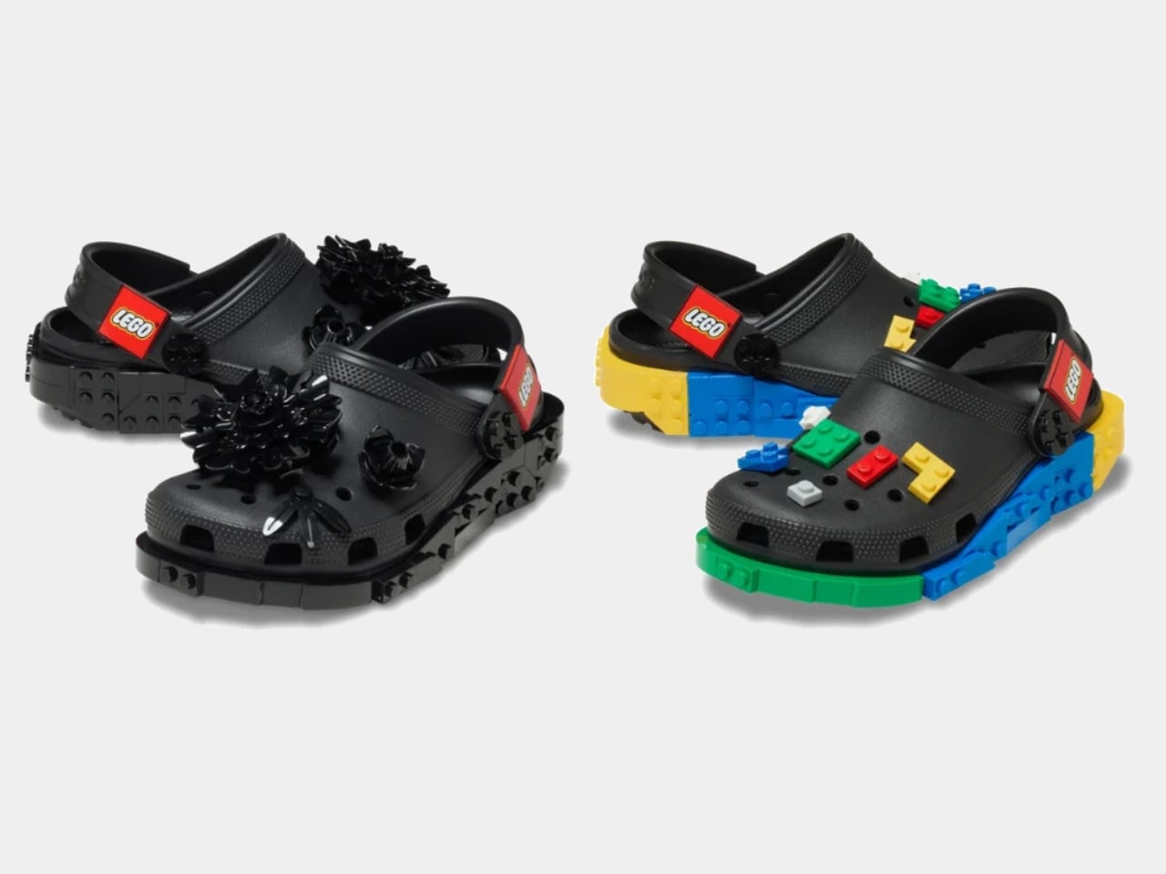
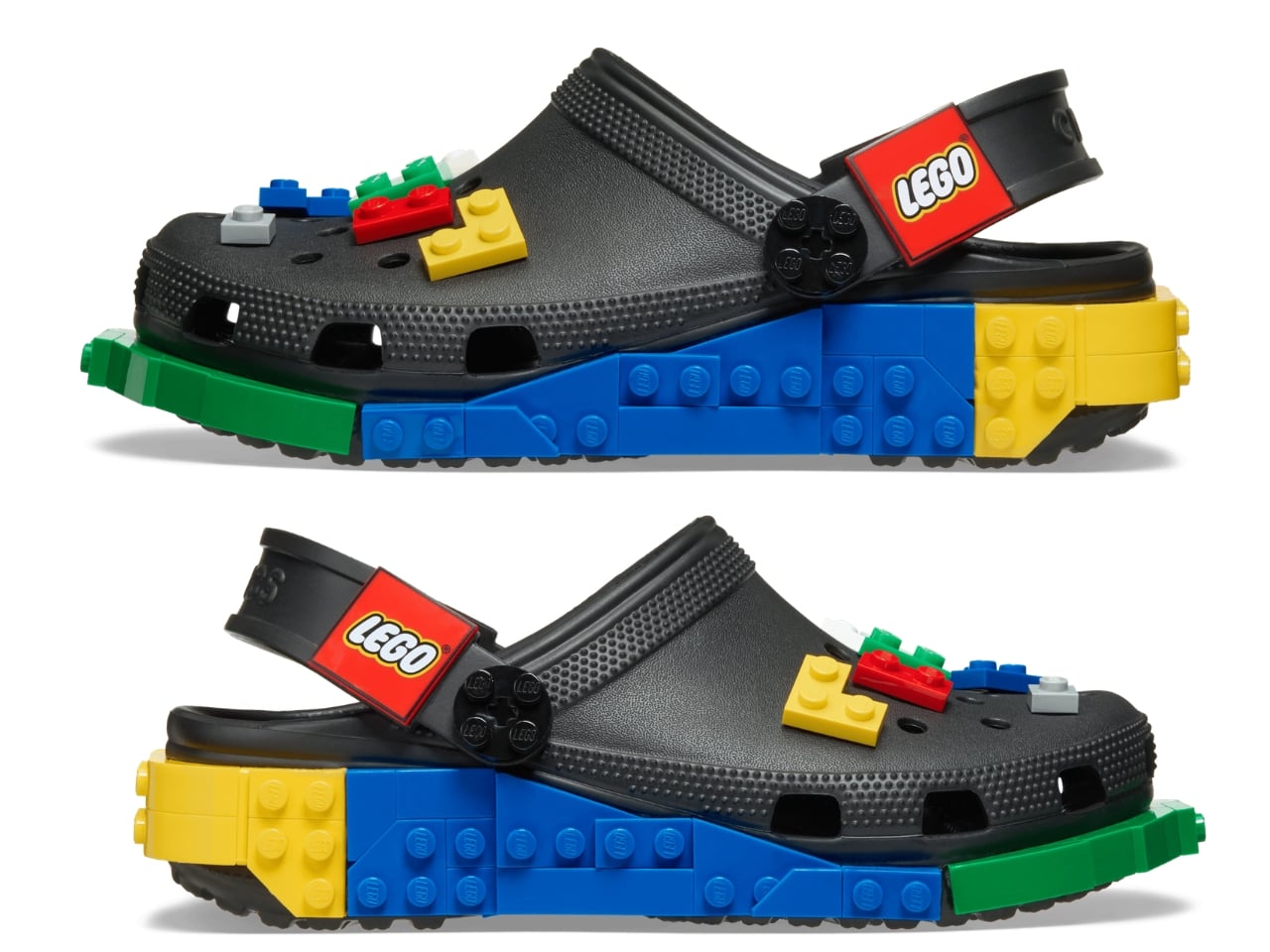
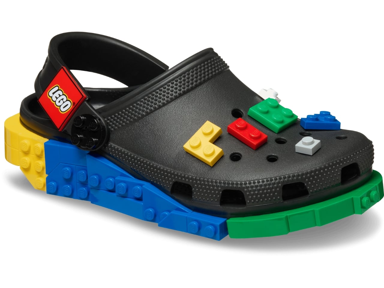
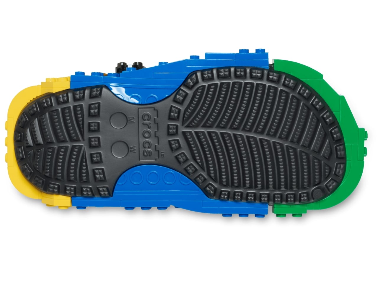
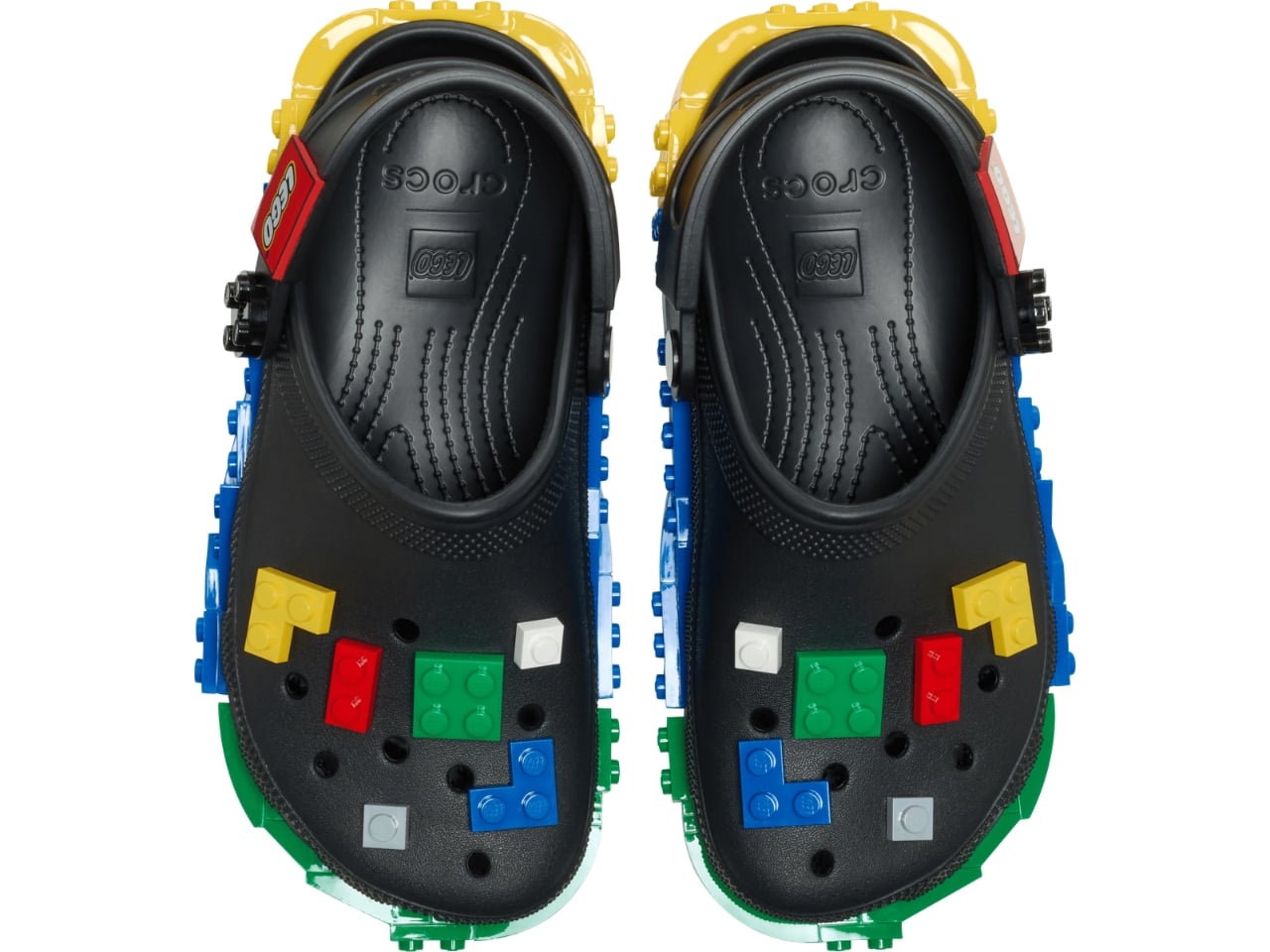
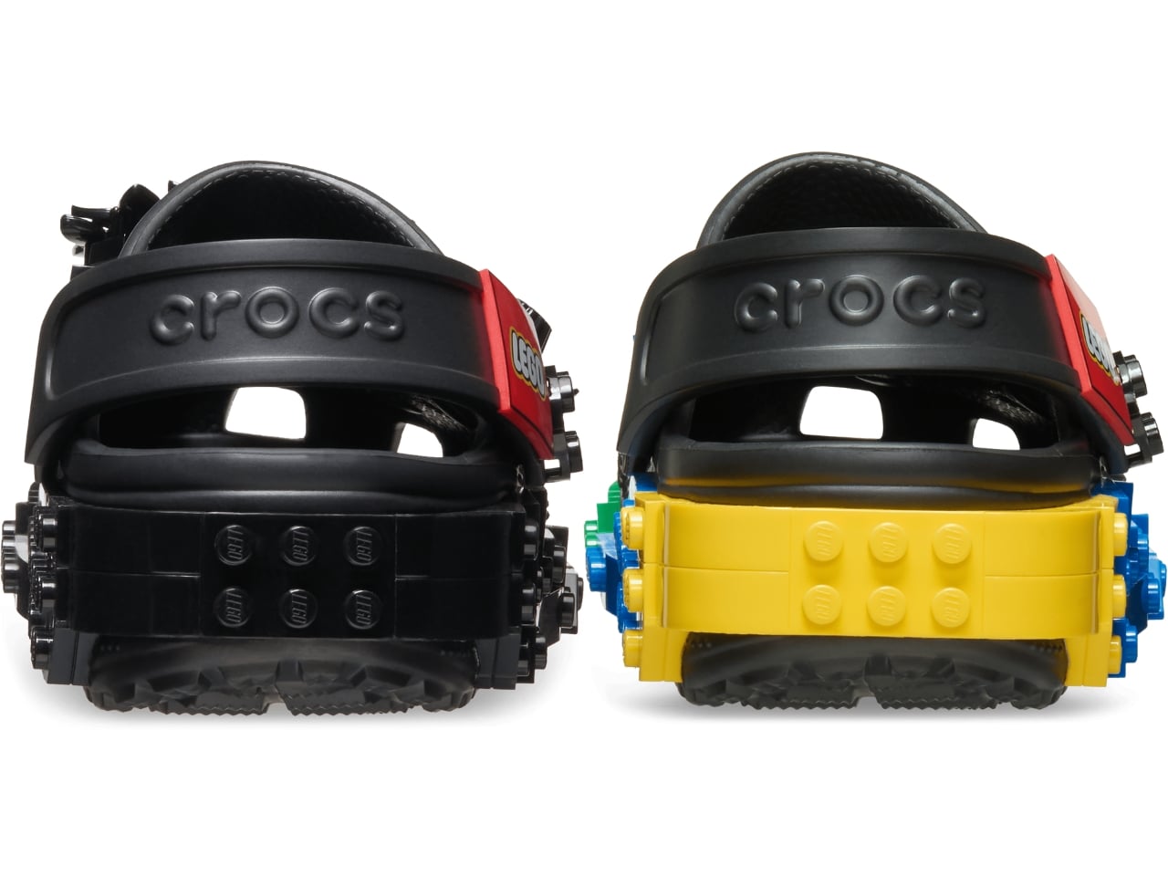
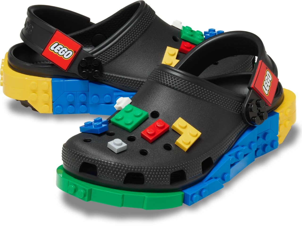
The collection spans several configurations. The base Creativity Clog starts at $79.99, keeping things relatively clean with colorful LEGO bricks along the sole and a Jibbitz-ready upper waiting to be personalized. There is also a Kids’ Creativity Clog at $59.99, because LEGO is a multigenerational brand whether anyone admits it or not.
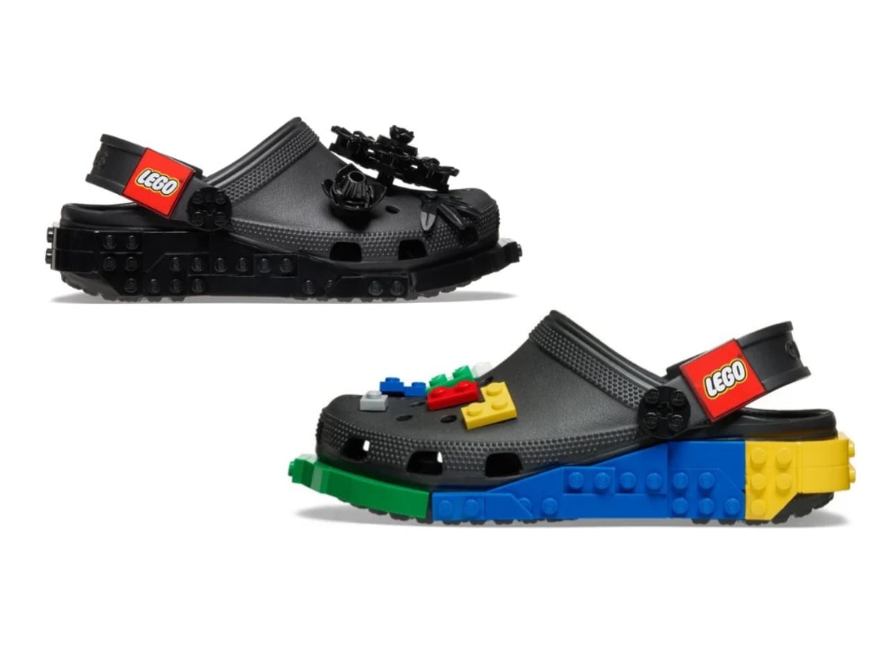
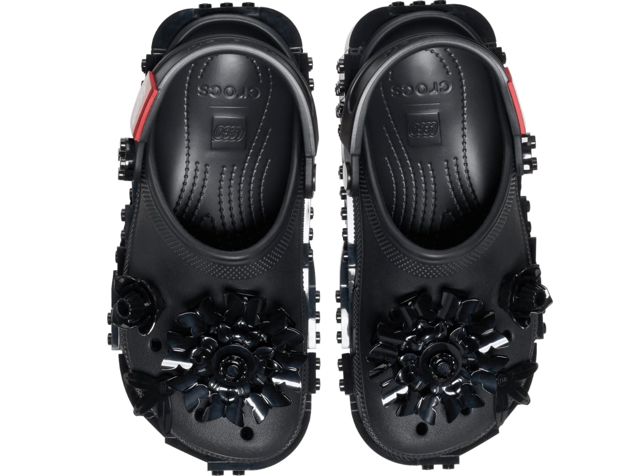
The Masterbrand Creativity Clog at $89.99 is the one that goes all in. It arrives with 12 LEGO brick Jibbitz charms already loaded onto the upper and around the sole, plus a LEGO Minifigure tucked into the box. That detail genuinely made me smile. It is the kind of considered touch that separates a real collaboration from a brand simply slapping a logo on an existing product.
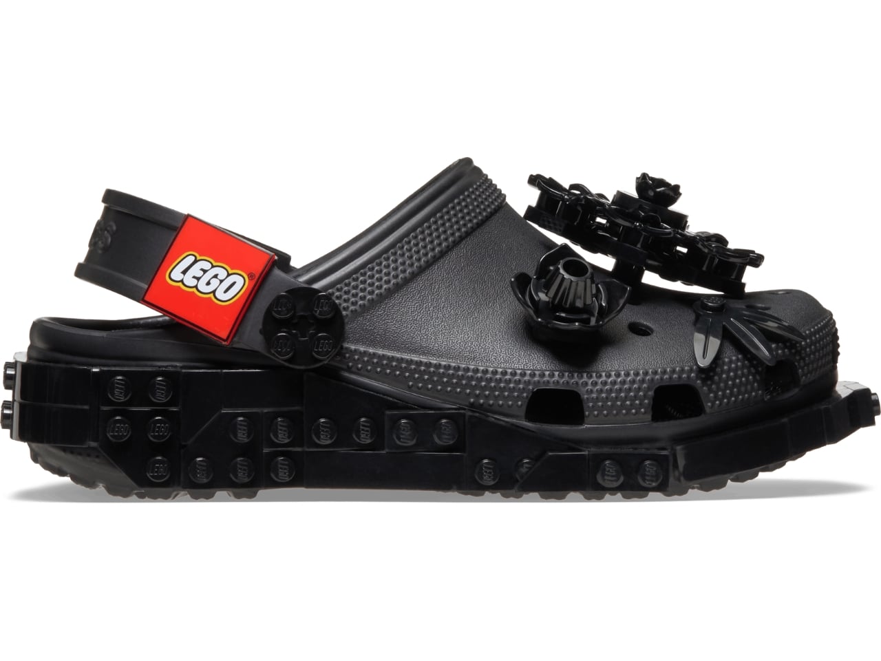
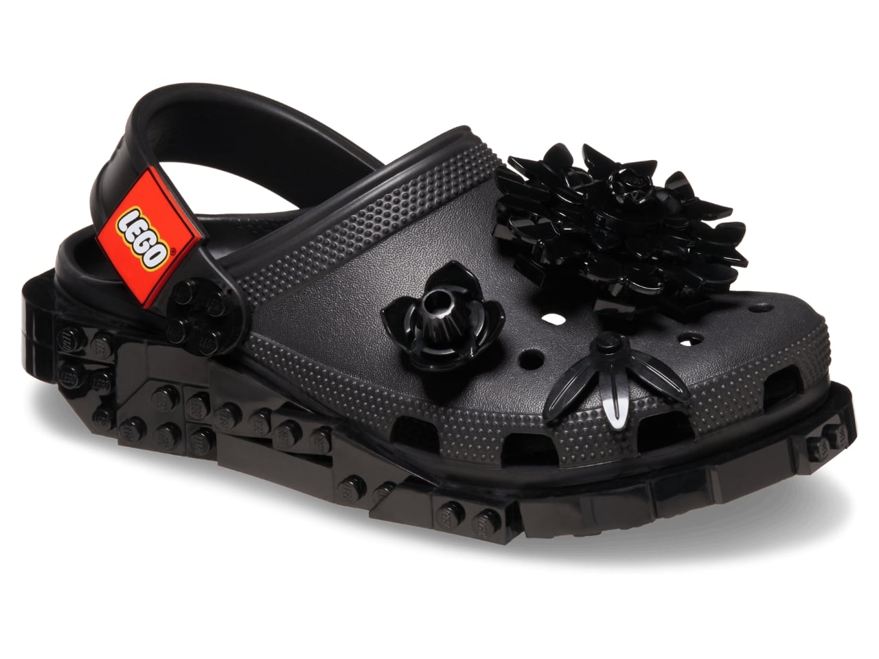
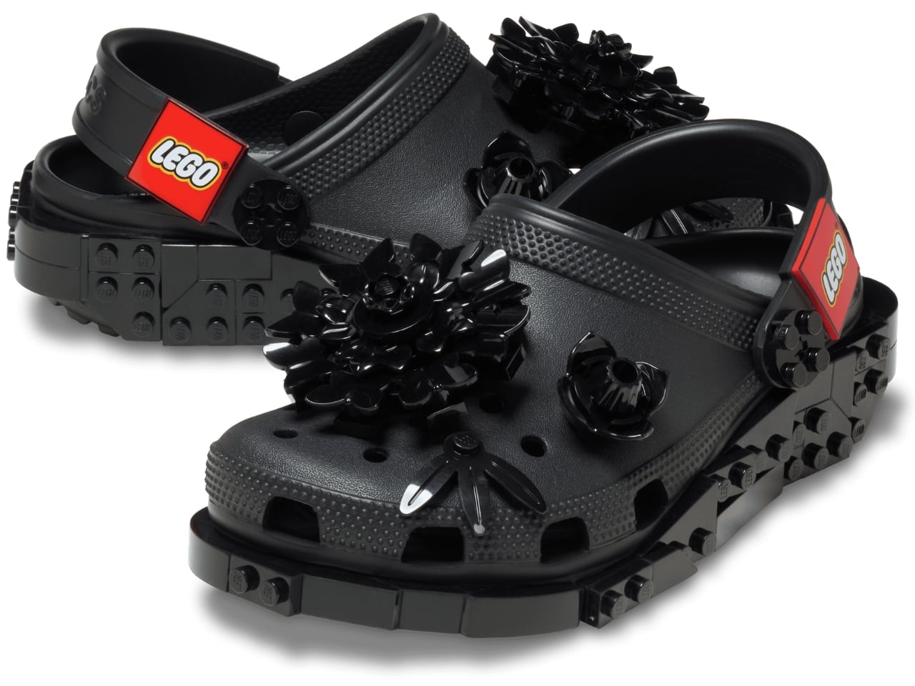
The Midnight Garden Creativity Clog takes the same design language in a different direction. Where the other colorways lean into LEGO’s signature primary palette, this version opts for a darker, more subdued aesthetic that feels almost grown-up by comparison. It is the right pick for someone who wants to quietly signal their appreciation for the collab without committing to the full crayon-box energy of the others.
Visually, these clogs strike a balance I did not expect. The brick texture runs along the sole without overtaking the whole shoe, so you are not walking around in something that looks like a toy store exploded on your feet. It is restrained enough to wear in public while still being obviously, joyfully LEGO. The Jibbitz-ready holes mean you can keep building on top of the base, swapping in dedicated LEGO charm packs depending on your mood. That is exactly the kind of open-ended customization that makes both brands tick.
The LEGO Group and Crocs announced their multi-year global partnership in January 2026, and the Creativity Clogs dropped on March 19, with LEGO Insiders getting a three-day head start. Certain sizes sold out quickly, which tells you all you need to know about the appetite for this one.
My honest read is that this collaboration is smarter than its predecessor. The original LEGO Brick Clogs were built for viral moments and display shelves. Giant foam bricks make a statement, but they do not go anywhere useful. The Creativity Clogs are the real follow-through, translating LEGO as a design language into something you would actually wear to a theme park, a farmers market, or around the house on a slow Tuesday. The playfulness is baked in without demanding you commit to a costume to participate.
That said, $89.99 for a pair of Crocs is a price point worth sitting with, even if the included Minifigure does technically sweeten the deal. Crocs collabs have always commanded a premium over the core classics, and by now the brand’s audience is accustomed to paying for the concept as much as the shoe itself. Whether the LEGO x Crocs Creativity Clog earns its place in your rotation will probably depend on how much real estate your inner kid still occupies. For a lot of people, that answer is quite a bit of space.
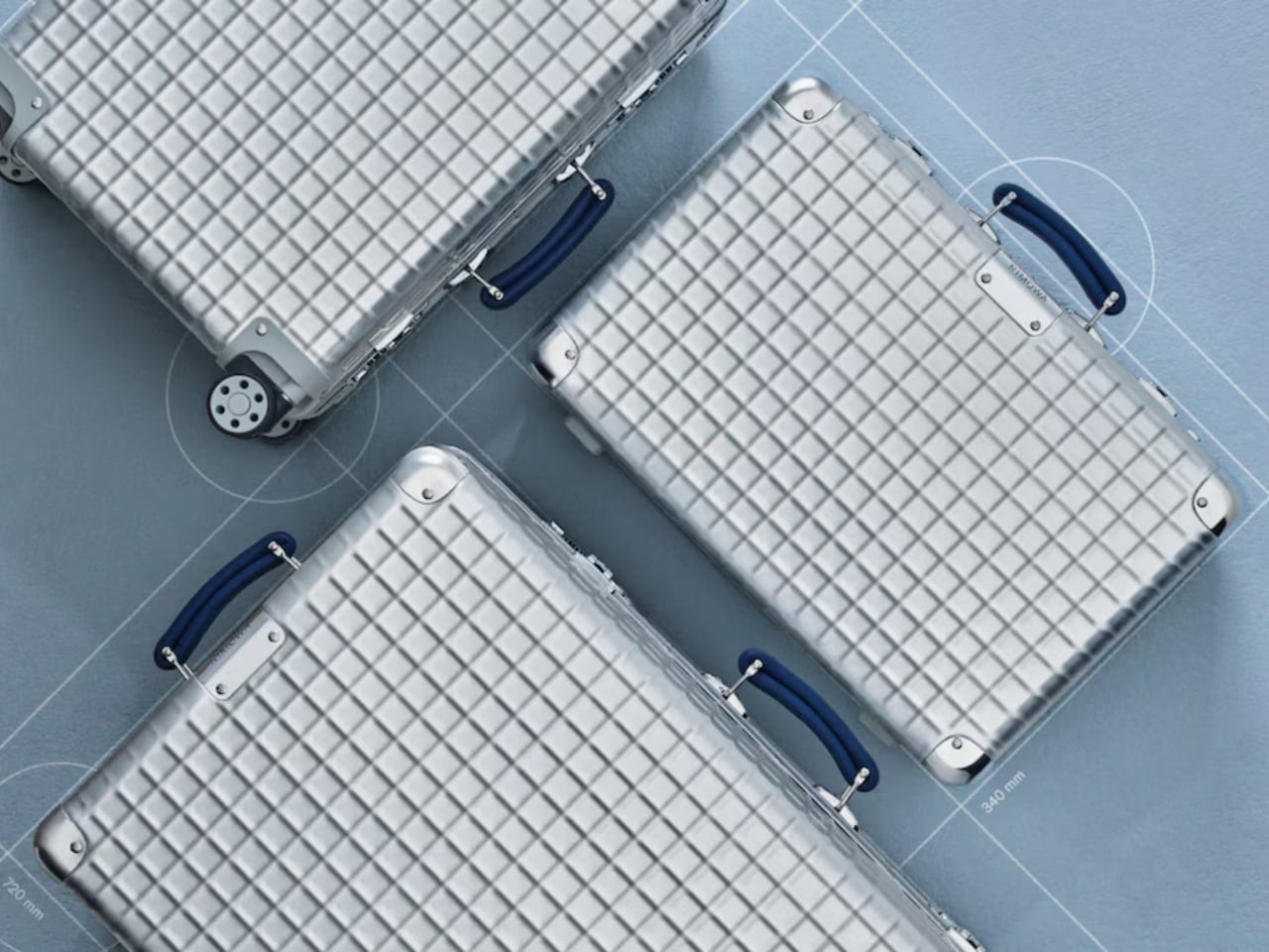
Most luggage brands don’t have a 127-year-old story to draw from. Rimowa does, and it seems to know exactly when it’s worth pulling from that history and when to let the present speak for itself. With the Classic Aluminium Grid, they’ve clearly decided the archive deserves a second act.
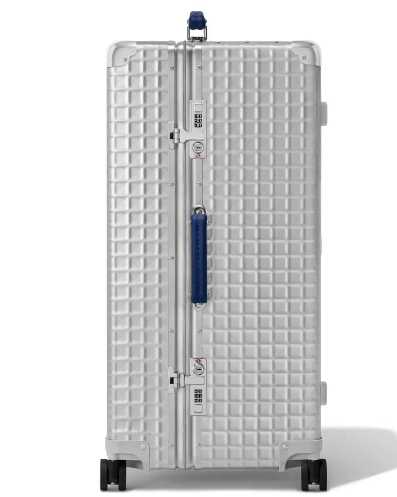
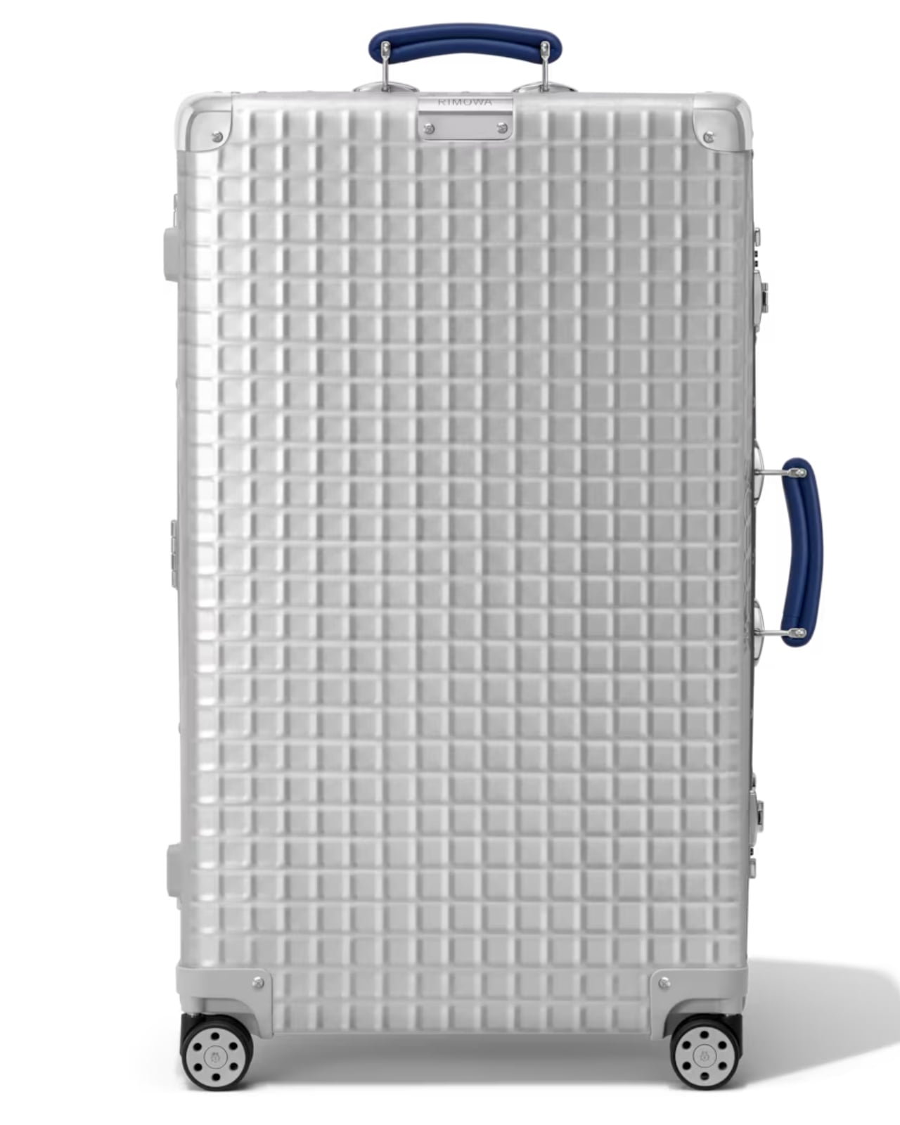
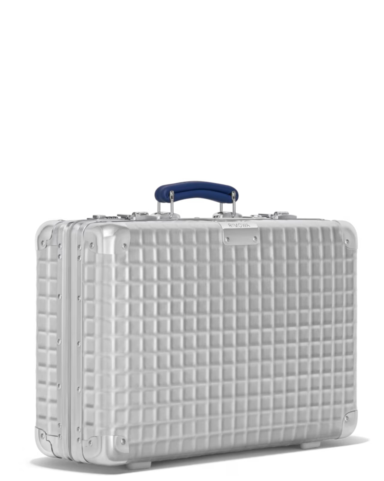
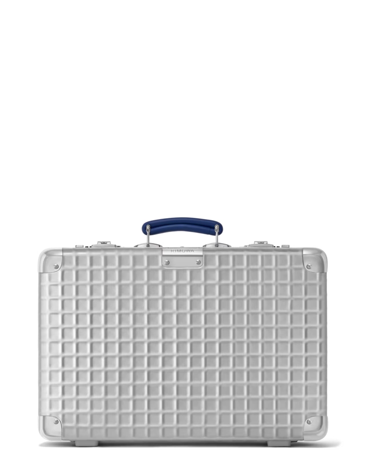
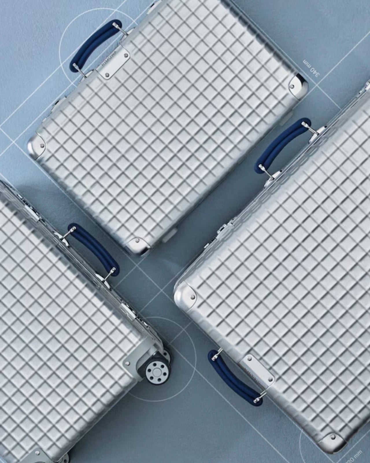
The Classic Aluminium Grid is the German brand’s latest limited-edition release, and it’s generating the kind of quiet excitement that reserved design circles usually save for restored mid-century furniture or a first-edition book that resurfaces at auction. The reason is simple: Rimowa didn’t just design something new. They reached back to 1969, pulled out a hand-carry case design that had been sitting in their archives, and asked what it would look like today if it were treated with the same reverence they give to the grooves.
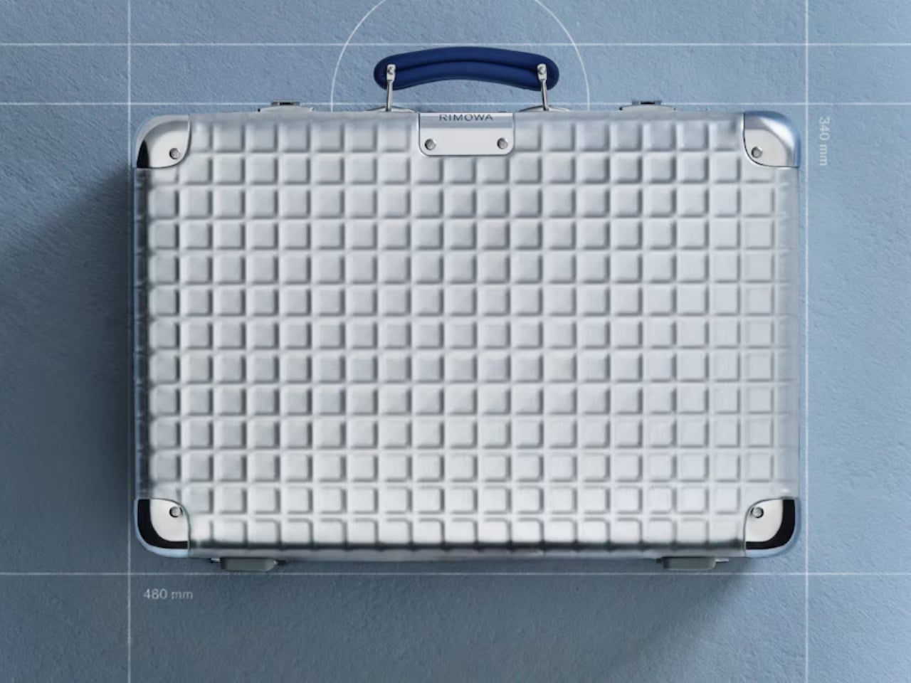
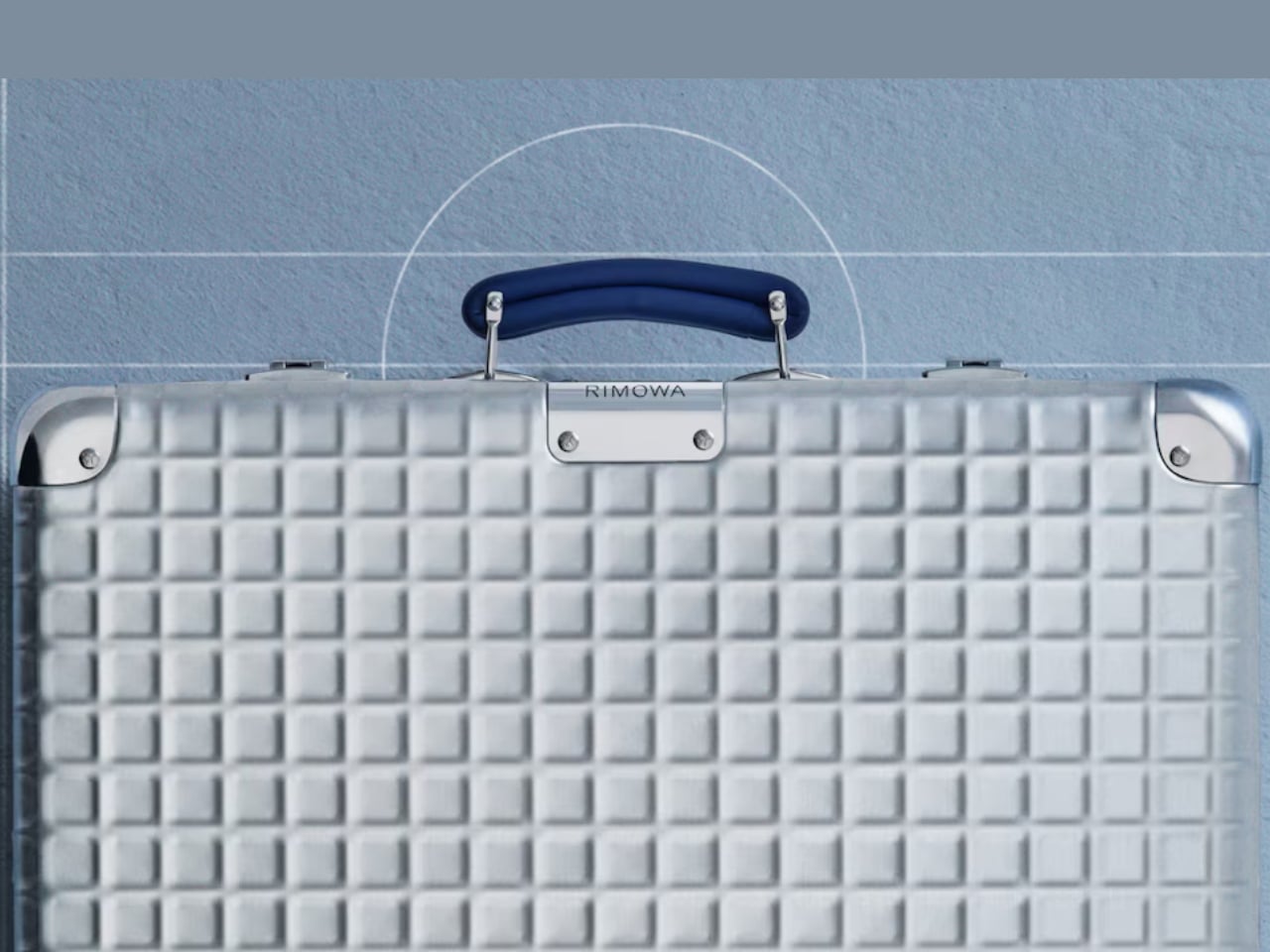
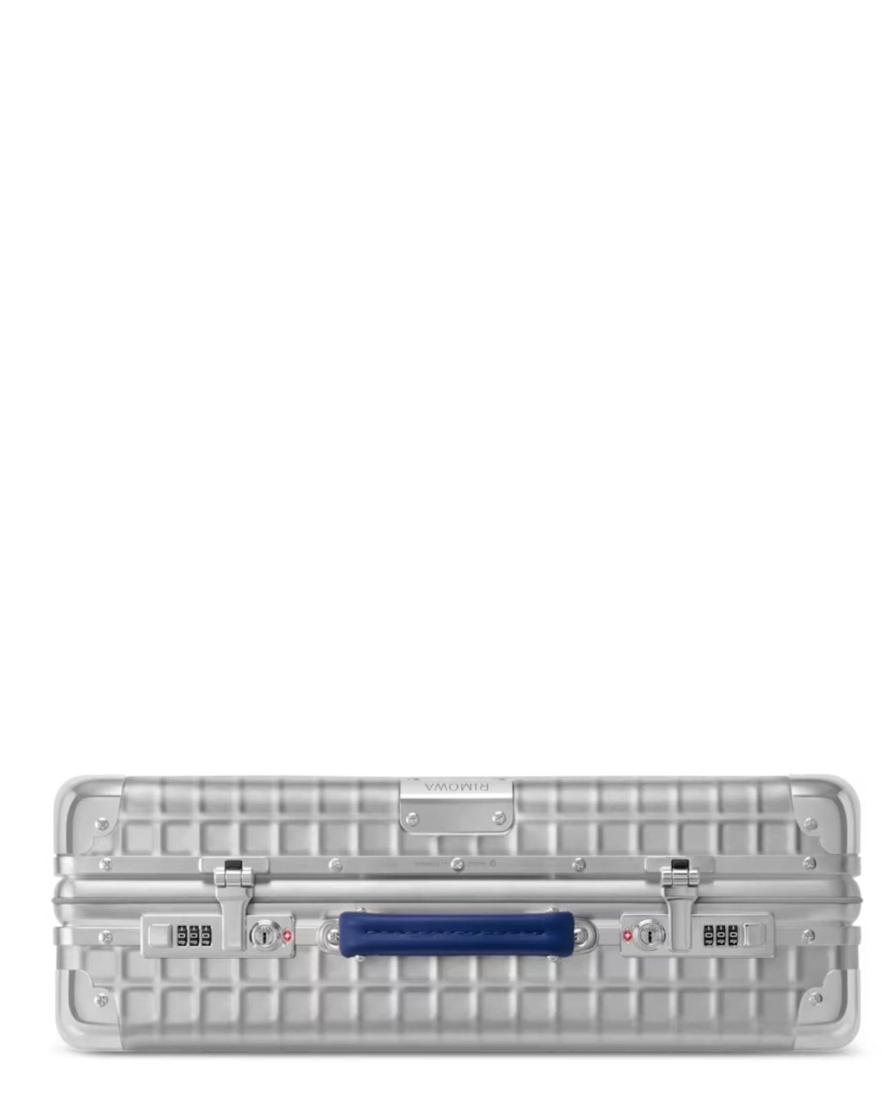
That grooved shell, by the way, is practically synonymous with the brand itself. You know a Rimowa from across an airport terminal. Those parallel ridges running down the aluminium surface are one of the most recognizable design signatures in travel goods, and they’ve been that way for decades. So when the brand quietly steps away from them and replaces the lines with a grid, a structured, geometric, embossed pattern pressed right into the aluminium shell, it feels like a real statement. It’s not a gimmick. It’s a choice that speaks to a different kind of confidence.
The grid comes from a real place. In 1969, Rimowa was producing hand-carry cases featuring this geometric pattern: practical, modular, and rooted in the kind of technical precision that defined that era’s design thinking. There’s a reason so much design from that decade still holds up. It wasn’t chasing aesthetics for their own sake. Form followed function, and it did so elegantly. Reviving that spirit in 2026 doesn’t read as nostalgia pandering. It reads as a brand that knows exactly where its DNA lives and isn’t afraid to dig for it.
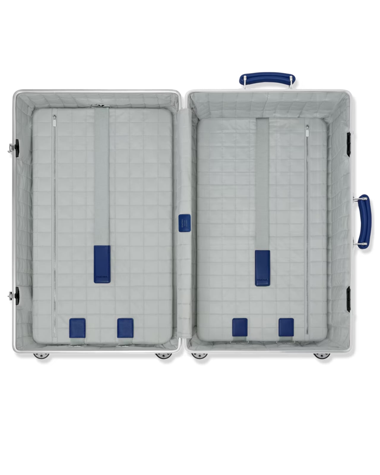
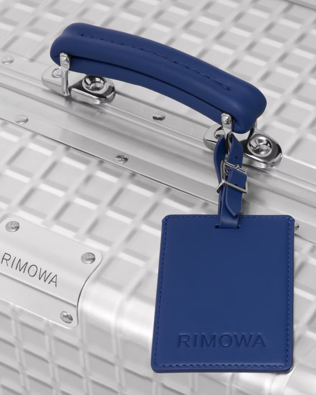
The collection comes in three sizes: the Classic Hand-Carry Case, the Classic Cabin, and the Classic Trunk. All three are made in Cologne, Germany, which matters more than it might seem. Manufacturing location is one of those details that’s easy to gloss over until you’re actually holding the product, and with Rimowa, the German-made quality is part of the whole point. The embossed grid pattern, the blue leather handles, the individually numbered serial number patch on each case: these aren’t details you’d notice in a thumbnail. They’re details you notice after living with the piece and realising it only gets better over time.
And yes, price matters here. The Classic Aluminium Grid sits in the $2,725 to $3,225 range, which puts it firmly in the territory of deliberate, considered purchasing. That’s not casual spending, and it shouldn’t be. This is the kind of purchase that functions as an heirloom more than a travel accessory, something you keep, care for, and eventually pass along. The lifetime guarantee Rimowa extends to all its suitcases reinforces that framing. They’re not selling you a bag built for a few trips. They’re selling you something built to outlast most things currently in your home.
What makes this collection feel genuinely compelling rather than just another limited drop is the restraint behind it. Rimowa didn’t add bright colour for the sake of attention. They didn’t partner with a streetwear brand or commission someone’s artwork across the shell. They went to their own archive, found something worth preserving, and let the design carry the weight. The grid is subtle enough that it won’t read as flashy at baggage claim, but anyone paying close attention will recognise it as something different. Something that doesn’t quite look like everything else on the carousel.
That’s a hard balance to strike in design. Loud enough to be interesting, quiet enough to be enduring. The Classic Aluminium Grid lands squarely in that space, and for a brand with over a century of aluminium behind it, that feels less like luck and more like a brand that knows exactly what it’s doing.
At some point, the line between fashion and performance art quietly dissolved, and I think we need to have a serious conversation about who’s holding the needle. Because KFC just debuted a puffer jacket filled with real sliced gherkins and acid-green brine, and it is fully, sincerely, unapologetically real.
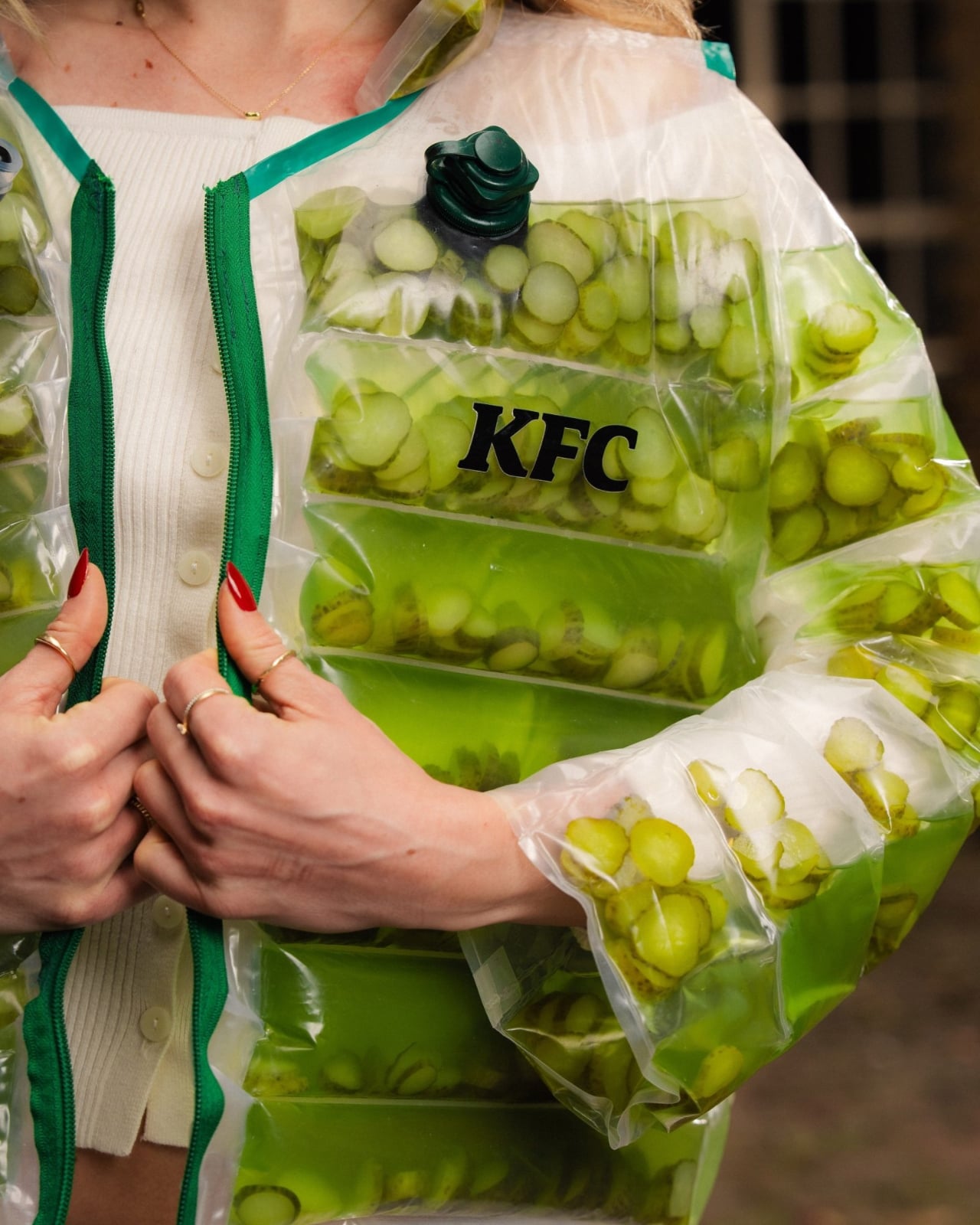
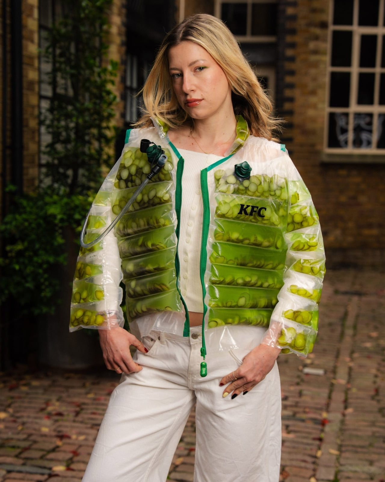
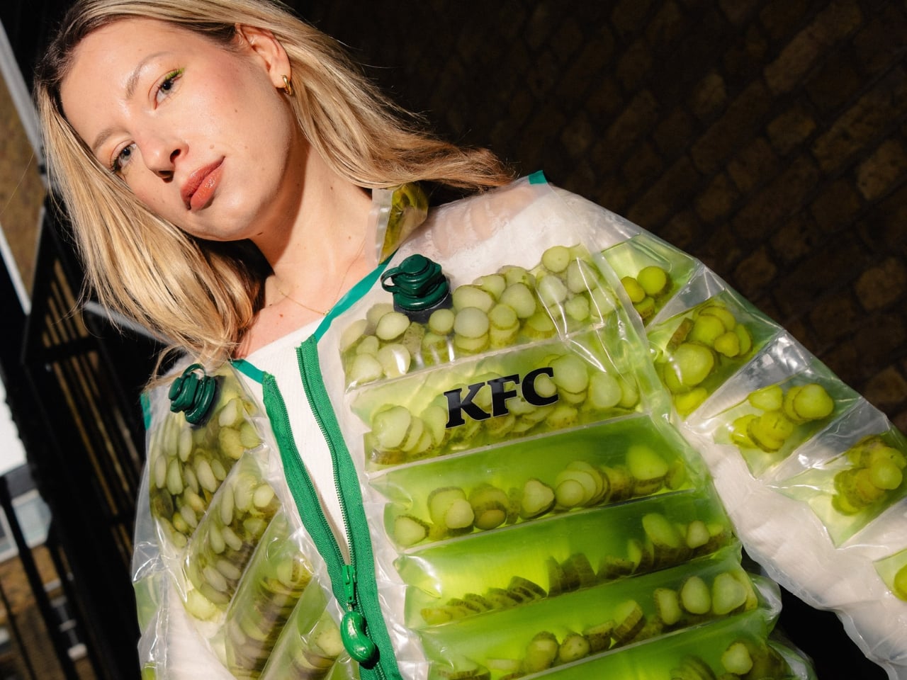
The Pickle Puffer is exactly what it sounds like. A clear plastic puffer jacket, entirely see-through, packed with floating slices of pickled cucumber and brine so vividly green it almost looks radioactive. The insulation is gone, replaced with hundreds of actual pickles that shift and float with every movement.
Designer: KFC
Picture a standard puffer silhouette, the kind you’d wear on a cold commute, except every quilted chamber is sealed, transparent, and filled with floating pickle slices suspended in green liquid. The jacket moves the way a lava lamp moves. Tilt left and the gherkins drift. A hydration hose runs along the chest like something from a trail runner’s kit, except it feeds into a reservoir of pickle juice. The zipper pull is shaped like a pickle. The whole thing is lurid and weirdly beautiful in the way that only objects with absolutely no interest in being subtle can be.
I genuinely don’t know whether to call this genius or absurdist theatre, and I’m starting to think the distinction doesn’t matter anymore. What makes the Pickle Puffer particularly fascinating is its origin story. It didn’t start in a brand meeting or a creative studio. It started with an AI-generated video on TikTok of a man handing out gherkin slices from a pickle-filled puffer jacket. The video had barely a hundred likes. A hundred. And yet something about it triggered that very specific brand instinct that says: we should make this real.
The fact that KFC actually followed through says a lot about where we are right now. We’ve officially entered an era where a low-engagement AI fantasy can become a physical product, and the feedback loop between online imagination and real-world manufacturing has compressed to almost nothing. KFC UK brand manager James Channon was refreshingly candid, calling it “a bit unhinged, but that’s the point.”
And it is unhinged. But it’s also timed to perfection. The jacket dropped alongside KFC’s new Pickle Mania Menu in the UK, which includes Pickle Loaded Fries and a Pickle Pepsi, riding the wave of a full-blown cultural obsession. The #pickles hashtag on TikTok has racked up billions of views, and apparently the correct brand response is to wear that moment on your body, literally soaked in brine.
Now, this is a one-off. You can’t buy it. You have to win it through an Instagram giveaway, which is its own kind of genius because the scarcity makes it collectible and the competition makes it content. KFC isn’t really selling a jacket. They’re selling a news story, a talking point, and a social media moment that will keep circulating long after the pickles start to turn. That’s the actual product here.
It also puts the Pickle Puffer in the company of a growing category of fashion-as-marketing stunts increasingly committed to the bit. Aldi’s Jacket Potato Jacket came before it. Lidl has played in this space too. There’s a whole lane developing for grocery and fast-food brands to use absurdist outerwear as their loudest advertising medium, and it’s clearly working. I’m writing about a pickle jacket right now, so there’s your proof.
What I keep coming back to is how genuinely well it’s designed for what it’s supposed to do. The translucency is intentional. The floating pickles are the visual. The hydration hose is the punchline that also happens to be functional. Every element is deliberate and considered, even if the whole thing is engineered to make you laugh first and think second. Plenty of brands try for weird and land on confusing. KFC landed on weird and made it covetable. Fashion has always been partly spectacle. The Pickle Puffer just has better snacks.
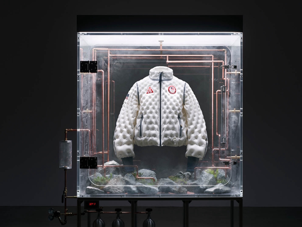
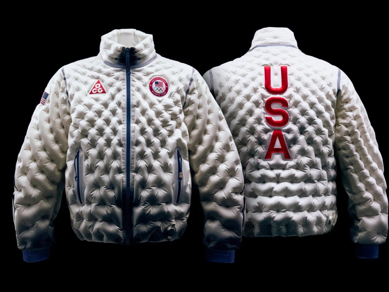
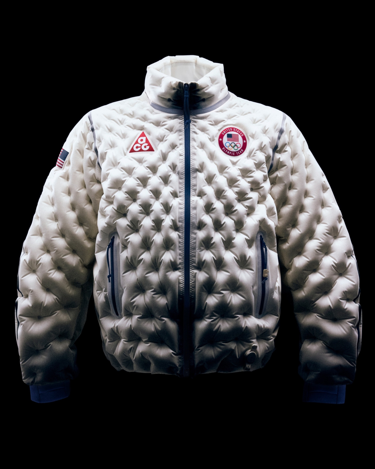
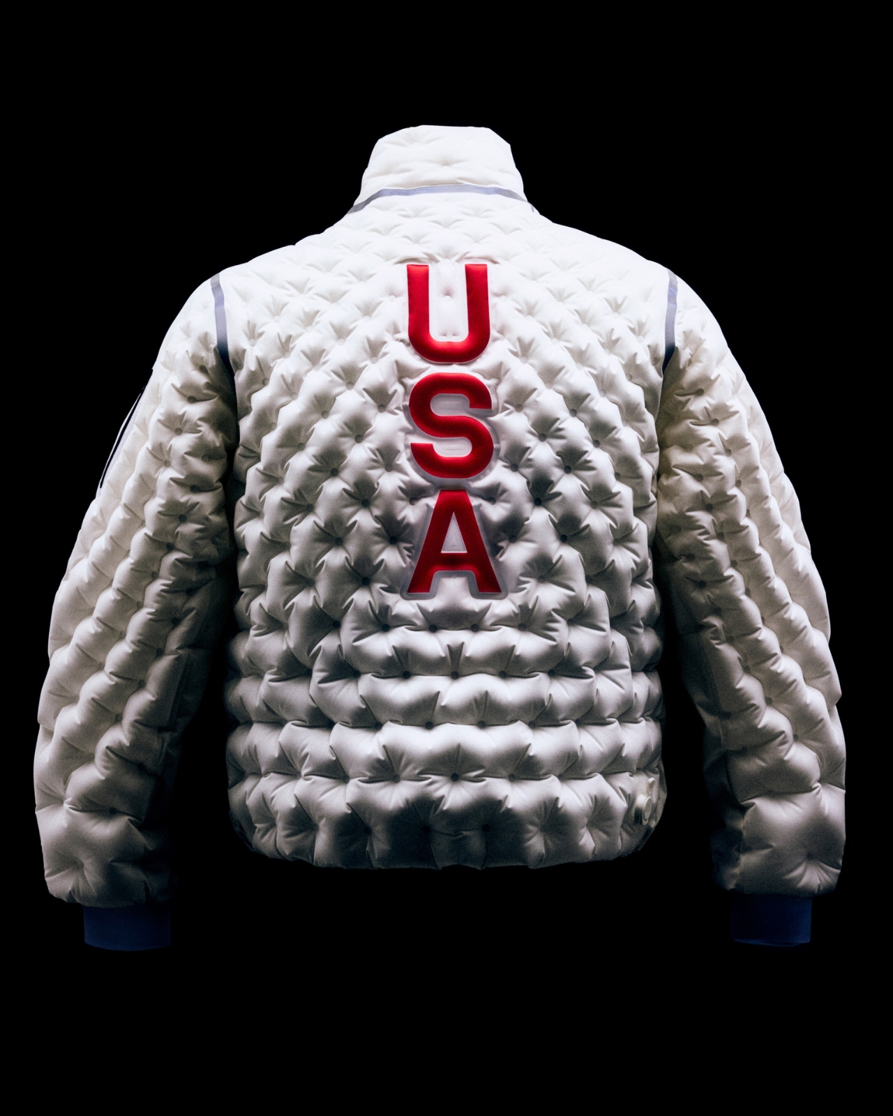
Remember when Nike put air bubbles in sneakers and everyone thought it was the coolest thing ever? Well, the Swoosh just did it again, but this time with a jacket that you can literally pump up or deflate like an air mattress. Meet the Therma-Fit Air Milano Jacket, and yes, it’s as wild as it sounds.
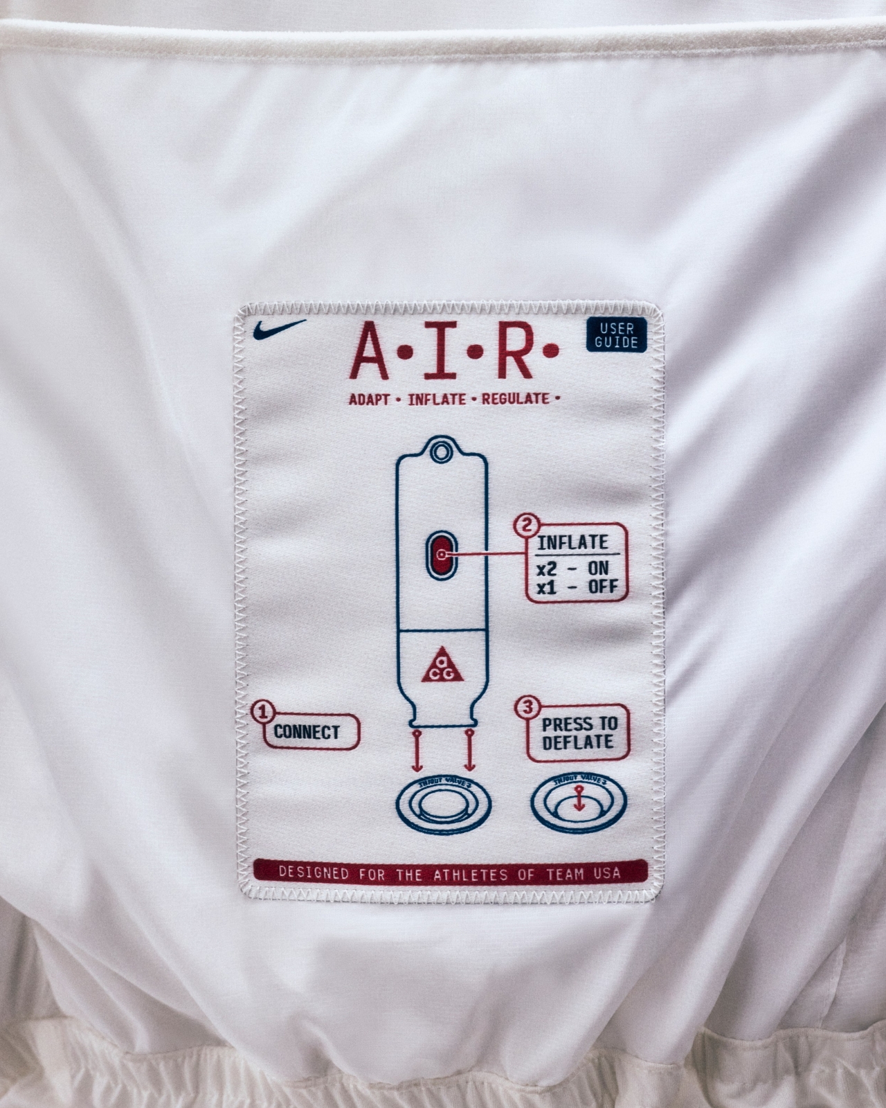
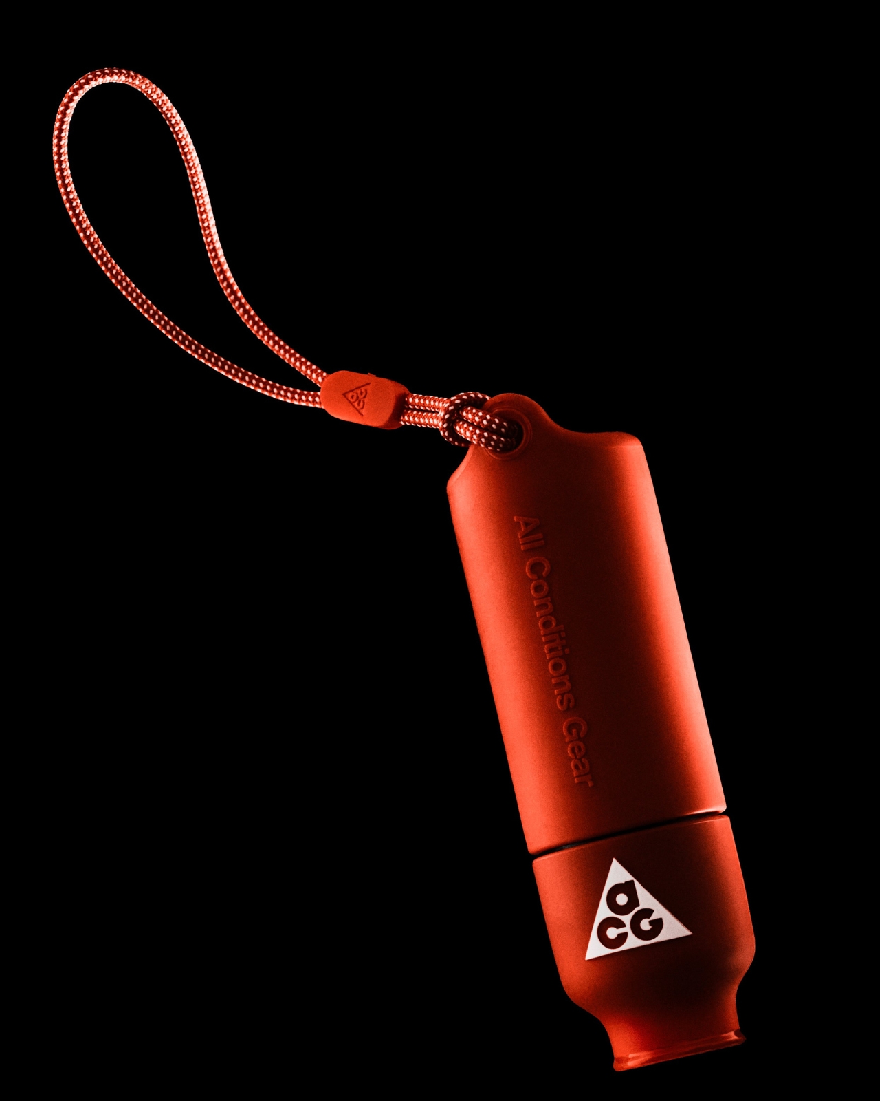
The jacket, which Nike is calling its most technically engineered garment ever, features what the brand has dubbed A.I.R. Technology (that stands for Adapt. Inflate. Regulate., not artificial intelligence). At first glance, it looks like any other sleek Nike puffer. But here’s the clever part: you can adjust how puffy it actually is depending on how cold you are. No more sweating through your coat after walking up a flight of stairs or shivering because you dressed for the wrong temperature.
The concept is brilliantly simple. Instead of stuffing the jacket with down feathers or synthetic insulation like traditional puffers, Nike filled the baffles with air. Using a small pump (think inflatable pool toy, but make it fashion), you can inflate the jacket in about 15 seconds. Deflate it, and it compresses down to something closer to a lightweight windbreaker. Nike is marketing it as “four jackets in one,” which honestly isn’t far off.
This isn’t Nike’s first rodeo with inflatable outerwear. The brand experimented with air bladders in jackets for about two decades, most notably with the 2008 ACG Airvantage jacket that’s now a grailed collector’s item. But the Air Milano takes those early experiments and refines them with nearly five decades of Nike Air innovation (the same tech that revolutionized sneakers in 1978).
What makes this jacket particularly interesting from a design perspective is how it breaks free from traditional puffer construction. Most down jackets are limited by horizontal quilting patterns because you need those channels to keep the insulation evenly distributed. With air as the insulator, Nike’s designers could create body-mapped volumes and customize the jacket’s shape without those constraints. The result is a two-layer composite laminate material that can transition from slim to puffy in seconds while maintaining its structure.
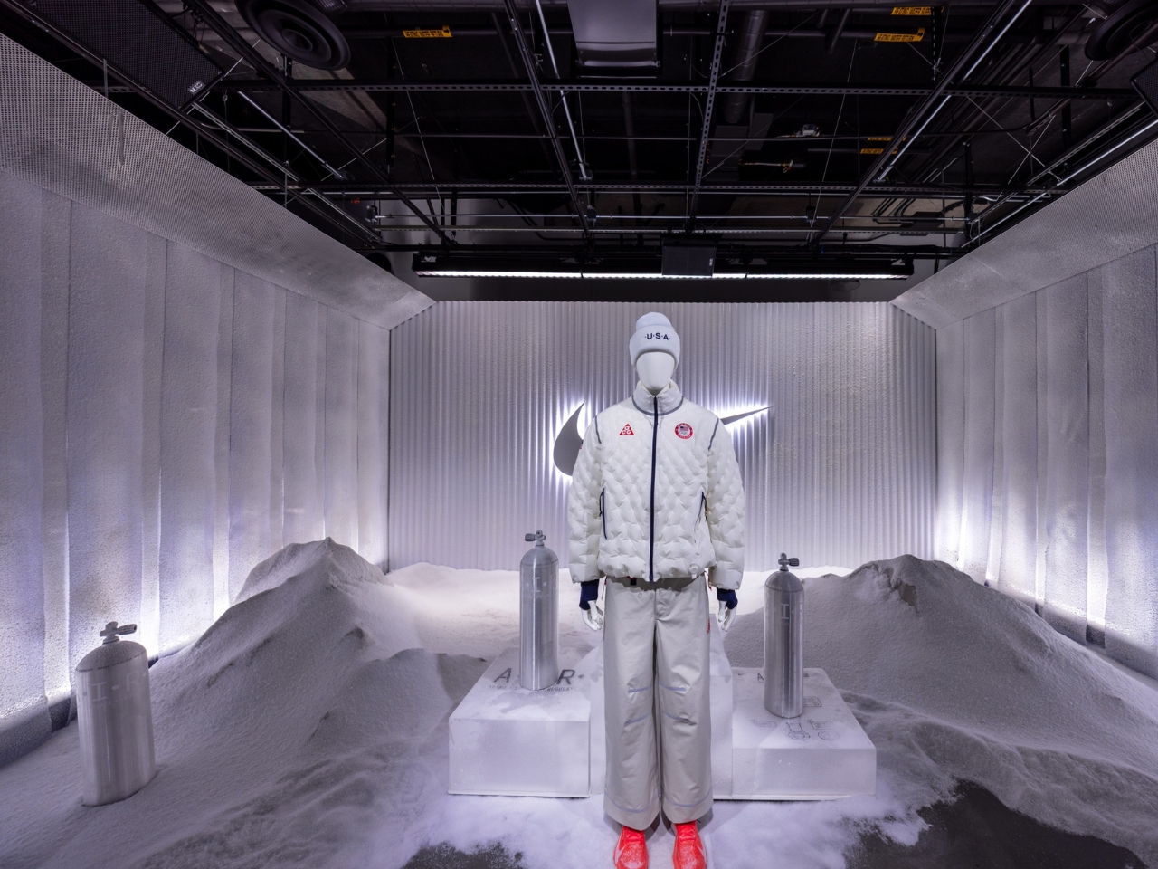
Team USA athletes will debut the Air Milano at the 2026 Winter Olympics in Milan as part of their official medal ceremony look, which feels fitting given the jacket’s name. It’s a smart showcase for technology that sits at the intersection of performance, design, and just plain cool factor. After all, watching someone pump up their jacket courtside or in the stands is going to turn heads.
The jacket integrates with Nike’s broader FIT system, working alongside familiar technologies like Dri-Fit moisture-wicking and Storm-Fit weather protection. This positions the Air Milano not as some gimmicky one-off, but as part of Nike’s ongoing commitment to performance innovation that actually solves real problems. And the problem here is universal: temperature regulation during activity is annoying. You’re either too hot or too cold, constantly adding or removing layers like some sort of fashion onion. According to Danielle Kayembe, Expert in Apparel Product Innovation Management at Nike, the jacket represents a blend of athlete science and data-driven design to create responsive, engineered garments. The brand studied years of data illustrating the challenges of competing in cold weather before landing on this solution.
The big question, of course, is whether this will hit the consumer market, and if so, when. Nike hasn’t announced a release date yet, though they’ve confirmed it won’t be cheap when (or if) it does launch. For now, it remains a Team USA exclusive. Beyond the practical applications, the Air Milano is just fun. In an era where so much tech feels either invisible or overly complicated, there’s something refreshingly tactile about pumping up your jacket. It’s the kind of design that makes people ask, “Wait, what is that?” And in a market saturated with similar-looking puffers, that’s no small feat.
Whether the Air Milano becomes as iconic as the Air Max or remains a fascinating footnote in Nike’s innovation archives remains to be seen. But one thing’s certain: Nike just reminded us that sometimes the best innovations come from asking a simple question. If we can put air in shoes, why not jackets?
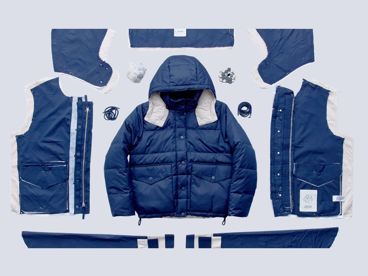
The puffer jacket is a winter staple for a lot of places that experiences really cold weather. But most of the ones in the market aren’t the most eco-friendly. Everlane has just launched what might be the fashion industry’s most sustainable puffer jacket yet. The EverPuff represents a groundbreaking approach to circular fashion design, proving that warmth, style, and environmental responsibility can coexist beautifully.
What makes the EverPuff revolutionary is its commitment to true circularity. Nearly every component of this sleek puffer jacket is crafted from certified recycled materials, from the insulating fill to the outer shell. The only exceptions are three small metal trims, making this jacket 97% recycled content. This isn’t just about using eco-friendly materials; it’s about creating a product designed for multiple lifetimes.
The jacket’s exterior features 100% recycled polyester that’s both water-repellent and water-resistant, ensuring you stay dry while maintaining a lighter environmental footprint . The recycled down filling provides exceptional warmth without compromising on sustainability principles. All materials are bluesign certified and PFAS-free, guaranteeing safer chemistry for both workers and consumers while reducing harmful emissions.
But Everlane’s innovation extends far beyond materials. The EverPuff comes with an unprecedented lifetime warranty and comprehensive repair program through their partnership with Tersus Solutions . If your jacket needs fixing, Everlane will repair it for free. If it’s beyond repair, they’ll replace it entirely. This commitment to longevity challenges the fast fashion model by encouraging consumers to invest in pieces that last. The design process itself was revolutionary. Everlane’s team worked closely with Debrand, a specialized recycling company, to ensure the jacket could be easily disassembled at the end of its life . By using mono-materials and avoiding complex stitching, they created a garment that can be completely broken down, with each component recycled into new products.
When your EverPuff finally reaches the end of its usable life, Everlane will take it back and transform it into a new garment. The polyester shell, down filling, and hardware are all separated and sent to specialized facilities for recycling into fresh materials. This closed-loop system represents the future of fashion manufacturing. The EverPuff also integrates with Everlane’s broader sustainability ecosystem. Through their partnership with Poshmark on the Re:Everlane program, customers can easily resell their jackets, extending the product’s life even further. The system automatically populates style details and original pricing, making resale effortless.
Available in five sophisticated colors including navy, black, dark green, peyote, and merlot, the EverPuff retails for $298 for the standard length and $348 for the long version . While the price point reflects the quality materials and comprehensive warranty, it represents a shift toward valuing durability over disposability. The EverPuff isn’t just a jacket; it’s a statement about the future of fashion. By proving that luxury outerwear can be both stylish and completely sustainable, Everlane is setting a new standard for the industry. This innovative approach to circular design shows that consumers no longer need to choose between looking good and doing good for the planet.
Traditional screens have become the digital equivalent of energy vampires, constantly draining batteries while bombarding our eyes with harsh blue light that leaves us squinting and tired. LCD and OLED displays demand constant power to maintain their bright, flashy visuals, creating a world where we’re always hunting for charging cables and dealing with screens that become unreadable the moment we step into sunlight.
E Ink displays offer a refreshingly different approach to this screen fatigue problem. By mimicking the look and feel of actual ink on paper, this technology flips the script on what we expect from digital displays. E Ink dominates the ePaper market, though other electronic paper technologies exist alongside it. The result feels like reading a book instead of staring at a glowing rectangle.
What Makes E Ink Different
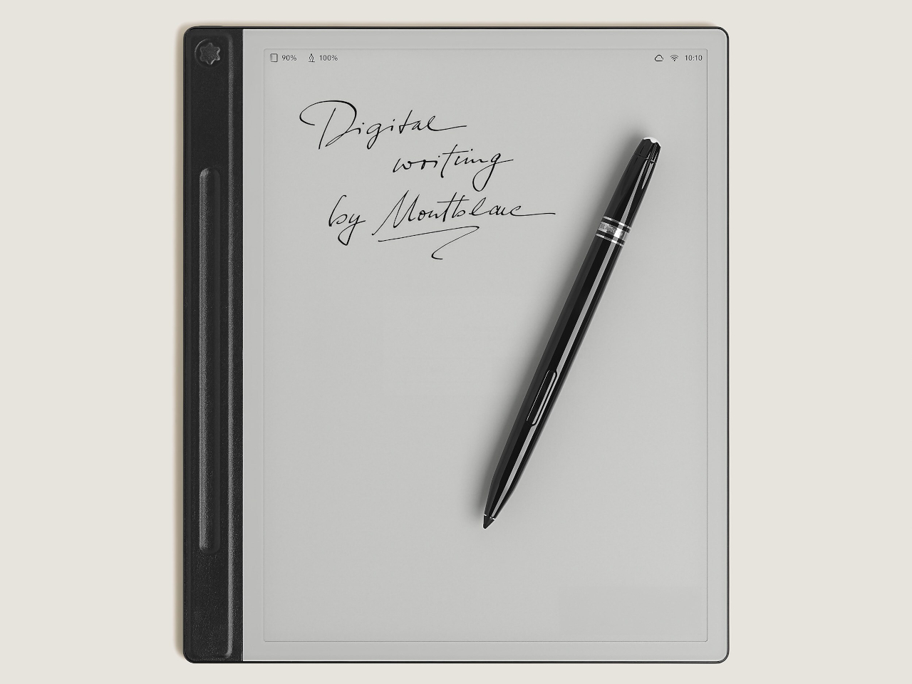
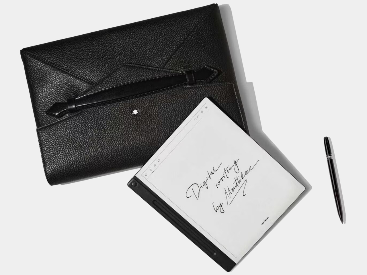
Unlike traditional displays that blast light at your face, E Ink reflects ambient light just like a printed page would. The technology uses tiny microcapsules filled with charged particles that rearrange themselves to form text and images. Once an image appears, it stays there without using any power at all, which explains why e-readers can last for weeks on a single charge.
The benefits extend far beyond just battery life. E Ink displays remain perfectly readable in bright sunlight, where your smartphone screen would become a useless mirror. The flexible nature of the technology means displays can bend, curve, and even fold without breaking. For designers tired of working around the rigid constraints of glass screens, E Ink opens up entirely new possibilities.
E Ink comes with certain trade-offs that designers need to understand. Colors remain somewhat muted compared to the vibrant displays we’re used to, though recent advances have brought more life to ePaper screens. Refresh rates are slower, so you won’t be watching Netflix on an E Ink display anytime soon. Large panels can still be pricey, though costs keep dropping as production scales up.
These constraints haven’t stopped designers from finding creative ways to harness E Ink’s strengths. Smart product teams have learned to work within these limitations, focusing on applications where the technology’s benefits far outweigh its drawbacks. The results often surprise people with their elegance and practicality, proving that constraints can spark innovation.
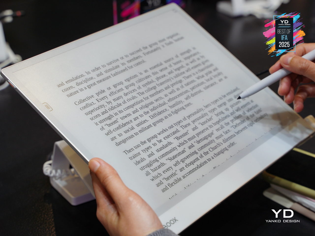
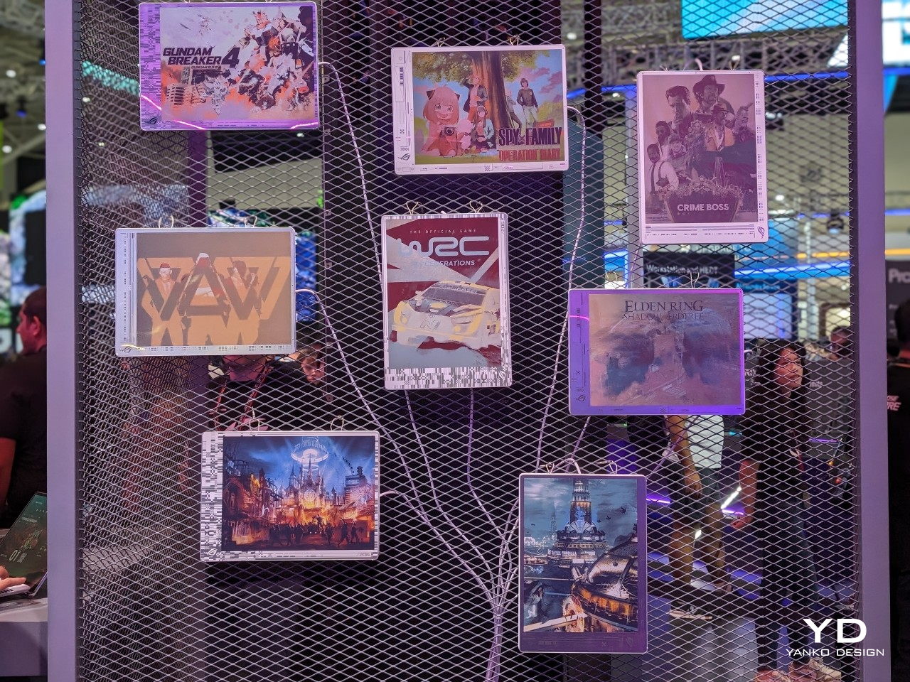
Designer: BOOX
Five Industries Embracing E Ink Innovation
The real magic happens when you see E Ink displays in action across different industries. Each sector has found unique ways to leverage the technology’s strengths, creating products that simply wouldn’t be possible with traditional screens. Here are five concrete examples that show how E Ink is changing the design game.
Laptops: Your Lid Becomes a Canvas
Designer: ASUS
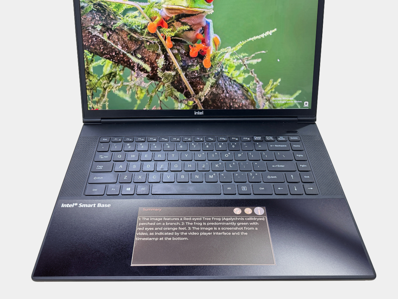
Laptop lids have been boring black rectangles for decades, but E Ink is changing that in fascinating ways. ASUS’s Project Dali concept turns the back of your laptop into a customizable display where you can showcase artwork, display your calendar, or show off your company logo during meetings. It’s like having a digital tattoo for your computer that changes whenever you want it to.
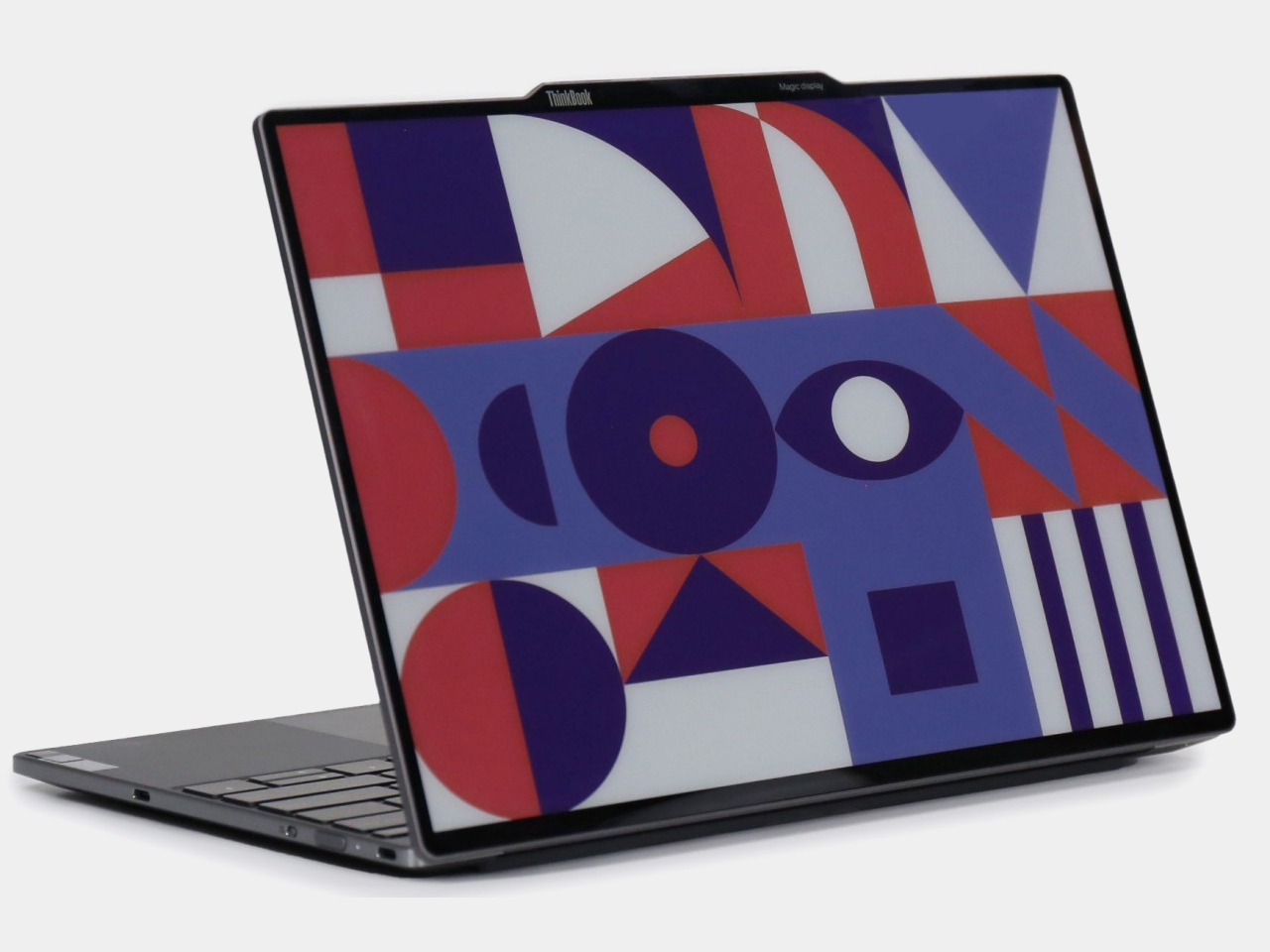
Designer: Lenovo
Lenovo took this concept to market with their ThinkBook 13x Gen 4 SPE, which features an actual E Ink display built into the lid. You can switch between personal artwork during coffee breaks and professional branding during client presentations. The display sips so little power that it barely affects battery life, yet it transforms your laptop from anonymous tech into a personal statement piece.
Transportation: Solar-Powered Information That Actually Works
Public transit signs have always been a nightmare to power and maintain, especially at remote bus stops without electrical connections. Boston’s MBTA solved this problem elegantly by deploying solar-powered E Ink signs throughout the city’s bus stops and Green Line stations. These displays show real-time arrival information, service alerts, and schedules without requiring a single wire to be run.
The beauty of these installations becomes obvious during New England winters, when the signs keep working despite snow, ice, and sub-zero temperatures. Solar panels provide enough juice to keep the displays running continuously, while the E Ink technology ensures perfect readability whether you’re squinting through morning glare or trying to read in dim evening light.
Makers: DIY Dreams Made Accessible
The maker community has embraced E Ink displays with the enthusiasm typically reserved for new Arduino boards or 3D printing breakthroughs. Waveshare offers dozens of different E Ink modules that work seamlessly with Raspberry Pi, Arduino, and other popular platforms. Suddenly, creating a custom weather station or smart home dashboard doesn’t require a computer science degree or a massive budget.
Hobbyists use these displays to build everything from digital art installations to battery-powered information kiosks that can run for months without maintenance. The paper-like appearance means these creations blend naturally into homes and offices, avoiding the harsh, obviously digital look of traditional screens. It’s democratized display technology in ways that would have seemed impossible just a few years ago.
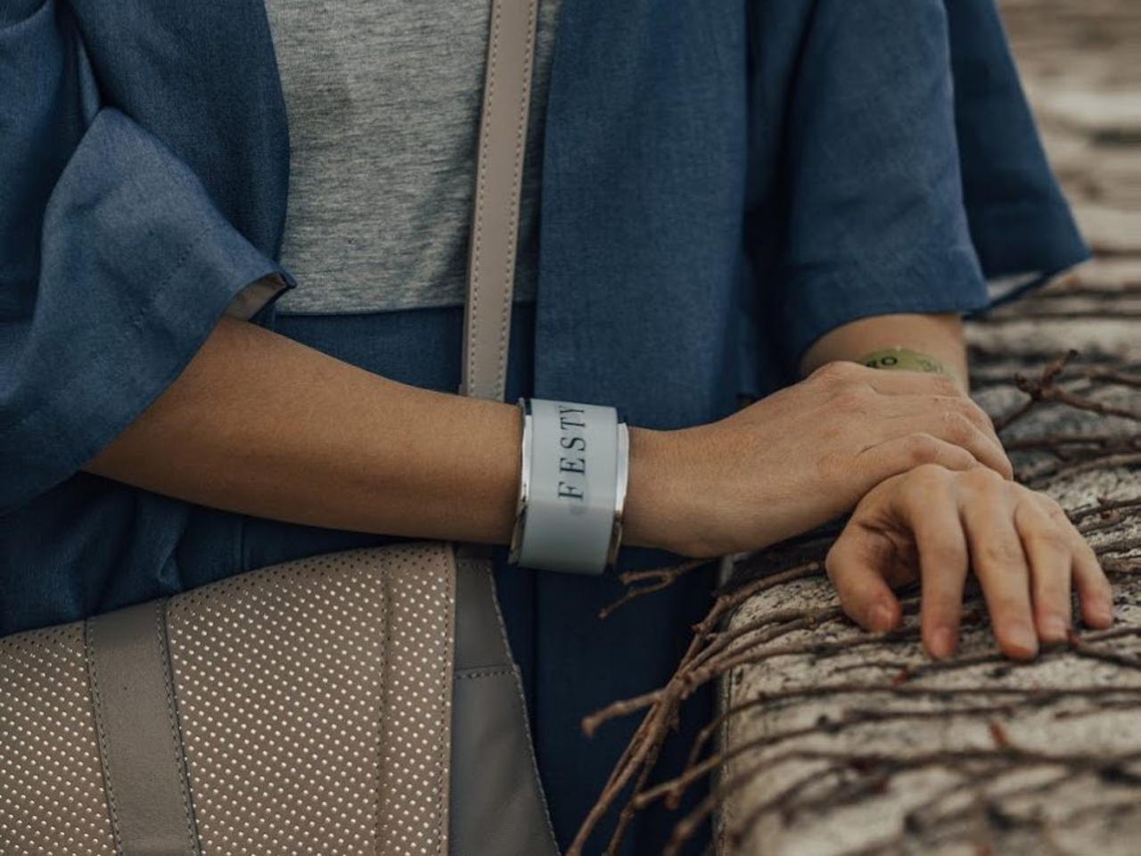
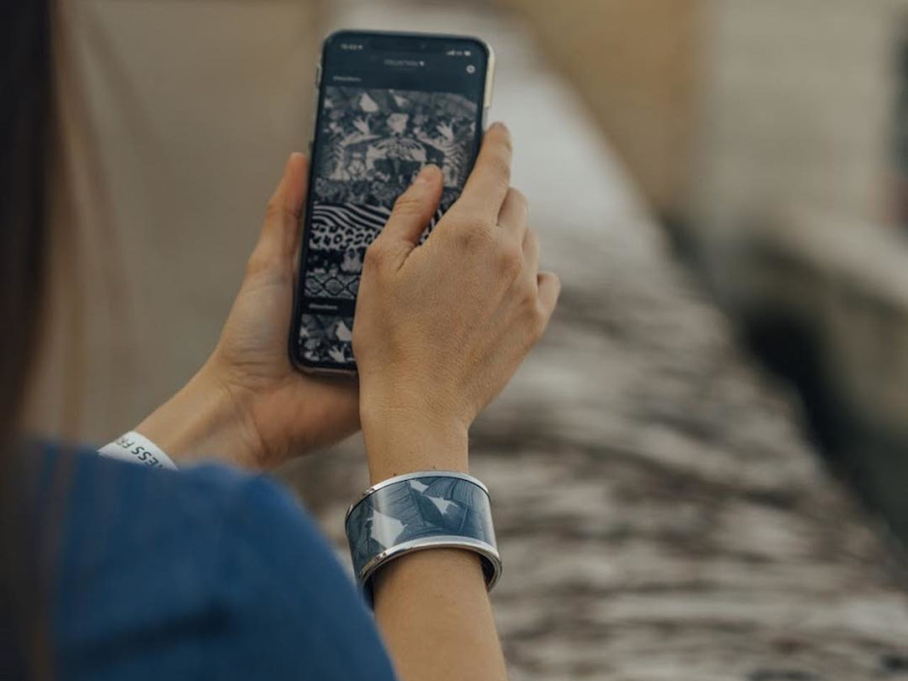
Fashion: Accessories That Change With Your Mood
Fashion has always been about self-expression, but E Ink takes personalization to an entirely new level. The Tago Arc bracelet demonstrates this beautifully, featuring a flexible E Ink display that lets you cycle through hundreds of different patterns using your smartphone. One moment you’re wearing geometric shapes, the next you’re sporting flowing organic patterns that match your outfit perfectly.
Designer: LIBR8TECH
The bracelet never needs charging because it draws power through NFC only when changing patterns. This means you get infinite customization without the hassle of yet another device to plug in every night. It’s the kind of accessory that makes people do double-takes, wondering how your jewelry just changed designs right before their eyes.
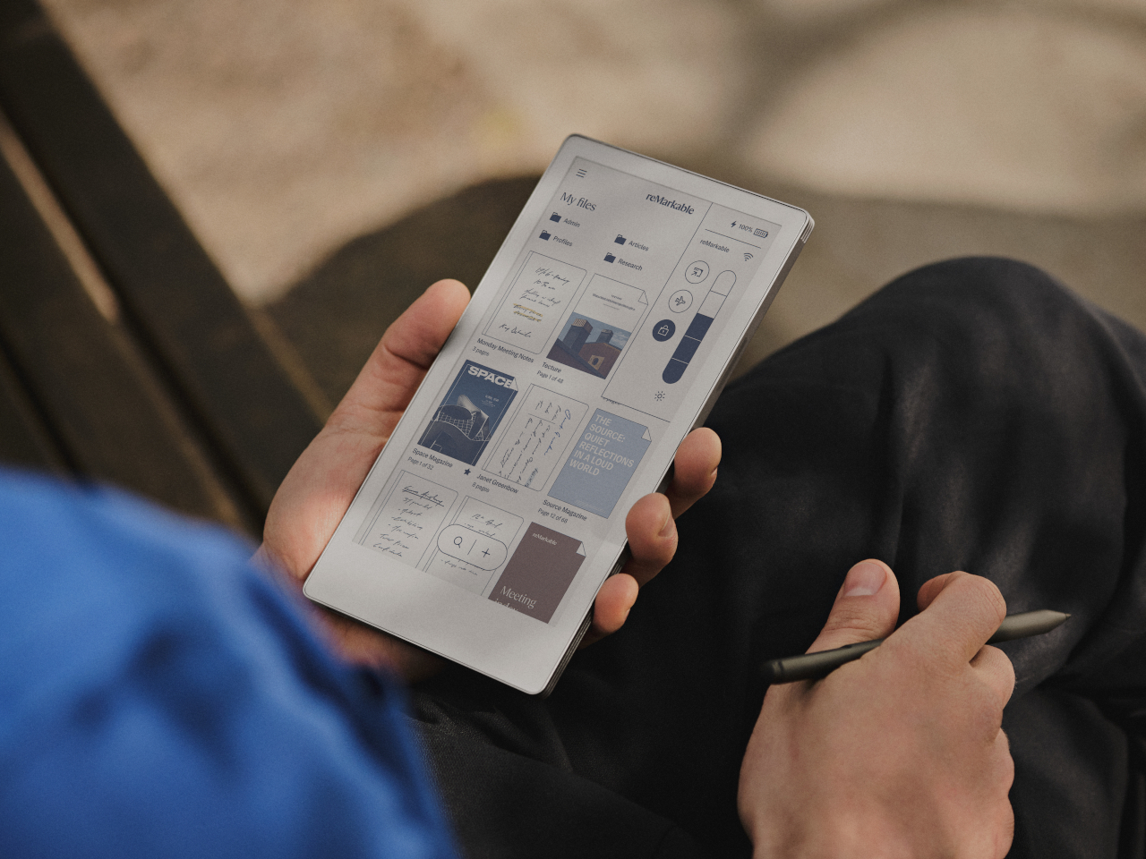
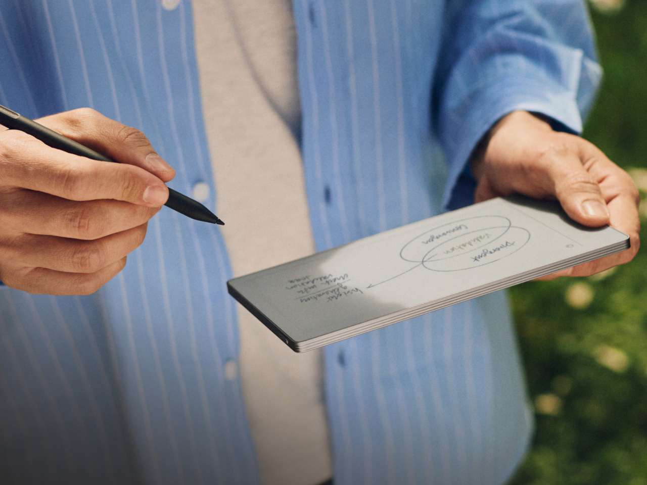
Consumer Electronics: Devices That Respect Your Attention
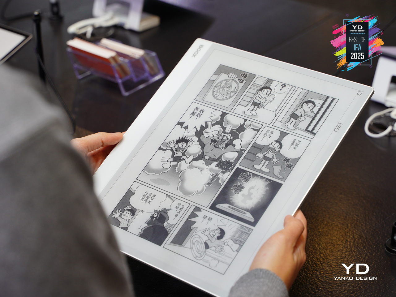
E Ink device like the BOOX Note Max and reMarkable Paper Pro Move have created an entirely new category of devices focused on thoughtful interaction. These tablets feel remarkably similar to writing on paper, making them favorites among designers, writers, and anyone who takes handwritten notes seriously. The screens don’t strain your eyes during long reading sessions, unlike their LCD counterparts.
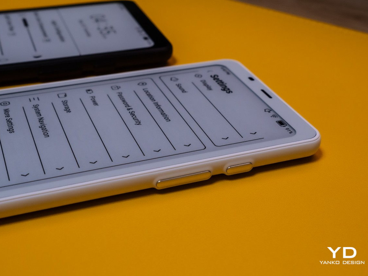
The BOOX Palma takes this concept in a different direction by creating a phone-sized E Ink device that looks and feels like a smartphone but focuses entirely on reading and productivity. This pocket-sized e-reader runs Android, giving you access to reading apps, note-taking tools, and basic communication functions without the distracting elements that make regular smartphones so addictive. It’s like carrying a digital book that happens to connect to the internet, perfect for people who want to stay connected without getting sucked into endless social media scrolling.
Accessibility Revolution
E Ink technology has become surprisingly accessible to individual designers and small companies over the past few years. Development kits and reference designs are readily available from multiple suppliers, while costs have dropped to levels that make experimentation feasible for creative projects and startup ventures. You no longer need deep pockets or specialized engineering knowledge to explore ePaper possibilities.
This democratization has accelerated innovation across multiple industries. Designers can prototype E Ink applications quickly and affordably, leading to creative solutions that might never have emerged from traditional corporate research and development cycles. The growing ecosystem of compatible components and software libraries continues to lower barriers while expanding creative possibilities for everyone.
Recent advances have addressed many of E Ink’s early limitations while opening up new application areas. Color reproduction has improved dramatically, though it still requires thoughtful design consideration. Refresh rates have increased enough to support interactive applications, while manufacturing improvements have reduced costs and increased reliability across the board.
Research into advanced ePaper technologies continues at a rapid pace. Flexible displays that can fold, roll, or stretch are becoming practical for commercial applications. Integration with touch sensors and other interactive elements keeps improving, making E Ink displays suitable for sophisticated user interface design that goes beyond simple text and images.
E Ink represents a fundamentally different approach to digital interaction, one that prioritizes sustainability, comfort, and thoughtful engagement over flashy visuals and constant stimulation. This philosophy resonates with designers who want to create products that enhance human experience without competing aggressively for attention. The technology encourages restraint and purposefulness in ways that feel refreshing in our cluttered digital landscape.
Products built around E Ink often exhibit a deliberate, focused quality that stands out from the noise. The constraints imposed by the technology force designers to think carefully about essential functions and user needs, often resulting in elegant solutions. The influence of E Ink thinking extends beyond products that actually use the technology, shaping broader conversations about conscious design practices.
As E Ink continues to mature, these ideas will likely influence how we think about digital interaction across many different product categories and industries. The technology has already proven that displays don’t need to be bright, fast, and power-hungry to be effective. Sometimes the best solution involves stepping back from the latest and greatest to focus on what actually serves people well.
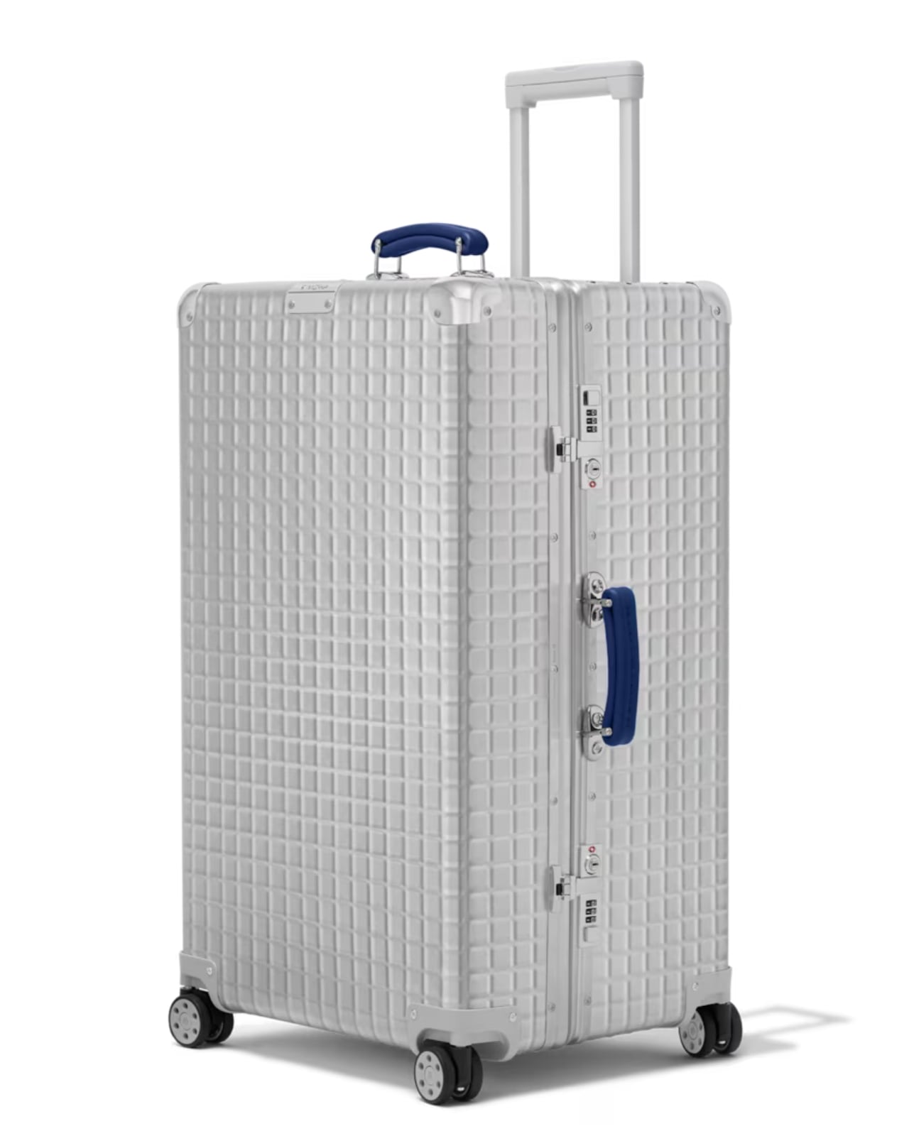
Whenever I see those distinctive Rimowa suitcases being lugged around airports, I picture how they would look as an everyday‑carry bag. I would love to brag that I own a Rimowa (which I don’t), but it would be silly to walk around the mall pulling that luggage. My dream was partially answered with their hand‑carry case, yet it remains too big and bulky for daily use. Now, another wish has been fulfilled.
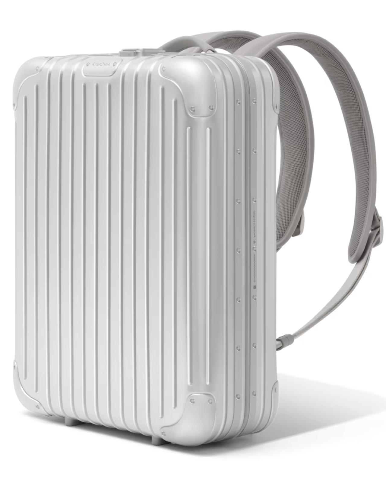
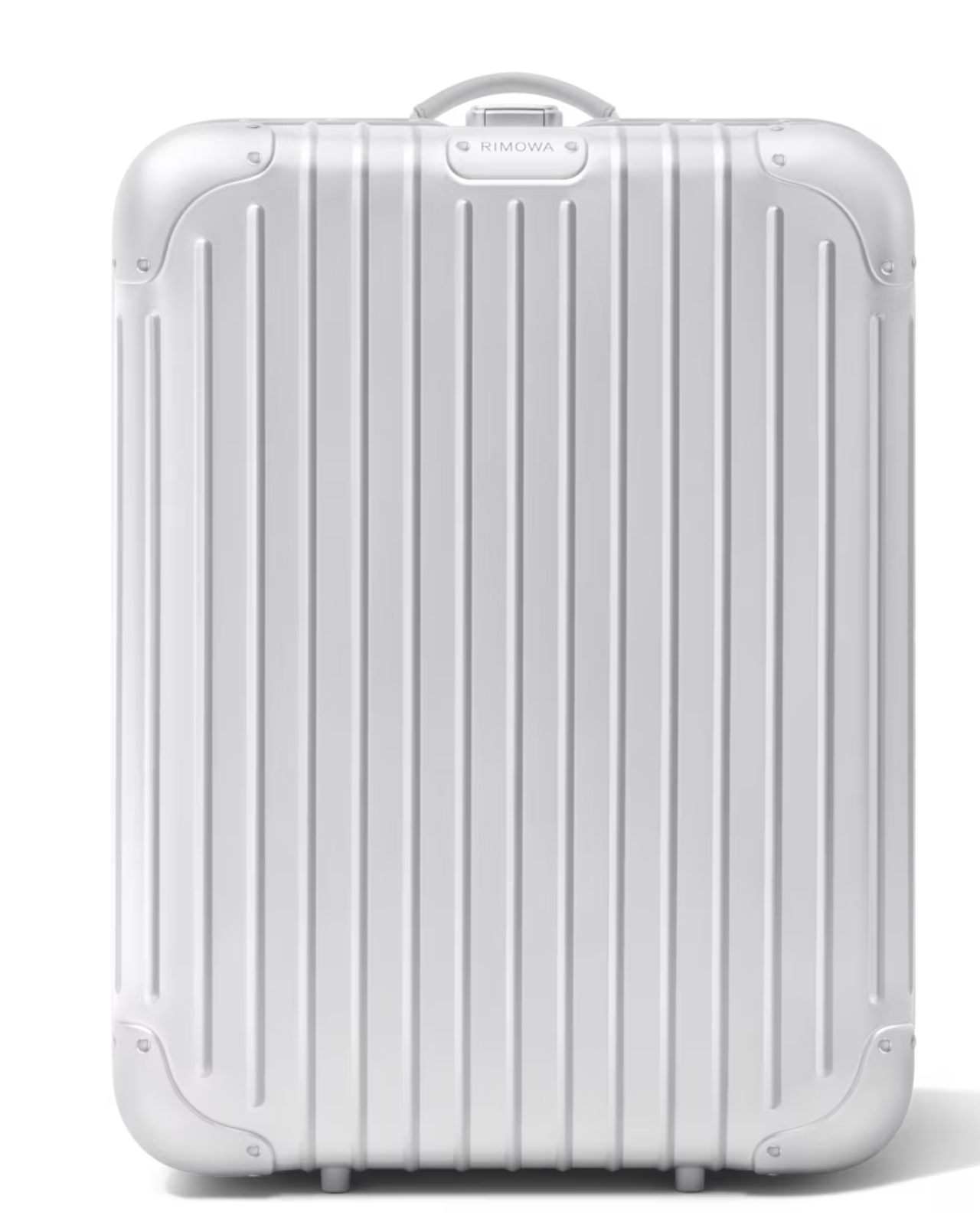
If you’re a backpack‑type person, you’d probably be queuing for the new Original Backpack—if you had around $2,400 to spare. You can now carry that iconic grooved silver shell, crafted from ultra‑resistant anodized aluminum, which gives you a minimalist, stylish bag that protects everything you store inside.
Rimowa’s Original Backpack in sleek silver marries the brand’s legendary durability with a contemporary, urban aesthetic. The shell is made from anodized aluminum that has been heat‑treated and brushed to a fine, matte finish. This not only creates the signature grooved pattern Rimowa is known for, but also adds corrosion resistance, making the bag suitable for rain, snow, or the occasional splash in a subway tunnel. The hard‑sided construction feels solid in the hand, yet the weight is surprisingly manageable for a piece of luggage this robust. Clean lines and a minimalist silhouette echo Rimowa’s iconic suitcase design, turning the backpack into a timeless accessory for commuters who value both style and substance.
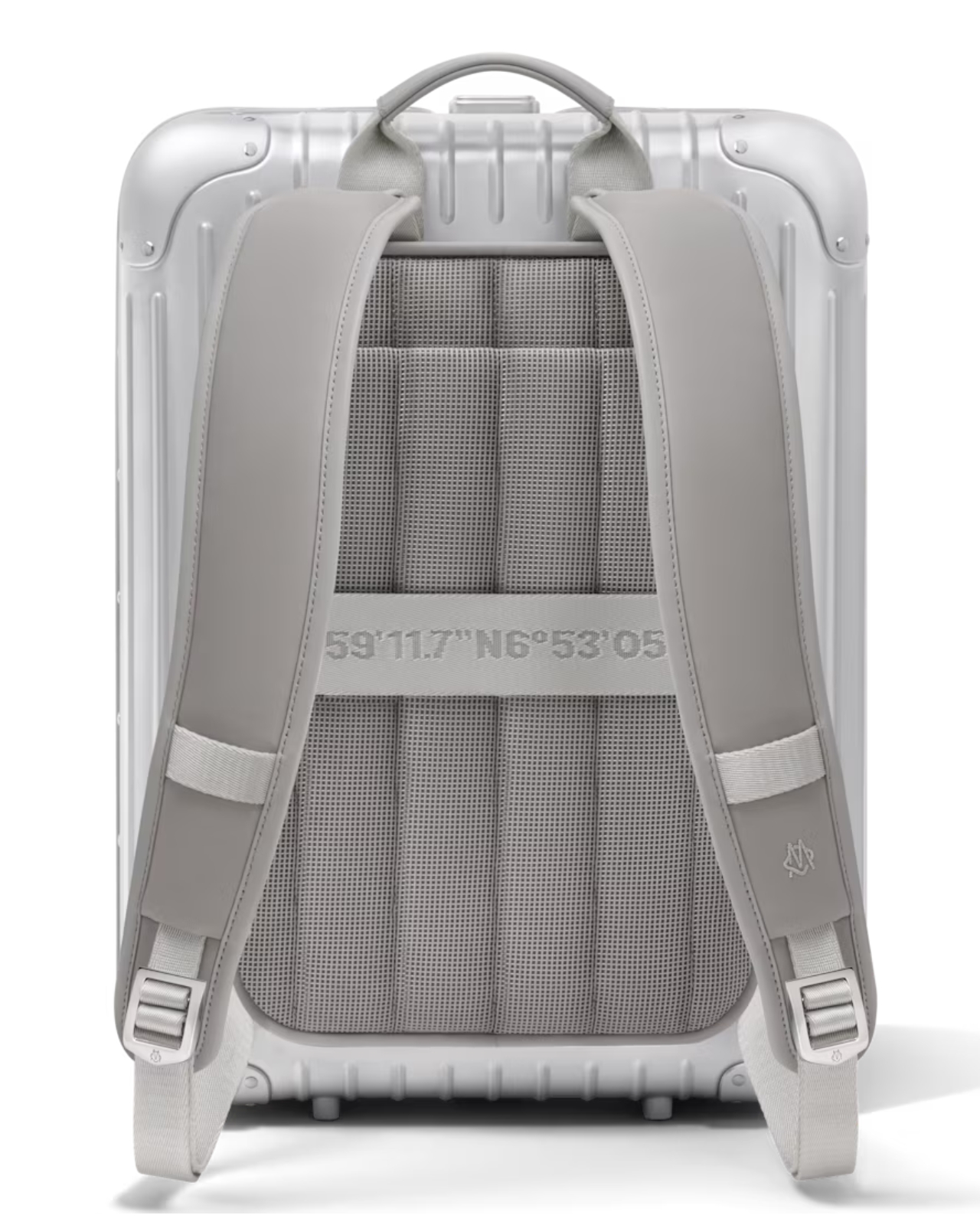
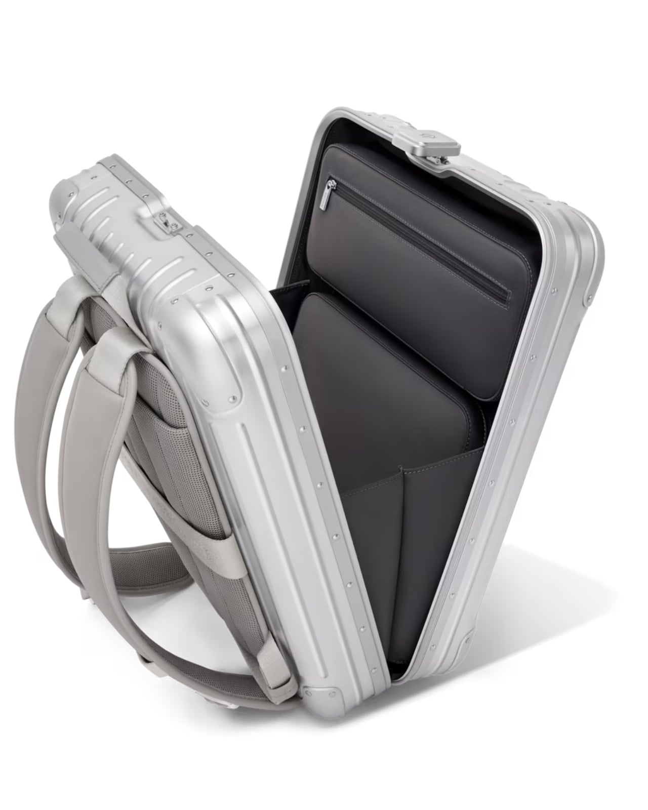
Inside, the backpack adapts to the fast‑paced life of today’s traveler. A flexible layout includes a removable divider with dedicated pockets for a 16‑inch laptop and accessories, plus a hidden quick‑access pocket for valuables such as a passport or phone. The divider can be taken out entirely, opening the main compartment for larger items like a change of clothes or a compact camera kit. A breathable padded back panel with mesh ventilation helps keep the wearer cool during long rides, while adjustable shoulder straps padded with high‑density foam distribute weight evenly and reduce fatigue. Practical extras include a secure closing system, which includes dual YKK zippers with a lockable pull tab, ensuring contents stay safe even when the bag is jostled in a crowded train. A suitcase‑attachment sleeve slides over the handle of a rolling suitcase, allowing seamless transition from backpack to carry‑on, and a removable pouch can be tucked inside to maximize space or used as a standalone organizer for chargers, pens, and business cards.
The backpack is inevitably heavier than a typical soft‑sided bag because of its hard shell and premium materials. At roughly 3.2 kg (7 lb) empty, it adds a noticeable load, but the weight feels justified when you consider the protection it offers. The aluminum shell shields delicate electronics from bumps and drops, while the internal padding cushions against shoulder pressure. The breathable back panel prevents sweat buildup during longer rides, and the adjustable straps can be fine‑tuned for a custom fit.
Overall, Rimowa’s Original Backpack is a statement piece that blends luxury luggage heritage with functional everyday carry. It suits urban commuters, frequent flyers, and style‑conscious professionals who want a bag that looks as good as it protects. While the price and weight may deter budget‑focused or ultra‑active users, anyone willing to invest in a durable, aesthetically striking backpack will find that the Original Backpack lives up to the brand’s reputation for quality and design excellence. At the very least, you can say you have a Rimowa on your back.
Carl Pei’s ethos of injecting fun into technology culminated in not one, but two brands. Most people recognize a Nothing device in the wild, instantly spotting and identifying its transparent design. But as a little sibling to the Nothing brand, Pei also unveiled CMF – a design-forward tech brand that was specifically founded to bring great technology and great design to the masses.
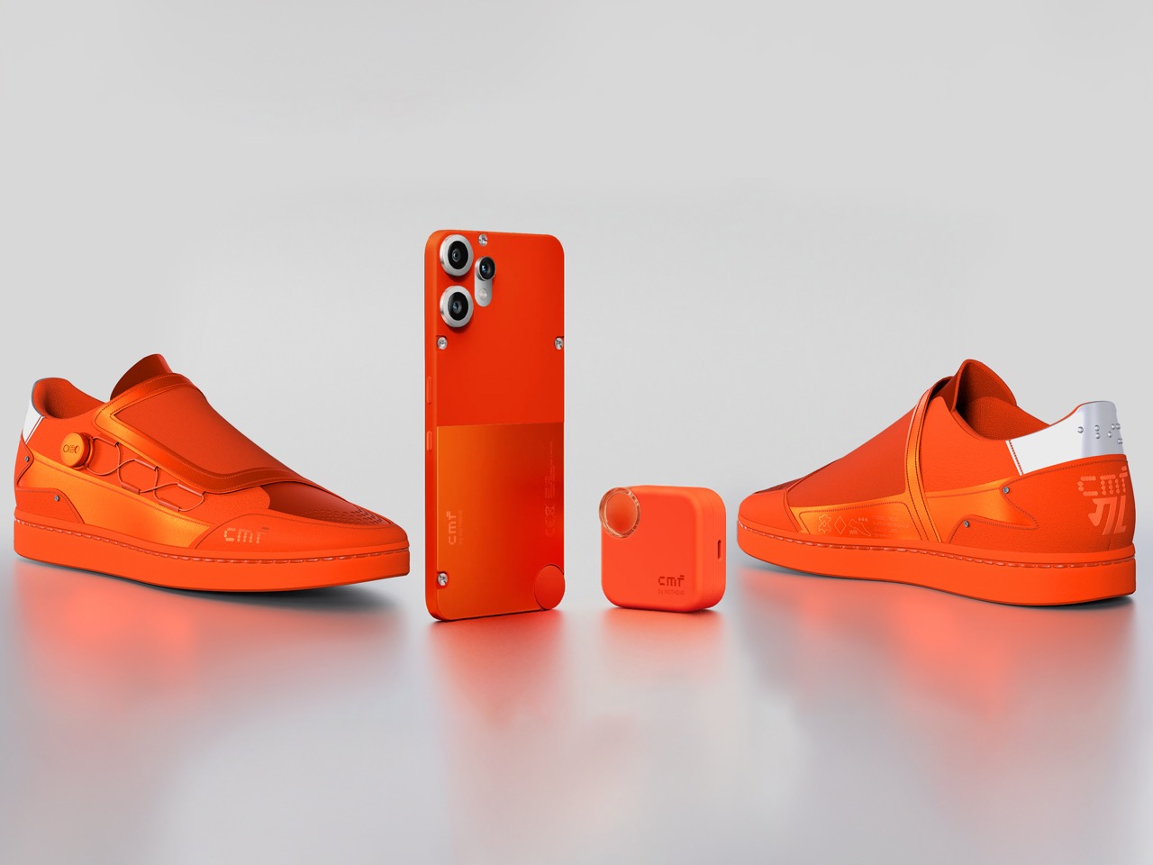
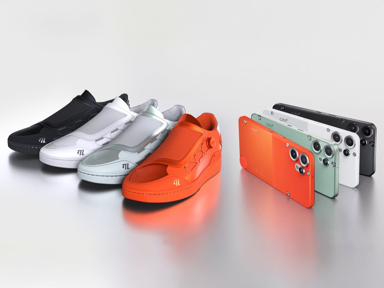
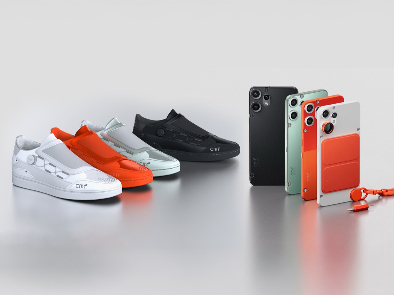
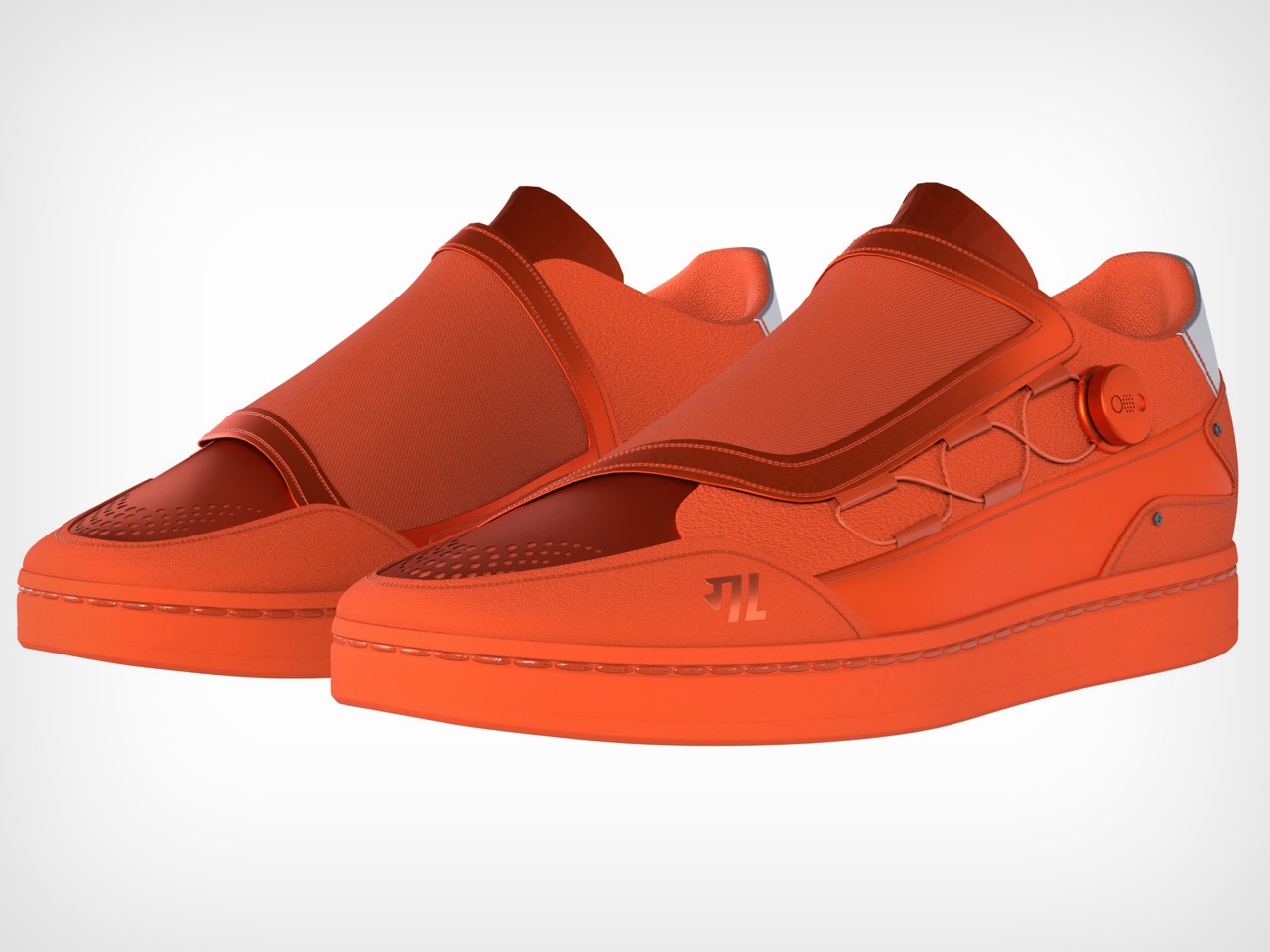
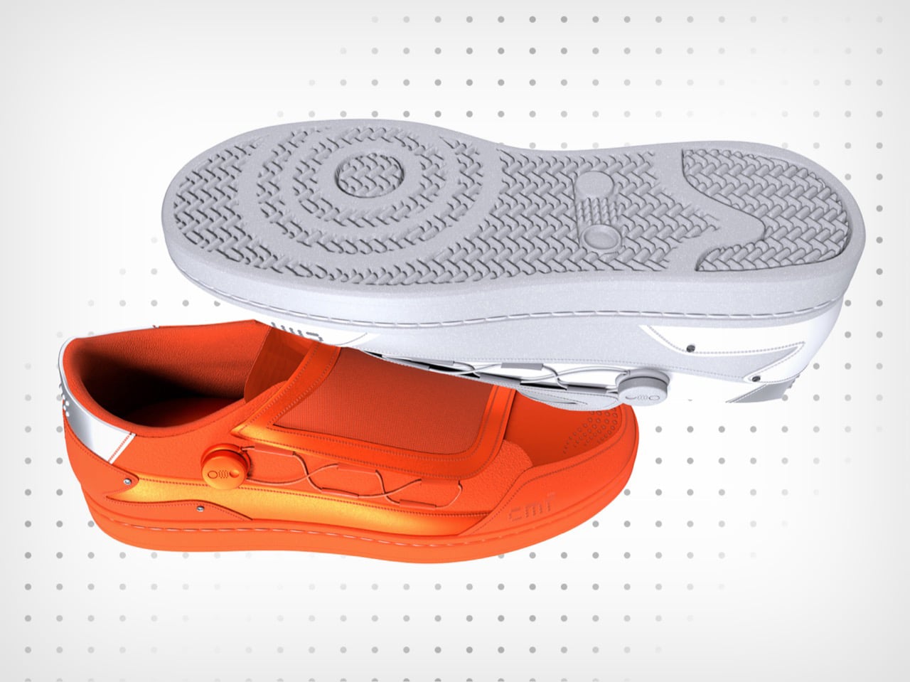
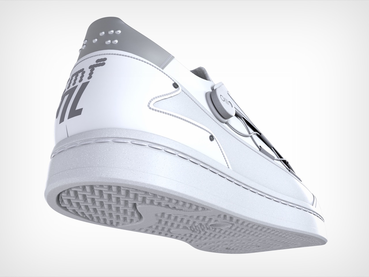
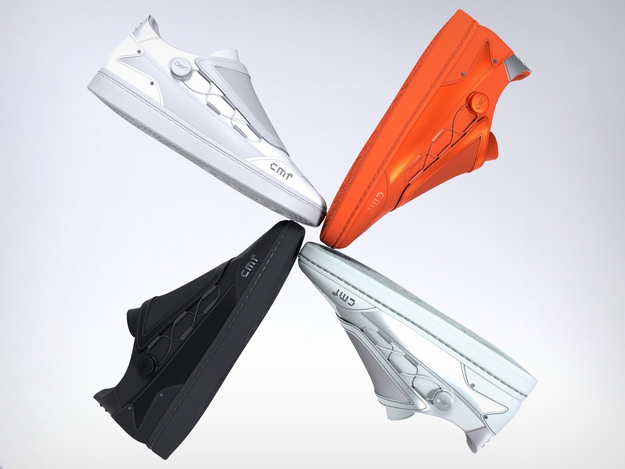
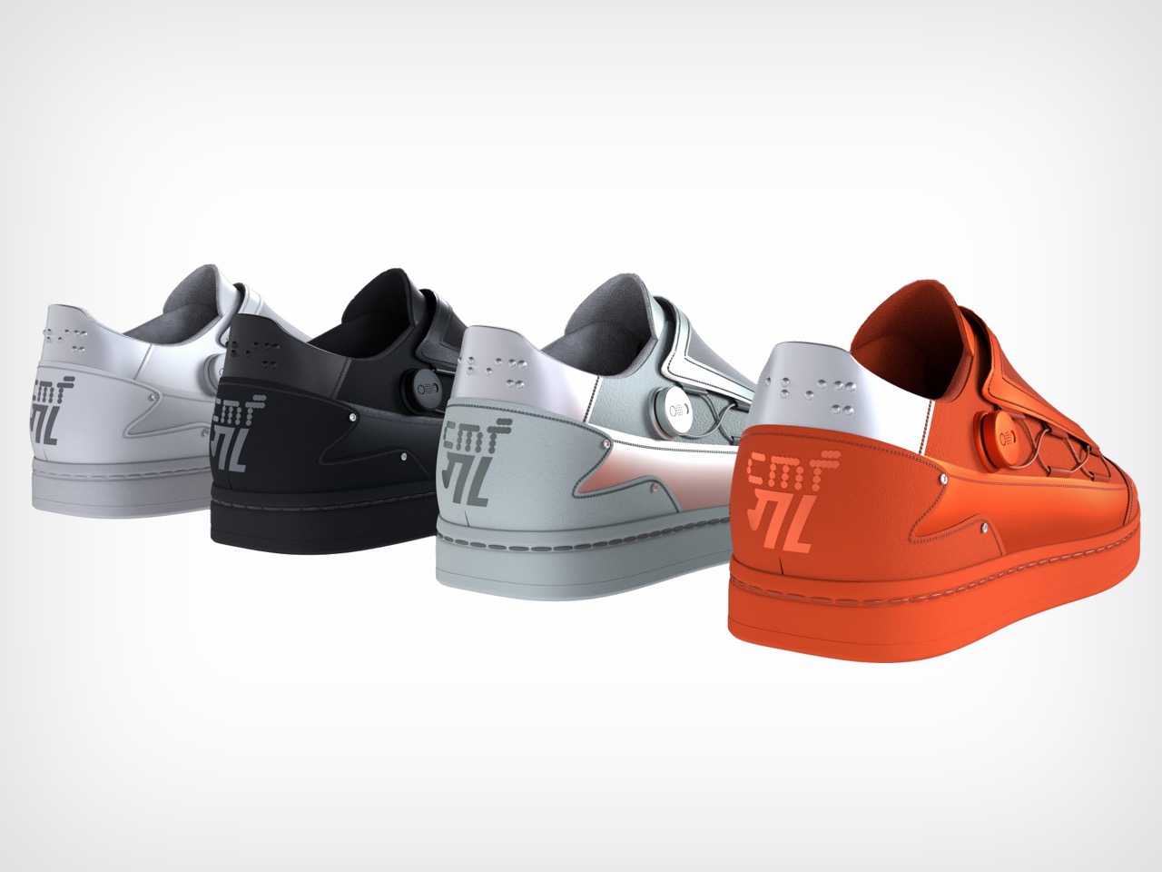
CMF actually pre-empted Nothing on a few fronts, it launched the first 3-camera smartphone before Nothing, it rolled out GaN chargers before Nothing, it even still holds the mantle of being the only brand of the two to have a smartwatch… and now it seems like CMF is adding sneakers to its list. The sneakers come as a result of a collab with Indian sneaker brand Gully Labs, but rather than merely launching a sneaker line, the two brands decided to turn the exercise into a community design effort. The result, perhaps one of the most interesting pieces of footwear I’ve seen from the design community. This particular concept by Abhishek Mistry injects CMF’s design ethos into a piece of footwear brilliantly. Aside from just making a neon orange pair of shoes, Mistry wove CMF details into them too, ditching the laces for a BOA system, and translating the CMF Phone’s modular backplate into a modular heel counter. The result feels perfectly CMF, it’s edgy, wild, and has that iconic flair that Pei’s constantly spoken about injecting into the products he creates.
The purpose of the community challenge was to rally the community behind the company – a classic move to build culture while also ensuring a strong, unwavering base of support. A side pursuit, however, is to also release a product that captures the brand’s essence perfectly – and Mistry’s design does that remarkably well. CMF’s design ethos has always been around building products that are fun, interactive, and modular. It’s practically baked into the Phone 1 and Phone 2 Pro’s designs, as well as the Buds series. The interaction manifests in the form of a laceless design that ditches conventional laces for a closed-loop BOA system. A knob, that looks very similar to the one found on the Phone and the Buds, lets you tighten or loosen the shoes, giving them a wonderfully tactile and enjoyable touch. You don’t need two hands to fasten your shoes, and you sure as hell don’t need velcro. Rotate the knob to tighten, rotate the other way to loosen. Genius.
The shoes also come in four colorways that match the CMF phones, you’ve got the iconic Orange color (which personally looks better on the shoes than on CMF’s tech), but then for the faint of heart, you’ve got more somber colors like white, black, and light green. The paneling feels exquisitely premium, as the shoes use cutting-edge new-age materials, or as Mistry calls, technical fabric. There’s an interplay of matte and metallic finishes, quite like on the Phone 2 Pro, and the CMF logo is confidently placed on the BOA knob, while the Gully Labs logo finds its way on the front.
That, however, isn’t where Mistry draws the line. Like the Phone 1 and 2 Pro, the sneaker builds modularity into its design too, giving the entire community the ability to customize their shoes while also opening up an entire third-party aftermarket for custom parts. The design borrows from the CMF Phones’ removable backplates, featuring a removable heel cover that’s held together by the same screws found on the Phone 1 and 2 Pro. Simply unscrew the heel cover on your existing shoe and swap it for something more funky or more your style. You could go for a color-change, a texture-change, even a material change should you choose! Want to go even more wild? Turn that modular heel into an accessory mount – maybe for AirTags, maybe a mount for a GoPro, the possibilities are quite literally endless, and let’s just say, CMF’s target audience has a surplus of creativity!
For now, Mistry’s footwear exists as a fan-made concept, but the competition’s underway, and with enough luck, designs like Mistry’s could get officially picked up by the brands and potentially turned into actual footwear. If you’d love to see modular sneakers with BOA fasteners, go check out Abhishek Mistry’s Instagram page for more photos. Or if you’re interested in designing your own shoes, check out the official competition page for more info.
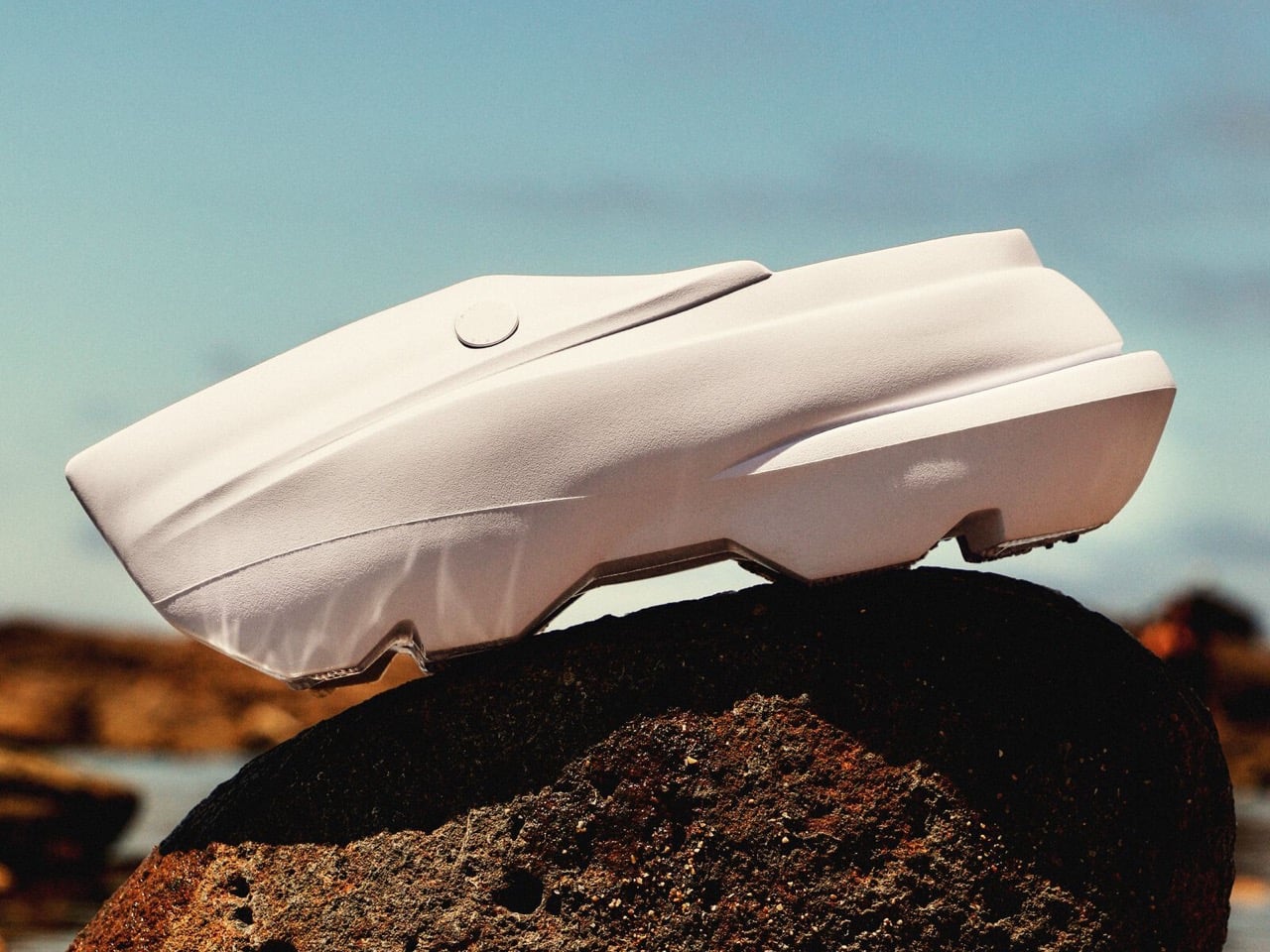
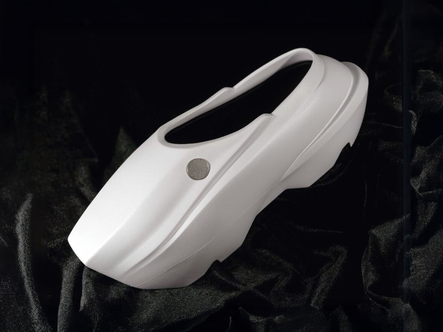
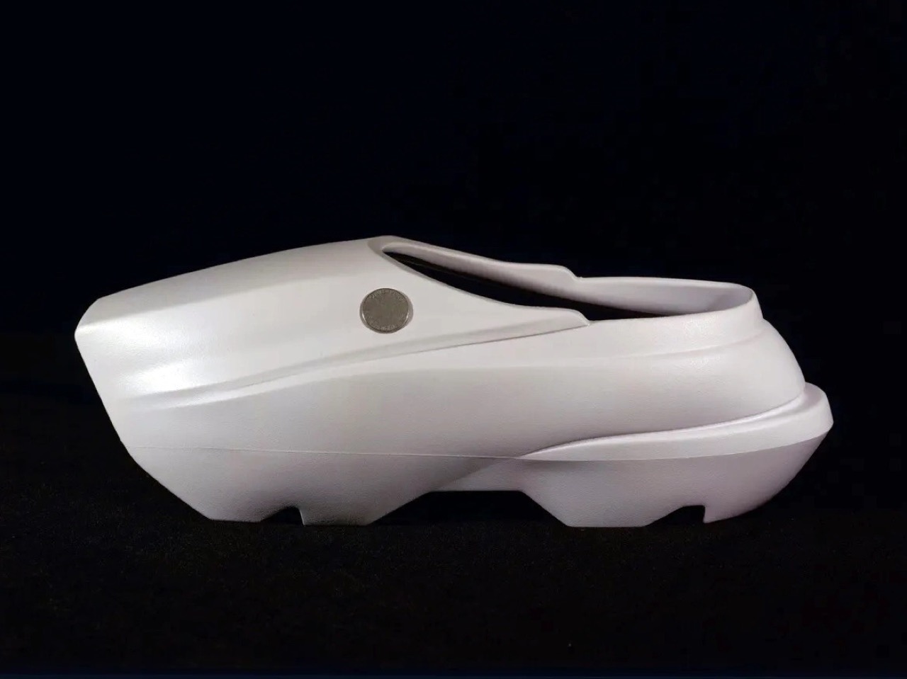
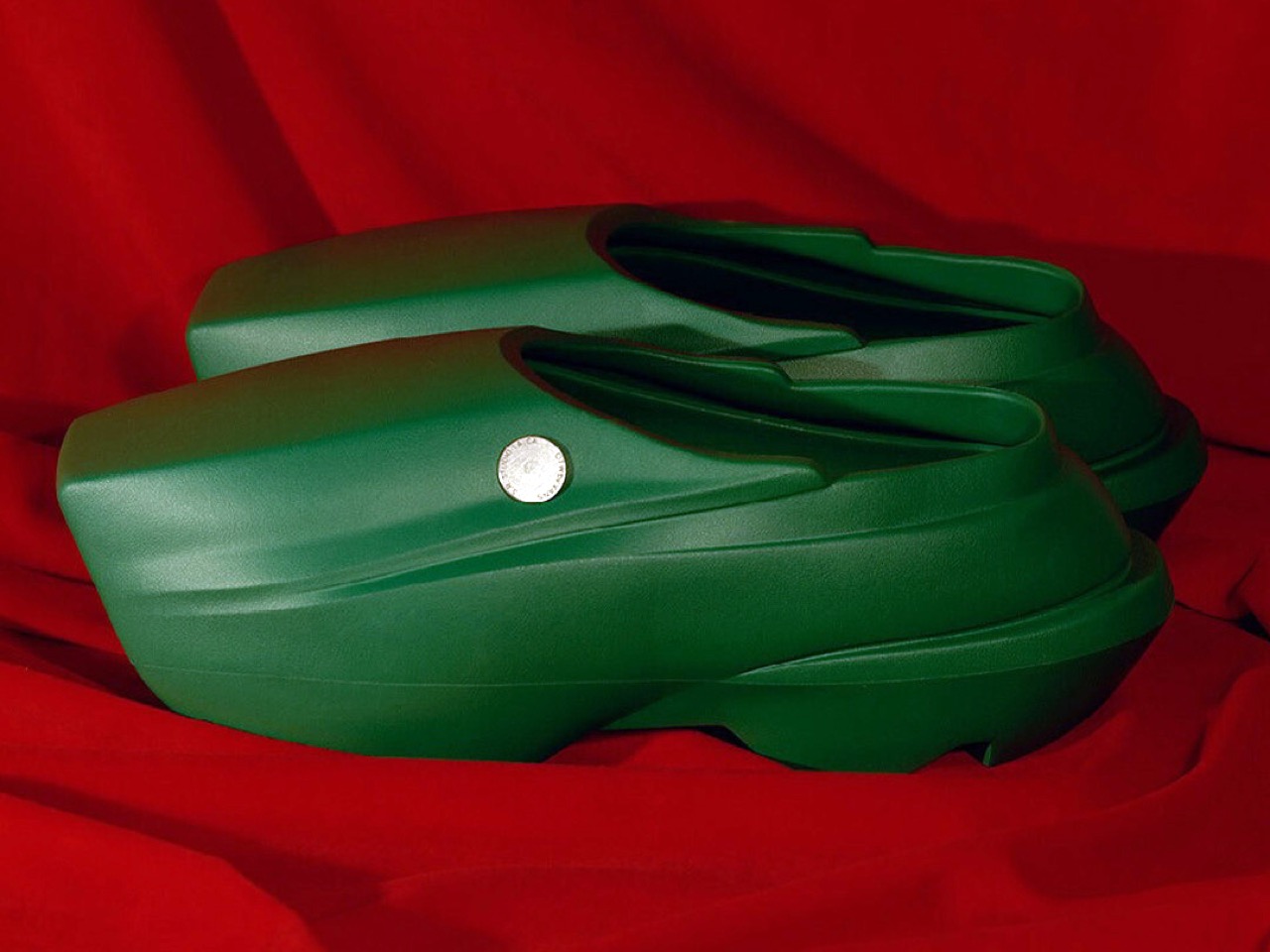
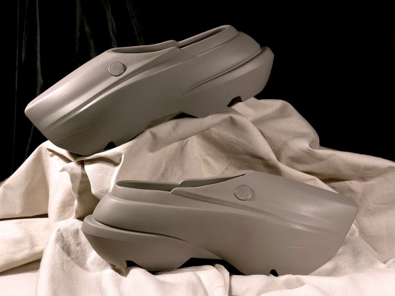
It’s a striking move for Vans to embrace the clog format, especially with a design that leans so hard into futuristic minimalism. Looking at the Vans Future Clog in light of the Dutch clog’s history, the connection is both surprising and oddly fitting. Traditional Dutch clogs, or “klompen,” were sturdy, carved from wood, and designed as practical footwear for farmers and laborers. Their iconic, blocky silhouette, instantly recognizable for its simplicity and function, has endured for centuries as a symbol of honest craftsmanship and everyday utility.
The Vans Future Clog plays with this legacy in a way that feels almost tongue-in-cheek. The exaggerated, blunt front and seamless build echo the klomp’s solid, all-in-one construction, but instead of wood, Vans opts for a lightweight, synthetic material that is molded rather than carved. The simplicity of the clog is preserved: there are no laces, minimal seams, and a monolithic look, but it’s been reimagined for a postmodern, urban audience. The result is something that feels both ancient and alien at once: a nod to Europe’s peasant past, updated for streetwear’s obsession with the bold and the unusual.
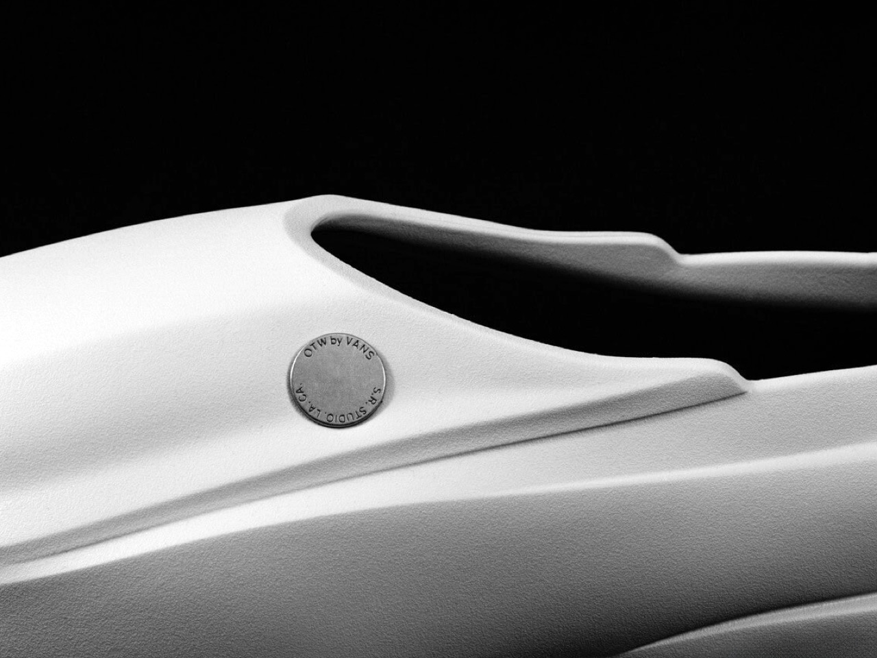
Designer: SR Studio for Vans
Sterling Ruby’s SR Studio brings an art world perspective to this collaboration that elevates the clog beyond typical footwear territory. Ruby, known for his large-scale sculptures and installations that often explore themes of decay, transformation, and industrial materials, seems like an ideal partner for reimagining something as humble as the clog. His influence is evident in the Future Clog’s sculptural quality and its willingness to look more like a wearable art piece than traditional footwear. The collaboration suggests that Vans is serious about pushing boundaries, not just creating another slip-on variation.
Comparing the Vans Future Clog to other modern, monomaterial footwear, the parallels with Yeezy’s Foam Runner and similar slip-on silhouettes are obvious. These shoes, popularized by brands like Adidas (Yeezy), Crocs (with their recent designer collabs), and even Merrell (Hydro Moc), all tap into a shared ethos: comfort, easy wear, and a sculptural approach that makes each pair instantly recognizable. They’re all about statement shapes, single-piece construction, and a willingness to look strange, sometimes even polarizing, rather than safe.
Where the Yeezy Foam Runner has organic curves and alien pod-like holes, the Vans Future Clog is more angular and automotive, almost as if the designers took the klomp, ran it through a wind tunnel, and then cast it in foam. Both shoes are intentionally minimal in branding, letting the silhouette and material do the talking. Each pairs well with streetwear and casual fits, but they telegraph different moods: Yeezies are more futuristic and playful, Crocs lean on comfort and nostalgia, while the Vans Future Clog splits the difference between industrial design object and fashion experiment.
The real question is whether this represents a new direction for Vans or just a one-off experiment. Given the brand’s recent “New Future” campaign and their push into premium materials and collaborations, this feels like testing the waters for a more design-forward approach. The clog format offers advantages: it’s Instagram-friendly, comfortable for extended wear, and different enough to generate buzz without alienating core customers who can always fall back on Old Skools. Smart brands know when to zig while others zag, and Vans appears to be zigging hard into sculptural footwear territory.